Best GitHub Websites of 2026 (20 Real-World Examples)
Twenty public product and company websites with original design reviews and documented GitHub engineering associations. The cases concern repositories and collaboration; they do not establish GitHub hosting of the captured pages.
GitHub supports the work behind a website: organizing source code, proposing changes, discussing decisions and keeping a record of revisions. The public result still depends on the team’s design judgment, content and implementation. These examples connect visible product communication with carefully scoped engineering accounts.
A strong development workflow makes a change understandable before it becomes part of a product. The repository holds the files and their history; a pull request gives collaborators a place to examine a proposed revision. Those tools help a team retain context, but they do not choose the page hierarchy, explain the product or make a confusing interface useful. Study the public design and the documented development practice as two related subjects.
This collection opens with Shopify, Spotify, Stripe, Figma and Duolingo. Each has a substantive primary GitHub customer case describing its product engineering. The reviewed destinations are the exact public properties named in each record, including Spotify’s browser player. Older or undated accounts remain documentary evidence. A company’s use of GitHub does not establish how every marketing page is built, where it is hosted or which tools produced an individual interface.
Before the examples
What makes good GitHub website development in 2026?
Make every proposed change understandable
A pull request combines a proposed revision with discussion, changed files and check results. Use that space to explain the visitor problem, the resulting behavior and the reason for the approach. A reviewer should be able to judge a navigation change without reconstructing its purpose from a list of altered files. Keep the explanation close to the work so later maintainers can understand why a decision was made.
A repository needs context as well as code. A concise README can explain what the project does, how to begin and where to get help. Add the details that matter to the actual website team: where content comes from, which service publishes it and who owns external integrations. Keep this introduction current as responsibilities change. A polished public homepage does not compensate for a handover that leaves the next maintainer guessing.
Make ownership visible without obscuring collaboration
GitHub’s CODEOWNERS file can identify the people or teams responsible for parts of a repository and request their review when relevant changes are proposed. Use that capability to make responsibilities clear, then establish how someone gets help when an owner is unavailable. Ownership should connect a question with useful expertise. It should not leave content, accessibility fixes or shared navigation stranded between teams with no obvious decision maker.
These public pages represent commerce, media, design, developer tools, communication, learning and other products whose teams have documented GitHub workflows. The reviews examine visible communication and interface choices; the separate evidence records describe the exact scope of each engineering association.
We start with five recognizable brands or organizations: Shopify, Spotify, Stripe, Figma, Duolingo. Each attribution applies to the named website property, not every product or website belonging to its organization. This is a curated reading sequence, not a measured ranking.
Shopify places a large, lightly weighted headline over a dark photographic scene. The white trial button repeats in the header and lower left, while products, pricing and enterprise routes remain visible above the campaign. That combination gives returning visitors a practical shortcut without making the opening feel like a software catalogue. A separate agent-oriented action introduces another starting path, although its prominence competes with the main trial. GitHub’s customer case documents repository collaboration and issue workflows for Shopify’s commerce product; it does not establish GitHub hosting for this marketing page.
What you can learn
Borrow the repeated primary action and the separation between campaign expression and durable navigation. In a repository-based workflow, keep changes to promotional copy reviewable alongside navigation and button behavior so a new campaign does not obscure established customer tasks.
Pros
Strong contrast separates the principal message from the photographic background.
Pricing and product navigation remain available before visitors commit to a trial.
Cons & considerations
Large background media needs a restrained fallback on slower connections.
Two different starting promises require careful explanation of their destinations.
Platform source: GitHub official customer case — documented product engineering. Core commerce application stored in a GitHub repository; Issues, pull requests, repository automation and documentation builds support Shopify product development. This is a primary documentary product-engineering association, read November 10, 2026. The case does not establish the present runtime, hosting or CMS of the pictured public page; older case details remain historical. Platform evidence is separate from the direct website screenshot and is not a complete current infrastructure audit.
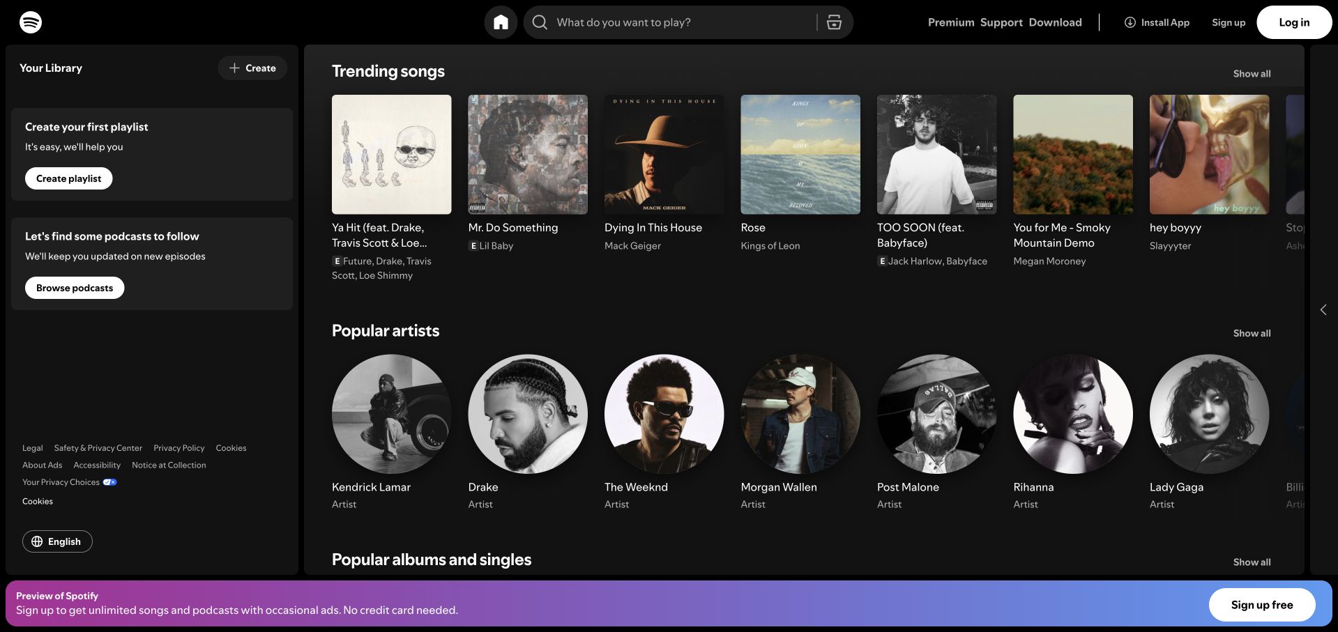
Spotify’s retained web-player capture opens directly into music browsing. Square artwork distinguishes songs, circular portraits distinguish artists, and the left library column offers separate creation and discovery prompts. Search sits near the center of the top bar, while a bright registration strip stays outside the catalogue panels. This makes the product understandable before someone creates an account. GitHub’s primary case describes Spotify’s repository collaboration and CI feedback across its engineering work, including browser listening; that documentary association does not reveal the current implementation of every player component.
What you can learn
The useful pattern is a stable application shell around changing content. Give reusable navigation and catalogue components clear ownership, then review changes in context with representative titles and images. A polished empty library can teach visitors what becomes available after registration.
Pros
Shape and spacing distinguish content types without a lengthy explanation.
Search, library and account actions occupy predictable areas around the catalogue.
Cons & considerations
The registration strip reduces the vertical space available for browsing.
Several simultaneous discovery rows can make the first listening choice feel crowded.
Platform source: GitHub official customer case — documented product engineering. Enterprise Server/Cloud support Spotify engineering, open-source work and CI feedback; the case explicitly includes its browser listening experience. This is a primary documentary product-engineering association, read November 10, 2026. The case does not establish the present runtime, hosting or CMS of the pictured public page; older case details remain historical. Platform evidence is separate from the direct website screenshot and is not a complete current infrastructure audit.
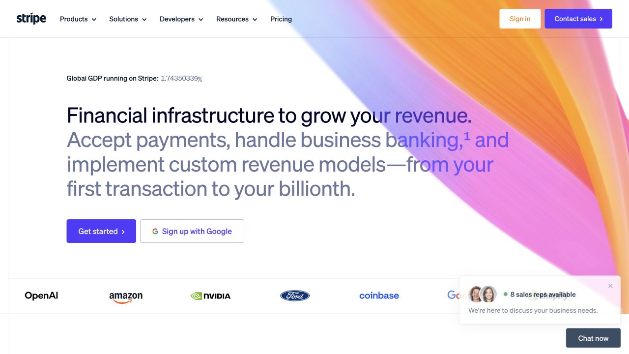
Stripe uses an expansive text introduction against a mostly white page, with a warm gradient sweeping in from the upper right. The headline moves from a broad business outcome into concrete payment and banking capabilities. Developers receive an explicit navigation route rather than being hidden inside resources, and the primary starting action sits next to an alternative signup option. A chat card overlaps the lower corner of the retained capture. GitHub’s case concerns Stripe’s source control, pull-request collaboration and public developer libraries; it is separate from evidence about this homepage’s hosting.
What you can learn
Use the first screen to state the commercial problem, then provide distinct routes for evaluation and implementation. Repository review can keep those routes coordinated: a product change should update customer-facing language, examples and developer entry points together, with responsibility assigned for each.
Pros
Developer navigation gives technical visitors a clear route into deeper material.
A restrained action group keeps the next step visible beneath the introduction.
Cons & considerations
Long headline lines require careful reflow at smaller widths.
The chat overlay competes with the lower-page proof and customer-logo area.
Platform source: GitHub official customer case — documented product engineering. Documented Enterprise Server source control and pull-request collaboration for Stripe payment APIs, with public SDK repositories. The marketing homepage represents that product; runtime hosting is not established. This is a primary documentary product-engineering association, read November 10, 2026. The case does not establish the present runtime, hosting or CMS of the pictured public page; older case details remain historical. Platform evidence is separate from the direct website screenshot and is not a complete current infrastructure audit.
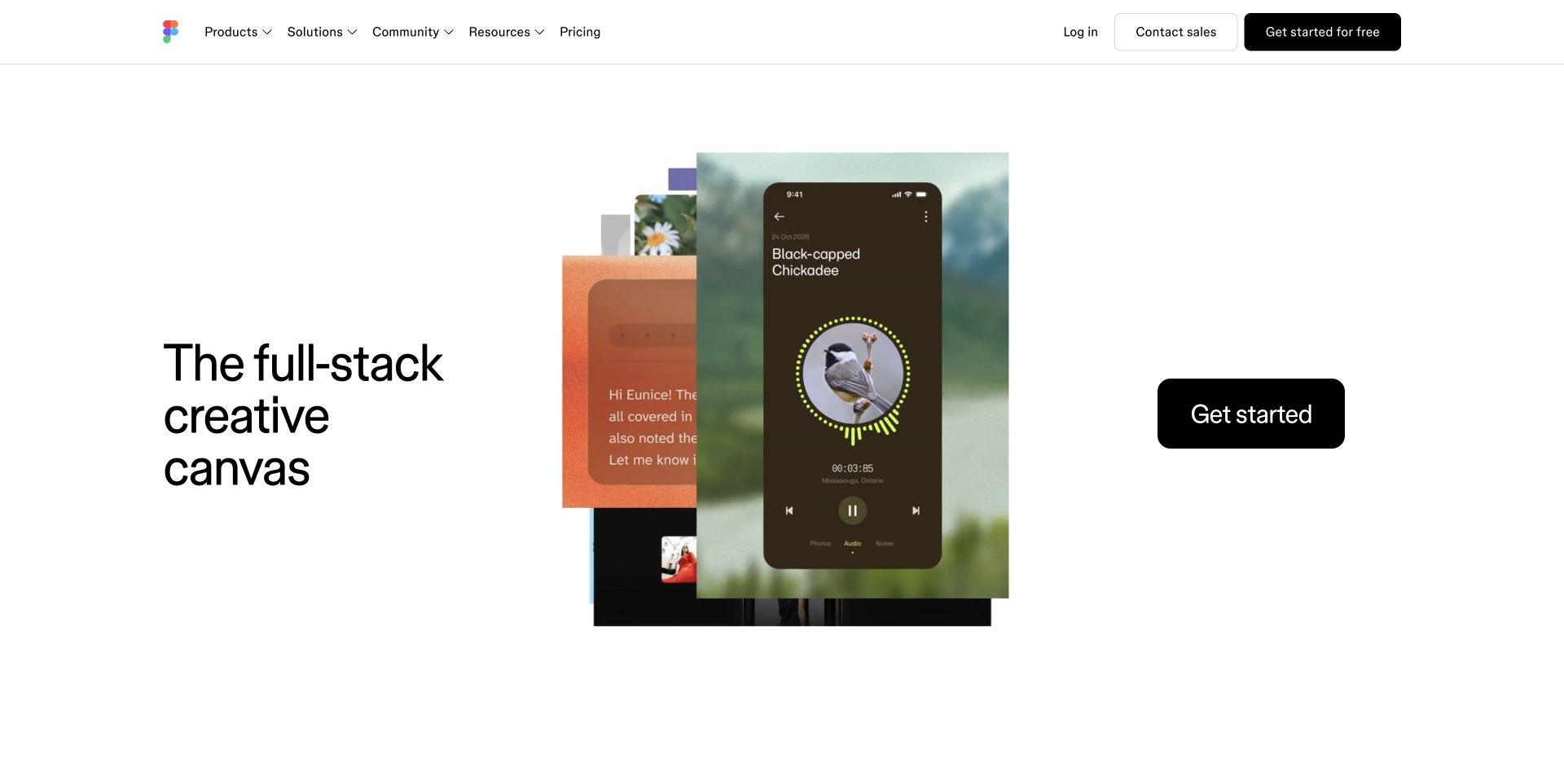
Figma’s retained homepage capture combines a short left-aligned statement, a layered design composition in the center and an oversized black starting button on the right. The example resembles a mobile experience rather than an abstract diagram, so visitors can infer a useful outcome without reading a feature list. A quiet header separates product, community, resources and pricing routes. GitHub’s Figma case documents centralized source code, pull requests and engineering collaboration for the web-based design product; it does not mean that the marketing composition was generated or hosted by GitHub.
What you can learn
The transferable idea is to show one legible result while keeping the surrounding interface calm. Teams maintaining a shared design system can use reviewable component changes to preserve that balance across campaigns, checking that visual experimentation still leaves navigation and calls to action easy to locate.
Pros
The central composition communicates a creative use case through recognizable interface details.
Wide spacing makes the starting action and short introduction easy to distinguish.
Cons & considerations
The broad opening promise leaves some product distinctions to later exploration.
A multi-column composition needs a deliberate reading order when it stacks on mobile.
Platform source: GitHub official customer case — documented product engineering. Enterprise source-code hosting, reviews, pull requests, Dependabot and API/CI integrations support Figma's web-based design platform. This is a primary documentary product-engineering association, read November 10, 2026. The case does not establish the present runtime, hosting or CMS of the pictured public page; older case details remain historical. Platform evidence is separate from the direct website screenshot and is not a complete current infrastructure audit.
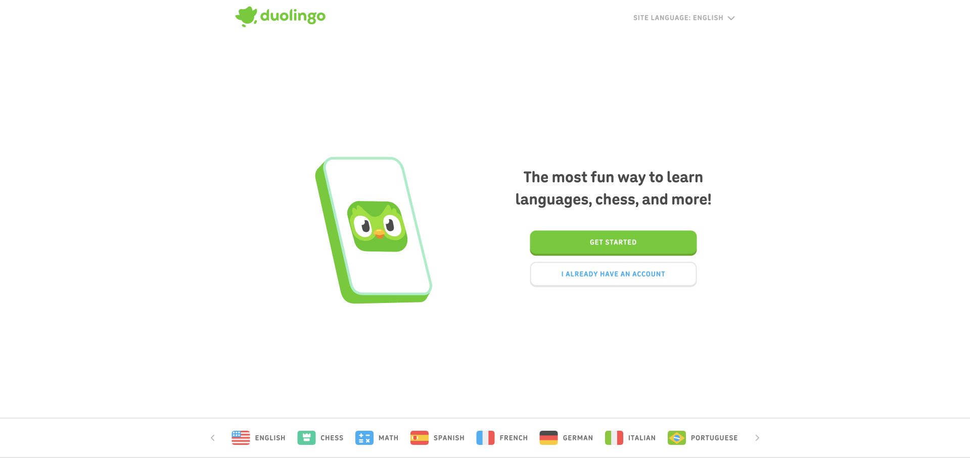
Duolingo’s captured opening uses a green character illustration beside a short learning promise and two stacked actions. The filled button is for newcomers, while the outlined button gives returning learners an equally understandable route. A narrow subject-and-language strip adds breadth without turning the central introduction into a directory. Large areas of white space reinforce the lightweight decision. GitHub’s customer case describes source management, review standardization and development tools across Duolingo’s learning-platform engineering; it does not identify the current code behind this exact landing-page illustration.
What you can learn
Keep the first decision tied to the visitor’s state rather than internal product organization. When teams share repositories and components, a clearly owned entry flow helps prevent new subjects or campaigns from adding competing primary buttons. Review the signed-out path as carefully as the returning-user route.
Pros
New and returning visitors receive clearly differentiated actions in the same visual group.
The illustration and green accent make the entry screen recognizable without dense copy.
Cons & considerations
Extensive empty space delays more detailed explanation of the learning experience.
Additional subjects need supporting pages to explain differences beyond their small strip labels.
Platform source: GitHub official customer case — documented product engineering. Source control, standardized review workflows, API integrations and Codespaces support Duolingo learning-platform engineering. The case also covers mobile apps; no claim all homepage code uses Copilot. This is a primary documentary product-engineering association, read November 10, 2026. The case does not establish the present runtime, hosting or CMS of the pictured public page; older case details remain historical. Platform evidence is separate from the direct website screenshot and is not a complete current infrastructure audit.
ASOS gives most of the retained first screen to a paired fashion photograph and large campaign lettering. Above it, a solid black bar holds audience links, a long search field and recognizable account, favorite and bag controls. The separation lets the image establish mood while the header supports shoppers who already know what they want. A substantial cookie notice covers the lower campaign area in this authentic capture. GitHub’s case explicitly connects ASOS website and app delivery to its repository and code-review workflows; it is not a statement that GitHub serves the storefront.
What you can learn
The practical lesson is to keep transaction-oriented navigation independent of a changing campaign. Review header, search and consent behavior with each promotional release, including the space overlays consume. A compelling photograph should never be the only route to the product range.
Pros
Search remains prominent even when the campaign fills most of the screen.
Platform source: GitHub official customer case — documented product engineering. Case explicitly ties daily app and website delivery to ASOS engineering's repository migration to GitHub and code-review/development workflows. This is a primary documentary product-engineering association, read November 10, 2026. The case does not establish the present runtime, hosting or CMS of the pictured public page; older case details remain historical. Platform evidence is separate from the direct website screenshot and is not a complete current infrastructure audit.
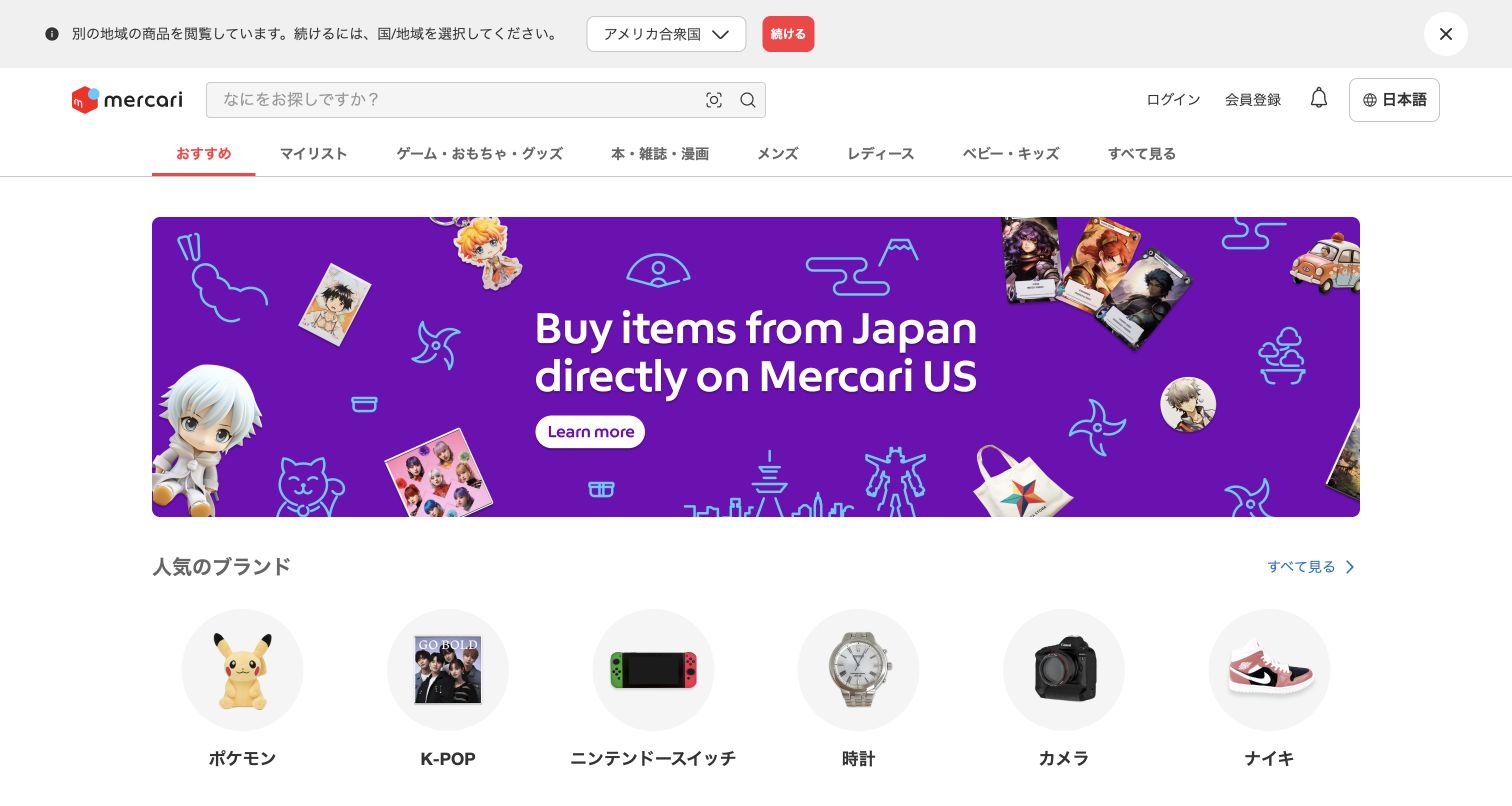
Mercari Japan’s directly captured page keeps a wide search field beside its logo and places category tabs in a separate row below. A purple promotional banner occupies the central area, followed by circular images for recognizable interests such as collectibles, cameras and footwear. The page also displays a region notice, retained in the capture, that distinguishes the Japanese catalogue from an overseas shopping path. GitHub’s Mercari case documents shared repositories and engineering collaboration across its marketplace business; it does not prove the implementation of every regional page or promotion.
What you can learn
Build the browsing structure from stable search and category components, while treating regional campaigns as replaceable content. Repository review should include the relationship between locale notices, navigation labels and destination URLs so a visitor understands whether a choice keeps them in the same marketplace.
Pros
A large search field supports visitors who arrive with a specific item in mind.
Circular category images make broad interests recognizable before detailed product browsing.
Cons & considerations
The regional notice introduces an extra decision before exploration begins.
Promotional content consumes substantial vertical space above the category collections.
Platform source: GitHub official customer case — documented product engineering. Mercari platform engineering uses GitHub for shared repositories, CI/CD and security. Japanese marketplace is the reviewed product property; source covers broader company operations too. This is a primary documentary product-engineering association, read November 10, 2026. The case does not establish the present runtime, hosting or CMS of the pictured public page; older case details remain historical. Platform evidence is separate from the direct website screenshot and is not a complete current infrastructure audit.
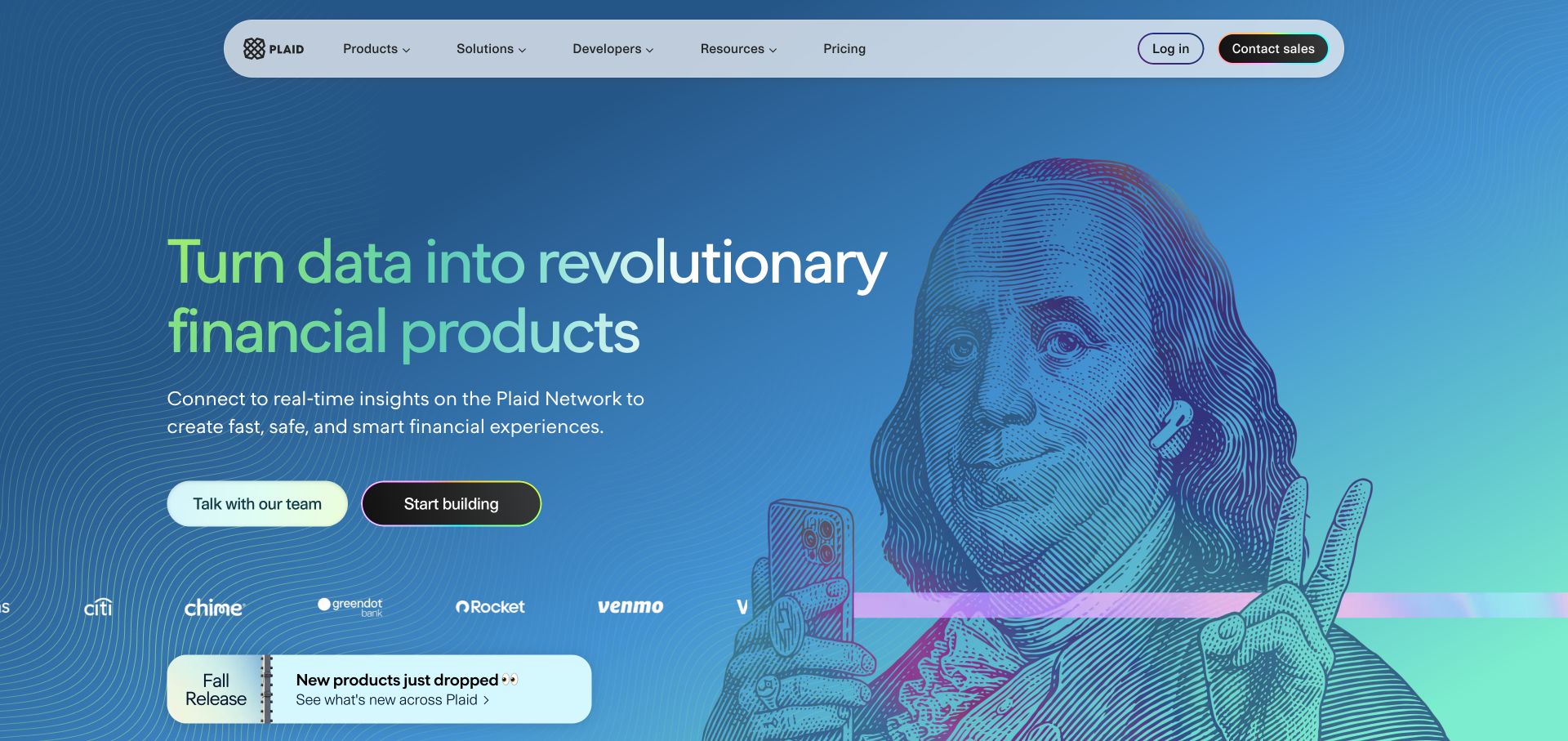
Plaid combines a blue gradient, fine contour lines and a large engraved-style portrait holding a phone. The headline highlights selected words in green, while two adjacent actions distinguish speaking with the team from beginning to build. A rounded navigation bar gives developers their own route, and customer marks sit below the principal message. The illustration supplies personality without replacing the product explanation. GitHub’s Plaid case describes Enterprise source control and pull-request-based engineering processes for its APIs; the visual homepage remains a separately observed public property.
What you can learn
Pair an evocative image with plain language that explains the actual capability. For a developer platform, keep the builder path visible beside the sales path, and use repository reviews to coordinate changes in product positioning with the documentation and examples those routes eventually reach.
Pros
Two distinct actions acknowledge different stages of evaluation and implementation.
The illustration makes an otherwise abstract data product visually memorable.
Cons & considerations
Detailed linework can compete with smaller text where their areas overlap.
A broad financial promise still needs concrete examples deeper in the visitor journey.
Platform source: GitHub official customer case — documented product engineering. Plaid API development uses self-hosted GitHub Enterprise, pull requests, custom review integrations and deployment workflows. Public product homepage is not asserted to be GitHub-hosted. This is a primary documentary product-engineering association, read November 10, 2026. The case does not establish the present runtime, hosting or CMS of the pictured public page; older case details remain historical. Platform evidence is separate from the direct website screenshot and is not a complete current infrastructure audit.
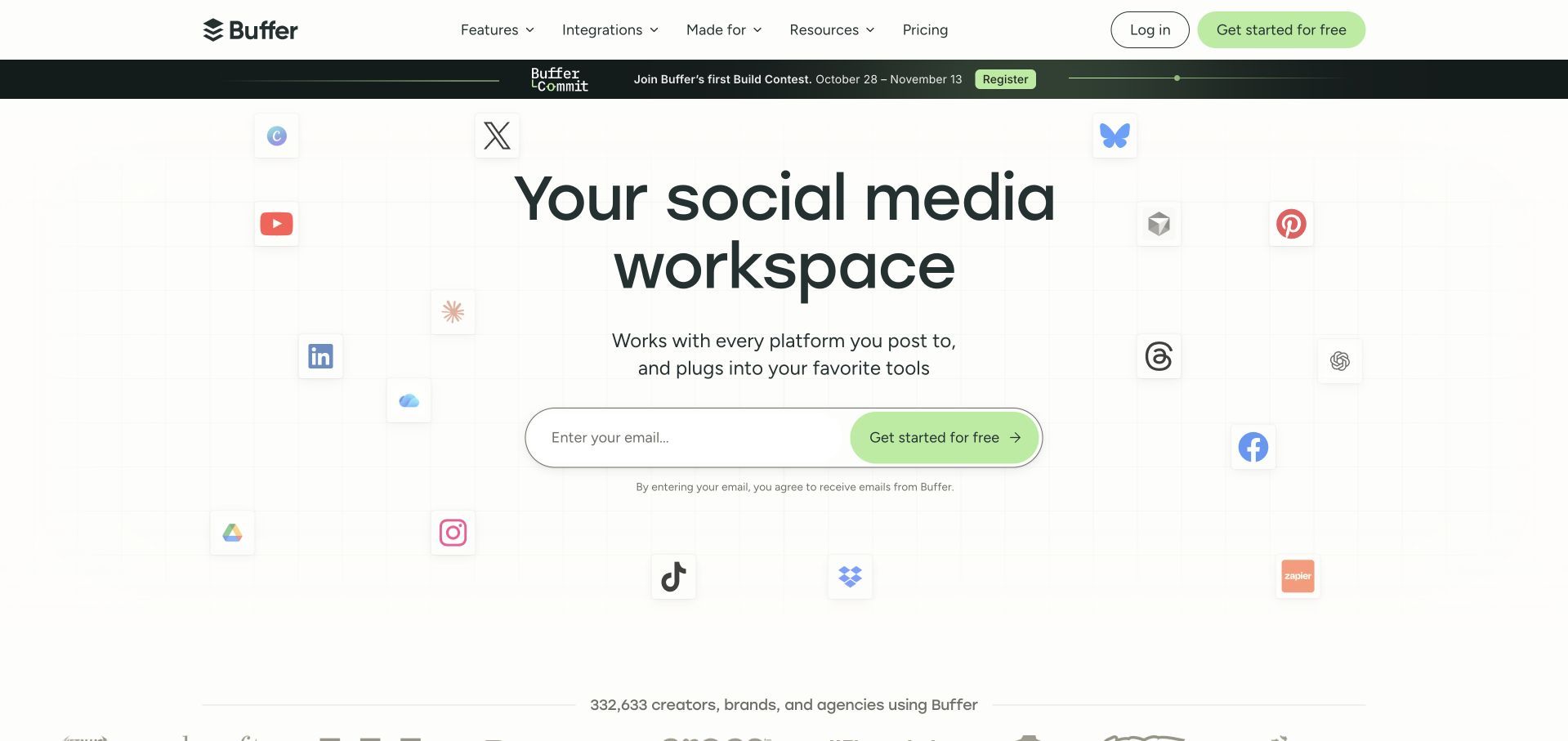
Buffer centers a short workspace message above a long email-entry control. Small platform marks surround the text on a faint grid, visually explaining the breadth of supported channels and tools without replacing the central hierarchy. The green starting button repeats the accent used in the header, while navigation keeps features and integrations explicit. The retained capture contains a dated event strip above the hero. GitHub’s customer case documents Buffer’s architectural pull requests and engineering release workflows; those facts do not establish the runtime stack of this public marketing page.
What you can learn
The useful balance is broad context around a narrow next step. Keep integration claims and destination links in reviewable content records so product changes can update them consistently. Avoid turning every supported service into an equally prominent call to action in the first viewport.
Pros
The main input and action read as one coherent starting control.
Platform marks support the ecosystem story without obscuring the short headline.
Cons & considerations
Event promotions add another message before the main product introduction.
An email-first action provides less immediate detail for visitors still comparing capabilities.
Platform source: GitHub official customer case — documented product engineering. Buffer's social publishing/analytics engineering uses pull-request architecture reviews and Actions for tests, release automation and dependency work. This is a primary documentary product-engineering association, read November 10, 2026. The case does not establish the present runtime, hosting or CMS of the pictured public page; older case details remain historical. Platform evidence is separate from the direct website screenshot and is not a complete current infrastructure audit.
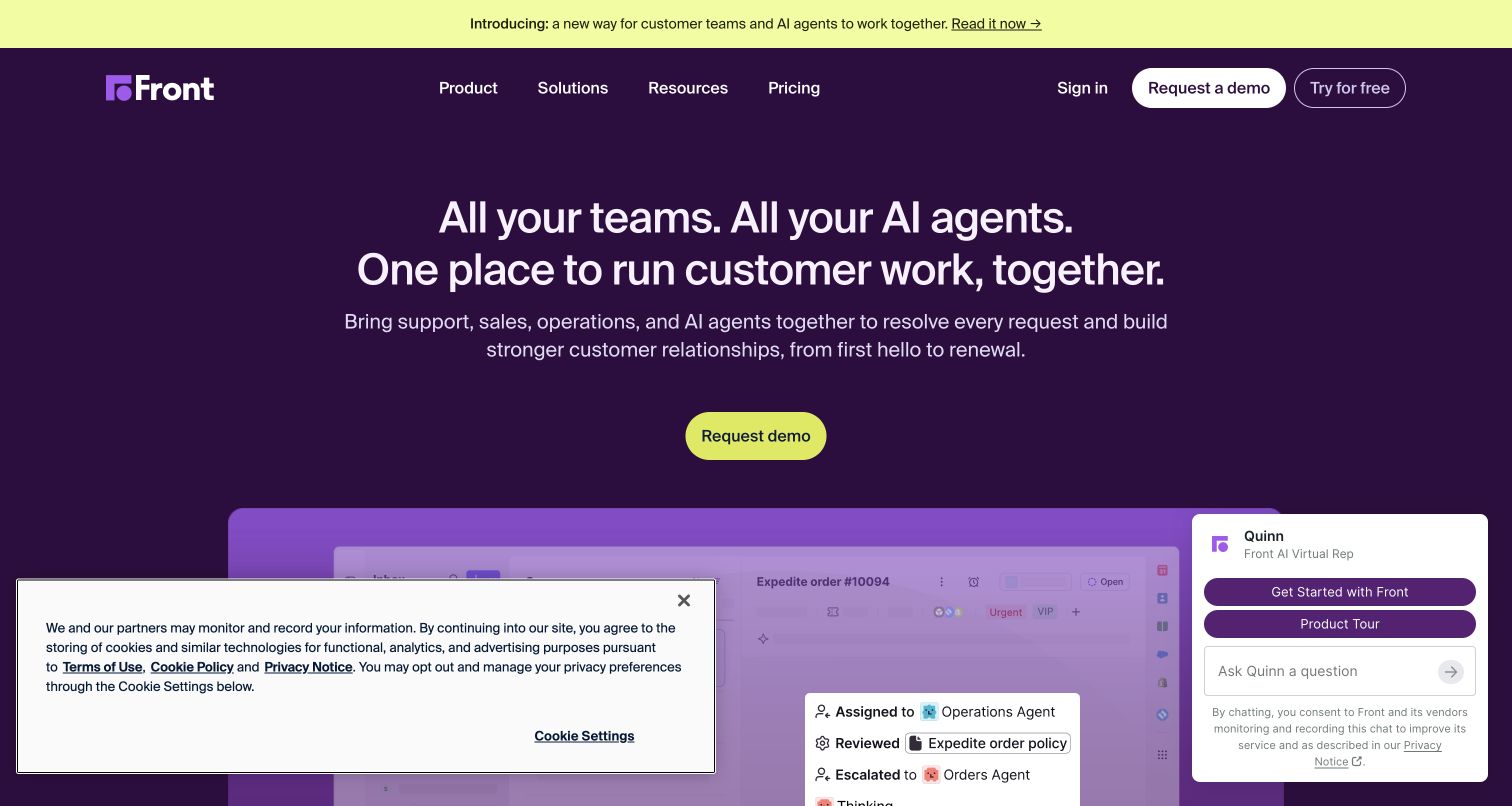
Front’s new capture uses a deep purple background, a centered white introduction and a bright yellow demo button. Its headline brings teams and AI agents into the same customer-work proposition. A large interface illustration begins beneath the action, connecting that claim with the product. The header retains pricing and a free-trial route for visitors who prefer another evaluation path. Cookie and chat panels overlap the lower viewport in the recorded state. GitHub’s Front case concerns repository collaboration and product-development workflows, rather than the hosting or generation of this homepage.
What you can learn
Lead with the shared task that brings different audiences together, then demonstrate it with a product view. In repository reviews, evaluate peripheral widgets alongside the main layout: separately reasonable consent, chat and demo elements can collectively obscure the evidence visitors came to inspect.
Pros
A strong color contrast makes the principal demo action easy to identify.
The introduction connects multiple teams through one understandable customer-work purpose.
Cons & considerations
The simultaneous cookie and chat panels cover much of the interface preview.
Several evaluation routes require clear differences between a demo and a free trial.
Visible tech stack
Earlier / documented evidence
GitHub
Platform source: GitHub official customer case — documented product engineering. Front's collaborative-inbox product engineering uses GitHub Team repositories and pull requests, with Kubernetes/Actions staging and deployment. Primary case's frontapp.com link redirects to this exact modern property. This is a primary documentary product-engineering association, read November 10, 2026. The case does not establish the present runtime, hosting or CMS of the pictured public page; older case details remain historical. Platform evidence is separate from the direct website screenshot and is not a complete current infrastructure audit.
Cesium places a large rendered globe opposite a plain explanation of its 3D geospatial platform. The dark background gives the earth image depth, while white text and a yellow signup button establish a simple hierarchy. Navigation separates the platform, industries, learning and community rather than forcing newcomers through product names. A release-story card starts below the opening, partly covered by the retained cookie notice. GitHub’s case documents Cesium’s open-source product collaboration and peer review, including CesiumJS; it does not identify the marketing page as GitHub-hosted.
What you can learn
Choose a visual that demonstrates the subject of a technical product before describing every feature. Then give learning and community clear routes beside commercial exploration. Repository discussions and reviews can help maintainers coordinate the examples, explanations and public documentation that make an open platform approachable.
Pros
The globe makes the geospatial subject clear without relying on specialist terminology.
Separate learning and community links support visitors with different levels of familiarity.
Cons & considerations
A large media treatment should have a lightweight, understandable fallback.
The consent panel covers part of the first content card in the captured state.
Platform source: GitHub official customer case — documented product engineering. Cesium's 3D geospatial platform and CesiumJS development use GitHub Team/open-source collaboration, issues and peer review. Company site presents that platform; marketing-site implementation remains unknown. This is a primary documentary product-engineering association, read November 10, 2026. The case does not establish the present runtime, hosting or CMS of the pictured public page; older case details remain historical. Platform evidence is separate from the direct website screenshot and is not a complete current infrastructure audit.
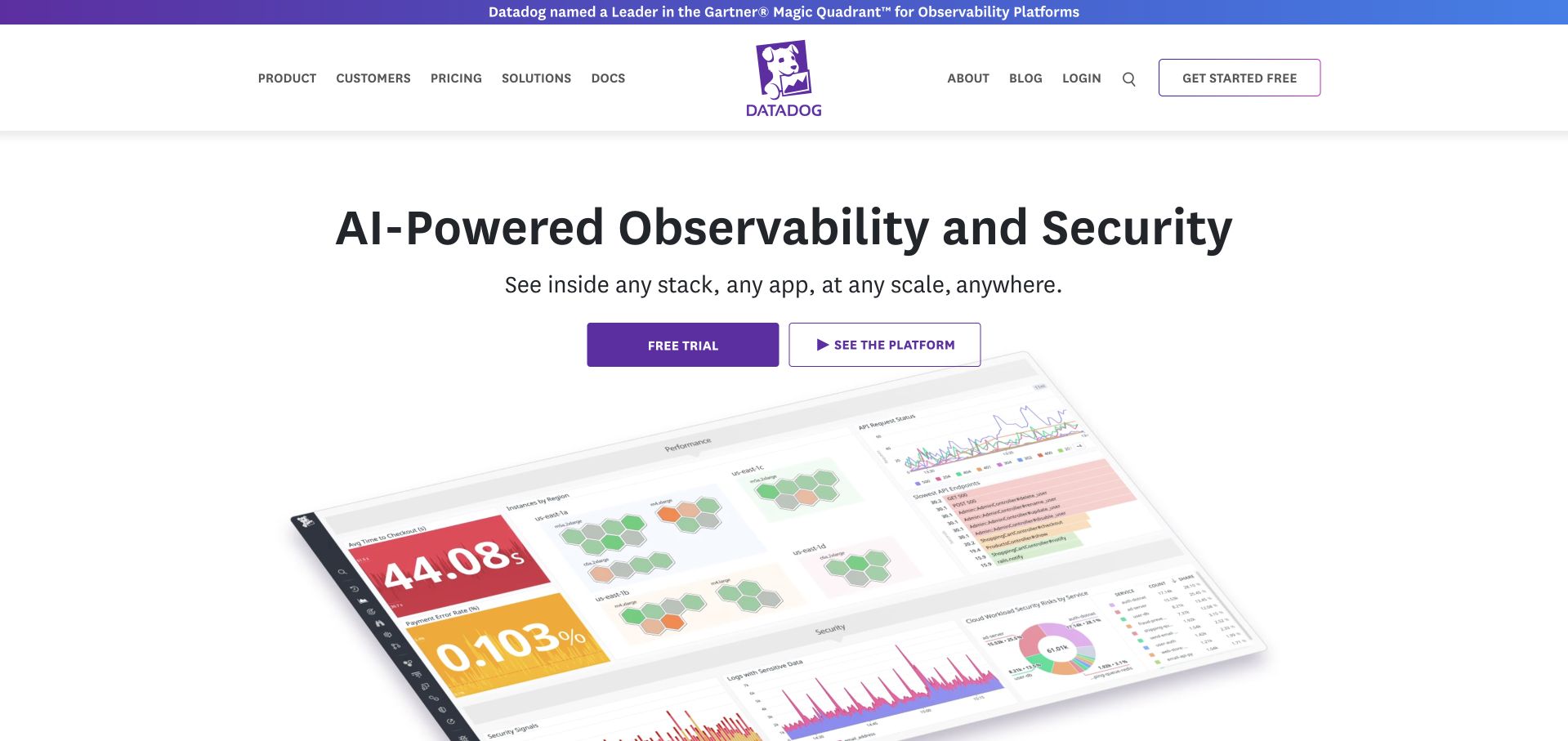
Datadog’s retained page presents a centered observability-and-security message over a tilted dashboard image. The interface preview includes charts, status blocks and a service map, making the platform more tangible than a purely abstract cloud illustration. Two buttons separate starting a trial from viewing the platform. A compact navigation row includes documentation, and the centered mascot reinforces the brand above the headline. GitHub’s Datadog case describes repository workflows and security collaboration for its monitoring products; those documentary engineering facts are not evidence that GitHub hosts this public page.
What you can learn
Introduce the central product job, then show enough interface detail to make it believable. Keep the exploratory route available beside signup. In code review, evaluate product imagery and explanatory text together so a refreshed screen does not illustrate an older workflow or imply capabilities the current page has not explained.
Pros
A visible dashboard gives substance to a broad infrastructure proposition.
Trial and product-exploration actions accommodate visitors at different evaluation stages.
Cons & considerations
Angled interface text is difficult to inspect at smaller display sizes.
The wide platform promise needs deeper routes to explain individual use cases.
Platform source: GitHub official customer case — documented product engineering. Datadog monitoring-product engineering uses GitHub public/private repositories, deployment integrations and Advanced Security/Actions reviews. No claim GitHub is its runtime cloud. This is a primary documentary product-engineering association, read November 10, 2026. The case does not establish the present runtime, hosting or CMS of the pictured public page; older case details remain historical. Platform evidence is separate from the direct website screenshot and is not a complete current infrastructure audit.
Zendesk’s retained opening combines a warm portrait of a person wearing headphones with large white text about automated customer interactions. A broad rounded image panel sits beneath a relatively conventional header, where products, solutions, pricing and two evaluation routes remain easy to find. The event announcement occupies its own narrow strip above navigation. The photographed person provides context for an otherwise technical message. GitHub’s case describes Zendesk’s product engineering, repository collaboration and pull-request workflows; the capture does not independently verify the marketing claim or the homepage’s hosting.
What you can learn
The useful pattern is to connect a technical capability with the people affected by it, while keeping evaluation routes straightforward. Treat quantitative campaign claims as content requiring its own substantiation and review. A software repository can organize changes, but it does not supply evidence for performance promises.
Pros
The human subject gives the service story an immediate visual context.
Pricing, trial and demo options remain outside the photographic campaign area.
Cons & considerations
Large promotional copy leaves little first-screen space for detailed product explanation.
An additional event strip competes with the main message for initial attention.
Platform source: GitHub official customer case — documented product engineering. Zendesk support-product engineering uses Enterprise Cloud repositories, pull requests, API integrations and deployment webhooks. This is a primary documentary product-engineering association, read November 10, 2026. The case does not establish the present runtime, hosting or CMS of the pictured public page; older case details remain historical. Platform evidence is separate from the direct website screenshot and is not a complete current infrastructure audit.
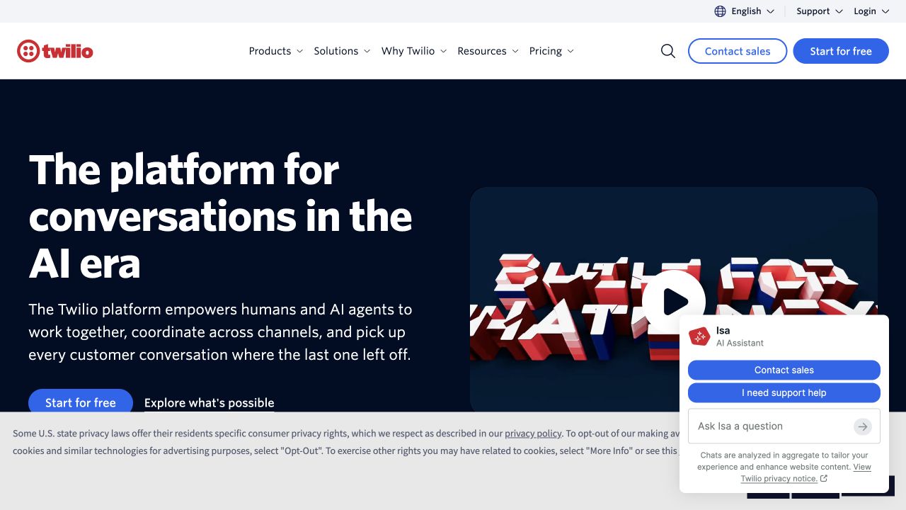
Twilio’s retained capture puts a bold white introduction on a dark blue field beside a video preview. A short paragraph explains the communication task, while a blue trial button and a quieter exploration link offer different next steps. The white header preserves product, developer, resource and pricing routes. Cookie and chat panels remain visible at the bottom, covering portions of the hero. GitHub’s Twilio case documents source control, peer review and API-connected development workflows, including documentation snippets; these are scoped engineering associations rather than proof of the marketing page’s runtime.
What you can learn
Use a split layout to separate explanation from demonstration, and give visitors a useful route even if they do not play the video. When reviewing changes, include the combined effect of consent and support widgets so the primary action remains reachable in realistic first-visit states.
Pros
A visible developer route acknowledges the needs of implementation-focused visitors.
The paired trial and exploration actions support different levels of commitment.
Cons & considerations
Overlapping chat and privacy elements reduce the usable space in this capture.
A video-centered explanation needs equivalent information for visitors who skip playback.
Platform source: GitHub official customer case — documented product engineering. Twilio communications APIs use GitHub as the entry point for product-code CI/CD and peer review; the case separately documents public SDKs and documentation snippets pulled through GitHub APIs. This is a primary documentary product-engineering association, read November 10, 2026. The case does not establish the present runtime, hosting or CMS of the pictured public page; older case details remain historical. Platform evidence is separate from the direct website screenshot and is not a complete current infrastructure audit.
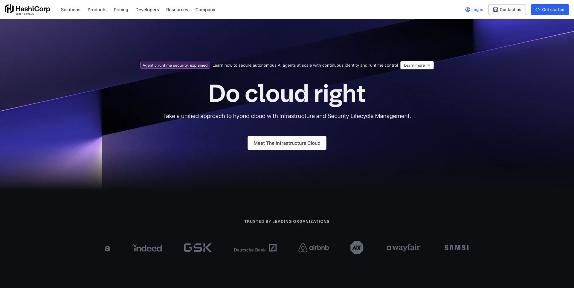
HashiCorp’s retained homepage uses dark geometric planes and a short central headline, followed by one primary route into its infrastructure platform. The light header holds products, pricing, developers and resources in a conventional arrangement. A smaller announcement sits above the main message, while a muted row of customer marks begins below. This gives the broad platform story room without abandoning practical navigation. GitHub’s case documents repository collaboration, documentation and website-build tasks at HashiCorp; its older licensing descriptions should not be treated as current claims about every product.
What you can learn
The lesson is to establish a clear umbrella concept and let navigation carry the detailed portfolio. In repository-based content work, review changes to that umbrella alongside the linked product descriptions so the broad message stays consistent with the capabilities visitors discover next.
Pros
A single central action gives the opening a clear destination.
Separate developer and product routes keep technical detail accessible beneath the broad story.
Cons & considerations
The very general headline needs the supporting sentence to explain the offering.
Muted customer marks are less legible than the higher-contrast navigation and primary action.
Platform source: GitHub official customer case — documented product engineering. Documented GitHub product-code/documentation collaboration and Actions tasks include company-website builds. Earlier case licensing wording must not be repeated as a current claim about all HashiCorp software. This is a primary documentary product-engineering association, read November 10, 2026. The case does not establish the present runtime, hosting or CMS of the pictured public page; older case details remain historical. Platform evidence is separate from the direct website screenshot and is not a complete current infrastructure audit.
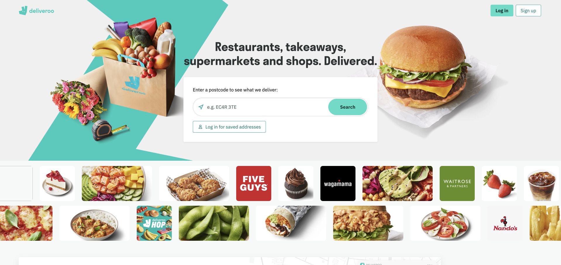
Deliveroo’s retained UK homepage places a postcode form in a central white card, surrounded by food, groceries and other delivery imagery. The instruction explains the purpose of the field before asking for input. Existing customers receive a separate saved-address login route, and a grid of food and retailer tiles starts beneath the hero. The turquoise brand color connects the composition without overwhelming the form. GitHub’s Deliveroo case documents engineering collaboration for its customer, rider and restaurant platform; it does not establish GitHub hosting for this regional storefront.
What you can learn
The transferable pattern is to explain an essential prerequisite at the moment it is requested. Keep location-dependent browsing and account-based shortcuts distinct. Repository reviews should cover the surrounding instruction and empty states alongside form logic, because the usefulness of the next page depends on that first decision being understood.
Pros
The field label gives a concrete reason for entering a postcode.
A separate saved-address option supports returning customers without confusing the default flow.
Cons & considerations
Visitors cannot judge local availability from the broad promotional imagery alone.
Dense product tiles can distract from the location step that enables relevant results.
Platform source: GitHub official customer case — documented product engineering. Deliveroo's customer/rider/restaurant platform engineering uses Enterprise Cloud collaboration and CI/CD/development workflows. This is a primary documentary product-engineering association, read November 10, 2026. The case does not establish the present runtime, hosting or CMS of the pictured public page; older case details remain historical. Platform evidence is separate from the direct website screenshot and is not a complete current infrastructure audit.
Wealthsimple’s directly captured Canadian homepage features a large gold coin against a dark background, paired with a short giveaway message and an email-entry action. A floating light navigation bar keeps chequing, trading, borrowing, accounts and business routes visible above the campaign. The simple composition makes the promotional action unmistakable, although it tells less about the underlying services. No form was used during review. GitHub’s customer case documents Wealthsimple engineering workflows and specifically discusses website builds; it does not verify promotion terms or establish the current backend of this page.
What you can learn
The useful distinction is between temporary campaign content and durable product navigation. Keep campaign copy, eligibility details and destination links reviewable together, while ensuring visitors can still reach ordinary product information. A prominent acquisition message should not become the only way to understand the business.
Pros
Strong spacing and a large visual give the campaign a clear focal point.
Persistent product navigation provides alternatives for visitors uninterested in the promotion.
Cons & considerations
The opening prioritizes a giveaway over an explanation of financial products.
An email-first action asks for commitment before visitors see much supporting detail.
Platform source: GitHub official customer case — documented product engineering. Wealthsimple engineering uses Enterprise and Actions; case specifically describes faster builds for its site with videos/cached assets, plus separate API-development workflows. This is a primary documentary product-engineering association, read November 10, 2026. The case does not establish the present runtime, hosting or CMS of the pictured public page; older case details remain historical. Platform evidence is separate from the direct website screenshot and is not a complete current infrastructure audit.
Etsy’s retained capture places a long search field across the header, with a second row of shopping themes beneath it. The seasonal hero pairs a large ornament photograph with smaller product images, visible price chips and a compact collection action. Warm neutral space around the imagery lets the bright red campaign stand out. A gift-interest section begins below, offering another discovery path. GitHub’s Etsy case documents source repositories, pull-request checks and coordination across its engineering work, with some mobile-specific examples; it does not identify the current homepage implementation.
What you can learn
The pattern to borrow is a strong seasonal collection inside a stable search-and-category structure. Treat imagery, labels and collection destinations as a coordinated change, and review them with realistic product names and prices. Merchandising can change frequently while familiar discovery controls remain dependable.
Pros
Search remains prominent for shoppers who know what they want.
Product photographs and visible prices make the seasonal collection more concrete.
Cons & considerations
Seasonal imagery becomes less useful if campaign destinations are not maintained.
A large promotional panel pushes the wider range of marketplace categories lower down.
Platform source: GitHub official customer case — documented product engineering. Etsy marketplace engineering uses GitHub Enterprise repositories, API-connected CI coordination and pull-request checks. Case includes mobile-specific details, which must remain labeled. This is a primary documentary product-engineering association, read November 10, 2026. The case does not establish the present runtime, hosting or CMS of the pictured public page; older case details remain historical. Platform evidence is separate from the direct website screenshot and is not a complete current infrastructure audit.
Mapbox’s retained opening balances a large left-hand proposition with an automotive interface image on the right. The illustrated application gives location infrastructure a recognizable setting, while the navigation keeps products, solutions, developers and pricing available. A blue starting button is paired with a contact route, and small integration choices sit below the visual. The introductory announcement is separated into a narrow strip. GitHub’s Mapbox case documents repositories, issues and collaboration around its mapping products; the pictured customer application is not evidence that GitHub hosts either public website.
What you can learn
Show an applied result without losing the distinction between the platform and the customer using it. Keep developer routes and commercial routes clear, and use reviewable content to track the scope of each example. A customer image should explain a use case, not imply an unsupported implementation claim.
Pros
A recognizable application makes the infrastructure proposition easier to understand.
The split layout balances a concise explanation with a substantial visual example.
Cons & considerations
Multiple integration choices add complexity beneath an already broad message.
A rotating example requires meaningful labels when a visitor sees only one frame.
Platform source: GitHub official customer case — documented product engineering. Mapbox mapping-platform engineering builds open-source components and coordinates work through GitHub repositories/issues. Case is documentary workflow evidence, not a current homepage runtime fingerprint. This is a primary documentary product-engineering association, read November 10, 2026. The case does not establish the present runtime, hosting or CMS of the pictured public page; older case details remain historical. Platform evidence is separate from the direct website screenshot and is not a complete current infrastructure audit.
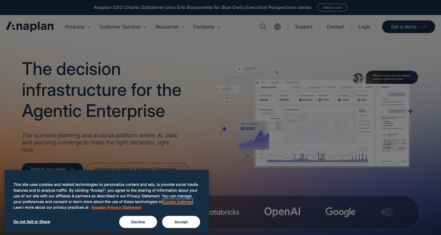
Anaplan’s new capture pairs a large planning-oriented headline with an interface preview showing inventory, charts and a conversational panel. The pale gradient supports the composition without becoming the main subject. A conventional header offers product and resource routes alongside a demo action. The recorded first-visit state includes a consent panel and dimmed background, so the underlying interface is visible but less prominent. GitHub’s Anaplan case documents branches, pull requests and API-connected engineering reporting for its planning product; it does not prove the current marketing page’s hosting.
What you can learn
The practical lesson is to give an abstract enterprise proposition a concrete screen to refer to. Review that screen together with its explanatory copy and first-visit overlays. Repository collaboration can keep these changes accountable, but the public interface still needs to communicate clearly before a visitor commits to a demo.
Pros
The product preview gives the planning message a visible working context.
Products, resources and demo navigation remain grouped in a familiar header.
Cons & considerations
The consent overlay dims and covers part of the principal introduction.
Specialist enterprise terminology needs supporting examples for less experienced visitors.
Visible tech stack
Earlier / documented evidence
GitHub
Platform source: GitHub official customer case — documented product engineering. Anaplan planning-platform engineering uses Enterprise branches/pull requests and API-driven build/deployment reporting. Public homepage represents the named product, not an inferred GitHub-hosted implementation. This is a primary documentary product-engineering association, read November 10, 2026. The case does not establish the present runtime, hosting or CMS of the pictured public page; older case details remain historical. Platform evidence is separate from the direct website screenshot and is not a complete current infrastructure audit.
Kegan has 15+ years of experience working with small businesses, Fortune 500 companies, and everything in between. No development job is too big or too small: he brings the same hands-on attention to a focused improvement, a complete website, or a custom application.
For GitHub projects, he can help with responsive interfaces, reusable components, custom functionality, API connections, and performance-minded implementation. He works directly with clients on scope, design, implementation, testing, and handover, with an emphasis on clear communication and a system that remains practical to maintain after launch.
Show 3 other GitHub developersHide other GitHub developers
For a website maintained by a small team, keep the starting workflow understandable: isolate a proposed change on a branch, describe it in a pull request, review it and merge it when the required checks are satisfied. GitHub flow also applies to documentation and other text changes. Decide how editors participate and where their content belongs, so a minor wording update does not require an unexplained engineering ritual.
A larger product may have separate interface, documentation and service work that must move together. GitHub Projects can track issues and pull requests, while links and explicit dependencies preserve their relationships. Organize work around a concrete outcome for the user, then divide it into changes that can be evaluated independently. A board is useful when its status explains what remains, who owns it and which decision would unblock progress.
Public repositories can support collaboration around software used by other developers. Make the project’s purpose, contribution expectations and support route easy to find, and document changes that affect users. GitHub releases associate a named software version with a point in repository history and supporting notes. Keep public-facing product explanations and implementation documentation aligned so an example does not silently rely on behavior that has changed.
Three priorities for a GitHub-supported website project
Turn visitor needs into reviewable changes
Begin with the problem the website needs to solve. Describe the person affected, the current difficulty and the behavior that would make the experience better. A request to simplify registration, for example, needs more context than a request to move a button. Identify the information people need before that action and the states they may encounter afterward. Break the work into changes that can be understood and checked independently without losing the connection to the larger goal. GitHub’s planning guidance recommends linking related work and making dependencies clear. Use that structure to explain what can proceed now and what depends on another decision. For each change, record the expected result and the evidence needed to assess it. Include content, empty states and error messages where they affect the journey. Keep the pull request description focused on the final behavior and any meaningful tradeoff. Ask reviewers to examine the proposed result in context, not merely approve a list of files. When a decision changes, update the description so the record reflects what will actually ship. A manageable unit of work should leave the next contributor with a clear starting point and a reliable explanation of the outcome being pursued.
Document boundaries, ownership and the editing routine
List the parts of the product that the repository actually controls. The marketing website, browser application, content store and payment service may have different owners even when visitors see one brand. Record those boundaries before choosing a review process. Explain where ordinary content changes originate and which parts of the system require a developer. A useful repository introduction should help a new maintainer find the setup instructions, public destinations and people responsible for support. Add specific ownership for shared navigation, reusable components and integrations that cross team boundaries. GitHub code owners can help route reviews, but the team still needs a practical arrangement for absences, disagreements and urgent corrections. Keep the requirements proportionate to the kind of change while preserving the checks that protect the project. Try the routine with a realistic example: correct a factual error, update a destination and identify the person responsible for a failed external service. Notice where the instructions assume knowledge that has not been written down. Clarify those steps before handover. Finally, decide who updates this documentation when the implementation changes. Ownership information is useful only while it describes the real team and the systems they can maintain.
Define what must be true before a change is ready to publish, then make those conditions visible to the team. GitHub repository rules can require pull requests and successful status checks for selected branches. Choose checks that address meaningful failure modes, and document what each result establishes. A passing code check does not by itself prove that the intended website version is serving visitors. Keep a record connecting the reviewed change with the released version and the public verification. GitHub releases can package a version with notes based on a specific tag; a tag, release and live deployment are related records with different meanings. Write release notes that explain user-facing effects and any action a maintainer must take. Preserve established destinations or map deliberate changes, and identify which integrations need follow-up after publication. Agree on how the team will recognize a problem and recover an earlier working state. Keep the necessary instructions available to the people responsible for that recovery. After publishing, confirm the actual pages, links and important states rather than relying solely on the completion of an automated process. Update the release record with what was verified so the next person can distinguish a prepared change from a confirmed public outcome.
Ask the actual team to carry out its routine job: publish a realistic update, correct a mistake, preview a narrow screen, and identify who owns an integration failure. For a library or frontend framework, also ask who maintains the content source and deployment. A polished screenshot does not answer those operational questions.
Beyond the screenshot
GitHub website development planning checklist
Identify the exact website or product associated with each engineering claim.
Separate documented development workflows from observed public-page technology.
Explain the visitor problem before specifying an interface change.
Keep proposed changes focused enough for meaningful review.
Link related work and make dependencies explicit.
Document where the website’s content comes from and who maintains it.
Give the repository a clear introduction and practical setup instructions.
Assign owners for shared components and external integrations.
Explain how contributors request a review and resolve blocked decisions.
Require the checks that address the project’s actual failure modes.
Preserve useful URLs and document intentional destination changes.
Connect reviewed changes, release records and the actual deployed version.
Record public verification and a practical recovery procedure.
Keep case-study dates and source scope attached to technology claims.
Test with real content, a keyboard, a small screen, slow or failed requests, and the people who will maintain the system. These are planning checks, not an accessibility, security, performance, or search-ranking certification.
Sources & editorial method
How this GitHub collection was reviewed
This collection pairs original design reviews of twenty distinct public properties with primary GitHub customer cases about the associated products or engineering teams. The cases document source repositories, pull requests, code review, collaboration or related product-development practices. They are not evidence that GitHub hosts every captured page, provides its CMS or produces all of its interface code. The opening five are Shopify, Spotify, Stripe, Figma and Duolingo; Spotify’s example is its actual browser player. Each property retains its exact source URL and direct screenshot provenance. Reused captures and public audits keep their original dates. Customer cases may be older or undated, and the date a source was read does not establish a new runtime observation. Historical company sizes, user counts, performance claims and licensing descriptions are not presented as current facts. Broad public-source audits remain separate, with incomplete or unavailable results retained without guesses. Private repositories, accounts, payments and administrative systems were not inspected. The reviews discuss visible communication and design tradeoffs, without claiming measured conversion results, security assurance or accessibility conformance.
Every image is an unmodified capture from the actual website, with its source and capture date. Some captures are reused from our shared catalog; their dates remain the original capture dates. None comes from a vendor gallery or a generated reconstruction. Moving imagery and live content can change.
Technology attribution uses public page assets or metadata, official platform documentation, or a cited first-party project case study. Documentary and framework-relationship evidence is identified where used; it is not a complete current backend inventory. A CMS image CDN alone does not establish a full CMS deployment. A library’s presence does not prove which individual controls use it, and a platform label does not establish AI authorship.
The composition notes, lessons, pros and tradeoffs are original editorial observations. We have not measured conversion, traffic, security, performance or accessibility conformance. Website owners retain their brands and imagery; these examples are not our client portfolio. Written, Edited and Curated are independent records, not dates advanced by a build. See our editorial standards or suggest a correction.
Questions worth asking
GitHub website development FAQs
What does a GitHub association mean in this collection?
It means a primary GitHub case documents development work for the named product or team, such as source repositories, pull requests or code review. Each example qualifies the scope. It does not automatically identify the captured homepage’s CMS, runtime framework or hosting provider.
Are these websites hosted on GitHub Pages?
That is not established by these customer cases. GitHub Pages is a separate static website hosting service. Using GitHub for source collaboration does not prove that a public website is hosted there; a hosting claim requires its own exact-property evidence.
How is this guide different from the GitHub Actions guide?
This guide focuses on repositories, proposed changes, review, ownership and collaboration across product development. GitHub Actions is the automation platform used for tasks such as tests and deployment workflows. Some cases mention both, but their roles remain distinct.
Why do public design reviews accompany engineering cases?
The screenshots make the public product communication and interface choices available for study. The customer cases separately explain a documented development relationship. Examining both is useful when their limits remain clear: a repository workflow does not prove which tool produced a particular visual element.
What should a useful pull request explain?
Describe the problem, the resulting behavior and the reason for the approach. Link related work, identify meaningful tradeoffs and record relevant checks. The explanation should let a reviewer understand the proposed result without reconstructing the whole project from the changed files.
Does a merged pull request prove the website is live?
No. A merge records a repository change. A deployment and a verified public result are separate steps. Keep a connection between the reviewed change, the released version and the actual pages checked after publication.
Borrow the habits that make a website easier to improve: clear problem statements, focused changes, visible ownership and a traceable public result. Use the examples to study communication and interface decisions, while keeping each GitHub claim within the evidence provided by its product-development case.