Best Zendesk Websites of 2026 (20 Real-World Examples)
Twenty public help centers that show how support architecture can carry a brand without obscuring the next useful answer.
The strongest Zendesk examples are not corporate homepages with a support widget. They are specific public help properties with clear audience choices, practical search prompts and honest routes from self-service to further assistance.
This collection examines 20 public support and learning properties, starting with Discord, Figma, Grammarly, Etsy and Reddit. Each exact captured page directly loaded the Zendesk Guide end-user application asset during inspection. That establishes the support-property association; it does not establish the technology of the company’s main marketing site, app or authenticated service.
Compare the decisions behind the page: whether the visitor first chooses a role, a product or a task; how search vocabulary is introduced; and where account, billing, safety and contact questions appear. The range includes expansive learning hubs and intentionally small gateways. Neither size alone nor brand familiarity is evidence of a successful support outcome.
Before the examples
What makes good Zendesk website development in 2026?
Scope the evidence to the help property
A public Guide end-user application asset is stronger evidence for the help-center page than an organization logo in a customer list or a Messenger widget on its marketing site. Record the exact URL and inspection date, and do not extend the finding to the entire organization’s stack.
Organize around the decision the user can actually make
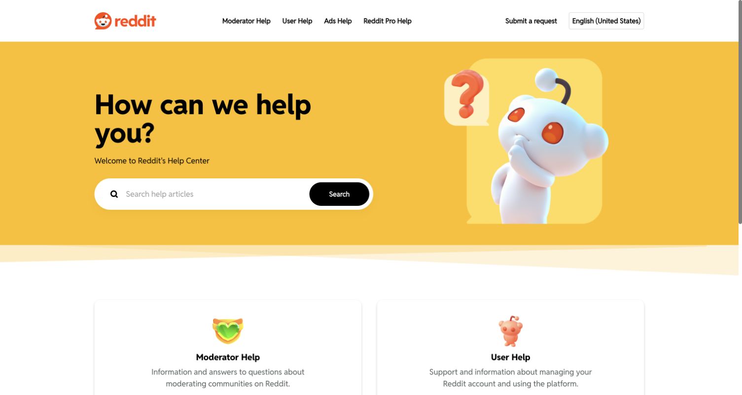
Etsy distinguishes shopping from selling, Reddit separates moderation from user help, and Mercury keeps product context beside task navigation. Choose an organizing axis that reflects different instructions, not simply internal ownership. Explain adjacent categories and preserve useful cross-links when a question crosses those boundaries.
Otter exposes auto-join controls, cancellation and account deletion; Hotjar highlights privacy and data export; Grammarly promotes sign-in and paid-account recognition. These observed editorial choices are useful planning references. They are not evidence that the site resolves every question, meets a particular response time or achieves a measured deflection rate.
Study the named public help centers below, not the parent companies’ homepages. The first five are deliberately selected recognizable brands with direct page-level platform evidence; the remaining examples broaden the navigation and support patterns.
We start with five recognizable brands or organizations: Discord Help Center, Figma Learn Help Center, Grammarly Support, Etsy Help Center, Reddit Help. Each attribution applies to the named website property, not every product or website belonging to its organization. This is a curated reading sequence, not a measured ranking.
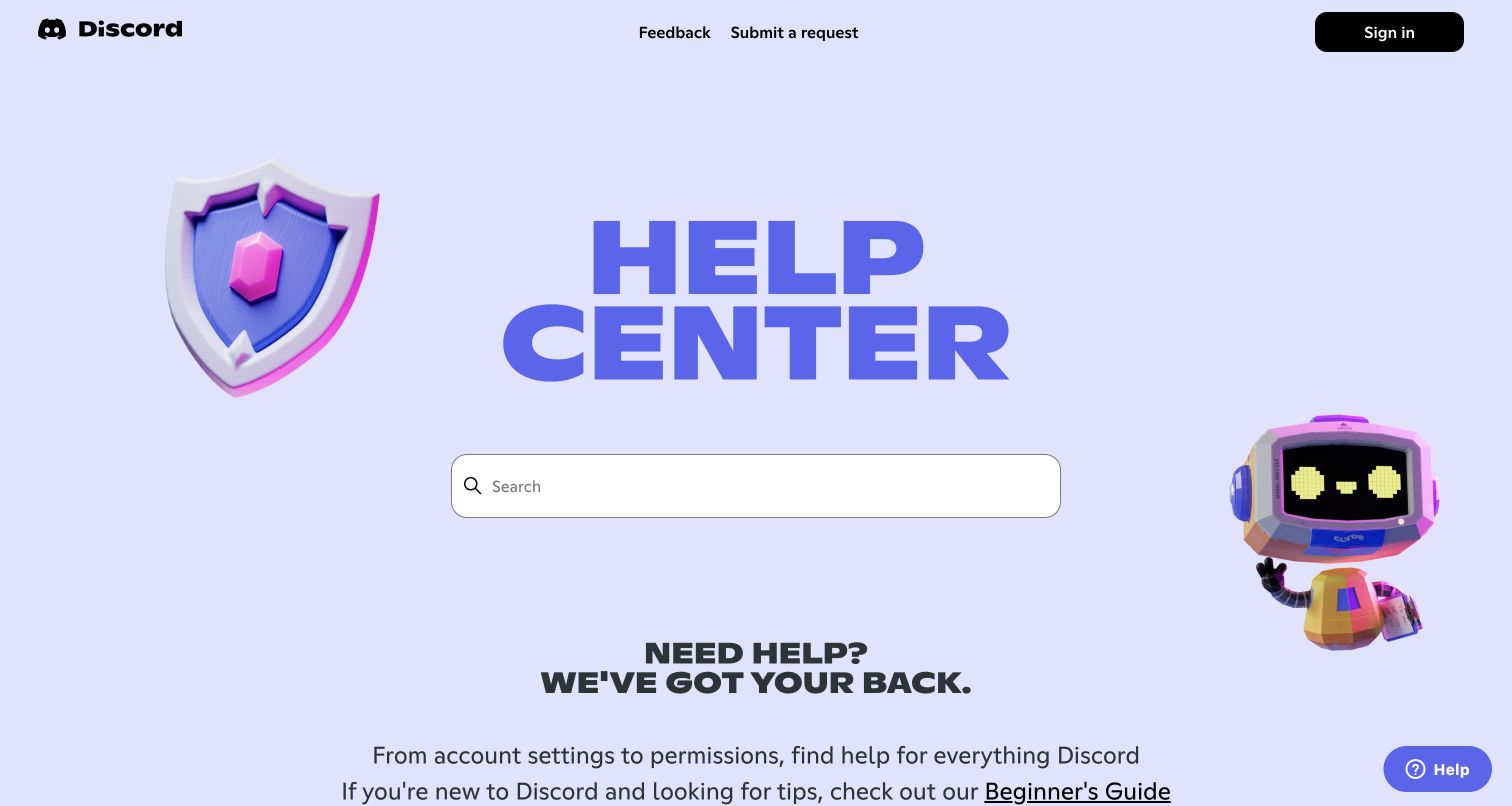
Discord brings its playful product identity into the help center with a lavender field, oversized title and three-dimensional characters around a broad search box. The navigation keeps feedback and submitting a request separate from signing in. Below the greeting, recognizable topic groups cover account settings, servers, Nitro, payments and safety, while developer and app support point to their own destinations. This is a public support property, not evidence that Discord’s main application uses Zendesk. The visible design makes a potentially anxious support visit feel consistent with the product without replacing the central search task.
What you can learn
Keep the distinctive illustration system around a single obvious support action. Separate audiences only where their questions and destinations genuinely differ; preserve a direct request route for people who already know they need assistance.
Pros
The search field remains the strongest functional object despite the large brand illustration and headline.
Developer and app support are explicitly separated from everyday account and community help.
Cons & considerations
If users need a category immediately, the generous hero pushes the topic directory below the initial viewport.
If your audience needs a restrained professional tone, the toy-like characters may be an inappropriate reference.
Visible tech stack
Earlier / documented evidence
Zendesk
Platform source: WordPress.org Showcase. Direct inspection of this exact public help-center document found https://static.zdassets.com/hc/assets/hc_enduser-6708e723d0ba8d6424b5466c814ba971.js loaded as a script, a Zendesk Guide end-user application asset. This scopes the association to the named public support property, not the organization’s main website or product. Platform evidence is separate from the direct website screenshot and is not a complete current infrastructure audit.
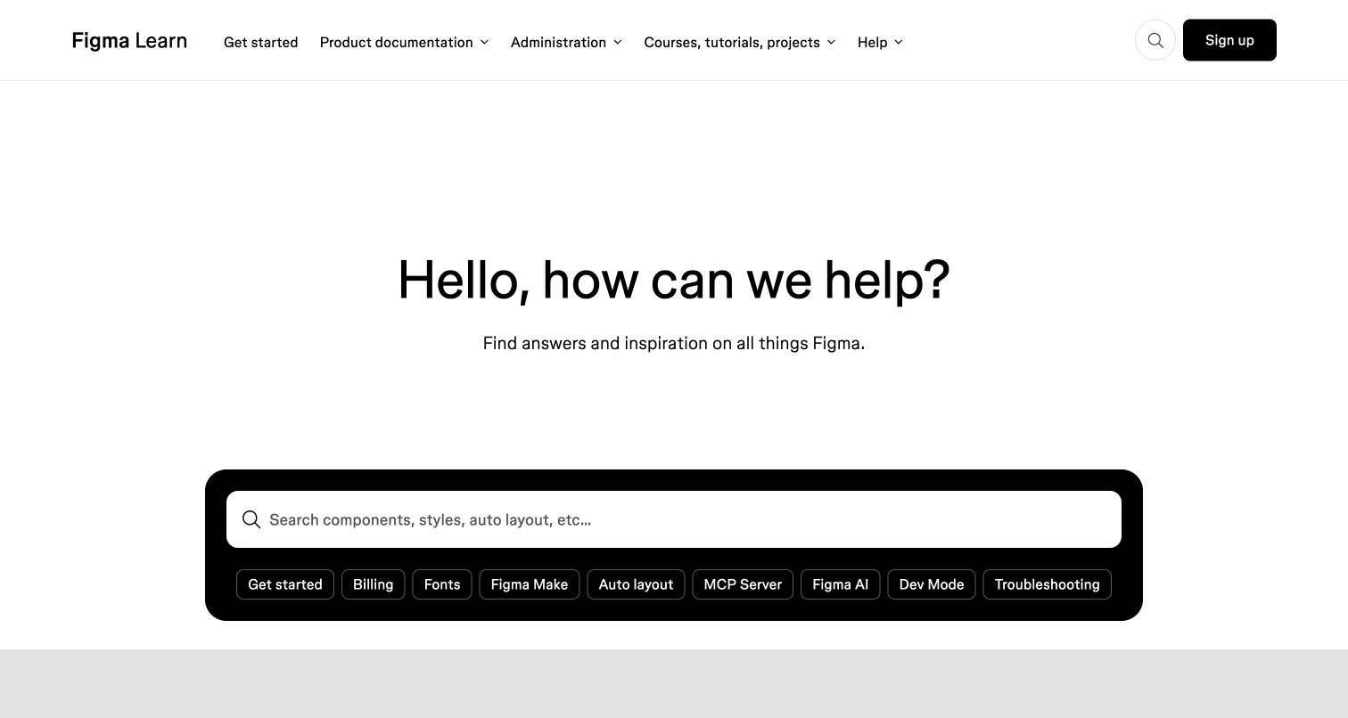
Figma Learn combines practical help with a broader education destination. The first screen uses unusually spacious typography, then places the search field and specific query suggestions inside a black rounded panel. Navigation separates product documentation, administration, courses and help. The page continues with an agent feature, course cards, release notes and task-oriented popular topics such as prototypes, components and billing. The interesting pattern is the connection between answering an immediate question and supporting an ongoing learning journey.
What you can learn
Use shared navigation to connect documentation and structured learning, but give both a clear purpose. Specific suggestions such as fonts or auto layout demonstrate useful search language more effectively than an empty generic prompt.
Pros
Topic shortcuts expose vocabulary that an inexperienced designer may not yet know to search for.
Administration has its own navigation route instead of being buried among creative technique tutorials.
Cons & considerations
If incident resolution is the only goal, course and feature promotions may add unnecessary browsing choices.
If your catalog is small, this expansive layout may create more hierarchy than the content requires.
Platform source: WordPress.org Showcase. Direct inspection of this exact public help-center document found https://static.zdassets.com/hc/assets/hc_enduser-6708e723d0ba8d6424b5466c814ba971.js loaded as a script, a Zendesk Guide end-user application asset. This scopes the association to the named public support property, not the organization’s main website or product. Platform evidence is separate from the direct website screenshot and is not a complete current infrastructure audit.
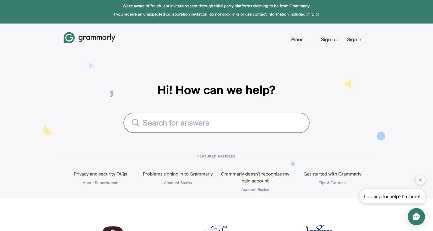
Grammarly’s support home pairs a calm, pale background with a large central search input and a short featured-article row. At inspection, a green notice warned about fraudulent collaboration invitations; the message occupied its own dismissible area above the brand header. Featured links addressed privacy, signing in, recognizing a paid account and getting started. Six broader destinations then separated billing, issues, account basics, tutorials and organizational use. The page makes account uncertainty an explicit editorial priority rather than leaving it entirely to search.
What you can learn
Reserve a controlled announcement area for urgent, actionable notices and keep everyday support navigation intact underneath it. Promote the exact customer-language questions that repeatedly cause uncertainty, especially when payment and account state can appear inconsistent.
Pros
The featured row directly surfaces sign-in and paid-account recognition questions without requiring a guessed category.
A distinct contact fallback gives readers another route after self-service content rather than an unexplained dead end.
Cons & considerations
If a notice remains indefinitely, it can become background noise and consume valuable first-screen space.
If users only need support, the extensive product-marketing footer may distract from finishing that task.
Platform source: WordPress.org Showcase. Direct inspection of this exact public help-center document found https://static.zdassets.com/hc/assets/hc_enduser-6708e723d0ba8d6424b5466c814ba971.js loaded as a script, a Zendesk Guide end-user application asset. This scopes the association to the named public support property, not the organization’s main website or product. Platform evidence is separate from the direct website screenshot and is not a complete current infrastructure audit.
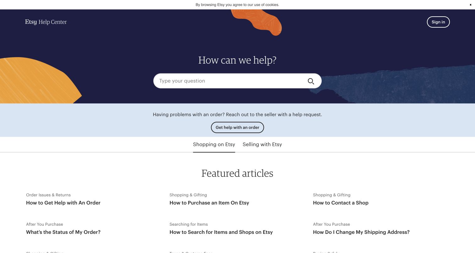
Etsy places a question search above two unmistakable audience tabs: shopping and selling. The captured state is the shopping segment, which promotes order help, contacting a shop, order status and address changes. A separate blue strip tells people with an order problem to reach out to the seller and provides an order-help action. The category structure follows the shopping journey from discovery and payment to orders and account safety. the support interface acknowledges that the first useful contact may be the seller, not the platform’s central team.
What you can learn
Segment support by the person’s role before exposing detailed terminology. When a transaction has an intermediary, explain the correct first escalation point near the search field instead of making users discover that rule after a long article.
Pros
Buyer and seller tabs express a meaningful difference in tasks, not merely a visual categorization preference.
Order-help guidance appears before the article list, making the relevant escalation route visible early.
Cons & considerations
If a user misses the active audience tab, similarly named articles may appear relevant to the wrong role.
If order-specific help requires account context, public guidance alone cannot complete the resolution journey.
Platform source: WordPress.org Showcase. Direct inspection of this exact public help-center document found https://static.zdassets.com/hc/assets/hc_enduser-6708e723d0ba8d6424b5466c814ba971.js loaded as a script, a Zendesk Guide end-user application asset. This scopes the association to the named public support property, not the organization’s main website or product. Platform evidence is separate from the direct website screenshot and is not a complete current infrastructure audit.
Reddit’s help home is unusually selective. A yellow hero holds the search field and a familiar mascot, then two large cards ask visitors to choose moderator help or user help. The header repeats those routes and adds advertising, Reddit Pro and a request link. Rather than filling the home page with dozens of topics, the design establishes the visitor’s relationship to the platform first. The short descriptions distinguish managing communities from managing an account and using Reddit.
What you can learn
Use a small number of role choices when the same product generates genuinely different responsibilities. Explain each role through its tasks so newcomers do not have to understand organizational jargon before they can navigate.
Pros
The two dominant cards make the main audience distinction clear without an overwhelming category grid.
A submit-request route remains in the header for cases that already require direct assistance.
Cons & considerations
If a question spans moderation and personal account access, the initial fork may require a second decision.
If detailed help is frequently needed, this compact gateway adds a navigation step before topic-level browsing.
Visible tech stack
Earlier / documented evidence
Zendesk
Platform source: WordPress.org Showcase. Direct inspection of this exact public help-center document found https://static.zdassets.com/hc/assets/hc_enduser-6708e723d0ba8d6424b5466c814ba971.js loaded as a script, a Zendesk Guide end-user application asset. This scopes the association to the named public support property, not the organization’s main website or product. Platform evidence is separate from the direct website screenshot and is not a complete current infrastructure audit.
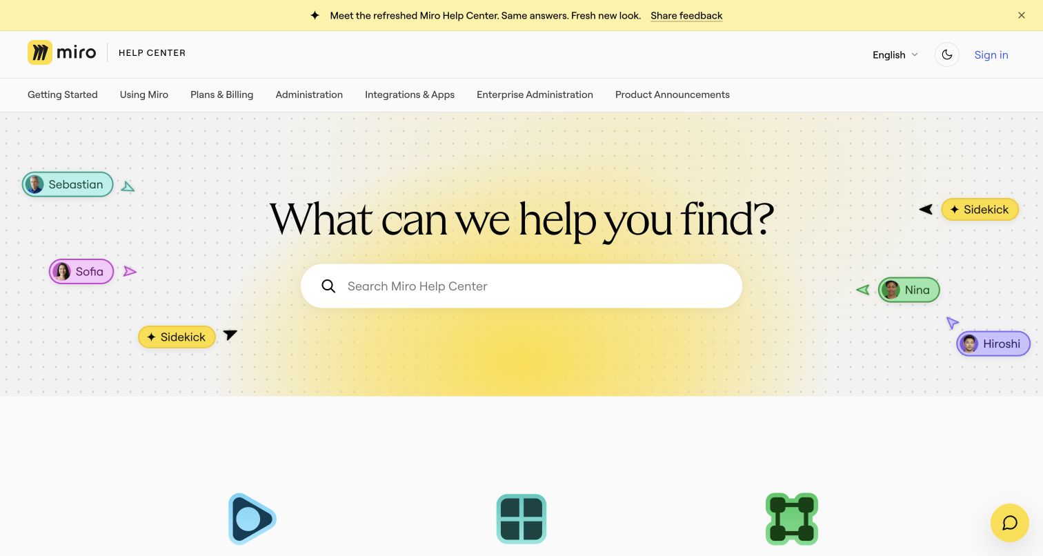
Miro’s refreshed help center echoes the whiteboard product with a dotted canvas, named collaborator cursors and a warm yellow search backdrop. A horizontal category bar offers getting started, billing, administration, integrations and enterprise administration before the larger illustrated category cards. Popular articles are labeled by their parent topic, providing context for tasks such as frames, visitors and shortcuts. The lower support section explicitly says available contact options depend on the customer’s plan and links to the explanation.
What you can learn
Borrow recognizable product metaphors only when the main support controls remain obvious. State contact-channel eligibility before users invest effort in a route they cannot use, and separate enterprise administration from ordinary personal settings.
Pros
The repeated category navigation supports both quick scanning at the top and more descriptive browsing below.
The contact section names plan-dependent availability instead of promising identical support access to every visitor.
Cons & considerations
If many new categories are added, the long horizontal bar will need careful small-screen treatment.
If visitors are troubleshooting urgently, animated or decorative collaborator cues should not compete with search.
Platform source: WordPress.org Showcase. Direct inspection of this exact public help-center document found https://static.zdassets.com/hc/assets/hc_enduser-6708e723d0ba8d6424b5466c814ba971.js loaded as a script, a Zendesk Guide end-user application asset. This scopes the association to the named public support property, not the organization’s main website or product. Platform evidence is separate from the direct website screenshot and is not a complete current infrastructure audit.
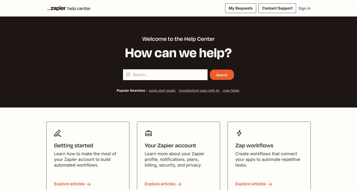
Zapier’s help center uses a dark brown search hero above a precise grid of outlined topic cards. Popular query links include quick start guidance, troubleshooting Zaps with AI and mapping fields. The directory then distinguishes account management, Zap workflows, Zapier tools, AI, custom logic, apps, Forms, Tables and Canvas. Each card includes a short explanation and an article-exploration action rather than an unexplained icon alone. The result is a useful reference for a product suite that must preserve its established workflow vocabulary while introducing new product areas without collapsing them into one miscellaneous help bucket.
What you can learn
Write descriptions that explain the boundary between neighboring tools. Concrete search suggestions can teach product vocabulary while accepting the user’s own question; maintain a separate account-help path for non-workflow problems.
Pros
Descriptions help distinguish automation tools, app integrations and custom-code capabilities before a user opens a category.
My Requests and Contact Support appear as separate destinations in the restrained support header.
Cons & considerations
If product areas expand further, equally weighted cards may make the most common task harder to prioritize.
If users do not recognize the word Zap, the category system still needs plain-language entry points.
Platform source: WordPress.org Showcase. Direct inspection of this exact public help-center document found https://static.zdassets.com/hc/assets/hc_enduser-6708e723d0ba8d6424b5466c814ba971.js loaded as a script, a Zendesk Guide end-user application asset. This scopes the association to the named public support property, not the organization’s main website or product. Platform evidence is separate from the direct website screenshot and is not a complete current infrastructure audit.
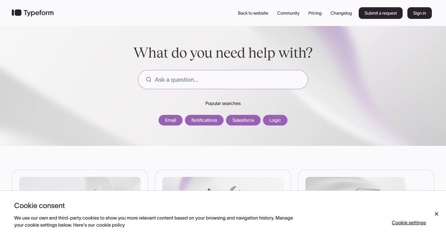
Typeform’s home asks what the visitor needs help with, then provides a broad question field and small popular-search chips. Three early routes distinguish getting started, use cases and how-to videos. Below them, trending topics mix new product areas with practical tasks such as embedding a form, receiving notifications and using URL parameters. Community discussions and videos extend the learning options, while a final contact section explains that live chat is tied to Business or Enterprise plans and signing in.
What you can learn
Name the learning format before a click and separate introductory, task-based and use-case material. Explain plan-dependent chat access alongside the contact route so the help center does not imply a universal channel that some visitors cannot use.
Pros
Getting-started, use-case and video paths acknowledge different reasons for seeking help with the same tool.
Trending links include concrete implementation questions rather than only promoting newly launched product features.
Cons & considerations
If a visitor needs urgent troubleshooting, community and new-feature blocks may add substantial page length.
If the cookie banner remains open, it obscures part of the lower first-screen content on desktop.
Visible tech stack
Earlier / documented evidence
Zendesk
Platform source: WordPress.org Showcase. Direct inspection of this exact public help-center document found https://static.zdassets.com/hc/assets/hc_enduser-6708e723d0ba8d6424b5466c814ba971.js loaded as a script, a Zendesk Guide end-user application asset. This scopes the association to the named public support property, not the organization’s main website or product. Platform evidence is separate from the direct website screenshot and is not a complete current infrastructure audit.
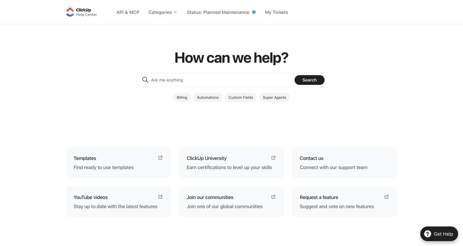
ClickUp places a simple search hero above six auxiliary routes: templates, university, contact, videos, communities and feature requests. Its help header exposes service status and ticket access alongside API and MCP documentation. Below the search area, product categories distinguish agents, AI, chat, mobile, integrations, technical support and security. This structure does not pretend that every request is an article question: learning, feature voting, service availability and direct assistance all have recognizable places within the support ecosystem.
What you can learn
Keep resource types distinct even when they share one help entrance. Status, education and feature requests solve different needs; label them directly and let the main article taxonomy follow actual product tasks rather than marketing departments.
Pros
Status and ticket links are available in the header without requiring visitors to traverse the article directory.
Article previews add context to broad labels such as workspace setup and guest roles before navigation.
Cons & considerations
If the auxiliary resource grid receives equal emphasis, it can delay access to the main category list.
If popular articles keep accumulating, the long list needs ongoing pruning to avoid becoming another directory.
Platform source: WordPress.org Showcase. Direct inspection of this exact public help-center document found https://static.zdassets.com/hc/assets/hc_enduser-6708e723d0ba8d6424b5466c814ba971.js loaded as a script, a Zendesk Guide end-user application asset. This scopes the association to the named public support property, not the organization’s main website or product. Platform evidence is separate from the direct website screenshot and is not a complete current infrastructure audit.
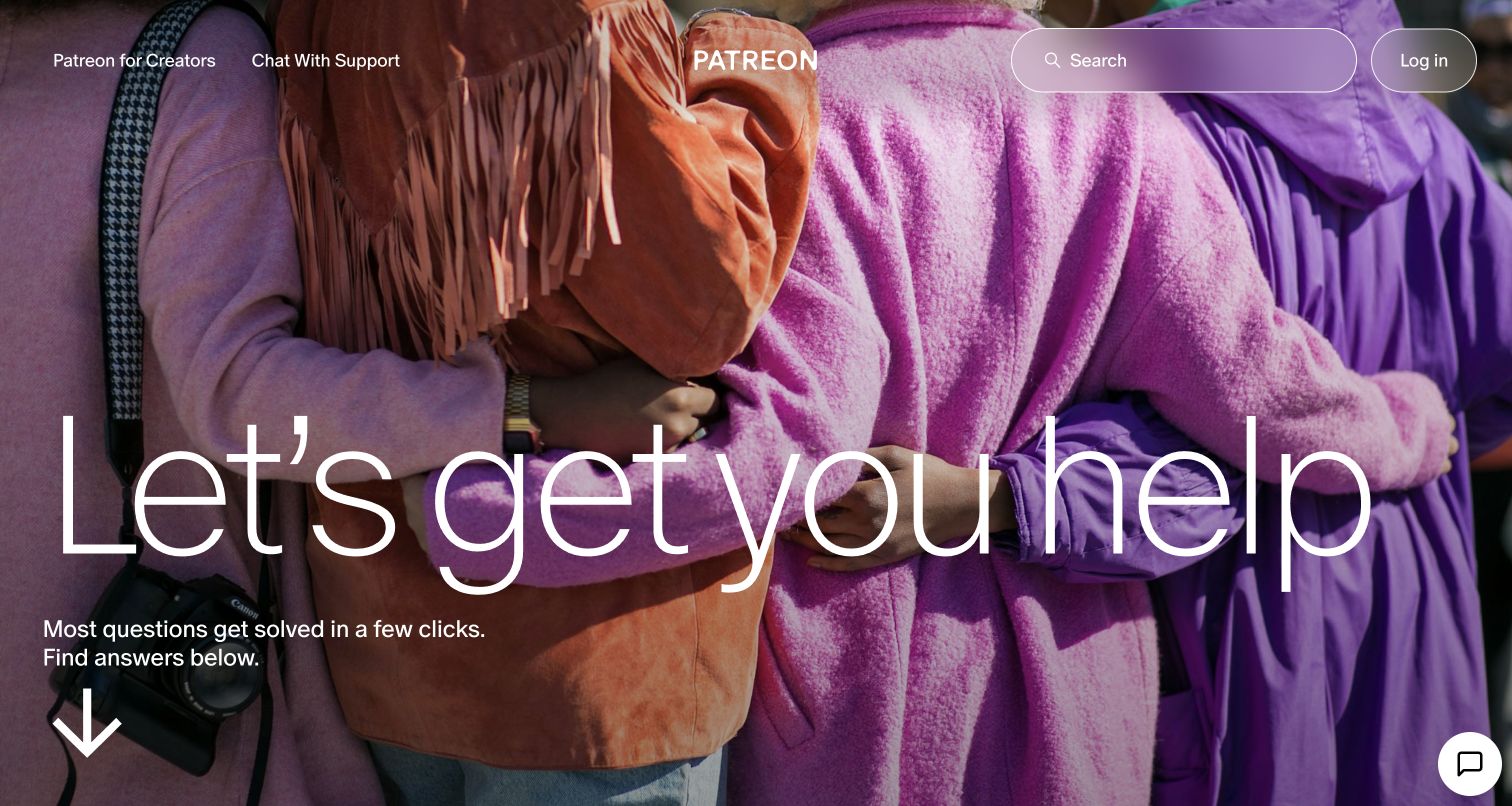
Patreon’s help center opens with a full-bleed photograph and an exceptionally large reassurance headline. Search, chat and login are placed in the top bar, while a downward cue leads to the topic area. The directory uses creator, member and general-topic tabs; the observed creator view includes earnings, payment processing, taxes, pricing, podcasting and community. Popular articles and videos sit beneath that selection. The design’s unusual tension is that its most expressive screen is also a gateway to financially consequential support questions.
What you can learn
If the hero is visually ambitious, keep search and contact usable before the visitor scrolls. Audience tabs should change the help vocabulary meaningfully, especially when one group receives income and another manages recurring payments.
Pros
Creator and member topics acknowledge that similar payment words describe very different customer responsibilities.
Search and support chat remain present above the oversized photographic introduction rather than disappearing below it.
Cons & considerations
If users arrive anxious about missing income, the large promotional-style hero may postpone the reassurance they need.
If white text overlays changing photography, each image choice requires a fresh contrast and readability check.
Platform source: WordPress.org Showcase. Direct inspection of this exact public help-center document found https://static.zdassets.com/hc/assets/hc_enduser-6708e723d0ba8d6424b5466c814ba971.js loaded as a script, a Zendesk Guide end-user application asset. This scopes the association to the named public support property, not the organization’s main website or product. Platform evidence is separate from the direct website screenshot and is not a complete current infrastructure audit.
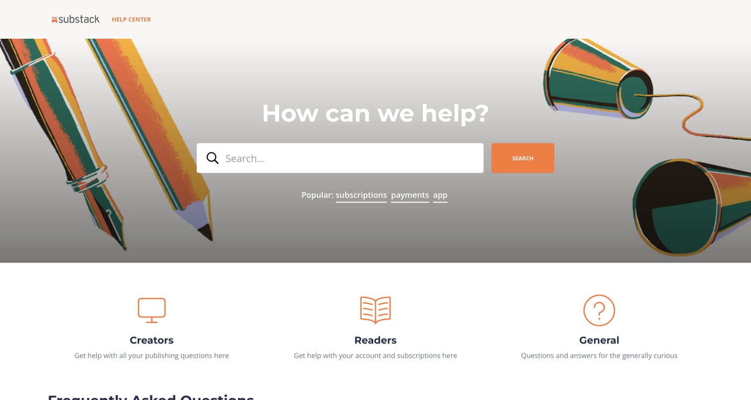
Substack’s help home places a large search field over an illustrated stationery scene, then offers three broad routes for creators, readers and general questions. Its popular query shortcuts are subscriptions, payments and the app. The FAQ list brings cancellation, missing emails, custom domains, support contact and publishing directly into view, with brief article excerpts. A separate getting-started area introduces video, payments, podcasts and publishing, while a status-page link gives service issues their own destination.
What you can learn
Pair a simple audience split with prominently linked operational FAQs. Cancellation and delivery problems deserve clear public routes; separating service status from account guidance also helps people distinguish a broad incident from a personal configuration issue.
Pros
Reader and creator paths are named in ordinary language and explained with concise task-oriented descriptions.
Cancellation and missing-email questions are visible public links rather than concealed behind a generic account category.
Cons & considerations
If article excerpts truncate too aggressively, they may add little context beyond an already descriptive title.
If your content is mostly troubleshooting, a separate getting-started promotion may be less valuable than issue-based navigation.
Platform source: WordPress.org Showcase. Direct inspection of this exact public help-center document found https://static.zdassets.com/hc/assets/hc_enduser-6708e723d0ba8d6424b5466c814ba971.js loaded as a script, a Zendesk Guide end-user application asset. This scopes the association to the named public support property, not the organization’s main website or product. Platform evidence is separate from the direct website screenshot and is not a complete current infrastructure audit.
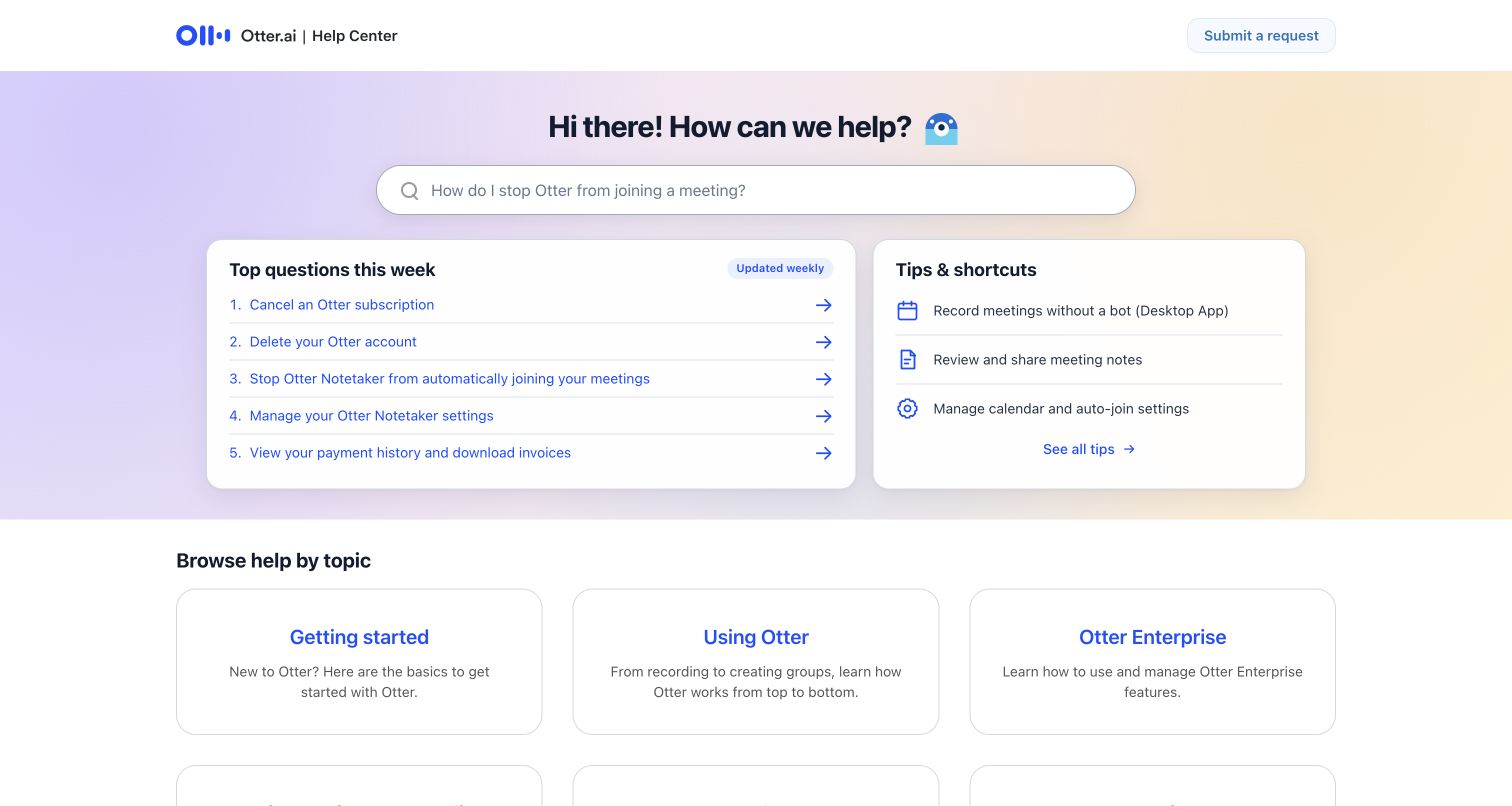
Otter.ai’s help center is notably candid about the questions visitors may actually have. The first screen promotes cancellation, deleting an account, stopping automatic meeting attendance, managing Notetaker settings and retrieving invoices. Beside those questions, tips explain botless recording, reviewing notes and calendar settings. The search placeholder itself asks how to stop Otter joining a meeting, and the topic directory follows below. These choices make the home page about user control as much as product adoption.
What you can learn
Let support priorities include stopping, disabling and leaving as well as learning and upgrading. For automation products, clearly exposing control settings can be more useful than another benefit statement, especially when the automation acts in shared spaces.
Pros
Auto-join controls, cancellation and deletion appear near the top instead of being buried among product tutorials.
The tips panel distinguishes botless recording from managing the meeting assistant’s calendar behavior and sharing settings.
Cons & considerations
If weekly labels are not maintained, they can create a misleading impression of freshness over time.
If visitors need a less common workflow, the strongly prioritized first screen still requires category browsing or search.
Platform source: WordPress.org Showcase. Direct inspection of this exact public help-center document found https://static.zdassets.com/hc/assets/hc_enduser-6708e723d0ba8d6424b5466c814ba971.js loaded as a script, a Zendesk Guide end-user application asset. This scopes the association to the named public support property, not the organization’s main website or product. Platform evidence is separate from the direct website screenshot and is not a complete current infrastructure audit.
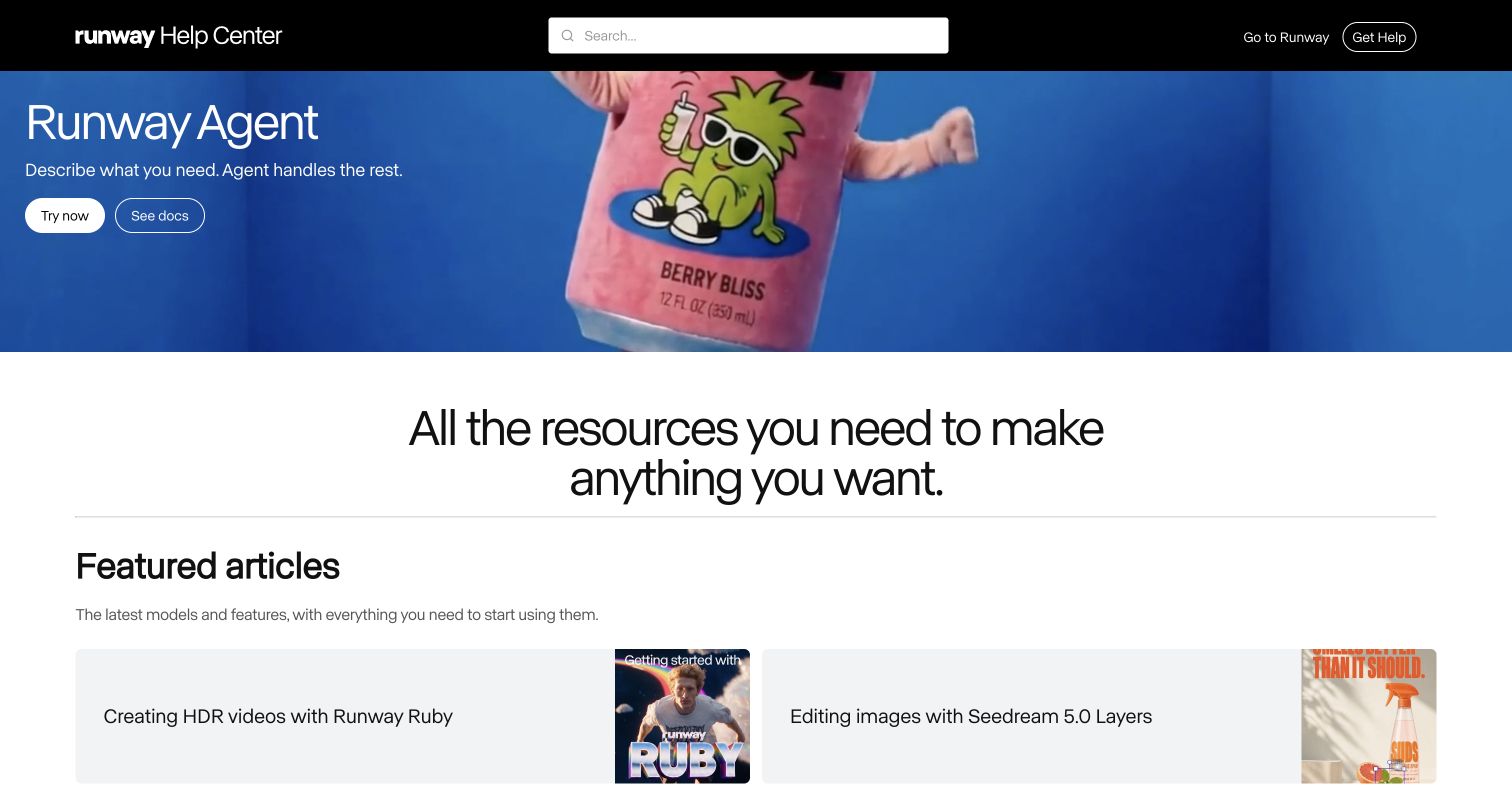
Runway’s help center combines an editorial feature banner with an unusually explicit all-articles index. The captured hero promotes Runway Agent with separate try-now and documentation actions; the next section highlights current creation guides. The directory below breaks account and billing into subscriptions, accounts, credits and invoices, while creation tools, assets, enterprise administration and troubleshooting receive distinct groups. Academy and community routes are available separately from support.
What you can learn
Keep durable account, asset and troubleshooting categories beneath changing product highlights. When promoting a new tool in support, provide a direct documentation action as well as the product-launch action so existing customers can learn without entering the application.
Pros
The feature hero offers documentation directly rather than relying only on a try-product call to action.
Billing, enterprise administration, assets and technical troubleshooting remain separately labeled in the full article index.
Cons & considerations
If the featured launch is unrelated to a visitor’s problem, the large banner consumes space before practical categories.
If model names change frequently, featured guides need active editorial maintenance to avoid becoming obsolete entry points.
Platform source: WordPress.org Showcase. Direct inspection of this exact public help-center document found https://static.zdassets.com/hc/assets/hc_enduser-6708e723d0ba8d6424b5466c814ba971.js loaded as a script, a Zendesk Guide end-user application asset. This scopes the association to the named public support property, not the organization’s main website or product. Platform evidence is separate from the direct website screenshot and is not a complete current infrastructure audit.
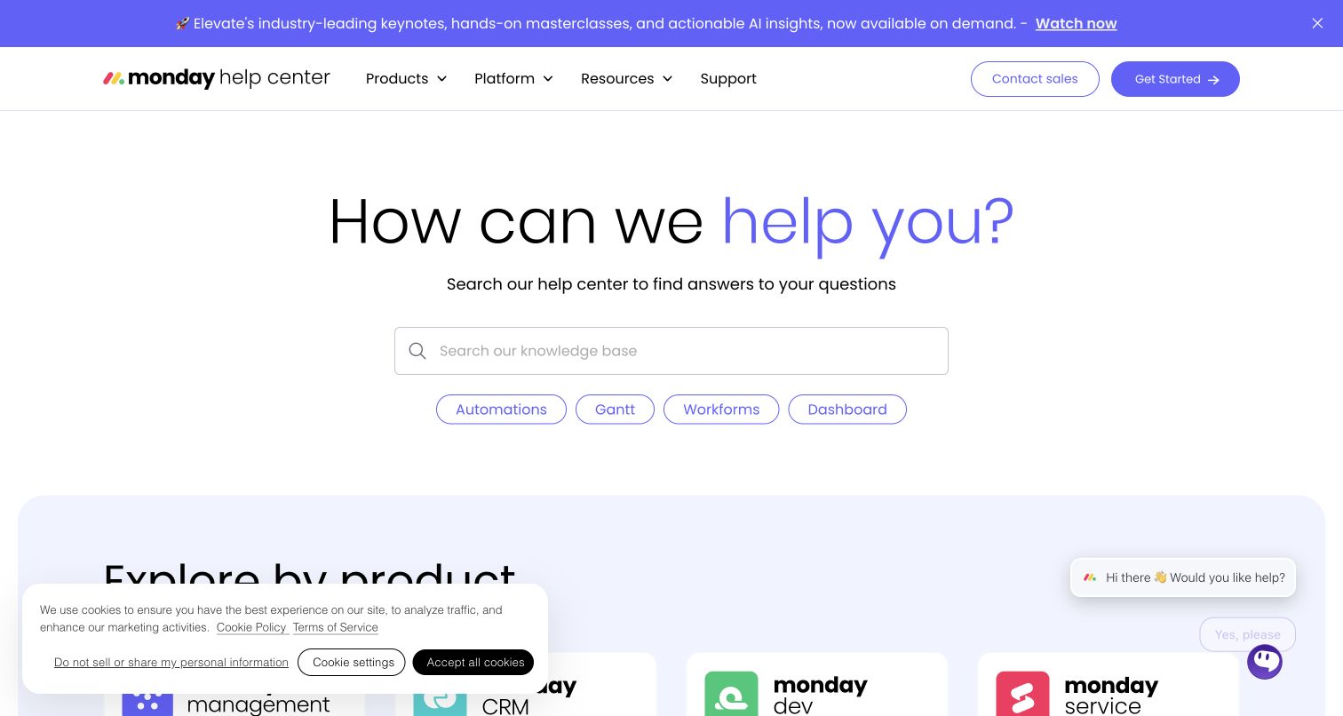
The monday.com help center offers both product-based and topic-based navigation beneath a question search. The product grid distinguishes work management, CRM, development and service, while the topic grid separates reporting, billing, automation, administration and data security. Popular articles then surface concrete items such as Excel import/export, permissions, formulas and dependencies. Academy lessons and community or expert routes extend the support ecosystem. The captured header also carried an event-replay announcement, showing how promotional messaging can coexist with help, but potentially compete with it.
What you can learn
Use parallel navigation only when each axis answers a different question: which product am I using, or which job am I trying to finish? Keep corresponding article ownership clear so product and topic directories do not become competing copies.
Pros
Product and topic routes accommodate customers who know their application but not the relevant feature vocabulary.
Popular article titles make specific administrative and workflow tasks visible beyond broad suite-level categories.
Cons & considerations
If articles appear under several products, inconsistent duplicates can emerge without deliberate ownership and canonical linking.
If the support visit is urgent, event promotions and academy content may create unnecessary visual competition.
Platform source: WordPress.org Showcase. Direct inspection of this exact public help-center document found https://static.zdassets.com/hc/assets/hc_enduser-6708e723d0ba8d6424b5466c814ba971.js loaded as a script, a Zendesk Guide end-user application asset. This scopes the association to the named public support property, not the organization’s main website or product. Platform evidence is separate from the direct website screenshot and is not a complete current infrastructure audit.
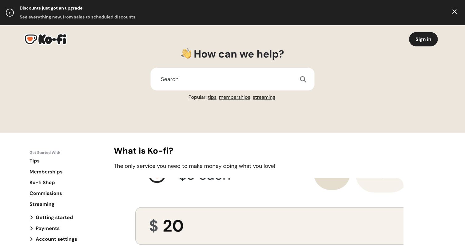
Ko-fi’s help center begins with search and popular terms, then organizes getting-started guidance around accepting tips, memberships, selling products, commissions and stream alerts. A separate section explains using Ko-fi with social and publishing platforms including Instagram, YouTube, Twitch, GitHub and Discord. The page also provides a topical sidebar and a request link near the end.
What you can learn
Order help around the user’s operating model, then provide integration guidance at the point where they need distribution. Distinguish receiving support from receiving creator payments so financially sensitive questions do not get lost among growth tutorials.
Pros
The introductory guides separate tips, memberships, products and commissions into recognizable creator business models.
Integration topics explicitly name the audience platforms rather than making users interpret a generic connectivity category.
Cons & considerations
If a visitor needs a payment problem resolved, the introductory growth material may precede the relevant operational article.
If icon fonts fail to load, several symbol-only controls or social labels may become less understandable.
Platform source: WordPress.org Showcase. Direct inspection of this exact public help-center document found https://static.zdassets.com/hc/assets/hc_enduser-6708e723d0ba8d6424b5466c814ba971.js loaded as a script, a Zendesk Guide end-user application asset. This scopes the association to the named public support property, not the organization’s main website or product. Platform evidence is separate from the direct website screenshot and is not a complete current infrastructure audit.
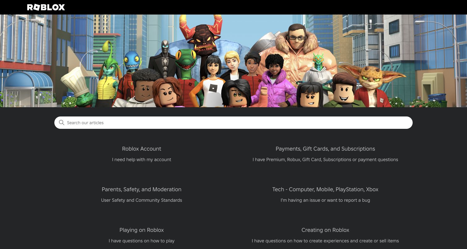
Roblox Support places a broad character illustration above a wide search field and a restrained two-column category directory. Category descriptions use first-person language: needing account help, having payment questions or reporting a technical problem. Parents, safety and moderation have a dedicated route, distinct from playing, creating and avatar customization. Promoted articles address account security, forgotten passwords, unauthorized charges, gift cards and voice chat. The page is an example of balancing a youthful visual brand with serious family and payment concerns.
What you can learn
Use ordinary problem statements to explain broad categories, particularly when adults and children may approach the same platform with different vocabulary. Give safety and account recovery their own visible entry points instead of treating them as miscellaneous technical issues.
Pros
First-person category descriptions translate internal support subjects into the reasons a visitor may be seeking help.
Safety, account protection and unauthorized-payment guidance are surfaced alongside ordinary play and customization topics.
Cons & considerations
If every promoted article receives equal weight, duplicate or similar voice-chat titles can make scanning less decisive.
If your audience expects a formal service interface, the character-heavy hero may not suit the context.
Platform source: WordPress.org Showcase. Direct inspection of this exact public help-center document found https://static.zdassets.com/hc/assets/hc_enduser-6708e723d0ba8d6424b5466c814ba971.js loaded as a script, a Zendesk Guide end-user application asset. This scopes the association to the named public support property, not the organization’s main website or product. Platform evidence is separate from the direct website screenshot and is not a complete current infrastructure audit.
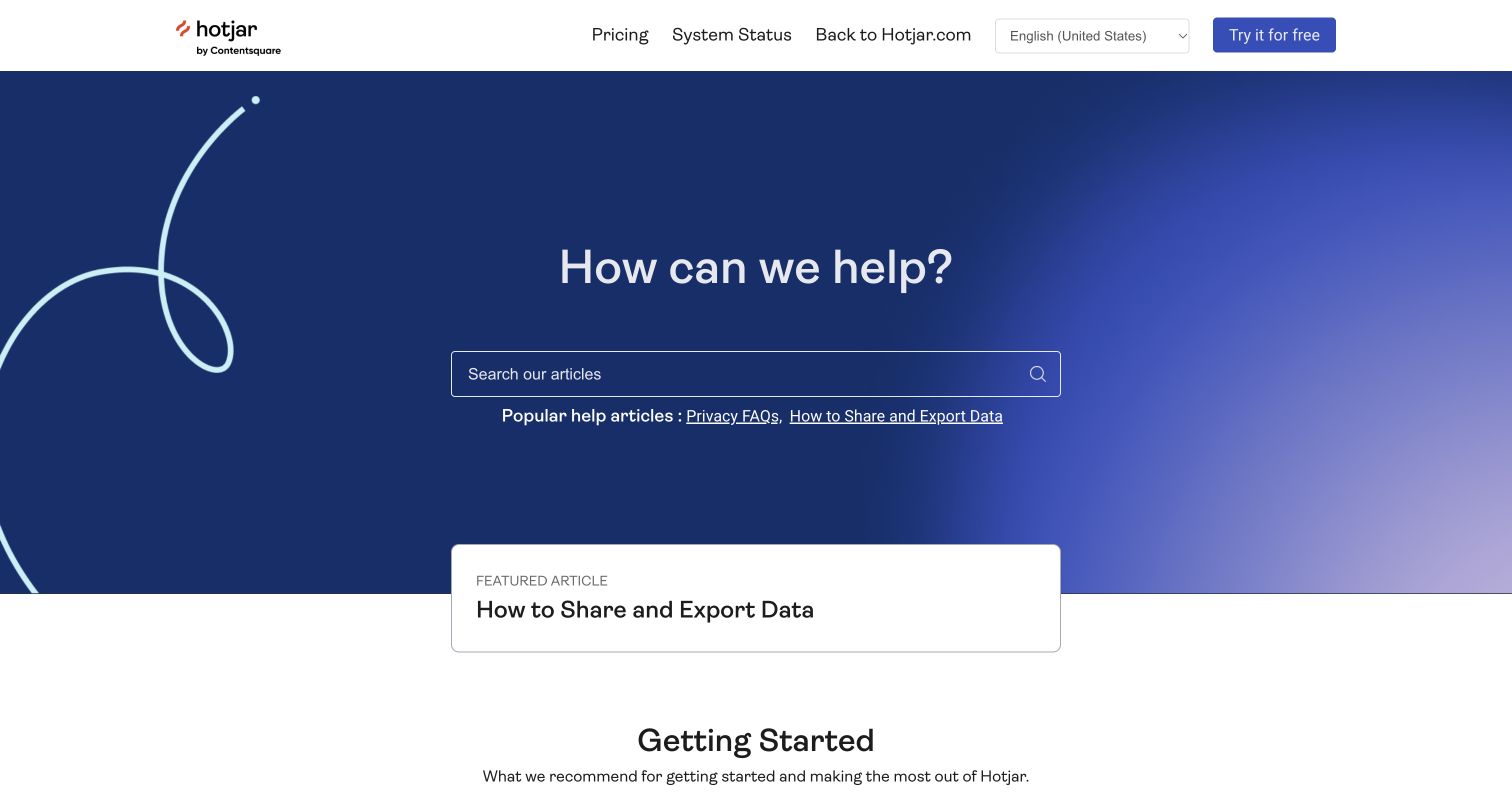
Hotjar’s documentation home uses a blue search hero with privacy and data-export links directly underneath. A featured card repeats the export task, followed by a getting-started group covering tracking-code installation, tag management, trends and collaboration. The topic directory separates account management, payments, observation tools, research tools, compliance and APIs. The header connects to system status and the commercial site without confusing them with documentation categories.
What you can learn
Promote consequential data questions where people look for operational help. Installation and feature guides should sit alongside clear privacy, export and ownership routes; a commercial signup action must remain distinguishable from assistance for existing customers.
Pros
Privacy FAQs and exporting data are explicit early entry points rather than only footer-level policy links.
Installation, account ownership, product tools and APIs are separated with descriptions that clarify the scope of each topic.
Cons & considerations
If the same export article occupies multiple highlighted positions, other important tasks receive less first-screen exposure.
If the search field relies heavily on styling, its contrast should be checked across the gradient background.
Platform source: WordPress.org Showcase. Direct inspection of this exact public help-center document found https://static.zdassets.com/hc/assets/hc_enduser-6708e723d0ba8d6424b5466c814ba971.js loaded as a script, a Zendesk Guide end-user application asset. This scopes the association to the named public support property, not the organization’s main website or product. Platform evidence is separate from the direct website screenshot and is not a complete current infrastructure audit.
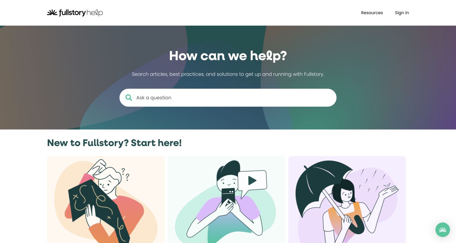
Fullstory’s help center opens with a question field over a muted abstract background, followed by three illustrated entry cards for getting started, video tutorials and system status. The topic list includes analytics, AI, mobile apps, privacy, release notes, integrations and developer guidance. Later, separate contact options distinguish technical support, the community and developer documentation. The structure acknowledges that a visitor may be trying to learn, diagnose an outage or implement a technical capability; those are related but not interchangeable tasks.
What you can learn
Put service health beside educational help when customers may mistake an incident for a configuration problem. Keep technical support, peer discussion and reference documentation clearly labeled so people understand both the destination and the kind of answer to expect.
Pros
System status is an early navigation choice rather than an obscure footer link after the article catalog.
Technical support, developer documentation and community discussion remain separate named routes in the final assistance block.
Cons & considerations
If illustration cards dominate the viewport, users looking for a precise product topic must scroll farther.
If the product family grows, an ungrouped topic list may need stronger hierarchy than equal-weight category labels.
Platform source: WordPress.org Showcase. Direct inspection of this exact public help-center document found https://static.zdassets.com/hc/assets/hc_enduser-6708e723d0ba8d6424b5466c814ba971.js loaded as a script, a Zendesk Guide end-user application asset. This scopes the association to the named public support property, not the organization’s main website or product. Platform evidence is separate from the direct website screenshot and is not a complete current infrastructure audit.
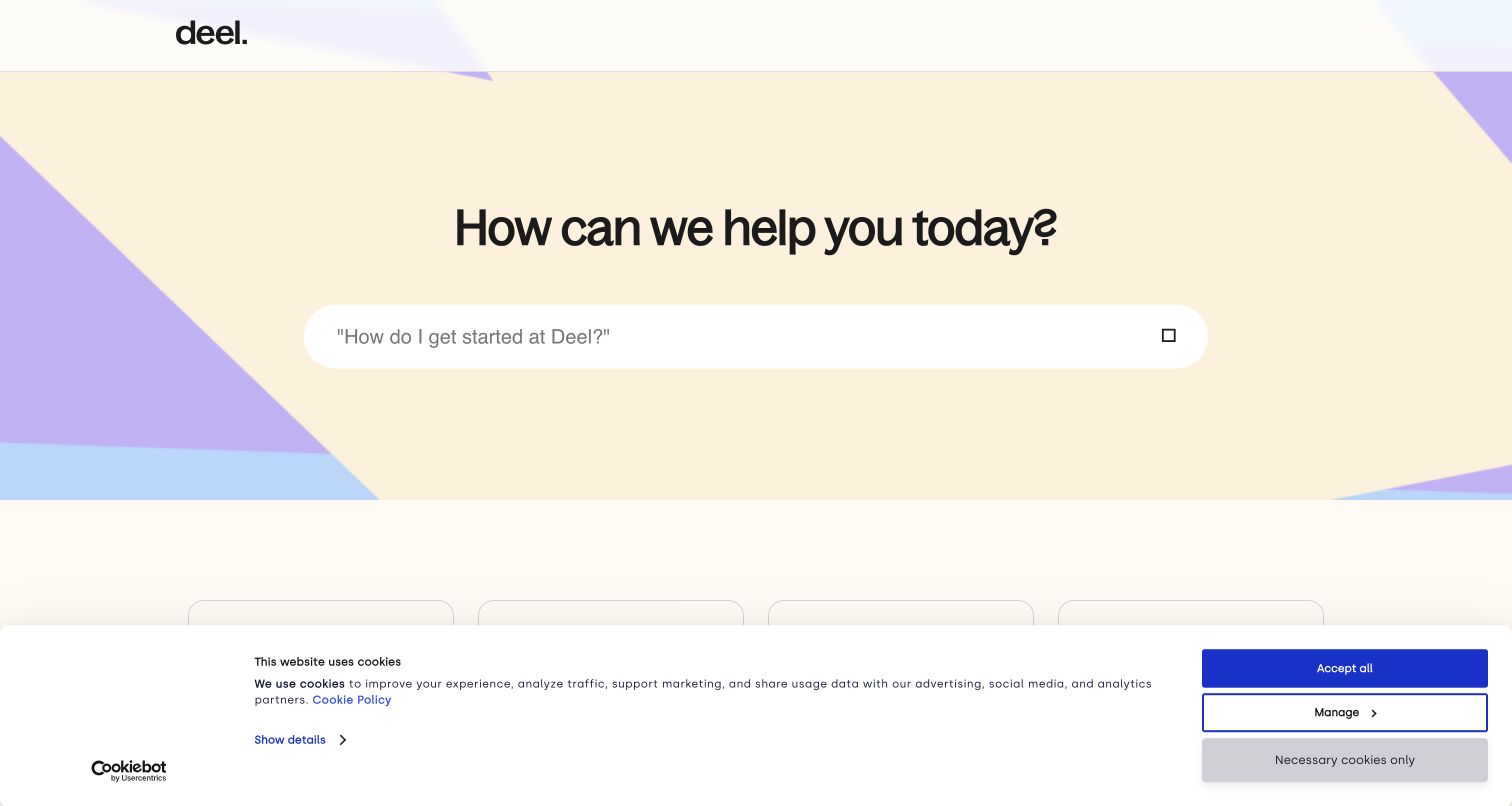
Deel’s public help entrance is deliberately sparse: a broad question search sits above four principal routes for an introduction, businesses, contractors and employees. The large pastel geometric hero supplies brand recognition, while the category decisions remain simple. Compared with the more elaborate learning hubs in this collection, this page relies on identifying the person’s role before presenting detailed employment and payment guidance. That makes the gateway easy to scan, but it also makes the category descriptions and downstream role boundaries important.
What you can learn
When legal and payment responsibilities vary by role, start with that role distinction and preserve it through the article hierarchy. Avoid pretending a universal answer applies to employers, employees and independent contractors simply because their questions use similar words.
Pros
Four top-level choices keep the initial decision understandable for visitors with very different relationships to the service.
Business, contractor and employee help are not collapsed into a generic account-management bucket at the entrance.
Cons & considerations
If someone holds more than one role, the simple fork may require clearer downstream cross-links to the right context.
If the search icon or font fails, the oversized input needs another unmistakable textual search cue.
Visible tech stack
Earlier / documented evidence
Zendesk
Platform source: WordPress.org Showcase. Direct inspection of this exact public help-center document found https://static.zdassets.com/hc/assets/hc_enduser-6708e723d0ba8d6424b5466c814ba971.js loaded as a script, a Zendesk Guide end-user application asset. This scopes the association to the named public support property, not the organization’s main website or product. Platform evidence is separate from the direct website screenshot and is not a complete current infrastructure audit.
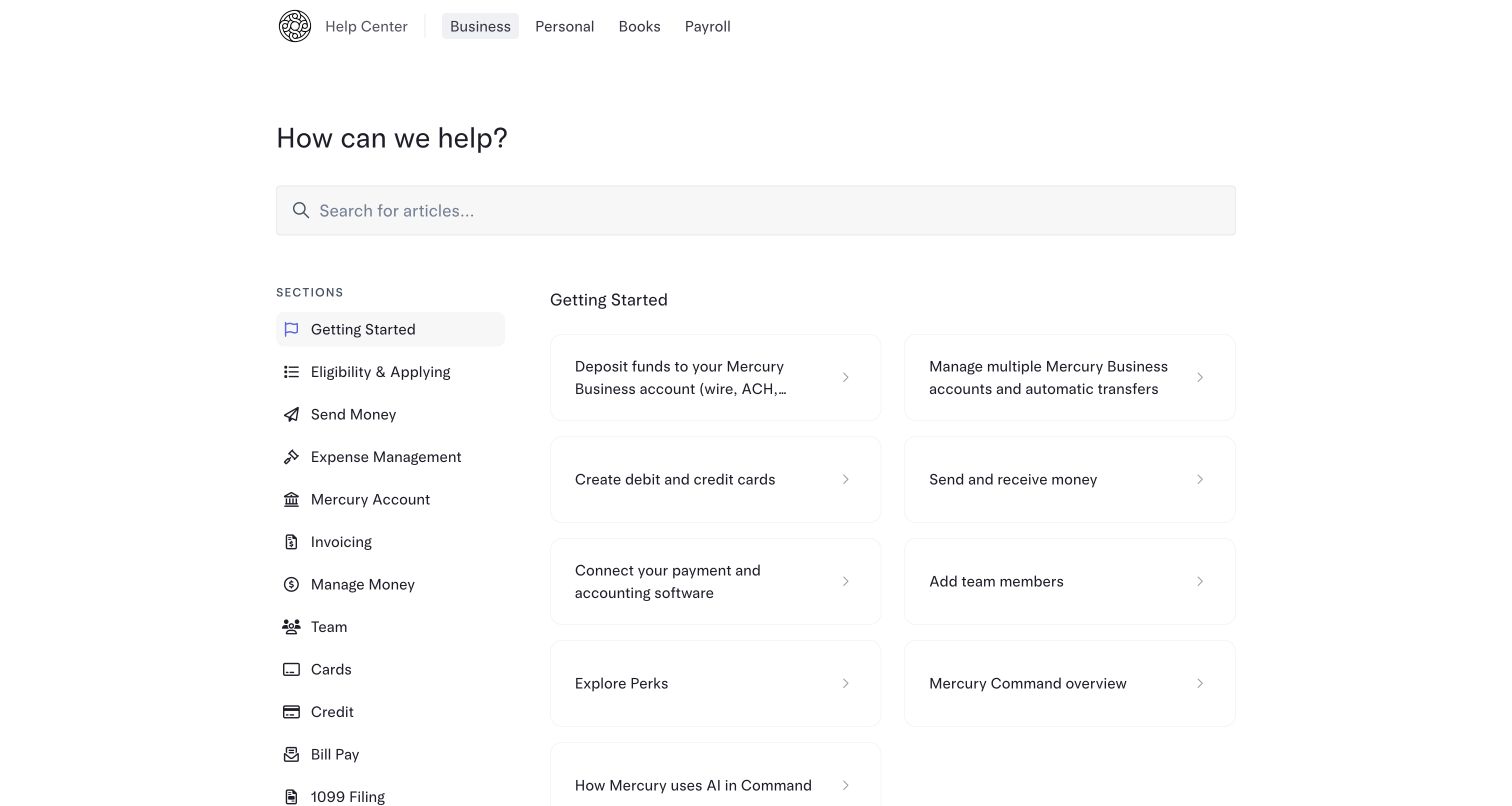
Mercury’s captured Business help view uses a restrained, nearly monochrome interface rather than a marketing hero. Product tabs distinguish Business, Personal, Books and Payroll, while a persistent sidebar separates eligibility, money movement, expenses, account management, invoicing, teams, cards and bill pay. The initial Getting Started panel links to funding, cards, transfers, integrations and team setup. A search field spans the content above that split. The pattern is valuable when product context must stay visible while a user explores a long operational knowledge base.
What you can learn
Keep product scope and task scope visible at the same time when instructions differ by account type. For consequential operations, use explicit article titles and preserve a clear distinction between reading guidance and executing an action inside an authenticated product.
Pros
Product tabs provide persistent context for Business versus Personal or adjacent products before instructions are selected.
The sidebar exposes practical operation families while the main panel can focus on a smaller starting sequence.
Cons & considerations
If article cards truncate important qualifiers, similar financial tasks can become harder to distinguish before opening them.
If the same question differs by account type, cross-product search results will need especially clear context labels.
Visible tech stack
Earlier / documented evidence
Zendesk
Platform source: WordPress.org Showcase. Direct inspection of this exact public help-center document found https://static.zdassets.com/hc/assets/hc_enduser-6708e723d0ba8d6424b5466c814ba971.js loaded as a script, a Zendesk Guide end-user application asset. This scopes the association to the named public support property, not the organization’s main website or product. Platform evidence is separate from the direct website screenshot and is not a complete current infrastructure audit.
Kegan has 15+ years of experience working with small businesses, Fortune 500 companies, and everything in between. No development job is too big or too small: he brings the same hands-on attention to a focused improvement, a complete website, or a custom application.
For Zendesk projects, he can help with website integrations, form and campaign connections, analytics implementation, testing, and clear ownership after launch. He works directly with clients on scope, design, implementation, testing, and handover, with an emphasis on clear communication and a system that remains practical to maintain after launch.
Show 3 other Zendesk developersHide other Zendesk developers
Choose the support entrance that fits the question
Search with useful examples
Use this when visitors arrive with varied but expressible questions. Zapier’s field-mapping query and Figma’s typography and auto-layout suggestions illustrate how examples can teach vocabulary. Keep a visible browse route for people who cannot yet name the feature, and assess search relevance with real task language rather than visual polish alone.
Role or product gateway
Use this when different audiences receive different instructions. A creator, a paying member, an employee and an administrator may all ask about payments but require different answers. Start with a short, meaningful fork; do not make visitors identify an internal department before they can seek help.
Learning and support hub
Use this when tutorials, reference material, status and assistance are all important. Figma, ClickUp and Fullstory connect these destinations while preserving their labels. Keep urgent operational questions easy to reach so training, announcements and feature launches do not become barriers to resolving a problem.
From references to requirements
Plan the content before styling the help center
Map the real top tasks
Collect recurring questions from authorized support records and product owners, then distinguish onboarding, troubleshooting, billing, safety and offboarding. Decide which deserve direct home-page links. Draft titles in customer language and identify where role, plan or product changes the answer. The public examples suggest patterns, not a substitute for your own evidence.
Design the escalation contract
Document which assistance routes are public, which require sign-in and which depend on the plan. Make the next step visible without promising a channel to someone who cannot use it. Keep service status, community advice, account-specific requests and educational resources distinct; label each destination before users commit to it.
Assign ownership and verify the whole journey
Give categories and articles named maintainers, with a process for retiring obsolete launch guides and updating duplicated product instructions. Test keyboard navigation, search queries, small screens and article-to-contact transitions on the actual implementation. Review privacy and safety notices for freshness, and evaluate support outcomes separately from a screenshot-based design assessment.
A useful handover demonstration
Ask the actual team to carry out its routine job: publish a realistic update, correct a mistake, preview a narrow screen, and identify who owns an integration failure. For a library or frontend framework, also ask who maintains the content source and deployment. A polished screenshot does not answer those operational questions.
Beyond the screenshot
Zendesk help-center planning checklist
Name the exact public support property and record dated page-level platform evidence.
Choose a primary role, product or task hierarchy that visitors can understand.
Write category descriptions that distinguish neighboring topics.
Supply concrete query examples without requiring users to know internal terminology.
Expose account access, billing, safety and cancellation questions where relevant.
Label contact eligibility, sign-in requirements and available support channels honestly.
Keep status, community, training and direct assistance as distinct destinations.
Assign maintenance owners and test the implemented article-to-resolution journey.
Test with real content, a keyboard, a small screen, slow or failed requests, and the people who will maintain the system. These are planning checks, not an accessibility, security, performance, or search-ranking certification.
Sources & editorial method
How this Zendesk collection was reviewed
All 20 examples were manually inspected on their official public support URLs on 6 November 2026 UTC and captured directly in a desktop browser. Each inspected document loaded the Zendesk Guide hc_enduser application asset recorded in its evidence. Reviews describe visible information architecture and editorial tradeoffs. No forms were submitted, accounts opened, bookings made or authenticated product actions taken. Screenshots do not establish accessibility conformance, search relevance, response speed, support deflection or commercial results.
Every image is an unmodified capture from the actual website, with its source and capture date. Some captures are reused from our shared catalog; their dates remain the original capture dates. None comes from a vendor gallery or a generated reconstruction. Moving imagery and live content can change.
Technology attribution uses public page assets or metadata, official platform documentation, or a cited first-party project case study. Documentary and framework-relationship evidence is identified where used; it is not a complete current backend inventory. A CMS image CDN alone does not establish a full CMS deployment. A library’s presence does not prove which individual controls use it, and a platform label does not establish AI authorship.
The composition notes, lessons, pros and tradeoffs are original editorial observations. We have not measured conversion, traffic, security, performance or accessibility conformance. Website owners retain their brands and imagery; these examples are not our client portfolio. Written, Edited and Curated are independent records, not dates advanced by a build. See our editorial standards or suggest a correction.
Questions worth asking
Zendesk website development FAQs
Do these examples prove the whole company website is built with Zendesk?
No. The evidence is scoped to the exact named public help center. A company can use different systems for its marketing website, product, community and support properties. A support widget or customer logo alone would not establish that the page is a Zendesk Guide help center.
Should every help center begin with a large search box?
Only if search is a useful first action for its audience and the underlying results work well. Reddit’s role split and Mercury’s persistent product/task navigation show other important choices. Provide browsing for people who cannot name their problem, and test actual queries before deciding on emphasis.
Can we copy the contact and chat options shown here?
Treat them as architectural examples, not entitlements you automatically have. The observed Miro and Typeform pages explicitly qualify support access by plan. Define your own support promise and confirm the platform configuration and current product terms before designing the contact route.
Are the most expressive designs necessarily the most effective?
No. Large illustrations, photographs and feature banners can preserve brand continuity, but may delay topic access for someone with an urgent problem. These reviews describe that tradeoff without claiming measured outcomes. Evaluate task completion, content quality and service data on your own implementation.
Start with the support decision you need to make easier. Then borrow the relevant pattern—role tabs, explicit task links, persistent product scope or a well-labeled learning hub—and verify it with your own questions and support process.