Best Mixpanel Websites of 2026 (20 Real-World Examples)
Public design references from organizations with documented Mixpanel product-analytics cases.
Explore 20 public interfaces and the different product questions behind their analytics stories. A Mixpanel customer association does not establish the framework or CMS rendering the pictured page.
Docusign, Yelp, Tata 1mg, Bolt and Sunrun open the collection. Their public experiences range from software marketing and company information to healthcare retail, mobility and home energy. The primary cases describe particular product or customer-journey analysis, not a universal marketing-site implementation. Bolt here is the mobility company, not the AI builder; Tata 1mg is not every Tata business.
Use these references to study understandable propositions, task-oriented navigation and useful next steps. Then plan measurement around your own decisions. The collection is not an instruction to install tracking on every page or copy the data collection of a large organization. Privacy, consent, retention and permitted purpose need their own deliberate review for the actual audience and jurisdiction.
Before the examples
What makes good Mixpanel website development in 2026?
Begin with a decision, not an event inventory
Choose a question the team can act on, such as where a defined onboarding flow stops working. Specify what success means before listing events. A small set of well-understood observations is more useful than a large stream no one can explain. Keep the measurement plan connected to a product decision and an accountable owner.
Treat identity as a lifecycle, not a single function call
Review the project’s identity mode before implementing an example. Mixpanel’s Simplified ID Merge documentation explicitly distinguishes it from Original ID Merge. Plan anonymous use, sign-in, sign-out and shared-device behavior together. A stitched journey is not inherently correct merely because an identifier appears in a report.
Define the minimum context needed for the chosen question. Avoid sending message contents, form text or sensitive account details simply because they are easy to capture. A measurement tool does not decide what an organization may collect. Review purpose, access, retention and any consent requirements before production.
The collection · 20 examples
20 Mixpanel website examples worth studying
Exactly 20 public design references, each paired with a qualified product-analytics association. Public interfaces and analytical workloads are reviewed separately.
We start with five recognizable brands or organizations: Docusign, Yelp, Tata 1mg, Bolt, Sunrun. Each attribution applies to the named website property, not every product or website belonging to its organization. This is a curated reading sequence, not a measured ranking.
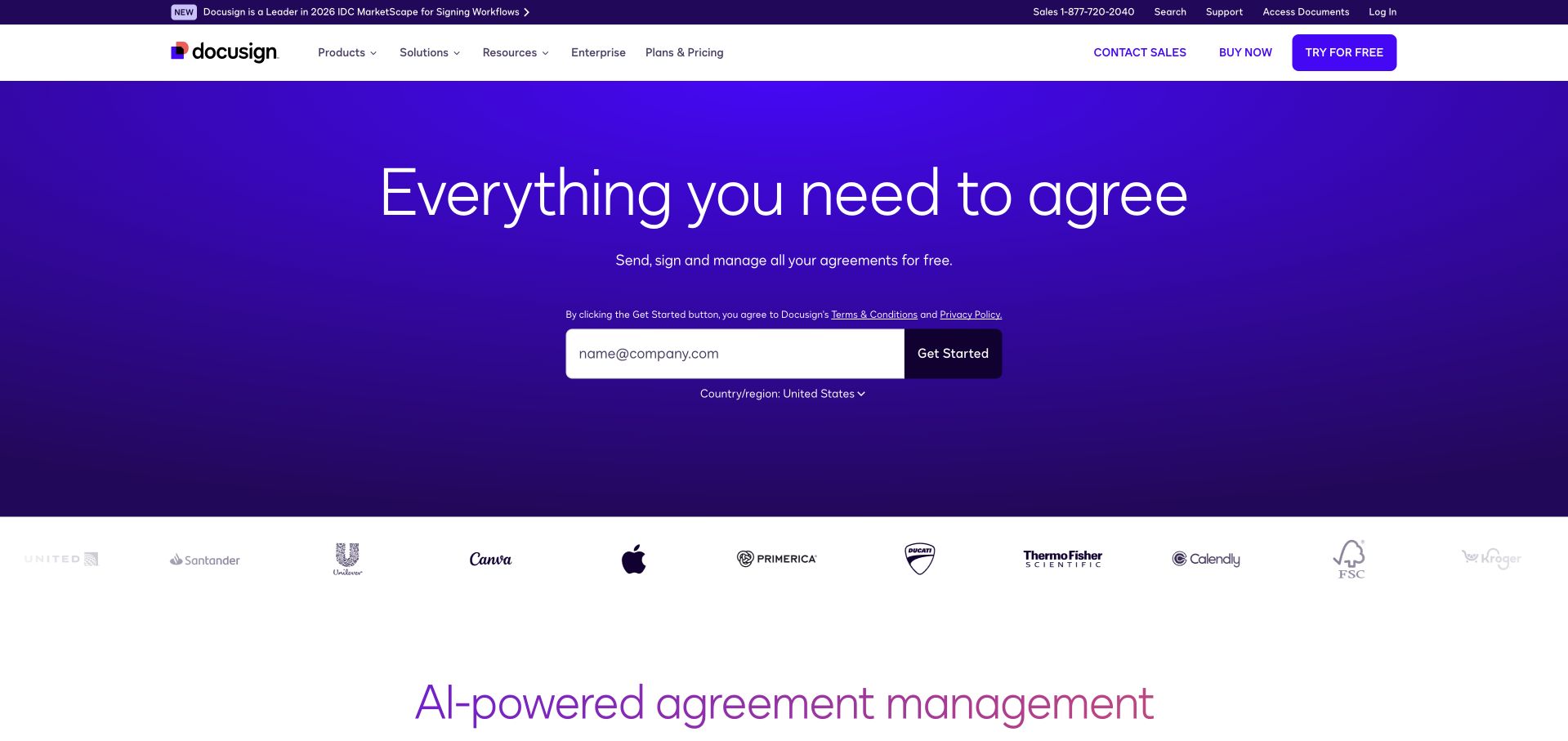
Docusign puts a short agreement-focused headline in the middle of a purple gradient rather than leading with a grid of enterprise features. The email field and dark start button form the next strong horizontal element, while customer logos appear below the main decision. A country selector and nearby terms introduce practical account context before registration. The white navigation separates product discovery from this direct entry route. Mixpanel’s customer account describes product and growth analysis, including onboarding and paid upgrades; that documentary association does not identify the framework or analytics configuration of this public marketing page.
What you can learn
Choose an entry action that visitors already understand, then let the wider platform story follow. Instrument progression toward a useful agreement workflow rather than treating every email-field interaction as equivalent to successful adoption.
Pros
The restrained headline, email field and contrasting button make the intended next step easy to locate.
Customer logos add a second layer of reassurance without interrupting the initial form.
Cons & considerations
The broad agreement promise leaves specific product differences for navigation or later sections.
Country selection and legal copy add necessary decisions to an otherwise minimal starting experience.
Platform source: Primary documented Mixpanel association. Documented association: Cited product-analytics/growth case, not proof of the eSignature marketing-page frontend. Platform evidence is separate from the direct website screenshot and is not a complete current infrastructure audit.
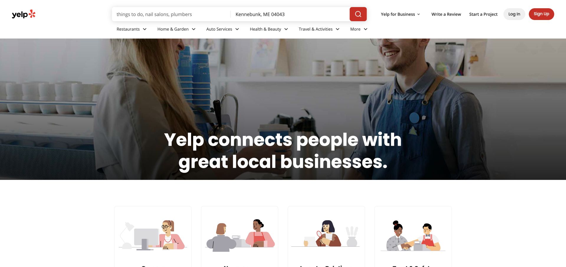
The reviewed Yelp page is its public About view, not a completed local-business search. A cafe photograph places a customer and staff member behind a large white mission statement. Above it, the usual service and location search fields remain available, followed by a dense category row. Illustrated content begins below the image, giving the corporate explanation a friendlier texture than a conventional investor presentation. Mixpanel documents Yelp’s internal product-analysis workflow alongside its own logging platform. That evidence concerns how teams investigate behavior, not which technology renders the photographed About page or every regional Yelp experience.
What you can learn
An informational page can retain the product’s core utility. Measure whether visitors use its search, continue into the organization story, or leave; those are different intentions and should not be collapsed into one engagement number.
Pros
The real business setting makes the marketplace mission tangible rather than purely abstract.
Persistent search keeps a useful route open for visitors who arrived with a local-service task.
Cons & considerations
Search, location and category controls compete with the simpler narrative of an About page.
White text over detailed photography needs careful contrast checks across changing image crops.
Platform source: Primary documented Mixpanel association. Documented association: Internal product-analysis workflow; not a complete public-page technology inventory. Platform evidence is separate from the direct website screenshot and is not a complete current infrastructure audit.
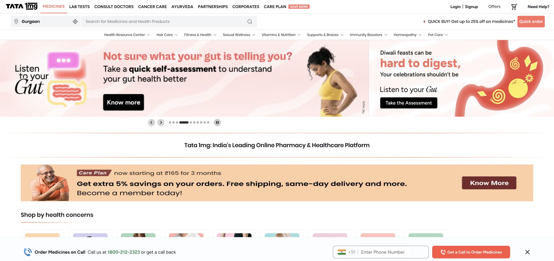
Tata 1mg’s public storefront layers health-category navigation, search and promotional content above a broad campaign image. The captured banner uses coral panels and an illustrated health theme, with carousel controls underneath. A platform introduction and membership offer follow closely, while a fixed telephone-order strip adds another route at the bottom. The design exposes several ways to proceed, but also demonstrates how quickly promotional surfaces can accumulate. Mixpanel’s case describes Tata 1mg’s product, marketing and operations analysis, including combining behavioral and transactional context. It does not establish the implementation of every Tata business or validate the health claims shown in campaigns.
What you can learn
Keep search, category browsing and assisted ordering distinguishable in both layout and measurement. A call request, a membership interaction and a completed purchase represent different needs, especially when a site handles health-related information.
Pros
Prominent search and category navigation support visitors who already know what they need.
A separate assisted-order route acknowledges that not every customer wants a self-service checkout.
Cons & considerations
Campaigns, membership promotion and the fixed call strip create a crowded first view.
Rotating health messages require editorial review and accessible controls beyond an attractive illustration.
Visible tech stack
Earlier / documented evidence
Mixpanel
Platform source: Primary documented Mixpanel association. Documented association: Product-led analytics for Tata 1mg; not a claim about every Tata business. Platform evidence is separate from the direct website screenshot and is not a complete current infrastructure audit.
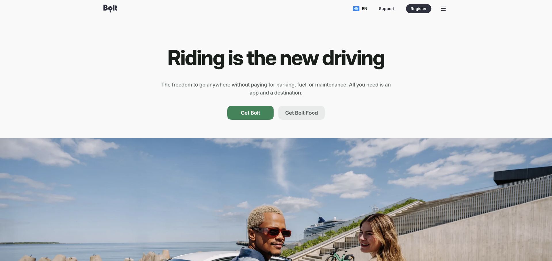
Bolt’s European public page starts with unusually generous white space around a bold, centered mobility message. A short explanation leads to two adjacent actions: the green primary route for Bolt and a quieter gray route for food delivery. The photograph begins lower down, introducing people and a waterfront setting without pushing the initial choice aside. Even at this wide size, the header stays compact, using language, support, registration and a menu control. The Mixpanel story concerns the mobility superapp’s product analytics and cross-service behavior. This is not Bolt.new, and the customer story does not independently reveal this homepage’s rendering stack.
What you can learn
When several services share a brand, name the destination at the decision point. Analyze which service people intend to use before comparing activation; a food order and a ride request are not interchangeable conversion events.
Pros
The paired buttons communicate the service split more clearly than an undifferentiated start action.
Large margins give the headline and next steps room to remain the visual priority.
Cons & considerations
Detailed service discovery is hidden behind the compact menu rather than exposed immediately.
The large open area delays richer evidence about availability and local service differences.
Visible tech stack
Earlier / documented evidence
Mixpanel
Platform source: Primary documented Mixpanel association. Documented association: Mobility superapp analytics; unrelated to the Bolt.new AI builder or other Bolt brands. Platform evidence is separate from the direct website screenshot and is not a complete current infrastructure audit.
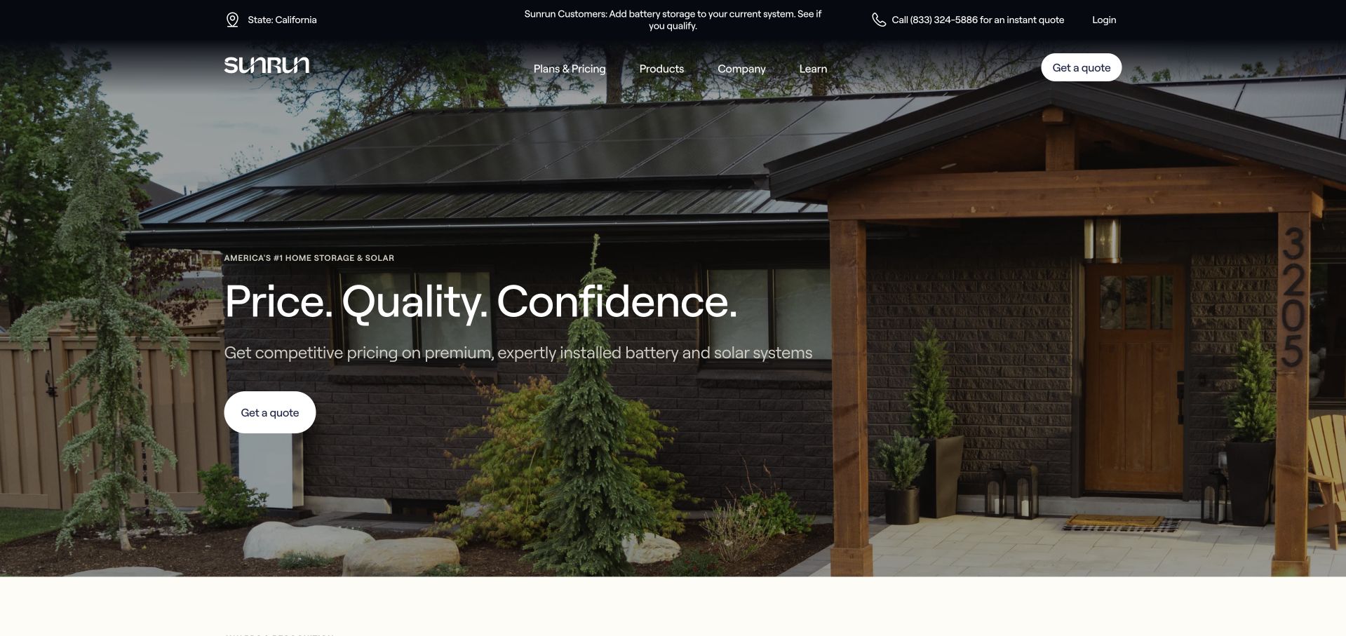
Sunrun uses a roof-level photograph of a home with solar panels as the entire hero setting. White type and a dark overlay keep the short value message readable, while a quote button appears both in the main content and the navigation. The utility bar separates existing-customer access, a regional setting and telephone support from product discovery. Residential context replaces abstract energy infrastructure. Mixpanel’s relevant case is specifically about adoption of the mySunrun application and its customer journey. It is separate from Sunrun’s other analytics initiatives and does not establish this marketing page’s runtime.
What you can learn
Separate pre-sale quote intent from post-installation account tasks. A useful analytics plan follows visitors into the appropriate journey, rather than interpreting an existing customer’s login or support visit as a failed sales conversion.
Pros
The residential photograph immediately explains where the product belongs in a customer’s life.
Repeated quote access and a distinct customer utility bar support different visitor purposes.
Cons & considerations
White navigation over photography needs resilient contrast as imagery and viewport proportions change.
The opening value claims provide less detail than a comparison of plans, eligibility and installation conditions.
Platform source: Primary documented Mixpanel association. Documented association: MySunrun app adoption case; not the same evidence as its separate Looker enterprise case. Platform evidence is separate from the direct website screenshot and is not a complete current infrastructure audit.
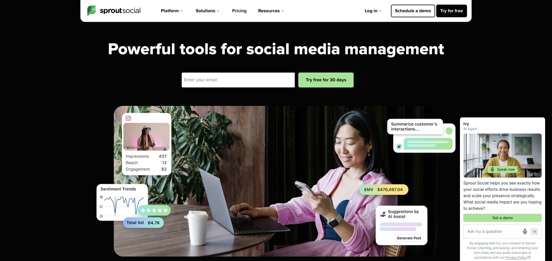
Sprout Social places a social-management headline and email trial form on black. Below, a photograph of a person with a phone and laptop is surrounded by illustrative cards: engagement figures, sentiment trends and AI assistance. White rounded navigation and a green button stand apart from the dark canvas. An open Ivy assistant panel occupies the right side in the reviewed capture, adding a competing demonstration and demo request. Mixpanel’s case documents how Sprout Social teams explore product behavior and releases. The floating graphics are marketing illustrations, not verified live customer metrics or evidence of this page’s analytics implementation.
What you can learn
Use interface fragments to explain a workflow, but give them a supporting role. Distinguish trial starts, demo requests and assistant conversations when evaluating the page, because each represents a different commitment and potential source of friction.
Pros
Strong light-on-dark hierarchy makes the category and trial route immediately apparent.
The work photograph gives otherwise abstract reporting cards a recognizable human context.
Cons & considerations
The open assistant competes with the trial form and covers part of the hero composition.
Numerous floating cards ask visitors to parse several capabilities before seeing a full workflow.
Platform source: Primary documented Mixpanel association. Documented association: Product-development analytics; public marketing implementation is independently observed. Platform evidence is separate from the direct website screenshot and is not a complete current infrastructure audit.
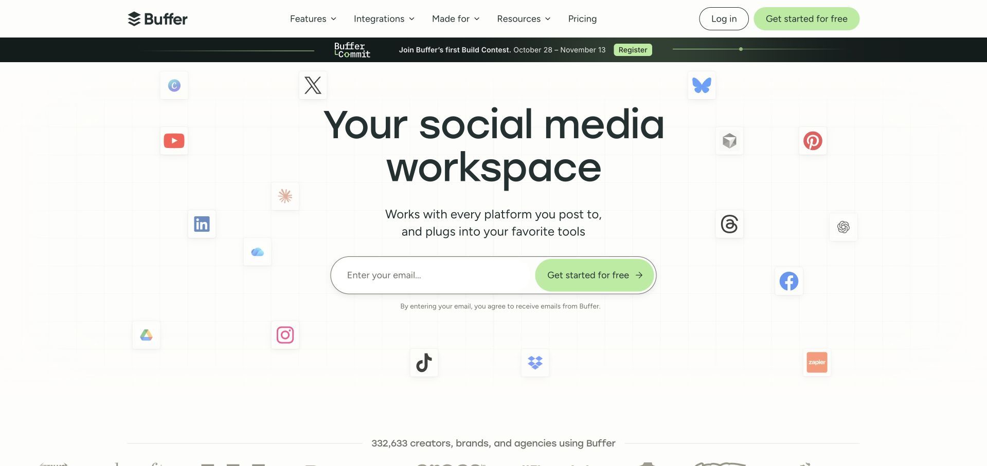
Buffer frames a very large social-workspace headline with scattered platform and tool logos on a faint grid. The central email form combines its field and green action into one pill-shaped unit, keeping signup visually simpler than the surrounding ecosystem. An announcement strip and customer-count statement introduce secondary messages. Small consent wording appears directly below the field instead of being separated from the action. Mixpanel’s customer story discusses Buffer’s internal access to event-based product analysis and the replacement of fragile reporting workflows. It does not prove that every Buffer resource page or this public frontend is built with Mixpanel.
What you can learn
Integration logos can establish relevance quickly, but they should lead into specific supported tasks. Track useful activation within connected workflows separately from the first email submission, and keep expectations about follow-up visible beside that submission.
Pros
The unified signup control creates a clear focal point within a visually busy ecosystem.
Familiar logos explain the breadth of the workspace without a long opening feature list.
Cons & considerations
Many scattered marks can become decorative noise before visitors understand the core product.
The announcement bar adds a second promotional destination above the main signup message.
Platform source: Primary documented Mixpanel association. Documented association: Product/team analytics; not a claim that the Ghost resources site is rendered by Mixpanel. Platform evidence is separate from the direct website screenshot and is not a complete current infrastructure audit.
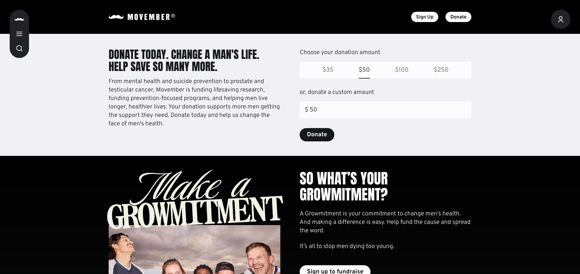
The captured Movember view pairs a condensed donation appeal with an amount selector and a clearly separated Donate button. A pale panel keeps the money-related controls distinct from the black campaign section below. That next section combines expressive lettering, a group photograph and an explanation of participation, so giving is not the only visible way to engage. The black header and narrow left-side navigation maintain a strong, recognizable identity. Mixpanel’s case describes fundraising-funnel analysis and privacy-related collection constraints. That is a documented analytics use case, not an independent assessment of consent compliance, medical outcomes or the implementation of this particular public view.
What you can learn
Fundraising pages benefit from separating contribution amount, payment completion and campaign participation. Agree on lawful collection boundaries before instrumentation; moving an event to a server does not, by itself, resolve consent or sensitive-data obligations.
Pros
Suggested amounts and a separate custom value make the next financial decision explicit.
The alternating pale and black sections distinguish donating from joining the wider campaign.
Cons & considerations
Highly condensed display type can be demanding when several lines carry an emotional appeal.
The compact side navigation makes some destinations less apparent than the donation controls.
Platform source: Primary documented Mixpanel association. Documented association: Fundraising funnel analytics with privacy constraints; no clinical endorsement or full-stack inference. Platform evidence is separate from the direct website screenshot and is not a complete current infrastructure audit.
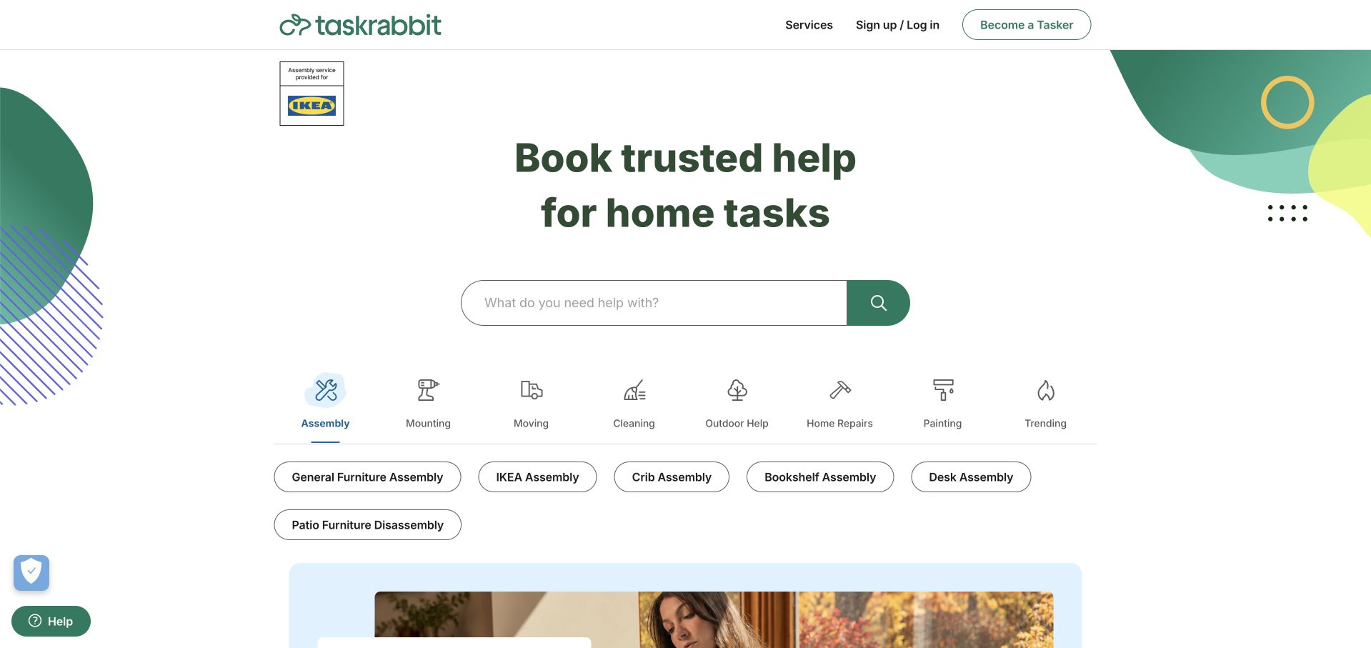
Taskrabbit centers a home-task promise above a wide search field, then breaks the catalog into a row of illustrated categories. The selected assembly category expands into specific pill-shaped options such as furniture, crib and desk assembly. An IKEA association appears separately near the top, while the header keeps customer access and becoming a Tasker distinct. Green decorative shapes add brand character without replacing the functional taxonomy. Mixpanel’s case describes marketplace product insights and a Segment integration. It establishes a customer analytics workflow, not the search algorithm, public rendering framework or quality of an individual service provider.
What you can learn
Give uncertain visitors categories and confident visitors search. Measure whether each route reaches a relevant task and an available provider; a category click alone does not demonstrate that someone found suitable help or completed a booking.
Pros
Search and labeled category icons provide complementary routes through a broad service catalog.
Specific assembly options reduce the need to invent an accurate search phrase from scratch.
Cons & considerations
The long category row and option pills need thoughtful reflow on smaller screens.
Trust language in the headline still needs supporting detail about the actual provider-selection process.
Platform source: Primary documented Mixpanel association. Documented association: Marketplace product insights; not proof of the public-page rendering framework. Platform evidence is separate from the direct website screenshot and is not a complete current infrastructure audit.
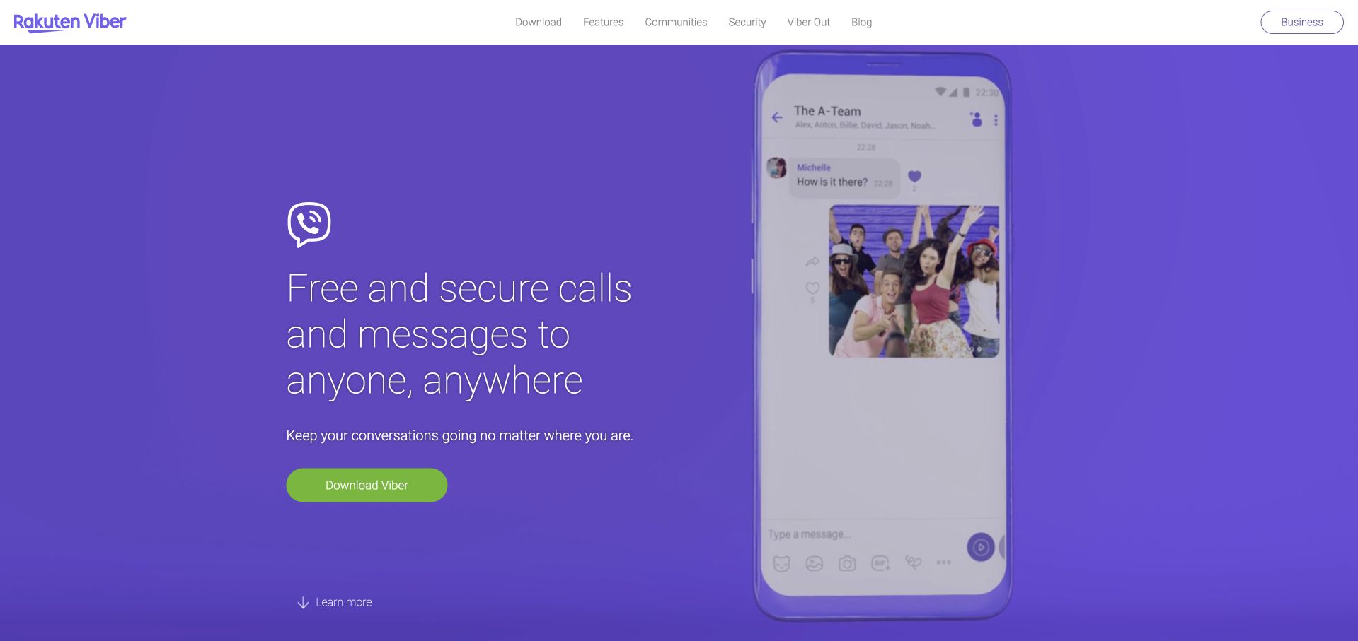
Rakuten Viber uses a full purple hero with light, thin typography and one green download button. A large phone mockup shows a group conversation, connecting the broad calling-and-messaging promise to a recognizable interaction. The white navigation above it contains download, features, communities and security routes, with business access kept at the far edge. A quieter learn-more cue sits near the bottom of the hero. Mixpanel’s case concerns analysis of Viber messaging-product behavior and feature discovery. Some tools described belong to the case’s historical context; the story does not establish current analytics across unrelated Rakuten services or the public page’s complete stack.
What you can learn
A familiar product can use a simple interface preview instead of explaining every feature immediately. For analytics, separate download intent, installation and meaningful conversation activity; the large button only exposes the beginning of that journey.
Pros
The phone conversation makes the product category understandable without requiring technical vocabulary.
One contrasting download button keeps the hero’s main decision visually unambiguous.
Cons & considerations
Very light headline strokes are less robust than heavier type against a saturated background.
Broad security language needs more detail than a promotional conversation mockup can provide.
Platform source: Primary documented Mixpanel association. Documented association: Messaging-product analysis; no inference across unrelated Rakuten services. Platform evidence is separate from the direct website screenshot and is not a complete current infrastructure audit.
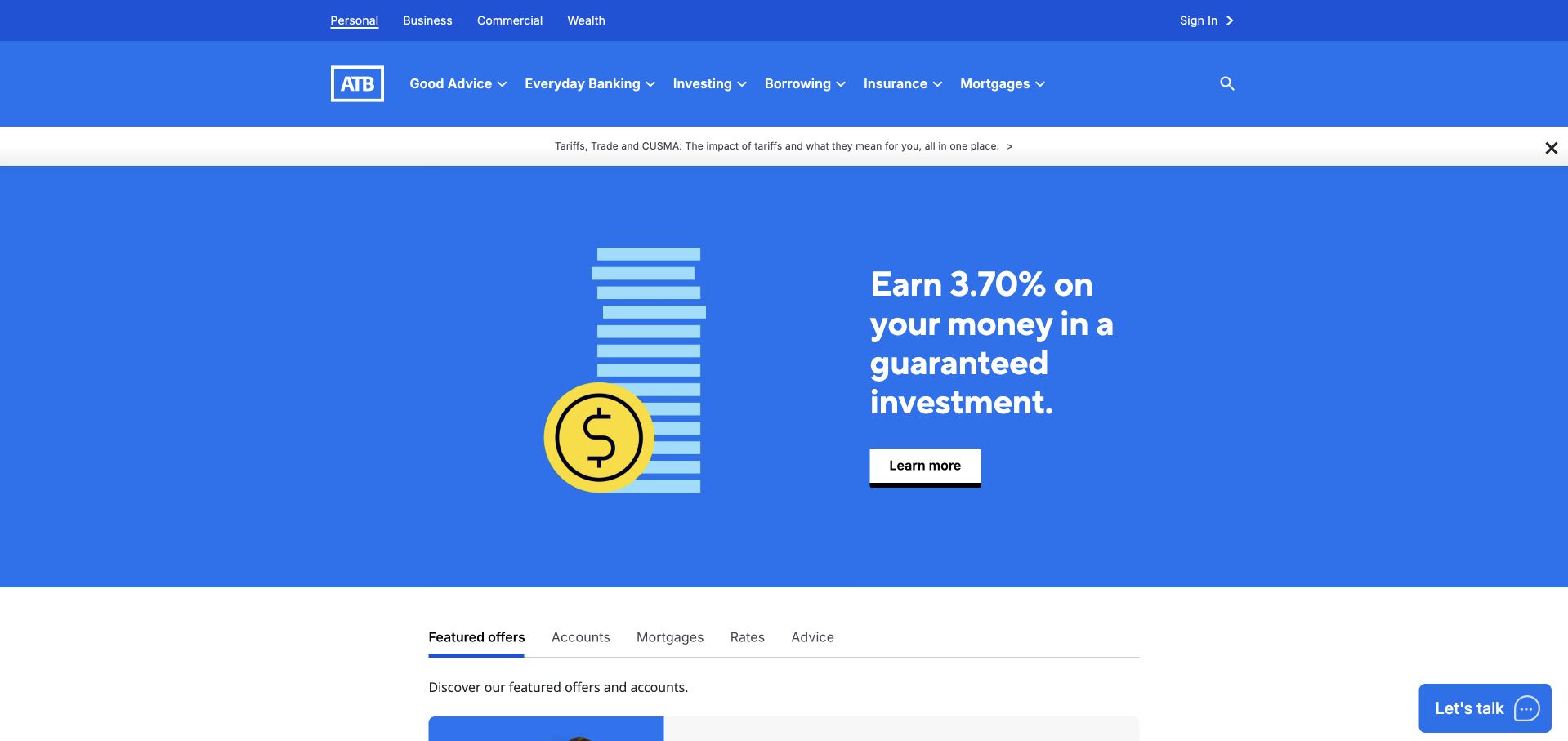
ATB Financial divides its header into an audience layer and a product layer before presenting a bright blue featured-offer hero. A simple coin-and-bars illustration accompanies a large rate-led message and a white learning action. A narrow topical notice sits above the hero, while tabs for offers, accounts, mortgages, rates and advice begin below it. The design favors navigation and a specific promotion over lifestyle photography. Mixpanel’s case describes ATB product-team analysis, including platform migrations, signup friction and contact-center planning. Those documented operational uses do not identify the bank homepage’s rendering technology, establish today’s product terms or amount to investment advice.
What you can learn
When a redesign moves customers between platforms, measure access to required features and use of fallback routes, not just adoption totals. The case’s migration lessons are more actionable than copying a temporary promotional rate into another financial design.
Pros
Audience and product navigation create distinct levels of choice within a large service catalog.
A restrained illustration and contrasting button make the featured offer straightforward to scan.
Cons & considerations
Two navigation layers and a notice consume substantial space before the main proposition.
Rate-led promotions require current conditions and disclosures beyond the brief hero message.
Platform source: Primary documented Mixpanel association. Documented association: Product-team analytics for sign-up flows, migrations and contact-center planning; not public bank-site rendering or financial-product advice. Platform evidence is separate from the direct website screenshot and is not a complete current infrastructure audit.
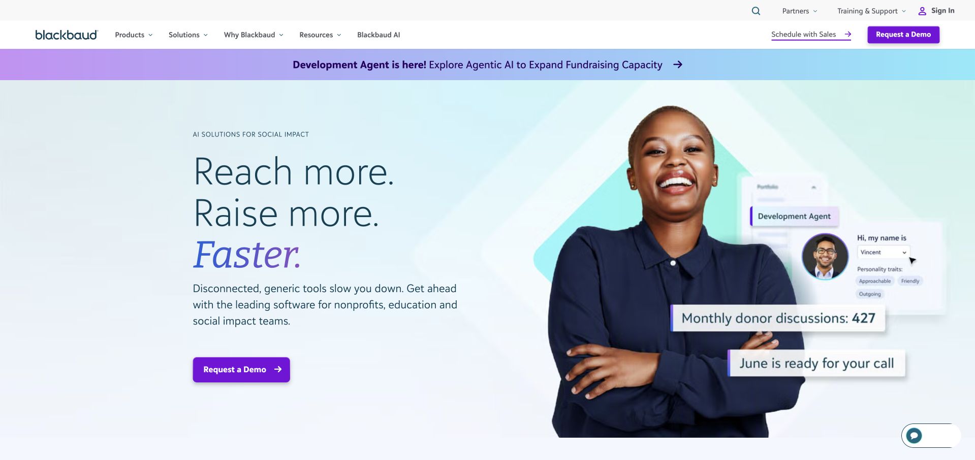
Blackbaud combines a pale mint-and-blue hero with a large portrait and a short fundraising-outcome headline. Purple actions connect the hero to the demo route in the white navigation. Small illustrative product cards float over the portrait, showing an agent concept and donor-workflow snippets; an announcement strip introduces the same theme above. In the accepted capture, the separate chat pane is closed, leaving the main proposition readable. Mixpanel’s case concerns product, marketing and customer-success analysis, including engagement with Raiser’s Edge NXT. It is not evidence that every Blackbaud product or the public marketing frontend shares one runtime.
What you can learn
Tie complex software to a concrete organizational job before exposing its full interface. Evaluate demo intent separately from actual use of a fundraising workflow, and label sample activity so visitors do not mistake an illustration for independently verified results.
Pros
The portrait gives a specialized software category a recognizable human point of reference.
Consistent purple calls to action connect the navigation and hero without introducing many competing colors.
Cons & considerations
Multiple floating snippets can imply more workflow detail than they actually explain.
The repeated agent promotion competes with the broader nonprofit-software positioning.
Platform source: Primary documented Mixpanel association. Documented association: Product, marketing and customer-success analytics; not proof of all product or website runtimes. Platform evidence is separate from the direct website screenshot and is not a complete current infrastructure audit.
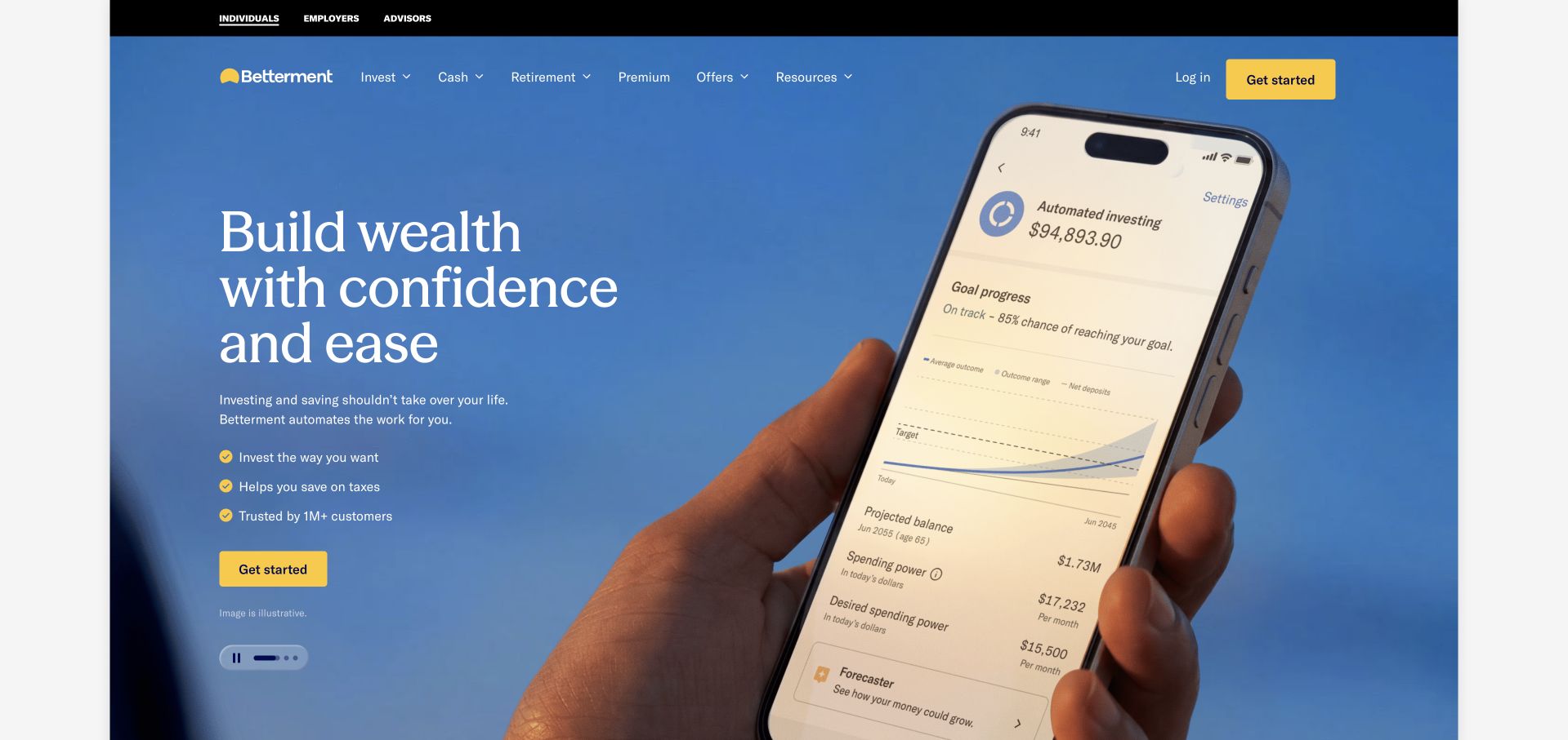
Betterment pairs a blue photographic hero with a serif statement about building wealth. A hand-held phone dominates the right side, showing an illustrative account, projection and progress view. Three benefit lines lead to a yellow start button, with an illustration notice beneath. Audience navigation sits above product navigation, and carousel controls allow the hero to be paused. Mixpanel’s customer story describes Betterment’s analysis of customer journeys and segmentation workflows. It does not verify investment performance, the assumptions behind the pictured projection or the current implementation of every Betterment page.
What you can learn
A product screen should explain the interface without becoming a promise of personal financial results. For measurement, distinguish exploring a projection, beginning account setup and completing an eligible account; those events carry different intent and regulatory context.
Pros
The oversized phone makes the application concrete instead of relying solely on an abstract wealth message.
Yellow actions and an illustration notice provide useful visual and interpretive cues.
Cons & considerations
Detailed numbers on a promotional screen can attract more attention than their illustrative qualification.
A rotating hero adds motion and control requirements to an already information-sensitive category.
Platform source: Primary documented Mixpanel association. Documented association: Documented customer-journey analysis, not investment advice or a claim about every current page. Platform evidence is separate from the direct website screenshot and is not a complete current infrastructure audit.
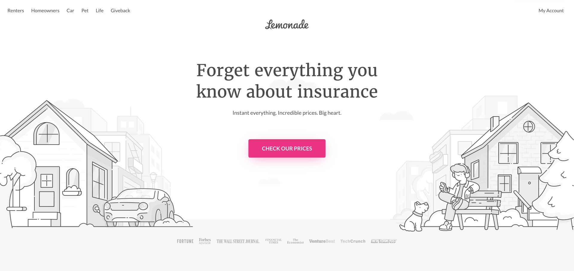
Lemonade leaves a wide white area around a centered serif headline and a single bright pink price-check button. Fine black-and-gray illustrations of homes, a car, a person and a dog frame the action from the edges, suggesting several insurance categories without turning the hero into a product grid. The centered script logo is deliberately separate from the small category navigation. A muted publication-logo row begins below the scene. Mixpanel’s case describes insurance-product user insights and funnel analysis. That association does not establish policy suitability, claims outcomes, quoted prices or the complete technology inventory of this marketing page.
What you can learn
An approachable visual language can lower the apparent complexity of the first step, but the following journey must still explain coverage and eligibility precisely. Measure progression into relevant policy information as well as entry into a quote funnel.
Pros
The single saturated button remains easy to find within the understated illustrated landscape.
Category links expose different insurance needs without adding multiple competing hero forms.
Cons & considerations
The opening promise is intentionally broad and provides little immediate detail about coverage limitations.
Very pale background illustration and publication marks may contribute less for low-vision visitors.
Platform source: Primary documented Mixpanel association. Documented association: Insurance product/user insights; no assertion about claims outcomes or current full stack. Platform evidence is separate from the direct website screenshot and is not a complete current infrastructure audit.
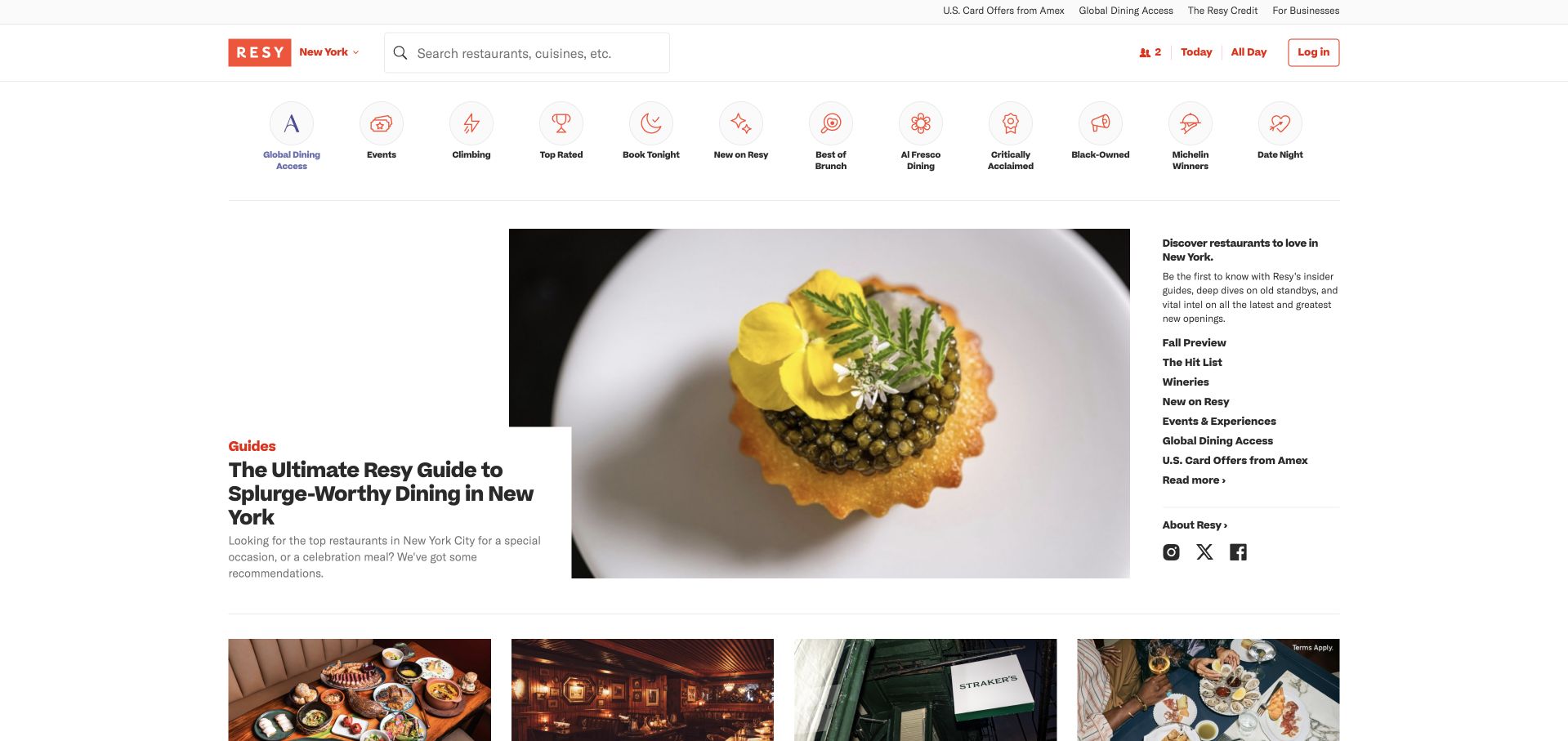
Resy keeps city, restaurant search, party size and date controls in the header, followed by illustrated dining categories. The New York view features a close-up food photograph, an overlapping editorial headline and a column of local guide links. More image-led stories begin below. The result behaves like a dining publication while preserving a booking utility at the top. Mixpanel’s customer case discusses reservation behavior, onboarding friction and restaurant-partner analysis. It does not establish current availability, the success of every restaurant listing or the rendering technology behind this public editorial view.
What you can learn
Support both visitors who know when they want to eat and those still choosing an occasion. Keep editorial reading, availability searches, account recovery and completed reservations distinct so that engagement with a story is not mistaken for a booking.
Pros
Persistent booking controls preserve a practical route alongside the editorial presentation.
Food imagery and occasion-based categories give visitors several understandable ways to browse.
Cons & considerations
The category strip and guide sidebar introduce many simultaneous choices above the next story row.
An editorial feature can dominate the screen for visitors primarily seeking immediate availability.
Platform source: Primary documented Mixpanel association. Documented association: Restaurant booking/revenue analysis in the cited case; public browsing page is separate. Platform evidence is separate from the direct website screenshot and is not a complete current infrastructure audit.
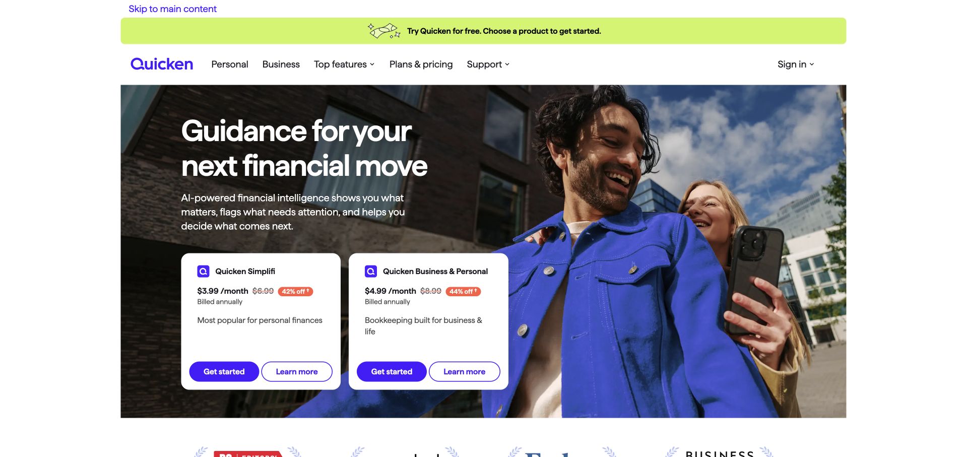
Quicken places two white product cards directly over a large lifestyle photograph. Each card names its product, shows annual-billing context and pairs a filled start action with an outlined learning route. A large white headline and supporting explanation sit above the cards, while a lime announcement strip spans the navigation area. The visible split between personal use and combined business-and-personal work is more informative than a single generic signup button. Mixpanel documents Quicken customer-experience and financial-software funnel analysis. Quicken is not Intuit QuickBooks, and this case does not establish every current financial connection or the public page’s complete technology stack.
What you can learn
Expose important product differences at the point where someone is about to choose. Compare activation by the selected product and intended job, and distinguish account-connection failures from simple lack of interest; they require different design and support responses.
Pros
Side-by-side cards make the two product routes concrete before visitors begin a subscription flow.
Separate learning and starting actions accommodate both comparison and purchase intent.
Cons & considerations
Promotional pricing, discounts and billing qualifications create a dense decision area within the hero.
The broad AI-led headline needs product-level explanation to show what assistance actually does.
Platform source: Primary documented Mixpanel association. Documented association: Customer-experience analytics; Quicken is not Intuit QuickBooks and the systems are not interchangeable. Platform evidence is separate from the direct website screenshot and is not a complete current infrastructure audit.
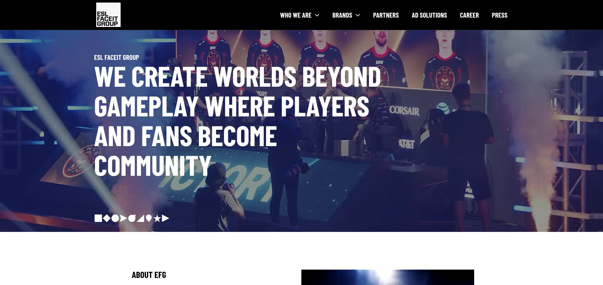
The FACEIT corporate address redirects to the public ESL FACEIT Group website. Its hero uses an event scene, blue-purple lighting and condensed white typography to emphasize players, fans and community. A black header groups brands, partners, careers and press, rather than presenting player signup. The next organizational section begins below the scene. Mixpanel’s customer story concerns FACEIT player experience, including product behavior and retention analysis. That evidence is scoped to the FACEIT brand and described workflows; the redirect does not establish Mixpanel adoption across every ESL FACEIT Group property or this corporate frontend.
What you can learn
Review the page visitors actually reach, not an assumed historical destination. A corporate audience and a player audience need different conversion definitions, so a partnership inquiry should not be compared directly with entering a gaming queue.
Pros
The event photograph communicates the community context without needing a long organizational history.
Corporate navigation labels clearly distinguish this surface from a game or player dashboard.
Cons & considerations
The oversized statement occupies much of the first view before concrete organizational details appear.
Text over a busy event scene requires consistent overlays and careful responsive cropping.
Platform source: Primary documented Mixpanel association. Documented association: Competitive-gaming player insights; not proof of current game-client or corporate-site runtime. Platform evidence is separate from the direct website screenshot and is not a complete current infrastructure audit.
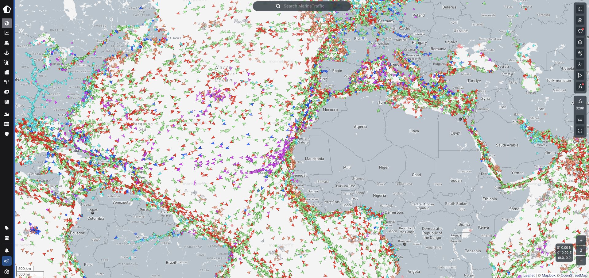
MarineTraffic opens directly into a public vessel map rather than a conventional headline-and-button hero. Colored directional markers fill the Atlantic-centered view, with search near the top and narrow vertical toolbars on both sides. Geographic labels, zoom controls and map attribution establish a working exploration surface. The density makes the product’s subject unmistakable, although understanding the different markers takes more knowledge than a promotional screenshot can provide. Mixpanel’s case describes a migration in product-analysis tooling and event flexibility. It does not independently establish vessel-data accuracy, subscription entitlements or the runtime of every part of the map platform.
What you can learn
For a specialist tool, a usable public demonstration can explain more than a lifestyle image. Measure meaningful map tasks, such as locating a vessel or selecting a relevant layer, while keeping service-quality and data-freshness checks separate from engagement analytics.
Pros
The immediate map makes the product’s geographic coverage and interaction model visible.
Persistent search and edge-mounted tools leave most of the viewport available for the data.
Cons & considerations
Numerous colored markers and icon-only controls create a substantial learning burden for newcomers.
A dense interactive map needs accessible alternatives and explanations beyond visual position and color.
Visible tech stack
Earlier / documented evidence
Mixpanel
Platform source: Primary documented Mixpanel association. Documented association: Product-analysis migration; map platform, shipping data and public-page technology remain separately scoped. Platform evidence is separate from the direct website screenshot and is not a complete current infrastructure audit.
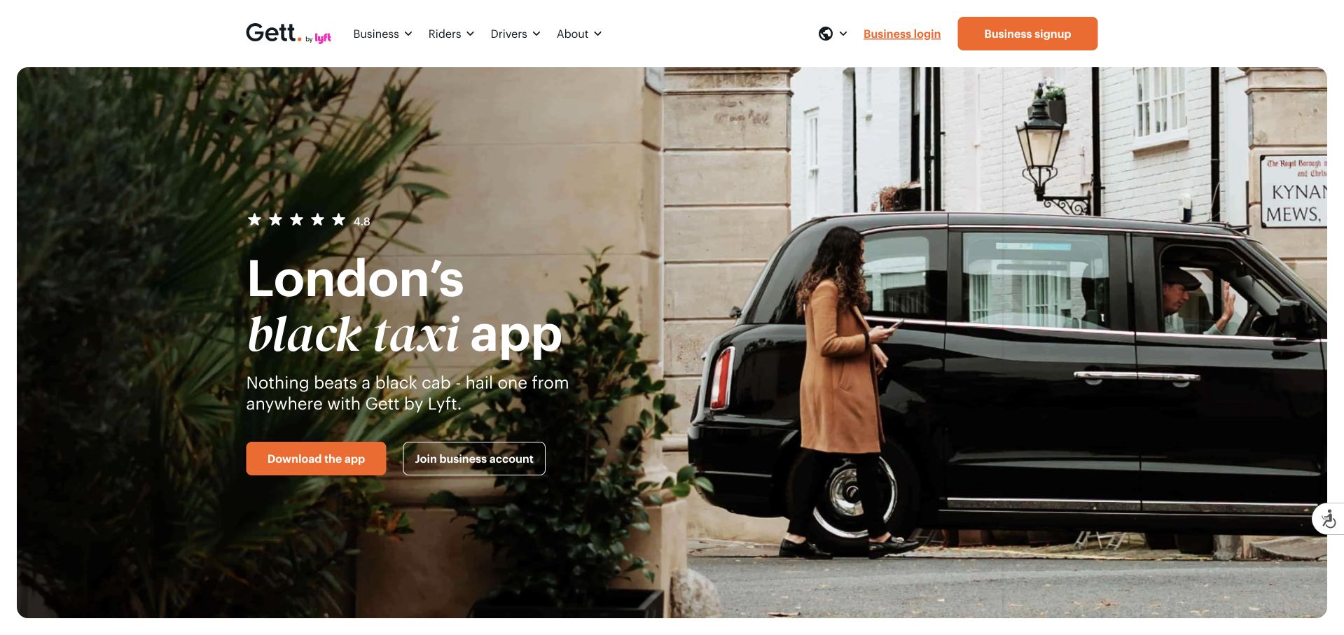
Gett resolves to its UK page, where a London black cab photograph supplies immediate geographic context. White text sits over a darkened image, while orange and outlined buttons separate downloading the app from joining a business account. The white header keeps business, rider and driver routes visible and identifies the Gett by Lyft branding. A displayed star rating is not independently validated by this review. Mixpanel’s cited case describes earlier Gett onboarding experiments; it does not establish the current UK frontend, every later integration or the outcome of today’s signup flow.
What you can learn
Regional specificity is useful when availability determines relevance. Preserve the distinction between consumer onboarding and business-account creation in the event plan, and re-test old friction hypotheses against the current product instead of assuming historical results still apply.
Pros
The recognizable vehicle and setting communicate the local service more quickly than a generic mobility graphic.
Separate rider and business actions make the two intended next steps explicit.
Cons & considerations
The photo-led hero depends on a dark overlay to keep white copy readable.
A prominent rating needs an accessible explanation of its source, scope and review basis.
Platform source: Primary documented Mixpanel association. Documented association: Business ride-service onboarding experiments; not unrelated Getty brands. Platform evidence is separate from the direct website screenshot and is not a complete current infrastructure audit.
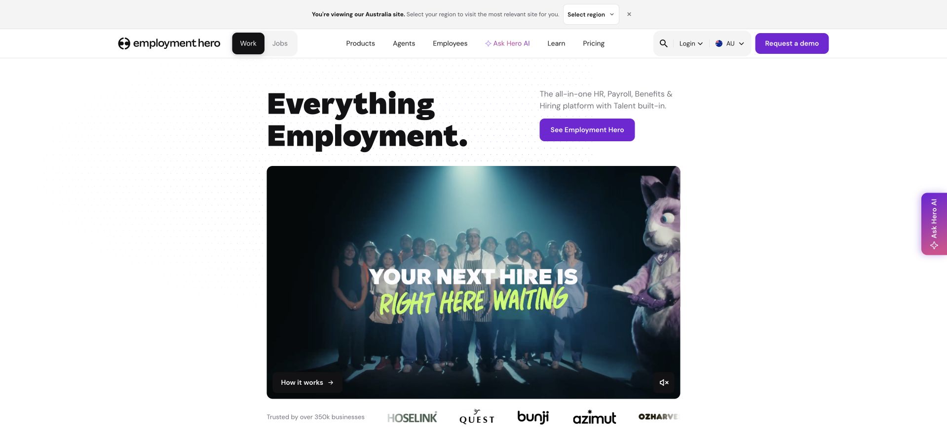
Employment Hero uses a two-line employment headline alongside a platform explanation and purple action. A wide campaign video follows, with playback controls and an explanation link at its bottom. Client logos sit below, while the header separates work and jobs and provides a regional selector. The accepted capture keeps the AI-assistant pane closed, leaving its edge tab visible. Mixpanel’s customer story concerns product analytics and the adoption of Session Replay for investigation. It does not establish that every HR workflow is recorded or that sensitive employment information can be collected without restrictions.
What you can learn
Use a brand film to introduce the range, then provide direct routes to specific payroll, hiring or HR tasks. Instrument only approved events and carefully mask sensitive fields; a compelling session replay is not a reason to record employee information indiscriminately.
Pros
The compact headline and adjacent explanation give the campaign video a clear product context.
Region selection and work-versus-jobs navigation acknowledge materially different visitor needs.
Cons & considerations
The large video takes space that could otherwise explain important product differences immediately.
A broad employment claim still requires detailed regional capability and eligibility information further into the journey.
Platform source: Primary documented Mixpanel association. Documented association: Product analytics and Session Replay case; no assertion that every HR product or marketing page uses the same stack. Platform evidence is separate from the direct website screenshot and is not a complete current infrastructure audit.
Kegan has 15+ years of experience working with small businesses, Fortune 500 companies, and everything in between. No development job is too big or too small: he brings the same hands-on attention to a focused improvement, a complete website, or a custom application.
For Mixpanel projects, he can help with website integrations, form and campaign connections, analytics implementation, testing, and clear ownership after launch. He works directly with clients on scope, design, implementation, testing, and handover, with an emphasis on clear communication and a system that remains practical to maintain after launch.
Show 3 other Mixpanel developersHide other Mixpanel developers
Choose a flow with a clear beginning and a meaningful completion. Define the eligibility rules and the situations that should not count as abandonment. Instrument only the observations needed to understand that flow, reconcile them with real application outcomes and give the team a specific decision to make from the result.
A shared product-measurement vocabulary
When several teams already collect events, inventory names, meanings and owners before adding more. Identify duplicates and contradictions, then establish a reviewed plan. Mixpanel recommends a living shared tracking document. Use it as an agreement about meaning and responsibility rather than a spreadsheet that becomes stale immediately after implementation.
Inventory the reports people depend on and the definitions that must remain comparable. Choose a comparison period and a small set of reconciled journeys. Document expected differences rather than forcing unlike tools to report identical totals. Keep the old system available long enough to explain discrepancies, with a deliberate retirement decision.
From references to requirements
Plan event meaning, identity boundaries and operating checks
Write a measurement contract around one useful question
Describe the decision first. If the question concerns completing a quote request, distinguish opening a form, attempting submission and a server accepting a valid request. A button click is not automatically a business outcome. Define the unit being measured, the eligible audience and the time window. Decide how retries, validation failures and repeated attempts should appear. Include examples that the product owner and implementer can both understand.
Give each proposed observation a name, a trigger and a short explanation of why it is needed. Separate the action from the context supplied with it. Avoid high-cardinality free text when a small reviewed category answers the question. Record which system is authoritative for an outcome and how the implementation will be reconciled with it. Keep personal or sensitive content out unless a specific approved purpose genuinely requires it.
Then decide what the team will do with the result. An abandonment report without a planned investigation or product decision can become a recurring number that changes nothing. Name the reviewer and the cadence. Preserve the definition of success alongside the report so a future change to the application does not silently turn a trend into a comparison of different behaviors.
Test the full identity journey with realistic account states
Check the actual project configuration before using an identity example. The Simplified and Original identity approaches have different documentation. Write down the intended behavior for a guest, a new account, a returning signed-in user and someone who signs out on a shared device. Choose a stable approved identifier for the intended account relationship; an email address is not automatically the right choice merely because it is available.
Review where the observation is created. A client interaction and a confirmed backend outcome may need different sources of truth. Plan how a retry or duplicate delivery is recognized instead of assuming every observed message describes a unique action. Keep privileged credentials out of the public browser bundle. Do not add cross-device stitching or additional personal attributes unless the purpose and privacy review justify them.
Run the lifecycle as an actual test plan before relying on a funnel. Include interrupted registration, login after guest activity, logout followed by another person’s session and a failed business action. Check whether the report describes those examples as intended. A chart that contains data is not enough: the team must understand who or what the records represent and which parts of the journey remain intentionally unmeasured.
Make validation and change review part of the product workflow
Use separate test data or an appropriately isolated development setup while validating. Review sample events with the people who own the business meaning, not only the person installing the library. Check names, trigger conditions, expected properties and rejected inputs. Compare a small set of known application outcomes with the analytical result before opening the dashboard to a wider audience.
Plan for missing data as well as wrong data. A blocked client script, an offline device or an interrupted page can create gaps. Explain the limitations instead of presenting every observed count as a complete census. Keep the report’s wording proportionate to the evidence. Do not turn a vendor customer-story outcome into a forecast for a different implementation.
Assign an owner for event changes and downstream reports. When the application changes a flow, review the measurement contract in the same release. Keep a record of meaningful definition changes so readers can interpret trends across versions. Document access, retention and deletion responsibilities with the appropriate reviewers. A maintainable analytics project is one where another person can explain the events, reproduce the acceptance checks and decide when a number should not be trusted.
Ask the actual team to carry out its routine job: publish a realistic update, correct a mistake, preview a narrow screen, and identify who owns an integration failure. For a library or frontend framework, also ask who maintains the content source and deployment. A polished screenshot does not answer those operational questions.
Beyond the screenshot
Mixpanel measurement brief checklist
Name one actionable product question and its owner.
Define the audience, unit and comparison window.
Distinguish an interaction from a confirmed business outcome.
Record event triggers and the minimum useful context.
Exclude free-text and sensitive payloads unless specifically approved.
Confirm the project’s actual identity mode.
Test guest, sign-in, returning-user and sign-out states.
Review shared-device and multiple-account behavior.
Plan duplicate and retry handling for the chosen sources.
Reconcile known examples before trusting a dashboard.
Document gaps, privacy decisions, access and retention.
Review event and report definitions with application changes.
Test with real content, a keyboard, a small screen, slow or failed requests, and the people who will maintain the system. These are planning checks, not an accessibility, security, performance, or search-ranking certification.
Sources & editorial method
How this Mixpanel collection was reviewed
Twenty independently inspected public interfaces are paired with checked Mixpanel customer evidence. Product, historical and organizational scopes remain qualified. Recommendations concern project design and validation; vendor-reported results are not independent benchmarks or promises of conversion improvement.
Every image is an unmodified capture from the actual website, with its source and capture date. Some captures are reused from our shared catalog; their dates remain the original capture dates. None comes from a vendor gallery or a generated reconstruction. Moving imagery and live content can change.
Technology attribution uses public page assets or metadata, official platform documentation, or a cited first-party project case study. Documentary and framework-relationship evidence is identified where used; it is not a complete current backend inventory. A CMS image CDN alone does not establish a full CMS deployment. A library’s presence does not prove which individual controls use it, and a platform label does not establish AI authorship.
The composition notes, lessons, pros and tradeoffs are original editorial observations. We have not measured conversion, traffic, security, performance or accessibility conformance. Website owners retain their brands and imagery; these examples are not our client portfolio. Written, Edited and Curated are independent records, not dates advanced by a build. See our editorial standards or suggest a correction.
Questions worth asking
Mixpanel website development FAQs
Does a customer case prove Mixpanel powers a public homepage?
No. It documents a particular product-analysis association. The public design is reviewed separately, and the case may concern an application or internal team rather than the marketing website.
Should we track every possible action first?
Begin with a defined question and the minimum observations needed to answer it. A large undifferentiated stream increases maintenance work and can introduce unnecessary privacy exposure without improving the decision.
Can we copy a single identity example into every project?
Check the project’s identity mode and the complete account lifecycle first. Guest activity, sign-in, sign-out and shared devices need a deliberate design and acceptance tests.
Is a button click the same as a completed conversion?
Not necessarily. Define the business outcome and its authoritative source. A click can be an attempt that later fails validation or is retried; the report should reflect the distinction.
Do these recommendations require analytics changes on Website Unpacked?
No. This is an editorial planning guide, not a change to this site’s collection settings. Any implementation needs its own scoped decision, privacy review and verification.
Start with one decision and a small, explainable measurement contract. Add observations only when they serve a real question and the team can maintain their meaning.