These 20 public properties referenced identifiable Sentry resources at the recorded observation time. The screenshots show their visible design. They do not show the Sentry dashboard, prove that events arrived or identify the monitoring coverage behind the site.
A website can make its purpose clear and still fail during an important interaction. Monitoring is most useful when the team knows which visitor tasks matter, who owns the relevant code and what evidence will help explain a failure. The interface and the operating process need to be planned together.
The examples span shopping, education, software, publishing and public service. Study how each page presents its main task, then consider the meaningful failures in that journey. A visible Sentry resource establishes a narrow technical signal; it does not rate reliability or reveal the organization’s incident process.
Before the examples
What makes good Sentry website development in 2026?
Start with important visitor journeys
List the actions that matter: find a course, compare a product, read support guidance or reach a service. Define what successful completion looks like and where a visitor could become stuck. Use that model to decide which events need attention.
Treat collected data deliberately
Sentry’s JavaScript documentation describes data that can accompany events. Inspect the actual SDK and configuration used by your application, including URLs and request context. Decide what should be removed or reduced before data leaves the product, and verify with safe test data.
An issue needs someone who can assess its visitor impact and act. Record the responsible service, release and support route. A collection of alerts without ownership can leave recurring failures unresolved even when the integration is technically present.
The collection · 20 examples
20 Sentry website examples worth studying
IKEA Global, Atlassian Support, GitLab’s public marketing website, Coursera and Imperial College London lead the collection. Each is the exact public property reviewed. Their inclusion does not establish monitoring across the parent organization, signed-in products or unrelated domains.
We start with five recognizable brands or organizations: IKEA Global, Atlassian Support, GitLab public marketing website, Coursera, Imperial College London. Each attribution applies to the named website property, not every product or website belonging to its organization. This is a curated reading sequence, not a measured ranking.
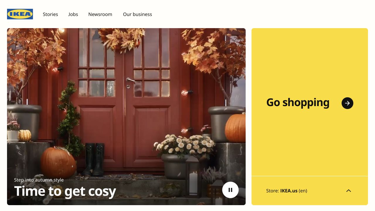
IKEA Global places a seasonal photograph next to a yellow shopping panel. The large destination choice and explicit US store label turn a brand entrance into a practical routing page, while Stories, Jobs and Newsroom serve visitors with different intentions. This makes regional routing a useful reliability boundary: a failed location choice should not strand the visitor behind a decorative campaign. The dated Sentry resource reference establishes an integration signal, not its settings, coverage or effectiveness.
What you can learn
Treat location selection as a complete journey with a clear destination and a readable fallback. Monitor failures in that handoff without collecting the visitor's full shopping history.
Pros
The yellow shopping panel gives a functional action as much visual weight as the editorial photograph.
The store label explains the destination before a visitor leaves this global property for the local storefront.
Cons & considerations
A seasonal image and motion treatment need reduced-motion and loading fallbacks so the shopping choice remains usable.
Monitoring this global page alone would not establish reliability or instrumentation on every separate national shopping site.
Public source checked November 3, 2026. References may be embedded or legacy—not a complete backend inventory.
Platform source: Dated public page resource observation. The public source page referenced Sentry resources on 2026-11-03. This is a scoped integration signal, not proof of configuration or successful behavior. The direct screenshot retains its separate original capture date. Platform evidence is separate from the direct website screenshot and is not a complete current infrastructure audit.
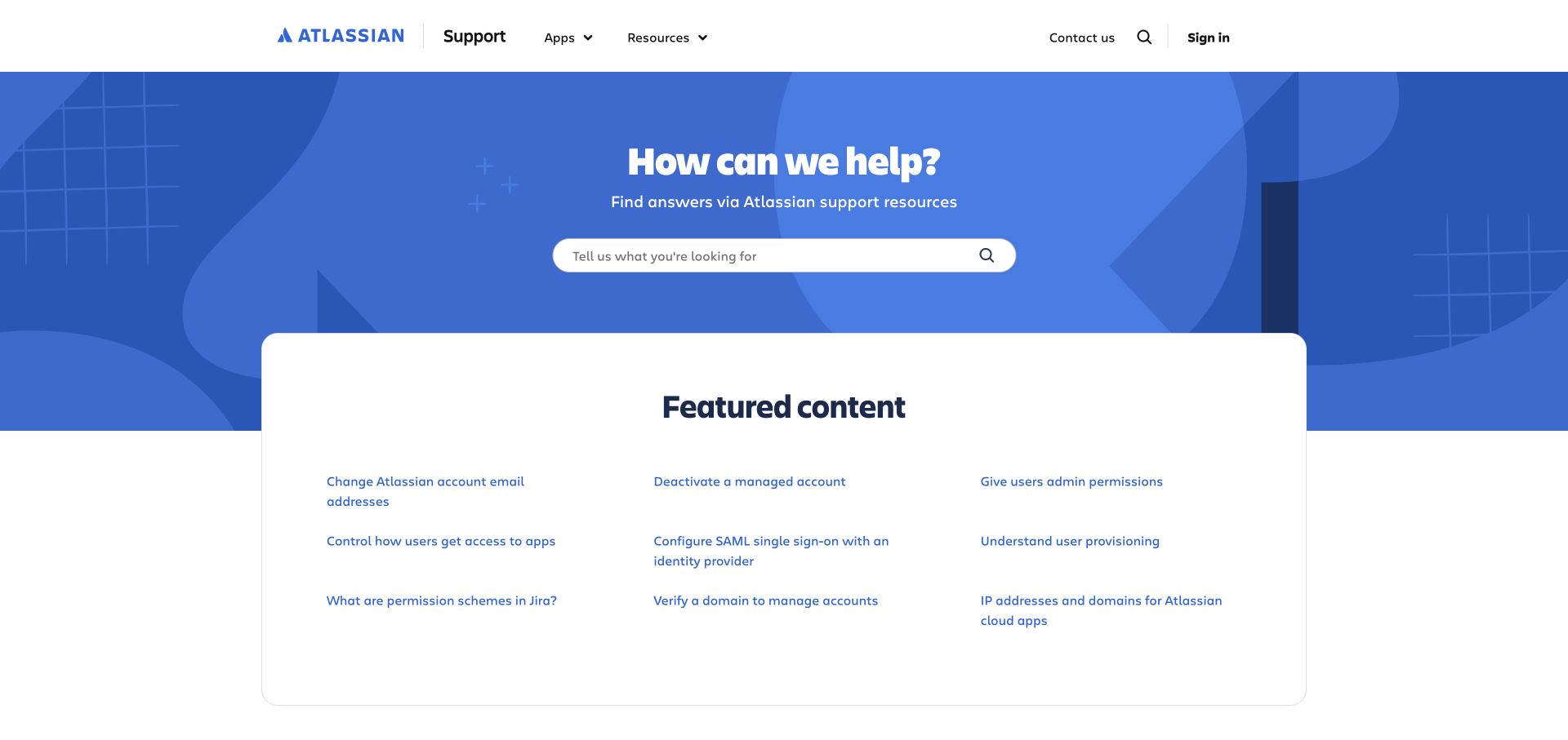
Atlassian Support centers its opening on a single help search, with a compact group of featured account and administration topics below. The blue field gives the search a distinct place without burying direct links behind it. Support interfaces benefit from observing failed searches and broken routes, but their query text may contain information about an organization's accounts or incidents. The dated Sentry resource reference establishes an integration signal, not its settings, coverage or effectiveness.
What you can learn
Pair search monitoring with deliberate query handling and direct topic alternatives. A user who cannot find an answer should have a useful next action without repeating a sensitive description.
Pros
The short help question establishes the page's purpose before the visitor chooses a product or reads documentation.
Featured account topics provide visible shortcuts for common tasks when the visitor does not know the right search terms.
Cons & considerations
A centered search can become a single point of failure unless direct product and contact routes remain usable.
Error records should avoid copying unrestricted help queries or signed-in account details into diagnostic events by default.
Public source checked November 3, 2026. References may be embedded or legacy—not a complete backend inventory.
Platform source: Dated public page resource observation. The public source page referenced Sentry resources on 2026-11-03. This is a scoped integration signal, not proof of configuration or successful behavior. The direct screenshot retains its separate original capture date. Platform evidence is separate from the direct website screenshot and is not a complete current infrastructure audit.
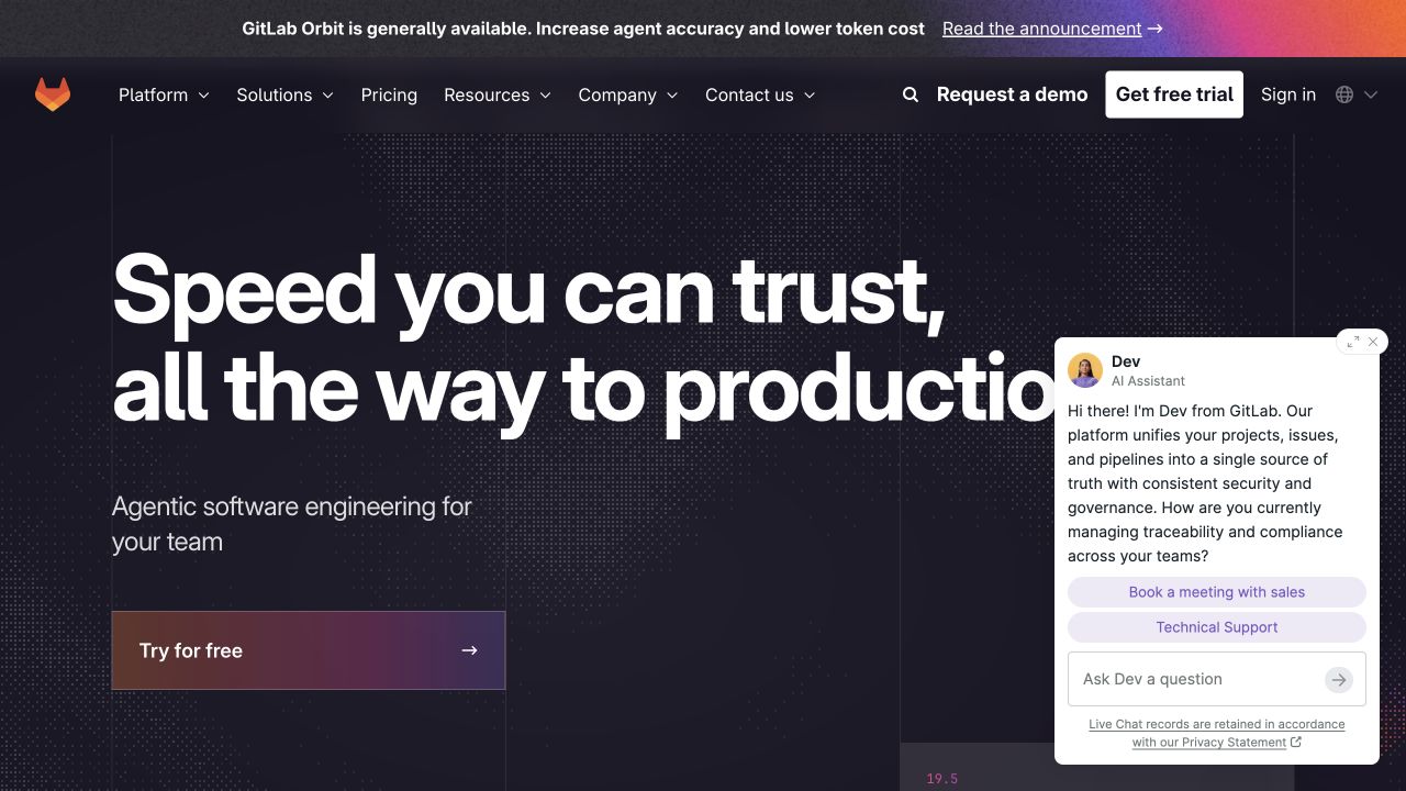
GitLab's public marketing page uses a dark field, an oversized production-focused headline and a direct trial button. The captured chat panel overlaps the right side of the main message, illustrating how an added assistance layer changes the first screen. The relevant development lesson is to check the complete composition when third-party widgets load, fail or expand, rather than measuring the hero in isolation. The dated Sentry resource reference establishes an integration signal, not its settings, coverage or effectiveness.
What you can learn
Assign monitoring ownership to overlays as well as the main application. Preserve a direct trial and navigation path when assistance fails, and avoid logging visitors' typed chat messages.
Pros
The trial action is repeated in the header and hero, providing a clear next step for an interested developer.
The navigation separates platform, solutions, pricing and resources, so the large campaign message does not replace ordinary discovery.
Cons & considerations
The expanded assistant covers part of the headline in this capture and deserves a narrow-screen overlap check.
A marketing-page integration does not establish the monitoring coverage of GitLab's authenticated repository and deployment workflows.
Public source checked November 3, 2026. References may be embedded or legacy—not a complete backend inventory.
Platform source: Dated public page resource observation. The public source page referenced Sentry resources on 2026-11-03. This is a scoped integration signal, not proof of configuration or successful behavior. The direct screenshot retains its separate original capture date. Platform evidence is separate from the direct website screenshot and is not a complete current infrastructure audit.
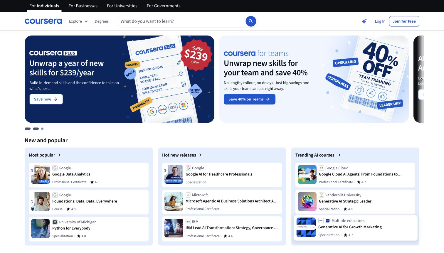
Coursera combines audience tabs, a persistent course search and promotional panels with a structured selection of popular courses. The multiple entrances accommodate someone seeking a specific subject and someone comparing a subscription offer. For monitoring design, these are different tasks: a working promotional slide does not prove that search, course detail and enrollment transitions all complete successfully. The dated Sentry resource reference establishes an integration signal, not its settings, coverage or effectiveness.
What you can learn
Define a small set of meaningful browsing checkpoints, then verify each independently. Keep course discovery available if promotional assets or recommendations are slow to load.
Pros
The search field stays prominent above the offers, retaining a direct route for visitors with a specific learning goal.
Course groups below the promotion expose subject and provider choices instead of making every visitor begin with a subscription.
Cons & considerations
Several competing promotions can make the first screen difficult to scan, particularly when carousel movement changes the message.
Diagnostic events should distinguish a failed course request from a declined enrollment instead of treating both as one generic error.
Public source checked November 3, 2026. References may be embedded or legacy—not a complete backend inventory.
Platform source: Dated public page resource observation. The public source page referenced Sentry resources on 2026-11-04. This is a scoped integration signal, not proof of configuration or successful behavior. The direct screenshot retains its separate original capture date. Platform evidence is separate from the direct website screenshot and is not a complete current infrastructure audit.
Imperial's opening pairs laboratory photography with a dark, high-contrast text panel, a large wordmark and visible search. A cookie banner occupies the lower edge of the captured screen while the institutional message stays readable. This combination makes a useful monitoring brief: core search, navigation and content must remain available across consent states, even when optional instrumentation is unavailable. The dated Sentry resource reference establishes an integration signal, not its settings, coverage or effectiveness.
What you can learn
Test the university entrance as a set of public information routes before adding diagnostics. Give search and menu failures an accessible explanation that does not depend on the monitoring service.
Pros
The solid text panel makes the main statement legible against a detailed laboratory scene with people and equipment.
Search and menu controls occupy a defined header area, separate from the image and lower consent controls.
Cons & considerations
A consent bar reduces the visible content area and needs careful testing at short phone heights and high zoom.
The captured ranking is the university's dated claim; the screenshot and Sentry reference do not independently verify that claim.
Public source checked November 3, 2026. References may be embedded or legacy—not a complete backend inventory.
Platform source: Dated public page resource observation. The public source page referenced Sentry resources on 2026-11-03. This is a scoped integration signal, not proof of configuration or successful behavior. The direct screenshot retains its separate original capture date. Platform evidence is separate from the direct website screenshot and is not a complete current infrastructure audit.
charity: water places a compact donation selector directly beside its mission and a person holding a glass of water. Monthly and one-time tabs, suggested amounts and the main action form a visible sequence rather than a distant fundraising link. A reliability plan for this layout should protect the donor's selected interval and amount when a later step fails, without recording payment details in diagnostics. The dated Sentry resource reference establishes an integration signal, not its settings, coverage or effectiveness.
What you can learn
Model donation states explicitly: selected, submitted, confirmed and uncertain. Preserve a visitor's choice on failure, but reconcile uncertain payment outcomes before encouraging another submission.
Pros
The monthly and one-time distinction is visible before the visitor chooses an amount, clarifying the intended commitment.
The donation controls sit within the main story, reducing the distance between understanding the mission and finding an action.
Cons & considerations
Suggested impact language should have its own evidence and date; the visual presentation alone cannot substantiate an outcome.
Monitoring must distinguish interface errors from payment confirmation, because a captured exception is not an authoritative transaction receipt.
Public source checked November 3, 2026. References may be embedded or legacy—not a complete backend inventory.
Platform source: Dated public page resource observation. The public source page referenced Sentry resources on 2026-11-03. This is a scoped integration signal, not proof of configuration or successful behavior. The direct screenshot retains its separate original capture date. Platform evidence is separate from the direct website screenshot and is not a complete current infrastructure audit.
Brooklinen uses a close crop of slippers to create a soft, tactile gift campaign, with a small shopping action in the center. Product categories, search and account controls remain in the header, supporting visitors who came for sheets rather than gifts. Monitoring this type of storefront should follow those practical entrances as well as the campaign button, since each leads to a different shopping intention. The dated Sentry resource reference establishes an integration signal, not its settings, coverage or effectiveness.
What you can learn
Keep campaign links and permanent product navigation in the same release checklist. When a promotional destination changes, verify the resulting category or product route before assuming the new banner works.
Pros
A single product scene creates a coherent visual theme instead of presenting many unrelated gift products in the hero.
Permanent category navigation remains visible, giving returning customers a familiar route beyond the temporary seasonal campaign.
Cons & considerations
Small white copy on a textured photograph needs contrast checks across crops rather than relying on one desktop image.
The presence of Sentry on the storefront does not demonstrate successful checkout monitoring or identify any customer data captured.
Public source checked November 3, 2026. References may be embedded or legacy—not a complete backend inventory.
Platform source: Dated public page resource observation. The public source page referenced Sentry resources on 2026-11-03. This is a scoped integration signal, not proof of configuration or successful behavior. The direct screenshot retains its separate original capture date. Platform evidence is separate from the direct website screenshot and is not a complete current infrastructure audit.
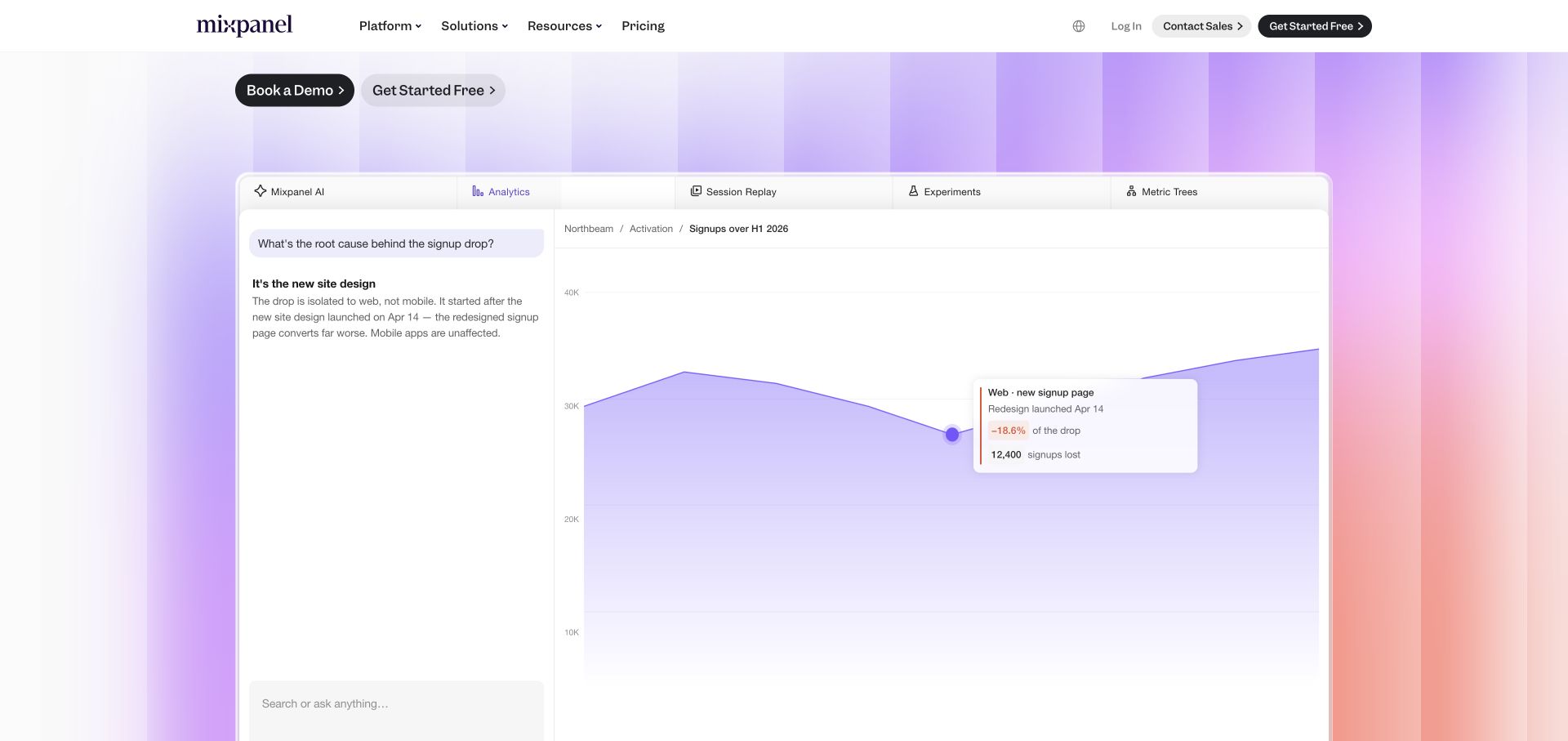
Mixpanel's captured marketing view gives most of the screen to an interface illustration with a chart and question panel. The demo and free-start actions remain above it, while a soft gradient separates the demonstration from the page background. The design is useful for explaining a complex product visually, provided the illustration is distinguished from a functioning interactive demo and remains legible when compressed. The dated Sentry resource reference establishes an integration signal, not its settings, coverage or effectiveness.
What you can learn
Monitor the actual demonstration component separately from the product it depicts. If the illustration fails to load, preserve a short textual explanation and the primary evaluation actions.
Pros
The large interface example makes the product category concrete without forcing visitors to infer it from abstract imagery.
Two clear evaluation paths accommodate visitors ready to start and teams that need a guided conversation first.
Cons & considerations
Detailed chart labels may become unreadable on small screens, so a mobile crop should retain only the essential story.
Sentry evidence on this marketing property does not identify the instrumentation of the analytics application or its customer projects.
Public source checked November 3, 2026. References may be embedded or legacy—not a complete backend inventory.
Platform source: Dated public page resource observation. The public source page referenced Sentry resources on 2026-11-03. This is a scoped integration signal, not proof of configuration or successful behavior. The direct screenshot retains its separate original capture date. Platform evidence is separate from the direct website screenshot and is not a complete current infrastructure audit.
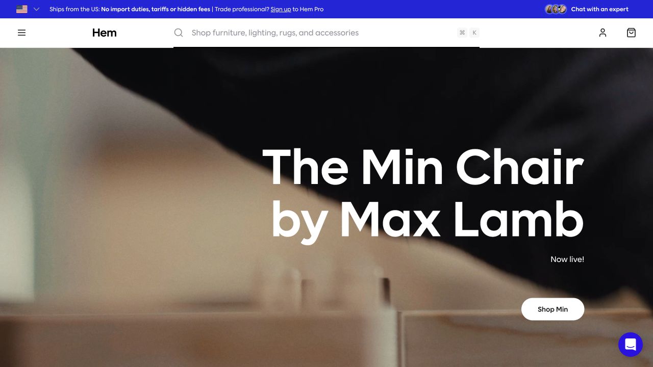
Hem gives a named chair and designer a large central headline over a close material scene. A compact shopping action sits below, while the wide search bar remains available in the header. The page demonstrates a useful split between an editorial product launch and utility navigation. Those paths should be observable independently because visitors may search for an unrelated item without engaging with the campaign. The dated Sentry resource reference establishes an integration signal, not its settings, coverage or effectiveness.
What you can learn
Define success around product discovery and usable navigation, not simply hero rendering. Keep the catalog accessible if a campaign image, chat widget or launch-specific component is unavailable.
Pros
The product and designer names explain what the image is promoting, adding context to an otherwise abstract material crop.
A generous search field gives goal-directed visitors an alternative to exploring the highlighted chair or opening the menu.
Cons & considerations
The close crop may not explain the complete product silhouette, so the next view should reveal shape and scale.
A diagnostic integration cannot establish stock accuracy, delivery availability or the reliability of separate commerce and support services.
Public source checked November 3, 2026. References may be embedded or legacy—not a complete backend inventory.
Platform source: Dated public page resource observation. The public source page referenced Sentry resources on 2026-11-03. This is a scoped integration signal, not proof of configuration or successful behavior. The direct screenshot retains its separate original capture date. Platform evidence is separate from the direct website screenshot and is not a complete current infrastructure audit.
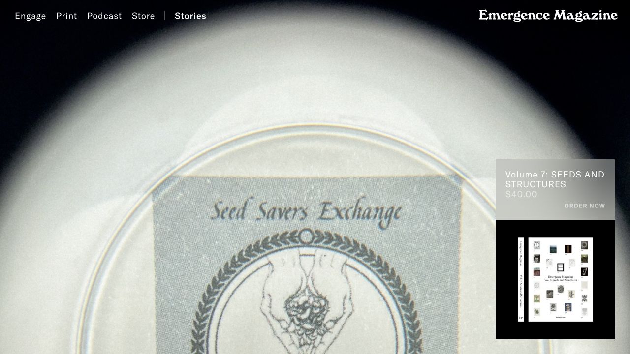
Emergence Magazine opens with a highly enlarged image of a seed packet, restrained navigation and a floating promotion for its print volume. The quiet presentation asks visitors to explore through mood and subject rather than a dense article list. For development, the combination raises a practical reliability question: editorial media and store prompts should degrade independently, so a failed promotional layer does not obstruct reading. The dated Sentry resource reference establishes an integration signal, not its settings, coverage or effectiveness.
What you can learn
Give immersive editorial pages a plain fallback route into stories. Track media and navigation failures without mistaking time spent on a static image for a successful reading experience.
Pros
The oversized image establishes a distinctive editorial atmosphere with very little competing typography in the opening view.
Print, podcast, store and stories are separated in the navigation, making the publication's different formats available immediately.
Cons & considerations
An abstract image may delay understanding for a first-time visitor unless supporting context appears quickly in the reading flow.
A floating print promotion can compete with the main story at smaller widths and should remain dismissible and keyboard reachable.
Public source checked November 3, 2026. References may be embedded or legacy—not a complete backend inventory.
Platform source: Dated public page resource observation. The public source page referenced Sentry resources on 2026-11-03. This is a scoped integration signal, not proof of configuration or successful behavior. The direct screenshot retains its separate original capture date. Platform evidence is separate from the direct website screenshot and is not a complete current infrastructure audit.
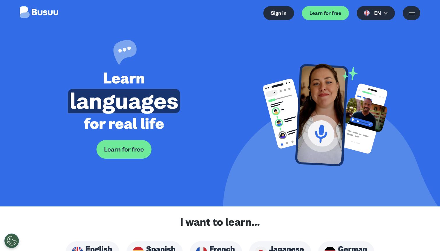
Busuu uses a blue background, a short learning promise and a green free-start action. A person and several phone-like interface panels illustrate conversational practice without displacing the main button. Language choices begin just below the hero, connecting the broad promise with a concrete next decision. Monitoring should distinguish the initial start action, language selection and later lesson loading rather than treating them as one funnel event. The dated Sentry resource reference establishes an integration signal, not its settings, coverage or effectiveness.
What you can learn
Make each learning transition recoverable without losing the selected language. Record enough diagnostic context to locate a failed step while keeping spoken practice and personal responses out of routine error logs.
Pros
The short heading and bright action create a clear first step without requiring an explanation of every learning feature.
Visible language choices below the hero help translate a broad product promise into the visitor's own intended subject.
Cons & considerations
Decorative phone panels should not be mistaken for an interactive lesson; their purpose needs to remain clear to assistive technology.
A public Sentry resource reference does not demonstrate monitoring of authenticated lessons, pronunciation assessment or mobile application behavior.
Public source checked November 3, 2026. References may be embedded or legacy—not a complete backend inventory.
Platform source: Dated public page resource observation. The public source page referenced Sentry resources on 2026-11-04. This is a scoped integration signal, not proof of configuration or successful behavior. The direct screenshot retains its separate original capture date. Platform evidence is separate from the direct website screenshot and is not a complete current infrastructure audit.
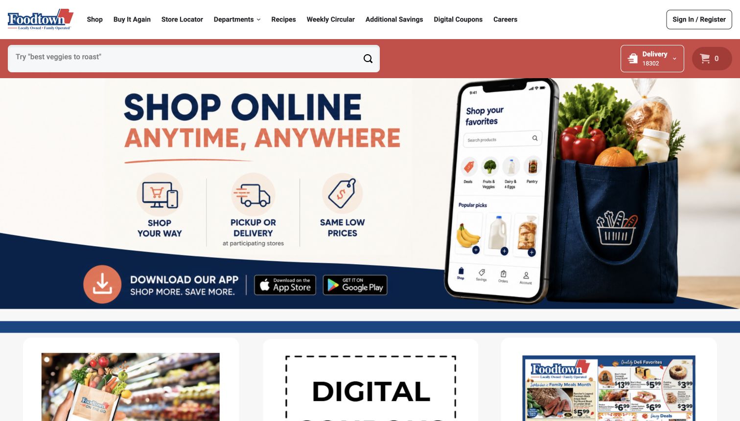
Foodtown's header combines a product search, store locator, digital coupons and a delivery selection. The hero reinforces online shopping with a phone illustration and a bag of groceries. This is a useful example of an interface whose apparent simplicity depends on several independent services. A reliable development plan must distinguish a search failure, an unavailable store and a delivery restriction instead of displaying the same unhelpful message for all three. The dated Sentry resource reference establishes an integration signal, not its settings, coverage or effectiveness.
What you can learn
Map the local-store context through search and ordering. Preserve the selected location during recoverable errors, and offer a store-information route when online shopping is temporarily unavailable.
Pros
The prominent product search supports repeat shoppers who already know what they need, while the campaign explains the online option.
Store location, coupons and ordering are exposed together, reflecting practical grocery decisions rather than only brand storytelling.
Cons & considerations
A location-dependent offer can mislead if the selected store is not carried consistently into later ordering screens.
Monitoring a public homepage cannot confirm inventory, local pricing, fulfillment availability or payment success on connected shopping services.
Public source checked November 3, 2026. References may be embedded or legacy—not a complete backend inventory.
Platform source: Dated public page resource observation. The public source page referenced Sentry resources on 2026-11-04. This is a scoped integration signal, not proof of configuration or successful behavior. The direct screenshot retains its separate original capture date. Platform evidence is separate from the direct website screenshot and is not a complete current infrastructure audit.
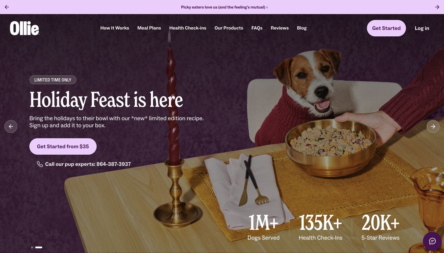
Ollie's captured opening uses a holiday meal scene, a prominently styled dog and a starting-price action. A phone contact appears beneath the main button, while navigation offers meal plans, process information and FAQs. The interface makes a personalized subscription feel approachable, but implementation needs careful handling of the profile questions that may follow. Monitoring should identify a broken step without retaining an unrestricted copy of the customer's answers. The dated Sentry resource reference establishes an integration signal, not its settings, coverage or effectiveness.
What you can learn
Keep subscription onboarding state separate from diagnostic payloads. Preserve the visitor's progress when a step fails and explain whether a plan was merely calculated or actually ordered.
Pros
The starting action and nearby phone contact offer both a self-service entrance and a route to human assistance.
Process, meal-plan and FAQ links provide alternatives for visitors who want more context before beginning a tailored recommendation.
Cons & considerations
Seasonal imagery and a starting price need supporting terms so visitors can understand the eventual subscription commitment.
Public Sentry evidence does not establish nutritional suitability, recommendation accuracy or how private questionnaire responses are handled.
Public source checked November 3, 2026. References may be embedded or legacy—not a complete backend inventory.
Platform source: Dated public page resource observation. The public source page referenced Sentry resources on 2026-11-04. This is a scoped integration signal, not proof of configuration or successful behavior. The direct screenshot retains its separate original capture date. Platform evidence is separate from the direct website screenshot and is not a complete current infrastructure audit.
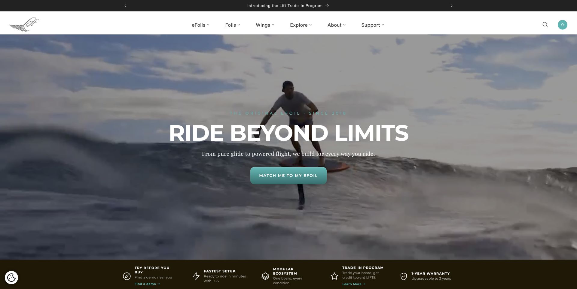
Lift Foils combines a water-sport image, a bold invitation and a matching action in the middle of the hero. The navigation separates equipment families, exploration and support, while the strip below introduces purchase considerations. The design is useful when buyers do not know the product vocabulary yet. Monitoring should follow the matching flow and preserve a simpler catalog route if that guided experience does not load. The dated Sentry resource reference establishes an integration signal, not its settings, coverage or effectiveness.
What you can learn
Treat a product matcher as optional assistance with a clear escape into ordinary categories. Instrument failed transitions without recording every personal answer as an unrestricted diagnostic attachment.
Pros
The action scene gives unfamiliar equipment an immediate use context before the visitor encounters detailed product terminology.
Support and product-family navigation remain visible, allowing experienced buyers to bypass the guided matching route entirely.
Cons & considerations
An aspirational activity image cannot explain training, safe use or suitability; those decisions require substantive information elsewhere.
The Sentry signal identifies a public integration, not evidence that the matching tool is accurate or its failures are resolved.
Public source checked November 3, 2026. References may be embedded or legacy—not a complete backend inventory.
Platform source: Dated public page resource observation. The public source page referenced Sentry resources on 2026-11-03. This is a scoped integration signal, not proof of configuration or successful behavior. The direct screenshot retains its separate original capture date. Platform evidence is separate from the direct website screenshot and is not a complete current infrastructure audit.
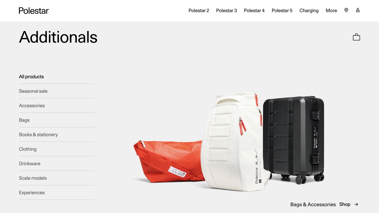
Polestar Additionals gives its merchandise section a large title, a short category list and a clean product arrangement. The surrounding header retains vehicle-related navigation, making the relationship to the parent brand apparent without turning the page into a car configurator. Monitoring needs the same scope discipline: this accessory property is a specific storefront, and evidence here should not be generalized to vehicle software or other Polestar services. The dated Sentry resource reference establishes an integration signal, not its settings, coverage or effectiveness.
What you can learn
Separate merchandise and core-product journeys in both navigation and diagnostics. Preserve the visitor's category choice when crossing between the parent brand and the dedicated shopping property.
Pros
The category list offers a quick path through bags, clothing and other accessories without requiring a search query.
The sparse product composition suits a small branded range and leaves room for the merchandise rather than extra promotional copy.
Cons & considerations
Shared parent navigation may pull shoppers away from the accessory task unless the return route remains clear.
A public monitoring reference on Additionals does not verify monitoring across vehicle purchasing, connected-car systems or other regional sites.
Public source checked November 3, 2026. References may be embedded or legacy—not a complete backend inventory.
Platform source: Dated public page resource observation. The public source page referenced Sentry resources on 2026-11-03. This is a scoped integration signal, not proof of configuration or successful behavior. The direct screenshot retains its separate original capture date. Platform evidence is separate from the direct website screenshot and is not a complete current infrastructure audit.
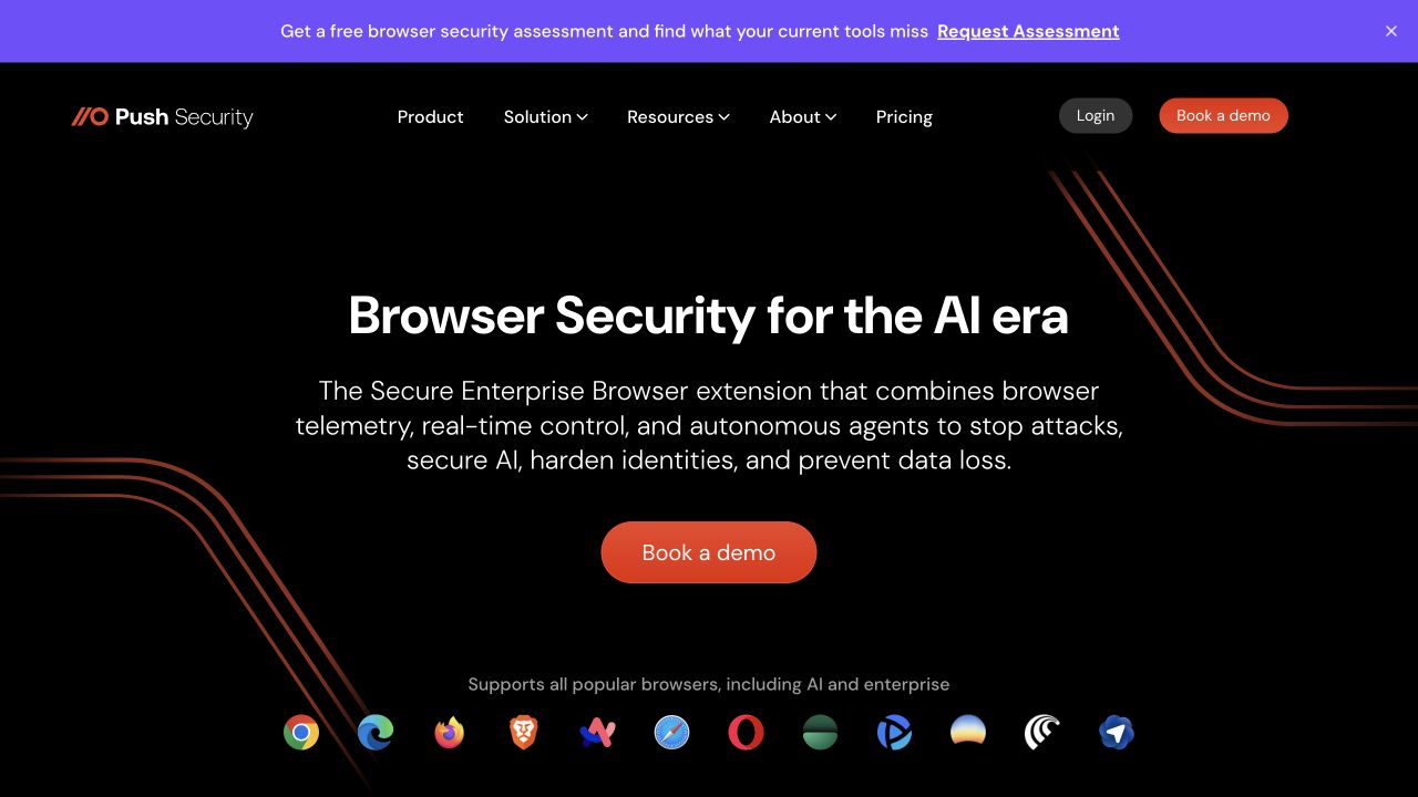
Push Security places a short browser-security proposition on a black background, supported by a sentence explaining the product category and one orange demo action. A row of browser marks adds compatibility context, and a narrow announcement bar sits above the navigation. The layout offers a focused evaluation entrance. Its monitoring plan should protect that path without turning visitors' security questions or assessment details into broad diagnostic data. The dated Sentry resource reference establishes an integration signal, not its settings, coverage or effectiveness.
What you can learn
Keep marketing instrumentation proportionate to the public task. A failed demo request should preserve a clear contact alternative while sensitive security descriptions stay out of routine client-side error records.
Pros
A single prominent demo action concentrates the first screen around one meaningful evaluation step for prospective buyers.
The browser marks give a visual compatibility cue, helping explain the product's place in a familiar working environment.
Cons & considerations
Compatibility artwork is not a substitute for current support documentation, version limits or evidence of a tested integration.
The observed Sentry resource does not establish the effectiveness of the security product or coverage within the authenticated platform.
Public source checked November 3, 2026. References may be embedded or legacy—not a complete backend inventory.
Platform source: Dated public page resource observation. The public source page referenced Sentry resources on 2026-11-03. This is a scoped integration signal, not proof of configuration or successful behavior. The direct screenshot retains its separate original capture date. Platform evidence is separate from the direct website screenshot and is not a complete current infrastructure audit.
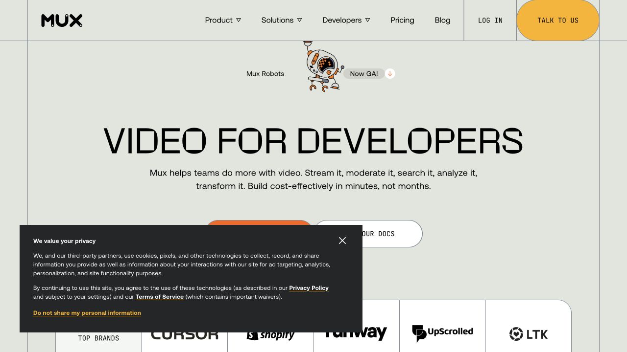
Mux combines a large developer-focused heading, simple navigation and two evaluation routes. In the capture, a substantial privacy panel overlaps the lower hero and part of the action area. That makes the page useful for studying integration resilience: documentation, sales links and media demonstrations should remain understandable when a consent layer is open, closed or unavailable, and the monitoring layer should not be their dependency. The dated Sentry resource reference establishes an integration signal, not its settings, coverage or effectiveness.
What you can learn
Test the same entrance under several consent and loading states. Give documentation a stable ordinary link so developers can continue evaluating the service when an optional widget fails.
Pros
The headline identifies both the technical audience and the product domain before introducing a long feature explanation.
Documentation and human contact are available as separate paths, reflecting different stages of a developer's evaluation process.
Cons & considerations
The privacy panel covers part of the main action area in this capture, warranting careful short-screen and keyboard checks.
Sentry evidence for the marketing site does not establish observability of video delivery, customer streams or private account operations.
Public source checked November 3, 2026. References may be embedded or legacy—not a complete backend inventory.
Platform source: Dated public page resource observation. The public source page referenced Sentry resources on 2026-11-03. This is a scoped integration signal, not proof of configuration or successful behavior. The direct screenshot retains its separate original capture date. Platform evidence is separate from the direct website screenshot and is not a complete current infrastructure audit.
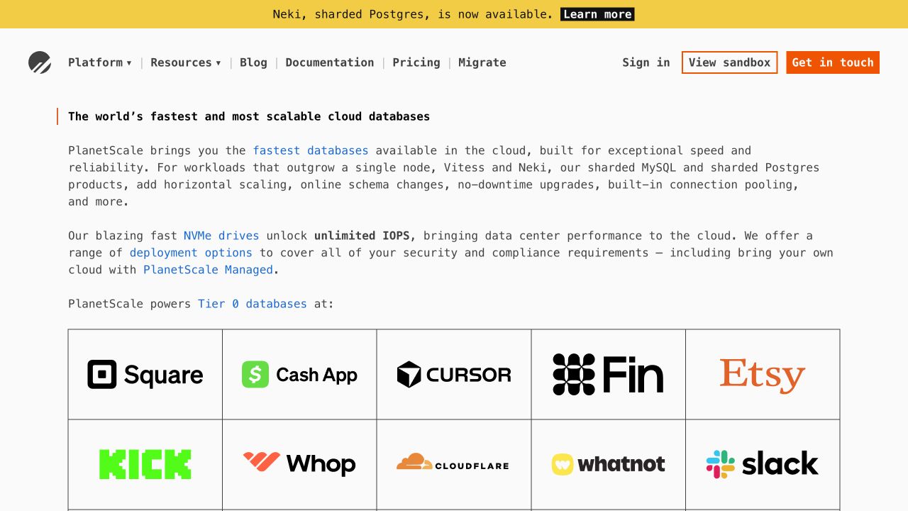
PlanetScale uses a restrained page of technical prose, documentation links and a customer-logo grid. The sandbox and contact actions appear in the header, while a yellow announcement highlights a specific release. The format gives technical buyers several levels of detail immediately. Monitoring should therefore preserve ordinary navigation and documentation access even if an announcement, customer grid or interactive evaluation element fails to load. The dated Sentry resource reference establishes an integration signal, not its settings, coverage or effectiveness.
What you can learn
Treat documentation and sandbox entry as separate reliability targets. Keep the technical explanation readable without interactive enhancements, and scope diagnostic events to the public site rather than customer databases.
Pros
Technical language and documentation links help an informed visitor assess relevance without passing through a generic sales narrative.
The sandbox and contact options offer distinct next steps for independent exploration and a conversation about requirements.
Cons & considerations
Dense introductory copy may overwhelm less experienced buyers unless unfamiliar terms lead to useful definitions or examples.
Displayed customer logos and marketing claims are not evidence of current deployments, performance measurements or the scope of Sentry instrumentation.
Public source checked November 3, 2026. References may be embedded or legacy—not a complete backend inventory.
Platform source: Dated public page resource observation. The public source page referenced Sentry resources on 2026-11-03. This is a scoped integration signal, not proof of configuration or successful behavior. The direct screenshot retains its separate original capture date. Platform evidence is separate from the direct website screenshot and is not a complete current infrastructure audit.
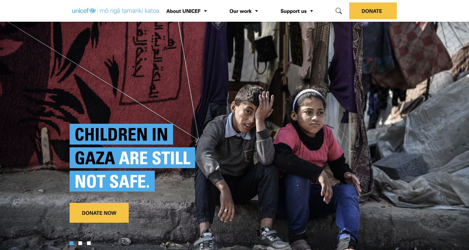
UNICEF Aotearoa New Zealand gives an appeal photograph most of the opening screen and overlays a short campaign message with a yellow donation button. The header separates learning about the organization from ways to help. This creates a direct route from attention to action, but it also makes reliability consequential: if the donation journey fails, the visitor needs an honest state and a safe recovery path. The dated Sentry resource reference establishes an integration signal, not its settings, coverage or effectiveness.
What you can learn
Keep appeal content, donation intent and transaction confirmation distinct. Track technical failures without duplicating a contribution or copying donor details into an unnecessarily broad error report.
Pros
The contrasting donation action is easy to distinguish from the campaign photograph and surrounding informational navigation.
The local organization identity is visible, clarifying which national property the visitor is using before taking action.
Cons & considerations
Urgent campaign wording and imagery need editorial review and current context independent of any technology or screenshot evidence.
The public Sentry reference applies to this New Zealand property and does not establish instrumentation across every UNICEF office.
Public source checked November 3, 2026. References may be embedded or legacy—not a complete backend inventory.
Platform source: Dated public page resource observation. The public source page referenced Sentry resources on 2026-11-03. This is a scoped integration signal, not proof of configuration or successful behavior. The direct screenshot retains its separate original capture date. Platform evidence is separate from the direct website screenshot and is not a complete current infrastructure audit.
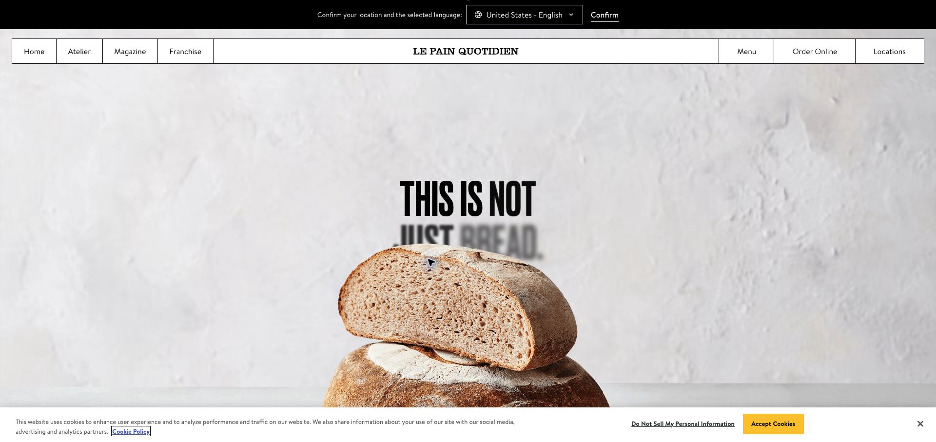
Le Pain Quotidien presents a spare bread photograph beneath a structured navigation bar. Menu, online ordering and locations sit together, while a region-and-language confirmation strip occupies the top. A cookie bar appears along the bottom in the retained capture. These layers show why a restaurant entrance needs coordinated state handling: visitors should retain the intended region and dining task when optional scripts or preferences change. The dated Sentry resource reference establishes an integration signal, not its settings, coverage or effectiveness.
What you can learn
Carry regional context consistently into menus and ordering. If a linked ordering service fails, provide a readable location route and distinguish an unsubmitted basket from an uncertain completed order.
Pros
The limited imagery and concise navigation make menu, ordering and location tasks available without a lengthy brand introduction.
The visible region selection acknowledges that restaurant information can vary, rather than presenting one location's details as universal.
Cons & considerations
Two horizontal notices reduce the remaining screen height and may compete with restaurant content on smaller devices.
A public monitoring resource reference does not prove that menus, opening hours or orders stay synchronized across regional systems.
Public source checked November 3, 2026. References may be embedded or legacy—not a complete backend inventory.
Platform source: Dated public page resource observation. The public source page referenced Sentry resources on 2026-11-03. This is a scoped integration signal, not proof of configuration or successful behavior. The direct screenshot retains its separate original capture date. Platform evidence is separate from the direct website screenshot and is not a complete current infrastructure audit.
Relate a technical failure to a recognizable stage in the visitor journey. Keep enough safe context to distinguish a failed page load from an optional enhancement. Validate the reporting path in a controlled environment without sending real customer information.
Use performance information with a question
Begin with a concrete concern, such as whether a route transition delays the next useful action. Check what the installed SDK and its configuration collect. Separate a measured result from a visual impression; a screenshot cannot establish responsiveness or loading performance.
Session Replay introduces a different view of user interaction and its own privacy controls. Sentry documents masking and blocking behavior for that feature. Evaluate the actual settings and representative screens with test data; the presence of a generic Sentry script does not show that Replay is enabled.
Use controlled accounts and synthetic inputs for intentional test failures. Confirm that the expected issue arrives with useful context and without sensitive data. Keep production visitor actions out of test submissions and document the test’s scope.
Match configuration to the release
Record the SDK version and integration points in the release notes. Sentry’s options evolve, so use the documentation that matches the actual implementation. Confirm settings for the product’s environment instead of assuming that defaults or another website’s setup apply.
Agree on what needs immediate attention, what can wait and who reviews recurring issues. Include an escalation route when the usual owner is absent. After a fix, check the relevant visitor journey and the resulting evidence rather than closing an issue solely because a deployment completed.
A useful handover demonstration
Ask the actual team to carry out its routine job: publish a realistic update, correct a mistake, preview a narrow screen, and identify who owns an integration failure. For a library or frontend framework, also ask who maintains the content source and deployment. A polished screenshot does not answer those operational questions.
Beyond the screenshot
Before releasing a Sentry integration
Name the important visitor journeys and meaningful failure states.
Record the SDK version, integration scope and environment.
Review data collection and filtering with safe representative inputs.
Verify a controlled event arrives with usable context.
Review Session Replay separately if it is intentionally enabled.
Assign ownership and escalation for actionable issues.
Keep user-facing error recovery understandable and accessible.
Confirm the visitor journey after a fix and retain dated evidence.
Test with real content, a keyboard, a small screen, slow or failed requests, and the people who will maintain the system. These are planning checks, not an accessibility, security, performance, or search-ranking certification.
Sources & editorial method
How this Sentry collection was reviewed
Original design reviews were written on November 4, 2026 from genuine existing direct browser captures. Original image dates, source URLs and dimensions are preserved. Each Sentry resource observation retains its timestamp and exact public-property scope. No authenticated dashboards, runtime event delivery, sampling settings, Replay configuration, performance benchmark or organization-wide coverage was verified.
Every image is an unmodified capture from the actual website, with its source and capture date. Some captures are reused from our shared catalog; their dates remain the original capture dates. None comes from a vendor gallery or a generated reconstruction. Moving imagery and live content can change.
Technology attribution uses public page assets or metadata, official platform documentation, or a cited first-party project case study. Documentary and framework-relationship evidence is identified where used; it is not a complete current backend inventory. A CMS image CDN alone does not establish a full CMS deployment. A library’s presence does not prove which individual controls use it, and a platform label does not establish AI authorship.
The composition notes, lessons, pros and tradeoffs are original editorial observations. We have not measured conversion, traffic, security, performance or accessibility conformance. Website owners retain their brands and imagery; these examples are not our client portfolio. Written, Edited and Curated are independent records, not dates advanced by a build. See our editorial standards or suggest a correction.
Questions worth asking
Sentry website development FAQs
Does Sentry presence mean a website is reliable?
No. It indicates an observed integration resource. Reliability requires evidence about real behavior over time, and the quality of a team’s response cannot be inferred from public HTML.
Can a screenshot identify what Sentry collects?
No. Collection depends on the installed SDK, enabled integrations and settings. Inspect the actual implementation and test its output safely.
Does every example use Session Replay?
No such claim is made. A Sentry resource does not establish that a particular feature is enabled, configured or effective.
Why review page design in a monitoring guide?
The page reveals the task a visitor is being asked to perform. That provides useful context for deciding which failures deserve attention, while the technical evidence remains a separate observation.
Use the visible journey to define meaningful failures, then verify that your monitoring gives the responsible team enough safe evidence to resolve them.