A strong SaaS website helps someone understand what the product does, whether it fits their work, and what a realistic next step involves.
A daily user, an administrator, a technical reviewer, and a purchasing stakeholder do not need the same opening explanation. The homepage should introduce a coherent product, then give those people useful routes to the evidence they need. A long list of capabilities is not a substitute for a clear product category and a recognizable task.
This collection looks at public marketing sites, not authenticated application behavior. It compares interface demonstrations, role-based introductions, developer propositions, and broad platform stories. The examples’ own claims about results, compliance, security, and automated work are not independent findings of this guide.
Before the examples
What makes good saas website design in 2026?
Explain the job before expanding the platform story
Describe who uses the software, what they bring to it, and what useful result they can produce. An unfamiliar visitor should not need to decode a slogan, a collection of AI terms, or a tiny dashboard to identify the product category. Introduce additional modules only after the central relationship is understandable.
Show one believable workflow
Choose a product image that demonstrates a real task and use plausible, clearly illustrative data. Explain the input, action, output, and review step. If the opening shows a finished result rather than the interface, supply the missing workflow nearby. Avoid a decorative interface collage that becomes unreadable when reduced to a phone screen.
Support evaluation without forcing premature contact
Give people useful product, documentation, pricing or plan, implementation, and support information before asking them to book a conversation. Label a self-serve trial differently from a guided demonstration. Explain what happens after either action and do not disguise an account-creation or sales form as an independent tool result.
The collection · 27 examples
27 saas websites worth studying
Compare focused tools with broad platforms, familiar end-user interfaces with technical infrastructure, and result-led imagery with task-led demonstrations. Each pattern solves a different explanation problem.
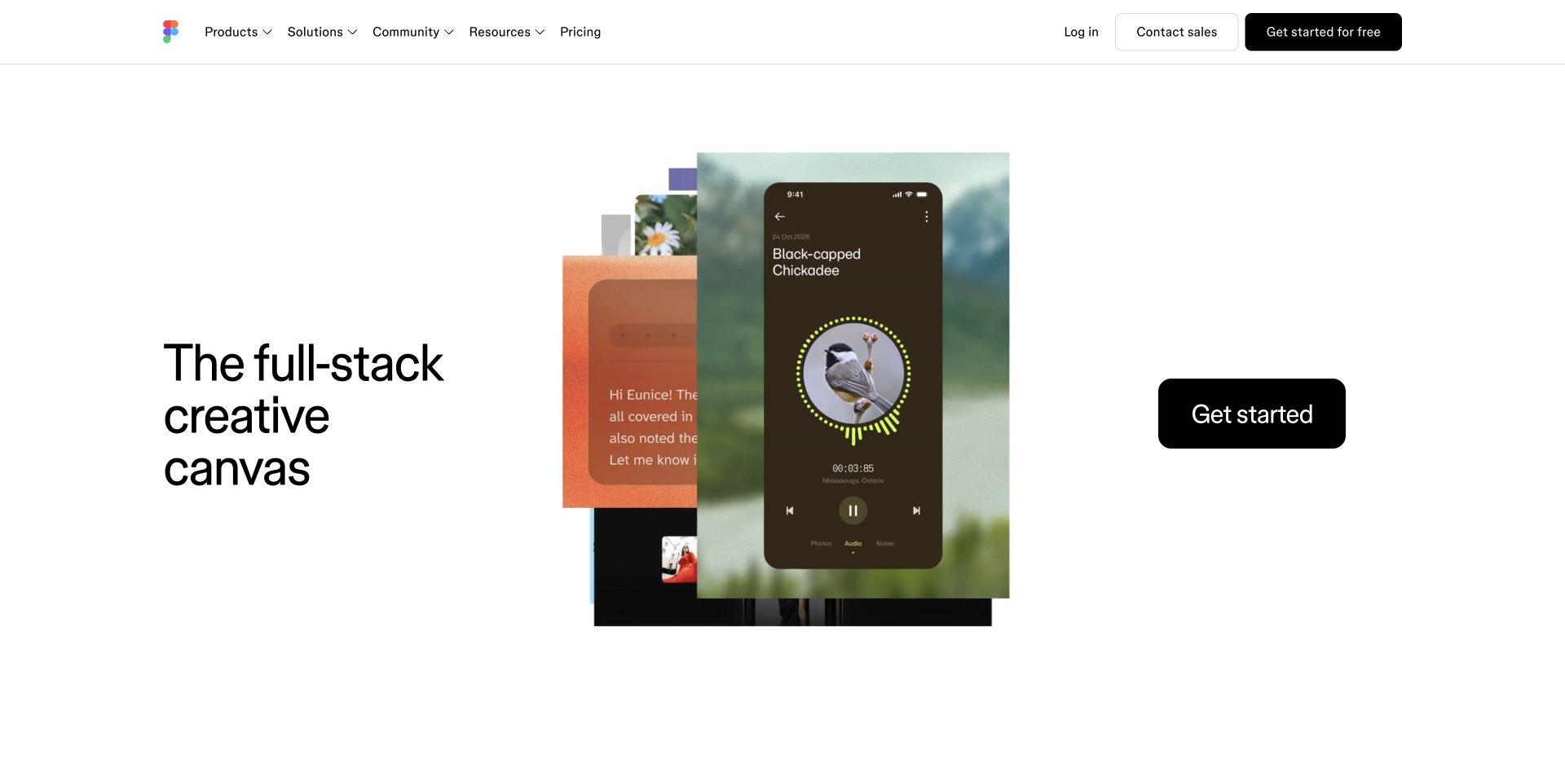
Figma gives a compact set of creative artifacts the center of a largely white opening. Its broad creative proposition sits to the left, while a distinct getting-started action sits to the right. The arrangement introduces the kind of work the product helps produce before showing a dense application screen. That is a useful option when the software serves several creative disciplines and a single dashboard would give an incomplete account of the product.
What you can learn
Choose whether the first image should demonstrate a result, a workflow, or an interface. Then provide the missing explanation immediately afterward. A result-led opening still needs a plain account of the audience, the product boundaries, and the route from interest to a usable first task.
Pros
The central artifacts provide a concrete counterpart to a broad creative promise.
The primary action is separated clearly from the product illustration.
Cons & considerations
An expansive category statement can leave a newcomer unsure which tool to start with.
Outcome imagery needs supporting detail about the actual workflow and plan requirements.
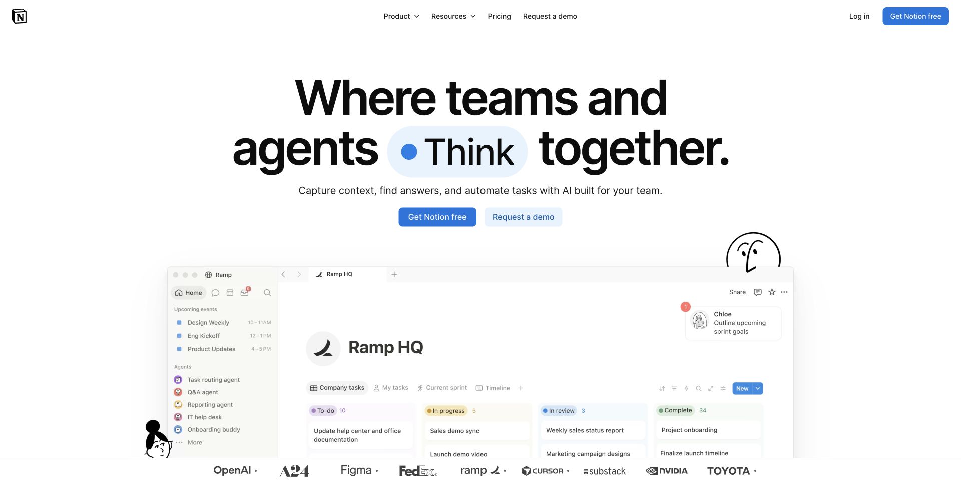
Notion places a recognizable workspace beneath a headline that expands the product into team and agent collaboration. The open page structure leaves room for a clear action before the interface begins. Because the screenshot resembles a place where work happens, it gives the larger promise a practical anchor. The challenge for a multifunction product is explaining which parts are documents, structured information, automation, or additional features rather than leaving the visitor to infer everything from one screen.
What you can learn
Use a representative workspace to establish orientation, then break the proposition into named jobs. Show one achievable first result for a new account and label plan-dependent or connected features. Keep product breadth from becoming a long list of unexplained capabilities.
Pros
The workspace makes an abstract collaboration message more tangible.
A centered hierarchy gives the main proposition and action clear priority.
Cons & considerations
Several product concepts in one headline can blur the simplest starting use case.
A populated demonstration needs honest empty and first-run states elsewhere in the journey.
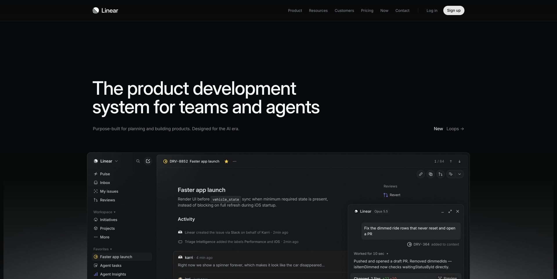
Linear presents a dark application interface under a concise product-development proposition. The image is not merely a decorative device frame: lists and an issue detail pane suggest the kind of daily coordination the product organizes. A quiet header keeps the opening focused on that work. The reference is especially useful for software whose audience already recognizes the central objects, but it can be less explanatory for someone who does not yet understand issues, projects, and their relationships.
What you can learn
Name the core objects and show how one moves through the workflow. Design the marketing screenshot around a believable task rather than a collection of impressive-looking panels. Pair familiar interface detail with plain explanations for buyers who evaluate the product but may not use it every day.
Pros
The product interface supports the category statement directly.
A restrained palette makes the working surface feel like the central subject.
Cons & considerations
Dense application detail becomes hard to interpret at small image sizes.
An expert audience’s terminology can exclude a less technical evaluator without supporting context.
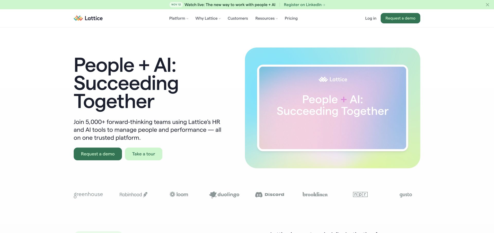
Lattice uses a pale green field, large type, and a framed product message to introduce its people-management proposition. The page mixes a human organizational theme with software-oriented navigation and clear actions. That avoids leading entirely with a busy administration screen, but the broad opening still needs subsequent information about the actual tasks and roles supported. A customer logo strip supplies context for the audience; it is not independent evidence of a particular customer outcome.
What you can learn
Make the relationship between the organizational goal and the product task explicit. A team lead, an administrator, and a purchasing stakeholder may need different evidence. Give each an understandable route without forcing the homepage to show every role’s complete workflow.
Pros
The muted visual system supports a calm, readable introduction.
Product and audience navigation remain available beside the high-level message.
Cons & considerations
A broad organizational promise needs concrete feature and workflow explanations.
Customer logos cannot replace detail about relevant use cases or implementation effort.
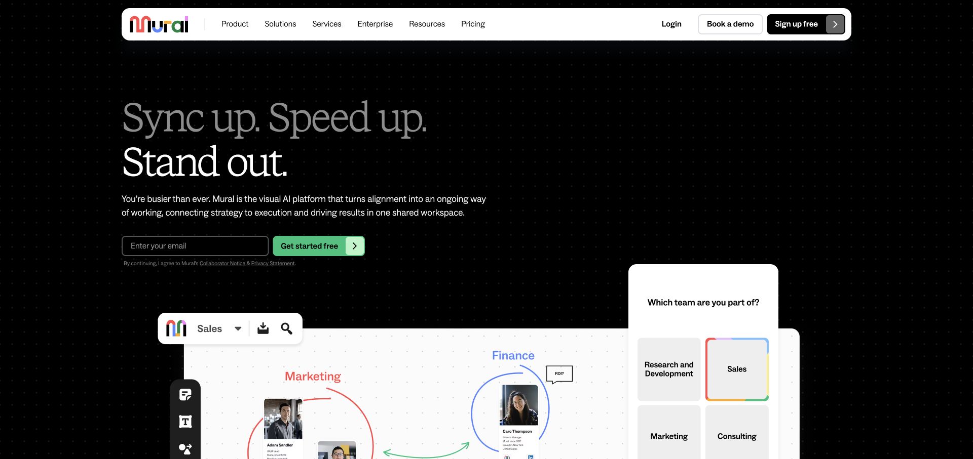
Mural combines a dark headline area with overlapping white work surfaces, meeting content, and visual notes. The product is introduced through the material a team would manipulate rather than a generic photograph of coworkers. This helps make an otherwise broad collaboration category more recognizable. The composition is also a reminder that several small screens in one hero can become illustrative texture unless the reader is given a clear sequence to follow.
What you can learn
Select one collaboration problem and show the transition from inputs to a useful shared result. Use the rest of the page to explain participation, facilitation, templates, and export or handoff needs. Do not assume a beautiful populated board tells a new customer how to create the first one.
Pros
Visible working artifacts make the collaboration concept specific.
Strong light-and-dark separation distinguishes the interface from the headline.
Cons & considerations
Overlapping panels can be difficult to read on a phone.
A rich demonstration needs a simpler first-use explanation and a route for unfamiliar participants.
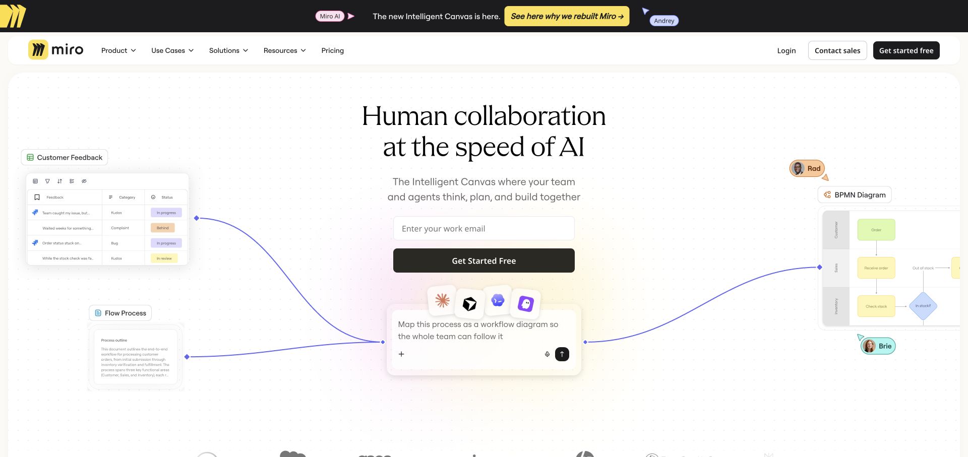
Miro places a centered proposition above a sparse, connected visual that runs between work surfaces and small tool symbols. The large amount of white space keeps a complicated collaboration story from becoming a wall of interface tiles. It is a useful example of showing relationships rather than only a screenshot. Those relationships remain explanatory marketing imagery, however; the capture does not establish which connections are automatic, separately configured, or available on a particular plan.
What you can learn
Use a diagram to clarify one relationship, then explain its actual operation in words. Label native features, integrations, and proposed workflows differently. Give a prospective customer a short path from the diagram to the documentation or demonstration that answers their specific implementation question.
Pros
The connected composition conveys relationships without crowding the opening.
The main action stays near the proposition rather than inside the illustration.
Cons & considerations
Small symbols may be recognizable only to visitors who already know the tools.
A conceptual connection line should not imply an integration that has not been documented.
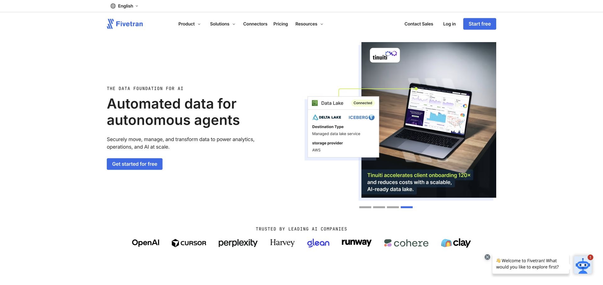
Fivetran places a concise data-automation message beside a laptop and a concrete business setting. The surrounding navigation and customer names suggest an enterprise software audience rather than a consumer application. This gives the infrastructure proposition a visible context without filling the hero with pipeline internals. The useful design question is how quickly a visitor can move from that high-level story to supported sources, destinations, operational boundaries, and a realistic evaluation path.
What you can learn
Connect the homepage promise to a maintained integration directory and specific product explanations. Record what a connection supports, what setup is required, and where responsibility changes hands. Treat architecture diagrams as scope explanations, not automatic proof that every illustrated system works together without additional effort.
Pros
The laptop scene gives an abstract infrastructure product a human working context.
Navigation remains distinct from the larger illustrative media.
Cons & considerations
A short automation headline cannot explain connector limits or operating responsibilities.
Enterprise proof needs relevant detail beyond a row of familiar organization names.
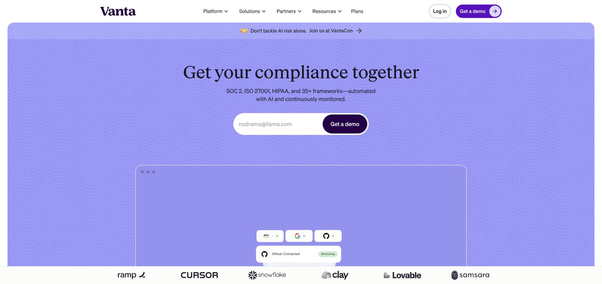
Vanta’s lavender opening uses a central headline and a clear action above a diagram-like product area. The spacious visual treatment makes a complex compliance-management subject feel less like an administrative form. The page must then supply the specificity that the calm introduction intentionally omits: which frameworks, tasks, records, and people the product helps coordinate. The design itself does not establish that a customer is compliant or that any particular audit requirement is satisfied.
What you can learn
Separate software workflow from an organization’s actual obligations. Show how a task, evidence item, owner, and review state relate, and explain the boundaries of automation. Have the appropriate product and subject-matter reviewers approve claims before turning a complex process into a reassuring headline.
Pros
A controlled color field gives the opening a strong identity without dense decoration.
The primary action is easy to locate within the centered hierarchy.
Cons & considerations
A broad compliance proposition can sound more definitive than the product’s actual scope.
Diagrammatic interface imagery needs a plain explanation of roles, evidence, and manual work.
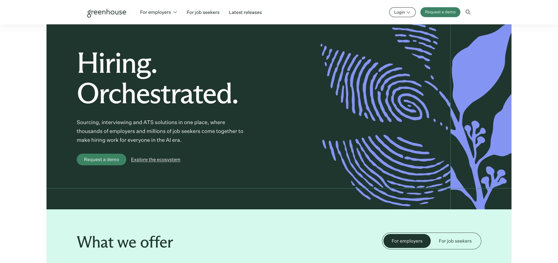
Greenhouse puts an expansive hiring proposition inside a deep green brand field with botanical patterning on one side. The navigation remains conventional and the next explanatory section begins directly beneath the lead. The page demonstrates how a distinctive identity can coexist with practical routes for a business-software audience. It also illustrates the limits of a category-level introduction: a recruiting coordinator still needs to understand the actual workflow, candidate communication, integrations, and administrative ownership.
What you can learn
Use the homepage to establish the product’s area of responsibility, then map visitor roles to concrete tasks. Keep evaluation information about the software distinct from advice or claims about hiring outcomes. Include an implementation and support route for the team that would administer it.
Pros
The brand pattern adds character without replacing the main words.
The next section starts promptly, creating a visible path into explanation.
Cons & considerations
An aspirational hiring statement needs practical product examples beneath it.
Several business audiences require a clear hierarchy rather than a generic demo route for everything.
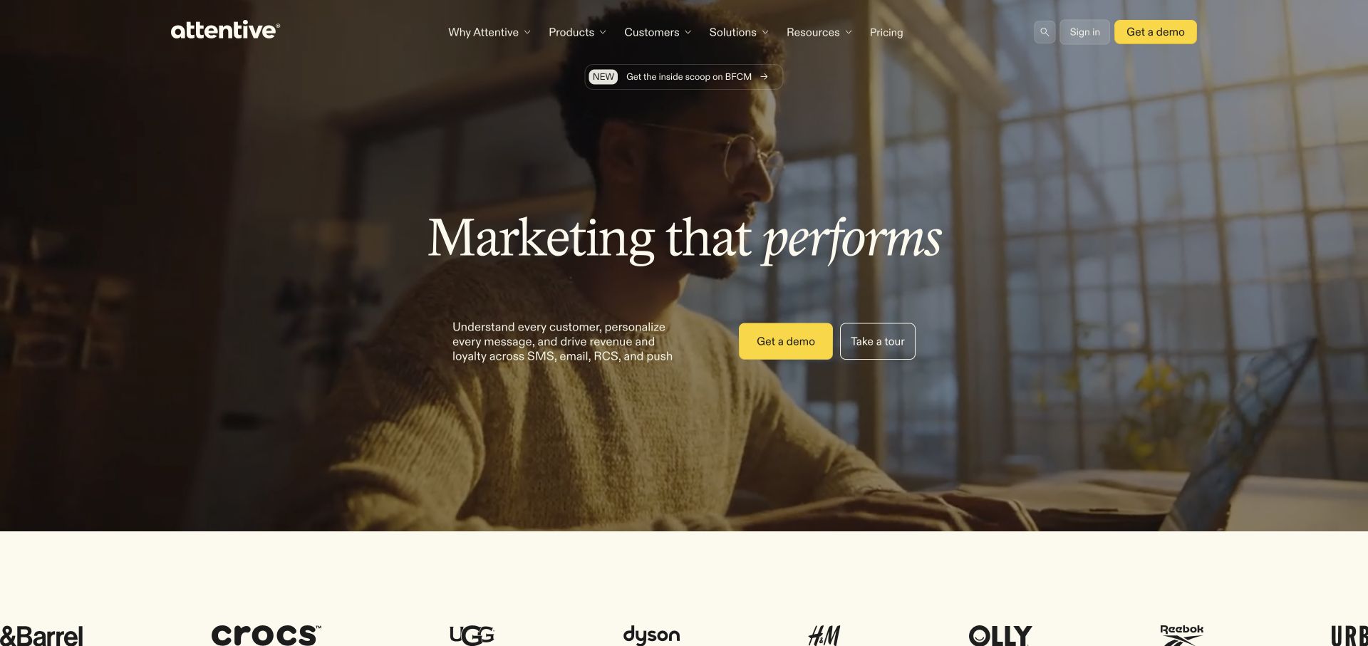
Attentive leads with a person in a work setting and a restrained statement about marketing performance. A contrasting action and a familiar customer strip sit inside a compact product-led layout. The human image gives the page a different tone from a dashboard-first introduction, but it provides less immediate information about what the application actually does. The next content needs to translate the channel and audience positioning into concrete campaign and data-handling tasks.
What you can learn
Balance the person-centered introduction with a specific workflow example. Explain who creates a campaign, what information is required, which messages or channels are involved, and how permission and preference handling are managed. Present reported customer results with their actual source and scope, not as a general guarantee.
Pros
The human scene gives an enterprise category an approachable visual starting point.
A distinct action separates evaluation from the surrounding navigation.
Cons & considerations
Performance language needs contextual evidence rather than visual reassurance alone.
A photograph cannot replace an explanation of the product’s data and messaging boundaries.
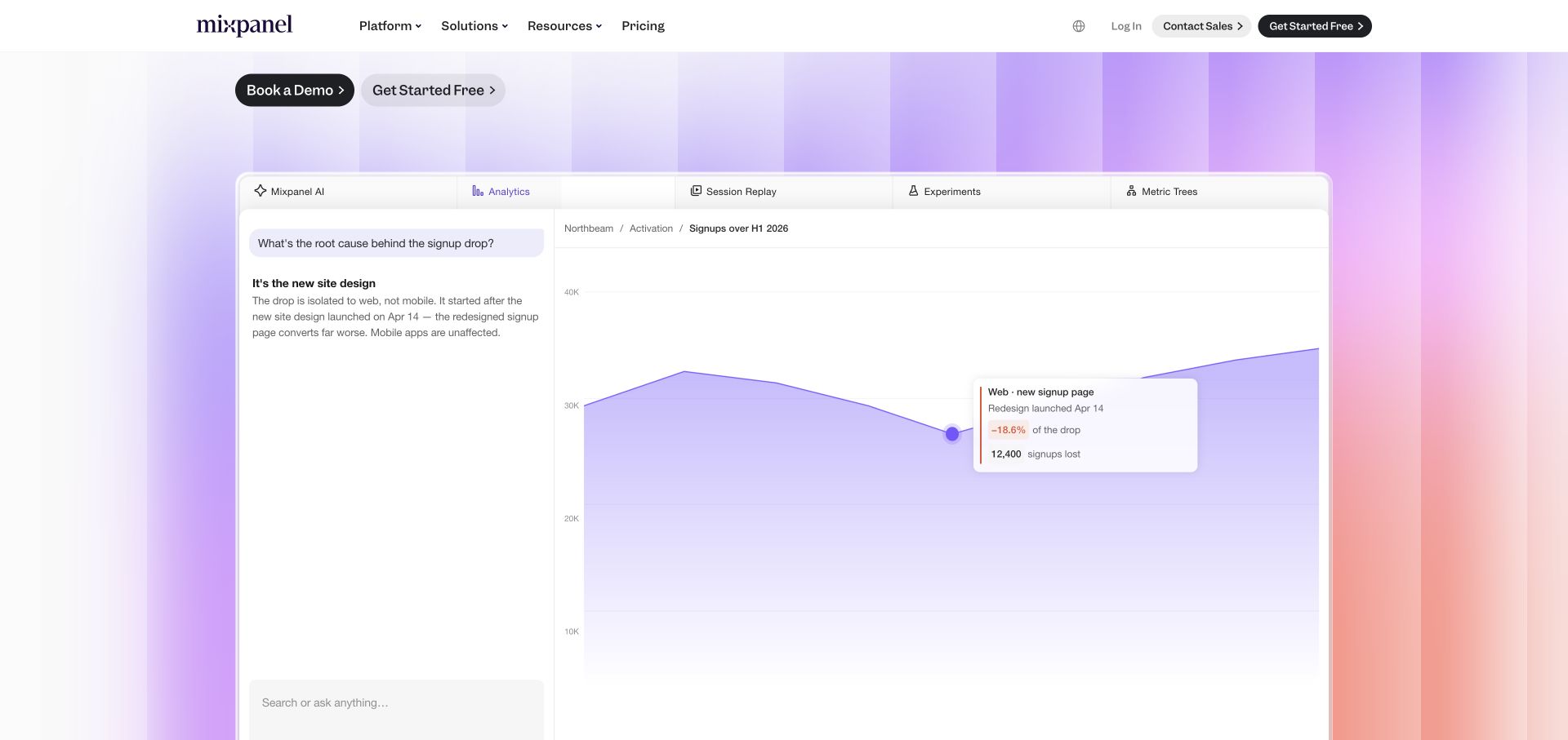
Mixpanel’s captured opening places a natural-language question above a product surface, with a prominent chart occupying much of the image. The bright gradient frame distinguishes the analysis area from a conventional report table. This is useful because an analytics buyer needs to understand both how to ask a question and what a readable answer might look like. It does not show whether the underlying event definitions, identity rules, or instrumentation are correct.
What you can learn
Choose a realistic decision and show the question, required data, and resulting view together. Keep demonstration data clearly identifiable and explain setup before implying an immediate answer. A strong analytics marketing page should not make measurement design disappear behind a polished chart.
Pros
The question-and-chart combination gives the analysis a recognizable purpose.
The product surface is visually separated from the surrounding marketing page.
Cons & considerations
A populated chart can conceal the data-modeling work needed before useful analysis.
Gradient effects need care so they do not reduce the legibility of actual chart information.
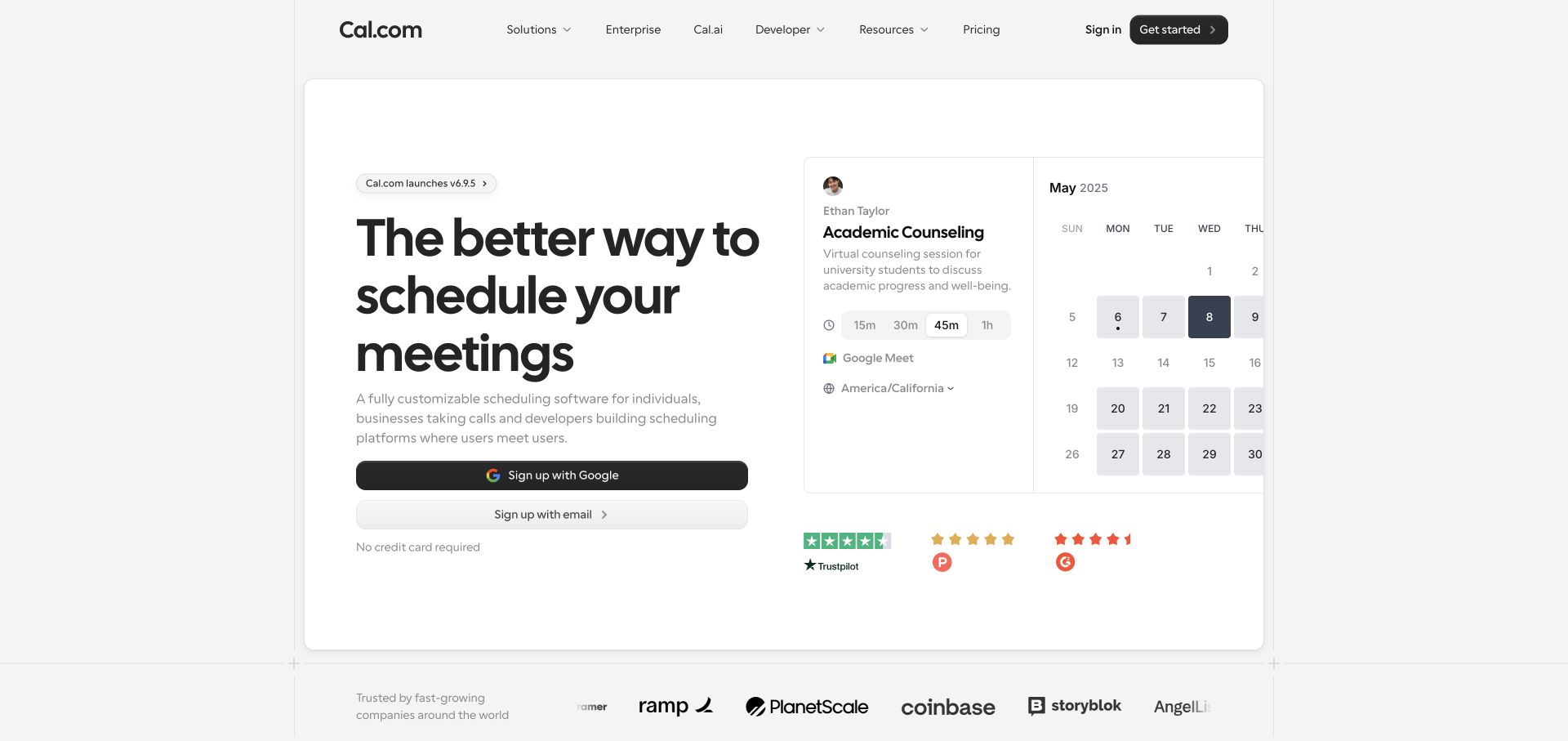
Cal.com pairs a straightforward scheduling proposition with overlapping appointment and calendar surfaces. The light page, compact header, and visible customer names keep attention on a task most visitors can recognize. This is a useful SaaS example because it does not require an elaborate category explanation before showing the product. The remaining challenge is making exceptions and operating boundaries discoverable: team routing, time zones, availability, connected calendars, and the difference between a public booking page and account administration.
What you can learn
Start with one complete booking journey, then show how configuration changes it. Design the marketing example around a real appointment type and describe what the host and invitee each receive. Test unusual availability and time-zone cases in the product rather than assuming the familiar calendar image explains them.
Pros
The visible calendar makes the core scheduling task immediately recognizable.
The primary action sits next to a concise product explanation.
Cons & considerations
A simple booking picture can understate team and calendar-connection complexity.
Small overlapping interface panels need a readable mobile alternative.
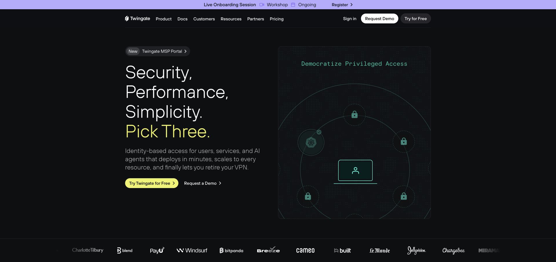
Twingate uses a dark field, stacked short phrases, and a diagram-like access illustration to organize its introduction. A bright action provides the main visual contrast. The restrained presentation is useful for a subject that can easily become an unreadable network chart. At the same time, a security proposition must lead to precise information about deployment, supported environments, administration, and the boundaries of the product rather than relying on the atmosphere of the dark interface.
What you can learn
Explain which access problem the software addresses and provide role-specific evaluation routes. Distinguish a conceptual access drawing from a deployable architecture. Ask technical reviewers to verify implementation claims and ensure that procurement, administrators, and end users can each find the information relevant to them.
Pros
Short text blocks prevent the opening from becoming a dense technical paragraph.
A contrasting action is easy to identify against the dark background.
Cons & considerations
Broad security adjectives require specific supporting documentation.
A conceptual diagram does not demonstrate deployment requirements or operational responsibility.
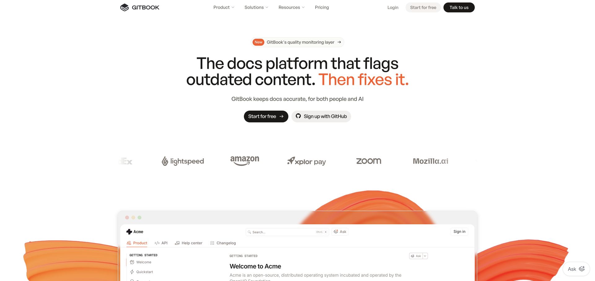
GitBook presents outdated documentation as the central problem, then brings a documentation workspace into view below the headline. Customer names and the short action sit between the proposition and the product image. This gives the interface a reason to exist: the visitor is not simply looking at a writing editor. The useful distinction is between publishing a document once and keeping it connected to a changing product or service over time.
What you can learn
Build the story around an actual maintenance task. Show how a page is identified for review, who is responsible, what changes, and how an updated version reaches readers. Clarify which suggestions are automated and which still require editorial judgment instead of presenting freshness as a one-click guarantee.
Pros
A specific documentation problem makes the opening more meaningful than a generic editor image.
The working surface appears early enough to connect the message to a product.
Cons & considerations
Automatic-sounding language needs an explanation of review and approval boundaries.
A populated knowledge base needs an equally clear starting process for a new team.
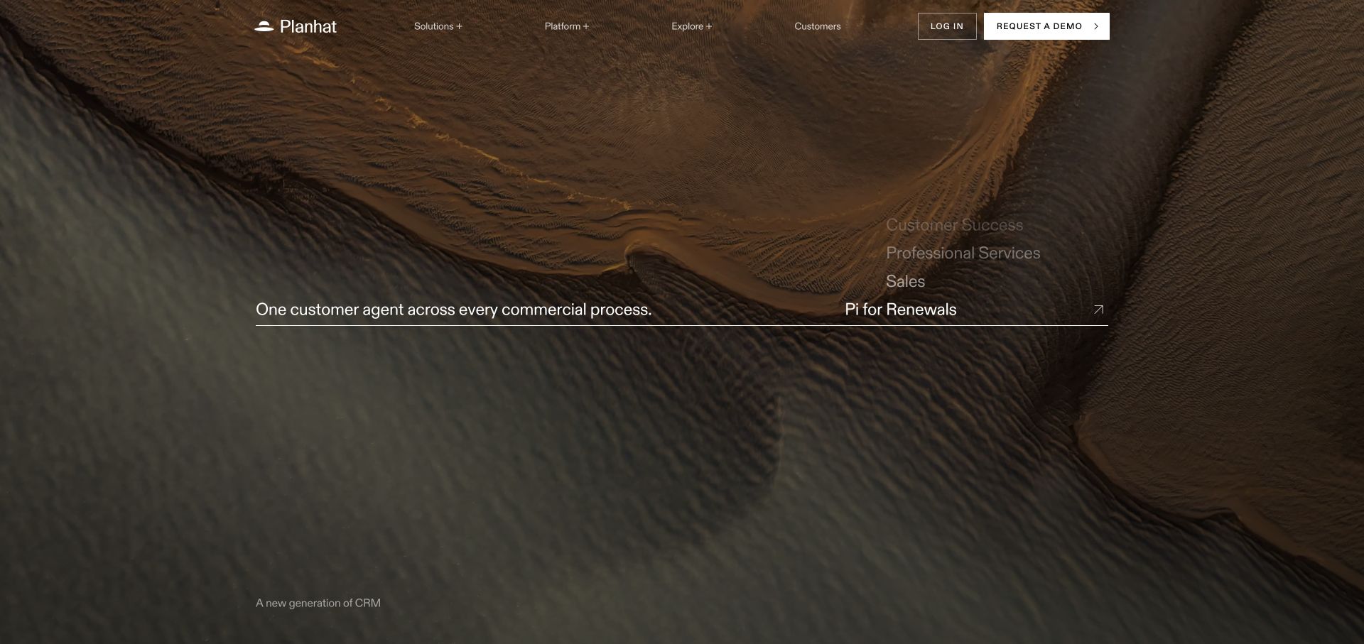
Planhat’s captured homepage uses a textured landscape-like image and a restrained line of product positioning. The logo, navigation, and prominent contact action are small relative to the atmospheric visual. This is a useful counterpoint to a dashboard-heavy SaaS homepage: it can create a distinctive first impression, but the visual itself explains little about records, workflows, or the people using the application. The later information architecture therefore has unusually important explanatory work to do.
What you can learn
If an opening prioritizes atmosphere, provide a quick route to a concrete product overview. Name the customer-facing and internal roles, show a real account or workflow, and explain how an evaluation proceeds. Avoid making a visitor watch or scroll through a long brand sequence before learning the product category.
Pros
The restrained composition creates a distinctive visual identity.
Navigation remains separate from the broad background image.
Cons & considerations
An atmospheric landscape offers little direct evidence of software functionality.
Small introductory text and large media require careful contrast and responsive treatment.
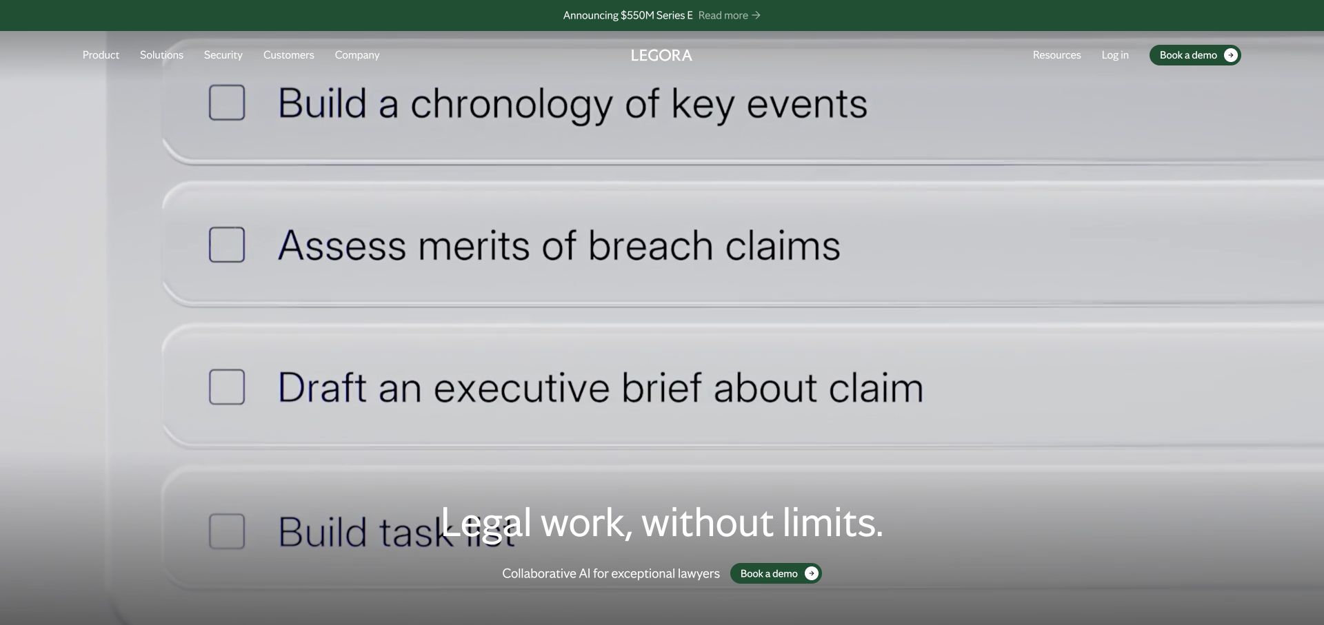
Legora fills the opening with large, task-oriented rows about reviewing and preparing legal work, with a concise positioning line over the composition. Instead of leading with a conventional dashboard, it uses the language of the work itself as the illustration. That makes the intended field recognizable, while leaving substantive questions about workflow, sources, review, and information handling for the next stage of evaluation. The screenshot is not evidence of legal accuracy or suitability for a particular matter.
What you can learn
Use realistic professional tasks to explain scope, then show the controls around them. Identify what a user provides, what the system produces, and which review or approval remains with a qualified person. Keep demonstrative task text separate from promises about the quality of a professional result.
Pros
Task descriptions make the intended professional context recognizable.
The large visual hierarchy avoids an unreadable miniature application screenshot.
Cons & considerations
Oversized examples can crowd the plain-language product explanation.
Professional and information-handling claims require evidence beyond a convincing task list.
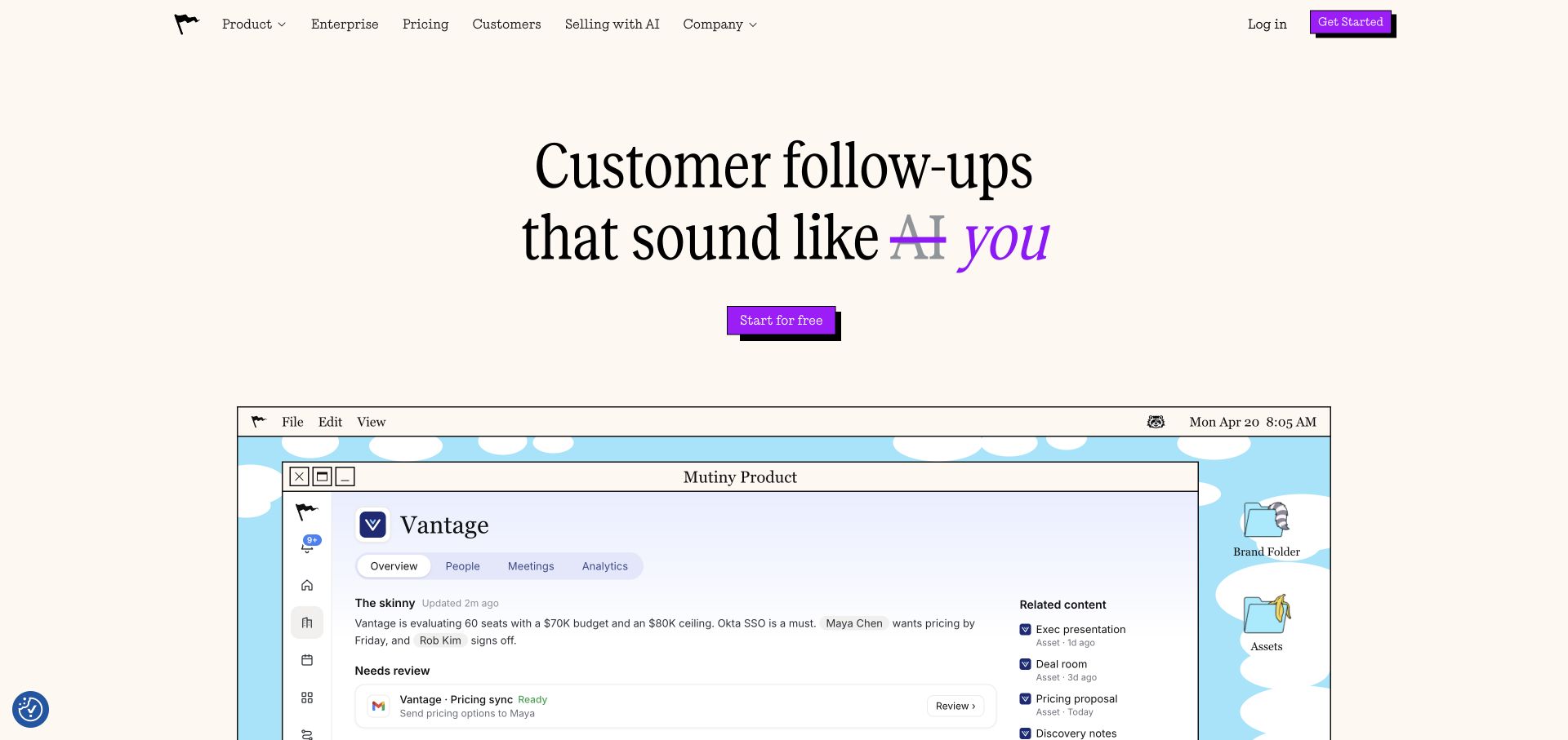
Mutiny places an example customer communication beneath a prominent headline and action. The product story is expressed through what a recipient might see rather than only through a campaign-management dashboard. This is a useful SaaS pattern for explaining an otherwise invisible workflow. It also puts responsibility on the surrounding copy to explain how the communication is prepared, what inputs it uses, and what remains under the sender’s control.
What you can learn
Show a clearly labeled example output alongside the minimum workflow needed to produce it. Separate draft generation, review, audience selection, and sending. Explain data sources and permissions honestly, and do not suggest that a persuasive-looking demonstration establishes how a real recipient will respond.
Pros
The communication example gives the proposition an immediately visible output.
A simple headline-and-action hierarchy keeps the introduction focused.
Cons & considerations
An output example can hide the preparation and review required behind it.
Personalization language needs a clear account of information sources and user controls.
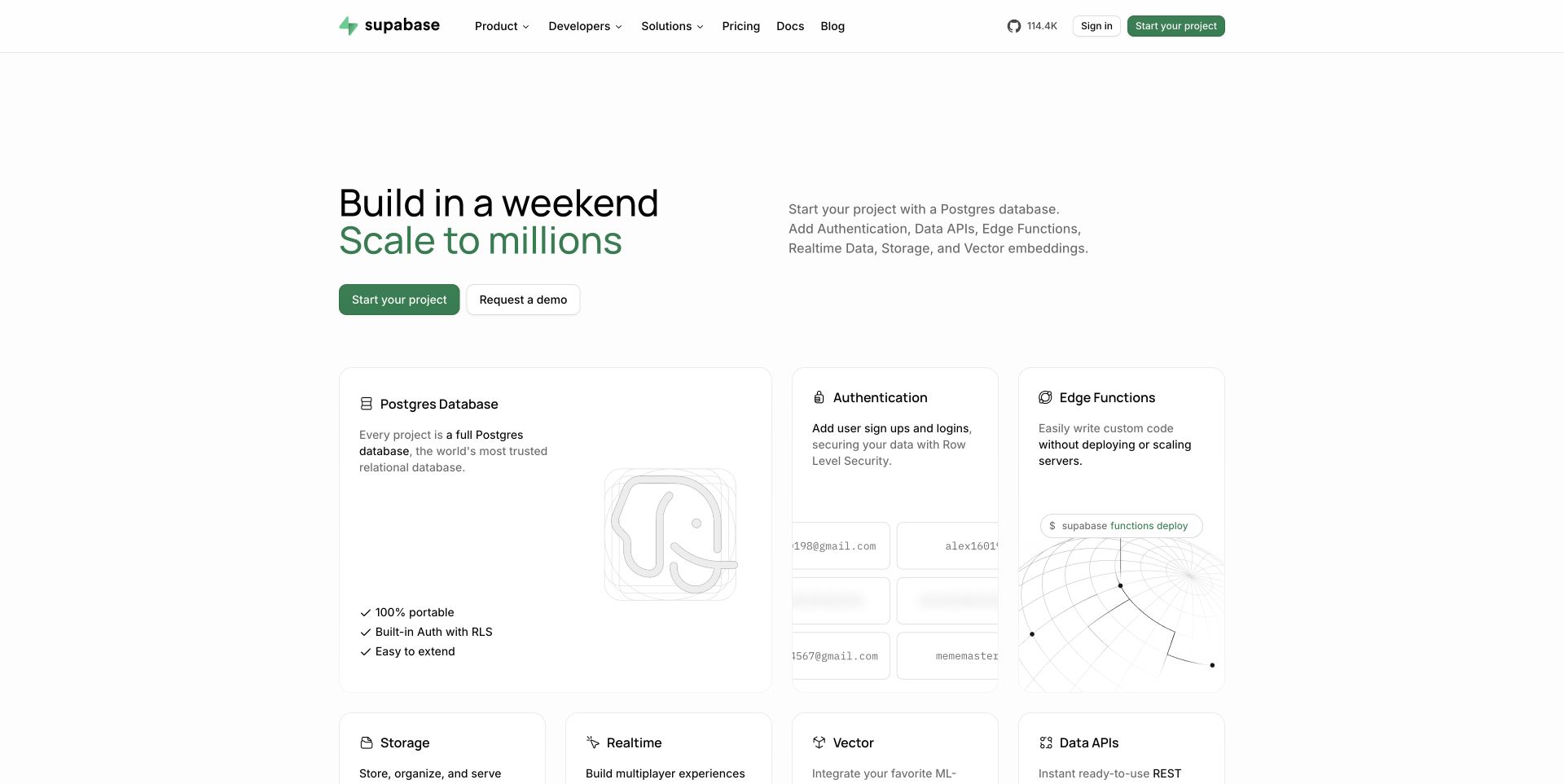
Supabase combines a short build-and-scale proposition with a light layout, visible product categories, and concrete examples of the building blocks it offers. The opening emphasizes that the product is something a developer can work with, not only an outcome for an executive buyer. That is useful when documentation and the marketing site must reinforce one another. The clean presentation does not itself establish the operating characteristics or suitability of any particular application architecture.
What you can learn
Make the first technical experiment easy to identify, then provide honest routes to configuration, limits, environments, and ongoing ownership. Keep example code, demonstration data, and production setup clearly distinguished. Explain how a team moves beyond a successful first request instead of treating quick-start completion as readiness to launch.
Pros
The product categories give a developer concrete areas to investigate.
A concise opening leaves room for useful examples rather than generic promotional media.
Cons & considerations
A fast-start message can understate data modeling and operational responsibilities.
Technical limits and production configuration need maintained documentation outside the hero.
Resend uses a dark page, a concise email-for-developers proposition, and restrained imagery rather than a large business-software dashboard. The small navigation and carefully limited opening make the product category easy to recognize. This is useful for an API-oriented service where the prospective user wants to know what they can build and how to try it. The marketing simplicity should not imply that delivery, sender configuration, monitoring, or message handling requires no additional work.
What you can learn
Keep the first integration task close to the main proposition, then explain the operating lifecycle around it. Separate a successful test request from verified sender setup, actual delivery expectations, failure handling, and the application’s own responsibilities. Use documentation links that lead to a specific next task.
Pros
A narrow category statement reduces the amount of introductory explanation required.
The restrained dark composition keeps the main words prominent.
Cons & considerations
A minimalist opening needs strong documentation and evaluation routes.
Simple API examples must not conceal configuration and ongoing message-handling responsibilities.
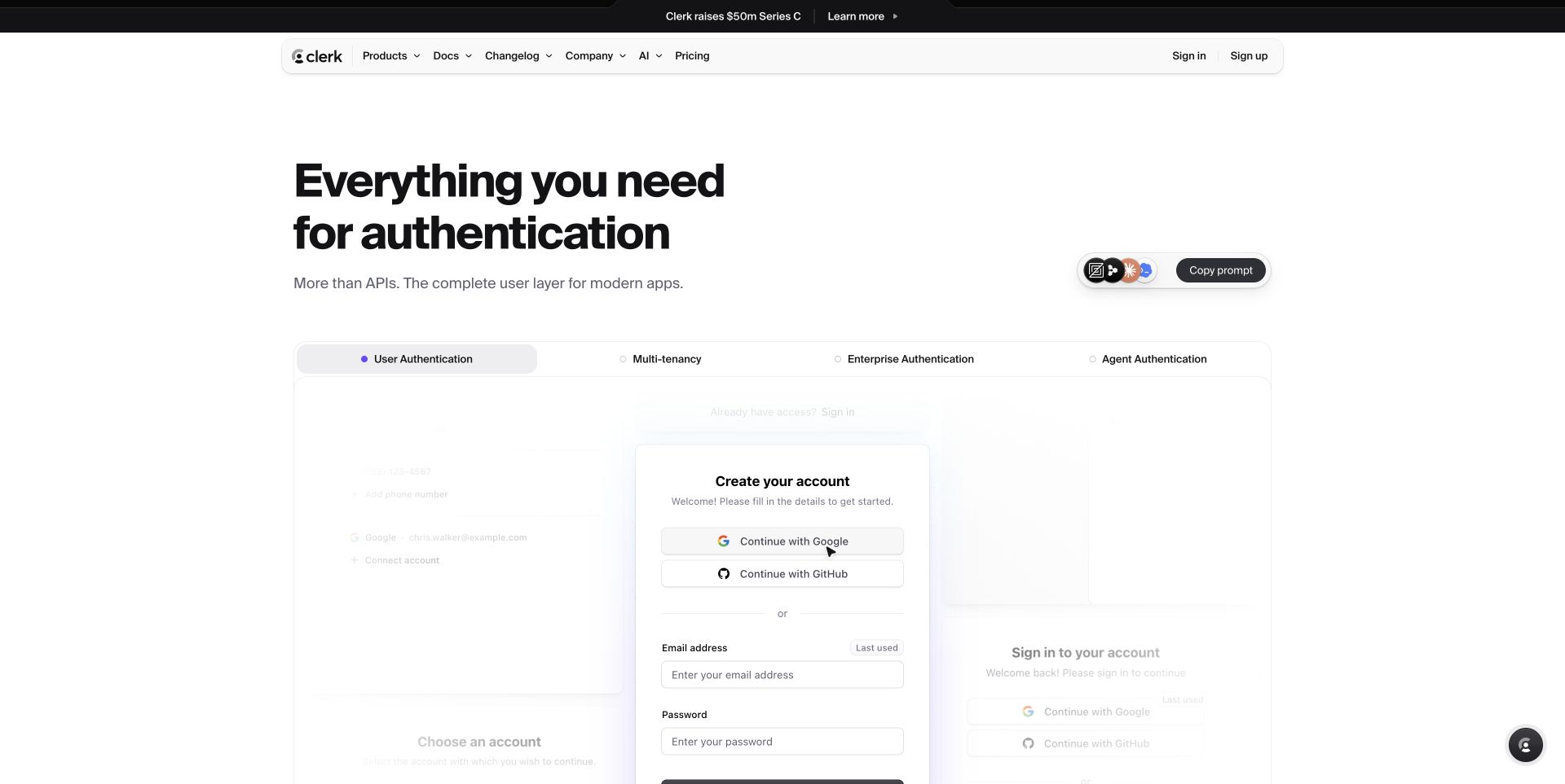
Clerk places a compact authentication proposition above examples of sign-in and account-related interfaces. The light design makes those familiar forms the explanation rather than treating authentication as an invisible backend service. This is useful for a product with two audiences: the team integrating it and the people who will ultimately use the resulting interface. A homepage demonstration, however, cannot establish whether an application’s complete identity and authorization design is appropriate.
What you can learn
Show the end-user task and the developer integration boundary separately. Plan account creation, errors, recovery, organization switching, and removal rather than only a successful sign-in screen. Document what the provider manages and what remains the application team’s responsibility, including product-specific access decisions.
Pros
Recognizable form patterns make the product category concrete.
A clear light hierarchy keeps the example interfaces easy to distinguish.
Cons & considerations
A polished sign-in example does not demonstrate complete account recovery or access design.
Developer and end-user needs require different supporting explanations and test cases.
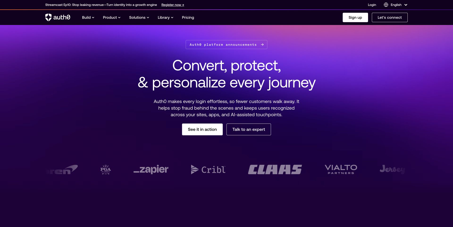
Auth0 uses a saturated purple field and a prominent category proposition, with product, solution, and learning routes retained in a conventional header. The visual emphasizes a broad identity platform rather than one isolated login component. This is useful for evaluating how an established SaaS brand accommodates technical research and commercial inquiry together. The same breadth can make it harder for a visitor with one specific identity problem to decide where to begin.
What you can learn
Organize evaluation by concrete use cases and implementation responsibilities. Give developers a direct documentation path while helping administrators and purchasing stakeholders find deployment, support, and plan information. Keep general identity messaging distinct from claims about the protection of a customer’s complete application.
Pros
The strong color field gives a broad platform a recognizable opening identity.
Persistent product and learning routes support more than one evaluation role.
Cons & considerations
Platform-level language can obscure a narrow first implementation task.
Security-related assurances require precise scope and technical support rather than atmosphere.
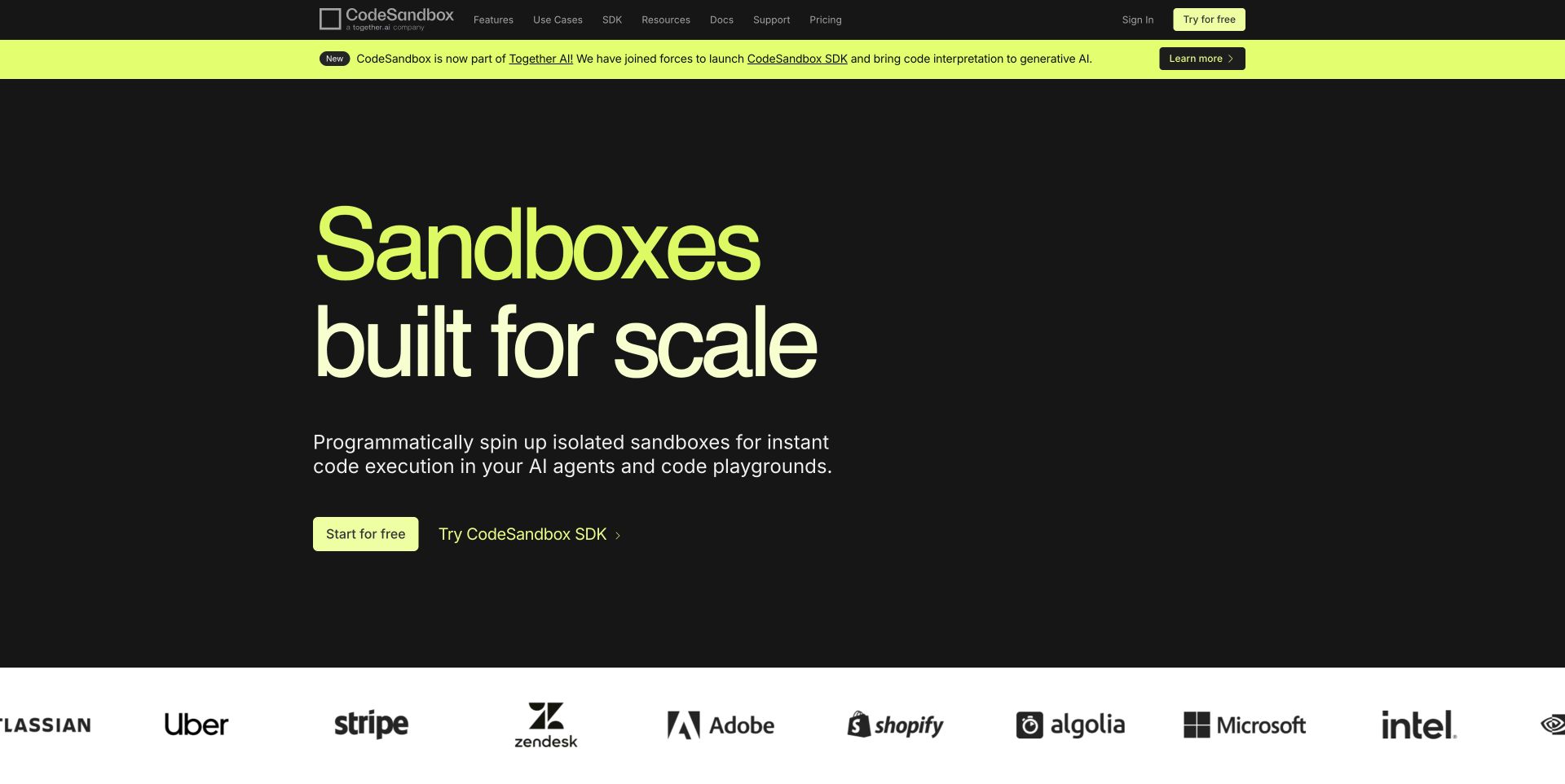
CodeSandbox gives the sandbox concept an oversized headline on a dark field, with a bright green promotional band and a small set of direct product routes. The opening is deliberately more declarative than explanatory, and its supporting surface begins to establish the development context. This can work for an audience already familiar with isolated development environments. Someone encountering the product category for the first time still needs to understand what runs, what persists, and how the environment is shared.
What you can learn
Follow the category statement with one concrete experiment and its lifecycle. Explain creation, access, persistence, shutdown, and the difference between a demo and an operating workload. Make resource and plan boundaries easy to find instead of allowing a scale-oriented headline to stand in for them.
Pros
A strong headline establishes a clear technical subject.
The contrasting brand color distinguishes key calls from the dark surface.
Cons & considerations
Expert terminology needs a plain-language route for unfamiliar evaluators.
Scale messaging needs documented limits and an explanation of environment ownership.
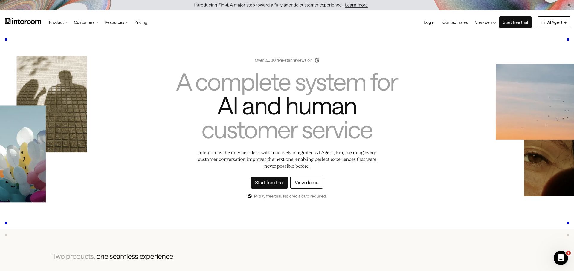
Intercom’s opening combines a human work scene, pale interface imagery, and a large customer-service proposition. The composition introduces an operational setting rather than treating service as a floating chatbot alone. A compact header retains product and pricing routes. This is a useful reference for a SaaS category where customers need to understand how different channels and kinds of response fit together, while the actual division of responsibility still requires a much more specific explanation.
What you can learn
Describe an entire support request from entry to resolution, including handoff and unresolved cases. Separate automated responses, staff actions, customer history, and reporting. Show what a customer sees as well as what an operator manages, and make escalation or fallback behavior part of the evaluation story.
Pros
Human and interface imagery acknowledge that service involves more than one kind of participant.
The product header remains discoverable around the large introduction.
Cons & considerations
A broad complete-system proposition needs concrete workflow boundaries.
The opening does not establish staffing, answer quality, or the behavior of a failed handoff.
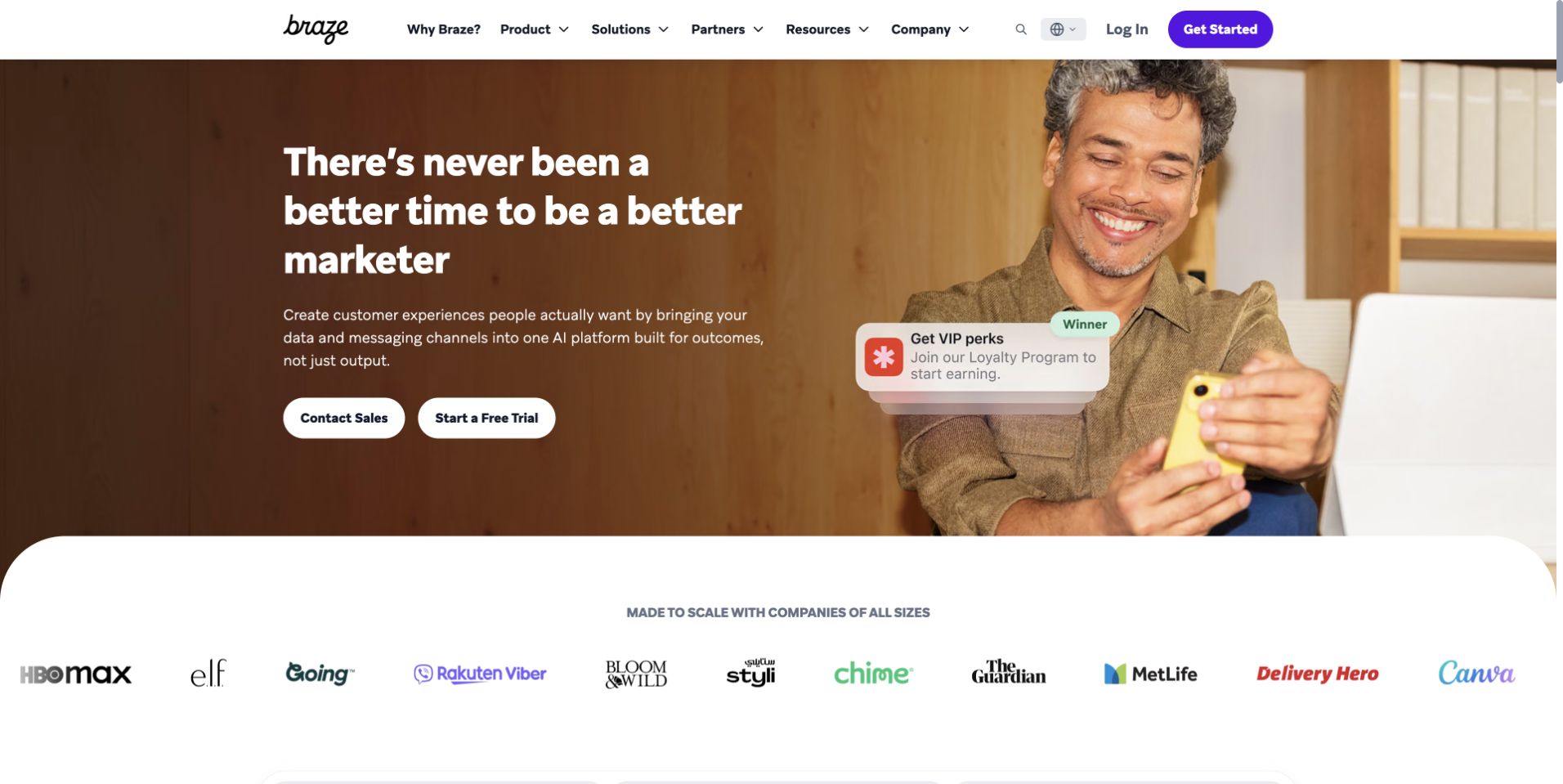
Braze puts a marketer and a short communication example inside a warm, room-like scene. The product navigation and contrasting actions frame the human-centered introduction, while customer names appear below. This makes the intended working audience more visible than a stack of abstract marketing icons would. The next task for the page is to translate that professional setting into clear capabilities, required information, and the relationship between campaign planning and delivery.
What you can learn
Use the role to establish context, then explain the actual sequence of work. Identify how audiences, content, approval, channels, and reporting connect, and which integrations supply information. Avoid turning a friendly portrayal of a user into an unsupported promise about workload or campaign effectiveness.
Pros
The work scene identifies an intended user rather than only a product category.
The example communication adds a concrete output to the broader brand story.
Cons & considerations
Role-focused imagery can leave the product’s boundaries vague.
Customer names and campaign examples need relevant detail rather than implied performance guarantees.
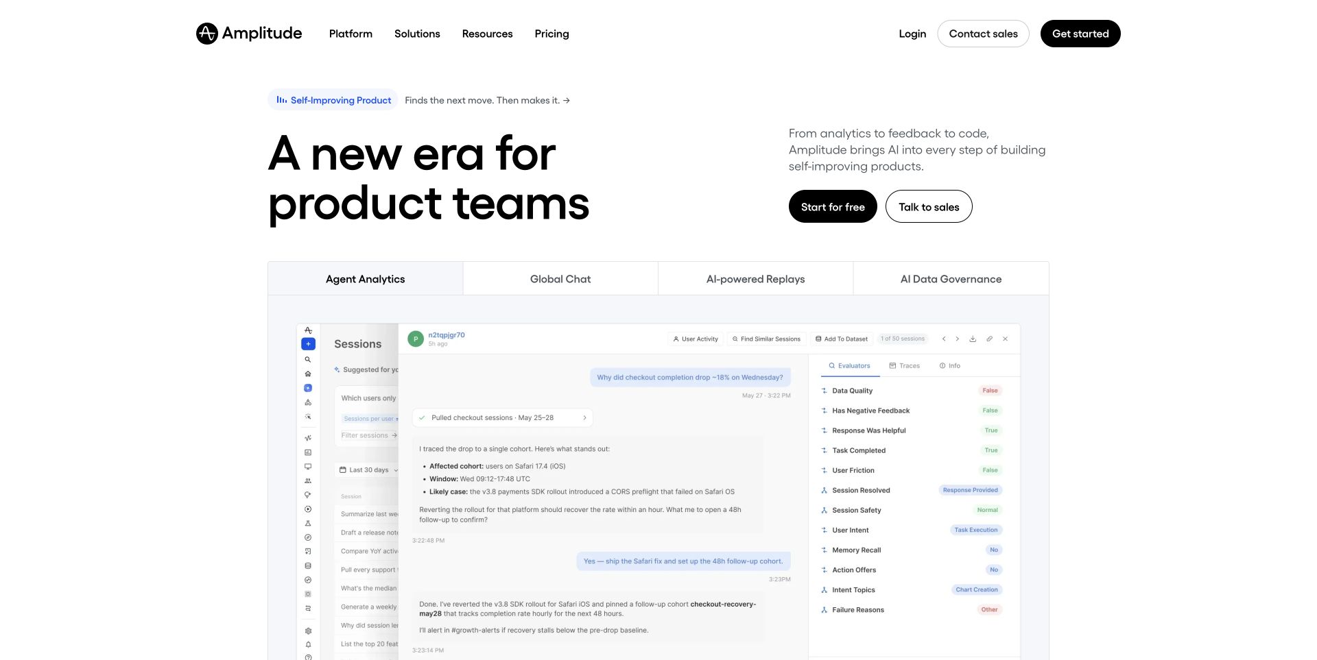
Amplitude leads with a product-team proposition and a large, relatively plain analytical interface. The layout gives the working surface substantial room instead of wrapping it in a complex device illustration. This is useful when the viewer needs to recognize that the product can organize questions, measures, and comparisons. The interface’s presence is not proof that the underlying events, identity stitching, or interpretation are correct; those responsibilities need a separate explanation.
What you can learn
Frame the example around a decision a product team would actually revisit. Explain the required events and definitions, the people who maintain them, and the path from a question to a shared interpretation. Keep demonstration charts and customer-reported results clearly scoped to their evidence.
Pros
The large interface gives the analysis surface room to be understood.
Audience-specific wording helps position the product within a team’s work.
Cons & considerations
A visible chart does not explain the instrumentation needed to create it.
A broad product-team claim needs specific examples for different roles and decision types.
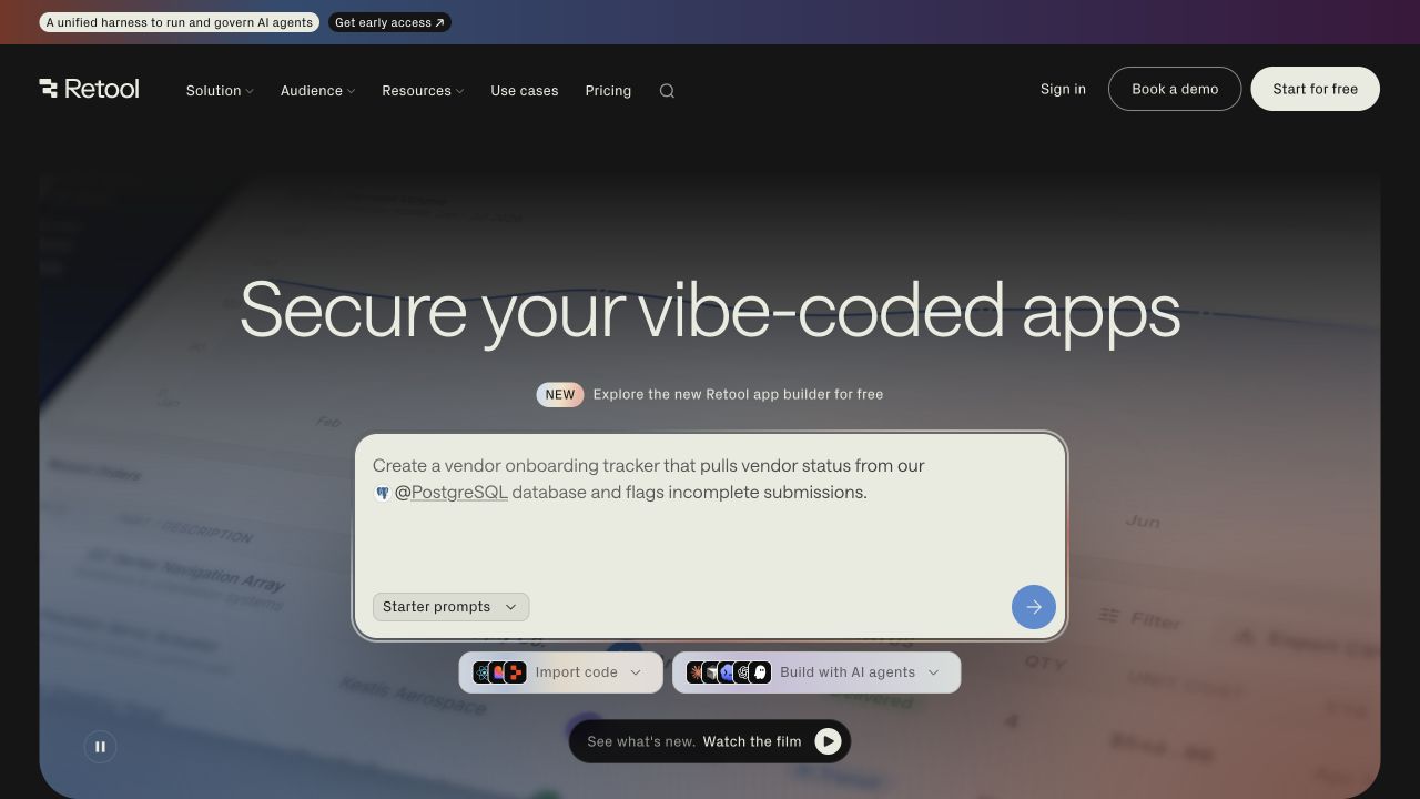
Retool places an application-building proposition over a soft, landscape-like background and surrounds it with a concrete example panel and customer names. The visible campaign addresses a current style of app creation while the main navigation preserves broader product routes. This is useful for studying how an established platform can respond to a topical question without making that campaign its entire information architecture. The presence of a security-oriented message is not an independent assessment of application safety.
What you can learn
Connect the topical campaign to a stable account of building, reviewing, deploying, and operating an internal tool. Explain data connections, permissions, environments, and change control in appropriate supporting pages. Do not let a fashionable development term replace the concrete responsibilities of the team maintaining the result.
Pros
A specific current problem gives the opening an identifiable reason to continue.
The broader product navigation remains available around the campaign.
Cons & considerations
Topical language can date quickly and requires an editorial owner.
A reassuring application image does not demonstrate permissions, review, or deployment controls.
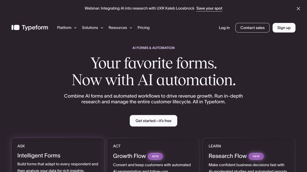
Typeform introduces its broader proposition on a dark purple field with a centered action and three clearly labeled product-use areas below. The hierarchy acknowledges that visitors may know the brand for forms while needing to understand newer automation-oriented possibilities. This is a useful pattern for an established SaaS product broadening its scope. The design still needs to explain where a form ends, what information is passed onward, and which action requires configuration or human review.
What you can learn
Keep the familiar core task easy to find while introducing additional use cases through specific examples. Trace one submission through confirmation, storage, routing, and any automation. Describe required connections and review steps instead of suggesting that adding automation makes operational responsibility disappear.
Pros
Labeled use cases provide structure beneath a broader brand message.
The familiar form category remains part of the introduction.
Cons & considerations
A widened proposition can make a simple form-building task harder to locate.
Automation examples need explicit data-handling and configuration boundaries.
Plan the product story and the evaluation journey together
Write the evaluation questions by role
Collect actual questions from prospective users, support, sales, and implementation staff. Distinguish daily workflow, administration, purchasing, and technical integration needs. Map each recurring question to a maintained page or specific documentation destination. Do not create thin role pages that repeat the same general platform claim.
Build an honest demonstration library
Prepare approved screens with fictional data, clear feature labels, and a recorded product version. Show a manageable first-use case as well as a rich established workspace. Define who replaces demonstrations after the application changes, and keep plan-dependent features or connected services from appearing universally available.
Design the path after the primary action
A trial, demo request, documentation link, and contact-sales action imply different commitments. Make the next step clear, explain information requested, and route submissions to responsible staff. Test validation, confirmation, notification, unavailable appointments, and a plain alternative without collecting unnecessary personal or confidential information.
The editing job behind the design
Treat the marketing site and the application as separate scopes
Choose the public-site platform around the content team’s editing, localization, documentation, preview, and release needs. A product application can use a different stack from its marketing site. The presence of a frontend library, analytics tag, or hosted page builder on a public page does not reveal the SaaS provider’s full infrastructure.
Model product modules, use cases, integrations, pricing explanations, release notes, and customer stories with clear owners. Review every third-party form, scheduler, analytics service, and embedded demo for purpose and failure behavior. A simple public site with reliable handoffs may be more useful than a complex replica of the application.
Our WordPress website examples offer a separate look at publishing approaches. A visible platform label is evidence for that named page, not a guarantee that the same system will suit your requirements.
Before the public launch
SaaS marketing website launch checklist
Ask unfamiliar readers to identify the audience, core task, and primary next step.
Check that interface images use approved fictional information and match the described feature.
Label trial, demo, pricing, documentation, and account destinations accurately.
Verify technical, security, compliance, and customer-result claims with appropriate reviewers.
Test a request, its error state, confirmation, and staff handoff without real customer data.
Read navigation, diagrams, product screens, and long page titles on a small screen.
Keep release notes and integrations connected to the actual maintained product documentation.
Assign owners for screenshots, product changes, broken links, and post-launch corrections.
These checks are a project checklist, not a performance, legal, security, or accessibility certification. Test real journeys with the people responsible for the website before making claims about the result.
Sources & editorial method
How this collection was selected and reviewed
We selected official public SaaS marketing properties with direct dated captures in the library and checked their current official sites for product context. Application accounts, internal dashboards, deployment configuration, and customer data were not accessed. Original screenshot dates remain visible; the category-specific reviews do not treat marketing claims as independently verified outcomes.
Each example links to its actual source page. Screenshots are direct browser captures with their own capture dates; moving imagery, announcements and live designs can change. The notes describe observable design choices and conditional tradeoffs, not measured traffic, conversion results, service quality, or accessibility conformance.
Technology labels use public page metadata, asset evidence, or explicitly cited platform documentation. Platform documentation is not a complete current deployment audit. A component reference may be legacy or unused; it is not a complete backend inventory. Unknown stacks are omitted. These sites are editorial examples, not our client portfolio.
Written, Edited and Curated are separate editorial records, not timestamps advanced by a rebuild. Website designs and imagery belong to their owners. See our editorial standards or suggest a correction.
Questions worth asking
SaaS website design questions
Should a SaaS homepage show the dashboard immediately?
Show the image that best explains the task. A dashboard helps when its objects are familiar and readable. A workflow, example output, or human work setting may introduce the product better, but it still needs a clear explanation of what the software actually does.
Should the main button be a free trial or a demo?
Use the action that matches the actual operating model. A self-serve product may support a useful first task without a meeting. A complex implementation may require a conversation. Describe the next step honestly and provide enough evaluation material that a visitor can decide whether it is worth taking.
Can we use AI or security language in the hero?
Only when the wording accurately describes a defined product capability and its limits. Have suitable reviewers check the supporting explanation, required configuration, information handling, and human review. A fashionable term or reassuring visual should not imply an unverified outcome.
Does the marketing site need the same technology as the app?
Not necessarily. The public site and application have different editing, deployment, authentication, and operating requirements. Choose an ownership model that supports both, and design their handoffs carefully. A public technology fingerprint is not a complete description of the application’s backend.
Borrow a more precise way to explain the product. Then make the demonstration, evaluation material, and next step match the way your software actually works.