Best ClickHouse Websites of 2026 (20 Real-World Examples)
Public interfaces, documented analytical workloads and a clearer brief for ClickHouse development.
Explore 20 public website designs beside primary ClickHouse customer accounts. The associations concern particular analytical or observability systems—not a claim that ClickHouse renders these marketing pages.
Visa, Cisco, Tesla, Netflix and Shopify introduce a collection spanning financial services, networking, vehicles, entertainment and commerce. Their documented ClickHouse uses are more specific: Visa’s conversational-agent analytics, Cisco Talos research and several observability workloads. Those distinctions matter more than the size of the company logo.
Later examples range from Ramp’s customer-facing analysis to LangSmith and Temporal’s Chronicle. The independently inspected public pages show how each organization communicates. The cited case shows a bounded implementation. Use one for interface ideas and the other for questions to ask of your own analytical project.
Before the examples
What makes good ClickHouse website development in 2026?
Start with the analytical question and its time boundary
Describe the decision the result must support. Name the population, time window and expected freshness before choosing a chart. A fast answer with an ambiguous definition is still an unreliable feature. Give reviewers a small example whose correct result they can calculate independently.
Choose the data arrangement against actual queries
ClickHouse’s MergeTree documentation describes sorting keys, sparse indexing and data parts. These choices belong to the workload design, not a visual redesign exercise. Ask the implementation team to explain the representative queries and their storage implications. Do not prescribe a table arrangement simply because a customer story used it.
A reporting feature needs understandable freshness and scope. Show the period being measured and distinguish a complete result from an import still in progress. When data arrives late, explain the limitation rather than relying on a live-looking animation to imply that every source is current.
The collection · 20 examples
20 ClickHouse website examples worth studying
Twenty public design references with scoped primary evidence for a ClickHouse workload. Customer claims remain attributed rather than becoming independent performance promises.
We start with five recognizable brands or organizations: Visa, Cisco, Tesla, Netflix, Shopify. Each attribution applies to the named website property, not every product or website belonging to its organization. This is a curated reading sequence, not a measured ranking.
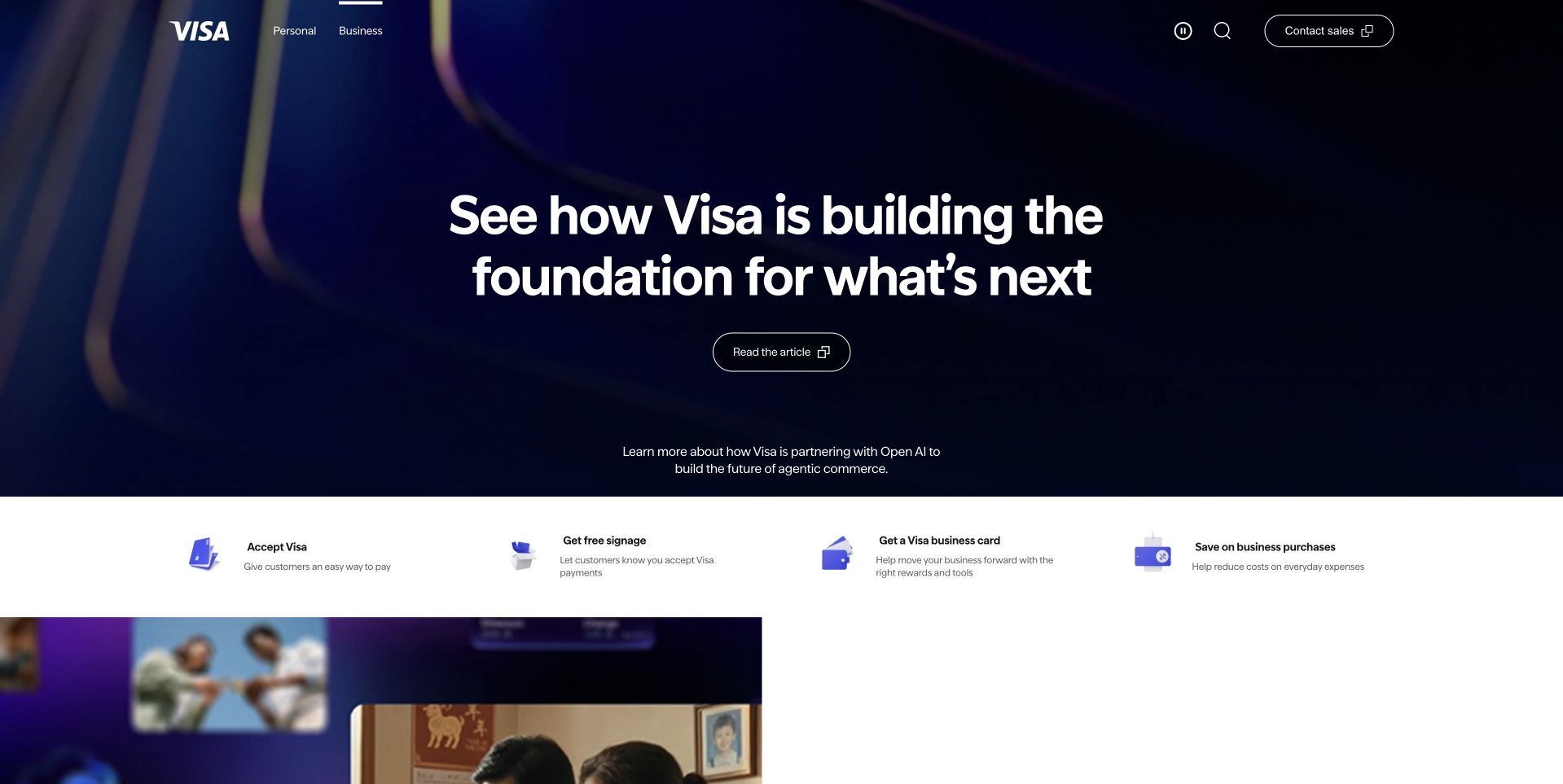
Visa’s public business page uses a dark blue campaign field above four concise routes for accepting payments, signage, a business card and business problem-solving. The large opening message is expansive, but the task strip gives the reader something more concrete to do next. A restrained header keeps the brand visible without competing with the campaign. This is a useful reference for introducing a broad enterprise service while preserving practical entry points. The ClickHouse account concerns conversational-agent analytics; it does not identify Visa’s payment-processing architecture or the public page’s rendering system.
What you can learn
Pair an ambitious brand introduction with a short, stable set of user tasks. Choose labels that describe an actual need rather than internal departments. Keep those routes usable when the campaign changes, and make the difference between exploring a capability and committing to a product clear.
Pros
The blue field establishes an unmistakable brand frame.
A four-task strip translates the broad proposition into practical routes.
Cons & considerations
A sweeping future-oriented headline needs concrete detail below.
Business visitors still need clear geographic and product eligibility.
Platform source: Primary documented ClickHouse association. Documented association: Documented conversational-agent analytical workload; not the implementation of Visa payment processing or the public corporate page. Platform evidence is separate from the direct website screenshot and is not a complete current infrastructure audit.
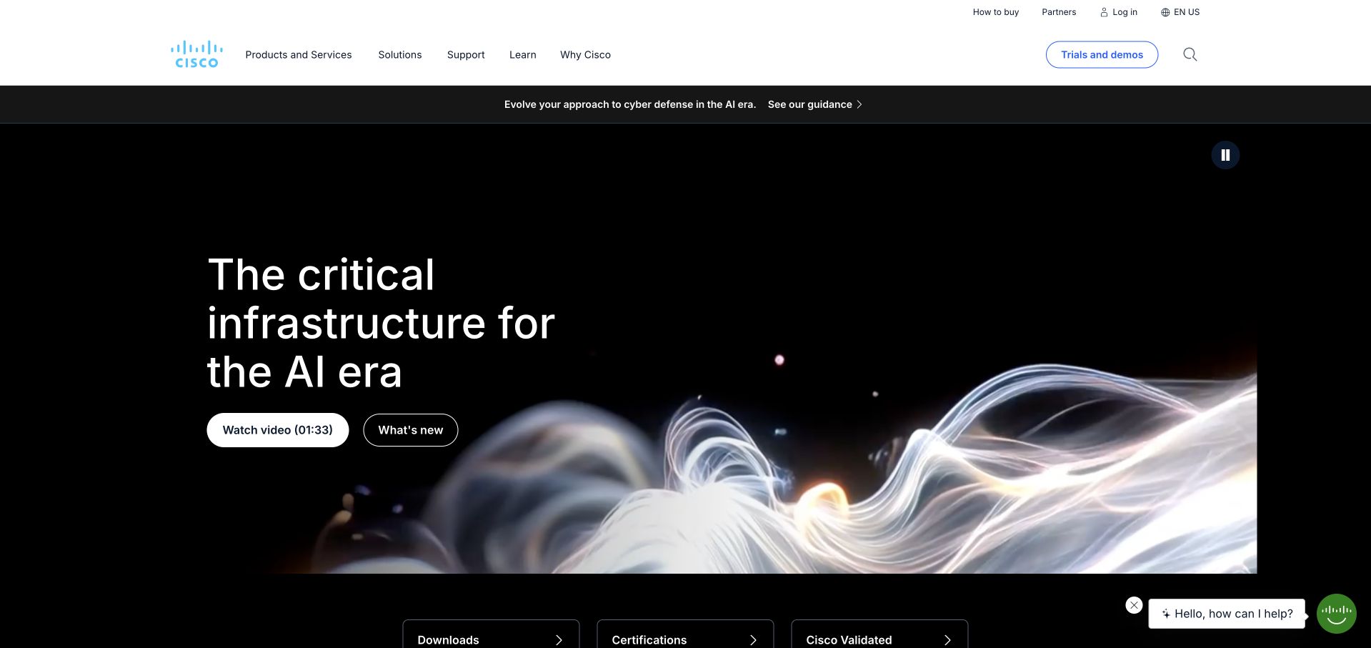
Cisco’s inspected public page places a dark infrastructure campaign beneath a white enterprise header. A flowing abstract image gives the AI-era theme a visual form, while separate viewing and discovery actions keep the opening from becoming a wall of explanation. Practical routes for downloads and certifications appear at the lower edge of the feature. The composition recognizes that some visitors want a new idea and others have an existing technical task. The documented ClickHouse association concerns Cisco Talos threat research, not every Cisco product or the implementation of this public marketing page.
What you can learn
Give a broad technical campaign a defined space, then preserve the utilities people already know. Explain the actual capability before asking visitors to interpret abstract imagery. A useful infrastructure homepage can support discovery without making support, documentation and downloads feel like secondary or hidden destinations.
Pros
The white header separates navigation from the dark campaign.
Technical utility routes remain distinct from promotional actions.
Cons & considerations
Abstract motion needs a meaningful static alternative.
A broad AI message must lead to specific products and evidence.
Platform source: Primary documented ClickHouse association. Documented association: Specific ClickHouse customer workload; no inference across every Cisco product or its public homepage. Platform evidence is separate from the direct website screenshot and is not a complete current infrastructure audit.
Tesla’s captured homepage centers a vehicle against a wide mountain setting, with a short model label and two compact actions above it. The navigation is narrow and deliberately light, leaving most of the first screen to the product. A separate financing line supplies commercial context without turning the image into a dense comparison table. The design is effective as a study in restraint, though it depends heavily on the visitor recognizing what is being sold. The ClickHouse reference concerns observability; it does not establish the software in the vehicle or the public storefront’s backend.
What you can learn
Use a strong product image to simplify an opening, but keep practical purchase conditions readable. Distinguish ordering from exploring specifications so a visitor knows the commitment involved. Maintain accessible text and controls rather than asking the photograph to carry information about availability, price or product differences.
Pros
The product has a clear and uninterrupted visual focus.
Two short actions make the next choices easy to distinguish.
Cons & considerations
Commercial terms need more context than the hero can provide.
A familiar product image is less explanatory for first-time buyers.
Visible tech stack
Earlier / documented evidence
ClickHouse
Platform source: Primary documented ClickHouse association. Documented association: Observability platform association; not the vehicle software, safety systems or public storefront. Platform evidence is separate from the direct website screenshot and is not a complete current infrastructure audit.
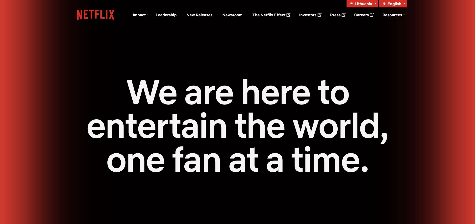
Netflix’s About page opens with a very large white mission statement inside a black field with red light-like edges. The centered typography becomes the main visual event, while the upper navigation retains corporate routes for leadership, news and impact. There is little ambiguity about whether this is an institutional destination rather than the streaming catalog. The page demonstrates how a familiar brand can introduce its purpose without depending on a grid of entertainment posters. The ClickHouse customer account concerns logging and observability, not the corporate publishing system or the whole streaming architecture.
What you can learn
Choose a single organizing idea for a corporate introduction and make the next institutional routes dependable. Large type works when the statement is short enough to scan and remains readable at narrow sizes. Keep product consumption and company information distinct so visitors understand which destination they have reached.
Pros
The black-and-red frame creates strong brand continuity.
A single statement gives the first screen an unmistakable hierarchy.
Cons & considerations
Oversized type requires careful line breaking on small screens.
A mission statement still needs specific supporting information below.
Platform source: Primary documented ClickHouse association. Documented association: Logging and observability workload; not the corporate publishing system or complete streaming architecture. Platform evidence is separate from the direct website screenshot and is not a complete current infrastructure audit.
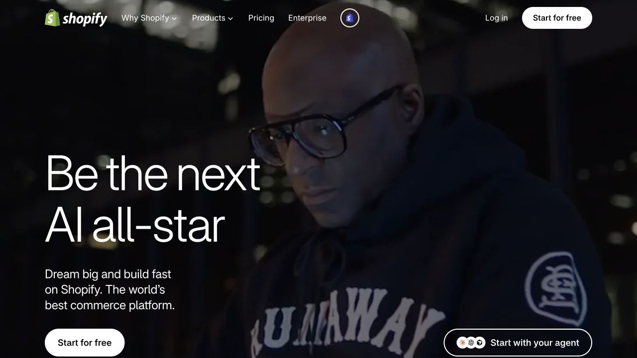
Shopify’s homepage uses a darkened full-width scene behind a large creation-oriented message and a bright rounded starting action. The person in the image gives the platform story a human setting, while the main header keeps products, enterprise information and pricing accessible. A smaller agent-oriented control sits separately from the principal action. The layout makes the current campaign prominent without completely replacing the underlying platform navigation. ClickHouse’s source describes Shopify observability. It does not imply that every Shopify merchant directly uses ClickHouse or that the pictured marketing page is rendered by it.
What you can learn
Use a human setting to introduce an enabling platform, then make the practical route into the product clear. Keep new feature controls distinguishable from the main start action. Explain who an offer is for and what setup involves rather than assuming a motivational headline can answer every buying question.
Pros
The campaign connects an abstract platform to a person.
The primary start action contrasts clearly with the image.
Cons & considerations
Text over video needs stable contrast and reduced-motion treatment.
A broad creation message needs specific commercial and setup details.
Platform source: Primary documented ClickHouse association. Documented association: Internal observability at Shopify; not every merchant store or the public marketing frontend. Platform evidence is separate from the direct website screenshot and is not a complete current infrastructure audit.
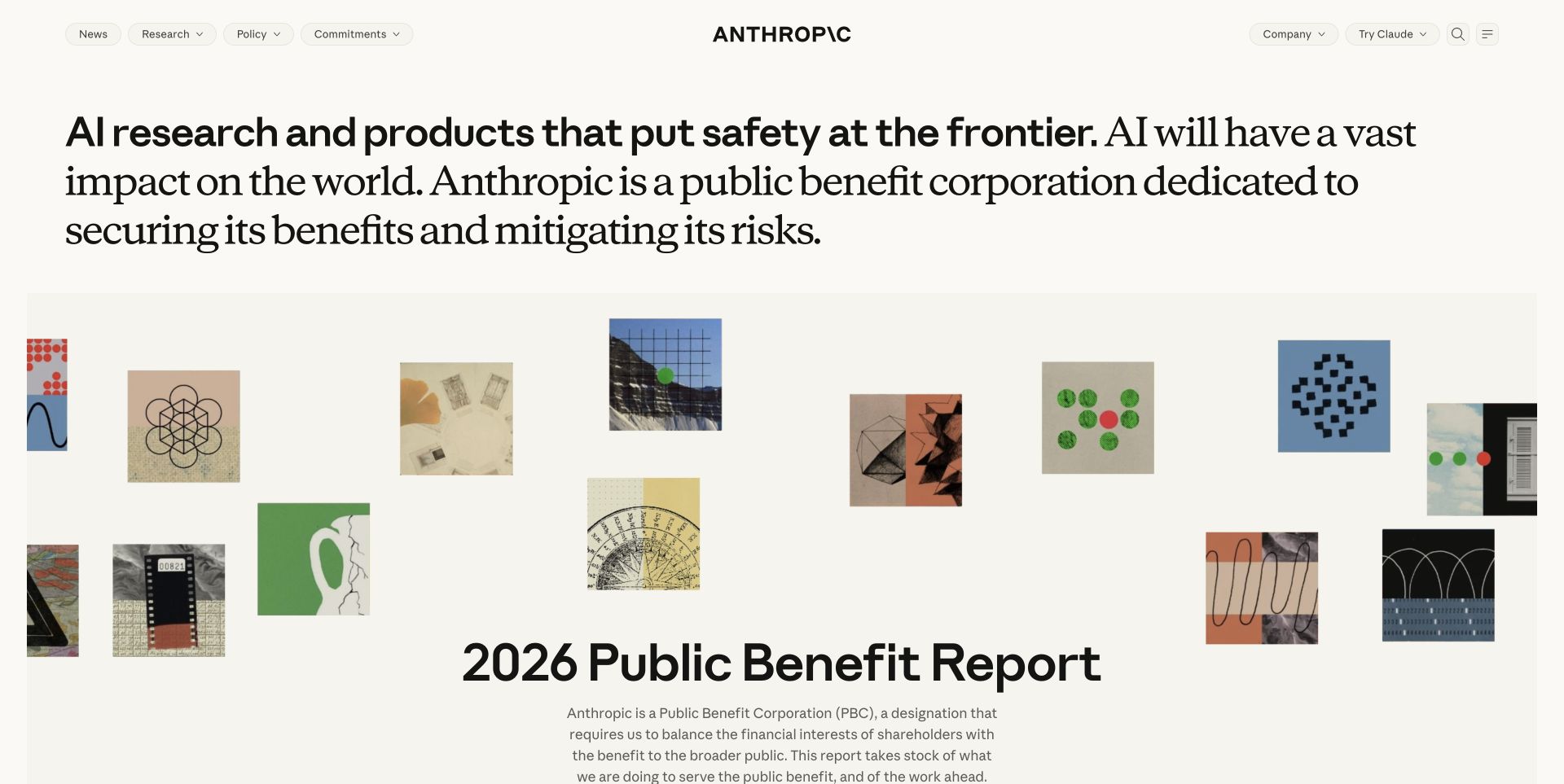
Anthropic’s public page uses a warm off-white background and a long editorial-style introduction before a public-benefit report feature. A loose arrangement of small artworks adds visual texture around the report without turning the opening into a conventional software screenshot. The sparse navigation keeps research and company exploration visible. This is useful for studying how institutional identity can be made distinct from a product sales page. The ClickHouse source concerns observability supporting AI operations; it does not reveal model architecture or establish the technology of the public website itself.
What you can learn
Let a research organization explain its role in readable language before presenting supporting material. Use artwork to create character, not to substitute for evidence. Give reports clear titles and dates, and preserve obvious routes for readers seeking products, research or organizational information rather than assuming they share one intention.
Pros
The warm background supports a calm editorial reading experience.
The report feature gives the mission a concrete continuation.
Cons & considerations
A long opening sentence needs disciplined mobile wrapping.
Decorative artwork should not be mistaken for research evidence.
Platform source: Primary documented ClickHouse association. Documented association: Observability supporting AI operations; not proof of model architecture or marketing-page runtime. Platform evidence is separate from the direct website screenshot and is not a complete current infrastructure audit.
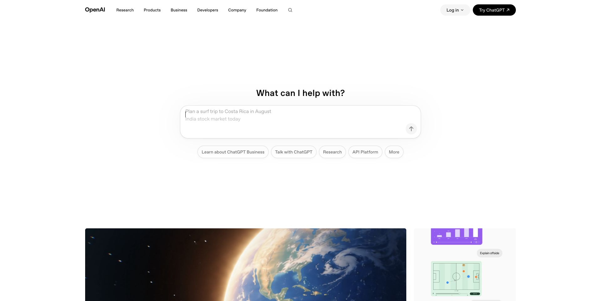
OpenAI’s captured public page centers a short prompt-like invitation and a large input-style surface within extensive white space. Smaller suggested actions sit underneath, while research and product navigation remain at the top. Content cards begin below the central interaction, creating a second layer for visitors who are not ready to start a task. The page is a useful reference for balancing a focused interactive entry with a broader information destination. The documented ClickHouse workload is observability; it is not evidence about model training, every OpenAI product or the public page’s database.
What you can learn
Make the first interaction understandable before asking for input. Keep browsing routes available for people who need context first, and label suggested actions by their purpose. The surrounding interface should explain what happens next and which destination is a product interaction rather than merely a public information link.
Pros
White space gives the central interaction an obvious priority.
Suggested actions provide alternatives to an empty starting point.
Cons & considerations
An input-like surface needs clear behavior before submission.
Minimal product language can leave unfamiliar visitors needing more context.
Platform source: Primary documented ClickHouse association. Documented association: Documented observability workload; no claim about model training or every OpenAI product. Platform evidence is separate from the direct website screenshot and is not a complete current infrastructure audit.
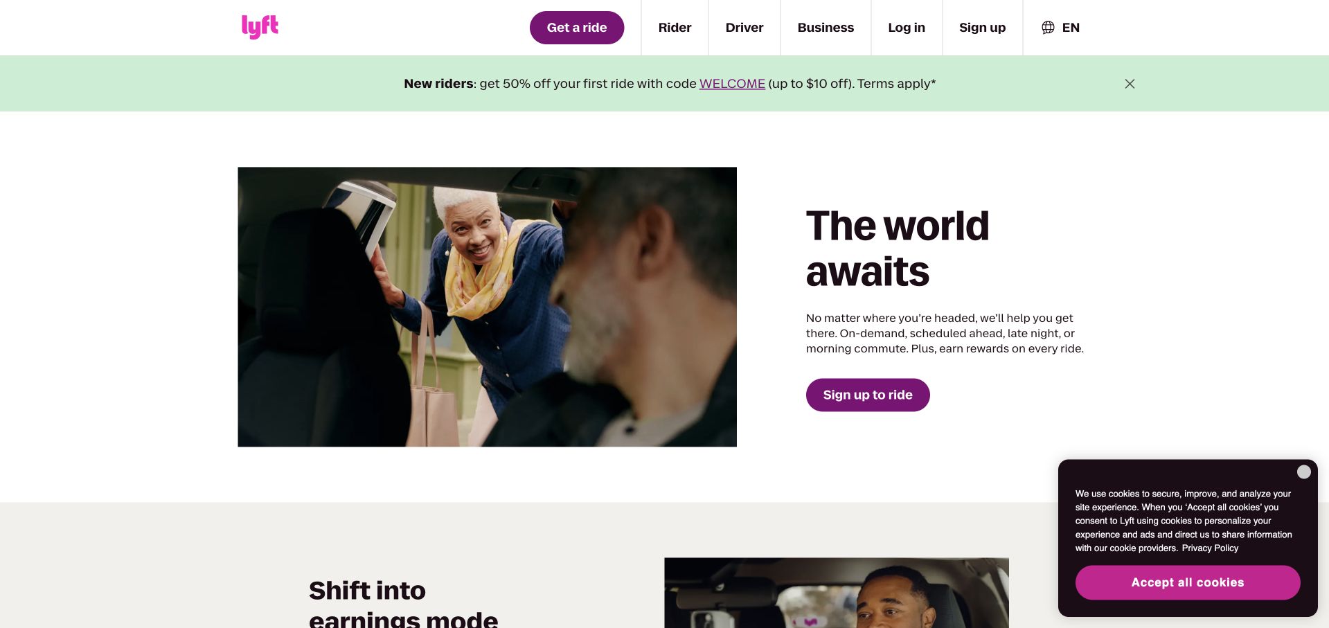
Lyft’s public homepage pairs a short travel-oriented message with a photograph of people connecting around a ride. Purple actions and branding sit within a mostly white layout, while a separate promotional strip appears above the feature. The rider and driver routes are visible in the header, acknowledging that the platform serves different audiences. This split composition offers a useful alternative to making an entire first screen a moving map. The ClickHouse source describes batch and real-time analysis, not the public page rendering or a complete inventory of Lyft’s application systems.
What you can learn
Show the outcome of a service and pair it with a plainly labeled action. Keep different audiences separate enough that someone trying to earn does not follow a route intended for someone booking a ride. Give temporary promotional conditions their own readable space instead of blending them into the service explanation.
Pros
The human scene makes the service outcome easy to imagine.
Rider and driver navigation acknowledges distinct audience needs.
Cons & considerations
Promotional conditions can crowd the opening on narrow screens.
Service availability and geography need explicit supporting detail.
Platform source: Primary documented ClickHouse association. Documented association: Batch and real-time analysis; not the public ride-service page rendering. Platform evidence is separate from the direct website screenshot and is not a complete current infrastructure audit.
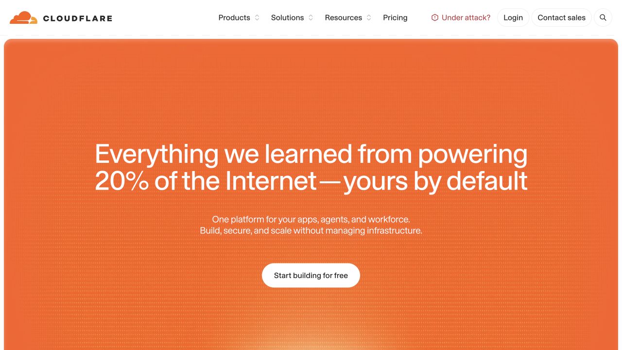
Cloudflare’s captured homepage uses a large orange field beneath a restrained white enterprise header. A centered message connects the platform’s experience to the visitor’s infrastructure needs, with a single rounded starting action below it. The visual is deliberately simple compared with the breadth of products available through the navigation. This makes the page useful for studying how to introduce a complex platform without presenting its entire catalog immediately. The ClickHouse reference concerns an analytical workload; it does not establish every Cloudflare service or identify the database behind this marketing page.
What you can learn
Create one comprehensible opening for a broad platform, then let product detail unfold through clear routes. A strong color field can carry identity without extra illustration. Keep the first action precise and explain the differences between starting freely, contacting sales and configuring a production service in the following content.
Pros
The orange field provides a strong and consistent visual identity.
A single central action keeps the opening easy to scan.
Cons & considerations
The broad proposition needs detailed capability routes below.
A saturated background requires careful text and focus contrast.
Platform source: Primary documented ClickHouse association. Documented association: Cited analytical workload; not proof that every Cloudflare service or its marketing page uses the same data system. Platform evidence is separate from the direct website screenshot and is not a complete current infrastructure audit.
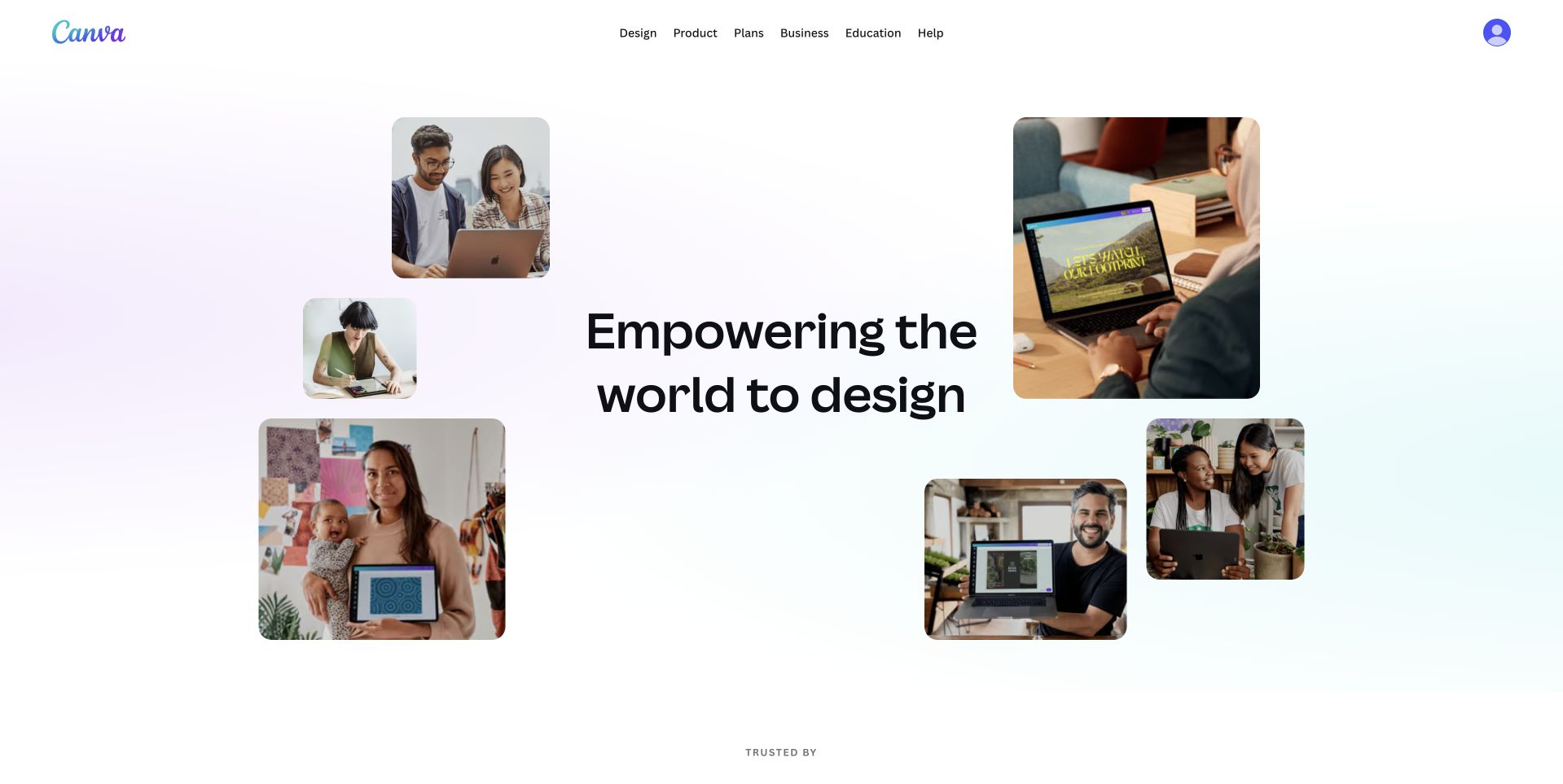
Canva’s About page places a concise design mission in the center of a loose collage of people using devices and working together. A soft pale background and generous spacing keep the composition light. The individual images suggest different contexts without requiring the reader to inspect a complex editor screenshot. A compact header preserves the platform’s main commercial and educational routes. The ClickHouse case concerns a specific search and analytics implementation. It should not be read as a complete account of Canva’s design editor or the stack serving this public About page.
What you can learn
Show several credible use contexts around one clear mission. Keep the images subordinate to the reading order and provide meaningful alternatives where they add information. An About page should connect the organization’s purpose to actual users while still offering practical routes for someone who wants the product, company information or support.
Pros
Several small scenes communicate variety without a dense catalog.
The central mission remains the strongest reading element.
Cons & considerations
A scattered collage needs a deliberate narrow-screen order.
General mission language should lead to specific organizational information.
Visible tech stack
Earlier / documented evidence
ClickHouse
Platform source: Primary documented ClickHouse association. Documented association: Specific search and analytical implementation described in the customer case; not the entire design editor or public About page. Platform evidence is separate from the direct website screenshot and is not a complete current infrastructure audit.
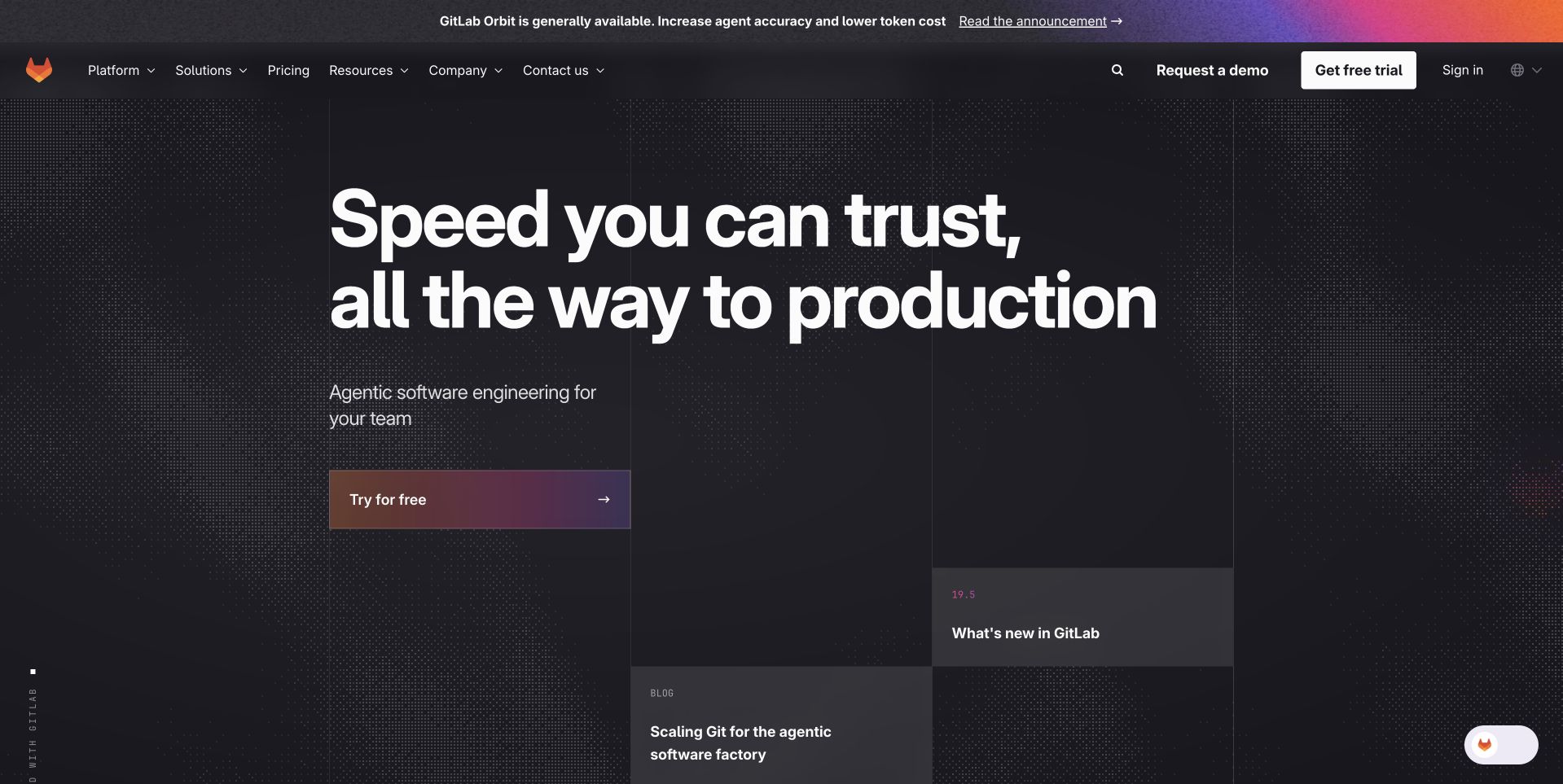
GitLab’s public marketing page places a large speed-and-production message on a dark patterned field. A warm gradient action stands apart from the background, while the upper navigation keeps the platform, solutions, resources and pricing available. A separate announcement strip introduces a current product update without becoming the main heading. The composition is useful for studying a developer brand that wants to feel expressive rather than purely documentary. The ClickHouse customer reference concerns analytical workloads, not the GitLab repository engine or proof of the technology rendering the public marketing page.
What you can learn
Give a complex developer platform a short opening proposition and an obvious continuation. Keep release announcements distinct from permanent navigation. Supporting technical material should explain the promise in concrete terms; a confident headline and decorative field cannot establish performance, security or the suitability of an entire delivery workflow.
Pros
Large type gives the dark composition a clear hierarchy.
The warm action treatment separates the next step from navigation.
Cons & considerations
Support widgets should not obscure the main message.
Speed language needs specific, qualified evidence beyond the hero.
Platform source: Primary documented ClickHouse association. Documented association: Analytical workload documented by ClickHouse; not the GitLab repository engine or marketing framework. Platform evidence is separate from the direct website screenshot and is not a complete current infrastructure audit.
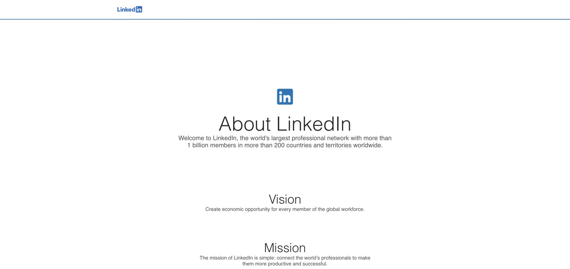
LinkedIn’s About page uses a small centered brand symbol above a plain organizational introduction, followed by separate vision and mission sections. The largely white composition gives each statement room and avoids recreating a professional feed. A very light upper frame keeps the page feeling institutional rather than transactional. It is useful as a study in separating a company explanation from the interaction patterns of its main product. The ClickHouse account describes an observability workload; it does not identify the implementation of this About page or every LinkedIn service.
What you can learn
Use a company page to answer organizational questions rather than imitate the application. Give mission, scale and practical company routes distinct roles. Keep factual claims current and provide a clear continuation for readers who need careers, press or product information instead of leaving the introduction as an isolated statement.
Pros
The centered sequence creates an uncomplicated reading order.
Mission and vision are visually separated rather than combined.
Cons & considerations
Large white gaps need adjustment for shorter screens.
Institutional statements still need useful routes to concrete information.
Platform source: Primary documented ClickHouse association. Documented association: Observability use described in the source; corporate About page is independently reviewed. Platform evidence is separate from the direct website screenshot and is not a complete current infrastructure audit.
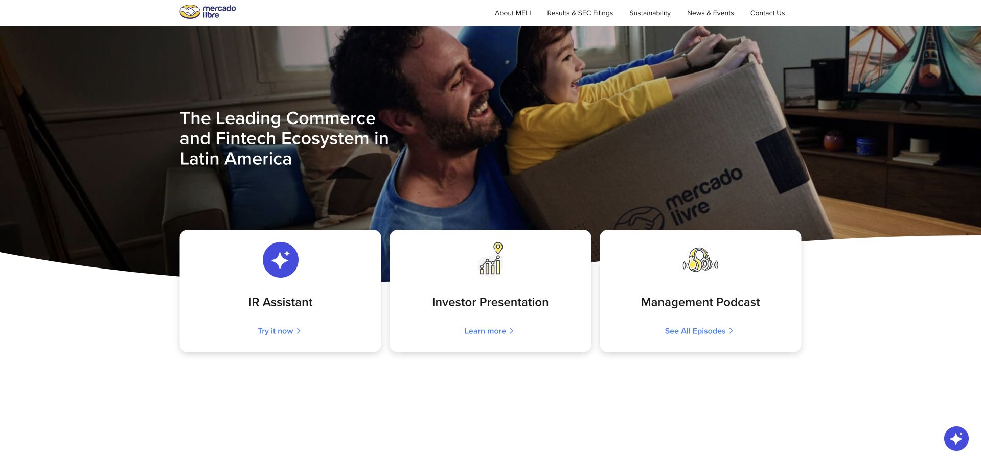
Mercado Libre’s investor page opens with a family receiving a branded delivery, then overlaps three white utility cards for an assistant, an investor presentation and a management podcast. The scene connects the corporate story to the commerce experience people recognize. A restrained header keeps reporting and sustainability routes available above the feature. The cards make the page more useful than a purely atmospheric investor introduction. The ClickHouse source concerns observability at the organization, not the investor page’s CMS or the full architecture of every marketplace and financial service it operates.
What you can learn
Anchor a corporate story in a recognizable activity, then provide the documents and resources the audience came to find. Keep dated investor material easy to identify and ensure overlapping cards retain a sensible keyboard and mobile order. Interactive assistance should supplement rather than replace direct access to the underlying information.
Pros
A delivery scene gives the parent-company story a concrete setting.
Three utility cards expose useful investor destinations immediately.
Platform source: Primary documented ClickHouse association. Documented association: Observability workload; not the public investor-site CMS or every marketplace system. Platform evidence is separate from the direct website screenshot and is not a complete current infrastructure audit.
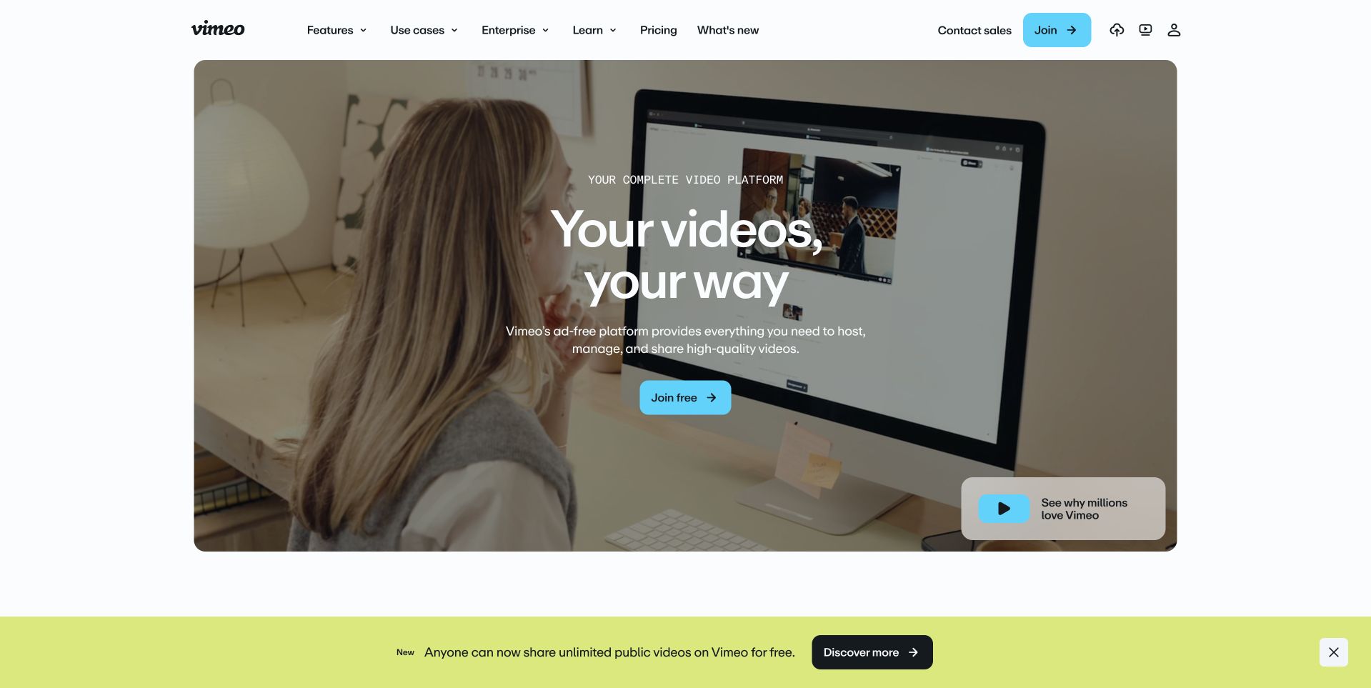
Vimeo’s homepage uses a large rounded feature containing a person working with video on a screen. A centered message and blue joining action sit over the scene, with a separate small video continuation in the corner. A bright announcement strip below has its own role rather than interrupting the headline. The header keeps features, use cases and pricing available for comparison. The ClickHouse customer story describes video analytics. It does not establish the technology of this marketing page or the complete storage, processing and delivery architecture of the video service.
What you can learn
Bound a rich media scene so navigation and adjacent information remain stable. Make the primary start action distinguishable from playing a demonstration. Provide a meaningful still image, captions where needed and a readable explanation outside the media so the page remains useful when motion or playback is unavailable.
Pros
The rounded feature gives media a defined visual boundary.
Blue action styling contrasts clearly with the muted scene.
Cons & considerations
Text over moving imagery needs stable contrast.
Joining and viewing a demonstration must remain distinct actions.
Visible tech stack
Earlier / documented evidence
ClickHouse
Platform source: Primary documented ClickHouse association. Documented association: Video analytics workload; no claim about the public marketing-page frontend or complete video-delivery system. Platform evidence is separate from the direct website screenshot and is not a complete current infrastructure audit.
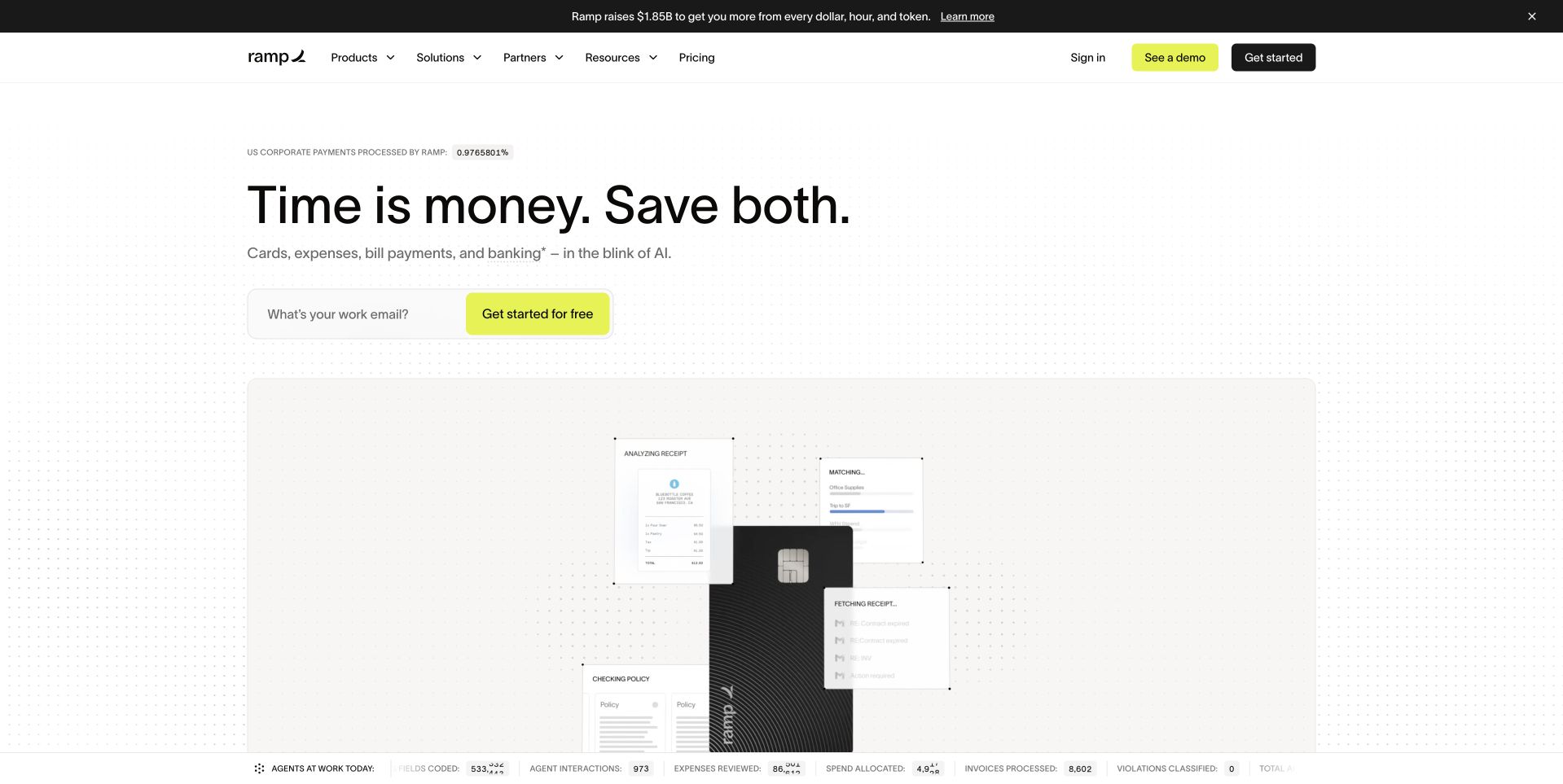
Ramp’s homepage uses a bright, mostly white composition with a short time-and-money proposition, a work-email entry and a product interface preview below. Lime accents make the primary routes easy to locate without coloring the entire page. The image suggests the flow of operational work rather than relying only on a corporate card photograph. A separate announcement strip stays above the main navigation. The January 2026 ClickHouse account concerns customer-facing analytics. It is not evidence of the public frontend or an endorsement of Ramp’s financial products and their suitability.
What you can learn
Translate an operational promise into an understandable product view. Explain what an email submission starts and preserve a route for visitors who need product or commercial information first. Keep financial terms, eligibility and commitments explicit rather than allowing a simple hero to imply the whole offer is equally simple.
Pros
Lime accents identify actions within a restrained white layout.
A product preview supports the otherwise abstract operational promise.
Cons & considerations
Email collection needs clear expectations about the next step.
Financial-product terms require more detail than the opening provides.
Platform source: Primary documented ClickHouse association. Documented association: Documented financial-operations analytics workload; not the public marketing frontend or a financial-product endorsement. Platform evidence is separate from the direct website screenshot and is not a complete current infrastructure audit.
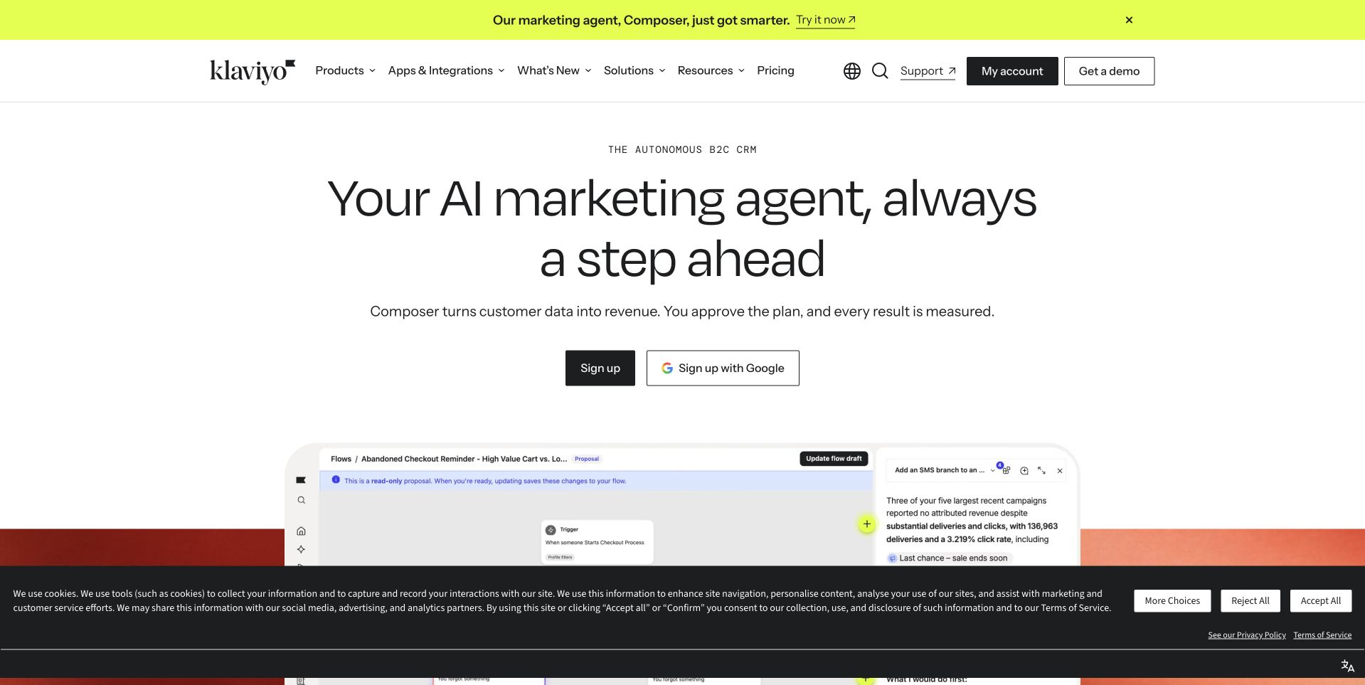
Klaviyo’s captured homepage centers a short marketing-agent proposition above signup actions and the beginning of a product interface. A white background and large type make the opening feel measured despite the broad automation theme. The main header offers product, integration, resource and pricing routes, while a bright announcement strip is visibly separate. The page is useful for studying how to give a platform one clear entry without immediately displaying every feature. The ClickHouse source concerns segmentation and personalization analysis, not the complete campaign system or the implementation of this public page.
What you can learn
Give an automation product a clear initial promise, then show enough interface to make the claim tangible. Explain the user’s review and control responsibilities in supporting content. Keep ordinary signup distinct from connected-account signup and make commercial exploration possible before asking for an account or business data.
Pros
The centered hierarchy makes the principal proposition easy to scan.
An interface preview gives the platform a tangible next layer.
Cons & considerations
Automation claims need concrete limits and review behavior.
Persistent notices should not obscure the product demonstration.
Platform source: Primary documented ClickHouse association. Documented association: Segmentation and personalization analysis; separate from the public platform-marketing page. Platform evidence is separate from the direct website screenshot and is not a complete current infrastructure audit.
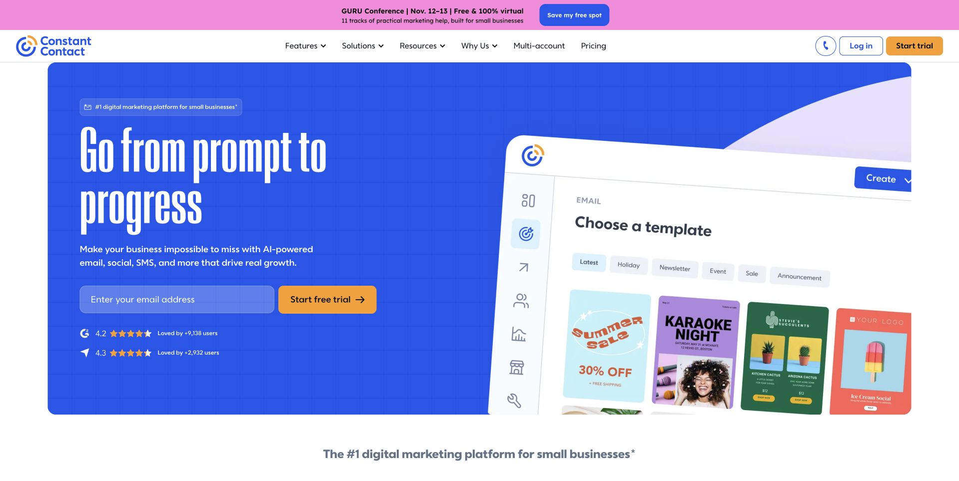
Constant Contact’s homepage places a large white headline on a saturated blue field beside a tilted product preview. The preview shows a template-selection task, grounding the broader prompt-to-progress campaign in something a small business can recognize. An orange starting action has its own strong contrast, and a pink event strip remains separate above the main navigation. The composition is more expressive than a plain feature list while still exposing the product’s setting. The ClickHouse source documents an analytics migration from Pinot; it does not establish every campaign system or the public frontend.
What you can learn
Pair an ambitious marketing message with one recognizable product task. Let the supporting interface explain what the user will actually do next. Keep temporary event promotion separate from the permanent platform routes, and ensure the lively composition retains a logical reading order when the two columns become a narrow layout.
Pros
The product preview makes the campaign more concrete.
Blue and orange create a clear visual action hierarchy.
Cons & considerations
Tilted previews may be difficult to read at small sizes.
Several bright promotional layers need disciplined mobile priorities.
Visible tech stack
Earlier / documented evidence
ClickHouse
Platform source: Primary documented ClickHouse association. Documented association: Documented analytics migration from Pinot; not proof of every current campaign or public-page system. Platform evidence is separate from the direct website screenshot and is not a complete current infrastructure audit.
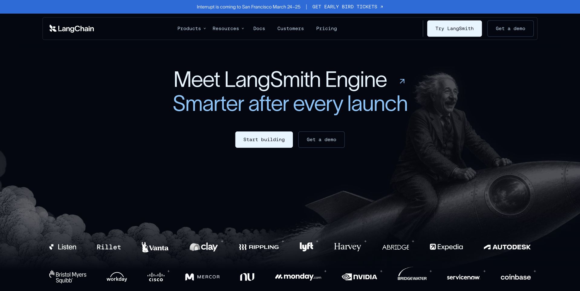
LangChain’s inspected public page uses a dark sculptural scene behind a LangSmith Engine launch message. The type and pale actions occupy the left side, while the unusual image supplies atmosphere rather than an interface walkthrough. A row of customer logos introduces a second visual layer below. The compact header retains products, resources, customers and pricing for readers who need practical context. The ClickHouse account concerns LangSmith analytics, not every LangChain integration or the runtime of this public marketing page. That product boundary matters when studying a brand with several related offerings.
What you can learn
A launch image can create character, but the product name and continuation must remain clear. Explain what the new feature does before relying on customer logos as reassurance. Keep the broader product family navigable so a visitor can distinguish a framework, an observability product and a specific engine announcement.
Pros
A distinctive dark scene gives the launch a recognizable identity.
The product name remains prominent despite the dramatic imagery.
Cons & considerations
Atmospheric imagery does not explain technical behavior by itself.
A broad logo strip needs properly scoped supporting customer evidence.
Platform source: Primary documented ClickHouse association. Documented association: Specific analytical product workload; no inference that every LangChain integration or public page uses ClickHouse. Platform evidence is separate from the direct website screenshot and is not a complete current infrastructure audit.
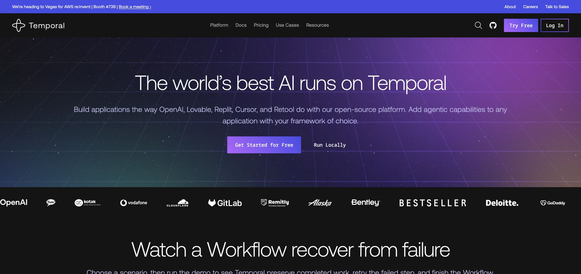
Temporal’s homepage places a large AI-workflow proposition over a dark purple and blue grid-like background. Two actions distinguish starting with the service from running locally, and recognizable customer marks sit below the feature. The technical atmosphere is restrained enough that the heading remains the main reading element. A later workflow-recovery heading begins the transition into a more concrete explanation. The ClickHouse reference concerns Chronicle observability. It does not imply that ClickHouse is the Temporal workflow engine or reveal the implementation of this public marketing page.
What you can learn
Distinguish hosted exploration from a local technical path in the opening. Move quickly from a broad platform promise to an understandable workflow and failure scenario. Customer marks and a technical-looking background can establish context, but the following content should explain the actual responsibility the product takes on and what remains with the application team.
Pros
Two starting paths acknowledge different developer intentions.
The spacious background leaves the heading easy to locate.
Cons & considerations
AI platform language needs concrete workflow examples.
Customer logos should not substitute for documented implementation scope.
Platform source: Primary documented ClickHouse association. Documented association: Chronicle observability workload; not the Temporal workflow engine or public-site runtime. Platform evidence is separate from the direct website screenshot and is not a complete current infrastructure audit.
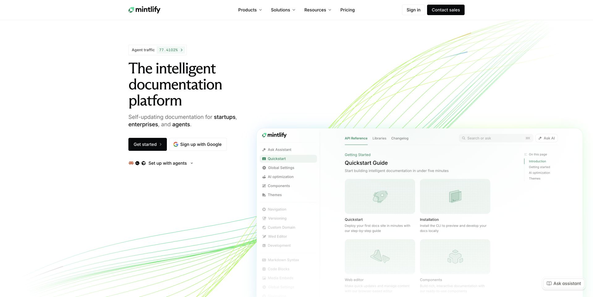
Mintlify’s homepage pairs a short documentation-platform proposition with a large example documentation interface. Pale green lines add movement to the background without dominating the reading area. Starting and connected signup actions sit near the explanation, while the navigation preserves product, solution and resource routes. The example shows the kind of reading environment the platform helps produce, which is more informative than a purely abstract AI illustration. The ClickHouse customer account concerns analytics. It does not establish that every hosted documentation site directly uses ClickHouse or that the public marketing page shares that implementation.
What you can learn
Show a documentation product through a readable output example and preserve the distinction between creating an account and exploring the product. Explain editing, review and publishing responsibilities in supporting content. The visual demonstration should remain comprehensible without animation and should not use tiny interface text as the only explanation of important capabilities.
Pros
An output example makes the platform’s purpose tangible.
Pale green accents create identity without overwhelming the copy.
Cons & considerations
Small documentation previews need accessible explanatory text.
AI-oriented positioning still needs clear publishing and review boundaries.
Platform source: Primary documented ClickHouse association. Documented association: Customer analytics workload; not proof that every documentation site hosted by Mintlify uses ClickHouse. Platform evidence is separate from the direct website screenshot and is not a complete current infrastructure audit.
Kegan has 15+ years of experience working with small businesses, Fortune 500 companies, and everything in between. No development job is too big or too small: he brings the same hands-on attention to a focused improvement, a complete website, or a custom application.
For ClickHouse projects, he can help with data modeling, application data access, query design, search and cache integrations, migration planning, access boundaries, and maintainable handover. He works directly with clients on scope, design, implementation, testing, and handover, with an emphasis on clear communication and a system that remains practical to maintain after launch.
Show 3 other ClickHouse developersHide other ClickHouse developers
Choose one customer question and define which account’s data the feature may show. Keep the first version narrow enough to test accuracy and access boundaries thoroughly. The surrounding application needs useful loading, empty and unavailable states, not just a successful chart.
An observability exploration area
Identify the event types an operator must connect during a real investigation. Describe timestamps, service context and the detail needed to move from a broad signal to a particular incident. Avoid presenting a large event count as a substitute for helping someone explain what happened.
A slow or fragile existing reporting workflow
Record the current questions, response times and reconciliation failures. Select a bounded replacement and compare it with a known result. Do not make a database migration an excuse to silently change the definition of a report that business users depend on.
From references to requirements
Plan ingestion, interpretation and the ongoing operating model
Write an evidence-based analytical brief
For the first report, specify the unit being counted, the relevant date and the treatment of corrections. An order-created date and a payment-settled date can answer different questions. Make that difference visible before the first query is optimized. Keep test records and cancelled events in the acceptance dataset so exclusions are deliberate.
Then describe the source-to-result path. Name the source owner, the point at which a record becomes available and the expected delay before a reader sees it. Identify whether a result can change after its first appearance. A customer-facing dashboard needs a coherent explanation for revised totals, not a collection of internal system names.
Review the brief with the person who will actually use the result. Ask them to explain the expected answer and the action it supports. If the team cannot agree on a simple worked example, adding a faster analytical engine will not resolve the underlying ambiguity.
Test representative ingestion and query behavior
Collect realistic examples of normal traffic, a busy period and a delayed or repeated batch. Define the intended handling for duplicated events and late corrections. A pipeline should have an explicit reconciliation path rather than silently accumulating whatever arrives. Keep the original business identifiers available to the authorized team investigating discrepancies.
Review sorting and query design with the implementation owner. MergeTree’s documented organization can guide the technical discussion, but performance must be measured with the intended data and queries. A benchmark from a different organization is not an acceptance test. Include the longest reporting period and an awkward filter combination, not only the fast demonstration query.
Record whether a slow response comes from ingestion, storage, application logic or rendering. That separation helps the team fix the actual bottleneck. Give users a clear waiting state and a safe recovery action if the request cannot complete. Do not expose SQL, internal hosts or private event payloads in a public error message.
Define who owns data definitions, pipeline incidents and permission changes. These may be different people. The handoff should make it obvious whom to contact when a figure looks wrong, when an import stops or when a customer’s access changes. Keep operational credentials out of the public frontend and use the application boundary to enforce the intended scope.
Review the interface at the sizes and contexts where it will be used. Make labels legible, filters understandable and important state changes perceivable without color alone. A visual trend should have a useful textual explanation or accessible route to its values. Test empty accounts and restricted views as carefully as a fully populated administrator demo.
Finally, keep a known-answer comparison set, a recovery exercise and a change procedure. Explain when an unreliable output should be paused rather than left online with unexplained numbers. A successful analytical feature is one people can interpret and the team can operate after the original implementer has moved on.
A useful handover demonstration
Ask the actual team to carry out its routine job: publish a realistic update, correct a mistake, preview a narrow screen, and identify who owns an integration failure. For a library or frontend framework, also ask who maintains the content source and deployment. A polished screenshot does not answer those operational questions.
Beyond the screenshot
ClickHouse project planning checklist
Name the first decision and intended reader.
Define the unit, reporting period and exclusions.
Keep known-answer records for reconciliation.
Describe source freshness and late corrections.
Specify duplicate-event handling.
Review sorting and storage against representative queries.
Measure the busy period and longest reporting window.
Distinguish pipeline delay from interface delay.
Enforce account scope outside public browser code.
Test empty, loading and unavailable states.
Assign definition, ingestion and access owners.
Keep a recovery and report-change procedure.
Test with real content, a keyboard, a small screen, slow or failed requests, and the people who will maintain the system. These are planning checks, not an accessibility, security, performance, or search-ranking certification.
Sources & editorial method
How this ClickHouse collection was reviewed
Twenty actual public interfaces are independently reviewed and paired with primary customer references. Specific products and observability systems remain qualified. Performance figures in vendor stories are not reproduced as independent benchmarks or promises for another implementation.
Every image is an unmodified capture from the actual website, with its source and capture date. Some captures are reused from our shared catalog; their dates remain the original capture dates. None comes from a vendor gallery or a generated reconstruction. Moving imagery and live content can change.
Technology attribution uses public page assets or metadata, official platform documentation, or a cited first-party project case study. Documentary and framework-relationship evidence is identified where used; it is not a complete current backend inventory. A CMS image CDN alone does not establish a full CMS deployment. A library’s presence does not prove which individual controls use it, and a platform label does not establish AI authorship.
The composition notes, lessons, pros and tradeoffs are original editorial observations. We have not measured conversion, traffic, security, performance or accessibility conformance. Website owners retain their brands and imagery; these examples are not our client portfolio. Written, Edited and Curated are independent records, not dates advanced by a build. See our editorial standards or suggest a correction.
Questions worth asking
ClickHouse website development FAQs
Are these public websites built with ClickHouse?
The sources establish particular analytical or observability workloads. They do not establish that ClickHouse renders the pictured public pages.
Why are so many examples observability-related?
That is the scope of several checked customer accounts. The reviews preserve that boundary rather than expanding it into every product or system at the organization.
Can we copy Ramp’s or another customer’s architecture?
Use it to ask better questions, not as a ready-made design. Your source data, access model, correction requirements and operating team need their own acceptance plan.
What should come before performance tuning?
An agreed definition and a known-answer dataset. Then measure representative ingestion and query behavior rather than optimizing an ambiguous result.
What makes an analytical interface trustworthy?
Clear scope, understandable freshness, correct account access and a way to reconcile results. Speed is valuable, but it does not replace those responsibilities.