Best PostHog Websites of 2026 (20 Real-World Examples)
Twenty public website and product properties with documented PostHog use, from learning platforms to developer tools and specialist marketplaces.
PostHog belongs in the measurement and product-development layer of a website. The useful design question is which customer task deserves to be understood, improved or safely tested.
The examples here show very different entrances to digital products: a straightforward course registration, an API platform, a prompt composer, a vehicle lookup and an equipment auction catalog. Their visual patterns are worth studying because each one frames a different next step. A large button may begin a journey, but the meaningful outcome usually happens later. Good analytics planning starts with that distinction, before a team chooses a dashboard or an experiment.
The PostHog relationships in this collection come from dated official customer stories that identify a public website, online service or product journey. Some explicitly cover a marketing site; others concern product events, embedded analytics or a data pipeline behind the service. Each example states that scope. We captured the current public pages directly, without logging in, submitting prompts, applying for finance or completing transactions. A screenshot and an earlier case study together do not establish every part of today's page runtime or backend.
Before the examples
What makes good PostHog website development in 2026?
Start with the customer task and a small event vocabulary
Write the question first: did someone reach a useful lesson, configure a working integration or find an appropriate listing? Then define the few events needed to answer it. PostHog supports custom events and configurable automatic capture, so a deliberate implementation can distinguish an interface gesture from a completed business action. Give each event an owner, a precise trigger and a short list of permitted properties. For example, a failed lookup should not be indistinguishable from a completed report just because both involved pressing the same button. Review naming and payloads with the people who will interpret the results, not only the person installing the SDK.
Plan recording boundaries before collecting sessions
Session replay can help explain an unclear interaction, but it should begin with a clear scope. PostHog's controls distinguish input masking from masking ordinary text and other page elements. Decide which routes and elements may be recorded, then test with synthetic examples of the sensitive material the interface can display. The important question is whether unwanted content leaves the browser at all. For a prompt tool, a finance application or a portrait service, copying the customer's submitted material into diagnostic data would be a very different decision from recording that an error category occurred. Access, retention and deletion also need named owners.
Feature flags can separate deploying code from making a change available to everyone. They do not remove the need to decide what the interface does when a flag has not loaded, a request fails or a user changes account. Design that default first. Then name the owner who can stop a rollout, the symptoms that justify stopping it and the date when temporary branching should be removed. Contra's documented gradual releases and Arena's attention to comparison bias illustrate different reasons to control exposure. Neither example supplies a universal rollout percentage for another product.
Read the openings as different answers to a practical question: what should a visitor understand or do next? The first five properties provide recognizable references, followed by smaller and more specialized examples. The order is editorial, with no measured performance ranking or technology award.
We start with five recognizable brands or organizations: Y Combinator Startup School, Supabase, ElevenLabs, AssemblyAI, Arena. Each attribution applies to the named website property, not every product or website belonging to its organization. This is a curated reading sequence, not a measured ranking.
Startup School keeps the opening unusually literal. Its orange mark, oversized course promise and short explanation occupy the left side, while a pale dotted world map gives the empty right side a purpose. The orange sign-up button is the strongest action; existing members get a quieter sign-in link. That hierarchy makes the commitment understandable before the curriculum appears. PostHog's October 2022 case specifically covers Startup School and other YC public services, rather than YC's entire infrastructure. The current capture is useful for studying the entrance to a learning journey, not its authenticated lessons.
What you can learn
Define the meaningful step after registration before measuring the hero. For a course, returning to a lesson or making progress may answer a different question from clicking the orange button. Keep those events distinct so a simpler landing page is not mistaken for better learning.
Pros
The course offer and free access are explained without competing product promotions.
A restrained palette makes the primary action easy to locate within generous whitespace.
Cons & considerations
The large map leaves relatively little curriculum detail in the initial viewport.
Visitors comparing teaching formats must continue below the opening promise for specifics.
Platform source: Official PostHog customer story. Official PostHog customer story published 2022-10-05, read 2026-11-11. The case explicitly names Startup School, the YC Library and co-founder matching as public services analyzed with PostHog. Platform evidence is separate from the direct website screenshot and is not a complete current infrastructure audit.
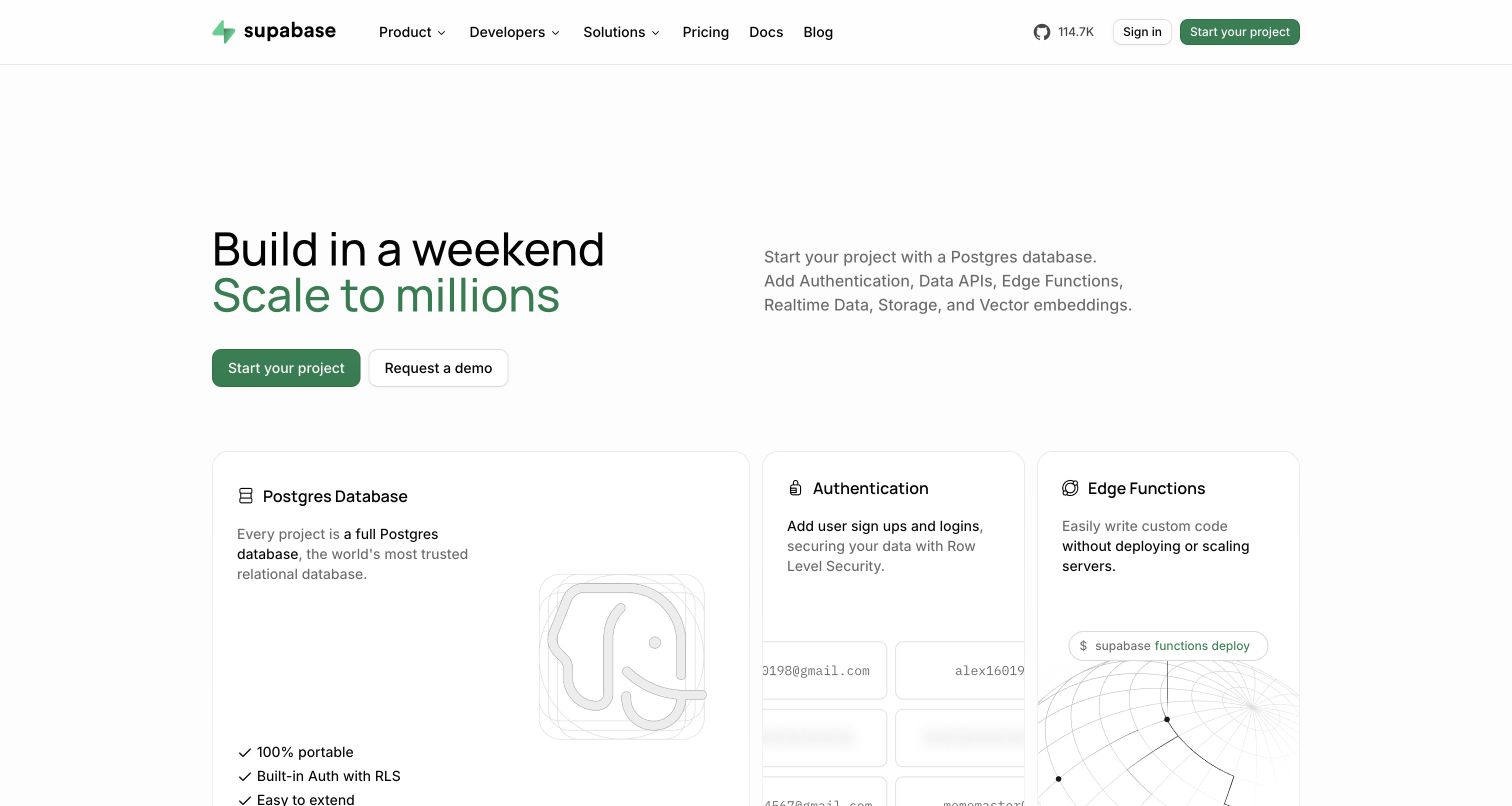
Supabase separates its opening into two useful jobs: the left makes an ambitious building promise, while the right explains the database platform more concretely. Start-project and demo routes sit together without turning the whole hero into a lead form. Below, the first cards introduce Postgres, authentication and edge functions as recognizable capabilities. Green accents and fine borders organize technical material without a wall of code. The June 2025 PostHog case concerns server-side product events, attribution and experimentation; this marketing screenshot does not establish the homepage's current analytics implementation or backend.
What you can learn
Keep marketing interest, project creation and sustained product use as separate milestones. A developer can inspect a capability card without being ready to provision anything. An event plan should retain that distinction and connect anonymous browsing to an account only through an explicitly designed identity policy.
Pros
Capability cards give the broad platform claim concrete technical meaning immediately below the hero.
Self-service and sales routes remain visible together without identical visual emphasis.
Cons & considerations
The opening assumes visitors already recognize infrastructure terms such as edge functions.
Several equally attractive capabilities can compete with the single next step for beginners.
Platform source: Official PostHog customer story. Official PostHog customer story published 2025-06-15, read 2026-11-11. The case describes server-side Node SDK events, product adoption and attribution for the Supabase platform. This marketing-page capture does not establish a current homepage analytics implementation. Platform evidence is separate from the direct website screenshot and is not a complete current infrastructure audit.
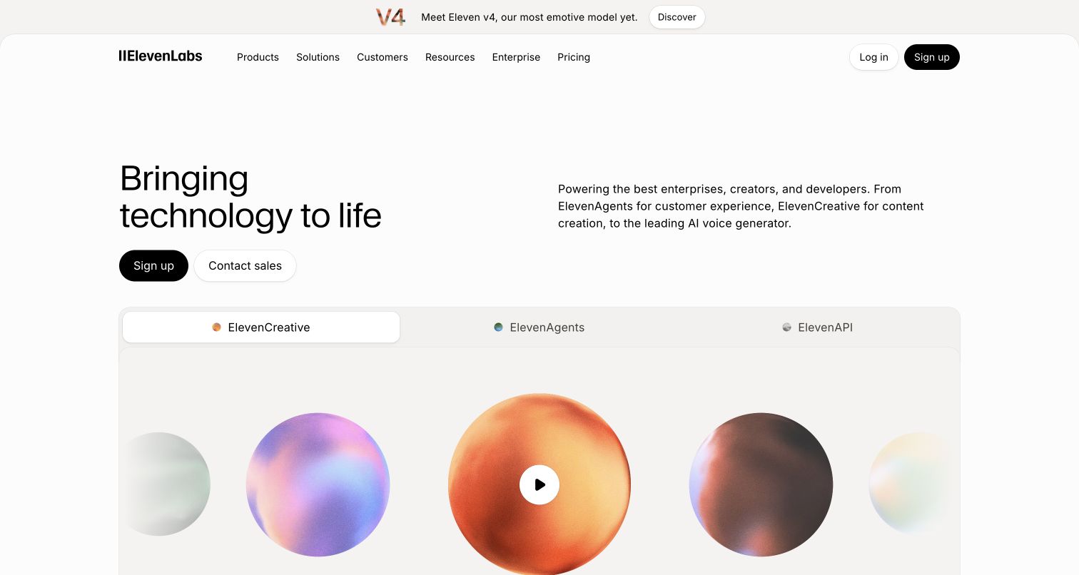
ElevenLabs uses a quiet white canvas and compact dark navigation to contain an increasingly broad product family. A large statement anchors the left of the hero, with a more practical explanation and two actions on the right. Creative, agents and API tabs then divide the offering into understandable entry points. Colorful audio artwork adds energy without carrying the explanatory burden. PostHog's March 2024 story describes web signup traffic, onboarding surveys, analytics and flags for the service. It supports that documented relationship, not a claim that every pictured component runs through PostHog today.
What you can learn
Choose a separate activation definition for each audience route. A developer obtaining credentials, a creator finishing an output and a buyer contacting sales are different outcomes. Segmenting the journey by intent is more useful than treating every tab switch as equivalent evidence of product success.
Pros
The product tabs make distinct use cases legible without separate competing hero sections.
Short explanatory copy gives the abstract brand statement a practical counterpart.
Cons & considerations
The broad opening still asks newcomers to choose among several unfamiliar product directions.
Audio previews require an interaction before their value can be fully understood.
Platform source: Official PostHog customer story. Official PostHog customer story published 2024-03-25, read 2026-11-11. The case documents web signup traffic, onboarding surveys, product analytics and feature flags for the ElevenLabs service, rather than its entire infrastructure. Platform evidence is separate from the direct website screenshot and is not a complete current infrastructure audit.
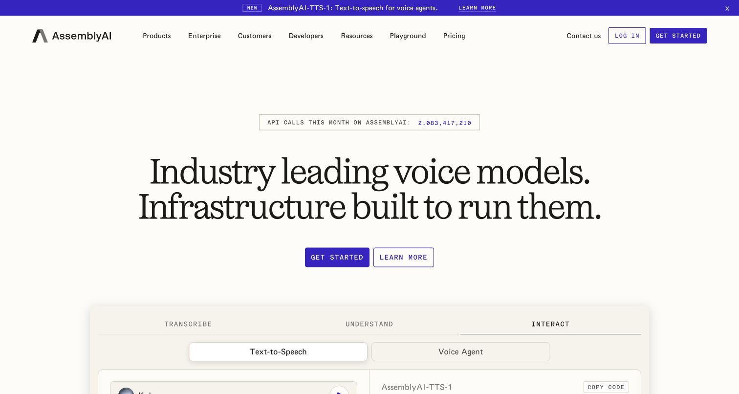
AssemblyAI pairs a warm background and very large serif headline with a comparatively technical navigation system. The purple announcement strip is prominent, but the central proposition still leads toward getting started or learning more. Beneath it, transcription, understanding and interaction give visitors a practical way to divide the voice offering. The public API-call counter provides a scale cue, although this review does not independently verify that number. PostHog's March 2022 case connects website traffic with signup and API-token activation; the captured page is a later design, not the historical experiment itself.
What you can learn
Measure the handoff from explanation to a successful developer task. An API-key request, a first valid call and a repeat integration session should not collapse into one conversion. Use the visible capability groups to organize questions, then confirm outcomes in an appropriately scoped implementation.
Pros
Three outcome-oriented groups provide structure beneath an otherwise very broad headline.
The restrained color palette gives both the main action and announcement clear emphasis.
Cons & considerations
Oversized typography postpones detailed technical evidence until further down the page.
A live scale counter can distract from the specific integration problem a visitor brings.
Platform source: Official PostHog customer story. Official PostHog customer story published 2022-03-23, read 2026-11-11. The case describes public website traffic, signup and API-token activation analytics for AssemblyAI. The photographed opening has changed since that report. Platform evidence is separate from the direct website screenshot and is not a complete current infrastructure audit.
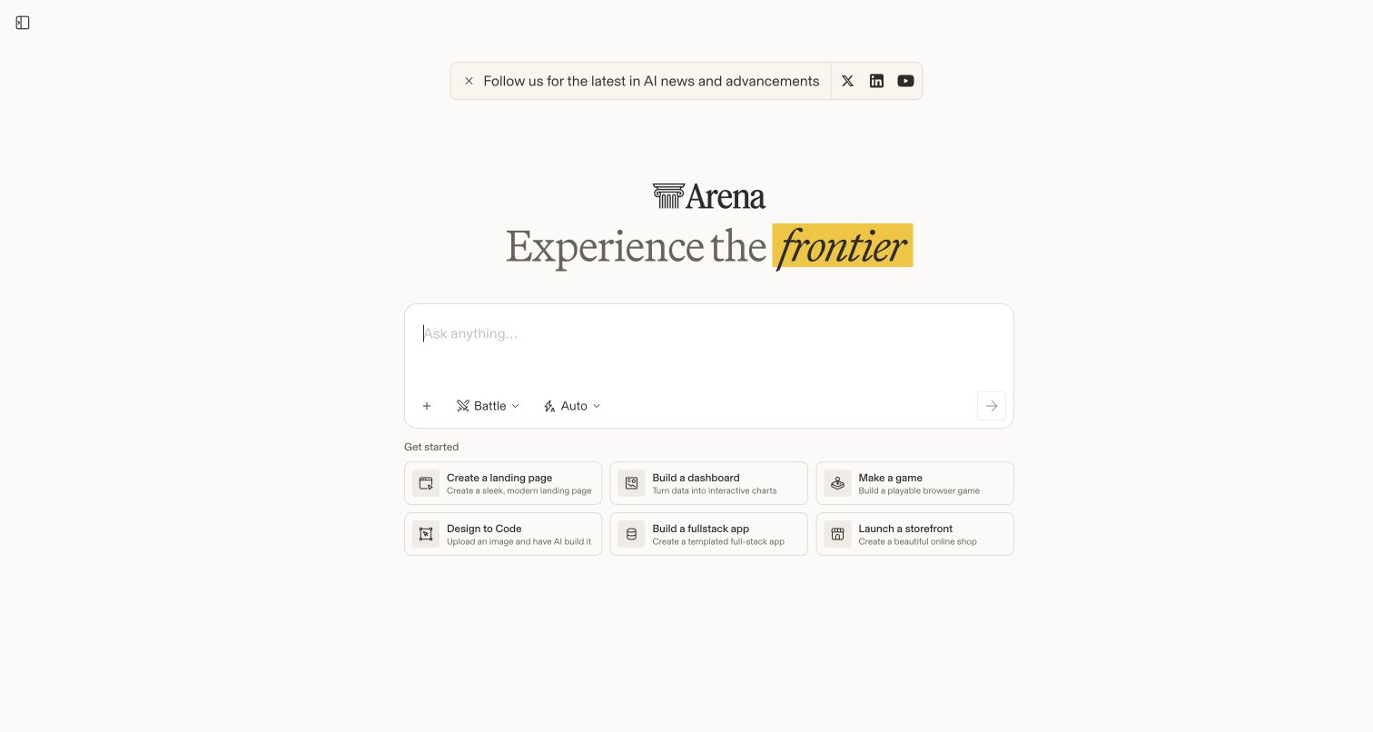
Arena puts an empty prompt field at the center of a deliberately sparse opening. A highlighted phrase and small logo establish tone, while Battle and Auto selectors expose product choices without a large settings panel. Six illustrated task cards offer concrete starting points beneath the composer. The result is closer to a working tool entrance than a conventional marketing hero. PostHog's February 2026 case explicitly covers public website experiments, leaderboards and anonymous-to-account journeys. We inspected the public interface without submitting a prompt or vote, so the capture does not evaluate generated results.
What you can learn
Protect the integrity of the task while testing its presentation. For a comparison product, a more prominent option could influence the decision being measured. Define both a completion metric and a guardrail for biased behavior before changing the composer or response layout.
Pros
The prompt and starter cards explain the next action with very little introductory copy.
Generous spacing keeps mode controls distinct from the main input area.
Cons & considerations
Visitors unfamiliar with the comparison model receive limited explanation before encountering controls.
The minimal opening offers little immediate reassurance about what happens after submission.
Visible tech stack
Earlier / documented evidence
PostHog
Platform source: Official PostHog customer story. Official PostHog customer story published 2026-02-10, read 2026-11-11. The case explicitly describes website UI experiments, leaderboard analytics, anonymous-to-logged-in conversion funnels and vote-quality guardrails for the public Arena comparison platform. Platform evidence is separate from the direct website screenshot and is not a complete current infrastructure audit.
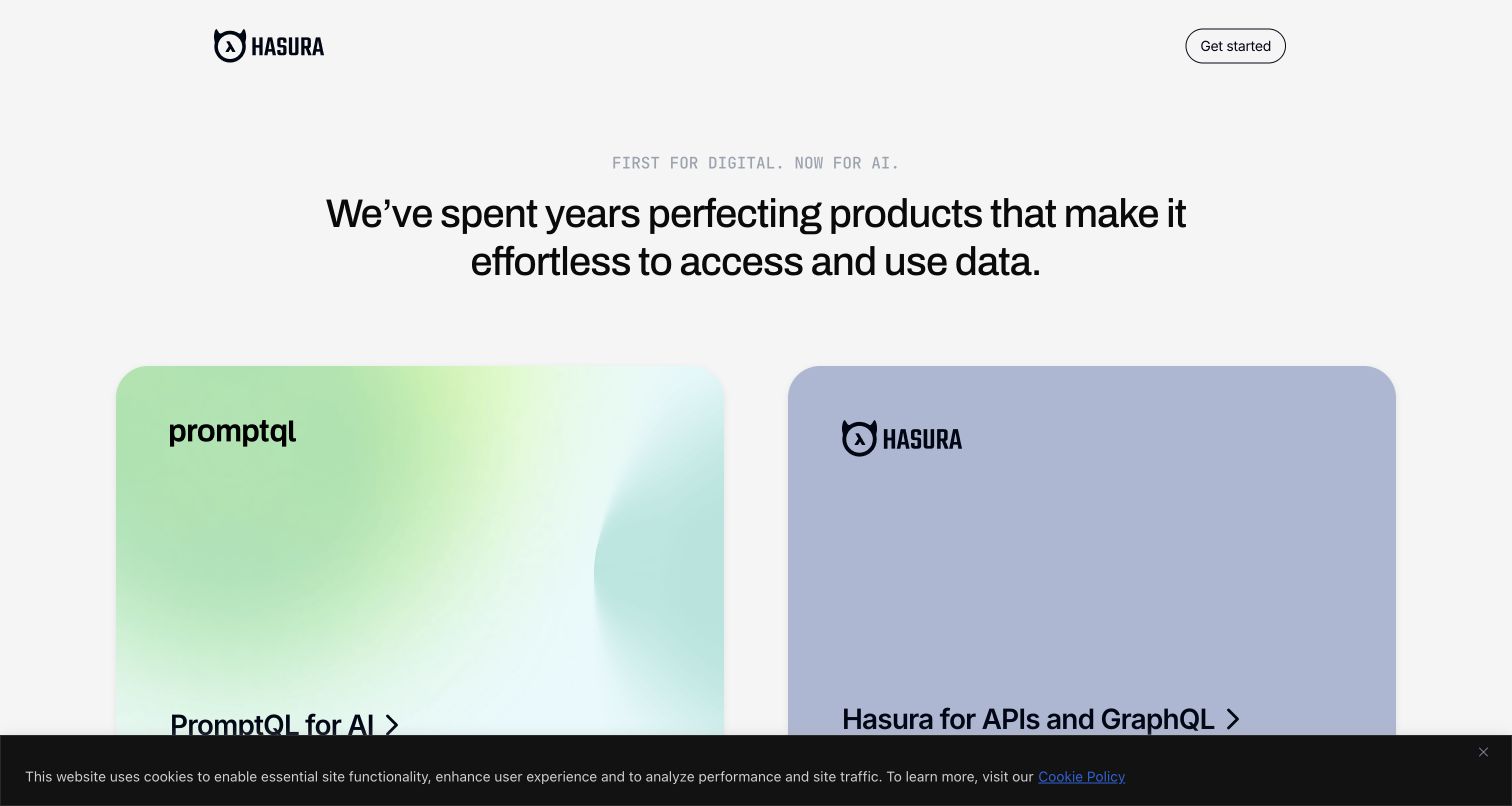
Hasura's current entrance is built around two large cards rather than a long list of features. PromptQL and the API offering receive distinct visual treatments, while the short central statement connects them under the same brand. The small header leaves almost all attention on that choice. A dark cookie notice remains visible in the capture and competes with the lower edge of the cards. PostHog's November 2021 case documents Hasura marketing pages, pricing and cloud signup analytics. It is historical evidence for that service, not proof of the newer PromptQL product's stack.
What you can learn
Treat a portfolio gateway as a routing decision with different downstream goals. Track whether visitors understand and reach the relevant product before comparing signup totals. When a brand changes its offering, preserve old event meanings or explicitly version them instead of silently reusing a familiar label.
Pros
Two substantial cards make the portfolio split immediately visible and easy to compare.
Minimal navigation avoids adding a third set of competing choices above the products.
Cons & considerations
The abstract umbrella statement provides less detail than either individual product route needs.
The captured consent notice occupies space needed to inspect the card content.
Platform source: Official PostHog customer story. Official PostHog customer story published 2021-11-24, read 2026-11-11. The historical case explicitly names Hasura marketing pages, blog/pricing paths and cloud signup analytics. It does not establish the current PromptQL product stack. Platform evidence is separate from the direct website screenshot and is not a complete current infrastructure audit.
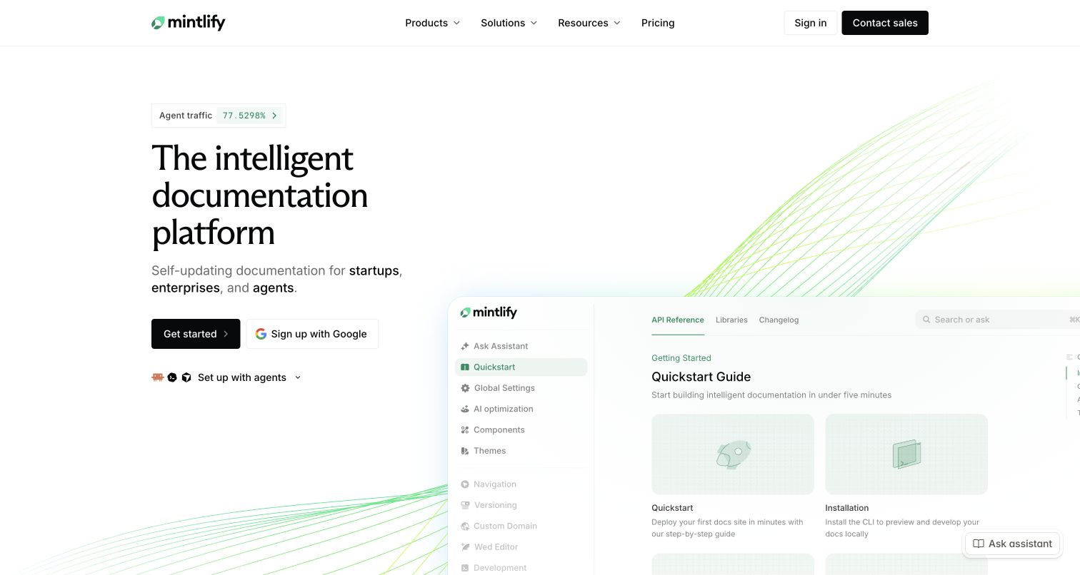
Mintlify combines a large editorial headline with a cropped documentation interface that makes the product tangible. Fine green curves add a technical atmosphere without replacing the visible UI. The opening offers several ways to begin, including a conventional action and more specialized setup choices. That flexibility suits different levels of readiness, though it introduces more decisions than a single-button hero. The April 2023 PostHog case describes product analytics and customer-facing documentation analytics. The current public marketing capture does not establish every element of the platform's present implementation.
What you can learn
Separate a visitor studying the documentation preview from a customer configuring their own documentation. Those activities may happen on related domains but represent different roles. Define source-page context and account boundaries carefully before drawing a funnel that accidentally mixes readers with administrators.
Pros
The visible documentation preview supplies concrete evidence alongside the headline's broader promise.
Distinct setup choices acknowledge that developers do not all start from the same workflow.
Cons & considerations
The cropped interface cannot show a full documentation task in the initial viewport.
Multiple starting mechanisms can make the preferred route unclear for an inexperienced visitor.
Platform source: Official PostHog customer story. Official PostHog customer story published 2023-04-06, read 2026-11-11. The case documents Mintlify product analytics and an embedded analytics experience for customers of its documentation platform, not every current marketing-page component. Platform evidence is separate from the direct website screenshot and is not a complete current infrastructure audit.
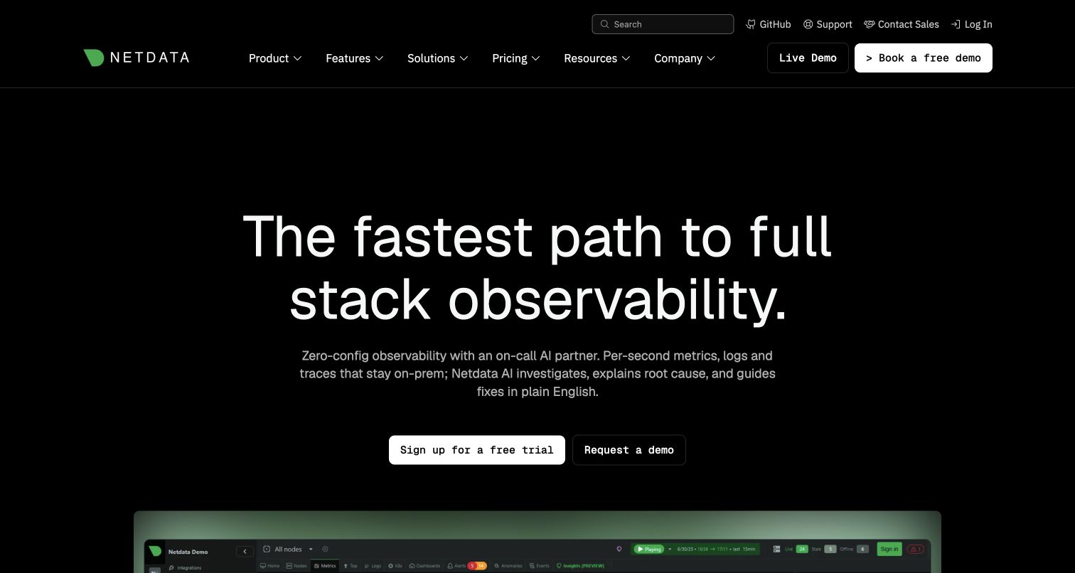
Netdata places a broad observability proposition over a dark, green-accented interface. Two navigation rows accommodate documentation, company utilities and product exploration, while trial and demo actions stay near the central explanation. The top of a detailed dashboard appears below the hero, turning the promise into something visitors can inspect. That density is appropriate to the product but asks readers to distinguish marketing navigation from interface content. PostHog's August 2022 story covers analytics, replays and feature flags in Netdata's cloud product; the public homepage is a separate design reference.
What you can learn
Give different meanings to exploring a demo, connecting an infrastructure source and returning to a useful dashboard. A monitoring service can attract technically curious visitors who never become operators. Measuring those steps separately helps identify an onboarding problem without assuming the homepage itself caused it.
Pros
The product dashboard appears early enough to support the broad observability proposition.
Trial and demo routes let visitors choose between immediate setup and preliminary investigation.
Cons & considerations
Two navigation rows create a substantial decision load before the main explanation.
Dense dashboard imagery may be difficult to interpret without an accompanying task or annotation.
Platform source: Official PostHog customer story. Official PostHog customer story published 2022-08-23, read 2026-11-11. The case identifies product analytics, session replay and feature flags in the Netdata cloud monitoring product. The marketing capture is a design reference, not proof of the product backend. Platform evidence is separate from the direct website screenshot and is not a complete current infrastructure audit.
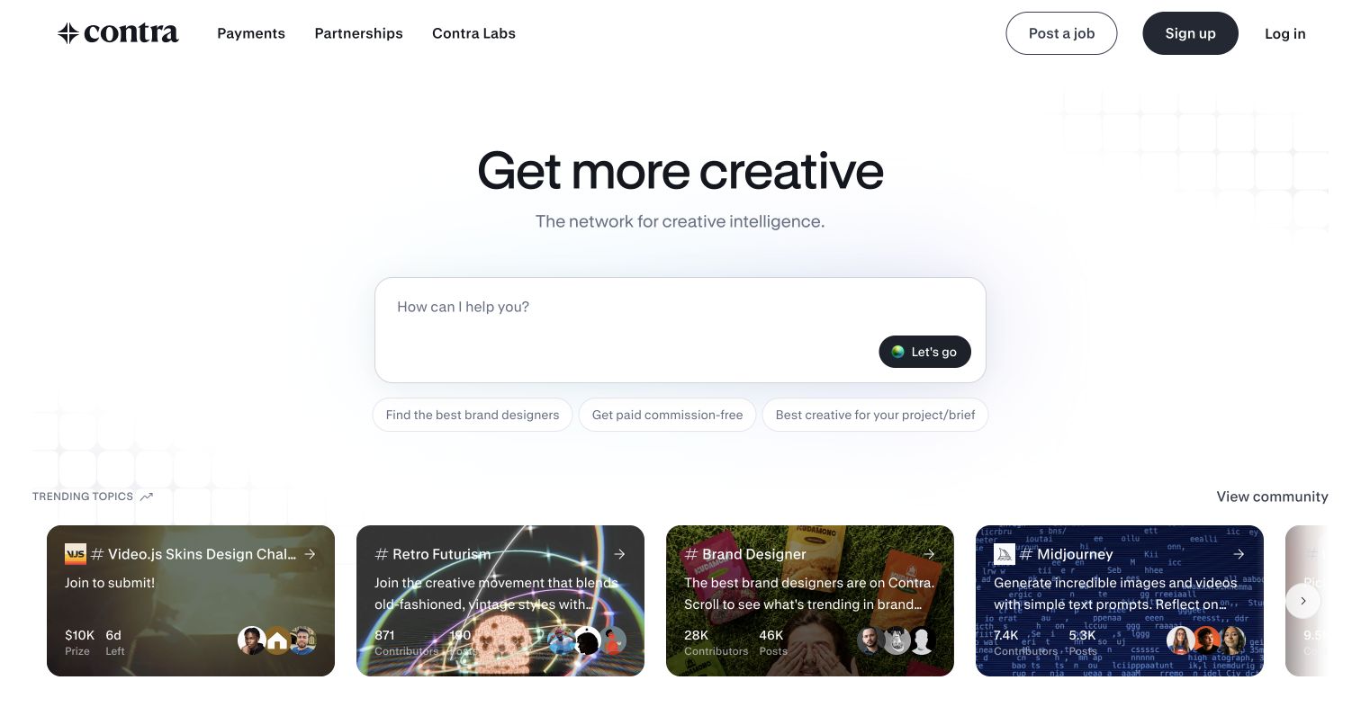
Contra leads with an expansive creative promise and a large prompt-like search area. Suggested tasks beneath the field make the open-ended invitation more approachable. Below that, community cards introduce real work and specialist categories, balancing the abstract opening with visible examples. Utility routes for posting work, payments and membership remain in the header. PostHog's March 2023 case documents platform onboarding, payment setup and gradual feature releases. This public capture reviews discovery only; it does not test a freelancer's quality, account registration or any payment flow.
What you can learn
A marketplace needs to distinguish the two sides of participation. A client describing a project, a freelancer publishing work and either person configuring payments are separate paths. Build event names around those tasks, then inspect abandonment without treating every incomplete journey as the same usability problem.
Pros
Suggested prompts make the large open search field less intimidating for first-time visitors.
Community work begins close to the hero and gives the marketplace a concrete identity.
Cons & considerations
The broad creative language may leave narrowly defined procurement needs insufficiently explained.
A visitor can enter the discovery flow before understanding how matching or engagement works.
Platform source: Official PostHog customer story. Official PostHog customer story published 2023-03-06, read 2026-11-11. The case documents Contra web-platform onboarding and payment-setup session replay, product analytics and staged feature releases. No account or payment action was performed. Platform evidence is separate from the direct website screenshot and is not a complete current infrastructure audit.
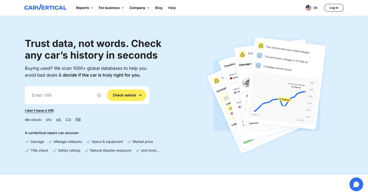
carVertical builds its opening around a vehicle-identification field and a bright yellow action. The surrounding copy explains the report's purpose, while angled report fragments show the kind of information visitors might receive. A smaller route helps people who do not have the requested identifier. This is a focused task entrance, though the report collage cannot establish completeness for any particular vehicle. PostHog's December 2023 case describes deliberately defined report-section events and feature flags. We did not enter a VIN, request a report or inspect a checkout.
What you can learn
Distinguish lookup initiation from a useful report being available. Error states, unavailable data and successful purchase all need separate meanings. The report-section structure also suggests measuring whether people reach the information they sought, while keeping vehicle identifiers and personal data out of unnecessary analytics fields.
Pros
One dominant input and action keep the immediate task clear within the hero.
Report fragments show potential output instead of relying entirely on abstract reassurance.
Cons & considerations
The collage is illustrative and cannot communicate coverage for a visitor's particular vehicle.
Visitors without an identifier must notice a much quieter alternative below the main field.
Platform source: Official PostHog customer story. Official PostHog customer story published 2023-12-01, read 2026-11-11. The case describes vehicle-report section events, checkout conversion analysis and feature flags for carVertical’s web service. No vehicle report was requested. Platform evidence is separate from the direct website screenshot and is not a complete current infrastructure audit.
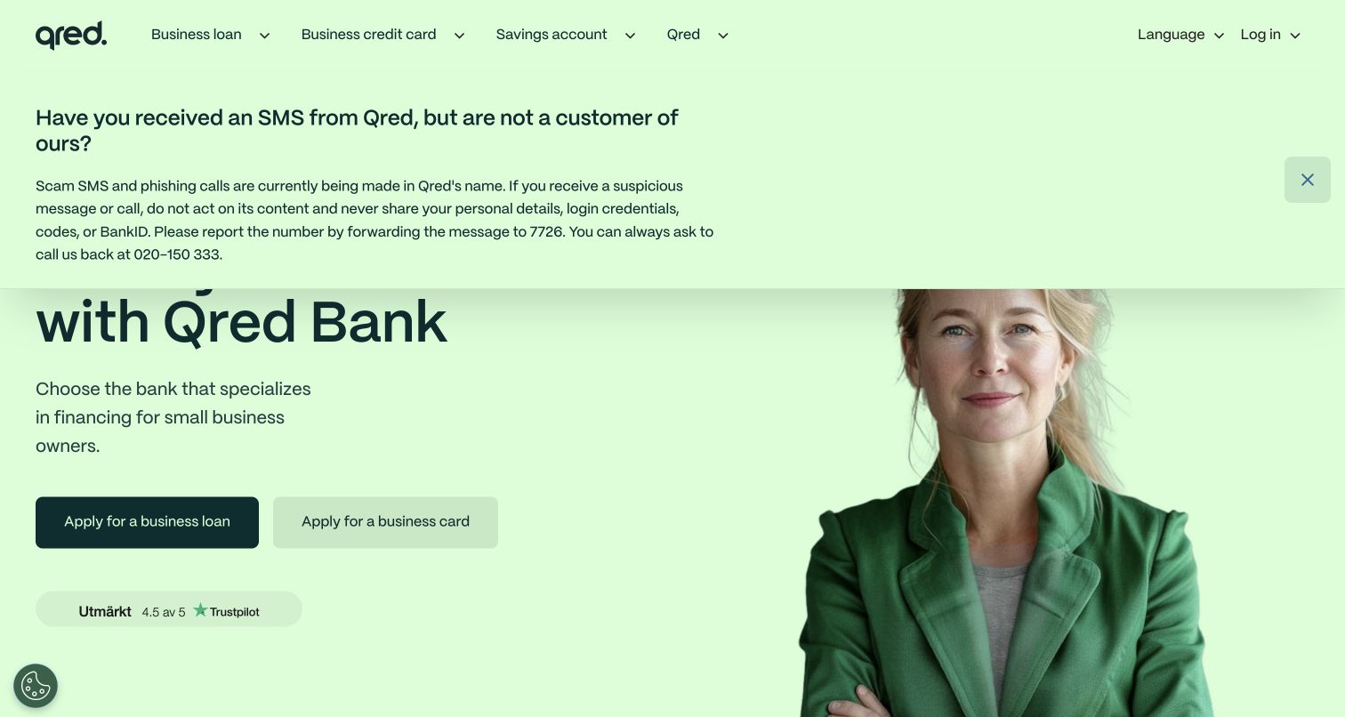
Qred's English-language Swedish page uses a bright green field, a human portrait and prominent product choices to explain its business-financing offer. The captured opening also contains a substantial fraud-warning notice, which pushes against the space normally reserved for the main proposition. That interruption is part of the real experience and makes the tradeoff between reassurance and browsing unusually visible. PostHog's August 2025 case discusses customer onboarding, frontend analytics and experiments. It does not verify current lending terms, establish regulatory compliance or reveal the bank's complete technology architecture.
What you can learn
Measure whether important notices are understood without assuming every interruption is a design failure. A banking journey should distinguish reading safety information, comparing products and beginning an application. Review the data allowed at each step before enabling broad capture, especially where sensitive customer information can appear.
Pros
The portrait and distinctive green field make the service approachable rather than purely transactional.
Product routes are explicit and separate lending from card and savings information.
Cons & considerations
The large captured warning competes directly with the opening product explanation.
Offer details and eligibility require deeper reading than the initial visual presentation supplies.
Platform source: Official PostHog customer story. Official PostHog customer story published 2025-08-26, read 2026-11-11. The case documents Qred customer onboarding, frontend analytics and experimentation. It does not establish every banking system or verify any financial offer on this English-language Swedish page. Platform evidence is separate from the direct website screenshot and is not a complete current infrastructure audit.
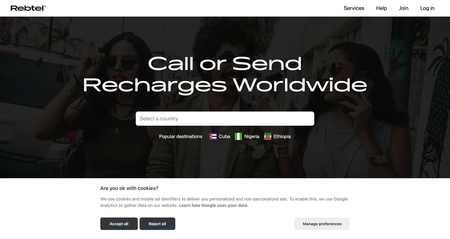
Rebtel centers its homepage on calling and mobile recharges, with a destination selector directly below the large headline. Country flags and popular choices give the field recognizable shortcuts. A darkened lifestyle image supplies emotion while keeping the white text prominent. The captured cookie band remains at the bottom, reducing the available space without hiding the primary task. PostHog's September 2025 case describes website and app events passing through mParticle and Snowflake into PostHog. This is a documented data-pipeline association, not evidence of a direct homepage JavaScript installation.
What you can learn
A destination choice is context, not a completed transaction. Keep it separate from reviewing a rate, starting a recharge and receiving confirmation. If analytics arrives through an intermediate pipeline, document transformations and delays so teams do not interpret missing or late events as immediate customer behavior.
Pros
The destination field connects the emotional headline to a concrete next step.
Popular-country shortcuts reduce the work needed for common journeys without replacing search.
Cons & considerations
Visitors must choose a destination before seeing the details most relevant to their decision.
The background image and cookie band compete with secondary information in the captured opening.
Platform source: Official PostHog customer story. Official PostHog customer story published 2025-09-24, read 2026-11-11. The case explicitly includes website and app frontend events routed through mParticle and Snowflake into PostHog. This is a documented data-pipeline association, not a claim of a direct homepage JavaScript SDK. Platform evidence is separate from the direct website screenshot and is not a complete current infrastructure audit.
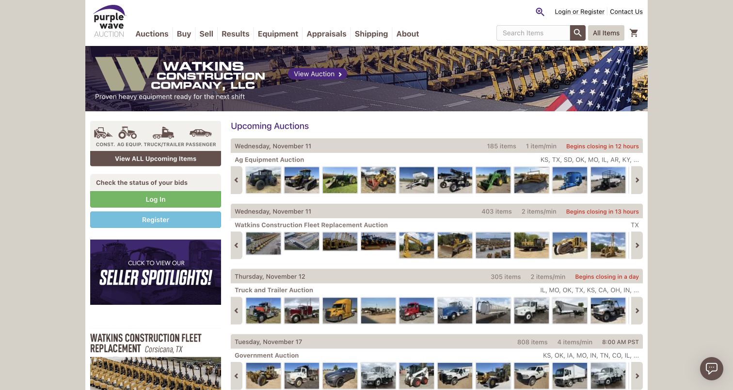
Purple Wave favors auction utility over an airy brand introduction. Search, category navigation and account routes surround a dense schedule of upcoming sales. Dates, item counts and thumbnail strips make each row useful before a visitor opens it, while a large promotion occupies the top of the content area. The left category rail gives repeat buyers a persistent starting point. PostHog's September 2023 case documents analytics, flags and surveys for the online marketplace. We reviewed the public discovery surface without registering, bidding or evaluating the condition of any listed equipment.
What you can learn
Use the listing structure to separate discovery from commitment. A category visit, auction inspection, watched item and submitted bid are different levels of intent. Keep time zones and auction status attached to the correct business events so a busy catalog does not produce misleading activity totals.
Pros
Auction rows expose dates and item counts before requiring another page visit.
The persistent category rail suits buyers who already know the equipment class they need.
Cons & considerations
The dense layout gives newcomers little breathing room to learn the bidding process.
Promotional imagery competes with the auction schedule that is likely many visitors' immediate goal.
Platform source: Official PostHog customer story. Official PostHog customer story published 2023-09-15, read 2026-11-11. The case documents analytics, feature flags and in-app surveys for the online equipment marketplace. This capture reviews public auction discovery; no bid or account was created. Platform evidence is separate from the direct website screenshot and is not a complete current infrastructure audit.
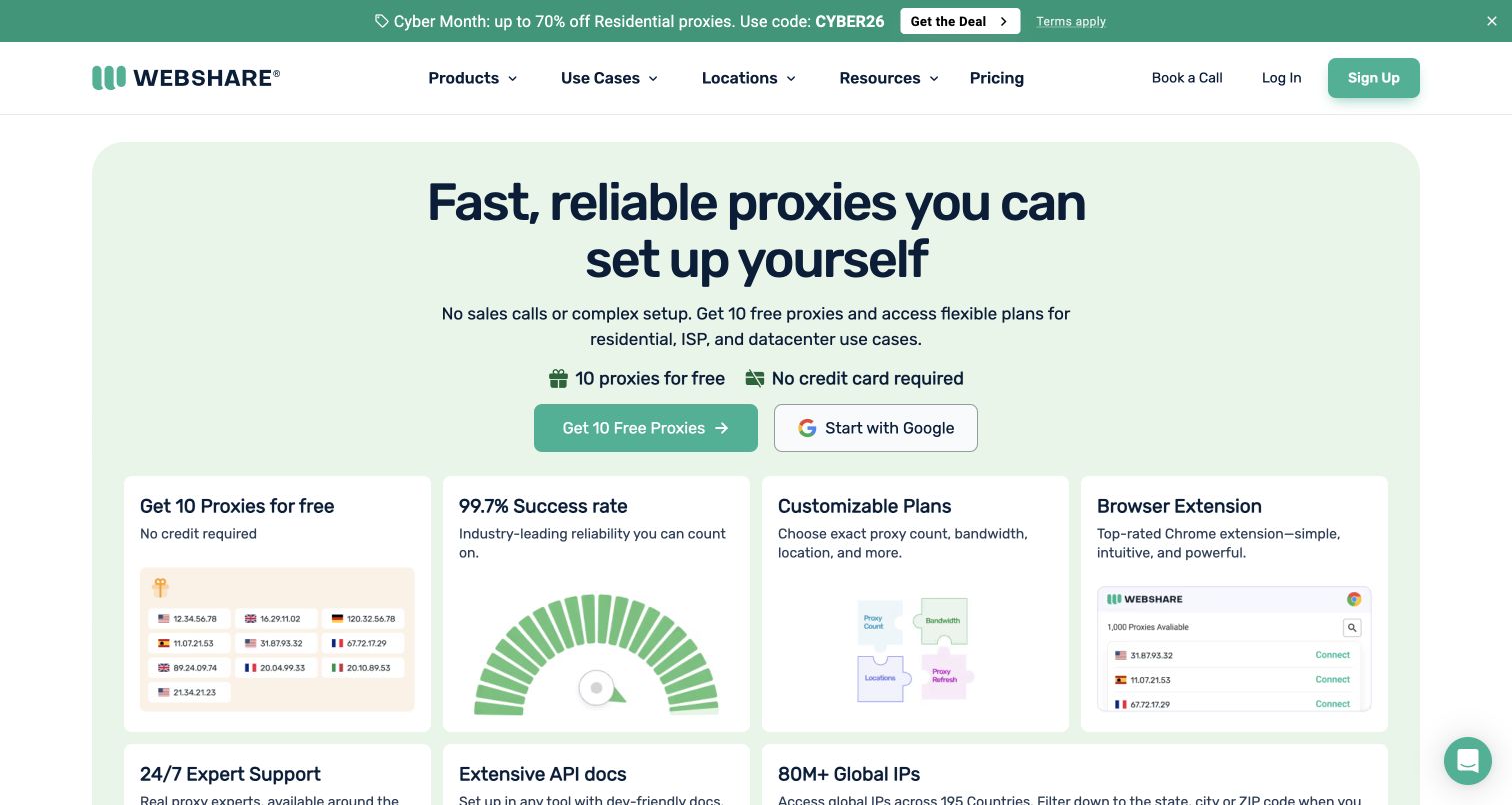
Webshare's pale green opening makes speed and self-service setup the central proposition. Two signup routes sit above short reassurance about the starting offer, while the first feature cards use compact interface illustrations to make infrastructure less abstract. The promotional strip adds another attention target above an otherwise orderly navigation bar. The source URL redirected from /homepage to the current root during review. PostHog's October 2023 case specifically documents homepage video and pricing-card experiments. No proxy account, network relay or customer setup was created as part of this design review.
What you can learn
Separate a low-friction account start from a successful configured connection. The first is easy to optimize while the second may better reflect product value. Preserve the visitor's entry route in a restrained event plan so alternate signup methods can be compared without collecting unnecessary browsing detail.
Pros
The self-service promise addresses a concrete objection to buying technical infrastructure.
Small interface illustrations make the feature grid easier to interpret than text alone.
Cons & considerations
Several promotional claims compete before the visitor reaches a specific product comparison.
A free starting offer still leaves operational limits and suitability to be investigated further.
Platform source: Official PostHog customer story. Official PostHog customer story published 2023-10-01, read 2026-11-11. The case explicitly describes homepage video and pricing-card call-to-action experiments using PostHog. No proxy account or service was used in this review. Platform evidence is separate from the direct website screenshot and is not a complete current infrastructure audit.
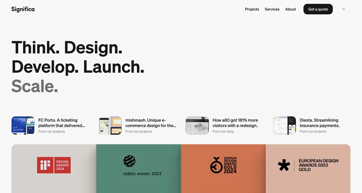
Significa uses a stack of five large process verbs as the main visual event. The typography is intentionally oversized, but small project and editorial previews nearby keep the page from becoming only a manifesto. A compact header offers projects, services and a quote route, while the lower strip introduces the showreel and recognition. The March 2024 PostHog case describes public website traffic, landing pages and interaction funnels. Its separate private proposal workflow was not accessed. The broad scanner reached a decoded-size limit, so this review adds no unsupported current stack conclusions.
What you can learn
Turn the process language into a testable navigation question: can a visitor reach a relevant project and understand the service behind it? Measure that path separately from opening a showreel. Large typography may attract attention, but attention alone does not show that a prospective client found useful evidence.
Pros
The verb structure gives a broad service offering a memorable organizing device.
Project previews connect the studio's positioning with visible work.
Cons & considerations
Oversized type leaves less room for detailed service explanations in the first viewport.
Editorial and showreel routes may compete with a buyer trying to evaluate a specific capability.
Visible tech stack
Earlier / documented evidence
PostHog
Platform source: Official PostHog customer story. Official PostHog customer story published 2024-03-20, read 2026-11-11. The case documents public agency website traffic, landing pages and interaction funnels. Its separate private proposal-tracking workflow was not accessed. Platform evidence is separate from the direct website screenshot and is not a complete current infrastructure audit.
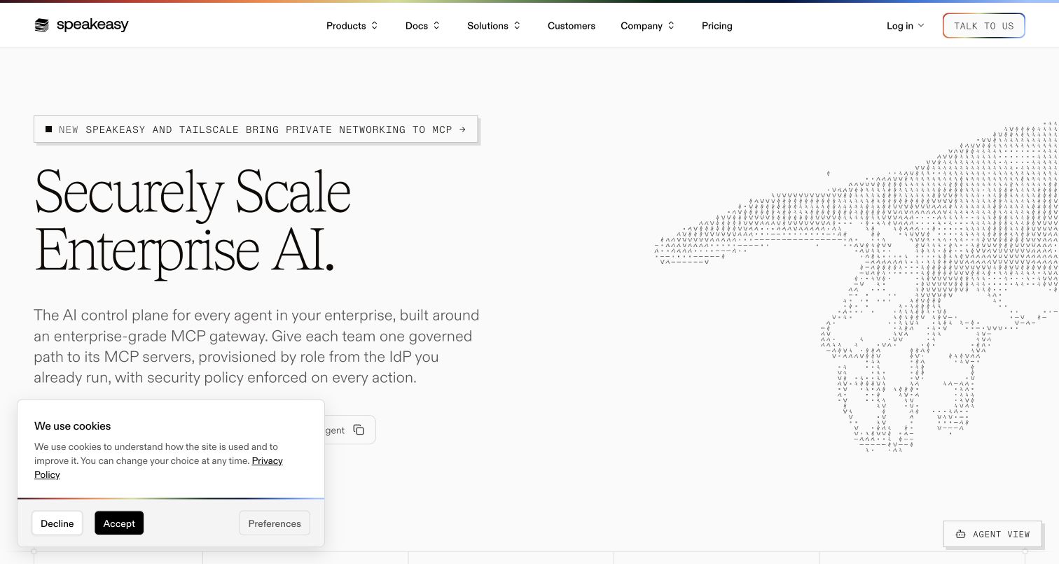
Speakeasy combines a large serif proposition with precise technical copy and an abstract, text-like wave illustration. Fine rules and a compact announcement create structure without a conventional screenshot-heavy hero. The visible navigation gives developers several product and documentation routes, while the captured consent notice occupies some lower space. The official August 2023 PostHog case documents product and marketing-site analytics. Its older speakeasyapi.dev link redirects to this current property, whose AI-control-plane positioning has changed; the historical case does not establish every detail of the present product architecture.
What you can learn
When positioning changes, revisit the meaning of conversion events before comparing old and new periods. A documentation visit for an SDK tool may represent different intent from one for an enterprise AI system. Keep comparable milestones explicit and annotate product changes rather than presenting every movement as a design effect.
Pros
The technical explanation gives the large headline substance without crowding the visual composition.
Documentation remains easy to find for visitors who prefer implementation detail over sales language.
Cons & considerations
The abstract illustration conveys atmosphere more readily than a concrete product workflow.
Specialist terminology and several navigation routes assume substantial prior knowledge from the visitor.
Platform source: Official PostHog customer story. Official PostHog customer story published 2023-08-31, read 2026-11-11. The case identifies product and marketing-site analytics. Its linked speakeasyapi.dev domain redirects to the current speakeasy.com property; the current AI-control-plane presentation is not evidence that all historical product details remain current. Platform evidence is separate from the direct website screenshot and is not a complete current infrastructure audit.
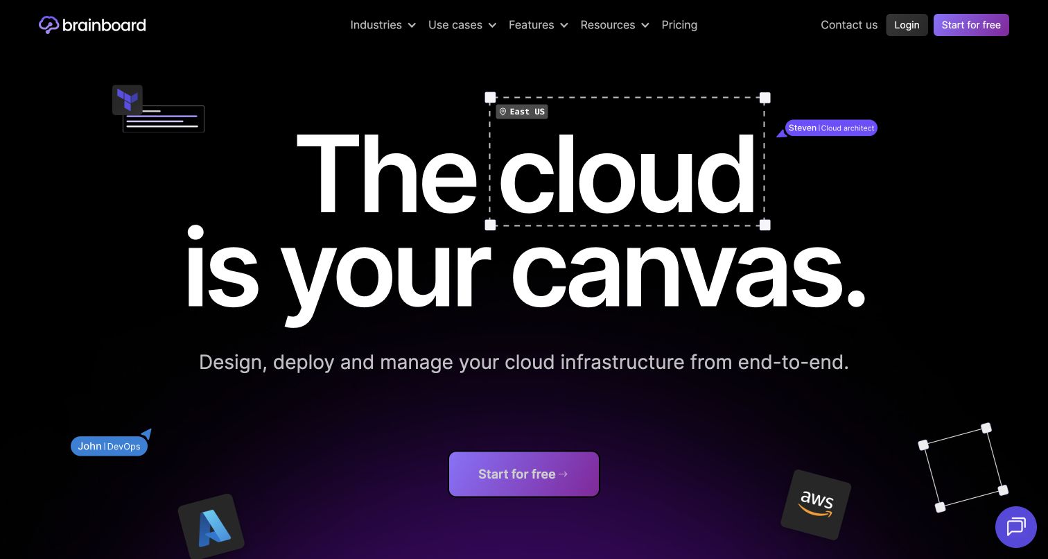
Brainboard places an enormous cloud-design statement on a dark purple canvas. Selection outlines and small cursor labels make the typography resemble something being edited collaboratively, while cloud-provider icons connect that metaphor to recognizable infrastructure. A short explanation and one bright starting action keep the opening from becoming a purely decorative scene. PostHog's November 2022 case explicitly covers the public website, landing pages and cloud product, including mobile and desktop journeys. The current screenshot is a later visual observation; historical conversion figures are not claims about this version of the page.
What you can learn
Use the editing metaphor to define the first real product task, then measure whether visitors reach it. Starting a design, connecting a provider and producing usable infrastructure are different achievements. Break results down by device only when the underlying task and event definitions remain meaningfully comparable.
Pros
Selection handles and cursors explain the visual nature of the product before a full demonstration.
A single prominent starting action keeps the rich hero focused on one next step.
Cons & considerations
The large visual metaphor postpones detailed workflow evidence until further down the page.
Provider logos communicate compatibility broadly but do not explain particular integration boundaries.
Platform source: Official PostHog customer story. Official PostHog customer story published 2022-11-23, read 2026-11-11. The case explicitly covers Brainboard’s public website and landing pages, mobile/desktop conversion and the cloud design product. Platform evidence is separate from the direct website screenshot and is not a complete current infrastructure audit.
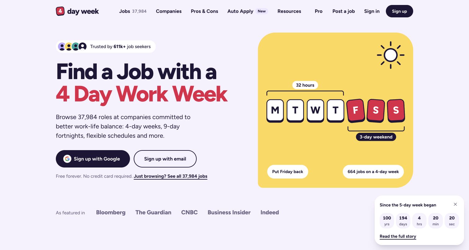
4DayWeek states its niche immediately through a large employment promise and a highlighted four-day phrase. A cheerful calendar-key illustration reinforces the same idea rather than introducing a second message. Email and Google entry routes sit beside a quieter option for people who only want to browse. Press marks and a community counter add supporting cues below the main invitation. The September 2023 PostHog case describes newsletter-signup and homepage-heading experiments on this job board. Those historical results are not presented as measured performance of the current captured design.
What you can learn
Keep newsletter interest separate from job discovery and an actual application. An email-first hero can increase one while obscuring another. Preserve the browsing path in both the interface and measurement plan, then judge a wording test against the audience outcome the board is meant to serve.
Pros
The niche is understandable immediately without navigating through broad employment categories.
A visible browsing alternative accommodates people who are not ready to create an account.
Cons & considerations
The prominent signup choices can overshadow the more direct route to available positions.
Counters and press marks offer reassurance but do not explain the quality of individual listings.
Visible tech stack
Earlier / documented evidence
PostHog
Platform source: Official PostHog customer story. Official PostHog customer story published 2023-09-15, read 2026-11-11. The case describes newsletter-signup and homepage-heading experiments on this job board. Historical reported conversion results are not reproduced or claimed for today’s page. Platform evidence is separate from the direct website screenshot and is not a complete current infrastructure audit.
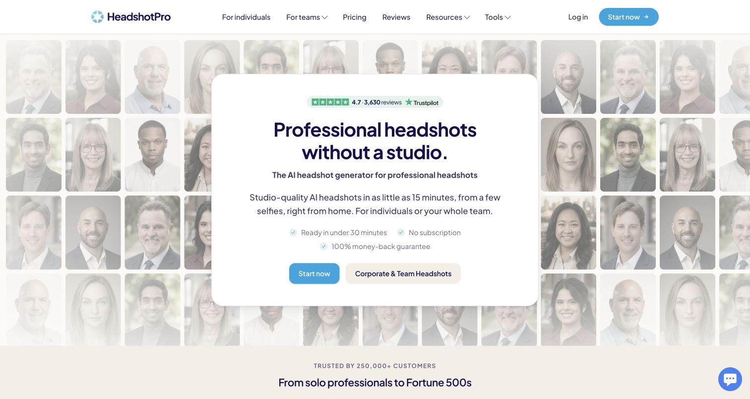
HeadshotPro surrounds a white central card with a soft mosaic of portrait examples. The card contains the proposition, short supporting points and a dominant blue starting action, while team buyers receive a separate route. Navigation exposes pricing and reviews without making visitors hunt through the collage. The imagery demonstrates the service's advertised output, not independently verified results for every customer. PostHog's June 2024 case covers product analytics and a warehouse combining advertising with usage data. This marketing screenshot does not establish the page's current analytics SDK or rendering stack.
What you can learn
Define success beyond clicking a purchase invitation. For an output-based service, completing preparation, receiving usable results and resolving a problem are separate questions. Evaluate individual and team journeys independently, and avoid sending portrait files or sensitive customer material into an analytics system merely to connect the funnel.
Pros
The central card keeps the purchase decision legible against a visually busy sample background.
Separate individual and team routes acknowledge different buying and preparation requirements.
Cons & considerations
Sample imagery can imply consistency that a screenshot cannot establish for every customer.
The strong starting action may draw attention away from preparation requirements and service limitations.
Platform source: Official PostHog customer story. Official PostHog customer story published 2024-06-02, read 2026-11-11. The case documents product analytics and a warehouse combining advertising and product-usage data for the HeadshotPro service. This public marketing capture does not establish its current rendering stack. Platform evidence is separate from the direct website screenshot and is not a complete current infrastructure audit.
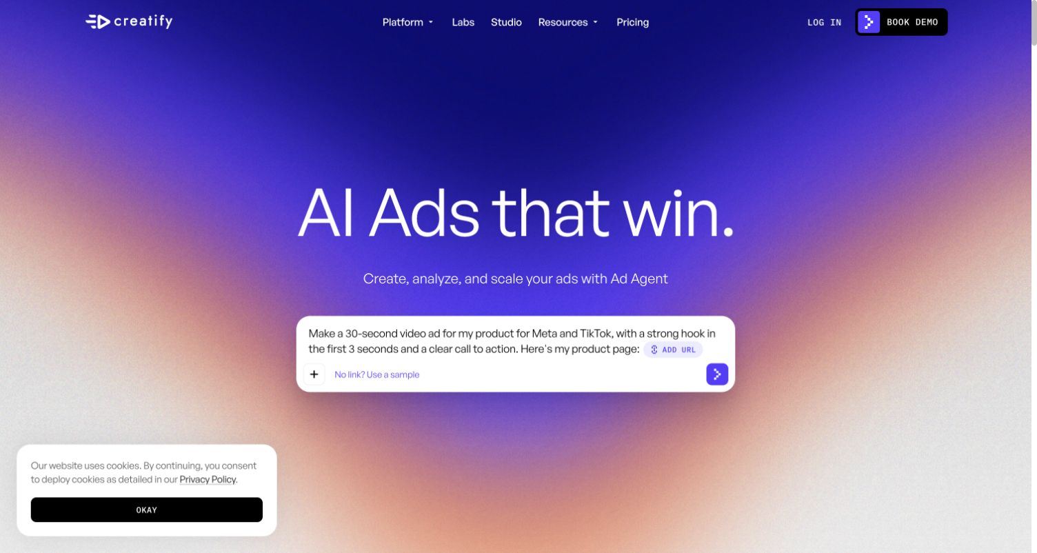
Creatify places a large prompt composer against an intense blue, purple and orange gradient. The short headline establishes an advertising outcome, while URL and sample options provide more concrete ways to begin than an empty field alone. A compact navigation bar separates product exploration, resources and pricing from the main creation invitation. The captured cookie notice remains visible in a corner. In the March 2024 PostHog case, the founding CTO explicitly identifies both the marketing site and product, with analytics, experiments, flags and surveys. We did not submit a prompt or generate an advertisement.
What you can learn
A composer makes starting look easy, so measure where the real effort begins. Distinguish choosing a sample, supplying a valid source and reaching a useful output. Keep sensitive briefs and imported customer material outside unnecessary event payloads, and use failure categories instead of copying their contents into analytics.
Pros
URL and sample options give the composer concrete starting points.
The central task stays dominant despite several product and resource links.
Cons & considerations
The vivid gradient and changing composer example can compete with secondary explanatory text.
The opening offers limited detail about the work required after the initial prompt.
Visible tech stack
Earlier / documented evidence
PostHog
Platform source: Official PostHog customer story. Official PostHog customer story published 2024-03-19, read 2026-11-11. The founding CTO explicitly documents PostHog deployment on both the marketing website and product, including web analytics, experiments, flags and surveys. Platform evidence is separate from the direct website screenshot and is not a complete current infrastructure audit.
Kegan has 15+ years of experience working with small businesses, Fortune 500 companies, and everything in between. No development job is too big or too small: he brings the same hands-on attention to a focused improvement, a complete website, or a custom application.
For PostHog projects, he can help with responsive interfaces, reusable components, custom functionality, API connections, and performance-minded implementation. He works directly with clients on scope, design, implementation, testing, and handover, with an emphasis on clear communication and a system that remains practical to maintain after launch.
Show 3 other PostHog developersHide other PostHog developers
Choose between website measurement, product analytics and experiments
A public website with a few important paths
Start here when the main uncertainty concerns finding information, choosing a service or reaching a useful destination. Significa and 4DayWeek make different promises, but both have visible routes that can be described without reconstructing every visitor's activity. A concise measurement brief should say which paths matter, what counts as completion and which data is unnecessary. If the site has little traffic, repeated usability observations may be more useful than a stream of inconclusive variants. Analytics can help locate questions; it cannot supply every explanation for them.
An authenticated product with several stages of value
Supabase, Netdata and Mintlify show why signup is often only an intermediate step. A product may require setup, an invitation, a first working result and later reuse before it becomes valuable. Map those stages with the product team and keep the marketing-site boundary explicit. Decide how anonymous and authenticated activity are related, how shared accounts or organizations are represented and how a logout changes the next event. Verify the same real action is not reported twice by frontend and backend instrumentation.
An experiment with a defined decision
Choose a test only after describing the change, the comparison, the exposure event and the decision it should inform. PostHog connects variants and recorded behavior to experiment metrics, but a dashboard does not choose the right metric for the business. A headline test might need a qualified signup outcome, while a comparison interface needs guardrails against distorting the task itself. Agree on duration, audience exclusions and stopping criteria before launch. Keep a short record of the decision, including an inconclusive result, so the same question is not repeatedly rediscovered.
Plan an implementation that another team can understand
Create an event map alongside the page map
For each important page or product state, record the visitor's task, the event trigger, allowed properties and the person responsible for interpreting it. Include empty, failed and cancelled paths. Keep a separate list of information that must never be collected. A route change should not silently rename a business action, and a successful network request should not automatically mean the user reached a successful outcome. Review the map against the actual interface before writing instrumentation.
Show the team a complete diagnostic example
A useful handover follows one synthetic journey from its interface action to the resulting event, relevant properties and report. Demonstrate a failed path too, including what is deliberately absent from the record. If events pass through a warehouse or another service, show the expected delay and transformation. Rebtel's documented pipeline is a reminder that a website can have a meaningful PostHog association without a direct browser SDK being the source of every event.
Budget for maintenance after launch
Assign time for renamed components, obsolete flags, changing consent requirements, unexpected event volume and questions about access. Keep development and production data distinguishable. When a product changes direction, as some of these older case studies illustrate, revisit whether the original event definitions still answer useful questions. Archive the decision context rather than quietly comparing unlike periods. A smaller set of trusted measurements is easier to maintain than an expanding collection that nobody can explain.
A useful handover demonstration
Ask the actual team to carry out its routine job: publish a realistic update, correct a mistake, preview a narrow screen, and identify who owns an integration failure. For a library or frontend framework, also ask who maintains the content source and deployment. A polished screenshot does not answer those operational questions.
Beyond the screenshot
A practical PostHog launch and maintenance checklist
Name the customer task each dashboard or experiment is intended to clarify.
Keep marketing interest, account creation, activation and repeat use as distinct outcomes.
Record exact event triggers, permitted properties and owners in the implementation brief.
Check that frontend and backend instrumentation do not duplicate a single completed action.
Test recording exclusions and masking with synthetic sensitive content before enabling replay.
Define identity transitions, logout behavior and shared-account boundaries explicitly.
Set a useful interface fallback for unavailable or delayed feature flag decisions.
Choose experiment metrics, guardrails and stopping criteria before exposing a variant.
Separate test traffic and document any warehouse or integration delay.
Review event volume, retention, access and temporary flags during maintenance.
Keep a dated decision record when the product, audience or event definition changes.
Verify core browsing and product actions remain usable when optional analytics requests fail.
Test with real content, a keyboard, a small screen, slow or failed requests, and the people who will maintain the system. These are planning checks, not an accessibility, security, performance, or search-ranking certification.
Sources & editorial method
How this PostHog collection was reviewed
All twenty public properties were inspected and captured directly on November 11, 2026 UTC. Each review is original commentary on the pictured page. Official PostHog customer stories were read on the research date, while their original publication dates remain identified in the example evidence. Marketing-page observation is kept separate from documented product analytics and historical associations. Every exact source page has a broad stack-audit attempt; prior matching observations keep their original dates, and access or size restrictions remain recorded without inferred technologies. The source URL /homepage at Webshare redirects to its root, and the older Speakeasy domain redirects to the current named property. No logins, purchases, applications, bids, prompts or votes were submitted. Screenshots are not proof of conversion performance, current backend completeness or service quality.
Every image is an unmodified capture from the actual website, with its source and capture date. Some captures are reused from our shared catalog; their dates remain the original capture dates. None comes from a vendor gallery or a generated reconstruction. Moving imagery and live content can change.
Technology attribution uses public page assets or metadata, official platform documentation, or a cited first-party project case study. Documentary and framework-relationship evidence is identified where used; it is not a complete current backend inventory. A CMS image CDN alone does not establish a full CMS deployment. A library’s presence does not prove which individual controls use it, and a platform label does not establish AI authorship.
The composition notes, lessons, pros and tradeoffs are original editorial observations. We have not measured conversion, traffic, security, performance or accessibility conformance. Website owners retain their brands and imagery; these examples are not our client portfolio. Written, Edited and Curated are independent records, not dates advanced by a build. See our editorial standards or suggest a correction.
Questions worth asking
PostHog website development FAQs
Are these websites built with PostHog?
PostHog is part of the documented analytics, experimentation or product-development workflow for these properties. It is not the visual page builder behind every screenshot. Several sources concern a related authenticated product or a data pipeline, and the reviews identify that distinction. A current public-page capture does not verify every historical implementation detail.
Does a PostHog customer story prove the current homepage uses its JavaScript SDK?
No. A story may describe server-side events, a mobile and web product, an embedded customer analytics feature or data imported from another service. This collection cites the actual relationship and its date. Direct source scanning is a separate evidence stream, and restricted or incomplete scans do not justify new runtime claims.
Should every interaction become a tracked event?
Start with the questions your team needs to answer and the minimum data needed for them. A button click, successful signup and useful product result have different meanings. Document the event contract, sensitive-data exclusions and who will act on the result before expanding collection. More activity records do not automatically produce a clearer decision.
Can these screenshots show which layout converts best?
No. They show the actual composition at the time of capture and support editorial observations about clarity and tradeoffs. They do not supply comparable traffic, audience, experiment exposure or business outcomes. Historical figures in vendor case studies are specific to those reported situations and are not reproduced as current performance rankings here.
How should a team choose its first experiment?
Choose a narrow uncertainty attached to an important customer task. Define the control, proposed change, exposure, outcome and guardrails, then confirm that the necessary events are reliable. If the available audience cannot support a useful comparison, improve the evidence through research or a simpler diagnostic question before promising a decisive result.
Why do some examples have more visible stack information than others?
Public evidence varies by page, date and access conditions. A broad scan can encounter a bot check or response limit even when a normal browser displays a genuine page. We preserve those limits and separately cite documented PostHog use. Missing visible details are not proof that a technology is absent, and they are not a reason to invent a backend inventory.
Borrow a clear task entrance from these examples, then define the evidence needed to improve your own version. The most useful measurement setup lets the team explain what happened, what remains unknown and which decision comes next.