Definitive guide · Amazon Web Services website development
Best Amazon Web Services Websites of 2026 (20 Real-World Examples)
Design references from organizations with documented AWS workloads—not a verified list of AWS-hosted homepages
Explore 20 public website references alongside precisely scoped Amazon Web Services evidence. The screenshots show design; the primary sources describe particular infrastructure, data or application workloads. Those are related subjects, but a customer story does not identify every technology behind the page you are viewing.
Amazon Web Services is an infrastructure and managed-services platform, not a visual website builder. A useful AWS project starts with the job the website must perform: publishing content, serving a customer application, processing a payment notification, or maintaining a reliable connection to another system. Those responsibilities can require very different delivery and support arrangements even when the public layout looks similar.
Netflix, Airbnb, BMW, Coca-Cola and Adobe open this collection with recognizable organizational context. Some sources concern an internal data platform or a particular product rather than the captured marketing website. Several are historical accounts. Read each association within its stated boundary, and borrow the design thinking without assuming that a large organization’s architecture is the right starting point for your own project.
Before the examples
What makes good Amazon Web Services website development in 2026?
Name the workload before choosing services
Describe what happens when a visitor reads a page, submits an inquiry, updates an account or requests a report. Separate public content from private records and background processing. A static publication with one protected form should not inherit the operational complexity of a streaming service merely because both can be associated with AWS.
Define reliability as a user-visible outcome
Write down which tasks must remain available, how long an interruption is acceptable, and what information must survive it. Then rehearse recovery for those tasks. AWS’s architectural framework is useful as a structured conversation about tradeoffs; a checklist or a familiar service name is not proof that a specific application will recover correctly.
Identify who controls the domain, cloud account, deployment process, billing and backups. Include expected traffic and unusual events such as campaigns, imports or large file downloads. Ask for a cost model that explains the major drivers and failure cases, not only a reassuring estimate based on a quiet development environment.
The collection · 20 examples
20 Amazon Web Services website examples worth studying
Compare the visible navigation, content hierarchy and next actions in each example. Follow the primary source for its actual AWS association. A database, engineering or AI workload elsewhere in the organization is not evidence that the pictured public page shares that complete backend.
We start with five recognizable brands or organizations: Netflix, Airbnb, BMW, The Coca-Cola Company, Adobe. Each attribution applies to the named website property, not every product or website belonging to its organization. This is a curated reading sequence, not a measured ranking.
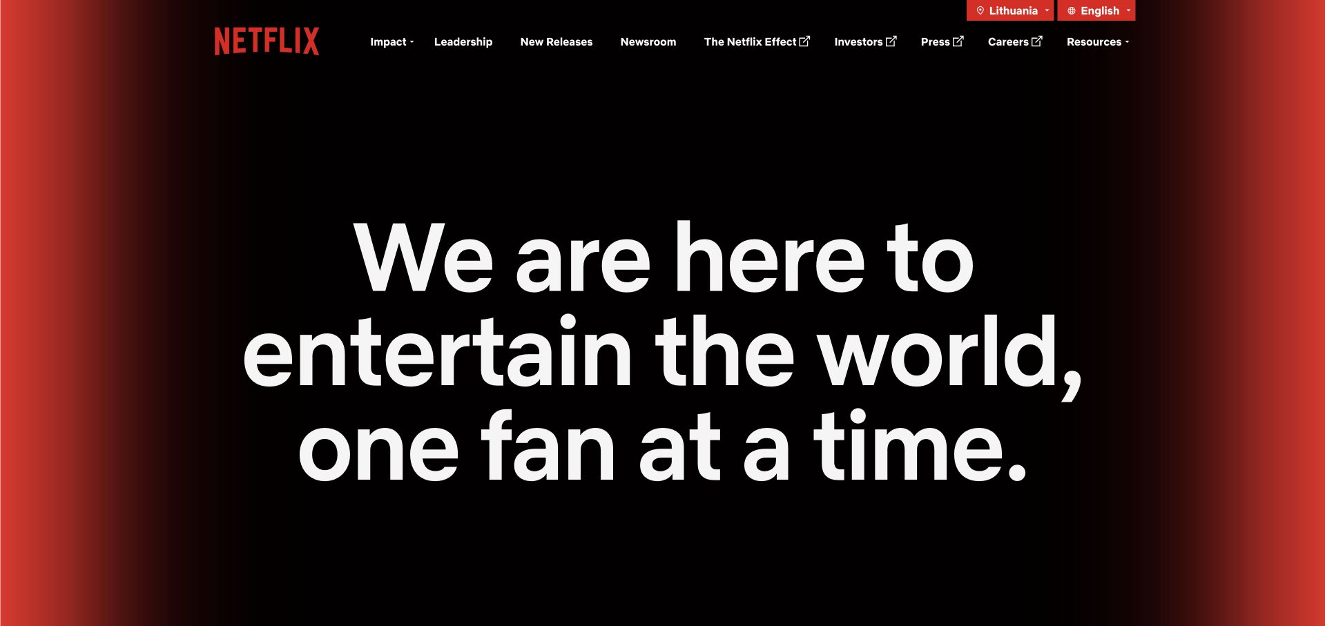
The About Netflix page gives its purpose almost the entire opening screen. White type sits against a restrained black field with red at the edges, while a comparatively small navigation separates leadership, releases, newsroom, investors and careers. There is no demand to choose a film or start a subscription before understanding the company. That distinction matters for a service with several very different audiences: an investor and a prospective employee can recognize the same brand without being pushed through the subscriber journey.
What you can learn
Borrow the separation of public storytelling from account functionality. AWS documents Netflix infrastructure, but this corporate page is a communication example, not a live diagram of its streaming architecture. Define the audience and destination before choosing cloud services.
Pros
The opening statement remains legible without competing promotional cards or an embedded sign-in form.
Audience-specific navigation makes the corporate site useful beyond the primary consumer product.
Cons & considerations
An abstract purpose statement needs concrete supporting stories further down the page.
The restrained first screen does not immediately explain individual services or their availability.
Platform source: Primary documented Amazon Web Services association. AWS documents Netflix's streaming-service compute and storage infrastructure. Platform evidence is separate from the direct website screenshot and is not a complete current infrastructure audit.
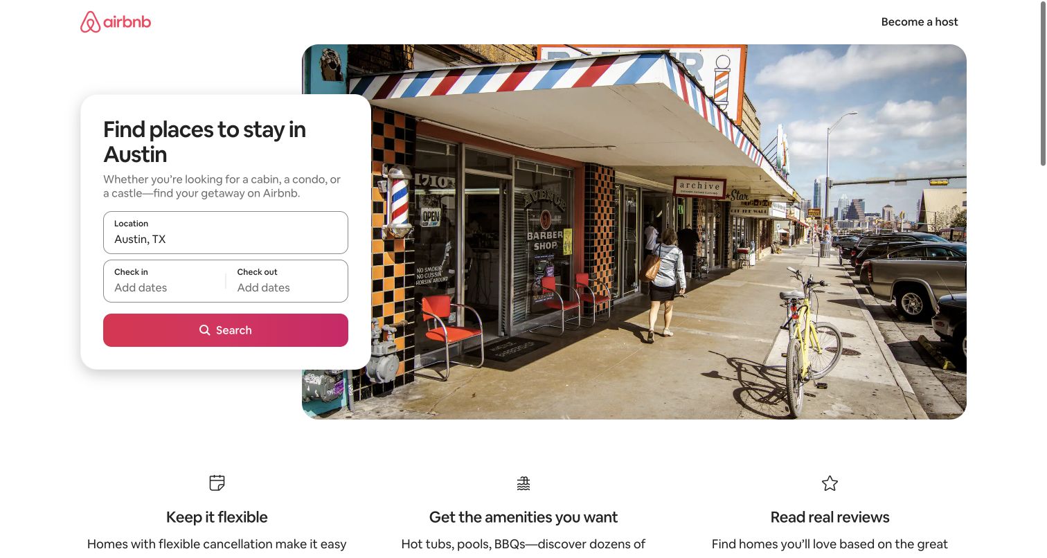
Airbnb’s Austin landing page anchors a compact search panel beside a large destination photograph. The location is already meaningful, while dates and the final search remain explicit decisions rather than hidden assumptions. Supporting benefits sit below the main task instead of competing with it in the headline. The page does not try to show the entire accommodation catalog at once. It introduces a place, gives visitors a useful starting configuration, and lets the detailed results interface handle the more demanding comparison work.
What you can learn
A landing page can prepare an application state without becoming the whole application. Airbnb’s documented AWS infrastructure supports the business; the design lesson here is to keep the initial request small and carry the chosen context into the next step.
Pros
The destination and search controls reinforce each other instead of repeating generic travel copy.
A single dominant panel creates an obvious route into a much larger inventory.
Cons & considerations
Calendar controls add interaction complexity even when the first screen looks simple.
Destination photography alone cannot explain availability, final pricing or accommodation suitability.
Platform source: Primary documented Amazon Web Services association. AWS documents Airbnb infrastructure and logging services. Platform evidence is separate from the direct website screenshot and is not a complete current infrastructure audit.
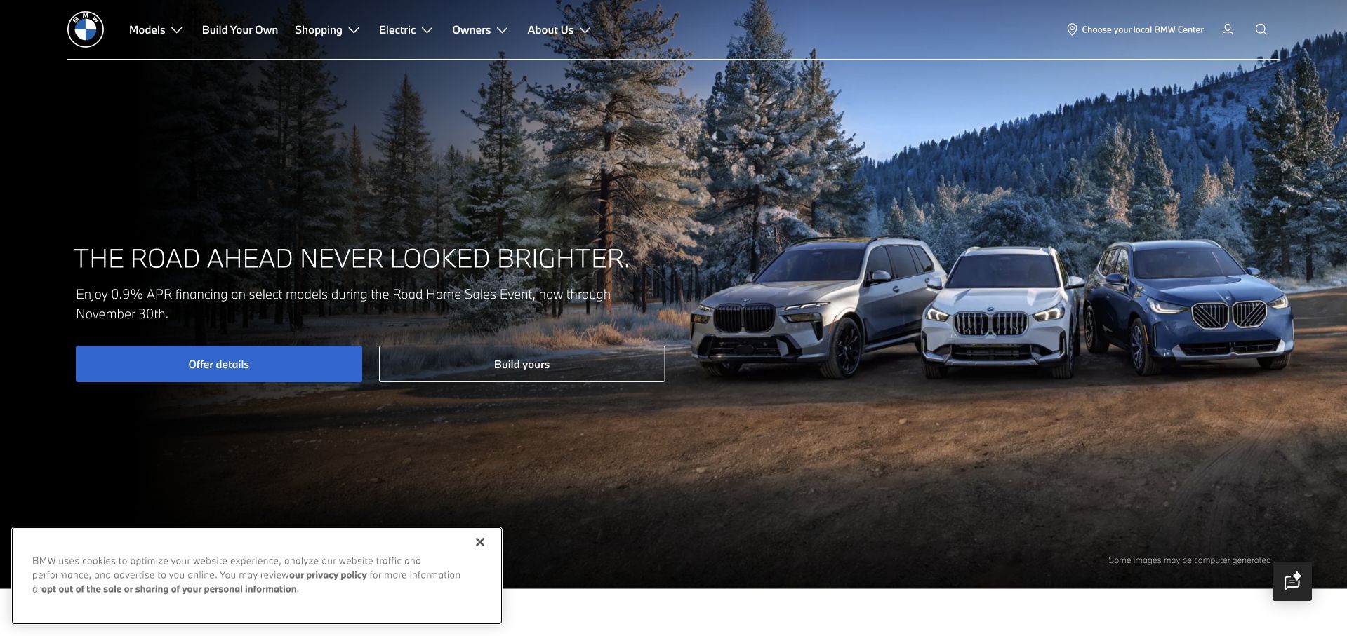
BMW’s US homepage pairs cinematic vehicle imagery with a short campaign line and recognizable shopping actions. The navigation reserves separate routes for models, building a vehicle, shopping, electric products and owners. This avoids making an existing owner retrace a new buyer’s discovery journey. The image supplies aspiration, but the surrounding controls still acknowledge practical work such as finding a center or comparing configurations. The result is a useful example of a visually ambitious page that does not abandon the visitor’s next decision.
What you can learn
Keep a campaign’s operational exits visible. BMW Group’s documented AWS Cloud Data Hub is a separate workload from the captured US marketing page; neither an attractive image nor a customer story proves the frontend’s full hosting arrangement.
Pros
The model and ownership routes support distinct stages of the customer relationship.
Prominent shopping actions give the image-led opening a practical purpose.
Cons & considerations
Changing campaign imagery can make the opening less consistent between visits.
Regional offers and vehicle configurations require careful explanation beyond the hero.
Platform source: Primary documented Amazon Web Services association. AWS documents BMW Group's Cloud Data Hub. Platform evidence is separate from the direct website screenshot and is not a complete current infrastructure audit.
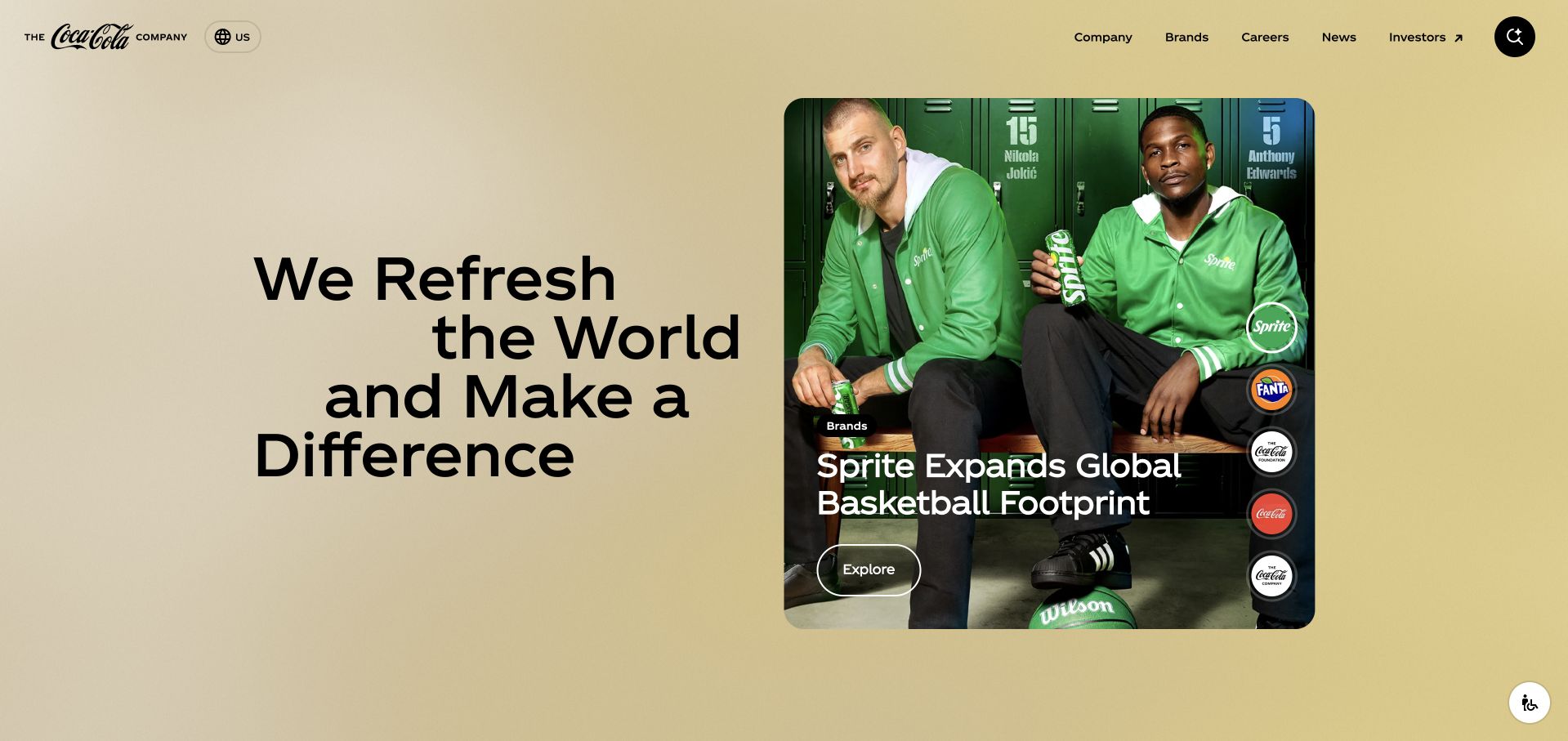
The Coca-Cola Company’s corporate site uses generous rounded content areas and clear navigation for company information, brands, careers, news and investors. Its main introduction speaks about the organization rather than presenting a store. Photography connects the familiar product world with people and activity, giving the corporate content a less institutional character. Distinct routes to the wider brand family are important here: visitors can understand that they are looking at the parent organization, not assume every product or local promotion is managed on this one homepage.
What you can learn
Make the parent-company and consumer-product boundaries understandable in the interface. The cited AWS case concerns Coca-Cola’s Consumer Data Service; it does not establish the runtime of every local brand site or the corporate page shown here.
Pros
Audience-based navigation gives corporate information a predictable place alongside the consumer brands.
Large image and text regions make a broad organization easier to scan without a dense directory.
Cons & considerations
Purpose-led language needs specific evidence to avoid feeling interchangeable with other large companies.
Rounded visual modules still require careful hierarchy when several campaigns are promoted together.
Platform source: Primary documented Amazon Web Services association. AWS documents Coca-Cola's global Consumer Data Service. Platform evidence is separate from the direct website screenshot and is not a complete current infrastructure audit.
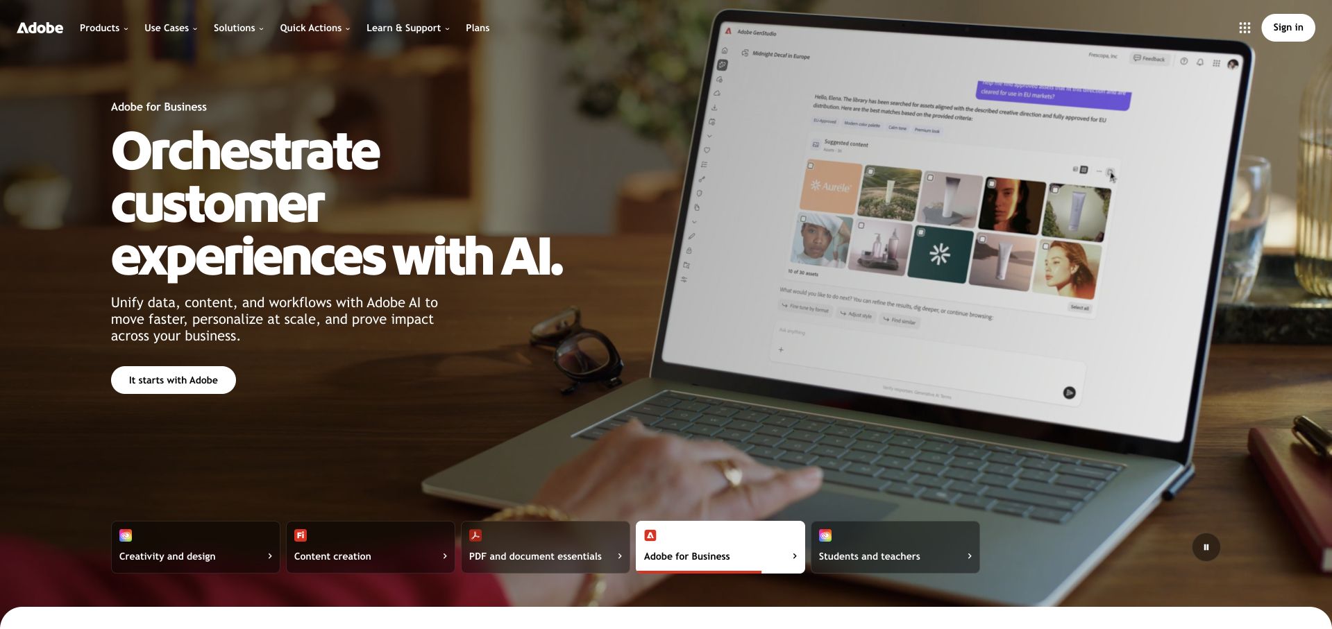
Adobe’s homepage presents a substantial visual campaign while a product-family selector introduces Creative Cloud, Firefly, Acrobat, business offerings and education. The selected category affects the visitor’s context without discarding the overall navigation. A concise primary action sits within the current story, while plans and support remain available elsewhere. This is useful for a company whose products are recognized individually: the interface can build on that recognition, but still needs to explain which family solves a particular problem rather than treating every visitor as the same kind of buyer.
What you can learn
Align navigation, campaign content and next actions around a coherent product family. Adobe’s AWS evidence concerns Experience Platform services, not a verified assertion that the whole public Adobe site uses that same deployment architecture.
Pros
The family selector gives several product lines a consistent visual and navigational home.
A focused campaign can coexist with broader routes for pricing and learning.
Cons & considerations
An animated campaign adds weight and requires a usable reduced-motion alternative.
Product-family labels may still be unfamiliar to someone describing a task rather than a brand.
Platform source: Primary documented Amazon Web Services association. AWS documents Adobe Experience Platform's cell-based cloud architecture. Platform evidence is separate from the direct website screenshot and is not a complete current infrastructure audit.
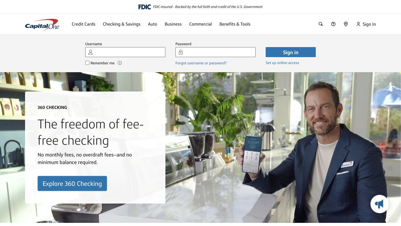
Capital One places account access close to its main navigation while leaving room for a substantial product promotion below. Banking, cards, auto, business and commercial routes describe recognizable needs rather than internal departments. The prominent sign-in area acknowledges that many visitors have an immediate repeat task and should not be forced through a campaign first. Product photography and a simple offer panel then serve people who are still comparing options. The useful design feature is not the specific financial offer, but the separation of repeat access from new-product discovery.
What you can learn
Map returning and first-time tasks independently before designing the hero. Capital One’s cited AWS recovery engineering is business infrastructure evidence; it should not be confused with an independent security assessment of the public sign-in experience.
Pros
Existing customers can identify account access without searching a promotional page.
Product-category navigation uses familiar financial tasks as the main organizing principle.
Cons & considerations
A large sign-in area reduces the space available to explain unfamiliar products.
Financial promotions need current eligibility and terms beyond what a homepage screenshot can establish.
Platform source: Primary documented Amazon Web Services association. AWS documents Capital One's automated regional failover and recovery engineering. Platform evidence is separate from the direct website screenshot and is not a complete current infrastructure audit.
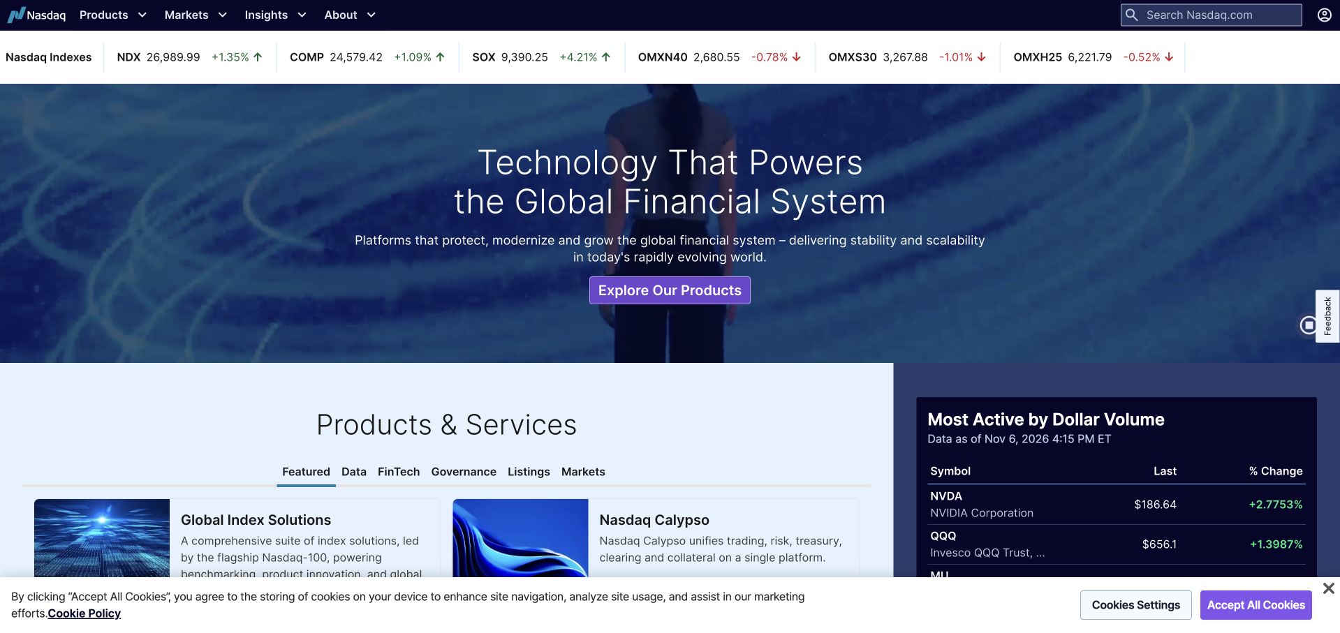
Nasdaq puts a compact market strip near the top of a much broader financial technology site. Beneath that live-information context, a large brand statement and a clear product action explain that the organization does more than display stock prices. Lower modules distinguish product and service areas from market activity. This combination is worth studying because data can easily consume the entire interface: here it provides context, while the primary structure still allows a visitor to learn about the business, examine offerings, or look for a particular kind of financial information.
What you can learn
Treat changing data as one layer of the experience, not the entire information architecture. AWS’s 2020 Nasdaq case documents an exchange-data lake, a dated association rather than proof that this current homepage and every quoted value share that architecture.
Pros
The compact index strip provides immediate context without replacing the main product narrative.
Products, markets, insights and company information have distinct navigational routes.
Cons & considerations
Dense numeric information can compete with the larger introduction on a narrower screen.
A captured market display is only a moment in time and is not suitable as current financial advice.
Platform source: Primary documented Amazon Web Services association. AWS's 2020 study documents Nasdaq's exchange-data lake. Platform evidence is separate from the direct website screenshot and is not a complete current infrastructure audit.
Pfizer’s opening combines a large human photograph with a tightly framed editorial story. The headline has enough space to read as an introduction rather than a caption pasted over a busy image. Science, products, stories, newsroom and about routes remain visible above it, with careers and investor access treated as supporting tasks. The homepage therefore has a recognizable editorial lead, but it is not only a magazine. Visitors who arrive with a specific research or corporate question can choose a more direct route instead of relying on the current feature.
What you can learn
Distinguish an engaging entry story from the complete information system behind it. Pfizer’s cited 2023 AWS keynote discusses scientific data and AI workloads; that association is not a clinical endorsement or a finding about this page’s entire technology stack.
Pros
The human-centered lead provides an accessible entry point to a complex scientific organization.
Navigation keeps product and research information discoverable outside the featured article.
Cons & considerations
A single featured condition cannot represent every visitor’s health or information needs.
Health-related content requires careful editorial review and accessible supporting detail beyond the photograph.
Platform source: Primary documented Amazon Web Services association. AWS's 2023 keynote describes Pfizer's Scientific Data Cloud and VOX workloads. Platform evidence is separate from the direct website screenshot and is not a complete current infrastructure audit.
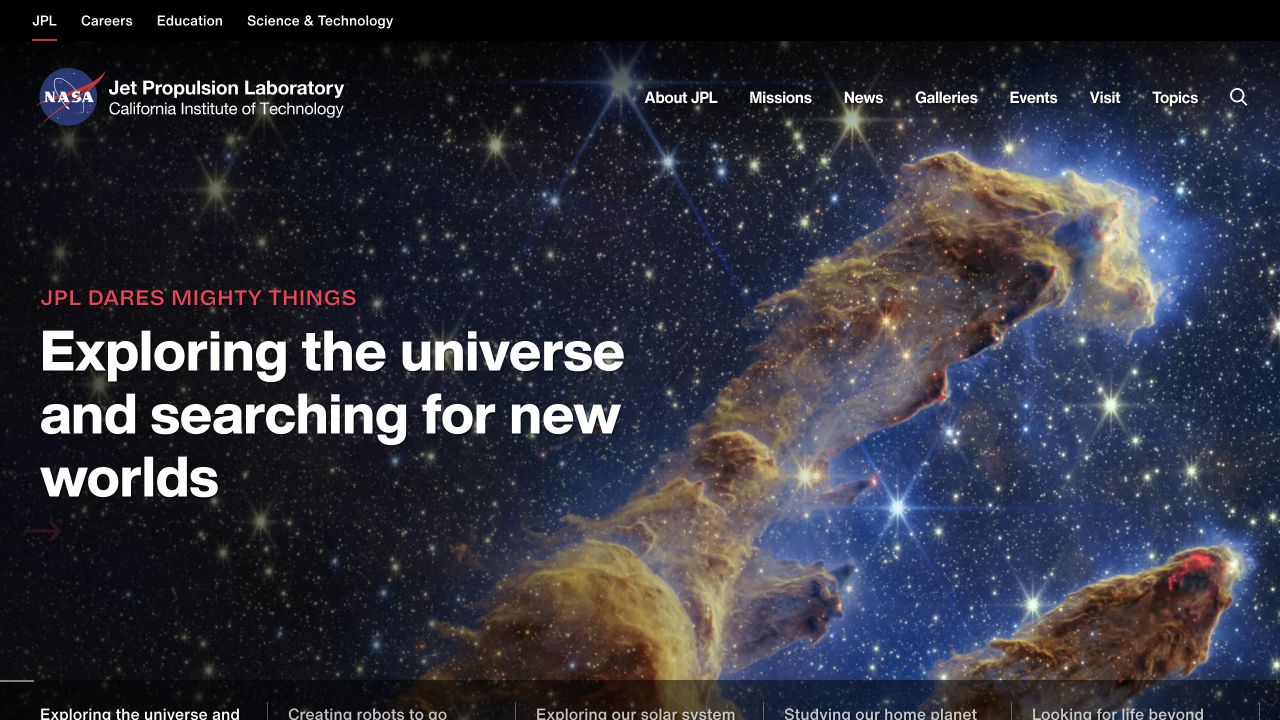
NASA JPL’s homepage gives a large astronomical image room to work while keeping a clear statement about exploration in the foreground. A narrow upper navigation distinguishes careers, education, and science and technology from broader routes such as missions, news, galleries and visiting. Topic links beneath the feature translate a complex research organization into questions and interests a general visitor can understand. The page is visually ambitious, but the taxonomy still makes room for practical tasks that are very different from simply admiring a photograph.
What you can learn
Use imagery as an invitation into a structured body of knowledge. The AWS case describes JPL’s planned NISAR data-processing workload, not a measurement of the captured homepage’s hosting, performance, mission outcomes or complete current infrastructure.
Pros
The imagery communicates the subject immediately without needing an elaborate explanation.
Separate education, research and visitor routes acknowledge genuinely different user tasks.
Cons & considerations
Large image assets require careful responsive delivery to keep the opening usable on slower connections.
A broad exploration statement needs descriptive links for visitors with a narrowly defined research question.
Platform source: Primary documented Amazon Web Services association. AWS documents planned NISAR satellite-data processing at NASA JPL using EC2 Spot. Platform evidence is separate from the direct website screenshot and is not a complete current infrastructure audit.
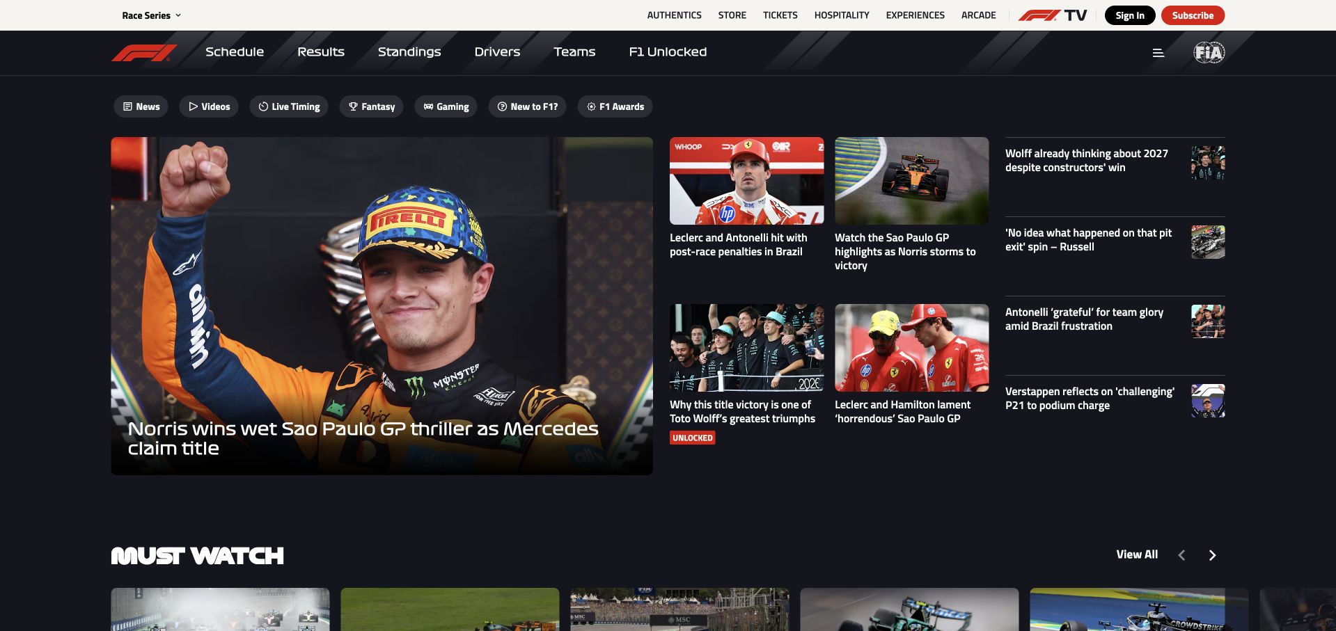
Formula 1’s homepage uses a dark editorial grid rather than a single generic brand statement. One prominent story carries the largest image, while adjacent cards offer other headlines and a secondary viewing section begins below. The navigation separates racing information from the wider ecosystem of tickets, merchandise, hospitality and viewing products. This gives the page a useful sense of urgency without making every item equally loud. A visitor can follow the current story or take a practical route to another part of the organization without first understanding its internal structure.
What you can learn
Give one editorial item visual priority, then make the surrounding commercial routes explicit. The AWS source concerns Formula 1’s fan-data platform; it is not proof that every linked ticketing, video or retail property uses the same cloud services.
Pros
The lead-story grid makes the editorial hierarchy visible before a visitor reads every headline.
Distinct ecosystem links accommodate fans with practical event or viewing intentions.
Cons & considerations
The dense header and multiple content formats create substantial mobile navigation work.
Fast-changing stories require disciplined publishing so that headlines, images and results remain aligned.
Platform source: Primary documented Amazon Web Services association. AWS documents Formula 1's fan-data platform. Platform evidence is separate from the direct website screenshot and is not a complete current infrastructure audit.
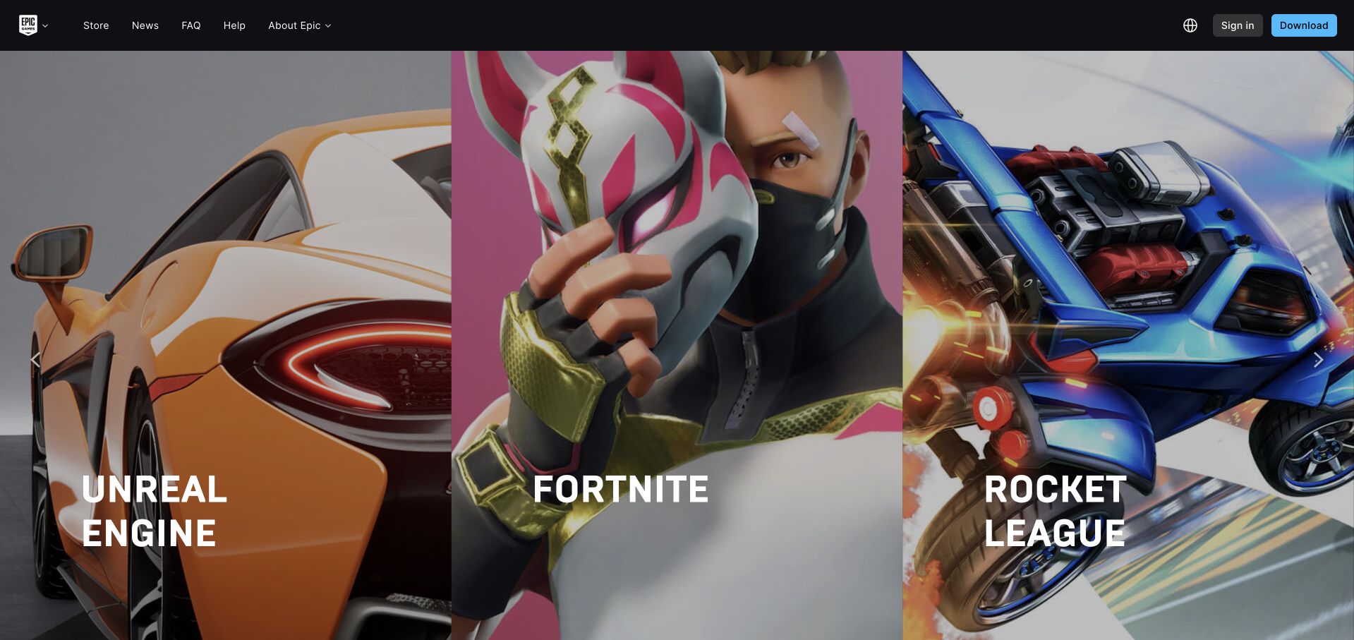
Epic Games’ corporate gateway divides the opening into tall visual panels for recognizable products and experiences. Each panel combines artwork, a short name and an exploration route instead of a lengthy corporate explanation. A compact dark header keeps store, news, help and company navigation separate from those product worlds. The design is useful when people already know one title but may not understand the parent company’s wider range. It can quickly send them toward the relevant property without making a central site reproduce every product’s features, pricing and community information.
What you can learn
A gateway should clarify destinations rather than duplicate them. Epic’s AWS evidence covers game infrastructure and capacity, especially Fortnite-related services, and does not independently establish the hosting stack of this corporate landing page or every linked game.
Pros
Product artwork and names make the available destinations immediately recognizable.
The small corporate shell keeps support and company information accessible above the promotional panels.
Cons & considerations
Unfamiliar visitors receive little explanation of how the separate product worlds relate.
Image-heavy panels need descriptive labels and careful narrow-screen ordering to remain useful.
Visible tech stack
Earlier / documented evidence
Amazon Web Services
Platform source: Primary documented Amazon Web Services association. AWS documents Epic Games' game infrastructure and Fortnite server capacity. Platform evidence is separate from the direct website screenshot and is not a complete current infrastructure audit.
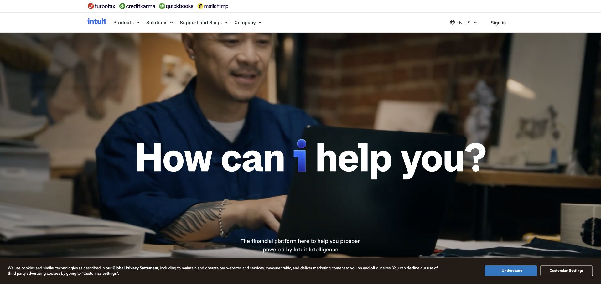
Intuit’s homepage places its familiar product brands in a compact strip above the main navigation, then gives the hero to a human-centered question about help. This avoids making the first screen a complicated product comparison chart. Products, solutions, support and company information remain available as explicit routes, while the large imagery presents the software in a recognizable business context. The parent brand becomes a way to understand the relationship between offerings, not just another logo that visitors must decode before finding the product they already know.
What you can learn
State the shared customer need before explaining organizational complexity. The cited AWS study establishes an Intuit data and machine-learning association, not an assertion that every subsidiary product or this public campaign page runs on a single uniform backend.
Pros
The product strip makes the relationship between established brands visible without dominating the hero.
Human imagery and a direct question provide an approachable opening for a technical software portfolio.
Cons & considerations
A broad help-oriented message still needs concrete examples of what each product actually does.
Multiple brand names can create uncertainty about account access, support ownership and purchasing boundaries.
Platform source: Primary documented Amazon Web Services association. AWS documents Intuit's data and machine-learning infrastructure. Platform evidence is separate from the direct website screenshot and is not a complete current infrastructure audit.
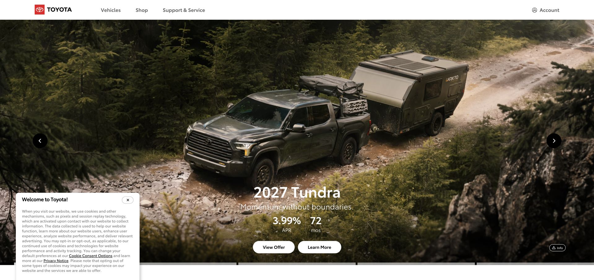
Toyota’s US homepage gives a vehicle campaign a large photographic canvas while retaining direct routes for vehicles, shopping and support. The surrounding tool structure includes configuration, offers, comparison, inventory and dealer discovery. That distinction is valuable: someone evaluating a truck and an existing owner looking for help should not have to interpret the same promotional call to action. The campaign creates a strong first impression, but the practical navigation helps turn that impression into a more specific task when the visitor is ready to make a decision.
What you can learn
Plan campaign assets and functional routes as separate layers that reinforce each other. Toyota’s AWS case concerns an Advanced R&D retrieval system, not proof that the US vehicle site uses the same services or offers a particular technical capability.
Pros
Vehicle imagery provides a clear product focus while practical shopping routes remain discoverable.
Support and service navigation prevents the homepage from addressing only prospective buyers.
Cons & considerations
Regional offers and model availability need current, location-specific detail beyond the campaign.
Large promotional imagery and rotating content require accessible controls and well-sized mobile alternatives.
Platform source: Primary documented Amazon Web Services association. AWS documents a Toyota Advanced R&D shared retrieval infrastructure. Platform evidence is separate from the direct website screenshot and is not a complete current infrastructure audit.
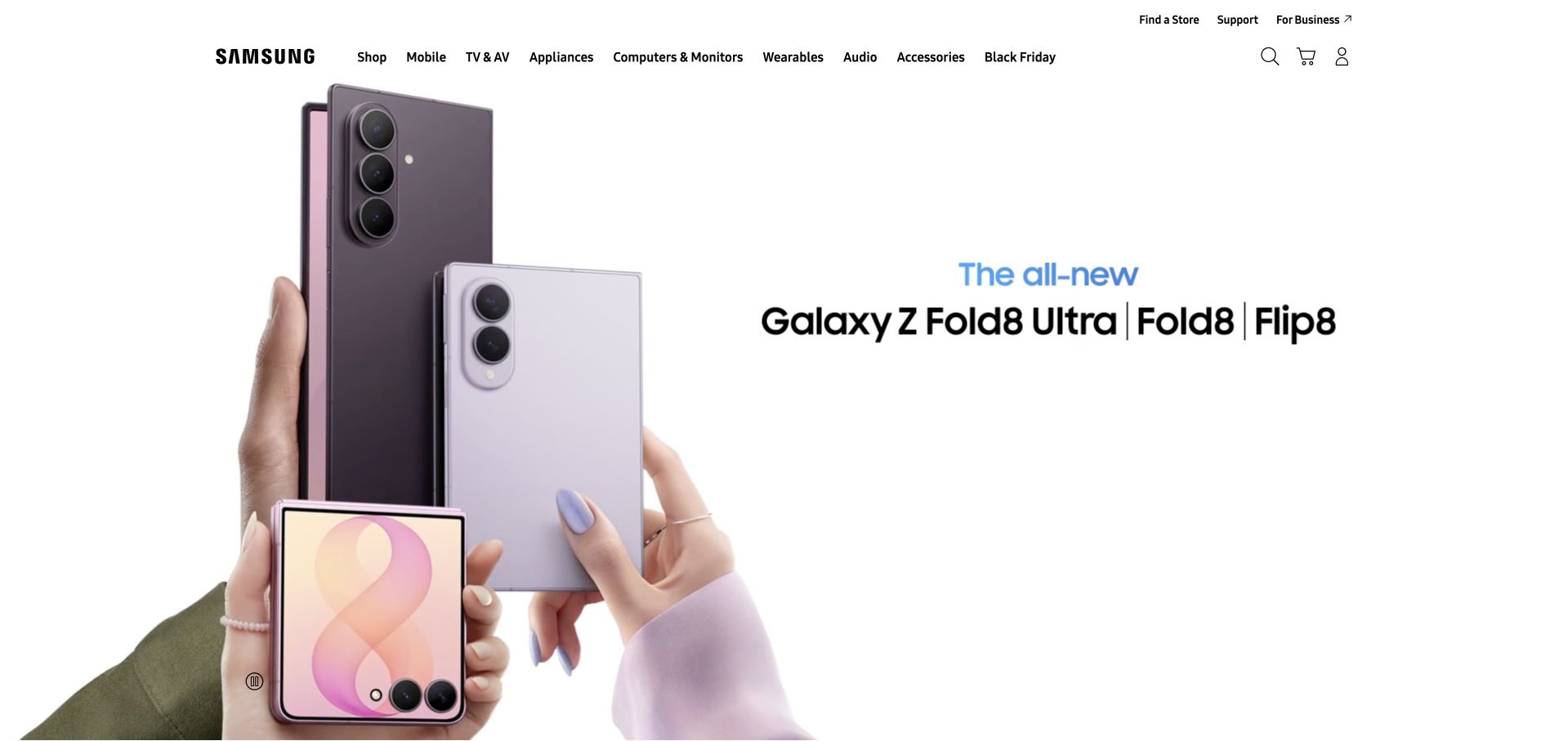
Samsung’s US homepage starts with a product-family campaign and keeps a substantial category navigation above it. Mobile, televisions, appliances, computing, wearables and audio are described as recognizable shopping areas. The hero’s product photography makes the promoted devices immediately visible, while search, support and business routes acknowledge other reasons to visit. This is a useful balance for a catalog spanning unrelated purchase cycles: the homepage can promote a current launch without requiring every visitor to follow that launch before finding an appliance, accessory or support document.
What you can learn
Make campaign emphasis temporary while keeping the product taxonomy stable. AWS documents Samsung Account’s database migration to Aurora; that specific identity-data workload does not establish the runtime of every regional retail page or the complete Samsung technology estate.
Pros
The product photograph shows the promoted devices instead of relying entirely on abstract campaign language.
Stable categories and support access accommodate visitors whose needs differ from the featured launch.
Cons & considerations
A large number of top-level categories can become difficult to scan on smaller screens.
Promotional specifications, trade-ins and financing need fuller qualification than a hero can provide.
Platform source: Primary documented Amazon Web Services association. AWS documents Samsung Account's database migration to Aurora. Platform evidence is separate from the direct website screenshot and is not a complete current infrastructure audit.
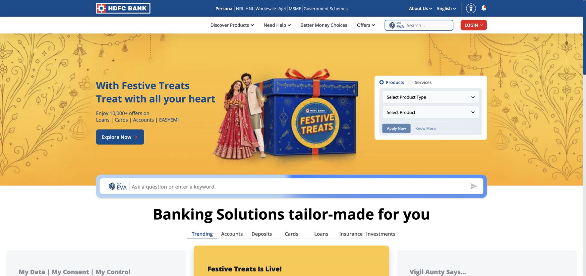
HDFC Bank’s public site begins by distinguishing audience groups such as personal, NRI, wholesale, agricultural and small-business banking. Those categories sit above a much broader banking interface, where product discovery and existing-customer access have different purposes. The useful reference is the explicit segmentation: a complex organization can reduce ambiguity by asking which kind of relationship the visitor needs before presenting every possible service. The page is still dense, so the supporting hierarchy and labels matter as much as the main campaign or promotional image.
What you can learn
Use meaningful audience distinctions to constrain a large service catalog, then test the path for each group. CNCF documents the Enterprise Payment Hub across AWS and Google Cloud; that named platform is not evidence that the public banking homepage shares every infrastructure component.
Pros
Audience categories make several different banking relationships visible from the outset.
Existing access and product discovery can be accommodated without pretending they are the same user task.
Cons & considerations
Several navigation layers increase cognitive load before a first-time visitor reaches a specific product.
Banking eligibility, security and product terms cannot be judged from a homepage layout or screenshot.
Platform source: Primary documented Amazon Web Services association. CNCF’s July2026 HDFC case study describes its Enterprise Payment Hub deployed across AWS and Google Cloud. Platform evidence is separate from the direct website screenshot and is not a complete current infrastructure audit.
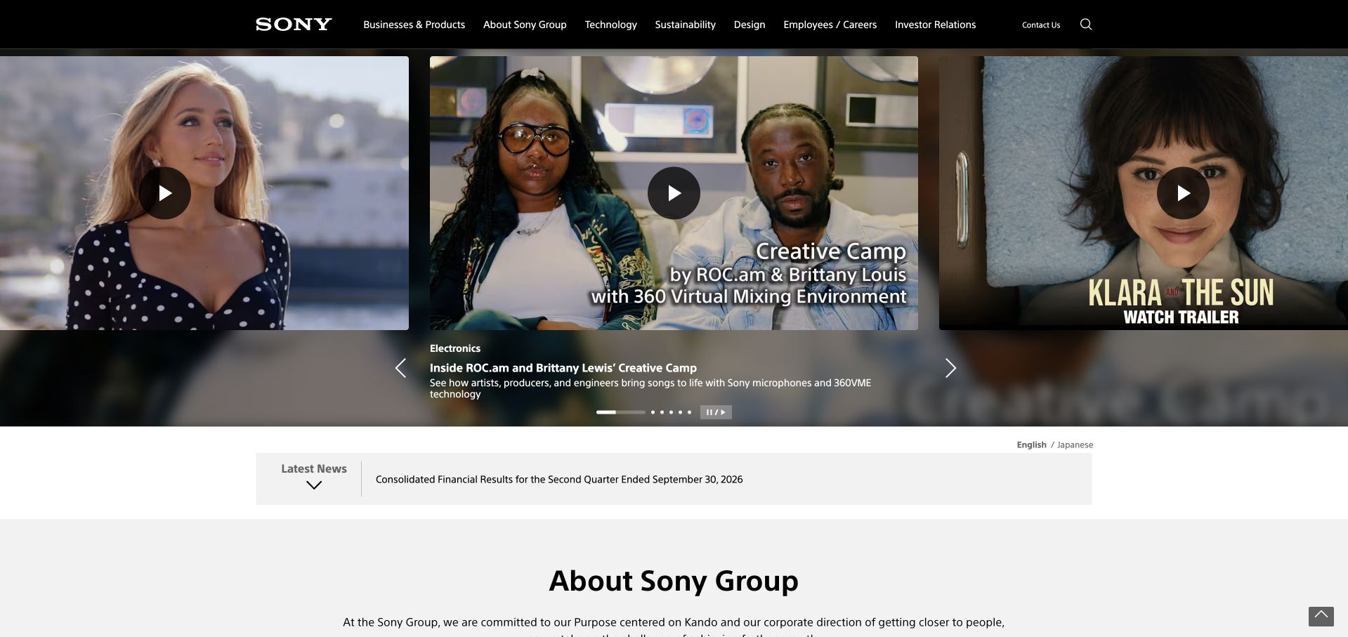
Sony Group’s portal leads with creative work presented in a wide visual feature. The surrounding navigation covers businesses and products, company information, technology, sustainability, design, careers and investors. This allows entertainment content to establish the character of the organization while practical corporate routes remain stable. The page is useful for a business whose public identity spans several categories: rather than forcing all of them into one product grid, it uses a shared editorial surface to show a relationship between creativity, technology and the wider group.
What you can learn
Let a portal express the common idea behind different businesses, while giving each audience a direct route onward. AWS’s Sony feature establishes a group AI-work association, not proof that every Sony property or the portal itself uses an identical cloud architecture.
Pros
Creative content gives the parent organization a recognizable character beyond its corporate structure.
Persistent investor, career and business routes serve practical needs outside the featured story.
Cons & considerations
A broad portal can leave visitors unsure whether a particular product belongs on this site or elsewhere.
Several simultaneous media features require clear playback controls and restrained loading behavior.
Visible tech stack
Earlier / documented evidence
Amazon Web Services
Platform source: Primary documented Amazon Web Services association. AWS highlights Sony Group's organization-wide AI work. Platform evidence is separate from the direct website screenshot and is not a complete current infrastructure audit.
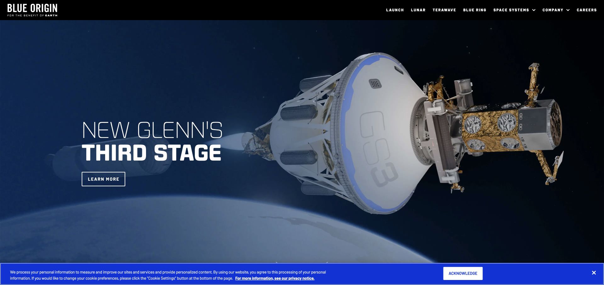
Blue Origin places a large spacecraft or mission-related visual at the center of its opening, accompanied by a brief label and a single route to learn more. The dark blue setting and restrained header give the subject room to read. Launch, lunar work, other space systems, company information and careers remain separate destinations rather than becoming paragraphs inside the hero. This is a useful pattern for technically complex organizations: start with something people can see and name, then let the information architecture reveal the breadth of the work.
What you can learn
Use a concrete object as an entry point, not as a substitute for technical explanation. The AWS feature concerns the TEAREx engineering workflow; it is not a statement about the captured homepage’s infrastructure, flight readiness or the performance of a space system.
Pros
A focused visual subject makes an unfamiliar engineering organization easier to approach.
Concise navigation leaves room for the main story while retaining company and career tasks.
Cons & considerations
A dramatic image alone cannot explain program maturity, operational scope or technical constraints.
Very dark image-led designs need deliberate contrast, alternative text and economical media delivery.
Platform source: Primary documented Amazon Web Services association. AWS highlights Blue Origin's TEAREx engineering workflow. Platform evidence is separate from the direct website screenshot and is not a complete current infrastructure audit.
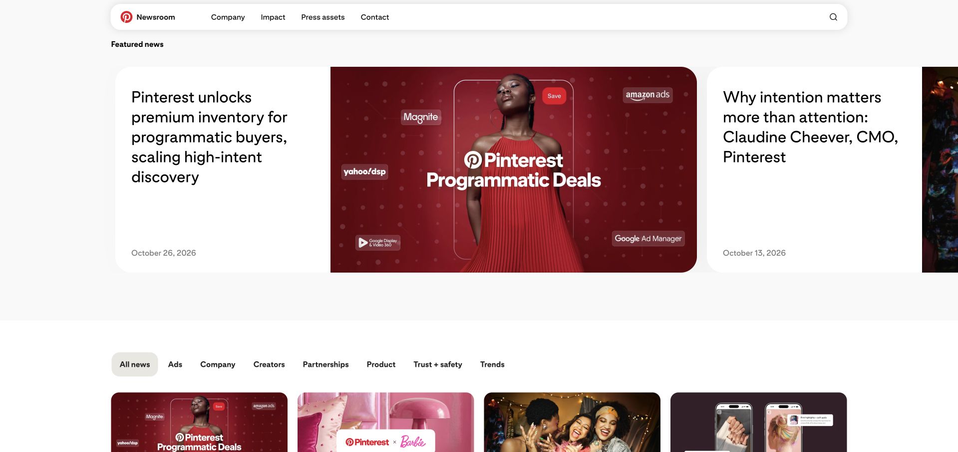
Pinterest’s newsroom presents a featured announcement as a large visual card beside a secondary story. The header separates company information, impact, press assets and contact, while topic filters introduce the wider archive below. This is not the same task as browsing saved ideas inside the product, and the page does not pretend otherwise. Its strength is the relationship between a clear editorial lead and a usable reference system: someone can read the latest announcement, locate media materials, or narrow a longer history of product and business updates.
What you can learn
Give public communications their own task model instead of copying the application interface. AWS highlights Pinterest’s discovery-platform infrastructure; the cited association should not be expanded into a claim about the newsroom’s complete CMS, hosting or analytics stack.
Pros
The featured-card hierarchy directs attention without making the rest of the archive disappear.
Press assets and corporate context are treated as useful destinations rather than buried footer links.
Cons & considerations
A newsroom’s promotional perspective needs to remain distinguishable from independent reporting.
Large cards must preserve descriptive titles and sensible reading order when stacked on mobile.
Platform source: Primary documented Amazon Web Services association. AWS highlights Pinterest's discovery-platform AI infrastructure. Platform evidence is separate from the direct website screenshot and is not a complete current infrastructure audit.
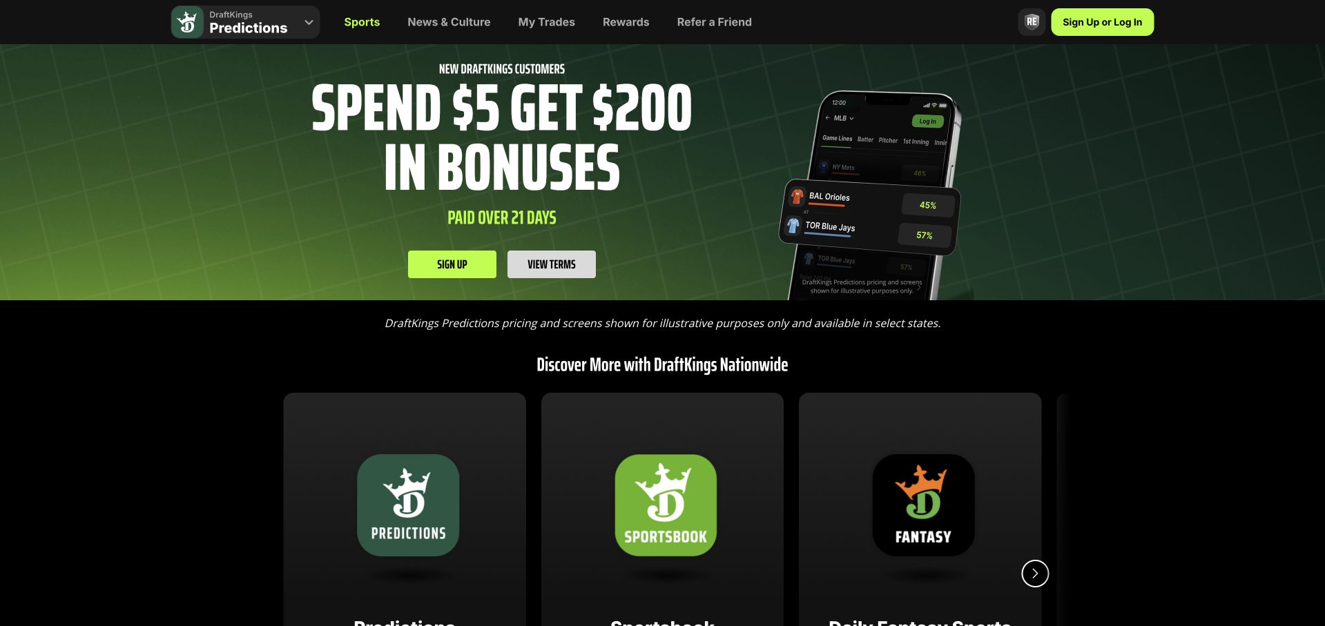
DraftKings’ public opening uses a high-contrast green-and-black campaign and then introduces distinct product destinations below it. The header includes product navigation and account access rather than relying entirely on the promotional panel. From a design perspective, the useful element is the separation of the brand’s different experiences: visitors should be able to understand which product they are entering, instead of assuming that one large offer applies to everything. The screenshot is an interface reference, not a recommendation to participate in betting, trading or any financial activity.
What you can learn
Make product boundaries and eligibility visible before promoting an action. AWS’s case concerns a DraftKings financial-ledger workload; it does not establish that the particular public Predictions experience shown here uses that same implementation or that its advertised outcomes are representative.
Pros
Distinct destination cards help explain a brand that offers several related experiences.
A strong visual identity makes primary navigation and promotional content easy to recognize.
Cons & considerations
Promotional urgency can overshadow product differences and important restrictions.
Age, location, risk and eligibility information require clear treatment beyond what the first screen can establish.
Visible tech stack
Earlier / documented evidence
Amazon Web Services
Platform source: Primary documented Amazon Web Services association. AWS documents DraftKings' financial ledger on Amazon Aurora. Platform evidence is separate from the direct website screenshot and is not a complete current infrastructure audit.
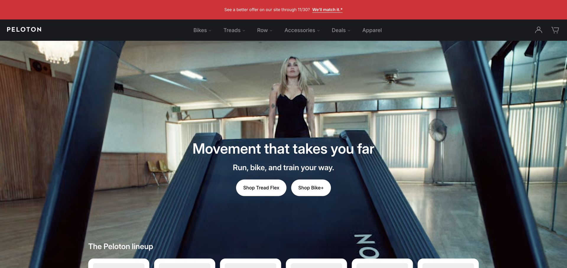
Peloton’s homepage shows the workout experience before explaining the underlying equipment in detail. A large lifestyle image sits behind a short movement-focused message, with separate shopping actions for different product families. The navigation exposes bikes, treadmills, rowing equipment, accessories and related offerings, while the next section begins to introduce the wider range. This is a useful reference for a product that combines physical equipment with a digital service: the first screen communicates the activity, and the surrounding structure helps visitors identify the particular purchase or comparison they want to make.
What you can learn
Connect the visible experience to explicit product routes, then explain subscription and hardware requirements further along the journey. The cited AWS engineering article describes live-event systems; it is not a benchmark of this retail page or a guarantee about an individual workout experience.
Pros
Human activity makes the connected-product proposition understandable before a specification table is needed.
Separate shopping actions help visitors choose between product families without a complicated opening form.
Cons & considerations
Lifestyle imagery cannot replace clear equipment, space and subscription requirements.
A media-led opening needs efficient loading and accessible controls for visitors who prefer less motion.
Platform source: Primary documented Amazon Web Services association. AWS's 2026 engineering article describes Peloton live-event streaming, queues and caching. Platform evidence is separate from the direct website screenshot and is not a complete current infrastructure audit.
Kegan has 15+ years of experience working with small businesses, Fortune 500 companies, and everything in between. No development job is too big or too small: he brings the same hands-on attention to a focused improvement, a complete website, or a custom application.
For Amazon Web Services projects, he can help with content architecture, custom functionality, system integrations, testing, and maintainable handover. He works directly with clients on scope, design, implementation, testing, and handover, with an emphasis on clear communication and a system that remains practical to maintain after launch.
Show 3 other Amazon Web Services developersHide other Amazon Web Services developers
Keep content publishing and public delivery straightforward when the only custom behavior is a bounded form or integration. Define the receiving system, spam protection, confirmation and failure handling. Treat email delivery and durable records as separate outcomes; a successful browser animation is not evidence that the business received the inquiry.
An application with persistent customer state
Map account permissions, data ownership and transactional behavior before selecting compute and storage. Include recovery from an interrupted request and repeated external notifications. The application, database, content system and public frontend need not become one indivisible project simply because they share a cloud account.
A data or integration workload beside an existing website
An AWS service may process documents, synchronize business systems or produce analytics while the main site remains on another platform. Document that boundary clearly. The important question is whether the integration is dependable and supportable, not whether every component can be relabeled as part of one cloud migration.
From references to requirements
Plan the operating model before launch
Separate environments and authority
Identify the public endpoints, administrative tools and private data paths. Give each component only the access it needs, and keep credentials out of browser code and public build artifacts. Test changes in a nonproduction environment with safe data rather than using real customer actions as a deployment experiment.
Rehearse a complete release and recovery
Ask the delivery team to demonstrate a clean build, a controlled deployment, a failed release and a return to the known working version. Include database and content changes, not only application files. A rollback that restores code but leaves incompatible records behind is not a complete recovery plan.
Create an understandable handover
Document account ownership, recurring costs, support contacts, backup retention and the routine update process. Make it possible for a future maintainer to locate the current release and understand which services are actually used. Keep the inventory accurate as the site changes rather than preserving a diagram that only matched the initial proposal.
A useful handover demonstration
Ask the actual team to carry out its routine job: publish a realistic update, correct a mistake, preview a narrow screen, and identify who owns an integration failure. For a library or frontend framework, also ask who maintains the content source and deployment. A polished screenshot does not answer those operational questions.
Beyond the screenshot
AWS website planning checklist
Define the public and private responsibilities.
Identify the owner of each cloud account and domain.
Map the complete inquiry or transaction path.
Set explicit access boundaries for services and people.
Keep secrets outside browser code and public artifacts.
Choose a workable content-editing process.
Describe expected traffic and unusual demand.
Estimate storage, delivery and operational costs.
Test failed requests and repeated external events.
Rehearse backup restoration and a failed release.
Document monitoring and a named response owner.
Provide a handover another maintainer can use.
Test with real content, a keyboard, a small screen, slow or failed requests, and the people who will maintain the system. These are planning checks, not an accessibility, security, performance, or search-ranking certification.
Sources & editorial method
How this Amazon Web Services collection was reviewed
These 20 references were selected for useful public design patterns and independently documented AWS associations. The first five are established major brands. Direct source-page captures retain their real dates; reused captures are not relabeled as fresh screenshots. Public technology audits may reveal other publishing layers. Documentary evidence remains qualified by product, workload and publication date.
Every image is an unmodified capture from the actual website, with its source and capture date. Some captures are reused from our shared catalog; their dates remain the original capture dates. None comes from a vendor gallery or a generated reconstruction. Moving imagery and live content can change.
Technology attribution uses public page assets or metadata, official platform documentation, or a cited first-party project case study. Documentary and framework-relationship evidence is identified where used; it is not a complete current backend inventory. A CMS image CDN alone does not establish a full CMS deployment. A library’s presence does not prove which individual controls use it, and a platform label does not establish AI authorship.
The composition notes, lessons, pros and tradeoffs are original editorial observations. We have not measured conversion, traffic, security, performance or accessibility conformance. Website owners retain their brands and imagery; these examples are not our client portfolio. Written, Edited and Curated are independent records, not dates advanced by a build. See our editorial standards or suggest a correction.
Questions worth asking
Amazon Web Services website development FAQs
Are all 20 captured websites hosted on AWS?
No. Each organization has a cited AWS association, but the source may describe an internal platform, a particular application or a historical workload. The screenshot and design review are separate from that infrastructure evidence. We do not infer a whole-company stack from one case study.
Does AWS determine which CMS I should use?
No. Content editing, approval, structured data and publishing requirements should drive the CMS decision. Infrastructure must support that workflow, but a cloud provider’s name does not choose it. Evaluate the editor’s actual tasks as carefully as the deployment arrangement.
Should a small site copy a major brand’s architecture?
Not without a matching need and an operating team. Large organizations have constraints that may not apply to a smaller publication or lead-generation site. Borrow useful design patterns, then choose the simplest system that meets the real reliability and integration requirements.
Can a screenshot show whether a site uses AWS?
Not reliably. A screenshot shows a rendered interface, not the cloud accounts and services behind it. Public source signals and official engineering material can support narrower findings, and those findings still need to be read with their original scope and date.
What should an AWS handover include?
Account and billing ownership, deployment instructions, service inventory, access boundaries, backup and restoration procedures, monitoring responsibilities and a tested recovery path. It should describe the system that is actually running, not just the technology names included in the original sales proposal.
Start with the visitor’s task and the operating responsibility behind it. A useful AWS website brief explains both clearly, without treating an impressive reference company as a substitute for your own requirements.