Best Aquarium Store Websites of 2026 (30 Real-World Examples)
Study 30 real aquarium-store websites, from local freshwater specialists to coral, plant and equipment shops, with practical lessons in catalog structure, visiting information and fulfillment clarity.
A useful aquarium-store website helps people find the right department, understand what they are looking at and choose a realistic next step.
Aquarium retail brings together several different decisions. Someone replacing a pump may know the exact model; someone planning a planted tank may need categories, examples and advice; a local visitor may only need opening hours and a current stocklist. A homepage that treats all three people as ready to buy the same featured product misses useful opportunities.
These 30 directly reviewed websites show how shops organize freshwater and marine interests, plants, livestock, equipment and professional services. The commentary focuses on presentation and navigation. It does not certify animal health, product suitability, shipping performance or claims made by the featured businesses.
Before the examples
What makes good aquarium store website design in 2026?
Separate the main aquarium contexts
Use clear department names for freshwater, marine, plants, livestock and equipment where they apply. Keep search obvious for shoppers who already know an exact product, while offering more guided routes for people starting with a project.
Make fulfillment differences visible
Explain local visits, collection, ordinary delivery and coordinated livestock shipments as separate tasks. Link notices to their complete conditions, and make operational updates easy to maintain when dates or availability change.
Connect inspiration with useful details
Show real aquariums, stock and store spaces, then provide the names, specifications, availability context and next steps that make those images useful. Keep educational material distinct from unqualified promotional promises.
The collection · 30 examples
30 aquarium store websites worth studying
The following examples cover 30 distinct public website properties. Aquarium Zen is the explicitly researched Editors Choice for its focused local-shop presentation and clear connection between its showroom, products and services. The selection concerns website design and communication, not a service-quality or animal-care endorsement.
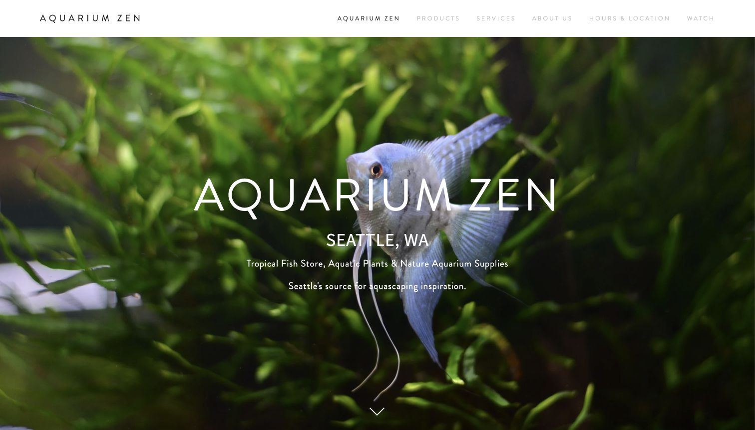
Aquarium Zen presents its Seattle shop through an expansive fish photograph, a precise location statement and a short description of its freshwater focus. The restrained navigation gives products, services and visiting information equal prominence. Further down, showroom photographs and an explanation of the hardscape planning area make the physical experience more concrete. Separate service sections describe design, installation and maintenance. This is a useful example of a local shop explaining why someone might visit, without making an online basket the whole story.
What you can learn
Connect the atmosphere of a specialist shop to practical next steps. Show the actual environment, name the location immediately and give visiting information a stable navigation link. Let service descriptions explain what an inquiry concerns before asking someone to contact the business.
Pros
The Seattle identity and aquarium specialism are clear within the opening screen, alongside genuine aquatic imagery.
Products, services and hours have straightforward labels that accommodate both browsing and purposeful local visits.
Cons & considerations
The pale, widely spaced navigation lettering could be easier to distinguish against the white header.
The immersive opening delays detailed inventory information; visitors seeking prices need to explore further.
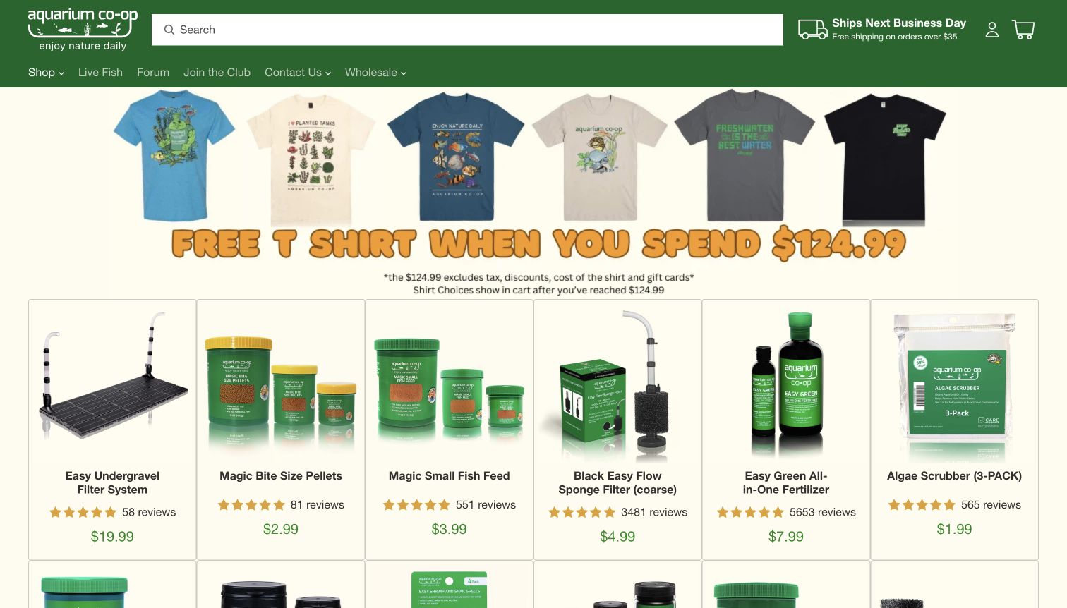
Aquarium Co-Op places a large search field above a compact retail navigation and a straightforward product grid. Individual cards combine product photographs, names, prices and review indicators, keeping comparisons close together. The captured opening also devotes prominent space to a merchandise promotion, while the broader page links to learning resources, community and store information. Its useful pattern is the connection between a practical catalog and an established educational ecosystem, rather than a purely decorative aquarium introduction.
What you can learn
Give returning shoppers a short route to a known item while keeping explanatory material available for unfamiliar choices. Use consistent card layouts and separate community, live-fish and equipment destinations so visitors can tell which kind of task each route supports.
Pros
Search occupies an obvious position and the product cards repeat a readily scannable visual structure.
Learning and community destinations provide context beyond the immediate product assortment and promotional campaign.
Cons & considerations
The large merchandise promotion competes with aquarium-related products for attention in the initial view.
Dense retail choices can require extra orientation for a first-time visitor who does not know product terminology.
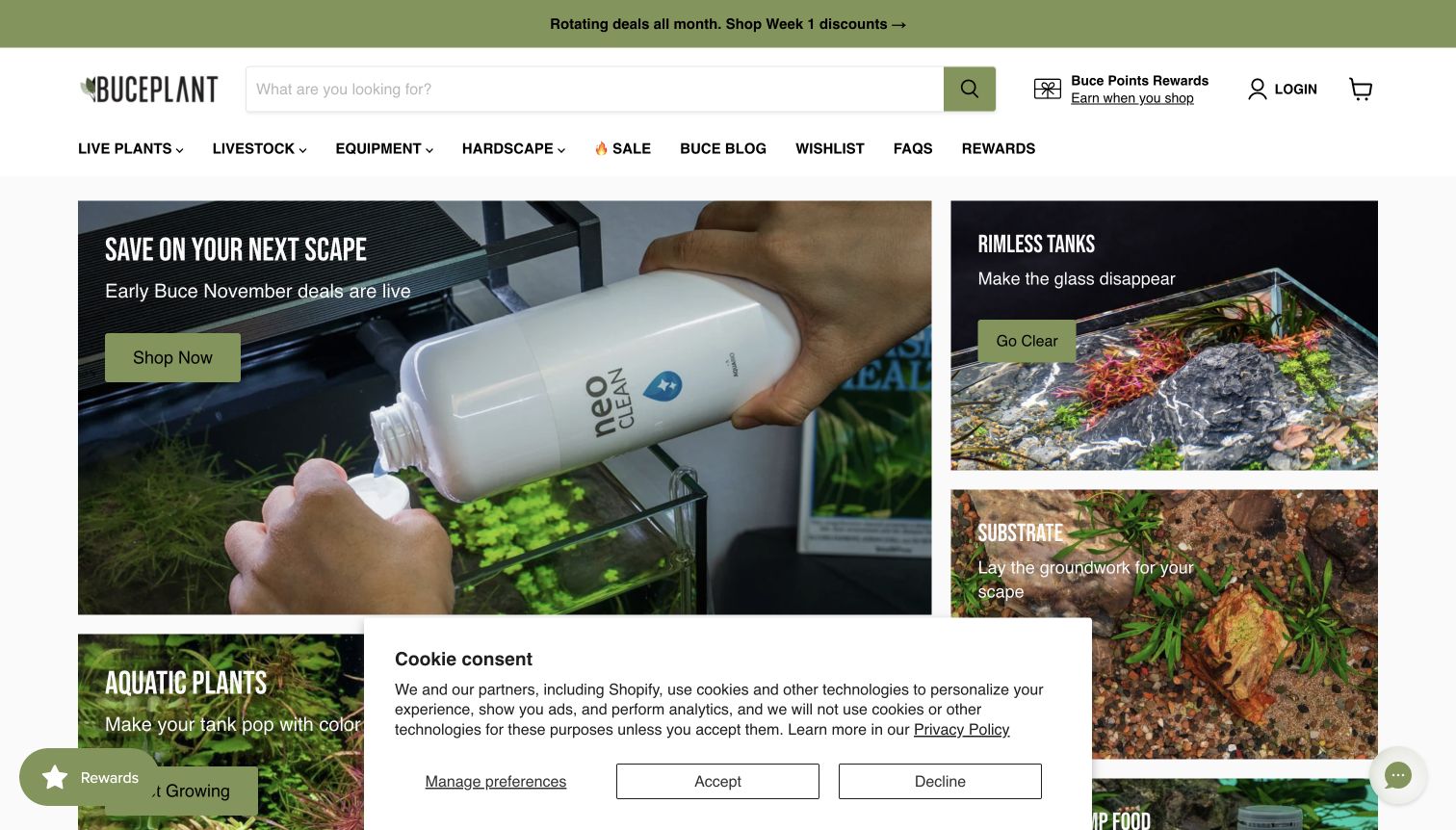
Buce Plant organizes the opening around a photographic mosaic rather than a single product list. A large maintenance image sits beside more focused aquarium and substrate tiles, while the header exposes plants, livestock, equipment and hardscape. This grouping makes the store feel connected to building an aquascape from several components. Search remains easy to spot. The captured view also includes a cookie panel and small utility widgets, a reminder that otherwise polished category photography can lose space to overlapping interface elements.
What you can learn
Use project photography to connect related departments, then label each destination with the actual category a shopper will find. Reserve sufficient space for necessary notices and keep optional prompts from competing with the tiles that provide the main browsing choices.
Pros
The image mosaic gives plants, tanks and supporting materials distinct visual entry points within one composition.
A broad search field and explicit department labels support visitors who already know their required component.
Cons & considerations
The visible cookie panel obscures part of the lower category area in the recorded desktop view.
Several small rewards and assistance elements add visual competition around an already image-rich shopping surface.
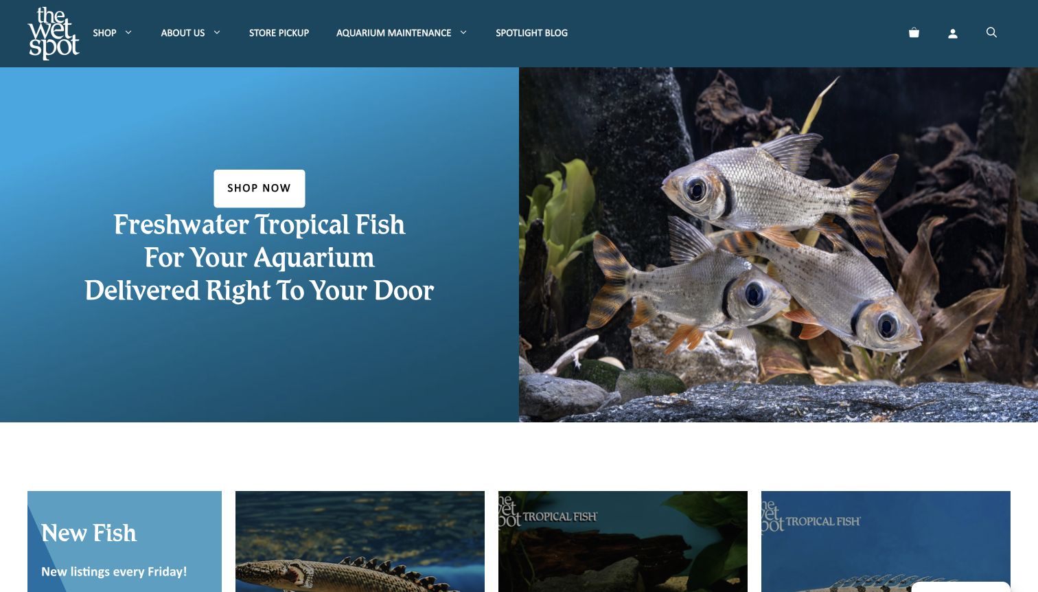
The Wet Spot Tropical Fish opens with a shopping message beside a fish photograph. Blue panels and navigation keep the first screen focused, with new arrivals beginning below. The wider homepage distinguishes online ordering from the Portland retail location and links to pickup, frequently asked questions and maintenance services. Its ordering explanation describes a shipping date and customer confirmation. The design lesson is the visibility of different fulfillment paths, not an independent verification of its livestock or delivery claims.
What you can learn
Present shipping, local collection and service inquiries as separate journeys. Explain the next operational step in plain language before a shopper commits, especially when a live-animal order needs coordination beyond ordinary parcel delivery. Keep location and policy information close to these choices.
Pros
The split opening balances a recognizable product subject with a concise explanation of the shop’s freshwater focus.
Pickup, shipping questions and aquarium services have distinct destinations instead of being folded into one generic contact link.
Cons & considerations
The first screen offers limited detail about the individual fish shown, so comparison begins farther down.
Visitors still need the linked policies to understand conditions and timing; the homepage cannot answer every fulfillment question.
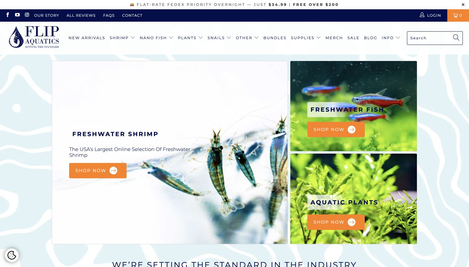
Flip Aquatics uses three large photographic choices to divide the opening into freshwater shrimp, fish and plants. The asymmetric arrangement makes shrimp the dominant starting point while leaving the other departments visible. Orange buttons contrast with a largely white and navy interface, and the navigation provides more detailed species and supply routes. The broader page includes learning and policy links. It is a useful example of converting a specialist assortment into a few recognizable starting decisions before exposing the full catalog.
What you can learn
Start with a small set of meaningful departments, then reveal finer categories within them. Let imagery explain the difference between those departments and use the same action style across each tile. Keep education nearby without presenting every article as an equally urgent homepage task.
Pros
The three-part photographic layout communicates the store’s principal freshwater departments without a long introductory paragraph.
Consistent bright buttons remain easy to identify against the otherwise restrained background and product imagery.
Cons & considerations
The fuller navigation contains many specialist labels that may still require explanation for new hobbyists.
Large category imagery postpones direct price and stock comparisons until the visitor enters a department.
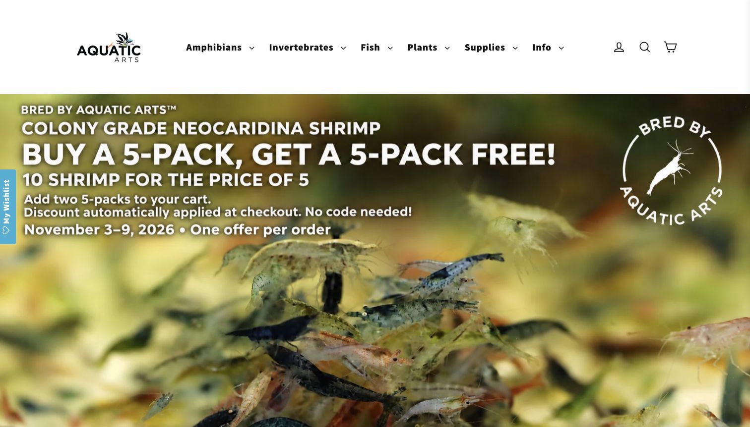
Aquatic Arts gives amphibians, invertebrates, fish, plants and supplies simple top-level labels. The spacious white header contrasts with a large shrimp campaign image, and a plant product row follows below with common and scientific names. The captured campaign carries dates ending November 9, while this review took place November 10. That visible mismatch is an editorial maintenance lesson: a clean layout cannot compensate for a promotion that has not been reconciled with the current date.
What you can learn
Make campaign expiry part of the publishing process. A promotion should have a clear end state that restores useful evergreen shopping information, rather than remaining the largest message after its stated window. Retain the calm category navigation so returning shoppers can bypass campaigns entirely.
Pros
Short department labels and generous spacing keep the broad assortment understandable at the navigation level.
Product naming includes more precise botanical identification alongside the consumer-facing plant names in the catalog row.
Cons & considerations
The reviewed hero displayed a promotion with a stated end date before the observation date.
The oversized campaign occupies most of the first screen, delaying stock and product comparisons below it.
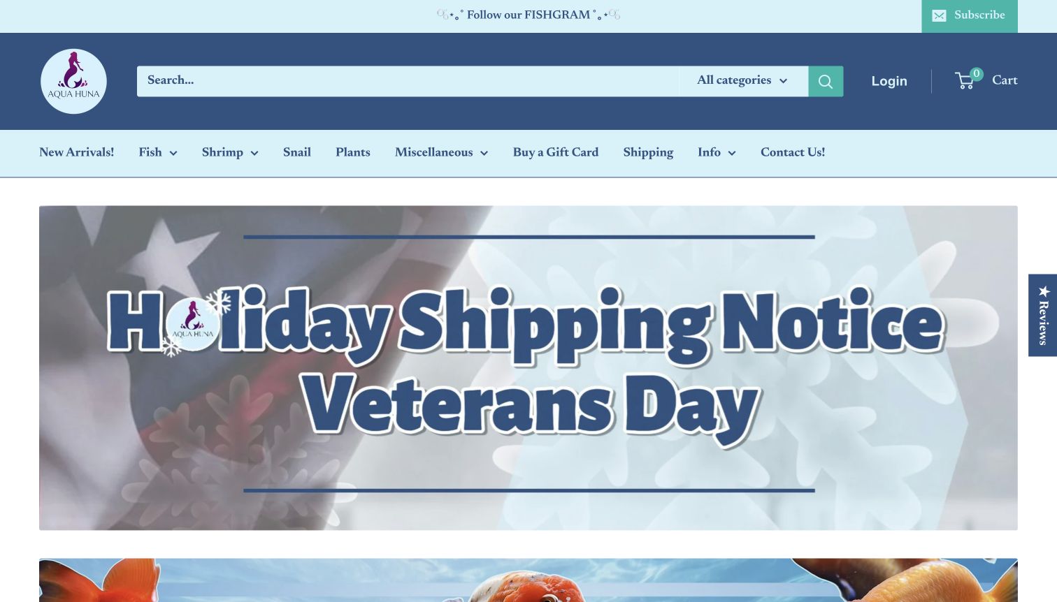
Aqua Huna gives a holiday shipping notice the dominant position in its opening view. The blue header combines search with categories for fish, shrimp, snails and plants, while the notice makes an operational interruption difficult to overlook. Farther down, category imagery and product cards restore the shopping context, including visible size and availability information. The useful design pattern is prioritizing a time-sensitive fulfillment message when it materially affects an order, rather than relying on a small footer announcement.
What you can learn
Use a prominent notice when shipping dates change, but connect it to a detailed explanation and retire it when no longer relevant. Maintain clear category and search access around the notice so someone researching future purchases can still browse without losing their place.
Pros
The holiday message is conspicuous and relevant to customers planning the arrival of live aquatic purchases.
Search and familiar livestock categories remain available above the notice instead of disappearing behind it.
Cons & considerations
The notice takes substantial opening space that would otherwise introduce the product range visually.
Precise fulfillment conditions require reading a separate shipping page; the large announcement alone is insufficient.
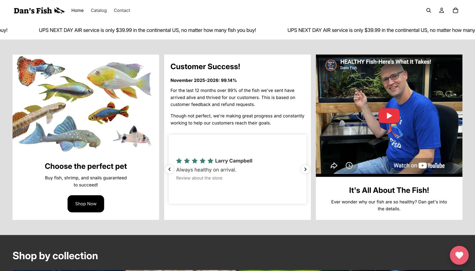
Dan’s Fish uses a sparse header and three opening panels: a fish-shopping collage, a prominently stated customer-outcome figure and a video introduction. The combination gives the business a human presence while keeping the catalog one click away. Species-group cards continue below. The stated performance figure includes a period and explanation, but it remains the company’s claim rather than a result verified in this review. The layout is instructive for presenting process and personality without burying the shopping route.
What you can learn
Place the main catalog path beside a concise explanation of who is behind the business. If numerical claims are used, label their scope and basis clearly and keep supporting context accessible. Do not let a reassurance panel substitute for item-specific availability and policy information.
Pros
A short global navigation reduces the number of competing choices before visitors reach the catalog.
The introduction and product imagery communicate a more personal specialist identity than a generic sales banner.
Cons & considerations
Some catalog group names use technical taxonomy that may be unfamiliar to a beginning fishkeeper.
A highly prominent outcome statistic can invite overconfidence unless visitors also read its stated limits and methodology.
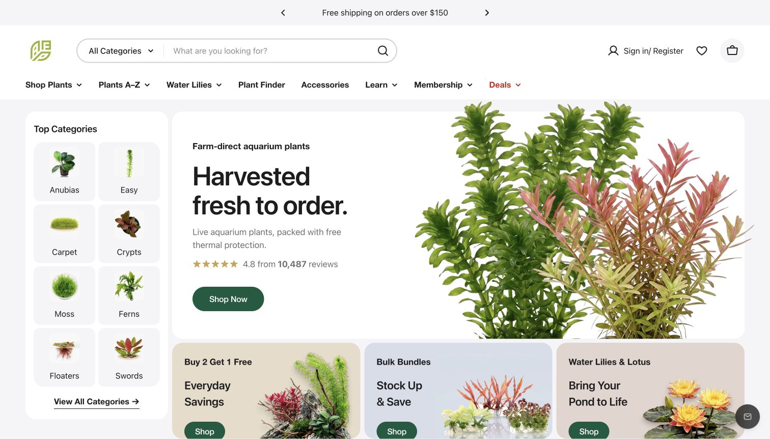
Aquarium Plants Factory combines a broad search field with a compact photographic category rail. Familiar plant groups sit beside beginner-oriented and placement-related routes, while a large plant image introduces the assortment. The navigation also provides an A–Z index and a plant finder. These overlapping entry methods are useful because one shopper may know a scientific name while another only knows the kind of planted layout they want. The page accommodates both without forcing a single classification system.
What you can learn
Offer complementary ways into a specialist catalog: exact-name search, recognizable groups and a guided discovery route. Keep their labels distinct so shoppers understand why each exists. Use photography to orient people, then preserve precise names and product details within the resulting listings.
Pros
The visible category rail gives several plant families and use-oriented groups an immediate photographic cue.
A–Z browsing and the plant finder supplement search for visitors with different levels of product knowledge.
Cons & considerations
The number of parallel classification options may feel dense before a new shopper understands the assortment.
The large promotional panel provides less item-level detail than the more compact category rail beside it.
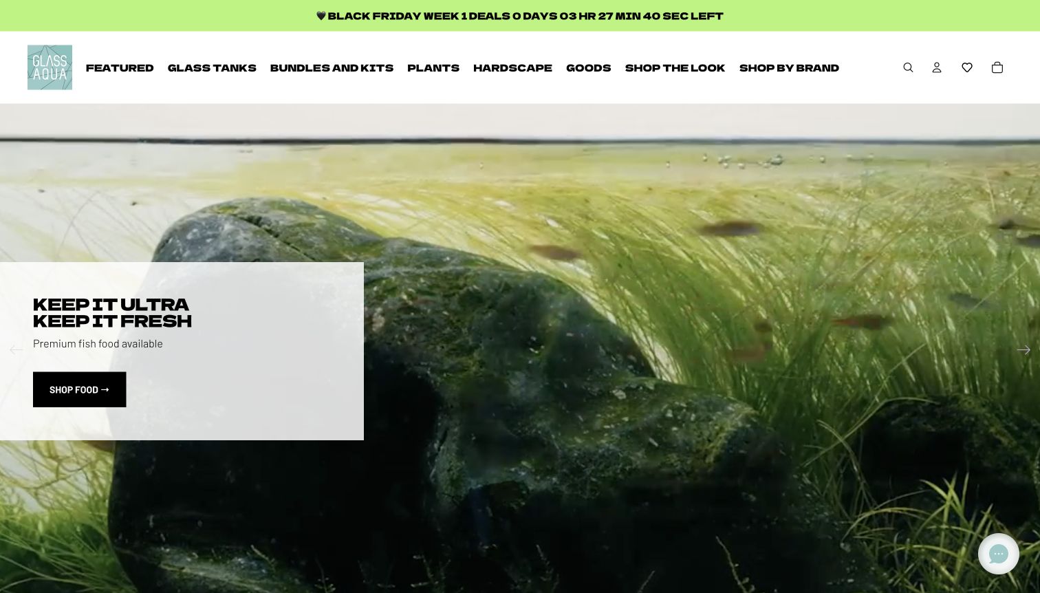
Glass Aqua pairs bold department typography with an immersive aquarium image and a contrasting product callout. Tanks, plants, hardscape and goods are joined by kits and a shop-the-look route, connecting individual components to a finished project. The surrounding page also promotes starter and build-your-own kit destinations. This is useful for studying how a retailer can organize an assortment around an intended result. The captured opening remains promotional, so detailed compatibility and kit contents still depend on subsequent pages.
What you can learn
Connect inspiration to an explicit shopping structure. A finished aquarium image should lead to identifiable components or a clearly described kit, rather than leaving visitors to reconstruct the project from unrelated categories. Keep the main navigation readable when using oversized display type.
Pros
Kit and shop-the-look destinations connect aspirational aquarium imagery with more concrete routes through the catalog.
The contrasting callout gives the large opening image an identifiable action rather than leaving it purely decorative.
Cons & considerations
Heavy typography and closely packed department labels make the header visually demanding at this viewport.
The immersive hero postpones the specifications a shopper needs to compare individual tanks or equipment.
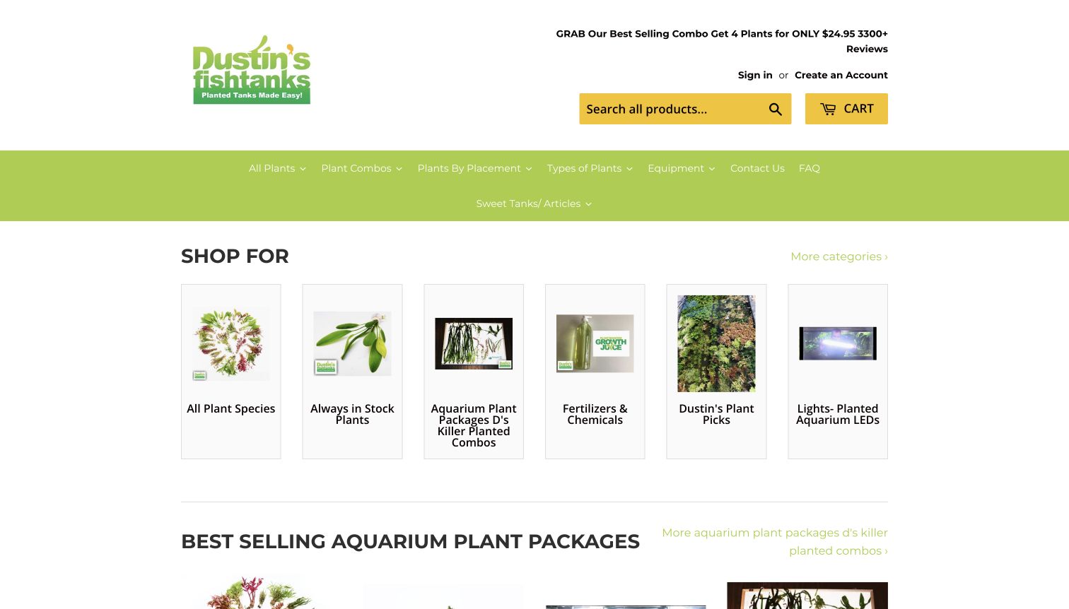
Dustin’s Fish Tanks uses a compact set of plant-category cards beneath a conspicuous green navigation bar. Plant combinations, placement and types provide different ways to approach the assortment, while search remains in the header. The wider navigation includes tank-help videos and frequently asked questions, giving the catalog an instructional layer. The opening is comparatively plain and leaves substantial white space around small product-category images. That makes it useful for studying directness and information hierarchy rather than an elaborate visual brand system.
What you can learn
Use bundles and placement-oriented categories to help people describe a need before choosing individual plants. Keep help routes visible, particularly when products require context. Size category imagery and labels together so a simple layout still communicates the differences between adjacent choices.
Pros
The main plant groupings and combinations are immediately reachable without first passing through a large campaign slide.
Instructional and FAQ links are integrated into the navigation instead of being isolated in a distant footer.
Cons & considerations
Small category photographs leave much of the opening area underused and can be harder to distinguish.
The long navigation labels demand more reading than the modest visual treatment initially suggests.
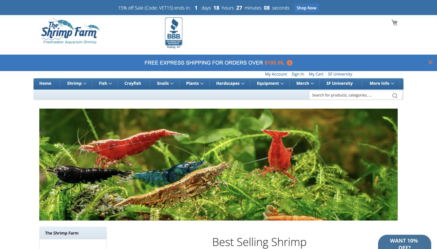
The Shrimp Farm establishes its focus through a large shrimp photograph beneath blue retail navigation. The menu extends to fish, snails, plants and equipment while retaining a specifically named educational section. That pairing is useful: the brand can remain associated with a particular animal group even as its supporting assortment grows. Several promotional and reassurance bands sit above the image, however, creating a tall opening stack. The page’s badges and guarantees are displayed claims, not independent findings of this website review.
What you can learn
Preserve a clear specialist identity when adding adjacent product categories. Give educational material a recognizable destination and let the main imagery reinforce what the business is known for. Consolidate routine promotional messages so the navigation and product subject do not begin too far down.
Pros
The close shrimp imagery quickly establishes a narrower retail focus than a generic aquarium-supplies homepage.
The education destination gives care and selection content a stable place alongside commercial departments.
Cons & considerations
Multiple shipping and promotional bands compete for attention before visitors reach the main photographic section.
The growing range of departments may require clearer beginner guidance than a single horizontal menu can provide.
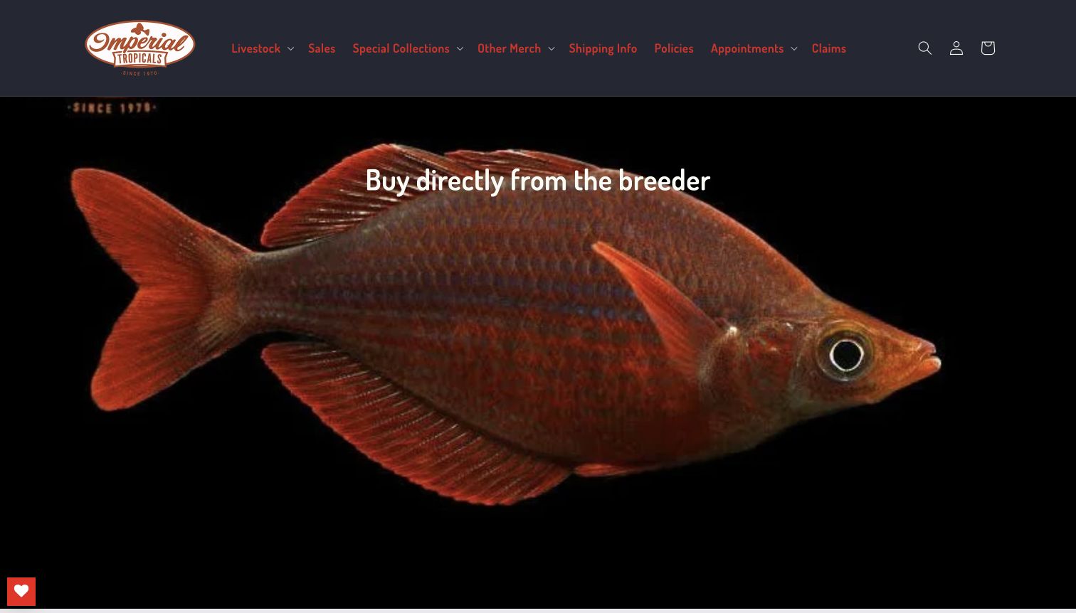
Imperial Tropicals makes a single fish photograph almost fill the opening viewport. A breeder-focused message sits over the image, with livestock, shipping, policies and appointments in the dark header. The wider page moves into sale listings that combine common and scientific names with availability and variant pricing. This progression pairs a memorable first impression with more practical catalog information. The origin message is the business’s positioning; this review evaluates its presentation rather than independently certifying breeding practices or livestock quality.
What you can learn
Choose one concrete differentiator for the opening and keep the wording brief enough for the image to remain legible. Follow it with product details and visible operating policies. A strong origin story works best when a shopper can quickly move from the claim to practical selection information.
Pros
The oversized fish photograph provides a strong subject and a clear visual identity without a crowded collage.
Shipping, policies and appointment routes appear in the main navigation instead of being hidden after purchase.
Cons & considerations
Red navigation text against the dark header is less immediately legible than the white hero message.
The opening image pushes product prices and availability entirely below the initial desktop view.
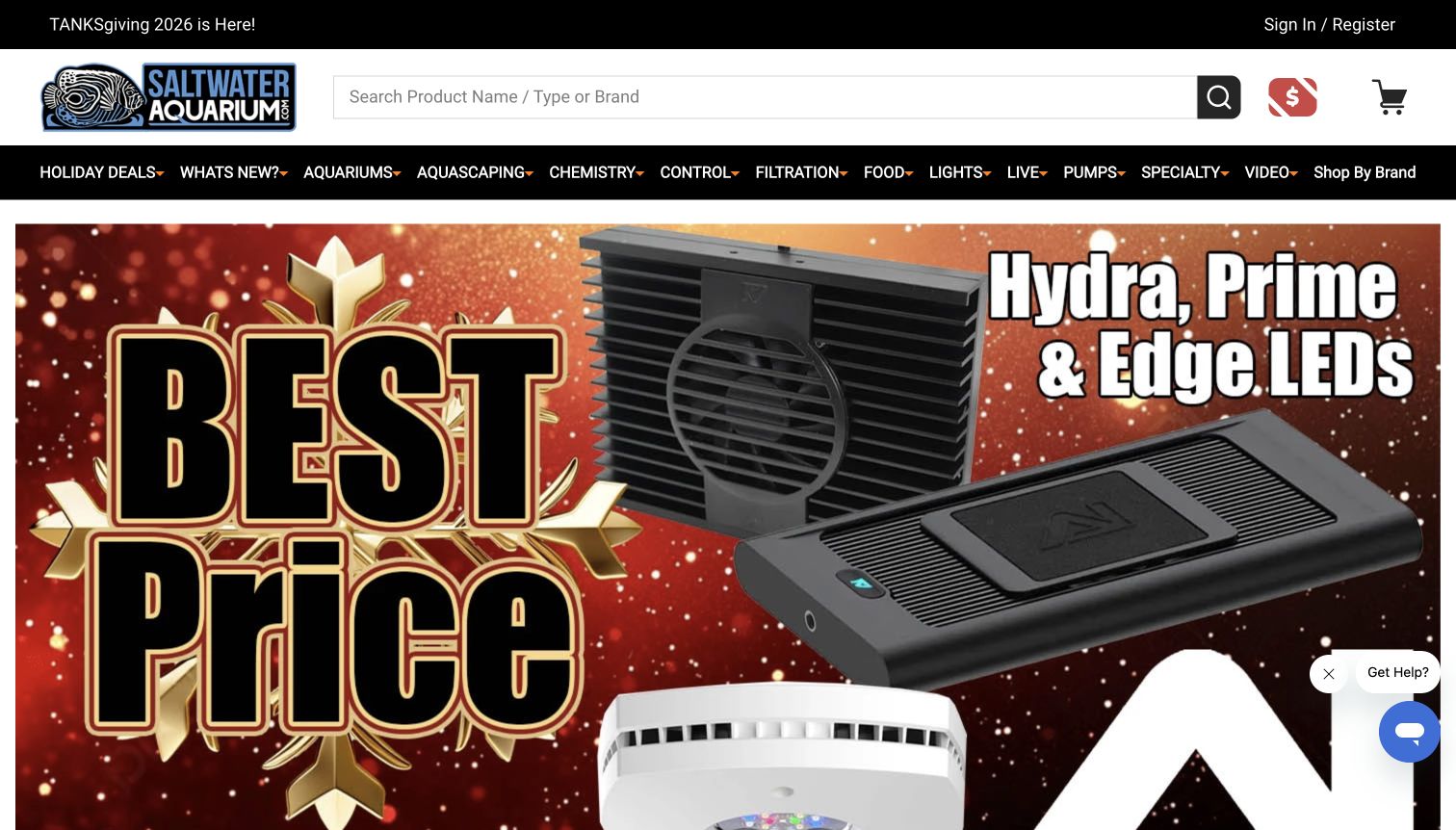
SaltwaterAquarium.com puts a wide search field above a dense but explicit department menu. Chemistry, control, filtration, lighting and pumps describe practical equipment needs, with a separate manufacturer route. The captured hero promotes lighting products through a large graphic, and the page continues into featured items and linked shopping-policy information. Its useful pattern is functional catalog organization: an experienced keeper can begin with the component they need rather than interpreting a lifestyle-oriented category name.
What you can learn
Name equipment departments after the task or component customers recognize. Support those routes with exact-product search and manufacturer browsing, then keep campaign artwork from becoming the only meaningful content in the opening. Explain fulfillment terms through direct links instead of expecting a promotional headline to carry their details.
Pros
Search explicitly invites a product name, type or brand, accommodating several common shopping starting points.
Functional labels distinguish equipment categories that would be difficult to infer from decorative photography alone.
Cons & considerations
The crowded horizontal menu asks visitors to scan many departments and repeated expansion controls.
The oversized promotional artwork dominates the captured view, leaving individual product comparisons below the fold.
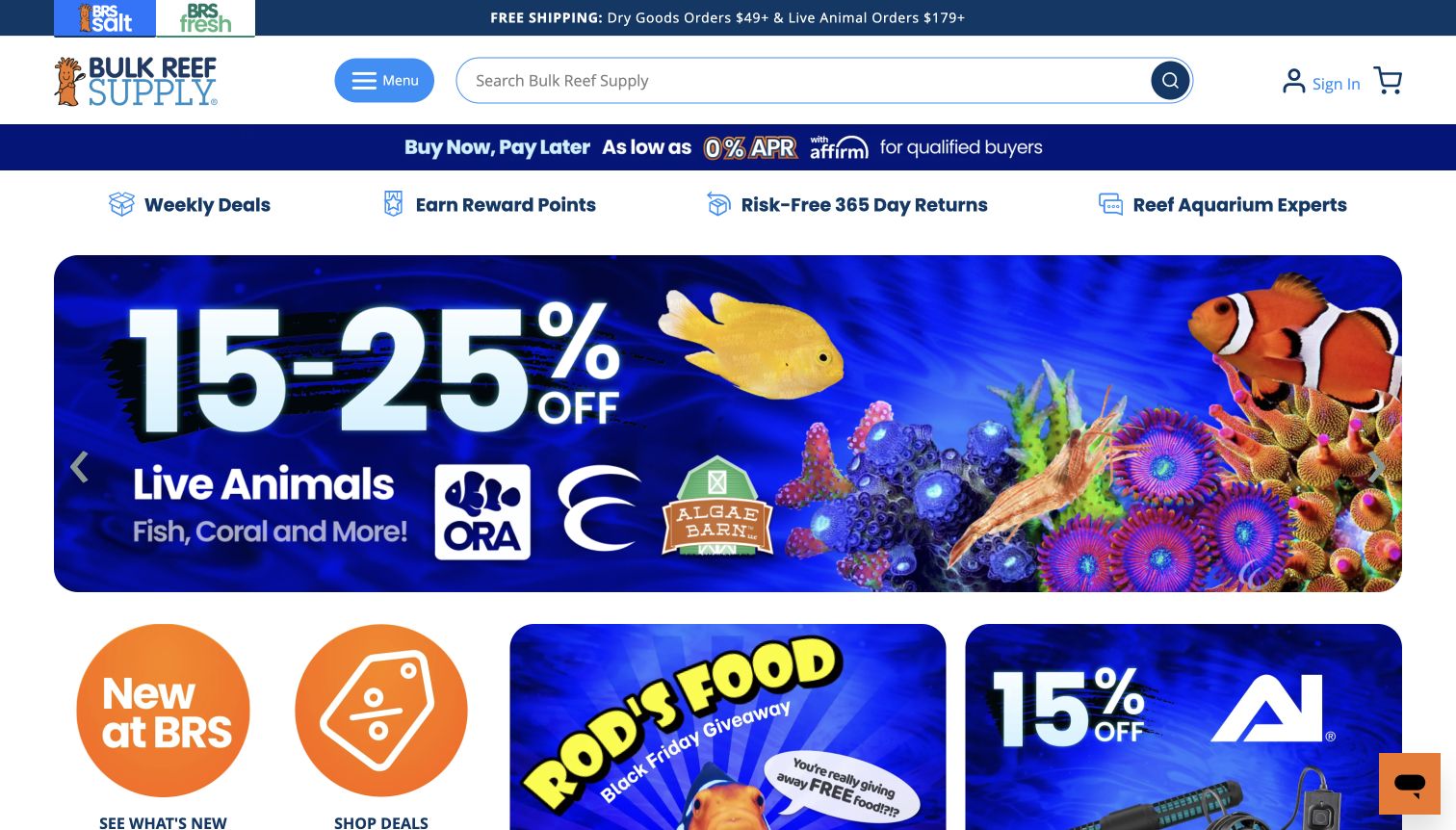
Bulk Reef Supply combines a conspicuous search bar with distinct saltwater and freshwater entry points. The opening includes reassurance links and campaign imagery, while subsequent tiles lead to new products, deals, a gift guide and an education area. The retail structure is useful for studying how learning content can sit beside a substantial product assortment. Financing, rewards and returns messages also occupy prominent space, so a first-time visitor encounters several commercial messages before seeing detailed equipment specifications.
What you can learn
Make educational content a first-class route when a catalog contains technical products. Keep search available for repeat buyers and distinguish separate aquarium interests clearly. Review the total height of reassurance and promotional strips so useful supporting information does not overwhelm the shopping hierarchy.
Pros
The broad search field is visually obvious and remains a practical route for a known product query.
An explicit education tile connects the catalog to further research without making shoppers find a small footer link.
Cons & considerations
Several stacked commercial messages compete with the actual aquarium assortment for initial attention.
The opening campaign imagery requires additional navigation before visitors can compare equipment specifications or item-level availability.
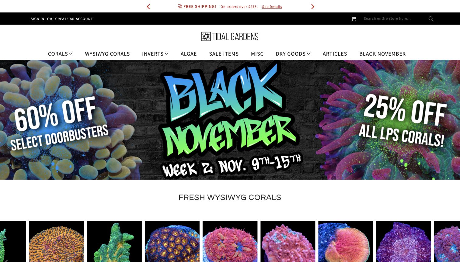
Tidal Gardens distinguishes its general coral categories from a specifically labeled WYSIWYG section, then presents a row of individual coral photographs. The white navigation and dark utility bar establish a relatively conventional retail frame around highly saturated coral imagery. A large dated campaign occupies the hero, while articles and practical shipping or guarantee destinations remain accessible. The strongest pattern is giving individually pictured stock its own route, although shoppers need an explanation of the specialist acronym and the scope of each listing.
What you can learn
Separate representative product photography from listings intended to describe a specific available specimen. Explain that distinction in plain language and keep item names close to the image. Link campaign claims to their conditions, and preserve learning and fulfillment routes alongside specialist catalog categories.
Pros
The exact-specimen category and consistently framed coral cards establish a useful distinction within the assortment.
Articles and shipping information are visible destinations rather than being disconnected from the retail structure.
Cons & considerations
WYSIWYG, SPS and LPS assume vocabulary that a new reef shopper may not yet understand.
The large promotional graphic consumes substantial opening space before the individual coral listings become visible.
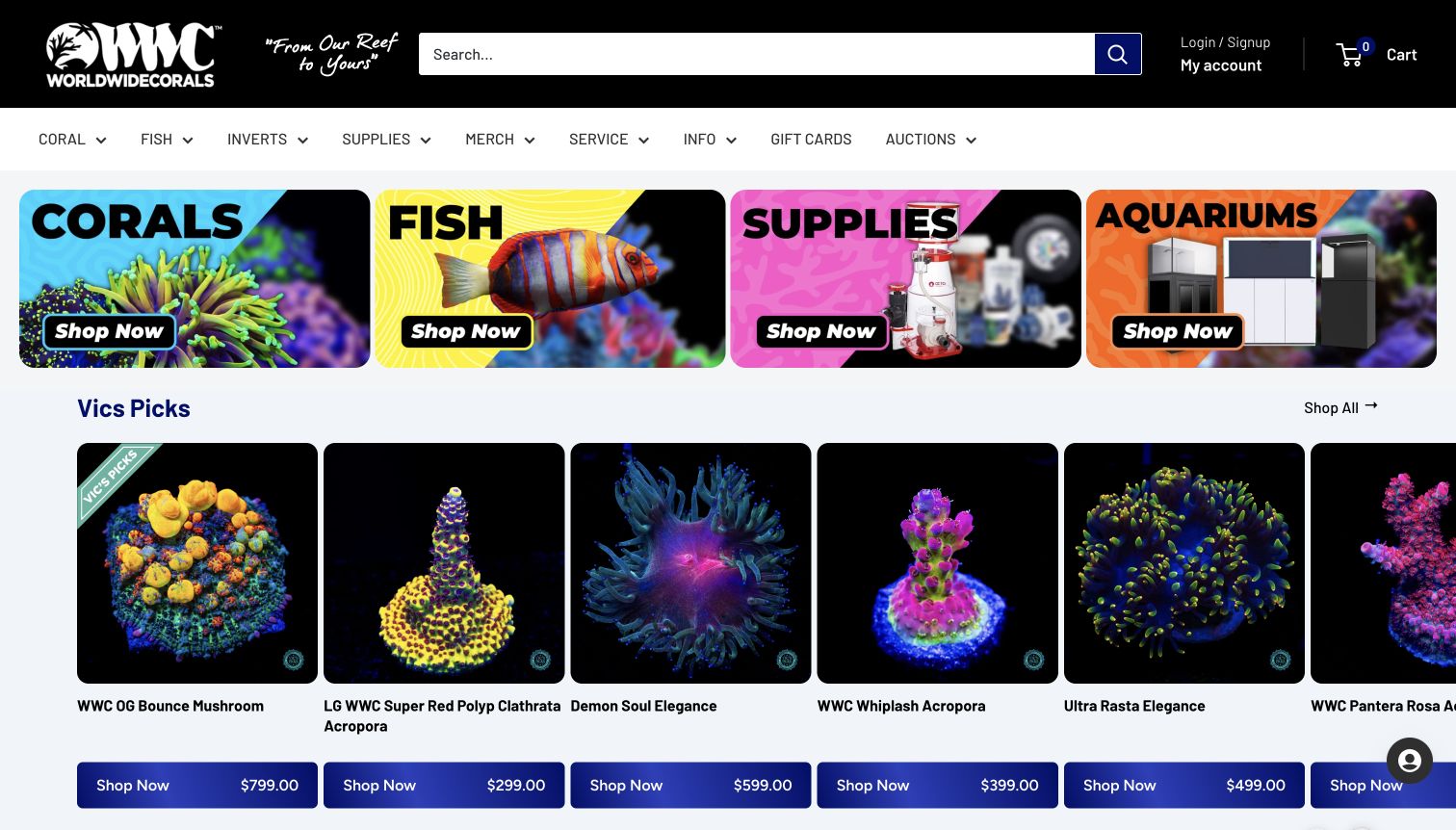
World Wide Corals opens with four brightly colored photographic tiles for corals, fish, supplies and aquariums. A selected-products row follows immediately, with large specimen images, names and prices. This makes the homepage more directly shoppable than a single full-height promotion. The black header and pale content background provide contrast, while the catalog’s intense colors supply most of the personality. Service and information routes remain in navigation, but the opening emphasis is clearly on choosing a department or inspecting a product.
What you can learn
Use a compact row of unmistakable department tiles, then show concrete inventory underneath. Keep product names, image framing and prices consistent so visual variety does not prevent comparison. Clearly distinguish curated selections from any objective ranking or externally verified assessment of the stock.
Pros
The four department tiles let visitors understand the major assortment divisions within one horizontal view.
Large product photographs and adjacent prices make the next section useful for immediate browsing and comparison.
Cons & considerations
Specialist product names and lighting-dependent coral imagery still need supporting explanations on individual listings.
The wide horizontal selection row means some products remain outside the captured view and require further browsing.
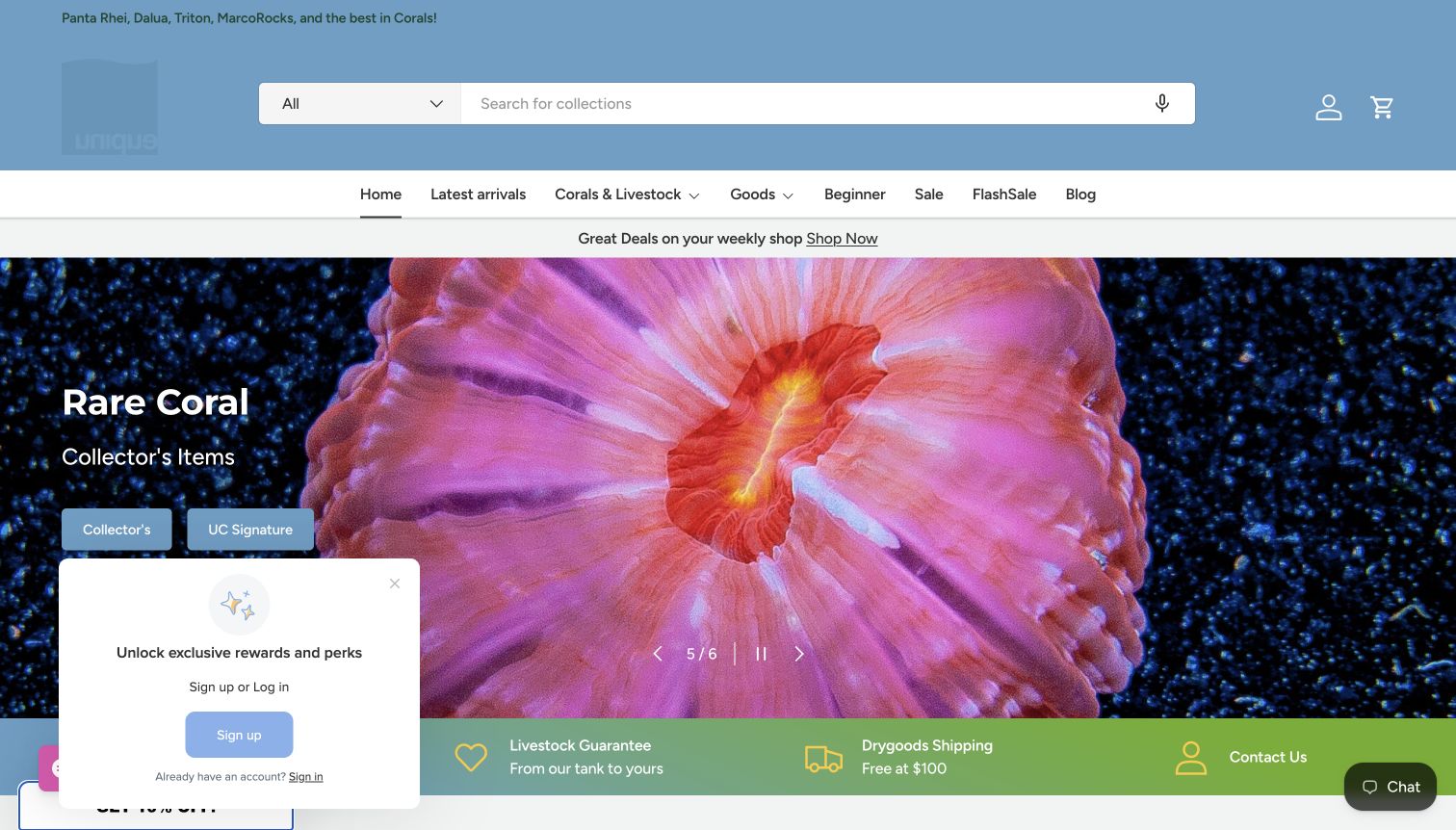
Unique Corals combines a full-width coral image with collection-specific calls to action. Its header includes a conspicuous search field and a dedicated beginner destination alongside latest arrivals, livestock and goods. Supporting strips distinguish live-order and dry-goods shipping, showing that these purchases are not operationally identical. In the captured view, a rewards prompt partially covers the lower left of the hero, while a chat control occupies the opposite corner. The useful structure is tempered by competing promotional interface elements.
What you can learn
Give beginner and specialist shopping paths equally recognizable labels, and state when different product classes have different fulfillment rules. Keep optional loyalty prompts compact enough that they do not cover the main collection actions or obscure the product image that provides orientation.
Pros
The beginner destination offers a direct alternative to collector-oriented categories and specialist coral terminology.
Separate shipping messages acknowledge the distinction between livestock orders and ordinary equipment purchases.
Cons & considerations
The visible rewards prompt covers part of the hero and competes with the collection calls to action.
The large rotating image and several promotional bands postpone detailed product comparison below the opening view.
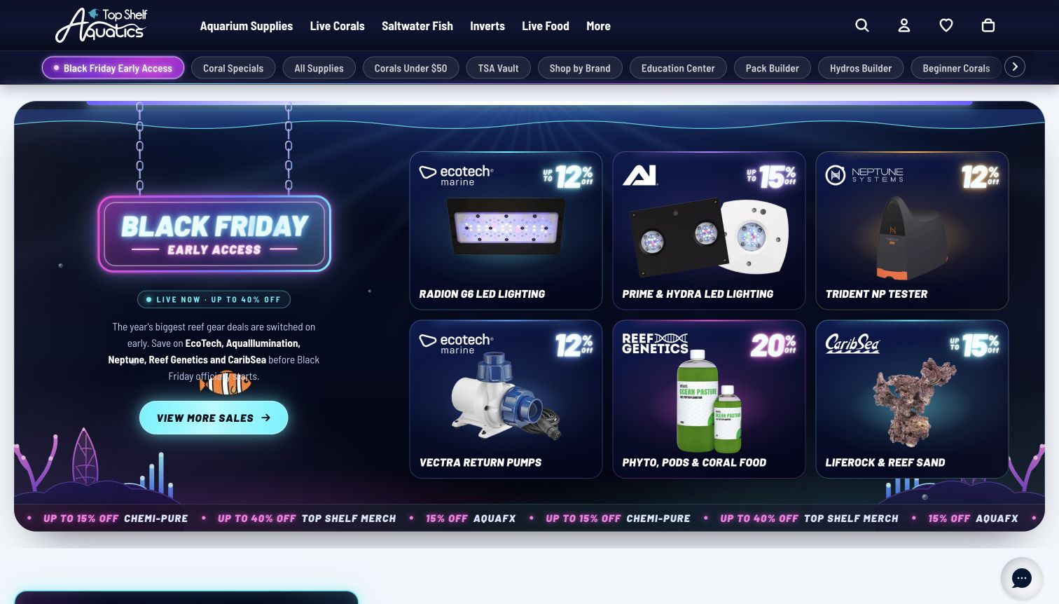
Top Shelf Aquatics uses a dark header with concise primary departments and a second row of quick links. Those shortcuts include beginner categories, education, a coral pack builder and a controller comparison destination. The captured promotion groups individual equipment offers inside a coordinated panel rather than relying on an unlabeled image alone. Its useful idea is exposing both ordinary catalog routes and more guided decisions. The resulting interface is rich with options, which makes disciplined prioritization especially important.
What you can learn
Identify the decisions that need more guidance than a product grid and give them named destinations. Keep ordinary category browsing available in parallel. When many shortcuts are necessary, distinguish primary departments from secondary tools and avoid making every sale message appear equally urgent.
Pros
The quick-link row exposes education and guided shopping tools alongside more conventional product categories.
The campaign panel labels individual equipment offers clearly instead of leaving visitors to interpret imagery alone.
Cons & considerations
Numerous shortcut pills create a dense secondary navigation that extends beyond the initial visible area.
The large, highly styled promotion dominates the opening and can distract from evergreen catalog decisions.
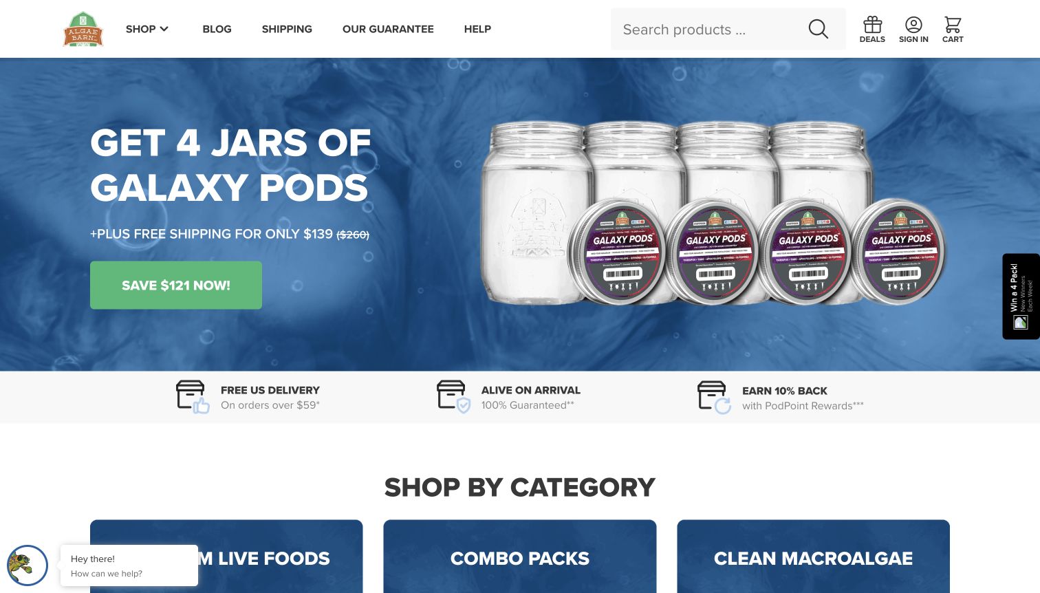
AlgaeBarn introduces a specific live-food offer with large product photography and a short purchase route. Below it, category tiles separate foods, macroalgae, invertebrates, fish and supplies, while a getting-started section addresses new tanks, sizing and repeat deliveries. The navigation keeps shipping, guarantee and help links prominent. This is useful for studying how a narrow product proposition can expand into practical discovery questions. The displayed biological and delivery claims remain the seller’s claims, not findings established by this design review.
What you can learn
Pair specialist products with the questions that determine which option a customer needs. Use clearly named help routes and keep shipping conditions reachable from the main navigation. A simple category grid can then support the deeper decision without requiring every technical explanation on the homepage.
Pros
The getting-started routes connect product browsing with distinct planning questions rather than generic promotional copy.
Shipping, guarantee and help have prominent labels near the logo and search field.
Cons & considerations
The initial bundle promotion requires existing product familiarity and offers limited explanation within the hero itself.
Floating support and promotional elements reduce the clean space around the lower edge of the captured layout.
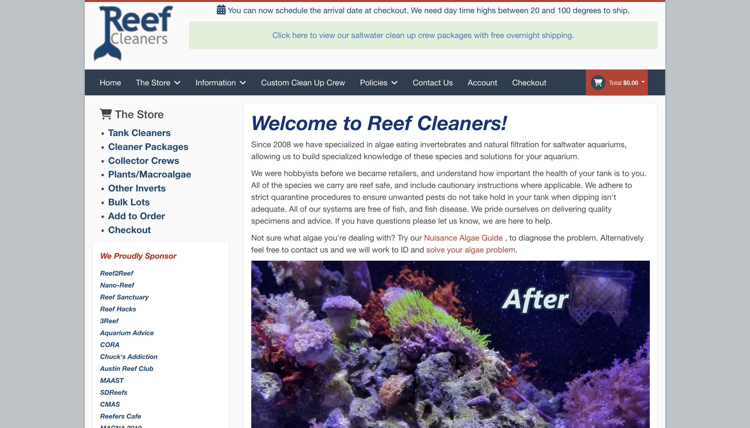
Reef Cleaners uses a compact, text-led homepage with a category sidebar. Its introduction identifies the shop’s focus on aquarium invertebrates and natural filtration, then links to an algae-identification guide and a custom-selection route. Shipping scheduling appears prominently above the navigation. The page also includes an explicit caution that a broad reef-safe label does not establish compatibility with every system. That qualification is useful communication, although the review does not independently verify the shop’s biological or quarantine claims.
What you can learn
Explain the problem a specialist assortment addresses and connect that explanation to relevant categories. Put important limitations beside reassuring language rather than burying them. Keep operational notices near the shopping navigation, while giving educational resources a clear name that describes the question they help answer.
Pros
The focused introduction and category sidebar give the store a clear purpose without relying on a generic sale campaign.
Visible compatibility qualifications help separate broad marketing terminology from an individual shopper’s specific requirements.
Cons & considerations
Long paragraphs and multiple sidebar sections make the opening more reading-intensive than a concise photographic catalog.
The older visual structure gives secondary sponsorship and account material substantial space beside the main explanation.
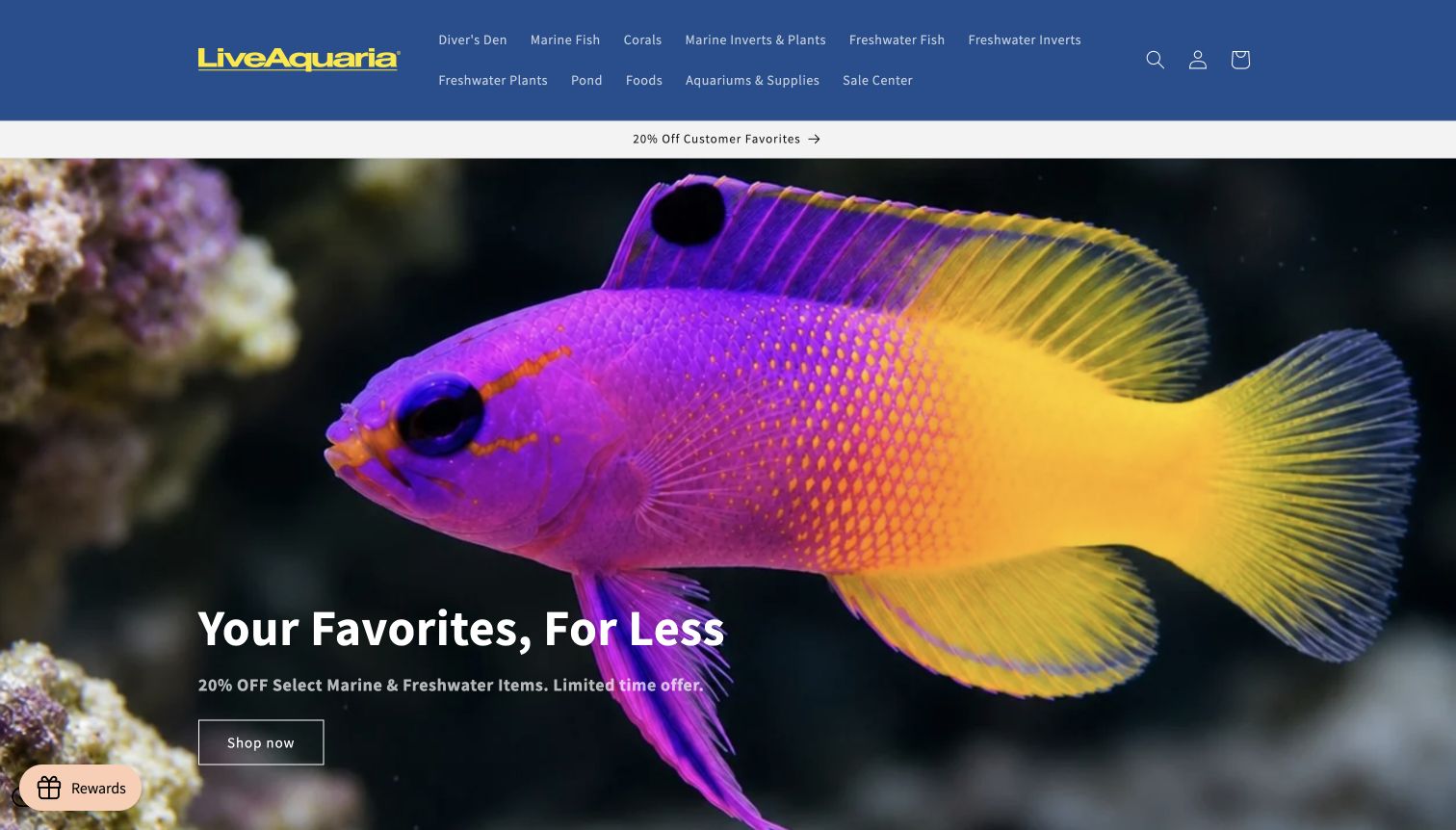
LiveAquaria divides its header into marine fish, corals, freshwater fish, plants and other clearly named departments. A vivid fish photograph anchors the opening promotion, while a featured exact-specimen row follows with size-bearing names and prices. Shipping, guarantees and rewards have their own supporting destinations. The arrangement is useful for studying a broad livestock catalog that still names its main aquarium contexts explicitly. The image is compelling, but the initial purchase action leads into a narrower offer rather than explaining the whole assortment.
What you can learn
Separate fundamentally different aquarium interests at the navigation level and make specialist listing conventions understandable. Use individual item names to carry practical distinctions such as size, while directing shoppers to fuller details before purchase. Let striking imagery establish interest without replacing product and fulfillment information.
Pros
Freshwater and marine categories are explicitly named, reducing ambiguity in a broad live-animal assortment.
Featured listings combine photographs, sizes and prices in a consistent pattern beneath the promotional opening.
Cons & considerations
The two-line navigation is dense and may require careful scanning when several category names are similar.
The full-height hero delays the detailed listing information needed for a more deliberate comparison.
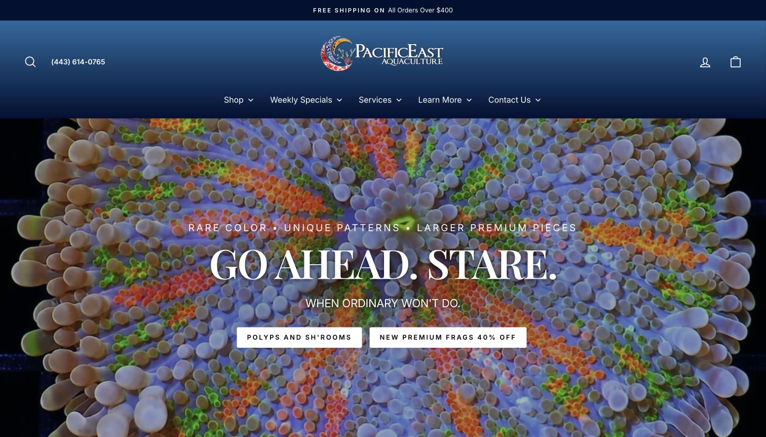
Pacific East Aquaculture gives its opening to richly detailed coral photography, a short headline and two collection actions. The main navigation separates shopping, specials, services and further information, while the header keeps a phone contact visible. Later categories include a clearly price-bounded frag collection alongside premium options. This structure shows how a specialist retailer can support both exploratory browsing and a budget-oriented starting point. Claims about licensing, quality and guarantees belong to the source and were not independently certified here.
What you can learn
Let close-up photography communicate the distinctiveness of the assortment, then pair it with clear collection labels. A price-oriented route can reduce initial uncertainty without implying that price alone determines suitability. Keep service and contact information visible for questions the product grid cannot resolve.
Pros
The coral imagery has a clear focal point, with collection actions that remain distinct from the background.
A visible phone contact and separate service navigation give visitors alternatives to immediately entering the catalog.
Cons & considerations
The dramatic opening provides little specification detail until visitors continue into an individual collection or product.
Promotional language about rarity and premium stock needs more concrete item information to support comparison.
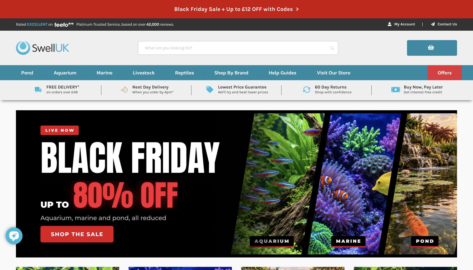
Swell UK combines a large search field with distinct aquarium, marine, pond and livestock departments. A row of shopping-condition links appears above the main campaign, and store visiting information has a visible navigation position. The captured promotion uses separate aquatic images to reinforce the main departments. The page provides several ways to start, but its review, delivery, finance and sale messages build a substantial header stack. The design illustrates both the usefulness and the visual cost of presenting many assurances together.
What you can learn
Give broad departments plain labels and make operational claims link directly to their full conditions. Keep a physical-store route visible if online and in-person shopping differ. Audit the combined height of promotional and reassurance bands so the catalog remains accessible without extensive initial scrolling.
Pros
Aquarium, marine and pond departments are clearly separated and supported by matching subject imagery.
Visiting information and delivery conditions have recognizable routes rather than being left to a generic contact page.
Cons & considerations
Several stacked reassurance and promotional rows push the main content noticeably farther down the screen.
A broad sale graphic offers less product-level guidance than the category navigation and linked details surrounding it.
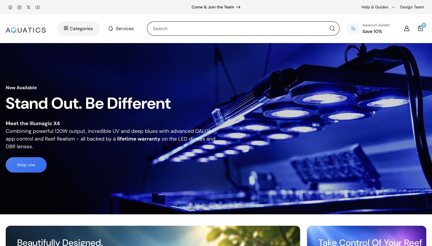
Charterhouse Aquatics uses a restrained white header with a large search field, a categories control and a separate services menu. Its opening highlights aquarium lighting, while supporting sections introduce tanks and reef-control equipment. The broader navigation includes custom aquariums, maintenance, delivery and collection, plus an aquarium-builder destination. This is useful for studying a retailer whose work extends beyond selling boxed products. The service routes are explicit, although the opening campaign primarily addresses visitors already interested in a particular equipment upgrade.
What you can learn
Separate product browsing from services that need an inquiry or project discussion. Give configuration tools an understandable name and keep them reachable without displacing ordinary search. Explain large-item delivery and collection through dedicated pages so those operational differences are not discovered only at checkout.
Pros
The header clearly distinguishes categories, services and search instead of mixing all three into one long menu.
Custom design and maintenance routes acknowledge customers whose needs extend beyond selecting a single retail item.
Cons & considerations
The equipment-led hero assumes some product knowledge and gives limited orientation to a new aquarium owner.
Categories hidden behind a control require an additional step before the breadth of the assortment becomes apparent.
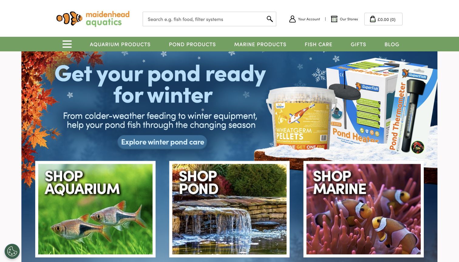
Maidenhead Aquatics places search and an Our Stores link in a spacious white header. Aquarium, pond and marine departments then appear in a green menu and as large photographic tiles. The captured seasonal campaign focuses on winter pond preparation, while further destinations include collection, care information and product manuals. The useful pattern is making physical-store discovery visible beside online shopping. The seasonal message is context-specific, however, and should not be mistaken for an explanation of every department the business serves.
What you can learn
Treat store discovery as a primary task when customers may want advice or local availability. Reinforce department names with imagery and keep care resources distinguishable from product categories. Seasonal content should lead to relevant detail while leaving evergreen shopping and visiting routes easy to find.
Pros
The Our Stores route is prominent beside search and account controls, supporting an immediate local-shopping intention.
Large labeled department tiles repeat the main aquarium, pond and marine divisions in a visual form.
Cons & considerations
The large seasonal pond message delays more direct exposure to the indoor aquarium assortment.
Some supporting routes rely heavily on graphic tiles, making concise descriptive labels especially important for clarity.
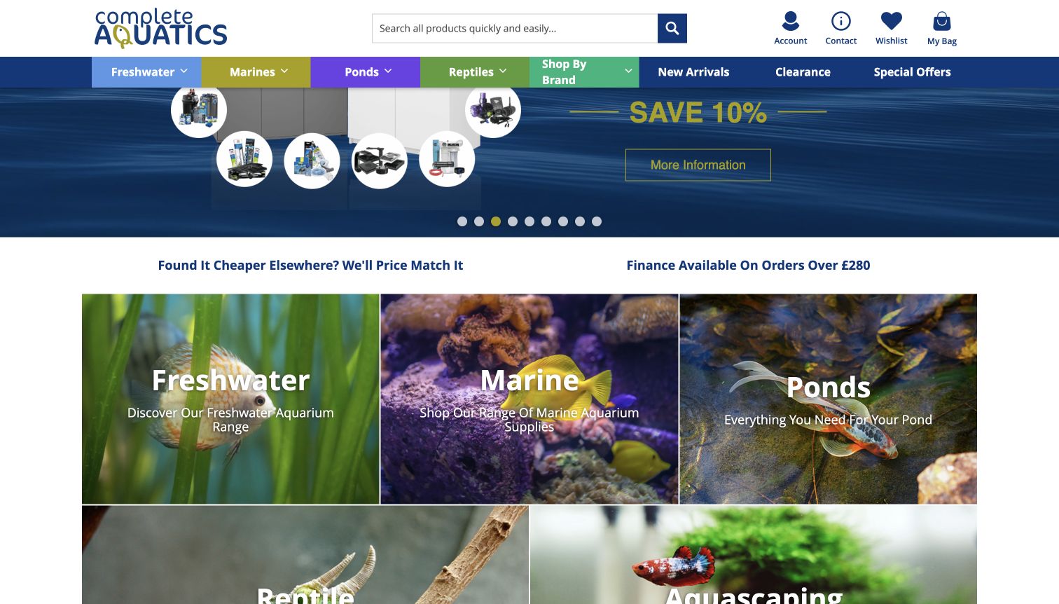
Complete Aquatics uses colored navigation sections to distinguish freshwater, marine, ponds and reptiles. Search and familiar utility links sit above them, while photographic department tiles continue the same structure below a rotating promotion. The captured view shows the category section beneath the hero, including a separate aquascaping destination. Bundle-building and product-range campaigns provide more focused routes within the larger catalog. It is useful for studying consistency between a broad navigation system and the visual departments on the page.
What you can learn
Repeat the same department structure in navigation and page content so shoppers do not need to relearn the catalog. Use bundles to support a defined purchase task, but describe what is included before asking for a commitment. Keep colors supplementary to written category labels.
Pros
Written labels and distinct color treatments reinforce the principal departments without relying on imagery alone.
The photographic category section provides a second, more visual way to enter the broad assortment.
Cons & considerations
The many campaign slides require ongoing maintenance and can dilute the importance of any single offer.
Price-match and finance messages occupy prominent space before shoppers reach detailed product information or compatibility context.
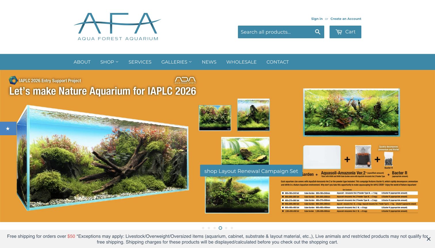
Aqua Forest Aquarium pairs a simple navigation with a large aquascaping campaign showing complete planted arrangements. Shop, services and galleries are separate routes, while the wider homepage links product types to the materials used in nature-aquarium projects. The captured promotional artwork includes several examples and detailed package information, with shipping exceptions stated in a visible bottom banner. This is useful for studying how a specialist shop can connect a finished visual result to the individual materials and professional services behind it.
What you can learn
Keep galleries, product departments and services connected but clearly labeled. Use project images to orient visitors, then provide readable item and package details outside promotional artwork. Put shipping exclusions near broad shipping offers so customers understand that tanks, materials and livestock may follow different rules.
Pros
Distinct gallery and service routes support visitors who want inspiration or project help before choosing products.
The shipping banner visibly qualifies the offer rather than implying that every product has identical delivery terms.
Cons & considerations
Dense text embedded within the campaign image is difficult to read at the captured desktop scale.
The large promotional artwork postpones straightforward comparison of individual product categories and current prices.
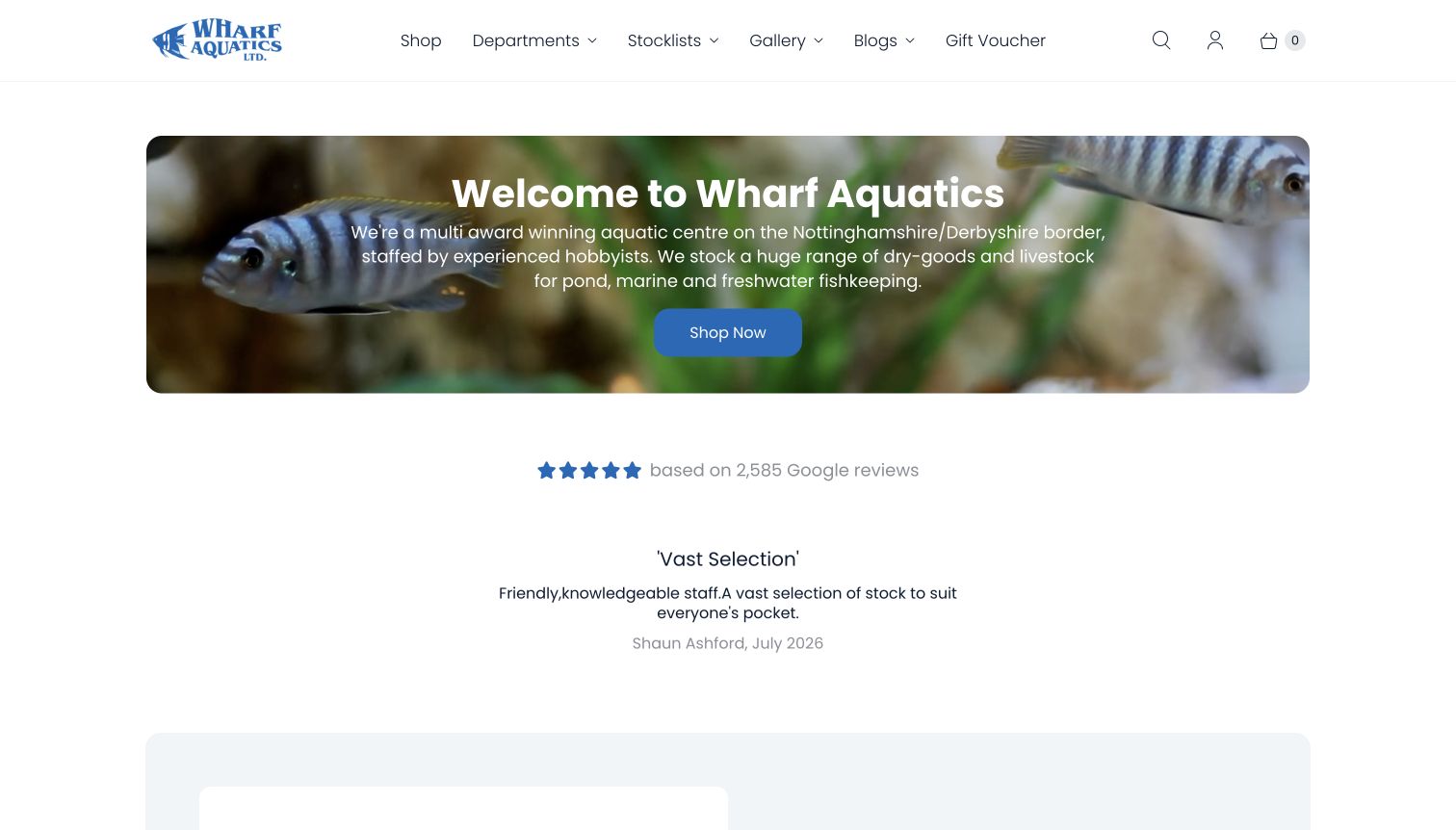
Wharf Aquatics introduces its location and broad aquatic focus in a panel over a fish photograph. The navigation separates departments, stocklists, galleries and blogs, while the body explains the local shop and displays customer quotations. Opening times and contact information are available below. Its useful pattern is naming stocklists as a distinct task, acknowledging that a physical aquatic shop may communicate availability differently from a conventional online catalog. The visible awards and review claims are the shop’s presentation, not independently verified rankings.
What you can learn
Explain where a local shop operates and distinguish online products from informational stocklists. Give visitors a predictable route to both, supported by visiting details. Keep testimonials supplementary to concrete information about departments, availability and services rather than making them the only evidence of fit.
Pros
The opening communicates a regional location and the main aquarium interests served without a long introductory section.
A clearly named stocklist destination supports a practical task specific to livestock-oriented retail stores.
Cons & considerations
A substantial testimonial area delays deeper catalog and store information after the initial introduction.
The main shopping button is broad, so visitors still need another step to reach a specific department or stocklist.
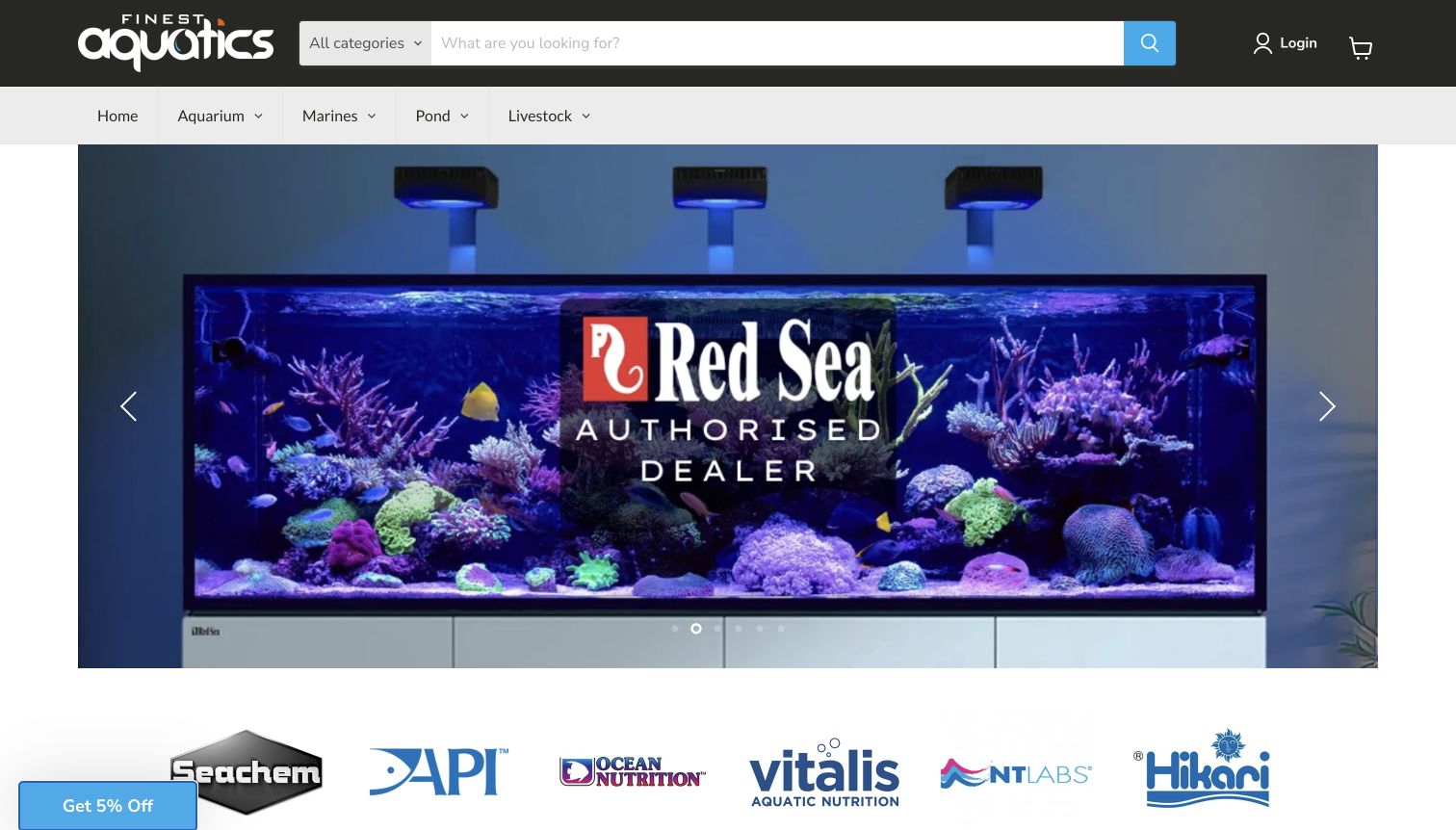
Finest Aquatics combines a category-filtered search with concise aquarium, marine, pond and livestock navigation. The captured hero promotes an aquarium brand through a large tank photograph, followed by a row of manufacturer logos. Farther down, staff picks and product listings offer more concrete browsing, while a dedicated visiting page documents the Widnes store. The structure is useful for studying how brand familiarity and conventional department browsing can coexist. The initial promotional image is visually clear but leaves specifications to subsequent pages.
What you can learn
Support shoppers who arrive knowing a manufacturer without forcing everyone to browse by brand. Keep department labels and product search equally accessible, and give local-store information its own destination. Staff selections should lead to clear product details rather than relying only on imagery or endorsement language.
Pros
The category-filtered search supports a focused query while keeping broad department browsing available in the header.
Manufacturer links and staff selections offer additional discovery routes beyond the main product taxonomy.
Cons & considerations
The large branded hero supplies little comparative information about the promoted aquarium or its requirements.
The physical store’s visiting details require a separate page rather than appearing in the opening view.
Kegan is a freelance web designer and developer with 15+ years of experience helping businesses turn complicated website requirements into clear, maintainable digital experiences. He works directly with clients from planning and design through development, launch, and ongoing support.
For aquarium store website design, his development approach focuses on livestock and equipment discovery, aquascaping service distinctions and practical store-visit information. The scope can be a targeted improvement or a complete custom build, with responsive layouts, thoughtful content structure, and integrations chosen around the people using and maintaining the site.
Show 3 other aquarium store website designersHide other aquarium store website designers
Plan the aquarium-store website around real customer decisions
Map catalog routes before designing the hero
Start by listing the actual ways customers describe their needs. Some know a manufacturer and model; others know a fish group, plant type, tank size or intended project. Compare those phrases with the store’s own product taxonomy. A technically accurate catalog can still be difficult to browse if its labels only make sense to experienced staff. Keep precise names in product records, while giving first-time visitors understandable entry points.
Distinguish the main aquarium contexts before adding promotional categories. Freshwater and marine interests should not require a customer to infer the difference from photographs alone. If the business also sells pond or reptile products, make those routes explicit. Search, department browsing and a beginner-oriented guide can coexist, provided each has a clear purpose. Do not create several near-identical menus merely to expose every item.
Build a sample journey for a replacement part, a new project and a local visit. Check whether each person can identify their next step from the homepage and recover their position after reading an article. Use real product names and actual store information during planning. This reveals missing details earlier than a polished mockup filled with placeholder products or aspirational claims.
Treat availability and delivery as content
Aquarium purchases do not all follow one fulfillment pattern. Equipment, bulky tanks, live plants and livestock may have different handling, collection or shipping arrangements. Document the business’s real process with the people responsible for it, then write clear customer-facing explanations. A broad shipping banner should link to its exceptions rather than imply that every item follows the same terms. This is a content-design task, not an invitation to promise an outcome the business cannot substantiate.
Decide how online inventory relates to a physical stocklist. If local availability is maintained separately, label that distinction and provide a realistic way to check it. Include the date or update context where it helps customers interpret the information. A stock photograph, a representative species image and a photograph of a particular available specimen should not be presented as interchangeable evidence.
Create a simple maintenance process for holiday notices, sale windows, opening hours and temporary restrictions. Assign someone to remove or replace expired messages. Place important updates near the relevant shopping route without making every notice a full-screen interruption. Test the informational journey through to the stated next step using read-only checks; publishing accurate explanations does not require submitting an order or contacting the shop during quality assurance.
Show expertise through specific, usable material
Plan photography around the information it provides. A showroom image can establish what a visitor will encounter; a close product image can identify an item; a complete planted aquarium can explain a design approach. Give each image an honest caption and a relevant next step. Avoid using an impressive display as if it proves the performance of an unrelated product or the condition of every animal offered by the store.
Build educational content around recurring customer questions and keep its scope clear. An equipment comparison, a glossary and a store-services explanation serve different purposes. Link them where they help a decision, then return the reader to the relevant department. Have qualified staff review factual care content before publication, and keep product-specific advice attached to the item it actually describes. A design guide cannot validate an animal’s individual requirements.
For local services, explain the distinction between consultation, design, installation and ongoing maintenance. Show genuine work when available and identify where the service is offered. Keep a stable visiting page with the correct location, opening hours and contact route. Finally, review the whole interface for competing prompts: rewards, chat, cookie notices and sale banners should not obscure the content that explains the business.
The editing job behind the design
Choose technology that supports the catalog and its upkeep
The public evidence sample includes commerce runtime references, content-platform signals, interface libraries, analytics references, font services and delivery infrastructure. These observations describe what the sampled source pages exposed. A media host is not proof of the site’s commerce backend, and a linked integration does not establish how every part of a store is implemented.
For a new aquarium-store website, prioritize accurate product records, maintainable category navigation, understandable availability and clear fulfillment content. A local showroom site may need a simpler content workflow than a large catalog. Select tools around those requirements rather than copying a platform because another featured business exposes a recognizable script.
Every example received a bounded broad audit attempt on its exact source page. Twenty-six returned checked results; four encountered access checks and add no new technology conclusion. Those limits and the original capture dates remain in the evidence records. Missing evidence is left unknown rather than filled with an assumed platform.
Our WordPress website examples offer a separate look at publishing approaches. A visible platform label is evidence for that named page, not a guarantee that the same system will suit your requirements.
Before the public launch
An aquarium-store website planning checklist
Name each major aquarium department in language customers recognize.
Provide search for exact product, model and manufacturer queries.
Separate online stock, local stocklists and visiting information.
Keep product names and relevant specifications close to photographs.
Clarify whether an image is representative or shows a specific available specimen.
Link shipping headlines to their full conditions and exceptions.
Explain collection and large-item delivery as distinct journeys when applicable.
Give holiday notices and promotions a defined review or removal date.
Connect educational material to relevant catalog routes without overstating its scope.
Describe consultation, installation and maintenance services separately.
Keep opening hours, location and contact information in a stable destination.
Check that optional prompts do not obscure navigation or essential content.
These checks are a project checklist, not a performance, legal, security, or accessibility certification. Test real journeys with the people responsible for the website before making claims about the result.
Sources & editorial method
How this collection was selected and reviewed
This collection follows the saved random-before-research target of 30 examples. Each entry was independently opened, directly captured and reviewed on November 10, 2026 for the original November 9 evening batch. The original screenshots retain their actual URLs, timestamps, dimensions and attribution; some captures include visible promotional or cookie interfaces. Reviews are original design commentary based on the observed pages. Broad technology audits sampled the exact source page and a bounded set of same-origin assets, respecting access restrictions. Aquarium Zen was explicitly selected after comparison and additional review of its own services, company context and visiting page. No orders, forms, account actions, votes or messages were submitted. Prices, promotions, stock and business claims can change, and this collection does not independently verify animal health, delivery performance or suitability for a particular aquarium.
Each example links to its actual source page. Screenshots are direct browser captures with their own capture dates; moving imagery, announcements and live designs can change. The notes describe observable design choices and conditional tradeoffs, not measured traffic, conversion results, service quality, or accessibility conformance.
Technology labels use public page metadata, asset evidence, or explicitly cited platform documentation. Platform documentation is not a complete current deployment audit. A component reference may be legacy or unused; it is not a complete backend inventory. Unknown stacks are omitted. These sites are editorial examples, not our client portfolio.
Written, Edited and Curated are separate editorial records, not timestamps advanced by a rebuild. Website designs and imagery belong to their owners. See our editorial standards or suggest a correction.
Use these examples to plan clearer shopping and visiting journeys. The strongest starting point is accurate store information, an understandable catalog and real imagery connected to useful next steps.