Definitive guide · Apache Kafka website development
Best Apache Kafka Websites of 2026 (20 Real-World Examples)
Public design references from organizations listed by Apache Kafka, with the workload evidence kept in scope
Explore 20 website references from organizations associated with Apache Kafka. Their public pages offer lessons in navigation, storytelling and product explanation. The separate adopter entries describe event infrastructure, are undated and may be historical; they do not prove that Kafka serves the pictured homepage.
Kafka is an event-streaming platform, not a page builder or a CMS. A website might publish an order event, receive updates from a business system or consume a prepared result while the user-facing application runs on a different stack. The useful planning question is what must happen after a particular business event, who depends on it and how the system should recover when a downstream service is unavailable. A visually simple interface can conceal complicated integration responsibilities.
adidas, Airbnb, Salesforce, Uber and Netflix open this collection as recognizable organizations with entries in Apache’s community-maintained adopter directory. That directory is not a continuously verified customer register. Some entries describe a named pipeline or engineering account rather than a whole company. Study the public design patterns independently, and read the documentary association within its original boundary rather than assuming the displayed interface and the cited infrastructure are one system.
Before the examples
What makes good Apache Kafka website development in 2026?
Describe the event in business terms
Write a concrete statement such as an order was accepted, a document was approved or a shipment changed state. Identify its owner and distinguish the event from a command asking another system to do something. Decide which identifiers, timestamps and version information consumers need. Avoid publishing an entire customer record merely because it is convenient for the first integration.
A retained stream can be read again, which is useful for rebuilding a view or recovering a failed process. It also means a consumer must not blindly repeat a consequential action such as charging a card or emailing a customer. Define deduplication, idempotency and reconciliation around the actual external system, not a blanket promise that the broker eliminates every possible duplicate.
Specify how current each visible result must be. An account balance, a product recommendation and a weekly operations report have different tolerances. Explain stale and unavailable states in the interface, and distinguish the event being accepted from every downstream update being complete. Do not add a streaming platform when a simpler scheduled integration meets the genuine requirement.
The collection · 20 examples
20 Apache Kafka website examples worth studying
Compare how these public pages introduce an audience, organize a large offering and make the next step understandable. Kafka associations come from the cited community directory, not from visual appearance. The directory’s missing publication dates and potentially historical descriptions remain explicit limitations.
We start with five recognizable brands or organizations: adidas, Airbnb Newsroom, Salesforce, Uber Engineering, Netflix. Each attribution applies to the named website property, not every product or website belonging to its organization. This is a curated reading sequence, not a measured ranking.
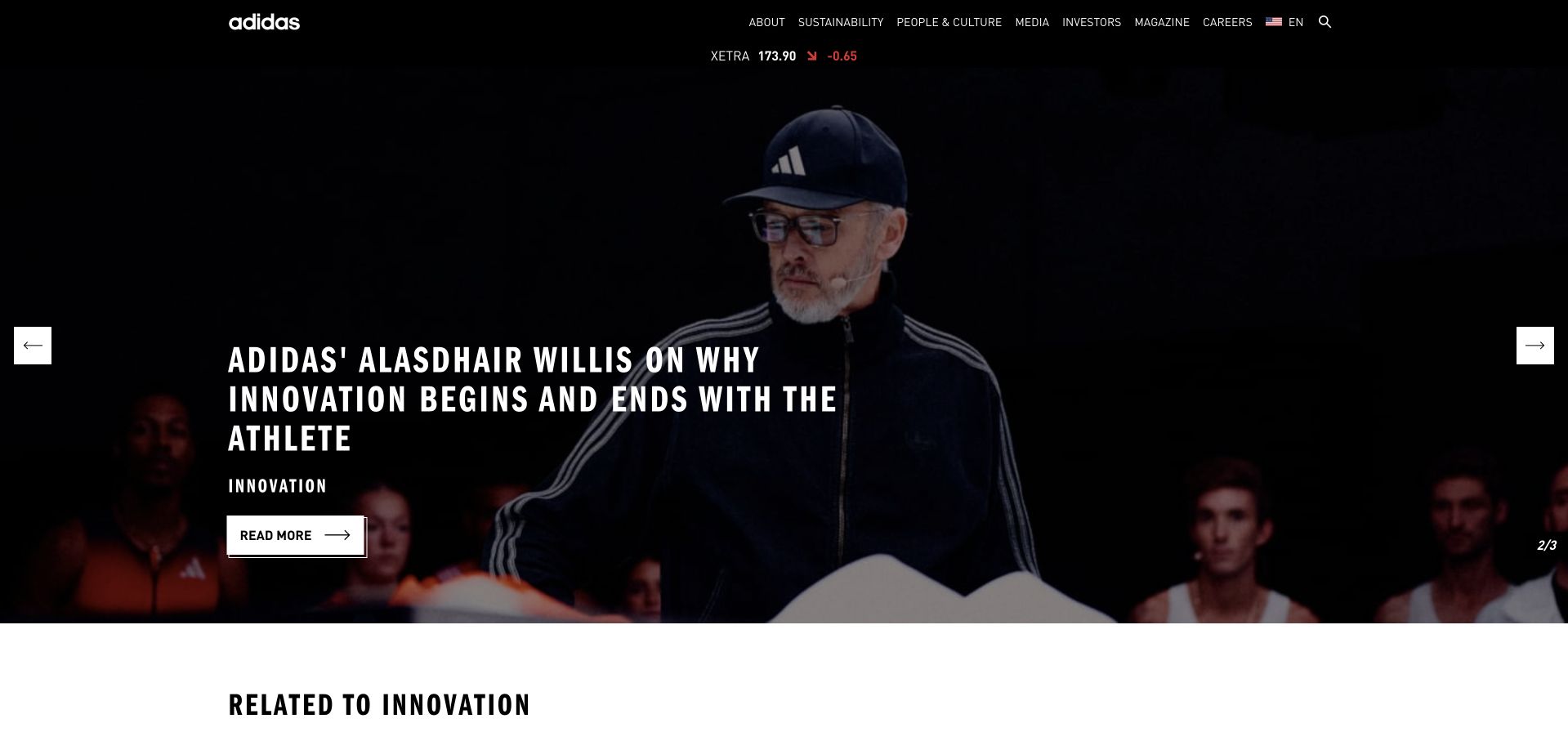
The adidas Group site opens as an editorial publication rather than a shopping catalog. A dark photograph carries a compact white story headline, while a narrow black navigation rail keeps company, sustainability, investor and careers routes available above it. The condensed lettering and restrained interface let the featured person do most of the visual work. Share information has its own small position rather than competing with the story. This is the corporate brand property: its purpose and audience differ from the retail storefront, even though both belong to the wider adidas identity.
What you can learn
Give a corporate homepage an identifiable editorial job. A single well-chosen story can introduce the organization, provided investors, applicants and other task-focused visitors still have dependable navigation. Keep important evergreen information outside the rotating feature so a campaign change does not move every useful destination.
Pros
High-contrast typography makes a photographic opening easy to scan.
Corporate audience routes remain distinct from the featured story.
Cons & considerations
A rotating story needs a stable archive and accessible controls.
Visitors seeking products need an unmistakable route to the separate store.
Visible tech stack
Earlier / documented evidence
Apache Kafka
Platform source: Primary documented Apache Kafka association. Apache Kafka’s adopter page documents adidas event streaming. Platform evidence is separate from the direct website screenshot and is not a complete current infrastructure audit.
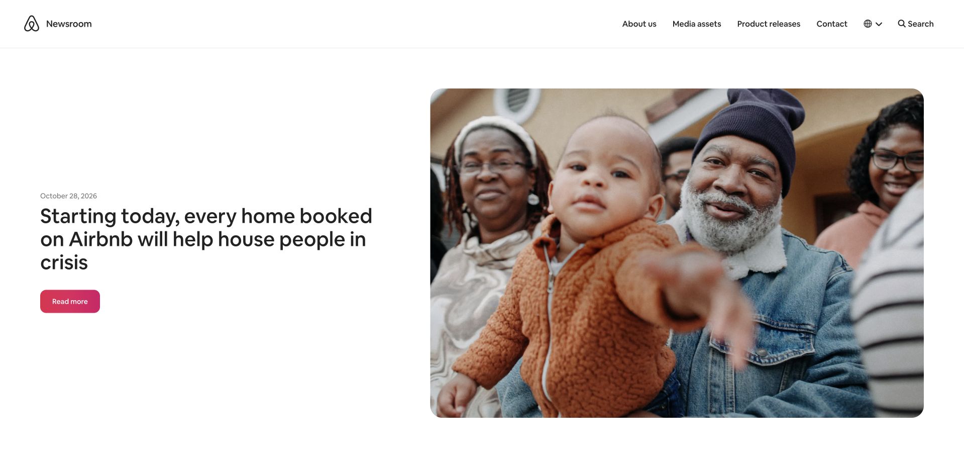
Airbnb’s newsroom uses an unusually quiet opening for a large consumer brand. A dated feature sits in a two-column composition: a short, dark headline on the left and a rounded photograph of a family on the right. The small newsroom identity and compact navigation leave plenty of white space around that pairing. About, media resources and contact are treated as publishing utilities instead of booking controls. The page can therefore explain an announcement without asking the visitor to start a travel search. Its value as a reference is this deliberate separation between press information and the accommodation product.
What you can learn
Choose an image that explains why the announcement matters, not simply one that fills the available width. Pair it with a date and a clear permanent article destination. A newsroom can borrow the parent brand’s familiarity while keeping its own navigation focused on journalists and interested readers.
Pros
The headline and image form one immediately understandable editorial unit.
A publication date makes the freshness of the feature visible.
Cons & considerations
A large lead feature can push the broader news archive down.
Media contacts should remain findable without reading the selected announcement.
Platform source: Primary documented Apache Kafka association. Apache Kafka’s adopter page lists Airbnb’s event pipeline. Platform evidence is separate from the direct website screenshot and is not a complete current infrastructure audit.
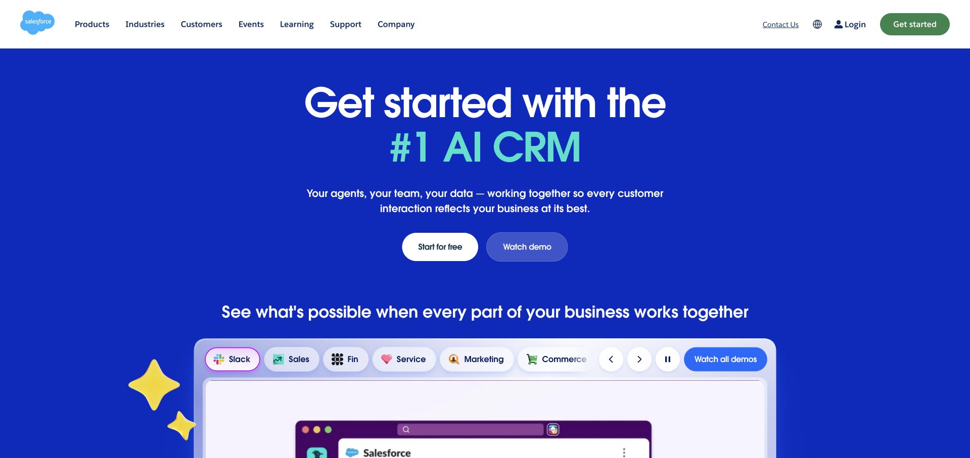
Salesforce presents its platform in a saturated blue field beneath a conventional white enterprise header. The main message is centered and large, with a short explanation and two compact next steps before a product illustration begins. A row of product-category tabs gives the broad offering a visible structure rather than presenting every capability as equal copy. The white and pale interface panels stand apart from the blue background, helping visitors recognize that the page is demonstrating software rather than showing decorative artwork. The opening remains a company marketing presentation, not independent evidence for its superiority claims.
What you can learn
Start with the category and the relationship between the main products. A recognizable interface can then make the promise concrete. Keep an exploratory action separate from a stronger trial or sales commitment, and make sure each product tab explains a meaningful user need rather than merely changing the artwork.
Pros
Strong color separation makes the product demonstration easy to locate.
Segmented categories provide a useful map of a broad offering.
Cons & considerations
Superlative marketing language still needs relevant evidence and qualifications.
Dense enterprise navigation can become difficult to translate to a small screen.
Platform source: Primary documented Apache Kafka association. Apache Kafka’s adopter page documents Salesforce’s event-driven systems. Platform evidence is separate from the direct website screenshot and is not a complete current infrastructure audit.
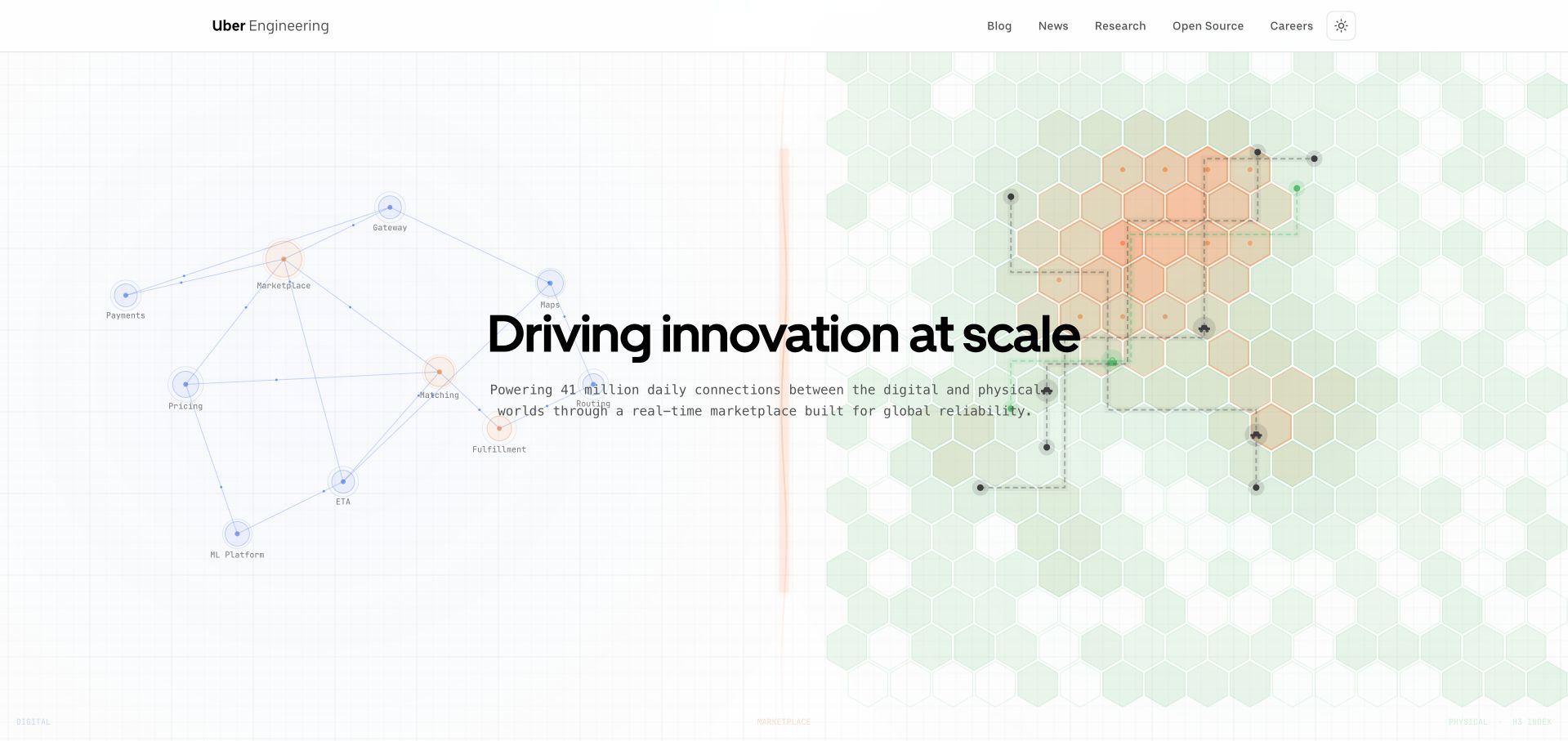
Uber Engineering combines a compact white publication header with a broad, pale technical illustration. Thin lines, small points and a green hexagonal field create a systems metaphor behind the dark headline, without making the text itself look like a diagram. The opening describes engineering’s role at the company, while the navigation offers ordinary routes into the blog, research and open-source material. This is a useful contrast to developer sites that begin with an unexplained code block. The page establishes its editorial subject first, then leaves the detailed technical material to the articles and resources that follow.
What you can learn
A technical publication does not have to make its introduction technically dense. Use a restrained visual language to establish the subject, then give readers clear routes to specific disciplines and article types. The illustration should support the hierarchy rather than become a puzzle that must be decoded before browsing.
Pros
The technical motif communicates scale without obscuring the main headline.
A small publication-specific header distinguishes engineering content from consumer tasks.
Cons & considerations
Very light illustration details need care on lower-quality displays.
Broad introductory language should lead quickly to concrete technical examples.
Platform source: Primary documented Apache Kafka association. Apache Kafka’s adopter page lists Uber’s data infrastructure. Platform evidence is separate from the direct website screenshot and is not a complete current infrastructure audit.
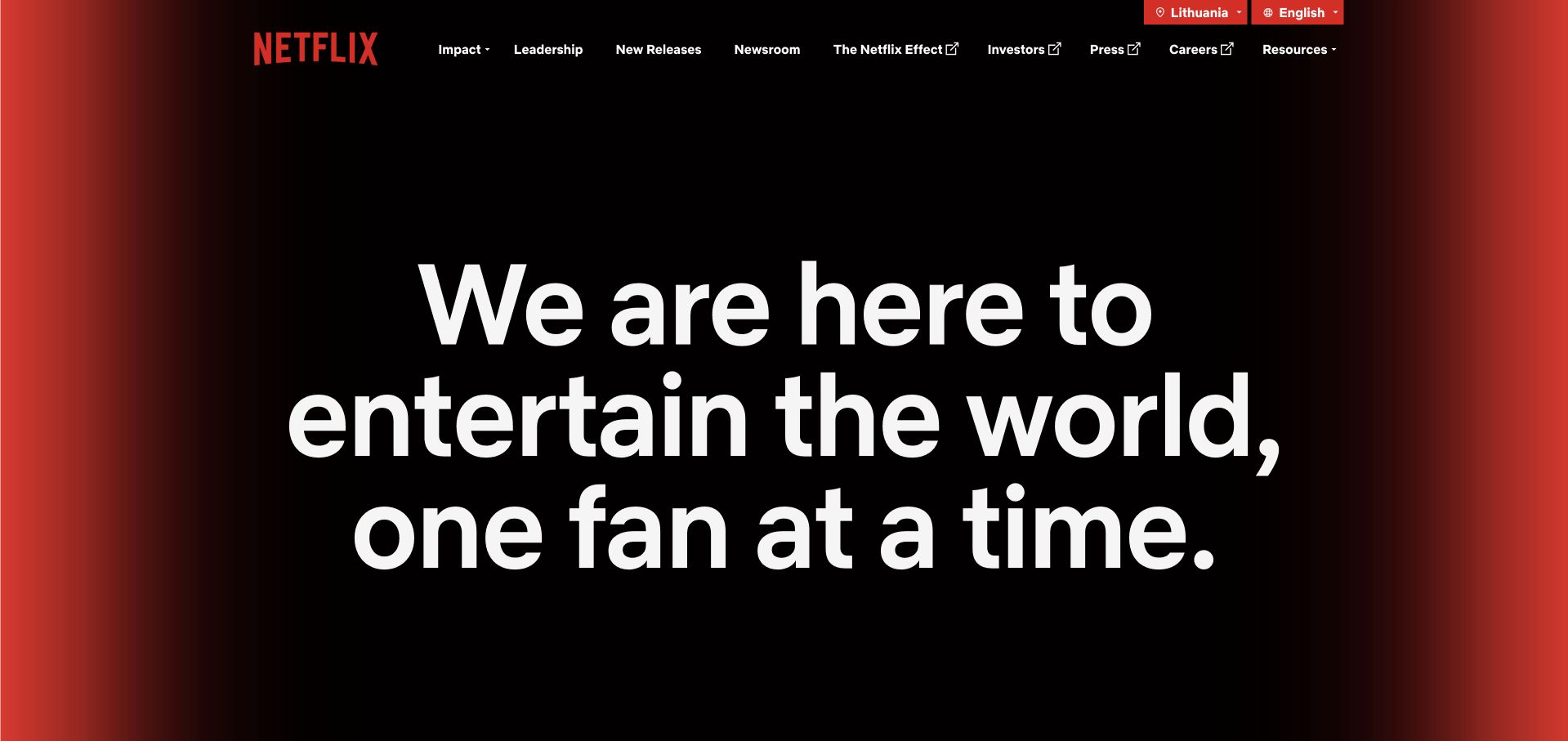
Netflix’s corporate page strips the opening down to very large white type against a mostly black background. Red light at the edges ties the composition to the brand without turning the center into a busy image. The statement occupies several deliberate lines, and the slim header keeps impact, leadership, releases, investor and careers destinations close at hand. Language choices sit in a separate utility area. Rather than resembling the streaming application, this page gives the organization a public voice. The absence of a conventional hero photograph makes the wording, spacing and line breaks carry nearly all the first impression.
What you can learn
Typography can be the main visual asset when the message deserves that emphasis. Keep the statement concise enough to remain readable, and test its line breaks across actual screen sizes. A corporate property should make its purpose clear without imitating the navigation or account tasks of the consumer product.
Pros
The limited palette creates a strong and unmistakable brand impression.
Public-company information has a stable navigation structure above the statement.
Cons & considerations
Large type can consume substantial vertical space on smaller screens.
A manifesto opening needs clear routes to concrete information and recent work.
Platform source: Primary documented Apache Kafka association. Apache Kafka’s adopter page cites Netflix’s Keystone pipeline. Platform evidence is separate from the direct website screenshot and is not a complete current infrastructure audit.
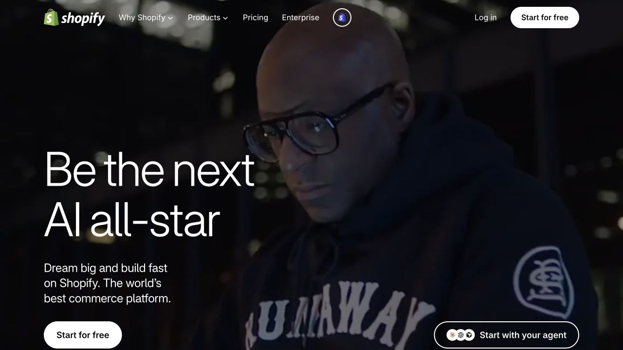
Shopify pairs a dark, full-width photograph of a person working at a screen with a large, lightly weighted headline. The principal copy and trial action sit to the left, while a separate agent-oriented action occupies another position in the composition. The header remains compact, allowing the photograph to set the mood without losing product, pricing and enterprise navigation. This version of the page is clearly campaign-led: its references to AI give it a particular moment in the company’s presentation. The lesson is the relationship between an aspirational image, a short promise and a practical starting point, not a claim about results.
What you can learn
Show the human context of a platform before asking visitors to understand every feature. Keep the first action plain, and explain specialized options where they appear. A campaign can change frequently, but the durable routes to pricing, product detail and support should remain predictable underneath the changing hero.
Pros
The working-person photograph gives an abstract platform a concrete context.
The primary action remains visible against the dark visual background.
Cons & considerations
Campaign wording can age more quickly than product and pricing information.
Multiple starting routes need clear explanations of their different commitments.
Platform source: Primary documented Apache Kafka association. Apache Kafka’s adopter page lists Shopify. Platform evidence is separate from the direct website screenshot and is not a complete current infrastructure audit.
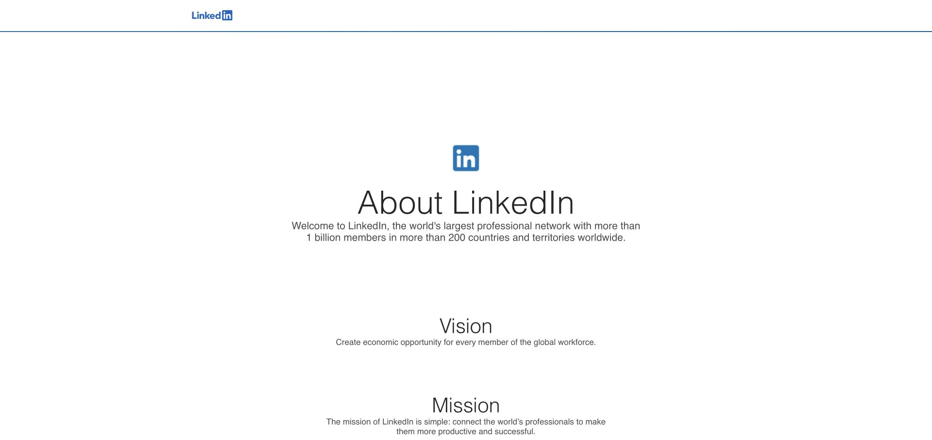
LinkedIn’s About page takes a restrained approach: a small blue brand mark, a centered introduction and large areas of white space. The company’s vision and mission follow as simple labeled sections rather than a set of animated promotional cards. The sparse header does little to compete with the central text. That choice makes this a useful corporate reference without copying the task-heavy professional network. The page’s strength is its clear editorial boundary; visitors are reading about the organization, not being dropped into a personalized feed or an unexplained account workflow.
What you can learn
Decide whether a page exists to explain, transact or support a repeat task. A short institutional introduction can benefit from considerable restraint. Give it enough navigation and onward links to remain useful, but do not add product-interface complexity merely because the parent organization operates a complex application.
Pros
A small amount of content is presented with a clear visual hierarchy.
The corporate purpose is distinct from the network’s everyday product interface.
Cons & considerations
Large empty areas may feel unhelpful to task-focused visitors.
Important onward routes need descriptive labels rather than reliance on brand familiarity.
Platform source: Primary documented Apache Kafka association. Apache Kafka’s adopter page lists LinkedIn. Platform evidence is separate from the direct website screenshot and is not a complete current infrastructure audit.
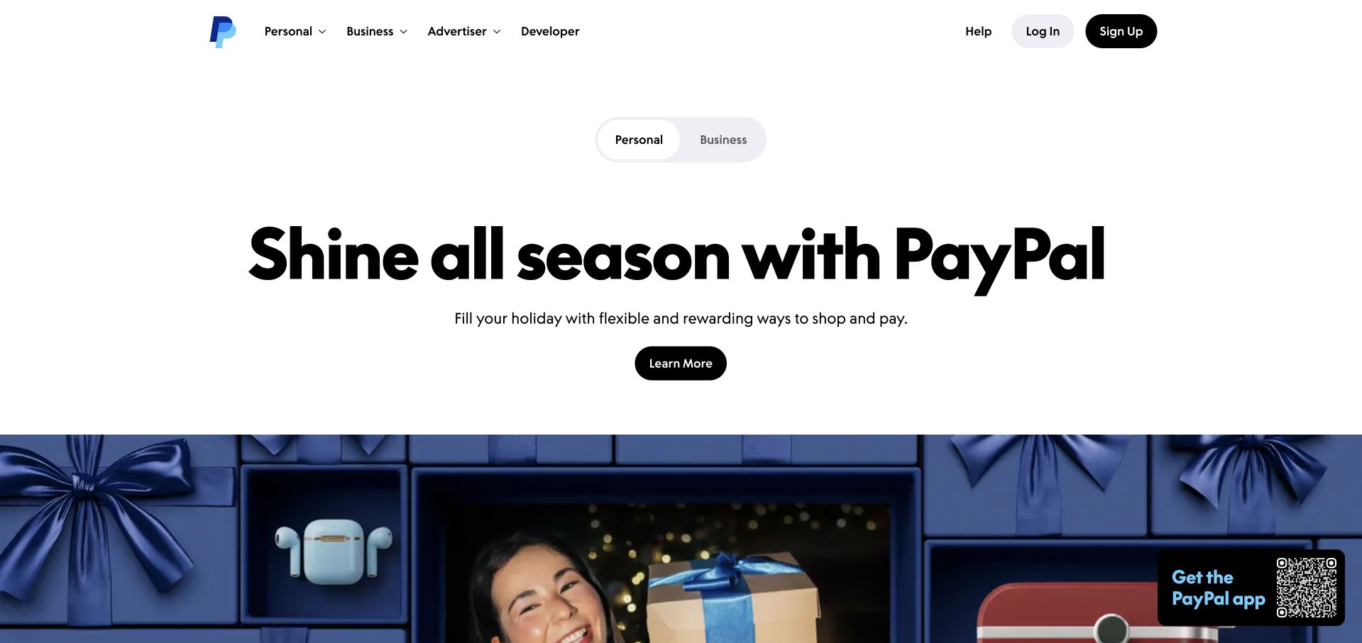
PayPal’s public page uses a mostly white opening with a large, centered seasonal headline and a simple dark action. A small personal/business switch appears above that message, while the main header keeps audience and developer routes visible. A broad blue-toned lifestyle photograph begins below the copy, introducing a different visual rhythm from the restrained text area. The separation is useful: the visitor can understand the promotion without immediately navigating a dense financial dashboard. This is a marketing page, and the depicted offer should not be confused with an individual account balance, eligibility decision or personalized financial recommendation.
What you can learn
Make audience selection available early when the same brand serves different types of customer. Keep a campaign’s promise readable before adding supporting imagery, and make its action describe the actual next step. Product terms and eligibility details should remain connected to the relevant offer rather than hidden behind a general brand statement.
Pros
Personal and business routes are visible before a visitor commits.
The white opening gives the seasonal message a strong visual focus.
Cons & considerations
A promotional feature can displace evergreen product explanations.
Offer details and important qualifications need to stay close to the destination.
Platform source: Primary documented Apache Kafka association. Apache Kafka’s adopter page documents PayPal data infrastructure. Platform evidence is separate from the direct website screenshot and is not a complete current infrastructure audit.
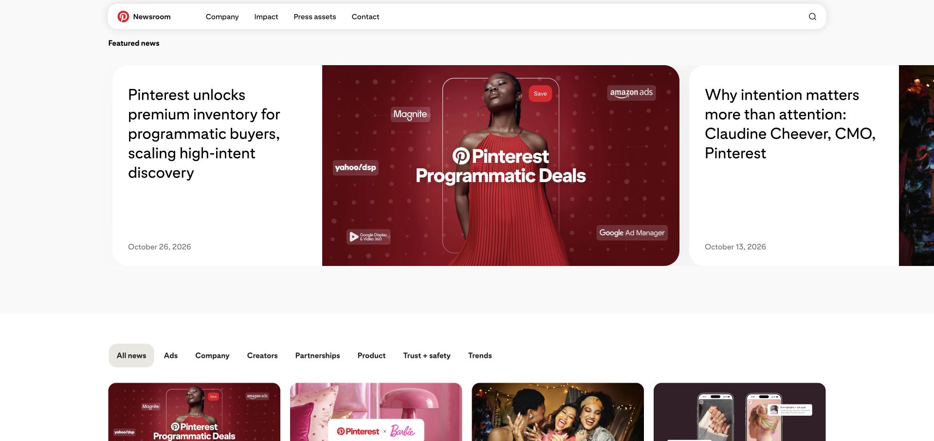
Pinterest’s newsroom uses rounded feature cards, spacious white margins and a restrained navigation strip. The leading story pairs a concise title with a large branded illustration; another feature is visible beside it, suggesting a horizontal editorial sequence. Below, category filters distinguish advertising, company, creators, partnerships and other subjects before the article grid begins. Dates are part of the story cards rather than hidden in separate detail pages. This is a public publication for company news, not a signed-in inspiration feed. Its design is useful for keeping a visual brand recognizable while giving journalists and interested readers a practical publishing structure.
What you can learn
Use a small, understandable set of editorial categories to help readers find relevant announcements. Give each card a date, descriptive title and stable destination. A visually expressive brand can keep its character without importing personalized account controls into a public newsroom.
Pros
Rounded image cards make an editorial stream feel related to the parent brand.
Visible dates and filters support task-focused browsing.
Cons & considerations
Horizontal features need clear controls and a coherent small-screen arrangement.
An attractive card still needs an informative title rather than campaign language alone.
Platform source: Primary documented Apache Kafka association. Apache Kafka’s adopter page describes Pinterest streaming workloads. Platform evidence is separate from the direct website screenshot and is not a complete current infrastructure audit.
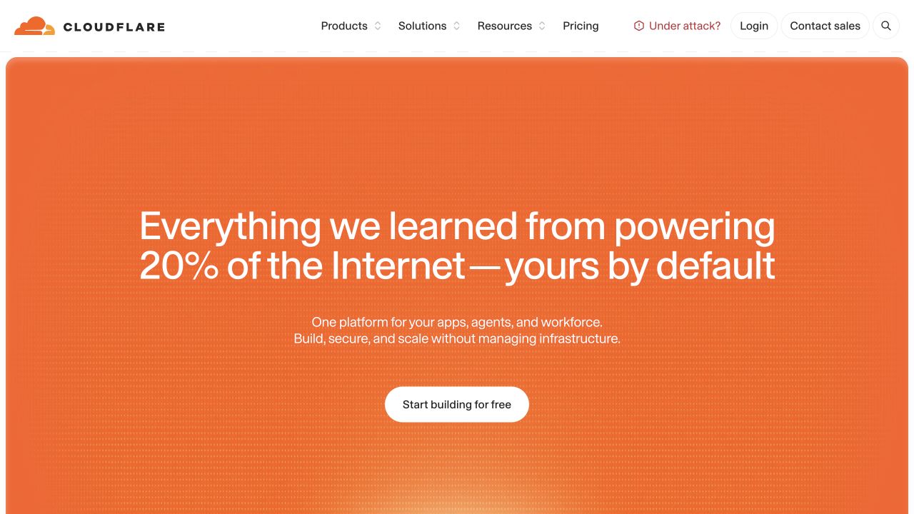
Cloudflare’s opening places a large orange panel beneath a clean white header. A centered headline carries the company’s broad infrastructure promise, followed by a short description and one contrasting action. Subtle texture adds depth without turning the background into a separate illustration to interpret. The navigation still exposes product, developer, resource and pricing routes for visitors who already know what they need. The composition is deliberately simpler than the underlying product catalog. Its scale claims remain marketing; the useful observation here is how the page organizes a broad offer, not whether the screenshot verifies those claims.
What you can learn
A technical homepage can introduce one useful organizing idea before exposing the full catalog. Give experienced visitors direct navigation at the same time. Make the first action understandable without a technical glossary, then let detailed product pages carry the architecture, limits and purchasing decisions that would overload the opening.
Pros
A single dominant color field makes the opening easy to recognize.
The header preserves direct access to technical and purchasing information.
Cons & considerations
Broad platform language can obscure which product solves a particular problem.
Text contrast and background texture should be checked together on real displays.
Platform source: Primary documented Apache Kafka association. Apache Kafka’s adopter page describes Cloudflare analytics ingestion. Platform evidence is separate from the direct website screenshot and is not a complete current infrastructure audit.
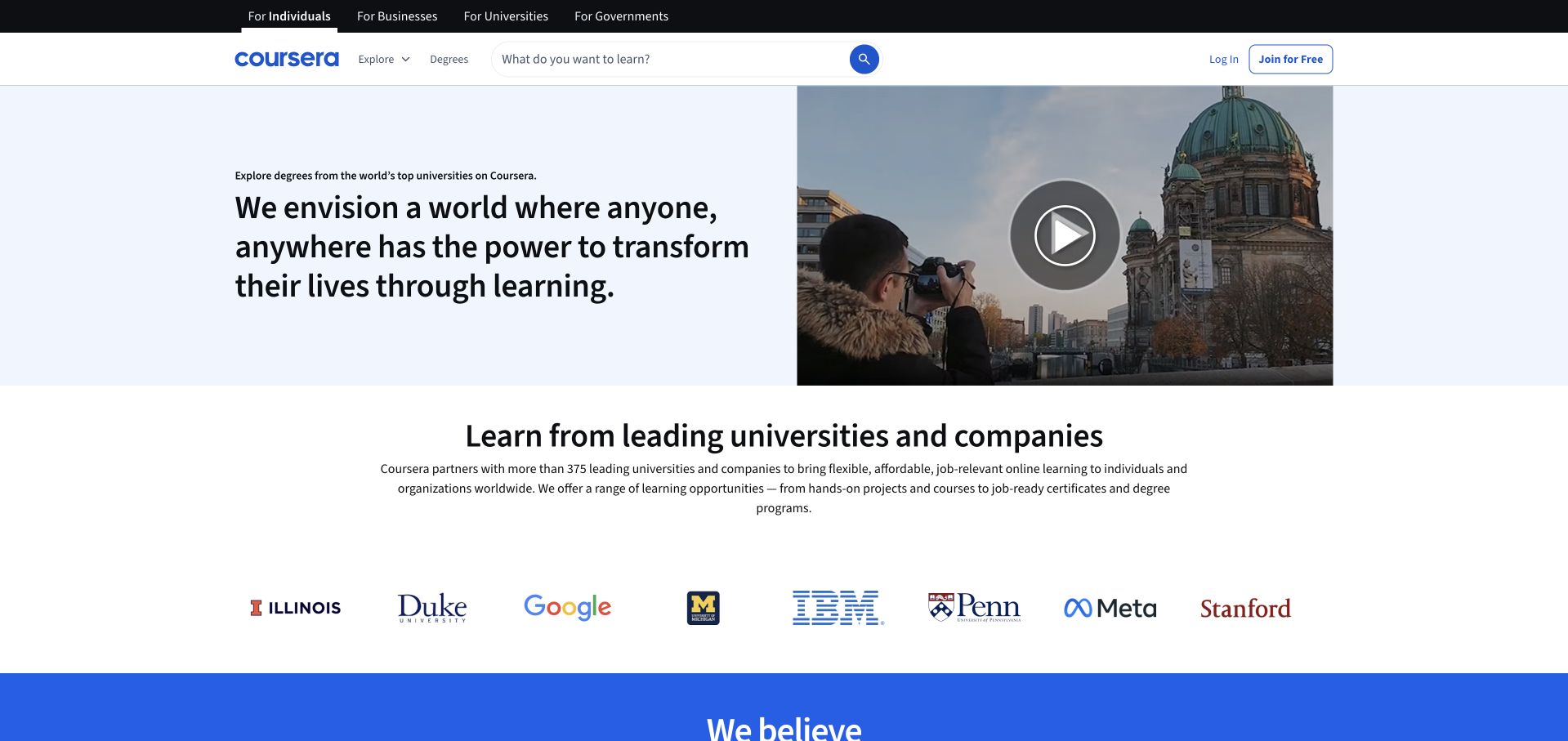
Coursera’s About page divides its opening between a short mission statement and an image with an obvious video control. Pale blue and white areas keep the composition calm, while a following row of university and company marks introduces the wider learning ecosystem. The regular site header remains available for people who actually want to explore courses. This creates a sensible distinction between institutional explanation and product discovery. The marks are published presentation, not independent evidence of a particular partnership scope, a learning outcome or the technical system behind this site.
What you can learn
Let an About page explain the relationship between an organization’s purpose and its product. A video can add a human introduction, but the essential message should remain understandable without playback. Use supporting marks with meaningful context and accessible text, rather than expecting recognition alone to explain every relationship.
Pros
The text and video image provide complementary ways into the introduction.
A separate ecosystem row supports the story without replacing the main message.
Cons & considerations
A video-led explanation still needs useful text for visitors who cannot play it.
Long rows of marks can become decorative if their relationships are not explained.
Platform source: Primary documented Apache Kafka association. Apache Kafka’s adopter page describes Coursera learning analytics. Platform evidence is separate from the direct website screenshot and is not a complete current infrastructure audit.
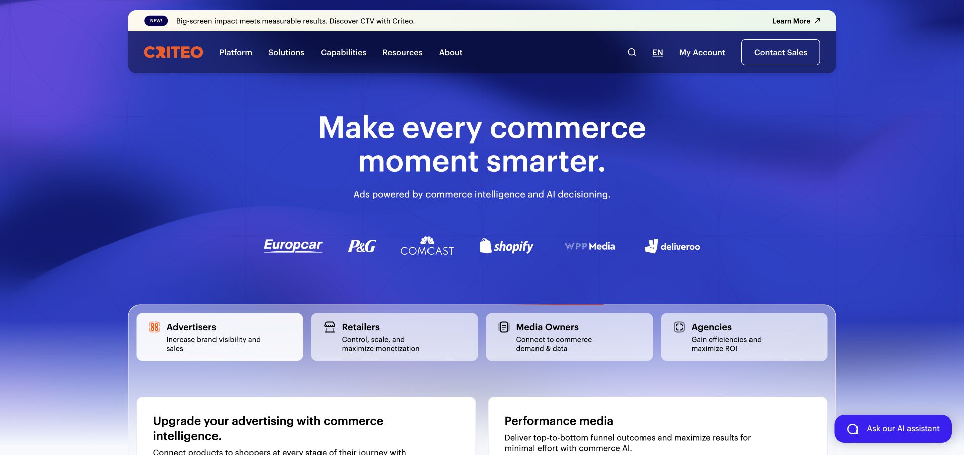
Criteo uses a saturated blue and violet environment around a clear central proposition. A rounded navigation bar and a narrow announcement strip sit above the opening, with customer marks and separate audience cards beginning below it. The cards distinguish advertisers, retailers and other commercial participants instead of treating the platform as one undifferentiated service. That distinction makes the proposition practical. The visual style is confident, but the more transferable lesson is structural: identify the different buyers before asking each of them to understand the full company offering or interpret a complicated product taxonomy.
What you can learn
Follow a broad proposition with audience-specific decisions. Each path should say who it serves and what happens next, rather than merely repeating a product name. Keep the announcement strip subordinate, and check that the main navigation, customer context and audience cards still form a readable sequence when space is limited.
Pros
Audience cards create practical routes through a broad commercial platform.
The blue-violet treatment gives the main message a consistent visual setting.
Cons & considerations
Several announcement and navigation layers can make the header feel busy.
A general intelligence promise needs concrete product explanations further into the journey.
Platform source: Primary documented Apache Kafka association. Apache Kafka’s adopter page describes Criteo streaming infrastructure. Platform evidence is separate from the direct website screenshot and is not a complete current infrastructure audit.
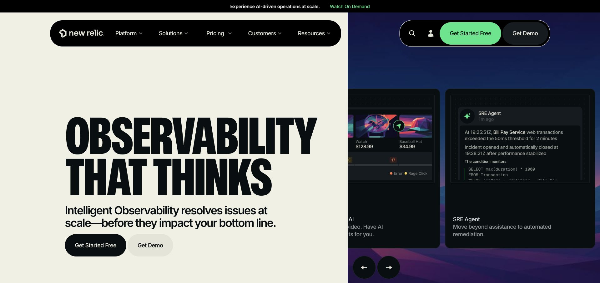
New Relic splits its opening between a warm, pale text panel and a dark product-oriented visual. Heavy condensed lettering gives the headline an editorial character, while the neighboring interface shows a more technical environment. Two different starting actions appear beneath the copy instead of being scattered across the demonstration. The contrast between the calm left side and the dense right side is the main organizing device. It helps the page communicate that an abstract observability offer has a real software surface, although that remains a marketing illustration, not an operational test.
What you can learn
Use contrast to separate the proposition from its supporting demonstration. Let the typography establish a recognizable voice, but keep the explanation plain enough to describe the product category. A trial and a sales conversation can coexist when their labels make the difference clear and neither depends on interpreting a complex mock interface.
Pros
Contrasting panels give the headline and software demonstration distinct roles.
The paired starting actions support different levels of purchasing readiness.
Cons & considerations
Very condensed type needs careful sizing and spacing on narrow screens.
A small interface preview cannot replace a legible walkthrough of key tasks.
Platform source: Primary documented Apache Kafka association. Apache Kafka’s adopter page describes New Relic event ingestion. Platform evidence is separate from the direct website screenshot and is not a complete current infrastructure audit.
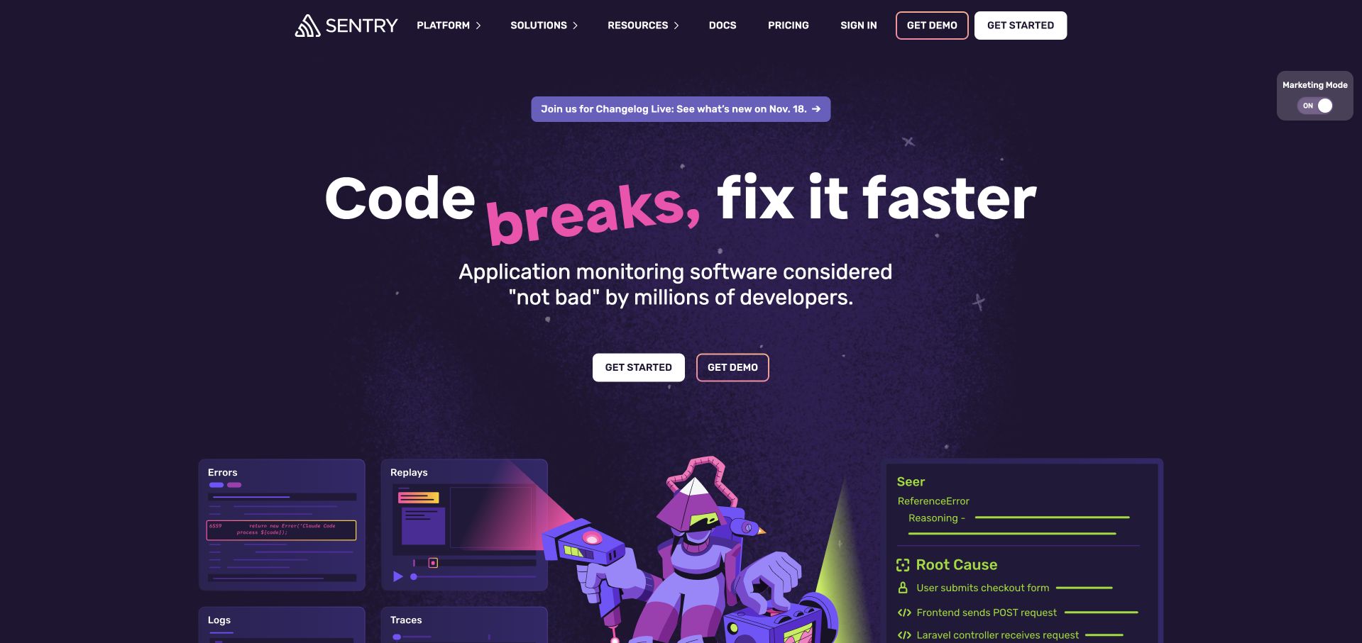
Sentry’s public opening combines a deep purple background, playful lettering and illustrated product scenes. A compact navigation row and a small announcement strip remain above the main statement. The copy names application monitoring in ordinary language, then uses a lighter aside to establish the brand’s humor. Below it, the illustrated interface elements make the page feel connected to development work without presenting an unreadable screenshot as the only explanation. The result is more characterful than a conventional enterprise template. Its usefulness depends on the category and next steps remaining clear beneath the jokes, rather than relying on jokes.
What you can learn
A strong voice works best when the basic product explanation is still easy to find. Keep humor separate from error messages, pricing terms and essential task labels. Illustrations can introduce an idea, while deeper product pages and documentation explain the precise behavior that a development team needs to evaluate.
Pros
A distinctive palette and illustration style give the page a coherent identity.
The product category remains recognizable alongside the informal writing.
Cons & considerations
Humorous phrasing may not translate consistently across audiences and languages.
Decorative scenes still need a clear relationship to actual product capabilities.
Platform source: Primary documented Apache Kafka association. Apache Kafka’s adopter page describes Sentry’s data transport. Platform evidence is separate from the direct website screenshot and is not a complete current infrastructure audit.
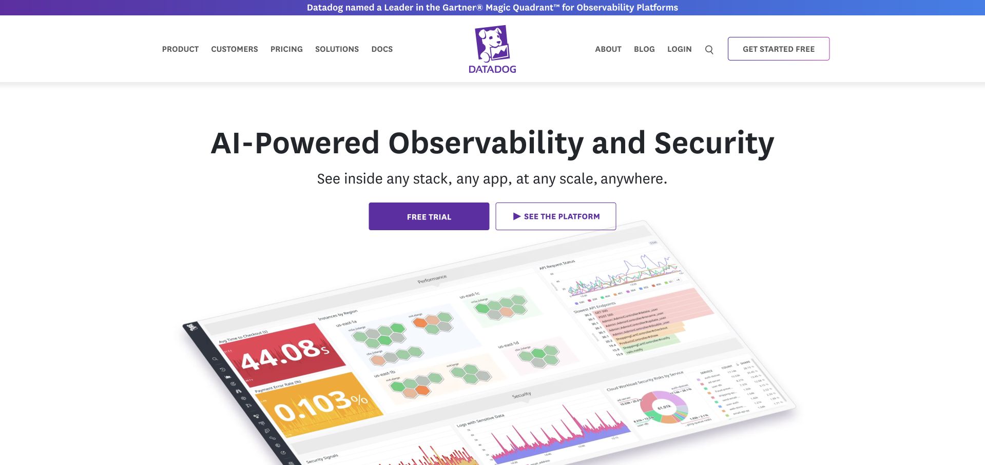
Datadog centers its purple identity within a broad white header, with product and developer routes on one side and company utilities on the other. The opening names observability and security before presenting an angled software illustration. Purple accents connect the main action to the brand while leaving most of the page light. The image contains recognizable charts and panels, but its tilt makes it a category cue rather than a detailed reading surface. That matters: visitors can recognize the type of tool before they choose a demo, documentation route or more specific product explanation.
What you can learn
Use an interface image to establish context, then provide a readable demonstration elsewhere. A strong category headline reduces the burden on the illustration. Keep exploratory and trial actions distinct, and make sure the navigation uses terms that people can connect to their own monitoring or security responsibilities.
Pros
The headline identifies the technical category before the visual details arrive.
A limited purple accent system gives important controls consistent emphasis.
Cons & considerations
An angled screenshot makes detailed interface labels difficult to read.
A broad platform still needs clear routes for different technical roles and tasks.
Platform source: Primary documented Apache Kafka association. Apache Kafka’s adopter page describes Datadog’s ingestion pipeline. Platform evidence is separate from the direct website screenshot and is not a complete current infrastructure audit.
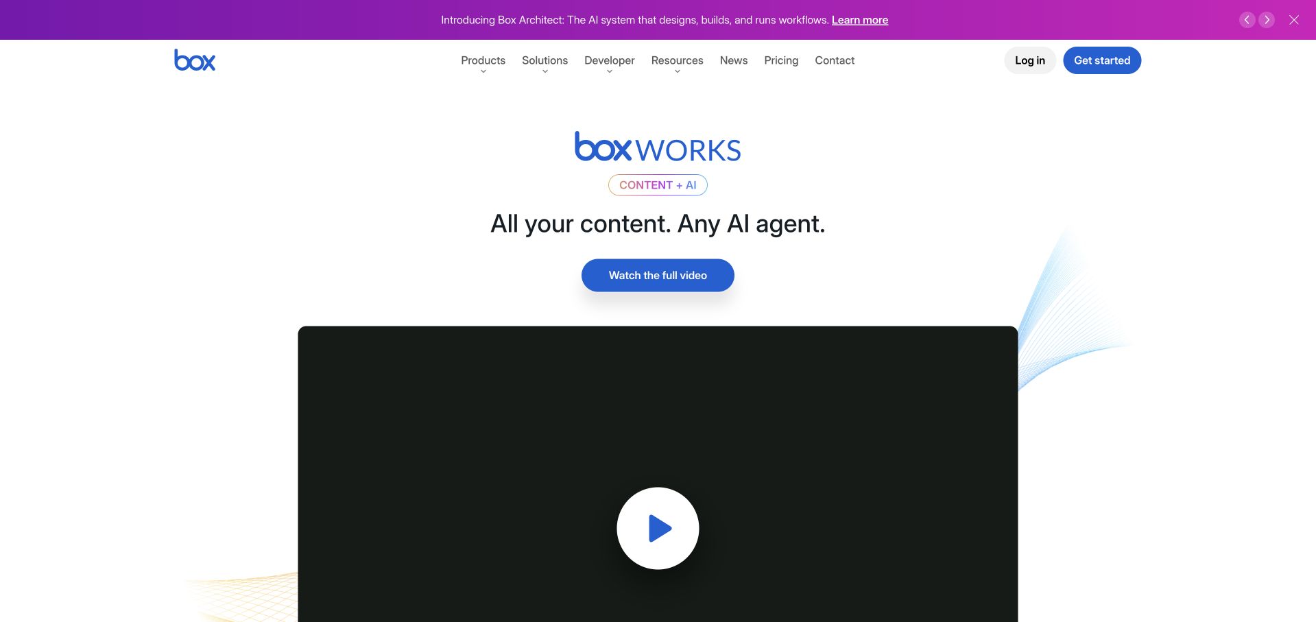
Box’s captured opening gives a company event and its AI-oriented message the main stage. A thin purple promotional strip sits above a familiar white navigation header, followed by a centered event identity, short statement and video action. A large dark playback panel begins below the copy. The light surrounding space makes that panel especially prominent. This is not an evergreen product comparison layout; it captures a particular editorial moment. As a reference, it shows how a temporary campaign can occupy the hero while the regular product, solution and resource routes remain available around it.
What you can learn
Treat an event-led homepage as a temporary editorial feature, not as the only explanation of the business. Preserve stable product routes, date the associated content and plan what replaces the feature when the event is no longer current. Provide a useful text summary for people who will not watch the video.
Pros
The event identity, message and video form a clear visual sequence.
The regular software navigation remains separate from the temporary campaign.
Cons & considerations
A large playback area can delay access to practical product information.
An event feature needs an explicit maintenance and replacement plan.
Platform source: Primary documented Apache Kafka association. Apache Kafka’s adopter page lists Box analytics infrastructure. Platform evidence is separate from the direct website screenshot and is not a complete current infrastructure audit.
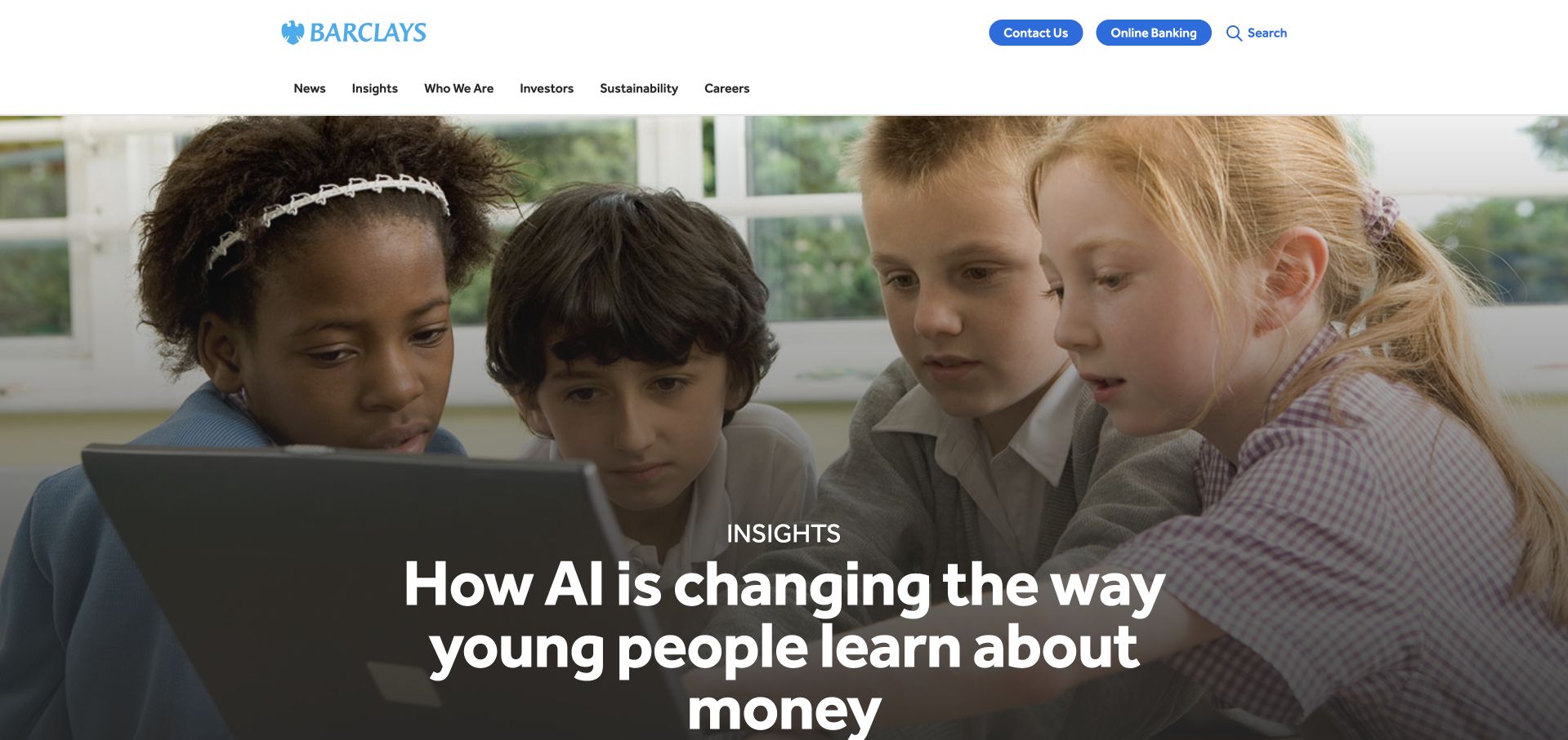
Barclays’ corporate opening places a large photograph of children using a computer beneath a restrained white header. The story title overlays the lower part of the image, making the subject feel connected to people rather than presenting it as a purely institutional announcement. Corporate navigation remains separate from an online-banking utility, which is an important distinction on a property that does not primarily serve everyday account tasks. The pale blue identity and clean navigation keep the brand visible without overwhelming the feature. Study this as a corporate and editorial destination, not a logged-in banking interface.
What you can learn
A human image can make a corporate issue approachable, but the headline must explain the relationship rather than rely on a generic smiling photograph. Keep account access clearly distinguished from company information. Readers should know whether they are entering a story, looking for an investor document or moving toward a separate banking service.
Pros
The photograph gives a corporate topic an immediate human context.
Banking access is differentiated from the main institutional navigation.
Cons & considerations
Overlay text needs contrast across changing images and responsive crops.
A story-led opening can obscure practical corporate tasks without clear navigation.
Platform source: Primary documented Apache Kafka association. Apache Kafka’s adopter page lists Barclays streaming analytics. Platform evidence is separate from the direct website screenshot and is not a complete current infrastructure audit.
Zalando’s corporate page uses a spacious two-column opening for an annual financial report. A large, simple headline appears on the left, with a restrained geometric image carrying the year marker on the right. Smaller links distinguish the overview story from the financial reporting material. The header keeps investors, people, sustainability and newsroom routes visible without imitating the consumer shopping interface. This makes the page’s public-company purpose clear through both content and structure. The design does not verify the financial headline; it shows how to present a timely report without opening with a dense table of figures.
What you can learn
Give an important report a short editorial entry point and a separate route to the underlying material. Use the visual to identify the edition or reporting period rather than decorate the page randomly. Keep the corporate and consumer journeys distinct so readers do not mistake the company information site for the store.
Pros
The reporting period and lead topic are easy to identify together.
Overview and financial-document links serve different levels of reader detail.
Cons & considerations
Report features need updates and a dependable reporting archive.
Visitors looking to shop require an obvious handoff to the retail property.
Platform source: Primary documented Apache Kafka association. Apache Kafka’s adopter page lists Zalando. Platform evidence is separate from the direct website screenshot and is not a complete current infrastructure audit.
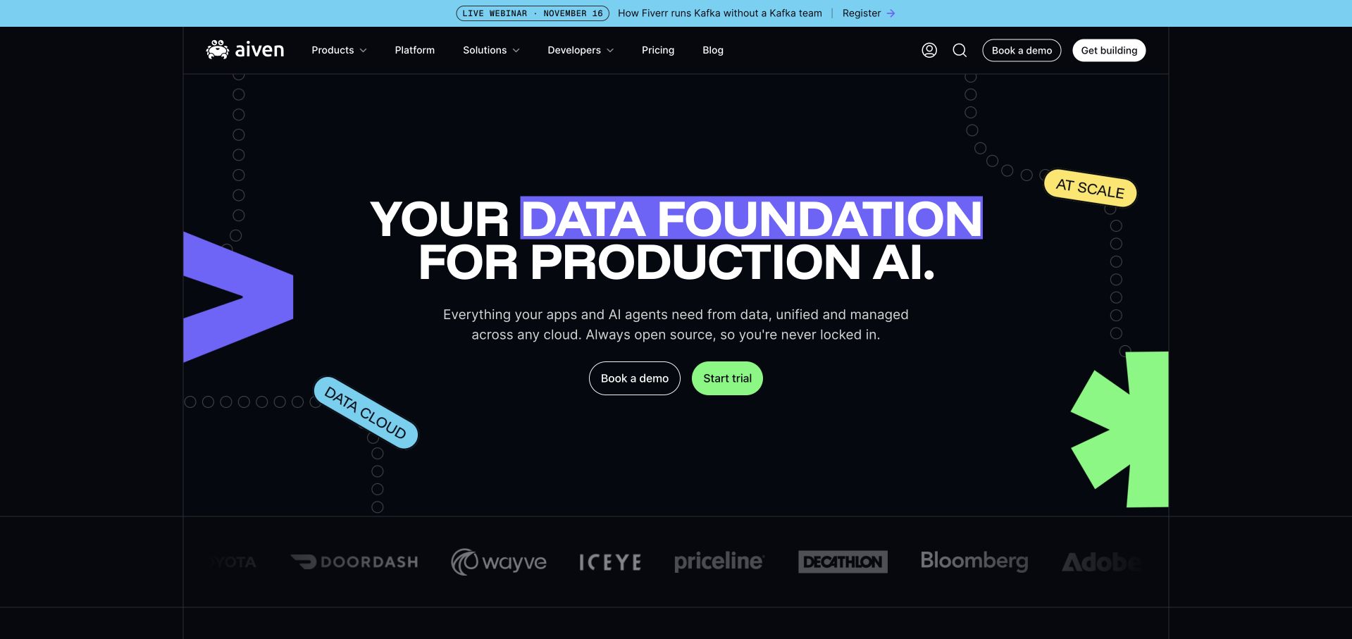
Aiven’s opening uses a dark grid, very large white lettering and bright purple and lime graphic shapes. A highlighted phrase gives the headline a clear internal hierarchy, while a short paragraph connects the message to the platform category. Demonstration and trial actions sit together beneath it, and a subdued row of company marks follows. The graphic language feels purpose-built rather than borrowed from a generic office-photo library. Its value is the consistency between type, accent colors and controls. The technical statements and customer relationships still require their own supporting information; the visual presentation is not proof of a deployment or a performance result.
What you can learn
Create a small graphic vocabulary and use it consistently across the proposition, actions and supporting sections. Explain the actual technical job in plain language alongside the visual personality. Differentiate trial and consultation paths, then give readers concrete documentation, product boundaries and operational details beyond the hero.
Pros
A consistent accent system connects the headline, shapes and primary action.
The short supporting explanation grounds an energetic visual treatment.
Cons & considerations
Large uppercase headlines need careful wrapping and comfortable reading widths.
Customer marks need context rather than being treated as technical guarantees.
Platform source: Primary documented Apache Kafka association. Apache Kafka’s adopter page describes Aiven’s managed platform. Platform evidence is separate from the direct website screenshot and is not a complete current infrastructure audit.
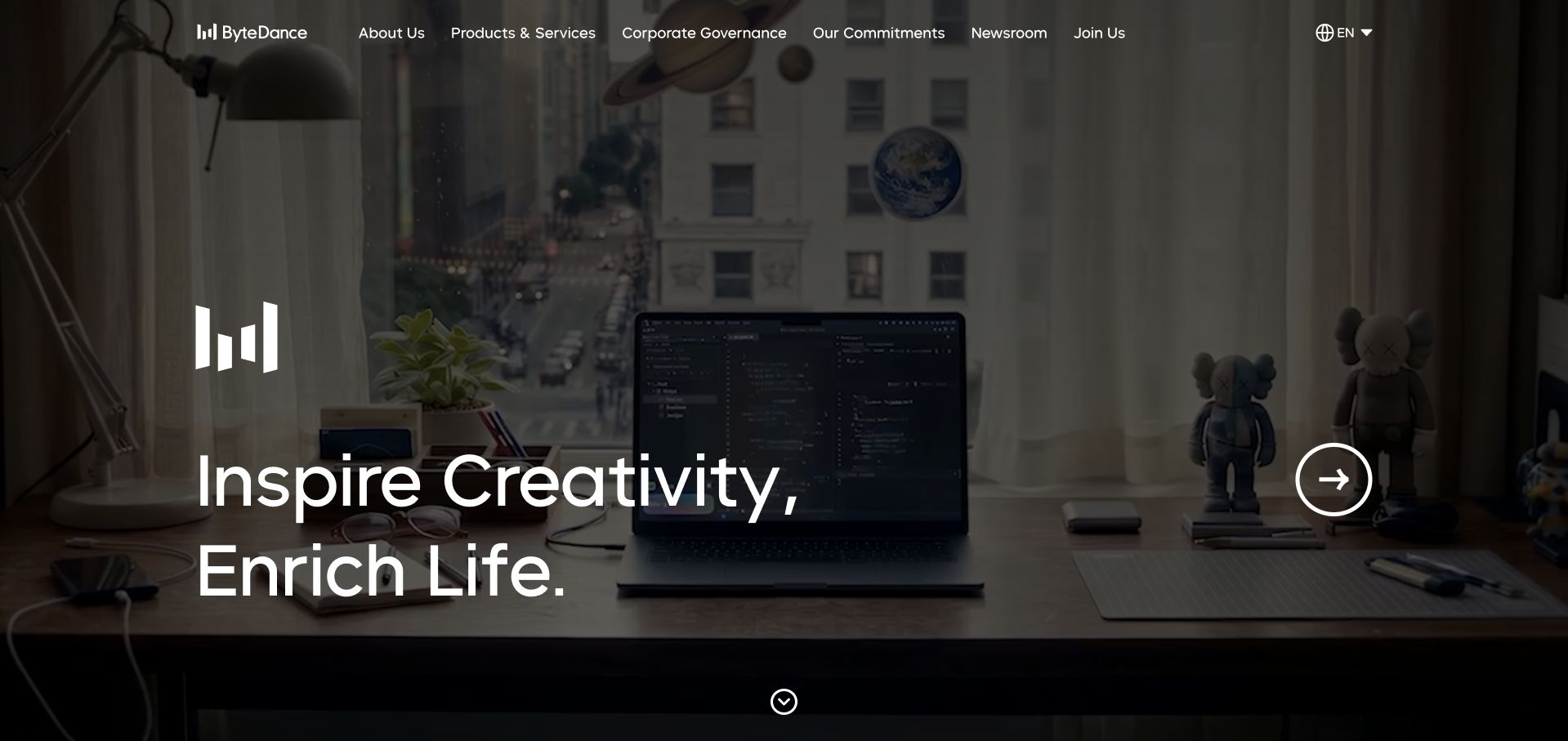
ByteDance opens with a darkened, full-width video scene and a short white mission statement near the lower left. The corporate symbol appears directly above the words, while a compact navigation bar spans the top. The pictured workspace and computer provide a concrete setting for a broad technology message, and a circular control suggests another story or transition. The page relies on scale and atmosphere rather than an immediate feature list. It is a corporate introduction, not a demonstration of the company’s individual products. The Apache adopter listing supplies a separate, undated organizational association and should not be mistaken for a fresh inventory of this homepage’s delivery systems.
What you can learn
Let a broad company introduction establish identity, then supply specific product and corporate routes in stable navigation. Ensure the headline survives without video playback and provide useful controls for motion. The message should remain understandable to someone who cannot recognize the scene or see the photograph.
Pros
A short statement remains visually distinct within the cinematic opening.
Corporate navigation stays separate from the main image and message.
Cons & considerations
Video-dependent atmosphere needs a lightweight, accessible fallback.
Broad mission language requires concrete supporting product and company information.
Platform source: Primary documented Apache Kafka association. Apache Kafka’s adopter page describes ByteDance event collection. Platform evidence is separate from the direct website screenshot and is not a complete current infrastructure audit.
Kegan has 15+ years of experience working with small businesses, Fortune 500 companies, and everything in between. No development job is too big or too small: he brings the same hands-on attention to a focused improvement, a complete website, or a custom application.
For Apache Kafka projects, he can help with data modeling, application data access, query design, search and cache integrations, migration planning, access boundaries, and maintainable handover. He works directly with clients on scope, design, implementation, testing, and handover, with an emphasis on clear communication and a system that remains practical to maintain after launch.
Show 3 other Apache Kafka developersHide other Apache Kafka developers
Choose an event boundary rather than a fashionable architecture
A conventional website with a small integration
For a publication or lead-generation site, start by establishing a durable form submission or business record. A queue, webhook or scheduled transfer may be sufficient. Add Kafka only when retention, multiple independent consumers, replay or sustained event volume creates a concrete need. Keep the public request path understandable and avoid making the visitor wait for unrelated background reporting.
A customer application with several consumers
An accepted order might feed fulfillment, analytics and notifications separately. Document which system is authoritative and which consumer owns each effect. Use clear event versions and compatibility expectations so one team’s release does not quietly break another. Give customer support an understandable record of what completed and what remains pending instead of a collection of unexplained technical offsets.
A stream can support analytics or operational data movement without replacing the public frontend. Identify the source, retention requirements, permitted consumers and destination stores. Plan schema evolution and replay costs before connecting production traffic. A managed service can change who operates the brokers, but it does not remove ownership of data definitions, access decisions or downstream correctness.
Describe where ordering matters and select keys around that requirement. Do not assume a global order across an entire distributed topic. Test delayed messages, a repeated event, a consumer restart and an unavailable destination. Include a practical way to inspect and reconcile failed business actions without granting every support user broad infrastructure authority.
Keep broker access out of public browser code. Review authentication, encrypted connections and authorization for each producer, consumer and administrative process. Name the person responsible for credentials and revocation. The project’s official security documentation covers different controls; selecting Kafka or a managed provider is not proof that those controls have been configured correctly for this application.
Estimate normal event volume, unusual campaigns, retained data and the time needed to replay it. Monitor consumer lag in the context of the business deadline it threatens. Decide who responds when a consumer falls behind and how an incident is communicated. Include a tested recovery procedure in handover, not just instructions for starting a development broker.
A useful handover demonstration
Ask the actual team to carry out its routine job: publish a realistic update, correct a mistake, preview a narrow screen, and identify who owns an integration failure. For a library or frontend framework, also ask who maintains the content source and deployment. A polished screenshot does not answer those operational questions.
Beyond the screenshot
Kafka integration planning checklist
Name the business event and its authoritative owner.
Separate facts that happened from commands requesting work.
Define identifiers, timestamps and schema versions.
Choose the smallest appropriate integration boundary.
State the freshness requirement for each user-visible result.
Define ordering requirements and partition keys.
Make consequential consumers safe against repeated work.
Set retention and a bounded replay procedure.
Restrict producer, consumer and administrative access.
Test unavailable destinations and interrupted consumers.
Monitor lag against business deadlines, not only technical counters.
Document reconciliation, recovery and a named operating owner.
Test with real content, a keyboard, a small screen, slow or failed requests, and the people who will maintain the system. These are planning checks, not an accessibility, security, performance, or search-ranking certification.
Sources & editorial method
How this Apache Kafka collection was reviewed
These 20 public references combine directly inspected screenshots and original design observations with Apache’s undated community adopter entries. Established major brands lead the collection. Documentary association remains distinct from observed public-page technologies, and retained screenshots keep their real capture dates. No company-wide runtime or current deployment claim is inferred from a directory entry.
Every image is an unmodified capture from the actual website, with its source and capture date. Some captures are reused from our shared catalog; their dates remain the original capture dates. None comes from a vendor gallery or a generated reconstruction. Moving imagery and live content can change.
Technology attribution uses public page assets or metadata, official platform documentation, or a cited first-party project case study. Documentary and framework-relationship evidence is identified where used; it is not a complete current backend inventory. A CMS image CDN alone does not establish a full CMS deployment. A library’s presence does not prove which individual controls use it, and a platform label does not establish AI authorship.
The composition notes, lessons, pros and tradeoffs are original editorial observations. We have not measured conversion, traffic, security, performance or accessibility conformance. Website owners retain their brands and imagery; these examples are not our client portfolio. Written, Edited and Curated are independent records, not dates advanced by a build. See our editorial standards or suggest a correction.
Questions worth asking
Apache Kafka website development FAQs
Does Kafka power all 20 public homepages?
That is not established here. Apache’s community directory associates the organizations with Kafka, sometimes through specific pipelines or historical engineering accounts. The public screenshot is a separate design reference. We do not infer a marketing page’s runtime or the company’s entire current stack from that entry.
Should a small business website use Kafka?
Only when its integration requirements justify it. A simple form, a low-volume webhook or a scheduled transfer may need much less infrastructure. Define retention, replay, independent consumers, event volume and operating responsibility before choosing a streaming platform.
Will a Kafka integration prevent every duplicate action?
No broad guarantee should be assumed across external systems. An event may be retried or replayed, and a destination can fail after performing some work. Design the consumer and destination around idempotency, stable identifiers and a reconciliation process that matches the business consequence.
Can customers connect directly to the brokers?
A normal public website should expose a controlled application boundary, not unrestricted infrastructure access. Authentication, authorization, rate limits and data minimization belong in the design. Keep service credentials and administrative access out of public frontend code.
What should I ask a Kafka developer to demonstrate?
A representative event flowing through the intended consumers, a repeated event handled safely, a destination outage, a consumer restart and a bounded replay. Ask how support can identify an incomplete business action and how the system will be monitored and operated after handover.
Begin with the business event, the consumer’s responsibility and the recovery path. A useful Kafka brief explains all three before it introduces a cluster diagram.