Best Appliance Repair Websites of 2026 (23 Real-World Examples)
Appliance repair websites that make coverage, supported equipment, and the next booking step clear.
Compare 23 real repair-company pages for useful ways to organize appliance categories, local availability, and service inquiries. These are website references, not recommendations about repair quality, warranties, or individual providers.
A broken appliance gives a visitor a specific question: can this company help with this equipment at this address, and how do I start? A useful repair website answers that question before asking the customer to understand the company's internal service process.
The examples include independent local firms, regional authorized-service businesses, and larger home-service networks. Their operating models differ. Compare their contact and coverage decisions without assuming that a fleet photograph, manufacturer mark, or review summary independently proves the suitability of a repair service.
Before the examples
What makes good appliance repair website design in 2026?
Confirm coverage before building a long request
Put the actual region and a usable service-area route near the introduction. If ZIP codes determine availability, explain the result and provide a fallback for an address that cannot be matched. A coverage check is not a reserved appointment, and a visitor may be researching a property different from the location inferred by their browser.
Name supported appliances and the relevant service boundaries
Separate refrigerators, laundry, cooking, dishwashers, and other actual categories. Explain brand or model limitations where the company can maintain that information accurately. Manufacturer authorization, warranty work, routine repair, and paid diagnostic visits are different relationships; familiar logos should not blur those boundaries or imply every model is eligible.
Make contact choices describe their real next step
Calling, texting, requesting a callback, and selecting an appointment are not interchangeable actions. Label the intended task and explain what happens after submission. Keep existing-appointment support and new service inquiries distinct so customers do not have to repeat a repair request merely to ask about a current visit.
The collection · 23 examples
23 appliance repair websites worth studying
Look at how each page identifies the service and location, uses company photography, and separates eligibility from booking. The order is editorial, not a measured ranking of repair performance.
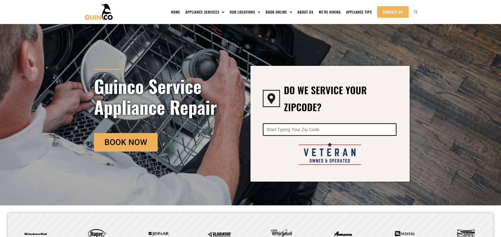
Guinco makes the visitor's location part of the hero instead of burying it in a service-area directory. A pale ZIP-code panel sits over a photograph of a technician working inside an appliance, alongside a short service title and a yellow booking button. The photograph communicates the trade immediately; the form introduces a practical eligibility question before a visitor starts a longer request. A restrained white navigation bar keeps the yellow accent associated with actions rather than spreading it across every heading. The veteran-owned badge adds an identity cue without replacing the coverage question.
What you can learn
Borrow the order of decisions: identify the repair service, check the address area, then ask for appointment details. A coverage tool should also explain what happens when a ZIP code falls outside the current territory.
Pros
The location panel gives an otherwise broad repair headline a specific purpose.
Work-in-progress photography makes the service recognizable without a product catalog.
Cons & considerations
The small navigation labels need careful sizing on narrower desktop displays.
A coverage result must not be mistaken for a confirmed appointment or arrival time.
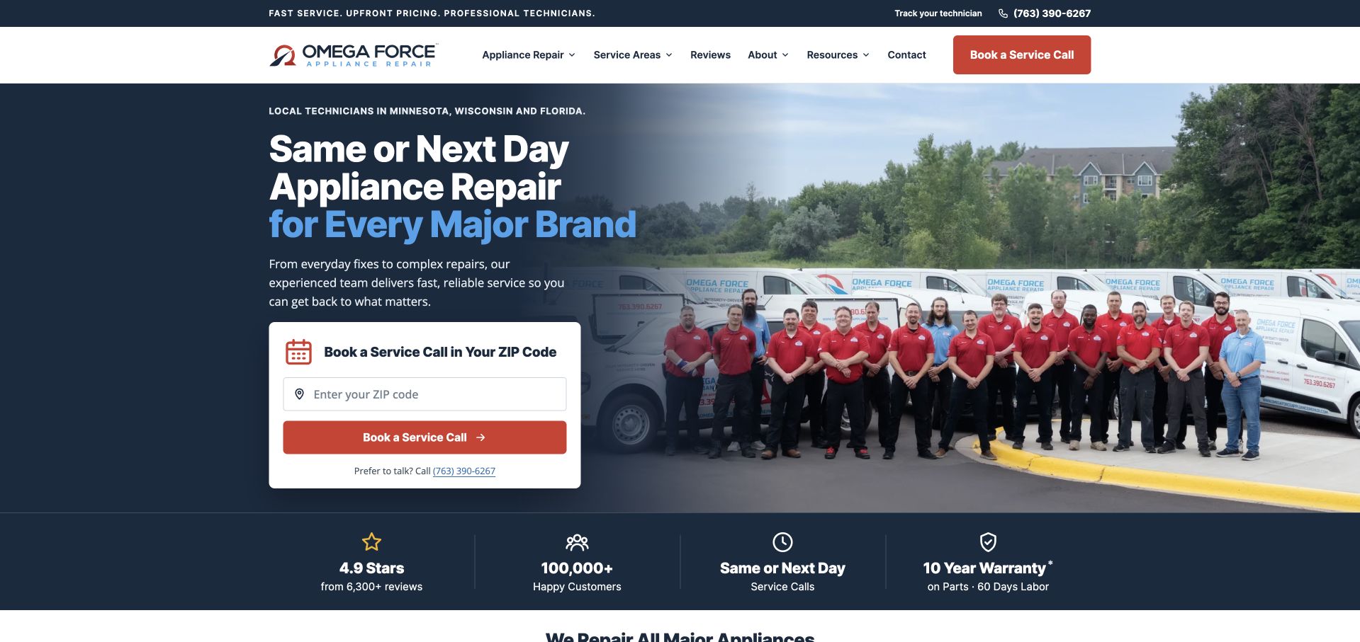
Omega Force places a large staff-and-vehicles photograph across the right of a dark blue hero. On the left, the appliance-repair headline leads into a compact ZIP-code booking card and a red call-to-action. This combination is more informative than an isolated kitchen photograph: visitors see the service category, the people behind the brand, and the first booking requirement together. A narrow proof strip below separates review, customer, scheduling, and warranty claims into distinct blocks. Those remain the company's own claims, not results established by this collection. The navigation provides appliance, service-area, review, and resource routes while the hero concentrates on one booking question.
What you can learn
Pair human recognition with a task-specific field, rather than making visitors choose between a personal introduction and a useful action. Keep regional availability and any booking confirmation explicit in the next step.
Pros
The team photograph gives the brand a recognizable visual subject.
A contrasting booking card keeps the first input easy to locate.
Cons & considerations
Several large performance claims compete within the same short first screen.
Availability wording needs local context rather than an implied universal promise.
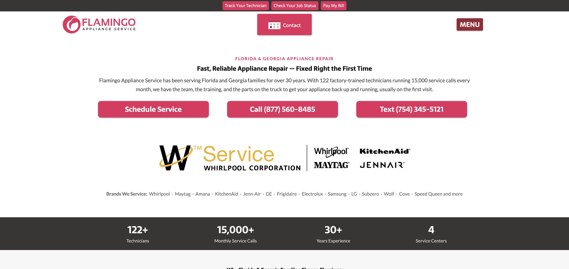
Flamingo avoids the usual full-width kitchen image in its opening screen. A small regional label, a centered repair headline, and a concise description sit above three pink contact buttons for scheduling, calling, and texting. Manufacturer-service marks occupy their own band, followed by a dark strip of company statistics. The result is unusually direct: the visitor does not need to decode an illustrated process or wait for a video to understand how to reach the company. The white background also gives the bright pink brand color a distinct role. This restrained opening is a useful contrast to the image-heavy examples in the collection.
What you can learn
Give different contact channels clear labels and destinations. If texting is offered, describe its purpose and expected reply process elsewhere so a visitor does not confuse a message with a booked repair.
Pros
Call, text, and scheduling actions are separated rather than hidden in one vague button.
The sparse opening makes manufacturer-service context easy to notice.
Cons & considerations
Small centered text can become difficult to scan when the paragraph expands.
Company statistics should link to explanatory context rather than stand as unsupported decoration.
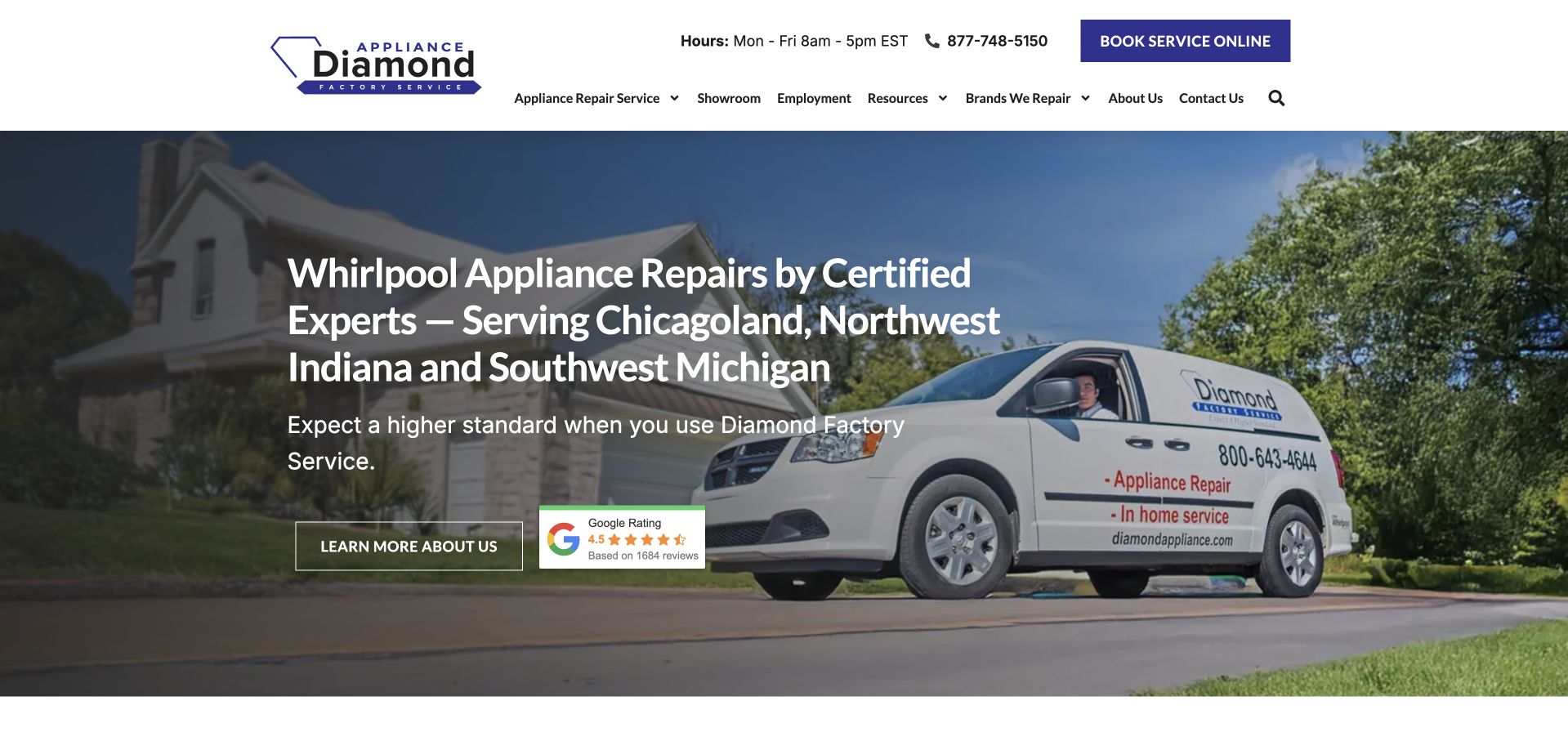
Diamond Factory Service uses a service van as the main photographic anchor. The headline names Whirlpool appliance repairs and spells out its Chicagoland, northwest Indiana, and southwest Michigan territory. That specificity distinguishes the opening from a generic promise to repair every appliance everywhere. A dark overlay keeps white text legible against a tree-lined residential photograph, while the navy booking button remains in the white header. A review badge is positioned close to the introductory action without consuming a separate full-width section. The navigation includes repair services, showroom, employment, resources, and brand routes, revealing a business with more than one visitor task.
What you can learn
Put actual territory and supported brands close to the primary service statement. Keep manufacturer relationships accurately described, with a separate path for customers who need to confirm a particular model or warranty situation.
Pros
The headline makes the regional scope concrete before a booking request.
The vehicle photograph connects the company identity to work at customers’ properties.
Cons & considerations
A long geographic headline can wrap awkwardly at intermediate screen widths.
Showroom and employment routes require a hierarchy that does not distract repair customers.
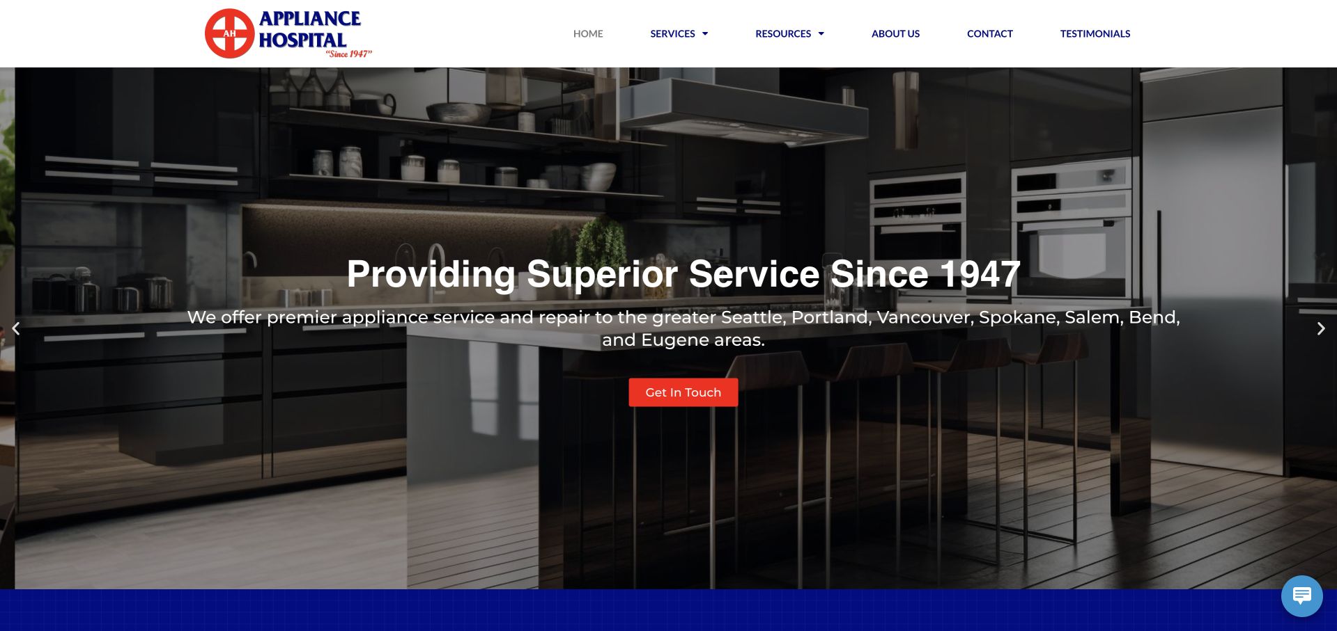
Appliance Hospital places a centered service-history statement over a darkened kitchen photograph. A short supporting line names several Pacific Northwest cities, and a small red contact button supplies the immediate action. The white navigation bar is deliberately calmer than the hero, using the medical-cross brand mark as the main identifying element. The page then offers appointment, contact, and company-information routes rather than forcing all visitors into one long explanation. This is a useful reference for a business whose location coverage matters as much as its trade. Its restrained use of red also helps the action remain distinct from the surrounding service copy.
What you can learn
A familiar hero can still work when its supporting text answers a concrete geographic question. Follow that opening with a clear distinction between an inquiry, a booking request, and a confirmed appointment.
Pros
The regional city line adds useful context to a broad appliance-service message.
The red action stands out against the subdued photograph and white header.
Cons & considerations
A centered image overlay limits how much supporting information remains comfortably readable.
The primary contact label is less explicit than an appointment-specific action could be.
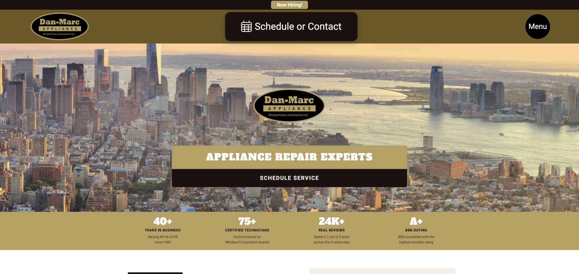
Dan Marc uses a New York skyline as the visual foundation of its hero rather than another close-up of a dishwasher. A central logo and rectangular service panel sit over the city photograph, with gold and near-black bands carrying navigation, scheduling, and company statistics. The large schedule-or-contact control in the header makes a practical route available above the imagery. It is a strong example of using a regional landmark as a brand cue without turning the homepage into a travel-style presentation. The statistics band below the hero creates a deliberate transition from recognition into supporting claims, while subsequent appliance and service sections can provide the operational detail.
What you can learn
Use a recognizable regional image to establish context, then make the actual coverage boundary easy to verify. A skyline should support, not substitute for, the list of towns and ZIP codes served.
Pros
The skyline gives the page a distinctive metropolitan identity.
Scheduling remains visible in both the header and the hero panel.
Cons & considerations
Text embedded in a central panel needs careful contrast over changing image crops.
Company statistics need explanation before visitors treat them as independent evidence.
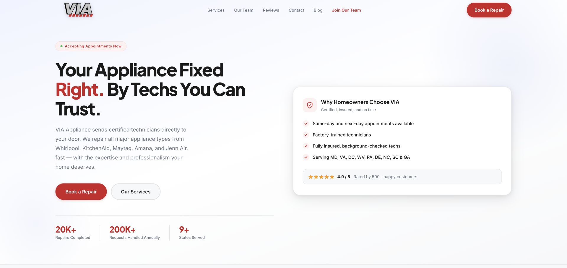
VIA puts the main repair statement in large black type on a pale background, with a small red emphasis inside the headline. A compact panel on the right lists reasons to choose the company and displays a review summary, while two clearly separated buttons offer booking and service information. There is no need to search around a busy kitchen image for the next step. Small company figures sit below the left column, giving the opening a familiar product-interface rhythm without changing its service-business purpose. The white header and limited red accents reinforce that hierarchy.
What you can learn
Group supporting reasons in one coherent panel and keep the primary action outside it. Confirm that each stated qualification or service-area claim has supporting detail elsewhere rather than relying on checklist styling to imply verification.
Pros
A pale, uncluttered background gives the service headline room to work.
Booking and exploratory service routes have visibly different emphasis.
Cons & considerations
The reasons panel can become dense if too many claims are added.
Broad trust language still needs concrete model, territory, and process information below.
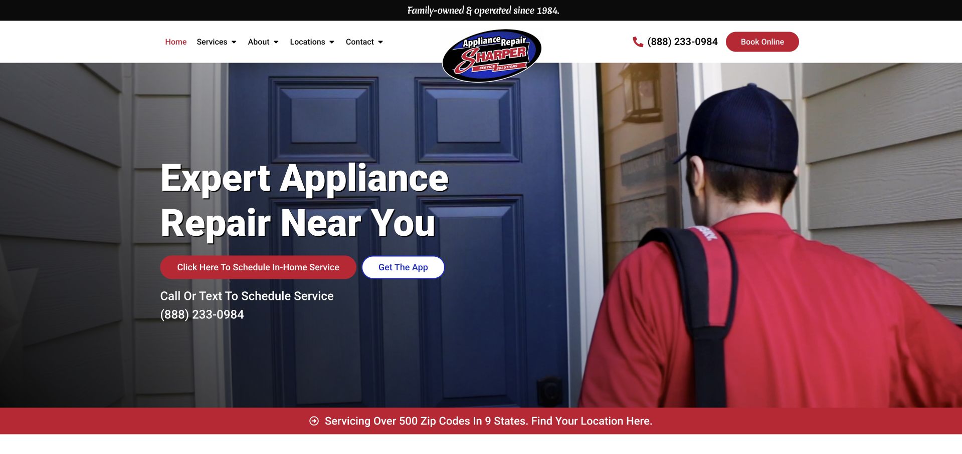
Sharper Service Solutions opens with a technician seen from behind, working at a refrigerator. The headline sits on the left over the appliance, while the person and red uniform provide a visual counterweight on the right. A red contact button and a separate app action make the two routes distinct, and a narrow red strip below introduces the service-area finder. The header combines the logo, navigation, telephone number, and booking action without letting a large logo dominate the page. The work photograph is particularly useful because it shows context rather than a posed portrait alone.
What you can learn
Let the image explain the work while the interface explains how to start. If an app is optional, keep a fully usable browser and telephone route available rather than making software installation a prerequisite for help.
Pros
The technician photograph immediately places the visitor in an appliance-repair context.
The separate coverage strip gives geographic confirmation a clear next location.
Cons & considerations
Several contact options can compete without a consistent primary booking route.
Text over detailed appliance imagery depends on a sufficiently dark overlay.
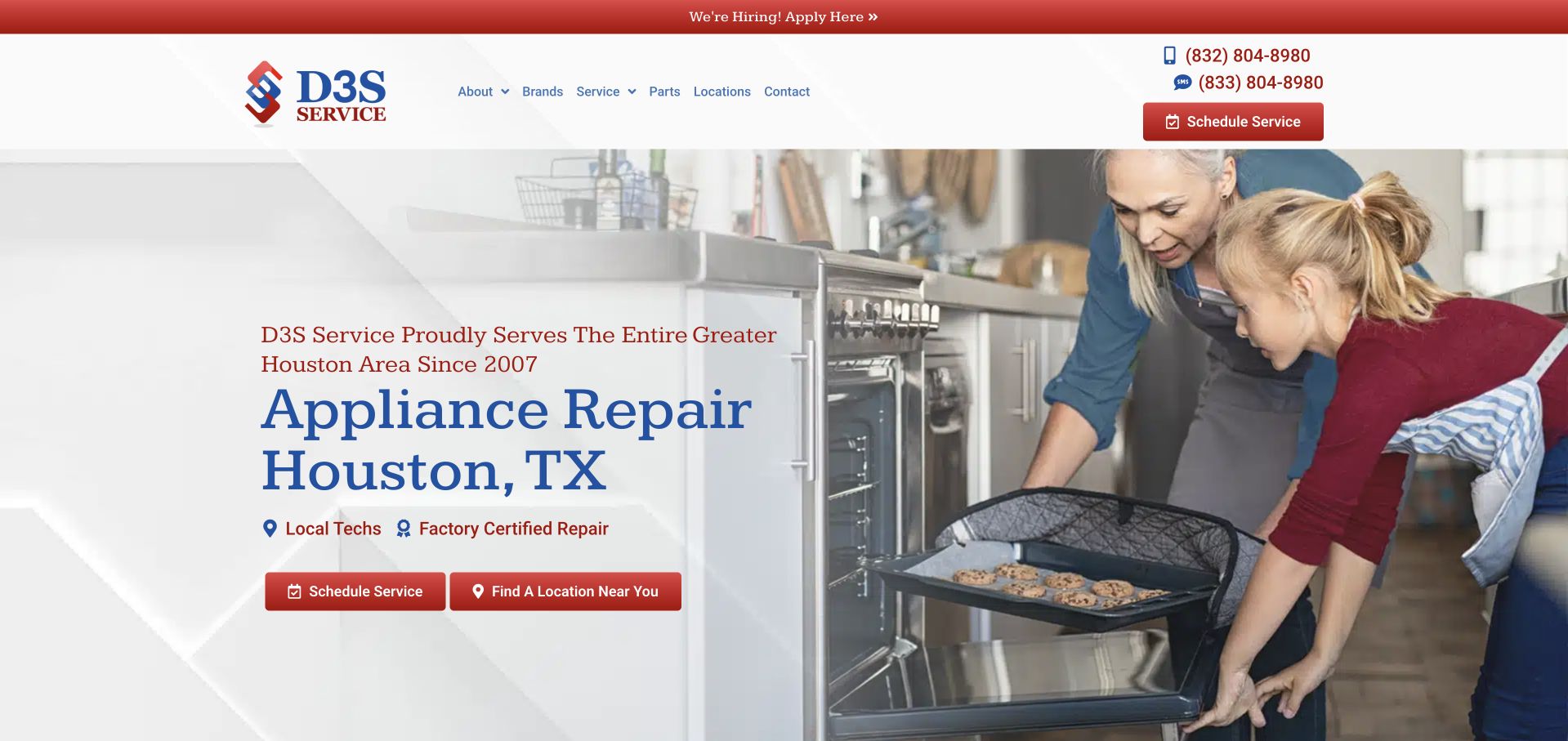
D3S combines a large photograph of a technician speaking with a customer with a compact Houston repair introduction on the left. The blue serif heading contrasts with the predominantly sans-serif navigation, giving the opening a slightly more editorial character than a standard contractor template. Red scheduling and location buttons create two distinct paths below the heading. The first screen is worth studying for the relationship between its photo and its location-specific copy: the image suggests a conversation, but the text still names the service and city. The page does not rely on the photo alone to explain what the business offers.
What you can learn
Use customer-and-technician photography to add a human dimension, while preserving a literal service heading and local coverage route. Keep recruitment actions visually separate from the customer’s repair task.
Pros
The photo supports a service conversation rather than functioning as unrelated scenery.
The city-specific heading and location button make regional relevance easy to recognize.
Cons & considerations
Multiple telephone and text numbers can require additional labeling on small screens.
Serif headings and several red accents need consistent spacing to avoid visual fragmentation.
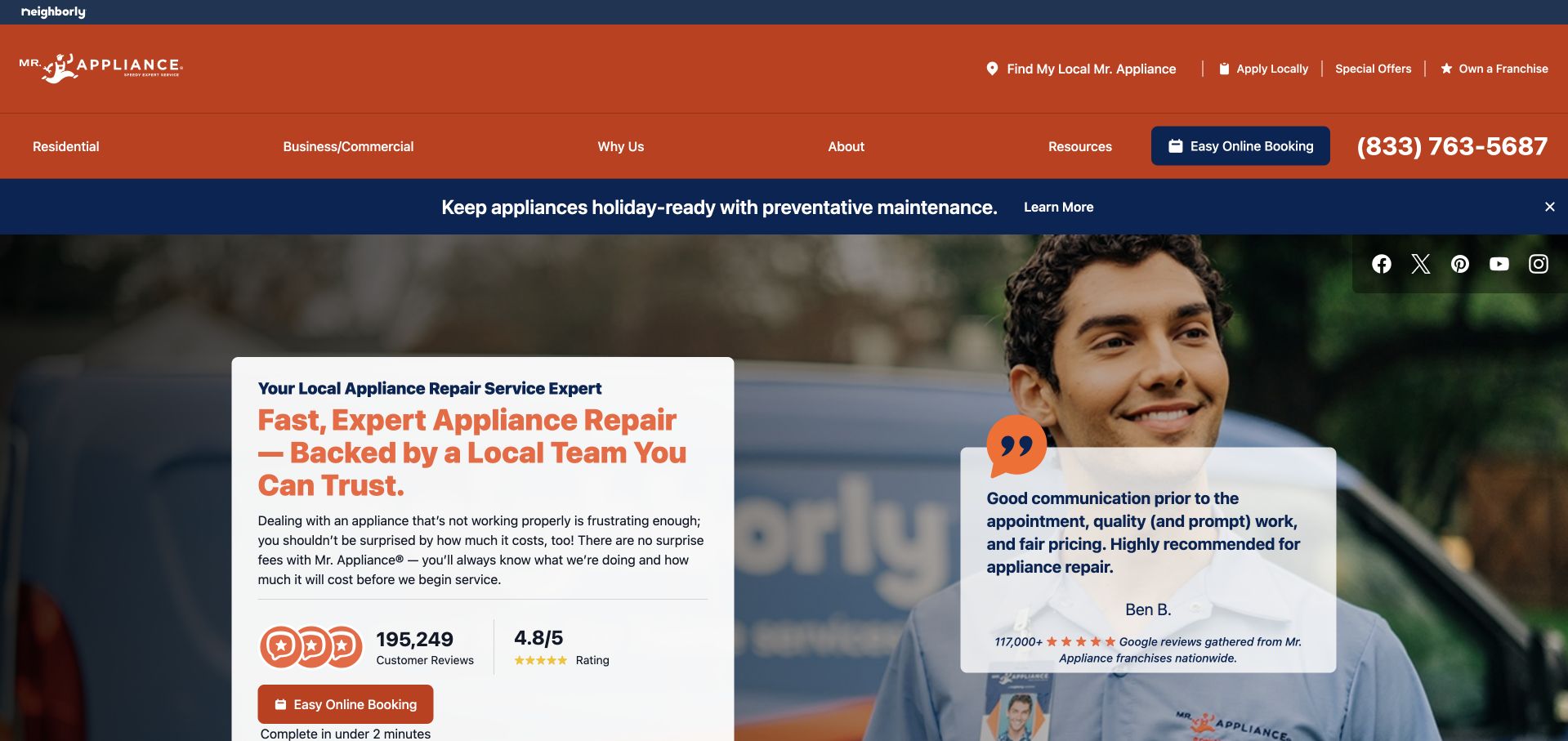
Mr. Appliance uses an orange-and-navy header and a large technician photograph to establish a recognizable service brand. A white headline card on the left explains the repair offer and presents an online-booking action, while a separate review card overlaps the photograph on the right. A slim promotional band introduces preventive maintenance above the hero, and the navigation separates residential, business, and company information. The design is useful as a study in managing several layers of information within a franchise homepage. Its strength lies in maintaining visible booking access despite the brand, promotion, review, and location content surrounding it.
What you can learn
Keep the local booking journey identifiable even when national branding and promotions occupy the header. Explain where review summaries come from and distinguish network-wide presentation from the terms of an individual location.
Pros
The white service card remains readable over the large photographic background.
A nearby review card introduces customer context without replacing the booking action.
Cons & considerations
Promotion, review, and booking layers can crowd a narrow viewport.
National messaging needs a clear transition to location-specific availability and service details.
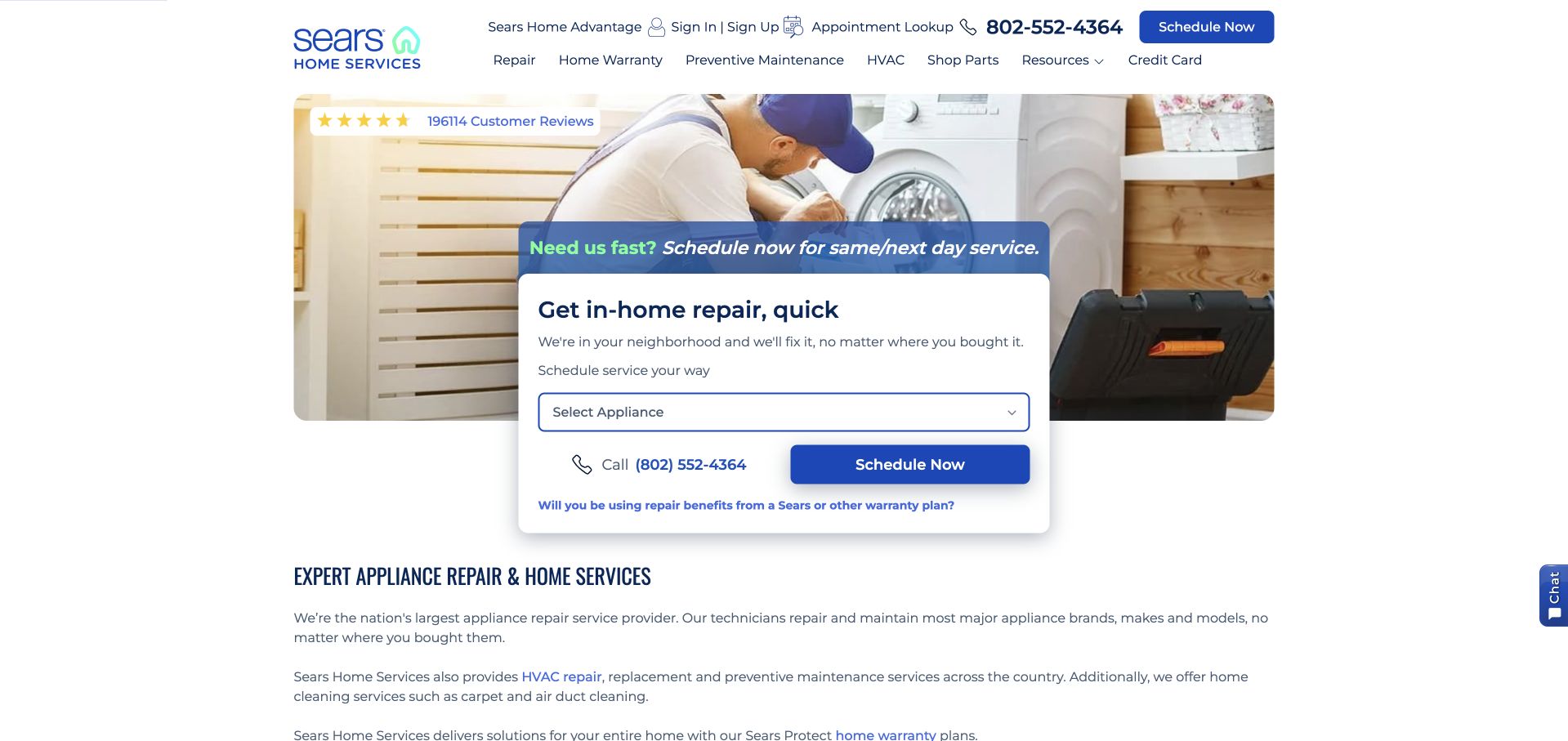
Sears Home Services makes the first task unusually concrete: select an appliance and enter a ZIP code. The small white booking card sits in front of a friendly domestic photograph, with a blue scheduling button aligned below the two inputs. The broader service heading and catalog begin beneath this action-led opening. That order is useful for a large provider because a visitor with a broken appliance can start without exploring unrelated categories. The navigation still provides appliance, HVAC, cleaning, improvement, account, and support routes, but they do not replace the compact first-step form.
What you can learn
Start with the minimum information needed to route the request, then explain the next step. A ZIP-code check should not imply a reserved visit until the customer has explicitly selected and confirmed one.
Pros
Appliance selection and ZIP code turn the hero into a practical routing interface.
The broader catalog appears after an obvious path for urgent repair visitors.
Cons & considerations
The large navigation contains more categories than a single-purpose local business needs.
A compact form requires visible error messages and clear confirmation language after submission.
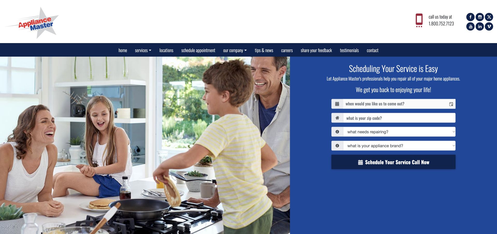
Appliance Master combines a bright domestic photograph with a solid blue scheduling panel. The panel asks about contact method, ZIP code, the appliance needing repair, and brand, grouping the first questions into one readable area. A navy navigation bar separates service, locations, scheduling, company, tips, careers, feedback, reviews, and contact routes. This is useful for studying progressive qualification before a longer service conversation. The photograph provides a friendly setting while the fields do the practical work, although the many small navigation labels would benefit from a simpler responsive hierarchy.
What you can learn
Keep the introductory request short and state whether it produces a callback or a booked visit. Promotional overlays should be dismissible without hiding the service form a visitor came to use.
Pros
The request panel groups related fields into one clearly identifiable task.
The pale palette separates the site from more aggressive contractor-style presentations.
Cons & considerations
A coupon overlay can interrupt the request journey when shown too early.
Older compact navigation patterns need generous tap targets and readable labels on mobile.
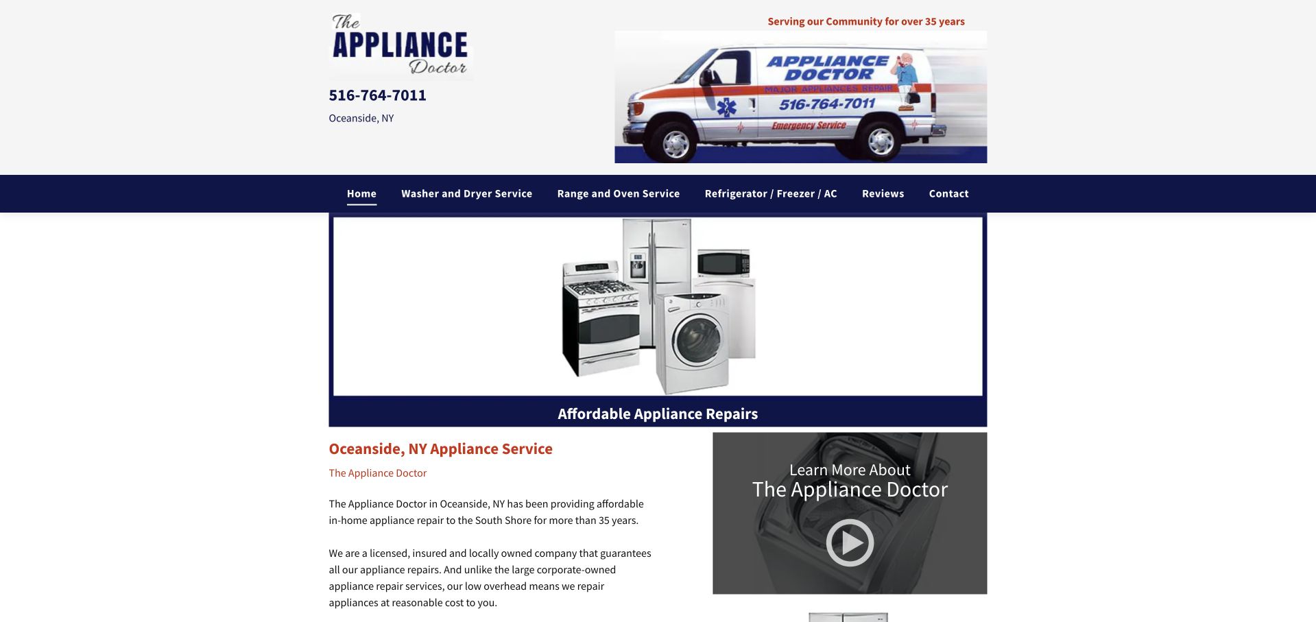
The Appliance Doctor uses a narrow, centered content column rather than a wide cinematic homepage. A logo and branded service van share the header with a large telephone number and the Oceanside location. Beneath it, a simple appliance illustration introduces the repair offer, followed by text and a video tile. The design is not a modern full-screen editorial treatment, but it is worth studying for its straightforward information priorities. A visitor can quickly identify the business, town, telephone number, and relevant category without interpreting abstract labels. The limited width also creates a useful contrast with the larger image-led pages elsewhere in this collection.
What you can learn
Preserve literal appliance labels and visible local contact information when modernizing an older site. Improve reading size and responsive spacing without replacing useful category names with vague brand language.
Pros
The telephone number and town are prominent in the company header.
Category labels describe recognizable appliances instead of internal service terminology.
Cons & considerations
The narrow legacy composition leaves substantial unused space on a large display.
Small text and tightly packed links would benefit from a stronger responsive reading hierarchy.
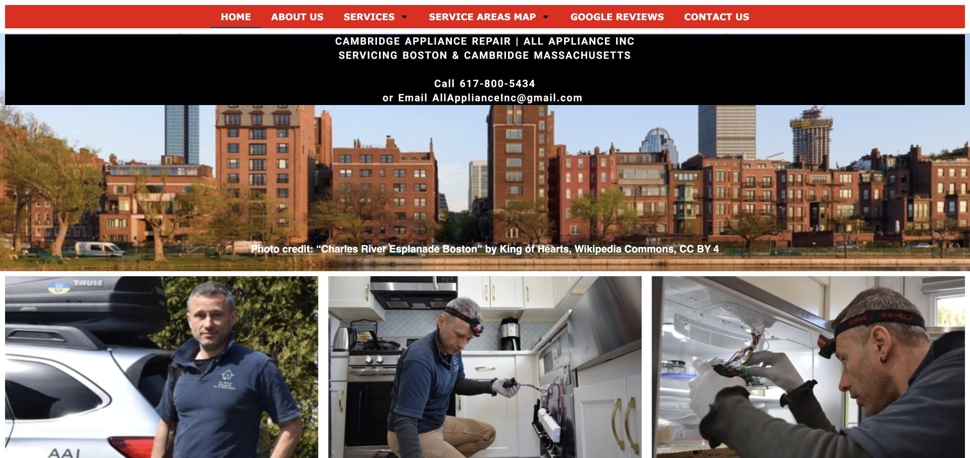
All Appliance uses a red navigation bar and black contact panel above a large Boston riverside photograph. The public page names Boston and Cambridge directly, then shows three photographs of technicians and appliance work below the city image. The result combines a recognizable local setting with company-specific people rather than relying on a generic kitchen alone. Telephone and email details are visible before the photographs, while service and coverage-map routes remain in the short navigation. This is a useful compact reference for preserving practical local facts while improving the reading hierarchy of an older service site.
What you can learn
For a local repair brief, prioritize supported appliances, real coverage boundaries, and a clear inquiry process before adding marketing components. Keep the business name and telephone route recognizable throughout the journey.
Pros
A local-business focus supports a more specific service conversation than a broad marketplace.
Direct company information can reduce the need to navigate through unrelated home-service categories.
Cons & considerations
A small catalog still needs enough model and service detail to answer eligibility questions.
The visual design should not be treated as evidence of technical competence or repair outcomes.
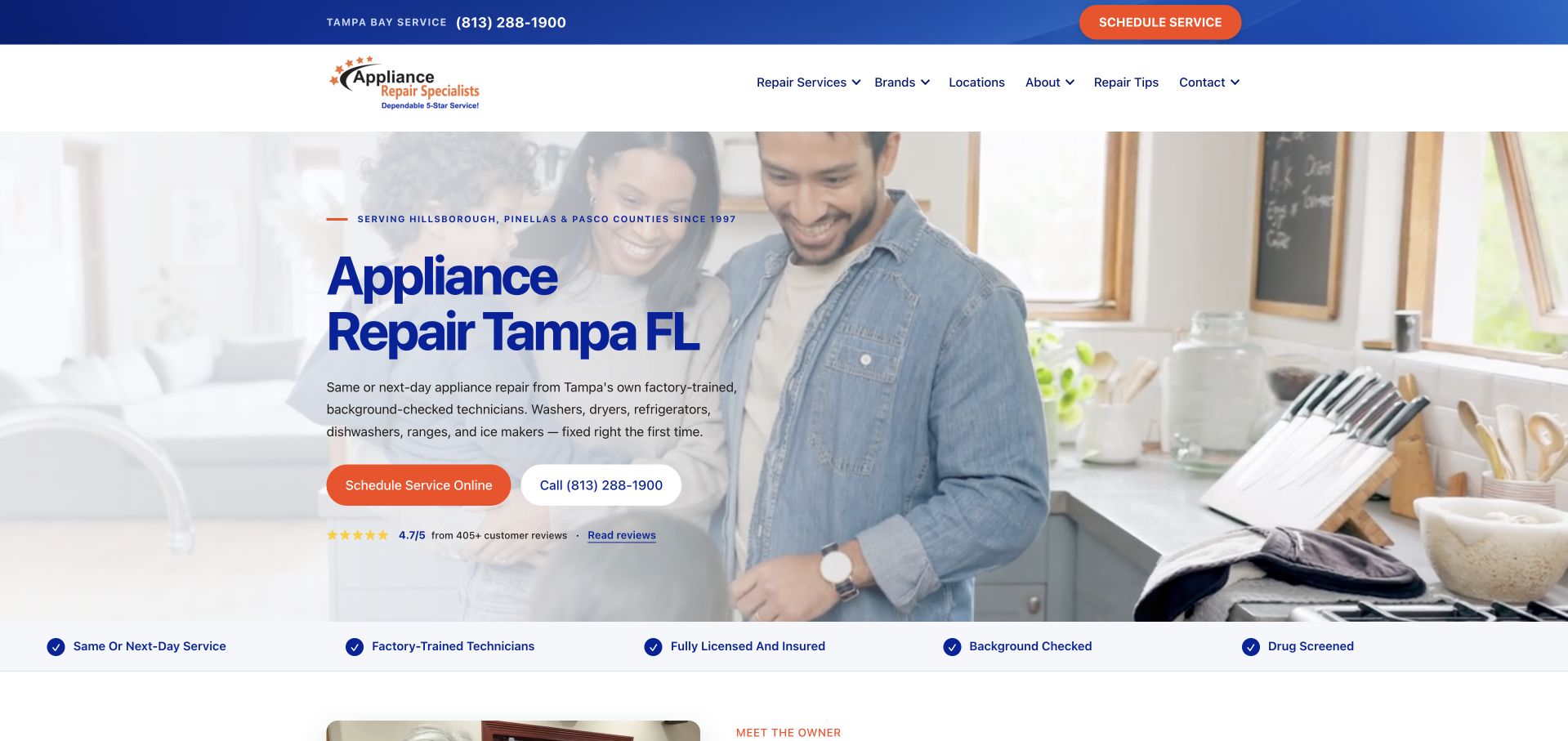
Appliance Repair Specialists gives its Tampa repair headline a large blue treatment over a softly faded technician photograph. Orange scheduling and telephone actions sit immediately below the introductory copy, followed by a narrow row of service-related reassurance statements. The fade is doing useful work: it allows the people and appliance to remain visible while keeping the text on a relatively quiet part of the image. A small upper strip establishes local telephone access, and the navigation offers services, brands, locations, company information, and repair tips. It keeps those elements in a clear left-to-right reading sequence.
What you can learn
Reserve the strongest accent color for actions and let supporting reassurance sit in a separate band. Any training, insurance, or availability statements should be accurate and explainable rather than treated as decorative badges.
Pros
The faded photo creates a readable area for a large location-specific heading.
Online scheduling and telephone contact are distinct but adjacent choices.
Cons & considerations
A long reassurance strip can become small and crowded on mobile.
Repeated local and service claims need detailed supporting pages rather than more hero copy.
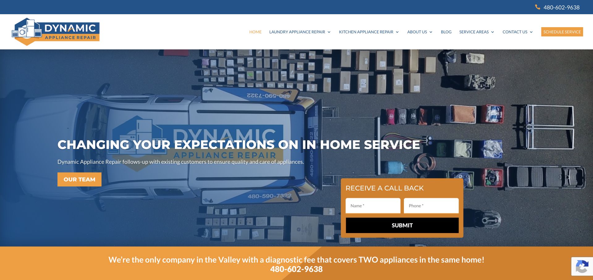
Dynamic Appliance Repair uses a blue-and-gold palette around a hero photograph of branded service vehicles and workshop equipment. The large central line focuses on the service experience, while a compact callback form occupies the right side of the image. A team button supplies an alternative exploratory route on the left, and a bright gold strip below carries a diagnostic-fee message. The opening feels more like a local operation than a generic kitchen-stock-photo page because the brand appears in the working environment itself. The page also shows the tradeoff of giving a brand statement more visual emphasis than a literal appliance-and-location heading.
What you can learn
If a callback is the intended first step, label it as a callback and explain the response process. Keep promotional fee statements separate from confirmed quotes and make any qualifying terms easy to find.
Pros
Branded working-environment imagery helps distinguish the company from generic service templates.
The callback panel offers a short contact task directly in the opening screen.
Cons & considerations
The experience-led headline needs nearby literal service and coverage information.
The gold promotional strip competes with the callback form for attention.
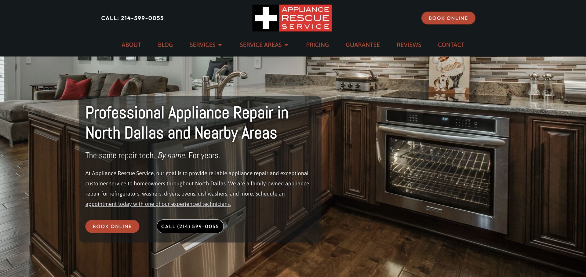
Appliance Rescue Service places a warm residential-kitchen photograph behind a dark, left-aligned text panel. The headline names North Dallas and nearby areas, while the supporting line emphasizes a continuing relationship with a technician. The logo's red cross and black header reinforce the rescue identity without filling the entire page with emergency language. Navigation includes service areas, pricing, guarantees, reviews, and contact information, giving visitors places to examine practical questions before making a request. The strongest design feature is the specificity of the opening: it combines a local area with an understandable working relationship rather than relying only on a broad quality claim.
What you can learn
Make the business relationship concrete, then let visitors inspect coverage and pricing context. A personable promise should be supported by an explanation of scheduling and team assignment rather than presented as a guaranteed individual technician.
Pros
The local heading narrows the audience before a visitor starts booking.
Booking and telephone controls remain clear against the dark photographic treatment.
Cons & considerations
A detailed kitchen background requires a sufficiently strong text overlay.
Relationship-based wording should not imply staffing arrangements the scheduling process cannot guarantee.
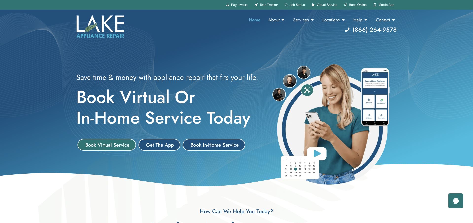
Lake Appliance Repair uses a blue graphic background, a person holding a phone, and a visible app interface to introduce both virtual and in-home service. Three adjacent buttons distinguish virtual service, the app, and an in-home booking. This is not simply an appliance company adding a generic contact form: the opening explains that different service modes exist and gives each an entry point. The curved lower edge and generous white space create a softer transition into the rest of the page than a hard rectangular contractor hero. A teal upper bar provides further support routes, while the main navigation includes locations and help.
What you can learn
Separate remote assistance from an on-site visit in both labels and confirmation screens. Explain device requirements and scope before asking someone to install an app or assume a virtual session replaces a technician visit.
Pros
The hero makes virtual and in-home service visibly different choices.
Phone imagery supports the digital-service explanation instead of functioning as generic decoration.
Cons & considerations
Three neighboring actions need clear priority and comfortable mobile spacing.
Remote-service eligibility and any technical requirements need explanation beyond the hero.
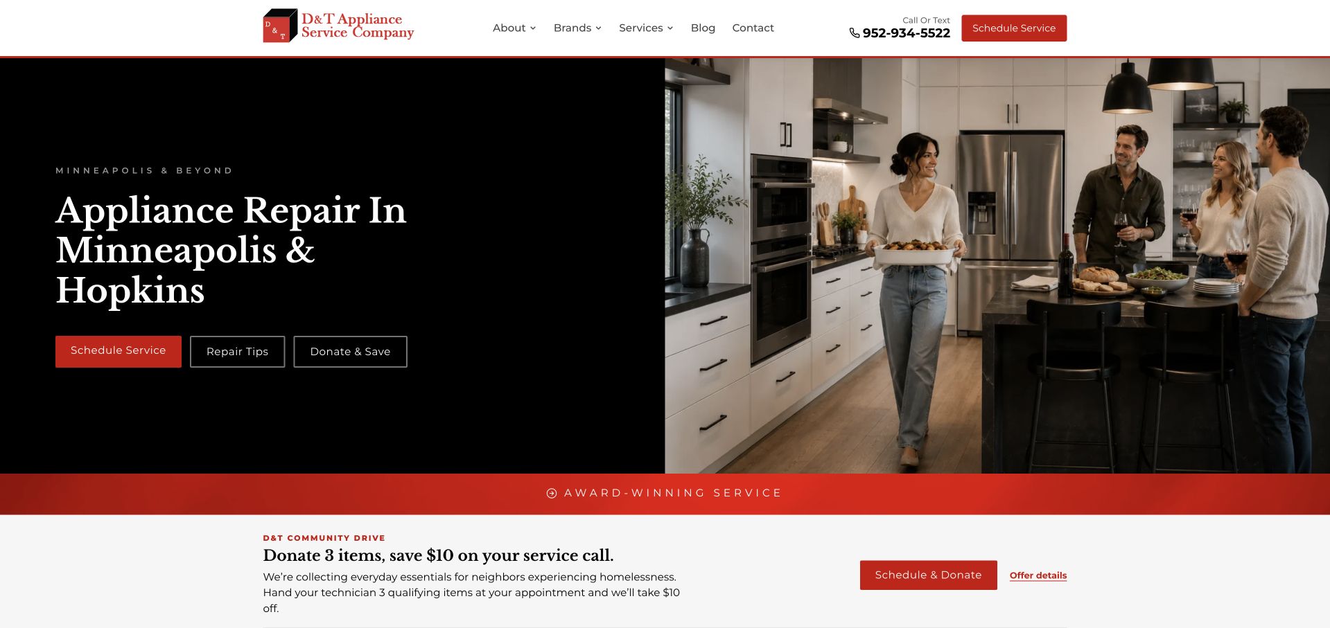
D&T uses a black text panel beside a bright kitchen photograph, with a large Minneapolis and Hopkins repair heading. Red scheduling and outlined repair-tip actions sit below the introduction. A separate community-drive strip follows the hero, explaining a donation-related service-call offer without replacing the main repair message. The white header keeps service, brand, company, blog, and contact routes available. This is useful for studying two different homepage jobs: helping a customer arrange a repair and explaining a temporary local initiative. The community material remains distinct from the stable service offer, and the coverage check gives eligibility a concrete interaction.
What you can learn
Treat a community campaign as a supplementary message with a clear close control and current dates. Keep location eligibility and repair contact accessible whether or not the visitor chooses to engage with that campaign.
Pros
The headline names the principal local markets rather than implying national coverage.
A dedicated ZIP-code check introduces a practical eligibility step.
Cons & considerations
A large campaign overlay can delay access to the service information underneath.
Temporary offer details need routine review so they do not outlive the campaign.
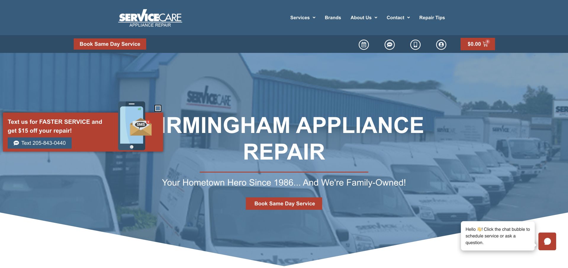
Service Care opens with a large Birmingham appliance-repair heading over a photograph of its branded vehicles. A blue overlay ties the photograph to the header and keeps white type readable across the full width. A red same-day-service action gives the opening a clear visual focus, while a small text-service promotion appears as a separate floating element. The navigation remains comparatively short, with service, brand, company, contact, and repair-tip routes. It also illustrates a familiar tension: useful secondary messaging can start to compete with the main booking route when several floating prompts appear at once.
What you can learn
Use genuine company vehicles or team photography to establish recognition, but keep the primary contact route consistent. If texting offers a promotion, explain the conditions without making visitors dismiss multiple competing prompts.
Pros
The blue overlay creates a cohesive relationship between the header and service photography.
The city heading makes the regional relevance immediately understandable.
Cons & considerations
Text promotions and chat prompts can compete with the central booking action.
Availability wording needs current local scheduling context rather than a universal timing promise.
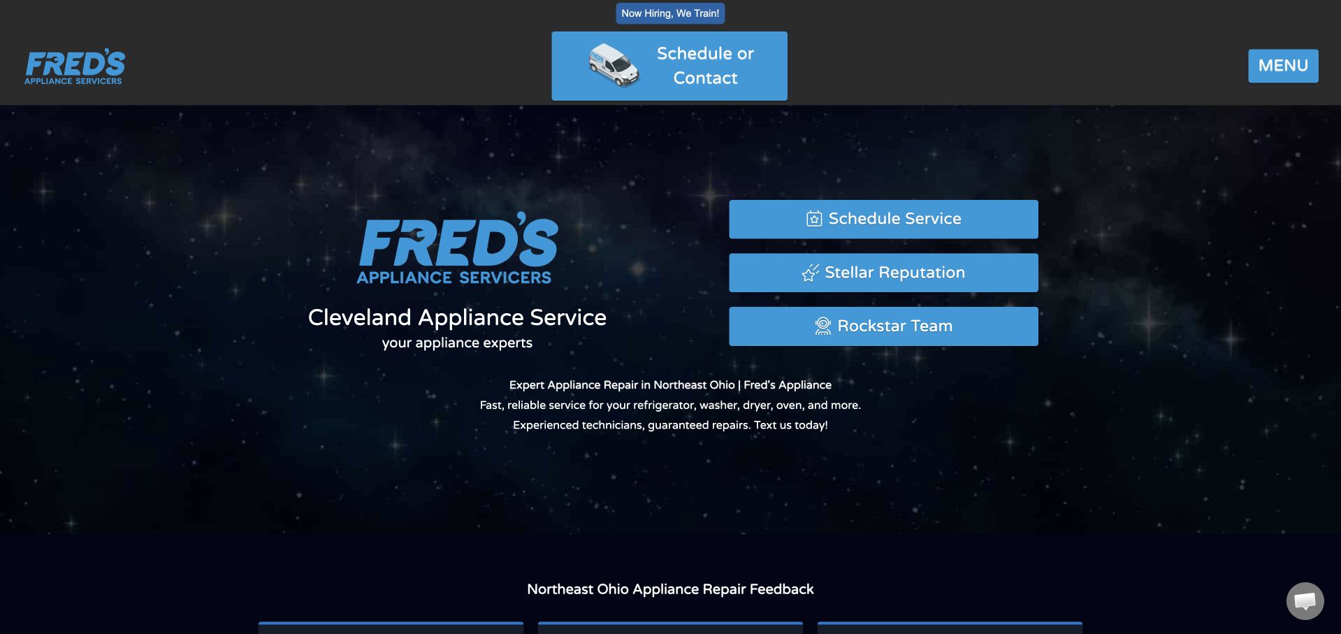
Fred’s Appliance uses a dark star-field background and a large blue brand mark instead of a conventional household photograph. A short Cleveland service line sits beneath the logo, while three blue action rows offer scheduling, reputation information, and the team. The same blue action treatment repeats in the header, making scheduling recognizable in two places. A slim recruitment strip remains above the main composition. This example stands out because its visual identity is unusually strong for the category, yet the first-screen choices are still understandable. The design does not need to look like a kitchen to communicate repair service when the company name, service line, and action labels are literal.
What you can learn
A distinctive visual theme can work when the basic service and location remain explicit. Keep decorative backgrounds subordinate to readable text, and give recruitment a separate path from customer scheduling.
Pros
A consistent dark-and-blue identity makes the page visually memorable.
Three clearly labeled routes reduce the need for a long introductory menu.
Cons & considerations
Very small supporting text can disappear against a detailed dark background.
A brand-led opening still needs appliance eligibility and coverage information nearby.
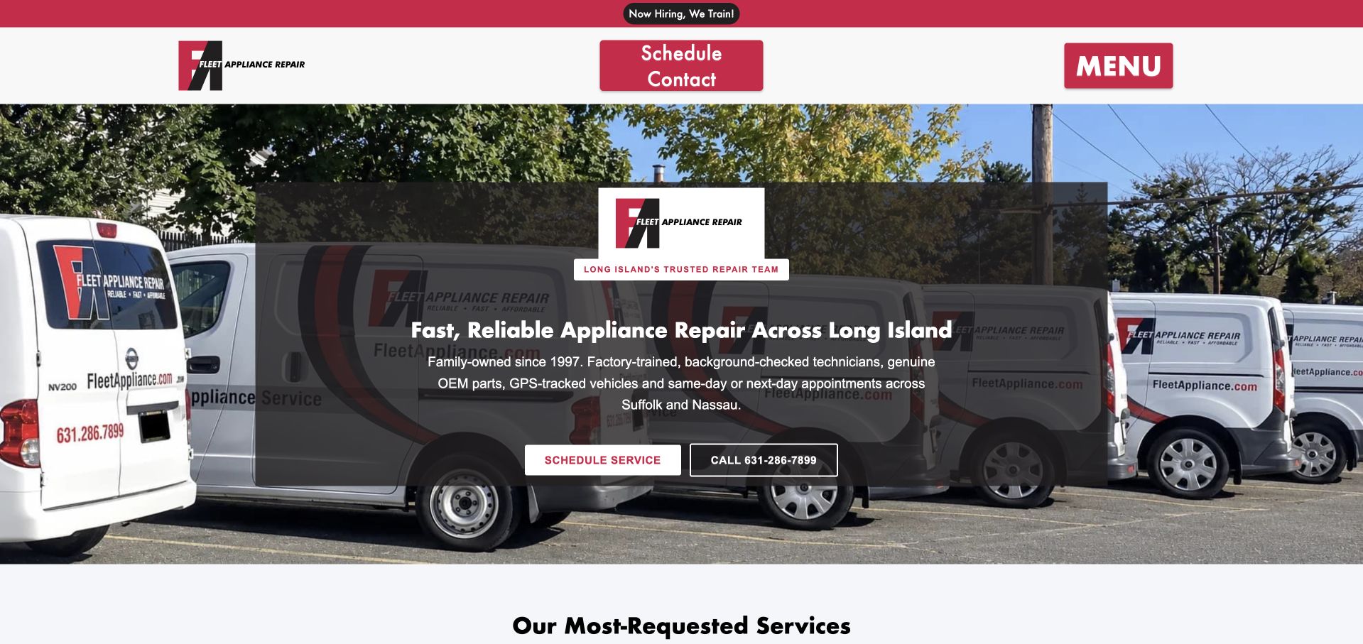
Fleet Appliance presents a row of branded service vehicles beneath a red-and-white header. The hero's central panel names Long Island appliance repair and places scheduling beside a telephone action, with the service catalog beginning immediately below. The header repeats the schedule-or-contact control and uses a compact menu button rather than displaying every navigation item at once. The page is useful for studying how a company can make its own assets do the visual work: the vehicles show the logo, the working context, and the local operation together. The dark text panel also gives a consistent reading area independent of the photograph's brighter patches.
What you can learn
Use real company imagery as a recognizable backdrop, then keep booking controls on a stable, high-contrast surface. Make the compact menu discoverable for visitors who need service details before contacting the team.
Pros
The branded fleet gives the opening an identity specific to this business.
The service catalog follows the hero without a long intervening promotional section.
Cons & considerations
A compact menu hides category choices until the visitor opens it.
Claims about timing, equipment, or staff checks need supporting detail beyond the image overlay.
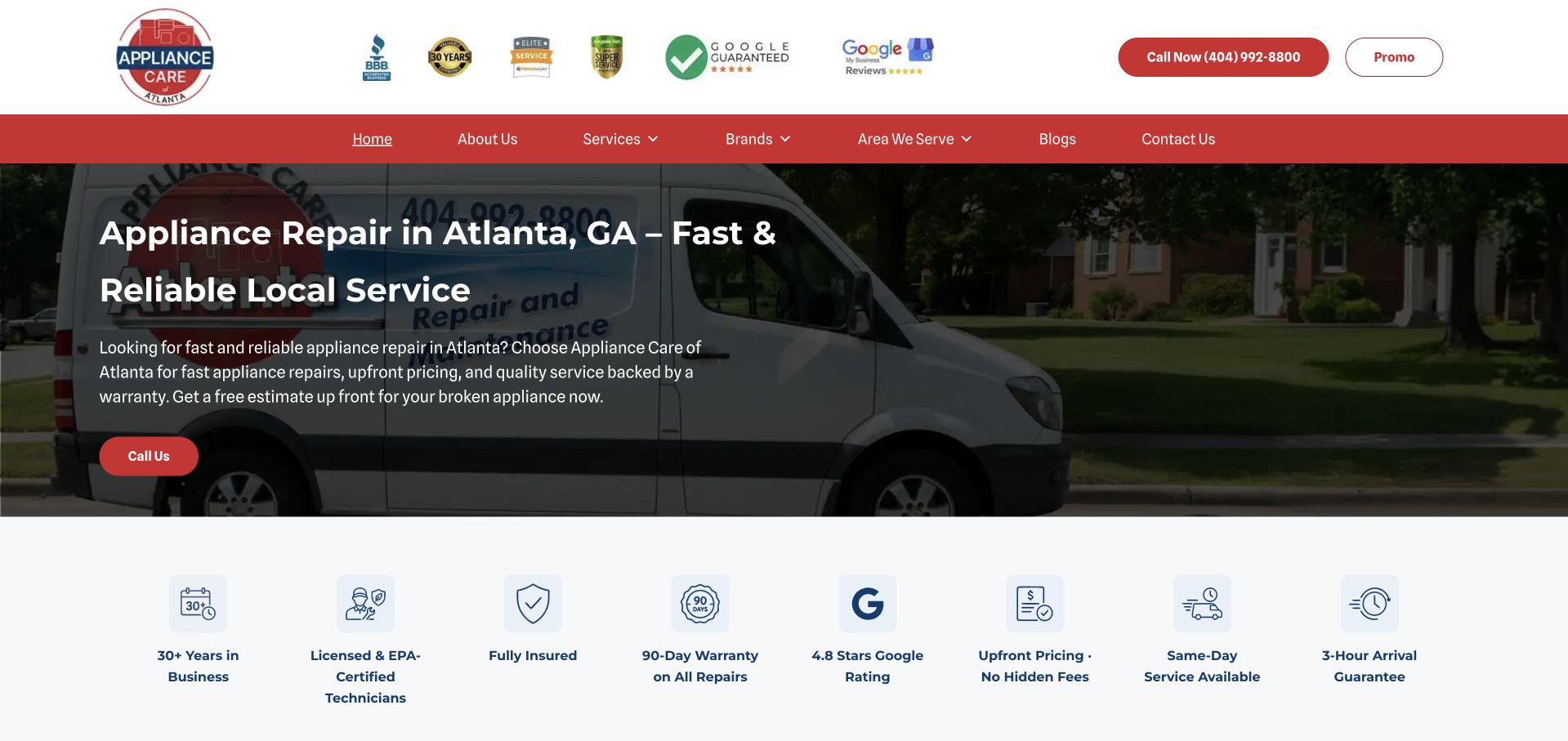
Appliance Care of Atlanta uses a service vehicle photograph behind a dark left-aligned text panel. The headline names the city and trade directly, with a red call action beneath it. The following pale-blue band organizes company and service-policy statements into separate icon-and-label blocks. That arrangement gives supporting information a place outside the introductory paragraph rather than making the hero carry every detail. The header also contains a prominent telephone action and a compact promotion button, while the main navigation separates services, brands, coverage, company information, and blog content. The visual hierarchy is more useful than simply adding more badges inside the hero itself.
What you can learn
Move secondary policy details into a clearly labeled supporting row, with links to the complete terms where relevant. Keep those statements accurate and distinguish the business’s own claims from independently established evidence.
Pros
The city-and-service heading gives visitors a literal answer about relevance.
Separate icon blocks prevent supporting policy information from overwhelming the hero paragraph.
Cons & considerations
A crowded header of third-party marks needs readable sizing and explanatory context.
Warranty and arrival-window wording requires clear conditions beyond a short icon label.
Kegan is a freelance web designer and developer with 15+ years of experience helping businesses turn complicated website requirements into clear, maintainable digital experiences. He works directly with clients from planning and design through development, launch, and ongoing support.
For appliance repair website design, his development approach focuses on supported appliances and brands, service coverage, repair-process explanations, and practical scheduling inquiries. The scope can be a targeted improvement or a complete custom build, with responsive layouts, thoughtful content structure, and integrations chosen around the people using and maintaining the site.
Show 3 other appliance repair website designersHide other appliance repair website designers
Plan the repair journey before choosing a kitchen photograph
Model eligibility as a useful customer decision
Begin with the questions the service desk actually uses to route an inquiry. Identify the appliance categories, brands, territory, and work types the business currently accepts. Decide which answers can be stated on the public website and which need a conversation. A short eligibility explanation is more useful than a broad promise to repair everything, especially when warranty, manufacturer, or geographic conditions affect the next step.
Write the service-area information in ordinary text as well as any interactive tool. A customer should be able to understand the territory when location access is unavailable or a map does not load. If a ZIP lookup is useful, make its role narrow and visible: it checks an area, not a particular technician's schedule. Explain what an unmatched result means and provide a maintained contact route for questions. Do not silently substitute the browser's approximate location for the property address.
Keep brand marks accurate and scoped. A logo can communicate supported equipment or a documented service relationship, but it does not automatically establish authorization, warranty eligibility, or compatibility with every model. Have the responsible staff review the wording and maintain it as relationships change. Create dedicated category pages only when there is useful, current information to put on them, rather than generating near-identical pages for every appliance keyword.
Explain the visit without turning the website into repair instructions
Describe the customer-facing process at the level the business can reliably support: inquiry, eligibility discussion, scheduling, visit, and any later follow-up. State what the customer will be asked to provide, such as broad appliance and location information, without collecting unnecessary personal or account details. A model label may be useful later, but a public form should not require someone to perform a technical inspection simply to ask for help.
Use genuine photographs of the company, vehicles, people, and work where permission exists. Plan crops around the text area and provide appropriate image descriptions. A large technician image can make the business recognizable, but it should not substitute for literal service and coverage information. Do not fabricate customer stories, qualifications, or before-and-after results to fill a template. Explain the source and scope of reviews and manufacturer relationships rather than using a dense badge row as an implied independent guarantee.
Have staff review fee and warranty wording. The site can explain how a diagnostic charge or estimate process is described by the company, but it should not imply that one advertised amount is a universal final repair price. Keep exclusions and current terms easy to reach. Avoid generalized technical or safety advice about operating a damaged appliance; the purpose of the page is to support an appropriate service conversation, not to diagnose equipment remotely.
Build a booking handoff the office can maintain
Choose the first action based on the actual operating process. A small team may need a callback request; a larger provider may offer a scheduling system. Do not add a calendar merely because it looks more advanced. If a form only requests a visit, its confirmation must say that rather than announcing a booked appointment. Explain the receiving business and any subsequent confirmation step before the customer assumes someone is on the way.
Keep the first form short and label each field persistently. Mark required and optional information clearly, give useful error messages, and preserve entered values when validation fails. Provide a usable telephone alternative without making the form inaccessible to people who cannot call. If texting is offered, explain its purpose and response process. Do not make installing an app a prerequisite when the same basic inquiry can be supported in the browser or by the service desk.
Assign owners for coverage, supported-brand wording, contact numbers, promotions, and form delivery. Test the handoff from a phone and keyboard, including an out-of-area ZIP, a missing optional email, and a failed booking integration. Check that existing customers can find appointment support without entering the new-lead flow. A useful appliance site reduces uncertainty about the service relationship; it does not establish repair outcomes or replace the professional assessment required for an individual appliance.
Run a content rehearsal with the person who answers service calls. Ask them to follow the page for an unsupported brand, a property outside the territory, and a customer asking about an existing appointment. Record where the page creates a wrong expectation, then change the wording or route before adding more visual components. Include a simple maintenance handoff describing which facts can be updated by office staff and which claims require approval from the responsible service manager.
The editing job behind the design
Choose technology for the service desk rather than a decorative booking demo
A maintainable CMS with clear category and territory content may be enough for a local firm. Give staff a controlled way to update coverage, supported equipment, and telephone details without rebuilding the page. Keep the initial request reliable before adding personalization or animation.
Use a scheduling integration only when it reflects real capacity and confirmation rules. Make location lookups and calendars optional enhancements with meaningful fallback states. Document which business system receives a request and how office staff recognize that it arrived.
Keep private customer records, technician scheduling, and manufacturer or warranty accounts in the appropriate operating systems. The public site should not expose those systems or collect credentials. Visible website signals are not a complete inventory of the company's repair-management technology.
Our WordPress website examples offer a separate look at publishing approaches. A visible platform label is evidence for that named page, not a guarantee that the same system will suit your requirements.
Before the public launch
Appliance repair website brief checklist
State the actual service region in readable text.
Explain what a ZIP-code check does and does not confirm.
List the appliance categories the business accepts.
Scope brand and manufacturer relationships accurately.
Separate warranty-related questions from general repair inquiries.
Label calls, texts, callbacks, and appointments according to their real purpose.
Keep the first request limited to useful contact and appliance context.
Distinguish requested visits from confirmed appointments.
Provide an existing-customer support route.
Use permitted company photographs and accurately attributed reviews.
Test mobile forms, keyboard access, errors, and integration failure.
Assign ownership for changing coverage, fees, promotions, and contact details.
These checks are a project checklist, not a performance, legal, security, or accessibility certification. Test real journeys with the people responsible for the website before making claims about the result.
Sources & editorial method
How this collection was selected and reviewed
These 23 public company pages were directly inspected and captured through Chrome. Reviews describe visible interface and content choices. The collection does not test booking completion, verify service claims, or infer private operating systems from the appearance of a marketing page.
Each example links to its actual source page. Screenshots are direct browser captures with their own capture dates; moving imagery, announcements and live designs can change. The notes describe observable design choices and conditional tradeoffs, not measured traffic, conversion results, service quality, or accessibility conformance.
Technology labels use public page metadata, asset evidence, or explicitly cited platform documentation. Platform documentation is not a complete current deployment audit. A component reference may be legacy or unused; it is not a complete backend inventory. Unknown stacks are omitted. These sites are editorial examples, not our client portfolio.
Written, Edited and Curated are separate editorial records, not timestamps advanced by a rebuild. Website designs and imagery belong to their owners. See our editorial standards or suggest a correction.
Build the page around a clear answer to service, coverage, and next-step questions. The strongest visual treatment supports those answers rather than asking a visitor to decode a generic promise.