Best Antique Shop Websites of 2026 (22 Real-World Examples)
Real antique-shop websites showing how to combine distinctive objects, useful stock records and an inviting physical gallery.
An antique-shop website needs to make a unique object understandable before it can make that object desirable.
Buyers arrive with different questions. A collector may search by maker or reference number, a decorator may browse by material or period, and a local visitor may simply need opening hours and directions. A useful antiques website gives those journeys clear entrances while retaining the dealer’s particular eye.
These examples include specialist galleries, decorative-antique dealers, architectural salvage shops and larger antiques destinations. Some also sell contemporary or reproduction pieces; a good catalog identifies those distinctions clearly. Study the presentation and the route to useful information, without treating the design as verification of provenance, condition or service quality.
Before the examples
What makes good antique shop website design in 2026?
Make the object record more useful than the hero
Room photographs communicate taste, but an individual item needs clear dimensions, materials, condition, availability and qualified dating or attribution. Show more than one view where it matters, including relevant wear or restoration. Keep the stock reference visible so a buyer and the shop can discuss the same piece without ambiguity.
Separate browsing from knowing what you need
Offer simple categories for exploratory visitors and a direct search route for people with an object name or reference. Add period, material or room filters only when those distinctions are accurately maintained across the stock. An empty filter or a category filled with unrelated pieces makes a detailed catalog harder to trust.
Connect the catalog to the real gallery
Make location, hours and appointment requirements easy to find. Explain whether the displayed stock is available at that address, held elsewhere or viewable by arrangement. Give online customers a clear route to ask about shipping and collection without requiring them to infer those arrangements from a photograph.
The collection · 22 examples
22 antique shop websites worth studying
Compare the large room-led introductions with the stock-first catalogs. Notice how category labels, search, object detail and visit information change the usefulness of the same photographic material.
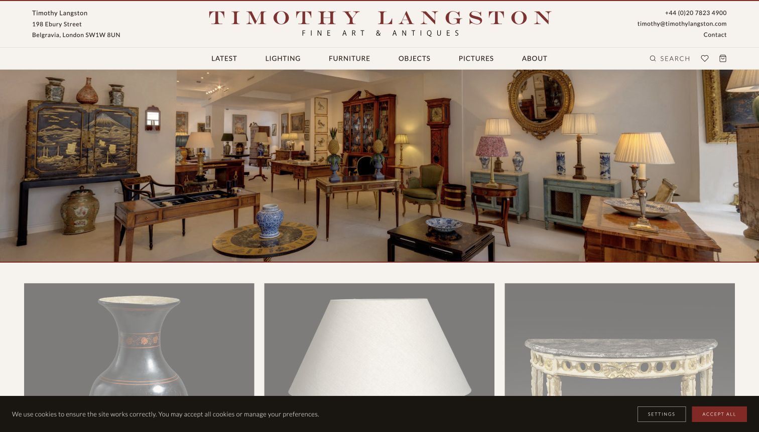
Timothy Langston gives its gallery a clear street-level identity before asking anyone to browse. A burgundy wordmark sits between the address and direct contact details, while a short second navigation row names lighting, furniture, objects and pictures. The opening showroom photograph supplies atmosphere without burying those routes inside the image. Category photographs below it make the breadth of stock understandable at a glance. The About page adds a named dealer and explains the gallery's collecting interests, giving the personal presentation useful context. This is a strong reference for a specialist shop that needs both an inviting first impression and a practical path to a particular object.
What you can learn
Keep the dealer, location and stock categories visible together. A room photograph can establish taste, but the visitor should still be able to choose a category or contact the gallery without decoding an elaborate introduction.
Pros
The header makes the physical gallery and direct contact route easy to locate.
Specific category labels give the atmospheric photography a practical purpose.
Cons & considerations
The long opening image postpones individual object details below the initial view.
Small navigation text needs careful spacing and contrast when adapting this restrained style.
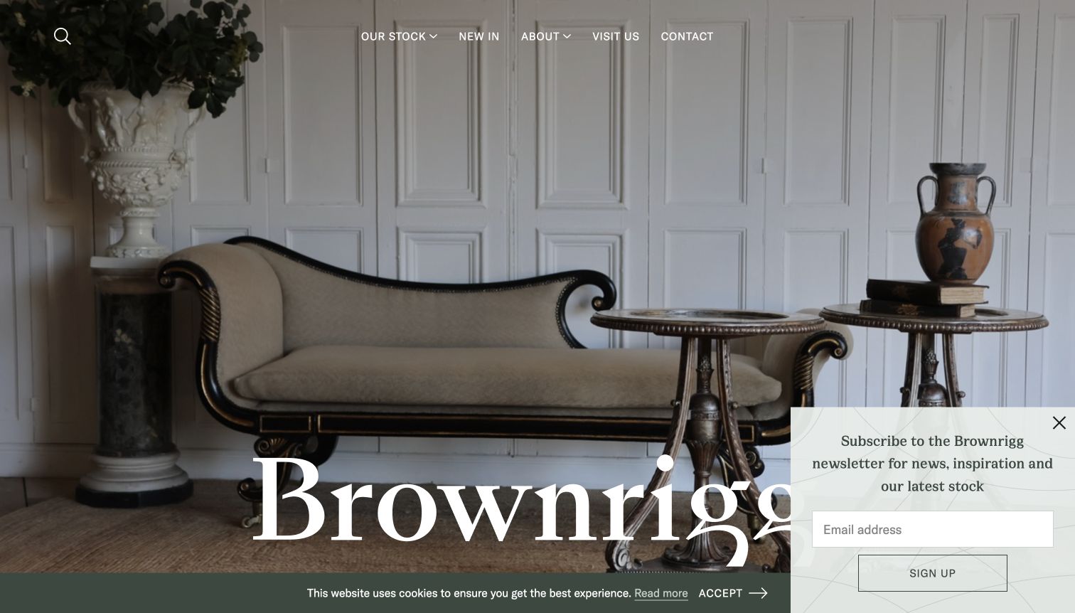
Brownrigg introduces its collection through a furnished room rather than an isolated product on white. The oversized serif name across the photograph makes the opening feel like a magazine spread, while the top navigation offers stock, new arrivals and visit information. Below that visual introduction, object names and prices turn the atmosphere into something shoppers can investigate. The combination is especially relevant to dealers selling across periods and materials: the arrangement communicates a point of view without claiming every piece shares one style. The newsletter panel visible during review also demonstrates the tension between promoting new arrivals and letting the room itself remain the main attraction.
What you can learn
Use a complete room to explain how disparate antiques can work together, then provide a direct stock route. Keep newsletter invitations small enough that they do not cover the name or the objects responsible for the first impression.
Pros
The room image communicates scale, materials and a coherent decorative sensibility.
New-arrival and visit routes support repeat browsers and local customers.
Cons & considerations
The visible newsletter panel competes with the oversized wordmark.
A crowded room is less useful for inspecting an individual object than a dedicated detail page.
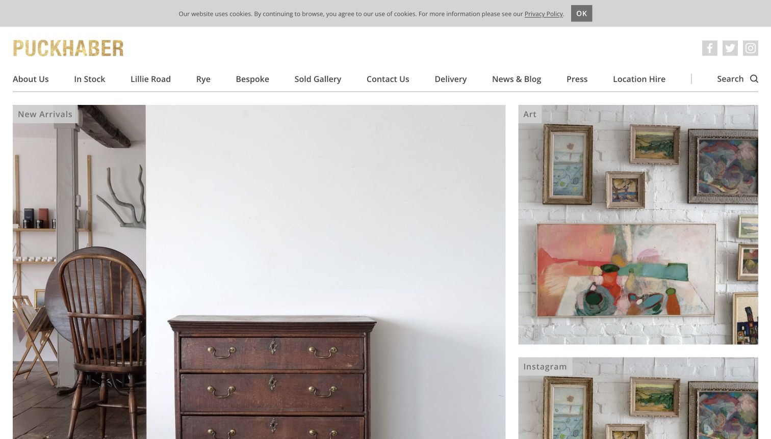
Puckhaber's opening pairs a discreet gold wordmark with a generously spaced white header and an uneven image grid. A large new-arrivals panel sits alongside smaller destinations such as art and Instagram, so the page feels selected rather than mechanically catalogued. The photographs retain room context and texture, helping furniture and decorative objects make sense together. Navigation also exposes the shops, delivery information and sold gallery, which gives returning visitors practical routes beyond today's stock. The variety of tile sizes is worth studying because it gives one destination priority while leaving several alternatives visible. It still asks the editor to choose useful, legible images for every crop.
What you can learn
Give the most useful shopping destination the largest tile, then use smaller panels for supporting categories or store information. Keep the labels explicit so an attractive arrangement does not become a guessing exercise about where each photograph leads.
Pros
Large and small tiles create a clear browsing hierarchy without a long introduction.
Delivery and shop links accompany the image-led stock presentation.
Cons & considerations
Unequal crops can hide important details in smaller panels.
A social destination competes with inventory links for limited first-screen attention.
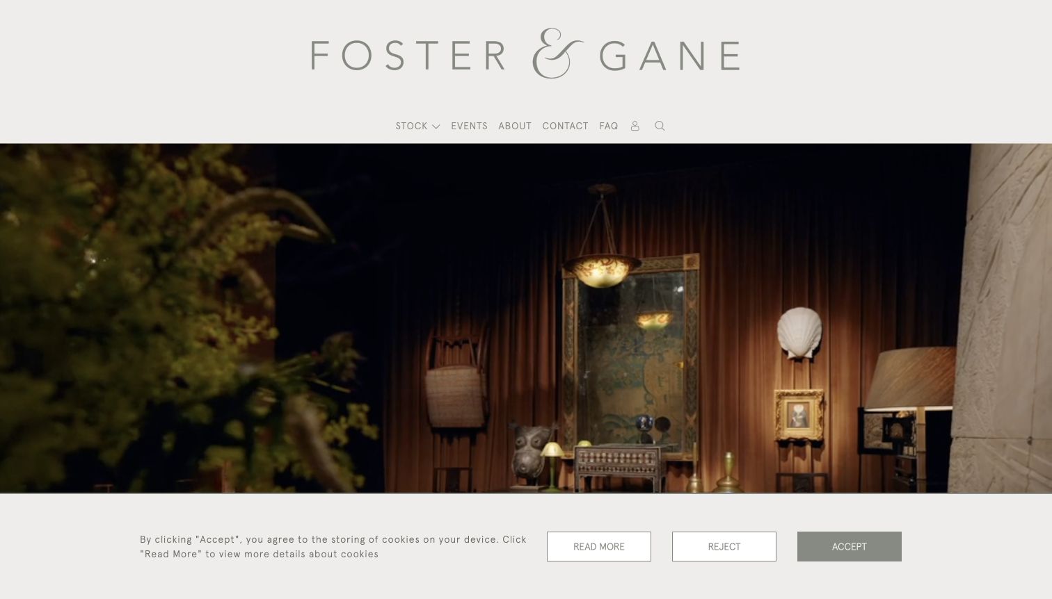
Foster & Gane places a widely spaced wordmark and a slim navigation above a warm, layered interior photograph. The header remains deliberately quiet, allowing the cabinet, chair and surrounding objects to carry the visual identity. Latest-arrival records below the hero introduce specific names and prices, so the page does not rely solely on atmosphere. This balance suits a varied collection where individual pieces may come from different periods but the dealer's arrangement supplies continuity. The contrast between a restrained interface and a textured room is the useful design decision here. Its limitation is equally visible: understated labels and fine type can become harder to scan than the image itself.
What you can learn
Let inventory photography supply the color and texture while keeping the interface consistent. Pair the large room image with a short, concrete selection of recent objects so a visitor can move from inspiration to an actual stock decision.
Pros
The uncluttered header allows the stock photography to establish character.
Named and priced arrivals provide a concrete continuation after the hero.
Cons & considerations
Fine navigation text can feel subdued beside the large photograph.
The first view gives more information about atmosphere than individual availability.
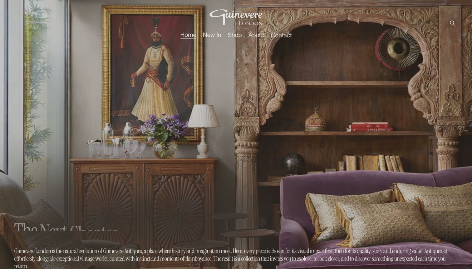
Guinevere uses a dramatic, richly detailed interior as the stage for its white script identity and navigation. The carved cabinet and surrounding layers communicate a decorative approach immediately, while the page continues into specific pieces with prices and information about the showroom. Textiles and other related offerings sit beside antiques rather than disappearing into an undifferentiated shop. The opening is a useful example of a dealer making its visual taste memorable. It also shows the risks of placing several text treatments over a complex image: some lettering and introductory copy compete with the objects, especially while the opening animation settles into its final position.
What you can learn
Choose a strong room photograph when it truly represents the collection, and reserve quieter areas for text. Keep movement optional in the design brief and make sure the name, navigation and main route remain legible throughout the transition.
Pros
The opening photograph establishes a distinctive decorative identity.
The page connects that identity to actual pieces and showroom information.
Cons & considerations
Layered white text competes with intricate background detail.
Animated introductory elements make the first view less stable than a static catalog opening.
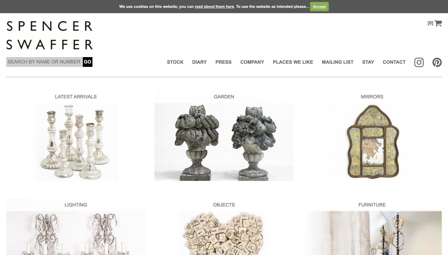
Spencer Swaffer's stock landing page presents a large stacked wordmark, a search field and six straightforward photographic categories. Latest arrivals, garden, mirrors, lighting, objects and furniture can be understood without reading a paragraph of promotional copy. The images are given enough space to show material and silhouette, and the labels remain separate from the objects. This is a useful reference for a shop where visitors often arrive knowing the kind of item they want. The capture shows the stock page rather than the homepage's separate entry screen, which adds a step before browsing. That distinction matters when borrowing the clean catalog structure.
What you can learn
Use an image gateway when the stock naturally divides into a small number of recognizable categories. Link customers directly to that useful catalog from search and campaign pages instead of making every journey pass through an introductory splash screen.
Pros
Six clearly named categories make the stock structure easy to grasp.
Search by name or reference supports visitors returning to a specific object.
Cons & considerations
The separate homepage entry adds friction before the useful stock view.
Category photography alone does not explain price range or current availability.
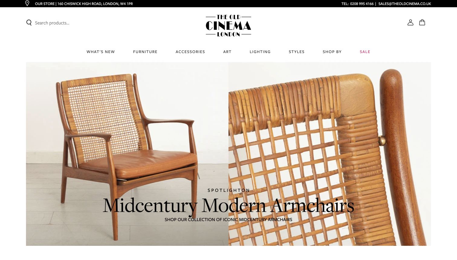
The Old Cinema gives the initial view a recognizable shopping structure: a clear search field, practical address information and navigation spanning furniture, accessories, art, lighting and styles. Its hero pairs an armchair's overall shape with a closer detail, making the campaign more informative than a purely atmospheric room. The art-deco wordmark supplies character without taking over the whole header. This combination is useful for a large and varied antiques shop because it accommodates browsers, category shoppers and visitors planning a trip. The many category routes are helpful, but they also make the top area dense; a smaller dealer would not necessarily benefit from copying the same breadth.
What you can learn
Borrow the pairing of a recognizable object view with a material detail, then match the navigation to the actual inventory. Prominent search and location information can coexist with a distinctive shop identity when they have separate, consistent positions.
Pros
Search and location details support both online browsing and a physical visit.
The hero shows an object and its detail rather than only a mood.
Cons & considerations
The large number of navigation options requires disciplined grouping.
Campaign imagery can push current stock lists below the opening view.
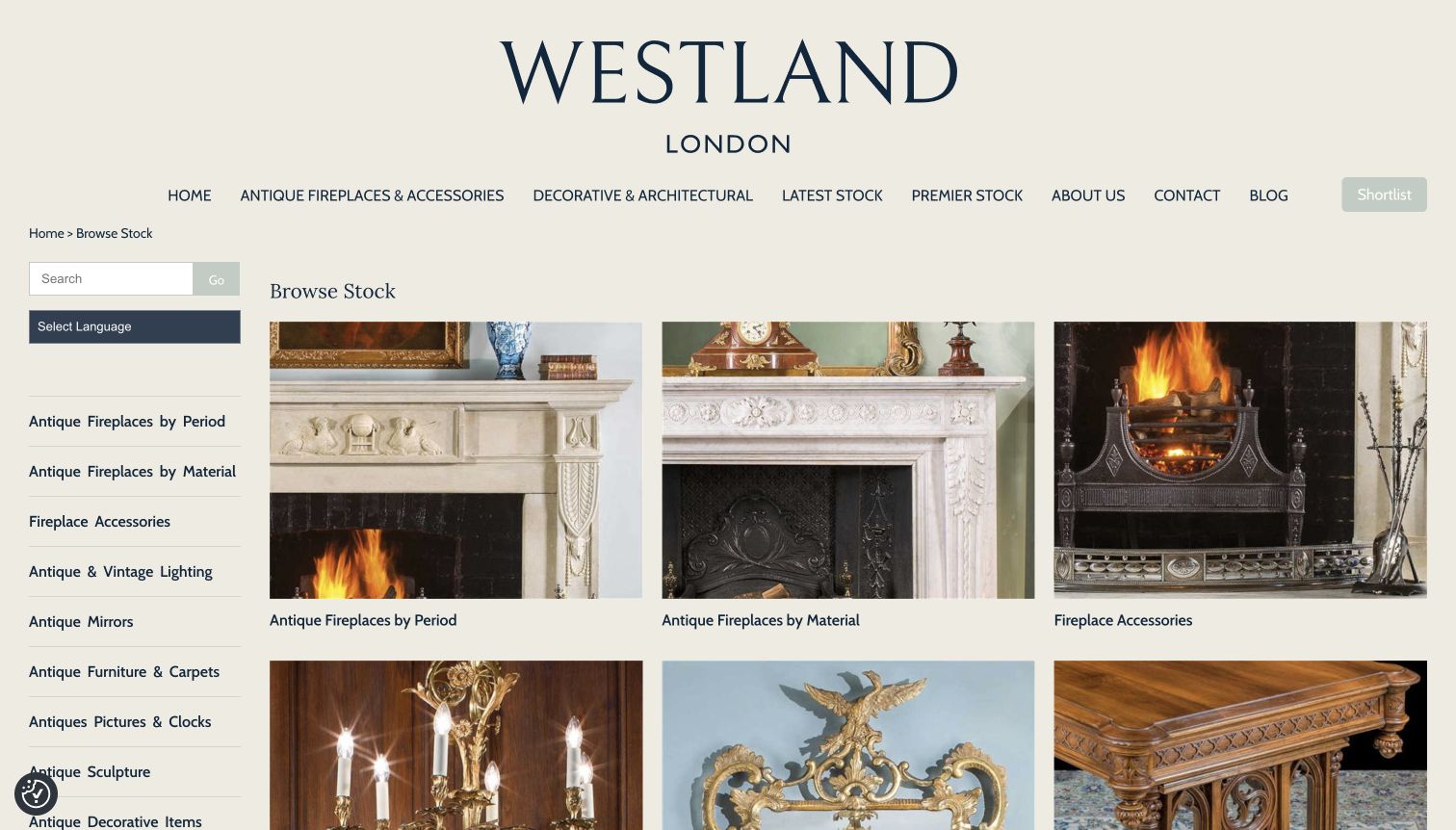
Westland's stock page puts a practical category system beside generous object photography. The sidebar includes search and distinct ways to browse fireplaces, including period and material, while the main area offers large visual destinations. A navy-and-cream palette and prominent wordmark keep the catalog recognizable without obscuring its structure. This is a useful reference for architectural antiques because the customer's question may concern a specific material or era rather than a decorative mood. The reviewed capture is the stock landing page after dismissing the consent panel. Its depth is also the main tradeoff: a long taxonomy can demand more reading than a small collection needs.
What you can learn
Organize specialist inventory around the questions buyers actually ask. Period and material may deserve separate paths when both influence suitability, but avoid duplicating categories unless they lead to meaningfully different selections and can stay maintained.
Pros
The sidebar exposes practical distinctions such as fireplace period and material.
Large category images help translate specialist labels into visible objects.
Cons & considerations
A deep sidebar can become difficult to scan as categories accumulate.
The stock gateway still requires another step for dimensions and installation constraints.
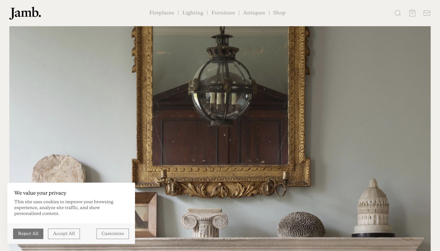
Jamb's cream header and sparse navigation give a large interior photograph most of the opening screen. A mirror, lighting and sculptural objects establish a consistent decorative setting, while separate fireplace, lighting, furniture and antiques routes explain that the business offers more than one kind of product. That separation is the useful lesson for dealers who also sell new pieces or reproductions. The page can present one visual world while preserving the distinction between original antiques and newly made stock. The initial view is intentionally slow and atmospheric, however, so shoppers with a precise object or measurement in mind need the navigation to reach practical information quickly.
What you can learn
Create a common visual identity without merging different product claims. Label original antiques, reproductions and current-made ranges clearly, and carry that distinction through item pages, inquiries and availability records rather than relying on the photograph to explain it.
Pros
The room image gives related ranges a coherent visual setting.
The navigation keeps antiques identifiable alongside other product categories.
Cons & considerations
The large hero postpones detailed stock information.
A restrained first view depends on clear category labels to distinguish new and old pieces.
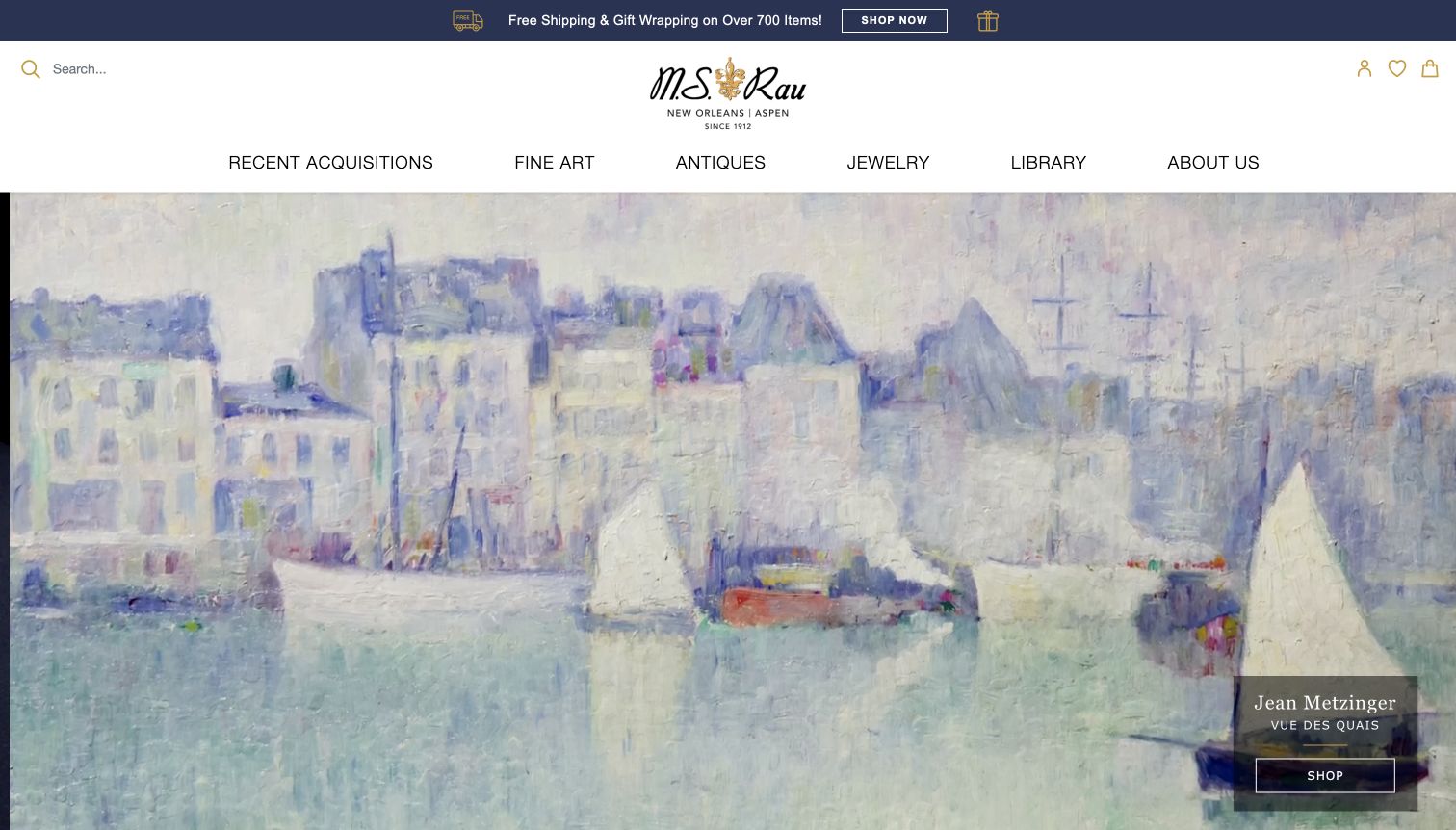
M.S. Rau opens with a bright, orderly header and separate routes to fine art, antiques, jewelry and editorial material. The reviewed hero centers a painting with its artist attribution and a shopping action, treating the object as the campaign rather than using a generic luxury image. Search and recent acquisitions provide additional routes for people who already know what they want. This structure is useful to study when an antiques business spans several collecting categories and needs both editorial storytelling and inventory discovery. The prominent campaign nevertheless favors one area at a time, so a furniture or decorative-object visitor must use the navigation to establish their own path.
What you can learn
Make campaign artwork identifiable and connect it to a specific collection. A multi-category dealer should keep its primary collecting areas visible around that campaign so a temporary promotion does not become the only apparent purpose of the website.
Pros
Distinct collecting categories remain visible above the campaign.
Artist attribution makes the featured image more informative than decorative stock photography.
Cons & considerations
One campaign cannot represent every part of a broad inventory equally.
Promotional strips add competing information near an otherwise orderly header.
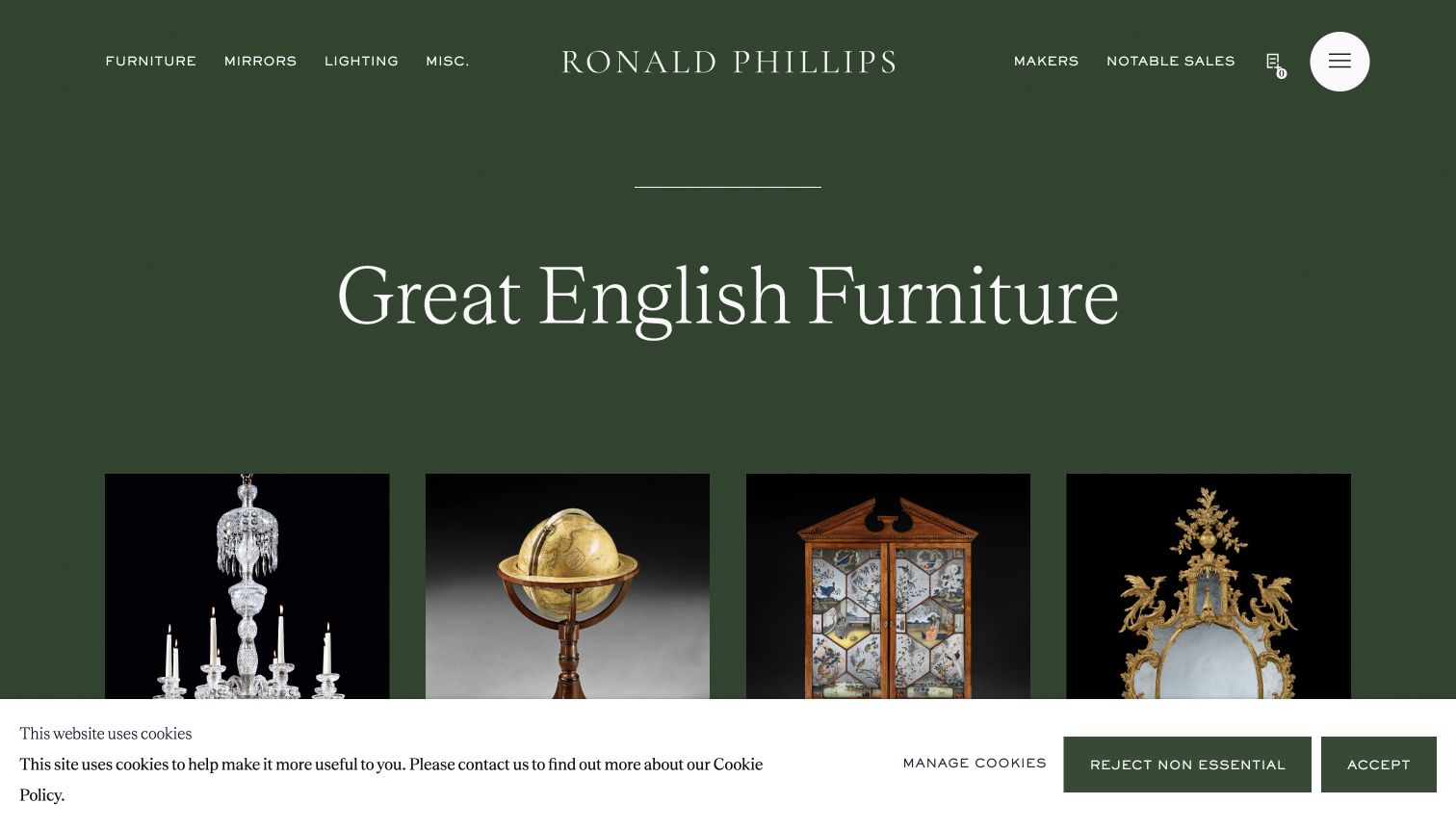
Ronald Phillips builds its opening around a deep green background, restrained white lettering and object photographs on dark grounds. The heading states the English-furniture focus, while navigation separates furniture, mirrors, lighting and other objects rather than asking visitors to interpret an abstract brand statement. The page also continues into a featured object with concrete descriptive details. The dark presentation is useful because it emphasizes silhouettes and surface decoration, especially on gilded or carved pieces. It is less effective as a substitute for inspection: buyers still need lighter contextual views, measurements and condition information on individual records to understand how a piece might fit their space.
What you can learn
Use a consistent photographic treatment to give specialist stock a recognizable identity, but pair dramatic images with factual object records. The category page should establish the field; the detail page should carry the evidence needed to judge a particular piece.
Pros
The specialist focus is stated clearly in the opening heading.
Dark photographic backgrounds make the forms of individual objects stand out.
Cons & considerations
Low-key photography can conceal condition details that need separate images.
The first screen emphasizes category identity over prices or availability.
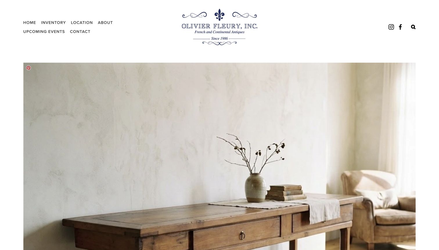
Olivier Fleury's homepage uses a simple white header, a traditional blue identity and a large, softly lit furniture photograph. Inventory, location, about and contact sit in an uncomplicated navigation, so the decorative image is surrounded by practical next steps. The introductory text explains the French and Continental focus and gives the physical showroom a clear role. The understated composition is useful for a regional dealer that wants its pieces to feel approachable rather than presenting a dense auction-style catalog immediately. During review, a newsletter dialog initially covered the image; the saved public capture shows the page after that dialog was closed without submitting information.
What you can learn
Keep the first navigation focused on stock and visiting information, then use one honest showroom or object photograph to establish tone. Delay optional mailing-list prompts until the visitor has had a chance to understand the shop and its collection.
Pros
The short navigation makes inventory and location easy to identify.
Softly lit furniture photography gives the opening a cohesive visual tone.
Cons & considerations
The initial newsletter dialog interrupted the first view.
The homepage image needs supporting detail pages for condition, size and availability.
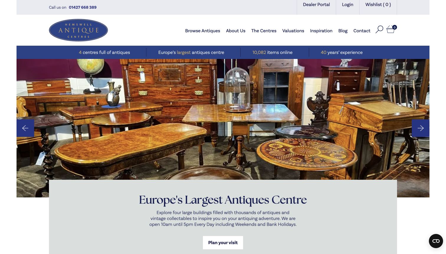
Hemswell Antique Centres uses a practical blue-and-cream header with search, wishlist and basket controls, then pairs a showroom photograph with a visit-planning action. A compact information strip introduces the physical centres and online collection before the hero. The page continues with useful visitor material such as opening information, buildings and on-site facilities. This structure is worth studying for an antiques destination whose website must support a trip as well as a product search. The breadth of information is also a restraint on the design: promotional counts and destination claims should remain accurate, and stock browsing should not be buried beneath every possible reason to visit.
What you can learn
Give online stock and a physical visit separate, equally intelligible routes. Maintain hours, locations and facilities as structured content so practical information can be updated without redesigning the hero or repeating inconsistent details across several pages.
Pros
Search and visit planning are both prominent in the opening screen.
The showroom photograph connects the digital catalog to a real destination.
Cons & considerations
Multiple informational strips can crowd the top of the page.
Changing inventory counts and destination claims need active editorial maintenance.
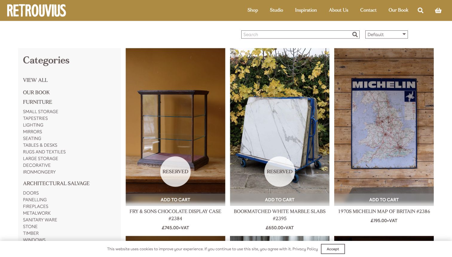
Retrouvius's shop page combines a mustard header with a substantial category sidebar and tall, closely framed product photographs. Furniture and architectural salvage are separated into useful subcategories, while search and sorting sit above the grid. Reserved labels appear directly on some objects, making stock state visible before a shopper opens the record. The reviewed selection includes very different scales and materials, from a display case to marble slabs and a wall map, so the consistent image cards help make an eclectic inventory manageable. The page also shows a potential source of confusion: a reserved badge and an add-to-cart strip can appear together and need a clearly explained interaction.
What you can learn
Treat availability as an explicit part of the catalog, particularly for unique pieces. Use consistent cards for diverse objects, but let their records explain dimensions, quantity and collection requirements rather than expecting one photograph to answer every practical question.
Pros
The taxonomy accommodates both furniture and architectural salvage.
Reservation states are visible on the product cards themselves.
Cons & considerations
Reserved labels beside cart actions can require additional explanation.
A long category sidebar occupies substantial space before individual product details.
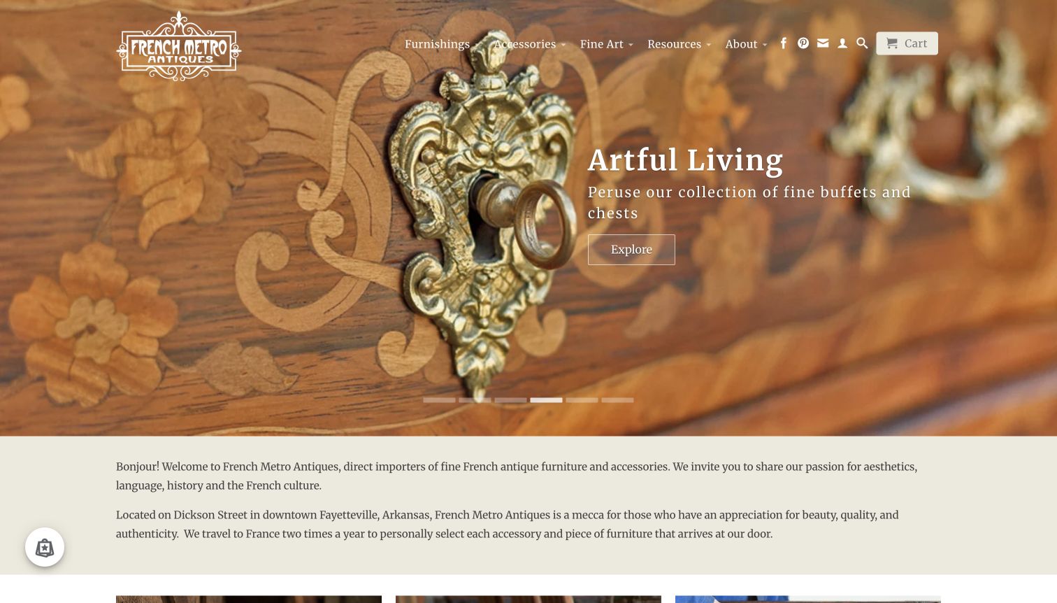
French Metro uses a close view of inlay and hardware to make the opening image about craftsmanship rather than just a complete room. A short campaign caption and outlined action lead into a furniture collection. Immediately below, a cream text section introduces the business’s French focus and Arkansas location, followed by featured objects with prices and editorial stories. This is a useful sequence for a dealer whose source expertise is part of the presentation: first show a detail worth noticing, then explain the shop behind it. The rotating hero still needs careful text placement because changing images create different levels of contrast beneath the same navigation.
What you can learn
Alternate object detail with useful context. A close-up can invite attention to material and workmanship, but it should lead to a real collection and be followed by location, stock and shipping information that helps turn interest into a practical inquiry.
Pros
The opening photograph draws attention to specific material and decorative detail.
The shop introduction quickly establishes the geographic and collecting focus.
Cons & considerations
A rotating background makes consistent text contrast harder to maintain.
The introduction is more expansive than a shopper seeking one exact item may need.
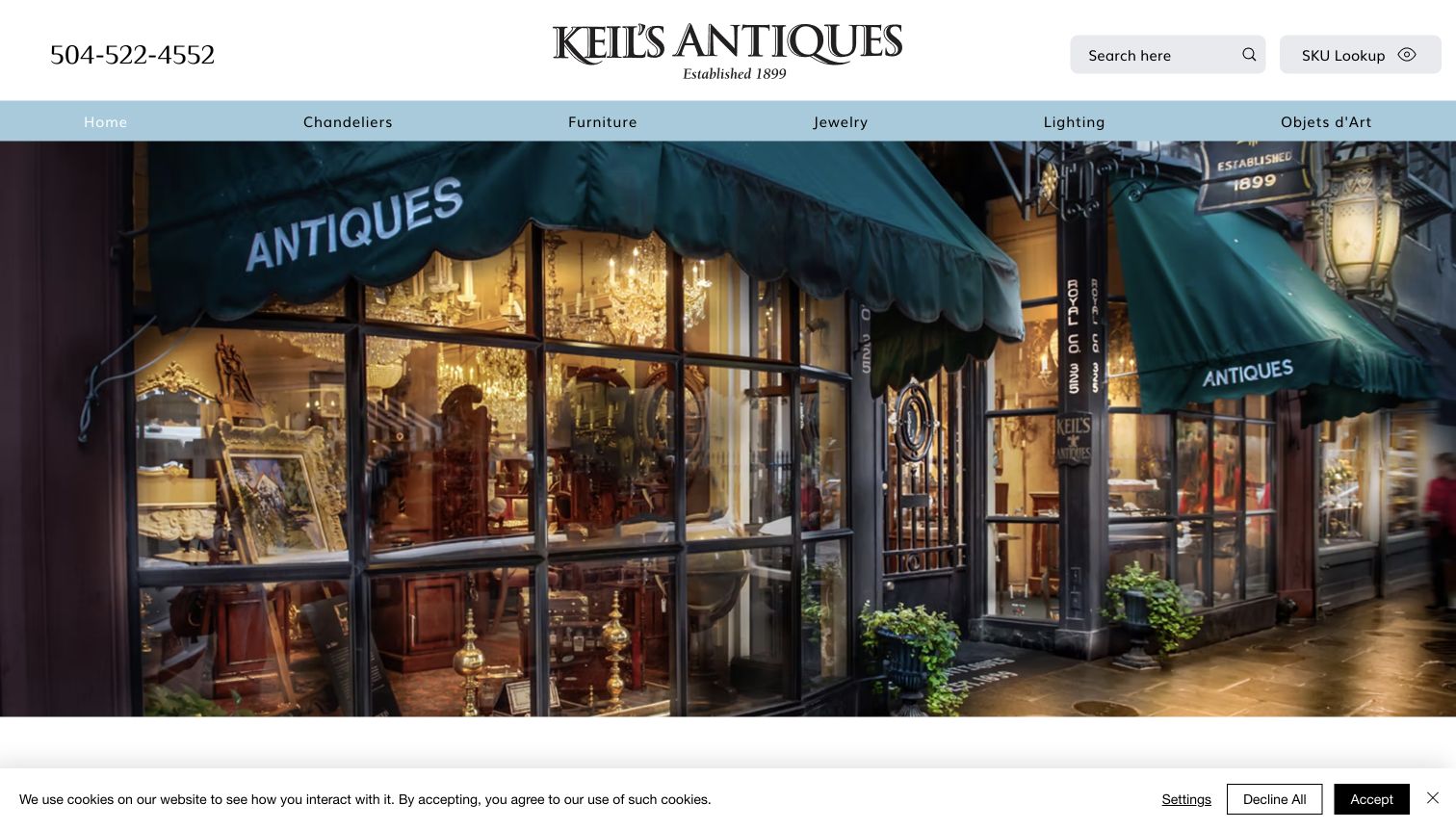
Keil's Antiques makes its shopfront the opening image, with illuminated windows and the street-facing entrance supplying a tangible sense of place. The header places a telephone number, search and SKU lookup around the wordmark, while a second row separates chandeliers, furniture, jewelry, lighting and decorative objects. This is a useful alternative to the generic room hero: a visitor can recognize the destination while still having routes to specific stock. The page's family-history messaging gives the storefront context, but the design itself does not independently verify service claims. Its practical strength is the combination of broad browsing and a direct route for someone returning with an item reference.
What you can learn
Photograph the actual shop when the physical destination is important, and pair that image with practical retrieval tools. Reference-number lookup is especially useful when inquiries start in person, by telephone or from a previously saved object record.
Pros
The storefront photograph gives the business a clear physical identity.
Search and SKU lookup support two different ways of finding inventory.
Cons & considerations
The hero does not immediately display individual stock prices or details.
Several header controls and categories need careful spacing on narrower layouts.
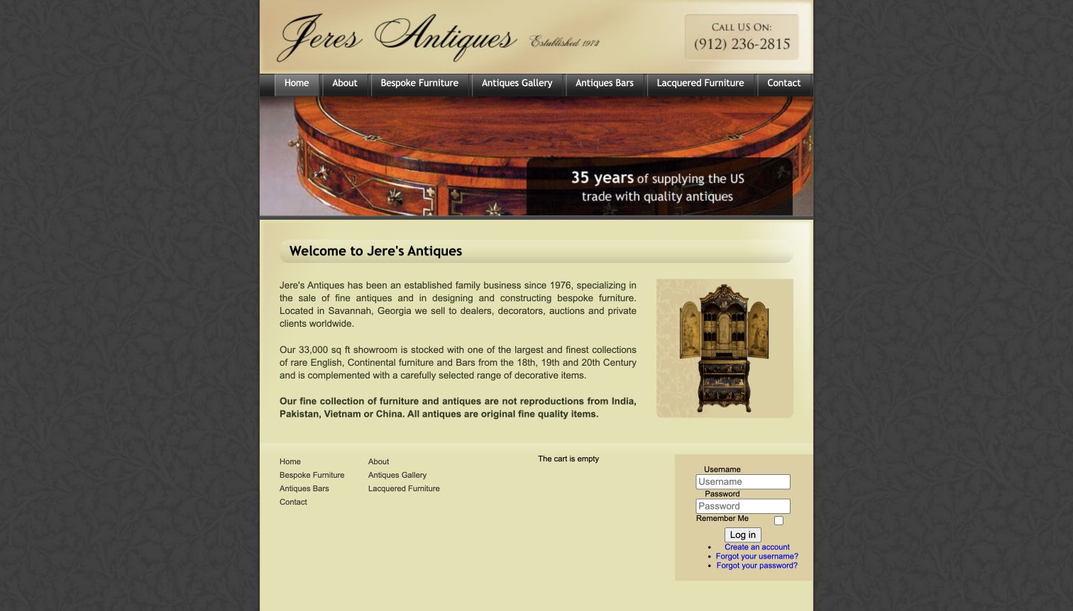
Jere's Antiques uses a narrow, traditional page with a scripted masthead, wood-detail banner and a concise introduction. The navigation distinguishes an antiques gallery, antique bars, lacquered furniture and bespoke work, giving the business's different offerings separate entrances. The main text also states the showroom location and collecting periods, so the page communicates its scope without a long sequence of promotional sections. Its presentation is useful as a study in directness rather than contemporary visual polish. Dense text, textured backgrounds and the visible account area compete for attention, and the site would benefit from making current stock and visit details more prominent than generic login controls.
What you can learn
Keep distinct services separate in the navigation, especially when original antiques sit beside newly commissioned furniture. Preserve the direct explanation of what the shop offers, while giving current inventory and contact information priority over account mechanics that many visitors may never need.
Pros
The navigation distinguishes antiques, bars and bespoke furniture.
The opening copy provides location and collecting scope in a compact area.
Cons & considerations
Textured backgrounds and dense text reduce the visual breathing room.
Account controls occupy space that could introduce stock or visit information.
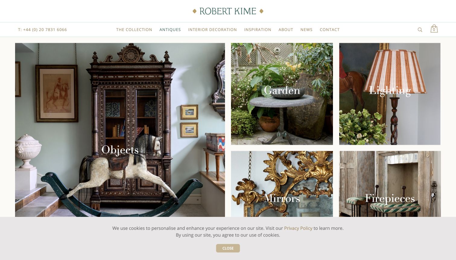
Robert Kime's antiques landing page uses a varied photographic mosaic under a restrained cream-and-green header. A large objects panel shares the opening with garden, lighting, mirrors and firepieces, showing how the collection can inhabit different parts of a room or garden. The parent navigation keeps antiques separate from the wider collection and interior-decoration services. This is a useful pattern when the business offers new products as well as historical pieces: the visual language can remain consistent while the catalog boundaries stay understandable. The photographs are richer than isolated packshots, although large overlaid category names can obscure details and offer little information about the exact object shown.
What you can learn
Use category scenes to orient a visitor within a larger design business, but make the antique range an explicit destination. Once someone chooses a category, switch from atmospheric presentation to clear records with availability, dimensions and qualified descriptions.
Pros
The mosaic gives several antique categories visible roles in one view.
Antiques remain a distinct route beside new collections and decoration services.
Cons & considerations
Large labels sit across detailed photographs.
Scene-based tiles cannot replace factual records for the pieces pictured.
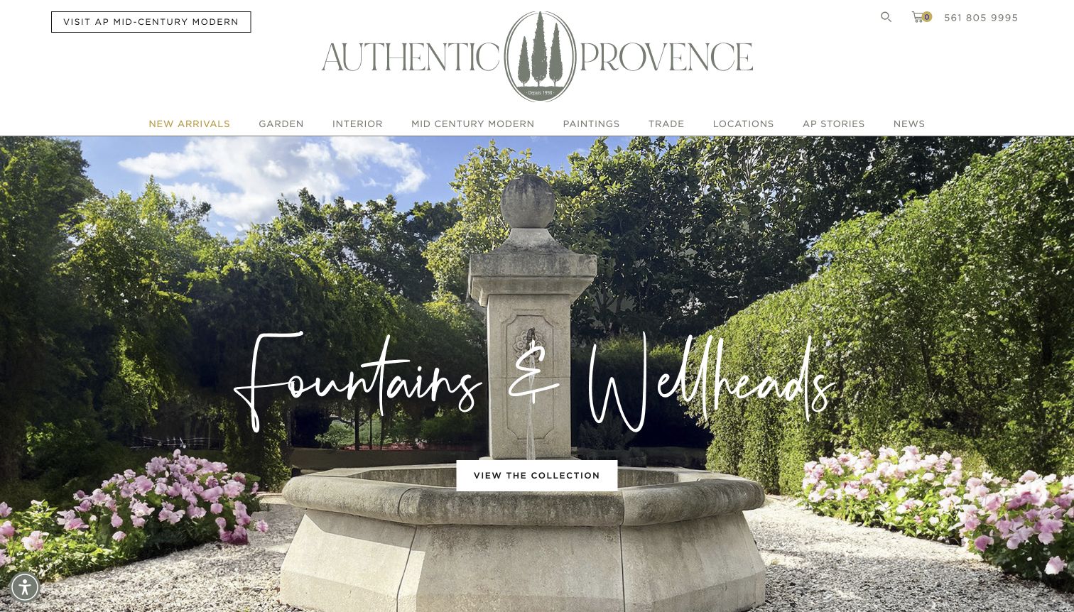
Authentic Provence opens with a stone fountain set within a garden, making the scale and setting of the collection immediately apparent. A large handwritten-style category heading and a contrasting collection button sit on the image, while a restrained header separates garden, interior, new arrivals and locations. This is especially useful for outdoor antiques, where a cropped object alone may not explain how it relates to planting, paving or architecture. The page extends into stories and catalogs, giving browsing a more editorial dimension. A mailing-list dialog initially obscured the scene during review; the saved capture shows the actual page after that optional prompt was closed.
What you can learn
Show large garden or architectural pieces in a believable setting, then connect the scene to a specific inventory category. Keep measurements, condition and handling requirements on the object record, and avoid letting promotional dialogs block the image doing the introductory work.
Pros
The garden setting communicates scale and the intended decorative context.
The collection button provides a clear next step from the large image.
Cons & considerations
The initial mailing-list overlay interrupted the opening experience.
A scenic hero provides little detail about individual availability or delivery constraints.
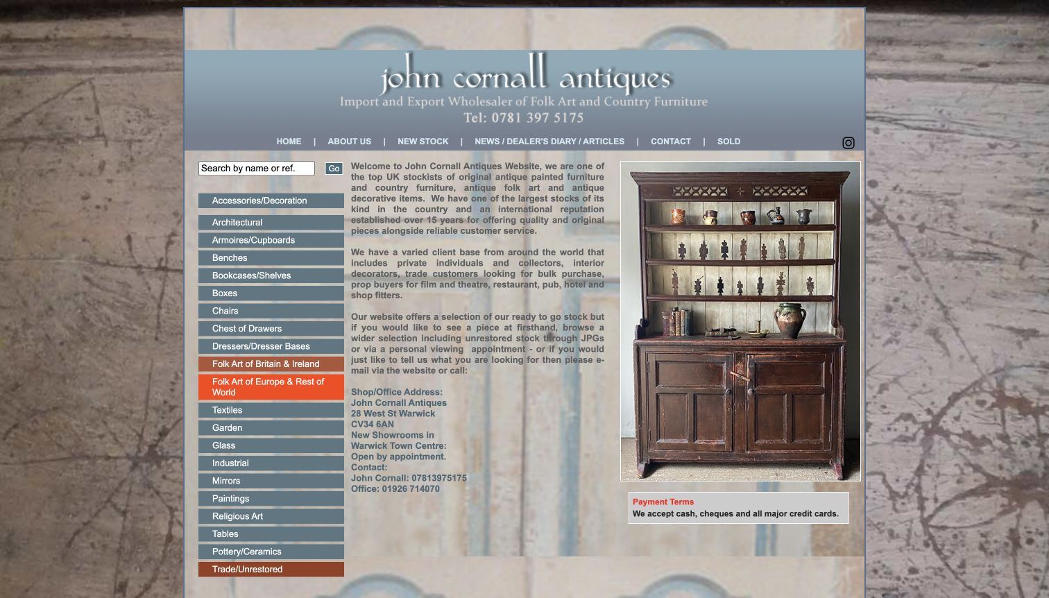
John Cornall's homepage puts an extensive list of stock categories beside an introduction and a large cabinet photograph. The categories include particular furniture forms, folk-art regions and trade or unrestored stock, making the specialist inventory more legible than a single broad antiques label. A name-or-reference search supports visitors returning to a known item, and appointment information is included directly in the introduction. The page is useful for its practical specificity, even though its visual treatment is busy. Patterned backgrounds, dense paragraphs and closely spaced category rows demand more reading than the quieter galleries in this collection, and would need careful simplification in a new implementation.
What you can learn
Borrow the specificity of the stock labels without inheriting the crowded presentation. Give collectors direct routes to meaningful subcategories and reference lookup, then separate the shop introduction and appointment details into readable sections with a clear visual hierarchy.
Pros
Specialist categories describe the actual range more precisely than broad lifestyle labels.
Search by reference and appointment details support purposeful inquiries.
Cons & considerations
Dense text and textured backgrounds make the opening harder to scan.
A long category list can overwhelm visitors who are still exploring the collection.
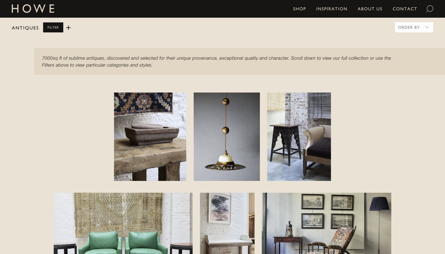
HOWE's antiques page uses a black header and warm neutral background around varied object photographs. A compact filter control and ordering menu sit above the inventory, while the available taxonomy includes object type, room and style. That is a useful combination for eclectic stock: one customer may seek a table, another an object for a library, and another a particular period. The photographs retain texture and setting rather than forcing every piece onto an identical white background. The first view keeps its labels restrained, which makes the images attractive but also means a shopper may need to interact or open a record before learning the object's price and fuller description.
What you can learn
Offer more than one browsing vocabulary when each is supported by actual inventory data. Object type, room and style can answer different questions, but filters need maintained records and clear reset behavior so visitors understand why a selection has narrowed.
Pros
Filters accommodate functional, room-based and stylistic ways of browsing.
Warm backgrounds let varied object photographs sit together coherently.
Cons & considerations
Sparse first-screen labels provide limited price or condition information.
Several filter dimensions create an ongoing catalog maintenance obligation.
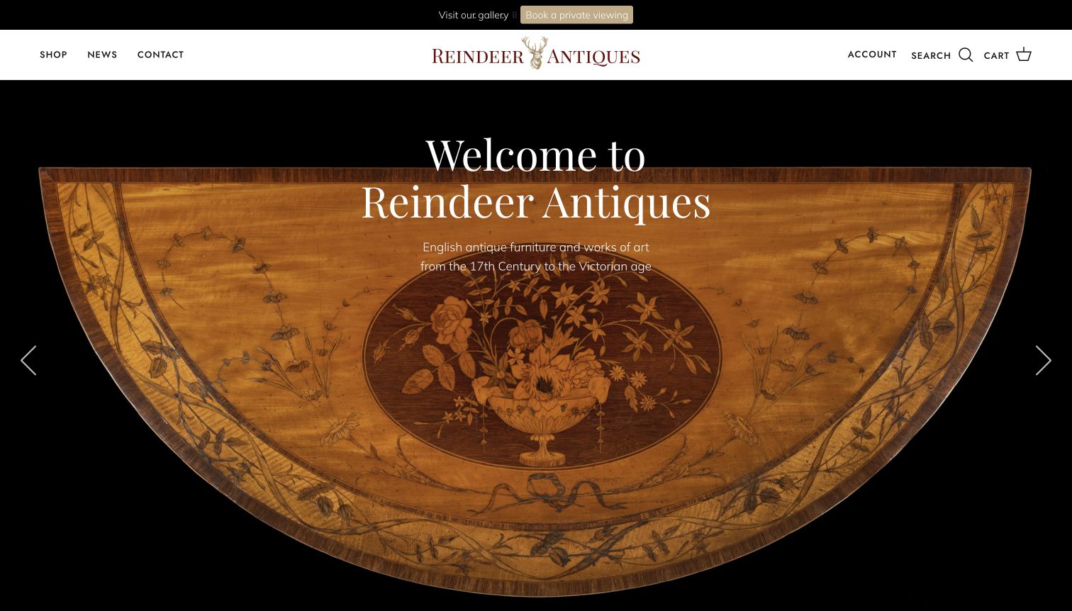
Reindeer Antiques places a close view of a decorated wooden tabletop against a black background, with a large serif welcome and a concise statement of its English-antique focus. A slim header keeps shop, news and contact separate from account and basket controls, and a top strip offers a private-viewing route. Lower sections introduce categories and a featured object. The opening is useful because it communicates material and craft without surrounding the object with unrelated imagery. The live page also contained a relocation-sale message alongside gallery information, illustrating why destination details must remain synchronized when the business changes premises or visiting arrangements.
What you can learn
Use one visually distinctive object to introduce a focused collection, then make the next step explicit. During a relocation or sale, review every address, appointment link and announcement together so the website does not leave visitors reconciling conflicting practical information.
Pros
The detailed object photograph communicates the collection’s period character.
A private-viewing route is visible before the visitor reaches the catalog.
Cons & considerations
Rotating announcements can make important relocation information easy to miss.
The hero prioritizes identity over immediate stock comparison.
Kegan is a freelance web designer and developer with 15+ years of experience helping businesses turn complicated website requirements into clear, maintainable digital experiences. He works directly with clients from planning and design through development, launch, and ongoing support.
For antique shop website design, his development approach focuses on antique shop websites that present individual pieces with clear dimensions, condition notes, provenance boundaries and practical collection or delivery enquiries. The scope can be a targeted improvement or a complete custom build, with responsive layouts, thoughtful content structure, and integrations chosen around the people using and maintaining the site.
Show 3 other antique shop website designersHide other antique shop website designers
Plan an antique-shop website around the life of each object
Define the inventory record before choosing a layout
List the information the team already records when a piece arrives: reference, title, dimensions, material, dating, attributed maker, condition, purchase status and photographs. Decide which details can be published and how uncertain attributions will be worded. A website cannot solve inconsistent stock records with a more elaborate visual theme.
Agree on the difference between available, reserved, sold and archived. A one-off item should not remain purchasable after it leaves the shop. If the site retains sold records for research or inspiration, make their status unmistakable and provide a relevant route back to current stock.
Plan photography for the information it must convey. Use a whole-object view, useful detail and scale where appropriate, with consistent lighting and honest editing. A room photograph can supplement those records; it should not replace evidence of the particular item’s condition or construction.
Design separate routes for browsing, inquiry and visiting
Choose a small set of top-level categories that reflects the real stock, then test whether a visitor can find a chair, a mirror and a new arrival without knowing the dealer’s internal terminology. More specialist labels can sit one level deeper, supported by photographs or short explanations.
For an inquiry-led business, carry the item reference into the contact journey and explain what the customer should provide. For a checkout-led business, establish shipping, collection, returns and reservation rules before designing the purchase controls. Do not imply that an inquiry or wishlist guarantees the item is held.
Give the physical gallery its own concise information page. Include current hours, appointment arrangements and practical arrival details. When a showroom relocates or uses several storage locations, check every header, footer and item page that repeats an address or visiting instruction.
Assign an editor to the changing parts of the collection
Identify who photographs new stock, checks descriptions, publishes an item and marks it reserved or sold. A beautiful catalog becomes misleading if the responsibility for these small updates is unclear. Build the editing process around the staff who actually handle the objects.
Choose a modest set of homepage features that can remain current: recent arrivals, a seasonal collection or a particularly informative object story. Avoid several competing carousels or popup campaigns unless the team can keep each one accurate and useful.
Review a sample of records before launch and after the first inventory cycle. Check that photographs correspond to the named item, measurements use consistent units and status changes reach category pages as well as detail pages. Improve the structure when staff repeatedly need an awkward workaround.
The editing job behind the design
Choose tools that keep unique stock accurate
An inquiry-led gallery may need a manageable content system with structured object fields, search and clear contact links. A shop taking payment needs inventory rules that handle one-off pieces, reservations, shipping and collection coherently. Choose between those workflows before deciding which visual theme looks most attractive.
Ask how the team will resize photographs, preserve originals, edit captions and remove a sold item from purchasing routes. The system should support useful alternative text, durable object URLs and redirects when records move. Large image libraries need a publishing process that avoids uploading unnecessarily heavy files on every update.
Public technology labels in this collection describe bounded evidence from the reviewed page, not a complete technical inventory. A font, delivery service or script reference does not establish the hidden catalog system. Select integrations according to the shop’s verified needs and staff capacity, rather than assuming another dealer’s visible stack will produce the same result.
Our WordPress website examples offer a separate look at publishing approaches. A visible platform label is evidence for that named page, not a guarantee that the same system will suit your requirements.
Before the public launch
An antique-shop website launch checklist
Every item has a stable reference and a clearly stated availability status.
Dimensions, materials, condition and attributions are checked and qualified where necessary.
Original antiques, reproductions and newly made pieces are distinguished consistently.
Whole-object and detail photographs show the actual listed piece.
Search and category paths work with real stock names and references.
Reserved and sold items cannot be mistaken for immediately purchasable stock.
Inquiry controls preserve the item context without exposing private customer data.
Shipping, collection, returns and appointment arrangements are explained accurately.
Current addresses and visiting hours agree across repeated locations.
Keyboard navigation, image descriptions and readable contrast are checked in the actual implementation.
Staff can add a piece, correct a record and change its status without developer intervention.
Archived object URLs and necessary redirects survive catalog changes.
These checks are a project checklist, not a performance, legal, security, or accessibility certification. Test real journeys with the people responsible for the website before making claims about the result.
Sources & editorial method
How this collection was selected and reviewed
We reviewed these 22 public antique-shop websites on November 11, 2026, using their actual homepage or explicitly labeled stock landing page. The collection compares room photography, category structure, object discovery and practical gallery information. Timothy Langston is the Editors Choice for the balance of distinctive presentation, clear stock categories and immediately visible gallery contact details. This is a design selection, not an appraisal of objects, provenance or service quality. Broad public technology checks are limited to the sampled source page and accessible supporting resources; blocked or unknown details are not inferred.
Each example links to its actual source page. Screenshots are direct browser captures with their own capture dates; moving imagery, announcements and live designs can change. The notes describe observable design choices and conditional tradeoffs, not measured traffic, conversion results, service quality, or accessibility conformance.
Technology labels use public page metadata, asset evidence, or explicitly cited platform documentation. Platform documentation is not a complete current deployment audit. A component reference may be legacy or unused; it is not a complete backend inventory. Unknown stacks are omitted. These sites are editorial examples, not our client portfolio.
Written, Edited and Curated are separate editorial records, not timestamps advanced by a rebuild. Website designs and imagery belong to their owners. See our editorial standards or suggest a correction.
Questions worth asking
Antique Shop website design questions
Should an antique shop sell online or invite inquiries?
Choose the model that matches the actual transaction. Smaller items with established shipping can suit checkout. Large, fragile or unusually valuable pieces may need a conversation about condition, delivery and installation first. State the process clearly and avoid giving an inquiry button the appearance of a guaranteed reservation.
What should every antique object page include?
Start with a clear name, reference, current status, dimensions, material, useful photographs and a qualified description of age, attribution and condition. Add shipping or collection information and a direct inquiry route. Do not turn uncertain provenance or restoration history into a definitive marketing claim.
Should sold antiques stay on the website?
A clearly labeled archive can show the dealer’s range and preserve useful references. Keep sold pieces out of available-stock results unless the filter makes their status explicit. Remove purchase controls and offer a relevant current category or sourcing inquiry instead of pretending the object remains available.
Are room photographs better than isolated product images?
They answer different questions. A room image helps someone understand a decorative point of view and approximate scale. An isolated view and close details help them inspect the particular object. Use both when possible, with captions that explain exactly what is pictured.
How many stock categories should an antiques website have?
Use enough to describe meaningful differences in the actual inventory, then test the routes with real items. A small collection may need only a few broad categories. Specialist furniture or architectural stock may benefit from period and material filters, provided those fields are maintained consistently.
Borrow the clarity of the object record and the usefulness of the browsing route. Let the collection’s genuine materials, history and visual character give the website its identity.