Best SendGrid Websites of 2026 (20 Real-World Examples)
Public websites with documented SendGrid email workflows, from commerce notifications and appointment communication to publishing and community updates.
A website journey often continues in the inbox. These twenty examples connect real public interfaces with specific, documented SendGrid email roles, showing how clear navigation and useful communication can support the same customer task.
SendGrid is an email-delivery platform, so a website screenshot cannot prove that it powers the page's frontend or CMS. The references here pair the visible website with an official case describing the associated service's email workflow. Some cases are historical; their implementation and performance claims are not presented as a fresh technical assessment.
Look for continuity between what a visitor does and what the next message needs to explain. A booking email should preserve the trip, a property alert should preserve the search, and a newsletter should deliver the value promised at signup. That connection is more useful to borrow than a familiar brand's colors or a vendor's headline delivery statistic.
Before the examples
What makes good SendGrid website development in 2026?
Design the next message around the user's task
Start with the action that creates a legitimate reason to communicate: an order, a registration, a requested update or an explicitly chosen subscription. Identify what the recipient needs to recognize, understand and do next. Use the same product names, dates and status language on the website and in its messages so the journey remains coherent.
Make sender identity and preferences part of the product
Use an understandable sender identity and verify the sending domain through the provider's documented authentication process. Treat preference controls as useful product navigation, not an obstacle to hide. SendGrid supports unsubscribe groups for categories of email; the website should explain those categories in language recipients recognize.
Keep delivery observations separate from business outcomes
A provider processing a message, a receiving server accepting it and a person completing a task are different events. The SendGrid Event Webhook documents delivery and engagement event types, including bounces, deferrals and unsubscribes. Use those distinctions to explain operational status instead of turning a delivery receipt into a claim that the recipient read or acted on the email.
Shopify, Glassdoor, Nextdoor, Strava and Klaviyo open the collection with recognizable services and explicitly documented email relationships. The remaining examples broaden the comparison across commerce, publishing, real estate, education and travel. Each review separates the pictured public page from the scope and age of its supporting SendGrid case.
We start with five recognizable brands or organizations: Shopify, Glassdoor, Nextdoor, Strava, Klaviyo. Each attribution applies to the named website property, not every product or website belonging to its organization. This is a curated reading sequence, not a measured ranking.
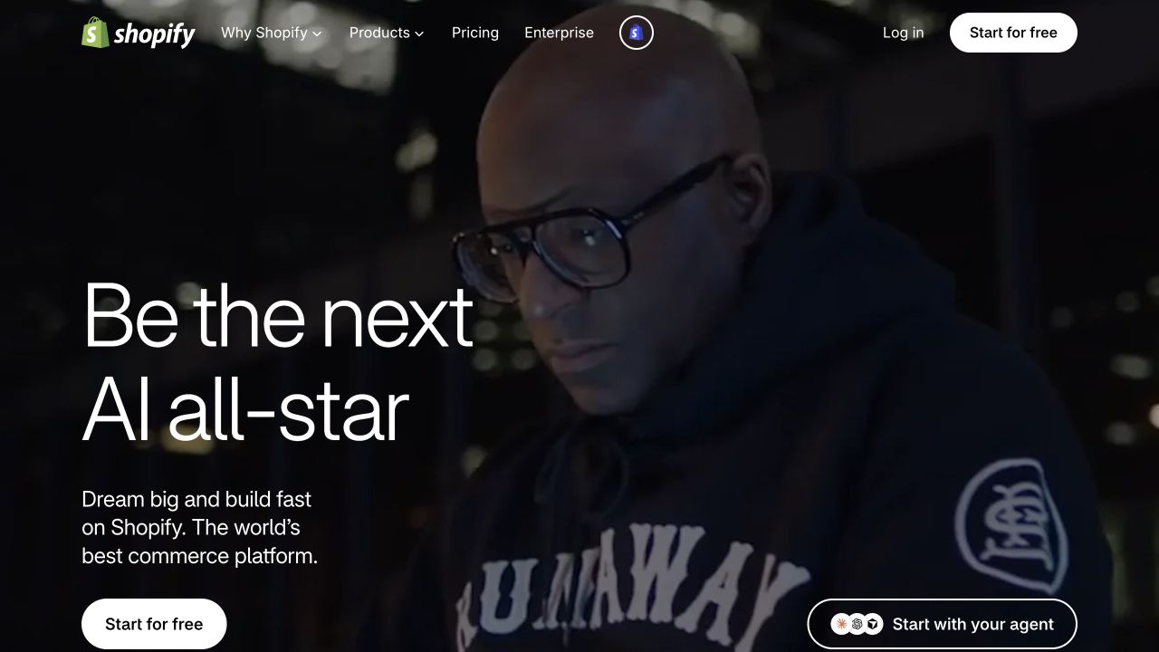
Shopify's retained homepage uses a dark photographic scene, unusually large type and a short commerce proposition to make starting a business feel approachable. The white signup control remains clear against the image, while product and pricing navigation serves visitors who need practical details first. Twilio's customer case describes Shopify building merchant email marketing and payment or shipping notifications with SendGrid's Email API. That is a documented commerce-platform relationship, rather than evidence about the page renderer. The contrast is instructive: the public entrance sells possibility, while the supporting communication system must handle precise, ordinary events after a customer buys.
What you can learn
Keep the emotional promise at the entrance, then make receipts, delivery updates and account messages concrete. A memorable acquisition page needs equally understandable communication when the visitor becomes a customer.
Pros
The restrained navigation keeps the main invitation prominent without hiding product and pricing routes.
Strong light-on-dark contrast makes the primary action readable over an expressive photographic backdrop.
Cons & considerations
The broad aspiration requires later pages to explain exactly what merchants can build and operate.
The agent-oriented secondary invitation needs additional explanation for visitors unfamiliar with that workflow.
Platform source: Official Twilio customer case — documented SendGrid email role. Merchant email marketing and transactional payment/shipping notifications through the Shopify commerce platform. Official documented email-service relationship, which may describe an earlier implementation. This does not establish the current frontend, CMS, complete stack or independently tested delivery performance of the pictured page. Platform evidence is separate from the direct website screenshot and is not a complete current infrastructure audit.
Glassdoor opens with a person surrounded by a mountain of paperwork and an oversized statement about the frustrations of job search. It makes the problem visible before introducing its alternative, while the central navigation separates job matches, company research and employers. A single rounded action sits beneath the promise. Twilio documents SendGrid-powered job recommendations, employer-review alerts and recruiting communications in an earlier Glassdoor email program. The captured Recruiter presentation is a newer public view; the case does not verify this particular interface's delivery implementation. The useful pattern is aligning a focused entrance with relevant reasons to return later.
What you can learn
Treat recommendation emails as continuations of a clear user goal. Link recipients to the matching role or insight, with enough context to recognize why it was selected and control future notifications.
Pros
The visual metaphor communicates an uncomfortable problem immediately, without a lengthy introductory explanation.
Audience choices remain available above the hero for people researching companies or recruiting candidates.
Cons & considerations
The dramatic background competes with the large text and offers little concrete product detail initially.
A broad getting-started action leaves the next step less explicit than a named matching workflow.
Visible tech stack
Earlier / documented evidence
SendGrid
Platform source: Official Twilio customer case — documented SendGrid email role. Job recommendations, employer review alerts and recruiting-platform email delivered through SendGrid. Official documented email-service relationship, which may describe an earlier implementation. This does not establish the current frontend, CMS, complete stack or independently tested delivery performance of the pictured page. Platform evidence is separate from the direct website screenshot and is not a complete current infrastructure audit.
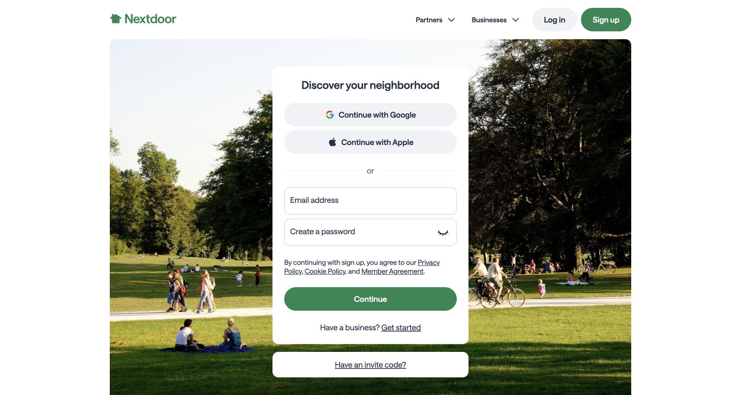
Nextdoor places a compact signup card over a photograph of people sharing a park. The surrounding neighborhood scene gives context to a form that otherwise asks for familiar account details. Google, Apple and email routes are clearly separated, with business onboarding and invite-code access nearby. The official SendGrid case describes neighborhood-update notifications and the operational challenge of sending them reliably as the community grew. It supports the network's documented email service, not a claim about the signup page's frontend. The design makes joining simple, although the public entrance reveals little of what an actual neighborhood feed looks like.
What you can learn
Before asking someone to join a community, explain the useful updates membership unlocks. Keep account creation separate from notification preferences so signing up does not imply wanting every possible email.
Pros
The central card creates a clear reading order and keeps the main signup choices together.
Separate business and invitation routes acknowledge visitors arriving with different intentions and existing context.
Cons & considerations
The tall form dominates the first view before visitors can inspect much of the product.
Community imagery conveys atmosphere but does not demonstrate the relevance or frequency of future alerts.
Visible tech stack
Earlier / documented evidence
SendGrid
Platform source: Official Twilio customer case — documented SendGrid email role. Neighborhood social-network update notifications; documented email-delivery service, not marketing-site runtime. Official documented email-service relationship, which may describe an earlier implementation. This does not establish the current frontend, CMS, complete stack or independently tested delivery performance of the pictured page. Platform evidence is separate from the direct website screenshot and is not a complete current infrastructure audit.
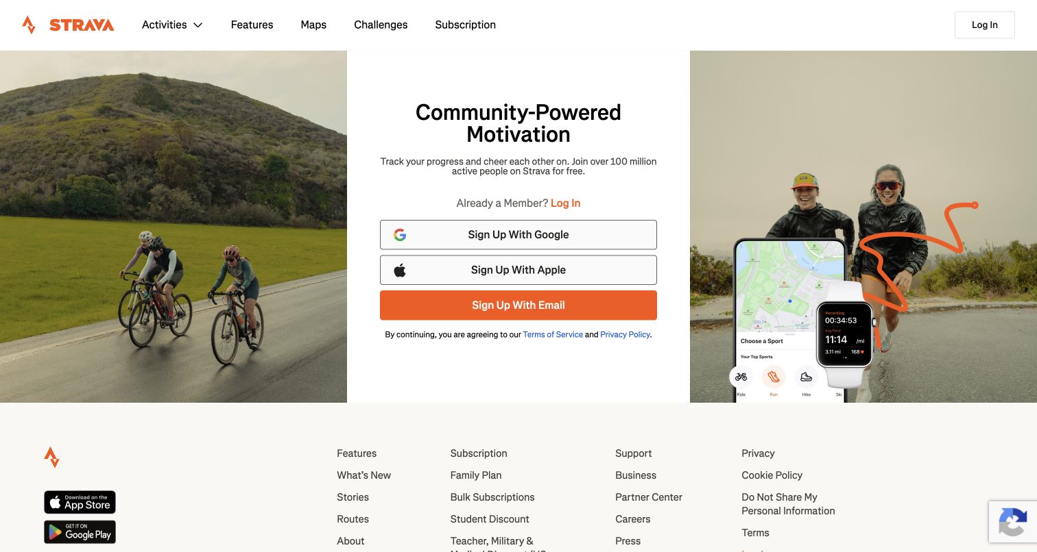
Strava balances a narrow central signup panel with outdoor activity photographs on either side. Its community proposition is concise, and the product image connects the website with the mobile experience without hiding the desktop navigation. Maps, challenges and subscription information remain easy to find above the form. Twilio's case explicitly covers Strava's website and applications, documenting kudos digests, engagement messages and challenge-related emails through SendGrid. Those earlier examples explain a communication role rather than the current implementation of every feature. The page's most useful lesson is that motivation can be presented as a shared experience rather than a technical tracking specification.
What you can learn
Connect activity messages to a meaningful next step, and aggregate repetitive events where appropriate. A reminder should reward progress or offer useful context instead of simply announcing that another event occurred.
Pros
The centered signup choices are easy to compare and remain distinct from returning-member login.
Activity photographs and the device illustration reinforce the relationship between movement and the product.
Cons & considerations
The short first view provides limited explanation of the differences between free and paid features.
Multiple signup methods still require clear downstream guidance about account identity and communication preferences.
Platform source: Official Twilio customer case — documented SendGrid email role. Case explicitly includes the website and mobile applications; platform engagement, kudos digests and challenge emails returning users to the website. Official documented email-service relationship, which may describe an earlier implementation. This does not establish the current frontend, CMS, complete stack or independently tested delivery performance of the pictured page. Platform evidence is separate from the direct website screenshot and is not a complete current infrastructure audit.
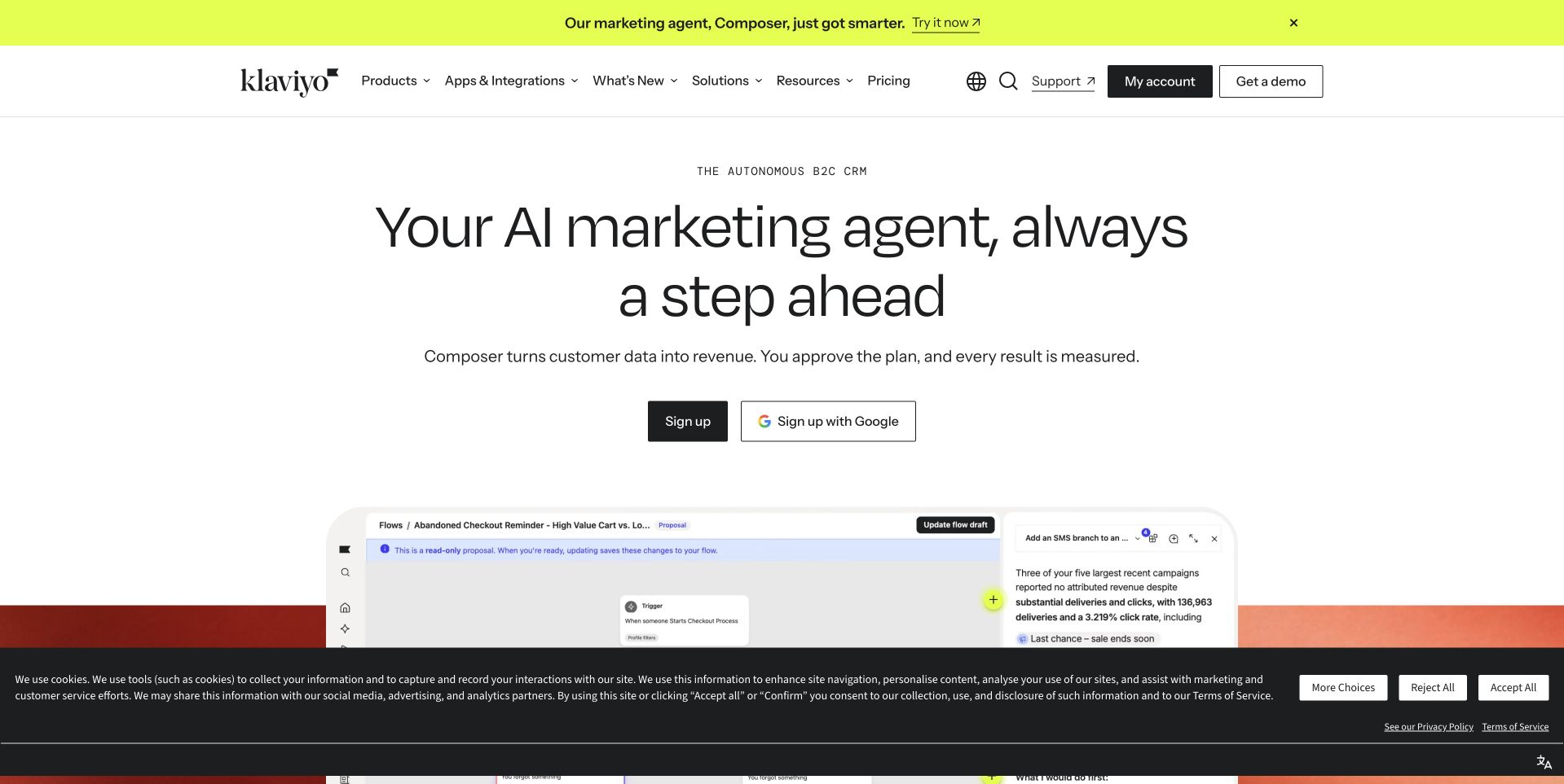
Klaviyo's retained page introduces an AI marketing agent with a large, centered headline and a brief explanation of turning customer data into action. A partial workflow preview below the signup controls provides a concrete counterweight to that broad promise. The bright announcement strip and conventional product navigation create separate routes for new and returning visitors. Twilio's case describes the earlier customer-facing email platform being built on SendGrid's Email API, including delivery-event reporting. It does not prove that the pictured Composer experience uses that same architecture today. The design lesson is to distinguish the customer-facing workflow from the infrastructure that carries its messages.
What you can learn
Show what a marketer can review, approve and understand before discussing delivery plumbing. Keep campaign actions and measurable outcomes close together, while explaining technical dependencies at the appropriate depth elsewhere.
Pros
The open layout gives the primary proposition and signup controls a clear visual hierarchy.
The visible workflow preview begins to connect the marketing claim with an actual product interaction.
Cons & considerations
A large introductory area delays the detailed demonstration that could substantiate the automation promise.
The announcement and cookie notice compete with the product preview in the retained desktop capture.
Platform source: Official Twilio customer case — documented SendGrid email role. Klaviyo built its customer-facing email marketing platform upon SendGrid Email API; qualify the documented platform relationship. Official documented email-service relationship, which may describe an earlier implementation. This does not establish the current frontend, CMS, complete stack or independently tested delivery performance of the pictured page. Platform evidence is separate from the direct website screenshot and is not a complete current infrastructure audit.
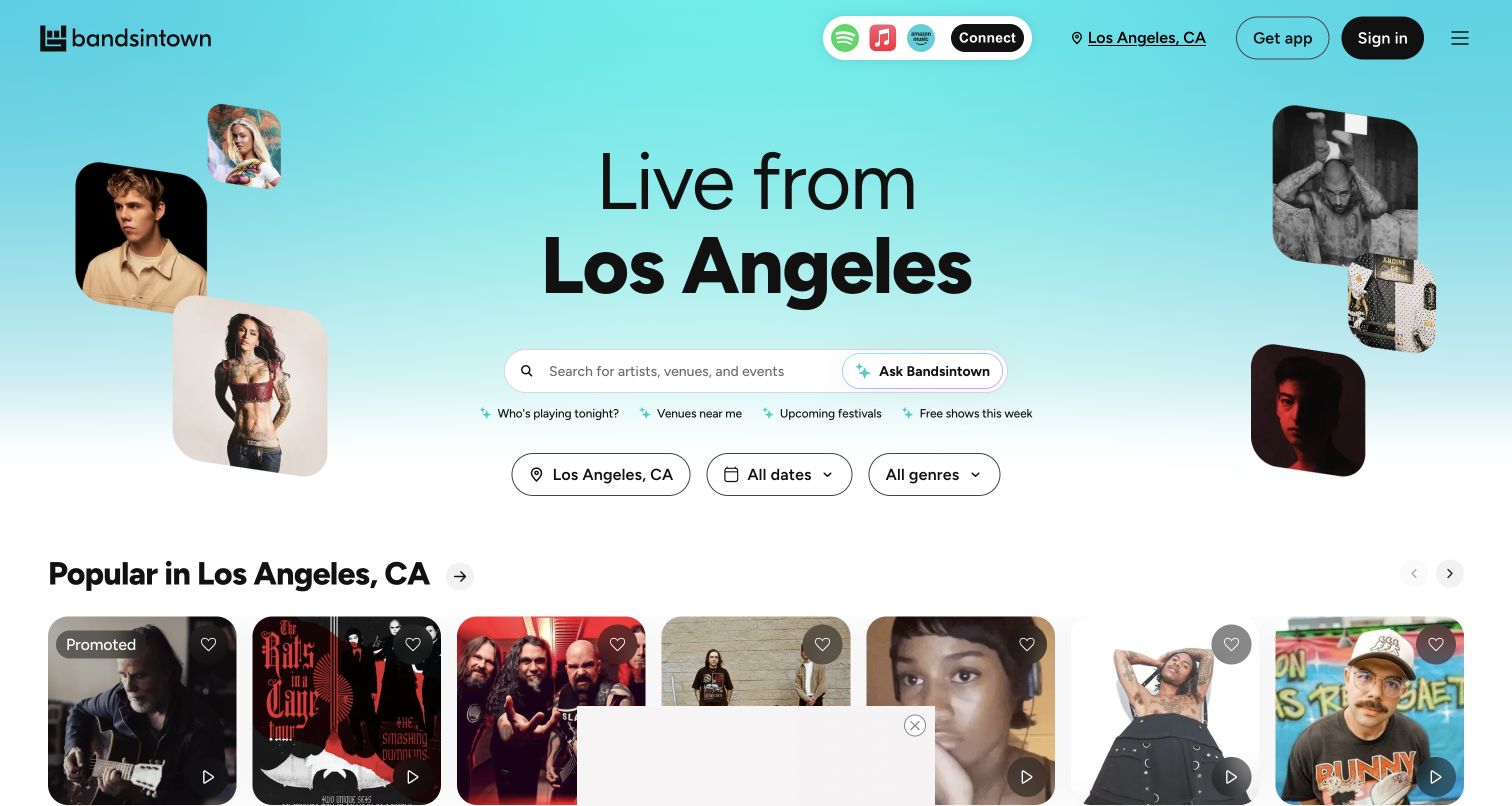
Bandsintown frames its homepage around a city, placing search above filters for location, date and genre. Artist photographs decorate the hero without replacing the practical discovery controls. The event cards immediately below carry recognizable performers, dates and venues, giving the page something useful before a visitor connects a music account. Twilio's SendGrid case describes location-based concert digests, ticket alerts and livestream reminders. Its separate discussion of a past subscription product should not be read as a current offering. The captured discovery page demonstrates how specific event context can make a notification worth opening and following back to the website.
What you can learn
Make event messages carry the same city, date and performer context as the destination page. Preference controls should help people narrow the signal without requiring them to disconnect from the entire service.
Pros
Location and date filters make the large event catalog approachable from the initial desktop view.
Visible artist cards offer immediate browsing value before signup or an external music-account connection.
Cons & considerations
Promoted listings and several connection options can distract from a visitor's original search intent.
The automatically presented city needs an obvious correction route when it differs from the visitor's plans.
Visible tech stack
Earlier / documented evidence
SendGrid
Platform source: Official Twilio customer case — documented SendGrid email role. Concert discovery platform digests, ticket alerts and livestream reminders; public concert discovery is the pictured surface, not a claim about a retired Plus subscription. Official documented email-service relationship, which may describe an earlier implementation. This does not establish the current frontend, CMS, complete stack or independently tested delivery performance of the pictured page. Platform evidence is separate from the direct website screenshot and is not a complete current infrastructure audit.
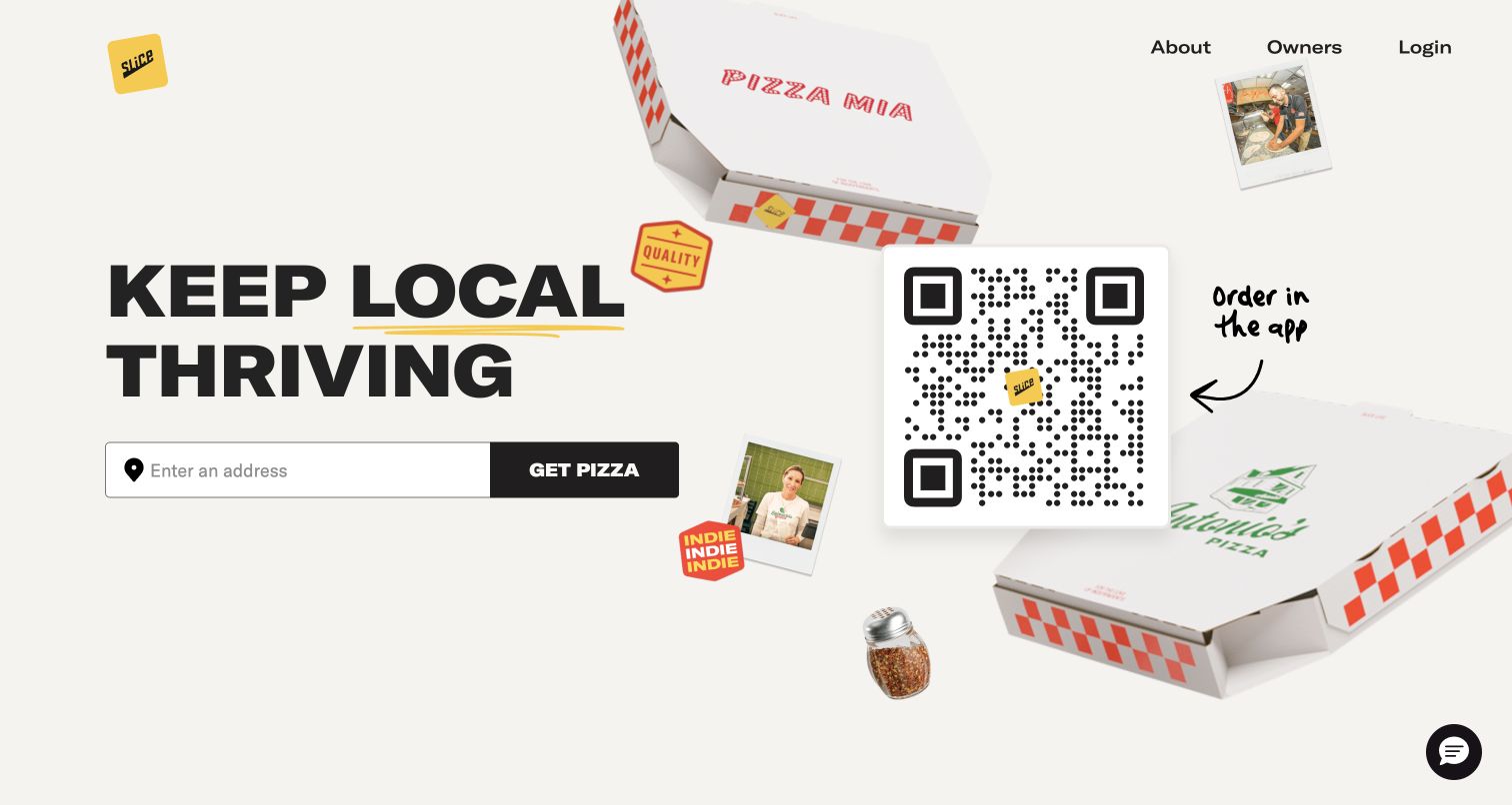
Slice pairs a bold local-business statement with a single address field and a clear pizza-ordering action. Floating boxes and small shop photographs make the proposition feel tied to independent restaurants rather than an anonymous delivery grid. A QR code offers another route, while navigation stays small. Twilio's case explicitly documents website and app orders, SendGrid order-confirmation emails and savings digests that reconnect purchases with local shops. These are documented service workflows, not evidence that SendGrid builds this interface. The useful relationship is between a short ordering entrance and specific reassurance after the order has been placed.
What you can learn
Ask for the location needed to show useful availability, then make the next step clear. Confirmation messages should repeat the shop, order and status context that the customer expects from the website.
Pros
A compact address-and-action pair makes the initial task easy to identify without scanning menus.
Shop imagery reinforces the local-business proposition and gives the otherwise minimal hero a distinct character.
Cons & considerations
The oversized app QR code competes with the browser ordering path on a desktop screen.
Visitors must provide location context before they can evaluate the range of available shops nearby.
Visible tech stack
Earlier / documented evidence
SendGrid
Platform source: Official Twilio customer case — documented SendGrid email role. Case explicitly documents website and app ordering, confirmation emails and customer savings digests. Official documented email-service relationship, which may describe an earlier implementation. This does not establish the current frontend, CMS, complete stack or independently tested delivery performance of the pictured page. Platform evidence is separate from the direct website screenshot and is not a complete current infrastructure audit.
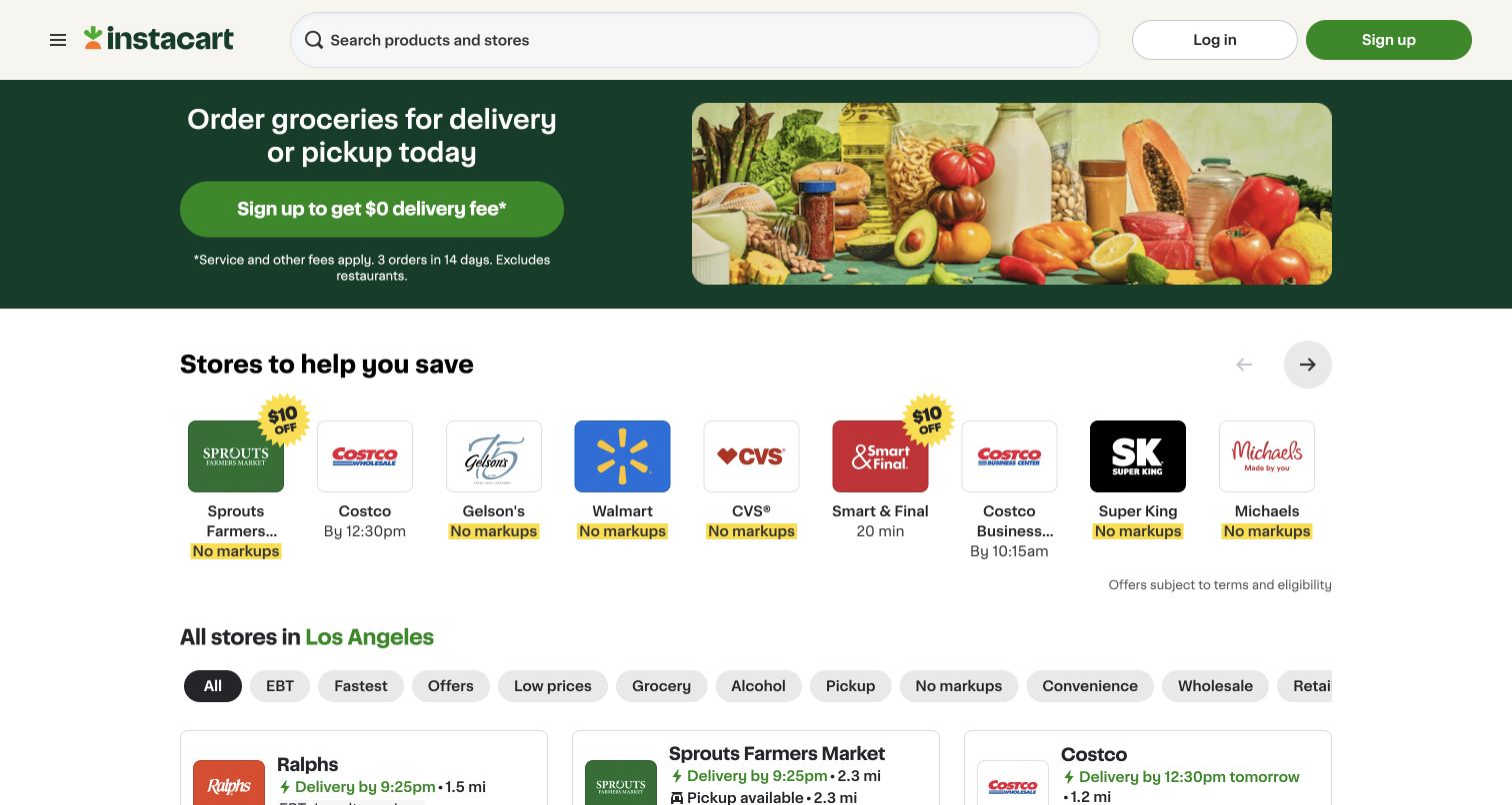
Instacart combines a grocery-delivery proposition with a retailer strip that exposes familiar store names, offer labels and availability cues. Search stays in the header, while category filters introduce ways to narrow the local marketplace without opening an account. The green hero and food photography explain the category, leaving room for comparison below. Twilio's Segment case specifically describes email-marketing data from SendGrid being evaluated against customer behavior across web and mobile applications. Segment is the data platform in that account; SendGrid's supported role is the email-campaign relationship. The screenshot independently shows the public shopping entrance, not that historical analytics implementation.
What you can learn
Make a campaign's promised retailer, offer or category easy to recognize on arrival. Evaluate the whole shopping journey with appropriate privacy controls instead of treating an email click alone as a completed purchase.
Pros
Recognizable store logos and short labels make the marketplace tangible before visitors begin a basket.
Search and category filters support both specific purchases and broader comparison between available retailers.
Cons & considerations
Promotional offers require clear eligibility details and can make like-for-like store comparison more difficult.
Location-dependent availability needs transparent controls so visitors understand why the displayed selection may change.
Visible tech stack
Earlier / documented evidence
SendGrid
Platform source: Official Twilio customer case — documented SendGrid email role. Historical documented email marketing campaigns measured against customer behavior across the grocery marketplace website and mobile applications. Segment is the data platform; SendGrid supplies the email-marketing data and campaigns, not the page renderer. Official documented email-service relationship, which may describe an earlier implementation. This does not establish the current frontend, CMS, complete stack or independently tested delivery performance of the pictured page. Platform evidence is separate from the direct website screenshot and is not a complete current infrastructure audit.
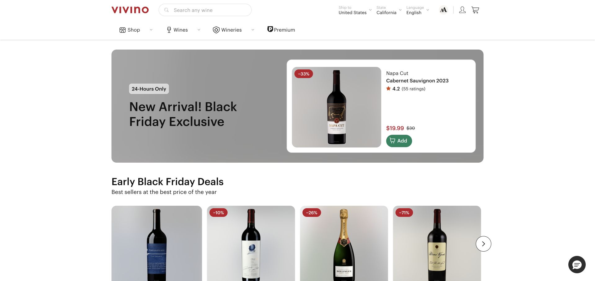
Vivino's retained storefront gives one wine a large promotional panel, then places a row of additional bottles underneath. The featured card keeps the vintage, rating, price and purchase control together, while the header makes wine search and browsing categories easy to find. Twilio's official case connects Vivino's wine-discovery website and app with SendGrid email delivery and a deliverability partnership supporting ecommerce. This documentary relationship does not establish the current frontend or endorse the site's performance claims. The design illustrates the transition from an email offer to a product page: the bottle and essential purchase facts can remain immediately recognizable.
What you can learn
Keep the product identity consistent between a campaign and its destination. Pair the photograph with the exact variant, price and availability context, while giving shoppers a clear route to further detail before buying.
Pros
The featured product combines a recognizable bottle image with concise commercial information in one card.
Persistent search and wine-specific categories support visitors who arrive with a more precise preference.
Cons & considerations
Discount emphasis can overshadow the tasting, provenance and suitability details some buyers need first.
A prominent short-term offer requires accurate destination updates when a campaign outlives its original promotion.
Platform source: Official Twilio customer case — documented SendGrid email role. Case explicitly identifies the wine-discovery/ecommerce website and mobile app; customer email delivery and merchandising engagement. Official documented email-service relationship, which may describe an earlier implementation. This does not establish the current frontend, CMS, complete stack or independently tested delivery performance of the pictured page. Platform evidence is separate from the direct website screenshot and is not a complete current infrastructure audit.
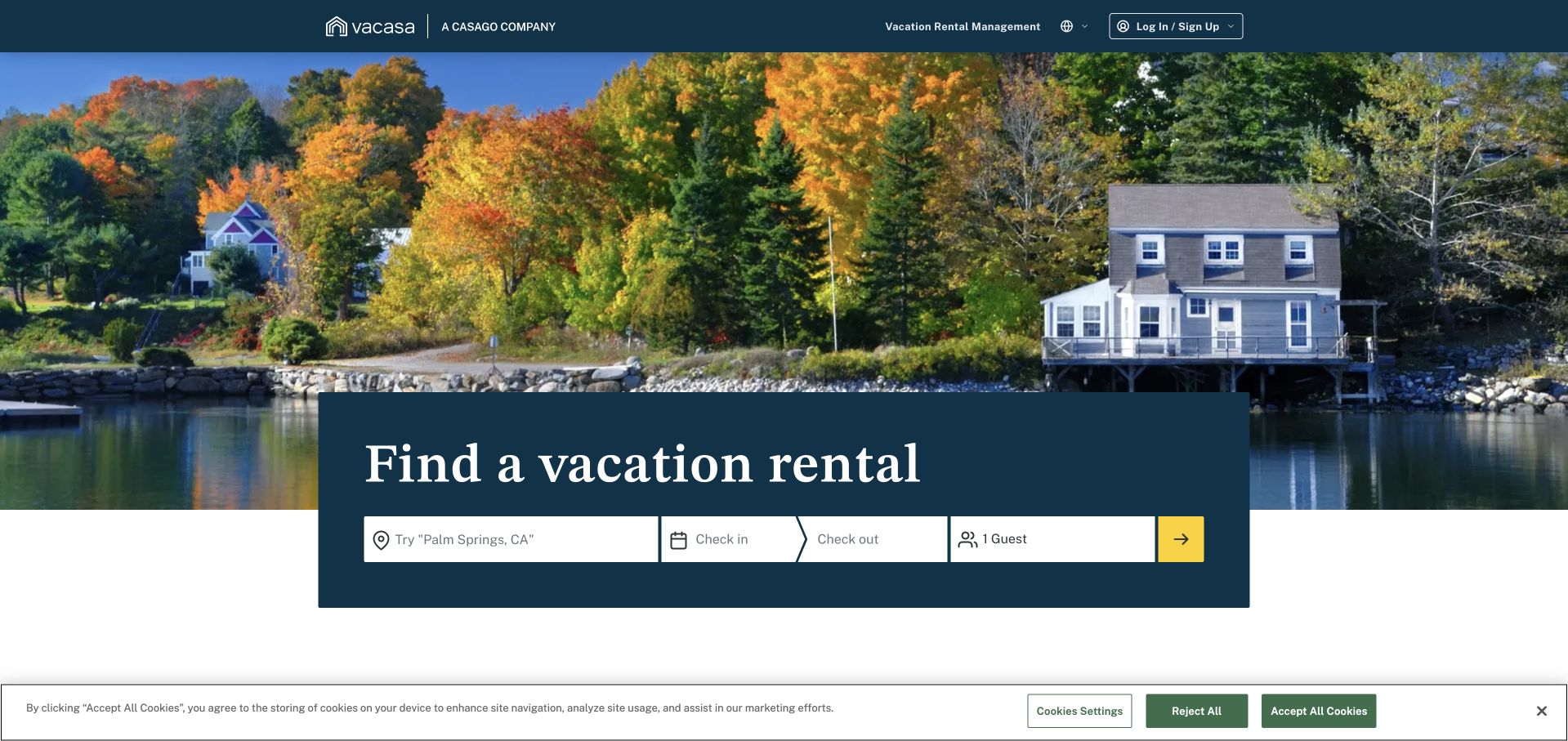
Vacasa's retained homepage sets a destination photograph behind a booking panel. Place, arrival, departure and guest fields form one horizontal sequence, with a bright arrow marking the next step. A management link acknowledges owners without interrupting guest search. Twilio's case describes SendGrid email in booking, welcome and check-in communications, alongside lifecycle campaigns and other Twilio services. That is a documented service relationship; the retained screenshot has its own original date and does not establish a newly observed delivery stack. The visual lesson is keeping an emotional travel invitation attached to the concrete information required to find a suitable stay.
What you can learn
Carry the selected property and dates consistently from search into booking and arrival communication. Important access instructions deserve a clear hierarchy and dependable fallback routes, separate from promotional material or unrelated recommendations.
Pros
The booking fields group the essential trip criteria into a compact and understandable sequence.
The destination photograph establishes atmosphere without replacing the practical search controls with vague inspiration.
Cons & considerations
The arrow-only search action offers less explicit wording than a clearly named search button would.
Large imagery and the cookie notice reduce the room available for property or service details initially.
Platform source: Official Twilio customer case — documented SendGrid email role. Vacation-rental website bookings, welcome/check-in communications and lifecycle campaigns, with both SendGrid API and Marketing Campaigns named. Official documented email-service relationship, which may describe an earlier implementation. This does not establish the current frontend, CMS, complete stack or independently tested delivery performance of the pictured page. Platform evidence is separate from the direct website screenshot and is not a complete current infrastructure audit.
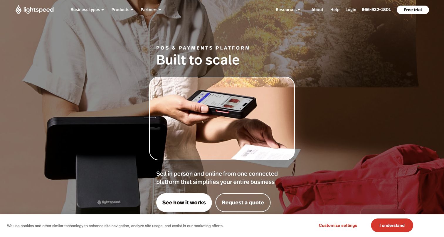
Lightspeed introduces its commerce platform through a retail scene and a framed payment-device demonstration. A short scaling proposition sits above a description connecting online and in-person sales, with demo and quote actions below. The navigation distinguishes business types from products for several merchant audiences. Twilio's case documents SendGrid for Lightspeed's ecommerce transactional emails, including shipping updates and password resets, across regional deployments. It describes an operational platform role rather than the technology rendering this marketing page. The design makes a broad software offer tangible by showing a recognizable transaction before asking visitors to explore the wider system.
What you can learn
Use a concrete merchant workflow to introduce a large platform, then explain where messages fit around it. Order and account emails should preserve store identity and useful status details across sales channels.
Pros
The payment-device scene provides a practical reference point for an otherwise broad platform proposition.
Separate demo and quote routes acknowledge different levels of buying readiness without overloading the hero.
Cons & considerations
The moving background and embedded demonstration can compete with the explanatory text and action controls.
The initial scene emphasizes physical retail, so online-only merchants may need clearer supporting context afterward.
Visible tech stack
Earlier / documented evidence
SendGrid
Platform source: Official Twilio customer case — documented SendGrid email role. Customer ecommerce platform transactional order/shipping/password emails; case covers North American and European deployments. Official documented email-service relationship, which may describe an earlier implementation. This does not establish the current frontend, CMS, complete stack or independently tested delivery performance of the pictured page. Platform evidence is separate from the direct website screenshot and is not a complete current infrastructure audit.
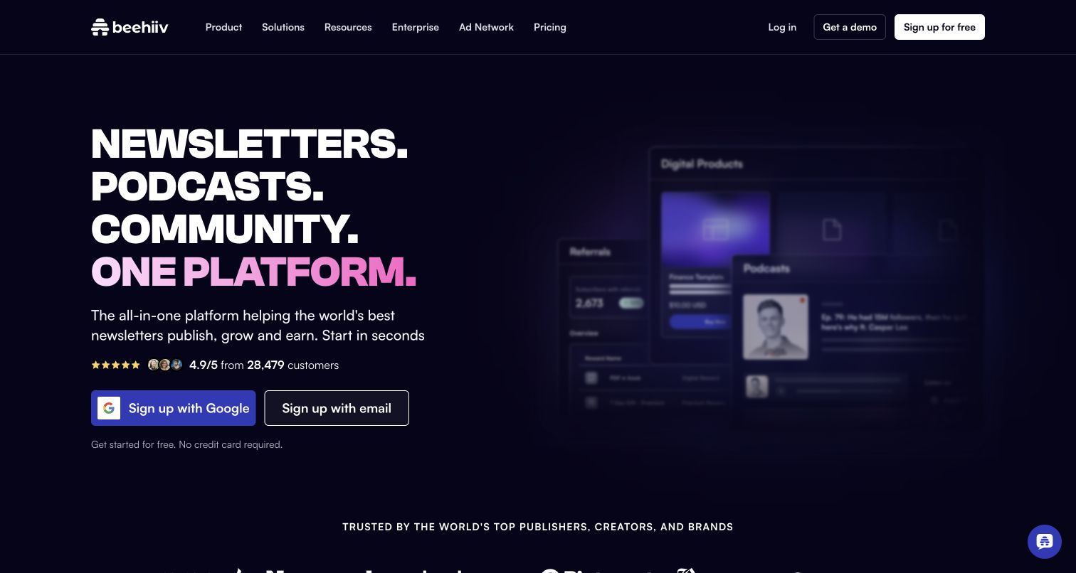
beehiiv uses a dark field, bold stacked words and a pink gradient to connect newsletters, podcasts and community in one proposition. Signup options sit beneath a short description, while a product interface montage begins to explain the broader offer. Navigation separates pricing, advertiser and creator routes. Twilio's case describes a SendGrid partnership for the newsletter platform's email delivery, sender reputation and mailstream management. It supports that documented publishing workflow, not a claim that SendGrid renders beehiiv's website or powers every current product. The page shows how a publishing service can communicate capabilities without losing its creator audience.
What you can learn
Keep publishing, audience growth and monetization understandable as separate jobs. Delivery infrastructure belongs behind clear sender controls, reputation safeguards and useful feedback without promising that every message will reach an inbox.
Pros
The short stacked headline communicates several product categories with a clear and consistent visual rhythm.
Pricing, advertising and creator signup have distinct routes instead of sharing a single ambiguous call to action.
Cons & considerations
The blurred interface montage communicates atmosphere more readily than it demonstrates a specific editing task.
A broad all-in-one promise needs later detail to explain which capabilities suit different publishing needs.
Visible tech stack
Earlier / documented evidence
SendGrid
Platform source: Official Twilio customer case — documented SendGrid email role. Newsletter publishing platform processes creator email through SendGrid, with a documented deliverability partnership. Official documented email-service relationship, which may describe an earlier implementation. This does not establish the current frontend, CMS, complete stack or independently tested delivery performance of the pictured page. Platform evidence is separate from the direct website screenshot and is not a complete current infrastructure audit.
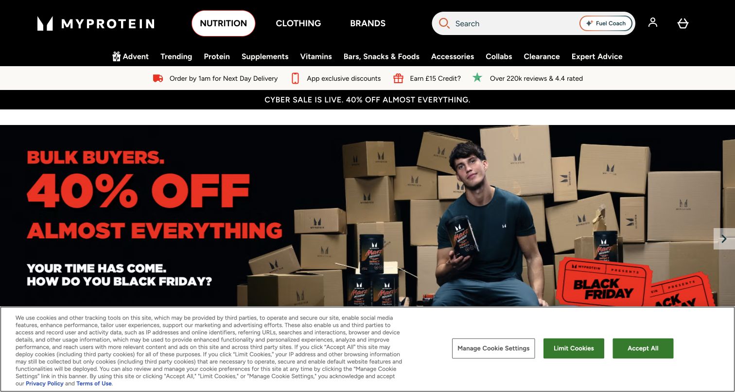
Myprotein's captured UK storefront surrounds a bold seasonal campaign with dense product navigation, search and short delivery or review cues. The large promotional panel uses striking red lettering against a dark scene, while the categories above it offer a way past the campaign for shoppers with a specific need. Twilio's THG case expressly names Myprotein and its localized sites within a shared ecommerce and customer-email platform using SendGrid. This is a historical group-platform association, not independent proof of the storefront's current rendering stack. The design issue is coordinating changing promotions with persistent routes to products and purchase information.
What you can learn
Match email offers to the correct regional storefront and current campaign details. Preserve a stable route to product information when the hero changes, and make exclusions or eligibility easy to discover before purchase.
Pros
Search and detailed product categories give returning shoppers alternatives to the dominant campaign presentation.
Delivery and service cues sit close to navigation where they can inform an early purchase decision.
Cons & considerations
Several promotional strips compete for attention and can make the overall page feel crowded.
Large discount language needs equally clear supporting conditions to prevent an oversimplified first impression.
Platform source: Official Twilio customer case — documented SendGrid email role. THG case specifically names Myprotein and its localized ecommerce sites within the shared commerce and customer-email platform. Historical group-platform relationship, not independent proof of current Myprotein frontend. Official documented email-service relationship, which may describe an earlier implementation. This does not establish the current frontend, CMS, complete stack or independently tested delivery performance of the pictured page. Platform evidence is separate from the direct website screenshot and is not a complete current infrastructure audit.
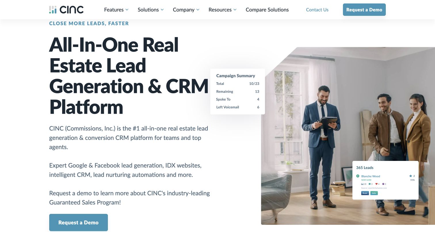
CINC's page spells out its real-estate lead-generation and CRM offer in a large left-hand headline. A property-tour photograph and small pipeline interface cards make the software's purpose easier to recognize, while the accompanying text names IDX websites and automated nurturing. The page belongs to Commissions Inc., avoiding confusion with unrelated companies sharing the acronym. Twilio's case documents SendGrid property-alert emails that direct prospects to CINC client websites, including earlier deliverability work. It is not proof of the marketing page's frontend. The useful pattern is making the audience and workflow explicit before introducing the details of the underlying communication infrastructure.
What you can learn
For specialized software, name the professional task and show the data that supports it. Property-alert destinations should preserve the listing and search context, with clear preferences instead of indiscriminate follow-up messages.
Pros
The headline identifies both the audience and software category without relying on brand familiarity.
Small interface overlays connect the property photograph with pipeline activity and the product's operational purpose.
Cons & considerations
The introductory copy is dense and gives several different growth claims similar visual weight.
The initial demo invitation offers less immediate product exploration for visitors comparing software independently.
Platform source: Official Twilio customer case — documented SendGrid email role. Customer-facing real-estate CRM and IDX website platform sends property-alert emails; distinct from unrelated CINC Systems. Official documented email-service relationship, which may describe an earlier implementation. This does not establish the current frontend, CMS, complete stack or independently tested delivery performance of the pictured page. Platform evidence is separate from the direct website screenshot and is not a complete current infrastructure audit.
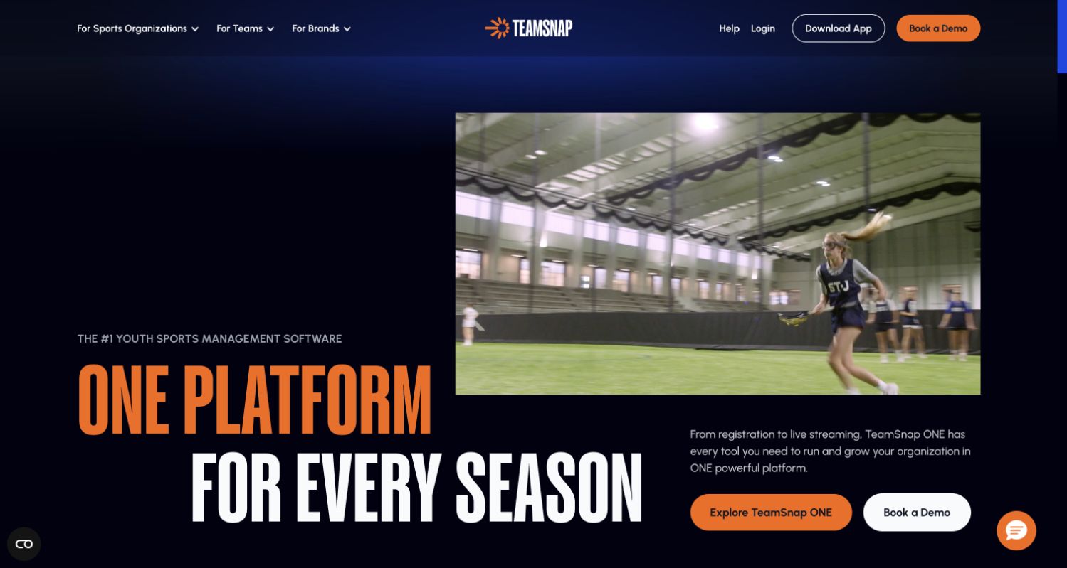
TeamSnap places a youth-sports video against a deep blue background, then uses orange and white type to introduce its platform. Organization, team and brand routes in the navigation help distinguish several audiences, while the hero pairs product exploration with a demo invitation. The official Twilio case describes a web and mobile team-management service using SendGrid for game reminders, registration confirmations and coach communications. The current page now distinguishes TeamSnap ONE from Classic; the earlier case should not be stretched into a claim about every new product's architecture. The lesson is connecting a platform promise with recognizable seasonal moments.
What you can learn
Give organizers, coaches and families distinct routes, then keep operational messages tied to the event or registration they concern. A reminder should make time, place and any required next action immediately clear.
Pros
The navigation acknowledges different sports audiences before asking them to explore the same product offer.
High-contrast typography and real activity footage give the software proposition a recognizable human context.
Cons & considerations
Large animated presentation consumes space that could otherwise explain concrete platform tasks above the fold.
The relationship between ONE and Classic needs careful explanation so existing users choose the correct route.
Platform source: Official Twilio customer case — documented SendGrid email role. Case explicitly identifies a mobile and web-based team-management platform with game reminders, registration confirmations and coach messages. Official documented email-service relationship, which may describe an earlier implementation. This does not establish the current frontend, CMS, complete stack or independently tested delivery performance of the pictured page. Platform evidence is separate from the direct website screenshot and is not a complete current infrastructure audit.
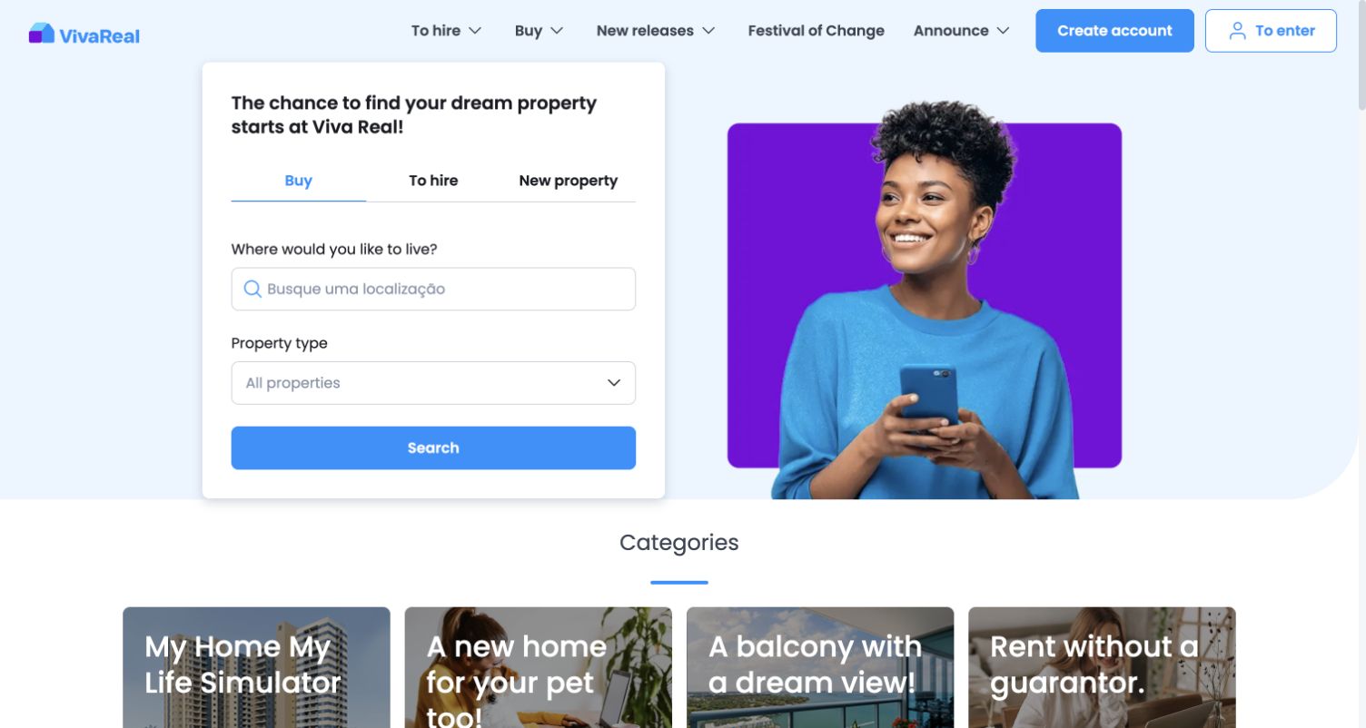
VivaReal puts buying, renting and new-property choices at the top of a search card, followed by location and property type. The adjacent portrait welcomes visitors without displacing the form; category cards provide alternative starting points. This capture reflects the browser's displayed translation of the Brazilian site. Twilio's case is explicitly historical, describing VivaReal's transition to SendGrid in 2011 and activity through 2013, including buyer inquiries and property newsletters. It does not verify today's portal infrastructure. The durable lesson is that a clear search intention can carry across the website and the subsequent email conversation.
What you can learn
Preserve location, transaction type and listing context when sending an inquiry or saved-search update. Keep the recipient's chosen criteria visible and editable rather than forcing them to reconstruct a search from a generic link.
Pros
Buy, rent and new-property tabs expose an important decision before visitors invest in detailed filtering.
A distinct search card gives the primary task a clear boundary within the broader homepage.
Cons & considerations
Category promotions below the form introduce additional choices before the visitor has narrowed their search.
Translated labels in this captured view should not be treated as verified original Portuguese interface wording.
Visible tech stack
Earlier / documented evidence
SendGrid
Platform source: Official Twilio customer case — documented SendGrid email role. Historical online real-estate portal case: prospective-buyer enquiries and property newsletters sent through SendGrid. Preserve historical2011–2013 scope. Official documented email-service relationship, which may describe an earlier implementation. This does not establish the current frontend, CMS, complete stack or independently tested delivery performance of the pictured page. Platform evidence is separate from the direct website screenshot and is not a complete current infrastructure audit.
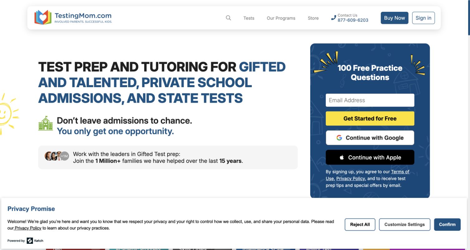
TestingMom presents its test-preparation scope in a large headline beside a contrasting panel offering free practice questions. The page makes the sample benefit concrete and places the email entry alongside familiar signup options. Test categories and separate membership or tutoring routes appear farther down, providing more detail about the offer. Twilio's case documents TestingMom's use of SendGrid Marketing Campaigns for segmented educational content and membership-related audiences. It supports that email-marketing role, not the site's rendering technology or educational effectiveness. The design shows how a sample-resource offer connects a public introduction with relevant follow-up material.
What you can learn
Tell families exactly what the sample contains and what future communication they are choosing. Use declared interests carefully, keep preferences understandable, and separate resource access from unsupported promises about a child's results.
Pros
The sample offer is specific enough to make the signup panel understandable without further navigation.
The page distinguishes test preparation, membership and tutoring instead of presenting every service as identical.
Cons & considerations
Urgent admissions language can overshadow the calmer explanation some parents need before evaluating an offer.
The large signup panel and privacy notice occupy substantial space before examples of the learning materials.
Platform source: Official Twilio customer case — documented SendGrid email role. Online education subscription platform uses SendGrid Marketing Campaigns for practice content, membership communication and segmented subscriber messages. Official documented email-service relationship, which may describe an earlier implementation. This does not establish the current frontend, CMS, complete stack or independently tested delivery performance of the pictured page. Platform evidence is separate from the direct website screenshot and is not a complete current infrastructure audit.
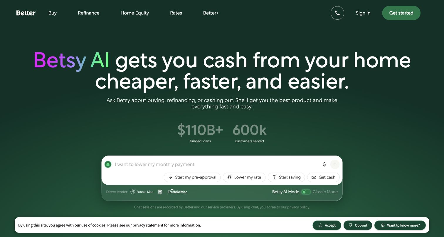
Better's current homepage centers a conversational mortgage assistant on a dark green background. Shortcuts for pre-approval, a lower rate, saving and accessing cash sit within the input area, while conventional product navigation remains above. A visible mode switch offers a route toward a classic form experience. Twilio's customer case describes Better Mortgage's online application service and SendGrid Email API for transactional emails. That earlier relationship does not establish the architecture of the pictured AI assistant or the accuracy of its claims. The lesson is offering recognizable intentions before asking visitors to explain a complex situation.
What you can learn
For a consequential application journey, preserve a clear conventional path alongside conversational help. Transactional messages should identify the application step and secure return destination without exposing unnecessary personal information in the email itself.
Pros
Intent shortcuts make the broad conversational input more approachable for visitors unsure how to begin.
Persistent product navigation and the mode switch provide alternatives to relying entirely on the assistant.
Cons & considerations
The large speed-and-savings promise requires careful supporting detail before a visitor evaluates a financial product.
A conversational entrance can leave the distinction between general information and a formal application unclear.
Platform source: Official Twilio customer case — documented SendGrid email role. Official case expressly describes its100%online mortgage application and SendGrid Email API managing transactional emails in that customer journey. Official documented email-service relationship, which may describe an earlier implementation. This does not establish the current frontend, CMS, complete stack or independently tested delivery performance of the pictured page. Platform evidence is separate from the direct website screenshot and is not a complete current infrastructure audit.
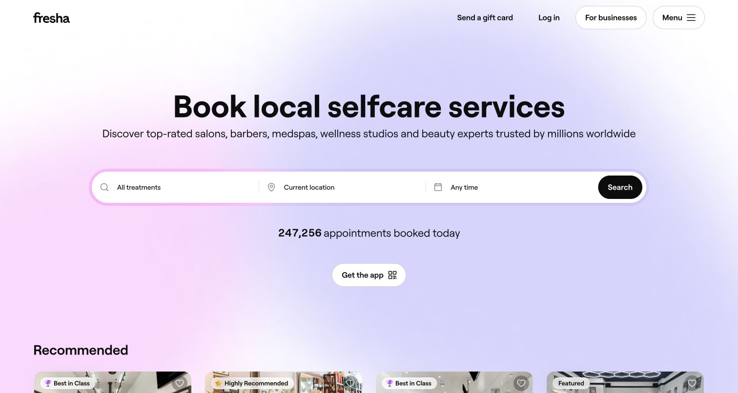
Fresha introduces local selfcare with a broad heading and a single horizontal search control for treatment, location and time. A soft gradient gives the otherwise minimal page character, while recommended businesses begin immediately below the opening section. Login, gifts and business-facing information remain separate in the header. Twilio's case identifies SendGrid-powered email within Fresha's wider customer-communications platform alongside messaging, voice and support tools. It does not assign every specific reminder channel to SendGrid or verify the page's frontend. The design makes several booking criteria feel like one task while preserving context for the next interaction.
What you can learn
Keep treatment, venue and appointment details consistent across discovery and subsequent messages. Distinguish booking confirmations from optional promotions, and make cancellation or support routes as recognizable as the original reservation action.
Pros
The combined search control groups the main appointment decisions without requiring a separate form page.
Recommended venue cards offer an alternative discovery path for visitors who have not chosen a provider.
Cons & considerations
The broad category promise leaves service-specific questions and availability to later stages of the journey.
Automatically presented location context needs an easy correction route before visitors rely on nearby recommendations.
Platform source: Official Twilio customer case — documented SendGrid email role. Official case identifies the beauty/wellness booking marketplace and its customer communications, explicitly including SendGrid-powered email alongside messaging, support and reminders. Official documented email-service relationship, which may describe an earlier implementation. This does not establish the current frontend, CMS, complete stack or independently tested delivery performance of the pictured page. Platform evidence is separate from the direct website screenshot and is not a complete current infrastructure audit.
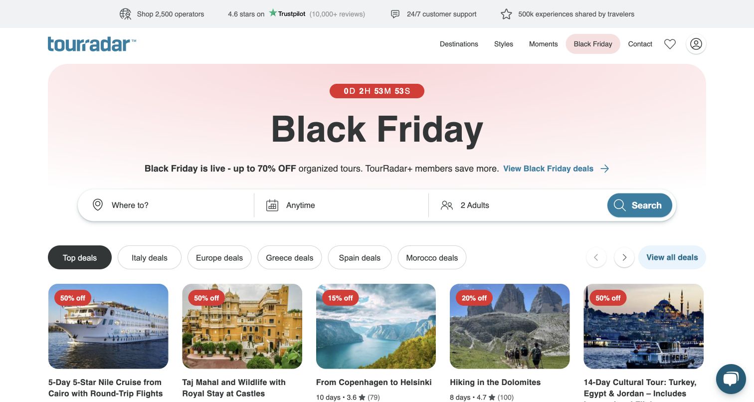
TourRadar combines a seasonal campaign with a search bar for destination, timing and party size. Below it, tour cards expose duration, ratings and prices beside recognizable destination photographs. Trust and support cues occupy a separate strip at the top, keeping them available without becoming the main pitch. Twilio's case documents SendGrid newsletters and transactional email for the tour-booking service, including periods of heavy promotional demand. Those historical operational claims are not independently tested here. The page connects an email campaign to a browsable collection, where visitors compare trips instead of facing another promotional slogan.
What you can learn
Carry campaign context into structured options, then keep itinerary and booking information distinct from discounts. A traveler should be able to identify the exact trip and support route before responding to urgency or membership offers.
Pros
Tour cards bring duration and commercial details together, making the first comparison more useful than imagery alone.
Destination, timing and party-size controls provide a practical route around the prominent seasonal campaign.
Cons & considerations
Countdowns and large discount claims can pressure attention away from itinerary details and booking conditions.
Membership savings and multiple offer labels make transparent price comparison especially important during promotions.
Visible tech stack
Earlier / documented evidence
SendGrid
Platform source: Official Twilio customer case — documented SendGrid email role. Official case describes its online multi-day tour marketplace and a dedicated SendGrid section: newsletters, personalized recommendations and transactional emails for the public travel platform. Official documented email-service relationship, which may describe an earlier implementation. This does not establish the current frontend, CMS, complete stack or independently tested delivery performance of the pictured page. Platform evidence is separate from the direct website screenshot and is not a complete current infrastructure audit.
Kegan has 15+ years of experience working with small businesses, Fortune 500 companies, and everything in between. No development job is too big or too small: he brings the same hands-on attention to a focused improvement, a complete website, or a custom application.
For SendGrid projects, he can help with responsive interfaces, reusable components, custom functionality, API connections, and performance-minded implementation. He works directly with clients on scope, design, implementation, testing, and handover, with an emphasis on clear communication and a system that remains practical to maintain after launch.
Show 3 other SendGrid developersHide other SendGrid developers
Choose the email workflow before choosing the interface
Transactional communication tied to a specific event
Order confirmations, application updates and booking instructions should repeat the relevant context and clearly identify the next action. Plan how the website and email behave when the event changes, a recipient cannot access an account or the message arrives late. Keep the authoritative state in the application so the inbox does not become the only place a customer can recover essential information.
A chosen subscription with useful editorial rhythm
For newsletters, recommendations and community updates, explain the content and expected frequency before signup. Make the destination worthwhile even for someone who returns after a delay. Aggregating repetitive updates can be more useful than sending every event, but that choice should follow the audience's needs and documented preferences.
A platform sending on behalf of other businesses
Commerce and publishing platforms need to distinguish the platform operator from the merchant or creator the recipient recognizes. Plan sender ownership, template controls, preferences and support responsibilities before scaling. The Shopify, Klaviyo and beehiiv cases illustrate documented platform relationships; their historical architectures are examples to study, not ready-made configurations to copy.
From references to requirements
Plan the website and its communication as one journey
Map events, destinations and ownership
List each message category, the event that permits it and the page it should open. Name the team responsible for wording, template changes, sender identity and operational support. A campaign and its destination need coordinated updates when prices, availability, product names or instructions change.
Define failure and recovery behavior
Explain what the website shows when email is delayed, an address is wrong or a recipient needs a replacement link. Choose retry and duplicate-prevention behavior deliberately. Use provider events to diagnose delivery problems while keeping customer-facing status based on the actual order, booking or account state.
Limit the information carried in email
Include enough context for recognition without putting unnecessary personal or sensitive details into the message or its URL. Keep privileged actions behind an appropriate authorized application flow. Review templates, logs and diagnostic exports so convenient troubleshooting does not become unintended disclosure.
Evaluate a complete destination experience
Check long product names, narrow screens, keyboard navigation and clear action labels on the website and message templates. Include expired offers, changed appointments, unsubscribed recipients and missing data in the review. The success criterion is a comprehensible journey, not merely a technically accepted send.
A useful handover demonstration
Ask the actual team to carry out its routine job: publish a realistic update, correct a mistake, preview a narrow screen, and identify who owns an integration failure. For a library or frontend framework, also ask who maintains the content source and deployment. A polished screenshot does not answer those operational questions.
Beyond the screenshot
A practical website and SendGrid planning checklist
Name the exact customer task and reason for every message category.
Keep sender identity recognizable and authenticate the intended sending domain.
Explain subscription topics and frequency before asking for signup.
Preserve product, booking or application context on the linked destination.
Keep campaign conditions and availability consistent with the live website.
Provide clear preference and unsubscribe routes for the relevant communication.
Distinguish provider processing, delivery events and completed customer actions.
Plan duplicates, delays, changed details and recovery without relying only on email.
Keep sensitive data and privileged actions within their appropriate access boundaries.
Assign owners for templates, event definitions, support and ongoing destination maintenance.
Test with real content, a keyboard, a small screen, slow or failed requests, and the people who will maintain the system. These are planning checks, not an accessibility, security, performance, or search-ranking certification.
Sources & editorial method
How this SendGrid collection was reviewed
Public pages and official Twilio customer cases were reviewed on November 11, 2026. Sixteen screenshots were captured directly for this collection; four verified original captures retain their earlier dates. Each SendGrid association describes the particular email service or platform workflow documented by its case, not detected frontend runtime. The VivaReal case specifically describes activity from 2011–2013, and other cases also represent the implementations they document rather than guarantees of current architecture. Broad source-stack audit attempts retain their actual dates and unavailable or robots-limited outcomes. Reviews consider visible public interfaces, not authenticated customer accounts or independently measured email delivery.
Every image is an unmodified capture from the actual website, with its source and capture date. Some captures are reused from our shared catalog; their dates remain the original capture dates. None comes from a vendor gallery or a generated reconstruction. Moving imagery and live content can change.
Technology attribution uses public page assets or metadata, official platform documentation, or a cited first-party project case study. Documentary and framework-relationship evidence is identified where used; it is not a complete current backend inventory. A CMS image CDN alone does not establish a full CMS deployment. A library’s presence does not prove which individual controls use it, and a platform label does not establish AI authorship.
The composition notes, lessons, pros and tradeoffs are original editorial observations. We have not measured conversion, traffic, security, performance or accessibility conformance. Website owners retain their brands and imagery; these examples are not our client portfolio. Written, Edited and Curated are independent records, not dates advanced by a build. See our editorial standards or suggest a correction.
Questions worth asking
SendGrid website development FAQs
Are these websites built with SendGrid?
The evidence supports a more specific statement: each public property is associated with a documented SendGrid email workflow. SendGrid handles email services; its customer case does not identify the CMS or frontend that renders the captured website.
Why include older customer cases?
They document real implementation decisions and communication patterns. Their age and scope matter: a historical relationship can be useful evidence without proving that every current feature still uses the same architecture. The reviews retain those limits instead of presenting old claims as new observations.
What can a public screenshot prove?
It records the visible interface at its capture time, including navigation, layout and public content. It cannot establish a hidden email service, delivery rate, private account workflow or complete technology stack. Technical associations require separate sources.
Does a delivered event prove someone read the email?
No. Delivery and recipient engagement are different observations. Provider events can help diagnose the message's progress, but an application should use its own appropriate evidence to establish whether the intended task was completed.
How should marketing and operational messages differ?
Give each a clear purpose, recognizable context and suitable recipient controls. A requested booking update should not be made confusing by unrelated promotional material. Define the categories and responsibilities before implementing templates and preferences.
What should a team borrow from these examples?
Borrow a useful journey: a clear signup promise, a focused search, an understandable confirmation or a destination that preserves context. Adapt it to your product and audience, and verify your own delivery, privacy, accessibility and operational requirements.
Choose a communication pattern that makes the next step easier to understand. Then build the website, message and destination around the same task, with honest evidence and clear ownership.