Definitive guide · Microsoft Azure website development
Best Microsoft Azure Websites of 2026 (20 Real-World Examples)
Public website design references with qualified Microsoft Azure application and business-workload evidence
Study 20 public interfaces alongside official Microsoft Azure customer sources. These are design references from organizations with documented Azure associations, not a declaration that every pictured homepage is currently hosted on Azure or shares the same application architecture.
Microsoft Azure includes many infrastructure, application, data and AI services. It is not one kind of website design, and an organization can use it for an internal assistant while publishing its marketing content through another system. Before selecting services, define the public website, administrative workflow, private information and business integrations as distinct responsibilities.
BMW, Adobe, Siemens, Mercedes-Benz and AXA open the collection with established major-brand context. Their primary sources describe different workloads and dates. Connected-car services, employee assistants and a campaign application should not be combined into a fictional whole-company stack. The visible design is useful to study even when your project does not need the infrastructure described by a source.
Before the examples
What makes good Microsoft Azure website development in 2026?
Begin with the application boundary
Write a plain-language account of what the site does and which systems it touches. Separate public content, customer accounts, employee tools and background tasks. A familiar cloud account does not make all of those responsibilities equivalent, and an internal AI case study is not a template for a public lead-generation website.
Choose a hosting responsibility the team can maintain
Azure offers managed application and container options as well as more involved infrastructure choices. Compare them against the real runtime, integrations and support model. Ask what the delivery team must operate after launch, including releases and recovery, rather than selecting the option with the most elaborate diagram.
Use explicit requirements for availability, security, performance and cost. Translate them into representative user tasks and operating checks, not an unsupported claim that choosing Azure makes a website enterprise-ready. The Well-Architected Framework can structure the discussion, while the project still needs its own evidence and acceptance criteria.
20 Microsoft Azure website examples worth studying
Read the design critique and the Azure source as separate evidence. A dated employee or product application proves its stated association, not the deployment arrangement of a regional marketing page, a corporate newsroom or every subsidiary website.
We start with five recognizable brands or organizations: BMW, Adobe, Siemens, Mercedes-Benz, AXA. Each attribution applies to the named website property, not every product or website belonging to its organization. This is a curated reading sequence, not a measured ranking.
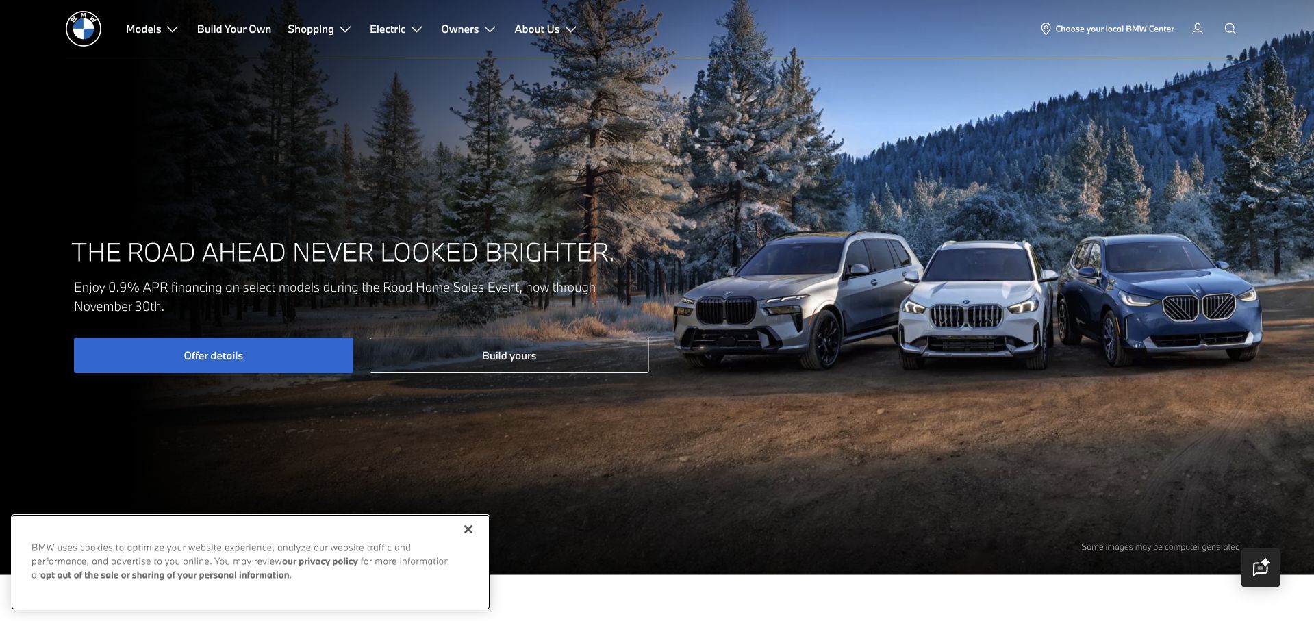
BMW’s US page gives a vehicle campaign considerable photographic space while keeping models, shopping, electric vehicles and owner information in a consistent header. The main shopping routes do not depend on the current campaign, and dealer selection is treated as a practical task rather than part of the advertising message. That is useful for a product with a long customer relationship: someone comparing a model, configuring a car and looking for ownership information should not all have to follow the same promotional journey to find a relevant destination.
What you can learn
Define the durable tasks before designing the changing campaign. Microsoft’s MyBMW case establishes an Azure application-services association, not proof that the captured US marketing homepage shares the connected-car application’s complete architecture or hosting setup.
Pros
Persistent configuration and shopping routes give the visually ambitious opening a practical role.
Owner information remains a distinct destination instead of being hidden behind the purchase journey.
Cons & considerations
A campaign cannot provide all the regional availability and configuration detail a shopper needs.
Large automotive imagery needs efficient responsive variants and readable text contrast across different scenes.
Platform source: Primary documented Microsoft Azure association. Microsoft documents MyBMW application services on Azure. Platform evidence is separate from the direct website screenshot and is not a complete current infrastructure audit.
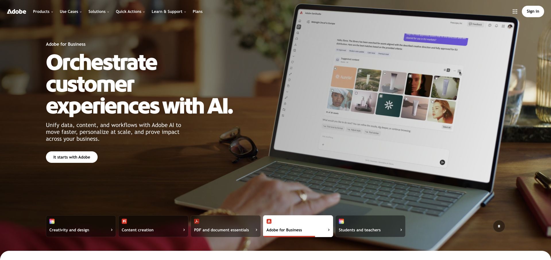
Adobe organizes its opening around a prominent campaign and a selector for major product families. Creative, document, business and education needs have distinct labels, but remain part of one visual system. This is useful when visitors arrive with different kinds of familiarity: some know a specific application, while others only know the task they want to accomplish. The shared navigation and family structure provide routes into that larger catalog without forcing the first screen to reproduce a detailed comparison table for every product.
What you can learn
Let the interface organize the offering around recognizable tasks and families. Microsoft’s Adobe story describes connected Azure cloud services, which is a documentary enterprise association rather than a verified inventory of the public homepage’s CMS, frontend or production deployment.
Pros
The family selector gives several product lines a consistent place within the same introduction.
Campaign content and broader navigation can coexist without making every product equally prominent.
Cons & considerations
Visitors unfamiliar with Adobe’s product names may still need a more task-oriented explanation.
Media-heavy creative demonstrations require restrained loading and clear alternatives for reduced-motion preferences.
Platform source: Primary documented Microsoft Azure association. Microsoft identifies Adobe’s Azure connected-cloud services. Platform evidence is separate from the direct website screenshot and is not a complete current infrastructure audit.
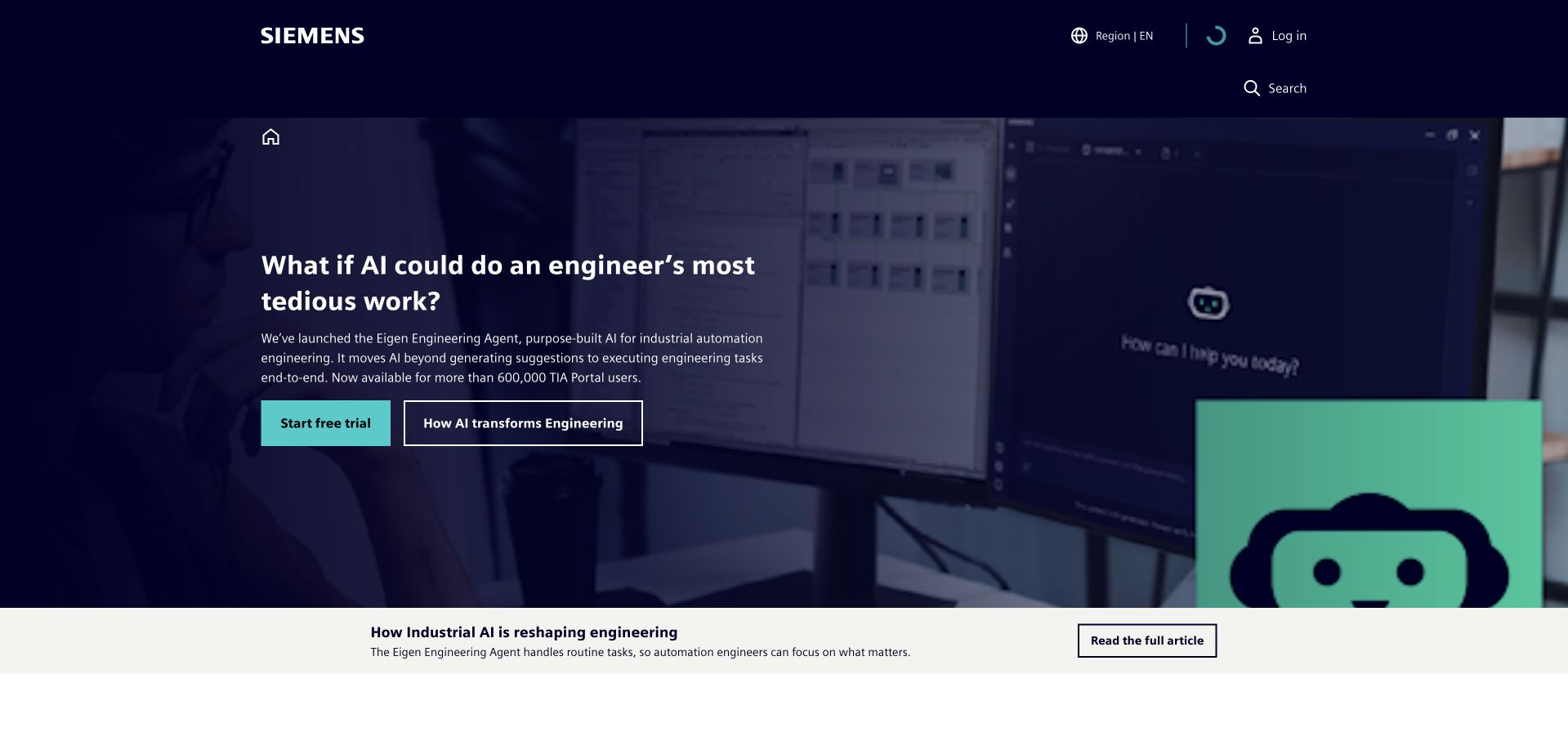
Siemens’ homepage places a focused industrial-technology proposition against a dark visual background, with a clear primary route and a supporting explanation. Products and services, solutions, industries, partners and insights remain distinct navigation areas. The page can therefore lead with a current topic while preserving a much broader reference structure. This is useful for a company whose technical offerings span many applications: the opening should make one idea understandable, but must not imply that every visitor has the same project or level of product familiarity.
What you can learn
Connect a current technical theme to a durable taxonomy of products and applications. Microsoft documents Siemens Industrial Copilot work with Azure OpenAI; that does not identify the complete runtime of this corporate page or every Siemens product and customer deployment.
Pros
The focused proposition gives a large industrial portfolio a more approachable entry point.
Separate product, industry and solution routes support different ways of evaluating the offering.
Cons & considerations
A broad campaign needs concrete examples to distinguish available features from future ambitions.
Large navigation systems require careful mobile grouping and descriptive labels to avoid becoming an obstacle.
Platform source: Primary documented Microsoft Azure association. Microsoft documents Siemens industrial tools using Azure OpenAI. Platform evidence is separate from the direct website screenshot and is not a complete current infrastructure audit.
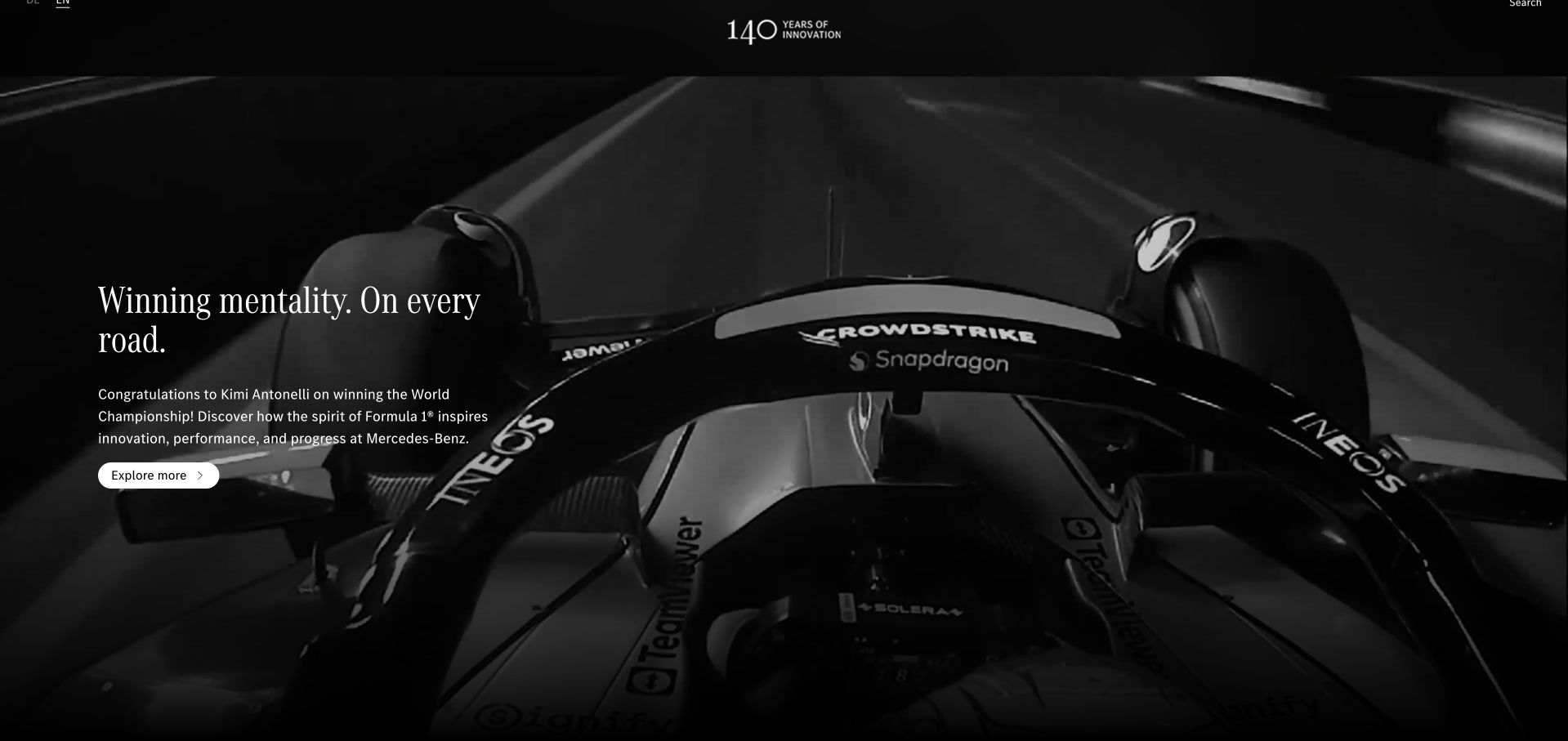
Mercedes-Benz’s global brand page uses a dark, image-led feature and a short editorial message rather than beginning with a full vehicle comparison grid. Product families, design, culture, sustainability and innovation have their own routes in the surrounding navigation. The visual treatment gives a specific story room to establish the brand’s character, while the broader structure allows visitors to explore a different interest. This is useful for a global brand experience that serves a different purpose from a local dealer or transactional configuration site.
What you can learn
Make the distinction between a brand experience and a local purchase journey explicit. Microsoft’s 2020 case concerns Mercedes-Benz R&D connected-car services on Azure, not the current hosting of this global brand page or every vehicle-related digital system.
Pros
A restrained dark composition gives the featured story a clear visual identity.
Separate product-family and editorial routes accommodate interests beyond the opening campaign.
Cons & considerations
A global brand story may not answer a local shopper’s practical availability or pricing question.
Image-led storytelling needs descriptive alternatives and clear navigation when the visual is unavailable.
Visible tech stack
Earlier / documented evidence
Microsoft Azure
Platform source: Primary documented Microsoft Azure association. Microsoft’s 2020 case study describes Mercedes-Benz R&D connected-car services on Azure. Platform evidence is separate from the direct website screenshot and is not a complete current infrastructure audit.
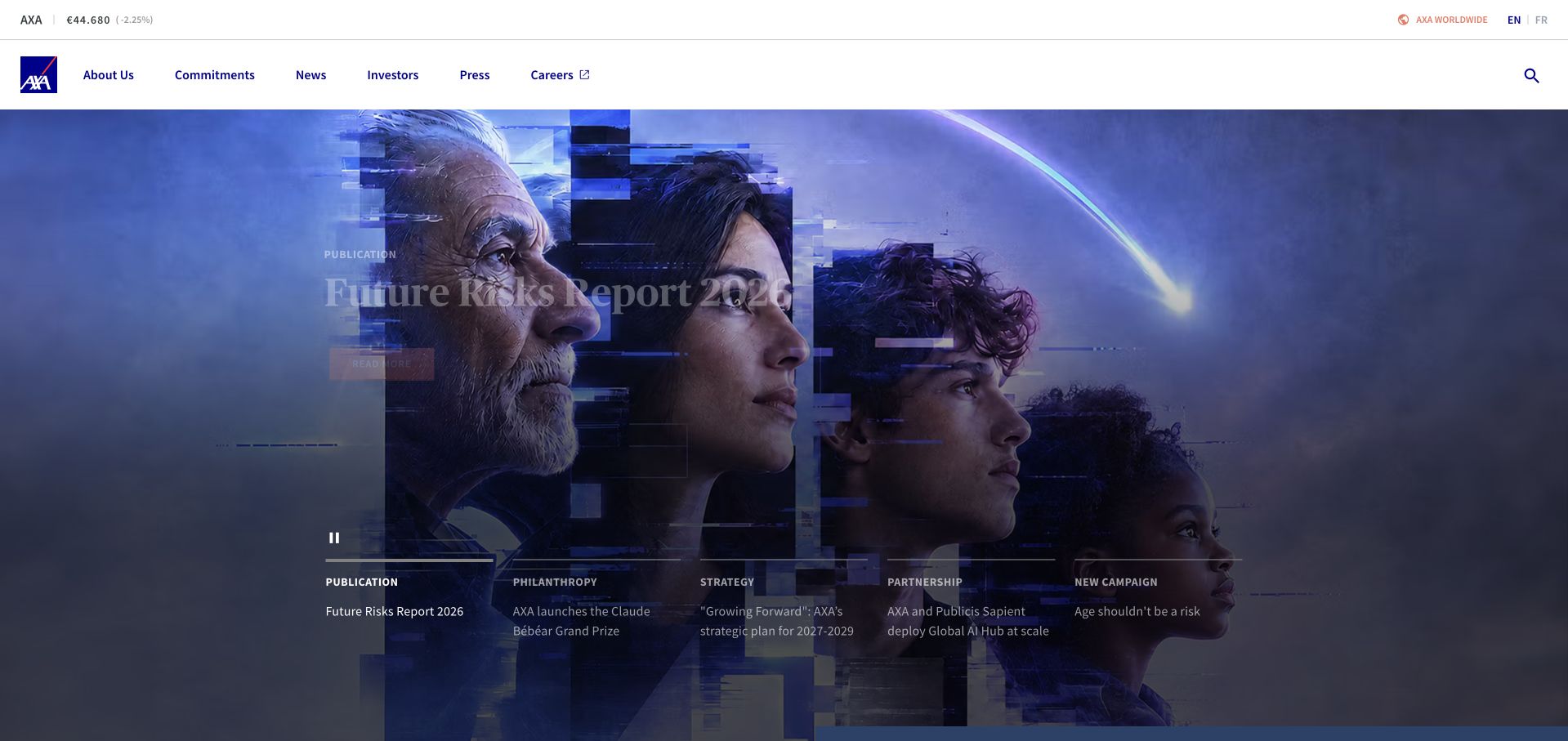
AXA’s corporate opening uses a large report-oriented visual feature, with company, commitments, news, investor, press and career routes surrounding it. The layout establishes the page as an institutional destination rather than a local insurance checkout. A compact share-information element and language controls support that context without becoming the main story. This is useful for an organization whose name appears across many consumer services: the corporate page can explain a wider perspective while leaving local product eligibility and account activity to more appropriate destinations.
What you can learn
A corporate research feature should connect to clear reference routes and dated supporting material. Microsoft’s AXA Secure GPT case concerns an employee AI platform using Azure OpenAI, not proof of this public page’s hosting or the suitability of any insurance product.
Pros
The report-led feature gives the corporate site a concrete subject rather than a generic welcome.
Investor and press routes remain accessible alongside broader company information.
Cons & considerations
Research-oriented positioning may not help someone looking for a particular local insurance service.
Institutional claims need full sources and context beyond the homepage’s editorial emphasis.
Platform source: Primary documented Microsoft Azure association. Microsoft documents AXA Secure GPT using Azure OpenAI. Platform evidence is separate from the direct website screenshot and is not a complete current infrastructure audit.
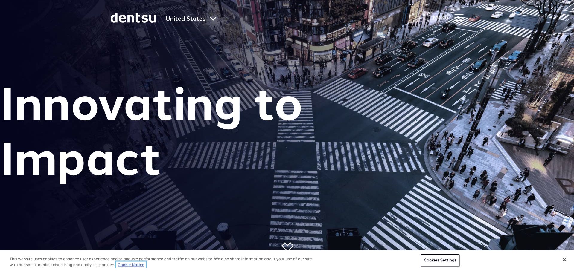
Dentsu’s public homepage overlays an oversized statement on an aerial urban photograph. The compact header keeps the regional context and menu visible, while the image supplies a recognizable real-world setting for a broad service proposition. This is useful as a study in visual confidence: a small number of elements can create a strong first impression without a card for every capability. The tradeoff is that the navigation and following content must quickly explain the actual services, relevant work and the boundaries of a prospective engagement.
What you can learn
A memorable statement earns attention, but practical service information must follow promptly. Microsoft’s cited case describes a Dentsu media-insights copilot built with Azure services; it does not establish the runtime of this regional marketing page or every Dentsu client project.
Pros
The large type and contextual photograph create a coherent visual opening without many competing modules.
Visible regional context helps explain which part of a global organization the visitor has reached.
Cons & considerations
A broad statement offers little detail about a particular service or project fit.
Extremely large typography needs careful line breaks and spacing across mobile sizes and translations.
Visible tech stack
Earlier / documented evidence
Microsoft Azure
Platform source: Primary documented Microsoft Azure association. Microsoft documents Dentsu’s media-insights copilot using Azure AI Foundry and Azure OpenAI. Platform evidence is separate from the direct website screenshot and is not a complete current infrastructure audit.
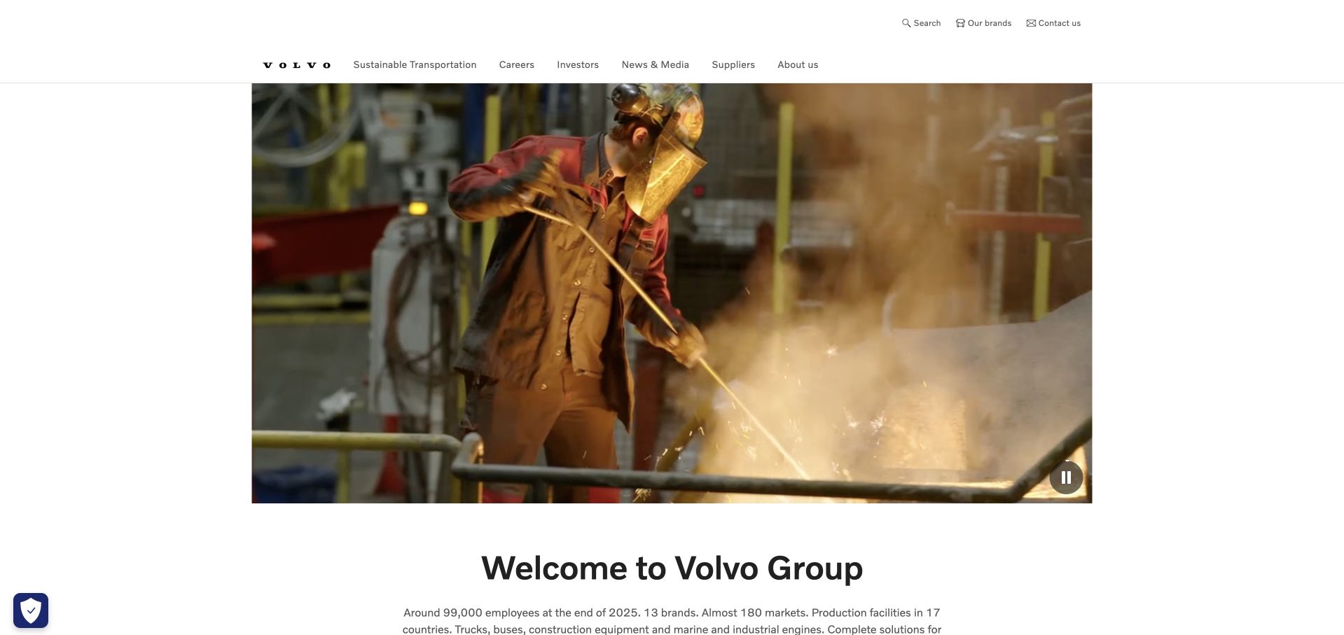
Volvo Group’s homepage frames a substantial visual introduction with navigation for sustainable transportation, careers, investors, news and the wider organization. A separate brands route helps distinguish the parent company from individual product businesses. The page does not need to behave like a retail vehicle configurator to be useful. Instead, it can explain the group and direct different audiences toward the relevant body of information. This is a useful reference whenever a familiar name has both consumer associations and a broader organizational structure that visitors may not immediately understand.
What you can learn
Explain the parent organization before expecting visitors to interpret its portfolio. Microsoft’s Volvo case concerns document and claims processing with Azure AI, not evidence that every vehicle system, group subsidiary or the corporate homepage uses an identical cloud deployment.
Pros
The brand-portfolio route helps clarify the relationship between the group and its individual businesses.
Career and investor tasks remain distinct from the main corporate story.
Cons & considerations
A broad group introduction may be insufficient for visitors seeking a specific product specification.
Large visual features need accessible controls and useful text context rather than relying entirely on atmosphere.
Platform source: Primary documented Microsoft Azure association. Microsoft documents Volvo document-processing tools using Azure AI. Platform evidence is separate from the direct website screenshot and is not a complete current infrastructure audit.
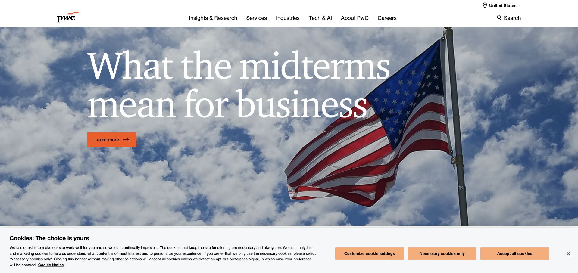
PwC’s US homepage leads with a timely business question on a large photographic background. Insights and research, services, industries, technology, company information and careers remain available above it. The opening feels like an editorial invitation rather than a generic capabilities statement, which can make a broad advisory organization easier to approach. The important design relationship is between the current feature and the durable structure: the topic can change with events, while visitors who arrive with a specific service question still have a direct route to more relevant information.
What you can learn
Use timely editorial content as one entry point, not as the whole service architecture. Microsoft’s ChatPwC case establishes an Azure AI application association, not a claim about the captured public site’s complete hosting stack or the outcome of any advisory engagement.
Pros
A concrete editorial question gives the first screen more relevance than an undifferentiated service list.
Stable industry and service routes support visitors whose needs differ from the featured topic.
Cons & considerations
Current-events features require careful dating and ongoing editorial maintenance.
A highly topical lead may distract a visitor looking for a narrow, immediate professional service.
Visible tech stack
Earlier / documented evidence
Microsoft Azure
Platform source: Primary documented Microsoft Azure association. Microsoft documents ChatPwC using Azure OpenAI. Platform evidence is separate from the direct website screenshot and is not a complete current infrastructure audit.
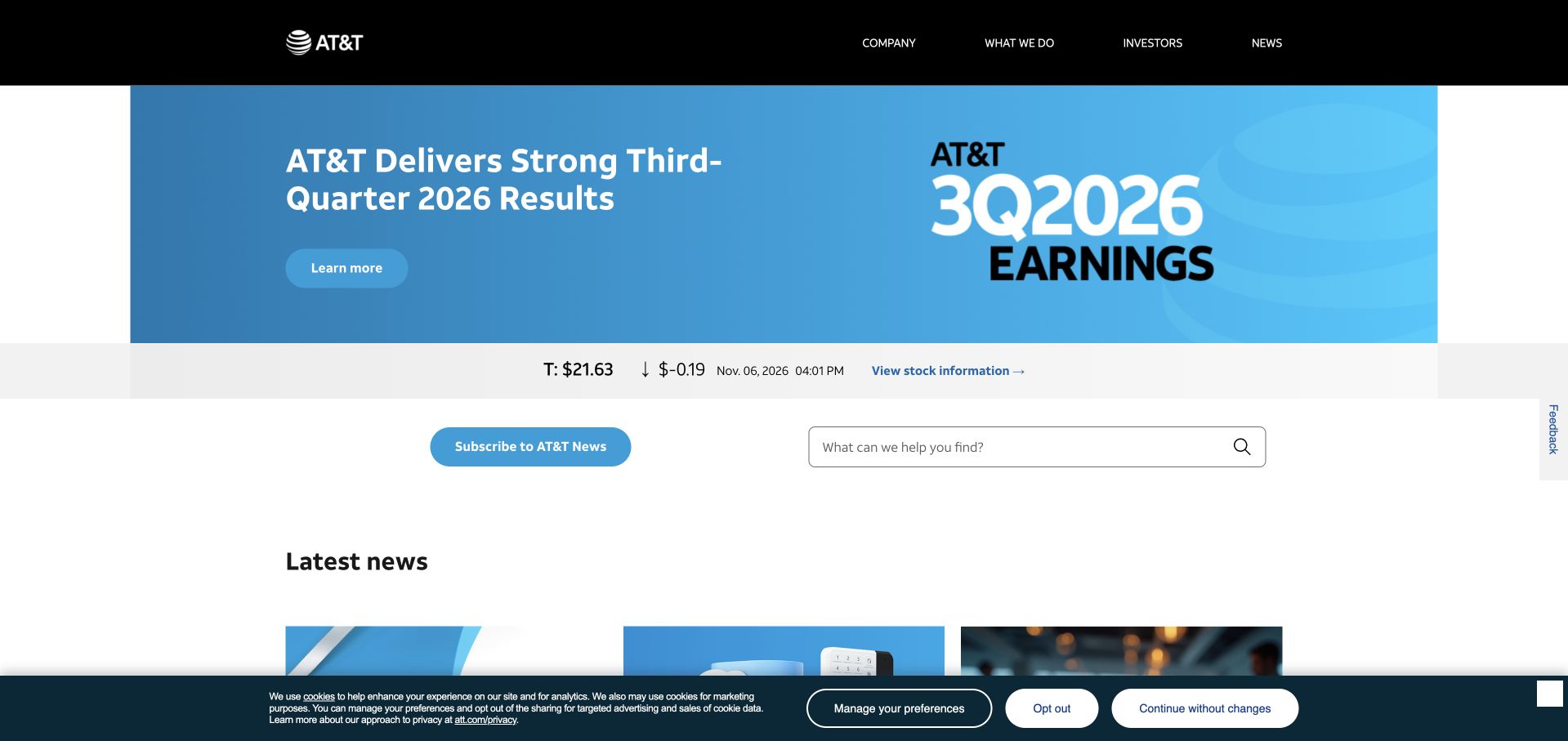
AT&T’s newsroom opens with a prominent earnings-related feature, supported by a compact stock-information strip and a latest-news area. The header distinguishes company information, business context, investors and news, while subscription and search tools support ongoing reading. This is useful for a large service provider with a separate consumer storefront: the corporate publication can prioritize announcements and organizational information without reproducing a mobile-plan purchase journey. The simple relationship between the lead story and the archive also helps readers understand where current news fits within the larger reference system.
What you can learn
Choose a publication structure for public announcements rather than borrowing transactional product navigation. Microsoft documents AT&T employee IT and HR assistants using Azure OpenAI; that named workload does not establish the infrastructure of the newsroom or every consumer network and service.
Pros
The lead announcement and latest-news area make the publication’s hierarchy straightforward to understand.
Investor and company routes serve institutional readers without requiring a retail shopping context.
Cons & considerations
An earnings-led introduction may be less relevant to readers seeking other company topics.
Stock and corporate performance information need dates and full supporting documents beyond the homepage display.
Platform source: Primary documented Microsoft Azure association. Microsoft documents AT&T employee IT and HR assistants using Azure OpenAI. Platform evidence is separate from the direct website screenshot and is not a complete current infrastructure audit.
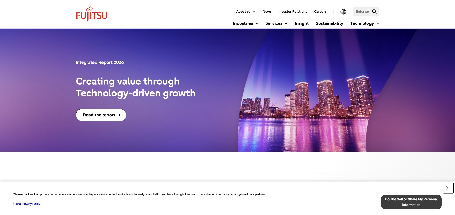
Fujitsu’s global page places a report-led feature within a recognizable two-level navigation system. Company information, news, investors and careers sit alongside routes for industries, services, insights, sustainability and technology. The main visual combines a restrained architectural image with a strong purple field, giving a broad organization a coherent opening without listing every capability in the hero. The useful reference is the way the page can serve both institutional readers and prospective technical buyers while keeping their destinations distinguishable.
What you can learn
Use a concrete report or editorial object to anchor a broad corporate introduction. Microsoft’s Fujitsu case concerns an internal sales-automation agent using Azure AI Agent Service; it does not prove the hosting of this global marketing page or the technology behind every client delivery.
Pros
The report feature provides a tangible subject within an otherwise very broad technology portfolio.
Industry and service routes offer distinct ways to explore the organization’s capabilities.
Cons & considerations
Two navigation levels can become difficult to scan on smaller screens.
A corporate-report lead still needs clear onward routes for visitors looking for a specific implementation service.
Platform source: Primary documented Microsoft Azure association. Microsoft documents Fujitsu’s sales-automation agent using Azure AI Agent Service. Platform evidence is separate from the direct website screenshot and is not a complete current infrastructure audit.
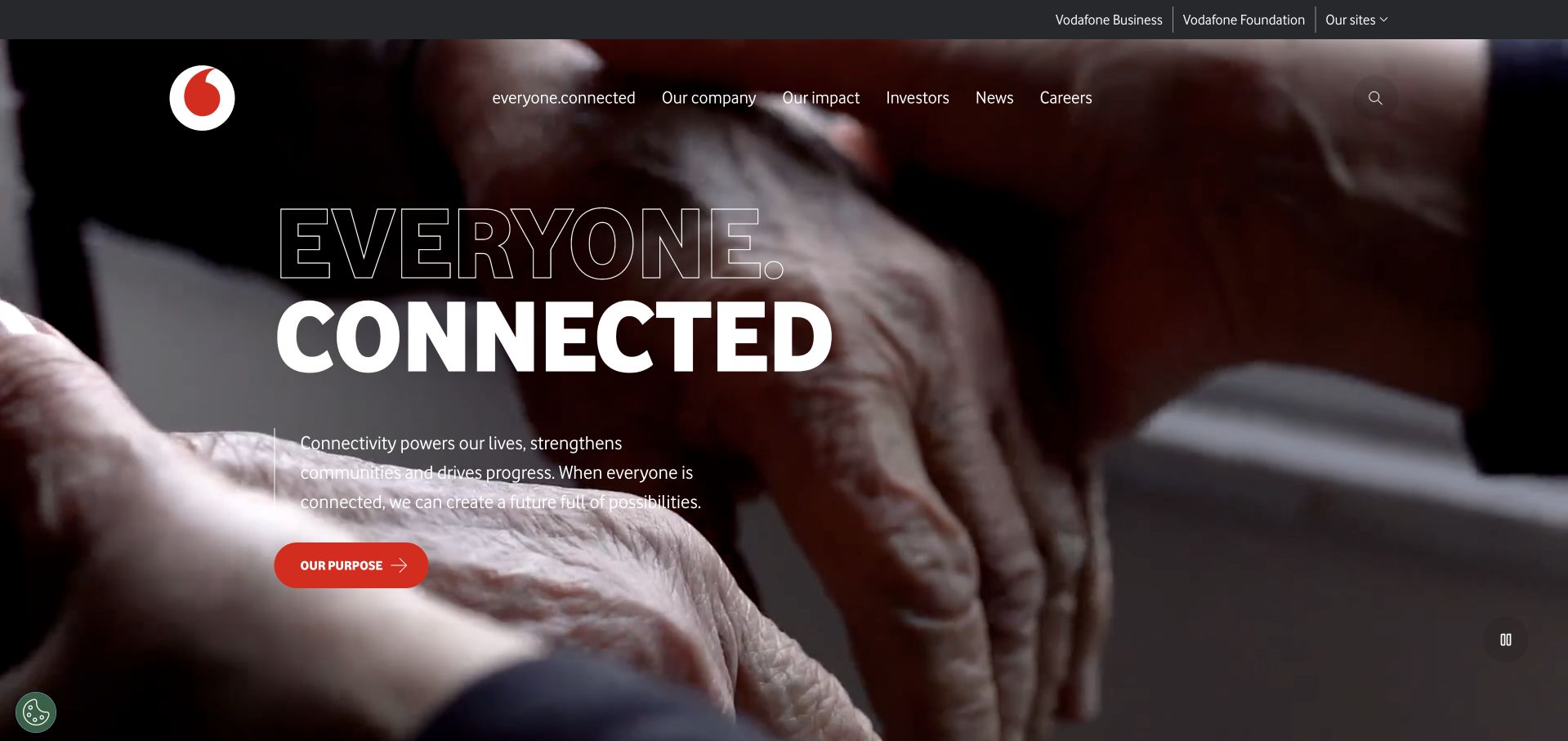
Vodafone’s global site combines a broad connectivity message with a large human photograph and a direct purpose route. Business and foundation links sit in a supporting header layer, while company, sustainability, investor and newsroom information form the institutional structure. The page is not a substitute for every local market’s phone or broadband storefront. That distinction is useful for a global service brand: it can explain a shared purpose and organization without making visitors assume that pricing, account access and product availability are uniform across countries.
What you can learn
Separate the global organization from market-specific service journeys. Microsoft’s customer summary documents Vodafone’s TOBi assistant using Azure services; it is a qualified application association, not a current inventory of this corporate page or all regional telecommunications systems.
Pros
The human visual gives a broad connectivity proposition an approachable point of reference.
Global business and foundation routes make the institutional role of the page clearer.
Cons & considerations
Purpose-led copy needs specific evidence and examples to distinguish it from other large service brands.
Visitors seeking local service or account information need a clear route away from the global corporate page.
Platform source: Primary documented Microsoft Azure association. Microsoft documents Vodafone TOBi using Azure services. Platform evidence is separate from the direct website screenshot and is not a complete current infrastructure audit.
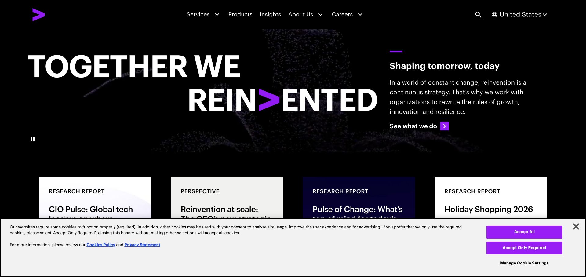
Accenture’s homepage uses bold white typography on a black field, with its purple brand mark integrated into the opening. A short supporting explanation sits beside the main statement, and a row of research and perspective cards begins beneath it. Services, products, insights, company information and careers remain recognizable header routes. This is useful because the page does not ask a broad brand statement to do all the explanatory work: it starts to connect the positioning with concrete editorial material that a visitor can explore at a different level of detail.
What you can learn
Follow a broad proposition with specific objects to read or evaluate. Microsoft’s Accenture case concerns a centralized Azure AI development platform, not proof about the public homepage’s runtime or a guarantee of results in any future consulting engagement.
Pros
The strong black-and-purple system makes the brand and primary hierarchy immediately recognizable.
Research cards provide concrete supporting destinations beneath a broad opening statement.
Cons & considerations
A confident brand phrase can remain abstract without service-specific detail further down.
Several insight cards need clear prioritization so they do not compete equally with the main introduction.
Platform source: Primary documented Microsoft Azure association. Microsoft documents Accenture’s Azure AI development platform. Platform evidence is separate from the direct website screenshot and is not a complete current infrastructure audit.
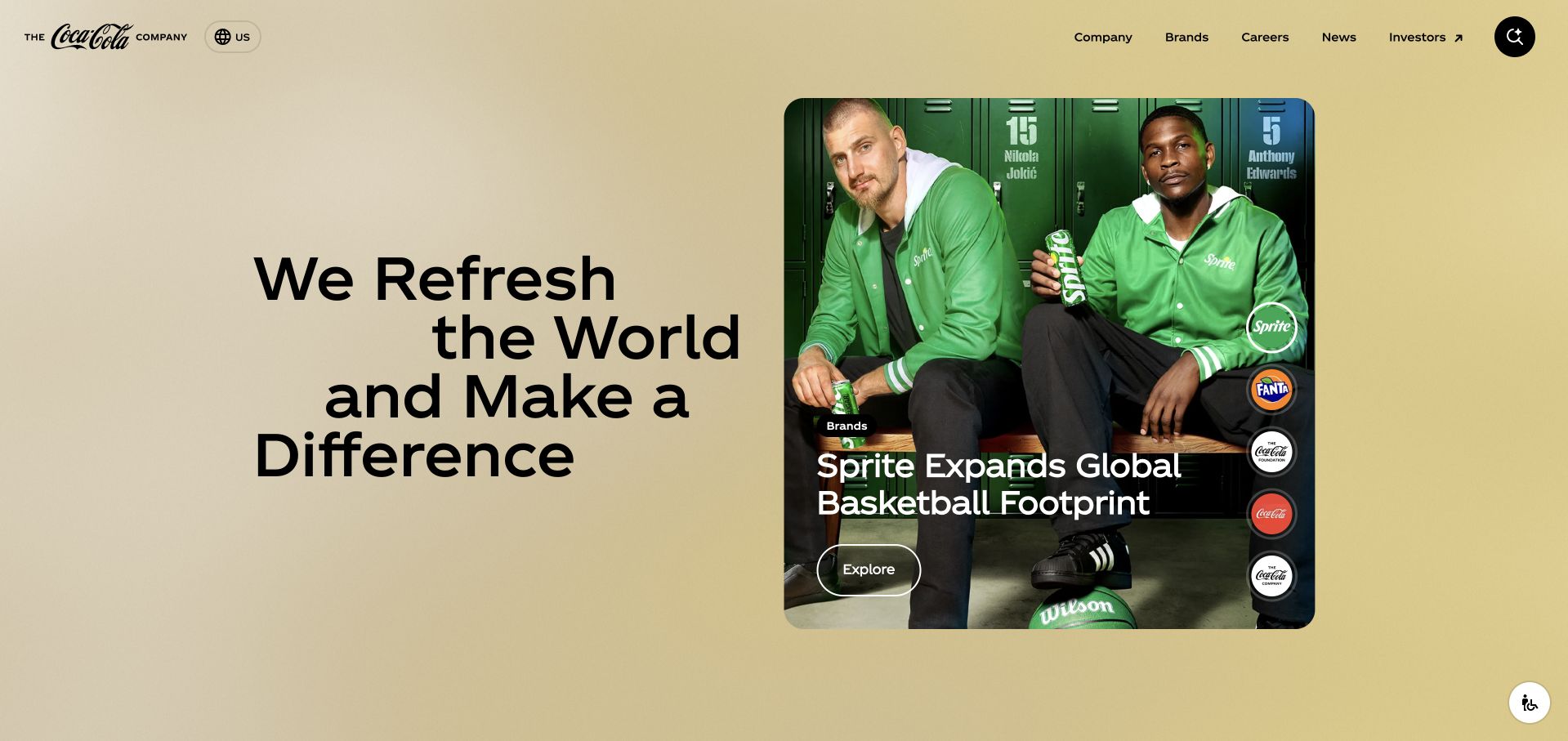
The Coca-Cola Company’s corporate page combines a concise purpose-led introduction with large rounded visual modules. Company information, brands, careers, news and investors have clear navigation labels, giving the parent organization a recognizable role beyond individual product advertising. The page can connect to people and everyday consumer imagery without becoming a store or a local promotion. This is useful for a business with many brands and markets: a shared corporate destination should explain what is common, while still giving visitors an understandable path to the specific area they need.
What you can learn
Make the scope of a shared corporate surface explicit. Microsoft’s cited Azure case concerns Coca-Cola’s interactive Santa campaign, not proof that this corporate page, every country site or the whole brand portfolio uses that campaign’s technology.
Pros
The parent-company navigation supports several audiences without reproducing a retail product grid.
Large text and image modules give a complex organization a more digestible visual structure.
Cons & considerations
A broad purpose statement requires evidence and concrete examples to avoid sounding generic.
Visitors may still need help distinguishing the corporate site from local consumer-brand experiences.
Platform source: Primary documented Microsoft Azure association. Microsoft documents Coca-Cola’s interactive Santa campaign using Azure AI. Platform evidence is separate from the direct website screenshot and is not a complete current infrastructure audit.
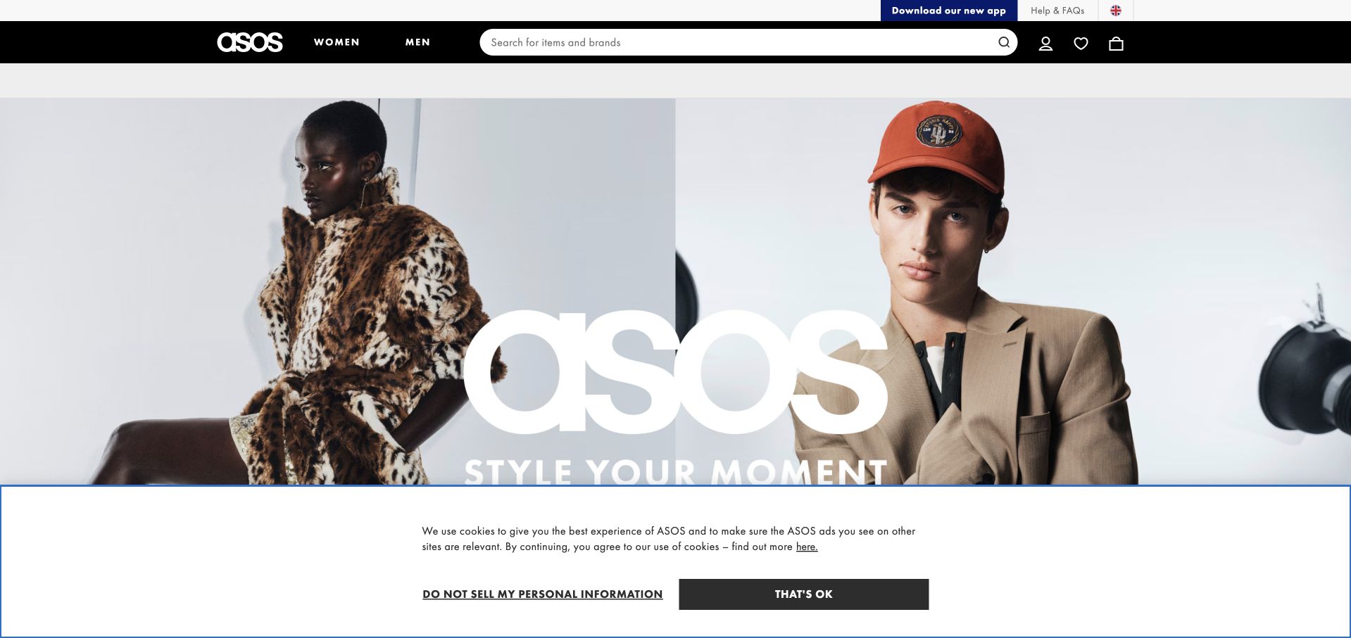
ASOS uses a fashion-led opening and a recognizable retail navigation rather than beginning with a corporate explanation. Search, audience choices, product categories and account-related tools provide the practical framework around the campaign. The page is useful as a reference for a retailer whose imagery changes frequently: the visual treatment can remain expressive, but the discovery controls need to be predictable enough that returning shoppers can get to a product without decoding the latest creative concept. The relationship between stable navigation and temporary merchandising is more transferable than the campaign itself.
What you can learn
Keep shopping tasks consistent even when the imagery and promotion change. Microsoft’s ASOS case documents an Azure AI shopping-assistance experiment and related platform work, not a verification of every recommendation, current storefront component or the complete public-page hosting stack.
Pros
Persistent search and category routes support shoppers who do not want to browse the current campaign.
A strong fashion identity can give a large catalog a more coherent editorial character.
Cons & considerations
Promotions and visual campaigns can compete with basic sizing, availability and product-comparison tasks.
Retail imagery needs descriptive alternatives and careful loading to remain usable across devices and connections.
Platform source: Primary documented Microsoft Azure association. Microsoft documents ASOS shopping assistance using Azure AI Studio. Platform evidence is separate from the direct website screenshot and is not a complete current infrastructure audit.
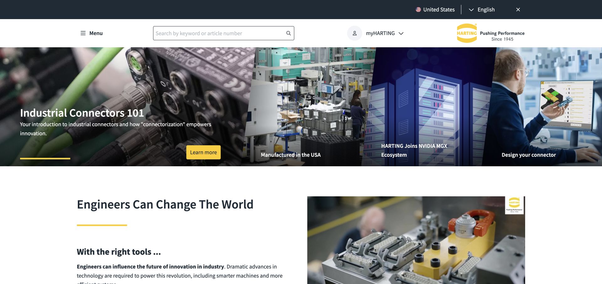
HARTING’s US homepage combines a keyword-or-article search with a series of visual entry points for connector education, manufacturing, infrastructure and product configuration. The yellow brand accent ties the main action to the wider interface, while the next section introduces the engineering context more directly. This is useful for a specialist catalog: a visitor who knows a part number needs a different route from someone still learning the category. The opening provides both without forcing the educational visitor to begin with a complicated product selector.
What you can learn
Offer a fast path for known items and a separate explanation path for uncertain requirements. Microsoft’s HARTING case concerns a configuration assistant using Azure OpenAI, not a claim that the homepage search, every connector tool or the public CMS uses that implementation.
Pros
Article-number search acknowledges experienced users with a specific product in mind.
Education and configuration entry points give less certain visitors a useful alternative route.
Cons & considerations
Several adjacent visual panels need careful mobile ordering to avoid becoming a difficult carousel.
Technical buyers still need detailed compatibility, specifications and documentation beyond the introductory content.
Platform source: Primary documented Microsoft Azure association. Microsoft documents HARTING’s configuration assistant using Azure OpenAI. Platform evidence is separate from the direct website screenshot and is not a complete current infrastructure audit.
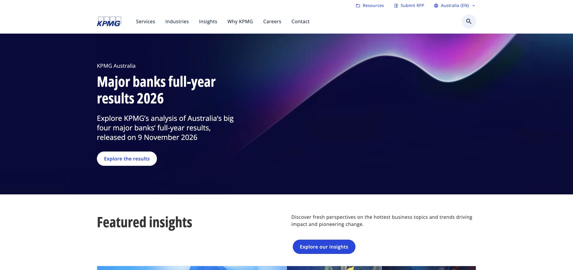
KPMG Australia’s homepage leads with a clearly identified analysis of major banks’ annual results. The report date and subject are visible within a restrained blue-and-purple feature, while services, industries, insights, company information, careers and contact remain separate routes. A featured-insights section follows the lead rather than leaving it as an isolated promotional panel. This is useful for a professional-services site whose credibility depends partly on useful public analysis: the opening can demonstrate a subject area while the navigation makes clear that the firm has a wider range of work.
What you can learn
Make research features specific, dated and connected to a useful archive. Microsoft’s 2023 KymChat case concerns KPMG Australia’s internal Azure AI application; it does not establish this public research page’s runtime or guarantee an advisory outcome.
Pros
The report topic and date make the opening more concrete than a broad expertise claim.
The insights section provides a logical continuation beyond the featured report.
Cons & considerations
One industry report may be irrelevant to visitors seeking a different service.
Research and advisory material need clear context, authorship and limitations beyond a homepage summary.
Platform source: Primary documented Microsoft Azure association. Microsoft documents KPMG Australia’s KymChat assistant using Azure OpenAI and Cosmos DB. Platform evidence is separate from the direct website screenshot and is not a complete current infrastructure audit.
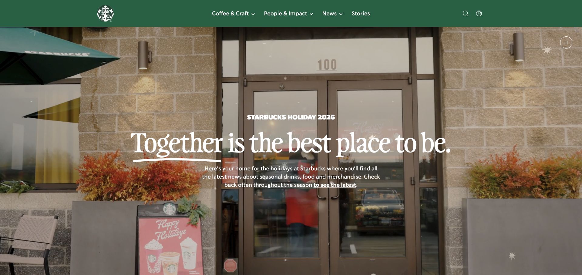
About Starbucks uses a large café scene and a short community-oriented statement beneath a restrained green header. Coffee and craft, people and impact, news and stories form the main publication routes. The page’s purpose differs from a store locator or mobile ordering interface: it introduces the company and its stories through a setting many visitors already recognize. This is useful when a consumer brand wants a separate editorial destination, because the visual identity can stay familiar while the content structure changes to support reading and reference rather than a transaction.
What you can learn
Adapt a familiar brand to the publication’s actual task. Microsoft’s 2019 article documents an Azure Sphere equipment association at Starbucks; it is dated IoT evidence, not proof of the current About site’s hosting, ordering systems or complete infrastructure.
Pros
The café image gives corporate and community stories an understandable everyday context.
The small publication navigation distinguishes company reading from an ordering or account journey.
Cons & considerations
A welcoming seasonal story may not provide enough context for someone researching corporate operations.
Large lifestyle imagery should be accompanied by meaningful text rather than carrying the whole explanation.
Visible tech stack
Earlier / documented evidence
Microsoft Azure
Platform source: Primary documented Microsoft Azure association. Microsoft’s 2019 article identifies Starbucks among Azure IoT customers. Platform evidence is separate from the direct website screenshot and is not a complete current infrastructure audit.
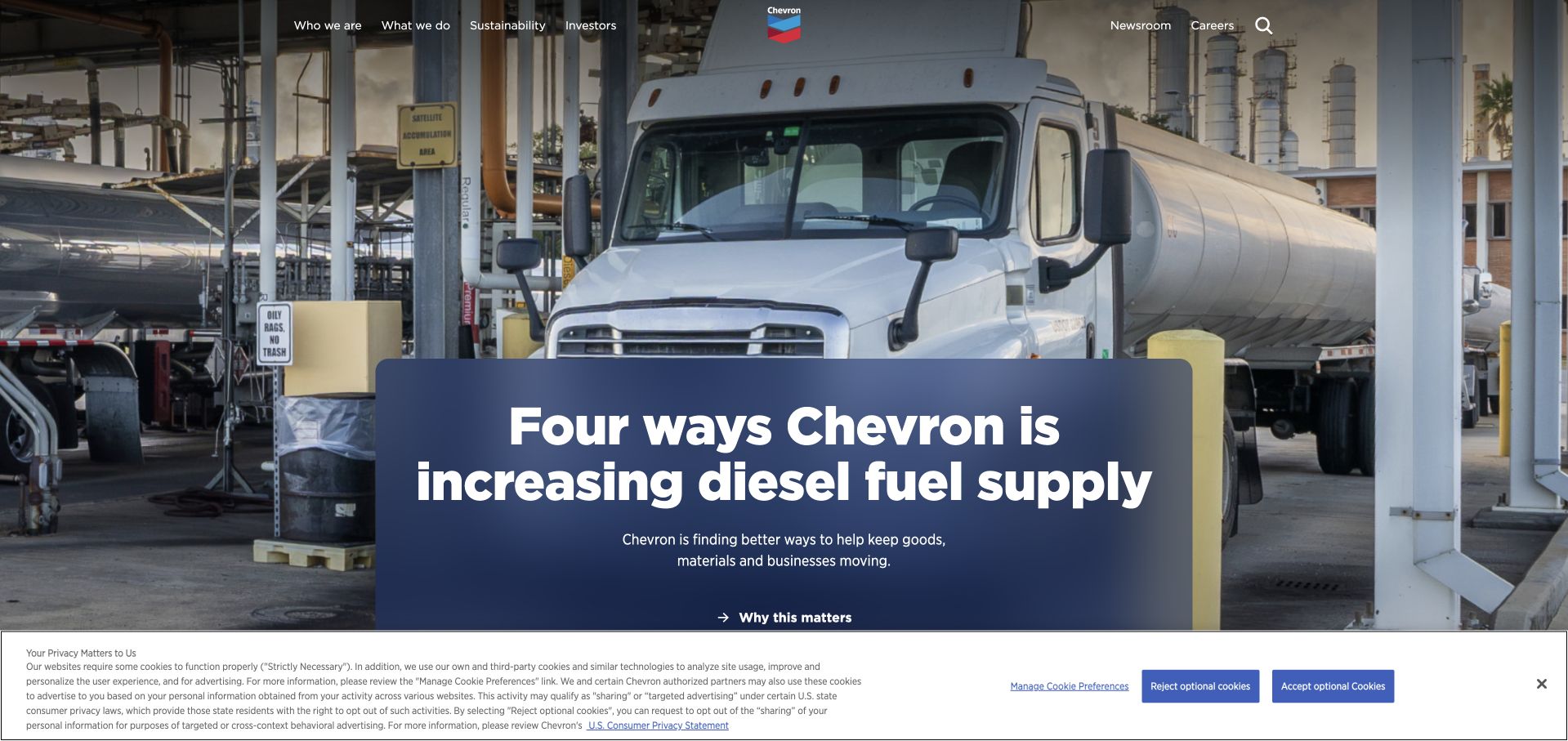
Chevron’s homepage uses a substantial operational photograph and a feature about a specific part of its business. Company, business, sustainability, investor, newsroom and career routes remain in a compact header. The image makes the subject tangible, while a short explanation and onward link give the story a clear next step. This is useful for a broad industrial organization: instead of expecting a generic purpose statement to explain everything, the opening can introduce one concrete topic and let the navigation expose the larger context.
What you can learn
Lead with an understandable operational subject, then provide the evidence and wider context. Microsoft’s 2019 article identifies an Azure IoT monitoring association at Chevron, which is not proof of the captured public page’s runtime or an independent finding about industrial or environmental performance.
Pros
A concrete operational image gives a large company a more understandable editorial entry point.
Institutional routes remain available without requiring visitors to follow the current feature.
Cons & considerations
A single operational story cannot represent the full range of a diversified industrial business.
Performance and impact claims require full supporting sources and context beyond the hero.
Visible tech stack
Earlier / documented evidence
Microsoft Azure
Platform source: Primary documented Microsoft Azure association. Microsoft’s 2019 article identifies Chevron among Azure IoT customers. Platform evidence is separate from the direct website screenshot and is not a complete current infrastructure audit.
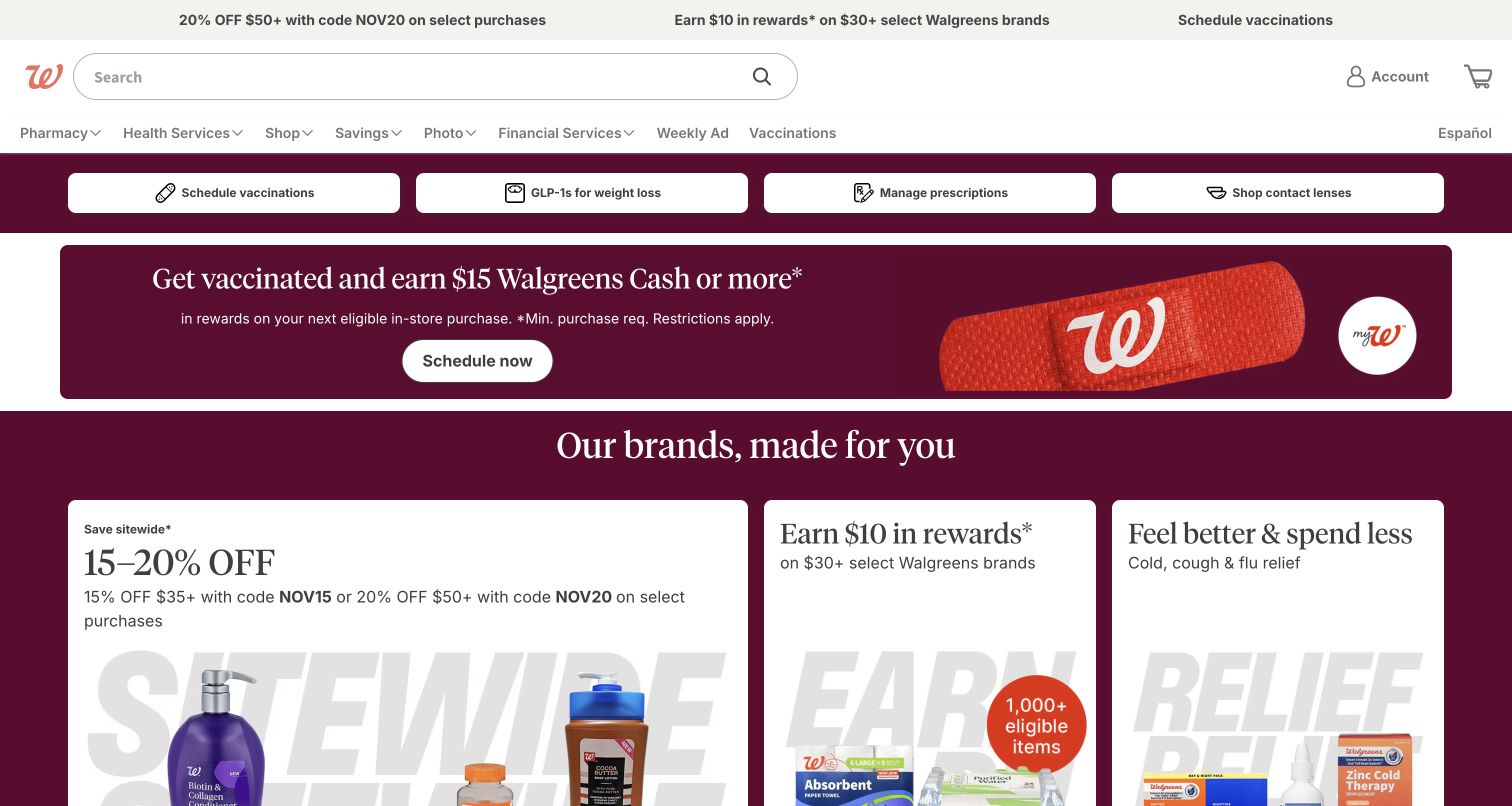
Walgreens’ homepage combines recognizable retail promotion with search, account access and practical service routes. A compact upper strip introduces current offers, while the main header keeps product and service discovery available. The page is useful as a study in competing tasks: someone collecting information about a pharmacy service may have a very different intention from someone browsing a seasonal promotion. A shared site needs enough hierarchy to acknowledge both without making the more urgent or repeat task depend on the campaign that happens to be visible that week.
What you can learn
Prioritize repeat service tasks independently from merchandising. Microsoft’s 2019 article lists Walgreens among Azure customer examples; that dated relationship is not a verified inventory of the current pharmacy website, its account systems or every operational service.
Pros
Search and account access provide useful routes that do not depend on the current offer.
The familiar retail identity helps visitors recognize the destination quickly.
Cons & considerations
Several promotional strips can crowd the opening before the main service choices appear.
Health-related and pharmacy information needs careful review, current availability and clear supporting detail beyond a retail campaign.
Platform source: Primary documented Microsoft Azure association. Microsoft’s 2019 article identifies Walgreens among Azure IoT customers. Platform evidence is separate from the direct website screenshot and is not a complete current infrastructure audit.
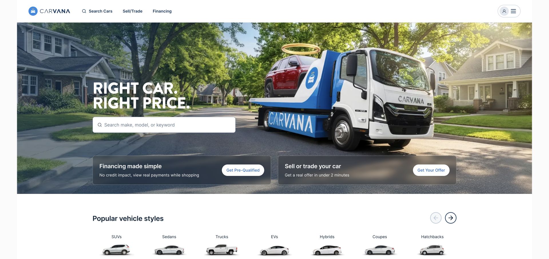
Carvana’s opening pairs a neighborhood delivery photograph with a short value proposition and a prominent vehicle search. Separate panels below introduce financing and selling or trading a car, while the header retains direct routes to those same activities. This is useful because the visitor may arrive with a vehicle to sell rather than a vehicle to buy. The page connects those tasks through a shared brand experience without pretending that they are a single workflow. Product-type browsing then gives a further route into the inventory beneath the main introduction.
What you can learn
Give related but different workflows their own visible starting points. Microsoft’s CARE case concerns Carvana customer-conversation analysis using Azure services, not proof that the captured search interface, pricing, financing or every marketplace component uses the same implementation.
Pros
Search, selling and financing are distinguishable tasks rather than hidden stages of one funnel.
The delivery scene communicates the service model without requiring a long initial explanation.
Cons & considerations
A concise value proposition cannot explain all vehicle condition, delivery and purchase restrictions.
Financing-related language needs complete qualification and must not be judged from a homepage impression alone.
Platform source: Primary documented Microsoft Azure association. Microsoft documents Carvana’s CARE conversation-analysis system using Azure AI. Platform evidence is separate from the direct website screenshot and is not a complete current infrastructure audit.
Kegan has 15+ years of experience working with small businesses, Fortune 500 companies, and everything in between. No development job is too big or too small: he brings the same hands-on attention to a focused improvement, a complete website, or a custom application.
For Microsoft Azure projects, he can help with content architecture, custom functionality, system integrations, testing, and maintainable handover. He works directly with clients on scope, design, implementation, testing, and handover, with an emphasis on clear communication and a system that remains practical to maintain after launch.
Show 3 other Microsoft Azure developersHide other Microsoft Azure developers
Start with how editors create, approve and publish content. Decide whether the site needs custom server behavior or can use a simpler delivery arrangement. Keep forms protected and verify their receiving systems. A visually rich homepage does not automatically require a large application platform or a custom content backend.
A customer or operational application
Model identity, authorization, persistent data and external effects before selecting hosting. Include returning users, interrupted requests and account recovery. Use realistic nonproduction scenarios to test the workflow. An attractive dashboard is incomplete if permissions, record ownership or uncertain writes are left for the operator to guess.
An internal or AI-assisted workflow
Define which data may be accessed, which actions are allowed and where a human must review the result. Keep the public website separate when it has a different audience and risk profile. An employee-assistant success story does not establish that a public chatbot should receive the same access to business information.
From references to requirements
Plan account ownership, releases and support
Make authority visible
Identify the organization’s account, subscription, domain and billing owners. Document who may deploy, change access or retrieve private records, and how that authority is reviewed. Avoid arrangements where a business depends on one contractor’s personal account or where a browser bundle contains credentials intended for a server.
Test the full release path
Demonstrate a clean build and deployment using documented inputs. Rehearse a failed release and recovery, including content and data changes rather than code alone. Confirm that a preview cannot accidentally submit real inquiries, charge a customer or modify production records while somebody is reviewing the design.
Define ongoing operations in the handover
Record the actual services used, recurring costs, backup procedures, update responsibilities and incident contacts. Give the owner a way to identify the current release and understand important alerts. A managed hosting service can reduce some infrastructure work, but does not eliminate application maintenance or responsibility for business workflows.
A useful handover demonstration
Ask the actual team to carry out its routine job: publish a realistic update, correct a mistake, preview a narrow screen, and identify who owns an integration failure. For a library or frontend framework, also ask who maintains the content source and deployment. A polished screenshot does not answer those operational questions.
Beyond the screenshot
Azure website planning checklist
Separate public content from private application work.
Document the real account and billing owners.
Identify every external system and data owner.
Choose a workable editorial workflow.
Define permissions for users and services.
Keep server credentials outside public code.
Compare hosting options against support capacity.
Set workload-specific reliability and cost requirements.
Use safe nonproduction data for evaluation.
Test failed requests and interrupted workflows.
Rehearse release recovery and backup restoration.
Provide a current service inventory and handover.
Test with real content, a keyboard, a small screen, slow or failed requests, and the people who will maintain the system. These are planning checks, not an accessibility, security, performance, or search-ranking certification.
Sources & editorial method
How this Microsoft Azure collection was reviewed
The 20 references combine direct public-page captures, original design reviews and primary Microsoft customer evidence. The first five are established major brands. Historical and workload-specific associations remain qualified, and reused captures retain their original dates. Broad public-source audits supplement rather than replace documentary evidence; neither approach reveals every private backend component.
Every image is an unmodified capture from the actual website, with its source and capture date. Some captures are reused from our shared catalog; their dates remain the original capture dates. None comes from a vendor gallery or a generated reconstruction. Moving imagery and live content can change.
Technology attribution uses public page assets or metadata, official platform documentation, or a cited first-party project case study. Documentary and framework-relationship evidence is identified where used; it is not a complete current backend inventory. A CMS image CDN alone does not establish a full CMS deployment. A library’s presence does not prove which individual controls use it, and a platform label does not establish AI authorship.
The composition notes, lessons, pros and tradeoffs are original editorial observations. We have not measured conversion, traffic, security, performance or accessibility conformance. Website owners retain their brands and imagery; these examples are not our client portfolio. Written, Edited and Curated are independent records, not dates advanced by a build. See our editorial standards or suggest a correction.
Questions worth asking
Microsoft Azure website development FAQs
Do these examples prove the pictured homepages run on Azure?
No. Each example has an official Azure association, but it can concern a particular internal system, product or historical workload. The design review describes the captured public page. We do not extend one customer story into an unsupported inventory of an entire organization.
Does an Azure AI feature determine the rest of the website stack?
No. A separate publishing system, frontend and hosting layer may coexist with an Azure-based AI or data service. Document the actual interfaces and responsibilities rather than assuming that one named feature determines every other component.
Should an Azure project always use containers?
Not automatically. Begin with the application’s runtime and operating requirements. A managed application platform, container service, existing hosted CMS or another arrangement may be appropriate. The choice should make releases and maintenance understandable to the team that will own the result.
Can an existing Microsoft relationship simplify the project?
It can provide useful organizational context, but does not replace a requirements review. Confirm account ownership, access boundaries, integrations, recurring costs and the actual support arrangement. Familiar licensing or terminology is not proof that a proposed architecture is suitable.
What should I ask to see before launch?
A representative user journey, permission checks, a clean deployment, a failed-release recovery and a backup restoration using safe test data. Also ask for an accurate inventory, ownership details and named support responsibilities so that the system remains understandable after handover.
Choose Azure around a clearly described workload and a realistic operating model. The most useful reference is the decision you can explain and maintain, not the longest list of services borrowed from a large company.