Best Art School Websites of 2026 (24 Real-World Examples)
Art school websites that explain the learning arrangement
These 24 examples span independent studios, online course providers, and degree-granting institutions, with attention to program format, admissions, pricing, and attributed student work.
The first useful distinction is often how learning happens: recorded lessons, live feedback, a weekly studio course, or full-time study. A strong site explains that arrangement before relying on a large artwork or an institutional reputation.
Schoolism is the editorial choice because its opening separates subscription access, individual-course access, and live instruction. This is recognition of website clarity, not an assessment of educational outcomes or accreditation.
Before the examples
What makes good art school website design in 2026?
Describe the teaching format
State attendance mode, duration, schedule, and whether feedback is included. Distinguish access to recordings from personal critique or a scheduled class.
Credit the work on display
Name the artist and give relevant program, medium, or year context. Student work can illustrate a community without implying that every learner will achieve the same result.
Make admissions and cost discoverable
Explain prerequisites, portfolio requirements, assessment steps, and price or tuition routes. Qualify deadlines by intake and purpose rather than using unexplained urgency.
The collection · 24 examples
24 art school websites worth studying
Compare the examples by the visitor decisions they support. Each review identifies a specific pattern, practical lesson, strengths, and limitations in the directly inspected page.
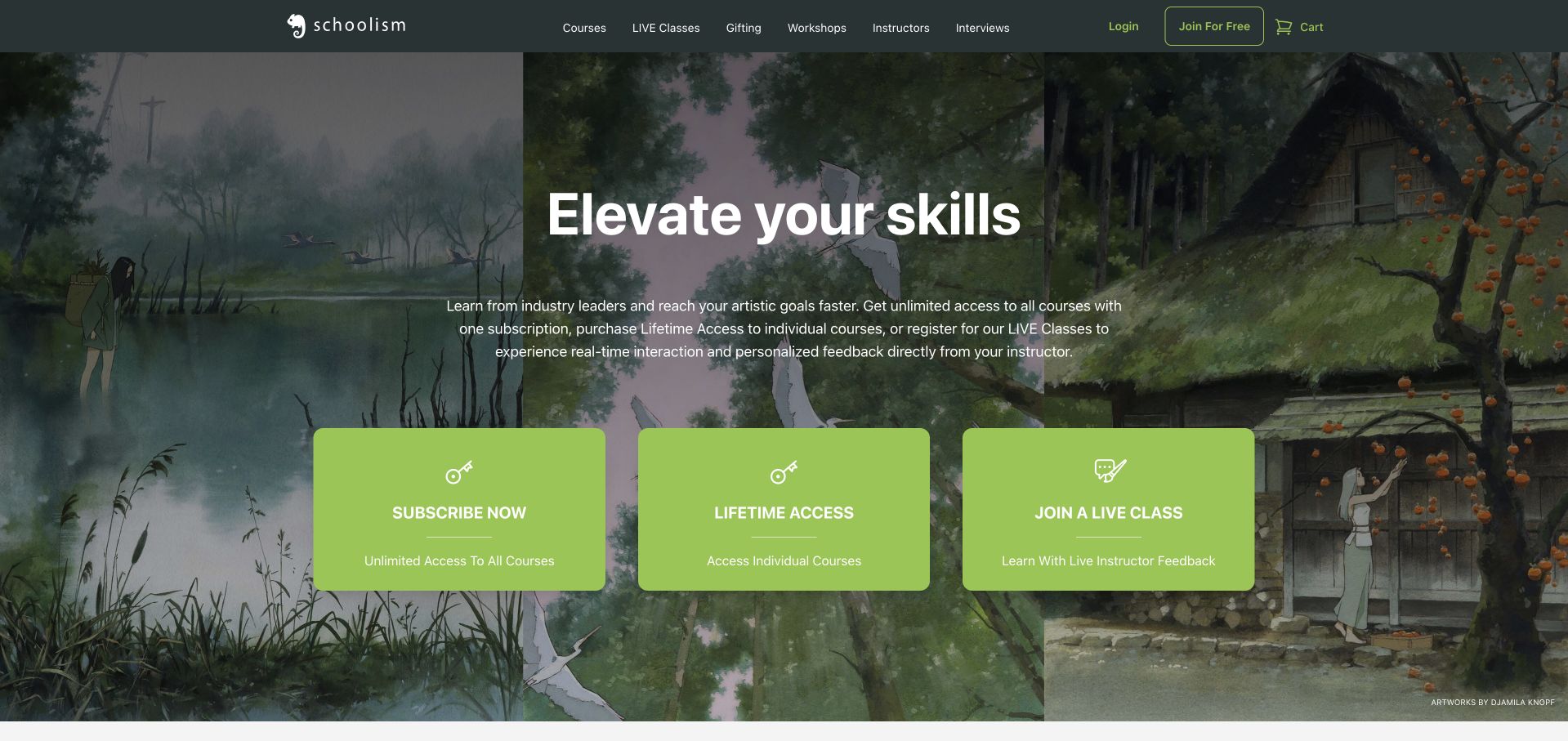
Schoolism makes its most important distinction early: one subscription for the catalog, lifetime access to individual courses, or live classes with instructor feedback. Three bright cards carry those choices across a painterly dark opening. Course tiles then name the instructor and distinguish upcoming releases, new courses, and free samples. A later section explains weekly assignments and the six-to-twelve-week live format. This is our editorial choice because it describes the learning arrangement before asking visitors to compare subjects. Prices are absent from the opening comparison, however, and white lettering on the lime cards is less readable than the darker surrounding text. Join For Free also needs its surrounding context to avoid implying that the paid catalog is free.
What you can learn
Explain how students receive instruction and feedback before presenting a large course library. Put the price and access duration beside each format, and distinguish a free account or sample from enrollment in a paid course.
Pros
Subscription, individual-course access, and live feedback are clearly separated.
Course cards identify instructors and release status.
Cons & considerations
The opening format comparison omits prices.
Bright cards and free-account wording need stronger clarity.
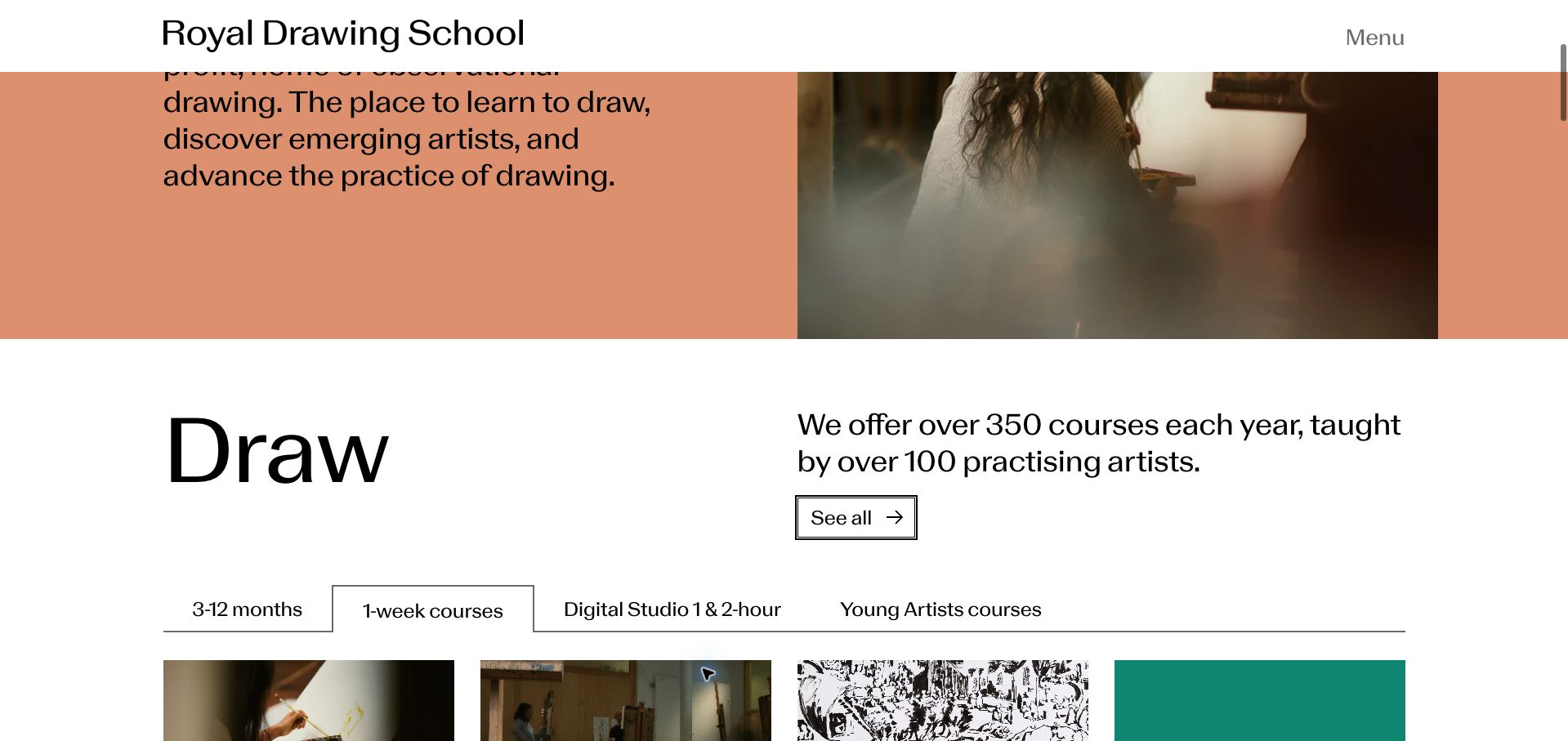
The Royal Drawing School introduces its observational-drawing purpose with oversized lettering and a close photograph of pencil preparation. The retained scrolled view reveals the stronger functional idea: courses grouped by months, weeks, short digital sessions, and young artists. Dated course cards distinguish upcoming holiday sessions, while an on-demand Drawing Foundations course offers another route. Events and exhibitions are separately labeled and dated, so public programming does not become indistinguishable from enrollment. The dramatic introduction delays this useful directory, and the first course cards do not include prices. Several sections use the same brief See all action, which depends on the surrounding heading for meaning.
What you can learn
Let learners browse by the time they can commit as well as by subject. Pair each upcoming course with dates, format, and price, and keep public events separate from classes that require enrollment.
Pros
Time-commitment tabs offer a practical way to browse.
Courses, exhibitions, and events carry distinct labels and dates.
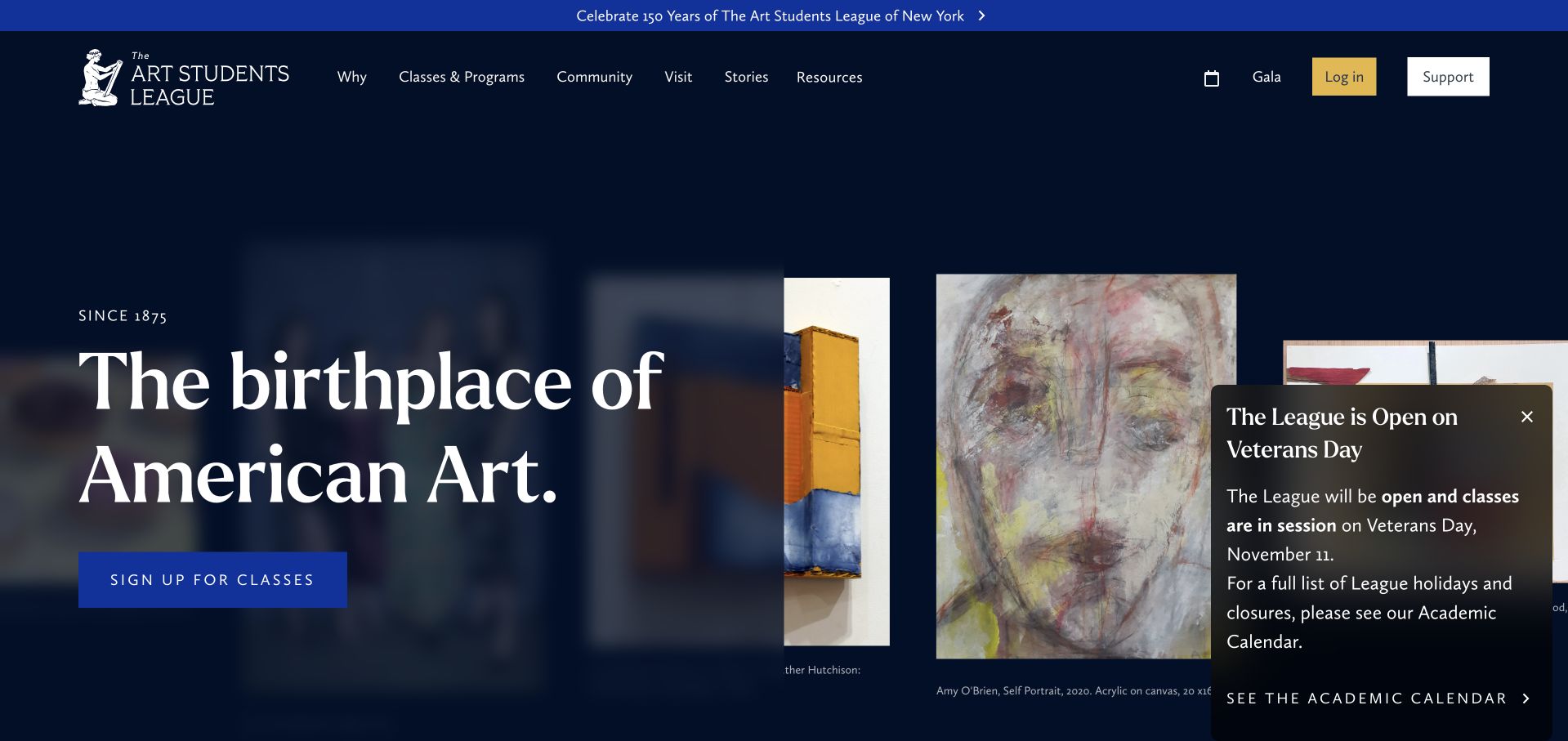
The Art Students League fills the opening with a changing gallery of paintings and drawings, framed by a restrained navy-and-white header and a blue class-signup action. Artwork descriptions name artists, media, and sometimes their classes or instructors, giving the images context beyond decoration. The site separates classes, visiting, community stories, and support. A retained Veterans Day notice explicitly says that classes remain open and links to the academic calendar. That is useful operational information, although its floating placement obscures part of the gallery. The anniversary strip and extensive artwork sequence occupy substantial space before visitors encounter course details, making quick comparisons harder than the strong visual introduction suggests.
What you can learn
Credit student and faculty work with enough context to connect it to teaching. Keep a clear class-search action beside the gallery, and present closure or holiday notices in a compact area that does not cover the work itself.
Pros
Artwork receives meaningful artist and medium attribution.
The holiday notice answers a concrete attendance question.
Cons & considerations
The floating notice covers part of the gallery.
Large visual and anniversary sections delay course comparison.
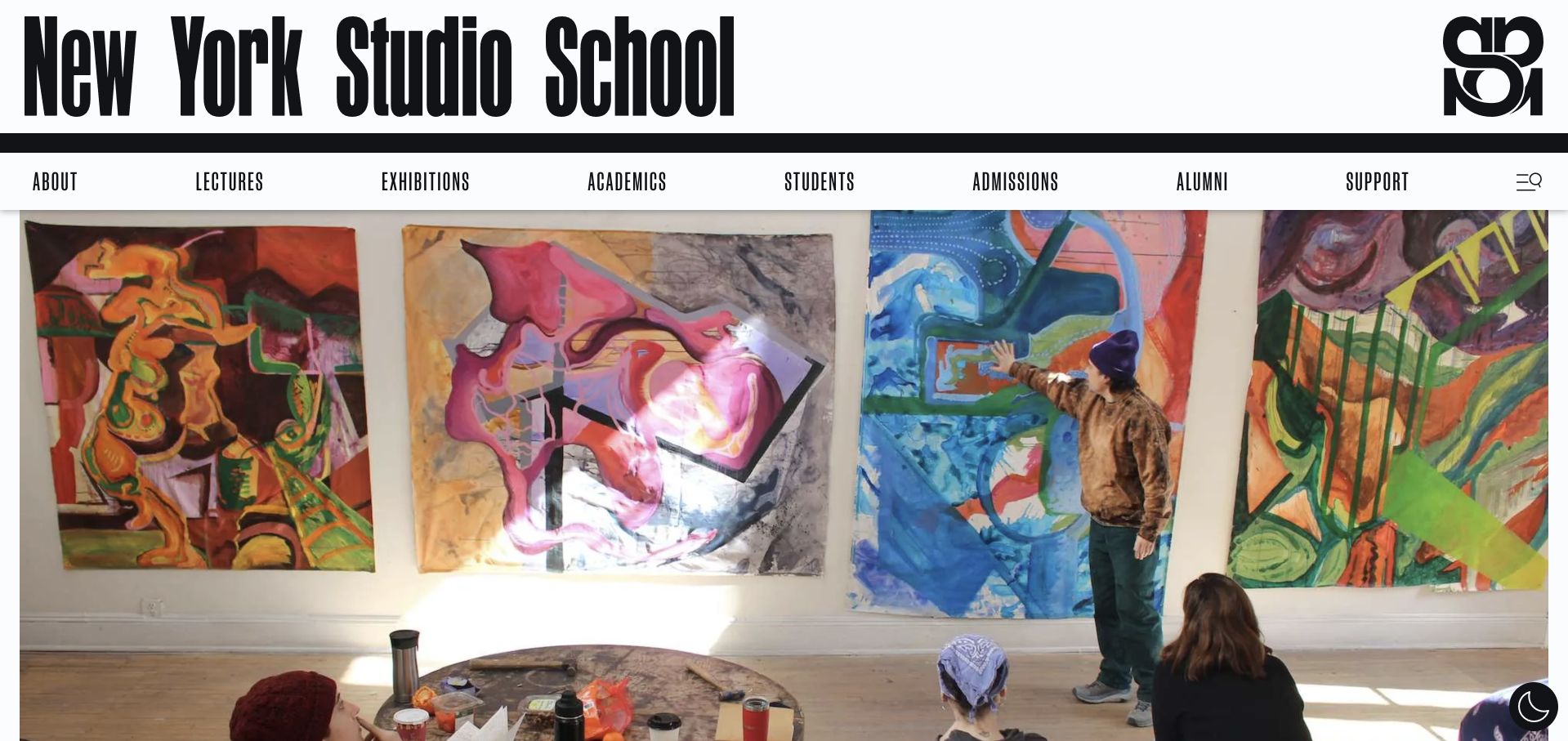
New York Studio School pairs an unusually large condensed wordmark with a classroom critique video. Below that introduction, three routes distinguish the MFA, Marathons, and evening or weekend classes. Current copy identifies Fall 2027 applications and explains that the spring classes run for eleven weeks with in-person and virtual sections. Dated exhibitions and evening lectures show the wider school community. The heavy masthead and video occupy much of the opening screen, pushing the practical choices downward. Program labels such as CFA and Marathons also require prior knowledge or another click, while the homepage postpones tuition information to a separate route.
What you can learn
Give different study commitments their own entry points and explain unfamiliar program names in a few words. Put duration, attendance format, and a tuition route beside the choice so prospective students can judge fit before exploring institutional stories.
Pros
Degree and shorter class routes are clearly separated.
Spring class copy states duration and attendance formats.
Cons & considerations
The large masthead delays the useful program choices.
Unexplained program labels and deferred fees add research effort.
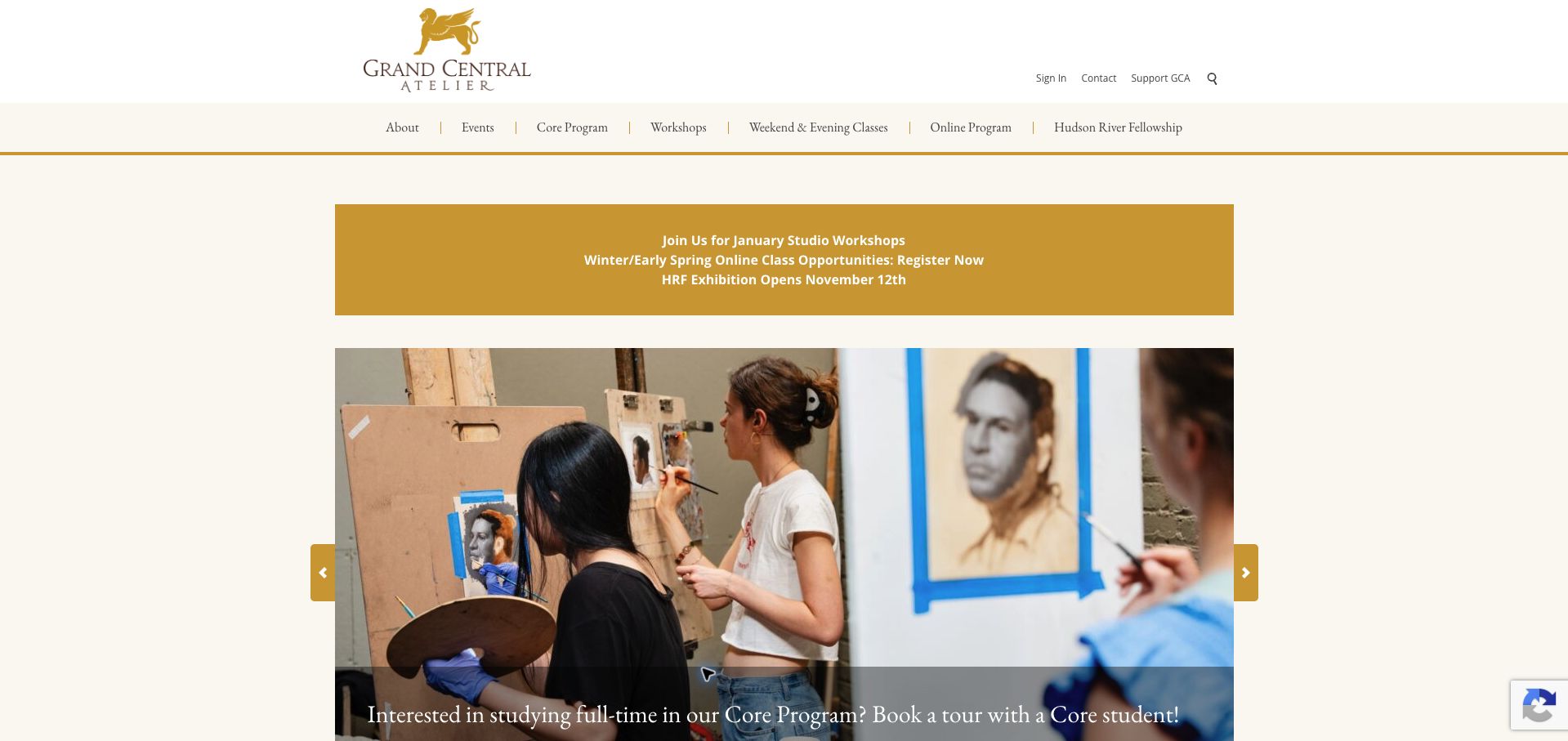
Grand Central Atelier uses a centered cream-and-gold composition with photographs of artists working in a studio. Navigation separates the core program, workshops, weekend and evening classes, and online study. Homepage notices offer a tour with a core student, an online drawing orientation, and self-paced demonstrations, giving visitors concrete ways to explore the teaching approach. The compact structure avoids an extensive institutional introduction. Its promotional messages are less consistent in freshness: a sculpture application notice still names January 2026 alongside winter and early-spring opportunities. Multiple gold notices also compete for priority, and the general program links do not immediately reveal prices or the scale of the required commitment.
What you can learn
Use distinct labels for full-time study, scheduled classes, and self-paced demonstrations. Maintain time-sensitive announcements as carefully as course information, removing expired application messages so visitors can tell which opportunities are currently actionable.
Pros
Study formats have separate navigation destinations.
Student tours and an orientation offer concrete exploratory steps.
Cons & considerations
An older application date remains among current promotions.
Several announcements compete without clear priority.
Watts Atelier leads with an instructor at work, a starting price, and a prominent first-month promotion. The page then distinguishes online learning from studio classes, explaining written critiques, demonstrations, and direct access to instructors. Two subscription plans list their curriculum, references, workbooks, and grading provisions. Crucially, the comparison states both the introductory charge and the later monthly price. Named instructors and a student-work gallery support further investigation. Repeated discount actions can overwhelm the quieter curriculum information, and the initial starting-price language is less complete than the later comparison. The visitor must scroll to understand how the plans differ and what the recurring commitment will cost.
What you can learn
Describe feedback, reference materials, and access duration as part of the product. Show the regular recurring price beside every introductory offer, and let the teaching process carry as much visual weight as the discount.
Pros
Plan details explain materials and written critiques.
The comparison states introductory and recurring prices.
Cons & considerations
Repeated discounts compete with curriculum information.
The hero price is less complete than the later plan comparison.
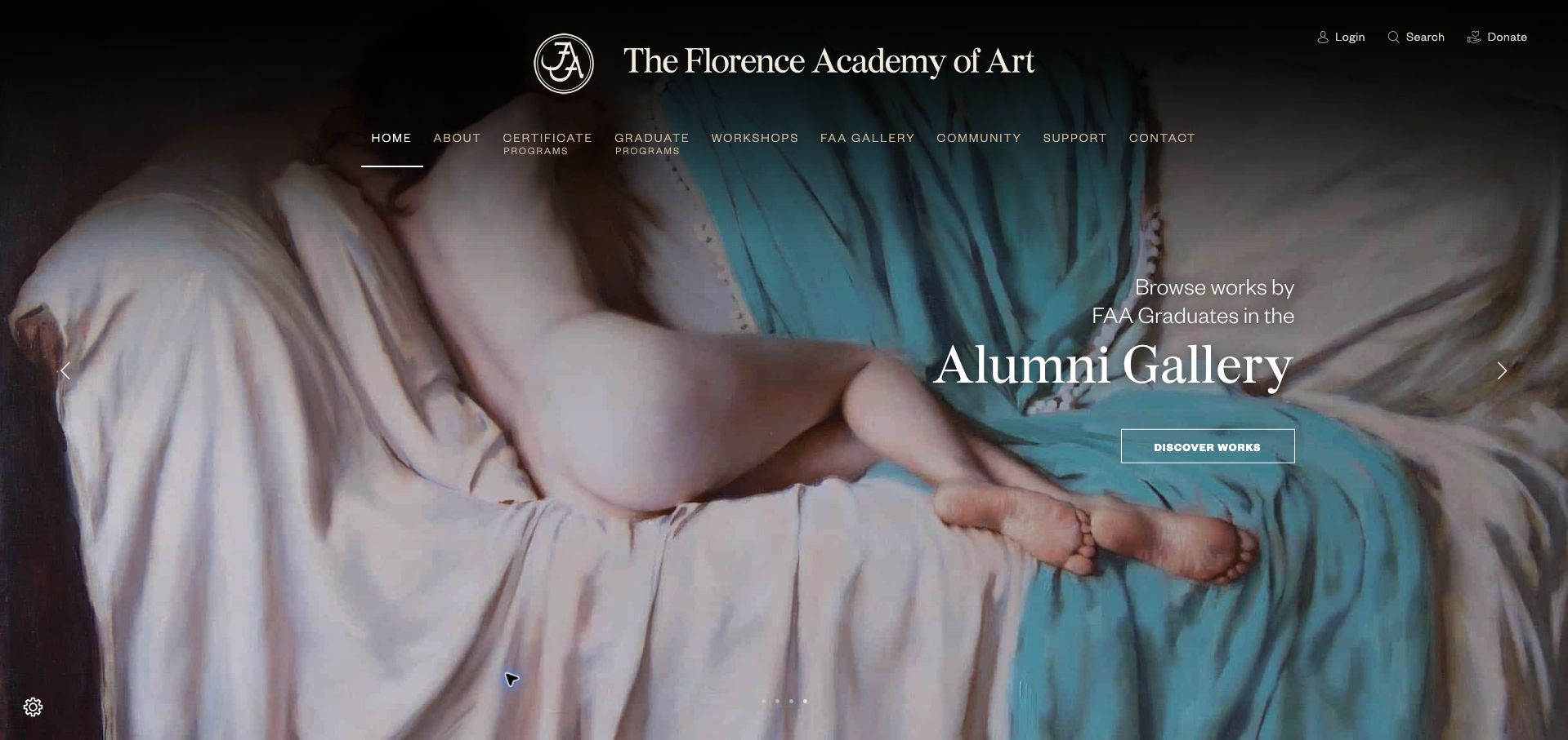
The Florence Academy of Art opens with a large alumni painting and restrained typography, then develops its case through the physical studio and teaching routine. The description explains north-light workspaces, time spent with the figure, individual exercises, and evening anatomy or materials lessons. Workshop cards name specific disciplines such as etching, marble carving, and portrait sculpture. This is more informative than a general claim about creative excellence. The extended institutional story comes before the workshop directory, however, and those cards repeat Learn More without immediately showing dates or fees. The generous image scale also makes program comparison a later task rather than part of the first view.
What you can learn
Translate a teaching philosophy into the daily activities students will actually encounter. Retain the artwork and studio story, but put dates, duration, and fees alongside workshop names so the practical decision does not require opening every course.
Pros
The teaching routine is described in concrete terms.
Workshop names identify specific media and techniques.
Cons & considerations
A long institutional story precedes course comparison.
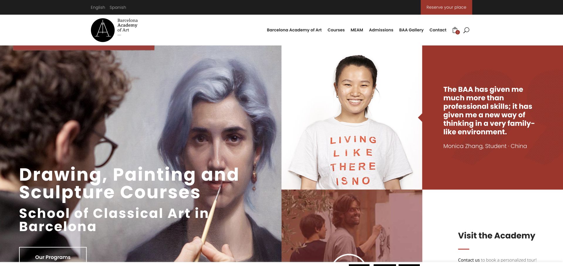
Barcelona Academy of Art combines a large drawing-and-painting introduction with a student photograph and rotating attributed testimonials. Below, the page separates full-time drawing and painting or sculpture programs from part-time, afternoon, weekend, and seasonal courses. Part-time sessions even state morning and afternoon time windows. A personalized academy-tour invitation provides a concrete next step before applying. The retained Spanish-root page was automatically translated by the browser, so its English wording is not evidence of the school’s native English presentation. Testimonials occupy substantial space ahead of the program choices, while fees and detailed eligibility are deferred. The repeating reservation message can also compete with comparing the actual formats.
What you can learn
Group studio courses by attendance commitment and show useful scheduling details early. Support testimonials with visible program requirements and prices, and make a tour an understandable exploratory option before asking visitors to reserve a place.
Pros
Full-time, part-time, weekend, and seasonal paths are distinguished.
Part-time time windows help learners judge scheduling fit.
Cons & considerations
Testimonials delay the program comparison.
Prices and entry requirements require further navigation.
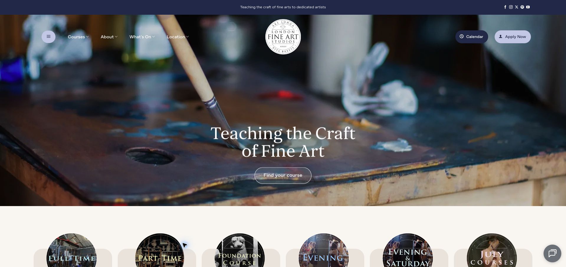
London Fine Art Studios uses a brush-and-palette photograph beneath navy navigation and a visible course-finding action. Full-time, part-time, foundation, evening, Saturday, and July courses are given distinct cards, making the range of commitments understandable. Calendar and application links remain available in the header. The homepage also lists term dates and named visiting-artist sessions rather than relying entirely on a promotional statement. The announcement area mixes late-October dates with later opportunities, so a visitor arriving in November must distinguish past material from upcoming courses. Repeated More Info labels and missing early prices make the cards less useful for comparison than their clear format names could be.
What you can learn
Keep the course-format directory compact and pair each format with duration, dates, and cost. Give expired workshops an archive treatment so the current term and upcoming teaching opportunities are not visually mixed with past announcements.
Pros
The directory distinguishes several attendance formats.
Calendar and application routes are easy to identify.
Cons & considerations
Past and upcoming workshop dates share the same announcement area.
Generic actions and deferred prices slow comparison.
Sydney Art School places a classroom photograph behind a large welcome message, while the navigation immediately distinguishes qualifications, university pathways, artistic skills, and children’s classes. A dated enrollment promotion gives example prices and separates a full-year offer from a single-term discount. Later sections identify the included materials and vouchers, then divide courses by subject and learner type. Studio addresses distinguish adult and children’s locations in Baulkham Hills. The page is dense with repeated contact blocks and locality lists, and broad leadership claims occupy space that could explain course prerequisites. Discount information is more prominent than a concise comparison of the teaching formats and their usual costs.
What you can learn
Separate learner ages and qualification goals before listing individual subjects. State promotion deadlines and inclusions clearly, but keep ordinary pricing, prerequisites, and the correct studio address close to the course choice rather than behind repeated contact prompts.
Pros
Navigation separates age groups and qualification pathways.
The promotion provides example prices, a deadline, and inclusions.
Cons & considerations
Repeated contact and locality sections make the page lengthy.
Promotional emphasis outweighs early course-format comparison.
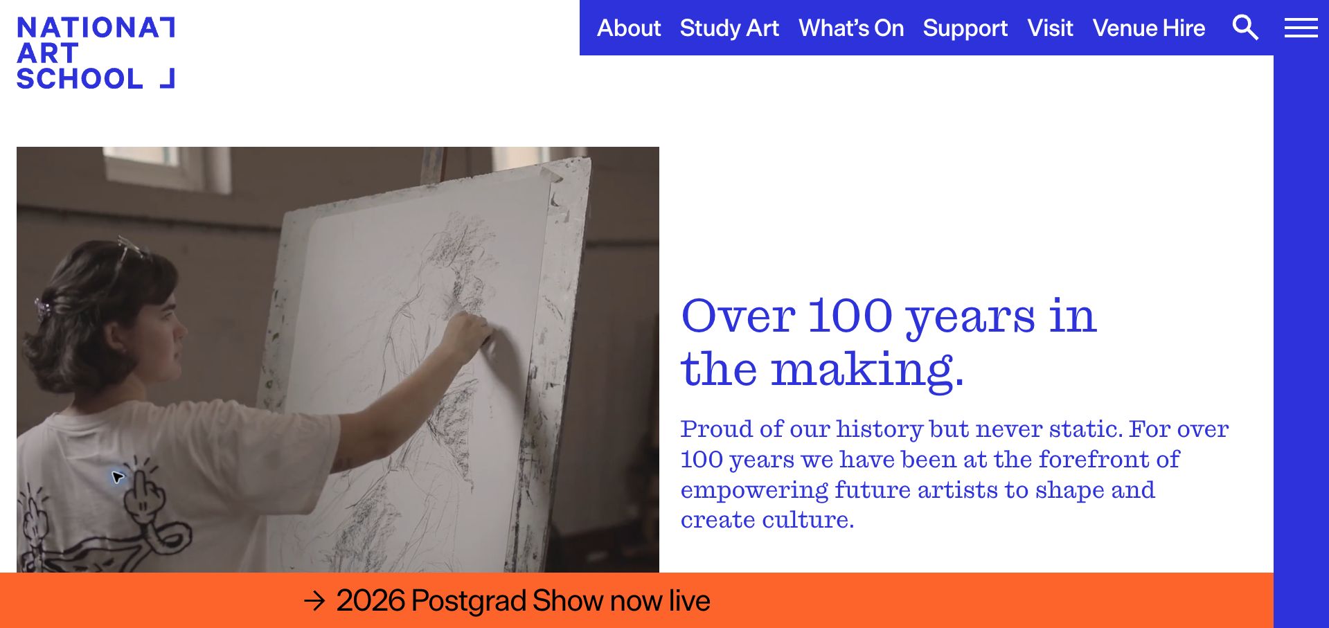
National Art School presents a large working-studio photograph beside a blue-and-white statement about its history. The page distinguishes degree study, short courses, and high-school programs, and uses named student work and facility descriptions to make the environment more tangible. A prominent lower strip promotes the postgraduate show and applications, connecting current activity with future enrollment. The first visit also presents a full-screen acknowledgment before the homepage; the retained capture follows its Continue action. The tall introduction and rotating strip postpone detailed course information, while fees and attendance commitments require further navigation. The visual account of studio life is stronger than the immediate comparison of study options.
What you can learn
Show the working environment and attribute the work on display, then give each study level a concise explanation of duration and attendance. Keep institutional introductions and current-event notices from covering or delaying the practical enrollment choices.
Pros
Degree, short-course, and school-age pathways are distinguished.
Studio imagery and attributed work give concrete learning context.
Cons & considerations
An introductory gateway adds a step before the homepage.
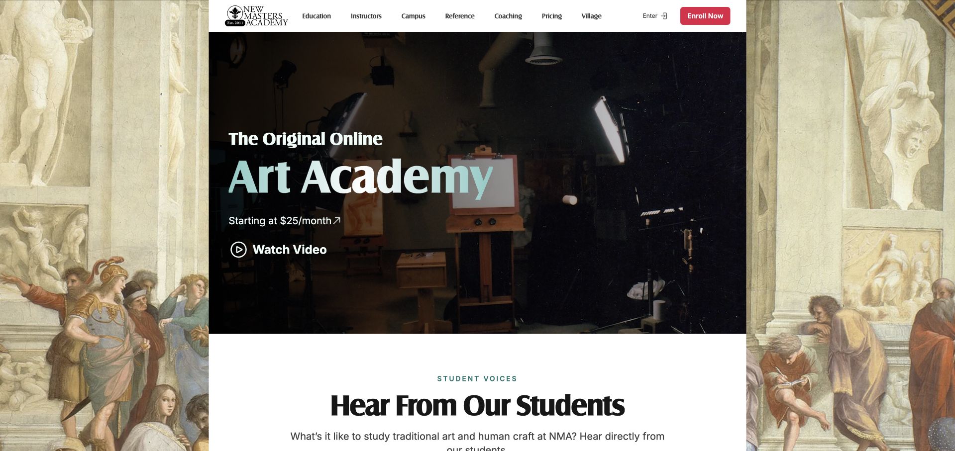
New Masters Academy frames a narrow central page with classical artwork and a studio-video opening. Named instructors receive specific professional descriptions, and a large student gallery includes media and dimensions. The page distinguishes its recorded course library, digital campus, reference materials, and optional coaching. Dated critique sessions and drawing events make the community offer more concrete. The opening starting-price message is less complete than the later annual-plan comparison, which includes cohort dates and enrollment conditions. Repeated mailing-list requests interrupt the route to pricing, and the course-guide offer requires signup. The substantial gallery demonstrates activity but makes practical plan comparison a relatively late task.
What you can learn
Explain which teaching elements are recorded, live, included, or optional before presenting a membership price. Attribute student work, but keep the syllabus and plan comparison directly accessible instead of making a mailing-list guide the clearest route to understanding the offer.
Pros
Recorded courses, community events, references, and coaching are distinguished.
Student work includes names and material details.
Cons & considerations
Mailing-list promotions interrupt the route to plan comparison.
The opening price requires later context about access and billing.
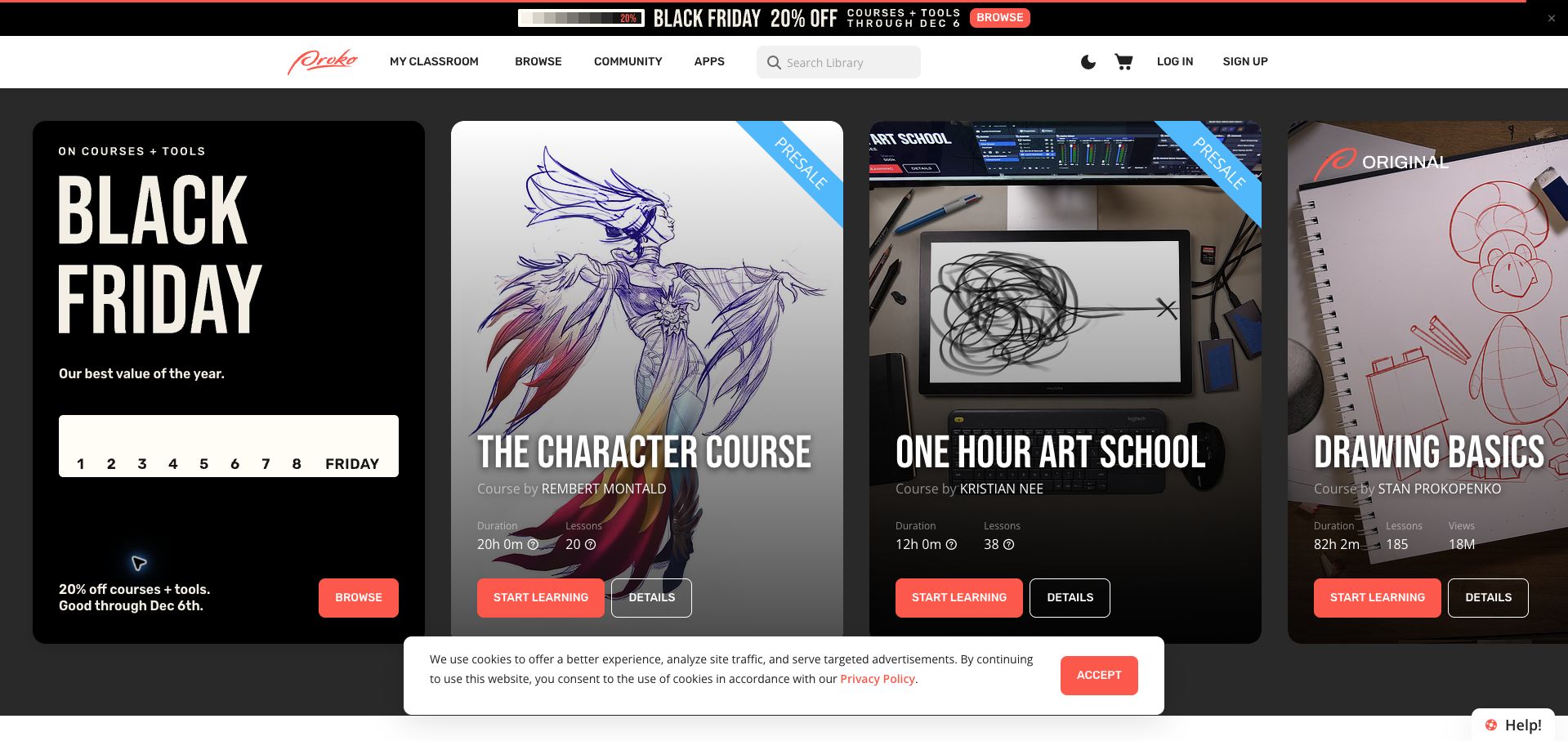
Proko uses a dark interface and large horizontal course cards to put individual subjects and instructors at the center. Course information includes lesson counts and total runtime, making the commitment more concrete than a thumbnail alone. A dated Black Friday promotion and presale badges distinguish different buying conditions, while detail links offer a separate route from starting a course. The large cards extend beyond the initial viewport, however, and prices are not equally visible in the opening overview. A Start Learning action can sit near a presale label, leaving the precise availability unclear without inspection. The retained cookie strip also occupies part of the lower screen.
What you can learn
Use lesson counts and runtime to explain what a course contains, then give availability and pricing equal prominence. A presale should have an action that describes reserving future access rather than suggesting all lessons can be started immediately.
Pros
Lesson and runtime counts make course scope tangible.
Presale and promotional dates provide useful availability cues.
Cons & considerations
Large horizontal cards restrict the immediate overview.
Starting actions and presale labels can imply different availability.
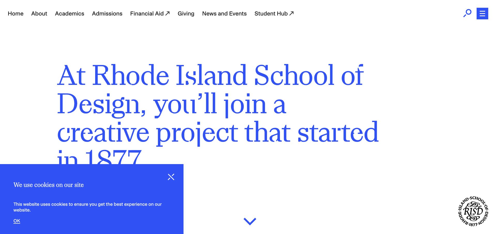
RISD leads with large blue typography describing a creative project that began in 1877, giving the opening a strong identity without relying on a full-screen image. Program exploration and online information sessions connect that statement to prospective-student tasks. Undergraduate, graduate, continuing-education, and pre-collegiate routes are distinguished farther down, alongside the museum. Dated lectures and exhibitions make the public program visible. The institutional introduction still consumes considerable space before the study-level choices, and the wide navigation serves many existing-campus audiences at once. A blue cookie panel remains over the lower corner of the retained view. The information architecture is broad, but a first-time applicant must identify their own path through it.
What you can learn
A strong typographic statement can establish identity, provided study levels and admissions help remain nearby. Separate prospective-student choices from campus resources, and keep overlays from covering the first useful route into programs or information sessions.
Pros
Study levels and continuing education have distinct routes.
Information sessions provide a practical exploratory step.
Cons & considerations
The broad campus navigation increases first-visit complexity.
Large introductory copy and a cookie panel reduce the initial overview.
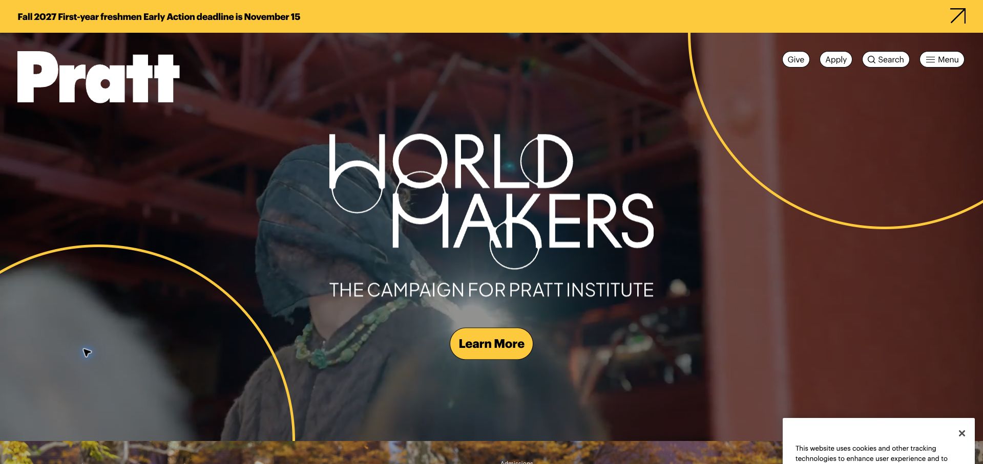
Pratt combines a black-and-yellow identity with a large World Makers campaign and a compact header for giving, applying, search, and the main menu. An early-action notice states the November 15 deadline and Fall 2027 intake, making the date interpretable rather than presenting an isolated urgency message. Stories identify students and their work, while events list dates, times, and physical or online locations. The campaign’s fundraising emphasis competes with the application journey, and the compressed menu hides academic choices from the first view. A retained cookie panel covers part of the opening. The page demonstrates institutional activity more readily than it helps a new visitor compare programs.
What you can learn
When a broad campaign leads the homepage, preserve a clearly qualified admissions deadline and an equally visible program route. Event cards should retain their practical time and location details, while prospective students should not need to decode a campaign to find study options.
Pros
The application deadline identifies its intake and application type.
Event listings include time and location details.
Cons & considerations
The fundraising campaign competes with prospective-student tasks.
Academic choices are tucked behind a compact menu.
School of Visual Arts uses a bold red-and-white header above a collage of classrooms, workspaces, and New York surroundings. A large professional-growth panel gives the opening a specific campaign, while Get Info and Apply remain available in the navigation. Exhibitions name their galleries and date ranges, and a dedicated section connects student work with the school’s physical exhibition spaces. Named alumni stories extend that community picture. Rankings occupy a substantial section and are presented as the school’s claims rather than independently established outcomes. The main campaign’s generic Learn More action leaves its program scope unclear, and repeated social-media cards lengthen the route through practical academic information.
What you can learn
Show how student work participates in a real public creative community, with exhibition venues and dates. Keep campaign actions specific about the program they describe, and use alumni or social stories as support for clear course and admissions information.
Pros
Exhibition listings identify galleries and date ranges.
Get Info and Apply remain visible beside the campaign.
Cons & considerations
The campaign action does not immediately explain its program scope.
Rankings and repeated social content lengthen the browsing path.
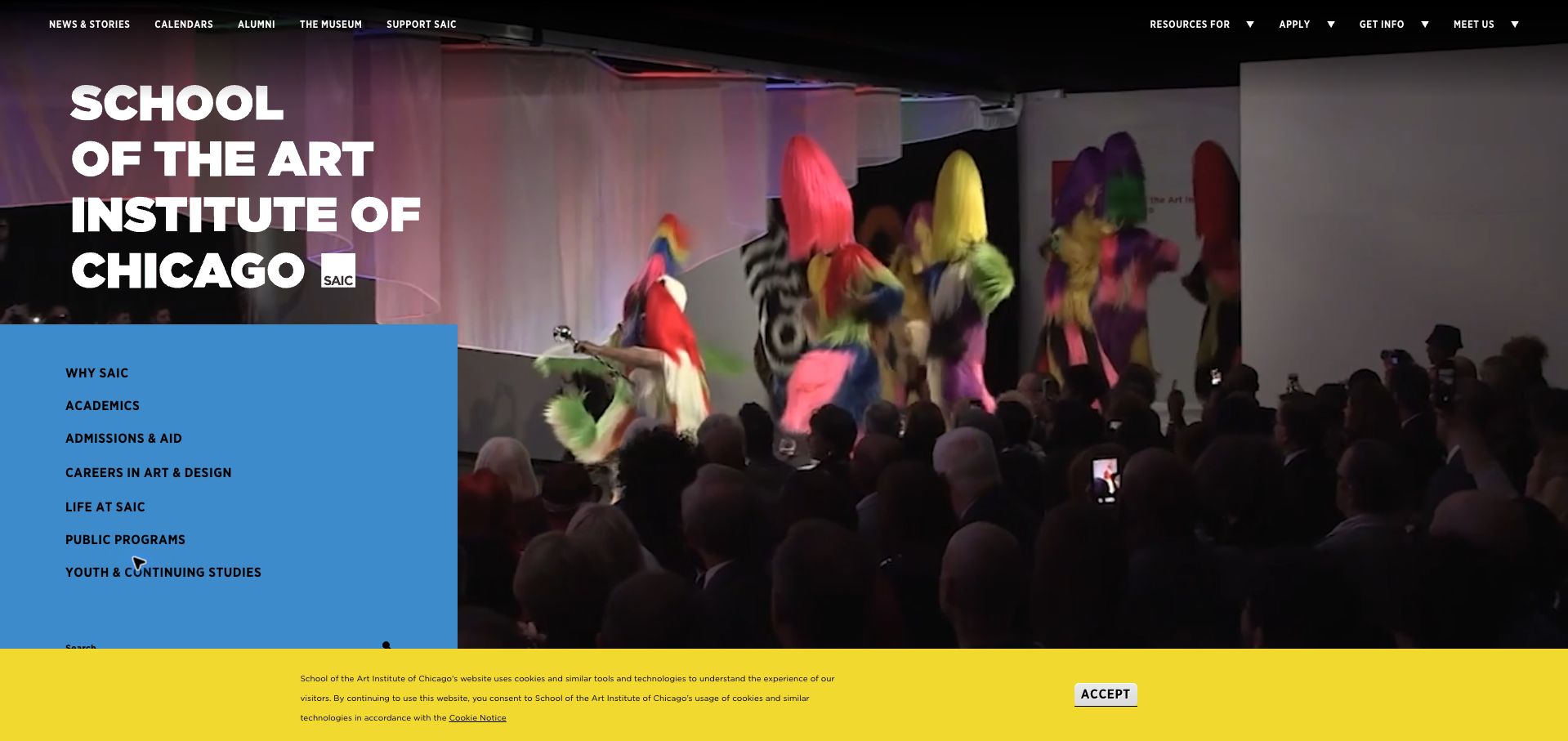
SAIC pairs a large school name and blue vertical navigation with a performance-led hero. Separate undergraduate and graduate routes lead into a narrative about interdisciplinary study, the museum, and Chicago. Student videos explain different reasons for attending, while the admissions messages distinguish a November priority-scholarship date from a December graduate reduced-fee date. That qualification helps visitors understand why each deadline matters. The long history, rankings, and career sections make the homepage extensive, however, and the opening provides little direct comparison of study commitments or costs. Small utility text and a retained yellow cookie strip reduce readability around an otherwise striking introduction.
What you can learn
Connect a school’s location and cultural resources to specific student activities, then keep admissions deadlines qualified by their actual benefit. Give program and cost discovery a shorter route than the full institutional narrative, particularly when the homepage serves several study levels.
Pros
Undergraduate and graduate pathways are separated.
Admissions deadlines explain their scholarship or fee context.
Cons & considerations
A long institutional narrative delays practical comparison.
Small utility text and the cookie strip reduce opening readability.
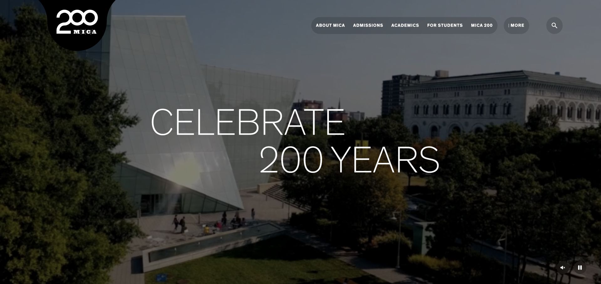
MICA introduces its bicentennial with oversized white lettering over campus video and a visible pause control. The more practical sections distinguish undergraduate, graduate, and professional study, then explain virtual tours, portfolio reviews, campus visits, and individual meetings. These options give an undecided applicant several concrete next steps. Events and stories are tied to Baltimore, including a dated documentary premiere, rather than presenting an interchangeable campus narrative. The anniversary treatment occupies most of the first viewport, and thin lettering loses clarity over the moving image. Repeated registration actions and a large story section also make the route to program requirements and tuition less direct.
What you can learn
Offer prospective students several clearly described ways to explore, especially portfolio feedback and visits suited to their study level. Keep an anniversary campaign subordinate to those decisions, with readable video text and a persistent route to requirements and cost information.
Pros
Visit and portfolio-review options are explained by study level.
Baltimore-specific events give the school concrete local context.
Cons & considerations
The anniversary hero delays practical study choices.
Thin video-overlay lettering is difficult to read consistently.
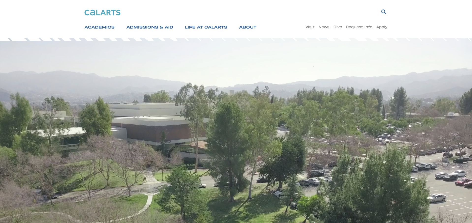
CalArts gives its opening almost entirely to a bright campus video beneath a spacious white header. Academics, admissions and aid, campus life, visiting, information requests, and applications have distinct routes. Below the video, six school links make the academic structure explicit, from art and critical studies to dance, film, music, and theater. Recent news and events include dates, disciplines, and venues, giving the community narrative useful detail. The full-height video delays those school choices and offers no immediate explanation of degree levels or costs. Rankings receive a substantial later section; they are attributed promotional claims, not a substitute for course requirements or independently verified educational outcomes.
What you can learn
Give a multidisciplinary school a clear discipline directory near the opening, alongside degree levels and admissions help. Campus imagery can establish place, but it should lead quickly to the academic choices and practical requirements that determine whether the school fits.
Pros
The six-school directory explains the institution’s academic breadth.
News and event cards identify disciplines, dates, and venues.
Cons & considerations
The full-height campus video delays program discovery.
Practical degree and cost comparisons require further navigation.
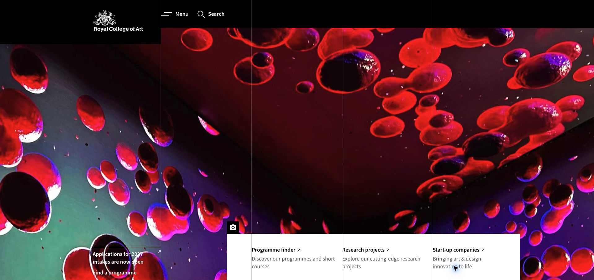
The Royal College of Art places a vivid abstract artwork beneath a black masthead and fine grid lines. Three panels distinguish the program finder, research projects, and start-up companies, explicitly acknowledging different audiences. An application notice names the 2027 intake, while later content introduces autumn masterclasses and dated open days. Alumni stories explain particular projects rather than relying only on broad endorsements. The artwork occupies most of the opening viewport, leaving the useful panels close to its bottom edge. Menu and search are the only prominent navigation labels, and the equal treatment of research and enterprise can dilute the immediate route for someone simply trying to compare programs.
What you can learn
When a school serves applicants, researchers, and businesses, name each pathway plainly. Keep the program finder high enough to remain visible without a full-screen image, and qualify application messages with an intake and a direct route to course requirements.
Pros
Program, research, and enterprise pathways are explicitly separated.
Application and open-day messages include meaningful dates.
Cons & considerations
Large artwork pushes the practical panels to the viewport edge.
Equal audience priorities can weaken the applicant’s main route.
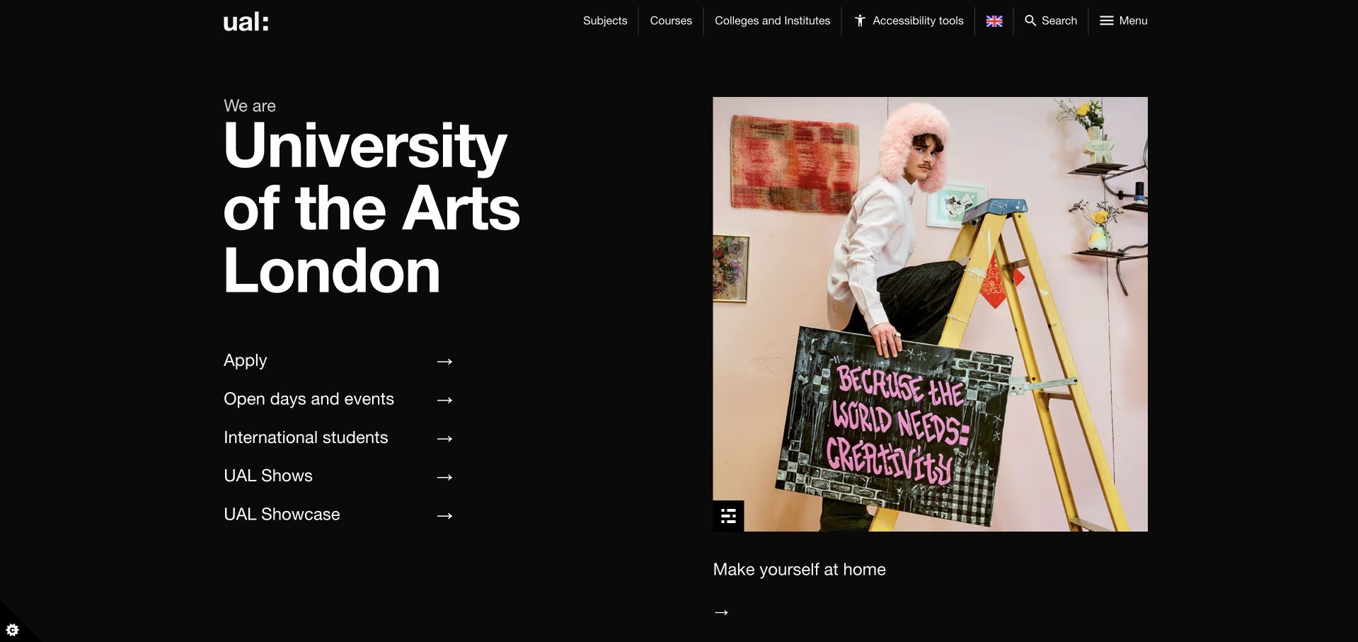
UAL uses a restrained black background, large white typography, and one credited creative photograph. Beside that image, a short list exposes applying, open days, international-student information, shows, and the student showcase. Subjects, courses, and colleges remain separate navigation choices, so visitors can approach the institution from different starting points. A course-search field and undergraduate, postgraduate, pre-degree, and short-course sections continue the practical structure below. The school name occupies a large proportion of the opening, however, and the direct course search falls below it. Similar labels for Shows and Showcase need context, while the homepage gives little immediate guidance on choosing among the colleges.
What you can learn
Offer a short list of applicant tasks beside a representative, credited project. Preserve subject, course, and college routes, but explain the distinction between similarly named showcases and provide enough orientation to help new visitors choose the right starting point.
Pros
Applicant tasks are visible without opening a menu.
Study levels and subjects offer several understandable discovery routes.
Cons & considerations
The large institutional heading pushes course search downward.
Shows, Showcase, and college choices need more introductory context.
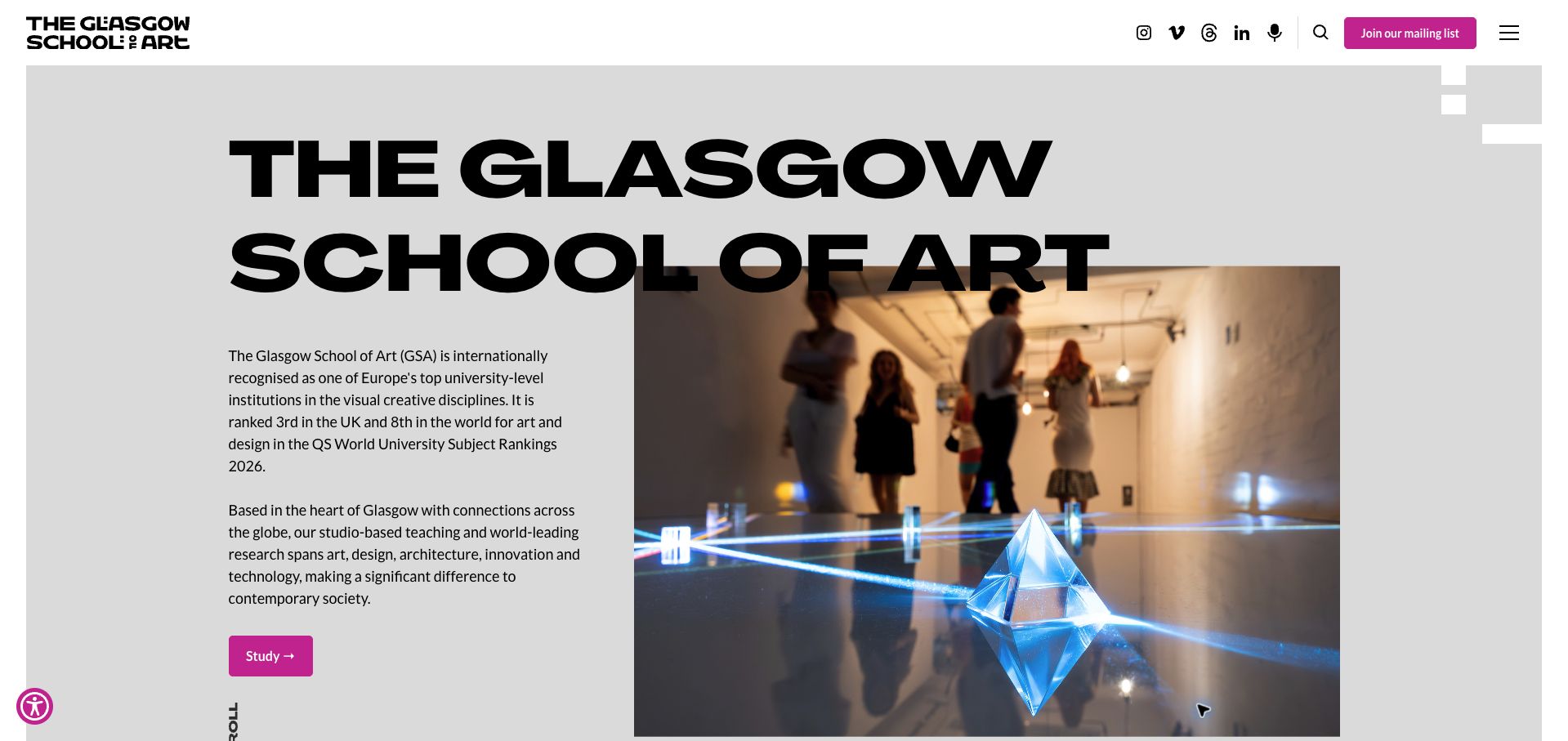
The Glasgow School of Art places a huge black title across a gray field and an installation photograph. A compact introduction names the creative disciplines, while a contrasting magenta Study action provides an obvious next step. Below, undergraduate, taught-postgraduate, and research routes are separated, with accommodation and graduate showcases nearby. Artwork captions identify creators, programs, and years, connecting the visual material to actual study contexts. The opening gives considerable space to rankings and institutional positioning, and the oversized title overlaps the photograph. Mailing-list signup receives stronger header emphasis than applying, while fees and entry requirements remain deeper in the study journey.
What you can learn
Credit graduate work with its program and year, then connect it to clearly labeled study levels. Keep the main study action prominent, but make requirements and costs easier to reach than mailing-list signup or a lengthy institutional ranking statement.
Pros
Study levels and graduate showcases have distinct routes.
Creative work is credited with useful program context.
Cons & considerations
The oversized title competes with the installation image.
Mailing-list promotion outweighs admissions detail in the header.
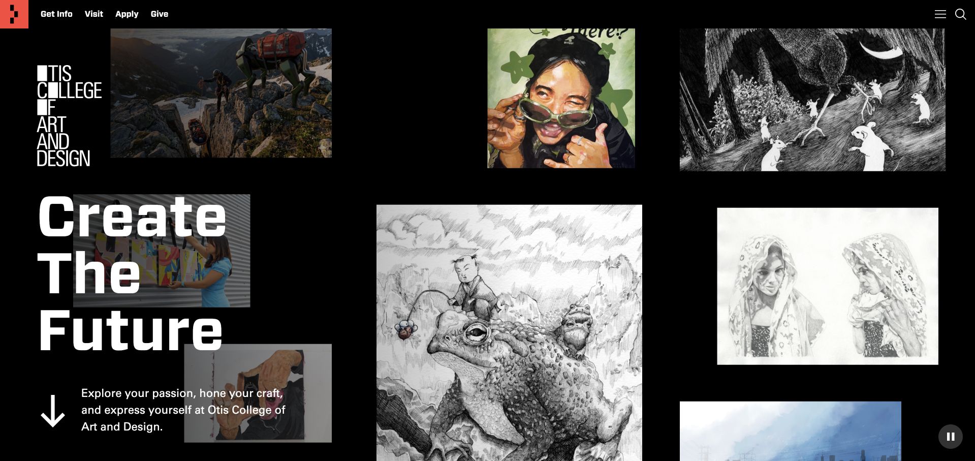
Otis fills its black opening with a collage of illustrations, digital scenes, and drawings around a large Create the Future message. A visible pause control lets visitors stop the motion, while Get Info, Visit, and Apply remain in a compact header. The next section separates undergraduate, graduate, extension, certificate, and youth programs. Named alumni stories and a linked survey article support further investigation of the school’s career claims, without establishing them as independent guarantees. The visual collage still delays the program directory, and the first view gives no practical indication of cost or attendance format. Numerous story cards add browsing depth but can distract from choosing a program.
What you can learn
Use a varied student-work gallery to show creative breadth, with an obvious motion control and persistent applicant actions. Follow it quickly with program categories, attendance formats, and cost routes; keep career statistics connected to their supporting methodology rather than presenting them as promises.
Pros
A pause control accompanies the moving gallery.
Degree, certificate, extension, and youth routes are separated.
Cons & considerations
The large collage delays practical program discovery.
Story volume competes with comparing format and cost.
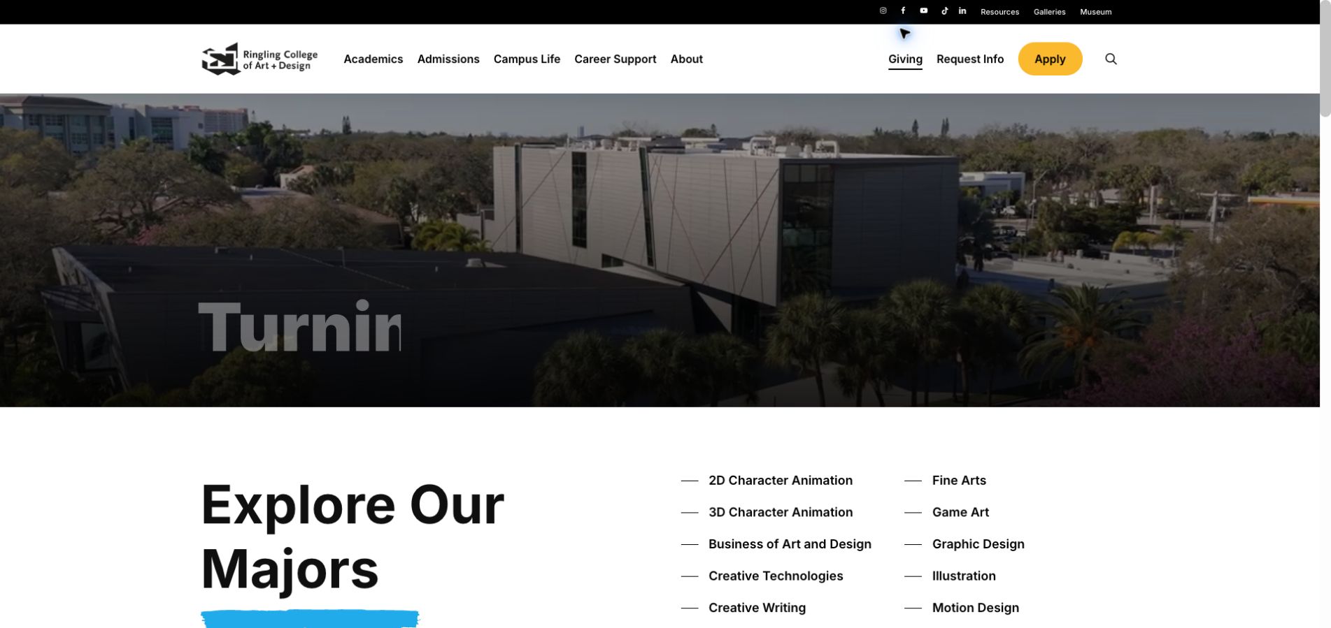
Ringling places a campus video above a two-column list of majors, including animation, game art, creative technologies, illustration, and visual studies. The directory appears early enough to share the retained viewport with the hero, making the breadth of the offer tangible. Admissions navigation distinguishes portfolio preparation, requirements, dates, tuition, and campus visits. An initial Spotlight Day overlay gave a date and time but covered most of the page; it was dismissed before the retained capture. The animated headline can be caught mid-word, and several major names still need short explanations. Repeated news treatments and broad Learn More actions make later sections less direct than the early directory.
What you can learn
Put a plain major directory close to the opening and explain unfamiliar subjects in a sentence. Keep portfolio, deadline, and tuition routes together, and promote visit events in a compact area that does not obscure the program choices students came to inspect.
Pros
The major directory appears immediately below the hero.
Admissions routes distinguish portfolios, deadlines, and tuition.
Cons & considerations
The initial event overlay obscures most of the homepage.
Animated text and unexplained major names reduce immediate clarity.
Kegan is a freelance web designer and developer with 15+ years of experience helping businesses turn complicated website requirements into clear, maintainable digital experiences. He works directly with clients from planning and design through development, launch, and ongoing support.
For art school website design, his development approach focuses on course and study-level comparisons, tutor and student work, application requirements, tuition information, and enrollment connections. The scope can be a targeted improvement or a complete custom build, with responsive layouts, thoughtful content structure, and integrations chosen around the people using and maintaining the site.
Show 3 other art school website designersHide other art school website designers
Connect subject, study level, attendance format, duration, cost, and requirements. A course catalog should support comparison rather than act as a gallery of unrelated promotional tiles.
Separate public programming
Exhibitions, talks, open days, and enrolled classes need different labels. Keep dates current and remove expired registration actions while preserving a useful archive.
Test the prospective-student journey
Ask someone to identify an appropriate program, explain how feedback works, find its cost basis, and understand the next admissions step. Check that large imagery and consent panels do not cover these choices.
The editing job behind the design
Choose systems the team can keep accurate
Use structured course and instructor records connected to the actual enrollment system. Keep program explanations accessible without an account or mailing-list signup.
Treat recordings, live classes, degree admissions, and public events as distinct workflows. The technology choice should follow those needs rather than the style of a reference school.
Our WordPress website examples offer a separate look at publishing approaches. A visible platform label is evidence for that named page, not a guarantee that the same system will suit your requirements.
Before the public launch
Website planning checklist
Name the study format.
State duration and dates.
Explain feedback provision.
Identify prerequisites.
Link tuition or course prices.
Credit student work.
Qualify admissions deadlines.
Separate exhibitions from classes.
Archive expired offers.
Provide a questions or visit route.
These checks are a project checklist, not a performance, legal, security, or accessibility certification. Test real journeys with the people responsible for the website before making claims about the result.
Sources & editorial method
How this collection was selected and reviewed
These 24 examples match the collection target saved before research. Public pages were directly opened and visually inspected; the pictured source and capture date identify the reviewed state. Reused captures retain their earlier dates. Each source also has a bounded public stack-audit attempt, with inaccessible and unknown results kept explicit. Editors Choice recognizes website design and information, not service quality or promised outcomes. No purchases, bookings, applications, or private forms were submitted. Images and trademarks belong to their owners.
Each example links to its actual source page. Screenshots are direct browser captures with their own capture dates; moving imagery, announcements and live designs can change. The notes describe observable design choices and conditional tradeoffs, not measured traffic, conversion results, service quality, or accessibility conformance.
Technology labels use public page metadata, asset evidence, or explicitly cited platform documentation. Platform documentation is not a complete current deployment audit. A component reference may be legacy or unused; it is not a complete backend inventory. Unknown stacks are omitted. These sites are editorial examples, not our client portfolio.
Written, Edited and Curated are separate editorial records, not timestamps advanced by a rebuild. Website designs and imagery belong to their owners. See our editorial standards or suggest a correction.
Questions worth asking
Art School website design questions
What should an online course card explain?
The subject, instructor, access period, price, availability, and whether feedback or live meetings are included.
Should an art school lead with student work?
It can, provided the work is attributed and program discovery remains easy to reach.
How should tuition and subscription prices differ?
State the actual commitment: term or program tuition, one-time course access, or recurring billing. Explain introductory offers beside the regular charge.
Do rankings establish educational outcomes?
No. Keep rankings attributed and provide their context. A design review cannot verify a student’s future experience or career result.