A fintech website should make the product and its intended audience understandable before asking for a financial commitment or personal information. A confident visual identity is not evidence of authorization, security, or suitability.
These examples include payment infrastructure, business financial tools, and consumer-oriented products. Their public marketing pages support different evaluation tasks. Compare audience labels, product explanations, documentation routes, and the boundaries around applying or signing in.
This is a design collection, not a recommendation to use a financial service. We have not assessed licensing, financial condition, protection arrangements, security, pricing suitability, or customer outcomes. Have the organization’s appropriate reviewers approve public claims and product information for the actual audience and locations served.
Before the examples
What makes good fintech website design in 2026?
Say who the product is for
Distinguish personal, business, platform, and developer audiences where they genuinely differ. Explain the product’s role in plain language before asking a visitor to decode a feature name. Keep relevant location, availability, eligibility, and product limitations close to the decision they affect.
Make important qualifications readable
Do not let a headline, calculator, animation, or aspirational scenario carry a promise that the surrounding information does not support. Provide an understandable route to approved pricing, terms, product details, and support. Decorative trust symbols are not a substitute for specific, verifiable explanations.
Keep exploration separate from private workflows
Label contact, application, developer documentation, and sign-in destinations clearly. Explain when a visitor is moving from public information to another service. An ordinary marketing form should not appear to be a protected place for account credentials, identity documents, or sensitive financial details.
The collection · 22 examples
22 fintech websites worth studying
Compare the way public fintech sites explain a product category and guide different audiences toward evaluation, documentation, or the next approved step. Do not treat visual polish or a detected technology as a financial or security endorsement.
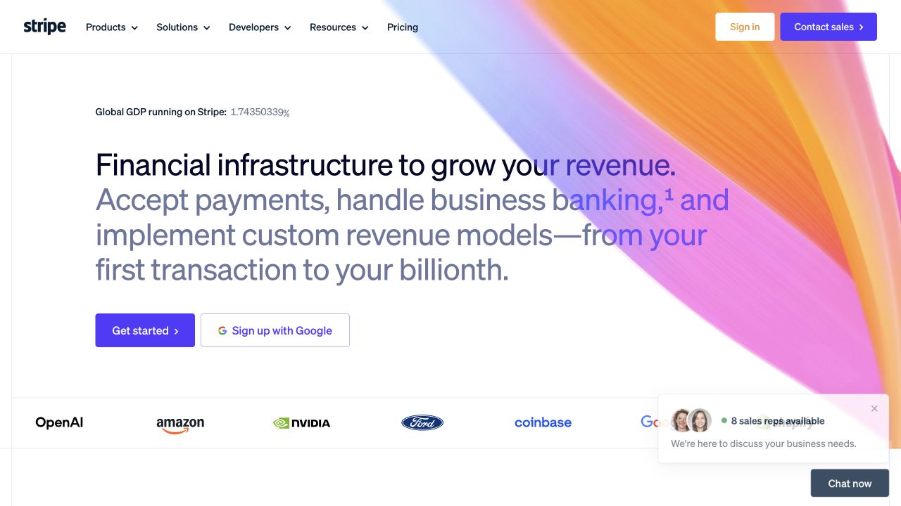
Stripe puts a multi-part financial-infrastructure introduction on a white field beneath its familiar product, solution, and developer navigation. A large flowing color graphic supplies identity without pretending to be a live account. A product-start action and a Google signup option appear together, while a separate sales contact remains in the header. The opening therefore accommodates different levels of readiness, but its broad promise still leaves the visitor to identify the relevant product family.
What you can learn
Give a platform introduction a clear route to specific jobs: accepting a payment, operating a marketplace, or evaluating an integration. Keep a developer’s exploration separate from a buying conversation. When an account shortcut appears early, explain what it starts rather than letting a familiar identity-provider button imply that evaluation is already complete.
Pros
Developer navigation is visible alongside commercial product routes.
The brand graphic leaves a readable area for the main explanation.
Cons & considerations
A wide platform proposition can postpone product-specific distinctions.
Several starting routes need clearly different purposes, not merely different button styles.
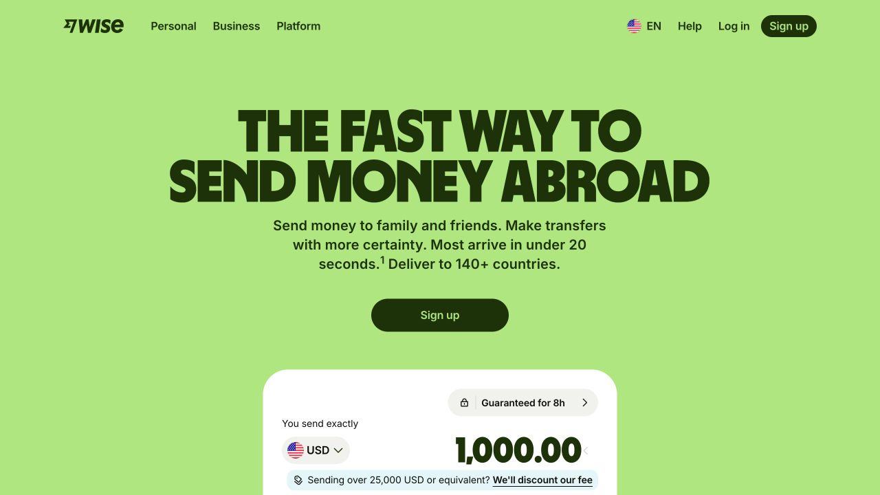
Wise uses a vivid green background and a large transfer-focused headline, followed by a compact sign-up action. The beginning of a white amount-entry panel makes the core task more tangible than a generic card illustration. Personal, Business, and Platform labels separate audiences in the header, with help and account access nearby. The first view concentrates on moving money rather than trying to give every product category equal promotional weight.
What you can learn
If a calculation is the opening explanation, make its inputs, assumptions, destination, and next step understandable. Preserve an ordinary information route for someone who wants to compare the service before entering amounts. Treat displayed figures as contextual interface information, not a universal quote that remains valid across locations, currencies, and later visits.
Pros
The interface preview connects the headline to a recognizable visitor task.
Audience labels distinguish personal use from business and platform evaluation.
Cons & considerations
A dominant transfer message may obscure other relevant product routes.
A cropped calculation panel needs enough surrounding context when viewed on a shorter screen.
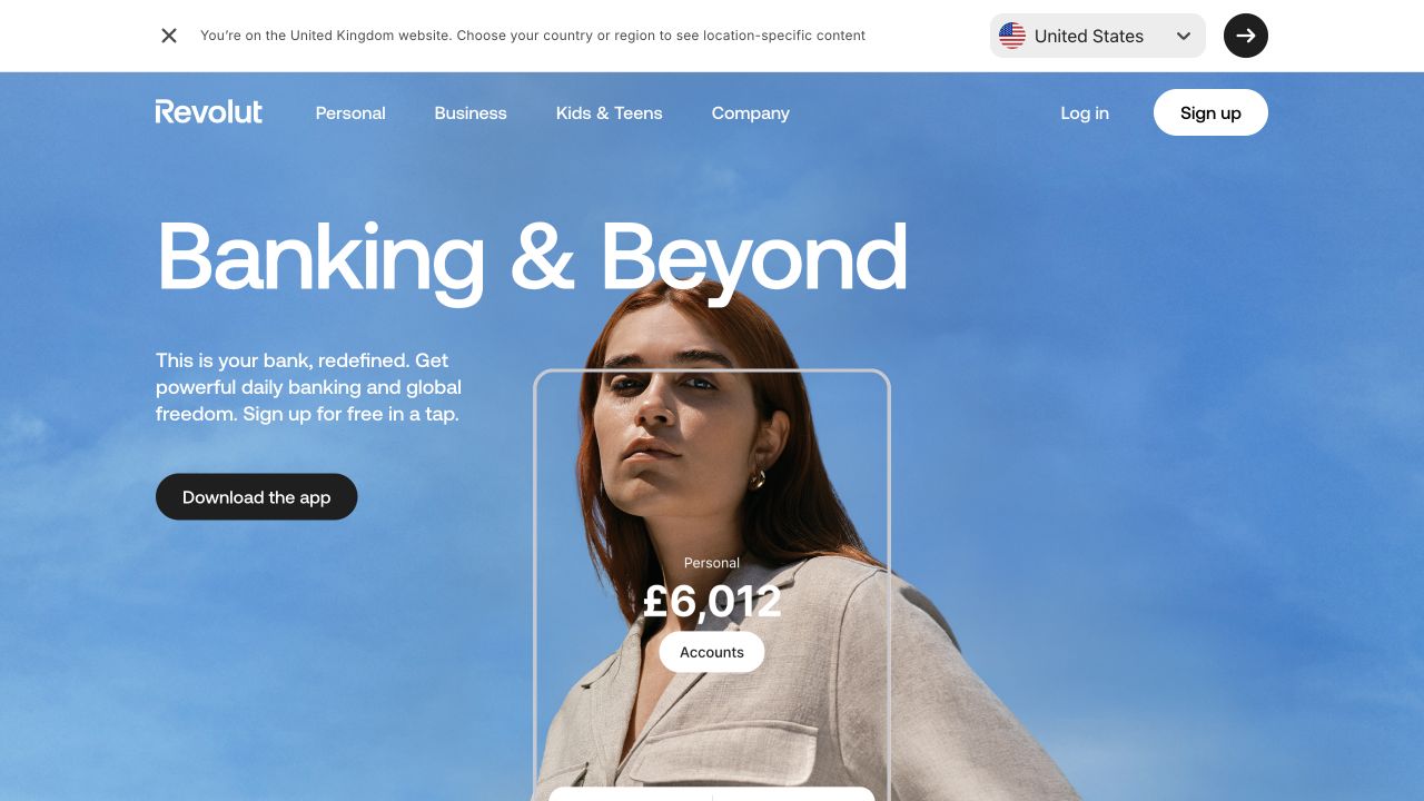
Revolut’s UK view overlays a large banking-oriented headline and an app-download action on a full-width portrait and blue sky. An illustrative account panel sits inside the scene, while Personal, Business, and Kids & Teens remain recognizable header choices. A separate top strip explains the current country context and offers a region choice. That regional notice is an important part of the interface, not simply an unwanted visual interruption.
What you can learn
Keep the relationship between a global brand and a location-specific product visible. A regional switch should lead to an appropriate explanation rather than silently carrying the same offer across markets. Balance the app-first action with readable product and support information for a visitor who is still evaluating the service on the public website.
Pros
Audience groups are separated using familiar labels.
The current regional context is stated before the main product invitation.
Cons & considerations
Large overlaid type depends on the chosen photographic frame and crop.
An app-download emphasis can move practical comparison details beyond the opening view.
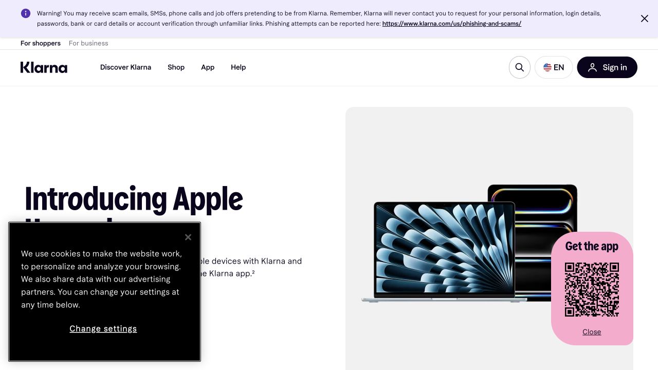
Klarna’s captured US homepage presents an Apple-device campaign within a restrained white layout. Shopper and business entrances sit above the main navigation, and a prominent safety notice occupies a separate upper strip. A device image, promotional headline, and floating app panel make the current campaign visually specific. The capture shows how a financial brand can borrow a retail-style product presentation without making the campaign the only organizational layer.
What you can learn
Keep campaign content tied to its approved explanation and destination, particularly when a visitor may be comparing a device offer rather than the wider service. Distinguish browsing, app installation, and a financial-product decision. Give urgent notices a deliberate position that does not disappear when the promotional module changes or the viewport narrows.
Pros
Shopper and business routes acknowledge different visitor purposes.
A separate notice strip is not embedded inside the campaign artwork.
Cons & considerations
Several persistent notices and floating elements compete with the campaign.
Device imagery can make an offer feel like ordinary retail before its specific conditions are understood.
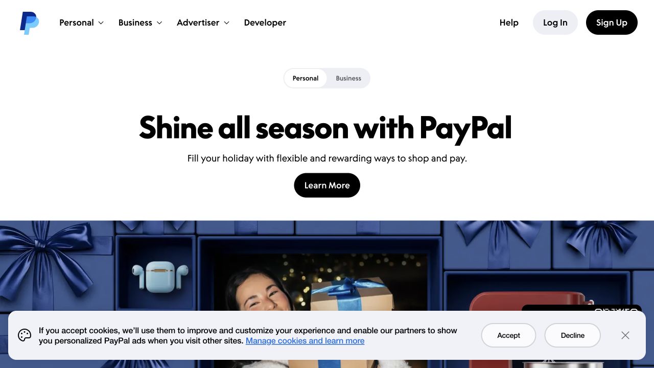
PayPal introduces a seasonal shopping message on a large white opening area, followed by gift-oriented imagery. The masthead keeps Personal, Business, Advertiser, and Developer routes distinct, with help and account access separated at the right. A smaller Personal/Business selector repeats the audience distinction near the campaign. The promotion supplies a timely reason to explore, but the surrounding navigation still has to serve visitors who arrived to perform an existing task.
What you can learn
Treat the campaign and permanent account journeys as different responsibilities. Test a returning visitor who wants help or a login alongside a new visitor following a seasonal promotion. When the same audience choice appears in two places, make its behavior and meaning consistent so that it does not look like a second, unrelated classification.
Pros
Account access is visually separate from the seasonal reading action.
Developer and business visitors have named routes outside the consumer promotion.
Cons & considerations
Repeated audience controls can feel redundant without consistent behavior.
A general seasonal message postpones the differences among the underlying financial services.
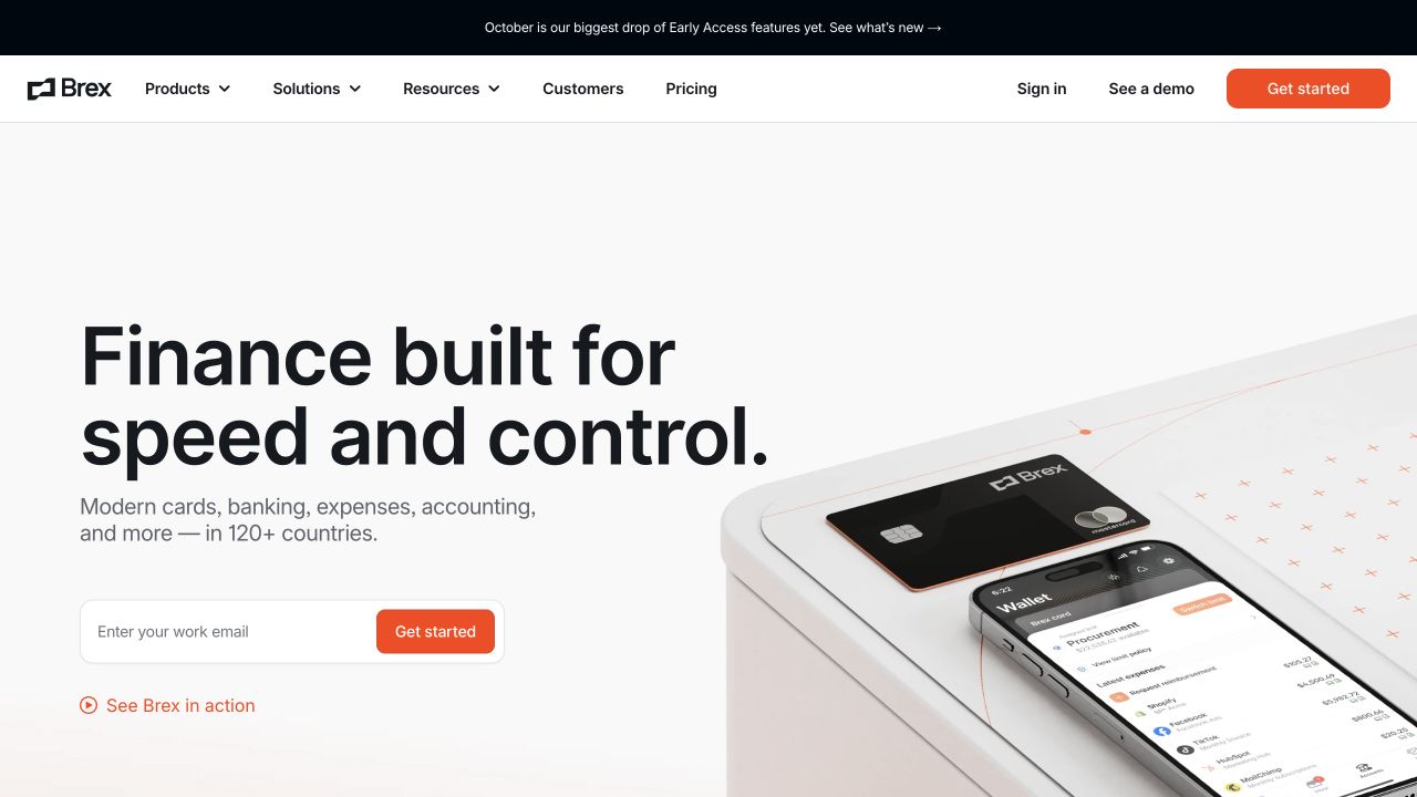
Brex uses a wide white split composition: a large finance-oriented headline and work-email entrance sit on the left, while a card and interface composition fills the right. The header distinguishes products, solutions, resources, customers, and pricing; a demo route remains separate from getting started. A narrow release announcement adds a timely layer above the permanent navigation. The opening positions a connected business platform rather than a single card in isolation.
What you can learn
Translate a platform-level introduction into specific workflows without making every feature compete in the hero. Explain what an email submission starts and distinguish that from a product demonstration or an existing account. Keep release announcements independently maintainable so that an expired feature promotion cannot contradict the main product explanation.
Pros
Demo and starting routes are presented as different visitor choices.
A product composition makes the otherwise broad platform description more concrete.
Cons & considerations
A compact email entrance provides little room to explain the following workflow.
Stacked campaign and navigation layers can reduce the space available for the main explanation.
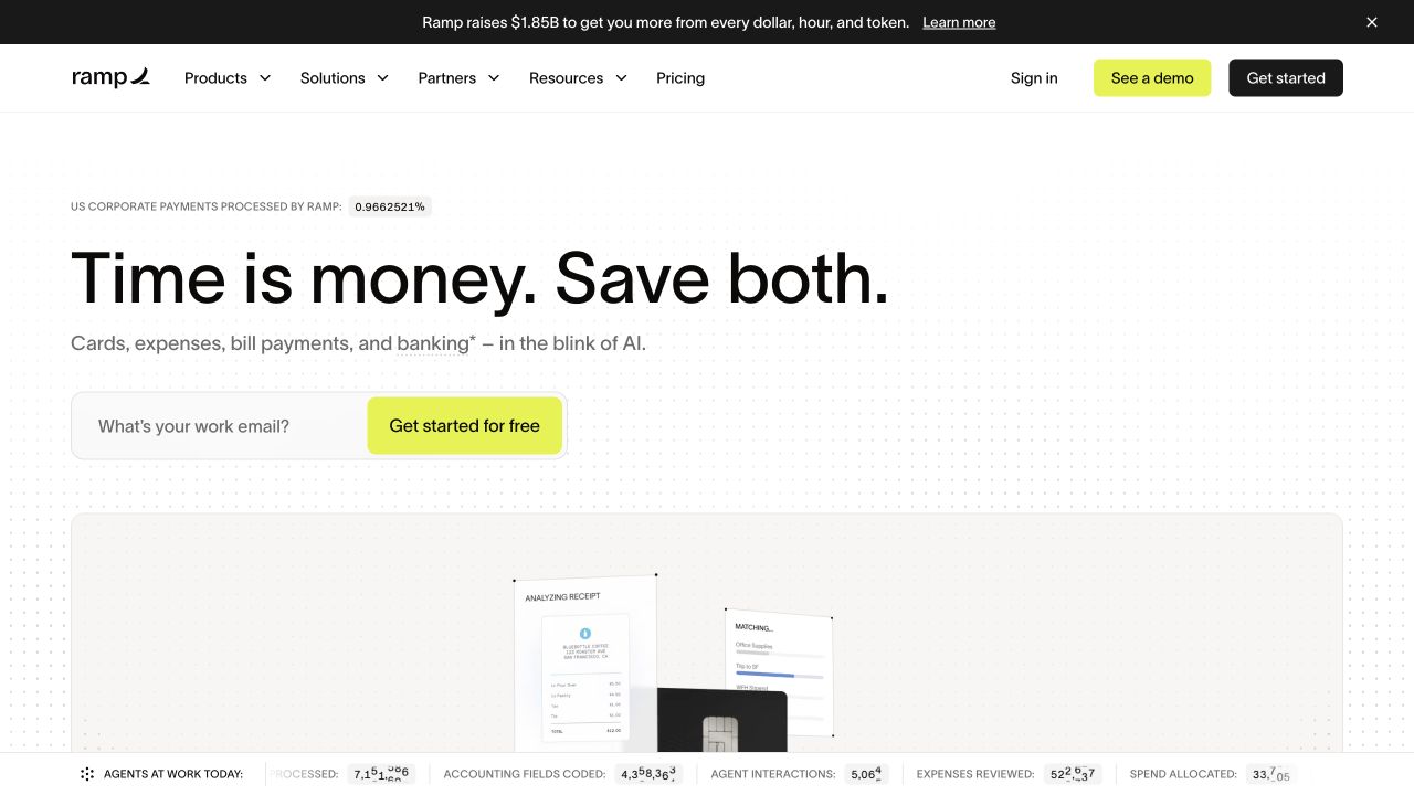
Ramp places a short time-and-money proposition above a compact work-email action on a mostly white canvas. Small product imagery begins below, while the masthead preserves product, solution, resource, and pricing routes. A contrasting demo action sits beside a separate get-started button in the header. The composition creates an unusually quiet opening for a platform spanning several workflows, but the short message leaves substantial explanation to the following content.
What you can learn
Use concise positioning as an entrance, not as the entire product brief. Follow it with concrete tasks and a clear audience definition. Align repeated starting actions so that a visitor understands whether each opens the same onboarding process, and keep a sales discussion distinguishable from an immediate product signup.
Pros
The main message has a single readable focal area.
A demo remains available without replacing the self-service entrance.
Cons & considerations
A broad benefit statement can leave unfamiliar visitors unsure what the platform actually does.
Repeated starting actions need consistent destination and expectation-setting.
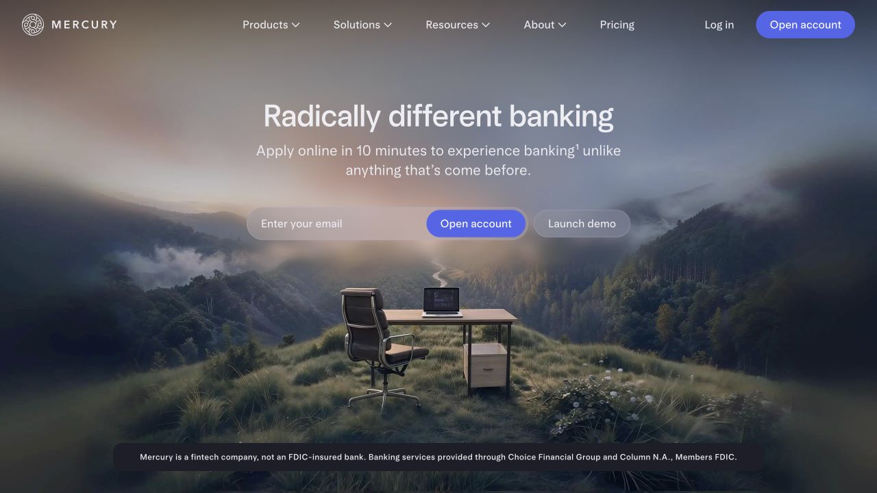
Mercury centers its introduction over a misty landscape containing a small desk scene. A work-email field, account-opening action, and separate demo link sit beneath the headline, while product, solution, resource, and pricing routes remain in the masthead. A factual qualification line is visible at the bottom of the image. The atmosphere differentiates the public brand, but the imagery itself explains little about the mechanics of the service.
What you can learn
Let a distinctive visual identity coexist with explicit product information and reviewed qualifications. Make the first account step understandable before collecting details. Keep essential explanatory content available outside a changing image or video frame, and preserve the difference between a demonstration of the interface and an application for the product.
Pros
The demo is offered separately from opening an account.
Practical navigation remains visible above the atmospheric scene.
Cons & considerations
A landscape metaphor provides little immediate operational explanation.
Small qualifications over image-led backgrounds need careful readability and responsive placement.
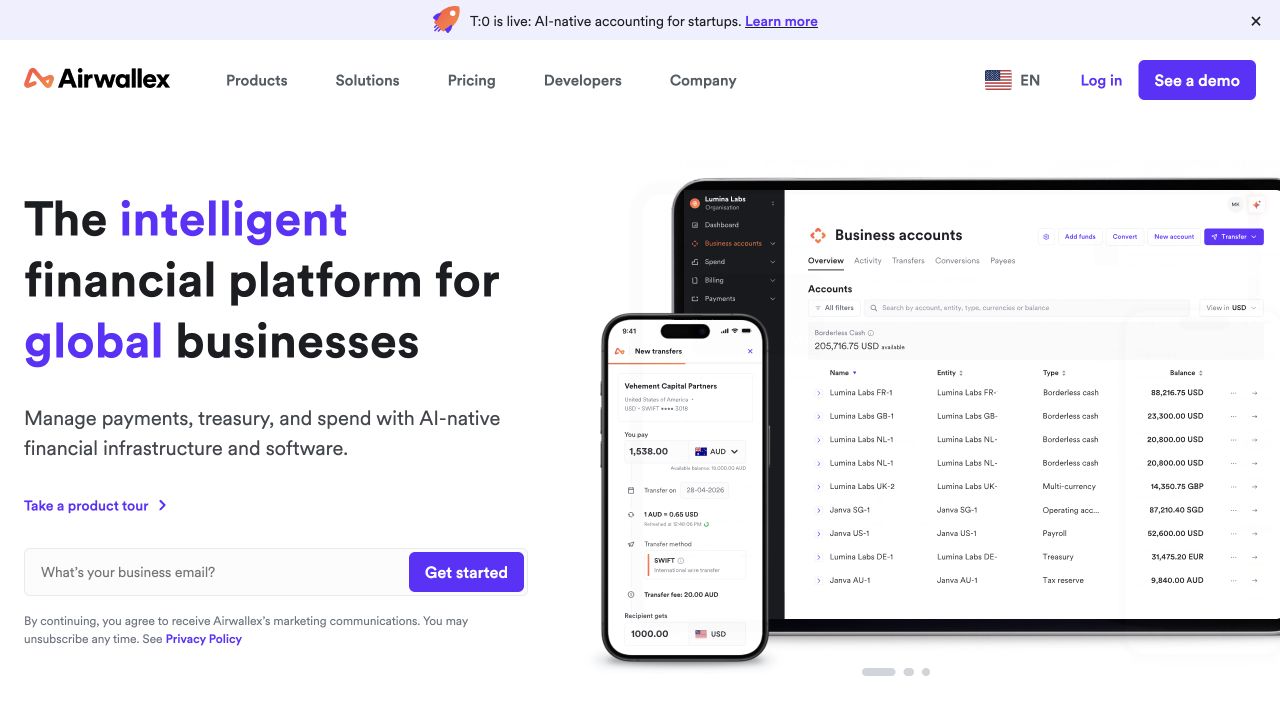
Airwallex pairs a left-aligned business-finance introduction with overlapping desktop and mobile product images. Purple emphasis connects the key phrase, primary action, and header styling, while Products, Solutions, Pricing, and Developers remain separate navigation routes. A work-email entrance sits near the explanatory text, with a distinct demo option in the masthead. The two device views make the product feel more concrete than the headline alone would allow.
What you can learn
Use product images to explain a specific workflow rather than merely demonstrate that a dashboard exists. Keep currency, business scope, and market information tied to the relevant product pages. Separate a developer’s evaluation from a sales-led demo, and explain what a first email submission will initiate before asking for additional details.
Pros
Desktop and mobile references connect the proposition to recognizable interfaces.
Pricing and developer material remain discoverable alongside the starting action.
Cons & considerations
Overlapping interface images can become unreadable when reduced to a narrow column.
A broad global proposition still needs precise product and availability explanations.
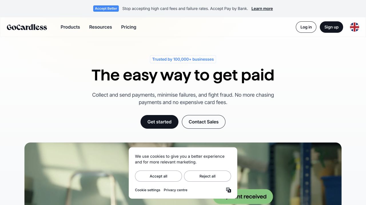
GoCardless uses a centered payment-collection introduction with a short supporting description and two neighboring actions. Getting started and contacting sales are visually different, while Products, Resources, and Pricing remain available above. The beginning of a photographic section softens the text-led opening without replacing its clear task focus. A separate product announcement occupies a narrow upper band, keeping that timely material outside the principal explanation.
What you can learn
When a service has one strong entry task, make that task understandable before introducing product variants. Distinguish the conditions under which someone should start independently or talk to sales. Keep campaign announcements and supporting imagery subordinate to the explanation, and test that the main choice remains clear when less vertical space is available.
Pros
The opening describes a recognizable business task rather than only a brand slogan.
Self-service and sales evaluation are presented as separate actions.
Cons & considerations
Two adjacent actions need enough explanation for a first-time evaluator to choose.
Announcements and lower-page media can crowd a deliberately concise opening on short screens.
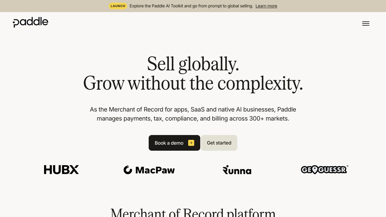
Paddle presents a large serif introduction on a warm, nearly white background. A supporting paragraph names the type of platform, and neighboring demo and starting actions follow it. Customer marks provide a separate visual line beneath, while the masthead uses a compact menu control rather than displaying a long product list. An upper launch strip introduces another topic without becoming the central headline.
What you can learn
Define the platform’s role plainly before using customer logos or an elegant visual identity as reassurance. Keep the demo and starting routes distinguishable, and give an unfamiliar reader a discoverable explanation of the service model. Customer marks should point to appropriate context rather than being treated as proof that every business needs the same arrangement.
Pros
The supporting paragraph provides a specific service-model description.
Restrained typography gives the primary explanation room to breathe.
Cons & considerations
A collapsed navigation hides product and support routes until another interaction.
A broad global-selling promise needs practical boundaries and qualifications beyond the introduction.
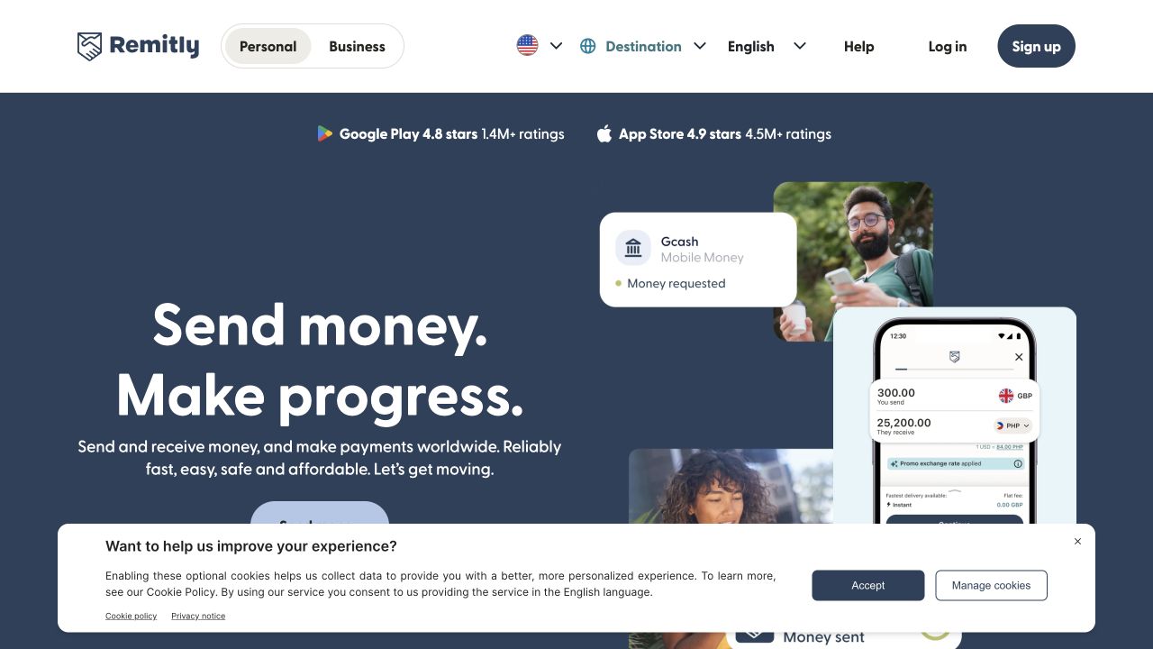
Remitly combines a dark-blue introduction with photographs, a mobile-interface illustration, and a transaction-style status card. Personal and Business entrances remain visible in the header, alongside sending-location, destination, and language controls. App-store ratings sit above the main message. This opening connects the product to people and a recognizable transfer task, while the geographical controls signal that the next information depends on context.
What you can learn
Make sending location, destination, language, and any displayed example assumptions understandable before inviting a transaction. Explain how an illustrative product screen differs from a visitor’s own quote or status. Keep help and ordinary product information available to someone who is comparing the service rather than ready to create an account.
Pros
Country and destination controls expose important context near the main navigation.
People and interface imagery connect the abstract service to a recognizable task.
Cons & considerations
Several overlays and reassurance elements compete for a relatively small introduction.
A depicted transaction can be mistaken for a universal example unless its context is clear.
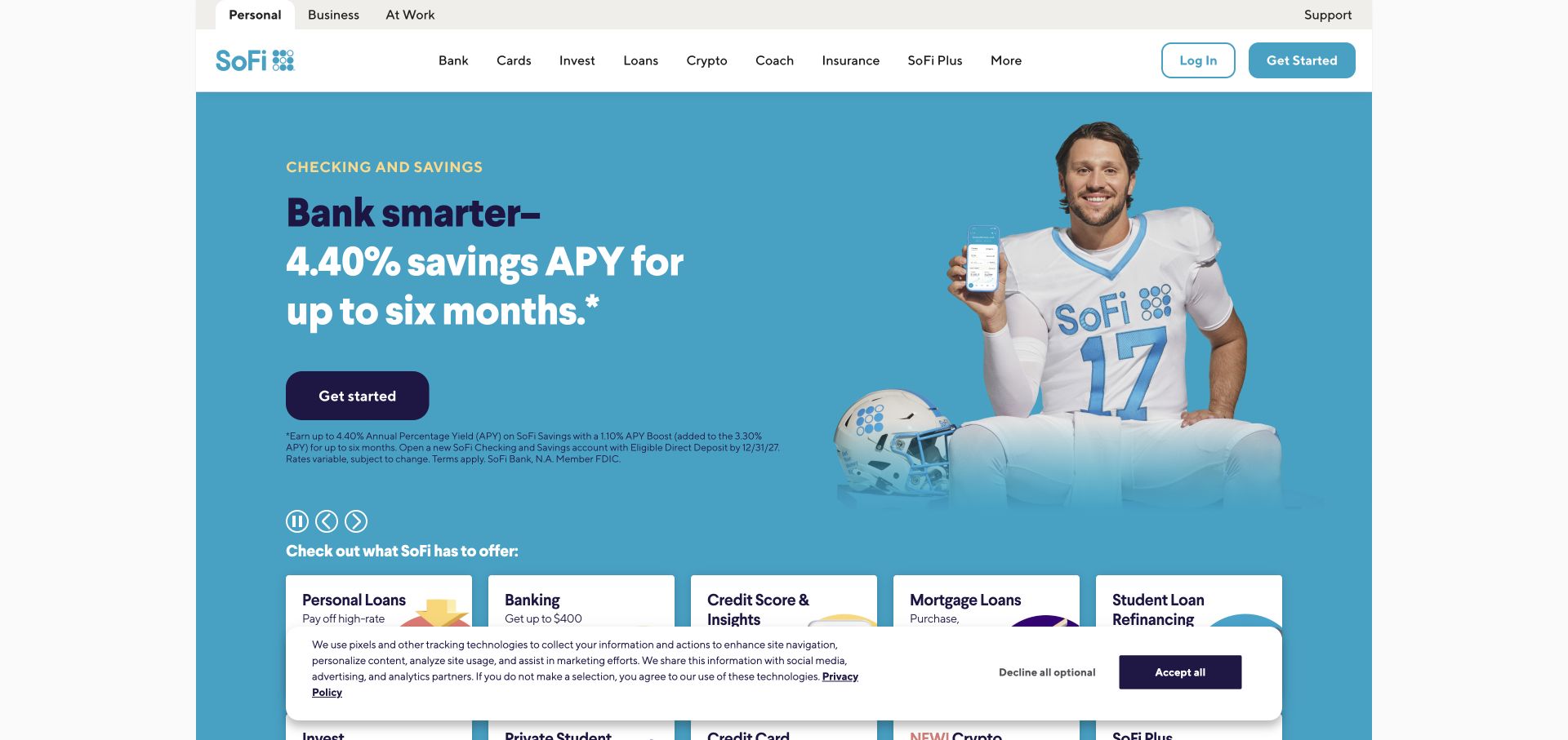
SoFi’s dated capture gives a large promotional rate and celebrity-led product image the dominant blue opening area. A get-started action sits beneath the offer, with a row of different financial-product cards beginning below. Personal, Business, and workplace audiences have separate top-level entrances, while familiar product categories occupy the main navigation. The composition makes the campaign easy to notice without pretending the organization offers only that product.
What you can learn
Keep a campaign’s reviewed terms and validity connected to its headline wherever the module is reused. Design a useful ordinary state for when the promotion ends. Preserve direct product-category routes for returning visitors and avoid making an old campaign image the only explanation of the service. The pictured figure is dated promotional content, not a current offer in this guide.
Pros
Product-family cards provide routes beyond the featured promotion.
Audience and product labels offer different ways into the same public site.
Cons & considerations
A large quantified offer can overshadow the information needed to evaluate it.
Notices and the lower product strip compete for space on a short screen.
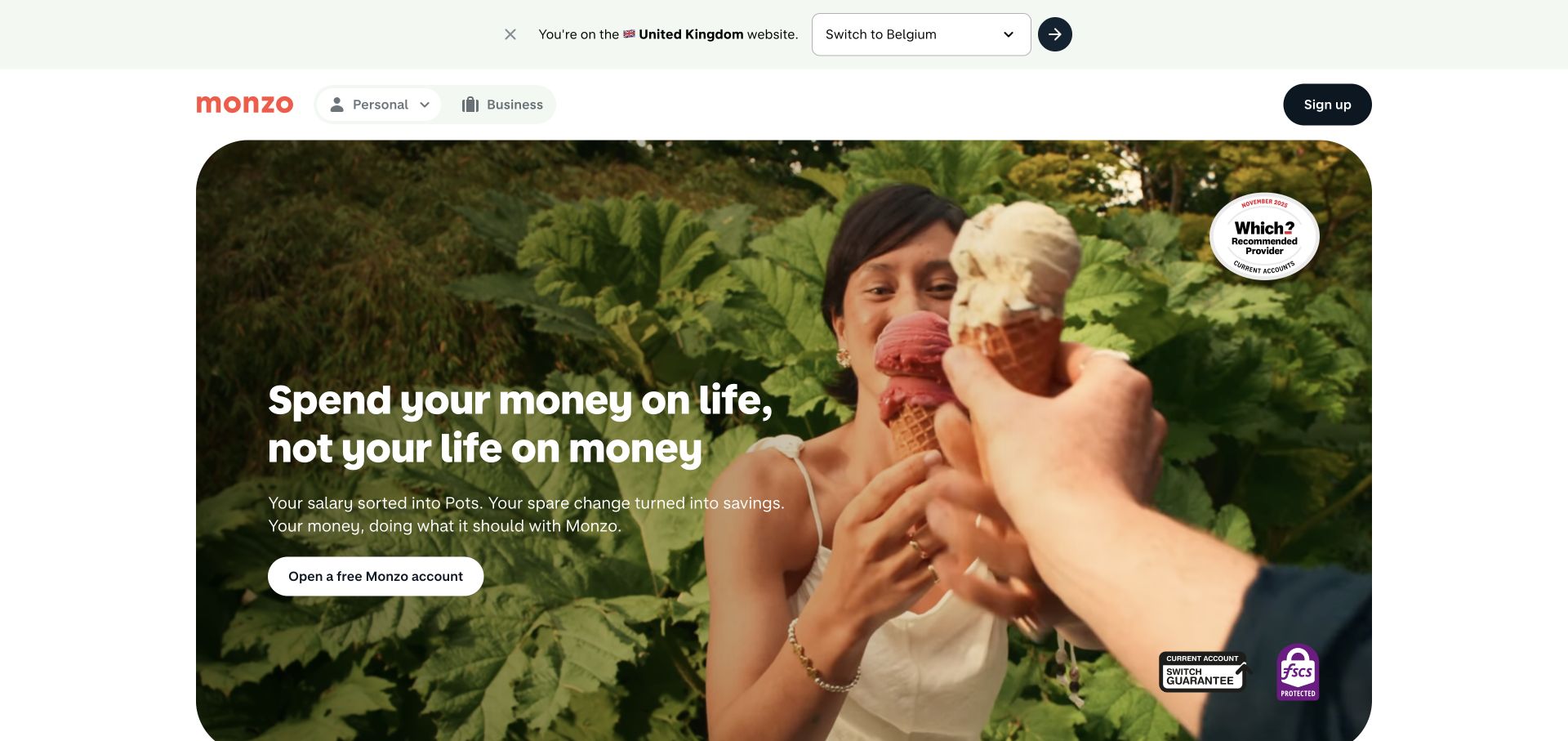
Monzo’s captured UK homepage frames a large lifestyle photograph inside a rounded panel. A short personal-finance message, supporting text, and account-opening action sit over the image, while the lighter masthead separates Personal and Business audiences. The top strip explicitly identifies the current country context and offers a location switch. Recognition marks appear within the image rather than replacing the main navigation or the primary action.
What you can learn
Use personality to introduce the brand without making essential product information depend on a photograph. Keep market selection explicit and make sure a change of region leads to the appropriate product explanation. Review how the headline, action, and accompanying qualifications remain readable as the image crop changes on a phone.
Pros
The regional notice makes the current market context visible.
A restrained action set keeps the lifestyle scene from becoming a collection of competing controls.
Cons & considerations
Image overlays require deliberate contrast and cropping choices.
A broad everyday-life message can defer practical product comparison until later pages.
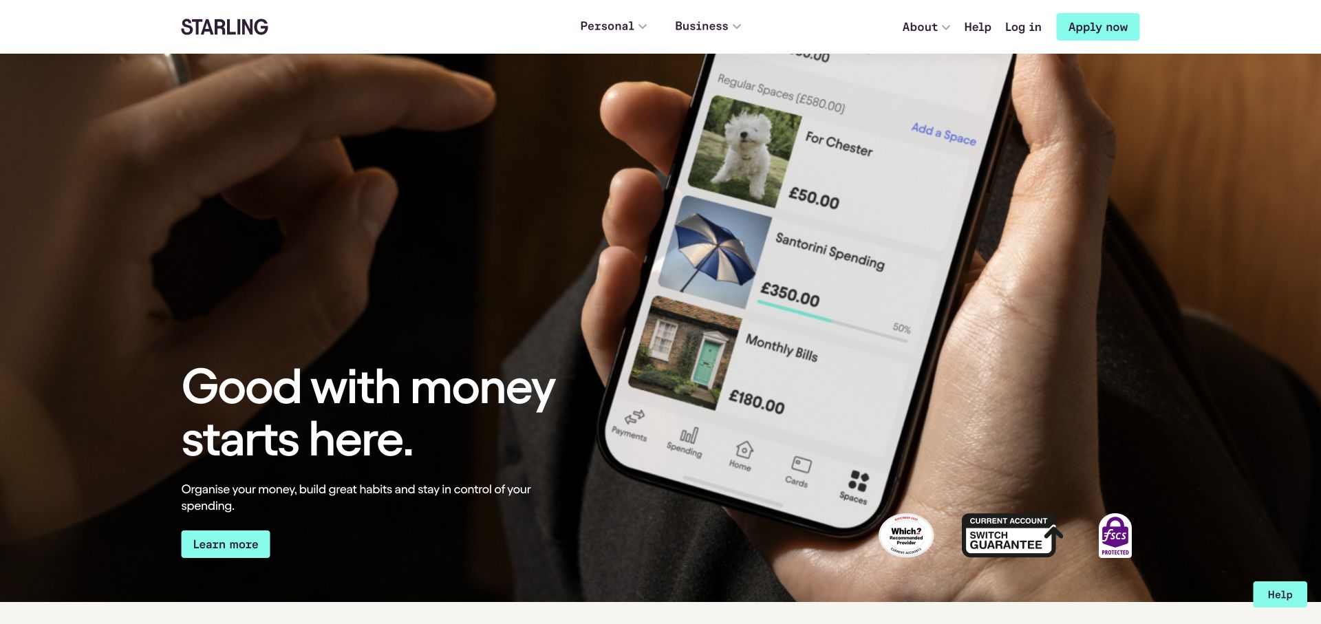
Starling’s opening photograph shows hands using a phone whose visible interface illustrates money organized into named categories. A compact introductory message and learning action sit to the left, while Personal and Business navigation, account access, and an application route remain in a white header. The product interface carries much of the explanation. Recognition and account-related marks sit near the lower edge of the image.
What you can learn
Use interface imagery to demonstrate a specific job a person can understand, not to imply a real customer’s situation or a guaranteed outcome. Keep product categories and the application boundary clear. When the image is cropped or reduced, preserve the underlying explanation in ordinary text so the visitor does not need to decipher a small phone screen.
Pros
The phone view demonstrates a more specific task than a generic payment-card image.
A white header separates persistent navigation from the photographic feature.
Cons & considerations
Fine interface detail becomes difficult to read as the image shrinks.
Recognition marks and multiple actions can compete with the product explanation near the fold.
Checkout.com places a centered payment proposition on a dark background, surrounded by rounded photographs of people, devices, and business situations. A blue contact action gives the composition one clear focal destination. A floating navigation bar keeps product, solution, documentation, and resource entrances distinct, while a narrow announcement above it introduces a separate timely message. The imagery supplies breadth and atmosphere rather than a detailed product demonstration.
What you can learn
Connect the central commercial message to concrete product and documentation routes for visitors who need to evaluate implementation. Define which photo regions are decorative and keep them from becoming accidental competing calls to action. Plan how an announcement can be removed without disturbing the permanent explanation or the mobile reading order.
Pros
One contrasting central action gives the dense visual frame a clear destination.
Documentation is a recognizable route within the permanent navigation.
Cons & considerations
Atmospheric photographs do not independently explain the service model.
A surrounding image collage requires careful simplification when the available width contracts.
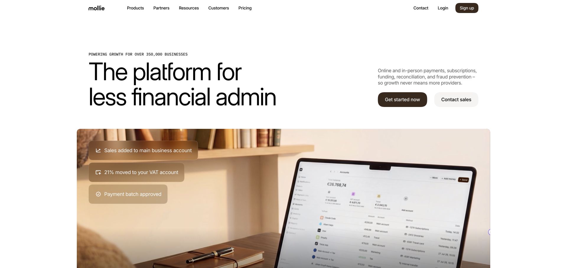
Mollie’s capture pairs a large financial-administration headline with a separate explanatory paragraph and two evaluation actions. A wide lifestyle image below contains illustrative payment-status overlays, giving the abstract proposition a more concrete business setting. The header maintains product, partner, resource, customer, and pricing routes within a restrained white frame. The visual system can support several service messages without requiring a completely different page composition for each.
What you can learn
Keep a stable product explanation around any changing campaign phrase. A visitor should understand the service and next step without waiting to see another headline state. Identify what interface overlays are illustrating and connect them to appropriate product detail rather than allowing sample payment figures to look like independent evidence of business results.
Pros
A separate explanation column gives context beyond the headline.
Starting and sales-contact actions distinguish different evaluation needs.
Cons & considerations
A broad platform statement can delay the differences among specific services.
Small illustrative status overlays may lose their meaning on a narrow screen.
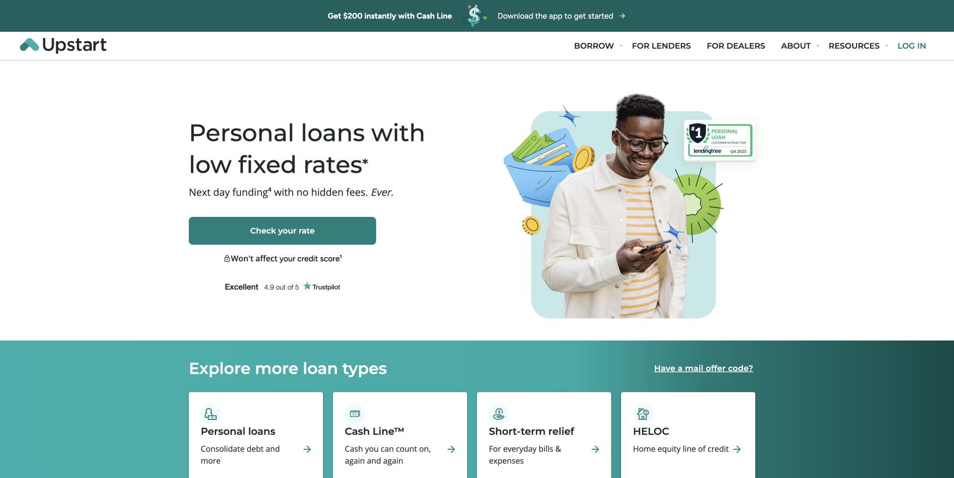
Upstart uses a white split hero with a concise loan-oriented introduction, a teal rate-check action, and a portrait-and-illustration composition. Supporting qualifications sit near the action, while a teal section below introduces several product categories. The masthead separates borrower, lender, and dealer audiences. The opening makes the next inquiry visually obvious, but the visitor still needs to understand what that step starts before entering personal information.
What you can learn
Treat the action label, reviewed product explanation, and nearby qualifications as a connected content unit. Keep application handoffs explicit and use the appropriate protected workflow for information collection. Preserve alternate product routes for someone who arrived to compare rather than proceed immediately, and test how the important explanatory text fits around the portrait on a phone.
Pros
The primary inquiry action is visually distinct from the product-category cards.
Different commercial and consumer audiences have named navigation entrances.
Cons & considerations
A prominent inquiry button can outpace a visitor’s understanding of the following process.
Campaign strips and reassurance elements can displace essential supporting information.
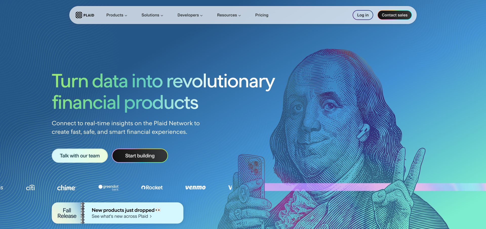
Plaid’s public marketing page combines an engraved-style illustration with a bright blue and green color field. Its product proposition sits beside two separately labeled entrances for speaking to the team and beginning implementation. A compact floating masthead distinguishes products, solutions, developers, resources, pricing, and account access. The illustration provides personality, while the different actions begin to explain that buyers and implementers need different follow-on material.
What you can learn
Build connected commercial and developer journeys instead of treating documentation as an obscure footer link. Let both audiences use the same stable product vocabulary while offering the evidence and detail appropriate to their task. Keep an illustrative financial metaphor separate from demonstrations or claims about a visitor’s actual data or product eligibility.
Pros
Paired actions make the distinction between evaluation and implementation visible.
A coherent illustration system gives a technical subject a recognizable public identity.
Cons & considerations
A broad metaphor still needs concrete product explanations on subsequent pages.
Strong background detail needs enough quiet space to preserve headline readability.
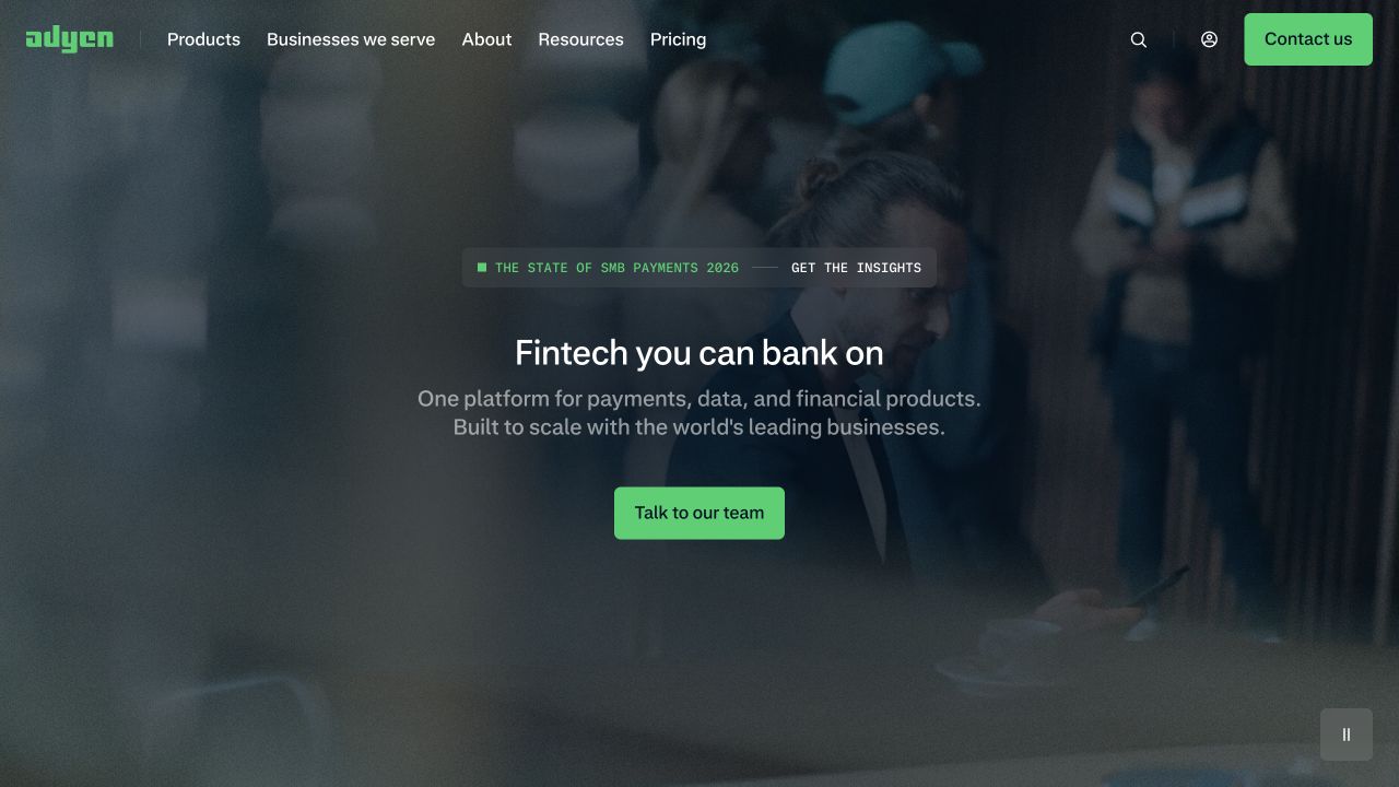
Adyen centers a brief enterprise-finance proposition over a darkened scene of people in a business setting. A green team-contact action repeats the accent used in the masthead, while products, audience groups, resources, pricing, and login remain visible. A small research announcement sits above the main introduction. The limited action set creates a readable hierarchy rather than trying to demonstrate every platform capability in the first frame.
What you can learn
Give an enterprise contact route a clear purpose without withholding the information someone needs for independent evaluation. Maintain pricing, product, audience, and technical entrances around the campaign. If a photograph or film changes, test that the same text and action remain readable rather than approving only the most favorable visual frame.
Pros
A consistent accent connects the principal action with the broader navigation.
The brief introduction leaves a clear route into a sales conversation.
Cons & considerations
The broad platform message postpones specific product differentiation.
Lifestyle media contributes atmosphere more readily than operational explanation.
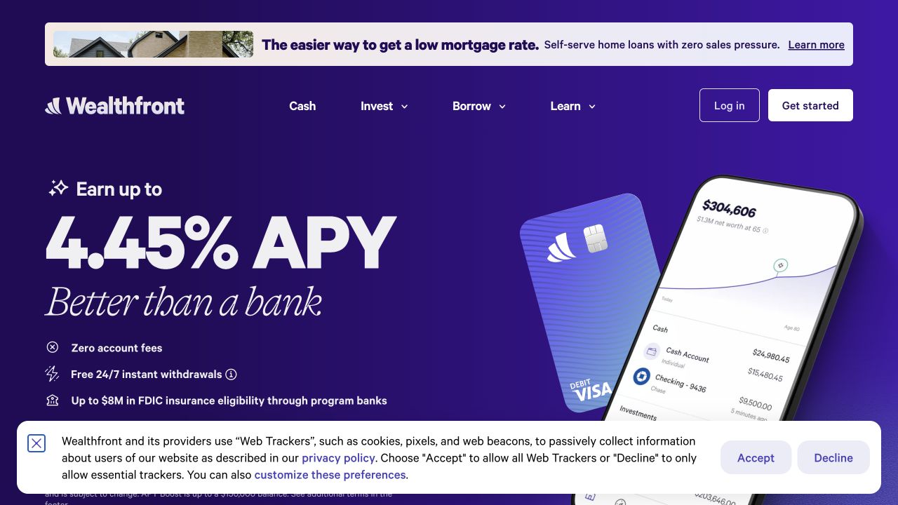
Wealthfront’s dated capture emphasizes a very large yield figure against a saturated purple background, accompanied by a tilted phone and card composition. Cash, investing, borrowing, and learning remain distinct navigation categories. A separate home-lending announcement occupies a light strip above the main header, while a broad privacy notice takes space at the bottom. Several independent messages therefore share the same introductory viewport.
What you can learn
Keep a promotional figure, its assumptions, and its approved supporting context together in the content model. Design a correction or replacement that does not depend on the original number fitting the same line. Review the combined height of announcements and notices before approving the mobile introduction. The captured promotion is a historical website view, not a current rate recommendation.
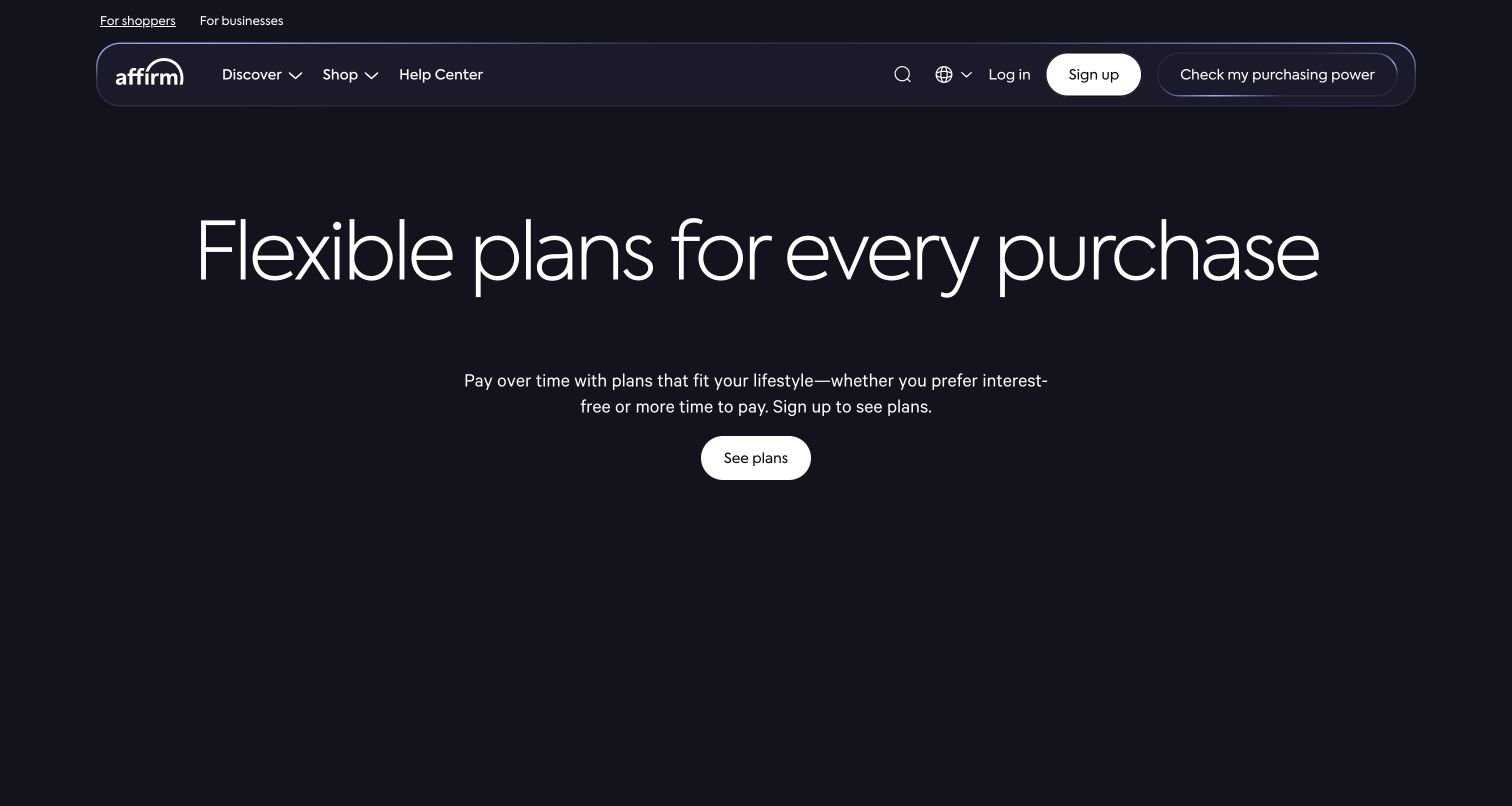
Affirm places a centered light-weight headline, short explanatory paragraph, and small plan-viewing action on a nearly black background. The rounded masthead distinguishes shopper and business visitors, while account entry and help remain available. There is little competing imagery or promotional furniture in the captured opening. This restraint makes the next reading action easy to identify, but it also places more explanatory responsibility on the following pages.
What you can learn
Keep the first information step understandable without making a short hero carry the entire product explanation. Define a useful path for someone comparing the service as well as someone returning to an existing account. Maintain approved conditions alongside the relevant product content rather than relying on a minimalist visual style to signal clarity or reassurance.
Pros
A small number of elements creates an unmistakable introductory hierarchy.
Audience and account routes remain separate from the central reading action.
Cons & considerations
Large quiet areas can postpone practical information for comparison-focused readers.
A broad product invitation needs precise supporting explanation beyond the short introductory paragraph.
Plan the public explanation and the product handoff together
Map the product and audience boundaries
Write the main visitor tasks and the information needed before each next step. Separate a sales conversation from an account application, and a developer’s technical evaluation from an end customer’s product comparison. Record where another team or provider takes responsibility for the workflow.
Make review and change ownership explicit
Assign responsible reviewers to pricing, eligibility, geographic availability, product claims, testimonials, and comparison statements. Keep supporting information with the approved version. Rehearse an update when a feature or available market changes so that old campaign pages do not continue making a different promise.
Test with synthetic information in the proper environment
Use approved test journeys for applications, account entry, demos, and developer handoffs. Check unsuccessful and unavailable states as well as the ideal path. Keep real identity, account, and financial information out of public test artifacts, ordinary analytics events, and design-review screenshots.
The editing job behind the design
Treat the public website and financial product as different scopes
Choose a CMS and frontend around reviewed publishing, product relationships, localization, documentation, and a maintainable release process. Public marketing can be one system while the financial product is another. Record that boundary instead of assuming the homepage’s visible framework describes the transaction platform.
Review analytics, chat, calculators, forms, support widgets, and application handoffs individually. Identify their owners and information flows. A CDN, JavaScript library, or hosting header cannot establish protection of private customer data, authorization status, or the suitability of a financial service.
Our WordPress website examples offer a separate look at publishing approaches. A visible platform label is evidence for that named page, not a guarantee that the same system will suit your requirements.
Before the public launch
Fintech marketing website launch checklist
Make product roles and personal, business, platform, or developer audiences clear.
Have appropriate owners approve product claims, qualifications, availability, and pricing.
Label contact, application, documentation, support, and sign-in destinations distinctly.
Keep private financial workflows separate from ordinary marketing forms.
Test handoffs, errors, unavailable products, direct links, and mobile navigation.
Exclude real identity, account, and financial information from test and measurement data.
Review each embedded service and assign an owner for its information handling.
Rehearse approved product updates, expired campaigns, corrections, and recovery.
These checks are a project checklist, not a performance, legal, security, or accessibility certification. Test real journeys with the people responsible for the website before making claims about the result.
Sources & editorial method
How this collection was selected and reviewed
The examples are official public fintech properties selected for original interface and content observations. Actual browser captures are dated and attributed. We did not open accounts, submit applications, make transactions, inspect private customer systems, or evaluate financial products, authorizations, security, or investment outcomes.
Each example links to its actual source page. Screenshots are direct browser captures with their own capture dates; moving imagery, announcements and live designs can change. The notes describe observable design choices and conditional tradeoffs, not measured traffic, conversion results, service quality, or accessibility conformance.
Technology labels use public page metadata, asset evidence, or explicitly cited platform documentation. Platform documentation is not a complete current deployment audit. A component reference may be legacy or unused; it is not a complete backend inventory. Unknown stacks are omitted. These sites are editorial examples, not our client portfolio.
Written, Edited and Curated are separate editorial records, not timestamps advanced by a rebuild. Website designs and imagery belong to their owners. See our editorial standards or suggest a correction.
Questions worth asking
Fintech website design questions
Should a fintech homepage target consumers and developers together?
Only when the product actually serves both, with recognizable routes and appropriately different explanations. Avoid forcing every visitor through the same vocabulary, evidence, or application process.
Do trust badges prove a platform is safe?
No. A symbol or polished layout is not an independent assessment. Public statements should be specific, supportable, and reviewed by the organization’s responsible people. This guide does not certify any financial service.
Can the public tech stack describe the payments backend?
Not by itself. It may identify a marketing frontend or delivery service. Private processing systems, integrations, and protection arrangements require separate evidence and appropriate review.
Should the site collect detailed financial information immediately?
Define what the particular step actually needs and which approved system is responsible. Keep ordinary marketing inquiries proportionate, and do not treat a generic contact form as an account, identity-verification, or transaction workflow.
Borrow a clearer explanation and a better-labeled next step. Keep the actual product promises, private workflows, and review responsibilities grounded in your own organization.