Best SQLite Websites of 2026 (20 Real-World Examples)
Public design references, embedded-software associations and a practical SQLite project brief.
Explore 20 public websites from organizations and projects with documented SQLite associations. Their interfaces are design references; the cited native software, runtime bindings and historical deployments are not evidence that SQLite powers each homepage.
Apple, Google, Microsoft, Adobe and Airbus introduce the collection. SQLite’s project documentation names particular products and implementations at these organizations. Windows 10, Lightroom application files and aircraft software are very different contexts. None identifies the current public website’s database, and an aircraft reference is not a safety assessment.
The later examples include development tools and language interfaces as well as businesses. Python’s standard library, PHP’s extension and Bun’s built-in interface establish supported ways to use SQLite—not universal adoption by applications written in those languages. Read the specific evidence alongside the independently inspected public design.
Before the examples
What makes good SQLite website development in 2026?
Choose a storage arrangement, not a fashionable logo
Start by asking where the data lives and which processes need to change it. A desktop tool, a small web application and a globally distributed service have different operational needs. SQLite’s own selection guidance distinguishes local application storage from a shared client/server repository. Do not choose by traffic slogans alone: describe actual reads, writes and ownership.
A database file is part of the application’s state, not an incidental build artifact. The brief should say where it persists, who can access it and what happens when a machine or application instance is replaced. This is especially important when a hosting platform treats its local filesystem as temporary. Ask the hosting owner to demonstrate the persistence design rather than assuming a writable directory is durable.
Keep public presentation separate from embedded implementation
A sophisticated public marketing page tells you little about an organization’s desktop file formats or a runtime’s database bindings. Use the screenshots for hierarchy, navigation and explanation. Use the cited documentation for the narrow association it actually establishes. Neither should be stretched into a complete current inventory of a company’s software.
The collection · 20 examples
20 SQLite website examples worth studying
Twenty independently reviewed public interfaces, paired with bounded product, project or historical SQLite evidence.
We start with five recognizable brands or organizations: Apple, Google, Microsoft, Adobe, Airbus. Each attribution applies to the named website property, not every product or website belonging to its organization. This is a curated reading sequence, not a measured ranking.
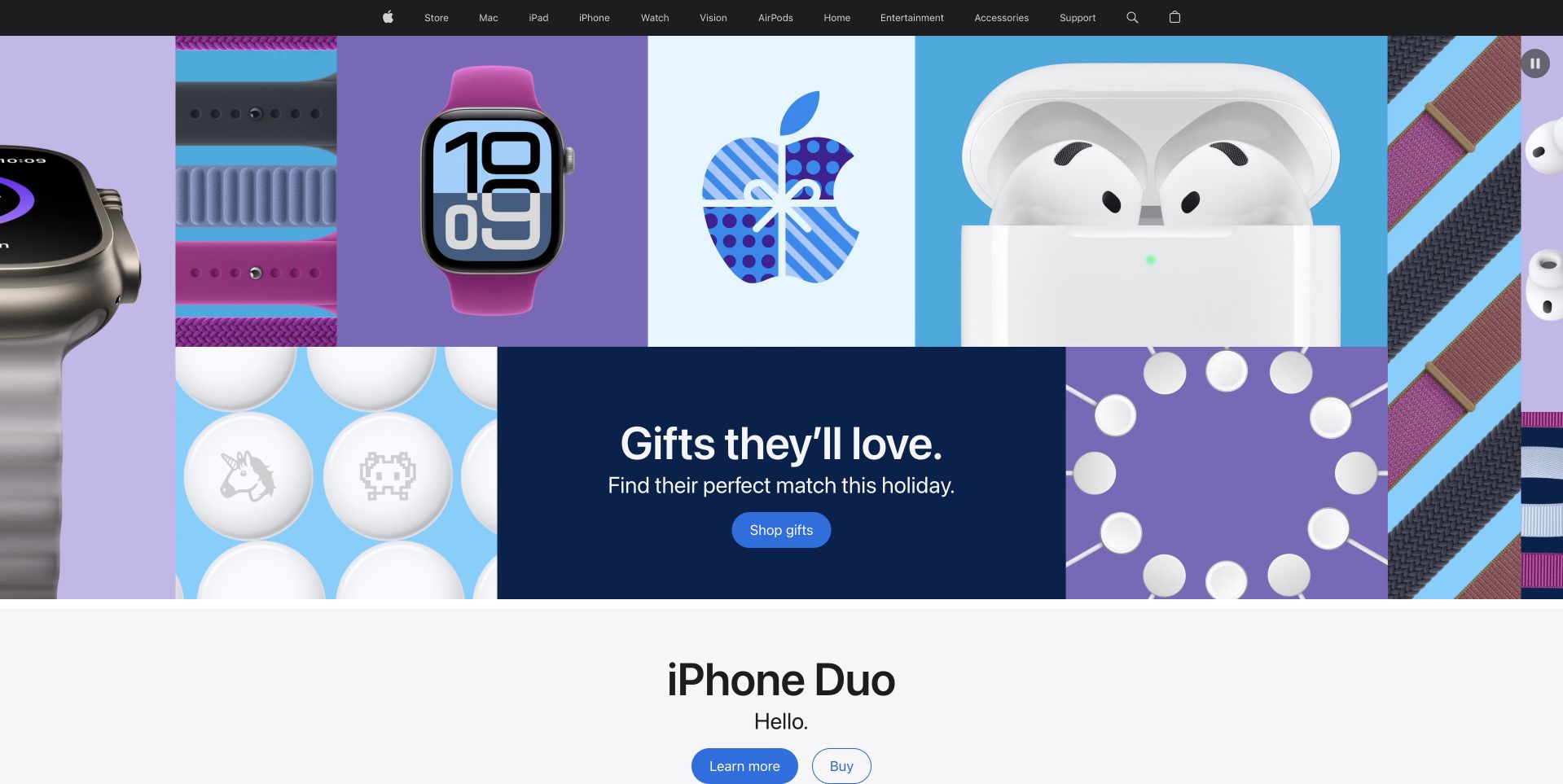
Apple’s reviewed homepage uses a colorful grid of watches, earbuds and graphic gift wrapping around a central navy shopping panel. The dark navigation stays compact, while the following product section begins on a quieter pale background. This creates a clear distinction between the temporary gift campaign and the continuing catalog. SQLite’s undated project documentation associates the database with native Apple applications and other named software contexts. That is the reason for the organizational reference here, not evidence that the current Apple homepage, its commerce system or every device feature uses SQLite. The public page is reviewed independently for its design.
What you can learn
Give seasonal merchandising a replaceable module inside a stable product structure. Keep the campaign’s destination obvious, then let the next section reset the visual pace. Treat a documented application-database association separately from the technology responsible for a public marketing page.
Pros
The central navy panel gives the colorful product grid a clear action.
A quieter following section separates the campaign from ordinary product browsing.
Cons & considerations
Numerous decorative product panels need careful crop handling on smaller screens.
The first campaign provides little detail for visitors comparing individual products.
Platform source: Primary documented SQLite association. Documented association: Undated project documentation associates SQLite with native Apple software; not the current Apple public website or all devices. Platform evidence is separate from the direct website screenshot and is not a complete current infrastructure audit.
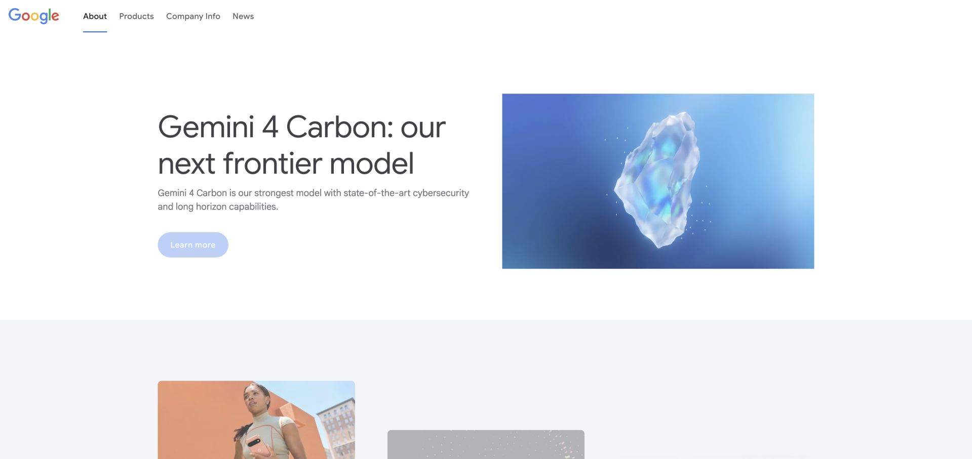
Google’s public About page places a short product-related headline beside a blue conceptual image, leaving generous white space around both. A small navigation separates products, company information and news, with a modest action below the introductory copy. The visual hierarchy is deliberately quieter than a consumer search or shopping interface. SQLite’s project documentation names Android and the Chrome browser as software contexts. It does not establish the database of Google Search, the current About-page publishing system or every Google product. This corporate page therefore serves as a design reference alongside that narrowly scoped application association.
What you can learn
A corporate page can introduce one current initiative without displaying every product at once. Keep the visual concept tied to a readable explanation and provide clear product and company routes. Do not turn an operating-system or browser dependency into a claim about the corporate website’s backend.
Pros
The side-by-side text and concept image preserve a calm, readable hierarchy.
Short corporate navigation distinguishes product discovery from organizational information.
Cons & considerations
Conceptual imagery explains less about a product than an actual interface view.
A broad corporate introduction needs useful destination pages for specific audiences.
Platform source: Primary documented SQLite association. Documented association: Project documentation names Android and Chrome; not Google Search or the public corporate page. Platform evidence is separate from the direct website screenshot and is not a complete current infrastructure audit.
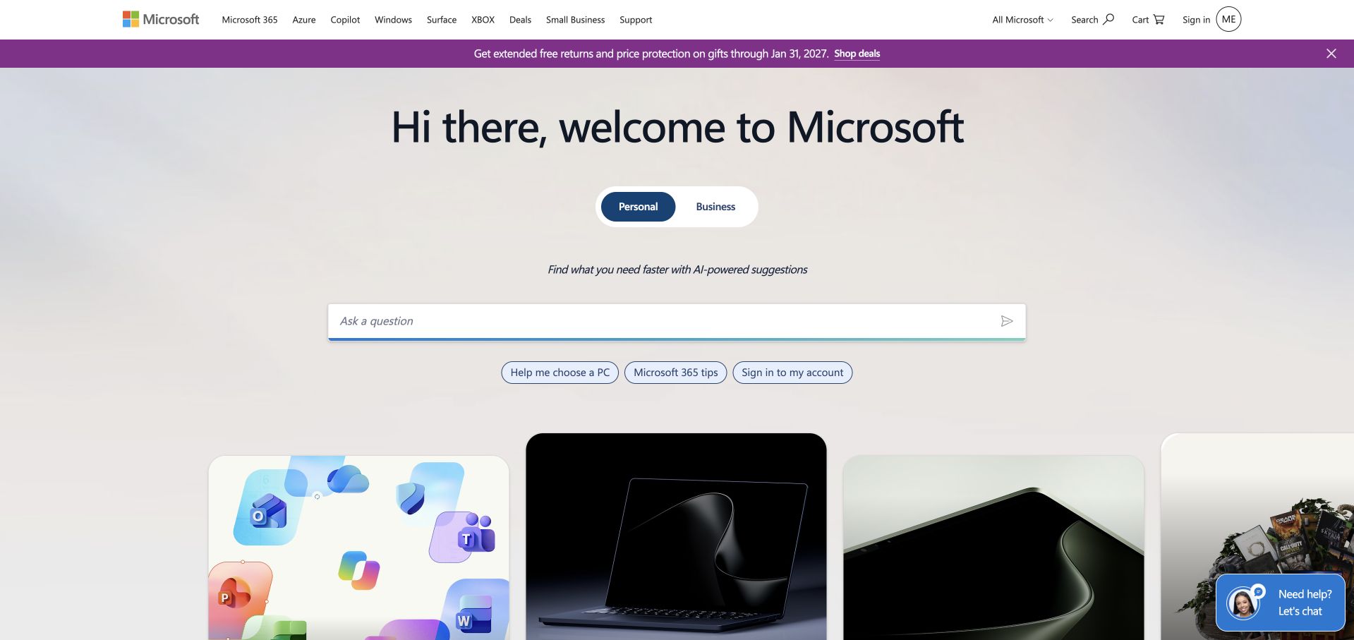
Microsoft’s reviewed homepage centers a welcoming headline above Personal and Business choices and a wide question field. Product cards begin below, using distinct imagery without abandoning the pale shared background. The structure makes an early audience decision more prominent than a single hardware photograph. SQLite’s project documentation specifically names Windows 10, an historical product context, rather than auditing the current Microsoft homepage. That bounded association does not prove that all Microsoft products or the public question interface use SQLite. The design reference is the current public page’s approach to audience selection and progressive product discovery.
What you can learn
Ask for an audience decision only when it changes the information people receive. Keep an alternative route to recognizable products, and explain what a question field will do before collecting input. Separate historical product dependencies from assertions about the present public website.
Pros
Personal and Business choices make the initial audience distinction visible.
Product cards begin below the introductory controls without a long narrative interruption.
Cons & considerations
A large question field needs a clear explanation of its behavior and limits.
A broad welcome can be less direct for visitors seeking one known product.
Platform source: Primary documented SQLite association. Documented association: Project documentation specifically names Windows 10; historical product scope, not the current public site or every Microsoft product. Platform evidence is separate from the direct website screenshot and is not a complete current infrastructure audit.
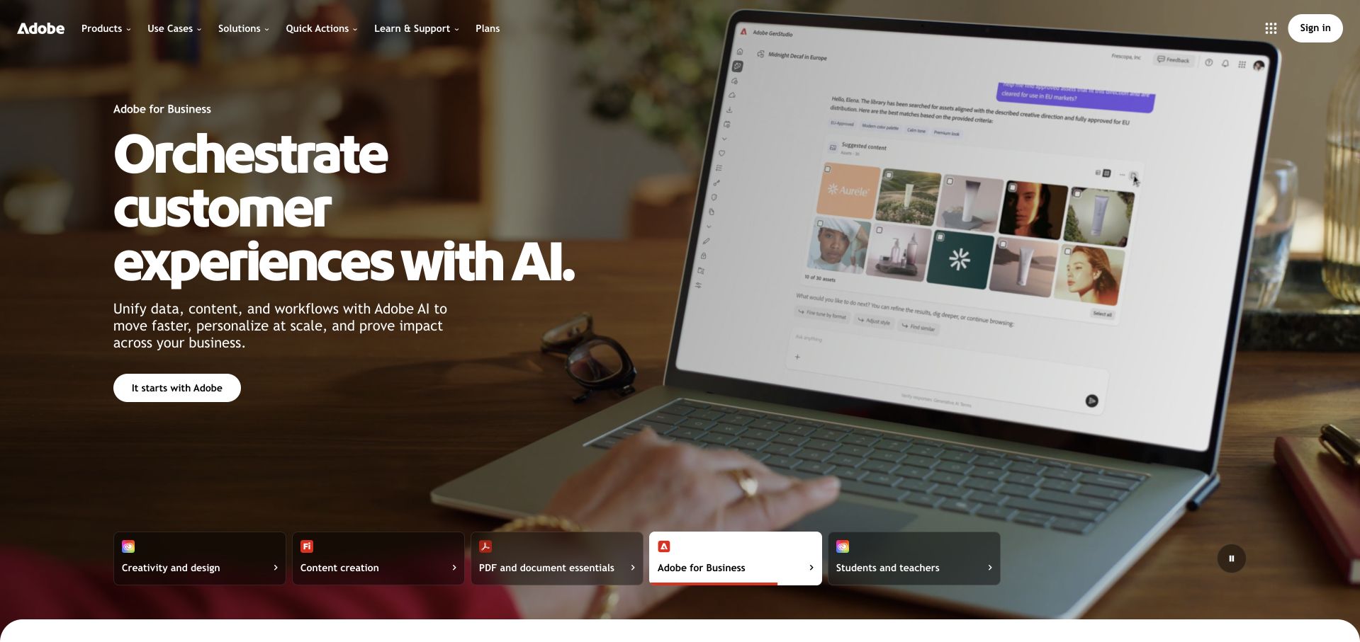
Adobe’s reviewed page combines a dark photographic scene and a laptop interface with large white business-focused copy. A pale action stands out at the left, while a row of audience and product routes sits along the lower edge. The composition explains an enterprise-oriented campaign without hiding the broader software range. SQLite’s project documentation names Lightroom application files and Adobe AIR; those are specific software associations, not evidence of the current public Adobe page’s frontend or database. The laptop scene and campaign wording are reviewed as design choices, independently of those documented application uses.
What you can learn
Use a product-in-context photograph to make an abstract software proposition tangible, then keep audience routes distinct. Ensure the screen content is understandable at reduced sizes, and do not present an application-file database as proof of how the vendor’s marketing website is implemented.
Pros
Large white copy has a stable dark area beside the laptop scene.
Audience routes preserve access to the wider offer beneath the campaign.
Cons & considerations
A photographed interface can become unreadable when the hero is compressed.
Several lower-edge categories need careful spacing to avoid competing with the main action.
Platform source: Primary documented SQLite association. Documented association: Project documentation names Lightroom application files and AIR; not the public Adobe marketing frontend. Platform evidence is separate from the direct website screenshot and is not a complete current infrastructure audit.
Airbus uses a blue-toned photograph of people working around an aircraft, with a large white introduction at the left. The header keeps careers, investors, suppliers and news as separate destinations, while the next stories begin beneath the image. That structure places people and industrial context ahead of a dense product diagram. SQLite’s project documentation names flight software for the A350 family. This is a bounded software association, not public-page technology evidence, safety validation or a claim across every aircraft system. The corporate homepage is independently useful for studying how a technically complex organization introduces itself visually.
What you can learn
Show a concrete working context when the organization’s offer is too complex for one product screenshot. Preserve stakeholder-specific navigation and follow broad mission language with supporting detail. Keep a database association separate from claims about safety, engineering outcomes or the public publishing system.
Pros
The working scene gives the industrial introduction a specific human context.
Stakeholder navigation remains available without covering the main photograph in labels.
Cons & considerations
Broad mission copy provides little immediate detail about individual capabilities.
White lettering needs reliable contrast as the working photograph changes or crops.
Platform source: Primary documented SQLite association. Documented association: Project documentation names A350 flight software; not public-page technology, safety validation or every aircraft system. Platform evidence is separate from the direct website screenshot and is not a complete current infrastructure audit.
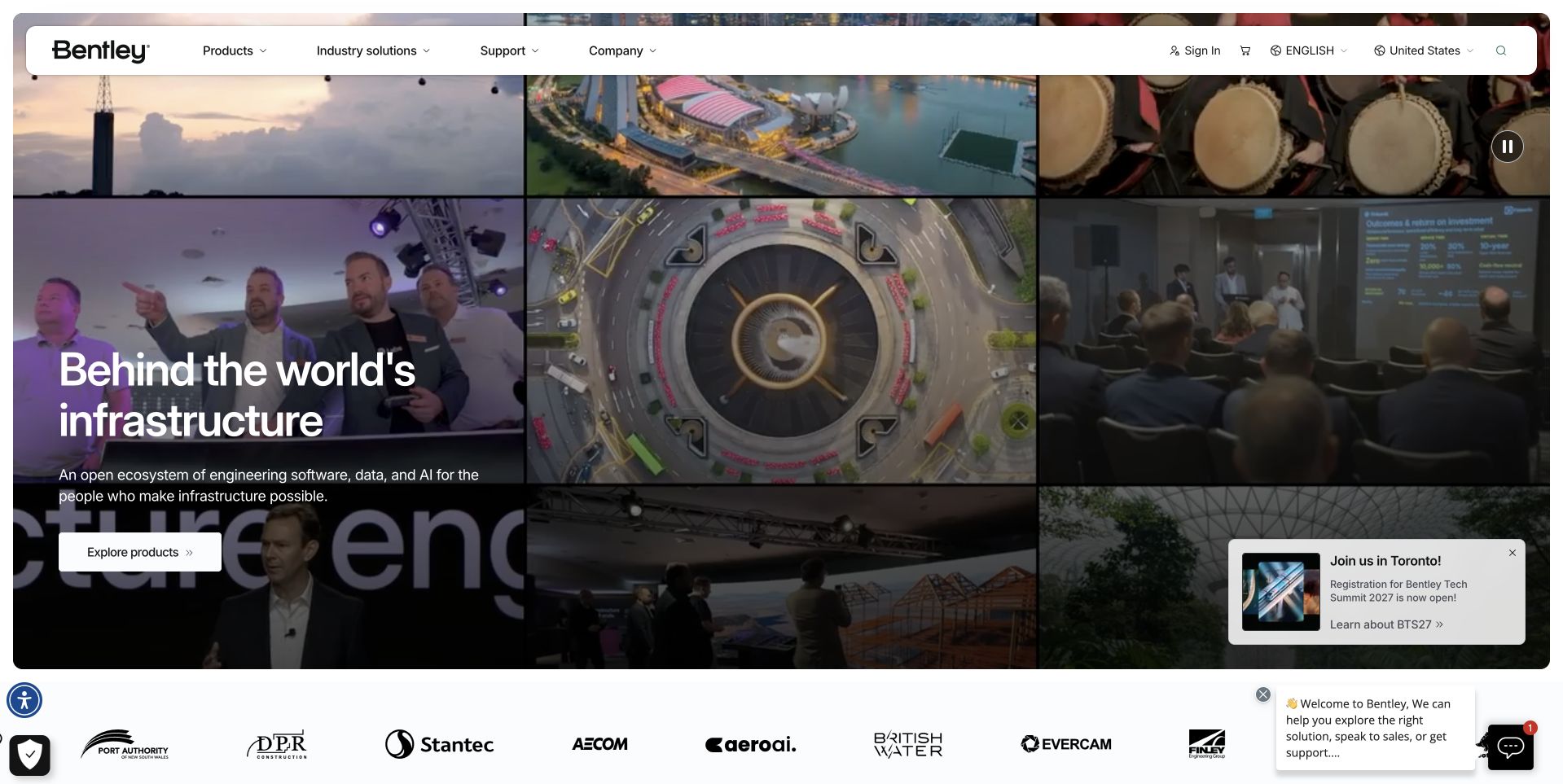
Bentley Systems uses a collage of infrastructure scenes beneath a white header, with a dark text panel introducing the software business. An Explore Products action gives that panel a practical destination, while different images show the breadth of the sector. The identity belongs to Bentley Systems, not the similarly named automobile company. SQLite’s project documentation names MicroStation’s application file format, which is a product-level association rather than evidence of the current public marketing page. The collage is reviewed for its relationship between engineering context and product discovery, not as a demonstration of the database’s visual or technical behavior.
What you can learn
A collage can explain breadth when every scene relates to a clear central proposition. Anchor it with a readable panel and literal product route. Verify the organization’s identity before borrowing a customer association, especially when another company shares a familiar part of its name.
Pros
The dark text panel gives the infrastructure collage a clear focal point.
The product action connects broad project imagery with a concrete next step.
Cons & considerations
Many visual scenes can compete when reduced to a narrow mobile composition.
A broad infrastructure message still needs product-specific explanations on destination pages.
Platform source: Primary documented SQLite association. Documented association: Project documentation names MicroStation application files; not Bentley Motors or the public marketing site. Platform evidence is separate from the direct website screenshot and is not a complete current infrastructure audit.
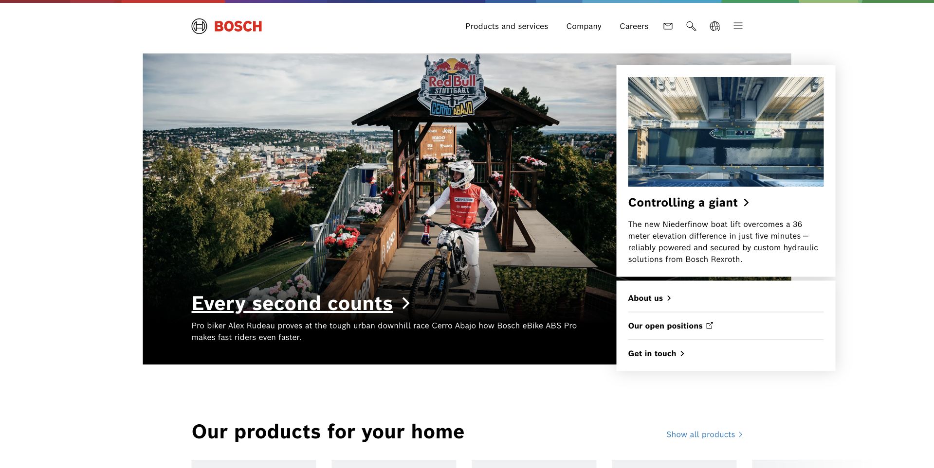
Bosch places a colorful line above a restrained white header, then uses a large editorial photograph beside a smaller story card. The main scene shows a downhill-racing setting, while the smaller card introduces a different engineering topic. A household-products section begins below, making the transition from stories to the wider offer explicit. SQLite’s undated project documentation names a bounded automotive multimedia context. That historical product association is not evidence across all Bosch divisions, vehicles or public websites. The page is useful as a corporate design reference for organizing varied subject matter around one consistent identity.
What you can learn
Let editorial stories create interest, but give product discovery its own clearly labelled section. Make each story’s relationship to the business understandable rather than assuming a photograph explains it. Keep a historical component association distinct from the current corporate page’s technology.
Pros
The asymmetric story grid gives one feature priority without hiding the second.
The next product section marks a clear transition from editorial content.
Cons & considerations
A sport-led feature may need supporting copy to explain the corporate connection.
Several unrelated stories can weaken the first-screen proposition for a new visitor.
Platform source: Primary documented SQLite association. Documented association: Project documentation names multimedia systems; historical bounded product association, not all Bosch divisions or websites. Platform evidence is separate from the direct website screenshot and is not a complete current infrastructure audit.
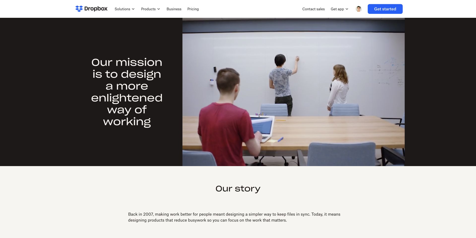
Dropbox’s reviewed source is the public About page, not a signed-in workspace. A dark mission panel sits beside a photograph of people working around a table and whiteboard, followed by an Our Story section on a pale background. The composition makes the company narrative distinct from the commercial product navigation above. A company engineering article published in April 2020 identifies a local SQLite database in the historical Sync Engine Classic discussion. That client-side account is not evidence of the About-page backend or every current Dropbox system. The public page’s design is assessed separately from the historical engineering association.
What you can learn
An About page should explain the organization without impersonating its application interface. Pair purpose with a concrete working scene, then provide an accessible story structure. Preserve dates and client-side scope when referencing engineering evidence rather than turning it into a current site-wide technology claim.
Pros
The split mission panel and working photograph give the company story a clear structure.
The public page separates organizational explanation from the product’s private workspace.
Cons & considerations
A broad mission statement needs supporting specifics in the following story.
Fine centered text can become difficult to scan when the panel narrows.
Visible tech stack
Earlier / documented evidence
SQLite
Platform source: Primary documented SQLite association. Documented association: Historical company-engineering account identifies the client local SQLite database; not the public About-page backend. Platform evidence is separate from the direct website screenshot and is not a complete current infrastructure audit.
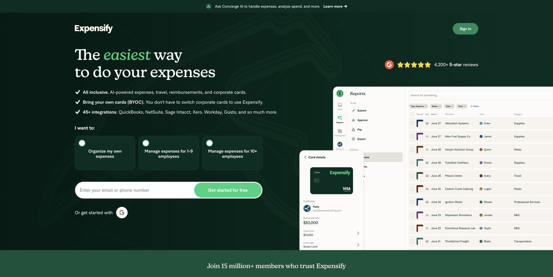
Expensify uses a deep green background with a large serif headline at the left and a product-interface composition at the right. Three small audience cards appear above the signup field, helping distinguish personal expense organization from managing teams. The receipt and card imagery makes the abstract spend-management proposition more tangible. SQLite’s undated project documentation describes an expense-reporting server-side database association. It is not a fresh audit of the current public homepage or proof that every product component uses the same database. The page remains a useful design reference for how audience selection, product evidence and a conversion action share one opening.
What you can learn
Use audience choices only where the onboarding experience genuinely differs. Show enough interface detail to explain the task, keep form expectations clear and qualify database evidence by its actual source and date rather than inferring a current public-site implementation.
Pros
Audience cards distinguish individual and team needs before the signup field.
The interface and receipt imagery make the software’s task concrete.
Cons & considerations
Several cards, review symbols and form controls create a dense first screen.
Product quality and business outcomes cannot be established from the promotional interface composition.
Visible tech stack
Earlier / documented evidence
SQLite
Platform source: Primary documented SQLite association. Documented association: Undated project documentation describes an expense-reporting database association; not a fresh audit of the public page. Platform evidence is separate from the direct website screenshot and is not a complete current infrastructure audit.
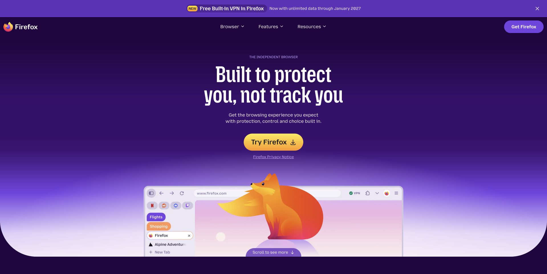
Firefox uses a purple gradient around a large centered headline, a yellow download action and a browser-window illustration with its fox character. A compact navigation remains at the top, while a narrow announcement is visually separated above it. The arrangement makes the main product action easy to identify without presenting a dense feature list. SQLite’s project documentation names browser metadata storage in Firefox. That application-level association does not establish the database of the current Firefox marketing page, nor does the design independently validate privacy or security claims. The public page is useful for studying the hierarchy of a focused software-download introduction.
What you can learn
A download page can remain concise when its identity, explanation and action are clear. Give claims supporting detail on subsequent pages and preserve platform-specific download information. Do not confuse a browser’s internal metadata database with the technology that renders its public marketing site.
Pros
The yellow action stands out clearly within the purple visual system.
The fox and browser-window illustration connect personality with the actual product category.
Cons & considerations
A centered claim needs supporting detail beyond the introductory illustration.
Prominent announcements can distract if they compete with the primary download journey.
Platform source: Primary documented SQLite association. Documented association: Project documentation names Firefox browser metadata; not the public Firefox marketing page. Platform evidence is separate from the direct website screenshot and is not a complete current infrastructure audit.
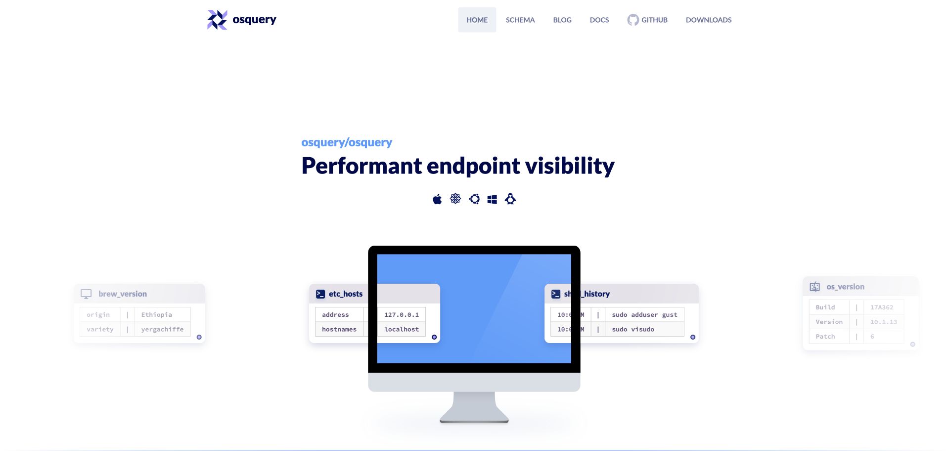
osquery uses a spacious white page with a compact project identity above a short dark headline. A desktop illustration and small floating query-result cards give the endpoint-visibility idea a visual form. The navigation separates schema, documentation, code and downloads, matching the tasks of someone evaluating or using an open-source tool. SQLite’s project documentation identifies it as the SQL engine within osquery. That is a project-level association, not a claim across every Meta system or evidence of the public project page’s backend. The visible design is useful for explaining a technical tool without opening on a wall of implementation detail.
What you can learn
Use a diagram-like product illustration to explain the task before introducing the full documentation. Keep schema, source and installation routes literal, and scope dependency evidence to the actual project rather than expanding it to the original developer’s entire organization.
Pros
The desktop and query cards make the tool’s task more tangible.
Documentation, schema and code routes support distinct developer evaluation needs.
Cons & considerations
Very generous white space can delay more detailed information on smaller displays.
Small query-card text may be decorative rather than readable without a larger view.
Platform source: Primary documented SQLite association. Documented association: Project documentation identifies SQLite as the SQL engine in osquery; the open-source project surface is reviewed, not a claim across Meta. Platform evidence is separate from the direct website screenshot and is not a complete current infrastructure audit.
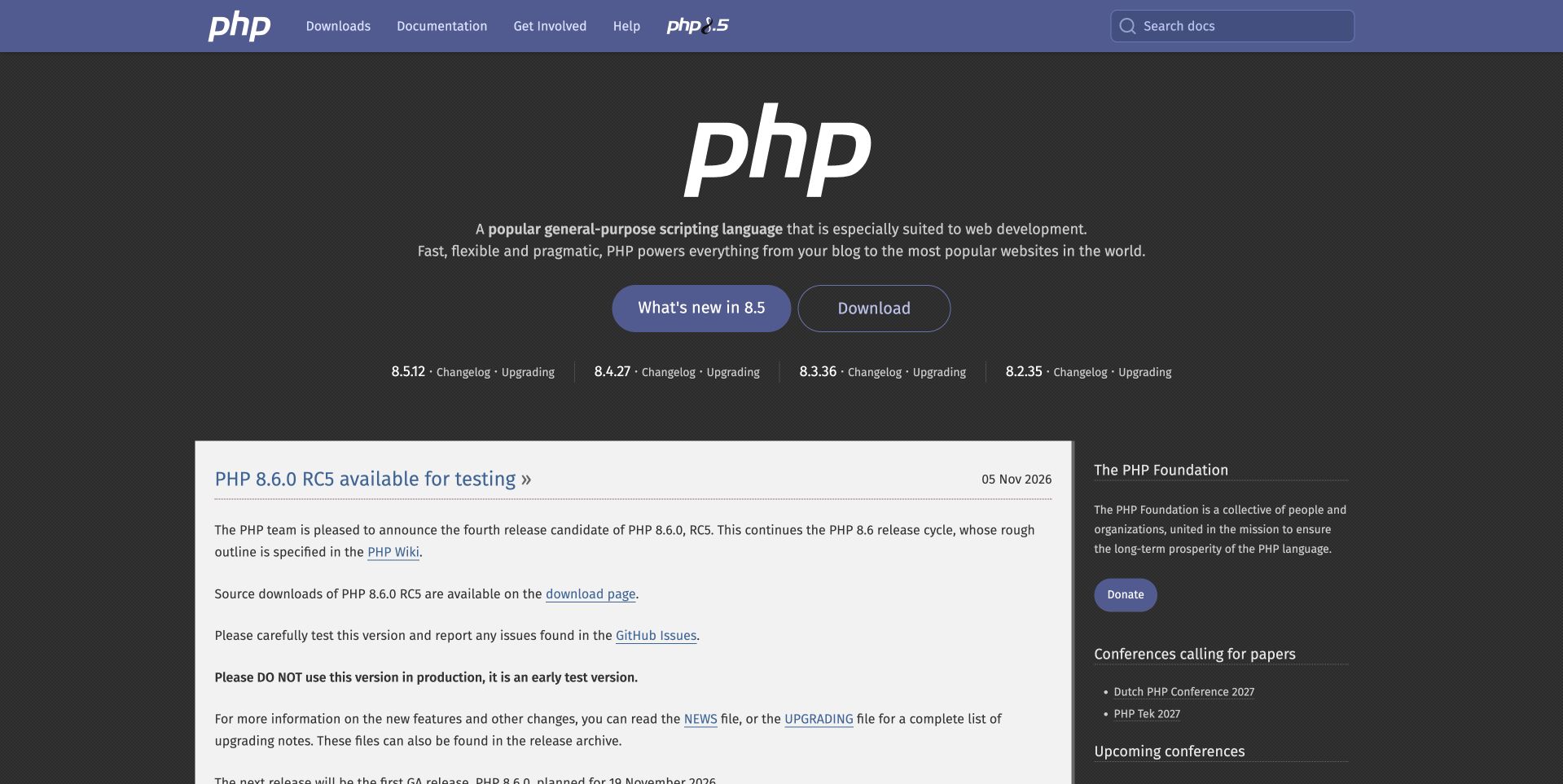
PHP uses a purple navigation bar over a dark introductory panel, with a large white language mark and two clear routes for learning about the release and downloading. A dated news column begins below, accompanied by foundation and conference information at the side. The layout separates a short newcomer explanation from the ongoing project record. The official manual documents a SQLite3 extension as a supported interface. That does not mean every PHP application uses SQLite or that the PHP.net public page has a proven SQLite backend. This example is about the visible project-site hierarchy alongside a documented language integration.
What you can learn
Give a language homepage both an orientation and a dependable release record. Keep downloads and documentation easy to locate, date important news and distinguish an available database interface from the deployment choices made by individual applications or the project’s own public website.
Pros
The dark introduction gives learning and downloading clear, contrasting actions.
Dated project news supports experienced users returning for current release information.
Cons & considerations
Dense news text can dominate the page after the short introduction.
Multiple side topics need clear grouping to avoid distracting newcomers from getting started.
Visible tech stack
Earlier / documented evidence
SQLite
Platform source: Primary documented SQLite association. Documented association: Official SQLite3 extension documentation; supported language interface, not proof that every PHP website uses SQLite. Platform evidence is separate from the direct website screenshot and is not a complete current infrastructure audit.
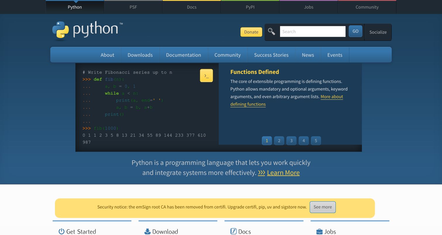
Python’s reviewed homepage uses its familiar blue-and-yellow identity above a split introductory panel. A short code example appears beside an explanation, with tabs or controls indicating other introductory subjects. Search and documentation routes stay prominent, and a row of task-oriented links begins below. This makes the language tangible rather than describing it only through adjectives. The official library documentation provides the sqlite3 interface for SQLite databases. That supported module is not proof of Python.org’s public-page database or a claim that every Python program uses SQLite. The public design is reviewed independently as an example of technical orientation and task routing.
What you can learn
A small code example can explain a language when it remains readable and connected to a clear lesson. Keep documentation and beginner routes distinct, and treat a standard-library interface as a capability rather than evidence of any particular website’s deployment architecture.
Pros
The code-and-explanation pairing makes the language’s introductory proposition concrete.
Search and common-task links support returning developers as well as new learners.
Cons & considerations
Small code text requires careful scaling and an accessible text representation.
Announcements and rotating introductory panels can compete with the stable learning hierarchy.
Platform source: Primary documented SQLite association. Documented association: Official standard-library SQLite interface; not a claim about the Python.org public-page database. Platform evidence is separate from the direct website screenshot and is not a complete current infrastructure audit.
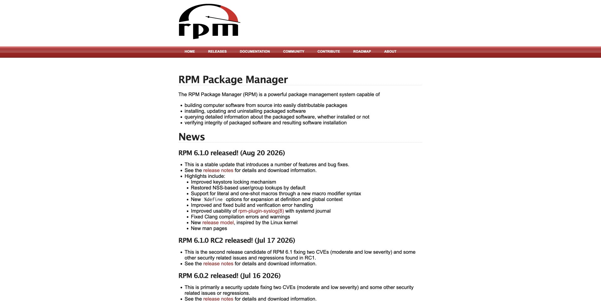
RPM uses a large black project mark above a narrow red navigation bar and a compact text-led page. A short introduction and bullet points explain package-management responsibilities before a chronological News section begins. The visual hierarchy is utilitarian, with little imagery between the reader and release information. SQLite’s undated project documentation names the RPM state database, an historical package-management association rather than a current audit of this public website. The page is useful for studying how a mature infrastructure project can prioritize readable project records, while also exposing the limitations of a very narrow content column and small navigation.
What you can learn
A project noticeboard can be effective when purpose, downloads and dated changes are easy to distinguish. Preserve that clarity while improving readable sizing and responsive width. Keep a state-database association separate from the technology of the project’s publishing page.
Pros
Purpose bullets introduce the tool before the chronological release record begins.
The restrained red navigation keeps documentation and contribution routes visible.
Cons & considerations
The narrow column and small type can underuse larger screens without improving comfort.
Long release lists need useful navigation so older records do not bury key tasks.
Platform source: Primary documented SQLite association. Documented association: Undated SQLite project documentation names the RPM state database; historical package-management association, not current project-website runtime. Platform evidence is separate from the direct website screenshot and is not a complete current infrastructure audit.
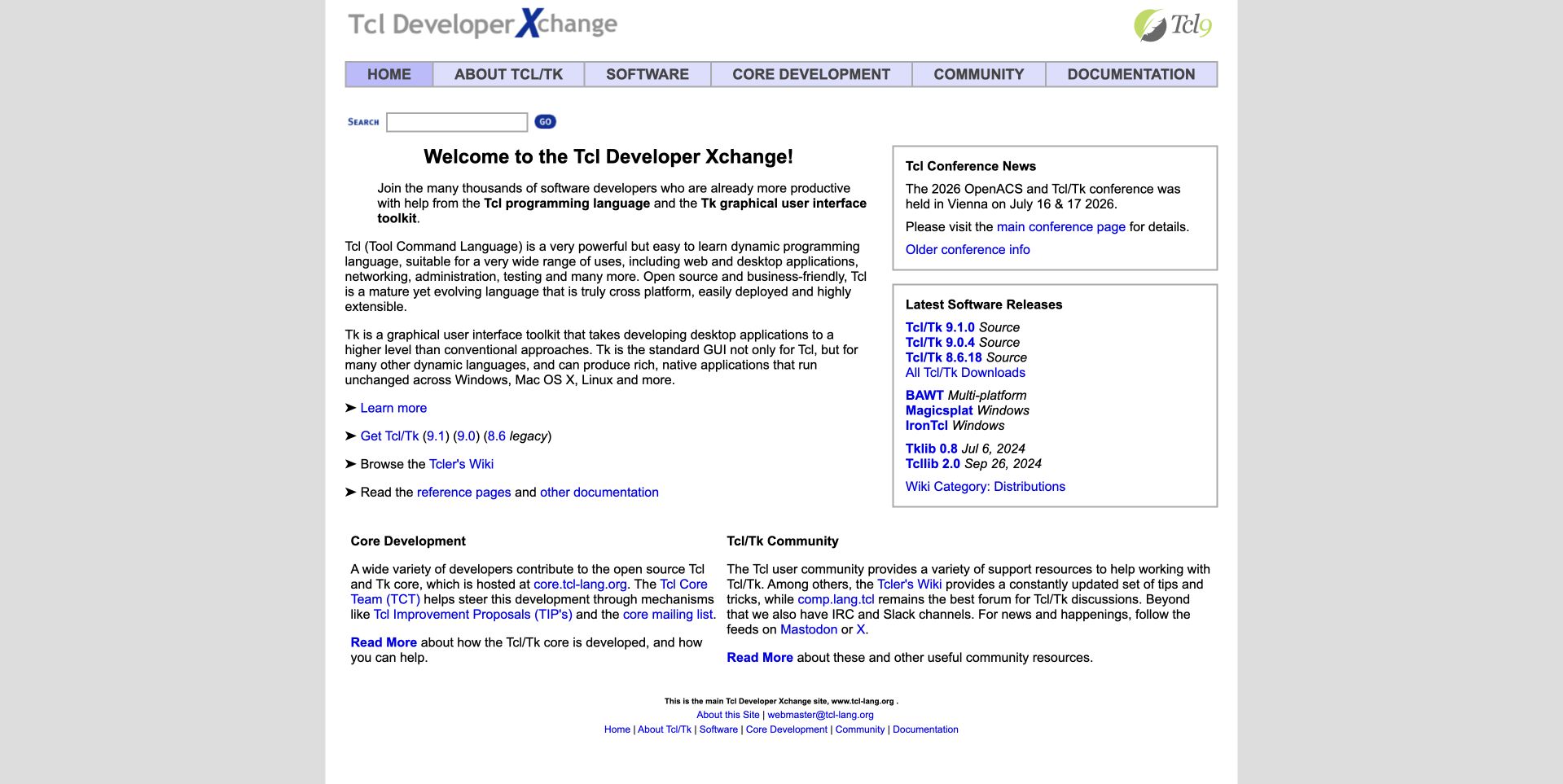
Tcl/Tk’s developer page uses a narrow light panel on a gray background, with a small identity and a pale navigation row. The main introduction occupies the left, while conference news and current software releases sit in a right-hand column. Lower sections distinguish core development from community information. The design is useful as a highly compact developer noticeboard rather than a photographic marketing page. SQLite’s project documentation describes a bundled Tcl/Tk relationship and its origins as a Tcl extension. That historical implementation association does not identify the public documentation frontend’s database or imply that every Tcl application uses SQLite.
What you can learn
For a mature developer community, keep learning material, releases and contribution routes distinct. A compact layout should still use comfortable type and sensible responsive columns. Preserve the historical scope of a bundled dependency instead of turning it into a claim about every application or project website.
Pros
The side column gives release and conference information a clearly defined place.
Separate core-development and community sections acknowledge different participation needs.
Cons & considerations
Small text and narrow columns can make longer introductory passages tiring to read.
A table-like desktop layout needs a thoughtful reading order on phones.
Platform source: Primary documented SQLite association. Documented association: Project documentation names the Tcl/Tk bundle; historical implementation association, not the public documentation frontend. Platform evidence is separate from the direct website screenshot and is not a complete current infrastructure audit.
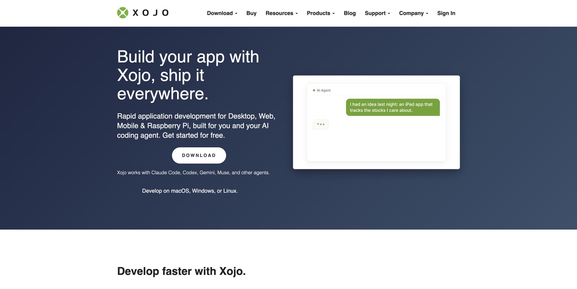
Xojo pairs a dark blue text area with a light application preview at the right, keeping the header white and restrained. A large headline introduces building once for several destinations, followed by a rounded Download action and short compatibility wording. The next section begins with a separate development message rather than another immediate signup form. SQLite’s project documentation names its bundling within the Xojo programming environment. That is an environment-level association, not proof that every Xojo application or the public vendor homepage uses SQLite. The visible page is useful for studying how a broad development proposition is condensed into an approachable first screen.
What you can learn
Pair a broad capability claim with a recognizable interface and an explicit getting-started route. Keep system requirements easy to find, and distinguish a database bundled with a development environment from the choices made by applications built with it.
Pros
The split layout keeps the product explanation readable beside the interface preview.
A single download action gives the broad capability statement a concrete next step.
Cons & considerations
A small interface preview may be difficult to interpret on mobile screens.
Cross-platform claims need accessible destination details about requirements and limitations.
Platform source: Primary documented SQLite association. Documented association: Project documentation names the bundled SQLite database; not the public marketing site or every Xojo application. Platform evidence is separate from the direct website screenshot and is not a complete current infrastructure audit.
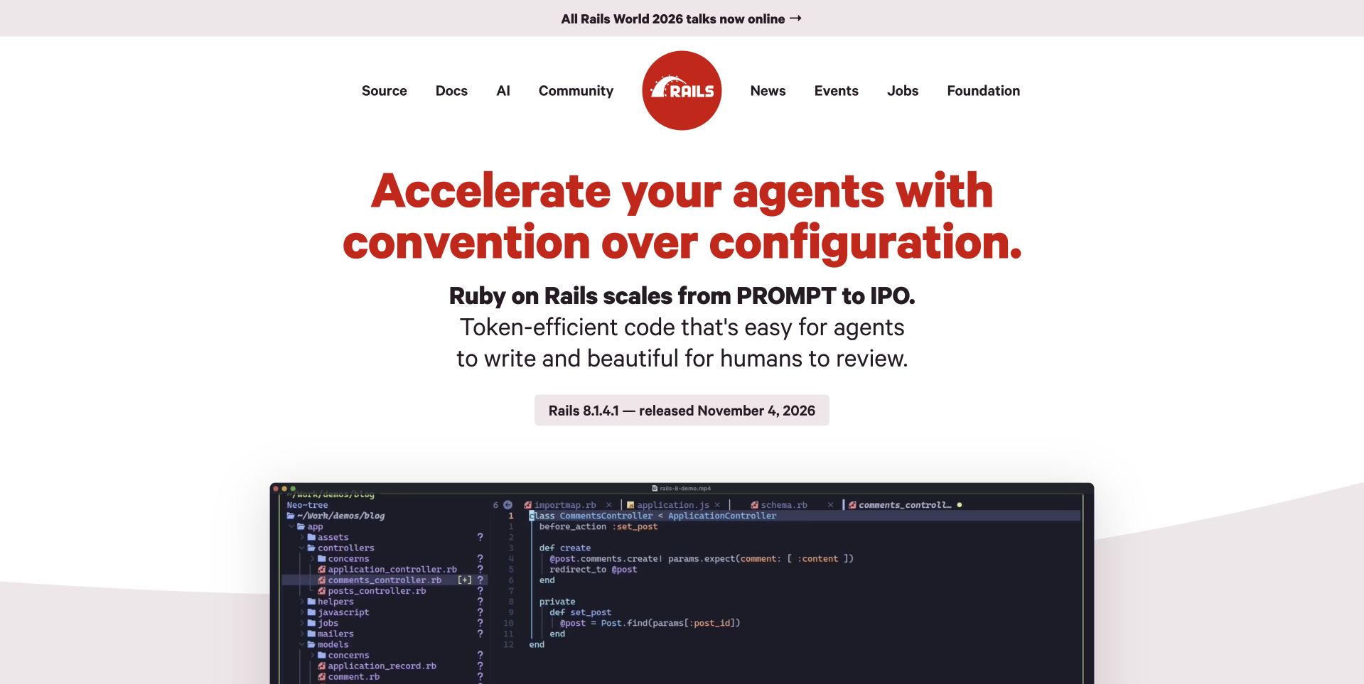
Ruby on Rails uses large red typography on a pale background, with a compact circular identity in the navigation. The introductory statement and short supporting paragraph are followed by a dated release link and a code-editor image beginning below. Documentation, source, community and news retain separate routes. The official getting-started guide uses SQLite as its default example database. That documents a supported framework starting point, not the database behind the public Rails website or every Rails application. The page’s design is useful for studying a confident technical introduction whose strongest visual asset is its typography rather than a conventional product photograph.
What you can learn
A framework can lead with a clear position while keeping practical documentation one step away. Date release information, make code visuals readable and distinguish a tutorial’s default database from a universal production recommendation or an audit of the public project website.
Pros
Large red type creates a clear hierarchy without depending on decorative photography.
Source, documentation and community routes remain distinct around the introductory position.
Cons & considerations
Strong positioning copy needs supporting technical material for readers evaluating actual fit.
A large code image requires accessible text alternatives for meaningful implementation details.
Platform source: Primary documented SQLite association. Documented association: Official getting-started guide uses the default SQLite database; not proof of the Rails public website implementation. Platform evidence is separate from the direct website screenshot and is not a complete current infrastructure audit.
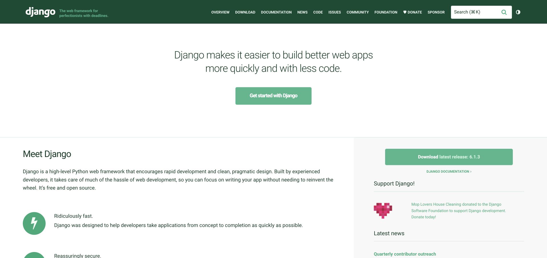
Django uses a dark green header and a spacious white introduction with a centered proposition and a simple green getting-started button. Below it, the page divides a Meet Django explanation from release and support information. The layout is comparatively quiet, making the first action clear without removing the deeper project routes from the header. The Django 5.2 tutorial documents SQLite as the default configuration for its introductory project. That is scoped tutorial evidence, not proof that all Django deployments or the current public project website use SQLite. The design reference concerns orientation, information hierarchy and access to maintained documentation.
What you can learn
Give newcomers one clear starting route, then support it with readable explanation and current project information. Keep tutorial defaults separate from production architecture decisions, and do not infer the public website’s backend simply because the framework supports a particular database.
Pros
The centered starting action remains clear within a restrained green-and-white system.
The following explanation and release column support different levels of reader familiarity.
Cons & considerations
A broad opening proposition gives little immediate sense of a concrete application.
The small header has many project routes that need careful mobile grouping.
Platform source: Primary documented SQLite association. Documented association: Official tutorial documents the SQLite default; not every Django application or the public project-site runtime. Platform evidence is separate from the direct website screenshot and is not a complete current infrastructure audit.
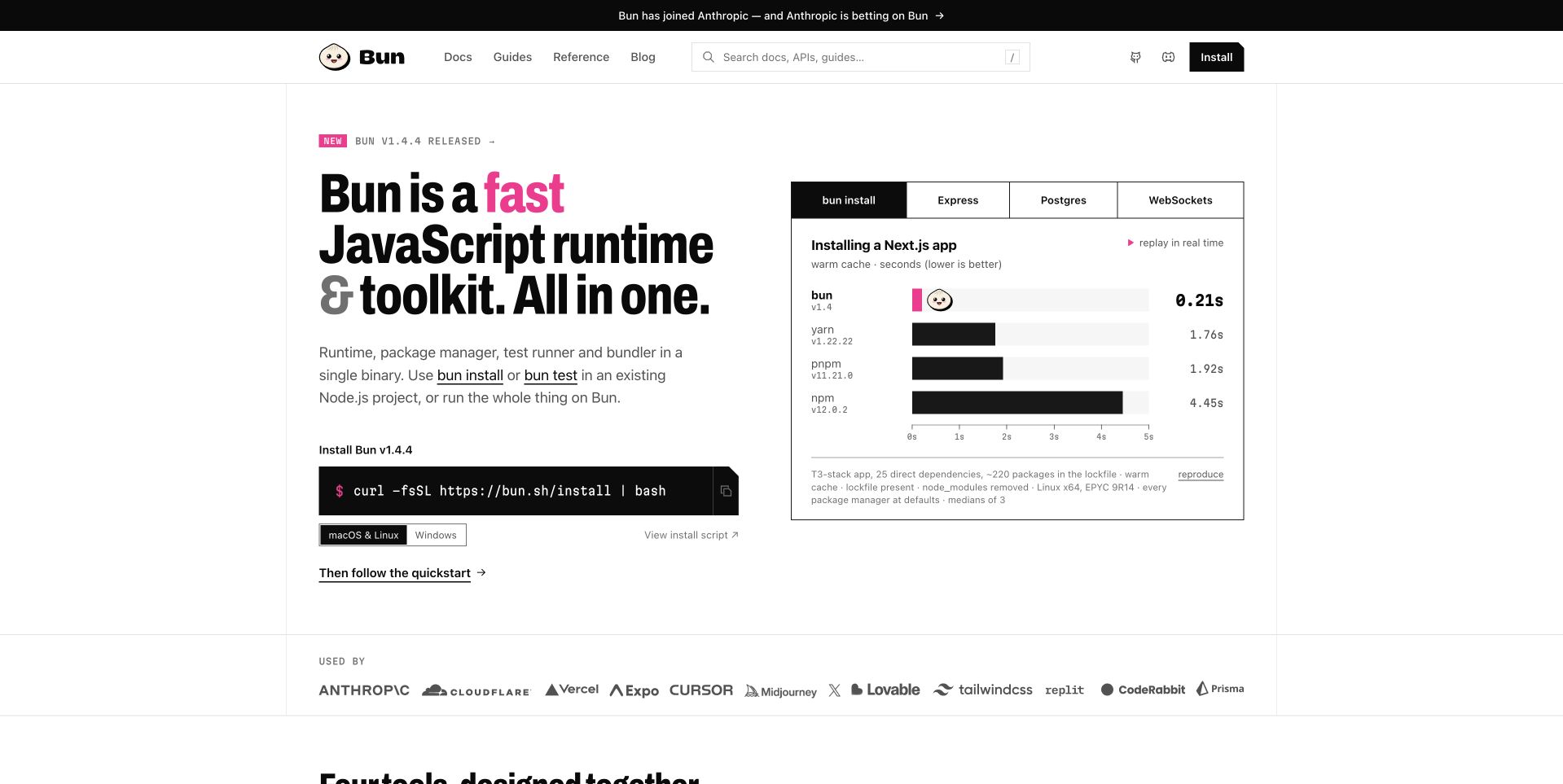
Bun uses a mostly white opening with a bold black headline, a small illustrated identity and an install command at the left. A benchmark panel occupies the right, with tabs for different test contexts and horizontal comparison bars. The navigation separates documentation, guides and reference material. Official Bun documentation describes the built-in bun:sqlite interface. That is a runtime capability, not evidence that the public homepage stores its content in SQLite or that every application running on Bun does so. The page is useful for examining how a technical proposition, an immediate installation route and vendor-presented comparative evidence share a first screen.
What you can learn
Keep installation simple while explaining what an integrated toolkit actually includes. Present benchmark context and reproducibility clearly rather than implying universal results. Treat a built-in database driver as a documented capability, separate from the runtime choices behind the public marketing page.
Pros
The install command gives experienced developers a concrete starting point.
Separate documentation routes and benchmark tabs acknowledge different evaluation tasks.
Cons & considerations
Prominent comparative charts need clear methodology and should not imply universal performance.
A copyable install command still requires users to understand and trust what it runs.
Platform source: Primary documented SQLite association. Documented association: Official built-in bun:sqlite runtime interface; not proof of the public homepage database or every Bun application. Platform evidence is separate from the direct website screenshot and is not a complete current infrastructure audit.
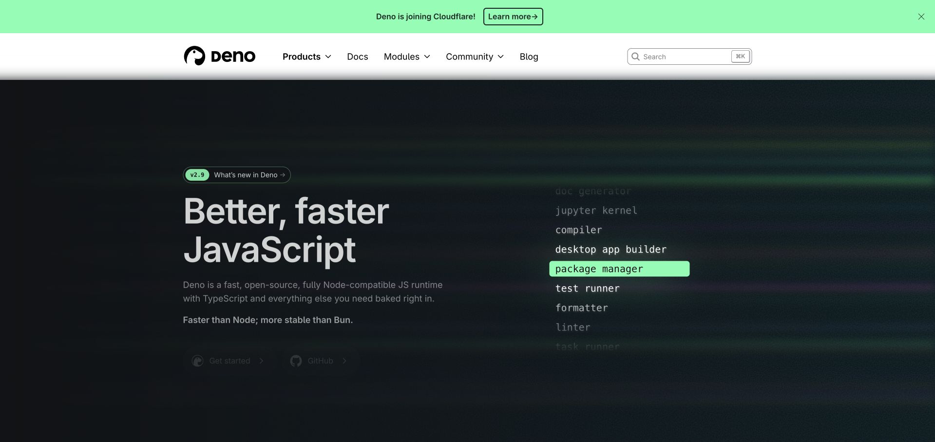
Deno uses a white header above a dark green-and-black hero, with a large two-line runtime statement on the left. A vertical set of capability words occupies the right, highlighting one item in green, while a narrow announcement sits above the navigation. The visual treatment gives the project a distinctive atmosphere without opening with a long feature grid. Official Deno documentation describes a node:sqlite interface; this is a supported runtime interface, not evidence of the public Deno page’s backend or the implementation of Deno Deploy KV. The page’s design is reviewed separately from that narrowly documented compatibility capability.
What you can learn
A concise capability display can introduce a broad developer tool, but it should lead to literal documentation and clear requirements. Keep announcements separate from the stable product hierarchy and avoid expanding one compatibility interface into a claim about unrelated services or the public website.
Pros
The green highlight gives the capability list a clear focal point.
A separate white header preserves documentation routes around the dark visual introduction.
Cons & considerations
Animated capability text needs a readable static and reduced-motion alternative.
A broad runtime headline requires more specific information before developers can assess fit.
Platform source: Primary documented SQLite association. Documented association: Official node:sqlite interface documentation for Deno 2.2 onward; not the public Deno site backend or Deno Deploy KV implementation. Platform evidence is separate from the direct website screenshot and is not a complete current infrastructure audit.
Kegan has 15+ years of experience working with small businesses, Fortune 500 companies, and everything in between. No development job is too big or too small: he brings the same hands-on attention to a focused improvement, a complete website, or a custom application.
For SQLite projects, he can help with data modeling, application data access, query design, search and cache integrations, migration planning, access boundaries, and maintainable handover. He works directly with clients on scope, design, implementation, testing, and handover, with an emphasis on clear communication and a system that remains practical to maintain after launch.
Show 3 other SQLite developersHide other SQLite developers
Consider a tool whose working data belongs to one installation or local project. Design clear open, export and recovery behavior, including what happens when a file is missing or belongs to a different application version. A local-first interface still needs an honest explanation of where information is stored and whether any part is synchronized elsewhere.
A deliberately scoped web application
Write down the intended deployment and expected write patterns before calling the application small. A public catalog with occasional edits differs from many simultaneous order updates. Test representative activity on the intended persistent storage. Keep the application boundary responsible for authentication and authorization; a convenient database file is not an access-control design.
Begin with the failure users experience: lost edits, unclear versions, slow startup or difficult export. Preserve a representative set of old data and agree on the correct transformed result. The migration should be reversible until the new format is accepted. A cleaner interface is useful only if the information behind it survives the transition.
From references to requirements
Plan persistence, concurrent work and a recoverable handoff
Describe the complete path from a user action to stored data
Take three ordinary tasks and one interrupted task. For each, specify what is saved, when the interface confirms success and what the person should see if saving fails. Distinguish a draft from a committed change. Do not let a reassuring animation appear before the application knows whether the action succeeded. Give interrupted users a way to understand whether retrying will duplicate their work.
Then draw the deployment boundary. Identify the process that opens the database, the persistent volume or device that stores it and the maintenance task that upgrades it. Name the person responsible for capacity, permissions and replacement. If an application can run on several instances, explain how those instances coordinate data rather than assuming a file visible to one machine is shared correctly with every other one.
Keep sample data realistic without exposing production records. Include long names, empty values, unusual characters and records from an earlier application version. The acceptance exercise should demonstrate that ordinary work still makes sense after a restart or upgrade, not simply that a demonstration form can insert one row.
Test the actual writing and reading pattern
Describe the busiest plausible moment in the application: a background import, several edits, a report and a scheduled export may coincide even when daily traffic is modest. Agree on acceptable waiting and failure behavior for that moment. A useful test records what the user experienced, not just a headline operations-per-second figure.
SQLite’s WAL documentation explains that readers and a writer can proceed concurrently, but it does not create unlimited simultaneous writers. WAL also has same-host requirements and checkpointing behavior. Review the chosen mode against the real deployment rather than treating it as a universal performance switch. Leave low-level tuning to a measured workload and an implementation owner.
Design the interface around understandable states. When an operation must wait, show that it is still in progress. If it cannot complete, explain the next safe action without revealing file paths or internal diagnostics. Repeatedly clicking a disabled-looking button should not become an accidental mechanism for submitting the same job several times. Keep operator detail in appropriate logs and user guidance in the interface.
Define the information the organization cannot afford to lose and the time it can tolerate being unavailable. Those requirements should shape the backup arrangement and restore rehearsal. A successful file transfer is not proof that a replacement application can open the restored data and perform the important tasks.
SQLite documents an online backup API and other supported techniques for a live database. Use a documented approach appropriate to the application rather than improvising a copy of an actively changing file. Keep backup destinations separate from the failure being protected against, and protect the copies according to the sensitivity of the original information.
At handoff, give another maintainer the storage location, schema-change procedure, backup schedule, retention policy and restore steps. Include a small acceptance dataset and the expected result after a restore. Test the process without relying on the original developer’s memory. The application is maintainable when someone else can explain its data lifetime and recover a known-good state, not merely when its first screen looks finished.
Ask the actual team to carry out its routine job: publish a realistic update, correct a mistake, preview a narrow screen, and identify who owns an integration failure. For a library or frontend framework, also ask who maintains the content source and deployment. A polished screenshot does not answer those operational questions.
Beyond the screenshot
SQLite project planning checklist
Describe the actual data owner and lifetime.
List normal reads, writes and background jobs.
Confirm the chosen hosting storage is persistent.
Explain behavior when an application instance is replaced.
Identify every process that opens the database.
Test the intended concurrency and busy states.
Review the selected journal mode against the deployment.
Keep credentials and private data out of browser code.
Plan schema upgrades with representative old records.
Use a documented live-backup approach.
Rehearse restoration and validate important tasks.
Name a maintenance and recovery owner.
Test with real content, a keyboard, a small screen, slow or failed requests, and the people who will maintain the system. These are planning checks, not an accessibility, security, performance, or search-ranking certification.
Sources & editorial method
How this SQLite collection was reviewed
Twenty public interfaces are reviewed separately from checked primary SQLite associations. Undated project claims remain qualified as such; historical product references are not presented as fresh public-page detection. Planning recommendations are an editorial project framework, not performance or durability guarantees.
Every image is an unmodified capture from the actual website, with its source and capture date. Some captures are reused from our shared catalog; their dates remain the original capture dates. None comes from a vendor gallery or a generated reconstruction. Moving imagery and live content can change.
Technology attribution uses public page assets or metadata, official platform documentation, or a cited first-party project case study. Documentary and framework-relationship evidence is identified where used; it is not a complete current backend inventory. A CMS image CDN alone does not establish a full CMS deployment. A library’s presence does not prove which individual controls use it, and a platform label does not establish AI authorship.
The composition notes, lessons, pros and tradeoffs are original editorial observations. We have not measured conversion, traffic, security, performance or accessibility conformance. Website owners retain their brands and imagery; these examples are not our client portfolio. Written, Edited and Curated are independent records, not dates advanced by a build. See our editorial standards or suggest a correction.
Questions worth asking
SQLite website development FAQs
Are these public websites all built on SQLite?
That is not established. The references include native products, historical implementations and official language or framework interfaces. The public screenshots are independently reviewed design examples.
Does a Python, PHP or Bun interface mean every application uses SQLite?
No. It establishes a supported interface in that language or runtime. An individual application still needs its own implementation evidence.
Is SQLite only suitable for prototypes?
No. Its project guidance describes many application and website uses. Suitability depends on the storage arrangement and workload, not a simple prototype-versus-production label.
Does WAL remove the need to think about concurrent changes?
No. Review the documented reading, writing and same-host constraints, then test the intended workload and the interface’s waiting and failure states.
What should a handoff include beyond the database file?
Storage ownership, access boundaries, schema-change steps, a supported backup procedure and a tested restore exercise. Include the expected results for important application tasks.
Choose the simplest storage arrangement you can explain, test and recover. Let the interface make its saving and failure states just as understandable.