Best Twilio Websites of 2026 (20 Real-World Examples)
Twilio-associated websites, useful communication journeys, and a practical implementation brief
These 20 websites belong to organizations with official Twilio customer stories. The documented work spans messaging, verification, support and customer-data services. Those products solve different problems; their presence does not identify the pictured homepage’s frontend or every system behind the brand.
A communication feature should begin with an event a person understands: confirming a reservation, verifying a channel or asking for help about an existing task. “Add SMS” is not a complete brief. Define the recipient, purpose, expected response and what the user sees if the communication is delayed or cannot be delivered.
Toyota Connected, Duolingo, Uber, Reddit and Intuit open the collection with documented contact-center, verification and communication use cases. Other examples deliberately broaden the scope: IBM and Asana concern Segment customer-data work, while Lyft and Philippine Airlines concern Flex. A Twilio customer relationship is not automatically a Messaging API attribution, and none of these public captures exposes a real private customer conversation.
Before the examples
What makes good Twilio website development in 2026?
Choose the responsibility, not just the channel
Verify, programmable communication and a Flex contact center are different implementation decisions. Identify whether the project needs proof of channel access, a service notification or an agent workflow. That decision changes the surrounding interface, support process and failure handling. Do not choose an architecture simply because a recognizable company used a different Twilio product.
Describe queued, attempted, delivered and unresolved states in terms appropriate to the product, and avoid presenting an API acceptance response as proof that a person read a message. Decide how a user returns to the original task and how support can find the relevant context without collecting unnecessary information.
Keep callbacks and credentials within a reviewed server boundary
Incoming requests need verification appropriate to the actual integration. Twilio documents validating signed requests and using HTTPS; the responsible team should apply its current SDK guidance rather than improvising a signature check from a visual example. Keep secret credentials out of public page code and make operational ownership explicit.
Compare how the public sites explain their service, separate audience intentions and give people a practical next step. Read the linked case as a separate, bounded communication or customer-data association. No example is treated as a complete current stack or an independently measured outcome.
We start with five recognizable brands or organizations: Toyota Connected, Duolingo, Uber, Reddit Inc., Intuit. Each attribution applies to the named website property, not every product or website belonging to its organization. This is a curated reading sequence, not a measured ranking.
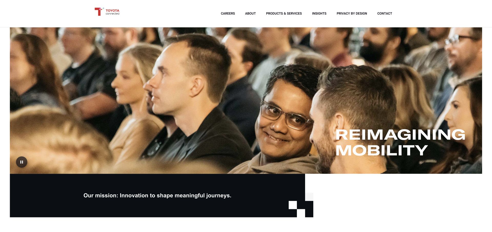
Toyota Connected uses an expansive photographic sequence and a short mobility statement beneath a restrained white header. The image shows people in a shared environment rather than presenting a vehicle specification sheet, giving the software business a distinct introduction within the larger automotive group. Products, insights and privacy receive named routes in the navigation. A dark mission strip below the hero supplies an immediate continuation, so the page begins explaining its purpose without opening with a dense catalog of connected services.
What you can learn
Explain the real situation a communication service supports before showing its technical components. Twilio’s Toyota Connected story concerns the Drivelink contact-center experience using Flex. It does not establish the frontend of this corporate page or the communications architecture of every Toyota vehicle and business unit.
Pros
People-focused photography distinguishes a software and service proposition from a conventional car catalog.
The privacy route has a visible place alongside products and organizational information.
Cons & considerations
A broad mobility statement needs specific service descriptions before a buyer can assess fit.
Large motion-led photography requires a useful static alternative and careful loading behavior.
Platform source: Toyota Connected — official Twilio association. Toyota Connected Drivelink contact-center use of Twilio Flex. Official documentary association only. The named workload or listing is not proof that this public page runs on Twilio, nor a complete or independently tested current stack. Platform evidence is separate from the direct website screenshot and is not a complete current infrastructure audit.
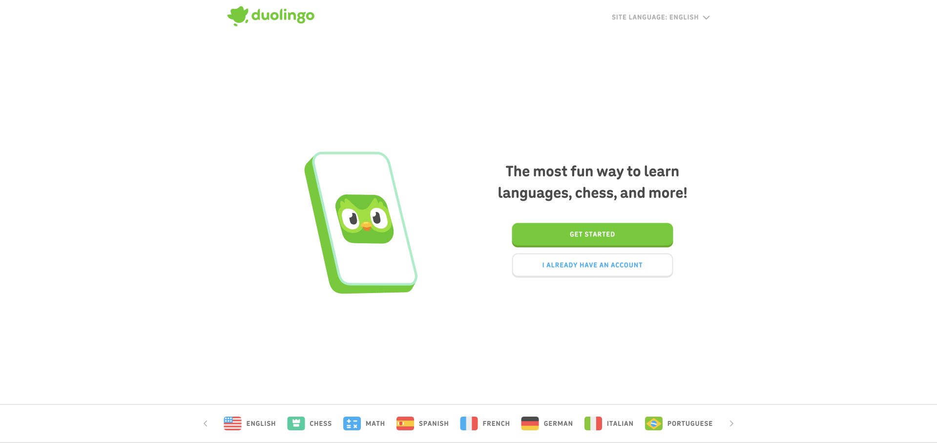
Duolingo combines an animated-looking phone illustration, its recognizable green character and a compact statement about what people can learn. The main action is green and the existing-account action sits immediately below it with a lighter treatment. A language selector stays in the header, while subject and language options appear in a row at the bottom of the captured screen. The page is intentionally sparse: it shows the category and the first decision without asking a new visitor to understand a full curriculum.
What you can learn
Make the entry point simple while keeping verification permissions and contact access understandable later in the flow. Twilio’s Duolingo story concerns contact syncing and Verify. That documented use does not establish every authentication method or the full stack behind the public learning-site introduction.
Pros
A recognizable character and limited palette make the first screen immediately coherent.
New and returning users receive separate, adjacent account actions with different visual emphasis.
Cons & considerations
The short proposition leaves course structure and product limits to later pages.
Playful illustration should not replace readable explanations when contacts or permissions are requested.
Platform source: Duolingo — official Twilio association. Duolingo contact syncing and Twilio Verify. Official documentary association only. The named workload or listing is not proof that this public page runs on Twilio, nor a complete or independently tested current stack. Platform evidence is separate from the direct website screenshot and is not a complete current infrastructure audit.
Uber’s public About page uses a large photograph of a family and a short section label before moving into a mission statement. The framing is deliberately broader than the transactional ride request: it explains the company through a human situation rather than a map or booking widget. A black header supplies a stable brand boundary above the colorful image. The layout is useful for a platform that needs a corporate story without making its service interface carry every organizational message.
What you can learn
Use the public narrative to explain context, then design communication states around the actual service event. Twilio’s Uber account documents SMS and Voice in ridesharing. It is not proof that every Uber product, country-specific journey or the pictured About page uses the same communications configuration.
Pros
The human photograph gives a corporate introduction a specific and approachable subject.
A simple image-to-text transition keeps the organizational story distinct from a booking interface.
Cons & considerations
The large image delays detailed information for visitors with a specific corporate question.
A broad company narrative cannot explain the consent and privacy details of in-service communications.
Platform source: Uber — official Twilio association. Uber ridesharing communications using SMS and Voice. Official documentary association only. The named workload or listing is not proof that this public page runs on Twilio, nor a complete or independently tested current stack. Platform evidence is separate from the direct website screenshot and is not a complete current infrastructure audit.
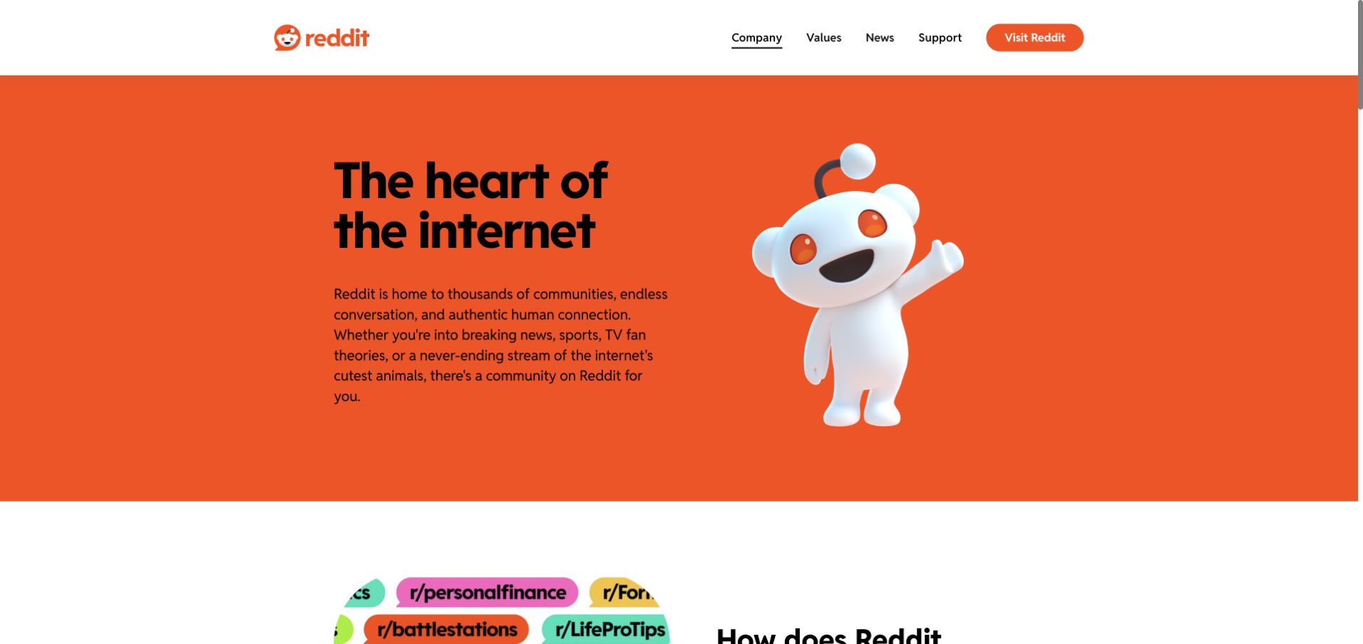
Reddit’s corporate homepage uses a vivid orange panel, a large community-oriented statement and a floating mascot illustration. A small set of navigation links covers company information, values, news and support, with an obvious route to the consumer platform. The design works because it does not attempt to recreate a personalized feed on the corporate site. It explains the brand in one strong composition, then begins introducing the communities that give the product its subject matter.
What you can learn
Keep corporate explanation, community browsing and account verification as different layers. Twilio documents Reddit user authentication, while the screenshot is the public corporate page rather than a signed-in feed. Neither the brand illustration nor that customer story establishes Reddit’s complete current application or moderation stack.
Pros
The orange field and mascot make the page recognizable without a crowded interface.
A deliberately small corporate navigation keeps the organizational purpose separate from product browsing.
Cons & considerations
A short brand introduction needs deeper content to explain governance and community expectations.
A consumer-platform link should make the destination change clear to first-time visitors.
Platform source: Reddit Inc. — official Twilio association. Reddit user authentication using Twilio; public corporate page is the design reference, not a signed-in feed. Official documentary association only. The named workload or listing is not proof that this public page runs on Twilio, nor a complete or independently tested current stack. Platform evidence is separate from the direct website screenshot and is not a complete current infrastructure audit.
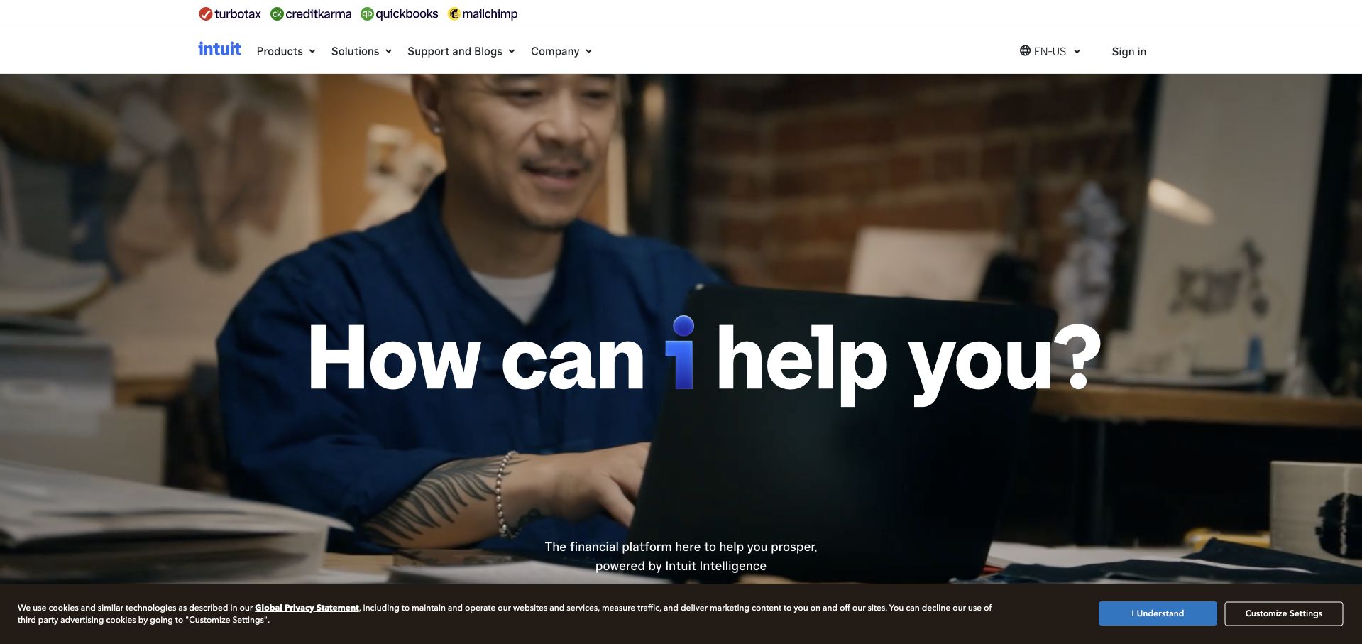
Intuit uses a full-width working-context photograph and a short question to introduce a broad financial-software group. A strip of product brands above the main navigation makes the family relationship visible before a visitor explores individual offerings. The photograph and large text create a conversational entrance rather than starting with a feature comparison table. Support and product routes remain available in the header, which matters for a business whose visitors may arrive as existing customers of very different services.
What you can learn
Shared branding should not obscure which product is verifying a person or why. Twilio’s Intuit case concerns Verify, not every identity or financial-data workflow in the company. The public introduction is a design reference, not an assessment of product suitability or the security of a specific account.
Pros
The product-brand strip helps visitors understand the relationship among otherwise distinct services.
A concise question makes a broad software portfolio feel less like a corporate directory.
Cons & considerations
A broad financial promise needs product-specific explanations before a visitor can choose responsibly.
Text over a changing photograph requires careful contrast and readable supporting alternatives.
Platform source: Intuit — official Twilio association. Intuit verification with Twilio Verify. Official documentary association only. The named workload or listing is not proof that this public page runs on Twilio, nor a complete or independently tested current stack. Platform evidence is separate from the direct website screenshot and is not a complete current infrastructure audit.
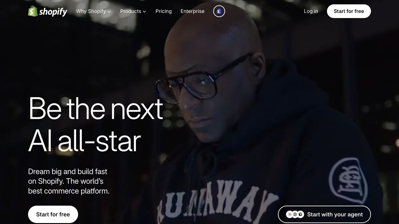
Shopify uses a dark photographic hero with large, light typography and a prominent white signup control. The navigation remains compact despite the breadth of the commerce platform, placing pricing and enterprise routes near the product choices. The captured campaign centers a person rather than a storefront screenshot, presenting the platform through entrepreneurial identity. That visual confidence is useful, but it works best when the underlying product pages quickly explain practical commerce tasks instead of relying on the campaign’s energy alone.
What you can learn
A recognizable commerce homepage does not identify the service behind every customer message. Twilio’s official Shopify customer story establishes a documented communications association. Keep that specific source separate from claims about merchant storefronts, checkout implementations or the complete architecture of Shopify’s public marketing page.
Pros
The single high-contrast action gives a large visual campaign a clear next step.
A compact header avoids overwhelming a new visitor with the entire commerce ecosystem.
Cons & considerations
A personality-led campaign may not answer an experienced merchant’s immediate operational question.
Signup prompts need clear expectations about the next step and any product limitations.
Platform source: Shopify — official Twilio association. Shopify communications association documented in Twilio customer story. Official documentary association only. The named workload or listing is not proof that this public page runs on Twilio, nor a complete or independently tested current stack. Platform evidence is separate from the direct website screenshot and is not a complete current infrastructure audit.
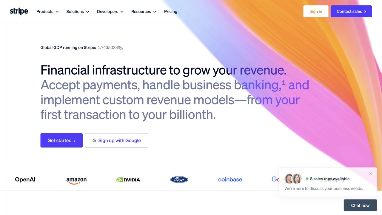
Stripe pairs a restrained white layout with a broad, colorful gradient shape that frames the opening proposition. The main statement explains revenue-related responsibilities rather than leading with a list of API names. A short row of recognizable customer marks sits below the actions, and the navigation separates products, solutions, developers and resources. The result demonstrates how a technical platform can feel visually distinctive while still giving a business evaluator and an implementing developer different routes into the same product family.
What you can learn
Treat each communication use as a bounded application responsibility. Twilio’s Stripe customer story documents a communications association; it does not establish the implementation of every Stripe product, payment flow or the public homepage. Product-specific documentation is still necessary before designing verification or notification behavior.
Pros
A distinctive gradient supplies personality without making the main text difficult to locate.
Developer and business-oriented routes remain visible rather than sharing one generic evaluation entrance.
Cons & considerations
A broad infrastructure proposition can hide important differences among individual products and regions.
Floating chat panels can compete with customer evidence and supporting introductory text.
Platform source: Stripe — official Twilio association. Stripe communications association documented in Twilio customer story. Official documentary association only. The named workload or listing is not proof that this public page runs on Twilio, nor a complete or independently tested current stack. Platform evidence is separate from the direct website screenshot and is not a complete current infrastructure audit.
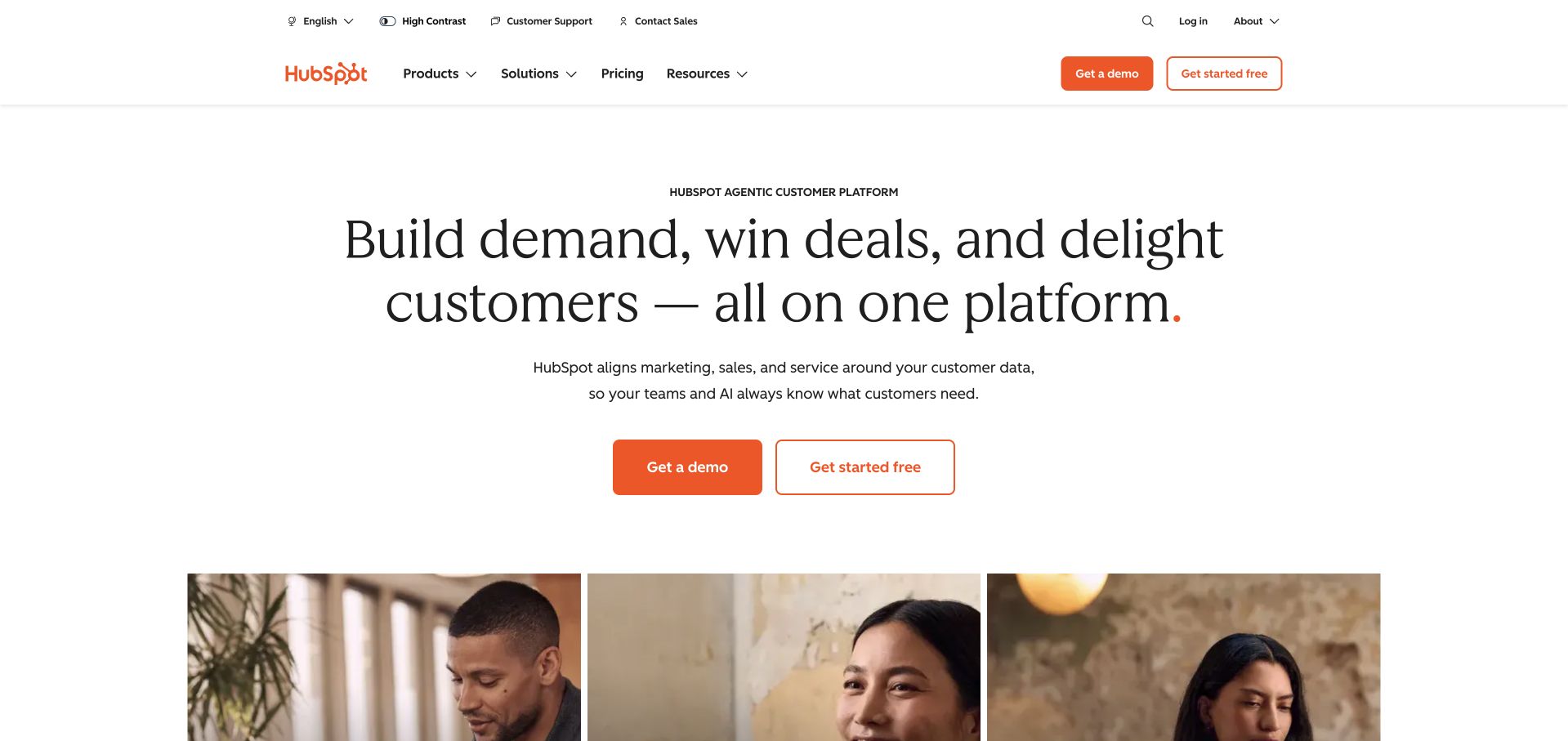
HubSpot centers a large serif statement on a white page with two orange evaluation actions beneath it. A photograph strip begins below the introduction, supplying a human counterweight to the broad platform language. The header separates products, solutions, resources and pricing, while utility information sits in a quieter row above. The page’s spacing makes the main proposition easy to find, but its structure also demonstrates why a broad platform needs more specific routes once a visitor moves beyond that first impression.
What you can learn
Identify the exact communications feature and its owner instead of assuming every CRM task is a messaging task. Twilio’s HubSpot story supports a documented customer association. It does not mean HubSpot’s marketing page, every customer integration or all CRM communications use one uniform Twilio implementation.
Pros
Generous white space keeps a broad platform statement readable rather than visually crowded.
Two clearly labeled evaluation actions accommodate different levels of interest.
Cons & considerations
Several business functions in one proposition can leave a specialist buyer seeking more detail.
A centered hero can postpone task-specific shortcuts if the next section remains equally broad.
Platform source: HubSpot — official Twilio association. HubSpot communications association documented in Twilio customer story. Official documentary association only. The named workload or listing is not proof that this public page runs on Twilio, nor a complete or independently tested current stack. Platform evidence is separate from the direct website screenshot and is not a complete current infrastructure audit.
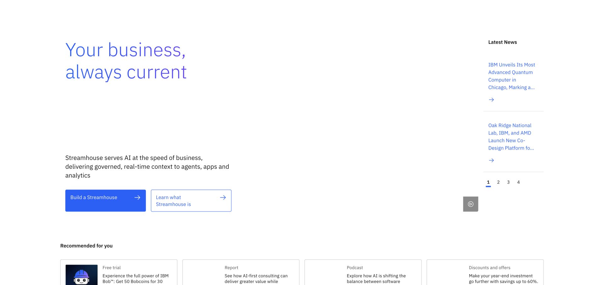
IBM uses a sparse white composition, blue typography and two clearly separated actions to introduce its current business theme. A slim news column sits to the right, while recommendation cards begin lower on the page. The layout gives an enterprise message substantial breathing room rather than surrounding it with a dense collection of product diagrams. The side column is particularly useful: current organizational news is available, but it is not given the same visual weight as the main introduction.
What you can learn
A communications-platform relationship can concern customer data rather than message delivery. Twilio’s IBM case documents Segment as a customer-data foundation across product lines. That is not a claim that the pictured IBM homepage runs on Twilio messaging APIs or reveals the company’s full data architecture.
Pros
The main proposition and secondary news are given clearly different visual weights.
A sparse palette makes the primary and secondary actions easy to distinguish.
Cons & considerations
A highly abstract headline needs concrete product or service explanation nearby.
Recommendations labeled for visitors should remain useful without implying personal account knowledge.
Platform source: IBM — official Twilio association. IBM customer data foundation using Twilio Segment, not a messaging-only attribution. Official documentary association only. The named workload or listing is not proof that this public page runs on Twilio, nor a complete or independently tested current stack. Platform evidence is separate from the direct website screenshot and is not a complete current infrastructure audit.
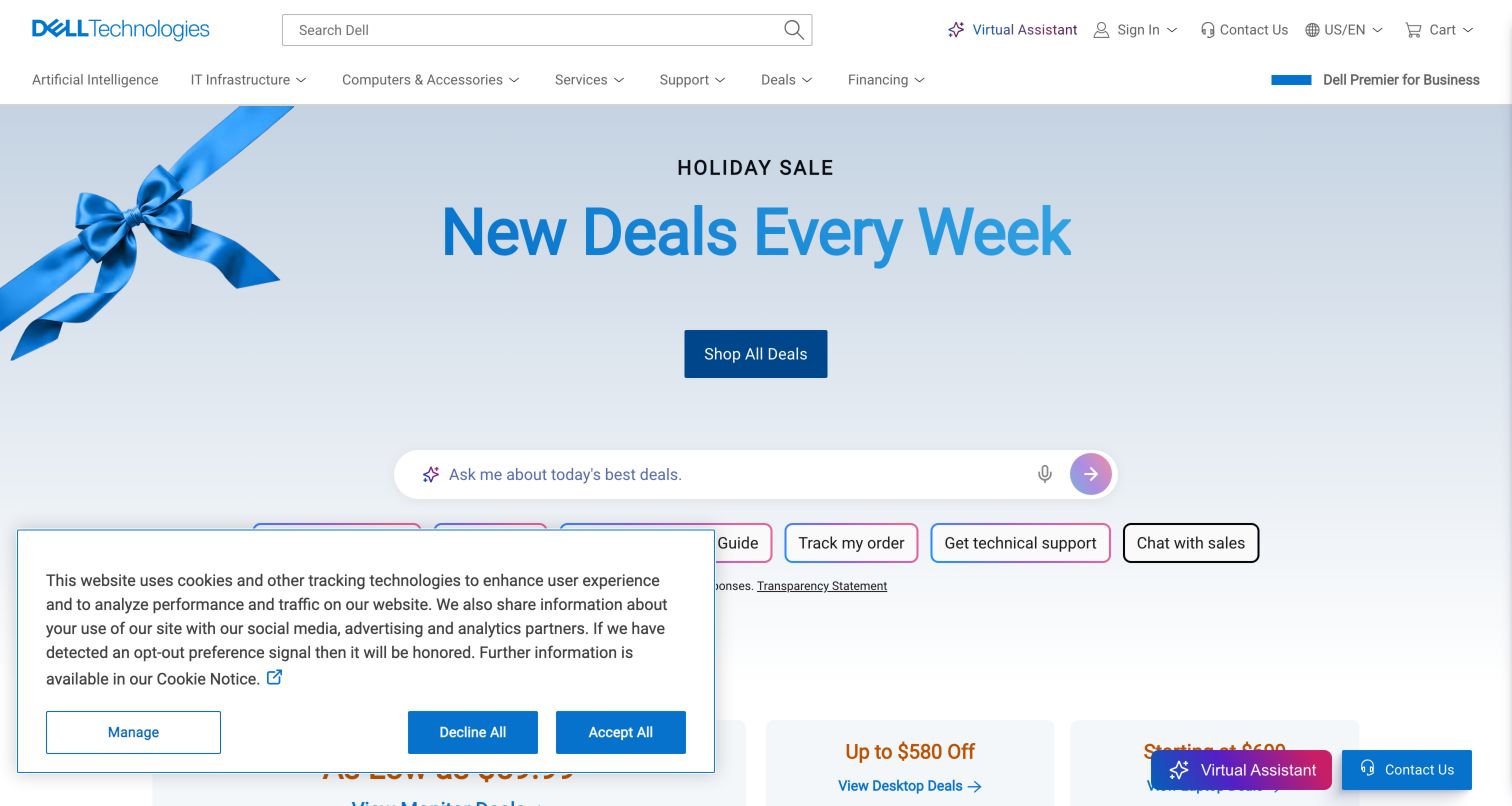
Dell uses a pale blue retail hero with a large seasonal offer and a simple shopping action. Beneath it, a compact assistant field and task controls acknowledge that visitors may need product guidance, order tracking or support instead of a new purchase. The navigation accommodates both consumers and technical buyers without making the hero a detailed hardware catalog. This is a practical reference for a business where the website relationship continues through purchase, delivery, troubleshooting and future upgrades.
What you can learn
Map communication events to those different stages rather than treating every visitor as a marketing recipient. Twilio’s Dell customer story establishes a communications association only. It does not identify every service message, support channel or frontend component on the captured retail page.
Pros
Post-purchase tasks remain visible near the shopping campaign instead of being relegated entirely to the footer.
A restrained seasonal visual gives the main promotion a clear focal point.
Cons & considerations
Consent panels and assistant controls can crowd the useful first-screen shortcuts.
A general product-guidance field needs clear boundaries and alternatives when it cannot answer.
Platform source: Dell — official Twilio association. Dell communications association documented in Twilio customer story. Official documentary association only. The named workload or listing is not proof that this public page runs on Twilio, nor a complete or independently tested current stack. Platform evidence is separate from the direct website screenshot and is not a complete current infrastructure audit.
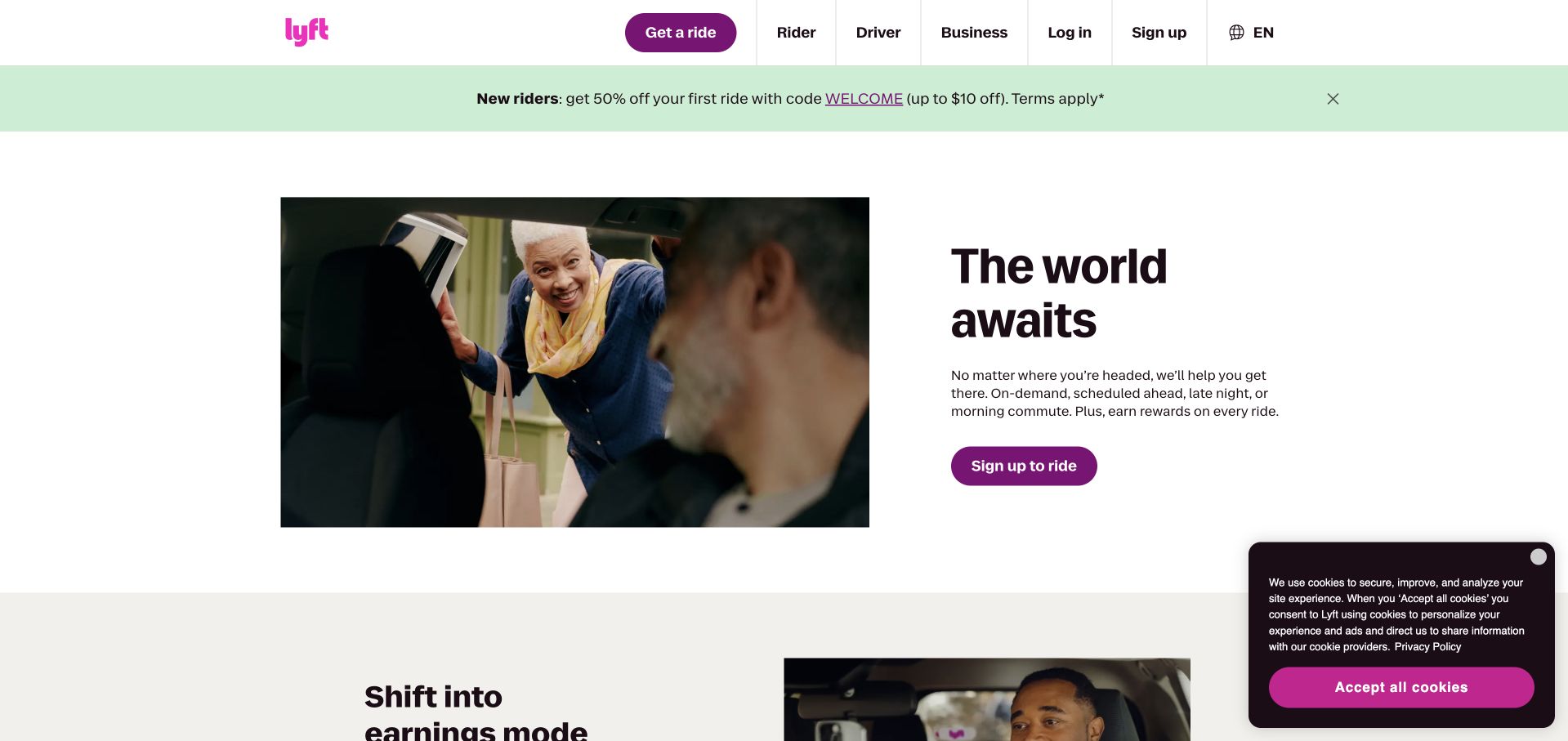
Lyft pairs a large everyday photograph with a concise travel-oriented message and a purple signup action. The header separates riders, drivers and business audiences, so the main consumer campaign does not become the only route through the site. A pale green promotional strip has its own position above the hero. The design is useful for a marketplace whose users have different roles: a person seeking a ride, someone considering driving and a company arranging travel should not all start with the same form.
What you can learn
Support communications must preserve those roles and the context of the actual trip. Twilio’s Lyft case concerns Flex for rider and driver support. The photographed public page does not establish the entire dispatch, account or contact-center architecture, and the review does not measure support outcomes.
Pros
Audience-based navigation keeps rider and driver intentions distinct before any signup step.
A single purple action remains noticeable against a largely neutral hero composition.
Cons & considerations
Promotional strips add another layer before the visitor reaches the service explanation.
A shared brand can still conceal different support expectations for each marketplace participant.
Platform source: Lyft — official Twilio association. Lyft rider and driver support using Twilio Flex. Official documentary association only. The named workload or listing is not proof that this public page runs on Twilio, nor a complete or independently tested current stack. Platform evidence is separate from the direct website screenshot and is not a complete current infrastructure audit.
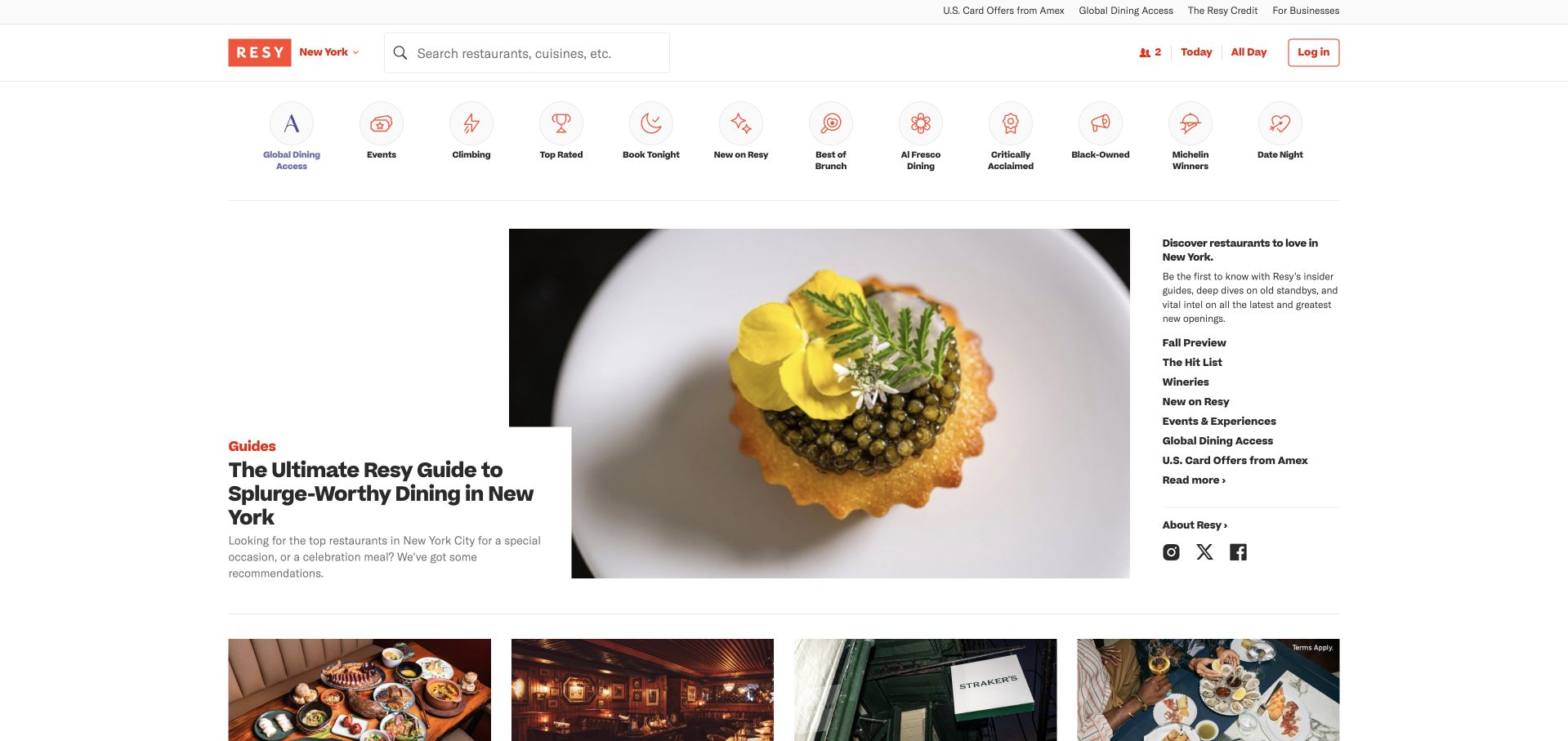
Resy’s public page combines a prominent restaurant search and simple dining controls with a large editorial food photograph. A row of illustrated category shortcuts offers several ways to browse without already knowing a restaurant name. The main feature uses an offset text panel, while a side column carries related editorial routes. This is a strong example of a transactional service borrowing a magazine-like composition without abandoning the search, party-size and date controls that make the platform useful.
What you can learn
Reservation communication should carry the relevant booking context, not become a generic promotional stream. Twilio’s Resy case documents Messaging for reservations and guest communication. That does not prove the technologies behind availability, restaurant operations or the editorial layout shown in this public screenshot.
Pros
Editorial photography and category shortcuts support discovery before a visitor chooses a specific restaurant.
Search and dining parameters remain available independently of the current feature.
Cons & considerations
An editorial first screen may slow someone whose only goal is checking one reservation.
Many illustrated categories need clear text labels and predictable small-screen behavior.
Platform source: Resy — official Twilio association. Resy reservations and guest communication using Twilio Messaging. Official documentary association only. The named workload or listing is not proof that this public page runs on Twilio, nor a complete or independently tested current stack. Platform evidence is separate from the direct website screenshot and is not a complete current infrastructure audit.
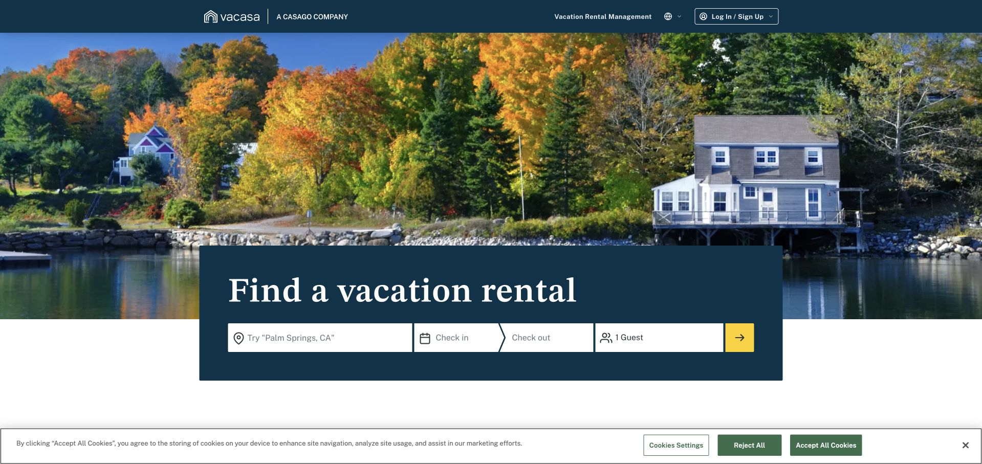
Vacasa uses a wide waterfront photograph and a dark blue booking panel with destination, dates and guest controls. The panel overlaps the image, giving the first task a clear physical place rather than hiding it in the navigation. Vacation-rental management has a separate route in the header, acknowledging an owner audience alongside travelers. The combination demonstrates how a large aspirational photograph can remain useful when the page gives visitors a structured way to turn interest into a specific search.
What you can learn
Keep booking operations and personalized campaigns distinguishable in both data use and messaging. Twilio’s Vacasa case discusses Twilio and Segment for customer engagement. It does not establish every property-management integration, the availability engine or the complete implementation behind this public vacation-search page.
Pros
The overlapping search panel connects destination imagery to a practical next step.
Property-management navigation provides an alternative to the primary traveler journey.
Cons & considerations
A large scenic image can postpone policies and operational details important to a booking decision.
Travel forms need clear failure and incomplete-state explanations beyond their initial labels.
Platform source: Vacasa — official Twilio association. Vacasa personalized customer campaigns with Twilio and Segment. Official documentary association only. The named workload or listing is not proof that this public page runs on Twilio, nor a complete or independently tested current stack. Platform evidence is separate from the direct website screenshot and is not a complete current infrastructure audit.
Lime’s captured hero fills the screen with a rider, a vivid green bicycle and a textured urban backdrop. A restrained white navigation sits over the photograph, with a bright download action matching the product color. The page communicates the physical service through the image before introducing technical details or organizational material. Its strength is the direct relationship among brand color, product and setting: the green accent is not merely decorative, because it corresponds to the equipment someone would recognize on the street.
What you can learn
A simple public introduction should lead to equally understandable verification and recovery states in the product. Twilio’s Lime story concerns Verify and fraud mitigation. That association is not a guarantee of fraud prevention or evidence about every rental, payment and vehicle system behind the service.
Pros
Brand color is connected to the actual physical product rather than an arbitrary graphic treatment.
The main download control is distinct without requiring several competing calls to action.
Cons & considerations
A photograph-led opening supplies little practical information about availability or local operating rules.
Important product and accessibility details need readable alternatives to the full-screen image.
Visible tech stack
Earlier / documented evidence
Twilio
Platform source: Lime — official Twilio association. Lime verification and fraud mitigation with Twilio Verify. Official documentary association only. The named workload or listing is not proof that this public page runs on Twilio, nor a complete or independently tested current stack. Platform evidence is separate from the direct website screenshot and is not a complete current infrastructure audit.
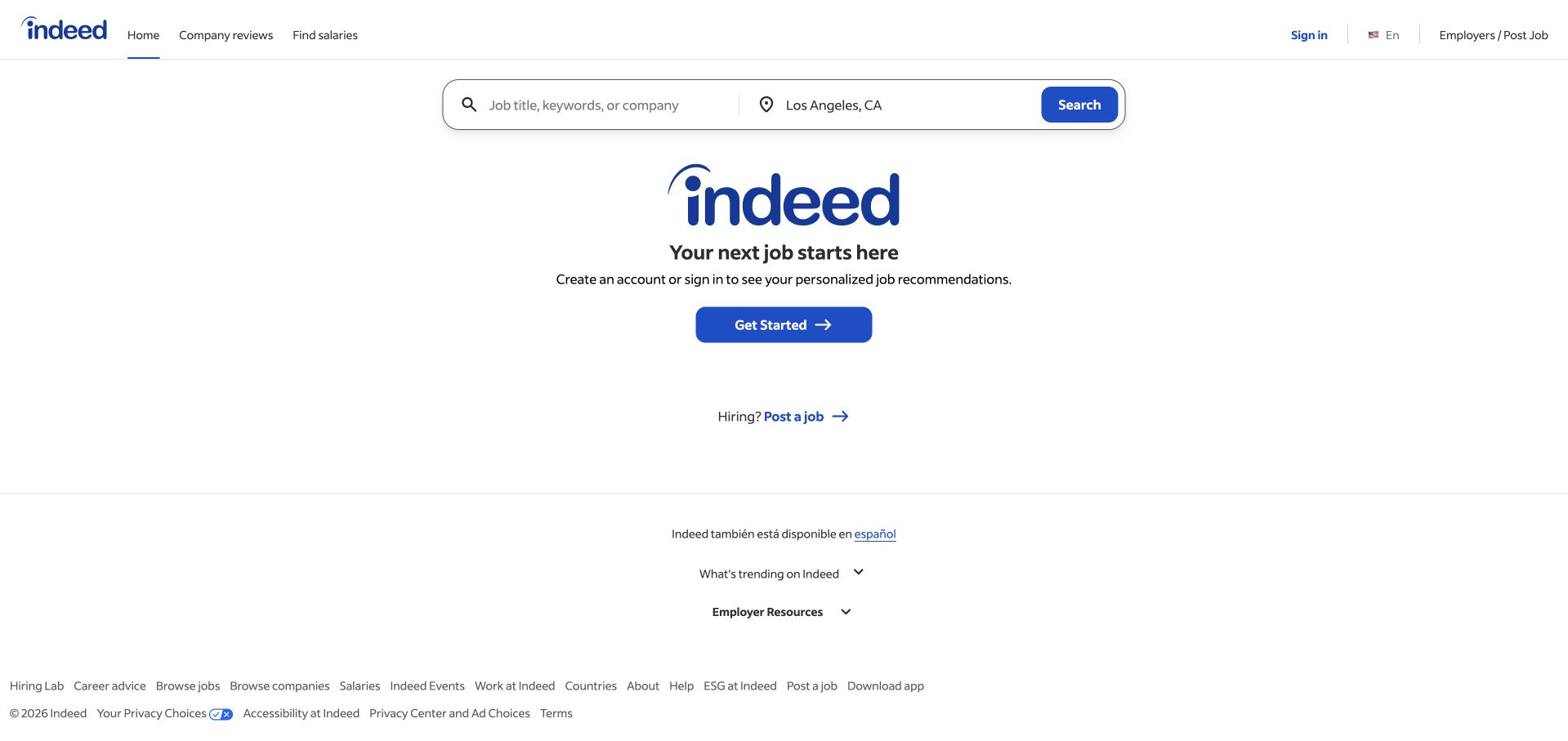
Indeed gives its public first screen a very direct hierarchy: a job-search field, a large brand statement and a clear account-starting action. Employer access is presented as a separate route rather than folded into the candidate message. The white background and compact blue controls keep the page visually restrained compared with many recruitment sites. This is worth studying as a task-first pattern, especially when the platform’s wider services could otherwise create a lengthy and confusing navigation before a visitor can begin.
What you can learn
The homepage task and a later interview communication feature are different responsibilities. Twilio’s Indeed story concerns a virtual-interview platform. It does not establish every job-search, account or hiring workflow, and this review does not assess employment decisions or the reliability of a specific interview experience.
Pros
The primary search task is recognizable without reading a broad corporate introduction first.
A separate employer route acknowledges a second audience without interrupting the candidate entrance.
Cons & considerations
A sparse screen leaves support, accessibility and process expectations to secondary content.
Account prompts should explain the benefit without making public exploration feel unnecessarily gated.
Visible tech stack
Earlier / documented evidence
Twilio
Platform source: Indeed — official Twilio association. Indeed virtual-interview communications using Twilio. Official documentary association only. The named workload or listing is not proof that this public page runs on Twilio, nor a complete or independently tested current stack. Platform evidence is separate from the direct website screenshot and is not a complete current infrastructure audit.
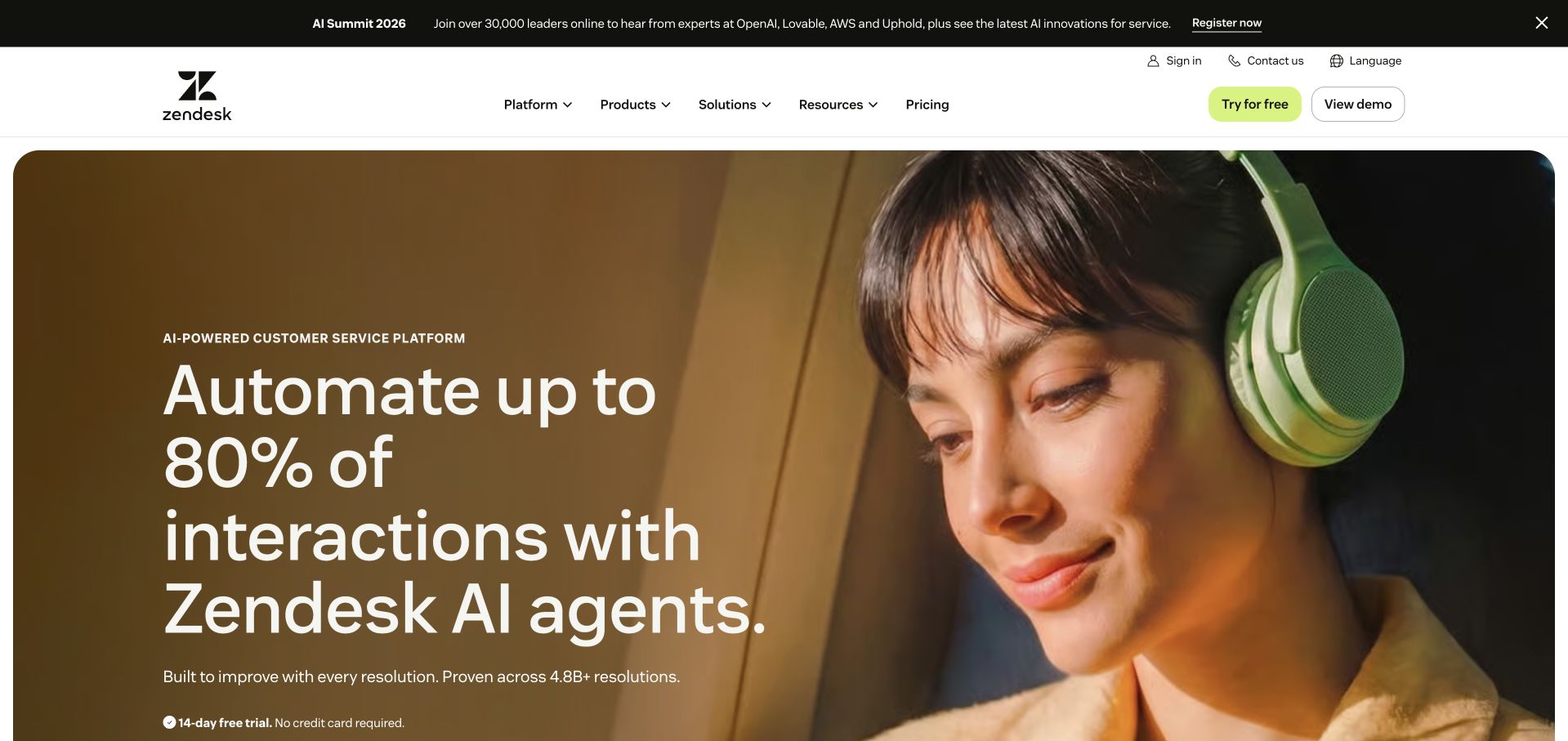
Zendesk uses a large portrait of a headset-wearing person beside an oversized product message. The photograph and warm tones soften a potentially technical AI-support proposition, while the lime evaluation action provides a distinct accent. A white header separates platform, product, solution and pricing routes. The page creates a clear visual hierarchy, but it also illustrates an important tradeoff: the human image makes the service approachable while the product explanation still needs to define which tasks are automated and when people remain involved.
What you can learn
Keep support channels, routing and human handoffs explicit in the implementation plan. Twilio’s Zendesk customer account documents a communications association. It does not independently validate AI resolution claims, customer-service outcomes or every frontend and backend dependency on the captured marketing page.
Pros
A recognizable support role gives an abstract platform proposition an immediate human context.
The lime action remains distinguishable within a warm photographic campaign.
Cons & considerations
Large performance-related claims need definitions and current supporting context beyond the headline.
Broad AI language can obscure the practical boundaries between automation and human assistance.
Platform source: Zendesk — official Twilio association. Zendesk customer-service communications association. Official documentary association only. The named workload or listing is not proof that this public page runs on Twilio, nor a complete or independently tested current stack. Platform evidence is separate from the direct website screenshot and is not a complete current infrastructure audit.
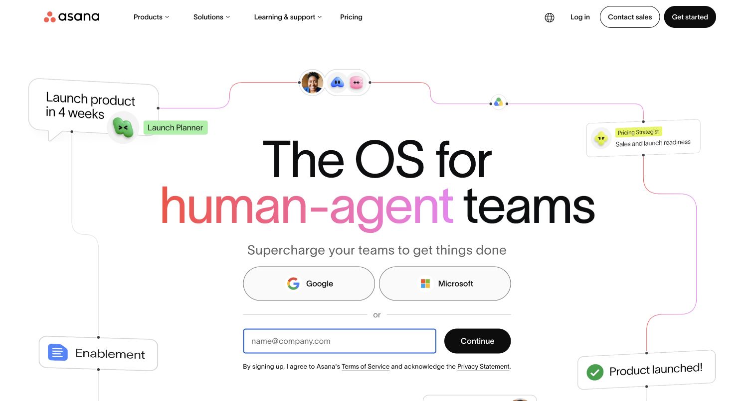
Asana’s public homepage places a large centered statement inside a loose diagram of connected tasks, people and status cards. A white background gives the interface fragments room, and account options sit directly beneath the explanation. The composition turns a work-management idea into a visual system rather than using a generic office photograph. It is a useful reference for explaining relationships among activities, though individual labels in a decorative product diagram should never be the only place important product behavior is described.
What you can learn
Customer-data infrastructure and work-management UI are separate layers. Twilio’s Asana case concerns Segment and data unification, not necessarily messaging APIs or the components pictured in the hero. A coherent public story cannot establish which events are collected, who can access them or how every workflow operates.
Pros
Connected task fragments give an abstract coordination proposition a recognizable visual model.
Account-starting actions sit near the explanation rather than requiring another navigation decision.
Cons & considerations
Decorative interface labels can become difficult to read when the composition shrinks.
A broad new-product metaphor needs concrete examples before implementation requirements become clear.
Platform source: Asana — official Twilio association. Asana customer data unification with Twilio Segment. Official documentary association only. The named workload or listing is not proof that this public page runs on Twilio, nor a complete or independently tested current stack. Platform evidence is separate from the direct website screenshot and is not a complete current infrastructure audit.
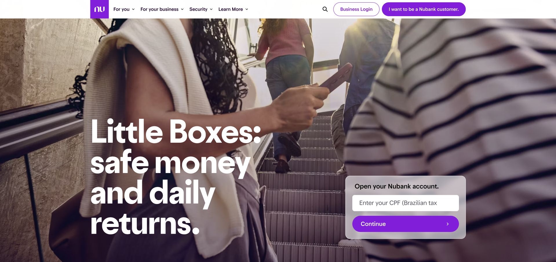
Nubank’s public page uses a large everyday-life photograph, strong white typography and a recognizable purple account-opening panel. Personal and business routes are named in the white header, while security information has a visible place alongside product discovery. The form is positioned as a distinct surface rather than blending into the image. The design demonstrates how an app-led financial brand can make its first step conspicuous, but it also makes clear why the surrounding explanation must carry much more detail than a short hero can contain.
What you can learn
Communications design should distinguish service messages from broader engagement. Twilio’s Nubank story documents digital customer engagement. This visual review does not establish financial suitability, account-opening eligibility, regulatory compliance or the complete communication and identity architecture behind the public page.
Pros
Purple accents connect the account surface to a consistent brand identity.
Personal, business and security routes are distinguishable before a visitor interacts with the form.
Cons & considerations
A prominent account form needs accessible explanations of required information and next steps.
Short financial headlines cannot communicate the full conditions of a product or service.
Platform source: Nubank — official Twilio association. Nubank digital customer engagement using Twilio. Official documentary association only. The named workload or listing is not proof that this public page runs on Twilio, nor a complete or independently tested current stack. Platform evidence is separate from the direct website screenshot and is not a complete current infrastructure audit.
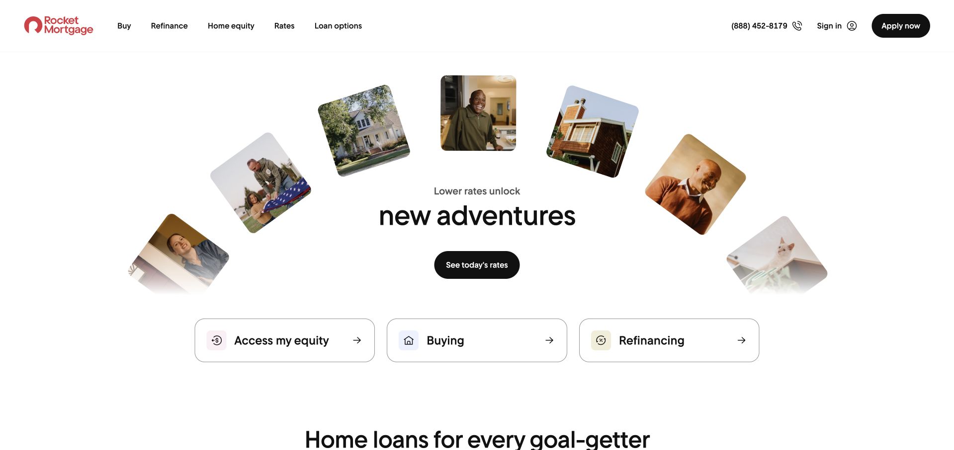
Rocket Mortgage uses a curved arrangement of photographs to frame a central introduction, then offers large controls for different borrowing intentions. The layout recognizes that an existing homeowner, a prospective buyer and someone exploring refinancing may have different questions before reaching any application. A phone route remains in the header for people seeking assistance rather than self-service. The most useful design choice is the early distinction among customer goals, not simply the playful shape of the image arrangement.
What you can learn
Communication should preserve the selected goal and the person’s stage in the process. Twilio’s official Rocket Mortgage story documents customer communications. It does not identify every lending system, establish the marketing homepage’s frontend or independently evaluate the suitability and outcomes of mortgage products.
Pros
Intention-based controls offer more useful direction than one generic application button.
A visible assisted-contact route provides an alternative to the primary self-service journey.
Cons & considerations
The broad choices need enough explanation to prevent visitors selecting the wrong process.
Product costs, eligibility and conditions require substantial information beyond the first-screen composition.
Platform source: Rocket Mortgage — official Twilio association. Rocket Mortgage customer communications documented in Twilio’s official story. Official documentary association only. The named workload or listing is not proof that this public page runs on Twilio, nor a complete or independently tested current stack. Platform evidence is separate from the direct website screenshot and is not a complete current infrastructure audit.
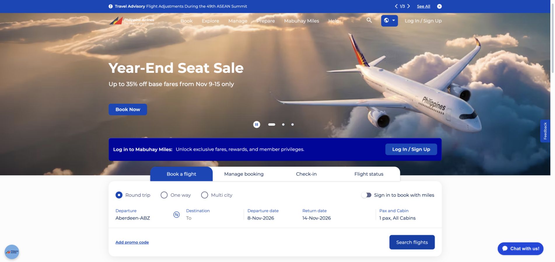
Philippine Airlines places a large aircraft image and a short seasonal offer above a substantial white booking panel. Tabs separate booking from trip management, check-in and flight status, so the main search is not asked to handle every passenger task. A separate loyalty strip makes the existing-member relationship visible. The blue palette connects the navigation, campaign and forms, while the form’s white surface preserves legibility. The hierarchy is useful for a travel service balancing inspiration with time-sensitive, repeat-passenger needs.
What you can learn
Keep support context connected to the trip while distinguishing it from promotional communication. Twilio’s Philippine Airlines case concerns Flex for customer support. The source does not establish every booking component, aircraft system or the full architecture of this public travel page.
Pros
Different trip tasks receive explicit tabs instead of being hidden inside a generic search.
The white form surface remains legible against the dramatic aircraft campaign.
Cons & considerations
Several campaign, loyalty and utility layers can make the first screen feel crowded.
Date, passenger and flight errors need clear explanations before the form can be considered usable.
Visible tech stack
Earlier / documented evidence
Twilio
Platform source: Philippine Airlines — official Twilio association. Philippine Airlines customer support using Twilio Flex. Official documentary association only. The named workload or listing is not proof that this public page runs on Twilio, nor a complete or independently tested current stack. Platform evidence is separate from the direct website screenshot and is not a complete current infrastructure audit.
Kegan has 15+ years of experience working with small businesses, Fortune 500 companies, and everything in between. No development job is too big or too small: he brings the same hands-on attention to a focused improvement, a complete website, or a custom application.
For Twilio projects, he can help with website integrations, form and campaign connections, analytics implementation, testing, and clear ownership after launch. He works directly with clients on scope, design, implementation, testing, and handover, with an emphasis on clear communication and a system that remains practical to maintain after launch.
Show 3 other Twilio developersHide other Twilio developers
Start with why verification is required, which channel is appropriate and what happens if the person cannot use it. Include expired attempts and retry guidance in the interface. Twilio’s Verify documentation provides product-specific channels and implementation material; a generic message-sending tutorial is not the same brief.
Name the source of truth for the booking, delivery or account event. Record when a notification should be created, whether a reply is expected and how the application avoids duplicate work. A service message should retain context without becoming an indiscriminate stream of unrelated campaigns.
A support workflow with human ownership
For a Flex-style contact center, define tasks, queues, agent context and handoffs before styling an interface. Include the person who receives the work as well as the customer initiating it. A visually polished chat bubble is not a complete support operation.
Plan the communication before designing the notification
Write a small event contract
For one representative event, record the initiating system, intended recipient, permitted content and state changes. Decide which identifier lets support reconcile the application event with communication activity. Avoid placing sensitive record details into messages or URLs merely because they are convenient to send.
Rehearse delays, duplicates and unavailable channels
Use a controlled test environment and appropriate test facilities rather than contacting real customers during development. Demonstrate a delayed callback, a repeated event and a person who needs another support route. The user-facing explanation should remain useful even when the integration is not behaving like the happy-path demo.
Separate service delivery from campaign data
Customer-data work, such as the IBM and Asana Segment cases, has different ownership questions from an individual support message. Document the purpose and access for each data flow. Decide notification preferences and policy requirements with the people responsible for the service rather than copying another company’s messaging volume or campaign design.
A useful handover demonstration
Ask the actual team to carry out its routine job: publish a realistic update, correct a mistake, preview a narrow screen, and identify who owns an integration failure. For a library or frontend framework, also ask who maintains the content source and deployment. A polished screenshot does not answer those operational questions.
Beyond the screenshot
A Twilio project checklist
Name the user event and communication purpose.
Choose the exact product and intended channel.
Identify the authoritative source of the event.
Define the recipient and expected response.
Keep private credentials server-side.
Review incoming-request verification.
Plan delays and duplicate-event behavior.
Explain failed and expired attempts clearly.
Give users an appropriate alternative support route.
Test without contacting real customers.
Separate campaign data from service delivery.
Assign support and operating-cost ownership.
Test with real content, a keyboard, a small screen, slow or failed requests, and the people who will maintain the system. These are planning checks, not an accessibility, security, performance, or search-ranking certification.
Sources & editorial method
How this Twilio collection was reviewed
Twenty distinct public website properties were independently reviewed for this Twilio collection. Direct public-browser captures were visually inspected; reused exact-page captures retain their original image paths, dates and provenance. Fresh captures were made November 9 UTC during November 8, 2026 Pacific research. A null capturedAt means the original day, but not a precise time, is known; no timestamp was invented. Official primary customer cases, engineering sessions, documentation and explicitly identified directory listings establish only the named workload or association. Historical material stays historical. Public screenshot appearance is not proof of the pictured page’s complete stack or current backend. These are original design observations, not measured rankings or endorsements of financial, clinical, security, accessibility, performance or AI outcomes. No private application workflows, signups, forms, purchases or account changes were used. Website owners retain their images and trademarks. The sole publisher performs a separate bounded public-stack audit before publication without replacing earlier observations.
Every image is an unmodified capture from the actual website, with its source and capture date. Some captures are reused from our shared catalog; their dates remain the original capture dates. None comes from a vendor gallery or a generated reconstruction. Moving imagery and live content can change.
Technology attribution uses public page assets or metadata, official platform documentation, or a cited first-party project case study. Documentary and framework-relationship evidence is identified where used; it is not a complete current backend inventory. A CMS image CDN alone does not establish a full CMS deployment. A library’s presence does not prove which individual controls use it, and a platform label does not establish AI authorship.
The composition notes, lessons, pros and tradeoffs are original editorial observations. We have not measured conversion, traffic, security, performance or accessibility conformance. Website owners retain their brands and imagery; these examples are not our client portfolio. Written, Edited and Curated are independent records, not dates advanced by a build. See our editorial standards or suggest a correction.
Questions worth asking
Twilio website development FAQs
Are all these examples using Twilio Messaging?
No. The official cases cover different products and workloads. IBM and Asana concern Segment; other examples concern Verify or Flex. Each attribution stays attached to its documented product and task.
Does a successful API response mean the person received the message?
Not by itself. Treat the integration’s documented states and callbacks according to their meaning, and avoid equating accepted work with a person reading or acting on a communication. The interface needs useful incomplete and failure states.
Can the website call every Twilio API directly from browser code?
Do not expose private credentials in a public page. Define the server-side responsibility and use current product and security documentation for the actual integration. A public product screenshot is not an implementation specification.
Is Verify simply a custom SMS code built with the messaging API?
It is a separate product with its own verification flows, channels and documentation. Choose based on the actual requirement and supported implementation rather than assuming that any message-sending example provides the same responsibilities.
Should a small business reproduce a large company’s contact center?
Only if its real support operation requires that scope. Begin with one task, a responsible person and a usable fallback. A famous customer’s architecture can supply context without being an appropriate starting point for every project.
Borrow the clarity of the public journey, then specify the communication event, product boundary, failure states and human owner. Useful communication design is about what the person can accomplish next, not how many channels appear in the stack.