Best Animal Shelter Websites of 2026 (13 Real-World Examples)
Animal shelter websites that help people find an appropriate next step, support the organization, and understand how a visit or inquiry works.
Compare 13 directly reviewed shelter and animal-welfare websites, from local humane societies to larger organizations. These are design references, not assessments of animal care, adoption outcomes or organizational effectiveness.
A shelter homepage serves several urgent but different needs. Someone looking for an animal, a person trying to find a lost pet, a prospective foster volunteer and a donor should not all have to interpret the same promotional banner.
The strongest starting point is a clear explanation of the organization and its actual services. Photographs can create an emotional connection, but practical eligibility, availability, location and contact information must remain readable and current. A website should help staff begin the right conversation without promising an adoption or an outcome before that process takes place.
Before the examples
What makes good animal shelter website design in 2026?
Separate the visitor’s immediate task
Use distinct routes for adopting, fostering, volunteering, donating and finding relevant services. Only include lost-and-found or intake routes when the organization actually handles them. A person seeking help should not have to infer eligibility or territory from the charity’s general mission statement.
Keep animal and visit information current
Explain what an available-animal listing represents and how it is updated. Make shelter addresses, temporary locations, opening arrangements and contact routes easy to find. Images and names are an invitation to learn more, not a promise that a particular animal will still be available at arrival.
Show the organization behind the appeal
Introduce real staff, facilities and programs where appropriate, with clear image permissions. Describe donation purposes accurately and distinguish the organization’s own claims from independently established outcomes. A dramatic photograph or numerical claim should not replace a useful explanation of the actual work.
The collection · 13 examples
13 animal shelter websites worth studying
Study how these sites organize adoption and support journeys, maintain local information, and connect animal photography to an understandable process. Editorial order does not rank animal care or adoption services.
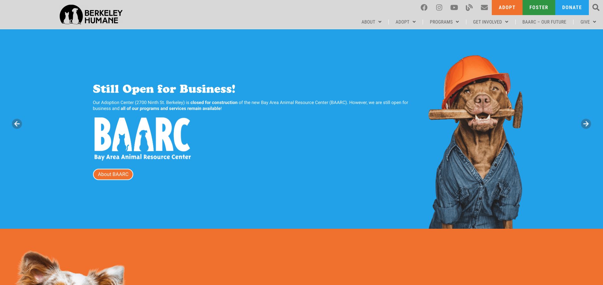
Berkeley Humane gives a construction update an unusually memorable visual treatment: a dog in a hard hat stands against a bright blue field beside the BAARC identity. The message explains that services continue while the adoption center is being rebuilt. Three differently colored actions for adoption, fostering and donations stay in the header, so the campaign does not become the only way through the site. Below it, separate blocks explain walk-in and appointment arrangements, with actual locations alongside them. This is our editorial selection for turning a potentially confusing operational change into clear, approachable communication.
What you can learn
Use a major homepage campaign to answer the practical question visitors are likely to ask. Keep permanent service routes visible and put location changes beside the relevant task, rather than expecting every visitor to read a news announcement first.
Pros
The construction photograph and message explain why the location is changing.
Adopt, Foster and Donate remain distinct header actions.
Cons & considerations
The rotating campaign can move before a reader finishes the explanation.
Several separate adoption locations require careful upkeep as arrangements change.
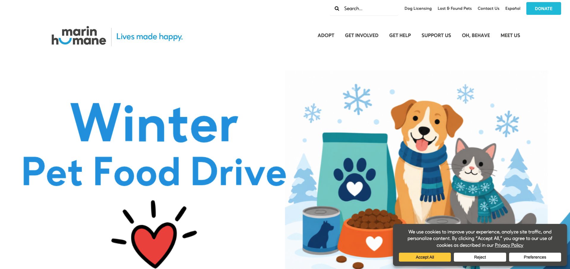
Marin Humane opens with a large winter food-drive illustration instead of an individual adoption profile. The seasonal artwork makes the requested kind of help immediately recognizable, while the relatively restrained white header gives the campaign room. Useful tasks such as dog licensing, lost pets and contact information occupy a separate utility row. The main navigation groups broader needs under Adopt, Get Involved, Get Help and Support Us. This distinction is particularly useful for an organization whose visitors may arrive in very different circumstances. The prominent appeal feels temporary, while the service structure feels permanent and easy to return to.
What you can learn
Separate a changing campaign from the navigation people rely on repeatedly. A food drive can dominate the visual opening without taking away the lost-pet, licensing and adoption routes that bring residents back throughout the year.
Pros
Utility links surface practical tasks before the campaign begins.
The uncluttered white header offsets the large seasonal illustration.
Cons & considerations
The oversized campaign pushes individual animals below the first view.
Broad labels such as Get Help need clear, well-maintained destination pages.
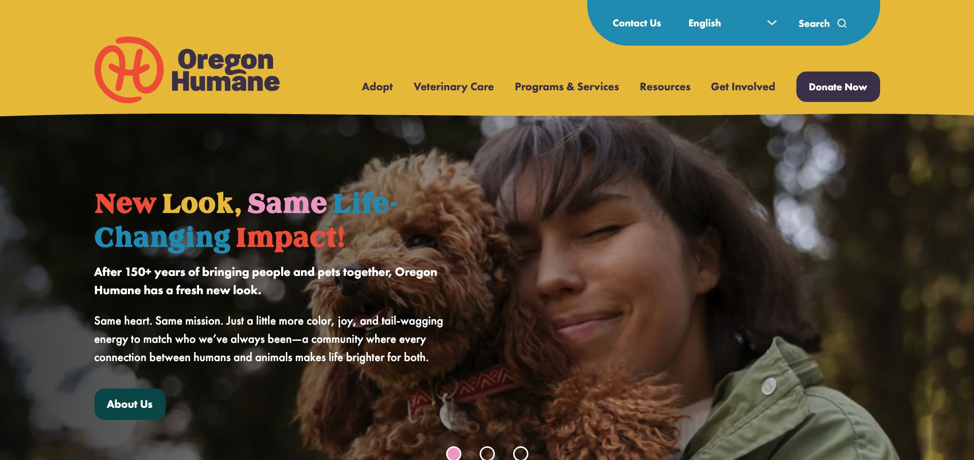
Oregon Humane pairs its bright yellow header with an intimate photograph of a person holding a dog. The opening announcement introduces a new visual identity, but keeps the emotional connection between people and animals at the center. Multicolored headline words echo the palette without replacing the explanatory text. Navigation distinguishes adoption, veterinary care and wider services, and language selection is available above it. A prominent donation button remains visually separate from those service categories. The result is an expressive brand introduction that still acknowledges the different reasons someone might visit an established regional animal organization.
What you can learn
Explain a rebrand through the continuity of the mission and services. Use a representative photograph and a short explanation, then keep familiar navigation categories intact so returning visitors can still complete their original task.
Pros
The photograph communicates companionship more specifically than a generic animal collage.
Language selection and veterinary care are visible in the header.
Cons & considerations
Several headline colors demand careful contrast checking against the photograph.
The About Us campaign action is less direct for a visitor ready to adopt.
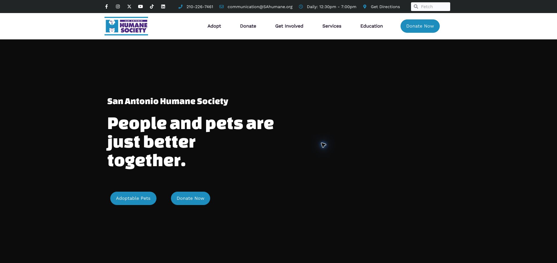
San Antonio Humane Society places its telephone number, email, daily hours and directions in a slim dark strip above the main navigation. Those practical details help the page act as a local service entrance, rather than only a fundraising brochure. The hero uses a short statement about people and pets, with two rounded actions for adoptable animals and giving. A small set of navigation categories separates services and education from ways to get involved. The overall structure is straightforward: establish the organization, make visiting information accessible, then offer two clear next steps without requiring a visitor to interpret a long introductory essay.
What you can learn
Treat opening hours and directions as part of the homepage hierarchy. People looking for a shelter may need to act quickly, so contact details should remain easy to find alongside the more emotional introduction and donation appeal.
Pros
Hours, directions and phone details are immediately available.
Adoptable Pets and Donate Now provide two specific next steps.
Cons & considerations
The large media area depends on its background loading reliably.
Several small icons and utility details need spacing checks on narrow screens.
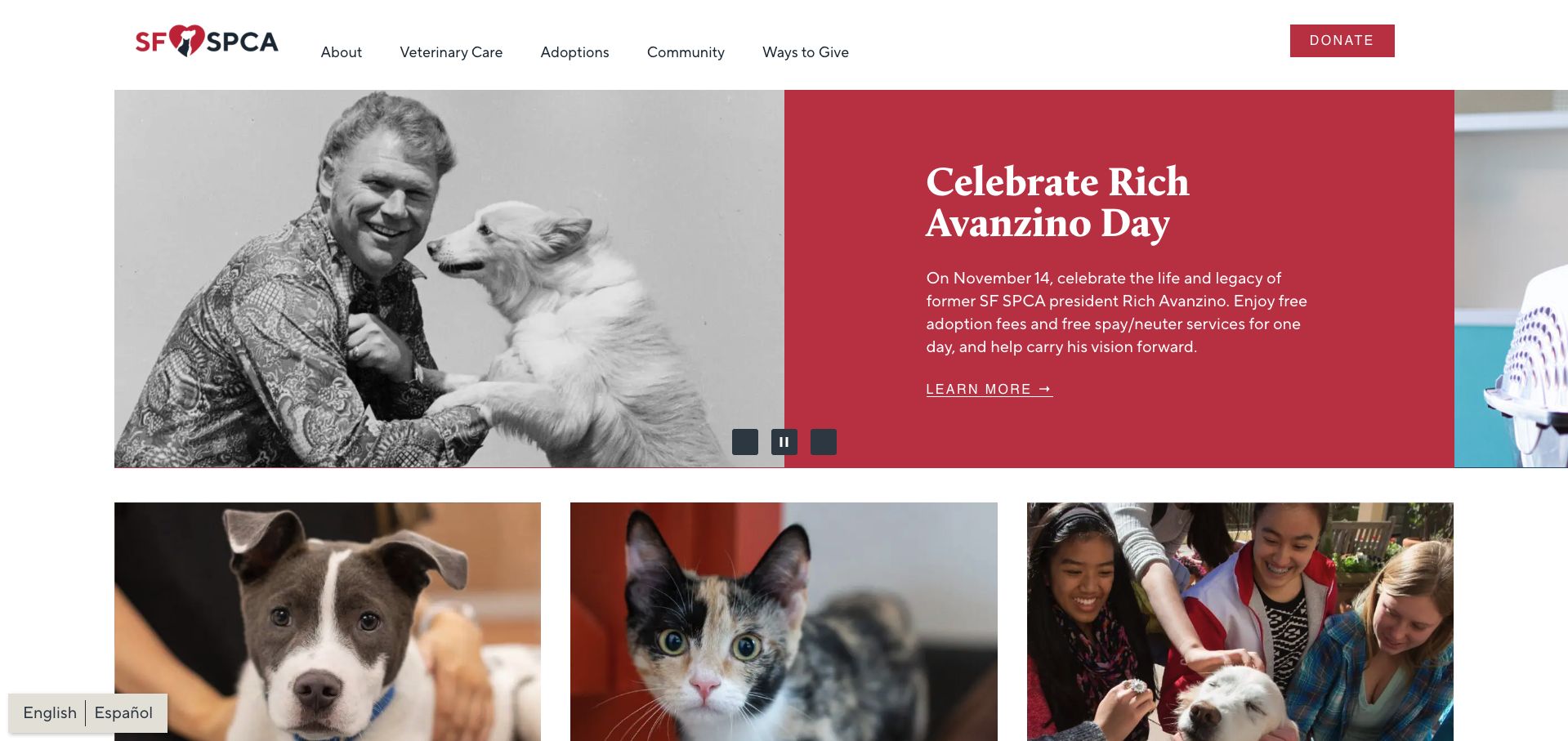
The San Francisco SPCA uses a split campaign panel: an archival photograph on one side and a deep red text block on the other. The featured commemoration connects the organization's history to a current activity without turning the whole page into a historical overview. Directly below, three large photographs lead into veterinary care, adoptions and community involvement. This is a useful division for visitors who need different services from the same organization. The compact header repeats those central categories, and the donation action is clearly separated at the far edge. Generous white margins keep the photography and editorial text from feeling crowded.
What you can learn
Give short-lived campaigns a defined place above a stable service grid. Returning visitors can recognize the main routes even when the featured story changes, while new visitors get a human introduction to the organization's purpose.
Pros
Three photographic service cards distinguish the main audiences.
The split campaign keeps text readable without placing it over a busy photograph.
Cons & considerations
The carousel requires accessible controls and enough reading time.
A featured date needs prompt maintenance after its event has passed.
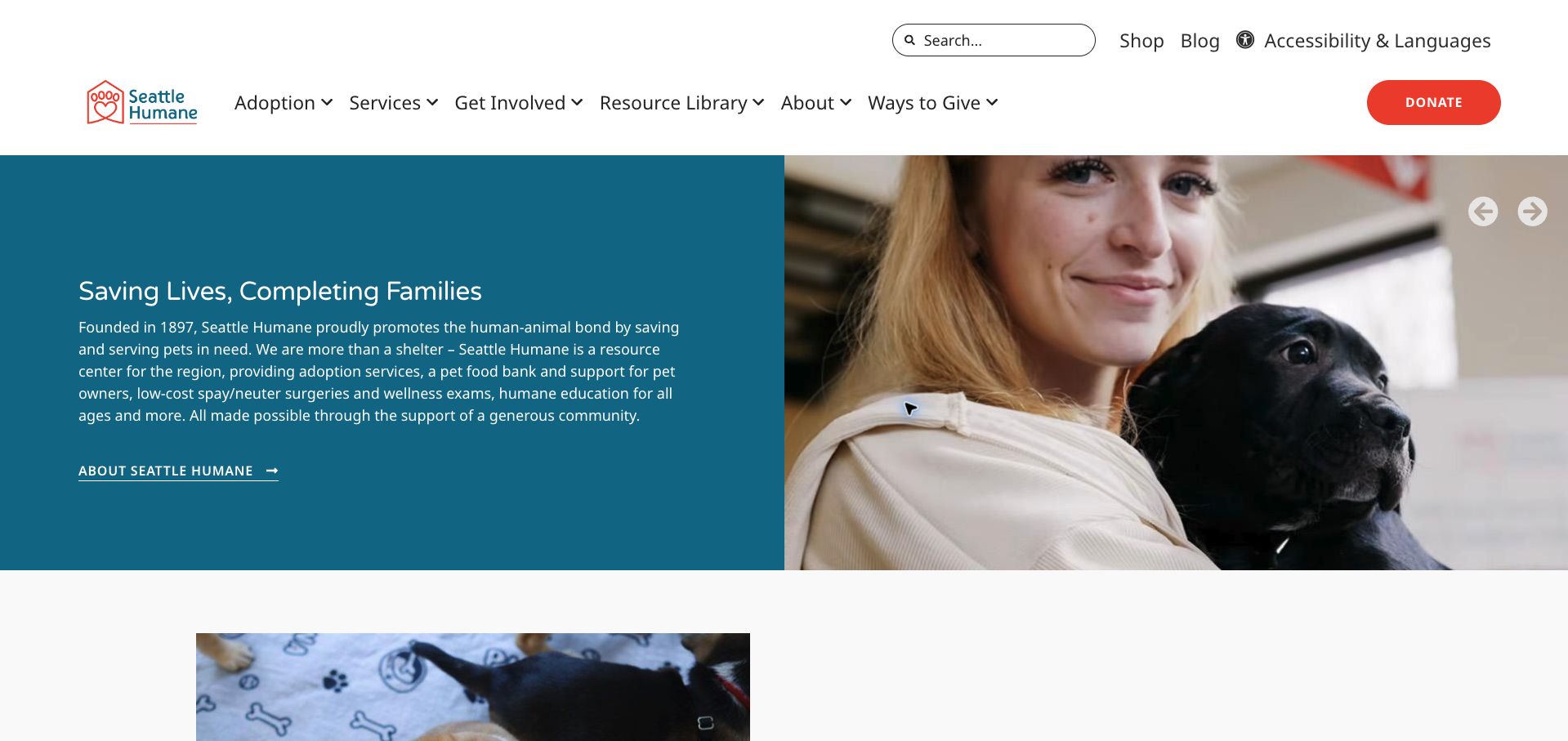
Seattle Humane uses a teal text panel beside a close photograph of a person holding a dog. The introductory paragraph explains that the organization also provides a food bank, veterinary services and education, broadening the picture beyond adoption. These services are supported by separate navigation routes for adoption, services, involvement and a resource library. A utility row includes search, a shop and accessibility and language tools. The composition is less campaign-driven than several examples in this collection: it gives the organization space to explain what it does before asking the visitor to choose a specific service or form of support.
What you can learn
If the public knows only one part of an organization, use the introduction to describe the wider offer in concrete terms. Support that description with navigation labels that lead to those services, so the added detail becomes useful rather than purely promotional.
Pros
The resource library has a distinct place in the main navigation.
The solid text panel avoids competing with the human-and-animal photograph.
Cons & considerations
The introductory paragraph is comparatively long for quick scanning.
The hero's About link adds a step for visitors ready to choose an animal.
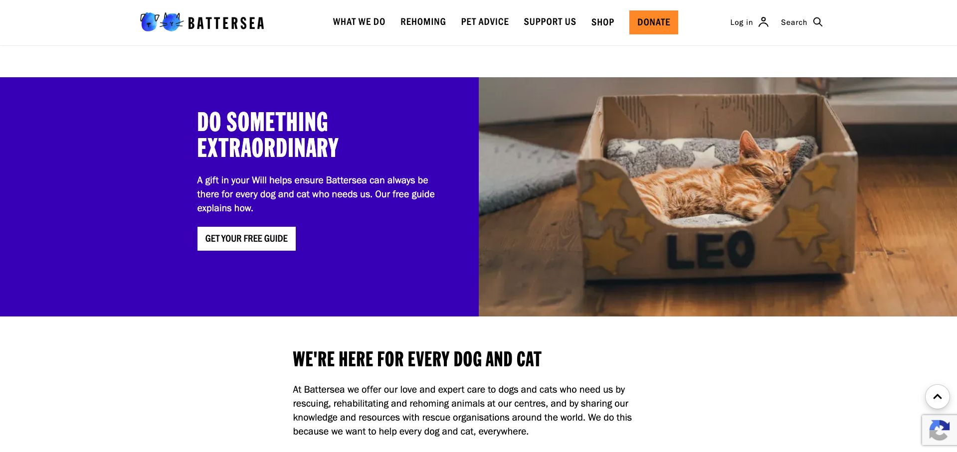
Battersea's opening appeal pairs a saturated purple panel with a photograph of a sleeping cat in a cardboard bed. The image is quiet and specific, which suits a message about long-term support better than a busy montage. A short explanation leads to one clearly labeled guide action. Beneath the campaign, a separate mission statement explains the broader work, while the header maintains distinct routes for rehoming, advice, support and shopping. Condensed black headings and generous white spacing give the page a recognizable voice without making the service menu difficult to identify. The campaign reads as one invitation within a larger organization.
What you can learn
Choose a single photograph that suits the particular request. Keep the campaign's next step specific and place it within a stable service structure, so visitors can understand the appeal without losing access to adoption or practical advice.
Pros
The cat photograph gives a broad appeal an individual, tangible focus.
The guide action describes the next step more clearly than a generic Learn More.
Cons & considerations
The opening emphasizes giving before animals available for rehoming.
Condensed display typography needs careful treatment at smaller sizes.
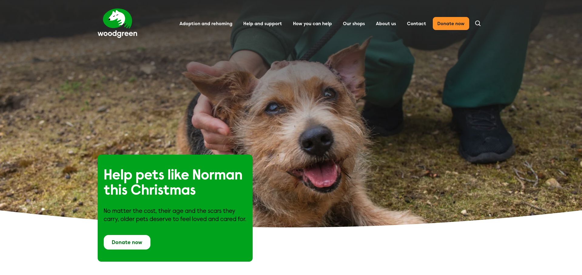
Woodgreen fills the opening with a close photograph of Norman, then places a green campaign card partly over the image and partly over the white section below. Naming the animal makes the seasonal request more concrete than a general appeal for support. The curved lower edge softens the transition into the rest of the page, while the orange donation control remains easy to spot in the transparent header. Navigation separates adoption and rehoming from help and support, acknowledging that some visitors need assistance with pets they already have. The composition feels cohesive because the photograph, animal name and campaign request all point to the same story.
What you can learn
Connect a campaign's image, headline and action to one clear subject. A named animal can provide that focus, but the surrounding navigation should still make help and rehoming available to visitors who arrive with a different need.
Pros
The named-animal appeal connects the photograph directly to the request.
Adoption and existing-owner support receive separate navigation categories.
Cons & considerations
Transparent navigation requires contrast checks across different hero images.
The overlapping card needs careful positioning to avoid cropping on smaller screens.
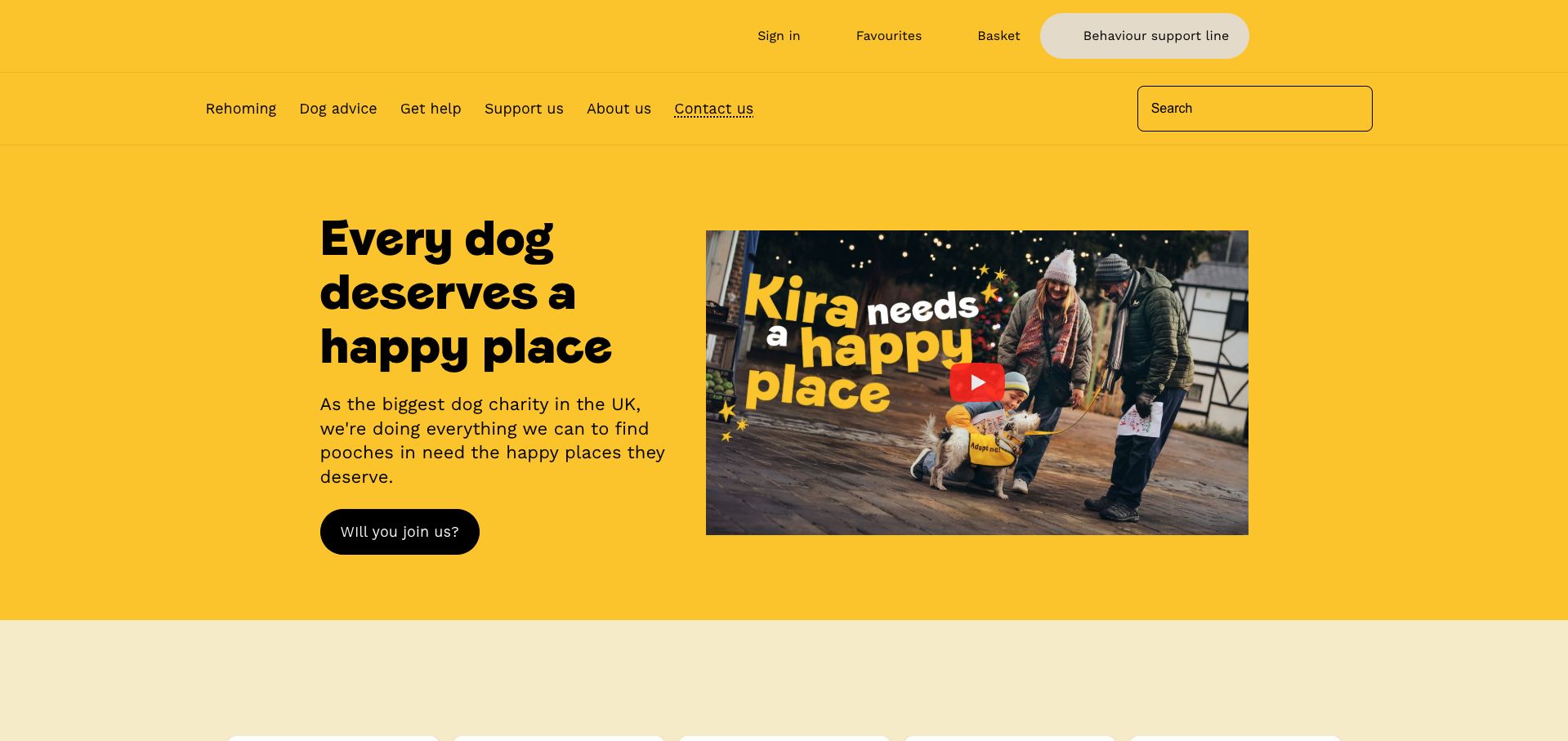
Dogs Trust builds its opening around a yellow field, a large black headline and a clearly recognizable video preview. The layout gives the campaign a strong identity without relying on several competing photographs. Rehoming, dog advice and help are separate navigation choices, while a behaviour support line appears in the utility area. That practical route is useful because the audience includes existing owners as well as potential adopters. The main invitation sits beside the video instead of being hidden inside it, allowing someone to continue without playing media. A search field gives visitors another way into the large body of supporting information.
What you can learn
Keep the essential message and next step outside an embedded video. Motion can add emotion, but a visitor should understand the purpose of the page and find advice or rehoming information without starting playback.
Pros
The high-level categories separate advice from rehoming and general support.
The video thumbnail has a visible play control instead of forcing playback.
Cons & considerations
The broad campaign invitation is less specific than an adoption-oriented action.
A large single-color opening needs careful hierarchy to keep navigation distinct.
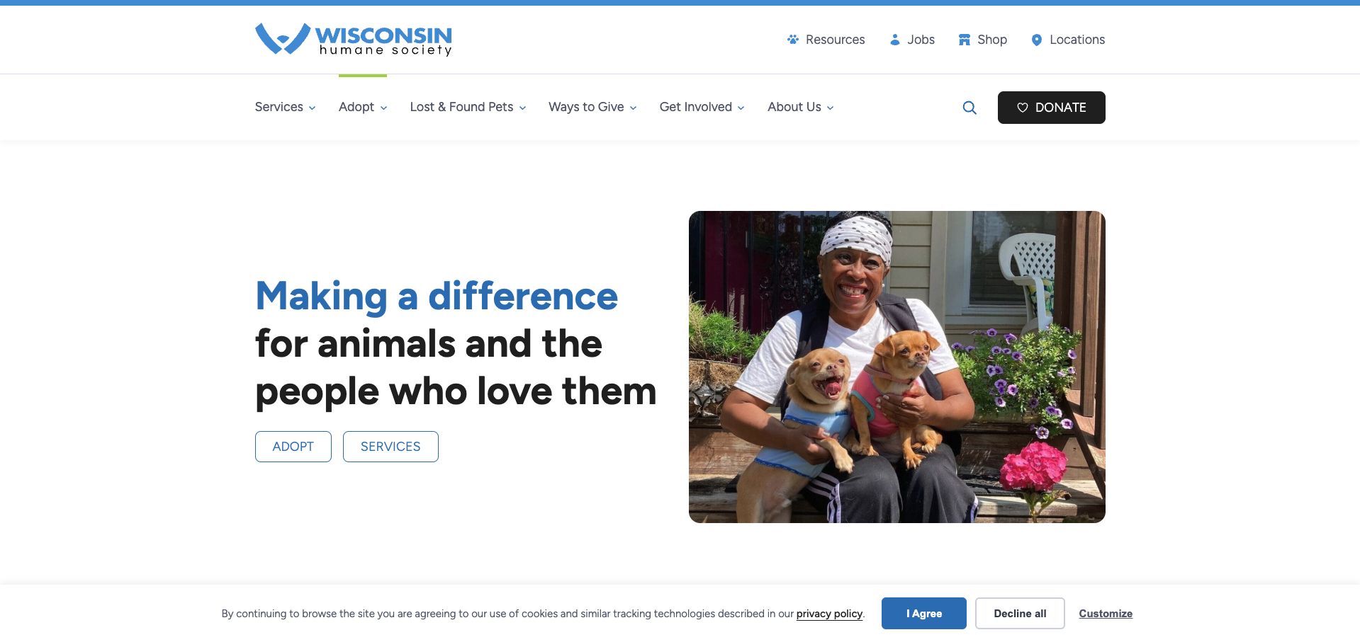
Wisconsin Humane Society uses a restrained split layout with a large mission statement on the left and a warm photograph of a person holding two dogs on the right. Two outlined actions offer adoption and services at the same level, making the site relevant to both prospective adopters and current pet owners. The white header divides utility links from the main navigation, with locations and resources easy to identify. The donation button is visually distinct without dominating the introductory panel. This is a useful example of a calm homepage that communicates the relationship between people and animals while maintaining a clear set of service routes.
What you can learn
Offer parallel actions when visitors have genuinely different goals. Adoption and services deserve separate destinations, and a balanced introduction can make both visible without forcing every visitor through a single campaign or fundraising pathway.
Pros
Adopt and Services are equally prominent in the opening panel.
Locations and Resources are available in the utility navigation.
Cons & considerations
The broad mission statement does not identify a specific local service immediately.
The cookie notice competes with the lower edge of the first viewport.
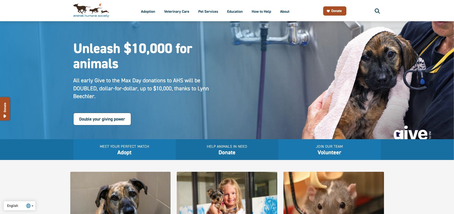
Animal Humane Society opens with a donation campaign over a photograph of a puppy receiving care. The message is placed on a quieter blue portion of the image, giving the text a readable area while leaving the animal visible. Immediately below, a three-part strip points to adoption, donations and volunteering. That strip is the most useful structural feature: it restores the full range of visitor tasks after a campaign-led introduction. The header also separates veterinary care, pet services and education. The page therefore makes room for an immediate appeal without treating every visitor as a prospective donor or hiding the service offer behind it.
What you can learn
Follow a campaign hero with a short set of lasting actions. The campaign can explain today's priority, while a consistent adoption, giving and volunteering strip helps visitors who came for a different reason continue immediately.
Pros
The three-part action strip broadens the options beneath the donation appeal.
Text occupies a visually quieter area of the hero photograph.
Cons & considerations
Several donation controls can compete for attention in the same viewport.
Campaign figures and deadlines require maintenance when the appeal ends.
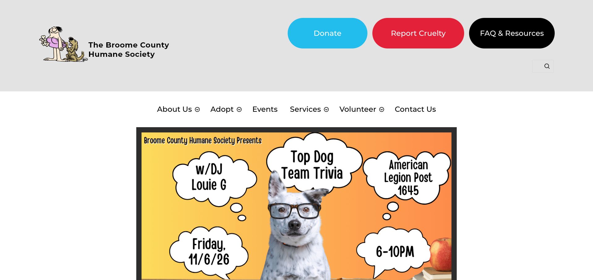
Broome County Humane Society places large colored controls for giving, reporting cruelty and finding resources above its main navigation. Those unusually prominent utility actions make the page's community role clear before the visitor reaches an animal listing. The opening content is an event poster with a playful dog photograph and speech-bubble lettering, giving the site a local, volunteer-driven character. The separate white navigation row offers adoption, services and volunteering without trying to fit every task into the artwork. This is a useful example of a site that prioritizes locally meaningful information, although the event-led opening also makes editorial maintenance especially visible.
What you can learn
Keep important service actions outside campaign graphics. Posters can convey a local event's personality, but reporting a concern, finding resources and beginning adoption should remain ordinary links that do not depend on reading an image.
Pros
Report Cruelty is highly visible alongside donation and resource actions.
The main navigation remains separate from the large event artwork.
Cons & considerations
The captured opening features an event date that has already passed.
Information embedded in a poster needs an equivalent accessible text description.
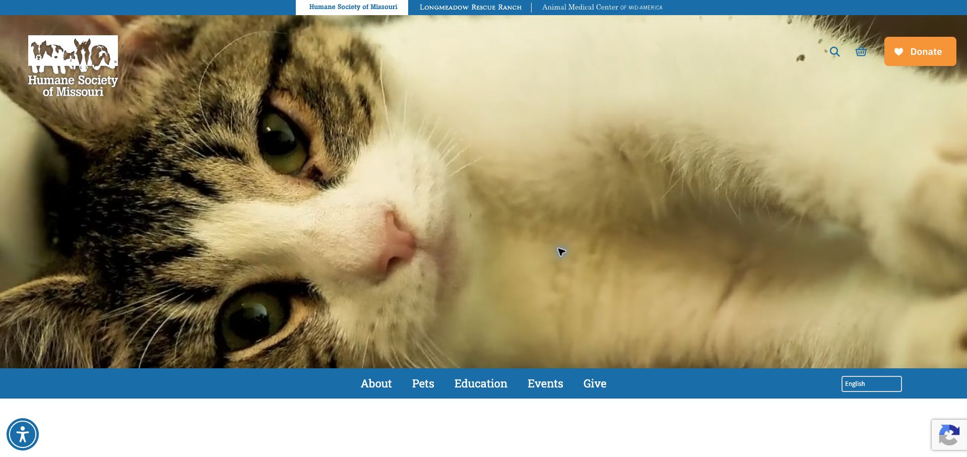
Humane Society of Missouri gives much of the opening viewport to a close animal photograph, with the organization mark and donation action overlaid near the top. A narrow upper strip links to its related rescue-ranch and medical-center sites, acknowledging that the organization offers more than one kind of animal care. Navigation sits along the lower edge of the hero, creating a distinctive frame around the photograph. Below it, individual adoption cards include names, animal types and ages. The contrast between an emotional opening and specific profiles is useful, though it relies on the large media region loading reliably and on visitors noticing the lower navigation.
What you can learn
Pair expressive animal imagery with concrete profile information. The photograph can establish an emotional connection, but the next section should help visitors compare real adoption options and understand how to proceed without relying on the image alone.
Pros
Related organizational services are separated in a narrow top strip.
Adoption profiles provide names, types and ages beneath the opening image.
Cons & considerations
The large hero delays access to adoptable-animal details in the first viewport.
Navigation over media needs reliable contrast and a robust loading fallback.
Kegan is a freelance web designer and developer with 15+ years of experience helping businesses turn complicated website requirements into clear, maintainable digital experiences. He works directly with clients from planning and design through development, launch, and ongoing support.
For animal shelter website design, his development approach focuses on clear adoption and foster pathways, maintained service and location details, animal photography, volunteer information, and distinct donation journeys. The scope can be a targeted improvement or a complete custom build, with responsive layouts, thoughtful content structure, and integrations chosen around the people using and maintaining the site.
Show 3 other animal shelter website designersHide other animal shelter website designers
Plan for people arriving with very different needs
Map the real service boundaries before designing the homepage
Begin with the staff who answer public questions. List the services the organization provides, the geographic area it serves and the requests it must refer elsewhere. Adoption, fostering, veterinary appointments, surrender inquiries, lost pets and emergency concerns can follow entirely different processes. Use only the categories that reflect the organization’s actual work, and give excluded or uncertain requests an appropriate maintained contact route.
Make the building information part of that service map. A temporary relocation, appointment-only arrangement, off-site event or separate adoption facility can matter more to a visitor than a new campaign image. Put the relevant notice close to the action it affects, and give it an owner and review date. Do not leave a closed-location announcement competing indefinitely with normal opening details.
Write literal navigation labels and test them with people unfamiliar with the organization. The aim is to help someone identify the right next step quickly. The website should not attempt to diagnose an animal’s condition or give individualized emergency advice; its role is to make the organization’s actual routes and limits clear.
Treat animal profiles as maintained records
Agree on the source of truth for each animal profile before choosing a gallery design. Identify who updates availability, photographs, descriptions and the next step. If a third-party listing system is used, explain the relationship and plan a useful fallback when an embed fails. Avoid maintaining two conflicting copies of a profile simply because one fits the website template better.
Make the information hierarchy consistent while allowing appropriate individual detail. A recognizable photograph, name and relevant characteristics can support browsing, but staff should decide which statements belong on a public profile and how qualifications are expressed. Do not translate a short description into a guarantee about behavior, health or suitability. Keep actual discussions and assessments within the organization’s established process.
Provide readable text alternatives and avoid putting essential facts only inside image graphics. Consider how a profile works on a small screen and with a keyboard. If a listing disappears because its status changes, retain a useful path back to current animals rather than leaving a broken link or implying that an application is still open.
Design responsible support and inquiry journeys
Separate the first public inquiry from later detailed intake or application stages. Ask only for the context needed to route the request, and explain what happens after submission. A confirmation should accurately describe receipt of a message; it should not imply an approved adoption, a reserved animal, an appointment or an accepted surrender unless that is truly what the system confirms.
For donations, distinguish a general contribution from a named campaign or recurring arrangement using the organization’s approved language. Explain the purpose and destination without inventing impact figures. Keep payment handling within the established donation provider and make ordinary contact information available when someone has a question. Do not make social-media messaging the only route to the team.
Review the complete first visit with consent notices, popups and urgent banners visible. Test finding a location, checking an animal’s status, identifying a foster route, understanding a donation purpose and recovering from a failed form. Use fictional information for private tests and avoid sending unnecessary messages to staff. Assign responsibility for campaign expiry, listing updates and links to external systems.
The editing job behind the design
Connect maintained listings to a manageable public website
Choose a publishing system the staff can use to update service boundaries, locations, events and practical notices. A small organization does not need a custom animal database simply to present a useful homepage.
If animal listings, applications or donations use specialist providers, preserve their actual responsibilities and explain the handoff. An embedded gallery should have a readable alternative when it is unavailable.
Keep applications, donor details and other private records outside the public content library. Visible technology evidence describes the reviewed public page; it does not establish the organization’s internal case-management or animal-care systems.
Our WordPress website examples offer a separate look at publishing approaches. A visible platform label is evidence for that named page, not a guarantee that the same system will suit your requirements.
Before the public launch
Animal shelter website brief checklist
Name the organization and its actual service territory.
Separate adoption, fostering, volunteering and donation routes.
Publish only services the organization really provides.
Keep temporary and permanent location details consistent.
Identify who updates animal availability and profile information.
Avoid guarantees about an animal’s future health, behavior or suitability.
Explain what each inquiry or application stage confirms.
Provide useful fallback links for external listing and donation systems.
Use permitted animal, staff and facility photographs.
Keep sensitive application and donor data private.
Test mobile navigation, keyboard access, notices and errors.
Assign review dates to campaigns, urgent announcements and service information.
These checks are a project checklist, not a performance, legal, security, or accessibility certification. Test real journeys with the people responsible for the website before making claims about the result.
Sources & editorial method
How this collection was selected and reviewed
All 13 source websites were directly inspected and captured for this collection. Reviews address public information structure, imagery, navigation and next steps. They do not assess animal care, veterinary services, adoption decisions, charity effectiveness or individual outcomes. Broad public technology-audit attempts are recorded separately, with unavailable checks kept distinct from positive observations.
Each example links to its actual source page. Screenshots are direct browser captures with their own capture dates; moving imagery, announcements and live designs can change. The notes describe observable design choices and conditional tradeoffs, not measured traffic, conversion results, service quality, or accessibility conformance.
Technology labels use public page metadata, asset evidence, or explicitly cited platform documentation. Platform documentation is not a complete current deployment audit. A component reference may be legacy or unused; it is not a complete backend inventory. Unknown stacks are omitted. These sites are editorial examples, not our client portfolio.
Written, Edited and Curated are separate editorial records, not timestamps advanced by a rebuild. Website designs and imagery belong to their owners. See our editorial standards or suggest a correction.
Questions worth asking
Animal Shelter website design questions
Should adopting and donating share one primary button?
Usually they represent different intentions and should have distinct labels. The organization can emphasize a current priority while keeping the other important routes easy to identify.
Does an animal listing promise current availability?
The site should explain its actual update process and next step. A public profile alone should not be presented as a reservation or guarantee that an animal will remain available.
Should a shelter build its own listing database?
Only when its actual requirements and maintenance capacity justify it. Connecting an established listing source to clear public content may be more manageable than maintaining duplicate records.
What should a first inquiry collect?
Only the information necessary to route the request and explain the next step. More detailed applications can follow the organization’s established process and private handling requirements.
Do these examples establish care quality?
No. They are observations about website design and communication, not independent assessments of animal welfare, veterinary services or adoption outcomes.
Make the right next step easy to find, keep the practical details current, and let genuine animal photography support clear information rather than replace it.