Best Archery Club Websites of 2026 (19 Real-World Examples)
Archery club websites that help newcomers understand their first session and give members practical information for returning to the range.
Explore 19 real archery club websites for ideas about beginner pathways, membership, shooting calendars and community identity.
An archery club website has to welcome people who may know very little about the sport while remaining useful to experienced members. A striking range photograph can establish the atmosphere, but a newcomer still needs to understand who can attend, whether equipment is supplied and how to find a suitable first session. Returning members usually need a different shortcut: the next shoot, a calendar update or a clear explanation of an event.
This collection looks at public club websites and dedicated club-information pages. It includes volunteer organizations and coaching businesses with ongoing club activity. The reviews concern visible design and communication, not coaching quality, sporting performance or the suitability of a particular club. Club arrangements can change; use the source websites for current participation details.
Before the examples
What makes good archery club website design in 2026?
Make the beginner route unmistakable
Separate a first-time trial, a structured course and ordinary membership. Explain prerequisites and equipment arrangements beside the appropriate next step rather than assuming that visitors understand club terminology.
Keep the next visit easy to plan
Publish current locations, session dates, eligibility and contact arrangements. Distinguish indoor and outdoor venues, seasonal schedules and member-only events wherever those differences affect attendance.
Show the people and place
Use genuine range and member photography with clear descriptions. Support the welcoming image with concrete information about participation, volunteer roles and the club community.
The collection · 19 examples
19 archery club websites worth studying
Compare 19 distinct public club properties. Tauranga Archers is the researched Editors Choice for pairing an authentic range introduction with a clear first-session action and well-separated participation pathways.
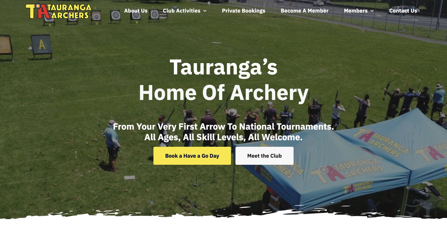
Tauranga Archers pairs an overhead photograph of its range with a concise local headline and two distinct actions. The yellow first-session button stands out from the quieter club-information link, making the next step understandable before a visitor studies the full program. Lower sections distinguish trial sessions, a beginner course, school activity, private bookings and a younger-child pathway. Short supporting explanations connect these choices with the club community and competition opportunities. This is the strongest selection here for turning a welcoming sporting introduction into an organized set of practical routes. The expansive hero still delays detailed dates, and some image descriptions retain unrelated theme wording. Those limitations are worth correcting without losing the clear action hierarchy.
What you can learn
Make the first suitable session the primary action, then explain how other pathways differ. Use authentic range imagery, and maintain the less visible image descriptions with the same care as the headline and buttons.
Pros
The primary beginner action is immediately distinguishable.
Participation pathways receive specific labels and explanations.
Cons & considerations
Session dates require a further step.
Some image descriptions use unrelated template wording.
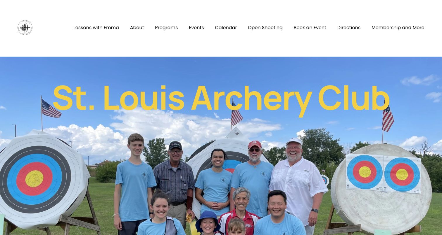
St. Louis Archery Club leads with a large group photograph rather than isolated equipment or an abstract sporting slogan. The yellow club name, outdoor targets and recognizable people make the opening feel connected to a real range. Navigation names practical tasks including lessons, open shooting, events and directions. Farther down, a short quiz invitation acknowledges that a newcomer may not yet know which program fits. Coaching, beginner options and membership then appear as separate choices. The useful pattern is the connection between a welcoming community image and a guided route into the offer. The opening photograph occupies most of the viewport, however, and a long navigation competes with the very simple first impression.
What you can learn
Use actual club people to establish the atmosphere, then help visitors identify their experience level. Keep the beginner route visible without making everyone complete a quiz before reaching dates, location or membership information.
Pros
The group photograph gives the club a specific identity.
Practical navigation covers both visitors and existing members.
Cons & considerations
The tall hero postpones the first actionable details.
Several navigation choices require careful scanning.
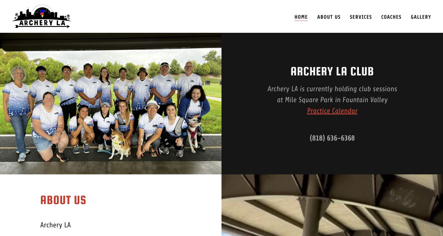
Archery LA divides its opening into a team photograph and a dark information panel. The panel names the current practice location, links the calendar and displays a telephone number, giving the welcoming image a practical counterpart. Red accents and condensed headings continue into the service sections below. Those sections distinguish athlete development, private instruction and getting started, while the text explains both junior and adult programs. This is useful because the site does not make a visitor infer where club sessions happen from the business address alone. The first-screen treatment is direct, although the calendar label and italic copy have less visual weight than the club heading. Appointment information and the contact form sit farther down.
What you can learn
Pair community imagery with the current meeting place and next session route. When coaching and club practice happen in different contexts, explain that distinction before asking a visitor to contact the organization.
Pros
The current practice location is stated in the opening panel.
Club activity and individual instruction receive separate explanations.
Cons & considerations
The calendar could have a stronger action treatment.
The lengthy page separates introductory information from appointment details.
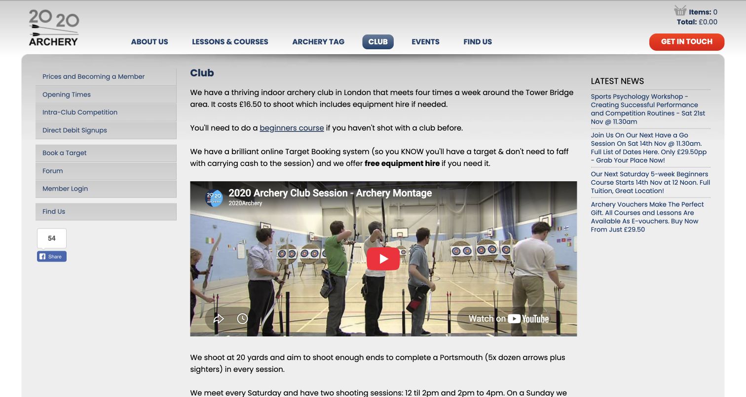
2020 Archery gives its club page a dedicated left navigation for prices, opening times, competition, target booking and member access. The central column explains the indoor setting, equipment arrangements and experience prerequisite before a video preview introduces the range. A news column keeps upcoming courses close to the membership information. This is a useful operational page because it treats booking a target differently from learning the sport for the first time. It also states expectations around helping set up and pack away, making club participation more concrete. The three-column layout carries considerable information, however, and repeated links in the footer add length. The screenshot shows the club detail page rather than the wider business homepage.
What you can learn
Give recurring member actions their own predictable navigation. Explain prerequisites and shared responsibilities in plain language near the session details, while preserving an obvious route for someone who needs a beginner course first.
Pros
Member tasks are grouped in a dedicated sidebar.
Equipment and participation expectations are explained directly.
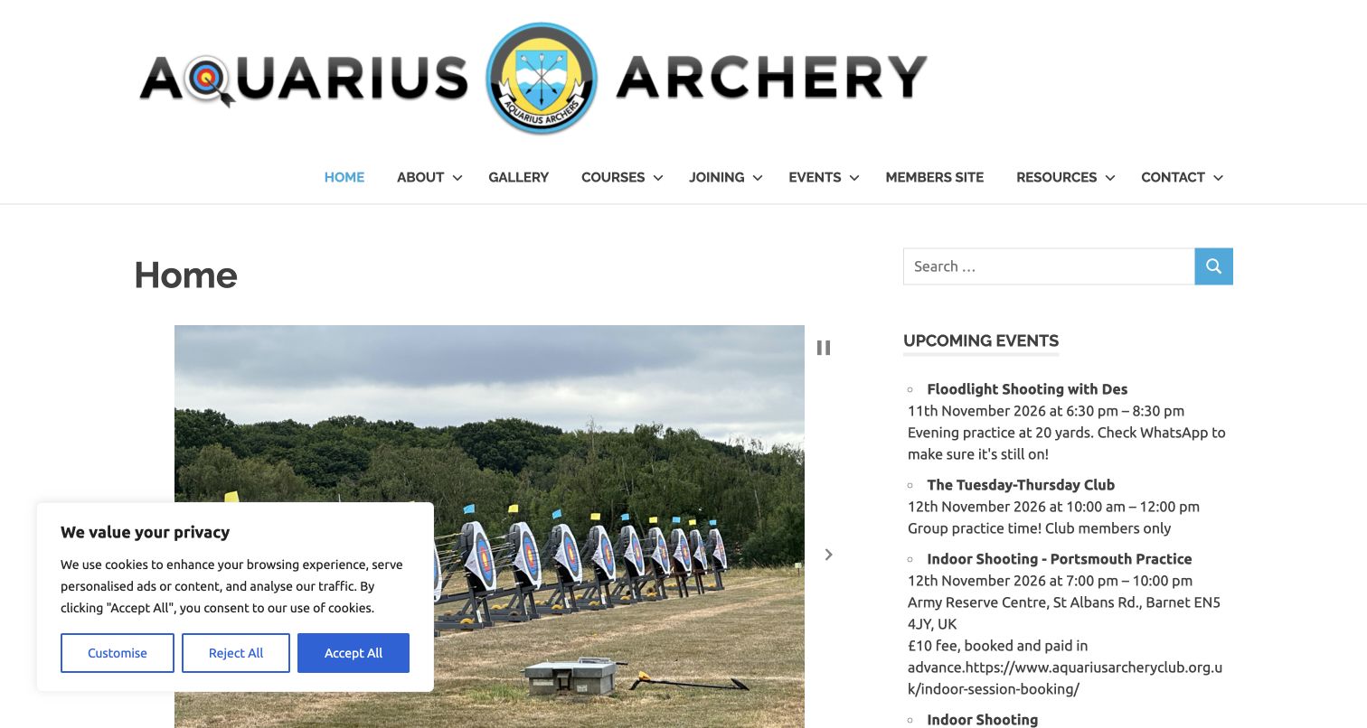
Aquarius Archery Club puts its large identity above a broad menu and a two-column homepage. Range photography fills the main column while upcoming events occupy the sidebar. The event list includes dates, times and short practical notes, so the page communicates an active club rather than only a general introduction. Lower content explains the setting, bow styles, beginner courses and community activities. This makes the site useful for studying a club homepage that serves established members as well as prospective ones. The captured first visit includes a cookie notice over part of the photograph. A generic Home heading and extensive navigation also use space that could make the newcomer pathway more immediate.
What you can learn
Keep a maintained calendar close to the club introduction, but label the first steps for non-members separately. Event detail should support orientation without forcing a new visitor to distinguish member-only sessions unaided.
Pros
Dated event details make ongoing club activity visible.
The site explains both shooting and social participation.
Cons & considerations
The visible privacy notice obscures part of the opening image.
The newcomer route competes with a broad navigation.
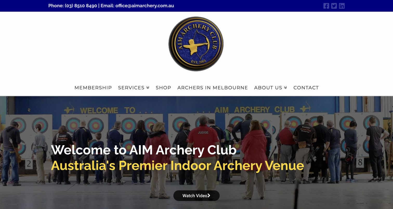
AIM Archery Club uses a blue-and-gold identity and a wide range photograph to establish its indoor focus. The opening heading emphasizes the venue, while navigation separates membership, services, supplies and club background. Below the hero, repeated service panels explain coaching, introductory sessions, events and range access. The page also gives specific range context and displays membership information within the broader offer. This is useful for organizations that operate both a regular club and commercial sessions. The large emblem and navigation take substantial vertical space before the hero, and the lower page includes older news entries. Those choices illustrate the need to distinguish durable facility information from material that requires more frequent maintenance.
What you can learn
Explain what the facility makes possible, then separate membership from lessons and group bookings. Maintain a clear hierarchy between current operational information and archived news so the range identity remains convincing and useful.
Pros
The indoor setting is unmistakable in the opening image.
Different service types have their own explanations.
Cons & considerations
A tall identity area delays the main content.
Older news competes with information visitors may expect to be current.
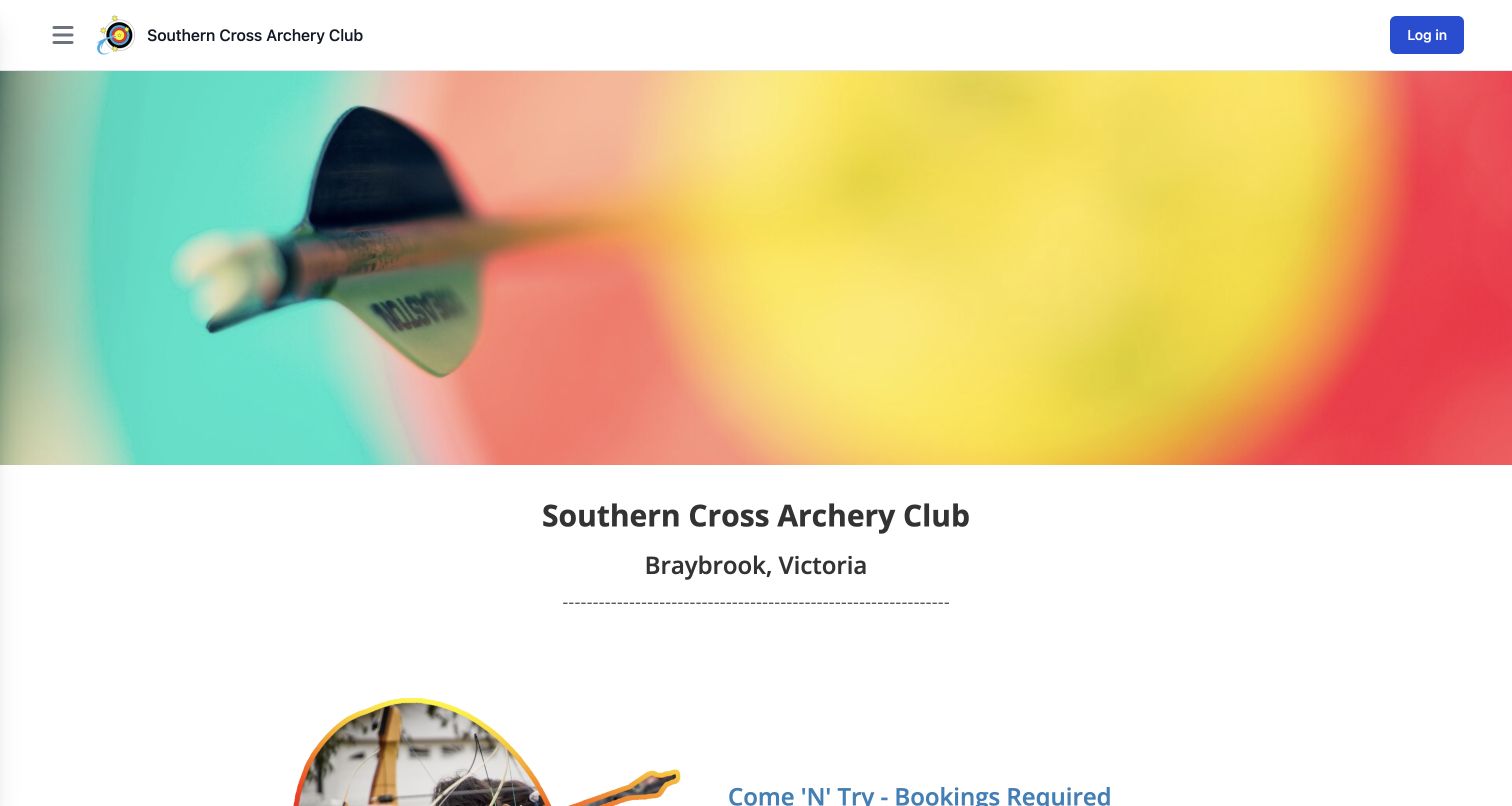
Southern Cross Archery Club opens with a close photograph of an arrow, followed by the club name and its Braybrook location. The page then explains the Sunday trial-session route in conversational language, including that equipment is supplied. Membership and the club league follow as separate stages, with upcoming events presented farther down. The design is useful because it gives a person with no archery vocabulary a recognizable starting point. The compact header also leaves room for the content rather than exposing every administrative option at once. Long runs of whitespace, decorative separators and lengthy event descriptions make the page less concise, while booking links use an additional club-management address that visitors must recognize as part of the same organization.
What you can learn
Describe the first visit before introducing membership administration. Keep trial sessions, joining and member competition in separate sections, and make transitions into a booking platform feel continuous through consistent names and labels.
Pros
The introduction explains the equipment arrangement clearly.
Trial sessions and membership are distinct next steps.
Cons & considerations
Large gaps and separators lengthen the page.
The booking-platform transition needs clear contextual labeling.
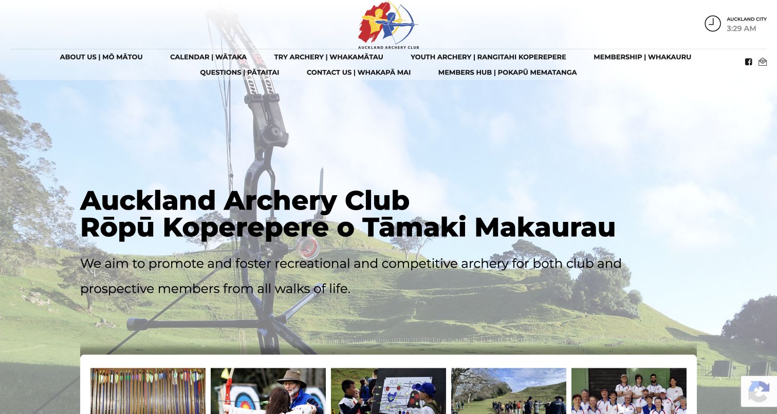
Auckland Archery Club places its English and Māori names over a photograph of the outdoor setting. Bilingual navigation continues that identity into practical destinations such as the calendar, youth archery, membership and questions. Below the opening, image-led cards separate the main reasons to visit, including trying archery and arranging a group event. The club description adds indoor and outdoor range context rather than relying only on broad sporting language. This creates a useful model for presenting several participation routes within one coherent organization. The navigation wraps into two lines in the captured viewport, and repeated Learn More labels require their surrounding headings. A lower social-feed error also demonstrates why external content needs a useful fallback.
What you can learn
Carry a bilingual identity through navigation as well as the headline. Give each audience a concrete route, and check that long labels and external feeds remain understandable when space or integrations are limited.
Pros
The language treatment is consistent across identity and navigation.
Audience-specific cards separate several participation goals.
Cons & considerations
Long navigation labels create a crowded header.
The observed external feed displays an error lower on the page.
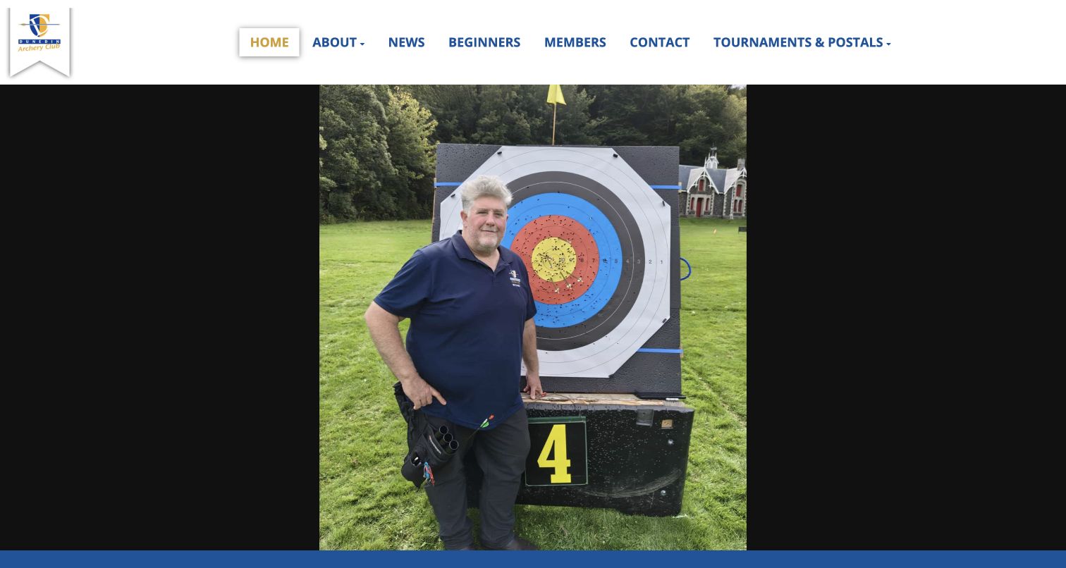
Dunedin Archery Club uses a restrained blue-and-gold identity with a short menu for beginners, members, news and contact information. The captured opening photograph presents a real archer and target, giving the site a human subject rather than a generic sports backdrop. Below it, a brief introduction explains the club setting and the range of bow styles represented. The page then points toward news, a newsletter and social activity. This is useful for a club whose website mainly helps people find the right information rather than complete a complex online purchase. The large portrait dominates the first screen, though, and the main explanation sits below it. The observed news area also provides little immediate detail compared with the prominent image.
What you can learn
Use member photographs to establish personality, but bring a short explanation and beginner action into the same opening view. Keep news useful even when there are no recent items available to populate the section.
Pros
The short menu separates beginner and member needs.
The member photograph gives the page a specific character.
Cons & considerations
The tall image pushes introductory information below the fold.
The news area offers limited immediate context in the observed page.
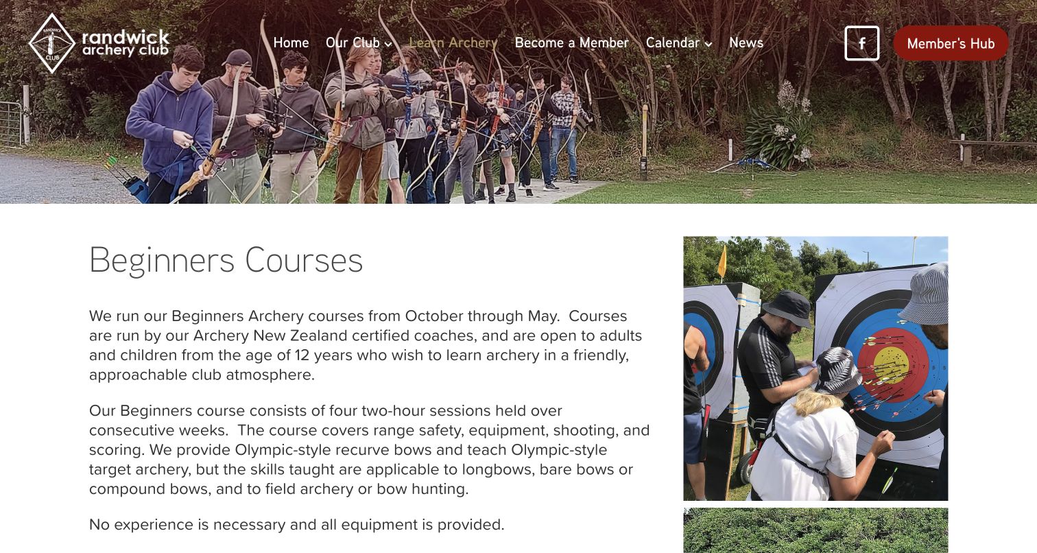
Randwick Archery Club gives its beginner-course page a clear heading, generous text column and supporting photographs of instruction. The copy answers practical questions in sequence: when courses run, who can attend, how sessions are organized and what equipment is provided. It then explains the route beyond the course, how availability is announced and where to check upcoming dates. This is a useful example of reducing uncertainty before directing a visitor toward booking. The navigation keeps the member hub separate from the learning pathway. The page is text-heavy, however, and key facts such as duration, age and equipment are embedded in paragraphs. A compact summary could make comparison quicker without removing the reassuring detail.
What you can learn
Explain eligibility, equipment, session structure and the next stage together. Preserve the fuller description, but surface its essential facts in a scan-friendly summary near the action that checks current availability.
Pros
Course structure and supplied equipment are explicitly explained.
Instruction photographs support the learning context.
Cons & considerations
Important facts are spread across several paragraphs.
Availability is separated from the introductory explanation.
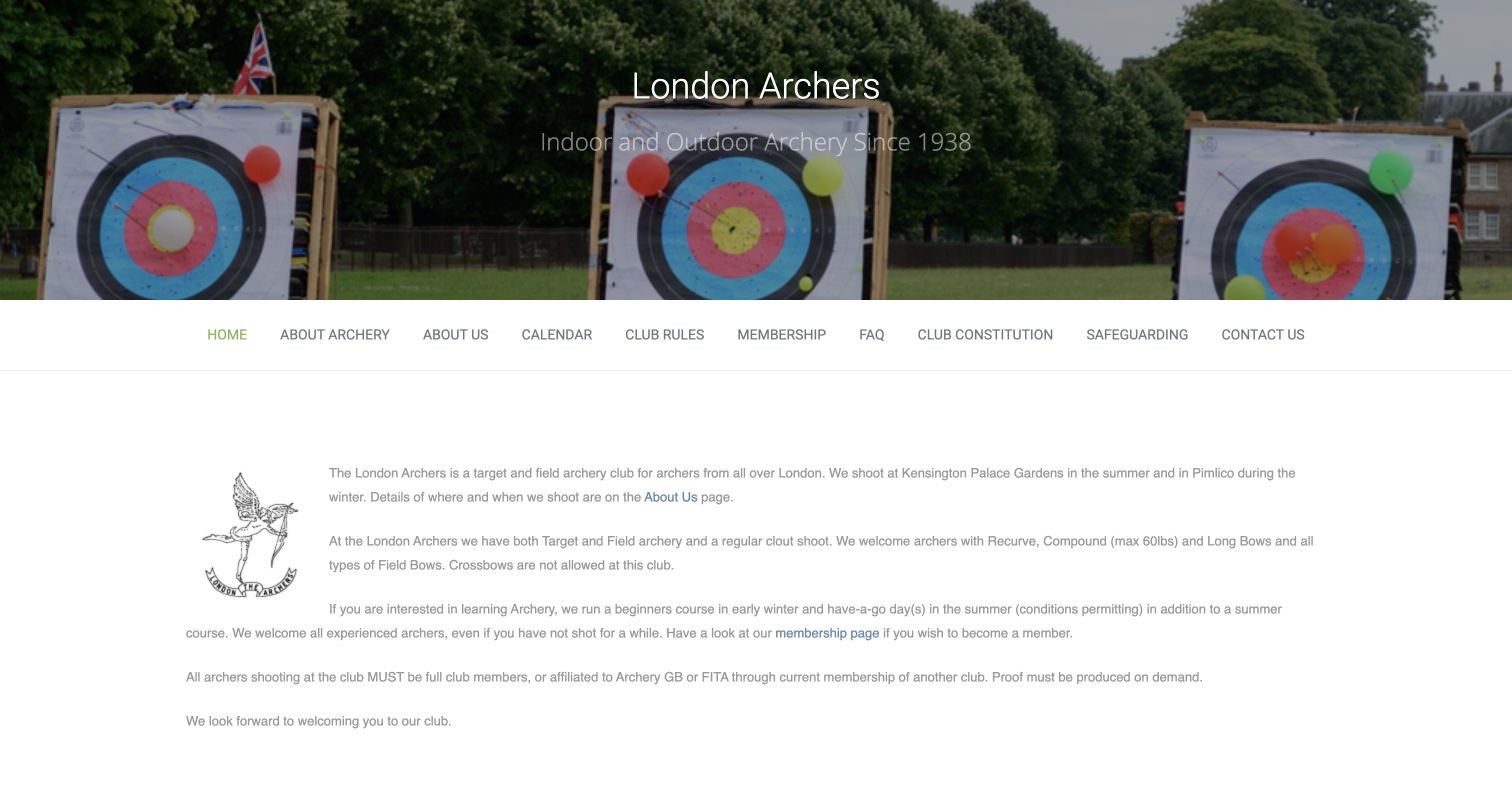
London Archers uses a target photograph as a wide header, followed by a single navigation row and a compact introduction. The text immediately distinguishes summer and winter shooting locations, names the types of archery represented and points visitors toward membership. It also states participation requirements instead of leaving an unfamiliar visitor to assume that any session is a public drop-in. The small club emblem beside the copy gives the information a recognizable identity without another large image. This is useful for a club that needs a maintainable website with a limited content set. The body text appears relatively small and pale in the captured view, while the long menu combines introductory and governance material with similar emphasis.
What you can learn
State the club scope and attendance conditions directly. Keep essential newcomer information visually prominent, and give policy documents a clear home without allowing them to overwhelm the main route into participation.
Pros
Seasonal location differences are stated early.
Membership requirements are explained in plain text.
Cons & considerations
Small, low-emphasis text makes the introduction harder to scan.
Governance links compete with immediate visitor tasks.
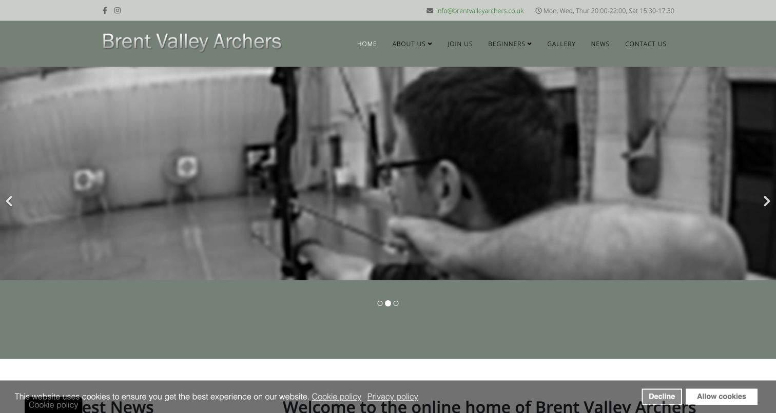
Brent Valley Archers puts session hours in a slim utility strip above its club name and menu. A monochrome range photograph introduces the activity, while the next section gives a prominent notice that visiting archers cannot currently be accommodated. The page then describes the club, explains its volunteer operation and separates beginner courses from joining. This is useful because it communicates a real limitation rather than allowing a welcoming headline to imply unrestricted access. Gallery previews add community context farther down. The observed privacy bar remains visible after the decline action, and the large carousel area postpones the practical notice. Repeated general link labels also make some destinations less specific than they could be.
What you can learn
Publish access limitations as clearly as invitations to join. Put current restrictions near the relevant action, maintain contact-response expectations, and ensure privacy controls leave visitors with a predictable route back to the content.
Pros
Session hours have a consistent utility position.
The visitor restriction is clearly acknowledged in page content.
Cons & considerations
The observed privacy notice persists after declining.
The large carousel delays the most important availability message.
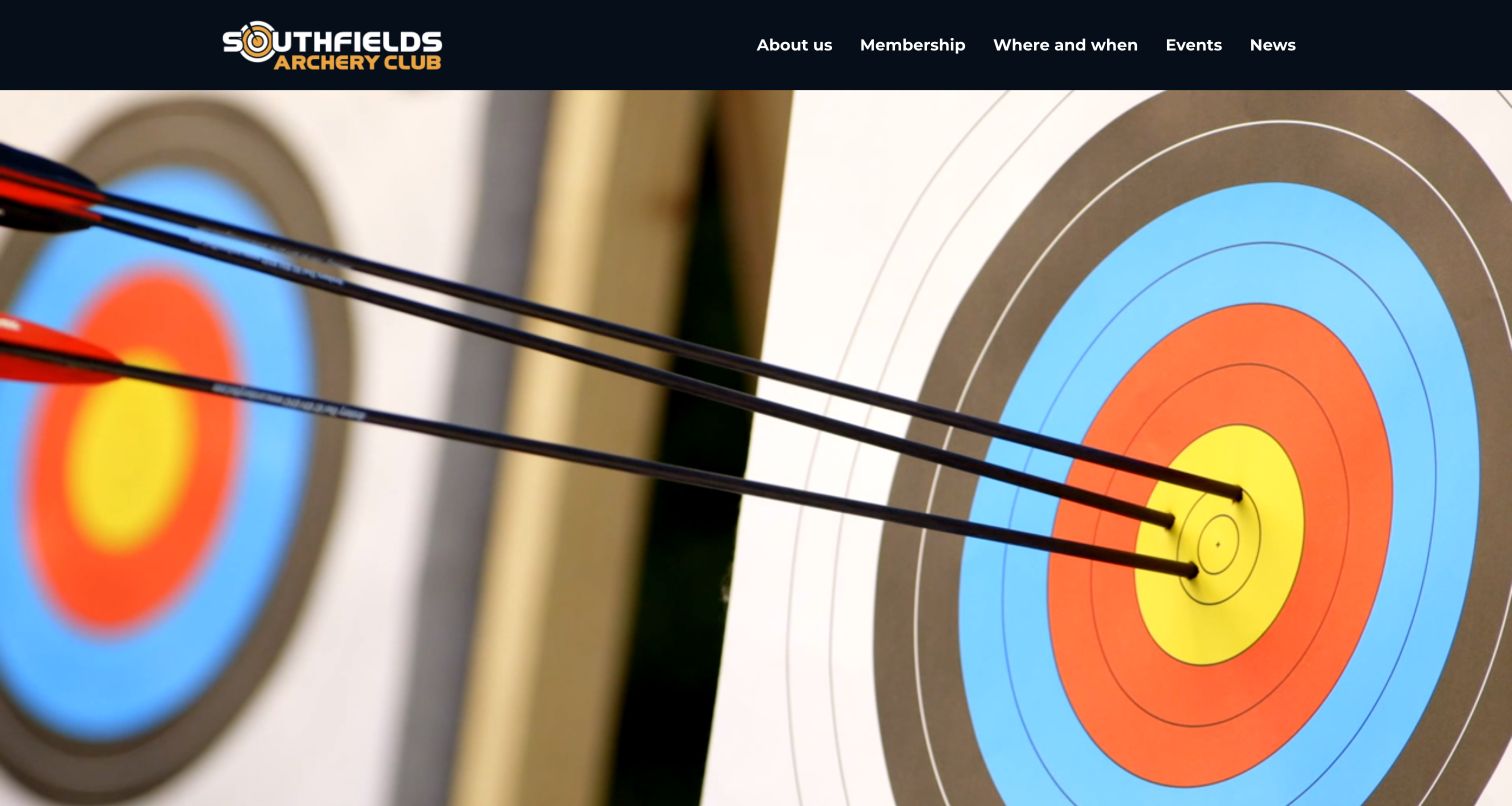
Southfields Archery Club uses a dark header, a compact logo and a large target photograph to create a simple sporting identity. Its navigation names membership, shooting locations, events and news without a sprawling service menu. Below the opening, a detailed Sunday-session section explains the member-only booking arrangement and distinguishes it from public sessions run by the venue. Further sections summarize the club, seasonal locations and classes before dated news cards appear. The useful pattern is the explicit distinction between a club session and a separate public offer. The first viewport is almost entirely photographic, however, and fundraising content precedes some of the practical explanation. The booking destination also moves into a shared document rather than a conventional booking page.
What you can learn
Differentiate member sessions from public classes before presenting booking links. Keep the next visit easy to plan, and explain any transition into an external scheduling tool so visitors understand its purpose and scope.
Pros
Member and public-session arrangements are explicitly distinguished.
The navigation uses a short set of practical labels.
Cons & considerations
The hero postpones useful session information.
Fundraising and an external document add steps to the main task.
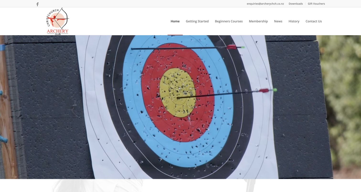
Christchurch Archery Club combines a clean white header with an opening range video frame and a short introduction below. The navigation foregrounds getting started, beginner courses and membership, while the body separates several ways to participate. A returning archer receives a different route from a complete beginner, and adaptive archery has its own explanatory link. That structure is valuable because a broad welcome becomes more useful when visitors can identify a relevant next step. The page also explains the club-run nature of the organization and its regular shooting program. The large moving-image area dominates the first view, though, and several repeated Learn More labels rely on surrounding text to communicate their destinations.
What you can learn
Translate an inclusive welcome into specific, maintained participation routes. Separate beginner, returning and adaptive information, then use descriptive links that remain meaningful when someone scans the page quickly or navigates by link text.
Pros
Different experience levels have distinct routes.
The introduction connects the site with an actual club program.
Cons & considerations
The large video area delays the main explanation.
Repeated generic link labels reduce independent clarity.
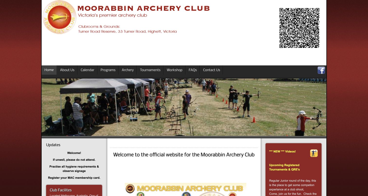
Moorabbin Archery Club uses a deep red frame, a large club header and a range slideshow above a three-column information layout. The center introduces the club and its trial program, while sidebars surface updates, facilities and tournament material. The page includes substantial practical detail, from equipment provision to calendar links and membership administration. This makes it useful as a reference for the breadth of information an established club may need to maintain. It also illustrates the cost of giving many topics similar visual prominence. The large header and QR code occupy much of the opening, and dense sidebars compete with the beginner explanation. Several links depend on surrounding copy rather than a concise action label.
What you can learn
Inventory the information members need, then organize it by visitor task rather than placing every item on the homepage. Keep trial-session details and calendar access visible while moving specialist resources into clearly named sections.
Pros
The page provides concrete facility and program context.
Calendar and membership resources are readily represented.
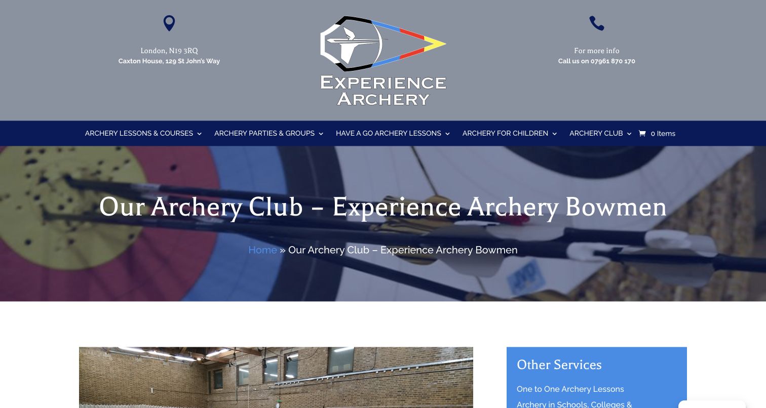
Experience Archery Bowmen gives its club information a dedicated page within a wider lessons-and-events website. A large branded header and breadcrumb establish the context before range imagery and detailed session information. The copy explains eligibility, equipment-related pricing, regular meeting times and the expectation that participants help set up and pack away. It also qualifies the organization’s club status rather than implying an affiliation it does not claim. Directions and progression information continue below. This is useful for explaining how an ongoing community activity fits beside individual lessons and group bookings. The header occupies considerable space, and the lengthy page mixes immediate attendance information with award schemes and other details that require more deliberate reading.
What you can learn
Explain the relationship between coaching services and regular club activity. Put attendance essentials together, preserve exact affiliation qualifications, and separate longer progression resources so they do not bury the information needed for a first visit.
Pros
Attendance and equipment arrangements are explained concretely.
The page explicitly qualifies its organizational status.
Cons & considerations
A tall header delays the club details.
Long progression sections make the page demanding to scan.
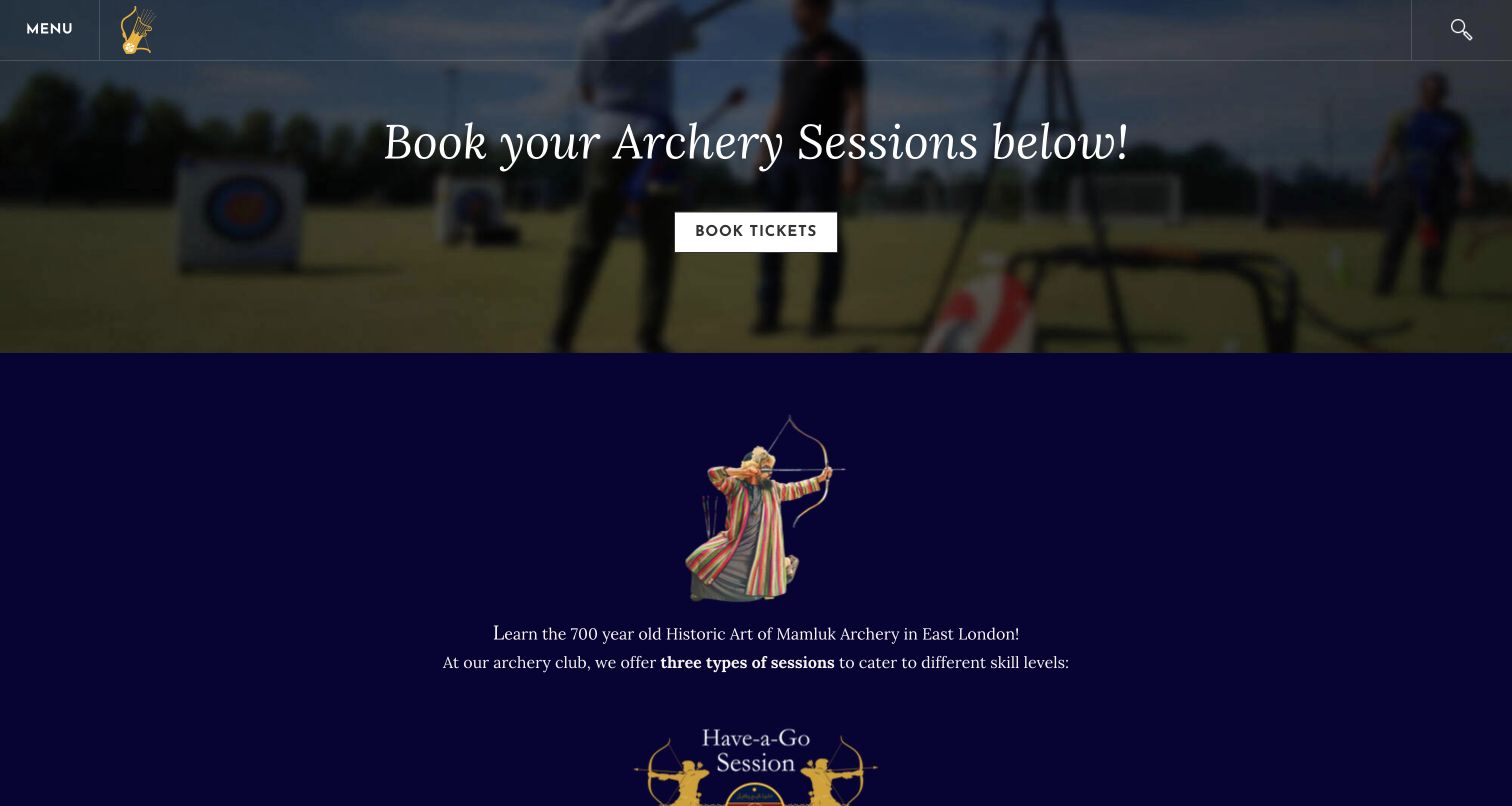
Fatima Elizabeth Archery Club uses a dark blue palette, gold illustration and serif display text to introduce its historic Mamluk focus. The booking page distinguishes a taster session, two course formats and independent shooting, with duration and prerequisite information attached to each. This is a useful specialist approach because the visual identity connects with the particular kind of archery being described. Repeated booking actions provide opportunities to continue after reading the relevant explanation. The opening button appears before those distinctions, however, and several descriptions use broad image labels rather than informative alternatives. Some of the comparison information also appears as images, which makes the surrounding written explanation especially important for visitors who cannot readily inspect them.
What you can learn
Connect a specialist visual identity with clearly differentiated learning stages. Explain prerequisites and duration in ordinary text, and make booking labels specific enough that visitors know which session type they are about to explore.
Pros
The course stages have distinct descriptions and prerequisites.
The visual identity reflects the specialist subject.
Cons & considerations
The first booking action precedes the course comparison.
Generic image labels limit the usefulness of visual information.
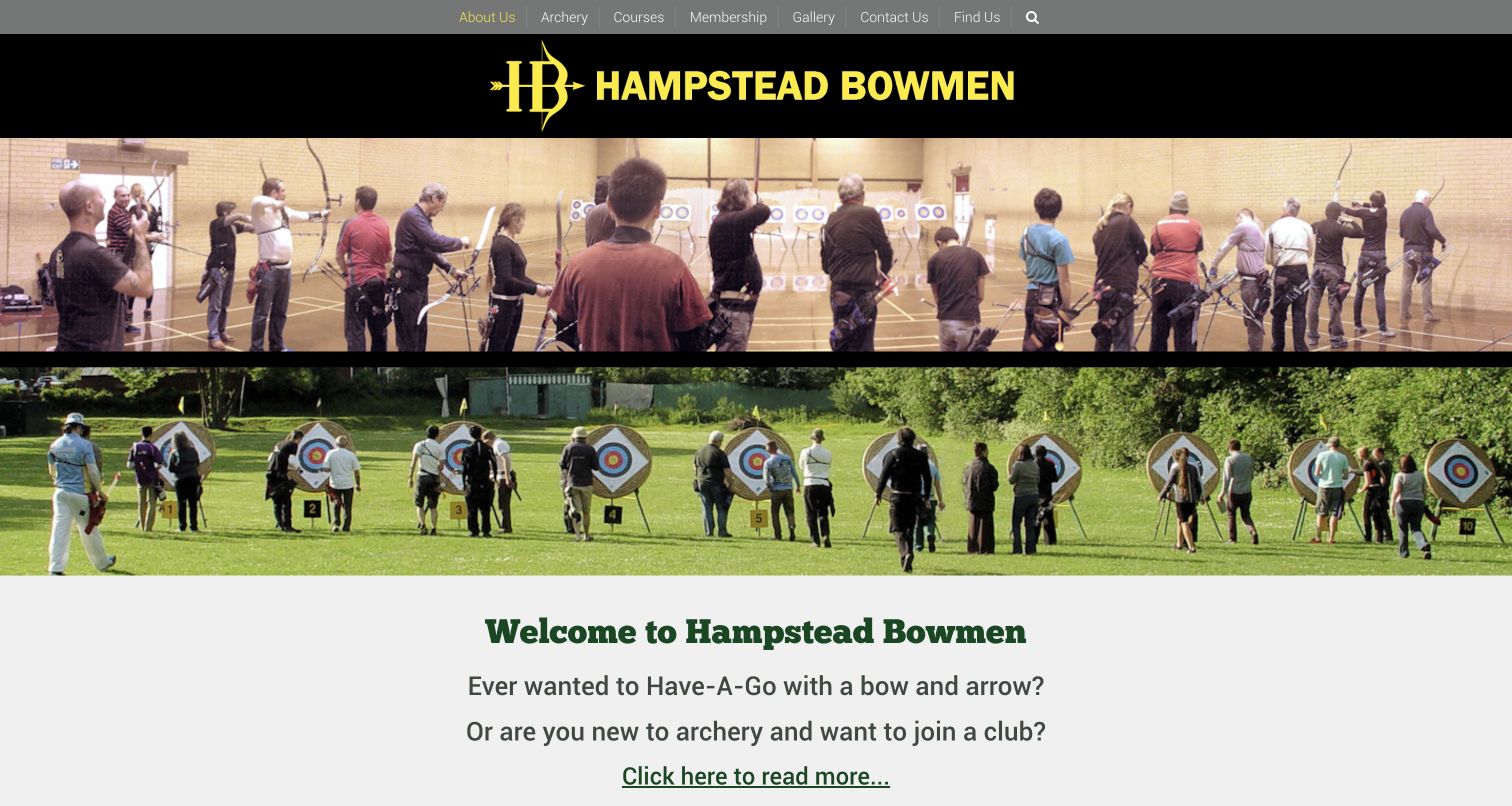
Hampstead Bowmen uses a bold yellow wordmark on black, followed by separate indoor and outdoor range photographs. Together they explain the two settings before the introduction begins. The page then asks direct newcomer questions and links toward courses, while later text explains bow styles, seasonal locations and membership. This is useful because the photography does more than decorate: it makes the physical difference between the club’s shooting environments apparent. The header remains compact, and the content is relatively straightforward. The two photographs still occupy a large portion of the viewport, however, and the main course link uses a general instruction rather than a descriptive destination. Detailed Saturday-session information is embedded in the longer introduction.
What you can learn
Use photographs to explain meaningful differences between venues or seasons. Follow them with named beginner and membership actions, and pull frequently checked session information into a small, clearly labeled block.
Pros
Two range photographs explain the indoor and outdoor offer.
The introduction addresses prospective members directly.
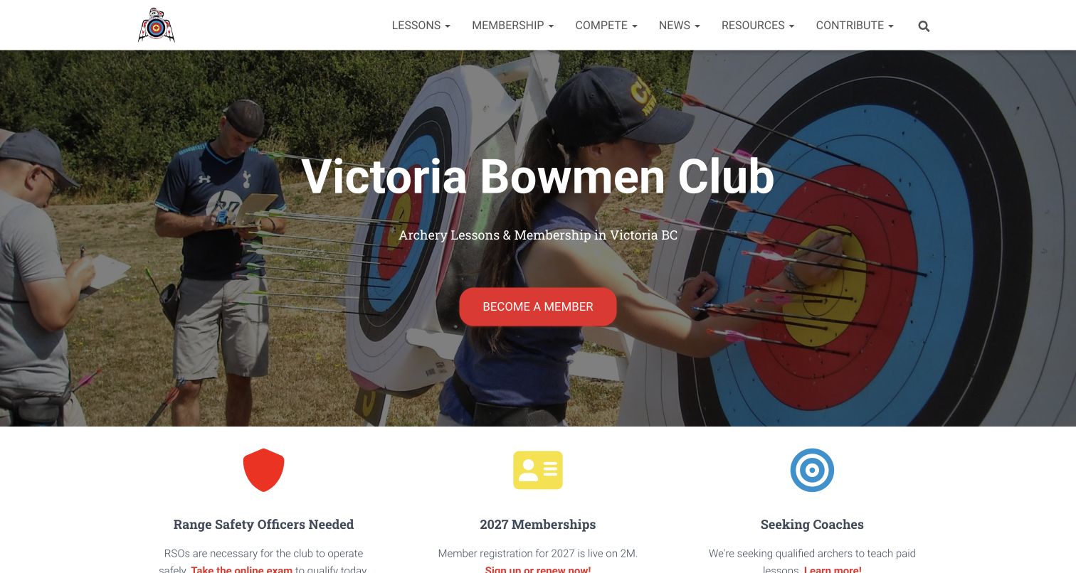
Victoria Bowmen opens with an outdoor range photograph, a concise location-based description and a prominent membership action. The next row presents three current operational needs or opportunities: range safety officers, membership registration and coaching. Below, the introduction gives beginners a route through lessons and explains why equipment purchases should follow informed advice. News and newsletter sections keep the wider club community visible. This is useful for studying a club website that recognizes volunteers and ongoing operations alongside recruitment. The first action emphasizes membership before lessons, so a complete beginner needs to read farther. Multiple update cards and repeated newsletter forms also add complexity to a page that otherwise has a clear, restrained visual structure.
What you can learn
Show how a club operates as well as how people join it. Keep volunteer opportunities concrete, and give beginners an equally visible learning route so the membership action does not imply that prior knowledge is assumed.
Pros
Operational cards make current club needs understandable.
Beginner information connects lessons with sensible equipment planning.
Cons & considerations
The initial membership action may be premature for newcomers.
Repeated newsletter forms add unnecessary page weight.
Kegan is a freelance web designer and developer with 15+ years of experience helping businesses turn complicated website requirements into clear, maintainable digital experiences. He works directly with clients from planning and design through development, launch, and ongoing support.
For archery club website design, his development approach focuses on beginner participation pathways, club calendars, range locations and accessible membership information. The scope can be a targeted improvement or a complete custom build, with responsive layouts, thoughtful content structure, and integrations chosen around the people using and maintaining the site.
Show 3 other archery club website designersHide other archery club website designers
Plan around the first visit and the next club session
Map the journey from curiosity to regular participation
Start by listing the ways someone can join in. A one-off trial, a beginner course, a returning-archer assessment and full membership may each have different conditions. Use the club’s actual arrangements rather than borrowing another organization’s vocabulary. Explain the sequence where one stage is required before another, and make it clear when experienced visitors have a separate route.
Give each pathway a short description of who it is for, what happens and what the visitor needs to bring. State age requirements and equipment provision where the club has confirmed them. Put current availability behind a specific action such as viewing beginner courses. A general contact form can remain available, but it should not be the only way to understand the offer.
Keep membership administration separate from orientation. New visitors should be able to read the essential information without creating an account. When an external platform handles bookings or membership, explain the transition and preserve the same club name, session terminology and location information. Make sold-out or unavailable sessions understandable without implying that every pathway is closed.
Treat the calendar and locations as maintained content
A club may use several ranges, change its schedule seasonally or share a venue with a public activity provider. Describe these relationships directly. Give each location an address, arrival information and a named set of sessions. Avoid making a visitor infer the correct venue from a photograph or a general business address in the footer.
Decide who maintains the calendar and how changes reach the website. A date should include enough context to distinguish training, open practice, competition and a social event. Member-only sessions need that qualification before a booking link. If weather or staffing can change an arrangement, explain where the latest update is maintained rather than presenting an old notice as permanent certainty.
Bring the next useful action close to the relevant detail. A returning member checking the next shoot should not need to pass through the full club history. A newcomer should not be sent into an unexplained spreadsheet or member portal. Keep archived results and news available, but give current participation information a clearer visual priority.
Build a welcoming identity that remains easy to use
Photographs of actual club activity can communicate the range setting and community more precisely than generic targets alone. Choose images that explain something useful: indoor versus outdoor space, a beginner lesson or the atmosphere at a club shoot. Record appropriate image permissions and provide descriptions that match what is actually shown. Unrelated theme labels undermine otherwise thoughtful presentation.
Balance the imagery with a short explanation and an immediate next step. Large heroes, slideshows and videos can consume the entire opening view. Keep important information available when motion does not load or a visitor prefers to avoid it. Give controls clear names and make text readable over the chosen image rather than relying on decorative effects.
Use a consistent set of labels across the homepage, navigation and booking destination. Review notices, forms and external content for predictable behavior. A volunteer-run club benefits from a structure that people can realistically maintain: a small number of useful, current sections usually serves visitors better than a large collection of stale announcements.
The editing job behind the design
Choose technology around maintainable club information
A club website usually needs dependable editing, a clear calendar and a small set of participation pages before it needs elaborate animation. Choose tools that the people maintaining dates and venue details can use consistently. Keep private member records outside the public content.
If booking or membership lives on another service, document the connection and use consistent session names. A link to a booking platform establishes a visitor destination, not proof that every part of the club website uses that platform.
The example stacks reflect bounded public-source observations on the reviewed pages. Partial, unavailable and robots-excluded results remain limited. They do not justify guesses about private systems, and a successful public observation does not certify the site’s security or accessibility.
Our WordPress website examples offer a separate look at publishing approaches. A visible platform label is evidence for that named page, not a guarantee that the same system will suit your requirements.
Before the public launch
Archery club website planning checklist
Name the club and its actual location clearly.
Separate trial sessions, courses and membership.
Explain experience and age requirements for each pathway.
State equipment arrangements from current club information.
Show the relevant venue beside each session type.
Distinguish seasonal indoor and outdoor schedules.
Label member-only events before their booking links.
Keep calendar ownership and update responsibilities clear.
Provide arrival and contact details without requiring an account.
Use real range and community photography with accurate descriptions.
Keep beginner actions visible beside the introductory content.
Identify transitions into external booking or membership tools.
Make notices and privacy controls predictable.
Archive outdated announcements without losing useful history.
These checks are a project checklist, not a performance, legal, security, or accessibility certification. Test real journeys with the people responsible for the website before making claims about the result.
Sources & editorial method
How this collection was selected and reviewed
We reviewed these public club pages and captured their actual opening desktop views on November 11, 2026. The collection includes club homepages and selected club or course detail pages; each example names its source. Reviews compare visible communication, navigation and participation information, with strengths and limitations. Screenshots record the observed state, including notices where visible. Tauranga Archers was selected after comparing the collection for its clear first-session route and organized participation choices. The selection concerns website design, not coaching quality or sporting results. Public technology observations are bounded and retain any access or completeness limitations.
Each example links to its actual source page. Screenshots are direct browser captures with their own capture dates; moving imagery, announcements and live designs can change. The notes describe observable design choices and conditional tradeoffs, not measured traffic, conversion results, service quality, or accessibility conformance.
Technology labels use public page metadata, asset evidence, or explicitly cited platform documentation. Platform documentation is not a complete current deployment audit. A component reference may be legacy or unused; it is not a complete backend inventory. Unknown stacks are omitted. These sites are editorial examples, not our client portfolio.
Written, Edited and Curated are separate editorial records, not timestamps advanced by a rebuild. Website designs and imagery belong to their owners. See our editorial standards or suggest a correction.
Questions worth asking
Archery Club website design questions
What should an archery club homepage explain first?
Identify the club, its location and the appropriate first step for a newcomer. Keep beginner sessions distinct from membership and member-only practice, with a direct route to current dates and participation details.
Should beginners be sent straight to a membership form?
Only when that matches the club’s actual process and the requirements are explained. Many visitors first need to understand a trial or course, equipment arrangements and eligibility before choosing membership.
How should several shooting locations be presented?
Connect each venue with the sessions held there, including seasonal changes. Provide practical arrival information and make the correct location visible before the booking step.
Can a club use an external booking platform?
Yes. Explain the transition and keep club, session and venue names consistent. The public website should still provide essential orientation without requiring an account on that service.
What makes a useful club photograph?
An image should show the actual place or community and support the page’s explanation. Indoor and outdoor views, instruction and club activity can all be useful when accurately described and used with appropriate permission.
Does Editors Choice endorse the club’s coaching?
No. This selection evaluates the reviewed website’s design and communication. It does not assess coaching quality, safety practices, sporting results or suitability for an individual participant.
Use the examples to make the next step clearer: a newcomer should understand how to start, and a returning member should quickly find the information needed for the next visit.