Best TypeScript Websites of 2026 (20 Real-World Examples)
Twenty real public properties with scoped TypeScript application, framework and SDK evidence, original design reviews and genuine dated screenshots.
TypeScript helps teams describe and check the data their JavaScript programs work with. It does not impose a visual style or prove how a public homepage was built. These examples connect useful interface decisions with carefully qualified engineering and product sources, making the distinction between visible design and documented implementation explicit.
The strongest TypeScript website planning begins with a clear model of the visitor’s task. A booking form, an editorial workspace and a developer portal may all benefit from typed code, but their content and interactions remain different design problems. Types can help a team maintain those decisions as an application grows. They do not choose the correct workflow, make a form accessible or guarantee that external data is trustworthy.
The opening references are Microsoft Visual Studio Code, Slack, Shopify, Asana and Airbnb. Their primary sources document an editor codebase, historical desktop and merchant-admin migrations, a single-page application decision, and a historical frontend development practice. Later examples include frameworks, content platforms and SDKs. Many screenshots show an organization’s public marketing or documentation property rather than the particular application described by its engineering source. Each record retains that boundary.
Before the examples
What makes good TypeScript website development in 2026?
Model the task before adding annotations
Name the entities a visitor works with and the states that matter: an available room, a draft article, a selected account or an unsuccessful request. Give those concepts consistent labels across the interface and code. A type definition is easier to maintain when it reflects an understandable product decision. Avoid starting with elaborate generic abstractions before the team agrees what a normal task and a recoverable failure look like.
Keep static checks separate from runtime validation
The TypeScript Handbook explains that type annotations are removed from emitted JavaScript. A declared type therefore does not inspect a network response or authorize a request at runtime. Treat external values as untrusted until the application checks them appropriately. Use the type system to describe the verified result, while the server continues to enforce permissions and the interface explains invalid or missing information.
Plan how the product behaves when data is absent, a request is still running or a dependency returns an unexpected result. TypeScript narrowing can help code handle different cases explicitly. The design still needs meaningful messages and recovery actions for each case. Avoid turning an optional value into an empty space that looks like a completed result, and do not hide an unsuccessful action behind a generic confirmation.
These twenty reviews assess the saved public captures. Their primary sources document specific applications, framework workflows, SDKs or historical engineering decisions. Original screenshot dates and broad-audit attempts remain unchanged. Visual Studio Code retains a partial broad audit and Directus an unavailable attempt; neither is described as a fresh successful runtime scan.
We start with five recognizable brands or organizations: Microsoft Visual Studio Code, Slack, Shopify, Asana, Airbnb. Each attribution applies to the named website property, not every product or website belonging to its organization. This is a curated reading sequence, not a measured ranking.
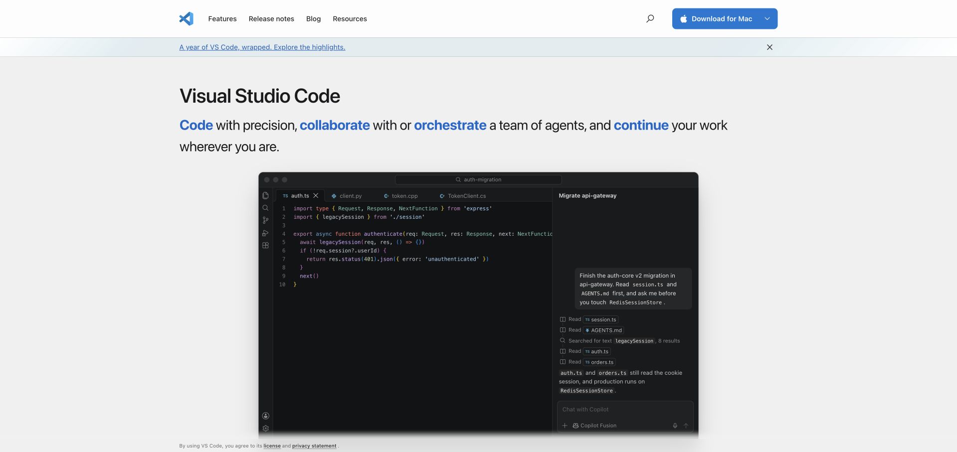
Visual Studio Code gives most of its captured opening screen to an editor window. The navigation stays narrow, the download button remains easy to locate, and a short sentence highlights several ways of working in blue. Inside the product image, source files and an assistant conversation share the same frame, making the collaboration promise concrete. Microsoft’s June 2026 engineering article documents TypeScript in the editor codebase; that evidence concerns the product, not this public page’s implementation. For a TypeScript project, the useful design reference is how much real interface context the hero preserves without asking visitors to understand the architecture first.
What you can learn
Present one representative workflow at a readable size, then offer a clear installation path. Keep implementation evidence in supporting documentation rather than expecting a screenshot to establish the underlying language.
Pros
The prominent download control gives returning developers a direct route.
A substantial editor image connects the promise to recognizable work.
Cons & considerations
The wide screenshot contains small text that loses detail when reduced.
Several highlighted verbs broaden the proposition before a single task is explained.
Platform source: Official source: scoped TypeScript association. Microsoft’s June 26, 2026 engineering account identifies Visual Studio Code as a TypeScript codebase and discusses its compiler migration. This documents the editor product, not the implementation of its captured public website. The prior broad source-page audit remains partial; no fresh complete runtime audit is claimed. Platform evidence is separate from the direct website screenshot and is not a complete current infrastructure audit.
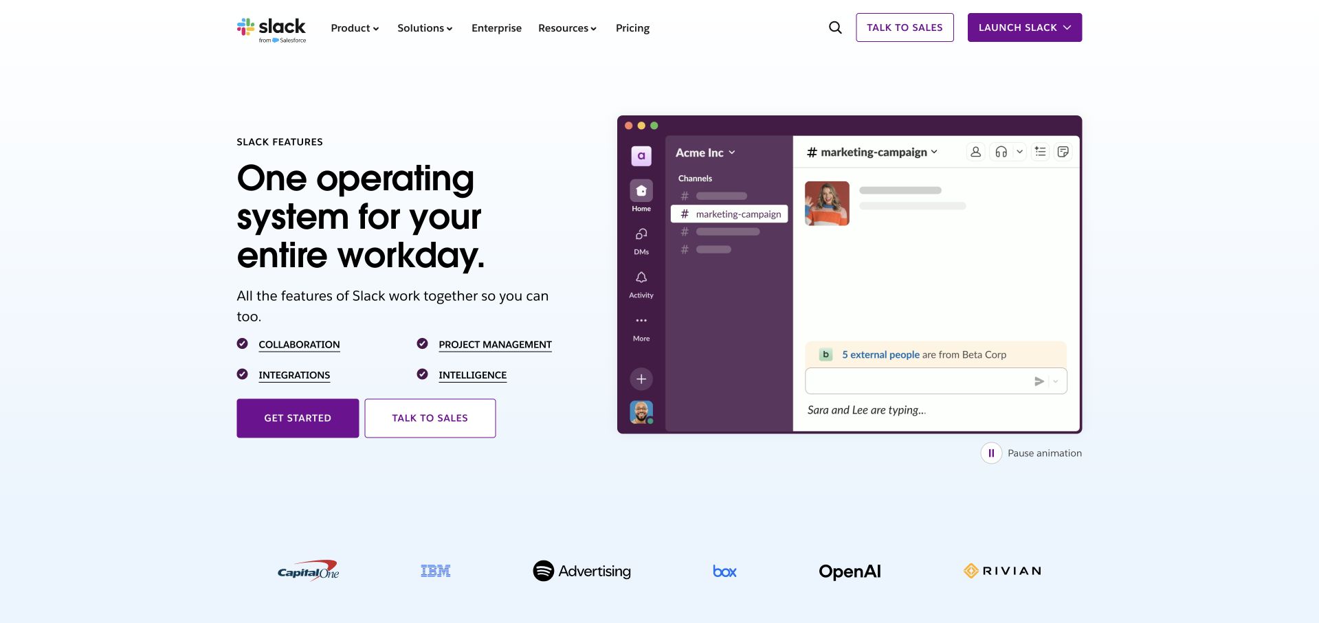
Slack’s Features page pairs a large left-aligned promise with a framed channel interface. Four underlined feature links sit between the description and the two conversion buttons, giving visitors a compact map before they commit. The purple application chrome carries the brand into the demonstration, while the customer marks below provide a quieter second layer. Slack’s official 2017 article, updated in 2020, documents a desktop-app TypeScript migration. It is historical application evidence and does not identify the language behind this marketing page. The design lesson is the orderly transition from platform positioning to named capabilities and then to a visible example.
What you can learn
Define a small set of user goals and make those routes apparent in the first screen. A product demonstration should support the route labels with enough recognizable context to orient newcomers.
Pros
Underlined feature links look actionable without competing with the main buttons.
The visible pause control acknowledges motion in the product demonstration.
Cons & considerations
Two sales and onboarding actions require visitors to choose their path.
The opening promise remains broader than the specific workflow shown beside it.
Platform source: Official source: scoped TypeScript association. Slack’s April 2017 engineering account, updated June 2020, documents its desktop application’s TypeScript migration. This is historical desktop-product evidence, not a current runtime attribution for the captured Features page. Platform evidence is separate from the direct website screenshot and is not a complete current infrastructure audit.
Shopify’s captured homepage uses a full-frame human image beneath a dark overlay, with a large white headline and a compact supporting statement. The trial action appears in both the header and the hero, while an outlined agent-related action occupies the opposite lower corner. The image gives an abstract commerce platform a personal focal point; the contrast keeps the text legible in this frame. Shopify’s 2020 engineering account describes TypeScript adoption in its merchant Admin UI beginning in 2017. That historical association belongs to the administration product and does not verify the marketing page or every merchant storefront.
What you can learn
Use the opening screen to communicate one commercial outcome, then provide an obvious entry point. Validate contrast across all media frames and keep specialized onboarding alternatives distinguishable from the main action.
Pros
Repeated trial actions make the next step easy to find.
A human focal point gives an infrastructure product a tangible context.
Cons & considerations
Large background media can carry significant delivery and accessibility costs.
The agent-specific option competes with the simpler trial route for attention.
Platform source: Official source: scoped TypeScript association. Shopify’s July 2020 engineering account describes migrating its merchant Admin UI to TypeScript, React and GraphQL beginning in 2017. This historical product association does not establish the marketing homepage or every merchant storefront’s implementation. Platform evidence is separate from the direct website screenshot and is not a complete current infrastructure audit.
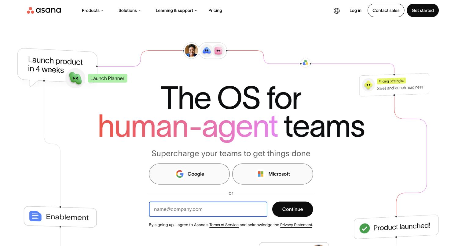
Asana places a large centered headline inside a loose diagram of people, tools and work items. A launch-planning card at one side and a completed-product card at the other suggest a sequence without turning the hero into a dense process chart. Below the statement, Google and Microsoft options precede a clearly separated email path. The surrounding cards make the organizational promise visible while leaving the central decision uncluttered. Asana’s official engineering article describes choosing TypeScript for its single-page application codebase. That documented product association is distinct from the captured marketing homepage, whose implementation is not established by the screenshot.
What you can learn
Let an illustration explain relationships while the signup area handles one decision at a time. Keep external identity options and email alternatives clearly labeled, and review the full form separately for accessibility.
Pros
The process illustration gives the broad teamwork message a concrete direction.
Multiple signup routes are grouped in a clear visual hierarchy.
Cons & considerations
Decorative connectors may add noise when the layout becomes narrow.
The first screen emphasizes signup before showing much of the working product.
Platform source: Official source: scoped TypeScript association. Asana’s official engineering article, displayed with a November 14, 2023 date, describes choosing TypeScript for its single-page application codebase. This documented application association does not establish the captured marketing homepage’s rendering stack. Platform evidence is separate from the direct website screenshot and is not a complete current infrastructure audit.
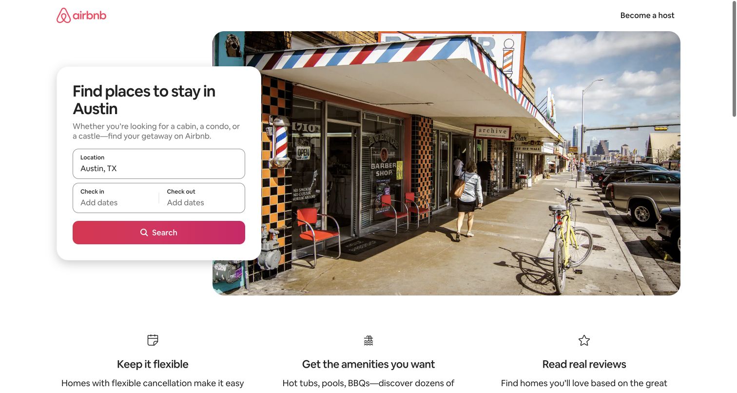
Airbnb’s Austin page overlays a white search card on a large streetscape photograph. The destination is already present in the location field, the two date fields are grouped together, and a saturated search button closes the form. The surrounding page keeps navigation minimal and follows the hero with three practical reassurance themes. This makes the page feel like an entry into a specific trip rather than a generic catalogue. Airbnb’s August 2020 engineering account identifies TypeScript in its frontend development practice. That historical organization-level evidence does not freshly verify the source language of this captured city page or its individual controls.
What you can learn
Start with the visitor’s known context and ask only for the missing inputs. Model dates and location explicitly in a typed application, while validating actual user input and availability independently at runtime.
Pros
A prefilled destination reduces the amount of initial form interpretation.
The image supports a sense of place without obscuring the search fields.
Cons & considerations
The photograph communicates atmosphere more readily than specific accommodation availability.
Calendar behavior and error handling cannot be assessed from this static view.
Platform source: Official source: scoped TypeScript association. Airbnb’s August 18, 2020 engineering account identifies TypeScript as its frontend web-development language and describes a migration tool. This historical organization/application association does not freshly verify the captured Austin listings page’s source language. Platform evidence is separate from the direct website screenshot and is not a complete current infrastructure audit.
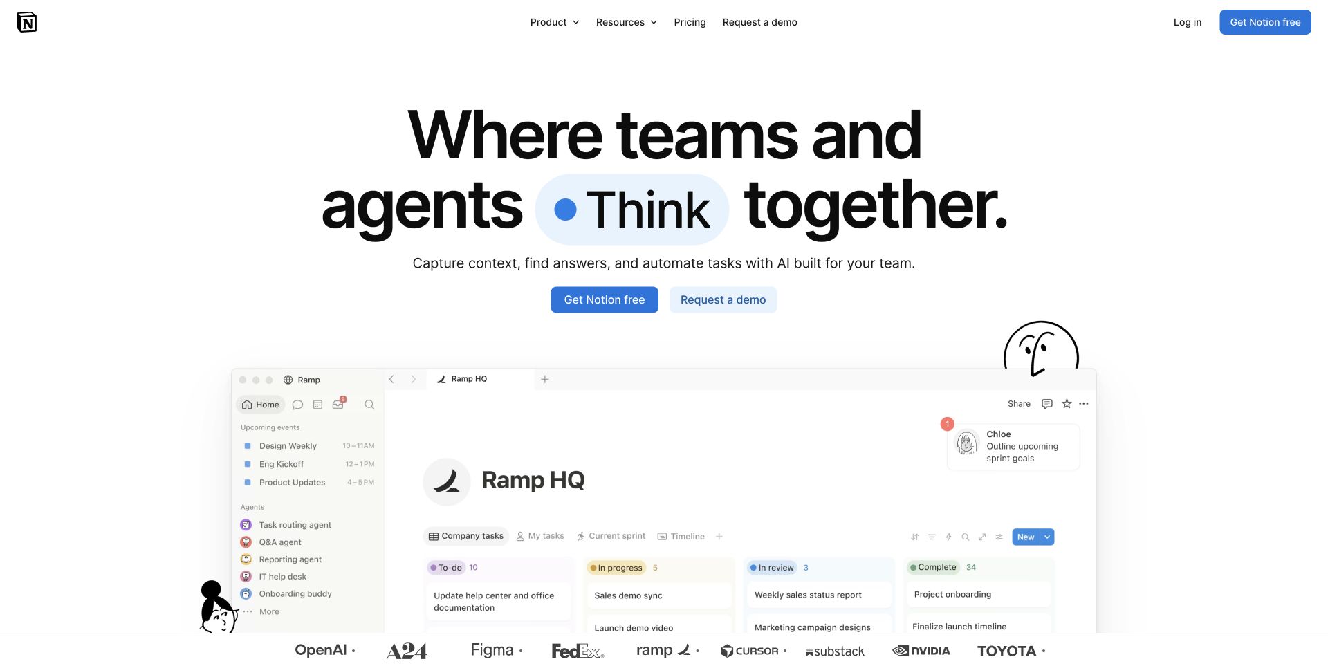
Notion combines an oversized centered headline with a large workspace preview beneath it. A blue emphasis shape and two restrained buttons concentrate attention above a board containing familiar status columns. Small illustrated figures add personality around the product image without replacing it. The preview’s sidebar, tasks and comments suggest how a team might organize work, which helps ground an otherwise expansive proposition. Notion’s March 2025 engineering article documents TypeScript cleanup within its application codebase. This is a product-engineering association, not proof about the captured homepage. The design is useful for studying how a flexible system can show an approachable first workspace.
What you can learn
Choose a representative workspace that demonstrates your central content model. A typed interface can reinforce consistency between tasks, states and comments, but the product story still needs recognizable labels and a manageable first view.
Pros
The large workspace preview gives the headline an immediate practical counterpart.
Primary and demo actions remain visually distinct without excessive button styling.
Cons & considerations
The expansive promise may be less specific for first-time individual visitors.
The lower product image becomes difficult to read at smaller display sizes.
Platform source: Official source: scoped TypeScript association. Notion’s March 3, 2025 engineering article documents removing unsafe TypeScript assertions from its application codebase. This is product-engineering evidence, not proof about the captured marketing homepage’s implementation. Platform evidence is separate from the direct website screenshot and is not a complete current infrastructure audit.
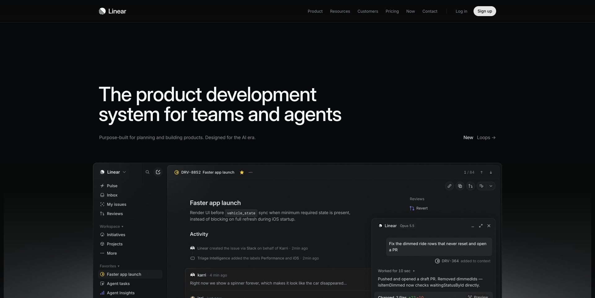
Linear’s dark opening screen leaves substantial space around a two-line headline and a short supporting sentence. The product preview then narrows the story to a single issue, with navigation on the left and an assistant panel on the right. The shared visual treatment makes the marketing page and application feel related. Linear’s official SDK documentation verifies a TypeScript integration library with typed models and operations; it does not establish the language of this homepage or the entire application. For a TypeScript-oriented project, this is a strong reference for showing related entities in context instead of presenting an abstract list of integration capabilities.
What you can learn
Demonstrate a complete slice of work with its surrounding navigation and history. When exposing typed models through an SDK, keep the concepts recognizable across documentation, interface labels and examples.
Pros
A single issue provides an understandable focal point for a complex product.
The restrained palette makes the large heading stand out clearly.
Cons & considerations
Muted supporting text needs careful contrast evaluation on real displays.
The interface-heavy preview assumes familiarity with issue tracking and development work.
Platform source: Official source: scoped TypeScript association. Linear’s official documentation identifies its API SDK as written in TypeScript, with typed models and operations. This verifies the integration SDK; it does not attribute the captured marketing homepage or all Linear application code to TypeScript. Platform evidence is separate from the direct website screenshot and is not a complete current infrastructure audit.
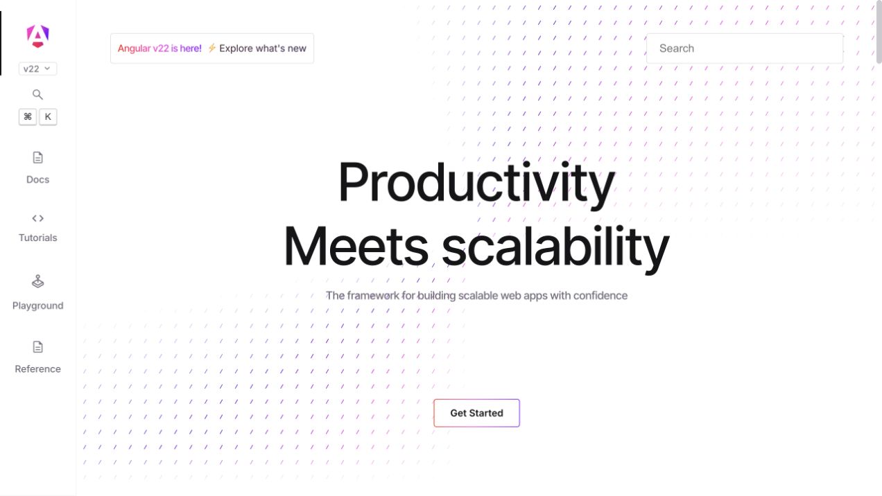
Angular’s captured homepage uses a slim vertical rail for documentation, tutorials, a playground and reference material. A version selector and search sit nearby, while the central area stays spacious around a short headline and one primary start button. The subtle diagonal background marks add texture without turning the page into an illustration-led sales pitch. Official compiler documentation confirms a TypeScript-based configuration workflow for Angular applications. That establishes the framework relationship rather than attributing every visible part of angular.dev to TypeScript. The page is useful as a reference for separating ongoing developer navigation from the simple initial decision to begin learning.
What you can learn
Keep recurring learning destinations consistently available, and reserve the main content area for the current task. Versioned TypeScript documentation should make its compatibility context easy to find before readers copy configuration examples.
Pros
The persistent rail separates major learning modes with clear labels.
One central start action avoids a crowded introductory decision.
Cons & considerations
The narrow rail depends on good responsive treatment outside this desktop capture.
The broad productivity promise provides little concrete code detail in the first screen.
Platform source: Official source: scoped TypeScript association. Angular’s official compiler documentation places Angular compilation options alongside TypeScript compiler options in tsconfig.json. This verifies the framework’s TypeScript development workflow, not a fresh source inspection of every element on angular.dev. Platform evidence is separate from the direct website screenshot and is not a complete current infrastructure audit.
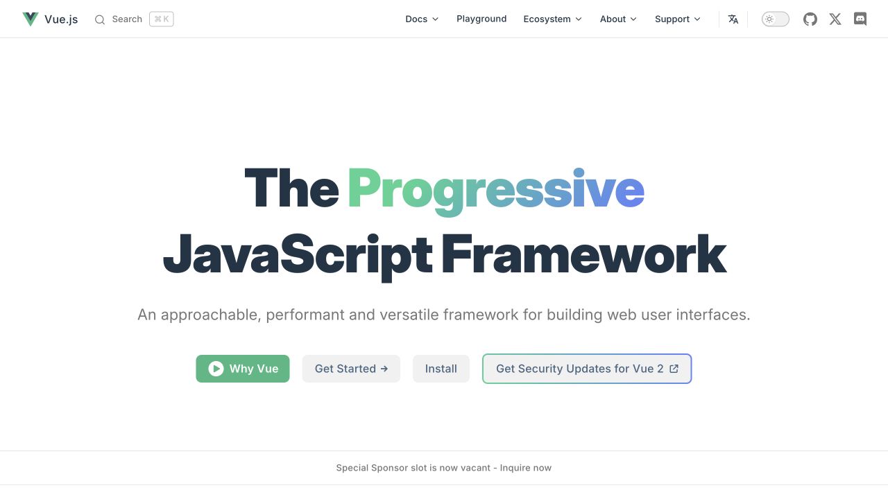
Vue’s homepage uses a bold centered headline with a green-to-blue accent on one word. The supporting line explains its general purpose, and a row of actions separates introductory explanation, getting started and installation. Documentation, playground and ecosystem links remain available in the compact header. The official TypeScript guide states that Vue itself is written in TypeScript and distributes type declarations. This verifies the framework implementation and support rather than separately proving the homepage’s language. The design offers a useful example of organizing several developer intents without requiring each visitor to follow the same onboarding sequence.
What you can learn
Distinguish conceptual learning from immediate installation and experimentation. For TypeScript support, connect those paths with consistent examples and explain where a tool transpiles code versus where a separate check validates types.
Pros
A concise purpose statement supports the larger brand-led headline.
Separate actions accommodate developers with different levels of readiness.
Cons & considerations
Four adjacent actions can dilute the prominence of the preferred next step.
A legacy-version security link adds context that newcomers must interpret.
Platform source: Official source: scoped TypeScript association. Vue’s official guide states that Vue itself is written in TypeScript and ships type declarations. This establishes the framework implementation and support; it does not separately prove the captured homepage’s source language. Platform evidence is separate from the direct website screenshot and is not a complete current infrastructure audit.
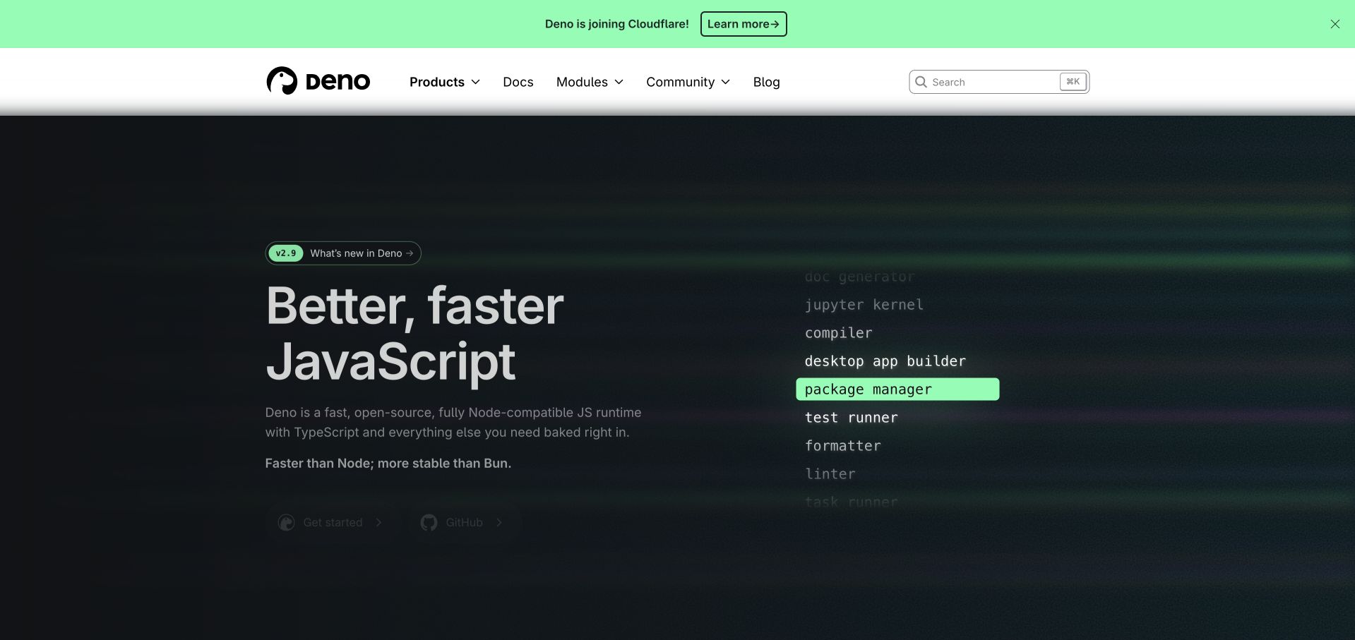
Deno’s captured hero places a large JavaScript-oriented headline beside a vertical list of development tools. A green highlight singles out one item, while the supporting copy explicitly mentions TypeScript. The light header provides documentation, modules and search above the darker product presentation. Deno’s official documentation confirms TypeScript execution support and distinguishes it from type checking. That is runtime-product evidence, not a finding about the marketing site’s source language. The visual list is useful because it translates a bundled toolchain into recognizable tasks, although the capture’s dim lower controls show how animation or overlays can reduce clarity in a particular frame.
What you can learn
Explain the toolchain through tasks developers already perform, then state which checks happen automatically. TypeScript execution and type checking should have distinct documentation and release steps so a successful run is not mistaken for validation.
Pros
The capability list makes an integrated runtime easier to understand.
Documentation and search remain easy to identify in the light navigation.
Cons & considerations
Some controls and supporting copy appear subdued in this captured frame.
Comparative marketing claims require independent evidence beyond the visual treatment.
Platform source: Official source: scoped TypeScript association. Deno’s official documentation describes native TypeScript execution and separate type-checking commands. This is runtime-product capability evidence, not proof that Deno’s marketing homepage was authored in TypeScript. Platform evidence is separate from the direct website screenshot and is not a complete current infrastructure audit.
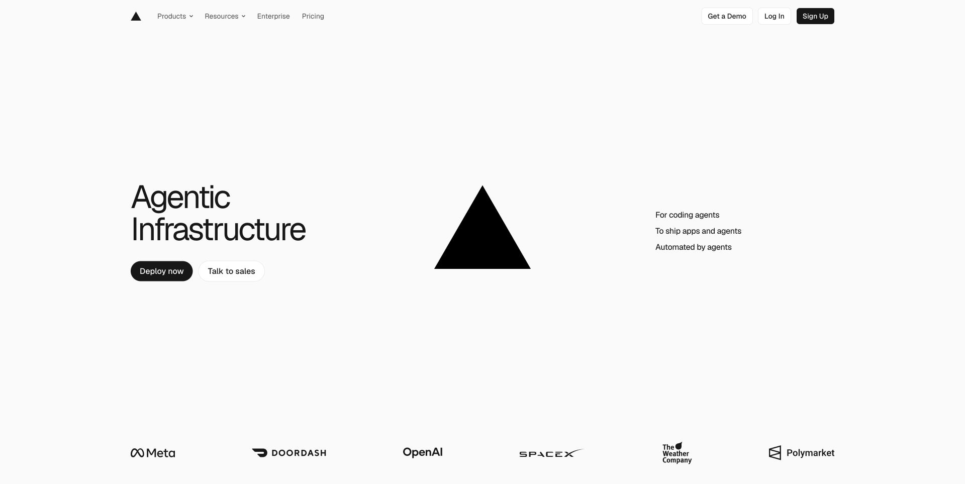
Vercel’s captured homepage distributes its opening content across three areas: a short headline and actions on the left, the triangle mark in the center, and three compact statements on the right. A row of customer marks sits far below, leaving unusually generous white space around the proposition. The sparse layout makes the deployment action easy to locate, but it relies on visitors bringing some knowledge of the product. Official documentation confirms TypeScript support in Vercel’s Node.js functions runtime. This is a deployment capability, not proof that the homepage or every hosted application uses TypeScript.
What you can learn
Keep the primary deployment path clear while linking technical detail nearby. A TypeScript deployment guide should specify entry points, build behavior and checks instead of treating support for a file extension as a complete operational guarantee.
Pros
The deployment action remains distinct within a very sparse composition.
The consistent monochrome treatment gives the product a recognizable identity.
Cons & considerations
Abstract positioning provides little immediate explanation for unfamiliar visitors.
The central brand mark occupies space that could demonstrate the product.
Platform source: Official source: scoped TypeScript association. Vercel’s official Node.js runtime documentation supports TypeScript function files and compiler configuration. This verifies a deployment-product capability, not the source language of the captured marketing homepage or every deployment. Platform evidence is separate from the direct website screenshot and is not a complete current infrastructure audit.
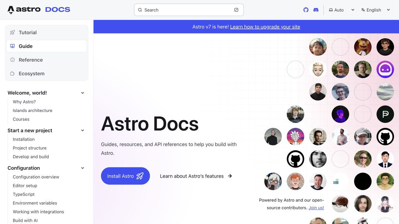
Astro’s documentation welcome page places the guide hierarchy in a persistent left column and a prominent search field at the top. The main panel combines a simple introduction with an installation button, a feature-learning route and a grid of contributor portraits. TypeScript appears as an ordinary configuration topic in the visible navigation. Astro’s official guide documents built-in TypeScript support for imports, components and configuration files. That verifies the framework workflow; the screenshot shows the Getting Started property rather than its source code. This is a useful reference for making technical depth discoverable while keeping the initial documentation page welcoming.
What you can learn
Expose the real documentation structure early so users can move from installation to configuration without relearning navigation. Keep TypeScript examples close to their relevant feature and distinguish transpilation from deliberate type checking.
Pros
The sidebar gives configuration topics a predictable and visible location.
Search and installation serve both returning readers and first-time visitors.
Cons & considerations
Contributor imagery consumes room that could hold a minimal working example.
A release banner adds another navigation choice above the introductory content.
Platform source: Official source: scoped TypeScript association. Astro’s official guide documents built-in TypeScript support for imports, components and configuration. This is framework-workflow evidence; the screenshot is its Getting Started documentation, not a source-level attribution of that page. Platform evidence is separate from the direct website screenshot and is not a complete current infrastructure audit.
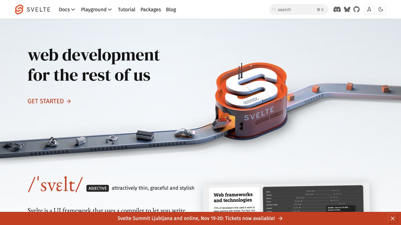
Svelte’s opening screen uses a large serif headline and a three-dimensional conveyor illustration built around its orange symbol. A simple start link sits beneath the message, while documentation, playground and tutorial routes occupy the header. Below the hero, a dictionary-style treatment begins explaining the name. The design gives the framework a distinctive tone without putting a signup form between visitors and learning. Svelte’s official TypeScript documentation demonstrates typed component scripts and props. That supports the component-authoring capability, not a claim that the homepage or all Svelte projects are implemented with TypeScript. The visual metaphor is strongest as an invitation to explore.
What you can learn
Use a memorable illustration to support a clear learning action, then move quickly to executable examples. Typed component guidance should explain inputs, optional values and event contracts in terms of visible behavior.
Pros
The orange accent ties the brand symbol to the start link.
The header offers direct routes to tutorials and practical experimentation.
Cons & considerations
The large illustration delays detailed technical explanation within the first viewport.
The event banner competes with content near the bottom of the capture.
Platform source: Official source: scoped TypeScript association. Svelte’s official documentation demonstrates TypeScript scripts, typed props and generic components. This verifies supported component-authoring capabilities, not the captured homepage’s implementation or a claim that every Svelte project uses TypeScript. Platform evidence is separate from the direct website screenshot and is not a complete current infrastructure audit.
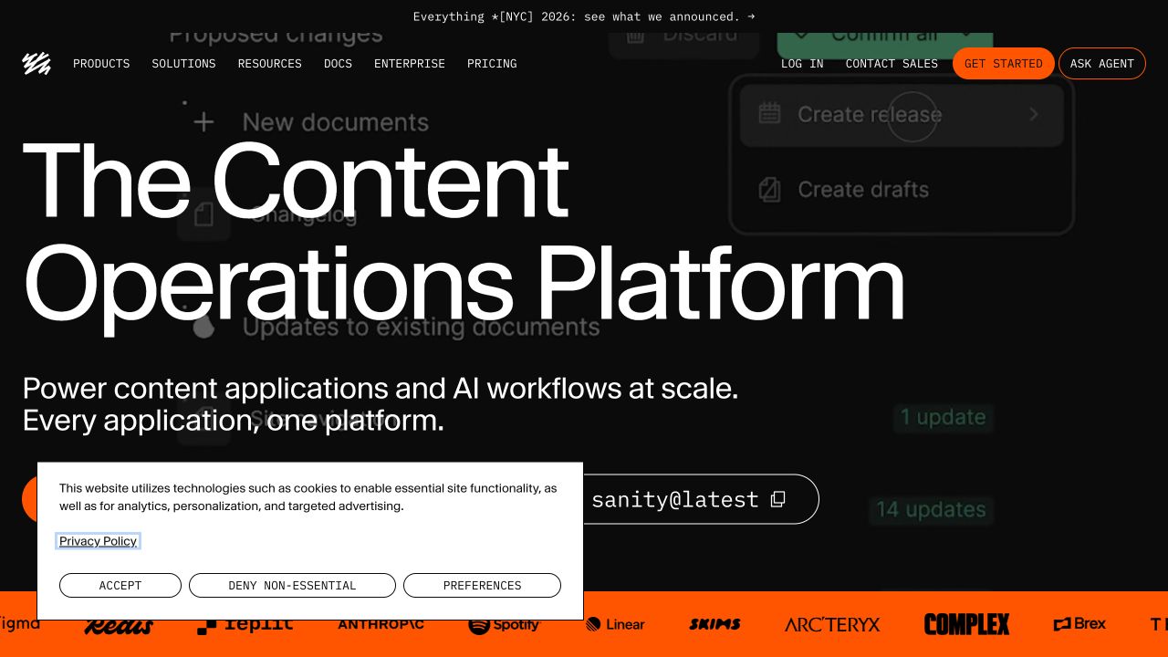
Sanity’s captured homepage combines oversized white typography with a dark interface backdrop and vivid orange accents. A command-style installation control gives developers a concrete starting point beneath the broad content-platform message. The dense top navigation also offers documentation and pricing, supporting readers who need specifics before committing. Sanity’s official documentation establishes TypeScript as the default for newly initialized Studio projects and describes its transpilation workflow. That concerns Studio development rather than the marketing homepage or every customer frontend. The capture also retains a consent panel covering part of the hero, which is an important limitation when studying the intended visual hierarchy.
What you can learn
Give technical and editorial audiences clearly different next steps without making either decode the other’s terminology. A typed content model should be accompanied by visible editing examples and runtime validation for actual content values.
Pros
The installation control turns a broad claim into a concrete developer action.
Strong contrast gives the primary headline immediate visual prominence.
Cons & considerations
The consent panel obscures lower hero controls in this genuine capture.
The platform-level headline needs supporting examples to clarify everyday editorial work.
Platform source: Official source: scoped TypeScript association. Sanity’s official documentation identifies TypeScript as the default when initializing Studio and describes its transpilation workflow. This concerns Sanity Studio configuration and development, not the marketing homepage or all customer frontends. Platform evidence is separate from the direct website screenshot and is not a complete current infrastructure audit.
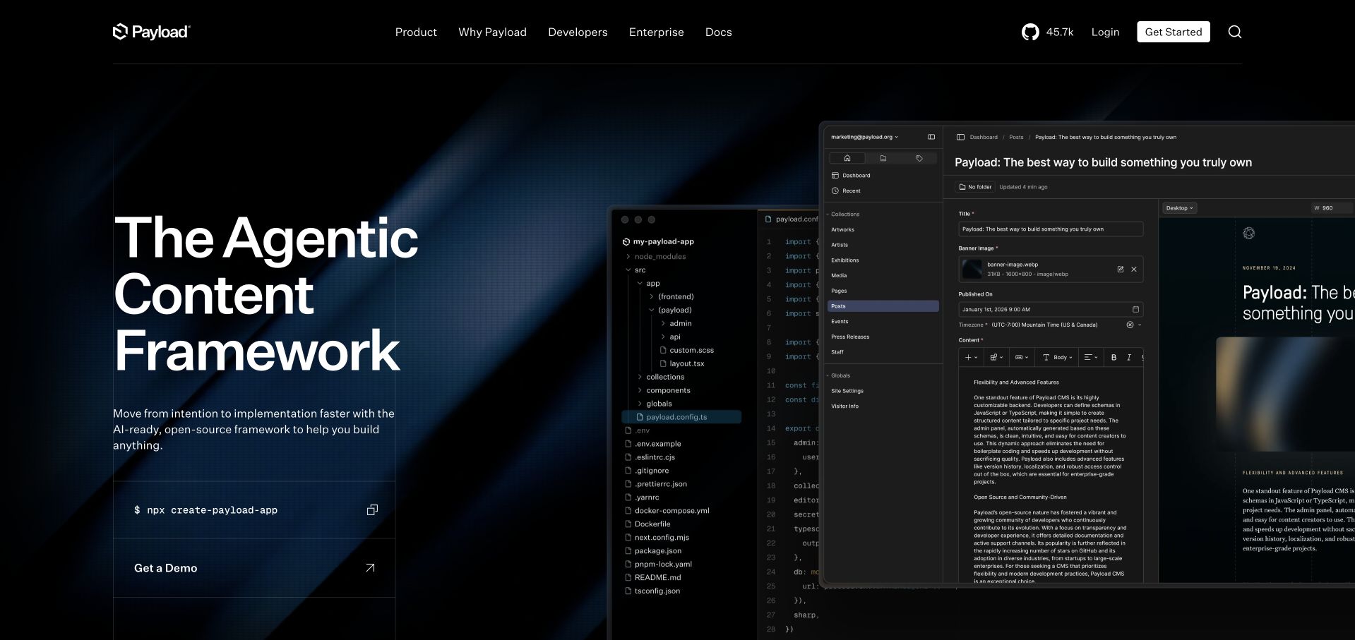
Payload’s hero sets a large statement against a dark blue background, then layers an editor window with a content-management interface on the right. The visible file tree includes configuration files, while the foreground panel shows an article and its preview. This juxtaposition explains the relationship between developer control and editorial work more directly than a feature list would. The installation command and demo route offer different starting points. Payload’s official documentation states that the CMS is built with TypeScript and supports it natively. That verifies the CMS product; the public homepage’s source language remains a separate question.
What you can learn
Demonstrate how a typed configuration becomes an editor-facing capability, using the same content example on both sides. Make the first setup step accessible while documenting permissions, validation and publishing behavior beyond the introductory image.
Pros
Layered code and editor views connect implementation choices with practical outcomes.
The installation command gives developers an immediate path into the product.
Cons & considerations
Overlapping panels make small interface details difficult to read at reduced sizes.
The broad headline leaves some explanation to the more detailed product imagery.
Platform source: Official source: scoped TypeScript association. Payload’s official TypeScript overview states that the CMS is built with TypeScript and supports TypeScript natively. This verifies the CMS implementation and developer workflow, not the captured marketing homepage’s source language. Platform evidence is separate from the direct website screenshot and is not a complete current infrastructure audit.
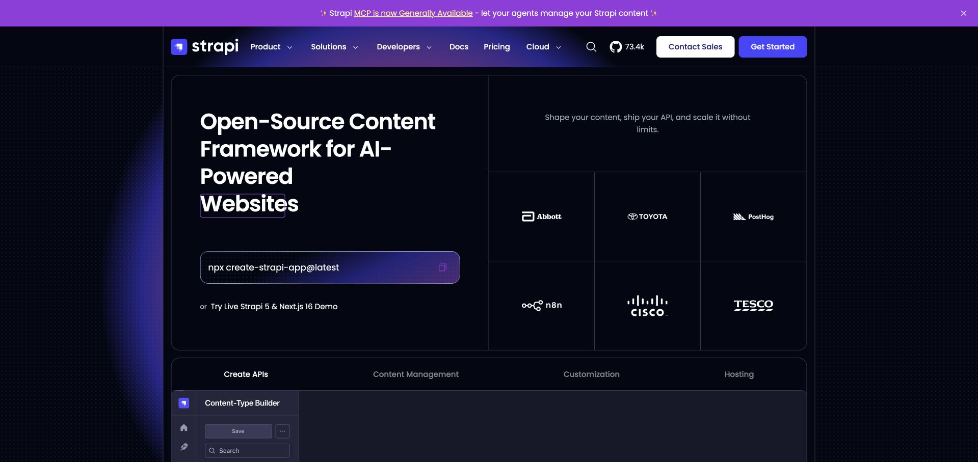
Strapi’s captured hero uses a bordered split grid: a large proposition and installation command occupy the left, while a short explanation and customer marks fill the right. Directly beneath, a second panel introduces product areas through tabs, with an administration screenshot beginning below them. The repeated borders provide structure within a dark, colorful presentation. Official Strapi documentation describes TypeScript project creation, conversion and generated types. This verifies a supported CMS development workflow, not the marketing homepage or every installation. The page is useful for studying how an executable first step can sit alongside social proof without either becoming a long introductory paragraph.
What you can learn
Place setup instructions near a concise explanation of the resulting product, then expose deeper capabilities progressively. For a TypeScript CMS, document how generated types stay aligned with content changes rather than assuming generation alone prevents runtime mistakes.
Pros
The split grid separates initial action from supporting customer evidence.
Product tabs establish a clear route into more detailed capabilities.
Cons & considerations
Numerous borders and announcement elements create a fairly busy first screen.
Customer logos indicate association but do not explain specific implementation details.
Platform source: Official source: scoped TypeScript association. Strapi’s official documentation describes creating or converting Strapi projects with TypeScript support and automatic type generation. This verifies a CMS development capability, not the marketing homepage or every Strapi installation. Platform evidence is separate from the direct website screenshot and is not a complete current infrastructure audit.
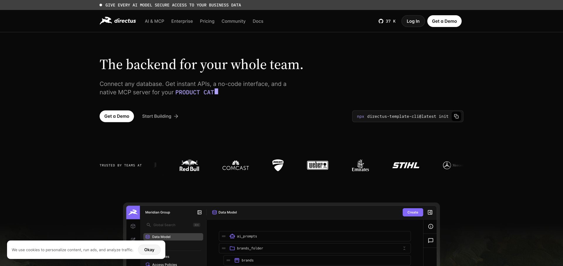
Directus opens with a large serif statement on a dark background, followed by a short description of database, interface and API capabilities. A demo button and a quieter build link sit on the left, balanced by a command-style control on the right. Customer marks and an administration preview provide further context lower down. Official SDK documentation verifies JavaScript and TypeScript integration support with schema-based typing. That is evidence for the client library rather than the homepage’s source language. The retained broad source audit was unavailable, so no fresh runtime stack claim is inferred from this capture or from the product’s name.
What you can learn
Make the relationship between data infrastructure and user-facing administration understandable before introducing setup details. Typed SDK models should match documented schemas, while permission checks and input validation remain explicit server responsibilities.
Pros
The concise statement explains the product in terms of the whole team.
Separate demo and build actions accommodate different evaluation needs.
Cons & considerations
The cookie notice covers part of the lower product preview.
The screenshot cannot establish the behavior of permissions or generated APIs.
Platform source: Official source: scoped TypeScript association. Directus’s official SDK documentation describes a JavaScript and TypeScript library with schema-based completion and typed output. This establishes the integration SDK capability, not a TypeScript runtime observation of the captured homepage. The prior broad source-page audit remains unavailable; no fresh runtime signals are inferred. Platform evidence is separate from the direct website screenshot and is not a complete current infrastructure audit.
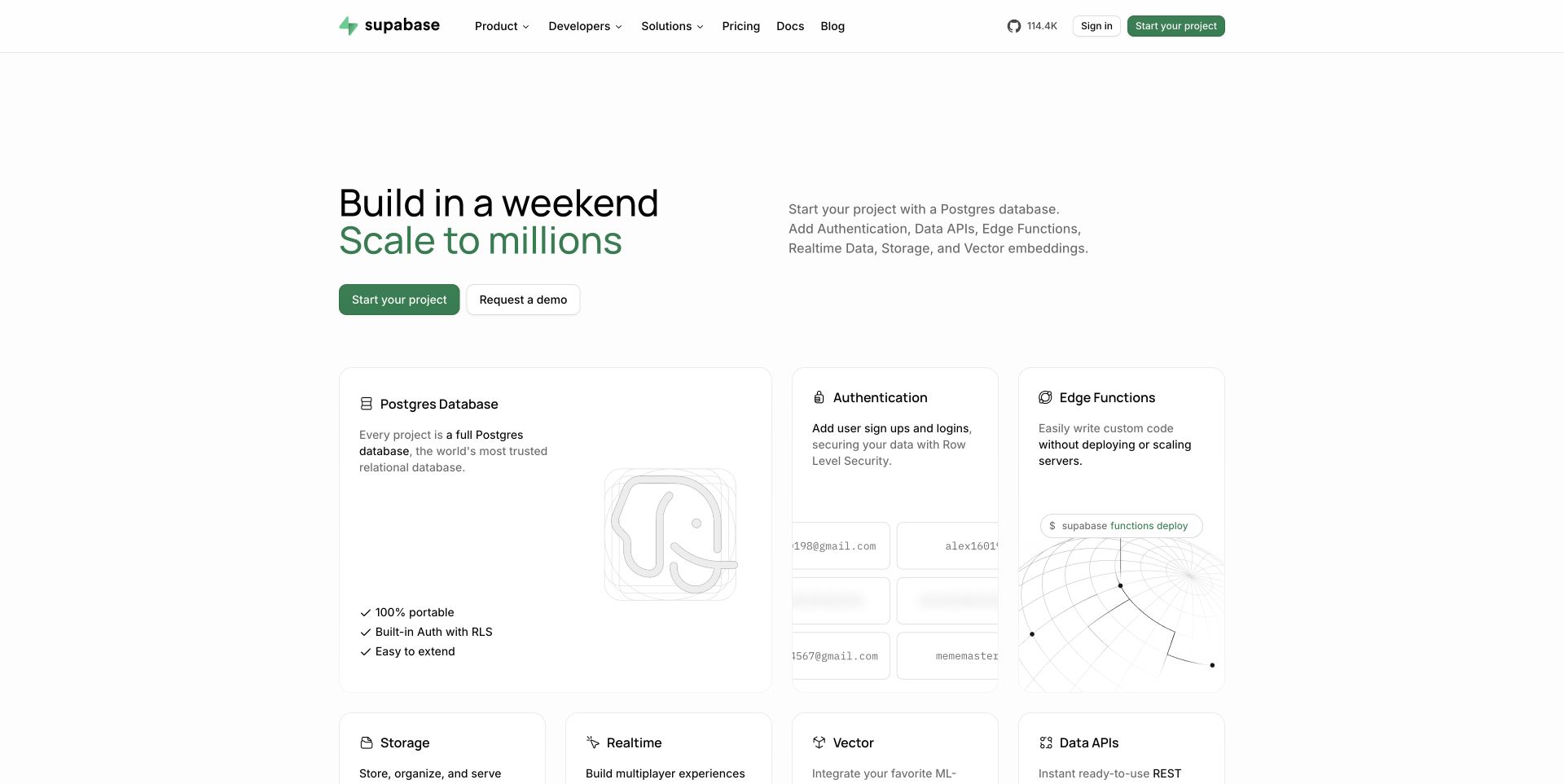
Supabase pairs a short two-line promise with a practical list of backend services, then immediately presents a card grid. The largest card describes the database, while neighboring cards introduce authentication and functions; additional services begin below. Restrained green accents link the primary action to the brand without overwhelming the white layout. Official client documentation confirms TypeScript support in supabase-js, including schema-derived inference and typed queries. This is client-library evidence, not a claim about the homepage’s language or the database implementation. The design helps visitors connect a broad platform to the individual pieces they would actually configure.
What you can learn
Structure the platform story around explicit services and their boundaries. For typed database clients, document nullable values, generated fields and schema refreshes, and keep authorization and runtime validation separate from editor autocomplete.
Pros
The card hierarchy makes the database foundation and related services legible.
Concise descriptions explain capabilities without requiring an immediate documentation visit.
Cons & considerations
The broad scaling promise needs workload-specific evidence beyond this page.
Several service cards compete for attention before a complete example is shown.
Platform source: Official source: scoped TypeScript association. Supabase’s official client documentation describes TypeScript support in supabase-js, including schema-derived inference and typed queries. This verifies a client-library capability, not the marketing homepage, database implementation or every customer application. Platform evidence is separate from the direct website screenshot and is not a complete current infrastructure audit.
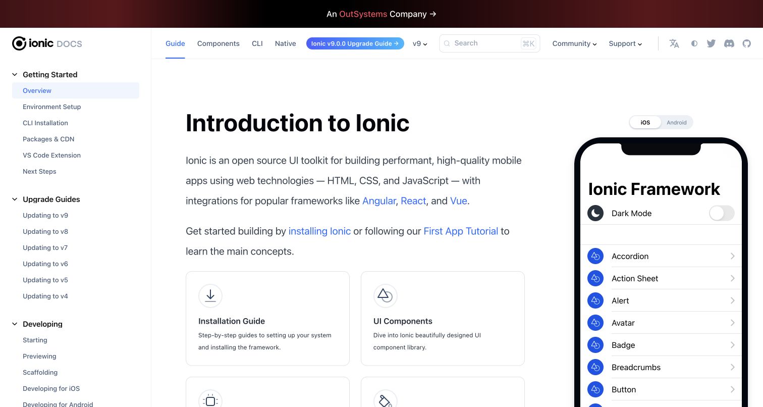
Ionic’s introductory documentation divides the screen between a substantial navigation tree, explanatory text and a phone-shaped component preview. Installation and component-library cards offer practical next steps below the introduction. The preview shows familiar interface elements such as an accordion, alert and avatar, while an iOS/Android selector signals platform context. Ionic’s official core package records TypeScript tooling and exported definitions, supporting the toolkit’s typed development and distribution association. That evidence does not separately attribute the documentation website’s implementation. The page is a useful reference for reducing the distance between a component’s name and the visual result developers expect to build.
What you can learn
Pair concepts with representative output, then provide the installation and API details needed to reproduce it. TypeScript component contracts should describe meaningful inputs and events, while actual keyboard and touch behavior receives separate testing.
Pros
The phone preview gives component names an immediately recognizable visual context.
The navigation distinguishes initial setup from upgrades and ongoing development.
Cons & considerations
The three-column composition requires thoughtful adaptation on narrow screens.
A static preview cannot establish accessibility or platform-specific interaction quality.
Platform source: Official source: scoped TypeScript association. Ionic’s official core package declares TypeScript tooling and exported type definitions. This documents the toolkit’s typed build and distribution; the captured documentation page is not independently attributed to TypeScript. Platform evidence is separate from the direct website screenshot and is not a complete current infrastructure audit.
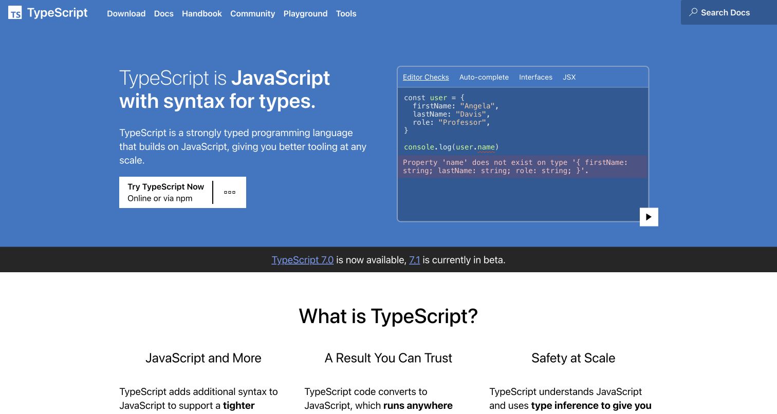
TypeScript’s official homepage uses a blue hero split between a concise explanation and a compact code demonstration. The example highlights a property error directly beneath the relevant code, making static analysis visible without requiring a long tutorial. Navigation offers documentation, a handbook, a playground and installation, while the next section divides the language’s benefits into three columns. This is the language’s own official public property and a direct source for its capabilities. The image still should not be treated as proof of the website’s implementation language. Its strongest lesson is how one small, concrete mistake can communicate an otherwise abstract tooling advantage.
What you can learn
Choose a short example that explains both the input and the feedback it produces. Teach the distinction between compile-time assistance and runtime behavior early, especially when visitors may assume types validate data arriving over a network.
Pros
The inline error makes the language’s practical benefit immediately understandable.
Separate learning and experimentation routes accommodate several developer intentions.
Cons & considerations
Small code and diagnostic text require careful responsive presentation.
Version announcements are time-sensitive details and should not become permanent claims.
Platform source: Official source: scoped TypeScript association. Microsoft’s official TypeScript website documents the language, compiler and tooling. Its language-product association is direct; the screenshot alone does not prove the implementation language of the website itself. Platform evidence is separate from the direct website screenshot and is not a complete current infrastructure audit.
Kegan has 15+ years of experience working with small businesses, Fortune 500 companies, and everything in between. No development job is too big or too small: he brings the same hands-on attention to a focused improvement, a complete website, or a custom application.
For TypeScript projects, he can help with responsive interfaces, reusable components, custom functionality, API connections, and performance-minded implementation. He works directly with clients on scope, design, implementation, testing, and handover, with an emphasis on clear communication and a system that remains practical to maintain after launch.
Show 3 other TypeScript developersHide other TypeScript developers
Introduce types around an existing JavaScript workflow
Select a useful boundary such as a form model, a content response or a reusable component. Document the behavior that must remain stable, then migrate a manageable area with clear ownership. The official migration guide describes a staged path from JavaScript. Keep the work connected to actual product tasks, and record temporary exceptions so they do not become an invisible permanent design. A migration should preserve working journeys while making their assumptions easier to inspect.
Use a framework’s established TypeScript conventions
Start from the framework’s current supported setup and follow its guidance for component inputs, events and build configuration. Angular, Vue, Astro and Svelte expose different workflows, even though each has a documented TypeScript association. Decide how types are checked in the development and release pipeline. A tool that successfully transforms a source file may not have run the full checker, so confirm the actual commands rather than relying on a familiar file extension.
Connect a typed SDK to a bounded product task
A typed SDK can make an integration easier to explore and maintain, but it does not create account access or guarantee that every field exists in a live response. Choose one specific task and confirm its supported operations in the provider’s documentation. Keep credentials on the appropriate trusted side, handle expired access and unavailable data, and isolate the provider’s models where the rest of the product needs a simpler vocabulary.
From references to requirements
Plan the interface, data boundaries and checks together
Write a realistic state and content inventory
List the main screens and the records each screen needs. Include empty lists, unusually long labels, optional images, incomplete profiles and users with different permissions. Show how each state changes the visible controls and next action. Agree on these examples with the people who maintain the content or support the product. This inventory gives designers and developers a shared reference before anyone debates the exact shape of an interface or the sophistication of a type utility.
Define a checking policy that survives normal changes
Choose compiler settings deliberately and document how the checker runs in continuous integration. TypeScript’s strict option enables a family of stronger checks, and compiler upgrades can introduce new diagnostics. Budget time to review those changes instead of suppressing errors indiscriminately. Keep tests for behavior, accessibility and integration boundaries alongside static checks. A passing type check is useful evidence about code consistency, but it does not prove that the complete visitor journey works.
Record who maintains API models, generated types, third-party SDK versions and shared UI contracts. Define what happens when a content field changes or an integration removes an operation. Include a safe handover exercise using representative data, such as adding a field and tracing its effect from storage to the visible page. Keep the operational steps understandable enough that another maintainer can investigate a mismatch without relying on the original author’s memory.
A useful handover demonstration
Ask the actual team to carry out its routine job: publish a realistic update, correct a mistake, preview a narrow screen, and identify who owns an integration failure. For a library or frontend framework, also ask who maintains the content source and deployment. A polished screenshot does not answer those operational questions.
Beyond the screenshot
TypeScript website planning checklist
Name the exact application, framework or SDK covered by each technology source.
Define the visitor’s main task and the content required to complete it.
List loading, empty, successful, partial and failed states with realistic examples.
Keep source-language evidence separate from the appearance of a screenshot.
Choose documented framework conventions and compatible dependency versions.
Run an explicit type check in the release pipeline, separate from transpilation.
Validate external input and enforce authorization in the trusted runtime path.
Assign ownership for schemas, generated types and shared component contracts.
Test keyboard interaction, readable errors and the complete user journey.
Document upgrades, deployment verification and recovery responsibilities.
Test with real content, a keyboard, a small screen, slow or failed requests, and the people who will maintain the system. These are planning checks, not an accessibility, security, performance, or search-ranking certification.
Sources & editorial method
How this TypeScript collection was reviewed
This collection contains twenty distinct public properties, each with a genuine direct browser capture, source URL, dimensions, attribution and preserved original capture date. The saved images were inspected for new collection-specific reviews on November 9, 2026, America/Los_Angeles. Official product documentation and first-party engineering accounts establish each TypeScript association. Slack, Shopify and Airbnb retain explicit historical scopes; the Asana article’s displayed date is recorded without treating it as a new runtime observation. Framework and SDK support is identified as a product capability, not proof of every associated homepage’s source language. Existing broad audit attempts remain intact, including a partial result for Visual Studio Code and an unavailable result for Directus. No account actions, submissions, private application access or performance measurements were performed. The reviews assess visible design and practical planning, not conversion outcomes, service quality or accessibility certification.
Every image is an unmodified capture from the actual website, with its source and capture date. Some captures are reused from our shared catalog; their dates remain the original capture dates. None comes from a vendor gallery or a generated reconstruction. Moving imagery and live content can change.
Technology attribution uses public page assets or metadata, official platform documentation, or a cited first-party project case study. Documentary and framework-relationship evidence is identified where used; it is not a complete current backend inventory. A CMS image CDN alone does not establish a full CMS deployment. A library’s presence does not prove which individual controls use it, and a platform label does not establish AI authorship.
The composition notes, lessons, pros and tradeoffs are original editorial observations. We have not measured conversion, traffic, security, performance or accessibility conformance. Website owners retain their brands and imagery; these examples are not our client portfolio. Written, Edited and Curated are independent records, not dates advanced by a build. See our editorial standards or suggest a correction.
Questions worth asking
TypeScript website development FAQs
Does every pictured public page run on TypeScript?
No. The sources establish specific application, framework, SDK or historical engineering associations. The screenshots are design references from the associated public properties. A marketing page’s appearance does not establish its original source language, and each example states the supported evidence scope.
Does TypeScript determine a website’s design?
No. TypeScript adds a type system and related tooling to JavaScript development. Layout, content, navigation and accessible interaction remain design and implementation choices. Use types to support a clear product model rather than expecting a language choice to create a good user experience.
Do TypeScript types validate API responses automatically?
No. Type annotations are removed from emitted JavaScript. External values still need appropriate runtime validation, and access decisions still need authorization checks. A declared type is not evidence that a remote service returned a valid or permitted value.
Is a successful build the same as a passing type check?
Not necessarily. Some development tools transform TypeScript syntax without running a complete checker. Follow the framework’s documentation and use an explicit checking step in the release workflow, alongside behavioral and integration tests.
Can an existing JavaScript project adopt TypeScript gradually?
Yes. The official migration guide describes a staged approach. Choose a manageable scope, preserve expected behavior and track temporary exceptions. The right pace depends on the project’s dependencies and maintenance capacity rather than on a public reference company’s migration story.
Why are older captures and engineering articles retained?
A verified capture can support a new design review while keeping its original date. A historical engineering article establishes what its author described at that time. Neither should be relabeled as a current runtime inspection simply because the collection has been newly written.
Borrow the clear task structure and useful feedback in these examples. Choose TypeScript where its documented tooling fits the team, and keep the full runtime and user experience responsibilities visible.