Explore 20 interfaces associated with documented Cassandra workloads, from major organizations to developer-led products. Historical case studies do not identify a company’s complete present-day architecture or the technology rendering its public page.
Apple, Netflix, Walmart, Target and Uber open this collection. The Apache project directory names historical workloads at several of them; Target’s engineering account dates to August 2018. Those are useful deployment references, but none turns a corporate homepage into a Cassandra-generated website.
Later references include dated engineering posts from Spotify and Yelp and specific products such as BlackBerry Radar and Intuit TurboTax. Keep those dates and boundaries intact. The design reviews concern the page actually captured; the separate database evidence concerns only the system described in its source.
Before the examples
What makes good Apache Cassandra website development in 2026?
Begin with the questions the application must answer
Cassandra’s documentation describes query-driven modeling rather than a relational model with server-side joins. Start with the access patterns and expected result shapes. Record what the user must retrieve, in which order and within which boundary. A list of business entities alone is not a sufficient database brief.
Treat availability and correctness as concrete acceptance questions
Ask what happens when a response is late, a connection fails or an operation is retried. Identify which actions are safe to repeat and which need protection against duplication. A broad promise of resilience is less useful than a worked example that explains what the customer sees and what the operator can reconcile.
Budget for an operating practice, not just an initial cluster
Distributed storage needs named operational ownership. Apache’s repair guidance explains how replicas are synchronized and why hints alone are insufficient. The project needs an appropriate repair process and monitoring responsibility, not an assumption that adding nodes makes maintenance disappear. Agree on the operating plan before accepting a production launch.
Twenty public design references with separately documented, often historical Cassandra associations. Read the workload scope before borrowing an architecture idea.
We start with five recognizable brands or organizations: Apple, Netflix, Walmart, Target, Uber. Each attribution applies to the named website property, not every product or website belonging to its organization. This is a curated reading sequence, not a measured ranking.
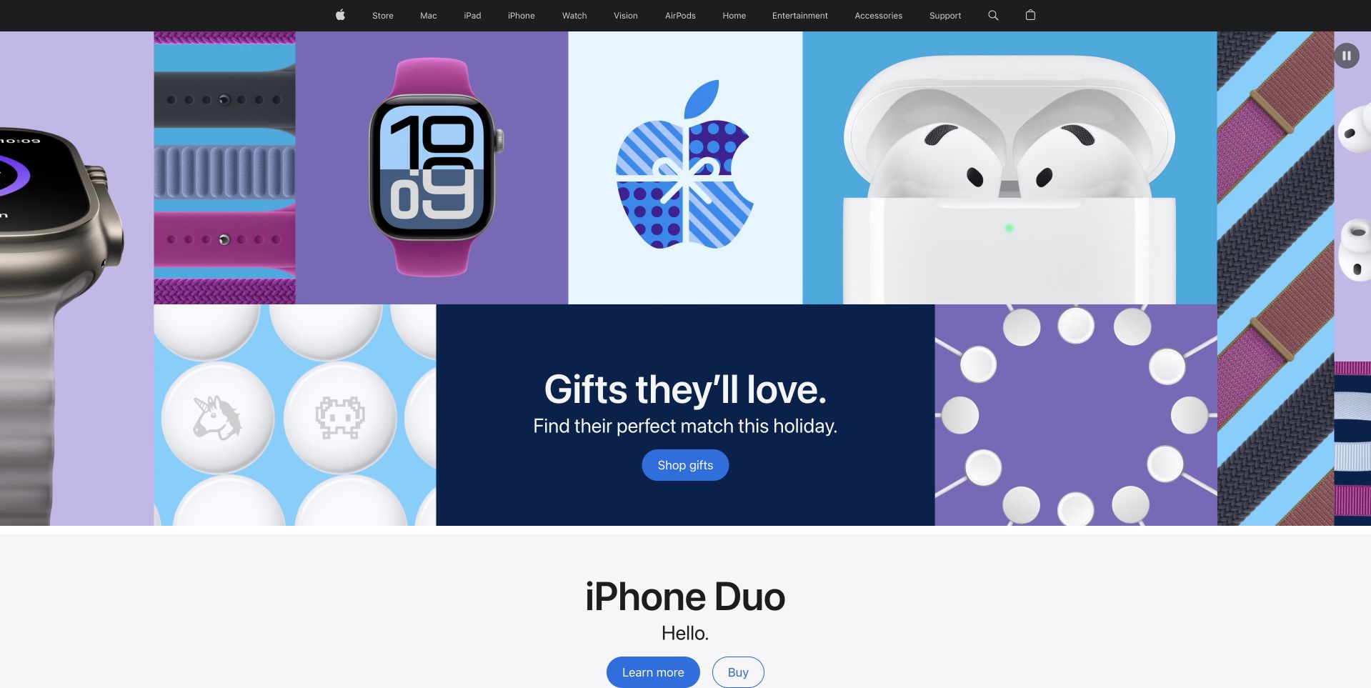
Apple’s captured public page opens with a colorful arrangement of devices and gift-like shapes around a central shopping message. A dark, narrow product navigation sits above the artwork, and a second product feature begins immediately below. The composition gives the seasonal collection its own identity without replacing the store’s familiar product categories. It is useful for studying how several different objects can be grouped through color, scale and framing rather than a dense catalog grid. The Apache project directory describes a historical Cassandra deployment at Apple; it is not current evidence for the public storefront’s backend.
What you can learn
Give a temporary retail theme a recognizable visual system, then preserve stable product navigation and a clear next feature. Keep shopping conditions and specifications outside decorative artwork. The campaign should remain understandable with static imagery and at narrow sizes, without requiring a visitor to identify every object before finding the right product category.
Pros
Repeated shapes and colors unify several product families.
Permanent product navigation stays separate from the seasonal artwork.
Cons & considerations
Decorative product arrangements need meaningful accessible context.
Seasonal messaging must lead to clear availability and purchase conditions.
Platform source: Primary documented Apache Cassandra association. Documented association: Project case directory names Apple; undated historical deployment account, not current corporate-page infrastructure proof. Platform evidence is separate from the direct website screenshot and is not a complete current infrastructure audit.
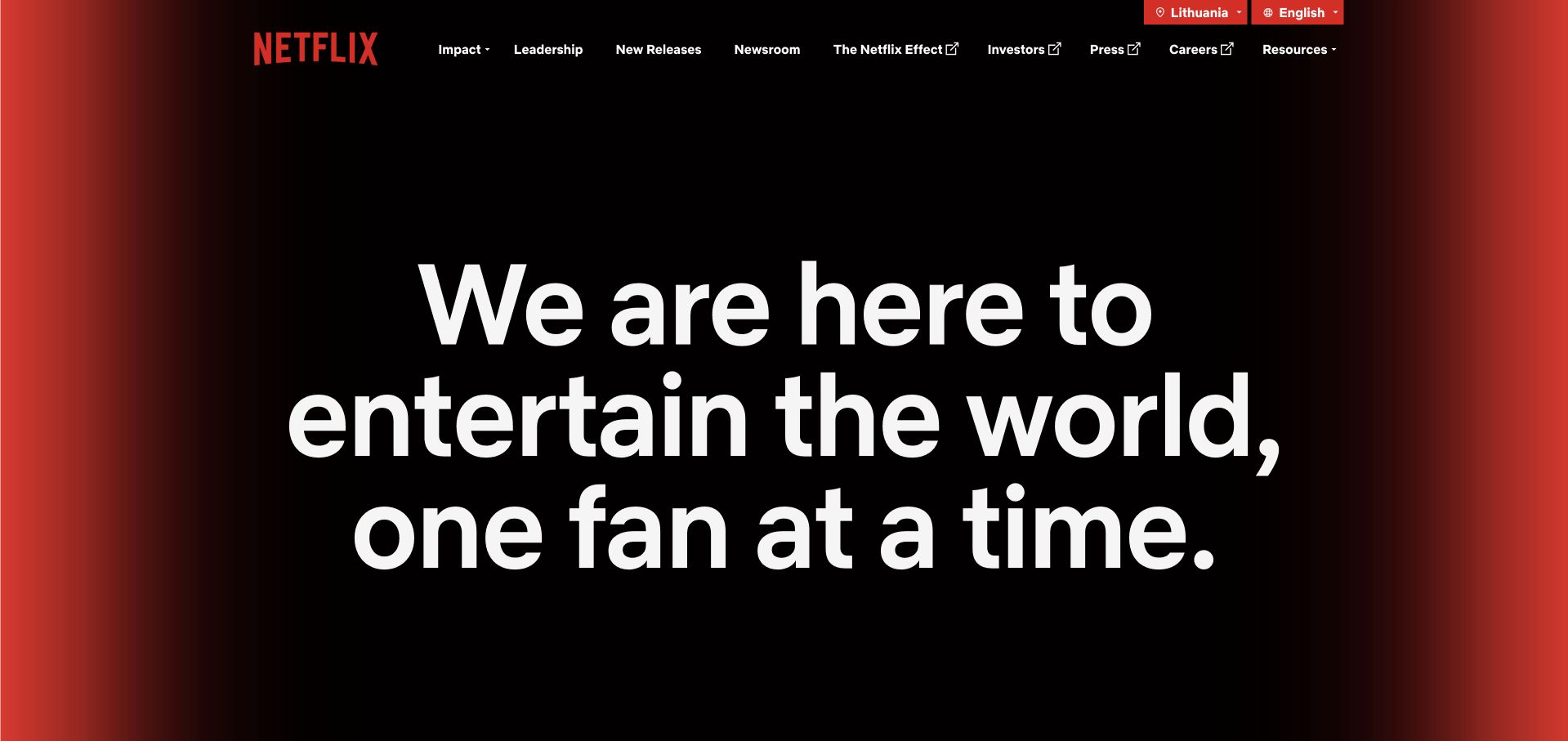
Netflix’s About page makes one large white purpose statement the center of a black-and-red composition. The absence of a poster grid is significant: visitors are being introduced to the organization rather than asked to choose something to watch. A compact upper navigation provides routes into leadership, impact and news. The page is useful for studying how a well-known consumer brand can create an institutional destination without losing its visual identity. The Apache directory’s Cassandra reference concerns a historical persistence workload. It does not identify the current corporate-page CMS or every component of the streaming service.
What you can learn
Make the purpose of a corporate destination clear before adding content. Use a restrained visual device when it strengthens the distinction from the consumer product. The next layer should supply specific company information and reliable navigation, so the opening statement becomes an introduction rather than an endpoint with nowhere useful to go.
Pros
A single statement gives the opening an unambiguous reading order.
The visual identity remains recognizable without product thumbnails.
Cons & considerations
Very large text needs careful handling on shorter screens.
Institutional language requires concrete supporting material below.
Platform source: Primary documented Apache Cassandra association. Documented association: Project directory describes a persistence workload; historical association, not the corporate publishing frontend or complete current streaming architecture. Platform evidence is separate from the direct website screenshot and is not a complete current infrastructure audit.
Walmart’s corporate page features a prepared holiday meal beneath a restrained blue organizational header. The table scene makes the current value-oriented campaign concrete, while a short reading action leads into the story rather than pretending this is a grocery checkout. Company, people, investor and supplier routes remain separate above the image. The page is useful for studying how corporate content can remain connected to the customer experience without recreating the entire retail interface. Apache’s directory describes a historical Cassandra analytical workload; it does not establish the current corporate website’s technology or verify the campaign’s commercial conditions.
What you can learn
Choose a timely scene that explains why a corporate story matters, then make the article route and its date clear. Keep promotional terms readable in the destination and preserve stable institutional navigation. A familiar customer occasion can introduce a company story without making every visitor follow a shopping journey they did not intend.
Pros
The meal scene makes a broad value message tangible.
Corporate navigation stays distinct from the campaign feature.
Cons & considerations
Time-sensitive commercial claims need explicit terms and dates.
Text over detailed food imagery requires consistent contrast.
Platform source: Primary documented Apache Cassandra association. Documented association: Project directory describes an analytical workload; historical association, not current corporate-page technology. Platform evidence is separate from the direct website screenshot and is not a complete current infrastructure audit.
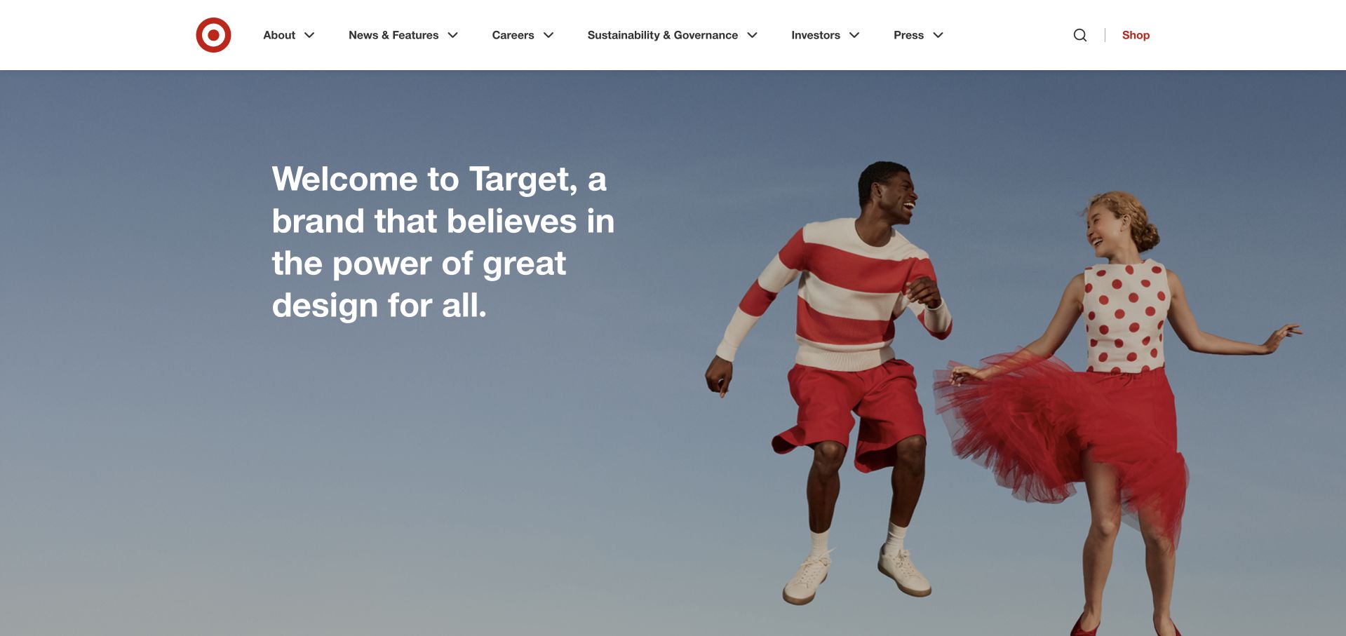
Target’s corporate introduction pairs a short statement about its design identity with two people in coordinated red-and-white clothing. A pale blue background gives the scene room, while the compact white header keeps company, news, careers and investor routes accessible. The composition connects the organization’s public identity to recognizable brand colors without becoming a retail collection page. It is useful for studying how a corporate message can feel visually specific rather than interchangeable. The Cassandra evidence is Target’s August 2018 store-infrastructure account, not proof of the current corporate page or every system used in its stores.
What you can learn
Let a corporate page express the brand through a consistent visual idea, then support it with specific organizational content. Keep the site’s institutional purpose clear and preserve practical routes for different audiences. A coordinated campaign can change over time without requiring returning readers to relearn where news, careers or reports are located.
Pros
The red-and-white styling creates immediate brand continuity.
A pale background keeps the short statement legible.
Cons & considerations
Campaign styling alone does not explain the organization’s activities.
A wide composition needs deliberate mobile cropping and reading order.
Platform source: Primary documented Apache Cassandra association. Documented association: August 2018 store-infrastructure account; historical database deployment, not the public corporate site. Platform evidence is separate from the direct website screenshot and is not a complete current infrastructure audit.
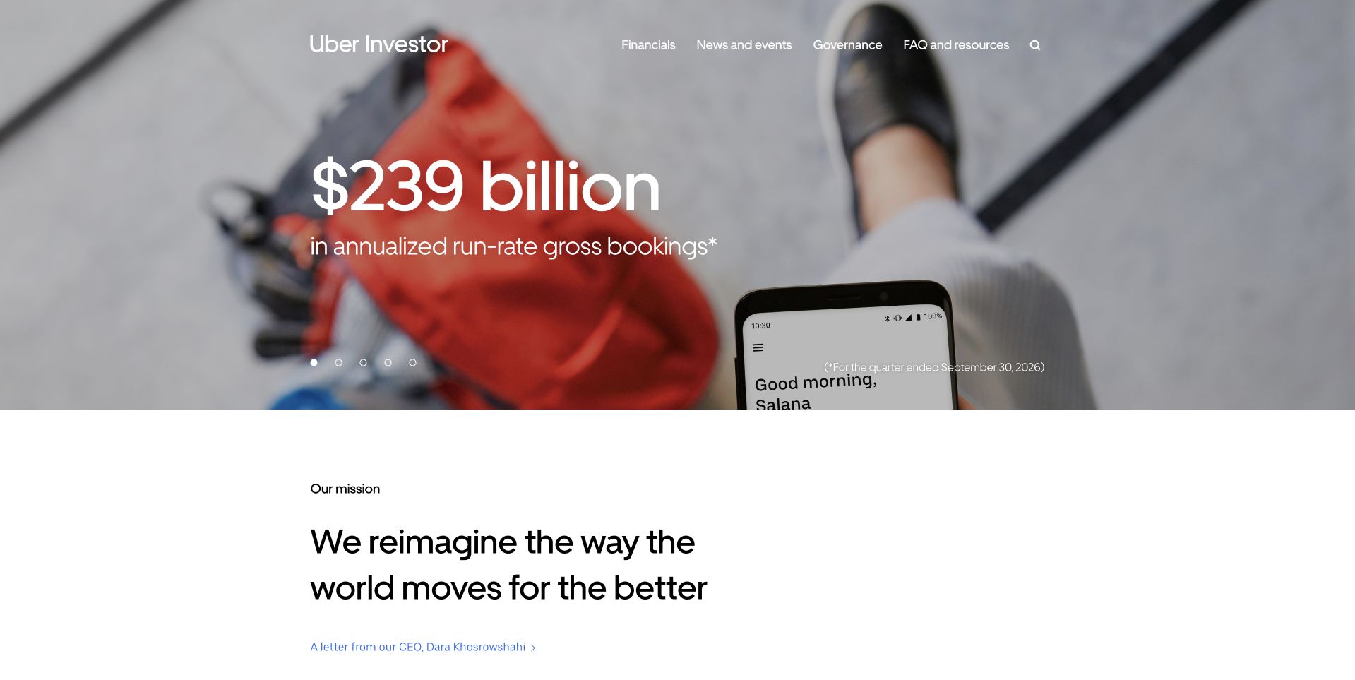
Uber’s investor page places a large financial metric over a photograph of someone holding a phone. The reporting period appears separately within the feature, and a mission section begins below on a white reading surface. Financials, news, governance and resources have clear upper-navigation routes. This is a useful reference for presenting corporate reporting without making it visually disconnected from the service the company operates. The Apache directory names a historical operational Cassandra database service. That association does not identify the investor site’s implementation or establish the architecture of all Uber applications.
What you can learn
Give a prominent financial figure its reporting context and a clear route to the underlying material. Keep the investor task distinct from consumer booking or account access. A product-related image can create continuity, but the meaning of a metric should remain understandable without depending on the image or treating presentation as investment analysis.
Pros
A product-related scene connects reporting to the underlying business.
The reporting-period note gives the lead figure needed context.
Cons & considerations
Large metrics need precise definitions in accessible supporting material.
Text over photography needs stable contrast across the feature.
Platform source: Primary documented Apache Cassandra association. Documented association: Project directory names an operational database service; historical association, not the investor-relations frontend or all application systems. Platform evidence is separate from the direct website screenshot and is not a complete current infrastructure audit.
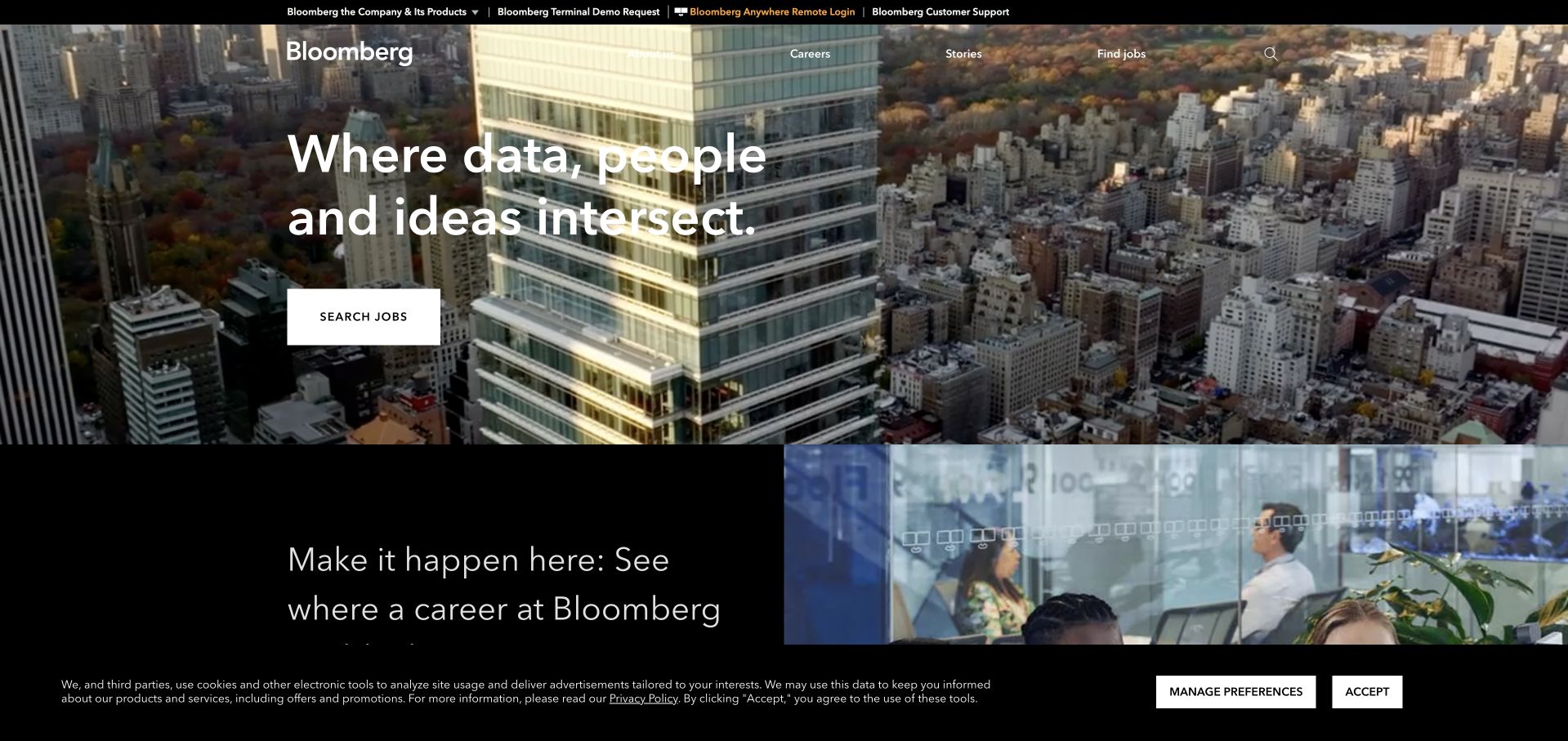
Bloomberg’s company page uses an aerial urban scene behind a concise organizational message and a clear job-search action. A second careers feature begins below, reinforcing that this destination has an employer-facing role as well as a corporate identity. The black-and-white frame keeps the image from becoming an isolated city postcard. This is useful for studying how an organization can connect its working environment to a practical next step. The Apache project directory describes a historical index-construction workload using Cassandra; it does not identify the current company-site runtime or provide financial advice.
What you can learn
Make a company page’s intended audience visible through its actions and supporting content. If careers are a principal route, connect the broad brand introduction to actual opportunities rather than a generic contact form. Keep corporate information available too, and explain the destination clearly enough that visitors do not confuse it with a news or terminal product.
Pros
The job-search route gives the corporate introduction a concrete use.
A consistent dark frame connects the first two features.
Cons & considerations
A city panorama needs useful context beyond atmosphere.
Careers emphasis should not hide other essential company information.
Platform source: Primary documented Apache Cassandra association. Documented association: Project directory describes index construction; historical workload, not financial advice or current company-site runtime. Platform evidence is separate from the direct website screenshot and is not a complete current infrastructure audit.
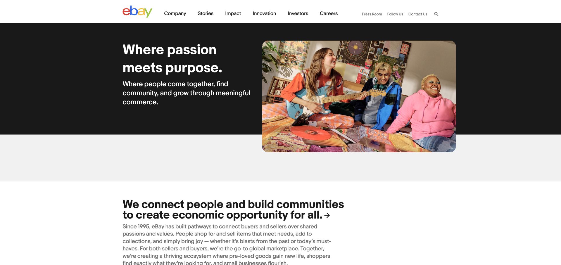
eBay’s corporate page places a short purpose statement in a dark text panel beside a warm scene of people gathered around a worktable. The page then begins a separate section about connections and communities, making the institutional story more explicit. A white header offers company, stories, impact, innovation and careers rather than marketplace search. It is useful for studying a corporate destination that wants continuity with the marketplace without duplicating its shopping interface. Apache’s directory lists a historical Cassandra deployment at eBay, not current public corporate-page technology or a complete account of marketplace systems.
What you can learn
Use a specific human scene to introduce an organization’s purpose, then explain what the organization actually does. Keep the corporate navigation distinct from consumer transactions. Supporting stories should substantiate broad community language rather than leaving a friendly photograph to imply evidence of impact or universal customer experience.
Pros
The dark text panel gives the purpose statement a clear boundary.
Corporate navigation differs usefully from a shopping interface.
Cons & considerations
Purpose language needs specific stories and evidence below.
The split composition requires a sensible narrow-screen sequence.
Platform source: Primary documented Apache Cassandra association. Documented association: Project directory lists eBay deployment; historical association, not current public corporate-page detection. Platform evidence is separate from the direct website screenshot and is not a complete current infrastructure audit.
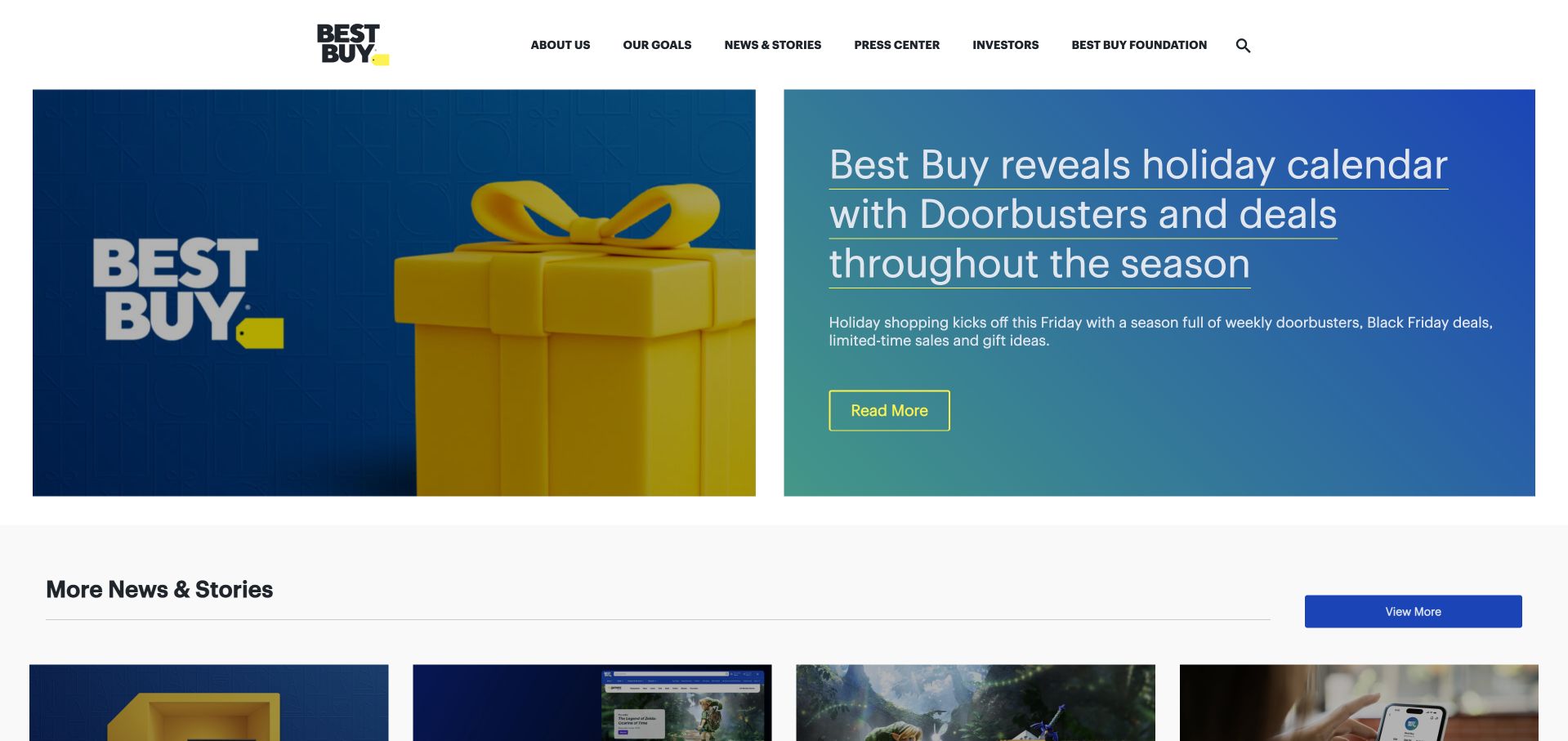
Best Buy’s corporate page opens with a blue-and-yellow holiday feature beside a large gift-like graphic. A concise reading action leads into the story, while a separate news collection starts below. The upper navigation remains institutional, with company goals, press information and investor routes rather than retail search. This is useful for studying how a corporate publishing site can borrow the consumer brand’s visual energy while retaining its editorial role. The Apache directory describes a historical Cassandra holiday-traffic workload. That account does not identify the current corporate website’s backend or establish present-day performance.
What you can learn
Give a current story a strong visual treatment and keep the rest of the publishing structure close by. Date time-sensitive material and provide an archive route when the campaign ends. A corporate newsroom should remain useful to someone seeking background or press resources, not only someone interested in the latest seasonal announcement.
Pros
Brand colors make the lead editorial feature immediately recognizable.
A separate news collection creates a clear continuation.
Cons & considerations
Seasonal material needs clear dates and an archival home.
A decorative gift graphic cannot explain the story’s practical details.
Platform source: Primary documented Apache Cassandra association. Documented association: Project directory describes holiday-traffic workload; historical scope, not the current public website stack. Platform evidence is separate from the direct website screenshot and is not a complete current infrastructure audit.
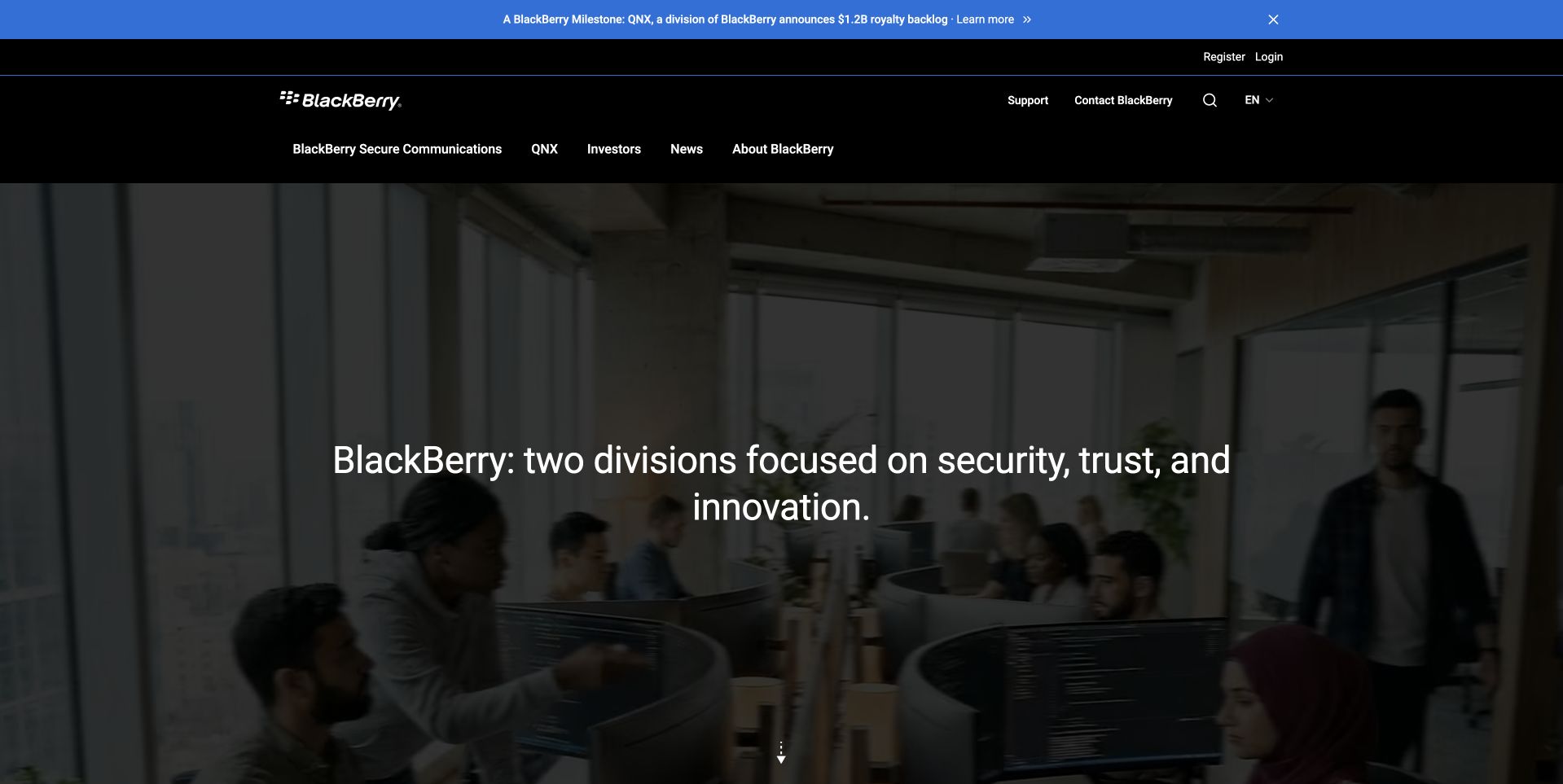
BlackBerry’s public page uses a darkened workplace scene behind a centered statement about its two divisions. A black header exposes secure communications, QNX, investors and company information as distinct routes. The composition acknowledges that visitors may need to understand the organization’s present business structure rather than recognize a single familiar device. It is useful for studying how a legacy brand can orient new and returning audiences. The Cassandra directory’s association is specifically the historical BlackBerry Radar IoT platform, not every current division or proof of the public page’s database.
What you can learn
Name the actual business structure and give each part an understandable route. Do not rely on a well-known historic product to explain a changed company. Use the opening to orient people, then provide concrete capabilities and current organizational context so a broad statement about trust or innovation does not become the only explanation.
Pros
Division-specific navigation makes the organization easier to understand.
A darkened scene gives the centered message a stable frame.
Cons & considerations
An abstract group statement needs concrete capability detail.
Background media needs readable contrast and a static alternative.
Visible tech stack
Earlier / documented evidence
Apache Cassandra
Platform source: Primary documented Apache Cassandra association. Documented association: Project directory scopes use to the Radar IoT platform; not every BlackBerry product or public page. Platform evidence is separate from the direct website screenshot and is not a complete current infrastructure audit.
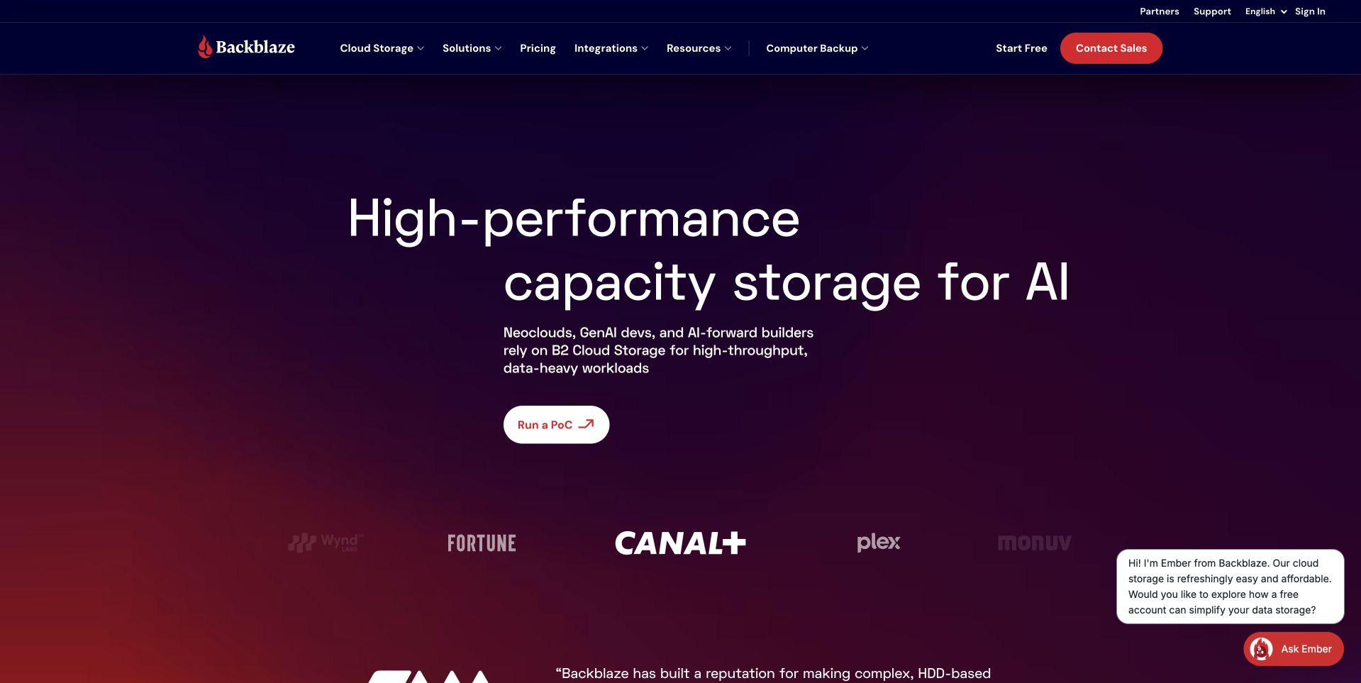
Backblaze’s homepage uses a dark purple-to-red field around a large storage message aimed at AI workloads. A compact proof-of-concept action provides a more specific continuation than a generic contact link. The header keeps cloud storage, pricing, integrations and developer resources available, with customer marks beginning beneath the main proposition. This is useful for studying how an infrastructure service can introduce a technical audience without opening with a specification table. The Apache project’s Cassandra case describes a historical company workload; it does not identify this public marketing page or every current storage-system component.
What you can learn
Give a technical proposition a concrete evaluation route and explain what that exercise involves. Keep pricing and developer resources accessible for readers who need evidence first. A customer-logo strip can support the story, but the actual workload, limitations and test conditions should be understandable without inferring capability from the logos alone.
Pros
A proof-of-concept route makes evaluation more concrete.
Developer and pricing navigation remain direct destinations.
Cons & considerations
Workload-oriented claims need measured supporting conditions.
A broad storage headline cannot describe the whole operating model.
Platform source: Primary documented Apache Cassandra association. Documented association: Historical company workload documented by the Apache project; not the public marketing frontend. Platform evidence is separate from the direct website screenshot and is not a complete current infrastructure audit.
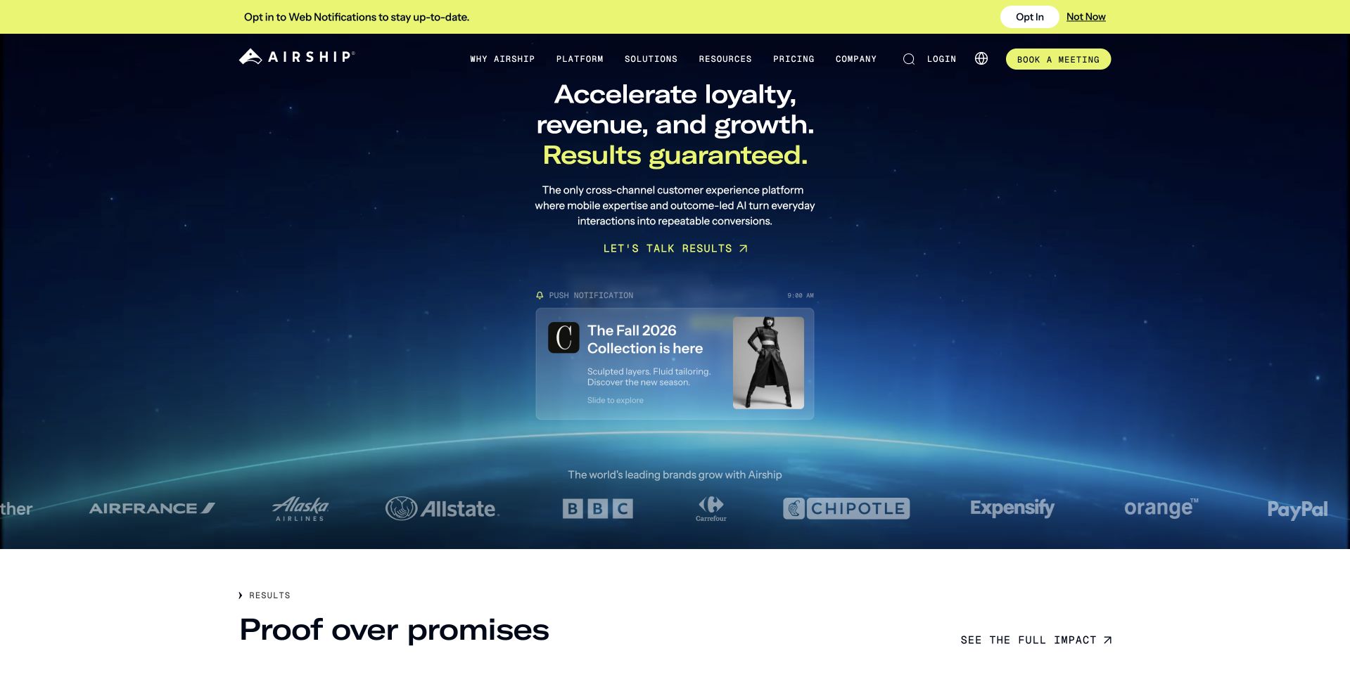
Airship’s homepage places a compact growth-oriented proposition above a product update preview on a deep blue, horizon-like background. A customer-logo row occupies a separate layer, and the next white section explicitly introduces proof-oriented material. The navigation keeps platform, solutions and resources available rather than making the hero the only route forward. This is useful for studying how a marketing platform can move from an ambitious opening to more concrete evidence. Airship’s engineering source describes a historical multistore architecture with Cassandra device data; it is not proof of every current service or public-page implementation.
What you can learn
Move quickly from a broad outcome proposition to scoped examples and an understandable product explanation. Keep customer evidence separate from guarantees or promotional language. The interface should help a reader discover the actual workflow and commercial boundaries rather than treating a dramatic background and familiar customer marks as sufficient justification.
Pros
Separate visual layers distinguish proposition, customers and evidence.
The header preserves practical routes into platform detail.
Platform source: Primary documented Apache Cassandra association. Documented association: Historical device-data workload in a multistore architecture; not a claim that every current service uses Cassandra. Platform evidence is separate from the direct website screenshot and is not a complete current infrastructure audit.
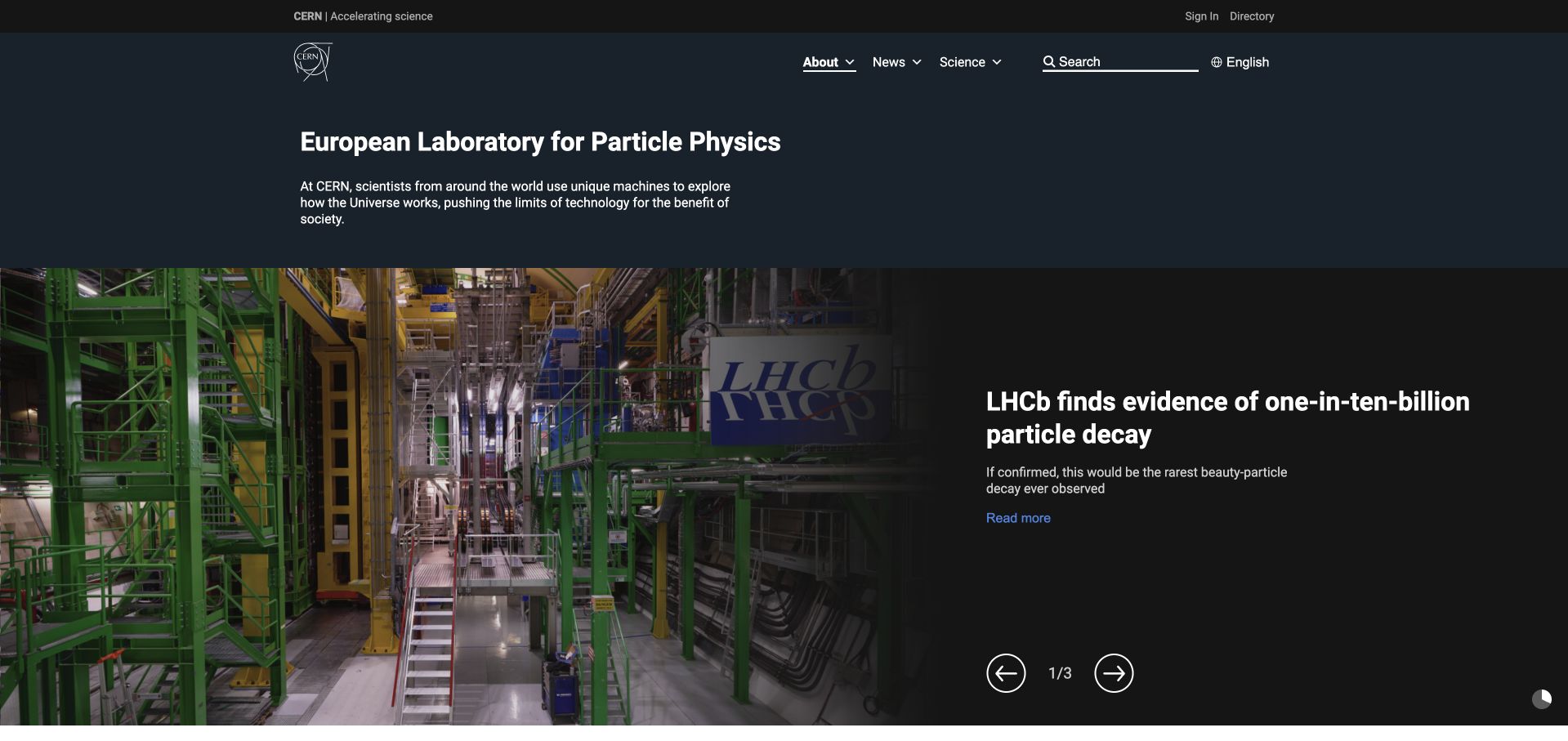
CERN’s public page begins with a plain institutional description above a large photograph of research equipment and an adjacent science-news headline. The dark background makes the image and white text feel part of one editorial feature. Visible carousel controls and a compact navigation preserve a route through the wider organization. It is useful for studying how to present a specialized subject without making the first screen a dense technical paper. The Apache project directory names the historical P-BEAST monitoring workload; it does not identify the public website’s CMS or validate a scientific result.
What you can learn
Introduce the institution in plain language, then give a specific story enough context to be understood. Use authentic equipment imagery with meaningful alternatives and clear continuation. A news carousel should have usable controls and should not make important information available only during one timed frame or through an unexplained technical label.
Pros
Real equipment connects the scientific story to a physical setting.
A plain institutional introduction helps unfamiliar readers orient themselves.
Cons & considerations
Technical news needs explanatory context for general audiences.
Carousel content requires accessible controls and stable alternatives.
Platform source: Primary documented Apache Cassandra association. Documented association: Project directory names P-BEAST monitoring; historical scientific-data association, not the public website CMS. Platform evidence is separate from the direct website screenshot and is not a complete current infrastructure audit.
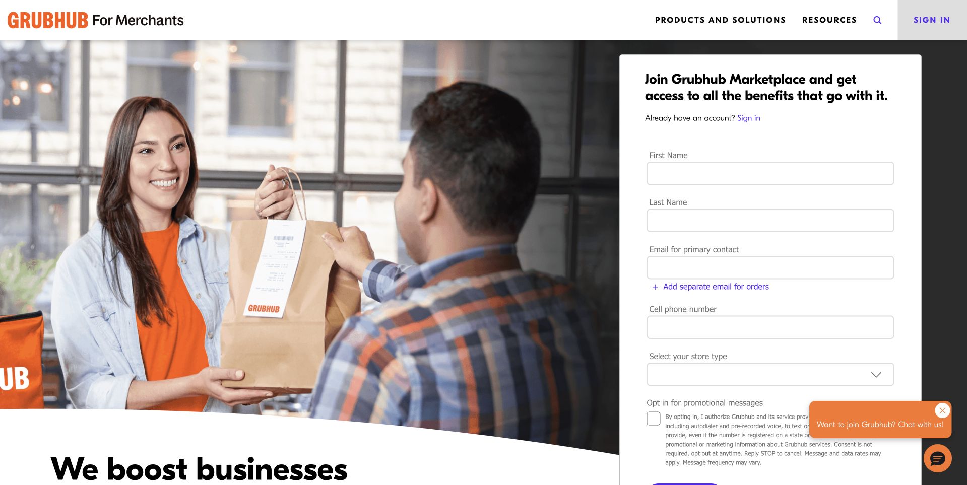
Grubhub’s merchant page pairs a restaurant handoff scene with a substantial signup form on the right. The form names the business information requested and sits directly beneath the merchant-oriented brand frame. A separate heading begins the broader business explanation below, rather than placing every benefit inside the form. This is useful for studying an acquisition page whose audience is a restaurant operator rather than someone ordering dinner. The Apache directory’s Cassandra reference concerns historical platform persistence; it does not identify the implementation of this restaurant-marketing page or the current ordering architecture.
What you can learn
State who the form is for and explain what submitting it starts. Keep important commercial context available before collection, and ask only for information needed at that stage. A strong restaurant image can establish the setting, but the form’s labels, privacy expectations and next-step explanation do the work of making the conversion understandable.
Pros
The merchant audience is explicit in the page’s identity.
A visible form makes the intended next step unambiguous.
Cons & considerations
A long opening form can ask for commitment before enough context.
Consent and commercial expectations need readable, specific treatment.
Platform source: Primary documented Apache Cassandra association. Documented association: Project directory describes platform persistence; historical association, not current restaurant-marketing page detection. Platform evidence is separate from the direct website screenshot and is not a complete current infrastructure audit.
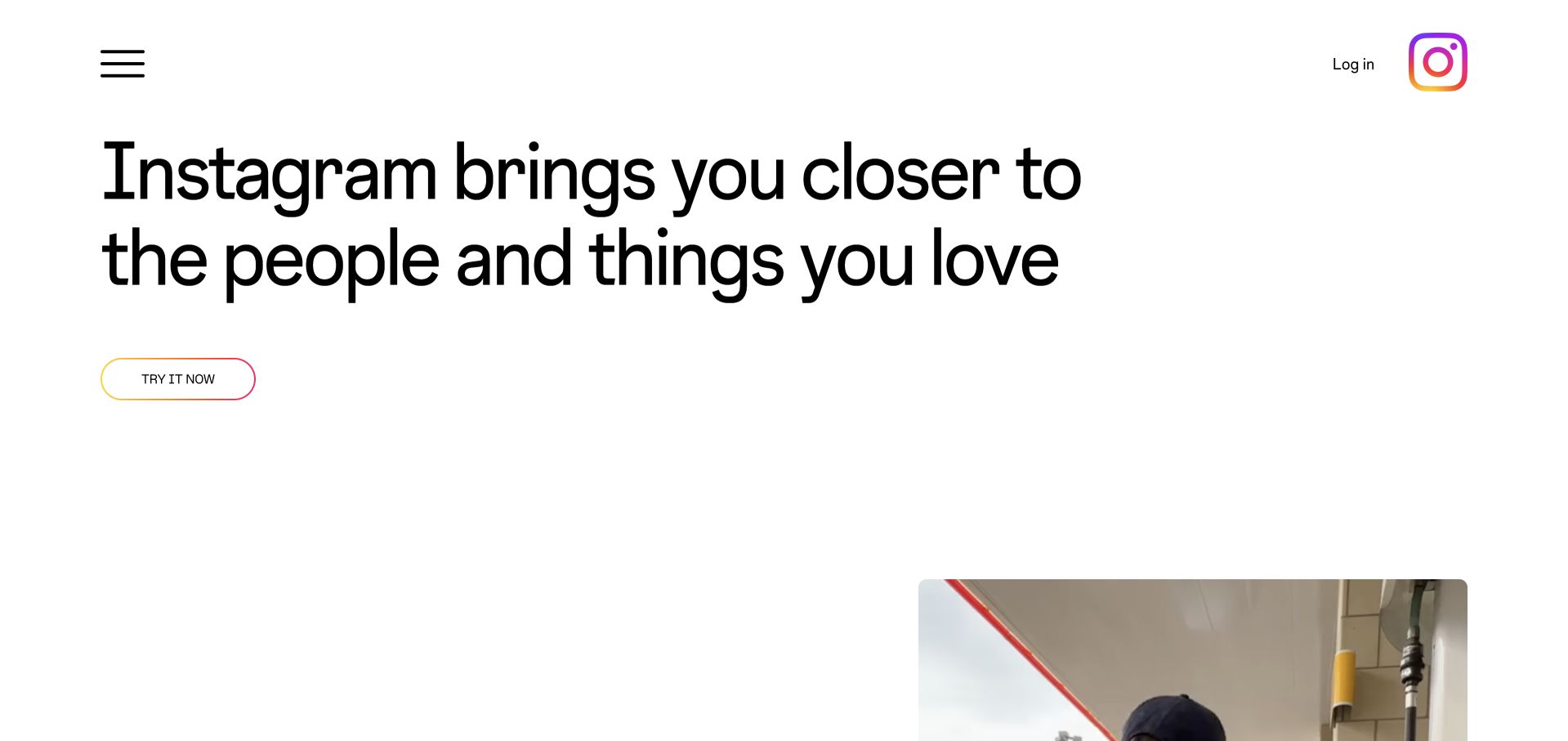
Instagram’s public About page uses large black type on a white field, with its multicolor symbol separated at the upper edge. A compact trial route sits beneath the statement, and the start of an image appears lower in the composition rather than filling the entire background. The sparse approach makes the product’s broad social purpose the entry point. It is useful for studying a public explanation that remains different from the logged-in application. The Apache directory names historical Instagram Cassandra workloads; it does not establish every current Meta system or the public About page’s runtime.
What you can learn
Use a public introduction to explain the product’s role without borrowing the visual density of a private application. Preserve a clear route to more information as well as starting the product. Large whitespace can create focus, but it should not leave unfamiliar visitors without practical context about what the service does or how it is used.
Pros
The white field gives the typographic message a clear priority.
The public explanation remains distinct from a personalized feed.
Cons & considerations
Large empty areas need careful adjustment for short screens.
A broad social statement needs concrete supporting information.
Platform source: Primary documented Apache Cassandra association. Documented association: Project directory names Instagram workloads; historical association, not every current Meta product or public About-page runtime. Platform evidence is separate from the direct website screenshot and is not a complete current infrastructure audit.
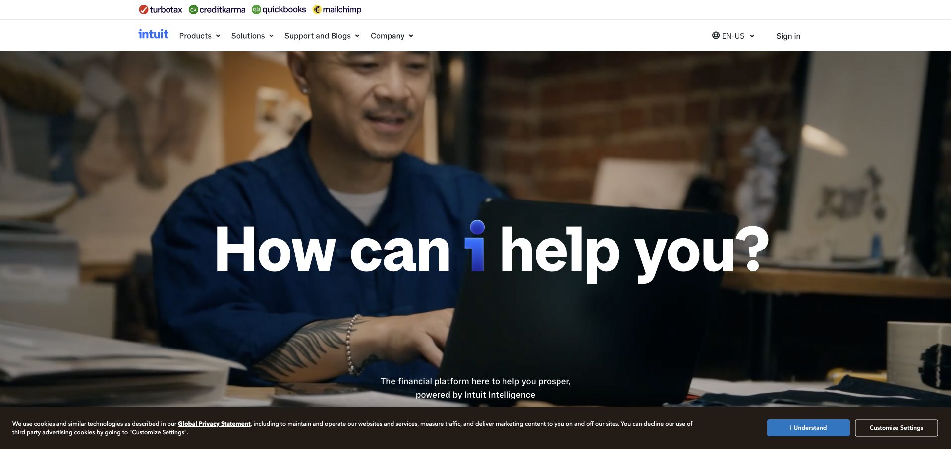
Intuit’s corporate page places a large question-like message over a person working in an everyday business setting. The upper frame names several product brands, while the main navigation provides product, support and company routes. This arrangement connects the group identity to recognizable offerings without making the first screen a comparison table. It is useful for studying how a parent platform can feel human while still acknowledging a substantial product family. The Apache project directory scopes the Cassandra association to a historical TurboTax workload, not every Intuit product or the public corporate website.
What you can learn
Connect a parent-brand introduction to recognizable products and a real working context. Keep the distinction between product selection, support and company information clear. A friendly opening question can invite exploration, but it should lead to specific capabilities and boundaries rather than implying one universal answer for every business or individual need.
Pros
Product-family branding helps visitors recognize the broader ecosystem.
A human working scene gives the corporate message context.
Cons & considerations
A broad invitation needs precise product routes below.
Overlay text requires dependable contrast across changing media.
Platform source: Primary documented Apache Cassandra association. Documented association: Project directory names a TurboTax workload; historical product scope, not all Intuit systems. Platform evidence is separate from the direct website screenshot and is not a complete current infrastructure audit.
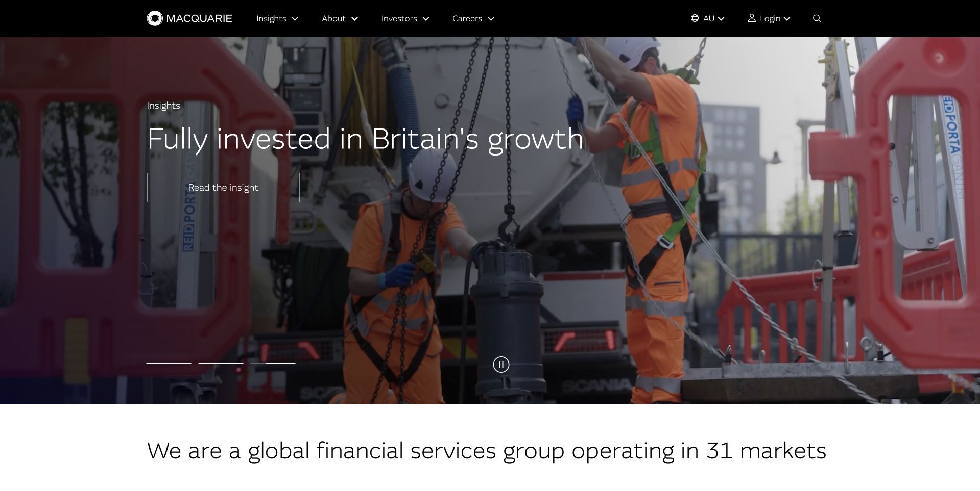
Macquarie’s public page features infrastructure workers and equipment behind a short Britain-focused story, with a plain group description beginning below. A dark upper navigation keeps insights, company information, investors and careers available. The page is useful for studying how a global organization can lead with one concrete regional topic without pretending that the single feature explains every business it operates. The Apache directory’s Cassandra reference concerns a historical Macquarie Bank data workload. It should not be generalized to every group company, the current public page’s technology or the suitability of financial services.
What you can learn
Use a specific project or regional story to make a broad organization more tangible, then explain the group’s wider role. Keep the feature’s geography and date clear. Corporate storytelling should direct readers toward evidence and relevant business information, not let a strong photograph imply an independent judgment about investment outcomes.
Pros
The infrastructure scene gives the lead story a concrete setting.
A separate group introduction prevents the feature defining the whole organization.
Cons & considerations
Regional stories need explicit scope and context.
Financial and investment claims require precise supporting information.
Platform source: Primary documented Apache Cassandra association. Documented association: Project directory describes a Macquarie Bank data workload; not every group company or public page. Platform evidence is separate from the direct website screenshot and is not a complete current infrastructure audit.
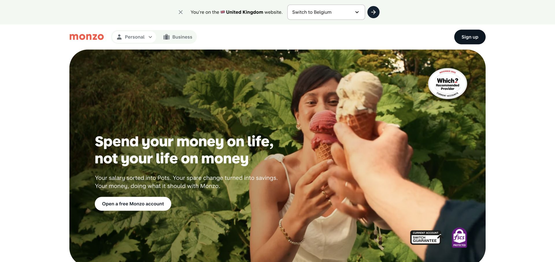
Monzo’s public page uses a warm scene of a person enjoying ice cream outdoors beneath a compact white navigation frame. A short lifestyle-oriented message and a rounded account-opening route sit over the image. A visible regional selector provides context above the main feature. The composition is useful for studying a financial brand that wants the opening to feel everyday rather than institutional. Apache’s directory cites a historical crowdfunding workload involving Cassandra. That is not current proof of the public bank site’s implementation, a complete banking architecture or an endorsement of account suitability.
What you can learn
A friendly scene can make a financial introduction less intimidating, but practical conditions still need clear routes. Keep geography and eligibility explicit before an account-opening journey. Support the simple headline with understandable product information, fees and limitations rather than letting the lifestyle image imply that every visitor can use the same offer.
Pros
The warm scene gives the banking brand an approachable setting.
A visible regional control provides useful geographic context.
Cons & considerations
Eligibility and product terms need more detail than the hero offers.
Text over imagery must remain readable across crops and screen sizes.
Platform source: Primary documented Apache Cassandra association. Documented association: Project directory cites a historical crowdfunding workload; not current public bank-site rendering. Platform evidence is separate from the direct website screenshot and is not a complete current infrastructure audit.
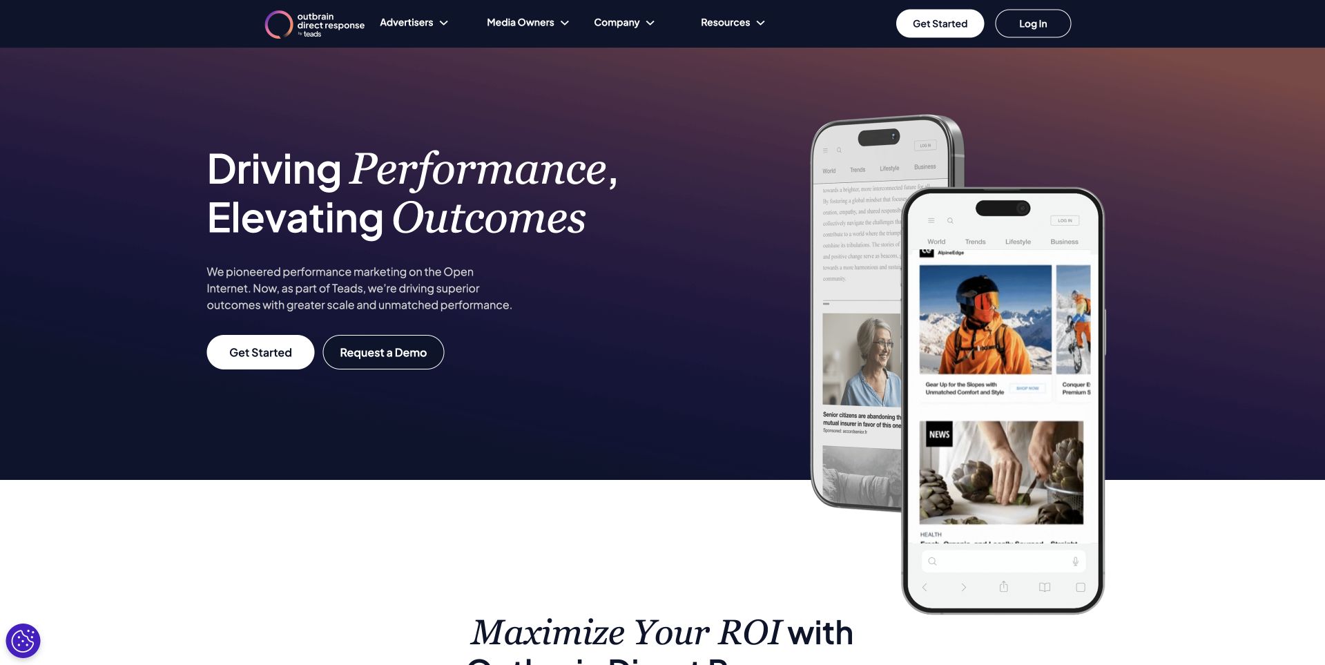
Outbrain’s direct-response page places a short performance-oriented statement beside overlapping phone-shaped content previews. A dark blue and muted purple field unifies the opening, while separate start and demonstration actions recognize different levels of buying readiness. The next white section begins a more detailed explanation below. This is useful for studying how an advertising product can show the environment in which it operates without presenting a dense campaign dashboard. The Apache directory names historical Outbrain Cassandra clusters; it does not establish the current public site’s technology or independently verify advertising outcomes.
What you can learn
Show the context in which a service appears and distinguish starting from evaluating it. Explain the relationship between the visible ad format and the buyer’s actual work in supporting content. Performance language needs scoped evidence and definitions, not only attractive mobile mockups or a confident promise of improved results.
Pros
Mobile previews make the advertising context recognizable.
Two actions distinguish initial evaluation from starting a relationship.
Cons & considerations
Performance claims need explicit definitions and supporting evidence.
Small mobile previews cannot explain every operational requirement.
Platform source: Primary documented Apache Cassandra association. Documented association: Project directory names Outbrain clusters; historical association, not proof of current corporate-page technology. Platform evidence is separate from the direct website screenshot and is not a complete current infrastructure audit.
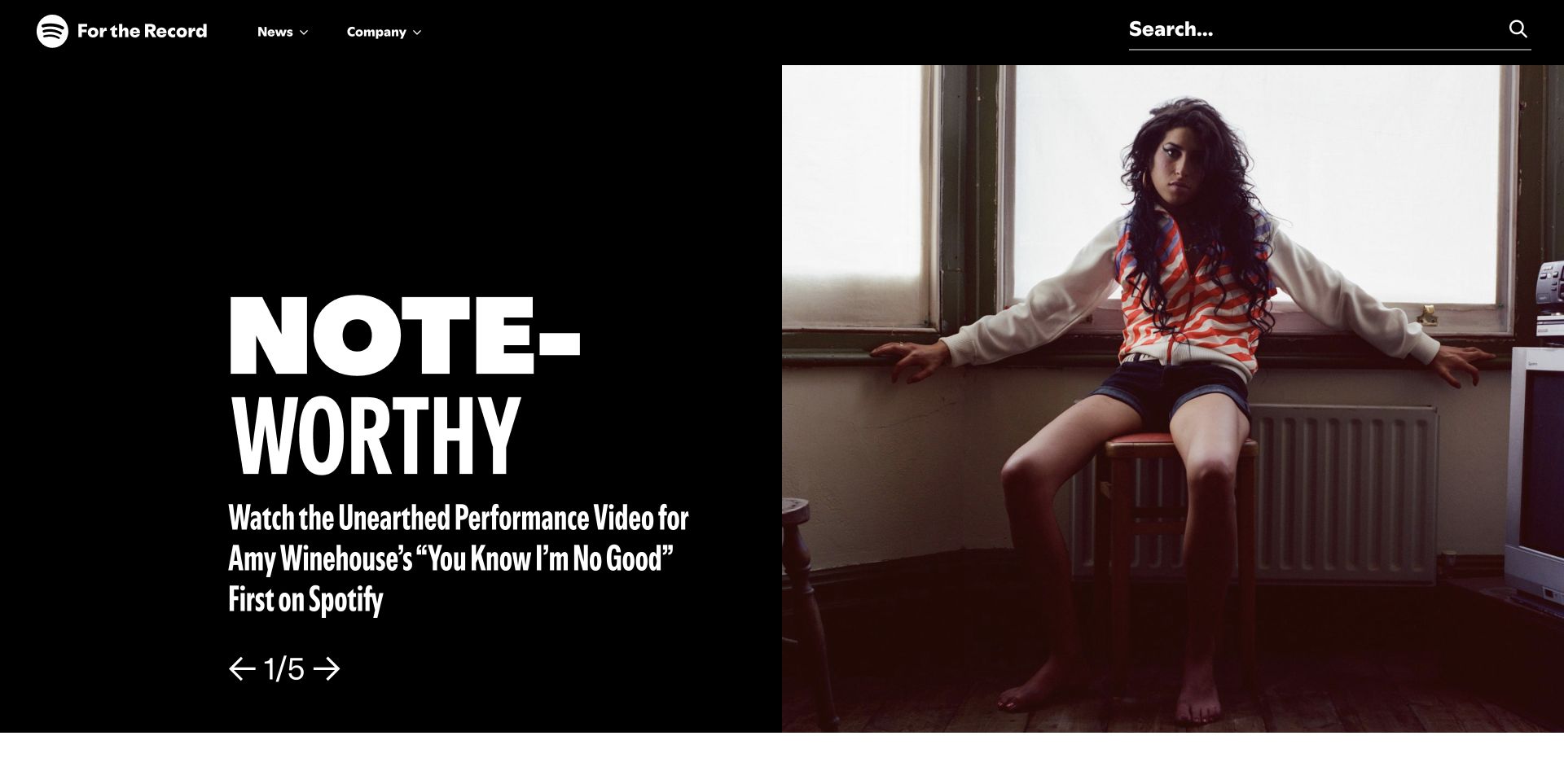
Spotify’s For the Record page pairs a large artist photograph with a bold white feature treatment on black. A concise description and visible carousel arrows frame the story, while news and company routes remain in the upper navigation. The composition emphasizes editorial discovery rather than reproducing a music player or subscription checkout. It is useful for studying how a product brand can publish stories in a visually coherent but functionally separate destination. The Cassandra engineering account dates to January 2015 and concerns personalization, not proof of the current newsroom stack or every present recommendation system.
What you can learn
Give editorial material its own recognizable reading experience while keeping the relationship to the product clear. Date stories, expose stable article destinations and provide accessible carousel controls. An artist image can carry atmosphere, but the text should explain why the story is relevant without requiring the visitor to recognize the person or play media.
Pros
The black-and-white frame gives the artist feature strong focus.
Newsroom navigation keeps editorial discovery distinct from playback.
Cons & considerations
Carousel stories need stable links and usable non-timed access.
Artist recognition should not be necessary to understand the article.
Platform source: Primary documented Apache Cassandra association. Documented association: January 2015 personalization account; historical workload, not proof of the current newsroom stack. Platform evidence is separate from the direct website screenshot and is not a complete current infrastructure audit.
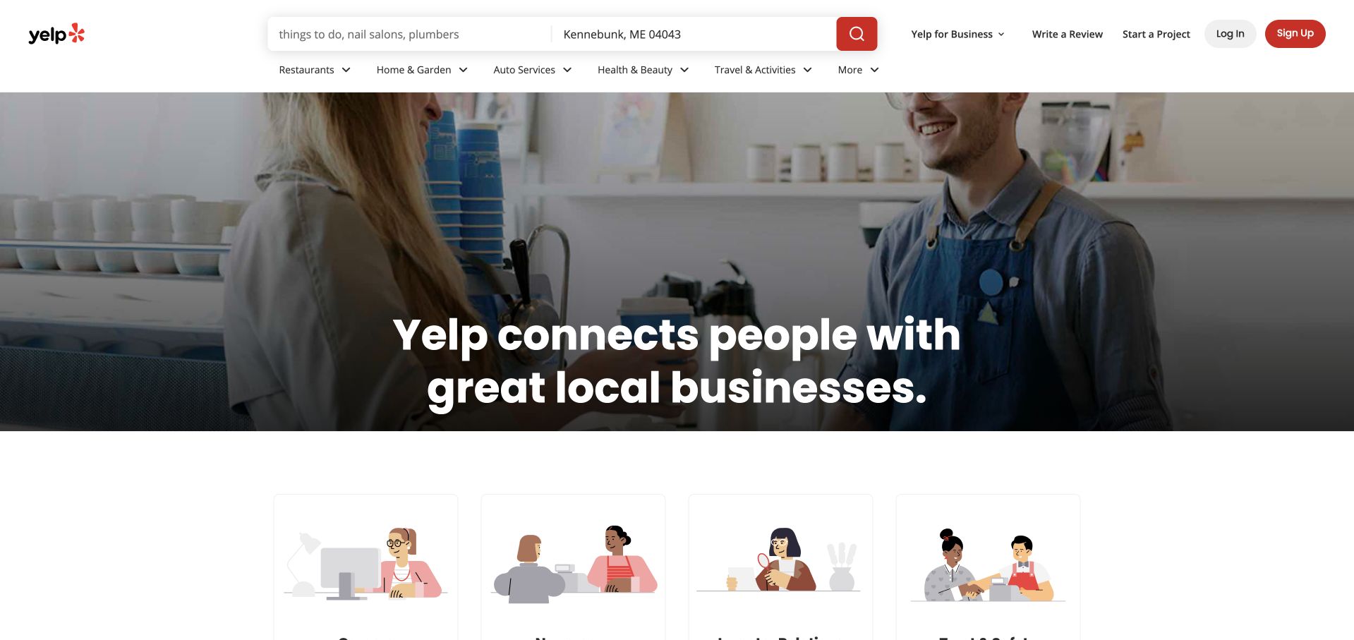
Yelp’s About page places a short statement about connecting people with local businesses over a service-related photograph. Unlike a purely corporate microsite, the upper frame retains recognizable search and category navigation. A lighter illustrated section begins below, giving the company explanation a second visual layer. This is useful for studying a public page that wants continuity with a familiar consumer platform without showing private account content. The Cassandra engineering source dates to November 2020 and concerns an orchestration deployment; it does not establish the current public About page’s backend or all review-system infrastructure.
What you can learn
Keep familiar product navigation where it helps orientation, but make the purpose of an About page clear. Use a service scene to ground the organization’s role and explain the broader story in accessible text. Location-dependent controls should be understandable without treating the displayed region as a universal setting for every visitor.
Pros
Familiar search navigation connects the company page to the product.
A concise purpose statement sits within a recognizable service setting.
Cons & considerations
Product utilities can compete with the institutional reading task.
Location-dependent information needs clear context and correction controls.
Platform source: Primary documented Apache Cassandra association. Documented association: November 2020 engineering deployment account; historical workload, not public About-page runtime. Platform evidence is separate from the direct website screenshot and is not a complete current infrastructure audit.
Kegan has 15+ years of experience working with small businesses, Fortune 500 companies, and everything in between. No development job is too big or too small: he brings the same hands-on attention to a focused improvement, a complete website, or a custom application.
For Apache Cassandra projects, he can help with data modeling, application data access, query design, search and cache integrations, migration planning, access boundaries, and maintainable handover. He works directly with clients on scope, design, implementation, testing, and handover, with an emphasis on clear communication and a system that remains practical to maintain after launch.
Show 3 other Apache Cassandra developersHide other Apache Cassandra developers
Three useful starting points for Cassandra planning
A bounded high-volume application feature
Choose one feature with a known access pattern and a measurable requirement. Map its data source, permitted readers and retention rules. Keep the pilot narrow enough to compare expected results with an independent reference. Do not use the first feature as permission to migrate every unrelated database in the organization.
A replacement for a strained existing workload
Identify the specific failure in the current system and preserve a representative baseline. A migration should improve the agreed workload without silently changing the meaning of records or reports. Give reconciliation, duplicate handling and rollback the same attention as throughput. Historical customer stories can suggest questions, but they do not supply your acceptance thresholds.
An existing deployment that is difficult to maintain
Start with the operational evidence: unresolved incidents, unclear repair ownership, capacity surprises or fragile recovery instructions. Fix the visibility and accountability gaps before adding features. A smaller, understood service is preferable to a larger system that only one person knows how to operate.
From references to requirements
Write a query, failure and maintenance brief
Make access patterns reviewable by the whole delivery team
Describe the first screen or API response in business terms. Name the records it includes, the period it covers and the order in which the user expects to see them. Include an empty result, an unusually large result and a boundary case. Ask the product owner to review the expected output before the implementation team commits to a data shape.
Cassandra’s modeling guidance ties tables and partition choices to queries and explains why data may be duplicated across query-specific tables. Keep this technical decision explicit in the brief. When a requirement changes, the team should be able to identify the affected access pattern rather than assuming a new filter is a cosmetic interface change.
Maintain an example dataset with known answers. Use it when checking imports, updates and new query paths. If two views represent the same business event, describe how reviewers will recognize that they agree. The objective is an explainable result, not a diagram that merely looks sophisticated.
Define failure behavior before a customer experiences it
Walk through an interrupted write, an uncertain response and a retry. Agree on whether the user should wait, check status or begin again. Avoid a generic failure message that encourages repeated submission when the original action may already have succeeded. The interface and application service need a shared understanding of the operation’s state.
Separate external messages from operational diagnostics. Users need a safe next step; maintainers need correlation and enough context to investigate without exposing private records. A support workflow should be able to identify the affected action and reconcile its final result. Test this with a realistic exercise rather than only a successful demonstration.
Specify the retention and correction process as well. A record may need to be updated or removed because it was wrong, not because a machine failed. State which systems hold related copies and who owns reconciliation. For sensitive information, involve the appropriate organizational reviewers before the dataset is copied into a new analytical or operational system.
Make routine maintenance and recovery visible work
Identify the operator responsible for cluster health, repair, capacity and upgrades. Apache documents repair as an operator-run process with resource costs and different full and incremental modes. The right cadence depends on the deployment; do not copy a generic schedule without understanding the data and operating constraints. Record how incomplete maintenance is detected and escalated.
Recovery acceptance should go beyond a node becoming available. Demonstrate that the important application queries return the expected information after the planned recovery procedure. Keep backups and restoration responsibilities distinct from replication and availability. A redundant system can still reproduce an unwanted change, so the project must explain which failure each protective measure addresses.
Give the next maintainer a concise runbook: dependencies, owners, maintenance windows, alert meanings, escalation contacts and the conditions for pausing a rollout. Keep a reviewed test dataset and recent recovery evidence with the handoff. A launch is not complete while essential knowledge remains only in a chat or the original implementer’s memory.
Ask the actual team to carry out its routine job: publish a realistic update, correct a mistake, preview a narrow screen, and identify who owns an integration failure. For a library or frontend framework, also ask who maintains the content source and deployment. A polished screenshot does not answer those operational questions.
Beyond the screenshot
Cassandra project planning checklist
Name one initial feature and its user-visible outcome.
List the queries, ordering and result boundaries.
Keep known-answer sample data for reconciliation.
Review partition and table choices against access patterns.
Explain duplicated representations and their correction path.
Define safe handling for retries and uncertain responses.
Keep private diagnostics out of public error messages.
Specify retention and data-correction ownership.
Assign repair and cluster-health responsibilities.
Test backup restoration separately from replica availability.
Record capacity, upgrade and escalation procedures.
Preserve historical dates and product scope in technology claims.
Test with real content, a keyboard, a small screen, slow or failed requests, and the people who will maintain the system. These are planning checks, not an accessibility, security, performance, or search-ranking certification.
Sources & editorial method
How this Apache Cassandra collection was reviewed
Public interface observations and primary Cassandra associations are reviewed separately. The project directory and dated engineering accounts remain bounded to their original workloads and periods. This is an editorial design and planning collection, not a current complete infrastructure inventory or a benchmark.
Every image is an unmodified capture from the actual website, with its source and capture date. Some captures are reused from our shared catalog; their dates remain the original capture dates. None comes from a vendor gallery or a generated reconstruction. Moving imagery and live content can change.
Technology attribution uses public page assets or metadata, official platform documentation, or a cited first-party project case study. Documentary and framework-relationship evidence is identified where used; it is not a complete current backend inventory. A CMS image CDN alone does not establish a full CMS deployment. A library’s presence does not prove which individual controls use it, and a platform label does not establish AI authorship.
The composition notes, lessons, pros and tradeoffs are original editorial observations. We have not measured conversion, traffic, security, performance or accessibility conformance. Website owners retain their brands and imagery; these examples are not our client portfolio. Written, Edited and Curated are independent records, not dates advanced by a build. See our editorial standards or suggest a correction.
Questions worth asking
Apache Cassandra website development FAQs
Do these screenshots show websites rendered by Cassandra?
No. They show independently inspected public interfaces. The associated sources document particular backend workloads, many of them historical.
Why include older engineering accounts?
They establish a concrete documented association and provide context. Their dates remain explicit so readers do not mistake them for a fresh audit of a company’s current infrastructure.
Should we copy a relational schema into Cassandra unchanged?
Begin with the application queries instead. Apache’s modeling documentation describes query-driven tables and partition choices, so an unchanged relational design is not a sufficient plan.
Does replication eliminate maintenance?
No. Repair and operational monitoring need explicit ownership. The Apache guidance explains why missed writes and replica synchronization require a considered process.
What should be proven before launch?
Known-answer queries, understandable failure and retry behavior, assigned routine maintenance and a demonstrated recovery process. A successful normal-path demo is only one part of acceptance.
Begin with a bounded query workload, an explainable failure model and people who can operate the result. Let those requirements determine the implementation.