Best Snowflake Websites of 2026 (20 Real-World Examples)
Customer-associated websites, dated platform evidence, and a practical brief for trusted analytical data
These 20 public websites are design references connected to official Snowflake evidence. Adobe, Capital One, Siemens, PepsiCo and Pfizer open the collection. Specific cases are distinguished from Snowflake’s October 31, 2024 customer fact sheet, which supports a historical organization-level association—not a present-day homepage stack or a particular workload unless separately documented.
A data platform is usually not visible in a marketing screenshot. A company may use Snowflake for analytics, governed data sharing or a named operational integration while its public website is built and hosted elsewhere. This guide keeps those questions separate: the reviews examine the public experience, and the technical sources state what is actually documented about the organization or workload.
The evidence has different dates and levels of detail. Adobe’s Unistore early-adopter reference is from 2022; the customer fact sheet is explicitly dated 2024; Capital One, Siemens and Mercury have more specific official cases. A new browser visit does not make an older customer listing current or prove that the same architecture remains in use. That limitation is part of the collection, not something to hide behind an impressive brand list.
Before the examples
What makes good Snowflake website development in 2026?
Begin with the decision the data must support
Name the report, product feature or operational decision and the people who depend on it. Define what correct and timely mean for that particular use. This is more useful than starting with a warehouse size or a platform diagram, because it creates a concrete way to judge whether an ingestion or modelling choice is adequate.
Separate ownership from convenient access
A dataset needs a business owner, a technical maintainer and clear rules about who may use it. Make the meaning of important fields and the process for changing them visible. Snowflake’s access-control model supplies technical mechanisms, but the organization still has to decide which responsibilities and permissions are appropriate for its data.
Treat cost and freshness as operating requirements
A useful data service needs more than a query that works once. State the expected update pattern, acceptable delay, review process and operating budget. Warehouse configuration and cost controls should serve those requirements. Do not assume a larger compute choice will solve a poorly defined data contract or missing ownership.
Study how these organizations explain complex portfolios, public information and practical next steps. Their Snowflake associations are not a visual design recipe. The same disciplined distinction should apply in your project: public interface, operational source system and analytical platform are separate questions.
We start with five recognizable brands or organizations: Adobe, Capital One, Siemens, PepsiCo, Pfizer. Each attribution applies to the named website property, not every product or website belonging to its organization. This is a curated reading sequence, not a measured ranking.
Adobe’s captured homepage puts a business-oriented customer-experience campaign over a full-width workplace image, with audience and product-family choices arranged along the bottom. The main header retains familiar creative, document and business routes. A white action stands out against the darker image without competing with a long form. The page is useful for studying how a single brand can feature one audience while still acknowledging several other important reasons to visit.
What you can learn
A campaign can be focused without pretending the company serves only one use case. Snowflake’s Unistore announcement named Adobe as an early adopter in 2022. Preserve that date and scope: it does not establish this marketing homepage’s infrastructure or prove a current deployment configuration.
Pros
Audience choices remain visible even while one enterprise campaign receives most of the opening’s visual emphasis.
A single high-contrast action makes the featured story understandable without adding several competing conversion paths.
Cons & considerations
Small navigation over detailed photography needs robust contrast and responsive placement at every screen size.
A rotating audience campaign can confuse returning visitors if the surrounding product-family structure is not stable and clearly labeled.
Platform source: 2022 Unistore announcement. Snowflake’s 2022 Unistore announcement identifies Adobe as an early adopter of Unistore, in the historical context of that announcement. This documents a particular organization-level or workload-level Snowflake association, not the pictured public website’s frontend, CMS, hosting or complete current infrastructure. Historical sources retain their original dates; vendor-reported results were not independently tested. Platform evidence is separate from the direct website screenshot and is not a complete current infrastructure audit.
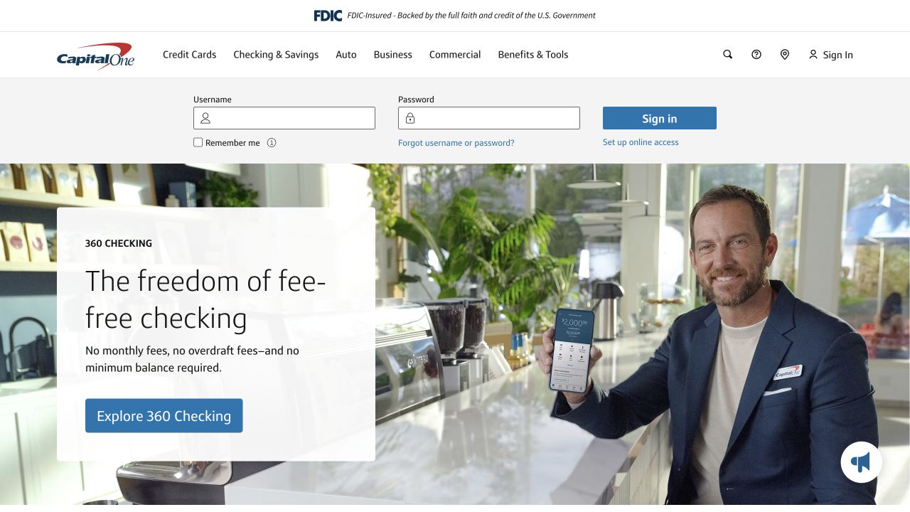
Capital One keeps a compact sign-in area above a large consumer-banking feature, while the main navigation separates cards, banking, auto and business tasks. The captured campaign combines a human scene with a clear checking-account action. Lower sections provide comparison and exploration routes rather than making the opening carry every product detail. The layout is worth studying for its deliberate separation between returning account users and prospective customers.
What you can learn
An established service should preserve access to existing tasks even when acquisition campaigns change. Snowflake’s Capital One story describes data engineering, analytics and machine-learning workloads. It does not establish the public homepage’s CMS or authenticate any financial offer shown in the design reference.
Pros
Existing-customer sign-in remains available without forcing prospective customers into an account-oriented interface.
Product-family navigation gives visitors a useful structure before they encounter more detailed comparison and eligibility material.
Cons & considerations
Promotional terms and account conditions need direct access rather than being inferred from a friendly campaign image.
A sign-in panel and a large hero can consume substantial mobile space unless their reading order is carefully designed.
Platform source: Official Capital One customer video page. Snowflake’s official Capital One customer page describes data-engineering, analytics and machine-learning use cases. This documents a particular organization-level or workload-level Snowflake association, not the pictured public website’s frontend, CMS, hosting or complete current infrastructure. Historical sources retain their original dates; vendor-reported results were not independently tested. Platform evidence is separate from the direct website screenshot and is not a complete current infrastructure audit.
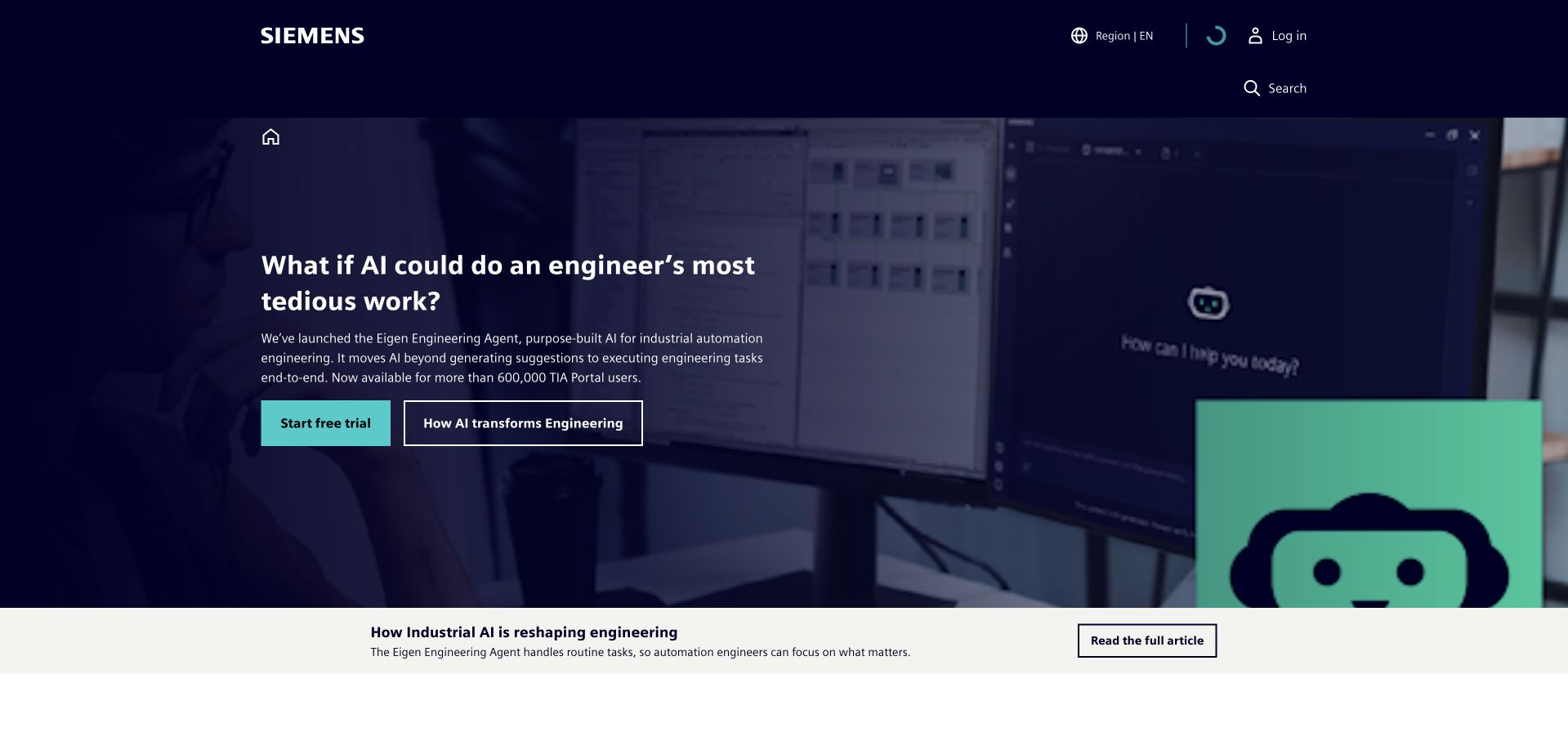
Siemens’s dark industrial opening introduces an engineering-agent proposition through a recognizable working environment. Trial and explanatory actions are separated, and the next story strip gives readers a lower-commitment route into the topic. The wider page then expands into industrial applications, products and services. This is a useful example of making a very large technical organization feel specific for one opening moment without reducing the entire site to that campaign.
What you can learn
A data-platform story becomes easier to understand when it is connected to a real organizational task. Snowflake’s Siemens case describes the Siemens Data Cloud and a data-mesh initiative. That enterprise association is not evidence that the pictured public homepage runs on Snowflake.
Pros
The engineering context makes a broad AI and industrial-platform proposition easier to picture immediately.
Two levels of action distinguish readers ready to evaluate a product from those seeking an explanation first.
Cons & considerations
A dark, detailed background needs deliberate text contrast and a useful static presentation when motion is disabled.
A campaign-specific opening should retain obvious routes for visitors seeking different established parts of a large industrial portfolio.
Platform source: Official Siemens Data Cloud case. Snowflake’s Siemens customer case describes Siemens Data Cloud and a data-mesh approach. This documents a particular organization-level or workload-level Snowflake association, not the pictured public website’s frontend, CMS, hosting or complete current infrastructure. Historical sources retain their original dates; vendor-reported results were not independently tested. Platform evidence is separate from the direct website screenshot and is not a complete current infrastructure audit.
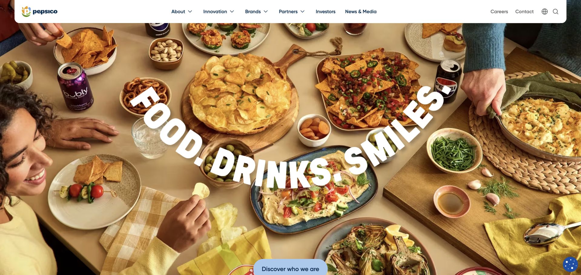
PepsiCo’s homepage uses food, drinks and people as the main visual vocabulary rather than opening with a corporate organization chart. A rounded white navigation bar sits above an expansive campaign scene, while lower sections lead into brands, company information and sustainability material. Large words and strong imagery make the opening approachable to a general audience. It is useful to study how a parent company can feel connected to everyday products without becoming an online grocery catalogue.
What you can learn
A corporate portfolio can borrow recognition from its products while still explaining the organization behind them. PepsiCo appears in Snowflake’s official October 2024 customer fact sheet. That is a dated organizational association, not a current homepage stack or a product-specific workload claim.
Pros
Familiar consumer products make a large corporate group easier to recognize without extensive introductory copy.
Brand and institutional routes provide different ways to explore the company after the visual opening.
Cons & considerations
Large animated words and changing scenes need a stable reading experience and appropriate reduced-motion alternatives.
Sustainability and performance claims require their own evidence; attractive everyday imagery should not be treated as verification of those outcomes.
Platform source: Official Snowflake customer fact sheet, October 31, 2024. PepsiCo is explicitly named among customers in Snowflake’s official fact sheet dated October 31, 2024. This is a historical organization-level listing without a specified workload. This documents a particular organization-level or workload-level Snowflake association, not the pictured public website’s frontend, CMS, hosting or complete current infrastructure. Historical sources retain their original dates; vendor-reported results were not independently tested. Platform evidence is separate from the direct website screenshot and is not a complete current infrastructure audit.
Pfizer’s captured homepage pairs a large research-oriented photograph with a clearly defined awareness topic and an editorial action. The white header separates science, products, stories and company information without overloading the image. Further content adds articles, press releases and other corporate material. The page is useful for studying how a specialized organization can give a current subject substantial attention while retaining a broader, recognizable information structure.
What you can learn
Health-related communication needs clear boundaries between an editorial introduction and advice for an individual. Pfizer is listed in Snowflake’s October 2024 customer fact sheet. That historical association does not identify this website’s runtime, establish a particular clinical workload or validate any medical claim pictured.
Pros
A defined editorial topic gives a broad corporate site a clear opening focus without requiring technical background.
Stable science and product navigation lets visitors move beyond the featured story to more specific information.
Cons & considerations
Health imagery and authoritative branding must not substitute for appropriately qualified, sourced medical information.
White text over a research photograph needs reliable contrast and an intentional responsive crop so supporting details remain readable.
Platform source: Official Snowflake customer fact sheet, October 31, 2024. Pfizer is explicitly named among customers in Snowflake’s official fact sheet dated October 31, 2024. This is a historical organization-level listing without a specified workload. This documents a particular organization-level or workload-level Snowflake association, not the pictured public website’s frontend, CMS, hosting or complete current infrastructure. Historical sources retain their original dates; vendor-reported results were not independently tested. Platform evidence is separate from the direct website screenshot and is not a complete current infrastructure audit.
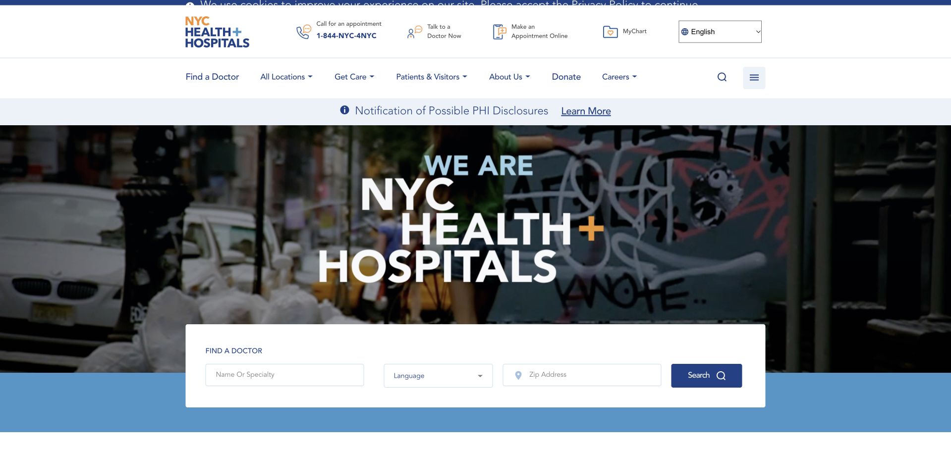
NYC Health + Hospitals combines a strong public-service introduction with immediately visible appointment, location and doctor-finding routes. A compact search area sits across the main image, while the header also exposes language selection and patient access. The design is useful because it does not assume every visitor wants to read the institution’s corporate story first. The page treats navigation to care-related information as a primary task rather than a secondary conversion opportunity.
What you can learn
For a public healthcare network, clear task labels and language access matter more than an elaborate campaign journey. Snowflake’s October 2024 fact sheet names NYC Health and Hospitals as a customer. It does not identify a clinical system or the stack of this public page.
Pros
Appointment and provider-finding routes are visible before visitors must understand the network’s full organizational structure.
Language access and patient-account routes acknowledge different practical needs within the same public-service interface.
Cons & considerations
Multiple urgent-looking actions need careful prioritization so routine navigation is not confused with emergency guidance.
A customer-list association should never be expanded into claims about patient data, clinical decisions or the security of a particular healthcare system.
Platform source: Official Snowflake customer fact sheet, October 31, 2024. NYC Health + Hospitals is explicitly named among customers in Snowflake’s official fact sheet dated October 31, 2024. This is a historical organization-level listing without a specified workload. This documents a particular organization-level or workload-level Snowflake association, not the pictured public website’s frontend, CMS, hosting or complete current infrastructure. Historical sources retain their original dates; vendor-reported results were not independently tested. Platform evidence is separate from the direct website screenshot and is not a complete current infrastructure audit.
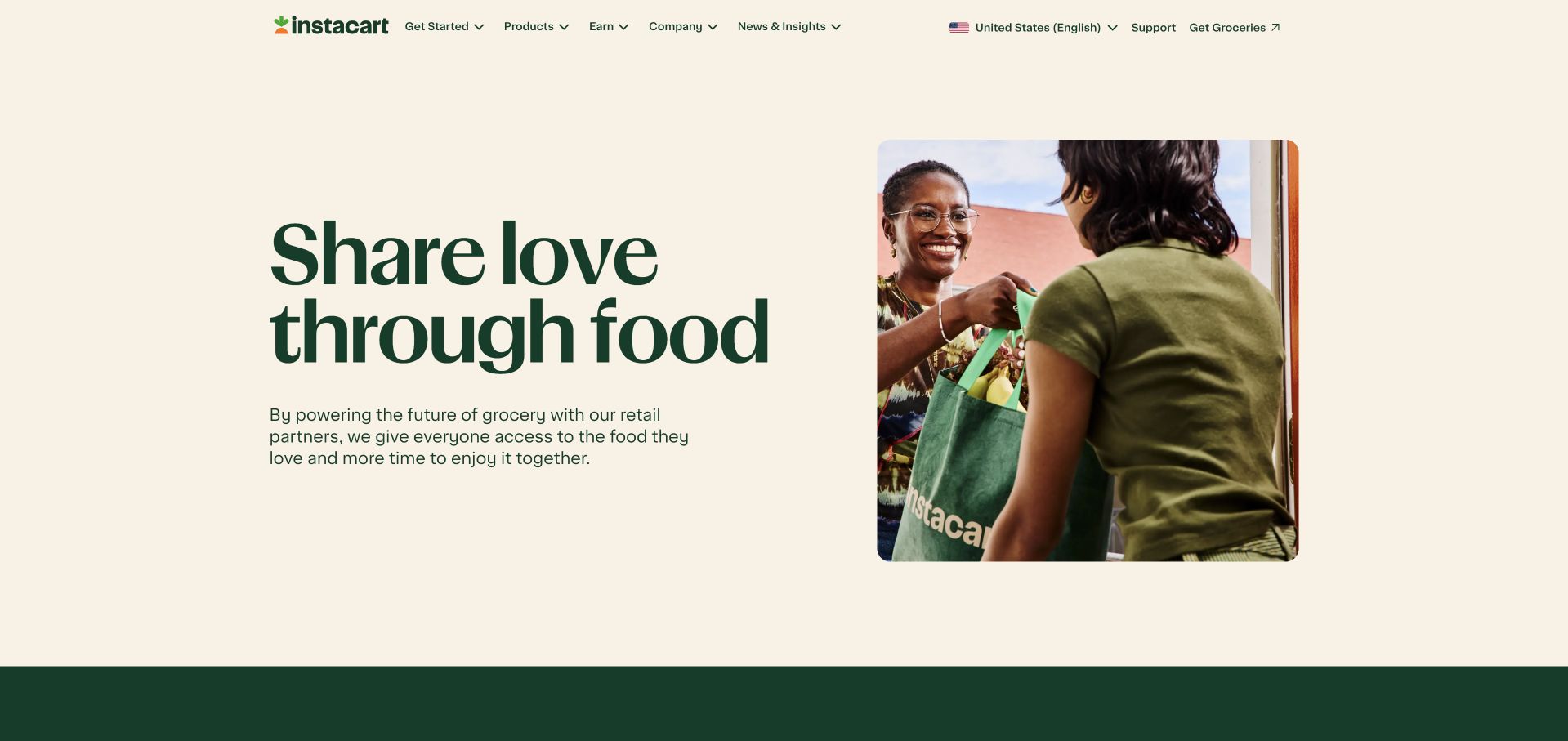
Instacart’s corporate homepage uses a warm neutral background, dark-green typography and a human delivery scene to introduce its broader grocery-technology story. Partner, advertising and company routes follow the opening rather than a location-specific shopping grid. The navigation still provides a clear route to groceries, but the page’s main purpose is institutional and commercial explanation. It is useful to compare this corporate surface with a marketplace’s more transactional customer application.
What you can learn
A marketplace often needs a distinct explanation for partners, advertisers and people studying the company. Instacart’s inclusion in Snowflake’s October 2024 customer fact sheet supports a dated organizational association, not a claim that this corporate page or the live grocery service runs on Snowflake.
Pros
The corporate surface explains the ecosystem without exposing personal shopping history or requiring a delivery address.
Partner and advertising routes are clearly different from the customer-facing grocery task.
Cons & considerations
A broad ecosystem statement needs concrete supporting pages so different business audiences can identify the relevant service.
Warm lifestyle imagery should not obscure practical distinctions between the platform, retailer partners and the responsibilities of individual delivery services.
Platform source: Official Snowflake customer fact sheet, October 31, 2024. Instacart is explicitly named among customers in Snowflake’s official fact sheet dated October 31, 2024. This is a historical organization-level listing without a specified workload. This documents a particular organization-level or workload-level Snowflake association, not the pictured public website’s frontend, CMS, hosting or complete current infrastructure. Historical sources retain their original dates; vendor-reported results were not independently tested. Platform evidence is separate from the direct website screenshot and is not a complete current infrastructure audit.
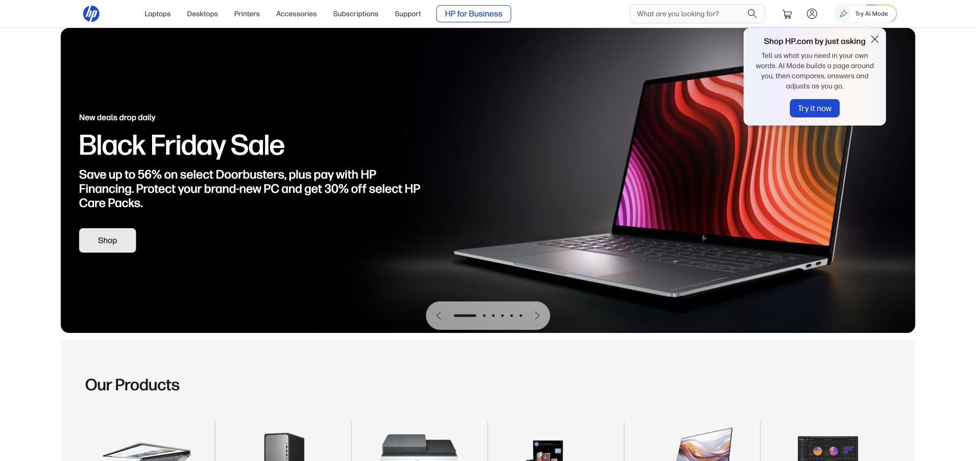
HP’s public retail homepage leads with a large laptop campaign and straightforward learn and shop routes. Product-family navigation across the top distinguishes laptops, desktops, printers, accessories and support, while later cards provide additional featured devices and services. The design is useful for studying how a broad hardware brand maintains category access when promotional content changes frequently. The first screen serves shopping intent without making technical product comparison disappear entirely.
What you can learn
A changing retail campaign needs a stable category structure around it. HP is named in Snowflake’s October 2024 customer fact sheet. That historical organization-level association does not establish the ecommerce homepage’s CMS, a particular analytics deployment or any relationship between the pictured hardware and Snowflake.
Pros
Product categories remain directly accessible instead of being hidden behind the current promotional campaign.
Separate learning and shopping actions allow for different levels of purchase readiness on a technically detailed product.
Cons & considerations
Frequent offers and overlapping promotional widgets can make it harder to compare stable product information.
Price, financing and performance statements need explicit terms and current specifications rather than being preserved as evergreen design-review claims.
Platform source: Official Snowflake customer fact sheet, October 31, 2024. HP is explicitly named among customers in Snowflake’s official fact sheet dated October 31, 2024. This is a historical organization-level listing without a specified workload. This documents a particular organization-level or workload-level Snowflake association, not the pictured public website’s frontend, CMS, hosting or complete current infrastructure. Historical sources retain their original dates; vendor-reported results were not independently tested. Platform evidence is separate from the direct website screenshot and is not a complete current infrastructure audit.
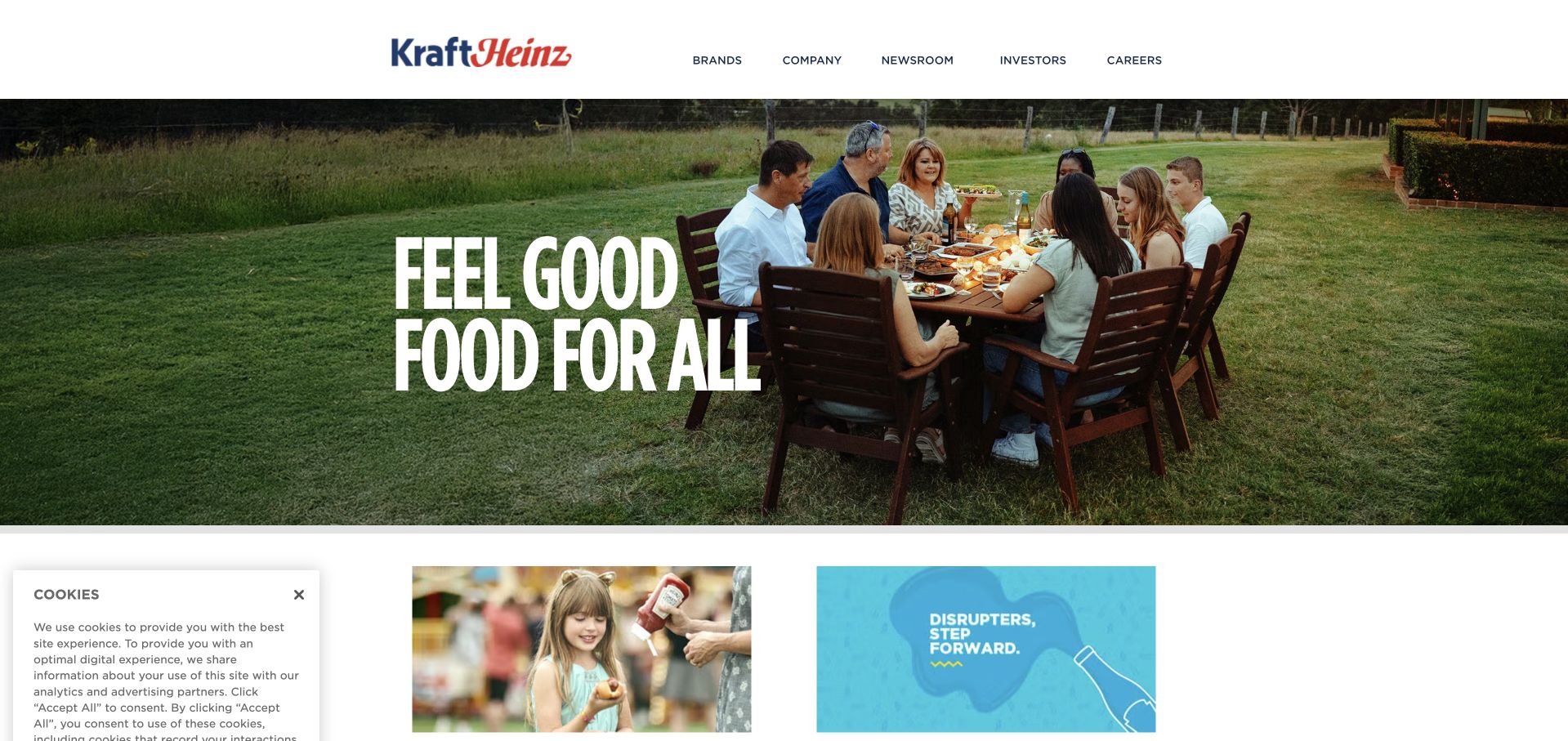
Kraft Heinz uses a large shared-meal scene and a short food-oriented headline before presenting brands, careers and corporate performance material. The white header is restrained, allowing the photograph to carry the first impression. Supporting cards below provide more specific routes without requiring visitors to understand the portfolio immediately. The page is a useful example of a corporate organization drawing a recognizable emotional connection to the products associated with it.
What you can learn
A parent-company site can begin with an everyday context, then explain the business through distinct supporting routes. Kraft Heinz appears in Snowflake’s official October 2024 customer fact sheet. That is historical organizational evidence only, not proof of the public homepage’s infrastructure or the systems used by every product brand.
Pros
A familiar meal scene gives a broad food portfolio an immediate human context.
Brands, careers and institutional information are offered as separate routes rather than forced into one acquisition funnel.
Cons & considerations
A short emotional headline still needs practical supporting content for investors, suppliers and visitors seeking specific product information.
Corporate scale and nutrition-oriented statements need appropriate sources and dates instead of relying on the reassuring tone of lifestyle photography.
Platform source: Official Snowflake customer fact sheet, October 31, 2024. Kraft Heinz is explicitly named among customers in Snowflake’s official fact sheet dated October 31, 2024. This is a historical organization-level listing without a specified workload. This documents a particular organization-level or workload-level Snowflake association, not the pictured public website’s frontend, CMS, hosting or complete current infrastructure. Historical sources retain their original dates; vendor-reported results were not independently tested. Platform evidence is separate from the direct website screenshot and is not a complete current infrastructure audit.
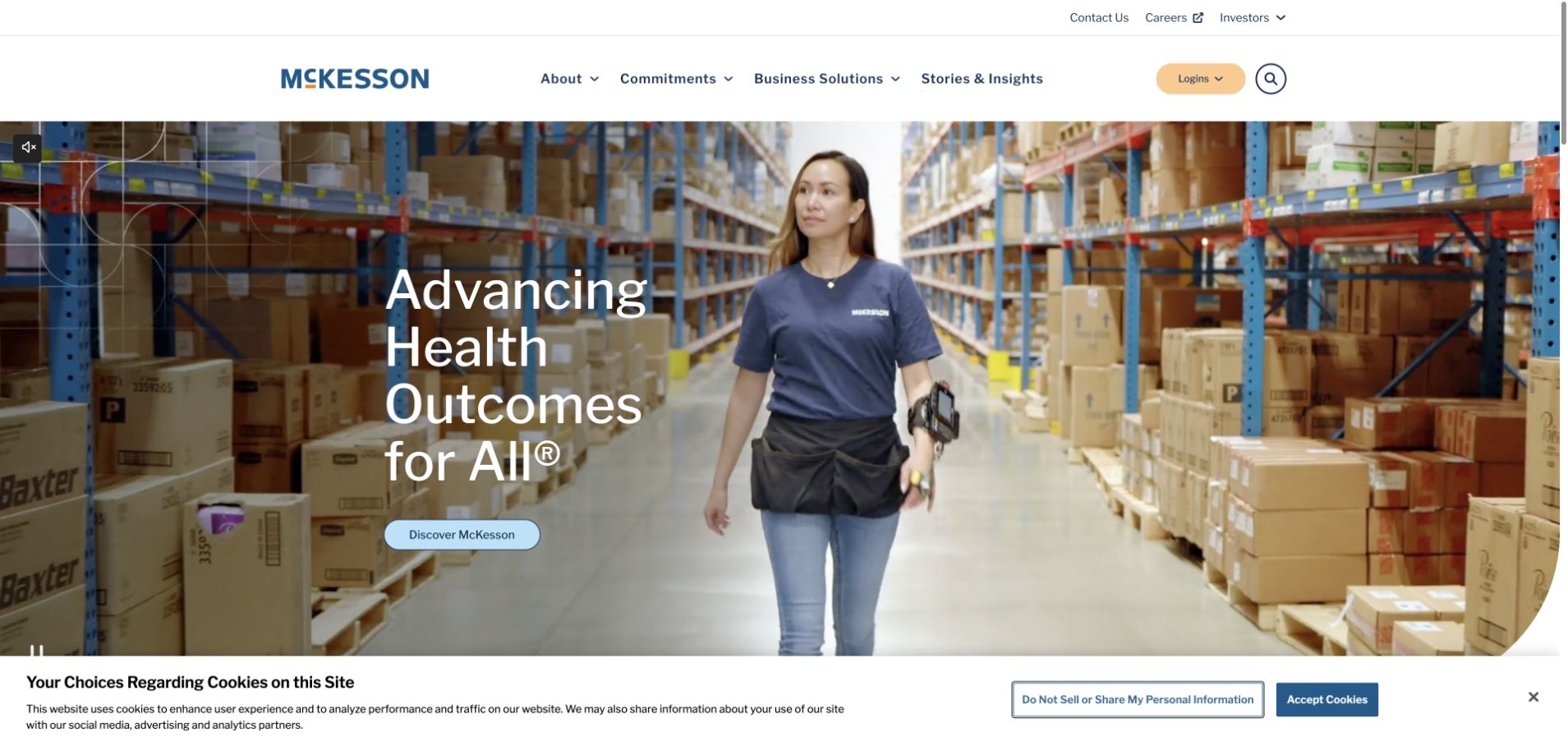
McKesson’s opening places a person within a distribution setting, connecting a broad healthcare proposition to a recognizable operational environment. The white header separates company, business solutions and stories, while lower content explains focus areas and current events. The design is useful because logistics and enabling services can otherwise be difficult to picture. It shows a practical setting before expanding into a wider organization-level explanation.
What you can learn
For an infrastructure-like service, show the environment and participants that make the work understandable. McKesson is named in Snowflake’s October 2024 customer fact sheet, but the source does not specify this website, a healthcare application or a current implementation. Keep the association narrower than the company’s entire operating environment.
Pros
Real operational imagery gives an abstract healthcare-services proposition a tangible first point of reference.
Business solutions and corporate stories provide different levels of detail for visitors with different reasons to arrive.
Cons & considerations
Health-outcome language needs careful supporting evidence and should not be inferred from a distribution photograph.
A large organization can require more precise audience routes than a single broad discover action offers on its own.
Platform source: Official Snowflake customer fact sheet, October 31, 2024. McKesson is explicitly named among customers in Snowflake’s official fact sheet dated October 31, 2024. This is a historical organization-level listing without a specified workload. This documents a particular organization-level or workload-level Snowflake association, not the pictured public website’s frontend, CMS, hosting or complete current infrastructure. Historical sources retain their original dates; vendor-reported results were not independently tested. Platform evidence is separate from the direct website screenshot and is not a complete current infrastructure audit.
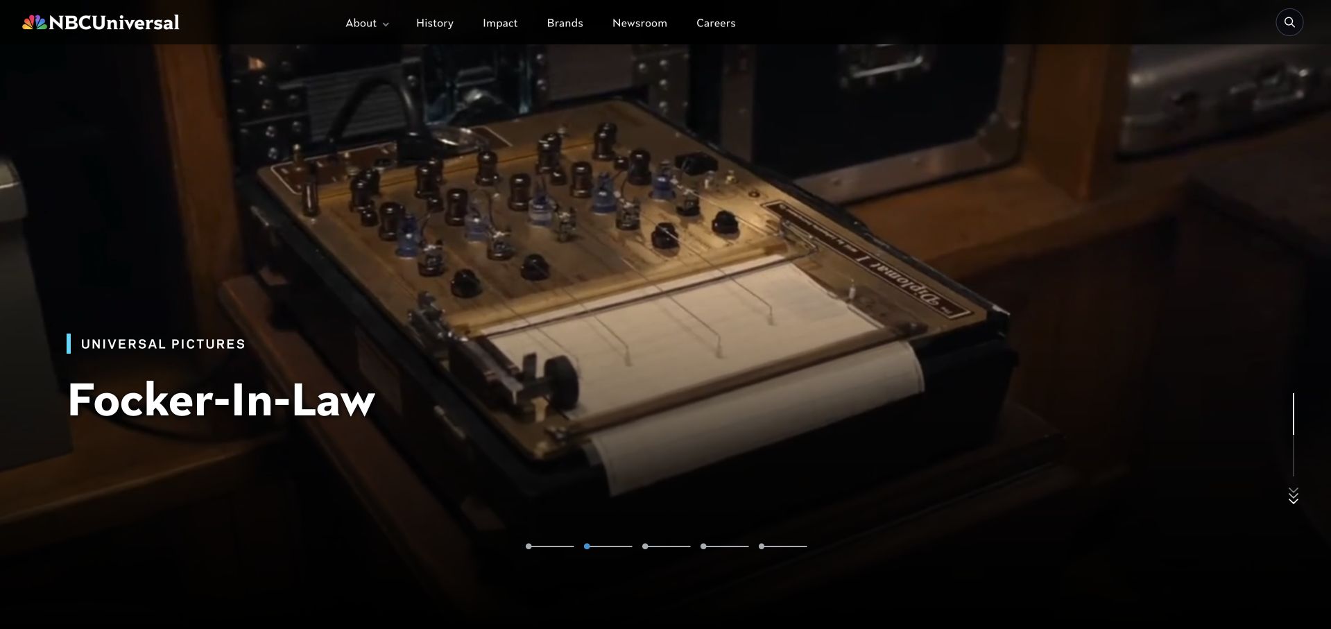
NBCUniversal’s homepage gives a featured entertainment property an expansive cinematic area, with a small content label and clear campaign information. A black header carries the corporate navigation without competing with the scene. Newsroom, brand and career content provide a different layer below. The site is useful for studying the relationship between a media group’s public identity and the individual films, channels and experiences associated with it.
What you can learn
A media parent can lead with creative work while retaining institutional routes for people who are not choosing what to watch. NBC Universal appears in Snowflake’s October 2024 customer fact sheet. The dated listing does not establish this marketing page’s CMS or the streaming infrastructure of any individual brand.
Pros
A real creative property gives the corporate brand an immediate and recognizable visual connection to its work.
The restrained corporate header preserves access to brands, careers and institutional information around a dominant campaign.
Cons & considerations
Autoplay entertainment footage requires clear pause controls and meaningful static alternatives for slower or reduced-motion contexts.
Release dates and viewing availability change quickly and need maintained destinations rather than being treated as permanent facts in a visual reference.
Visible tech stack
Earlier / documented evidence
Snowflake
Platform source: Official Snowflake customer fact sheet, October 31, 2024. NBCUniversal is explicitly named among customers in Snowflake’s official fact sheet dated October 31, 2024. This is a historical organization-level listing without a specified workload. This documents a particular organization-level or workload-level Snowflake association, not the pictured public website’s frontend, CMS, hosting or complete current infrastructure. Historical sources retain their original dates; vendor-reported results were not independently tested. Platform evidence is separate from the direct website screenshot and is not a complete current infrastructure audit.
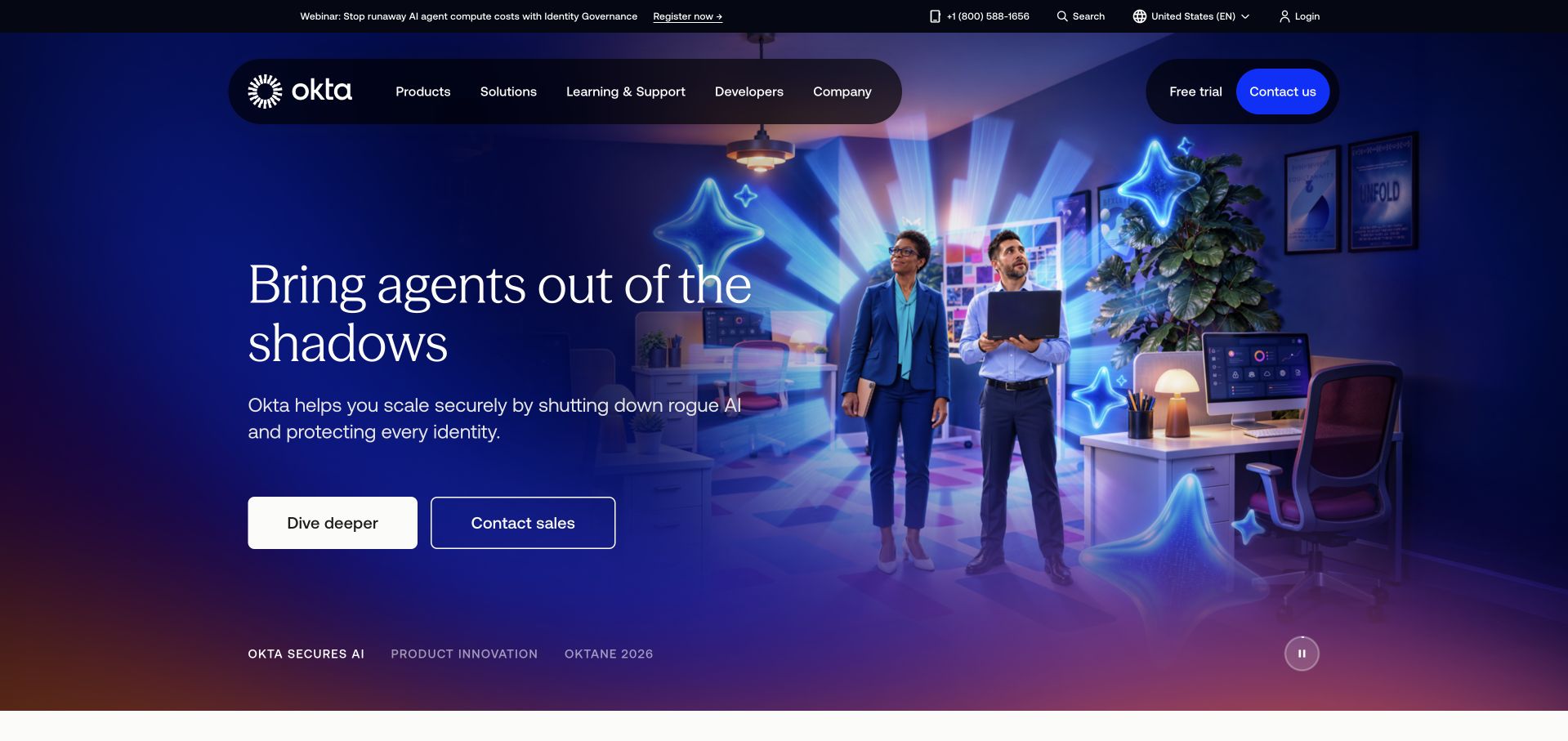
Okta’s captured homepage uses a dark, dramatic campaign composition to introduce identity and AI agents. A clear pair of actions sits below the proposition, while lower sections distinguish workforce, customer and agent-oriented needs. The top navigation retains developers, learning and commercial routes. The design is useful for studying how a software company can introduce a new category theme while still exposing established audiences and evaluation tasks.
What you can learn
A platform narrative needs explicit audience boundaries if it is to remain useful beyond the headline. Okta is named in Snowflake’s October 2024 customer fact sheet. That association does not specify this homepage’s implementation, identify the relevant analytics workload or establish a current deployment across Okta’s products.
Pros
The page preserves developer and product-evaluation routes around a visually strong current campaign.
Audience-specific sections help translate a broad identity theme into more concrete application and access contexts.
Cons & considerations
A dramatic AI theme can make established workforce and customer distinctions harder to find on a quick visit.
Customer logos and platform language need precise supporting evidence rather than implying a universal configuration or outcome across every identity scenario.
Platform source: Official Snowflake customer fact sheet, October 31, 2024. Okta is explicitly named among customers in Snowflake’s official fact sheet dated October 31, 2024. This is a historical organization-level listing without a specified workload. This documents a particular organization-level or workload-level Snowflake association, not the pictured public website’s frontend, CMS, hosting or complete current infrastructure. Historical sources retain their original dates; vendor-reported results were not independently tested. Platform evidence is separate from the direct website screenshot and is not a complete current infrastructure audit.
Notre Dame’s homepage uses a large research-related scene and a short health-and-wellbeing theme before expanding into broader public-interest work. The university header retains admissions, academic and institutional navigation, while stories below explain different research challenges. The page’s value as a design reference is the way it connects an institution’s identity to a coherent editorial topic without making every department compete in the first viewport.
What you can learn
An institution can organize its opening around one meaningful subject while retaining reliable routes for its established audiences. The University of Notre Dame appears in Snowflake’s October 2024 customer fact sheet. That dated association does not identify this public homepage’s stack or a particular research-data system.
Pros
A focused editorial theme makes a large university’s public-facing story easier to understand initially.
Stable institutional navigation preserves practical routes for prospective students and returning visitors beyond the featured research.
Cons & considerations
Public-impact claims need links to the underlying work and should not be accepted merely because the layout feels authoritative.
Large imagery and mission language can delay access to time-sensitive admissions or campus information unless those routes remain clearly prioritized.
Platform source: Official Snowflake customer fact sheet, October 31, 2024. University of Notre Dame is explicitly named among customers in Snowflake’s official fact sheet dated October 31, 2024. This is a historical organization-level listing without a specified workload. This documents a particular organization-level or workload-level Snowflake association, not the pictured public website’s frontend, CMS, hosting or complete current infrastructure. Historical sources retain their original dates; vendor-reported results were not independently tested. Platform evidence is separate from the direct website screenshot and is not a complete current infrastructure audit.
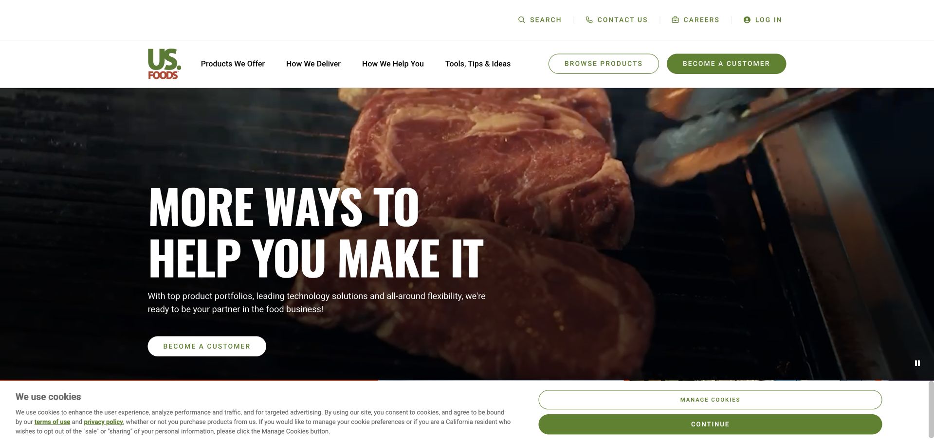
US Foods uses large food imagery, a high-contrast headline and a clear customer-start action to introduce its service. Lower sections divide the story into delivery, quality and tools, connecting the company’s broad portfolio to the work of running a food business. The white-and-green navigation remains practical above the campaign. The design is useful for studying a supplier whose value depends on both products and the operational relationship around them.
What you can learn
A B2B supplier can explain breadth through the customer’s ongoing tasks rather than a vast product list. US Foods is named in Snowflake’s October 2024 customer fact sheet. The historical listing does not establish this website’s architecture, a current operational data model or the availability of individual delivery services.
Pros
Delivery, product quality and business tools provide understandable organizing themes for a broad supplier offering.
The primary customer route is easy to identify without eliminating product and support navigation.
Cons & considerations
Large campaign imagery should not make practical location, eligibility and service-area information difficult to find.
Operational claims need precise definitions and supporting terms because different customers may have substantially different delivery arrangements and product availability.
Platform source: Official Snowflake customer fact sheet, October 31, 2024. US Foods is explicitly named among customers in Snowflake’s official fact sheet dated October 31, 2024. This is a historical organization-level listing without a specified workload. This documents a particular organization-level or workload-level Snowflake association, not the pictured public website’s frontend, CMS, hosting or complete current infrastructure. Historical sources retain their original dates; vendor-reported results were not independently tested. Platform evidence is separate from the direct website screenshot and is not a complete current infrastructure audit.
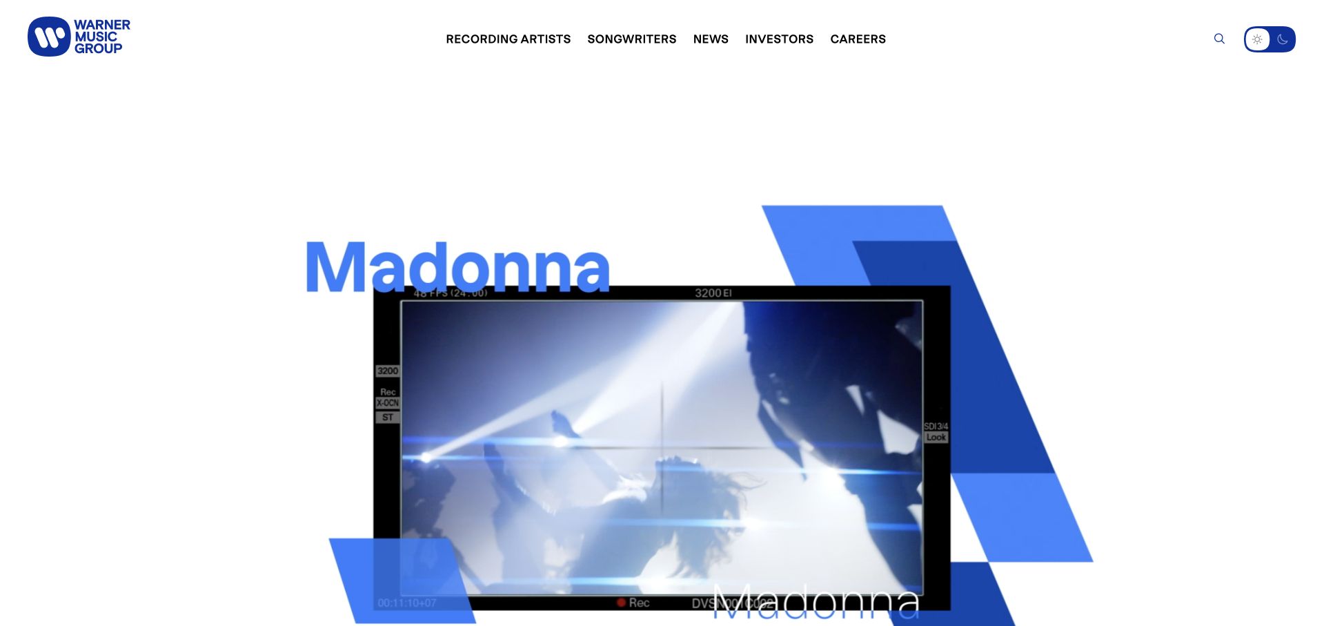
Warner Music Group uses large artist imagery, bold blue graphic elements and a deliberately sparse header to establish its creative identity. The page gives recording artists and songwriters distinct routes, with careers and corporate material available without dominating the first screen. The design is useful because the parent company remains visible while the people associated with its work supply the visual energy. It avoids presenting a music group as a generic professional-services firm.
What you can learn
A creative organization can let its artists lead the story while maintaining clear institutional tasks. Warner Music Group appears in Snowflake’s October 2024 customer fact sheet. That dated brand association does not identify this website’s CMS, a particular rights-management system or the current infrastructure of every associated label.
Pros
Artist imagery and a restrained corporate frame connect the parent organization to recognizable creative output.
Separate artist, songwriter and career routes acknowledge different audiences without requiring a complicated first-screen taxonomy.
Cons & considerations
Motion-heavy compositions need a stable, accessible fallback and should not make the main navigation dependent on animation timing.
A parent-brand presentation should preserve distinctions between labels, artists and corporate services rather than implying one uniform organizational or technical relationship.
Platform source: Official Snowflake customer fact sheet, October 31, 2024. Warner Music Group is explicitly named among customers in Snowflake’s official fact sheet dated October 31, 2024. This is a historical organization-level listing without a specified workload. This documents a particular organization-level or workload-level Snowflake association, not the pictured public website’s frontend, CMS, hosting or complete current infrastructure. Historical sources retain their original dates; vendor-reported results were not independently tested. Platform evidence is separate from the direct website screenshot and is not a complete current infrastructure audit.
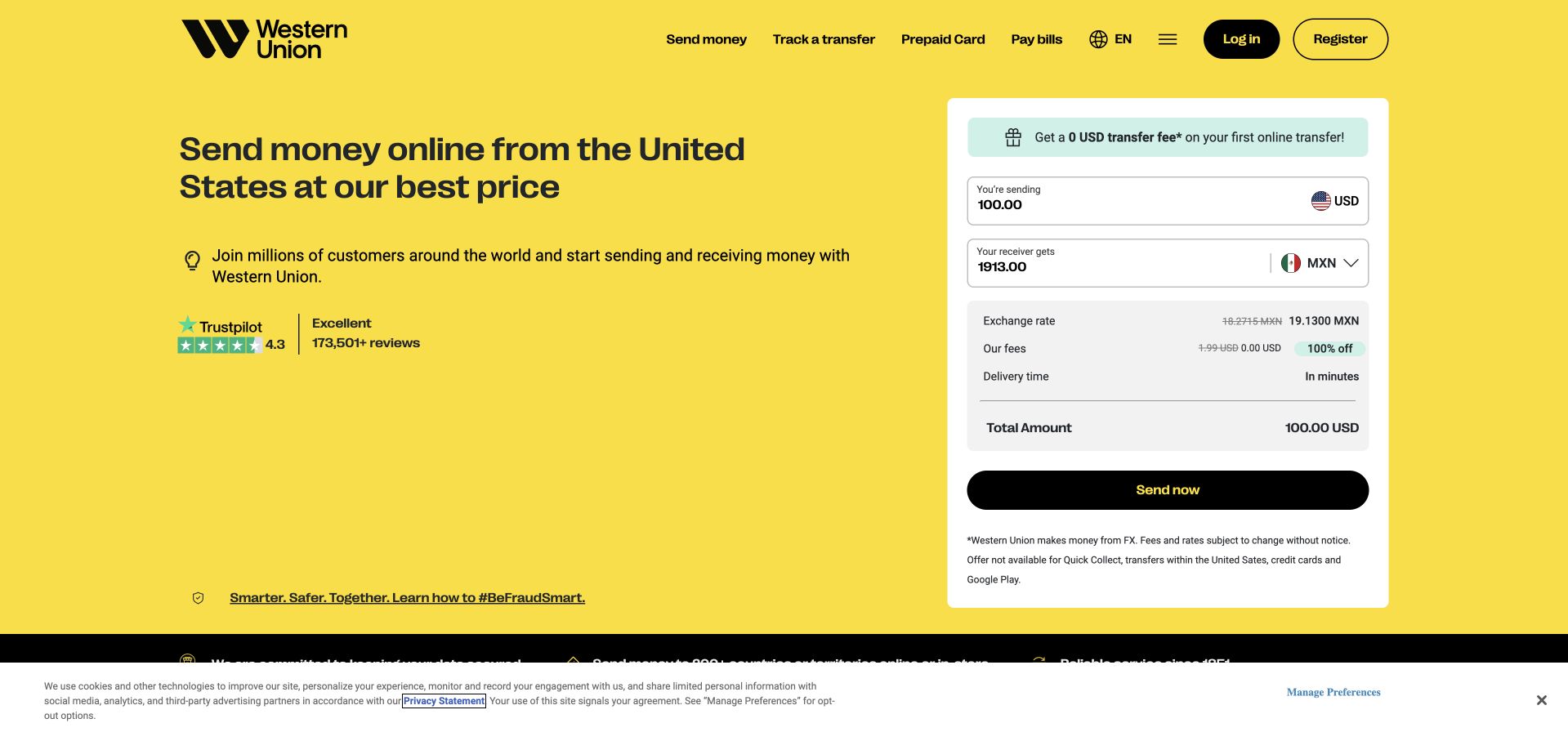
Western Union’s public homepage places a transfer-calculation panel beside a large yellow introduction. Currency, fee and total information are grouped within the same visual area as the sending action, while the header preserves tracking and bill-related routes. Supporting sections explain different ways to send and receive money. The design is worth studying for the attempt to make a multi-part transaction understandable before a visitor enters a longer service journey.
What you can learn
Keep the relevant components of a transaction visible together, including qualifications that affect interpretation. Western Union is named in Snowflake’s October 2024 customer fact sheet. That historical association does not establish this calculator’s backend, verify any displayed rate or describe the current systems handling transfers.
Pros
The calculation panel groups related amounts and the next action in one recognizable task area.
Tracking and other returning-customer routes remain available separately from the new-transfer acquisition message.
Cons & considerations
Rates, fees and delivery times change and require current terms rather than being reused as evergreen factual examples.
A high-contrast promotional field still needs legible qualifications so visitors do not confuse an introductory offer with the full cost of a transfer.
Platform source: Official Snowflake customer fact sheet, October 31, 2024. Western Union is explicitly named among customers in Snowflake’s official fact sheet dated October 31, 2024. This is a historical organization-level listing without a specified workload. This documents a particular organization-level or workload-level Snowflake association, not the pictured public website’s frontend, CMS, hosting or complete current infrastructure. Historical sources retain their original dates; vendor-reported results were not independently tested. Platform evidence is separate from the direct website screenshot and is not a complete current infrastructure audit.
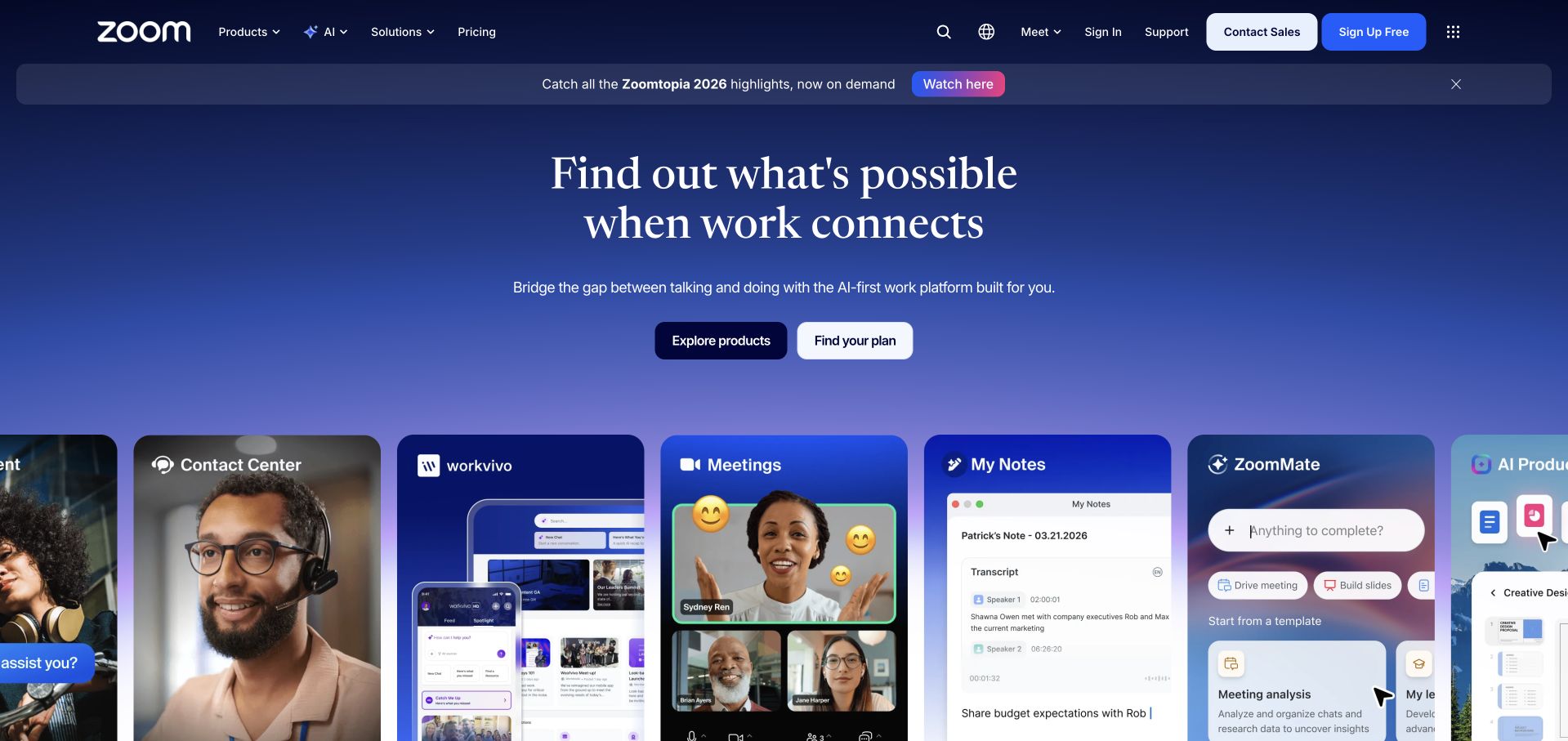
Zoom’s captured homepage uses a blue gradient and a central work-oriented proposition above a horizontal set of product surfaces. The individual tiles give concrete form to a broad connected-platform story, while product and plan routes provide different ways to continue. The layout is useful for studying a brand expanding beyond one familiar feature: the page needs to explain breadth without losing the recognition that brought many visitors there in the first place.
What you can learn
When a brand grows into a platform, show the distinct working surfaces rather than merely adding more category names. Zoom appears in Snowflake’s October 2024 customer fact sheet. That dated listing does not establish the homepage’s stack or the data architecture of any particular meeting or collaboration product.
Pros
Product surfaces help translate a broad connected-work proposition into interfaces visitors can recognize.
Plan selection and product exploration remain distinct, supporting both immediate evaluators and people learning about the wider platform.
Cons & considerations
A horizontal product strip needs clear keyboard behavior and an understandable stacked alternative on mobile.
Platform breadth can make the original core task harder to find unless navigation and plan explanations retain a deliberate hierarchy.
Platform source: Official Snowflake customer fact sheet, October 31, 2024. Zoom is explicitly named among customers in Snowflake’s official fact sheet dated October 31, 2024. This is a historical organization-level listing without a specified workload. This documents a particular organization-level or workload-level Snowflake association, not the pictured public website’s frontend, CMS, hosting or complete current infrastructure. Historical sources retain their original dates; vendor-reported results were not independently tested. Platform evidence is separate from the direct website screenshot and is not a complete current infrastructure audit.
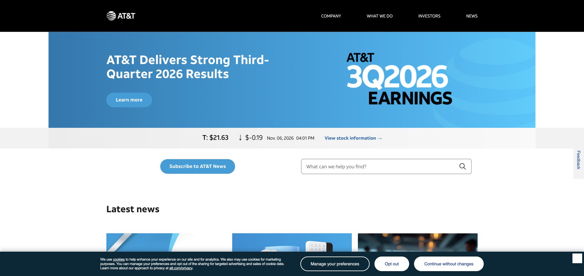
AT&T’s newsroom opens with a results feature, a stock-information strip and practical subscription and search routes. The large blue campaign graphic gives the opening a clear focus, while later stories are organized into a readable current-news sequence. Corporate navigation remains compact above the editorial area. The page is a useful reference for a company whose public communications need to serve journalists, investors and people researching its wider activities rather than only prospective service customers.
What you can learn
A newsroom can prioritize current information when the supporting routes make its institutional purpose clear. AT&T appears in Snowflake’s October 2024 customer fact sheet. That historical organizational listing does not identify the newsroom’s CMS, a telecommunications workload or the present configuration of a customer-facing application.
Pros
Results, stock context and current stories are separated into recognizable content types rather than mixed indiscriminately.
Search and subscription routes support repeat use without requiring the visitor to understand the whole corporate portfolio.
Cons & considerations
Market information and financial results need explicit dates and authoritative source documents beyond a promotional summary.
A corporate newsroom should maintain clear boundaries from consumer-support and account tasks so readers do not confuse publication with service access.
Platform source: Official Snowflake customer fact sheet, October 31, 2024. AT&T is explicitly named among customers in Snowflake’s official fact sheet dated October 31, 2024. This is a historical organization-level listing without a specified workload. This documents a particular organization-level or workload-level Snowflake association, not the pictured public website’s frontend, CMS, hosting or complete current infrastructure. Historical sources retain their original dates; vendor-reported results were not independently tested. Platform evidence is separate from the direct website screenshot and is not a complete current infrastructure audit.
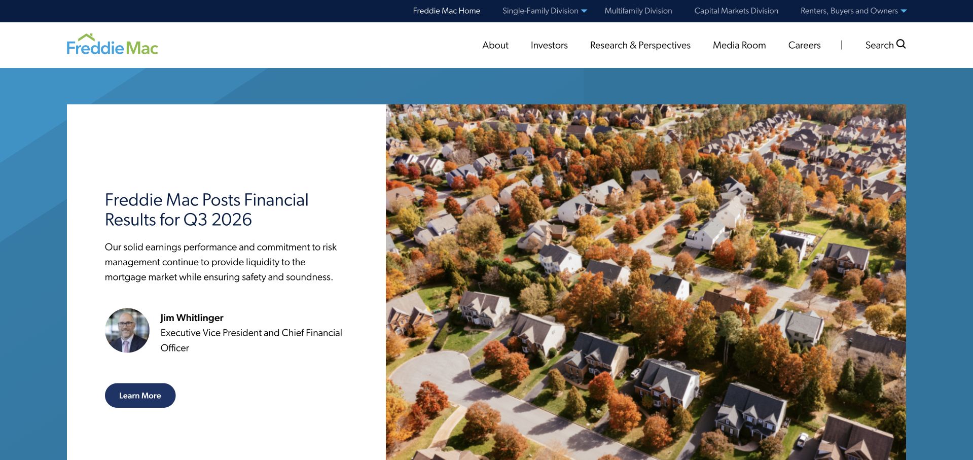
Freddie Mac’s homepage combines a financial-results feature with a large neighborhood image and a clear institutional header. Press releases and mortgage-rate material sit below, while a separate audience selector points to business divisions and renter, buyer and owner resources. The layout is useful for studying an organization that must explain its role to very different readers without presenting every audience with the same product-sales funnel.
What you can learn
Use explicit audience routes when corporate, professional and public-information tasks differ substantially. Freddie Mac is named in Snowflake’s October 2024 customer fact sheet. That historical association does not identify this homepage’s implementation, the systems behind market statistics or a particular mortgage-related data workload.
Pros
The audience selector recognizes that professional divisions and public housing-information resources serve different visitor needs.
Results and press material have a clear institutional setting rather than being mixed into a consumer application interface.
Cons & considerations
Financial and rate information needs visible dates and links to the authoritative publication behind each summary.
A large results campaign can make practical renter or buyer resources feel secondary unless the audience routes remain easy to find on mobile.
Visible tech stack
Earlier / documented evidence
Snowflake
Platform source: Official Snowflake customer fact sheet, October 31, 2024. Freddie Mac is explicitly named among customers in Snowflake’s official fact sheet dated October 31, 2024. This is a historical organization-level listing without a specified workload. This documents a particular organization-level or workload-level Snowflake association, not the pictured public website’s frontend, CMS, hosting or complete current infrastructure. Historical sources retain their original dates; vendor-reported results were not independently tested. Platform evidence is separate from the direct website screenshot and is not a complete current infrastructure audit.
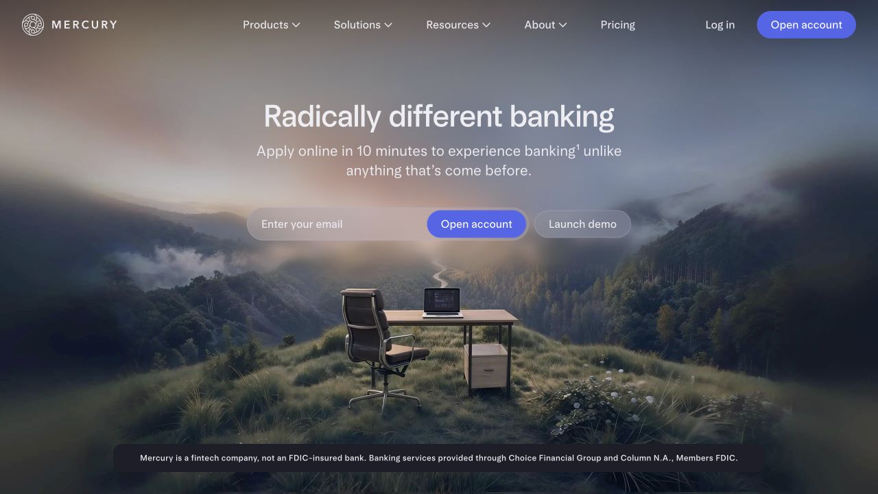
Mercury pairs an unusually atmospheric landscape with a compact banking proposition, an email-based starting action and a separate demo route. The calm typography and muted palette distinguish the page from more transactional banking interfaces. Product navigation broadens the story into cards, payments and accounting, while a nearby qualification explains the company’s role. The design is useful for studying how a strong visual metaphor can coexist with a practical business-software next step.
What you can learn
An unconventional image can differentiate a familiar category when essential product boundaries remain visible. Snowflake’s Mercury case specifically describes operational-data ingestion with Openflow and analytics. It does not establish this marketing homepage’s runtime or independently verify any banking, yield or financial-product statement displayed there.
Pros
A demo route gives evaluators an alternative to beginning an account-oriented email flow immediately.
The distinctive image and restrained layout create a memorable identity while keeping the primary task recognizable.
Cons & considerations
An email-first action needs a clear explanation of follow-up and data handling before submission.
Financial-product qualifications must remain readable and close to the proposition rather than being lost against a dramatic background or decorative composition.
Platform source: Official Mercury Openflow case. Snowflake’s Mercury case describes Openflow integration for operational-data ingestion and analytics. This documents a particular organization-level or workload-level Snowflake association, not the pictured public website’s frontend, CMS, hosting or complete current infrastructure. Historical sources retain their original dates; vendor-reported results were not independently tested. Platform evidence is separate from the direct website screenshot and is not a complete current infrastructure audit.
Kegan has 15+ years of experience working with small businesses, Fortune 500 companies, and everything in between. No development job is too big or too small: he brings the same hands-on attention to a focused improvement, a complete website, or a custom application.
For Snowflake projects, he can help with data modeling, application data access, query design, search and cache integrations, migration planning, access boundaries, and maintainable handover. He works directly with clients on scope, design, implementation, testing, and handover, with an emphasis on clear communication and a system that remains practical to maintain after launch.
Show 3 other Snowflake developersHide other Snowflake developers
Start with one report that currently creates disagreement or repeated manual work. Identify its source records, definitions and reconciliation rules. Demonstrate how a correction moves through the pipeline and how the owner knows the report is ready. A smaller trusted dataset can be more useful than a large catalogue of poorly explained tables.
An operational-data integration
Define the source of truth, update behavior and downstream consumers. Include duplicates, late records, deletions and schema changes in the design rather than treating them as rare exceptions. Mercury’s documented Openflow case is a specific example of integration work, not a reason to assume the same tool is appropriate for every source system.
Governed sharing or analytical applications
Identify the people or organizations consuming data, the permitted purpose and the responsibility for access changes. The visible application should explain freshness and limitations rather than presenting every result as immediate and complete. Keep product permissions and data-governance responsibilities understandable to the people who will maintain them.
From references to requirements
Write a data contract that can survive a failed update
Document meaning before copying records
For important fields, define units, identifiers, timezones and the treatment of missing or corrected values. Identify the person who can resolve a disagreement about meaning. This prevents a technically successful migration from silently changing what a dashboard or product metric actually represents.
Reconcile representative changes
Choose examples of a new record, a changed record, a deletion and a late-arriving correction. Compare the source and the intended output in a controlled environment. Record expected differences rather than relying only on total row counts. A useful validation explains why the result is correct for the task.
Plan monitoring, cost review and recovery
Decide who notices a delayed update, an unexpected spend pattern or a broken source contract. Document the safe restart and backfill process, including the impact on consumers. Resource monitors have a defined scope and are not a universal account-wide spending guarantee; review the current documentation for the services you actually use.
Ask the actual team to carry out its routine job: publish a realistic update, correct a mistake, preview a narrow screen, and identify who owns an integration failure. For a library or frontend framework, also ask who maintains the content source and deployment. A polished screenshot does not answer those operational questions.
Beyond the screenshot
A Snowflake project-planning checklist
Name the decision or product outcome.
Identify the source of truth.
Assign a business owner and technical maintainer.
Define identifiers, units and timezones.
Specify freshness and completeness expectations.
Map access to permitted purposes.
Test new, changed, deleted and late records.
Reconcile representative outputs.
Separate operational and analytical responsibilities.
Set cost review and notification ownership.
Rehearse restart and backfill behavior.
Retain dated evidence and a clear handover.
Test with real content, a keyboard, a small screen, slow or failed requests, and the people who will maintain the system. These are planning checks, not an accessibility, security, performance, or search-ranking certification.
Sources & editorial method
How this Snowflake collection was reviewed
Public properties were independently reviewed and directly captured or matched to an unchanged exact-page capture. Technical associations come from official Snowflake customer cases, the dated 2022 Unistore announcement and the October 31, 2024 fact sheet. Historical evidence retains its original scope. No private warehouses, financial accounts or patient systems were accessed, and vendor-reported outcomes were not independently tested.
Every image is an unmodified capture from the actual website, with its source and capture date. Some captures are reused from our shared catalog; their dates remain the original capture dates. None comes from a vendor gallery or a generated reconstruction. Moving imagery and live content can change.
Technology attribution uses public page assets or metadata, official platform documentation, or a cited first-party project case study. Documentary and framework-relationship evidence is identified where used; it is not a complete current backend inventory. A CMS image CDN alone does not establish a full CMS deployment. A library’s presence does not prove which individual controls use it, and a platform label does not establish AI authorship.
The composition notes, lessons, pros and tradeoffs are original editorial observations. We have not measured conversion, traffic, security, performance or accessibility conformance. Website owners retain their brands and imagery; these examples are not our client portfolio. Written, Edited and Curated are independent records, not dates advanced by a build. See our editorial standards or suggest a correction.
Questions worth asking
Snowflake website development FAQs
Are these websites hosted on Snowflake?
The collection does not claim that. Official evidence connects the organization or a named data workload to Snowflake. The pictured public pages remain design references, and their frontend, CMS and hosting require separate evidence.
Why retain an older customer fact sheet?
It is an official dated source, useful for a historical association. Its limitations remain explicit. We do not treat it as proof of a current contract, a particular implementation or the technical configuration of every property under that brand.
Should a project begin by migrating every dataset?
Not usually. Begin with a bounded decision or product outcome, clear ownership and representative source records. Establish meaning, access, validation and recovery before expanding the scope to more datasets and consumers.
Is a resource monitor a complete spending cap?
No. Resource monitors have a documented scope and do not cover every possible service cost. Review the current controls for the exact workloads involved and assign someone to monitor and respond rather than assuming one setting removes financial responsibility.
What should a useful data-platform handover demonstrate?
A maintainer should be able to explain a dataset’s meaning, trace an update, recognize a delay, reconcile a correction and perform a safe recovery. Include access ownership and cost review, not only a successful query or dashboard screenshot.
Use the visual examples to improve explanation, not to infer hidden infrastructure. A strong data brief starts with a decision, trustworthy definitions and a recovery plan that the future maintainer can actually operate.