Best Appliance Store Websites of 2026 (30 Real-World Examples)
Appliance store website examples that connect product choice with dimensions, stock, delivery, installation and useful local advice.
An appliance store website needs to answer whether a product fits the home, the installation and the customer’s timetable.
Someone replacing a failed refrigerator may need available stock and a delivery date immediately. A customer planning a kitchen has a different task: comparing sizes, finishes, ventilation, integrated units and several products together. A useful appliance website makes both journeys possible without burying essential conditions beneath a promotion.
These examples include regional showrooms, specialist dealers and broader online retailers. Compare their search, department structure, package shopping, service information and treatment of physical stores. The reviews evaluate website presentation and shopping guidance; they do not certify stock, prices, installation quality or the businesses themselves.
Before the examples
What makes good appliance store website design in 2026?
Make compatibility visible before checkout
Give dimensions, clearances, power or fuel requirements and installation type a consistent place on product pages. Distinguish product dimensions from required openings and packaging. Link manufacturer documentation where appropriate, and explain when a customer needs an installer or qualified trade professional to confirm suitability. A lifestyle image cannot establish whether an appliance will fit.
Separate availability from promotional urgency
Show the difference between in-stock, special-order, display and clearance products. Explain whether availability is local to a showroom or warehouse and when a delivery estimate becomes confirmed. Keep expired campaigns out of the main navigation. A sale deadline should never substitute for clear stock and delivery information.
Explain the services around the appliance
State delivery coverage, access requirements, installation scope and old-appliance removal conditions. Make repair, parts and order tracking easy to find for existing customers. Where a purchase requires a quote or consultation, describe that next step plainly instead of presenting a cart action that cannot complete the task.
The collection · 30 examples
30 appliance store websites worth studying
Study how these stores balance an attractive kitchen image with the practical details that make a large appliance purchase possible.
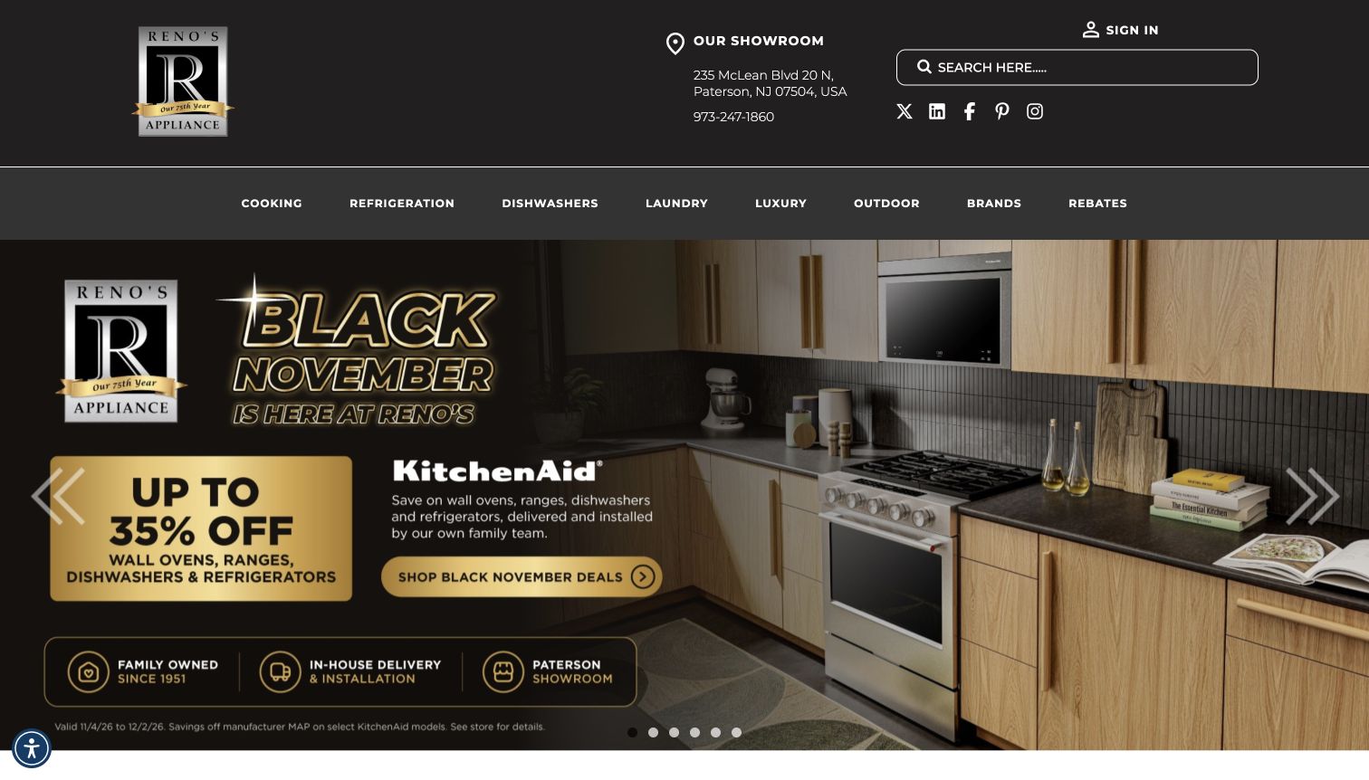
Reno’s places its showroom address and telephone number in a spacious dark header, alongside search and a concise appliance-category row. The captured kitchen campaign carries the same black-and-gold visual language as the logo, with a single prominent shopping action and a small service-information band. The page’s later content explains the family business and showroom, giving the catalogue a specific local setting.
What you can learn
Make the physical store part of the page’s information hierarchy, not a detail hidden in the footer. A coherent image, colour palette and department row can support a specialist identity while preserving practical search and contact routes.
Pros
The showroom location is visible before visitors begin browsing products.
The campaign and brand use a consistent, restrained visual language.
Cons & considerations
The large promotional image leaves product comparisons below the first screen.
Some featured products use a call-for-price route rather than immediate online pricing.
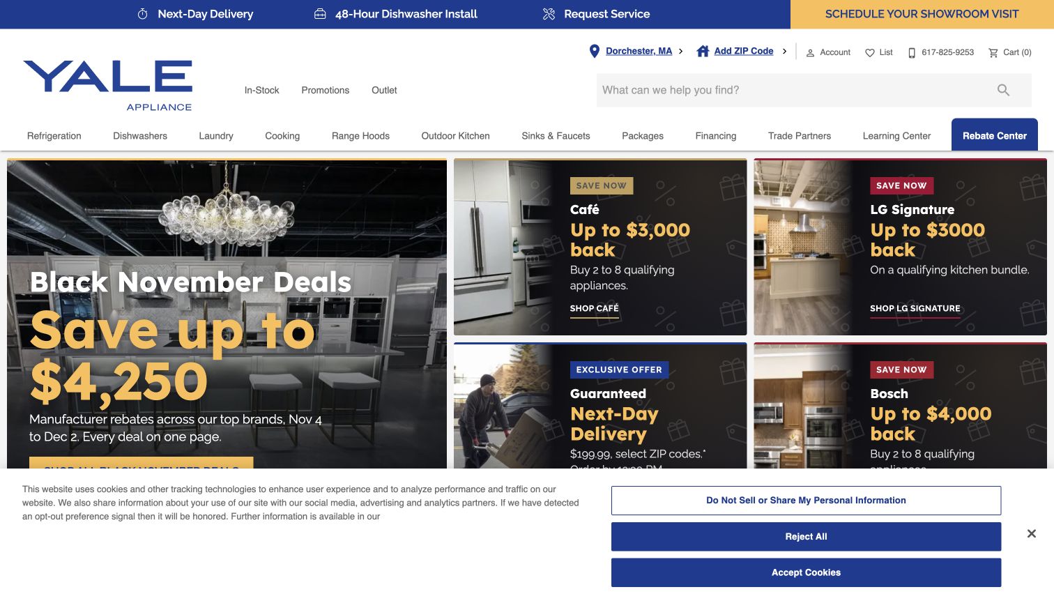
Yale gives shoppers several ways to begin before the promotional tiles take over. Its header pairs a substantial search field with showroom information, while the upper service links distinguish delivery, dishwasher installation and repair. The opening grid combines a kitchen image with smaller brand and rebate panels, so the page can support a broad sale without presenting every offer at the same size.
What you can learn
Keep buying guidance and service information available outside the campaign artwork. A shopper researching an unfamiliar appliance should have a clear route even when the main promotion changes.
Pros
The Learning Center has a named place in the main navigation.
Showroom and service routes support purchases that need human advice.
Cons & considerations
Several promotional panels compete for attention in the opening view.
Delivery and installation claims need their linked conditions; the banner alone is insufficient.
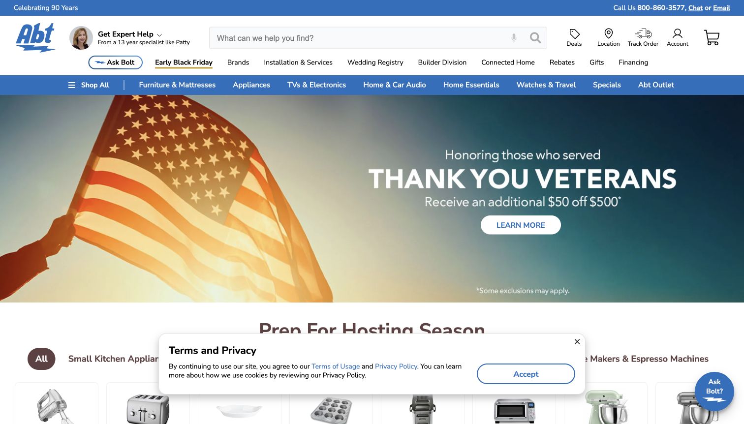
Abt places a named specialist and portrait in the header, making help more tangible than an anonymous support icon. A wide search field sits beside store and order information, while two navigation rows accommodate appliances and many adjacent departments. The captured homepage also uses a prominent seasonal message and product-category routes rather than pretending every visitor has the same purchase in mind.
What you can learn
A broad retailer can make its scale easier to handle by placing real assistance beside search. Keep that assistance distinct from promotional banners and from the functional route for tracking an existing order.
Pros
The specialist portrait gives the header a human point of reference.
Search, store information and order tracking remain easy to distinguish.
Cons & considerations
The wide range of departments can dilute an appliance-specific shopping task.
Seasonal artwork occupies space that could otherwise show products or buying guidance.
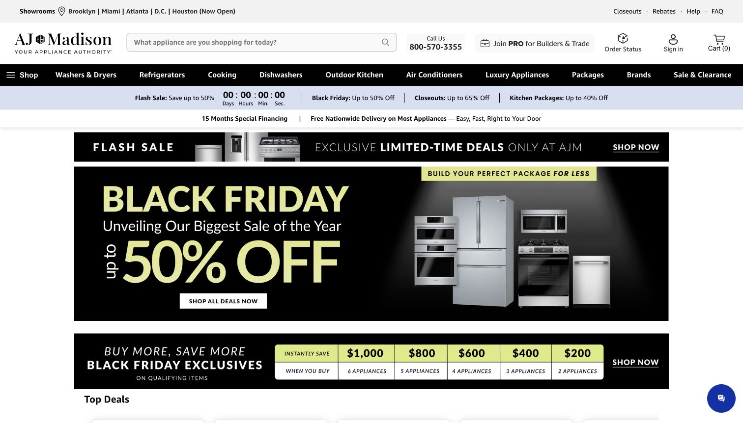
AJ Madison anchors a heavily promotional homepage with practical shopping context. Showroom cities sit above a large search field, and a trade-program route is separated from the consumer catalogue. The bright campaign artwork uses appliance cutouts to make the category unmistakable, while the package-savings strip encourages visitors to think beyond a single replacement item. Black and white navigation provides a stable frame around the vivid sale colour.
What you can learn
When a store serves trade buyers and households, label those routes explicitly and keep showroom geography visible. Product packages deserve a maintained destination rather than an offer that exists only inside a banner.
Pros
Showroom locations give a nationwide-looking storefront a physical reference.
The professional-buyer route is visible without replacing ordinary shopping navigation.
Cons & considerations
Multiple savings messages make the opening screen visually busy.
Banner discounts do not explain model eligibility or installation requirements by themselves.
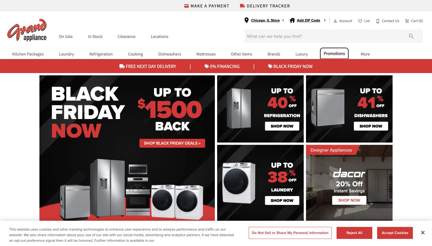
Grand Appliance and TV makes In Stock and clearance prominent near its search field. The selected store and ZIP prompt establish that appliance availability and delivery are local questions. Its opening grid gives the principal campaign a larger panel and surrounds it with smaller refrigeration, laundry and brand offers. Payment and delivery tracking are separated into a utility bar, supporting customers after the initial purchase.
What you can learn
Make stock-oriented shopping a first-class route. A broken refrigerator creates a different task from a planned remodel, so the header should let visitors identify available products without decoding a rotating offer.
Pros
In-stock and clearance routes are easy to find near search.
Existing customers have visible payment and delivery-tracking links.
Cons & considerations
Several offer panels make the first screen dense.
The initial store selection should not be mistaken for a verified delivery location.
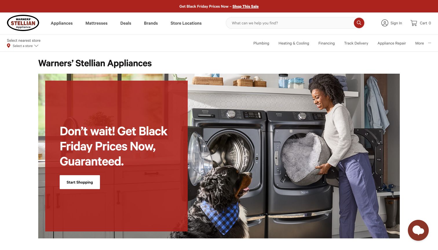
Warners’ Stellian uses a large laundry photograph and a single coloured text panel for its main campaign. The composition is easier to read than a wall of separate product cutouts. Above it, a small set of department labels, search and store selection handle shopping, while a second row exposes delivery tracking, repair and other home services. The captured view follows dismissal of an optional signup overlay.
What you can learn
Use one strong campaign message, then give practical service tasks their own stable navigation. A customer seeking repair should not have to work through a sales carousel or an email signup to find the relevant route.
Pros
The main image establishes the appliance’s use in a home.
Repair and delivery tracking are named separately from product departments.
Cons & considerations
The optional signup overlay can interrupt the initial browsing experience.
The broad home-services menu adds choices beyond the immediate appliance task.
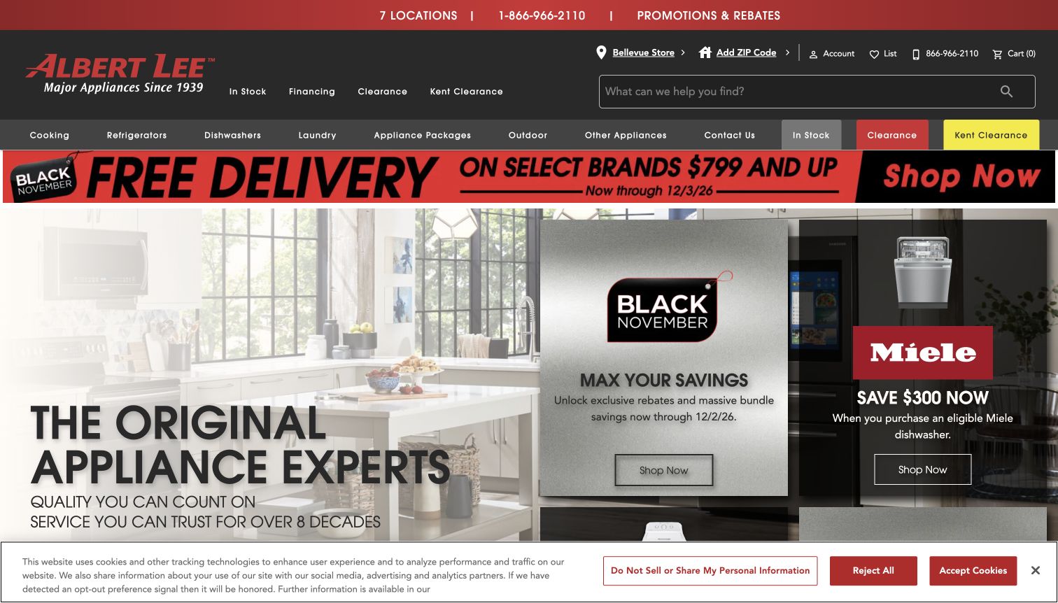
Albert Lee pairs a large kitchen photograph with smaller sale tiles rather than making every panel equally prominent. The header identifies a showroom, includes search, and gives clearance and in-stock shopping explicit routes. A separate clearance-centre label makes that destination more concrete than a generic deals link. Red accents connect the brand, navigation and promotional messages across the otherwise restrained layout.
What you can learn
Treat inspiration and availability as complementary entry points. A kitchen image can establish the desired result, while clearly labelled stock and clearance routes help someone who already knows what they need.
Pros
The large lifestyle image gives the opening grid a clear visual centre.
Showroom and clearance-centre labels connect browsing to physical locations.
Cons & considerations
Several utility links and promotions create a tall header.
Delivery offers need eligibility details beyond the short promotional strip.
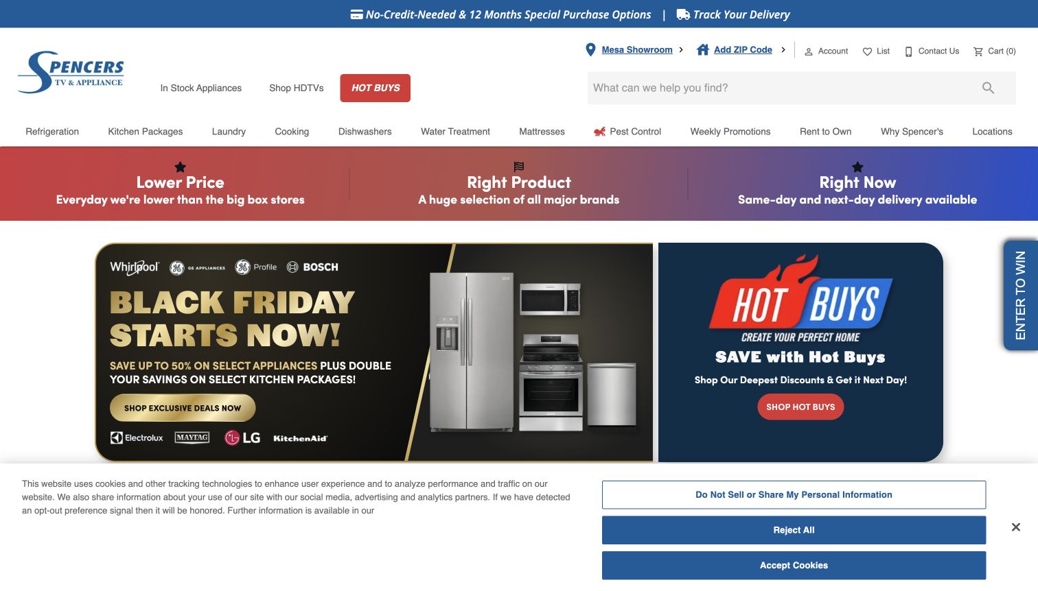
Spencer’s places the selected showroom and search above a strong Hot Buys button. The opening promotional pair combines a package offer with a second deals destination, while the benefit strip stresses price, product choice and availability. Delivery tracking and financing occupy a separate upper bar. The catalogue extends into mattresses, televisions and other services, which explains the breadth of the navigation but also makes prioritisation important.
What you can learn
A distinctive deals label works best when it leads to a dependable selection of products. Keep stock, delivery and store information close to it so visitors can evaluate practicality as well as the promotional promise.
Pros
The Hot Buys button has a clear visual priority.
The showroom label provides a regional reference before product browsing.
Cons & considerations
Adjacent non-appliance services compete with the main shopping task.
The opening cookie panel and campaign tiles reduce the visible product detail.
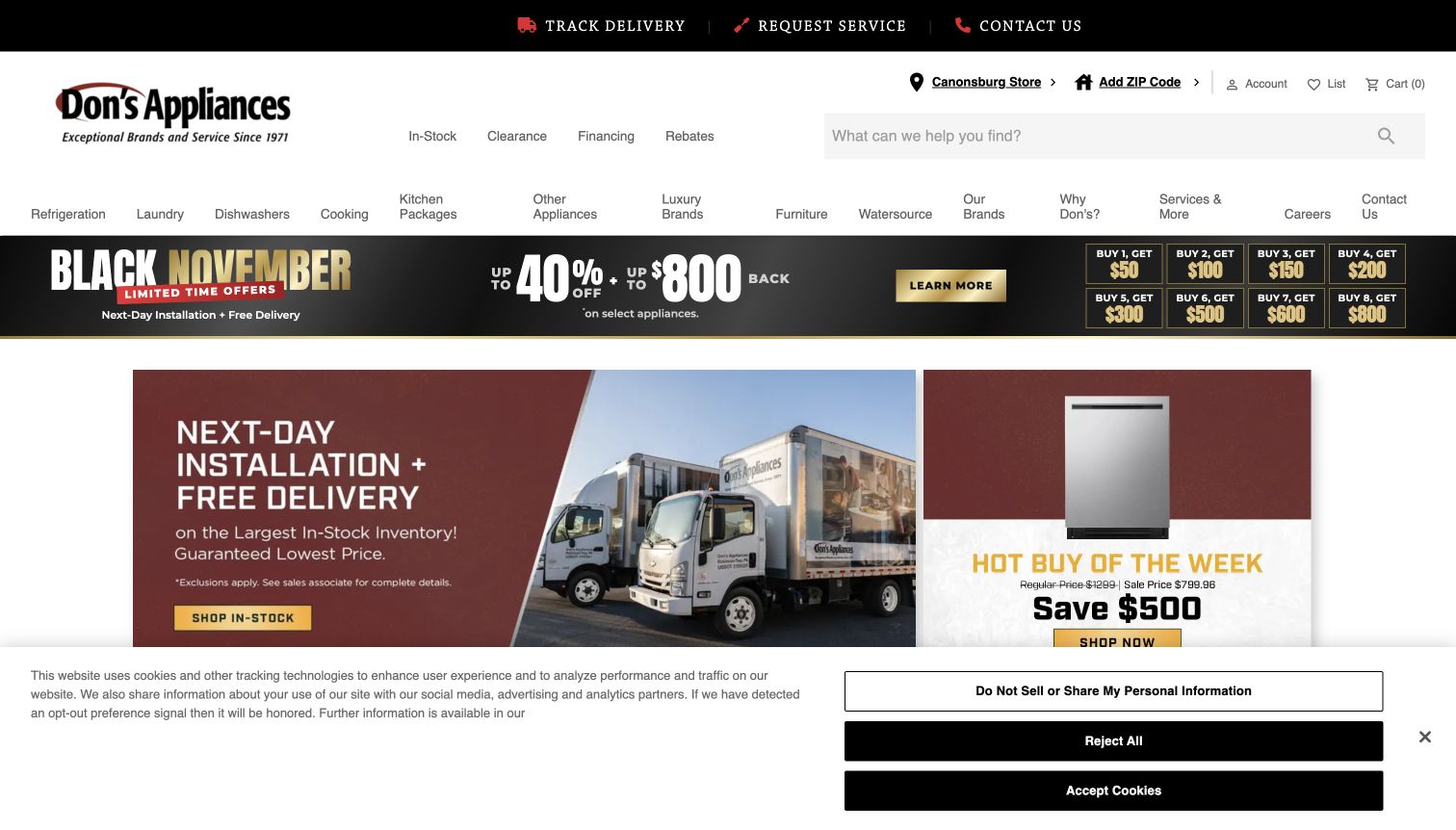
Don’s Appliances uses a branded delivery truck in the opening feature, giving installation and fulfilment a visible role in the shopping story. A smaller weekly-product panel sits beside it instead of overwhelming the main image. The header separates delivery tracking, service requests and contact information from catalogue search. In-stock products, clearance, financing and rebates remain available as concise shortcuts.
What you can learn
Photographs of an actual delivery operation can explain what happens after the order more concretely than a generic kitchen scene. Link the promise to clear service conditions, coverage and preparation information.
Pros
The truck photograph gives the delivery message a specific visual subject.
Service requests and order tracking have visible routes.
Cons & considerations
The rebate strip introduces several competing numerical messages.
Delivery and installation performance cannot be established from the promotional image.
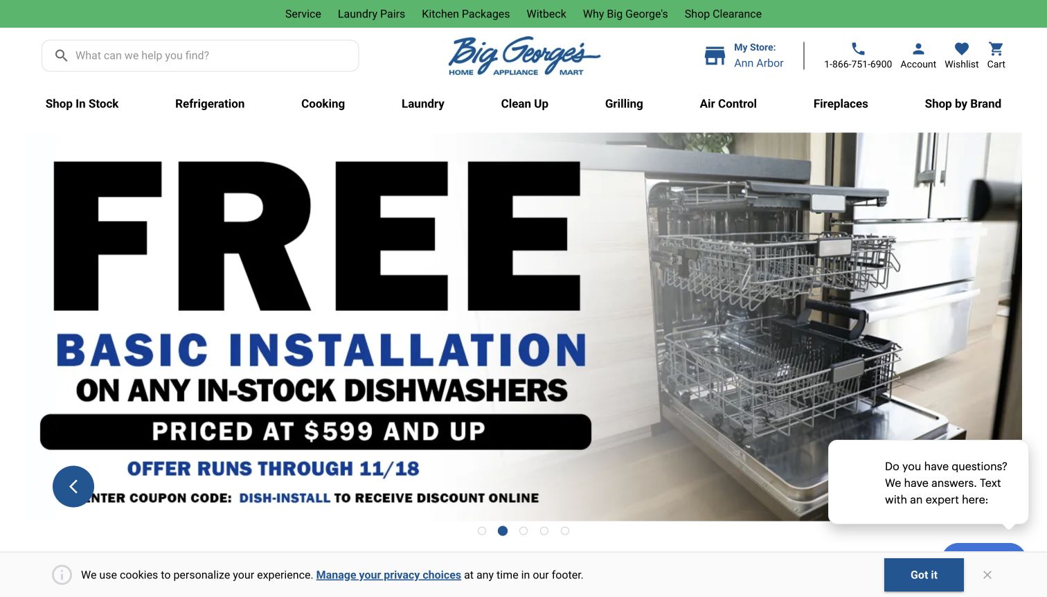
Big George’s leads the captured carousel with a dishwasher installation offer. Large typography makes the service component unmissable, while the adjacent appliance photograph supplies context. The header names the Ann Arbor store and begins the department row with Shop In Stock. Kitchen packages and laundry pairs appear in the upper navigation, supporting shoppers who are coordinating several appliances rather than buying one item.
What you can learn
Appliance promotions can focus on the work around a purchase, but the terms need to remain readable. Keep a stable stock route and a clear service destination available when the carousel moves to another offer.
Pros
Installation is presented as a distinct part of the buying decision.
The store name and in-stock route are prominent.
Cons & considerations
The oversized campaign text pushes other content below the opening view.
A chat prompt and cookie notice occupy additional space around the main promotion.
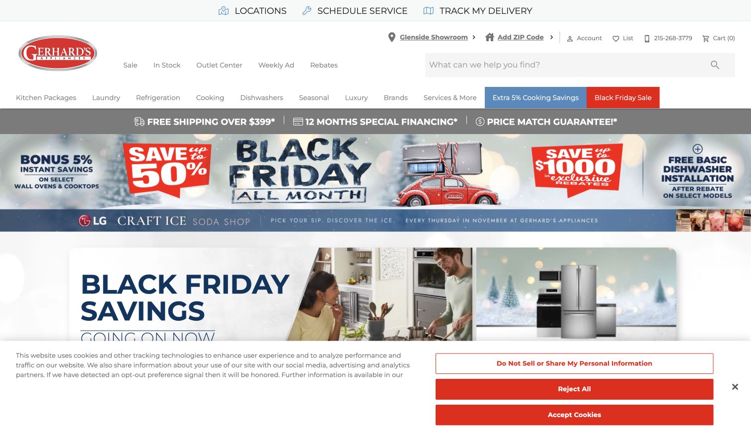
Gerhard’s puts Locations, Schedule Service and Track My Delivery in a dedicated top row. That is a useful distinction from the showroom, ZIP prompt, search and shopping shortcuts below. The homepage layers a seasonal offer strip, a separate in-store themed promotion and larger sale panels. Its red brand colour makes actions visible, though the number of campaign messages creates a busy opening impression.
What you can learn
Separate support utilities from promotional content before adding more offers. A strong service row can remain consistent across seasons, giving existing customers a reliable destination while new shoppers explore the catalogue.
Pros
Service scheduling and delivery tracking have plain, visible labels.
Outlet, weekly-ad and rebate routes are distinct from product departments.
Cons & considerations
Several horizontal campaigns compete before the main product content begins.
Large privacy controls cover part of the opening layout in the recorded view.
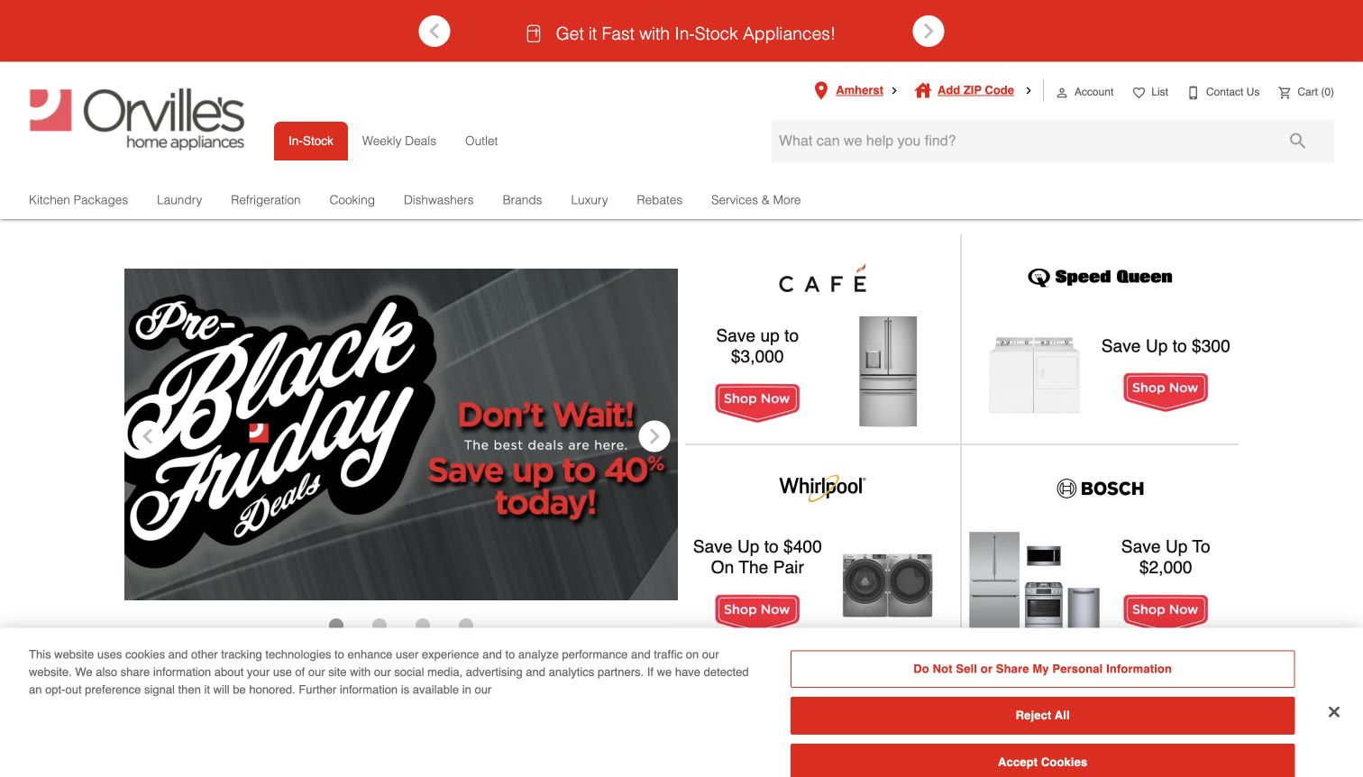
Orville’s combines a large seasonal campaign on the left with a neatly divided group of manufacturer offers on the right. Each smaller panel pairs a brand name, appliance image and shopping action, creating a recognisable structure across different products. In Stock receives a coloured shortcut near search, while the selected showroom and contact route remain visible above the department navigation.
What you can learn
When several manufacturers have concurrent offers, give their cards a consistent structure. The shopper should be able to recognise the brand, product category and destination without studying a different layout in every tile.
Pros
The offer grid uses a consistent hierarchy across brands.
In-stock shopping is highlighted independently of seasonal promotions.
Cons & considerations
Discount messages take precedence over detailed product comparison.
The cookie panel conceals part of the lower offer row in the captured view.
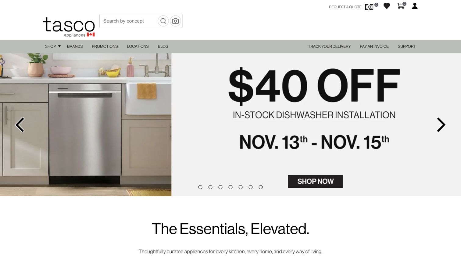
Tasco’s opening view uses generous white space, a compact wordmark and a restrained navigation bar. Search is labelled around concepts, and an adjacent image-search control suggests an alternative discovery route without requiring it. The main dishwasher promotion uses a single image and a large, simple message. Delivery tracking, invoice payment and support are separated from the shop and brand links.
What you can learn
A sparse header can still support complex appliance shopping if it distinguishes discovery from existing-order tasks. Keep the main catalogue route clear when broad labels such as Shop replace a long list of departments.
Pros
The restrained layout gives the primary promotion room to breathe.
Delivery, payment and support utilities have a separate visual group.
Cons & considerations
A generic Shop label reveals less detail than visible department names.
A carousel-led opening depends on each slide having clear, accessible controls.
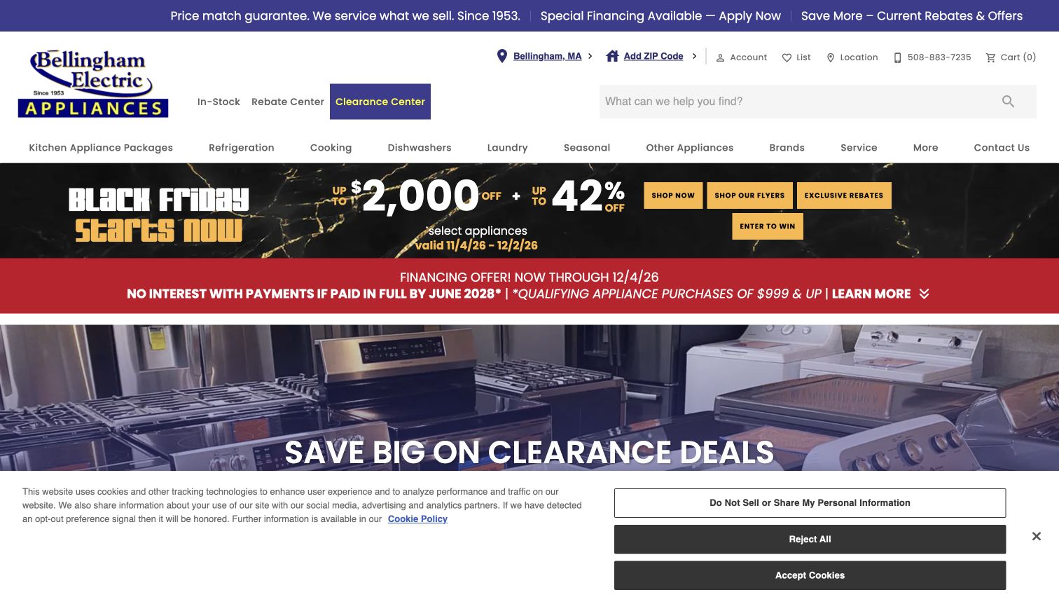
Bellingham Electric highlights its Clearance Center beside In-Stock and Rebate Center links. The main photograph shows rows of appliances, reinforcing the clearance message with a tangible retail scene. A top strip connects price-match information, service and current offers, while the department navigation keeps kitchen packages and individual appliance categories separate. The result is strongly oriented toward availability and value rather than a purely aspirational kitchen image.
What you can learn
If clearance is central to the business, treat it as a maintained shopping destination with its own label. Explain condition, availability and collection or delivery requirements on the products it contains.
Pros
Clearance has a distinct button rather than an ambiguous sale label.
The service route remains visible within the primary navigation.
Cons & considerations
Multiple promotional strips make the first screen feel crowded.
The displayed guarantees are retailer claims whose conditions require further reading.
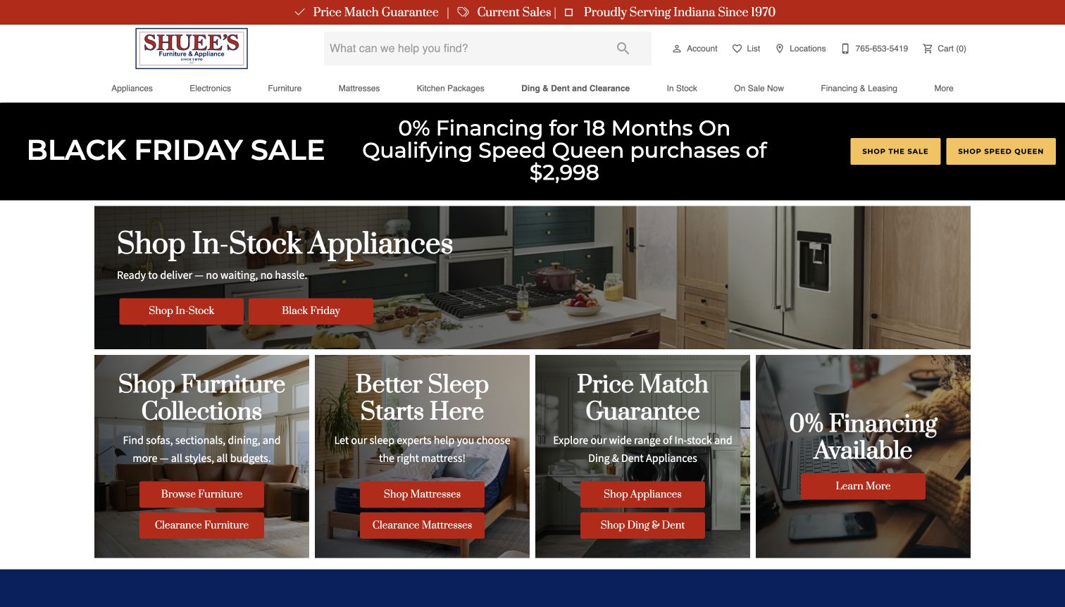
Shuee’s gives in-stock appliances the wide lead tile, then uses four smaller cards for furniture, mattresses, appliance value and financing. This arrangement shows the store’s breadth without giving every department equal visual weight. The navigation explicitly names Ding & Dent and Clearance, while the appliance feature uses a kitchen setting and two straightforward shopping buttons.
What you can learn
A mixed home retailer benefits from choosing a clear lead task on each page. Use a large primary card and smaller secondary destinations, while keeping condition-based categories such as scratch-and-dent separate from ordinary stock.
Pros
The tile sizes communicate which shopping route has priority.
Ding-and-dent merchandise receives an explicit navigation label.
Cons & considerations
Several neighbouring categories can distract a visitor seeking only appliances.
Finance and price-match claims need their full conditions outside the tile.
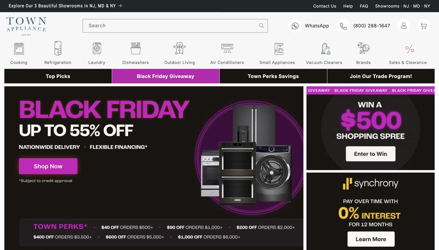
Town Appliance gives each major department a small line illustration, making cooking, refrigeration, laundry and dishwashers visually distinguishable before the promotional content begins. Search, telephone help and WhatsApp sit together in the header. The opening campaign area is dense, combining a large sale graphic with a giveaway and financing panel, while a separate strip introduces trade and savings destinations.
What you can learn
Pair familiar category labels with simple illustrations when a catalogue spans several appliance types. Keep advice channels easy to find, but avoid letting unrelated promotional actions crowd out the route to actual products.
Pros
Department illustrations support rapid scanning without replacing text labels.
Several clearly named help routes sit beside the search field.
Cons & considerations
The giveaway competes with the immediate product-shopping task.
Multiple savings messages require careful reading of eligibility and terms.
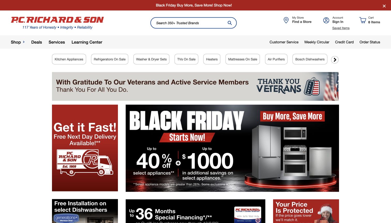
P.C. Richard & Son keeps the main navigation relatively concise, using Shop, Deals, Services and Learning Center as broad entry points. A row of category shortcuts then narrows the task toward kitchen appliances, laundry sets and other popular destinations. The campaign area combines a major offer with a separate delivery message, while order status and customer service remain available in the utility navigation.
What you can learn
A broad catalogue does not require every department in the primary row. Pair a small set of stable navigation concepts with specific shortcuts, and preserve service and learning routes for visitors who are not ready to buy.
Pros
Learning and service information have named primary routes.
Category shortcuts offer a faster start beneath the general navigation.
Cons & considerations
The promotional grid contains several competing messages.
Delivery and installation offers still require product and location qualification.
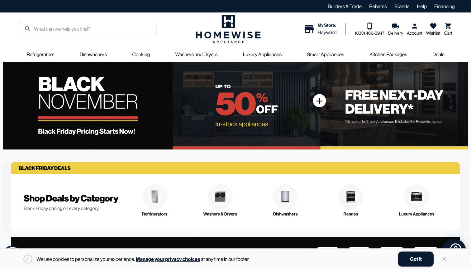
The former Airport Appliance address redirected to Homewise Appliance during review. The current homepage uses a centred wordmark, a large search field and a named store, then presents a compact set of appliance departments. Beneath the main campaign, a category strip pairs small product images with refrigerators, laundry, dishwashers, ranges and luxury appliances. Delivery has its own header icon rather than being confined to an offer.
What you can learn
When a retailer changes brand, evaluate and link the current destination. Preserve familiar shopping tasks through clear category names, store context and service links so the new identity does not make the catalogue harder to understand.
Pros
The category strip supplies a useful next step below the main promotion.
Delivery and local-store information remain visible in the header.
Cons & considerations
The former brand’s visitors need clear continuity at the new destination.
The headline delivery offer includes geographic and product exclusions.
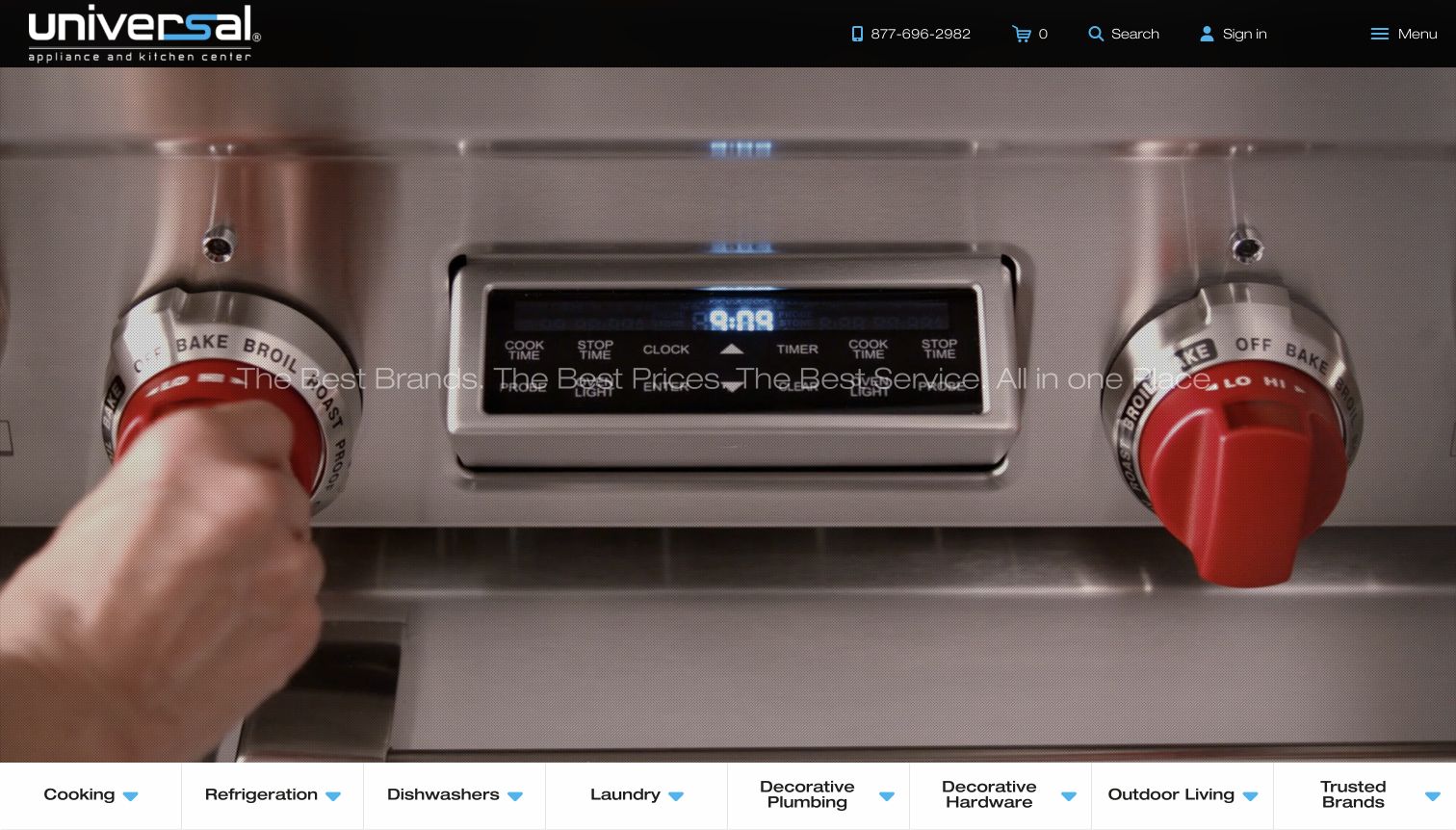
Universal Appliance and Kitchen Center uses a full-width moving-image introduction instead of opening with a grid of discounts. The captured frame shows a close view of a cooking appliance, while a compact black header contains search, telephone help and a menu control. A horizontal category bar sits at the bottom of the opening view, giving the presentation a route into practical browsing.
What you can learn
A visual introduction needs a dependable escape into the catalogue. Keep category links and search available outside the video, and ensure text remains readable across every frame rather than only a selected poster image.
Pros
The close appliance imagery communicates material and control details.
The category bar provides a direct route beyond the brand introduction.
Cons & considerations
Text contrast varies against the moving background in the captured frame.
The collapsed main menu makes some destinations less immediately visible.
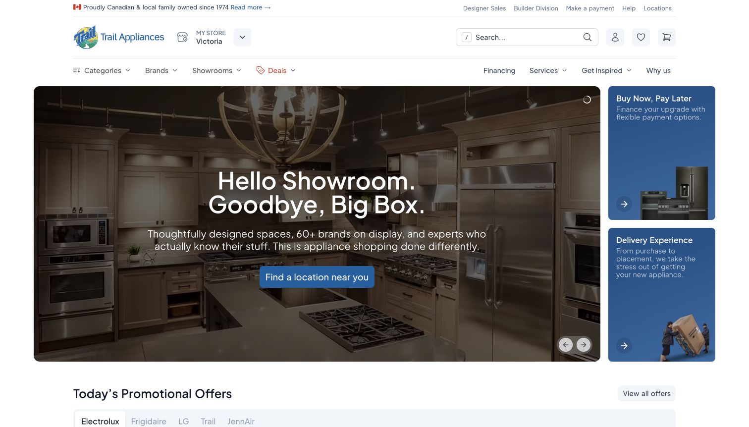
Trail’s British Columbia page gives the showroom experience the largest opening panel and places financing and delivery cards beside it. The selected region and store appear in the header, while separate links serve designers and builders. The main action leads to locations rather than immediately pushing a product, making the page useful for visitors planning a considered kitchen purchase.
What you can learn
A showroom-led homepage can explain why an in-person visit matters while still providing catalogue search. Make the regional scope explicit and keep delivery information visible for shoppers deciding whether that store can serve them.
Pros
The main action clearly points toward finding a showroom.
Delivery has a dedicated supporting card beside the principal image.
Cons & considerations
The region-confirmation dialog interrupts the first visit.
A showroom-first message is less direct for someone seeking one exact replacement model.
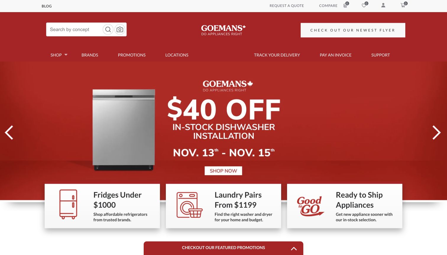
Goemans uses a strong red identity across the header and main promotion, then places three overlapping cards beneath it. Those cards distinguish a price-bounded refrigerator route, laundry pairs and ready-to-ship appliances. Search, quotes, comparison and the customer portal occupy a separate upper area, while delivery tracking and support stay in the navigation. The specific cards make the broad campaign more actionable.
What you can learn
Follow a large promotion with practical shopping constraints such as budget, appliance pairing and availability. Those routes should use maintained product data, so their promises remain accurate after the artwork changes.
Pros
The supporting cards express recognisable shopper needs.
Delivery and support remain separate from new-purchase browsing.
Cons & considerations
The saturated campaign colour dominates much of the opening view.
A general Shop label requires an extra step to reveal the full department structure.
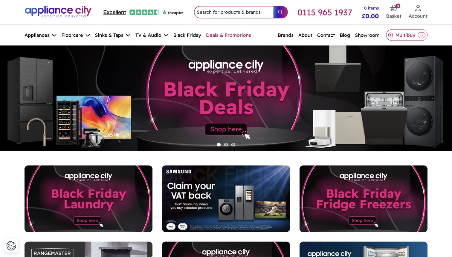
Appliance City keeps a Multibuy control visible in the navigation alongside brands, showroom information and product departments. The captured page uses a large campaign banner followed by smaller category and manufacturer offers, with a consistent pink-and-purple accent. Search is labelled for products and brands, and the telephone contact is prominent. Privacy preferences initially overlay the page and can be adjusted before browsing.
What you can learn
For kitchen-package shoppers, make the multibuy concept a clear part of the interface rather than a hidden promotion. Explain how items are collected, quoted and compared without forcing visitors to infer the process from a badge.
Pros
Multibuy has a persistent, named navigation position.
Search and telephone assistance are both prominent.
Cons & considerations
Several campaign graphics compete below the main banner.
The initial consent dialog obscures the catalogue until a choice is made.
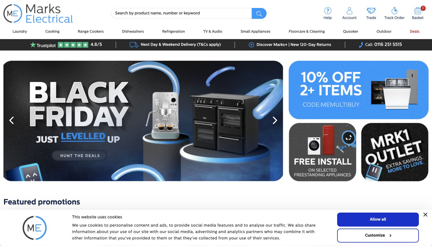
Marks Electrical pairs a large seasonal panel with smaller cards for multibuy savings, installation and an outlet. Rounded shapes, a blue accent and consistent appliance imagery make the collection of offers feel coordinated. The header keeps Help, Trade and Track Order distinct, while the main department row names range cookers and floorcare separately from broader cooking and small-appliance categories.
What you can learn
A reusable campaign system can give each offer a recognisable role without duplicating the whole page. Keep product imagery, labels and destinations consistent, and retain utility navigation for visitors dealing with an existing purchase.
Pros
The different offer cards share a coherent visual structure.
Trade, help and order tracking have clear individual labels.
Cons & considerations
The large campaign section postpones detailed product browsing.
Installation and multibuy offers require their own eligibility explanations.
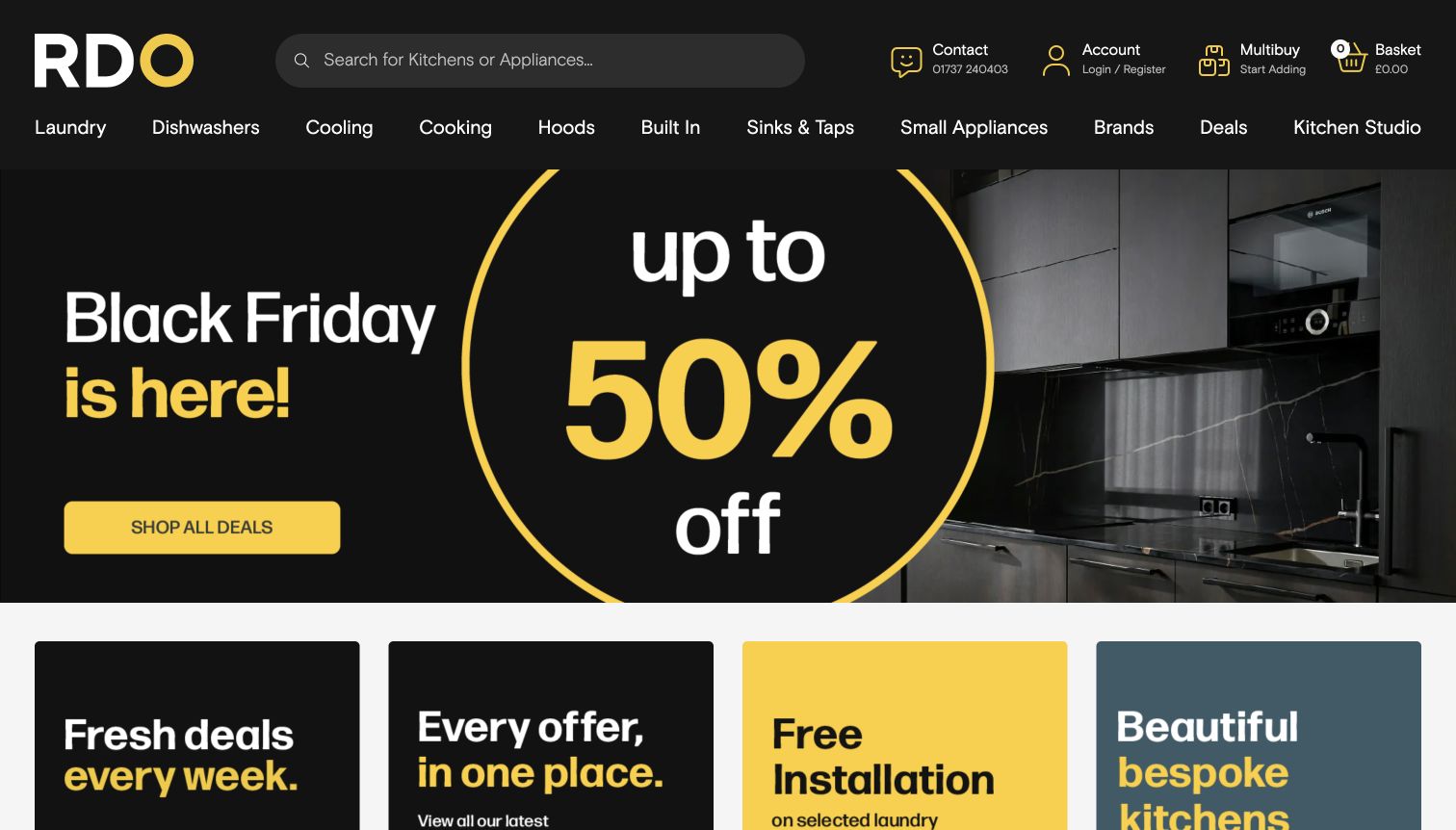
RDO’s black-and-yellow interface gives search substantial space and keeps Contact, Multibuy and Basket visibly separate. Its department row includes Built In, Hoods and Kitchen Studio, reflecting the overlap between appliance selection and a larger kitchen project. The opening campaign is followed by cards for current offers, installation and bespoke kitchens, extending the shopping task beyond a single discounted product.
What you can learn
Use category labels that reflect installation context as well as product type. A shopper planning integrated appliances needs a route to kitchen advice without losing the ability to search for an exact model.
Pros
Kitchen Studio and built-in appliances have explicit navigation routes.
The multibuy action is visually distinct from the basket.
Cons & considerations
The large sale message dominates the first screen.
Project advice and ordinary product shopping need clearly different next steps.
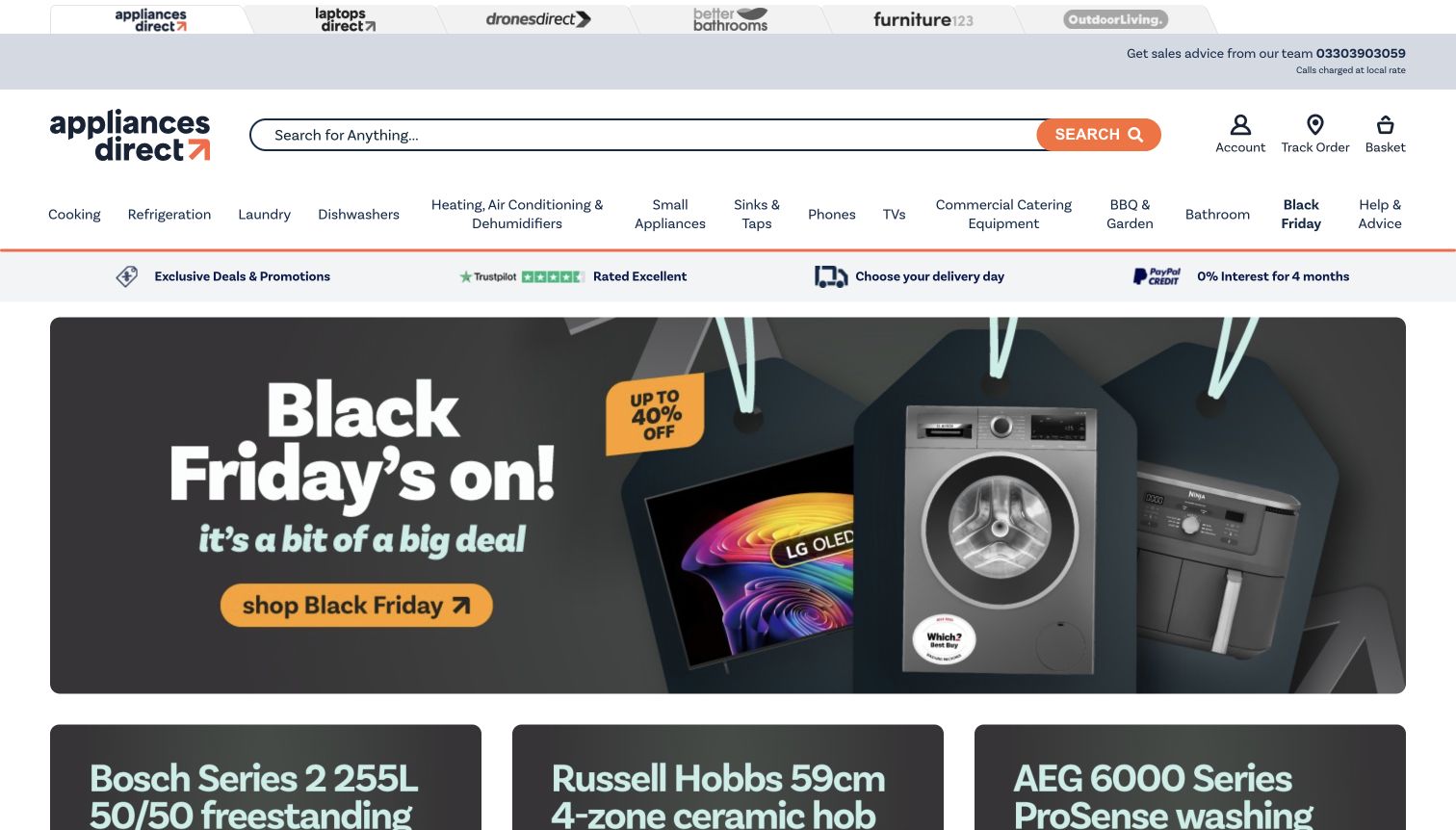
Appliances Direct uses a long search field and a detailed department row that includes heating, commercial catering and other specialist categories. A service strip beneath it highlights delivery-day choice alongside promotional and payment information. The main campaign uses product imagery, with smaller product-specific offers beginning immediately below. Links to sister retail sites sit above the main header, making the wider group visible.
What you can learn
For a broad catalogue, combine searchable model information with explicit specialist departments. Keep delivery choice close to the shopping routes, because a large appliance’s arrival can matter as much as its feature list.
Pros
Specialist categories are named instead of being buried in a generic menu.
Delivery-day choice is visible before product selection.
Cons & considerations
Sister-site links and many departments increase navigation density.
Promotional finance messaging needs full terms beyond the short service strip.
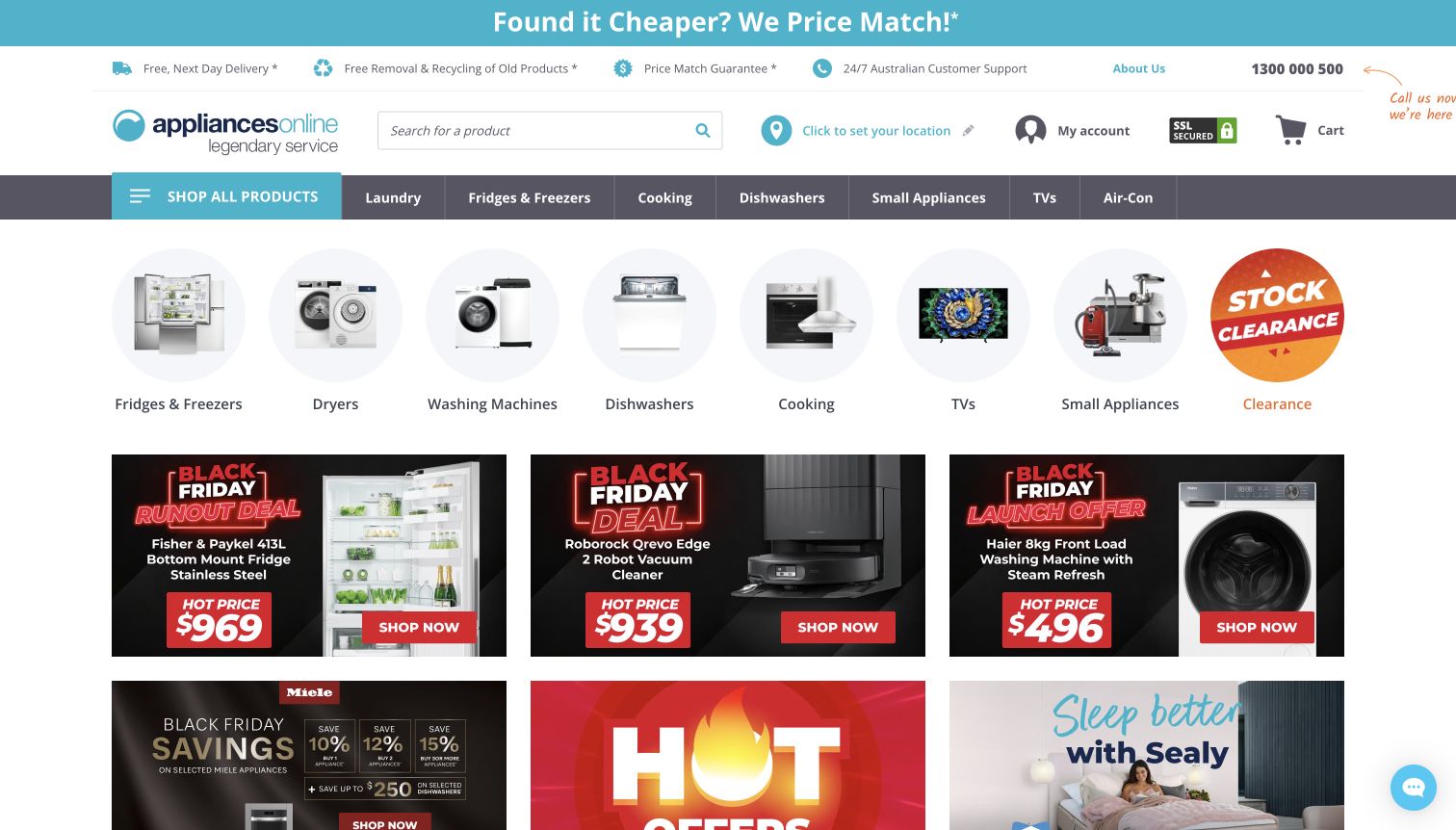
Appliances Online places delivery, removal, price-match and support links across the top, giving service conditions a clear role in the page. Beneath search and location selection, a row of circular product images distinguishes refrigerators, dryers, washing machines and other departments. Individual offer cards follow, combining product photographs, names and prices rather than relying solely on one oversized campaign.
What you can learn
Show the product categories before asking shoppers to interpret a sale. Keep delivery and removal policies accessible, and make the location dependency explicit before promising that an appliance is available for a particular home.
Pros
Category images and labels provide a quick visual overview.
Removal and recycling have a dedicated information link.
Cons & considerations
The many individual offers create a dense page below the category row.
Displayed service promises are qualified by location and other policy conditions.
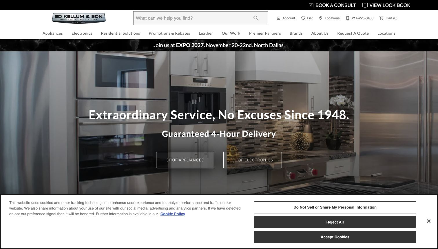
Ed Kellum & Son places Book a Consult and View Look Book in a narrow top bar, signalling a more consultative shopping journey. The main navigation includes Our Work and Residential Solutions alongside appliances and brands. A large kitchen image carries the opening service message, with separate shopping actions for appliances and electronics. The page connects retail products with the planning of a broader home environment.
What you can learn
If consultation and installed projects are part of the offer, give them named routes beside the catalogue. Project imagery should help visitors understand scope while leaving exact product search and contact information easy to reach.
Pros
Consultation and portfolio-style browsing are explicit entry points.
Appliance and electronics shopping have separate opening actions.
Cons & considerations
The large hero delays exposure to individual product information.
The prominent delivery guarantee needs its full service-area and eligibility conditions.
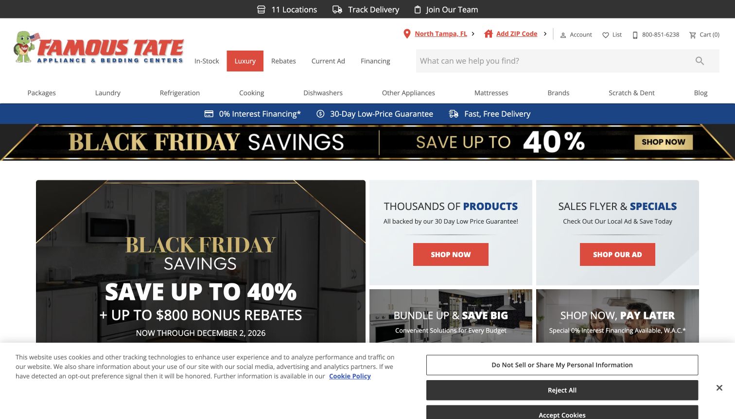
Famous Tate pairs a main campaign panel with separate cards for products, the local sales flyer, bundles and payment options. The upper navigation identifies the selected store and highlights Luxury, while the department row includes Scratch & Dent. Delivery tracking and the store-location route sit above the search area. This structure acknowledges that visitors may arrive from a printed or local advertisement rather than a product query.
What you can learn
Treat the current flyer as a useful shopping route, but connect it to maintained product pages. Keep condition-based stock and luxury ranges clearly labelled so different budgets do not become mixed into one vague deals category.
Pros
The sales flyer has its own clearly labelled card.
Scratch-and-dent and luxury shopping are separately named.
Cons & considerations
Several offers compete in the opening grid.
Price and financing claims require their linked conditions and current product details.
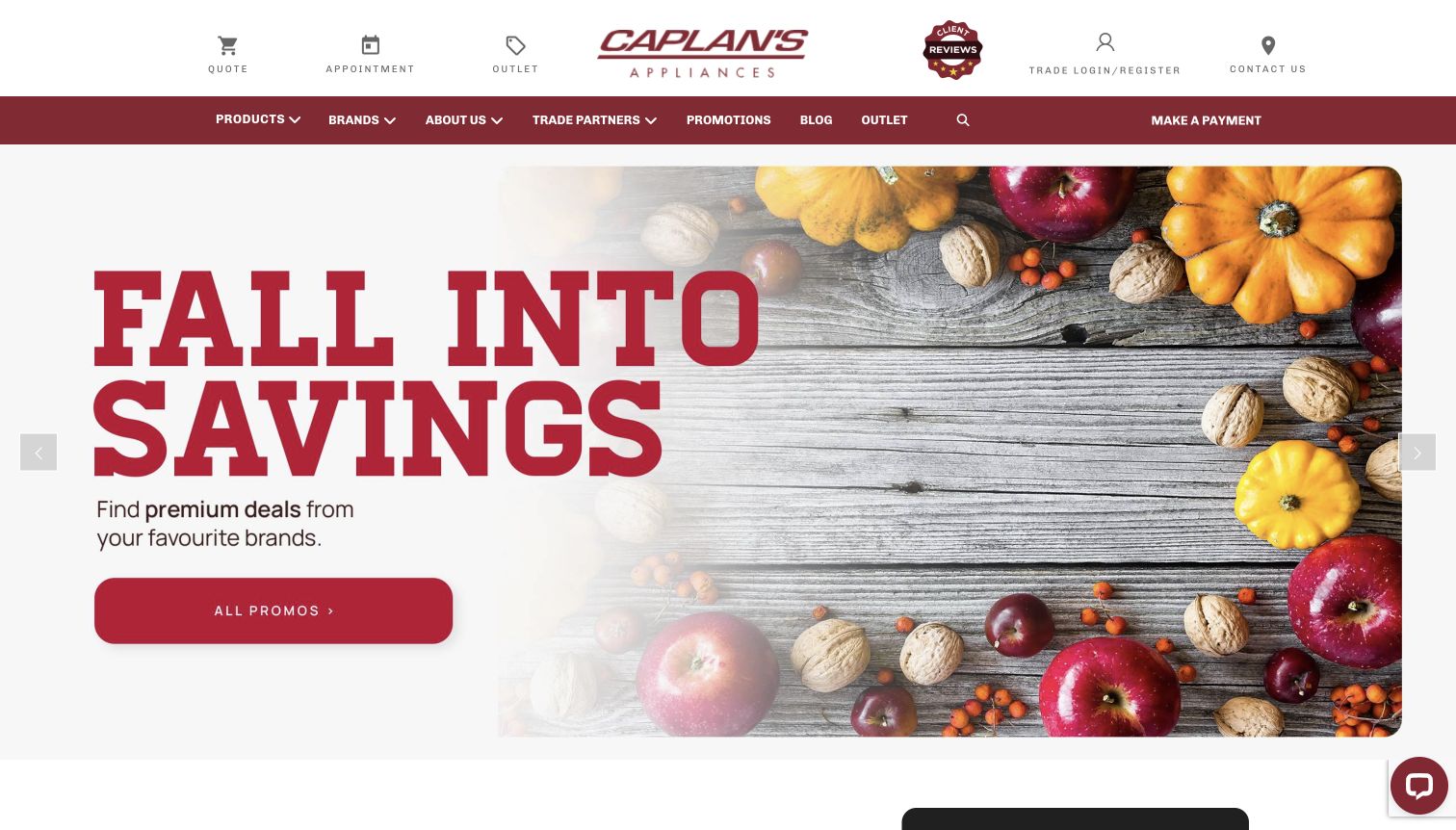
Caplan’s places Quote, Appointment and Outlet actions in the top row, making the intended shopping paths unusually clear. The main navigation adds trade partners, brands and promotions, while a large seasonal image gives the page a warm editorial tone. The photograph is atmospheric rather than product-specific, so the practical controls above it do much of the work of explaining how to proceed.
What you can learn
A showroom-led store should name its conversion steps in ordinary language. Give appointment booking and quote-building distinct destinations, and keep product discovery available for visitors who are still deciding what to discuss.
Pros
Quote and appointment actions are visible without opening a menu.
Trade partners and outlet shopping have distinct navigation routes.
Cons & considerations
The seasonal hero contains little appliance-specific detail.
A large image pushes product discovery further down the initial view.
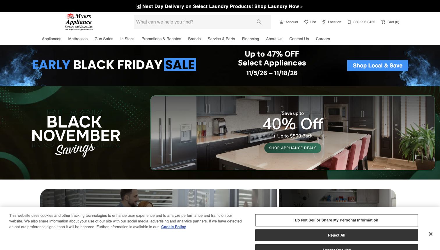
Myers Appliance gives Service & Parts a place in the same navigation as appliances, brands and in-stock products. The opening view combines a narrow sale strip with a larger kitchen campaign, while a top notice identifies a specific laundry delivery route. Search, telephone contact and location remain visible in the header. The practical service label gives the store a role beyond the initial product transaction.
What you can learn
An appliance retailer that supports repairs should make that route explicit. Separate service and parts from general contact information, and ensure purchase promotions do not obscure the task of identifying an existing appliance or obtaining help.
Pros
Service & Parts is named directly in the main navigation.
The delivery notice links to a specific product category.
Cons & considerations
Two major campaign messages compete in the opening screen.
Adjacent non-appliance departments add choices that may distract a focused buyer.
Kegan is a freelance web designer and developer with 15+ years of experience helping businesses turn complicated website requirements into clear, maintainable digital experiences. He works directly with clients from planning and design through development, launch, and ongoing support.
For appliance store website design, his development approach focuses on product catalogue structure, model comparisons, showroom information and delivery or installation guidance. The scope can be a targeted improvement or a complete custom build, with responsive layouts, thoughtful content structure, and integrations chosen around the people using and maintaining the site.
Show 3 other appliance store website designersHide other appliance store website designers
Plan around replacement, renovation and ongoing support
Map three real buying journeys
Start with an urgent replacement, a coordinated kitchen package and an existing customer seeking service. Identify the information each needs and the point where a person must help. Build search, departments and support routes around those tasks before choosing campaign layouts or adding more promotional panels.
Define the catalogue’s critical attributes
Choose representative refrigerators, dishwashers, ranges and laundry products. Record model identifiers, dimensions, installation type, finish, documented specifications and fulfilment status. Decide which attributes belong to a product variant and which require explanatory guidance. Test the structure on awkward exceptions such as display stock or call-for-price products.
Keep stores, stock and campaigns maintainable
Assign ownership for showroom hours, service coverage, delivery estimates, model changes and promotional expiry. Connect campaign destinations to maintained product records. Keep physical-store information useful even when stock systems differ, and explain those differences rather than suggesting the website knows more than it does.
The editing job behind the design
Choose a platform that supports appliance data and operations
Assess catalogue filtering, model search, product comparisons, package quotes, local inventory and delivery rules before choosing a theme. The most attractive homepage will not compensate for unclear dimensions or an order path that omits installation constraints. Test a realistic product and delivery scenario with the store’s actual operating rules.
Use a content system that lets staff maintain buying guides, manufacturer documents and showroom information alongside products. The public technology evidence shown with these examples is limited to reviewed source pages. It does not reveal the complete stock, payment, service or warehouse system, and it is not a recommendation to copy another retailer’s architecture.
Our WordPress website examples offer a separate look at publishing approaches. A visible platform label is evidence for that named page, not a guarantee that the same system will suit your requirements.
Before the public launch
Appliance store website launch checklist
Keep exact model numbers searchable and visible on product records.
Distinguish appliance dimensions, installation clearances and required opening sizes.
Explain documented electrical, fuel, plumbing and ventilation requirements.
Label in-stock, special-order, display, clearance and damaged-packaging products accurately.
State which location or warehouse an availability message describes.
Explain delivery coverage, access preparation, installation scope and removal conditions.
Provide clear routes for packages, quotes and consultations when a cart is insufficient.
Keep repair, parts, warranty information and order tracking separate from new-sale promotions.
Check keyboard access, visible focus, text contrast and product-option controls.
Give seasonal campaigns accurate destinations and an expiry owner.
These checks are a project checklist, not a performance, legal, security, or accessibility certification. Test real journeys with the people responsible for the website before making claims about the result.
Sources & editorial method
How this collection was selected and reviewed
We reviewed official public appliance-store pages on November 11, 2026, examining catalogue entry points, product presentation, showroom context and service navigation. Reno’s Appliance is the Editors Choice for its clear local showroom information and coherent kitchen-focused presentation. This is an editorial website-design selection, not a customer-vote award or service-quality endorsement. Captures record the pages as observed, including promotional material and notices. Bounded public technology audits retain access limitations and do not establish hidden systems.
Each example links to its actual source page. Screenshots are direct browser captures with their own capture dates; moving imagery, announcements and live designs can change. The notes describe observable design choices and conditional tradeoffs, not measured traffic, conversion results, service quality, or accessibility conformance.
Technology labels use public page metadata, asset evidence, or explicitly cited platform documentation. Platform documentation is not a complete current deployment audit. A component reference may be legacy or unused; it is not a complete backend inventory. Unknown stacks are omitted. These sites are editorial examples, not our client portfolio.
Written, Edited and Curated are separate editorial records, not timestamps advanced by a rebuild. Website designs and imagery belong to their owners. See our editorial standards or suggest a correction.
Questions worth asking
Appliance Store website design questions
What should an appliance homepage prioritise?
Give visitors a clear route to search, product departments, available stock and local-store information. Delivery, installation and service should be easy to find. A promotion can support those tasks, but it should not be the only way into the catalogue.
Which product details matter most for appliance shopping?
Exact model identifiers, dimensions, installation type and documented connection requirements are essential. Explain the difference between a product’s dimensions and the space it needs. Use manufacturer documentation and qualified installation advice rather than guessing compatibility.
Should an appliance retailer offer online checkout or quotes?
Use the route that matches the real purchase. Standard products with clear fulfilment rules may suit checkout, while packages, installation-sensitive items or project work may need a quote. Explain the next step and what information the customer will need.
How should delivery promises appear?
Keep coverage, stock eligibility, access requirements and installation exclusions close to the promise. Distinguish an estimate from a confirmed appointment. A large headline is not a substitute for the conditions that determine whether the service is available.
How can a store support both urgent replacements and kitchen projects?
Provide a direct in-stock route for urgent purchases and separate package, showroom or consultation routes for planned work. Both should lead to consistent product information, with service and delivery details available throughout.
Can a public technology audit identify a retailer’s entire commerce system?
No. Public pages may expose a platform or supporting library while inventory, payments and service operations remain private. Treat observed signals as scoped evidence and choose your own tools around product data, fulfilment and staff requirements.
Borrow the clear categories, useful service routes and coherent product presentation. Make the practical questions about fit, availability and delivery as easy to answer as the question of style.