Definitive guide · Apache Airflow website development
Best Apache Airflow Websites of 2026 (20 Real-World Examples)
Public design references from organisations with documented orchestration workloads—not a list of homepages built with Airflow.
Apache Airflow coordinates workflows expressed as code. It is not a visual website builder, CMS or homepage framework. These 20 examples pair public website-design observations with primary sources about particular organisational workloads. Study the visible navigation and information hierarchy, then read the separate evidence to understand what Airflow actually coordinates. Neither subject provides a complete inventory of the other.
Adobe, Booking.com, Autodesk, DISH and Société Générale open the collection with recognisable major organisations. Their documentary associations cover different scheduling, data-platform and orchestration contexts. Some describe managed Astro deployments; others are project-published testimonials. The pictured public pages are design references, not screenshots of private Airflow consoles, and the sources do not establish that every company application or its marketing frontend uses Airflow.
For a website project, orchestration becomes relevant when background work has dependencies, operating windows or a need for controlled recovery. A catalogue import might precede an approved publication step; a report may depend on several datasets. Begin with that actual responsibility. A simple contact submission or a single short-lived action should not acquire an enterprise workflow platform merely because a large reference organisation uses one elsewhere.
Before the examples
What makes good Apache Airflow website development in 2026?
Define repeatable work for a specific data interval
Airflow’s best-practice guidance emphasises consistent results when tasks run again. Identify the input partition or interval and the output it belongs to rather than reading whichever data happens to be newest. Design writes so a retry does not simply append duplicates. Idempotent task design is a responsibility of the workload and its destination systems; installing a scheduler does not automatically make business effects safe to repeat.
Make recovery a designed behaviour, not a retry count
Describe what happens if extraction succeeds but publication fails, or if an external request completes before the task receives its acknowledgement. Decide which stages can be repeated, checked or reconciled. A green task state is not independent proof that an external business outcome occurred exactly once. Keep the user-facing promise separate from internal scheduling status, with a maintained way to investigate missing or repeated results.
The official security model explains that DAG authors submit executable code and can potentially access credentials used by their tasks. A restricted view of a DAG in the interface is not a complete sandbox for that author’s code. Limit author and deployment access to trusted people, use reviewed changes and design stronger separation where different trust groups require it. Do not expose the administrative interface as a public website feature.
Compare the public design patterns, then follow the cited workload source for the Airflow association. A retail campaign, corporate report or sports news page does not reveal its organisation’s orchestration topology. The collection illustrates different public interfaces alongside bounded infrastructure evidence, not a measured ranking or a set of interchangeable backend architectures.
We start with five recognizable brands or organizations: Adobe, Booking.com, Autodesk, DISH, Société Générale. Each attribution applies to the named website property, not every product or website belonging to its organization. This is a curated reading sequence, not a measured ranking.
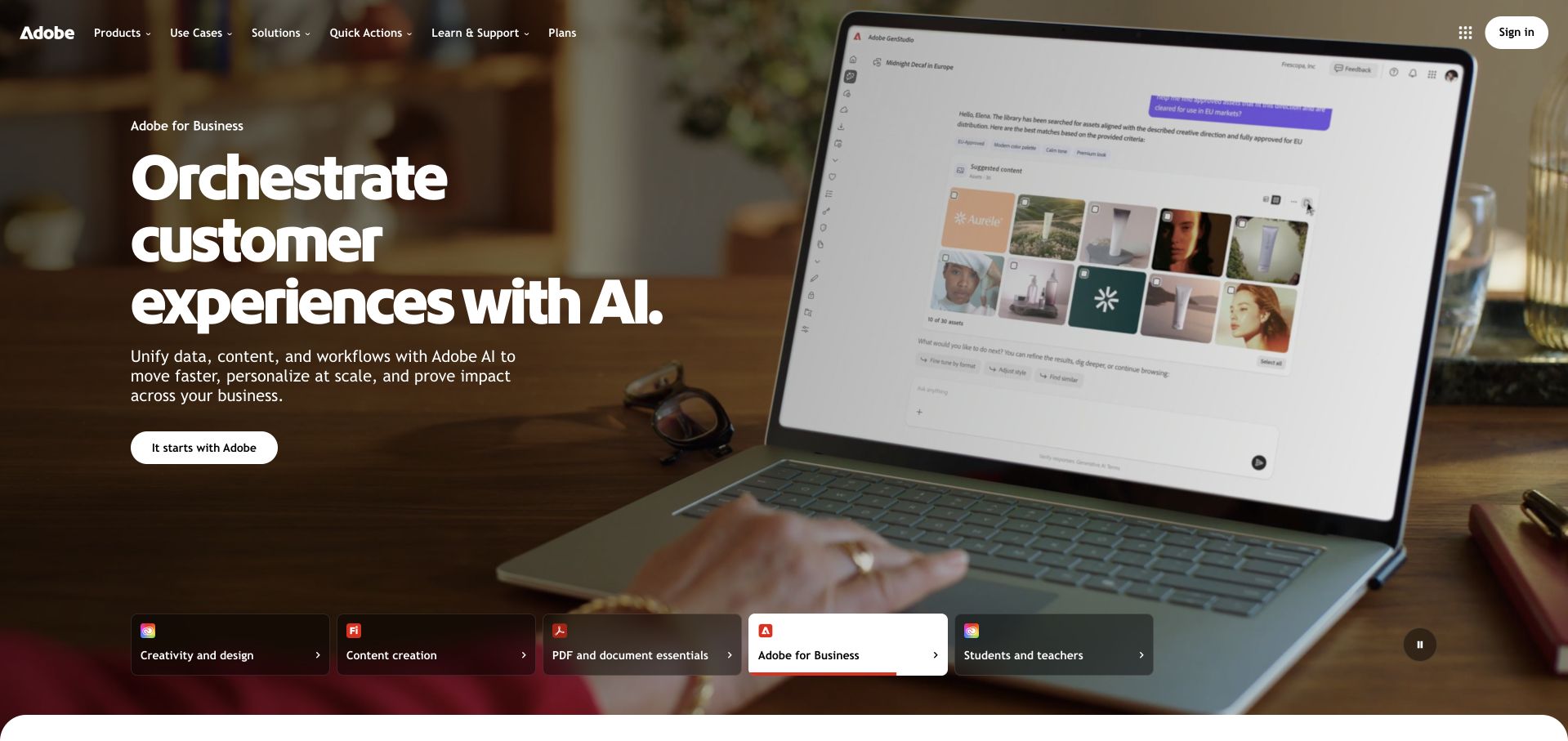
Adobe’s captured opening uses a large product-demonstration photograph, bold white typography and a row of audience or product-family shortcuts. The business campaign has a clear place without removing creativity, documents or education from the navigation. The image makes the proposition tangible, although small interface details are illustrative rather than a readable product walkthrough. Separately, Apache’s Adobe case describes Experience Platform workflow scheduling and custom operators using Airflow. That documented orchestration workload does not establish how adobe.com renders this campaign or identify every system involved in the public website.
What you can learn
A portfolio homepage can feature one audience while preserving stable shortcuts for the others. Keep a product demonstration visually concrete, and distinguish documentary infrastructure evidence from the technology serving the marketing page.
Pros
The audience shortcuts preserve several useful routes beneath a dominant business-focused campaign.
Bold type and a restrained action create a clear hierarchy over the photographic demonstration.
Cons & considerations
Small product-interface details in a photograph are not a substitute for an accessible explanation.
A full-screen campaign needs reliable contrast and a useful still state across changing media.
Platform source: Primary documented Apache Airflow association. The Apache project publishes Adobe’s Airflow testimonial. Platform evidence is separate from the direct website screenshot and is not a complete current infrastructure audit.
Booking.com gives a blue brand field and a yellow-edged search component the principal visual positions. Destination, dates and occupancy are separate decisions, with related travel products arranged in a navigation row above. Offers follow on white rather than occupying the main search area. The design demonstrates how a complex marketplace can make its primary task obvious. Astronomer’s separate case documents Booking.com’s Airflow-based orchestration on Astro for data and AI workloads. It is evidence about that shared data platform, not proof that the public booking interface itself runs on Airflow.
What you can learn
Let the most important task define the opening, then give promotional content a secondary place. Separate the interface a visitor uses from the data-orchestration systems described in a vendor case.
Pros
The search visibly separates destination, travel dates and occupancy instead of hiding them behind one action.
Related travel products are discoverable without removing the principal accommodation-search hierarchy.
Cons & considerations
A dense search needs careful mobile stacking and clear labels when several controls expand.
Promotions and financing-related offers can distract from the core task if allowed equal emphasis.
Platform source: Primary documented Apache Airflow association. Astronomer documents Booking.com’s Airflow orchestration on Astro. Platform evidence is separate from the direct website screenshot and is not a complete current infrastructure audit.
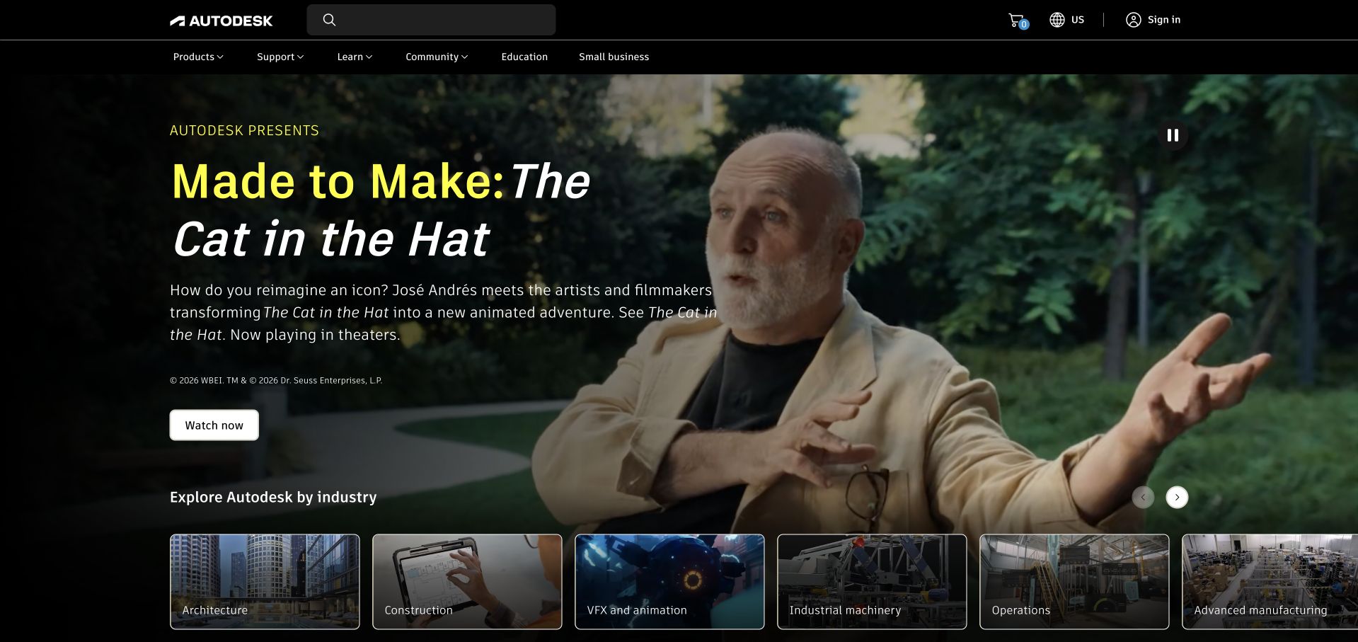
Autodesk uses a dark cinematic campaign with a large headline, a watch action and a horizontal row of industry cards. The cards make architecture, construction, animation and manufacturing visible even while one editorial story dominates the hero. Search and product navigation remain available in the black header. The campaign is memorable, but a task-focused visitor needs those stable alternatives. Astronomer documents Autodesk’s migration from Oozie to Airflow-powered orchestration for business workflows. That cloud-transformation case concerns data operations; it does not identify the frontend or complete backend of the photographed public homepage.
What you can learn
Give editorial storytelling a bounded role within a broad product portfolio. Preserve literal audience shortcuts, and describe an orchestration migration as its documented workload rather than a universal website-stack claim.
Pros
Industry cards provide practical alternatives to the featured film without opening a large menu.
The dark header keeps product search and support navigation visually separate from the campaign.
Cons & considerations
A cinematic story can postpone the practical product question that brought a professional visitor.
Horizontal industry cards need an obvious, usable alternative when screen width is limited.
Platform source: Primary documented Apache Airflow association. Astronomer documents Autodesk’s Airflow-powered orchestration. Platform evidence is separate from the direct website screenshot and is not a complete current infrastructure audit.
DISH uses a strong red proposition panel beside a social viewing photograph, with shopping and telephone actions beneath the price message. Package cards begin immediately below the hero, giving the visitor a concrete comparison after the campaign. The page is direct about its commercial task, although price conditions need to remain readable rather than disappear into small print. Apache’s separate DISH testimonial describes Airflow as part of its batch-pipeline scheduling approach. That association does not demonstrate that Airflow serves the storefront, calculates every offer or powers the public package-selection interface.
What you can learn
Connect a headline offer directly to comparable packages and clear conditions. Keep data-platform evidence separate from the consumer interface, and avoid treating a scheduling testimonial as a claim about checkout technology.
Pros
Package comparison begins close to the campaign instead of after a long corporate introduction.
Telephone and shopping actions are distinct, giving visitors more than one way to continue.
Cons & considerations
A dominant price claim needs readable scope and terms rather than tiny supporting qualifications.
Promotional photography offers little practical information unless the package details remain easy to compare.
Platform source: Primary documented Apache Airflow association. The Apache project publishes DISH’s Airflow testimonial. Platform evidence is separate from the direct website screenshot and is not a complete current infrastructure audit.
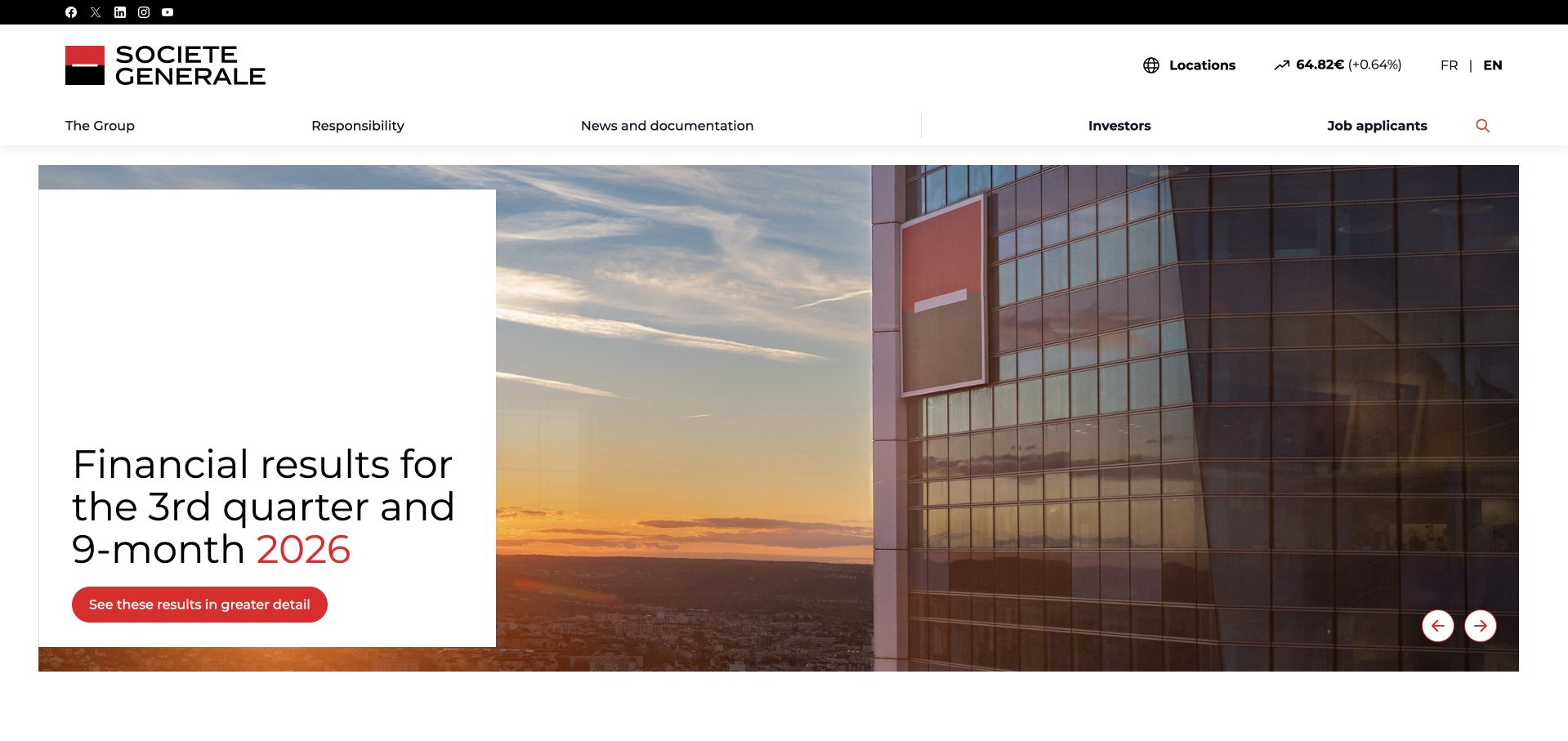
Société Générale uses a wide architectural photograph with a white results card and a restrained red action. Its header separates group information, responsibility, documentation, investors and job applicants. That structure fits a corporate publication rather than a personal-banking transaction page. The card makes the featured reporting period explicit, while the photograph carries the brand atmosphere. Astronomer’s case separately describes an internal Airflow-as-a-Service platform for engineering teams. It supports that defined organisational association, not a claim that this corporate homepage or every banking application runs on Airflow.
What you can learn
Match the homepage to its actual corporate audience and date the featured publication clearly. Separate internal platform evidence from public-site implementation, preserving the distinction between brand communication and transactional services.
Pros
The results card gives the featured publication a readable surface and an explicit reporting context.
Investor, documentation and employment routes acknowledge different corporate visitor tasks.
Cons & considerations
A large campaign image can delay direct access to specific reports for returning visitors.
Small corporate navigation labels require careful spacing and readable mobile alternatives.
Platform source: Primary documented Apache Airflow association. Astronomer documents Société Générale’s Airflow-as-a-Service platform. Platform evidence is separate from the direct website screenshot and is not a complete current infrastructure audit.
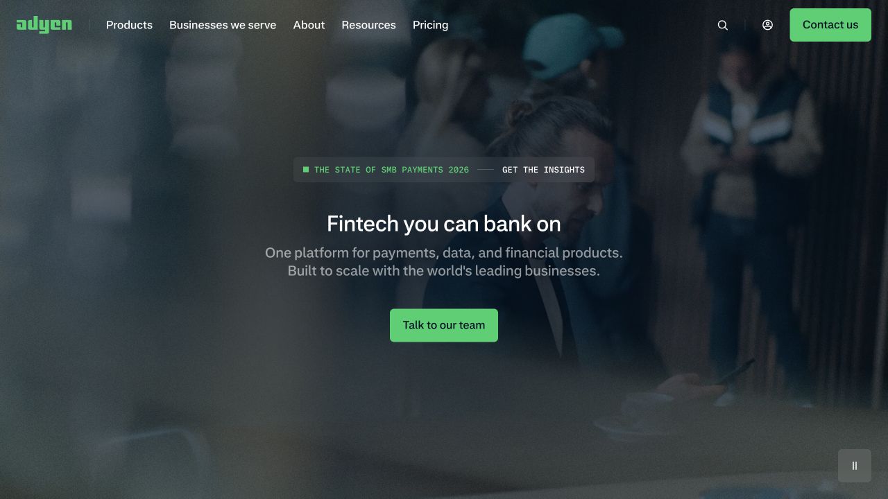
Adyen combines a darkened real-world photograph with a short central proposition and a bright green conversation action. Navigation separates products, business types, company information, resources and pricing. A compact report promotion sits above the headline without replacing the core offer. The layout creates focus, although the broad platform statement needs more specific product explanation below. Apache’s Adyen case documents custom Airflow plugins, operators and user roles for internal orchestration. That is a scoped engineering association, not evidence that the public payment-marketing page or transaction systems use the same runtime.
What you can learn
Use a short proposition to establish the platform, then provide literal product and pricing routes. Keep an internal workflow case distinct from claims about public-site rendering or regulated transaction infrastructure.
Pros
The green action is clearly identifiable against the dark photographic treatment.
Pricing and business-type navigation give visitors practical alternatives to immediate sales contact.
Cons & considerations
A broad fintech statement leaves important product distinctions to supporting content.
Photographic overlays need stable contrast and a meaningful fallback when moving media cannot play.
Platform source: Primary documented Apache Airflow association. The Apache project documents Adyen’s Airflow plugins. Platform evidence is separate from the direct website screenshot and is not a complete current infrastructure audit.
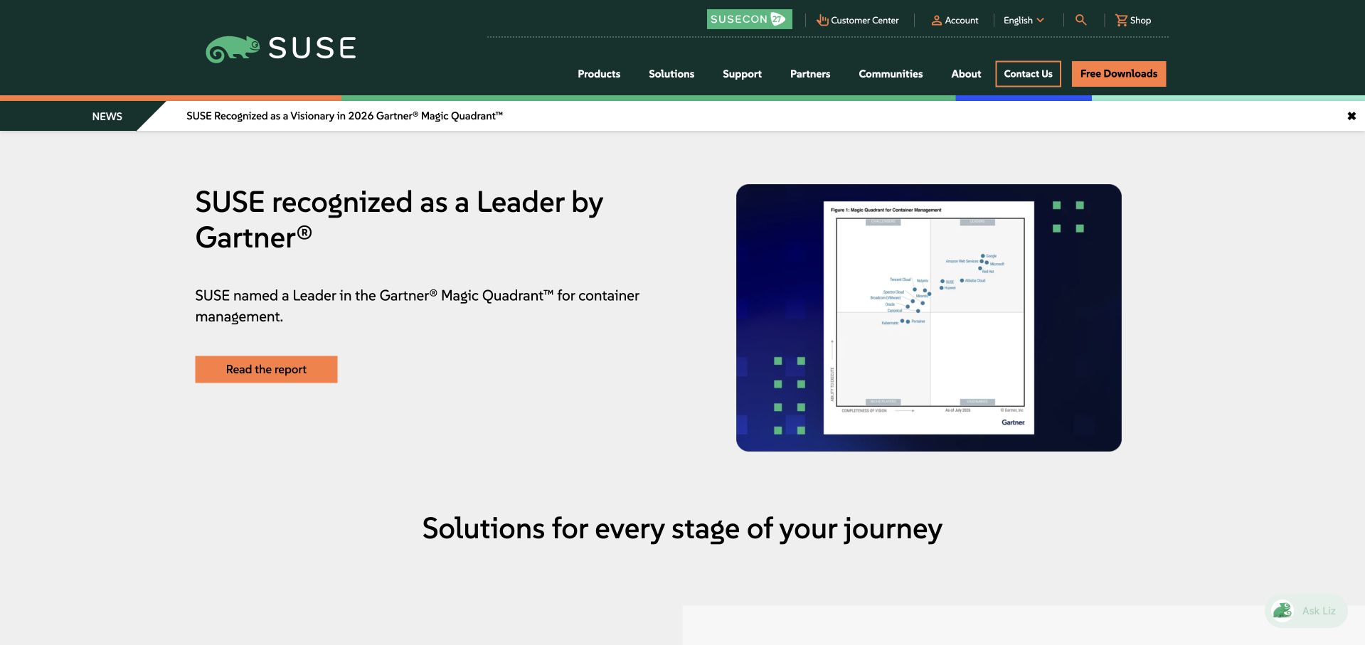
SUSE uses a dark green header above a pale campaign panel, pairing a recognition-led headline with a contained product-interface image. Products, solutions, support, partners and community have separate navigation routes, while contact and downloads receive distinct treatments. The composition supplies useful alternatives for buyers and existing users. Recognition language still needs its original scope rather than being treated as an independent product verdict. Apache’s Rancher by SUSE case describes Airflow coordinating container construction and release workflows. It does not establish that the suse.com marketing page or every container product is implemented with Airflow.
What you can learn
Keep product discovery, support and downloads visible around a corporate evidence campaign. Explain the exact workflow behind a technology association instead of generalising build-orchestration use to an entire software portfolio.
Pros
Support, community and downloads remain explicit routes alongside sales-oriented navigation.
The contained interface image gives the campaign a concrete technical reference without dominating the whole page.
Cons & considerations
Recognition claims need source context and should not replace a clear product explanation.
A small interface screenshot requires a fuller accessible description elsewhere to communicate useful detail.
Platform source: Primary documented Apache Airflow association. The Apache project documents Rancher by SUSE’s container orchestration. Platform evidence is separate from the direct website screenshot and is not a complete current infrastructure audit.
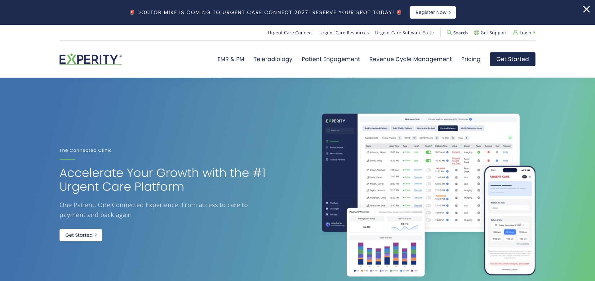
Experity uses a blue-to-green gradient with a concise platform headline on the left and desktop and mobile interface previews on the right. Navigation separates records software, teleradiology, patient engagement, revenue services and pricing. That makes the vertical specialisation more tangible than a generic transformation slogan. The previews communicate breadth, but their small text is not a complete feature explanation. Apache’s Experity account documents enterprise scheduling and its contribution of Windows-related Airflow integration. The case concerns workflow orchestration, not the pictured marketing page’s frontend, patient-data handling or the implementation of every advertised product.
What you can learn
Show related product interfaces as context while keeping the service categories literal. Treat an engineering integration story as a scoped association and avoid inferring clinical-system architecture or data protections from a promotional screenshot.
Pros
Named product categories help visitors understand the platform’s vertical scope before contacting sales.
Desktop and mobile previews provide a concrete visual counterpart to the short introduction.
Cons & considerations
Small interface details need a readable feature explanation rather than relying on the hero composite.
A broad platform promise can blur distinct products unless pricing and implementation boundaries are explained.
Platform source: Primary documented Apache Airflow association. The Apache project publishes Experity’s Airflow scheduling account. Platform evidence is separate from the direct website screenshot and is not a complete current infrastructure audit.
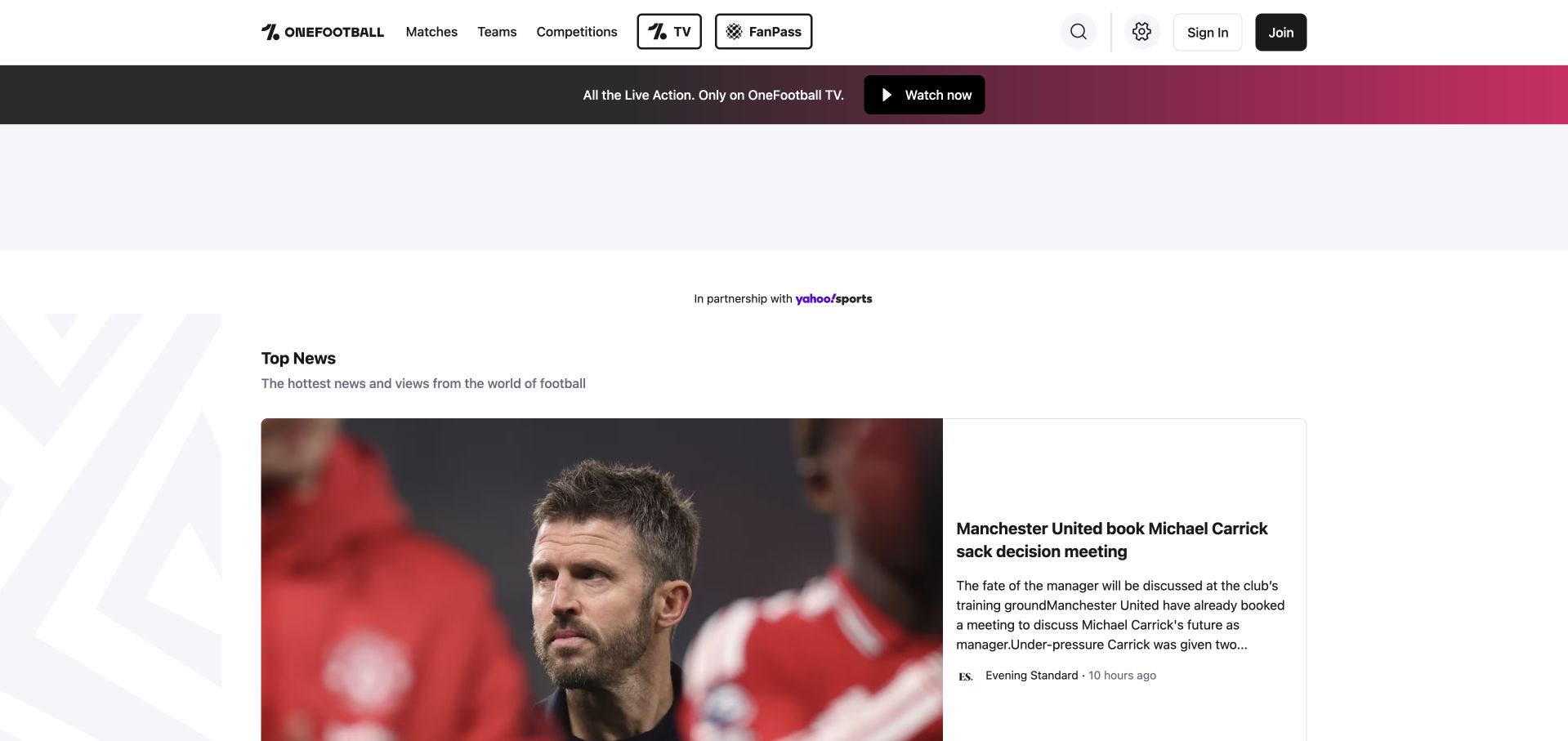
OneFootball’s captured page uses a white utility header, a separate video-promotion strip and a prominent news card. Matches, teams and competitions have literal navigation labels, while account and video products occupy separate controls. The large photograph and attributed story make the editorial task clear. A substantial reserved area above the news demonstrates the cost of allowing non-editorial space to dominate the first view. Apache’s OneFootball case describes migrating analytics pipelines from cron to Airflow DAGs. That documented DataOps history does not establish the current runtime of the public news feed or its video platform.
What you can learn
Keep content discovery and paid or account-based products understandable as different tasks. Distinguish an analytics-pipeline case from the infrastructure serving articles, and make reserved promotional space proportionate to the main editorial purpose.
Pros
Matches, teams and competitions provide straightforward content routes without requiring account creation.
The featured story retains publication attribution rather than presenting every item as anonymous platform content.
Cons & considerations
A large reserved area delays the news content that gives the page its practical value.
Video, membership and editorial products need clear boundaries to avoid a crowded header.
Platform source: Primary documented Apache Airflow association. The Apache project publishes OneFootball’s Airflow account. Platform evidence is separate from the direct website screenshot and is not a complete current infrastructure audit.
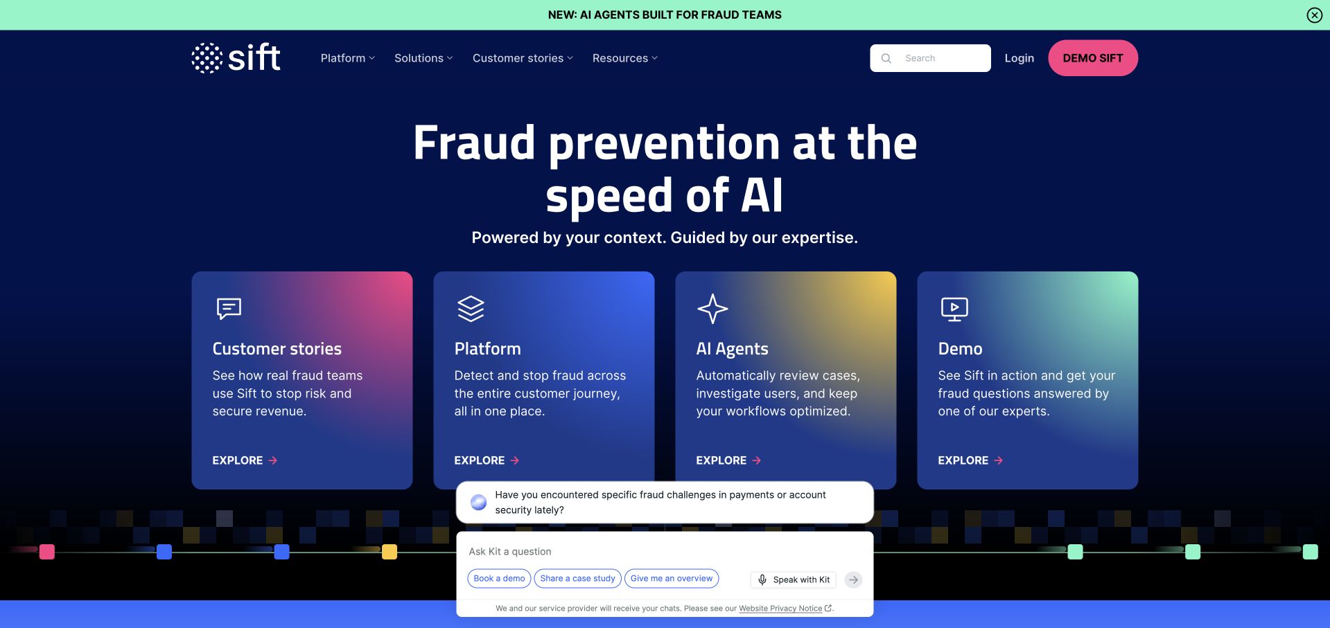
Sift uses a dark blue field, a prominent fraud-prevention statement and four colourful discovery cards. Customer stories, platform information, AI agents and a demo are separate routes rather than one repeated sales button. Search and login remain in the header. The card structure is useful for visitors who need evidence or product explanation before a conversation, though an expanded helper panel can compete with it. Apache’s Sift case describes Airflow coordinating dependencies in machine-learning training pipelines. It does not prove how this marketing page is delivered or establish the effectiveness of the advertised fraud products.
What you can learn
Offer evidence, product learning and sales contact as different next steps. Keep helper widgets secondary, and attach the technology association to the documented model-training workflow rather than the public campaign or its performance claims.
Pros
The four-card structure supports several meaningful research paths without forcing immediate sales contact.
Search and existing-user login remain visible outside the promotional cards.
Cons & considerations
Expanded assistance panels can obscure the same cards intended to simplify discovery.
A broad AI-oriented security headline needs specific product explanations and properly scoped evidence underneath it.
Platform source: Primary documented Apache Airflow association. The Apache project documents Sift’s Airflow ML pipelines. Platform evidence is separate from the direct website screenshot and is not a complete current infrastructure audit.
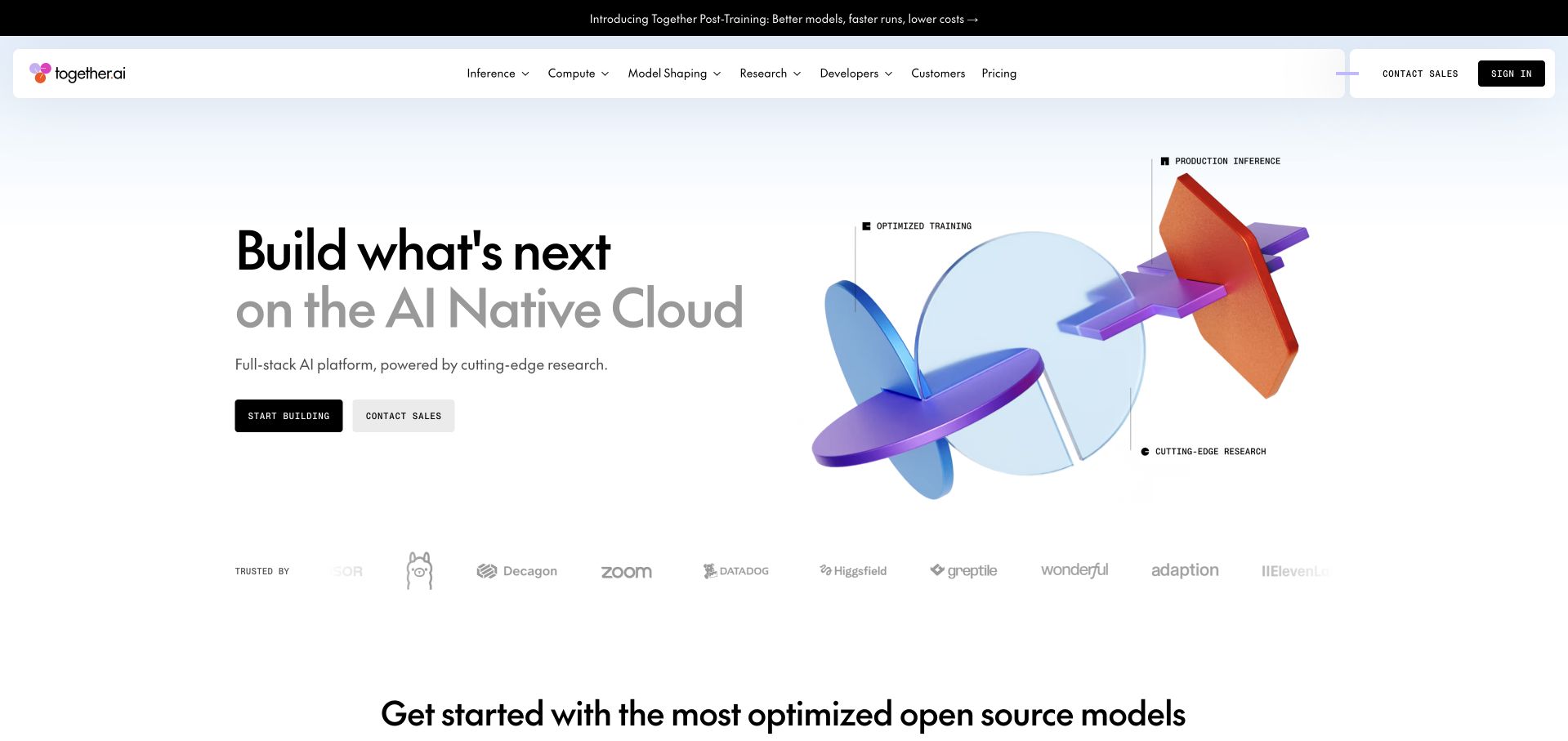
Together AI pairs a minimal white opening with a technical abstract illustration and two distinct actions for building and sales. Navigation exposes inference, compute, model shaping, research, developers and pricing. The composition gives a broad infrastructure offer a clear taxonomy without crowding the hero with implementation details. The illustration is branding, not an architecture diagram. Astronomer’s case separately documents Together AI’s warehouse orchestration and Airflow DAG authoring on Astro. That association concerns the described internal data-engineering workflow, not the public site’s renderer or the full serving architecture behind its AI products.
What you can learn
Use literal product categories to make a broad infrastructure platform navigable. Keep developer entry and enterprise sales distinct, and separate a documented warehouse workflow from claims about the architecture of customer-facing model services.
Pros
Developer-oriented building and sales contact have separate actions with a clear hierarchy.
The navigation names infrastructure categories rather than relying only on an abstract AI promise.
Cons & considerations
An abstract illustration cannot explain the technical boundaries among the advertised products.
A broad native-cloud proposition needs concrete documentation and pricing context for practical evaluation.
Platform source: Primary documented Apache Airflow association. Astronomer documents Together AI’s managed orchestration. Platform evidence is separate from the direct website screenshot and is not a complete current infrastructure audit.
Janus Henderson’s captured opening uses a large professional portrait, bold paired wording and a three-part audience strip. Financial professionals, individual investors and institutional investors are given different routes. The dark, restrained identity makes those divisions feel part of the main architecture rather than a minor footer filter. Its broad expertise message needs the appropriate product and jurisdiction context on subsequent pages. Separately, Astronomer documents orchestration and recovery work for investment-data pipelines using Astro and Airflow. That case is not evidence about the website’s frontend, investment performance or every system used by the organisation.
What you can learn
Make audience boundaries explicit before presenting detailed financial product information. Preserve jurisdiction and destination context, and describe data-pipeline evidence without turning infrastructure claims into an endorsement of investment outcomes.
Pros
Three audience routes recognise materially different information needs within the same brand.
The segmentation strip remains readable outside the main photographic campaign.
Cons & considerations
A general expertise headline gives limited practical product or jurisdiction information on its own.
Audience choices need clear explanations and consistent follow-through rather than merely changing a label.
Platform source: Primary documented Apache Airflow association. Astronomer documents Janus Henderson’s orchestrated data tasks. Platform evidence is separate from the direct website screenshot and is not a complete current infrastructure audit.
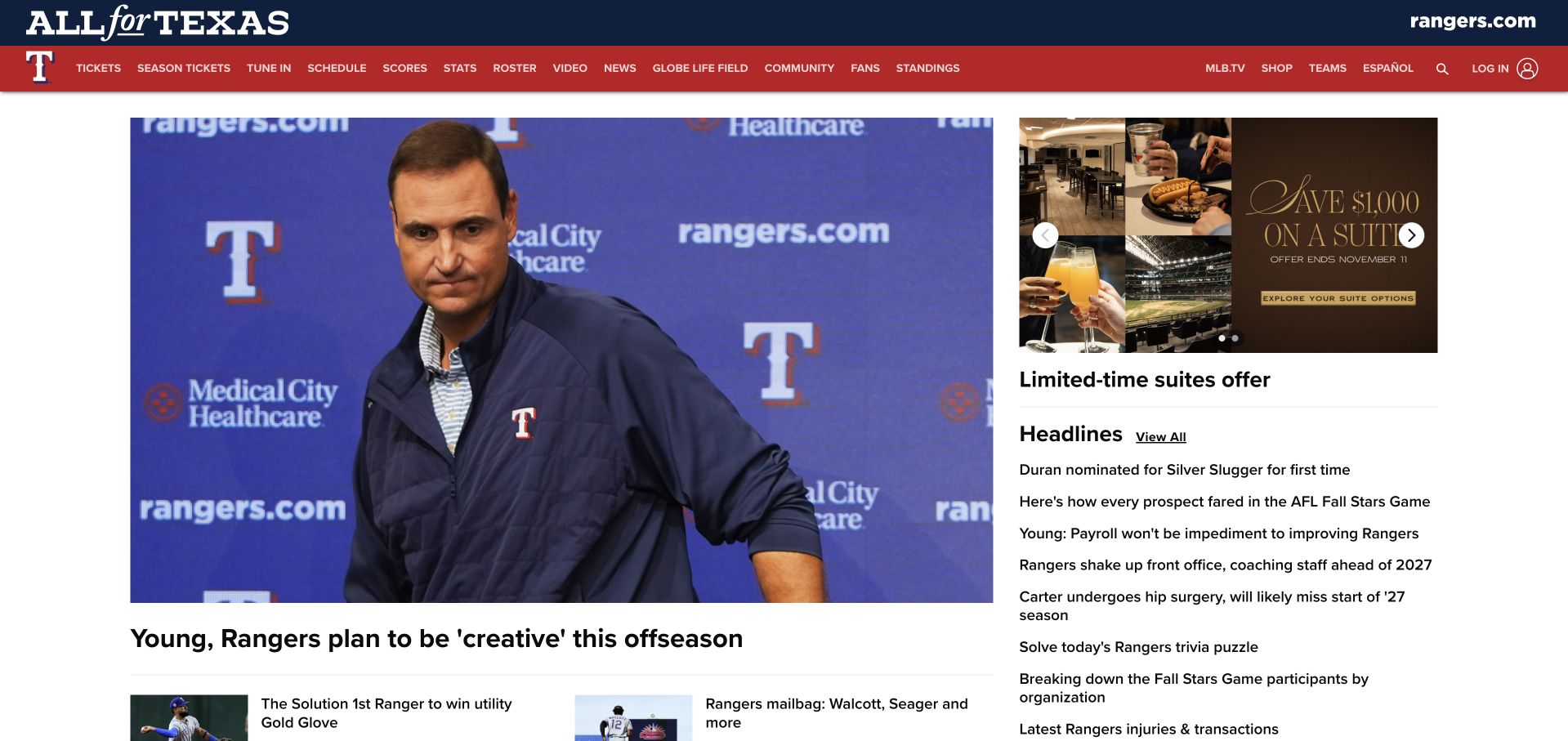
The Texas Rangers page uses a strong red team navigation bar above a large lead news image and a right-hand headline column. Tickets, schedules, roster information and stadium topics remain visible while editorial content leads the page. A suite promotion has a separate area rather than becoming the only homepage task. The density is appropriate to a frequently updated publication, but hierarchy matters when commercial and news items compete. Astronomer documents the Rangers’ analytics orchestration using Airflow and Astro. That case concerns organisational data pipelines, not the MLB page’s publishing runtime or an independently verified explanation of sporting results.
What you can learn
A sports homepage can serve recurring information tasks alongside commercial activity. Keep news attribution and timestamps clear, and distinguish a documented analytics platform from the technology publishing the fan-facing page or claims about competitive success.
Pros
Schedule, roster and stadium routes remain visible without forcing fans into ticket purchase.
The lead story and compact headline column provide two useful levels of editorial browsing.
Cons & considerations
Dense navigation and promotions need careful mobile prioritisation to preserve the news hierarchy.
Commercial tiles can compete with time-sensitive editorial material if they receive identical emphasis.
Platform source: Primary documented Apache Airflow association. Astronomer documents Texas Rangers analytics on Astro. Platform evidence is separate from the direct website screenshot and is not a complete current infrastructure audit.
Everlane uses a large fashion photograph, a restrained gift-guide headline and two small shopping actions. Product categories remain in a separate white navigation row, with a promotional strip above the hero. The arrangement lets the seasonal story change while the catalogue structure remains recognisable. Small white text over a pale photograph is the clearest readability tradeoff in the captured view. Astronomer’s separate Everlane case describes managed Airflow orchestration for business reporting and related data pipelines. That account does not establish the storefront’s frontend, checkout technology or whether the campaign’s product claims have been independently verified.
What you can learn
Keep catalogue navigation stable while seasonal imagery changes. Give campaign text reliable contrast and separate documentary data-platform adoption from the technology serving product pages or the evidence behind sustainability-oriented messaging.
Pros
Product categories remain accessible independently of the large seasonal gift-guide campaign.
The restrained header gives search, account and bag tasks clear, familiar positions.
Cons & considerations
Small white campaign text can lose contrast against the pale photographic background.
Several promotional strips can consume first-view space before visitors reach actual products.
Platform source: Primary documented Apache Airflow association. Astronomer documents Everlane’s data-pipeline orchestration. Platform evidence is separate from the direct website screenshot and is not a complete current infrastructure audit.
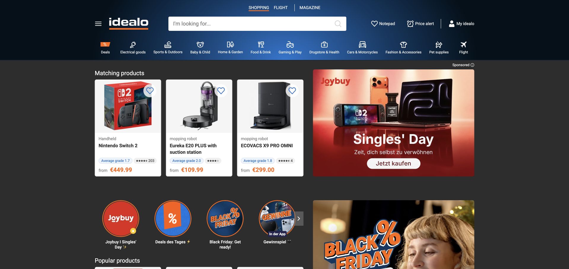
idealo uses a dark header with a wide product search and a compact row of category shortcuts. Product cards, retailer promotions and seasonal deal modules follow closely, making the page feel like an active comparison tool rather than a brand brochure. The density supports knowledgeable shoppers but requires clear separation between editorial comparison and sponsored material. Astronomer’s case separately describes idealo replacing its managed Airflow environment with Astro for shared data pipelines. That documents a defined orchestration platform, not the frontend serving the comparison page or the methods behind every price, recommendation and promotional placement.
What you can learn
Keep product search dominant within a dense commercial page and label promotional context clearly. Treat orchestration evidence as a data-platform association rather than a claim about the comparison interface or the completeness of its prices.
Pros
A wide search field and category row support both known-product and browsing tasks.
Compact product cards expose useful comparison content without a long introductory campaign.
Cons & considerations
Retailer promotions and product results need clear distinctions to avoid an ambiguous commercial hierarchy.
Dense icon rows and small labels require thoughtful mobile and enlarged-text treatments.
Visible tech stack
Earlier / documented evidence
Apache Airflow
Platform source: Primary documented Apache Airflow association. Astronomer documents idealo’s managed data pipelines. Platform evidence is separate from the direct website screenshot and is not a complete current infrastructure audit.
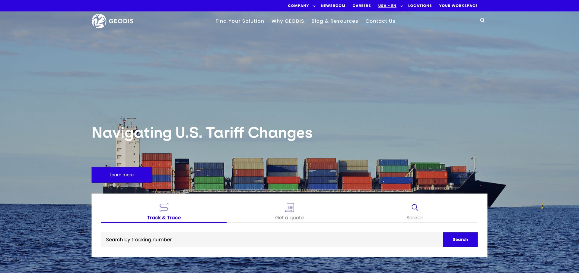
GEODIS uses a broad freight photograph and a timely campaign headline, with a white functional panel positioned across the lower hero. Tracking, quotation and search are distinct tabs, allowing an existing customer task to remain visible beside the sales story. The header also provides geographic and company context. The photograph establishes the sector quickly, but the panel supplies the practical value. Astronomer’s case documents migration and orchestration of freight-related data workflows with Airflow on Astro. It does not identify the public homepage’s runtime or establish that every tracking result is generated by that same pipeline arrangement.
What you can learn
Give recurring customer tasks a stable component that survives campaign changes. Keep tracking and quotation separate, and describe documentary freight-data orchestration without implying a complete map of the public customer interface.
Pros
The functional panel distinguishes tracking, quotation and search within one clearly bounded area.
Existing customers have an immediate task route without navigating the corporate campaign first.
Cons & considerations
A timely policy-related campaign needs review and expiry ownership to remain useful.
Tabbed tools require clear active states, labels and error handling when the selected function cannot load.
Platform source: Primary documented Apache Airflow association. Astronomer documents GEODIS’ orchestrated freight data. Platform evidence is separate from the direct website screenshot and is not a complete current infrastructure audit.
Carnegie Mellon’s Delphi Group uses a patterned data-map image with a direct indicator-focused heading and a public portal action. A mission statement begins immediately below, while navigation separates indicators, forecasting and material for modellers and developers. The page makes a research output tangible without turning the opening into a technical paper. The map remains a visual introduction, not a substitute for dataset definitions or uncertainty information. Astronomer’s case documents Delphi’s forecasting-data orchestration with Airflow and Astro. That association does not establish the public portal’s complete backend or validate the forecasts and health-related information it publishes.
What you can learn
Introduce a research tool with a clear task and preserve documentation for interpretation. Keep data-orchestration evidence separate from claims about model validity, public-health conclusions or the implementation of every published interface.
Pros
The portal action connects the research introduction to a concrete public output.
Developer and modelling audiences have identifiable routes beyond the general mission statement.
Cons & considerations
A data-themed background cannot communicate definitions, limitations or uncertainty by itself.
Research tools need clear documentation and dates rather than relying on institutional identity as sufficient explanation.
Platform source: Primary documented Apache Airflow association. Astronomer documents CMU Delphi’s forecasting orchestration. Platform evidence is separate from the direct website screenshot and is not a complete current infrastructure audit.
Clayco uses a large project image with a named manufacturing-plant feature and a small location label. The wordmark and compact menu let the architecture dominate, while carousel controls indicate a wider project sequence. This makes the work concrete, though a visitor seeking a specific service has to take another navigation step. The image’s project role and credits need their own explanation rather than being inferred from the photograph. Astronomer’s case separately documents Clayco unifying business data orchestration with Airflow and Astro. It is not evidence that the portfolio page itself runs on Airflow or that the image proves every project responsibility.
What you can learn
Lead with a real project when its identity and the firm’s role are clear. Preserve literal service navigation, and distinguish business-data orchestration from both public-site implementation and the professional responsibilities represented in a portfolio.
Pros
A named project and location provide more useful context than an anonymous architectural background.
Restrained overlay text preserves the physical work as the main visual subject.
Cons & considerations
Compact menu controls make a service-specific visitor take an additional discovery step.
A photographic project feature needs explicit scope, status and collaborator credits beyond the opening image.
Platform source: Primary documented Apache Airflow association. Astronomer documents Clayco’s data orchestration. Platform evidence is separate from the direct website screenshot and is not a complete current infrastructure audit.
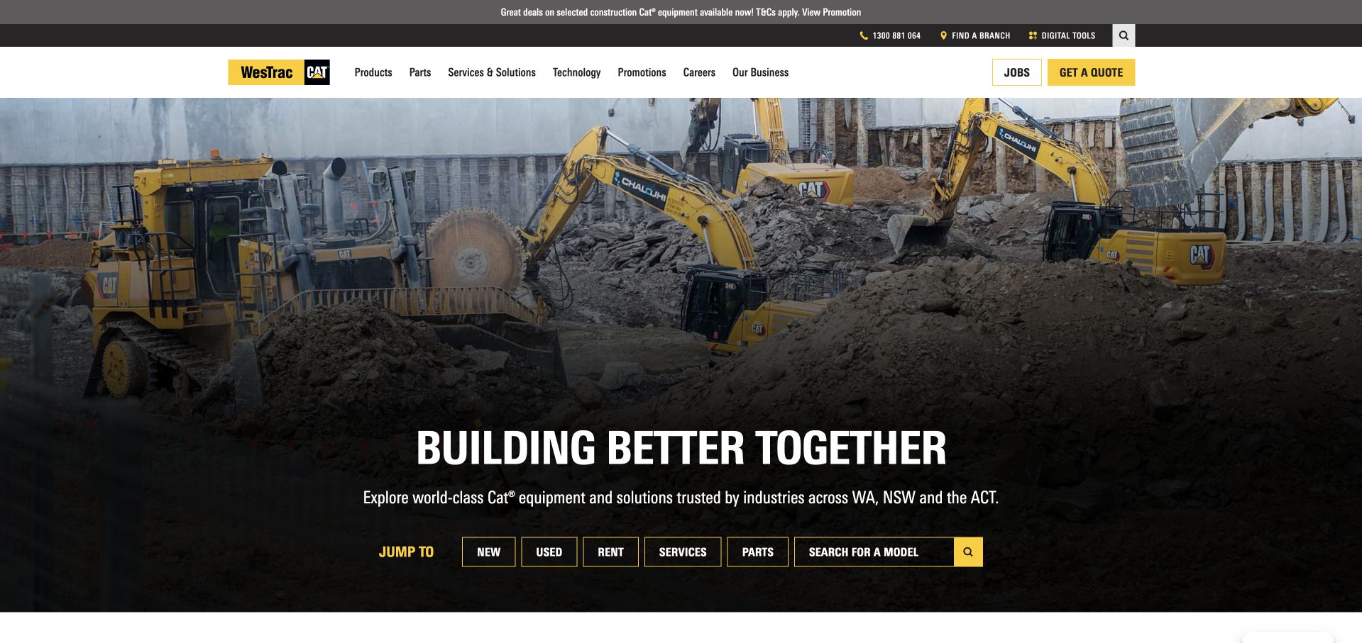
WesTrac uses a large machinery photograph with a short headline and a row of literal jump-to shortcuts. New equipment, used equipment, rentals, services, parts and model search are visible below the introduction. The yellow-and-black identity is reinforced in the header, where jobs and quotation have distinct actions. The page is useful for making a broad dealer offer navigable without an immediate long form. Astronomer’s case separately describes Airflow-based orchestration across WesTrac’s enterprise data workflows. It does not show that this product-facing homepage, stock search or quotation system uses Airflow as its public runtime.
What you can learn
Turn a broad industrial offering into concrete task shortcuts and maintain regional context. Keep the documented enterprise orchestration association separate from the implementation and current availability of customer-facing stock, rental and quote functions.
Pros
The jump-to row exposes several practical equipment and service tasks in the opening view.
Quotation and employment are separate header actions rather than competing versions of one general contact route.
Cons & considerations
A dramatic machinery photograph still needs product and service details to support a real comparison.
Small shortcut controls need readable mobile layout rather than simply shrinking the entire row.
Platform source: Primary documented Apache Airflow association. Astronomer documents WesTrac’s managed data pipelines. Platform evidence is separate from the direct website screenshot and is not a complete current infrastructure audit.
Foursquare uses a dark blue technical illustration with a short location-intelligence proposition and separate sales and trial actions. A prominent organisational announcement sits above it, while navigation exposes products, solutions, developers and resources. The design makes the category recognisable, although the announcement adds another layer before product detail. The globe graphic is an explanatory brand device, not a literal map of the infrastructure. Astronomer’s case separately documents Foursquare centralising orchestration with Airflow on Astro. That scoped data-platform evidence does not establish the public website’s runtime or independently validate its marketing performance and privacy claims.
What you can learn
Separate developer exploration from enterprise sales and give corporate changes a bounded place. Describe orchestration evidence precisely, without turning a vendor case into a full-stack inventory or an endorsement of product claims.
Pros
Developers have a visible route distinct from the primary sales conversation.
Trial and sales actions support visitors at different stages of technical evaluation.
Cons & considerations
A large organisational announcement can push practical product explanation farther down the page.
Technical graphics and performance claims need specific supporting information rather than being treated as self-evident proof.
Platform source: Primary documented Apache Airflow association. Astronomer documents Foursquare’s orchestration on Astro. Platform evidence is separate from the direct website screenshot and is not a complete current infrastructure audit.
Kegan has 15+ years of experience working with small businesses, Fortune 500 companies, and everything in between. No development job is too big or too small: he brings the same hands-on attention to a focused improvement, a complete website, or a custom application.
For Apache Airflow projects, he can help with data modeling, application data access, query design, search and cache integrations, migration planning, access boundaries, and maintainable handover. He works directly with clients on scope, design, implementation, testing, and handover, with an emphasis on clear communication and a system that remains practical to maintain after launch.
Show 3 other Apache Airflow developersHide other Apache Airflow developers
Choose an orchestration scope that fits the actual job
A bounded pipeline beside an existing website
Keep the publishing site and the background workflow separate when they have different responsibilities. Define the source, validation stage, destination and approval boundary for a recurring import or report. Give the public site a useful stale-data or unavailable state instead of exposing an operator console. Agree who can author the workflow and who can approve the material it eventually publishes; those are not automatically the same permission.
A managed orchestration platform
A managed service can change who operates infrastructure, upgrades and parts of the runtime, but it does not remove responsibility for the DAGs, external permissions or data correctness. Compare supported versions, deployment process, observability, connection handling and recovery procedures. Ask the team to demonstrate representative work, not merely cite a customer’s scale or savings. Booking.com’s case is context for its own platform decisions, not a performance forecast for a smaller project.
Self-management requires named responsibility for the deployment, access controls, metadata services, monitoring, updates and restoration. Choose it because the organisation has matching requirements and operating capability, not because a public design reference has a familiar brand. Keep development experiments separate from production and document who can promote code. Adobe’s extensible orchestration case illustrates one specialised workload rather than a default architecture for an ordinary brochure site.
Plan the interval, failure and operating responsibilities before launch
Write a workload record that another maintainer can understand
Record the business purpose, owner, expected schedule, source data, intended interval and destination of each workflow. Identify which outputs are public and which remain private. Define how late or absent upstream data is handled. A schedule is not a substitute for a completeness check, and the wall-clock time of an execution should not silently redefine the historical period it processes. Keep this record with reviewed code so operational meaning survives a staff change.
Test reruns and bounded backfills in a safe environment
Rehearse a repeated task, partial failure and a controlled historical replay before production. Give test connections and output paths genuinely separate destinations rather than changing hard-coded production values by hand. Define the interval range, concurrency limits, expected cost and reconciliation checks for a backfill. A replay should not inadvertently resend customer messages or republish every historical item. Require a deliberate approval for side effects that need a different policy from ordinary data reconstruction.
Identify who receives alerts, what information an alert contains and how someone decides whether to retry, reconcile or stop. Keep logs useful without including credentials or unnecessary private data. Document release and rollback procedures, including compatible dependencies and any external schema changes. Agree the visible website behaviour during a pipeline interruption. An internal workflow can fail gracefully for the public site only if someone has designed that boundary and can explain the current state.
Ask the actual team to carry out its routine job: publish a realistic update, correct a mistake, preview a narrow screen, and identify who owns an integration failure. For a library or frontend framework, also ask who maintains the content source and deployment. A polished screenshot does not answer those operational questions.
Name the background workflow and explain why ordinary application processing is insufficient.
Separate the public publishing interface from orchestration and administrative systems.
Define the input partition or data interval for every repeatable task.
Design destination writes and external side effects for safe retries and reconciliation.
Document late-data, partial-output and missing-dependency behaviour.
Limit DAG authoring and deployment authority to reviewed, trusted contributors.
Keep the administrative UI protected by appropriate authentication and network controls.
Use approved connections and scoped credentials outside source code and public assets.
Keep test inputs, connections and outputs distinct from production.
Rehearse failure recovery and a bounded historical backfill with capacity controls.
Assign alert ownership and document release, rollback and restoration procedures.
Preserve primary-source scope and dates when describing reference organisations’ technology use.
Test with real content, a keyboard, a small screen, slow or failed requests, and the people who will maintain the system. These are planning checks, not an accessibility, security, performance, or search-ranking certification.
Sources & editorial method
How this Apache Airflow collection was reviewed
These 20 public design references have separate primary documentary Airflow associations. The first five are Adobe, Booking.com, Autodesk, DISH and Société Générale. Reviews are original observations of actual public captures; reused images retain their recorded provenance and dates. Project testimonials and vendor cases are read within their workload boundaries, not treated as fresh full-stack audits or independent performance measurements.
Every image is an unmodified capture from the actual website, with its source and capture date. Some captures are reused from our shared catalog; their dates remain the original capture dates. None comes from a vendor gallery or a generated reconstruction. Moving imagery and live content can change.
Technology attribution uses public page assets or metadata, official platform documentation, or a cited first-party project case study. Documentary and framework-relationship evidence is identified where used; it is not a complete current backend inventory. A CMS image CDN alone does not establish a full CMS deployment. A library’s presence does not prove which individual controls use it, and a platform label does not establish AI authorship.
The composition notes, lessons, pros and tradeoffs are original editorial observations. We have not measured conversion, traffic, security, performance or accessibility conformance. Website owners retain their brands and imagery; these examples are not our client portfolio. Written, Edited and Curated are independent records, not dates advanced by a build. See our editorial standards or suggest a correction.
Questions worth asking
Apache Airflow website development FAQs
Were these 20 public homepages built with Apache Airflow?
That is not what the evidence establishes. Each example has a primary source about a particular organisational orchestration workload. The public screenshot is a separate design reference. A data pipeline, build workflow or managed platform case does not identify the complete backend of the pictured page.
Does Airflow guarantee that a task’s business effect happens exactly once?
No such guarantee should be assumed. Retries and historical runs make repeatability important. Design the task and destination together, with checks for already completed work and a reconciliation process for ambiguous outcomes. A scheduler state alone cannot prove what happened in an external system.
Why do data intervals matter for a website integration?
A retry or backfill should know which period or partition it is processing. If the task reads whichever input is newest, a later rerun can produce a different result. Define the intended source and destination interval explicitly, including how corrections and late data should be handled.
Can different teams safely upload any DAG code to one shared environment?
Do not assume interface permissions create complete code isolation. The official security model treats DAG authors as trusted code contributors. Review authoring and deployment authority, credentials and required separation with the operating team. Use an architecture appropriate to the actual trust boundaries rather than promising isolation from a menu setting.
What is a sensible first Airflow project?
A bounded workflow with a clear owner, meaningful dependencies and a demonstrable recovery need. Start with safe representative data, distinct test outputs and a written definition of success. Include retries, partial failure and historical replay in the acceptance criteria rather than judging the project only by its first successful scheduled run.
Start with the work, the interval and the person responsible for recovery. Borrow clear public interface patterns from the examples, then choose an orchestration arrangement that can be tested, restricted and maintained without pretending it defines the whole website.