Definitive guide · styled-components website development
styled-components website examples and component planning (20 Real-World Examples)
Twenty public websites with generated styled-components output, direct screenshots and original lessons for building maintainable visual systems.
Component styling works best when the contract includes real content, states and responsive behavior. These examples show the visual decisions worth specifying before a library is asked to implement them.
styled-components connects styling with component-based interfaces. Its official documentation covers component styles, prop-based variation, themes and rendering integration. This guide is a planning resource rather than a code tutorial or a version recommendation. Framework and library versions matter, so implementation choices should be checked against the documentation for the actual project.
The examples were selected because sampled public responses contain generated style elements with data-styled and data-styled-version markers. That is direct evidence of output on the page, but it can come from an included component rather than the entire site. The reviews therefore discuss visible hierarchy and reusable design decisions without assigning every header, carousel or form to styled-components.
Before the examples
What makes good styled-components website development in 2026?
Define the component’s visual contract
Specify content limits, spacing, action hierarchy and responsive behavior before accumulating variants. The official basics describe styling associated with components and adapting styles through props. In a project brief, those mechanisms should serve clear design rules rather than become a collection of one-off exceptions.
Document foreground and background relationships, focus states and usable boundaries between surfaces. The advanced documentation describes theming, with rendering-context qualifications. Confirm the integration for your framework rather than assuming that a pattern copied from another version will behave identically.
Server and client rendering need a deliberate implementation plan. The official advanced guidance covers server-side rendering and related setup. Use the guidance appropriate to your actual stack, and test the first usable render instead of assuming that a style marker in another website proves a particular architecture.
Volkswagen, Vodafone UK, Target, Chase and The New Yorker open the collection. Their sampled public pages contain generated style output; that does not identify the styling implementation of every property, private application or component operated by those brands.
We start with five recognizable brands or organizations: Volkswagen, Vodafone UK, Target storefront, Chase, The New Yorker. Each attribution applies to the named website property, not every product or website belonging to its organization. This is a curated reading sequence, not a measured ranking.
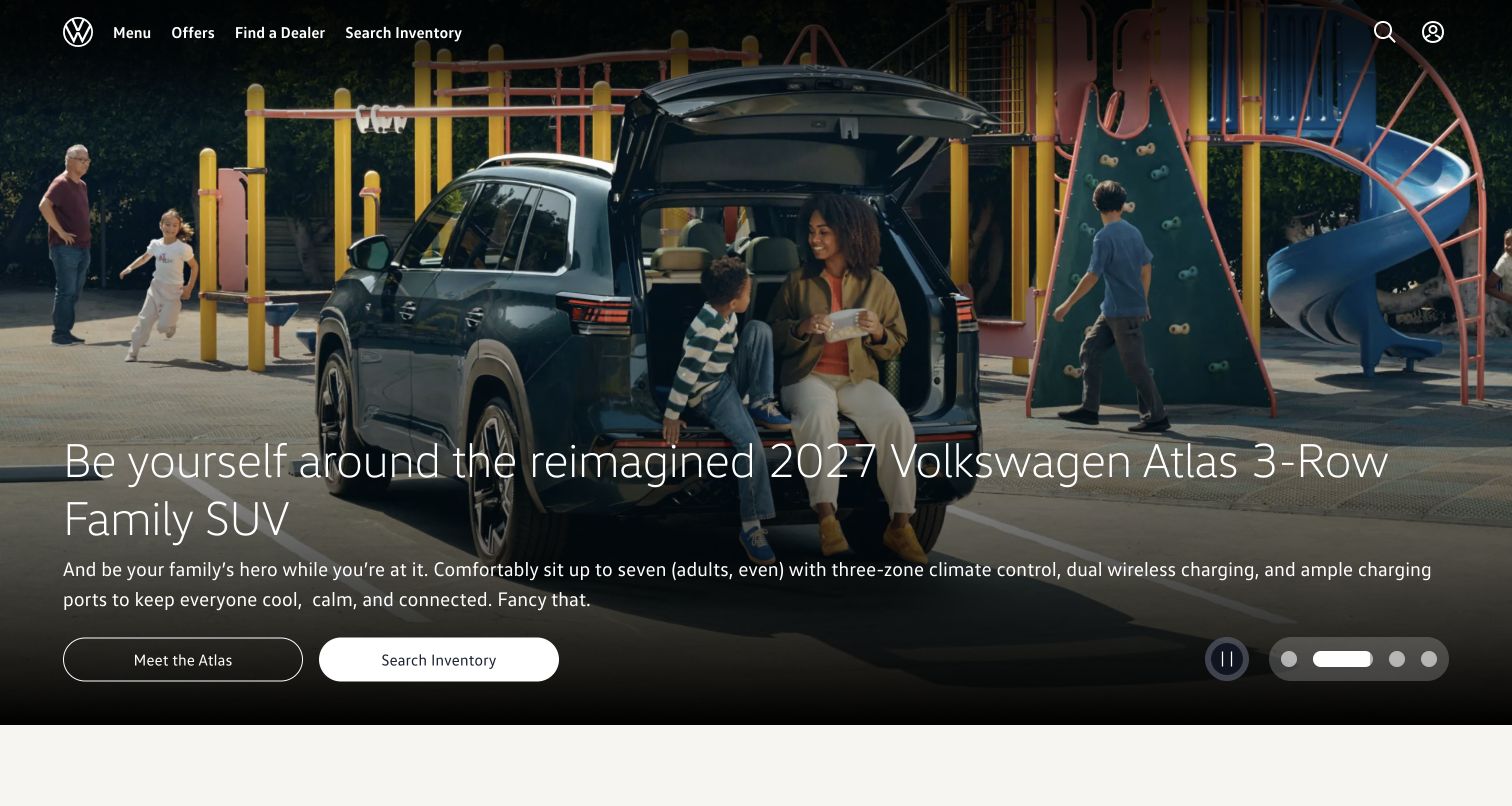
Volkswagen overlays a short vehicle introduction and two pill-shaped actions on a large lifestyle photograph. A transparent header keeps the brand and primary routes within the same visual canvas. The lower text gradient gives the copy a steadier surface. This is a useful composition to study when separating reusable navigation and action styles from campaign-specific imagery.
What you can learn
Define the header, hero copy and action group as separately testable presentation responsibilities. Preserve contrast when photographs or labels change, and test the same actions without the preferred crop. The sampled source contains styled-components output, but it does not identify which visible elements were authored with that library. Check that action labels remain fully visible when a longer vehicle name changes the height of the introductory block.
Pros
The paired actions distinguish exploring the vehicle from broader search.
A gradient creates a more stable surface for introductory copy.
Cons & considerations
Transparent navigation needs contrast checks across every campaign image.
Small carousel controls require keyboard and reduced-motion consideration.
Platform source: Dated public source inspection. The dated public response contains style elements carrying data-styled and data-styled-version markers. This identifies generated styled-components output on the sampled page, possibly an included component, not the authorship of every visible element or the whole application. Platform evidence is separate from the direct website screenshot and is not a complete current infrastructure audit.
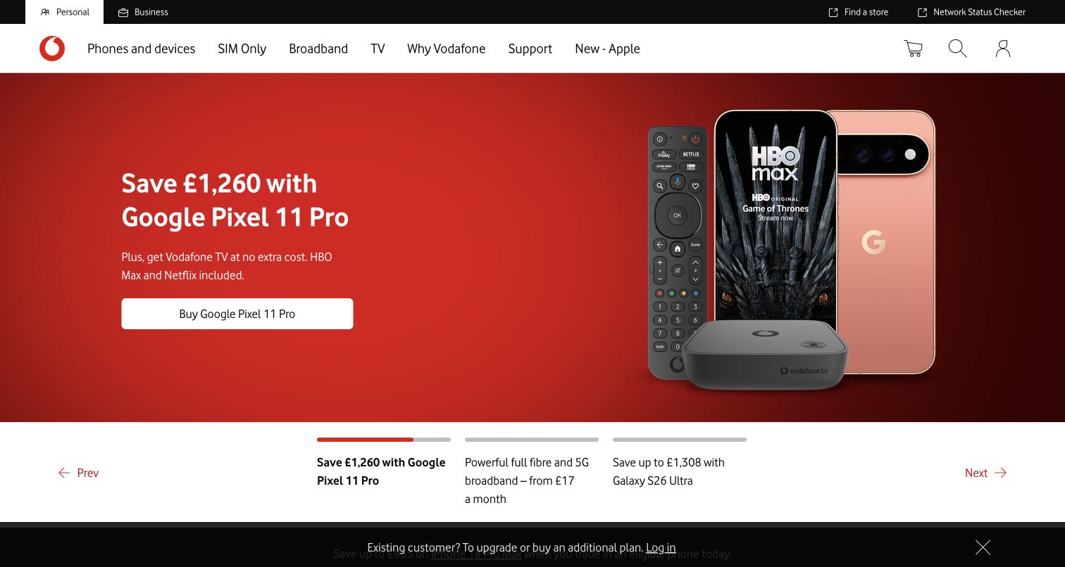
Vodafone's captured page uses a strong red offer panel with a device image and a compact light button. The white navigation above groups products and customer support, while a black strip below introduces another task. These clear horizontal regions make the design a practical reference for styling boundaries between navigation, promotion and utility content.
What you can learn
Use shared spacing and action variants without forcing every region to share the same background treatment. Test long plan names and offer copy before approving a component contract. Public data-styled markers establish generated styling output in the sampled page, not the authorship or behavior of each promotional element. Keep price qualifications associated with their offer when the layout stacks rather than treating them as detachable decorative text.
Pros
The red campaign is visually separated from the navigation row.
Device imagery makes the offer more concrete than copy alone.
Cons & considerations
Several horizontal strips can consume substantial space on smaller screens.
Offer details must remain readable when labels wrap or translations expand.
Platform source: Dated public source inspection. The dated public response contains style elements carrying data-styled and data-styled-version markers. This identifies generated styled-components output on the sampled page, possibly an included component, not the authorship of every visible element or the whole application. Platform evidence is separate from the direct website screenshot and is not a complete current infrastructure audit.
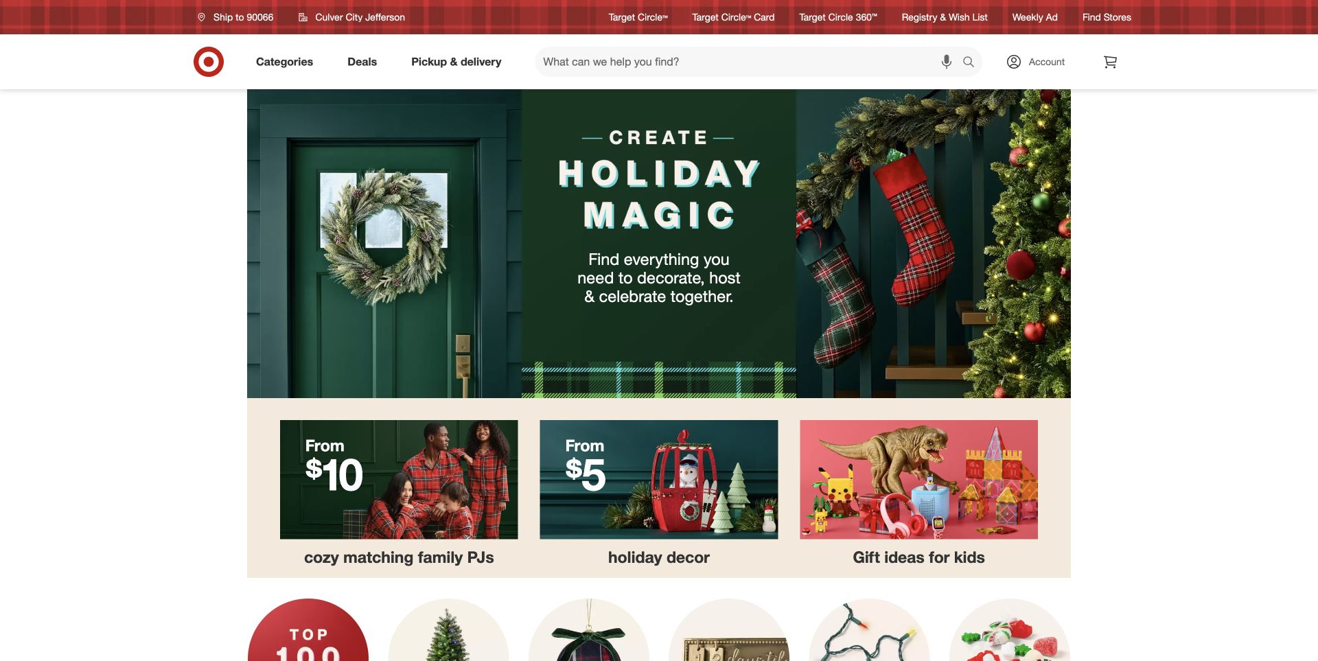
Target presents a green holiday feature above a row of warm, product-focused gift tiles. Its red utility bar and broad white search area remain clearly separated from the campaign. The screen shows how a retail design can combine highly seasonal art direction with predictable shopping controls, without requiring every panel to look identical.
What you can learn
Define a small set of card, link and action conventions that survive a campaign change. Test the transition from the hero to smaller tiles with real long labels and different image proportions. Styled-components output in the public response does not prove that the whole storefront or its checkout uses the same styling implementation. Include empty, loading and unavailable merchandise states in the same component review, not only the fully populated seasonal arrangement.
Pros
Search retains a prominent position outside seasonal creative.
The smaller tiles turn a broad holiday theme into concrete choices.
Cons & considerations
Multiple campaign scales need consistent focus and reading order.
Dense navigation requires testing at zoom and narrow viewport sizes.
Platform source: Dated public source inspection. The dated public response contains style elements carrying data-styled and data-styled-version markers. This identifies generated styled-components output on the sampled page, possibly an included component, not the authorship of every visible element or the whole application. Platform evidence is separate from the direct website screenshot and is not a complete current infrastructure audit.
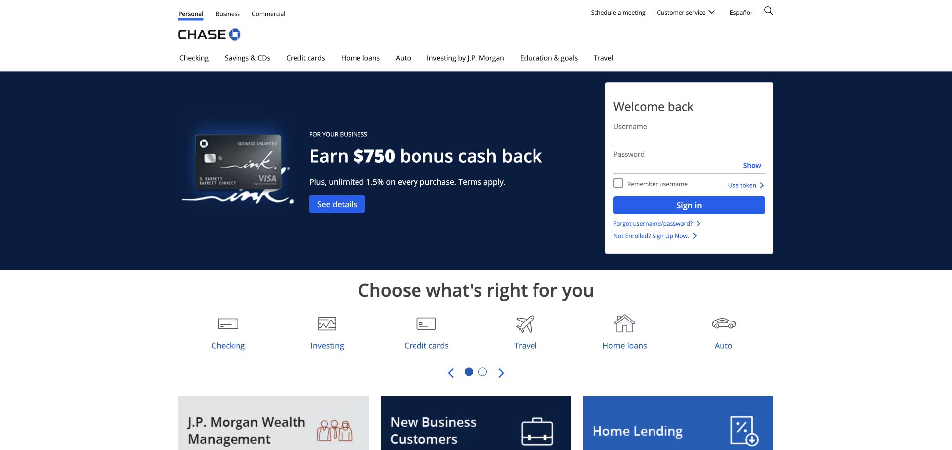
Chase places a white sign-in panel beside a blue rewards promotion, with product-category icons directly below. The white header gives the bank identity and broad navigation their own area. The arrangement makes returning-customer access visually distinct from acquisition content while still fitting both within a coherent opening screen.
What you can learn
Treat authentication presentation as an independent component boundary with its own security and accessibility review. Reuse spacing and typography where helpful, but avoid letting promotional variants change form semantics. Generated styled-components markers establish public style output only; they do not establish how account systems are implemented or tested. Ensure the visual component API cannot accidentally remove a form label or turn a real button into a decorative element.
Pros
The sign-in area has a separate light surface from the campaign.
Product icons provide a structured continuation below the hero.
Cons & considerations
Financial forms demand more verification than visual consistency alone.
Promotional and account tasks can compete for attention at small widths.
Platform source: Dated public source inspection. The dated public response contains style elements carrying data-styled and data-styled-version markers. This identifies generated styled-components output on the sampled page, possibly an included component, not the authorship of every visible element or the whole application. Platform evidence is separate from the direct website screenshot and is not a complete current infrastructure audit.
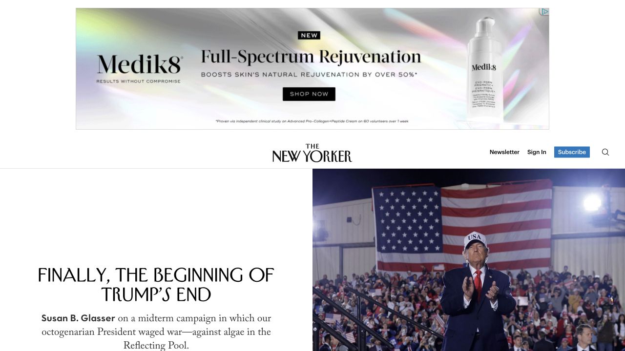
The New Yorker shows a large advertisement above its familiar masthead and a split lead-story presentation. The headline uses narrow editorial typography beside a news photograph, while subscription and account controls occupy the masthead area. This is a useful reference for keeping article hierarchy recognizable when advertising contributes its own visual language.
What you can learn
Define editorial text styles separately from advertising containers and subscription controls. Reserve space for external content so the reading frame does not depend on a particular creative. Public styled-components output does not identify which of these regions uses the library or prove the absence of layout shift. Check that reserved advertising space and article headings preserve their reading relationship when an external creative arrives late.
Pros
The masthead separates commercial material from the lead editorial content.
The lead story receives a distinct headline and image relationship.
Cons & considerations
Large advertising space delays access to the main story.
Mixed typography needs careful hierarchy and reflow testing at higher zoom.
Platform source: Dated public source inspection. The dated public response contains style elements carrying data-styled and data-styled-version markers. This identifies generated styled-components output on the sampled page, possibly an included component, not the authorship of every visible element or the whole application. Platform evidence is separate from the direct website screenshot and is not a complete current infrastructure audit.
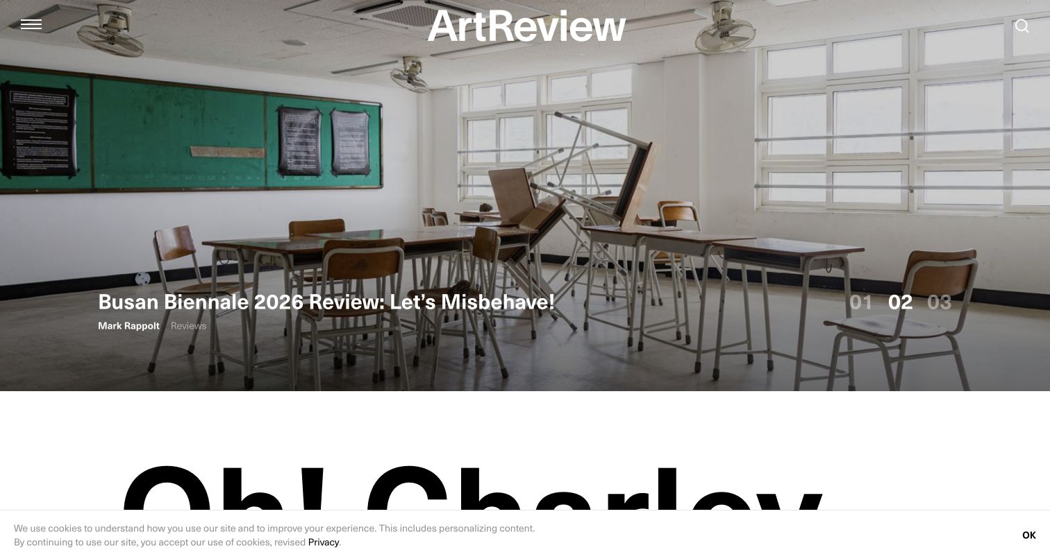
ArtReview layers a story title and numbered controls over an exhibition photograph, with its name centered at the top. A very large headline begins in the next section. The contrast between image-led opening and oversized text demonstrates how a component system may need to support very different editorial rhythms without losing a recognizable visual voice.
What you can learn
Specify text-overlay limits and fallback layouts rather than assuming every image will leave readable space. Keep carousel controls semantically distinct from story links. The page's styled-components markers support a scoped styling association, not evidence that the library implements the carousel or determines editorial ordering. Include a long exhibition title in layout tests so the overlay contract is based on editorial reality rather than a short example.
Pros
The exhibition photograph gives the story a concrete setting.
The next section changes scale enough to establish a new reading beat.
Cons & considerations
Overlay text needs testing against every selected photograph.
Oversized headings must remain useful when space or text length changes.
Platform source: Dated public source inspection. The dated public response contains style elements carrying data-styled and data-styled-version markers. This identifies generated styled-components output on the sampled page, possibly an included component, not the authorship of every visible element or the whole application. Platform evidence is separate from the direct website screenshot and is not a complete current infrastructure audit.
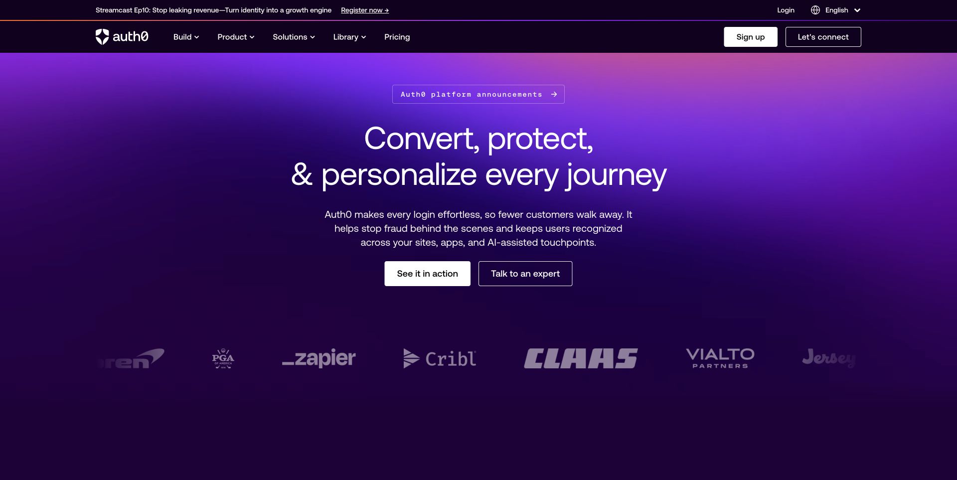
Auth0's public marketing page uses a purple gradient behind a centered proposition and a small pair of actions. Customer marks sit below the message, while navigation and account utilities remain above. The wide open space concentrates attention on the promise without making the primary buttons compete with a large product screenshot.
What you can learn
Build a controlled set of heading, action and logo-row components with explicit wrapping rules. Test translations and longer customer names, not just the balanced desktop composition. Public generated style evidence applies to this marketing page; it does not establish the implementation of Auth0's authenticated product or every customer integration. Keep logo rows legible at narrow widths without shrinking their accompanying context or implying an endorsement beyond the source material.
Pros
The centered proposition has a clear visual relationship with its actions.
A restrained customer-mark row offers supporting context below.
Cons & considerations
Gradient backgrounds still require contrast checks for every text state.
Marketing simplicity cannot stand in for testing a real authentication journey.
Platform source: Dated public source inspection. The dated public response contains style elements carrying data-styled and data-styled-version markers. This identifies generated styled-components output on the sampled page, possibly an included component, not the authorship of every visible element or the whole application. Platform evidence is separate from the direct website screenshot and is not a complete current infrastructure audit.
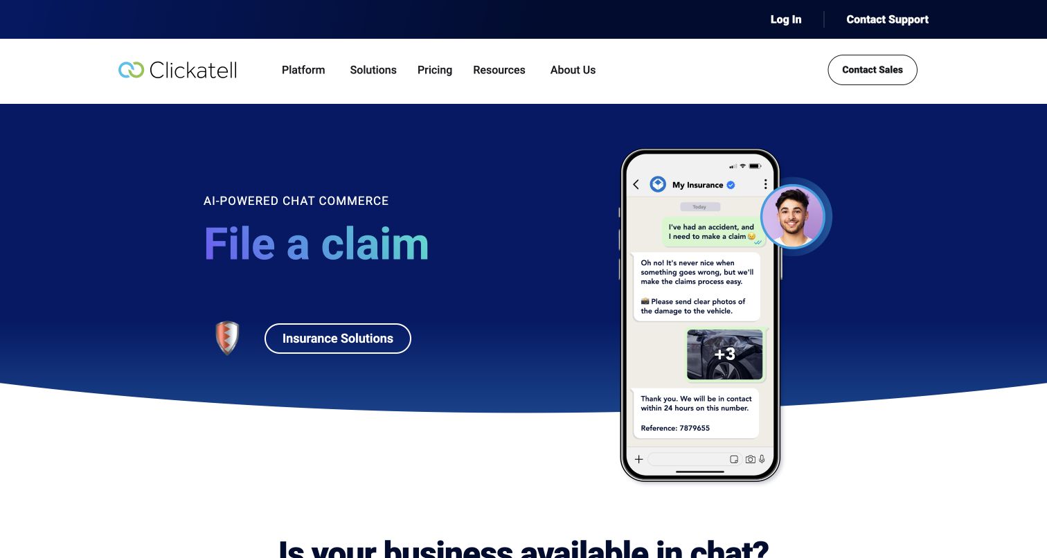
Clickatell presents a dark blue hero with a short claim-related message and a phone-shaped conversation illustration. The navigation stays on a white surface above, and a curved boundary leads into the next section. This is a practical example of a product-story component using a specific scenario rather than only abstract platform language.
What you can learn
Keep the scenario content separate from the container and decorative boundary so it can change without destabilizing layout. Provide meaningful text outside any embedded illustration. The sampled styled-components output establishes styling artifacts, not proof that the visible conversation is functional or that it uses a particular application framework. Test whether the same information remains available when the phone illustration fails to load or is hidden by a narrow layout.
Pros
A concrete scenario makes the product proposition easier to picture.
The white header remains distinct from the dark story panel.
Cons & considerations
Important content inside illustrations needs an accessible textual equivalent.
Decorative curves should not disrupt reading order or responsive spacing.
Platform source: Dated public source inspection. The dated public response contains style elements carrying data-styled and data-styled-version markers. This identifies generated styled-components output on the sampled page, possibly an included component, not the authorship of every visible element or the whole application. Platform evidence is separate from the direct website screenshot and is not a complete current infrastructure audit.
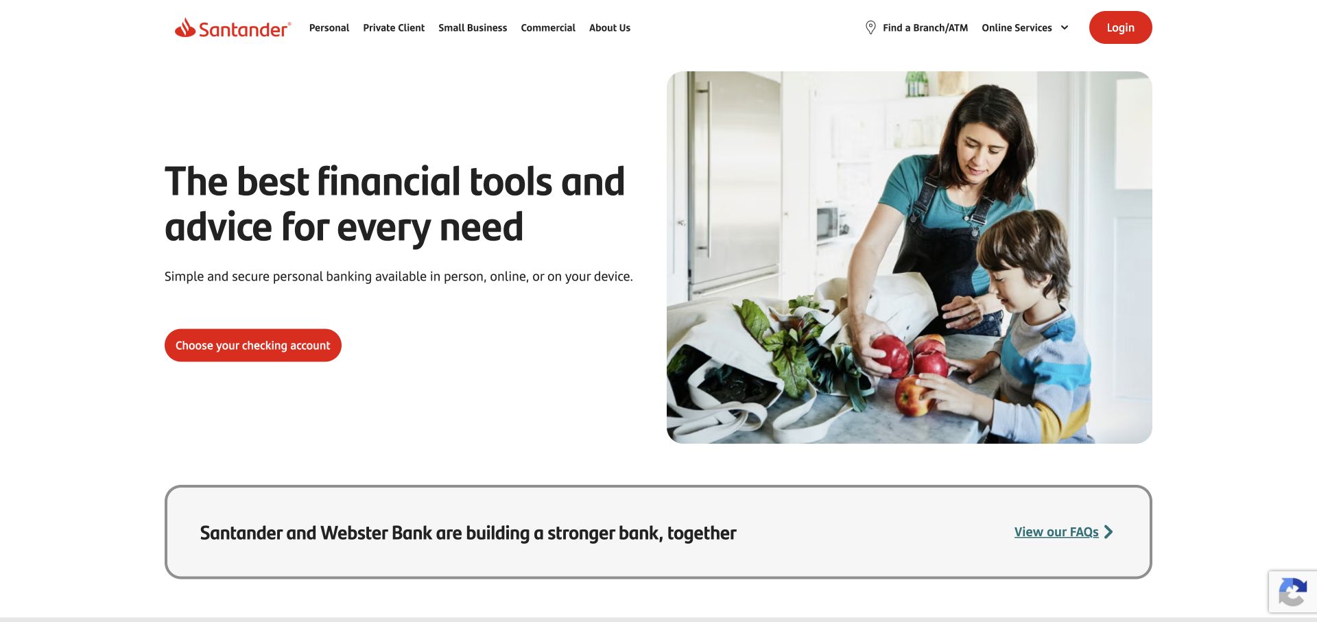
Santander's homepage pairs a bold black proposition with a rounded photograph of people and a compact red action. A bordered announcement panel begins beneath the hero. The restrained white background and repeated rounded edges provide a simple visual system, leaving room for the bank's red identity without making every region compete.
What you can learn
Specify the relationship between image radius, content width and action spacing as reusable rules, then test them with different offers. Keep announcement content independent so it can expand without overlapping the hero. Public style markers do not show which component produced these details or establish the behavior of banking services. Use a realistic long announcement to verify that the bordered panel expands without changing the meaning of adjacent product actions.
Pros
The short proposition is easy to distinguish from supporting content.
The announcement receives its own bordered surface below the offer.
Cons & considerations
Rounded imagery still needs useful crops at narrow widths.
A clean marketing view does not verify forms or account accessibility.
Platform source: Dated public source inspection. The dated public response contains style elements carrying data-styled and data-styled-version markers. This identifies generated styled-components output on the sampled page, possibly an included component, not the authorship of every visible element or the whole application. Platform evidence is separate from the direct website screenshot and is not a complete current infrastructure audit.
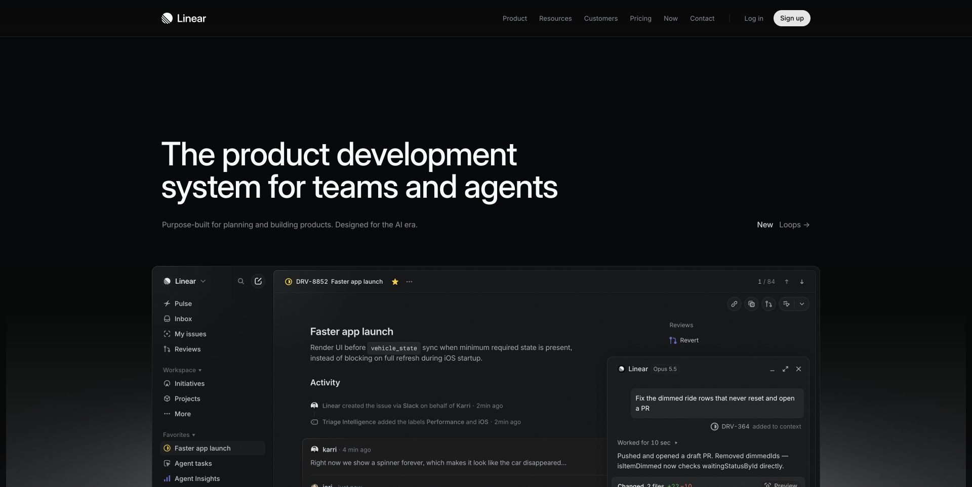
Linear uses a near-black background for its product statement and a large, understated interface preview. A compact header provides product and account routes above. The visual hierarchy relies on differences in type scale and muted borders rather than a collection of bright panels, making it a useful reference for disciplined component styling in dark themes.
What you can learn
Write explicit contrast and surface rules for primary text, secondary labels and inactive controls. Test the interface preview as an image with an appropriate alternative, not as a functioning product. Styled-components output on the marketing page does not establish how the authenticated application is built or performs. Include visible focus and disabled states in the theme specification, since a dark static composition cannot demonstrate either interaction.
Pros
Large text makes the main proposition distinct from the interface preview.
The limited palette avoids competing promotional accents.
Cons & considerations
Muted labels require measured contrast rather than aesthetic judgment alone.
A screenshot of software cannot demonstrate keyboard or application behavior.
Platform source: Dated public source inspection. The dated public response contains style elements carrying data-styled and data-styled-version markers. This identifies generated styled-components output on the sampled page, possibly an included component, not the authorship of every visible element or the whole application. Platform evidence is separate from the direct website screenshot and is not a complete current infrastructure audit.
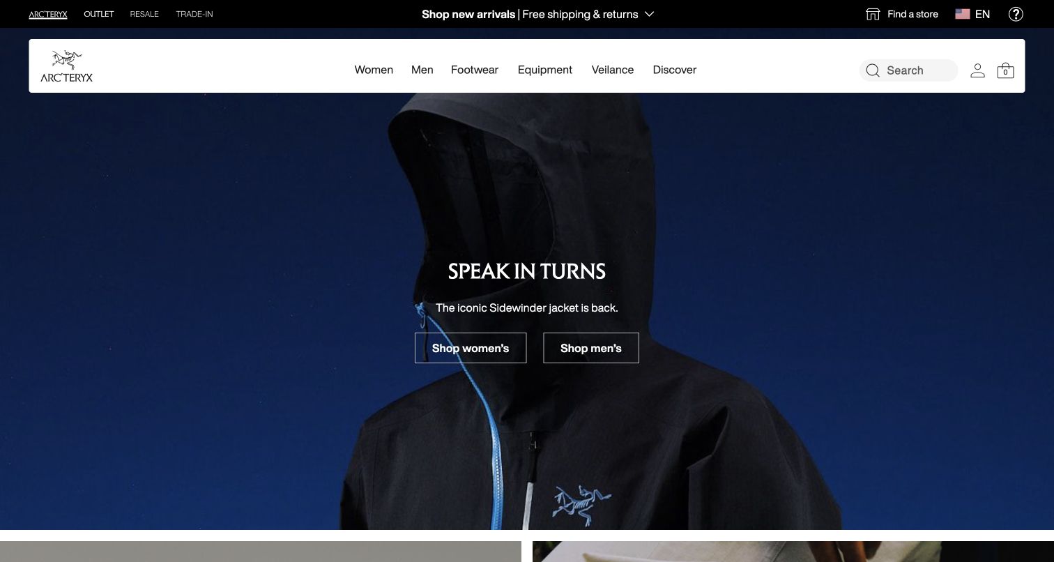
Arc'teryx places a dark garment photograph beneath a broad white commerce header. A compact centered title and two shopping actions sit over the image, while a black strip carries a separate promotion above. The interface gives the seasonal photograph considerable authority without removing ordinary product navigation, search or account utilities from the top frame.
What you can learn
Define campaign-overlay variants that preserve action contrast without requiring hand-tuned exceptions for every photograph. Check keyboard focus and long labels against both light and dark imagery. Public styled-components output supports the sampled styling association only, not a claim that every commerce component shares that implementation. Keep a useful nonphotographic fallback so navigation and campaign actions do not depend on a successfully loaded background image.
Pros
The white header keeps shopping utilities legible above dark imagery.
Two actions give the central campaign a practical continuation.
Cons & considerations
Dark photographs and small text require crop-specific contrast checks.
Stacked promotional and navigation rows need a usable mobile arrangement.
Platform source: Dated public source inspection. The dated public response contains style elements carrying data-styled and data-styled-version markers. This identifies generated styled-components output on the sampled page, possibly an included component, not the authorship of every visible element or the whole application. Platform evidence is separate from the direct website screenshot and is not a complete current infrastructure audit.
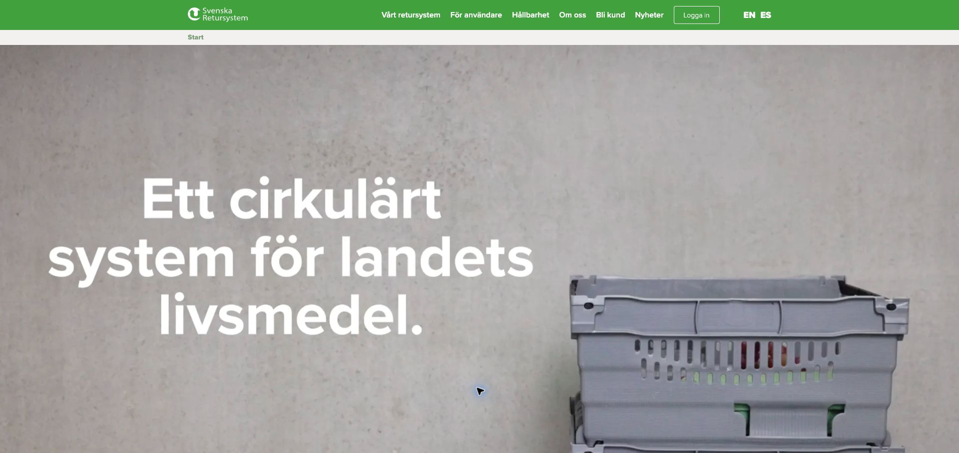
Svenska Retursystem presents a large Swedish headline beside a stackable container image against a neutral background. A green top navigation supplies the brand accent, while the main content uses white text and generous space. The composition demonstrates a straightforward way to make an industrial product visible without surrounding it with a dense specification table.
What you can learn
Treat language length and contrast as component requirements rather than final polish. Separate the headline container from the product image so a translated message can wrap without covering the object. The public style tags show styled-components output, but do not establish how logistics systems or private customer tools operate. Test the headline in another language before fixing its container height, especially when product imagery occupies a competing portion of the row.
Pros
The product image makes an abstract circular-system proposition tangible.
The green header provides a consistent identity above a neutral hero.
Cons & considerations
Large white copy needs adequate contrast against the pale background.
Technical buyers will need detail beyond the simplified opening statement.
Platform source: Dated public source inspection. The dated public response contains style elements carrying data-styled and data-styled-version markers. This identifies generated styled-components output on the sampled page, possibly an included component, not the authorship of every visible element or the whole application. Platform evidence is separate from the direct website screenshot and is not a complete current infrastructure audit.
Tuffy combines a mechanic photograph with a bold service promise and yellow location action. Its white navigation includes service categories and another location control, while a values section begins below. The repeated yellow accent ties practical actions together. The layout is a useful reference for separating location finding from broader reassurance about the business.
What you can learn
Give location controls consistent wording and focus treatment wherever they appear. Audit shared widgets alongside the surrounding branded layout rather than assuming one styling system owns the page. Here, styled-components evidence includes component style output; it does not prove that the complete Tuffy site is built with the library. Include the location widget in regression checks after shared-style changes, even when it is maintained separately from the main site.
Pros
The location action is visible inside the main service proposition.
Yellow accents connect actions across the navigation and hero.
Cons & considerations
Text over a busy workshop photograph needs consistent contrast support.
Embedded components need accessibility checks alongside the main page shell.
Platform source: Dated public source inspection. The dated public response contains style elements carrying data-styled and data-styled-version markers. This identifies generated styled-components output on the sampled page, possibly an included component, not the authorship of every visible element or the whole application. Platform evidence is separate from the direct website screenshot and is not a complete current infrastructure audit.
SAGE uses a muted photograph of a clinical setting behind its care statement and location action. The white header separates emergencies and other contact routes with colored buttons. A large consent panel covers the lower part of the opening view. This combination highlights the need for component rules that consider overlays as well as the intended hero composition.
What you can learn
Test the location and emergency routes with consent controls present, not only on a clean screenshot. Preserve semantic differences between urgent access and general information actions. Public styled-components output does not establish which widget or section uses the library, nor whether any clinical appointment system shares it. Ensure an expanded consent explanation does not obscure the urgent contact route or displace it outside a usable viewport.
Pros
Emergency and general routes receive visibly different treatments.
The location action is tied directly to the main service statement.
Cons & considerations
The consent panel consumes a substantial portion of the opening view.
Health-related interactions need more than a consistent visual treatment.
Platform source: Dated public source inspection. The dated public response contains style elements carrying data-styled and data-styled-version markers. This identifies generated styled-components output on the sampled page, possibly an included component, not the authorship of every visible element or the whole application. Platform evidence is separate from the direct website screenshot and is not a complete current infrastructure audit.
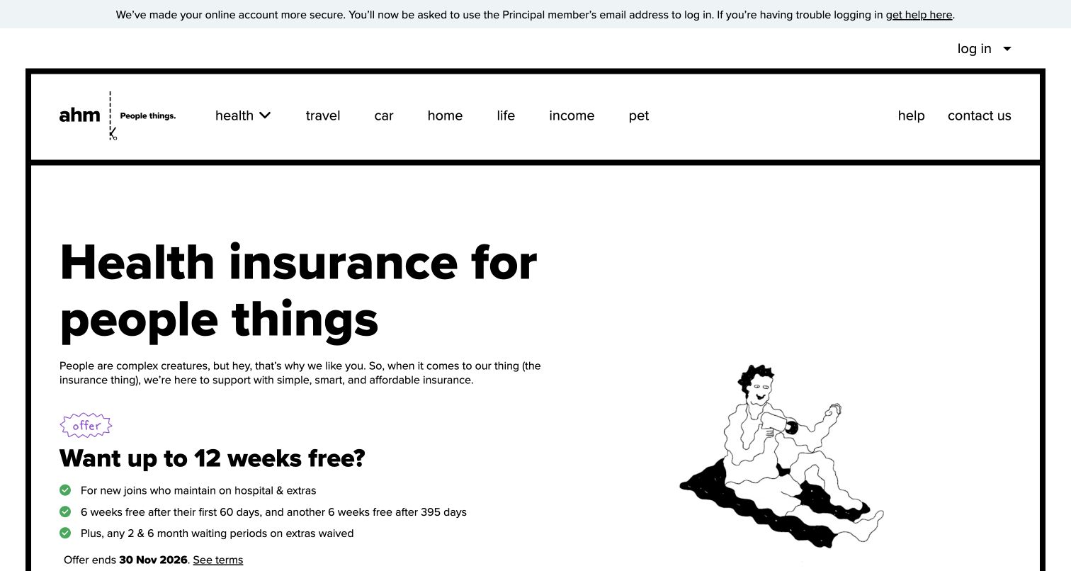
ahm uses a thick black border, a large plain-language heading and a small playful illustration on a mostly white page. Product categories run across the header. The composition places the explanatory copy ahead of the illustration, demonstrating how a deliberately limited visual vocabulary can support a strong hierarchy without relying on photographic storytelling.
What you can learn
Create clear typography and spacing tokens before introducing component variants. Test product labels, legal explanations and assistive-technology order with real content. The page's generated style tags are evidence of styled-components output, not proof that the library ensures accessibility or implements insurance quotations and account services. Keep supporting qualifications near their product claim when the layout reflows, rather than pushing them into an unrelated visual region.
Pros
Large dark text establishes a clear reading priority.
The restrained illustration supports rather than dominates the message.
Cons & considerations
Dense supporting terms can undermine the simplicity of the opening.
A bold visual hierarchy still needs measured contrast and semantic testing.
Platform source: Dated public source inspection. The dated public response contains style elements carrying data-styled and data-styled-version markers. This identifies generated styled-components output on the sampled page, possibly an included component, not the authorship of every visible element or the whole application. Platform evidence is separate from the direct website screenshot and is not a complete current infrastructure audit.
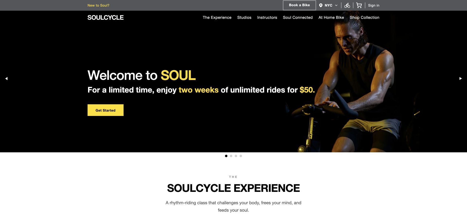
SoulCycle places a new-rider offer on a dark background beside an instructor photograph. A small yellow action stands out beneath the copy, while the header retains studio and booking routes. The next white section begins with a brand-experience heading. The transition between dark promotion and light explanation provides a clear separation of content roles.
What you can learn
Specify dark and light surface variants with consistent action semantics and focus states. Keep booking utilities independent from acquisition-offer components so regular users retain a direct route. Styled-components markers establish public generated styling, not evidence about a class-booking system, membership status or how the photograph's interaction behaves. Confirm that the booking route retains its label and priority after the introductory offer expires or changes for another audience.
Pros
A yellow action is distinct within the dark introductory panel.
The next section changes background to signal a new content role.
Cons & considerations
Small offer text needs a useful mobile and zoomed arrangement.
Returning customers should not depend on an introductory campaign route.
Platform source: Dated public source inspection. The dated public response contains style elements carrying data-styled and data-styled-version markers. This identifies generated styled-components output on the sampled page, possibly an included component, not the authorship of every visible element or the whole application. Platform evidence is separate from the direct website screenshot and is not a complete current infrastructure audit.
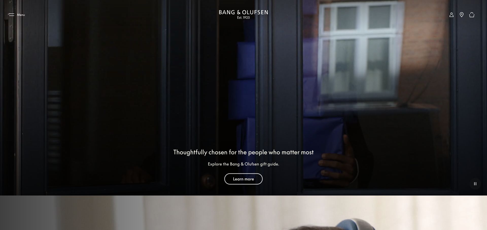
Bang & Olufsen's captured page presents a dark architectural interior with product branding and a small invitation near the bottom. The navigation is understated, allowing the scene to dominate. The composition is useful for evaluating the limits of subtle component styling: restraint can create focus, but practical controls still need to be discoverable and readable.
What you can learn
Set minimum requirements for contrast, hit areas and focus visibility before approving a quiet visual treatment. Test the same overlay against alternate crops and slower image loading. Public style-output evidence does not establish that styled-components renders the photograph, manages shopping interactions or improves the page's performance. Provide a stable text surface when a photograph is unavailable, preserving both the product invitation and the next practical action.
Pros
The interior photograph connects the product with a real living context.
Limited overlay copy keeps the image from becoming visually crowded.
Cons & considerations
Small controls can be difficult to discover against dark imagery.
Subtle navigation needs careful keyboard and touch-target validation.
Platform source: Dated public source inspection. The dated public response contains style elements carrying data-styled and data-styled-version markers. This identifies generated styled-components output on the sampled page, possibly an included component, not the authorship of every visible element or the whole application. Platform evidence is separate from the direct website screenshot and is not a complete current infrastructure audit.
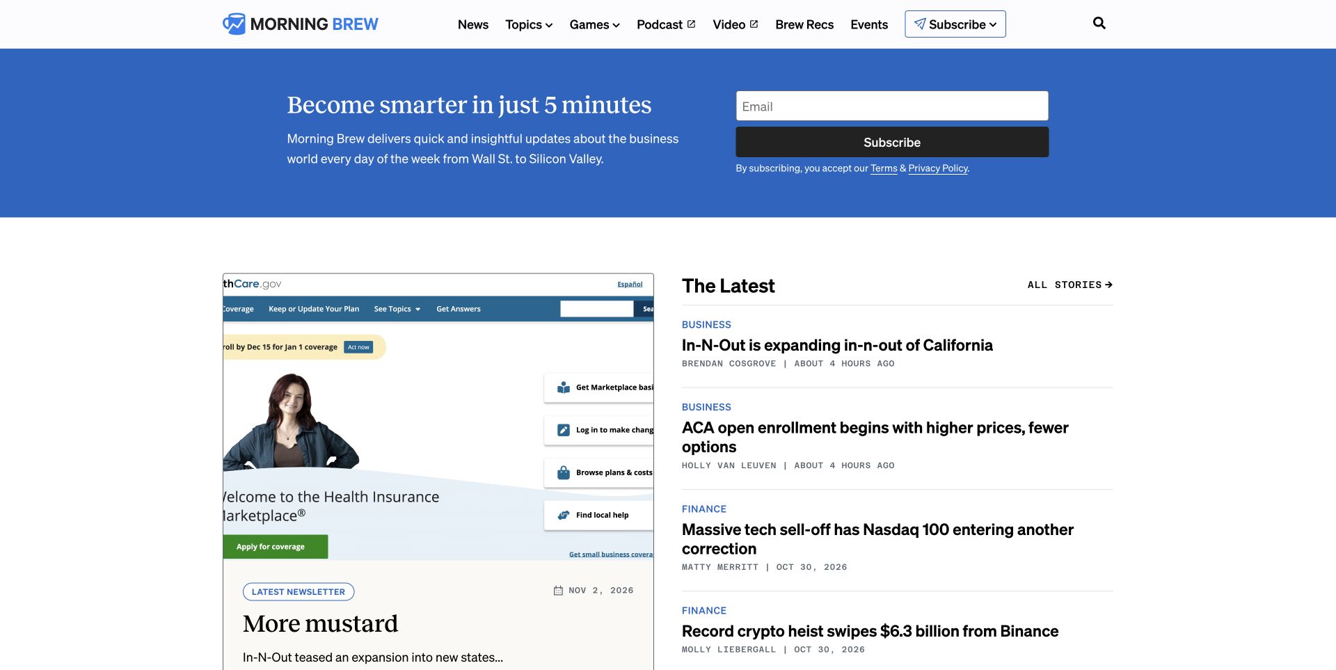
Morning Brew uses a blue newsletter invitation above a compact editorial grid and latest-story list. The masthead is small relative to the content, and the form occupies a direct position inside the colored panel. This shows how a subscription component and a news layout can share a page without requiring every article to carry its own signup pitch.
What you can learn
Keep form semantics, feedback and privacy copy independent from editorial-card variants. Test the feed with long headlines and missing images rather than only the balanced capture. The public styled-components markers identify generated style output, not evidence of subscription success or the implementation of the email delivery service. Test long addresses and validation messages so the newsletter panel can grow without obscuring neighboring stories or breaking reading order.
Pros
The newsletter invitation is grouped in a clearly bounded blue region.
Latest-story links create a direct alternative to the featured grid.
Cons & considerations
Compact editorial columns need careful reflow at smaller widths.
A signup form requires validated error states beyond its initial appearance.
Platform source: Dated public source inspection. The dated public response contains style elements carrying data-styled and data-styled-version markers. This identifies generated styled-components output on the sampled page, possibly an included component, not the authorship of every visible element or the whole application. Platform evidence is separate from the direct website screenshot and is not a complete current infrastructure audit.
Ace & Tate pairs two large portraits beneath a restrained navigation bar. The campaign lettering remains small, letting faces and eyewear carry the story. The split image introduces a deliberate visual rhythm, while the header provides practical commerce routes. It is a useful example for component planning around art-directed photography rather than uniform product thumbnails.
What you can learn
Define how paired images stack and crop before approving the desktop composition. Preserve product and search routes when the campaign changes, and make any overlaid action independently legible. Styled-components output establishes a scoped styling association, not proof of the rendering strategy for every photograph or checkout component. Choose image alternatives and stacking order together so the paired portraits remain meaningful rather than merely decorative on smaller screens.
Pros
The paired portraits make eyewear visible in a human context.
The restrained header avoids competing with the campaign imagery.
Cons & considerations
Split photography needs careful stacking rules on narrow screens.
Small campaign text can become difficult to read over detailed portraits.
Platform source: Dated public source inspection. The dated public response contains style elements carrying data-styled and data-styled-version markers. This identifies generated styled-components output on the sampled page, possibly an included component, not the authorship of every visible element or the whole application. Platform evidence is separate from the direct website screenshot and is not a complete current infrastructure audit.
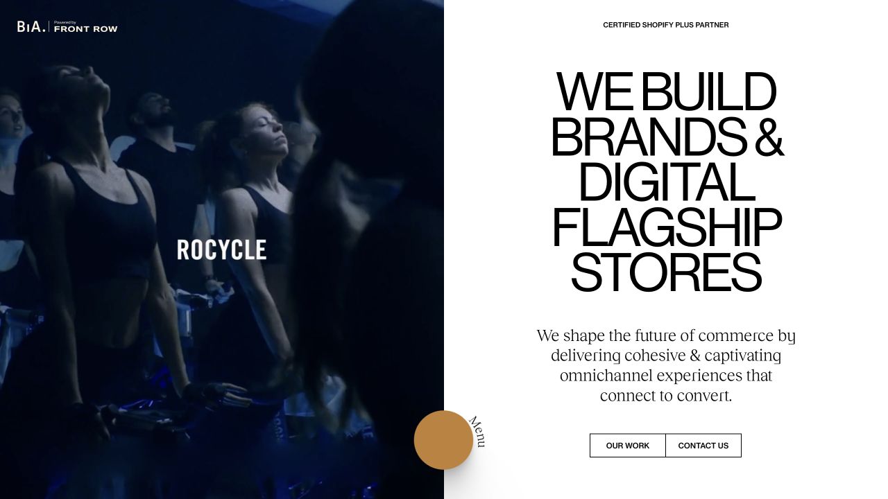
Build in Amsterdam splits the opening between a large client-project visual and a white panel of oversized agency positioning. Small navigation controls and rounded actions sit around the edges. The result makes a project and the agency's own proposition visible at once, showing why portfolio component systems need to accommodate unusually different text and media proportions.
What you can learn
Define explicit limits for heading size, line wrapping and project-preview height. Test long client names and narrow screens rather than scaling the desktop split proportionally. Public style markers establish generated styled-components output, not proof that the library powers every project shown or determines the agency's underlying workflow. Check that the agency statement and project link remain distinct destinations when the two-column composition becomes a single reading sequence.
Pros
A project visual provides context beside the agency's own claim.
The split surface gives branding and work distinct visual roles.
Cons & considerations
Oversized text can create awkward wrapping on smaller viewports.
Edge-positioned controls require deliberate focus and touch-target checks.
Platform source: Dated public source inspection. The dated public response contains style elements carrying data-styled and data-styled-version markers. This identifies generated styled-components output on the sampled page, possibly an included component, not the authorship of every visible element or the whole application. Platform evidence is separate from the direct website screenshot and is not a complete current infrastructure audit.
Kegan has 15+ years of experience working with small businesses, Fortune 500 companies, and everything in between. No development job is too big or too small: he brings the same hands-on attention to a focused improvement, a complete website, or a custom application.
For styled-components projects, he can help with responsive interfaces, reusable components, custom functionality, API connections, and performance-minded implementation. He works directly with clients on scope, design, implementation, testing, and handover, with an emphasis on clear communication and a system that remains practical to maintain after launch.
Show 3 other styled-components developersHide other styled-components developers
Choose the component boundaries that suit the content
Campaign and commerce systems
Separate persistent navigation from seasonal media and promotional copy. Establish card and action variants that accommodate different images without changing the meaning of controls. Include unavailable-product and long-label states in the brief.
Editorial and portfolio systems
Allow meaningful differences in headline scale, image ratio and advertising space while protecting reading order. Treat content length as an ordinary condition, not an edge case. Preserve permanent article and project identity when presentation changes.
Services and account entrances
Keep urgent routes, authentication controls and ordinary promotional actions semantically distinct. Shared visual tokens should not erase differences in risk or purpose. Test included widgets alongside the surrounding page even when a different team maintains them.
From references to requirements
Specify more than the ideal desktop screenshot
Build a content stress set
Collect short and long labels, missing images, translations, validation messages and genuine example content. Review the same component across those conditions. A neatly balanced campaign is not a sufficient definition of the component’s limits.
Include interaction states
Define visible focus, disabled and error states alongside the default appearance. Preserve native semantics and understandable labels. A styling library can help organize CSS, but it cannot establish accessible behavior from a static visual composition.
Review change boundaries
Identify who owns the shared component and which pages depend on it. Compare representative routes when altering tokens or variants. Keep a recovery point and verify that a small styling change does not silently obscure navigation, content or a form message.
A useful handover demonstration
Ask the actual team to carry out its routine job: publish a realistic update, correct a mistake, preview a narrow screen, and identify who owns an integration failure. For a library or frontend framework, also ask who maintains the content source and deployment. A polished screenshot does not answer those operational questions.
Beyond the screenshot
Component-styling planning checklist
Confirm the actual library, framework and rendering versions.
Separate permanent navigation from campaign-specific presentation.
Define content length, crop and wrapping constraints.
Specify focus, error, disabled and loading states.
Test narrow screens, zoom and translated labels.
Preserve semantics and accessible text alternatives.
Review third-party widgets as well as your own components.
Verify representative dependent pages after shared-style changes.
Test with real content, a keyboard, a small screen, slow or failed requests, and the people who will maintain the system. These are planning checks, not an accessibility, security, performance, or search-ranking certification.
Sources & editorial method
How this styled-components collection was reviewed
Twenty distinct public properties were selected from previously documented source pages and dated public technology observations. The direct browser captures retain their original source URLs, capture dates, dimensions and attribution. The new collection-specific reviews describe visible composition and planning implications separately from technical evidence. Previously recorded source observations were rechecked without being relabeled as fresh observations. The retained screenshots were visually re-reviewed; no real form, account, purchase or booking was submitted. Each selected public response contains data-styled and data-styled-version style markers. The association is with generated output on that sampled page and may reflect a single included widget. It does not establish the complete application architecture, the origin of every visible component, accessibility conformance or a performance benefit.
Every image is an unmodified capture from the actual website, with its source and capture date. Some captures are reused from our shared catalog; their dates remain the original capture dates. None comes from a vendor gallery or a generated reconstruction. Moving imagery and live content can change.
Technology attribution uses public page assets or metadata, official platform documentation, or a cited first-party project case study. Documentary and framework-relationship evidence is identified where used; it is not a complete current backend inventory. A CMS image CDN alone does not establish a full CMS deployment. A library’s presence does not prove which individual controls use it, and a platform label does not establish AI authorship.
The composition notes, lessons, pros and tradeoffs are original editorial observations. We have not measured conversion, traffic, security, performance or accessibility conformance. Website owners retain their brands and imagery; these examples are not our client portfolio. Written, Edited and Curated are independent records, not dates advanced by a build. See our editorial standards or suggest a correction.
Questions worth asking
styled-components website development FAQs
Are all these websites built entirely with styled-components?
That is not established. The public evidence identifies generated style output, which may belong to an included component. The reviews deliberately avoid assigning the whole site to the library.
Can I identify the styled component from a screenshot?
Not reliably. The screenshot shows visual output, while the source markers identify a technology association. Mapping a particular element to its source requires additional implementation evidence.
Does using the library make a site accessible or fast?
No such result follows from the library choice alone. Semantics, interaction design, content, rendering and testing all affect the experience and require their own evidence.
Should I use the version seen in an example?
The examples are not version recommendations. Check your project’s current requirements and the applicable official guidance, including rendering and framework compatibility, before choosing an implementation.