Definitive guide · Google Cloud website development
Best Google Cloud Websites of 2026 (20 Real-World Examples)
Website design references paired with scoped Google Cloud customer and workload sources
Explore 20 public websites from organizations with documented Google Cloud associations. Study their design choices without mistaking a customer’s AI, analytics or application workload for a verified description of the captured homepage’s current hosting and complete technology stack.
Google Cloud can support applications, data processing, storage, analytics and AI, while the public website uses a different publishing and delivery layer. A useful project brief identifies the responsibility of each part. The page that introduces a business, the system that processes a private record and an internal employee assistant may have different audiences, access boundaries and support requirements.
Shopify, Spotify, Etsy, PayPal and The Home Depot open this collection with established major-brand examples. Their source scopes differ deliberately. Some references describe commerce infrastructure; others concern discovery, customer service, internal tools or data workloads. The reviews examine what a visitor can actually see, while the linked sources explain the narrower technology association.
Before the examples
What makes good Google Cloud website development in 2026?
Describe the complete visitor task
Write what a visitor is trying to do and what must happen beyond the browser. Reading a guide, booking a service and submitting a protected inquiry require different operating arrangements. Keep the visible success message aligned with the actual receiving system, rather than treating a polished interface as proof that the business workflow is complete.
Make the runtime contract concrete
A managed service reduces some infrastructure work but still has an execution model. Cloud Run’s documented contract is an example of the details an application must fit. Have the delivery team explain the chosen runtime, request lifetime, temporary files and durable state in terms the operator can verify.
Keep service identity separate from personal ownership
Identify which automated workload needs access to which resource, and assign only the necessary authority. Google Cloud’s service-account documentation provides the relevant identity model. The business should also understand its human account, billing and domain ownership, rather than relying on a contractor’s undocumented personal access.
The public-page critique and the Google Cloud source answer different questions. A named analytics, AI or operational workload can be well documented without proving that a corporate newsroom or regional storefront is hosted on the same infrastructure.
We start with five recognizable brands or organizations: Shopify, Spotify, Etsy, PayPal, The Home Depot. Each attribution applies to the named website property, not every product or website belonging to its organization. This is a curated reading sequence, not a measured ranking.
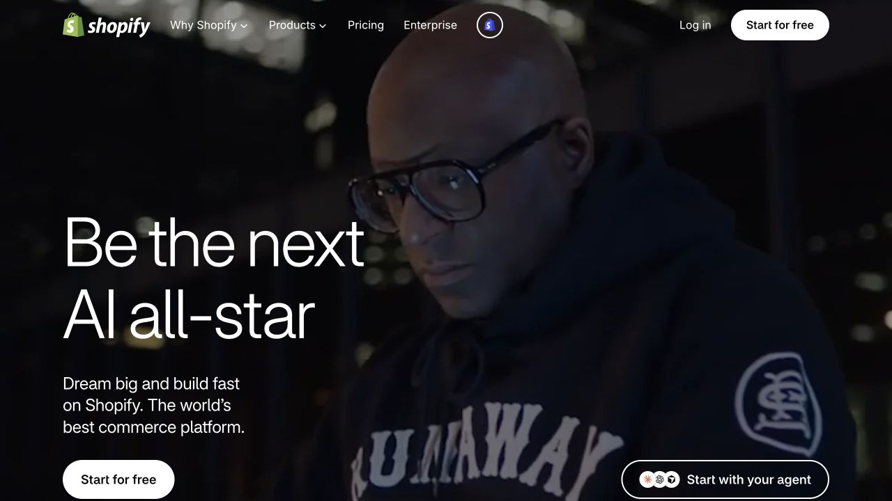
Shopify gives a short entrepreneurial proposition a large visual canvas, with one clear start action and a compact product navigation. The image supplies a human reference point while product, pricing, enterprise and developer routes remain available for people who already know what they need. The page does not begin by explaining infrastructure or listing every commerce capability. That is useful for a platform with a wide audience: a newcomer can understand the invitation, while a more experienced evaluator can move toward specific product or implementation information.
What you can learn
Begin with the merchant’s task, then make the deeper platform routes explicit. Google Cloud’s compute case documents Shopify commerce infrastructure; it is not an assertion that every store, app, theme or the captured corporate campaign uses an identical Google Cloud configuration.
Pros
The opening has a recognizable primary action rather than several equally prominent starting routes.
Developer and enterprise destinations acknowledge needs beyond a first-time merchant signup.
Cons & considerations
An aspirational opening needs concrete operational examples before a visitor can judge fit.
Media-heavy campaigns need lightweight alternatives and must not hide essential product information.
Platform source: Primary documented Google Cloud association. Google Cloud documents Shopify commerce-platform compute. Platform evidence is separate from the direct website screenshot and is not a complete current infrastructure audit.
Spotify’s For the Record page pairs large editorial typography with a photographic feature and a compact publication-style navigation. News and company context sit alongside search, making the page useful as a reference destination rather than a substitute for the music player. The main story receives visual priority, but the structure can lead into a larger archive. This is worth studying for a platform whose public communication serves different readers from its application: press, partners and interested observers need reliable stories and reference material, not the controls used to manage a personal listening session.
What you can learn
Design a public content surface for reading, retrieval and citation. Google Cloud documents Spotify’s infrastructure and data migration; that relationship does not mean the newsroom shares the listening product’s complete backend or that every visible page component comes from Google Cloud.
Pros
The editorial presentation retains the brand’s personality without requiring a logged-in product session.
Simple publication navigation suits readers searching for an announcement or company explanation.
Cons & considerations
A large featured story can obscure older but still important reference content.
Expressive headline typography requires care when a title becomes longer or is translated.
Platform source: Primary documented Google Cloud association. Google Cloud documents Spotify's data-center migration and data workloads. Platform evidence is separate from the direct website screenshot and is not a complete current infrastructure audit.
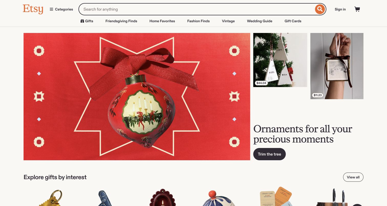
Etsy places a substantial seasonal image and a concise shopping theme beneath a persistent search bar. Category access and familiar shopping routes remain visible, while product-led modules begin directly below the campaign. The page therefore supports two different modes: a visitor can browse the current editorial theme or search for a specific kind of item. The useful pattern is the relationship between a changing promotion and a stable discovery system. The campaign can change, but people should not have to relearn where search and category exploration live.
What you can learn
Treat curated campaigns as optional shortcuts into a catalog. Google Cloud’s Etsy case concerns inventory understanding and discovery AI; it does not independently identify the current rendering stack, every seller’s shop technology or the systems behind each recommended item.
Pros
Persistent search remains useful even when the seasonal creative does not match a visitor’s intention.
The first product modules connect the campaign with concrete items rather than leaving it purely decorative.
Cons & considerations
A busy promotional period can create competing badges, offers and browsing routes.
Marketplace photographs and merchandising do not establish seller quality, availability or final purchase conditions.
Platform source: Primary documented Google Cloud association. Google Cloud documents Etsy's inventory and discovery AI. Platform evidence is separate from the direct website screenshot and is not a complete current infrastructure audit.
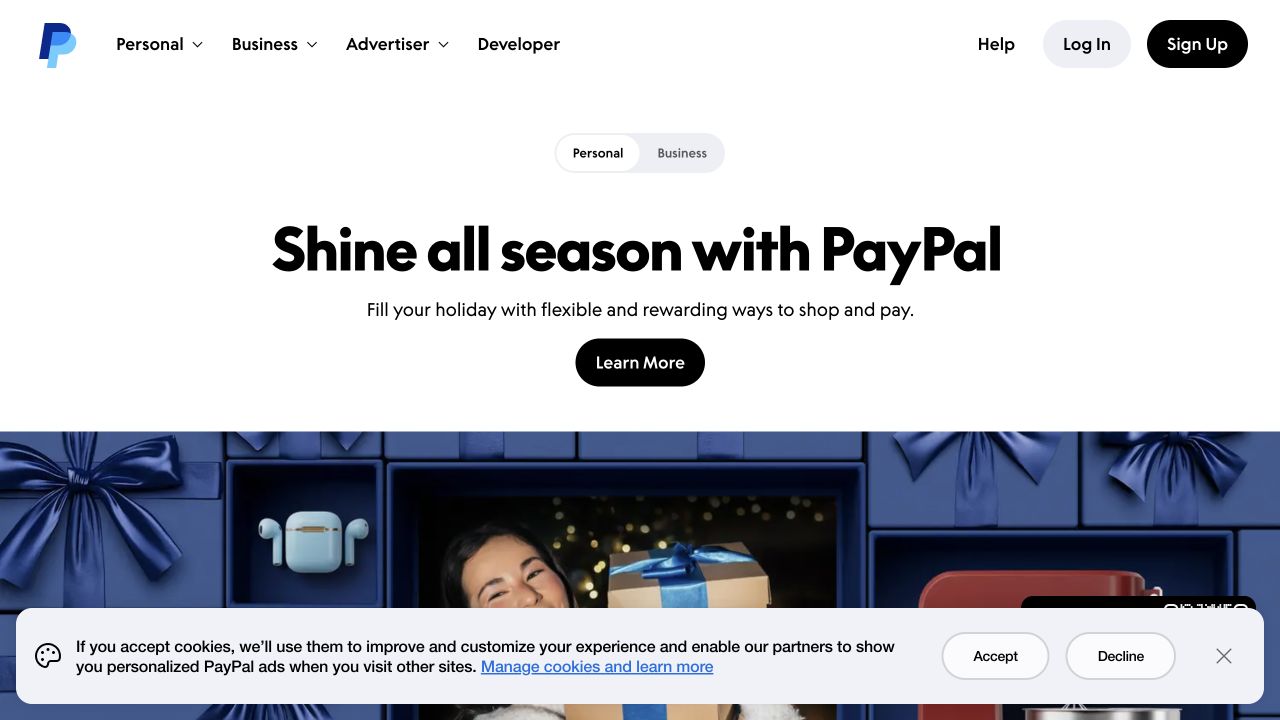
PayPal’s public page gives a short campaign headline generous white space and one main action. Personal and business choices appear close to the introduction, while developer, advertiser and help destinations remain available in the header. This is useful for a service with several very different audiences: the main campaign can stay concise because the navigation provides context for visitors who are not shopping for the featured experience. A broader visual section begins below the headline, separating the initial proposition from the supporting content rather than forcing everything into one dense panel.
What you can learn
Keep audience choices near the introduction when they change the meaning of the offering. Google Cloud’s PayPal case concerns a unified AI platform, not proof that this public campaign page or every payment flow uses the same cloud infrastructure.
Pros
Generous spacing and a limited opening message make the main action easy to identify.
Audience-specific routes reduce the need to explain every business line in the hero.
Cons & considerations
A broad seasonal proposition may not answer a visitor’s immediate transactional or support question.
Financial services need detailed regional terms, eligibility and security information beyond a promotional introduction.
Platform source: Primary documented Google Cloud association. Google Cloud documents PayPal's unified AI platform. Platform evidence is separate from the direct website screenshot and is not a complete current infrastructure audit.
The Home Depot’s corporate site uses its recognizable orange identity in a compact header above a wide editorial image. Shopping and store access remain available, but about, newsroom, investor, community and career routes establish that this is a corporate destination. The lead story can connect to a seasonal retail event without turning the entire site into a product catalog. This distinction is useful when a company has both a large consumer storefront and a separate responsibility to publish organizational information for press, employees, investors and community audiences.
What you can learn
Make the relationship between corporate communication and retail activity obvious without merging the two tasks. Google Cloud’s catalog features a Home Depot customer-service workload; it does not demonstrate the corporate site’s complete CMS, hosting or application architecture.
Pros
The familiar orange header makes the corporate destination immediately recognizable.
Institutional navigation keeps company information available alongside practical shopping and store links.
Cons & considerations
A seasonal retail story may not be the most relevant lead for every corporate audience.
Wide images and compact navigation labels need careful treatment when the page narrows.
Platform source: Primary documented Google Cloud association. Featured for customer-service agents. Platform evidence is separate from the direct website screenshot and is not a complete current infrastructure audit.
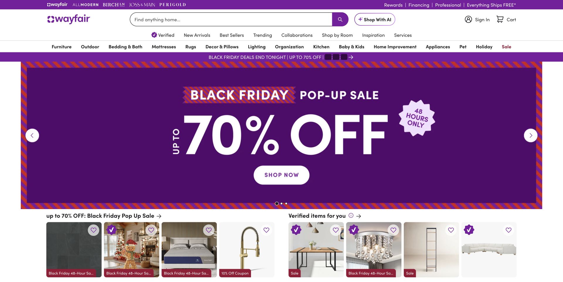
Wayfair’s homepage uses a large purple promotional panel, with search and a deep product-category navigation above it. Product cards appear immediately below the offer, showing that the promotion connects to a browsable inventory rather than ending at a generic signup request. Brand links and account-related tools add further context, but also increase the amount of information competing for attention. The page is useful as a reference for high-volume retail: its visual hierarchy must make an offer noticeable while still allowing a shopper to locate a particular room, product type or item.
What you can learn
Keep a durable search-and-category structure underneath changing merchandising. Google Cloud’s customer catalog associates Wayfair with AI-powered discovery, which is a named workload rather than a verified statement about the storefront’s full delivery stack or every recommendation shown.
Pros
Search and product categories remain available when the current offer is irrelevant to the shopper.
Visible product cards connect the promotional message with concrete inventory.
Cons & considerations
Several header bands and badges can make the first screen feel crowded.
Offer-led urgency needs clear restrictions and should not overwhelm product details or accessibility controls.
Platform source: Primary documented Google Cloud association. Featured for AI-powered discovery. Platform evidence is separate from the direct website screenshot and is not a complete current infrastructure audit.
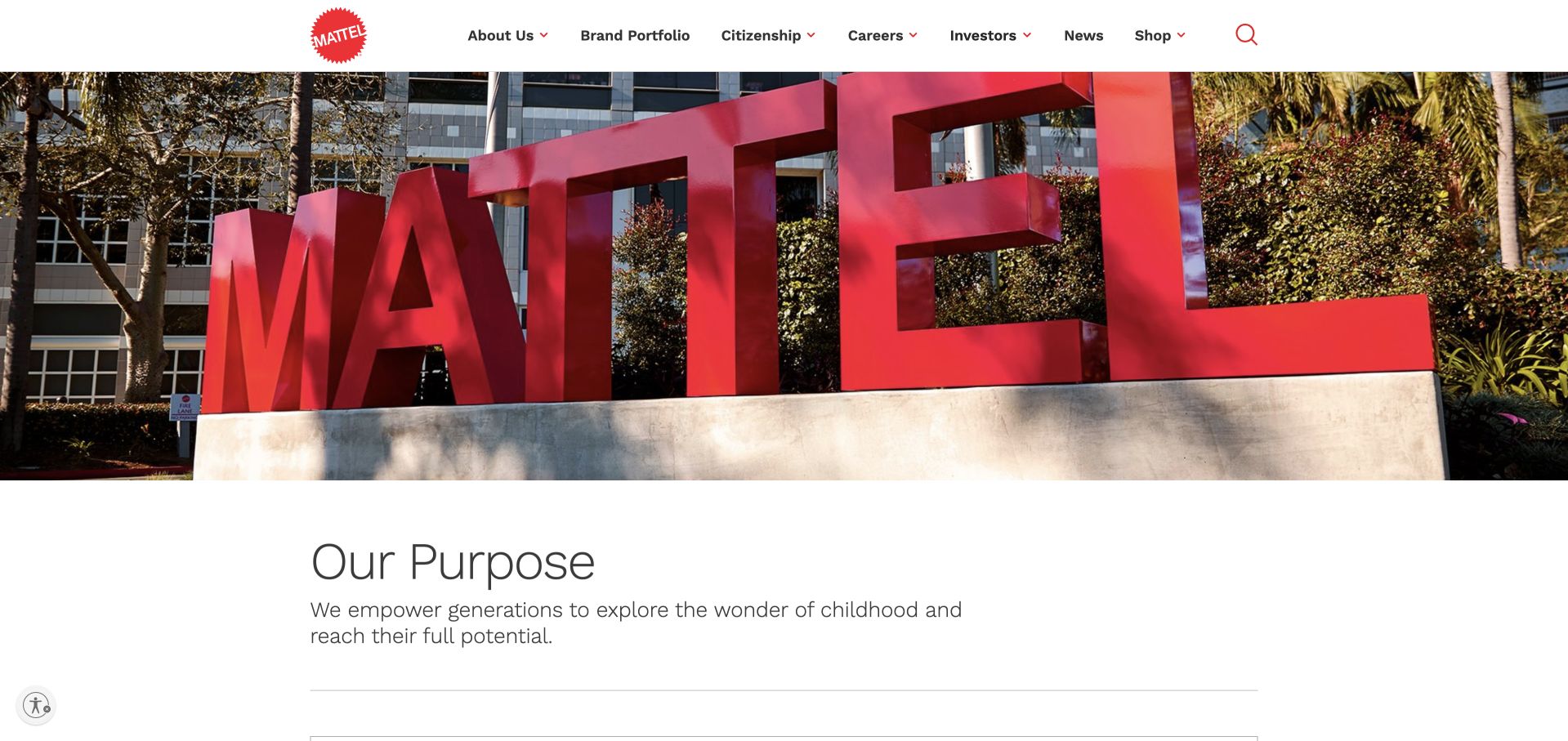
Mattel’s corporate opening uses a large photograph of its own brand sign, followed by a concise purpose statement. The surrounding navigation separates company information, the brand portfolio, citizenship, careers, investors and news. Rather than presenting a toy-store interface, the page explains the organization that connects a wider group of products and experiences. The physical sign is a useful visual anchor: it makes the corporate identity tangible, while the following copy and navigation can explain the broader purpose without relying on a complicated diagram of subsidiaries.
What you can learn
Use a recognizable brand asset to establish the parent organization, then provide audience-specific routes. Google Cloud’s catalog identifies Mattel customer-feedback analysis with Gemini and BigQuery; that association does not prove the technology used to publish this corporate homepage.
Pros
A simple, tangible brand image gives the institutional page a clear visual starting point.
Portfolio and corporate responsibility routes acknowledge needs beyond buying a particular toy.
Cons & considerations
A short purpose statement needs concrete supporting examples to avoid feeling generic.
Visitors seeking a specific consumer brand may need a more direct path than the corporate introduction provides.
Platform source: Primary documented Google Cloud association. Featured for customer-feedback analysis with BigQuery. Platform evidence is separate from the direct website screenshot and is not a complete current infrastructure audit.
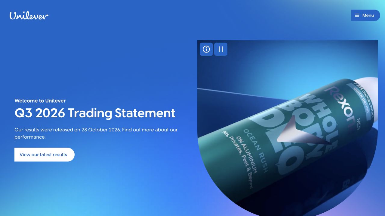
Unilever’s homepage uses a strong blue field, a large product image and a concise corporate update. The composition gives both the parent brand and a recognizable consumer context room to work, while a compact menu holds the wider information architecture. This is useful for a group whose audience includes investors, suppliers, job seekers and consumers. The opening can communicate a timely institutional message without losing the connection to everyday products, but the menu and supporting sections must carry the detail that the deliberately sparse first screen leaves out.
What you can learn
A corporate update can be visually specific without becoming a storefront. Google Cloud’s catalog describes Unilever’s integrated AI work; it is not evidence that the public corporate homepage, every local brand site or each consumer product uses the same Google Cloud services.
Pros
The product image keeps an institutional update connected to the group’s recognizable consumer world.
A restrained visual field gives the main information room to read.
Cons & considerations
A compact menu can conceal useful routes if visitors do not understand the parent organization.
A reporting-led first screen may be less helpful to people looking for a particular brand or service.
Platform source: Primary documented Google Cloud association. Featured for an integrated AI stack. Platform evidence is separate from the direct website screenshot and is not a complete current infrastructure audit.
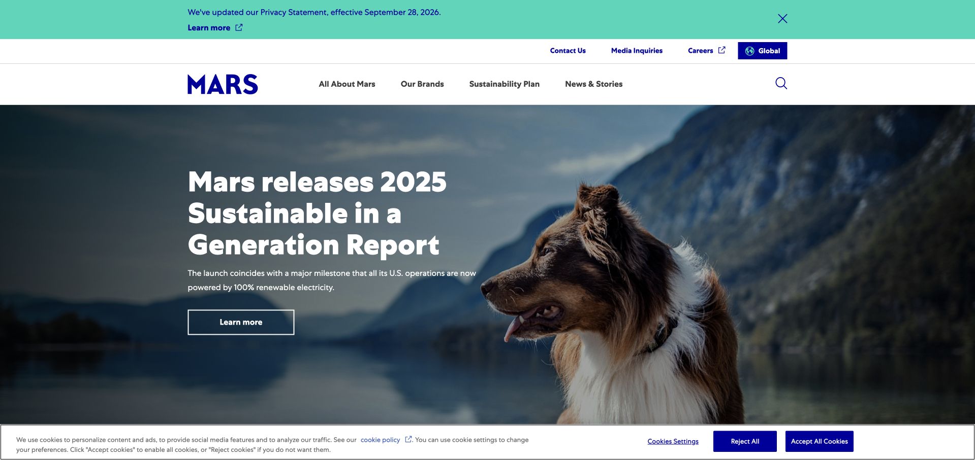
Mars’s homepage frames a large contextual photograph with a concise corporate story and a relatively compact navigation. The visible feature connects the business with a specific theme rather than listing every petcare, food and confectionery brand at once. Company, brand, sustainability and newsroom routes remain available above the image, with practical contact and career access nearby. This is useful when a parent company needs to communicate shared priorities while leaving room for the very different interests that bring people to a broad corporate site.
What you can learn
Choose one editorial theme for the opening, but keep the wider portfolio discoverable. Google Cloud features Mars’s marketing-campaign AI work, a specific business association rather than a finding about the corporate site’s current CMS, hosting or full backend.
Pros
A concrete image and editorial theme give a diversified organization a coherent first impression.
Brand and corporate-information routes provide alternatives to reading the current feature.
Cons & considerations
One theme can underrepresent business areas that are not visible in the opening image.
Corporate sustainability or impact claims require accessible evidence and context beyond a campaign headline.
Platform source: Primary documented Google Cloud association. Featured for marketing-campaign AI. Platform evidence is separate from the direct website screenshot and is not a complete current infrastructure audit.
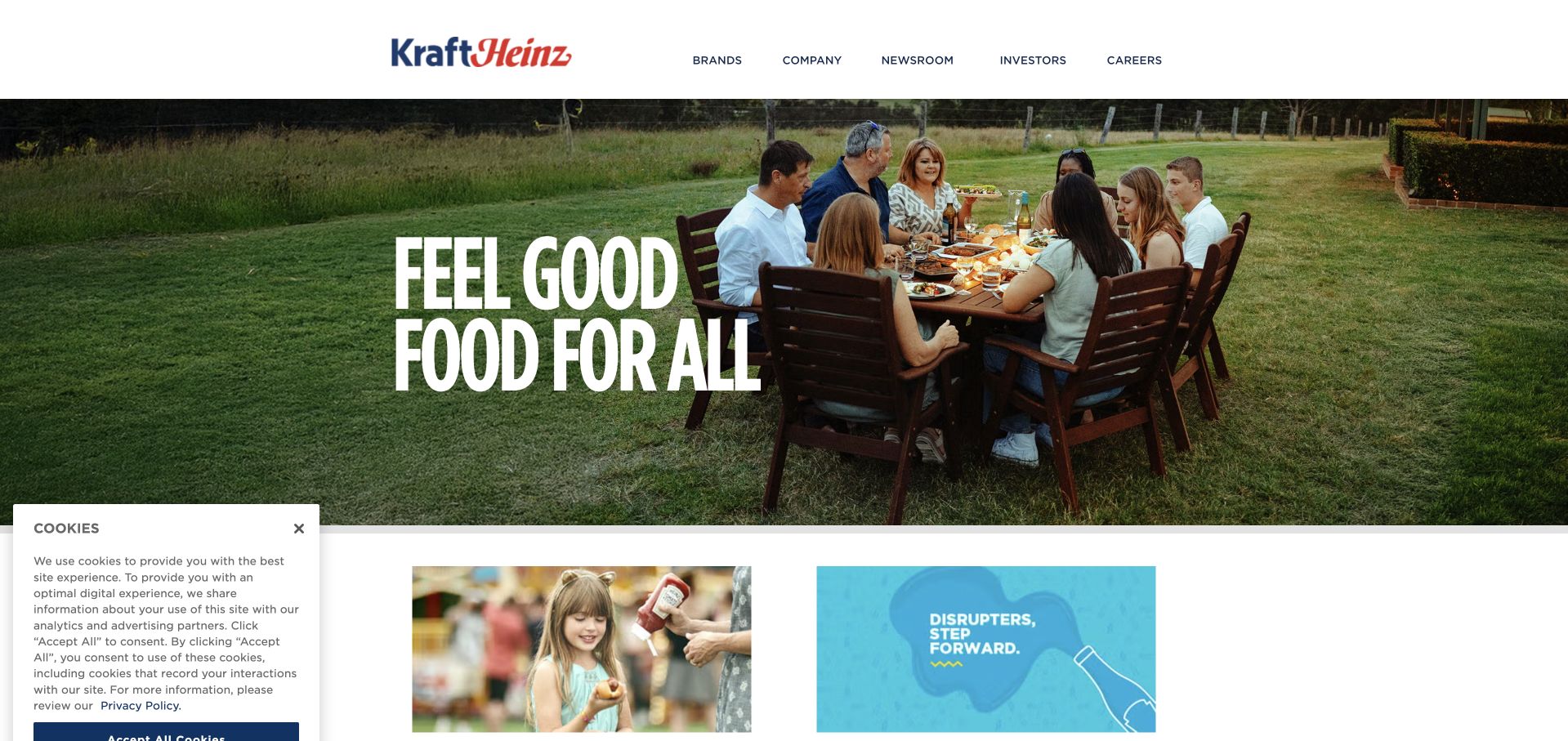
Kraft Heinz’s homepage pairs a broad food-related statement with a photograph of people sharing a meal. The header separates brands, company information, newsroom, investors and careers, while the next modules begin to expose the portfolio. This is a useful approach for an organization known through individual products: the shared human setting gives the parent brand a reason to exist without making the first screen an exhaustive logo wall. The portfolio remains important, but it arrives within a recognizable context rather than as an unexplained collection of trademarks.
What you can learn
Give a parent-company proposition a concrete everyday setting, then explain the individual brands. Google Cloud’s Kraft Heinz case concerns content-creation workflow; it does not independently identify the runtime of this captured corporate page or establish how each product site is built.
Pros
The meal scene makes the group-level proposition understandable without technical or organizational language.
A small set of institutional routes keeps the corporate purpose clear.
Cons & considerations
A broad food statement needs specific examples to differentiate the group from other consumer companies.
A static corporate page still needs current reporting, contact and accessibility information to remain useful.
Platform source: Primary documented Google Cloud association. Google Cloud documents Kraft Heinz's content-creation workflow. Platform evidence is separate from the direct website screenshot and is not a complete current infrastructure audit.
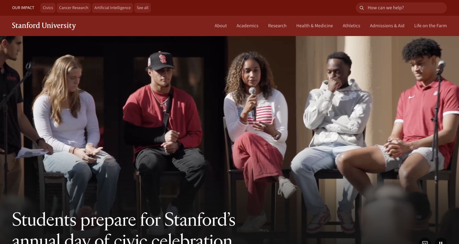
Stanford’s homepage pairs its recognizable red identity with a large feature about university life. The navigation makes room for academics, research, health, athletics, admissions and other institutional tasks, while an upper layer highlights broader areas of public impact. This gives the page two complementary roles: it can tell a current story about people at the university and act as a gateway into a substantial information system. The useful pattern is the separation between editorial emphasis and durable task routes, rather than assuming that one featured story can answer every visitor’s question.
What you can learn
Keep institutional tasks stable while the editorial lead changes. Google Cloud’s catalog features Stanford’s campus AI exploration; that named association is not evidence that every department, research project or the public university homepage uses a single Google Cloud stack.
Pros
Human editorial content gives a large institution a more approachable opening.
Stable academic and institutional routes support visitors whose needs do not match the featured story.
Cons & considerations
Several navigation layers can add complexity for a first-time or mobile visitor.
A homepage feature cannot substitute for clear admissions, academic or research information deeper in the site.
Platform source: Primary documented Google Cloud association. Featured for campus AI exploration. Platform evidence is separate from the direct website screenshot and is not a complete current infrastructure audit.
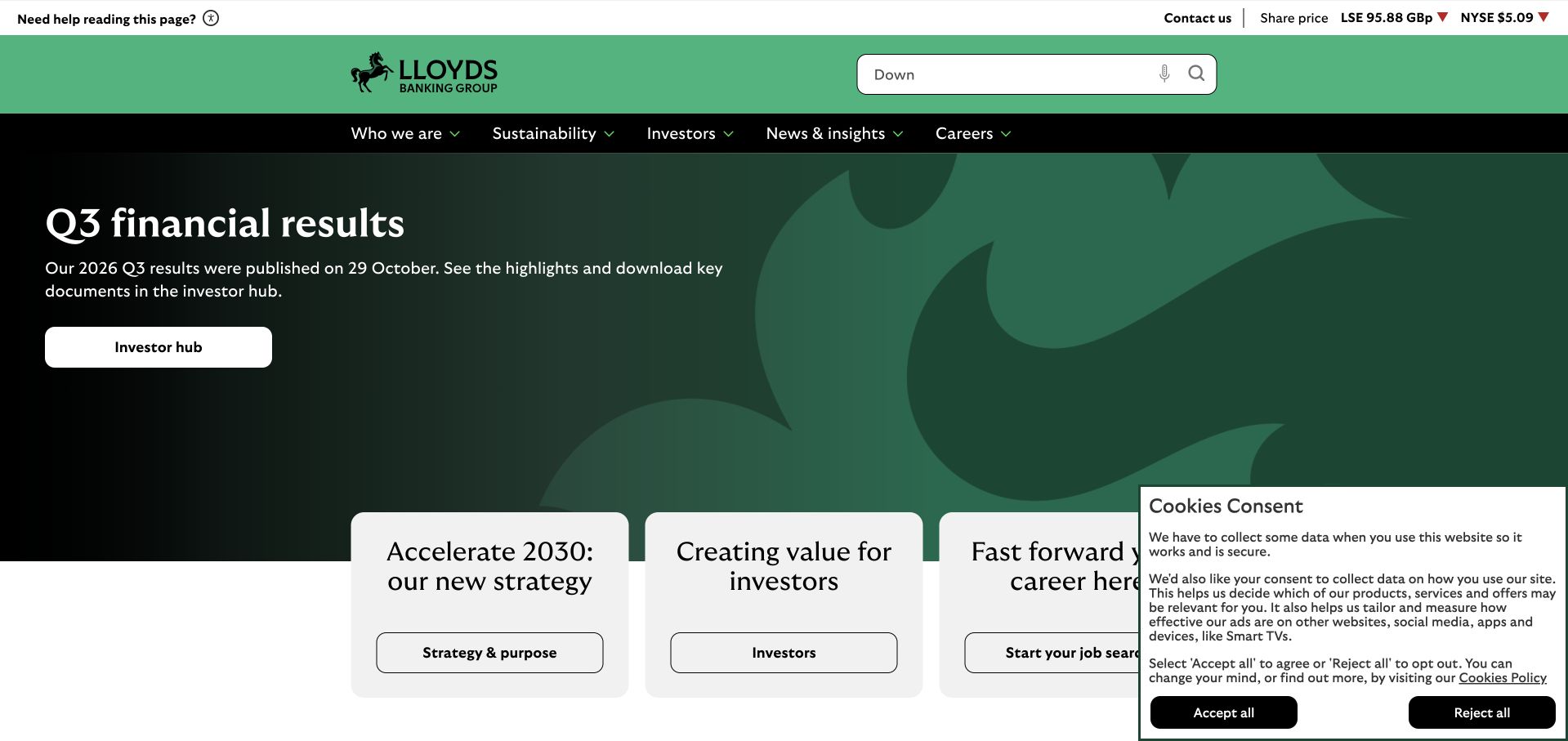
Lloyds Banking Group’s corporate homepage uses a strong green visual identity and a report-led introduction. A primary investor route appears within the lead, while strategy, investor information and careers receive supporting entry points below. The header keeps company, sustainability and news destinations available, reinforcing the institutional purpose of the page. This is useful when a parent organization has several consumer-facing services: the corporate site can prioritize reporting and strategic context without making visitors mistake it for the place to manage a personal bank account.
What you can learn
State the corporate task through both content and navigation. Google Cloud’s catalog identifies a Lloyds security-operations association, not proof of the retail brands’ infrastructures or an independent assessment of this public site’s security and availability.
Pros
The report-led introduction gives institutional readers an immediate, concrete next step.
A consistent green system ties the hero and supporting routes together without excessive decoration.
Cons & considerations
A reporting feature may provide little immediate value to someone seeking a local consumer service.
Financial and strategic claims need full dated documents and accessible explanations beyond the homepage summary.
Visible tech stack
Earlier / documented evidence
Google Cloud
Platform source: Primary documented Google Cloud association. Featured for Google Security Operations. Platform evidence is separate from the direct website screenshot and is not a complete current infrastructure audit.
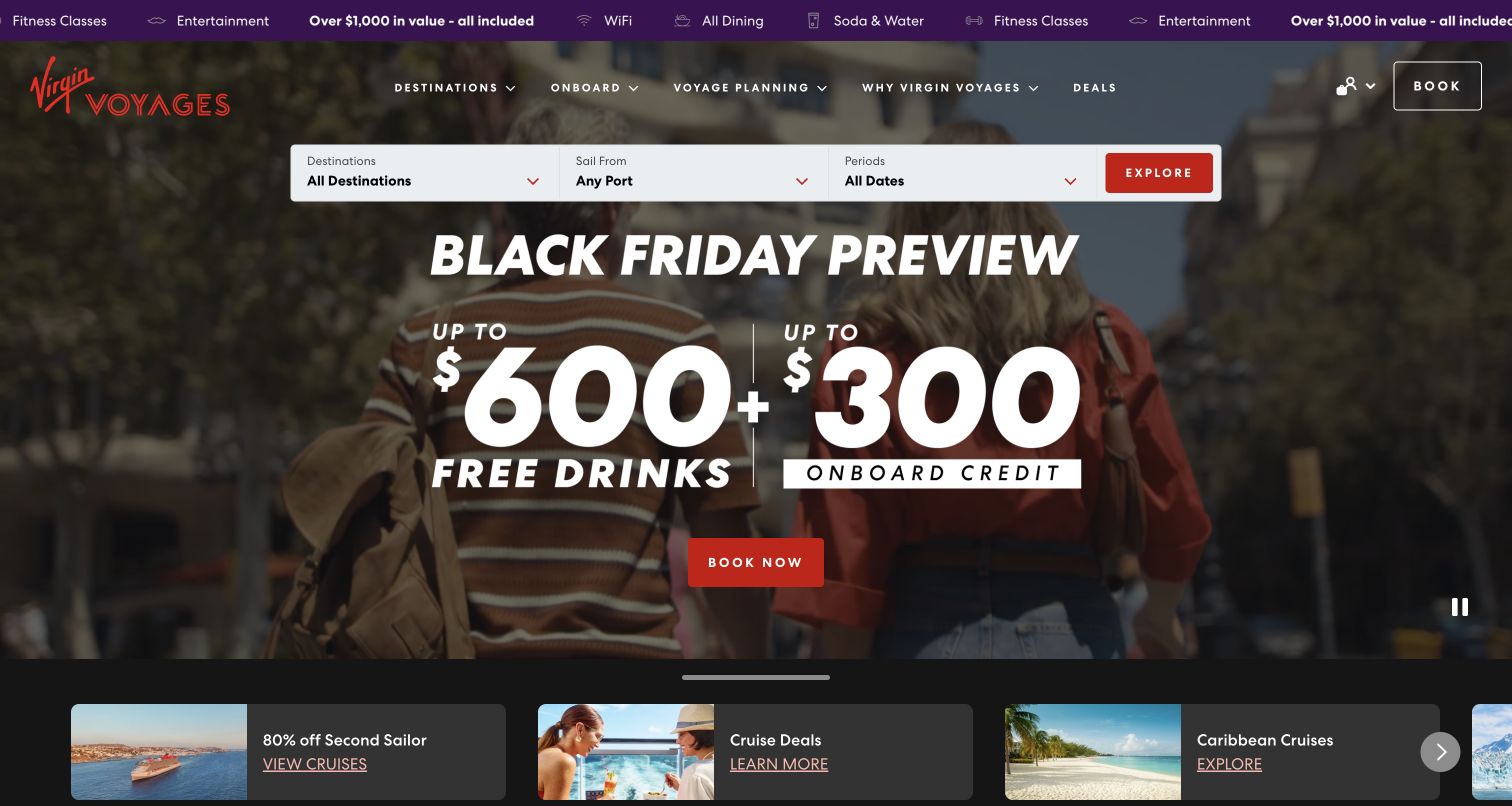
Virgin Voyages’ homepage uses a high-impact travel promotion while keeping a compact destination and date search close to the top. The red primary action is recognizable within a darker photographic setting, and supporting cards introduce other offers or experiences below. The design has a clear commercial energy, but the useful reference is the relationship between inspiration and practical selection. A visitor should be able to move from an attractive image to an actual itinerary question without hunting through a separate navigation system.
What you can learn
Connect the experience you show with the inputs needed to find a relevant trip. Google Cloud’s catalog describes a Virgin Voyages crew-assistance workload, which does not establish the hosting architecture of the booking page or the systems used for every passenger interaction.
Pros
Destination and date controls give the promotional opening a practical route forward.
A strong red accent makes the main action easy to distinguish from supporting content.
Cons & considerations
Large promotional claims need clear terms, availability and eligibility in the relevant booking context.
Multiple offers can compete with the basic task of finding a suitable itinerary.
Platform source: Primary documented Google Cloud association. Featured for crew-assistance AI. Platform evidence is separate from the direct website screenshot and is not a complete current infrastructure audit.
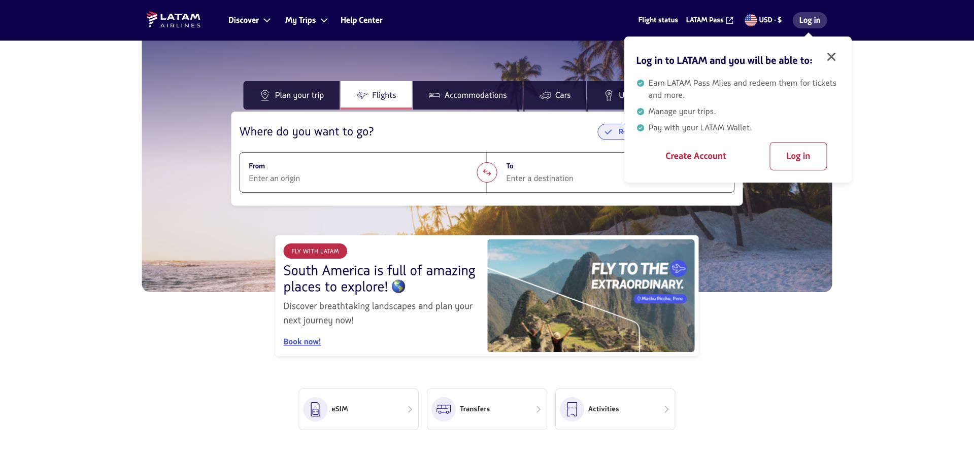
LATAM’s public homepage places its travel-booking task within a header that also exposes help, flight status, loyalty information and existing-trip access. Those supporting tasks matter because many airline visitors are not starting a new purchase. The brand’s purple identity connects the navigation and booking environment without making every control equally prominent. This is a useful reference for service businesses with time-sensitive repeat tasks: the public opening needs to support a new search, but it must not make a returning customer work through a sales campaign to find operational information.
What you can learn
Map booking, support and existing-service tasks separately before composing the hero. Google Cloud’s LATAM feature concerns AI innovation, not a verified inventory of this regional homepage’s booking engines, data systems or current cloud-hosting configuration.
Pros
Help and flight-status routes recognize urgent tasks that differ from buying a new ticket.
A consistent brand shell can organize several travel-related destinations without separate visual systems.
Cons & considerations
Regional choices, loyalty prompts and booking inputs can create a crowded mobile opening.
Displayed fares and travel conditions require current, route-specific information beyond a homepage screenshot.
Visible tech stack
Earlier / documented evidence
Google Cloud
Platform source: Primary documented Google Cloud association. Featured for Google Cloud AI work. Platform evidence is separate from the direct website screenshot and is not a complete current infrastructure audit.
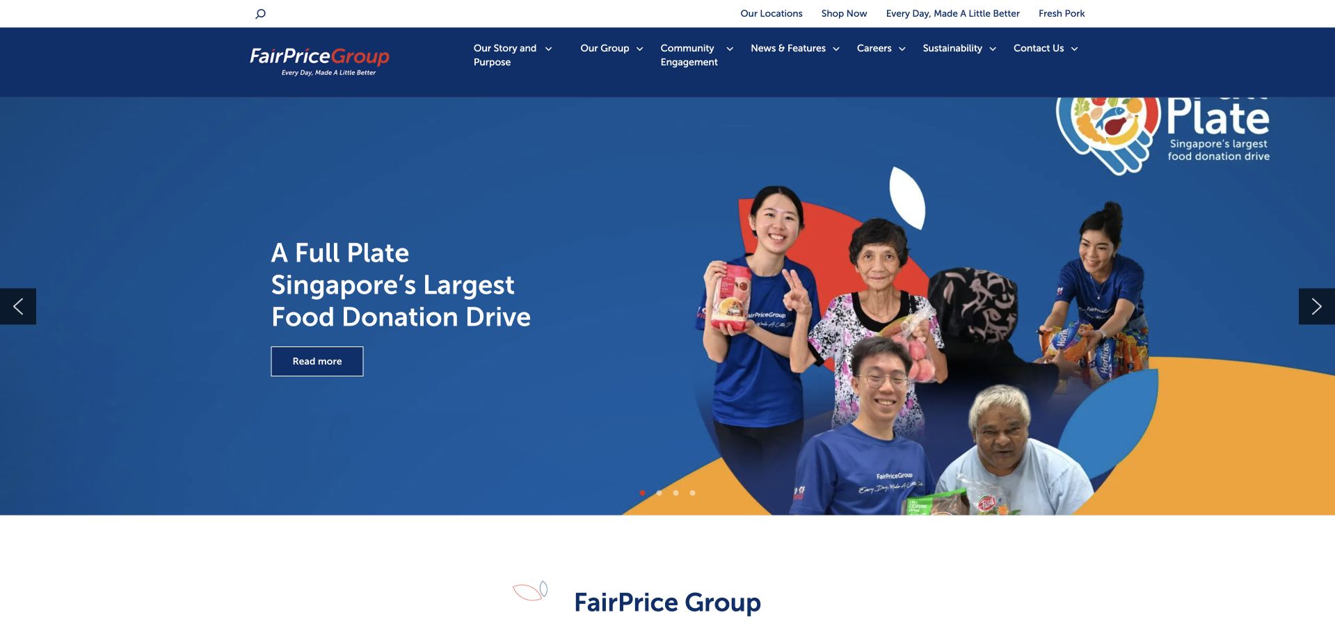
FairPrice Group’s corporate homepage gives a community-oriented feature a substantial blue visual field. Navigation separates the group’s story, work, community engagement, news, careers and contact, while shopping and store-location routes are available in a supporting layer. This makes the institutional role of the page clear without cutting it off from the consumer services people may already know. The design is useful for a group that combines retail activity with a broader public mission: a current story can lead, provided visitors can still find the organization and its practical destinations.
What you can learn
Let a corporate story explain the group while keeping retail tasks explicitly separate. Google Cloud’s FairPrice case documents retail agents, not the current hosting of this corporate page or the technology behind every store and consumer application.
Pros
The feature gives the group’s community role a concrete and visually approachable introduction.
Shopping and location routes remain available without taking over the corporate information structure.
Cons & considerations
A rotating group campaign may not explain the full set of businesses or services.
Community and impact statements require supporting evidence and dated information beyond the opening feature.
Platform source: Primary documented Google Cloud association. Google Cloud documents FairPrice retail agents. Platform evidence is separate from the direct website screenshot and is not a complete current infrastructure audit.
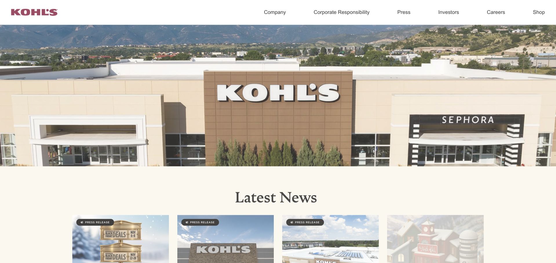
Kohl’s corporate homepage uses a substantial store photograph above a latest-news area, with company, responsibility, press, investor and career routes in the header. The retail identity remains clear, but the site’s purpose is organizational information rather than product selection. A visible shop route connects the corporate page with the consumer business without requiring the two interfaces to be merged. This is useful when a brand has an established storefront: the corporate destination can provide context, reports and announcements in a structure that suits readers rather than shoppers.
What you can learn
Match modules to the task of reading and reference, not only to the visual identity of the store. Google Cloud’s Kohl’s case concerns analytics and shopping AI; it does not establish that the corporate publication uses the same runtime or complete technology stack.
Pros
The store image makes the corporate brand tangible while the navigation clarifies the institutional audience.
A distinct news area provides a logical place for regularly changing announcements.
Cons & considerations
A large introductory photograph can delay access to the actual news on a small screen.
A corporate publication needs clear dates and archive routes so older announcements remain understandable.
Visible tech stack
Earlier / documented evidence
Google Cloud
Platform source: Primary documented Google Cloud association. Google Cloud documents Kohl's analytics and shopping AI. Platform evidence is separate from the direct website screenshot and is not a complete current infrastructure audit.
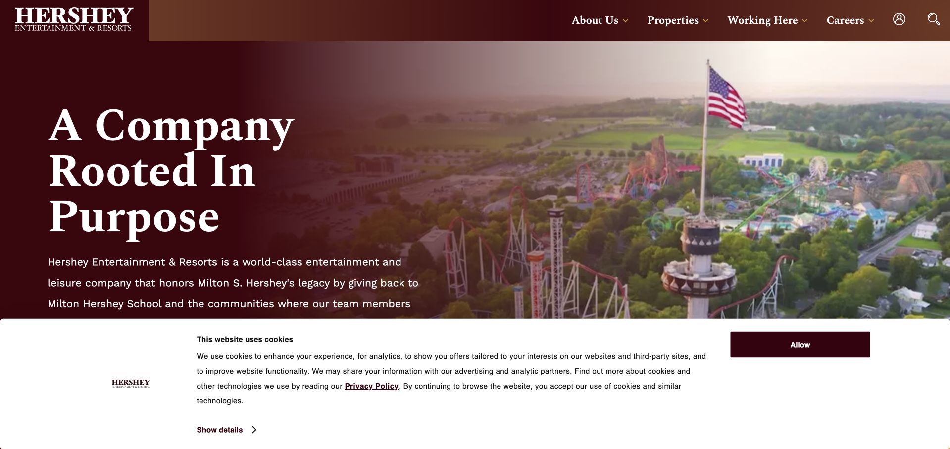
Hershey Entertainment & Resorts uses a large aerial or place-based image beside a concise statement about the company’s purpose. The deep red treatment connects the typography and navigation with a recognizable brand character. About, properties, working at Hershey, careers and search provide practical destinations, while the hero explains the group rather than selling a single ticket or hotel room. The useful pattern is the connection between place and organization: a large portfolio can become easier to understand when the opening shows the setting that links its experiences.
What you can learn
Use a real place to explain a group’s identity, then separate the different visitor tasks. Google Cloud’s Hershey case describes customer-experience AI work, not a verification of every property’s booking systems or the corporate homepage’s full hosting and CMS setup.
Pros
The place-based visual gives the institutional introduction a concrete and recognizable context.
Properties and employment routes acknowledge different reasons to visit the group’s website.
Cons & considerations
A broad purpose statement still needs specific explanations of the properties and services.
The corporate page must provide clear onward routes for people who actually want to plan or book a visit.
Platform source: Primary documented Google Cloud association. Google Cloud documents Hershey customer-experience AI. Platform evidence is separate from the direct website screenshot and is not a complete current infrastructure audit.
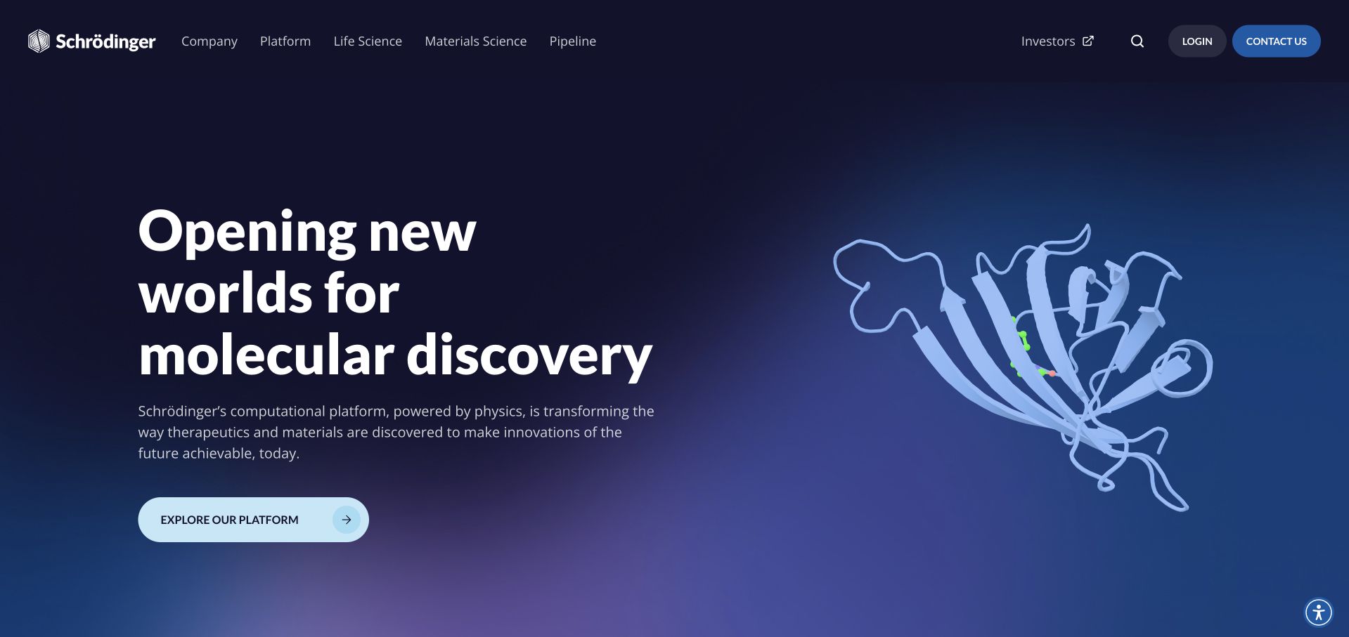
Schrödinger’s homepage places a concise molecular-discovery proposition against a dark blue field, with a simple scientific visual supporting the message. The navigation separates platform information, science, materials, pipeline and company context, while login and contact remain practical alternatives. This is useful for a specialist technology business with several audiences: a researcher, a commercial evaluator and an institutional reader may share an interest in the science but need different next steps. The opening supplies a coherent subject without trying to explain the entire product and research program at once.
What you can learn
Create a clear entry point into a technical subject, then let the taxonomy expose its different applications. Google Cloud’s case documents drug-discovery computing, not clinical effectiveness or the complete current infrastructure used to publish this public marketing page.
Pros
The restrained molecular visual reinforces the subject without overwhelming the main statement.
Separate platform and science routes support visitors with different levels of technical and commercial intent.
Cons & considerations
Scientific language needs accessible supporting explanations for readers outside the specialist field.
A polished visual identity cannot establish research validity, clinical outcomes or product suitability by itself.
Visible tech stack
Earlier / documented evidence
Google Cloud
Platform source: Primary documented Google Cloud association. Google Cloud documents Schrödinger drug-discovery computing. Platform evidence is separate from the direct website screenshot and is not a complete current infrastructure audit.
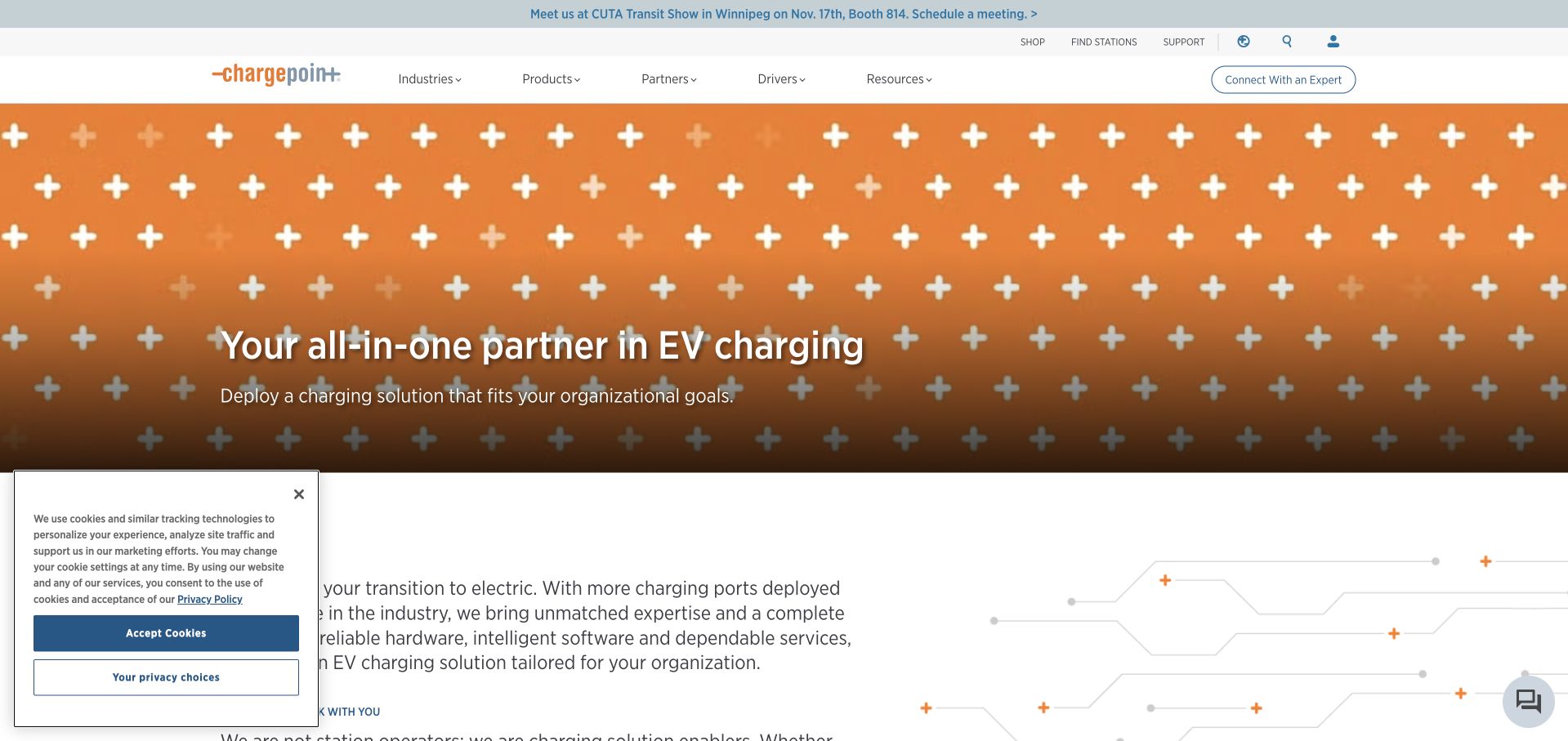
ChargePoint’s homepage combines a broad charging-infrastructure proposition with navigation for industries, products, partners and company information. A supporting layer includes shopping, support and station-finding tasks, acknowledging that a driver and an infrastructure buyer do not arrive with the same question. The orange visual identity connects the main feature with product and utility routes. This is useful for a platform with both physical infrastructure and digital services: the site needs to explain the business while still helping a visitor complete an immediate real-world task.
What you can learn
Keep operational utilities visible without making them compete equally with a commercial introduction. Google Cloud documents ChargePoint’s Snowflake-on-Google-Cloud data lake, a specific analytics association rather than proof of this marketing page’s complete frontend or hosting architecture.
Pros
Station-finding and support routes recognize visitors who are not evaluating an enterprise purchase.
The shared identity connects practical utilities with a broader product and industry information system.
Cons & considerations
Several audience groups can make navigation complex unless their routes are clearly distinguished.
A broad infrastructure proposition needs concrete compatibility, availability and implementation information deeper in the site.
Platform source: Primary documented Google Cloud association. Google Cloud documents ChargePoint's Snowflake-on-Google-Cloud data lake. Platform evidence is separate from the direct website screenshot and is not a complete current infrastructure audit.
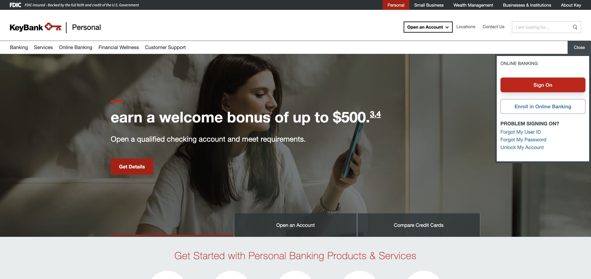
KeyBank’s public homepage begins with explicit personal, small-business, wealth and institutional routes. A conventional banking header then connects search, product navigation and account access with a large customer-oriented feature. The useful reference is the layering: audience selection provides context before the visitor encounters a more detailed product catalog. This can make a broad financial organization easier to navigate, provided the labels lead to genuinely different information rather than simply repeating the same promotional content behind several tabs.
What you can learn
Use audience distinctions to reduce the number of irrelevant choices a visitor must interpret. Google Cloud’s KeyBank case concerns developer-assistance tooling; it is not evidence that this public banking interface uses the same services or an independent assessment of its security or financial products.
Pros
Audience routes make several different banking relationships visible before a visitor selects a product.
Account access and search provide practical alternatives to following the current campaign.
Cons & considerations
Multiple navigation layers and an account-access panel can crowd the first screen.
Financial promotions still need complete eligibility, rate and term information in the relevant product context.
Visible tech stack
Earlier / documented evidence
Google Cloud
Platform source: Primary documented Google Cloud association. Google Cloud documents KeyBank's developer-assistance tooling. Platform evidence is separate from the direct website screenshot and is not a complete current infrastructure audit.
Kegan has 15+ years of experience working with small businesses, Fortune 500 companies, and everything in between. No development job is too big or too small: he brings the same hands-on attention to a focused improvement, a complete website, or a custom application.
For Google Cloud projects, he can help with content architecture, custom functionality, system integrations, testing, and maintainable handover. He works directly with clients on scope, design, implementation, testing, and handover, with an emphasis on clear communication and a system that remains practical to maintain after launch.
Show 3 other Google Cloud developersHide other Google Cloud developers
Choose the smallest useful Google Cloud responsibility
A bounded website service
A protected form, small API or background task can sit beside a simple content website. Define the allowed inputs, receiving system, error states and retry behavior. Keep previews from creating real records or sending real notifications, and test the complete nonproduction path before calling the feature ready.
A customer-facing application
Model account permissions, data ownership and the parts of the experience that must remain available. Identify the application, database, file storage and external providers as separate responsibilities. Choose scaling and recovery behavior around representative work rather than copying a large customer’s reported traffic or architecture.
A data or AI integration
Describe the permitted source data, output and action boundary. An analytics pipeline and an assistant that can modify records have different consequences. Preserve a human review path where needed, and keep the main publishing workflow separate when it does not need the same data access or execution privileges.
From references to requirements
Plan releases, evidence and long-term ownership
Draw the boundaries around private data
Record which information stays public, which enters the application, where it is stored and who can retrieve it. Keep secrets outside browser bundles and public artifacts. Include logs, backups and exports in the discussion rather than assuming only the primary database needs an access policy.
Rehearse deployment and failure
Demonstrate a clean build and an identifiable release, then test an interrupted request, unavailable provider and failed rollout with safe data. A rollback should restore a coherent application state, not simply replace code while leaving incompatible records behind. Make the result visible enough that an operator can distinguish failure from an uncertain outcome.
Make cost and maintenance understandable
Document the services actually used, the main cost drivers, expected demand and the person responsible for updates and alerts. Include backups, restoration and a support handover. Use the architectural framework to structure tradeoffs, but keep the acceptance criteria specific to the website and the business tasks it supports.
Ask the actual team to carry out its routine job: publish a realistic update, correct a mistake, preview a narrow screen, and identify who owns an integration failure. For a library or frontend framework, also ask who maintains the content source and deployment. A polished screenshot does not answer those operational questions.
Beyond the screenshot
Google Cloud website planning checklist
Define the visitor and business task.
Separate public content from private application state.
Identify the owner of the cloud project and billing.
Map external providers and receiving systems.
Assign narrow service identities and permissions.
Keep server secrets out of public assets.
Confirm the selected runtime’s operating contract.
Identify durable data and restoration requirements.
Use safe nonproduction records for testing.
Rehearse failed requests and release recovery.
Document cost drivers, alerts and update ownership.
Provide an inventory another maintainer can understand.
Test with real content, a keyboard, a small screen, slow or failed requests, and the people who will maintain the system. These are planning checks, not an accessibility, security, performance, or search-ranking certification.
Sources & editorial method
How this Google Cloud collection was reviewed
These 20 public references have independent design reviews, direct source-page captures and primary Google Cloud customer evidence. The first five are established major brands. Workload, product and historical qualifications are retained. Reused screenshots keep their original dates, while public technology audits supply additional observations without pretending to reveal a complete private architecture.
Every image is an unmodified capture from the actual website, with its source and capture date. Some captures are reused from our shared catalog; their dates remain the original capture dates. None comes from a vendor gallery or a generated reconstruction. Moving imagery and live content can change.
Technology attribution uses public page assets or metadata, official platform documentation, or a cited first-party project case study. Documentary and framework-relationship evidence is identified where used; it is not a complete current backend inventory. A CMS image CDN alone does not establish a full CMS deployment. A library’s presence does not prove which individual controls use it, and a platform label does not establish AI authorship.
The composition notes, lessons, pros and tradeoffs are original editorial observations. We have not measured conversion, traffic, security, performance or accessibility conformance. Website owners retain their brands and imagery; these examples are not our client portfolio. Written, Edited and Curated are independent records, not dates advanced by a build. See our editorial standards or suggest a correction.
Questions worth asking
Google Cloud website development FAQs
Are these all confirmed Google Cloud-hosted homepages?
No. The cited sources establish customer or workload associations, which may concern a product, internal tool or data system. The screenshots show public design. We do not turn one documented Google Cloud workload into a claim about every page or subsidiary.
Does a Gemini feature mean the whole site is on Google Cloud?
No. A website can call an AI service while using a different frontend, CMS and hosting provider. Document what the feature does, what information it can access and where it runs. That boundary is more informative than a broad provider label.
Is a managed runtime maintenance-free?
No. It can reduce particular infrastructure responsibilities, but the application still needs updates, access boundaries, monitoring, recovery and ownership. The team should understand the runtime’s contract and show how the software behaves within it, including failure and replacement.
Can Google Cloud coexist with an existing CMS?
Yes, where the responsibilities and interfaces are clear. A separate integration can handle a bounded task without replacing the entire publishing workflow. Evaluate the complete system’s editorial and support needs rather than assuming that one cloud service requires a full-site migration.
What should be tested before launch?
Representative visitor tasks, authorization, safe handling of private data, receiving systems, provider failures, repeated events, deployment recovery and backup restoration. Testing should use appropriate nonproduction data and should not depend on sending real customer messages or performing real transactions.
Start with a clear responsibility, a workable publishing process and an operator who understands the result. Google Cloud should support that plan, not replace it with an impressive but unexplained service list.