Best Okta Websites of 2026 (20 Real-World Examples)
Okta-associated websites, workforce and customer boundaries, and practical access planning
These 20 public properties are design references connected to official Okta customer evidence. Most documented workloads concern workforce access and governance—not the consumer page pictured. Historical customer listings remain historical, and customer identity is not silently substituted for employee identity.
An organization can have a public website, customer products, partner portals and internal employee applications with different account systems. The same logo may appear across them, but the user population and access rules are not interchangeable. That is why this collection pairs visual observations with a specific documentary scope instead of calling every pictured page “built with Okta.”
FedEx, Adobe, JetBlue, Slack and T-Mobile open the collection as recognizable organizations. The evidence varies: individual workforce and customer cases, a historical Adobe identity account, and T-Mobile’s inclusion in the official 2022 press kit. A fresh screenshot does not refresh an older technical claim. McLaren also illustrates an important boundary: its workforce case is distinct from Auth0’s separately documented fan-club identity work.
Before the examples
What makes good Okta website development in 2026?
List populations before applications
Start by identifying employees, contractors, partners, customers and administrators. Then list the applications each population needs and who approves that access. A person may occupy more than one role without having the same rights in every context. The public navigation should use language people understand rather than expecting them to know the organization’s internal identity terminology.
Keep authentication and authorization distinct
Okta’s protocol guidance distinguishes OpenID Connect authentication from OAuth-based delegated access to protected resources. In the project brief, translate that into practical questions: who is signing in, which application receives the result and which action is permitted afterwards? A successful redirect is not enough evidence that the application’s data-access boundary is correct.
An external identity provider is another system with its own account lifecycle and expectations. Okta can connect applications to different providers, but someone must decide which connection applies, how people are linked and what happens when the relationship changes. Make provider choice and errors understandable rather than showing a collection of unexplained login buttons.
Study how the public pages separate audiences, retain practical tasks and explain broad organizations. The corresponding identity facts are deliberately scoped. A retail campaign, a recruiting page and a private employee application are not treated as the same surface merely because the company name matches.
We start with five recognizable brands or organizations: FedEx, Adobe, JetBlue, Slack Features, T-Mobile. Each attribution applies to the named website property, not every product or website belonging to its organization. This is a curated reading sequence, not a measured ranking.
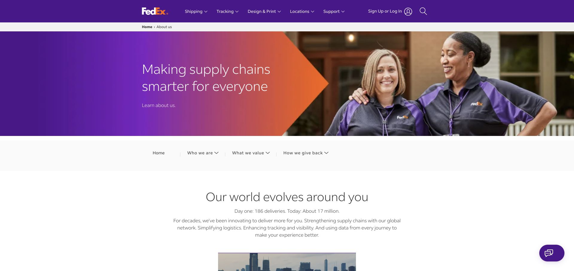
FedEx’s public About page combines a purple-to-orange brand shape with a photograph of employees, then introduces the organization in a spacious text section. Shipping, tracking, printing and support remain in the main header even though the content is corporate rather than transactional. A second navigation row separates organizational information into a few readable groups. The composition shows how a large service company can explain its purpose without disconnecting visitors from the practical tools that probably brought them to the brand.
What you can learn
Retain task continuity when someone moves between corporate content and operational applications. Okta’s FedEx case concerns workforce access across SaaS and on-premises applications. The photographed About page is a design reference, not evidence that the consumer website’s sign-in or every FedEx system uses the same configuration.
Pros
Employee photography makes a large logistics organization feel concrete rather than purely infrastructural.
The operational header remains useful even within a corporate-information section.
Cons & considerations
Two navigation levels require careful labeling to prevent apparently overlapping destinations.
A broad purpose statement cannot replace clear service scope and practical support information.
Visible tech stack
Earlier / documented evidence
Okta
Platform source: FedEx — official Okta association. FedEx workforce, SaaS and on-premises application identity; public About page is the visual reference. Official documentary association only. The named workload or listing is not proof that this public page runs on Okta, nor a complete or independently tested current stack. Platform evidence is separate from the direct website screenshot and is not a complete current infrastructure audit.
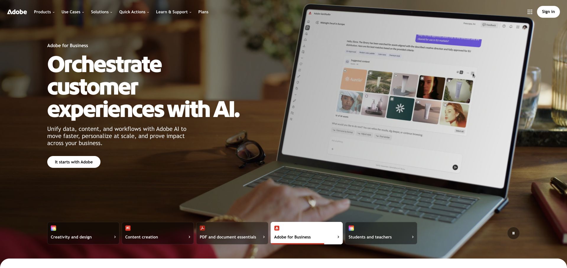
Adobe uses a large working-context photograph to introduce its business offering. White typography is placed over the darker area of the image, and a compact action appears directly beneath the explanation. A row of labeled campaign choices at the bottom of the hero makes the broader product family visible without requiring separate competing hero panels. The page balances a very large brand with a specific audience, while the top navigation retains routes to products, solutions, learning and plans.
What you can learn
Separate a public product entrance from workforce and enterprise-account responsibilities. Okta’s linked Adobe material is historical documentary evidence of identity use; it is not a fresh audit of Adobe’s current deployment. Preserve that distinction when borrowing the site’s audience-routing design.
Pros
A contextual product image makes the business proposition easier to visualize.
Labeled campaign choices acknowledge several audiences without turning the header into a product directory.
Cons & considerations
Text over photography needs continued contrast checks as campaign assets change.
A changing hero can make the principal proposition inconsistent between visits and captures.
Platform source: Adobe — official Okta association. Historically documented Adobe workforce and enterprise customer identity; no current whole-stack claim. Official documentary association only. The named workload or listing is not proof that this public page runs on Okta, nor a complete or independently tested current stack. Platform evidence is separate from the direct website screenshot and is not a complete current infrastructure audit.
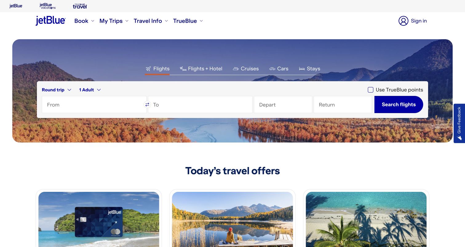
JetBlue frames a compact flight-search panel with a large destination photograph. The form stays readable on its white surface while the scenery supplies atmosphere around it. Booking, trip management, travel information and loyalty routes are visible in the header, giving returning passengers alternatives to a new search. Beneath the hero, offer cards continue the travel theme without forcing every visitor through a promotional sequence. It is a practical example of putting the trip task ahead of a general brand introduction.
What you can learn
Account and loyalty access should support the trip rather than become an unexplained obstacle before it. Okta documents customer and crewmember digital access at JetBlue. That scope does not establish the booking engine or every identity boundary behind the captured consumer page.
Pros
The white search panel stays distinct from the scenic background photograph.
Trip management and loyalty have recognizable routes alongside the new-booking entrance.
Cons & considerations
Several travel products can make the compact form harder to navigate on small screens.
Booking errors and unavailable itineraries need more explanation than a promotional hero provides.
Platform source: JetBlue — official Okta association. JetBlue customer and crewmember digital access. Official documentary association only. The named workload or listing is not proof that this public page runs on Okta, nor a complete or independently tested current stack. Platform evidence is separate from the direct website screenshot and is not a complete current infrastructure audit.
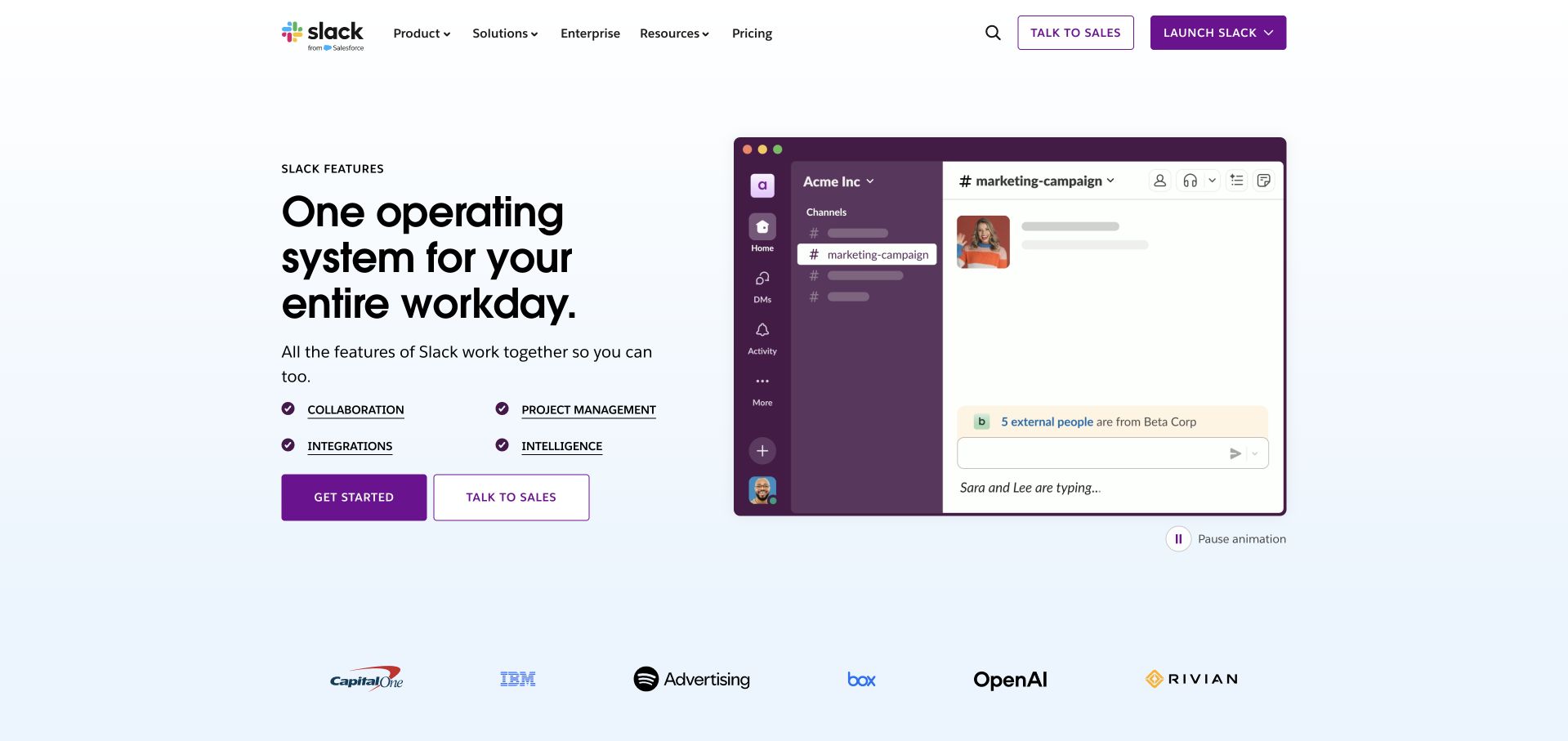
Slack’s public Features page places a clear product statement beside a recognizable workspace illustration. Four compact capability labels sit below the introduction, and two actions distinguish starting from speaking to sales. A pale blue ground and customer-logo row keep the page lighter than the dark purple interface demonstration. The screenshot is an intentional public marketing reference, not an account workspace. Its strength is that a visitor can understand the product category before exploring each individual capability.
What you can learn
Use product imagery to explain the experience, not to imply what an authenticated employee can access. Okta’s Slack case concerns workforce identity. The public features page neither exposes that internal workflow nor proves that player-style sign-in buttons and employee application access share an architecture.
Pros
The workspace illustration makes the product recognizable without needing a long feature inventory.
Capability labels give a useful intermediate layer between the headline and detailed product pages.
Cons & considerations
Multiple evaluation actions require clear distinctions for smaller organizations and existing customers.
Animated interface demonstrations need readable text alternatives and predictable motion controls.
Platform source: Slack Features — official Okta association. Slack workforce identity; public Features page is the design reference, not an audited workforce login. Official documentary association only. The named workload or listing is not proof that this public page runs on Okta, nor a complete or independently tested current stack. Platform evidence is separate from the direct website screenshot and is not a complete current infrastructure audit.
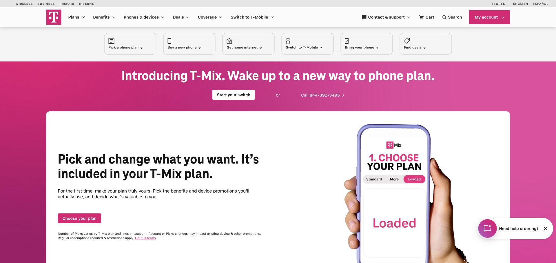
T-Mobile uses its distinctive magenta across the current plan campaign while a white header and task shortcuts keep practical choices separate. The opening screen pairs a phone image with a concise explanation of a configurable plan. Utility controls for account access and store or support tasks remain available above the campaign. The design demonstrates the value of a strong visual identity when the offer itself is complex: color creates recognition, while the layout must still explain what the visitor is selecting.
What you can learn
Design the offer and the account journey as related but distinct responsibilities. T-Mobile appears in Okta’s official 2022 press kit as a customer. That historical listing establishes an association only, not the current product, workforce configuration or authentication architecture of this captured retail page.
Pros
Consistent magenta gives a changing promotion immediate brand recognition.
Task shortcuts allow visitors to bypass the campaign for familiar account and shopping needs.
Cons & considerations
Configurable plans need transparent comparison details beyond the simple introductory statement.
Several promotional and utility layers can compress the first screen on mobile devices.
Platform source: T-Mobile — official Okta association. Historically named Okta customer in its 2022 official press kit; no current whole-stack claim. Official documentary association only. The named workload or listing is not proof that this public page runs on Okta, nor a complete or independently tested current stack. Platform evidence is separate from the direct website screenshot and is not a complete current infrastructure audit.
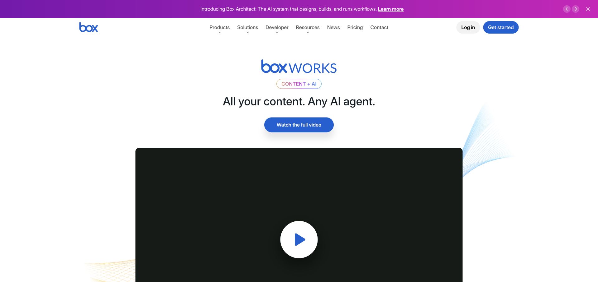
Box uses a narrow magenta announcement strip above a white navigation and a centered event-led introduction. The product brand remains prominent, but the large video surface and short headline give the current campaign the main visual space. Product, solution, developer and resource routes stay available in the header. This arrangement is worth studying for a mature platform that needs to promote a moment in time without rebuilding the permanent information architecture or confusing the campaign with the application itself.
What you can learn
Keep event registration, product evaluation and employee access distinct in both language and permissions. Okta’s Box case describes identity governance and workforce access. It does not mean the video campaign, the customer file-sharing product and Box’s internal employee applications have one undifferentiated identity model.
Pros
The announcement strip gives temporary news a recognizable place outside the main navigation.
A centered composition makes the current campaign easy to identify without losing product routes.
Cons & considerations
A large video panel needs an explanatory fallback when playback is unavailable.
An event headline alone may not help a first-time visitor understand the underlying product.
Platform source: Box — official Okta association. Box identity governance and workforce access. Official documentary association only. The named workload or listing is not proof that this public page runs on Okta, nor a complete or independently tested current stack. Platform evidence is separate from the direct website screenshot and is not a complete current infrastructure audit.
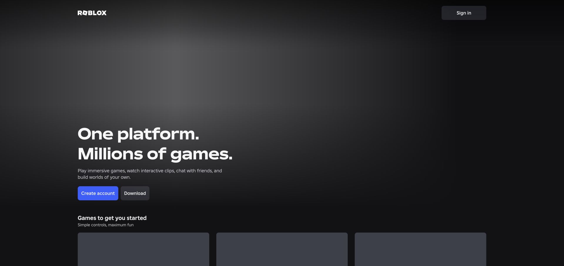
Roblox’s captured public landing page uses a dark background, a concise product statement and two immediately recognizable actions: create an account and download. The brand mark and sign-in control occupy opposite ends of a restrained header. The lack of a dense corporate menu keeps attention on the platform’s consumer entrance. Lower content begins introducing games rather than explaining internal business systems, making the page’s intended audience clear even though the company behind it has a much broader operational environment.
What you can learn
Do not confuse the audience pictured on a public landing page with the audience in an enterprise identity story. Okta’s Roblox case concerns employees receiving application access on their first day, not player registration. That distinction is essential when interpreting the visible account controls.
Pros
The short introduction makes the product’s general purpose understandable with little navigation overhead.
Separate account and download controls express different next steps without a complex decision tree.
Cons & considerations
A minimal first screen leaves safety, parental and creator information to secondary routes.
Dark media-led openings need useful fallbacks when promotional assets are slow or unavailable.
Visible tech stack
Earlier / documented evidence
Okta
Platform source: Roblox — official Okta association. Roblox workforce day-one application access, not player sign-in. Official documentary association only. The named workload or listing is not proof that this public page runs on Okta, nor a complete or independently tested current stack. Platform evidence is separate from the direct website screenshot and is not a complete current infrastructure audit.
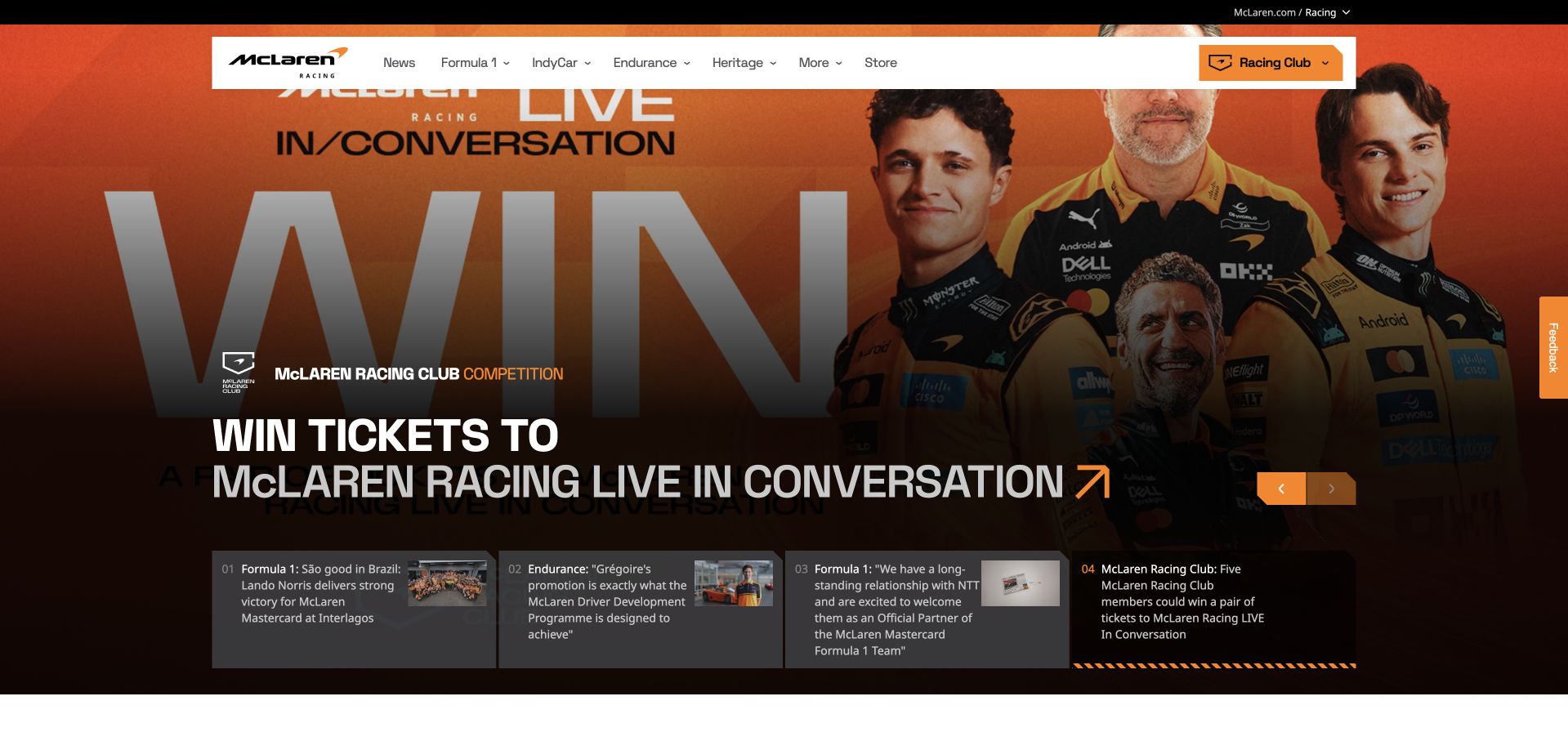
McLaren Racing uses dramatic photography, oversized headlines and a floating white navigation to create an editorial sports entrance. The orange Racing Club control remains a recognizable destination while story cards below the current feature offer other routes into the content. In the captured state, a fan competition makes membership tangible. The page works as a public brand experience because it combines enthusiasm with a visible set of choices rather than reducing the entire first screen to an unlabelled promotional image.
What you can learn
Keep the organizational identity story separate from the fan-facing design. Okta’s McLaren case concerns workforce access; Auth0 separately documents Racing Club membership. A public Racing Club button is not proof that those two populations share an account, a policy or an application boundary.
Pros
The floating white header remains legible against changing racing photography.
Visible story choices let readers move beyond the current campaign without using the full menu.
Cons & considerations
Large campaign typography can obscure useful photographic context on narrow displays.
Rotating features need predictable keyboard controls and a readable nonanimated alternative.
Platform source: McLaren Racing — official Okta association. McLaren workforce identity; keep distinct from Auth0 Racing Club use. Official documentary association only. The named workload or listing is not proof that this public page runs on Okta, nor a complete or independently tested current stack. Platform evidence is separate from the direct website screenshot and is not a complete current infrastructure audit.
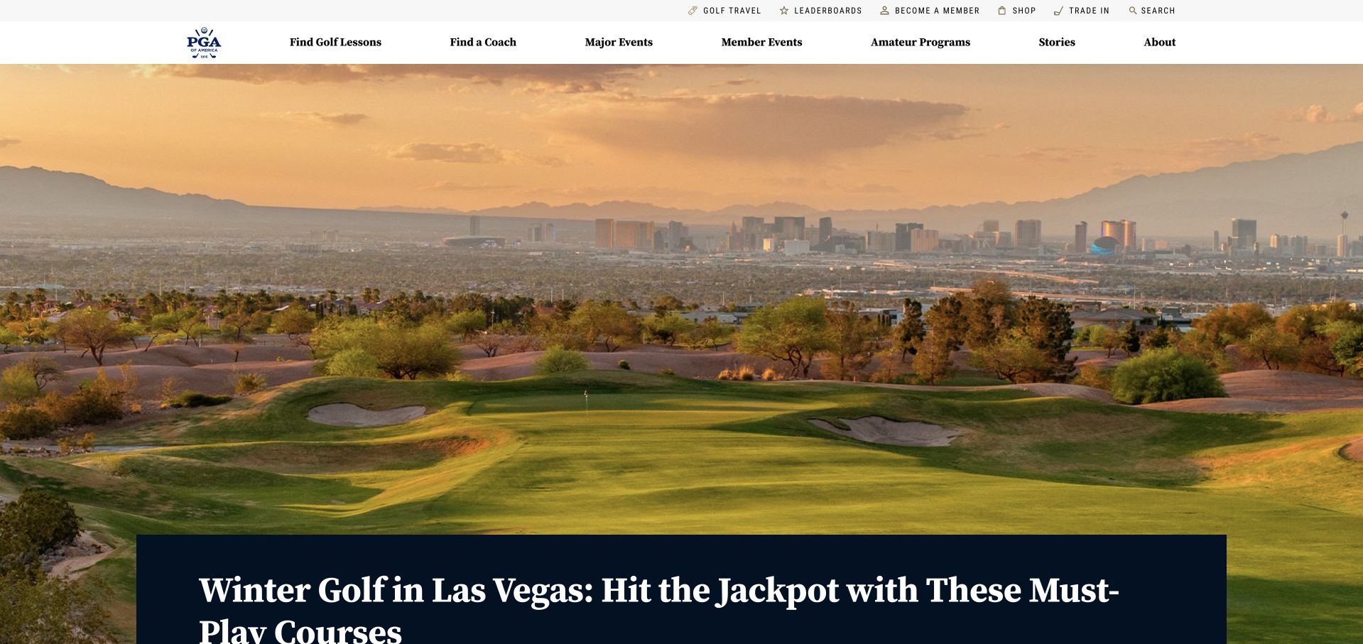
PGA of America leads with a broad golf landscape and a dark editorial headline panel. A slim utility bar carries organizational tasks, while the main navigation names lessons, coaching, events and stories. That separation allows a general golf visitor to find an approachable route without erasing professional or member needs. The large photograph gives the page a sense of place, but the navigation is what makes the institution’s different services understandable rather than treating every visitor as a prospective member.
What you can learn
Name the organization precisely and map access to the relevant service. Okta’s case concerns PGA of America identity modernization, not every golf association or tournament brand. The captured public content is an editorial reference, not evidence that all member and public services share one implementation.
Pros
Task-based navigation explains different ways to participate before a visitor opens a menu.
The landscape photograph gives an editorial story a concrete destination and mood.
Cons & considerations
A very large scenic hero delays access to practical event or membership details.
Similar golf organizations and acronyms require careful labeling to avoid identity confusion.
Visible tech stack
Earlier / documented evidence
Okta
Platform source: PGA of America — official Okta association. PGA of America identity modernization, not every professional golf organization. Official documentary association only. The named workload or listing is not proof that this public page runs on Okta, nor a complete or independently tested current stack. Platform evidence is separate from the direct website screenshot and is not a complete current infrastructure audit.
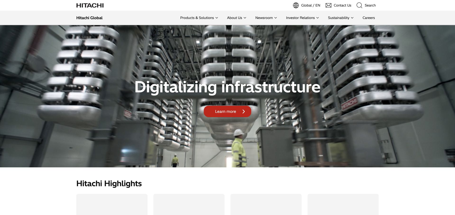
Hitachi places its wordmark and a restrained white navigation above a full-width infrastructure photograph. A large, plain headline sits over the industrial scene, with a small red action providing the primary contrast. The composition makes a broad digitalization message concrete through recognizable equipment rather than a generic cloud illustration. An initial highlights section begins below the campaign, giving the page an editorial continuation. It is a useful reference for explaining a large technical organization without placing its entire product taxonomy in the hero.
What you can learn
A corporate campaign can provide context, but access decisions need named applications and populations. Okta’s Hitachi case supports an identity-management association. It is not evidence of the pictured homepage’s frontend, every group subsidiary or the operating systems shown in the photograph.
Pros
A real infrastructure photograph gives an abstract transformation message a tangible subject.
The red action remains distinguishable within an otherwise restrained corporate palette.
Cons & considerations
Broad campaign language needs specific solution explanations before a buyer can evaluate relevance.
An extensive corporate menu should retain straightforward paths for existing users and support tasks.
Platform source: Hitachi — official Okta association. Hitachi identity and access management. Official documentary association only. The named workload or listing is not proof that this public page runs on Okta, nor a complete or independently tested current stack. Platform evidence is separate from the direct website screenshot and is not a complete current infrastructure audit.
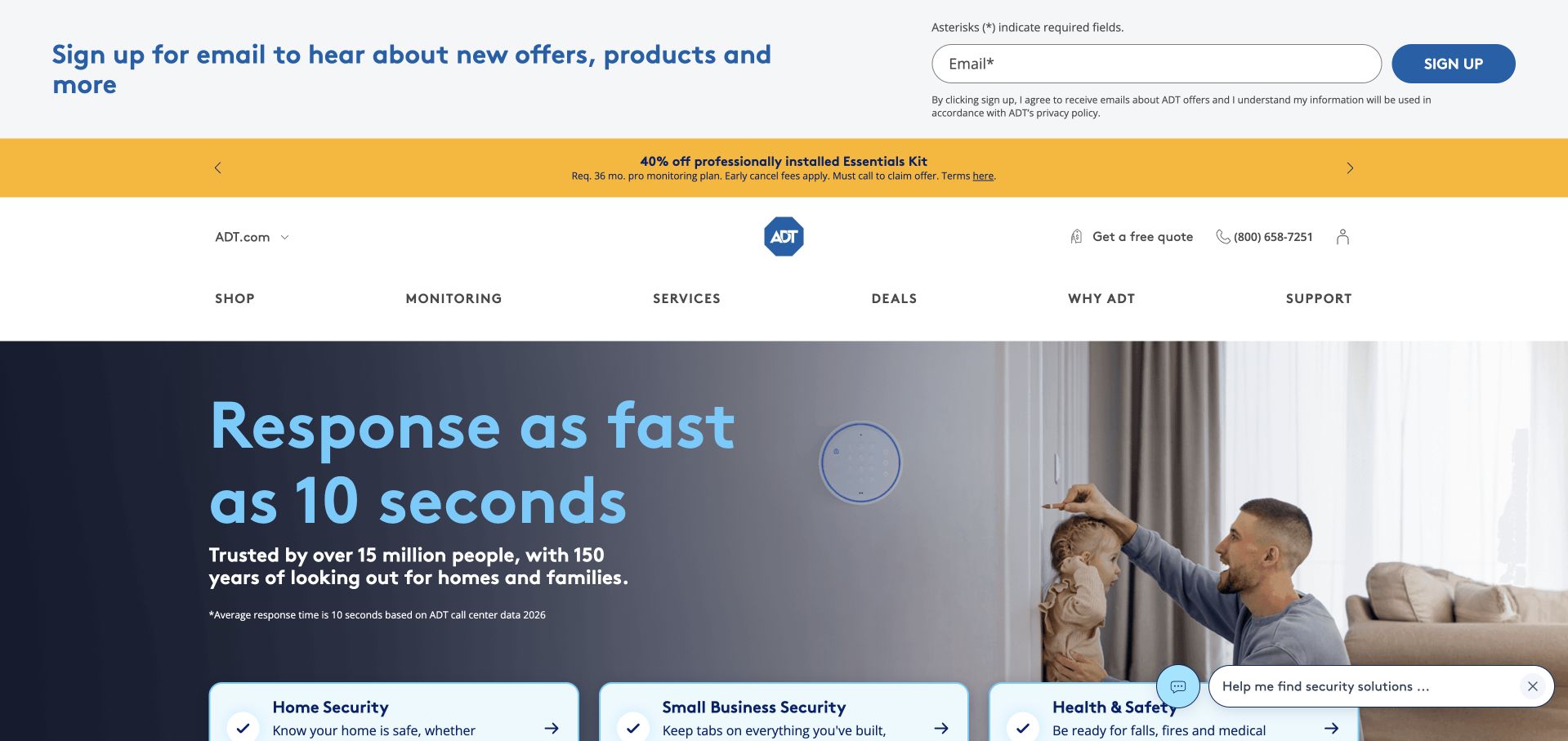
ADT uses a home scene and a prominently displayed response-related claim to introduce its offering. The blue headline is paired with a photograph of a person interacting with equipment in an ordinary living space. Shopping, monitoring, services and support occupy a separate navigation row, while category cards begin below the hero. The design makes the household context immediately recognizable, though several promotional and email-signup bands compete with that clarity near the top of the captured page.
What you can learn
Keep the public consumer promise separate from employee access controls and avoid turning vendor statements into independent guarantees. Okta’s ADT case concerns protecting workforce identities. It does not validate alarm response, product effectiveness, service availability or the identity architecture of every customer-facing ADT application.
Pros
The household photograph makes the product’s everyday context immediately understandable.
Support and monitoring are named separately from the shopping entrance in the main navigation.
Cons & considerations
Promotional bars and newsletter signup consume space before the primary service explanation.
Time-based service claims need nearby definitions, conditions and current supporting information.
Platform source: ADT — official Okta association. ADT workforce identity threat protection. Official documentary association only. The named workload or listing is not proof that this public page runs on Okta, nor a complete or independently tested current stack. Platform evidence is separate from the direct website screenshot and is not a complete current infrastructure audit.
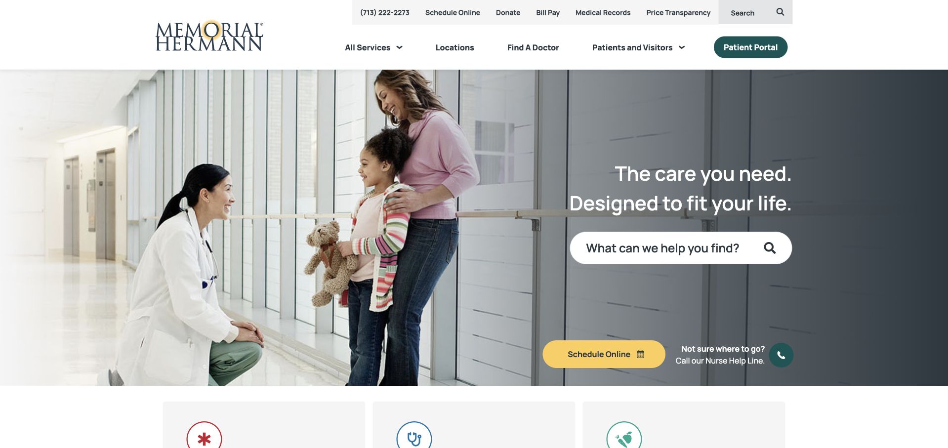
Memorial Hermann pairs a family-and-clinician photograph with a dark panel containing a concise care statement and a prominent search field. Scheduling and patient-portal routes remain visible, with practical utility information above the main navigation. The image communicates the setting, but the page’s real strength is its attention to tasks: finding care, locating services and accessing an existing relationship. The layout does not assume every visitor is ready to book the same appointment or learn about the organization first.
What you can learn
Public patient tasks and internal staff access are different systems of responsibility. Okta’s case concerns workforce identity supporting Memorial Hermann operations. The screenshot does not demonstrate clinical effectiveness, patient-record access rules, privacy compliance or the implementation of the public patient portal.
Pros
Search is prominent enough to function as a primary route rather than a utility afterthought.
Scheduling and existing-patient tasks remain distinct within the public information architecture.
Cons & considerations
A broad search needs understandable result categories to avoid mixing providers, locations and advice.
Multiple care routes require accessible labels and careful mobile prioritization under stressful circumstances.
Platform source: Memorial Hermann — official Okta association. Memorial Hermann workforce identity supporting healthcare operations. Official documentary association only. The named workload or listing is not proof that this public page runs on Okta, nor a complete or independently tested current stack. Platform evidence is separate from the direct website screenshot and is not a complete current infrastructure audit.
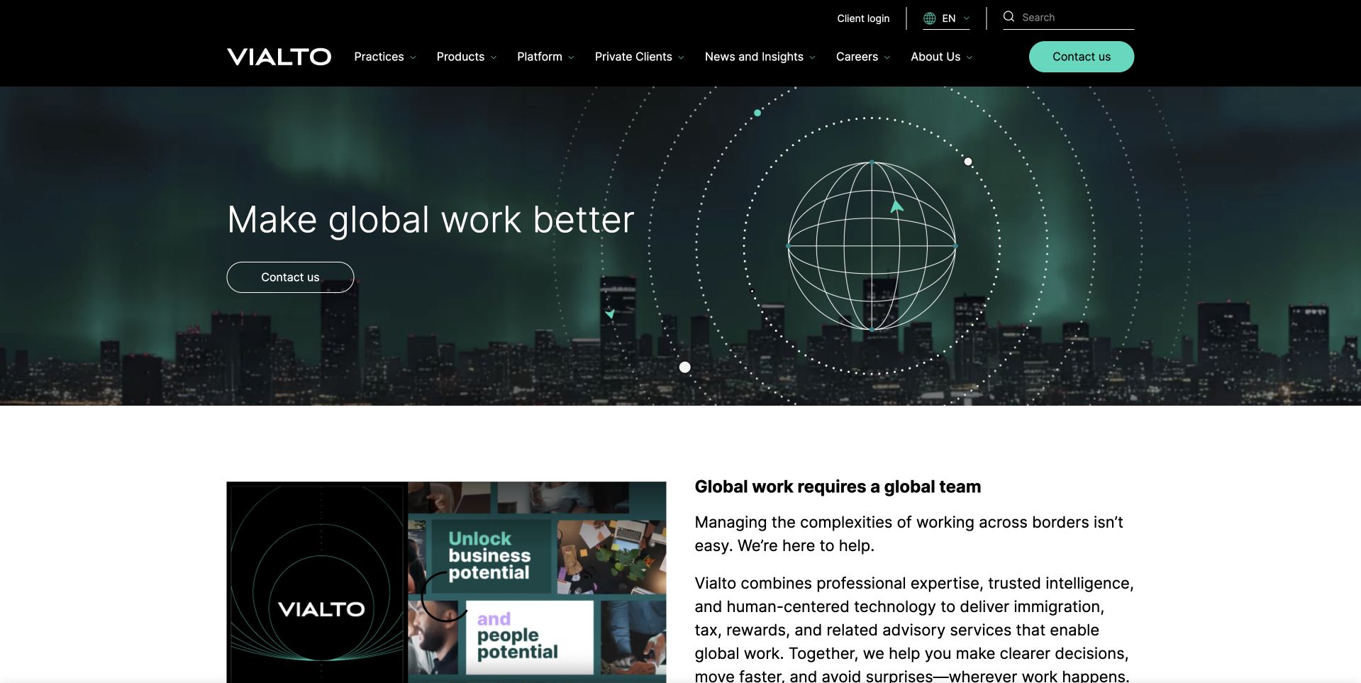
Vialto Partners combines a dark city panorama, a restrained globe motif and a short introduction to global work. The top navigation names practices, products, clients and insights, while a mint contact control supplies the primary visual contrast. A white explanatory section follows promptly, pairing a small editorial image with more specific text. The transition is useful: an atmospheric first impression is allowed, but it does not occupy the entire page before the service begins explaining what it actually does.
What you can learn
Use the public hierarchy to clarify services, then document workforce access and governance separately. Okta’s Vialto case concerns identity governance and access controls. It does not establish legal compliance, the suitability of professional advice or the full technology estate behind this marketing page.
Pros
The mint action remains clear against the darker corporate image and navigation.
A detailed white section follows the campaign quickly instead of extending the atmospheric treatment indefinitely.
Cons & considerations
A global-work headline needs specific practice descriptions to establish relevance for an individual visitor.
Dark city imagery can become generic unless the supporting service content remains concrete.
Platform source: Vialto Partners — official Okta association. Vialto identity governance and access controls. Official documentary association only. The named workload or listing is not proof that this public page runs on Okta, nor a complete or independently tested current stack. Platform evidence is separate from the direct website screenshot and is not a complete current infrastructure audit.
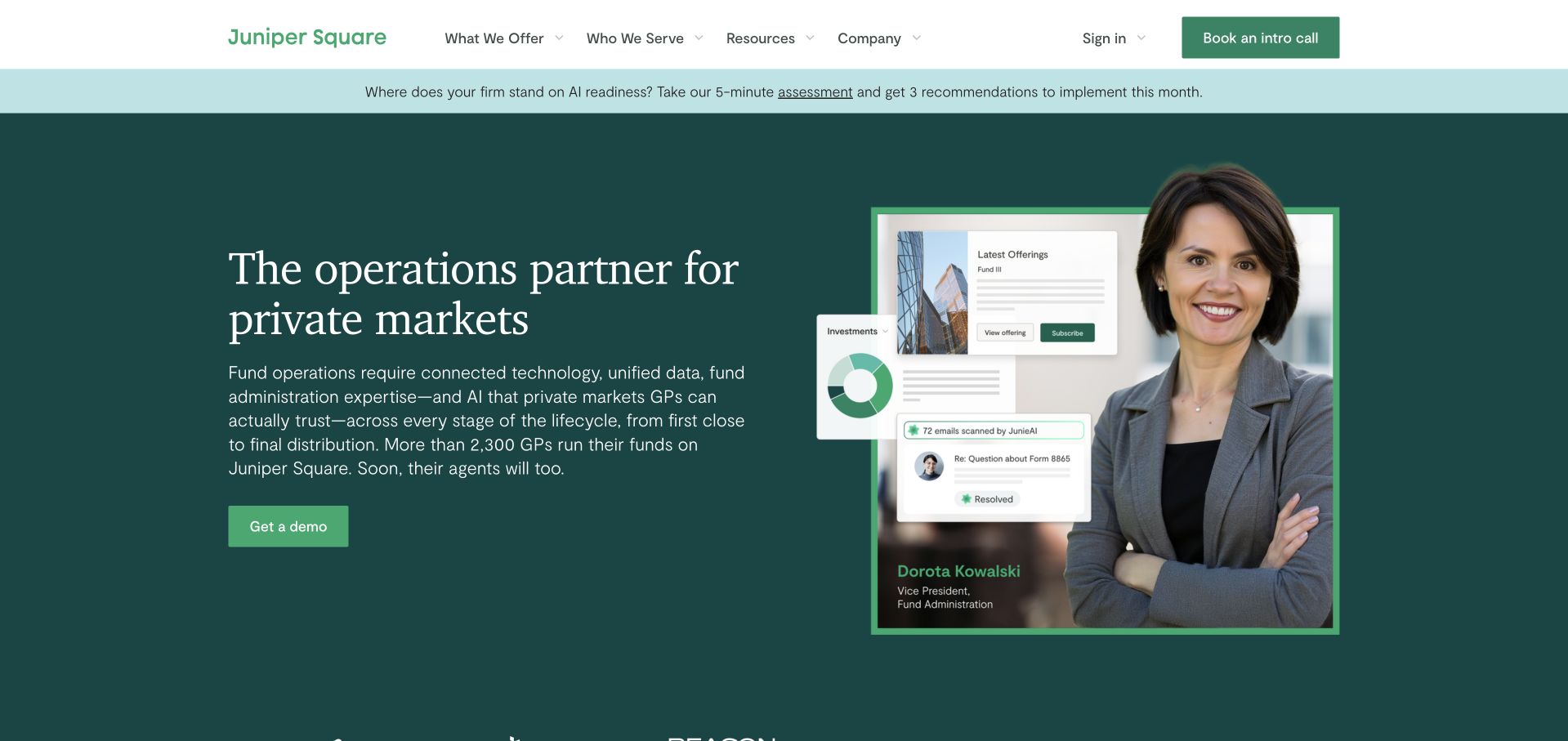
Juniper Square uses a deep green hero, a serif headline and a portrait layered with compact application cards. The combination suggests a relationship between people, investment operations and software without presenting an overwhelming dashboard. A contrasting demo control is placed beneath the explanation, while the header separates offerings, audiences, resources and company information. A slim announcement strip provides a home for current news without displacing the permanent navigation. The visual hierarchy makes an intricate B2B proposition feel more approachable.
What you can learn
Treat the platform’s public explanation and its internal governance needs as separate design questions. Okta documents continuous identity governance at Juniper Square. That story is not a financial endorsement, an audit of customer data permissions or proof of this public homepage’s underlying application stack.
Pros
The portrait anchors abstract operational language in a recognizable human context.
Application fragments introduce the product without requiring visitors to read a full dashboard immediately.
Cons & considerations
Layered cards may become too small to explain meaningful product behavior on mobile devices.
Broad private-markets language still needs precise explanations of supported users and workflows.
Platform source: Juniper Square — official Okta association. Juniper Square continuous identity governance. Official documentary association only. The named workload or listing is not proof that this public page runs on Okta, nor a complete or independently tested current stack. Platform evidence is separate from the direct website screenshot and is not a complete current infrastructure audit.
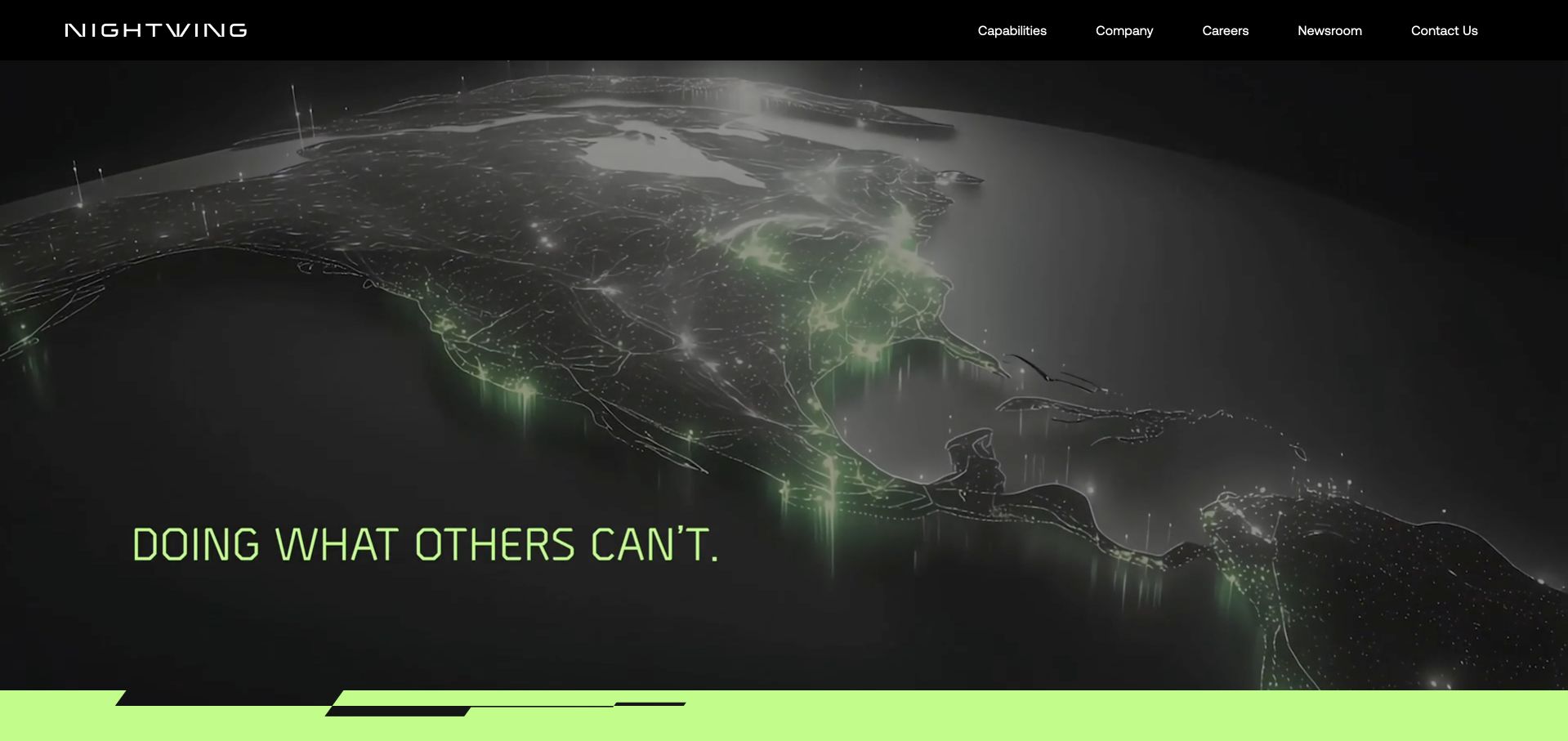
Nightwing uses a dark view of the globe with illuminated connections and a short lime-accented statement. The black header contains a small number of plain navigation choices, giving the opening a deliberate, cinematic character. The restrained layout creates strong recognition, but it also makes the supporting capability pages important: the first screen communicates attitude and scale more than a detailed service definition. This is worth studying as a brand entrance, not as a complete template for an application interface.
What you can learn
Do not let a high-assurance visual style substitute for documented access boundaries. Okta’s Nightwing case concerns workforce identity in a federal-standards context. That source is not an independent certification of every service, a security guarantee or evidence about the photographed marketing page’s complete implementation.
Pros
A tightly limited navigation makes the corporate entry point easy to scan.
The dark-and-lime treatment creates a distinctive visual identity without a crowded set of actions.
Cons & considerations
The opening statement is too broad to explain specific capabilities without further content.
A large dark animation needs accessible alternatives and should not delay practical navigation.
Platform source: Nightwing — official Okta association. Nightwing workforce identity and federal security standards workflow. Official documentary association only. The named workload or listing is not proof that this public page runs on Okta, nor a complete or independently tested current stack. Platform evidence is separate from the direct website screenshot and is not a complete current infrastructure audit.
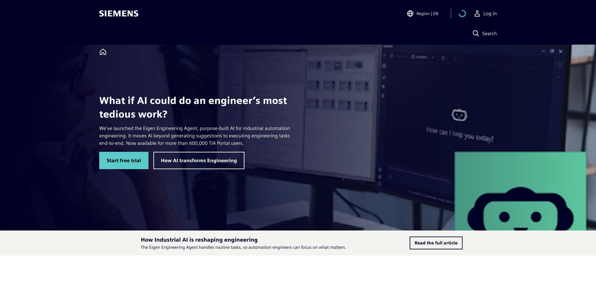
Siemens gives a large corporate portfolio a focused opening through a dark canvas, a bright accent and one dominant campaign. The header stays relatively restrained, allowing the visual and headline to carry the introduction rather than exposing an enormous category tree. It is a useful model for separating a public front door from many downstream services. The limitation is equally useful: the page’s broad appeal does not tell a visitor which account or organization they will need when they enter a particular product.
What you can learn
Name identity relationships according to their actual evidence. Siemens appears in Okta’s official 2022 customer listing, which does not identify a current application or product. Auth0’s separate Siemens ID story should not silently be substituted for that historical Okta evidence.
Pros
A focused campaign gives an extensive corporate group a readable first impression.
Bright accent color creates hierarchy without adding several competing promotional controls.
Cons & considerations
A shared brand can conceal important differences among downstream application access requirements.
Historical customer-list evidence should never be presented as a fresh production-stack audit.
Platform source: Siemens — official Okta association. Historically named Okta customer in its 2022 official press kit; product and application scope not independently identified by that listing. Official documentary association only. The named workload or listing is not proof that this public page runs on Okta, nor a complete or independently tested current stack. Platform evidence is separate from the direct website screenshot and is not a complete current infrastructure audit.
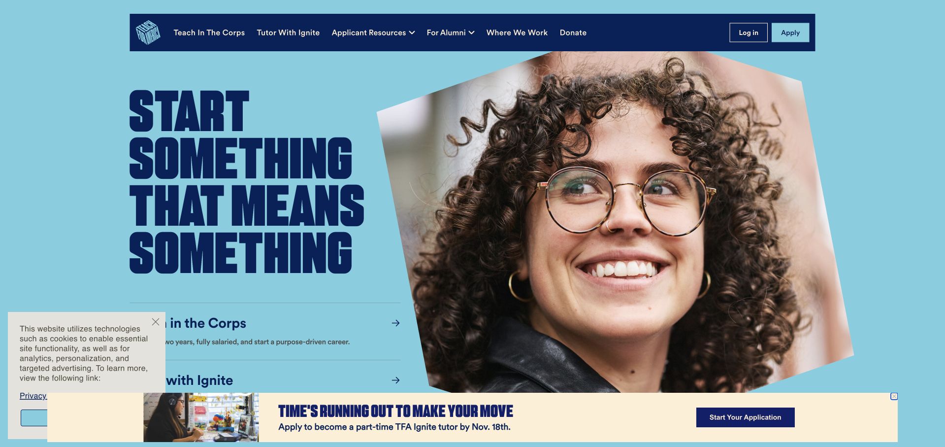
Teach For America uses a bright blue ground, an oversized condensed headline and a close portrait to make its recruitment message immediate. Two prominent program routes offer a more specific choice beneath the introductory statement. Existing-participant and alumni destinations remain in the dark navigation rather than being folded into the recruitment action. The composition demonstrates how a mission-led organization can lead with emotion while still acknowledging that not everyone arriving at the site is a prospective applicant beginning at the same stage.
What you can learn
Keep applicant, participant, alumni and employee access understandable as separate roles. Teach For America is named in Okta’s official 2022 customer press kit. That historical association does not reveal the current application, product configuration or identity architecture behind this captured public recruitment page.
Pros
The portrait and strong headline establish a clear recruitment-oriented first impression.
Program choices provide more direction than a single generic participation button would.
Cons & considerations
Sticky application promotions can compete with the permanent recruitment and participant routes.
Large display typography needs careful wrapping and comfortable reading order on narrow screens.
Platform source: Teach For America — official Okta association. Historically named Okta customer in its 2022 official press kit; no current whole-stack claim. Official documentary association only. The named workload or listing is not proof that this public page runs on Okta, nor a complete or independently tested current stack. Platform evidence is separate from the direct website screenshot and is not a complete current infrastructure audit.
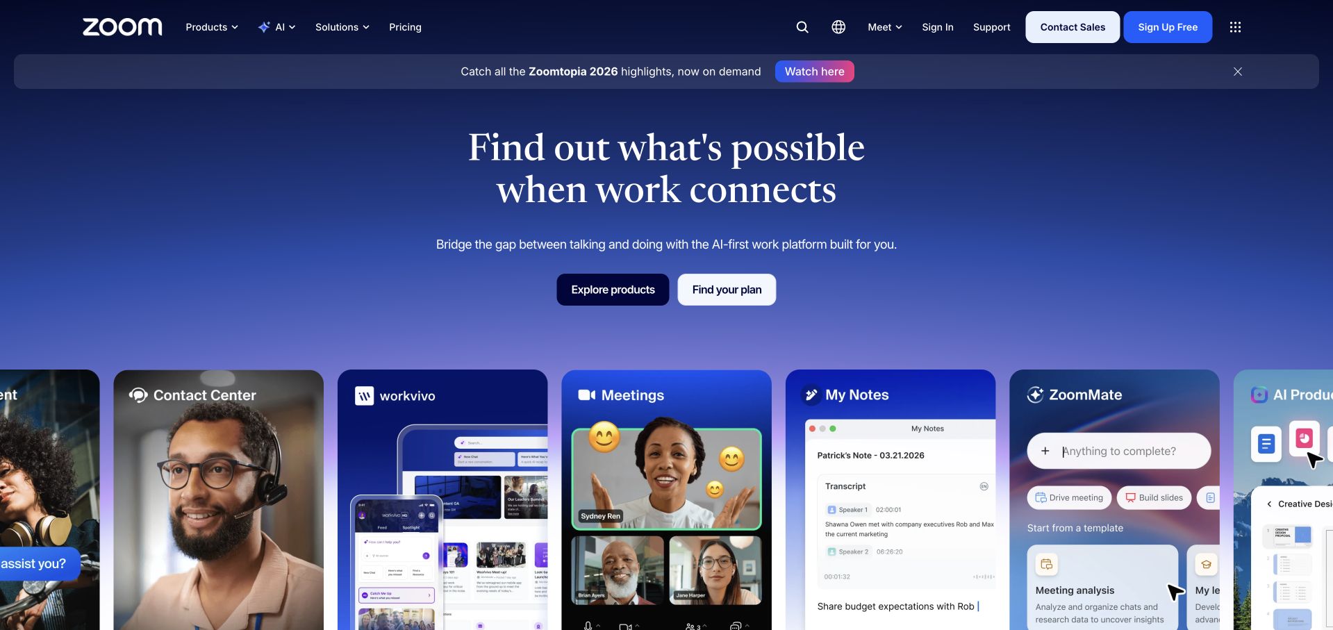
Zoom uses a blue-gradient hero with a centered proposition and a row of large product-oriented interface cards. The white navigation distinguishes products, solutions, resources and pricing, while contact and signup actions remain visible at the right. The cards make a broad collaboration ecosystem more tangible than the headline alone. They also create a practical comparison point: a platform homepage can show several experiences without assuming that every product, visitor type or account relationship should be treated as one undifferentiated journey.
What you can learn
Separate product discovery, customer accounts and internal workforce access in the architecture brief. Okta’s Zoom case documents workforce identity and application access. It is not proof that Zoom customer authentication or every consumer-facing product uses that same configuration, despite sharing the public company brand.
Pros
Large interface cards make the product family more concrete than a purely abstract illustration.
Pricing and evaluation controls retain a stable place above the campaign.
Cons & considerations
A broad ecosystem message may need faster shortcuts for visitors seeking one specific product.
A horizontally arranged card set requires an equally understandable keyboard and mobile experience.
Platform source: Zoom — official Okta association. Zoom workforce identity and application access. Official documentary association only. The named workload or listing is not proof that this public page runs on Okta, nor a complete or independently tested current stack. Platform evidence is separate from the direct website screenshot and is not a complete current infrastructure audit.
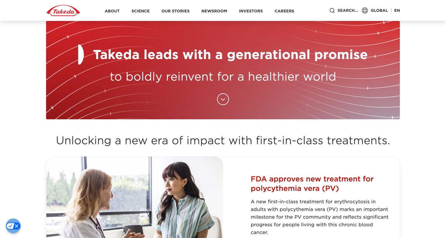
Takeda begins with a red, wave-patterned mission panel, then moves promptly into a white section introducing a specific science-related story. The header names science, organizational stories, news, investors and careers rather than making one generic contact route do all the work. The visual transition matters: a broad corporate promise is followed by content that gives visitors a more concrete subject to explore. The page is a useful reference for an institution balancing public explanation, specialist information and corporate responsibilities.
What you can learn
Keep those public information needs distinct from workforce identity. Takeda is historically named in Okta’s 2022 press kit; the listing does not identify a current product deployment. Neither it nor the screenshot evaluates medical outcomes, research quality or access to any particular clinical system.
Pros
The red institutional panel has a recognizable identity without an elaborate visual effect.
A concrete editorial story follows the broad mission rather than leaving it unsupported visually.
Cons & considerations
Mission language can feel abstract until visitors reach a specific topic or program.
Life-sciences navigation needs clear boundaries between general corporate information and audience-specific materials.
Platform source: Takeda — official Okta association. Historically named Okta customer in its 2022 official press kit; no fresh deployment claim. Official documentary association only. The named workload or listing is not proof that this public page runs on Okta, nor a complete or independently tested current stack. Platform evidence is separate from the direct website screenshot and is not a complete current infrastructure audit.
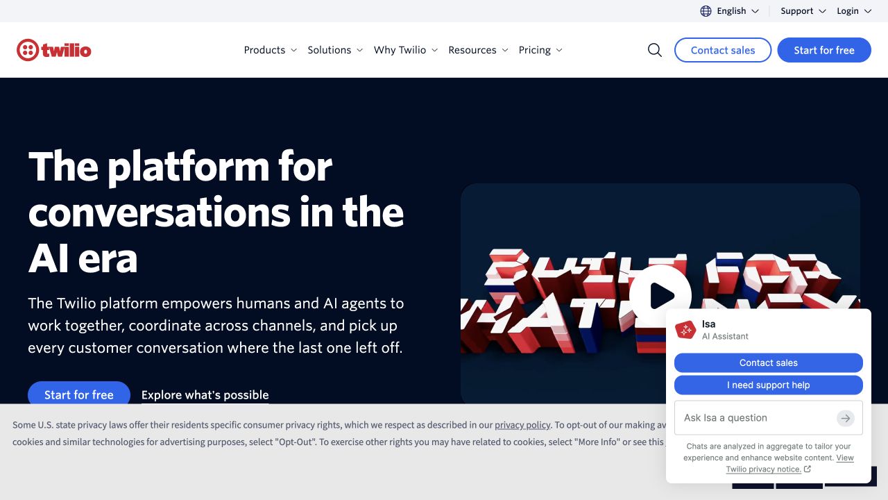
Twilio uses a dark navy hero, a large conversational-platform message and a vivid red dimensional illustration. The white header carries products, solutions, resources and pricing, with separate sales and self-service actions. The composition gives a broad API portfolio a recognizable brand entrance without attempting to list every service in the main headline. A compact privacy notice and assistant panel also show a tradeoff worth noticing: useful support controls can begin to compete with the initial product explanation when both are visible.
What you can learn
Distinguish the platform being sold from the workforce systems used to run its business. Twilio appears in Okta’s official 2022 press kit. That historical customer listing is not a current audit of Twilio account authentication, product infrastructure or the complete stack of this public page.
Pros
The navy-and-red pairing creates strong recognition around a complex software portfolio.
Separate sales and self-service actions accommodate different evaluation preferences.
Cons & considerations
A broad platform claim needs specific service explanations before implementation decisions can be made.
Overlapping assistant and privacy controls can reduce the usable introductory space.
Platform source: Twilio — official Okta association. Historically named Okta customer in its 2022 official press kit; no fresh deployment claim. Official documentary association only. The named workload or listing is not proof that this public page runs on Okta, nor a complete or independently tested current stack. Platform evidence is separate from the direct website screenshot and is not a complete current infrastructure audit.
Kegan has 15+ years of experience working with small businesses, Fortune 500 companies, and everything in between. No development job is too big or too small: he brings the same hands-on attention to a focused improvement, a complete website, or a custom application.
For Okta projects, he can help with content architecture, custom functionality, system integrations, testing, and maintainable handover. He works directly with clients on scope, design, implementation, testing, and handover, with an emphasis on clear communication and a system that remains practical to maintain after launch.
Show 3 other Okta developersHide other Okta developers
Choose the access problem you are actually solving
Workforce application access
Inventory the applications used for a representative role and the business owner who can approve each one. Include joining, changing teams and leaving. The useful outcome is an understandable access lifecycle, not merely a visually consistent login page or an impressive count of integrations.
Customer and partner product access
Define the product’s users and organization boundaries separately from workforce policy. JetBlue’s mixed audience and McLaren’s distinct fan and workforce cases show why a single company name is not a sufficient specification. Name the actual product and permitted task before selecting an implementation.
Federated access between systems
Document the parties, protocol, attributes and responsibility for account changes. Test what a user sees when a provider is unavailable or an expected association is missing. Existing identities should not be merged or granted access merely because their display names look similar.
Plan changes in access as carefully as first login
Build an application and ownership inventory
Record the application, audience, service owner, approval path and recovery contact. Identify duplicate-looking names that actually represent different environments or organizations. This inventory is also an information-design tool: it reveals where the website or portal needs clearer labels before anyone changes a sign-in integration.
Test membership changes in a controlled environment
Rehearse a person joining, moving roles and losing an entitlement using nonproduction identities and representative applications. Verify the intended result in the application, not only the identity dashboard. Include the support explanation for a person who signs in successfully but cannot access the task they expected.
Make operational support part of the handover
Assign responsibility for connection changes, policy review and incident escalation. Give maintainers a readable map of providers and applications. A handover should demonstrate a normal administrative change and its reversal, with the relevant business owner involved, rather than presenting only the successful login path.
A useful handover demonstration
Ask the actual team to carry out its routine job: publish a realistic update, correct a mistake, preview a narrow screen, and identify who owns an integration failure. For a library or frontend framework, also ask who maintains the content source and deployment. A polished screenshot does not answer those operational questions.
Beyond the screenshot
An Okta access-planning checklist
Name every relevant user population.
Identify the exact applications and environments.
Record the business owner for each access decision.
Separate workforce and customer responsibilities.
Choose the documented protocol and deployment model.
Define provider and account-linking boundaries.
Map joining, role changes and departure.
Test the application result, not only the redirect.
Explain successful login with insufficient access.
Document provider failure and recovery routes.
Demonstrate a controlled change and reversal.
Preserve the dates and limits of technical evidence.
Test with real content, a keyboard, a small screen, slow or failed requests, and the people who will maintain the system. These are planning checks, not an accessibility, security, performance, or search-ranking certification.
Sources & editorial method
How this Okta collection was reviewed
Twenty distinct public website properties were independently reviewed for this Okta collection. Direct public-browser captures were visually inspected; reused exact-page captures retain their original image paths, dates and provenance. Fresh captures were made November 9 UTC during November 8, 2026 Pacific research. A null capturedAt means the original day, but not a precise time, is known; no timestamp was invented. Official primary customer cases, engineering sessions, documentation and explicitly identified directory listings establish only the named workload or association. Historical material stays historical. Public screenshot appearance is not proof of the pictured page’s complete stack or current backend. These are original design observations, not measured rankings or endorsements of financial, clinical, security, accessibility, performance or AI outcomes. No private application workflows, signups, forms, purchases or account changes were used. Website owners retain their images and trademarks. The sole publisher performs a separate bounded public-stack audit before publication without replacing earlier observations.
Every image is an unmodified capture from the actual website, with its source and capture date. Some captures are reused from our shared catalog; their dates remain the original capture dates. None comes from a vendor gallery or a generated reconstruction. Moving imagery and live content can change.
Technology attribution uses public page assets or metadata, official platform documentation, or a cited first-party project case study. Documentary and framework-relationship evidence is identified where used; it is not a complete current backend inventory. A CMS image CDN alone does not establish a full CMS deployment. A library’s presence does not prove which individual controls use it, and a platform label does not establish AI authorship.
The composition notes, lessons, pros and tradeoffs are original editorial observations. We have not measured conversion, traffic, security, performance or accessibility conformance. Website owners retain their brands and imagery; these examples are not our client portfolio. Written, Edited and Curated are independent records, not dates advanced by a build. See our editorial standards or suggest a correction.
Questions worth asking
Okta website development FAQs
Does Okta on a customer list prove the public homepage uses it?
No. The organization may use Okta for internal applications, a named customer product or another specific workload. The public screenshot is a design reference; the official source establishes only the documented relationship.
Is workforce identity the same as customer identity?
No. They can involve different populations, approval processes, support expectations and application boundaries. This collection preserves those distinctions, including cases where a company has separately documented Okta and Auth0 relationships.
Are OAuth and OpenID Connect interchangeable labels?
No. They are related standards with different responsibilities. Okta’s overview distinguishes delegated access from user authentication. The implementation team should select the documented flow and model for the actual application rather than choosing by visual preference.
Should all users see the same sign-in choices?
Not automatically. The useful choices depend on the application and expected identity relationship. Explain the intended audience and recovery path; a long list of providers is not inherently a clearer experience.
Why keep older technical evidence in a current design guide?
It can provide useful organizational context if its date and limits remain explicit. A current capture does not make a historical customer association current, and this guide does not present it as a fresh production audit.
Use these public examples to clarify audiences and navigation. Then create an access brief that names the people, applications, owners and lifecycle changes involved instead of copying the identity architecture of a large customer by association.