Definitive guide · Customer.io website development
Best Customer.io Websites of 2026 (20 Real-World Examples)
Twenty public websites with documented Customer.io messaging relationships, original design reviews and practical lifecycle planning.
A useful Customer.io reference connects a clear website task with a relevant next message. Study the visible entry points here alongside the documented customer journeys, keeping presentation, product behavior and messaging infrastructure distinct.
This collection covers workspace software, commerce, learning, visitor attractions and other public services. Each example has an official Customer.io case explaining a customer-facing communication role. These sources support that stated relationship; they do not establish that Customer.io builds the pictured website.
The opening screenshots were inspected on November 11, 2026. Some customer cases describe earlier implementations, and a service may have changed since publication. The reviews separate what is visible now from the documented messaging context, with regional and localized properties identified where relevant.
Before the examples
What makes good Customer.io website development in 2026?
Begin with the next useful customer action
Name the task that brought someone to the website: finding a rental, choosing a lesson, finishing a design or joining a workspace. Then write the smallest helpful next step. A welcome sequence becomes easier to evaluate when it supports that action instead of announcing every feature at once.
Give events clear meanings and owners
Customer.io accepts activity events that can drive customer journeys. In a project brief, define each event, the system responsible for it and the difference between a click, a saved change and a completed transaction. Specify how duplicate or delayed events should be handled before connecting them to messages.
Customer.io segments group people using shared attributes or behavior. Start with distinctions that affect usefulness: guest versus property owner, creator versus producer, or learner versus account administrator. Document why each group exists and how someone leaves it rather than collecting attributes with no communication purpose.
Compare the promise made in each opening with the particular customer journey described by its source. A photographed product, account button or search field provides design context; it is not a detector for the messaging service behind the business.
We start with five recognizable brands or organizations: Notion, Buffer, Georgia Aquarium, GNC Mexico, StuDocu. Each attribution applies to the named website property, not every product or website belonging to its organization. This is a curated reading sequence, not a measured ranking.
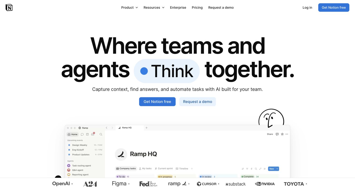
Notion gives its broad workspace offer one large, central statement, with a blue highlight separating the changing action from the surrounding black typography. Free signup and a sales conversation sit together beneath the explanation, while the product interface begins lower down. The composition makes a complex product approachable before asking visitors to understand every feature. Customer.io's official case describes localized onboarding and feature-adoption emails for the workspace service. That documented relationship provides a useful lifecycle comparison; it does not establish the technology rendering this current marketing page.
What you can learn
Carry the language and task promised on the landing page into the first useful account experience. A visitor attracted by team collaboration should receive relevant next steps, with translated journeys checked for meaning as carefully as the headline itself.
Pros
Large typography makes the central proposition readable before the detailed product preview begins.
Adjacent self-service and assisted routes accommodate different purchasing needs without separate competing heroes.
Cons & considerations
The broad AI promise still needs concrete examples before a newcomer can judge practical fit.
The opening product preview is partly below the fold, delaying evidence of the everyday interface.
Platform source: Official Customer.io case — documented messaging relationship. Localized onboarding and product-feature adoption emails are explicitly attributed to Customer.io. The case describes customer use of the workspace product, not an employee-only tool. Official documentary association for customer messaging, reviewed November 11, 2026. The case may describe an earlier implementation; neither the current screenshot nor this association proves that Customer.io renders the page or identifies its present complete stack. Platform evidence is separate from the direct website screenshot and is not a complete current infrastructure audit.
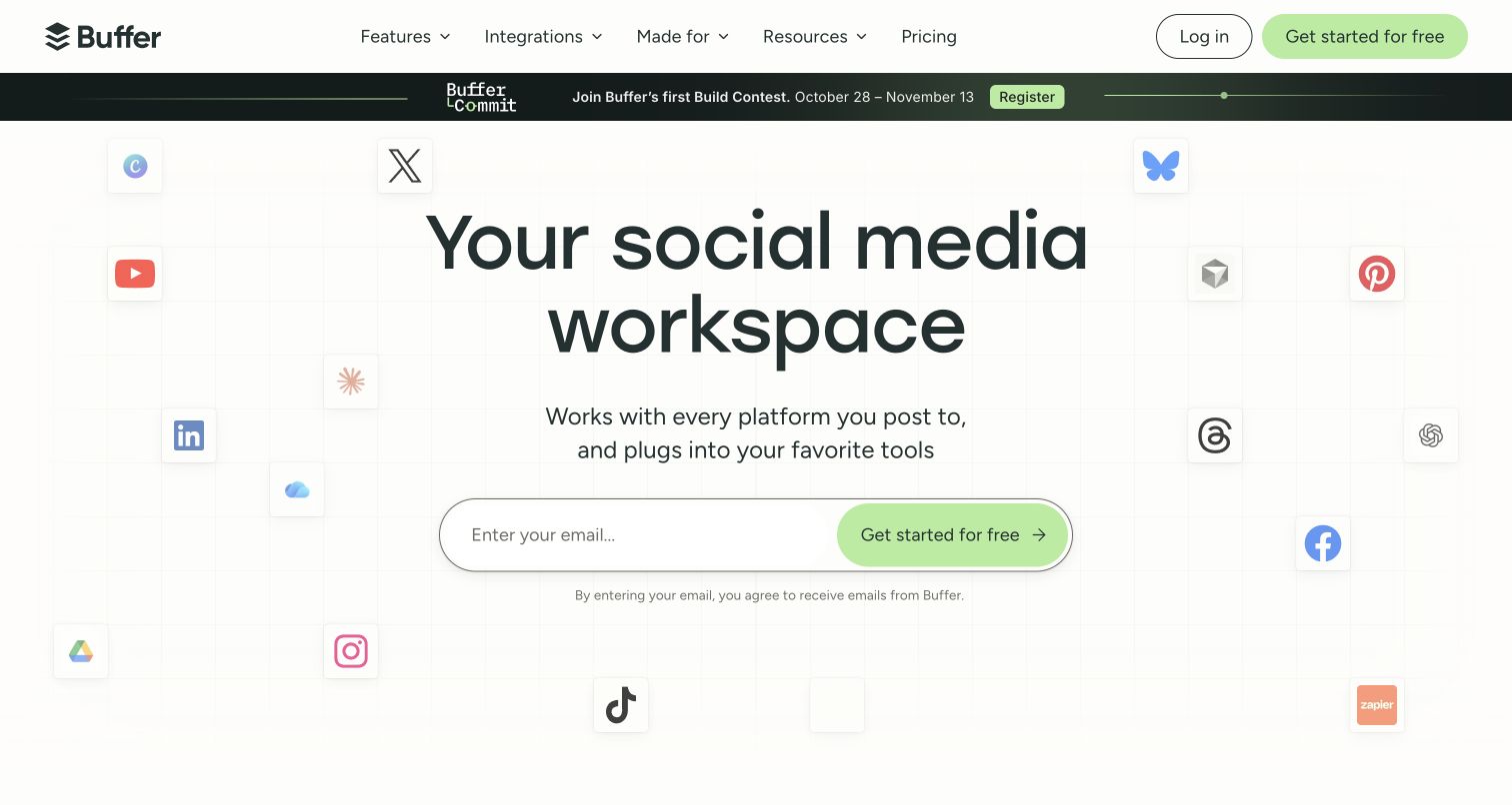
Buffer places its social-media workspace promise inside a light grid, with floating channel symbols adding context around a prominent email entry. The green action is easy to identify, and the nearby explanatory line makes the signup relationship more explicit. Navigation separates publishing, creation, community and insights, suggesting several possible reasons to join. The Customer.io case documents messages informed by connected social accounts and trial or free-plan behavior. Those customer-service events support the association, while the pictured email field alone cannot establish which system processes a submission.
What you can learn
Treat signup as the beginning of a specific task rather than a completed conversion. A useful onboarding sequence would distinguish someone who has connected a channel from someone still choosing one, instead of repeating the entire feature menu to both.
Pros
The restrained grid and single bright action keep the first decision visually clear.
Channel imagery explains the category without requiring a long introductory product demonstration.
Cons & considerations
The email-first opening asks for commitment before visitors have explored all operational constraints.
A promotional strip and multiple feature families add secondary demands around an otherwise focused invitation.
Platform source: Official Customer.io case — documented messaging relationship. Customer.io receives product-event data through Segment and branches customer emails around connected social accounts, trials and plan status. Official documentary association for customer messaging, reviewed November 11, 2026. The case may describe an earlier implementation; neither the current screenshot nor this association proves that Customer.io renders the page or identifies its present complete stack. Platform evidence is separate from the direct website screenshot and is not a complete current infrastructure audit.
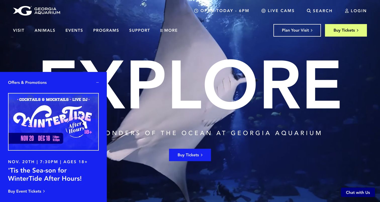
Georgia Aquarium combines an underwater hero with a direct ticket button and prominent visit-planning navigation. The photograph supplies the emotional reason to go, while practical controls help turn interest into a visit. In the captured state an offers panel and a chat invitation compete with that first view, illustrating the cost of simultaneous promotional layers. Customer.io's case connects ticketing and visitor data with customer messages. Its discussion of future website-behavior and entry-gate integrations is planning context, not evidence that those capabilities already operate on the pictured page.
What you can learn
Connect inspirational content to the information a visitor actually needs before arrival, then separate confirmed booking messages from optional promotions. Design the communications around the ticket and visit lifecycle without assuming every data source is already integrated.
Pros
The aquatic imagery establishes the attraction immediately and supports a memorable visual identity.
Visit planning and ticket purchase remain recognizable actions in the main navigation.
Cons & considerations
The automatically visible offers panel obscures part of the opening composition and headline.
Several promotional and assistance elements compete for attention before the visitor has chosen a task.
Platform source: Official Customer.io case — documented messaging relationship. The aquarium connects ticketing and customer data through BigQuery to Customer.io for visitor messaging. The case distinguishes the completed messaging migration from planned website-behavior and entry-gate integrations. Official documentary association for customer messaging, reviewed November 11, 2026. The case may describe an earlier implementation; neither the current screenshot nor this association proves that Customer.io renders the page or identifies its present complete stack. Platform evidence is separate from the direct website screenshot and is not a complete current infrastructure audit.
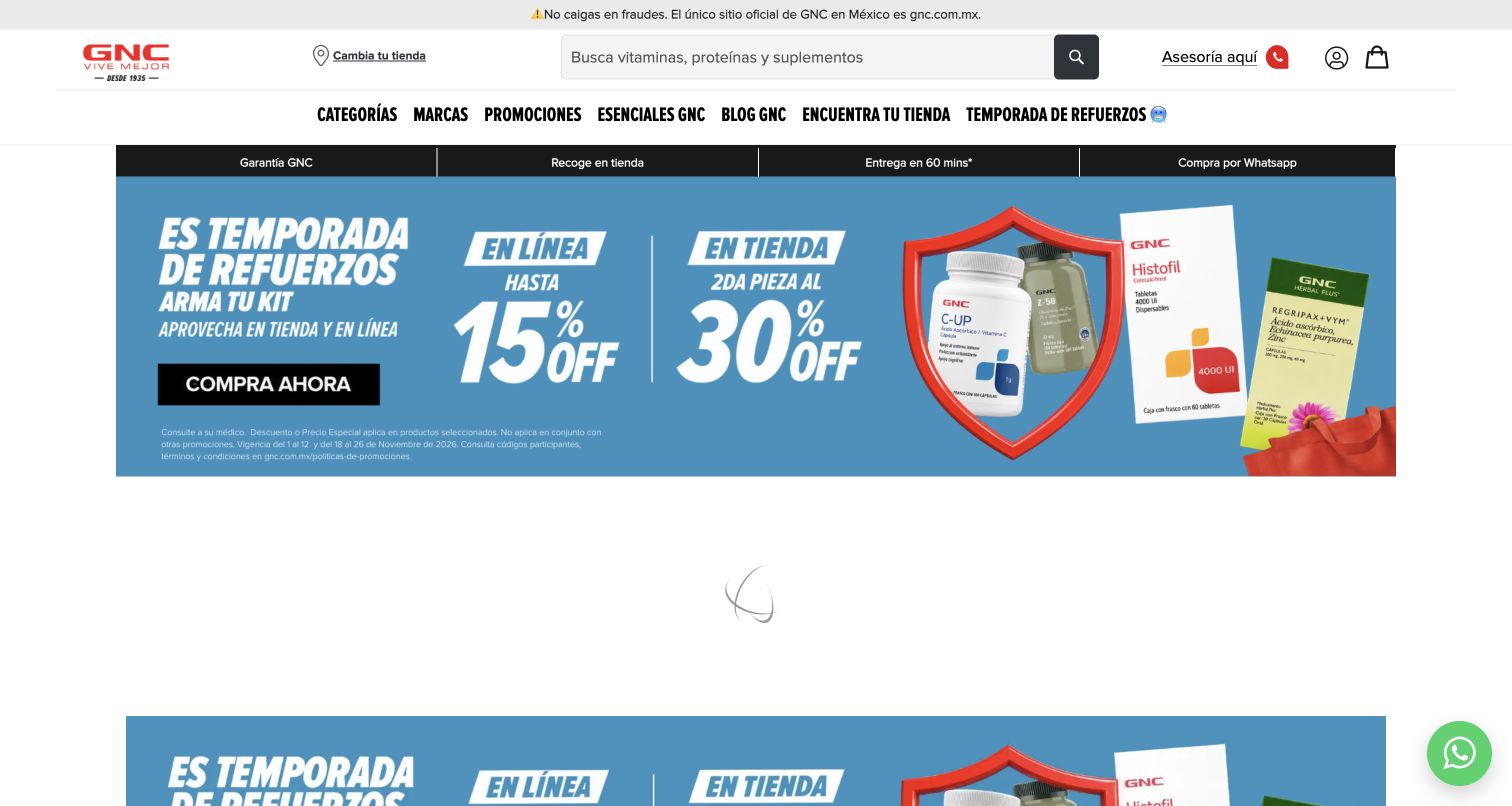
GNC Mexico pairs a familiar red identity with a wide search field, category navigation and highly visible shopping promotions. Fulfillment cues near the header connect online shopping with pickup and store-related options. The captured campaign uses several large colored blocks, making the offer immediate while leaving some supporting conditions comparatively small. The official Customer.io case specifically covers GNC Mexico, including cart-abandonment messaging and subsequent in-store attribution. This is a regional commerce example; it does not establish the same messaging arrangement for GNC properties in other countries.
What you can learn
Keep the message consistent when a shopping journey crosses channels. Cart reminders, pickup instructions and store offers should name the relevant market and preserve the product context, while measurement rules distinguish a recorded event from a proven cause of purchase.
Pros
Prominent search supports shoppers arriving with an exact product or category already in mind.
Visible fulfillment options connect the digital storefront with practical ways to receive an order.
Cons & considerations
Competing campaign blocks can make it harder to identify which offer applies to which purchase.
Small promotional conditions deserve close review on narrow screens before copying this dense approach.
Platform source: Official Customer.io case — documented messaging relationship. The documented Mexico property uses online abandoned-cart signals for Customer.io email and connects later in-store purchases through its attribution setup. Limited to GNC Mexico. Official documentary association for customer messaging, reviewed November 11, 2026. The case may describe an earlier implementation; neither the current screenshot nor this association proves that Customer.io renders the page or identifies its present complete stack. Platform evidence is separate from the direct website screenshot and is not a complete current infrastructure audit.
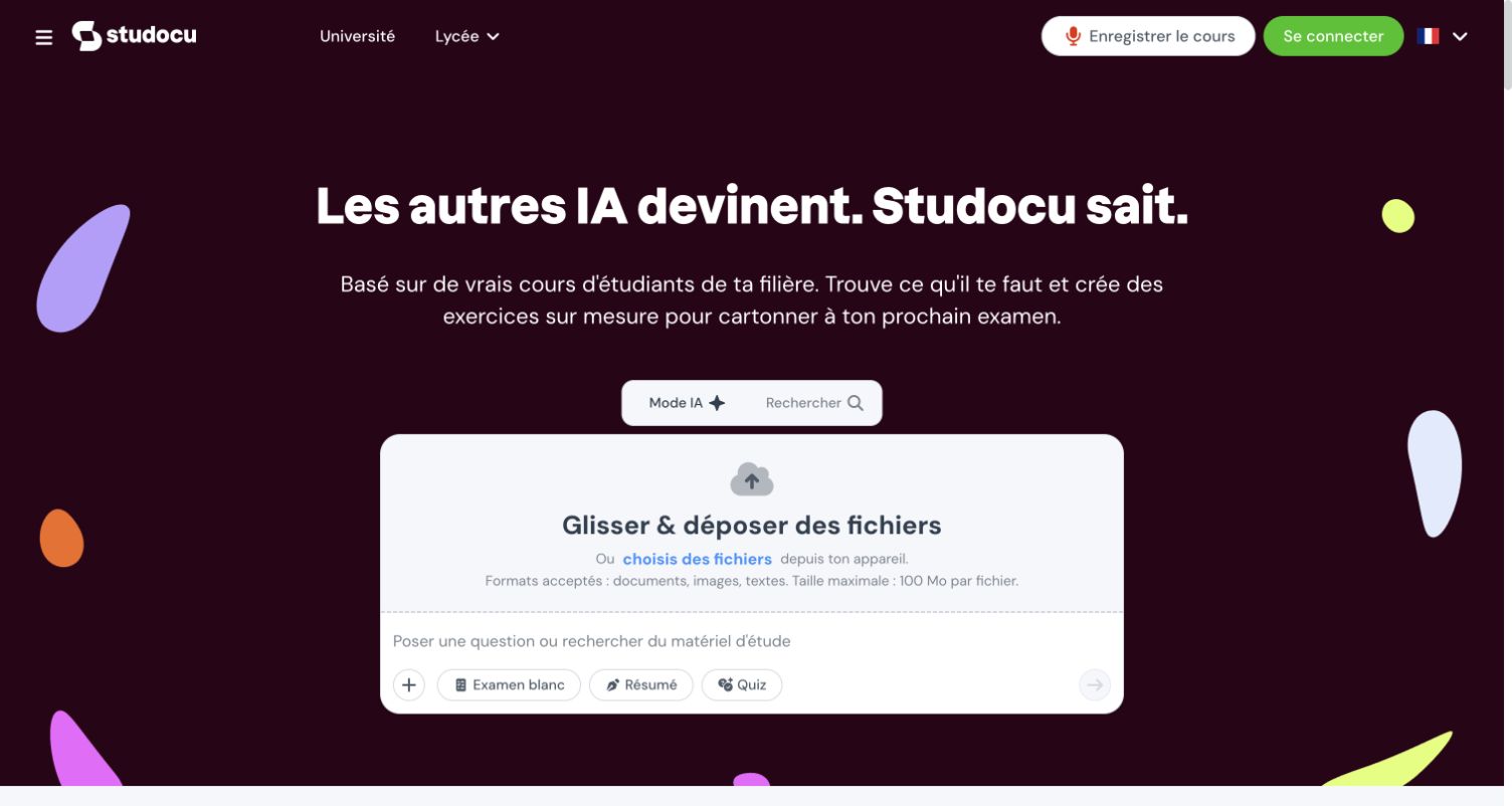
The inspected StuDocu root redirected to its French page, which places a large question and study-material workspace under a strong purple and lime identity. Search and AI-related modes sit inside one central panel, with mock exams, summaries and quizzes presented as concrete starting tasks. The arrangement makes the service tangible before account exploration. Customer.io's earlier case describes onboarding, account confirmation, password-reset and activity messages for StuDocu's learning service. That broader documented relationship is distinct from a new runtime detection on this particular French page.
What you can learn
Use the student's chosen task and language as explicit context throughout onboarding. Transactional account messages should remain clear and recognizable even when the landing page promotes several study modes, and uploading course material needs understandable expectations before the action.
Pros
The central workspace makes the first useful interaction easier to understand than a feature list.
Distinct task shortcuts reveal several learning uses without forcing visitors through deep navigation.
Cons & considerations
Upload and AI prompts raise content-handling questions that need clear explanations at the decision point.
The service-level case does not establish a separate Customer.io implementation for this localized page.
Platform source: Official Customer.io case — documented messaging relationship. The online study platform uses Customer.io for onboarding, password-reset and confirmation messages, status updates and activity notifications. The current capture is the French /fr page; the case describes the broader learning service. Official documentary association for customer messaging, reviewed November 11, 2026. The case may describe an earlier implementation; neither the current screenshot nor this association proves that Customer.io renders the page or identifies its present complete stack. Platform evidence is separate from the direct website screenshot and is not a complete current infrastructure audit.
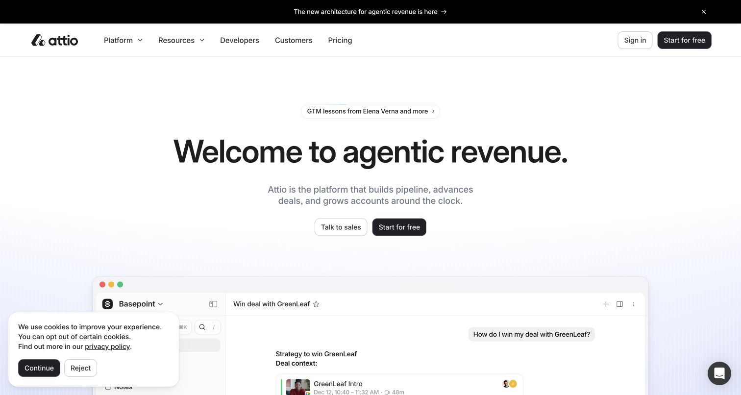
Attio presents an expansive revenue-platform idea in a spare black-and-white hero, with sales and self-service actions directly beneath it. A product preview starts below the headline, giving the abstract promise a more concrete destination. A launch strip and cookie notice add visible layers without changing the main two-way choice. Customer.io's case describes public-site interest and workspace events feeding customer onboarding and billing communication. The relevant lesson is how those account contexts can shape messages, not an assertion that Customer.io builds the CRM or renders its marketing site.
What you can learn
Decide whether a new visitor needs evaluation help or an immediate working account, then preserve that distinction beyond the first click. Workspace membership and billing responsibilities should be modeled separately so operational notices reach the appropriate person.
Pros
The restrained composition makes the primary proposition and two actions straightforward to locate.
The interface preview supplies a bridge from a high-level promise to the actual product.
Cons & considerations
The term agentic needs concrete explanation for readers unfamiliar with the category vocabulary.
The opening preview contains more detail than a small first-view rendering can comfortably communicate.
Platform source: Official Customer.io case — documented messaging relationship. Customer.io connects website demo-interest signals and workspace/product events to demo follow-up, onboarding and billing journeys. Official documentary association for customer messaging, reviewed November 11, 2026. The case may describe an earlier implementation; neither the current screenshot nor this association proves that Customer.io renders the page or identifies its present complete stack. Platform evidence is separate from the direct website screenshot and is not a complete current infrastructure audit.
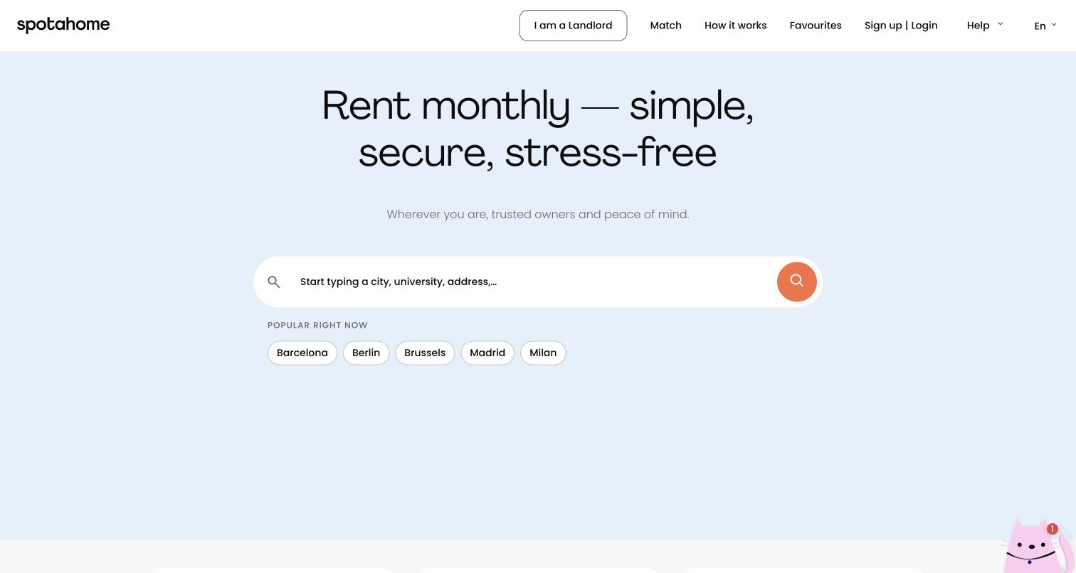
Spotahome centers its opening around a rental search, using a pale blue field and orange action to keep the next step obvious. City shortcuts reduce the effort of starting, while landlord navigation separates the supply side from people seeking a home. The broader page explains property types and rental questions rather than relying solely on attractive interiors. Customer.io's case documents messages around tenant and landlord booking, availability and verification events. Those workflows are the supported association; the search control does not independently identify the current application's infrastructure.
What you can learn
Start a marketplace journey with the decision that narrows the inventory meaningfully. Carry location, role and booking state into later communication so a renter and an owner do not receive the same generic sequence after very different actions.
Pros
The central search gives visitors a direct way to express location intent before browsing.
Role-specific navigation helps landlords find their route without replacing the renter-focused hero.
Cons & considerations
Trust and cancellation details still require deeper reading before a visitor can evaluate commitments.
The assistant invitation adds another interaction near a search experience that is otherwise deliberately simple.
Visible tech stack
Earlier / documented evidence
Customer.io
Platform source: Official Customer.io case — documented messaging relationship. Tenant and landlord journeys on the rental-booking service use Customer.io for listing availability and tenant-verification messages with webhooks. Official documentary association for customer messaging, reviewed November 11, 2026. The case may describe an earlier implementation; neither the current screenshot nor this association proves that Customer.io renders the page or identifies its present complete stack. Platform evidence is separate from the direct website screenshot and is not a complete current infrastructure audit.
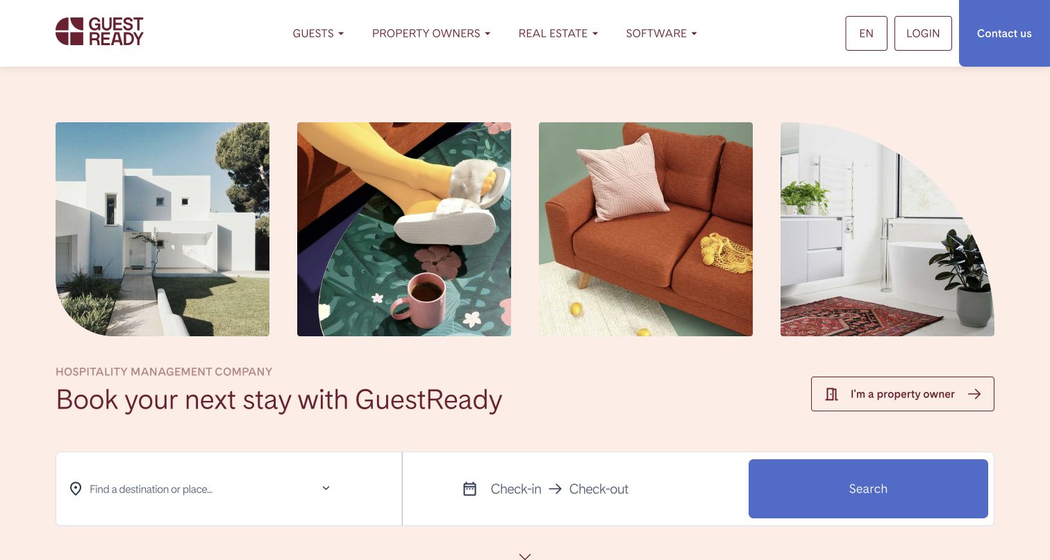
GuestReady uses warm interior photography and curved image shapes around a practical destination-and-date search. The guest's immediate booking task occupies the hero, while property owners receive a separate entry in the header. Navigation also exposes real estate and software services, making the business's multiple audiences visible. The official Customer.io case describes property-view follow-up, city and property variants, and communication around accounts and stays. Its anonymous onsite plans should remain future context; they do not prove a currently implemented anonymous messaging layer on this homepage.
What you can learn
Give each audience a clear route before designing lifecycle automation. A traveler comparing accommodation needs different reminders from an owner evaluating management services, and a property-specific follow-up should preserve the relevant destination rather than send everyone a general brand message.
Pros
The booking controls connect lifestyle imagery with a useful trip-planning action in the same view.
The property-owner route is visible without taking over the guest-focused first impression.
Cons & considerations
The expanding menu of guest, owner, property and software services increases navigation complexity.
Availability and total booking conditions still need examination beyond the inviting opening photographs.
Platform source: Official Customer.io case — documented messaging relationship. Property views without booking trigger a delayed, property- and city-specific email; the case also covers account creation, check-in and post-stay lifecycle messages. Official documentary association for customer messaging, reviewed November 11, 2026. The case may describe an earlier implementation; neither the current screenshot nor this association proves that Customer.io renders the page or identifies its present complete stack. Platform evidence is separate from the direct website screenshot and is not a complete current infrastructure audit.
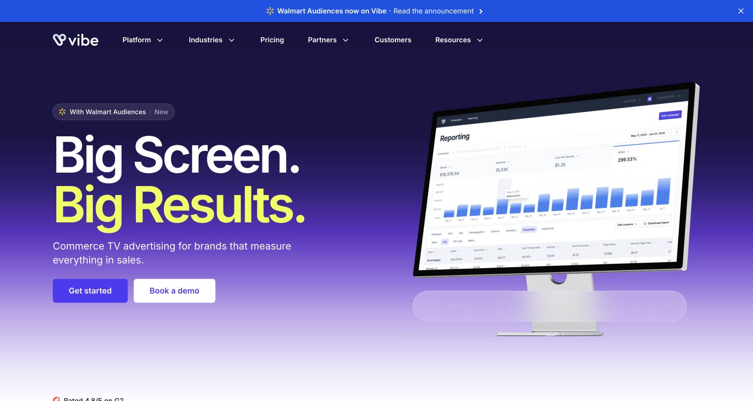
Vibe.co makes its television-advertising category unmistakable through a dark blue-purple field, oversized type and an adjacent campaign interface. Lime accents give the headline energy while the paired start and demo routes serve different buying needs. A partnership announcement adds another point of interest above the navigation. Customer.io's case concerns onboarding for the self-service advertising platform, including account and campaign-status communication. It does not establish that Customer.io delivers television advertisements, nor does the site's promotional language independently verify advertising performance.
What you can learn
Make the product category obvious, then design messages around the operational steps needed to use it. Payment problems and campaign expiry have different urgency from educational onboarding, so their content, audience and fallback expectations should be specified separately.
Pros
Large type and a coherent color palette make the category and primary actions easy to identify.
The dashboard imagery gives a complex advertising service a visible operational context.
Cons & considerations
Performance-oriented headlines need substantiation beyond the impression created by a polished marketing page.
A partnership strip and extensive navigation can compete with the central start-or-demo decision.
Platform source: Official Customer.io case — documented messaging relationship. The self-service streaming advertising platform uses Customer.io for signup onboarding and messages triggered by payment failures or campaign expiry. Official documentary association for customer messaging, reviewed November 11, 2026. The case may describe an earlier implementation; neither the current screenshot nor this association proves that Customer.io renders the page or identifies its present complete stack. Platform evidence is separate from the direct website screenshot and is not a complete current infrastructure audit.
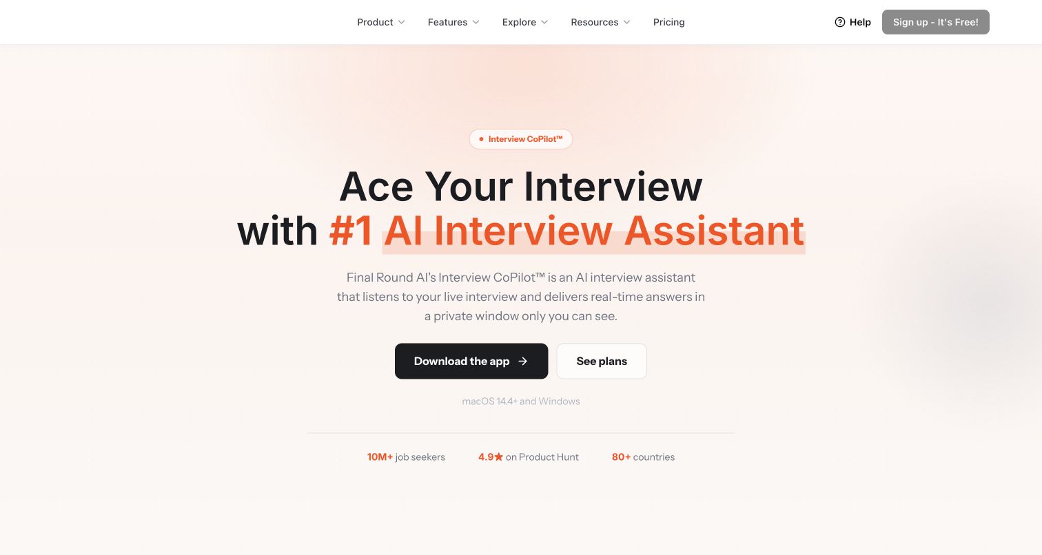
Final Round AI currently opens with a centered interview-assistant proposition, warm background and a strong download action beside a pricing route. Platform requirements near the action clarify that the featured offering includes desktop software. This matters when reading the Customer.io case: its documented journeys concern repeated visits to the public Interview Question Bank and related educational or conversion emails. The case supports that earlier web-service relationship, not a claim that the current desktop app or homepage is built with Customer.io.
What you can learn
Keep technology evidence tied to the journey it actually documents when a product's positioning changes. Educational resources can introduce a service, but the transition to downloads or paid plans should clearly explain the different environment and requirements.
Pros
The dominant download action and adjacent pricing route make the present acquisition choice clear.
Visible operating-system requirements supply useful context close to the software invitation.
Cons & considerations
Strong promotional claims need independent scrutiny and should not be adopted as editorial findings.
The current app-focused hero differs from the web-resource journey described in the historical customer case.
Platform source: Official Customer.io case — documented messaging relationship. Customer.io journeys segment visitors by repeated visits to the public Interview Question Bank and provide different educational and conversion email sequences. Official documentary association for customer messaging, reviewed November 11, 2026. The case may describe an earlier implementation; neither the current screenshot nor this association proves that Customer.io renders the page or identifies its present complete stack. Platform evidence is separate from the direct website screenshot and is not a complete current infrastructure audit.
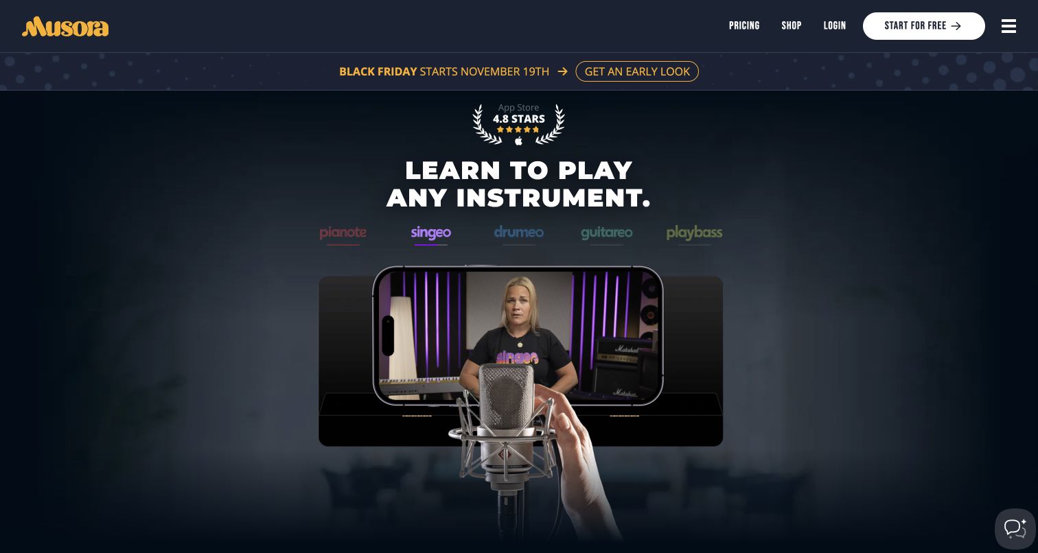
Musora's dark opening brings several instrument-learning brands under one visible navigation system. A lesson video inside a phone-shaped frame makes the subscription tangible, while the free-start action and instrument labels offer recognizable ways into the catalog. Promotional messaging sits above this main teaching proposition. Customer.io's case describes win-back communication based on reasons supplied when people cancel the learning subscription. That is a documented customer journey across the service's website and app; it does not identify the technology delivering the current lesson video or homepage.
What you can learn
Ask what a learner was trying to achieve before deciding which follow-up is helpful. Someone pausing a subscription has a different need from someone unable to find suitable lessons, and any return invitation should reflect that distinction without overstating the evidence.
Pros
Instrument-specific labels help visitors recognize their interests inside a broad subscription offering.
The lesson demonstration shows a teaching context instead of relying entirely on abstract benefits.
Cons & considerations
The moving lesson area can initially show an incomplete frame while media is loading.
A seasonal promotion adds urgency that can compete with understanding the subscription and its terms.
Visible tech stack
Earlier / documented evidence
Customer.io
Platform source: Official Customer.io case — documented messaging relationship. The online music-learning service uses subscription cancellation reasons from its website/app journeys to drive segmented Customer.io win-back messages. Official documentary association for customer messaging, reviewed November 11, 2026. The case may describe an earlier implementation; neither the current screenshot nor this association proves that Customer.io renders the page or identifies its present complete stack. Platform evidence is separate from the direct website screenshot and is not a complete current infrastructure audit.
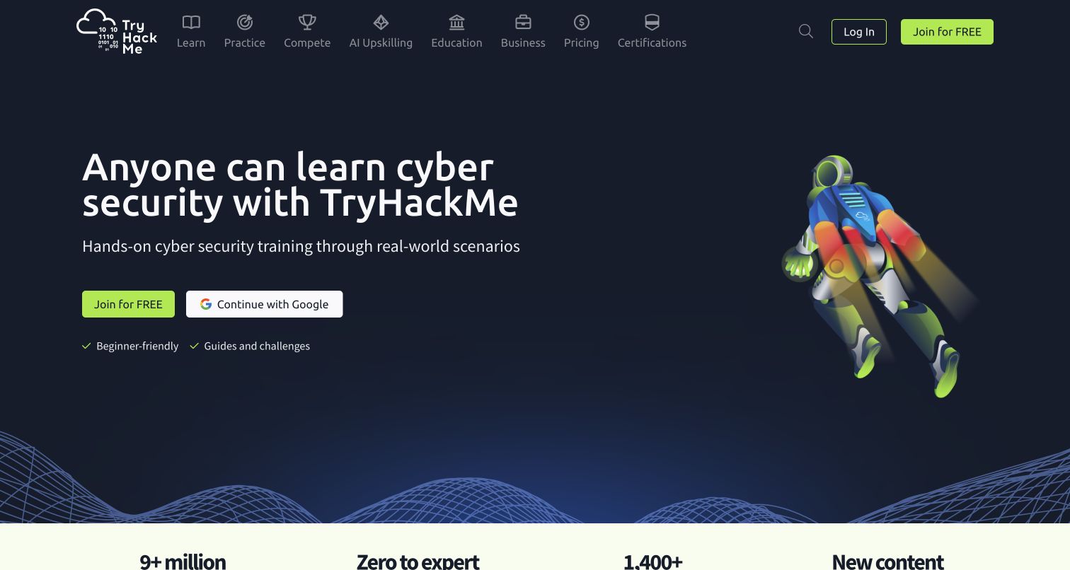
TryHackMe uses a dark background, bright green accents and an illustrated character to frame cybersecurity learning as approachable. A clear free-entry action sits near the main promise, while the broader page introduces guided paths and choices based on experience. The playful visual language reduces the distance between an unfamiliar subject and a first action. Customer.io's older case documents event-led onboarding and tested email flows for the online learning service. It establishes a historical messaging association rather than a fresh detection of the current website's frontend.
What you can learn
Align early messages with actual learning progress. A beginner exploring a first path should receive different guidance from someone already completing exercises, and the invitation should describe a manageable next task rather than repeat a general enthusiasm for cybersecurity.
Pros
The contrast between a dark surface and green actions makes the starting route conspicuous.
Beginner-oriented language and learning-path content help visitors assess where they could begin.
Cons & considerations
The playful character and broad promise leave detailed course expectations for later exploration.
Historical lifecycle evidence cannot establish which current lessons, account screens or pages use the platform.
Platform source: Official Customer.io case — documented messaging relationship. The online cybersecurity-learning service describes event-led Customer.io onboarding and tested customer lifecycle flows. Official documentary association for customer messaging, reviewed November 11, 2026. The case may describe an earlier implementation; neither the current screenshot nor this association proves that Customer.io renders the page or identifies its present complete stack. Platform evidence is separate from the direct website screenshot and is not a complete current infrastructure audit.
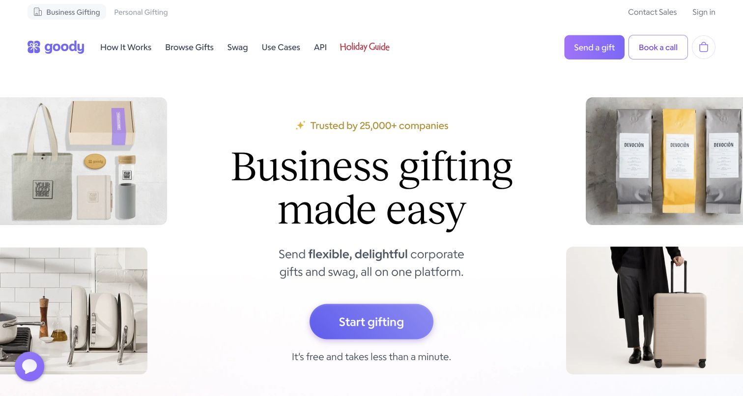
Goody presents business gifting with a spacious white background, a large serif headline and product photographs around one central action. Business and personal routes are visible at the top, while deeper navigation covers gifts, swag and other buying contexts. The page explains an address-light sending process that continues with the recipient. Customer.io's official case attributes gift-notification messages and acceptance steps to its platform. This qualifies a public customer-facing gifting journey, rather than merely a company's internal employee-tool usage or an inference from a logo.
What you can learn
Design the recipient's experience as carefully as the buyer's. A notification needs to explain who sent the gift, what the next step means and how acceptance works, while maintaining recognizable context from the original service without unnecessary pressure.
Pros
The uncluttered hero leaves the gifting proposition and first action easy to recognize.
Product imagery makes an intangible sending workflow feel connected to actual gifts.
Cons & considerations
The business and personal branches need consistent labeling as people move deeper into the catalog.
A simple opening promise still requires clear explanation of costs and recipient choices later in the journey.
Platform source: Official Customer.io case — documented messaging relationship. Customer.io powers gift-notification messages that let recipients accept a gift, linking its transactional communication to the public gifting service. Official documentary association for customer messaging, reviewed November 11, 2026. The case may describe an earlier implementation; neither the current screenshot nor this association proves that Customer.io renders the page or identifies its present complete stack. Platform evidence is separate from the direct website screenshot and is not a complete current infrastructure audit.
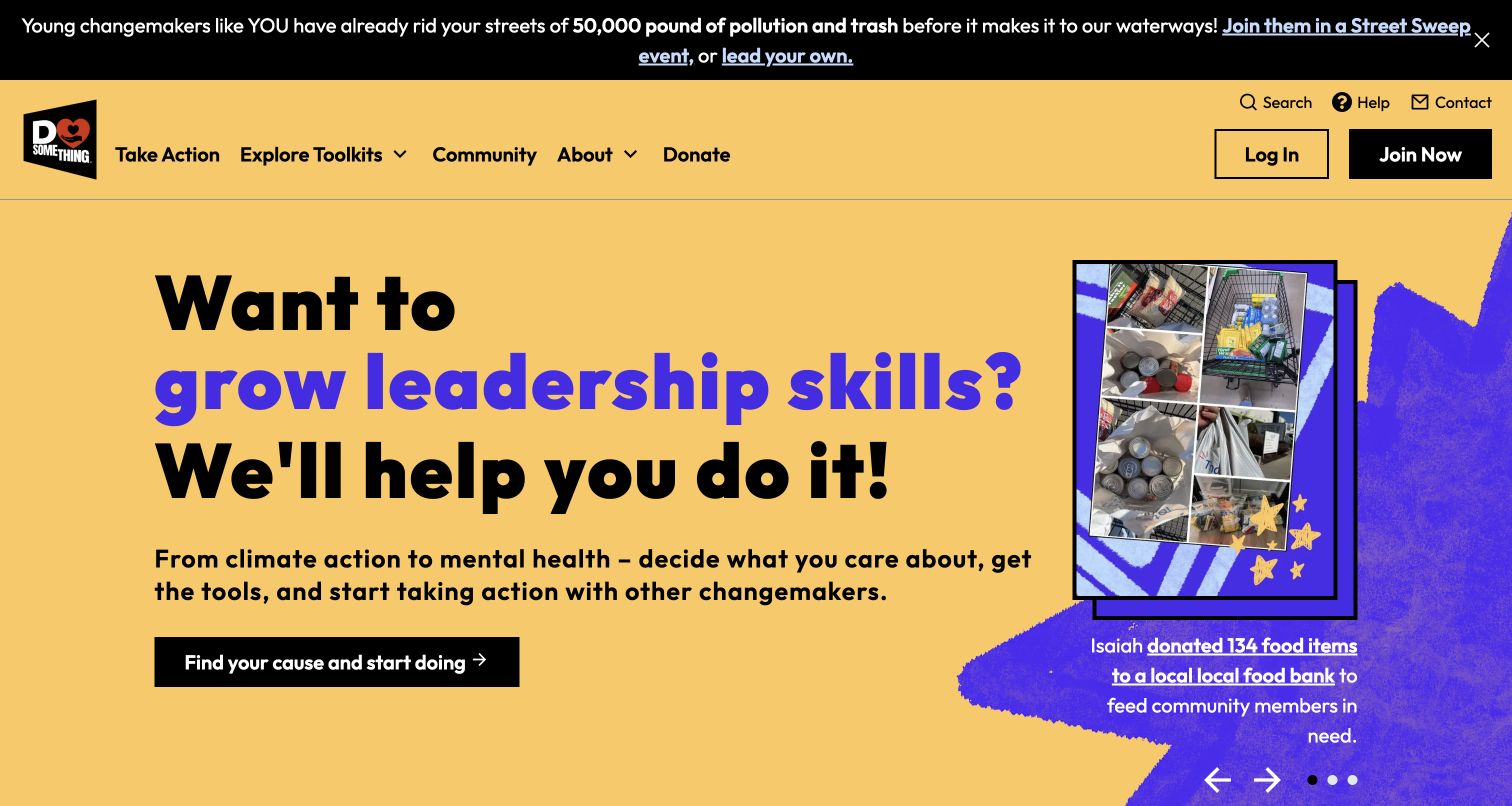
DoSomething uses a warm yellow field, bold black type and purple graphic accents to frame social action as something a young visitor can begin. A changing question connects personal motivation with a prominent cause-discovery action, while community photographs show specific participation. Toolkit and community routes extend the opening beyond a single campaign. Customer.io's historical case documents membership preferences and activity-based email journeys for the digital platform. That supports the service relationship without proving that the current animated hero or membership application is implemented by Customer.io.
What you can learn
Invite people to choose an interest before deciding which messages are relevant. A member seeking local participation needs a useful next action and an understandable way to manage preferences, rather than an undifferentiated stream of every campaign the organization runs.
Pros
The cause-focused action connects a broad mission with a concrete way to begin participating.
Community imagery and toolkit navigation give the mission practical context beyond a donation request.
Cons & considerations
The moving headline and campaign strip introduce several messages into the first screen.
Individual participation stories illustrate the organization but do not measure the effectiveness of its email journeys.
Platform source: Official Customer.io case — documented messaging relationship. The digital social-action platform uses Customer.io for member subscription preferences, activity-triggered segmentation and interest-based email journeys. Official documentary association for customer messaging, reviewed November 11, 2026. The case may describe an earlier implementation; neither the current screenshot nor this association proves that Customer.io renders the page or identifies its present complete stack. Platform evidence is separate from the direct website screenshot and is not a complete current infrastructure audit.
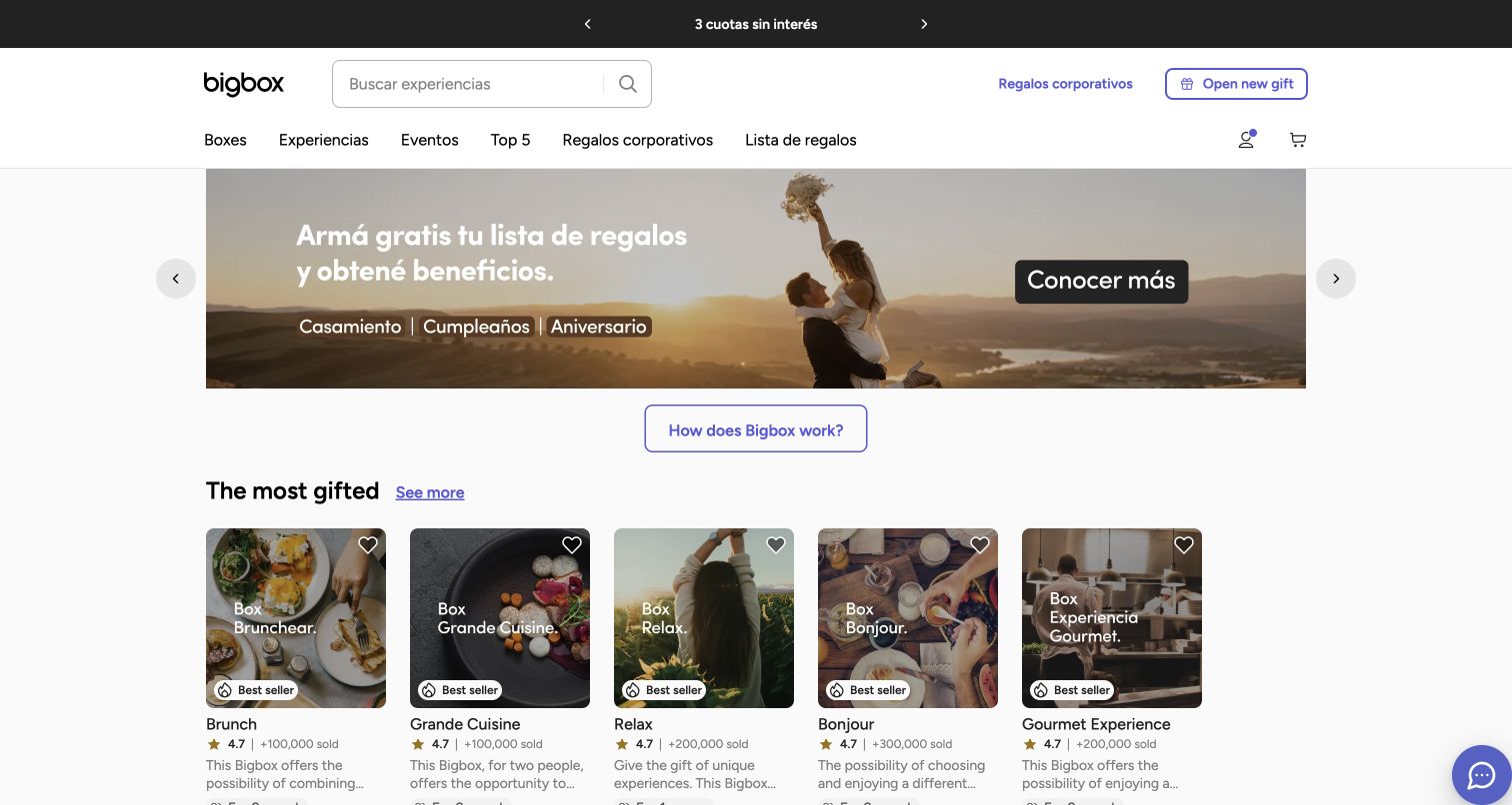
Bigbox's Argentina storefront brings experience categories, search and gift-related services into a compact shopping header. The captured campaign promotes a gift-registry context, while product cards below it expose experience types, recipient counts and option counts. A distinct route for opening a received gift recognizes that not every visitor is buying. Customer.io's case directly links this Argentina property and describes buyer and recipient onboarding plus date reminders. The case covers regional workspaces, but this review counts only the inspected Argentina website, not those other markets.
What you can learn
Keep purchase intent separate from gift redemption. The same brand may need to explain selection and payment to one person, then activation and available experiences to another; reminder content should preserve that role and the relevant occasion.
Pros
Category cards give visitors a quick overview of experiences before they investigate individual options.
The received-gift route acknowledges a second audience with a different immediate task.
Cons & considerations
The many category and service choices can make the shopping header feel crowded.
Occasion campaigns and experience conditions need careful regional maintenance rather than copying one market unchanged.
Platform source: Official Customer.io case — documented messaging relationship. The case directly links the Argentina experience-gift storefront and documents Customer.io buyer/recipient onboarding and the Regalendario date-reminder feature across its five regional workspaces. Official documentary association for customer messaging, reviewed November 11, 2026. The case may describe an earlier implementation; neither the current screenshot nor this association proves that Customer.io renders the page or identifies its present complete stack. Platform evidence is separate from the direct website screenshot and is not a complete current infrastructure audit.
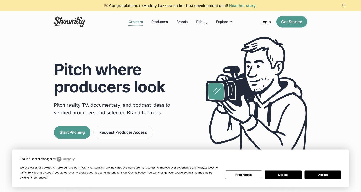
Showrilly pairs a plain-language pitching proposition with a large camera illustration and separate creator and producer actions. The opening establishes a marketplace relationship before explaining the build, publish and engagement steps below. A prominent cookie notice remains visible in the capture, while a development-story banner adds social proof above the navigation. Customer.io's case documents creator registration and unfinished-pitch emails alongside producer onboarding. Its experimental and future plans should not be presented as completed features, and the association does not prove who renders the public homepage.
What you can learn
Identify the role before choosing the next message. A creator with an unfinished pitch needs different help from a producer entering a pitch room, so reminders should point to the relevant task without implying that submission guarantees attention or a deal.
Pros
The paired actions explain both sides of the platform without burying the producer route.
The illustrated hero keeps attention on the proposition instead of a dense interface screenshot.
Cons & considerations
The large consent notice takes substantial space from the first view in the captured state.
Success stories are persuasive but should remain examples rather than promises of outcomes for new creators.
Platform source: Official Customer.io case — documented messaging relationship. Customer.io follows creator registration and unfinished pitches with separate email sequences; producer onboarding introduces the platform pitch room. Official documentary association for customer messaging, reviewed November 11, 2026. The case may describe an earlier implementation; neither the current screenshot nor this association proves that Customer.io renders the page or identifies its present complete stack. Platform evidence is separate from the direct website screenshot and is not a complete current infrastructure audit.
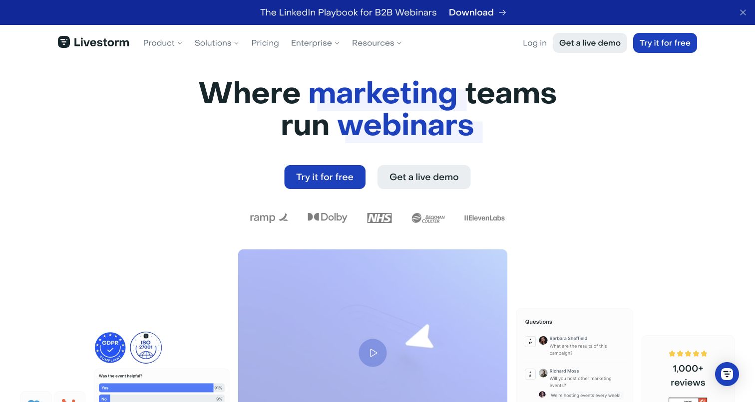
Livestorm names marketing teams directly in its opening webinar proposition and uses blue accents to distinguish the important words and actions. A free trial and live demonstration sit above customer logos and a stylized event interface. The product imagery combines video, questions and feedback, making the category clearer before the detailed feature list. Customer.io's case describes workspace-user data supporting billing messages and review requests for Livestorm customers. It does not establish the technology streaming webinars or rendering the registration pages shown in product illustrations.
What you can learn
Treat an account as a set of roles rather than a single email address. Billing messages should reach the appropriate workspace contact, while invitations for feedback should respect the person's experience instead of assuming every member performed the same task.
Pros
The audience-specific headline quickly distinguishes the service from a general-purpose meeting tool.
Trial and demonstration options support both immediate exploration and a guided buying conversation.
Cons & considerations
The large product illustration communicates several features at once but delays detailed explanations.
Customer logos and review badges provide context without independently proving performance or suitability for another organization.
Platform source: Official Customer.io case — documented messaging relationship. Customer.io uses workspace-user data for targeted customer billing messages and review invitations tied to the webinar platform. Official documentary association for customer messaging, reviewed November 11, 2026. The case may describe an earlier implementation; neither the current screenshot nor this association proves that Customer.io renders the page or identifies its present complete stack. Platform evidence is separate from the direct website screenshot and is not a complete current infrastructure audit.
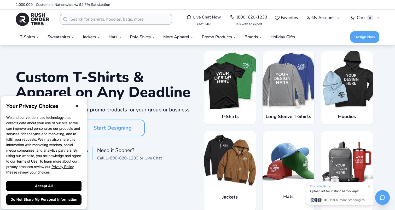
RushOrderTees presents custom apparel through a split opening: a direct service promise on the left and recognizable product categories on the right. Shopping and starting a design appear as different actions, while search, phone and chat remain available above. Delivery-related information connects the creative task with a practical deadline. The Customer.io case describes behavior-driven messages around abandoned designs and customer orders. That documented commerce workflow does not identify the current design editor's implementation, and visible satisfaction claims are the site's claims rather than measured findings from this review.
What you can learn
Preserve the visitor's place when a purchase includes creative work. A useful reminder should distinguish an unfinished design from an incomplete order, include enough context to resume, and avoid implying that a delivery promise survives every production or shipping condition.
Pros
Product category photography makes the range legible without requiring visitors to start designing first.
Separate shopping and design routes accommodate different levels of purchase readiness.
Cons & considerations
The privacy and chat panels cover part of the opening content in the captured view.
Price, quantity and delivery conditions require careful reading beyond the simplified headline and category tiles.
Platform source: Official Customer.io case — documented messaging relationship. The online custom-apparel service connects abandoned designs, customer behavior and order-related messages to Customer.io. Official documentary association for customer messaging, reviewed November 11, 2026. The case may describe an earlier implementation; neither the current screenshot nor this association proves that Customer.io renders the page or identifies its present complete stack. Platform evidence is separate from the direct website screenshot and is not a complete current infrastructure audit.
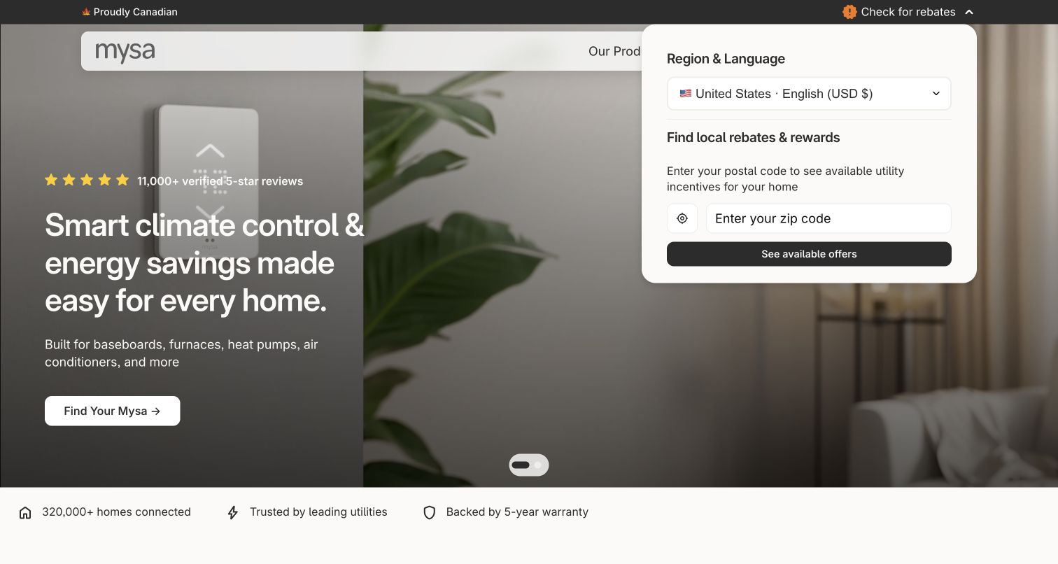
Mysa's root redirected to the US English store, where a home interior and thermostat imagery support a broad climate-control proposition. The opening offers a product-matching route, while navigation distinguishes products, savings and support. A region-and-rebate panel is visible over the image, making local context explicit but taking substantial space. Customer.io's case connects website compatibility-quiz information and commerce events with customer communication. That is stronger website evidence than the existence of a thermostat app alone, but it does not establish the current storefront's complete implementation.
What you can learn
Ask for the information needed to establish product fit before sending a purchase reminder. Compatibility and regional availability should remain consistent across the quiz, product page and later message, with clear limits on what an automated recommendation can determine.
Pros
The matching route acknowledges that heating equipment requires more guidance than a generic product grid.
Product, savings and support categories reflect distinct questions a prospective buyer may have.
Cons & considerations
The open regional panel obscures part of the main image and navigation in this capture.
Energy and savings language requires context; the page's marketing presentation does not verify individual household results.
Platform source: Official Customer.io case — documented messaging relationship. The thermostat seller connects its website compatibility quiz and ecommerce/customer events to Customer.io messaging and personalization. The root redirected to the US English /en-us store. Official documentary association for customer messaging, reviewed November 11, 2026. The case may describe an earlier implementation; neither the current screenshot nor this association proves that Customer.io renders the page or identifies its present complete stack. Platform evidence is separate from the direct website screenshot and is not a complete current infrastructure audit.
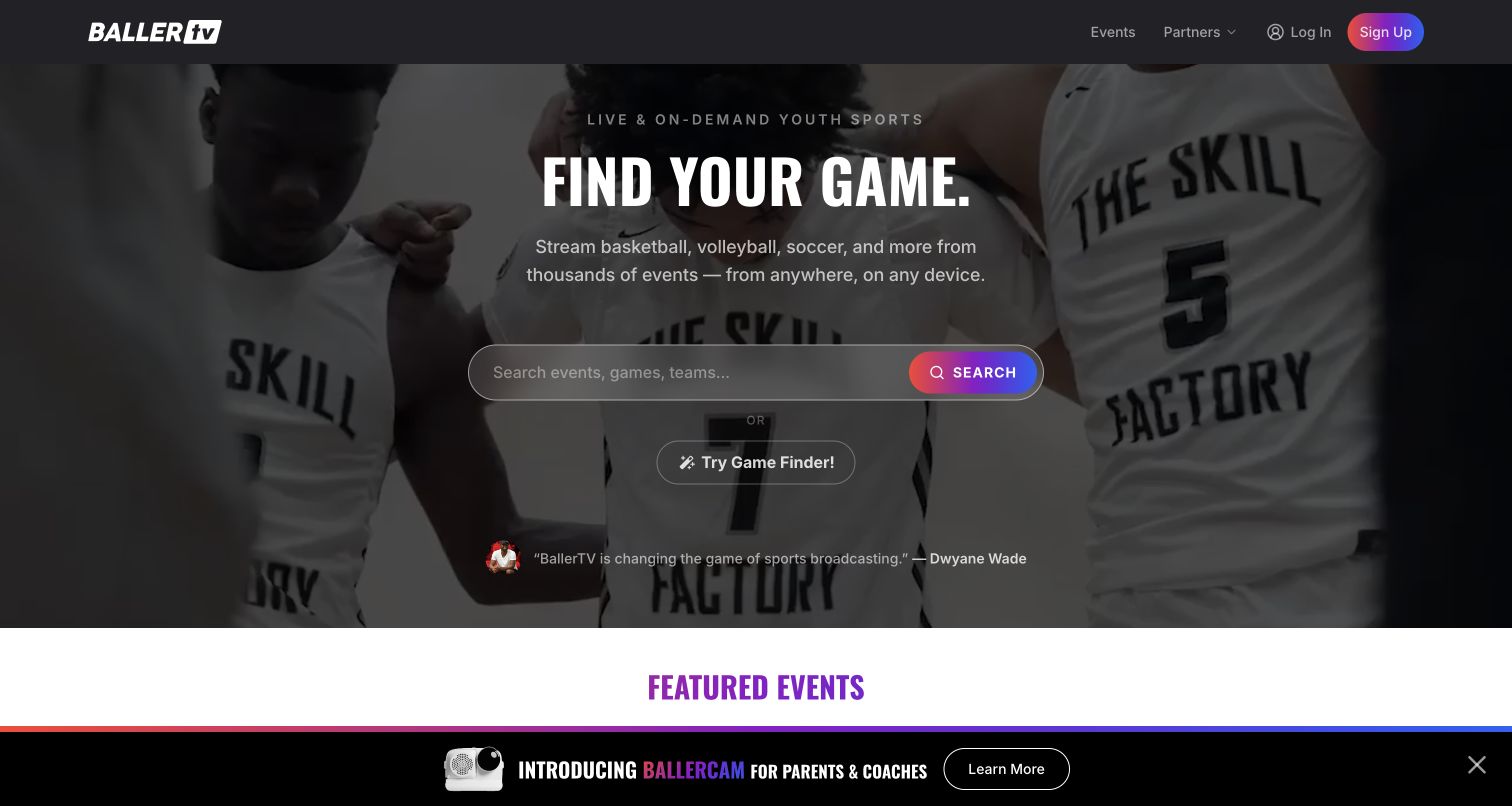
BallerTV makes finding a game the central task, placing a large search field and a separate game-finder route over sports footage. The header stays compact, and a featured-events section immediately below introduces dates, places and sports as useful discovery context. A product promotion occupies the lower edge of the captured view. Customer.io's case documents email and SMS journeys shaped by subscriber sports and game preferences. The relationship concerns customer communication, not proof that Customer.io powers the video delivery or the current search experience.
What you can learn
Use a subscriber's actual interests to narrow communication before increasing message frequency. A person following one team or event needs timely, clearly identified updates, with subscription and channel choices that remain understandable when the service covers many sports.
Pros
The search-led hero gives visitors with a specific game in mind a direct starting point.
Featured events introduce practical location and date context instead of relying only on brand messaging.
Cons & considerations
Video imagery and the lower promotional strip compete with the otherwise focused discovery task.
Membership terms and viewing availability require deeper investigation before the initial search becomes a purchasing decision.
Platform source: Official Customer.io case — documented messaging relationship. The sports streaming and replay service uses sports/game preferences for Customer.io email and SMS subscriber journeys. Official documentary association for customer messaging, reviewed November 11, 2026. The case may describe an earlier implementation; neither the current screenshot nor this association proves that Customer.io renders the page or identifies its present complete stack. Platform evidence is separate from the direct website screenshot and is not a complete current infrastructure audit.
Kegan has 15+ years of experience working with small businesses, Fortune 500 companies, and everything in between. No development job is too big or too small: he brings the same hands-on attention to a focused improvement, a complete website, or a custom application.
For Customer.io projects, he can help with responsive interfaces, reusable components, custom functionality, API connections, and performance-minded implementation. He works directly with clients on scope, design, implementation, testing, and handover, with an emphasis on clear communication and a system that remains practical to maintain after launch.
Show 3 other Customer.io developersHide other Customer.io developers
Choose a messaging approach around the customer task
Guide a new account toward one useful result
For software and learning products, map the steps between registration and the first meaningful result. Include people who stop before that result and those who finish quickly. The message should respect the actual state, and the product should remain understandable without relying on an email to explain every control.
Support a transaction without confusing it with promotion
Customer.io distinguishes automations, broadcasts and transactional messages. Choose the mechanism from the purpose and trigger. A receipt, billing notice or gift acceptance link needs different content and failure handling from an optional announcement. Record the audience, timing and responsible team for each.
Rentals, custom orders and equipment purchases can span several visits. Keep the relevant item, market and stage explicit in the design brief. A reminder should help someone resume an unfinished task, while expired availability or changed conditions need a clear destination rather than a misleading old promise.
From references to requirements
Plan the data, content and handover together
Draw the journey before connecting systems
Create a small map from the public entry page to the customer action and its follow-up. Mark which observations are confirmed, which depend on another system and which are only proposed. Include cancellation, failure and no-response paths so the intended experience is reviewable before automation begins.
Define identity and regional context
Decide which customer, workspace or order a message concerns. Record the source of language, market and role information and what happens when it is missing. The French StuDocu capture and GNC Mexico example show why a brand-level reference should not become an assumption about every localized property.
Make ownership practical
Assign an owner for event changes, message copy, sender configuration, subscription choices and delivery failures. During handover, ask the team to diagnose a missing prerequisite and correct one piece of sample content in an isolated test workflow. Record how to stop a faulty journey without losing its history.
A useful handover demonstration
Ask the actual team to carry out its routine job: publish a realistic update, correct a mistake, preview a narrow screen, and identify who owns an integration failure. For a library or frontend framework, also ask who maintains the content source and deployment. A polished screenshot does not answer those operational questions.
Beyond the screenshot
A checklist for useful, maintainable customer journeys
Identify the exact public service, market and customer task being supported.
Write down event meanings, identifiers, timestamps and duplicate-handling expectations.
Check missing profile data, changed roles and unsupported language fallbacks.
Keep operational notices and optional promotion purposes clear to recipients.
Explain subscription and channel choices at the point where they matter.
Review message text and destinations with realistic product, booking or account context.
Use designated test identities and isolated workflows when exercising message behavior.
Assign responsibility for failed delivery, interrupted integrations and content changes.
Preserve a documented rollback or stop procedure and the evidence needed to investigate a problem.
Test with real content, a keyboard, a small screen, slow or failed requests, and the people who will maintain the system. These are planning checks, not an accessibility, security, performance, or search-ranking certification.
Sources & editorial method
How this Customer.io collection was reviewed
Twenty distinct public properties were directly inspected and captured on November 11, 2026, then reviewed for visible structure and useful customer-journey patterns. Each Customer.io association comes from a cited official customer case read on that date. Reading an older case does not refresh its implementation date. GNC is limited to Mexico; StuDocu redirected to its French page and Mysa to its US English store. The cases establish messaging roles, not current frontend or complete backend inventories. Broad public technology audits are separately recorded; blocked scans add no inferred technology claims, and retained earlier observations keep their original dates.
Every image is an unmodified capture from the actual website, with its source and capture date. Some captures are reused from our shared catalog; their dates remain the original capture dates. None comes from a vendor gallery or a generated reconstruction. Moving imagery and live content can change.
Technology attribution uses public page assets or metadata, official platform documentation, or a cited first-party project case study. Documentary and framework-relationship evidence is identified where used; it is not a complete current backend inventory. A CMS image CDN alone does not establish a full CMS deployment. A library’s presence does not prove which individual controls use it, and a platform label does not establish AI authorship.
The composition notes, lessons, pros and tradeoffs are original editorial observations. We have not measured conversion, traffic, security, performance or accessibility conformance. Website owners retain their brands and imagery; these examples are not our client portfolio. Written, Edited and Curated are independent records, not dates advanced by a build. See our editorial standards or suggest a correction.
Questions worth asking
Customer.io website development FAQs
Are these websites built with Customer.io?
The evidence establishes the particular messaging relationship described in each official case. Customer.io is not identified here as the website builder. The screenshot shows the current public design, while a case may describe an earlier customer communication workflow.
Why include ecommerce, software and visitor attractions together?
They expose different customer tasks: buying, learning, booking, gifting and managing an account. Comparing those tasks is useful when planning communication, but a successful pattern in one setting still needs to be evaluated against another audience and product.
Does every page of a featured brand use Customer.io?
That is not established. The review identifies one exact captured property and qualifies the documented service relationship. Regional stores, localized pages, product applications and unrelated company websites should not inherit technology claims automatically.
Can I copy the timing and messages from a customer case?
Use the case to develop questions for your own brief. Your product states, recipient expectations and operational constraints may differ. Define the intended action and test the relevant conditions with designated test data before deciding that a sequence is suitable.
Do these reviews verify improved conversions or delivery performance?
No. The reviews describe visible design and sourced messaging associations. They do not independently measure campaign results, email delivery, accessibility conformance, security or the performance of the featured services.