Go-associated website examples, scoped engineering evidence, and a practical service-development brief
These 20 public websites belong to organizations with documented Go work. Their screenshots offer design ideas; the engineering references identify separate infrastructure, service or application workloads. They are not a claim that every pictured homepage is implemented in Go.
Go is a programming language, not a visual website builder. A company can use it for a network service, operational tool or database while publishing its public content through an unrelated system. Keep the interface you admire separate from the technical component described by the source. A good implementation brief explains why that component belongs in the project.
Google, PayPal, American Express, Microsoft and Uber open this collection because recognizable organizations provide useful context when the workload is named precisely. Several sources are historical: a documented system is evidence of that account, not proof that every part of the organization still uses the same architecture. The remaining examples broaden the comparison across commerce, games, APIs and infrastructure.
Before the examples
What makes good Go website development in 2026?
Choose a service responsibility before a language
Describe one request or event from arrival to completion. Name the information it reads, changes and returns, then identify the external systems it must wait for. A Go service should have a reason to exist beyond resembling a famous organization’s architecture. A conventional marketing site may need no custom service at all.
Give concurrent work an owner and an ending
List the work started by a request, its deadline and what happens when the caller leaves. Go’s database guidance describes cancellation through context. Use that as a starting point for a project-specific plan: the team should know which work stops, which result is retained and who investigates a partial failure.
Write examples for a successful request, invalid input, an unavailable dependency and a repeated event. The official testing tutorial demonstrates a small testable unit; a production service also needs realistic integration and operating checks. A clean build does not establish that the surrounding business workflow is correct.
Compare each public page’s information hierarchy with the separately named Go workload. The screenshots are design observations, while linked primary sources establish documentary associations. Neither a brand logo nor a successful source scan reveals a complete private backend.
We start with five recognizable brands or organizations: Google, PayPal, American Express, Microsoft, Uber. Each attribution applies to the named website property, not every product or website belonging to its organization. This is a curated reading sequence, not a measured ranking.
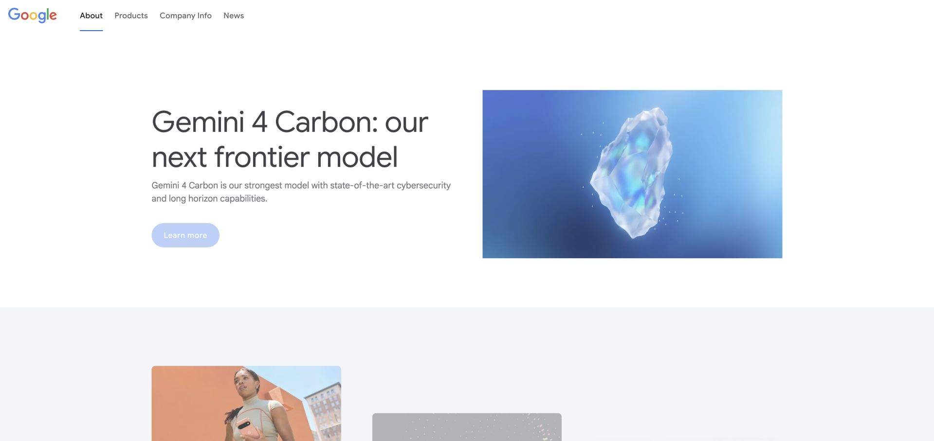
Google’s About page gives a single product story most of the opening viewport instead of trying to introduce every division at once. A restrained navigation, pale background and large image keep that story legible. The next row begins a broader editorial collection, making the page feel like a regularly maintained publication rather than a static corporate brochure. Google’s published Go case concerns indexing and infrastructure services; this photographed public-facing presentation is a separate design layer, not evidence that every Google page is served by Go.
What you can learn
Give a complex organization one timely entry point, then offer a clearly structured route into its other work. A technical capability becomes easier to understand when its first visual and first sentence describe the same concrete subject.
Pros
The opening image and headline form an unusually focused pair for a large corporate site.
Short navigation labels make company information approachable without a large menu immediately competing for attention.
Cons & considerations
A rotating news-led opening can leave a first-time visitor searching for the enduring company introduction.
The spacious presentation needs careful content selection; several equally important announcements would dilute its hierarchy.
Platform source: Official Go engineering or project evidence. Web indexing and infrastructure services, documented in a 2020 case. The cited engineering, project or customer source establishes only the named language association. It does not establish the marketing page runtime, every company system, current deployment continuity or independent performance results. Platform evidence is separate from the direct website screenshot and is not a complete current infrastructure audit.
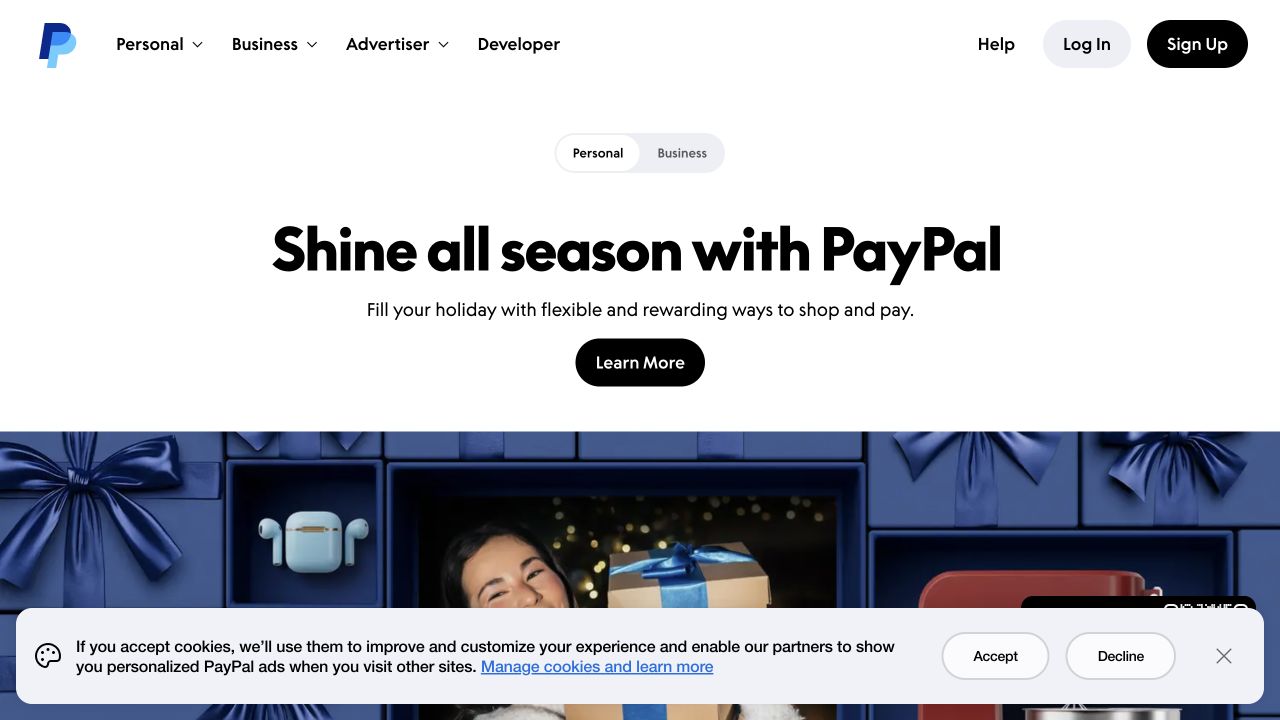
PayPal puts a seasonal shopping message below its familiar navigation, with a simple Personal and Business switch separating two quite different audiences. The large promotional image follows the introductory offer rather than crowding the menu. Log In and Sign Up remain easy to distinguish, a useful treatment for an account-based service that must also explain its value to new visitors. The Go association comes from a published database and operational-tooling modernization case, not a claim about this specific retail campaign page.
What you can learn
Separate the returning-user task from the acquisition story. Keep the account control in a predictable location while allowing the main page to explain a current, relevant use case. Do not make an existing customer read a marketing pitch before reaching their task.
Pros
The audience switch makes a broad financial platform feel like two more manageable starting points.
The black primary action remains visible against a restrained white introductory section.
Cons & considerations
Seasonal copy ages quickly and requires a genuinely maintained publishing schedule to remain useful.
The captured consent strip overlaps the lower promotional image and adds another decision before exploration.
Platform source: Official Go engineering or project evidence. Database and operational tooling modernization, documented in 2020. The cited engineering, project or customer source establishes only the named language association. It does not establish the marketing page runtime, every company system, current deployment continuity or independent performance results. Platform evidence is separate from the direct website screenshot and is not a complete current infrastructure audit.
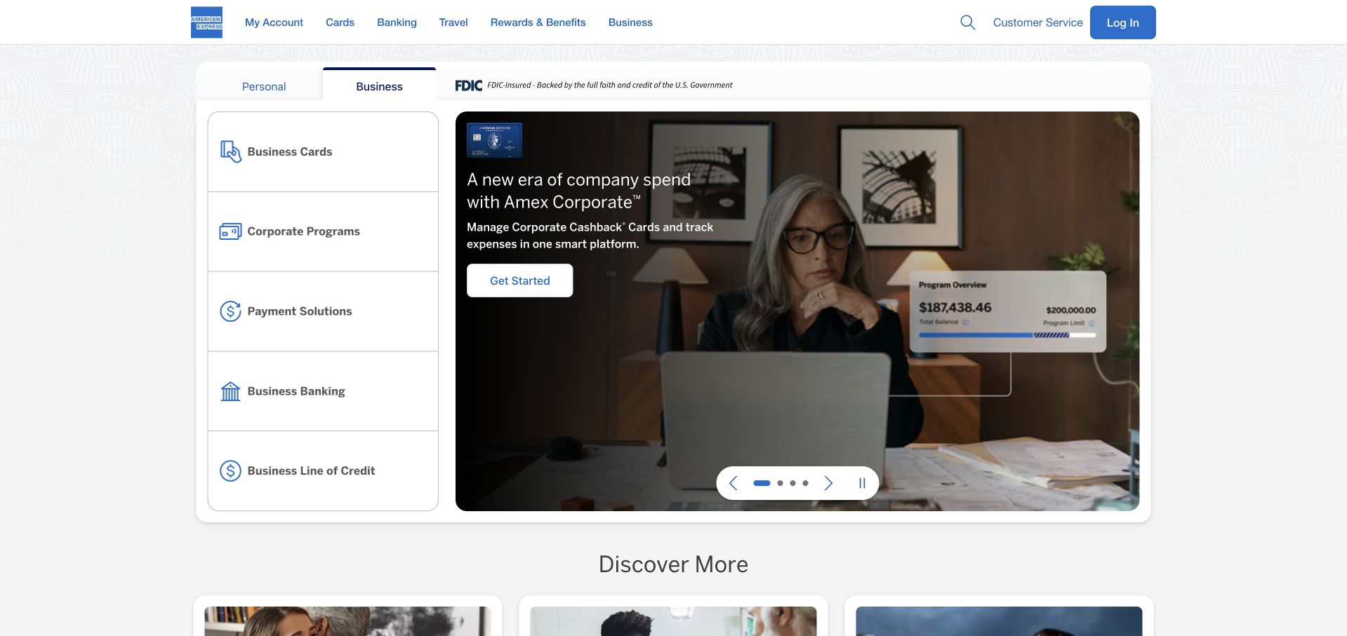
American Express uses a vertical product selector next to its main campaign, giving the visitor an alternative to waiting for the carousel. The selected Business context and familiar blue navigation establish the audience before the campaign asks for attention. A restrained card-like container separates the promotional area from the surrounding page. Its Go case discusses payment and reward services in a historical engineering account; neither that account nor the visible product menu establishes the technology behind this particular campaign’s frontend.
What you can learn
When a brand has several product families, make those families directly selectable beside the main story. The promotional panel can then change without becoming the only route to an important service. Give the selected audience state enough contrast to be understood immediately.
Pros
The product list provides a stable navigation structure even when the main campaign changes.
A clearly bounded promotional card makes the opening easier to scan than an unstructured full-screen montage.
Cons & considerations
The number of navigation layers increases the effort needed to understand where a visitor currently is.
Carousel controls and campaign copy need accessible timing and keyboard behavior beyond what a screenshot can establish.
Visible tech stack
Earlier / documented evidence
Go
Platform source: Official Go engineering or project evidence. Payments and rewards services, documented in a 2019 case. The cited engineering, project or customer source establishes only the named language association. It does not establish the marketing page runtime, every company system, current deployment continuity or independent performance results. Platform evidence is separate from the direct website screenshot and is not a complete current infrastructure audit.
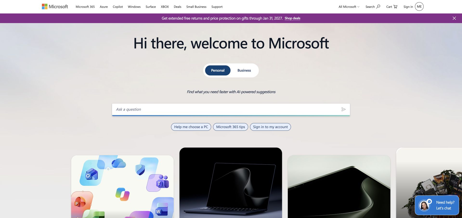
Microsoft’s public opening greets the visitor with an unusually simple question-led interface. Personal and Business choices sit above a broad input field, while recognizable product cards begin below it. The soft gradient and generous empty space make the interface feel less like a crowded software marketplace. Microsoft’s documented Go association concerns cloud infrastructure in an engineering interview; the page’s conversational search surface should not be treated as evidence of its server language or the architecture of any suggested product.
What you can learn
A guided question can reduce the intimidation of a very broad catalog, provided conventional navigation remains available. Pair open-ended discovery with visible categories so people who already know their destination do not have to describe it to an assistant.
Pros
The Personal and Business choice gives a broad prompt useful context before the visitor types anything.
Visible product cards offer a fallback for people who prefer recognition to an open-ended search task.
Cons & considerations
A question field asks visitors to formulate an intention that ordinary category navigation might answer faster.
The large greeting occupies valuable space without explaining which product best suits a particular need.
Platform source: Official Go engineering or project evidence. Cloud infrastructure, described in a 2018 engineering interview. The cited engineering, project or customer source establishes only the named language association. It does not establish the marketing page runtime, every company system, current deployment continuity or independent performance results. Platform evidence is separate from the direct website screenshot and is not a complete current infrastructure audit.
Uber’s About page leads with a human photograph and a compact mission statement rather than a diagram of its platform. The image establishes movement and ordinary life before the copy expands on the company’s purpose. That choice is especially relevant to a technically complex service: people arrive to understand what the company enables, not to inspect its service topology. The Go case directory names an AresDB analytics-engine association; it does not establish the runtime of this public About page.
What you can learn
Translate an infrastructure-heavy business into a recognizable human situation before introducing technical depth. Use engineering material as supporting proof for the appropriate audience, not as a substitute for explaining why the service exists or what a customer can actually do.
Pros
The photograph gives the otherwise abstract mission a concrete and approachable setting.
A short introductory statement creates an easy transition from imagery into a deeper company narrative.
Cons & considerations
An About page is not the best reference for task completion or the actual ride-booking experience.
A broad mission statement needs more specific evidence further down the page to avoid sounding interchangeable.
Platform source: Official Go engineering or project evidence. AresDB analytics-engine association in the Go case directory. The cited engineering, project or customer source establishes only the named language association. It does not establish the marketing page runtime, every company system, current deployment continuity or independent performance results. Platform evidence is separate from the direct website screenshot and is not a complete current infrastructure audit.
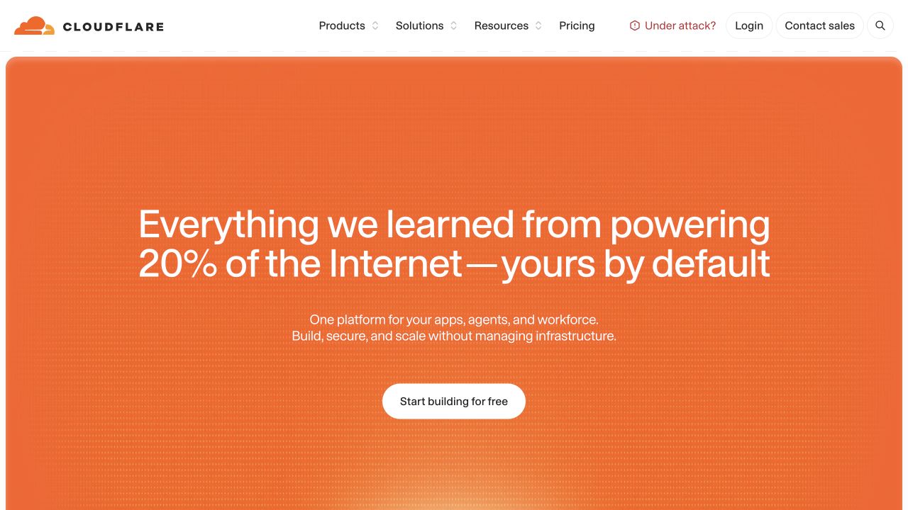
Cloudflare’s captured homepage uses a large orange panel as an unmistakable focal point. Its opening statement connects the platform to the wider internet, with a short description and a single bright call to action beneath it. Product and resource navigation stay outside that dominant panel, creating a cleaner first read than the breadth of the catalog might suggest. The cited Go engineering article discusses network-service upgrades; the public marketing composition and the underlying network implementation are not the same layer.
What you can learn
Compress the initial explanation of a broad technical platform, then let navigation expose the specialist detail. A memorable visual container can do more for recognition than adding more product names to the first sentence, but the supporting pages must still make concrete capabilities discoverable.
Pros
A strong orange field creates brand recognition without needing several competing decorative illustrations.
The main action remains distinct from the top navigation’s numerous specialist destinations.
Cons & considerations
The broad headline depends on supporting copy to explain the actual products and buying decision.
A platform-wide numerical claim should retain its source and scope rather than being copied as a generic trust badge.
Platform source: Official Go engineering or project evidence. Graceful network-service upgrades, described in an engineering article. The cited engineering, project or customer source establishes only the named language association. It does not establish the marketing page runtime, every company system, current deployment continuity or independent performance results. Platform evidence is separate from the direct website screenshot and is not a complete current infrastructure audit.
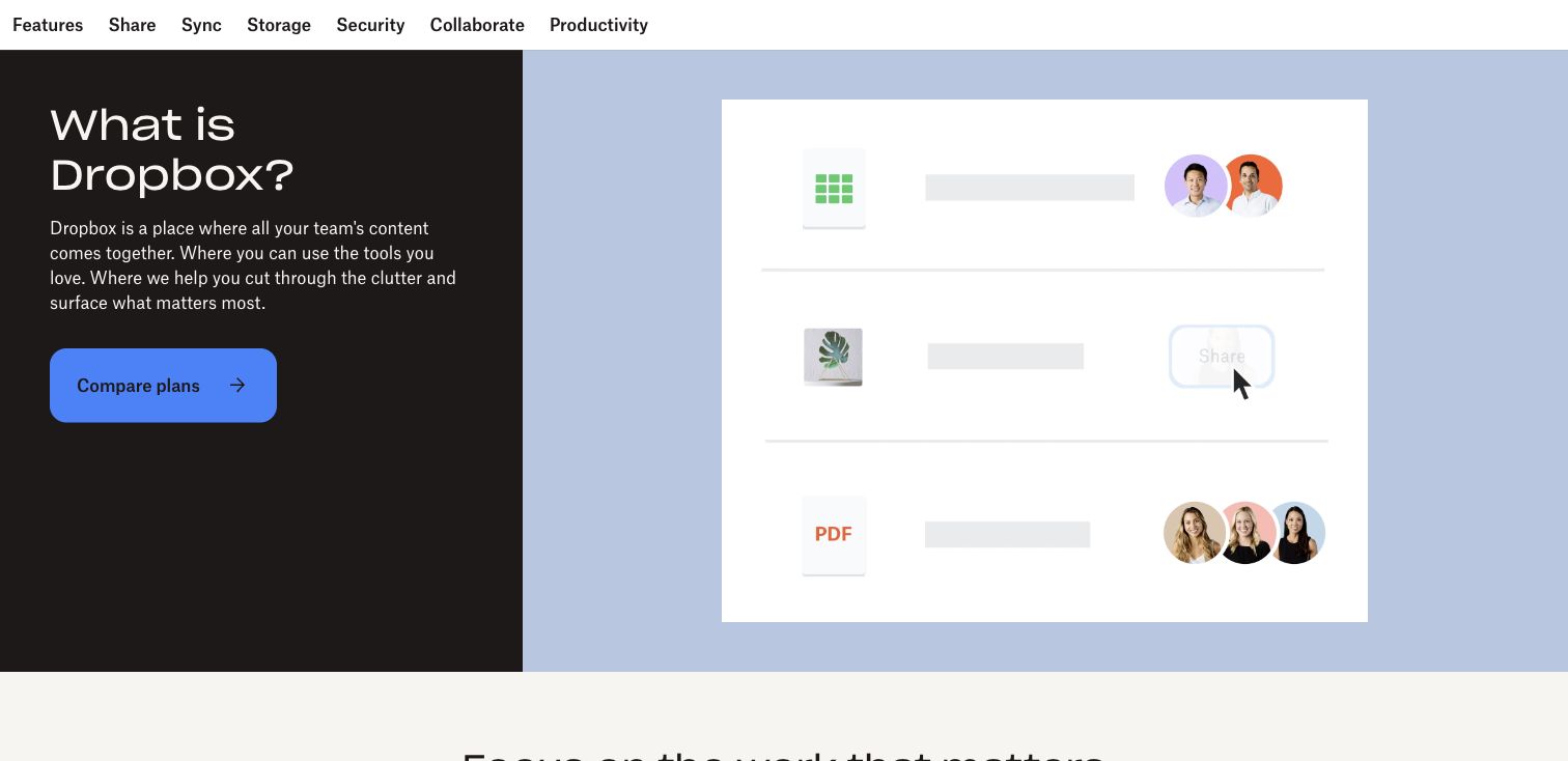
Dropbox’s feature overview starts by answering what the product is, placing a compact explanation opposite a simplified file-and-collaborator illustration. The dark text panel contrasts with a pale blue demonstration area, giving the opening two clear jobs. A feature navigation above the hero also makes specific capabilities easy to locate. The Go source concerns infrastructure libraries; this page is useful as an example of product explanation, not as proof that its visible content layer is implemented in that language.
What you can learn
Use an overview page to resolve the basic category question before comparing features. A simple illustration can show relationships between files and collaborators without pretending to be a complete interactive demonstration. Follow it with the real workflow and any important product limitations.
Pros
The direct opening question helps a visitor who recognizes the brand but not its current product range.
The split composition gives explanatory copy and the supporting illustration equal, clearly separated roles.
Cons & considerations
A simplified workspace illustration cannot establish the quality or accessibility of the actual application.
Feature tabs can fragment a related workflow if the visitor must repeatedly switch pages to understand it.
Platform source: Official Go engineering or project evidence. Infrastructure libraries, described in an engineering account. The cited engineering, project or customer source establishes only the named language association. It does not establish the marketing page runtime, every company system, current deployment continuity or independent performance results. Platform evidence is separate from the direct website screenshot and is not a complete current infrastructure audit.
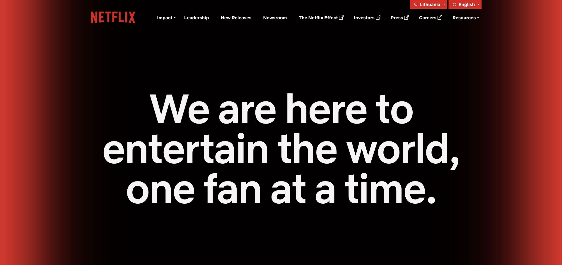
Netflix’s public company page uses oversized white type on a restrained dark-to-red background. Rather than replaying the consumer subscription flow, it opens with a broad entertainment statement and leaves company subjects in a compact navigation bar. The design borrows the visual confidence of a poster while keeping its text readable without a film clip. The Go case directory associates Netflix with application-data caching; that infrastructure example does not identify the backend of this separate corporate page.
What you can learn
A large statement works when it has one clear purpose and sufficient contrast. Distinguish a corporate introduction from a product purchase journey instead of forcing investors, press and prospective employees through consumer onboarding. Keep practical company destinations easy to find beside the expressive opening.
Pros
Large text creates a strong first impression without relying entirely on an autoplaying media asset.
Corporate navigation gives different professional audiences a direct alternative to scrolling through the brand story.
Cons & considerations
The opening is intentionally broad and provides little immediate detail about a specific service or product.
Oversized typography needs careful responsive testing so short statements do not become cumbersome on small screens.
Platform source: Official Go engineering or project evidence. SSD application-data caching association in the Go case directory. The cited engineering, project or customer source establishes only the named language association. It does not establish the marketing page runtime, every company system, current deployment continuity or independent performance results. Platform evidence is separate from the direct website screenshot and is not a complete current infrastructure audit.
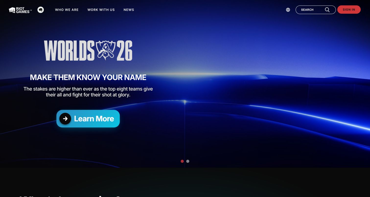
Riot Games gives its featured competition a dramatic blue stage, with a large event mark and one clearly lit action. The short supporting sentence is easier to absorb than a catalog of every game. A minimal header leaves the event artwork room to work, while search and sign-in stay visible for returning visitors. Riot’s engineering account describes Go in development and operations; the campaign artwork is not evidence of a particular language rendering this public page.
What you can learn
Use a genuine current event to give a portfolio a timely entrance, but preserve reliable routes to the rest of the organization. Borrow the relationship between headline, artwork and one action rather than copying the visual intensity for an unrelated, lower-involvement service.
Pros
The opening has a clear editorial priority instead of making every game compete at equal size.
The main button contrasts well against the dark environment and reads as an actionable next step.
Cons & considerations
An event-led hero can be less useful to visitors who want a different game or a company introduction.
Large media treatments need loading and reduced-motion checks that the captured frame cannot independently verify.
Platform source: Official Go engineering or project evidence. Game-development and backend-operations account. The cited engineering, project or customer source establishes only the named language association. It does not establish the marketing page runtime, every company system, current deployment continuity or independent performance results. Platform evidence is separate from the direct website screenshot and is not a complete current infrastructure audit.
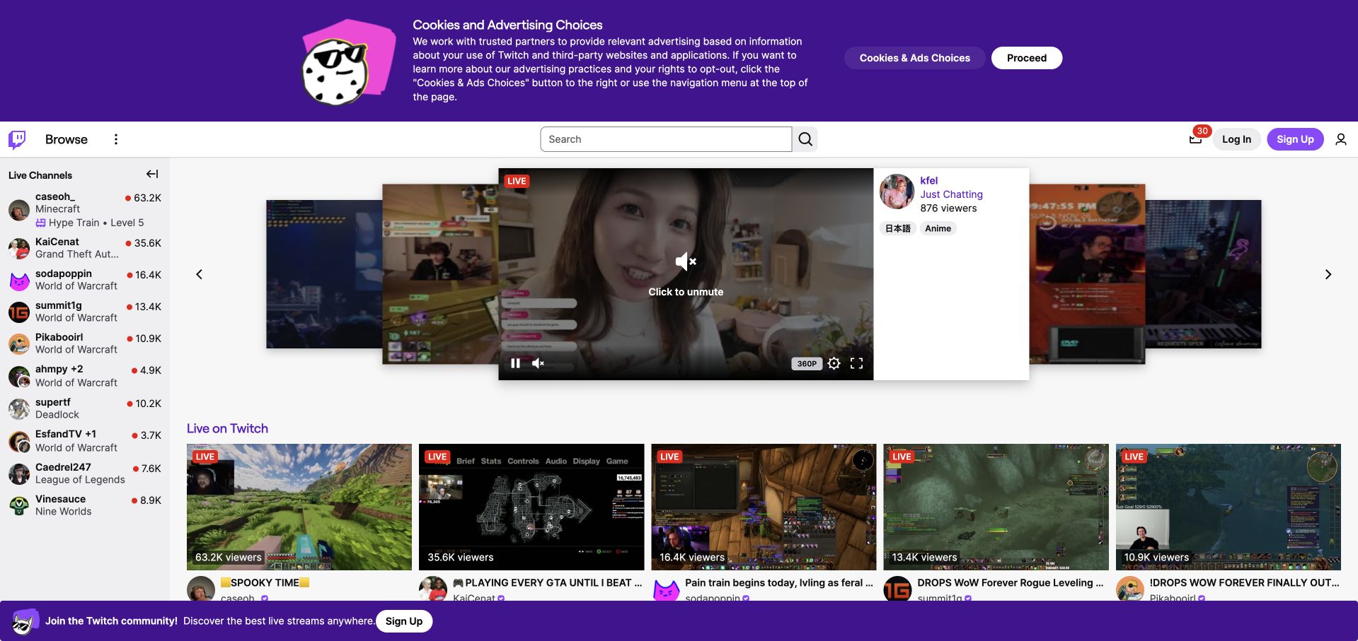
Twitch presents the service itself: a featured stream sits among live-channel previews, with browse navigation and a persistent channel rail. This is a more direct explanation of the product than an abstract landing-page illustration. The visible sign-in and sign-up controls also distinguish this public discovery view from a private account screen. The Go evidence is a historical engineering discussion of latency and garbage collection, not a measurement of the current interface’s responsiveness or an inventory of its complete architecture.
What you can learn
When discovery is the core product, showing real inventory can explain more than a slogan. Keep the first interaction understandable without an account, and make media playback, navigation and the registration offer separable decisions rather than one unavoidable combined action.
Pros
A real browsing surface communicates the range of content before a visitor decides to register.
Persistent browse and search controls provide alternatives to the currently featured channel or category.
Cons & considerations
The captured cookie and signup notices consume space around an already busy, media-heavy interface.
Moving previews and several simultaneous content choices can make the opening overwhelming for unfamiliar visitors.
Visible tech stack
Earlier / documented evidence
Go
Platform source: Official Go engineering or project evidence. Latency and garbage-collection engineering account from 2016. The cited engineering, project or customer source establishes only the named language association. It does not establish the marketing page runtime, every company system, current deployment continuity or independent performance results. Platform evidence is separate from the direct website screenshot and is not a complete current infrastructure audit.
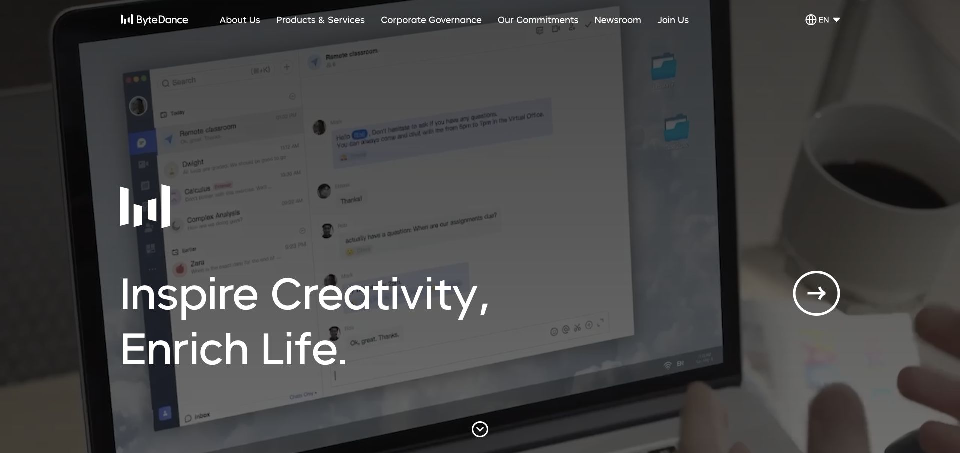
ByteDance’s homepage places a short white statement over large moving imagery, with a restrained navigation across the top. The video frame supplies texture and a glimpse of a digital working environment, while a prominent circular control signals that the opening is interactive. It is an expressive company introduction rather than a specification sheet. The Go directory identifies a CloudWeGo microservice association; it does not establish which language serves this corporate page or every ByteDance product.
What you can learn
Use a short corporate statement when the imagery genuinely adds context, then provide explicit routes into products, governance and company information. A moving background should support an intelligible still frame so the page remains useful before playback or with motion reduced.
Pros
High-contrast introductory type remains readable over a deliberately darkened visual background.
The top navigation separates product information from corporate and governance subjects without a long introductory paragraph.
Cons & considerations
The broad creative message gives little immediate guidance about the particular product a visitor should explore.
A video-led first screen requires a useful static fallback and careful testing on slower connections.
Platform source: Official Go engineering or project evidence. CloudWeGo microservice association in the Go case directory. The cited engineering, project or customer source establishes only the named language association. It does not establish the marketing page runtime, every company system, current deployment continuity or independent performance results. Platform evidence is separate from the direct website screenshot and is not a complete current infrastructure audit.
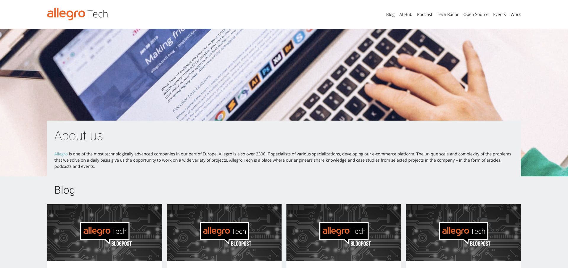
Allegro Tech combines a recognizable brand header, a large coding photograph and a direct About section before its blog cards. The page makes the team’s publishing activity visible instead of treating technical writing as a small footer link. Orange accents tie the editorial cards to the parent brand without turning each article into a sales banner. The Go association comes from the official case directory’s cache-service example; the engineering publication’s visible page design is a different subject from that implementation.
What you can learn
Give an engineering publication a clear team identity and an obvious route to substantive articles. The strongest introduction explains who writes and what kind of work they do, then gets out of the way. Avoid making every article depend on a large promotional hero.
Pros
The About section provides context before readers encounter a row of technical article titles.
Consistent orange accents establish a recognizable connection between the masthead, imagery and article cards.
Cons & considerations
The large introductory photograph pushes the first readable article summaries further down the opening screen.
Small text over detailed card imagery can lose legibility when the page is viewed at narrower widths.
Platform source: Official Go engineering or project evidence. Cache-service engineering association in the Go case directory. The cited engineering, project or customer source establishes only the named language association. It does not establish the marketing page runtime, every company system, current deployment continuity or independent performance results. Platform evidence is separate from the direct website screenshot and is not a complete current infrastructure audit.
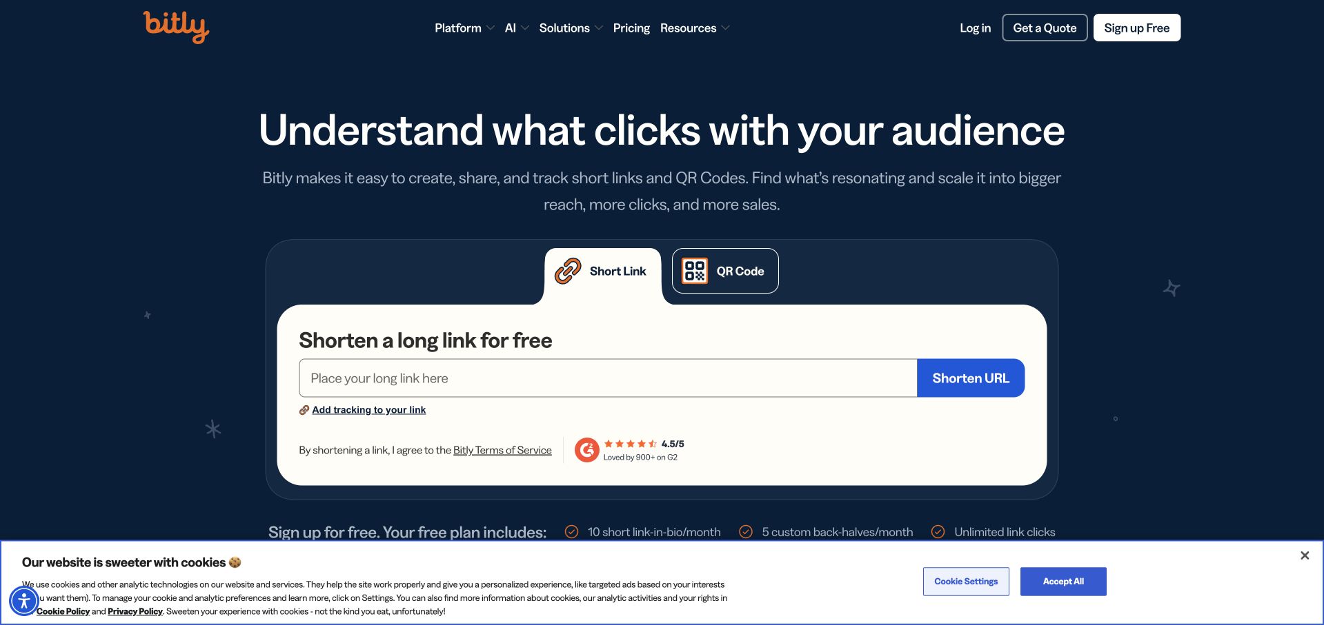
Bitly places a link-shortening form directly inside its opening, below a concise platform statement. Short Link and QR Code tabs make two related jobs visible without opening a menu. The navy background and bright form surface give the task strong visual separation from navigation and supporting trust marks. The Go directory associates Bitly with NSQ and service development; the form’s appearance does not establish the backend handling a submitted link, and this review did not submit one.
What you can learn
A bounded sample task can be a more useful introduction than a long product tour. State what the visitor can try, expose the input clearly and explain account or usage limits before submission. Treat the demonstration as a real workflow with errors and accessibility requirements, not simply decoration.
Pros
The bright form is the clearest object in the opening and makes the first task easy to identify.
Two task tabs describe concrete outputs rather than requiring visitors to understand a broad platform taxonomy.
Cons & considerations
A secondary signup pitch and consent strip compete with the otherwise focused first action.
The captured form cannot establish submission behavior, abuse protection, account requirements or successful output quality.
Visible tech stack
Earlier / documented evidence
Go
Platform source: Official Go engineering or project evidence. NSQ and service-development association in the Go case directory. The cited engineering, project or customer source establishes only the named language association. It does not establish the marketing page runtime, every company system, current deployment continuity or independent performance results. Platform evidence is separate from the direct website screenshot and is not a complete current infrastructure audit.
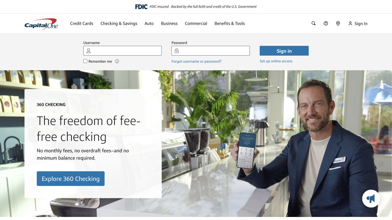
Capital One places an account sign-in strip above its checking-account campaign, distinguishing the repeat customer task from the new-product message. The hero pairs a concrete product proposition with an everyday retail photograph, while the main navigation keeps major financial categories visible. This is a useful example of two audiences sharing a familiar entrance. Its Go association is a serverless application case named in the official directory, not proof of the technology responsible for the pictured banking page.
What you can learn
Make returning-customer access predictable without allowing it to consume the whole acquisition story. Keep financial product details and eligibility accessible beyond the short hero promise. The design lesson is task separation, not evidence that a particular account is suitable for every visitor.
Pros
The sign-in area is easy to locate before a customer has to engage with promotional content.
A concrete product name provides a clearer starting point than a generic promise about financial freedom.
Cons & considerations
The combined navigation, sign-in strip and campaign require careful stacking and focus order on mobile.
A short headline cannot communicate all fees, eligibility conditions or account terms that a real decision requires.
Platform source: Official Go engineering or project evidence. Serverless application association in the Go case directory. The cited engineering, project or customer source establishes only the named language association. It does not establish the marketing page runtime, every company system, current deployment continuity or independent performance results. Platform evidence is separate from the direct website screenshot and is not a complete current infrastructure audit.
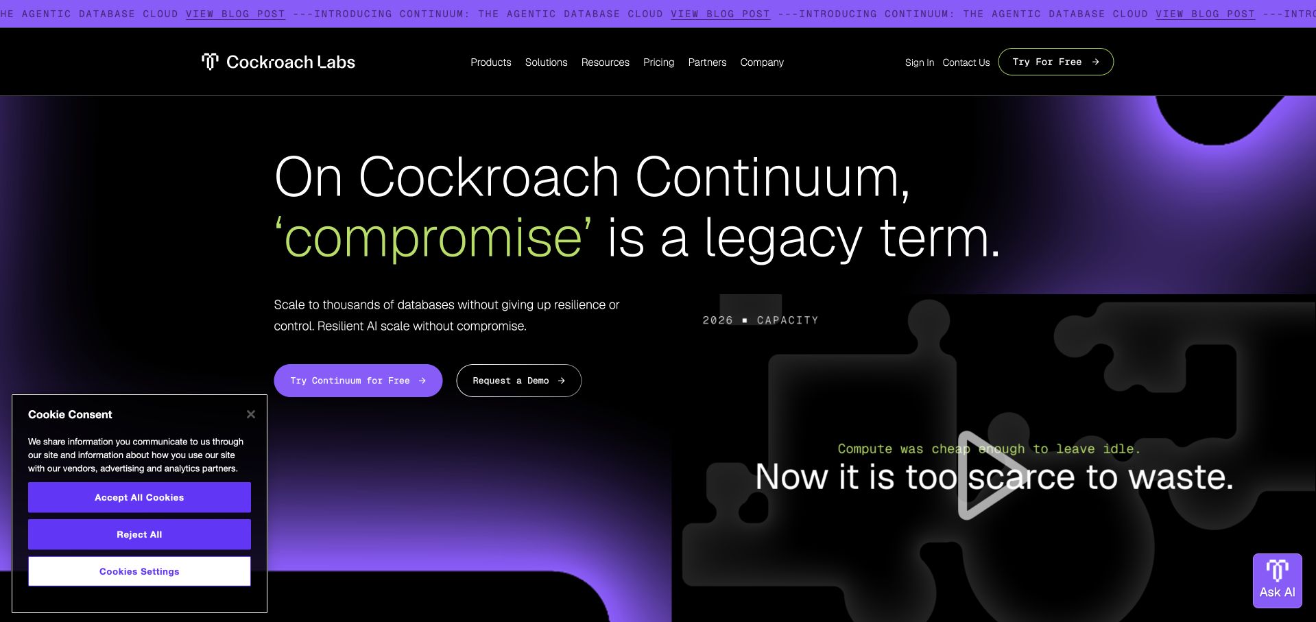
Cockroach Labs uses dark space, violet lighting and a large headline to introduce its database platform. A visible demonstration panel occupies the opposite side of the hero, giving the otherwise abstract message a concrete visual companion. The small top announcement creates an additional route without replacing the main product actions. The official Go case directory identifies CockroachDB’s implementation association; it does not make this marketing composition a Go frontend or independently validate the performance implications of the campaign copy.
What you can learn
Pair an infrastructure promise with a demonstration that shows what an operator actually sees or does. Keep reliability and scale claims tied to appropriate documentation and test conditions. A striking visual theme should make a technical concept easier to approach, not substitute for explaining its operational boundaries.
Pros
The limited dark-and-violet palette gives a dense infrastructure subject a distinctive visual identity.
Separate trial and demonstration actions acknowledge that visitors may be ready to experiment or only investigate.
Cons & considerations
The opening headline is memorable but needs more concrete supporting language to explain the product category.
The consent panel and assistant control add competing layers beside an already visually active demonstration.
Platform source: Official Go engineering or project evidence. CockroachDB implementation association in the Go case directory. The cited engineering, project or customer source establishes only the named language association. It does not establish the marketing page runtime, every company system, current deployment continuity or independent performance results. Platform evidence is separate from the direct website screenshot and is not a complete current infrastructure audit.
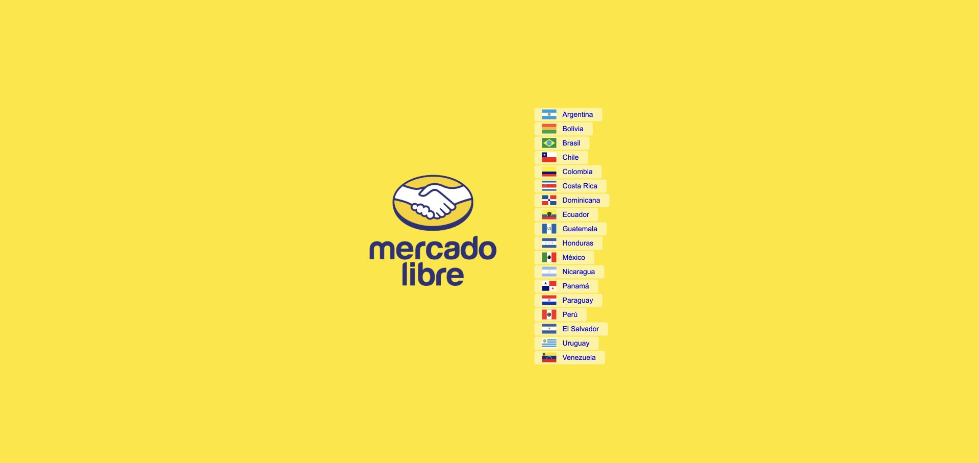
Mercado Libre’s root page is intentionally sparse: the brand mark and country links occupy a vivid yellow field. It does not pretend one inventory, currency or delivery promise can serve every market. Without a promotional carousel, the immediate decision is obvious, although the country list is modest relative to the available space. The Go directory records a commerce-service association; this regional gateway is not evidence of the language powering every local storefront or checkout.
What you can learn
Resolve the market choice before presenting information that changes by country. A regional gateway needs clear country names, keyboard access and an easy way to revise the selection later. Avoid making flag recognition the only way to choose, especially where languages and territories do not map neatly.
Pros
A single preliminary decision prevents mismatched currency, delivery expectations and country-specific offers at the opening.
The strong brand color makes an extremely simple utility page still feel recognizably part of the marketplace.
Cons & considerations
Small country links leave much of a wide screen unused and may be harder to scan than larger targets.
A gateway gives little product context to someone unfamiliar with the company or arriving for the first time.
Platform source: Official Go engineering or project evidence. Commerce-service association in the Go case directory. The cited engineering, project or customer source establishes only the named language association. It does not establish the marketing page runtime, every company system, current deployment continuity or independent performance results. Platform evidence is separate from the direct website screenshot and is not a complete current infrastructure audit.
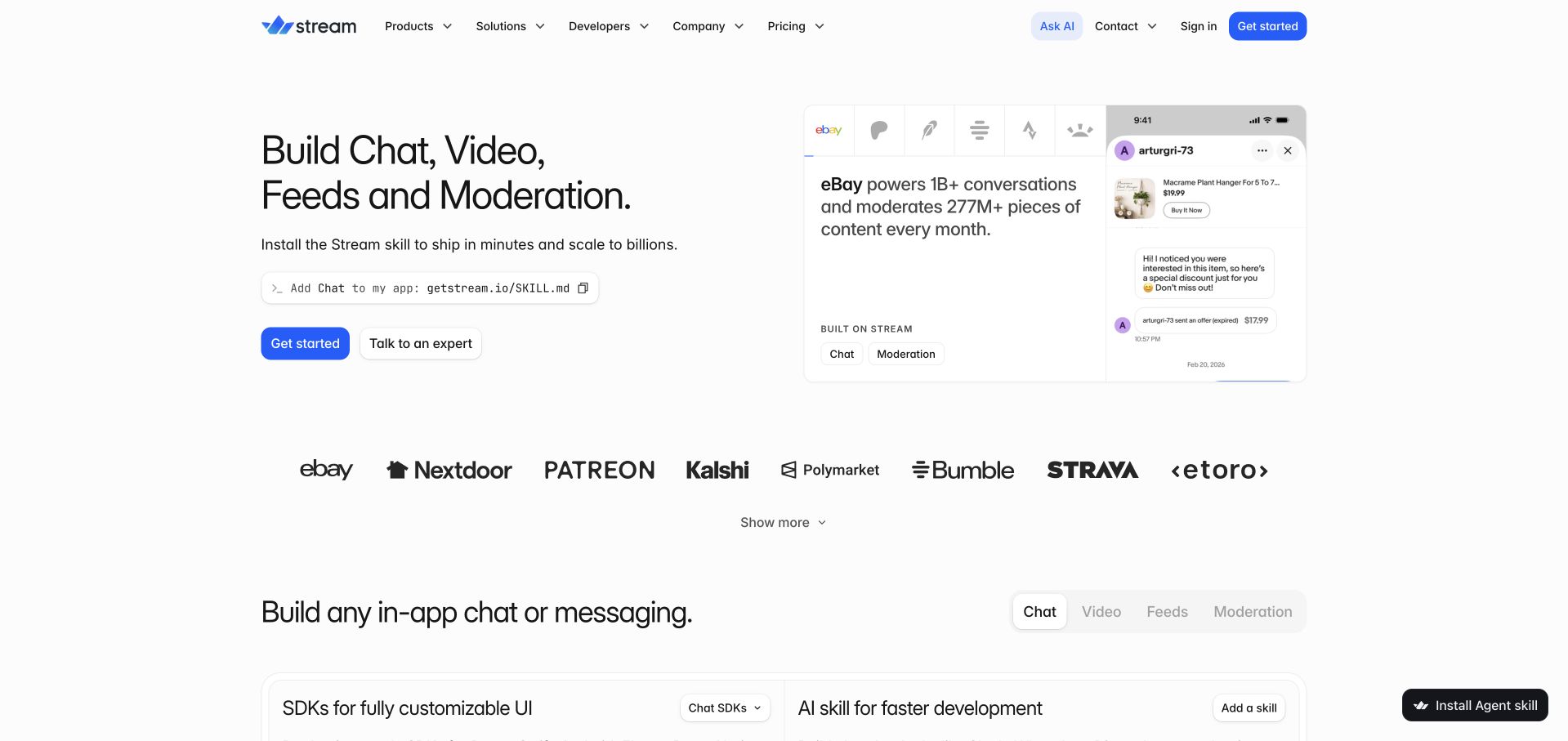
Stream opens with four concrete capabilities—chat, video, feeds and moderation—rather than asking visitors to decode a vague platform label. A compact interface demonstration sits beside the copy, and a recognizable customer-logo row follows below. Developer, product and commercial routes are all visible in the header. The official Go directory associates Stream with feed and chat services; the pictured demonstration is useful visual context but cannot independently establish its underlying runtime, production capacity or a particular customer’s implementation.
What you can learn
Name the jobs an API enables, then show the resulting user experience. Keep the code and integration route close enough for developers to assess the work involved. Customer context is most useful when it leads to a scoped case study rather than implying every logo uses every capability.
Pros
The capability list explains the product category without a long introductory paragraph or unexplained acronym.
Side-by-side messaging and interface imagery connect an API purchase to the application experience it supports.
Cons & considerations
Several product categories and assistant controls can compete for attention before the visitor chooses a use case.
A compact demonstration cannot answer operational questions such as moderation ownership, migration effort or service limits.
Platform source: Official Go engineering or project evidence. Feed and chat service association in the Go case directory. The cited engineering, project or customer source establishes only the named language association. It does not establish the marketing page runtime, every company system, current deployment continuity or independent performance results. Platform evidence is separate from the direct website screenshot and is not a complete current infrastructure audit.
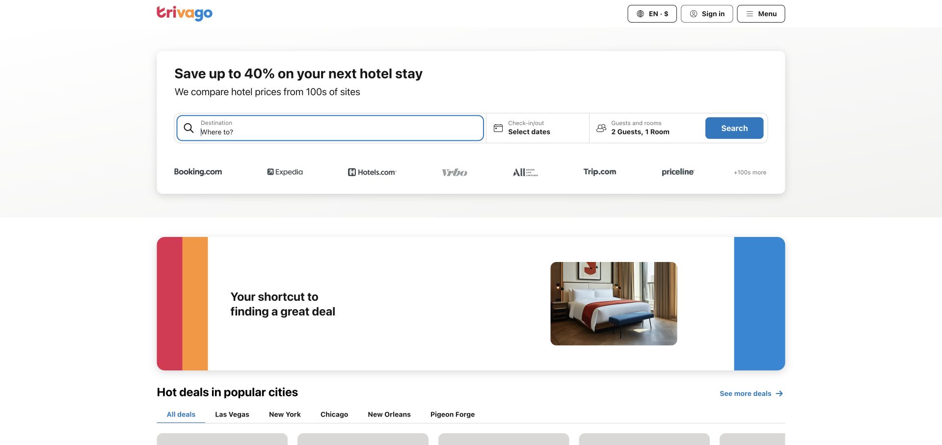
trivago gives the search form first priority, with location, dates and guest count arranged as a single recognizable booking task. Small alternative inputs and amenity cues sit below it, while a promotional card and city suggestions begin further down. The design puts practical intent ahead of large destination photography. Go is associated with service development in the official case directory; that documentary association does not establish the complete current search stack or demonstrate the quality of any returned hotel comparison.
What you can learn
Bring the inputs that materially change results into the first coherent task. Use inspiration further down the page for visitors who have not yet chosen a destination. The form should explain missing values and preserve corrections rather than treating search as a single unqualified button press.
Pros
The opening is organized around a familiar task rather than a decorative travel statement.
Location, dates and guests are visually grouped, helping visitors understand which decisions belong together.
Cons & considerations
The density of input labels and amenity options needs careful touch-target and focus testing on small screens.
Promotional savings copy should not be mistaken for a guarantee about every property, date or competing offer.
Platform source: Official Go engineering or project evidence. Service-development association in the Go case directory. The cited engineering, project or customer source establishes only the named language association. It does not establish the marketing page runtime, every company system, current deployment continuity or independent performance results. Platform evidence is separate from the direct website screenshot and is not a complete current infrastructure audit.
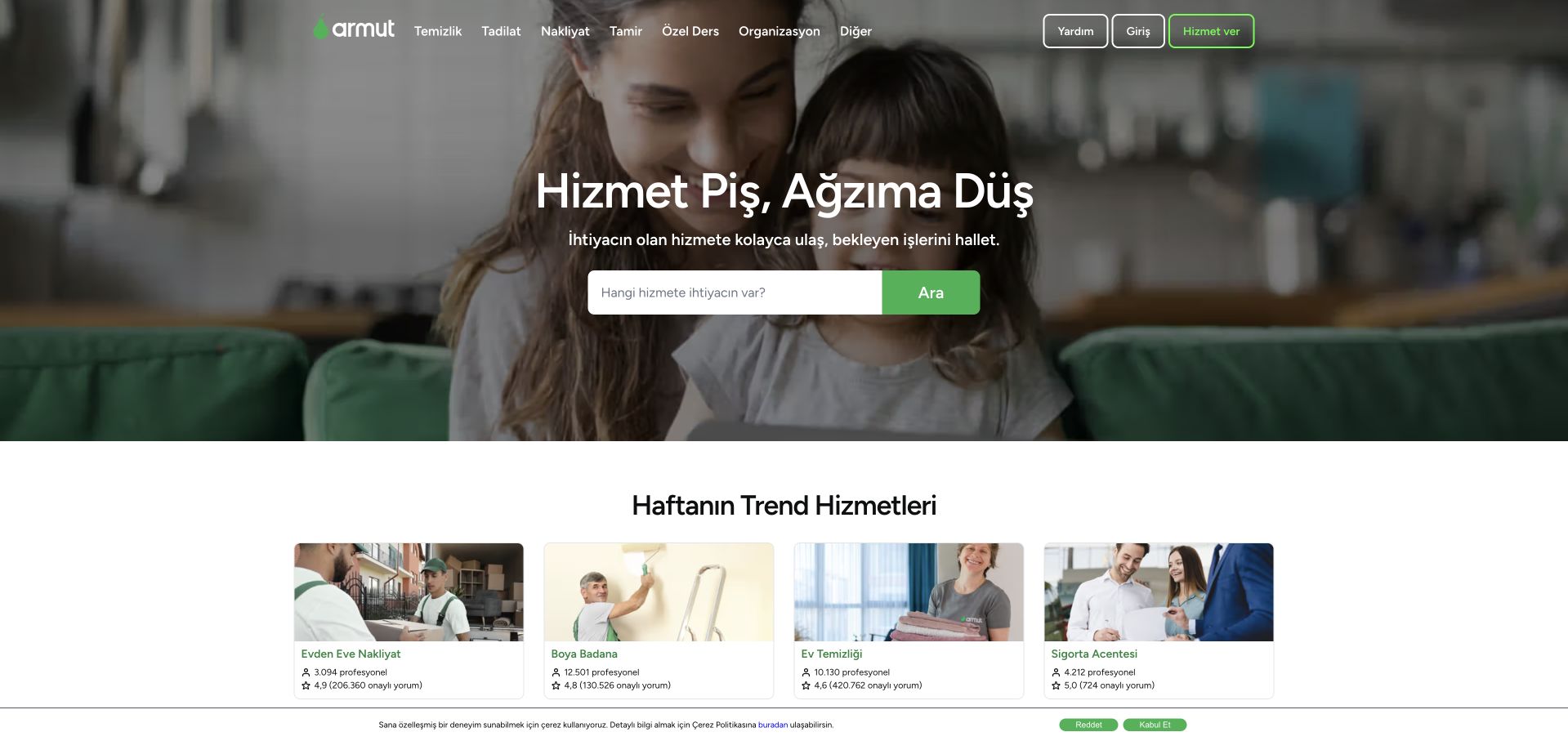
Armut’s Turkish-language homepage puts a service-search field over a household photograph, with familiar service categories in the navigation. A row of trending service cards follows, supplying examples for visitors who are unsure how to phrase their request. The green search action is visually distinct from the softer photographic background. The official Go case directory describes an API-modernization association; it does not establish the runtime of every marketplace page or the quality and availability of any individual service provider.
What you can learn
Help visitors name the task before asking them to choose a professional. Pair a search field with concrete category examples, then distinguish marketplace information from claims about the providers themselves. Localization should shape the wording and service taxonomy, not just translate a generic global landing page.
Pros
A real household setting gives an abstract service marketplace an immediately understandable practical context.
Visible category and trending-service routes support people who prefer browsing to formulating a search query.
Cons & considerations
Text over photography depends on a stable overlay and responsive crop to remain consistently readable.
A marketplace’s short opening cannot communicate provider screening, pricing or fulfillment conditions without deeper supporting information.
Platform source: Official Go engineering or project evidence. Marketplace API modernization association in the Go case directory. The cited engineering, project or customer source establishes only the named language association. It does not establish the marketing page runtime, every company system, current deployment continuity or independent performance results. Platform evidence is separate from the direct website screenshot and is not a complete current infrastructure audit.
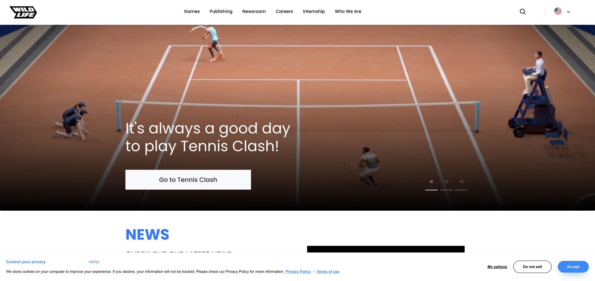
Wildlife Studios leads with a tennis-game scene and a direct route to the featured title. The photographic-style game artwork fills the opening, while the white navigation above it keeps company, publishing and careers routes easy to distinguish. A news section begins just below the hero, giving the site an editorial continuation rather than an abrupt end. The Go case directory associates Wildlife with mobile-game backends; the public publisher homepage and the game’s production services remain separate evidence scopes.
What you can learn
Let a strong product world carry the visual opening while retaining practical company navigation outside it. Make the title and destination explicit enough that a person interested in publishing or employment can choose another route without first entering a consumer game experience.
Pros
The featured game provides a concrete subject for a publisher that otherwise spans several products.
The clean white header remains visually separate from the immersive artwork and preserves corporate discovery routes.
Cons & considerations
A title-specific opening may be less relevant to visitors interested in a different game or partnership.
The captured privacy strip adds another horizontal layer near the transition from the hero into editorial content.
Platform source: Official Go engineering or project evidence. Mobile-game backend association in the Go case directory. The cited engineering, project or customer source establishes only the named language association. It does not establish the marketing page runtime, every company system, current deployment continuity or independent performance results. Platform evidence is separate from the direct website screenshot and is not a complete current infrastructure audit.
Kegan has 15+ years of experience working with small businesses, Fortune 500 companies, and everything in between. No development job is too big or too small: he brings the same hands-on attention to a focused improvement, a complete website, or a custom application.
For Go projects, he can help with content architecture, custom functionality, system integrations, testing, and maintainable handover. He works directly with clients on scope, design, implementation, testing, and handover, with an emphasis on clear communication and a system that remains practical to maintain after launch.
Show 3 other Go developersHide other Go developers
Keep publishing and service responsibilities separate. A content site can remain in an editor-friendly CMS while a Go API handles a justified application task. Define the request contract, authentication boundary and error presentation before deciding whether a separate frontend or a smaller server-rendered route is necessary.
A background worker or operational tool
An export, import or integration job may be a better first boundary than a complete platform rewrite. Record how work is queued, retried and reconciled, and make progress visible to the person responsible for it. Repeating an operation should not silently create duplicate business actions.
A performance-sensitive component
First collect a representative workload and a measurement of the actual bottleneck. Compare the proposed replacement with the existing component under the same conditions, including failures and resource use. Go’s presence in an infrastructure case study is useful context, not evidence that rewriting an unrelated service will improve it.
From references to requirements
Brief the request, the operator and the recovery path
Trace one complete interaction
Include validation, authorization, persistence, external calls and the final user-visible result. Describe a slow response, a canceled request and a duplicate submission. Decide which identifiers connect the public action to an internal diagnostic record without putting sensitive values into logs.
Define capacity and dependency limits
Agree limits for request size, concurrency, external timeouts and queued work. Test with realistic data rather than an empty demonstration endpoint. A service should fail in an understandable way when a dependency is slow instead of accumulating unbounded work that nobody knows how to clear.
Rehearse deployment and rollback
Name the person who owns builds, configuration, secrets, database changes and recovery. Practice deploying a compatible change and returning to the previous version in a nonproduction environment. Keep the application behavior, public content and any data migration coordinated rather than treating a binary release as the whole launch.
A useful handover demonstration
Ask the actual team to carry out its routine job: publish a realistic update, correct a mistake, preview a narrow screen, and identify who owns an integration failure. For a library or frontend framework, also ask who maintains the content source and deployment. A polished screenshot does not answer those operational questions.
Beyond the screenshot
Go service project checklist
Name the workload and why a custom service is needed.
Separate publishing, frontend and backend responsibilities.
Write the input, output and authorization contract.
Define deadlines and cancellation behavior.
Set concurrency, request and queue bounds.
Plan retries and duplicate handling.
Test unavailable and slow dependencies.
Keep diagnostic records useful without exposing sensitive values.
Measure the actual bottleneck before a rewrite.
Verify database-change compatibility.
Rehearse deployment, rollback and recovery.
Assign maintenance and dependency-upgrade ownership.
Test with real content, a keyboard, a small screen, slow or failed requests, and the people who will maintain the system. These are planning checks, not an accessibility, security, performance, or search-ranking certification.
Sources & editorial method
How this Go collection was reviewed
Twenty distinct public website source pages were independently reviewed for this collection. Screenshots are direct browser captures, with actual source URLs, dates, timestamps where known, dimensions and attribution retained. Existing source-page captures were inspected and reused without changing their original capture dates. New screenshots were captured November 9 UTC during the November 8, 2026 Pacific research session. Private account screens, transient blank shells and challenge pages were excluded. Official engineering, runtime, repository and project sources establish only the named language or workload association; historical and archived projects remain qualified. They do not establish current marketing-homepage runtime, a full corporate technology inventory, independent performance results or service-quality endorsement. Original reviews describe visible public design, not private account workflows. A separate bounded public source audit records additional supported technologies before publication. Images and trademarks belong to their owners.
Every image is an unmodified capture from the actual website, with its source and capture date. Some captures are reused from our shared catalog; their dates remain the original capture dates. None comes from a vendor gallery or a generated reconstruction. Moving imagery and live content can change.
Technology attribution uses public page assets or metadata, official platform documentation, or a cited first-party project case study. Documentary and framework-relationship evidence is identified where used; it is not a complete current backend inventory. A CMS image CDN alone does not establish a full CMS deployment. A library’s presence does not prove which individual controls use it, and a platform label does not establish AI authorship.
The composition notes, lessons, pros and tradeoffs are original editorial observations. We have not measured conversion, traffic, security, performance or accessibility conformance. Website owners retain their brands and imagery; these examples are not our client portfolio. Written, Edited and Curated are independent records, not dates advanced by a build. See our editorial standards or suggest a correction.
Questions worth asking
Go website development FAQs
Are these homepages proven to run on Go?
No. The captures show the named public pages, and primary engineering or project sources establish the separately identified Go association. A company’s use of Go for one service does not reveal its marketing-page runtime or complete stack.
Does a smaller business need the architecture of these large brands?
Usually the useful starting point is a much narrower requirement. Study a navigation or explanation pattern, then choose the smallest maintainable service boundary that satisfies the actual workflow. A famous company is not an architecture specification.
Should an existing service be rewritten in Go?
Not without a defined problem, representative measurements and a migration plan. Compare maintaining the current service, improving its bottleneck and replacing a bounded component. Include operational and handover costs, not only a successful prototype.
Does using goroutines remove capacity planning?
No. Decide how much work may run, how long it may wait and what happens when it is canceled or fails. Concurrency is an implementation capability, not permission to create unlimited work.
Can the public technology scan reveal the full backend?
No. It records bounded public evidence from the selected source page and available assets. Hidden services, private data systems and unexposed dependencies remain unknown unless a separately attributed source establishes them.
Borrow a clear public communication pattern, then write a Go brief around one understandable service, its dependencies and its recovery behavior. Keep the visual inspiration separate from the engineering evidence.