An airport website has to help someone find a flight, reach the right terminal and prepare for the journey while conditions are changing. These examples show how airports place those tasks beside parking, retail and destination content.
The best starting point for an airport redesign is a passenger situation, not a sitemap. A person collecting a relative needs arrivals and pickup instructions. A connecting passenger needs terminal movement and transfer guidance. Someone departing tomorrow may need baggage, assistance and a realistic route to the airport. A single large search box can support several of those needs, but it cannot explain every exception.
This collection examines public passenger pages across different airport sizes and regions. The reviews describe visible hierarchy, task language, forms and guidance. They do not rate airport operations, validate live flight feeds, or certify accessibility. Screenshots record a particular moment; flights, prices, wait times and travel notices can change.
Before the examples
What makes good airport website design in 2026?
Make flight information immediate
Expose arrivals, departures and a search field that explains whether it accepts airline, city, airport or flight number. Offer a complete board for visitors who cannot supply an identifier. Keep status labels and scheduled versus estimated times unambiguous.
Preserve terminal and journey context
Carry the selected terminal, airport and travel stage into parking, maps, assistance and security guidance. A network website needs a persistent airport identity so a visitor cannot silently move into another location’s rules.
Give disruptions a clear place
Roadworks, rail changes and terminal restrictions can alter the journey before the passenger reaches check-in. Use an owned notice with affected location, effective period and next step. Define an expiry and review process before launch.
Keep assistance discoverable
Expose assistance as a normal passenger task, with contact details, preparation information and relevant timing. Explain the boundary between airport and airline responsibilities using current official guidance rather than leaving people to infer it from a menu.
The collection · 20 examples
20 airport websites worth studying
The twenty examples below were selected to compare flight-first interfaces, booking-led openings, visible operational boards and airport pages within larger authority networks. Each review highlights a concrete pattern and the tradeoff a design team should examine before borrowing it.
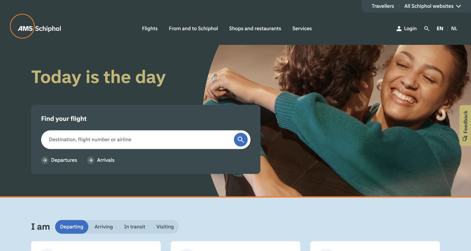
Schiphol pairs a warm reunion photograph with a practical flight field that accepts a destination, flight number or airline. The large yellow headline gives the airport a recognizable voice, while separate departure and arrival links keep the functional next step readable. Below that opening, the ‘I am’ navigation changes the information frame to departing, arriving, connecting or visiting. That distinction matters because a person meeting someone has different questions from a passenger carrying baggage through security. The observed page also groups preparation, assistance and airport facilities around those stages. Its strength is the connection between emotional travel imagery and an explicit passenger task.
What you can learn
Organize airport information around the traveler's current situation, then let flight search remain a shortcut across those categories. Test that a visitor can change stage without losing the context of their flight or terminal.
Pros
The flight field explains several accepted search inputs.
Passenger stages separate preparation from meeting and connecting tasks.
Cons & considerations
The large emotional hero still occupies space needed for immediate operational details.
Stage tabs require clear selected states and equally usable keyboard navigation.
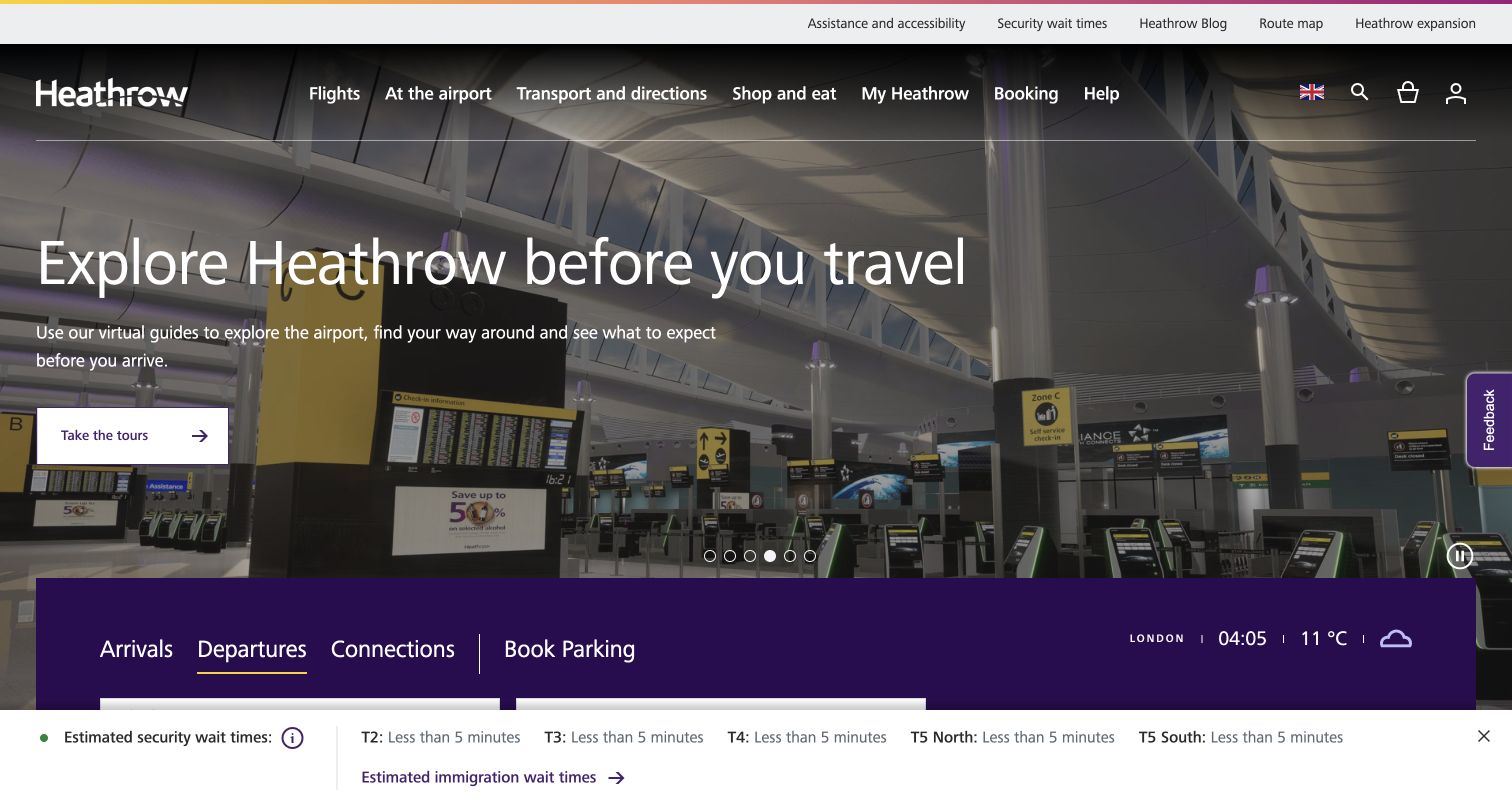
Heathrow's captured homepage promotes a virtual terminal tour above a row of practical tabs for arrivals, departures, connections and parking. The campaign area uses a darkened terminal photograph and a clearly bounded white action, while the navigation exposes assistance and security information separately. A security-estimate strip remains near the bottom of the viewport, giving operational content another location outside the carousel. The interesting design choice is this division of labor: rotating editorial stories occupy the large image, but travelers can begin a familiar task below it. A visitor should not need to wait for a particular slide to locate a flight.
What you can learn
Keep terminal tours and retail campaigns in a replaceable promotional area. Make flight lookup, connections and assistance stable components, and label any security estimate with its terminal scope and update context.
Pros
Useful task tabs remain outside the changing hero message.
Assistance and security have visible entry points in the header.
Cons & considerations
Several campaigns and navigation layers compete in the first screen.
A wait estimate can be misunderstood unless its meaning and freshness stay explicit.
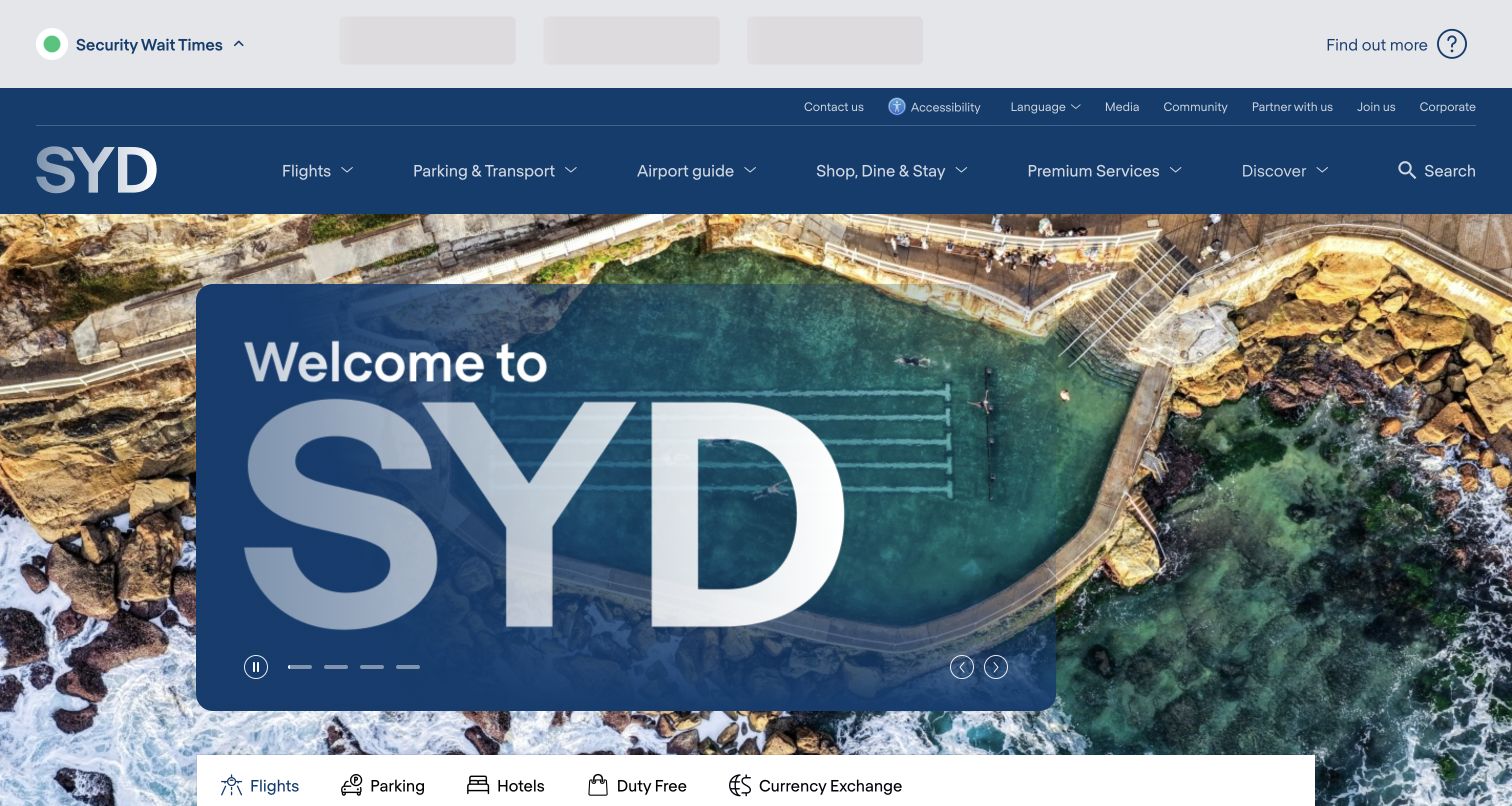
Sydney Airport opens with a coastal image and an oversized welcome treatment that identifies the city before presenting a row of service tabs. Flights, parking, hotels, duty free and currency exchange share that switcher, so the homepage behaves partly like a service marketplace. The upper navigation covers airport preparation and terminal information, while a security information strip occupies a more operational position above it. This creates three different reading speeds: immediate status at the top, destination atmosphere in the middle, and a chosen transaction below. The layout is a useful reference for an airport that wants a strong sense of place without removing familiar travel categories.
What you can learn
Separate destination identity from the controls that determine a passenger's next action. Keep terminal-specific information visible after a service is chosen, especially when flight, parking and hotel journeys use different systems.
Pros
The service tabs make the breadth of available tasks legible.
The local photography gives the gateway a specific visual identity.
Cons & considerations
Retail and essential flight tasks receive similar switcher treatment.
A large image can push the active service form lower on smaller screens.
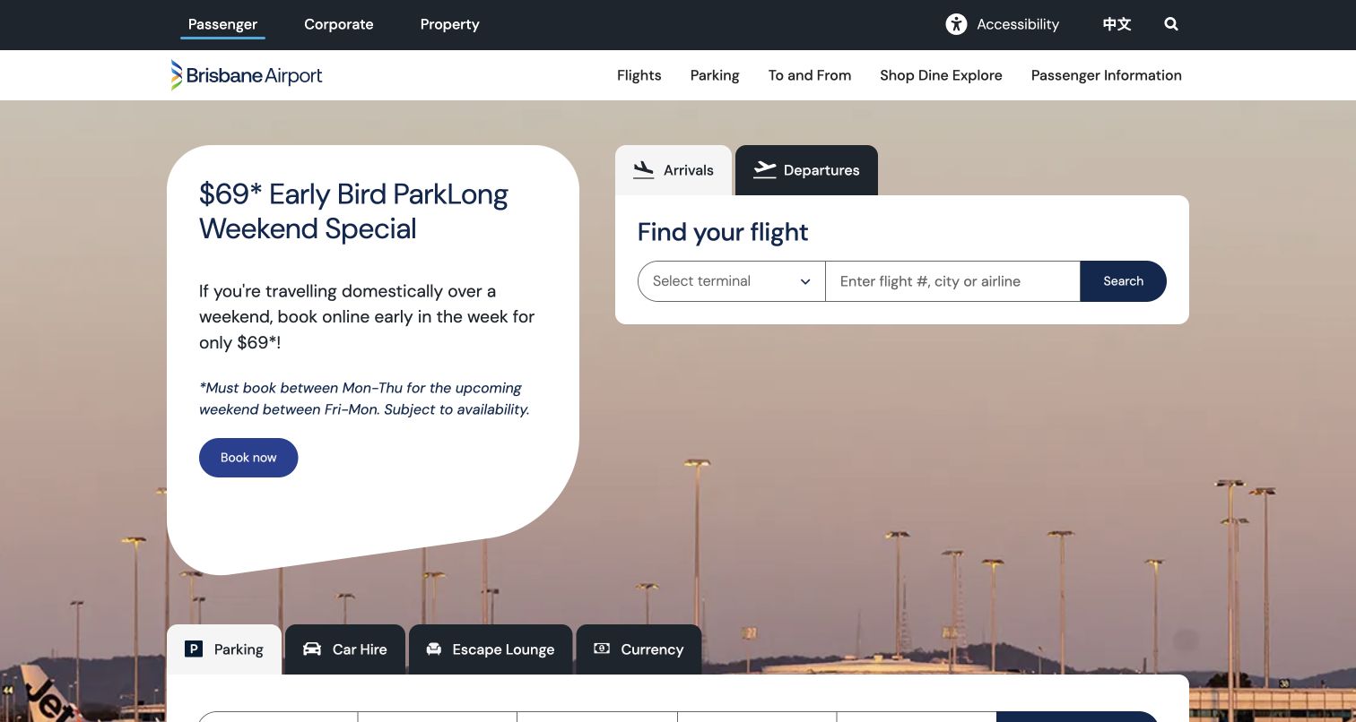
Brisbane Airport places a parking promotion beside a dedicated flight lookup card against an airport-at-dusk background. The flight card exposes arrivals and departures, a terminal selector, and a field for a flight number, city or airline. The terminal choice is a meaningful piece of context rather than an instruction buried on a separate page. A second row of service tabs continues below the opening, while the very top distinguishes passenger, corporate and property audiences. The composition makes two high-demand jobs visible together. It also reveals the editorial tradeoff involved: the commercial parking message has substantial visual weight beside time-sensitive flight information.
What you can learn
If two tasks share the hero, give each its own clear heading, boundaries and completion path. Use the terminal selector to reduce ambiguity, and preserve an obvious all-flights route for visitors who do not know their flight number.
Pros
The flight search names its accepted identifiers.
Passenger and business audiences are separated before the main navigation.
Cons & considerations
Parking promotion and flight status compete for initial attention.
Several service tabs can become dense when the layout narrows.
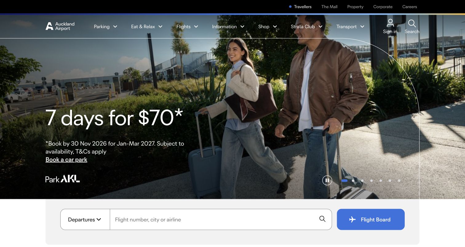
Auckland Airport uses a broad traveler photograph as the setting for a parking offer, with the booking window and conditions placed close to the campaign message. Beneath the hero, a long flight-search field and a distinct Flight Board button create a second path for people who arrived to check a service rather than book parking. The top audience navigation separates travelers from property, corporate and careers content. Other observed homepage stories concern changes to airport services and travel preparation, demonstrating that the same visual system accommodates operational notices as well as promotions. That flexibility is useful, provided urgent notices are not dependent on carousel timing.
What you can learn
Put offer limitations beside the offer, and give operational tasks a stable route beyond the campaign. Treat a service change as a dated notice with a clear next step rather than relying only on a rotating image.
Pros
Offer conditions are presented near the promotional headline.
A dedicated Flight Board link supports visitors who prefer browsing.
Cons & considerations
The initial emphasis is parking rather than flight status.
A rotating collection can hide a service-change message from hurried visitors.
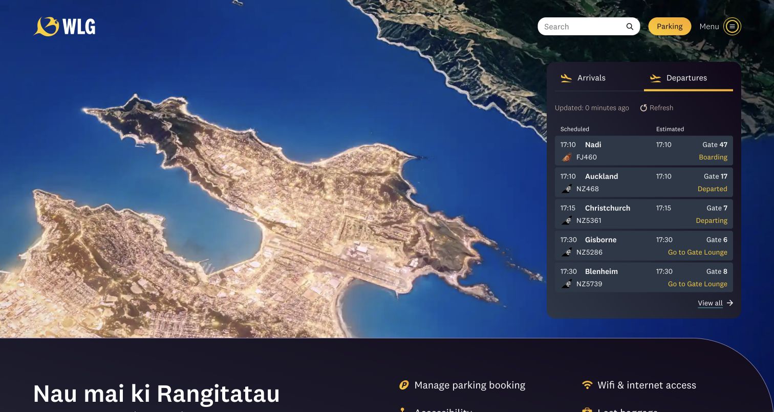
Wellington Airport combines a coastal aerial background with a compact departure board on the right. The board distinguishes scheduled and estimated times, shows gates and status, and includes a refresh control and update timestamp. These details make the panel feel like operational information rather than decorative sample rows. The purple and yellow palette carries through the header and board, while the welcome copy and task links continue below. Unlike a homepage that asks every visitor to run a search first, this approach offers a quick scan of current departures. It is particularly instructive where the number of visible flights can remain understandable within a modest card.
What you can learn
When displaying a live board, explain the columns and expose freshness. Provide a full-board link so truncation is obvious, and make status changes readable without depending on color or a passenger noticing an animation.
Pros
Scheduled and estimated times are explicitly distinguished.
The update timestamp and refresh control explain the information state.
Cons & considerations
A compact board shows only a portion of the available flights.
Dense rows need careful spacing and reflow on a phone.
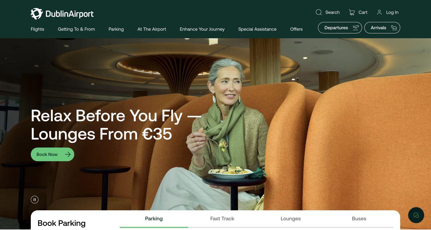
Dublin Airport keeps arrivals and departures as outlined buttons near the header while a lounge campaign occupies the main photograph. A white booking card below groups parking, fast track, lounges and buses into separate tabs. The form's entry and exit controls make the current booking task concrete, and the page also exposes management of existing bookings. This is a useful example of separating flight information from paid extras without hiding either. The dark green header establishes a consistent frame, but the number of booking products means the selected tab must do substantial explanatory work. The screenshot illustrates entry points only; no booking or payment was completed.
What you can learn
Give flight status its own stable controls, then let ancillary products share a clearly labeled booking region. Each tab should explain what is being bought, what information is required and how a passenger returns to an existing reservation.
Pros
Arrivals and departures remain distinct from the sales form.
Booking products are grouped under familiar service names.
Cons & considerations
The lounge campaign occupies more space than operational information.
Different products may need different date, terminal and passenger rules.
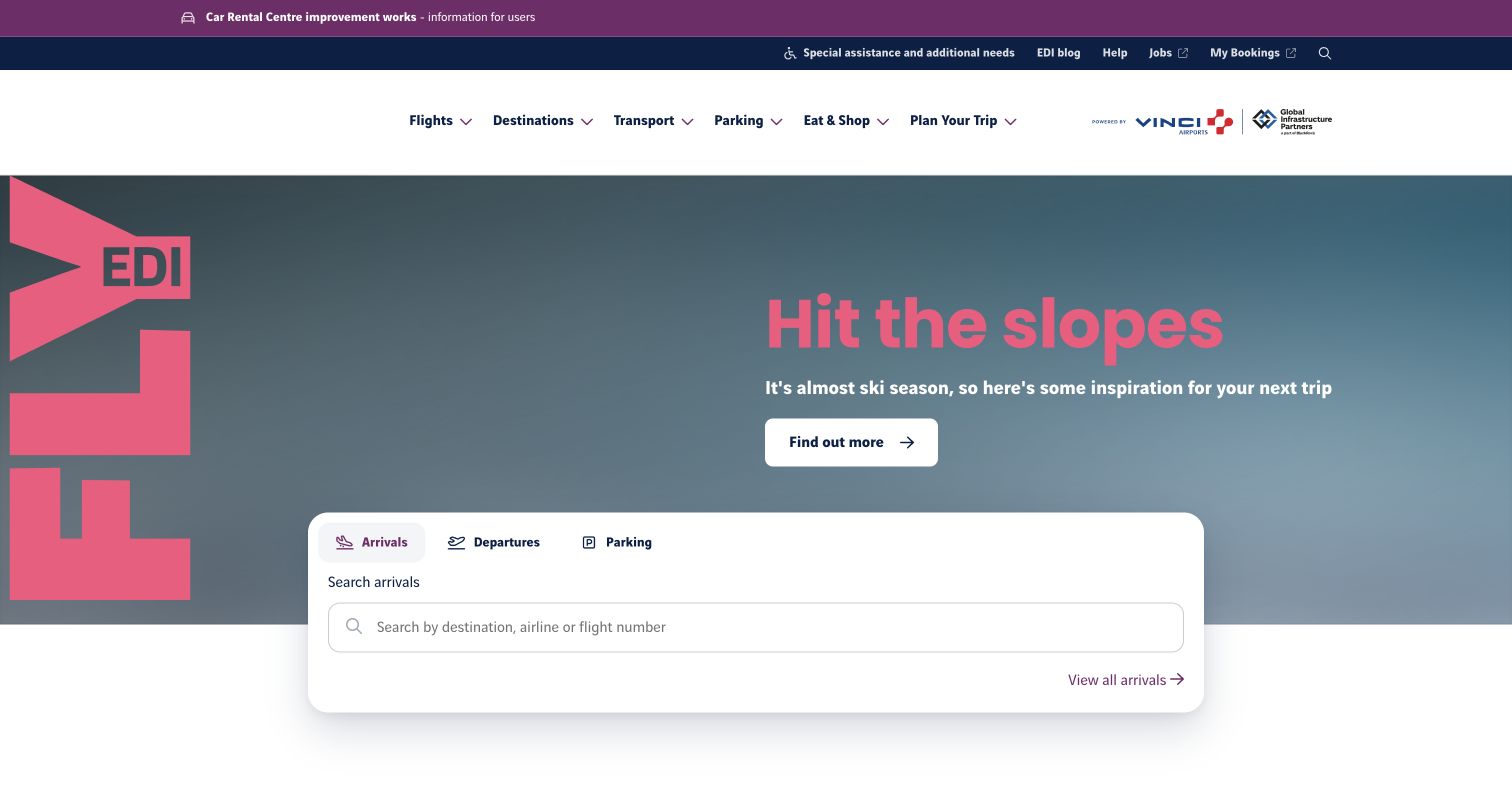
Edinburgh Airport places its bright pink EDI identity beside a seasonal travel campaign, then overlays the lower edge with a white flight and parking widget. Arrivals, departures and parking appear as a short row of choices, and the active search field spells out destination, airline or flight number. A direct all-arrivals link offers a browse alternative. Above the main navigation, a notice strip calls attention to transport-related works, with assistance and help links in a separate utility bar. The layered design distinguishes broad inspiration from a concrete lookup task. Its most reusable feature is the fixed visual home for search even when the campaign headline changes.
What you can learn
Treat the flight widget as permanent infrastructure and the hero as replaceable editorial space. Place disruption notices above both, with a meaningful affected location and a route to details rather than an unexplained warning icon.
Pros
The search field supports several recognizable flight identifiers.
Transport notices sit above the promotional area.
Cons & considerations
The tall header and campaign consume considerable vertical space.
An overlapping card requires careful small-screen ordering and focus visibility.
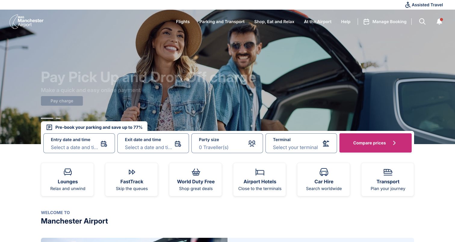
Manchester Airport's observed opening makes parking comparison the most prominent interaction. Entry and exit dates, party size and terminal sit in a horizontal form with a contrasting comparison button. Below it, icon cards lead to lounges, fast track, duty free, airport hotels, car hire and transport. The campaign photograph concerns pickup and drop-off payment, while the header retains a Flights category and assisted-travel link. This is a clear commercial hierarchy: multiple travel extras are treated as products with their own next steps. It also provides a useful caution for airport teams, because a visitor checking a delayed flight must recognize the header route rather than mistake the parking form for the main airport search.
What you can learn
Ask for trip context only when it changes the product being compared. Preserve a visible flight-information shortcut near a dominant parking form, and make pickup fees, reservations and general transport guidance clearly different journeys.
Pros
Terminal and party-size fields explain the parking comparison context.
Service cards use both icons and readable names.
Cons & considerations
Parking occupies more immediate attention than arrivals or departures.
The long form needs a deliberate stacking order on compact screens.
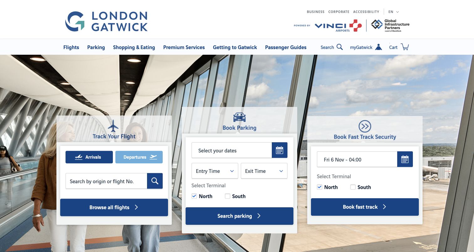
London Gatwick gives flight tracking, parking and fast-track security their own adjacent panels. Each panel has a short title and a visible action, so a traveler can compare tasks without first opening a menu. Flight tracking includes arrivals and departures plus a browse-all option; the purchase panels ask for dates or times and terminal selection. The corridor photograph provides context while translucent headings and solid white fields retain a functional foreground. This is a more form-led opening than a large campaign headline. Its success depends on making the three workflows distinguishable, because they share colors and similar button proportions despite having different consequences.
What you can learn
Use parallel panels only for tasks that visitors can distinguish quickly. Keep terminal choice beside the relevant booking fields, and label paid-service actions so they cannot be confused with a simple information lookup.
Pros
Flight lookup offers both search and an all-flights route.
North and South terminal choices are exposed in booking panels.
Cons & considerations
Three forms produce a busy first screen.
Narrow layouts must prioritize the essential task rather than merely shrink every column.
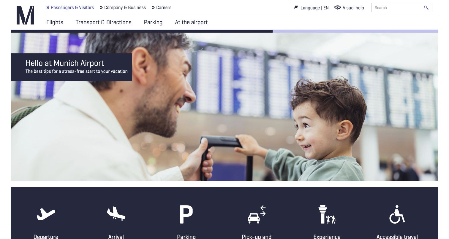
Munich Airport leads with a parent-and-child photograph linked to preparation advice. The main navigation is comparatively short, grouping flights, transport, parking and airport facilities, while a separate audience bar handles business and careers. A dark row of large white pictograms underneath the hero points toward departure, arrival, parking, pickup, experiences and accessible travel. The icon row makes the transition from reassurance to action visually clear. The observation is useful for airports that receive many occasional travelers: preparation can have an inviting place without forcing every service into the header. Labels are essential here because the symbols alone would not fully explain the destination of each link.
What you can learn
Pair each pictogram with plain text and keep the set small enough to scan. Use preparation stories to answer a specific passenger concern, then place practical next steps immediately after the story rather than several sections below it.
Pros
The main menu uses a small set of broad, familiar categories.
Accessible travel appears alongside other primary task icons.
Cons & considerations
The large preparation image delays the operational controls below it.
Some pictograms need their text labels to avoid ambiguous meanings.
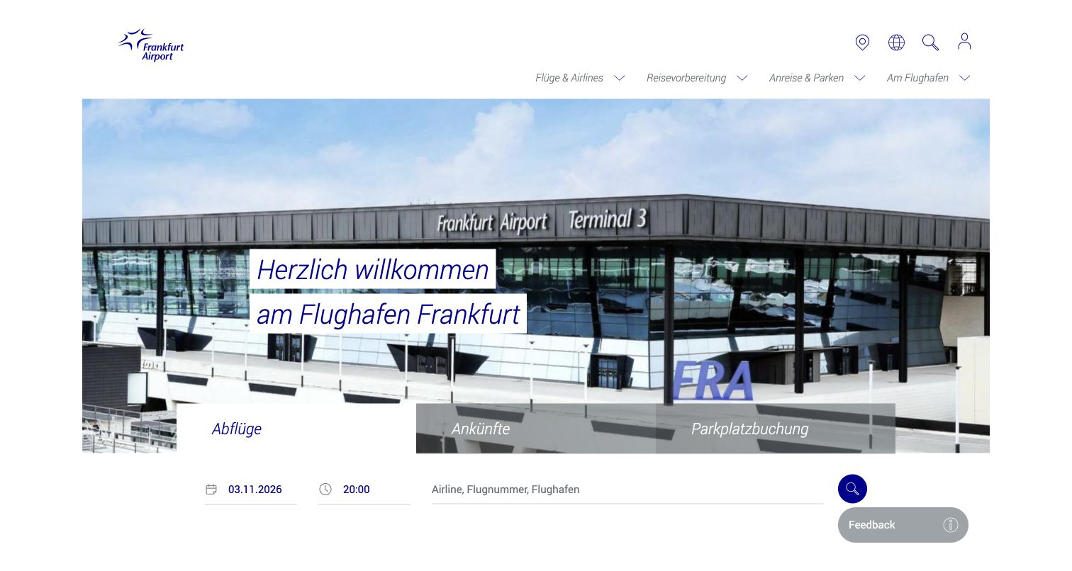
Frankfurt Airport's German homepage combines a terminal photograph with a tabbed area for departures, arrivals and parking. The active flight form includes a date, time and a field for airline, flight number or airport. Farther down, a second set of passenger-stage tabs organizes departure, arrival, transfer and visiting content. This distinction between finding a flight and preparing for a journey is valuable: one task needs a precise identifier, while the other needs an information path. The restrained white and blue layout gives the form a clear boundary. The review concerns the observed German page; an English-language option was also exposed in its navigation.
What you can learn
Separate precise flight lookup from broad journey guidance, and keep the language switch easy to find before either task begins. Date and time controls should clearly indicate their defaults so yesterday's or tomorrow's flights are not mistaken for current results.
Pros
The lookup form supports both flight identifiers and airport names.
Passenger-stage tabs organize preparation separately from live search.
Cons & considerations
Two sets of tabs can require extra orientation.
Default dates and times deserve explicit context on an operational page.
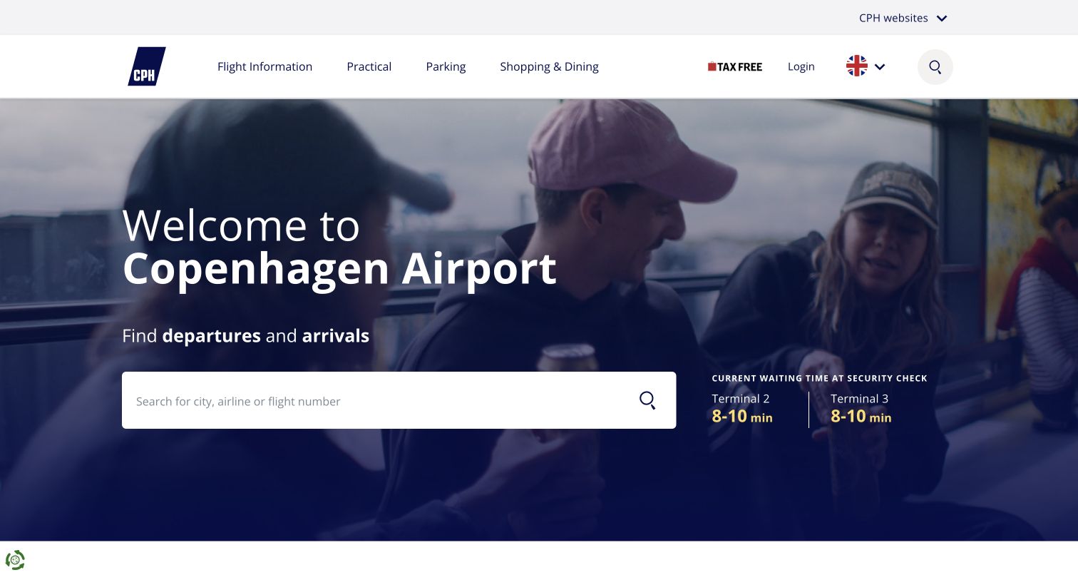
Copenhagen Airport centers the first screen on a flight-search field and terminal-specific security waiting information. The darkened passenger photograph makes the white search box prominent, while yellow waiting-time figures create a second focal point beside it. The header is relatively concise, grouping flight information, practical matters, parking and shopping. This arrangement links two questions a departing passenger may ask together: where is my flight, and what should I expect before reaching it? The terminal labels are a useful qualification, because a single airport-wide number would hide important differences. The screenshot is a momentary observation and the displayed values are not a forecast or a guarantee.
What you can learn
Place operational estimates near the task they inform, but identify their terminal and measurement scope. Preserve a fallback when data is unavailable, and make flight search usable without requiring a traveler to interpret the promotional background.
Pros
The first screen emphasizes a single broad flight-search input.
Security information is separated by terminal.
Cons & considerations
Waiting figures can appear more certain than an estimate warrants.
The large background area leaves limited room for preparation links above the fold.
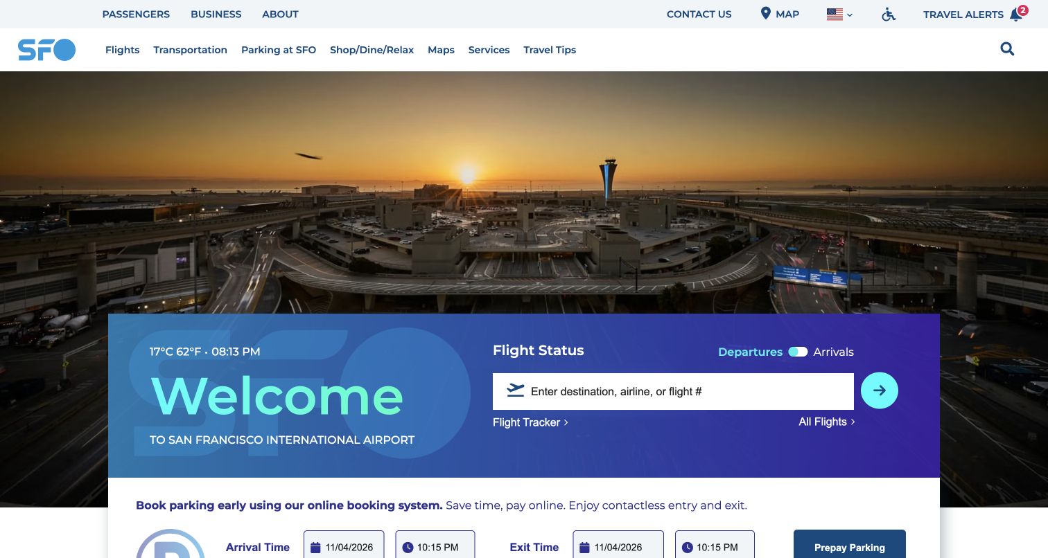
San Francisco International Airport uses a sunrise panorama to establish place, then overlays it with a blue-to-purple panel that contains both the welcome message and flight-status controls. The departure/arrival switch sits above a field for destination, airline or flight number, with separate Flight Tracker and All Flights links beneath. Parking booking follows as a distinct white section. The upper utility row exposes maps, accessibility and travel alerts, avoiding the need to search through general editorial content for those entries. The layout creates a clear sequence from urgent status to an optional transaction. Its gradient and turquoise accents also make the search panel recognizable against the detailed photograph.
What you can learn
Offer both a direct search and a complete board, because passengers may know different amounts about a flight. Keep map, assistance and alert entry points consistent across pages, and distinguish a tracking tool from the general status listing.
Pros
Flight Tracker and All Flights are separate, explicit alternatives.
Travel alerts and accessibility are visible in the utility navigation.
Cons & considerations
The departure/arrival switch needs an unmistakable selected state.
A tall panorama can push the parking and preparation sections below the opening view.
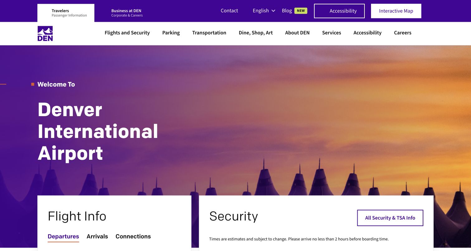
Denver International Airport introduces flight information and security as neighboring cards beneath a recognizable terminal-roof image. The flight card includes departures, arrivals and connections, while the security card visibly qualifies its times as estimates and links to broader security information. The top area also distinguishes travelers from business audiences and exposes accessibility and an interactive map. This is a strong reference for making two related travel problems equally discoverable: knowing the flight is only part of knowing how to move through the airport. The purple visual system gives the page a coherent identity without relying solely on photography or an oversized campaign claim.
What you can learn
Pair flight status with the preparation details that can change a passenger's next action. Keep estimate qualifications adjacent to the values, and make connection and accessibility paths discoverable before a traveler has committed to a specific terminal route.
Pros
Connections appear alongside arrivals and departures.
The security panel includes an explicit estimate qualification.
Cons & considerations
Several primary and utility categories create a broad header.
The initial card area requires thoughtful reflow to keep both flight and security information visible.
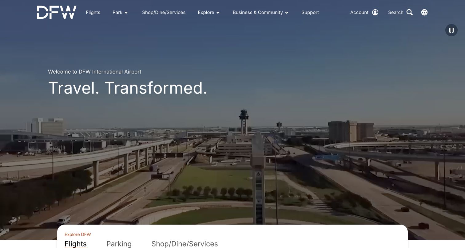
Dallas Fort Worth International Airport gives its aerial footage and welcome statement much of the first viewport. A rounded white task shelf begins near the bottom, with flights, parking and shops or services presented as tabs. The header exposes these same categories along with support, search and account access. A visible pause control is a useful part of the large moving-media treatment. This example shows the tradeoff of an expansive brand introduction: it communicates the scale of the airport, but practical details begin close to the fold. Teams borrowing the approach should evaluate it on a small phone, where the shelf's position matters more than the dramatic width of the image.
What you can learn
If moving imagery occupies the opening, provide a pause control and a compact fallback. Bring the flight task high enough that a traveler can identify it immediately, and retain clear routes to parking availability and terminal maps.
Pros
The moving hero exposes a pause control.
The same core task names recur in the header and task shelf.
Cons & considerations
The large introduction leaves little of the active form visible initially.
Account and broad exploration links add competition around urgent passenger tasks.
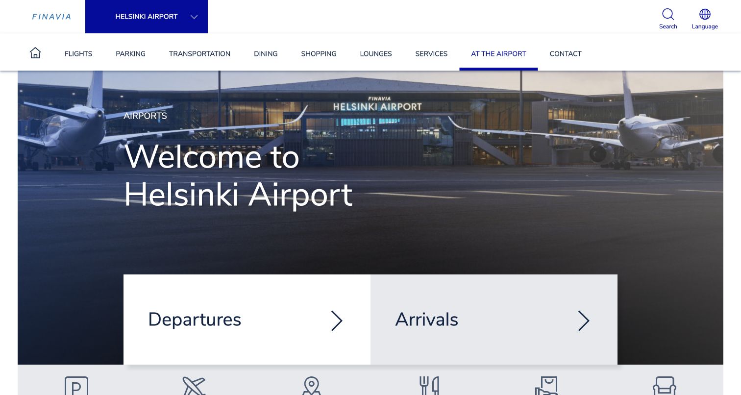
Helsinki Airport's Finavia page makes the selected airport explicit in the header and pairs a terminal photograph with very large departure and arrival links. The wider navigation names transportation, dining, shopping, lounges and services individually. Further down, practical content includes a travel-item search, assistance information and a qualified security-queue feature. The airport selector is an important detail in a network website: a traveler should not accidentally read advice for a different location. The page also illustrates how preparation can be organized as specific questions instead of a single undifferentiated help section. The two large flight choices are simple, but their size makes their purpose immediately legible.
What you can learn
On a multi-airport platform, preserve the airport name and location scope throughout the journey. Give common flight tasks simple labels, then structure preparation around concrete passenger questions with a clear owner and review date.
Pros
The selected airport is visible before the main content.
Large arrival and departure links make the first decision straightforward.
Cons & considerations
The long category menu can be dense on smaller screens.
Network-wide and local guidance need careful scoping to avoid conflicting instructions.
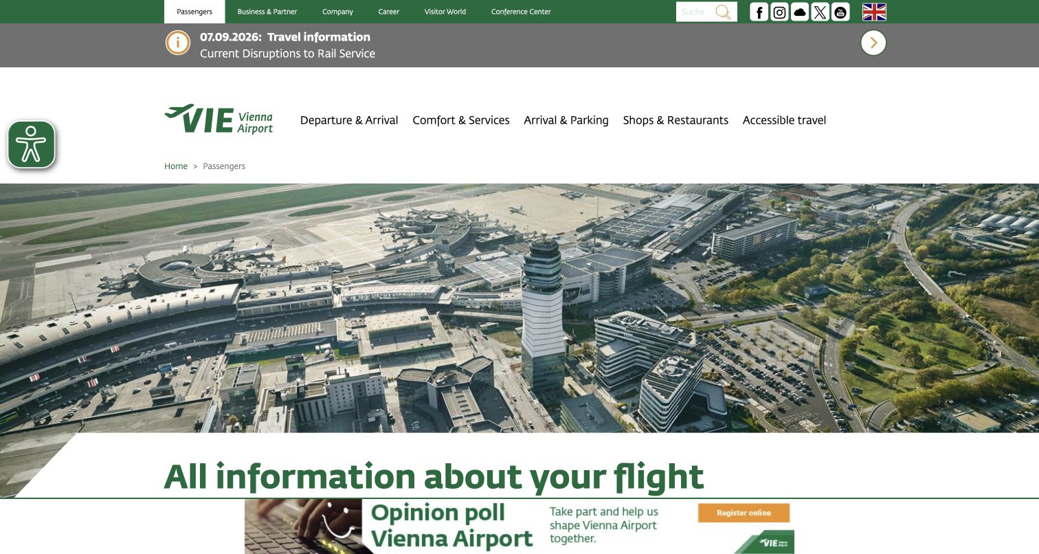
Vienna Airport places a dated rail-service disruption notice above its passenger navigation and terminal aerial photograph. Departure and arrival, services, ground access, shops and accessible travel are separate menu categories. The page keeps business, company and visitor-center audiences in a higher utility row, leaving the main navigation focused on passengers. The alert's position is the most instructive feature: a problem outside the terminal may affect a passenger before any flight information becomes relevant. The broad aerial image and secondary promotional strip consume substantial room, however, so the route to specific flight details must remain obvious. The captured notice is evidence of the design pattern, not current travel advice.
What you can learn
Promote disruptions according to their effect on the journey, including rail and road access. Give each notice a date, affected service and detailed next step, and define when it should expire so old alerts do not become background noise.
Pros
The transport disruption is elevated above the hero.
Accessible travel appears as a named primary category.
Cons & considerations
Multiple utility and promotional layers lengthen the opening.
Dated notices require active ownership to remain trustworthy.
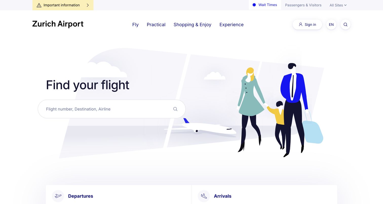
Zurich Airport uses a family illustration and a large ‘Find your flight’ heading instead of a photographic campaign. The search field names flight number, destination and airline as accepted inputs, with departure and arrival links below. A slim upper strip separately highlights important information and wait times, while the main menu uses four broad categories. The result is a quieter entry point than a homepage with several competing booking forms. The illustration supplies a human context without demanding that the traveler interpret a promotion. That restraint is especially useful when the main question is operational and the visitor may already be under time pressure.
What you can learn
Let one unmistakable task lead the page, then provide secondary paths in a stable order. An illustration can support the airport's identity, but the search label and accepted inputs should carry the actual explanation of what the visitor can do.
Pros
The primary search task is stated in a large plain-language heading.
Important information and wait times have a separate utility location.
Cons & considerations
Broad labels such as Practical need clear subnavigation.
The minimal opening depends on search handling incomplete or unfamiliar flight details well.
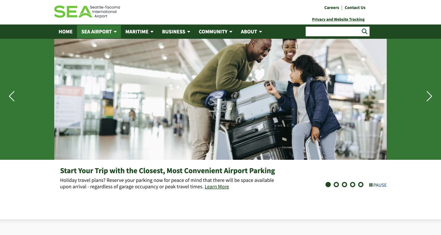
Seattle-Tacoma International Airport lives within the Port of Seattle website, and the header makes that wider organization visible through maritime, business and community navigation. The airport landing page uses a large carousel with an explanatory text block beneath the image, plus visible previous, next and pause controls. Observed stories include airport parking, public transit and passenger services. This gives the airport room to explain a practical topic rather than reducing every message to a short button. It also creates an information-architecture challenge: the passenger section must stay distinct from the authority's many other responsibilities. The captured page is valuable as a reference for shared institutional platforms, not just standalone airport marketing.
What you can learn
When an airport shares a larger authority site, make the passenger context unmistakable and retain direct operational shortcuts. Give carousel stories permanent detail pages and visible controls so useful advice remains accessible after the slide changes.
Pros
Carousel controls include a clearly labeled pause action.
Stories have explanatory copy and links to fuller guidance.
Cons & considerations
Authority-wide navigation adds categories unrelated to an immediate flight.
A large editorial carousel can delay the route to operational information.
Plan around the moments when passengers need certainty
Map five urgent situations
Start with departing, arriving, connecting, meeting someone and seeking assistance. For each, identify the first question, the required data, the responsible organization and a fallback when the website cannot answer. Use these maps to choose the homepage hierarchy.
Specify the flight-data states
Document scheduled, estimated, delayed, canceled and unavailable states with the operational team. Decide how often information updates, how freshness is displayed, and what a visitor sees if the feed fails. Test stale and empty results as carefully as a normal flight list.
Design terminal-aware pathways
Use the same terminal names in flight details, parking, transport and maps. Include walking or transfer context only when verified by the airport. Provide a way to change terminal without restarting a complicated form or losing useful preparation information.
Separate purchases from guidance
Parking, fast track and lounges need product details, eligibility, prices, cancellation terms and a route to existing bookings. Flight lookup and public transport information should remain clearly identifiable beside those purchase journeys. Label transitions into partner systems.
Build a practical publishing process
Assign owners to maps, security preparation, assistance, disruption notices and retail listings. Record review dates privately and define escalation when information changes. A visually consistent site can still fail passengers if different departments publish conflicting instructions.
Validate under travel conditions
Review the website on a small screen, with keyboard navigation, enlarged text and reduced motion. Exercise no-result searches, slow connections and unavailable widgets. Include visitors unfamiliar with airport terminology and people who use assistive technology in usability research.
The editing job behind the design
Choose technology for reliable passenger information
Select the platform after defining the information flows. A content system should make emergency notices quick to publish, support language review, and keep terminal guidance consistent across pages. Flight feeds, maps and booking providers need clear ownership, monitored integration points and readable fallback states. The appearance of a widget is not evidence of its accuracy or uptime.
Use public stack observations as implementation clues. A detected analytics script, font library or delivery service does not identify an airport’s internal operational systems. Before adopting a similar component, evaluate its accessibility, data contracts, performance, privacy behavior and failure mode in the actual passenger journey.
Our WordPress website examples offer a separate look at publishing approaches. A visible platform label is evidence for that named page, not a guarantee that the same system will suit your requirements.
Before the public launch
Airport website launch checklist
Arrivals and departures are clearly distinguished and reachable without a promotional interaction.
Flight search explains accepted inputs and offers a useful no-results state.
Scheduled, estimated and actual times have distinct labels and a clear time zone.
Live information includes a freshness or availability state.
Terminal names match across flight details, parking, maps and transport guidance.
Assistance information and contact routes remain easy to find on mobile.
Disruption notices identify the affected service, effective dates and next step.
Parking and paid extras show relevant conditions before a visitor enters a purchase journey.
Language selection and airport selection preserve the visitor’s context.
Moving media has usable controls and a meaningful reduced-motion experience.
Map-dependent instructions have a readable text alternative.
Content owners can remove expired notices and correct conflicting guidance promptly.
These checks are a project checklist, not a performance, legal, security, or accessibility certification. Test real journeys with the people responsible for the website before making claims about the result.
Sources & editorial method
How this collection was selected and reviewed
We inspected twenty distinct official airport passenger pages and recorded genuine direct browser screenshots, source URLs and capture metadata. The saved collection target was twenty; incomplete rendering examples were excluded rather than used to fill the count. Reviews analyze visible design and information architecture. We did not submit booking forms, buy services, verify operational feed accuracy or perform a full accessibility audit. Public technology observations are evidence of exposed components only, not hidden airport systems.
Each example links to its actual source page. Screenshots are direct browser captures with their own capture dates; moving imagery, announcements and live designs can change. The notes describe observable design choices and conditional tradeoffs, not measured traffic, conversion results, service quality, or accessibility conformance.
Technology labels use public page metadata, asset evidence, or explicitly cited platform documentation. Platform documentation is not a complete current deployment audit. A component reference may be legacy or unused; it is not a complete backend inventory. Unknown stacks are omitted. These sites are editorial examples, not our client portfolio.
Written, Edited and Curated are separate editorial records, not timestamps advanced by a rebuild. Website designs and imagery belong to their owners. See our editorial standards or suggest a correction.
Questions worth asking
Airport website design questions
What should an airport homepage prioritize?
Usually flight lookup and the next physical step in the journey: terminal, transport, parking, security preparation or assistance. Confirm the order with passenger research and task data. Retail can remain visible, but a traveler should not need to understand a campaign before finding a flight.
Should flight status appear directly on the homepage?
A compact board can help at an airport with a manageable number of flights. A large hub may benefit from a clear search field plus an all-flights route. In either case, distinguish time fields, show the scope of results and provide a fallback when data is unavailable.
How should security waiting times be presented?
Describe them as estimates when that is what the source provides. Identify the terminal or checkpoint, freshness and any meaningful limitation. Do not imply that a displayed waiting time covers every step from arrival at the airport to boarding.
Can one platform serve several airports?
Yes, if airport identity and local rules stay explicit. Shared components can improve consistency, but maps, transport, assistance contacts and security guidance must remain correctly scoped to the selected airport. Test navigation between locations for accidental context loss.
Do these examples prove accessibility or conversion performance?
No. A screenshot and public-page inspection can reveal useful patterns and possible friction, but they do not establish conformance, completion rates or operational reliability. Use representative task testing and appropriate specialist review before making those claims.
Use these airport website examples to make passenger decisions easier to understand. The strongest pattern is a clear connection between the information shown, the traveler’s current situation and the next action they can safely take.