Best Databricks Websites of 2026 (20 Real-World Examples)
Customer-associated public websites, careful data-platform evidence, and a practical governance-first brief
These 20 public websites are connected to official Databricks customer information, releases or named cases. Shell, Comcast, AT&T, Toyota and Walgreens open the collection. Where the evidence is a customer-brand listing, the specific legal entity, workload and public-property implementation remain unspecified. A marketing screenshot is not a data-platform architecture diagram.
An organization’s public website, operational applications, analytical data and AI workloads can have very different architectures. Databricks may support a particular data programme without serving the company’s marketing homepage at all. This guide pairs independently reviewed public pages with exact documentary evidence so that the visual lesson remains useful without turning a customer logo into an unsupported stack claim.
The examples span energy, media, telecommunications, vehicles, retail, healthcare and financial services. Shell has a detailed official data-science case; several other brands are named in Databricks’ corporate customer information or its 2026 Microsoft partnership release. Those sources establish their stated association, not every current deployment detail. Scope, organization and source date matter as much as the technology name itself.
Before the examples
What makes good Databricks website development in 2026?
Define the asset and the people responsible for it
Name the dataset, model, report or application result and the decision it supports. Identify both a business owner and a technical maintainer. A unified platform can make assets easier to discover, but it cannot decide what a field means, who should approve a change or whether a result is fit for a particular business purpose.
Design governance around actual use
Map the people and services that need to read, change or publish an asset. Include the context in which access should end or change. Unity Catalog provides a governance layer with a defined object and permission model, but a project still needs clear organizational decisions and an implementation that matches those decisions.
A successful notebook demonstration is not the same as an operable production process. Define what triggers the work, what each task produces and how failure becomes visible. Lakeflow Jobs supplies orchestration mechanisms; the project still needs appropriate ownership, input contracts and an understandable response when a scheduled operation is delayed or stops.
Compare the public pages’ audience routes, explanations and practical next steps. Their Databricks relationship concerns data and engineering contexts, not a shared visual style. Use the source notes to distinguish a named case from a more limited brand-level customer association.
We start with five recognizable brands or organizations: Shell, Comcast, AT&T, Toyota, Walgreens. Each attribution applies to the named website property, not every product or website belonging to its organization. This is a curated reading sequence, not a measured ranking.
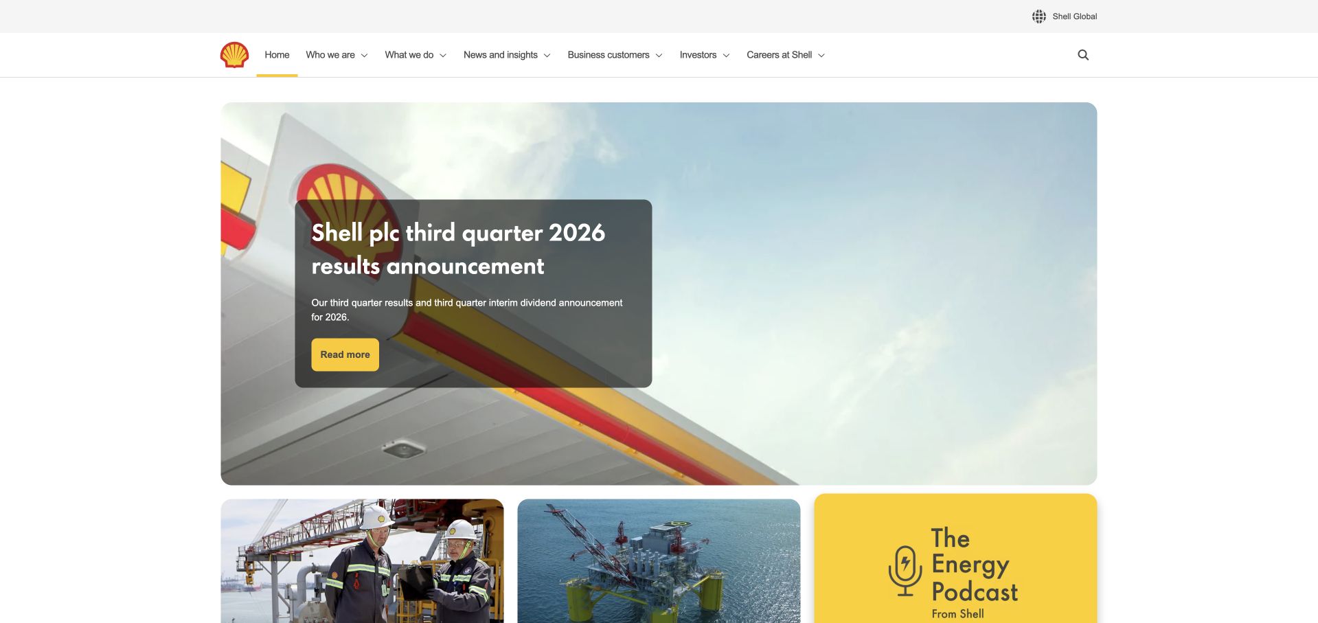
Shell’s homepage leads with a quarterly-results announcement and a concise action, then broadens into current projects, strategy, careers and useful public tasks. The restrained white navigation and yellow accent keep the corporate identity recognizable even when the opening campaign changes. Station-location and job-search routes acknowledge visitors who are not reading financial material. The page is useful for studying a very large organization’s need to balance current reporting with several stable reasons to visit.
What you can learn
A reporting-led opening should not erase the practical tasks surrounding it. Databricks’ Shell case describes data-science and AI applications in the organization. That specific enterprise association does not identify the public homepage’s hosting, verify energy-project claims or establish the current architecture of every Shell business.
Pros
Current financial reporting has an identifiable place without replacing access to careers and other practical routes.
A limited accent palette and familiar header provide continuity around changing campaign content.
Cons & considerations
A corporate-results feature may be less immediately useful to visitors arriving with a local or transactional task.
Strategy and sustainability statements need precise supporting documents rather than being treated as verified outcomes because of a professional presentation.
Platform source: Official Shell customer case. Databricks’ official Shell customer case describes a data-science platform and AI application context. The official source establishes the stated customer-brand or workload association only. It does not identify every current legal entity or deployment, the pictured public page’s frontend or hosting, or a complete stack. Vendor-reported outcomes were not independently tested. Platform evidence is separate from the direct website screenshot and is not a complete current infrastructure audit.
Comcast’s corporate homepage uses an expansive architectural image and a compact results feature before introducing the company’s broader role. A short header separates company, sports, investors, press and careers. The latest-story sequence adds business, technology and entertainment context without making the first viewport carry every division. The design is useful for a parent organization whose public identity needs to connect several products and audience experiences without replacing their individual websites.
What you can learn
A corporate front door can establish the parent organization while leaving detailed consumer tasks elsewhere. Databricks names Comcast in its official customer information and discusses its data-governance work. That association does not establish this corporate page’s CMS, the infrastructure behind a particular entertainment product or the configuration of a consumer connectivity service.
Pros
A real architectural setting gives the corporate brand a concrete identity rather than an abstract technology background.
Institutional navigation remains concise while current stories demonstrate the breadth of the organization’s activities.
Cons & considerations
Large image-led campaigns need a clear reading order and useful static alternatives across responsive layouts.
Parent-company storytelling should preserve clear boundaries between corporate information, consumer support and the separate responsibilities of individual services.
Platform source: Official Databricks corporate customer information. Comcast is named in Databricks’ official corporate customer information as relying on its data and AI platform. The listing does not specify the pictured page’s architecture. A separate official use-case article describes Comcast data-governance work; the customer-listing evidence alone is not treated as a full deployment audit. The official source establishes the stated customer-brand or workload association only. It does not identify every current legal entity or deployment, the pictured public page’s frontend or hosting, or a complete stack. Vendor-reported outcomes were not independently tested. Platform evidence is separate from the direct website screenshot and is not a complete current infrastructure audit.
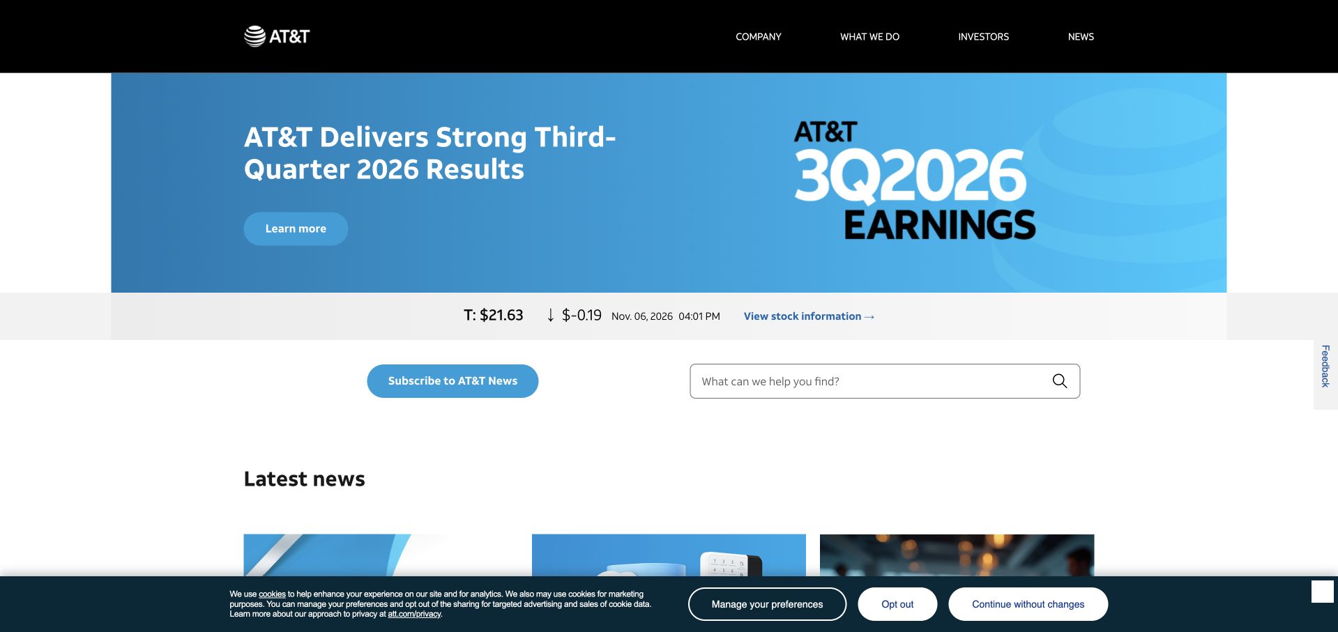
AT&T’s public newsroom combines a prominent results feature with stock context, a search route and a subscription action. The blue visual field gives the current announcement a recognizable place, while later stories cover technology and company activity in a more conventional editorial sequence. The page is useful for studying how a large organization can publish frequently without turning its entire corporate website into a single campaign or a customer-account interface.
What you can learn
A newsroom should make it easy to distinguish current publication from stable company information. Databricks’ 2026 partnership release names AT&T among its platform customers. This supports a documented organizational relationship, not the newsroom’s runtime, any particular network workload or a complete current inventory of AT&T’s data systems.
Pros
Search and subscription routes support repeated information gathering rather than assuming every visit is a first-time introduction.
Results, stock context and current news occupy distinguishable parts of the page’s hierarchy.
Cons & considerations
Financial and market information needs clear timestamps and links to the authoritative documents behind summaries.
A newsroom’s publication routes should remain separate from consumer support so visitors do not mistake editorial content for account or service assistance.
Platform source: Official Databricks Microsoft partnership release, July 23, 2026. AT&T is named among Databricks customers in its July 23, 2026 Microsoft partnership release; that naming does not specify this brand’s exact workload or public-site implementation. The official source establishes the stated customer-brand or workload association only. It does not identify every current legal entity or deployment, the pictured public page’s frontend or hosting, or a complete stack. Vendor-reported outcomes were not independently tested. Platform evidence is separate from the direct website screenshot and is not a complete current infrastructure audit.
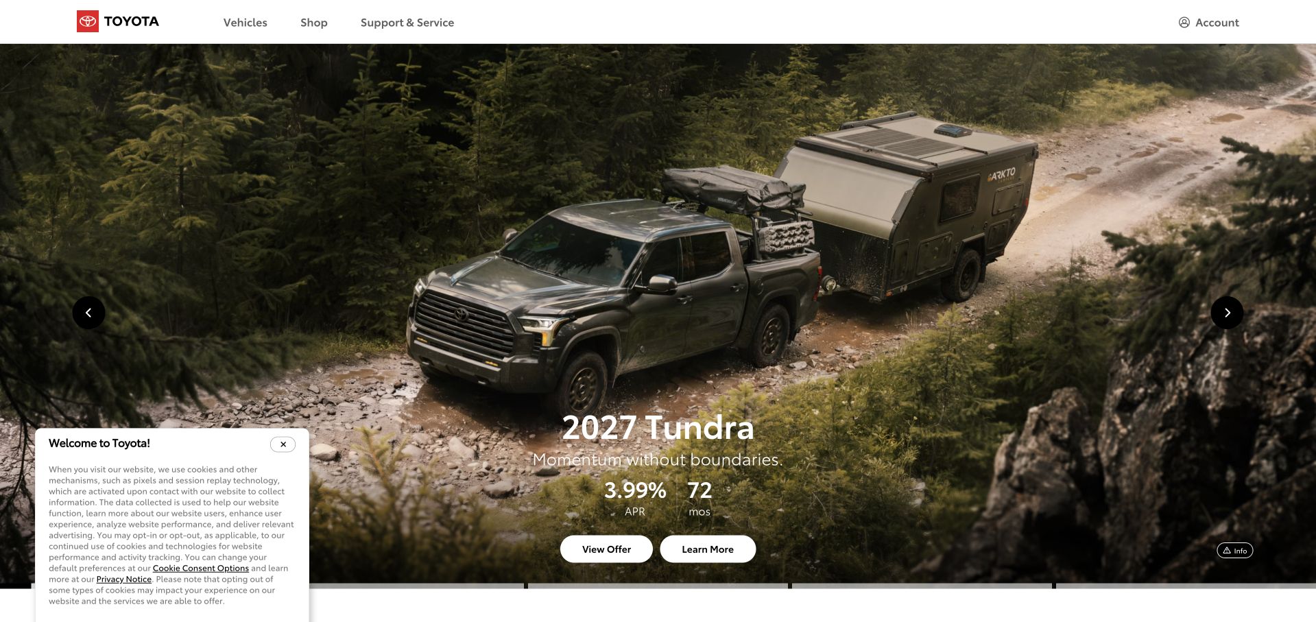
Toyota’s captured homepage places a vehicle in a large outdoor setting, with concise model information and actions below. The header retains vehicles, shopping and owner-support routes, while the wider page exposes inventory, comparison and configuration tools. The design is useful for studying the tension between an emotional first impression and the detailed practical questions involved in evaluating a complex product. The hero establishes the setting, but the surrounding navigation must do substantial functional work.
What you can learn
A strong product image should lead into useful comparison rather than standing in for it. Databricks’ official customer carousel names Toyota, without identifying this US marketing property or a specific workload. Keep that brand-level association separate from claims about the homepage’s stack or any vehicle’s systems.
Pros
The vehicle image provides an immediate sense of product context without requiring a long introductory paragraph.
Shopping and owner-support routes acknowledge that prospective buyers and existing customers arrive with different tasks.
Cons & considerations
Financing and performance details need current specifications and terms rather than being treated as stable design-review facts.
Promotional imagery and overlapping notices can make the first useful comparison action harder to find on smaller screens.
Platform source: Official Databricks corporate customer information. Toyota appears in the Customers logo section on Databricks’ official About page, separate from its investor section. The listing does not identify a specific workload or public-property implementation. The official source establishes the stated customer-brand or workload association only. It does not identify every current legal entity or deployment, the pictured public page’s frontend or hosting, or a complete stack. Vendor-reported outcomes were not independently tested. Platform evidence is separate from the direct website screenshot and is not a complete current infrastructure audit.
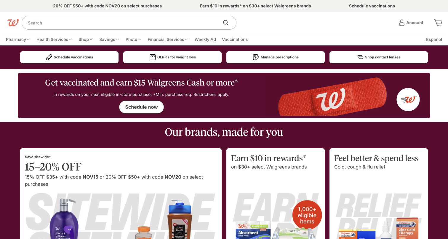
Walgreens keeps vaccination, prescription and other recurring service routes near the top of a dense retail homepage. Promotional modules and product cards then fill the larger shopping surface, using the brand’s burgundy color to connect offers and navigation. The page is useful for studying a business where a visitor may be completing a familiar service task rather than browsing a general catalogue. Those intentions need distinct routes even when they share one public website.
What you can learn
Do not make returning service users work through the same campaign journey as casual shoppers. Databricks’ official customer information names Walgreens, but does not identify the public retail homepage or a clinical workload. That relationship is separate from the design observations and should not be expanded into claims about patient-data architecture.
Pros
Recurring tasks such as prescription and vaccination navigation remain visible above the changing retail promotions.
A consistent burgundy identity helps organize a large amount of commercially varied content.
Cons & considerations
Many simultaneous offers can make the page harder to scan and may compete with essential service access.
Health-related navigation needs clear qualification and appropriate support routes rather than relying on promotional treatment or broad reassurance.
Platform source: Official Databricks corporate customer information. Walgreens appears in the Customers logo section on Databricks’ official About page, separate from its investor section. The listing does not identify a specific workload or public-property implementation. The official source establishes the stated customer-brand or workload association only. It does not identify every current legal entity or deployment, the pictured public page’s frontend or hosting, or a complete stack. Vendor-reported outcomes were not independently tested. Platform evidence is separate from the direct website screenshot and is not a complete current infrastructure audit.
Rivian’s homepage combines full-width vehicle storytelling with routes for exploring, configuring and arranging a drive. Its restrained navigation and muted interface treatment allow the vehicles and surrounding environments to carry the identity. Different campaign panels introduce models, events and offers, while practical product sections appear below. The page is useful for studying how a brand can present a strong lifestyle context without making every interested visitor commit to the same next action.
What you can learn
A complex product needs several legitimate evaluation steps, not just one prominent purchase button. Databricks names Rivian in its official customer information. That organizational association does not identify this marketing homepage’s framework, a vehicle’s embedded software or the current data architecture behind configuration and reservation services.
Pros
Exploration, configuration and drive-booking routes support different levels of readiness within the same product journey.
A restrained visual frame lets actual vehicles and environments communicate more than decorative interface elements.
Cons & considerations
Campaign carousels need stable controls and meaningful static states rather than leaving essential information inside motion.
Prices, finance offers and availability require current terms and clear boundaries between a reservation, configuration and completed purchase.
Platform source: Official Databricks corporate customer information. Rivian is named in Databricks’ official corporate customer information as relying on its data and AI platform. The listing does not specify the pictured page’s architecture. The official source establishes the stated customer-brand or workload association only. It does not identify every current legal entity or deployment, the pictured public page’s frontend or hosting, or a complete stack. Vendor-reported outcomes were not independently tested. Platform evidence is separate from the direct website screenshot and is not a complete current infrastructure audit.
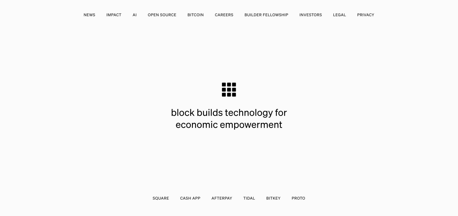
Block’s homepage is unusually sparse, centering a compact symbol and an economic-empowerment statement within a wide white field. The top navigation carries institutional topics such as news, impact, open source and careers, while product-family names sit along the bottom. The page is useful for studying the limits and strengths of a parent-brand introduction that assumes many visitors already know one of the underlying products.
What you can learn
Extreme simplicity can work when it clarifies a corporate layer rather than pretending to explain every service. Databricks lists Block in its official customer information. The statement supports an organizational association only, not the public homepage’s implementation, a specific payment product or a current backend configuration across the group.
Pros
A single central statement creates a clear parent-brand introduction without competing product campaigns.
Institutional and product-family routes are visually separated, helping distinguish the company from the services associated with it.
Cons & considerations
A very sparse opening may leave unfamiliar visitors without enough context to understand what the organization actually does.
A broad economic mission needs concrete supporting material and should not be treated as evidence of financial outcomes or universal product suitability.
Platform source: Official Databricks corporate customer information. Block is named in Databricks’ official corporate customer information as relying on its data and AI platform. The listing does not specify the pictured page’s architecture. The official source establishes the stated customer-brand or workload association only. It does not identify every current legal entity or deployment, the pictured public page’s frontend or hosting, or a complete stack. Vendor-reported outcomes were not independently tested. Platform evidence is separate from the direct website screenshot and is not a complete current infrastructure audit.
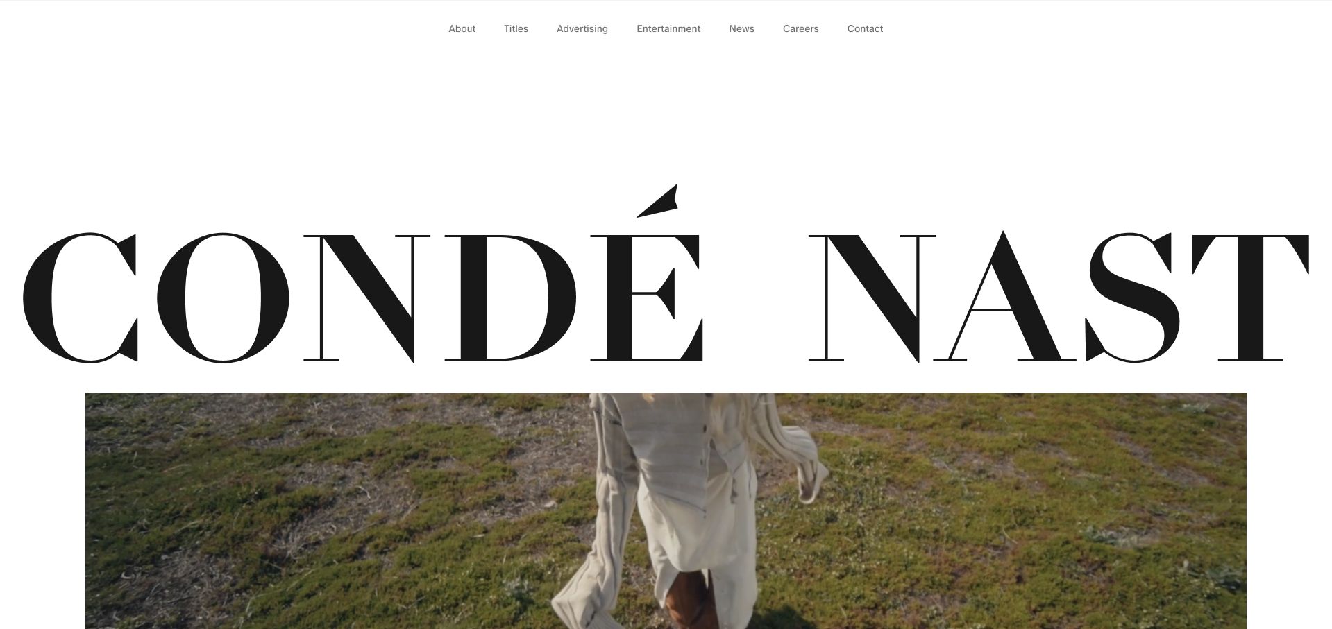
Condé Nast places an exceptionally large wordmark above editorial imagery, with a small, restrained navigation row for titles, advertising, entertainment and careers. The opening relies on the strength of the publisher’s visual identity rather than a detailed explanation of every brand. Lower sections introduce markets, work opportunities and organizational principles. The page is useful for studying how a parent publication group can communicate creative authority while leaving individual titles room for their own design languages.
What you can learn
A recognizable name can carry an opening, but the surrounding routes must explain the actual organization. Databricks lists Condé Nast in its official customer information. That association does not establish this homepage’s CMS or imply that every publication, market and audience product uses the same data infrastructure.
Pros
The oversized wordmark and editorial photography establish a distinct identity without an elaborate interface.
Title and advertising routes acknowledge different audiences instead of treating the corporate homepage as a consumer magazine.
Cons & considerations
Large typography needs deliberate responsive scaling so the identity does not push all practical context out of view.
Brand prestige should not substitute for clear organizational, market and technical boundaries across the group’s many individual properties.
Platform source: Official Databricks corporate customer information. Condé Nast is named in Databricks’ official corporate customer information as relying on its data and AI platform. The listing does not specify the pictured page’s architecture. The official source establishes the stated customer-brand or workload association only. It does not identify every current legal entity or deployment, the pictured public page’s frontend or hosting, or a complete stack. Vendor-reported outcomes were not independently tested. Platform evidence is separate from the direct website screenshot and is not a complete current infrastructure audit.
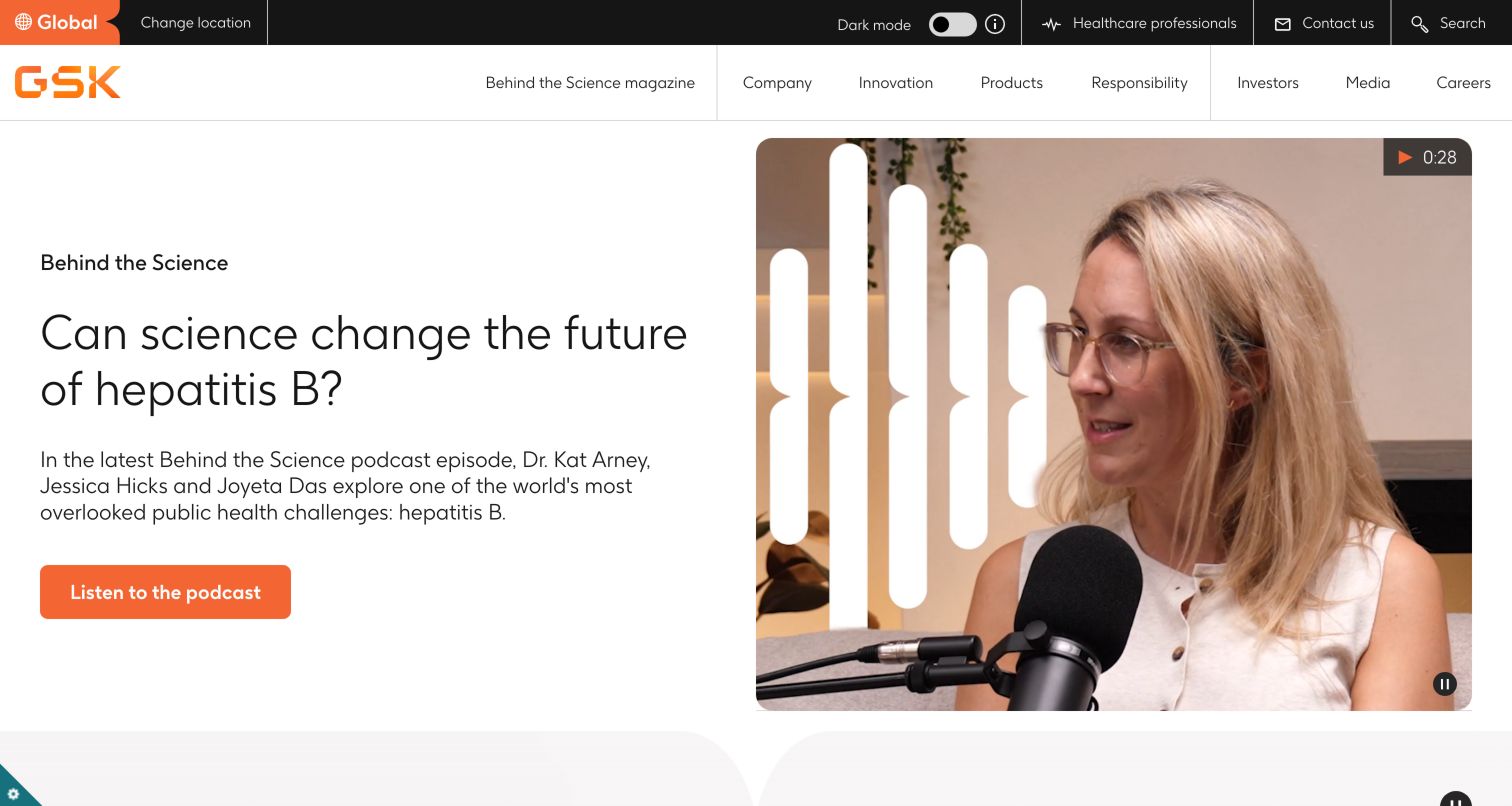
GSK’s captured homepage uses a podcast-style research feature, combining a concise question with a speaker image and a clearly labeled listening action. The white-and-orange visual system keeps the opening calmer than a dense corporate dashboard. Company, science and investor routes remain accessible above the feature, while later sections explain therapeutic focus areas. The design is useful for making a specialized subject approachable without replacing the wider organization’s information needs.
What you can learn
An editorial format can make a complex topic easier to enter, but it must remain connected to accurate supporting material. Databricks’ official customer carousel names GSK without specifying this public homepage or a particular research system. That brand association is not evidence of clinical effectiveness or a complete present-day technical stack.
Pros
A clearly labeled conversation format gives a specialized research topic an understandable way into the story.
The restrained color system allows both the question and the human context to remain visually prominent.
Cons & considerations
Health and research communication needs appropriately qualified evidence beyond a reassuring presenter image.
Audio-led features should provide transcripts or equivalent access and should not delay practical company or product-information tasks.
Platform source: Official Databricks corporate customer information. GSK appears in the Customers logo section on Databricks’ official About page, separate from its investor section. The listing does not identify a specific workload or public-property implementation. The official source establishes the stated customer-brand or workload association only. It does not identify every current legal entity or deployment, the pictured public page’s frontend or hosting, or a complete stack. Vendor-reported outcomes were not independently tested. Platform evidence is separate from the direct website screenshot and is not a complete current infrastructure audit.
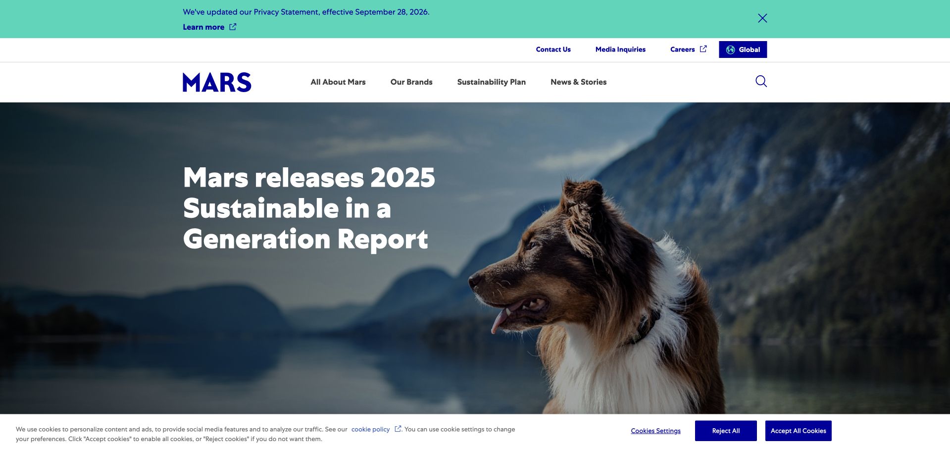
Mars’s homepage combines large campaign imagery with a concise message, then moves through company, brands and sustainability-related material. The familiar blue identity and white navigation provide continuity around changing food, petcare and corporate stories. The page is useful for studying how a parent organization can connect several very different product categories through a shared editorial frame rather than presenting an enormous brand catalogue immediately.
What you can learn
Let recognizable contexts introduce a portfolio, then provide distinct routes for the underlying businesses and evidence. Databricks’ official customer information includes Mars. The listing does not identify the photographed public homepage, specify a business-unit workload or establish a current configuration across every food, petcare and consumer brand associated with the group.
Pros
A shared corporate frame connects diverse product categories without requiring them to look identical.
Brand and institutional routes provide useful alternatives after the current campaign has established the opening context.
Cons & considerations
Sustainability and investment statements require dated supporting reports rather than being treated as verified by lifestyle imagery.
A rotating parent-company campaign can make specific consumer-product information harder to locate unless the brand navigation stays clear.
Platform source: Official Databricks corporate customer information. Mars appears in the Customers logo section on Databricks’ official About page, separate from its investor section. The listing does not identify a specific workload or public-property implementation. The official source establishes the stated customer-brand or workload association only. It does not identify every current legal entity or deployment, the pictured public page’s frontend or hosting, or a complete stack. Vendor-reported outcomes were not independently tested. Platform evidence is separate from the direct website screenshot and is not a complete current infrastructure audit.
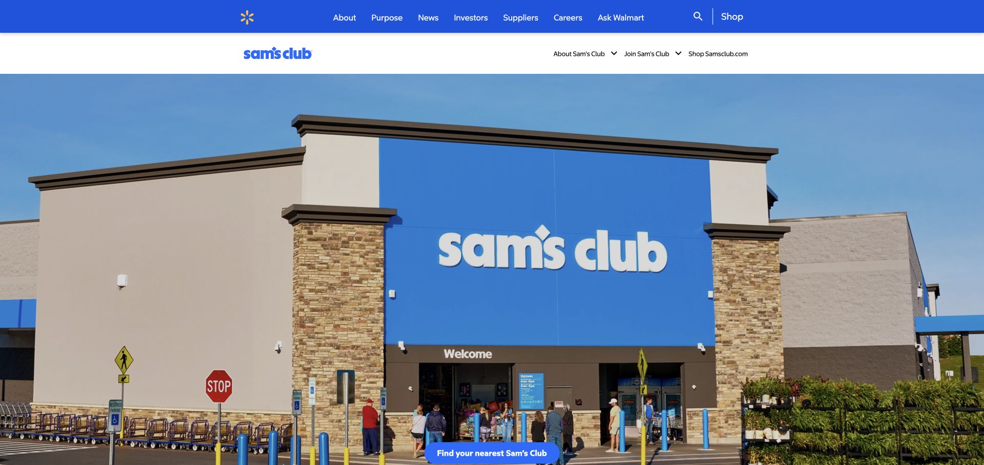
Sam’s Club’s corporate page appears within Walmart’s wider institutional framework, using a separate sub-brand bar and a large club-store image. The main navigation carries company-level audiences, while join, shop and location routes identify the more practical Sam’s Club tasks. Current stories follow below. The design is useful for studying how a sub-brand can retain recognition inside a shared corporate publishing system without pretending it is an entirely independent website.
What you can learn
A shared parent framework needs visible sub-brand orientation and explicit destination labels. Databricks names Sam’s Club in its official customer information. That association is not evidence that the pictured Walmart-hosted corporate page, the retail shopping application or every related membership system uses the same data platform.
Pros
A distinct sub-brand navigation layer makes the organization recognizable within a larger parent-company structure.
Corporate stories and practical shopping or membership routes are clearly different types of next step.
Cons & considerations
Two navigation layers can consume substantial mobile space if their hierarchy is not simplified carefully.
Shared hosting and ownership must not be mistaken for shared technical architecture, especially when public corporate content and transactional retail services serve different purposes.
Visible tech stack
Earlier / documented evidence
Databricks
Platform source: Official Databricks corporate customer information. Sam’s Club appears in the Customers logo section on Databricks’ official About page, separate from its investor section. The listing does not identify a specific workload or public-property implementation. The official source establishes the stated customer-brand or workload association only. It does not identify every current legal entity or deployment, the pictured public page’s frontend or hosting, or a complete stack. Vendor-reported outcomes were not independently tested. Platform evidence is separate from the direct website screenshot and is not a complete current infrastructure audit.
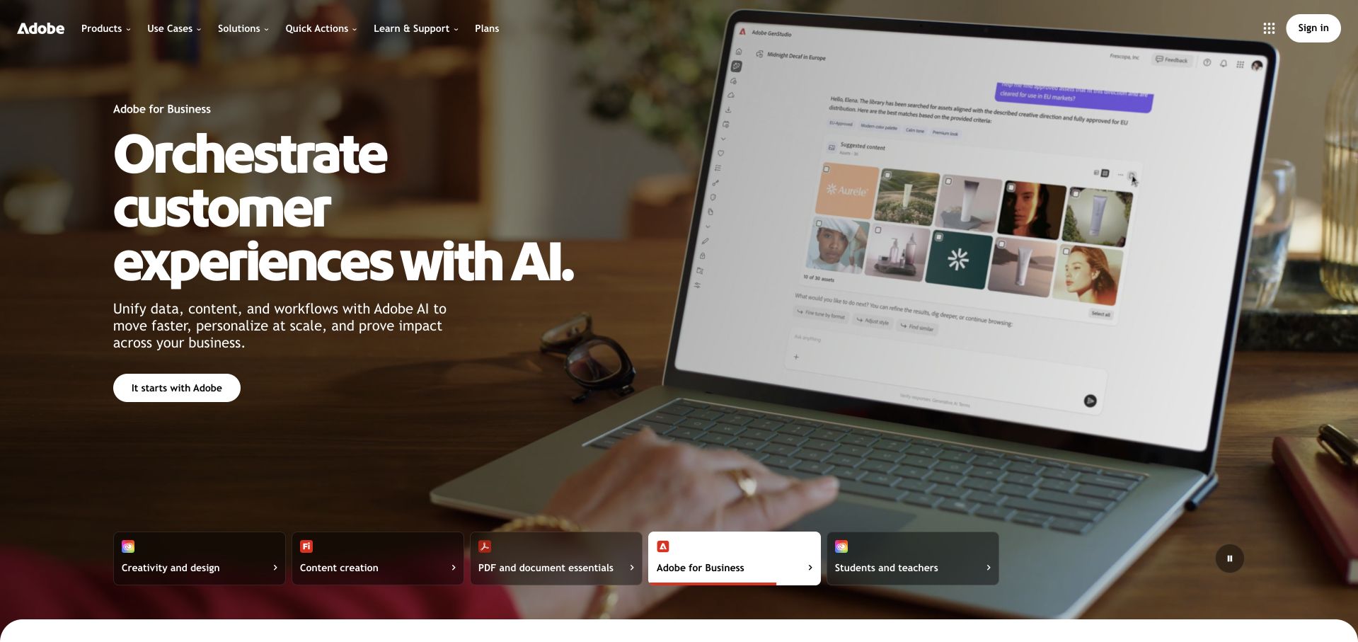
Adobe’s captured homepage uses a business-customer campaign with a large workplace image and a clear white action. A row of audience and product-family choices anchors the bottom of the opening, keeping creative, document and educational uses visible around the featured enterprise story. The design is useful for studying how a multi-product company can give one campaign a strong visual focus without making the wider portfolio disappear.
What you can learn
A featured story should sit within a stable audience structure rather than replace it entirely. Databricks’ official customer carousel names Adobe, but does not identify this homepage or a particular product workload. Preserve that limited association instead of assuming the visible enterprise campaign reveals Adobe’s current analytics or publishing architecture.
Pros
Audience and product-family choices provide a clear way out of the featured campaign for visitors with another task.
A single high-contrast action keeps the enterprise story legible without requiring a complicated first-screen interaction.
Cons & considerations
Campaign imagery can feel generic unless the linked destination supplies concrete product and workflow detail.
A corporate customer listing does not establish the data systems behind every product family or the infrastructure of the public marketing surface.
Platform source: Official Databricks corporate customer information. Adobe appears in the Customers logo section on Databricks’ official About page, separate from its investor section. The listing does not identify a specific workload or public-property implementation. The official source establishes the stated customer-brand or workload association only. It does not identify every current legal entity or deployment, the pictured public page’s frontend or hosting, or a complete stack. Vendor-reported outcomes were not independently tested. Platform evidence is separate from the direct website screenshot and is not a complete current infrastructure audit.
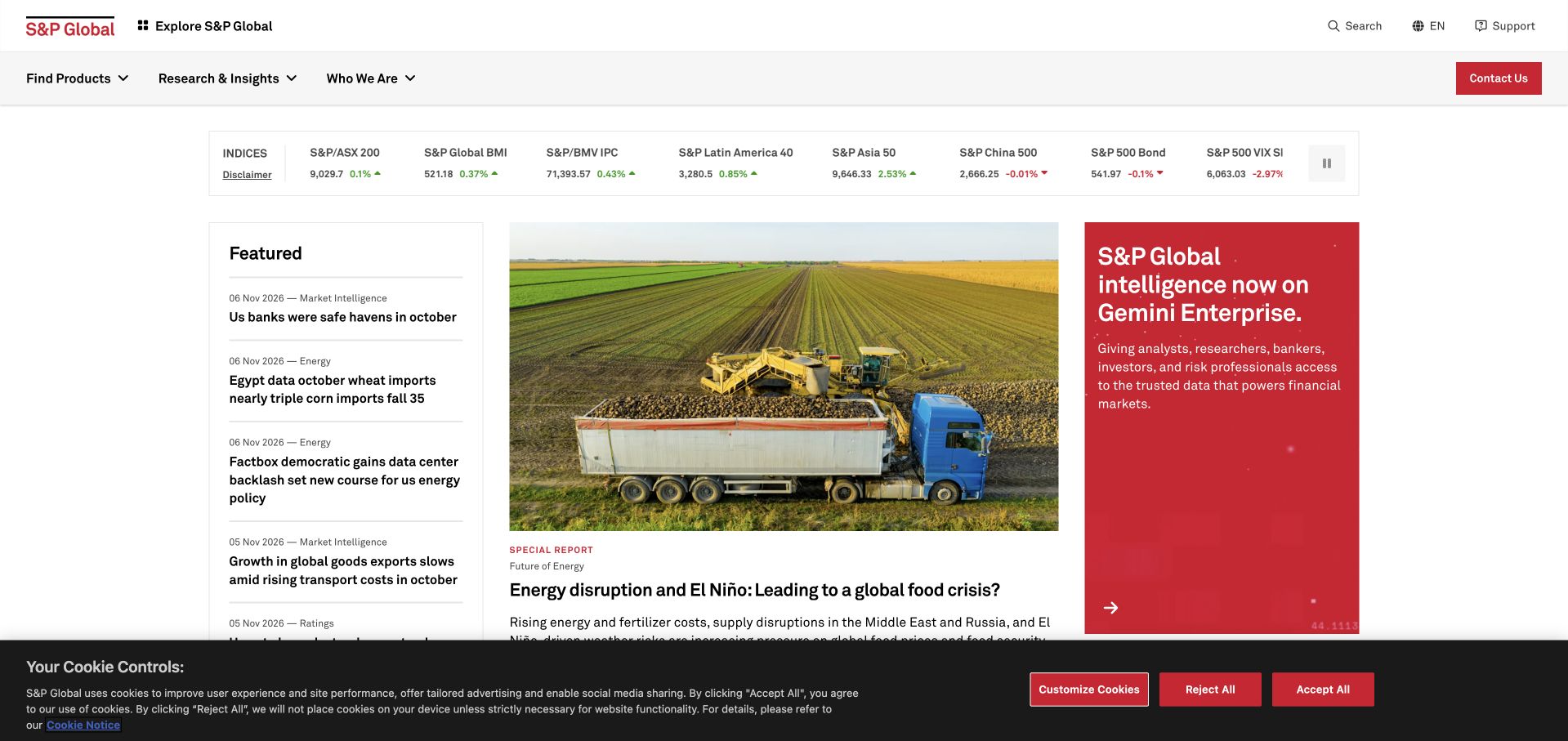
S&P Global’s homepage combines a compact market-index strip with featured research, editorial summaries and a distinct enterprise-product panel. The white background and red accent create structure without requiring a large lifestyle hero. Product, research and corporate routes remain available in the header. The page is useful for studying a site where a visitor may want a quick signal, a substantive report or a specific commercial service, all within one information-rich public surface.
What you can learn
Dense information can be useful when content types have clear boundaries and recognizable labels. Databricks’ official customer information names S&P Global without identifying this page or a specific dataset. That association does not verify market values, establish data freshness or reveal the complete infrastructure behind the published information.
Pros
Market context, featured reports and commercial products are presented as distinguishable information types.
A restrained palette and clear alignment make a dense business-information surface easier to scan.
Cons & considerations
Live or delayed market information needs visible timing, definitions and appropriate qualification alongside numerical displays.
A broad research portfolio can overwhelm unfamiliar visitors without clear explanations of the difference between public articles, subscription products and underlying datasets.
Visible tech stack
Earlier / documented evidence
Databricks
Platform source: Official Databricks corporate customer information. S&P Global appears in the Customers logo section on Databricks’ official About page, separate from its investor section. The listing does not identify a specific workload or public-property implementation. The official source establishes the stated customer-brand or workload association only. It does not identify every current legal entity or deployment, the pictured public page’s frontend or hosting, or a complete stack. Vendor-reported outcomes were not independently tested. Platform evidence is separate from the direct website screenshot and is not a complete current infrastructure audit.
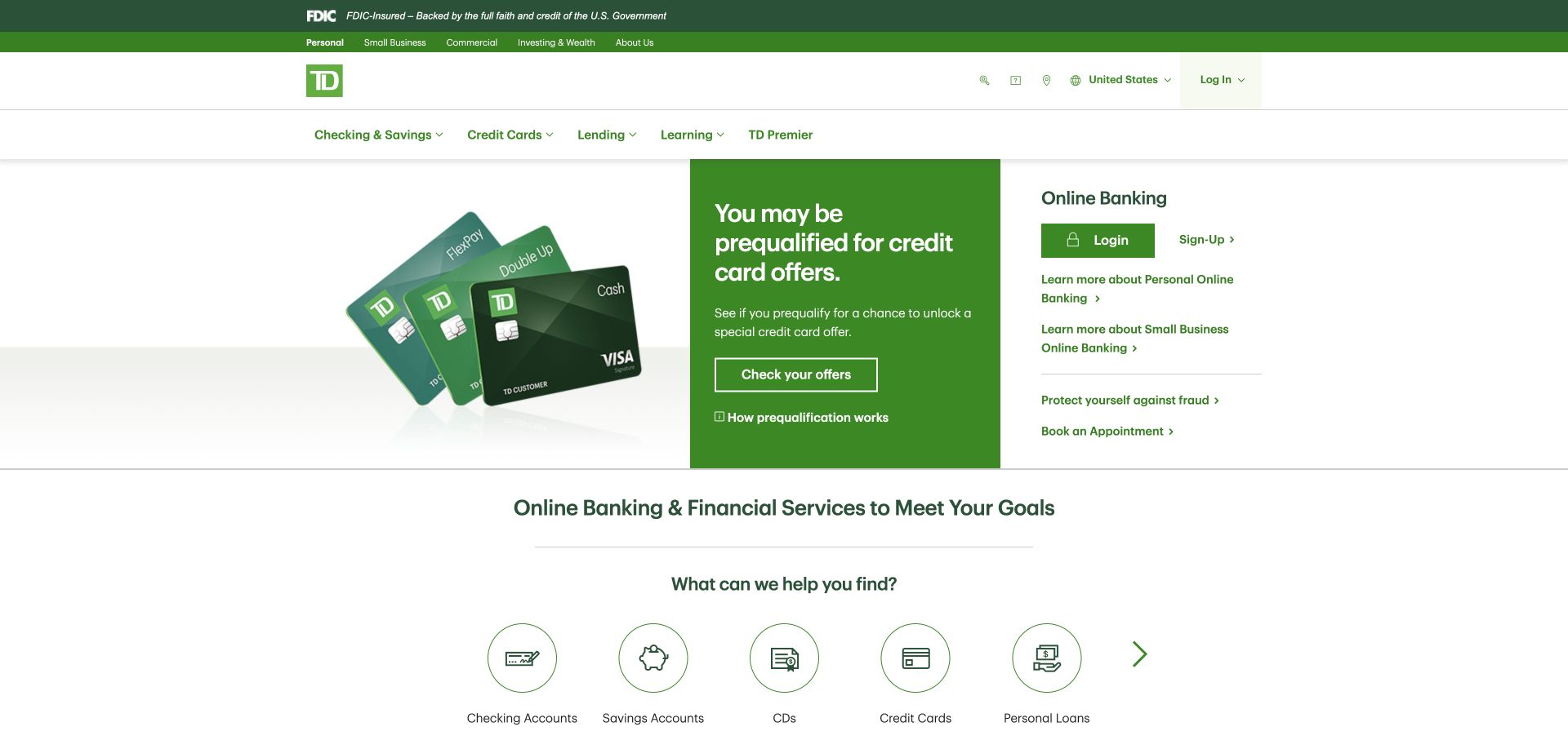
TD Bank’s captured homepage places online-banking access beside a current product offer, using green to connect the header, campaign and service identity. Product categories appear directly below, with routes into checking, savings, cards and lending. Further sections explain account management and support. The page is useful for studying a financial site that cannot assume all visitors are shopping: many arrive with an established account and a specific task to complete.
What you can learn
Keep recurring service access distinct from promotional evaluation, even when they share the same visual system. Databricks names TD Bank in its official customer carousel without specifying this US public property or a workload. The association does not establish the homepage’s runtime or authenticate any financial offer pictured.
Pros
Existing-account access remains available without forcing returning users through a promotional product journey.
Recognizable product categories provide a practical bridge from the campaign to more detailed evaluation.
Cons & considerations
Offer eligibility and financial terms need direct, current explanations beyond the headline and friendly visual treatment.
Campaign and login panels require deliberate mobile ordering so neither obscures urgent support or an existing customer’s basic task.
Platform source: Official Databricks corporate customer information. TD Bank appears in the Customers logo section on Databricks’ official About page, separate from its investor section. The listing does not identify a specific workload or public-property implementation. The official source establishes the stated customer-brand or workload association only. It does not identify every current legal entity or deployment, the pictured public page’s frontend or hosting, or a complete stack. Vendor-reported outcomes were not independently tested. Platform evidence is separate from the direct website screenshot and is not a complete current infrastructure audit.
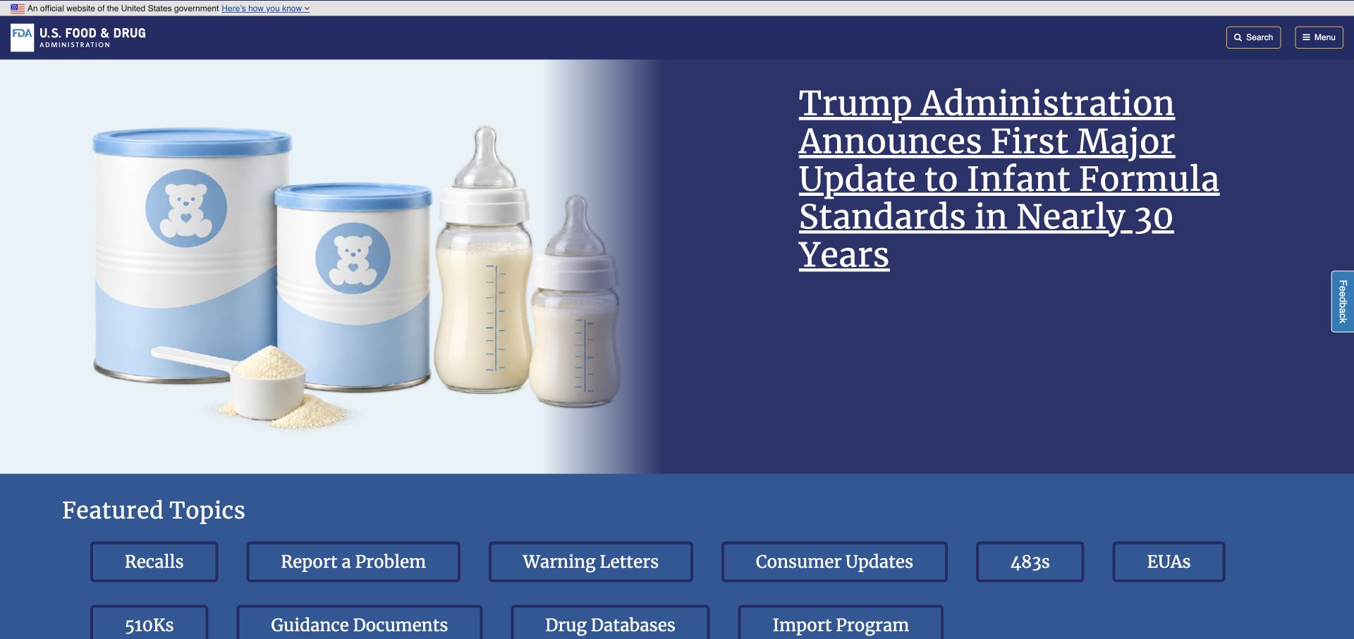
The FDA’s captured homepage combines a current agency feature with a compact set of recurring information routes. Recalls, reporting a problem, guidance and other recognized tasks remain visible near the top, while later sections group products, topics and audiences. The restrained government-style header and blue palette give the site a clear institutional frame. The design is useful for studying how to support both public lookup tasks and specialized regulatory information without starting with an internal organization chart.
What you can learn
Public-service navigation should reflect what people need to find, not only how an agency is organized. Databricks’ official customer information includes the FDA. That listing does not identify this homepage’s publishing system, a particular regulatory dataset or the security and processing rules of any agency application.
Pros
Recurring tasks such as recalls and problem reporting remain identifiable around a changing editorial feature.
Topic and audience groupings provide different routes through a broad and technically specialized information library.
Cons & considerations
Regulatory and health information needs clear dates, status and authoritative documents beyond a homepage summary.
Institutional branding must not be interpreted as validation of unrelated vendor claims or as proof of a specific system’s architecture.
Platform source: Official Databricks corporate customer information. US Food and Drug Administration appears in the Customers logo section on Databricks’ official About page, separate from its investor section. The listing does not identify a specific workload or public-property implementation. The official source establishes the stated customer-brand or workload association only. It does not identify every current legal entity or deployment, the pictured public page’s frontend or hosting, or a complete stack. Vendor-reported outcomes were not independently tested. Platform evidence is separate from the direct website screenshot and is not a complete current infrastructure audit.
Bayer’s homepage uses a large human-focused scene and a concise health-and-nutrition mission before explaining its business areas. The lower structure separates pharmaceutical, consumer-health and crop-science topics, while news and company routes remain accessible above. The design is useful for studying a group whose broad public purpose connects activities that still need different explanations, evidence and visitor journeys. The opening supplies an umbrella identity rather than pretending one product serves every audience.
What you can learn
A shared mission works best when the following structure restores the distinctions between its underlying activities. Databricks’ 2026 official partnership release names Bayer among platform customers. That organizational relationship does not identify this public homepage, establish a particular research workload or validate a medical or agricultural outcome.
Pros
A concise mission creates a coherent group identity before visitors encounter several specialized business areas.
Distinct division routes acknowledge that healthcare and agricultural audiences require different information and supporting evidence.
Cons & considerations
Large human imagery and reassuring language must not substitute for appropriately scoped scientific information.
Animated organizational figures need reliable final states and dates so a polished introduction does not display misleading intermediate values.
Platform source: Official Databricks Microsoft partnership release, July 23, 2026. Bayer is named among Databricks customers in its July 23, 2026 Microsoft partnership release; that naming does not specify this brand’s exact workload or public-site implementation. The official source establishes the stated customer-brand or workload association only. It does not identify every current legal entity or deployment, the pictured public page’s frontend or hosting, or a complete stack. Vendor-reported outcomes were not independently tested. Platform evidence is separate from the direct website screenshot and is not a complete current infrastructure audit.
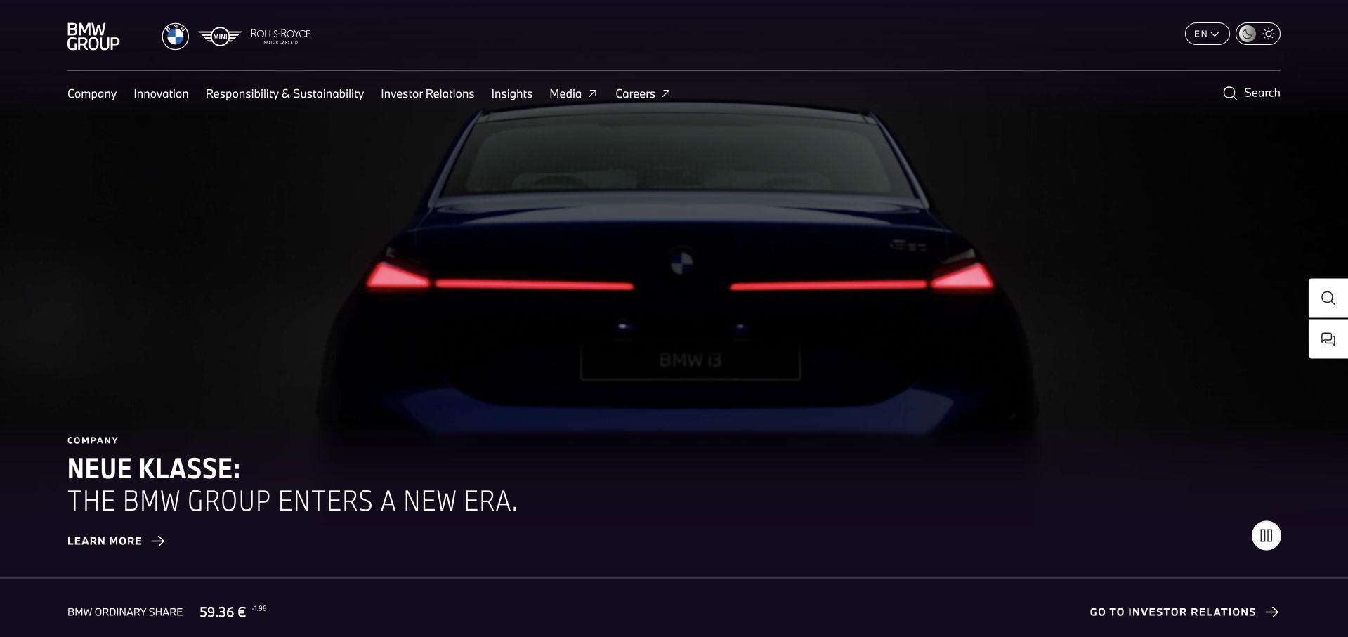
BMW Group’s corporate homepage uses a large Neue Klasse feature and a restrained dark navigation system, with investor information and current company stories close behind. The page is different from a model-configurator landing page: it introduces the group, its strategy and wider activities. Large editorial sections provide room for innovation, production and reporting material. The design is useful for studying how an automotive organization can maintain a coherent corporate narrative without recreating its retail website.
What you can learn
Corporate audiences need different routes from people comparing an individual vehicle. Databricks’ 2026 official release names BMW Group as a platform customer. That supports an organizational association, not a claim about this homepage’s publishing system, vehicle software or the data architecture behind a particular manufacturing programme.
Pros
The corporate navigation clearly prioritizes institutional topics rather than implying every visitor is ready to configure a car.
A defined transformation theme gives current reporting and innovation stories a recognizable editorial context.
Cons & considerations
Large video-led campaigns require accessible controls and useful alternatives that do not depend on motion or autoplay.
Strategy language and financial information need dated sources rather than being treated as verified outcomes because of premium visual presentation.
Platform source: Official Databricks Microsoft partnership release, July 23, 2026. BMW Group is named among Databricks customers in its July 23, 2026 Microsoft partnership release; that naming does not specify this brand’s exact workload or public-site implementation. The official source establishes the stated customer-brand or workload association only. It does not identify every current legal entity or deployment, the pictured public page’s frontend or hosting, or a complete stack. Vendor-reported outcomes were not independently tested. Platform evidence is separate from the direct website screenshot and is not a complete current infrastructure audit.
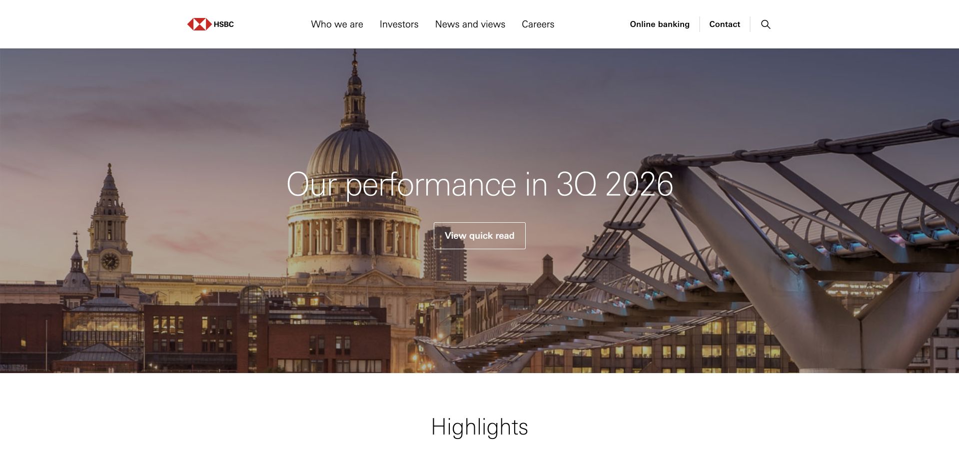
HSBC’s corporate homepage leads with quarterly performance and a compact set of headline figures, then moves into company, investor, news and career material. The restrained red accent and white navigation keep the interface familiar around changing financial content. The page is useful for studying an institution whose visitors often arrive with a research task rather than a product purchase. Its corporate purpose is clearly different from the bank’s consumer account interfaces.
What you can learn
A results-led homepage should make publication dates and deeper source documents easy to locate. Databricks’ 2026 partnership release names HSBC among platform customers. That relationship does not establish this corporate page’s CMS, specify a banking workload or independently verify the financial information displayed in the design reference.
Pros
Current results are presented within a recognizable institutional structure rather than mixed into retail product selling.
Company, investor and career routes acknowledge several legitimate reasons to visit beyond reading one announcement.
Cons & considerations
Financial highlights need explicit definitions and source links so abbreviated figures are not mistaken for complete reporting.
A results campaign can dominate the opening, so stable information and support destinations should remain easy to reach on mobile.
Platform source: Official Databricks Microsoft partnership release, July 23, 2026. HSBC is named among Databricks customers in its July 23, 2026 Microsoft partnership release; that naming does not specify this brand’s exact workload or public-site implementation. The official source establishes the stated customer-brand or workload association only. It does not identify every current legal entity or deployment, the pictured public page’s frontend or hosting, or a complete stack. Vendor-reported outcomes were not independently tested. Platform evidence is separate from the direct website screenshot and is not a complete current infrastructure audit.
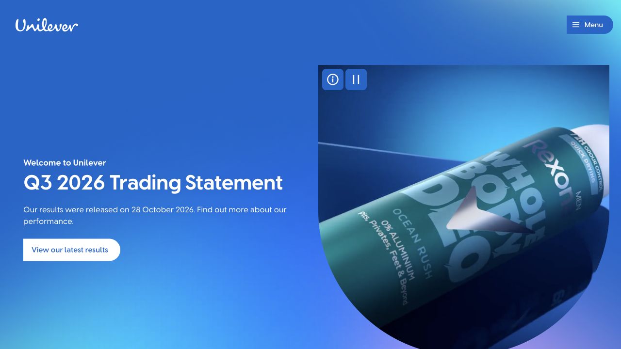
Unilever’s captured homepage combines a vivid blue corporate feature with a familiar consumer product, then expands into company, brands and sustainability content. The compact navigation and strong visual identity keep the opening coherent despite the breadth of the portfolio. Investor material is presented as a defined destination rather than scattered across unrelated modules. The design is useful for studying how a parent group can connect financial communication to the everyday products that make its name recognizable.
What you can learn
A portfolio business can draw on product familiarity while keeping institutional reporting clearly labeled. Databricks’ 2026 partnership release names Unilever and identifies Azure Databricks in the customer context. That evidence does not identify the public homepage’s runtime or establish a common architecture across every associated brand.
Pros
A recognizable product gives corporate communication a tangible connection to the group’s consumer-facing work.
Defined investor and brand routes support different audiences without forcing them into one generic exploration path.
Cons & considerations
Current financial events and portfolio changes need dated supporting material rather than depending on a campaign headline.
A strong parent identity should preserve distinctions between brands, markets and the technical systems behind their separate public properties.
Platform source: Official Databricks Microsoft partnership release, July 23, 2026. Databricks’ July 23, 2026 Microsoft partnership release specifically names Unilever among Azure Databricks users. The official source establishes the stated customer-brand or workload association only. It does not identify every current legal entity or deployment, the pictured public page’s frontend or hosting, or a complete stack. Vendor-reported outcomes were not independently tested. Platform evidence is separate from the direct website screenshot and is not a complete current infrastructure audit.
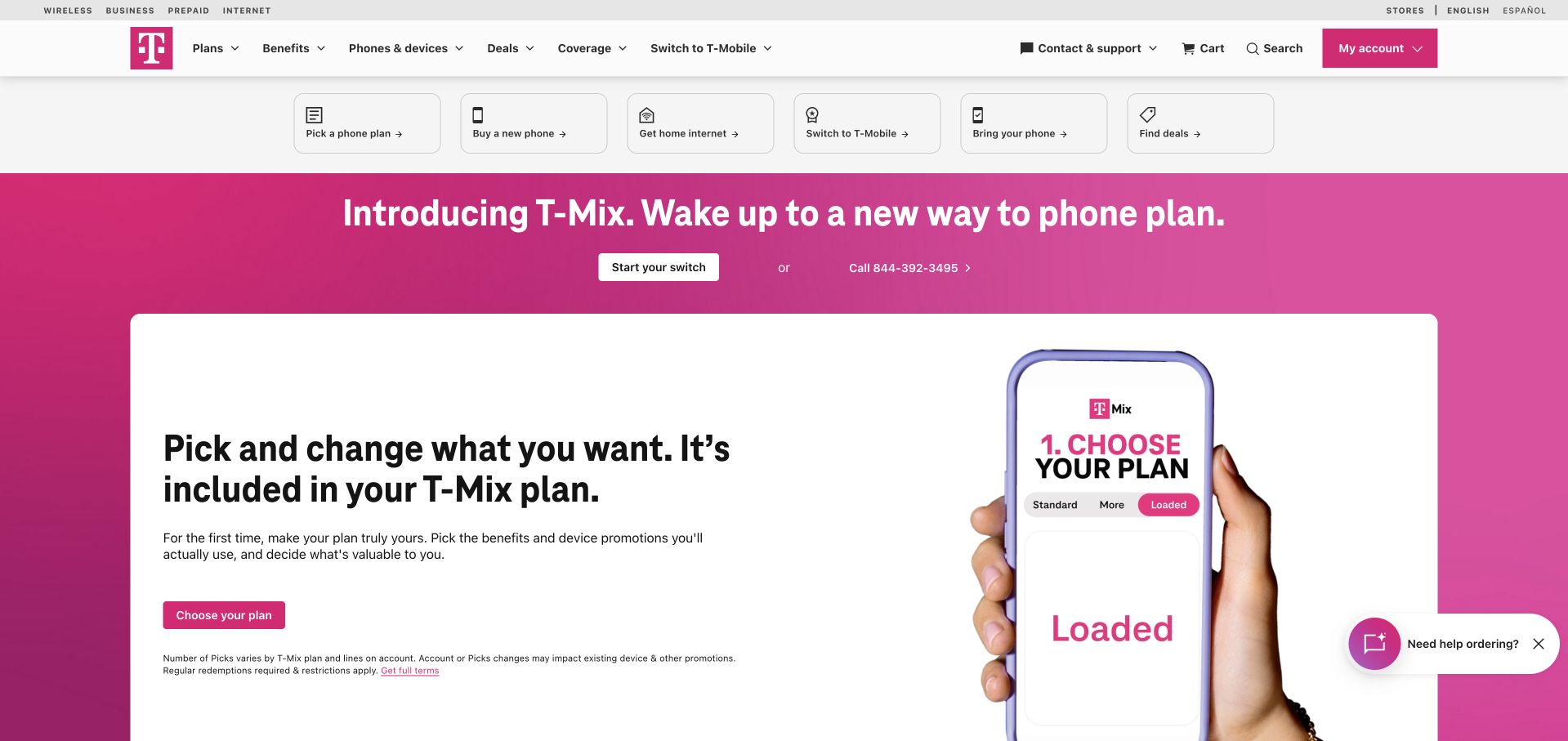
T-Mobile’s captured homepage uses its distinctive magenta field to introduce plan selection, with a white explanatory panel and a direct switching action. Utility routes across the top expose phones, internet, deals and existing-customer tasks. Lower sections expand into device offers and service options. The page is useful for studying how an established consumer brand can maintain recognition while explaining a changing plan structure and several closely related purchase decisions.
What you can learn
A strong retail identity still needs clear product choices and readable qualifications. Databricks’ 2026 official release names T-Mobile among its platform customers. That association does not establish this marketing homepage’s framework, a particular customer-data workload or the technology operating the network services being advertised.
Pros
The magenta identity and white information panel create a recognizable hierarchy within a promotion-heavy category.
Practical top-level tasks let visitors choose between plans, devices and internet rather than treating them as one transaction.
Cons & considerations
Plan benefits and device promotions require explicit eligibility and current terms beyond the campaign’s visual emphasis.
Dense offers and floating assistance widgets can compete with the information needed to compare recurring costs and commitments.
Platform source: Official Databricks Microsoft partnership release, July 23, 2026. T-Mobile is named among Databricks customers in its July 23, 2026 Microsoft partnership release; that naming does not specify this brand’s exact workload or public-site implementation. The official source establishes the stated customer-brand or workload association only. It does not identify every current legal entity or deployment, the pictured public page’s frontend or hosting, or a complete stack. Vendor-reported outcomes were not independently tested. Platform evidence is separate from the direct website screenshot and is not a complete current infrastructure audit.
Kegan has 15+ years of experience working with small businesses, Fortune 500 companies, and everything in between. No development job is too big or too small: he brings the same hands-on attention to a focused improvement, a complete website, or a custom application.
For Databricks projects, he can help with data modeling, application data access, query design, search and cache integrations, migration planning, access boundaries, and maintainable handover. He works directly with clients on scope, design, implementation, testing, and handover, with an emphasis on clear communication and a system that remains practical to maintain after launch.
Show 3 other Databricks developersHide other Databricks developers
Choose a data product before choosing a platform-wide programme
A governed analytical dataset
Start with a dataset whose owner and consumers can explain what correct means. Define the important fields, permitted use and update expectations. Demonstrate a correction and show how a consumer learns that the data changed. This gives a governance discussion a practical outcome rather than leaving it as a list of platform features.
A repeatable data-processing job
Select one recurring process and describe its inputs, tasks and outputs. Include the conditions that should stop publication instead of allowing incomplete results to look successful. The initial design should account for reruns, late data and a maintainer’s ability to see which source revision produced a result.
An evaluated model or AI-assisted application
Identify the permitted inputs, output consumer and human review requirements before discussing model choice. Keep evaluation records and define a process for withdrawing or replacing a result. A demonstration that produces a plausible answer is not enough evidence that an application is safe, accurate or appropriate for a particular decision.
From references to requirements
Plan the lifecycle, not just the first successful run
Write down the meaning and lineage of the result
Record the source systems, transformations, definitions and owner of the output. Include identifiers, timezones and how corrected or deleted records should be handled. This helps maintainers distinguish a broken job from a deliberate change in meaning, and helps product teams explain the limits of the information they display.
Choose an operational identity deliberately
Decide which identity runs production work and which permissions it requires. Avoid making continuity depend casually on an individual employee’s account. Databricks’ job-privilege guidance distinguishes who can manage a job from the identity it runs as; review both when specifying access and handover responsibilities.
Use nonproduction assets to test delayed inputs, a failed task, a corrected result and a withdrawn dataset or model. Confirm what downstream consumers see and who is notified. A practical runbook should identify safe retry and recovery behavior instead of assuming that every failure is solved by rerunning the whole process.
A useful handover demonstration
Ask the actual team to carry out its routine job: publish a realistic update, correct a mistake, preview a narrow screen, and identify who owns an integration failure. For a library or frontend framework, also ask who maintains the content source and deployment. A polished screenshot does not answer those operational questions.
Beyond the screenshot
A Databricks project-planning checklist
Name the dataset, model or application output.
Identify the decision it supports.
Assign business and technical owners.
Document source systems and field meaning.
Define freshness and quality expectations.
Map readers, writers and publishing authority.
Choose a suitable production identity.
Version the relevant code and configuration.
Record the source of each published result.
Test delayed, corrected and deleted inputs.
Rehearse failure and downstream recovery.
Hand over access review and operational ownership.
Test with real content, a keyboard, a small screen, slow or failed requests, and the people who will maintain the system. These are planning checks, not an accessibility, security, performance, or search-ranking certification.
Sources & editorial method
How this Databricks collection was reviewed
Public websites were independently reviewed and directly captured in Chrome or matched to exact existing captures with original dates preserved. Associations use official Databricks customer information, the Shell case, the 2026 Microsoft partnership release and published use-case material. No private workspaces, financial accounts or clinical data were accessed. Customer listings are not interpreted as homepage-runtime evidence or independent verification of vendor-reported results.
Every image is an unmodified capture from the actual website, with its source and capture date. Some captures are reused from our shared catalog; their dates remain the original capture dates. None comes from a vendor gallery or a generated reconstruction. Moving imagery and live content can change.
Technology attribution uses public page assets or metadata, official platform documentation, or a cited first-party project case study. Documentary and framework-relationship evidence is identified where used; it is not a complete current backend inventory. A CMS image CDN alone does not establish a full CMS deployment. A library’s presence does not prove which individual controls use it, and a platform label does not establish AI authorship.
The composition notes, lessons, pros and tradeoffs are original editorial observations. We have not measured conversion, traffic, security, performance or accessibility conformance. Website owners retain their brands and imagery; these examples are not our client portfolio. Written, Edited and Curated are independent records, not dates advanced by a build. See our editorial standards or suggest a correction.
Questions worth asking
Databricks website development FAQs
Does a Databricks customer listing prove the homepage uses it?
No. The relationship may concern data engineering, analytics or an AI workload elsewhere in the organization. A brand listing does not identify a particular public property, legal entity, configuration or complete current stack.
Why begin with governance rather than a model or cluster?
The team needs to know what the asset means, who owns it and which uses are permitted. Without those decisions, a technically successful pipeline or model can produce an output that nobody can safely interpret or maintain.
Is a working notebook enough for production handover?
No. Production work needs defined triggers, permissions, source versions, monitoring and recovery. A maintainer should be able to identify the result’s provenance and understand what to do when inputs are late or a task fails.
Should production work depend on an individual account?
That should be a deliberate decision, not an accidental default. Review the current job-privilege guidance and choose an operational identity and ownership model that remain understandable when people change roles or leave the organization.
How should a website explain a data-backed result?
Make freshness, scope and limitations visible in language the audience understands. Do not present an incomplete or delayed output as current merely because the interface looks polished. Define the user-facing state for unavailable, corrected and withdrawn results.
Borrow the information clarity from the public examples, then define your own asset ownership, permitted use and recovery process. A useful platform implementation is one whose results and responsibilities remain understandable after the original project team has moved on.