Best Concrete Contractor Websites of 2026 (30 Real-World Examples)
Concrete-contractor website design that makes project types, specialist scope, and the first inquiry easier to understand.
Explore 30 actual public company pages spanning decorative surfaces, residential flatwork, architectural precast, coatings, and larger construction organizations. Compare their communication choices, not engineering capability, workmanship, or material performance.
Concrete is a broad label. Someone seeking a patio, a custom bar component, a polished commercial floor, or structural construction may need a different provider, project discussion, and information. A useful website makes that distinction visible early.
The collection deliberately includes different business models rather than treating every company as a driveway installer. Borrow the relevant information structure and visual lesson, while keeping technical scope, qualifications, safety, and project suitability under responsible professional review.
Before the examples
What makes good concrete contractor website design in 2026?
Name the actual project and service categories
Decorative finishes, coatings, precast components, masonry, flatwork, and structural construction should not collapse into one vague label. Hyde's specialist categories illustrate a useful separation. Give each genuine service a clear destination, but avoid implying that a company offers every discipline merely because a broad industry template includes it.
Show the work with accurate context
A whole room, outdoor setting, or construction scene can explain more than a close texture. Pair photographs with the project type, visible material or component, location where appropriate, and permitted attribution. Appearance is not evidence of durability, slip resistance, construction quality, or suitability for another site.
Make the inquiry appropriate to the project
A household improvement, trade collaboration, custom precast commission, and enterprise construction inquiry need different conversations. Start with enough information to route the request, then let the responsible team clarify requirements. Do not make a website visitor select a technical specification merely to ask a question.
The collection · 30 examples
30 concrete contractor websites worth studying
The 30 examples range from compact local portfolios to corporate construction sites. The reviews identify concrete interface choices such as service cards, complete project scenes, estimate panels, and stakeholder navigation. Their usefulness depends on the actual audience and scope, not on copying the largest image or most elaborate form.
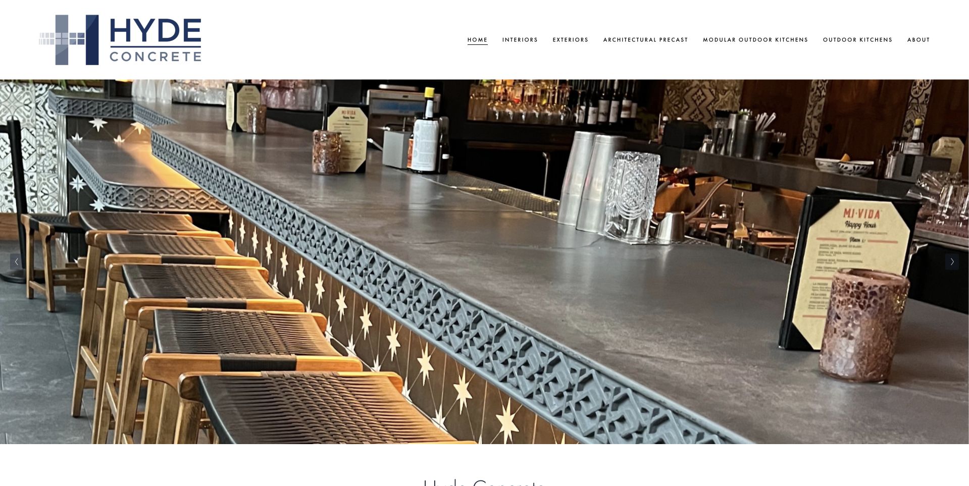
Hyde opens with a generous photograph of a concrete bar surface in its architectural setting. A white header separates interior, exterior, architectural precast, specialty-construction, outdoor-kitchen, and company routes. The image is allowed to show material, shape, and context without a large estimate form covering it. This is the editorial choice for a regional specialist whose service categories and portfolio imagery reinforce one another. The company's public material describes a Mid-Atlantic operation, rather than a generic national service. Inclusion is a design judgment, not confirmation of awards, structural performance, material suitability, workmanship, or the circumstances of a future commission.
What you can learn
Give specialist work enough visual space to be understood, then provide accurate category routes and project captions. Explain whether a visitor is looking at a finish, custom component, or construction service instead of treating every concrete inquiry as identical.
Pros
A substantial architectural image shows the material within a complete setting.
Literal category navigation separates several specialist service relationships.
Cons & considerations
An image-led opening still needs a readable service and regional introduction.
Portfolio photographs require project context rather than implied universal material performance.
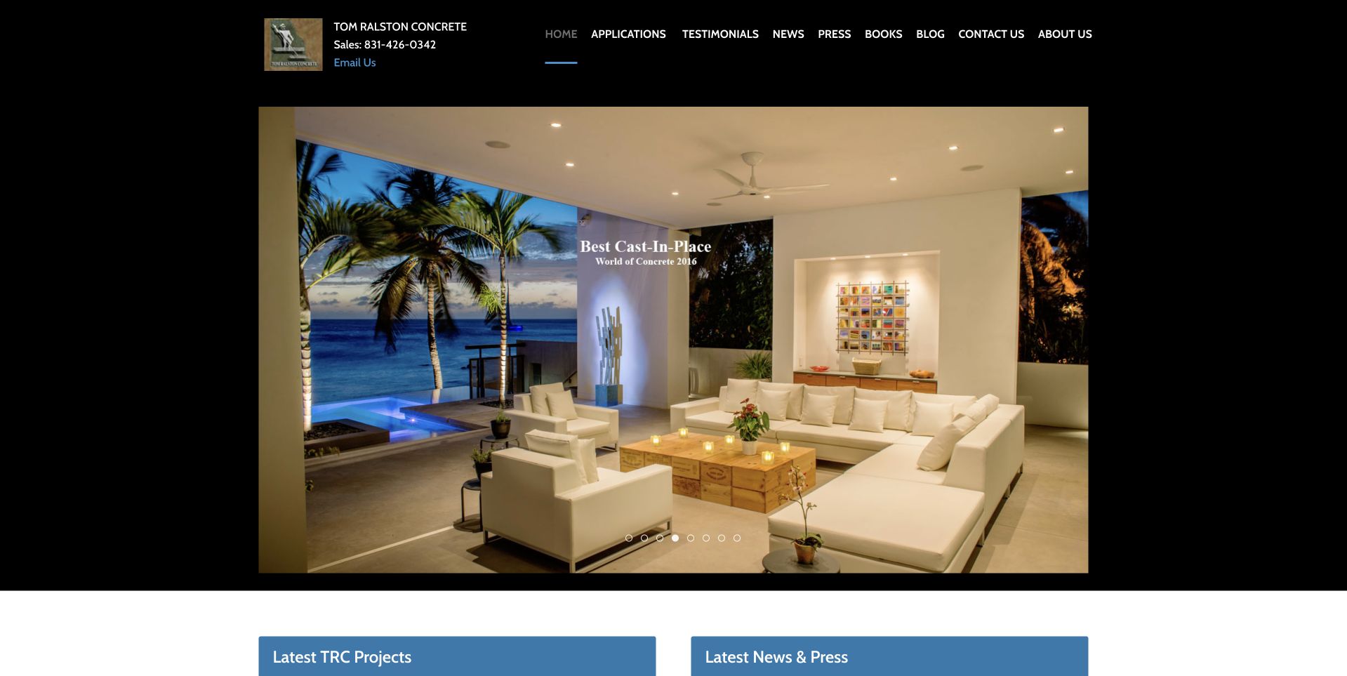
Tom Ralston uses a centered black composition with compact navigation and a large interior photograph showing a concrete floor in an ocean-facing room. Blue project and news headings begin beneath the image. The presentation gives the portfolio visual priority without a large form or animated sales panel. It is useful for studying an established specialist archive, including the way a detailed room photograph communicates the material's relationship to architecture. The narrow layout and small navigation also reveal opportunities for improved reading comfort. The current homepage identifies Adam and Danielle Billings as local owners since January 2026; the historic company name should not be mistaken for current ownership.
What you can learn
Preserve valuable project archives during a refresh, while updating ownership and contact context. Give projects accurate captions and larger navigation targets so the useful history remains accessible without depending on an older desktop layout.
Pros
The large interior image lets the viewer inspect concrete within its architectural context.
Project and news routes begin close to the portfolio opening.
Cons & considerations
Small navigation requires more generous touch targets and readable sizing.
A narrow centered layout leaves substantial unused space on wider screens.
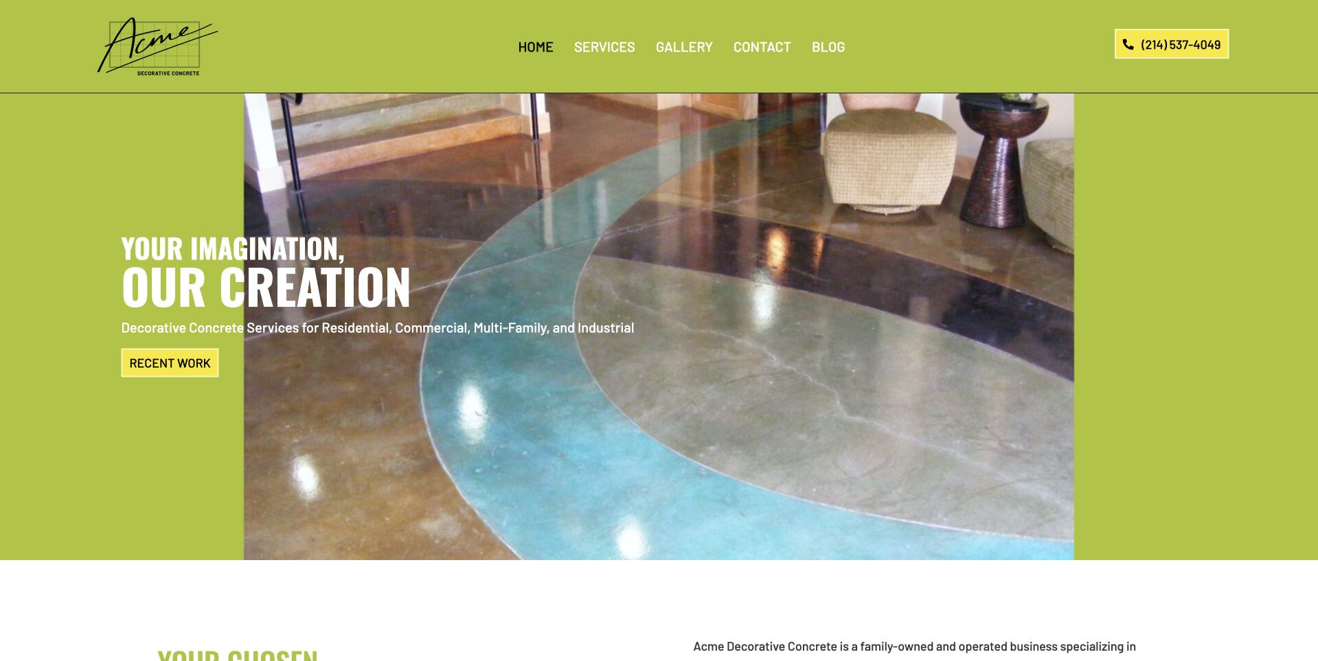
Acme uses a vivid lime surface around a large photograph of a polished interior floor. White display wording and a gold recent-work action create a strong introductory hierarchy, while the next section supplies Dallas–Fort Worth context. This is useful for studying a decorative-concrete site that chooses a distinctive color treatment rather than another dark photograph-and-form template. The floor photograph gives the palette a material reference, but detailed service information remains necessary. Neither its sheen nor the surrounding room establishes slip resistance, durability, maintenance needs, suitability, or the result another customer would receive. Promotional claims should remain attributable to the company rather than conclusions drawn from the picture.
What you can learn
Use a distinctive palette to frame the portfolio, not overpower it. Pair finish photographs with accurate service and regional text, and leave technical performance or suitability questions to responsible project assessment rather than a visual impression.
Pros
The lime background creates a recognizable identity around the project photograph.
A recent-work action makes the portfolio a clear next destination.
Cons & considerations
Bright brand colors require contrast checks for every text and action state.
An attractive finish image needs material and project context beyond its appearance.
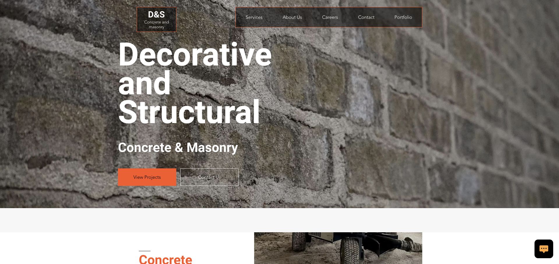
D&S places large white decorative-and-structural wording over a close view of masonry texture. An orange projects action and an outlined secondary control sit below the message, with service information beginning further down. The compact header keeps the company identity separate from the textured background. This is useful for studying how a contractor can introduce more than one work category without hiding the portfolio behind a lengthy questionnaire. The broad scope also makes precise service explanations essential: masonry, decorative finishes, and structural concrete are not interchangeable. The photograph and headline are public marketing content, not verification of engineering capability, licensing, workmanship, or material performance.
What you can learn
Make broad construction categories understandable before asking for a project inquiry. Give each genuine discipline a clear destination and use the portfolio to illustrate scope, while keeping technical qualifications and project requirements accurately documented elsewhere.
Pros
The orange portfolio action is distinct from the textured monochrome background.
Decorative and structural scope is visible in the introductory wording.
Cons & considerations
Texture can compete with smaller explanatory text.
Broad construction categories require more precise scope than a single headline provides.
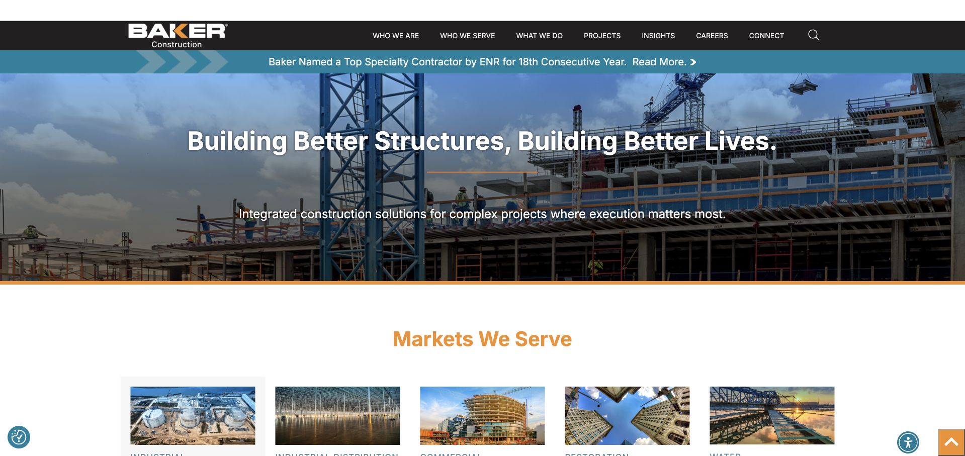
Baker uses a wide construction-site photograph with a centered white headline beneath a dark navigation bar. A blue news strip appears above the image, and a markets section begins directly below. The header separates company, audiences, services, projects, insights, careers, and connection routes. This is useful as a larger-scale contrast to local residential contractors: the site organizes an integrated construction business rather than a short driveway inquiry. Cookies were rejected before the selected capture. The company's structural-concrete material supports its inclusion, but the public homepage does not establish a project's engineering requirements, contractor suitability, or the technology behind the site.
What you can learn
Organize enterprise construction content around actual markets and stakeholder tasks. Keep news and recruiting accessible without allowing them to obscure service and project discovery, and do not copy a large organizational structure into a small contractor's brief unnecessarily.
Pros
Markets begin immediately after the wide construction image.
Navigation distinguishes service, project, career, and company information.
Cons & considerations
A broad corporate headline needs more specific project and service explanations.
News strips add another layer above the principal introduction.
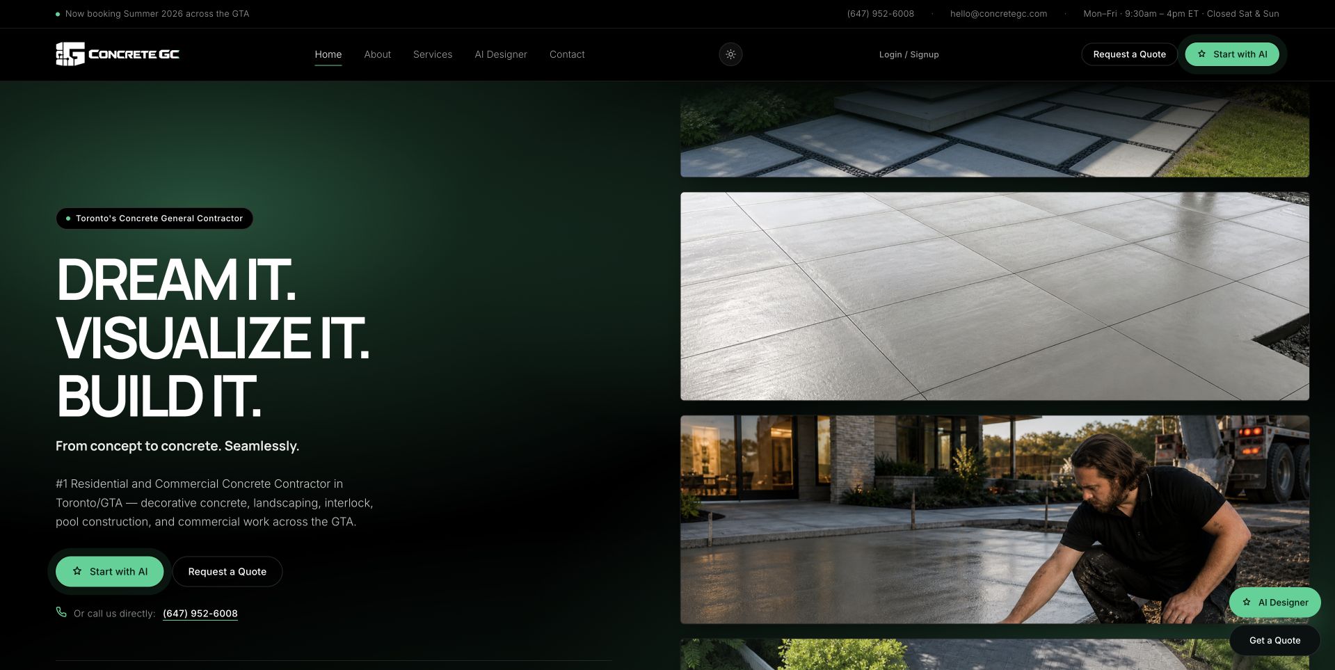
ConcreteGC uses a dark green and black split composition. Large short verbs occupy the left side, while stacked work photographs fill the right. The opening text identifies Toronto and the Greater Toronto Area, with quote and conversation routes near the message. A visualization-oriented option also appears in the interface. This is useful for studying how a regional concrete company can combine a compact introduction with several visual references rather than one long slideshow. The presence of a visualization feature does not establish its accuracy or suitability for estimating a real project. Images and interface labels remain communication choices, not engineering evidence or independently tested service outcomes.
What you can learn
Keep visualization clearly separate from a measured project proposal. Maintain literal service and geographic text beside expressive wording, and make sure the inquiry route explains what staff need before a customer can understand scope, timing, and price.
Pros
The stacked images show more than one work context within the opening view.
The regional wording gives the short display headline practical meaning.
Cons & considerations
Several floating conversation and visualization controls can compete with contact.
A visualizer needs clear limits so a concept is not confused with a specification.
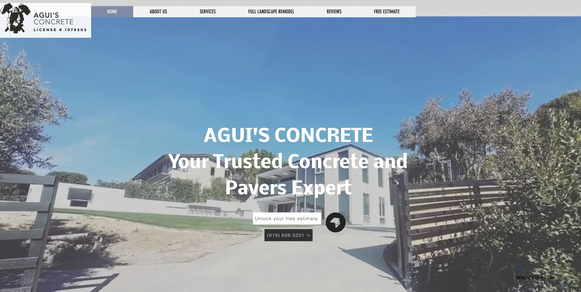
Agui's places a large residential driveway photograph beneath a compact pale header. Centered white wording names concrete and pavers, with estimate and telephone routes close to the message. The company mark stays at the upper left, and the following section introduces trending services. This is useful for studying a straightforward small-business presentation that does not require a complicated menu or a tall introductory form. The image establishes a residential context but should not be treated as proof of project authorship, construction details, surface performance, or the work appropriate for another site. A light image treatment also makes contrast around the smaller contact controls important.
What you can learn
Keep a simple homepage literal and easy to navigate. Add accurate service, territory, and project context beyond the image, and ensure the contact labels remain readable when the photograph changes or the layout narrows to a phone.
Pros
Concrete and paver scope appears directly in the introduction.
A compact header leaves substantial room for the residential project image.
Cons & considerations
Centered white text needs stronger contrast over lighter parts of the photograph.
A generic residential image needs captions and specific service context elsewhere.
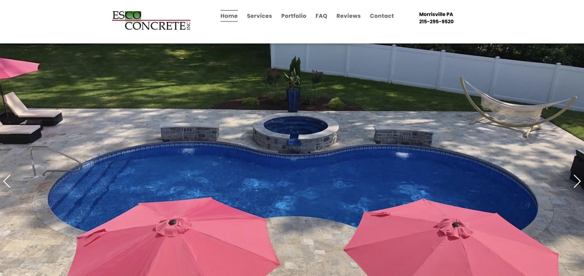
Esco uses a clean white header above a large pool-and-patio photograph. The company mark, compact service navigation, and Morrisville, Pennsylvania telephone context remain above the image rather than covering it. Slide controls indicate a broader image collection. This is useful for studying a portfolio-led contractor homepage where the viewer can inspect the relationship between concrete, landscaping, and a finished outdoor setting. The restraint avoids an immediate form overlay, but the opening depends on the image to communicate much of the offer. A pool-deck photograph does not establish surface safety, construction details, material suitability, or the scope and conditions of a future project.
What you can learn
Let complete outdoor scenes communicate project context, then provide accurate captions and literal service routes. Ensure essential contact and scope information is available without waiting for a particular slide or inferring technical properties from the image.
Pros
The image remains largely unobstructed by promotional text or form fields.
Regional telephone context is available in the compact white header.
Cons & considerations
A slideshow can hide useful examples behind interaction or timing.
A portfolio-led opening still needs an explicit service and territory explanation.
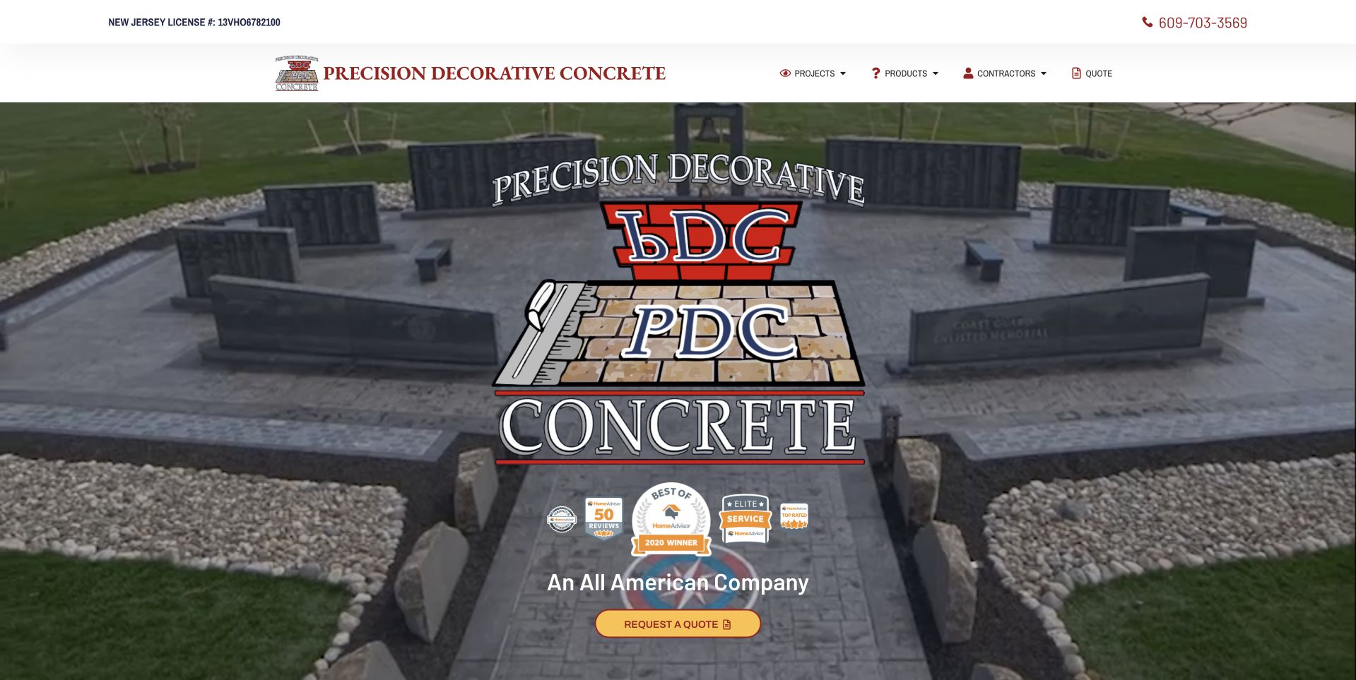
Precision Decorative Concrete places its large company mark over a photograph of stepped hardscape and patterned concrete. A white header includes telephone access and concise project, application, and company routes. A small gold quote action sits within the image, while the following section begins service information. This is useful for studying a specialist portfolio introduction with restrained navigation rather than a long first-screen form. The oversized logo and supporting badges occupy part of the work image, which creates a tradeoff between identity and project visibility. Displayed marks and claims remain the company's presentation, not independent verification of qualifications, material performance, or the suitability of a decorative treatment.
What you can learn
Balance brand recognition with the practical value of a project photograph. Keep a clear quote route and accurate service categories, but allow visitors to inspect the actual work without asking badges or a large mark to substitute for context.
Pros
The stepped hardscape photograph relates directly to decorative-concrete scope.
Telephone and quote access are visible without a lengthy form.
Cons & considerations
A large central mark obscures some useful project detail.
Supporting badges need accurate explanations rather than implied independent endorsement.
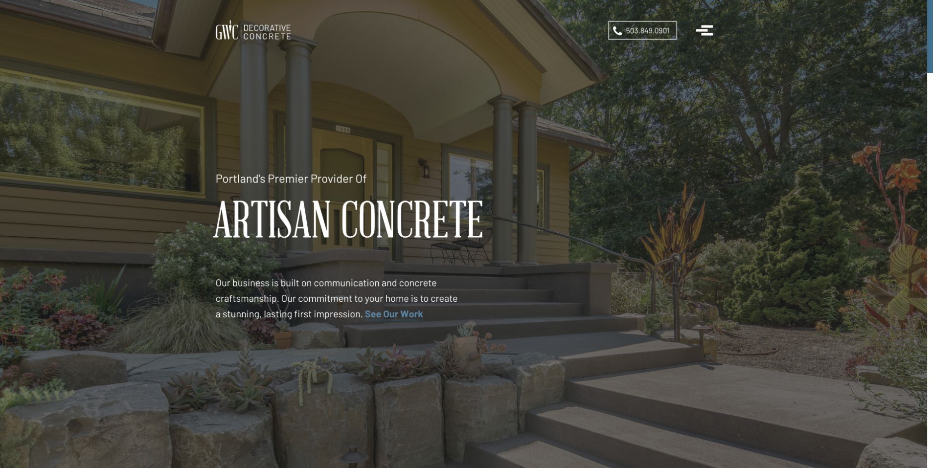
GWC uses a large residential exterior photograph with a dark treatment and a compact artisan-concrete introduction. A small company mark, telephone control, and menu icon keep the header restrained, while a work-viewing link appears in the text. The scene shows concrete in relation to the house and planting instead of isolating a material sample. This is useful for studying a quiet portfolio-led opening that lets the project setting carry much of the visual identity. The minimal navigation also creates a discovery tradeoff. The photograph and artisan wording do not independently establish project authorship, qualifications, durability, workmanship, or the requirements of another property.
What you can learn
Use complete settings to show how a finish relates to its surroundings, then make service and project routes easy to discover. A restrained menu should still expose enough practical scope for visitors who are not ready to call.
Pros
The residential scene gives the concrete a clear architectural and landscape context.
A restrained header leaves the work image visually prominent.
Cons & considerations
A menu icon hides category choices until the visitor interacts.
Dark image treatments need careful contrast around smaller descriptive wording.
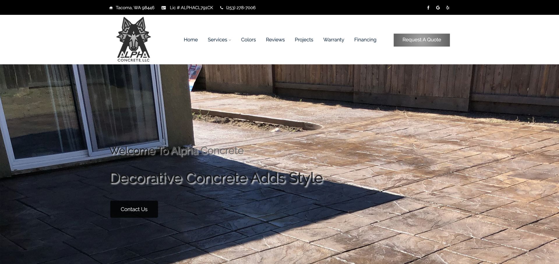
Alpha uses a white header beneath a black contact strip, followed by a wide patio photograph with a short decorative-concrete introduction. Navigation separates services, colors, reviews, projects, financing, and quote access. The image gives a view of the concrete surface beside a house rather than only a close texture. This is useful for studying a compact service page with several practical information routes near the top. The smaller shadowed wording over the image is harder to read than the header, illustrating the importance of a stable text surface. The photograph does not verify material performance, construction details, pricing, or the suitability of a finish for another location.
What you can learn
Keep useful material and project routes when simplifying a contractor website. Place essential service text on a reliably readable surface, and distinguish inspiration, material choices, finance information, and a project quote as different visitor tasks.
Pros
Service, color, project, and quote routes are available in the main header.
The patio photograph shows the finish within a residential setting.
Cons & considerations
Shadowed text over the detailed image has limited reading comfort.
A dense category header needs careful responsive spacing and touch targets.
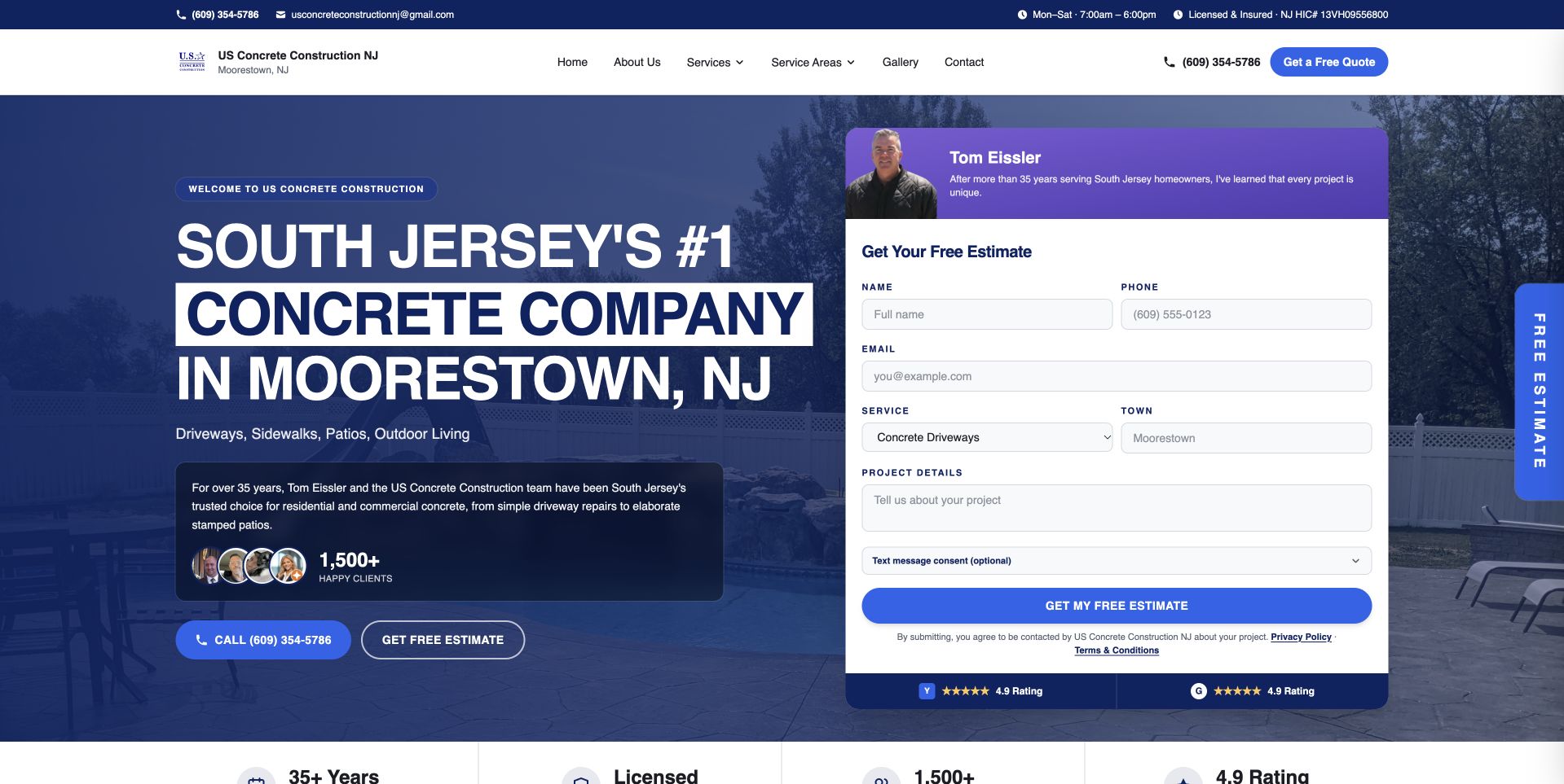
US Concrete Construction NJ uses a blue split hero with a large Moorestown and South Jersey introduction on the left. A white estimate form on the right includes a small founder panel, and quote and telephone controls sit beneath the opening message. The navigation exposes service and territory categories in detail. This is useful for studying a local contractor that combines personal company context with structured intake. Its superlatives, experience statements, and customer counts remain company claims rather than independently verified findings. The form's presence also does not mean that a requested service, time, price, or project has been accepted.
What you can learn
Use personal context to clarify who receives the inquiry, then ask only for information that helps that team respond. Keep service and territory choices meaningful, and describe the next estimate step without implying an agreed construction scope.
Pros
The Moorestown and South Jersey wording makes the operating context explicit.
A white form creates a distinct surface within the blue introduction.
Cons & considerations
A tall estimate panel can dominate the mobile first view.
Prominent numerical and superlative claims need their own maintained evidence and context.
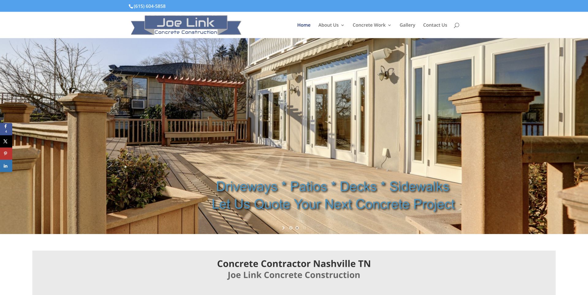
Joe Link uses a large patio photograph beneath a compact white header and blue contact strip. A short overlay names driveways, patios, decks, and sidewalks, with a quotation invitation directly below. The next section begins a literal Nashville contractor introduction. This is useful for studying an older portfolio-led service layout with concrete categories visible in the opening view. The house and patio setting provides spatial context, but blue text over the detailed image loses some contrast. The photograph should not be treated as a specification or proof of material performance, workmanship, project ownership, or suitability for another property.
What you can learn
Preserve clear project categories and useful archives during modernization. Improve contrast and caption the work accurately, then make the quote invitation explain what information starts a discussion rather than implying that a photograph determines project scope.
Pros
The residential scene shows the concrete within a complete outdoor setting.
Several project categories are named before the longer company explanation.
Cons & considerations
Blue overlay wording competes with the detailed patio photograph.
A traditional compact header needs larger mobile navigation targets.
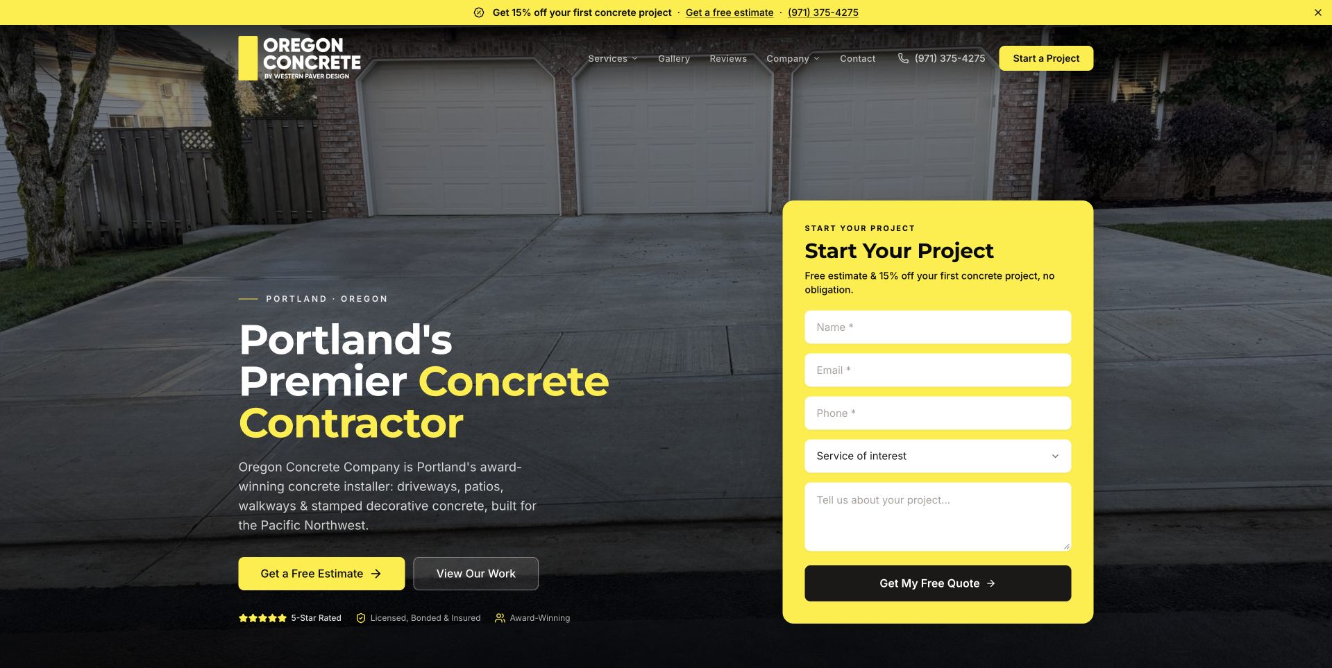
Oregon Concrete Company pairs a darkened driveway photograph with a large Portland service introduction and a yellow project-start form. The bright panel makes the intake task impossible to miss, while service, work, and contact routes remain in the header. A promotional offer was dismissed before the selected capture, leaving the main composition visible. This is useful for studying high-contrast form hierarchy and the tradeoff of using substantial first-screen space for inquiry fields. The company's price promotion and credentials are its own public statements. Neither the image nor the form establishes construction suitability, project cost, availability, or the outcome of work at another property.
What you can learn
Keep the main form understandable without relying on an offer overlay. Explain what happens after submission and use a limited first-stage field set, with a useful route for visitors who need to clarify scope before entering project details.
Pros
The yellow form is clearly separated from the dark driveway image.
Portland context is visible in the main introductory wording.
Cons & considerations
A large intake panel can overwhelm a visitor with an initial question.
Promotional layers can interrupt the service task when they appear after loading.
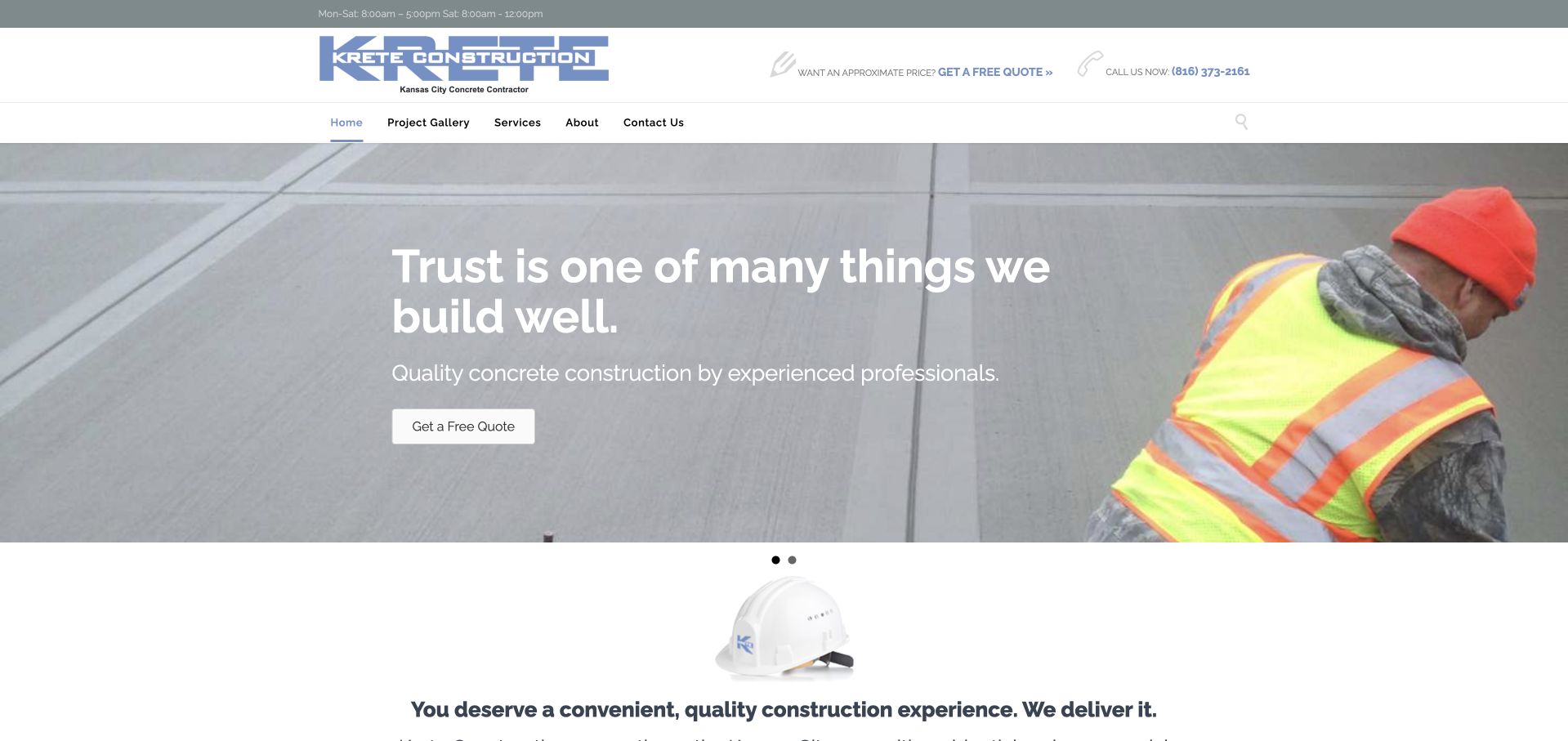
Krete uses a compact pale header above a wide photograph of a worker finishing a concrete surface. Centered white wording introduces the business, with a small quote control beneath. The next section begins a short construction-experience explanation on a white background. This is useful for studying a quieter alternative to a large portfolio collage or tall estimate form. The work image relates directly to the service, although the broad trust-oriented wording needs more literal scope and geographic context nearby. The photograph is not a technical instruction or independent verification of procedures, qualifications, surface performance, or the service a future customer would receive.
What you can learn
Pair work imagery with precise service information and a clearly labeled inquiry route. Keep the introduction concise, but do not make visitors infer the operating territory or project types from a slogan and a single finishing photograph.
Pros
A small quote control leaves the work photograph substantially visible.
The following white section provides a stable reading surface for further explanation.
Cons & considerations
General trust wording does not explain the full construction scope.
Centered white type requires careful contrast over changing work images.
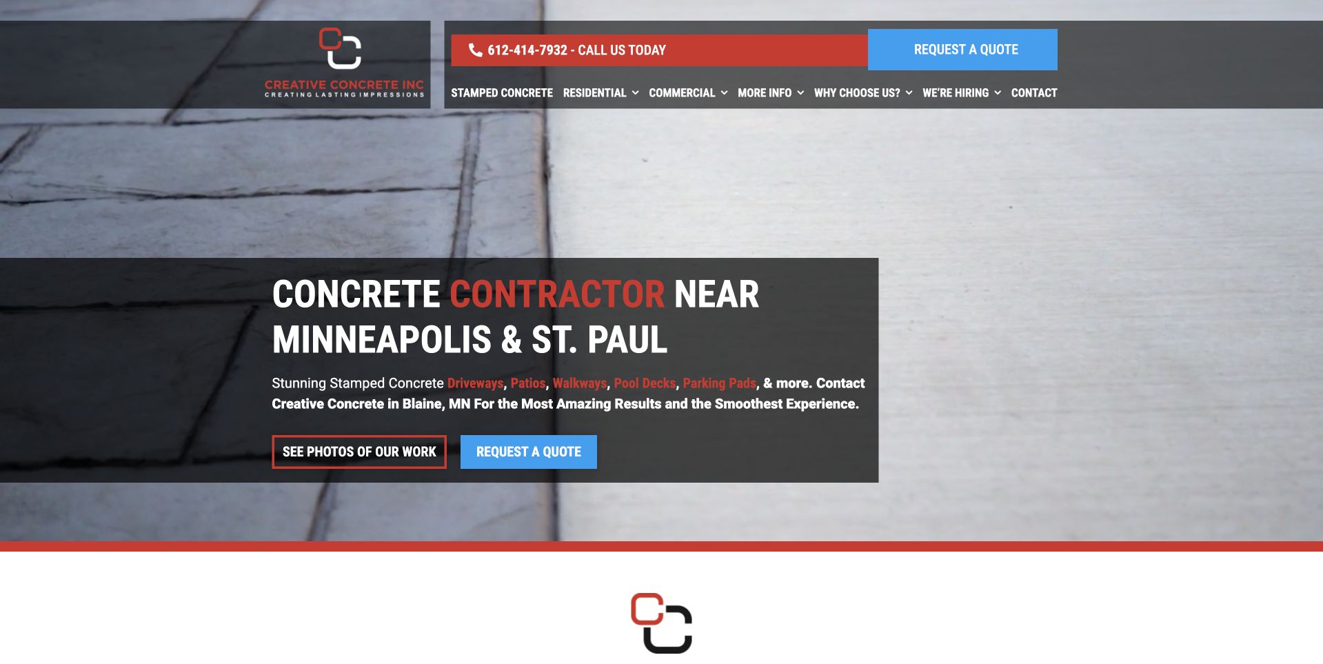
Creative Concrete uses a large surface-detail photograph with a dark text panel naming Minneapolis and St. Paul. A red telephone band and blue quote action anchor the compact header, while the hero separates work-photo viewing from requesting a quote. This is useful for studying a regional contractor whose main actions reflect two different stages of interest: looking at examples and starting a conversation. The textured image supplies material context without a large collection of promotional badges. Its visual finish does not establish durability, construction details, maintenance needs, or suitability. Technical and performance statements need their own responsible review rather than being inferred from a photograph.
What you can learn
Give project browsing and inquiry their own clear routes. Maintain literal metropolitan wording and accurate finish captions, and ensure the text panel remains readable when the image crops differently on a phone.
Pros
The Minneapolis and St. Paul heading gives the service a clear regional frame.
Photo-viewing and quote actions acknowledge different visitor intentions.
Cons & considerations
The dense compact header needs careful mobile spacing.
A close surface image needs additional project context beyond its texture.
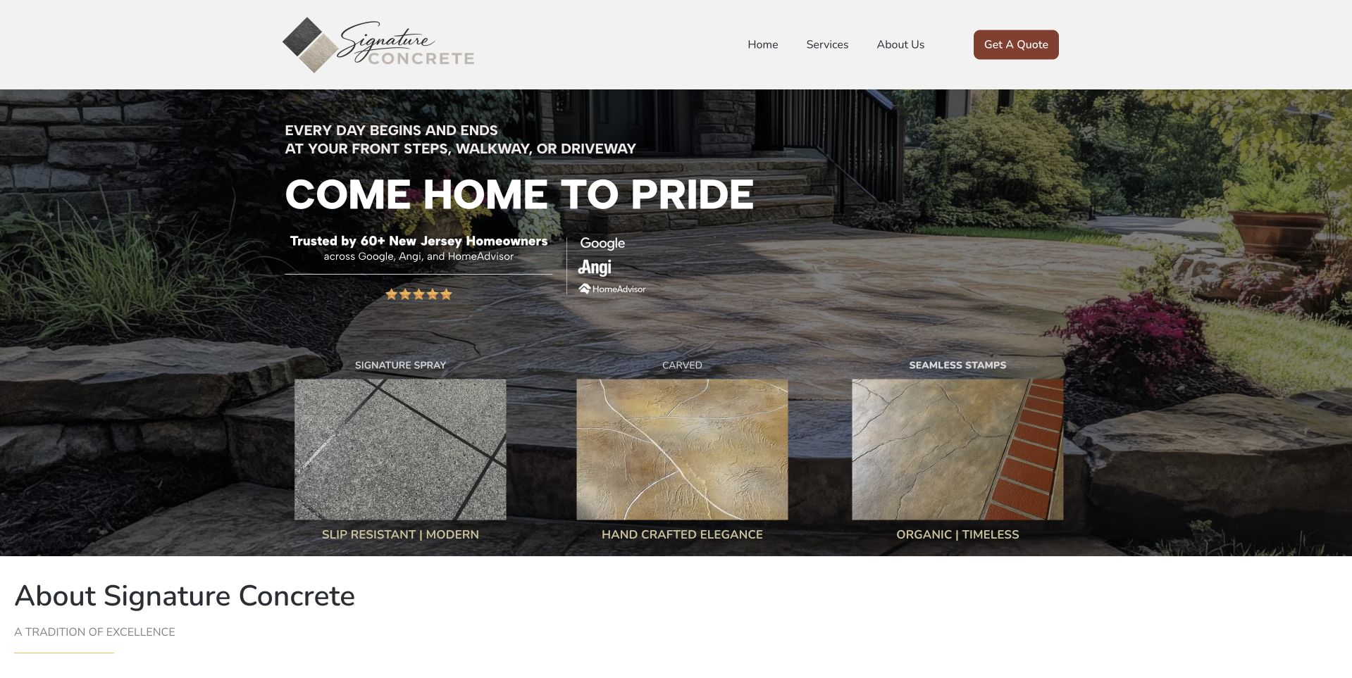
Torres Signature Concrete places a large outdoor walkway photograph beneath a restrained white header. Three material-style panels sit within the image, connecting the broader setting with different finish appearances. A compact quote route remains in the header, while the next section begins the company introduction. This is useful for studying a decorative-concrete page that introduces choices visually rather than placing every visitor in the same generic project form. The swatches also need accurate explanation: appearance categories are not complete specifications. Neither a thumbnail nor a finished walkway photograph establishes slip resistance, durability, maintenance requirements, construction details, or suitability for a particular property.
What you can learn
Use finish samples to start an informed conversation, not as a substitute for project assessment. Give each appearance a clear label and context, and distinguish visual inspiration from the materials and specifications ultimately proposed by the responsible team.
Pros
Three finish panels connect material choices to a complete outdoor setting.
A restrained white header keeps the quote route visible without covering the image.
Cons & considerations
Small swatches need clear labels and accessible descriptions.
Visual finish categories can be mistaken for specifications without supporting explanation.
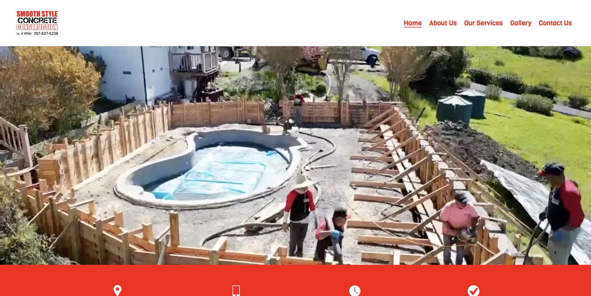
Smooth Style uses a very simple white header with red navigation above a large photograph of a pool-area construction scene. Workers and surrounding site conditions remain visible rather than presenting only an isolated finished surface. A red information band begins below the image. This is useful for studying a compact contractor site that lets an actual work context carry much of the opening. It also reveals the limits of an image-only introduction: a visitor still needs literal services, territory, and contact information. The photograph is not a safety assessment, construction instruction, or independent verification of who performed the work or what methods suit another site.
What you can learn
Let process imagery add context, but accompany it with accurate project captions and readable service information. Keep the header simple while ensuring that location, inquiry, and work categories do not depend on interpreting the photograph.
Pros
The wide image shows a complete work setting rather than a generic texture.
Simple navigation makes the small brochure structure easy to recognize.
Cons & considerations
The image-led opening provides little literal service explanation.
Red links on white need adequate sizing and distinct interactive states.
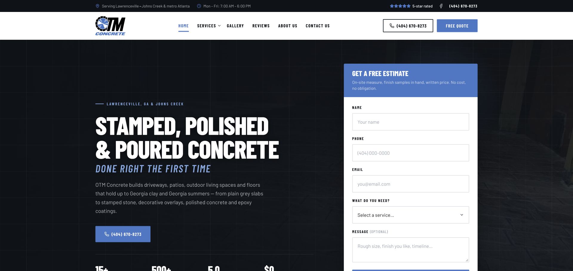
OTM uses a dark grid-like hero with bold white stamped, polished, and poured-concrete wording. A white estimate card occupies the right side, and a compact blue call action sits beneath the explanatory text. The header provides Lawrenceville and Johns Creek context alongside straightforward service and work routes. This is useful for studying a form-led contractor layout where the main text remains on a stable surface rather than over a detailed photograph. The broad finish labels need more specific service explanations. Company claims and numerical statements are not independently validated by this collection, and submitting a request does not confirm engineering scope, suitability, price, or timing.
What you can learn
Use a stable text surface when the service introduction carries important distinctions. Keep the estimate request proportionate, explain the next response, and give each finish category an accurate destination rather than treating all concrete work as one interchangeable service.
Pros
Bold text remains readable against the restrained dark background.
The white estimate card is clearly separated from the introduction.
Cons & considerations
A tall form can dominate the first view on mobile.
Broad finish terms require more detailed scope and project context beyond the hero.
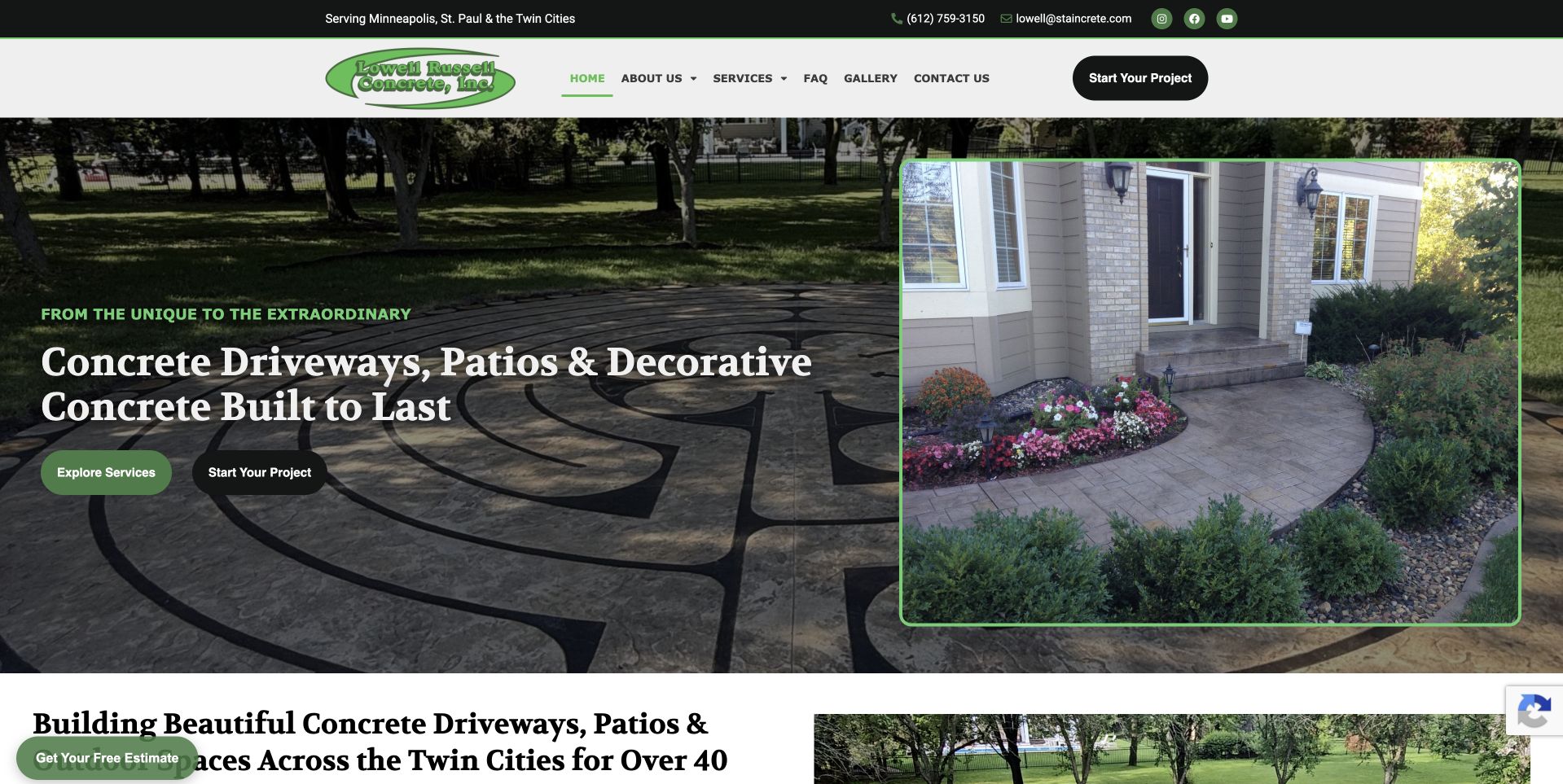
Lowell Russell uses a darkened patio photograph behind a clear concrete-driveway and decorative-concrete heading. A second framed image on the right shows a curved residential walkway, giving the hero a more specific project reference. Green and black actions separate service exploration from starting a project, while the header names the Twin Cities context. This is useful for studying a regional site that combines literal scope with visible work without a large form. The substantial photographic detail also makes captions and responsive cropping important. Experience and durability wording remain company claims, not independent verification of material performance, workmanship, or the requirements of a future site.
What you can learn
Combine a broad service introduction with one legible project example, then provide accurate captions and category routes. Keep the project-start action distinct from browsing, and avoid presenting visual finish or experience claims as an agreed specification.
Pros
The framed walkway image provides a specific project reference within the hero.
Service browsing and project-start actions are clearly differentiated.
Cons & considerations
Two substantial images need responsive sizing to control page weight.
Durability and experience wording require maintained supporting context.
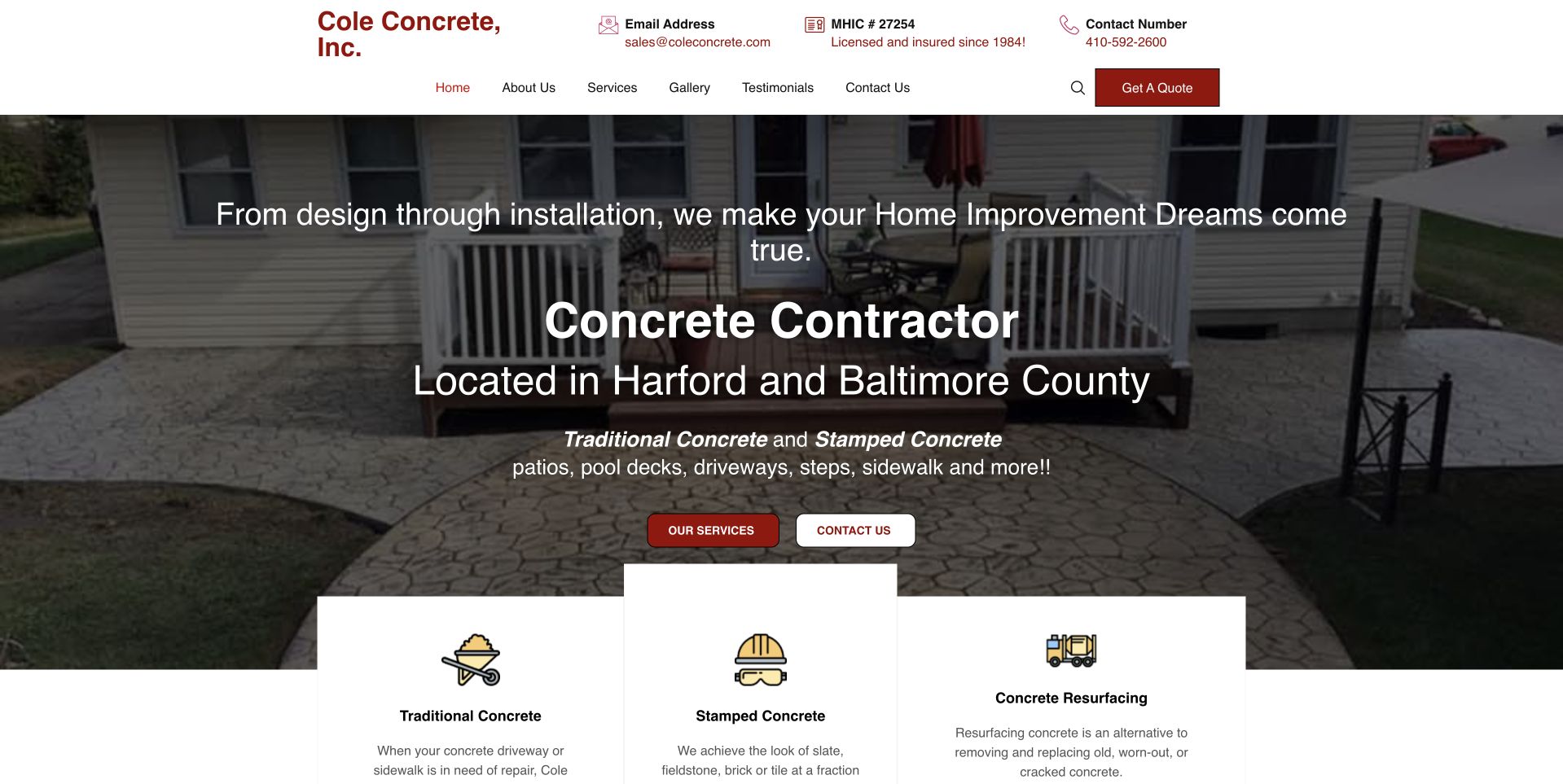
Cole uses a white header with telephone, email, and company information above a residential patio photograph. Large white text names Harford and Baltimore County, while three service cards overlap the bottom edge of the image. The cards distinguish traditional concrete, stamped concrete, and resurfacing. This is useful for studying a local contractor that makes service categories visible before a visitor reaches the longer explanation. The overlap adds depth but needs careful responsive ordering. The photograph and company statements do not independently establish licensing status, material suitability, construction performance, or the outcome a customer would receive. Contact details and claimed credentials need routine maintenance by the business.
What you can learn
Expose meaningful service differences early, using readable card labels and clear destinations. Keep practical contact context accessible, and ensure overlapping elements become a sensible linear sequence on phones rather than covering either text or project imagery.
Pros
Three literal service cards clarify the catalog near the opening.
County-level wording makes the residential offer geographically specific.
Cons & considerations
Overlapping cards need careful spacing and reading order at narrow widths.
A dense contact header can make small details difficult to read.
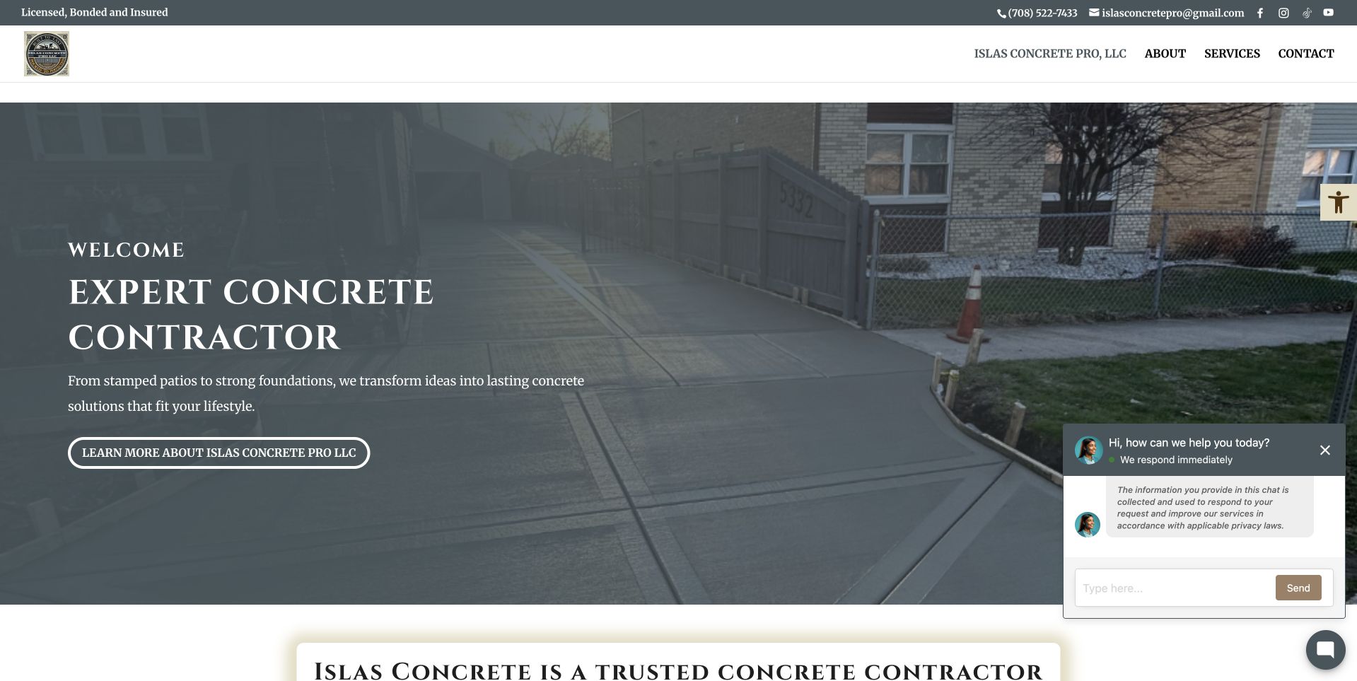
Islas uses a wide driveway photograph beneath a slim contact strip and white navigation. A muted overlay supports a small welcome line and a large contractor heading, with a company-information action below. The next white section begins the broader introduction. This is useful for studying a straightforward regional presentation where the photograph provides residential context without a large initial form. A small chat prompt appears at the lower right and should remain subordinate to the main task. The page's claims and the pictured driveway do not independently verify qualifications, project authorship, construction details, material performance, or the service arrangement available to another customer.
What you can learn
Keep a modest brochure site practical by naming territory and actual services alongside the image. Make chat optional and unobtrusive, and offer a clear inquiry route for visitors who need to discuss a project rather than browse company information.
Pros
The white header separates navigation from the residential photograph.
A simple company-information action keeps the opening visually restrained.
Cons & considerations
Muted imagery needs deliberate contrast around the smaller welcome text.
Floating chat can cover useful content when the layout narrows.
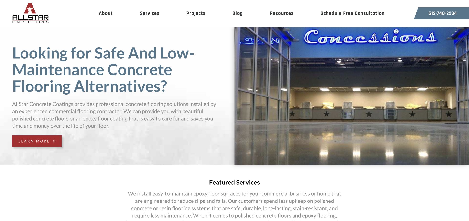
AllStar places a large flooring question on a pale text surface beside a commercial interior photograph. The polished floor is visible within the venue rather than as an isolated close-up, while the header separates services, projects, resources, and consultation access. Featured services begin directly below. This is useful for studying a coatings specialist whose reading surface is independent of the image. The question's safety and maintenance wording remains the company's marketing language, not an independently verified property of any pictured floor. Concrete coatings, polishing, and installation scope need accurate distinctions, and the public page does not establish suitability for a particular facility or use.
What you can learn
Give commercial flooring inquiries a clear service taxonomy and project context. Keep safety, maintenance, and performance statements appropriately supported, and distinguish a consultation request from a technical recommendation or agreed flooring specification.
Pros
The solid text panel provides reliable reading contrast beside the commercial image.
Service and project routes are visible before the featured catalog begins.
Cons & considerations
Question-led promotional wording needs a precise explanation of actual scope.
Floor appearance alone cannot establish safety, maintenance needs, or performance.
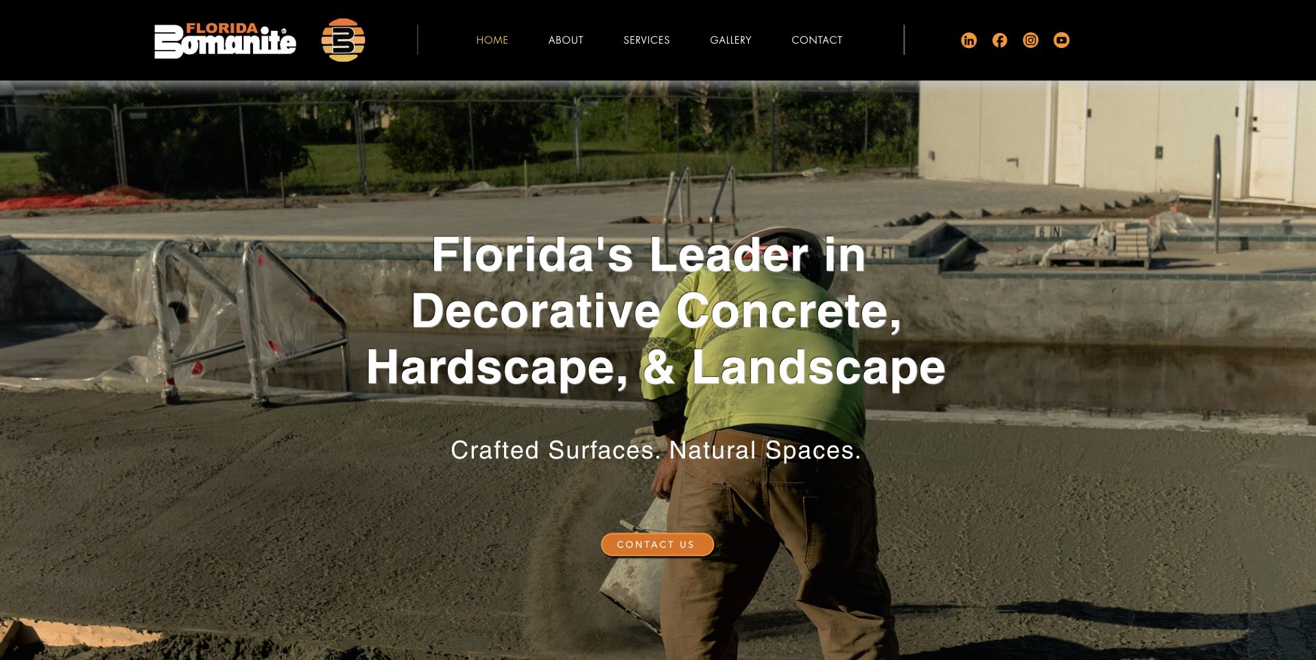
Florida Bomanite uses a black header with gold accents above a wide work-site photograph. Large white wording names decorative concrete, hardscape, and landscape, with a compact contact action below. The image shows an active site rather than an exclusively finished lifestyle scene. This is useful for studying a broader specialist offer whose service categories appear in the introduction. The wide scope also makes accurate distinctions important: landscape work, decorative surfaces, and construction tasks may involve different assessment and inquiry details. The company's leadership wording and the photograph are not independent evidence of credentials, safety practices, workmanship, or suitability for a particular project.
What you can learn
Name the genuine disciplines clearly, then give each a useful destination and inquiry context. Work-site imagery can explain the setting, but it should not replace project captions, technical scope, or responsible review of qualification and performance claims.
Pros
The opening wording identifies three related but distinct service areas.
Black and gold branding keeps the header visually coherent with the work image.
Cons & considerations
Broad multidisciplinary scope needs more detail than the introductory headline.
Text over an active work scene requires careful contrast and responsive cropping.
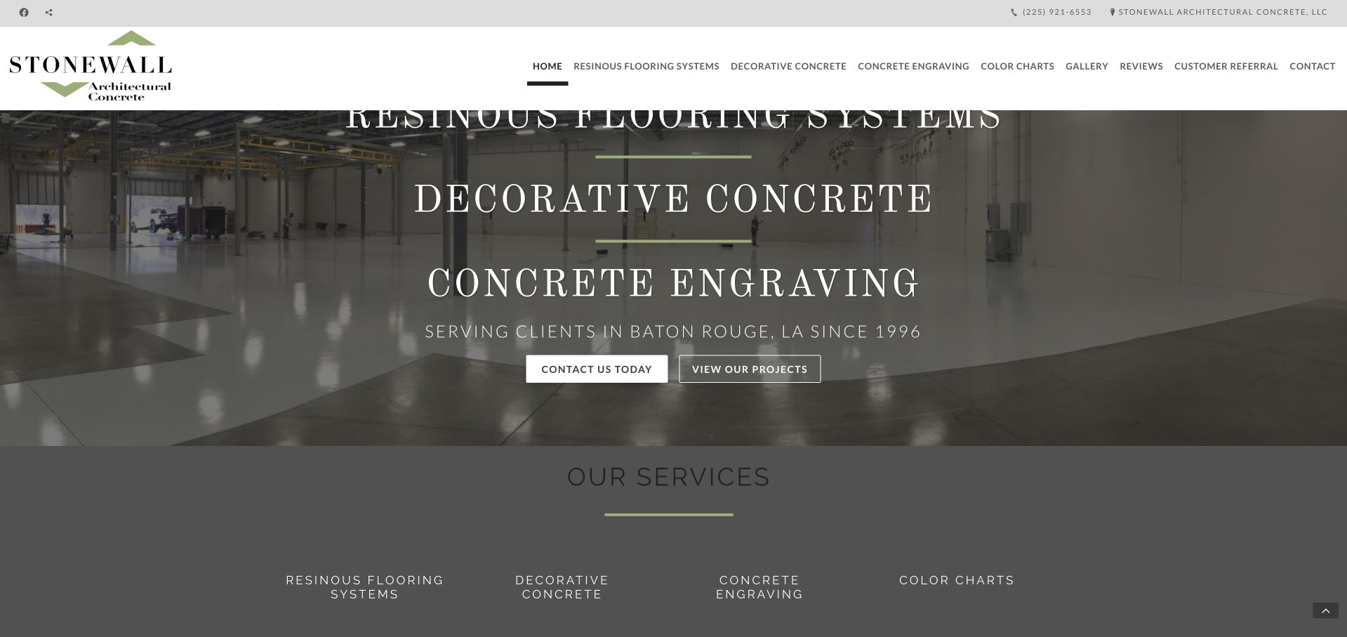
Stonewall uses a commercial-floor photograph with large serif wording naming resinous flooring, decorative concrete, and concrete engraving. Baton Rouge context and contact and project actions sit beneath those categories, with a compact service row below. The white header exposes the specialist navigation directly. This is useful for studying a regional flooring site whose taxonomy is more specific than a generic concrete-contractor label. The captured first category sits close to the header, showing a spacing issue worth avoiding in a refresh. Photographic sheen and category names do not establish performance, installation requirements, safety, or suitability for another facility.
What you can learn
Preserve the literal specialist categories while improving header clearance and reading comfort. Explain each finish system accurately on its destination, and use project photographs as context rather than specifications or promises about maintenance and performance.
Pros
The named flooring systems make the specialist scope understandable.
Contact and project-viewing actions serve different stages of interest.
Cons & considerations
The upper display wording needs more clearance beneath the header.
Large serif text and a dark treatment can compress the available image detail.
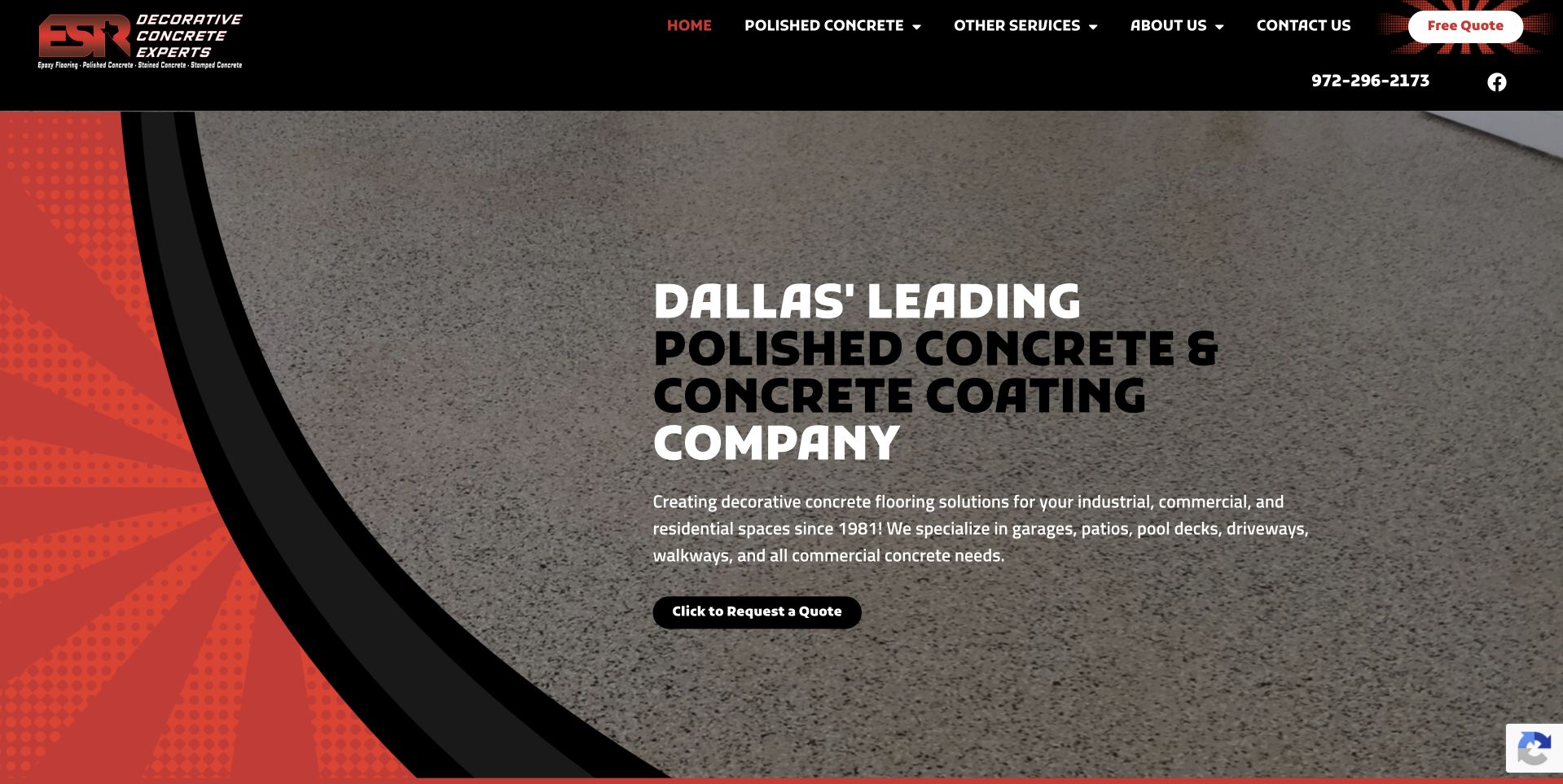
Texas Concrete Stain presents ESR Decorative Concrete Experts branding in a black header above a gray material-texture hero. Red and black curved elements frame a large Dallas polishing-and-coating heading, with a compact quote action below. This is useful for studying how a descriptive domain and a trading identity can coexist when the page makes the actual brand visible. The service message is literal, though the abstract texture offers less project context than a complete interior photograph. The company's leadership and experience wording remains its presentation, not independent verification of performance, credentials, suitability, or the construction and maintenance requirements of a particular floor.
What you can learn
Make the relationship between domain, brand, and receiving company clear. Pair literal service wording with accurate project examples elsewhere, and explain what a quote request starts instead of allowing a texture image to imply a complete flooring specification.
Pros
The Dallas polishing-and-coating wording gives the introduction a clear scope.
Black and red framing creates a recognizable hierarchy around the gray texture.
Cons & considerations
An abstract material background provides limited real-project context.
A domain and trading-brand difference needs consistent identity throughout contact and project pages.
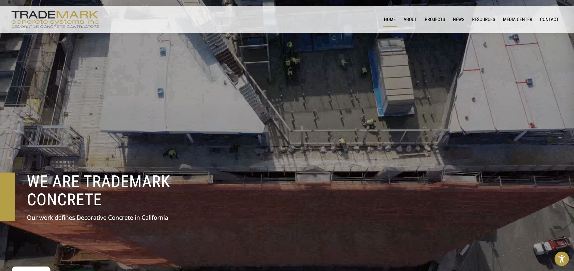
Trademark uses a wide construction-site photograph with a restrained company statement positioned near the lower left. A pale header holds the mark and compact project, news, resource, and contact navigation. Yellow emphasis ties the introduction to the brand without placing a form over the image. This is useful for studying a portfolio-first concrete site with a more architectural, less domestic visual context. The next section begins company information, keeping the opening concise. The photograph and decorative-concrete positioning do not independently validate workmanship, qualifications, engineering requirements, or material performance. An optional accessibility interface was closed before capture so the actual content remained visible.
What you can learn
Let a substantial project image establish context, then supply accurate scope and captions. Keep optional interfaces from obscuring the portfolio, and distinguish a concise brand introduction from the detailed information needed to evaluate a construction inquiry.
Pros
The project photograph remains largely unobstructed by intake fields.
Yellow emphasis adds brand identity without overwhelming the image.
Cons & considerations
A short company statement needs a fuller service and regional explanation nearby.
Compact upper navigation requires comfortable sizing on smaller screens.
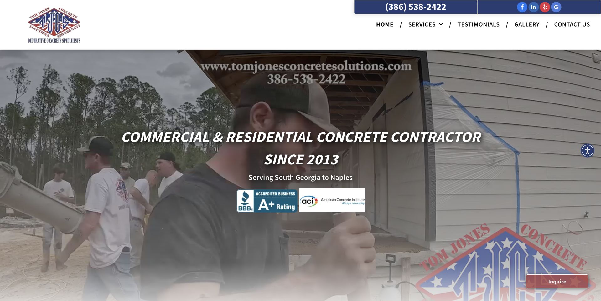
Tom Jones uses a wide crew-at-work photograph beneath a white header with a blue telephone strip. Centered wording identifies commercial and residential concrete work, with a regional line and several supporting company marks below. The work image shows people and the site setting rather than only a finished surface. This is useful for studying a small contractor that makes its broad audience visible in the introduction. The number of overlaid elements also creates a reading hierarchy challenge. Displayed ratings, credentials, dates, and company statements remain attributed claims; they do not independently establish safety, qualifications, workmanship, or the project arrangements available to another customer.
What you can learn
Keep mixed residential and commercial scope literal, then route inquiries according to actual project needs. Use crew photography with accurate context, and avoid allowing several badges and overlaid claims to compete with the basic service and contact explanation.
Pros
The introduction explicitly names both residential and commercial work.
A crew photograph gives the service a human and site-specific context.
Cons & considerations
Several overlaid marks and statements reduce the clarity of the work image.
Mixed project types need more precise inquiry routing beyond the broad hero.
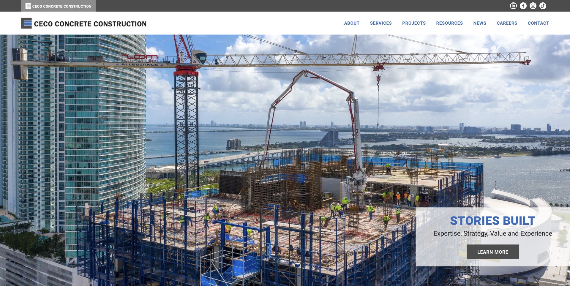
Ceco uses a large urban construction photograph beneath a compact white header. A pale message panel sits at the lower right of the image, while company, services, projects, resources, news, careers, and contact routes remain visible above. This is useful as a corporate-scale contrast to local decorative and driveway sites. The image communicates a different project setting and buyer relationship without using a residential quote form. Cookies were rejected before the selected capture. The public presentation supports a construction-company design reference, not a conclusion about engineering capability, project suitability, workplace conditions, material performance, or the complete technology used by the website.
What you can learn
Match the information architecture to real organizational tasks. Large project and career catalogs can share a coherent header, but the service and project routes still need specific descriptions rather than relying on the scale of a construction photograph.
Pros
The substantial urban image gives the corporate construction scope visible context.
Services, projects, and careers remain separate in the main navigation.
Cons & considerations
A compact message panel needs adequate readable type at narrow widths.
A broad corporate introduction requires detailed project scope and service information afterward.
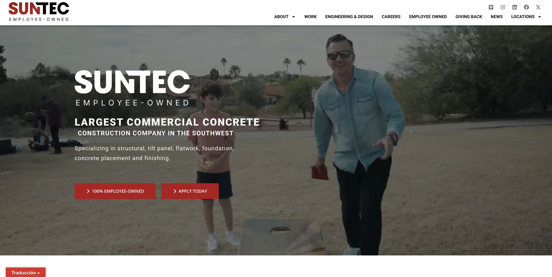
Suntec uses a broad human-focused image beneath a white header, with a prominent company mark and commercial-concrete introduction on the left. Red employee-ownership and application actions appear in the opening view. The main navigation separates company, work, engineering and design, careers, ownership, community, news, and locations. This is useful for studying a construction website where recruiting and company identity are major homepage tasks rather than secondary footer links. The wording and imagery remain the organization's presentation, not independent verification of ownership arrangements, employment terms, qualifications, project capacity, or construction outcomes. A customer seeking project detail needs a clear route beyond that initial employer-oriented message.
What you can learn
Identify the homepage's real audiences before choosing its main actions. Recruiting can be prominent, but project discovery and service scope should remain easy to reach, with company and employment claims maintained by the responsible internal owners.
Pros
The header clearly separates work, engineering, career, and location information.
Human imagery supports the employee-oriented company introduction.
Cons & considerations
Recruiting actions can overshadow the path for prospective project clients.
Broad scale and ownership statements need accurate context beyond the opening message.
Kegan is a freelance web designer and developer with 15+ years of experience helping businesses turn complicated website requirements into clear, maintainable digital experiences. He works directly with clients from planning and design through development, launch, and ongoing support.
For concrete contractor website design, his development approach focuses on project galleries, finish and application comparisons, service-area information, practical project requirements, and estimate inquiries. The scope can be a targeted improvement or a complete custom build, with responsive layouts, thoughtful content structure, and integrations chosen around the people using and maintaining the site.
Show 3 other concrete contractor website designersHide other concrete contractor website designers
Plan the project taxonomy before choosing the visual treatment
Separate inspiration, service scope, and technical decisions
Begin with the actual work the company accepts and the customer language used to describe it. Organize portfolio inspiration separately from service definitions and technical documentation. A finish photograph may help someone express a preference, but it should not become an implied specification. Give custom components, coatings, structural work, and household flatwork clear labels where those services exist. Record who reviews qualification, safety, performance, and material statements before publication. The homepage can be concise, while the destination pages explain scope and how the next conversation works. Keep a useful route for visitors who do not know the correct technical term.
Build project records instead of an uncaptioned image pile
For each selected project, record image permission, visible subject, project category, business role, and any location or collaborator details the company is authorized to publish. Distinguish an installed finish from a sample, rendering, process photograph, or work by another party. Describe what the viewer can actually see without inferring engineering performance. Prepare responsive image sizes and descriptive alternatives for meaningful photographs. Keep useful project text available outside carousels and avoid hiding the best scope explanation behind a slide timer. A strong portfolio is a maintained content system, not simply a directory of large JPEG files.
Design a clear first-stage request and internal handoff
Determine whether an inquiry is received by a local estimator, specialist workshop, sales team, or corporate office. Ask for the project type, broad location, contact details, and a short description only where useful. Let staff request plans or other files through a suitable process rather than collecting unnecessary sensitive information in a general form. Explain whether submission starts a callback or estimate discussion, and avoid suggesting that it confirms price, availability, engineering scope, or acceptance of the work. Test failure, validation, duplicate submission, and notification delivery, with a monitored fallback for visitors who cannot complete the form.
The editing job behind the design
Choose a maintainable portfolio and inquiry system
[object Object]
[object Object]
[object Object]
Our WordPress website examples offer a separate look at publishing approaches. A visible platform label is evidence for that named page, not a guarantee that the same system will suit your requirements.
Before the public launch
Concrete-contractor website brief checklist
List the actual decorative, precast, coating, masonry, flatwork, or structural services offered.
Identify household, trade, commercial, and enterprise audiences where their needs differ.
Keep inspiration images separate from specifications and technical recommendations.
Record the company’s actual role and permitted attribution for each project.
Caption visible materials and settings without inferring performance from appearance.
Have responsible staff review qualification, safety, material, and construction claims.
State the genuine operating territory and route specialist inquiries accurately.
Label callback, estimate, consultation, and accepted project as different outcomes.
Collect only the first-stage contact and project information needed to respond.
Protect any requested plans or files and explain their purpose.
Test gallery controls, keyboard access, responsive images, forms, and delivery failures.
Assign ownership for service scope, portfolio permissions, contact information, and claim review.
These checks are a project checklist, not a performance, legal, security, or accessibility certification. Test real journeys with the people responsible for the website before making claims about the result.
Sources & editorial method
How this collection was selected and reviewed
The examples were inspected as public pages and captured directly in Chrome, with company material used to establish identity and service context. Hyde Concrete is the editorial choice for its restrained architectural imagery and clear specialist categories. This is not an assessment of engineering capability, licensing, safety, workmanship, material performance, pricing, or suitability. No project inquiries were submitted. Larger corporate and smaller regional examples are intentionally different reference types, not interchangeable providers. Technology labels require separate public evidence; image style, a polished form, or a visualization feature does not establish the site's complete backend.
Each example links to its actual source page. Screenshots are direct browser captures with their own capture dates; moving imagery, announcements and live designs can change. The notes describe observable design choices and conditional tradeoffs, not measured traffic, conversion results, service quality, or accessibility conformance.
Technology labels use public page metadata, asset evidence, or explicitly cited platform documentation. Platform documentation is not a complete current deployment audit. A component reference may be legacy or unused; it is not a complete backend inventory. Unknown stacks are omitted. These sites are editorial examples, not our client portfolio.
Written, Edited and Curated are separate editorial records, not timestamps advanced by a rebuild. Website designs and imagery belong to their owners. See our editorial standards or suggest a correction.
Show what the company actually does, give projects honest context, and make the first conversation easy to route. Let attractive concrete imagery support the scope rather than stand in for it.