Best Junk Removal Websites of 2026 (17 Real-World Examples)
Junk removal websites that explain the crew, material scope, and quote process before a customer commits.
Compare 17 actual company pages for regional service communication, removal-versus-rental navigation, and useful inquiry design. These are editorial website references, not ratings of hauling quality or environmental outcomes.
Someone arranging a cleanout needs more than an empty-room photograph. They need to know what the company accepts, where it works, whether a crew or container is involved, and what happens after a quote request.
The collection includes local teams and larger networks. Their operating models differ, so borrow the useful information structure rather than assuming a national locator, same-day slogan, or recycling percentage belongs in every small-business brief.
Before the examples
What makes good junk removal website design in 2026?
Separate crew-assisted removal from rental arrangements
A full-service cleanout and a dumpster rental can have different pricing, scheduling, and customer responsibilities. Give each a literal route when both are offered. Do not make a visitor infer the difference from a vehicle photograph or a single generic booking label.
Explain material and geographic scope
Name the actual territory and provide a maintained explanation of accepted and excluded categories. Keep uncertain items easy to discuss with the business. A broad cleanout statement should not imply that every material, property condition, or collection method is automatically accepted.
Make quote and booking language match the process
Calling, texting photographs, requesting an estimate, and reserving an agreed visit are different actions. Describe what happens next, who receives the inquiry, and what a confirmation actually means. Keep promotional conditions separate from a final job price.
The collection · 17 examples
17 junk removal websites worth studying
Study how each page identifies its local business, organizes removal and rental tasks, and connects the first contact to a clear process. The editorial order is not a measured service or disposal ranking.
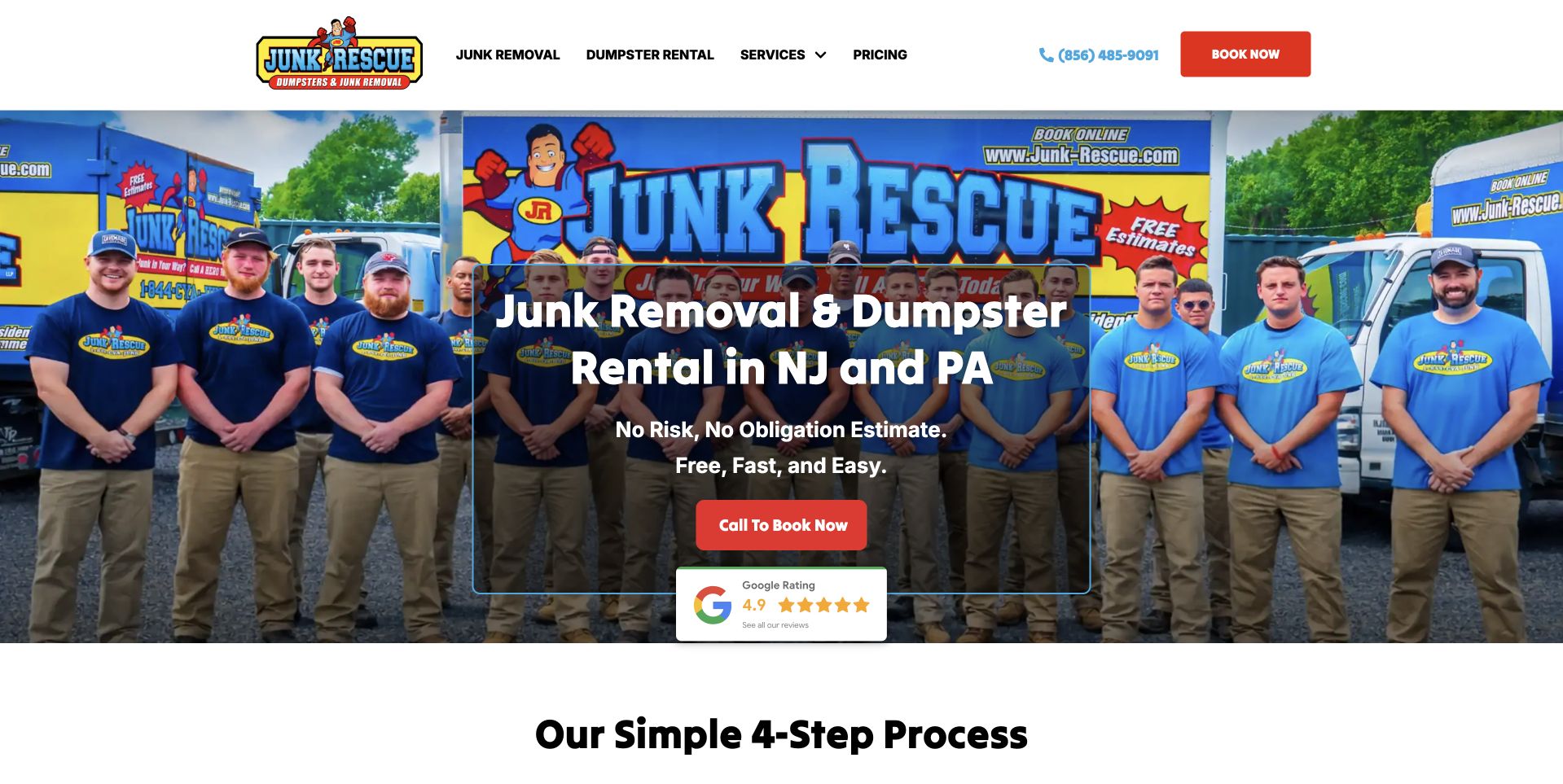
Junk Rescue fills its hero with a team standing in front of branded vehicles. A dark central panel names junk removal, dumpster rental, New Jersey, and Pennsylvania, with a red telephone action and review panel beneath. The white header keeps removal, rentals, services, pricing, and booking routes separate. A four-step process begins immediately below the photograph, connecting the first contact to a more concrete explanation. The company-specific image and literal regional headline make this a useful specialist reference rather than another anonymous truck template. The design selection does not independently verify pricing, service speed, or disposal practices.
What you can learn
Name different service relationships early and explain what follows the inquiry. A dumpster rental and a crew-assisted cleanout can need different information; the website should not imply they are the same booking simply because both remove unwanted material.
Pros
Real team and vehicle imagery gives the business a recognizable identity.
The next-step process follows the introduction without a long promotional detour.
Cons & considerations
A centered overlay needs careful contrast and mobile cropping over the team photograph.
Review and estimate claims need clear scope beyond the compact hero panel.
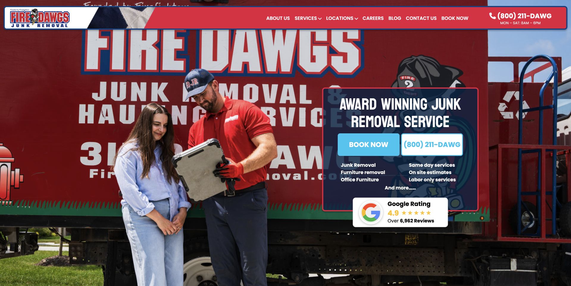
Fire Dawgs uses a photograph of a worker speaking with a customer beside a prominently branded red truck. A compact dark panel contains the service heading, blue booking and telephone controls, short category information, and a review summary. The red navigation bar stays relatively shallow above the image. This illustrates a business whose own equipment and people provide a stronger identity than a generic pile-of-junk photograph. The interaction shown gives the page a human service context, while the panel supplies a practical next step. The busy vehicle graphics also reveal a tradeoff: brand recognition and readable page copy must share the same visual space.
What you can learn
Use genuine company photography with a planned quiet area for text. Keep booking and telephone labels understandable, and explain what the first request confirms rather than allowing a branded truck image to imply a scheduled crew or promised result.
Pros
The worker-and-customer scene establishes a concrete service relationship.
Blue contact controls remain distinguishable against the red company imagery.
Cons & considerations
Large vehicle lettering competes with the overlaid service panel.
The compact category and review text needs readable sizing at narrower widths.
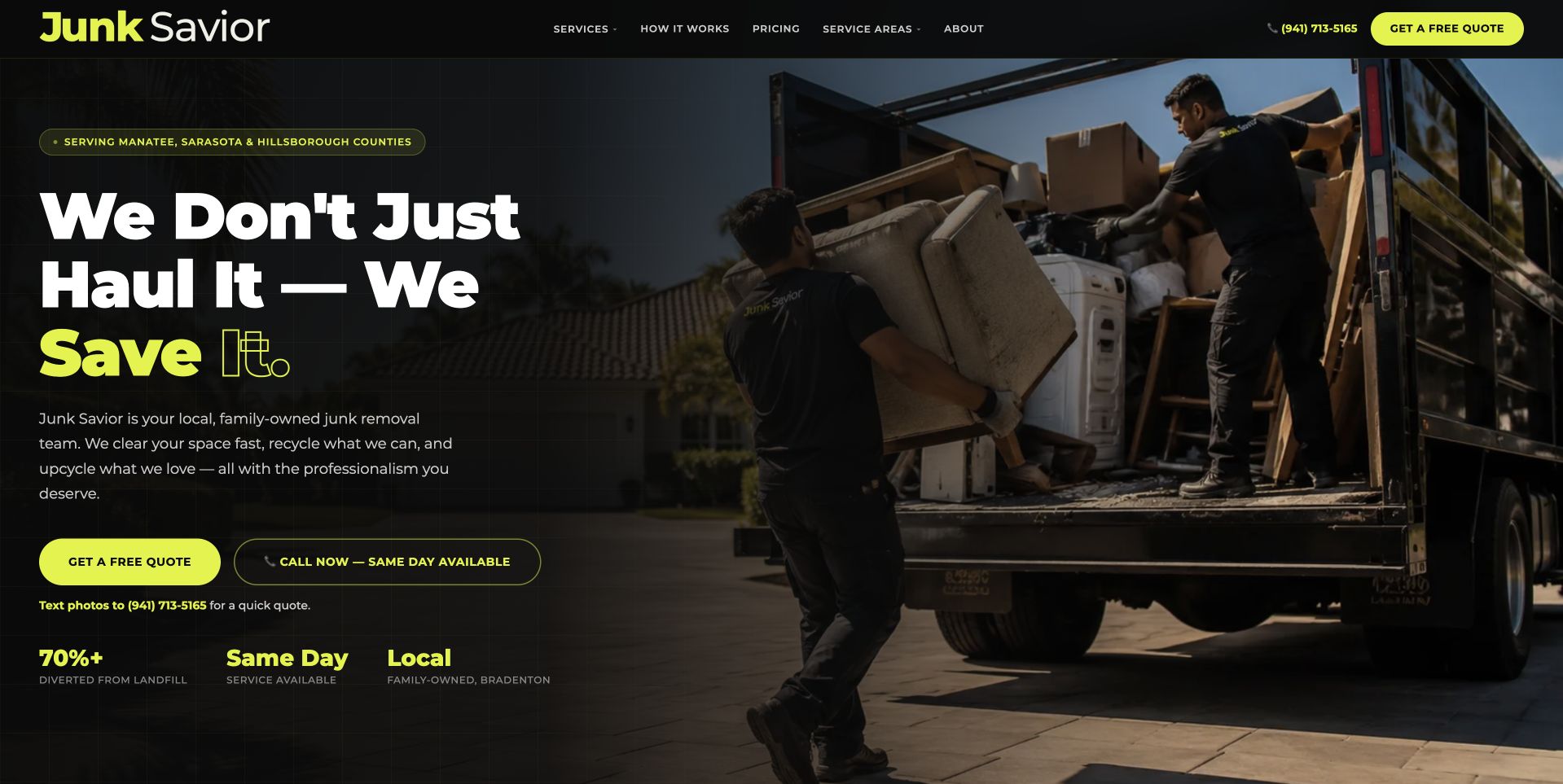
Junk Savior uses a black-and-lime palette with a large left-aligned headline and a photograph of people loading a truck on the right. A small regional line names the Florida counties before the main message, while quote and telephone actions sit beneath the introduction. The header separates services, process, pricing, territory, and company information. This illustrates a strong brand voice supported by literal contact and coverage information. The lower figures summarize the company's own diversion and availability claims; they should be treated as attributed statements, not independent environmental or response evidence. The photograph supplies the working context while the solid dark panel keeps the copy readable.
What you can learn
Pair a memorable slogan with clear territory, accepted-item scope, and a predictable quote process. Environmental statements need their own substantiation and limits rather than relying on a bright percentage or an implied universal recycling outcome.
Pros
The solid text area and lime actions create a strong reading hierarchy.
The county line makes local relevance visible before a quote request.
Cons & considerations
A slogan needs literal service detail close beneath it.
Diversion and timing figures require supporting context beyond a short promotional label.
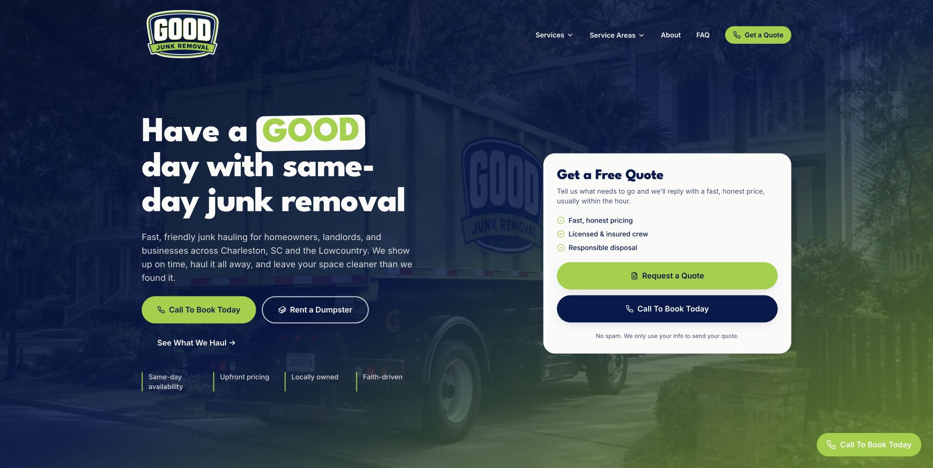
Good Junk uses a dark blue vehicle photograph with a large friendly headline on the left and a pale quote card on the right. Lime green connects the highlighted brand word, primary action, and card controls. The introduction names Charleston-area customers, while separate controls offer calling and dumpster rental. A short explanatory route below invites visitors to see the accepted-item scope. This illustrates how a small business can separate related offers without immediately presenting a long form. The card is a contact-choice surface rather than a full appointment calendar, keeping the first action compact. Availability and disposal wording remain company claims rather than verified service outcomes.
What you can learn
Keep removal and rental choices distinct and make the next step explicit. If a quote card begins a conversation rather than confirming a job, say so before visitors assume a crew or container has been reserved.
Pros
A consistent blue-and-lime palette ties the contact choices together.
Removal and rental routes remain visibly different tasks.
Cons & considerations
The large quote card repeats some contact options already beside the headline.
Claims about service timing and material destinations need current, specific supporting detail.
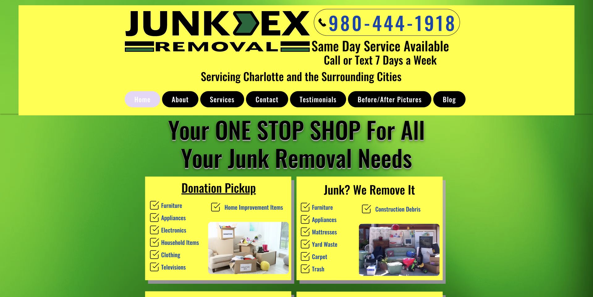
Junk-Ex uses a vivid yellow-and-green layout with a large telephone number and Charlotte service-area statement in the header. Rounded navigation labels lead into a short introductory heading and two illustrated panels for donation pickup and material removal. The compact page puts recognizable item categories in view quickly rather than relying only on a large truck photograph. This is useful as an information-organization reference, not a model for contemporary spacing or type treatment. A redesign could retain the literal scope and direct contact while reducing competing colors and improving the reading area. Donation wording still needs accurate conditions and should not imply every collected item is accepted by a charity.
What you can learn
Preserve the useful distinction between removal and donation-related inquiries, then modernize the hierarchy. Keep item eligibility readable in text and explain the quote process without implying that a website category guarantees a particular material destination.
Pros
The telephone and local territory are prominent in the opening header.
Two category panels make the broad offer more concrete.
Cons & considerations
Bright competing backgrounds make the page visually demanding.
Small rounded navigation labels need more space and stronger mobile tap targets.
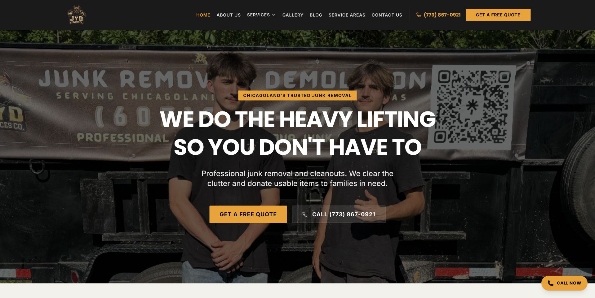
JYD places two people beside branded hauling equipment behind a large white headline. Gold quote styling appears in the header and hero, while a separate telephone action provides another contact route. The short supporting text describes removal and cleanouts, and the navigation exposes services, gallery, company information, territory, and contact. This illustrates a straightforward relationship between actual company imagery and a readable service task. The image gives the business a specific identity, while the text does not require the visitor to interpret the vehicle lettering. The dark overlay is important because the photograph includes faces, equipment graphics, and a large QR code that could otherwise compete with the page's actions.
What you can learn
Choose a company photograph around the intended text placement rather than adding copy wherever space remains. Keep quotation and calling routes consistent, and make any donation statement conditional on the business's actual documented process.
Pros
Real people and branded equipment distinguish the opening from stock imagery.
Gold quote controls provide a consistent action vocabulary.
Cons & considerations
The vehicle QR code and lettering add visual competition behind the text.
A broad cleanout statement still needs accepted-item and coverage details below.
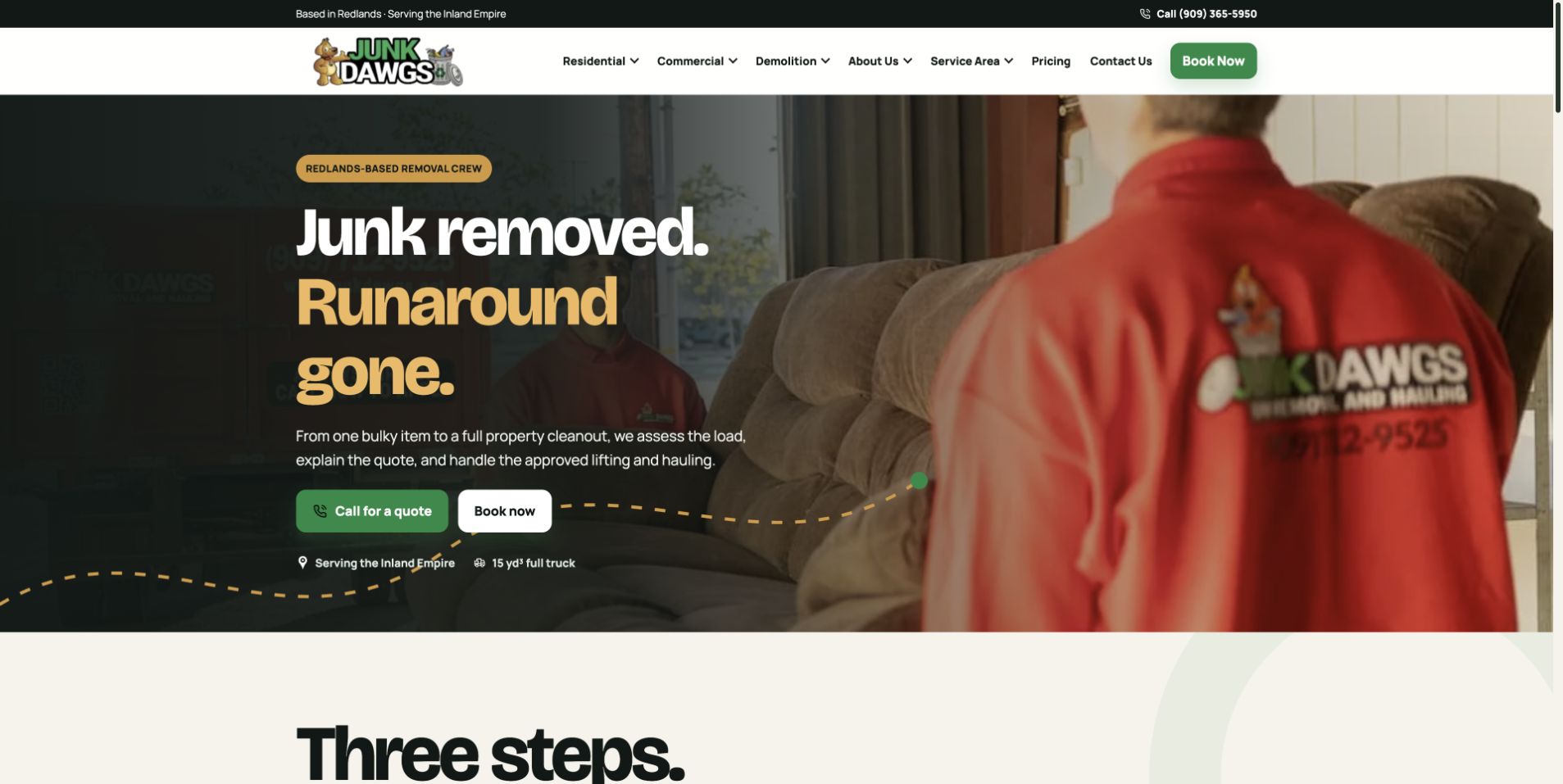
Junk Dawgs uses a photograph of a uniformed worker carrying furniture, with a large removal headline and two compact contact actions on the left. Green and gold accents connect the logo, buttons, and highlighted words without filling the whole page. A cream section introducing a three-step process begins immediately below the image. The header distinguishes residential, commercial, demolition, company, territory, pricing, and contact routes. This illustrates a service introduction that shows the actual kind of labor involved rather than a generic empty room. The process transition supplies context after the first action, although important service boundaries still need their own readable explanation.
What you can learn
Use work imagery to show the service relationship, then explain the approved quote and hauling steps. Keep demolition and removal scope distinct, and do not let a short process imply that every material or property condition is automatically accepted.
Pros
The furniture-carrying photograph makes the service recognizable immediately.
A process section follows the hero while the initial message is still fresh.
Cons & considerations
Several catalog categories require a simplified mobile navigation.
A work photograph cannot substitute for clear item restrictions or quote conditions.
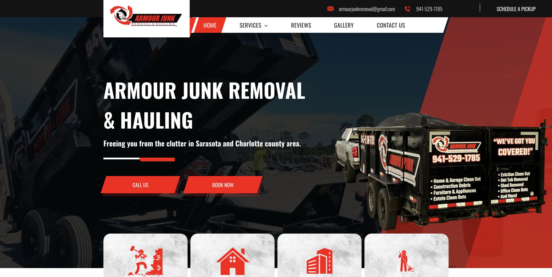
Armour uses a dark red-and-black hero with a branded truck occupying the right side and a large removal heading on the left. Two red actions distinguish calling from booking, while the supporting line identifies the Sarasota and Charlotte County context. A row of pale service cards begins along the lower image edge. The white-and-red navigation repeats the same angled visual vocabulary, giving the page a coherent contractor-style identity. This illustrates how graphic shapes can separate a detailed vehicle image from the text. The broad hauling label remains understandable, but the service cards need to supply the practical distinctions the short hero intentionally leaves out.
What you can learn
Use a consistent shape and color system to organize the page, not to add more competing badges. Keep the territory literal and explain whether a booking control requests contact or actually reserves a service date.
Pros
The truck and regional line give the introduction a specific local-business context.
Red action styling connects the header and hero.
Cons & considerations
Angled shapes and vehicle graphics can crowd the smaller service text.
Overlapping lower cards need careful stacking and spacing on mobile.
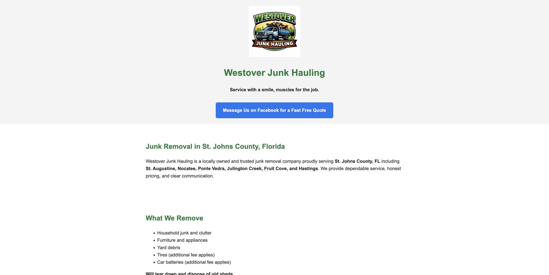
Westover uses a pale, minimally decorated page with a small illustrated company mark, a short business introduction, and a blue Facebook messaging action. The next section names St. Johns County and nearby Florida communities, followed by a plain-text list of material categories. This is useful as a content-priority reference rather than a large visual showcase. A visitor can identify the company and broad territory without opening a directory or waiting for video. The sparse layout also makes its limitations clear: the primary inquiry depends on an external messaging service, and the page provides little visual explanation of the crew or working process. Those are concrete design questions for a future refresh.
What you can learn
A small site can still be useful when identity, coverage, and scope are explicit. Keep an accessible alternative to an external social-messaging route and explain what information is needed for the initial conversation.
Pros
The local territory and material list appear as readable ordinary text.
The minimal layout avoids unnecessary promotional layers.
Cons & considerations
The main contact action depends on a third-party messaging platform.
A small logo and limited company imagery provide little operational context.
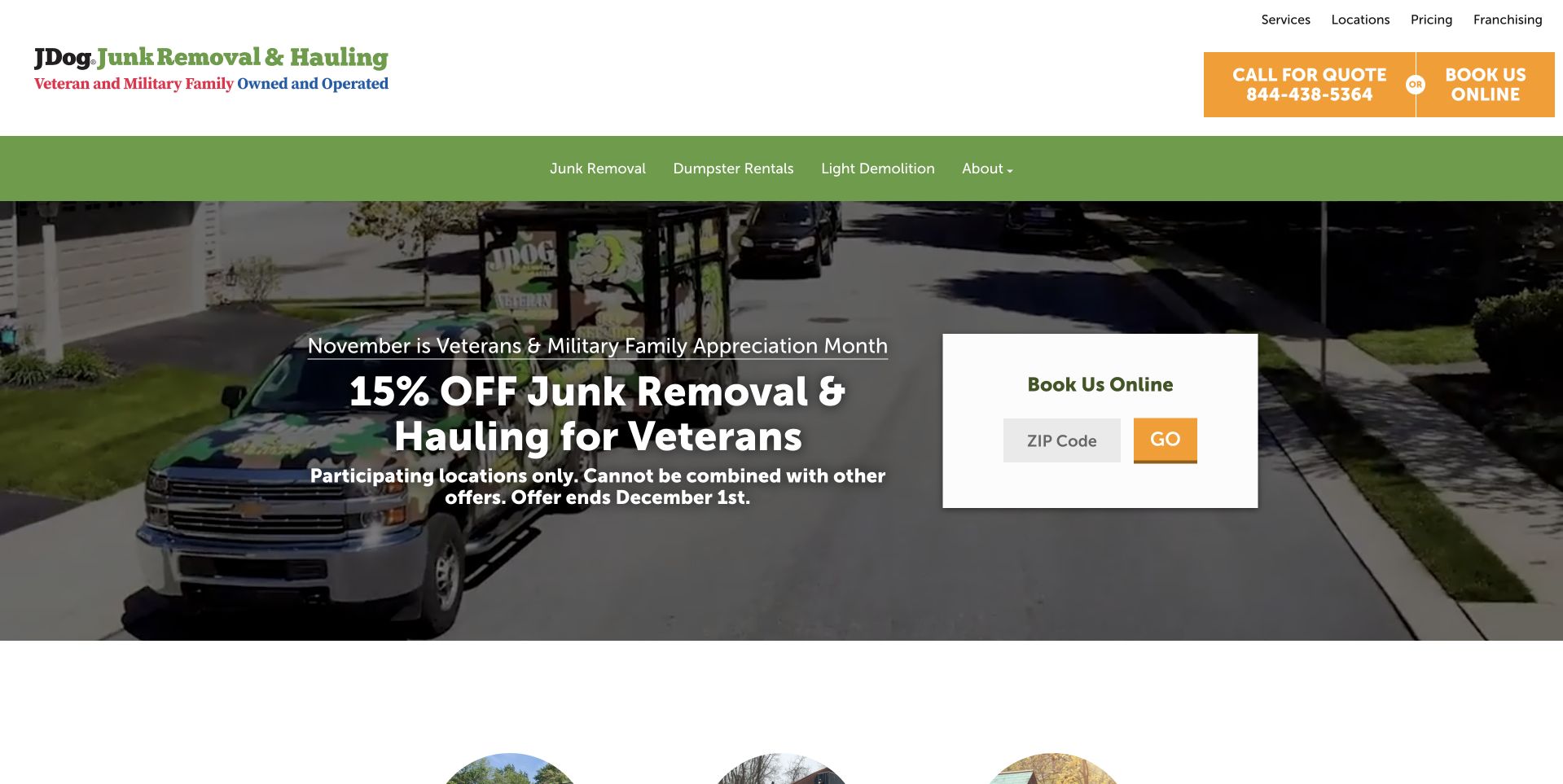
JDog uses a green navigation band above a service-vehicle photograph and a seasonal veteran offer. A white ZIP-code booking card sits to the right, giving the broad network message a concrete location task. The offer's participation and expiration conditions appear directly beneath the large promotion rather than being omitted from the opening. This illustrates the relationship between a temporary campaign and local-service routing. The header keeps services, locations, pricing, and franchise information distinct. The company describes a veteran and military-family identity, but that statement should not be expanded into claims about every employee, location, or service outcome. The captured offer is a specific page state, not a permanent price promise.
What you can learn
Keep campaign conditions and dates close to the promotion, while preserving a useful service route after it expires. A ZIP check should identify local relevance without implying that a participating office has confirmed the requested job.
Pros
The offer includes visible participation and expiration context.
A separate ZIP card makes the local-routing task recognizable.
Cons & considerations
A seasonal promotion can overshadow the underlying service explanation.
Network identity and pricing claims need clear local-office scope.
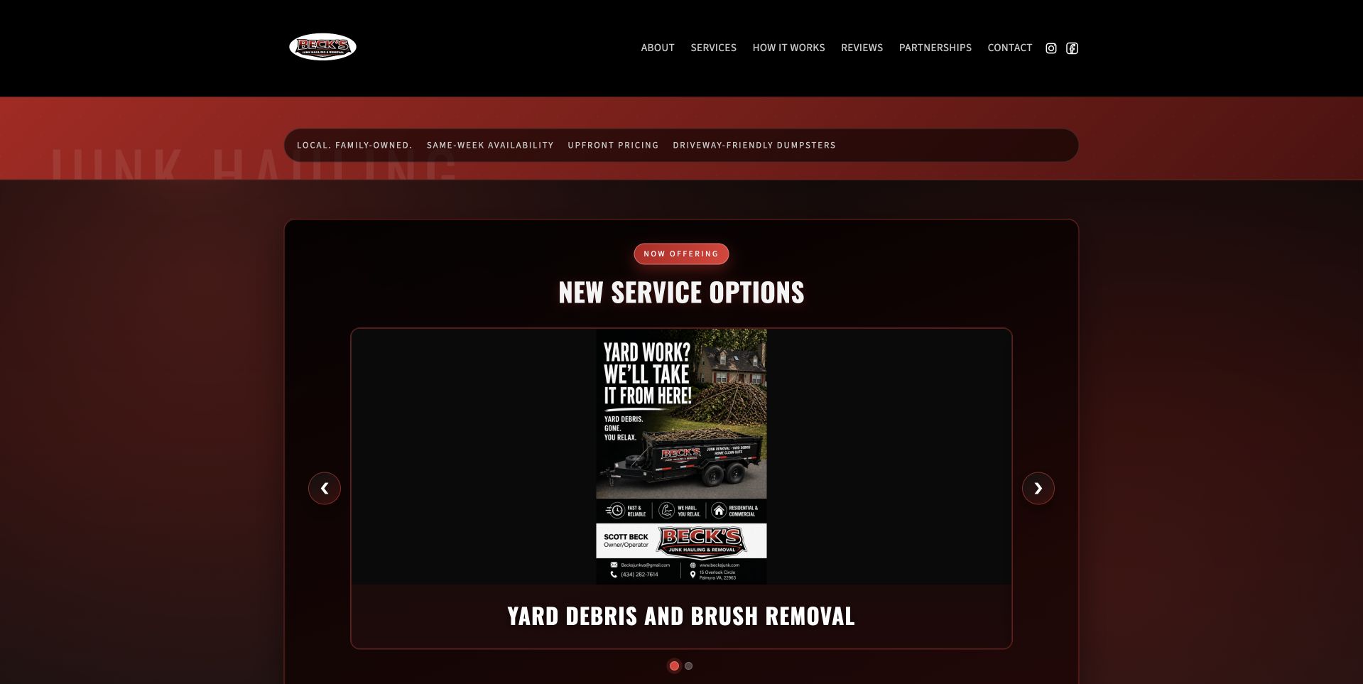
Beck's uses a black-and-red composition with a central new-service card inside a dark hero. The captured feature introduced yard debris and brush removal, with arrow and dot controls indicating other offerings. A compact top navigation separates company, services, process, reviews, partnerships, and contact. This is useful for examining how a small operator gives a current announcement a prominent home. It also exposes a visual tradeoff: a poster-like card within another panel can make the useful text small while leaving substantial surrounding space. The broader company and contact explanation should remain available outside the changing feature so visitors do not need to wait for the right slide.
What you can learn
Keep essential service and contact information in static readable content. Use changing announcement cards as supplements, with clear controls and meaningful labels, rather than the sole explanation of what the business accepts or how a request begins.
Pros
The navigation gives service scope and process information distinct destinations.
A current offering has a recognizable place without changing the whole site.
Cons & considerations
The nested card makes important text much smaller than the available space permits.
A rotating service feature may not match the reason a visitor arrived.
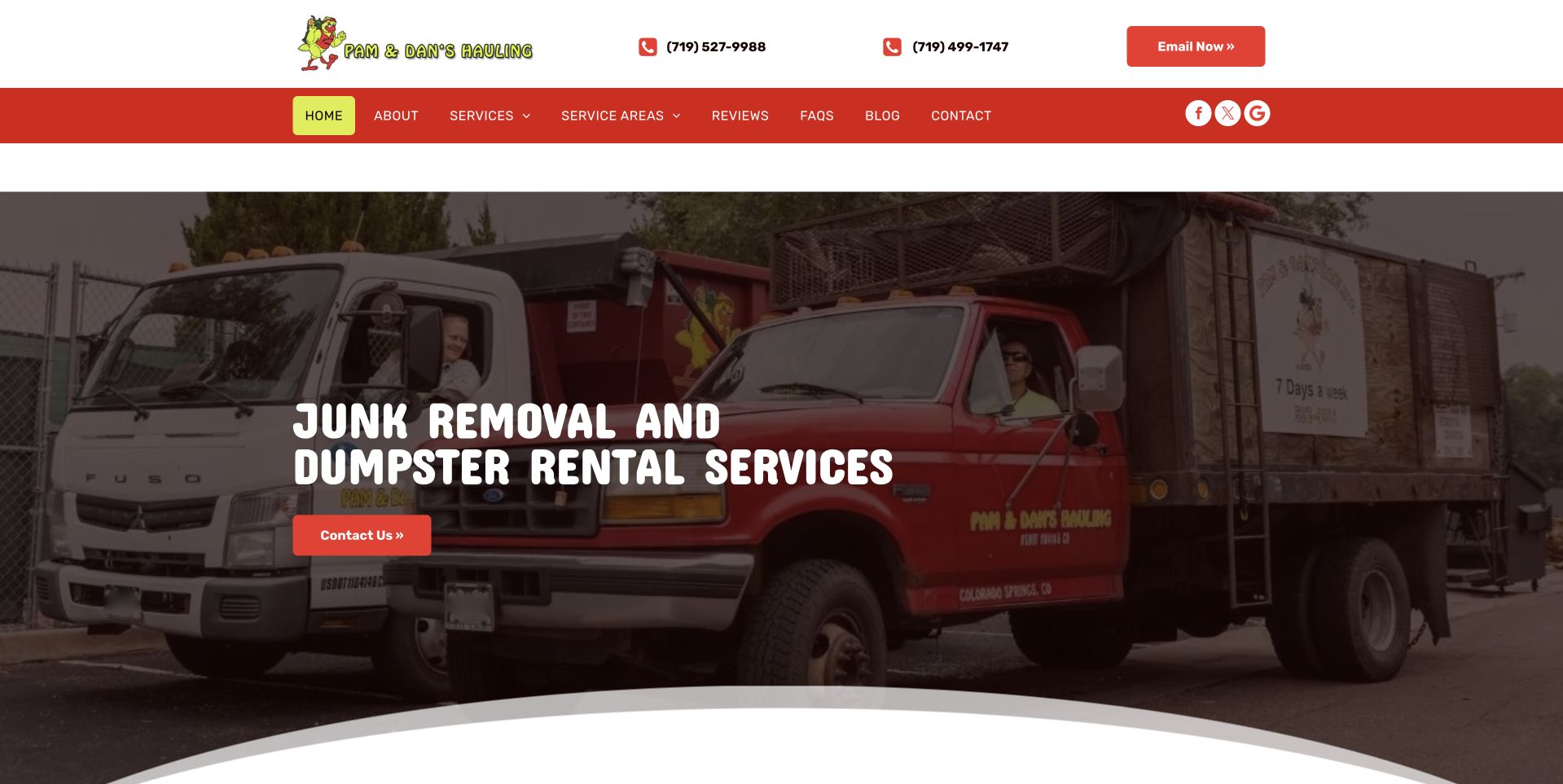
Pam & Dan's uses a large photograph of branded trucks beneath a white contact header and red navigation bar. A short white headline names junk removal and dumpster rental, with a red contact action over the darker image area. Two telephone numbers and an email route remain visible above, while the menu separates services, territory, reviews, questions, blog, and contact. This illustrates a company with two related but different customer arrangements. The truck image supplies an actual business identity, and the literal headline avoids making visitors infer the rental offer from the vehicle alone. A curved white edge provides a clear transition into the catalog below.
What you can learn
Keep rental and crew-service details separate when pricing, scheduling, or customer responsibilities differ. Label telephone routes clearly and explain the initial request rather than presenting multiple contact choices without a predictable next step.
Pros
The headline explicitly distinguishes removal from dumpster rental.
Actual company vehicles make the photographic introduction specific.
Cons & considerations
Multiple telephone routes need labels explaining which one to use.
The long supporting service scope requires more readable detail than the hero can hold.
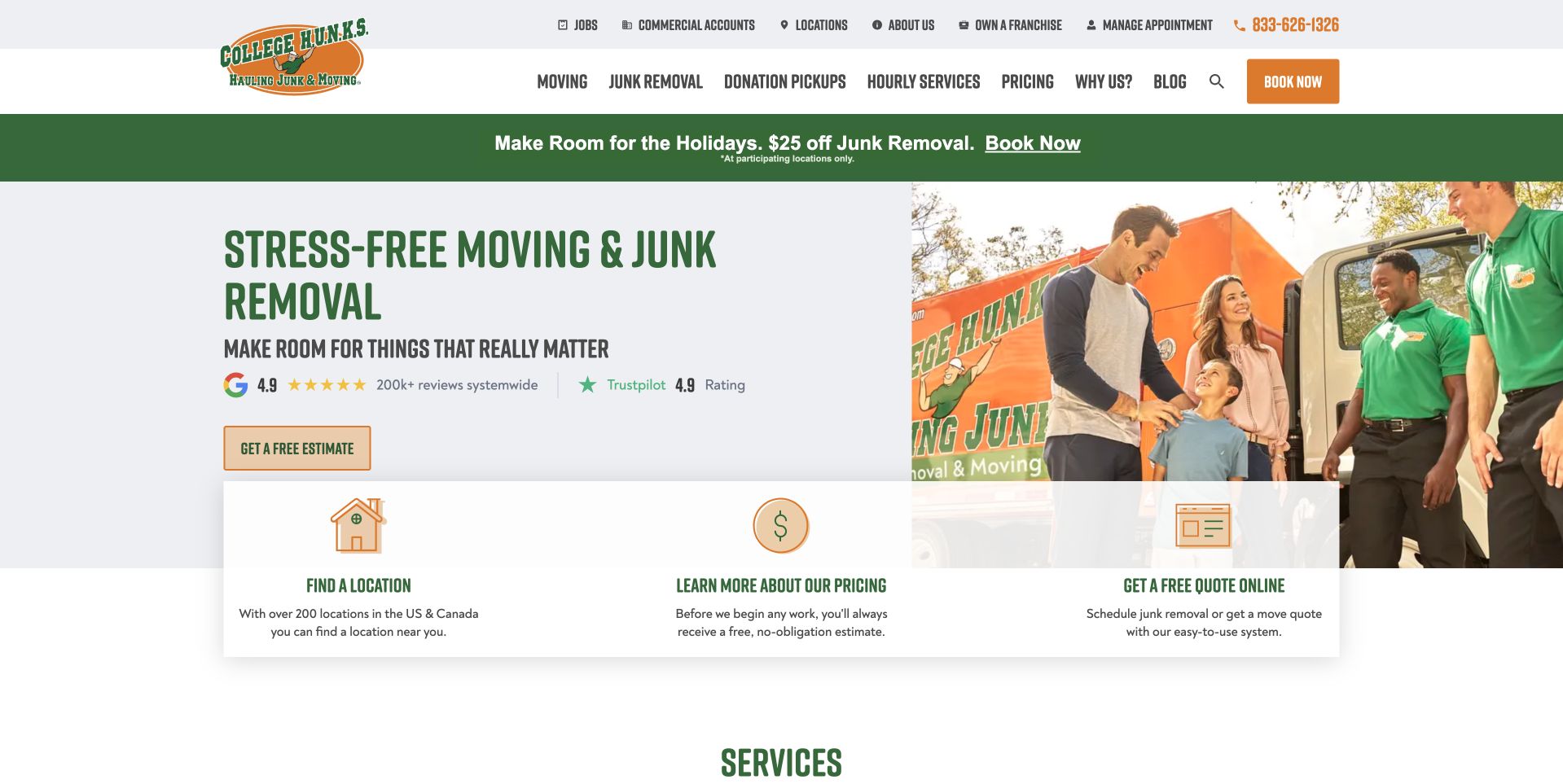
College HUNKS uses a light split hero with a service message on the left and a crew-and-customer photograph on the right. An orange estimate action sits beneath the introduction, while three white cards below offer location discovery, pricing information, and an online quote. The orange-and-green identity remains consistent across the header and service navigation. This illustrates a broad network whose moving and removal audiences need different routes. The task strip gives visitors more orientation than one generic contact action, although it adds another layer below an already detailed header. Network review and performance statements remain company-supplied context rather than independent evidence about a particular local job.
What you can learn
Separate service selection from location and pricing research when all three matter. Keep the chosen service and receiving office clear through the quote flow, and distinguish a request from an accepted or scheduled job.
Pros
Location, pricing, and quote tasks have clearly different entry points.
The light split layout keeps the text off the detailed people photograph.
Cons & considerations
Several header and promotional layers compete before the visitor reaches the service catalog.
A broad network needs accurate local scope after a visitor chooses a location.
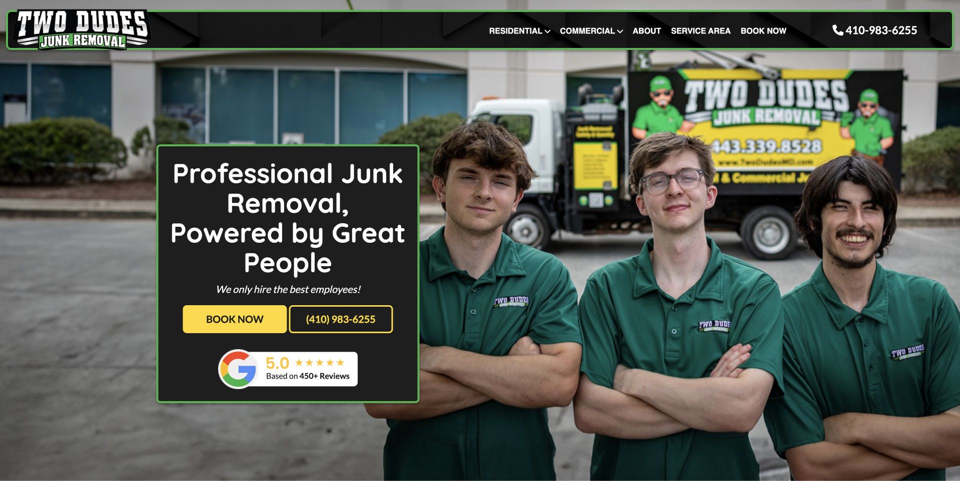
Two Dudes places three uniformed people in front of branded hauling equipment, with a dark text card to the left. The card combines the removal headline, a yellow booking action, telephone access, and a review panel. A shallow black-and-green header separates residential, commercial, company, territory, and booking routes. This illustrates an actual team image as the principal brand asset. The photograph communicates a specific operation without requiring a long company-history paragraph, while the card provides the practical next step. The people-led wording is the company's presentation, not an independently verified judgment about hiring, service quality, or the outcome of a cleanout.
What you can learn
Plan genuine team photography around the intended text surface and mobile crop. Keep audience and territory information literal, and explain the quote or booking process so a recognizable crew image does not imply an already assigned team.
Pros
Real uniformed staff and equipment create a specific company identity.
A solid text card keeps the contact controls readable over the photograph.
Cons & considerations
A portrait-heavy crop can obscure staff or vehicle context at narrow widths.
Review and staff-quality claims need their own source and scope explanation.
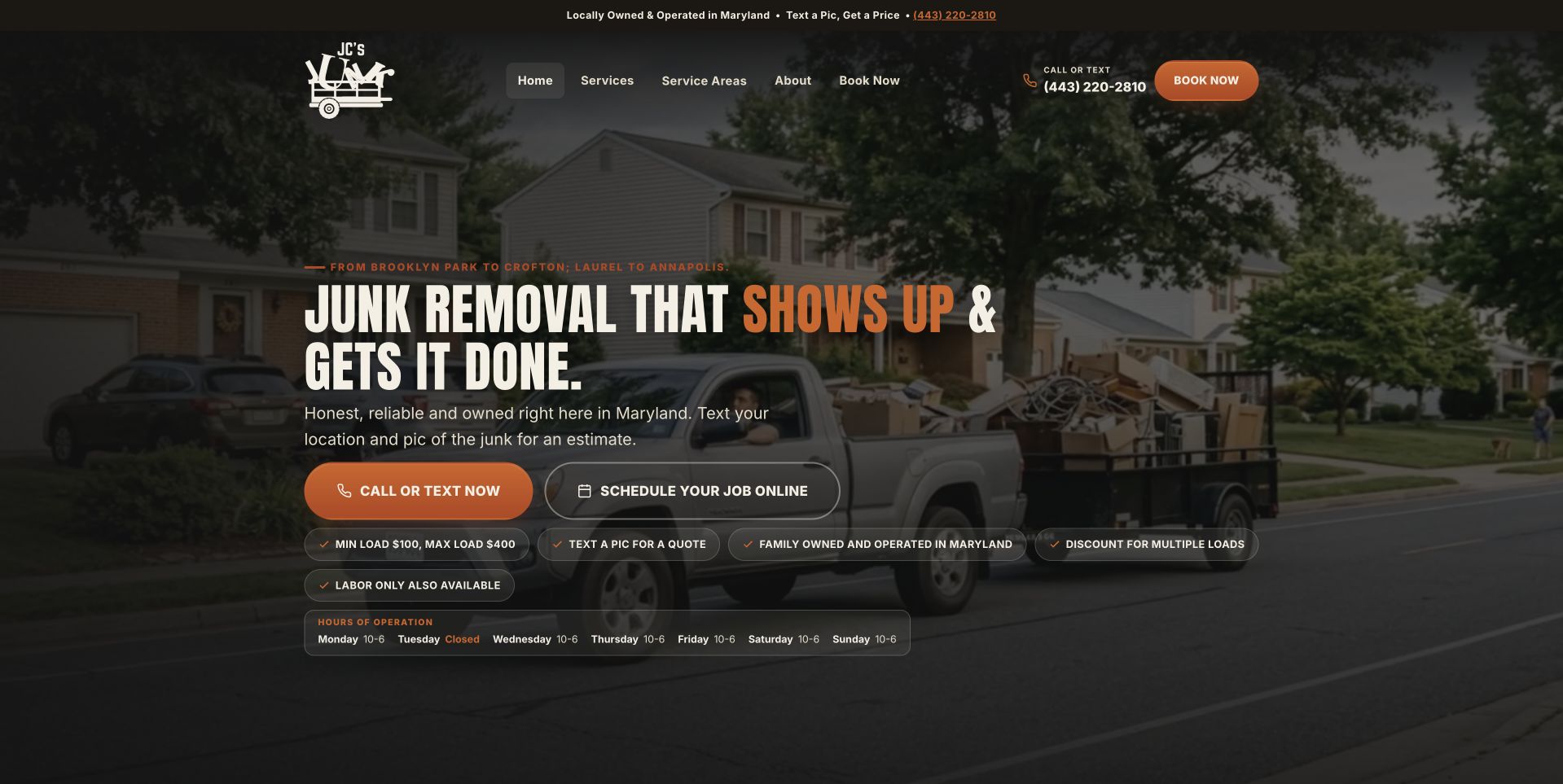
JC's uses a darkened residential hauling photograph behind a large white heading. Orange call-or-text and outlined online-scheduling actions sit together beneath a short Maryland introduction. Compact labels summarize minimum-load and company context, with opening hours visible lower in the hero. The navigation stays relatively short, separating home, services, territory, company information, and booking. This illustrates a local service page that puts practical contact modes near the main message rather than in a distant footer. The photograph provides a residential setting, while the text and hours do the work of explaining how to reach the business. The small supporting labels need especially careful reading size.
What you can learn
Explain the difference between calling, texting, and requesting a date. Keep hours and quote conditions visible without overloading the hero, and do not let a scheduling label imply confirmation unless the actual process reserves a visit.
Pros
Telephone, text, and online scheduling routes are easy to find together.
Opening information appears close to the local introduction.
Cons & considerations
Several small condition labels can become hard to read on mobile.
A broad service promise still needs clear accepted-item restrictions and quote context.
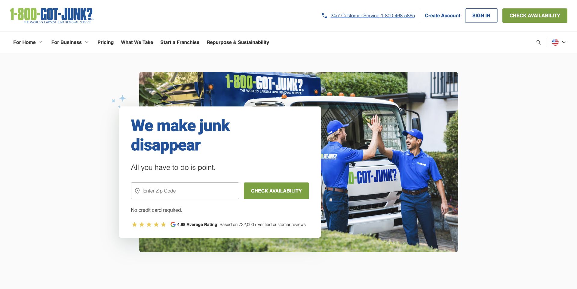
1-800-GOT-JUNK? uses a bright white page with a compact service card over a photograph of workers beside a branded vehicle. A short headline leads directly into a ZIP input and green availability action, while account controls remain separate in the header. Home and business service routes, pricing, material scope, franchise information, and sustainability have distinct navigation positions. This illustrates a national offer reduced to one concrete first question. The form is short enough to remain recognizable without a large modal, but its result still needs to explain the selected location and next contact step. The photograph and review summary do not independently verify a particular crew or service outcome.
What you can learn
Use the minimum information needed to route a visitor, then make the result explicit. Checking an area is different from agreeing a price or confirming a job, so the later flow should not blur those decisions.
Pros
The ZIP card turns a broad national message into a specific routing task.
Account controls remain separate from the service-availability interaction.
Cons & considerations
A location result needs a clear receiving-office and confirmation explanation.
Network-wide review presentation requires scope when placed beside a local inquiry action.
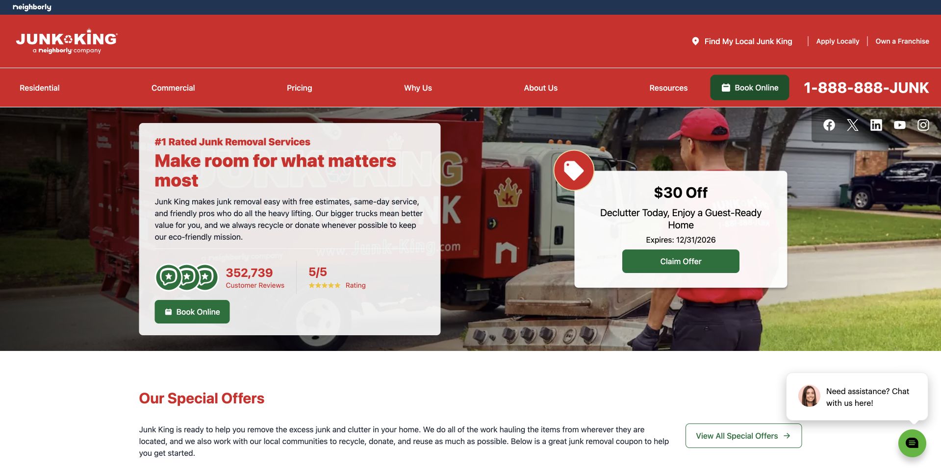
Junk King uses a red-and-white contact card over a branded truck-and-worker photograph. A green booking action sits beneath the main message, while a separate offer card occupies the right side of the image. The red header keeps residential, commercial, pricing, company, resources, and location tasks visible. A special-offers section begins directly below the hero. This illustrates the separation of a stable service introduction from a temporary discount. It also shows how quickly promotional layers can compete with the main inquiry. The page's rating and leadership wording remain company claims rather than independently measured rankings or proof of a particular local service result.
What you can learn
Keep temporary offers distinguishable from ordinary service information and maintain their conditions and dates. The booking flow should identify the local provider and clarify the quote process instead of allowing a promotional card to imply a universal final price.
Pros
Booking and offer content are presented on distinct readable surfaces.
The service header separates residential and commercial audiences.
Cons & considerations
Several review, offer, and chat elements compete within the first screen.
A network promotion needs local applicability and current conditions explained clearly.
Kegan is a freelance web designer and developer with 15+ years of experience helping businesses turn complicated website requirements into clear, maintainable digital experiences. He works directly with clients from planning and design through development, launch, and ongoing support.
For junk removal website design, his development approach focuses on clear collection scope, service-area checks, genuine team and removal photography, pricing expectations, and practical pickup inquiries. The scope can be a targeted improvement or a complete custom build, with responsive layouts, thoughtful content structure, and integrations chosen around the people using and maintaining the site.
Show 3 other junk removal website designersHide other junk removal website designers
Plan the cleanout conversation before adding another truck photograph
Build the catalog around real customer arrangements
Start with the work the business actually accepts. Identify the difference between crew-assisted hauling, container rentals, labor-only requests, commercial cleanouts, donation-related pickup, and any demolition work. These categories should reflect real operating boundaries rather than every keyword used by competitors. A homeowner clearing furniture and a manager planning a larger property cleanout may need different conversations, even when both begin with the same telephone number.
Write the service territory in ordinary text as well as any map or ZIP checker. Explain whether all service types share that territory. A rental may have different practical coverage from a crew visit, and a national brand may need to identify the receiving local office. If a lookup is used, give it a useful failure state and a manual contact route. Checking a ZIP code should not silently become a booking or imply that the requested material has been accepted.
Organize material information so customers can find the relevant category without diagnosing a disposal process themselves. Provide clear exclusions and a way to ask about uncertain items. Avoid publishing broad promises about accepting everything. The site should support an informed conversation with the business, not give individualized environmental, legal, or hazardous-material advice. Keep service descriptions maintainable, with one responsible person reviewing changes when the company's equipment, territory, or accepted work changes.
Show the actual service relationship and scope of claims
Use permitted photographs of the real crew, company vehicles, and general work context. These can establish a specific business identity more effectively than anonymous piles of discarded material. Plan the crop and text surface before the shoot: vehicle lettering, faces, QR codes, and equipment can compete with a headline. Keep the service and territory in readable page text rather than relying on information painted on a truck.
Describe the customer-facing process at a level the business can reliably explain. Show how an inquiry becomes a discussion, estimate, agreed arrangement, and later service. Make clear which information is provisional. A photo-based estimate, a minimum charge, a load-size explanation, and an accepted final price are not equivalent. Do not use a decorative progress card or arrival graphic in a way that looks like a live crew assignment. Keep current-client questions and rescheduling separate from the new-lead form.
Have the business review recycling, donation, diversion, and environmental wording. A large percentage is a claim that needs a defined basis and timeframe, not simply an attractive hero statistic. Donation-related language should acknowledge the actual acceptance process rather than promise a destination for every item. Attribute reviews and company qualifications accurately. Neither a review score nor a staff photograph independently proves service speed, disposal outcomes, or the result of a future cleanout.
Design an inquiry the team can receive and answer
Choose contact modes with the staff who handle them. A short telephone or callback route may fit a small crew better than a complex scheduling calendar. If customers can text or upload photographs, explain their purpose, what is optional, and how they are handled. Do not require a visitor to move heavy items, enter an unsafe area, or gather technical information simply to make an inquiry. Ask for the minimum useful contact and location context first.
Write acknowledgment messages carefully. Receiving a request is not the same as accepting a job, agreeing a price, reserving a container, or assigning a crew. State the next step in ordinary language and provide a reliable alternative if an external form or booking service is unavailable. Keep personal addresses and submitted photographs in the appropriate private business process rather than an exposed shared gallery. Do not make a social-network account the only way a customer can contact the company.
Test realistic mobile and keyboard tasks before approving the design: finding excluded categories, checking an uncertain location, comparing a rental with crew service, requesting contact, and asking about an existing arrangement. Review labels, error messages, telephone links, optional uploads, and confirmation text. Keep coupons, chat prompts, consent controls, and promotional videos from blocking those tasks. Assign ownership for changing prices, offers, territory, material lists, and form delivery. A useful hauling website makes the relationship understandable; it does not guarantee a final price, disposal destination, timing, or service outcome.
The editing job behind the design
Keep the public request layer simpler than the hauling operation
A local operator can use a maintainable CMS with service, territory, material-scope, process, and contact pages. Preserve useful local facts when updating an older layout. A reliable short inquiry is more valuable than a simulated dispatch dashboard.
A company offering rentals or multiple offices may need structured routing or a booking integration. Explain which task the integration supports and provide a manual fallback. Do not add a locator merely to make a single-region business look national.
Keep customer addresses, quote photographs, scheduling, invoices, and disposal records in appropriate private operating systems. Public website technology signals are not a complete inventory of the company's logistics or record-management software.
Our WordPress website examples offer a separate look at publishing approaches. A visible platform label is evidence for that named page, not a guarantee that the same system will suit your requirements.
Before the public launch
Junk removal website brief checklist
Name the actual company and current service territory.
Separate crew-assisted hauling, rentals, and other genuine service arrangements.
Provide a readable accepted-item and exclusion explanation.
Give uncertain materials and locations a maintained contact route.
Explain what a ZIP check does and does not establish.
Distinguish estimates, requests, agreed prices, and confirmed arrangements.
Use permitted crew, vehicle, and work photographs.
Scope donation, recycling, and diversion claims accurately.
Keep optional quote photos limited and appropriately handled.
Provide an inquiry alternative to third-party social messaging.
Test mobile, keyboard, errors, overlays, and failed integrations.
Assign ownership for material scope, territory, offers, and request delivery.
These checks are a project checklist, not a performance, legal, security, or accessibility certification. Test real journeys with the people responsible for the website before making claims about the result.
Sources & editorial method
How this collection was selected and reviewed
All 17 company pages were directly inspected and captured for visible website analysis. The collection does not test hauling work, pricing, qualifications, response times, donation acceptance, or environmental outcomes. Company claims are discussed as page content, not independent verification.
Each example links to its actual source page. Screenshots are direct browser captures with their own capture dates; moving imagery, announcements and live designs can change. The notes describe observable design choices and conditional tradeoffs, not measured traffic, conversion results, service quality, or accessibility conformance.
Technology labels use public page metadata, asset evidence, or explicitly cited platform documentation. Platform documentation is not a complete current deployment audit. A component reference may be legacy or unused; it is not a complete backend inventory. Unknown stacks are omitted. These sites are editorial examples, not our client portfolio.
Written, Edited and Curated are separate editorial records, not timestamps advanced by a rebuild. Website designs and imagery belong to their owners. See our editorial standards or suggest a correction.
Give the customer a clear service choice, an honest scope explanation, and a predictable next conversation. Let genuine company imagery support that clarity rather than replace it.