Best Butcher Shop Websites of 2026 (29 Real-World Examples)
Real butcher-shop websites, from neighborhood counters to online meat specialists.
Good butcher website design makes the product tempting and the next step dependable. Customers need to know whether they are visiting a counter, reserving a holiday order, buying a delivery box or asking about a specialist service.
A butcher’s homepage has to communicate more than appetite. The same visitor may want a particular cut today, a larger joint for a future celebration or advice about an unfamiliar ordering process. The visual identity can be traditional, graphic or contemporary, but the practical questions remain specific: what is available, in what quantity, from which location and through which fulfillment route? A beautiful steak photograph cannot answer those questions on its own. The most useful designs connect photography with an intelligible product and service structure.
These 29 public references include independent neighborhood shops, larger online retailers, restaurant-and-butcher combinations and a specialist processing service. They are not interchangeable business models, and the reviews identify those differences rather than pretending every example sells the same products online. Fatted Calf is the first editorial selection for its disciplined specialist-shop presentation. The remaining order is editorial, not a measurement of meat quality, farming practices, delivery reliability or commercial performance. Borrow a useful decision pattern, not another shop’s unsupported claims or entire visual identity.
Before the examples
What makes good butcher shop website design in 2026?
Make the buying model explicit
Put the customer’s first meaningful choice near the introduction. A walk-in counter, an ordinary online order, a recurring box and a processing appointment can involve different rules. Label those routes literally rather than relying on a generic Shop button everywhere. Pat LaFrieda’s food-service and home-delivery split is a useful reference for separating audiences before discussing individual products. A local shop may need a call or directions action more than a subscription funnel.
Show representative products and real working context
Commission photographs with a job in mind: a product detail, the actual shopfront, the counter team or a prepared-food use case. Leave a predictable area for readable copy when a photograph will carry text. Do not use a pastoral image as a substitute for explaining sourcing. If the shop makes production claims, give customers the supporting information the business can actually document. The design should help people evaluate the offer, not decorate uncertainty.
Treat seasonal orders as a separate operational system
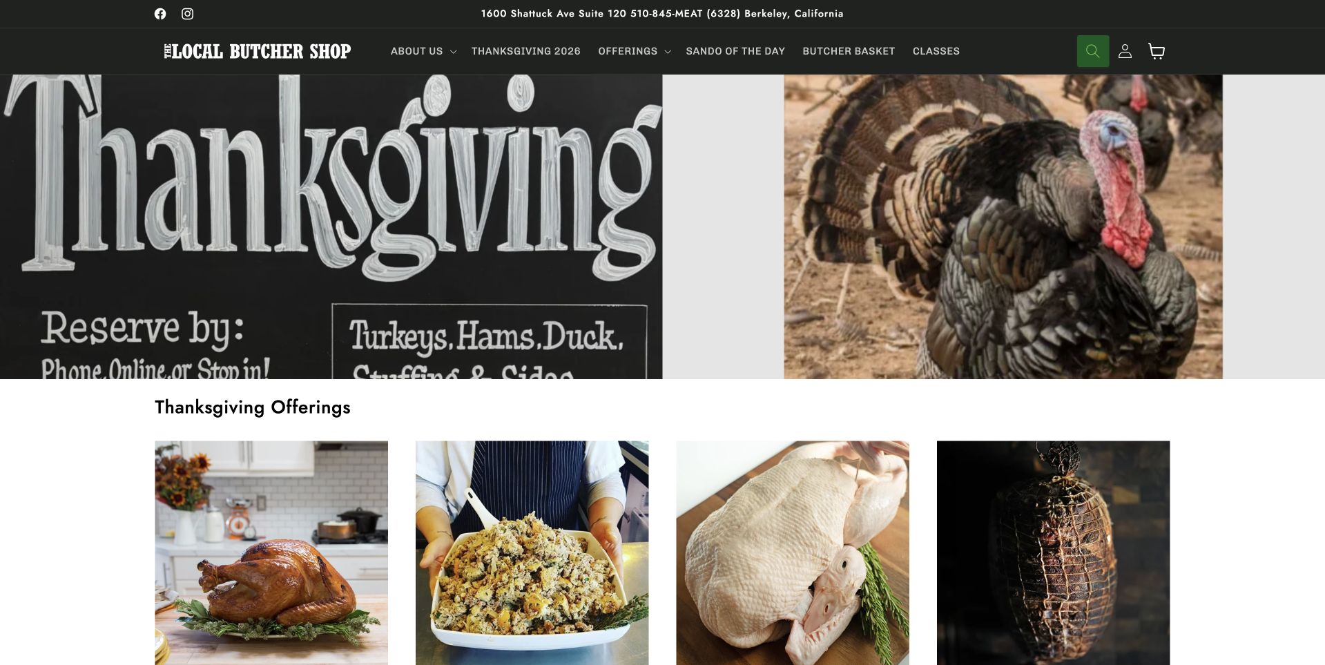
Holiday reservations need dates, collection arrangements and current availability, not only decorative festive artwork. Keep that information in editable text outside permanent photographs. Distinguish a reservation request from a confirmed order and make any follow-up step clear. The Local Butcher Shop’s seasonal board is useful for understanding how an immediate trading priority can take the homepage lead without becoming the permanent navigation structure.
The collection · 29 examples
29 butcher shop websites worth studying
Compare the following pages by the task each supports. Note whether the opening prioritizes a product catalog, a physical shop, provenance information, prepared meals or a specialist service before deciding which pattern belongs in your own brief.
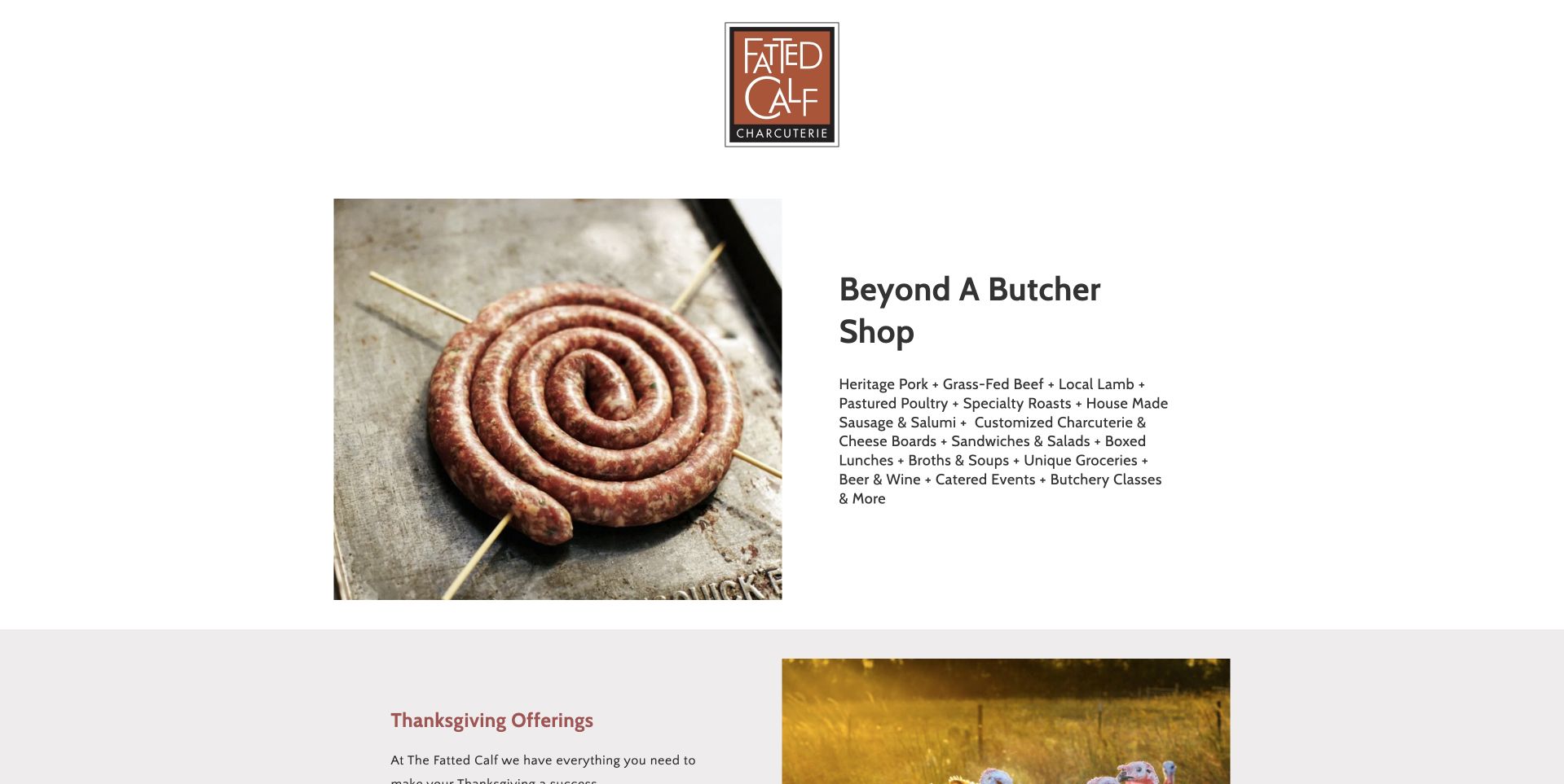
Fatted Calf resists the oversized sales banner. A small, brown framed wordmark sits above a photograph of coiled sausage and a compact description headed Beyond A Butcher Shop. The white canvas and restrained width make that product photograph feel like an editorial still life rather than a discount advertisement. The adjacent list explains that this is also a place for sandwiches, pantry foods and classes, giving the regional business more dimensions without a sprawling menu. Thanksgiving offerings begin as a separate band below. This is our editorial first selection for its unusually disciplined expression of a specialist shop.
What you can learn
Give a small food business a clear central composition before adding campaigns. A representative product photograph, a short description of the actual offer and a distinct seasonal section can establish personality without turning every service into a competing homepage tile.
Pros
The sausage still life communicates the specialty without borrowed lifestyle imagery.
The compact service list broadens the offer without overwhelming the introduction.
Cons & considerations
Store hours and directions require a further step from the opening composition.
Small introductory text needs careful scaling to remain comfortable on phones.
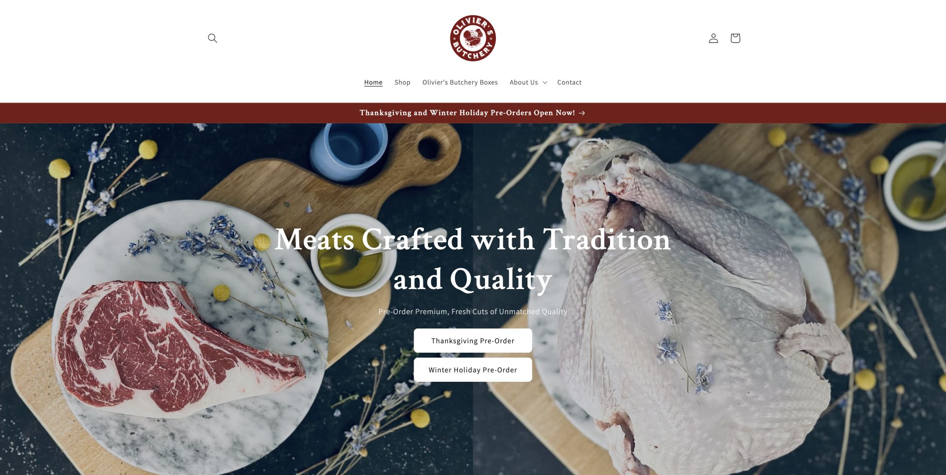
Olivier’s Butchery places a round burgundy identity above a carefully staged overhead arrangement of meat, poultry and kitchen ingredients. The composition leaves room for a central white headline, so the introduction reads as one deliberate scene. Two light buttons distinguish Thanksgiving ordering from regular holiday orders. That separation is more useful than a single vague Shop link when customers arrive with different collection dates in mind. A thin burgundy notice reinforces the seasonal message without replacing the normal navigation. The design is worth studying for its balance between a local butcher’s visual character and a practical reservation campaign.
What you can learn
Separate seasonal ordering paths when they follow different availability rules. Keep the distinction in the button wording and destination, then explain collection, cancellation and cut-off details on the relevant page rather than fitting operational fine print into the hero photograph.
Pros
The overhead food arrangement creates room for legible central messaging.
Two seasonal actions distinguish ordering intentions before customers enter the catalog.
Cons & considerations
White lettering needs protection when the hero photograph changes its brightness.
The opening campaign gives less immediate prominence to everyday store information.
The Local Butcher Shop uses a dark green header and a large, high-contrast Thanksgiving composition. Oversized lettering occupies one side while a turkey photograph occupies the other, making the seasonal priority unmistakable. Reservation language sits close to the campaign rather than being buried beneath a brand story. Immediately below, a row of food photographs turns the campaign into specific offerings. This is a helpful example of a neighborhood business being commercially direct while retaining its own identity. The page is not simply a beautiful farm photograph: it is an ordering notice, a product introduction and a recognizable local shop in one screen.
What you can learn
Use the homepage as a useful counter sign during peak trading periods. State what can be reserved, when the reservation closes and how customers proceed, while preserving a clear route to ordinary shopping after the campaign finishes.
Pros
Large seasonal typography makes the immediate shopping purpose exceptionally easy to notice.
The product row below connects the announcement with recognizable food choices.
Cons & considerations
A dominant holiday panel needs prompt replacement once reservations have closed.
Dense navigation can compete with small-screen access to practical shop details.
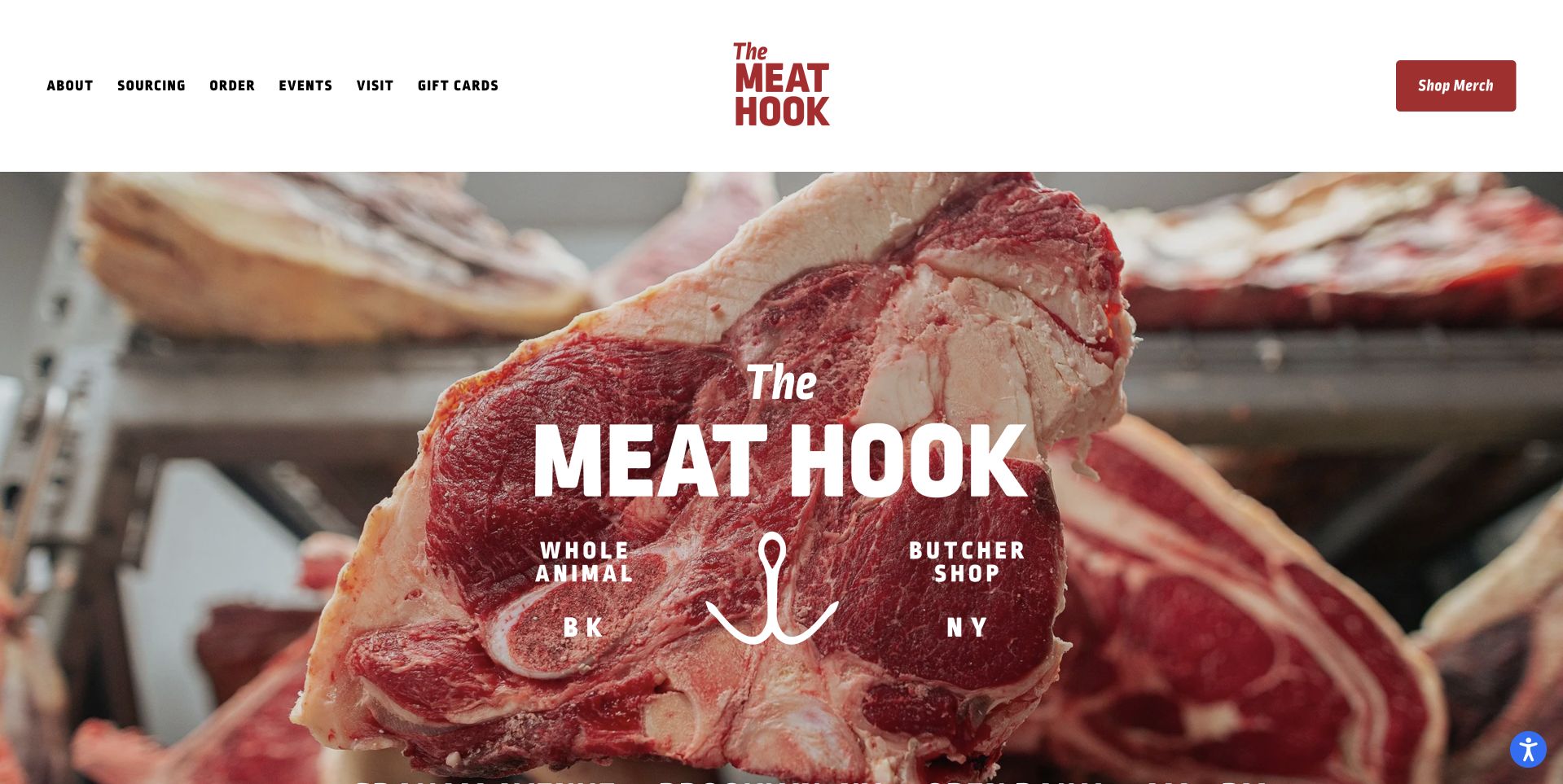
The Meat Hook keeps its white header simple, with a stacked red wordmark, compact navigation and a separate Shop Meat button. Below it, a close-up cut of meat fills the frame and carries a second, much larger version of the identity. This repetition works as a graphic device: the product and the brand are inseparable in the first view. The photograph is frank rather than polished into an anonymous lifestyle scene. The page therefore offers a useful contrast with farm-led butcher websites. It puts the counter product first, while the quiet header still gives visitors an obvious commercial next step.
What you can learn
A distinctive brand does not need a complicated opening interaction. Combine one representative product image with a readable identity and a clearly labelled shop action, then give sourcing, events and store information their own routes instead of squeezing them into the same headline.
Pros
The red shop action remains separate from the large photographic brand statement.
The close-up product image makes the business category immediately recognizable.
Cons & considerations
Repeated branding occupies space that could introduce delivery or collection details.
The strong meat close-up may not suit every butcher’s customer positioning.
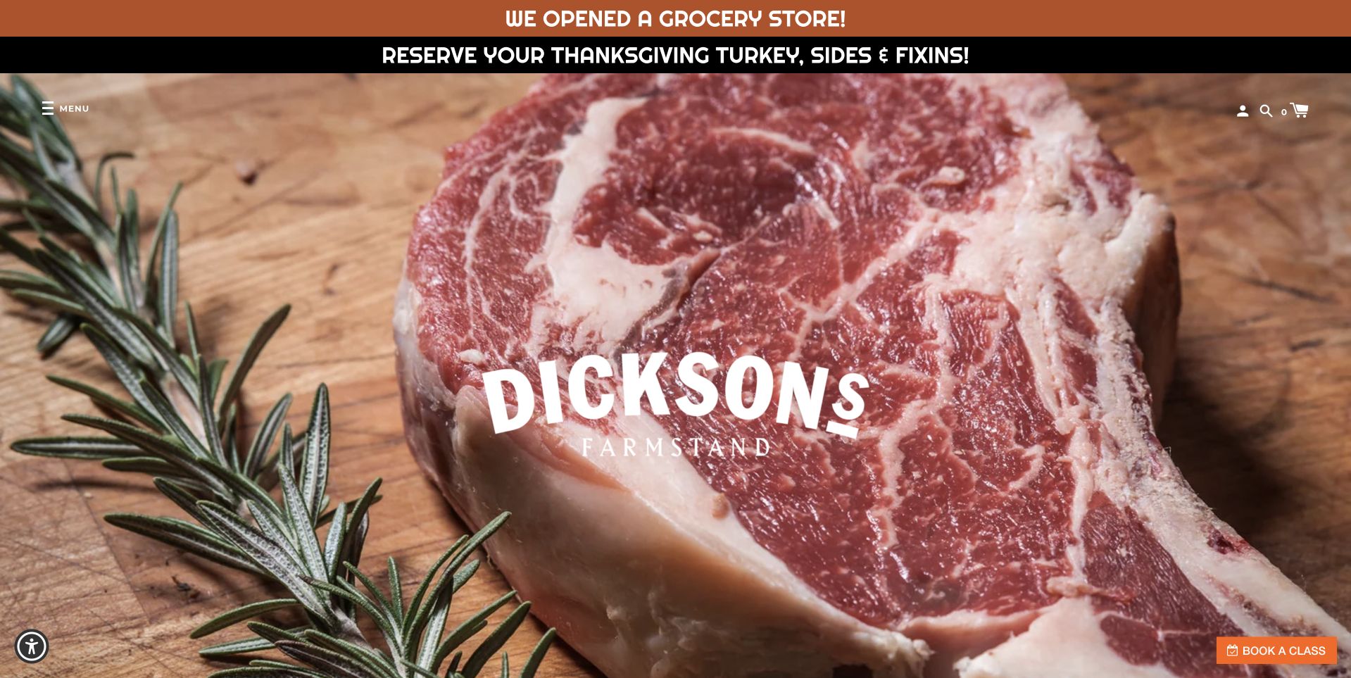
Dickson’s Farmstand Meats opens with an extremely close view of a marbled steak, overlaid by a compact white brand mark. A narrow orange announcement above the image introduces its grocery store, while another line calls attention to Thanksgiving reservations. Those notices do important work because the photograph itself is intentionally more atmospheric than explanatory. The small Book A Class action at the edge of the composition adds another route without introducing a full promotional panel. Study this page as a contrast in scale: a very large product texture, a small central identity and thin operational messages around the outside.
What you can learn
Keep changing announcements outside a hero image’s permanent lettering. A narrow, editable notice can introduce a new store or reservation deadline without requiring a redesigned photograph, provided the normal shopping and location routes remain easy to reach.
Pros
The steak texture creates an immediate and distinctive butcher-shop visual identity.
Announcement strips accommodate timely information without replacing the central brand image.
Cons & considerations
Multiple narrow notices can become difficult to scan on smaller screens.
The dramatic image gives little immediate explanation of the wider shop offer.
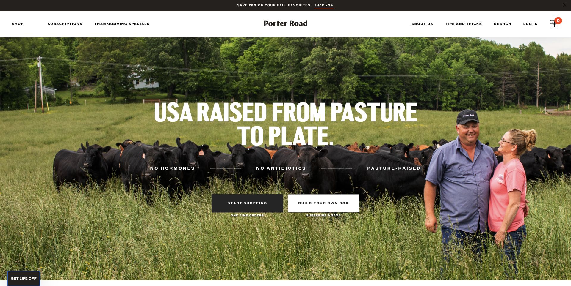
Porter Road combines a quiet white navigation bar with a wide photograph of people standing beside cattle in a green pasture. Large white lettering ties the farm scene to the route from pasture to plate, while two contrasting buttons offer different ways to buy. The visual emphasis is on the supply story rather than an isolated steak or a wall of prices. That is a deliberate positioning choice, not independent proof of farming practices. The useful design feature is the separation between the introductory story and the customer’s next decision. A visitor can appreciate the scene without first reading a long explanation of the business.
What you can learn
If a store supports both recurring boxes and ordinary purchases, explain those models before customers commit to either journey. Let the farm story frame the offer, but use explicit buttons and subsequent delivery information to make the practical differences understandable.
Pros
The people-and-pasture image gives the supply story a concrete setting.
Two shopping actions distinguish the available buying models.
Cons & considerations
Broad pasture claims need supporting information beyond an evocative hero photograph.
Large white lettering must remain readable across changing image crops and devices.
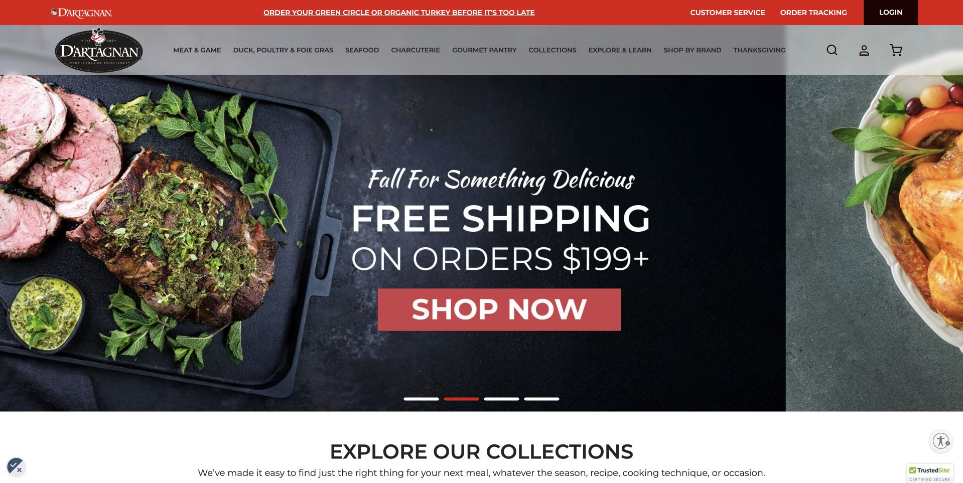
D’Artagnan uses a compact red-and-white header above a dark food composition. Prepared meat and vegetables frame a shipping promotion, with a large Shop Now button giving the campaign a specific destination. The opening is recognizably commercial rather than a long brand manifesto. Below it, the collection heading begins the transition from campaign to browsing, which matters for a retailer selling much more than one cut of beef. The design is useful for understanding how a broad catalog can share space with a temporary incentive. The delivery threshold is campaign information from the retailer, not a permanent condition established by this review.
What you can learn
Treat a shipping offer as a temporary, editable sales component rather than part of the permanent brand identity. Keep the catalog categories close enough that a shopper who does not qualify for the offer can still begin an ordinary product search.
Pros
The dark food backdrop creates strong contrast for the campaign’s main action.
The collection section provides a sensible next step beyond the temporary offer.
Cons & considerations
Promotional thresholds can become misleading unless campaign updates are carefully maintained.
A campaign-led first screen provides less room for provenance and store context.
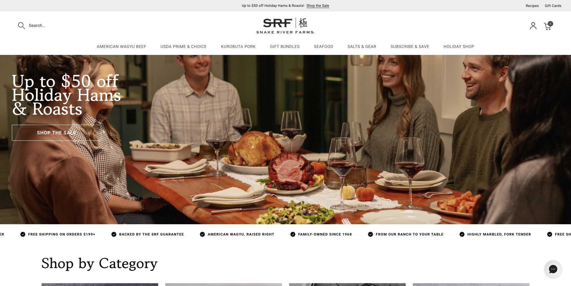
Snake River Farms opens with a warm photograph of people sharing a holiday meal. The offer is set at the left of the image, while the white header and long category navigation remain visually separate above it. This is a useful alternative to showing only raw cuts: the photograph presents the occasion for the purchase. The navigation then brings visitors back to specific product families and gifts. It is worth studying how the page keeps those two modes distinct. The celebration supplies context, but a returning shopper does not have to interpret the image to find a familiar category or begin browsing the assortment.
What you can learn
Use an occasion photograph to explain why someone might buy, then keep category navigation literal enough to explain what is available. Seasonal storytelling works best when it complements a stable product structure rather than temporarily replacing the entire browsing system.
Pros
The meal photograph connects products with a recognizable customer occasion.
A separate category bar supports shoppers arriving with a specific cut in mind.
Cons & considerations
An extensive category row needs thoughtful compression on narrow mobile screens.
Seasonal savings deserve clearly maintained dates and conditions on destination pages.
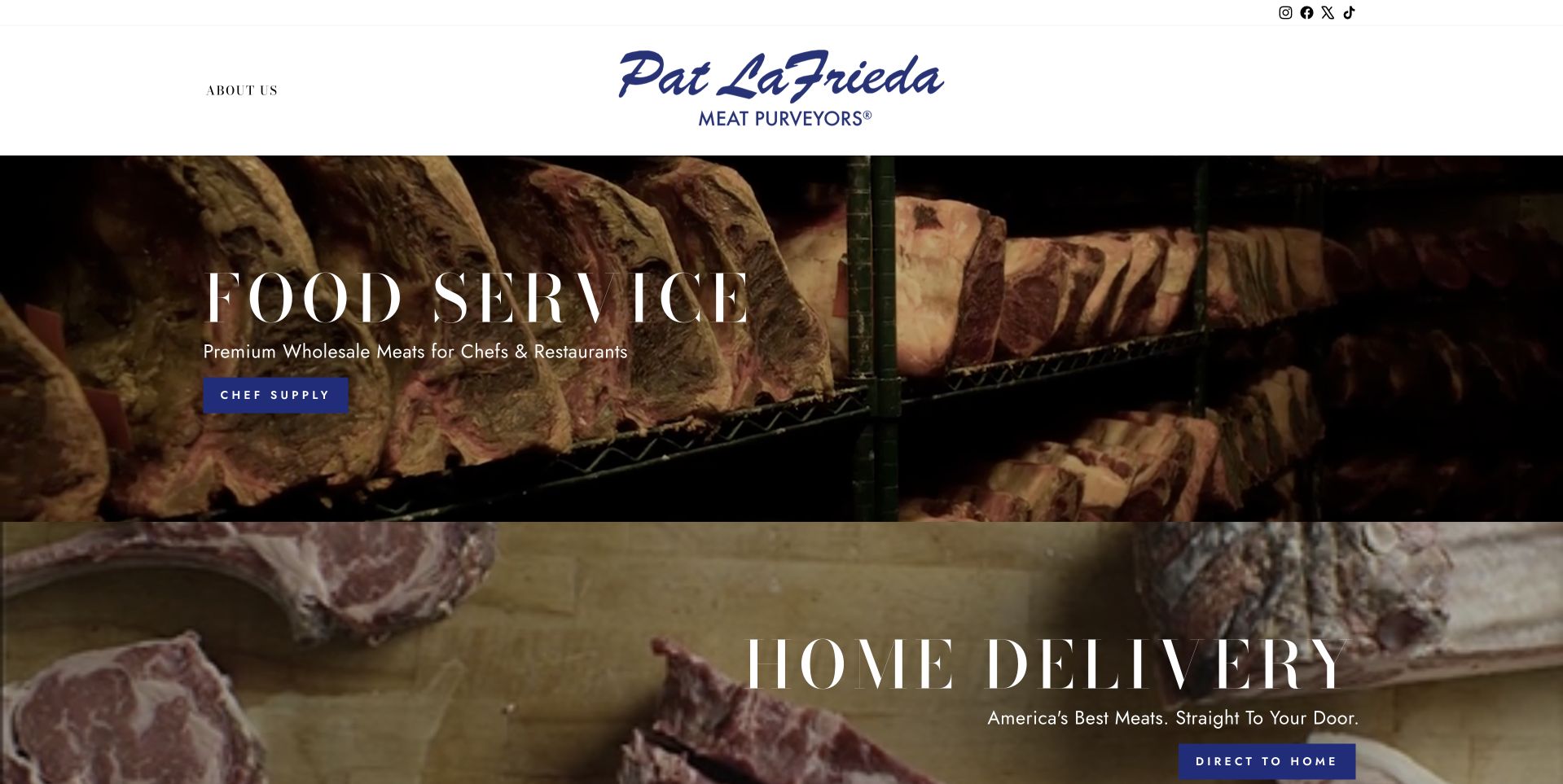
Pat LaFrieda gives its blue script identity a quiet white header, then divides the main content into two substantial photographic panels. Food Service is presented separately from Home Delivery, with different wording and actions for each audience. The distinction is functional rather than merely decorative. A chef sourcing for a restaurant and a household ordering dinner do not necessarily need the same prices, quantities or contact route. The dark photographs and widely spaced serif lettering lend both options a consistent visual treatment. Study the page for audience routing: it makes the first decision about the customer’s context before introducing individual products.
What you can learn
Where wholesale and retail orders follow different terms, divide the journeys at the start. Give each route its own plain-language explanation, destination and contact details, while retaining enough shared identity that customers understand they are dealing with the same business.
Pros
Separate panels explain the difference between food-service and household buying routes.
The restrained blue identity remains consistent across two distinct customer journeys.
Cons & considerations
Large photographs push practical details such as delivery coverage farther down the journey.
Fine, widely spaced lettering requires careful checking at small display sizes.
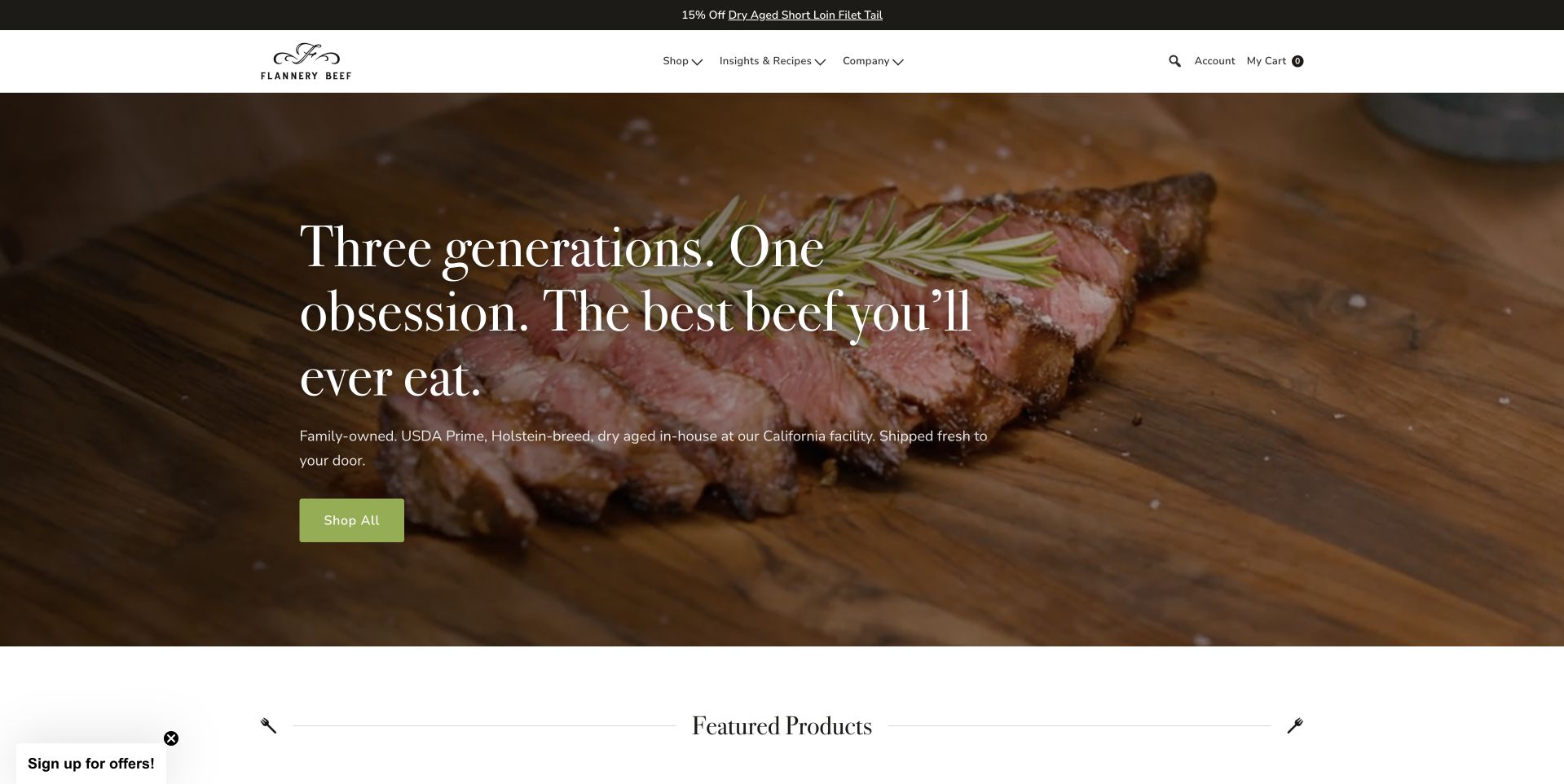
Flannery Beef places a modest logo and navigation above a close photograph of cooked beef on a wooden surface. A serif introduction connects the business with three generations, while a green shopping button gives that story a clear commercial outlet. Featured products begin immediately below, so the page does not stay in storytelling mode for too long. The useful aspect is the relationship between the headline and the merchandise: the family positioning frames a specific product rather than an unrelated lifestyle photograph. The copy’s quality claims belong to the retailer; the design lesson is the restrained way they are presented beside a direct action.
What you can learn
A family-owned positioning statement becomes more useful when it leads into real products. Keep the opening story short, then show the cuts, weights, prices and delivery choices that let a customer evaluate an actual purchase instead of relying on inherited reputation alone.
Pros
A green action stands out against the warm product photograph.
Featured products follow the family introduction without a narrative detour.
Cons & considerations
The text-heavy headline occupies space that could clarify delivery coverage sooner.
Thin serif lettering needs contrast checks against different portions of the image.
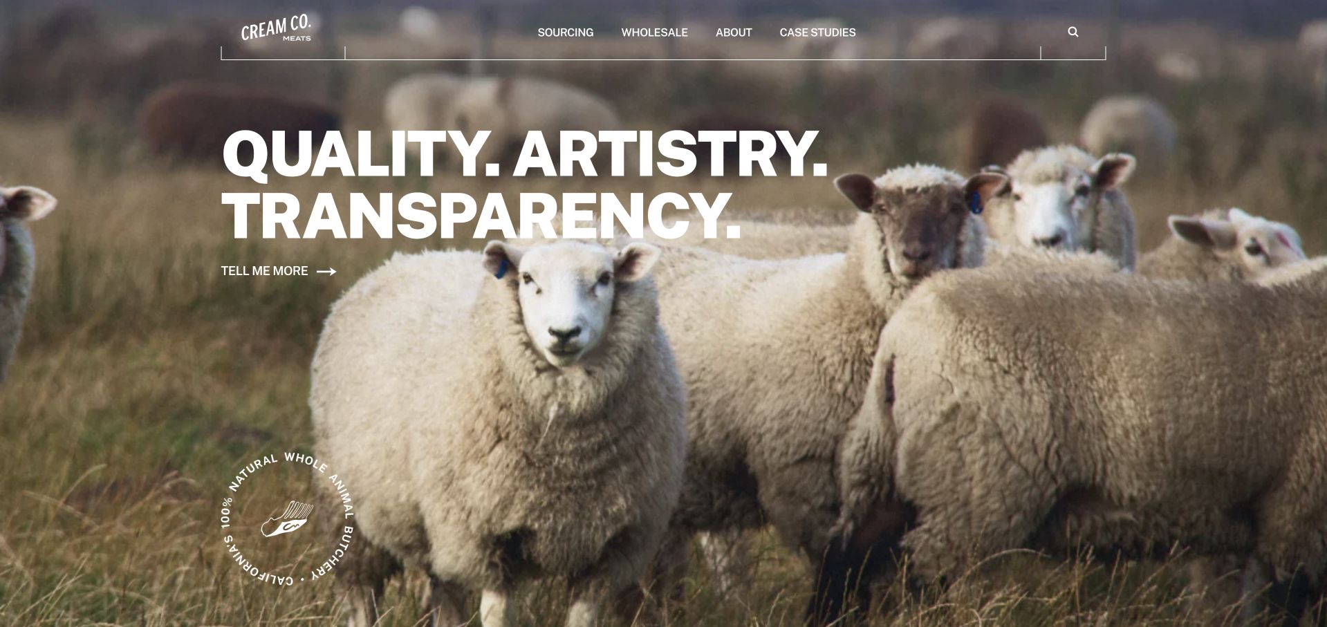
Cream Co. Meats uses a full-width photograph of sheep beneath a restrained white navigation bar. Three large words about quality, artistry and transparency occupy the left side, with a small route to learn more rather than a dominant promotional price. The navigation explicitly includes Sourcing and Wholesale, signalling that the website serves people evaluating the business as well as placing ordinary orders. It is a useful reference for a supply-chain-led identity. The farm photograph establishes the topic, but it does not independently verify a husbandry claim; the supporting sourcing pages need to do that explanatory work for a serious buyer.
What you can learn
If sourcing is central to the business, create a real information path for it instead of treating farm imagery as evidence. Distinguish wholesale enquiries from consumer shopping and make operational details discoverable without requiring visitors to decode a brand slogan.
Pros
The sheep photograph gives a sourcing-led introduction a clear visual subject.
Named Sourcing and Wholesale routes support different levels of buyer investigation.
Cons & considerations
Abstract headline words need concrete supporting information to become meaningful.
A small learn-more action is less direct for visitors ready to shop immediately.
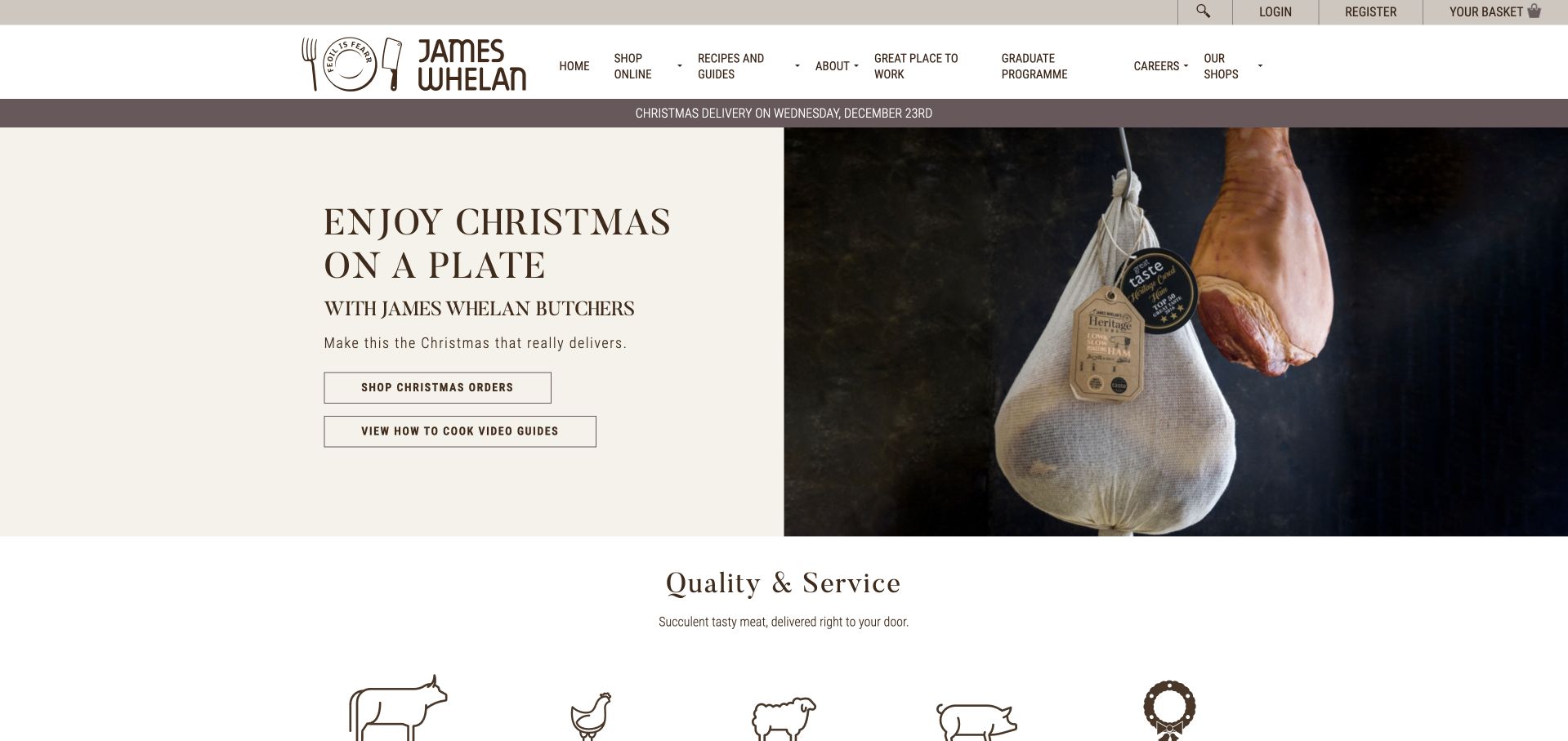
James Whelan Butchers splits its opening into a cream text panel and a dark photograph of a hanging prepared joint. The Christmas message has two distinct actions: shopping seasonal orders and viewing cooking guides. This is useful because a food purchase can involve uncertainty about preparation as well as availability. Beneath the hero, animal outline icons introduce the wider meat selection without immediately becoming a dense product grid. The header also separates the shops, company information and online store. The design is worth studying for how it presents helpful content beside the sales route while keeping both tied to the same seasonal purchase.
What you can learn
Connect relevant preparation information to a product campaign, but keep it separate from ordering. A shopper should be able to buy without watching a video, and someone researching a meal should be able to find the guidance without accidentally entering checkout.
Pros
The split layout keeps seasonal copy off the detailed product photograph.
Separate shopping and cooking-guide actions support two different customer intentions.
Cons & considerations
The prominent Christmas panel needs active maintenance after the ordering period.
Small header labels may be difficult to distinguish when the menu becomes crowded.
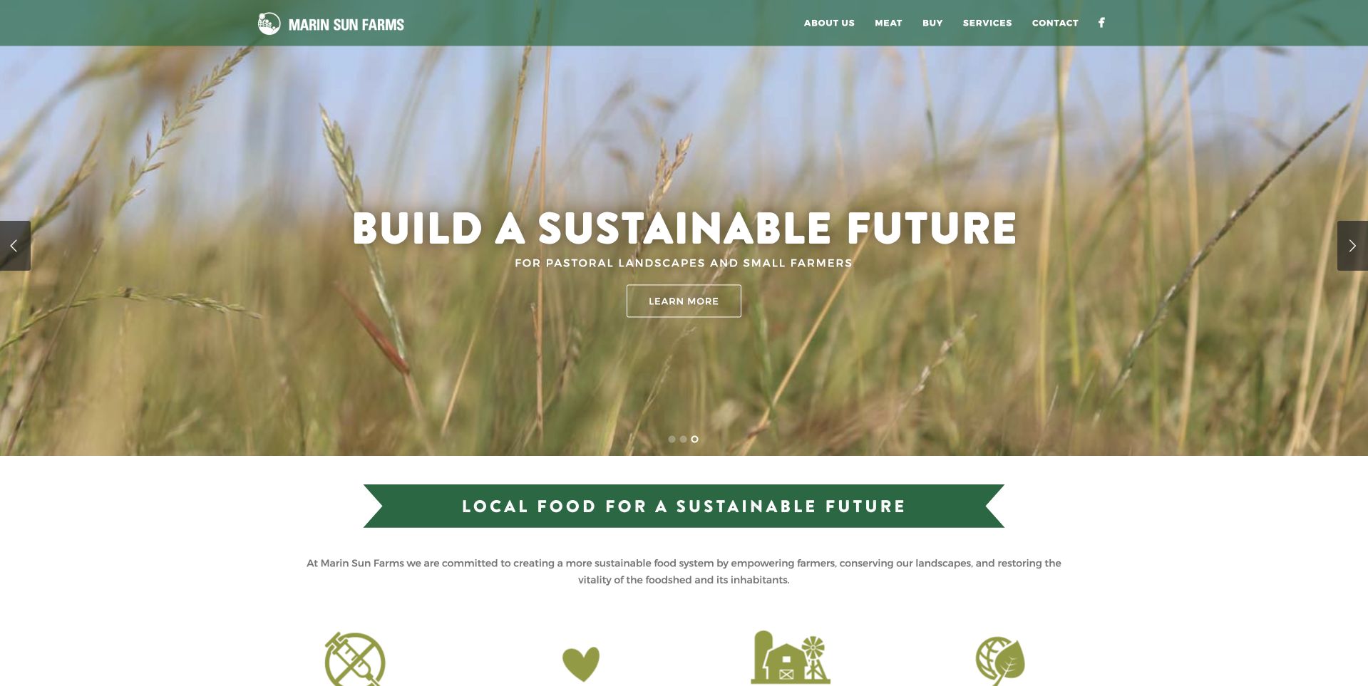
Marin Sun Farms uses green as a structural color rather than a small decorative accent. The header, ribbon-style section heading and outlined benefit illustrations all reinforce the agricultural subject. A wide photograph of a field carries the central message, followed by a more literal local-food heading and a short explanatory paragraph. That transition from atmosphere to explanation is the useful pattern here. The page does not rely entirely on a landscape image to tell visitors what the organization does. Its sustainability language is the publisher’s positioning, not a certification established by this review, so a reader should continue into the supporting sourcing information.
What you can learn
Let agricultural imagery introduce a sourcing story, then explain the actual operating model in ordinary language. Identify who the business serves, where products can be obtained and which practices are supported by documentation rather than leaving customers with broad environmental adjectives.
Pros
Green ribbons and simple illustrations create a consistent agricultural visual system.
The explanatory section begins directly after the atmospheric field photograph.
Cons & considerations
Broad environmental language needs specific supporting details and careful qualification.
The first screen is less transaction-focused than a conventional online butcher catalog.
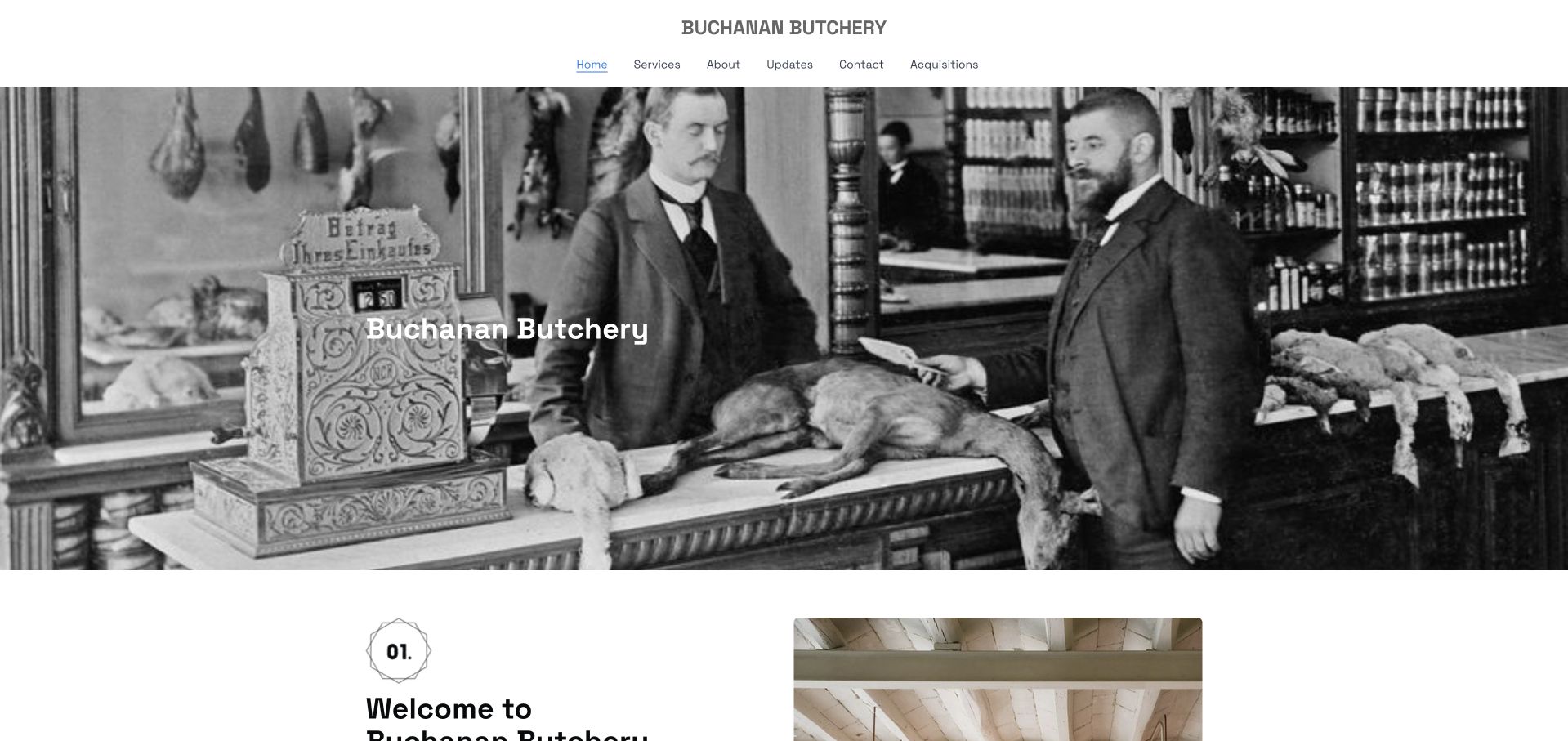
Buchanan Butchery opens with a black-and-white historical butcher-counter photograph beneath a small centered identity. The restrained header gives the page a quieter character than the heavily promotional meat-delivery stores in this collection. Its navigation includes Services, Contact and Registration, reflecting a local processing business rather than a nationwide box subscription. The historical image supplies atmosphere, while the welcome section begins the explanatory material below. That distinction matters when borrowing from the page: the website should be read as a reference for introducing a specialist butcher service, not as proof that every pictured product is currently available for online purchase.
What you can learn
For a service-based butcher, explain the process before copying an ecommerce layout. State what can be brought in, which registration or appointment steps apply and how the customer receives confirmation. Keep historical imagery separate from photographs documenting the current premises and offer.
Pros
A restrained header makes the specialist business feel focused rather than sprawling.
Services and Registration are more relevant here than a generic shopping menu.
Cons & considerations
Historical stock-like imagery does not show the current facility or team.
The first view needs subsequent explanation before a newcomer understands the processing offer.
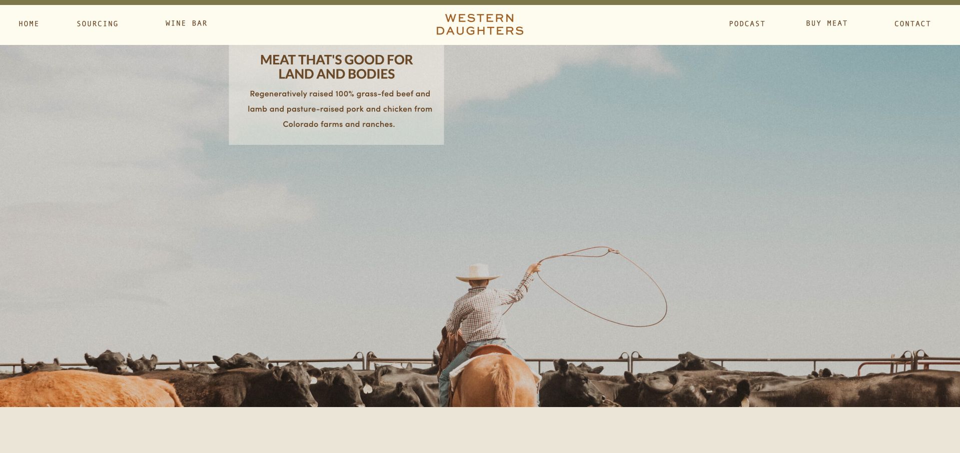
Western Daughters uses a pale header, widely spaced navigation and a large landscape photograph showing a person working around cattle. The short introduction is placed in a small cream panel rather than enlarged across the whole photograph. That choice lets the scene retain its scale and gives the website an editorial, almost magazine-like pace. The header separates the shop, wine bar, sourcing and contact routes, so the broader identity does not have to be explained in one paragraph. This is useful for a butcher with multiple neighborhood roles, although the landscape alone is not evidence of any specific production or welfare standard.
What you can learn
A spacious photographic homepage can work when the navigation gives customers concrete choices. Preserve the character of a landscape image, but add visible routes to the actual shop, current hours and supporting sourcing explanation so atmosphere does not become a substitute for useful information.
Pros
The small text panel preserves the working-landscape photograph’s scale.
Shop, sourcing and wine-bar routes acknowledge different business roles.
Cons & considerations
The opening image tells less about available cuts than a product-led storefront.
Widely spaced fine navigation needs mobile testing for readable tap targets.
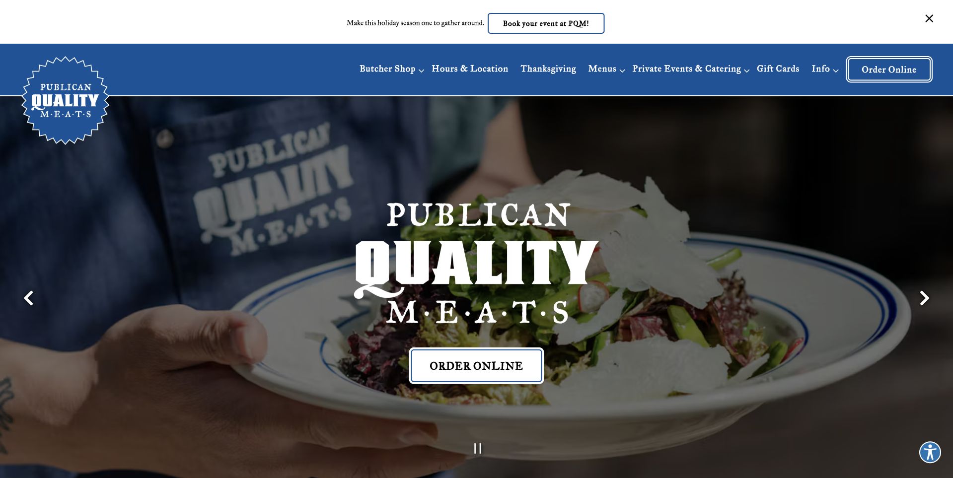
Publican Quality Meats uses a strong blue header and a circular seal-style identity over a photograph of a prepared meal. The large white name and simple Order Online button make the first screen feel like a welcoming restaurant introduction rather than a technical meat catalog. The navigation is more specific: Butcher Shop, Menus and private-event routes explain the different ways to use the business. A separate narrow event notice stays above the main header. This arrangement is worth studying when a shop has both a retail counter and a kitchen, because it lets one photographic introduction lead into several distinct service journeys.
What you can learn
When food retail and prepared meals share a brand, make their routes explicit. A common hero can establish the place, but menus, butcher ordering, collection arrangements and event enquiries should not be collapsed into one ambiguous ordering page.
Pros
A strong blue identity ties the meal photograph and header together.
Literal service labels clarify the combination of butcher shop and kitchen.
Cons & considerations
Large centered branding leaves practical location details for later in the visit.
Multiple event notices can distract unless outdated promotions are removed promptly.
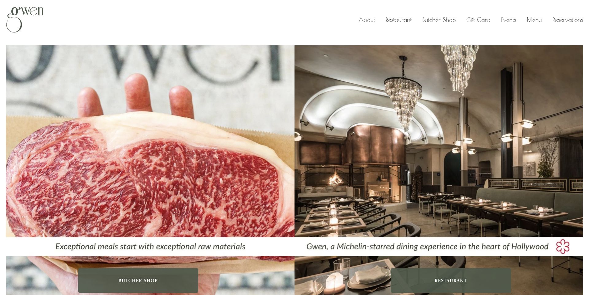
Gwen presents a side-by-side opening with a close-up of beef on one side and a restaurant interior on the other. A small, delicate wordmark sits in the white header, while the two main destinations are labelled Butcher Shop and Restaurant. The split is especially useful here because those are different customer tasks, not merely different product categories. A visitor planning dinner out should not have to work through a retail checkout, and a shopper should not have to inspect a booking form. The visual treatment gives both offers equal dignity, while the separate actions prevent the attractive photography from blurring their operational differences.
What you can learn
Give genuinely different services separate entry points. Use imagery that represents each task, then keep booking, takeaway or retail purchasing conditions specific to the destination rather than expecting a shared brand photograph to explain how everything works.
Pros
The paired photographs make the shop-versus-restaurant distinction immediately tangible.
Separate destination buttons reduce ambiguity for two different customer journeys.
Cons & considerations
Fine header lettering may need enlargement for comfortable mobile scanning.
The split hero gives each individual service less space to explain practical details.
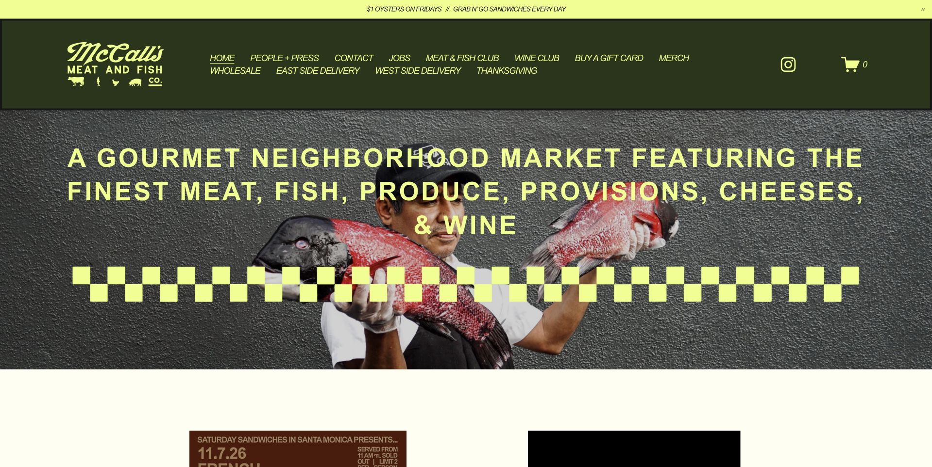
McCall’s Meat & Fish uses dark green, acidic yellow and a checkerboard band to create an identity that is difficult to confuse with a generic food template. A fishmonger figure and illustrated food sit behind a large uppercase description of the neighborhood market. The text explicitly includes meat, fish, produce, provisions, cheese and wine, so the page broadens the visitor’s understanding quickly. Small dated notices begin below the opening graphic, giving current shop information its own place. This is useful for a market that would otherwise be described too narrowly as a butcher: the visual energy supports a very literal statement of what the shop sells.
What you can learn
If the business spans several food categories, name those categories instead of relying on the logo to explain them. Keep the descriptive headline and the current notices separate so the core identity remains stable while events, specials and opening arrangements change.
Pros
The green-and-yellow palette creates a memorable, coherent neighborhood market identity.
The descriptive headline makes the broader assortment clear before visitors scroll.
Cons & considerations
Dense uppercase text can become tiring when the design is compressed.
Graphic personality needs equally legible practical details on the following sections.
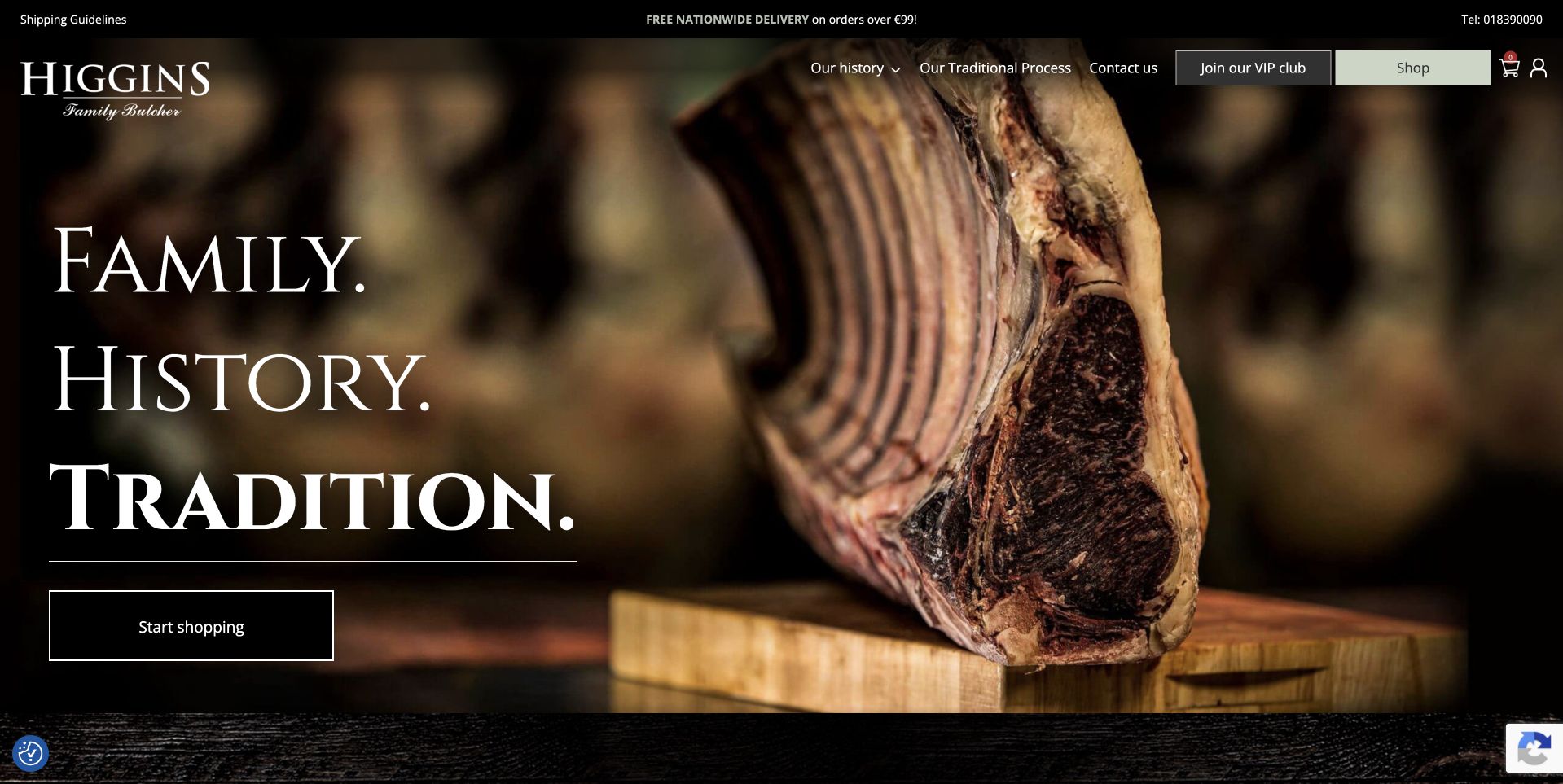
Higgins Family Butcher places a dramatic rib photograph beneath a black header, leaving a dark area at the left for three large serif words about family, history and tradition. A simple outlined Start Shopping button sits below them. The composition is tightly controlled: the cut of meat supplies texture, while the copy and action retain a quiet, readable zone. Small navigation and delivery information stay above the photograph. The page is useful for studying a heritage-led visual identity that still admits an immediate transaction. Its family positioning is communicated by typography and wording rather than a lengthy opening history lesson.
What you can learn
Reserve a predictable text area when commissioning product photography for a homepage. A strong image can carry heritage positioning, but customers still need a plain shopping action and accessible details about collection, delivery and the current range once they follow it.
Pros
The dark left side gives the large serif headline a readable setting.
An outlined shopping action remains distinct without introducing another dominant color.
Cons & considerations
Heritage words need concrete supporting company information farther into the site.
The extensive dark hero may delay useful delivery details for first-time buyers.
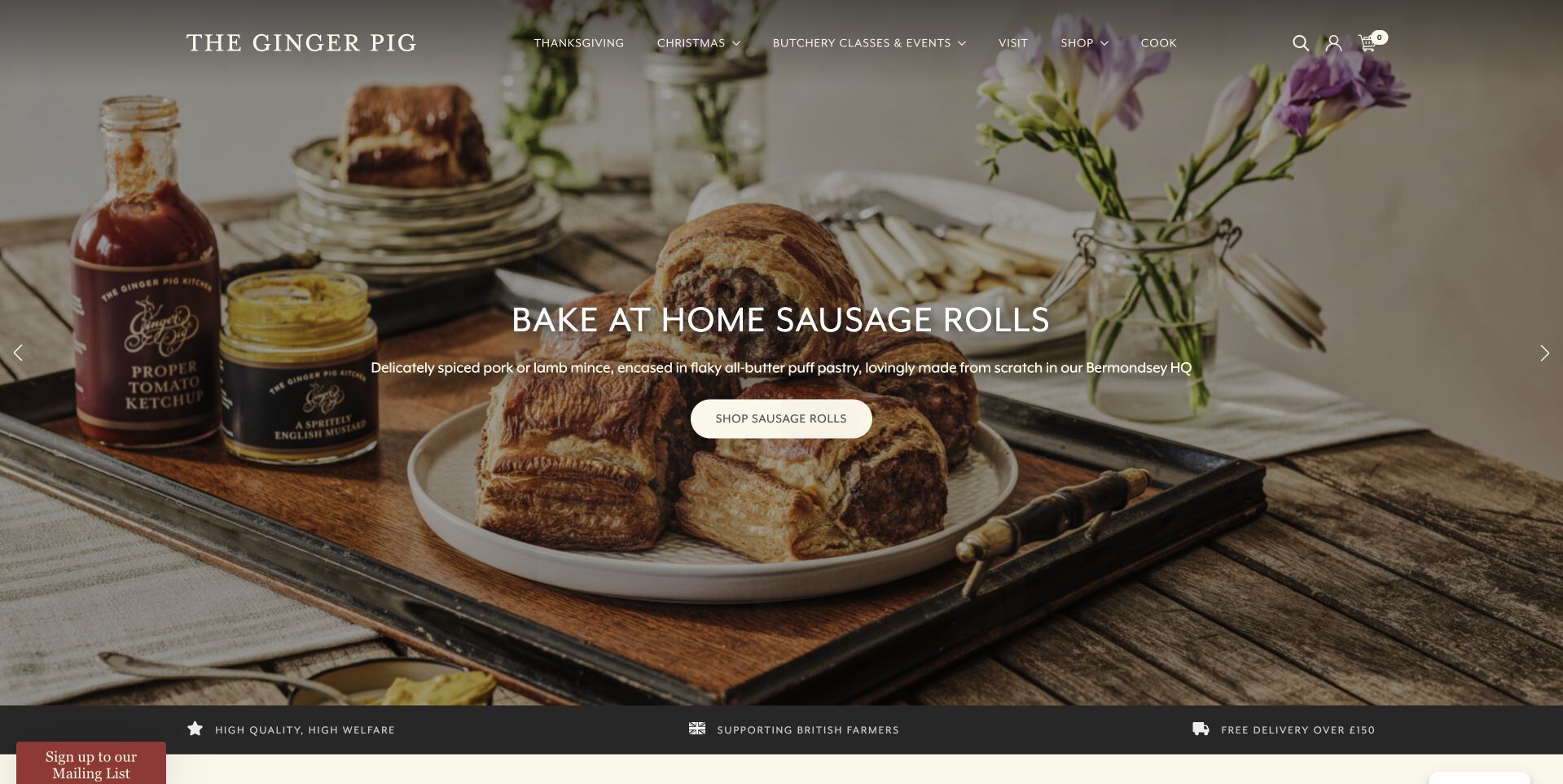
The Ginger Pig centers its opening on a carefully arranged table of sausage rolls, flowers and serving pieces. A short white headline and rounded shopping action sit over the photograph, while the brand and navigation occupy the quieter area above. The scene explains a specific prepared-food use case rather than presenting another anonymous steak. A dark benefit strip at the bottom connects the campaign to shopping and delivery information. The design is useful for a butcher introducing products that are not simply raw cuts: the preparation and occasion are visible, and the call to action names the relevant collection rather than asking visitors to infer it.
What you can learn
Choose a representative use case when broadening a butcher’s range. A prepared-food campaign should explain what the customer receives and what preparation remains, with honest product information on the destination page rather than relying only on styled serving photography.
Pros
The prepared-food still life makes the campaign’s product immediately understandable.
The short headline leaves the photograph enough space to communicate the occasion.
Cons & considerations
White type needs stable contrast across alternative image crops and slides.
A campaign-led opening can make everyday shop details less immediately visible.
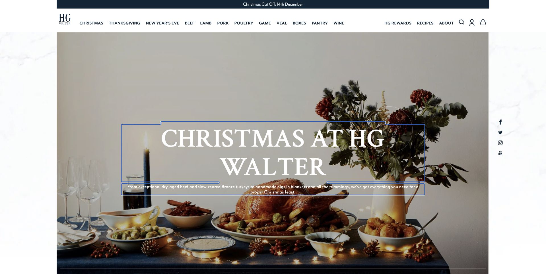
H. G. Walter uses a clean white header and a long, closely organized navigation row above a photographic Christmas table. Fine framing lines and a centered serif headline give the campaign an understated invitation-like quality. The table photograph explains the occasion without displaying a cluttered wall of promotional prices. At the same time, the header retains routes for the ordinary product families, so a returning customer can bypass the campaign. This is worth studying as a balance between an editorial seasonal scene and a practical catalog structure. The quieter visual tone depends on strong photography and a carefully maintained hierarchy rather than on numerous decorative elements.
What you can learn
Keep the everyday catalog available when seasonal storytelling becomes dominant. A table scene can attract attention, but the navigation should still let customers find a known product without waiting for a slideshow or guessing which campaign button will lead to the main store.
Pros
The restrained frame and typography give the seasonal photograph consistency.
Stable categories let returning shoppers bypass the campaign.
Cons & considerations
The dense header needs a clear mobile alternative and adequately sized labels.
A large seasonal photograph requires regular editing when the campaign changes.
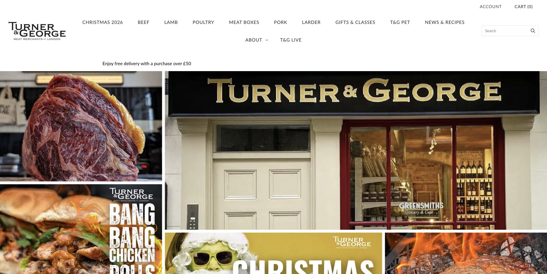
Turner & George uses a white header with a compact black identity and a broad category menu. The opening below is a collage: a shopfront sits alongside close-up meat and prepared-food images, with a seasonal graphic beginning at the edge. That arrangement connects an online order with a real place rather than presenting the store as an anonymous delivery warehouse. It also introduces several buying occasions at once. The tradeoff is visual competition, because each tile asks for attention. Study the page for how the storefront photograph acts as an anchor between product imagery, campaigns and the business’s local identity.
What you can learn
A multi-tile hero works best when every tile has a distinct job. Use a physical shop image to establish place, a product image to establish the range and a campaign tile only when its destination and expiry are managed as carefully as the main catalog.
Pros
The shopfront connects ecommerce with a recognizable physical place.
The collage introduces several product contexts without generic imagery.
Cons & considerations
Several equally strong images can dilute the first action a newcomer should take.
A broad category menu needs careful grouping when displayed on smaller screens.
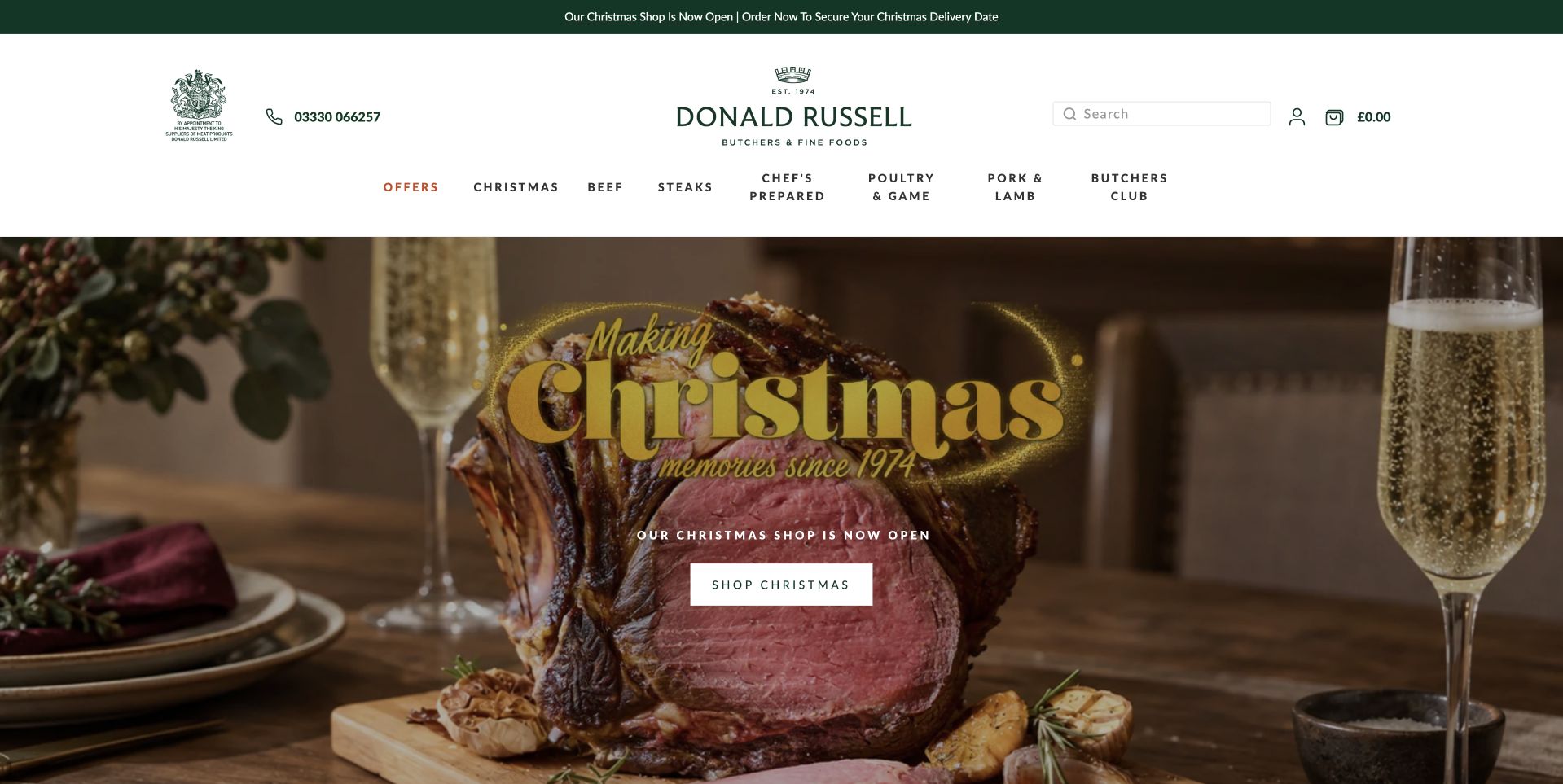
Donald Russell gives a festive roast photograph most of the opening space, with a gold seasonal headline and a compact shopping button over the food. The white header above contains the identity, search, account and shopping controls, keeping those practical functions out of the campaign image. Product-family navigation provides another way into the store for people not interested in the holiday promotion. The useful design relationship is between the warm, aspirational food photography and the familiar structure around it. The image establishes the occasion, but the catalog controls make the site usable as a store rather than just a seasonal advertisement.
What you can learn
Build a stable storefront around changing campaigns. Search, category labels and delivery information should retain predictable locations while the hero photograph changes, so regular customers do not have to relearn the site each time a festive offer is introduced.
Pros
The white header separates practical shopping controls from the seasonal food scene.
Product categories offer a useful alternative to the Christmas campaign route.
Cons & considerations
Decorative seasonal lettering needs careful contrast and small-screen readability checks.
Promotional deadlines and delivery conditions require active maintenance beyond the hero.
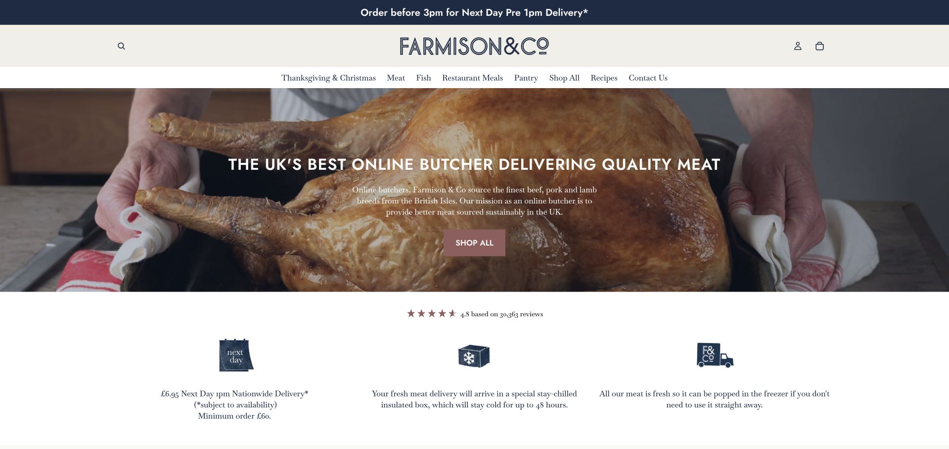
Farmison & Co uses a close photograph of a roast beneath a modest white header. Centered white copy and a small shopping action introduce the proposition, while a row of simple fulfillment illustrations begins directly below. This moves the page from appetite to practical reassurance without requiring a long story between them. The navigation includes recipe and meat-category routes, so visitors can investigate an ingredient or find ideas for using it. The design is useful for its sequencing: a product-led first impression is quickly followed by how the service works. Any sourcing or quality language still needs supporting detail rather than being inferred from the photograph.
What you can learn
After a strong food image, answer the practical delivery questions early. Small benefit blocks can summarize the service, but they should lead to precise information about coverage, timing and handling rather than making broad promises that a checkout later qualifies.
Pros
The fulfillment icons follow the product-led introduction at a useful moment.
Recipe and product routes support browsing and purchase-oriented visits.
Cons & considerations
Centered copy over detailed food photography can lose contrast at some sizes.
Generic benefit icons need explicit wording to avoid vague service reassurance.
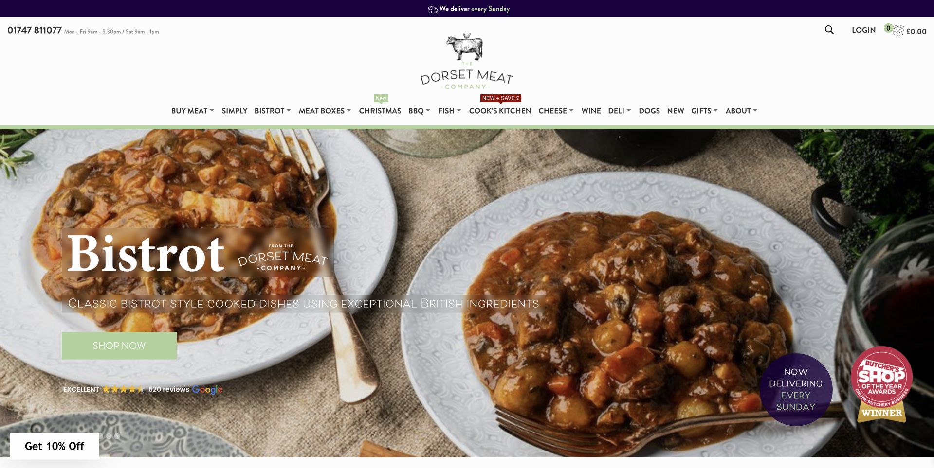
The Dorset Meat Company uses a pair of bowls filled with a prepared dish as the main photographic subject. A large Bistro label and shopping action introduce the meal-focused campaign, while the white header retains a broad product navigation. This is useful because the photograph changes the implied task: the customer is not only choosing a raw cut, but considering a prepared meal. Small delivery and shop markers occupy the edge of the composition without taking over the central dish. Study the page for how a campaign can introduce an expanded offer while the normal store categories remain available above it.
What you can learn
Use photography to distinguish a prepared-food collection from a raw-meat catalog, then state the distinction explicitly on the collection page. Customers need to understand serving sizes, preparation remaining and collection or delivery terms before the styled dish becomes a purchase decision.
Pros
The prepared dish gives the Bistro collection a distinct, understandable visual identity.
The ordinary category navigation stays available above the temporary campaign.
Cons & considerations
Several edge badges can compete with the central collection action.
Serving photography alone does not explain what arrives in the package.
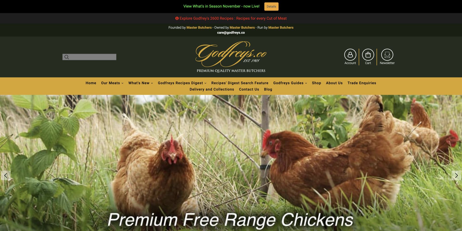
Godfreys uses a dark green and gold header that feels closer to a traditional shop sign than a contemporary subscription box brand. A long yellow navigation strip introduces product families above a photograph of chickens in grass. Large white copy names the featured poultry category, keeping the campaign connected to something customers can browse. The page is useful for its consistency between identity, menu and photography: the colors remain recognizable even when the featured food changes. The photograph and free-range wording are the retailer’s presentation, not independent verification of a production standard. Practical product information must still accompany the items being sold.
What you can learn
A traditional visual identity can support a large catalog when category labels remain literal and consistent. Keep product claims attached to documented items, and do not ask pastoral photography to carry information about weight, provenance or delivery that belongs in the actual product pages.
Pros
Green and gold connect shop identity and catalog structure.
Literal categories help visitors move beyond the poultry campaign.
Cons & considerations
The long horizontal menu risks cramped labels on intermediate screen widths.
Pastoral imagery needs supporting detail before customers can evaluate production claims.
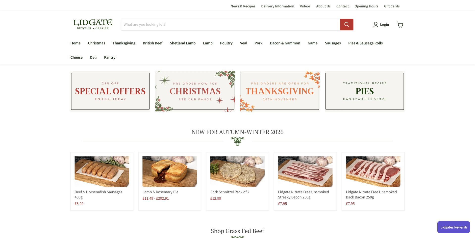
Lidgates gives more space to navigation and product browsing than to a single full-screen photograph. Beneath its white header, four framed seasonal or promotional panels lead into a compact row of autumn-and-winter products. The product tiles show recognizable food, names and prices, making the page feel closer to a working online counter. A broad list of meat families sits above them. This is a useful contrast with the atmospheric butcher sites in the collection: customers are offered concrete choices early. The tradeoff is density, because announcements, categories and products all need enough visual separation to remain easy to scan.
What you can learn
For a catalog-led butcher, a useful product grid may do more work than an oversized hero. Give each seasonal signpost a clear destination, retain readable product names and prices, and avoid adding so many promotional strips that shoppers lose the browsing hierarchy.
Pros
Product names and prices appear early rather than after a lengthy brand story.
Framed seasonal links give campaigns a separate role from ordinary category browsing.
Cons & considerations
Numerous small navigation labels can make the header feel crowded.
Several promotional panels need clear priorities to avoid flattening the page hierarchy.
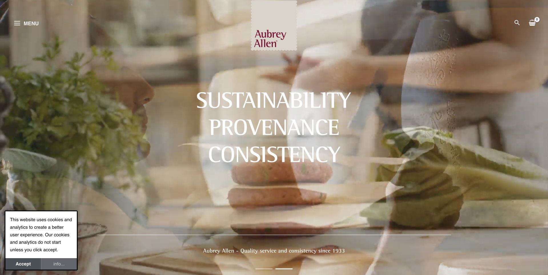
Aubrey Allen opens with moving food-preparation imagery rather than a conventional product grid. The identity sits near the top center while the menu is deliberately compact. Large white words about provenance and consistency connect the scene with a supplier-oriented proposition. This is important context: the website should not be read as only a household ecommerce butcher. It also introduces trade supply and a separate retail presence. Study the page for how hospitality imagery can establish the professional context of an ingredient business, while recognizing that practical ordering details require a subsequent destination.
What you can learn
If trade supply is central, show the setting in which the products are used and make the customer route explicit afterward. Separate wholesale requirements from retail shop information so a cinematic introduction does not conceal which audience each service actually supports.
Pros
The chef-and-service imagery makes the professional hospitality context immediately visible.
A compact menu preserves space for a strong central brand introduction.
Cons & considerations
Motion-led imagery should have an accessible reduced-motion and still-image alternative.
The first view gives fewer direct purchasing details than a conventional retail catalog.
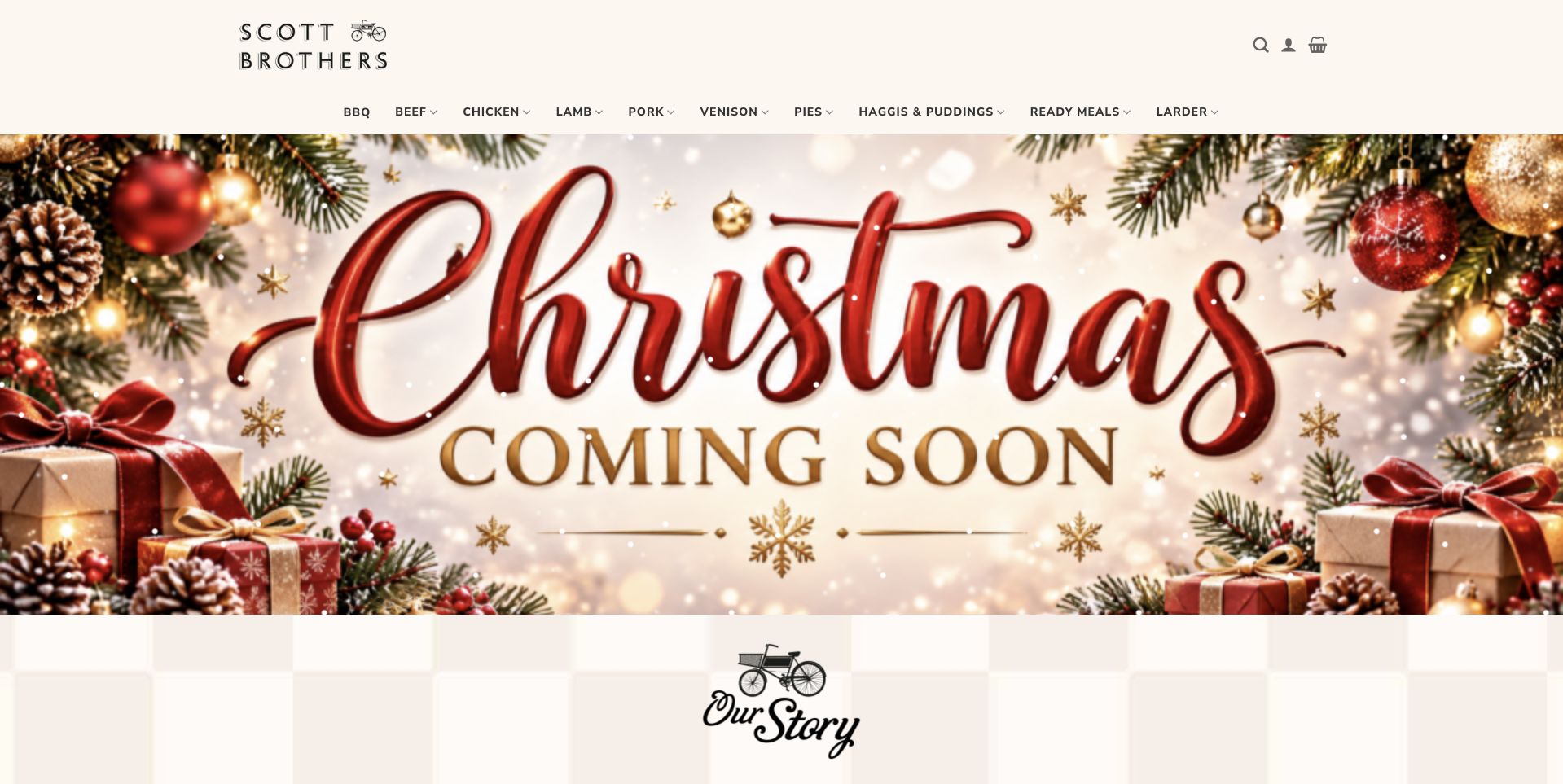
Scott Brothers Butchers keeps a small black wordmark and conventional navigation above a large Christmas graphic. Decorative red lettering, foliage and pale space give the campaign a greeting-card quality rather than the dark close-up meat photography used elsewhere in this collection. An Our Story section begins below, creating a clear transition from temporary promotion to the longer-lived business introduction. The design is useful for considering how a familiar family shop can update its homepage around seasonal trading without changing the whole brand. The seasonal graphic attracts attention, but the ordinary shop navigation remains the reliable route into the assortment.
What you can learn
Treat seasonal artwork as a replaceable campaign layer. Keep the family story, category labels and practical shop information stable underneath it, and make sure Coming Soon messages are removed or updated when the relevant ordering period actually opens.
Pros
The seasonal graphic is visually distinct from the permanent black wordmark.
The next section gives the family story its own place below the campaign.
Cons & considerations
Decorative lettering can be harder to read on small or low-resolution displays.
A Coming Soon campaign needs a clear update plan and useful destination.
Kegan is a freelance web designer and developer with 15+ years of experience helping businesses turn complicated website requirements into clear, maintainable digital experiences. He works directly with clients from planning and design through development, launch, and ongoing support.
For butcher shop website design, his development approach focuses on product and provenance information, readable ordering and collection details, shop hours, preparation guidance, and maintainable retail content. The scope can be a targeted improvement or a complete custom build, with responsive layouts, thoughtful content structure, and integrations chosen around the people using and maintaining the site.
Show 3 other butcher shop website designersHide other butcher shop website designers
Plan the shop’s real ordering journey before designing the hero
Map stock, portions and fulfillment together
Create a sample product record before drawing the homepage. Include the product name, cut or preparation format, displayed unit, portion or weight information, current availability and the fulfillment methods that actually apply. Decide how variable-weight items will be explained and who maintains stock changes. A product grid is only useful when its labels match what the customer can order. Ask the shop team to review the language using real counter questions rather than assuming everyone understands specialist terminology.
Give every physical location its own dependable details
List the actual address, current hours, telephone number, access information and location-specific services for each shop. If online ordering uses a related business or external checkout, explain the relationship before sending customers there. Make holiday exceptions temporary, dated records rather than edits scattered across the site. A visitor should not have to compare an old photograph, a social profile and a footer to work out whether the relevant counter is open.
Define maintenance responsibilities before launch
Decide who updates prices, product availability, seasonal cut-offs, notices and contact details. Give that person a manageable publishing interface and a short checklist for each campaign. Agree how expired reservations disappear and what replaces them. A small butcher may benefit from a focused catalog and a reliable telephone route more than a complicated ordering system nobody can keep current. Test the design with the person who will operate it during the busiest trading week.
The editing job behind the design
Choose technology around inventory and staff capacity
[object Object]
[object Object]
[object Object]
Our WordPress website examples offer a separate look at publishing approaches. A visible platform label is evidence for that named page, not a guarantee that the same system will suit your requirements.
Before the public launch
A practical butcher-website brief
Identify the main audience: local counter shoppers, delivery customers, trade buyers or a clearly separated combination.
Document every shop’s current address, hours, telephone number and location-specific services in one maintainable place.
Define product names, units, weights, portion descriptions and availability states using the shop’s actual selling process.
Separate one-off purchases, recurring boxes, reservations and enquiries before asking customers to begin.
Explain delivery coverage, collection locations, lead times and exceptional dates near the relevant buying route.
Create seasonal campaign records with an owner, clear dates and a planned replacement when the offer ends.
Photograph real products, shopfronts and working context with permission and a specific layout purpose.
Publish sourcing information only to the level the business can document, without relying on pastoral imagery as proof.
Give approved preparation and handling information an appropriate destination without inventing medical or safety assurances.
Check navigation, forms and purchasing controls using keyboard access, readable contrast and adequately sized mobile targets.
Confirm how product updates, order notifications and failures reach the staff responsible for dealing with them.
Test complete sample journeys for an ordinary purchase, a closed shop and an expired holiday-order campaign.
These checks are a project checklist, not a performance, legal, security, or accessibility certification. Test real journeys with the people responsible for the website before making claims about the result.
Sources & editorial method
How this collection was selected and reviewed
The examples are public website-design references reviewed through their actual pages and captured in a normal browser. Commentary concerns visible layout, content and navigation, not food quality, animal welfare, certification or sales results. Different business models are identified where relevant. Technology labels require separately qualified public evidence; an image or familiar layout is not proof of a backend system.
Each example links to its actual source page. Screenshots are direct browser captures with their own capture dates; moving imagery, announcements and live designs can change. The notes describe observable design choices and conditional tradeoffs, not measured traffic, conversion results, service quality, or accessibility conformance.
Technology labels use public page metadata, asset evidence, or explicitly cited platform documentation. Platform documentation is not a complete current deployment audit. A component reference may be legacy or unused; it is not a complete backend inventory. Unknown stacks are omitted. These sites are editorial examples, not our client portfolio.
Written, Edited and Curated are separate editorial records, not timestamps advanced by a rebuild. Website designs and imagery belong to their owners. See our editorial standards or suggest a correction.
Questions worth asking
Butcher Shop website design questions
Does a butcher need a full online shop?
Not automatically. A clear range overview, accurate opening information and a useful telephone or enquiry route may suit a local counter better than an unmaintained catalog. Add transactions when stock, pricing and fulfillment can be kept dependable.
Should the homepage show raw meat or finished meals?
Choose the image that explains the current offer. Raw cuts communicate the counter range, while prepared dishes can introduce a kitchen collection. Make clear what customers actually receive rather than letting a serving photograph imply an included finished meal.
How should holiday reservations work?
Treat them as dated offers with their own collection or delivery conditions. Explain whether the first step reserves stock, requests a callback or completes a purchase. Remove or replace the campaign promptly when its period ends.
Can wholesale and household customers use one website?
Yes, when their routes are distinct. Use clear audience labels and separate the information that differs, including quantities, contact arrangements and fulfillment. Do not send professional buyers through a household checkout unless that genuinely matches the business process.
Can the technology stack be copied from a reference site?
A public screenshot cannot identify the complete stock, payment or fulfillment system. Use observed technology information only within its evidence limits, then choose a stack around the shop’s actual operations, budget and staff capacity rather than its visual similarity to another business.
Begin with real customer tasks and a sample product. Build a recognizable identity around accurate stock and practical fulfillment information, not simply an oversized photograph.