Best Terraform Websites of 2026 (20 Real-World Examples)
Public design references from organizations with documented Terraform use or clearly scoped official customer associations.
Terraform manages infrastructure, not page layouts. The useful connection is a disciplined delivery process: clear ownership, reviewable changes and a website that remains dependable while its content evolves.
A company can use Terraform to provision internal cloud services while its public website uses an entirely different managed platform. The examples below therefore do not treat a customer logo as a frontend fingerprint. Specific case studies and dated engineering talks identify their actual workloads; product-page customer listings establish only a narrower organization-level relationship.
For a website project, separate what editors change from what infrastructure changes. A headline update should not require the same approval path as a database permission or network modification. At the same time, a deployment pipeline should make it possible to understand what changed, who reviewed it and how to restore service when an unexpected result appears.
Before the examples
What makes good Terraform website development in 2026?
Make the desired infrastructure reviewable
Treat infrastructure definitions as a maintained part of the project rather than a one-time setup script. Review changes before applying them and explain the effect in terms the service owner can evaluate. The goal is not simply to generate resources faster, but to make the intended configuration inspectable and repeatable.
Terraform state connects configuration to managed resources and requires deliberate storage and access decisions. Document who can read it, how concurrent work is controlled and how recovery is handled. Do not treat state as an ordinary public project file or assume that marking a value sensitive makes every surrounding system safe.
Keep content work separate from privileged changes
Editors should be able to publish ordinary content without receiving infrastructure credentials. Define a separate process for permissions, networking and production configuration. This makes routine publishing less fragile while keeping high-impact changes visible to the people responsible for security, cost and availability.
The collection · 20 examples
20 Terraform website examples worth studying
The 20 examples show public communication patterns from documented Terraform-associated organizations. Five sourced major brands open the collection; each evidence note distinguishes a specific case, dated talk or product-page customer listing from a homepage-runtime claim.
We start with five recognizable brands or organizations: Deutsche Bank, GitHub, Comcast, Lufthansa Systems, Duke Energy. Each attribution applies to the named website property, not every product or website belonging to its organization. This is a curated reading sequence, not a measured ranking.
Deutsche Bank’s public homepage provides several distinct navigation layers around a topical editorial panel. Stakeholder links such as careers and investor relations occupy one level, while business divisions and broader company sections occupy others. The structure is more important than the individual campaign: the featured story can change without moving the routes that repeat visitors rely on. Blue panels and the familiar geometric mark provide continuity across the page. The tradeoff is navigational density, particularly when these layers become a mobile menu. HashiCorp’s case documents Terraform Enterprise and standardized cloud landing zones for internal teams, not the implementation of this public corporate homepage.
What you can learn
Treat durable navigation and temporary editorial content as separate systems. Define stable tasks and audiences first, then create a campaign area that editors can update without reorganizing the entire site or breaking established paths.
Pros
Several stakeholder groups have clearly differentiated routes in the header.
The editorial area can change while the institutional navigation remains stable.
Cons & considerations
Multiple navigation layers can become overwhelming without a thoughtful mobile hierarchy.
A topical story does not replace a concise explanation for unfamiliar visitors.
Platform source: Official product-specific customer case. HashiCorp’s Deutsche Bank case describes Terraform Enterprise, Sentinel and standardized cloud landing zones for internal application teams. This source establishes only the stated organization, product or workload association. It does not prove the pictured public page uses this technology, identify its CMS or frontend, establish a complete current architecture, or independently verify vendor-reported outcomes. Platform evidence is separate from the direct website screenshot and is not a complete current infrastructure audit.
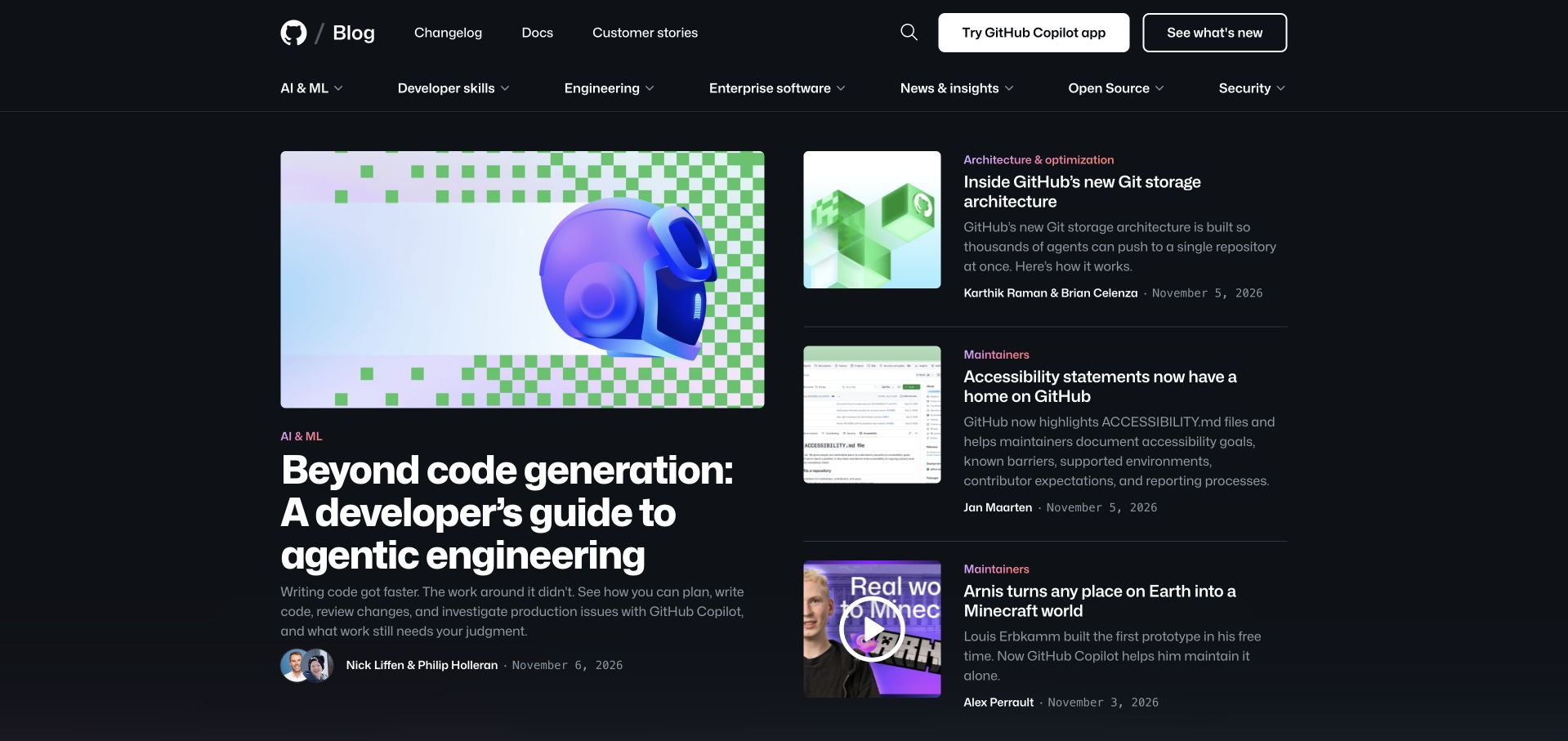
GitHub’s blog uses a dark editorial layout with one large lead article beside a smaller stack of related updates. Topic labels, dates, authors and short descriptions add useful context to the cards. A separate primary navigation groups AI, developer skills, engineering, enterprise software, open source and security, so the publication is not dependent on the current homepage arrangement. The hierarchy is strong enough to support both browsing and a purposeful return visit. The main risk is that several adjacent articles can share similar category language and compete for attention. HashiCorp’s GitHub case concerns infrastructure modules and backend provisioning, not the runtime of the public blog pictured here.
What you can learn
A developer publication should make expertise inspectable. Give stories authors, dates and meaningful categories, then use a clear lead-and-support hierarchy rather than making every card equally large or relying on a continuously rotating feature.
Pros
Author and date metadata make technical articles easier to evaluate before opening them.
A lead-story hierarchy supports depth without hiding current smaller updates.
Cons & considerations
Closely related article topics can become difficult to distinguish in a dense grid.
Dark layouts need sufficient contrast for small metadata and secondary descriptions.
Visible tech stack
Earlier / documented evidence
Terraform
Platform source: Official product-specific customer case. HashiCorp’s GitHub case describes Terraform modules and self-service provisioning across cloud and datacenter infrastructure. The pictured GitHub Blog is a separate public design reference. This source establishes only the stated organization, product or workload association. It does not prove the pictured public page uses this technology, identify its CMS or frontend, establish a complete current architecture, or independently verify vendor-reported outcomes. Platform evidence is separate from the direct website screenshot and is not a complete current infrastructure audit.
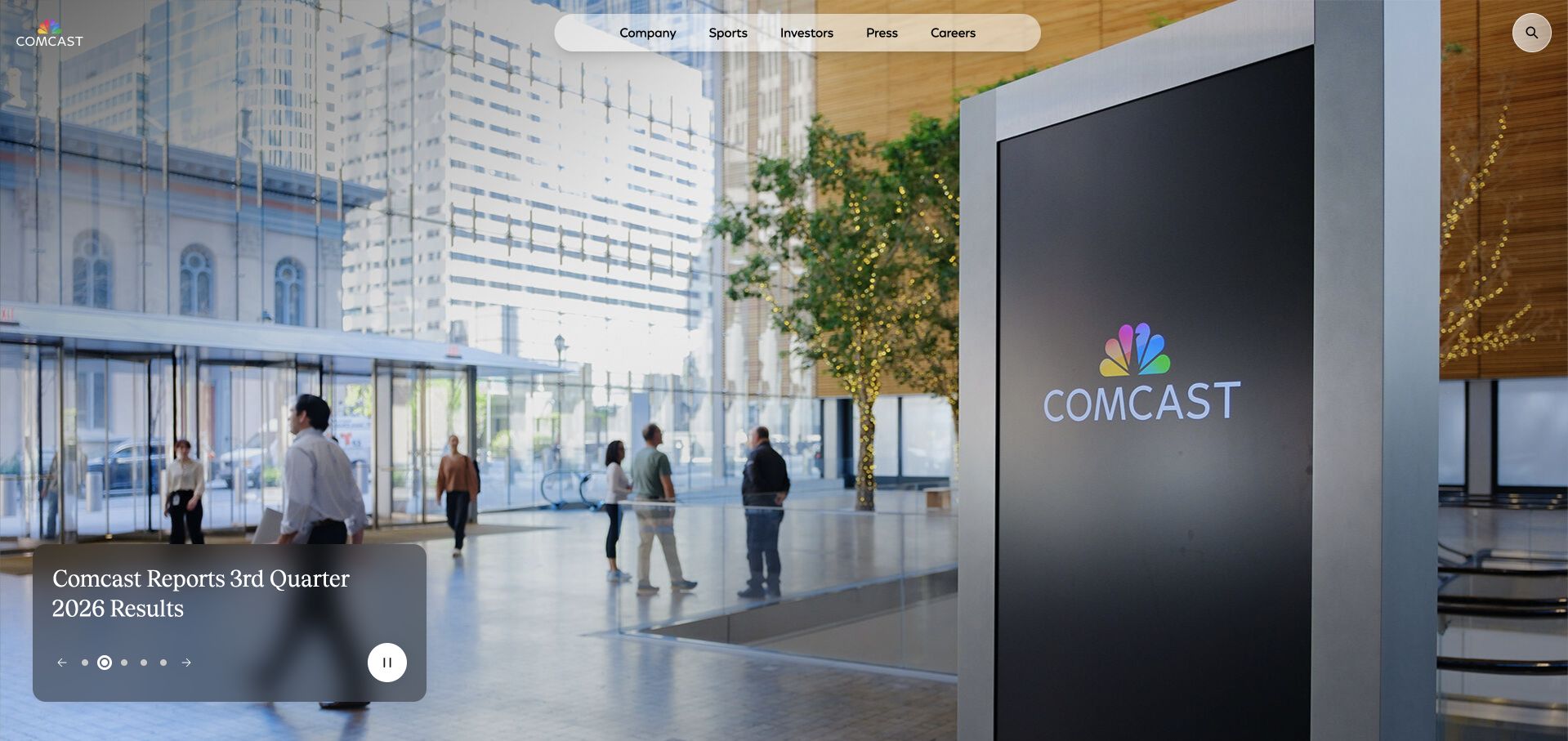
Comcast’s corporate homepage places a small audience-based navigation capsule over an expansive workplace photograph. A compact business-update panel sits near the lower edge, leaving most of the screen to establish the company’s physical and visual identity. The arrangement demonstrates how a corporate site can be regularly updated without turning its opening into a collection of press-release tiles. Company, sports, investors, press and careers remain available as stable destinations. The visual restraint is effective, but the image and overlay must be tested together for readability. The Terraform evidence is a specifically dated 2020 engineering talk about consistent development and deployment, not proof of today’s corporate-page infrastructure.
What you can learn
Keep the content delivery system invisible to the reader. Editors need a dependable place for a current story, while visitors need stable navigation and readable content regardless of which image or update is active.
Pros
The restrained update panel gives a current story a clear but limited role.
Audience-based navigation avoids exposing the company’s internal organizational structure.
Cons & considerations
Text over imagery needs reliable contrast through every frame of a campaign.
A corporate photograph can communicate atmosphere without explaining specific services.
Platform source: Official product-specific customer case. HashiCorp’s December 17, 2020 engineering talk describes Comcast Terraform patterns for consistent development and deployment, including build containers, modules and remote state. The evidence retains that date. This source establishes only the stated organization, product or workload association. It does not prove the pictured public page uses this technology, identify its CMS or frontend, establish a complete current architecture, or independently verify vendor-reported outcomes. Platform evidence is separate from the direct website screenshot and is not a complete current infrastructure audit.
Lufthansa Systems’ homepage pairs a cloud-and-aircraft setting with a short aviation-technology proposition. The header keeps solutions, product brands, current topics and company information separate, while the next section presents a broad set of aviation customer logos. The sector is immediately recognizable, and the page does not need to explain the basic meaning of an airline before introducing its software. The challenge is specificity: a broad digital-transformation statement should lead quickly into actual operational categories. HashiCorp’s evidence is a dated 2021 talk describing Terraform-based self-service infrastructure and a landing-zone framework, not an audit of this public website’s hosting or frontend.
What you can learn
A specialist vendor can use industry context to shorten its introduction, but it still needs to explain its particular contribution. Follow the sector-level promise with concrete operational jobs and product categories rather than extending the same general message.
Pros
The aviation setting immediately identifies the intended industry audience.
Solution and product-brand routes let visitors choose different ways into the portfolio.
Cons & considerations
A general transformation message needs concrete operational examples nearby.
Customer logos should not be treated as proof of every product or current deployment.
Platform source: Official product-specific customer case. HashiCorp’s November 29, 2021 talk documents Lufthansa Systems’ Terraform-based self-service landing-zone framework and Terraform Cloud execution in the architecture described at that time. This source establishes only the stated organization, product or workload association. It does not prove the pictured public page uses this technology, identify its CMS or frontend, establish a complete current architecture, or independently verify vendor-reported outcomes. Platform evidence is separate from the direct website screenshot and is not a complete current infrastructure audit.
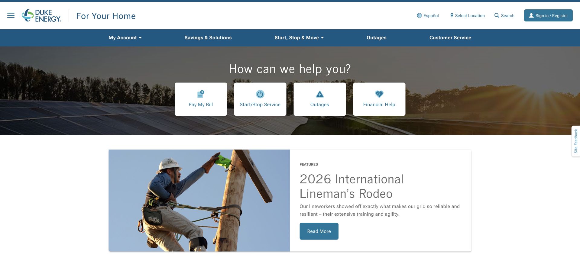
Duke Energy’s public home page gives billing, service changes, outages and financial assistance a prominent row of practical links. A wide landscape image establishes context, but the interface is organized around what customers need to do. A separate featured-story panel provides room for company activity without displacing the service routes. The header keeps account access, location selection and customer service recognizable. This is a useful counterpoint to technology marketing pages: the best opening is often a task list rather than a new positioning statement. HashiCorp’s February 2026 article documents internal Terraform Enterprise and Sentinel controls, not the runtime of this public customer page.
What you can learn
For an essential service, organize the entry point around the actions people repeatedly need. Urgent tasks should remain easy to locate even when promotions or company stories change, and each route should clearly explain its next step.
Pros
Billing, outages and assistance are visible without opening a large menu.
Editorial content occupies a separate area below the practical service choices.
Cons & considerations
Location-dependent services need a clear, editable geographic context.
Urgent outage information should remain available through a lightweight fallback experience.
Visible tech stack
Earlier / documented evidence
Terraform
Platform source: Official product-specific customer case. HashiCorp’s February 9, 2026 Duke Energy article describes Terraform Enterprise, Sentinel policy checks and governed self-service modules. This source establishes only the stated organization, product or workload association. It does not prove the pictured public page uses this technology, identify its CMS or frontend, establish a complete current architecture, or independently verify vendor-reported outcomes. Platform evidence is separate from the direct website screenshot and is not a complete current infrastructure audit.
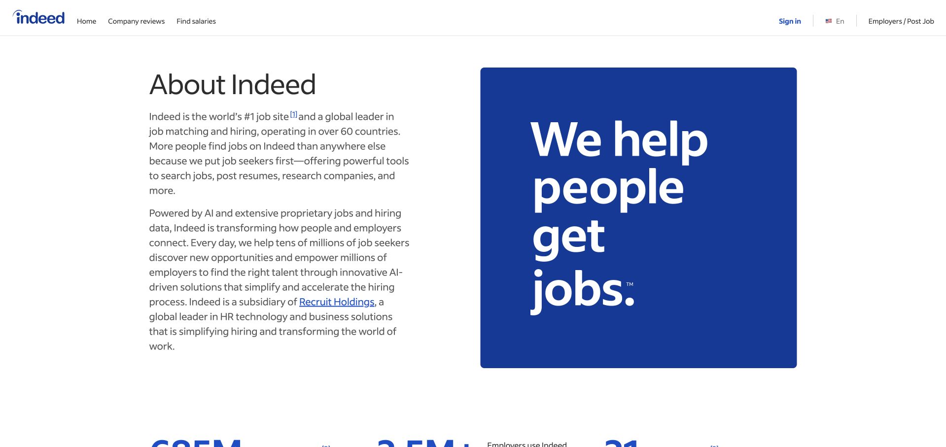
Indeed’s About page combines introductory paragraphs with a blue mission statement. The page does not attempt to reproduce a job-search interface inside the company introduction. Instead, it explains the organization, its matching role and its broader context, with supporting figures appearing below. The familiar global header keeps a route back to ordinary product use. The composition is straightforward and economical, although some quantitative claims depend on small footnotes that deserve careful treatment. Indeed appears in the customer-logo group on HashiCorp’s Terraform product page; that establishes a scoped product association, not the exact workload or this About page’s implementation.
What you can learn
An About page should answer a different question from the application. Explain the organization’s purpose and role clearly, support quantitative statements with readable references and keep a simple route back to the product for visitors who arrived in the wrong place.
Pros
The mission graphic provides a strong visual anchor without requiring an elaborate illustration.
The company explanation remains distinct from the job-search product interface.
Cons & considerations
Small footnote markers can make important claim definitions easy to miss.
A broad mission statement still needs concrete explanation of how the service operates.
Platform source: Official Terraform product-page customer-logo association. Indeed is explicitly displayed in the customer-logo group on HashiCorp’s Terraform product page. The product-specific listing establishes only an organization-level association; it does not identify a particular workload, team, cloud provider, version or public-property implementation. This source establishes only the stated organization, product or workload association. It does not prove the pictured public page uses this technology, identify its CMS or frontend, establish a complete current architecture, or independently verify vendor-reported outcomes. Platform evidence is separate from the direct website screenshot and is not a complete current infrastructure audit.
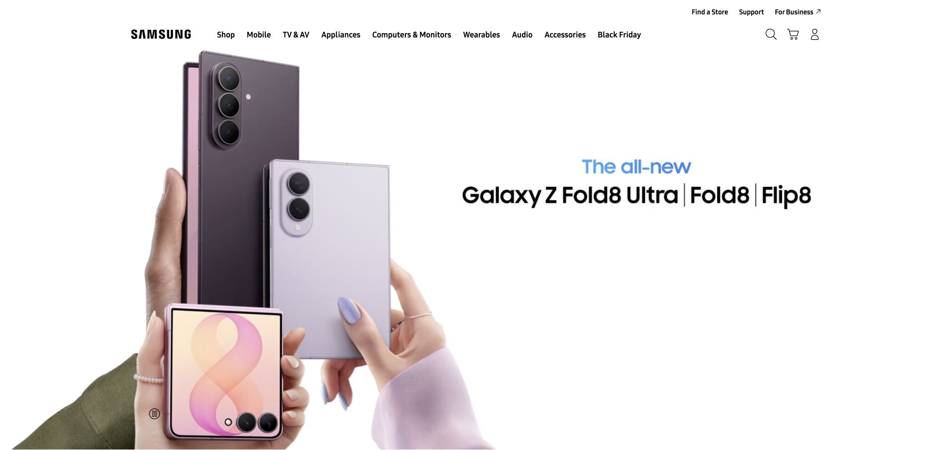
Samsung’s captured US homepage uses a large white product canvas to show several foldable devices in related positions. The composition has an obvious campaign identity, but it sits beneath a conventional multi-category retail header rather than replacing the entire site structure. Search, store discovery, support and business routes remain nearby. This is useful for studying the separation between a reusable retail shell and a temporary product story. The model family is visually clear, though visitors still need a comparison route to understand meaningful differences. Samsung’s Terraform association is a customer-logo listing on the official Terraform product page, not a verified claim about this retail property’s provisioning.
What you can learn
Design campaigns as modules within a stable service framework. Preserve search, support and category navigation while allowing the product photography and message to change, and avoid making a seasonal panel the only route to important information.
Pros
A consistent retail header supports discovery beyond the currently promoted devices.
The clean campaign canvas gives physical product details enough room to be noticed.
Cons & considerations
Similar model names require accessible comparison content beyond the launch image.
A wide product composition needs carefully designed mobile crops rather than simple shrinking.
Platform source: Official Terraform product-page customer-logo association. Samsung is explicitly displayed in the customer-logo group on HashiCorp’s Terraform product page. The product-specific listing establishes only an organization-level association; it does not identify a particular workload, team, cloud provider, version or public-property implementation. This source establishes only the stated organization, product or workload association. It does not prove the pictured public page uses this technology, identify its CMS or frontend, establish a complete current architecture, or independently verify vendor-reported outcomes. Platform evidence is separate from the direct website screenshot and is not a complete current infrastructure audit.
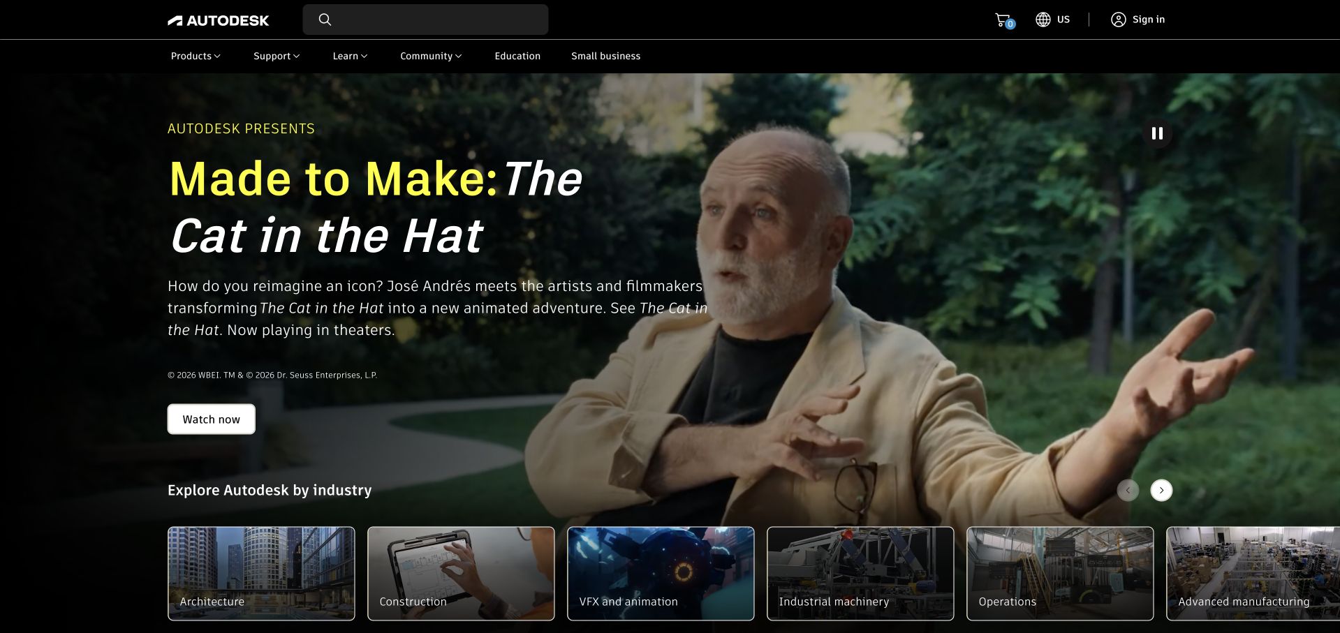
Autodesk’s homepage leads with a film-production story and a large portrait from the creative process. The headline connects the company to a recognizable finished work, while a Watch action offers depth for interested visitors. Below, image cards divide the wider portfolio into industries such as architecture, construction and visual effects. The structure moves from an engaging story into practical categorization without immediately listing software features. It depends on strong editorial selection: one creative campaign cannot represent every product audience. Autodesk’s association is an official Terraform product-page customer listing, which does not identify a particular deployment or prove the pictured homepage uses Terraform-managed infrastructure.
What you can learn
Demonstrate software through the work it enables, then give other audiences a clear route into their own context. A compelling creative story is most useful when it leads to specific industries rather than standing in for the entire product explanation.
Pros
A real creative project makes the software’s value more tangible than a generic dashboard.
Industry cards provide practical alternatives to the featured entertainment story.
Cons & considerations
One campaign can overrepresent a small part of a broad software portfolio.
Video-led content needs a concise text explanation and a reduced-motion alternative.
Platform source: Official Terraform product-page customer-logo association. Autodesk is explicitly displayed in the customer-logo group on HashiCorp’s Terraform product page. The product-specific listing establishes only an organization-level association; it does not identify a particular workload, team, cloud provider, version or public-property implementation. This source establishes only the stated organization, product or workload association. It does not prove the pictured public page uses this technology, identify its CMS or frontend, establish a complete current architecture, or independently verify vendor-reported outcomes. Platform evidence is separate from the direct website screenshot and is not a complete current infrastructure audit.
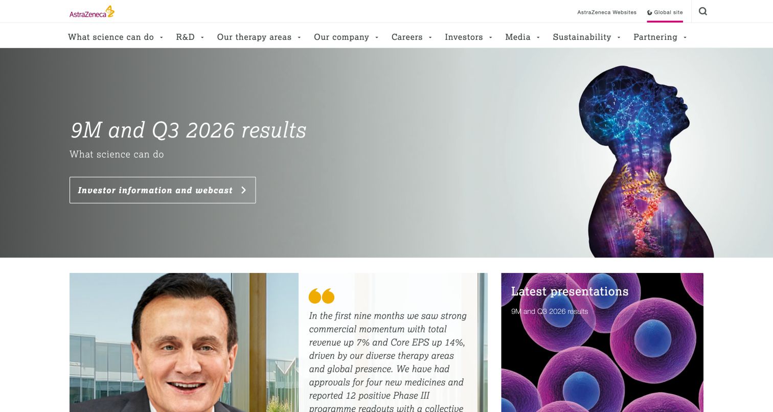
AstraZeneca’s homepage presents a current-results message beside a colorful scientific silhouette, then moves into a grid of company and research material. The light background, serif headline and restrained brand accents give the financial update a different tone from a consumer-product promotion. The header separates science, therapy areas, company information, investors and careers. This is a useful arrangement for a research organization whose public site must support both specialist and institutional audiences. A scientific image can suggest context without explaining a result, so the linked materials remain essential. The Terraform relationship is a scoped official customer-logo association, not an independently verified infrastructure inventory.
What you can learn
Use a consistent visual language to connect financial, scientific and company content, but preserve their different evidentiary roles. A research image should not be asked to substantiate a corporate result, and an investor update should retain clear dates and source materials.
Pros
The current-results panel has a concise message and an obvious materials route.
Science and investor information remain distinct within a coherent brand system.
Cons & considerations
Abstract scientific imagery can be evocative without explaining a concrete subject.
Institutional updates need clear dates and a dependable archive beyond the homepage.
Visible tech stack
Earlier / documented evidence
Terraform
Platform source: Official Terraform product-page customer-logo association. AstraZeneca is explicitly displayed in the customer-logo group on HashiCorp’s Terraform product page. The product-specific listing establishes only an organization-level association; it does not identify a particular workload, team, cloud provider, version or public-property implementation. This source establishes only the stated organization, product or workload association. It does not prove the pictured public page uses this technology, identify its CMS or frontend, establish a complete current architecture, or independently verify vendor-reported outcomes. Platform evidence is separate from the direct website screenshot and is not a complete current infrastructure audit.
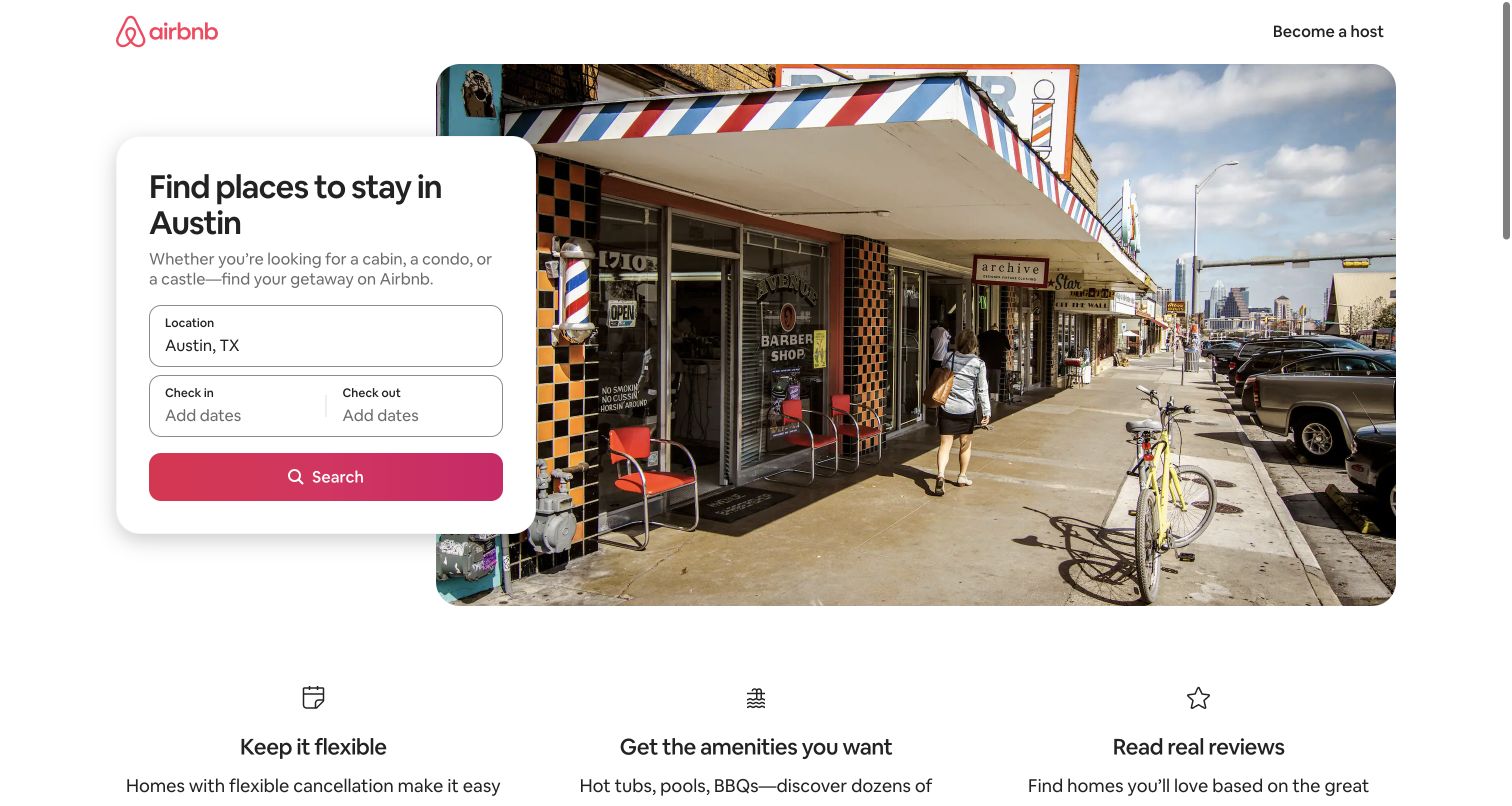
Airbnb’s Austin page places a compact destination search card over a neighborhood photograph, with flexibility, amenities and reviews summarized beneath. The city is already known, so the page does not ask the visitor to restart the entire search process. This is a useful pattern for a large location-based service: the shared layout can remain consistent while the title, image and relevant context change. The challenge is maintaining genuine local relevance rather than producing interchangeable pages with a different place name. Airbnb’s Terraform association is an official product-page customer listing, not evidence about the infrastructure behind this specific destination page or its current search behavior.
What you can learn
Build reusable layouts around meaningful context. A destination page should carry forward the visitor’s location choice, provide useful local information and leave dates or other changing inputs editable rather than treating every visit as a blank slate.
Pros
The destination-specific introduction reduces the number of decisions left to make.
A shared benefit row supports the search form without overwhelming it.
Cons & considerations
A local photograph does not guarantee that the underlying content is genuinely location-specific.
Overlaid forms need a robust stacked layout and clear mobile labels.
Platform source: Official Terraform product-page customer-logo association. Airbnb is explicitly displayed in the customer-logo group on HashiCorp’s Terraform product page. The product-specific listing establishes only an organization-level association; it does not identify a particular workload, team, cloud provider, version or public-property implementation. This source establishes only the stated organization, product or workload association. It does not prove the pictured public page uses this technology, identify its CMS or frontend, establish a complete current architecture, or independently verify vendor-reported outcomes. Platform evidence is separate from the direct website screenshot and is not a complete current infrastructure audit.
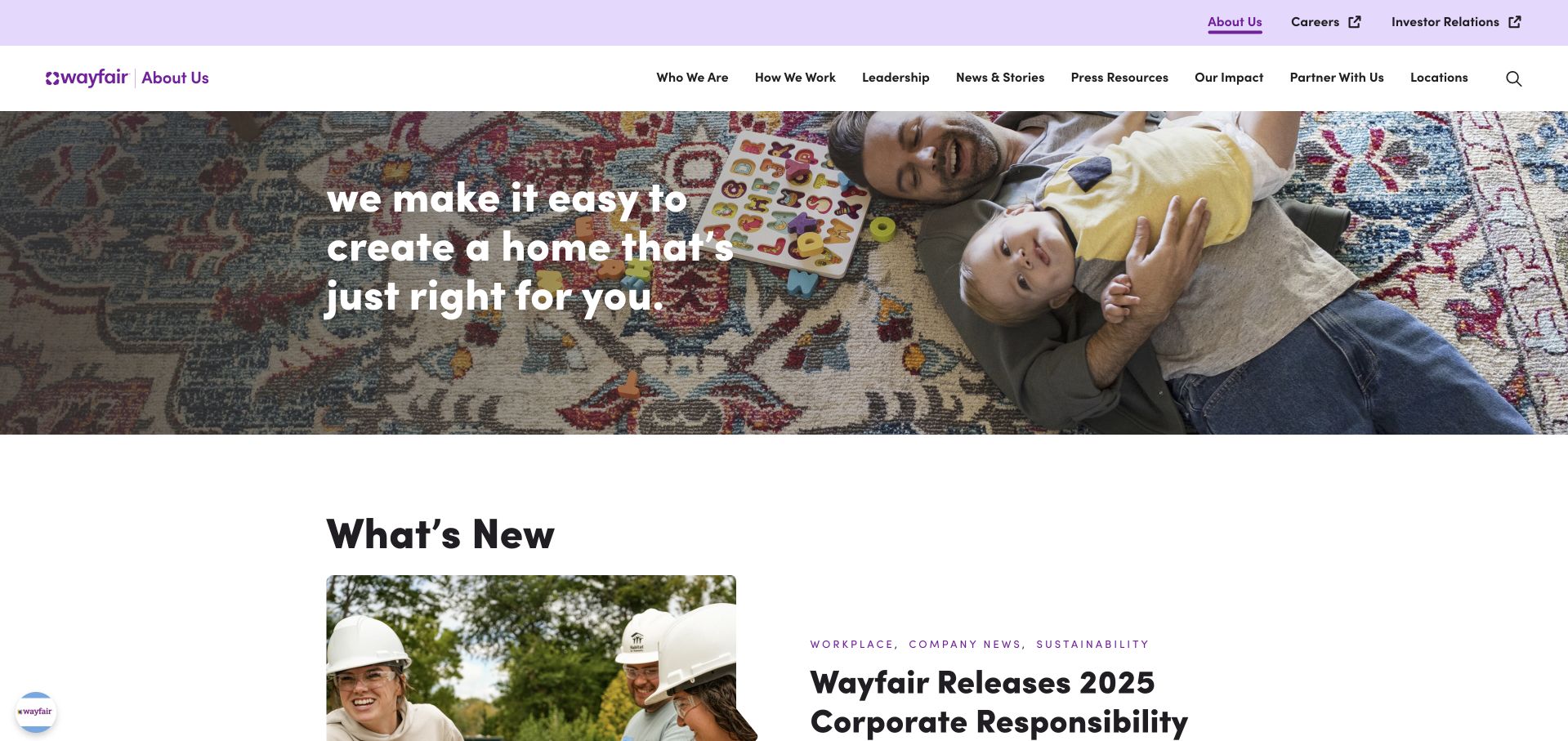
Wayfair’s About site begins with a home-focused photograph and a short statement about helping people create the right home. A separate upper strip points to careers and investor relations, while the main navigation organizes company identity, leadership, news, impact and partnerships. The next visible section is editorial rather than a product grid. This clearly distinguishes the organization’s public story from the shopping experience. The image is approachable, but the broad promise needs the following content to explain how the company works. Wayfair is listed on the official Terraform product page; the listing does not establish the exact workload or the implementation of this corporate property.
What you can learn
A corporate site should not feel like a storefront with the prices removed. Give culture, leadership and impact material its own editorial structure, and retain explicit links for visitors whose real goal is shopping or investor research.
Pros
Careers and investor routes remain distinct from the main company narrative.
The home photograph establishes category context without filling the opening with merchandise.
Cons & considerations
A general lifestyle statement needs concrete company information shortly afterward.
Several corporate content categories can become difficult to distinguish without concise summaries.
Platform source: Official Terraform product-page customer-logo association. Wayfair is explicitly displayed in the customer-logo group on HashiCorp’s Terraform product page. The product-specific listing establishes only an organization-level association; it does not identify a particular workload, team, cloud provider, version or public-property implementation. This source establishes only the stated organization, product or workload association. It does not prove the pictured public page uses this technology, identify its CMS or frontend, establish a complete current architecture, or independently verify vendor-reported outcomes. Platform evidence is separate from the direct website screenshot and is not a complete current infrastructure audit.
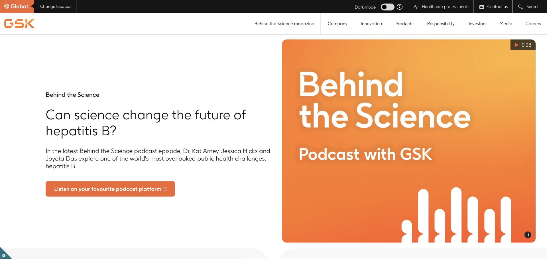
GSK’s homepage leads with a science-related podcast story, using a large portrait, a specific topic and a clear listening route. The main navigation still preserves company, innovation, products, responsibility, investors, media and careers. The design is editorial rather than a direct product advertisement, which is useful for a company addressing public, scientific and institutional audiences together. The specificity of the topic gives the opening more substance than a generic innovation slogan. Audio is not equally convenient for everyone, so a transcript and readable summary matter. GSK’s Terraform association is a scoped official customer-logo listing, not a claim about the current public homepage’s infrastructure.
What you can learn
Use one concrete scientific question to introduce broader expertise. Keep the article or podcast understandable on its own, provide a text alternative and make the relationship between editorial explanation and product information explicit.
Pros
A specific science topic gives the opening a clear editorial purpose.
Stable corporate navigation remains available beside the featured conversation.
Cons & considerations
An audio-first story needs a transcript and a concise written summary.
A single featured topic cannot represent the full scope of a research portfolio.
Platform source: Official Terraform product-page customer-logo association. GSK is explicitly displayed in the customer-logo group on HashiCorp’s Terraform product page. The product-specific listing establishes only an organization-level association; it does not identify a particular workload, team, cloud provider, version or public-property implementation. This source establishes only the stated organization, product or workload association. It does not prove the pictured public page uses this technology, identify its CMS or frontend, establish a complete current architecture, or independently verify vendor-reported outcomes. Platform evidence is separate from the direct website screenshot and is not a complete current infrastructure audit.
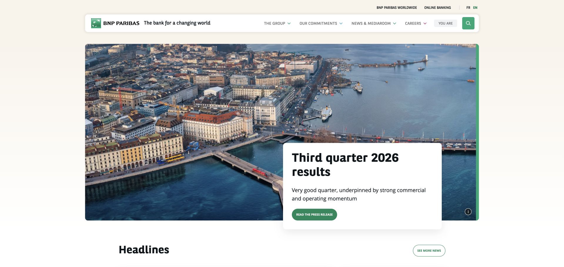
BNP Paribas’ group homepage combines a city photograph with its latest quarterly-results message and a clear materials link. The green brand mark and restrained white navigation frame give the page continuity, while headlines below establish a separate editorial layer. The upper navigation distinguishes the group, commitments, news and careers rather than making every audience enter through a retail product. The opening is effective for repeat institutional visitors, although newcomers still need a straightforward explanation of the group’s services. BNP Paribas appears among customers on HashiCorp’s Terraform product page; no particular cloud environment or public-page deployment is established by that listing alone.
What you can learn
Keep current financial material visibly dated and easy to retrieve, then maintain separate evergreen routes for company context. A homepage should spotlight the latest update without becoming the only place an investor can find the relevant source documents.
Pros
A single results message provides a clear starting point for current investor research.
The recognizable green system ties institutional and editorial content together.
Cons & considerations
A results-led hero may not answer a new visitor’s basic company question.
Global and retail navigation need clear boundaries to prevent audience confusion.
Visible tech stack
Earlier / documented evidence
Terraform
Platform source: Official Terraform product-page customer-logo association. BNP Paribas is explicitly displayed in the customer-logo group on HashiCorp’s Terraform product page. The product-specific listing establishes only an organization-level association; it does not identify a particular workload, team, cloud provider, version or public-property implementation. This source establishes only the stated organization, product or workload association. It does not prove the pictured public page uses this technology, identify its CMS or frontend, establish a complete current architecture, or independently verify vendor-reported outcomes. Platform evidence is separate from the direct website screenshot and is not a complete current infrastructure audit.
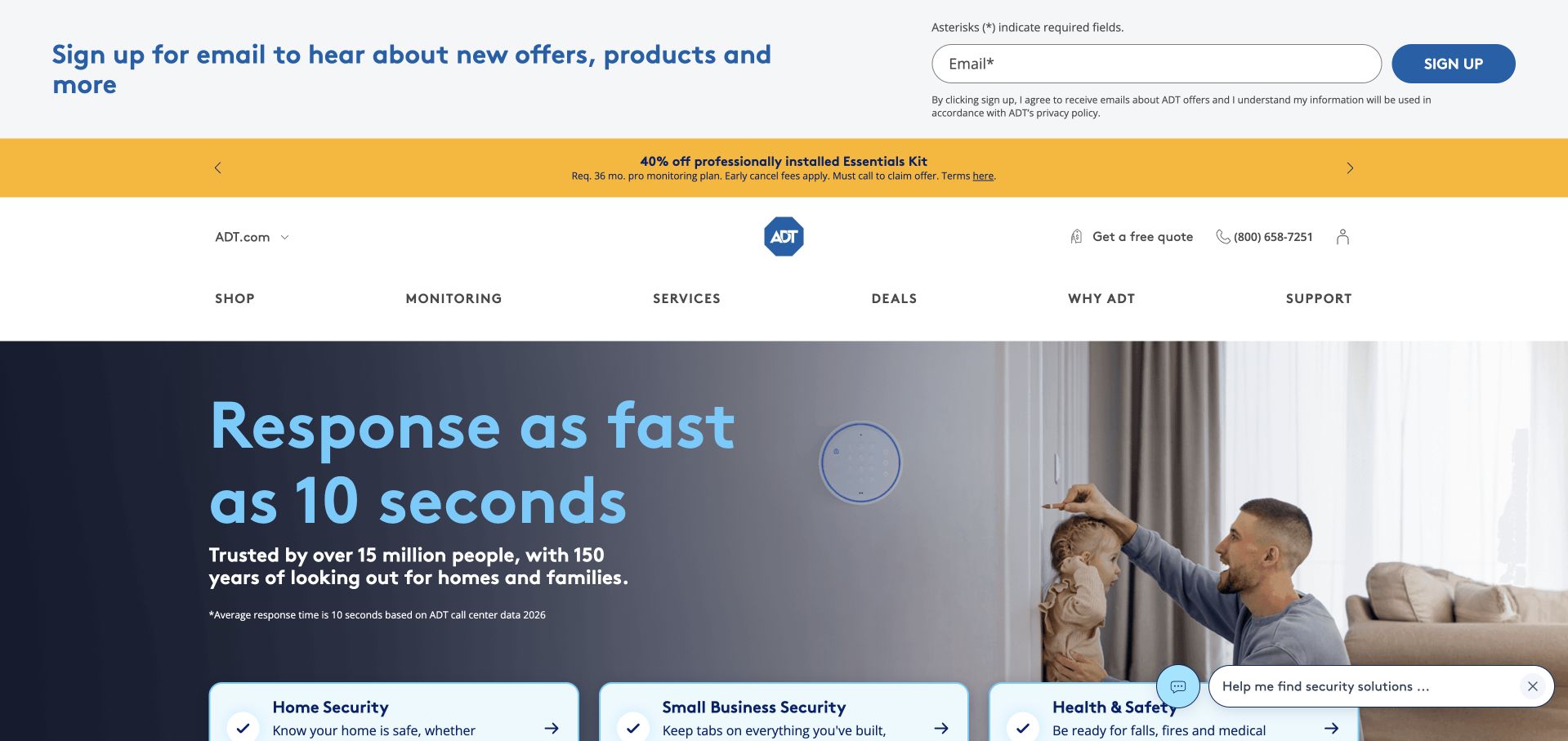
ADT’s captured homepage uses a household photograph beside a bold response-time proposition, then places several service options in a row beneath it. The header separates shopping, monitoring, services, deals and support, which acknowledges both acquisition and ongoing ownership. The opening is visually approachable and gives the service a recognizable domestic context. Its quantitative promise still requires readable qualifications, and a photograph cannot establish how a response process actually performs. The page should lead into clear service scope, equipment requirements and support information. ADT’s Terraform association comes from an official product-specific customer listing, not an audit of this public marketing page or its security operations.
What you can learn
For a recurring household service, show how the offer fits into daily life while keeping performance claims qualified. Separate equipment, monitoring and support so customers can understand what is included before they reach a quote or purchase process.
Pros
The household setting makes the service easier to picture in ordinary use.
Monitoring, services and support have distinct navigation routes.
Cons & considerations
Prominent response-time language needs nearby definitions and conditions.
Several introductory service cards can obscure the most appropriate starting point.
Platform source: Official Terraform product-page customer-logo association. ADT is explicitly displayed in the customer-logo group on HashiCorp’s Terraform product page. The product-specific listing establishes only an organization-level association; it does not identify a particular workload, team, cloud provider, version or public-property implementation. This source establishes only the stated organization, product or workload association. It does not prove the pictured public page uses this technology, identify its CMS or frontend, establish a complete current architecture, or independently verify vendor-reported outcomes. Platform evidence is separate from the direct website screenshot and is not a complete current infrastructure audit.
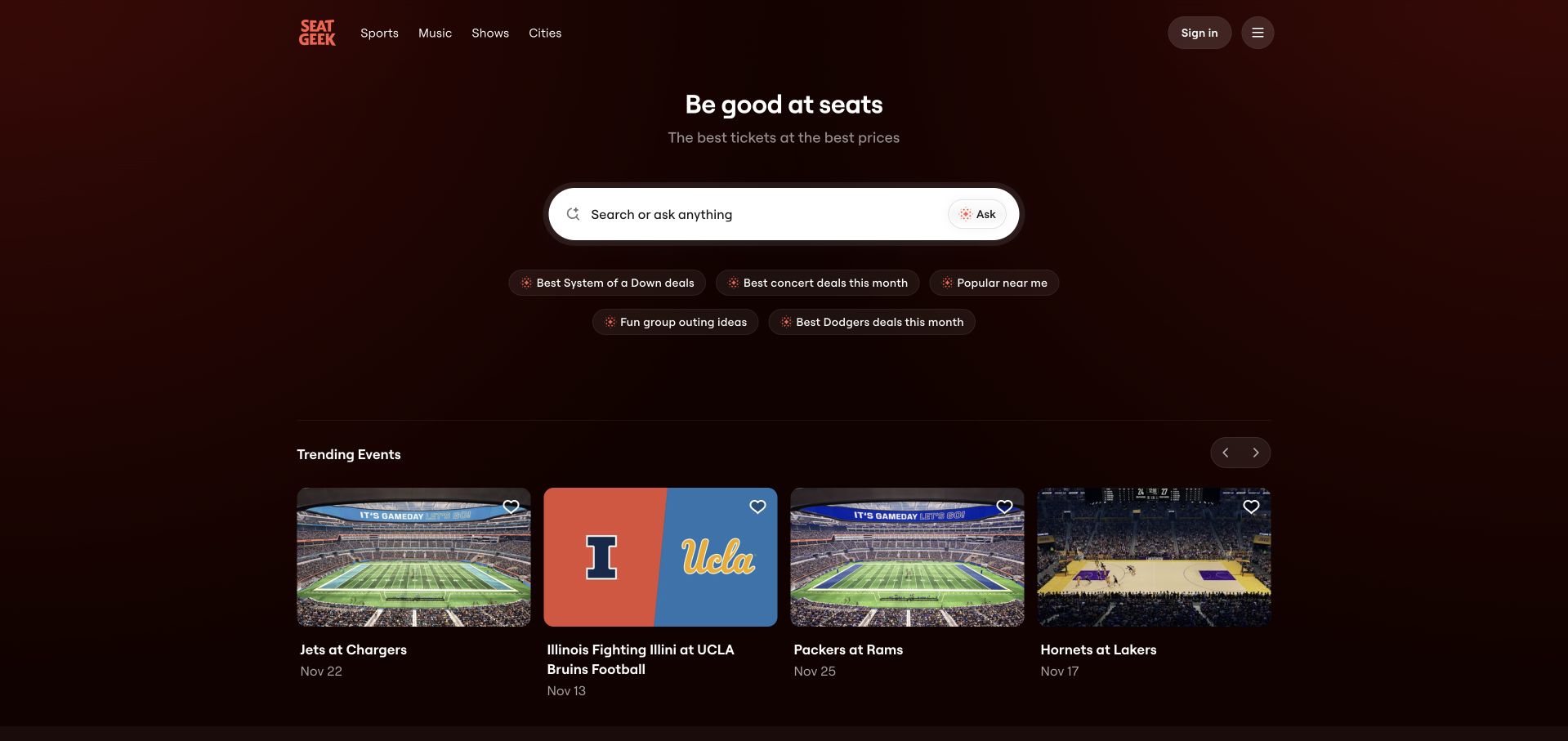
SeatGeek’s homepage uses a centered promise above a prominent search field, with suggestion chips and a row of trending event cards below. The dark red background is atmospheric but restrained enough to leave the input as the functional center of the page. This works well for visitors who already know an artist, team or venue, while the event cards provide an alternative for people still exploring. The interface must remain clear about dates, location and inventory rather than relying on an attractive event image alone. SeatGeek’s Terraform association is an official customer-logo listing, not verification of its current transaction platform or public-page provisioning.
What you can learn
Let search lead when visitors are likely to arrive with a named entity in mind. Use suggested queries and browsable cards to support exploration, but preserve enough event metadata to prevent a visually compelling card from being ambiguous.
Pros
A prominent search field gives the page a clear practical purpose.
Trending cards offer a second route for visitors without a specific query.
Cons & considerations
Event images need clear dates and venue information to support an informed choice.
Search suggestions should not hide the ability to enter an entirely different query.
Platform source: Official Terraform product-page customer-logo association. SeatGeek is explicitly displayed in the customer-logo group on HashiCorp’s Terraform product page. The product-specific listing establishes only an organization-level association; it does not identify a particular workload, team, cloud provider, version or public-property implementation. This source establishes only the stated organization, product or workload association. It does not prove the pictured public page uses this technology, identify its CMS or frontend, establish a complete current architecture, or independently verify vendor-reported outcomes. Platform evidence is separate from the direct website screenshot and is not a complete current infrastructure audit.
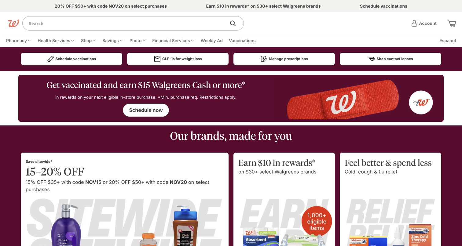
Walgreens’ public homepage combines a large search field, familiar account controls and a compact service shortcut row before the main retail promotion. The maroon campaign panels then introduce vaccination and store-brand offers as separate pieces of content. The structure is a useful example of a reusable page shell carrying several changing commercial messages. The shell has to remain stable because returning visitors may be trying to complete a specific service task rather than browse products. Promotional density can make that hierarchy harder to maintain on mobile. Walgreens appears in Terraform’s official customer group, but the logo association does not identify this property’s infrastructure or any healthcare workflow.
What you can learn
When a site has recurring service responsibilities, protect those routes from campaign churn. Design promotions as replaceable content modules, and test the page with a visitor who wants a routine task rather than the featured offer.
Pros
A stable search and service layer supports repeat visits despite changing campaigns.
Familiar account and shopping controls remain easy to recognize.
Cons & considerations
Several simultaneous offers can compete with more important service tasks.
Sensitive workflows require clear secure destinations beyond a general homepage shortcut.
Platform source: Official Terraform product-page customer-logo association. Walgreens is explicitly displayed in the customer-logo group on HashiCorp’s Terraform product page. The product-specific listing establishes only an organization-level association; it does not identify a particular workload, team, cloud provider, version or public-property implementation. This source establishes only the stated organization, product or workload association. It does not prove the pictured public page uses this technology, identify its CMS or frontend, establish a complete current architecture, or independently verify vendor-reported outcomes. Platform evidence is separate from the direct website screenshot and is not a complete current infrastructure audit.
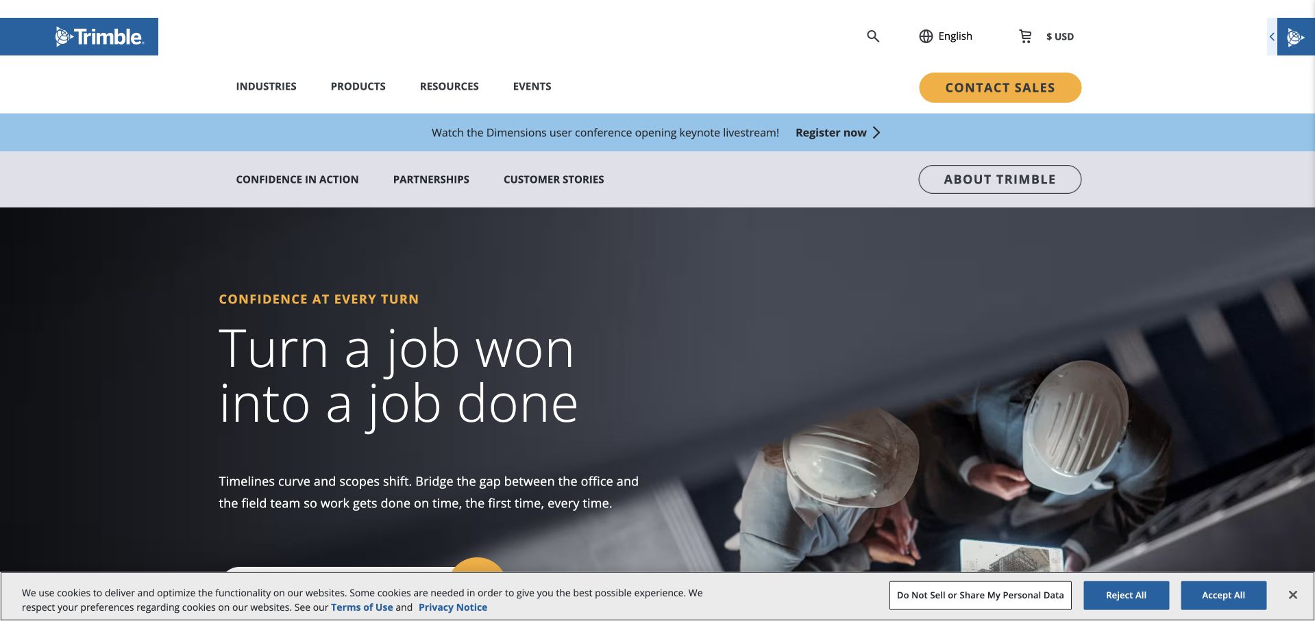
Trimble’s homepage pairs a concise job-delivery statement with a photograph of professionals reviewing a digital model in a working environment. The navigation separates industries, products, resources and events, while a secondary strip offers company context and customer stories. The image is useful because it places technology in the hands of the people who use it, rather than isolating the device as a product glamour shot. The proposition remains broad across several industries, so detailed routes must explain relevant workflows. HashiCorp’s specific case concerns the Trimble eBuilder team’s HCP Terraform and policy workflow, not every Trimble product or this public corporate page.
What you can learn
Show the handoff your technology supports. Office-to-field, design-to-build or plan-to-delivery transitions are easier to understand when the introduction identifies the people, information and practical decision involved rather than listing capabilities in isolation.
Pros
Working-context photography connects digital technology to a tangible industrial task.
Industry and product routes offer two useful ways into a broad portfolio.
Cons & considerations
A broad delivery promise needs industry-specific detail to become actionable.
Small device screens in photographs should not carry essential explanatory information.
Platform source: Official product-specific customer case. HashiCorp’s Trimble case specifically concerns the eBuilder team’s HCP Terraform workflow and Sentinel policies, not every Trimble application. This source establishes only the stated organization, product or workload association. It does not prove the pictured public page uses this technology, identify its CMS or frontend, establish a complete current architecture, or independently verify vendor-reported outcomes. Platform evidence is separate from the direct website screenshot and is not a complete current infrastructure audit.
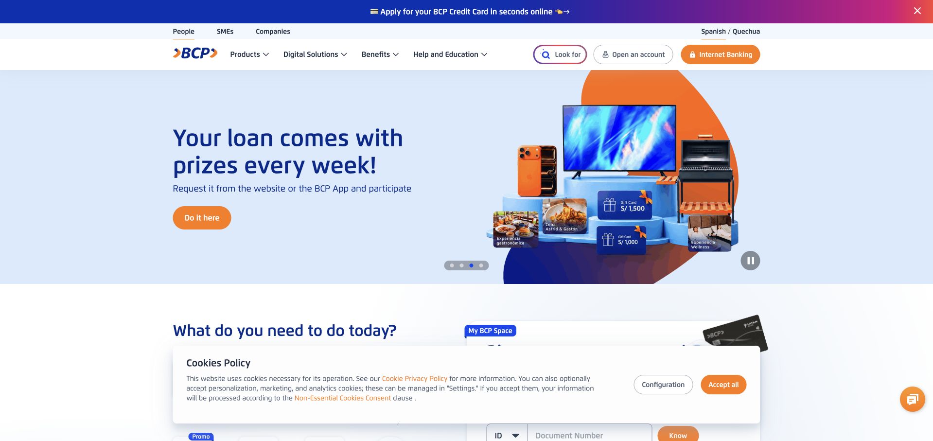
BCP’s public homepage uses a pale blue promotional canvas, bright orange actions and a clear division between personal, small-business and enterprise audiences. A compact navigation row keeps products, digital services, benefits and help separate, while the next section begins common customer tasks. The composition is energetic without abandoning ordinary banking navigation. The promotional image and prize language are not the most useful part to borrow; the stronger lesson is the visibility of audience and task categories around them. The captured page was rendered in the browser’s translated view. HashiCorp’s case documents Terraform and Vault in a banking infrastructure program, not this public page’s complete implementation.
What you can learn
Separate the durable banking tasks from temporary acquisition campaigns. Audience labels, help routes and account-entry controls should remain recognizable when the promotion changes, and localized content should be tested in the language customers actually use.
Pros
Personal, small-business and enterprise audiences have visibly different entry points.
Orange actions remain easy to identify against the light promotional background.
Cons & considerations
Prize-led promotions can distract from the underlying banking service explanation.
Browser translation may alter wording and wrapping compared with the original Spanish page.
Visible tech stack
Earlier / documented evidence
Terraform
Platform source: Official product-specific customer case. HashiCorp’s Banco de Crédito del Perú case describes Terraform and Vault supporting its documented cloud infrastructure and digital-banking program. This source establishes only the stated organization, product or workload association. It does not prove the pictured public page uses this technology, identify its CMS or frontend, establish a complete current architecture, or independently verify vendor-reported outcomes. Platform evidence is separate from the direct website screenshot and is not a complete current infrastructure audit.
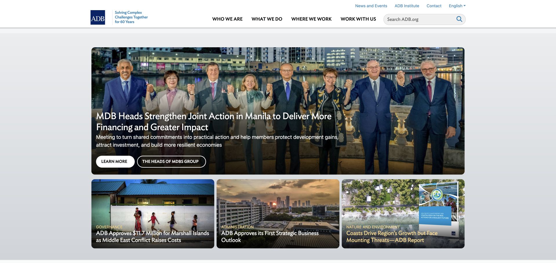
The Asian Development Bank’s homepage uses a large current-story image and headline above a row of smaller project updates. A compact utility navigation provides news, events, institute and contact routes, while the main categories separate who the organization is, what it does, where it works and how to work with it. The hierarchy gives the institution a clear editorial rhythm without reducing its role to a generic mission statement. A prominent search field supports readers seeking a specific publication or project. HashiCorp’s ADB case concerns Terraform’s role in initial cloud infrastructure provisioning and a virtual datacenter program, not every public data service or the homepage runtime.
What you can learn
Institutional work should be organized around actions and evidence. Present the current story, but keep project, geography, publication and partnership routes stable so readers do not need to reconstruct the organization from a sequence of news cards.
Pros
A lead-story hierarchy makes current institutional activity easy to scan.
Plain main-navigation questions provide understandable routes into a complex organization.
Cons & considerations
News-led layouts need dependable archives and publication metadata behind the cards.
A broad institutional homepage can still require more direct project and data shortcuts.
Visible tech stack
Earlier / documented evidence
Terraform
Platform source: Official product-specific customer case. HashiCorp’s Asian Development Bank case describes Terraform for initial cloud infrastructure provisioning and a virtual datacenter program, alongside other operational tools. This source establishes only the stated organization, product or workload association. It does not prove the pictured public page uses this technology, identify its CMS or frontend, establish a complete current architecture, or independently verify vendor-reported outcomes. Platform evidence is separate from the direct website screenshot and is not a complete current infrastructure audit.
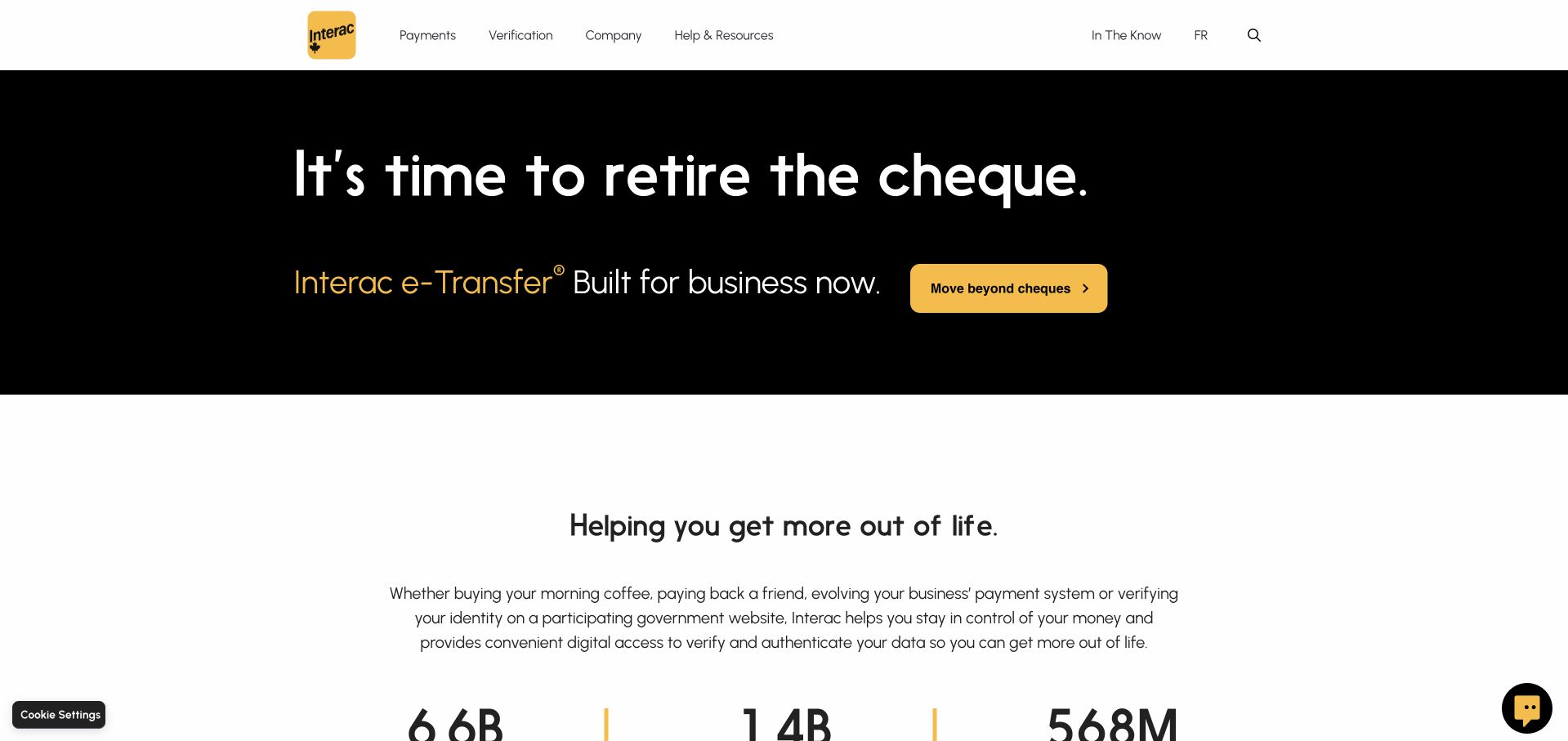
Interac’s homepage leads with a black panel, a short statement about moving beyond cheques and a yellow action. The familiar yellow brand mark remains in a restrained white header, with payment, verification, company and help routes kept separate. The next section expands into the organization’s everyday role rather than repeating the same campaign language. This is a useful way to introduce a specific behavior change while preserving a broader service identity. The simple message still needs practical supporting information about eligibility, participating institutions and the actual process. HashiCorp’s case documents Terraform within Interac’s infrastructure modernization, not the runtime of this marketing page.
What you can learn
A behavior-change campaign should identify one familiar task and offer a clear alternative. Follow the short message with concrete process information, and retain broader service navigation for visitors whose needs fall outside the featured campaign.
Pros
A limited black-and-yellow palette makes the campaign action easy to recognize.
Payment and verification routes remain distinct from company and support information.
Cons & considerations
A concise campaign cannot explain participating institutions or service conditions on its own.
Large type needs careful wrapping to preserve meaning across narrow screens.
Platform source: Official product-specific customer case. HashiCorp’s Interac case describes Terraform within the infrastructure-modernization workflow, alongside Consul and Vault. This source establishes only the stated organization, product or workload association. It does not prove the pictured public page uses this technology, identify its CMS or frontend, establish a complete current architecture, or independently verify vendor-reported outcomes. Platform evidence is separate from the direct website screenshot and is not a complete current infrastructure audit.
Kegan has 15+ years of experience working with small businesses, Fortune 500 companies, and everything in between. No development job is too big or too small: he brings the same hands-on attention to a focused improvement, a complete website, or a custom application.
For Terraform projects, he can help with content architecture, custom functionality, system integrations, testing, and maintainable handover. He works directly with clients on scope, design, implementation, testing, and handover, with an emphasis on clear communication and a system that remains practical to maintain after launch.
Show 3 other Terraform developersHide other Terraform developers
A managed website with a small infrastructure layer
Use a content or application hosting platform for ordinary publishing, and manage only the surrounding resources that genuinely benefit from infrastructure as code. Define the boundary clearly. Trying to control every vendor setting through one tool can create more maintenance than a small website needs.
A custom application with repeatable environments
Separate development, preview and production responsibilities, and document the resources each environment owns. Use realistic but non-sensitive test data. A preview should help reviewers evaluate the application without accidentally granting access to production records or encouraging changes to shared live services.
An internal self-service platform
For multiple teams, provide maintained modules and clear ownership rather than a folder of copied examples. Define which options are supported, how exceptions are reviewed and who maintains upgrades. A useful self-service system reduces repeated decisions without making infrastructure behavior mysterious to the team operating the application.
From references to requirements
Plan the change process before the first production apply
Inventory existing resources and responsibilities
Identify which resources already exist, who owns them and whether another system currently manages them. Separate discovery from adoption into Terraform. A website redesign does not authorize replacing shared DNS, databases or credentials simply because they appear in the same account. Record dependencies and agree on exact targets before making infrastructure changes.
Define review, credentials and state handling
Choose the execution environment, access duration and approval process for production changes. Limit credentials to the resources the workflow actually needs. Protect state and deployment logs appropriately, and test how a teammate would continue the work if the original implementer were unavailable. This operational handoff matters as much as the initial configuration.
Validate a proposed change in a non-production environment, but also rehearse what happens when the provider API fails or an apply stops partway through. Decide how drift is reviewed and who resolves unexpected differences. Recovery may require a corrective change rather than assuming that reverting a source commit automatically restores every live resource.
A useful handover demonstration
Ask the actual team to carry out its routine job: publish a realistic update, correct a mistake, preview a narrow screen, and identify who owns an integration failure. For a library or frontend framework, also ask who maintains the content source and deployment. A polished screenshot does not answer those operational questions.
Beyond the screenshot
A Terraform website delivery checklist
Inventory existing resources and their current owners.
Define exactly which resources Terraform will manage.
Separate public content publishing from privileged deployment.
Choose protected state storage and access rules.
Document concurrency and change-review responsibilities.
Limit credentials to the required resources.
Record provider and module version choices.
Use non-sensitive data in preview environments.
Test partial failure and corrective recovery.
Review drift through a named decision process.
Assign cost, monitoring and backup ownership.
Document a handoff that another maintainer can follow.
Test with real content, a keyboard, a small screen, slow or failed requests, and the people who will maintain the system. These are planning checks, not an accessibility, security, performance, or search-ranking certification.
Sources & editorial method
How this Terraform collection was reviewed
Design reviews were written from independently inspected public pages and real browser images. Official HashiCorp product and case-study documentation establishes scoped Terraform associations. Historical talks retain their dates. No customer logo is presented as proof of a particular public-page runtime, successful deployment or complete current architecture.
Every image is an unmodified capture from the actual website, with its source and capture date. Some captures are reused from our shared catalog; their dates remain the original capture dates. None comes from a vendor gallery or a generated reconstruction. Moving imagery and live content can change.
Technology attribution uses public page assets or metadata, official platform documentation, or a cited first-party project case study. Documentary and framework-relationship evidence is identified where used; it is not a complete current backend inventory. A CMS image CDN alone does not establish a full CMS deployment. A library’s presence does not prove which individual controls use it, and a platform label does not establish AI authorship.
The composition notes, lessons, pros and tradeoffs are original editorial observations. We have not measured conversion, traffic, security, performance or accessibility conformance. Website owners retain their brands and imagery; these examples are not our client portfolio. Written, Edited and Curated are independent records, not dates advanced by a build. See our editorial standards or suggest a correction.
Questions worth asking
Terraform website development FAQs
Can a screenshot prove Terraform use?
No. Terraform is an infrastructure-management tool. The public visual design does not reveal whether a company provisions resources with Terraform, another tool or a managed service.
Does a customer logo establish a specific workload?
No. A product-page logo is an organization-level association. A detailed case study may establish a narrower service or team context, which is stated separately here.
Does Terraform replace the CMS?
No. Editorial content and infrastructure configuration have different responsibilities. A CMS can remain the appropriate tool for routine publishing while infrastructure is managed separately.
Is a source-code revert a complete rollback?
Not necessarily. Infrastructure changes can affect state and live resources. Plan and test a recovery procedure for the actual change rather than assuming a commit reversal is sufficient.
What is the best first milestone?
A small, reviewed, repeatable environment with clear state ownership and a tested change process. Expand only when the team can explain and maintain the resources already managed.