Best Fishmonger Websites of 2026 (27 Real-World Examples)
Fishmonger websites that connect seafood discovery with real counters, delivery and clear service choices.
Seafood website design has to explain the product as well as make it appealing. Species, preparation, portions, availability and fulfillment should become easier to understand after visiting the site—not more dependent on guesswork.
A fishmonger’s website can represent a neighborhood counter, a wholesale supplier, a changing daily market or a recurring seafood box. Each model creates different customer questions. A local shopper may need a telephone number and today’s hours; someone ordering remotely may need to understand the product format and delivery conditions. Strong imagery helps, but a photograph of a harbor or a plated meal cannot answer those questions by itself. The design needs to connect appetite with accurate, maintained information and an appropriate route to buy, visit or enquire.
These 27 public examples deliberately include several business models. The reviews identify supplier, restaurant and membership contexts rather than presenting every brand as the same kind of fish counter. George Hughes Fishmonger is the first editorial selection for the connection between its real lettered storefront and practical regional-shop identity. The collection evaluates visible website presentation, not seafood quality, sustainability, safety, fishing practices or service performance. Study how each page helps a particular customer task, then use that pattern only where it matches the operations you can actually support.
Before the examples
What makes good fishmonger website design in 2026?
Explain the actual product format
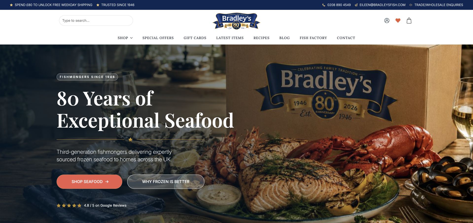
A species name alone is rarely enough. Customers may need to distinguish a whole fish, fillet, portion, prepared item, frozen product or mixed box. Use accurate descriptions and representative photographs, and state what is included rather than allowing a plated meal to imply a ready-to-eat delivery. Bradley’s separate explanation of frozen seafood illustrates the value of addressing a likely customer question beside the shopping action.
Make availability and service scope visible
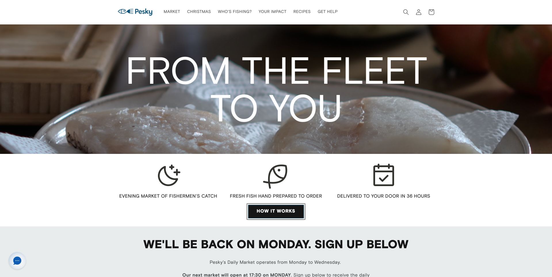
Daily catch, scheduled markets and recurring boxes do not work like an always-full general store. Explain when ordering is possible and how availability changes. Pesky Fish’s market-status message is a useful reference for that operational information. A local counter should also state where it is and how to contact it. Keep wholesale supply distinct from household retail rather than assuming all fish-related businesses support the same buying journey.
Give sourcing claims a real information path
Working-water photographs and coastal scenery can establish context, but they do not verify an environmental or origin claim. Publish only what the business can support, qualify changing product sources and keep any certifications accurately scoped. A strong local-shop photograph, as George Hughes uses, can communicate identity without requiring an inflated claim. The website’s job is to help customers find the relevant information, not manufacture certainty from a mood image.
The collection · 27 examples
27 fishmonger websites worth studying
Compare these pages by the customer relationship they support: a physical counter, a one-off delivery, a scheduled seafood market, professional supply or a recurring box. A useful visual pattern should follow that distinction rather than conceal it.
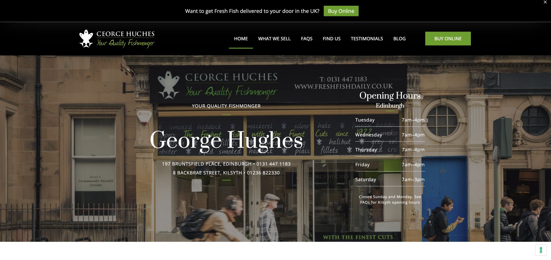
George Hughes Fishmonger uses its actual lettered shop window as the hero photograph. The dark header, green accents and serif title echo that traditional storefront rather than imposing an unrelated visual identity. A clear online buying route sits alongside information about the physical shops, and the following section begins to explain the range. This is our first editorial selection for its direct connection between website and place: customers can recognize a real counter, not only a generic fish-on-ice photograph. The site’s current public information identifies Edinburgh and Kilsyth locations, which should remain distinct from any separate delivery service.
What you can learn
A real shopfront can be a strong homepage image when the lettering is distinctive. Follow it with current branch addresses, hours and a clearly explained shopping destination, especially when online orders are handled through a related business rather than the same physical counter.
Pros
The lettered window gives the specialist fishmonger a recognizable local identity.
Green accents and restrained typography connect the interface with the physical shop.
Cons & considerations
Lettering within the photograph can compete with text placed over it.
The relationship between shop visits and the online buying route needs explicit explanation.
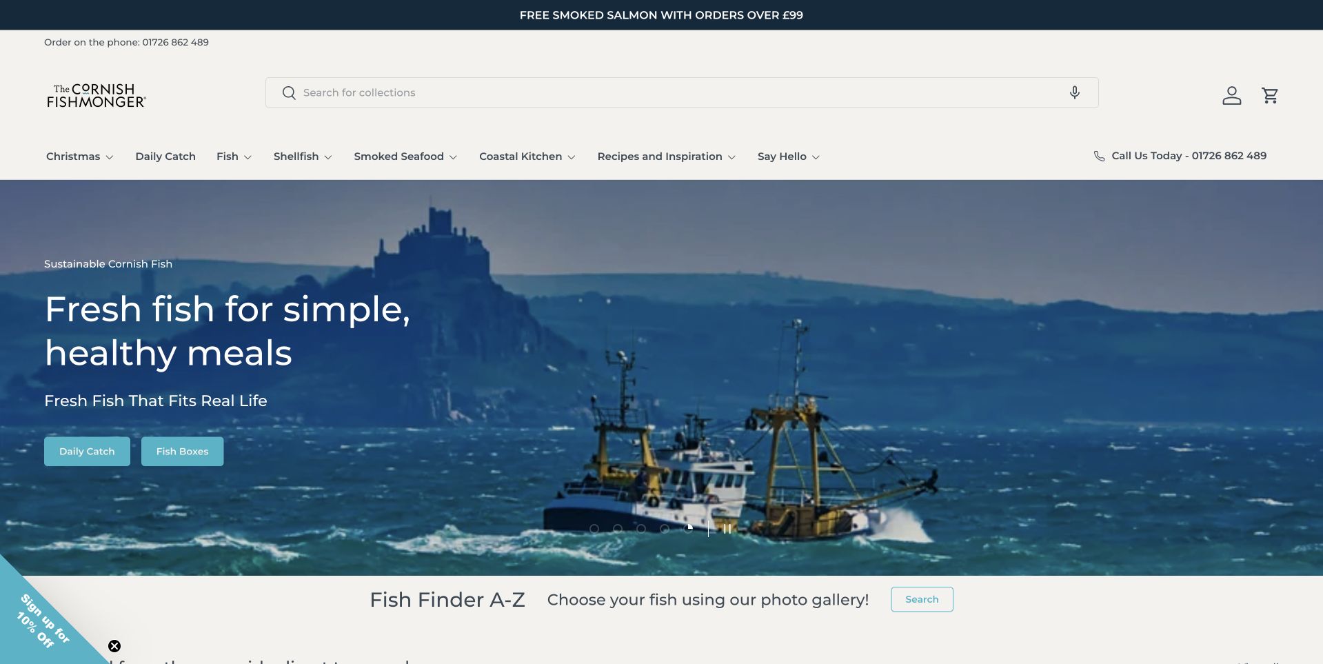
The Cornish Fishmonger uses a coastal fishing-boat photograph beneath a clean white header. The blue scene carries a short introduction and shopping action, while a Fish Finder A–Z strip begins just below. That sequence moves from regional atmosphere to a concrete browsing tool. The navigation also separates fish, shellfish, smoked products and recipe inspiration. The page is worth studying for how it gives less confident seafood shoppers more than one way to begin. The coastal photograph establishes the subject, but customers do not have to recognize every species or understand the whole range before finding an appropriate route into it.
What you can learn
Pair place-based seafood imagery with a practical way to identify products. An alphabetical finder or clear species categories can reduce uncertainty, provided the product pages still explain preparation, portions, availability and delivery rather than leaving those questions to the hero.
Pros
The A–Z finder creates a useful next step after the coastal introduction.
Named fish, shellfish and smoked categories make the broad assortment easier to scan.
Cons & considerations
The scenic photograph says less about an individual product’s form or portion.
Several promotional notices can compete with species navigation on smaller screens.
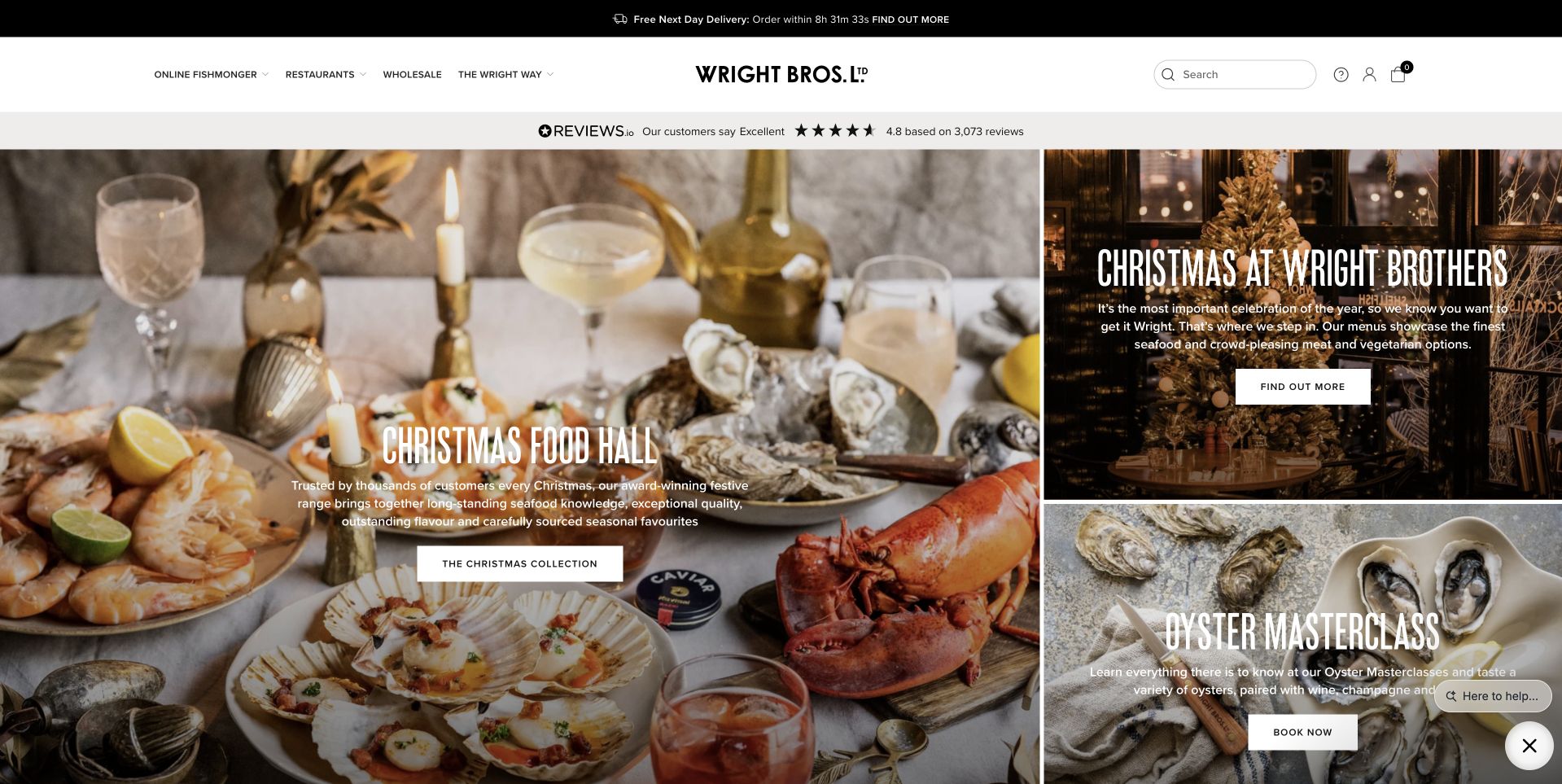
Wright Brothers builds its opening from several photographic panels instead of a single full-screen statement. The largest shows a seasonal food spread, while smaller panels introduce another festive route and an oyster class. A restrained white header holds the identity and normal shopping navigation above them. This is useful for a seafood business with more than one kind of customer interaction. The tiles distinguish buying food from booking an experience, but they also reveal the cost of making every campaign visually strong: the visitor must choose between several competing invitations before reaching the ordinary catalog.
What you can learn
Use separate panels only when they represent genuinely different tasks. Give food ordering, restaurant visits and classes explicit destinations, then preserve an easy route to the normal seafood catalog for customers who are not looking for the featured occasion.
Pros
Separate photographic panels distinguish food shopping from an educational experience.
The white header keeps ordinary navigation outside the busy campaign collage.
Cons & considerations
Several equally prominent promotions can weaken the first action for new visitors.
Seasonal panels require prompt updates and clearly explained booking or ordering conditions.
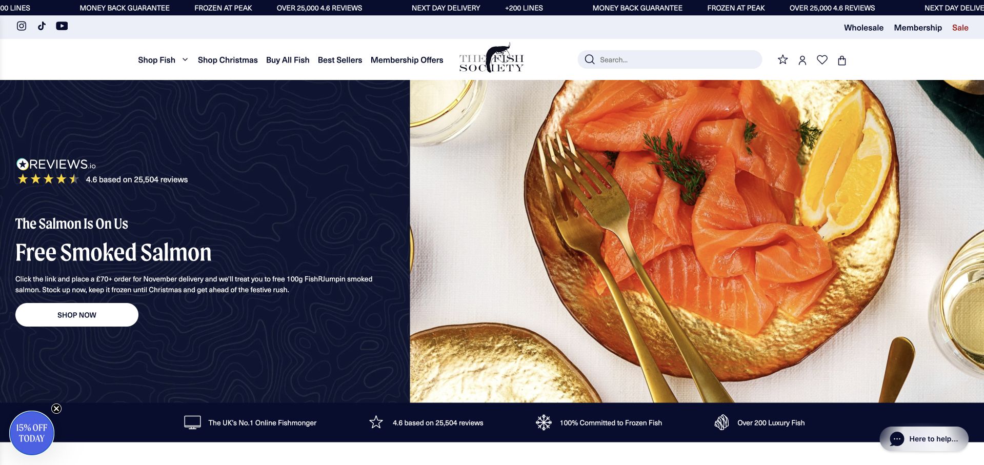
The Fish Society splits its opening between a navy text panel and a close photograph of prepared salmon. The white header and category navigation remain separate above, giving the store a clear browsing structure around the campaign. A small benefit strip begins beneath the hero, connecting the offer to practical shopping reassurance. The reviewed page also shows a compact promotional tab rather than leaving a large newsletter dialog over the food. Study the composition for its stable text area: the offer remains legible without covering the main product image, while returning shoppers can bypass it through the categories.
What you can learn
A split hero is useful when promotions change frequently. Keep the offer on a stable contrasting panel, connect it to clear conditions and leave the category structure available so a temporary incentive does not become the only route into the assortment.
Pros
The navy panel protects the campaign copy from the detailed food photograph.
A separate category row supports visitors arriving with a specific species in mind.
Cons & considerations
Multiple narrow offer strips can become visually tiring before the catalog begins.
Promotional claims need current terms and should not replace product-level information.
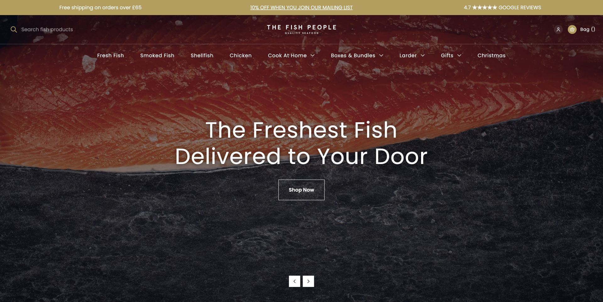
The Fish People uses a dark burgundy header and a large close-up of salmon beneath it. White text introduces fish delivered to the customer’s door, with a modest Shop Now action below. The opening is literal about the service rather than relying on a coastal scene or a long company history. Product-family links remain visible in the navigation, including prepared-food routes alongside fish and shellfish. This is useful for a retailer with both ingredients and ready-to-use options. The dramatic crop creates appetite, but it is the plain delivery wording that explains why the visitor might use the website.
What you can learn
State the fulfillment model as clearly as the product category. Then use product pages to distinguish fresh, frozen and prepared options, explain actual delivery eligibility and describe portions instead of expecting a salmon close-up to answer those practical questions.
Pros
The literal delivery headline explains the service without a long introductory paragraph.
The product close-up supports a clear, consistent burgundy-and-white identity.
Cons & considerations
White lettering needs reliable contrast across alternative hero photographs and crops.
A broad delivery promise needs coverage and timing details near the buying journey.
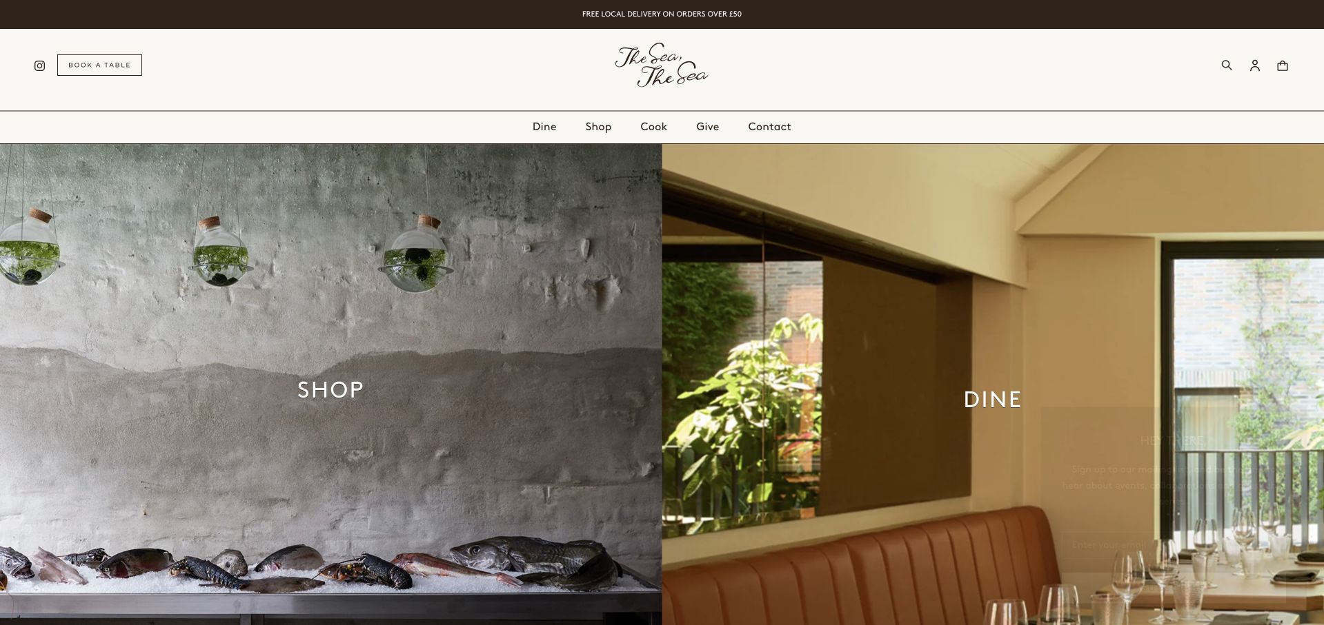
The Sea, The Sea divides the hero into two large photographic panels labelled Shop and Dine. One shows a cool-toned counter and seafood setting, while the other introduces a warmer restaurant interior. A restrained white header and a small central wordmark give both sides one identity. The first decision is therefore about the customer’s intention rather than a particular fish species. This is worth studying for mixed retail-and-hospitality businesses: the page does not force a dinner reservation and a seafood purchase into the same vague call to action. The photographs establish the distinction before the visitor needs to read the supporting pages.
What you can learn
Separate shopping from dining when their availability and booking rules differ. Use a shared visual identity, but keep restaurant menus, reservations, retail products and delivery information in clearly labelled destinations so the first choice remains meaningful throughout the journey.
Pros
The paired images make the shop-versus-dining distinction easy to understand.
A restrained shared header keeps the two services recognizably part of one business.
Cons & considerations
One-word labels need fuller explanation on the pages they lead to.
A balanced split gives each service less room for immediate practical details.
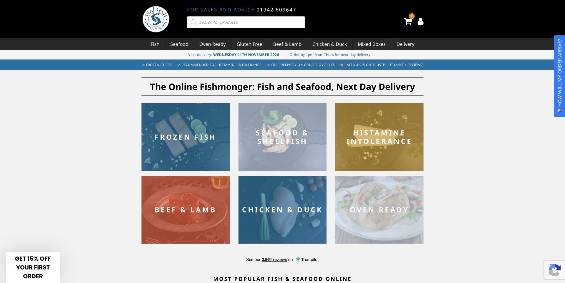
SeaFresh uses a dark header above a compact board of six large category tiles. Frozen fish and seafood sit beside meat, poultry and prepared-food options, making the wider assortment visible without a long introductory story. The page places a literal online-fishmonger heading above those tiles and begins a popular-products section below. This is a useful alternative to the full-screen seafood hero: a customer can start browsing immediately. One tile also introduces health-related information, which should be read as the retailer’s content rather than medical guidance. The design lesson is the category-first structure, not an endorsement of the claims attached to any product.
What you can learn
A clear category board can outperform a large campaign when customers arrive with a practical shopping task. Keep labels concrete, separate informational material from purchasing claims and make sure product descriptions explain the actual form, size and fulfillment conditions.
Pros
Large category tiles give shoppers several direct entry points into the assortment.
The compact layout introduces popular products without a long atmospheric detour.
Cons & considerations
Mixed seafood and meat categories can blur the specialist fishmonger positioning.
Health-related content needs careful qualification and must not substitute for professional advice.
Bradley’s Fish combines a navy-and-white header with a staged seafood photograph and a branded shipping box. Large serif lettering introduces the anniversary campaign, while two contrasting actions lead toward shopping and an explanation of frozen seafood. That second route is the particularly useful feature: it acknowledges a question a newcomer might have before choosing a product. Categories, offers and delivery information remain accessible in the header. The page is a reference for connecting product appetite with service explanation. Its anniversary and quality wording are publisher claims, while the visible design makes the delivery format more tangible than a generic fish photograph would.
What you can learn
If the buying model needs explanation, give that explanation its own obvious route beside the shop action. Show the real packaging context, then document delivery handling, coverage and customer responsibilities without promising that a styled box photograph proves the entire process.
Pros
The branded box makes the delivery format visible alongside the seafood.
A separate explanatory action addresses a likely question before product selection.
Cons & considerations
An anniversary campaign needs dates and supporting context beyond the large headline.
The detailed hero still needs careful contrast and crop testing on phones.
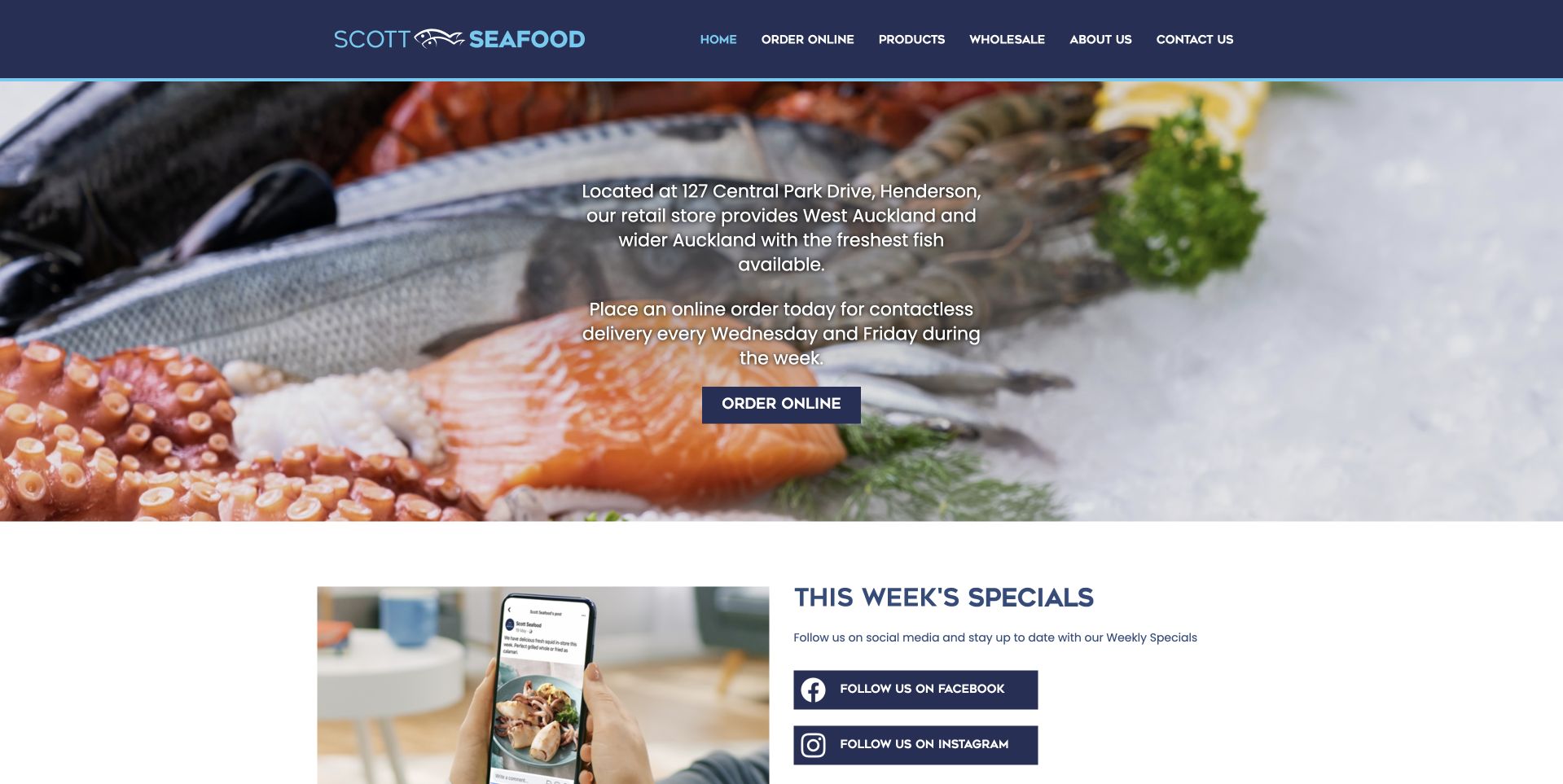
Scott Seafood uses a dark blue header and a wide seafood photograph with a compact white introduction in the center. The text identifies the local shop setting and online ordering rather than leaving location information entirely to the footer. A small Order Online button leads onward, and a weekly-specials section starts below the hero. The page is useful for a retailer whose practical availability matters more than an elaborate lifestyle narrative. Its navigation also distinguishes wholesale from ordinary products. The straightforward layout makes the business type recognizable quickly, although the small text over the photograph requires care to remain comfortable to read.
What you can learn
For a local fish shop, an address and a literal order route can be more useful than a broad brand slogan. Keep weekly specials editable, distinguish wholesale terms and support the hero with current hours and clear collection or delivery information.
Pros
Local address context appears early rather than only in the footer.
Weekly specials receive a separate section below the stable introduction.
Cons & considerations
Small centered text over food photography can be difficult to scan quickly.
The relationship between wholesale, shop visits and online orders needs fuller destination detail.
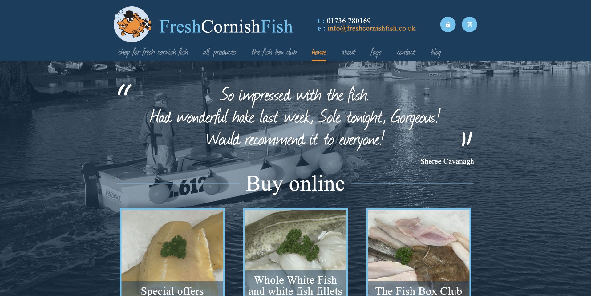
Fresh Cornish Fish uses a blue harbor photograph as the background for a short quotation and a large Buy Online heading. Beneath it, three photographic cards introduce specials, whole fish and a fish-box club. The blue header includes contact details and a compact handwritten-style navigation, reinforcing the coastal character. The useful feature is the transition from an atmospheric scene into specific buying models. A visitor does not have to interpret the harbor as a catalog: the cards name the actual next choices. The quotation is presented by the business and should not be treated as independently verified customer research in this design review.
What you can learn
Let regional imagery frame the shop, then state the buying choices literally. Distinguish a recurring box from a one-off fish purchase and make preparation, portions and delivery conditions clear before a customer commits to the selected route.
Pros
The three buying cards turn coastal atmosphere into concrete shopping choices.
Contact details remain close to the identity in the compact blue header.
Cons & considerations
Script-style navigation and quotation text need careful mobile readability checks.
A recurring club needs explicit terms rather than relying on the introductory card.
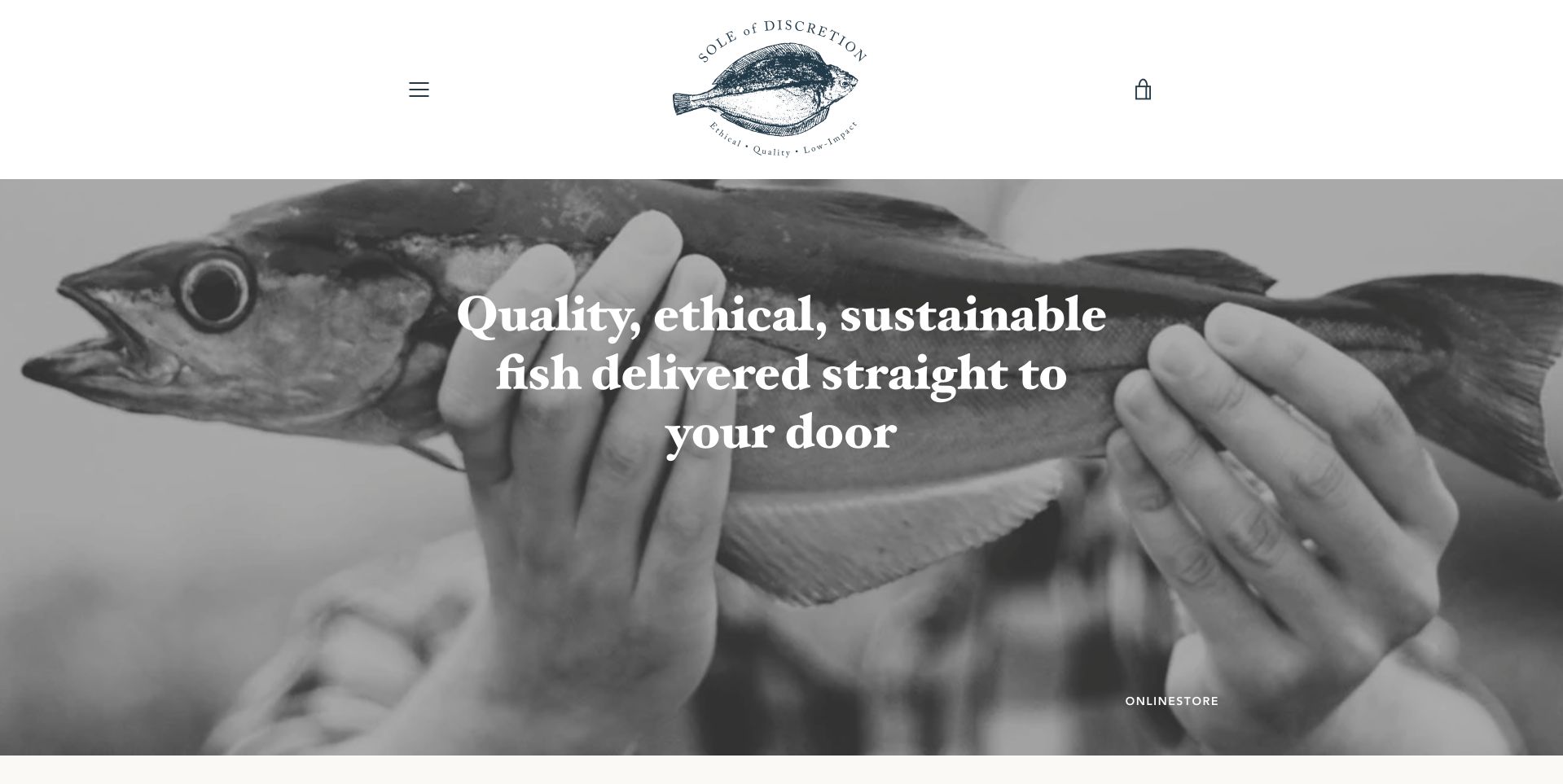
Sole of Discretion opens with a black-and-white close-up of a whole fish being held, beneath a spacious white header and a small illustrated identity. The central white headline introduces delivery directly, while a subtle shopping action remains near the bottom of the photograph. The monochrome treatment sets the page apart from the colorful salmon and cheeseboard-style food photography elsewhere in this collection. It also directs attention to the physical fish rather than to plated serving ideas. The site’s ethical and environmental wording is its own positioning; this review assesses the visual and navigational presentation rather than verifying fishing practices.
What you can learn
A distinctive photographic treatment can make a sourcing-led retailer memorable, but it still needs documentary support and practical shopping information. Explain the actual products, preparation and delivery area clearly instead of allowing broad ethical language to become the only reason to proceed.
Pros
The monochrome fish photograph creates a distinctive, tightly focused visual identity.
A restrained header leaves the product image room without visual clutter.
Cons & considerations
A subtle shopping action may be easy to miss at the image edge.
Environmental positioning needs specific supporting information beyond the hero statement.
Pesky Fish uses a large close photograph of fish beneath a quiet white header. A short fleet-to-customer headline introduces the idea, followed by three simple icons explaining the market rhythm and delivery. Below them, a current message states when the market will return, rather than presenting unavailable stock as immediately purchasable. That operational honesty is the most useful pattern here. A visitor can see that the service works to a schedule, not simply as an always-full catalog. The imagery creates appetite, but the availability message helps manage the practical expectation of when browsing or ordering will actually be possible.
What you can learn
If stock depends on a limited market window, explain that window before asking customers to shop. Keep the next opening time current, distinguish notifications from orders and avoid leaving stale availability language when the selling rhythm changes.
Pros
The market-status message makes time-sensitive availability visible before product selection.
Simple process icons connect the fleet story with the customer’s next steps.
Cons & considerations
Relative reopening language can become confusing without a clear date and time zone.
A closed-market state needs useful explanation rather than only a signup invitation.
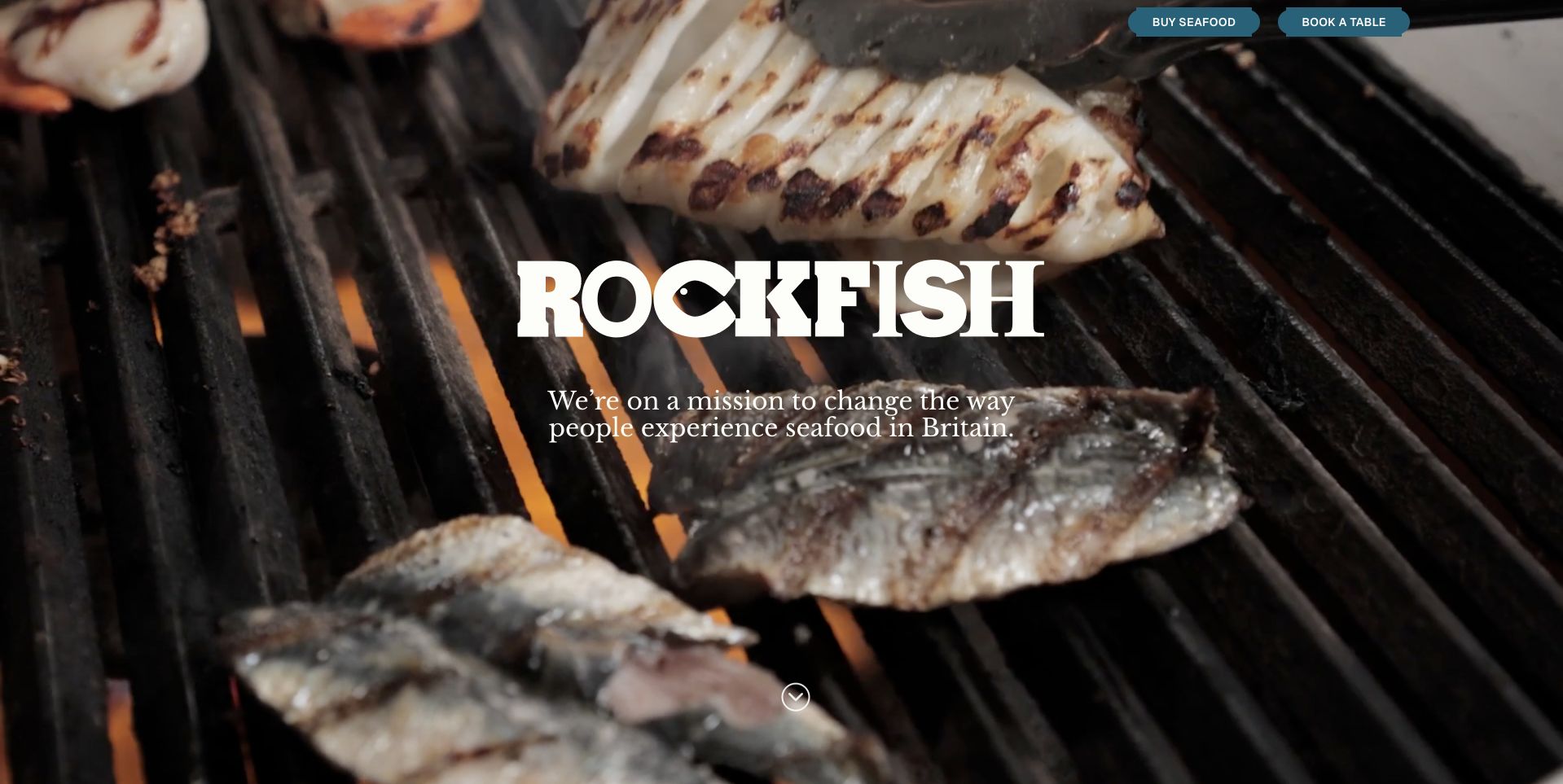
Rockfish opens with a dramatic photograph of fish cooking over heat, a large white identity and a short statement about seafood. Two small but distinct actions at the top lead toward buying seafood and booking a table. That distinction is important: the central image could otherwise be read only as a restaurant campaign. The page is useful as a mixed-service example rather than a pure fish-counter storefront. Its film-like food presentation creates atmosphere, while the separate actions explain how the visitor might use the brand. The broad mission wording remains the publisher’s positioning rather than an independently established environmental conclusion.
What you can learn
When a restaurant also sells ingredients, make that option explicit. Preserve separate shopping and booking routes, explain which service each location supports and do not expect cooking imagery alone to tell customers whether they are ordering a meal or raw seafood.
Pros
Separate seafood-shopping and table-booking actions clarify two different customer intentions.
The cooking photograph gives the seafood identity an immediate, energetic visual subject.
Cons & considerations
Small actions at the top can be overshadowed by the large central identity.
Motion-heavy food imagery needs accessible controls and a useful still alternative.
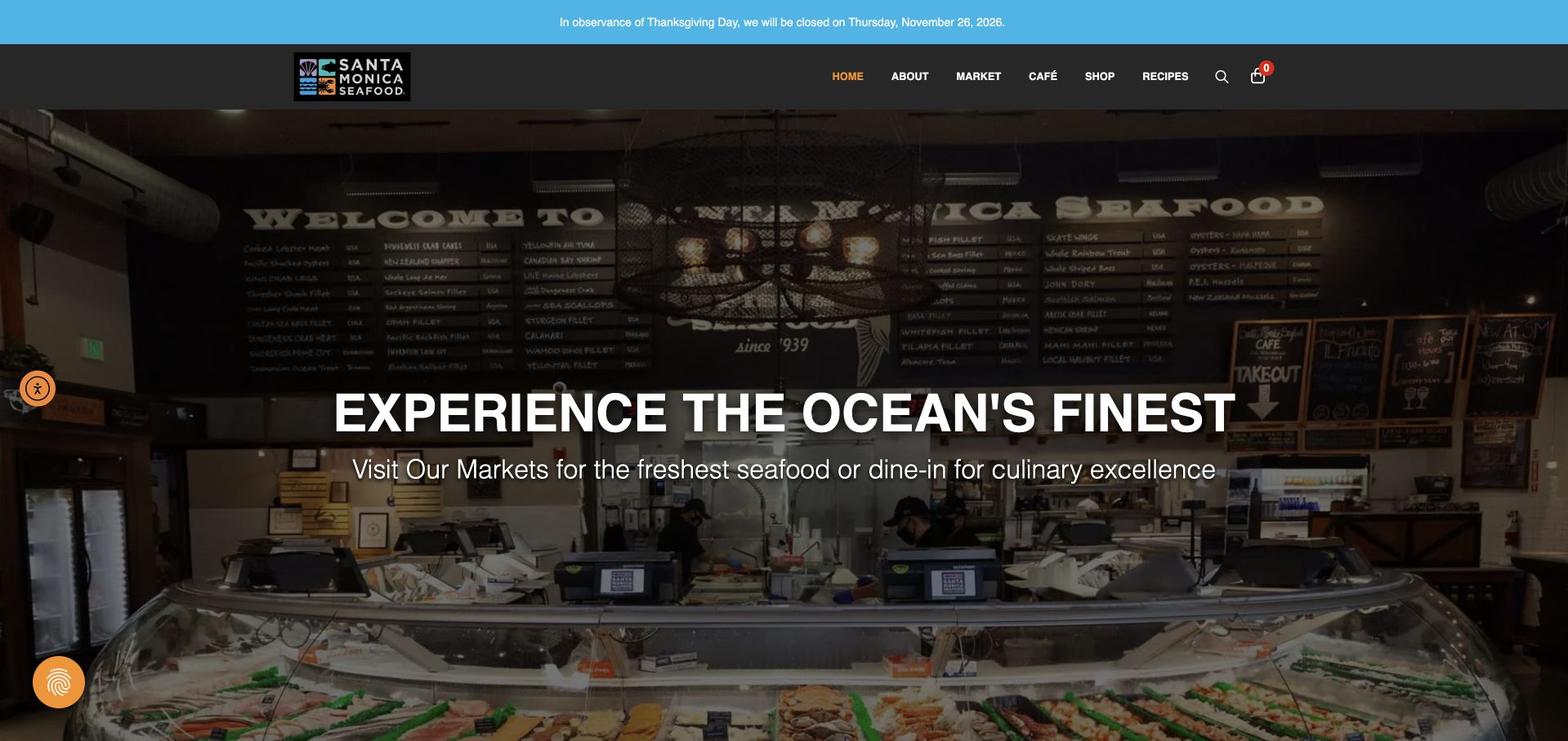
Santa Monica Seafood Market & Café uses a photograph of its actual counter beneath a dark header. The large white introduction sits over the interior, while a thin blue notice above carries current holiday closure information. The menu distinguishes market, café, recipes and location-related routes, reflecting the business’s dual purpose. The reviewed source is the public market-and-café landing page, not a wholesale supplier homepage. That scope matters when borrowing from it. The strongest design feature is the real counter scene: customers can understand the place they might enter rather than seeing only a polished plate or an anonymous delivery package.
What you can learn
Show the physical counter when the visit is central to the offer, and keep market shopping separate from café menus. Put exceptional closure information in an editable notice with a date, while maintaining ordinary location and opening details on stable pages.
Pros
The real counter photograph makes the local market setting concrete.
A separate holiday notice can change without replacing the main location introduction.
Cons & considerations
The darkened interior needs adequate contrast without obscuring the actual market details.
Market and café services require clearly differentiated menus and location information.
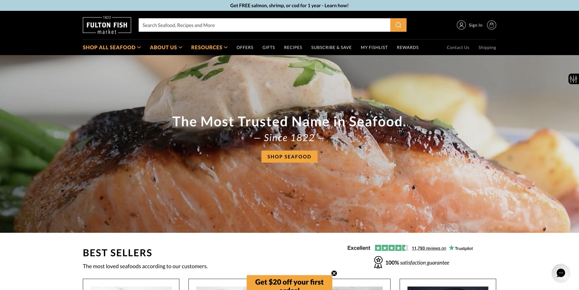
Fulton Fish Market places a long search field prominently in a black header, with product categories immediately below it. A close-up of cooked salmon fills the hero, overlaid with a short heritage statement and an orange Shop Seafood button. Best sellers begin below, bringing the customer quickly back to actual products. The useful relationship is between broad discovery and specific buying: search supports a visitor who already knows a species, while the hero and best sellers support someone browsing for ideas. The site’s heritage and trust wording is publisher content, not a guarantee established by a website-design review.
What you can learn
A large seafood assortment benefits from both search and editorial entry points. Keep the search visible, make species names understandable and follow atmospheric photography with actual products so customers can compare formats, portions and availability instead of relying on a broad campaign claim.
Pros
Prominent search supports shoppers who arrive looking for a specific seafood product.
Best sellers follow the hero without a long interruption in the shopping journey.
Cons & considerations
A long category row needs careful grouping on tablets and mobile screens.
Large trust statements need supporting business information rather than photographic reassurance alone.
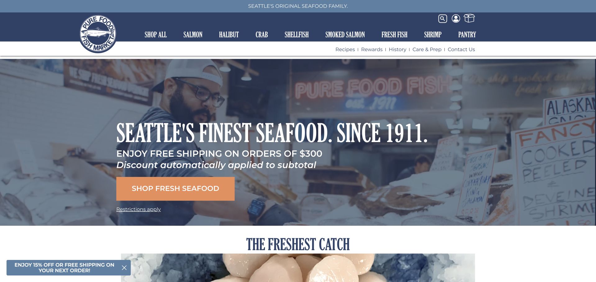
Pure Food Fish Market uses a blue header and a hero photograph of a person working behind its seafood counter. Large white lettering introduces the Seattle identity, while a shipping promotion and orange shopping action sit below. The image connects the ecommerce site with a real market setting rather than an anonymous warehouse. Product categories above allow visitors to move directly to salmon, shellfish and other families. This is useful for a local landmark selling beyond its immediate neighborhood. The counter provides context, but customers still need current delivery eligibility, product descriptions and handling information on the shopping pages rather than inferring those details from the photograph.
What you can learn
Use the physical counter to establish identity, then document the separate shipping service clearly. Keep delivery thresholds current and distinguish local visits from shipped orders so customers understand which conditions apply to their particular purchase.
Pros
The counter connects the catalog with a working place.
Seafood categories let returning customers bypass the campaign.
Cons & considerations
Shipping promotions need current terms and destination eligibility.
White counter-scene lettering needs careful contrast checks.
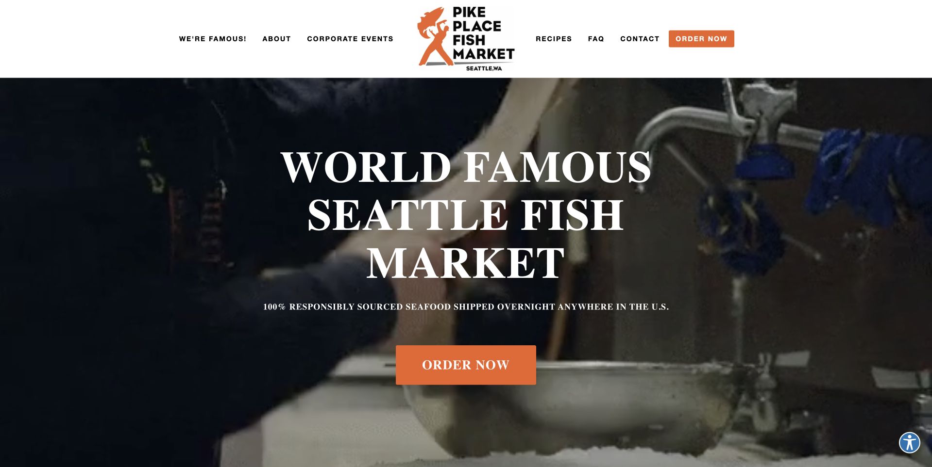
Pike Place Fish Market uses a compact white header above a dark working-market scene. A large serif headline and orange Order Now button provide a clear focal point over the photograph or film frame. The navigation includes wholesale, events and recipes, making the business broader than a simple gift-package catalog. The reviewed page also identifies an external shipping service farther down, which is important context for the ordering route. The useful design lesson is the combination of a recognizable physical market atmosphere and a very simple first action. The imagery establishes place while the button gives remote customers a practical next step.
What you can learn
When online fulfillment happens through another service, make that relationship understandable before checkout. Retain the local market’s identity, but explain where the customer is going, what can be ordered and which delivery terms apply once they leave the main site.
Pros
A single orange order action remains clear against the darker market imagery.
The navigation acknowledges wholesale and events without obscuring the central retail route.
Cons & considerations
Video-led imagery needs pause controls and a useful reduced-motion alternative.
External ordering requires clear continuity so visitors understand the fulfillment destination.
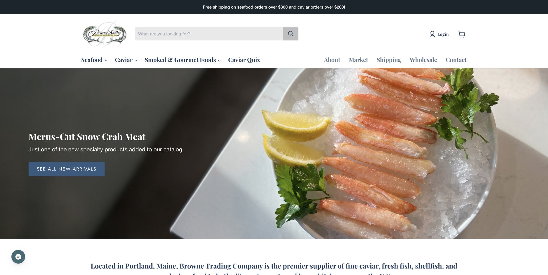
Browne Trading Company pairs a white header with a close photograph of crab meat arranged beside lemon on ice. The hero leaves a dark panel-like area for a short product name and a blue arrival button, keeping the campaign copy off the brightest food details. The navigation separates seafood, caviar, smoked products and gifts, while a short location introduction begins below. This is useful product presentation because the featured format is visible rather than implied by a broad ocean scene. The page’s premium language is the retailer’s positioning; the review focuses on the clear relationship between the photographed product, its label and its next browsing step.
What you can learn
Photograph the actual product format customers will evaluate, then give it a precise label and destination. Keep gift, fresh and smoked categories distinct, and use product pages to explain portions and delivery rather than letting elegant styling imply unspecified qualities.
Pros
The product name has a darker area with stable contrast.
The close photograph makes the crab format tangible.
Cons & considerations
Fine serif copy needs attention to readability at smaller screen sizes.
A premium visual tone does not replace explicit product and delivery information.
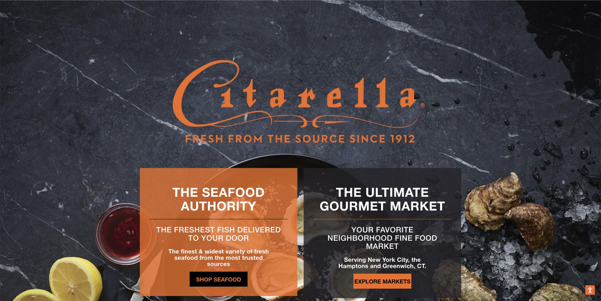
Citarella opens on a dark stone-like background, with an orange script identity above two large destination panels. One introduces the seafood-shopping offer, while the other introduces the broader gourmet market. Food photographs frame those choices rather than filling the whole page with product tiles. This is useful audience routing: a customer looking for shipped seafood and someone planning a local market visit need different information. The design acknowledges that distinction before the visitor enters a long catalog. The restrained number of choices makes the page easy to understand even though the business itself has a much broader assortment than fish alone.
What you can learn
If the brand covers both a local market and a separate shipping store, divide those journeys early. Use literal labels, preserve the distinction on destination pages and avoid letting one polished gourmet identity conceal differences in products, locations or fulfillment.
Pros
Two clear panels distinguish seafood shipping from the broader market experience.
The orange identity stands out consistently against the dark food-oriented background.
Cons & considerations
Introductory panels need sufficiently explicit destinations to prevent mistaken ordering assumptions.
The first screen provides less immediate access to individual seafood categories.
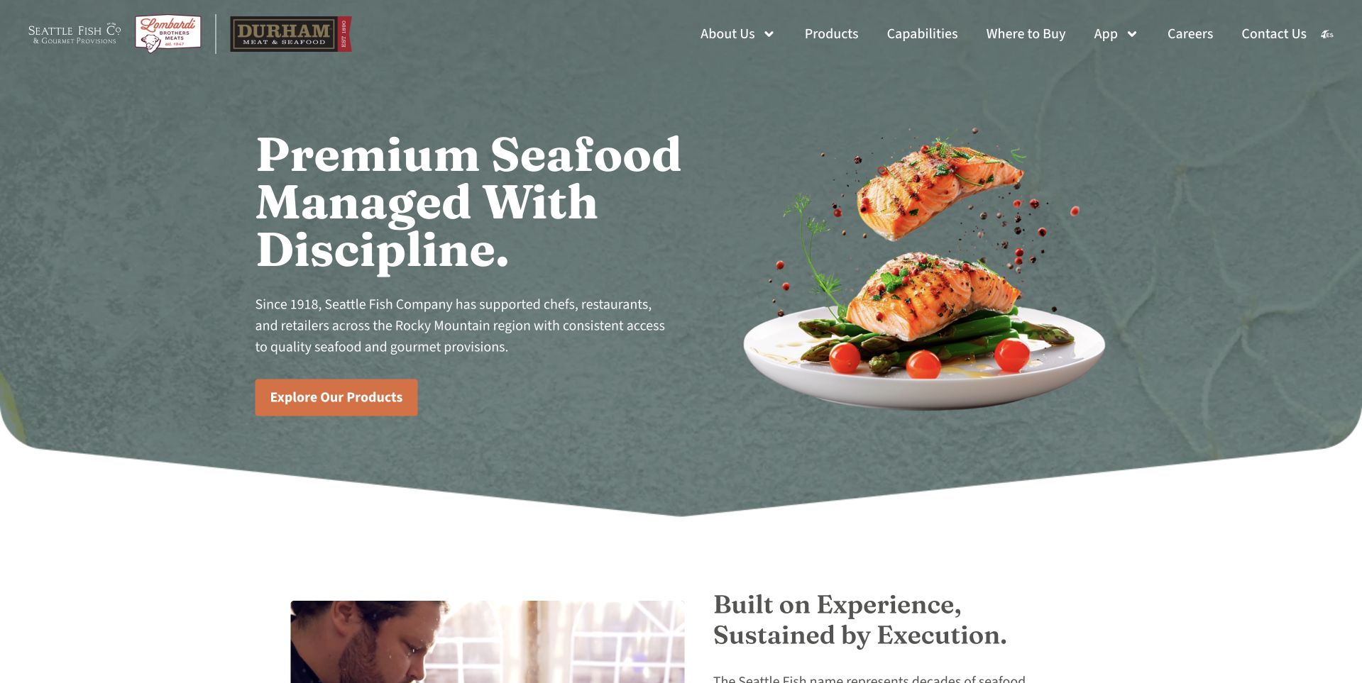
Seattle Fish Company uses a muted green textured background with a plated seafood photograph positioned at the right. A large white serif headline introduces managed seafood supply, while a small orange action leads to products. The navigation emphasizes capabilities, where the company buys and contact information rather than a consumer cart. That is important scope: this page is a design reference for a supplier, not evidence of a household delivery storefront. The rounded lower edge and generous white space soften the otherwise operational message. Study the way a professional purchasing proposition is made approachable without pretending it follows an ordinary retail checkout model.
What you can learn
For wholesale seafood, explain the customer and service model before presenting products. Use capability and contact routes that match real procurement needs, and keep household-shopping assumptions out of the copy unless a separate consumer service genuinely exists.
Pros
The plated food image makes an operational supply proposition visually approachable.
Capability-oriented navigation matches the professional buying context of the page.
Cons & considerations
A short headline needs supporting detail about coverage and procurement arrangements.
The opening view offers little product-level information for an unqualified first-time visitor.
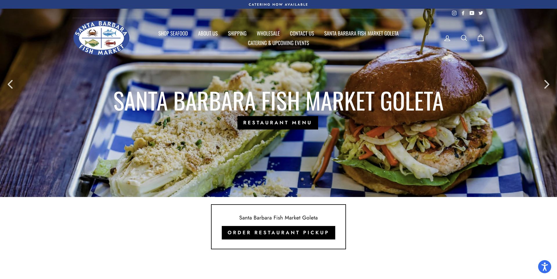
Santa Barbara Fish Market uses a large prepared-food photograph with a location-specific heading across the center. The reviewed panel names Goleta and leads to its restaurant menu, while a separate order-for-pickup action appears below. The blue header and circular market identity remain consistent above the image. This is useful for a seafood business whose locations have different offerings: the campaign identifies which place and service it is describing rather than assuming every market visit is the same. The prepared sandwich photograph also makes the restaurant side clear, while the normal navigation preserves access to the wider fish-market business.
What you can learn
Tie every menu and ordering action to the correct location when a fish market also serves prepared food. Distinguish retail seafood, restaurant meals and pickup terms so a location-specific campaign does not accidentally promise the same service at every branch.
Pros
The location name appears within the campaign rather than only on a destination page.
Separate menu and pickup actions clarify two practical customer tasks.
Cons & considerations
Prepared-food imagery can overshadow the raw-seafood market offer for newcomers.
Carousel panels need maintained location details and accessible navigation controls.
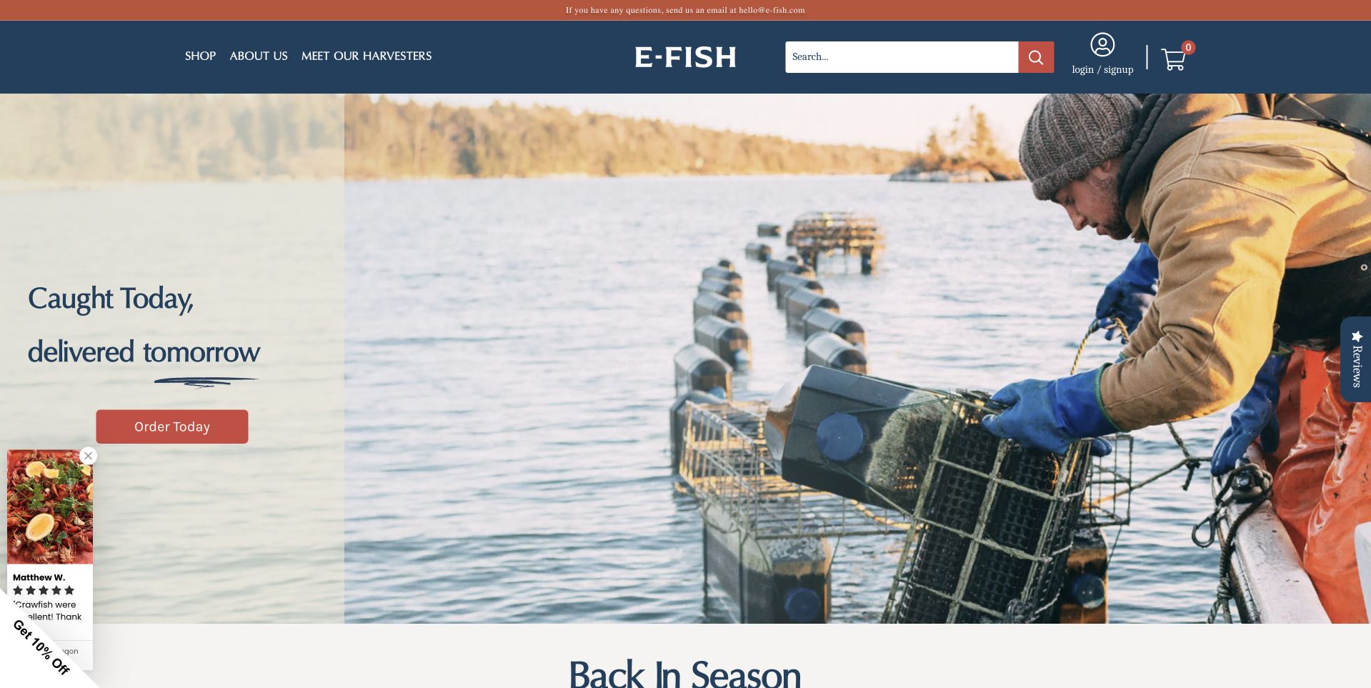
E-Fish uses navy and coral around a wide photograph of a person working with shellfish equipment on the water. The short introduction sits on a pale panel at the left, giving the copy a stable background while preserving the working scene. A coral order action repeats the header accent, and product browsing begins below. The page is useful for the way it connects a supply story with a concrete transaction without covering the person and equipment in large type. Its timing language belongs to the retailer’s offer and requires current conditions; the photograph alone does not prove the timing of any particular shipment.
What you can learn
If origin is part of the proposition, show the actual work and explain its connection to the order. Keep timing claims precise, describe the products customers receive and separate a compelling sourcing photograph from the operational evidence needed for delivery promises.
Pros
The pale copy area preserves readability beside the working-water photograph.
A consistent coral action connects the hero with the rest of the storefront.
Cons & considerations
Short delivery-timing claims need clear coverage and cut-off conditions.
The origin scene gives less immediate information about the individual product assortment.
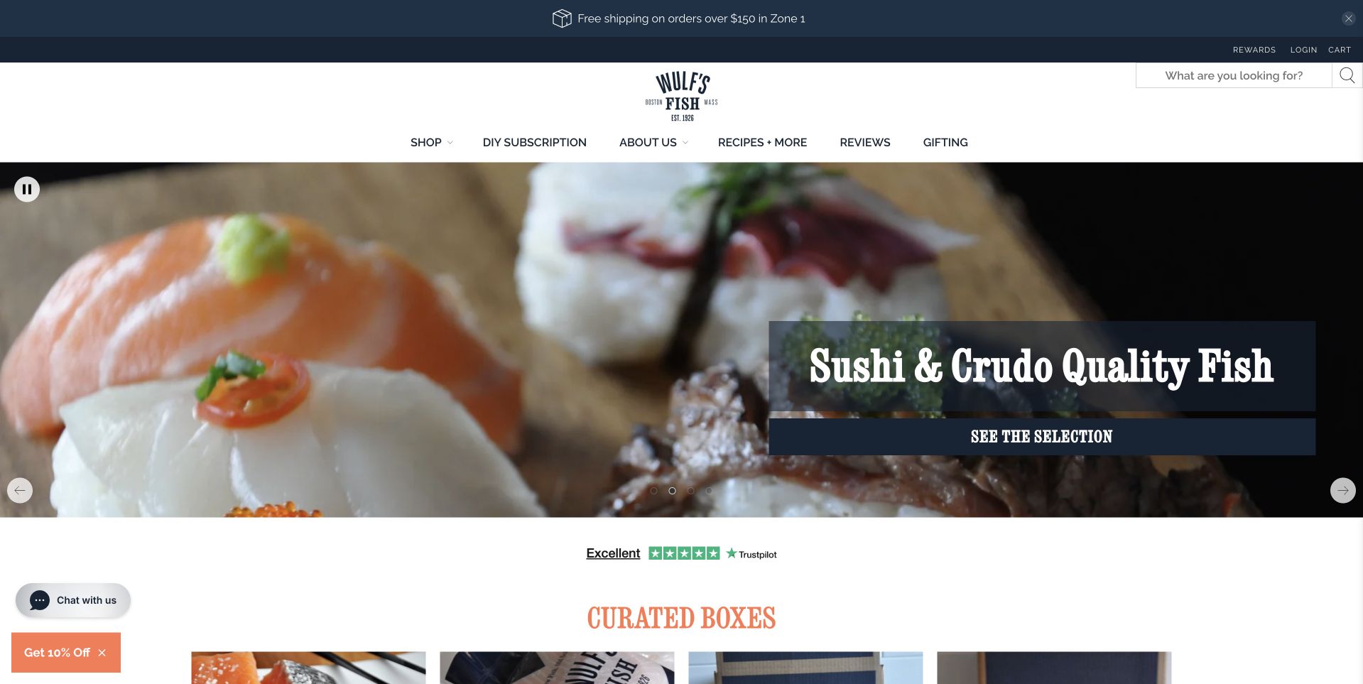
Wulf’s Fish uses a white header and a large photograph of prepared seafood, with a compact dark label over the image introducing the featured selection. The opening is followed by curated boxes, making the transition from appetite to a structured assortment visible quickly. The navigation distinguishes shopping, subscriptions, company information and recipes. That separation matters because a themed box and a recurring order are different commitments. The page is useful for studying a catalog that offers guided choices rather than only an alphabetical species list. Its quality wording is the retailer’s own claim; this review focuses on how the selection is presented and routed.
What you can learn
Curated boxes can help undecided seafood shoppers, but explain what makes them different from subscriptions. State quantities, formats and recurring terms clearly, and keep individual-product browsing available for customers who already know what they want.
Pros
Curated boxes appear promptly after the main food photograph.
Subscription and ordinary-shopping routes are separately labelled in the header.
Cons & considerations
Prepared-food imagery needs supporting descriptions of the product format actually supplied.
A rotating campaign can obscure box details unless the next section remains clear.
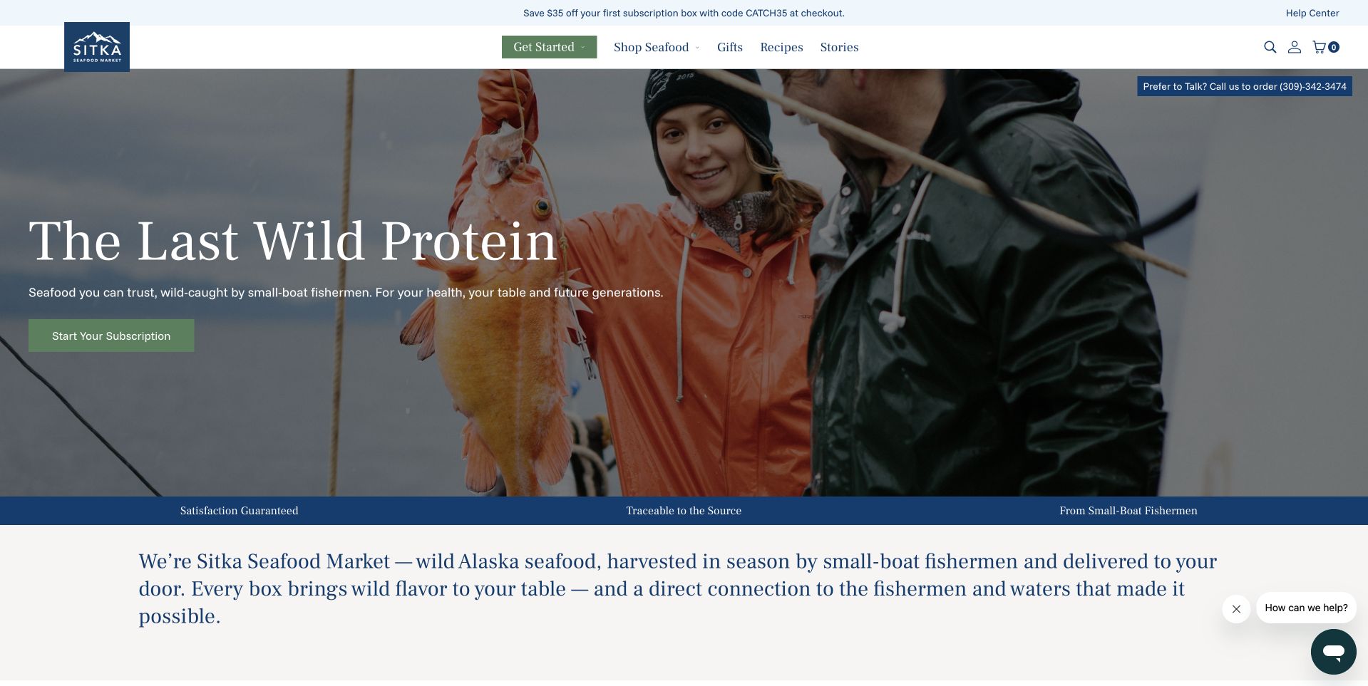
Sitka Seafood Market uses a photograph of people and a fish at the water’s edge, with a large white headline and a green action over the darker part of the image. The text below introduces the relationship between fishermen, seasonal harvest and the customer’s delivery. The header gives shopping and membership-related routes their own places. This is useful for understanding a community-led supply narrative, but the portrait should not be treated as evidence of every operational claim. The design’s strongest feature is the transition from the human image into an explanatory paragraph before visitors are expected to understand the buying model.
What you can learn
For membership-led seafood, explain what the relationship actually requires. Put schedule, box contents, pause or cancellation terms and delivery coverage near the buying route, while using the community photograph as context rather than a substitute for those practical details.
Pros
The people-and-catch photograph gives the supply story a concrete human subject.
An explanatory paragraph follows the hero before the customer must understand membership.
Cons & considerations
Broad origin language needs product-specific support and current operational details.
White hero copy must remain readable across changing photograph crops.
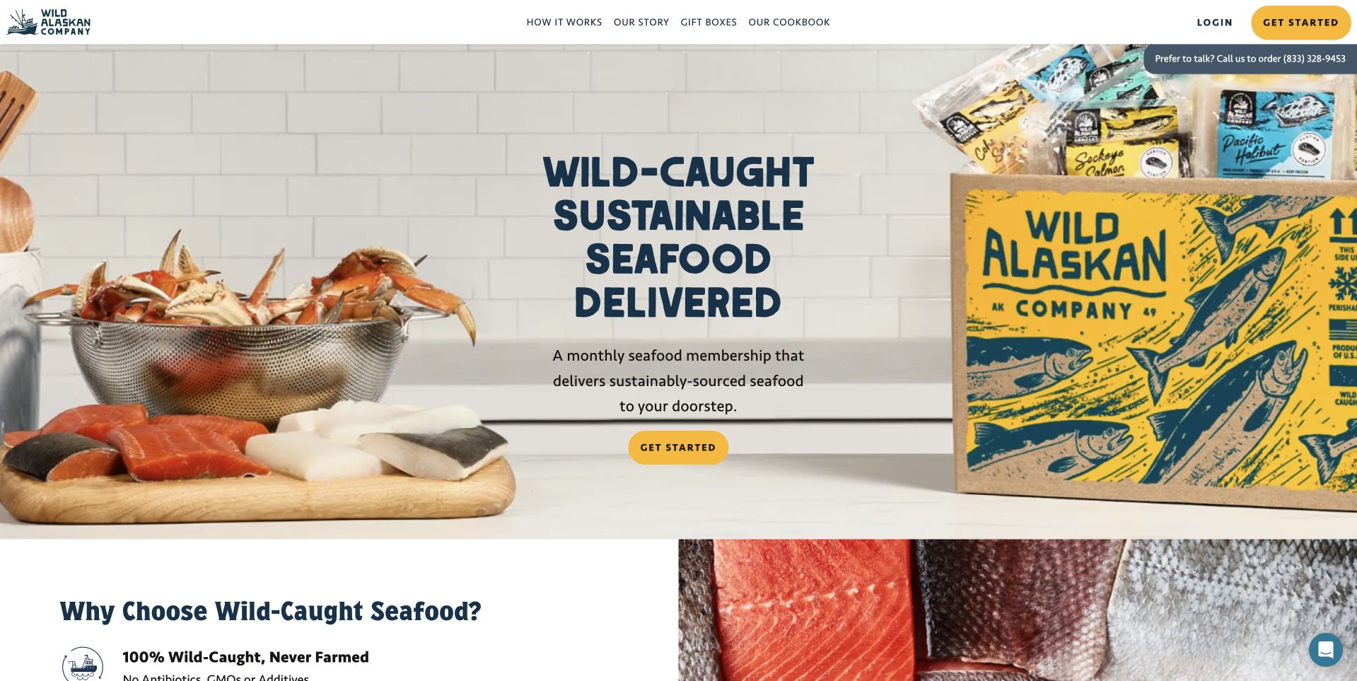
Wild Alaskan Company pairs a plate of prepared seafood with a prominently branded delivery box in its opening photograph. The dark blue uppercase headline and yellow Get Started action sit on a pale background, giving the proposition a clear, commercial shape. A short description identifies a monthly membership rather than leaving the recurring model implicit. Below, a product-focused section starts explaining the seafood. This is useful for businesses whose first conversion is not a simple one-off purchase. The page makes the package and the recurring relationship visible, while the remaining journey needs to explain the actual selection, schedule and customer controls.
What you can learn
Name a recurring model before asking visitors to begin. Show the package and an understandable product context, then give schedule, price, pause and cancellation information enough prominence that a bright Get Started button does not obscure the nature of the commitment.
Pros
The branded box makes the home-delivery format immediately recognizable.
The short introduction explicitly identifies the recurring membership model.
Cons & considerations
Prepared food photography needs clear distinction from the items delivered in the box.
The opening action depends on later pages explaining price and membership controls.
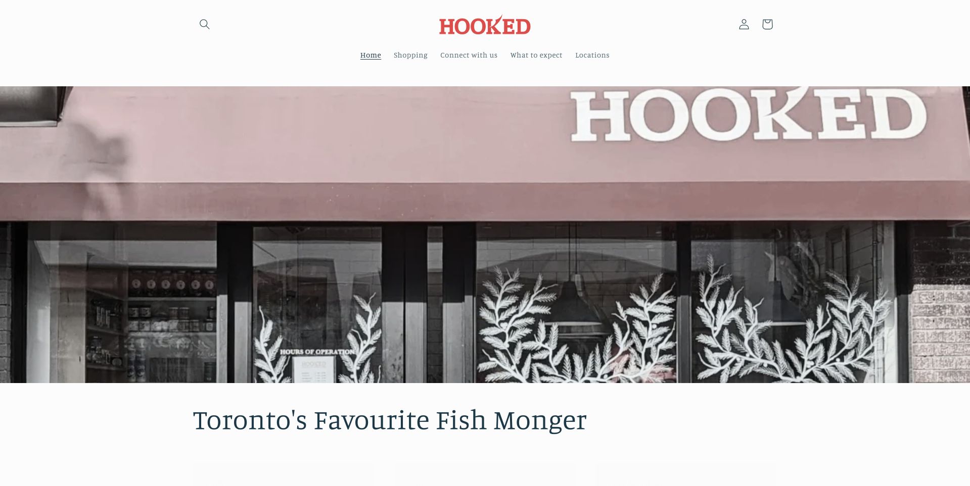
Hooked uses a restrained white header with a small red wordmark above a wide photograph of its actual storefront. The lettering on the awning and the decorative window treatment give the page a recognizable sense of place before the short Toronto introduction below. The navigation includes shopping, sourcing and locations, making the business understandable without a large promotional slogan. This is a useful reference for a local counter that wants a calm website rather than an aggressive delivery-box campaign. The physical photograph supplies identity, while the supporting routes can explain what is available and how the different shops operate.
What you can learn
A distinctive storefront can introduce a local fishmonger effectively when the practical routes remain clear. Keep shop locations, current hours and sourcing information easy to find, and do not assume a photograph of the counter explains online ordering availability.
Pros
The storefront photograph gives the local business a specific and recognizable identity.
A restrained navigation separates sourcing information from shopping and location finding.
Cons & considerations
A storefront-first introduction shows less of the actual seafood range.
Small header labels need appropriate touch targets and readable sizing on phones.
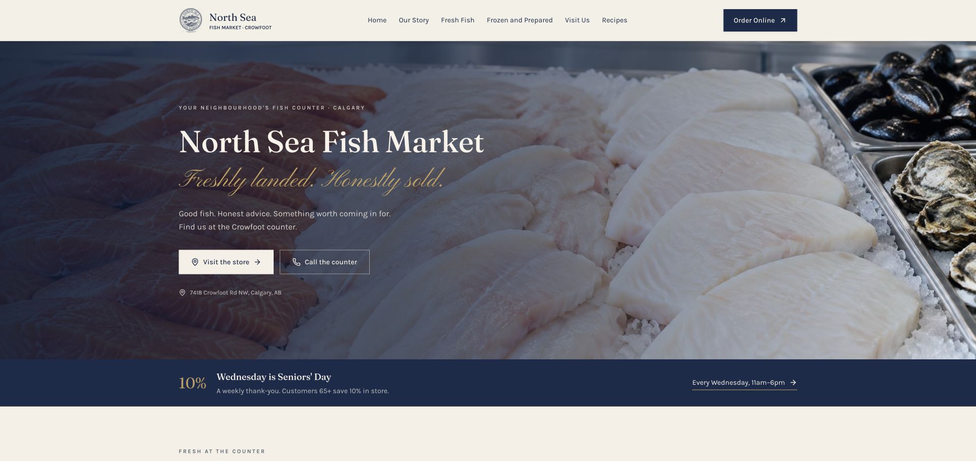
North Sea Fish Market uses a navy-and-cream identity over a close photograph of fish and shellfish on ice. The left-aligned serif headline is paired with two practical actions: visiting the store and calling the counter. The street address appears in the same opening area, and a weekly in-store notice sits directly below. This is useful for a neighborhood business because it does not assume every customer wants a shipped package. The design gives the physical counter priority while keeping a separate online-order route in the header. Its plain local structure is more informative than a generic seafood-delivery slogan.
What you can learn
Design around the service the shop actually provides. Put address, hours and a callable number close to the introduction, distinguish in-store notices from online offers and explain any external ordering destination rather than treating local visits and shipped purchases as interchangeable.
Pros
Visit and call actions make the neighborhood counter’s practical purpose immediately clear.
The address and weekly notice keep location-specific information near the introduction.
Cons & considerations
Text over pale fish imagery requires a sufficiently dark and stable overlay.
In-store offers need clear conditions so they are not confused with online pricing.
Kegan is a freelance web designer and developer with 15+ years of experience helping businesses turn complicated website requirements into clear, maintainable digital experiences. He works directly with clients from planning and design through development, launch, and ongoing support.
For fishmonger website design, his development approach focuses on product and sourcing information, availability expectations, collection and delivery details, preparation resources, and clear ordering journeys. The scope can be a targeted improvement or a complete custom build, with responsive layouts, thoughtful content structure, and integrations chosen around the people using and maintaining the site.
Show 3 other fishmonger website designersHide other fishmonger website designers
Plan the seafood information and fulfillment model first
Create product records with clear distinctions
Agree the fields needed to describe the actual range: species or product name, supplied form, quantity or weight, availability and fulfillment eligibility. Add the approved storage, preparation and ingredient information the business is responsible for publishing, without inventing safety or health assurances. Decide how substitutions and changing sources are explained. Test descriptions with someone unfamiliar with seafood terminology so the site helps a newcomer rather than only reflecting the vocabulary of an expert counter team.
Separate local visits from remote orders
A physical shop needs current hours, address, telephone and service details. A delivery offer needs coverage, timing and a clear explanation of the supplied product. A restaurant needs menus and booking information. Where these share a brand, give them separate routes and preserve the distinction throughout. The Sea, The Sea’s Shop and Dine panels illustrate an early split. Avoid sending a customer into an external checkout without explaining which service they have selected.
Define what happens when the offer changes
Write the empty and unavailable states before launch. If the daily market is closed, explain its next actual opening; if a product is unavailable, offer a useful alternative without implying an automatic substitution. Date seasonal notices and assign an owner to updates. For memberships, explain schedules, box contents policies and customer controls. The website should remain useful on a day when nothing can be ordered, not merely replace the catalog with an unexplained email signup.
The editing job behind the design
Choose systems around changing stock and dependable information
[object Object]
[object Object]
[object Object]
Our WordPress website examples offer a separate look at publishing approaches. A visible platform label is evidence for that named page, not a guarantee that the same system will suit your requirements.
Before the public launch
A practical fishmonger website checklist
Identify whether the main offer is a local counter, household delivery, scheduled market, subscription or professional supply.
Describe the actual product form, quantity or weight and current availability in consistent product records.
Separate whole fish, fillets, portions, prepared foods and mixed boxes where customers need different explanations.
Publish approved ingredient, preparation and handling information without inventing personal health or safety assurances.
Explain changing stock, product sources and substitution policies rather than implying an identical daily assortment.
Document current shop addresses, hours, telephone numbers and location-specific services in one maintainable place.
State delivery eligibility, timing and relevant conditions before customers invest effort in the ordering journey.
Explain recurring charges, schedules, box policies and customer controls before someone joins a seafood membership.
Give scheduled markets a useful closed state with the next actual date and a clear time zone where relevant.
Use representative product and working-place photographs with permission, without treating them as proof of broad claims.
Test categories, search, mobile controls and accessible form labels without submitting an actual purchase or enquiry.
Assign responsibility for campaign expiry, stock reconciliation and handling failures in ordering or notification systems.
These checks are a project checklist, not a performance, legal, security, or accessibility certification. Test real journeys with the people responsible for the website before making claims about the result.
Sources & editorial method
How this collection was selected and reviewed
The examples were reviewed as public design references and captured in a normal browser. Commentary concerns visible layout, content and customer tasks, not seafood safety, environmental performance, fishing practices or quality. Supplier, dining and membership contexts are identified where relevant. Technology information requires separately supported public evidence and is not inferred from visual appearance.
Each example links to its actual source page. Screenshots are direct browser captures with their own capture dates; moving imagery, announcements and live designs can change. The notes describe observable design choices and conditional tradeoffs, not measured traffic, conversion results, service quality, or accessibility conformance.
Technology labels use public page metadata, asset evidence, or explicitly cited platform documentation. Platform documentation is not a complete current deployment audit. A component reference may be legacy or unused; it is not a complete backend inventory. Unknown stacks are omitted. These sites are editorial examples, not our client portfolio.
Written, Edited and Curated are separate editorial records, not timestamps advanced by a rebuild. Website designs and imagery belong to their owners. See our editorial standards or suggest a correction.
Questions worth asking
Fishmonger website design questions
Should a fishmonger start with a full online catalog?
Only if it can be maintained accurately. A useful local site with current hours, contact information and a clear range overview can be better than an ambitious store with stale stock. Add transactions when the product and fulfillment process is ready.
How should a changing daily catch be shown?
Explain the update rhythm and make availability explicit. Use clear unavailable states and current dates rather than leaving last week’s assortment visible as if it can still be purchased. Decide how substitutions are communicated and approved before offering them.
Can a fish shop and restaurant share a homepage?
Yes, but shopping and dining should be clearly separated. Give them distinct menus or buttons, explain which location supports each service and avoid sending someone seeking raw seafood into a restaurant booking flow.
Should the hero use a harbor or a product photograph?
Choose the image for its explanatory job. A harbor can establish place and a counter can establish the real shop; a product photograph can show format. None replaces written details about the item, availability, sourcing or delivery.
Can public technology detection reveal the complete stock system?
No. Public signals can sometimes identify a storefront or other visible component, but they do not establish every inventory, supplier or fulfillment tool. Treat technology notes as scoped evidence and choose systems around the actual business process.
Begin with real counter questions, then make the answers easy to find. Connect recognizable seafood and place with an honest explanation of how to buy, visit or enquire.