Best Land Surveyor Websites of 2026 (26 Real-World Examples)
Help clients identify the right survey, understand the output and prepare a useful project brief.
A land surveyor website should reduce uncertainty before it celebrates precision. Most clients arrive with a decision to make, not a complete technical specification. They may need a plan for a design team, information about a boundary, site monitoring or data for a larger development programme. Good design helps them describe that need and reach an appropriate professional.
This collection includes local specialists, regional geospatial teams and multidisciplinary firms. The difference matters. A compact boundary-survey practice and a national infrastructure consultancy should not have identical enquiry flows simply because both use surveying instruments. Compare how each site explains geography, survey type, output and project context before borrowing its visual layout.
The reviews concern public website design, not the accuracy of a survey, the validity of a boundary opinion or a firm’s professional suitability. Survey terminology and requirements vary by location and purpose. A website should explain its service boundaries and point to appropriate professional guidance, rather than making universal claims about what one plan, scan or dataset can establish.
Before the examples
What makes good land surveyor website design in 2026?
Organise services around the client’s decision
A visitor may know that an architect needs drawings, that a development site needs measuring or that a boundary is disputed, without knowing the precise service name. Pair technical labels with short explanations of the intended use. Keep land, measured-building, utility, monitoring and specialist water work distinguishable. Do not imply that a practice offers every service merely because several appear in a broad industry collection.
Explain the deliverable and its context
A sample plan, point-cloud view or model can make the output more understandable than another photograph of an instrument. Explain what the example represents, its intended use and the relevant project context. Avoid publishing client-sensitive drawings or implying universal compatibility. Land-registration plans are a particularly clear reason to link official, jurisdiction-specific guidance rather than treating every drawing as interchangeable.
Make coverage and accountable people visible
State where the team works and how the appropriate office or surveyor is identified. For a local practice, a named person and a realistic service area may be more useful than a large animated counter. For a group, separate office coverage from a general national message. Keep professional affiliations and claims current and attributed; neither a logo nor a website photograph establishes the scope of a future commission.
The collection · 26 examples
26 land surveyor websites worth studying
Look beyond instrument photographs when comparing these sites. Notice whether a visitor can identify the intended survey, the relevant region, the kind of output and the next useful question. The first example highlights a smaller regional specialist; the rest illustrate different scales and niches rather than a measured ranking of survey performance.
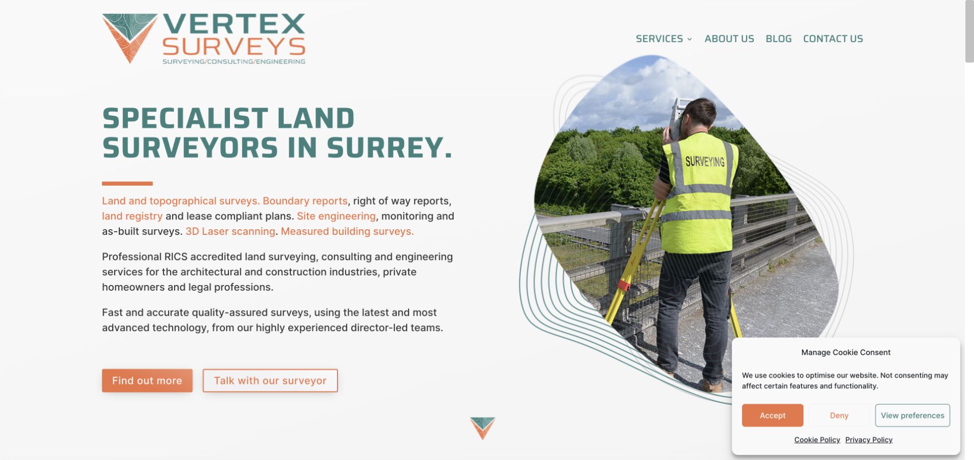
Vertex Surveys gives a regional surveying business a confident, approachable identity. Teal and orange organise the opening screen, with a literal Surrey service headline on one side and an on-site surveyor photograph on the other. The irregular image shape and contour decoration add character without replacing the practical message. Two actions distinguish learning about the firm from talking to a surveyor. The family-run background supplies a useful human context further down the page. This feels proportionate to a specialist practice rather than a miniature version of a national engineering portal. More immediate examples of survey outputs would make the proposition even easier for an unfamiliar homeowner to understand.
What you can learn
Lead a local survey site with the service area, the type of work and a real working photograph. Then explain the difference between outputs so a client can ask about the right survey without pretending to understand every technical specification.
Pros
The literal regional headline helps visitors judge relevance before investing in the longer company story.
A genuine working scene and distinctive colour system make a small practice feel specific rather than generic.
Cons & considerations
Decorative contour lines and image masks still need contrast and responsive-layout checks around the main text.
A short sample-output explanation would help non-specialists distinguish a measured building survey from other survey types.
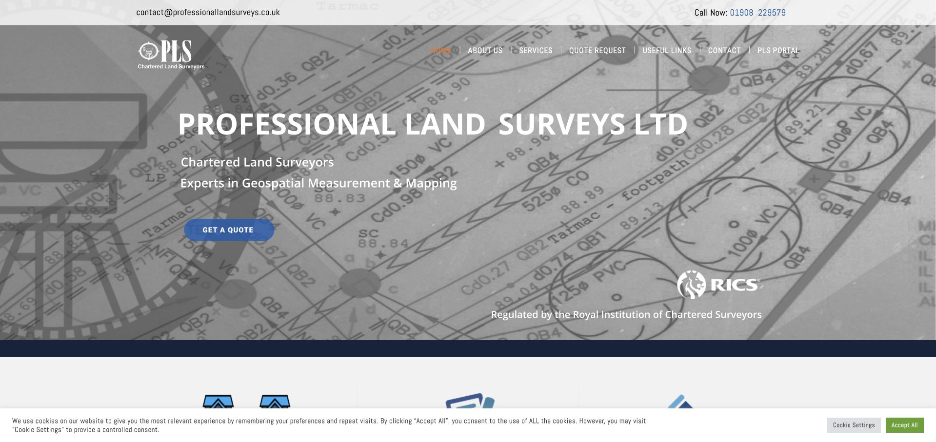
Professional Land Surveys uses a large monochrome plan as the backdrop to its name and service description. The blue quote action is easy to distinguish, and contact details sit in a utility bar above the main navigation. Services, quote requests and useful links are presented as separate choices, while a professional-body mark adds another reference point. This is a practical way to connect a technical deliverable with a commercial enquiry. The dense drawing background makes typography work harder than it would on a plain field, however. Professional designations also need appropriate explanation and verification links; a logo is not an independent assessment of an individual project or survey result.
What you can learn
Use a plan to show the kind of information a survey delivers, but keep essential text on a reliably readable surface. Give qualifications their own explanation and direct users to the exact service and quote information they need.
Pros
Public contact information and a prominent quote action reduce uncertainty about how to begin an enquiry.
The drawing background connects the page to a tangible output rather than an unrelated corporate photograph.
Cons & considerations
Fine plan detail behind large text can reduce legibility on small or lower-quality displays.
Professional-body marks need accessible labels, current context and supporting links rather than being treated as self-explanatory proof.
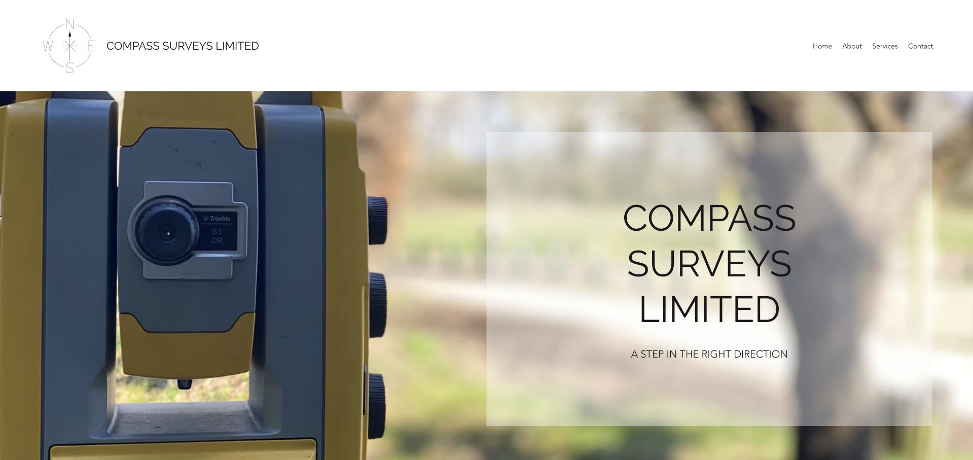
Compass Surveys uses a real total-station photograph as the main visual reference, with a translucent white information panel beside it. The large compass-style identity and small set of navigation choices create an unusually quiet first impression. Home, about, services and contact are enough to understand the basic structure without a complicated menu. The instrument makes the field-work connection clear, but the short direction-themed message is less useful than a literal description of the surveys offered. Geography and output details appear in the supporting content. This is a good reminder that visual restraint works best when the remaining words carry practical information rather than only a memorable line.
What you can learn
A small survey site does not need a national firm’s navigation. Keep the structure compact, but use the opening text to state the service, coverage area and intended clients so that simplicity does not become ambiguity.
Pros
A real survey instrument provides an immediate visual connection to field work and measurement.
The short navigation avoids making a small service business feel more complicated than necessary.
Cons & considerations
The opening message explains the brand more clearly than the exact scope of surveying services.
A large identity panel consumes space that could introduce location, project types or a sample deliverable.
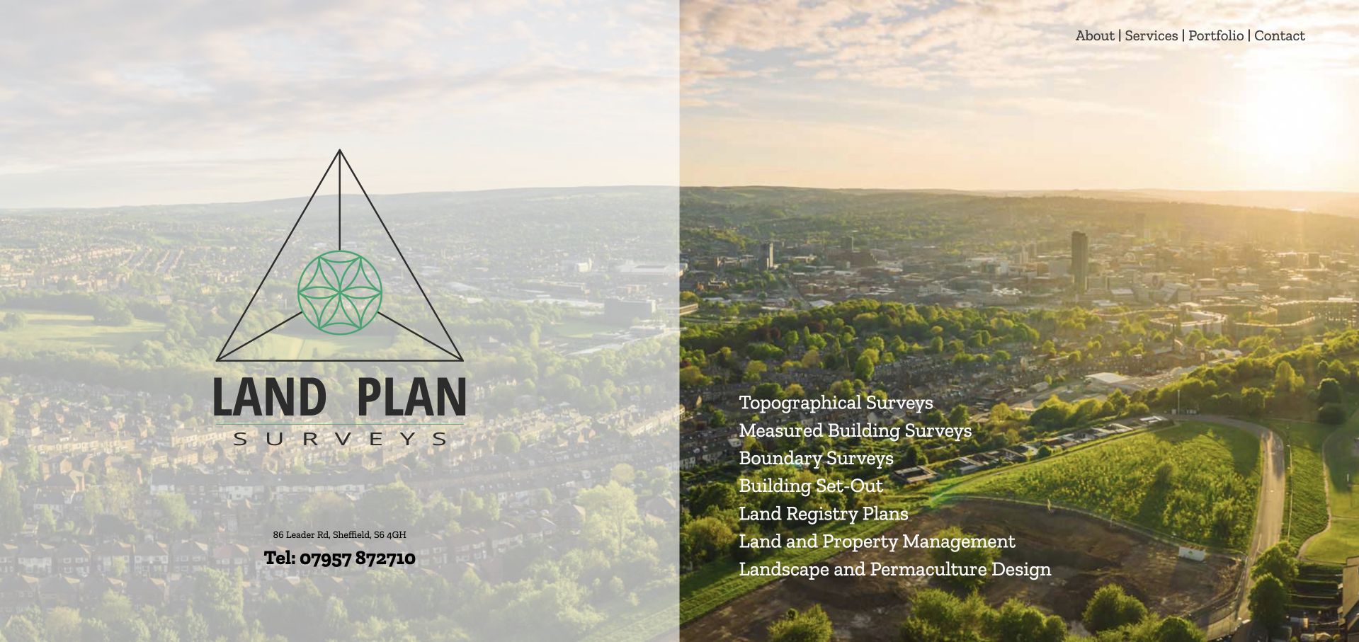
LandPlan Surveys places its identity and public contact details against a Sheffield aerial scene, then uses a substantial service list to explain the offer. Topographical and building surveys sit alongside boundary, setting-out and other services instead of being hidden beneath a generic capability label. A small top navigation supplies company, portfolio and contact routes. The composition is useful for a visitor who already knows which survey is needed: the list is the most informative element in the opening view. For a less experienced property owner, the variety can be harder to interpret. Aerial imagery establishes place, but it does not explain the differences between deliverables or professional responsibilities.
What you can learn
A service list can outperform a clever slogan when each label matches a real client need. Add short explanations and linked examples so that less technical visitors can identify the appropriate route without relying on an unfamiliar survey term.
Pros
The opening list makes multiple service types visible without requiring a menu interaction.
Local aerial imagery and explicit contact details give the practice a concrete geographic identity.
Cons & considerations
A broad list needs prioritisation so uncommon services do not compete equally with the main enquiry routes.
Service names alone may not explain output formats, boundaries of responsibility or the information required for a quote.
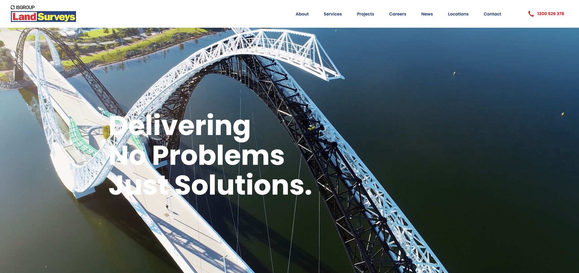
Land Surveys uses a broad Australian infrastructure scene to communicate the scale of the environments it works in. A white identity, complete navigation and a strong telephone treatment sit over the image, while the service structure becomes more explicit below. The opening is visually expansive and suits a business working beyond small domestic commissions. It is less helpful for someone trying to identify a particular survey output immediately. A bridge or aerial landscape can signal context, but it cannot establish accuracy, turnaround or the exact role of the survey team. Those details need to be stated in service and project content, with coverage and regional contact information kept current.
What you can learn
Use infrastructure imagery to establish the operating environment, then name the deliverables and regional routes explicitly. Separate evidence of experience on large sites from any promise about a future survey’s precision, schedule or suitability.
Pros
The wide infrastructure image establishes a distinctive scale and geographic setting for the business.
Visible navigation and a prominent telephone route support visitors who want a practical next step.
Cons & considerations
The visual opening postpones a literal explanation of the particular survey services available.
A national presentation needs clear regional coverage and contact ownership to avoid a generic central enquiry experience.
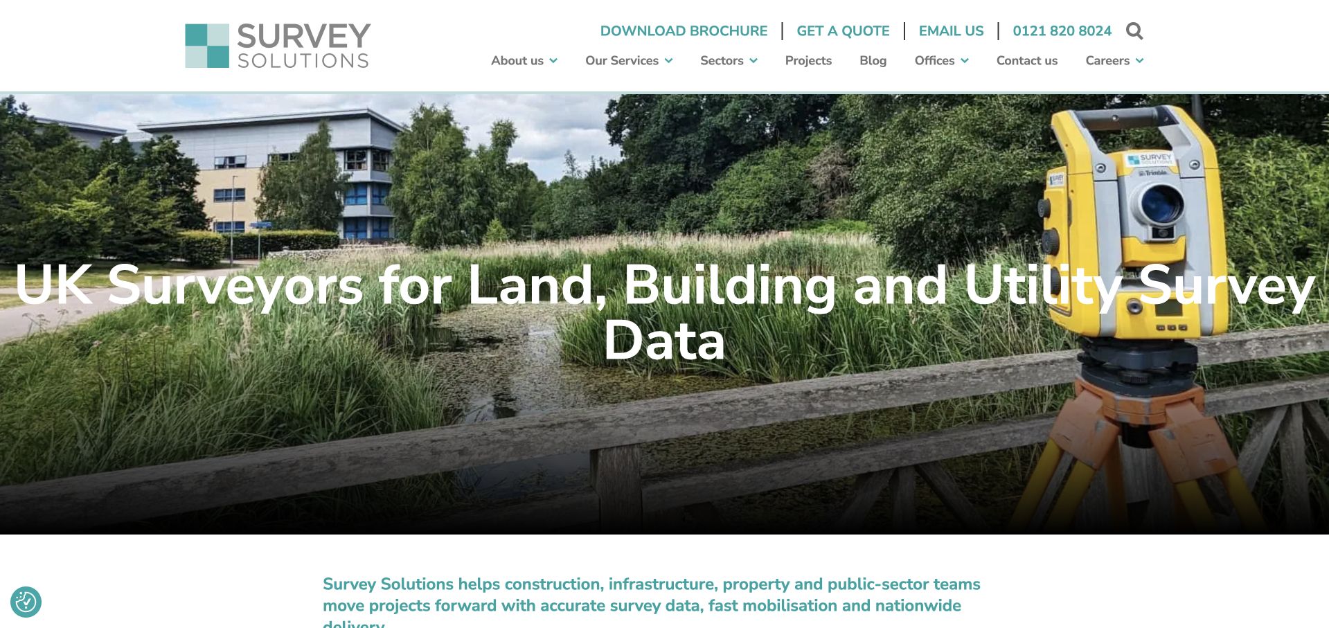
Survey Solutions puts a large, literal description of land, building and utility survey data over an on-site instrument photograph. The utility navigation makes quote, email and phone options visible, while the main menu separates services, sectors, projects and offices. The following text explains several survey disciplines and the delivery network, which helps make a large organisation more navigable. This is a strong practical structure for a visitor arriving with a procurement brief. The headline is very wide at desktop size, and the number of navigation and contact choices creates a dense opening. It requires disciplined mobile wrapping and a clear primary action rather than making every link equally prominent.
What you can learn
For a large survey practice, organise discovery by service, sector and office without losing one clear quote route. Let the service copy explain the output and scope; avoid asking a very long headline to carry the entire catalogue.
Pros
The headline identifies the actual survey disciplines rather than relying on a broad precision slogan.
Service, sector, project and office routes support both technical buyers and geographically focused enquiries.
Cons & considerations
The very long opening title creates a difficult responsive typography and line-wrapping problem.
Several utility actions and a substantial menu can compete with the primary survey-quote decision.
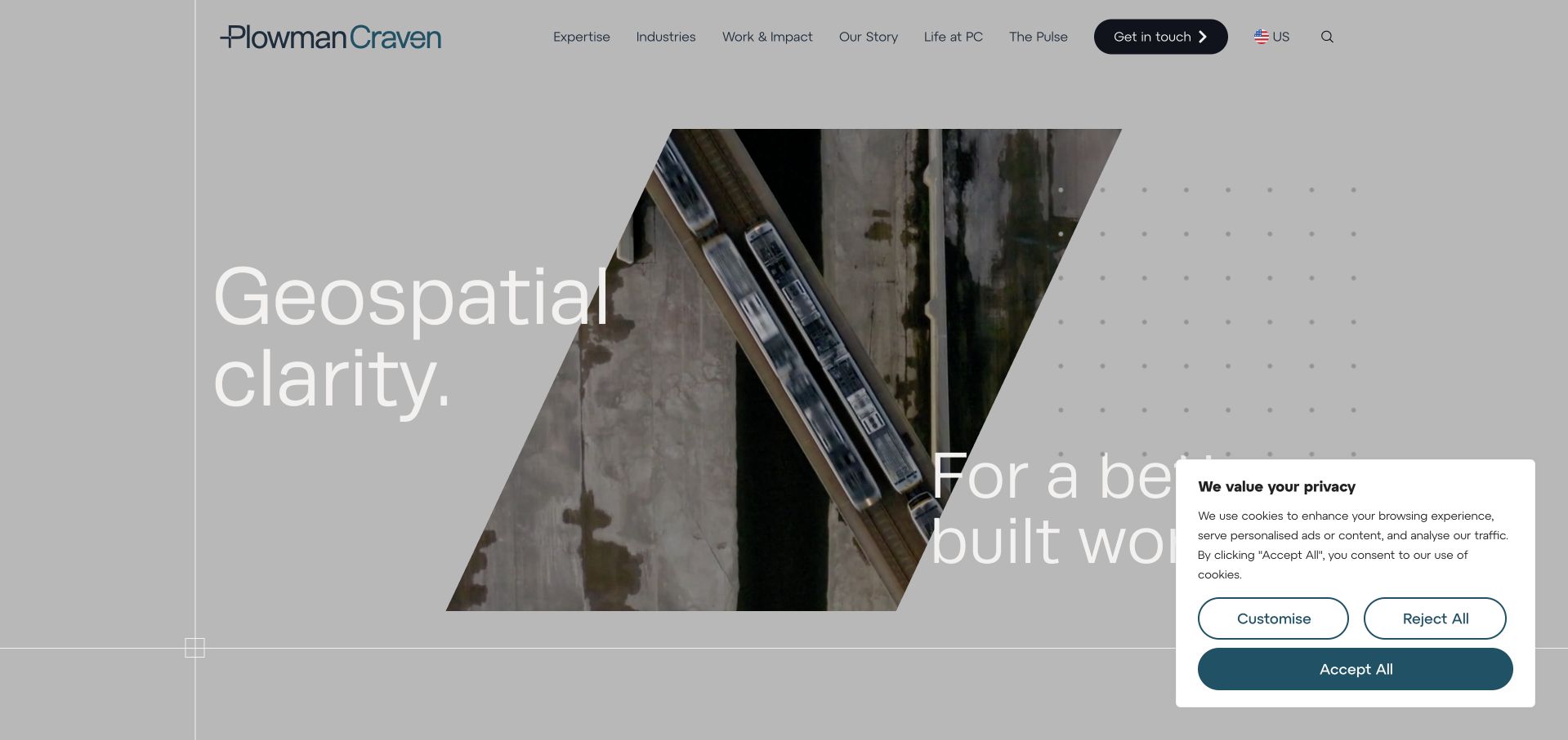
The observed Plowman Craven page is the US regional destination. Its angled image treatment and large geospatial message give the opening an energetic identity, while the header provides sector, service and project routes. The region matters: a global brand should not leave a visitor guessing which team or market a page represents. The layout also makes the relationship between spatial information and the built environment easier to grasp than a bare technology list would. At the same time, a dramatic geometric crop and moving media can make the central proposition less stable. Clients still need concrete details about the deliverable, local coverage and the responsibilities attached to a survey brief.
What you can learn
Make regional context explicit when a geospatial firm serves several markets. Use a consistent visual identity across regions, but localise service availability and contact ownership instead of treating a country switch as purely decorative.
Pros
A clearly regional destination helps connect a global business with the visitor’s likely market and team.
The angled visual system distinguishes the brand while keeping geospatial work connected to built-environment decisions.
Cons & considerations
Large geometric crops and motion can compete with the practical service explanation in the opening view.
A regional page still needs clear deliverable, coverage and enquiry information rather than only a broad geospatial promise.
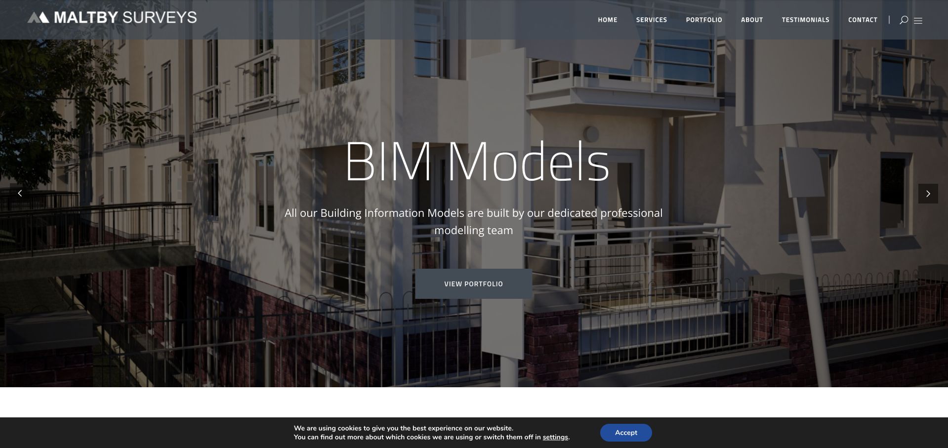
Maltby Surveys opens with a large building scene and a direct BIM-model feature. A dark overlay gives the thin white typography space to remain readable, while a portfolio action connects the technical output to actual work. The white wordmark and conventional navigation keep the page recognisable as a service business rather than a software product. This is useful when clients need a model or survey dataset but may not know how field work turns into that output. The feature is still only one route through a wider geospatial offer. A visitor seeking another survey type needs an equally clear service structure, and the model terminology should explain intended uses and limitations rather than imply universal compatibility.
What you can learn
Feature a specific survey deliverable and connect it to a project example. Then describe format, intended use and handover expectations on the relevant service page so that a technical label does not become an unsupported promise.
Pros
The BIM-model focus gives the opening a more tangible subject than a generic accuracy statement.
A direct portfolio route lets a technical buyer look for evidence of the type of output being described.
Cons & considerations
A single highlighted deliverable can overshadow other survey services unless the navigation remains clear.
Thin type over imagery requires careful contrast, image selection and readable mobile alternatives.
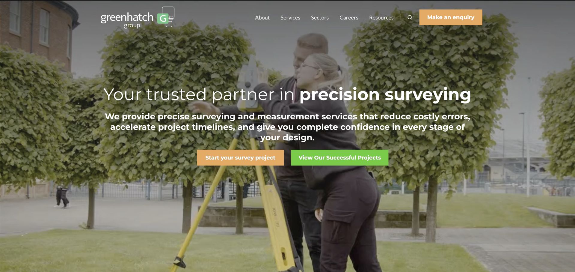
Greenhatch Group uses a darkened workplace scene, a large precision-led message and bright orange and green actions. The contrast between starting a survey and viewing projects is easy to understand: one route is commercial, the other exploratory. The substantial navigation reflects a group with several disciplines and audiences, while project content helps ground that breadth. There is also a brochure promotion near the opening, adding another possible next step. The main lesson is therefore partly about prioritisation. Strong colour can make individual actions visible, but too many invitations at once still compete for attention, especially when a visitor needs to identify one service and one responsible regional team.
What you can learn
A growing survey group should give users a clear distinction between commissioning work and inspecting examples. Treat brochures and promotional overlays as secondary so that they do not interrupt service selection, accessibility or the main project enquiry.
Pros
Distinctly coloured survey and project actions make two common visitor intentions easy to recognise.
The broader service and project structure provides context for a multi-disciplinary surveying group.
Cons & considerations
A brochure promotion adds another competing decision close to the main conversion and research actions.
A long navigation needs careful grouping and a simpler mobile treatment to avoid overwhelming occasional buyers.
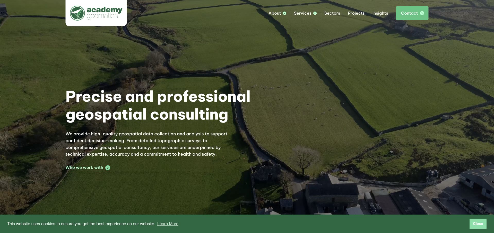
Academy Geomatics uses an aerial landscape and a green brand field to introduce a literal geospatial consulting offer. The main sentence is concise enough to understand without interpreting the image, and the following copy explains the relationship with different clients. A compact menu separates services, sectors, projects and insights, giving the page a useful business-to-business structure. The working academyG.com destination is important here; older references to a different Academy domain did not provide the reviewed page. The design is strongest when it moves from a broad consulting statement into specific outputs. An aerial view can establish territory and scale, but cannot by itself communicate what will be delivered or how a survey is specified.
What you can learn
Combine a concise geospatial proposition with distinct service and sector routes. Keep domain redirects maintained and explain concrete outputs so that a memorable landscape does not become the only evidence of a technical practice.
Pros
A literal consulting headline makes the purpose of the site clear before the visitor explores the service catalogue.
Separate service, sector and project routes support several professional ways of assessing suitability.
Cons & considerations
The aerial opening needs specific deliverable examples to explain the actual work beyond its visual setting.
Older domain references require maintenance so prospective clients do not reach an unavailable or unrelated destination.
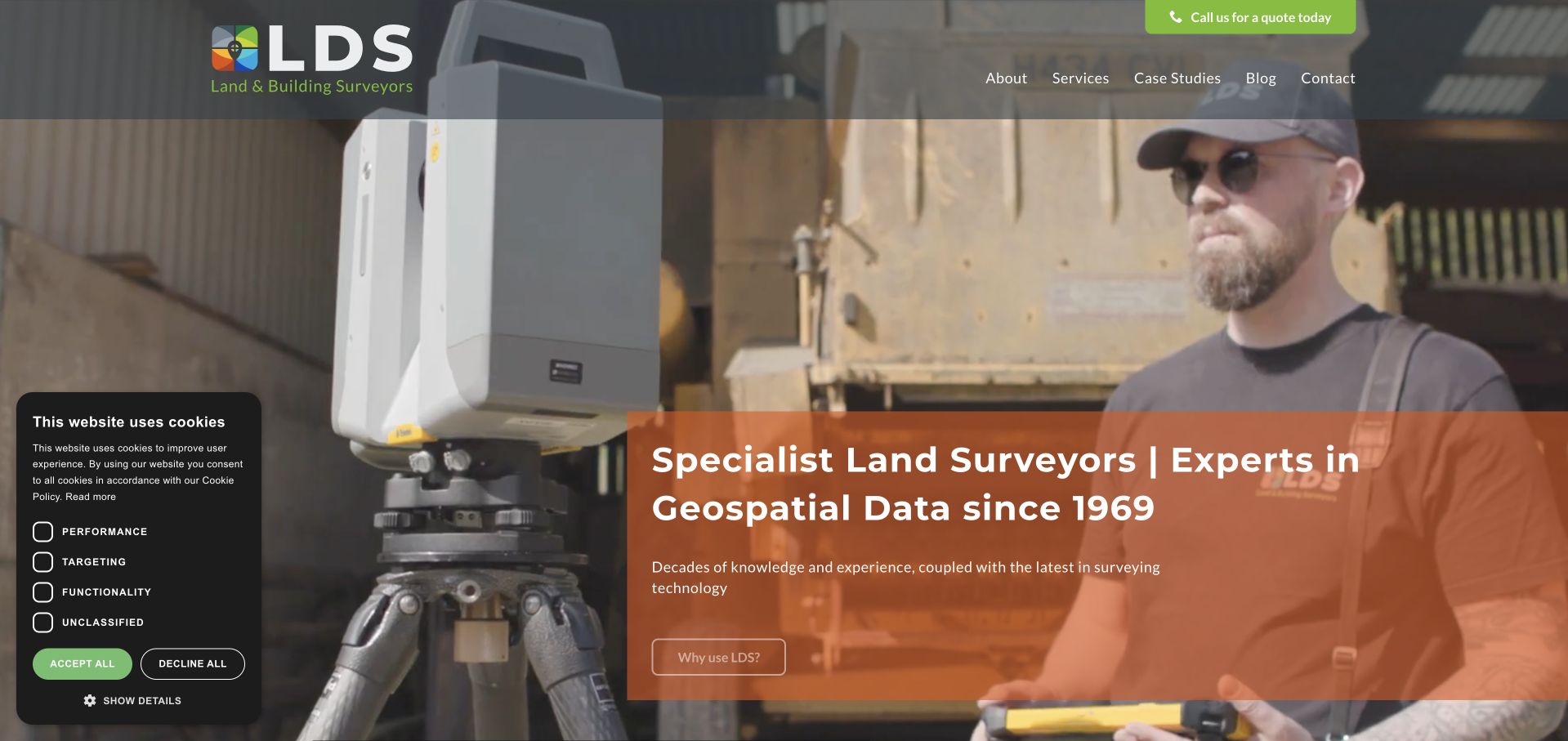
LDS uses an on-site survey scene with a translucent rust-coloured information panel and a dark, green-accented header. The service statement and long-history reference are close to the photograph, so the scene has a practical context rather than functioning as a generic background. The menu and quote route keep the business proposition accessible. This is a useful balance for a technical practice: show the instruments and setting, then explain why the work is relevant. The panel’s density still needs editing, and the history claim is not a substitute for current project evidence. Clients need to understand the particular survey, output and team they would commission now.
What you can learn
A working scene becomes more useful when it is paired with a literal description of the survey service. Use a firm’s history as context, but support today’s offer with current project responsibilities, deliverables and a straightforward enquiry process.
Pros
A real survey environment connects the brand to field work rather than abstract technology decoration.
The adjacent information panel provides service context without forcing all explanation into the navigation.
Cons & considerations
A substantial overlay panel can obscure the visual evidence it is intended to explain on smaller screens.
Longevity alone does not establish the scope, output quality or suitability of a future survey commission.
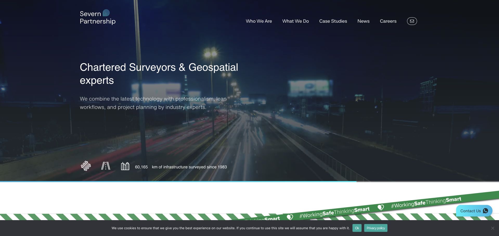
Severn Partnership uses an aerial transport setting, a strong dark-blue treatment and a literal geospatial introduction. Supporting service icons and scale information create a bridge between the infrastructure photograph and the technical work. Navigation remains available in a white header, while the page moves into sector and project material below. This is a useful way to make a complex site-data business understandable to procurement and project teams. Some displayed figures animate as the page loads, so they should not be treated as a stable measurement without a date and definition. The photograph establishes context, but the service pages must still explain which deliverables and responsibilities belong to the firm.
What you can learn
Connect infrastructure imagery with named survey services and clearly defined evidence. If numbers animate, make their final values accessible and attach a date and scope; do not let motion turn important business facts into decorative counters.
Pros
The aerial setting and explicit geospatial message connect large project environments with the firm’s service.
Service icons create scan-friendly entry points before the visitor reaches more detailed project content.
Cons & considerations
Animated counters can be difficult to interpret without accessible final values and a clear date or definition.
A broad infrastructure presentation needs specific output examples so buyers can assess a relevant survey scope.
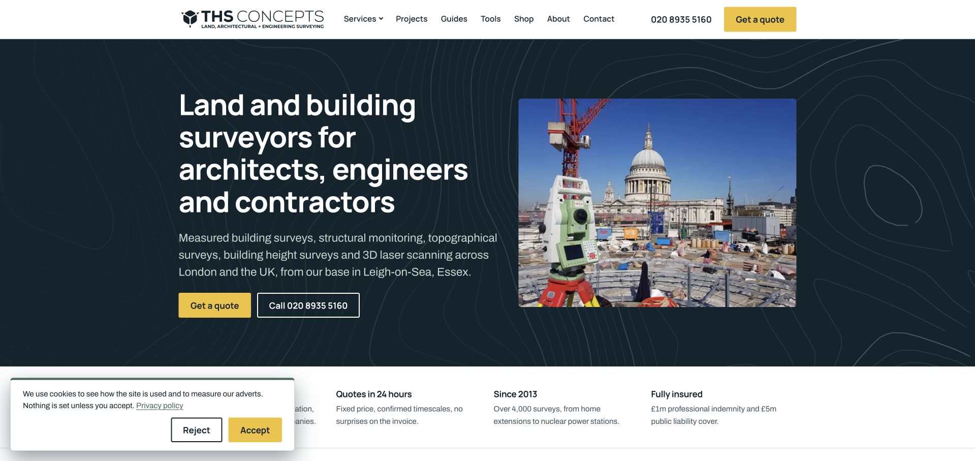
THS Concepts names its intended professional audiences in the opening headline rather than speaking to an unspecified client. A dark contour-map background, yellow quote action and a real instrument photograph establish a recognisable technical identity. The public telephone route and concise coverage copy provide practical information close to the main message. Tools and guides in the navigation offer an additional educational route, which can be useful when a client is still preparing a brief. The page is more direct than many cinematic survey sites, though the long headline and range of destinations make prioritisation important. Technical resources should help clarify scope, not imply that every visitor can specify a survey without professional discussion.
What you can learn
State who a survey service is for and make the initial enquiry practical. Educational tools can support better briefs when they explain assumptions and limitations, while a human surveyor remains available to clarify the required scope.
Pros
The opening identifies architects, engineers and contractors instead of relying on a generic professional-services promise.
Quote, telephone and coverage information appear close to the service statement.
Cons & considerations
A long audience-qualified headline needs careful line lengths and hierarchy on smaller displays.
Tools, guides and commercial routes can fragment attention unless each has a clearly defined purpose.
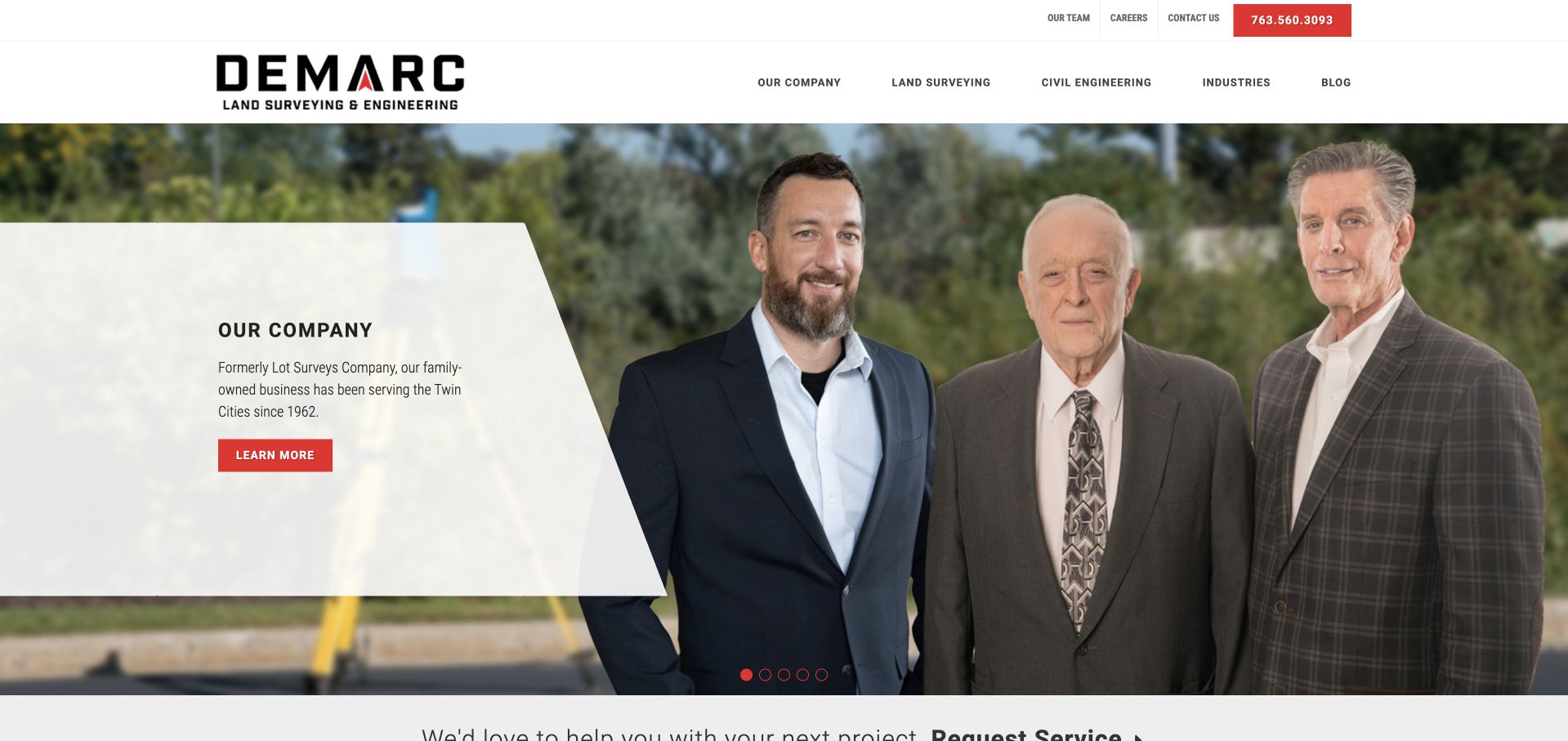
Demarc introduces the business with a group portrait and a sharply angled white panel rather than another aerial landscape. Red accents and a clear family-company message give the opening a recognisable personality. A public telephone number is easy to find, and navigation separates services from industries, allowing visitors to approach the work in different ways. The local Twin Cities context adds useful qualification. People are persuasive evidence of a real firm, but the photograph cannot prove the quality of a survey or the continuity of a particular project team. The supporting service and project content therefore remains important, especially for clients who need a specific legal or technical deliverable.
What you can learn
Use real people to explain a regional practice’s continuity, then show how those people relate to current survey responsibilities. Pair the human story with clear service geography, deliverable examples and an enquiry route that suits the intended clients.
Pros
A real group portrait gives the regional business a human identity that differs from standard equipment imagery.
Separate service and industry routes support both technically informed clients and people starting with a project type.
Cons & considerations
A family-business story needs current project evidence rather than being used as a proxy for professional performance.
Angled image panels and layered text require careful responsive composition so faces and essential copy remain visible.
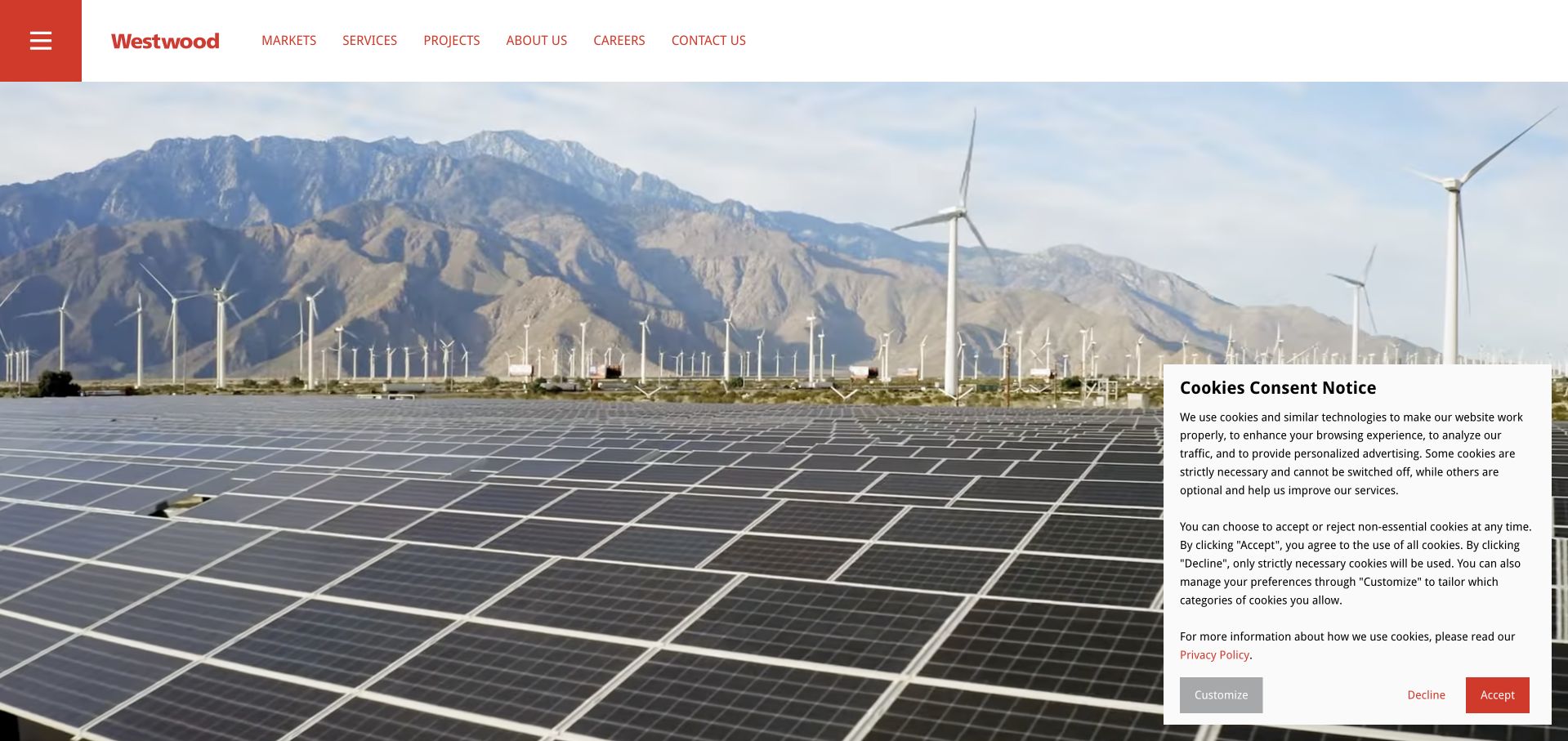
Westwood opens with a broad energy landscape and a restrained white header with red branding. The visual scale communicates the kinds of development environments the practice serves, while market, service and project routes provide the practical structure. Surveying is part of a wider professional-services offer rather than the sole identity of the homepage. That makes this a useful example for firms whose survey teams work alongside civil and environmental specialists. The first screen is less explicit about the survey deliverable itself, however. A visitor who needs boundary, topographic or construction information must use the service catalogue rather than infer a capability from turbines or solar arrays.
What you can learn
When surveying sits within a multidisciplinary business, show the larger development context but provide a direct, literal route to survey services. Project pages should identify which team delivered which part of the work rather than implying one firm owned every discipline.
Pros
Energy and development imagery situates geospatial work within the larger project environment.
Market, service and project routes offer several ways to reach the relevant technical discipline.
Cons & considerations
The image-led opening does not immediately explain the scope of surveying services.
A broad multidisciplinary identity can make a small or narrowly specified survey enquiry feel difficult to place.
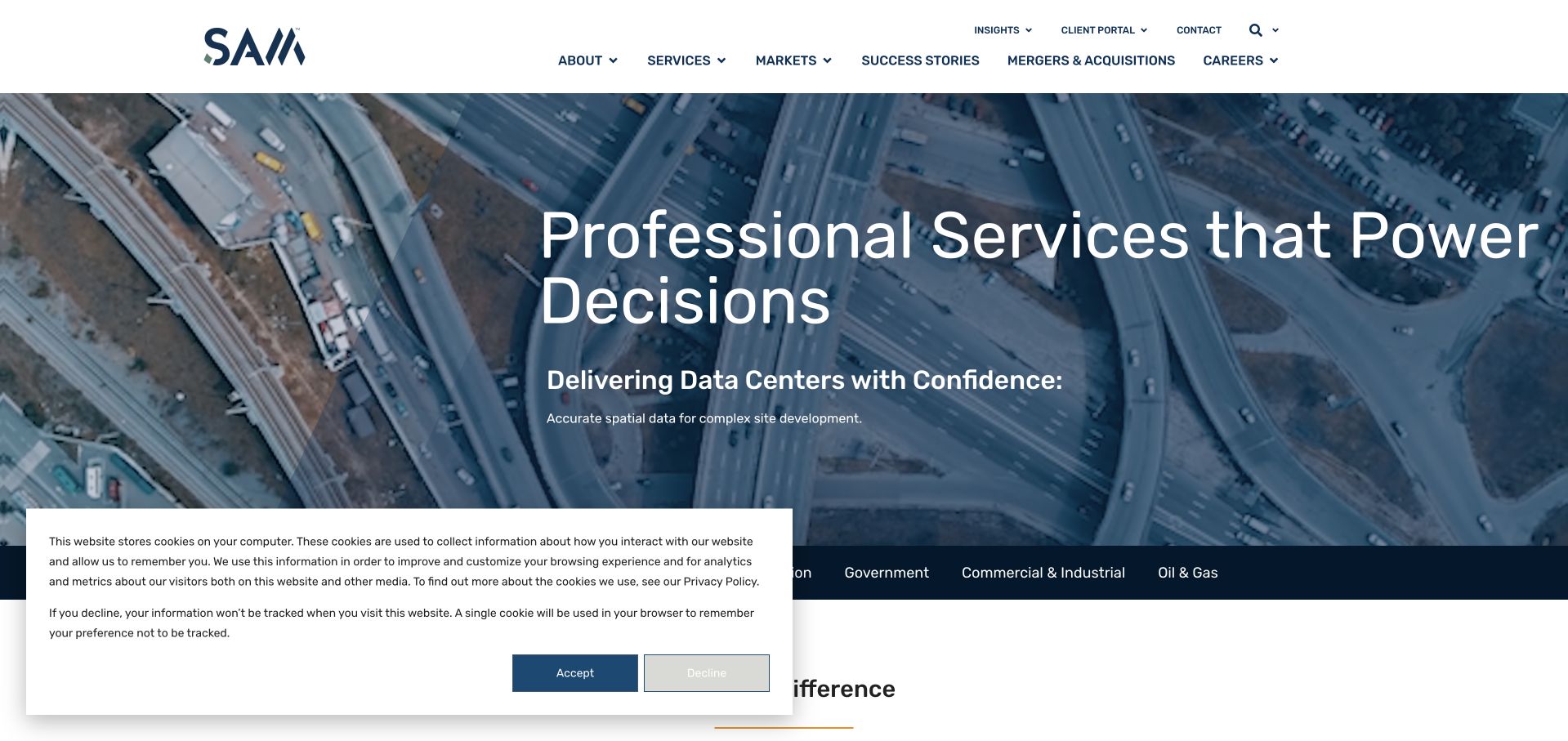
SAM uses a data-centre setting and a dark blue overlay to connect its geospatial services with a specific development market. The large headline frames the work in terms of project decisions, while supporting copy adds the sector context. A two-level header exposes markets, services, careers and client routes, reflecting a larger organisation with different audiences. This is more informative than a generic technology promise because the photograph and text describe where the work is used. It still requires discipline in the next layer: data-centre relevance does not explain every surveying output, and a large navigation can make the route to a simple commission harder to identify.
What you can learn
A sector feature is useful when it explains the decisions spatial data supports. Follow it with exact service outputs and regional contacts, and distinguish a case-study association from claims about every capability used on that project.
Pros
The sector-specific hero connects geospatial work to a recognisable infrastructure programme.
Separate market and service routes let buyers research either their project context or a known technical requirement.
Cons & considerations
A featured market can dominate the opening even when the visitor needs a different survey application.
The two-level corporate navigation needs clear hierarchy to keep everyday commissioning and contact routes easy to find.
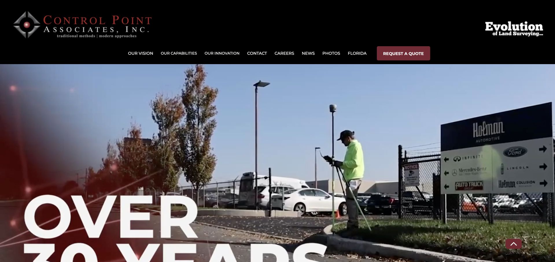
Control Point Associates uses a dark header, a strong red identity and an on-site work scene to create a more industrial first impression. A very large years-in-business statement occupies the lower edge of the hero, while a highlighted quote route sits among the navigation choices. The page communicates an established field operation rather than a purely digital-data product. It also illustrates the risk of oversized proof: the history statement can become cropped or more visually dominant than a literal description of the work. Acquisition and company news add another layer of information, so current service coverage and responsible offices need to remain easy to separate from corporate updates.
What you can learn
Treat a long operating history as supporting information, not the main explanation of a survey service. Give changing company news its own place and make current coverage, deliverables and quote ownership clear for a new client.
Pros
On-site imagery grounds the company identity in actual field-work environments.
A highlighted quote route remains visible within a substantial service-business navigation.
Cons & considerations
Oversized history typography can become cropped and displace more useful service information.
Corporate updates and acquisitions need careful separation from the current list of services and offices.
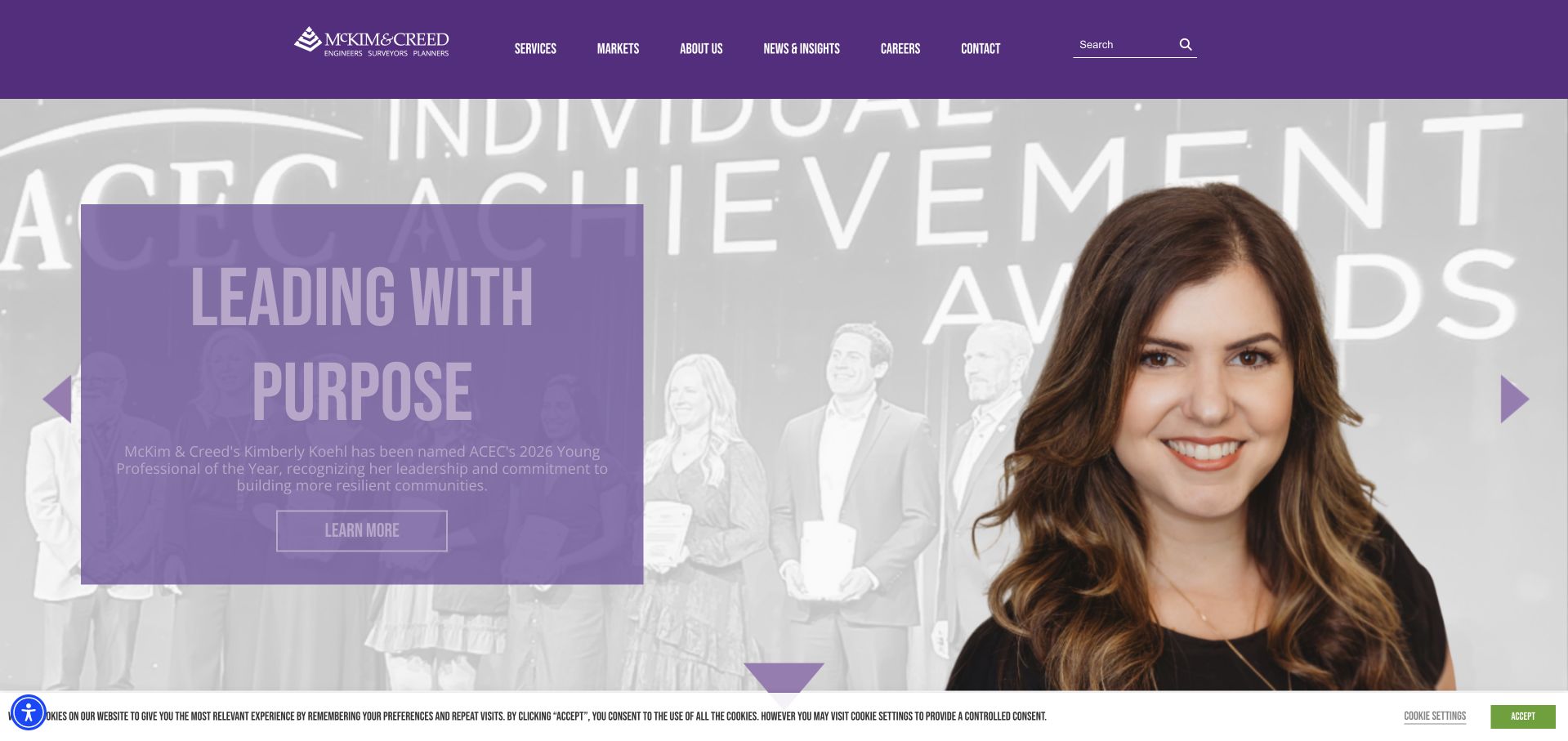
McKim & Creed uses a purple identity and a current people-led feature to make the homepage feel like an active professional organisation. The observed opening pairs a portrait with a substantial text panel rather than relying exclusively on infrastructure imagery. Services, markets, news, careers and contact remain visible in the header. For a multidisciplinary practice, this editorial approach can show the people behind the technical work and make recruitment content feel connected to the company. It also changes the first impression depending on which story is featured. A visitor seeking geospatial services still needs a direct service route, and professional recognition should remain clearly attributed rather than being repeated as an independent assessment.
What you can learn
People and current news can humanise a technical consultancy when they supplement stable service information. Keep a clear geospatial route available and label recognition stories with their source and date instead of letting a featured accolade define the whole practice.
Pros
A people-led feature gives the technical firm a more personal identity than another generic skyline.
The visible service and market structure supports a broader multidisciplinary catalogue.
Cons & considerations
The changing editorial feature may not match the immediate reason a survey client has arrived.
Recognition and personnel stories need clear attribution and should not replace concrete descriptions of project responsibility.
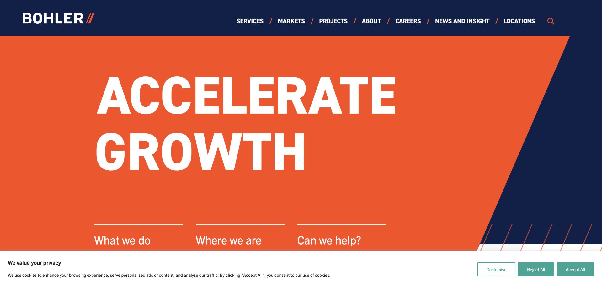
Bohler leads with an orange geometric field and a large growth-oriented statement rather than an equipment photograph. The navy header and short routes to work, locations and contact give the brand a confident, commercial feel. Surveying belongs to a wider land-development offer, so the homepage is useful as a study in presenting a technical discipline within a larger business objective. The visual identity is memorable, but the central phrase is more abstract than a direct surveying headline. A new visitor must continue into service content to understand what the firm can provide, where it operates and how an initial site enquiry should be framed.
What you can learn
A broad development proposition can sit above several disciplines if the service routes remain explicit. Follow brand language with named outputs, coverage and examples that explain the survey team’s role within a larger development process.
Pros
A restrained orange-and-navy system creates a distinctive identity without relying on a complex photographic carousel.
Work, location and contact routes give visitors practical ways to move beyond the brand statement.
Cons & considerations
The growth-oriented opening is less specific than a literal description of surveying or site-development services.
A broad business promise needs project-level evidence and clear discipline responsibilities to avoid ambiguity.
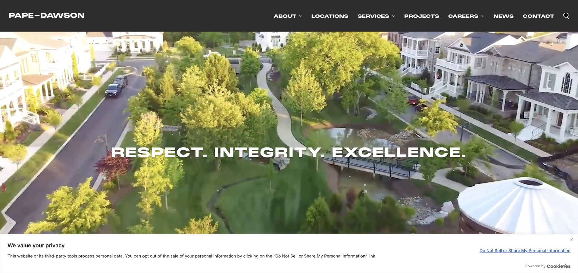
Pape-Dawson uses a large aerial development scene with a dark header and a widely spaced values-led message. The photograph provides immediate context for land and civil work, while the service navigation gives access to the more specific professional disciplines. Survey and geospatial capability sits within that broader offer rather than being isolated as a separate brand. The approach is useful for clients coordinating several parts of a development programme, but the hero itself says little about a particular survey output. Location, project stage and intended deliverable are the information a buyer needs next; they should not have to interpret a neighbourhood aerial photograph as evidence of a precise service.
What you can learn
Use an aerial development image to establish context, then identify the survey services and regional teams directly. Explain the boundary between surveying and adjacent engineering work so that prospective clients can build a realistic initial brief.
Pros
The aerial development context connects the firm to recognisable land and civil project environments.
A conventional service navigation helps users move from a broad company identity to a specific discipline.
Cons & considerations
The values-led hero postpones the exact description of survey outputs and commissioning requirements.
A multidisciplinary presentation needs explicit team and responsibility information on the project pages.
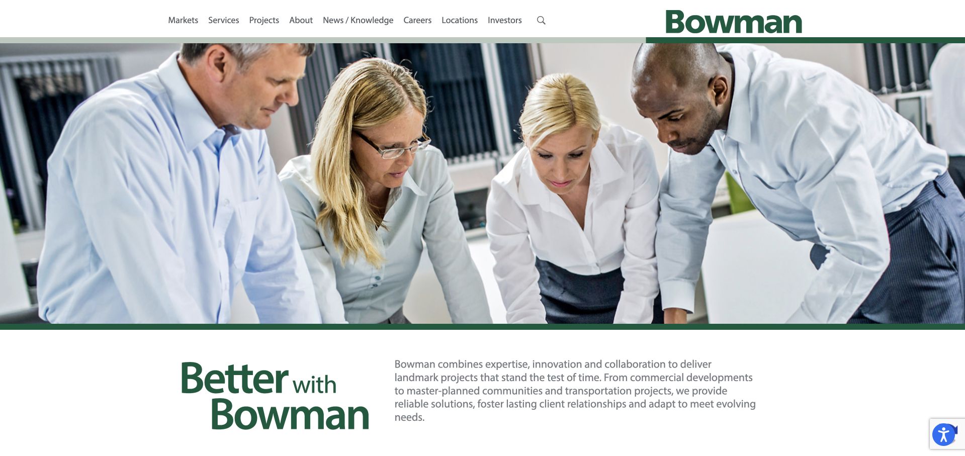
Bowman combines a broad team or worksite photograph with a green statement panel and a straightforward supporting description. A white header keeps the service-business structure familiar, while news appears as a separate layer below the introduction. The people-led image makes a larger consultancy feel less like a catalogue of infrastructure assets. Surveying is part of the service mix, so this is most useful for studying how a discipline fits into a broad brand. The opening promise is not a survey specification. Clients still need to find the right regional team and determine whether their requirement concerns boundary, topographic, construction or another type of survey work.
What you can learn
Use people to make a large consultancy approachable, then let service pages do the technical qualification. Keep news separate from enduring capability information, and provide a direct way to identify the team responsible for a local survey enquiry.
Pros
The people-led image introduces a human dimension to a broad technical consultancy.
The split introduction gives supporting explanatory copy its own space rather than placing everything over a photograph.
Cons & considerations
The broad company message does not immediately distinguish the different types of surveying available.
A large service portfolio needs clear regional and discipline ownership so smaller enquiries do not feel lost.
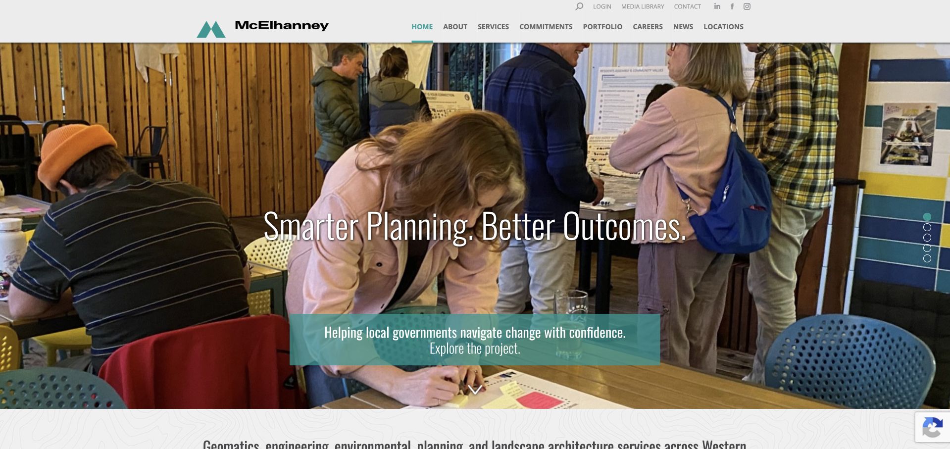
McElhanney uses a community-oriented photograph and a teal text treatment to connect technical work with the places it supports. The two-tier header separates utility information from the main navigation, while the next section names engineering, geomatics and planning explicitly. That combination helps a broad firm feel understandable: the image gives context, and the following words identify the disciplines. For a visitor researching surveying, the geomatics route is important but may still need a plain-language explanation. The opening should not assume that a property owner knows whether a task belongs to planning, land surveying or another specialist. Clear service boundaries are particularly valuable when several disciplines appear under one brand.
What you can learn
Connect surveying to community and development contexts, but explain technical discipline names in plain language. A multidisciplinary site should help a visitor identify the appropriate first conversation rather than requiring them to understand the firm’s internal structure.
Pros
Community imagery gives technical services a recognisable setting beyond instruments and aerial photographs.
The explicit engineering, geomatics and planning statement helps explain the breadth of the practice.
Cons & considerations
Technical discipline names still need accessible explanations for clients unfamiliar with professional terminology.
A two-tier header can become dense unless regional, utility and service choices are carefully prioritised.
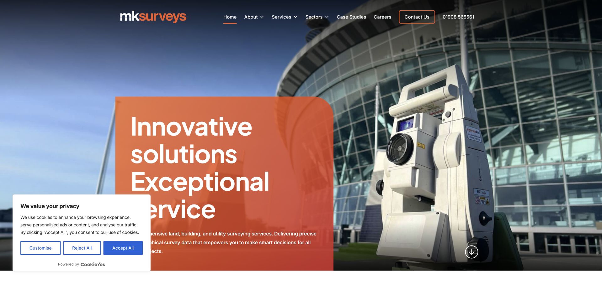
MK Surveys places a translucent orange information panel over an on-site instrument photograph. The brand colour carries from the identity into the hero, creating a coherent opening without elaborate illustration. A narrow contact treatment and a conventional menu make the page recognisable as a practical survey business. The welcome is more direct than a purely abstract precision slogan, and the supporting service grid explains the available technical outputs. The overlay still reduces how much of the working scene a visitor can inspect. A long-established company also needs current project examples and clear deliverable descriptions so that history and brand familiarity do not carry all of the credibility work.
What you can learn
A consistent brand-colour overlay can organise a survey homepage when the text is concise and the working photograph remains useful. Move quickly from the welcome into current outputs, example projects and the information required to request a quote.
Pros
The orange identity and overlay create a consistent visual system across the opening view.
A real instrument photograph and service grid connect the brand with recognisable surveying work.
Cons & considerations
A large overlay panel can obscure useful visual evidence and become text-heavy on smaller screens.
An established-business introduction needs current examples rather than relying on longevity alone to establish relevance.
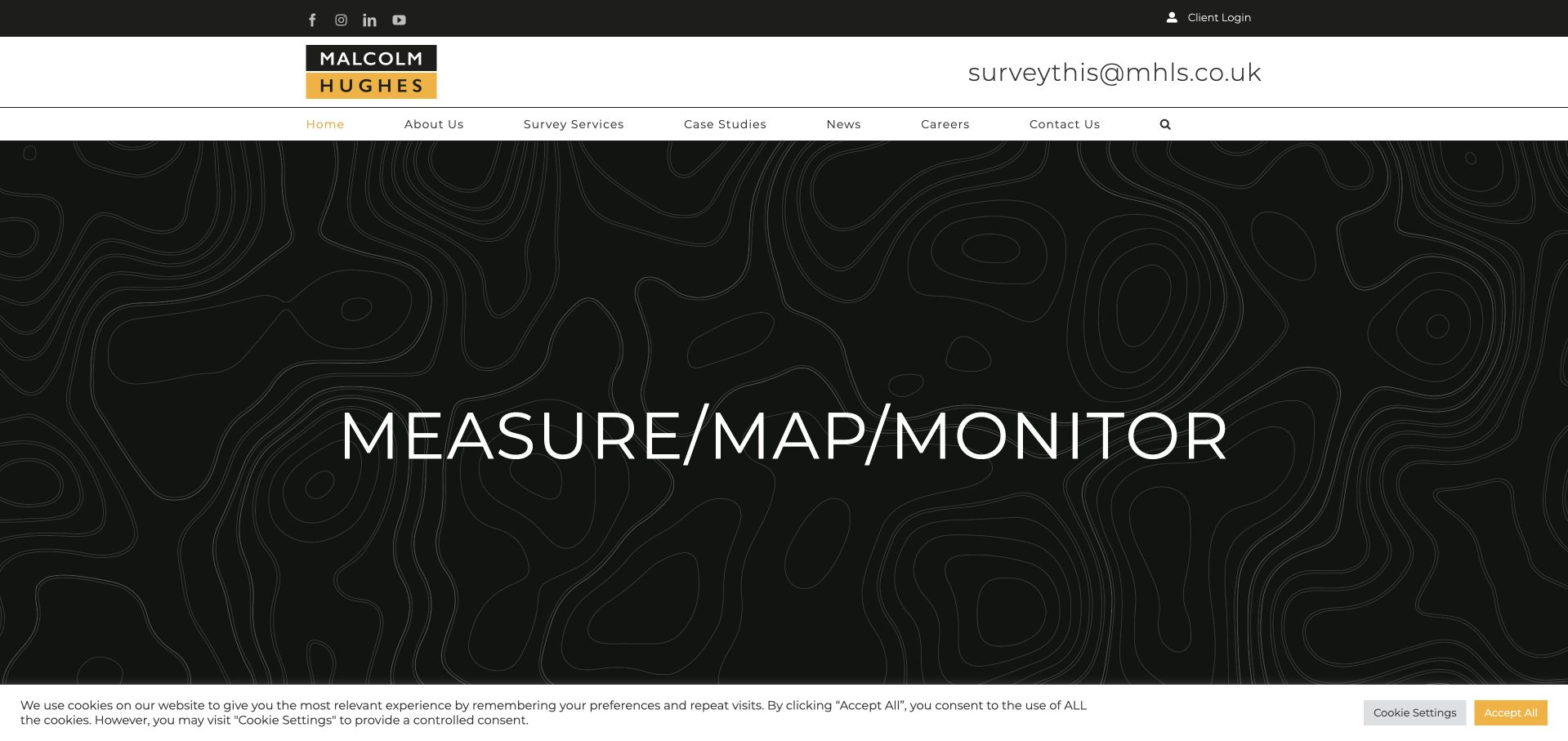
Malcolm Hughes uses a contour-map background and three large survey-related verbs to organise its first impression. The black and yellow identity is highly visible, and public contact information is unusually prominent near the top. Services, case studies, news and careers remain distinct destinations. This gives the page a practical technical character without a conventional full-screen site photograph. The large verbs are memorable, but they are still broader than the specific outputs a client might commission. The next layer must explain whether a requirement concerns land measurement, monitoring or another service, and what information is needed before a quote or technical discussion can be useful.
What you can learn
A small set of verbs can give a geospatial brand a memorable structure, provided each connects to concrete services. Keep contact details prominent, but do not replace scope, output and project examples with an abstract three-word proposition.
Pros
The contour-map visual language reinforces measurement and spatial work without generic corporate imagery.
Prominent contact details and separate service and case-study routes support practical enquiry and research tasks.
Cons & considerations
Broad verbs require linked explanations to distinguish the particular survey deliverables available.
Very large contact and headline treatments can compete for attention and create awkward mobile proportions.
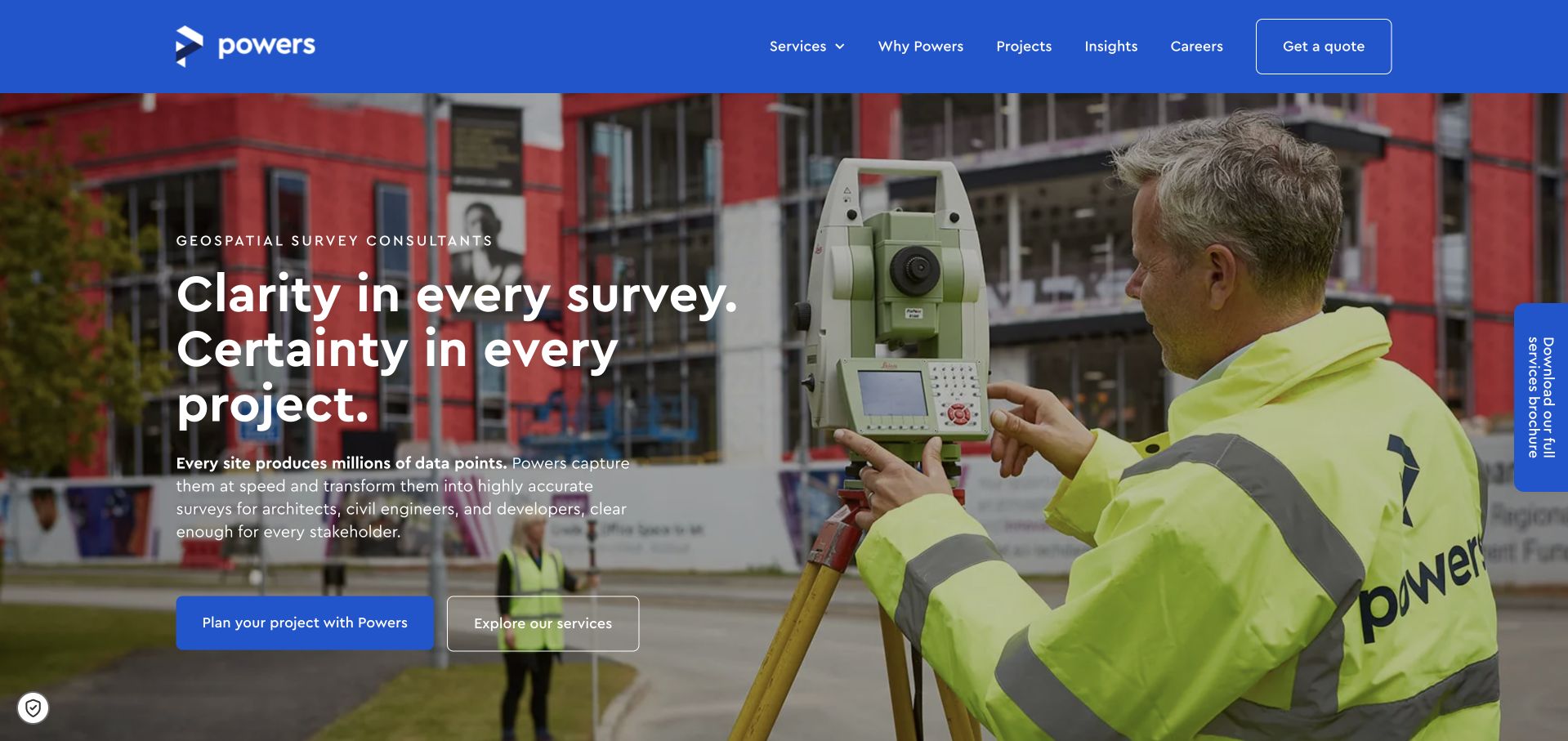
Powers pairs a strong blue header with an on-site instrument photograph and a literal geospatial introduction. The large statement is supported by a project-planning action and a separate service-exploration route, making it possible to engage before having a complete survey specification. The photograph shows the working environment, while the menu supplies familiar service-business choices. A brochure tab offers another route without needing to dominate the page. This is useful for clients who know the project decision they face but not the required output. The certainty-led language still needs careful boundaries: no visual design or headline can guarantee that every site condition or project risk has been resolved.
What you can learn
Let clients begin with the project decision and then explore the appropriate survey service. Explain what information a survey can provide, what remains uncertain and what the team needs to scope the commission; avoid treating certainty as an unconditional promise.
Pros
Separate project-planning and service actions accommodate both early-stage and technically informed visitors.
A real field-work photograph gives the geospatial proposition an understandable physical context.
Cons & considerations
Certainty-oriented language needs clear service limitations so it is not read as a blanket risk guarantee.
Brochure promotions should remain secondary to the main service and enquiry paths.
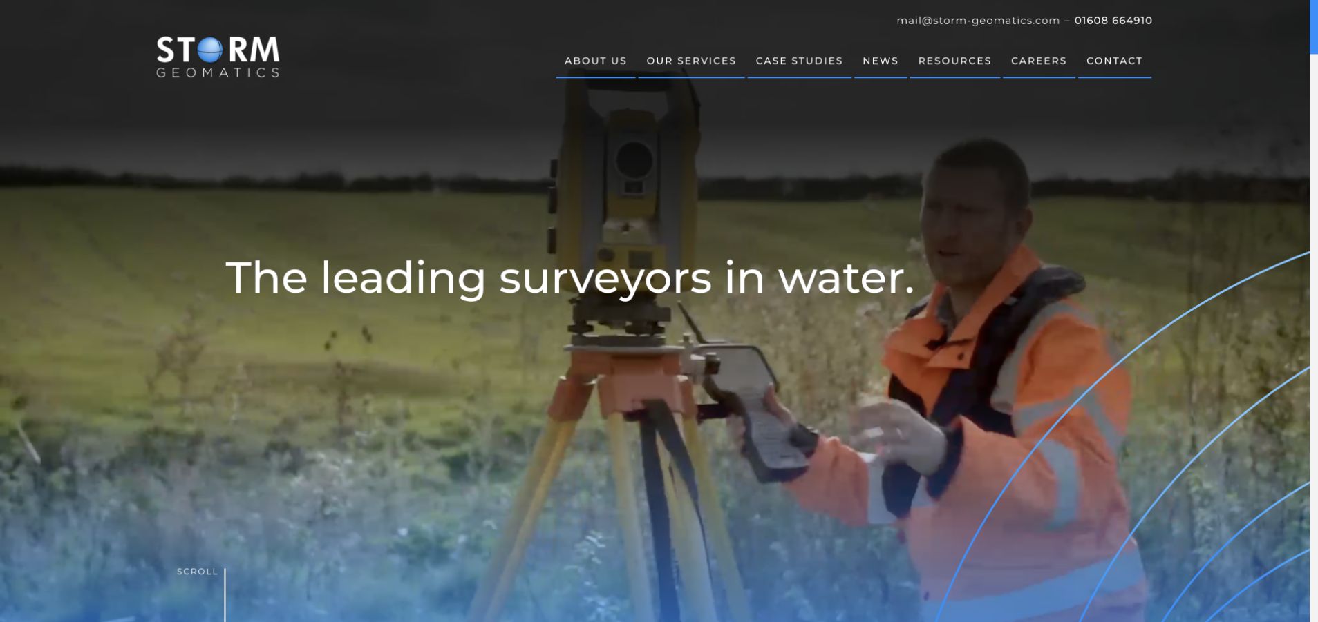
Storm Geomatics opens with a surveyor working in a watercourse, a large water-specialist message and bright contour-style linework. The photograph is unusually specific: it shows an operating environment that immediately distinguishes the practice from a general land-surveying company. A slim contact bar and a compact set of navigation choices keep practical information available. This makes the site valuable as a niche-positioning example within the broader survey collection. Its scope should not be generalised, though. A water-focused practice is not automatically the right reference for boundary or domestic measured-building work, and the technical service pages need to explain methods, outputs and appropriate project contexts.
What you can learn
A specialist survey environment can be a stronger differentiator than a generic instrument photograph. Name the niche clearly, show relevant work and make service boundaries explicit so prospective clients do not mistake a specialist offer for every type of surveying.
Pros
The watercourse working scene makes the practice’s niche understandable in a single view.
A literal specialism statement and visible contact information support quick qualification of a prospective project.
Cons & considerations
The strong water-focused identity may be unsuitable as a template for a general boundary or building-survey practice.
Decorative contour linework and thin large type need careful contrast and motion treatment around the photograph.
Kegan is a freelance web designer and developer with 15+ years of experience helping businesses turn complicated website requirements into clear, maintainable digital experiences. He works directly with clients from planning and design through development, launch, and ongoing support.
For land surveyor website design, his development approach focuses on survey-service explanations, jurisdiction and coverage information, project requirements, and quote requests. The scope can be a targeted improvement or a complete custom build, with responsive layouts, thoughtful content structure, and integrations chosen around the people using and maintaining the site.
Show 3 other land surveyor website designersHide other land surveyor website designers
Build a survey website that leads to a better brief
Define a practical service-page template
For each survey type, explain who usually commissions it, the decisions it supports, the typical outputs and the information needed to discuss scope. Use a clearly labelled sample or diagram where permission allows. Include relevant access or site-context questions without turning them into universal technical requirements. A service page should help a client prepare a conversation, not pretend to replace the surveyor’s professional assessment of the task.
Separate evidence from business decoration
Use real working scenes, relevant project examples and named responsibilities. If a site uses animated business figures, define what is being counted and attach a date. If it uses equipment or software names, explain their relevance instead of assuming that a product logo proves output quality. Keep completed work, demonstration models and research examples distinguishable, and never expose precise private site information merely to create an impressive portfolio tile.
Ask for enough context, not everything
An initial brief can request contact details, site location, project purpose, approximate area or building context, timing and any known output requirement. Allow an unsure client to say they need help choosing the survey. Explain file handling before asking for plans. Route an enquiry by service and geography internally, and confirm receipt without implying that the scope, price or appointment has already been accepted.
The editing job behind the design
Structure the service catalogue before choosing visual effects
A maintainable survey site benefits from structured services, offices, projects and people. Relate those records so a regional page can show genuinely available work rather than duplicate a generic national paragraph. Use a CMS that the practice can update after an office change or acquisition. Keep technical download versions, sample labels and document ownership explicit, especially when a brochure and a web page describe the same service.
Treat maps, file controls and service filters as interfaces that need real testing. Provide a text-based service area rather than relying only on an interactive map. Keep important descriptions readable without video, and make the initial enquiry usable by keyboard and at increased text sizes. The W3C reference below supports the accessibility brief, while the official land-plan source illustrates why technical requirements need a specific jurisdiction and purpose.
Our WordPress website examples offer a separate look at publishing approaches. A visible platform label is evidence for that named page, not a guarantee that the same system will suit your requirements.
Before the public launch
Land surveyor website planning checklist
Pair every technical service name with a plain-language explanation of its purpose.
Distinguish land, building, utility, monitoring and specialist survey work.
State realistic coverage and the office responsible for each region.
Show a useful sample output only when permission and confidentiality allow.
Label demonstrations, models and completed project records accurately.
Explain output formats and intended use without universal compatibility claims.
Keep professional affiliations and business figures dated and attributed.
Offer an enquiry option for clients unsure which survey they need.
Explain how plans and other sensitive files should be transferred.
Provide a text alternative to map-only service-area information.
Test upload controls, navigation and forms across keyboard and mobile use.
Review service availability, offices, contact destinations and download versions regularly.
These checks are a project checklist, not a performance, legal, security, or accessibility certification. Test real journeys with the people responsible for the website before making claims about the result.
Sources & editorial method
How this collection was selected and reviewed
We reviewed the public pages and direct browser captures listed with the examples. These are original observations about information hierarchy, imagery and enquiry design, not a test of survey accuracy or professional suitability. Official guidance is linked for context where a plan’s purpose and jurisdiction matter; it is not general legal or surveying advice.
Each example links to its actual source page. Screenshots are direct browser captures with their own capture dates; moving imagery, announcements and live designs can change. The notes describe observable design choices and conditional tradeoffs, not measured traffic, conversion results, service quality, or accessibility conformance.
Technology labels use public page metadata, asset evidence, or explicitly cited platform documentation. Platform documentation is not a complete current deployment audit. A component reference may be legacy or unused; it is not a complete backend inventory. Unknown stacks are omitted. These sites are editorial examples, not our client portfolio.
Written, Edited and Curated are separate editorial records, not timestamps advanced by a rebuild. Website designs and imagery belong to their owners. See our editorial standards or suggest a correction.
Questions worth asking
Land Surveyor website design questions
Should the homepage list every survey service?
It should expose the main service groups, not necessarily every technical variant. Give visitors enough information to recognise a likely route and a clear option to ask for help. A specialist practice should not imitate a large group’s catalogue if it does not provide those services.
Is a sample plan better than a surveyor photograph?
They serve different purposes. A working photograph shows a real team and environment; a labelled sample helps explain the output. Use both when they add information, with permission and clear context. Do not publish sensitive site details merely because they look technical.
How should a site describe accuracy?
Avoid a universal number or blanket promise in marketing copy. Explain that scope and specifications depend on the project and have the responsible professional approve technical wording. The website’s task is to help prepare a useful brief, not to issue a specification for every situation.
Can one national page cover every local enquiry?
A national introduction can help, but visitors still need to know whether the service is available in their area and which team will respond. Use genuine regional information and avoid creating thin pages for places the firm does not meaningfully serve.
What should a first quote form ask for?
Start with the site, purpose, timing, contact details and any known output requirement. Let users explain uncertainty. Ask for drawings only when there is a clear reason and an appropriate transfer process, and state that submitting a form does not itself agree scope or price.
The most useful survey website makes a technical service easier to discuss without oversimplifying it. Borrow the examples’ clarity, people and output explanations, then build an enquiry process that fits your actual practice and geography.