Best Home Health Agency Websites of 2026 (25 Real-World Examples)
Separate service models, local coverage and referral tasks so a broad care promise becomes useful public information.
A home-health website often serves families, professionals, prospective staff and community supporters at once. They do not all need the same form. Good design explains the actual services and geography, then gives each audience an appropriate next step. A reassuring home photograph can support that explanation, but it cannot replace it or determine whether a person is eligible for a service.
The collection spans local visiting-nurse organisations and larger networks. Some also provide personal care, hospice, equipment or other services. Those relationships are part of the design problem: a visitor should not have to know the corporate structure before learning which page is relevant. Compare literal service labels, public location information and the separation between enquiries and professional referrals.
These reviews concern website design, not clinical quality, coverage eligibility or service suitability. Published claims and geographic information remain the organisation’s responsibility. Images are reviewed as public presentation, not verified patient stories. Have qualified clinical, privacy and operational reviewers approve the actual service descriptions, intake channels and data handling rather than assuming a standard marketing form is appropriate.
Before the examples
What makes good home health agency website design in 2026?
Distinguish the service models
Explain home health, personal support, hospice and other offerings individually where the organisation provides them. Do not let the word care hide important differences in process. Give each category a plain public explanation, realistic geographic scope and an appropriate contact route. Visitors can be unsure which term applies; offer a way to ask without turning a simple website selection into a clinical judgement.
Separate family enquiries and professional referrals
A family learning about the organisation needs service and contact information. A professional making a referral may need a different, approved process. Recruitment and donations are different again. Use literal labels and explain the destination before collecting details. A prominently placed referral button should not be the only route for someone who simply wants to understand whether the agency works in their area.
Make local coverage concrete
State the actual geographic service area and how a local team is found. A national identity does not establish local availability. Provide text-based coverage information alongside any map, with an owner for changes. For a regional nonprofit, a specific community history and ordinary telephone route may be more useful than a complex locator or an unsupported nationwide message.
The collection · 25 examples
25 home health agency websites worth studying
Look for the practical explanation behind the care imagery. The first selection highlights a southeastern Massachusetts nonprofit with documented regional scope. Other examples show contrasting networks and service combinations, not an independent assessment of their care or a claim that every organisation offers identical services.
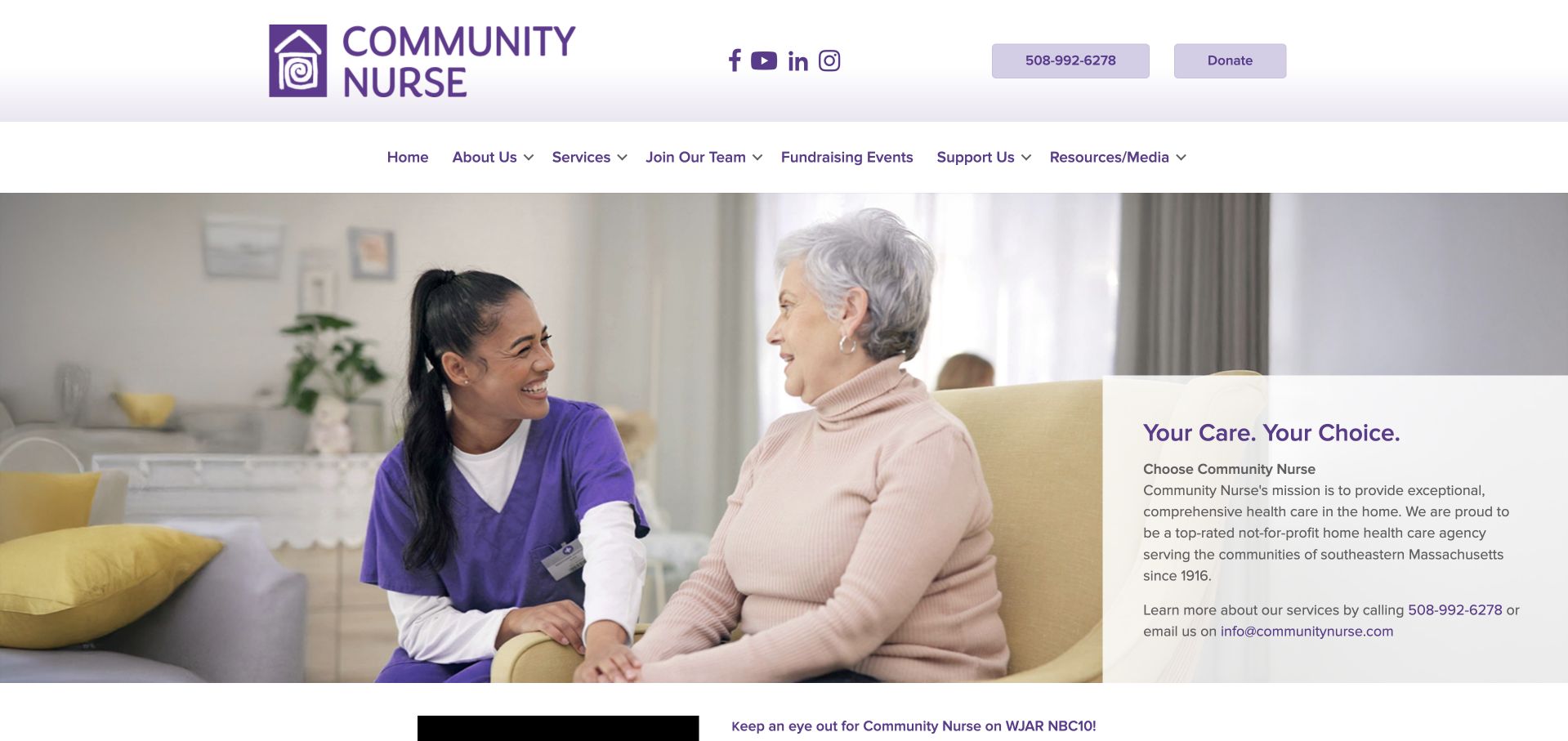
Community Nurse combines a purple local identity with a broad care-interaction photograph and a pale explanatory panel. A telephone route and donation action have separate positions above the main navigation. Services, employment, funding benefits, support and resources are distinct topics, reflecting an organisation with more than one audience. Its public community profile supports the southeastern Massachusetts nonprofit context. The page is useful for showing how a local organisation can present a substantial service range without looking like a national directory. The photograph and published care claims remain its own presentation; the design review does not verify clinical quality or the experience of the people pictured.
What you can learn
Keep a regional home-health identity grounded in place and public service information. Separate donations and recruitment from patient or professional enquiries, and explain the difference between general information and a referral process.
Pros
Donation, recruitment and service information have distinct routes rather than sharing one catch-all conversion action.
The local identity and telephone access provide concrete context beside the broader service introduction.
Cons & considerations
A broad continuum needs clear explanations of the individual services and their geographic availability.
The introductory panel should lead to practical referral and contact instructions rather than rely on reassurance alone.
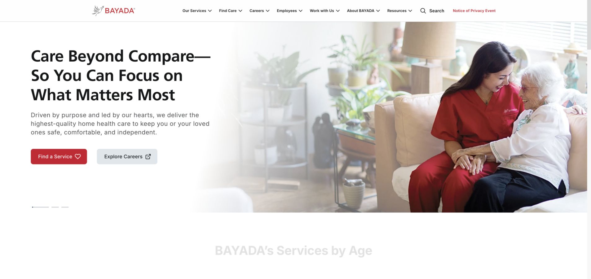
BAYADA uses a white split composition with a large care-interaction photograph on the right and a concise introduction on the left. Finding a service and exploring careers are separate actions, which acknowledges two important but different audiences. The header adds service, employer and resource routes without turning the opening into a directory grid. The photograph fades into the white background, giving the page a lighter visual treatment than a full-screen campaign. The broad term care still needs explanation: visitors must be able to distinguish skilled services, personal support and other offerings, with specific local availability rather than assuming every service belongs to every office.
What you can learn
Separate recruitment from service discovery early, then explain the actual care categories in plain language. A large network should attach geography and referral details to individual services instead of relying on a universal brand promise.
Pros
Care discovery and careers have separate actions that do not force different audiences into one enquiry form.
The white text area maintains a stable reading surface beside the large photograph.
Cons & considerations
A broad care proposition needs clearer service-level distinctions before it can support a practical decision.
A network-wide image and headline cannot establish local staffing, coverage or availability.
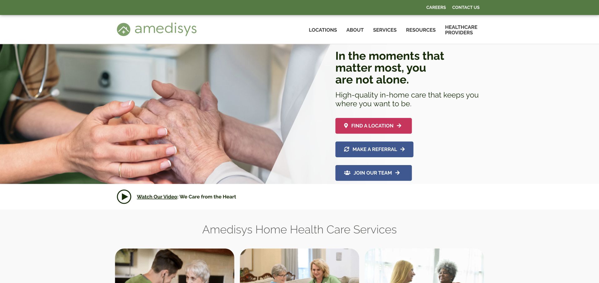
Amedisys uses a close care-interaction photograph beside a compact introductory panel. Three prominent actions distinguish finding a location, making a referral and joining the team. This is a useful information hierarchy for home health, where a family enquiry, a professional referral and a job application require different processes. Service cards begin below the hero, allowing the opening to remain brief. The warm image supports the tone but cannot explain eligibility or service provision. The strongest design lesson is the explicit task separation: the page does not pretend that every visitor should complete the same contact form or provide the same information.
What you can learn
Make public discovery, professional referral and recruitment separate journeys. Explain the next step and appropriate channel for each before requesting details, and keep service-area information publicly available rather than trapped inside referral intake.
Pros
The three opening actions reflect genuinely different relationships with the organisation.
Service cards begin near the opening without requiring every category to appear inside the hero.
Cons & considerations
A broad home-care message needs specific local service and referral information underneath it.
The photograph supplies reassurance but cannot substantiate eligibility, care quality or individual availability.
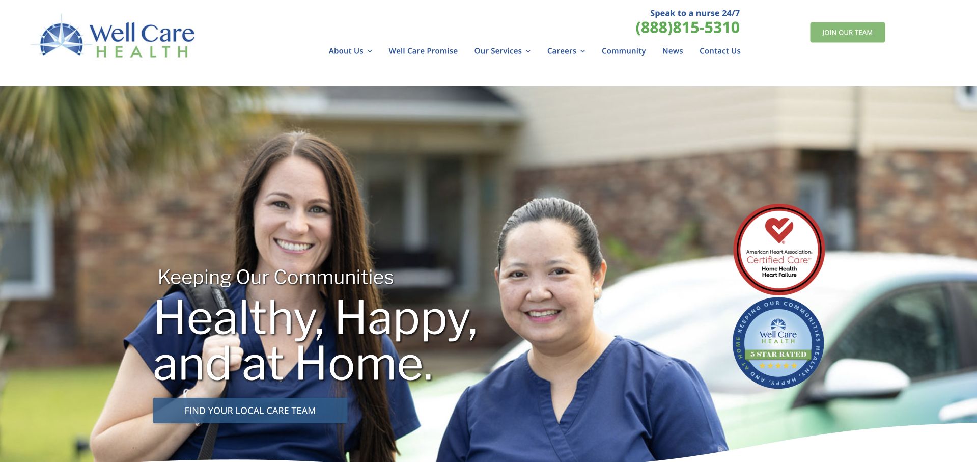
Well Care Health combines a wide outdoor care-team photograph with a short home-focused headline and a local-team action. The telephone number is visible above the navigation, which separates services, community and organisational information. The page’s regional positioning is supported by public service information for the Carolinas rather than inferred from the photograph. Recognition graphics sit within the opening, adding visual weight but requiring their own original context. The most useful element is the connection between a home-focused proposition and a local-team route. A visitor still needs clear distinctions among home health, hospice and other services, rather than treating the shared brand as one uniform care arrangement.
What you can learn
Tie a regional care introduction to a concrete local-team destination. Keep recognition claims sourced and secondary, then explain service differences and referral expectations through maintained public information.
Pros
The local-team action gives the regional introduction a practical direction.
A visible telephone route supports visitors who need an alternative to online browsing.
Cons & considerations
Recognition graphics can compete with the main task and should retain their original dates and scope.
A shared home-focused message needs specific service distinctions and geographic detail before an enquiry.
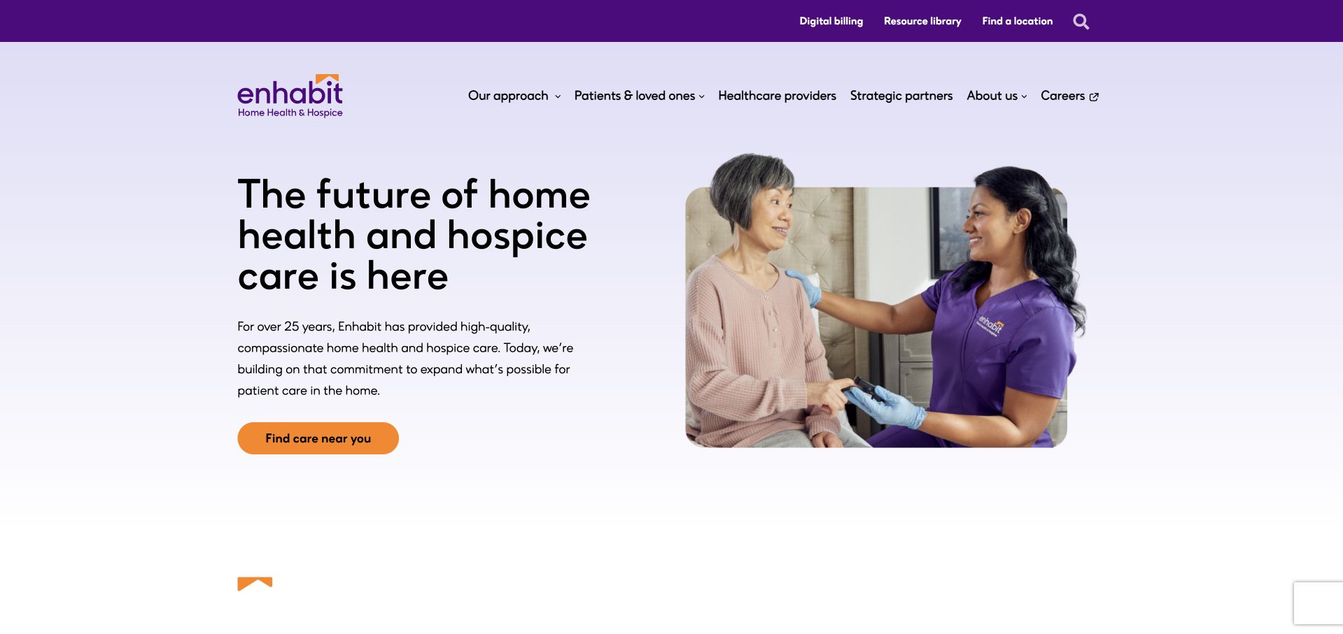
Enhabit uses a pale purple split layout with a concise headline and a care-interaction photograph in a rounded frame. A contrasting orange location action gives the opening a clear task, while the navigation distinguishes patients and loved ones, professionals, and employment. The organisation names home health and hospice together in its identity, making the relationship visible rather than hiding one service in a secondary menu. That pairing still requires careful explanation. A visitor should understand that the service models, referral questions and local provision differ, rather than assuming one general care button is a complete description of both.
What you can learn
Related services can share a brand without sharing an opaque intake path. Use audience-specific navigation and public explanations to distinguish home-health and hospice enquiries before any personal information is requested.
Pros
The contrasting care-location action is clearly positioned on a stable light background.
Patient, professional and employment audiences have separate navigation routes.
Cons & considerations
A combined home-health and hospice introduction needs service-specific detail to avoid an oversimplified impression.
A rounded photograph adds warmth but does not explain local availability or the practical referral process.
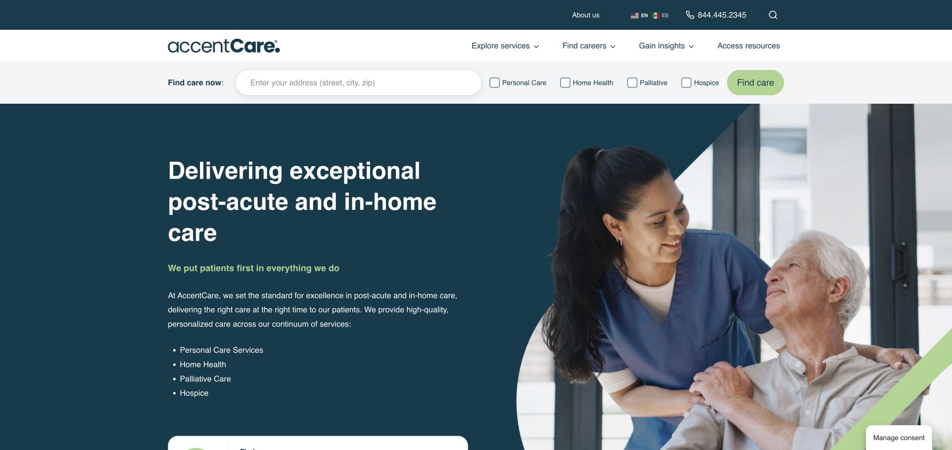
AccentCare places a location finder and service choices in a separate strip above its main hero. The hero itself combines a dark teal text field with a care-interaction photograph and a concise service list. Personal care, home health, palliative care and hospice are named rather than collapsed into a single generic label. The arrangement is useful for a network where the visitor may know either the geography or the required service. Its complexity also deserves attention: a compact strip can become a dense cluster of controls on mobile. The public page needs to explain category differences without presenting the selection as a clinical recommendation.
What you can learn
Separate geography and service type while keeping their relationship visible. Provide plain definitions and appropriate contact routes, then use local results to confirm actual provision rather than implying that every service exists everywhere.
Pros
The opening names several service lines explicitly instead of relying only on a broad care promise.
The finder sits on its own stable surface outside the photographic hero.
Cons & considerations
Several closely spaced service controls need careful mobile layout and keyboard testing.
Choosing a service category should not be presented as an assessment of a person’s needs or eligibility.
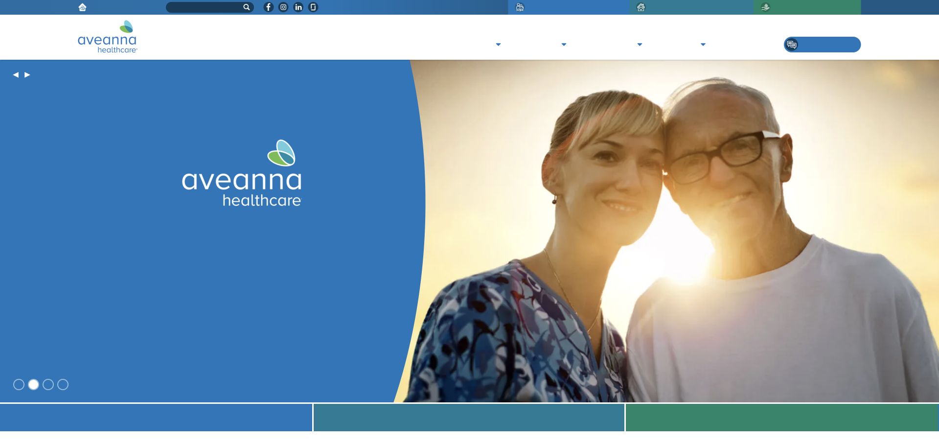
Aveanna uses a large blue curved field beside a close human photograph, carrying the organisation’s identity across the opening. The header is compact, with service and location information separated from other organisational tasks. The visual treatment creates immediate recognition and gives the page a distinct shape without requiring a large text overlay. The first view is more atmospheric than explanatory, however. A visitor needs supporting content that distinguishes the organisation’s different service lines, age groups and local offices. The image should be read as brand presentation rather than proof of the service model, relationship or clinical circumstances of the people pictured.
What you can learn
Use a strong identity to create continuity, then provide specific service and location explanations quickly. Do not expect a human photograph or a familiar brand shape to communicate the differences among care arrangements.
Pros
The curved blue treatment creates a consistent visual identity without covering the photograph in multiple captions.
A compact header preserves access to the wider service and organisational structure.
Cons & considerations
The image-led first view explains less about practical service scope than a concise text panel would.
A broad network presentation needs local and service-specific information before it can support an enquiry.
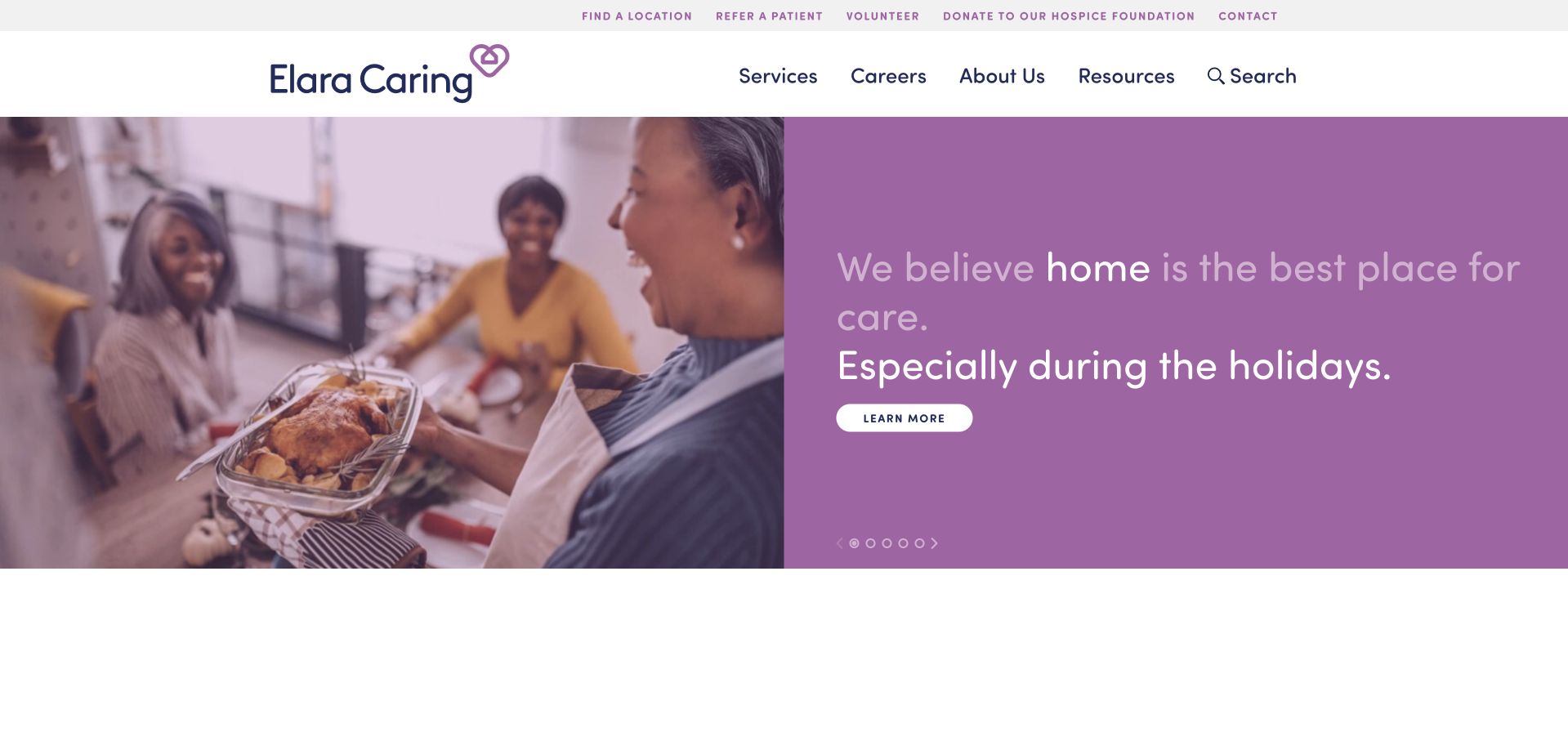
Elara Caring combines a seasonal domestic scene with a large purple text panel. The headline relates the service to home and a timely holiday context, with a compact learning action beneath it. The header keeps location, referral, employment and organisational routes separate from the campaign. This is useful for a brand whose public story changes through the year while the practical information structure remains stable. The seasonal message should not become a substitute for explaining service types or local provision. A family or professional arriving with a specific question needs a direct route that works independently of the featured campaign.
What you can learn
Give timely campaigns a bounded role within a stable home-health information structure. Keep referral and location routes permanently visible, and make the core service explanation understandable after the seasonal wording is removed.
Pros
The solid purple panel gives the campaign text a predictable reading surface beside the photograph.
Referral, location and employment routes remain separate from the seasonal learning action.
Cons & considerations
A holiday-led message can feel less relevant to visitors seeking immediate practical service information.
Seasonal campaigns require expiry and review ownership so the homepage does not appear neglected later.
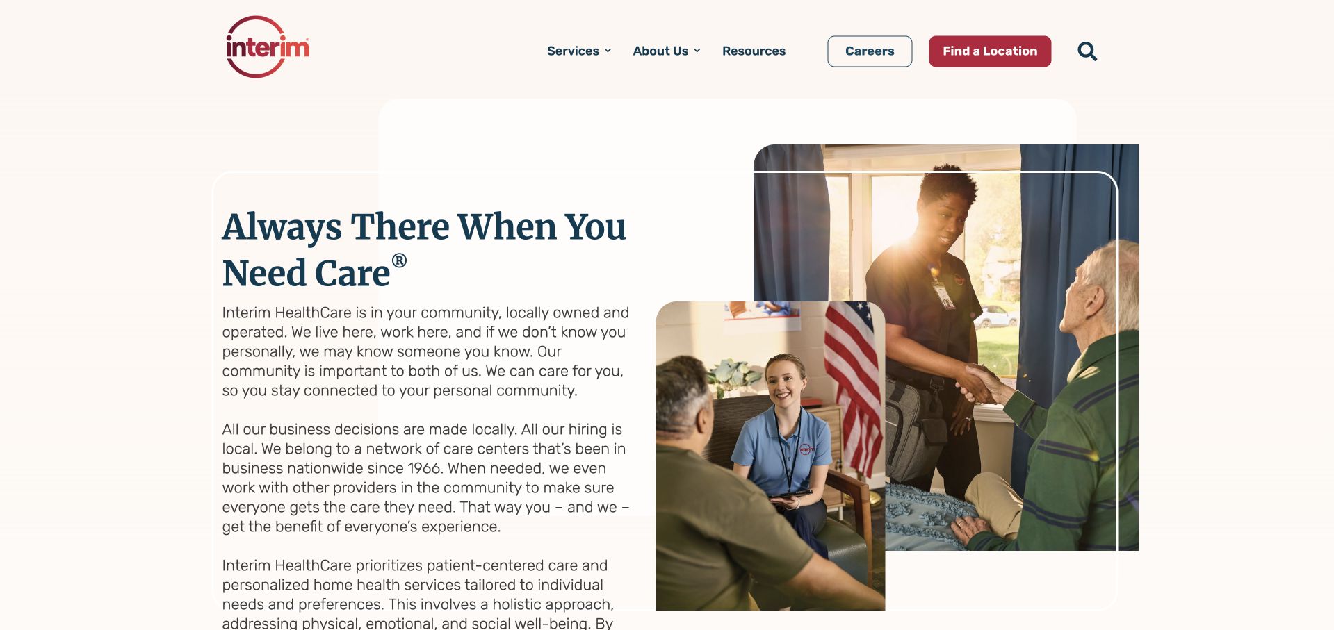
Interim HealthCare uses a restrained cream opening with a substantial text introduction and overlapping photographs on the right. The images suggest a home visit and a family setting, while the navigation gives services, resources, careers and location discovery separate routes. The opening contains more explanation than many competitors, which can help communicate a broad organisation but also slows scanning. It is especially important here to distinguish home health, personal care, staffing and hospice where those services are offered. A single warm paragraph should not leave visitors assuming these are interchangeable or available through every local office.
What you can learn
A broad home-care organisation needs plain service definitions more than additional generic reassurance. Break longer introductory copy into readable decisions and give each service model a clear public route before a visitor begins an enquiry.
Pros
Services, resources, careers and location discovery have explicit separate navigation labels.
The layered imagery gives the otherwise restrained opening a concrete home-visit context.
Cons & considerations
A lengthy introduction can delay the practical local-service question that many visitors bring.
Several service relationships need explicit distinctions rather than one broad home-care description.
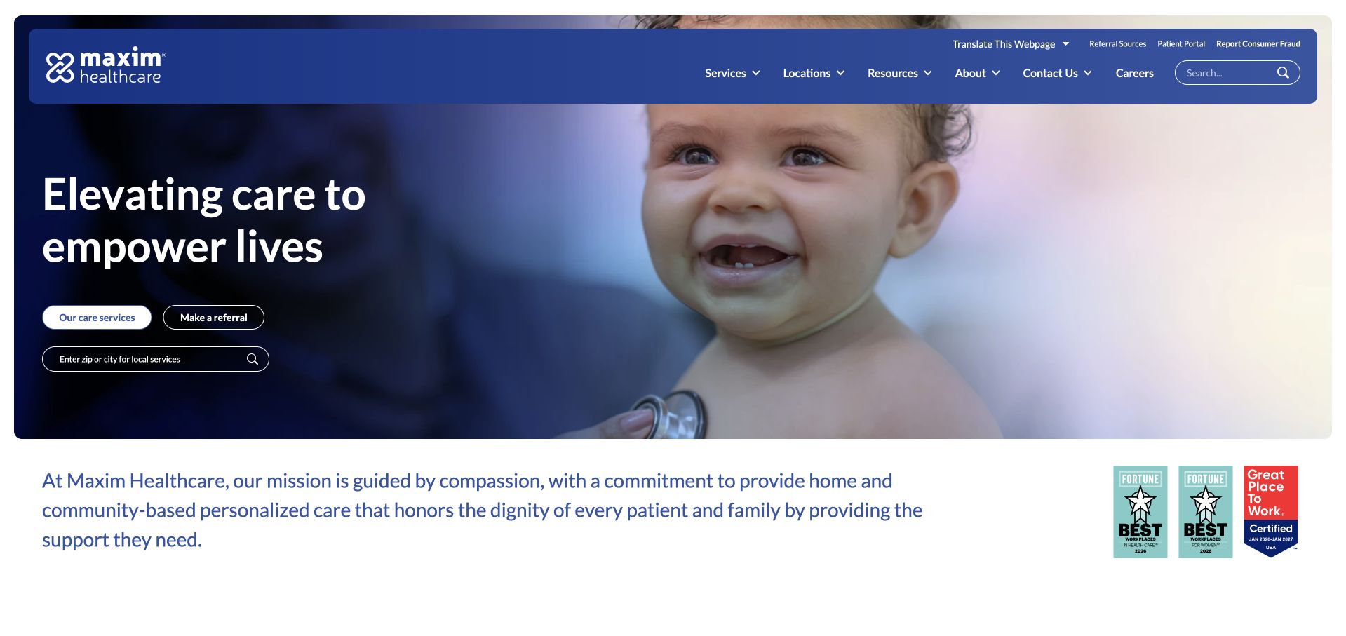
Maxim uses a dark blue header and a large child photograph beside a concise service statement. Two small opening actions distinguish service exploration from making contact, followed by a short mission paragraph and supporting recognition graphics. The composition is visually confident, with a strong contrast between the dark text area and the bright image. The image also creates a scope question: the public site needs to make clear which services and age groups it covers rather than letting one photograph define the entire offer. Recognition badges should remain contextual evidence about the specific award or programme, not a blanket claim of clinical quality.
What you can learn
Choose imagery deliberately but explain the full service scope in text. Keep service exploration distinct from contact, and ensure any recognition graphics link to an appropriate current source rather than acting as decorative guarantees.
Pros
The dark text area gives the concise introduction strong visual contrast against the bright photograph.
Service exploration and contact are distinct actions rather than a single ambiguous get-started route.
Cons & considerations
A child-focused image can narrow the perceived service range unless supporting text is explicit.
Small action labels and recognition badges need enough readable space to remain useful on mobile.
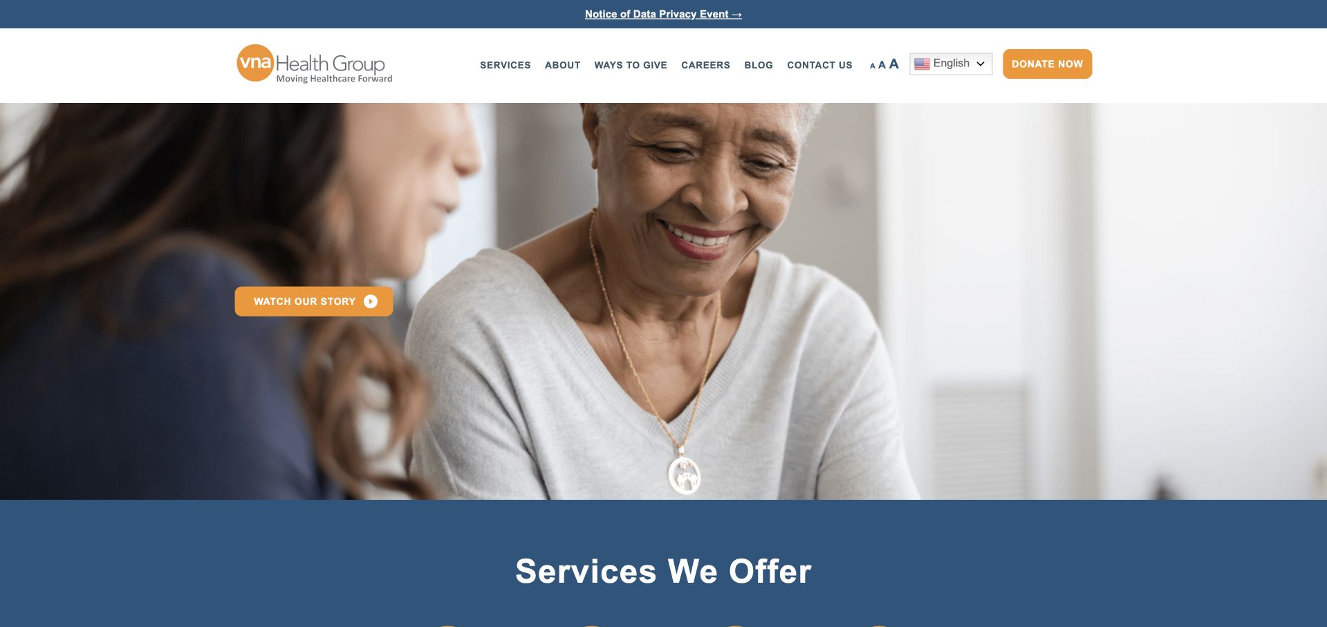
VNA Health Group uses a large care-interaction photograph and a restrained orange action, followed by a broad blue service section. The white header separates services, about, ways to give, careers and public information. That structure acknowledges that a nonprofit-style visiting-nurse organisation has donors and volunteers as well as families and referring professionals. The hero itself carries relatively little explanatory text, leaving the service section to make the organisation understandable. The useful lesson is that the navigation should preserve those different relationships. A general request or support action should not be mistaken for a clinical referral or a promise of local availability.
What you can learn
Use the opening photograph to establish tone, then make service scope and geographic coverage concrete. Keep donations and organisational participation separate from the public care-information and professional-referral journeys.
Pros
The navigation recognises support and employment tasks without treating every visitor as a prospective patient.
A dedicated service section follows the image rather than relying exclusively on the hero to explain the organisation.
Cons & considerations
A lightly labelled hero can leave unfamiliar visitors uncertain about the immediate next step.
Service categories need current local detail rather than a general network-wide availability assumption.
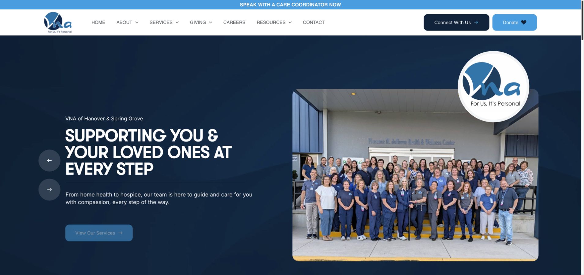
VNA of Hanover and Spring Grove pairs a dark blue text field with a large photograph of the organisation’s team outside a named building. A floating logo reinforces the local identity, while the headline describes supporting people and loved ones. The primary action leads to services, and a separate top strip offers contact with a care coordinator. Donations have their own header action. The layout is useful because the service path and community-support path do not compete as one generic form. The team photograph gives concrete organisational context, but current staff roles and service capacity need maintained text rather than assumptions drawn from the picture.
What you can learn
A local team image can make a regional organisation tangible. Pair it with a literal service route and a separate giving action, then explain coordinator contact and referral expectations before requesting personal information.
Pros
Service discovery, coordinator contact and donations are expressed as different visitor tasks.
The local team and building photograph provide a specific alternative to anonymous care imagery.
Cons & considerations
A large floating logo uses space that could hold more practical first-view service detail.
A team photograph needs an update process and cannot establish current staffing or service availability.
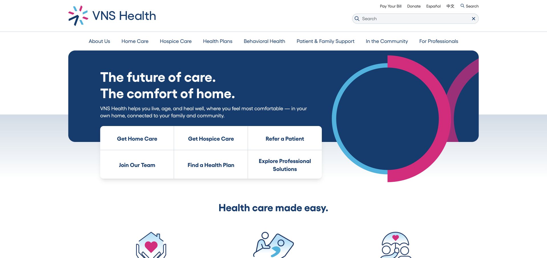
VNS Health uses a contained blue brand panel with a compact six-item task grid below the headline. Home care, hospice, referral, employment, health-plan discovery and professional solutions are distinct routes. The upper navigation also provides language choices and search, recognising that a large service organisation cannot be understood through one care button. The design is valuable for making different relationships visible before a long explanation. Its challenge is terminology: home care, health plans and professional solutions refer to materially different things. Each destination needs to explain its role and local availability instead of relying on the shared VNS identity.
What you can learn
When a brand includes care and coverage-related services, separate the tasks explicitly. Use a small grid of literal actions, with public explanations that prevent visitors from confusing a provider enquiry with a health-plan question.
Pros
Six explicit task routes acknowledge different audiences and service relationships within the same organisation.
Search and language options provide useful alternatives to navigating a large service taxonomy.
Cons & considerations
Several adjacent actions can feel dense unless their labels remain readable and clearly distinct.
Care provision and health-plan information need strong boundaries rather than an implied single process.
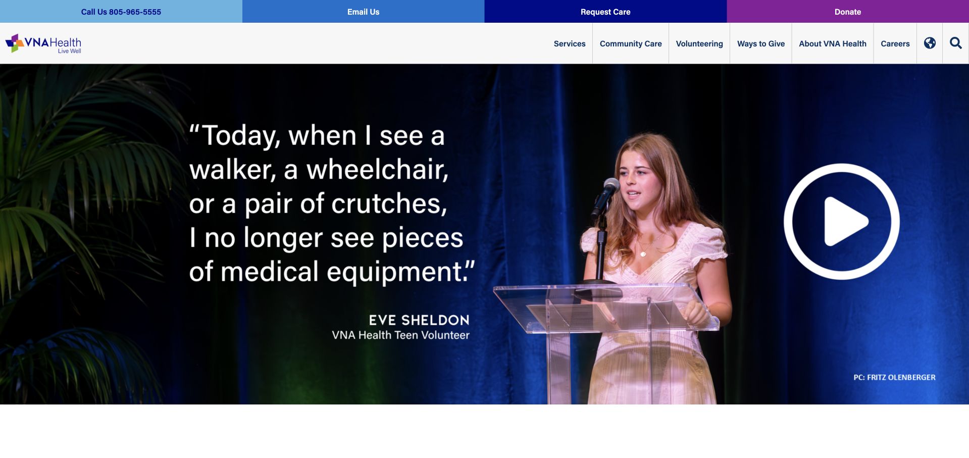
VNA Health’s captured homepage leads with a volunteer story and a large video action rather than an appointment or referral form. The utility strip provides calling, email, care requests and donations, while the main navigation separates services, community care, volunteering and organisational information. Its official service pages include home health, but the homepage represents a broader continuum and community role. This is useful inspiration for nonprofit storytelling, not a stand-in for a dedicated home-health landing page. The story should remain optional to practical navigation, and the video’s emotional message must not be treated as independent evidence about the quality or suitability of any service.
What you can learn
A community story can introduce a nonprofit, but keep service discovery independent of the video. Give home health, hospice and other services their own explanations and public contact expectations within the broader organisation.
Pros
Calling, care requests and giving have separate positions in the upper utility strip.
The navigation makes community participation and direct service information recognisable as different paths.
Cons & considerations
A story-led homepage can delay the practical home-health question of a newly arriving visitor.
The broad service continuum needs careful labelling so a community video does not imply one uniform care arrangement.
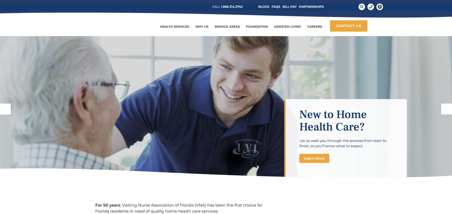
VNA of Florida places a pale explanatory card over a large care-interaction photograph. The card directly addresses visitors who are new to home health, giving the opening a more specific purpose than a generic reassurance statement. The header separates services, about, patients and families, and professional resources, with contact highlighted in orange. This is a useful model for an unfamiliar service category: some visitors need to understand what home health means before choosing an action. The card still needs a concise public destination that explains service scope and the referral process without asking the visitor to self-assess eligibility.
What you can learn
Address unfamiliarity directly and explain the service before asking for an enquiry. Keep the first explanation public, with separate routes for families and professionals and clear geographic service information.
Pros
The introductory card explicitly recognises that visitors may be encountering home health for the first time.
Patient-family and professional navigation are separated rather than sharing an unexplained referral action.
Cons & considerations
A small overlay card can become cramped over the photograph when viewed on narrower screens.
The educational route needs clear boundaries and should not become an automated eligibility or clinical assessment.
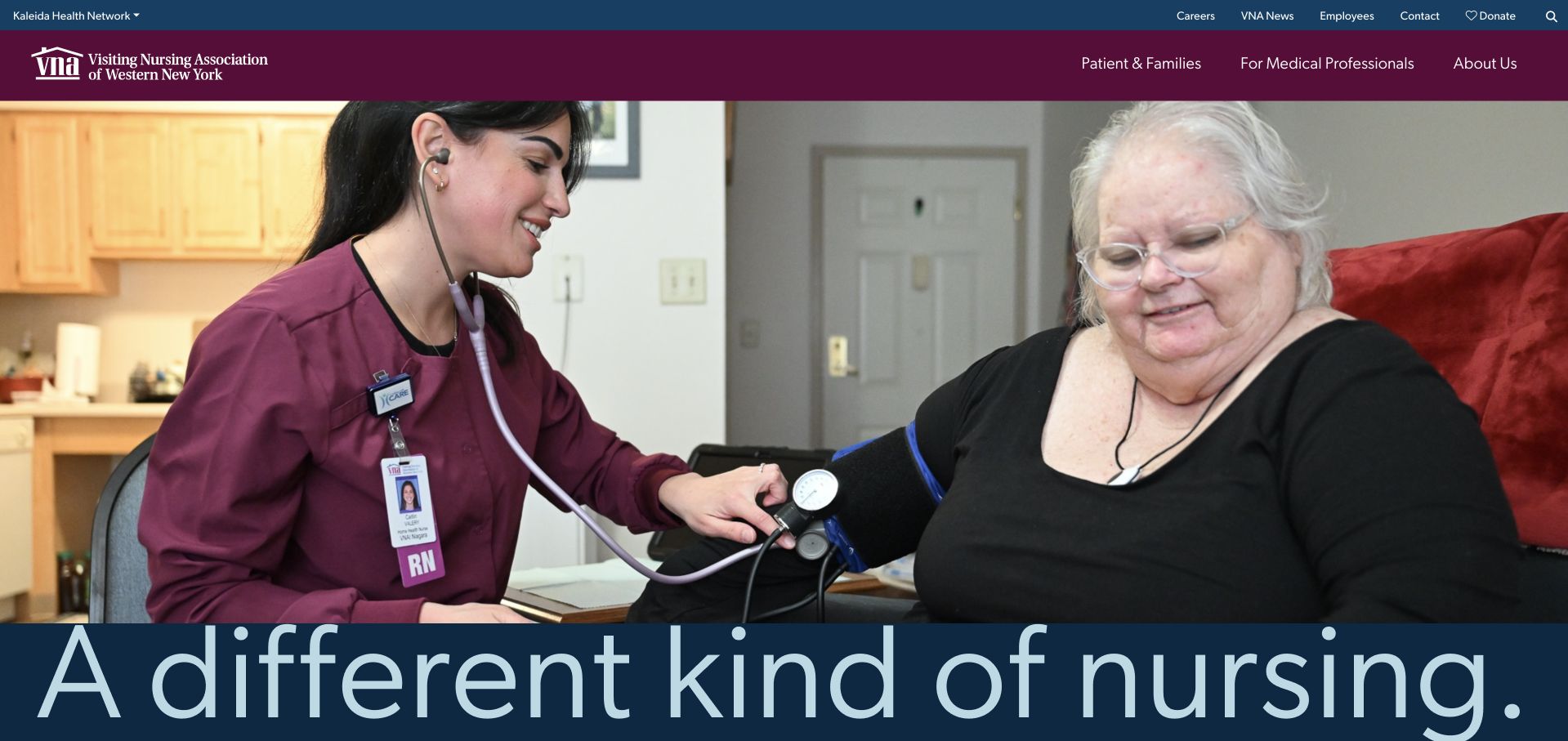
VNA of Western New York combines a maroon identity with a large home-visit photograph and a prominent nursing-focused statement. Patients and families, medical professionals and organisational information are distinct navigation routes. The regional name itself supplies meaningful geographic context, while the page’s physical care setting helps explain that services happen outside a clinic. The photograph is useful communication, but it does not verify a person’s clinical situation or the scope of care available to every visitor. The design’s main opportunity is to make practical service-area and referral information as prominent as the large visual introduction.
What you can learn
Use a clear regional identity and audience-specific navigation to explain home-based care. Pair care imagery with maintained service-area and referral details, rather than assuming the image communicates the operational limits.
Pros
Patient-family and professional routes make two important audiences visible from the header.
The maroon identity and home-visit scene give the service a recognisable regional presentation.
Cons & considerations
A large photographic statement can delay concrete access and service-area information.
Nursing-focused imagery needs supporting explanations of the wider service range and local availability.
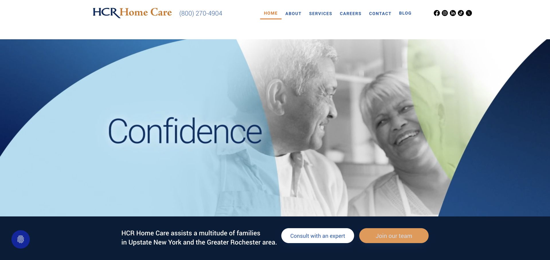
HCR Home Care uses blue brand curves, photographic material and a spacious white header to introduce the organisation. The telephone number sits beside the logo, while a compact menu exposes about, services, careers, contact and public resources. A regional introduction below the media area provides more practical context than the animation alone. The opening is distinctive, but it also illustrates a performance and communication tradeoff: animated brand sequences can take time to settle and show less useful information in an initial frame. The service explanation and contact route therefore need to work independently of the moving material.
What you can learn
An animated identity should be optional decoration, not the only introduction to a care organisation. Provide a meaningful still state and a concise service-area statement, with practical navigation available before the animation completes.
Pros
The telephone route is visible beside the identity rather than hidden in a footer.
The compact navigation separates services, recruitment and contact into understandable destinations.
Cons & considerations
An animated opening can delay meaningful service information and needs a useful static alternative.
Broad brand imagery requires concrete regional and service explanations before it can support an enquiry.
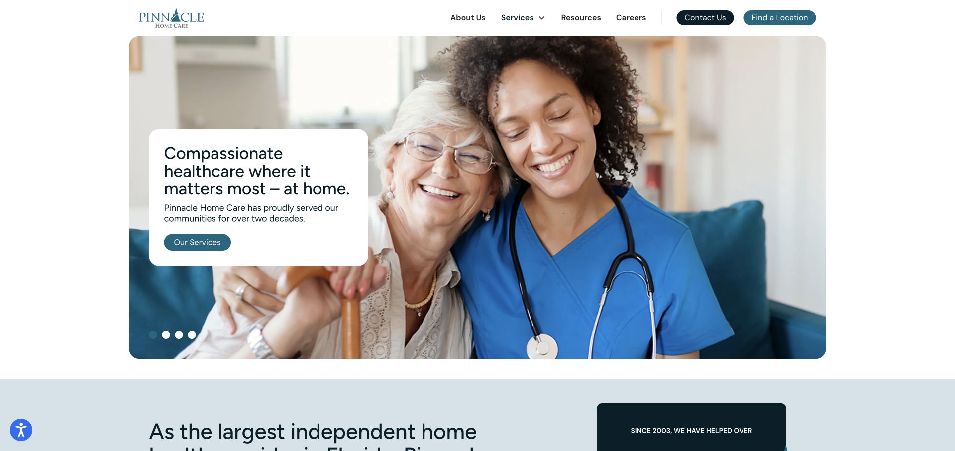
Pinnacle Home Care uses a rounded photographic panel with a pale text card over one side. The card names healthcare at home and offers a service-exploration action, while the header keeps contact and location discovery separate. A short supporting section begins immediately below the image. The contained layout gives the page a calm frame without making the photograph full bleed. The familiar care-interaction image is not unique evidence of the organisation’s work, so the supporting service descriptions must provide the real substance. The small overlay also needs enough space to explain the next step without becoming a dense miniature brochure.
What you can learn
Use a photographic card as a concise introduction, then provide specific services, geography and referral information in ordinary text. Keep generic illustrative photography distinct from documented staff, patient or project stories.
Pros
Service exploration, contact and location discovery are distinct visible routes.
The contained image and pale card give the opening a clear, bounded composition.
Cons & considerations
A familiar care image cannot establish the organisation’s distinctive service model or local provision.
A small overlaid card needs careful mobile layout so text and actions remain comfortably readable.
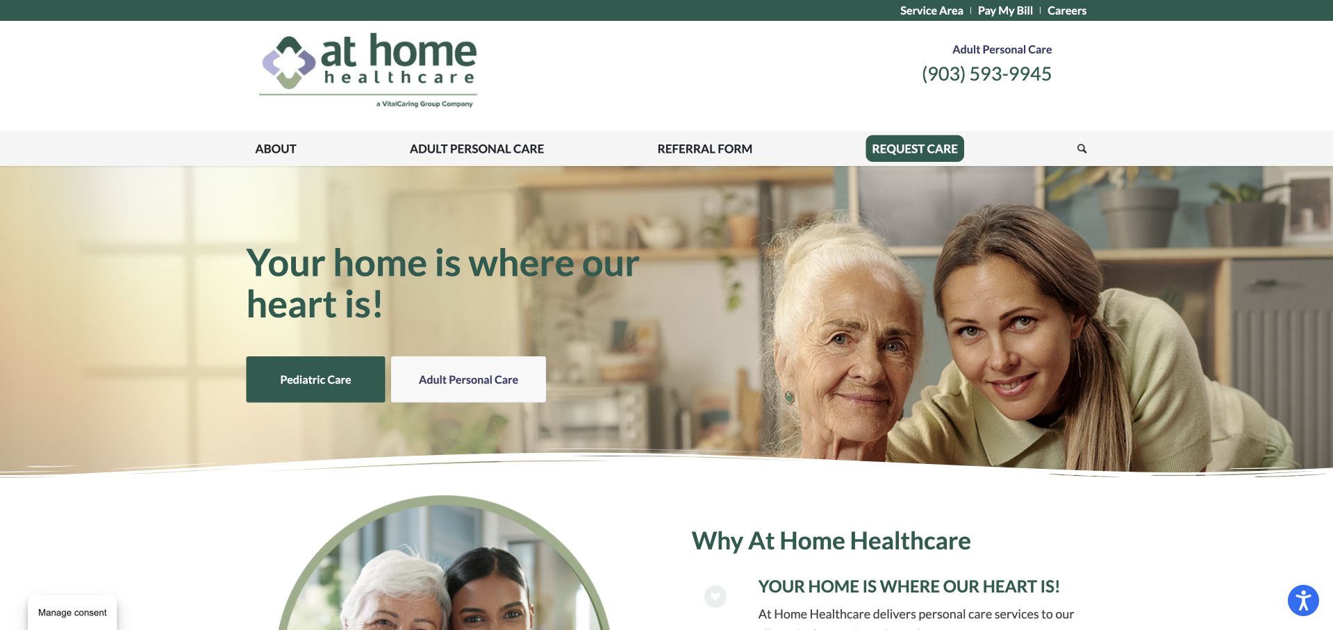
At Home Healthcare uses a warm domestic photograph with a green headline and two opening actions: patient care and adult personal care. The same distinction appears in the navigation, alongside referral and request-care routes. That separation is the most useful element because skilled services and personal support should not be presented as interchangeable simply because both occur at home. The header also provides a telephone number and distinguishes service-area information. The image and friendly message create an approachable introduction, but the practical explanation must establish which local team provides each service and what the enquiry or referral process involves.
What you can learn
Explain different home-based service models before asking a visitor to select a route. Keep patient care, personal support and professional referral clearly labelled, with geography and contact expectations attached to each.
Pros
Patient care and adult personal care are distinct actions in both the opening and navigation.
Telephone and service-area information provide practical context beyond the domestic photograph.
Cons & considerations
A warm general headline cannot explain the practical boundaries between the two service models.
Several request and referral actions need clear next-step descriptions to prevent visitors entering the wrong process.
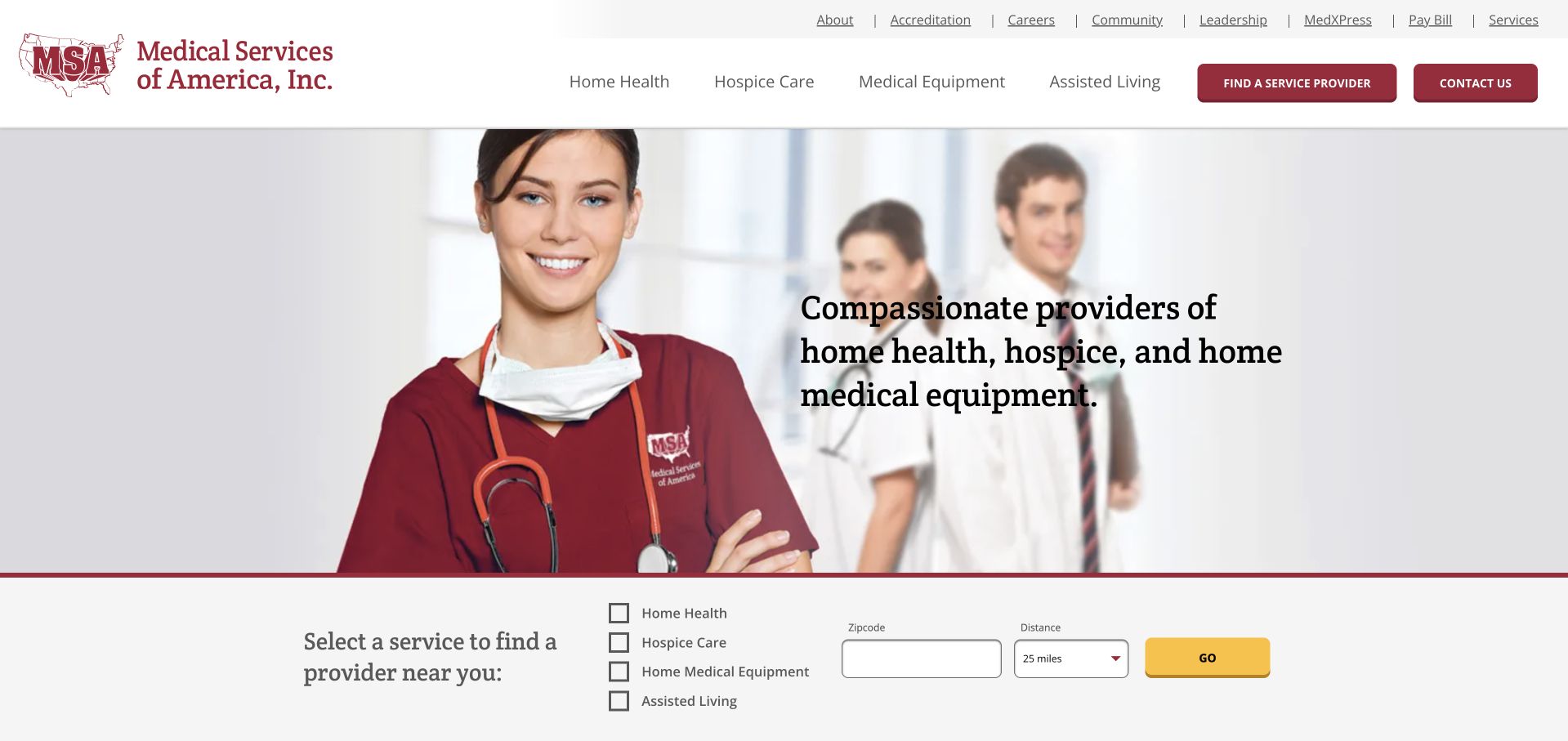
Medical Services of America uses a large staff-style photograph and a compact introductory statement, followed by a finder that combines service selection with geography. Home health, hospice, equipment and assisted-living categories are visibly separate. That is a useful structure for a diversified organisation: a visitor should not have to interpret the corporate name to know which business line to explore. The interface is more conventional than some newer brands, but the explicit categories provide substance. The main design challenge is control density. Small checkboxes, location fields and a submit action need readable labels and a logical order when the layout narrows.
What you can learn
A diversified care organisation needs an explicit service selector, not just a corporate introduction. Preserve service and geographic context through results, and make the finder usable without assuming visitors understand internal business categories.
Pros
The finder names distinct service lines instead of hiding them under one broad care label.
Geographic search provides a practical bridge from the corporate homepage to local information.
Cons & considerations
Small adjacent controls can become difficult to use on mobile or with enlarged text.
Selecting a category does not establish clinical suitability, eligibility or current local availability.
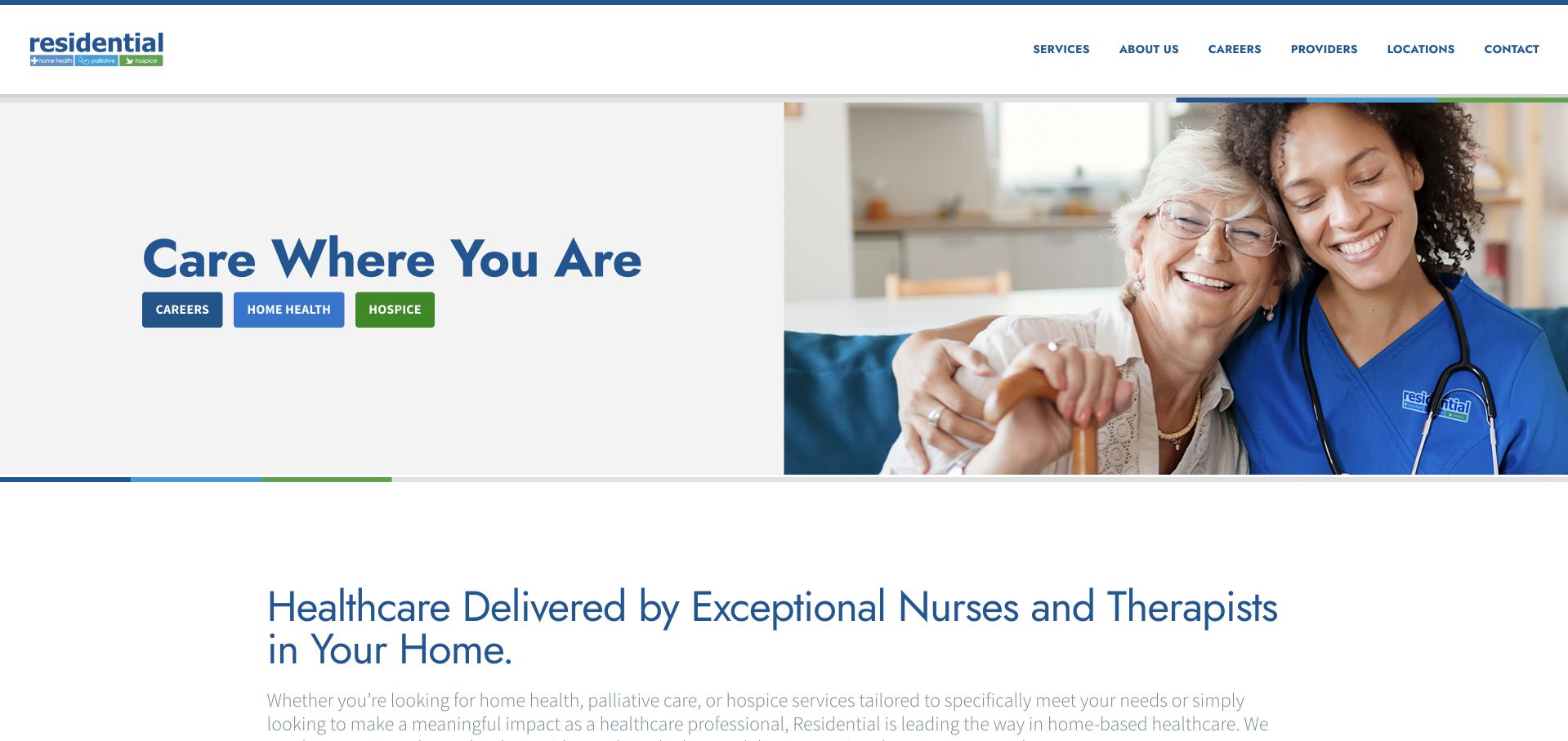
Residential Healthcare Group uses a white split hero with a large care-interaction photograph on the right. The short headline is followed by three coloured service labels for home health, palliative care and hospice. The page then begins a more detailed explanation of care delivered at home, with referrals and location information accessible in the header. The design is useful for making the service categories visible without a crowded menu. Those categories still need clear, separate explanations and appropriate contact routes. A shared photograph and a brief headline should not imply that the services involve the same process, eligibility conditions or local team.
What you can learn
Expose related service categories early, then explain their differences through dedicated public pages. Preserve referral and location routes outside the hero, and avoid treating a concise brand statement as a complete service description.
Pros
Three distinct service labels make the broader care range visible near the main headline.
The white text area provides a stable reading surface beside the large photograph.
Cons & considerations
Short category labels need fuller explanations before visitors can understand practical differences.
Generic care-interaction imagery does not establish which local services or professionals are actually available.
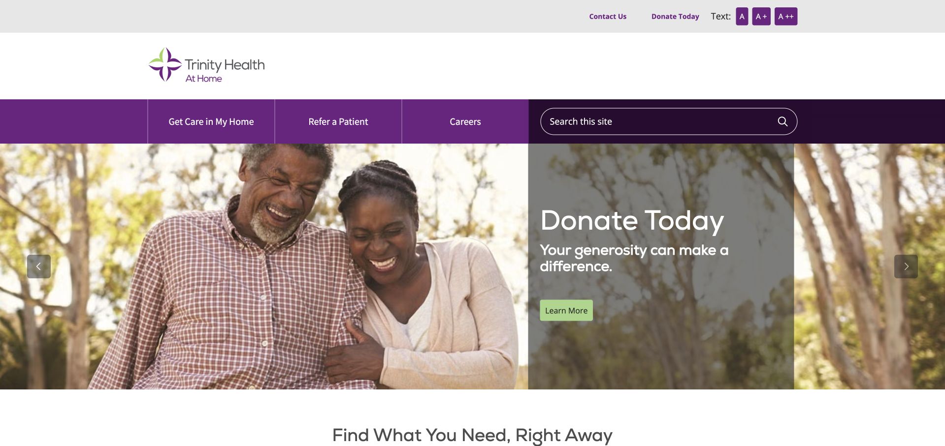
Trinity Health At Home uses a strong purple navigation bar with explicit routes for getting care, referring a patient and careers. The captured hero promotes donations through a large outdoor photograph and a concise appeal. A practical task section begins below it. This is a useful example of why permanent navigation must work independently of a campaign: a person seeking care should not have to interpret a fundraising message first. The purple bar does much of that work. The design still needs to make the organisation’s service areas and local referral arrangements public, rather than assuming the parent health-system identity answers those questions.
What you can learn
Keep care access and professional referral stronger than the changing campaign. A donation appeal can share the homepage, but its form and information requirements should remain separate from patient or family enquiries.
Pros
Care, referral and career routes are explicit and visibly separated in the main navigation.
A practical task section follows the fundraising hero rather than continuing only the campaign story.
Cons & considerations
A donation-led first view may feel less relevant to visitors seeking immediate service information.
A large parent-system identity needs local service-area detail and specific contact or referral instructions.
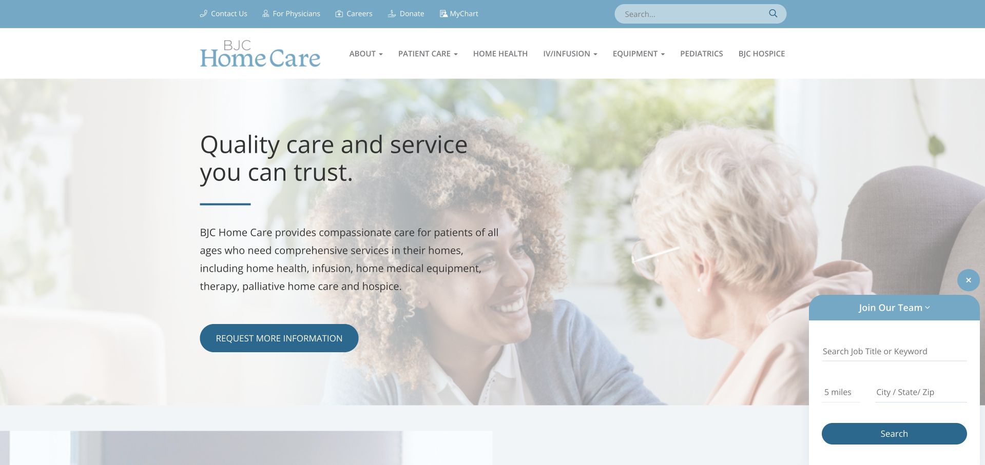
BJC Home Care uses a pale blue identity, a large care photograph and a concise text introduction. The utility row distinguishes contact, physician information, careers, giving and the existing health-system account. The main menu separates patient care, resources and organisational information, while an information-request action sits within the opening. This structure recognises that home care is part of a broader system but still needs its own public explanation. The pale photograph and text treatment are visually gentle, though they need careful contrast. A small recruitment panel also demonstrates how optional widgets can compete with the main service message if allowed to expand over the page.
What you can learn
Give a health-system service its own clear public identity and professional route. Keep recruitment widgets secondary, and provide a plain account of available services and contact expectations outside the parent account system.
Pros
Professional, employment and existing-account tasks are separated in the utility navigation.
The service has a dedicated introduction rather than relying only on the wider health-system homepage.
Cons & considerations
Pale text and photographic backgrounds need stronger readability checks than the gentle visual style suggests.
Optional recruitment or chat panels can distract from the service explanation when they occupy the same screen area.
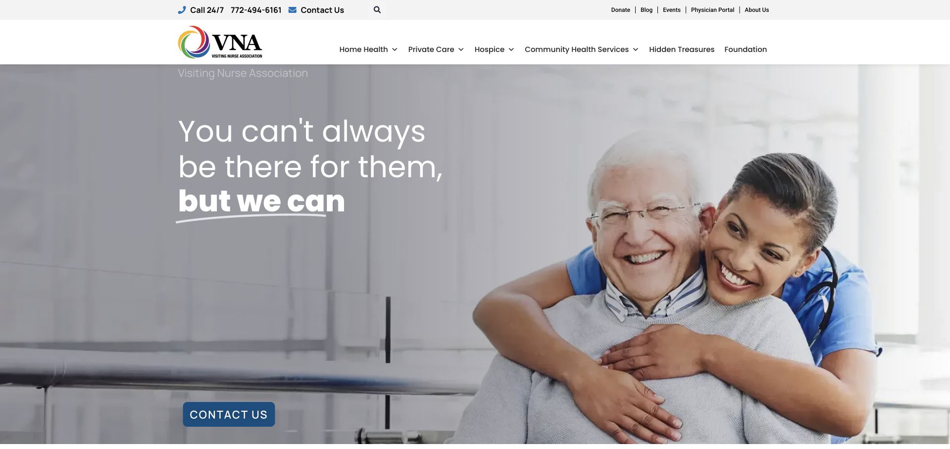
VNA of the Treasure Coast pairs a large care-interaction photograph with a short family-oriented statement and a blue contact action. A compact header exposes services, private care, community participation, organisational information and giving. The opening is simple enough to scan without a long intake process, while the navigation recognises that home-health and other support-related services may require different routes. The message should not be interpreted as a guarantee that the organisation can replace every family role or meet every need. Its practical value depends on service-area, referral and availability details that explain the real limits behind the reassuring introduction.
What you can learn
Use concise family-oriented copy to introduce the organisation, then make service boundaries concrete. Distinguish private care, home-health information and community support rather than allowing one contact button to conceal different arrangements.
Pros
A clear contact action gives the short introduction a practical next step.
Service and community-support routes are visibly distinct within the compact navigation.
Cons & considerations
Reassuring family language needs service-specific limits so it does not imply universal availability or substitution.
A large photograph supplies little practical information without local coverage and referral explanations beneath it.
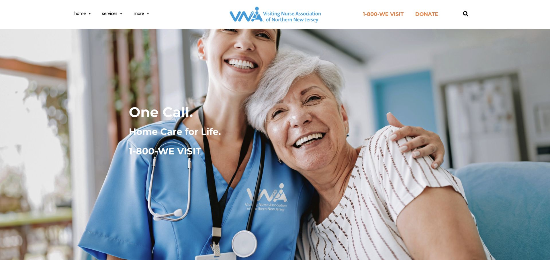
VNA of Northern New Jersey uses a large care-interaction photograph, a memorable telephone statement and a restrained header. The telephone route and donation action sit above the image, with a compact menu providing access to the wider site. The regional name establishes the broad geographic context without a national locator. This is useful for studying a direct-contact model, but the visual simplicity places more responsibility on supporting pages. Visitors still need to understand the specific service area, different services and how an enquiry differs from a professional referral. A newsletter invitation should remain optional and should never obstruct those essential public tasks.
What you can learn
A memorable telephone route can simplify a regional service site when public service information remains easy to find. Keep newsletter capture separate from care enquiries and explain what information belongs in each contact channel.
Pros
The telephone route is conspicuous and connected to a recognisable regional identity.
Donation and service contact are separate tasks rather than one shared conversion form.
Cons & considerations
A compact menu can make service and referral detail harder to discover for first-time visitors.
Newsletter popups can interrupt a practical care-information task and should remain clearly optional and dismissible.
Kegan is a freelance web designer and developer with 15+ years of experience helping businesses turn complicated website requirements into clear, maintainable digital experiences. He works directly with clients from planning and design through development, launch, and ongoing support.
For home health agency website design, his development approach focuses on service-area information, care-service explanations, referral-system handoffs, and accessible family resources. The scope can be a targeted improvement or a complete custom build, with responsive layouts, thoughtful content structure, and integrations chosen around the people using and maintaining the site.
Show 3 other home health agency website designersHide other home health agency website designers
Plan the service explanation and referral boundaries first
Write a service-and-audience map
For every actual service, record the public explanation, geographic coverage, intended audience and next contact step. Relate the service to offices without implying uniform provision across a network. Keep patient-family, professional and employment routes separate. A page should answer the basic question of what the agency does before asking someone to identify themselves or describe a personal situation.
Keep enquiries proportionate and destinations clear
Explain what a general contact request does and what information belongs in it. Give an approved alternative for sensitive referral material rather than encouraging unrestricted uploads or detailed health histories in a marketing form. Clearly label external systems. Test confirmations and internal routing so a family enquiry does not disappear into a recruitment queue or receive a misleading appointment confirmation.
Govern photography, claims and local updates
Use accurate captions and appropriate permission for staff or care stories. Do not imply that generic illustrative subjects are actual patients, and never invent testimonials or clinical results. Assign review ownership for local coverage, service names and referral destinations. Keep campaign films optional and make the service explanation readable when media has not loaded or motion is reduced.
The editing job behind the design
Structure services, locations and audiences before adding integrations
Use a CMS that relates services and offices while keeping public content separate from private systems. Maintain one source for recurring telephone and coverage information. A network search should distinguish a local office record from confirmation of availability. Have the responsible reviewers assess any forms, document transfer and third-party widgets before a new integration collects personal information.
A practical accessibility brief covers readable headings, labelled controls, understandable feedback and a text alternative to map-only coverage. Keep contact routes usable without animation or optional scripts. The forms reference below gives implementation context, not an assurance of compliance. Evidence-limited stack labels in this collection do not identify the organisation’s complete clinical, referral or private operational software.
Our WordPress website examples offer a separate look at publishing approaches. A visible platform label is evidence for that named page, not a guarantee that the same system will suit your requirements.
Before the public launch
Home-health agency website planning checklist
Name each service model the organisation actually provides.
Explain service differences without making an individual eligibility judgement.
State realistic local coverage and identify the relevant team.
Separate family information, professional referrals, recruitment and donations.
Keep basic service information public before asking for personal details.
Explain what a general enquiry or referral action does next.
Use approved channels for sensitive information rather than generic public uploads.
Maintain one source for recurring telephone and service-area facts.
Label staff, care-story and illustrative photographs accurately.
Avoid invented testimonials, patient identities and clinical outcome claims.
Test location search, keyboard access, form feedback and enlarged text.
Review service scope, local records and external destinations after organisational changes.
These checks are a project checklist, not a performance, legal, security, or accessibility certification. Test real journeys with the people responsible for the website before making claims about the result.
Sources & editorial method
How this collection was selected and reviewed
We reviewed public pages and actual browser captures. These original observations assess design, navigation and service communication, not clinical quality, eligibility or outcomes. The first selection has documented regional scope; operational and service claims remain attributed to their publishers.
Each example links to its actual source page. Screenshots are direct browser captures with their own capture dates; moving imagery, announcements and live designs can change. The notes describe observable design choices and conditional tradeoffs, not measured traffic, conversion results, service quality, or accessibility conformance.
Technology labels use public page metadata, asset evidence, or explicitly cited platform documentation. Platform documentation is not a complete current deployment audit. A component reference may be legacy or unused; it is not a complete backend inventory. Unknown stacks are omitted. These sites are editorial examples, not our client portfolio.
Written, Edited and Curated are separate editorial records, not timestamps advanced by a rebuild. Website designs and imagery belong to their owners. See our editorial standards or suggest a correction.
Questions worth asking
Home Health Agency website design questions
Should home health and personal care share one page?
They can share a brand introduction, but their differences need clear explanation and appropriate next steps. Use separate service pages when the process, geography or audience differs. Do not rely on the general word care to explain the distinction.
Does every visitor need a referral form?
No. Many people are gathering basic information or trying to find the right local team. Explain the approved referral process separately and provide ordinary public service information without asking for sensitive details first.
How should a large network show coverage?
Use maintained local records and clear text alongside any map or search. Do not imply that every advertised service is available through every office. Distinguish geographic coverage from current staffing, availability and any individual eligibility question.
Are stock-style care photographs a problem?
They can illustrate a general setting when used honestly. Do not label them as actual patients or evidence of the organisation’s results without appropriate substantiation and permission. Specific staff, local environments and well-explained services add more useful context.
What should the homepage prioritise?
The actual service range, local coverage and clear audience routes. Recruitment and giving can remain visible, but they should not displace the family-information and professional-referral paths. The right hierarchy depends on the organisation’s real work.
Borrow the examples’ clear service categories and audience separation. A useful home-health website makes an organisation easier to understand and contact while preserving the boundaries that a warm photograph or broad promise cannot explain.