Best Garage Door Installer Websites of 2026 (29 Real-World Examples)
Installation, repair and door-selection websites with different jobs to do
Garage door websites serve someone with a stuck door and someone planning an expensive exterior change. Good information design recognises both, then makes local coverage, product choice and the next contact step clear.
An urgent repair visitor is usually trying to establish availability and a reliable contact route. A homeowner researching a new door may want to compare materials, mechanisms, finishes, visualisers and installation arrangements before speaking to anyone. Commercial buyers have another set of requirements. A single homepage can serve these audiences, but the journey becomes confusing when a new-door promotion, a repair form and a dealer catalogue all use the same vague “get started” label.
These examples span local installers, regional repair businesses and product brands with installer or dealer networks. The distinction matters: a manufacturer’s visualiser is not a confirmed local quotation, and a national repair introduction does not establish who will attend a particular address. Use the collection to study navigation, readable service explanations and enquiry choices. Inclusion recognises website communication, not independently measured repair quality, safety performance or customer outcomes.
Before the examples
What makes good garage door installer website design in 2026?
Separate a repair request from a new-door project
Give the two tasks their own labels and explain what happens next. A repair route can ask for a location, contact preference and a brief description; a new installation route can introduce product types, measurement and a survey. Do not require a homeowner to identify an opener mechanism or diagnose a spring fault just to request help. If telephone contact is the right route for urgent problems, state the actual service hours and coverage without letting a form imply immediate attendance.
Make the provider relationship explicit
A brand, dealer, franchise and local installer may all be involved in one purchase. Explain which organisation supplies the door, surveys the opening, installs the system and handles later service. A dealer locator should return meaningful contact and coverage information, not simply the nearest point on a map. Where local offices have different schedules or service offerings, keep that context visible after a visitor selects a location.
Connect the appearance to practical product information
A beautiful garage façade is useful inspiration but does not explain opening method, clearance, materials or what installation includes. Organise product ranges in language customers can compare, with captions and supporting specifications. Visualisers should be labelled as illustrative and should not imply that a pictured configuration is suitable for every opening. Let people research without first handing over their email address.
The collection · 29 examples
29 garage door installer websites worth studying
Notice how each page handles three different decisions: finding a local provider, understanding the door or repair service, and choosing a sensible next action. The strongest lesson may be a small navigation distinction rather than the largest photograph.
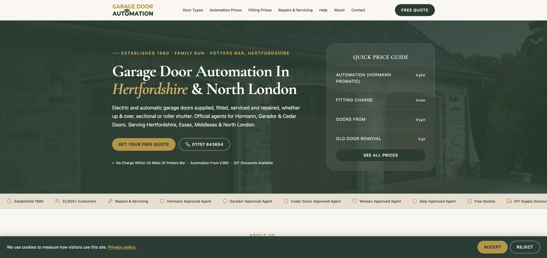
Garage Door Automation combines a dark green architectural photograph, traditional serif headings and a compact price-guide panel. The opening names Hertfordshire and North London, explains that doors can be supplied, fitted, serviced or repaired, and offers both a quotation and a telephone route. The guide separates automation, fitting, doors and old-door removal rather than presenting one ambiguous headline price. Navigation continues that distinction with door types, automation prices, fitting prices and help. This gives a regional specialist a useful information structure without requiring a large first-screen form. The displayed figures remain the company’s own starting information, not independently verified estimates.
What you can learn
Show the components of a considered purchase without pretending a web page can price every opening. Publish scope, exclusions and the next assessment step beside indicative prices, and keep repair and installation journeys distinct.
Pros
Service scope and coverage are explicit in the opening.
Price categories make several different kinds of work visible.
Cons & considerations
The background photograph is heavily tinted and provides limited project context.
A compact guide still requires full terms and a survey before a project can be assessed.
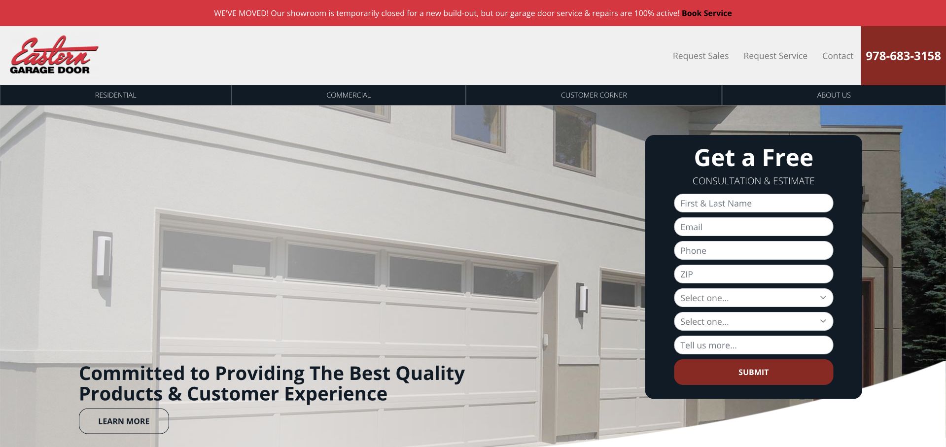
Eastern Garage Door opens with a prominent notice explaining a temporary showroom closure while distinguishing it from active repair service. Beneath the red-and-black header, a large installed-door photograph anchors the service introduction and a dark consultation form exposes the full first enquiry. Separate sales and service links in the header support different visitor intentions. Residential, commercial and customer-corner navigation further divides the audience. The page is not visually minimal: the long form and several horizontal bars share the opening. Its useful idea is operational clarity—an important temporary change is explained without implying that the entire business has stopped working.
What you can learn
Treat a showroom move or closure as maintained operational information. State which services continue, where current customers should go and what a new enquiry requires rather than leaving visitors to interpret an outdated address.
Pros
The temporary showroom situation is communicated prominently.
Sales and service requests have separate header destinations.
Cons & considerations
The many form fields create a substantial first-screen commitment.
Several horizontal navigation layers reduce the space available for the project image.
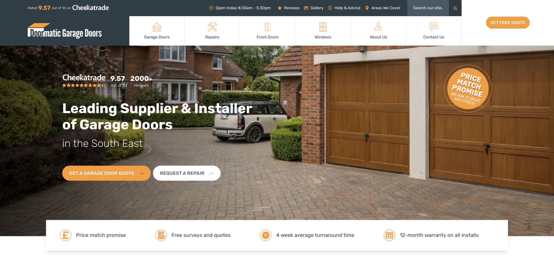
Doormatic uses an installed timber-look door and driveway photograph to make its product range tangible. A dark overlay supports a plain supplier-and-installer headline, with the South East named directly underneath. Yellow and white actions distinguish a new-door quote from a repair request, while the header uses small product illustrations to separate doors, repairs, front doors and windows. A compact reassurance strip sits below the image rather than becoming a large wall of badges. The review score and price-match message are visible commercial claims from the company, not independent findings of this collection. The core structure is useful because it separates two fundamentally different customer tasks.
What you can learn
Do not make a broken-door caller interpret a new-installation funnel. Give repair and replacement their own clearly labelled actions, then use a service-area statement to establish whether either route is relevant.
Pros
New quotes and repairs are separated in the hero.
The regional scope appears beside the main service description.
Cons & considerations
Several assurances and rating elements compete for attention near the headline.
The broad product menu could dilute the garage-door focus on a small screen.
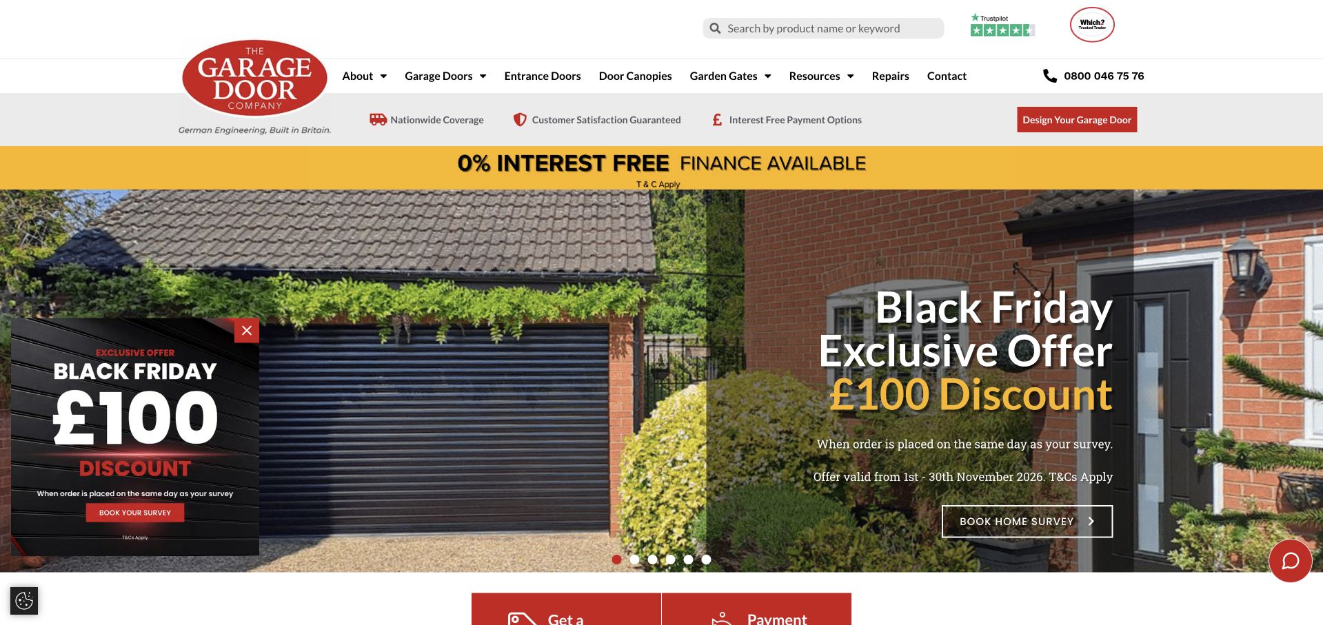
The Garage Door Company combines a restrained white catalogue header with a large photographic campaign carousel. Garage doors, entrance doors, canopies, gates, repairs and resources are individually named, and a door-design tool has a visible shortcut. A consent dialog can initially obscure the opening, adding another decision before a visitor can compare products or understand the survey route. Several time-limited offers and payment messages appear around the main slide, making campaign governance an important part of this design. Its strongest transferable feature is the separation of product selection, a visualiser and repairs; the amount of promotional repetition is less suited to a small installer with a narrower service.
What you can learn
Keep product navigation stable while campaigns change. Give each promotion a maintained date and destination, and test the actual privacy interface so it does not hide the basic product and service choices.
Pros
Product families and repair information have explicit navigation labels.
The door-design tool is available separately from booking a survey.
Cons & considerations
Multiple offers and payment messages crowd the opening hierarchy.
The initial privacy interface can obscure the main introduction.
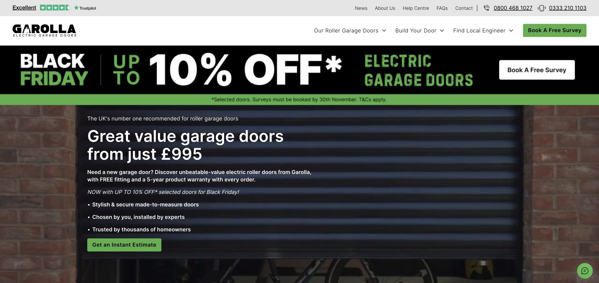
Garolla concentrates its introduction on electric roller garage doors rather than a broad home-improvement catalogue. A dark door photograph, green actions and large campaign strip make the current offer unmistakable. Product browsing, a door-building tool, a local engineer finder and a survey request are separate menu choices. Beneath the opening, the range is divided into named products with dimension and feature information, which is more useful for comparison than a gallery alone. The captured page was cleaned by rejecting optional cookies. The design is direct, but its headline price, campaign conditions and product promises require careful reading beyond the headline.
What you can learn
A focused product business can explain fewer choices in greater detail. Keep dimensions, inclusions and assessment requirements close to each range, and distinguish a configurator’s indicative result from a confirmed installation quotation.
Pros
The navigation separates configuration, local coverage and a survey.
Named products have specific comparison information.
Cons & considerations
The campaign banner occupies a substantial share of the first screen.
A prominent starting price can overshadow qualifying dimensions and terms.
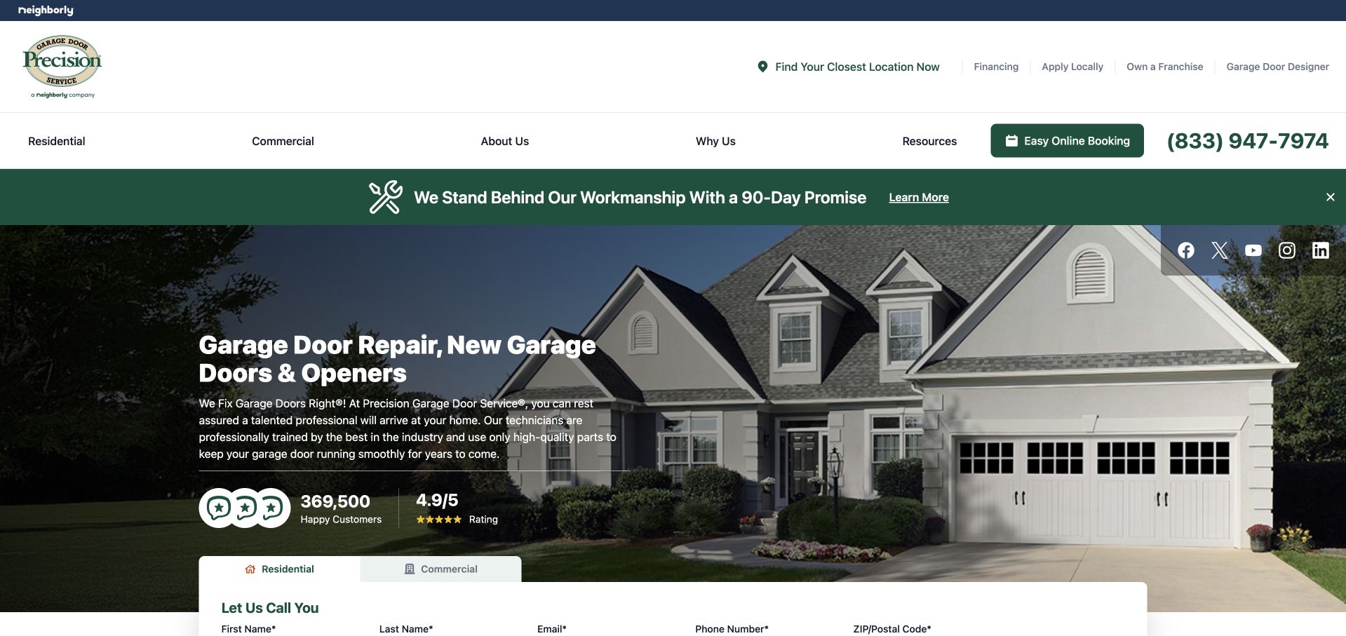
Precision places finding the closest location in the header before its main service introduction. Residential and commercial interests are separated, while a door designer and online booking serve different stages of the decision. The hero uses a complete house exterior with a readable left-aligned service statement, followed by a call-request panel with audience tabs. A workmanship message occupies another horizontal strip above the photograph. This is useful as a network-navigation example: the national brand can introduce the offer, but local eligibility remains a distinct task. Review totals and ratings displayed in the hero are the site’s own presentation rather than independently audited evidence.
What you can learn
A national service page should lead quickly to the responsible local office. Preserve the visitor’s residential or commercial context when they move from product browsing into a callback, instead of asking the same routing questions repeatedly.
Pros
The closest-location route is visible before the hero.
Residential and commercial callback interests are distinguished.
Cons & considerations
Trust claims and a separate promise strip compete with the service message.
National copy still needs local availability and team information.
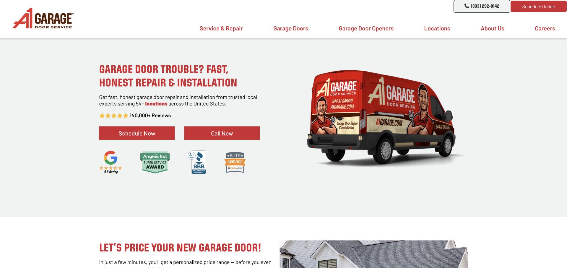
A1 Garage Door Service uses its illustrated vehicle and warm red identity rather than a full-screen house photograph. A pale background gives the repair-and-installation headline, coverage reference and two actions a predictable reading surface. Calling and scheduling are presented as separate choices. The next section introduces a new-door cost estimator, recognising that a replacement purchase differs from an urgent repair. An automatic booking panel may interrupt that journey before the visitor has finished understanding the service and the alternatives to scheduling. Numerous review and award marks remain visible below the hero; these should be read as company-presented trust content, not a verified comparative ranking.
What you can learn
A service-vehicle image can identify the operational business while leaving room for readable copy. Keep an automatic booking interface dismissible and provide a separate, properly qualified research route for a larger replacement project.
Pros
Call and scheduling actions are easy to distinguish.
The replacement estimator has its own section beyond the repair introduction.
Cons & considerations
A large row of trust marks can distract from the actual service choices.
An automatically opened booking panel can interrupt an exploratory visit.
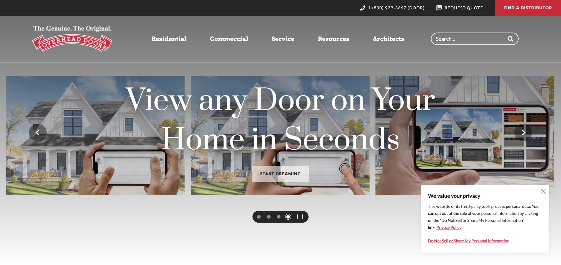
Overhead Door gives its visualiser a wide photographic hero showing a house through a mobile device. The composition demonstrates the tool rather than explaining it only in a button label. Residential, commercial, service, resources and architect routes remain distinct above it, while a red distributor finder makes the handoff to a local provider visible. Unlike a local repair homepage, this is a broader manufacturer-and-network presentation; its lesson is about discovery and routing, not a claim that the central company directly installs every pictured door. The carousel and small privacy panel also show how auxiliary controls can share an otherwise image-led opening.
What you can learn
Explain the relationship between the product brand and the company that will survey or install it. A visualiser should lead to product details and an appropriate local contact rather than making simulated imagery look like a confirmed specification.
Pros
The visualiser is demonstrated through a recognisable use context.
A distributor finder has a distinct place in the header.
Cons & considerations
Several carousel controls compete with the main tool action.
The national product page needs a further handoff before local installation details are clear.
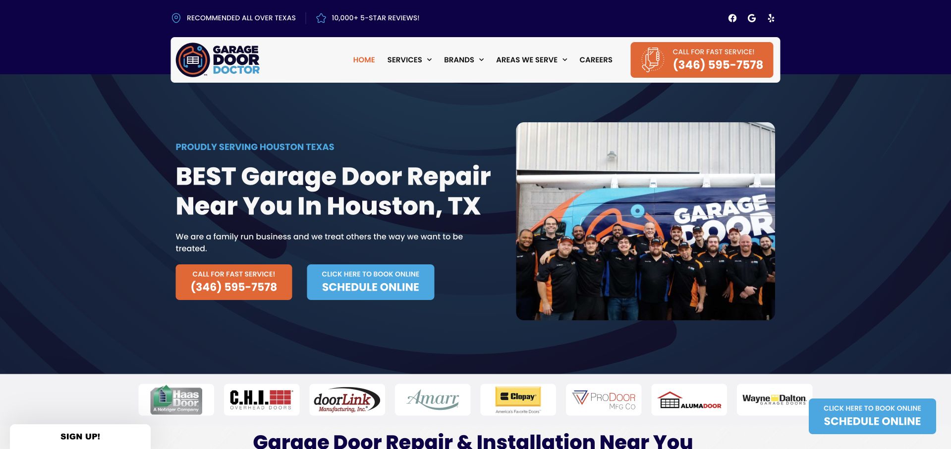
Garage Door Doctor uses a dark blue and orange identity, a service-vehicle image and a team photograph to make the repair business recognisable. The main introduction names its regional service, while the header separates service categories, brands and covered areas. A prominent telephone route and an online scheduling control support immediate contact. A promotional email-signup popup can obscure the initial view, adding a marketing task before the visitor can evaluate the repair service. The underlying design is a more useful reference than the popup: it shows the people and operating identity behind the service rather than only a finished garage façade.
What you can learn
For repair-led businesses, make contact and location easy to understand before presenting promotions. A signup invitation should not hide the task someone arrived to complete, especially when the visitor may have an unusable door.
Pros
Team and vehicle imagery give the business a recognisable operational identity.
Areas served and service categories have visible navigation routes.
Cons & considerations
A promotional popup initially interrupts the repair journey.
Brand, service and booking controls create a busy upper navigation.
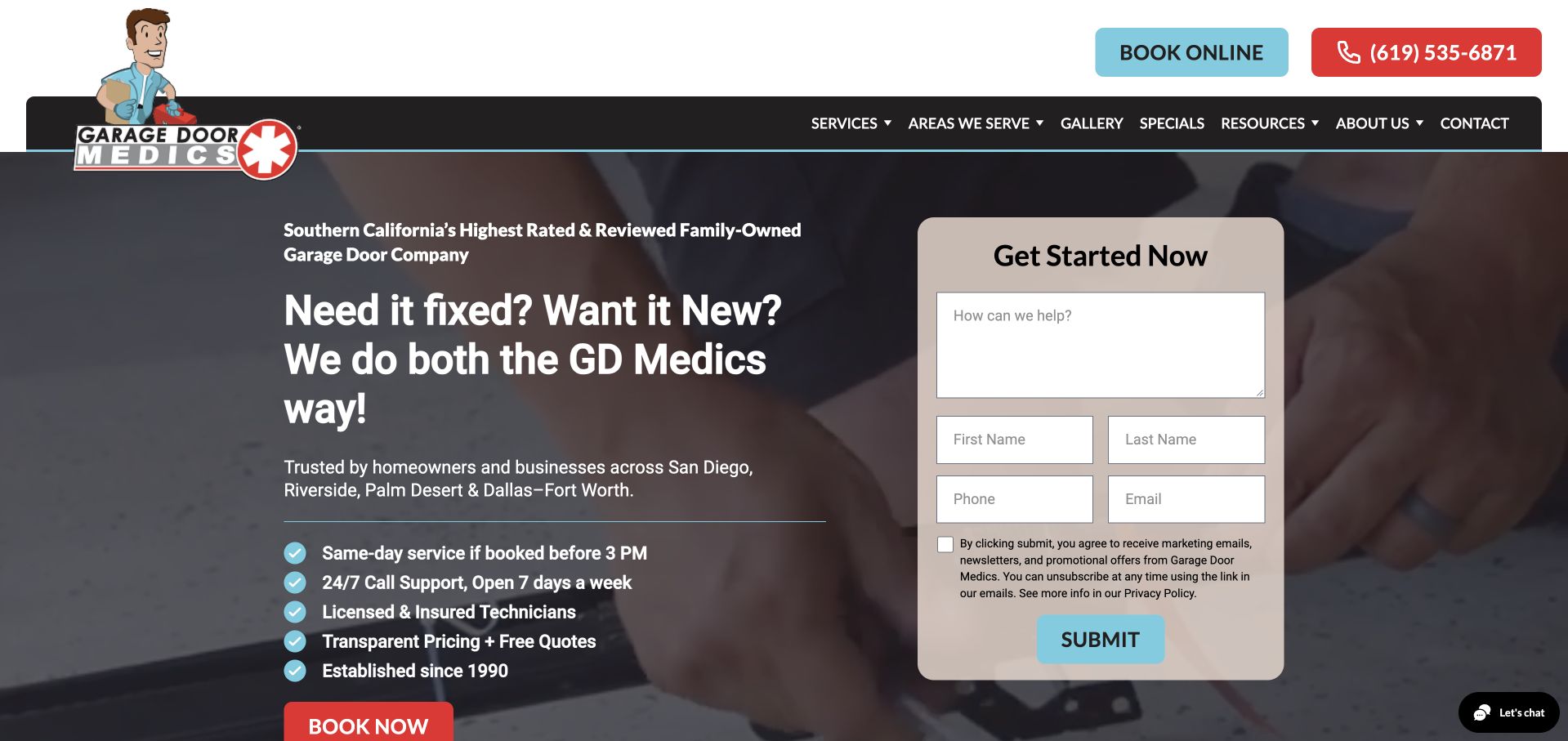
Garage Door Medics makes its central distinction explicit: whether the visitor needs an existing door fixed or wants a new one. A technician-at-work photograph sits behind the introduction, while a beige form card asks how the team can help before requesting contact details. Turquoise and red controls separate booking and calling. The opening also states the broad service locations and customer types, with a short practical reassurance list below the headline. The composition is information-heavy but task-oriented. Its form’s contact-consent text is visible, which makes the communication expectations more inspectable than a bare submit button.
What you can learn
Ask about the customer’s problem in ordinary language before forcing them into a technical product taxonomy. Keep communication permissions readable and make sure calling remains a clear alternative to completing a longer service-request form.
Pros
The headline distinguishes repair from a new installation.
The form asks about the actual need and displays contact-consent text.
Cons & considerations
The hero contains several competing lists, actions and form fields.
The technician background contributes less product context than a completed project image.
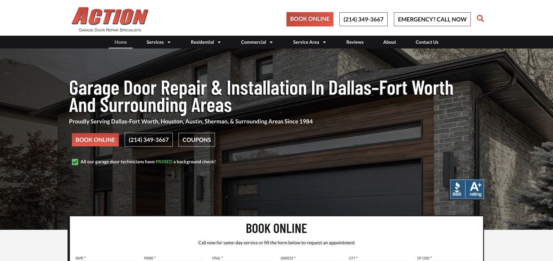
Action Garage Door uses a complete modern house exterior behind a large repair-and-installation headline. Dallas–Fort Worth is named prominently, with other covered regions in a smaller supporting line. Red booking controls, an outlined telephone number and a separate emergency-call label distinguish several contact intentions. Residential, commercial, services and service-area navigation remain available above the photograph, and the booking form begins immediately below it. This is useful for studying a repair-led hierarchy rather than decorative novelty: the page tells visitors what the company does and how to contact it, although many routes ask for attention at the same moment.
What you can learn
Distinguish an emergency call from an ordinary booking request without promising instant attendance through a generic form. Keep the actual coverage and availability explanation close to those controls, particularly when several cities share the same homepage.
Pros
The primary location and both repair and installation roles are explicit.
Emergency calling is labelled separately from online booking.
Cons & considerations
Several contact routes repeat within the first screen.
The long geographic supporting line is harder to scan than a concise coverage summary.
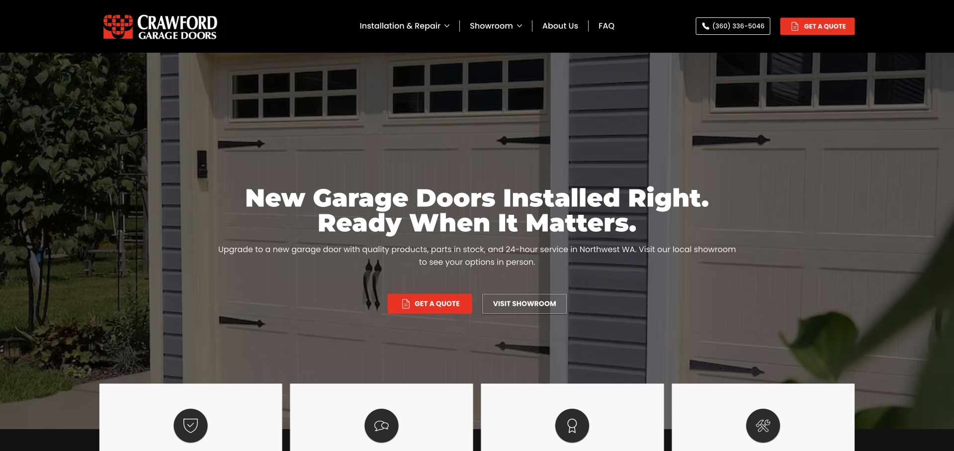
Crawford Garage Doors uses a dark header and orange estimate action over a close view of an installed carriage-style door. The headline describes new-door installation, while a smaller line also names repairs and around-the-clock service. The hero’s second action invites a showroom visit, giving a product-research alternative to starting a quotation. Installation and repair, showroom information, company background and FAQs form a short navigation. The opening is visually disciplined, but the broad headline does not itself establish the geographic service boundary. This makes the example useful for a specific lesson: showroom access can be a first-class customer task rather than a buried contact-page detail.
What you can learn
A showroom route should explain what a visitor can see and whether an appointment is required. Pair it with straightforward coverage and service information, rather than assuming a local telephone code will establish practical eligibility.
Pros
Showroom visits and quotation requests are separate actions.
The compact navigation keeps installation, repair and FAQs identifiable.
Cons & considerations
The main headline does not name the service region.
A dark photograph needs careful contrast testing for the small supporting line.
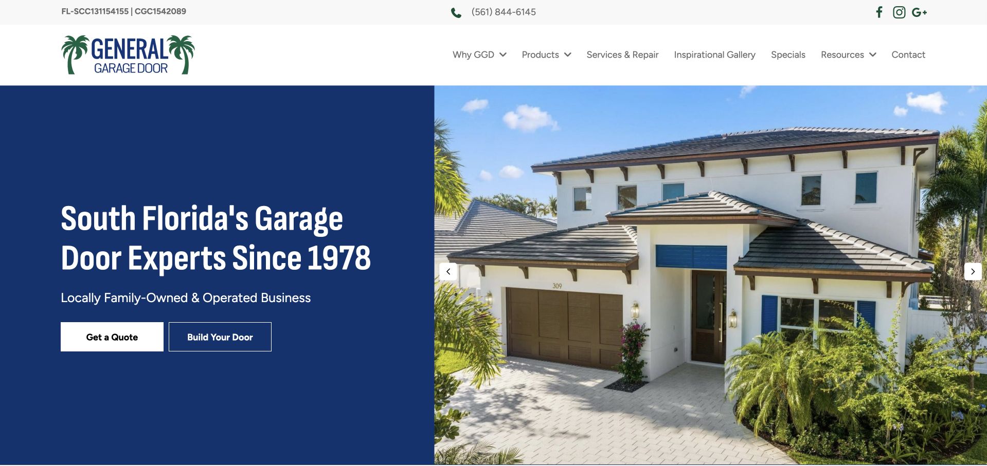
General Garage Door splits the opening into a solid blue text panel and a bright house photograph. The text names South Florida and introduces the business’s family-run identity, while two adjacent controls offer a quote or a door-building journey. An inspiration gallery, products, service and repair, resources and contact information are clearly labelled above. The composition avoids placing a long explanation over the photograph, which gives the service message stable contrast. The company-history claim remains company-provided context. The useful structure is the separation between understanding local service and imagining a different door, rather than treating both as one lead-generation step.
What you can learn
Give product imagination and service eligibility different but connected routes. A stable text panel is useful when the project photography changes, but a configurator still needs a clear route to dimensions, survey requirements and an actual quotation.
Pros
The region and service identity are immediately readable.
A quote and a door-building tool have distinct purposes.
Cons & considerations
The broad exterior image provides little detail about the featured door.
The product tool needs further explanation beyond its short button label.
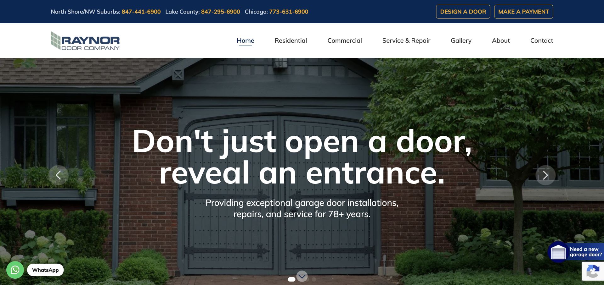
Raynor Door Company uses an installed entrance photograph and a large central headline about revealing an entrance rather than simply opening a door. The practical supporting text specifies installation, repair and service. Above it, the blue utility bar names three geographic telephone routes and separates a door designer from making a payment. Residential, commercial and service-and-repair pages sit in a concise main menu. The result serves new prospects and existing customers without making them share one booking form. Several floating assistance elements appear around the image, so the clean visual composition still has competing peripheral controls to manage.
What you can learn
Keep returning-customer tasks, such as payment, separate from a new project request. Where different territories have different numbers, label the regions clearly and preserve that context after a visitor chooses a contact route.
Pros
Regional telephone numbers are labelled by territory.
Payments and product design have separate utility destinations.
Cons & considerations
The poetic headline relies on smaller text to explain the service.
Multiple floating chat and assistance elements interrupt the photograph.
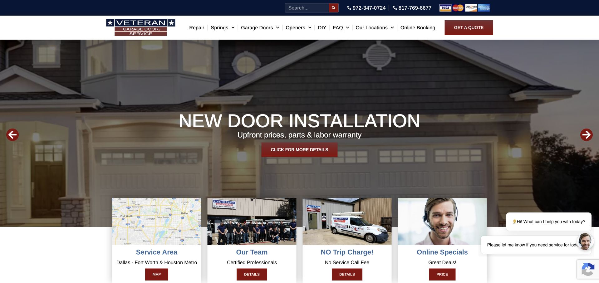
Veteran Garage Door Repair places a new-door installation slide over a house exterior, with a red detail action and visible carousel arrows. Immediately below, four cards introduce the service area, team, trip-charge policy and current specials. This gives several kinds of practical reassurance their own labels instead of compressing them into a line of unqualified icons. The header exposes repair, springs, doors, openers, FAQs and locations, alongside booking and quotation controls. The page is dense, but the structure is useful for showing which questions sit between an initial repair need and a decision to call. The policy statements remain the company’s own claims.
What you can learn
Turn common pre-call questions into short, clearly named destinations. Coverage, staff information and charging policy answer different concerns; do not make a discount card substitute for explaining the actual service and any conditions.
Pros
The cards separate coverage, team and policy information.
Product and repair categories are explicitly named.
Cons & considerations
The carousel and cards compete with several floating chat prompts.
A large technical menu may overwhelm someone who cannot identify the fault.
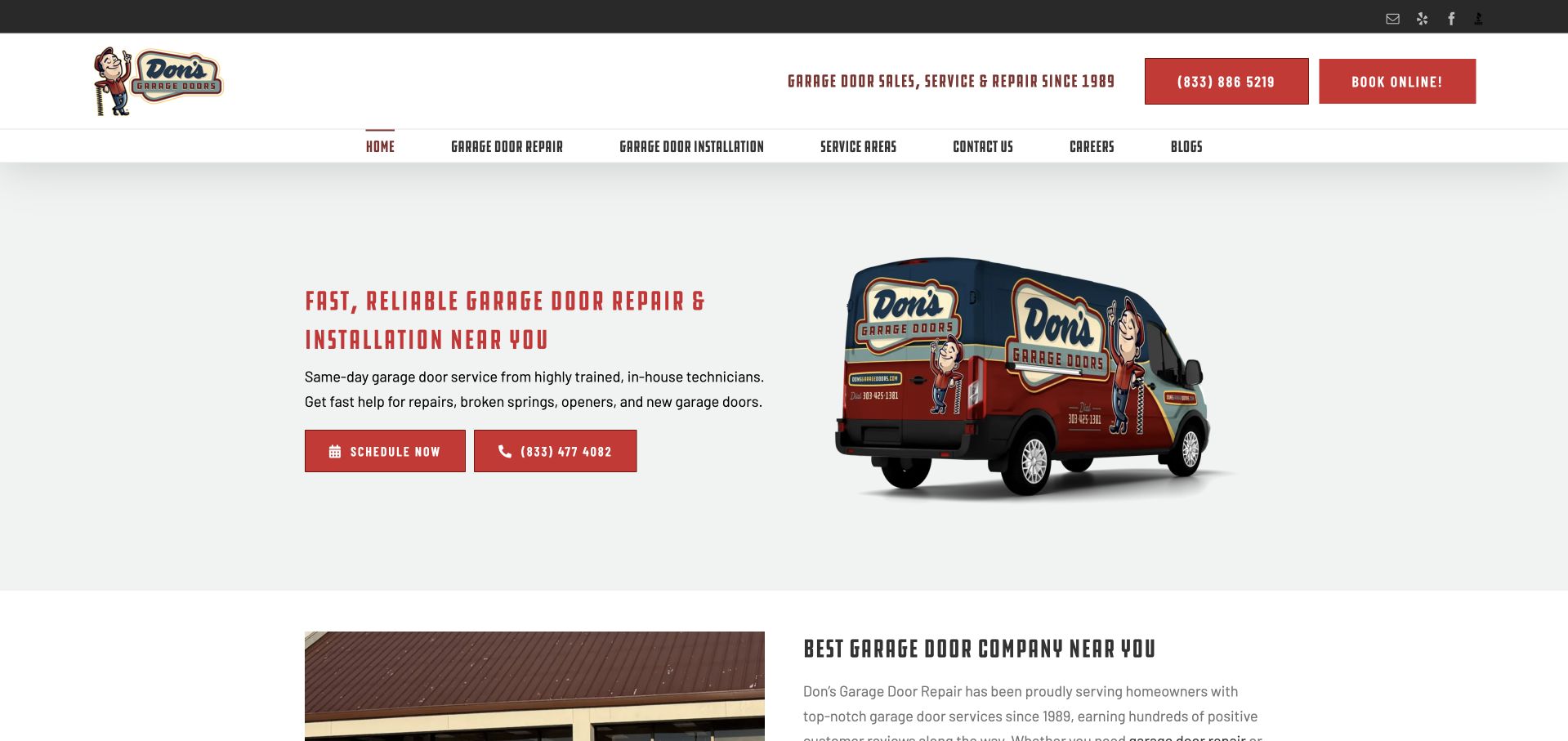
Don’s Garage Doors gives its illustrated van almost as much importance as the repair-and-installation text. The pale background, condensed red headings and modest pair of contact buttons create an introduction that is lighter than the full-screen form examples. The copy names springs, openers and new doors without making the visitor select one immediately. Service areas, repair, installation and contact have their own navigation links. A content section starts within the first view, so the hero does not consume the entire page. This is a useful reference for using existing vehicle graphics and a focused message as a coherent identity, rather than assuming every trades homepage needs another stock house photograph.
What you can learn
A recognisable operational asset can do useful brand work when the service explanation is clear. Keep repair and installation information accessible behind the concise opening, and explain the service area without relying solely on a broad “near you” phrase.
Pros
The branded vehicle reinforces the visual identity without a large background image.
Repair, installation and service-area routes are separately labelled.
Cons & considerations
The opening geographic claim is broad until coverage pages are consulted.
Condensed uppercase copy needs careful sizing on small screens.
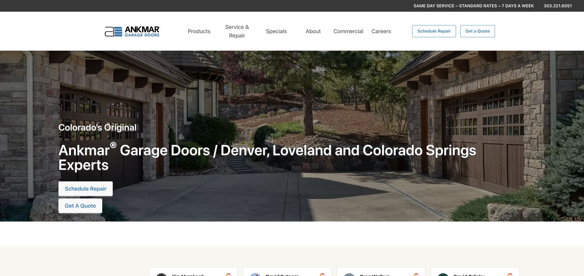
Ankmar uses a stone-house exterior behind a direct headline naming Denver, Loveland and Colorado Springs. A compact white header lists products, repair, commercial work and company information, while outlined quotation and repair controls appear in the navigation and again over the hero. The layout is restrained compared with many offer-led door sites. Its strongest distinction is the ability to schedule repair without beginning a new-door quotation. The photograph establishes an architectural context, though it offers little explanation of the actual product shown. The smaller history and service claims should be treated as company statements rather than independent evidence of comparative quality.
What you can learn
A replacement buyer and a repair caller may share a homepage but should not have to share the same first action. Name the real territory clearly, then use the next section to connect the photograph to relevant products and project examples.
Pros
The headline names the main regional territories.
Scheduling repair is distinct from requesting a quotation.
Cons & considerations
Quotation and repair buttons repeat across the same opening.
The architectural image has little accompanying product or project context.
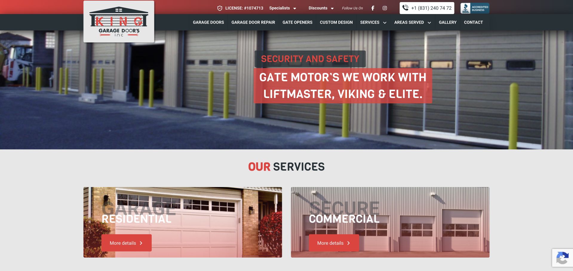
King Garage Doors uses a red-and-dark identity, a licence reference in the utility bar and a large image of several industrial door openings. The captured carousel slide discusses gate motors, while the service cards immediately below distinguish residential and commercial work. This makes the company’s wider range visible, but also illustrates the risk of allowing a rotating slide to define the business incompletely. A visitor arriving on this frame sees gates and motor brands before a general installation explanation. Gallery, custom design, service categories and areas served remain accessible in a dense horizontal menu. The page is useful as an information-architecture example more than a minimal visual treatment.
What you can learn
For mixed residential, commercial and gate work, keep a stable service statement outside the carousel. A visitor should be able to identify the right branch regardless of which slide happens to be showing.
Pros
Residential and commercial services have separate image cards.
Coverage and a project gallery are visible navigation choices.
Cons & considerations
The current gate-motor slide does not introduce the full garage-door offer.
A long technical menu competes with small utility and contact text.
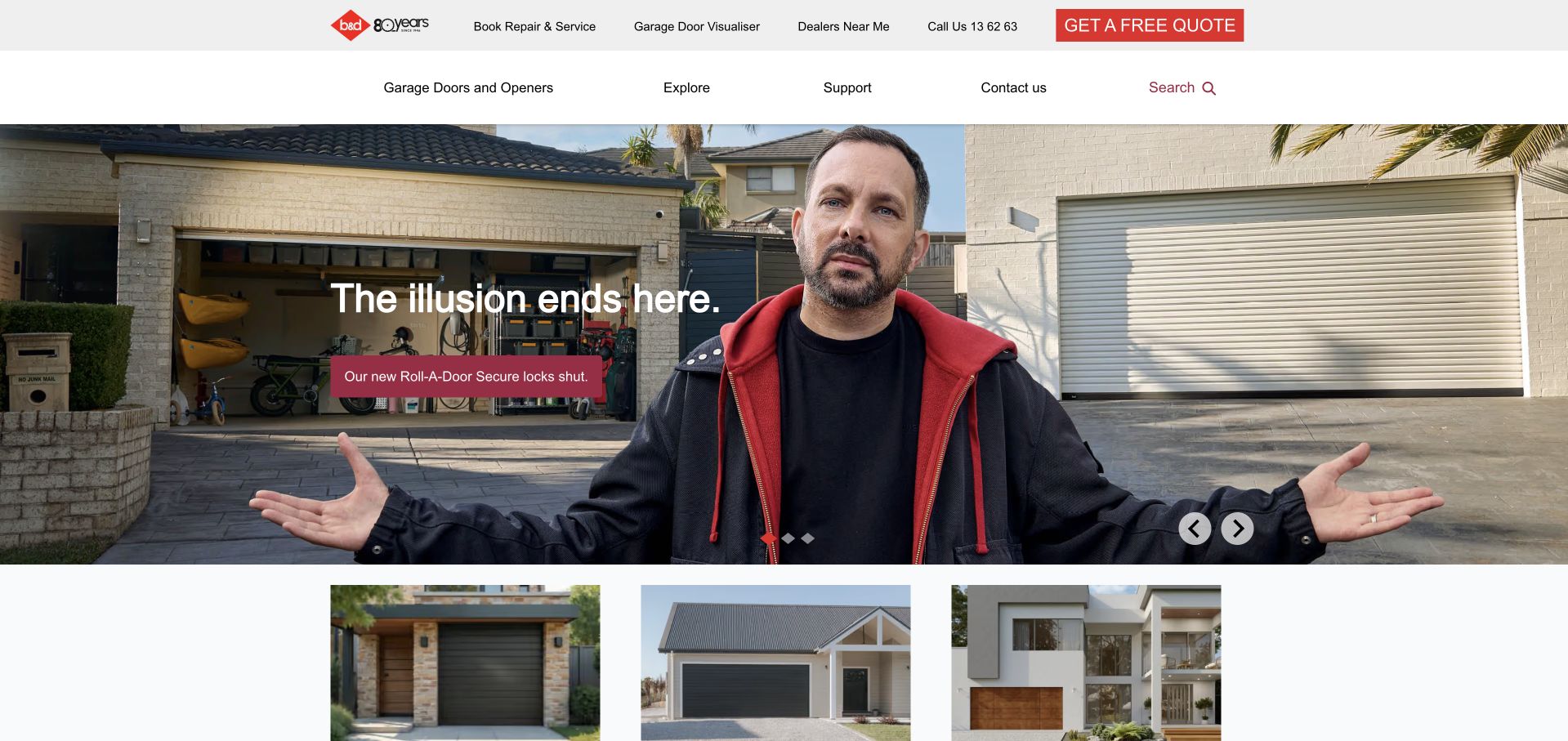
B&D combines a recognisable campaign image, a complete garage exterior and a short product message in its opening carousel. The utility row separates booking repair, visualising a door, finding a dealer and requesting a quote. This is an important structural difference from a single local installer: the brand website serves product research and a network handoff as well as support. Below the hero, project-style image cards begin another discovery route. The restrained navigation leaves the campaign room to breathe, but the small headline assumes the visitor will explore for the actual product differences and the relationship between the brand and local installation.
What you can learn
A product campaign can attract attention without having to carry every practical task. Keep dealer finding and repair distinct, and explain where a product visualisation ends and local measurement, selection and installation begin.
Pros
Repair, visualisation and dealer finding have separate labels.
The product campaign is supported by further image-led discovery below.
Cons & considerations
The short campaign message does not explain the range on its own.
Carousel content may foreground an advertisement rather than a visitor’s immediate task.
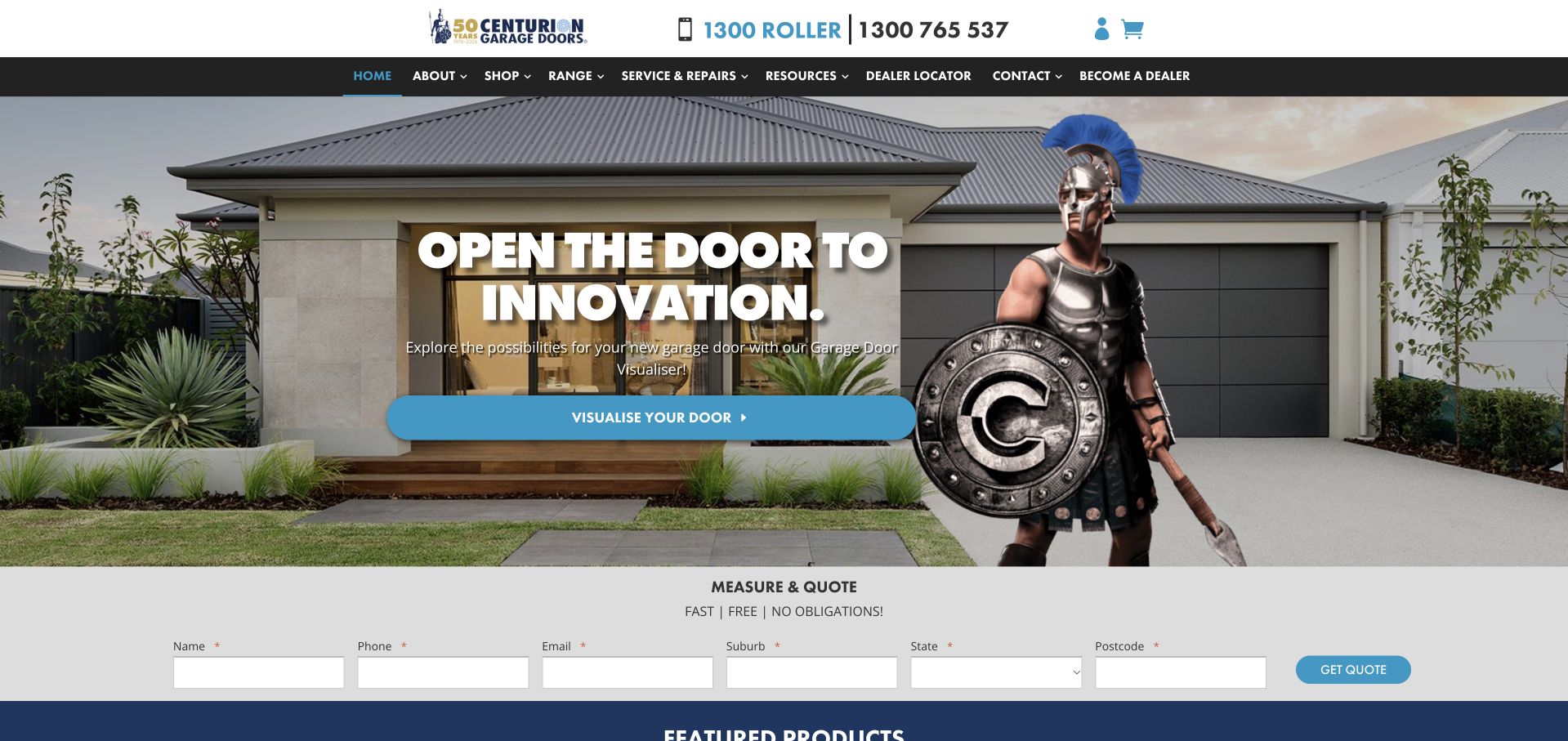
Centurion uses its helmeted character beside a finished garage façade, tying the product image to a distinctive brand device. The hero’s broad innovation headline leads to a door visualiser rather than directly to an enquiry form. A separate measure-and-quote strip beneath it exposes the contact and location fields. The dark navigation covers the range, repairs, resources, dealer finding and dealer participation, recognising several audiences. The visual identity is memorable, but the character and general headline offer less practical detail than the form and menu. A smaller installer could borrow the separation of visual exploration and quotation without needing an elaborate mascot.
What you can learn
Use a recognisable visual device to support a task, not replace the service explanation. Keep the visualiser’s role clear and ask only for the location and contact information genuinely needed for an initial measurement enquiry.
Pros
Visualising a door and requesting measurement are separate steps.
Repair and dealer routes remain visible in the main navigation.
Cons & considerations
The broad innovation headline leaves product specifics to later content.
The large character competes with the actual installed door for visual attention.
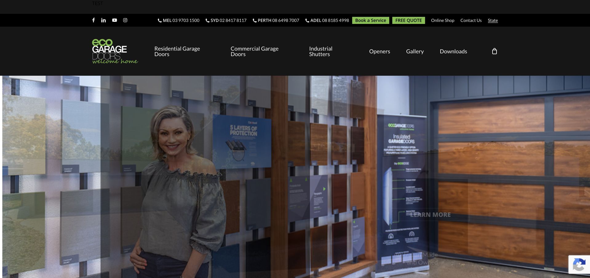
Eco Garage Doors presents residential doors, commercial doors, industrial shutters, openers and downloads in its main navigation. The dark-and-lime identity supports a product-led hero, while regional telephone numbers and quote controls sit in a utility row. A dismissible state-selector panel introduces a regional choice before the visitor starts exploring the catalogue or comparing the available products. This is useful for studying how a broader range needs both product organisation and geography. The showroom imagery introduces the range rather than documenting one particular local installation, so a visitor must look further to understand service delivery and installation coverage.
What you can learn
Where product or service availability varies by region, explain why a location is requested. Keep the main catalogue usable without inventing the visitor’s location, and distinguish buying a part from arranging a site visit or installation.
Pros
Residential, commercial and industrial categories are visibly distinct.
Regional contact information is present in the utility header.
Cons & considerations
The initial state selector interrupts the first view.
The showroom image provides limited evidence about a particular installed project.
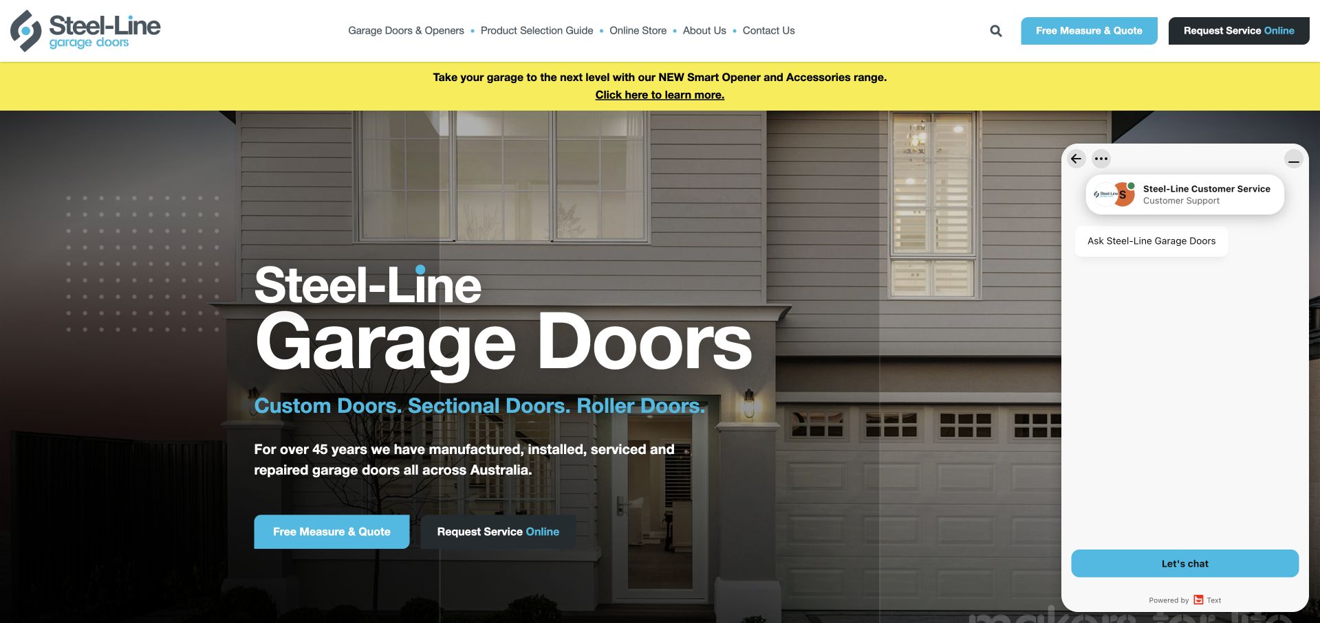
Steel-Line places a large plain-language garage-door headline over an installed exterior, followed by specific references to custom, sectional and roller doors. Two actions distinguish a measure-and-quote visit from a service request, and the same distinction appears in the header. A product-selection guide and online store support visitors still researching or looking for parts. The bright blue accent makes the main action easy to spot. In the captured view, an expanded chat panel occupies much of the right side; the central service explanation remains visible, but the panel demonstrates how assistance widgets can compete with product imagery.
What you can learn
Use the navigation to distinguish product selection, installation measurement and service after purchase. Test an expanded chat widget as part of the real page layout, because its default state can materially reduce the viewing area even on a large screen.
Pros
New measurement and existing-door service are separate actions.
The product-selection guide is distinct from the store.
Cons & considerations
The expanded chat panel obscures a substantial portion of the hero.
Several commercial and support destinations require a clear mobile hierarchy.
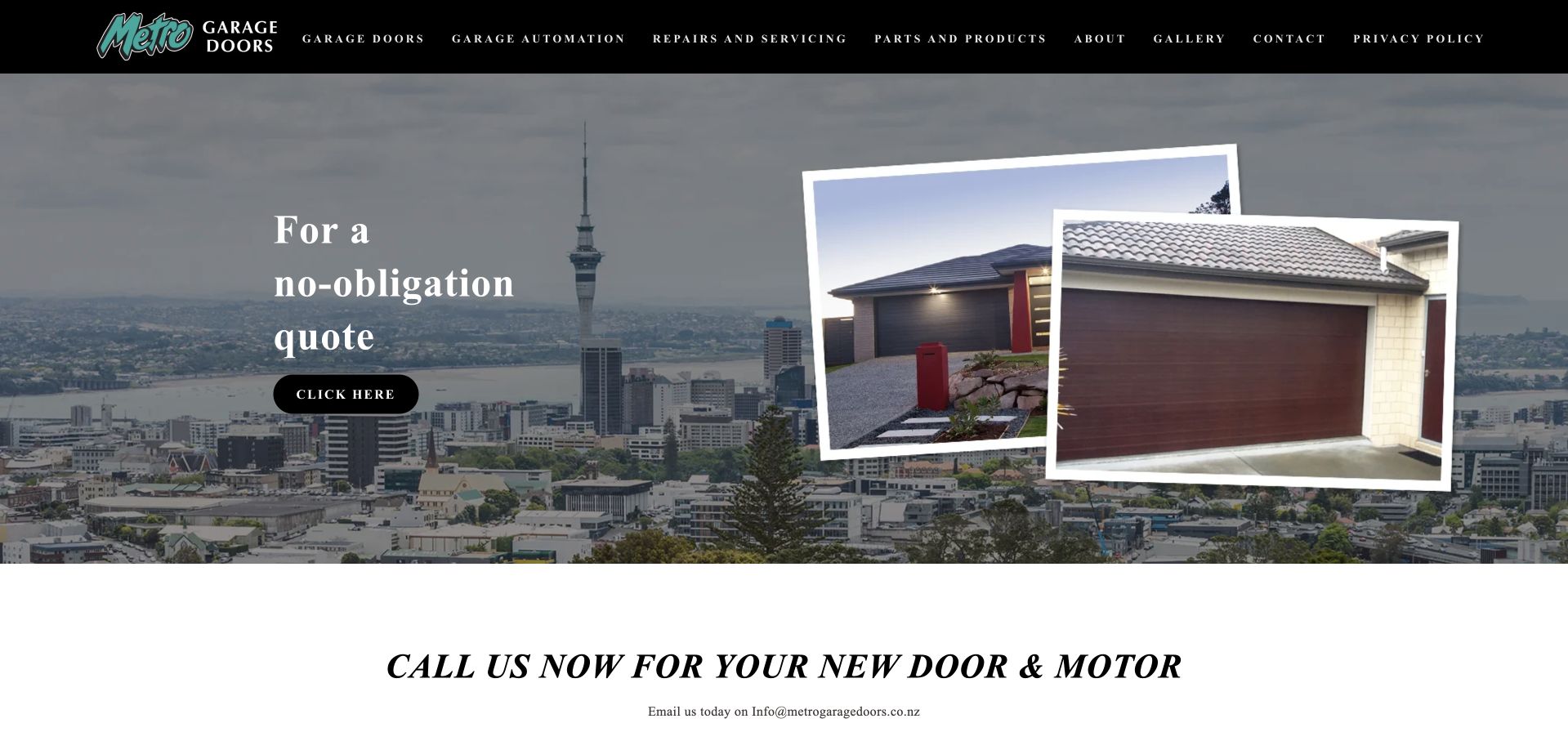
Metro Garage Doors uses an Auckland skyline behind overlapping framed garage-door photographs. The quotation invitation is short, while a large call-or-email prompt begins immediately below the hero. A black header separates doors, automation, repairs, parts, company information and a gallery. The composition makes the locality visually recognisable without relying entirely on repeated place names, and the product images have a different role from the background. The central quote button is small and generically labelled, however, and the service explanation depends on navigation and following text more than on the initial headline. The example suits a compact regional business with a relatively direct enquiry journey.
What you can learn
Use a local image to establish context, but state what the company actually does in text. A quotation action should describe the next step more clearly than “click here,” especially for someone navigating without the surrounding visual cues.
Pros
The skyline and product photographs have distinct visual roles.
Repairs, automation and parts are separately named in the menu.
Cons & considerations
The short hero lacks a concrete installation or repair explanation.
The generic quotation-button label gives little expectation of the next page.
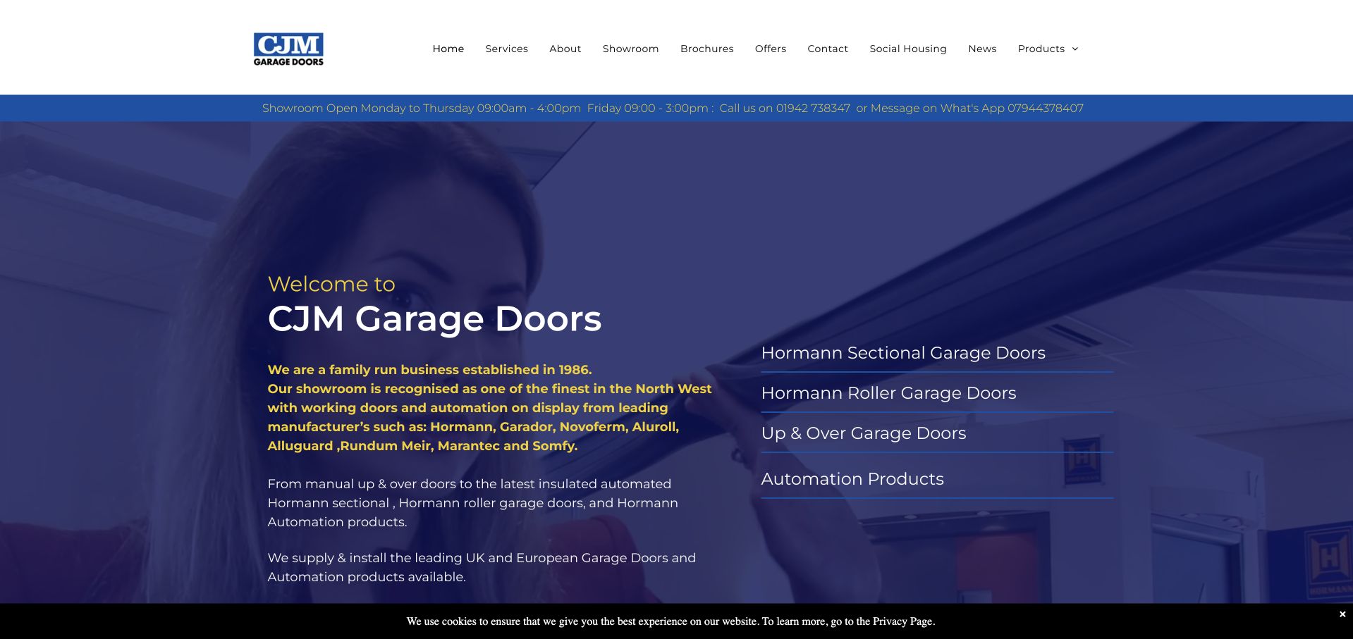
CJM Garage Doors uses a blue-tinted installation photograph behind a substantial introductory text block. The company’s family-business positioning and showroom information are visible before the product range, while a right-hand list separates sectional, roller, up-and-over and automation products. The header exposes brochures, offers, social-housing information and the showroom, recognising that not every visitor is a domestic replacement buyer. This is more information-led than a one-line photographic hero. The tradeoff is density: small text and several product terms require deliberate reading, and the showroom-hours strip is easy to overlook between larger navigation and image sections.
What you can learn
A specialist range benefits from naming its mechanisms rather than hiding everything behind “products.” Support technical terms with understandable comparison pages and keep showroom hours and appointment instructions readable in their own practical section.
Pros
Different door mechanisms have separate entry points.
Showroom and social-housing audiences are explicitly recognised.
Cons & considerations
The long introduction is relatively small over a tinted photograph.
Many equal-weight header choices make the first scan demanding.
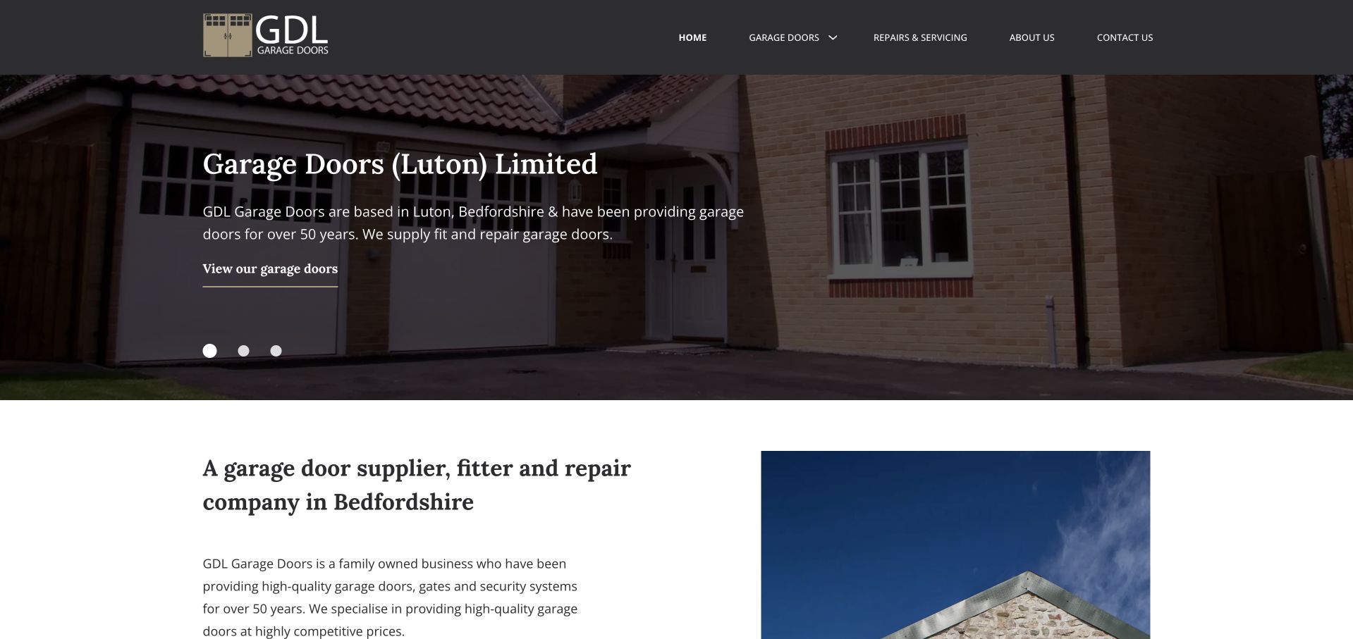
GDL uses a dark header, a modest photographic carousel and a traditional serif introduction. The opening names Garage Doors (Luton) Limited and Bedfordshire, while the supporting text explains supplying, fitting and repairing doors. A short main menu keeps new products, repairs and company information distinct. The next section repeats the supplier, fitter and repair role in a readable white content area beside another photograph. This provides a useful local-service structure without a prominent lead form or a wall of promotions. Its limitation is that the small hero text and carousel controls receive more space than a clear, immediate enquiry action.
What you can learn
Say explicitly which parts of the job the business handles, especially when a company both sells and fits products. A calm local introduction still needs a recognisable next step and enough type size for its practical service facts.
Pros
The installation role and service region are explicit.
A short menu distinguishes repairs from the new-door range.
Cons & considerations
The hero action is visually modest compared with the photograph.
Some service facts are repeated rather than developed with project context.
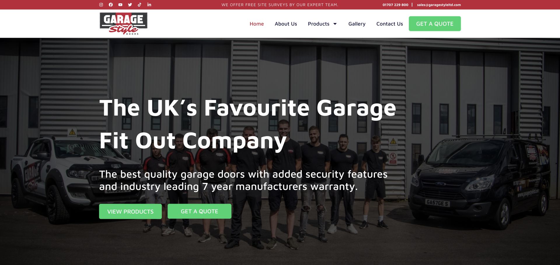
Garage Style places its team and branded vehicles outside the workshop behind a bold white introduction. Green buttons contrast with the red utility strip and black-and-white header. The headline identifies a broader garage fit-out business rather than only a door installer, and the supporting line names doors, security and a manufacturer-warranty message. Product browsing and quotations have separate actions, while the header stays compact. The real team photograph is the strongest transferable feature: it gives the company a recognisable identity without an anonymous lifestyle image. The broad superlative in the headline, however, provides less useful information than a clear location and specific project scope would.
What you can learn
When a garage business does more than doors, name the wider scope accurately and show the people behind it. Avoid letting a sweeping popularity claim replace service boundaries, product distinctions or a concrete explanation of the fitting process.
Pros
The team and service vehicles make the business recognisable.
Products and quotation requests have separate hero actions.
Cons & considerations
The headline’s superlative is less informative than a service-and-location statement.
The wider fit-out offer needs clear boundaries on subsequent product pages.
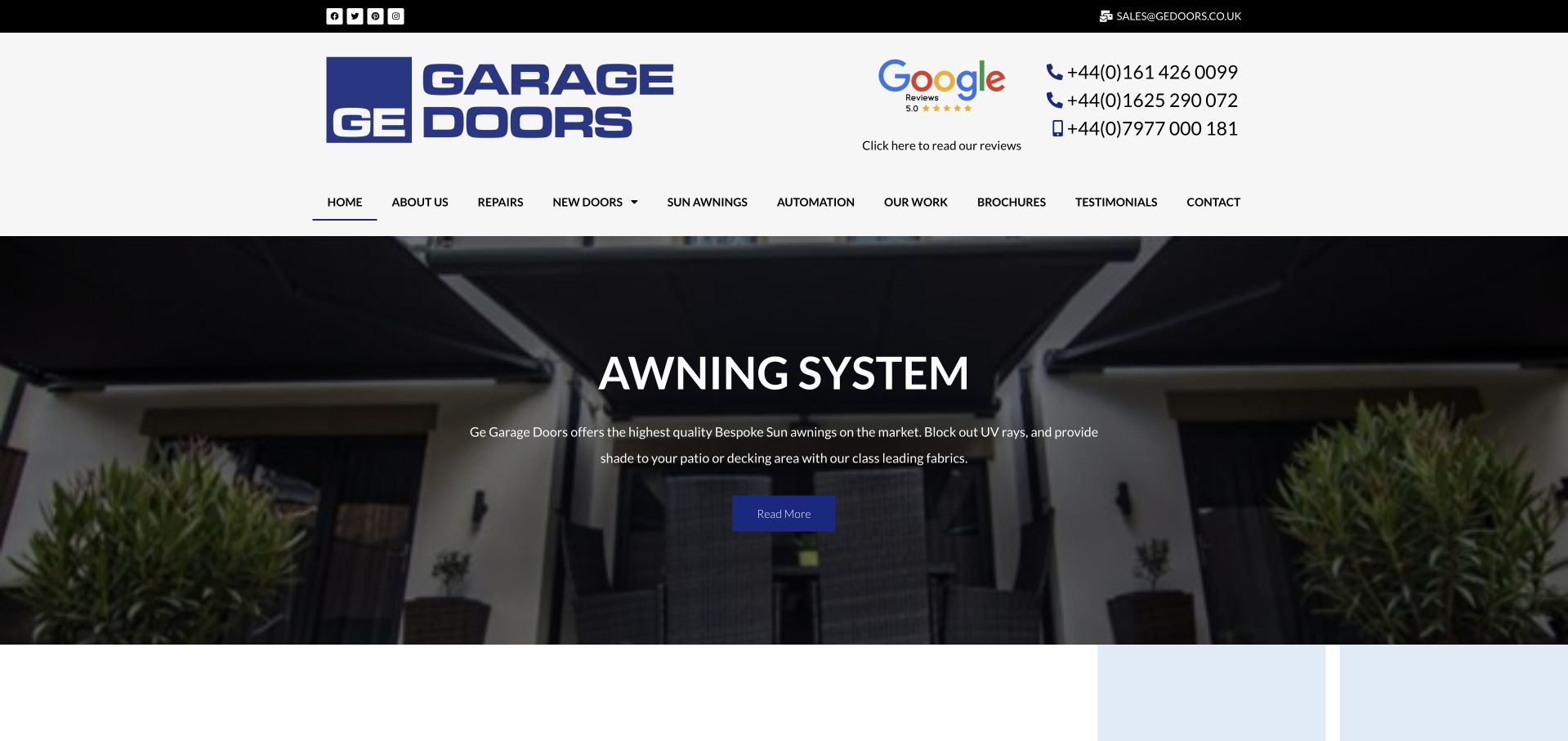
GE Garage Doors uses a large blue mark, a review link and several telephone numbers in a spacious white header. Its product and service navigation includes repairs, new doors, automation, awnings, work examples and brochures. The captured carousel happens to feature an awning system, showing how an expanding product range can alter the first impression of a garage-door specialist. The dark image and small central action are less informative than the explicit categories above them. This is a useful example for planning a mixed catalogue: complementary services can be visible without pretending they are all the same customer task, but a stable introduction is needed outside the rotating slide.
What you can learn
Keep the core company scope visible even when a carousel promotes a complementary product. Explain which telephone route serves which need, and give each product family a coherent path to examples, specifications and an enquiry.
Pros
Repairs, automation and completed work are explicit menu destinations.
Telephone contact is highly visible in the header.
Cons & considerations
The current awning slide does not introduce the garage-door service.
Several telephone numbers appear without a concise task-based explanation.
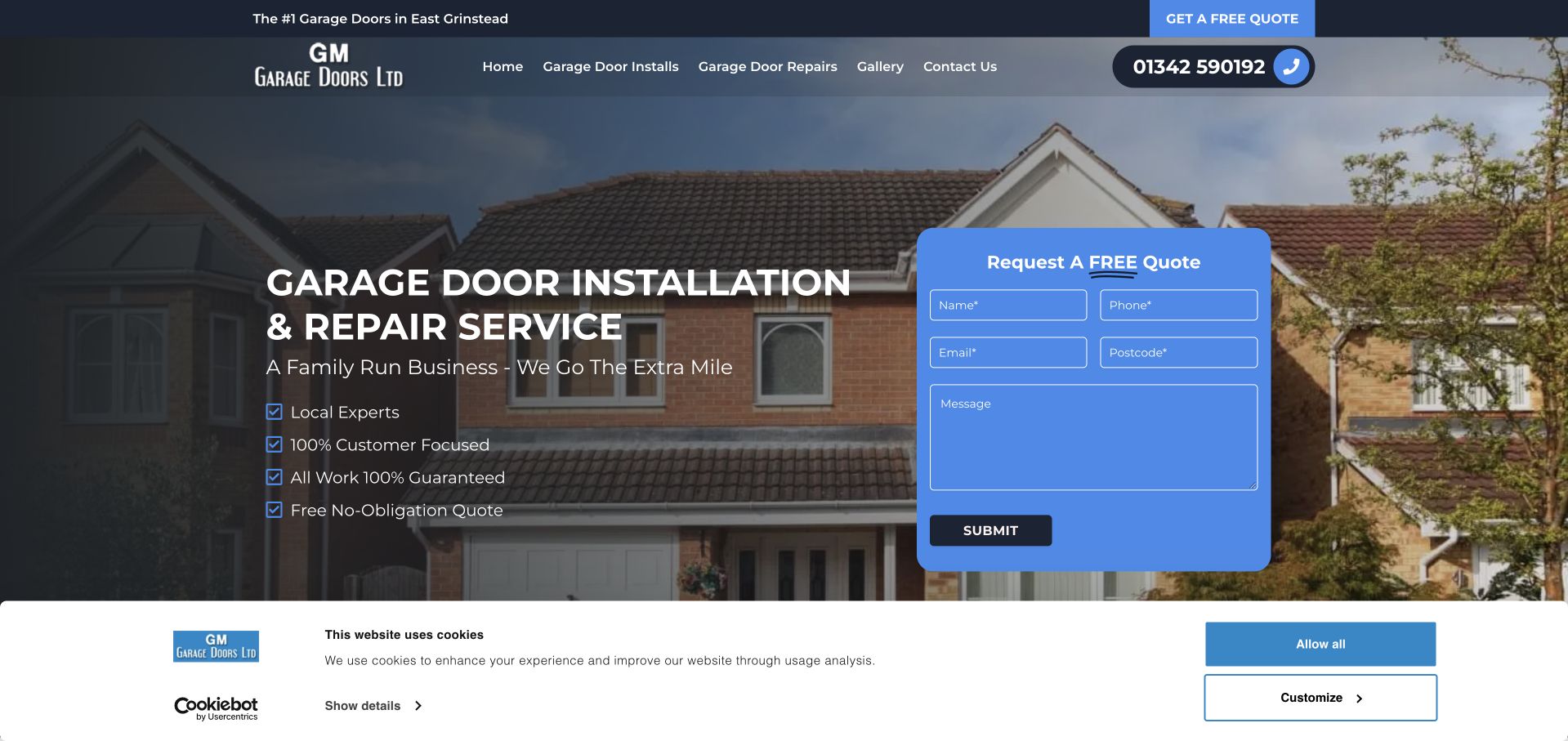
GM Garage Doors places a blue quotation card beside a direct installation-and-repair headline over a house exterior. The form asks for a name, phone, email, postcode and a short message, making the initial effort visible. Installation, repairs, a gallery and contact information form a compact main navigation; a telephone control is also prominent in the header. The introduction names the family-run service identity, while the utility strip adds the local area. The captured privacy bar occupies the bottom of the screen but does not replace the main content. The design is useful for studying a clear small-business enquiry, although several broad assurance claims add little specific project information.
What you can learn
A short message and postcode can help route a local enquiry without requiring a detailed technical diagnosis. Explain the next contact step, keep optional consent controls separate and replace generic assurances with concrete process or project facts.
Pros
The form exposes the requested information rather than hiding it behind a button.
Installation and repairs have distinct navigation links.
Cons & considerations
The first-screen assurances are broad rather than specific evidence.
The privacy bar and form compete for space on smaller displays.
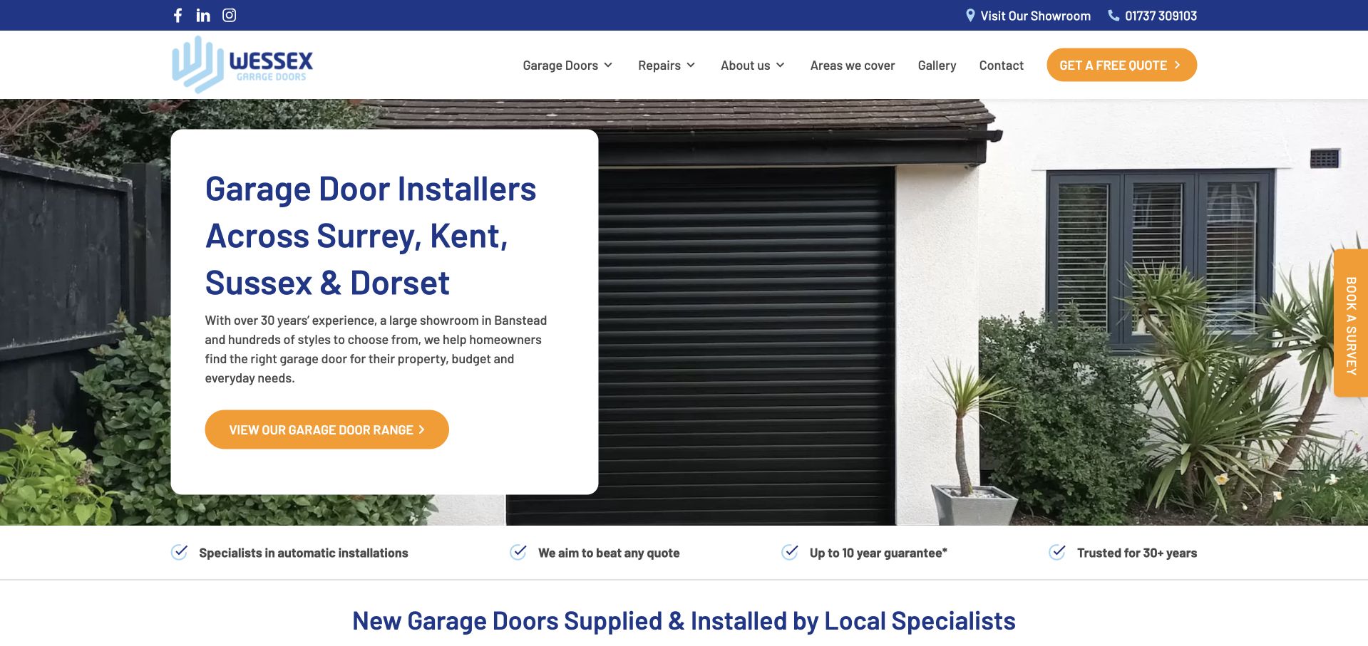
Wessex uses a white information card over a garage exterior, giving its service-and-location headline stable contrast. Surrey, Kent, Sussex and Dorset are named directly, and the main action invites browsing the door range rather than immediately completing a form. A top utility row offers a showroom visit, while the main navigation separates doors, repairs, areas covered and a gallery. A narrow assurance strip and a supply-and-installation heading follow below. The layout balances visual inspiration and practical research, although the extra vertical survey tab repeats a contact intention already represented in the header and can compete with the photograph.
What you can learn
A regional introduction can name its territory once and then support it with a useful coverage page. Give showroom visits, range browsing and survey requests different labels so a visitor can choose a level of commitment appropriate to their stage.
Pros
The service region appears in a readable, high-contrast panel.
Range browsing and showroom visits are clear alternatives to an immediate survey.
Cons & considerations
The vertical survey tab repeats the header’s enquiry route.
The opening photograph has little captioned detail about the specific installed door.
Kegan is a freelance web designer and developer with 15+ years of experience helping businesses turn complicated website requirements into clear, maintainable digital experiences. He works directly with clients from planning and design through development, launch, and ongoing support.
For garage door installer website design, his development approach focuses on repair and replacement pathways, door and operator information, service-area details, practical emergency contact boundaries, and survey or estimate requests. The scope can be a targeted improvement or a complete custom build, with responsive layouts, thoughtful content structure, and integrations chosen around the people using and maintaining the site.
Show 3 other garage door installer website designersHide other garage door installer website designers
Build the brief around service tasks, not just curb-appeal images
Map the common calls before drawing the homepage
Ask the team which enquiries are repairs, replacement projects, opener questions, existing-customer support or commercial work. Define a short route for each genuine service rather than one large catch-all questionnaire. Write a response expectation that reflects the actual office process. Distinguish an online request from an appointment confirmation, and make after-hours arrangements explicit. Useful routing information should not become a request for unnecessary household details.
Create a catalogue the business can keep accurate
Model door types, materials, finishes, manufacturers and accessories separately where those distinctions are useful. Give each range a place for specifications, available options, compatible services and relevant project photographs. Keep manufacturer claims attributed and link to the current documentation rather than copying a spec sheet indefinitely. If a starting price is published, make the included work and qualifications clear; a prominently displayed number without its scope can mislead more than it helps.
Treat aftercare and current information as core content
Existing customers need service, documentation and contact information after the sales journey ends. Keep repair and support destinations visible while promotions are running. Assign someone to maintain coverage, opening hours, showroom access, supplier relationships and offer dates. A brand acquisition or domain change deserves a plain explanation at arrival, not a silent redirect to an unfamiliar name. Test any booking, chat and privacy tools together, because their combined default state can obscure the basic service message.
The editing job behind the design
Technology should support accurate products and a reliable contact handoff
Choose a content system that lets staff update product facts, service areas, projects, promotions and support information without rebuilding layouts. An installation business may need a project library and location records more than a shop. A parts retailer may need actual ecommerce information. Test the editorial tasks before committing to a platform: retire an offer, correct a telephone number, update a range and add a captioned installation.
Integrations deserve the same care as the page design. A scheduler must explain whether a request is confirmed, what coverage it supports and how someone can call instead. A visualiser needs a useful fallback when it cannot run. Compress large images, provide readable form labels and error messages, and test expanded assistance widgets on small screens. Public technology signals in the examples do not identify private scheduling, payment or dispatch systems.
Our WordPress website examples offer a separate look at publishing approaches. A visible platform label is evidence for that named page, not a guarantee that the same system will suit your requirements.
Before the public launch
Garage door website planning checklist
State installation, repair, automation and supply-only roles accurately; do not imply all services are available everywhere.
Give urgent repair, planned replacement and existing-customer service different routes.
Publish real service hours, local coverage and a clear contact alternative when online booking is unsuitable.
Explain the relationship between the product manufacturer, dealer and installation team.
Compare relevant door mechanisms and options using readable descriptions and maintained specifications.
Caption project images and distinguish completed installations from manufacturer imagery or visualisations.
Explain whether an online price is illustrative, a range or a confirmed quotation, with its actual scope.
Provide showroom location, visit arrangements and accessibility information where applicable.
Test mobile forms, keyboard navigation, errors, privacy controls and the combined effect of chat and scheduling widgets.
Assign an owner to coverage details, current offers, support links and documentation updates.
These checks are a project checklist, not a performance, legal, security, or accessibility certification. Test real journeys with the people responsible for the website before making claims about the result.
Sources & editorial method
How this collection was selected and reviewed
The collection is based on directly inspected public company pages and direct browser captures. Reviews concern visible information hierarchy, service communication and design tradeoffs. Official pages establish the stated business role and service scope; company claims about quality, reviews, prices or response times are not independently certified here. Product brands and dealer-network sites are identified as such rather than presented as equivalent local installers. Technology information remains limited to supported public evidence.
Each example links to its actual source page. Screenshots are direct browser captures with their own capture dates; moving imagery, announcements and live designs can change. The notes describe observable design choices and conditional tradeoffs, not measured traffic, conversion results, service quality, or accessibility conformance.
Technology labels use public page metadata, asset evidence, or explicitly cited platform documentation. Platform documentation is not a complete current deployment audit. A component reference may be legacy or unused; it is not a complete backend inventory. Unknown stacks are omitted. These sites are editorial examples, not our client portfolio.
Written, Edited and Curated are separate editorial records, not timestamps advanced by a rebuild. Website designs and imagery belong to their owners. See our editorial standards or suggest a correction.
Questions worth asking
Garage Door Installer website design questions
Should a garage door site put emergency repair first?
If urgent repair is a genuine core service, make its contact route easy to find and state the actual coverage and hours. Do not let it hide the new-door research journey. A separate repair action and replacement action usually communicate more clearly than a single button that opens a long form for every type of visitor.
Is a door visualiser necessary?
Not always. It is useful when it helps someone compare relevant styles and leads to accurate product information. It also adds implementation, maintenance and accessibility work. A small installer with strong captioned project examples and clear product pages may serve customers better than a poorly explained or unsupported visualiser.
How should prices be presented?
State what the figure includes, which dimensions or options it assumes, and what requires assessment. Product supply, automation, fitting and removal are different components. Avoid presenting a starting figure as the final cost for an unknown property. Keep price information maintained and direct visitors to a proper survey or quotation where needed.
What should the initial repair form ask?
Enough to route the request: contact details, service location, a short description and any genuinely necessary customer-status information. It should not ask visitors to perform a technical diagnosis or attempt a repair themselves. Explain whether the submission requests a callback or books a confirmed slot, and provide a telephone alternative.
Can a national manufacturer site be a useful local design reference?
Yes, particularly for catalogues, product comparisons and visualisation. But a local installer needs more direct coverage, personnel, survey and aftercare information. Borrow the useful product structure without copying national claims or implying that a manufacturer’s central office is the team performing the installation.
Start with clear service choices and an accurate local handoff. A recognisable identity, maintained product information and honest enquiry expectations do more useful work than adding another discount banner to every screen.