Best Divi Websites of 2026 (20 Real-World Examples)
Twenty public properties with dated Divi evidence, real screenshots and practical ideas for a maintainable WordPress website.
A successful Divi website starts with a clear content structure and a small set of useful layouts. These examples show how architecture practices, cultural organizations and service businesses present their work while keeping navigation and next steps understandable.
Divi is Elegant Themes’ WordPress theme and visual builder. Its official product documentation describes visual page editing and reusable site structures. The platform gives a team many presentation options; the project still needs decisions about content ownership, useful destinations and how an editor can make a routine change without rebuilding a page.
This collection opens with Norm Architects, Core by Clare Smyth, Santa Barbara International Film Festival, QEII Centre and City Lights Booksellers & Publishers. Their identities are verified separately from the technology evidence. The examples are specific public pages with saved Divi references, not claims about every system operated by each organization or an assessment of its services.
Before the examples
What makes good Divi website development in 2026?
Choose reusable patterns from actual content
Start with the pages the organization really needs. A project case study, course listing and service introduction may share colors and spacing while requiring different information. Write representative content before choosing a layout. Include long titles, modest photographs and missing optional fields so the pattern works beyond the most attractive demonstration.
Make global changes intentional
Divi’s Theme Builder supports shared structures such as headers, footers and content templates. Decide which elements belong everywhere and which should change by section. A global header is useful when its destinations are stable; an expired campaign is a poor candidate for permanent placement. Document the scope of each shared element before handing the editor broad controls.
A dramatic photograph or full-screen opening can establish character, but it should not hide the reason someone arrived. Give visiting, booking, browsing, support and contact tasks understandable labels. Separate an editorial story from a transaction or account system, and make clear when a button leads to another property with its own rules.
The collection · 20 examples
20 Divi website examples worth studying
These twenty examples pair original Divi-focused design reviews with genuine saved browser captures. Public Divi theme and builder references qualify each named source page at its recorded observation time. The reviews describe visible compositions and useful planning ideas; they do not identify the exact modules behind individual controls.
We start with five recognizable brands or organizations: Norm Architects, Core by Clare Smyth, Santa Barbara International Film Festival, QEII Centre, City Lights Booksellers & Publishers. Each attribution applies to the named website property, not every product or website belonging to its organization. This is a curated reading sequence, not a measured ranking.
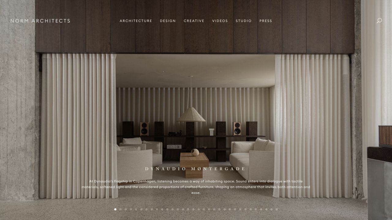
Norm Architects lets one interior photograph occupy almost the entire opening. The slim navigation sits across the upper edge, while a project name and short description appear near the bottom. Nothing in this composition requires a crowded collection of boxes or promotional badges. For a Divi project, the useful reference is the relationship between the image crop, the text width and the space reserved for navigation. The saved public evidence identifies Divi assets; it does not reveal the precise modules or editing workflow behind this composition.
What you can learn
Plan the photograph and its caption as one reusable pattern. Give editors clear limits for title length and focal position, and provide a quieter background treatment when a replacement image makes the text difficult to read. Keep the actual project archive reachable without advancing the opening slideshow.
Pros
The restrained header leaves the architectural composition easy to understand.
A specific project caption provides context beyond an attractive background.
Cons & considerations
Small white navigation needs careful checking against each replacement photograph.
Numerous slide indicators add visual detail without naming the other projects.
Platform source: Dated public Divi resource reference. Dated public Divi theme or builder resource on normcph.com; no version, individual component or private-system attribution. Platform evidence is separate from the direct website screenshot and is not a complete current infrastructure audit.
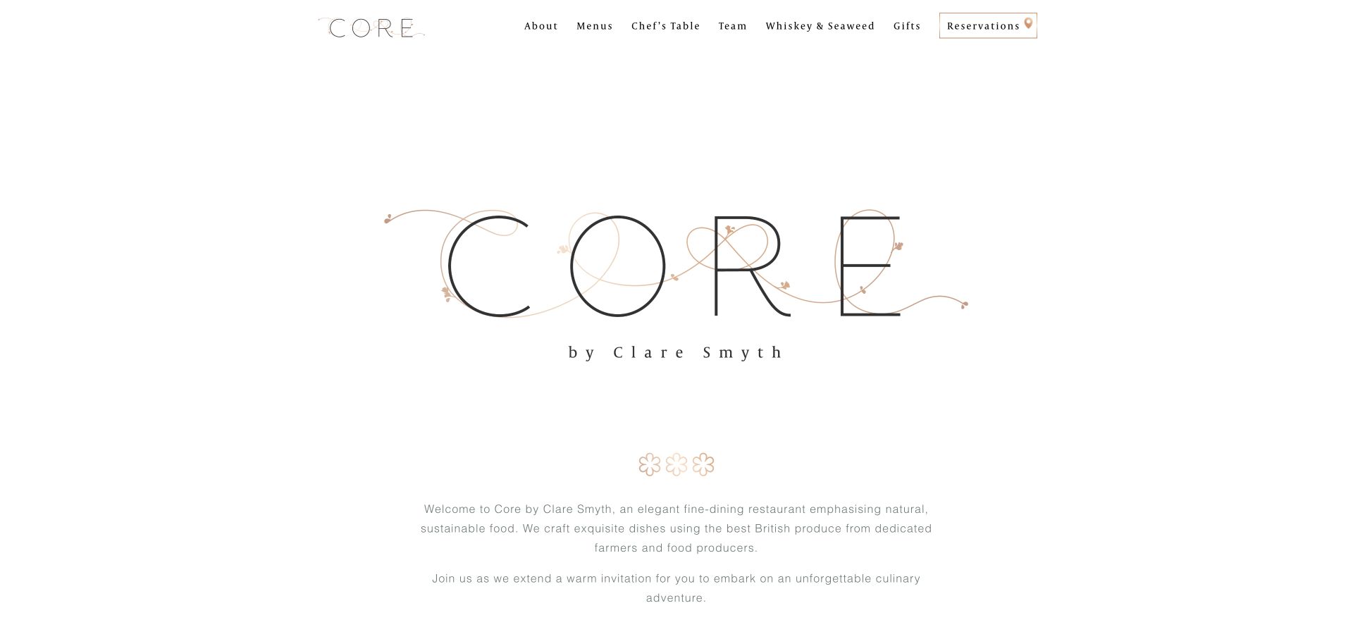
Core by Clare Smyth uses a large, delicate wordmark and generous white space instead of opening with a dense menu or booking widget. A compact top navigation separates menus, the chef’s table, the team and gifts, with reservations outlined at the right. The typography and copper accents provide the character. This is a useful Divi reference for resisting the temptation to add every available module. The observed Divi resources establish a dated public theme association, not the software behind the separate reservation or gift services.
What you can learn
Start with the restaurant’s most important destinations and give each an explicit label. A shared header can carry the reservation route while individual pages explain menus and experiences. Test long navigation labels and the large identity artwork at narrow widths before treating the spacious desktop arrangement as a complete design.
Pros
The outlined reservation link remains visible within an otherwise quiet header.
A limited palette connects the navigation and central brand artwork.
Cons & considerations
The large identity area delays practical detail about the dining experience.
Fine lettering and pale introductory text warrant careful contrast and size checks.
Platform source: Dated public Divi resource reference. Dated public Divi theme or builder resource on corebyclaresmyth.com; no version, individual component or private-system attribution. Platform evidence is separate from the direct website screenshot and is not a complete current infrastructure audit.
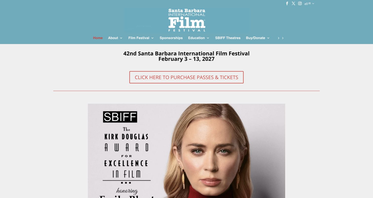
The Santa Barbara International Film Festival capture places the festival edition and dates directly above a bordered ticket link. A large editorial image follows, while the blue masthead holds the institutional identity and routes to education, sponsorship and theatres. The page makes a recurring event feel connected to a year-round organization. For a Divi build, the instructive detail is the separation between reusable navigation and the short-lived campaign block. Public Divi asset references support the platform association without proving how ticketing or donations are implemented.
What you can learn
Give seasonal announcements an owner and an expiry rule. Keep dates, ticket destinations and campaign artwork together in the editing brief, then ensure year-round programs retain stable routes after the campaign changes. A festival homepage should not require visitors to interpret a celebrity image before finding the next event.
Pros
The event dates and ticket action form a clear, compact sequence.
Institutional navigation keeps education and sponsorship distinct from the festival promotion.
Cons & considerations
The large masthead consumes space before the visitor reaches event information.
Editorial artwork needs descriptive text so meaning does not depend on an image.
Platform source: Dated public Divi resource reference. Dated public Divi theme or builder resource on sbiff.org; no version, individual component or private-system attribution. Platform evidence is separate from the direct website screenshot and is not a complete current infrastructure audit.
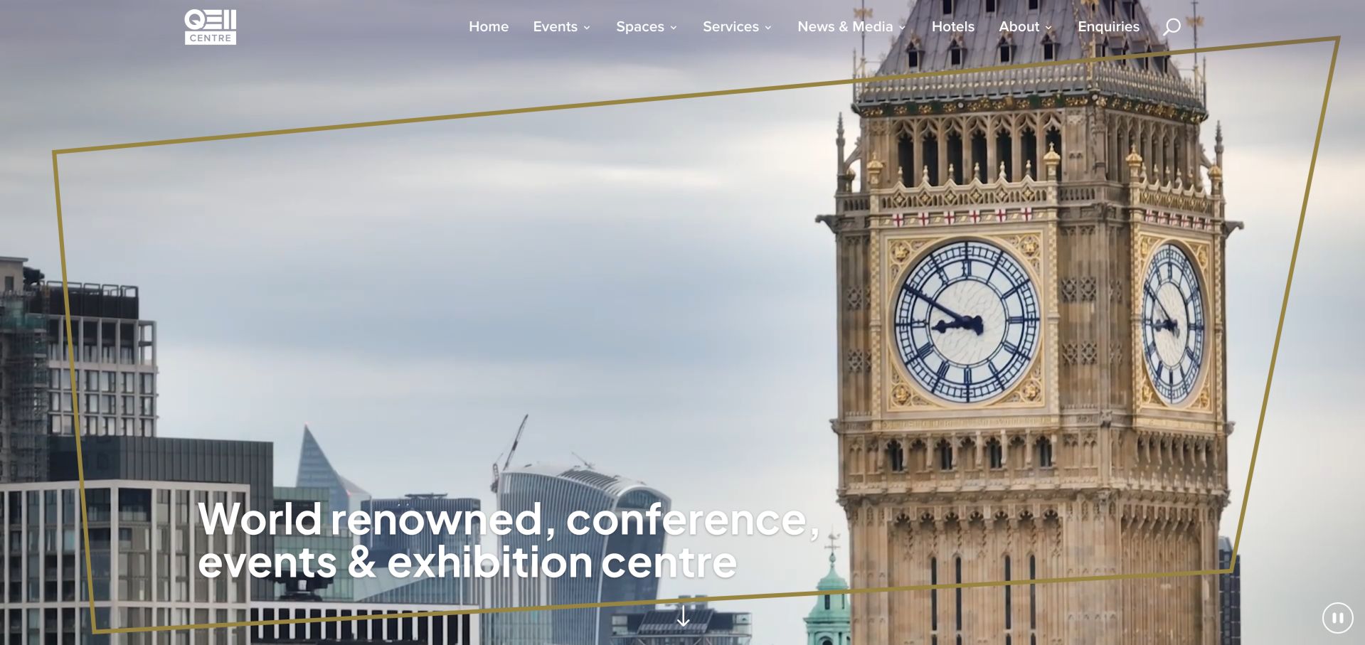
QEII Centre uses a Westminster scene to place the venue within a recognizable London setting. An angled gold outline frames the picture and the large conference headline, while a transparent header separates events, spaces, services and enquiries. A visible pause control acknowledges the moving opening. The design lesson for Divi is about treating imagery, decoration and content as separate layers with different responsibilities. The dated Divi evidence concerns this public property; it does not establish the technology of its floorplan, venue systems or individual media controls.
What you can learn
Build the useful room and event information before refining the cinematic opening. Reserve a stable area for navigation and keep the decorative frame out of the text’s way at every layout size. Provide a still image and understandable links so a video is an enhancement rather than the only explanation of the venue.
Pros
Destination imagery immediately gives the venue a geographic context.
The navigation names planning categories that an event organizer can recognize.
Cons & considerations
The opening emphasizes place more than the specific rooms available to hire.
A transparent header must remain readable across changing video frames and crops.
Platform source: Dated public Divi resource reference. Dated public Divi theme or builder resource on qeiicentre.london; no version, individual component or private-system attribution. Platform evidence is separate from the direct website screenshot and is not a complete current infrastructure audit.
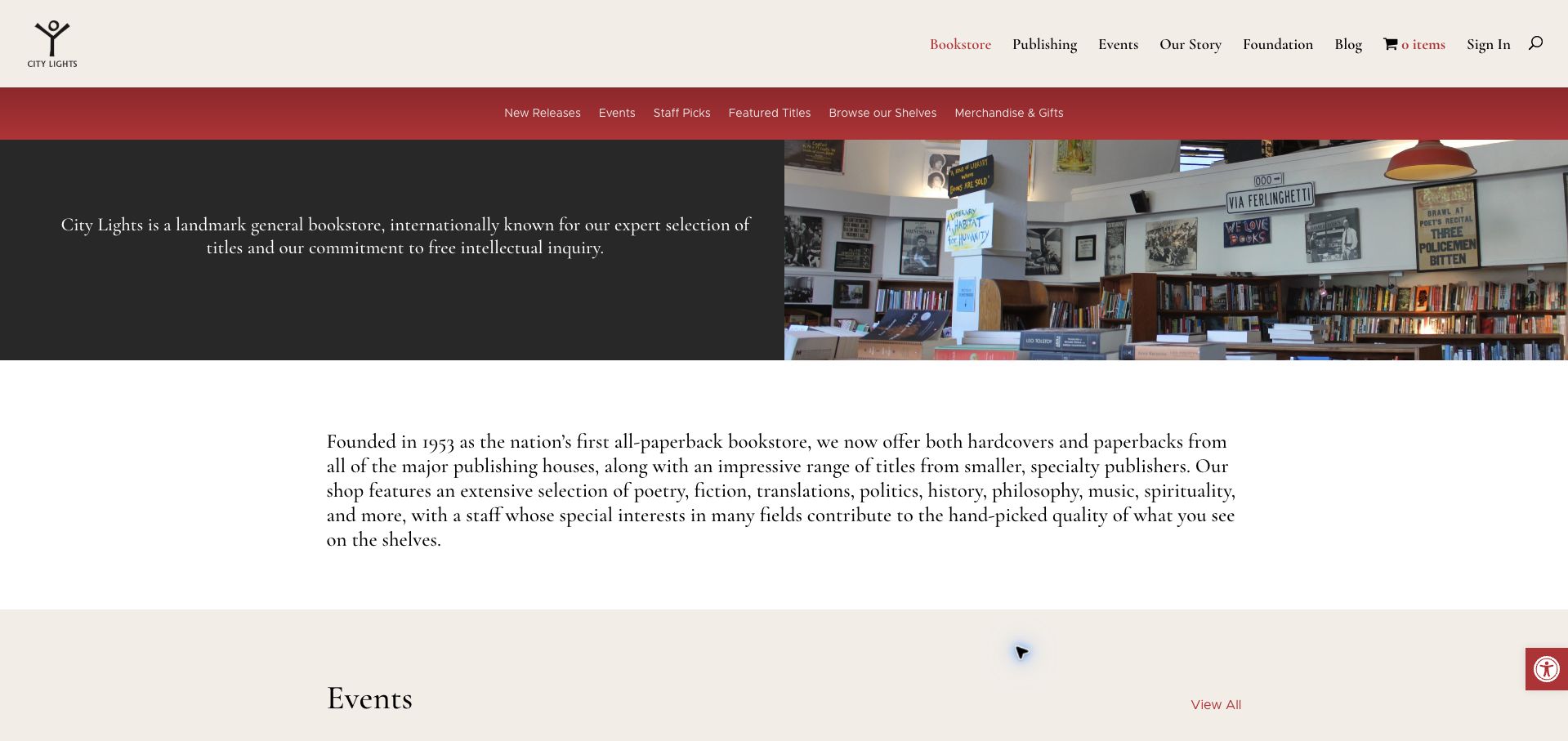
City Lights separates its bookstore navigation from the broader publishing, events and organizational links above it. A red secondary bar names new releases, staff picks, featured titles and browsing routes. Beneath that, a dark text panel sits beside a photograph of the physical shop, followed by an unhurried introduction. This is a useful Divi reference for a website with several connected purposes. The source and capture are specifically the bookstore page; neither its Divi assets nor its visible cart establish the implementation of every City Lights service.
What you can learn
Draw the site hierarchy before designing a second navigation row. Use the section header to explain where the visitor is, then keep the parent organization reachable without mixing every destination into one menu. In a reusable template, let the active section and its editorial introduction change independently from the global identity.
Pros
Two navigation levels distinguish bookstore browsing from the wider organization.
The shop photograph connects online discovery to a recognizable physical place.
Cons & considerations
Several adjacent browsing labels require clear destination pages to remain meaningful.
The long introduction pushes the next content section below the opening view.
Platform source: Dated public Divi resource reference. Dated public Divi theme or builder resource on citylights.com/bookstore; no version, individual component or private-system attribution. Platform evidence is separate from the direct website screenshot and is not a complete current infrastructure audit.
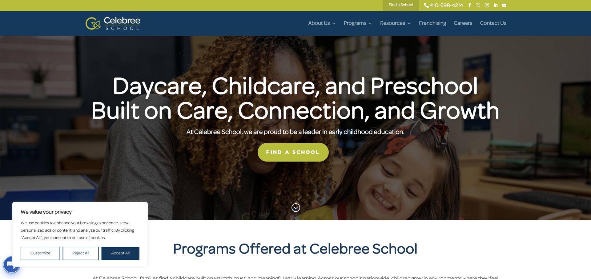
Celebree School gives the opening a single strong task: find a school. The lime button appears over a classroom photograph, while the blue header separates programs, resources, franchising, careers and contact information. The next section starts explaining the programs without changing the visual vocabulary. A Divi project can learn from the consistency between the utility strip, main header and hero action. The saved theme resources qualify this public page as a Divi example; they do not verify enrollment systems, educational outcomes or individual school availability.
What you can learn
Treat the location journey as a content requirement before styling the hero. A network template should reserve room for addresses, local programs and contact details, with a clear distinction between parent-facing information and franchise recruitment. Review the design with consent notices present so important routes are not hidden by an otherwise legitimate overlay.
Pros
The main button states a concrete next step instead of a vague invitation.
Separate program and career routes accommodate different audiences within one identity.
Cons & considerations
The broad headline occupies substantial space before local details become available.
The visible consent panel overlaps the transition into the following content section.
Platform source: Dated public Divi resource reference. Dated public Divi theme or builder resource on celebree.com; no version, individual component or private-system attribution. Platform evidence is separate from the direct website screenshot and is not a complete current infrastructure audit.
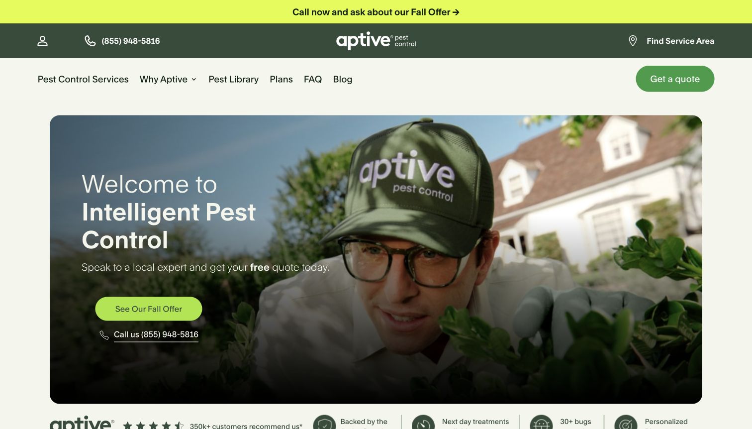
Aptive combines a bright seasonal announcement, a dark utility header and a lighter service navigation row. The hero then pairs a technician photograph with a short proposition and a prominent offer button. Phone and service-area routes remain visible, so the promotion does not completely replace the practical ways to proceed. For Divi, this is a useful study in separating global information from a campaign message. Public asset evidence identifies Divi at the recorded date, without establishing the booking system or validating the service claims shown in the capture.
What you can learn
Document which parts of a service template are permanent and which expire. Put campaign copy, eligibility details and destination links under one owner, while keeping location coverage and contact options stable. Avoid duplicating an offer across several independently edited modules where the wording can drift after the season ends.
Pros
Phone, service-area and quote routes are visible before deeper navigation.
The framed hero gives the photograph and message a coherent shared boundary.
Cons & considerations
Three horizontal header bands compete for the first screen’s vertical space.
Repeated seasonal calls to action need coordinated updates to avoid stale offers.
Platform source: Dated public Divi resource reference. Dated public Divi theme or builder resource on aptivepestcontrol.com; no version, individual component or private-system attribution. Platform evidence is separate from the direct website screenshot and is not a complete current infrastructure audit.
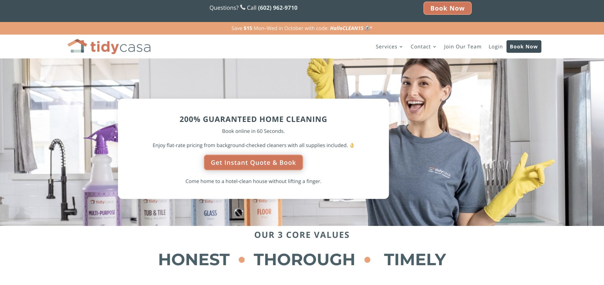
Tidy Casa places its cleaning proposition inside a white card over a household photograph. The card groups the service statement, a short explanation and the quote-and-book action, making them readable without depending on the image’s colors. Booking also appears in the header, alongside a visible phone route. The design is useful for a Divi team deciding how to make a reusable hero understandable when photography changes. Its dated public Divi evidence does not identify the booking application or independently substantiate the guarantees and timing claims in the screenshot.
What you can learn
Define the message hierarchy before applying shadows or rounded corners. The service, relevant conditions and next step should fit in the card without forcing an oversized block on smaller screens. Keep a promotion’s end date with its content so an old offer cannot remain simply because the surrounding template still looks current.
Pros
A solid card protects the main text from a busy photographic background.
The primary button describes both obtaining a quote and proceeding to booking.
Cons & considerations
Multiple booking buttons can feel repetitive when shown together on desktop.
The saved promotion refers to a specific month and needs explicit lifecycle ownership.
Platform source: Dated public Divi resource reference. Dated public Divi theme or builder resource on tidycasa.com; no version, individual component or private-system attribution. Platform evidence is separate from the direct website screenshot and is not a complete current infrastructure audit.
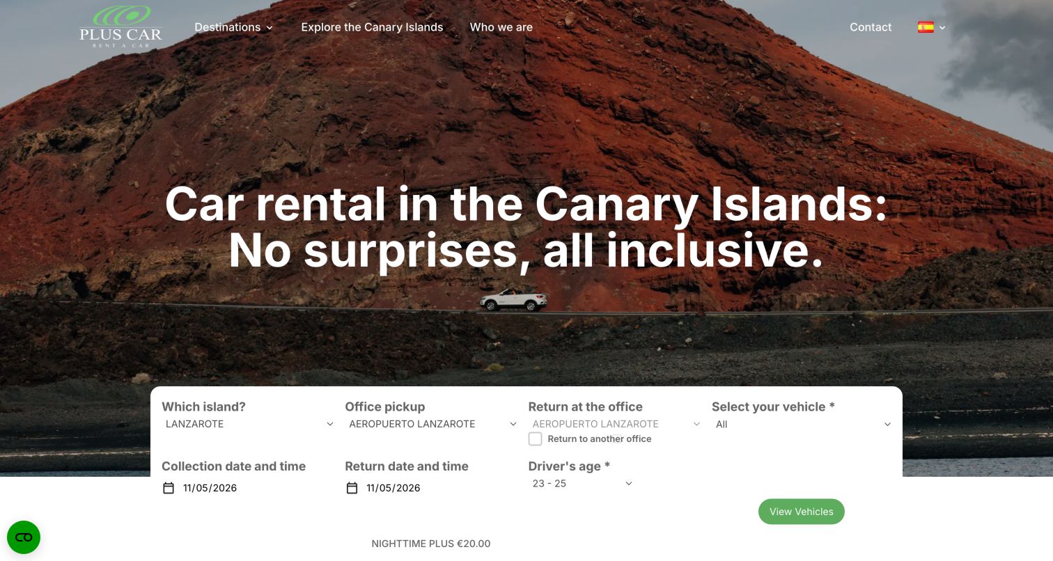
PlusCar’s opening uses a volcanic landscape to establish its Canary Islands focus, with a car and clear rental headline. A white search panel then gathers island, pickup office, return arrangements, vehicle choice and dates. The transition from destination appeal to practical inputs is the useful design pattern. Divi resources are documented on the public page, but that evidence does not show that Divi supplies availability, pricing, reservations or payment processing. The captured form was observed as an interface, not submitted or tested as a transaction.
What you can learn
Write the dependencies between fields before designing their columns. A return-office exception, driver-age condition or late pickup fee needs a place in the flow that remains understandable when the panel stacks vertically. Treat the booking integration as its own requirement, with clear labels and recoverable errors rather than assuming the page builder provides its business logic.
Pros
The photograph and headline establish the destination before asking for details.
Field labels expose the practical information needed to start a rental search.
Cons & considerations
Many controls appear together and need a deliberate reading order on small screens.
Additional conditions beneath the fields can be missed beside a prominent action button.
Platform source: Dated public Divi resource reference. Dated public Divi theme or builder resource on pluscarcanarias.com; no version, individual component or private-system attribution. Platform evidence is separate from the direct website screenshot and is not a complete current infrastructure audit.
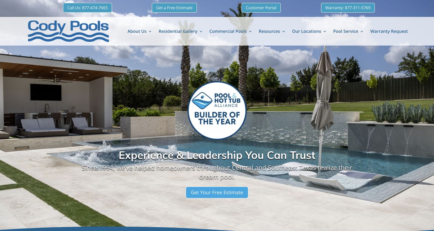
Cody Pools places estimates, a customer portal, phone access and warranty information in a utility row above its main navigation. The hero uses a finished pool scene, an award graphic and a second estimate action. This opening recognizes that a contractor’s website serves people before and after a project. For a Divi brief, the strongest reference is the division of responsibilities between utility links and marketing content. The observed Divi assets concern the public website, not the private portal, warranty workflow or the validity of the displayed award.
What you can learn
Map existing-customer tasks separately from new enquiries. A shared header can provide stable service and warranty links while project pages explain the work through relevant photography. Keep award artwork and any supporting citation editable together, and give essential maintenance information a route that does not depend on a promotional slide.
Pros
Customer support routes remain visible alongside the invitation to request an estimate.
A completed project photograph makes the main service visually concrete.
Cons & considerations
The award graphic competes with the pool photograph and the central headline.
Numerous header choices need careful prioritization when the navigation becomes compact.
Platform source: Dated public Divi resource reference. Dated public Divi theme or builder resource on codypools.com; no version, individual component or private-system attribution. Platform evidence is separate from the direct website screenshot and is not a complete current infrastructure audit.
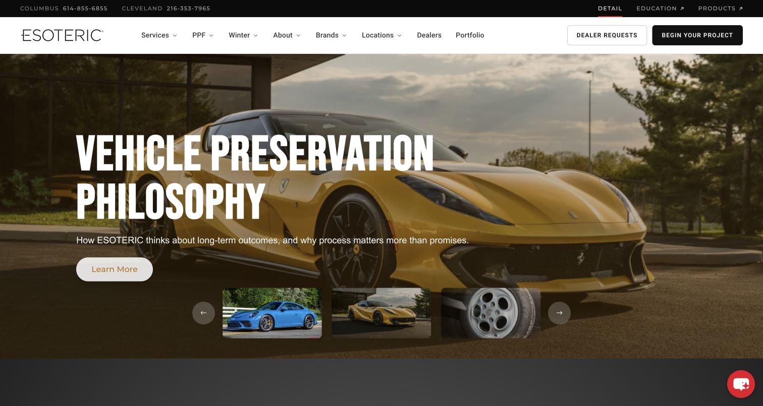
ESOTERIC’s capture combines a large vehicle photograph with an assertive headline about preservation. A short supporting line and a modest learn-more button lead into the subject, while thumbnails below hint at other visual stories. The header distinguishes service browsing, dealer requests and starting a project, with education and products given separate utility links. For Divi planning, this is a strong reference for organizing several related businesses without giving every action equal weight. The saved Divi signals do not establish the mechanics of the carousel or the linked retail and education properties.
What you can learn
Create a content model for each featured story before adding slide controls. Each item should have a title, meaningful destination and image that remains useful independently. Keep project enquiries distinct from dealer requests so a reused header does not send different audiences into the same ambiguous form.
Pros
The opening connects the service to a specific point of view about vehicles.
Different audience routes are named clearly instead of hidden behind one contact link.
Cons & considerations
A large photographic carousel creates additional content and maintenance responsibilities.
The broad learn-more label provides less destination detail than the surrounding navigation.
Platform source: Dated public Divi resource reference. Dated public Divi theme or builder resource on esotericdetail.com; no version, individual component or private-system attribution. Platform evidence is separate from the direct website screenshot and is not a complete current infrastructure audit.
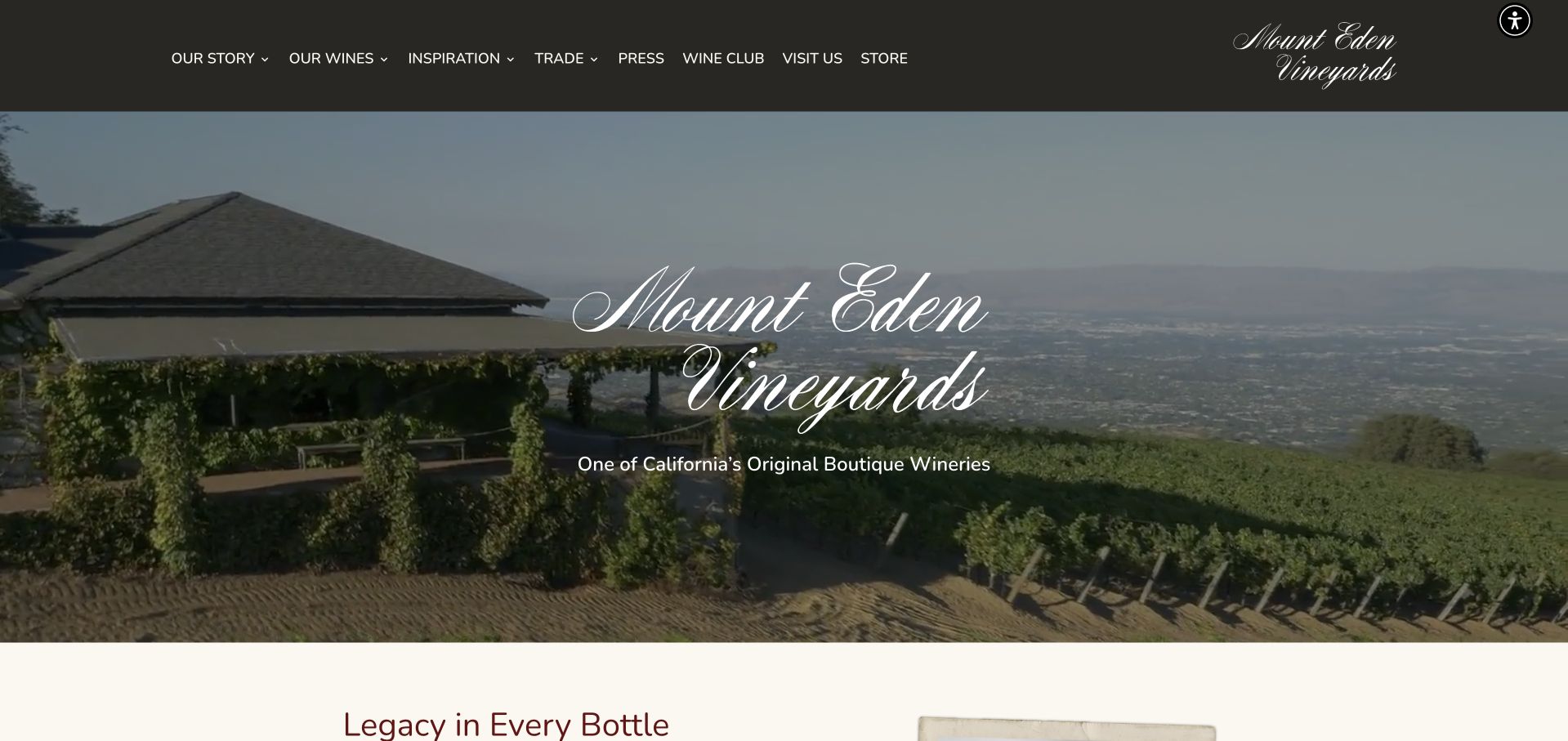
Mount Eden Vineyards pairs a vineyard view with a large script identity and a short positioning line. The dark header presents a broad but orderly set of routes: story, wines, inspiration, trade, press, membership, visits and the store. The image establishes place while the navigation acknowledges several reasons to visit the site. A Divi team can study how the header carries those recurring choices without putting several competing buttons over the photograph. Public Divi references do not establish the technology or regulatory handling of the separate purchasing and membership processes.
What you can learn
Separate editorial pages, visitor information and commercial destinations in the planning stage. Reuse a small set of text and image arrangements, but give trade resources and visit details their own structured fields. A location photograph should support practical information, not become the sole explanation of what a guest can do next.
Pros
The vineyard image ties the brand to a specific physical setting.
Trade, visit and store destinations are visible within the primary navigation.
Cons & considerations
The opening gives little practical detail about visits or product availability.
Script lettering works as identity but should not become the style for long content.
Platform source: Dated public Divi resource reference. Dated public Divi theme or builder resource on mounteden.com; no version, individual component or private-system attribution. Platform evidence is separate from the direct website screenshot and is not a complete current infrastructure audit.
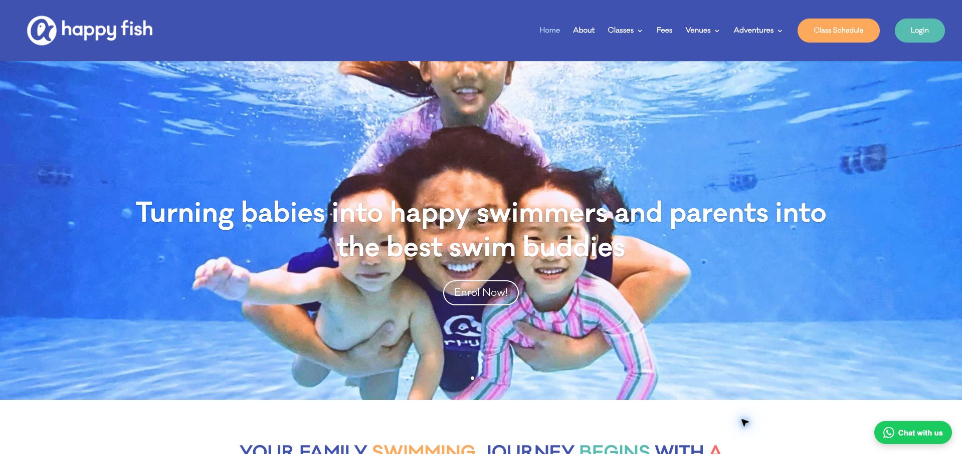
Happy Fish opens with an underwater family photograph, a centered message and an enrolment button. Above it, a solid blue header separates classes, fees and venues from two colored controls for the class schedule and login. That distinction is useful for a Divi project serving both new families and existing customers. The photograph supplies an immediate emotional context, while the header exposes practical routes. The public Divi evidence is a dated page-level association; it does not verify lesson outcomes, account behavior or which system manages schedules and enrollment.
What you can learn
Give prospective students and returning customers different routes before designing the hero. Keep fees, venue details and suitability information in maintainable page structures. An enrolment invitation should lead to clear class requirements, while the schedule and account controls remain recognizable wherever the shared header appears.
Pros
Fees, venues and classes are named directly rather than grouped into vague categories.
Schedule and login controls remain distinguishable from the central enrolment action.
Cons & considerations
White text crosses a visually active image and needs checking with alternate crops.
The large family photograph leaves detailed class information for later in the page.
Platform source: Dated public Divi resource reference. Dated public Divi theme or builder resource on happyfish.sg; no version, individual component or private-system attribution. Platform evidence is separate from the direct website screenshot and is not a complete current infrastructure audit.
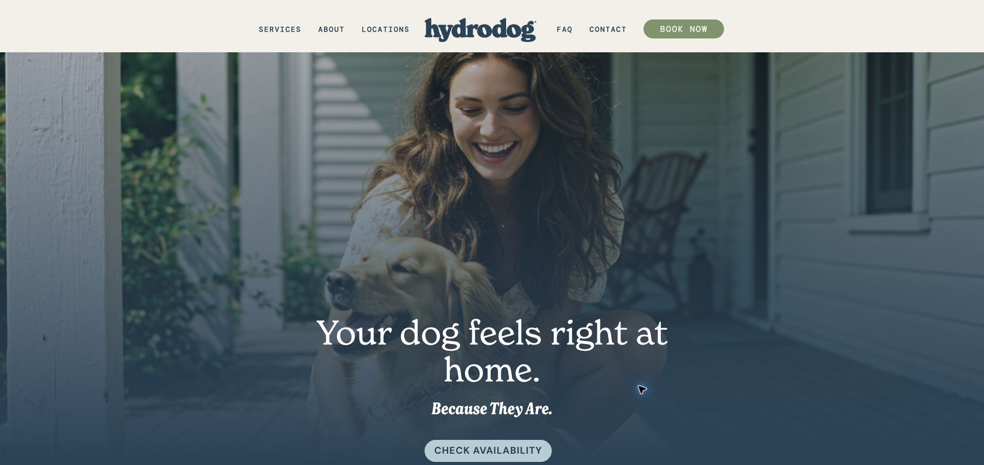
Hydrodog’s opening uses a dog and owner photograph, a deep blue overlay and a short message centered low in the image. A restrained cream header presents services, locations, questions and contact, with booking highlighted at the edge. The hero’s availability button names a more specific first step than the emotional headline. For a Divi build, the useful pattern is the separation between reassurance and action. Saved Divi resources support the public-page association, without revealing service coverage, appointment inventory or the system behind the booking route.
What you can learn
Keep the emotional promise brief and put the practical next step beside it. A reusable location template should explain coverage and service options before asking for appointment details. Check the bottom of a tall hero at smaller screen heights so its key action does not disappear while the decorative photograph remains dominant.
Pros
The quiet header preserves a clear distinction between browsing and booking.
The availability label prepares visitors for a practical check before committing.
Cons & considerations
The opening does not explain the exact service scope without further navigation.
A tall image places the main hero action close to the captured viewport’s edge.
Platform source: Dated public Divi resource reference. Dated public Divi theme or builder resource on hydrodog.com; no version, individual component or private-system attribution. Platform evidence is separate from the direct website screenshot and is not a complete current infrastructure audit.
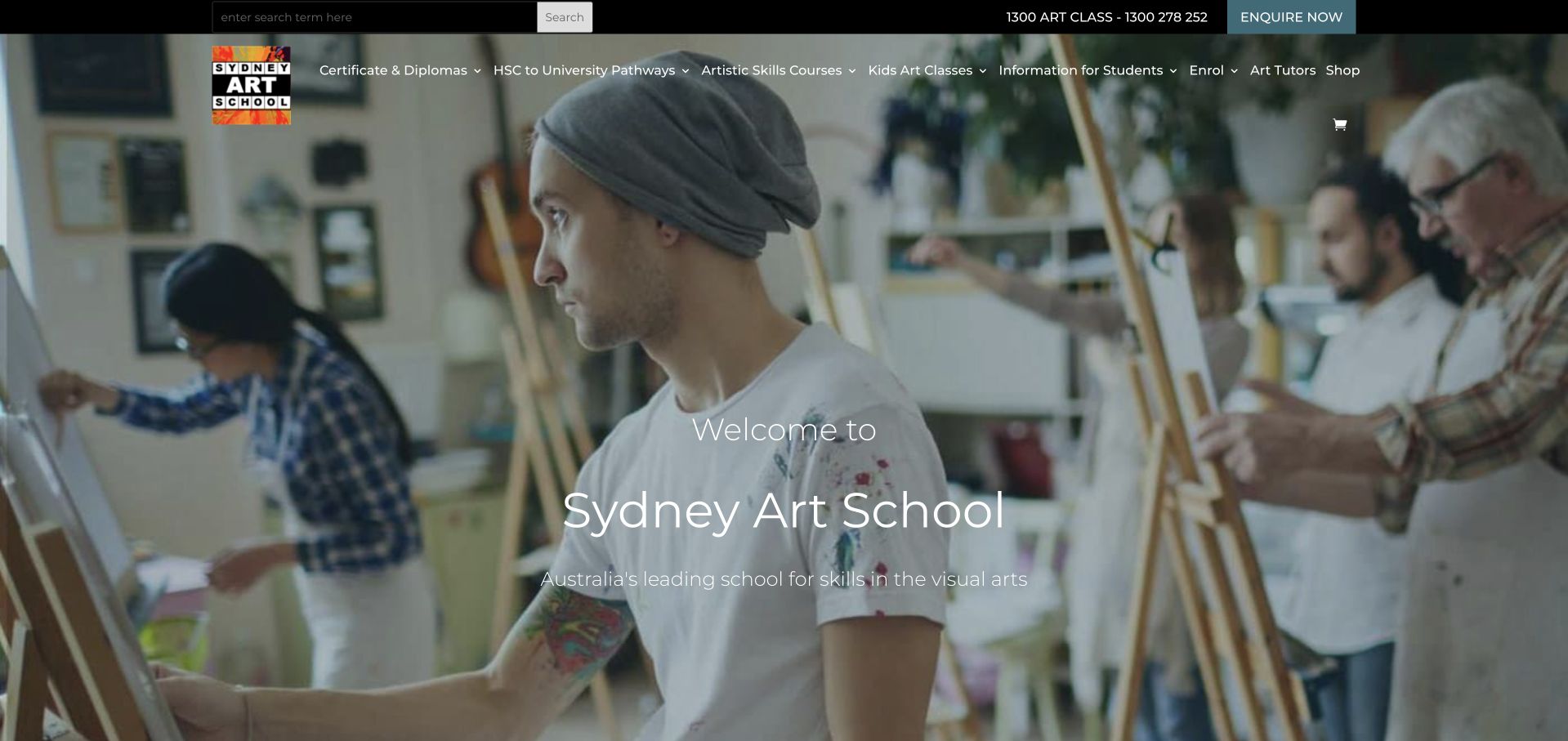
Sydney Art School places a classroom scene beneath a navigation that names different educational routes: qualifications, university pathways, skills courses and children’s classes. Search, a phone number and an enquiry action occupy a separate dark strip. The image introduces the activity while the navigation does much of the practical explanation. This is a useful Divi reference for planning a site with several course audiences. Its public Divi evidence does not establish the enrollment platform, credential status or the outcome claims made by the organization.
What you can learn
Create a consistent course-detail structure before arranging the homepage. Duration, audience, prerequisites, venue and next intake should have predictable places even when individual course images vary. Keep prospective-student routes distinct from information for current students, and check whether a broad navigation still works when labels wrap or the menu collapses.
Pros
The navigation identifies several learning goals rather than using a single course label.
Search and enquiry access remain available independently of the central welcome message.
Cons & considerations
A large set of header categories can make compact navigation difficult to scan.
The atmospheric introduction provides little immediate detail about choosing a suitable course.
Platform source: Dated public Divi resource reference. Dated public Divi theme or builder resource on sydneyartschool.com.au; no version, individual component or private-system attribution. Platform evidence is separate from the direct website screenshot and is not a complete current infrastructure audit.
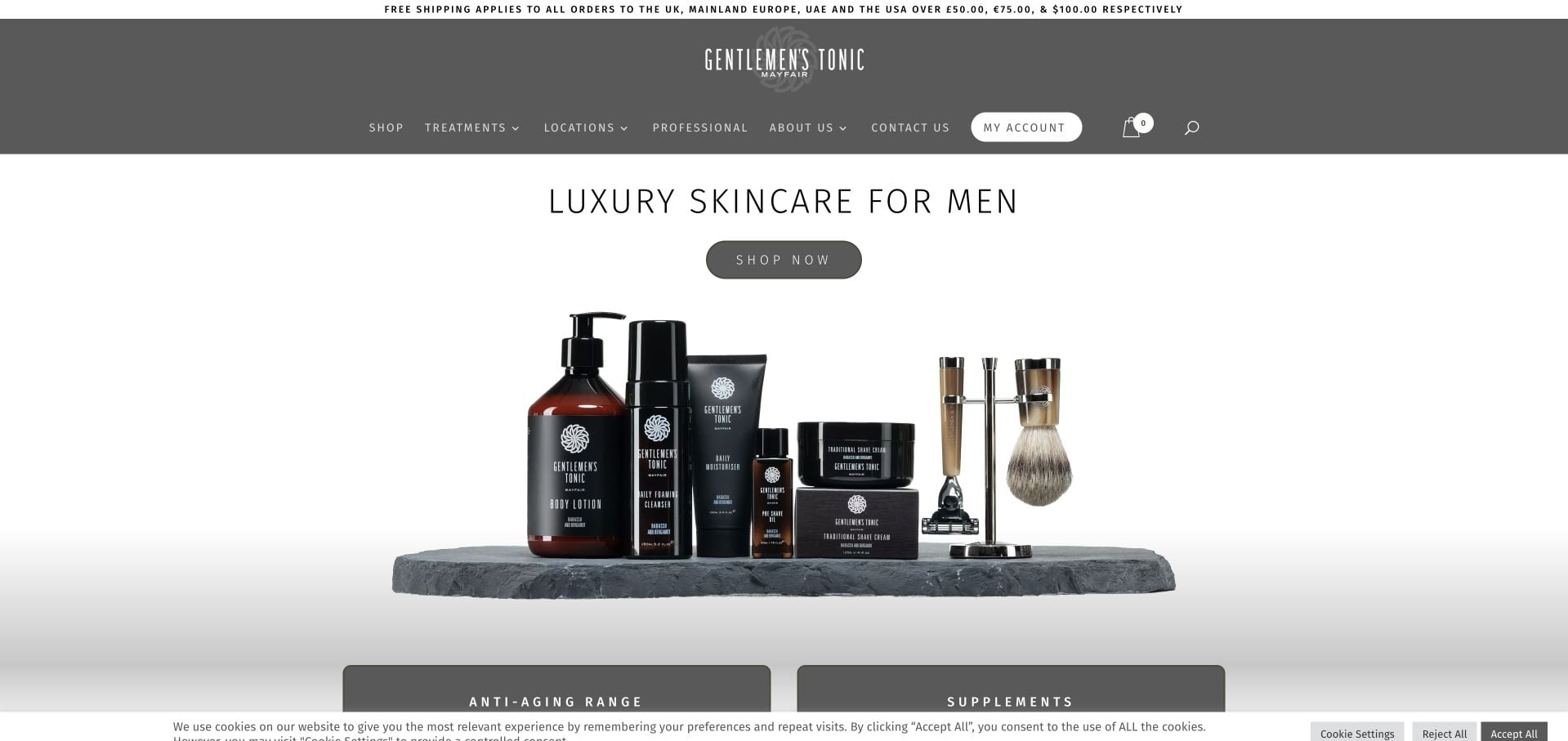
Gentlemen’s Tonic uses a wide product arrangement against white space, with a centered skincare heading and a shop button. The dark header also offers treatments, locations and professional information, acknowledging that the brand extends beyond the displayed products. Account, cart and search controls sit nearby without becoming the hero’s main subject. A Divi team can study this division between a focused campaign area and a broader site structure. Dated Divi resources do not identify every commerce component or demonstrate how treatments and purchases are fulfilled.
What you can learn
Define which pages share the brand shell and which need different decision information. Product pages need practical product details, while treatment and location pages need their own structured content. Keep temporary shipping messages outside the permanent identity area, with clear ownership for changing conditions and destinations.
Pros
The simple product grouping gives the central offer a clear visual focus.
Treatments and locations remain reachable without competing with several hero buttons.
Cons & considerations
The wide product image needs a deliberate crop and scale strategy on smaller screens.
The visible consent bar and shipping strip add peripheral messages around the main offer.
Platform source: Dated public Divi resource reference. Dated public Divi theme or builder resource on gentlemenstonic.com; no version, individual component or private-system attribution. Platform evidence is separate from the direct website screenshot and is not a complete current infrastructure audit.
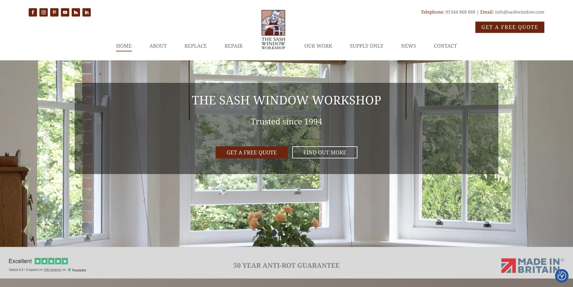
The Sash Window Workshop shows a bright interior window scene behind a dark translucent information panel. The header separates replacement, repair, previous work and supply-only enquiries, with a quote action repeated in the hero. A lower strip contains review, guarantee and manufacturing claims. The useful Divi lesson is the clarity of the service categories: visitors can identify the relevant kind of work before reading a long introduction. Public Divi signals qualify the page’s technology association without independently validating the displayed ratings, guarantees or manufacturing statements.
What you can learn
Write separate content requirements for repair, replacement and supply-only work. Their photographs may share a visual system, but their questions and eligibility details differ. Use a reusable call-to-action pattern with an explanatory destination, and keep any proof or warranty claim linked to its relevant conditions rather than repeating an isolated badge.
Pros
Service labels describe concrete project types that homeowners and trade buyers can distinguish.
The solid overlay makes the central message readable over a detailed window photograph.
Cons & considerations
Repeated quote actions compete with the secondary invitation to learn more.
Several proof claims appear together and require accessible supporting detail beyond the graphic strip.
Platform source: Dated public Divi resource reference. Dated public Divi theme or builder resource on sashwindow.com; no version, individual component or private-system attribution. Platform evidence is separate from the direct website screenshot and is not a complete current infrastructure audit.
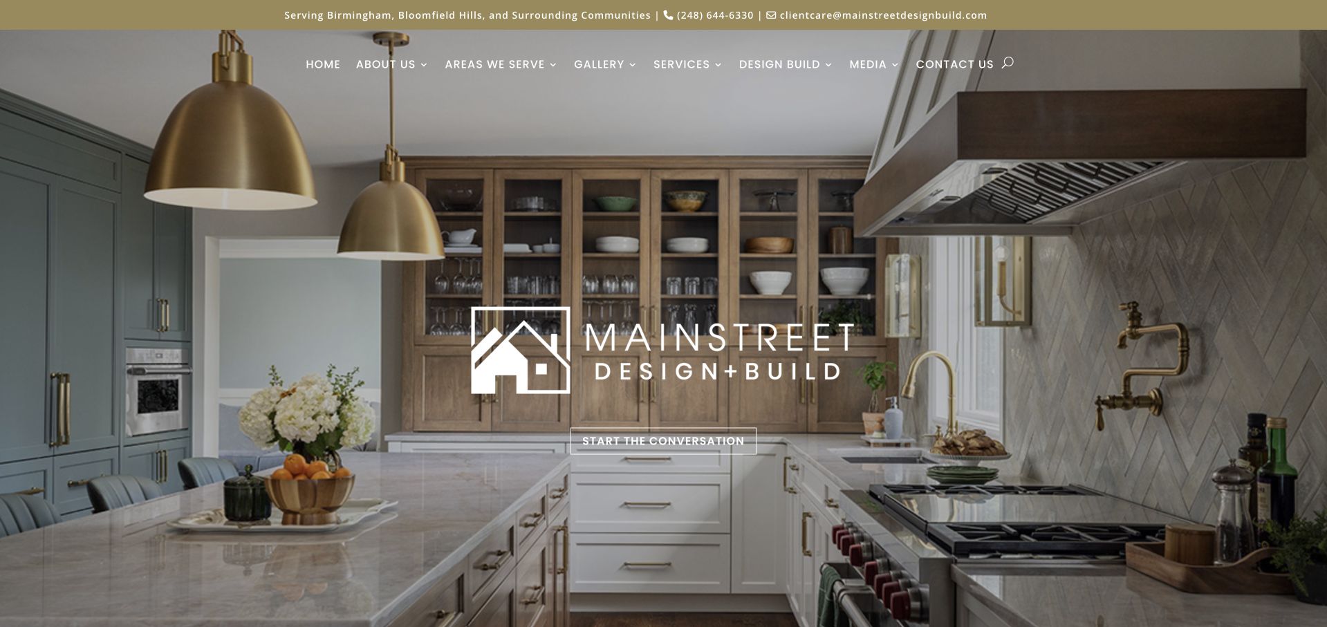
MainStreet Design Build centers its identity over a finished kitchen, using cabinetry, lighting and materials to introduce its work. A narrow utility strip names the service area and contact routes, while the navigation distinguishes galleries, services and the design-build process. The central invitation is understated. For a Divi project, the instructive point is how a reusable hero can combine a stable logo with project photography and genuinely local information. Theme assets do not verify project ownership, construction outcomes or the business’s internal enquiry workflow.
What you can learn
Give project images useful accompanying records: the type of work, relevant constraints and an understandable route to the full case study. Keep service-area details in a shared location that editors can maintain. Avoid relying on a large identity mark to explain the practical difference between a gallery, a service and a process page.
Pros
The kitchen image shows concrete materials and spatial detail rather than an abstract mood.
Local coverage is visible before the visitor reaches the main navigation.
Cons & considerations
The restrained central action can be easy to overlook against the detailed photograph.
The opening offers little project context unless visitors continue to the gallery.
Platform source: Dated public Divi resource reference. Dated public Divi theme or builder resource on mainstreetdesignbuild.com; no version, individual component or private-system attribution. Platform evidence is separate from the direct website screenshot and is not a complete current infrastructure audit.
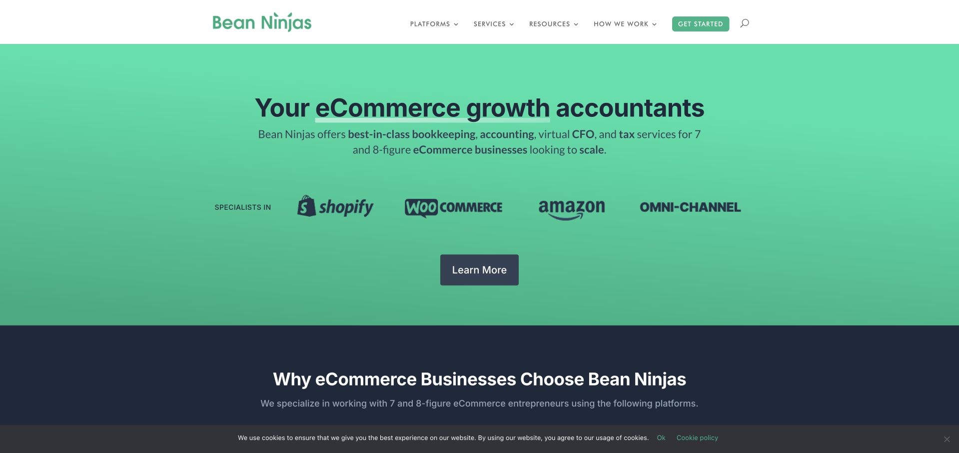
Bean Ninjas uses a green field, a large accounting proposition and a concise description of its intended ecommerce audience. Platform logos form a separate supporting row, with a single dark learn-more button below. The header then distinguishes platforms, services, resources and process. This is a useful Divi reference for a service business that needs specificity more than elaborate visual effects. The dated Divi evidence concerns the public page; the platform logos describe the firm’s stated focus and are not proof that its own website runs on those commerce systems.
What you can learn
Keep customer-fit language separate from implementation evidence. A reusable service introduction can name who the work is for, what questions it addresses and where to learn about the process. Give any partner or platform logos descriptive context, and avoid treating decorative badges as substitutes for detailed service boundaries.
Pros
The first screen identifies a clear audience and a specific professional-service category.
A limited visual vocabulary keeps the central proposition easy to find.
Cons & considerations
The learn-more button gives less destination information than a more descriptive label could.
Large platform logos can be mistaken for affiliations without nearby explanatory context.
Platform source: Dated public Divi resource reference. Dated public Divi theme or builder resource on beanninjas.com; no version, individual component or private-system attribution. Platform evidence is separate from the direct website screenshot and is not a complete current infrastructure audit.
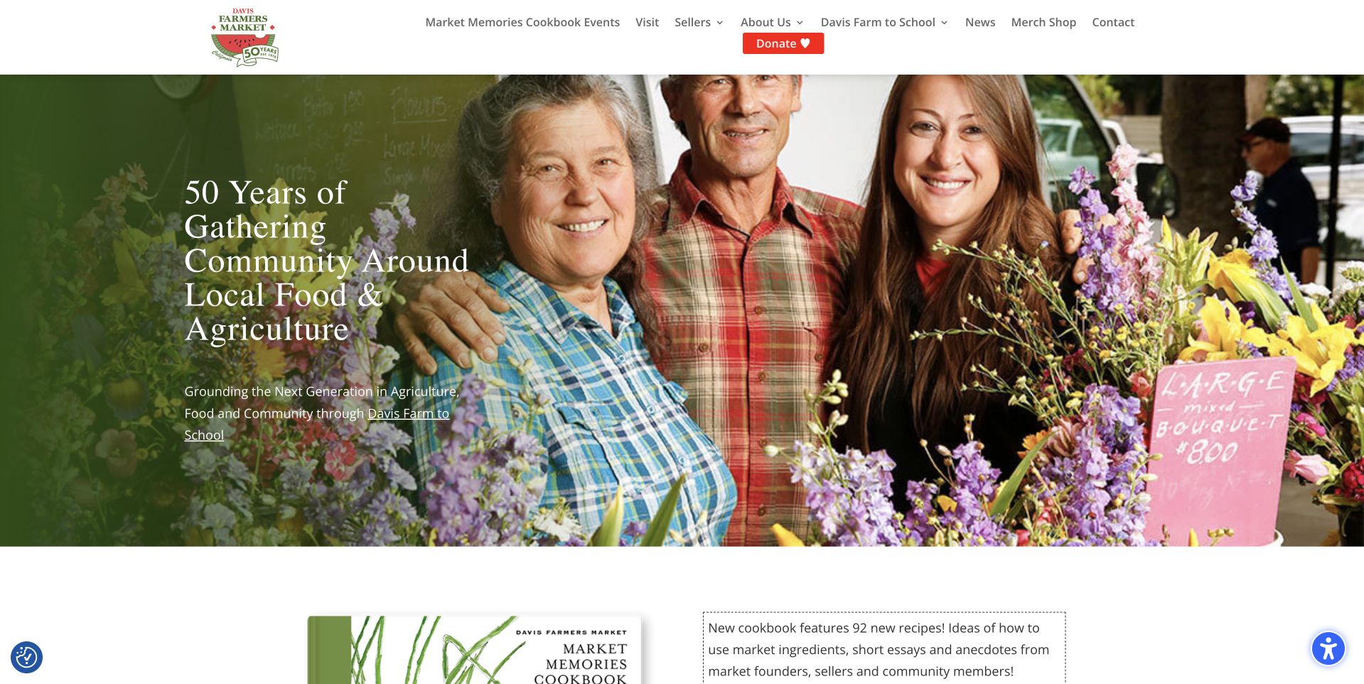
Davis Farmers Market combines a photograph of market participants with an anniversary message and a linked school-program reference. The white header includes visit information, sellers, news and merchandise, while a contrasting donation button gives support its own place. A cookbook feature begins directly below the hero. For a Divi project, this is a useful example of balancing a recurring community service with campaigns and stories. Public Divi evidence establishes a dated page association, without proving donation processing, seller management or any private program infrastructure.
What you can learn
Keep practical visit details available independently of an anniversary campaign. Build reusable editorial sections for people, products and programs, then assign review dates to time-sensitive announcements. A donor, a first-time visitor and a prospective seller need distinct destinations even when they share the same homepage and visual identity.
Pros
The photograph introduces the people behind the market rather than only displaying products.
Visit, seller and donation routes acknowledge different reasons for arriving at the site.
Cons & considerations
Several campaign and organizational links make the main navigation relatively dense.
The story-led hero does not itself provide the practical details needed to plan a visit.
Platform source: Dated public Divi resource reference. Dated public Divi theme or builder resource on davisfarmersmarket.org; no version, individual component or private-system attribution. Platform evidence is separate from the direct website screenshot and is not a complete current infrastructure audit.
Kegan has 15+ years of experience working with small businesses, Fortune 500 companies, and everything in between. No development job is too big or too small: he brings the same hands-on attention to a focused improvement, a complete website, or a custom application.
For Divi projects, he can help with responsive interfaces, reusable components, custom functionality, API connections, and performance-minded implementation. He works directly with clients on scope, design, implementation, testing, and handover, with an emphasis on clear communication and a system that remains practical to maintain after launch.
Show 3 other Divi developersHide other Divi developers
For a small service business, begin with the questions that distinguish its offers. Agree on a concise introduction, relevant proof, a practical explanation and one next step. Reuse the arrangement where it helps readers compare services, while allowing the evidence and details to differ. A consistent page should not become an excuse for interchangeable copy.
Create structured templates for a growing library
A project archive, course catalog or recurring event program benefits from predictable fields. Define how an editor supplies a title, image, summary and practical details, then show the result with varied real entries. The Theme Builder documentation illustrates templates for several content types; choosing those types and maintaining their information remains a separate editorial responsibility.
Treat existing customizations as a maintenance project
Before extending an established Divi site, inventory its child theme, custom styles, third-party modules and external integrations. Identify who owns each dependency and which pages depend on it. Prefer a bounded improvement with a clear rollback over an undocumented visual overhaul that leaves future editors unsure which controls are safe to change.
From references to requirements
Plan editing, integrations and upkeep together
Rehearse the routine editorial changes
List the changes the organization makes each month: replacing a photograph, updating dates, adding a service or retiring a promotion. Have the intended editor walk through representative examples in a safe working copy. Record which fields they own and who reviews changes to navigation, claims and transactional destinations. The handoff should explain decisions, not merely identify buttons in the editor.
Specify external workflows separately
Bookings, donations, account areas and commerce may involve systems beyond the page builder. For each integration, name the destination, data owner, expected return path and failure behavior. A screenshot of a form does not establish that it works. Keep production submissions and account writes outside casual editorial checks, and use an authorized test workflow when implementation testing is needed.
Keep version changes evidence-based
The official Divi documentation distinguishes the current product and version-specific guidance. Record the installed version and custom-module compatibility in the project’s maintenance notes before planning an upgrade. A public path containing Divi is not enough to identify a version. Evaluate the actual installation and preserve a tested recovery path instead of assuming a successful demonstration guarantees a safe migration.
Ask the actual team to carry out its routine job: publish a realistic update, correct a mistake, preview a narrow screen, and identify who owns an integration failure. For a library or frontend framework, also ask who maintains the content source and deployment. A polished screenshot does not answer those operational questions.
Beyond the screenshot
A practical Divi project checklist
Identify the visitor tasks, page types and content owners before choosing layouts.
Use real long titles, varied photographs and incomplete optional fields in template examples.
Document which header, footer and content sections are global and where they apply.
Provide clear image-cropping guidance and appropriate text alternatives.
Check readable contrast, heading order, keyboard access and understandable control labels.
Keep essential information available without requiring a carousel or background video.
Assign an expiry date and owner to seasonal promotions and event announcements.
Record custom modules, child-theme changes and external integrations with their maintainers.
Verify the installed Divi version before using version-specific upgrade instructions.
Keep private credentials and privileged business rules outside browser-visible content.
Run the project’s automated checks and verify canonical routes and assets after release.
Provide an editorial handoff and a tested recovery process for future maintenance.
Test with real content, a keyboard, a small screen, slow or failed requests, and the people who will maintain the system. These are planning checks, not an accessibility, security, performance, or search-ranking certification.
Sources & editorial method
How this Divi collection was reviewed
We selected twenty distinct public source pages with explicit Divi theme or builder references in their saved public evidence. Each has a genuine direct browser capture with its original URL, dimensions, attribution and capture date. Collection-specific reviews were written on November 9, 2026 after inspecting all twenty images. Existing broad audit attempts and their original observation dates were retained. The first five organizations were independently identified through their official pages; City Lights’ official indexed description and saved capture establish its bookstore identity, while a fresh direct text request returned an access restriction and was not bypassed. Recognition is an editorial opening choice, not a traffic ranking. Reviews assess visible design and planning lessons without validating organizational claims or attributing private services to Divi.
Every image is an unmodified capture from the actual website, with its source and capture date. Some captures are reused from our shared catalog; their dates remain the original capture dates. None comes from a vendor gallery or a generated reconstruction. Moving imagery and live content can change.
Technology attribution uses public page assets or metadata, official platform documentation, or a cited first-party project case study. Documentary and framework-relationship evidence is identified where used; it is not a complete current backend inventory. A CMS image CDN alone does not establish a full CMS deployment. A library’s presence does not prove which individual controls use it, and a platform label does not establish AI authorship.
The composition notes, lessons, pros and tradeoffs are original editorial observations. We have not measured conversion, traffic, security, performance or accessibility conformance. Website owners retain their brands and imagery; these examples are not our client portfolio. Written, Edited and Curated are independent records, not dates advanced by a build. See our editorial standards or suggest a correction.
Questions worth asking
Divi website development FAQs
Does a Divi asset prove the whole organization uses Divi?
No. It supports a dated association with the specific inspected public page. Booking tools, private accounts, shops and other subdomains may use different technology. The evidence does not identify every system or individual interface component.
Can Divi provide shared headers and content templates?
Yes. Elegant Themes’ Theme Builder documentation describes shared headers, footers and templates for different content types. A project still needs a clear decision about which structure belongs on each page and who maintains the content inside it.
Are these examples all using the same Divi version?
The collection does not make that claim. The saved resource paths identify Divi but do not consistently establish a version. Version-specific development and migration decisions should use evidence from the actual installation and the corresponding official documentation.
Can I reproduce a reference website by choosing the same builder?
The builder alone does not supply the organization’s photography, information architecture, writing or integration behavior. Use a reference to identify a useful pattern, then design it around your own content, audience and maintenance responsibilities.
Do the screenshots and audits have the same date?
Not necessarily. Each capture retains its original date, and technology observations retain their separate evidence dates. Writing a new review or rebuilding the guide does not make an older capture or audit newly observed.
Borrow the structure that makes a page useful, then build an editing process that keeps it useful. Clear content, explicit template ownership and dependable destinations matter more than the number of visual effects a builder can offer.