Best Painting Contractor Websites of 2026 (18 Real-World Examples)
Painting websites that explain surfaces, coverage and the estimate journey
A useful painting contractor website turns an attractive room or exterior into a clear service decision. These examples show how local specialists and larger networks explain what they paint, where they work and how a homeowner or property manager can begin.
Painting enquiries start with different problems. One customer wants interior walls refreshed, another needs cabinet work, and a property manager may be planning an occupied multifamily building. A single quality promise does not explain those differences. The most useful website names the relevant services, shows actual work and describes the first assessment without asking the visitor to diagnose surfaces or select a technical coating system alone.
This collection includes local painters, regional practices and franchise networks. Their operating models and service areas differ, so the list is a study of website presentation rather than a ranking of painting quality. The smaller specialist appears first for its editorial design merits. Ratings, guarantees and licensing statements displayed on example sites remain those companies’ claims; screenshots do not independently verify them.
Before the examples
What makes good painting contractor website design in 2026?
Name the surfaces and the people buying the work
Interior, exterior, cabinetry, commercial property and floor coatings are not interchangeable categories. Explain the services actually offered and give each a useful destination. A homeowner should not have to search a property-management page to find room painting, while a facilities manager needs information about coordination and project scope rather than only decorative colour inspiration.
Make coverage understandable before contact
State the region near the opening. If the business is a network, explain why a postcode is needed and take the visitor to the relevant operator without losing the chosen service. Distinguish a national brand from the local team. A small painter may need only a clear coverage summary and service-area page rather than an elaborate locator.
Explain what the estimate action means
A remote estimate, telephone conversation and site visit are different steps. Describe which information is requested, who responds and what remains to be assessed. Do not imply that a short form produces a final price for unseen work. Keep a service and project route available for people who are still researching.
The collection · 18 examples
18 painting contractor websites worth studying
Look beyond the room photographs. Compare the service categories, coverage statements and explanation of the first conversation, then consider which structure matches your own painting business.
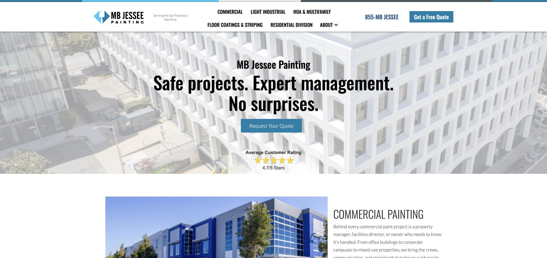
MB Jessee uses condensed black lettering, a pale architectural photograph and a restrained blue action button to present painting as a managed property project. Its first navigation choices distinguish commercial, light industrial, HOA and multifamily, floor coatings and residential work. That taxonomy matters more than the decorative treatment: an apartment manager and a homeowner do not have to infer whether they belong here. The opening promise emphasises management and predictability, while the next section starts explaining commercial work beside a building photograph. The Bay Area coverage statement remains close to the logo.
What you can learn
Organise a mixed painting business around the people buying the work, then show the relevant surfaces and project context within those routes. A commercial prospect needs coordination information, not just a gallery of freshly painted bedrooms. Treat the company’s ratings and safety language as its own claims, not independently established results.
Pros
Buyer-specific navigation makes residential and property-management work easy to separate.
The faded photograph leaves strong contrast for the dark headline and blue quote action.
Cons & considerations
Two navigation rows make the header comparatively tall before the main message.
The broad opening promise could be supported sooner by a specific project example.
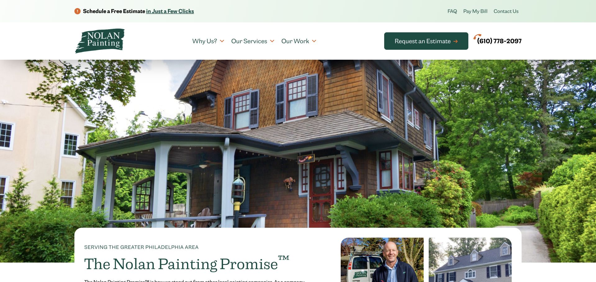
Nolan Painting places a forest-green brush-mark logo in a generous white header, with estimate and telephone actions grouped on the right. A large exterior house photograph introduces the work before a rounded white panel overlaps it with the company’s promise and an identifiable person. The result feels like a local service business rather than a paint catalogue. A pale utility strip separates frequently needed tasks such as paying a bill and reading FAQs from the principal service and project navigation. Greater Philadelphia appears in the opening content, helping visitors establish geographic fit.
What you can learn
Give existing customers a small utility route without making it compete equally with the new-estimate journey. The overlapping promise panel is useful because it connects the project image with the people and commitments behind the service. Keep that explanation visible rather than relying on photography to communicate preparation, scheduling or scope.
Pros
The restrained green palette connects the logo, headline and estimate button consistently.
Bill payment and FAQs have dedicated routes away from the main prospect navigation.
Cons & considerations
The large photograph pushes much of the introductory explanation below the first screen.
Several estimate entry points repeat the same action before service detail appears.
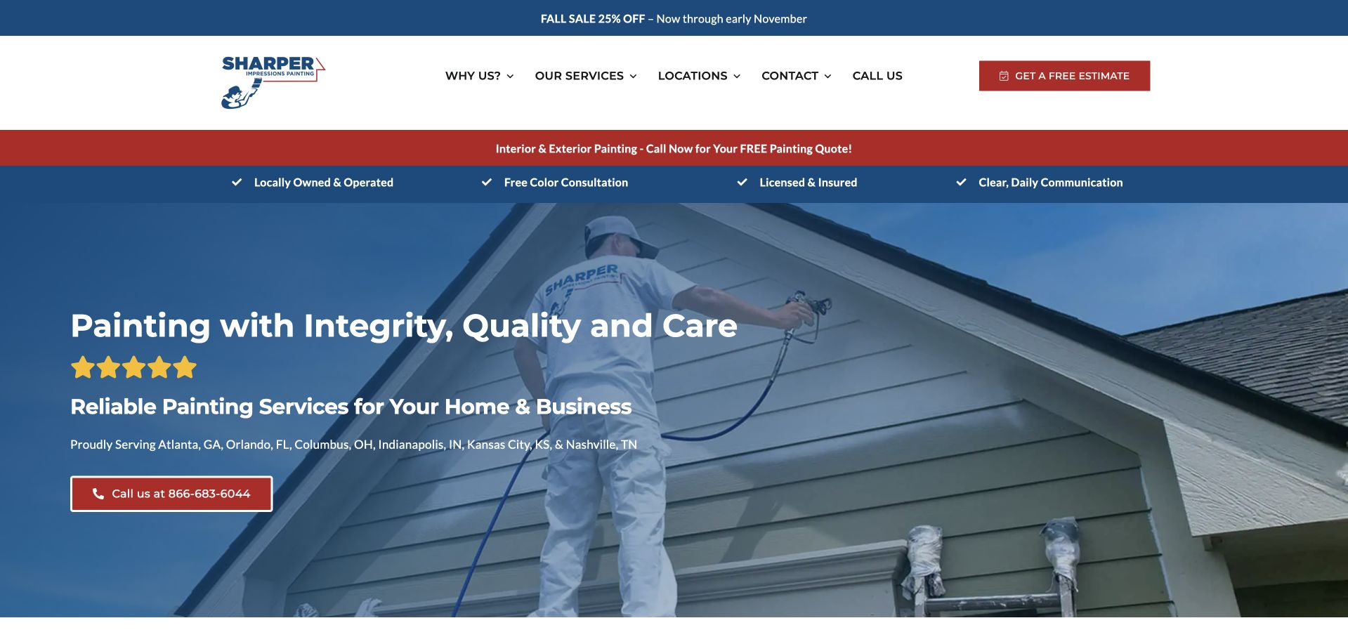
Sharper Impressions layers a seasonal promotion, white navigation, a red service strip and a blue checklist above its main project image. The blue-tinted photograph shows a worker painting siding, so the service remains recognisable behind the text. Four short assurances address ownership, colour consultation, insurance and communication; the company then names the cities it serves directly in the hero. This is a practical information hierarchy for a visitor checking availability, although the accumulation of horizontal bands makes the page feel more promotional than quiet. The primary telephone action has a distinct red outline.
What you can learn
A short checklist can summarise the operational questions buyers bring to a painting project. Use specific, maintainable commitments and connect them to fuller explanations below. A concise list of genuine markets is more useful than an unsupported nationwide implication, particularly when a company operates in several separated metropolitan areas.
Pros
The work-in-progress photograph communicates painting more directly than a generic interior image.
Named cities make the initial service-area check possible without opening a locator.
Cons & considerations
Multiple promotional and assurance strips consume substantial vertical space on desktop.
Several assurance claims would benefit from direct links to their terms or evidence.
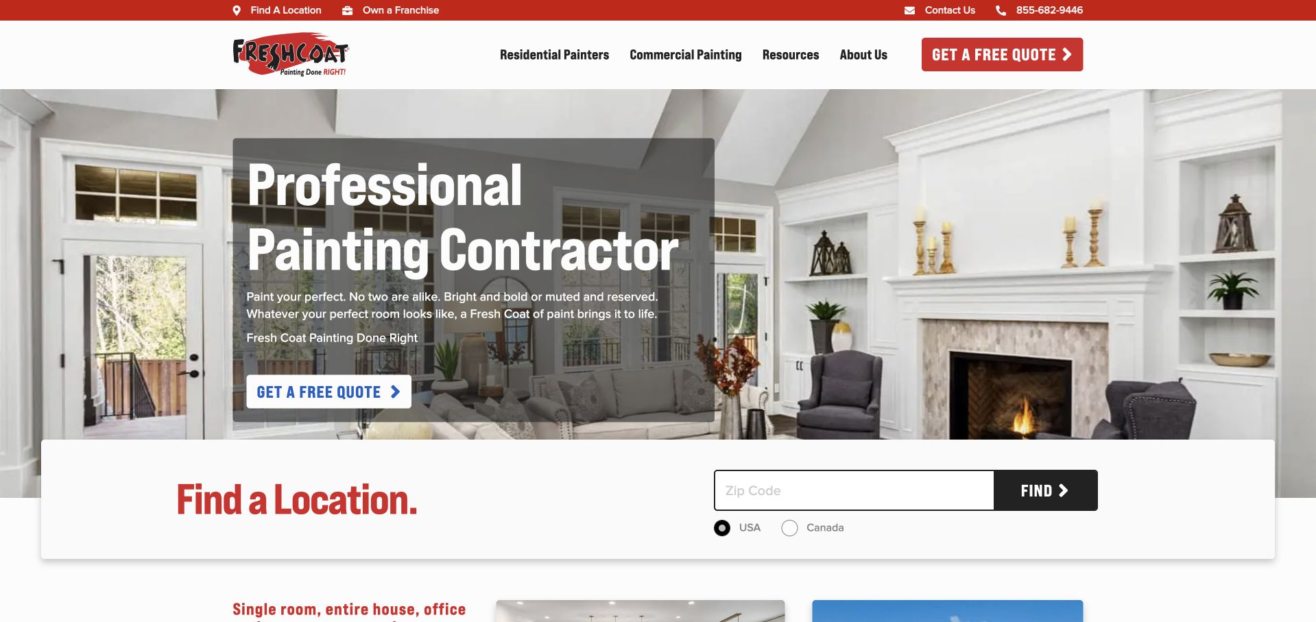
Fresh Coat Painters uses a bright room photograph, a dark translucent text panel and red branding to make its offer immediately recognisable. The large location card overlaps the bottom of the hero and asks for a ZIP code, with separate USA and Canada options. This makes the national-to-local transition explicit instead of pretending the central website is the local contractor. Residential and commercial services remain visible in the navigation, while franchise ownership is relegated to the utility bar. The estimate action is repeated inside the hero for visitors who already know what they want.
What you can learn
For a network business, finding the right operator is a core service task rather than an optional footer feature. Keep the coverage check separate from a lengthy lead form, and explain what happens after a location is selected. The photographed room supplies aspiration; the local route supplies practical relevance for the homeowner.
Pros
ZIP and country choices make the regional routing mechanism easy to recognise.
The translucent panel keeps white text readable against a detailed living-room photograph.
Cons & considerations
The location card and hero quote button create competing first-step choices.
The opening copy gives limited detail about preparation or the local estimate process.
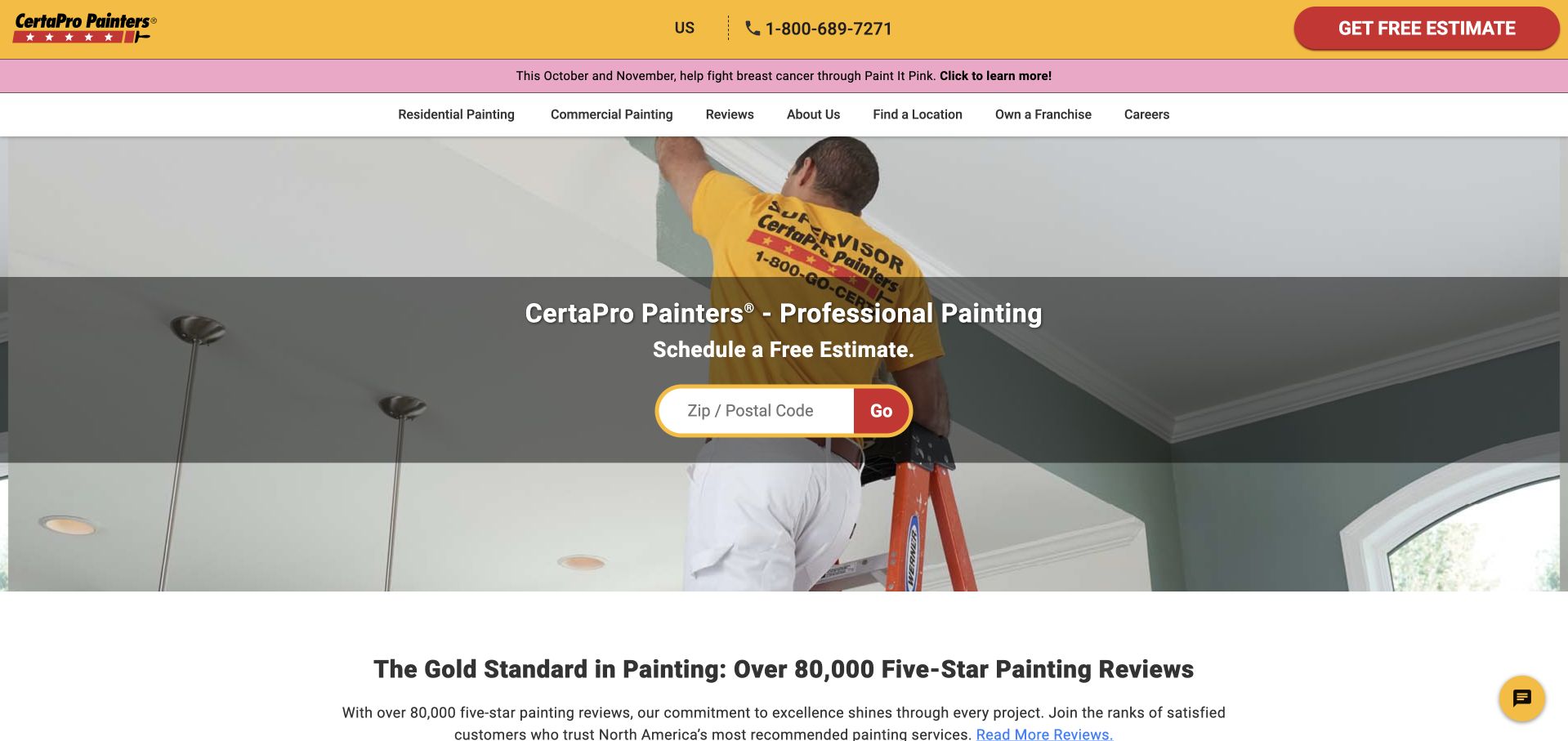
CertaPro places its yellow-and-red identity above a recognisable photograph of a painter working on an interior wall. A broad translucent band contains a short service heading and a ZIP or postal-code field, making location the obvious first input. Residential, commercial and review routes are expressed in plain language underneath the utility header. Below the hero, a review-count statement introduces social proof; it is a presentation choice rather than a result this collection independently verifies. A current campaign strip adds a second brand message without replacing the estimate route.
What you can learn
Reduce the first interaction to the information genuinely needed for routing. The postcode field works because the website has already named the service, while the photograph shows the work itself. For a smaller painter, the equivalent might simply be a visible service-area statement and one estimate link rather than a national locator.
Pros
The isolated postcode field creates an uncomplicated starting point for a nationwide network.
Residential and commercial navigation is understandable without specialist painting terminology.
Cons & considerations
The campaign banner adds another message before visitors reach the core service content.
The review headline is visually prominent but needs its linked source and context.
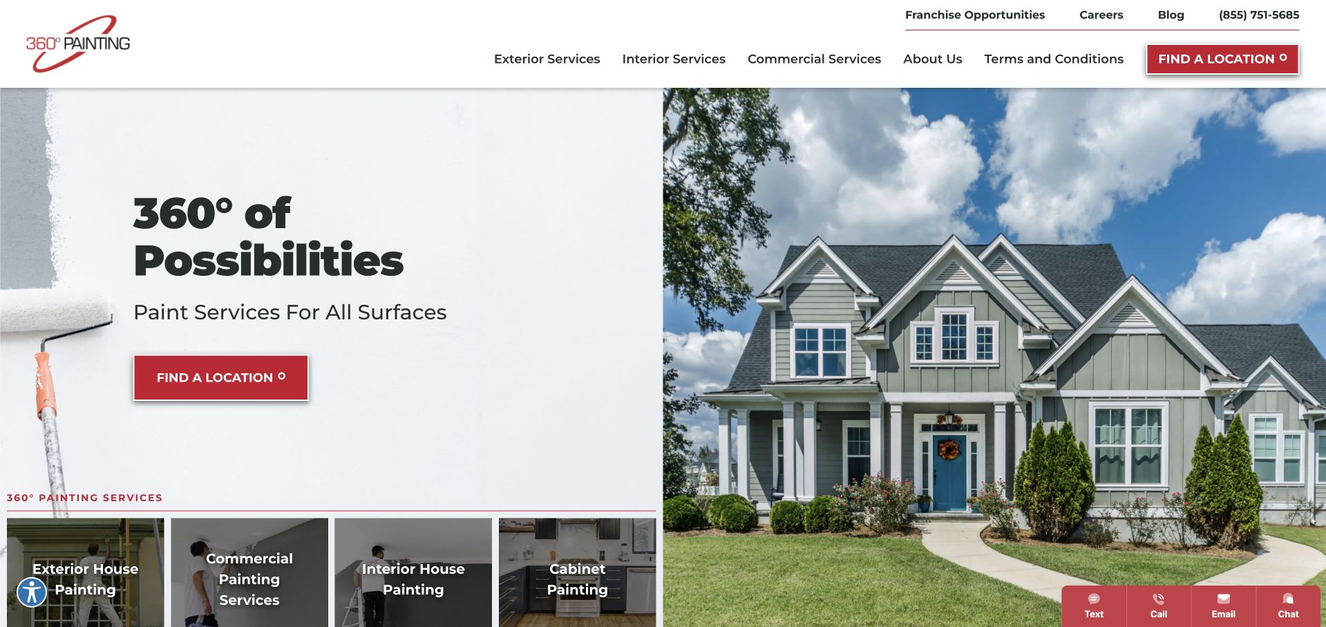
360 Painting divides its opening between a pale panel with a bold headline and an exterior house photograph. A roller at the far edge adds a literal painting cue, while a row of photographic service tiles starts below the headline. Exterior, commercial, interior and cabinet work are visible as separate categories, so the visitor can investigate scope without reading a long introduction. Red buttons consistently identify the location action. The utility navigation also includes employment and franchise information, keeping those secondary audiences distinct from the main service choices at the top.
What you can learn
Use the first set of cards to answer what the company paints, not merely to repeat a broad quality promise. Surface-specific navigation is especially valuable when cabinet refinishing and commercial work have different preparation, scheduling and enquiry needs. Keep chat optional: an automatically expanded panel can cover the very project image intended to explain the offer.
Pros
The split layout separates readable service copy from the detailed exterior photograph.
The initial service tiles offer concrete destinations for four different project types.
Cons & considerations
The large header carries several secondary business routes before the main content.
An automatically expanded chat panel can obscure the right side of the hero.
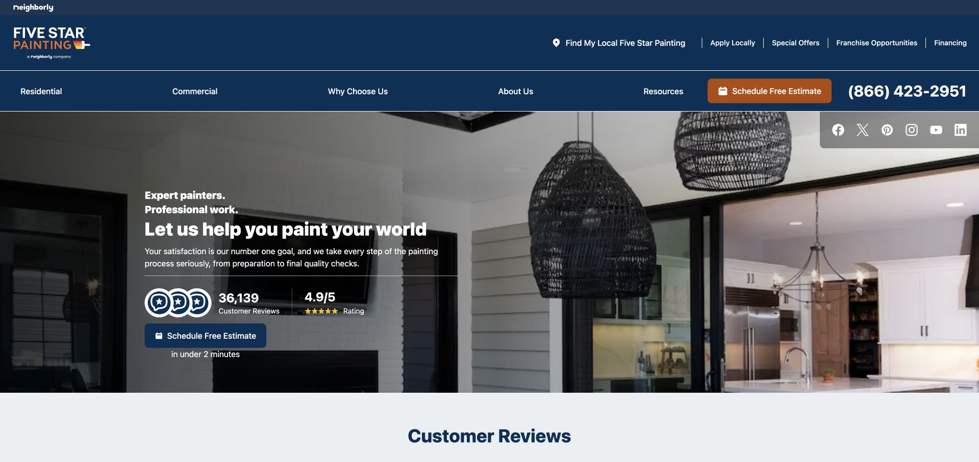
Five Star Painting combines a navy header, orange estimate button and a large photograph looking from an outdoor area into a painted kitchen. The left-aligned hero explains the service and displays a review count and rating before the estimate action. A small timing line describes the initial scheduling task, which helps distinguish an enquiry from the work itself. The navigation separates residential, commercial, resources and company information, while a local-provider route sits in the upper bar. It is a dense opening, but the colour hierarchy keeps the main conversion action recognisable.
What you can learn
Place reassurance beside the decision it supports, while keeping its source and meaning clear. A network-wide rating is not automatically the same as the rating of the operator serving a visitor’s address. Describe the estimate step precisely and avoid implying that quick form completion predicts the duration, price or quality of the painting project.
Pros
The navy-and-orange contrast makes the estimate button stand out from supporting navigation.
Local-provider navigation acknowledges that visitors need a geographically relevant service team.
Cons & considerations
Two header rows and multiple utility links make the opening relatively crowded.
The hero rating needs clear scope so readers do not assume every location is identical.
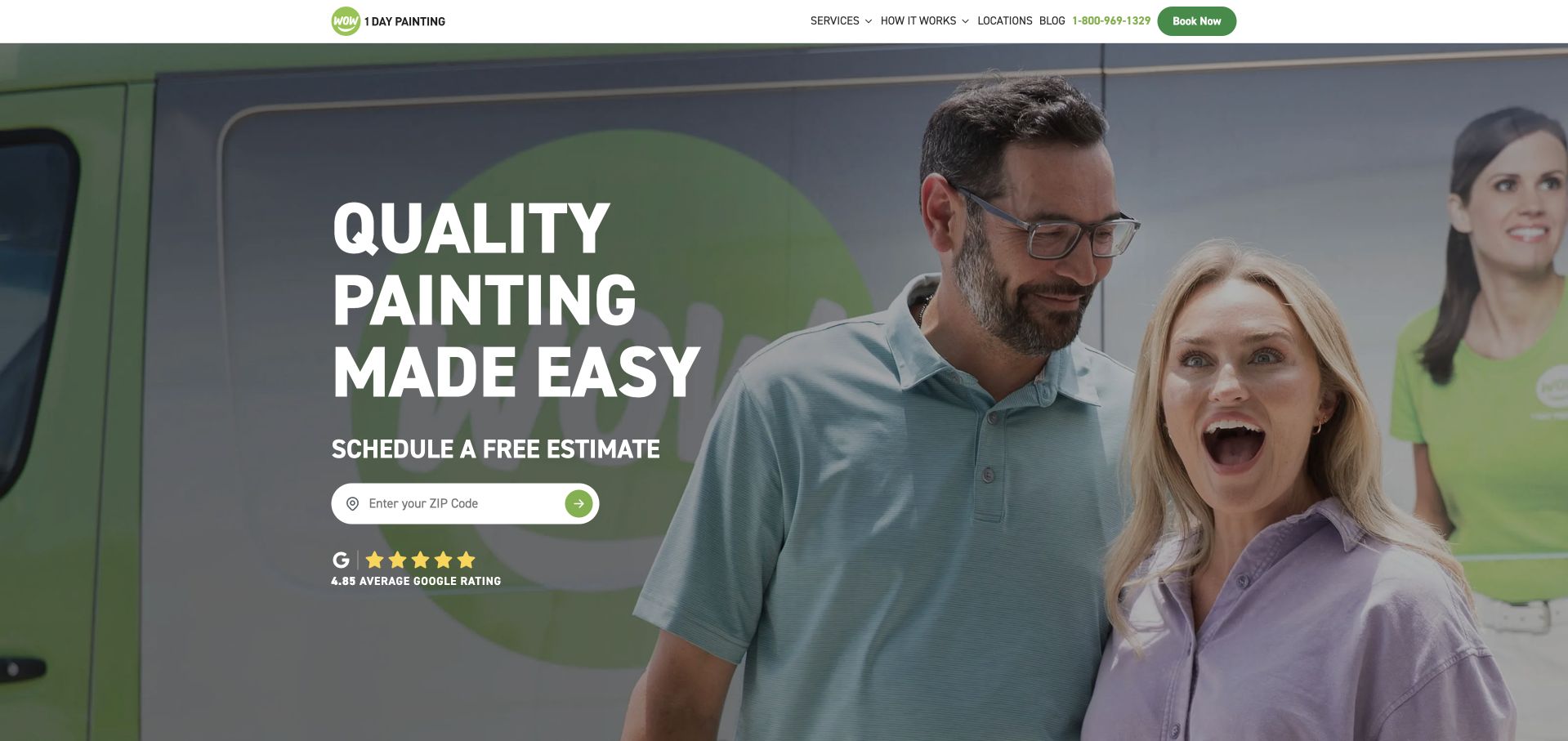
WOW 1 DAY PAINTING uses a bright green identity, a large lifestyle photograph and compact white navigation to give its page an upbeat tone. The opening message is set in heavy condensed capitals, followed immediately by a ZIP-code estimate field. The photograph includes customers and a branded vehicle rather than only an empty finished room, making the service encounter part of the story. A displayed Google rating sits beneath the field, while the phone number and booking action remain visible above. Lower content distinguishes interior, exterior and commercial services and includes before-and-after imagery.
What you can learn
A single input can feel approachable when the page already explains why it is needed. Pair the simple front door with real service detail and clearly labelled project comparisons further down. A speed-oriented brand name should not replace explicit scope, preparation and scheduling information for homeowners whose projects involve more complicated surfaces or repairs.
Pros
The short navigation and focused postcode field make the first action easy to locate.
Before-and-after content provides a different kind of evidence from lifestyle photography alone.
Cons & considerations
The oversized photograph delays some of the practical service explanation until scrolling.
The bold speed-oriented identity needs careful qualification for more complex painting work.
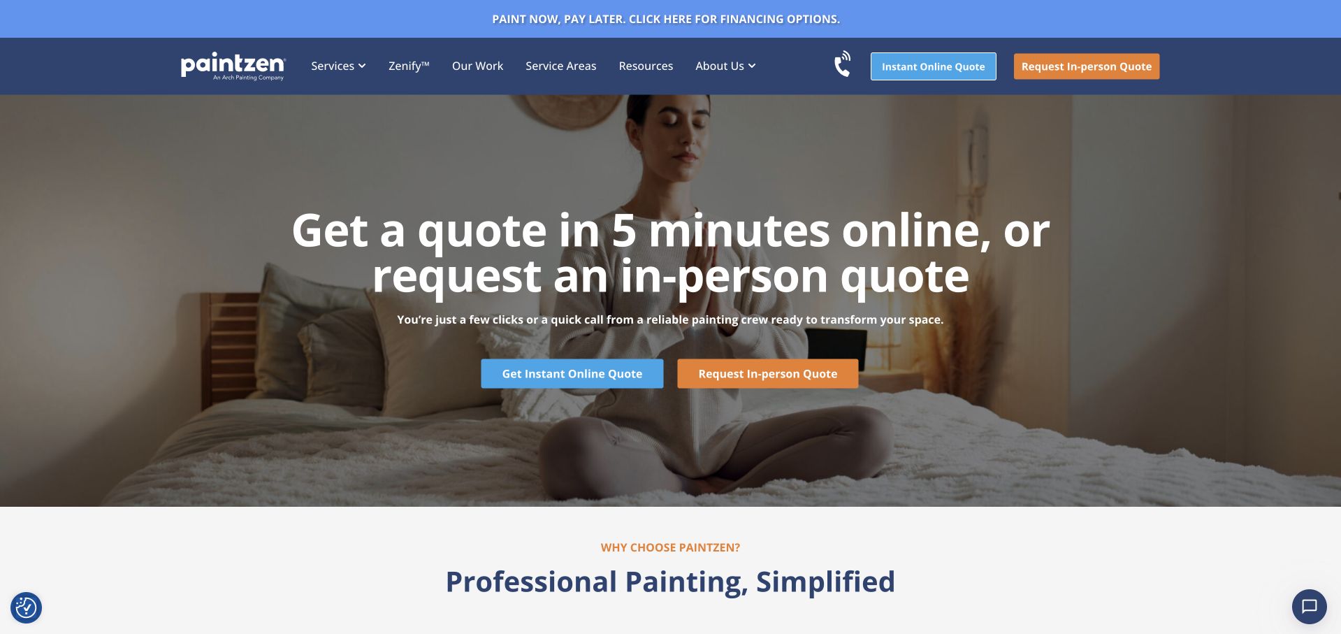
Paintzen leads with a direct choice between an online quote and an in-person quote, using blue and orange buttons to distinguish them. The same pair appears in the header, so the action labels remain consistent rather than changing between sections. A quiet interior image provides a lifestyle background, while the large white headline explains the two routes. Services, work, coverage and resources are all available before an enquiry. A financing strip sits above the navy navigation, and the next section starts to explain the service in a calmer white layout.
What you can learn
Name different estimate methods by what the visitor will actually do. Remote estimating and an on-site consultation create different expectations about information, accuracy and time; the destination pages should explain those differences rather than treating the buttons as interchangeable lead forms. Preserve a route to service research for people who are not ready to request either quote.
Pros
Online and in-person choices are described consistently in both the header and hero.
Service-area and project routes remain accessible without starting the quote process.
Cons & considerations
Repeating two equally strong actions can make the first decision feel less focused.
The lifestyle photograph communicates relaxation more clearly than preparation or painting workmanship.
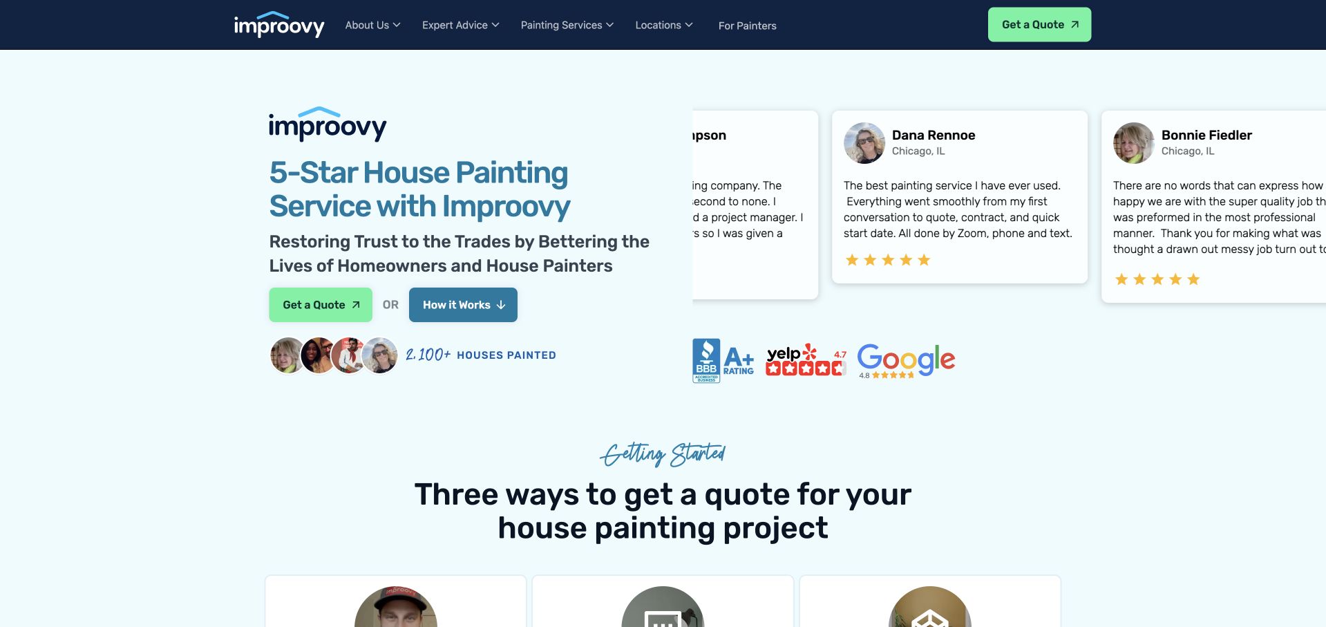
Improovy replaces the usual full-screen room photograph with a pale blue split layout. Service copy and a mint quote button occupy the left, while large customer-review cards occupy the right. Review-platform marks and customer imagery support the story without forcing visitors into an immediate form. A second button explains how the process works, and the next visible heading introduces three quotation methods. The compact navy navigation keeps service and location research available. The cards make the page feel active, although partially visible moving testimonials can be harder to read than a fixed quotation.
What you can learn
When convenience is a differentiator, explain the sequence rather than simply labelling the company modern. Pair the enquiry action with a process route and make each quotation method concrete. Reviews can support that explanation, but they should stay attributable and readable; animated proof loses usefulness if readers cannot finish a specific account before it moves.
Pros
The process button provides an alternative for visitors who need to understand the service first.
A restrained mint accent consistently distinguishes the main quote action from supporting content.
Cons & considerations
Moving review cards may be cut off at the edges of the desktop layout.
The opening relies more heavily on review presentation than on completed project imagery.
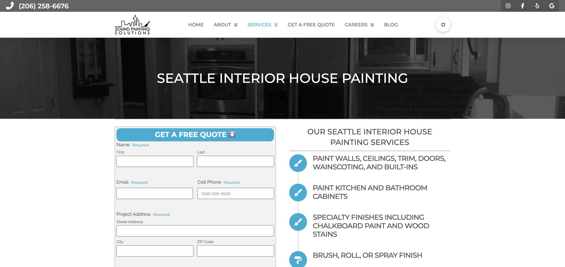
Sound Painting Solutions’ interior-painting page puts a specific Seattle service heading over a dark room photograph. Beneath it, a quotation form sits beside a plainly written scope list covering walls, ceilings, trim, doors, built-ins and cabinets. Turquoise icons and dividing lines make those service statements scannable, while the telephone number stays in the narrow utility bar. This captured view is a service page, not the company’s homepage. Its value is the close relationship between the enquiry form and the actual work being requested, rather than a purely aspirational hero.
What you can learn
An individual painting service deserves more than a location keyword and a contact button. Explain the surfaces and finishes within scope, then let the visitor ask about that specific work. Ask only the details required for the first conversation; address and contact fields should have clear labels, sensible mobile types and useful validation before a real customer attempts submission.
Pros
The service list explains several interior surfaces beside the initial quote form.
A specific Seattle heading establishes both geography and project type immediately.
Cons & considerations
The form is long enough to continue beyond the first desktop screen.
Some utility icons appear less clearly rendered than the written service labels.
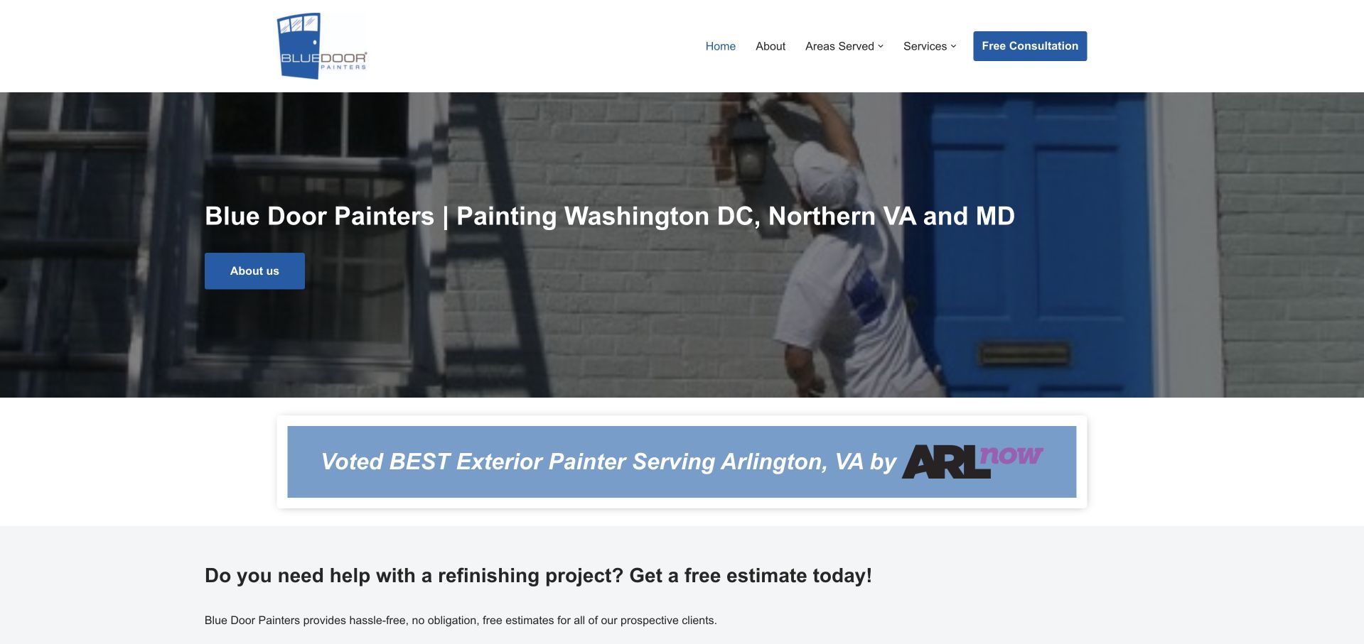
Blue Door Painters uses its namesake blue door in the hero photograph, connecting the logo, image and blue action buttons with an immediately understandable idea. A white header provides just four main navigation choices and a consultation action. The headline spells out Washington DC, Northern Virginia and Maryland, so the market is explicit rather than hidden inside a service-area page. An award-style local publication banner appears directly below the photograph before the estimate introduction. The page is direct and legible, though the hero’s About Us button is a softer next step than the header’s consultation action.
What you can learn
A simple visual motif can distinguish a small service business without an elaborate illustration system. Let it support location, services and next-step clarity rather than replace them. Local recognition is more useful when its source and date are accessible, and a visitor should be able to compare the underlying service information without relying on an award graphic alone.
Pros
The door photograph and blue buttons reinforce a memorable, coherent business identity.
The opening names the served metropolitan areas in ordinary, readable language.
Cons & considerations
The hero’s About Us action is less direct than the separate consultation button.
A large recognition banner appears before detailed service and project information.
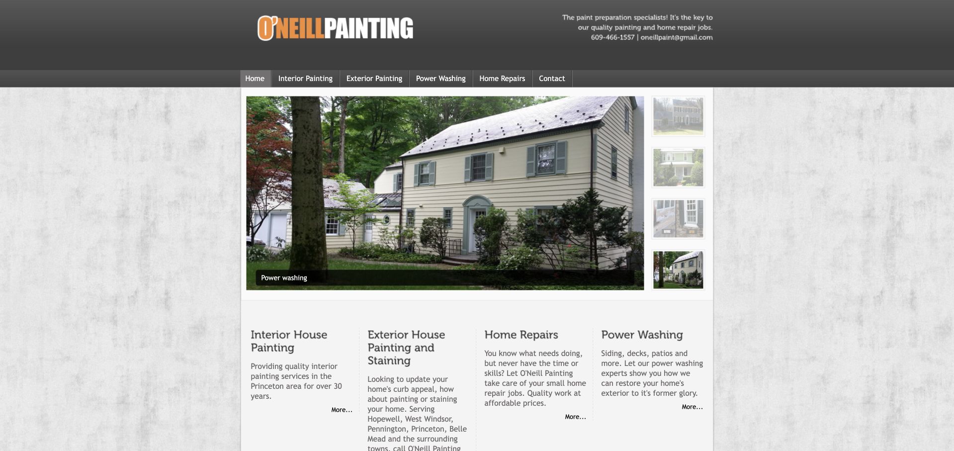
O’Neill Painting uses an older, boxed desktop layout with an orange-and-white wordmark, textured background and a central house-photo gallery. Four short columns below describe interior painting, exterior painting, home repairs and power washing. The header’s preparation message, phone number and email make the operating proposition straightforward. Princeton-area coverage appears in the service descriptions rather than a national locator. The image thumbnails are a useful alternative to a purely decorative slideshow because they show several available views, although the fixed narrow composition leaves a great deal of unused space on a wide screen.
What you can learn
A small painter can explain a useful service offer with a modest number of pages. Carry that directness into a contemporary responsive layout: retain the visible contact methods and distinct work categories, while improving line lengths, spacing and image controls. Preparation is a credible topic for detailed process content, but a slogan alone does not explain what will be done on a particular project.
Pros
Four concrete service columns make the offer understandable without extensive navigation.
Phone and email contact details appear prominently alongside the company identity.
Cons & considerations
The narrow boxed composition makes the page feel small on a wide desktop display.
Small text and terse More links give the service summaries limited visual hierarchy.
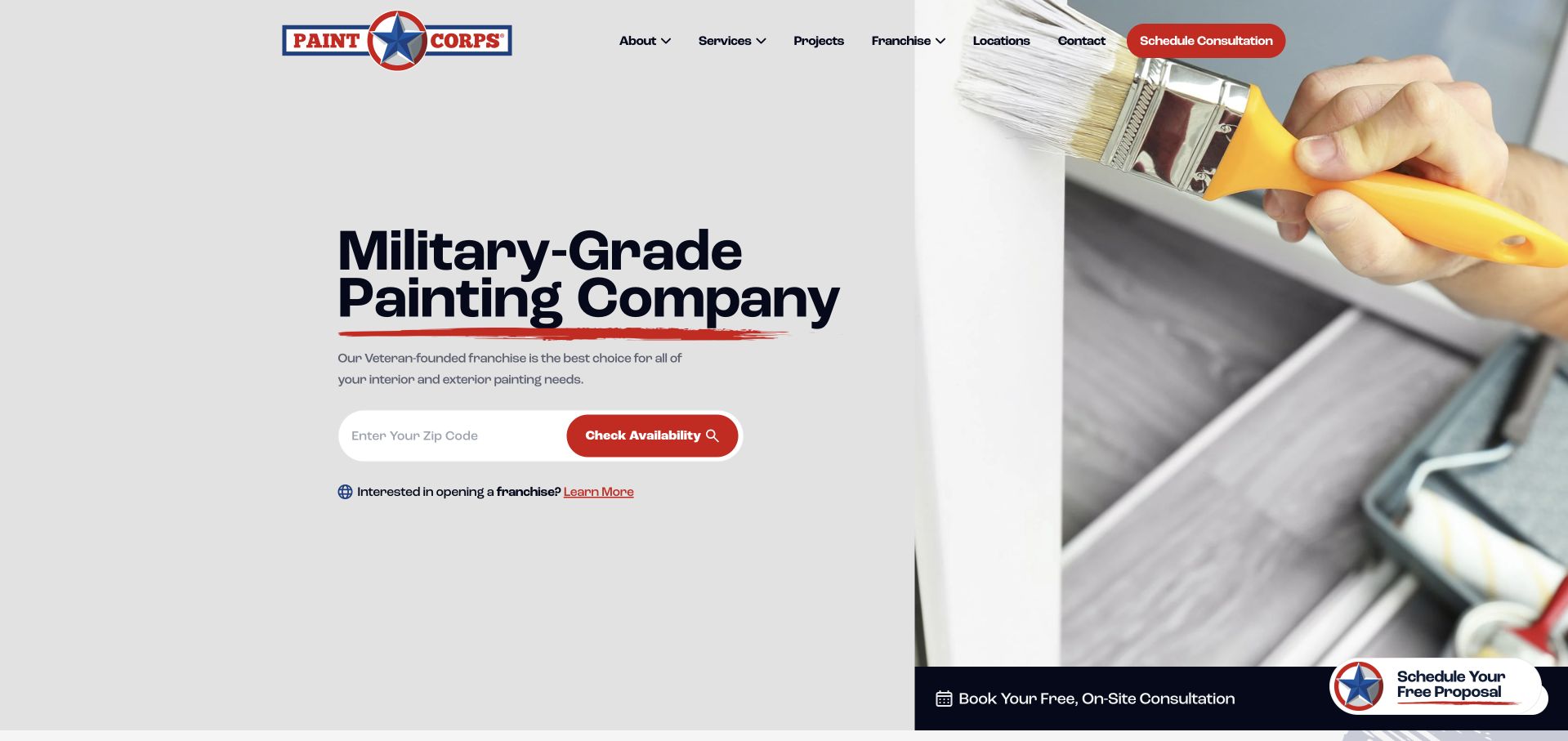
PAINT CORPS gives its star emblem and red, white and navy palette a consistent role across the page. The opening uses a large brush photograph on the right and bold dark text on a pale panel on the left. A ZIP-code availability field provides the practical next step underneath the brand statement. The navigation includes services and projects alongside franchise information, and a smaller note acknowledges the separate audience interested in opening a location. The layout is clean enough to scan quickly, although military-themed language communicates a positioning idea more than the actual details of a painting specification.
What you can learn
A founder story or ownership identity can establish a memorable voice, but it should be translated into concrete service information. Explain preparation, supervision, protection of the property and handoff instead of assuming the theme proves those practices. Keep employment or franchise recruitment subordinate to the homeowner’s service and coverage questions, with a separate destination for business enquiries.
Pros
The large brush photograph makes the painting category unmistakable without extra decoration.
The pale text panel gives the postcode field and red action strong contrast.
Cons & considerations
The opening brand language offers less project detail than the service pages must supply.
Franchise messaging introduces a second audience before the homeowner has explored the work.
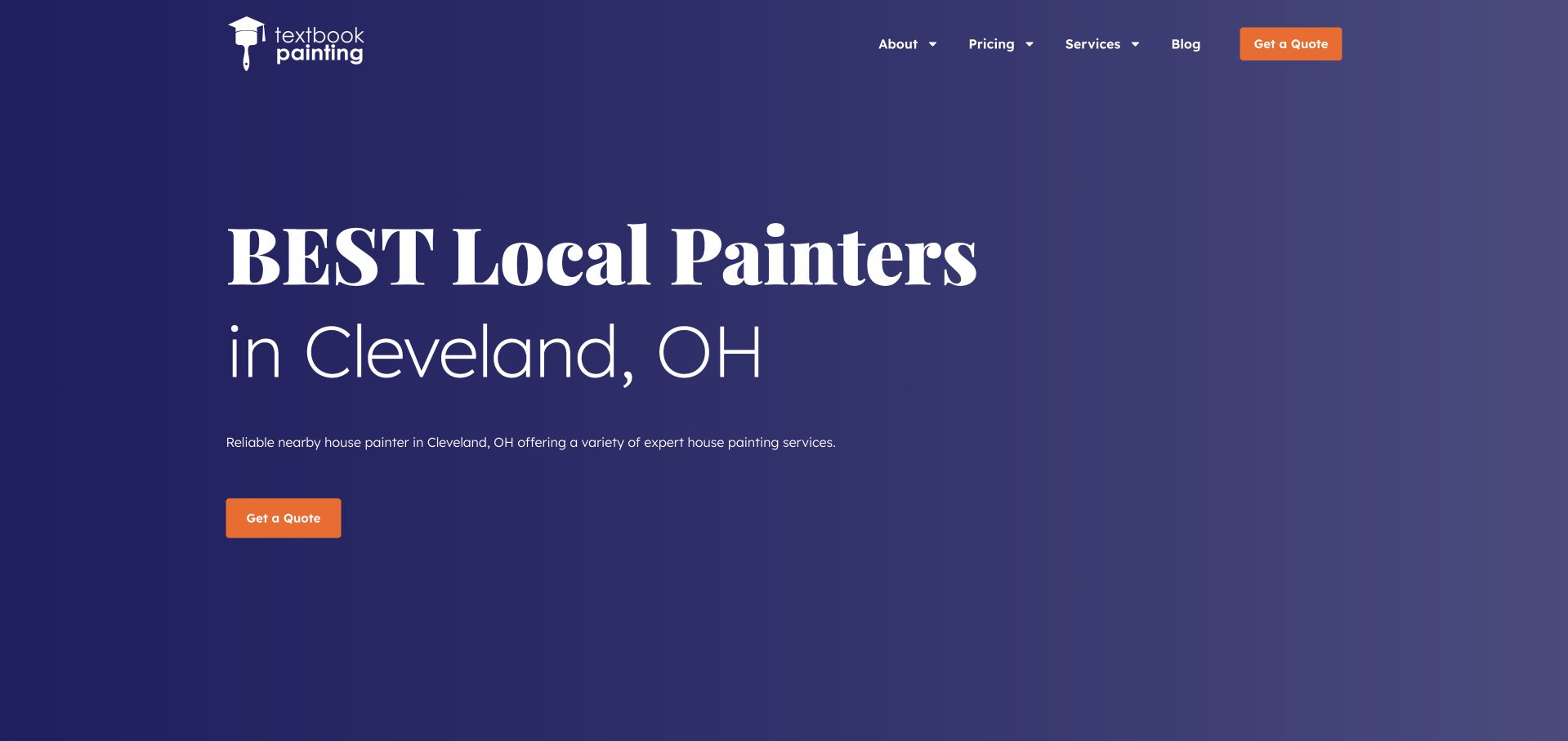
Textbook Painting opens with a purple gradient, oversized white serif lettering and a small orange quote button. The company name is modest in the header; the dominant message is the local painting offer in Cleveland. That text-first approach is a useful contrast to the many image-led sites in this collection. Pricing has a visible navigation category, which signals that practical research matters as well as appearance. Services, company information and editorial content complete the compact header. The composition is visually memorable, but the opening superlative remains the company’s marketing language rather than an independently established ranking.
What you can learn
Strong typography can create a recognisable painting brand when project photography is limited, provided useful evidence follows it. Support a local headline with genuine work, clear service coverage and a meaningful pricing explanation. An oversized statement should not be the only information visible on a small screen, and its line breaks must remain readable without crowding the enquiry action.
Pros
The purple and orange palette differentiates the page from conventional trade-site styling.
A visible pricing category acknowledges a key question before visitors request a quote.
Cons & considerations
The opening uses a broad superlative instead of a specific example of the work.
The large type and generous empty space postpone visual project evidence until later.
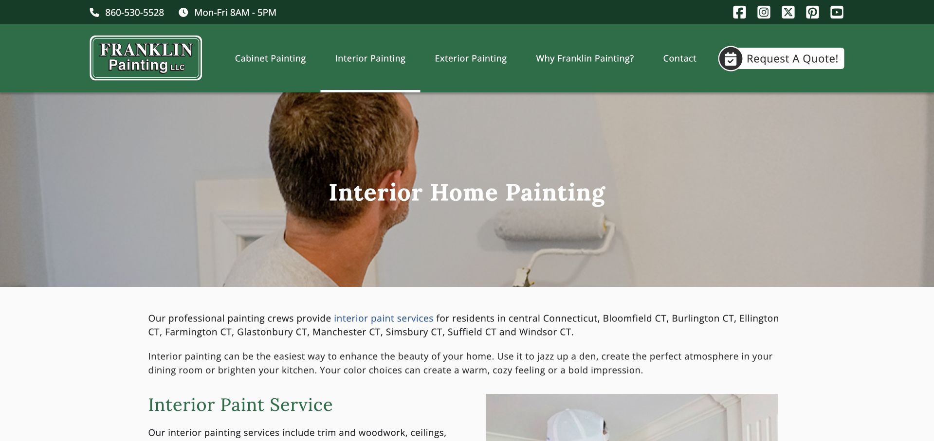
Franklin Painting’s interior page carries the homepage’s forest-green header and cream-and-white content treatment into a more specific service presentation. A photograph of a painter using a roller sits behind a straightforward interior-painting heading. The opening paragraphs then name central Connecticut communities and explain the room-related service before a second section begins. Telephone, weekday hours and a quote action remain visible above. This is a captured service-page view rather than the rotating homepage hero, so the headline stays complete and the content is directly relevant to an interior project.
What you can learn
Build service pages around actual differences in the work rather than simply replacing one keyword in the same template. Interior painting can explain surfaces, preparation, occupied-room arrangements and finish decisions, while an exterior page can address different questions. Use a concise regional coverage summary and a genuine service-area route instead of allowing a long town list to overwhelm the useful explanation.
Pros
The service heading and working-painter photograph establish the page’s purpose immediately.
Brand colours, hours and contact actions remain consistent with the company’s main identity.
Cons & considerations
The introductory coverage list is lengthy compared with the initial explanation of project scope.
A large image pushes more detailed interior-service information below the opening paragraphs.
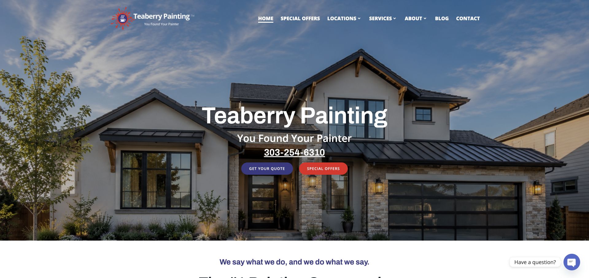
Teaberry Painting places its colourful hand-mark logo over a full-width house photograph and uses a dark overlay to keep the central white text legible. The telephone number is a substantial part of the hero rather than a tiny utility link. Quote and special-offer buttons provide two distinct actions, while a location menu supports the company’s multiple markets. The navigation is conventional enough to understand quickly, with services and company information separated. A concise statement below the hero continues the brand voice. The image-led composition is attractive, although it gives the main phone and promotional actions more emphasis than service specifics.
What you can learn
If telephone enquiries are important, make the number readable and clickable rather than hiding it behind an icon. Pair that contact prominence with enough geographic and service detail to qualify the conversation. A special offer is a secondary commercial choice, so maintain a clear hierarchy between learning about the work, requesting a quote and reading promotion terms.
Pros
The large telephone number is easy to find without opening another page.
The dark image treatment gives the white headline and coloured actions clear separation.
Cons & considerations
The hero names the brand more strongly than the individual services available.
A special-offer button competes with the quote action before project details are introduced.
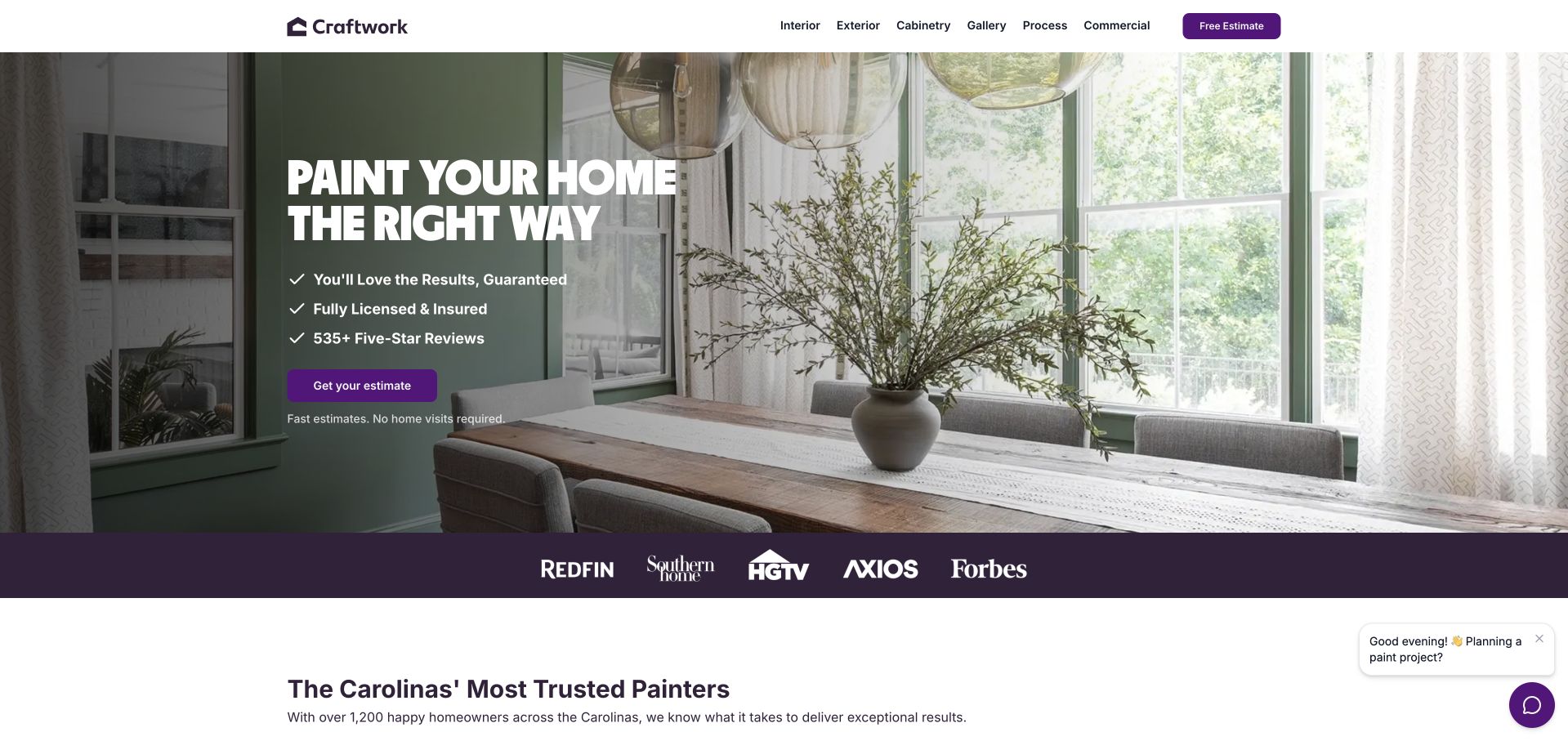
Craftwork uses a clean white header, plum accents and a large dining-room photograph to frame a short painting proposition. The hero groups three reassurance statements above a purple estimate button and a line explaining that the initial estimate does not require a home visit. Interior, exterior and cabinetry are visible as separate navigation choices, while gallery and process routes support further research. A narrow row of publication marks gives way to a local Carolinas introduction below. The composition feels contemporary without complex animation; most of its hierarchy comes from spacing, contrast and a small number of consistent actions.
What you can learn
Make the estimate method part of the explanation when it differs from a conventional site visit. Customers need to know what information they will provide and when an estimate might change. A concise reassurance list can orient the visitor, but guarantees, licensing statements and review figures should connect to accessible evidence and terms rather than acting only as decorative checkmarks.
Pros
Interior, exterior and cabinetry routes describe specific homeowner project intentions.
The estimate action is supported by a short explanation of its initial format.
Cons & considerations
Publication logos appear without much context in the first visible proof strip.
The opening reassurance list needs fuller supporting information before becoming a buying decision.
Kegan is a freelance web designer and developer with 15+ years of experience helping businesses turn complicated website requirements into clear, maintainable digital experiences. He works directly with clients from planning and design through development, launch, and ongoing support.
For painting contractor website design, his development approach focuses on service-area pages, project galleries, finish and surface information, and clear estimate requests. The scope can be a targeted improvement or a complete custom build, with responsive layouts, thoughtful content structure, and integrations chosen around the people using and maintaining the site.
Show 3 other painting contractor website designersHide other painting contractor website designers
Plan a painting website around the questions that precede a quote
Document the scope before selecting a hero image
List the work the team genuinely undertakes, including any preparation, repairs or related carpentry, and identify what requires assessment. Write plain descriptions rather than a long list of paint-manufacturer terms. For each service, choose a relevant project and record what was done. A house image should not imply the company painted every visible surface, and a coating photograph should not suggest a technical suitability that has not been established.
Build an honest project and review library
Use project images with permission and add broad location, surface and scope captions. Before-and-after views are useful when their perspective, lighting and labels are honest. Keep customer quotations attributable and link to their actual source where possible. Do not invent reviewer portraits, combine unrelated reviews or present a network rating as the record of one local team. The goal is to help readers understand the work, not to manufacture proof.
Test the actual enquiry and maintenance workflow
Walk through the estimate form with the staff who will answer it. Ask what information is necessary now and what can wait until a conversation. Make optional uploads explicit, explain privacy handling and provide a useful success or error state. Assign someone to update seasonal offers, service areas and response expectations. A visible phone number is only useful if its hours and destination remain correct.
The editing job behind the design
Choose a platform that keeps painting services and projects current
Model services, markets, projects, team information and review sources as maintainable content. Editors should be able to add a cabinet project, retire an expired offer or correct a service-area statement without rebuilding the page. Avoid duplicating the same paragraphs across dozens of town pages; location content should contain useful local facts or relevant work.
Large photos, booking widgets, chat and rotating testimonials all affect the public experience. Provide readable text over every image, a useful still when video cannot play and clear controls for motion. Test labels, keyboard operation and form errors with the real quote form. Visible technology notes record supported public evidence, not a complete private estimating or customer-management system.
Our WordPress website examples offer a separate look at publishing approaches. A visible platform label is evidence for that named page, not a guarantee that the same system will suit your requirements.
Before the public launch
Painting contractor website brief checklist
Define interior, exterior, cabinetry, commercial and specialist services only where they are genuinely offered.
State the real service region and distinguish a national brand from a local operator.
Explain remote estimates, calls and site visits as separate steps where applicable.
Give project photos captions identifying surfaces, broad location and actual scope.
Separate residential and property-management journeys when their information needs differ.
Keep preparation and repair explanations practical without asking visitors to make technical diagnoses.
Attribute reviews and explain the scope of any displayed rating or review count.
Provide readable guarantee and promotion terms rather than relying on a decorative badge.
Request only the contact and project details needed to route the first conversation.
Test telephone links, forms, uploads, errors and success messages without sending real enquiries.
Review image contrast, motion, keyboard access and mobile menu behaviour with actual content.
Assign responsibility for offer expiry, contact hours, service coverage and new project records.
These checks are a project checklist, not a performance, legal, security, or accessibility certification. Test real journeys with the people responsible for the website before making claims about the result.
Sources & editorial method
How this collection was selected and reviewed
We inspected the linked official public pages and captured their visible presentation directly. MB Jessee’s official company history supports the regional-specialist context for the opening selection. Our observations concern information design, not verified painting outcomes. The W3C forms tutorial informs the recommendation to keep the enquiry clear and proportionate. Technology entries are limited to separately supported public signals.
Each example links to its actual source page. Screenshots are direct browser captures with their own capture dates; moving imagery, announcements and live designs can change. The notes describe observable design choices and conditional tradeoffs, not measured traffic, conversion results, service quality, or accessibility conformance.
Technology labels use public page metadata, asset evidence, or explicitly cited platform documentation. Platform documentation is not a complete current deployment audit. A component reference may be legacy or unused; it is not a complete backend inventory. Unknown stacks are omitted. These sites are editorial examples, not our client portfolio.
Written, Edited and Curated are separate editorial records, not timestamps advanced by a rebuild. Website designs and imagery belong to their owners. See our editorial standards or suggest a correction.
Questions worth asking
Painting Contractor website design questions
Should a painter put a quote form in the hero?
It can suit contact-ready visitors, but establish the service and coverage first. Explain the next step and keep a parallel route to project or process information. A short initial form is often easier to understand than requesting every property detail before a visitor knows whether the company can help.
How should commercial and residential painting be separated?
Use distinct routes when the buying process and project information differ. Residential content may focus on rooms and occupied-home arrangements; commercial content can explain coordination and the types of properties served. Do not create empty categories solely to appear comprehensive, and keep shared company information consistent.
Are before-and-after photographs necessary?
They can clarify a change, but honest captions and comparable views matter more than the format. A finished-project photograph with a clear scope note is useful too. Never alter conditions to exaggerate a transformation or imply that a photograph proves durability, preparation quality or future performance.
Do all painters need a postcode finder?
No. A network may need one to route readers to a local provider. A regional company can often communicate coverage more clearly with a concise statement and useful service-area page. Avoid forcing visitors to submit contact information merely to learn whether their town is served.
Which platform should a painting company choose?
Start with the content and maintenance tasks: services, projects, coverage, quote routing and staff updates. Then compare platforms against those requirements. Another painter’s visual design or detected public stack does not prove that its platform fits your editorial capacity, integrations or budget.
Begin with service clarity, honest project evidence and an understandable estimate journey. Those decisions will make a stronger painting website brief than collecting attractive room photographs alone.