Best Asphalt Paving Websites of 2026 (24 Real-World Examples)
Asphalt-paving website design that clarifies property types, maintenance categories, and the first estimate conversation.
Study 24 public paving-company pages for service taxonomy, regional communication, project imagery, and useful inquiry design. These are editorial interface references, not assessments of construction quality, engineering, pricing, or contractor suitability.
A driveway owner, commercial property manager, and municipal project team do not necessarily arrive with the same question. A useful paving homepage makes the actual audience and work scope clear before inviting a project request.
The collection includes local operators, regional specialists, and larger organizations. Some emphasize maintenance, others construction, production, or additional divisions. Use the examples to sharpen a real brief rather than assume that every contractor needs every service category, finance promotion, or corporate navigation route.
Before the examples
What makes good asphalt paving website design in 2026?
Separate installation and maintenance tasks
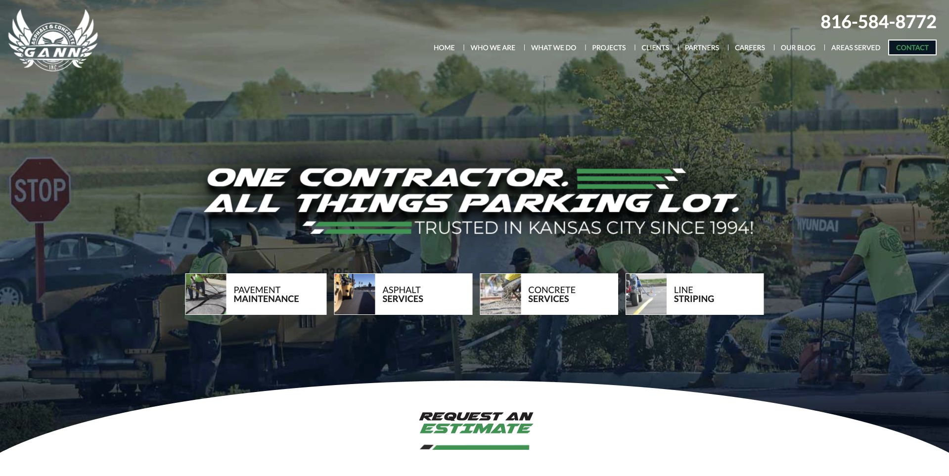
Paving, repair, sealcoating, crack sealing, striping, concrete work, and excavation should have literal labels where offered. Gann's compact service cards are useful because the broad parking-lot message becomes a set of understandable choices. The website should not diagnose which work a property requires from a short description or photograph.
Make audience and geography explicit
A household driveway, commercial lot, church property, industrial site, and municipal contract can involve different receiving teams and information. State the genuine territory and actual audiences. Be precise with ambiguous place names, such as Ohio, Illinois, rather than relying on a city word that could be mistaken for another region.
Explain what an estimate request starts
A form may request a callback, preliminary discussion, site visit, or bid information. Those outcomes are different from an accepted project or fixed price. Ask for useful first-stage context and explain the next step without making a visitor select technical construction requirements they cannot reasonably determine.
The collection · 24 examples
24 asphalt paving websites worth studying
These 24 references include parking-lot service cards, regional driveway imagery, equipment-led introductions, estimate-heavy heroes, and corporate stakeholder navigation. Their useful lessons concern communication and interface choices. Photographs, historic claims, ratings, badges, and company superlatives are not independently measured construction evidence.
Gann places a bold parking-lot introduction over a work photograph, with four compact cards naming pavement maintenance, asphalt, concrete, and striping. Green accents connect the message to the company mark, while a curved white edge leads toward an estimate route below. The Kansas City context is visible without searching a national locator. This is the editorial choice for a regional company whose service taxonomy makes a broad offer more digestible. The selection concerns communication and interface design, not construction performance, credentials, pricing, or the condition of a future project. Its parking-lot focus also makes it a different reference from a household driveway contractor.
What you can learn
Organize the opening around the customer's property task, then expose the actual service choices. Keep maintenance, installation, concrete work, and striping distinct, and explain the estimate process rather than implying that one broad proposition settles project scope.
Pros
Four literal service cards make the broad parking-lot offer easier to understand.
Regional wording gives the work photograph a clear operating context.
Cons & considerations
Small cards need comfortable labels and touch targets on phones.
Bold promotional wording still needs accurate project and qualification details afterward.
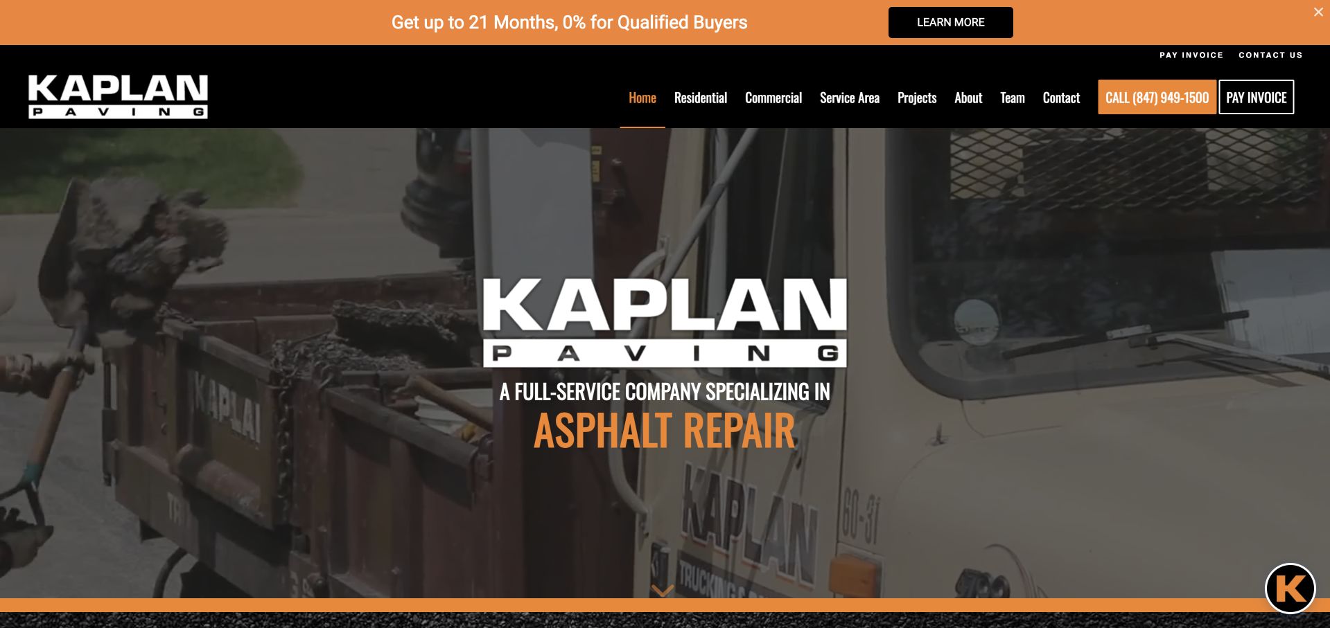
Kaplan uses a black and orange palette around a wide work photograph. A large central company mark sits above a rotating service label, while the header separates residential, commercial, service-area, project, and company routes. A finance-related strip occupies the very top. This is useful for studying a regional pavement company whose familiar brand identity ties together several service categories. The changing service label should not be the only way visitors learn the offer. Finance and company claims remain attributed marketing content, not independent advice, verified eligibility, construction suitability, or evidence of the terms available to a particular customer.
What you can learn
Keep audience and service routes available outside rotating hero text. Make any financing message clearly separate from the project inquiry, and provide the actual scope and conditions through appropriate maintained information rather than a compressed promotional strip.
Pros
Residential and commercial visitors have distinct routes in the main header.
Black and orange branding is consistent across the mark, navigation, and service emphasis.
Cons & considerations
A large central mark hides some useful work-image detail.
Promotional finance wording adds another layer before the service introduction.
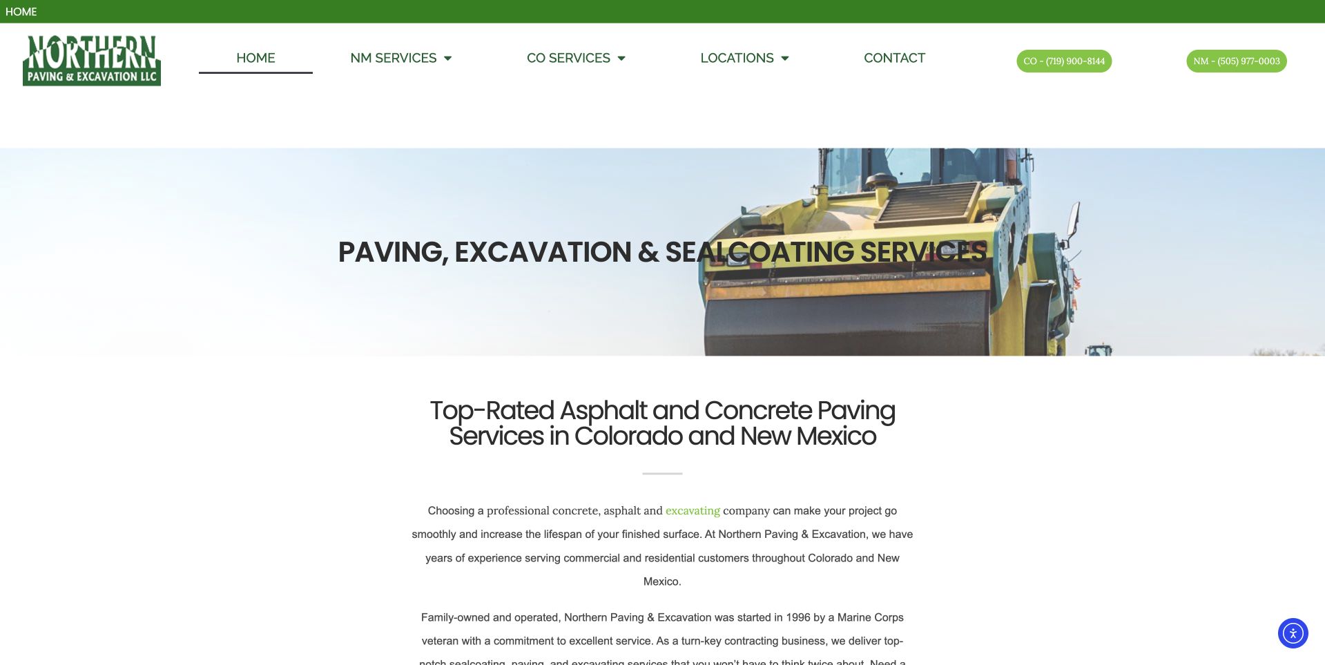
Northern Paving uses a white page with green navigation accents and a shallow equipment photograph. The image carries a literal paving, excavation, and sealcoating heading, while the next section describes Colorado and New Mexico service context. Separate state-service routes appear in the header, alongside locations and contact. This is useful for studying a regional contractor whose practical geography is more important than an elaborate first-screen form. The generous white space improves separation, although the main paragraph is small relative to the available area. The company's ratings, history, and qualification wording remain its own statements rather than independently verified findings about service quality or construction outcomes.
What you can learn
Use geographic navigation when it reflects a real operating distinction. Keep service and state information readable, and avoid turning a simple brochure site into a collection of repetitive location pages without useful maintained local scope.
Pros
State-service routes make the regional structure visible in the header.
A shallow hero leaves room for the literal service explanation to begin earlier.
Cons & considerations
Small body text reduces reading comfort despite the available white space.
The equipment image needs project or service context beyond a broad heading.
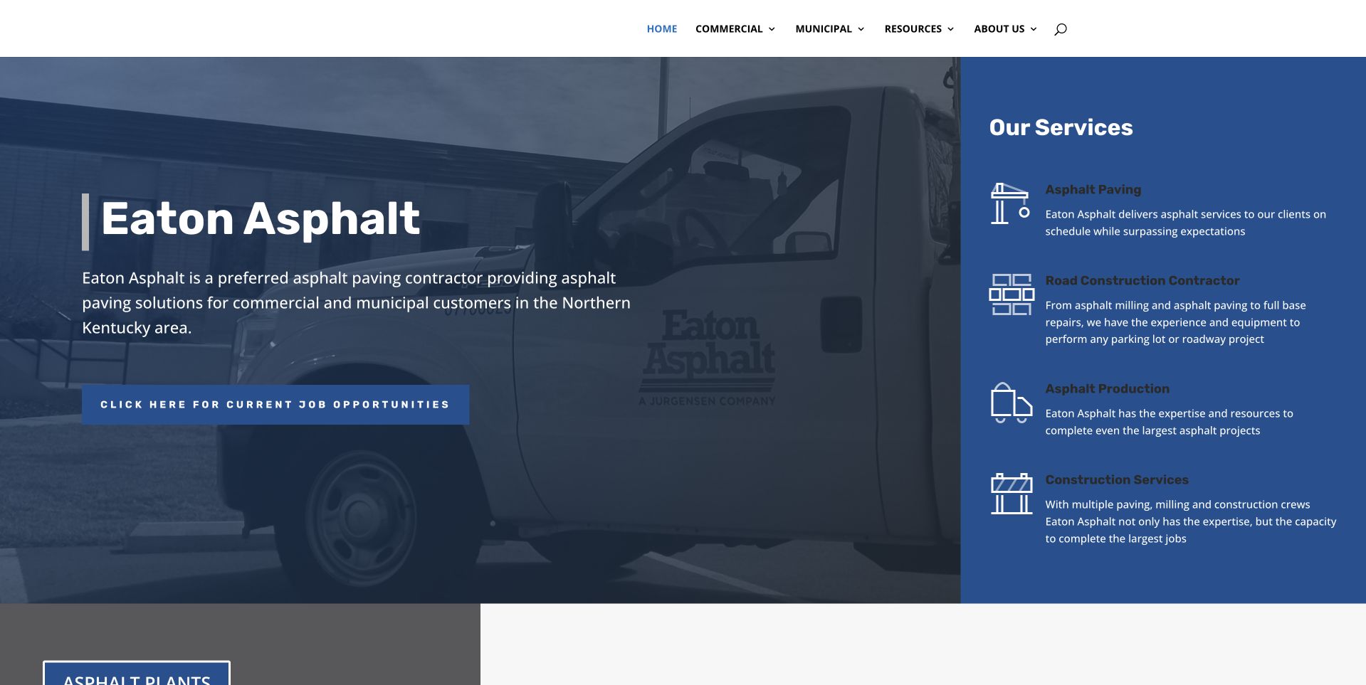
Eaton uses a blue split composition with a company-vehicle photograph on the left and a solid service panel on the right. The panel distinguishes asphalt paving, road construction, production, and construction services with short descriptions and icons. The main introduction names Northern Kentucky and the commercial and municipal audience. A job-opportunity action is prominent beneath the copy. This is useful for studying a broader contractor site that makes its operational categories visible before a long portfolio. The photograph and scope statements do not independently establish project capacity, qualifications, employment conditions, engineering requirements, or the performance of materials and construction work.
What you can learn
Translate a broad contractor organization into clear service categories, while keeping recruiting and customer tasks distinct. Explain which team and process handles a project inquiry instead of letting the scale of the equipment imply suitability for every job.
Pros
The solid blue panel gives several services their own readable descriptions.
Commercial and municipal audiences are named in the introduction.
Cons & considerations
A prominent careers action can compete with prospective-client tasks.
Small service descriptions need careful sizing and spacing on mobile.
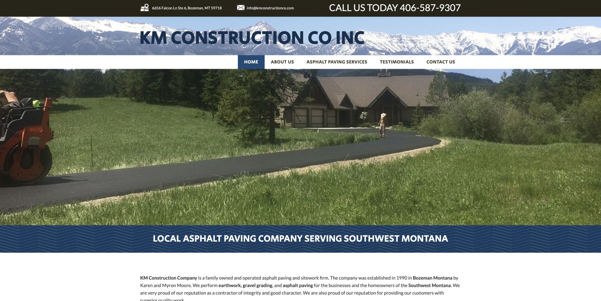
KM Construction uses a mountain-themed header above a large driveway photograph. A blue band names southwest Montana asphalt paving, followed by a compact paragraph explaining the company and service context. Telephone access remains at the top, with company, services, testimonials, and contact routes below the mark. This is useful for studying a small regional business that relies on literal information rather than a large quote overlay. The photographed driveway gives a residential setting, but the small body text limits reading comfort. Company history and service statements remain public claims, not independent verification of construction quality, qualifications, availability, or suitability for another site's conditions.
What you can learn
Keep the local service explanation straightforward and give it enough typographic space. Use project photography with accurate context, then provide a clear inquiry route and a useful account of the next assessment step rather than relying on a landscape image.
Pros
The southwest Montana heading establishes regional scope immediately.
Telephone and contact routes are visible within a simple header.
Cons & considerations
The compact explanatory paragraph is small relative to the wide image.
A decorative regional header can consume space needed for practical service information.
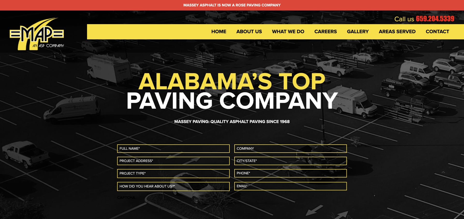
Massey uses yellow and black branding over a parking-lot photograph, with a large Alabama introduction and an outlined request form. A red upper strip states that Massey Asphalt is now a Rose Paving company, giving the visible brand a useful ownership context. The main navigation separates company, work, careers, gallery, coverage, and contact. This is useful for studying how an established regional brand communicates a wider organizational relationship without removing its familiar identity. The superlative headline, history, and company claims are not independently verified by this collection. The form also does not establish construction scope, price, suitability, or the terms of a future project.
What you can learn
Keep ownership and receiving-company context accurate when a brand changes. Make the inquiry task readable against the image, and explain what information starts an estimate discussion rather than implying that the form creates a settled project arrangement.
Pros
The upper ownership notice clarifies the relationship behind the visible regional brand.
Yellow and black create a consistent hierarchy across heading and navigation.
Cons & considerations
Outlined form fields need sufficient contrast against the parking-lot image.
A large superlative heading leaves less room for specific scope information.
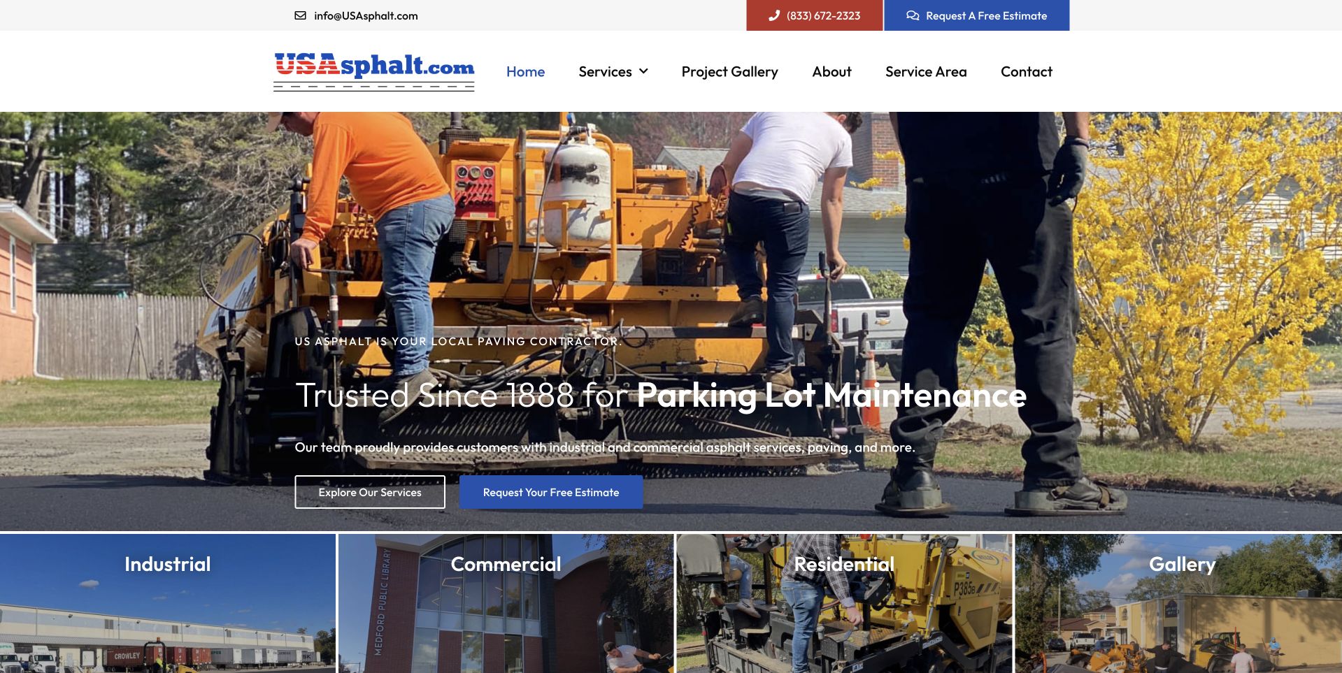
US Asphalt uses a broad photograph of people and paving equipment, with a compact introductory overlay near the bottom. Blue actions separate service exploration from an estimate request. A row of image categories follows, identifying industrial, commercial, residential, and gallery routes. This is useful for studying a contractor site that lets visitors choose their project context rather than treating every inquiry identically. The upper header keeps telephone and quote access visible. Historic and service claims remain the business's presentation, not independent verification of continuity, qualifications, construction quality, or the conditions and arrangements that would apply to a particular property.
What you can learn
Give different property audiences meaningful destinations only where their questions differ. Keep company-history claims accurate and project photographs attributable, while making a quote request clearly the start of a discussion rather than a promise of suitability or price.
Pros
The audience-image row makes several project contexts visible near the opening.
Service browsing and estimate actions are separately labeled.
Cons & considerations
Text low on a detailed work image needs reliable contrast.
Broad audience categories need useful specific content rather than interchangeable destinations.
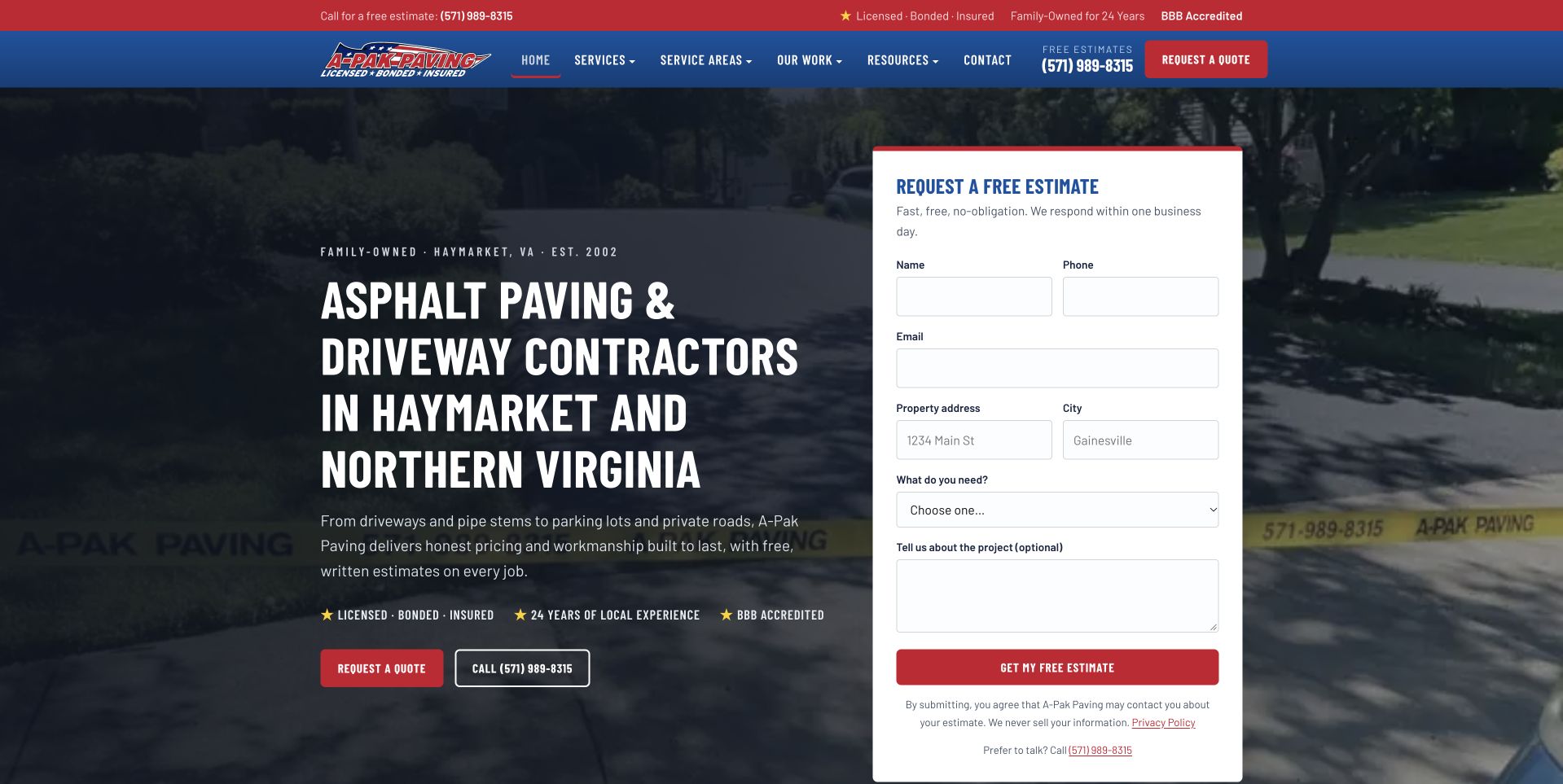
A-Pak uses a darkened driveway photograph with a large Haymarket and Northern Virginia introduction on the left. A white estimate form on the right includes contact, property, service, and optional project-detail fields. Red emphasis connects the header action and form submission control. This is useful for studying a regional contractor whose first-screen intake is explicit and visually separated from the background. The form's length also illustrates the cost of asking for substantial information before a conversation. Displayed qualification statements remain company claims, and neither the photograph nor a submitted request confirms engineering scope, project suitability, price, timing, or acceptance of work.
What you can learn
Ask only for the information staff need to route the initial inquiry. Explain the next estimate step clearly and provide a telephone alternative, especially for customers who cannot yet identify the service or describe the property's technical requirements.
Pros
The regional heading makes the intended operating area explicit.
A solid white form separates inputs from the detailed driveway image.
Cons & considerations
A tall first-screen form can be demanding on a phone.
Qualification and experience statements need maintained evidence beyond short labels.
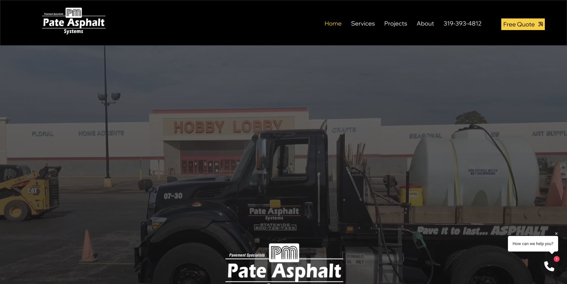
Pate uses a black header with gold accents above a large photograph of branded equipment at a commercial property. The company identity appears within the image, and the header keeps services, projects, company information, telephone, and quote access available. A small contact prompt sits at the lower right. This is useful for studying a fleet-led introduction that makes the business visually specific without a full-screen intake form. The image contains considerable detail, so it needs supporting captions and literal scope nearby. The company's experience wording and equipment photograph are not independent evidence of service capacity, construction quality, qualifications, or suitability for a future project.
What you can learn
Use company equipment as identity and project context, not as a substitute for service information. Keep the quote route clear, and make optional contact prompts unobtrusive so they do not cover useful content on smaller screens.
Pros
Branded equipment provides a company-specific subject rather than a generic road image.
The restrained header keeps project and quote routes easy to identify.
Cons & considerations
A detailed fleet photograph needs captions to explain the project setting.
A floating contact prompt can compete with content near the screen edge.
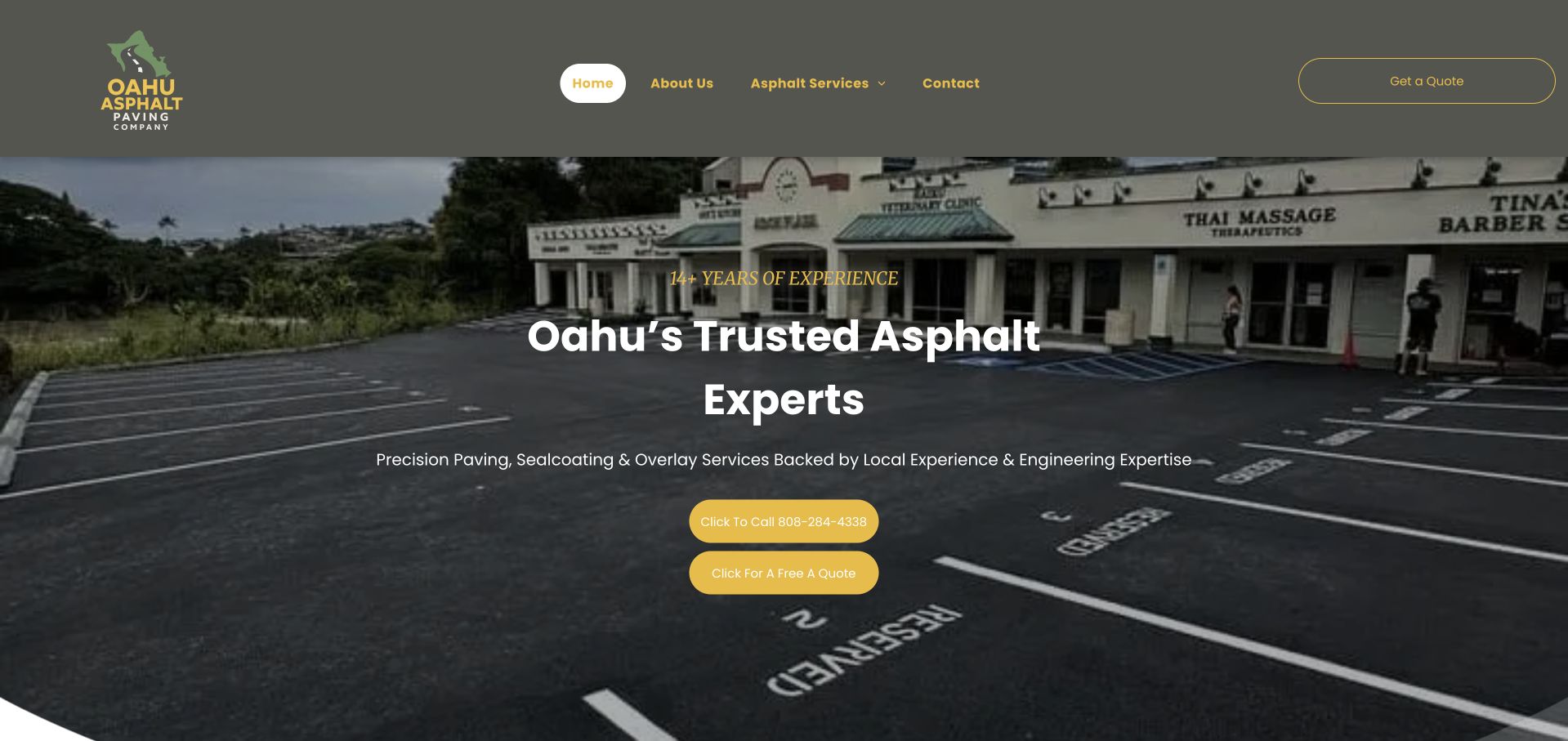
Oahu Asphalt uses a large commercial parking-lot photograph with a centered white service introduction and two gold contact controls. A muted gray header holds company, service, and contact navigation, while the island-level identity is repeated in the headline. This is useful for studying a concise regional offer that separates calling from requesting a quote without beginning with a lengthy form. The finished lot gives a clear property context, but does not establish who completed the work, construction details, maintenance needs, or performance. Experience, licensing, and engineering-related wording remains the company's presentation rather than independently validated findings about suitability for another property.
What you can learn
Keep the geographic introduction literal and pair completed-project imagery with accurate captions. Distinguish a call or quote request from project acceptance, and ensure that technical or qualification claims have specific supporting context outside the hero.
Pros
The island-level wording makes the regional context unmistakable.
Gold controls clearly separate calling from requesting a quote.
Cons & considerations
Centered text covers part of the useful parking-lot image.
Experience and technical claims require more detail than compact hero wording.
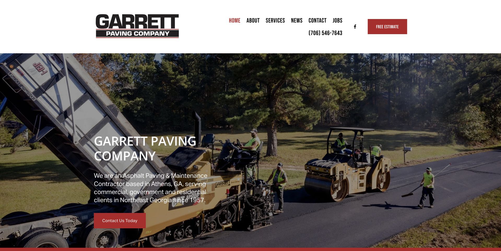
Garrett uses a clean white header above a wide photograph of active paving work. A dark translucent text panel sits at the left with the company name, a short regional explanation, and a red contact action. Telephone access remains in the header, alongside services, news, contact, and jobs. This is useful for studying a straightforward contractor introduction that lets the work setting remain visible. An announcement was closed before the selected capture. The company history and service statements are public marketing content, not independent verification of construction quality, qualifications, employment conditions, safety practices, or the specific arrangements that would apply to a future inquiry.
What you can learn
Keep the project image and service explanation balanced, with clear contact and recruiting destinations. Use a readable text surface and accurate captions so the scene adds context without being mistaken for proof of technical performance or suitability.
Pros
A translucent panel separates the introduction from the busy work photograph.
The white header provides clear telephone and contact access.
Cons & considerations
A compact regional paragraph needs comfortable type sizing.
Optional announcements can interrupt an otherwise straightforward service introduction.
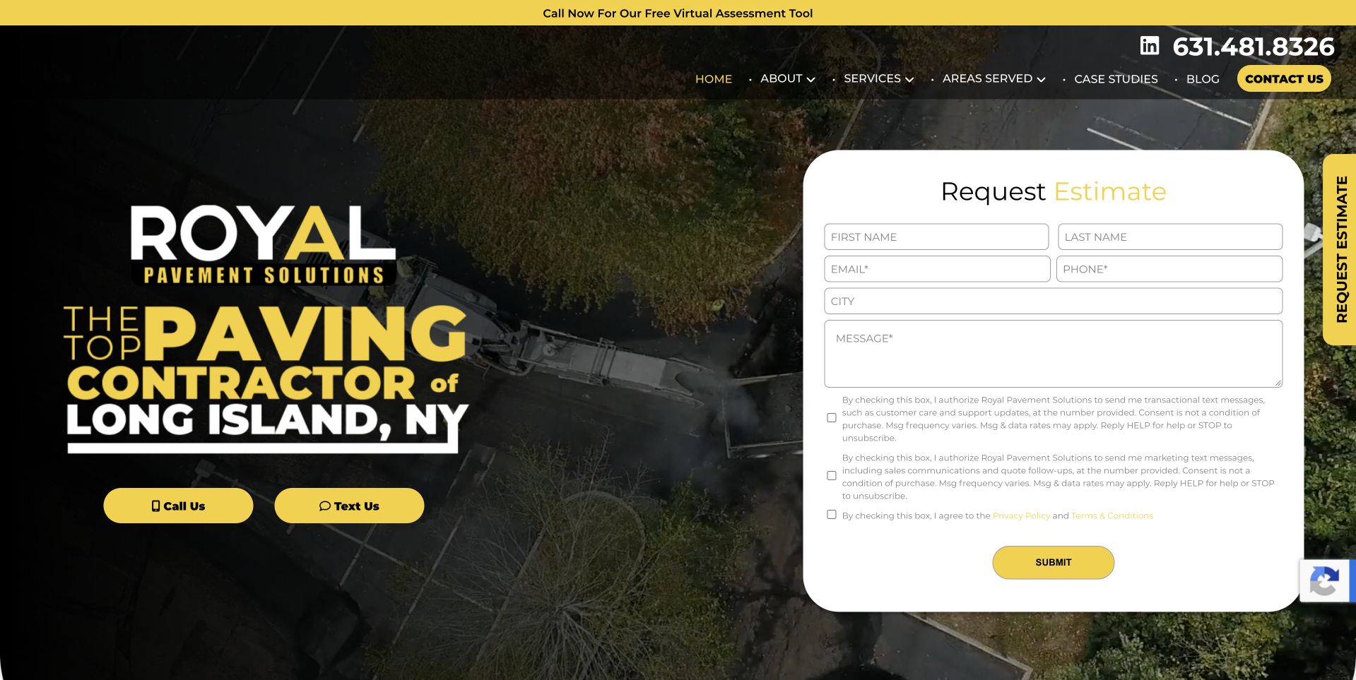
Royal places a large Long Island paving introduction over an aerial work photograph. Yellow call and text controls sit on the left, while a rounded white estimate form occupies the right. A narrow upper strip promotes another assessment route, and the main header keeps services, coverage, case studies, and company information visible. This is useful for studying a commercial contractor with several ways to begin contact. It also shows how quickly a hero can become crowded when promotion, multiple contact actions, and intake share one screen. Company superlatives and service claims do not independently establish construction quality, qualifications, price, or suitability for an individual property.
What you can learn
Choose a primary entry route and explain what each alternative does. Keep case studies and scope information accessible for visitors not ready to enter details, and ensure the form confirmation describes the actual next step rather than an agreed project.
Pros
Case-study and coverage routes remain visible in the main navigation.
The white estimate panel is distinct from the aerial photograph.
Cons & considerations
Several contact and assessment routes compete for attention.
A rounded tall form needs careful spacing and reading order on phones.
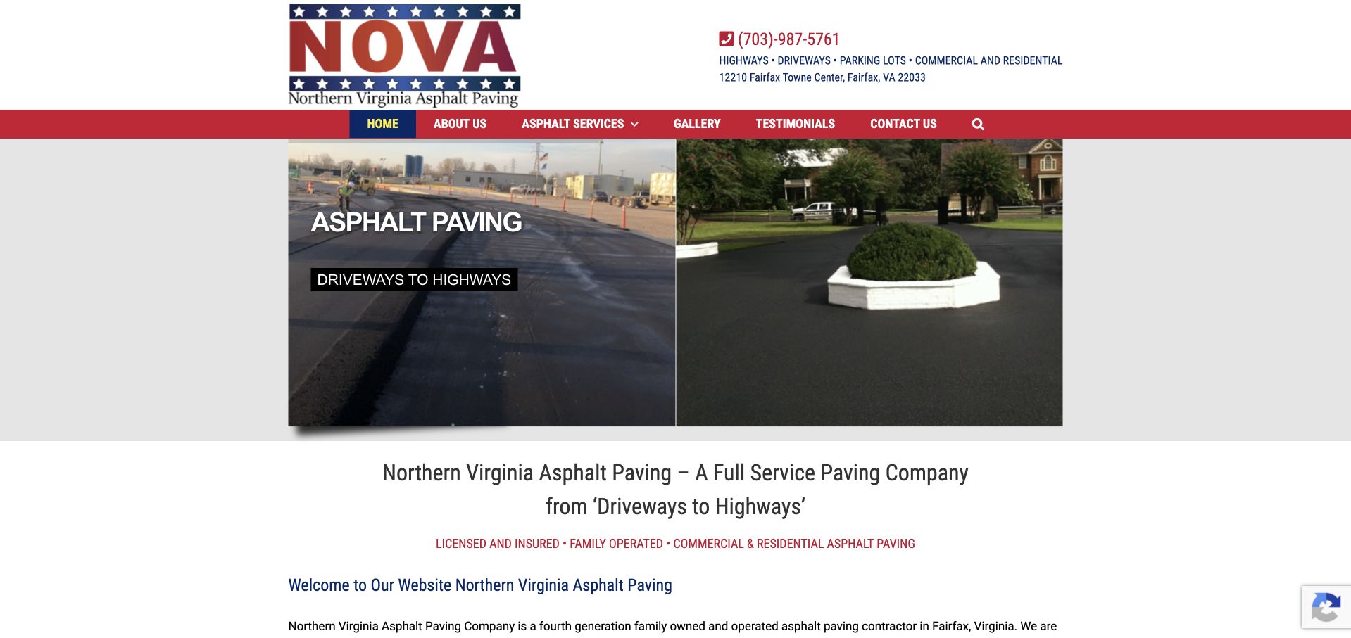
Northern Virginia Asphalt uses a compact white header and red navigation above a two-part photograph showing different paved settings. A short image label introduces asphalt paving, while a centered text section below describes the company and broader service scope. Telephone and address context remain above the navigation. This is useful for studying a traditional regional contractor site whose practical facts are immediately available, even though its narrow image area and small text feel dated. The company statements about licensing, family operation, and work types are attributed claims, not independently verified evidence of qualifications, construction outcomes, or the arrangements available for another property.
What you can learn
Retain useful telephone, territory, and service facts during a visual refresh. Make the body text and navigation more comfortable, and provide accurate captions so two different paved settings clarify scope rather than imply identical project requirements.
Pros
Telephone and address context are available before the visitor reaches the service explanation.
The split image introduces more than one project setting.
Cons & considerations
Small centered text makes the practical explanation harder to scan.
The narrow image and dense header need improved responsive spacing.
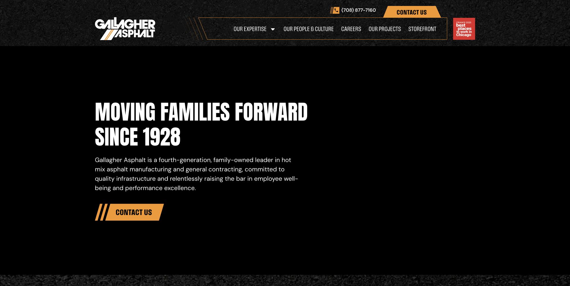
Gallagher uses a black introductory surface with bold white display wording and gold contact emphasis. A textured upper header separates expertise, people and culture, careers, employees, and a storefront route. In the selected capture, the main text remains readable on the dark background without depending on a visible project image. This is useful for studying a company-story approach that gives organizational audiences a prominent place. It also demonstrates the need for specific service and project context after a broad historic message. History, family-business, manufacturing, and construction claims remain the organization's presentation, not independent verification of continuity, performance, employment terms, or suitability for a particular project.
What you can learn
Keep a useful text fallback when media is optional, then make service and project discovery explicit. A company-story homepage can serve several audiences, but its main actions should still help a prospective client understand where a relevant inquiry belongs.
Pros
High-contrast white and gold text remains readable on the dark opening surface.
Organizational and employee-oriented routes are clearly distinguished in the header.
Cons & considerations
A broad company-story message provides limited immediate project detail.
Many stakeholder routes can compete with prospective-client service discovery.
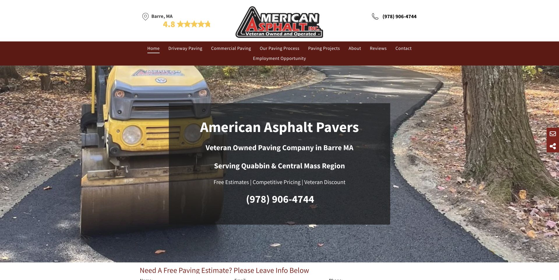
American Asphalt uses a centered company mark and telephone context above maroon navigation. A wide residential paving photograph contains a dark text panel naming Barre, Massachusetts, and the Quabbin and Central Massachusetts region. The main contact number appears within that panel, and an estimate section begins immediately below. This is useful for studying a local operator whose geographic offer is clear without a large locator or elaborate form overlay. Cookies were declined before capture. Veteran ownership, ratings, pricing, and discount statements remain company claims; this collection does not verify them or infer construction quality, qualifications, availability, or the terms of a particular quote.
What you can learn
Keep regional wording and contact details prominent, while giving promotional statements accurate context. Let the estimate section explain the receiving process, and preserve a clear distinction between requesting information and agreeing to a construction project.
Pros
The local and regional wording makes the intended service context explicit.
A dark panel protects the main introduction from the detailed photograph.
Cons & considerations
Several promotional statements compress the small text panel.
A compact traditional header needs comfortable mobile navigation targets.
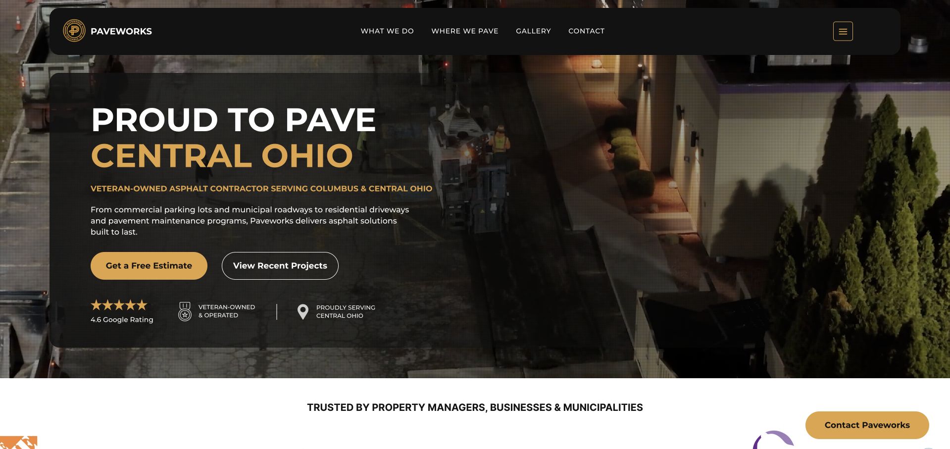
Paveworks uses a dark text panel over a large work photograph, with white and gold wording naming Central Ohio. A gold estimate action and outlined recent-projects route sit together, while the header remains restrained. A customer-oriented supporting strip begins beneath the hero. This is useful for studying a regional paving site that exposes both inquiry and project browsing in the first view. An automatic quote overlay was closed before the selected capture, demonstrating why the unobstructed page needs to work independently of promotion. Company ownership, ratings, and service statements remain attributed claims rather than independent verification of construction performance or project suitability.
What you can learn
Let visitors inspect relevant work before requesting details, and make the estimate action explain its actual outcome. Keep automatic overlays optional and dismissible so they do not prevent the customer from understanding the main service and project routes.
Pros
Estimate and recent-project actions represent two clear stages of interest.
A dark text surface protects the Central Ohio introduction from image detail.
Cons & considerations
Automatic quote overlays can interrupt an otherwise clear homepage.
Supporting claims need context beyond compact labels beneath the main actions.
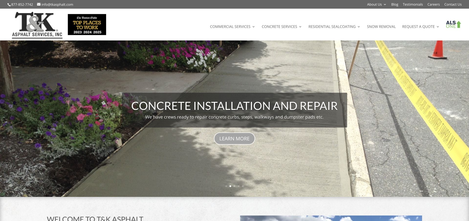
T&K uses a wide concrete-installation photograph beneath a white header and gray contact strip. A centered translucent panel identifies the featured service and offers a learn-more route. The header distinguishes commercial services, concrete services, residential sealcoating, snow removal, and quote access. This is useful for studying a contractor whose homepage needs to communicate a wider catalog than asphalt alone. The captured slide introduces concrete, so permanent navigation is important for visitors looking for paving or another service. Displayed workplace and company marks remain attributed statements, not independent verification of employment conditions, construction quality, qualifications, or suitability for a future project.
What you can learn
Keep all major services discoverable outside a rotating feature. Give each category a useful destination and make the quote route clear, while treating a selected slide as an introduction to one service rather than the entire operating scope.
Pros
Permanent navigation exposes several distinct service categories.
A restrained image panel keeps the featured-service explanation readable.
Cons & considerations
A visitor may initially see a service different from the one they need.
Numerous category and company routes require careful mobile organization.
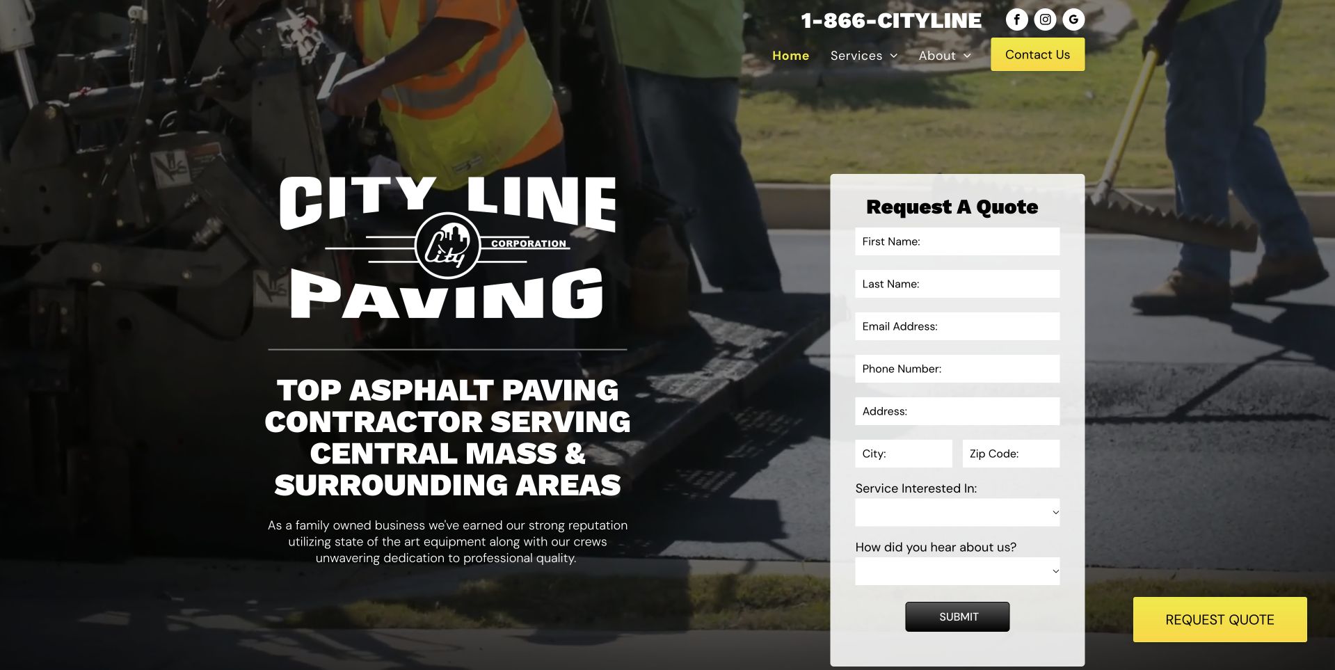
City Line places a large company mark and Central Massachusetts introduction over a paving-work photograph. A narrow white quote card appears to the right, and telephone access remains above the compact navigation. Yellow emphasis marks another quote action near the lower edge. This is useful for studying an independent contractor that combines recognizable branding with an immediate inquiry task. The tall narrow form and oversized logo also reveal a tradeoff: both compete with the actual project image and service explanation. Company reputation and equipment statements remain public claims, not independent verification of workmanship, qualifications, project suitability, pricing, or the outcome of another construction job.
What you can learn
Use a limited first-stage field set and a clear confirmation rather than treating the form as a complete project brief. Balance the company mark with readable scope and territory information, especially when the layout collapses to a phone.
Pros
The regional introduction gives the large company identity practical context.
A white quote card is easy to distinguish from the work image.
Cons & considerations
A tall narrow form needs more comfortable spacing on mobile.
Large branding and repeated quote controls compete with the project photograph.
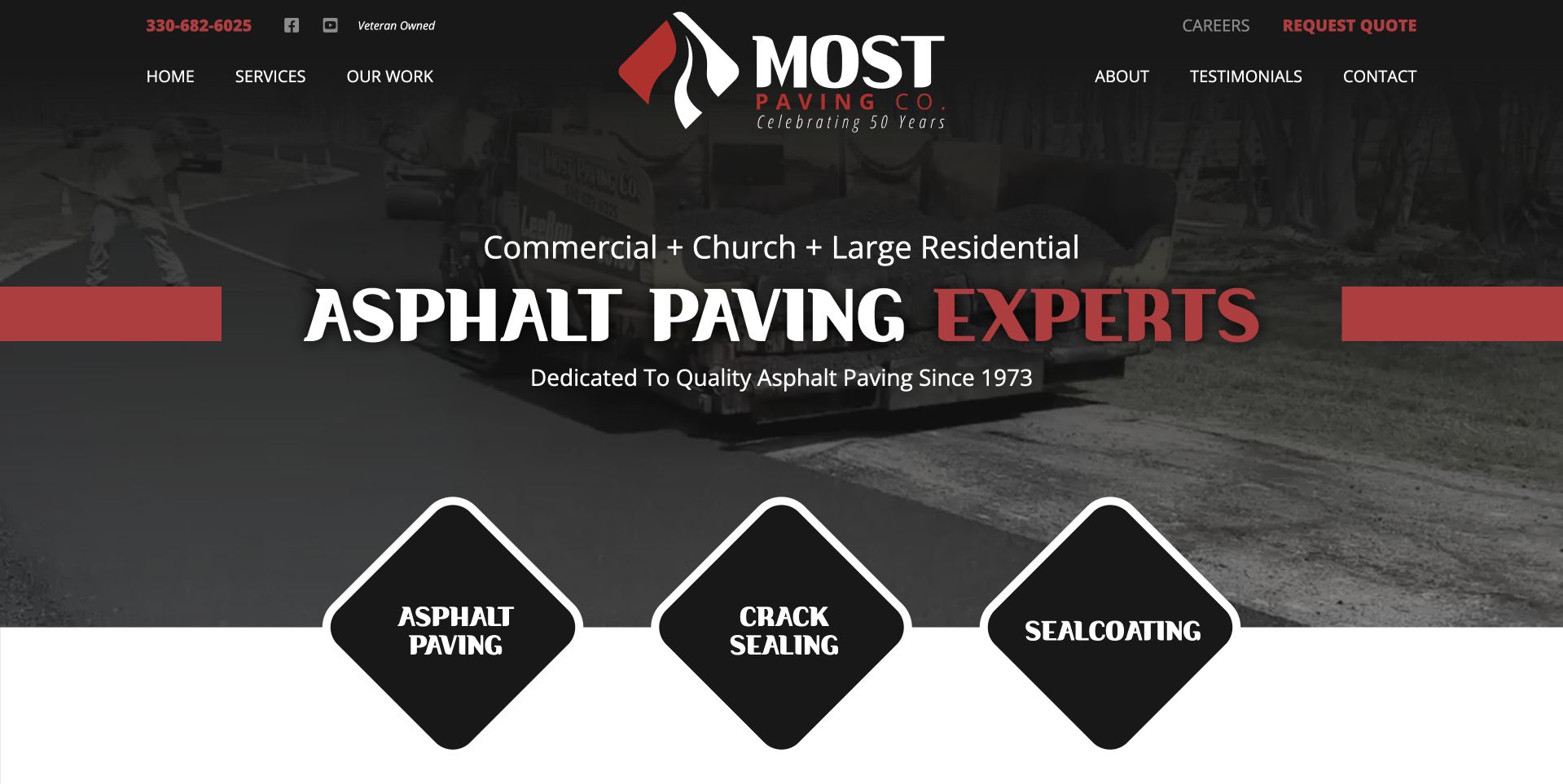
Most Paving uses a darkened equipment photograph with large white and red asphalt wording. A smaller line identifies commercial, church, and larger residential audiences, while three diamond-shaped panels introduce paving, crack sealing, and sealcoating. The header keeps work, company, testimonials, careers, and quote access visible. This is useful for studying a regional contractor that exposes service distinctions without placing a long form in the hero. The diamond treatment creates a recognizable visual motif but needs clear mobile behavior. Historic and quality-oriented statements remain company claims, not independent verification of construction outcomes, maintenance suitability, qualifications, or the arrangements available for a particular property.
What you can learn
Make installation and maintenance categories literal and keep their destinations meaningful. Decorative card shapes should not reduce label clarity or touch-target comfort, and the page should explain the next inquiry step rather than imply that a service label determines the work required.
Pros
Three named service panels distinguish paving from maintenance categories.
The introductory audience line helps define the intended project context.
Cons & considerations
Diamond-shaped cards require careful responsive sizing and focus styling.
Short service labels need supporting explanations of actual scope and assessment.
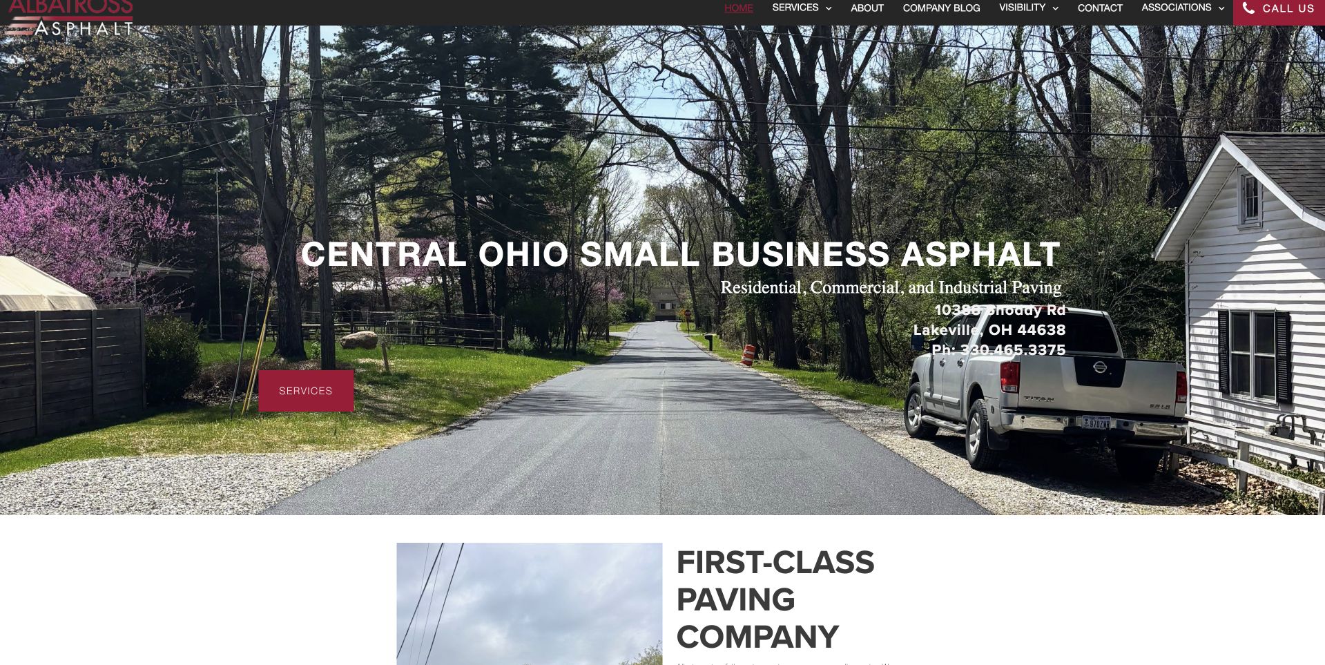
Albatross uses a large residential driveway photograph with company vehicles visible, beneath a compact dark header. White wording identifies Central Ohio and residential, commercial, and industrial paving, with a red services action nearby. A company-introduction section begins directly below. This is useful for studying a small-business presentation that gives the region and broad service categories a literal place in the opening. The image shows a complete property context rather than an isolated asphalt texture. Telephone, quality, and service statements remain attributed company information, not independent verification of project authorship, construction performance, qualifications, availability, or suitability for another site's requirements.
What you can learn
Keep the regional and service description plain, then support it with accurate project captions and useful category pages. Make the main contact route easy to find without asking the visitor to decode a detailed image or a crowded upper navigation.
Pros
Central Ohio wording gives the broad service heading a clear local frame.
The complete driveway scene provides useful property context.
Cons & considerations
White wording competes with trees and other detailed parts of the photograph.
A compact upper menu needs readable sizing and clear category organization.
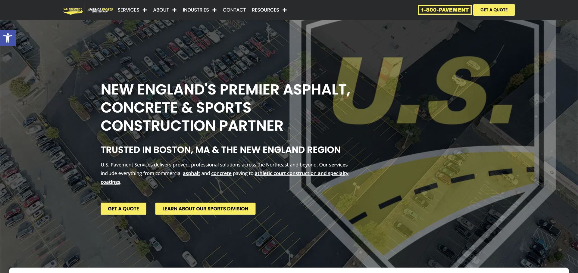
U.S. Pavement uses an aerial property photograph with a dark treatment and an oversized brand motif. The white heading names asphalt, concrete, and sports construction in New England, with gold quote and sports-division actions below. The header separates services, company, industries, contact, and resources. This is useful for studying a broader regional organization whose divisions need clear entry routes. Cookies were declined before capture. The scale of the image and the company's leadership wording do not independently establish capacity, qualifications, project suitability, safety, or construction performance. Sports construction and general pavement inquiries may also require different receiving teams and information.
What you can learn
Make division boundaries and receiving teams understandable before a detailed inquiry. Use broad aerial imagery as context, while keeping service scope and project evidence specific enough that visitors do not mistake a large brand presentation for a universal construction capability.
Pros
The introduction names several distinct construction disciplines and a regional context.
A separate sports-division action exposes an important organizational distinction.
Cons & considerations
An oversized brand motif reduces the amount of project detail visible.
Broad divisional scope requires precise inquiry routing beyond the opening.
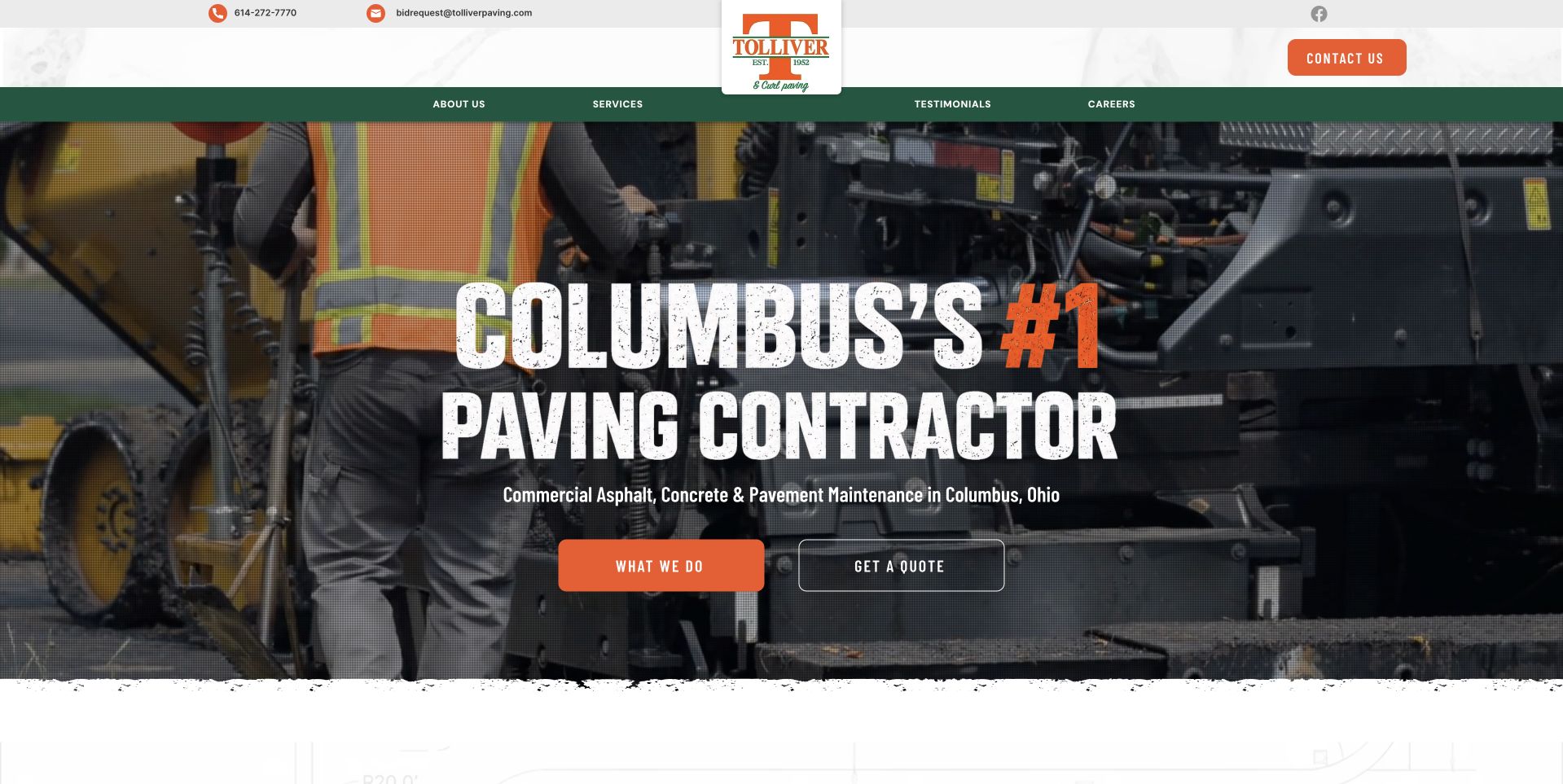
Tolliver & Curl uses a wide crew-and-equipment photograph beneath a white header with a green navigation band. Large white and orange display wording names Columbus, while a smaller line specifies commercial asphalt, concrete, and pavement maintenance. Orange and outlined actions separate service exploration from requesting a quote. This is useful for studying a regional commercial contractor whose main audience and territory are visible without a national-style locator. The textured lower edge gives the image a distinctive transition into the next section. Company superlatives and the photograph remain marketing content, not independent verification of qualifications, safety practices, construction quality, or suitability for an individual site.
What you can learn
Keep commercial scope and local context explicit, and give browsing and inquiry different labels. Let work imagery provide human context while accurate service pages explain the assessment and project process that the first-screen photograph cannot establish.
Pros
The smaller scope line clarifies the broad Columbus headline.
Service-viewing and quote actions are distinct within the image.
Cons & considerations
A large superlative headline leaves limited room for practical detail.
Textured transitions and image overlays need careful contrast and responsive checks.
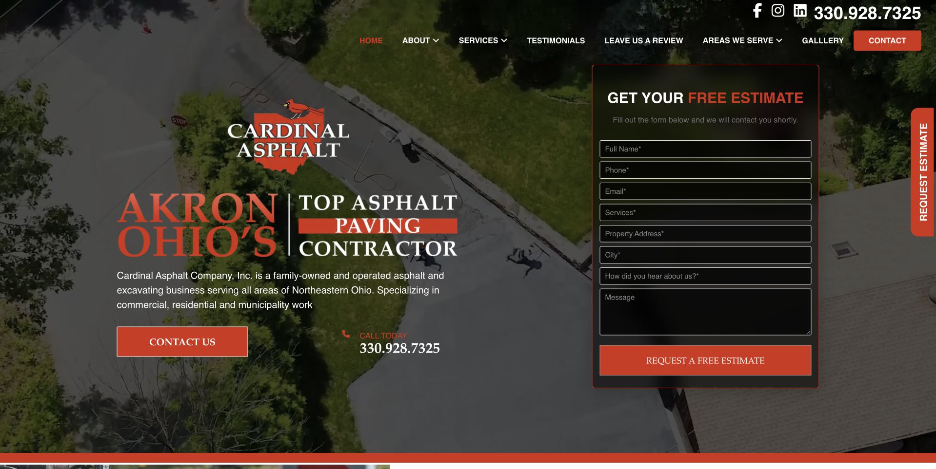
Cardinal uses an aerial driveway photograph with a dark overlay, a large Akron introduction on the left, and a dark estimate form on the right. Red controls and accents connect the quote task to the company mark. Telephone and social routes remain above the compact navigation, while a side estimate tab adds another entry point. This is useful for studying a local contractor with a highly visible intake journey. It also shows the density created by a full form and repeated request access in one view. Company family-business, experience, and quality claims remain attributed statements, not independently verified conclusions about construction outcomes, qualifications, pricing, or project suitability.
What you can learn
Prioritize one understandable estimate route and keep the required fields proportionate. Explain the response and assessment process, then provide service and project details for visitors who are not ready to submit property information immediately.
Pros
The Akron wording gives the aerial project setting a clear local frame.
Red contact accents create a consistent visual link between branding and intake.
Cons & considerations
Repeated estimate access can crowd the same first-screen task.
Dark outlined fields require careful contrast and clear validation states.
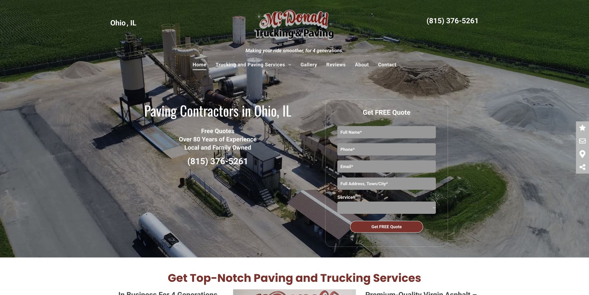
McDonald uses an aerial photograph of equipment at a work site beneath a compact header. Centered wording identifies paving in Ohio, Illinois, with a telephone number and a pale quote form to the right. A lower section begins an explanation of paving and trucking services. This is useful for studying an independent company whose town name could otherwise be confused with the state: the literal Ohio, IL wording matters. Cookies were declined before the selected capture. Company history, family-ownership, and service statements remain attributed claims rather than independent verification of construction quality, qualifications, capacity, or the terms and suitability of a particular project.
What you can learn
Disambiguate location names and separate different service inquiries when their receiving process differs. Keep quote labels readable over the image and explain what follows submission rather than allowing an equipment photograph or experience claim to stand in for project scope.
Pros
The Ohio, Illinois wording helps prevent geographic misunderstanding.
Paving and trucking scope begins directly after the opening image.
Cons & considerations
Pale form fields over a detailed photograph need stronger separation.
Several small overlaid claims can become difficult to read on mobile.
Kegan is a freelance web designer and developer with 15+ years of experience helping businesses turn complicated website requirements into clear, maintainable digital experiences. He works directly with clients from planning and design through development, launch, and ongoing support.
For asphalt paving website design, his development approach focuses on residential and commercial service distinctions, genuine paving projects, process and access information, coverage details, and site-survey inquiries. The scope can be a targeted improvement or a complete custom build, with responsive layouts, thoughtful content structure, and integrations chosen around the people using and maintaining the site.
Show 3 other asphalt paving website designersHide other asphalt paving website designers
Gather the questions staff receive and the services the company genuinely accepts. Distinguish installation from maintenance and separate additional disciplines only when their scope and receiving process differ. A property owner may describe a problem rather than know a technical service term, so provide a way to ask without choosing a method. Give commercial and municipal audiences appropriate project routes where relevant, but do not copy enterprise bid language into a small household form. Keep engineering, drainage, accessibility, material, safety, and performance statements under responsible review. The designer's role is to make scope understandable, not prescribe construction work.
Build project evidence with accurate captions and roles
Select photographs that show a complete property setting, a useful work stage, or a clearly described finished project. Record permission, attribution, the company's role, and any location or collaborator details authorized for publication. A large fleet or active equipment image communicates context but does not prove capacity or suitability for another job. Avoid inferring construction quality, durability, drainage performance, or safety from appearance. Prepare responsive image sizes and readable captions. Keep project information accessible outside carousels so visitors do not need to wait for the relevant property type or service to appear.
Define inquiry routing before designing the hero form
Identify who receives driveway, commercial, maintenance, municipal, and specialist requests. Ask for enough information to route the first conversation, such as contact, broad location, property type, and a short description. Defer plans, schedules, procurement details, or other files until the receiving team explains what is useful and how it will be handled. Label the action and confirmation around the actual next step. Test invalid information, delivery failure, duplicate clicks, and mobile keyboard behavior. A tall polished form is not an improvement if it collects unnecessary details or promises a response process the business does not operate.
The editing job behind the design
Choose reliable content and contact tools
[object Object]
[object Object]
[object Object]
Our WordPress website examples offer a separate look at publishing approaches. A visible platform label is evidence for that named page, not a guarantee that the same system will suit your requirements.
Before the public launch
Paving-company website brief checklist
List the actual paving, maintenance, concrete, excavation, and related services offered.
Identify household, commercial, industrial, municipal, or other genuine project audiences.
State the operating territory and disambiguate place names where necessary.
Provide useful routes for customers who do not know the technical service term.
Have responsible staff review construction, drainage, accessibility, safety, and performance claims.
Record image permission, project context, and the company’s actual role.
Keep installation and maintenance categories clear without prescribing work through the website.
Explain whether a form starts a callback, estimate discussion, site visit, or bid inquiry.
Collect only the first-stage details the receiving team actually needs.
Keep finance, recruiting, promotions, and customer inquiry as distinct tasks.
Test delayed overlays, mobile forms, keyboard access, gallery controls, and failed delivery.
Assign owners for service scope, regional information, project permissions, and contact maintenance.
These checks are a project checklist, not a performance, legal, security, or accessibility certification. Test real journeys with the people responsible for the website before making claims about the result.
Sources & editorial method
How this collection was selected and reviewed
The collection uses actual public-page inspection, direct Chrome captures, and primary company material for identity and scope. Gann Asphalt & Concrete is the editorial choice for its clear regional parking-lot proposition and immediately visible service categories. This is a design decision, not an assessment of construction quality, credentials, engineering, safety, prices, availability, or material performance. No project forms were submitted. Company history, customer ratings, awards, and promotional claims remain attributed statements. Different operating scales and audiences are intentionally represented, and separate technology evidence is required before a visible stack label is added.
Each example links to its actual source page. Screenshots are direct browser captures with their own capture dates; moving imagery, announcements and live designs can change. The notes describe observable design choices and conditional tradeoffs, not measured traffic, conversion results, service quality, or accessibility conformance.
Technology labels use public page metadata, asset evidence, or explicitly cited platform documentation. Platform documentation is not a complete current deployment audit. A component reference may be legacy or unused; it is not a complete backend inventory. Unknown stacks are omitted. These sites are editorial examples, not our client portfolio.
Written, Edited and Curated are separate editorial records, not timestamps advanced by a rebuild. Website designs and imagery belong to their owners. See our editorial standards or suggest a correction.
Give each property audience a clear service map, honest project context, and a predictable first conversation. A useful paving website explains the relationship before asking the visitor to commit.