Best Water Damage Restoration Websites of 2026 (28 Real-World Examples)
Restoration websites that separate urgent contact, local responsibility, and service information.
Compare 28 company pages for readable contact paths, incident categories, and regional service communication. This is design research, not remediation, health, insurance, or emergency advice.
A restoration website often receives visitors who do not know what happens next. The useful design task is to identify the business, show the relevant contact route, explain the service relationship, and avoid turning uncertainty into unsupported promises.
The collection includes local specialists and larger office networks. A national locator, an inspection-request form, and a routine cleaning calendar solve different problems. Borrow the information hierarchy that fits the actual operation rather than copying the most dramatic damage photograph or largest set of qualification badges.
Before the examples
What makes good water damage restoration website design in 2026?
Identify the receiving local business
Make the office or territory visible near the contact action. If the page suggests a location automatically, provide a clear correction route. A visitor may be researching a different property, and a network-wide telephone or review display should not be mistaken for evidence about every local office.
Separate contact from assessment and commitment
Explain whether a button calls the office, requests a conversation, or starts a later scheduling process. A form cannot establish the condition of a property, determine insurance coverage, or confirm that a crew has been dispatched merely because an acknowledgment screen appears.
Keep incident categories literal and claims carefully scoped
Water, fire, mold, storm, reconstruction, and routine cleaning can involve different inquiry paths. Use understandable labels and have qualified staff review technical, health, response-time, and insurance wording. The website can explain who to contact without promising outcomes it cannot establish.
The collection · 28 examples
28 water damage restoration websites worth studying
Compare the relationship among incident categories, location selection, telephone access, and form complexity. The editorial order is not a ranking of restoration providers or their service outcomes.
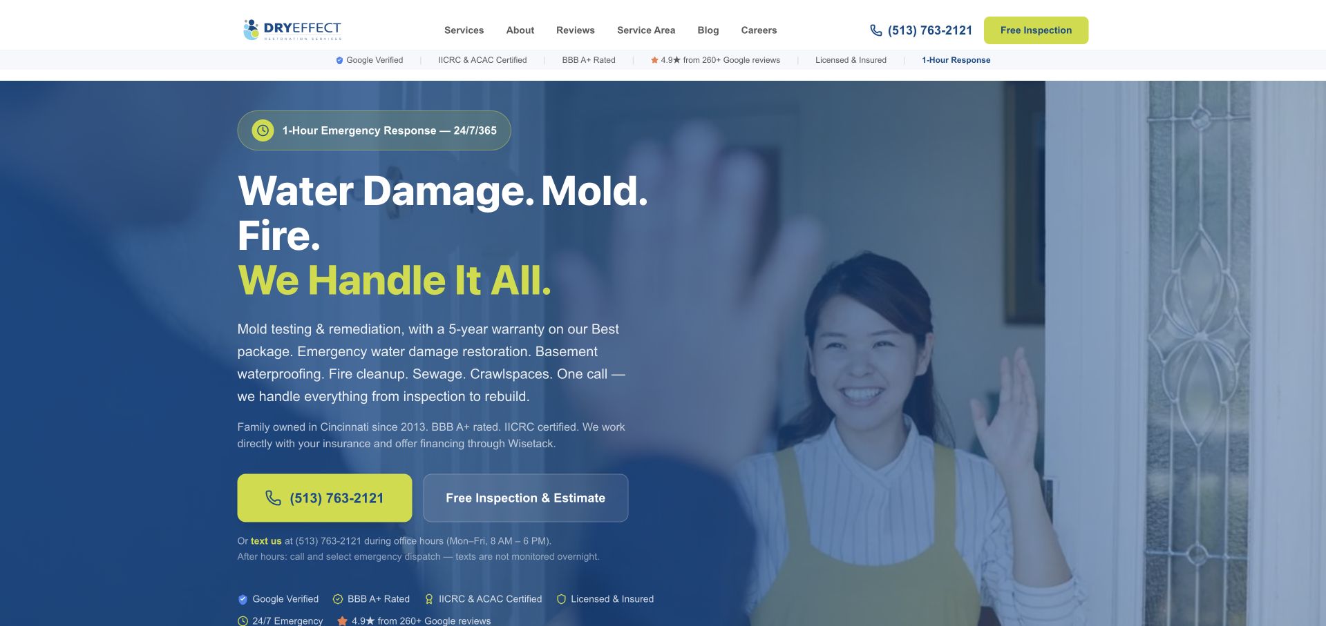
Dry Effect puts water, mold, and fire in a short, stacked headline over a domestic photograph. The blue overlay keeps the lime accent reserved for the final headline line, telephone button, and inspection action. The header is comparatively small, leaving room for the service message and the Cincinnati context to remain visible together. A narrow strip of company qualifications sits above the image, while the next section explains what happens after a call. This is a useful specialist reference because it connects an immediate contact choice to a subsequent process explanation rather than relying on urgency alone. The design selection concerns the interface, not the page's health, insurance, response-time, or remediation claims.
What you can learn
Explain the next conversation after the initial contact action. A request should establish location and the visitor’s needs without implying that an online description provides a professional property assessment or guaranteed dispatch.
Pros
A limited blue-and-lime palette gives the contact actions clear visual priority.
The short headline is readable without requiring a long introductory paragraph.
Cons & considerations
Several qualification and timing statements need accessible supporting context.
A faded person photograph is less specific than documented local project imagery could be.
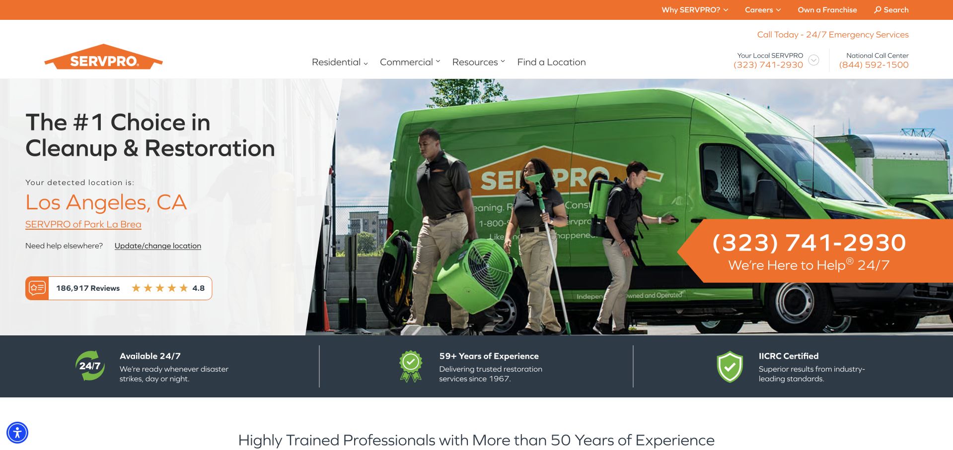
SERVPRO uses a bright green vehicle photograph beside a large restoration headline and a location panel. The captured public page displayed a Los Angeles location suggestion and a matching telephone action; that is a page behavior, not a statement about every visitor's location. An orange upper strip and contact treatment connect the header to the brand mark, while a dark supporting band separates experience and availability claims. It is useful for studying network routing, particularly the prominence of the change-location control. A smaller company would not need the same directory infrastructure, but can learn from making geographic relevance explicit before a customer begins an inquiry.
What you can learn
Expose the detected or selected location and provide an obvious correction route. Never allow a location suggestion to silently determine a service request when a visitor may be researching a different property.
Pros
The location panel makes local routing part of the first-screen experience.
Strong vehicle and color branding remain recognizable across the contact interface.
Cons & considerations
Automatically suggested locations can be wrong for the property needing service.
National review summaries need clear scope when placed beside an individual office.
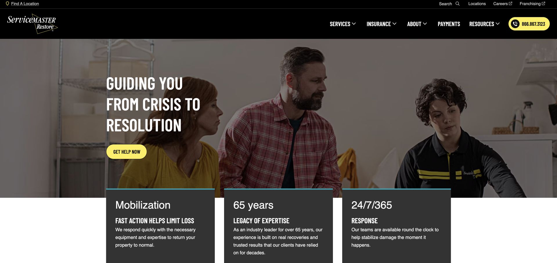
ServiceMaster Restore uses a household-and-technician photograph beneath a black navigation bar. The hero headline describes movement from crisis toward resolution, with a bright yellow help action providing the practical next step. Three dark cards overlap the lower edge of the image, introducing mobilization, company history, and availability as separate topics. This gives the opening a distinct sequence: acknowledge the situation, offer contact, then organize supporting information. The yellow accent remains easy to recognize against the dark header and card backgrounds. The company's timing and service claims remain its own statements; the screenshot does not independently establish response speed or restoration outcomes.
What you can learn
Use supportive language without obscuring the service and contact route. Keep operational details in clearly labeled blocks, and make any response or availability wording specific enough to be checked by location.
Pros
Yellow contact styling is visually consistent across the darker composition.
Three summary cards create a readable transition into more detailed service information.
Cons & considerations
The emotional headline needs nearby literal service categories for first-time visitors.
Overlapping cards require careful responsive spacing to avoid covering the photograph or action.
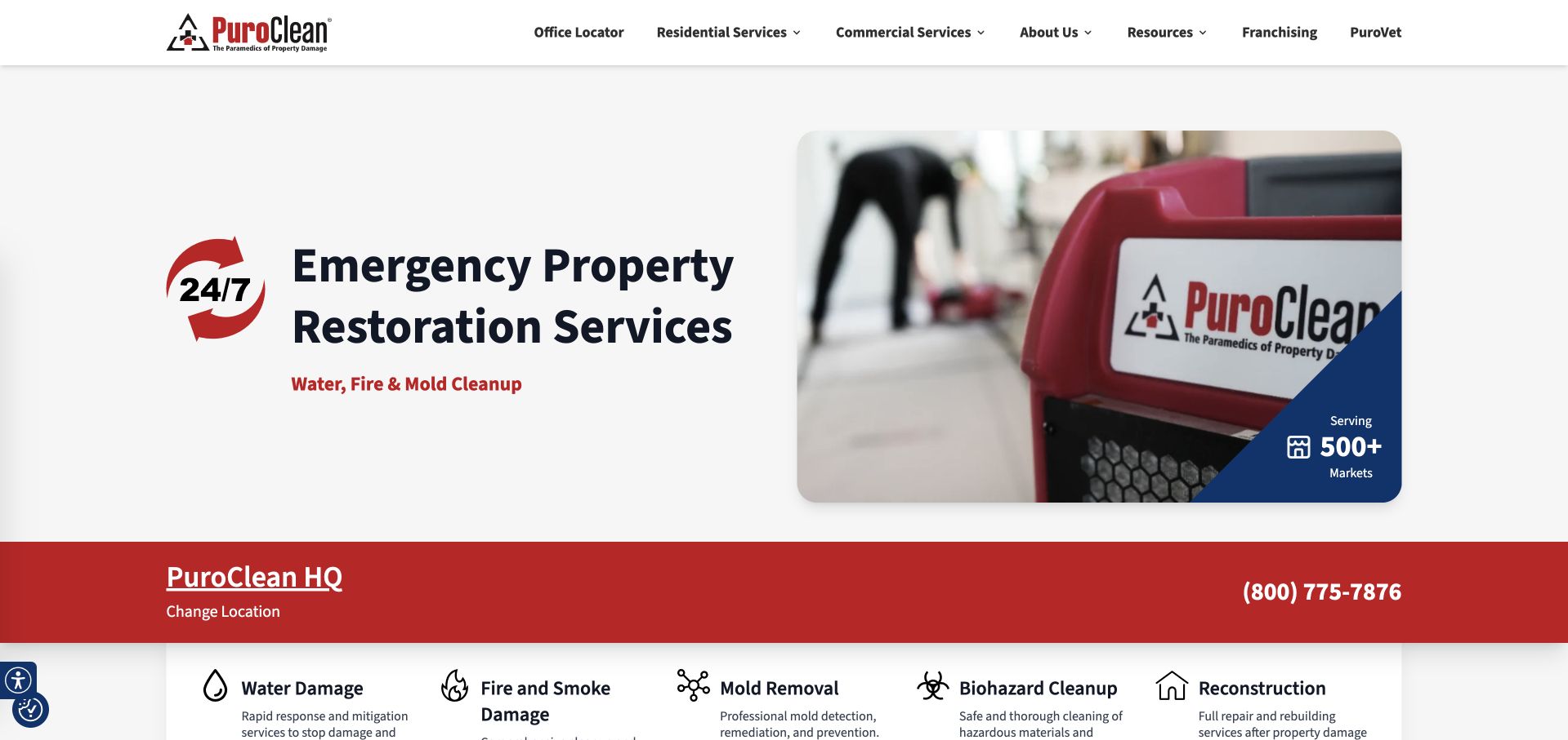
PuroClean pairs a large emergency-property-restoration heading with a close view of branded equipment. The white background and restrained red details make the opening feel more like a service interface than a disaster-photo montage. A red location-and-telephone bar separates the hero from icon-led links for water, fire, mold, biohazard, and reconstruction topics. The headquarters presentation in the captured page also makes it important to distinguish the network from a particular local office. The design can inform a local brief, but its scale and service catalog should not be copied without matching the actual business.
What you can learn
Keep incident-type navigation explicit and place the selected office near the contact details. Category labels should lead to scope and inquiry information, not suggest that a homepage can diagnose property conditions.
Pros
Equipment photography supports the service category without relying on graphic damage imagery.
A separate icon row makes the main incident routes easy to identify.
Cons & considerations
Headquarters and local-office contact scope need to be unambiguous.
A broad service taxonomy may overwhelm a small specialist with a narrower offer.
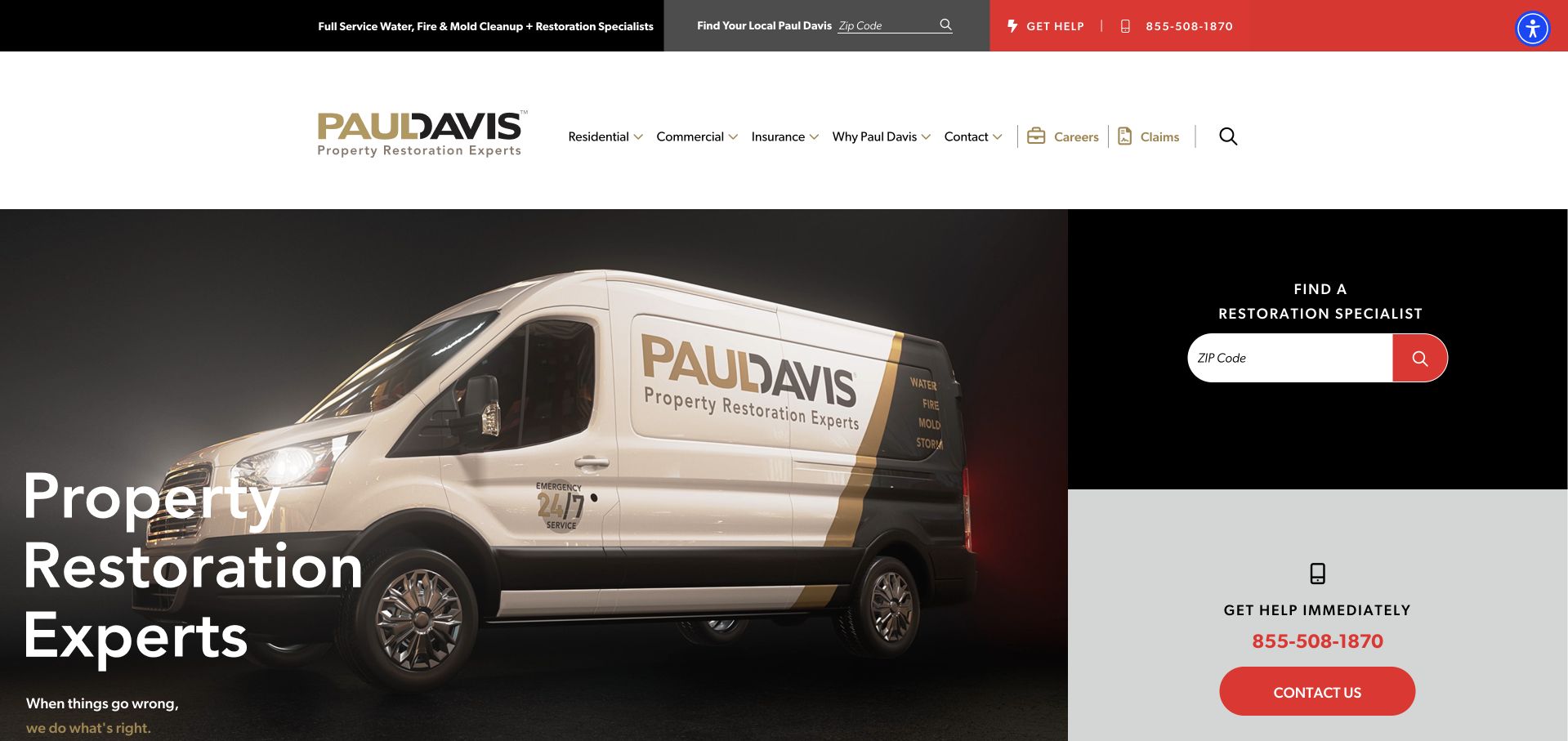
Paul Davis gives its branded van much of the hero, with a short property-restoration heading set against the darker left portion of the photograph. A separate right-hand column contains a ZIP-code specialist finder above an immediate-help telephone and contact block. The split is useful because it distinguishes locating an office from making direct contact rather than treating them as interchangeable buttons. A pale header and small gold details keep the brand recognizable without competing with the red contact action. The captured page's large photograph also provides a strong anchor for a relatively short message.
What you can learn
Give a location finder and an immediate contact route distinct labels and roles. Explain which office receives the request and avoid presenting a ZIP search result as a confirmed service arrangement.
Pros
The dedicated right column separates location search from the image-led introduction.
A short headline leaves room for clearly labeled contact information.
Cons & considerations
The large photograph can push service-specific detail below the first screen.
A two-part routing column needs careful stacking order and input labeling on mobile.
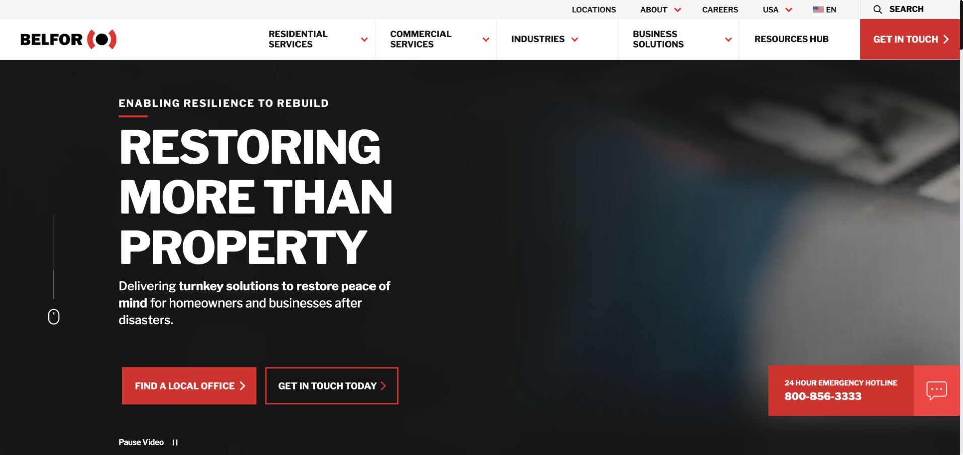
BELFOR uses oversized white type over a dark photographic hero, with a compact red contact vocabulary repeated in the header, buttons, and emergency telephone tab. The headline emphasizes restoration beyond the physical property, while the supporting sentence names homeowners and businesses. Two outlined actions distinguish finding a local office from contacting the organization. The header also separates residential, commercial, industry, business-solution, and resource routes, revealing a broader information architecture than a small local specialist requires. This is useful as a reference for handling multiple audience types without crowding all of them into the hero paragraph. The photographed people and strong typography provide emotional context, but the useful interaction remains the choice between location discovery and contact.
What you can learn
Use audience-specific navigation when the service catalog genuinely differs by audience. Keep the first contact choices literal, and make local-office responsibility clear before a visitor shares property details.
Pros
Two distinct actions clarify the difference between finding an office and contacting the business.
Consistent red contact styling connects the header and hero.
Cons & considerations
The broad navigation needs progressive disclosure on smaller screens.
A large brand statement must be followed by concrete service and location information.
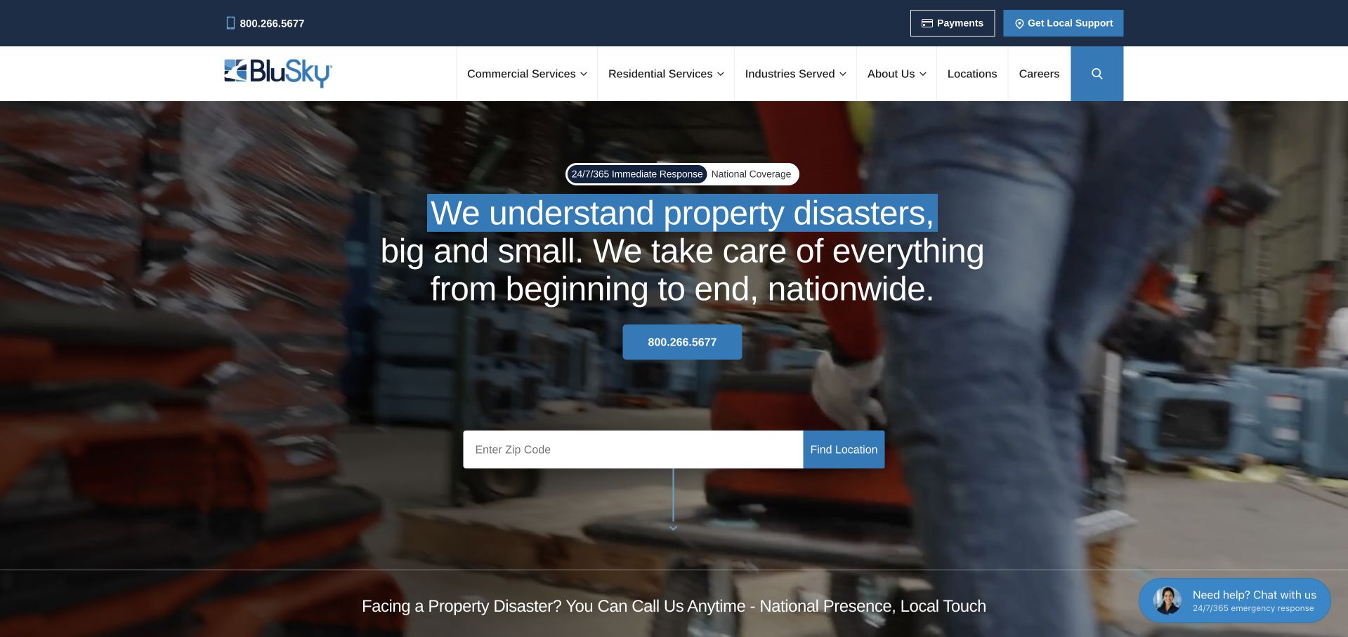
BluSky places a service team and branded vehicle behind a centered introduction. A blue-highlighted phrase breaks up the otherwise white headline, and a wide ZIP-code finder appears directly beneath the telephone action. The header separates local support and payments from the main service navigation, keeping customer-account tasks distinct from new inquiries. The photographic setting suggests field work rather than abstract corporate imagery. The page also includes a help prompt, illustrating the need to manage secondary assistance so it does not crowd the main contact interface. The design reference concerns those routing and hierarchy choices, not independently verified scale or response claims.
What you can learn
Place the location field where visitors expect to begin, then explain the result and receiving office. Secondary chat assistance should remain optional and should not cover the input or telephone control.
Pros
A wide ZIP-code finder makes the local-routing task obvious.
Operational photography reinforces the service context behind the national brand.
Cons & considerations
Centered text over a detailed team photograph depends on a strong overlay.
A floating assistance prompt can compete with the contact and location actions.
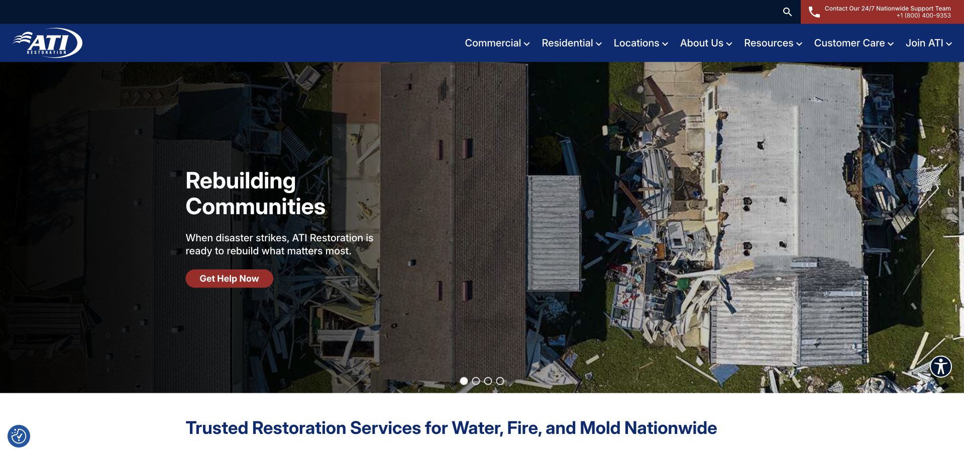
ATI uses an aerial view of a damaged property and a dark split overlay to introduce its rebuilding message. A red help button sits below the short white headline, while the navy header carries location, contact, and service navigation. The next white band restates the water, fire, and mold service categories in literal language. That sequence is useful: the image establishes the type of work, while the following heading supplies the category terms a visitor may be looking for. A small set of slide controls reveals that the hero is part of a rotating presentation, so the captured view is one state rather than the whole site.
What you can learn
When using a rotating hero, keep essential service and contact information outside the changing slide. Visitors should understand the offer without waiting for a particular photograph or headline to appear.
Pros
A separate literal service heading supports the more emotional hero statement.
The dark panel creates a consistent text area over a complex project image.
Cons & considerations
Damage imagery can dominate the opening before visitors find local contact details.
Important content should not depend on a timed slide or animation.
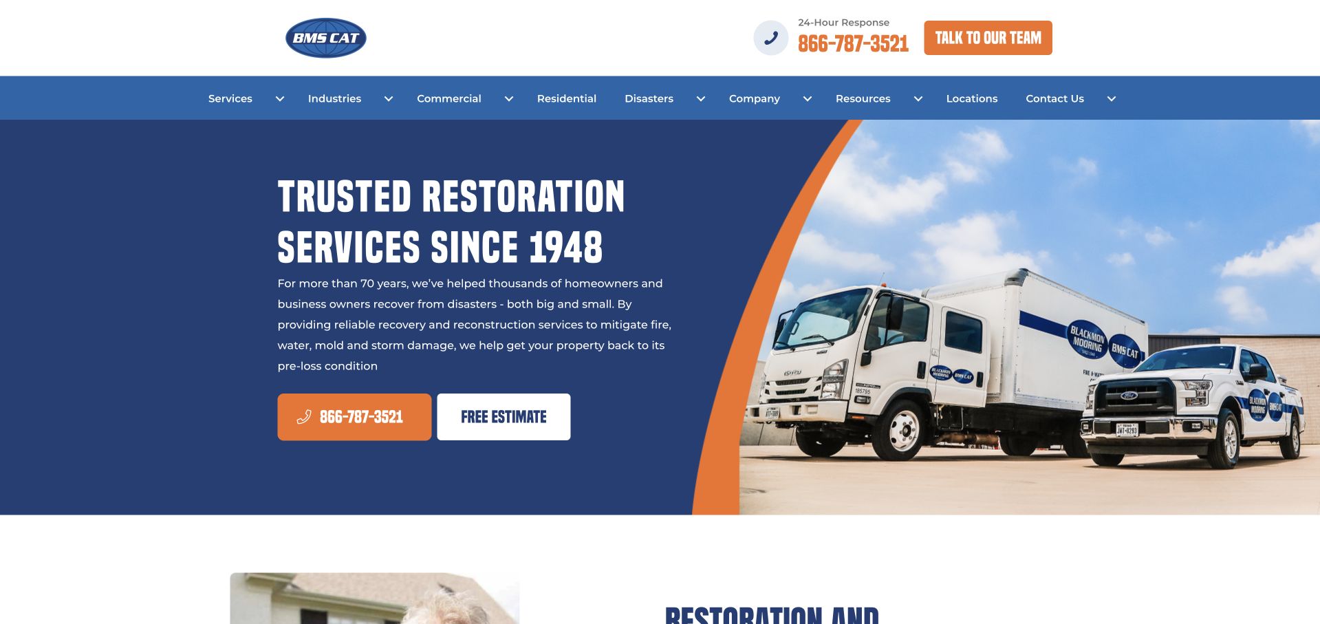
BMS CAT uses a large navy text panel separated from a service-vehicle photograph by an orange diagonal edge. The headline and paragraph stay on the quiet blue surface, while the photograph can remain bright and detailed. Orange telephone and white estimate buttons sit together beneath the copy. The upper header makes the emergency telephone prominent before the navigation begins, and the menu separates services, industries, commercial, residential, disasters, resources, and locations. The example is worth studying for its controlled use of a dynamic shape: the diagonal adds motion without placing text over the busiest part of the image. The fleet photograph also connects the visual identity to equipment and field work rather than an unrelated building exterior.
What you can learn
Use a graphic split to separate readable copy from detailed photography. Keep a clear distinction between requesting an estimate and confirming work, especially when a service business presents emergency availability.
Pros
The navy panel keeps the main message readable independent of image crop.
Telephone and estimate actions are visible without competing with the navigation.
Cons & considerations
The extensive menu may be excessive for a small regional specialist.
Experience and emergency-service claims require location-specific supporting information.
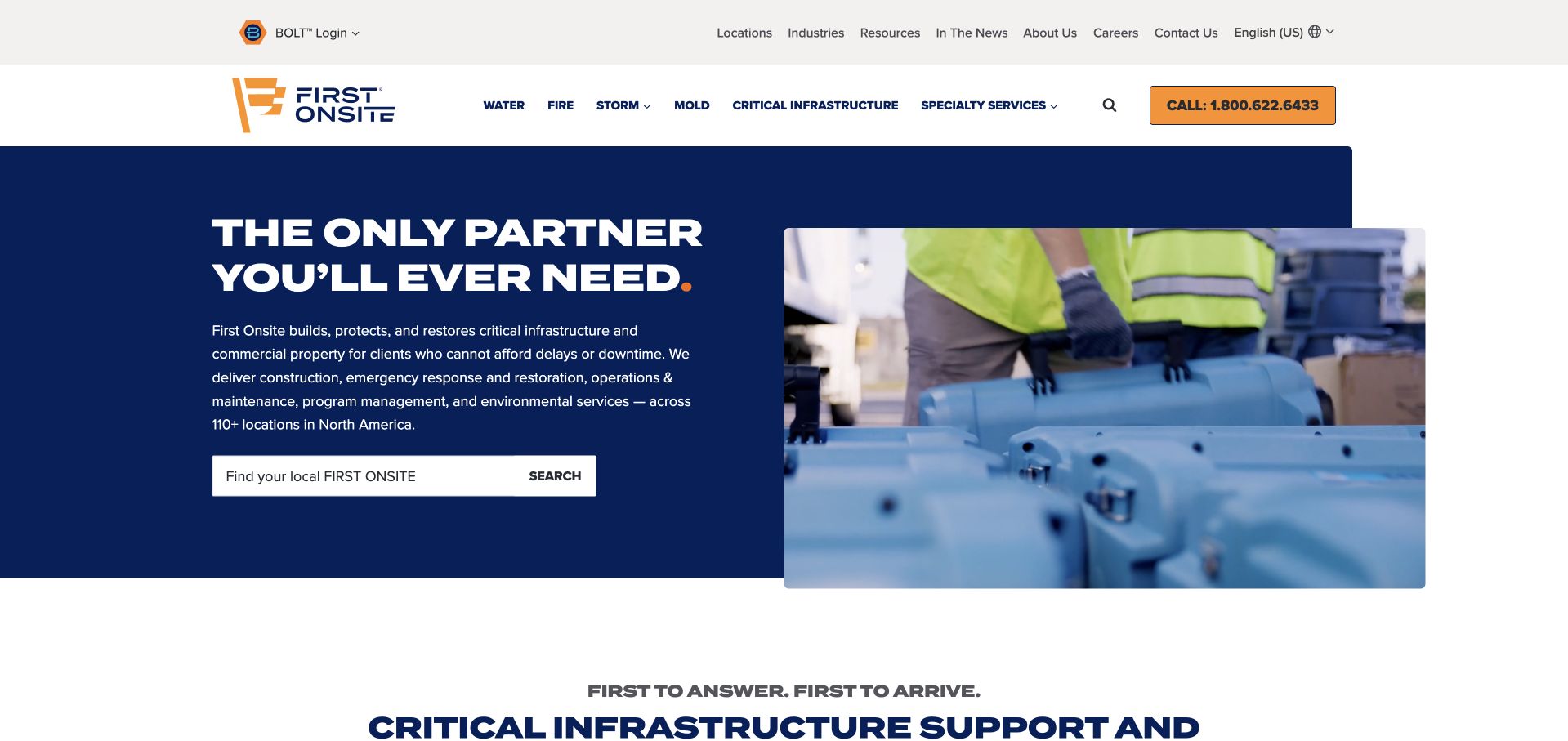
FIRST ONSITE opens with a large navy-and-gold composition, a bold partnership headline, and a field-work image on the right. A local-office search appears beneath the introductory copy, while the header organizes locations, industries, resources, company information, and a prominent call action. The page's emphasis extends beyond household incidents into commercial property and infrastructure support, so its broad language is best understood in that context. A regional-language selection prompt is part of the public experience and should be resolved before evaluating the unobstructed page. It is not a model for claiming capabilities a smaller business does not provide.
What you can learn
Match the breadth of the navigation to the actual audience and service structure. Keep language or region choices easy to dismiss or confirm without obscuring the office finder and main contact route.
Pros
The office search gives the broad corporate message a practical next step.
Navy and gold keep the action language consistent across the header and hero.
Cons & considerations
A region prompt can interrupt the first impression if it is shown too aggressively.
A broad partnership headline needs concrete local service detail below it.
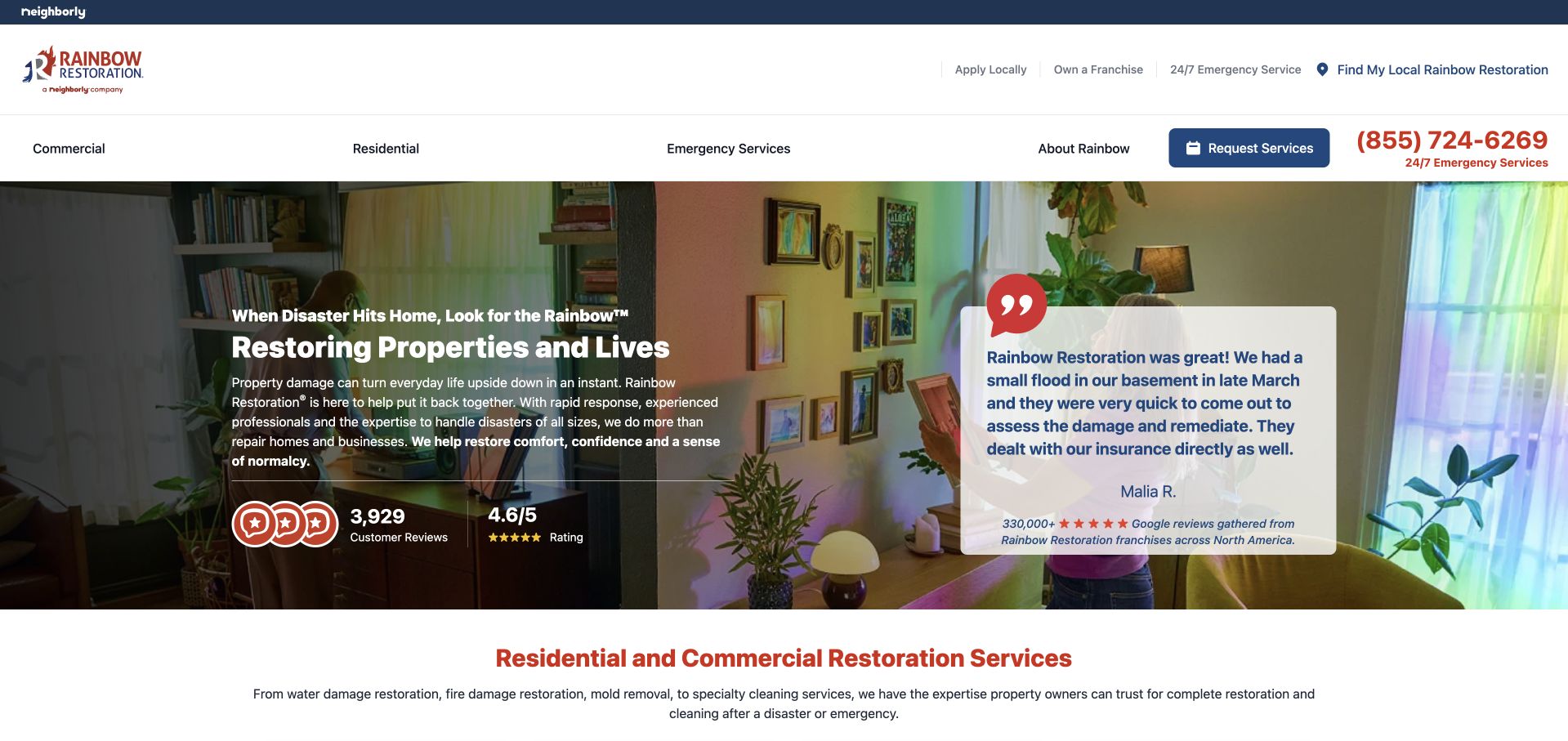
Rainbow Restoration places a large testimonial card on the right of a domestic interior photograph, with the service introduction and review summary on the left. The navy-and-red header provides a telephone number and request-service action, while the navigation separates commercial, residential, and emergency routes. The customer quotation is visually prominent but remains inside the main composition rather than starting a separate carousel section below the fold. A visitor can see both without scrolling, although the quotation occupies space that could otherwise explain scope. The page is an editorial design reference; its network-wide review totals and the quoted customer's experience are not independently validated service outcomes.
What you can learn
Keep testimonials attributable and distinguish an individual experience from the terms of a local service. Do not let a large review card replace an understandable explanation of who receives the inquiry.
Pros
The testimonial card and service introduction are visually distinct but adjacent.
Telephone and service-request actions remain available above the image.
Cons & considerations
A long quotation can crowd the first-screen explanation on smaller displays.
Network review summaries need clear sourcing and location scope.
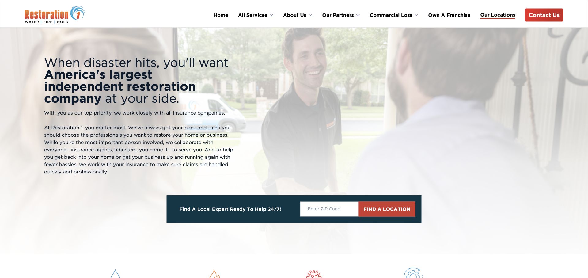
Restoration 1 uses a softly faded household photograph behind a left-aligned headline and explanatory paragraph. Instead of putting a bright emergency button at the center of the hero, it introduces a wide local-expert ZIP-code search below the text. The white header keeps the logo and service, location, company, and contact routes visible without a heavy colored navigation band. The page is useful for studying how a location finder can become the main next step within an otherwise text-led introduction. The long headline also demonstrates a tradeoff: a detailed brand statement takes more reading time before the visitor reaches the practical routing control.
What you can learn
Use a calm surface when the visitor needs orientation, but keep the geographic task concrete. A local-expert result should identify the office and explain the next contact step rather than silently submitting a request.
Pros
The pale background keeps a relatively long introduction legible.
A wide location search provides a clear practical action after the copy.
Cons & considerations
The headline asks for more reading than a concise incident-specific statement.
A broad network claim needs supporting context separate from the local contact result.
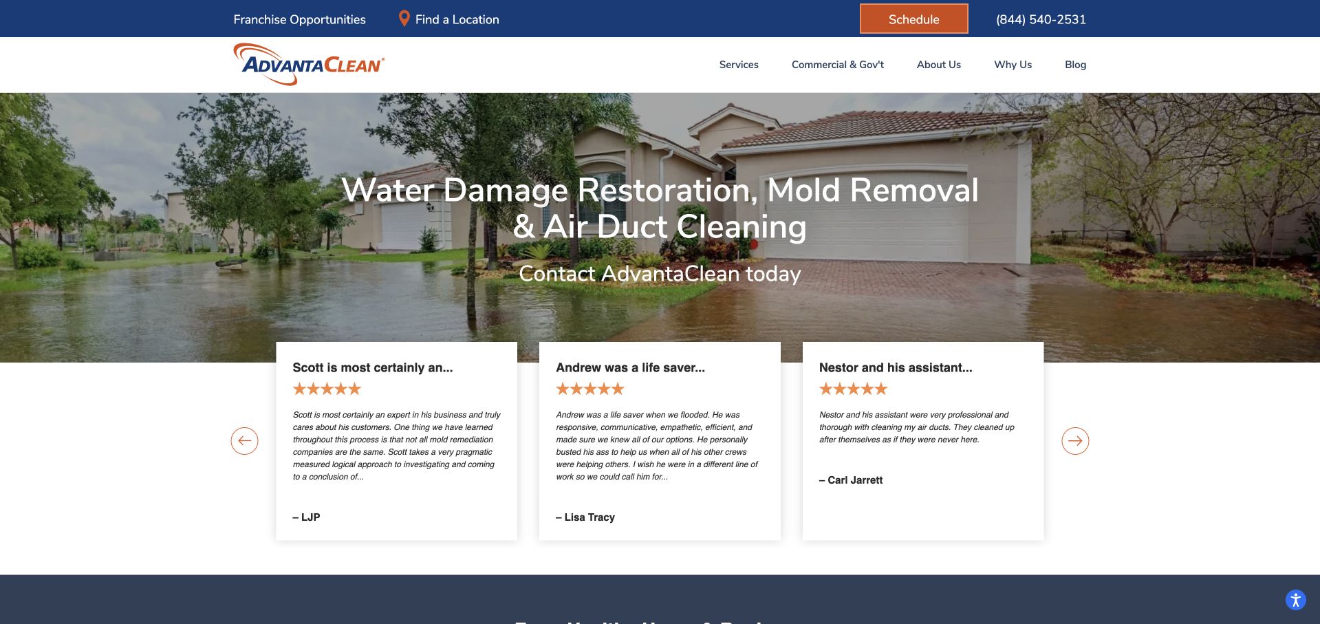
AdvantaClean puts water damage, mold removal, and air-duct cleaning directly in its opening headline. A flooded-property photograph fills the background, while three white review cards overlap the lower edge of the hero. The upper blue strip carries location, franchise, scheduling, and telephone access; the white navigation below organizes the main company and service routes. The literal heading is useful because the company spans more than one service category. The overlapping reviews create an early transition from the service message into customer context, rather than adding another paragraph to the hero. The review quotations and service claims remain attributed website content, not independent evidence that any particular result is guaranteed.
What you can learn
Name the actual service categories early when a company has a mixed catalog. Keep customer quotations readable and sourced, and do not let review overlays cover important contact or eligibility information.
Pros
The headline clearly identifies the main service categories without abstract brand language.
Review cards create a structured transition below the photograph.
Cons & considerations
The combination of flooded imagery and overlapping cards can feel crowded.
A mixed service catalog needs clear boundaries between restoration and routine cleaning inquiries.
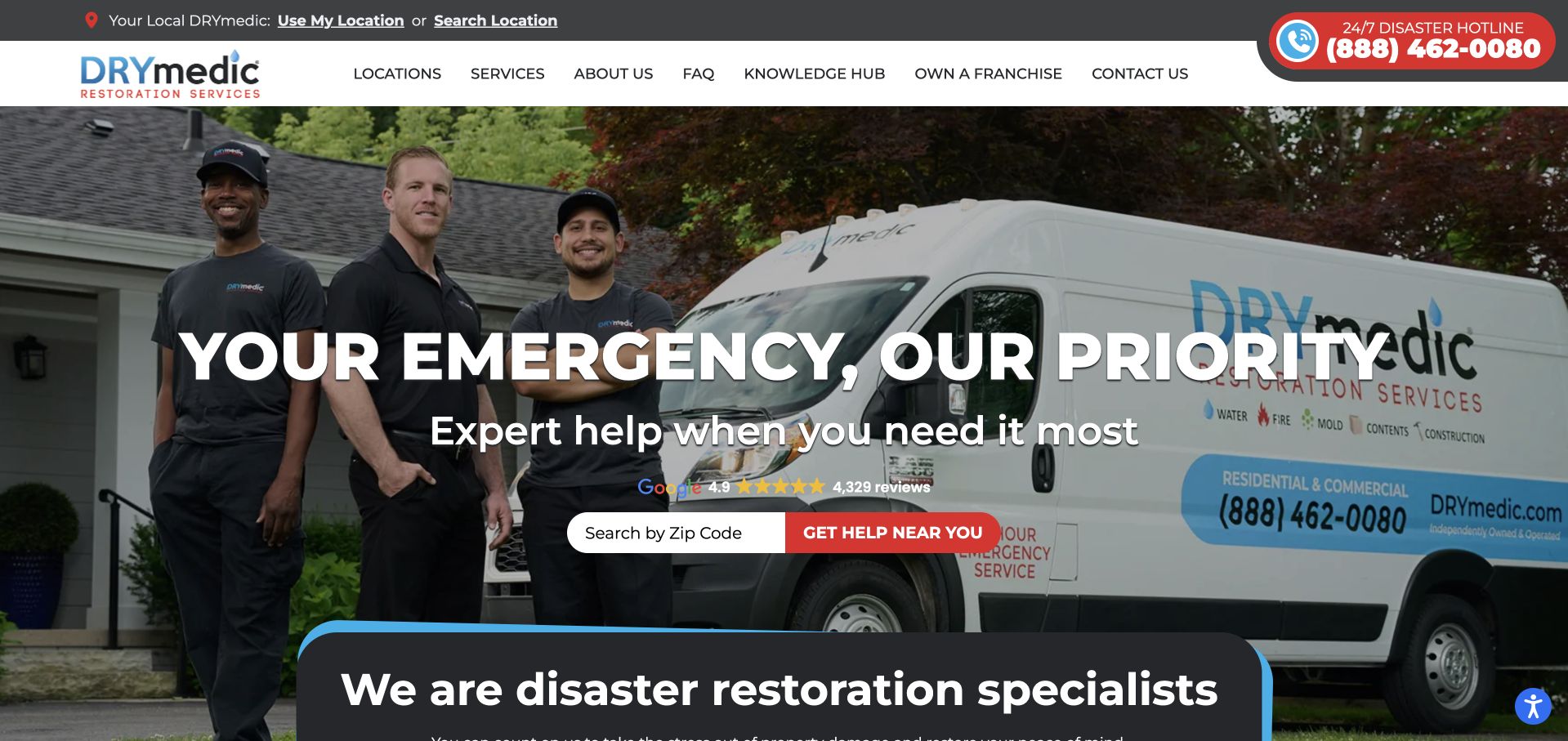
DRYmedic presents a team standing beside a branded vehicle beneath a white-and-charcoal header. The page then introduces the business as a restoration specialist in a separate dark panel. The first screen is useful for studying how people and operational equipment can support a location-based request without needing a detailed project story. The red telephone treatment in the header also supplies an alternative route for visitors who do not want to use the search field. The team photograph gives the presentation a recognizable subject, while the interface still needs to make clear which local office will handle the resulting inquiry.
What you can learn
Keep a location input and telephone route available together, but explain their different next steps. Treat emergency wording as a contact context, not as an independently established guarantee of response time or work outcomes.
Pros
Team-and-vehicle photography gives the service brand a concrete visual subject.
The ZIP field makes local routing part of the main hero task.
Cons & considerations
Large uppercase text over people can obscure useful details in the photograph.
The next section overlaps the hero and needs careful spacing at mobile widths.
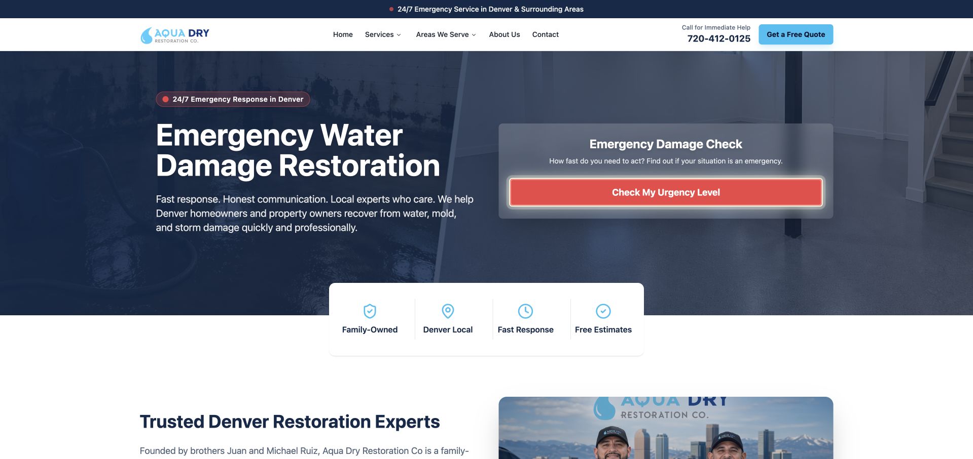
Aqua Dry uses a dark blue emergency-water-restoration introduction beside a pale panel titled Emergency Damage Check. A red action inside that panel offers an urgency-level interaction, while a quote control remains in the header. Four supporting blocks overlap the lower hero edge before the company introduction begins. This is useful for studying how an interactive feature competes with a direct contact task. The solid text surface remains readable over the work photograph, but the assessment-like panel needs especially clear limits so visitors do not mistake a marketing interaction for professional or emergency judgment.
What you can learn
Keep direct contact available and explain the limited purpose of any interactive check. A website feature must not diagnose a property, determine emergency action, or replace appropriate qualified assessment.
Pros
Solid blue text surfaces remain readable over the work photograph.
The separate interactive panel makes the optional feature easy to distinguish from the introduction.
Cons & considerations
An assessment-like label can imply more authority than a marketing interaction provides.
The interactive action competes with the more direct contact and quote routes.
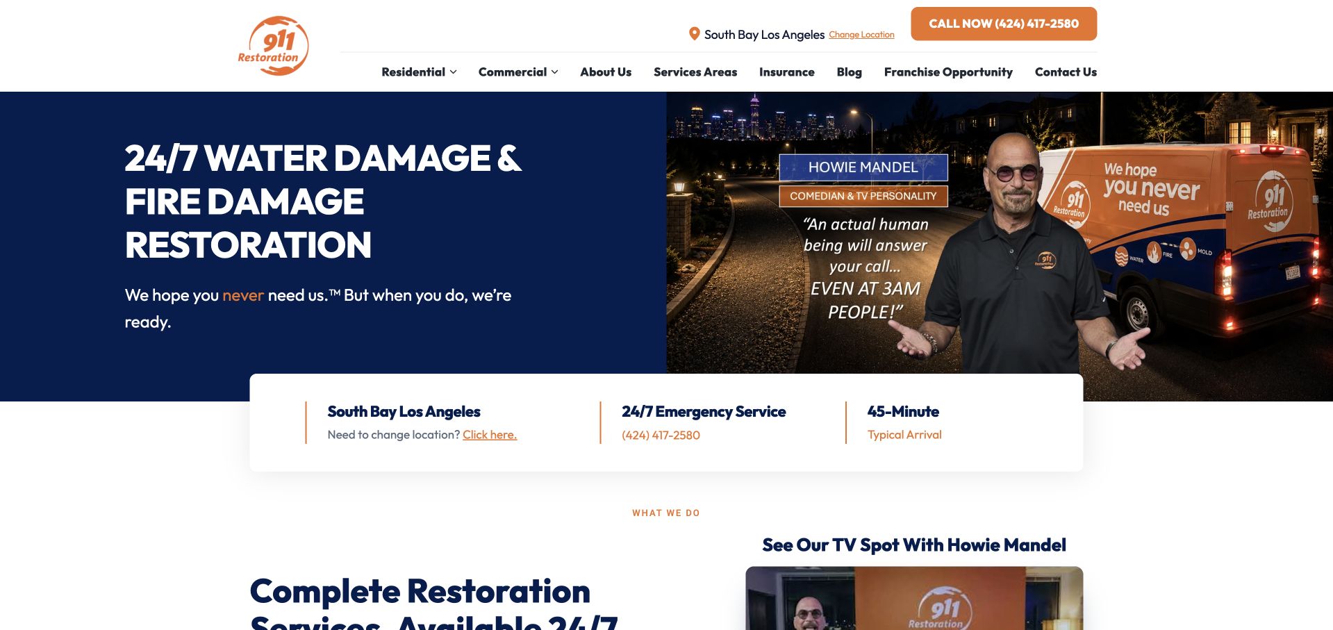
911 Restoration divides its opening into a large navy service statement and a campaign photograph with a branded vehicle. The headline names water and fire damage restoration rather than relying only on a brand promise. A white information strip beneath the hero displays the selected office, emergency contact context, and a timing claim, while the main service catalog begins immediately below. The captured public page showed a South Bay Los Angeles office suggestion; that should not be generalized to every visitor or property. The local-office strip also makes network routing visible before a longer request.
What you can learn
Keep campaign imagery secondary to the service and receiving-office information. Automatically selected office details should have a clear correction route, and timing statements need explicit local context rather than implied universal availability.
Pros
A solid navy panel gives the incident-specific headline a stable reading surface.
The office strip makes the local contact context visible beneath the hero.
Cons & considerations
A spokesperson campaign may draw attention away from practical service questions.
Automatically suggested offices and timing claims require clear qualification and correction controls.
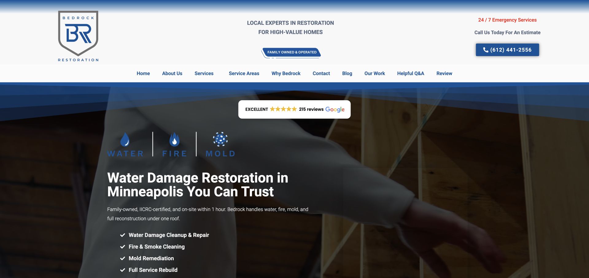
Bedrock uses a white-and-blue header above a dark, angular hero framed around a work photograph. A Minneapolis water-damage heading sits beneath three simple incident icons for water, fire, and mold. The compact checklist below separates the principal service topics, while telephone and estimate context remain visible in the header. This is useful for studying a local company whose introduction is narrower than a national directory. Blue graphic edges provide structure without putting all the copy over the busiest part of the photograph. Qualification statements remain company claims, not independently verified outcomes.
What you can learn
Use the local scope as an organizing constraint: name the territory, show the relevant services, and explain the inquiry process. Avoid presenting a website form as a professional assessment of property damage.
Pros
A regional-company focus can support a shorter path to relevant contact information.
The service context is more specific than a general home-services marketplace.
Cons & considerations
Local scope still needs an explicit and maintainable service-area description.
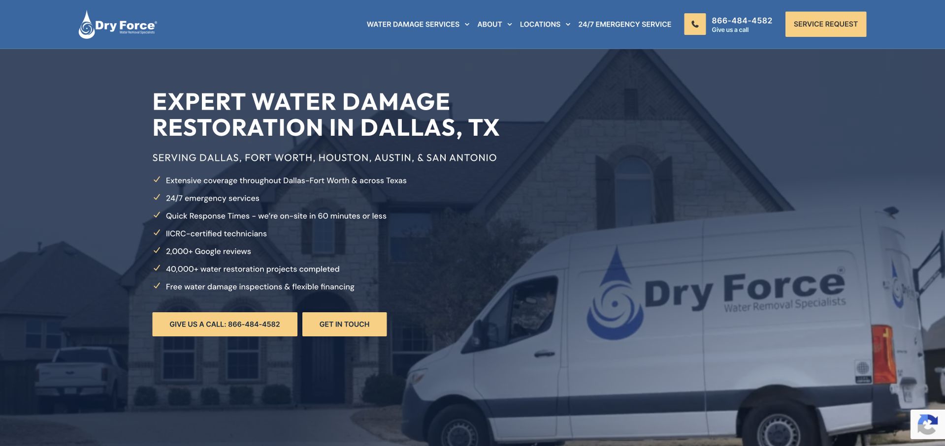
Dry Force uses a dark blue overlay on a branded service-vehicle photograph, with a large Dallas water-damage headline on the left. A short region line and a vertical checklist follow the headline, and two yellow contact actions sit below. The blue-and-yellow vocabulary repeats in the header, connecting the telephone and service-request controls to the hero. This is a useful example of using a checklist to organize supporting information without making the introduction one long paragraph. The site's claims are not independently established by this design review, so the lesson is about hierarchy and information placement rather than promised service performance.
What you can learn
Use a checklist for genuinely distinct questions and link to the underlying details. Keep the primary contact action clear, and qualify timing or monitoring statements with the relevant service and location context.
Pros
The vehicle photograph and geographic heading establish a concrete local-service context.
Yellow actions remain recognizable against the dark blue overlay.
Cons & considerations
A long checklist can dominate the first screen and reduce reading comfort.
Timing and qualification statements need more explanation than a short checkmarked line.
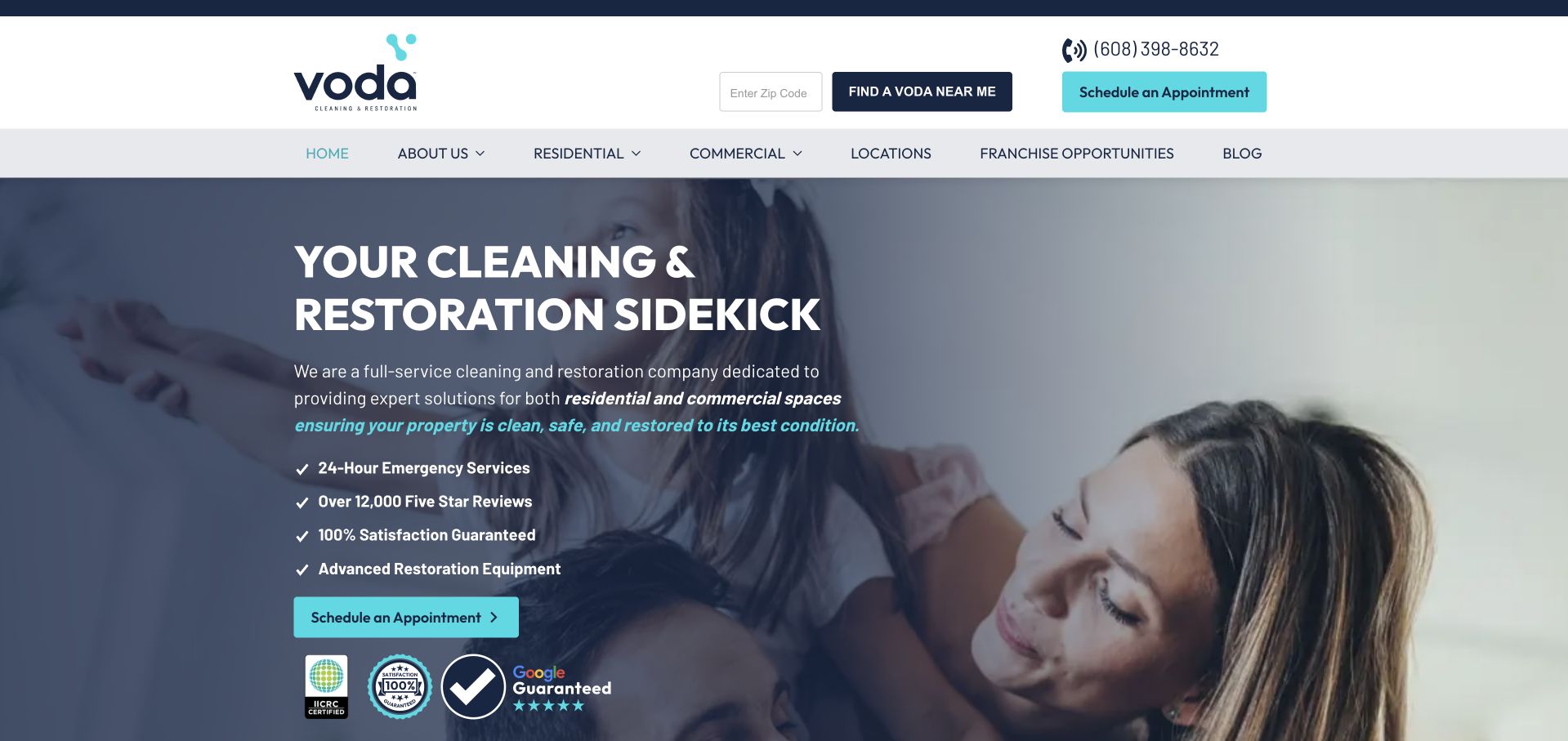
Voda pairs a large cleaning-and-restoration headline with a household photograph and turquoise scheduling controls. The header provides both a local-office finder and an appointment action, while the navigation separates residential, commercial, location, and company information. The hero uses a short checklist and a row of marks below the main button, keeping supporting claims together rather than scattering them across the image. This example is useful because its catalog spans routine cleaning and restoration, two visitor situations that can require different intake questions. The interface presents a friendly, planned-service tone rather than relying exclusively on emergency imagery.
What you can learn
Separate planned cleaning requests from incident-related restoration inquiries in the form flow. Use the same brand vocabulary across both, but explain the receiving location and expected next step rather than treating every appointment identically.
Pros
Turquoise action styling creates a clear thread between the header and hero.
Residential and commercial routes give the broad catalog a visible structure.
Cons & considerations
Routine and urgent services may need different contact priorities than one scheduling button suggests.
The checklist and marks require accessible supporting detail rather than visual reassurance alone.
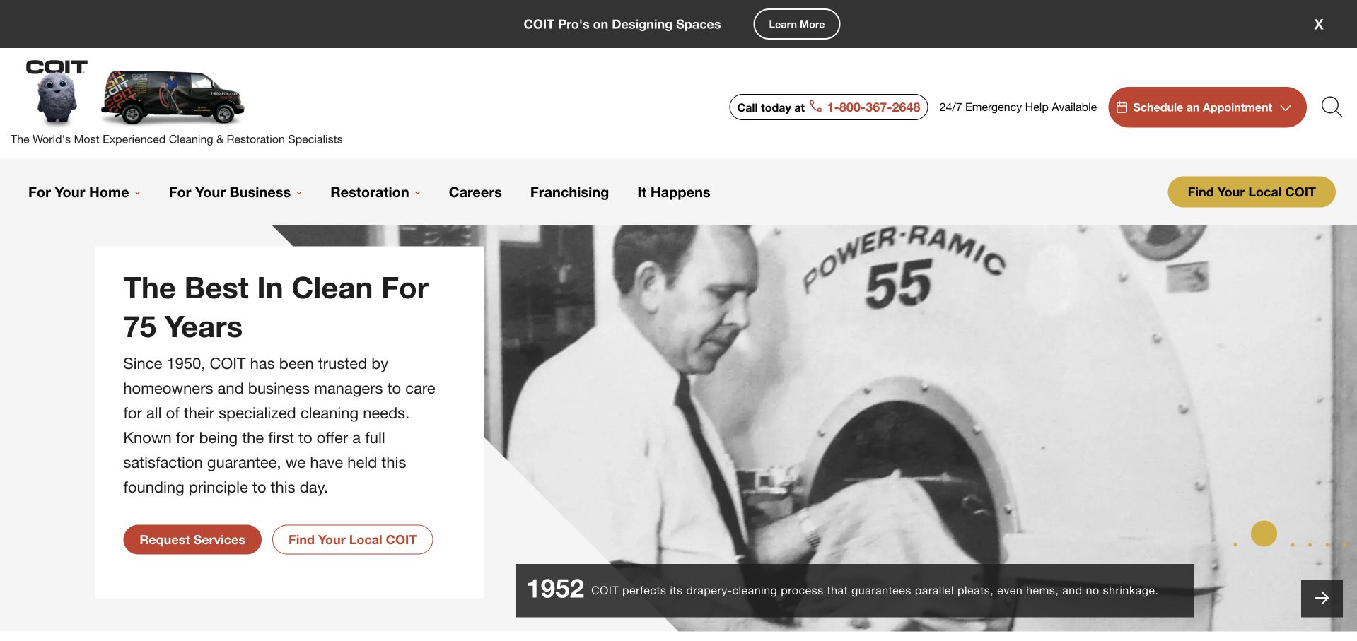
COIT opens with an archival black-and-white cleaning photograph beside a white text panel about the company's history. The red request-service action and outlined local-office finder appear below the copy, while the header explicitly includes restoration among the wider home and business service routes. This is a broader cleaning homepage, not a water-damage-only landing page, and that distinction matters when borrowing from it. The historical image gives the brand a different tone from the emergency-vehicle and damaged-property imagery elsewhere in the collection. A specialist restoration company can borrow the clear contact hierarchy without adopting a large mixed-service catalog or implying that historical longevity independently proves current service quality.
What you can learn
Use history as supporting context rather than the sole reason to inquire. If restoration is one part of a wider offer, provide a clear incident-specific route with appropriate local contact information.
Pros
The archival photograph gives the company presentation a distinctive visual character.
Request and local-office actions remain clear within a broader service catalog.
Cons & considerations
A history-led opening is less direct for visitors seeking immediate water-damage help.
The wider catalog requires an obvious restoration path rather than relying on the brand alone.
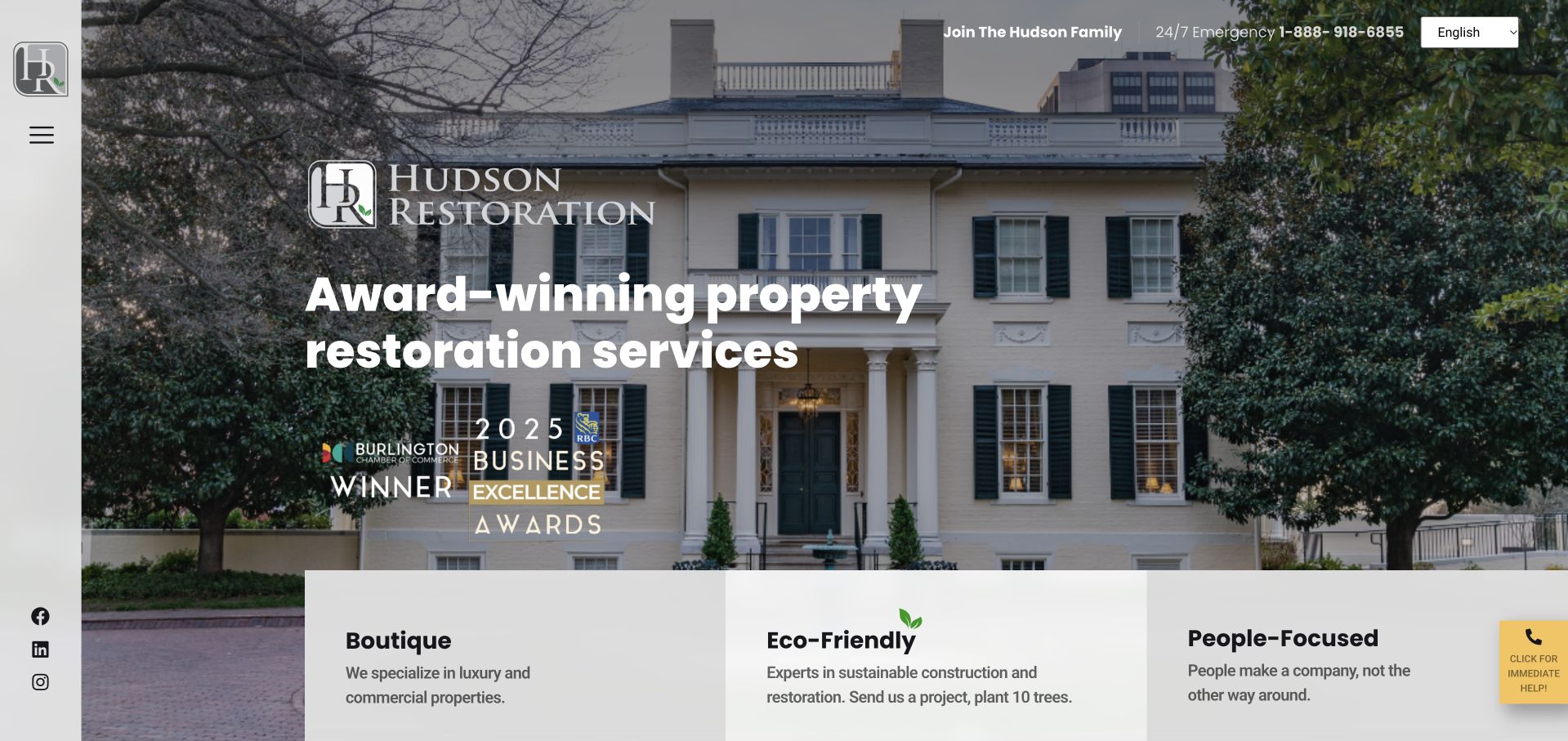
Hudson Restoration uses a large residential-property photograph beneath a minimal, vertically arranged brand navigation. The main heading sits directly on the image, while a compact upper line keeps emergency telephone access visible. Three pale cards overlap the lower edge of the hero and introduce boutique, environmental, and people-focused positioning. The overall presentation feels closer to a specialist property business than a national incident-response directory. The cards' environmental and company claims remain the business's own statements, not independently verified outcomes. The design lesson is the coherent relationship between a chosen property image and a concise set of positioning themes.
What you can learn
Align photography with the properties and audience the business actually serves. Support positioning themes with specific project and process information, and keep emergency contact visible even when the overall visual tone is premium and restrained.
Pros
The property photograph establishes a distinct market tone before the service catalog.
Three supporting cards provide a clear transition from image to company positioning.
Cons & considerations
Minimal vertical navigation may be less discoverable than a conventional service menu.
Environmental positioning requires substantiation beyond a short promotional card.
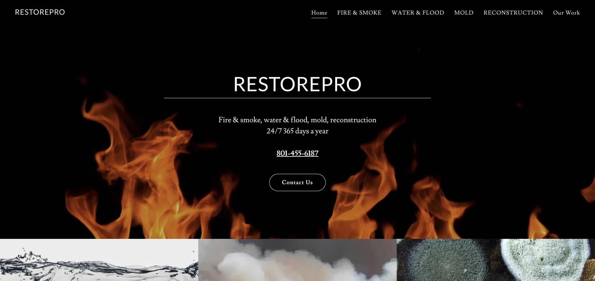
RestorePro uses a nearly black hero with flame imagery, a centered company name, a brief list of incident categories, a telephone number, and a contact action. The navigation is correspondingly direct, separating fire and smoke, water and flood, mold, reconstruction, and work examples. This stripped-back presentation is useful to compare with the more elaborate multi-location networks in the collection. It does not require a locator, a large set of badges, or several overlapping promotional panels to explain how to contact the company. The tradeoff is that the visual emphasis on fire can dominate an offer that also includes water restoration.
What you can learn
A minimal homepage still needs clear geographic scope and a useful description of the contact process. Choose imagery that supports the wider catalog, or provide equally visible routes to incident types not represented by the hero.
Pros
Literal incident categories make the small navigation easy to understand.
The telephone number and contact action remain close to the company introduction.
Cons & considerations
Fire imagery can overshadow water and other restoration services.
A compact opening needs additional local coverage and process information below.
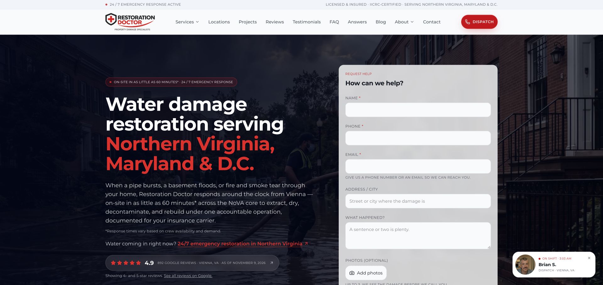
Restoration Doctor gives Northern Virginia, Maryland, and Washington, D.C. prominent red emphasis inside the hero headline. A dark property photograph supports the text, while a large pale request form occupies the right side. The form asks for incident, contact, address, and optional photo information, making the page function as an intake interface rather than only a brand introduction. The header includes a dispatch action and detailed service, location, project, review, and resource routes. It also shows how quickly a first-screen form can become substantial. The presence of a form or dispatch wording does not establish that an online submission is a confirmed visit or professional property assessment.
What you can learn
Collect only the information needed for the next conversation and label optional photos clearly. Explain who receives the request, protect submitted property details, and distinguish a request from a confirmed service arrangement.
Pros
The regional headline makes the business’s geographic context unusually explicit.
The form groups incident and contact details on a clearly separate surface.
Cons & considerations
A long hero form may be demanding for a visitor using a phone.
Optional photos and addresses require a clear privacy and submission explanation.
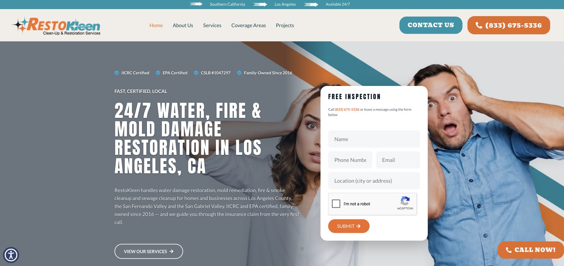
RestoKleen combines a large Los Angeles water, fire, and mold headline with a central white inspection-request form. Teal and orange frame the composition, including the header contact and telephone actions, while a diagonal edge separates the text area from a photograph of people reacting to a property problem. The form is visually dominant, asking for contact and location information before the visitor reaches the rest of the service catalog. The strong color contrast makes the task easy to find, but the amount of first-screen information requires careful mobile treatment. The design review concerns that interface arrangement, not the company's inspection, qualification, or remediation claims.
What you can learn
Make an inspection inquiry explicit about its purpose and next step. Keep required fields limited, provide readable labels, and do not imply that submitting a form supplies an assessment or confirms work.
Pros
The white form is easy to distinguish from the colored photographic background.
Telephone and contact actions use a consistent teal-and-orange vocabulary.
Cons & considerations
The central form can obscure the wider service explanation.
A distressed-person photograph may feel more promotional than documented local project imagery.
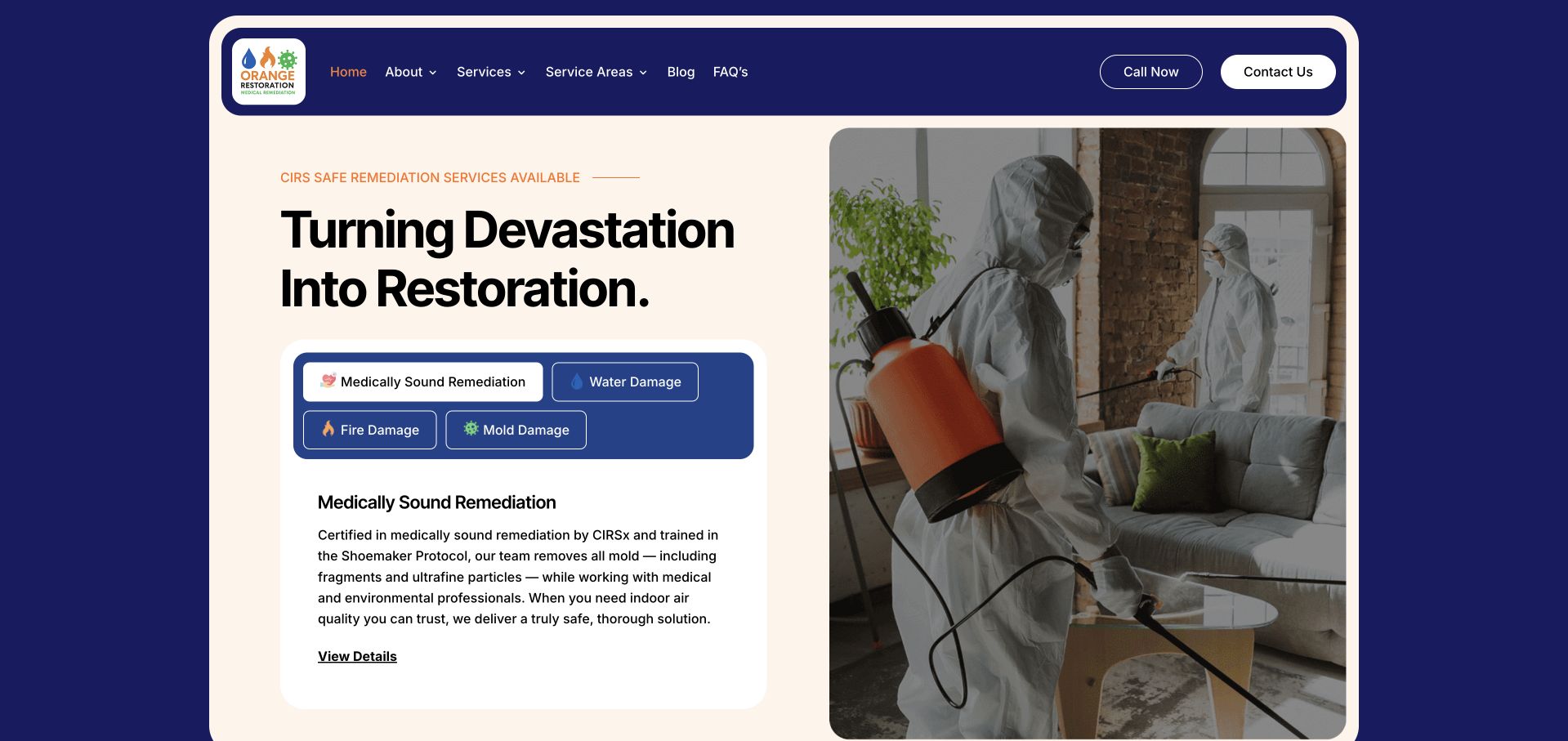
Orange Restoration uses a cream panel within a deep navy surround, with a large headline on the left and a technician-at-work photograph on the right. A compact tabbed card beneath the headline separates several service topics rather than adding all of their descriptions to the hero. The header and contact buttons remain inside the same cream frame, producing a cohesive contained composition. This is useful to study as an alternative to full-bleed damage imagery and oversized emergency banners. Some of the site's wording concerns medically framed remediation; this collection does not validate those claims or provide health advice. The design lesson is narrower: a service selector can present a broad catalog within a calm, well-defined first-screen panel.
What you can learn
Use tabs only when each panel has a clear label and keyboard-accessible behavior. Keep important contact information outside changing panels, and obtain appropriate review for any health-related service wording before publication.
Pros
The contained cream-and-navy frame creates a coherent, quieter service presentation.
A tabbed card separates related service explanations without one long paragraph.
Cons & considerations
Important descriptions inside tabs may not be seen by every visitor.
Health-related positioning needs substantiation and specialist review beyond visual design.
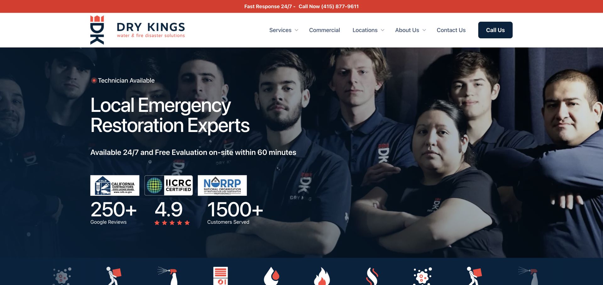
Dry Kings uses a dramatic group portrait against a dark background, with the local emergency-restoration message positioned beside the team. A white header and narrow red telephone strip provide a clean contrast to the dark image. The first screen also organizes qualifications and review figures into a compact row rather than placing them inside a long paragraph. The portrait gives the brand a recognizable subject, while the literal service heading and telephone route keep the opening practical. The design is not evidence that the company achieves any particular arrival time or restoration result; those remain claims requiring their own verification and local context.
What you can learn
Commission genuine team imagery that works with the planned text area and responsive crop. Pair it with a literal service and coverage statement so the photograph supports a useful customer decision rather than becoming an advertisement alone.
Pros
The team portrait gives the homepage a distinctive, company-specific visual identity.
A restrained white header keeps the main service and telephone routes readable.
Cons & considerations
Dark portrait treatments require careful crop and contrast across screen sizes.
Prominent response and review claims need clear sources and qualifying context.
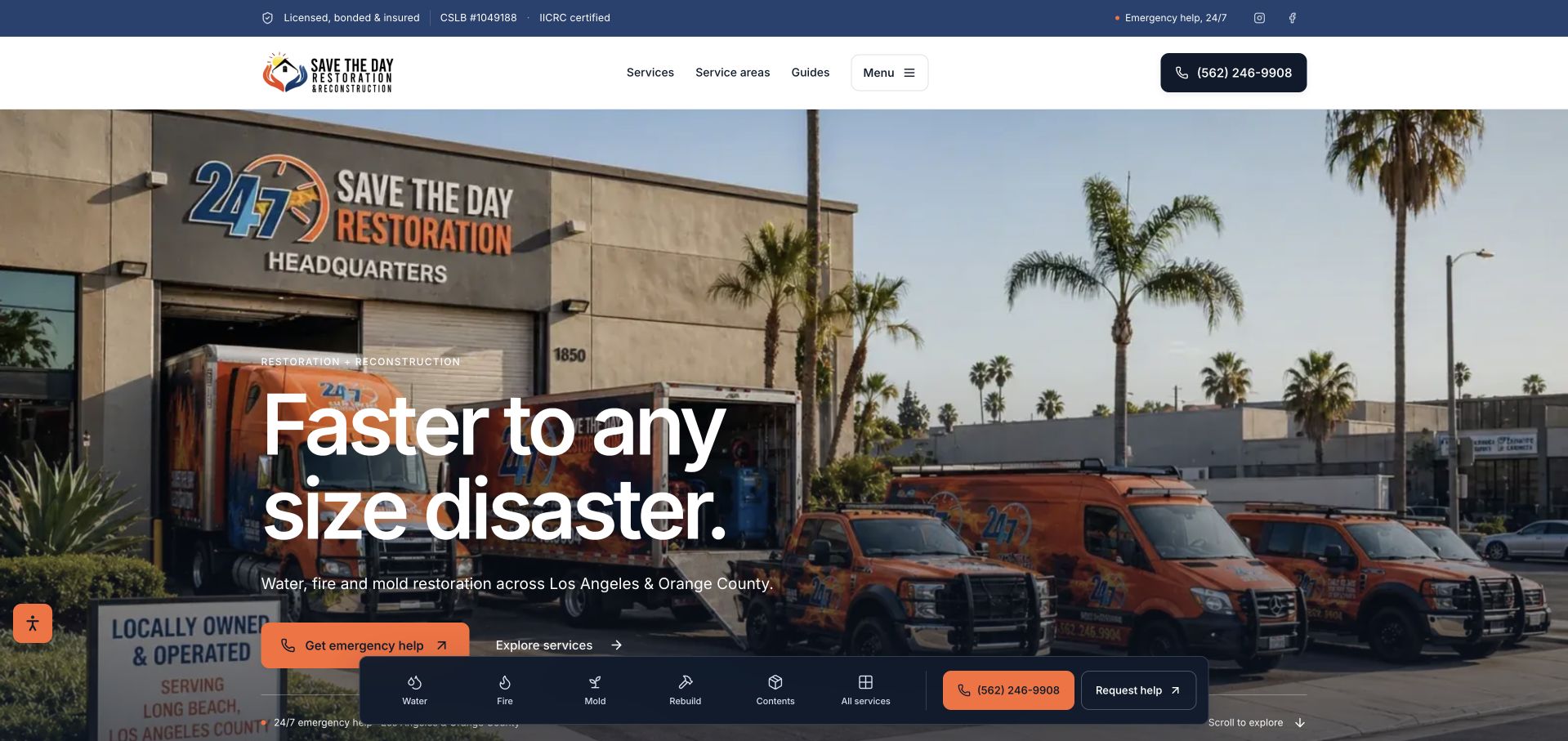
Save The Day uses a large photograph of its headquarters and orange vehicle fleet behind a short white headline. The supporting line names Los Angeles and Orange County, giving the broad restoration message a regional context. An orange help action and a service-exploration route sit near the lower hero, while a floating toolbar exposes incident categories and contact. This is useful for studying the relationship between real company assets and a task-oriented interface. The headquarters photograph establishes a particular business identity rather than a generic damaged-property scene. The timing-oriented headline remains the company's claim, not a verified response result.
What you can learn
Keep the regional service boundaries explicit and make the next contact step predictable. The form should gather context for a conversation, not imply that a visitor has received a diagnosis or confirmed restoration work.
Pros
A particular company identity can support a simpler journey than a network locator.
Incident-specific service context is more useful than a generic home-improvement catalog.
Cons & considerations
The local territory still needs clear, current detail before an inquiry begins.
Any emergency or outcome wording requires context beyond the homepage presentation.
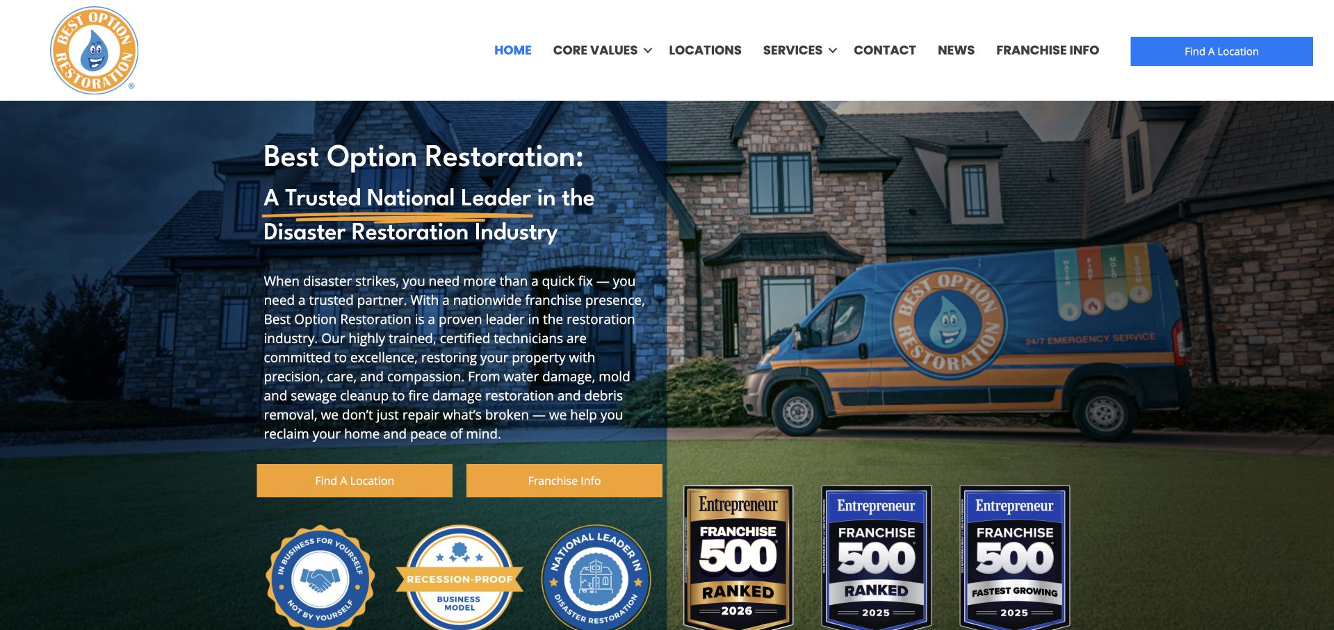
Best Option Restoration places its branded vehicle and a residential property behind a dark text panel. A large company heading and supporting copy introduce the restoration offer, while yellow buttons distinguish finding a location from franchise information. The white header repeats those audience routes, and a row of prominent award-style marks occupies the lower part of the hero. The branded van gives the photograph a company-specific anchor. The badges and national-leadership wording are the site's own presentation, not independently established rankings or service-performance evidence in this design collection.
What you can learn
Separate customer-service and franchise-development journeys in both navigation and forms. Keep the service contact path visually primary for property owners, and explain the source and date of any award-style marks used as supporting material.
Pros
Two labeled buttons distinguish local service discovery from franchise research.
The branded vehicle connects the visual identity to the field-service context.
Cons & considerations
A large badge row can compete with the actual customer contact route.
Franchise messaging may distract visitors who only need a nearby service office.
Kegan is a freelance web designer and developer with 15+ years of experience helping businesses turn complicated website requirements into clear, maintainable digital experiences. He works directly with clients from planning and design through development, launch, and ongoing support.
For water damage restoration website design, his development approach focuses on service-area information, urgent-contact routing, restoration-process explanations, and documented project context. The scope can be a targeted improvement or a complete custom build, with responsive layouts, thoughtful content structure, and integrations chosen around the people using and maintaining the site.
Show 3 other water damage restoration website designersHide other water damage restoration website designers
Plan a clear contact experience without manufacturing urgency
Define the local contact and routing model first
Map the business structure before drawing the hero. A single regional specialist can often state its coverage directly; a network may need an office finder. Decide who receives a call, a request form, and a message sent after normal office hours. Keep that responsibility visible to the customer. A national brand should not make an individual office's availability or scope ambiguous, and a local firm should not imitate a directory simply to appear larger.
If a page uses geolocation, treat it as a suggestion rather than a fact about the property. Show the selected location and provide a manual alternative. Design an understandable fallback when a nearest-office lookup is slow, unavailable, or has no result. A perpetual loading panel is not useful orientation for someone trying to reach a business. Avoid collecting an exact address until the process actually needs it, and explain which organization receives that information.
Separate a direct telephone action from a request form. State what the form does and what the confirmation means. Do not display dispatch-style graphics, arrival timers, or simulated status cards in a way that could be mistaken for live operational information. Any real service timing statement needs current, appropriate local context and review by the responsible business. The website should support contact, not claim that an online interaction resolves a property incident.
Explain service scope without making unsupported safety or insurance claims
Organize the catalog around the incident types and audiences the business actually handles. Water-related work, fire-related work, mold services, reconstruction, commercial facilities, and routine cleaning should not be collapsed into one all-purpose paragraph when the inquiry process differs. Use dedicated pages where there is useful scope information, but avoid generating many near-identical locality pages with claims the team cannot maintain.
Describe the customer-facing process without publishing operational remediation instructions. Explain what the business will discuss, what information may be useful, and how the next conversation is arranged. Do not ask visitors to diagnose contamination, assess structural conditions, interpret symptoms, or decide insurance coverage from a marketing page. Technical and health-related wording needs appropriate qualified review. A general checklist or automated urgency tool should not present itself as a professional property assessment or emergency decision-maker.
Use qualifications, project photographs, customer quotations, and company marks accurately. Record permission and sources, and distinguish company claims from independent evidence. A dramatic damaged-building photograph may establish context, but it does not prove how a different property will be restored. Similarly, a review summary or an experience figure cannot promise the result of a new job. Keep policy and insurance descriptions narrow, current, and reviewed rather than using reimbursement language as a broad marketing guarantee.
Create a dependable request and follow-up handoff
Decide what the first conversation genuinely requires. A name, preferred contact method, broad incident description, and general location may be sufficient to route an inquiry. If exact addresses or photographs are collected, explain why they are needed and how they are handled. Mark optional uploads clearly and do not encourage people to enter unsafe areas or gather technical evidence simply to complete a website form.
Write acknowledgment messages carefully. A successful submission means the website received a request; it does not necessarily mean the company accepted work, inspected the property, or scheduled a visit. Explain the next step in ordinary language and provide a maintained alternative if delivery or an external form integration fails. Keep existing-client questions separate from new requests so people can reach the correct team without restarting the lead process.
Test the site with realistic mobile tasks and keyboard access. Review labels, contrast, error messages, telephone links, location corrections, and optional-photo handling. Make sure privacy choices, chat prompts, region selectors, promotional videos, and review widgets do not obstruct the main contact route. Assign a business owner to changing service territories, telephone numbers, availability wording, qualifications, and claim review. A useful restoration website creates an understandable communication path; it does not establish health, safety, insurance eligibility, or the outcome of any restoration work.
Review the contact language with the people who actually receive requests. Walk through a visitor researching a different property, a commercial manager asking about scope, and an existing customer seeking an update. Check whether the page sends each person to the right conversation without unnecessary repetition. Document who can change local telephone information and who approves sensitive service claims. This rehearsal is a design acceptance task, not a test of the business's emergency performance or a substitute for its operating procedures.
The editing job behind the design
Keep the contact layer simple and the operating systems separate
A small specialist can use a maintainable CMS and a reliable request form with clear service and coverage content. Prioritize fast, readable pages and direct contact before adding background video, automated urgency scoring, or a complex location interface.
A genuine multi-office operation may need a structured location directory and routing integration. Design manual search and failure states alongside automatic lookup, and keep the selected office visible throughout the inquiry. Test the receiving team's process rather than only the submit button.
Keep property records, claim documents, crew scheduling, and private customer communication in appropriate operational systems. Public website technology signals do not reveal a complete restoration-management stack or prove which systems a local office uses.
Our WordPress website examples offer a separate look at publishing approaches. A visible platform label is evidence for that named page, not a guarantee that the same system will suit your requirements.
Before the public launch
Restoration website brief checklist
Name the actual business and service territory.
Make the selected office visible and correctable.
Provide a manual alternative to automatic location lookup.
Separate direct telephone contact from an online request.
Use literal incident and audience categories.
Explain what a submission acknowledgment does and does not mean.
Limit property details and make uploads optional where possible.
Have qualified staff review technical and health-related wording.
Review insurance and response-time statements for accurate scope.
Use permitted project images and attributable customer content.
Test keyboard, mobile, error, privacy, and integration-failure states.
Assign maintenance ownership for local contacts, territories, and claims.
These checks are a project checklist, not a performance, legal, security, or accessibility certification. Test real journeys with the people responsible for the website before making claims about the result.
Sources & editorial method
How this collection was selected and reviewed
These 28 directly captured public pages were reviewed for visible design and communication choices. No remediation work, emergency response, insurance outcome, health claim, or professional qualification was tested or endorsed. Location suggestions shown in captures are specific public page states, not universal visitor locations.
Each example links to its actual source page. Screenshots are direct browser captures with their own capture dates; moving imagery, announcements and live designs can change. The notes describe observable design choices and conditional tradeoffs, not measured traffic, conversion results, service quality, or accessibility conformance.
Technology labels use public page metadata, asset evidence, or explicitly cited platform documentation. Platform documentation is not a complete current deployment audit. A component reference may be legacy or unused; it is not a complete backend inventory. Unknown stacks are omitted. These sites are editorial examples, not our client portfolio.
Written, Edited and Curated are separate editorial records, not timestamps advanced by a rebuild. Website designs and imagery belong to their owners. See our editorial standards or suggest a correction.
Give visitors a clear route to the right business and an honest explanation of the next conversation. Keep the website useful without suggesting that its interface can assess the property or guarantee the result.