Best Farmers Market Websites of 2026 (27 Real-World Examples)
Farmers-market websites that make the next visit, seller discovery and community participation easier.
A farmers-market website should answer when and where before it asks visitors to admire the produce. Strong design connects the energy of a market with dependable schedules, location information and clear routes for shoppers and sellers.
A farmers market is not a conventional online food store. The operator may organize sellers, manage a venue, support food-access programs and publish seasonal events without selling every product itself. The website must explain those relationships while helping someone plan an ordinary visit. A person checking whether a market is open this weekend has a different task from a grower applying for a stall or a supporter considering a donation. Good information architecture makes those distinctions visible without losing the community character that makes the market worth visiting.
These 27 references include neighborhood markets, regional networks, historic public markets and official municipal program pages. Their operating models differ, so the reviews identify the context rather than suggesting every example has the same hours, seller rules or facilities. Foodwise is the first editorial selection for its clear connection between a recognizable regional place, market activity and a broader community mission. The collection is not an assessment of produce quality, vendor eligibility, accessibility compliance or organizational outcomes. Use it to study how visible design helps people find the right information and choose an appropriate next step.
Before the examples
What makes good farmers market website design in 2026?
Show the next useful opening information
Dates, hours and location are the core content, not supporting decoration. For a single market, place them near the introduction. For a network, help visitors choose the correct neighborhood or day. Crescent City Farmers Market’s upcoming cards are a useful schedule-first reference. Include explicit dates where relative wording could mislead, and plan how closure or exceptional-weather notices become visible without leaving conflicting information elsewhere on the site.
Separate shopping visits from participation
A visitor needs directions and current information; a prospective seller needs the operator’s application process; a volunteer or donor needs a different explanation. Name those routes plainly. Foodwise’s market, program and support structure illustrates how several roles can coexist. A market page should also distinguish operator information from individual sellers’ products and policies rather than implying that a central website guarantees every offer at every stall.
Make discovery work without relying on a map
A map can be helpful for a large network, but it should have a usable text-list alternative. Give results meaningful names, current schedules and links to full location details. GrowNYC’s locations page is useful for studying paired map and list discovery, while London Farmers’ Markets puts nearby-market search close to the introduction. The interface must still explain what kind of place each result represents.
The collection · 27 examples
27 farmers market websites worth studying
Compare the practical task beneath each visual style. A produce photograph, an illustrated regional system and a schedule-card layout can all work, but only when the current market details and audience routes remain easy to understand.
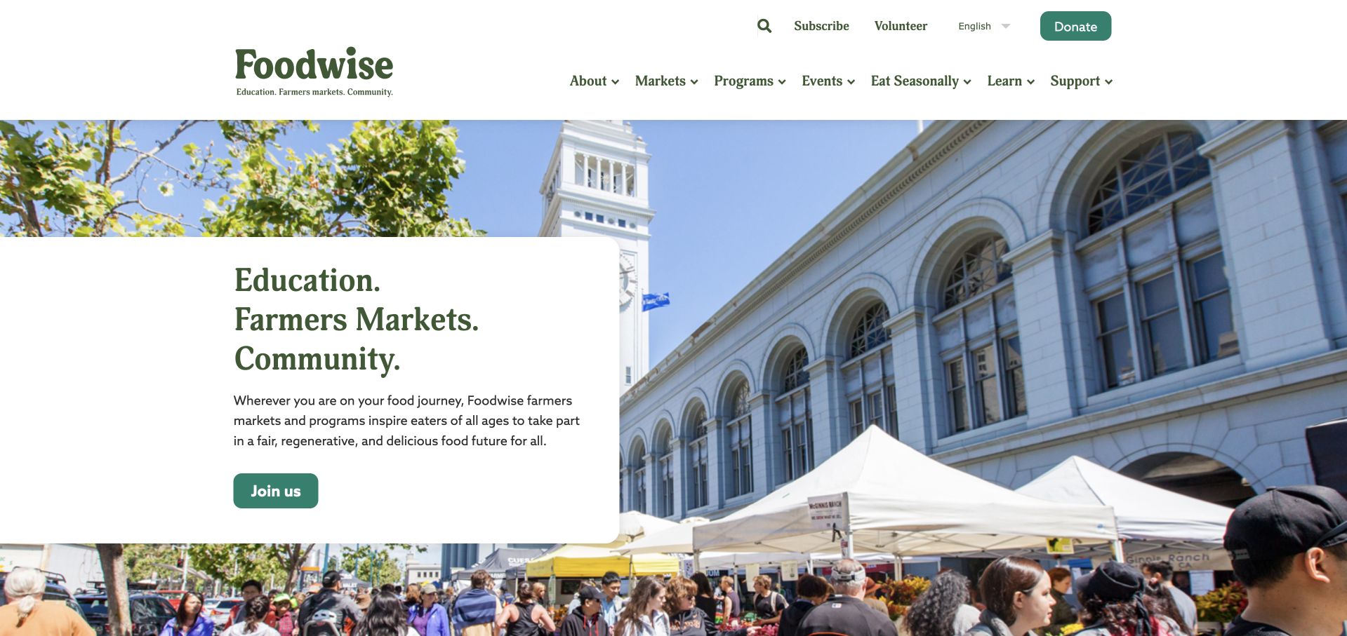
Foodwise uses a white header with a green identity above a wide photograph of a busy market beside San Francisco’s Ferry Building. A large white text card sits over the left side, introducing education, farmers markets and community as related parts of the organization. The photograph provides a recognizable regional setting while the card protects the wording from the crowd’s visual detail. This is our first editorial selection for its clear connection between place, activity and mission. The navigation then separates markets, programs, events and seasonal information, so visitors can find a practical shopping route without treating the whole organization as one undifferentiated event.
What you can learn
For a regional operator, explain the relationship between markets and other programs before expanding the navigation. Pair the community scene with literal routes to current locations, schedules and seller information, keeping donation and participation journeys distinct from planning an ordinary visit.
Pros
The white card stays readable against the detailed market photograph.
Market, program and event routes support different tasks.
Cons & considerations
The broad organizational introduction leaves individual market hours for subsequent destinations.
A busy photograph needs thoughtful cropping so people and place remain clear on phones.
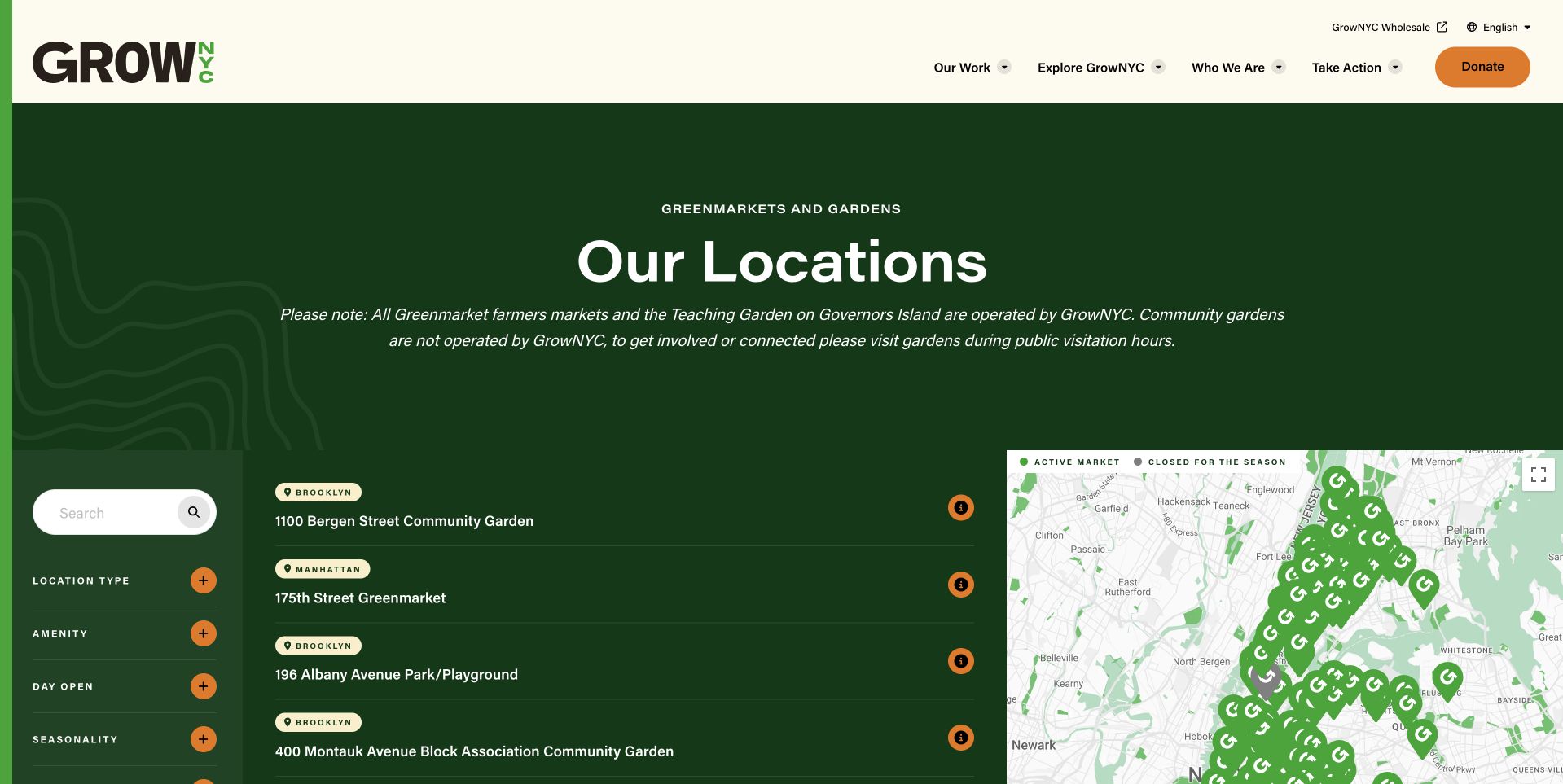
GrowNYC’s reviewed source is its public locations directory, reached from the former Greenmarket entry route. A cream header sits above a dark green map-and-list interface, with filters and place names at the left and a marker-filled map at the right. The page explicitly covers Greenmarkets and gardens, so it should not be mistaken for a single market’s homepage. This is a useful reference for a large operator: the practical question of where to go is given the main canvas. The visual identity remains present, but the interface is organized around finding a relevant place rather than reading a general organizational introduction.
What you can learn
When an operator has many locations, make discovery a first-class task. Provide a usable list alongside any map, distinguish different types of places and keep each location’s schedule current rather than asking visitors to infer opening information from a marker alone.
Pros
The list and map offer two discovery methods.
The stated scope avoids presenting every marker as a market.
Cons & considerations
A dense map can become difficult to use without accessible list alternatives.
Location discovery still needs clear detail pages for current hours and exceptions.
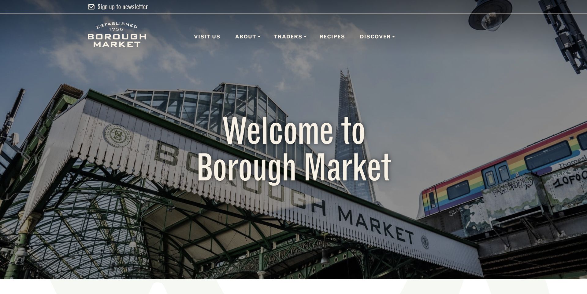
Borough Market opens with a photograph looking up at its recognizable entrance structure and surrounding buildings. A short white welcome sits over the image, while the dark header separates visiting, traders, recipes and discovery routes. The photograph is about the place rather than an individual product, which suits a market that contains many sellers. The useful pattern is the relationship between a strong architectural identity and literal navigation. Visitors can recognize a destination, then move toward practical planning or trader information without needing the homepage to list every stall. The main image also avoids implying that the organization itself sells every item shown on the site.
What you can learn
A market’s entrance can be a strong visual anchor, but the header must answer what visitors need next. Keep hours, directions, trader information and accessibility details in clear destinations, and distinguish operator information from the products or policies of individual sellers.
Pros
The entrance photograph gives the market a distinctive place identity.
Visitor and trader routes support different tasks.
Cons & considerations
Large architectural imagery gives little immediate detail about current sellers or products.
White welcome lettering needs reliable contrast as the image crops on phones.
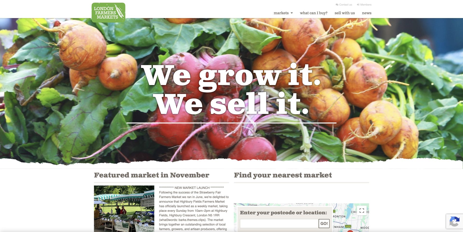
London Farmers’ Markets uses a vivid overhead photograph of vegetables with a large white statement about growers and selling. Beneath that image, the page divides into a featured market and a nearby-market search with a postcode or location field. This is a useful hierarchy: appetite and the producer proposition are quickly followed by a practical discovery task. The green identity and compact header hold the regional system together without turning the page into a dense municipal directory. The photograph presents the category, while the search acknowledges that a market is only useful to a visitor if its place and opening arrangements fit the trip.
What you can learn
For a network of markets, connect the appeal of fresh produce with an immediate way to find a relevant location. Keep featured markets separate from search results and provide current hours, transport and exception notices on each destination page.
Pros
The location search appears directly after the broad produce-led introduction.
A featured market can highlight timely activity without replacing the wider directory.
Cons & considerations
Large white lettering needs careful contrast over the varied vegetable colors.
Postcode discovery needs a useful non-map route and clear result descriptions.
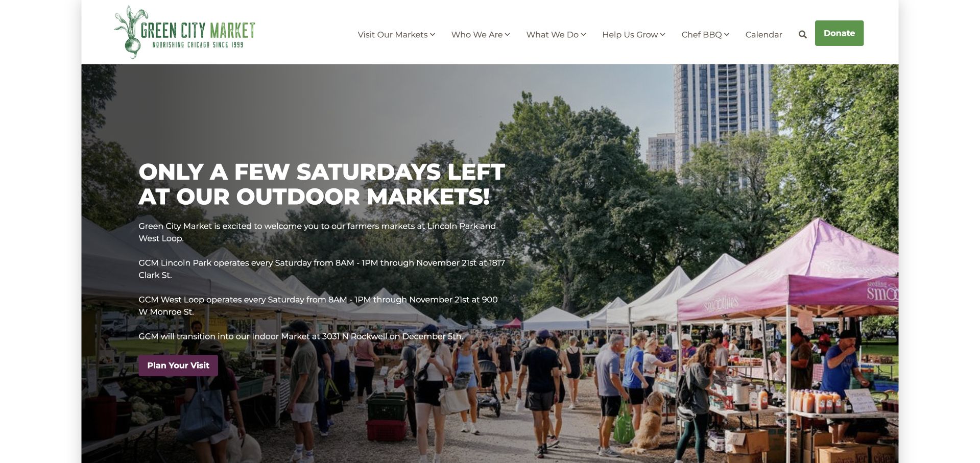
Green City Market uses a photograph of outdoor stalls and a city backdrop beneath a restrained white header. A large seasonal message states that the outdoor-market period is nearing its end, with additional lines identifying the relevant schedules and upcoming arrangements. This is useful because the homepage is doing more than inviting people to a market: it is preventing a timing mistake. The green identity remains consistent while the actual campaign changes with the season. The design also gives donation and organizational routes their own places in the header, keeping them distinct from the immediate task of deciding when and where to shop.
What you can learn
Treat season transitions as essential visitor information. State the dates, location and hours clearly, link to the current market details and remove old announcements promptly so a beautiful outdoor photograph does not send someone to a closed location.
Pros
The seasonal notice addresses a practical timing question before visitors plan a trip.
The outdoor photograph connects the announcement with a concrete market setting.
Cons & considerations
Several schedule lines can become crowded over a detailed photographic background.
Relative language such as only a few left needs explicit dates and active maintenance.
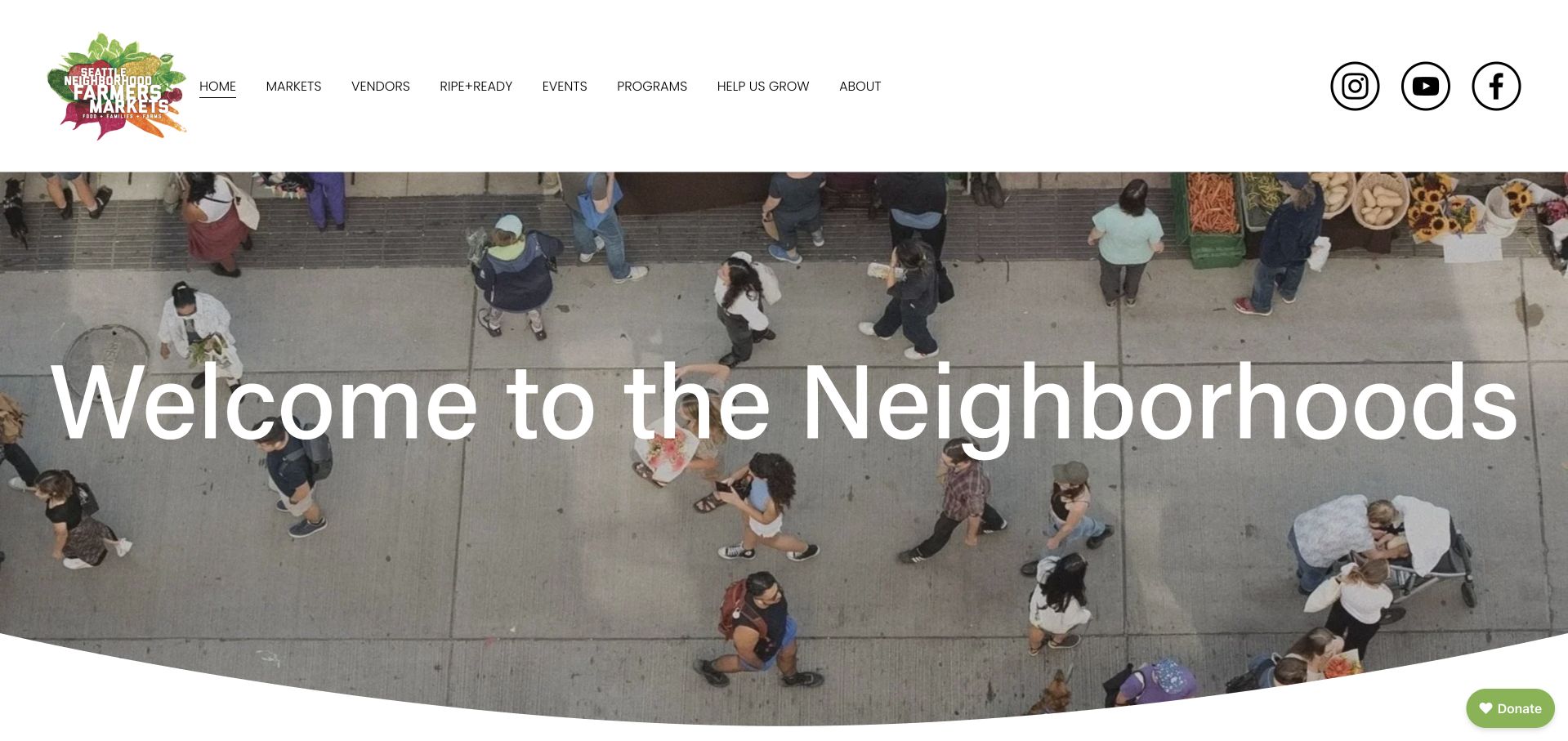
Seattle Neighborhood Farmers Markets opens with an overhead photograph of people moving between stalls, beneath a white header and compact illustrated identity. A broad welcome headline introduces the network, while the page continues into separate day-and-location information for the individual markets. That structure is useful because the organization’s identity is shared but the practical visit is always specific. The aerial view communicates activity without making one stall appear to represent every seller. The navigation separates markets, vendors, programs and support, acknowledging that a shopper and a prospective seller arrive with different tasks. The design’s strongest lesson is the move from neighborhood atmosphere into explicit local choices.
What you can learn
A network homepage should lead quickly to individual market details. Keep dates, hours and seasonal exceptions attached to the correct neighborhood, and distinguish becoming a vendor from planning a shopping visit rather than using a generic contact route for both.
Pros
The overhead scene introduces the network without privileging one seller.
Market and vendor navigation support different visits.
Cons & considerations
A broad welcome alone does not answer which neighborhood is open today.
Seasonal schedules need careful maintenance across every linked market page.
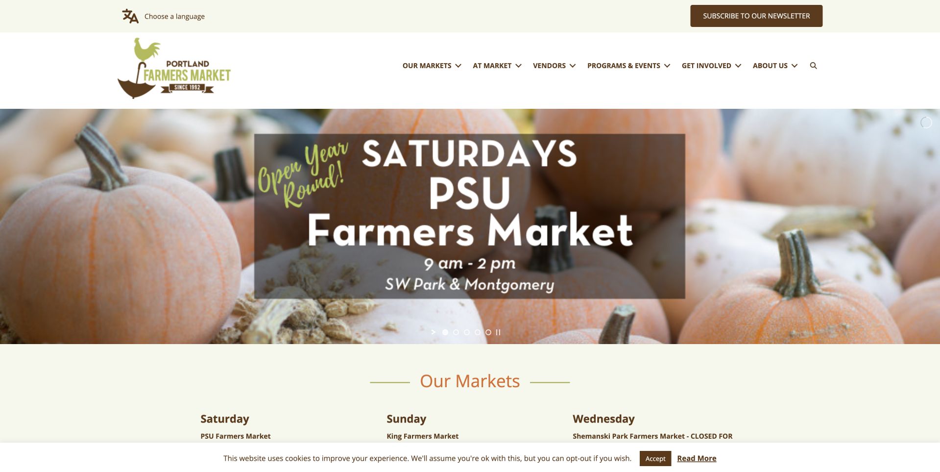
Portland Farmers Market uses a pale header and a pumpkin photograph to introduce the PSU market’s Saturday schedule. The hours and street location are printed within the central campaign, with an Our Markets section beginning directly below. That lower section organizes the wider network by days, creating a useful transition from one featured destination to the full set of options. The design is worth studying because the food image does not displace the operational information. It gives the season a visual setting while leaving the actual question of when and where to go visible in the first screen.
What you can learn
Put schedule and place beside a market campaign, not only in a footer. If one location is featured, provide a clear route to the rest of the network and make sure the date range and holiday exceptions remain consistent across both views.
Pros
The featured market’s hours and street location are visible within the campaign.
A weekly market overview begins immediately below the seasonal photograph.
Cons & considerations
Text embedded over a detailed seasonal photograph needs reliable contrast.
A featured location can overshadow other markets unless the following grid stays prominent.
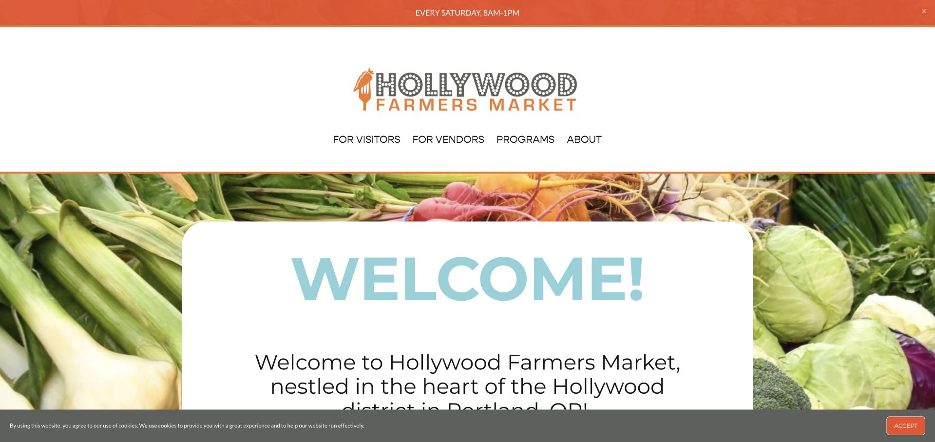
Hollywood Farmers Market uses an orange identity and a photograph of fresh produce around a pale Welcome card. The introductory wording names the Portland neighborhood, making the location context explicit rather than relying on the market’s familiar-sounding name. The header separates visitors, vendors, programs and organizational information. This is useful for a community market that serves several audiences but does not need a complex directory. The card keeps the welcome readable without covering the produce in large white lettering. The practical next task is to connect that friendly introduction with current hours and a clearly labelled route for someone considering selling there.
What you can learn
Use a welcoming introduction to establish the neighborhood, then keep shopper information distinct from vendor applications. Make current hours and location details easy to reach, and do not assume that a market name uniquely identifies its city for a first-time visitor.
Pros
The pale welcome card protects the introduction from the colorful produce background.
Separate visitor and vendor routes acknowledge different practical tasks.
Cons & considerations
The first view gives less immediate schedule detail than some market-network examples.
A tall header can use valuable mobile space before the main introduction appears.
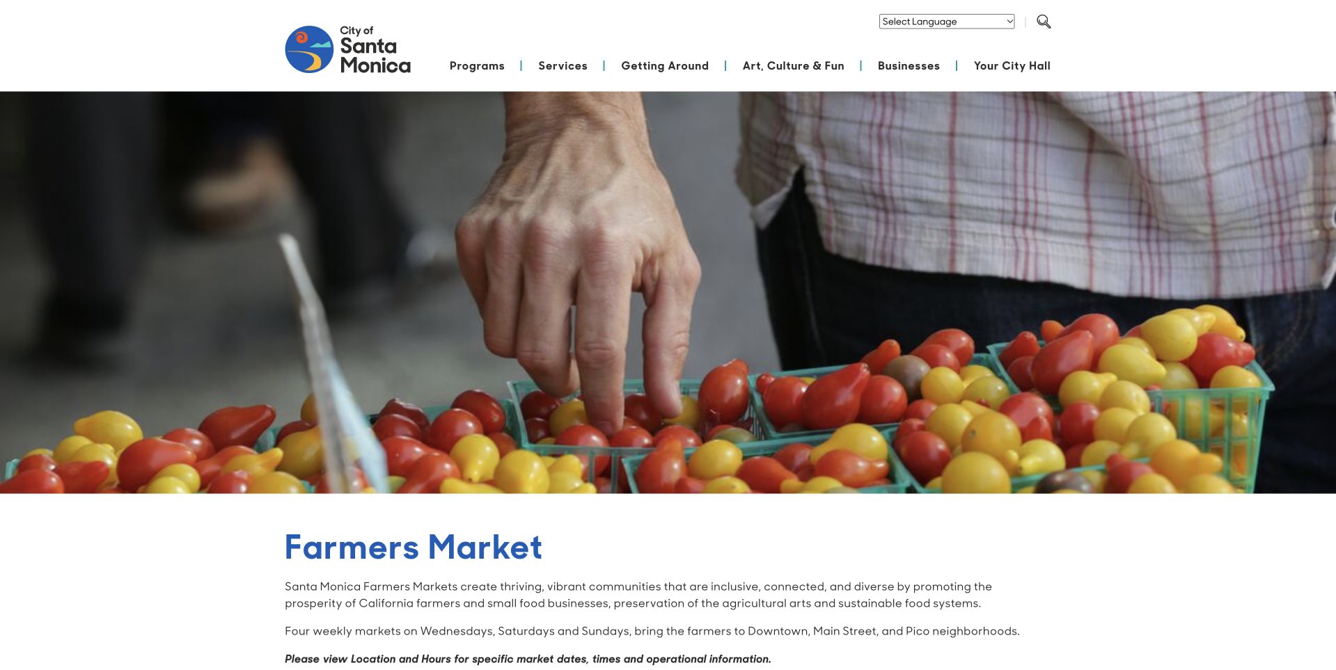
Santa Monica’s Farmers Market page sits within the city’s broader website rather than using a standalone market brand. A wide photograph of tomatoes and a shopper’s hand introduces the subject beneath the civic header. The title and explanatory text begin below the photograph, making the page feel like an official program reference. This is useful when accuracy and continuity with other municipal services matter more than a dramatic retail identity. The reviewed source is the current farmers-market program category, not the old short route that returned an error. The page can therefore serve as a stable introduction to the city’s individual market destinations.
What you can learn
A civic market page should prioritize dependable information architecture over promotional effects. Connect the program introduction to current locations, schedules and accessibility details, and preserve redirects when routes change so residents do not arrive at an obsolete address.
Pros
The civic header makes the market program’s official municipal context clear.
The produce photograph provides a relevant visual introduction without implying a single seller.
Cons & considerations
A large citywide menu competes with the market-specific visit-planning task.
The introductory photograph pushes the program details below the first visible area.
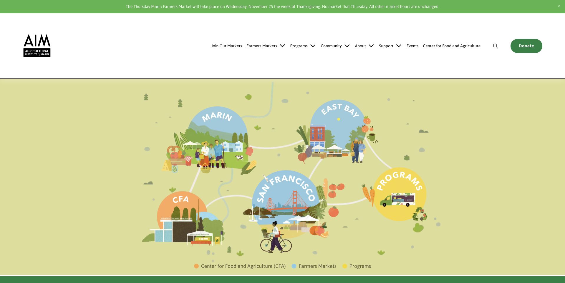
Agricultural Institute of Marin uses a large illustrated landscape rather than a documentary market photograph. Named areas of the drawing introduce markets, education, food access and other connected activities, while the white header retains literal navigation above. The pale yellow-green canvas gives the organization a friendly, distinctive system without centering one seller or product. A narrow current notice sits above the header, keeping operational changes separate from the illustration. This is useful for a regional organization that needs to explain several related roles. The drawing makes those roles approachable, but the navigation still needs to provide direct routes for someone simply checking a market’s next opening.
What you can learn
An illustration can explain a broader food-system organization, provided practical market information remains easy to reach. Separate changing closure notices from the permanent artwork and offer literal text links alongside visual hotspots so the structure works for keyboard and screen-reader users.
Pros
The landscape gives related programs one visual system.
A separate notice accommodates updates without changing the artwork.
Cons & considerations
Illustrated navigation needs accessible text equivalents rather than relying on visual position.
A program-rich introduction can delay the basic question of which market is open.
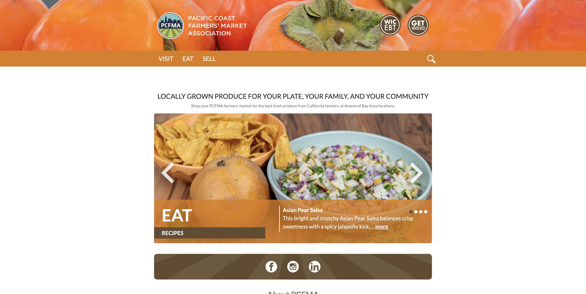
Pacific Coast Farmers’ Market Association uses an orange produce photograph behind its circular identity and a compact set of task-oriented labels. Below the header, a large recipe card introduces prepared food rather than another general market photograph. The arrangement makes the organization feel connected to how produce is used, not only where it is sold. It is useful for a network with a broad educational role, but the market-finding task must remain clear beside editorial recipes. The central design tradeoff is visible: food inspiration can encourage interest while still competing with the practical need to find the correct market and current operating schedule.
What you can learn
Give recipes and market discovery different roles. Food ideas can support a regional network’s mission, but a resident checking hours needs a direct route to locations and exceptions rather than a sequence of editorial cards before useful visit information appears.
Pros
The orange produce header gives the association a distinctive, coherent food identity.
Task-oriented labels provide a clearer starting point than a long organizational menu.
Cons & considerations
A large recipe feature can overshadow the immediate market-finding purpose.
The association’s broad role needs concise explanation for visitors unfamiliar with the network.
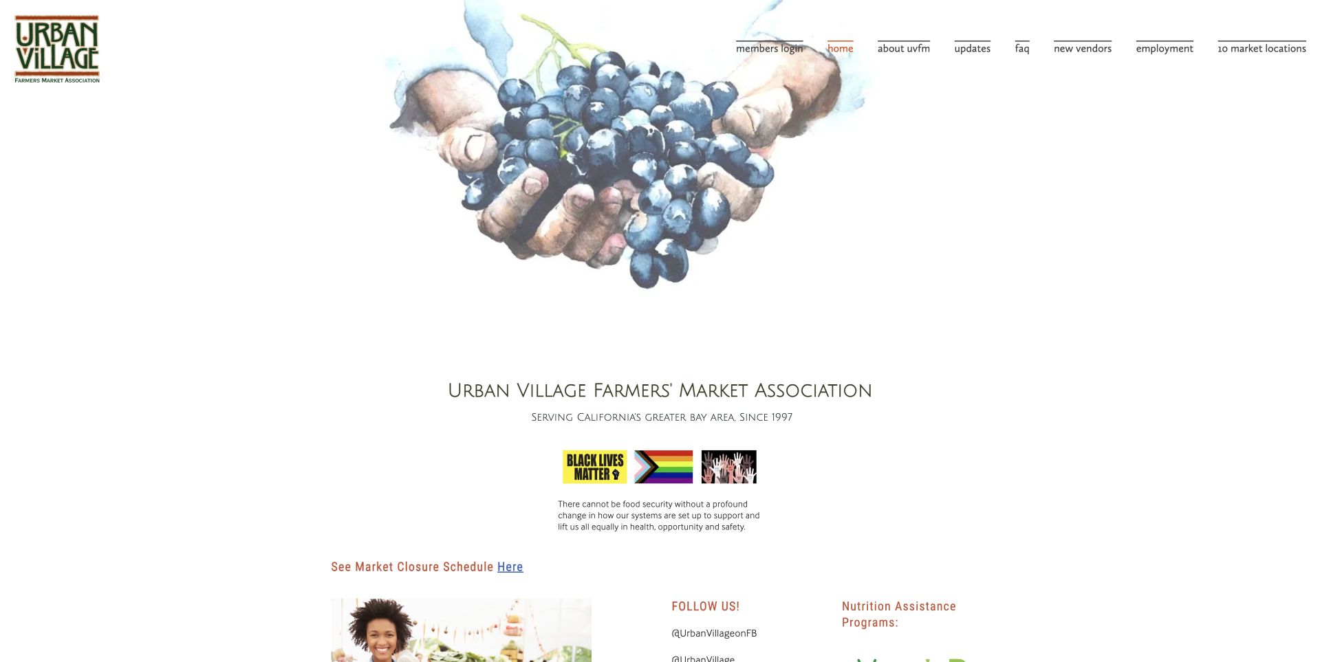
Urban Village Farmers’ Markets uses a small multicolored identity and a large illustration-like image of cupped hands holding berries. Wide white space surrounds the central association name and short supporting information. The page is quieter and more compact than the large campaign-led market networks nearby. It is useful as a reference for a modest organization that wants to communicate stewardship and local produce without commissioning a continuous stream of new hero photography. The tradeoff is that symbolic imagery does not itself help someone plan a visit. Current market locations, hours and food-access details still need clear routes within the restrained presentation.
What you can learn
A low-maintenance homepage can remain welcoming when the practical information is well structured. Use a symbolic image as identity, then prioritize readable market links, current schedules and contact routes so generous white space does not turn into unnecessary searching.
Pros
The berry-and-hands image provides a distinctive produce-related focal point.
The restrained layout can support a simpler ongoing editorial workload.
Cons & considerations
Small central text needs enlargement to remain comfortable on phones.
Symbolic imagery supplies less immediate location context than a real market photograph.
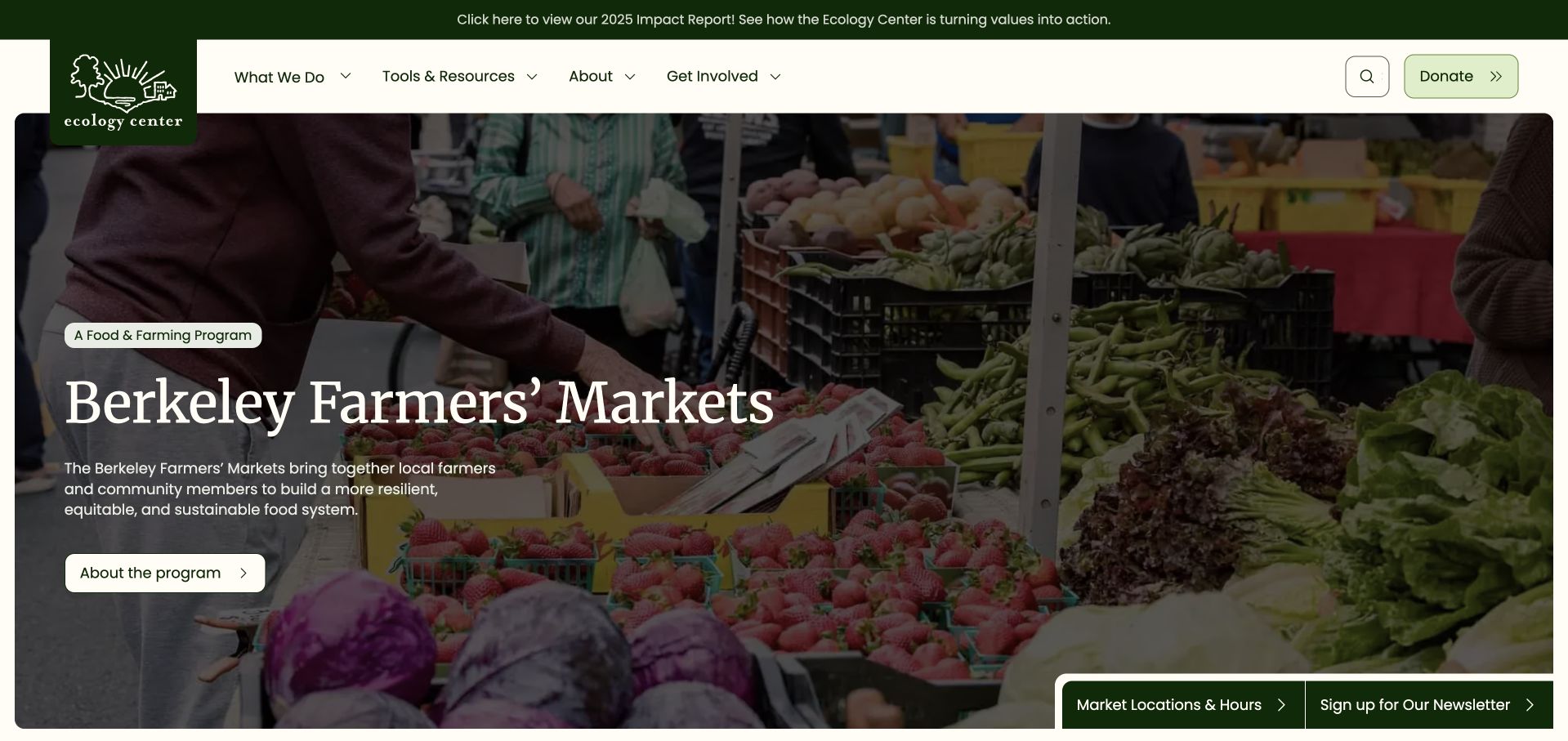
The Ecology Center’s Berkeley Farmers’ Markets page uses the parent organization’s green identity and navigation above a wide photograph of people and produce at a stall. A large serif title and short program introduction occupy the darker left side. Two practical actions remain near the lower edge, including market locations and hours. This is useful program architecture: the page retains the wider organization’s identity without making the market disappear inside it. The photograph is documentary in character, while the title states exactly which program is being described. Visitors can understand the organizational relationship and still find a route toward planning a shopping visit.
What you can learn
When a market sits inside a wider nonprofit website, give it a clear program landing page. Retain the parent identity but prioritize location, schedule and participant information within the page so shoppers do not have to navigate unrelated programs to plan a visit.
Pros
The program title clearly identifies the market within the wider organization.
A visible locations-and-hours action supports the practical shopping task.
Cons & considerations
White copy needs stable contrast over a busy market-stall photograph.
The parent organization’s broad menu can compete with market-specific navigation.
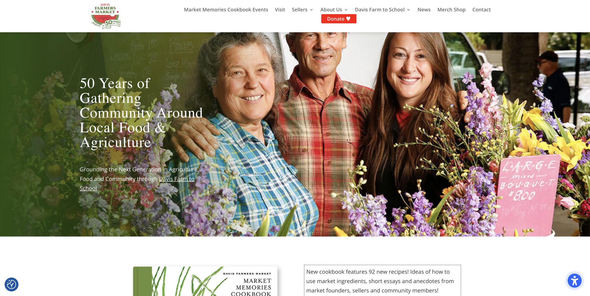
Davis Farmers Market uses a photograph of people at a flower stall beneath a white header and anniversary identity. The large serif text introduces the market’s long-running community role, while a cookbook-related section starts below. The image gives the history a human setting rather than presenting an isolated number or decorative seal. Navigation includes visiting, sellers, school programs and current information, showing the market as a community organization as well as a weekly shopping destination. This is useful for balancing celebration and utility: the anniversary supplies a campaign, but practical visit routes must remain available around it throughout the year.
What you can learn
Use an anniversary to tell a specific community story, not to replace current operating information. Keep visit details prominent, distinguish programs from shopping and plan what replaces anniversary artwork so the homepage remains current after the celebration ends.
Pros
The market portrait connects the anniversary with people and place.
Visitor, seller and program routes remain distinct.
Cons & considerations
The large anniversary message can overshadow the next market’s practical schedule.
Historical campaigns need a clear replacement plan once their dates are no longer current.
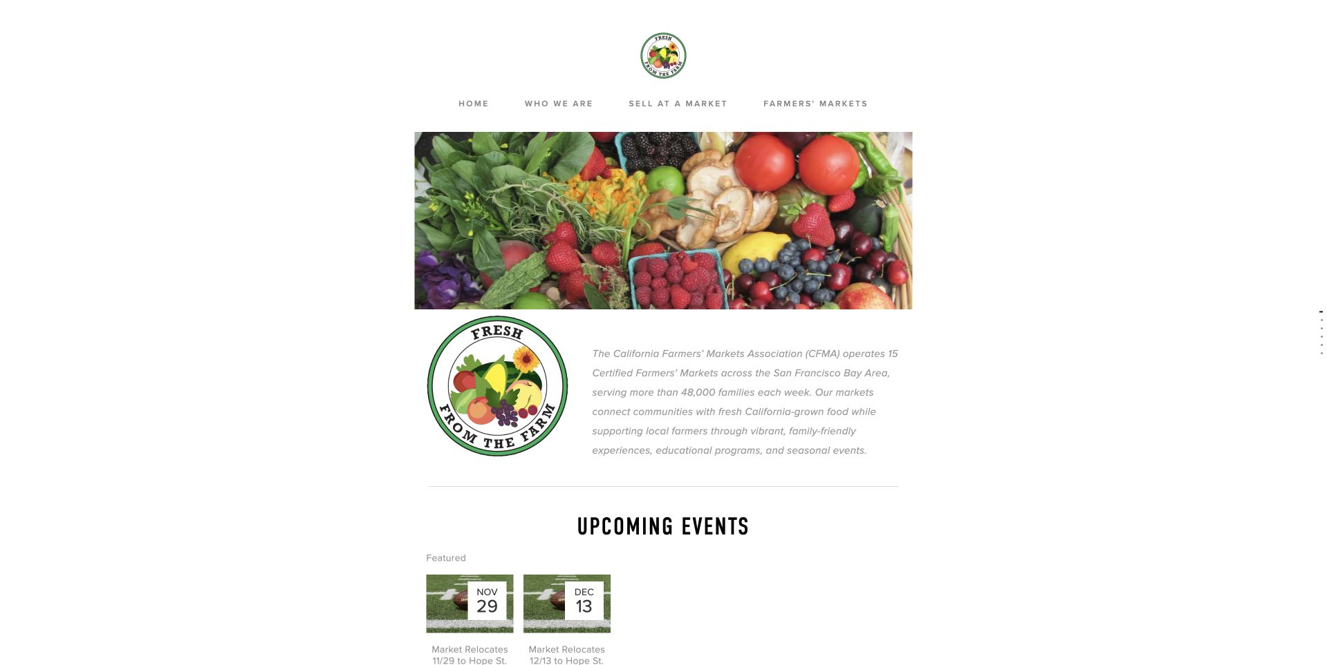
California Farmers’ Markets Association keeps its identity small within a spacious white page. A centered produce photograph introduces the subject, followed by a compact explanation and an Upcoming Events section with date cards. The restrained layout avoids the visual scale of a destination-market campaign and feels more like an association noticeboard. That is useful when current events and a network of market information matter more than a single location’s atmosphere. The small central content column also exposes an important design tradeoff: a simple maintenance model can be sensible, but the schedule and location routes still need enough visual prominence to answer common visitor questions quickly.
What you can learn
A modest association site should prioritize dependable, readable information over oversized photography. Keep events current, use clear market-finding links and make the central text large enough that a low-maintenance layout does not become difficult to read or navigate.
Pros
Event cards distinguish current dates from general information.
A restrained layout reduces campaign-image maintenance.
Cons & considerations
Small central text leaves space unused without improving readability.
A specific market’s hours need a stronger immediate route.
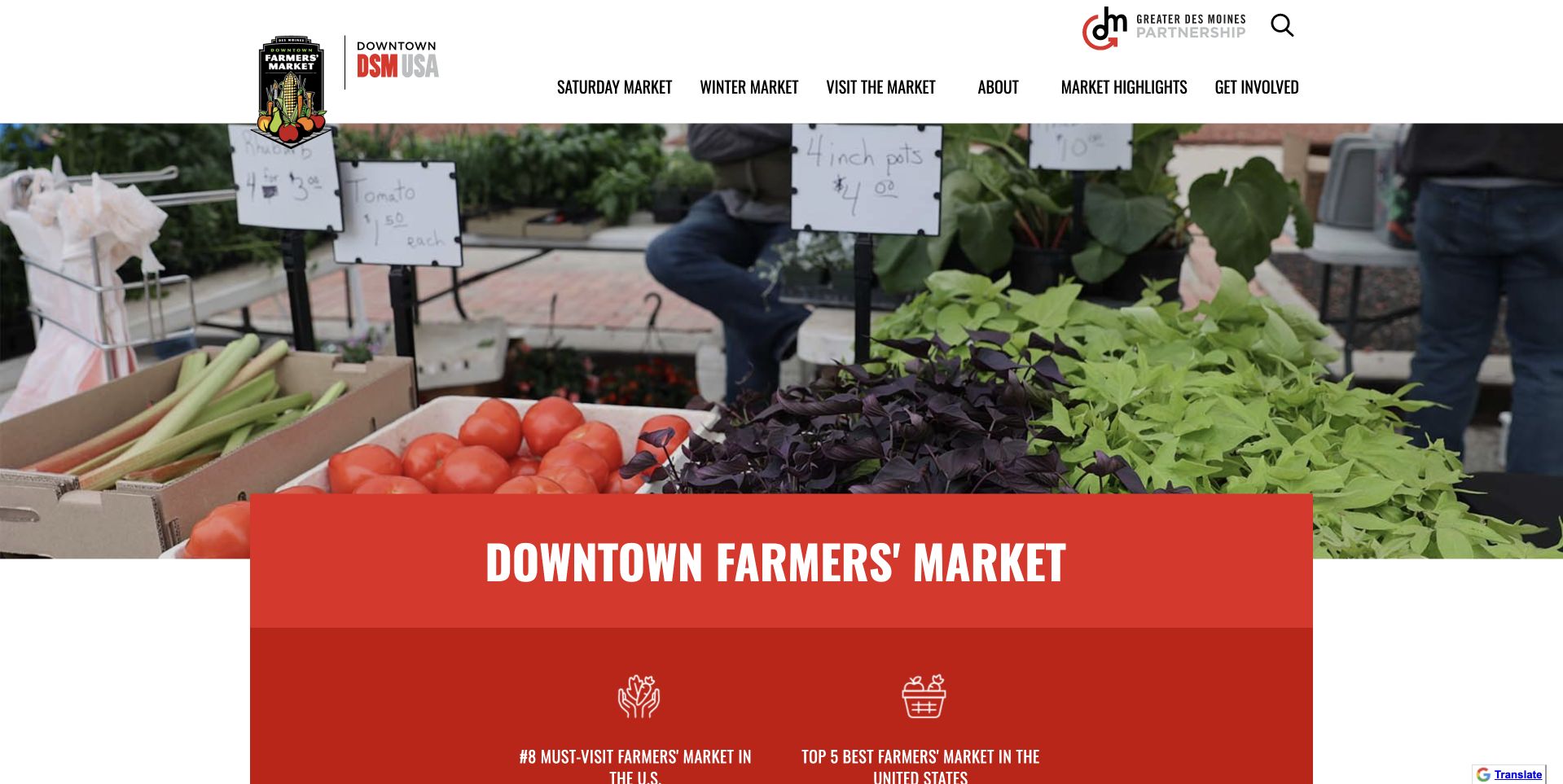
Downtown Des Moines Farmers’ Market uses a compact monochrome identity and literal seasonal navigation above a large photograph of produce stalls. A bright red panel overlaps the lower part of the photograph, carrying the market name and introductory choices. That panel gives the page a strong structural anchor without putting all of the copy directly over the food. The menu separates the Saturday market, winter market and visitor information, acknowledging that one destination has different seasonal forms. This is useful for an event-led market brand: the image creates interest, while the navigation and colored panel begin to explain which version of the market the visitor should investigate.
What you can learn
When a market has several seasonal formats, give each a clearly named route. Use the same identity across them, but preserve their dates, venues and visitor rules so a winter event is not accidentally treated as the normal Saturday schedule.
Pros
The red panel anchors the produce photograph.
Seasonal labels distinguish the market’s different operating formats.
Cons & considerations
Overlapping panels need careful responsive handling to avoid covering useful image or text areas.
A destination-brand introduction still needs prominent current dates and venue details.
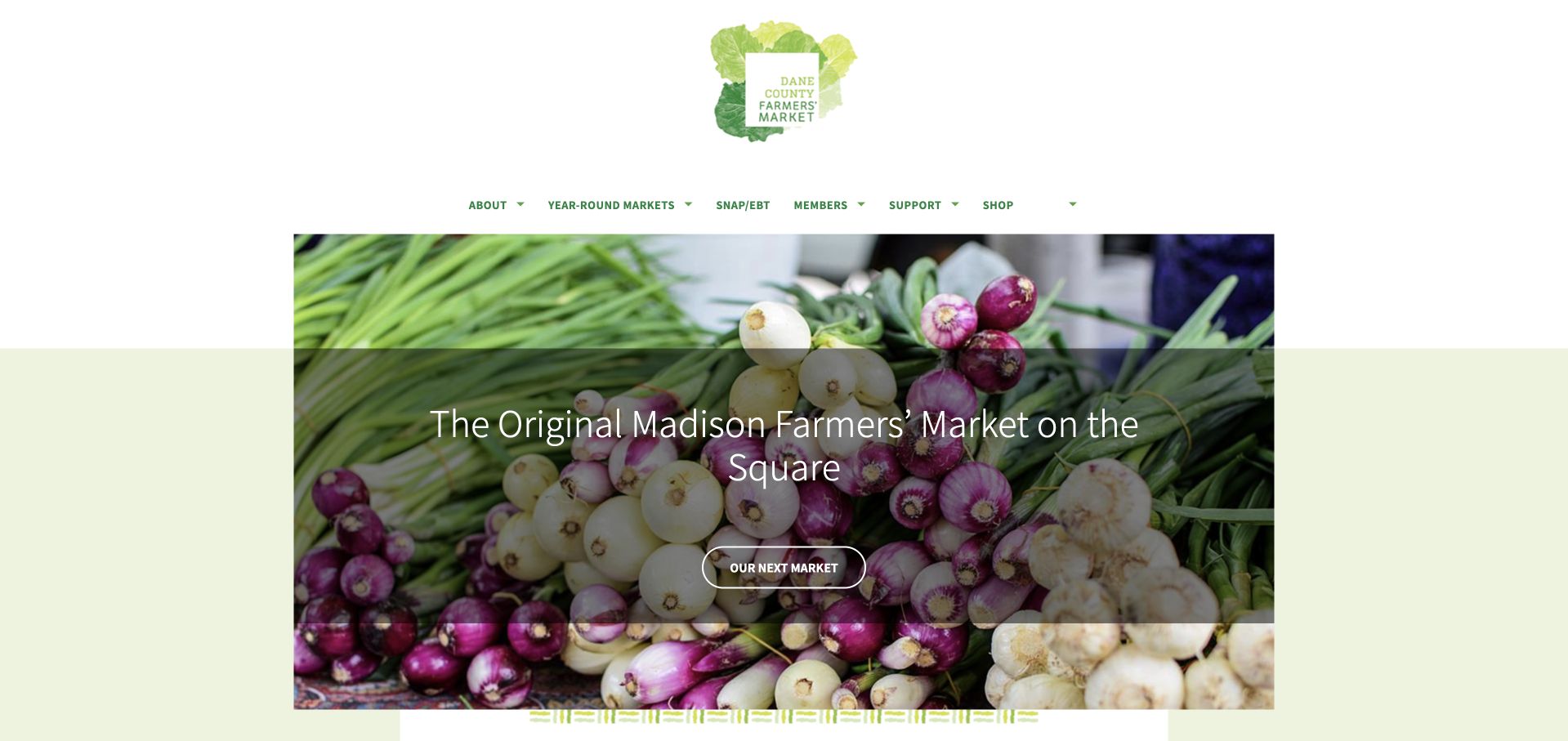
Dane County Farmers’ Market uses a small green-and-yellow identity above a centered photograph of vegetables. A short white statement introduces the Madison market, with a rounded Find Your Market action beneath it. Pale green bands and generous white margins give the page a calm, produce-led tone. This is useful for a market organization where the identity and location task are more important than a continuous promotional carousel. The visual hierarchy is simple enough to understand quickly: organization, produce, next action. The photograph does not attempt to represent every seller or product, leaving the current market details to the destination reached from the main button.
What you can learn
A simple market homepage can work well when its one main action is useful. Make market finding lead to clear current schedules, location and exception information, and keep supporting seller or visitor routes available without turning the first screen into a crowded noticeboard.
Pros
One market-finding action gives the composition a clear purpose.
Pale green framing connects identity and produce imagery.
Cons & considerations
White text over varied vegetables needs careful contrast and responsive crop testing.
A general market-finding button needs descriptive results rather than another broad introduction.
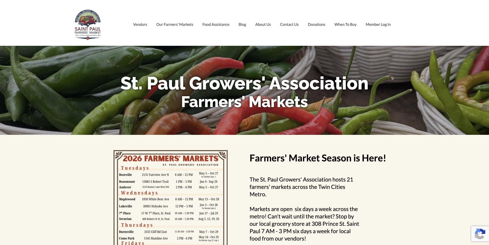
St. Paul Farmers’ Market uses a green-and-cream palette and a close photograph of vegetables beneath its circular identity. A large heading identifies the growers association, while the next section places a market list beside a short explanation of the season. The layout is useful because it begins to expose the network rather than making the visitor enter a separate search experience before seeing any locations. Food-access, vendor and contact routes remain in the header. The design makes a regional association understandable through ordinary produce imagery and a practical directory, without implying that all locations share the same hours or current seasonal arrangements.
What you can learn
For a market network, place useful location choices near the introduction. Keep each market’s own schedule and seasonal status attached to its listing, and distinguish grower information and food-access programs from the ordinary task of finding somewhere to shop.
Pros
The market list appears early beside the introductory explanation.
The grower-association title clarifies the scope beyond a single market location.
Cons & considerations
A long location list needs readable spacing and a useful mobile presentation.
Seasonal wording can become stale unless it is tied to explicit current dates.
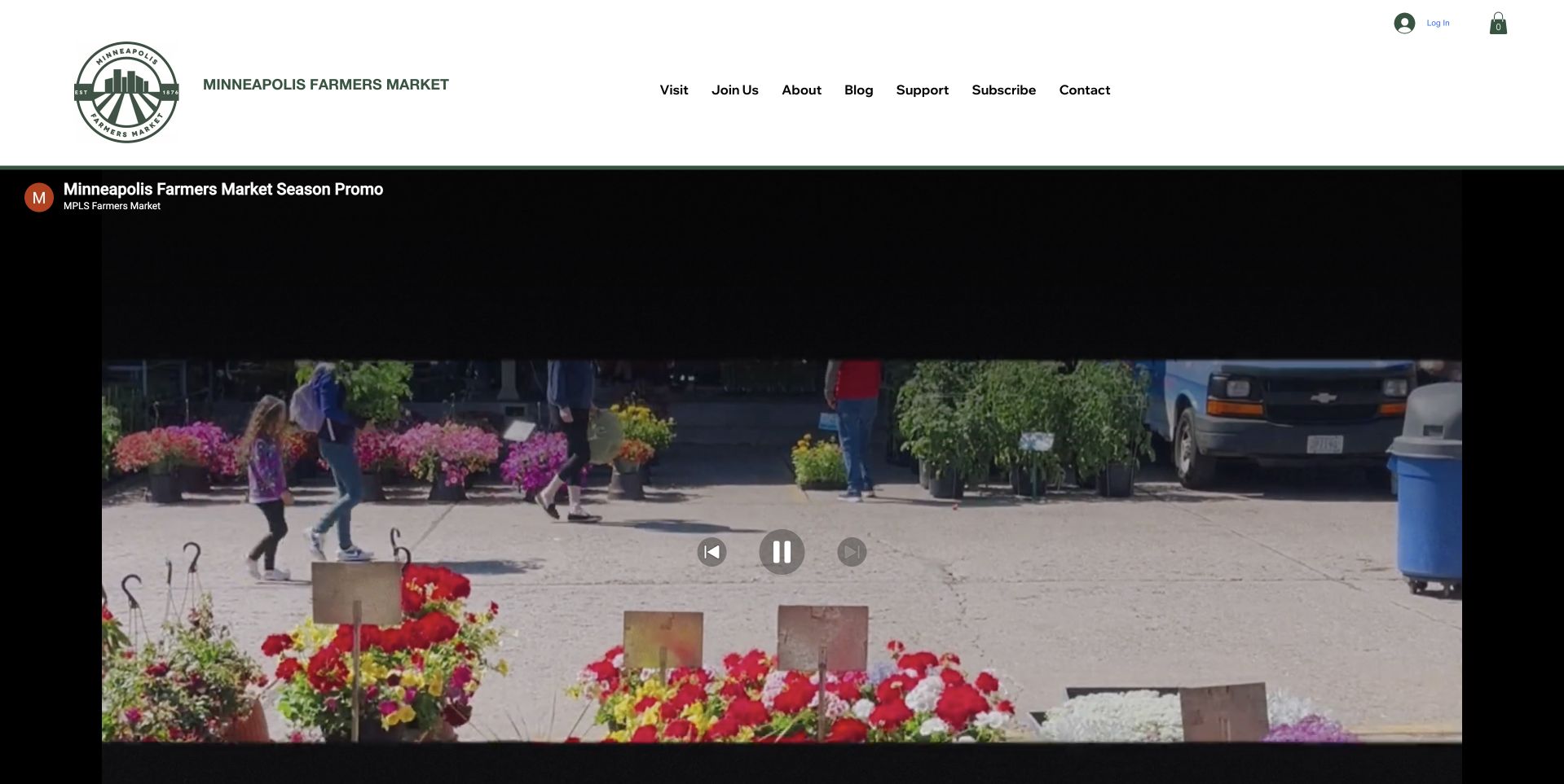
Minneapolis Farmers Market places a compact green-and-black identity in a white header above a large embedded season video. The visible frame shows flowers and market activity, supplying a sense of the place rather than a static product arrangement. The navigation includes visiting, joining, organizational information and support, giving different audiences distinct routes. This is useful for considering video as an introduction, but the black player chrome and controls also occupy a substantial part of the first screen. A market visitor still needs dependable hours and directions even if they do not play the film or cannot use the embedded service.
What you can learn
Use video as optional context rather than the only explanation of a market. Provide a meaningful poster image, captions and a clear non-video route to current visit information, and avoid making visitors load or play a film before discovering the schedule.
Pros
The market footage can communicate people and activity beyond a single produce photograph.
Visitor and participation routes remain separately labelled above the player.
Cons & considerations
The embedded player consumes substantial first-screen space before practical information appears.
Third-party video needs accessible controls, captions and a useful fallback state.
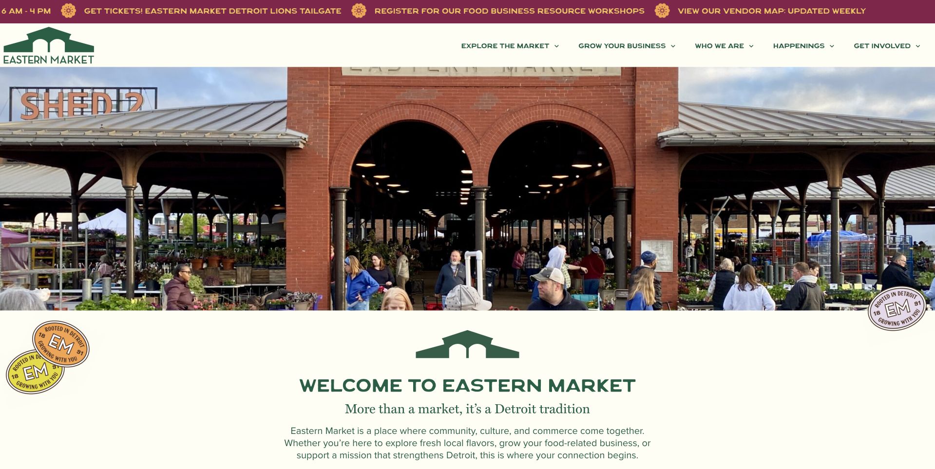
Eastern Market Detroit uses a wide photograph of its recognizable brick entrance and covered market structure. Burgundy and green accents frame the header, while a cream section below begins a clear Welcome to Eastern Market introduction. Small current notices above the image identify different kinds of activity without replacing the main identity. This is useful for a public market with several roles: the architecture establishes the destination, while the page begins to separate visiting, shopping and participation. The photograph supplies scale and place, but customers still need specific current information about which market format or event is operating on their intended day.
What you can learn
A landmark entrance can unify a complex market brand, but the visit details must remain specific. Distinguish regular market days, special events and permanent businesses, and keep their hours and transport information attached to the correct destination pages.
Pros
The brick entrance gives the market a recognizable setting.
A separate welcome allows explanation without crowding the photograph.
Cons & considerations
Multiple announcement strips can be difficult to scan on phones.
The image does not clarify which market format is open today.
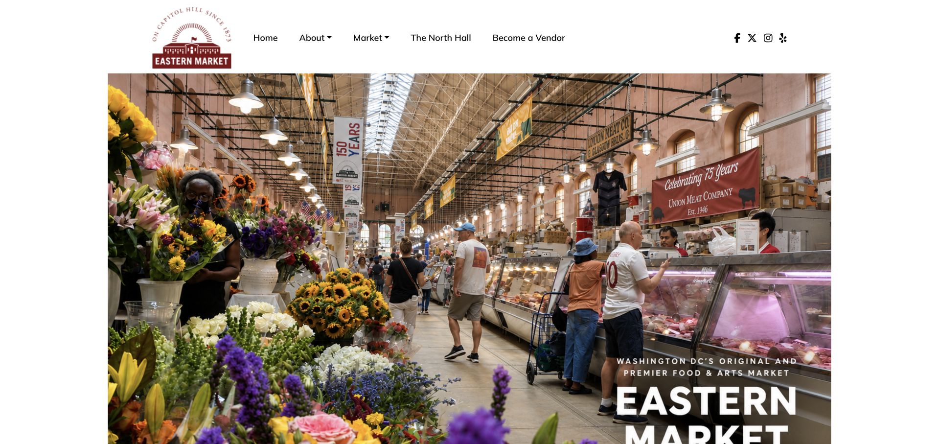
Eastern Market DC uses a large interior photograph showing stalls, flowers, shoppers and the roof structure of the hall. A compact circular identity sits above it, while the destination title is placed over a darker area at the lower right. The image makes the market feel like a real, navigable place rather than a generic festival of produce. Navigation distinguishes market information, the hall and vendor participation. This is useful for a destination with indoor and outdoor activities that may operate differently. The photograph introduces the setting, but the detail pages still need to make the relevant opening times and vendor arrangements explicit.
What you can learn
Show the shopping environment when the building is part of the visit. Keep indoor hall information distinct from outdoor stalls and events, and give users a readable route to current hours even when the main image is designed to be immersive.
Pros
The interior photograph shows a specific market environment.
Separate hall and vendor routes acknowledge different uses.
Cons & considerations
Text at the photograph’s edge needs careful cropping and contrast on narrow screens.
One interior image cannot explain different indoor, outdoor and event schedules.
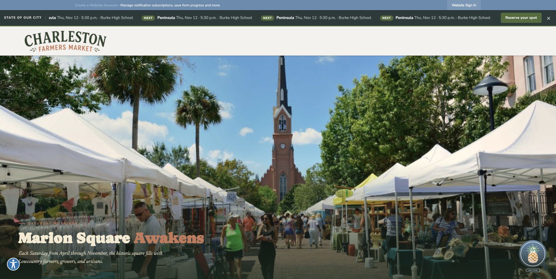
Charleston Farmers Market uses the city website’s dark civic header above a broad photograph of stalls and shoppers in Marion Square. The market identity remains visible at the left, and a short location-based title sits over the lower part of the image. This is useful as an example of an official program page that still gives the public event a clear visual character. The municipal context supplies continuity with other city services, while the market photograph establishes the particular destination. The reviewed URL is the city’s current public Farmers Market page, reached through a redirect from the older standalone market domain.
What you can learn
A municipal market can keep its own identity within a civic system. Preserve descriptive redirects from old domains, prioritize the current schedule and venue, and make operator information distinct from the products or commitments of individual participating sellers.
Pros
The public-square photograph connects the official page with a recognizable destination.
The current redirected city page preserves a clear market-specific visual identity.
Cons & considerations
The large civic header competes with the market’s own practical navigation.
Overlay text must remain legible across a detailed crowd and stall photograph.
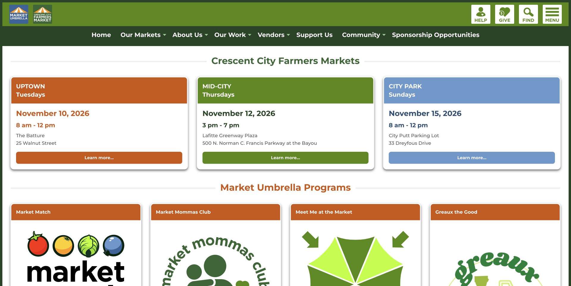
Crescent City Farmers Market gives three upcoming market cards the main space beneath a green header. Each card has a distinct color, location label, day and current date, with hours and a learn-more action. Program tiles begin below. This is one of the collection’s clearest examples of operational information taking priority over atmosphere. The visitor can start with when and where to shop rather than reading a broad mission paragraph or watching a video. The surrounding Market Umbrella identity explains that the network also supports other programs, but those programs do not hide the immediate market schedule.
What you can learn
If the main task is choosing the next market, show the next actual dates instead of only recurring weekday names. Keep every card linked to complete location and exception details, and update the displayed dates automatically or through a dependable editorial process.
Pros
Upcoming dates, locations and hours are grouped together in easily compared cards.
Program content follows the schedule instead of displacing the main shopping task.
Cons & considerations
Color-coded cards need clear text labels so color is not the only distinction.
Date-specific information requires a reliable update process to avoid misleading visitors.
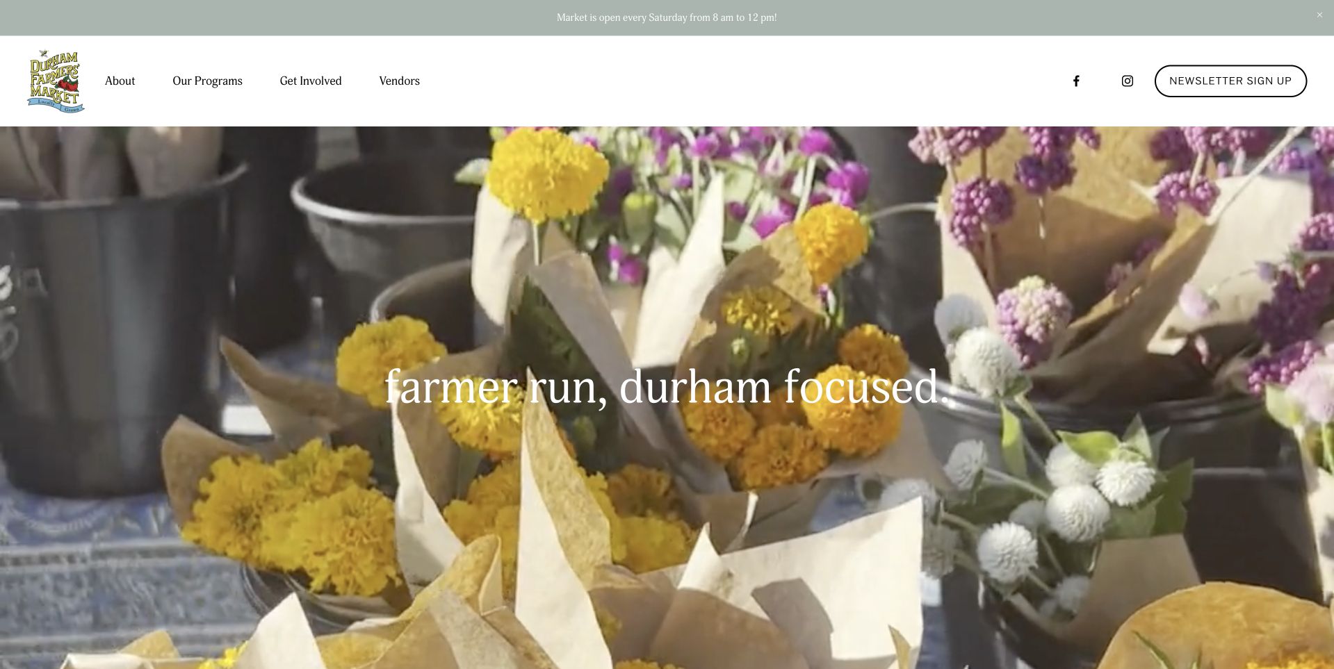
Durham Farmers’ Market uses a wide photograph of flowers and market activity beneath a restrained white header. A short lowercase local statement sits across the image, while a narrow announcement above carries the recurring opening information. The navigation separates visiting, programs, organizational details and vendors. This is useful for a market that wants a clear neighborhood identity without building a complicated promotional system. The flowers introduce one recognizable part of the market rather than pretending to summarize every seller. The practical schedule is kept outside the photograph, which makes it easier to update without rebuilding the main visual introduction.
What you can learn
Keep current opening information in an editable text component even when the hero is photographic. Use the image to establish place and activity, then provide literal visitor and vendor routes so the local welcome leads into a useful task.
Pros
The flowers provide a specific, appealing market subject without a generic stock-food collage.
The separate announcement makes recurring schedule information easier to maintain.
Cons & considerations
Small text over the photograph can become hard to read on mobile screens.
A concise local slogan still needs supporting directions and access information nearby.
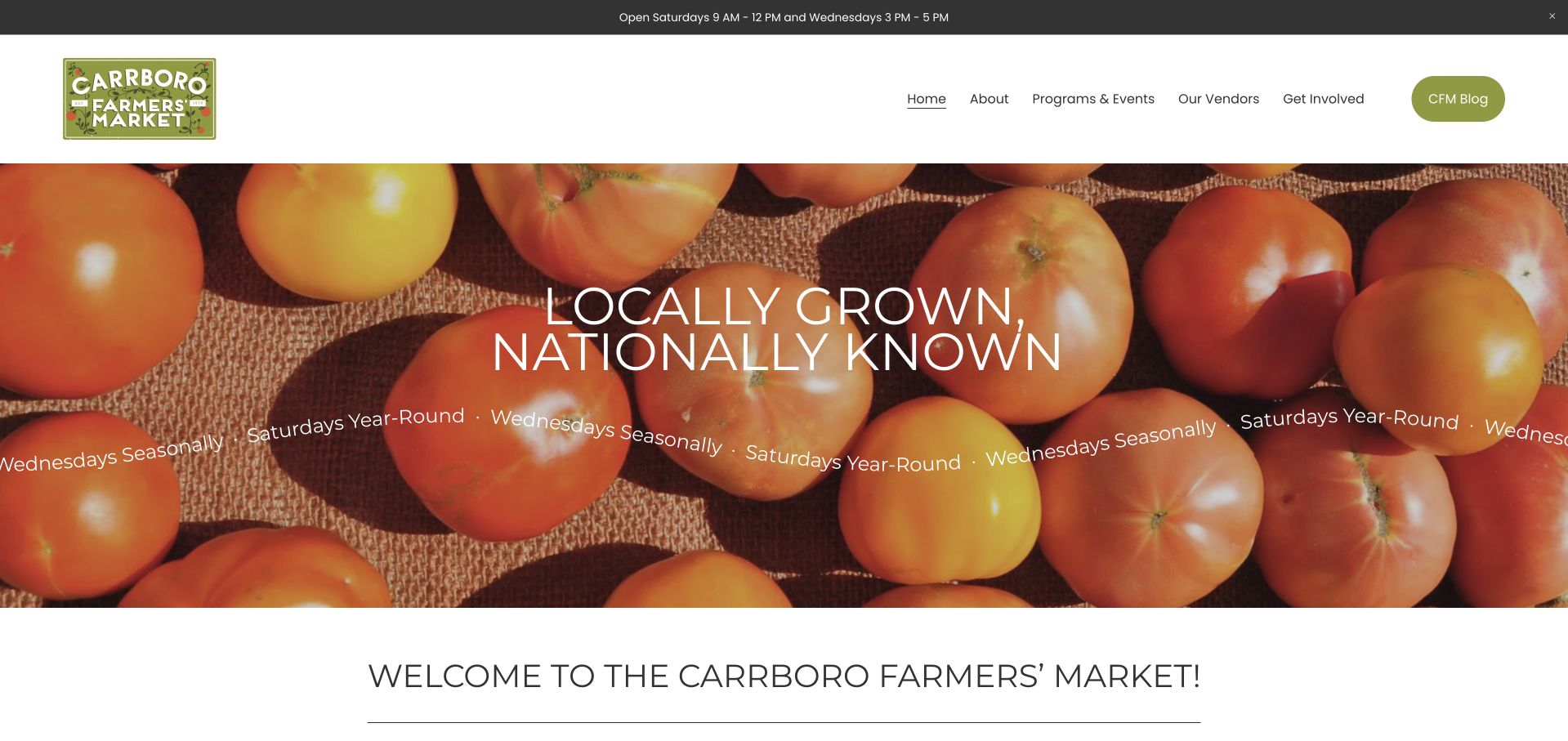
Carrboro Farmers’ Market places a green-and-white identity above a close photograph of tomatoes in woven baskets. A short central statement introduces the local-growing proposition, while recurring schedule language appears across the lower part of the campaign. A welcome section begins immediately below. The top announcement also carries current hours, making operational details part of the overall structure rather than a footnote. This is useful for a market that changes between summer and winter schedules. The produce photograph remains a stable identity asset while the hours and event notices can change around it, provided those separate text areas are kept consistent.
What you can learn
Give schedule changes an explicit home outside the permanent photograph. Use dates and season labels consistently across announcements and market pages, and make current event pop-ups optional so they do not prevent a visitor from checking the ordinary opening information.
Pros
The tomato photograph gives the market a simple and distinctive produce identity.
Separate announcement space accommodates seasonal hours without redesigning the main image.
Cons & considerations
Repeated schedule text can become inconsistent if maintained in more than one place.
White lettering over bright tomatoes needs careful contrast at small screen sizes.
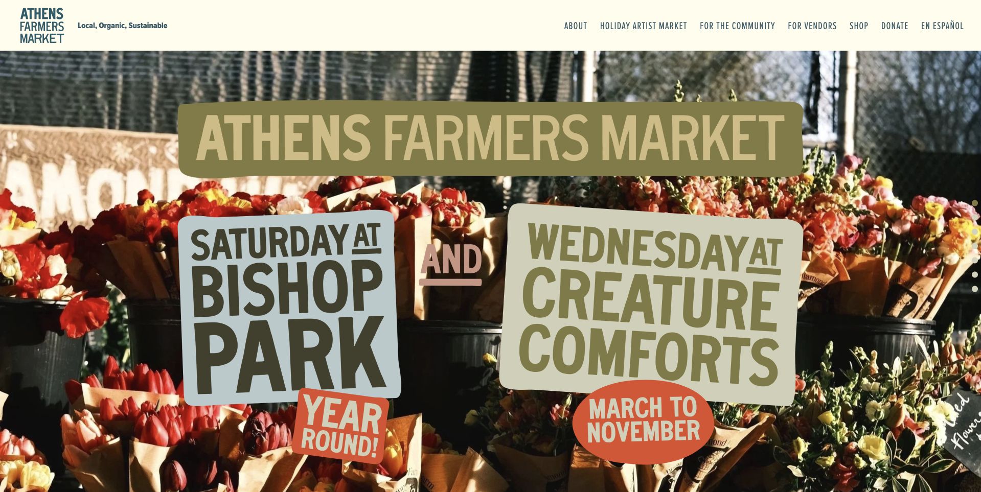
Athens Farmers Market uses a compact pale header above a lively market photograph with large physical-looking signs for its Saturday and Wednesday locations. The scene connects the organization with people and produce while making the two weekly formats visible in the image. Supporting navigation provides vendor, program and market routes above. This is useful for showing how location and schedule can become part of the identity, but it also reveals a maintenance risk: information inside a photograph is harder to update than ordinary page text. A visitor needs the current schedule in accessible text as well as in the photographed sign.
What you can learn
Treat photographed schedules as supporting visuals, not the authoritative operating record. Repeat current dates, hours and venues in editable accessible text, and make clear which weekly location each piece of information belongs to before someone plans a trip.
Pros
The scene connects the two weekly market formats with real activity and place.
The compact header leaves most of the opening view to the market itself.
Cons & considerations
Schedule information within an image is harder to update and access nonvisually.
A busy documentary scene can compete with additional overlaid campaign text.
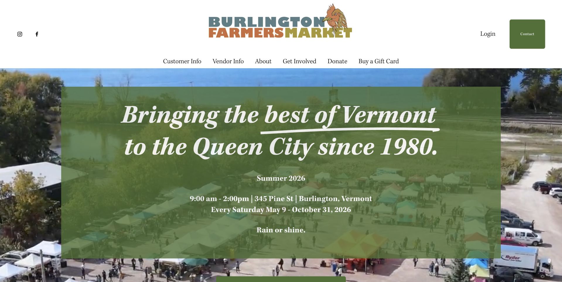
Burlington Farmers Market uses a playful green identity above a large outdoor market photograph. A translucent green panel carries the regional introduction and an explicitly dated summer-season schedule, including hours and location. This is useful because the scenic image does not leave visitors guessing whether the market is open year-round. The header also separates customer information, vendor information and support. The design’s strongest lesson is the combination of atmosphere with a bounded operating period. The photograph invites a visit, while the dated panel provides a basis for deciding whether that visit fits the current season rather than assuming an evergreen weekly schedule.
What you can learn
For a seasonal market, state the year and operating period clearly. Plan the transition to winter or off-season information before the summer schedule expires, and keep directions and exceptions available in ordinary text rather than only inside a decorative image panel.
Pros
The dated seasonal panel makes the operating period more explicit than a generic welcome.
Separate customer and vendor routes support distinct practical audiences.
Cons & considerations
A translucent panel needs enough contrast across changing outdoor photographs.
The seasonal introduction must be replaced promptly when its date range ends.
Kegan is a freelance web designer and developer with 15+ years of experience helping businesses turn complicated website requirements into clear, maintainable digital experiences. He works directly with clients from planning and design through development, launch, and ongoing support.
For farmers market website design, his development approach focuses on dated market schedules, location and access information, vendor discovery, seasonal notices, and distinct visitor and producer journeys. The scope can be a targeted improvement or a complete custom build, with responsive layouts, thoughtful content structure, and integrations chosen around the people using and maintaining the site.
Show 3 other farmers market website designersHide other farmers market website designers
Plan the schedule and location records before the campaign imagery
Give every market a single current record
Record its name, address, normal schedule, operating season, current status and contact route. Add transport, parking, access and facilities information only to the level the operator can verify. Keep exceptional notices dated and connected to the correct location. If a network uses the same schedule in several places, publish from one maintained source rather than asking staff to update a header, calendar, footer and social embed independently every time something changes.
Decide how sellers and products are represented
A seller directory can be organized by market, day or product category, but the information needs an update owner. Clarify whether attendance is expected or confirmed and avoid implying that a listed product is guaranteed at every visit. Foodwise’s seller directory shows the usefulness of practical discovery categories. Keep the operator’s application process separate from seller browsing, and collect only the information needed for the task when a form is eventually used.
Design the off-season and exception states
A seasonal market still needs a useful website when it is not operating. State the relevant year and date range, explain the next known opening or alternative format and preserve directions and contact details. Write the closure state before launch, not during the first disruption. Plan how an urgent notice is posted, reviewed and removed. A beautiful summer photograph should never be the only clue a visitor has about whether a November trip is worthwhile.
The editing job behind the design
Choose tools that keep public information dependable
[object Object]
[object Object]
[object Object]
Our WordPress website examples offer a separate look at publishing approaches. A visible platform label is evidence for that named page, not a guarantee that the same system will suit your requirements.
Before the public launch
A farmers-market website planning checklist
State whether the website represents one market, a network, a historic venue or a wider program operator.
Create one maintained record for each location’s address, schedule, season and current operating status.
Show the next useful opening information near the introduction rather than only in a footer or social feed.
Use explicit dates and years for seasonal schedules, temporary closures and exceptional opening arrangements.
Provide directions, transport and facility details to the level the operator can actually verify.
Pair any map with a readable list and individual market details that work without map interaction.
Separate shopper information, seller applications, volunteer opportunities and donations into clearly named routes.
Explain directory scope and whether seller attendance or product availability is confirmed, expected or subject to change.
Describe food-access programs accurately without implying eligibility or availability beyond the operator’s current information.
Use real market imagery or accessible illustrations with permissions and appropriate text alternatives.
Test the site in-season, off-season and during an exceptional closure without submitting real forms.
Assign owners for schedule updates, notice expiry, directory maintenance and correcting reports from the public.
These checks are a project checklist, not a performance, legal, security, or accessibility certification. Test real journeys with the people responsible for the website before making claims about the result.
Sources & editorial method
How this collection was selected and reviewed
Public pages were reviewed and captured in a normal browser. Commentary concerns visible design, not produce quality, vendor suitability, compliance or organizational results. Municipal, regional and mixed-market contexts are identified where relevant. Technology notes require separate evidence rather than visual inference.
Each example links to its actual source page. Screenshots are direct browser captures with their own capture dates; moving imagery, announcements and live designs can change. The notes describe observable design choices and conditional tradeoffs, not measured traffic, conversion results, service quality, or accessibility conformance.
Technology labels use public page metadata, asset evidence, or explicitly cited platform documentation. Platform documentation is not a complete current deployment audit. A component reference may be legacy or unused; it is not a complete backend inventory. Unknown stacks are omitted. These sites are editorial examples, not our client portfolio.
Written, Edited and Curated are separate editorial records, not timestamps advanced by a rebuild. Website designs and imagery belong to their owners. See our editorial standards or suggest a correction.
Questions worth asking
Farmers Market website design questions
What should be at the top of a farmers-market homepage?
Current visit information or a clear route to it. A strong photograph can help establish the place, but visitors should quickly find the relevant date, hours and venue. For a network, begin with a useful way to choose the correct market.
Does a market website need an interactive map?
Not always. A single market may need clear directions more than a complex map. A network can benefit from geographic discovery, but it should retain a readable list and location pages so the information works without map interaction or a particular third-party service.
Should every seller have a page?
Only if the directory can be kept useful and current. Decide which details matter, who maintains them and how attendance changes are represented. A shorter dependable directory is better than an extensive collection that implies every seller will attend every market.
How should seasonal closures be handled?
State the operating period with a year, give the next known information and remove expired notices. Keep contact and location details available off-season. If a winter format exists, explain its different venue or dates rather than treating it as the normal summer schedule.
Can the operator’s site guarantee what is sold?
The website should describe its actual role. Operator information, seller listings and product availability are different things. Avoid language that turns a directory entry or an appealing market photograph into a guarantee about individual sellers, products or services.