Definitive guide · Beaver Builder website development
Best Beaver Builder Websites of 2026 (20 Real-World Examples)
Twenty public websites with dated Beaver Builder plugin evidence, real screenshots and original ideas for planning a useful WordPress website.
Beaver Builder projects benefit from a small, well-organized set of reusable layouts. These examples show how very different organizations arrange introductions, audience choices, practical details and next steps within a coherent public website.
Beaver Builder is a visual page builder for WordPress. Its official documentation describes layouts assembled from rows, columns and modules, with reusable content for repeated patterns. The tool can support many visual directions; choosing the right information, maintaining its accuracy and giving visitors useful destinations remain editorial and design decisions.
The collection opens with Janus Henderson Investors, Patient First, FSG, BMS CAT and BankNewport. Their official pages establish distinct global, national or regional contexts. They are recognizable opening references, not a claim that every organization operates at the same scale. Every example has an explicit saved Beaver Builder plugin reference on its named public source page; private accounts, operational systems and unrelated properties are outside that evidence.
Before the examples
What makes good Beaver Builder website development in 2026?
Define the content before choosing modules
Start with what visitors need to understand: the offer, its scope, relevant evidence and a useful next step. Write representative content before arranging rows. A clinic location, a venue program and a project case study may share spacing and colors while requiring different fields. A good reusable layout accommodates ordinary real content, not only a short headline and the strongest photograph.
Choose the right kind of reuse
Beaver Builder distinguishes reusable templates, synchronized global content and components with selected editable settings. Those differences matter when a team updates a site. Decide whether a change should affect one page, every instance, or only the allowed fields of a shared design. Name saved items clearly and record their intended scope so editors can choose the right pattern without trial and error.
Several examples serve more than one audience: patients and existing clients, service customers and partners, planners and attendees. Separate those journeys with specific labels before adding visual emphasis. A large photograph can establish context, but a visitor should still understand where to go for locations, practical details or account access. Avoid making a rotating campaign the only route to essential information.
The collection · 20 examples
20 Beaver Builder website examples worth studying
These twenty distinct public properties have genuine saved browser captures and original Beaver Builder-focused design reviews. Each source has an existing broad technology audit and an explicit bb-plugin resource reference. Screenshots, audit times and collection review dates remain separate. The reviews discuss visible design decisions without attributing individual controls, private systems or business results to the builder.
We start with five recognizable brands or organizations: Janus Henderson Investors, Patient First, FSG, BMS CAT, BankNewport. Each attribution applies to the named website property, not every product or website belonging to its organization. This is a curated reading sequence, not a measured ranking.
Janus Henderson gives its opening composition a distinctive center: an oversized orange ampersand connecting a portrait with the brand’s message. The white header stays restrained, while audience routes underneath begin separating financial professionals, individuals and institutions. That division is the useful design idea for a Beaver Builder project. A shared visual system can remain consistent while different readers receive appropriate starting points. The saved plugin reference belongs to this public United States page; it does not identify the systems behind investment research, transactions or client accounts.
What you can learn
Plan audience selection as an information-architecture decision before styling the hero. Give each route a clear destination and owner, then make sure a strong campaign composition does not postpone the practical choices visitors came to find.
Pros
The orange graphic supplies a memorable focal point without filling the header with decoration.
Distinct audience entry points make a complex organization easier to approach from the homepage.
Cons & considerations
The large opening composition places useful audience choices relatively low in the captured viewport.
A public marketing screenshot cannot demonstrate the usability or security of downstream account experiences.
Platform source: Dated public Beaver Builder plugin resource. Dated Beaver Builder plugin resource reference on janushenderson.com/en-us; no version, individual module, private account or organization-wide system attribution. Platform evidence is separate from the direct website screenshot and is not a complete current infrastructure audit.
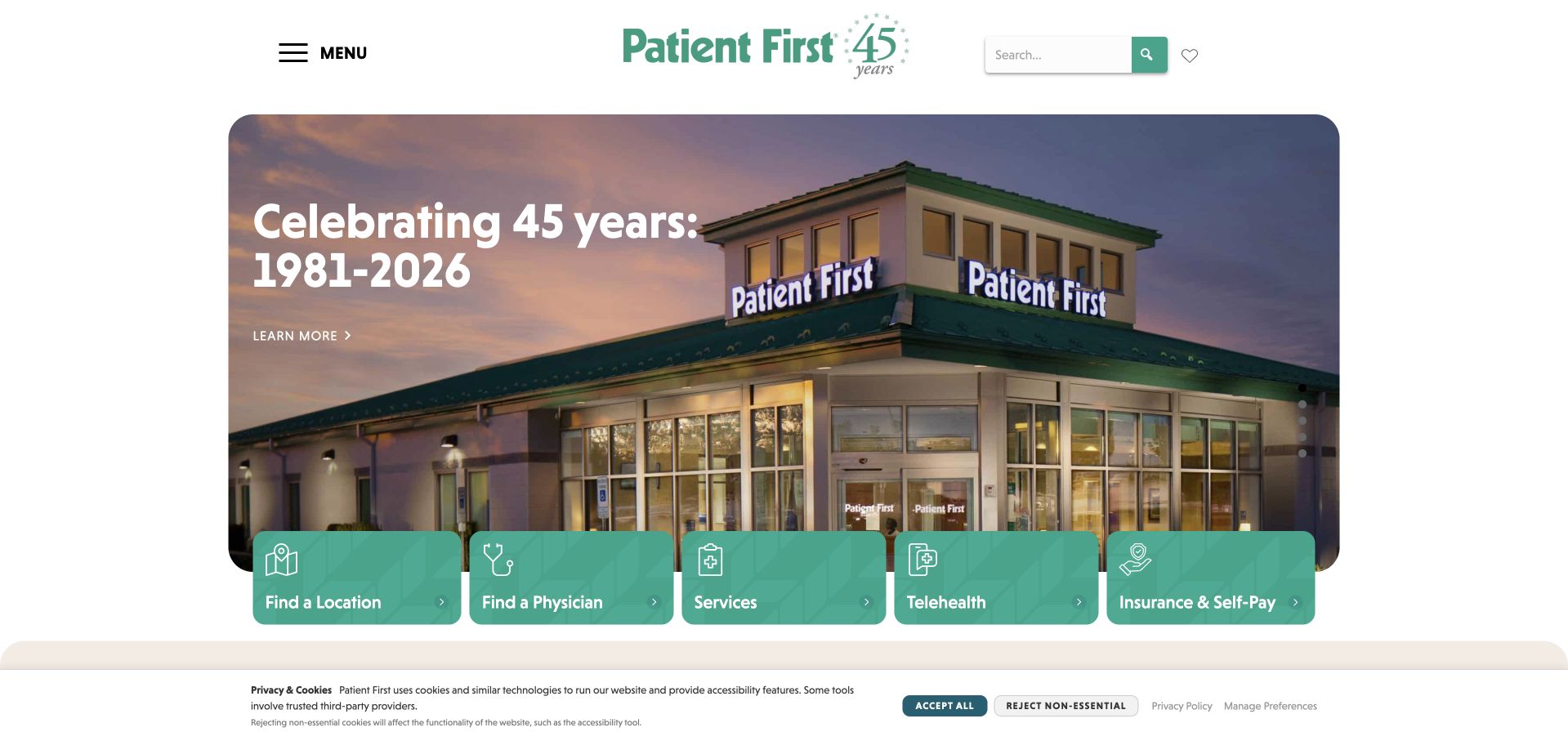
Patient First places a photograph and anniversary message inside a rounded central banner, then overlaps it with five green route cards. Location, physician, services, telehealth and insurance information each receive their own recognizable entrance. The composition illustrates how a builder-based homepage can organize practical tasks without making every visitor read the same introduction. Its official location directory establishes a Mid-Atlantic care network, rather than a nationwide footprint. The saved Beaver Builder resource evidence applies to the photographed public homepage; appointment systems and clinical operations are outside that observation.
What you can learn
Make the first set of reusable cards correspond to genuine visitor questions. Write the labels before choosing icons, and preserve enough space for the longest label so the layout remains useful when content changes.
Pros
The five green cards create a clear progression from general introduction to specific visitor needs.
A centered brand and restrained surrounding space keep the busy service choices visually organized.
Cons & considerations
The anniversary message uses valuable opening space that may need replacing as the campaign changes.
The cookie notice occupies the lower edge, so important controls should remain clear of temporary overlays.
Platform source: Dated public Beaver Builder plugin resource. Dated Beaver Builder plugin resource reference on patientfirst.com; no version, individual module, private account or organization-wide system attribution. Platform evidence is separate from the direct website screenshot and is not a complete current infrastructure audit.
FSG uses a dark architectural background, white typography and yellow accents to establish a technical, commercial tone. A broad introductory message sits above service destinations for electrical construction, national lighting, electrical service and commercial signs. Those categories provide more practical information than the headline alone. The saved capture is useful for planning a Beaver Builder homepage whose sections need to accommodate several business lines. FSG’s own institutional page describes national services; the public plugin references do not reveal its estimating, project-management or customer systems.
What you can learn
Treat a broad company introduction as the beginning of a route map. Put concrete service categories close enough to the main message that visitors can translate the positioning into a relevant next page without hunting through a large menu.
Pros
Yellow accents distinguish contact and service routes against the dark photograph and neutral typography.
Visible service categories clarify the range of work more quickly than a general brand statement.
Cons & considerations
The two navigation levels and side careers tab compete for attention around the main message.
Dense background detail requires careful contrast treatment when this pattern receives different project photography.
Platform source: Dated public Beaver Builder plugin resource. Dated Beaver Builder plugin resource reference on fsg.com; no version, individual module, private account or organization-wide system attribution. Platform evidence is separate from the direct website screenshot and is not a complete current infrastructure audit.
BMS CAT divides the hero into a blue text panel and a photograph of branded vehicles, joined by an angled orange edge. The header repeats the contact priority through a visible phone number and orange button. The composition works as a reference for arranging reusable text, image and action blocks while preserving a recognizable service identity. The company’s own disaster-services page establishes a nationwide presence. The saved Beaver Builder files identify public-page resources, not the tools used to dispatch crews or manage a restoration project.
What you can learn
Separate urgent contact from explanatory content in the page plan. Keep the action label consistent across the header and hero, and give the surrounding copy enough structure to explain the service without burying the immediate route.
Pros
The split composition gives the main introduction a stable, readable surface beside contextual photography.
Repeated contact opportunities keep the next step visible at both navigation and content levels.
Cons & considerations
Several prominent contact controls can create repetition unless their destinations and purposes are clearly distinguished.
Vehicle imagery establishes business context but does not explain the complete restoration process or service eligibility.
Platform source: Dated public Beaver Builder plugin resource. Dated Beaver Builder plugin resource reference on bmscat.com; no version, individual module, private account or organization-wide system attribution. Platform evidence is separate from the direct website screenshot and is not a complete current infrastructure audit.
BankNewport’s captured homepage gives a scam warning and deposit-insurance notice space above the primary brand navigation. Below, a lifestyle photograph supports a broad everyday-banking message, while utility routes include locations, rates, contact and login. This is a useful Beaver Builder reference because it separates short-lived public notices from the main campaign and persistent navigation. BankNewport’s own annual report grounds its regional community-bank identity. The visible plugin reference concerns its public marketing page; it does not establish the technology used for authenticated banking.
What you can learn
Assign separate ownership and expiry rules to notices, campaign content and permanent navigation. A reusable warning section should communicate its purpose quickly and should not displace essential access routes when a new announcement is published.
Pros
The warning is visibly separate from the campaign, making its different purpose easier to recognize.
Practical utility destinations remain available above the large photographic section instead of relying on scrolling.
Cons & considerations
Multiple header bands reduce the space left for the first substantive page content.
The large lifestyle image offers limited detail about individual banking products until visitors explore further.
Platform source: Dated public Beaver Builder plugin resource. Dated Beaver Builder plugin resource reference on banknewport.com; no version, individual module, private account or organization-wide system attribution. Platform evidence is separate from the direct website screenshot and is not a complete current infrastructure audit.
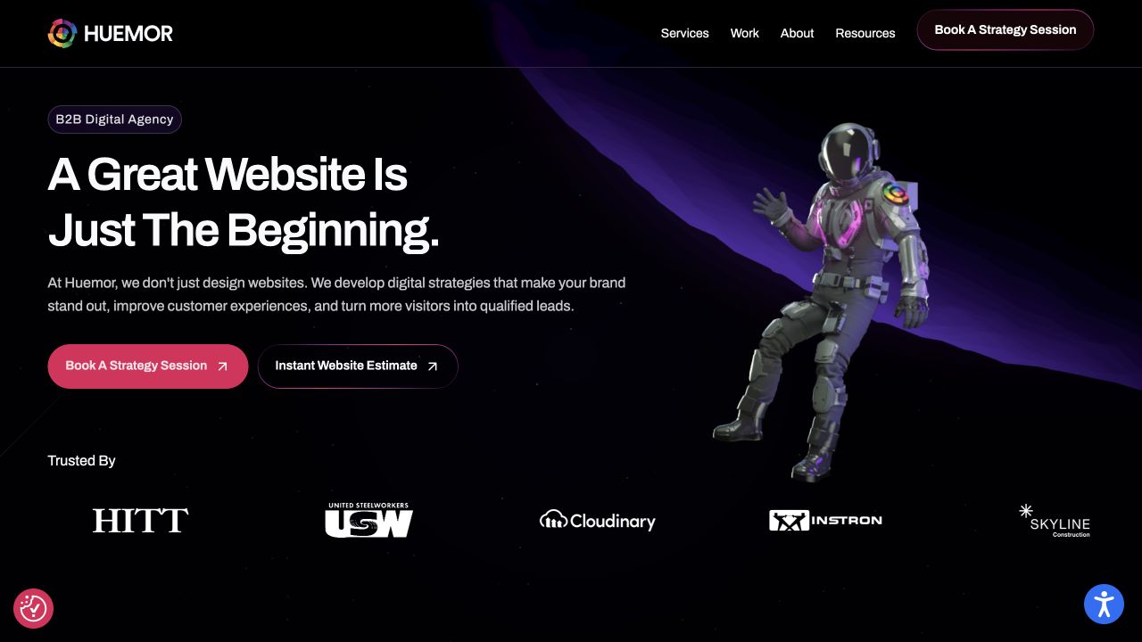
HUEMOR combines an astronaut illustration with a dark purple sweep, large white headline and two differently weighted actions. A pink strategy-session button stands beside an outlined estimate route, while client logos form a separate proof band below. The arrangement shows how an expressive art direction can sit inside a straightforward sequence of message, choice and supporting context. For Beaver Builder planning, the useful reference is that sequence and its spacing. The saved plugin resource does not establish which tool created the illustration or any particular interaction.
What you can learn
Give expressive artwork a defined role in the content hierarchy. Draft the main promise and distinguish the two conversion paths before adding decoration, then preserve a readable text area when imagery or campaign language changes.
Pros
Different button treatments establish a primary conversation route and a secondary estimation option.
The separate logo row gives supporting context its own rhythm beneath the opening message.
Cons & considerations
The astronaut occupies substantial space that could otherwise introduce specific services or project outcomes.
Floating utility widgets add visual competition near the viewport corners and need careful placement.
Platform source: Dated public Beaver Builder plugin resource. Dated Beaver Builder plugin resource reference on huemor.rocks; no version, individual module, private account or organization-wide system attribution. Platform evidence is separate from the direct website screenshot and is not a complete current infrastructure audit.
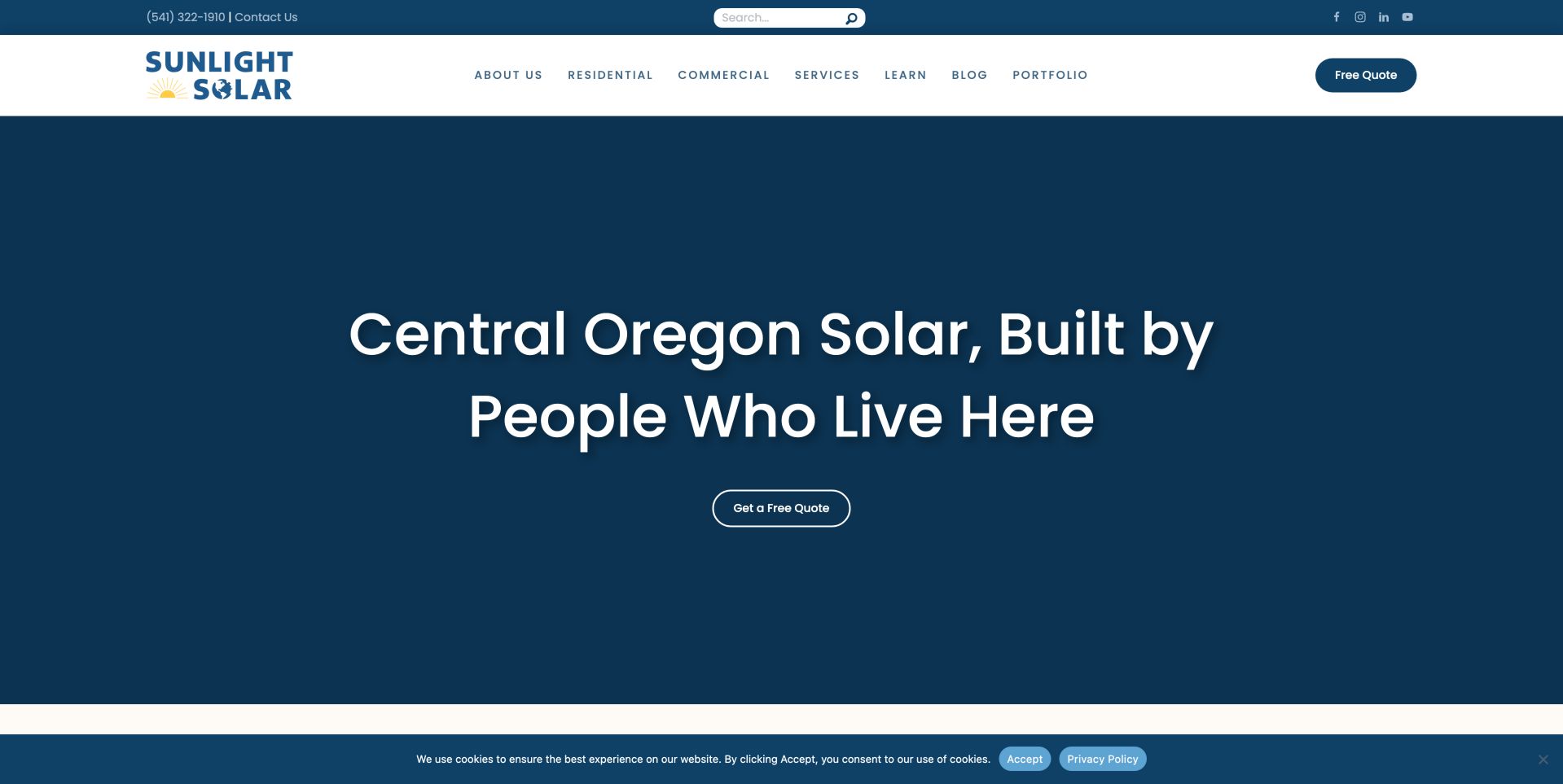
Sunlight Solar’s saved opening is unusually spare: a deep blue field, a centered regional statement and a single outlined quote button. The white header carries residential, commercial, learning and portfolio destinations, with a second quote action at the right. The composition demonstrates that a page builder does not require a crowded module inventory. A small number of well-spaced elements can establish service area and next step. The capture shows this particular blue-background state; it does not establish whether other media appears at another moment or viewport.
What you can learn
Start with the information a local customer needs to recognize relevance: service, region and next action. Keep that message readable without depending on background media, then use later sections to supply project evidence and practical qualification details.
Pros
The regional headline is easy to find because the opening avoids competing cards and decorative details.
Distinct residential and commercial navigation lets different audiences continue from the same introduction.
Cons & considerations
The large empty field postpones project photographs and other concrete evidence below the captured opening.
Two quote buttons repeat the action while leaving the initial scope of the quotation process unexplained.
Platform source: Dated public Beaver Builder plugin resource. Dated Beaver Builder plugin resource reference on sunlightsolar.com; no version, individual module, private account or organization-wide system attribution. Platform evidence is separate from the direct website screenshot and is not a complete current infrastructure audit.
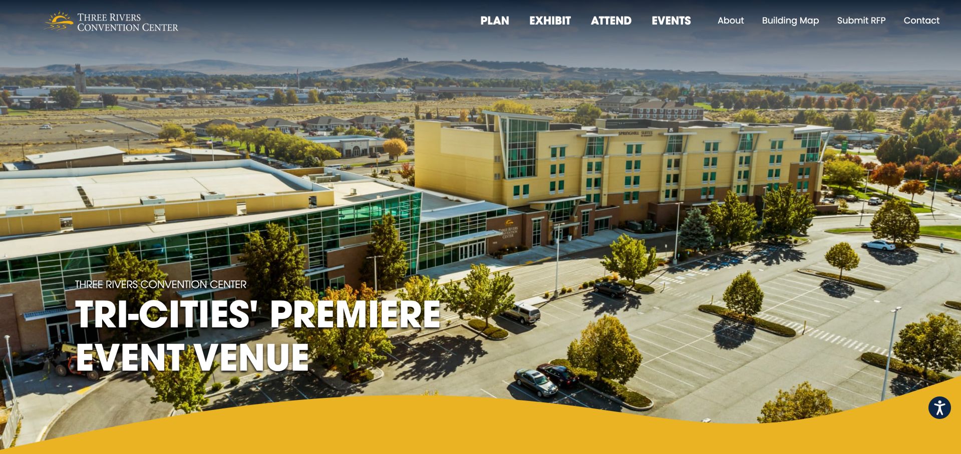
Three Rivers Convention Center fills the opening with an aerial photograph that makes the venue and surrounding setting tangible. The top navigation begins with four emphatic choices: plan, exhibit, attend and events. Smaller links cover the building map, requests and contact. That role-based structure is the strongest lesson for a Beaver Builder venue project. A single introductory image supports several journeys without forcing their information into one long homepage. The saved evidence identifies plugin resources on this homepage, not a booking platform or event-management system.
What you can learn
Map the visitors’ roles before building repeated sections. Give each role a dependable landing page with its own practical details, and use broad venue photography to orient readers rather than making it carry room capacities or event instructions.
Pros
The aerial view supplies immediate physical context that an abstract venue slogan could not provide.
Prominent role-based navigation separates planning, exhibiting and attending tasks before the visitor begins scrolling.
Cons & considerations
White navigation overlays a varied photograph, making contrast dependent on the selected image and crop.
The opening emphasizes setting while dates, accessibility information and room details require another destination.
Platform source: Dated public Beaver Builder plugin resource. Dated Beaver Builder plugin resource reference on threeriversconventioncenter.com; no version, individual module, private account or organization-wide system attribution. Platform evidence is separate from the direct website screenshot and is not a complete current infrastructure audit.
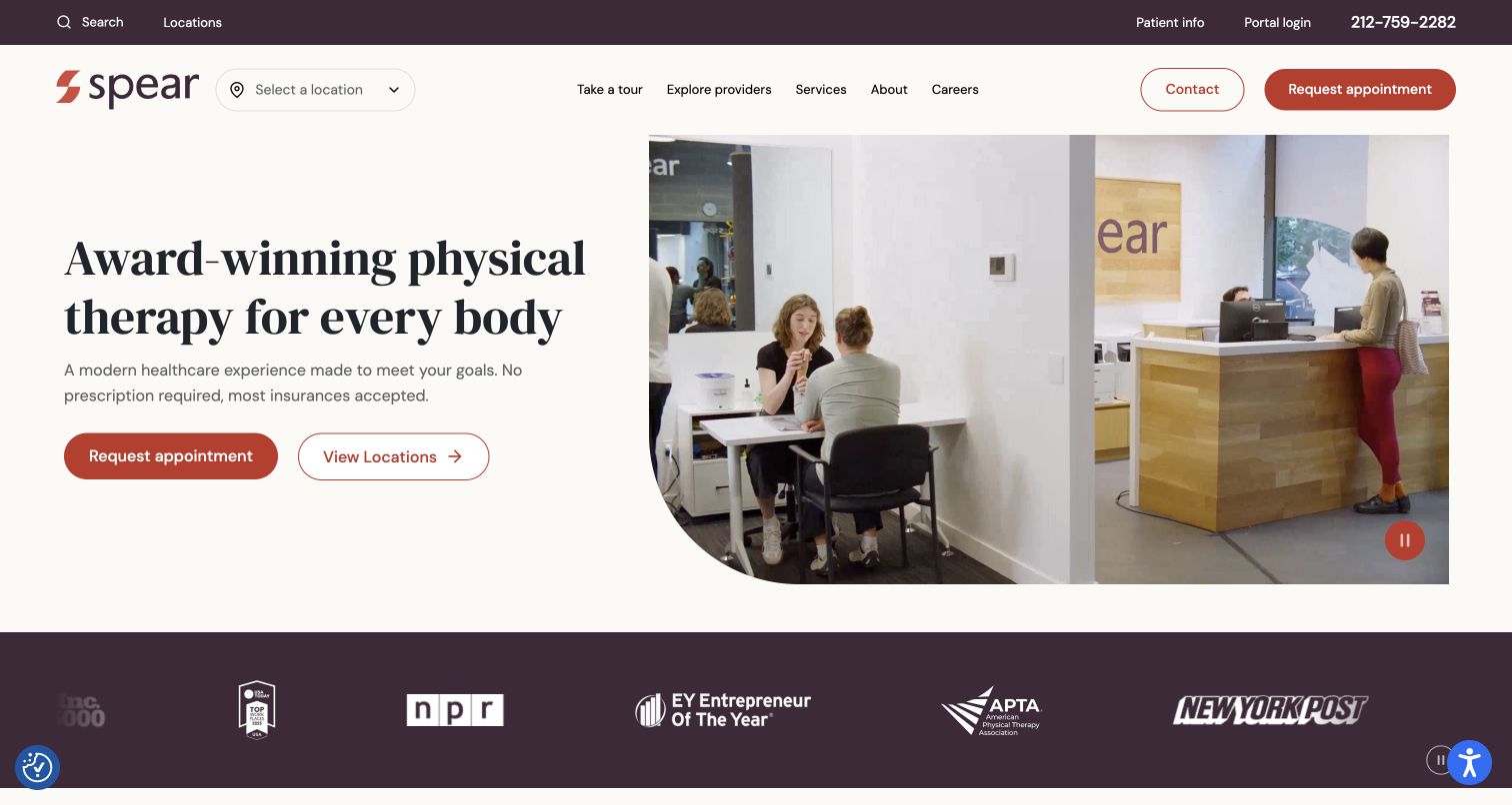
Spear pairs a large serif introduction with a rounded photograph of the clinic environment. A location selector sits beside the logo, while the header and hero both expose appointment routes. The muted background and restrained red accents make the page feel orderly despite numerous utility links. For a Beaver Builder project, the useful pattern is a stable two-column introduction that leaves practical navigation close at hand. The public plugin evidence supports this source-page association only; it does not identify the patient portal or verify clinical outcomes.
What you can learn
Design the location and appointment paths alongside the introductory copy, rather than appending them after the layout is finished. Keep routine visitor tasks understandable and ensure the image can change without breaking the balance between explanation and action.
Pros
A visible location selector makes geography part of the initial journey instead of a hidden later step.
The split layout keeps the main message on a quiet background beside contextual interior imagery.
Cons & considerations
Appointment actions appear several times and may feel repetitive without a clear navigation hierarchy.
The media and recognition strip convey atmosphere and claims, but they do not establish treatment suitability.
Platform source: Dated public Beaver Builder plugin resource. Dated Beaver Builder plugin resource reference on spearcenter.com; no version, individual module, private account or organization-wide system attribution. Platform evidence is separate from the direct website screenshot and is not a complete current infrastructure audit.
Rehab 2 Perform places a sports-focused photograph beneath a black navigation area and a red location announcement. Billing, insurance, careers and scheduling occupy a utility line above services, locations and resources. The captured slide shows supervised exercise with an introductory headline and a learn-more button. This is a useful reference for arranging multiple kinds of content in a Beaver Builder page plan. The plugin references concern the public site; the image does not reveal the technology behind scheduling or substantiate the medical claims shown in marketing copy.
What you can learn
Separate returning-client utilities from first-visit discovery in the information architecture. Give temporary opening announcements an explicit owner and expiry date, then ensure the main service explanation remains available when a campaign banner or slideshow changes.
Pros
Distinct utility and primary navigation lines organize different categories of task without hiding all of them.
The exercise photograph provides more concrete context than a purely abstract promotional background.
Cons & considerations
The announcement and two navigation rows consume substantial vertical space before the main content begins.
A rotating hero can obscure alternative messages, so essential service details need stable destinations as well.
Platform source: Dated public Beaver Builder plugin resource. Dated Beaver Builder plugin resource reference on rehab2perform.com; no version, individual module, private account or organization-wide system attribution. Platform evidence is separate from the direct website screenshot and is not a complete current infrastructure audit.
Red Rocket Tattoo uses a black background, prominent illustrated emblem and tall condensed lettering to create an unmistakable studio identity. The navigation then moves quickly into artist choice, appointments, questions, aftercare and related services. A large illustrated New York graphic continues the visual language below. The example is useful when planning a Beaver Builder site that needs character without turning every section into a different visual system. The saved plugin reference supports the public homepage association, not the tools used by individual artists or any booking service.
What you can learn
Let a consistent graphic vocabulary connect the header and content, while giving practical questions their own plain labels. Plan artist profiles, booking guidance and aftercare as maintained content areas so the brand illustration does not have to answer every visitor need.
Pros
The emblem and condensed typography establish a coherent identity before the visitor reaches the main image.
Specific navigation labels make artist selection and practical studio guidance directly discoverable.
Cons & considerations
The tall brand header pushes individual artwork and artist evidence further down the first visit.
Several menu items wrap onto a second line, creating a dense navigation block to maintain.
Platform source: Dated public Beaver Builder plugin resource. Dated Beaver Builder plugin resource reference on redrockettattoo.com; no version, individual module, private account or organization-wide system attribution. Platform evidence is separate from the direct website screenshot and is not a complete current infrastructure audit.
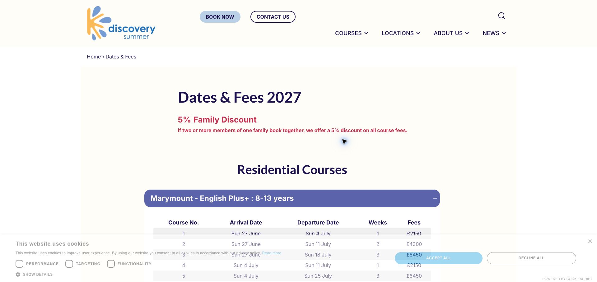
Discovery Summer’s captured dates-and-fees page prioritizes a year heading, a family-discount explanation and residential-course groupings. The first expanded group begins a table of arrival dates, departure dates, duration and fees. A breadcrumb gives this detailed page context within the broader site. For a Beaver Builder implementation, it is a useful example of letting structured information lead rather than adding another decorative hero. The screenshot preserves its original 2027 offer text as historical page content; this review does not confirm current availability, prices or discount eligibility.
What you can learn
Define the schedule fields and update responsibility before choosing accordion styling. Keep each group’s label specific enough to identify the course, and provide a clear publication year so families can distinguish current information from an older saved reference.
Pros
The breadcrumb and explicit year help readers understand where the detailed information belongs.
Repeated table columns create a consistent way to compare dates, duration and advertised fees.
Cons & considerations
The cookie panel covers part of the table in the saved viewport and reduces immediate readability.
Expandable groups need clear labels and accessible controls so important dates do not become difficult to discover.
Platform source: Dated public Beaver Builder plugin resource. Dated Beaver Builder plugin resource reference on discoverysummer.com/dates-fees; no version, individual module, private account or organization-wide system attribution. Platform evidence is separate from the direct website screenshot and is not a complete current infrastructure audit.
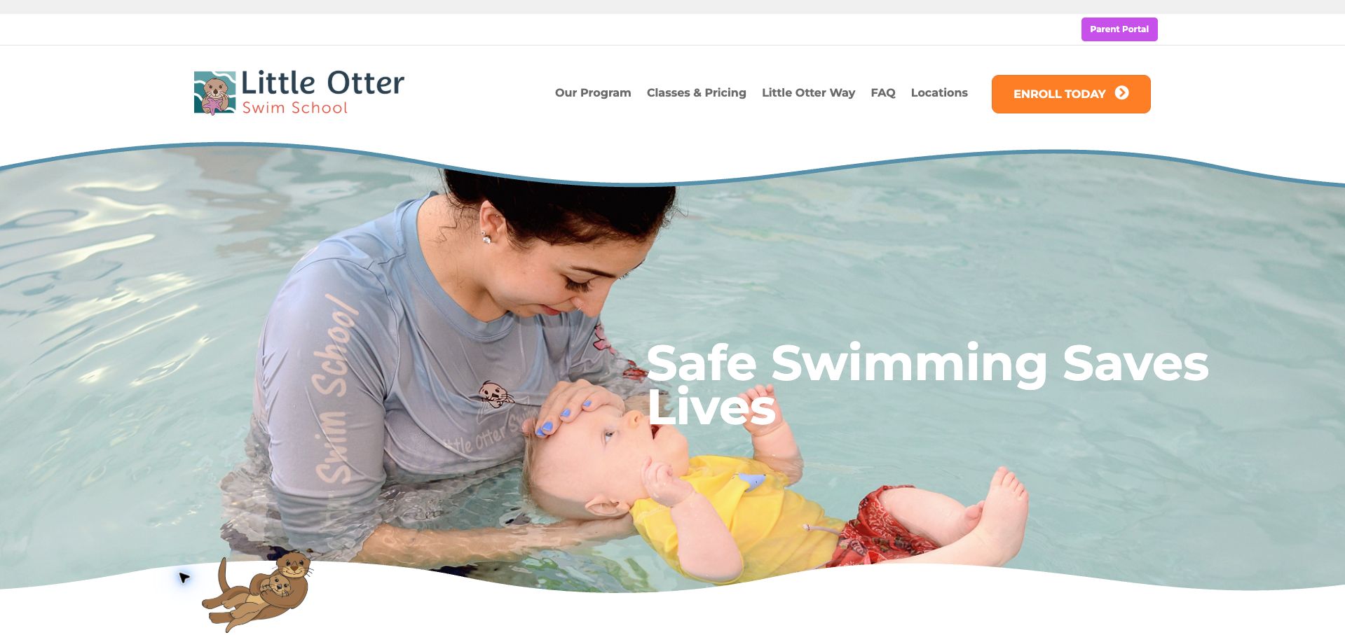
Little Otter Swim School frames a large lesson photograph with curved blue-edged shapes and an illustrated mascot. Above it, the navigation exposes program details, classes and pricing, questions and locations. The orange enrollment action stands apart from a smaller purple parent-portal link. That separation is a useful planning reference for a Beaver Builder site serving both new families and existing customers. The saved resource evidence belongs to the public page; it does not reveal the enrollment platform, teaching methods or results of the pictured activity.
What you can learn
Distinguish discovery from ongoing account access before choosing button colors. Use consistent shapes and photography to establish an approachable tone, but give pricing, location and program information dependable text routes that remain useful without the hero image.
Pros
Different colors and positions separate the enrollment route from the existing-customer parent portal.
The navigation names practical family questions instead of relying entirely on an emotional opening statement.
Cons & considerations
White headline text overlaps a light and detailed photograph, making legibility sensitive to cropping.
The large image delays specific class information for visitors who already understand the school’s purpose.
Platform source: Dated public Beaver Builder plugin resource. Dated Beaver Builder plugin resource reference on littleotterswim.com; no version, individual module, private account or organization-wide system attribution. Platform evidence is separate from the direct website screenshot and is not a complete current infrastructure audit.
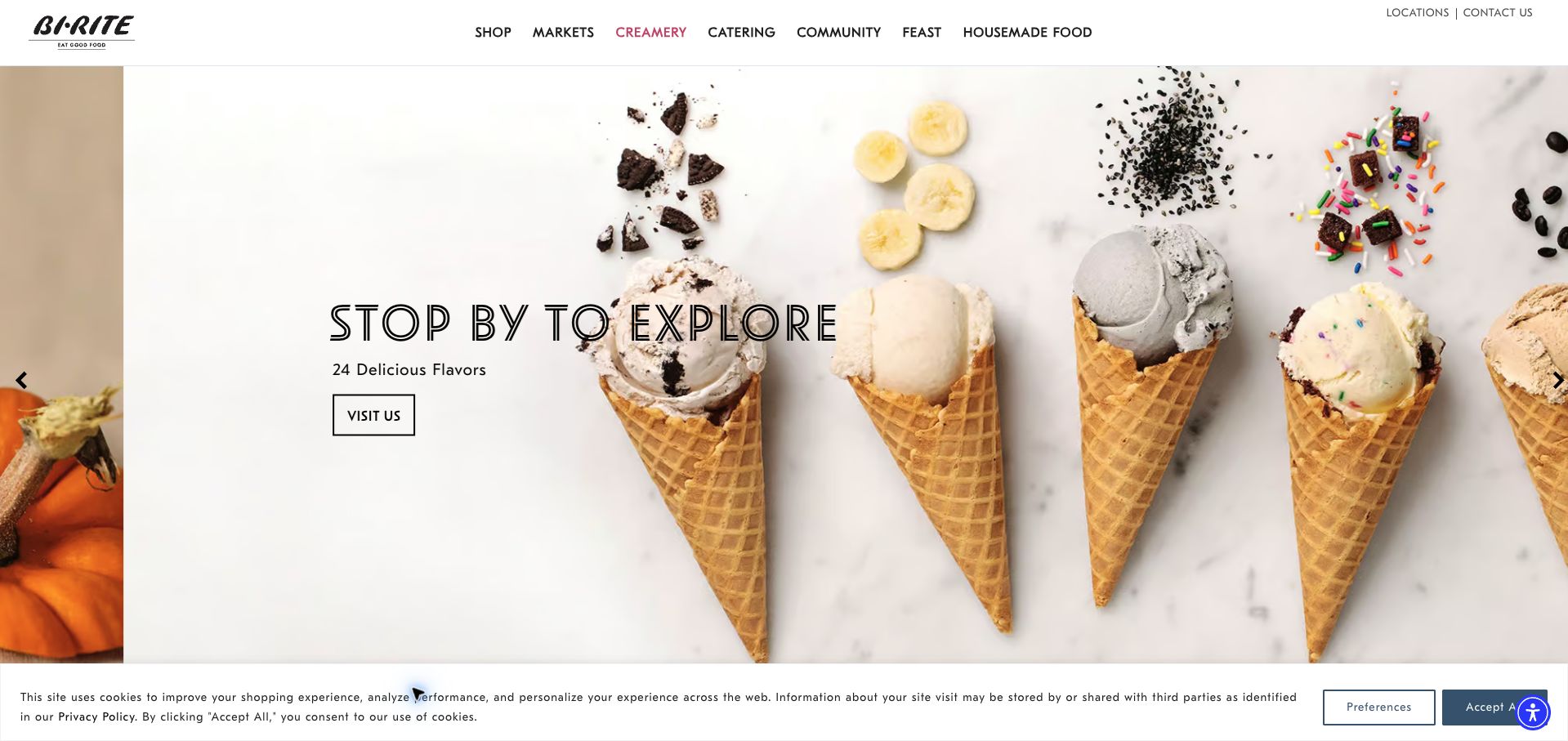
Bi-Rite Creamery’s saved page uses a wide photograph of ice-cream cones as its main visual field. An outlined headline, a short flavor message and a compact visit button occupy the lighter space beside the products. The shared header identifies Creamery as the active section while preserving routes to markets, catering and other parts of the organization. For Beaver Builder planning, the useful distinction is between a reusable site frame and a department-specific introduction. The plugin evidence applies to this creamery URL, not every shop or ordering system.
What you can learn
Give a department page its own visual story while preserving the wider site’s navigation conventions. Place the main action where the photograph provides a quiet background, and keep practical visiting details available beyond a changing promotional slide.
Pros
The active navigation treatment clearly locates the creamery within a broader family of offers.
The product photograph communicates the subject immediately while leaving a distinct area for the main action.
Cons & considerations
The carousel arrows suggest additional slides, so important visiting information should not depend on one frame.
The cookie panel takes space along the bottom and can compete with content near the viewport edge.
Platform source: Dated public Beaver Builder plugin resource. Dated Beaver Builder plugin resource reference on biritemarket.com/creamery; no version, individual module, private account or organization-wide system attribution. Platform evidence is separate from the direct website screenshot and is not a complete current infrastructure audit.
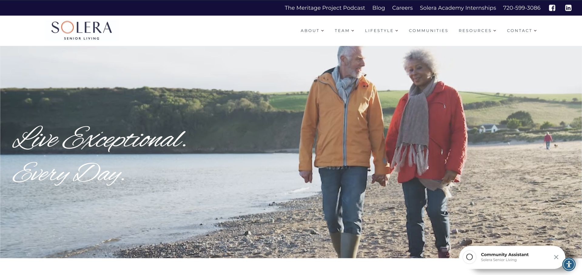
Solera Senior Living gives most of the opening to a photograph of an older couple walking outdoors, with a short script-style message on the left. The white navigation bar remains reserved, offering communities, lifestyle, resources and contact. A separate utility strip carries careers, editorial content and other organizational destinations. This composition is useful for discussing how a Beaver Builder page can establish tone before introducing individual locations. The saved plugin evidence concerns the public homepage; it does not verify care arrangements, availability or systems used by any community.
What you can learn
Decide what the opening image should communicate, then connect that atmosphere to a concrete location-finding journey. Keep organizational utilities distinct from the information prospective residents and families need, and assign clear ownership to each community’s detailed pages.
Pros
A restrained header allows the large image and short message to form a clear first impression.
Communities and resources are visible navigation destinations rather than hidden behind the main promotional story.
Cons & considerations
The script headline and lifestyle photograph provide little practical information within the captured opening.
The floating assistant occupies a corner of the image and adds another competing interaction to manage.
Platform source: Dated public Beaver Builder plugin resource. Dated Beaver Builder plugin resource reference on soleraseniorliving.com; no version, individual module, private account or organization-wide system attribution. Platform evidence is separate from the direct website screenshot and is not a complete current infrastructure audit.
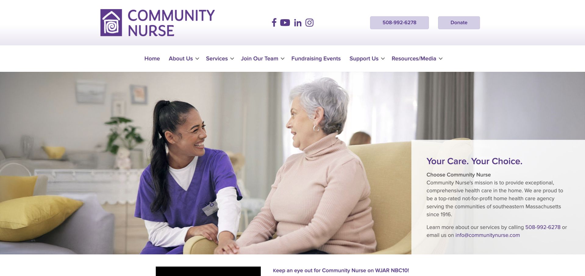
Community Nurse places a photograph of an in-home conversation beside a pale panel explaining the organization’s role and service area. Its purple identity appears consistently in the logo, navigation and text links. Phone and donation buttons sit in the upper header, while services, careers and support have separate menu destinations. The useful Beaver Builder lesson is the relationship between a full-width image and a legible explanatory surface. The saved plugin reference does not establish the systems used for referrals, care records or donations.
What you can learn
Write the essential service explanation before deciding how much of the hero belongs to photography. Keep the contact route close to that explanation, and separate donor, employment and service information so each audience can continue with a clear purpose.
Pros
The text panel gives the organization’s role and geographic context a readable surface beside the image.
Phone and donation actions remain visually distinct from the broader informational navigation.
Cons & considerations
The lengthy introductory panel requires careful editing to remain balanced when text or image crops change.
A tall header and navigation area postpone the detailed service information below the initial brand presentation.
Platform source: Dated public Beaver Builder plugin resource. Dated Beaver Builder plugin resource reference on communitynurse.com; no version, individual module, private account or organization-wide system attribution. Platform evidence is separate from the direct website screenshot and is not a complete current infrastructure audit.
Portland Farmers Market combines seasonal produce photography with a prominent market-day message, hours and a street-location line. Beneath the main image, the next section begins organizing markets by weekday. The header separates visitors, vendors, programs and organizational information, with language choice in a utility strip. For a Beaver Builder project, this is a useful model for connecting a changing promotional image to a more stable schedule structure. The saved screenshot’s hours are historical page content, not a fresh confirmation of the market calendar.
What you can learn
Keep recurring dates and locations in maintained text fields rather than relying only on promotional artwork. Give each market a predictable detail page, and ensure seasonal images can change without breaking the route to practical visiting information.
Pros
The opening combines atmosphere with concrete scheduling context instead of showing produce without directions.
Weekday groupings begin immediately below the hero and suggest a practical structure for multiple markets.
Cons & considerations
Text placed over the seasonal photograph needs careful contrast when the background changes.
The carousel and cookie notice add controls around information that visitors may need to read quickly.
Platform source: Dated public Beaver Builder plugin resource. Dated Beaver Builder plugin resource reference on portlandfarmersmarket.org; no version, individual module, private account or organization-wide system attribution. Platform evidence is separate from the direct website screenshot and is not a complete current infrastructure audit.
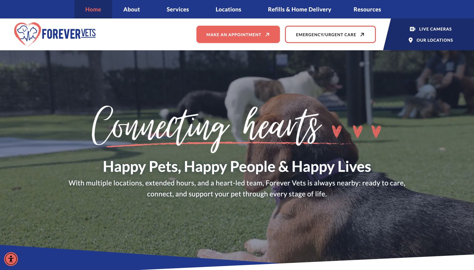
Forever Vets places appointment and emergency-care buttons beside its logo, above a large dog photograph and a welcoming brand message. The navigation also exposes locations, services, refills and resources. Blue, coral and white recur across the header and hero, giving the page a consistent visual language. The example is useful for planning Beaver Builder layouts where several tasks deserve distinct emphasis. The observed plugin files belong to the public page; they do not identify appointment infrastructure or establish the availability of urgent treatment at a particular location.
What you can learn
Name different levels of urgency explicitly instead of directing every visitor to a general contact button. Keep location information close to service choices, and make the underlying destinations explain their scope before someone begins a booking or request.
Pros
Routine appointments and emergency care receive separate labels and contrasting button treatments in the header.
Locations remain accessible alongside the main actions rather than being buried below the introductory image.
Cons & considerations
The large script message contributes atmosphere but competes with the more practical supporting sentence.
Several repeated location and service routes need consistent destinations to avoid confusing returning visitors.
Platform source: Dated public Beaver Builder plugin resource. Dated Beaver Builder plugin resource reference on forevervets.com; no version, individual module, private account or organization-wide system attribution. Platform evidence is separate from the direct website screenshot and is not a complete current infrastructure audit.
Best Option Restoration presents a photograph of a branded vehicle outside a house behind a darkened introductory text area. The header highlights location finding, while the hero places location and franchise information buttons beside one another. Badges below continue the business-opportunity emphasis. The useful Beaver Builder reference is the challenge of serving two audiences within one opening composition. The screenshot records the company’s own promotional claims without independently validating rankings or service quality, and the saved plugin evidence concerns only the public source page.
What you can learn
Decide whether service customers or prospective partners are the primary homepage audience. Give each a clearly labeled route, then move detailed business credentials into an appropriate supporting section so an urgent local-service journey remains easy to understand.
Pros
The branded vehicle and property image supply concrete context for the service category.
Location and franchise routes are explicitly named rather than combined into an ambiguous general inquiry.
Cons & considerations
Two different audience goals receive similar emphasis and can dilute the first visitor’s next step.
The long introductory paragraph and several badges make the opening comparatively dense for quick scanning.
Platform source: Dated public Beaver Builder plugin resource. Dated Beaver Builder plugin resource reference on bestoptionrestoration.com; no version, individual module, private account or organization-wide system attribution. Platform evidence is separate from the direct website screenshot and is not a complete current infrastructure audit.
Keystone Outdoor Living uses a darkened aerial photograph of a completed outdoor setting as a nearly full-screen introduction. A centered brand mark and short service list give the expansive image context, while an estimate button remains visible near the top. The menu is collapsed even in the saved desktop view. For Beaver Builder planning, this is a useful example of image-led composition with very few competing content blocks. Public plugin references do not establish the tools used to design, estimate or manage the pictured project.
What you can learn
Choose a photograph that explains the kind of work before asking a headline to do everything. Preserve a concise service label and a clear next action, then provide project details and location information in stable sections beyond the opening.
Pros
The broad project view communicates relationships between the pool, structures and gathering spaces.
A small number of visible elements keeps the image and estimate action from competing with many cards.
Cons & considerations
The collapsed desktop menu hides service and location details until a visitor opens another control.
The dark overlay and expansive photograph leave limited room for practical project qualifications in the first view.
Platform source: Dated public Beaver Builder plugin resource. Dated Beaver Builder plugin resource reference on keystonecustomdecks.com; no version, individual module, private account or organization-wide system attribution. Platform evidence is separate from the direct website screenshot and is not a complete current infrastructure audit.
Kegan has 15+ years of experience working with small businesses, Fortune 500 companies, and everything in between. No development job is too big or too small: he brings the same hands-on attention to a focused improvement, a complete website, or a custom application.
For Beaver Builder projects, he can help with responsive interfaces, reusable components, custom functionality, API connections, and performance-minded implementation. He works directly with clients on scope, design, implementation, testing, and handover, with an emphasis on clear communication and a system that remains practical to maintain after launch.
Show 3 other Beaver Builder developersHide other Beaver Builder developers
Choose the website structure before the editing workflow
Build a focused service website
For a small service business, define a limited set of page types with clear responsibilities. A service page might need a short explanation, scope, project evidence and contact route. A location page needs different practical details. Reuse the arrangement where comparison helps visitors, while writing specific content for each offer. A saved template is a starting point; it should not turn distinct services into interchangeable copy.
A growing site needs decisions about repeated records as well as page appearance. Define the fields for projects, events, locations or articles and identify which content belongs in a common template. Beaver Themer is a separate add-on for theme layouts, including headers, footers and archive or single-post templates. Confirm that the project needs those capabilities rather than assuming the page-builder plugin controls every area of the site.
Before extending an existing builder site, inventory its theme, custom code, add-on modules and external workflows. Identify the pages that depend on each customization and the person responsible for maintenance. Begin with a bounded change that addresses a clear visitor or editor problem. Document why the chosen pattern belongs in the system so future edits do not accumulate several nearly identical ways to present the same information.
From references to requirements
Plan content ownership, reusable sections and handover
Rehearse the changes editors actually make
List the recurring changes: replacing a project photograph, adding a location, changing course dates or retiring a notice. Give the intended editor representative content and a safe working copy. Observe where labels or saved patterns are unclear, then document the smallest set of controls needed for routine work. Beaver Builder has user-access settings, but WordPress capabilities still apply; decide permissions through the actual project’s authorized administration process.
Booking, payment, donations, patient portals and client accounts may run outside the page builder. Record each destination, its owner and what visitors should expect before leaving the public site. Explain important eligibility or location requirements near the link. A screenshot of a button is not evidence that its complete workflow has been tested, and routine editorial checks should not create real appointments, payments or records.
Make migrations and maintenance explicit
Keep a record of installed versions, add-ons, saved content and custom styles before planning an update or move. The official export guidance notes that images, icons and links need attention beyond the template itself. Include those dependencies in the migration plan, then verify the resulting public routes and assets. Preserve a tested recovery path and a clear release record rather than assuming an imported layout is a complete working website.
Ask the actual team to carry out its routine job: publish a realistic update, correct a mistake, preview a narrow screen, and identify who owns an integration failure. For a library or frontend framework, also ask who maintains the content source and deployment. A polished screenshot does not answer those operational questions.
Beyond the screenshot
A practical Beaver Builder project checklist
Identify visitor tasks and the page types needed to support them.
Write representative content before selecting or styling reusable layouts.
Distinguish independent templates from synchronized globals and controlled components.
Give saved content clear names, owners and a documented intended scope.
Specify image crops and text alternatives for each repeated content pattern.
Check semantic headings, readable contrast, keyboard controls and meaningful link labels.
Keep locations, dates and other essential details available outside changing hero slides.
Document the role of the theme, Beaver Builder, Beaver Themer and third-party add-ons separately.
Describe external booking, account and payment destinations before visitors enter those workflows.
Include images, links and customizations in any migration or handover plan.
Run automated checks, deploy the checked release and verify live canonical pages and assets.
Provide maintenance ownership, an editorial handoff and a tested recovery process.
Test with real content, a keyboard, a small screen, slow or failed requests, and the people who will maintain the system. These are planning checks, not an accessibility, security, performance, or search-ranking certification.
Sources & editorial method
How this Beaver Builder collection was reviewed
We selected twenty distinct public website properties with explicit Beaver Builder bb-plugin references in saved broad public audits. All twenty audit attempts are recorded as checked; their original dates remain unchanged. Each example uses an inspected direct browser capture with its original URL, dimensions, attribution and capture date. New collection-specific reviews were written for the November 9, 2026 morning batch. The opening organizations were verified through their own primary pages: Janus Henderson describes a global investment business; FSG and BMS CAT document national service reach; Patient First documents a Mid-Atlantic network; BankNewport provides regional community-bank context. Their ordering is an editorial introduction rather than a traffic or service-quality ranking. No private system, clinical result, financial product, booking or submission was tested for this research.
Every image is an unmodified capture from the actual website, with its source and capture date. Some captures are reused from our shared catalog; their dates remain the original capture dates. None comes from a vendor gallery or a generated reconstruction. Moving imagery and live content can change.
Technology attribution uses public page assets or metadata, official platform documentation, or a cited first-party project case study. Documentary and framework-relationship evidence is identified where used; it is not a complete current backend inventory. A CMS image CDN alone does not establish a full CMS deployment. A library’s presence does not prove which individual controls use it, and a platform label does not establish AI authorship.
The composition notes, lessons, pros and tradeoffs are original editorial observations. We have not measured conversion, traffic, security, performance or accessibility conformance. Website owners retain their brands and imagery; these examples are not our client portfolio. Written, Edited and Curated are independent records, not dates advanced by a build. See our editorial standards or suggest a correction.
Questions worth asking
Beaver Builder website development FAQs
What does the Beaver Builder evidence establish?
Each selected public page has a saved script or stylesheet reference under the bb-plugin directory, recorded by a broad public audit. That supports a dated association with the page. It does not identify every system operated by the organization or prove which module implements a particular visible feature.
Are Beaver Builder and Beaver Themer the same thing?
No. The official documentation describes Beaver Builder as a page-builder plugin for content layouts and Beaver Themer as an add-on for theme layouts such as headers, footers, archives and single-post templates. Plan and verify their roles separately in the actual installation.
Do changes to a saved template update every page?
The official saved-template guidance says existing pages are not changed when the saved template is modified. Synchronized global content has a different purpose. Choose the appropriate reuse type and document the expected editing scope before handing a site to its content team.
Can the same builder reproduce a reference site’s results?
A builder does not supply the reference organization’s writing, photography, information architecture or operational processes. Use a reference to identify a useful arrangement, then design and maintain it around your own audience and evidence. These reviews make no conversion or service-performance claims.
Why are screenshot and audit dates different?
A browser capture and a public technology observation are separate research events. Each retains its actual recorded date. Reusing a verified capture for a new original review, or rebuilding the guide, does not make the older image or audit newly observed.
Choose the smallest set of patterns that makes the website clear and maintainable. A useful Beaver Builder project gives visitors dependable routes and editors a predictable way to keep the underlying information accurate.