Best Bookkeeping Service Websites of 2026 (26 Real-World Examples)
Bookkeeping websites that explain the people, recurring work and service boundaries behind the promise.
Compare specialist practices, outsourced teams and adjacent business platforms for useful scope, pricing and onboarding communication—not as recommendations about financial outcomes or professional suitability.
Bookkeeping is often marketed with a promise of less worry, but a useful website goes further. It explains who the service is for, which recurring tasks are included, what the client must provide and how the first conversation differs from secure onboarding.
The collection spans independent practices, ecommerce specialists, startup-focused firms and platforms offering bookkeeping among other services. Their operating models are different. Study the clarity of each relationship rather than assuming that a polished dashboard illustration or familiar software logo makes the services equivalent.
Before the examples
What makes good bookkeeping service website design in 2026?
Define the customer before listing every service
A local owner-operated business, an ecommerce seller, a startup and an accounting firm seeking support may need different workflows. Name the actual audience and explain relevant operating context. A narrow, accurate description helps more than a broad claim that one service works for every company.
Describe recurring deliverables and responsibilities
Explain what is done, how often it is reviewed and what the client needs to approve or provide. Keep bookkeeping, payroll, tax and advisory activities distinct. A sample report can help illustrate an output, but it should not imply that every engagement includes the same work or produces the same result.
Separate a friendly inquiry from sensitive onboarding
The public contact form should start the right conversation, not collect credentials or complete financial records. Explain the next step, identify the people responsible and use an appropriate later system for documents and access. A reassuring design is not a substitute for a deliberate operating process.
The collection · 26 examples
26 bookkeeping service websites worth studying
Compare how each business defines its audience, explains the recurring relationship and distinguishes a service from software access.
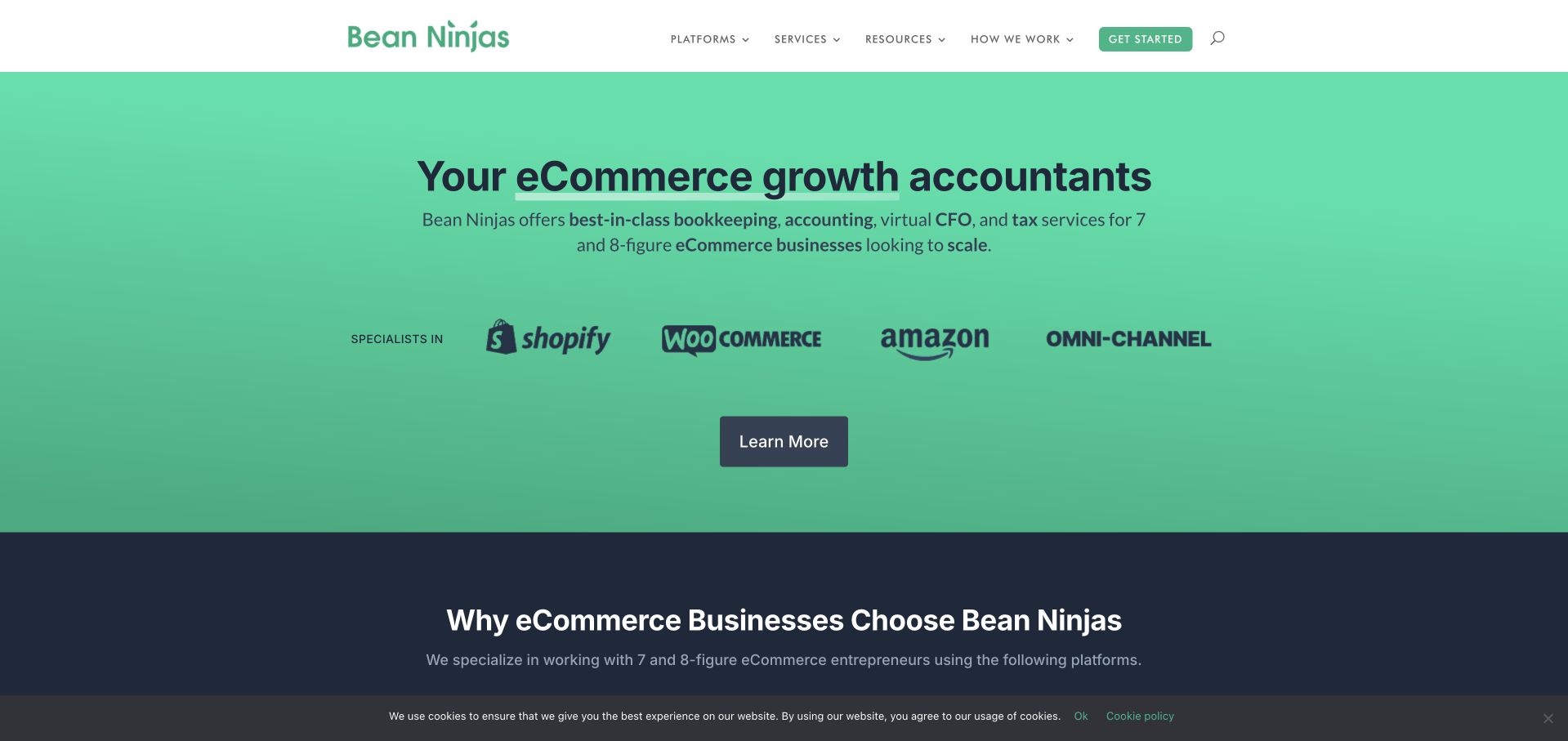
Bean Ninjas leads with a green brand field and a direct ecommerce-accounting proposition. Shopify, WooCommerce, Amazon and omnichannel labels appear beneath the introduction as client-platform specialisms, not as evidence of the website’s own runtime. The next section continues that segmentation with platform-specific service content. Navigation keeps services, resources, company information and a start route separate. The useful design choice is the narrow audience definition: the page does not pretend that every small business has the same accounting needs. Its official story identifies a specialist practice with named leadership, which provides more context than a generic outsourced-finance claim alone.
What you can learn
A specialist bookkeeper can make relevance clearer by naming the business models and operational systems it supports. Explain the actual scope behind those labels, distinguish bookkeeping from tax or advisory services and make sure platform logos describe client compatibility rather than implying ownership of the public website’s technology.
Pros
The ecommerce focus helps a visitor judge relevance before reading a long general services page.
Platform-specific routes connect the niche proposition to more concrete explanations of the work.
Cons & considerations
A strong growth-oriented message needs clear service boundaries and should not imply a financial result.
A mostly text-and-logo opening provides limited immediate context about the people delivering the service.
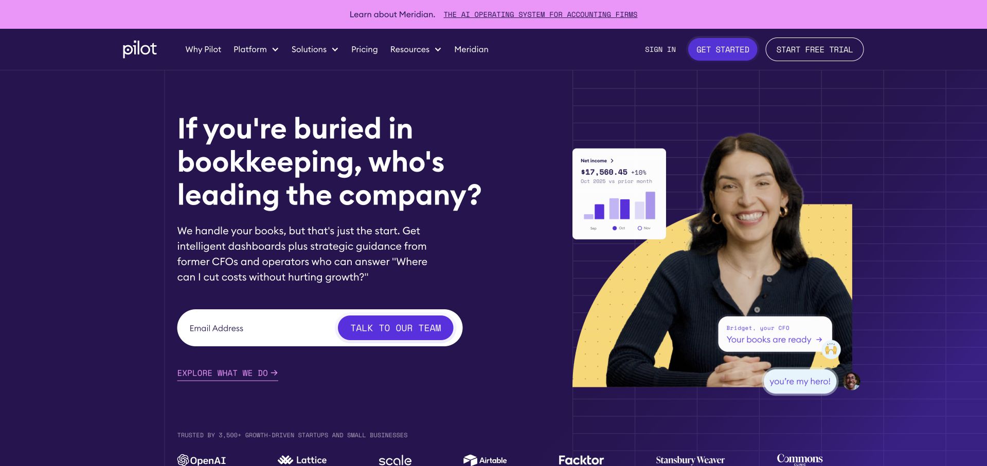
Pilot uses a purple opening, a direct question about the owner’s time and a photograph combined with a small financial-interface illustration. A single email field and conversation action keep the first inquiry compact. Navigation separates the platform, solutions, pricing and company content, while client marks appear below rather than forming the main message. The design is useful for studying how a financial service can acknowledge an owner’s operational problem without presenting a dense spreadsheet in the hero. The visible interface is an illustrative communication device, not a demonstration that every client receives the same result or workflow.
What you can learn
Use a recognizable owner question to introduce the service, then explain who does the work and what the engagement includes. Keep a first-contact field limited and transparent, and distinguish product illustrations, human service responsibilities and actual account access before requesting detailed financial information.
Pros
The compact email interaction avoids a lengthy first-screen lead form.
A human photograph and limited interface detail make the service more tangible than an abstract finance diagram alone.
Cons & considerations
A rhetorical time-saving message needs specific service and process detail to avoid becoming generic.
Client marks and dashboard fragments require context and cannot establish the result of an individual engagement.
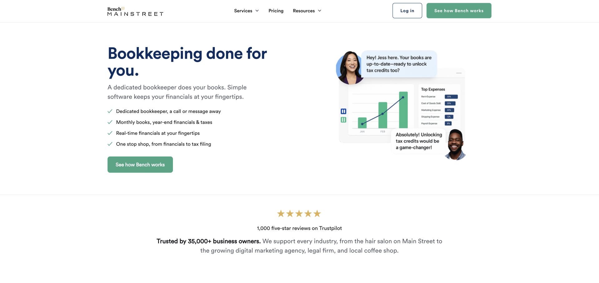
Bench uses a restrained white page, a short bookkeeping headline and a small checklist. A compact person-and-chart illustration sits beside the text, while a green action starts the inquiry. Pricing, resources and company information remain visible in the header, with login separated for returning users. A review and customer-context section follows below. The useful pattern is the modest scale of the opening: it explains the category and a few aspects of the relationship without requiring a large photographic hero. The displayed review and customer figures are the source’s own presentation, not independently verified measures of service quality.
What you can learn
A simple bookkeeping introduction should explain the ongoing relationship and the actual deliverables, not just promise relief. Keep pricing and process information accessible before contact, separate client login from new inquiries and use illustrative charts only to clarify the service rather than imply a particular financial outcome.
Pros
The short checklist and compact illustration make the initial service explanation easy to scan.
Pricing and login have clear, separate navigation positions serving different visitor needs.
Cons & considerations
A very broad bookkeeping promise needs more specific scope to distinguish the service from alternatives.
Review counts and customer statements require dated source context rather than being treated as proof by themselves.
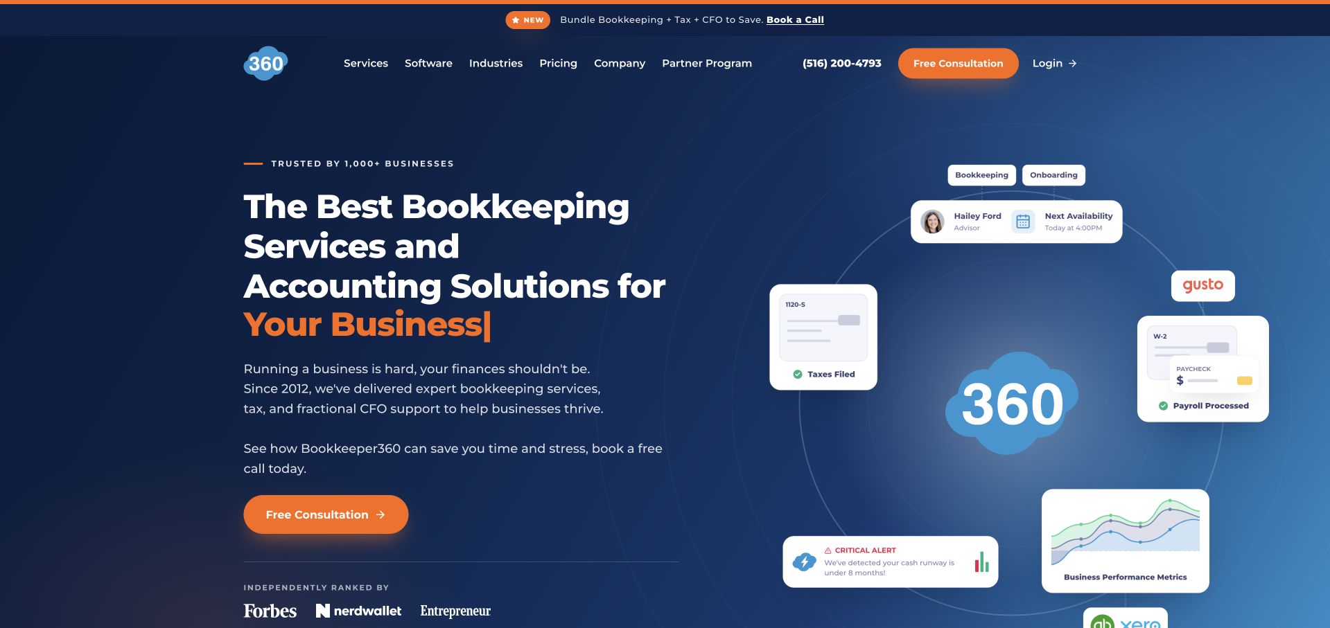
Bookkeeper360 places a navy-and-orange service introduction beside a diagram of financial tools and functions around its mark. The diagram includes bookkeeping and related operational labels rather than a single large spreadsheet screenshot. The header separates services, software, industries, pricing and company information, signaling that these are different ways to understand the offer. A contrasting consultation action supplies the main next step. This is useful for studying how a provider can communicate a connected service ecosystem, although the presence of product logos or interface fragments does not establish the technology running its public marketing website or a client’s exact implementation.
What you can learn
A service diagram should explain responsibilities and connections rather than simply collect recognizable logos. Pair it with clear scope and pricing information, identify which tools are optional or client-dependent and keep a consultation distinct from a software account or accepted engagement.
Pros
The diagram gives connected financial functions a visual relationship without filling the hero with dense report data.
Services, software and industries are explicitly different navigation categories.
Cons & considerations
Small diagram labels can become unreadable on mobile and need equivalent explanatory text.
A broad connected-service message needs clear boundaries between bookkeeping, tax, advisory and software access.
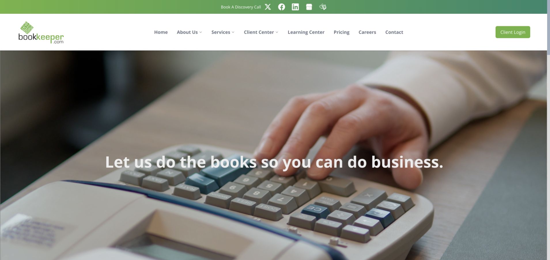
Bookkeeper.com uses a simple green-and-white header and a close-up bookkeeping image behind its introduction. Navigation exposes services, a client center, learning content, pricing and contact. The page continues into bookkeeping, payroll and other service categories, making it more than a single-purpose lead form. The design is useful for studying a conventional professional-services structure where the practical destinations are plainly named. Its large image is less informative than those navigation labels, so a visitor’s ability to find scope, pricing and process matters more than the visual metaphor of a calculator or keyboard.
What you can learn
A bookkeeping site can be straightforward and familiar if its task labels are clear. Distinguish existing-client access from new inquiries, give each service a defined scope and explain which information belongs in a secure client system rather than a general marketing form.
Pros
Client-center and pricing routes are visible without requiring a visitor to open a large menu.
Separate service categories allow the site to explain recurring work beyond a broad bookkeeping headline.
Cons & considerations
Generic calculator imagery provides little information about the people or working process behind the service.
A broad all-in-one service message needs clear boundaries so visitors understand what is and is not included.
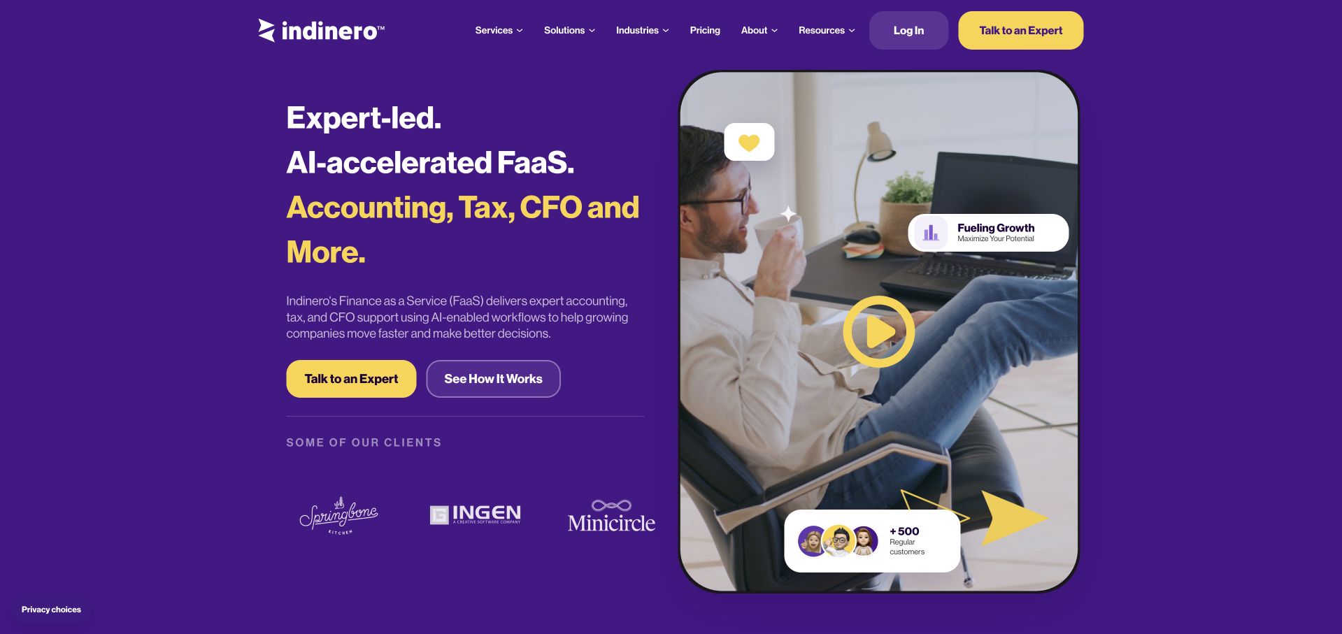
inDinero uses a purple hero, yellow accents and a people-led image to introduce expert-led, AI-supported financial services. The page then explicitly contrasts AI-only tools with traditional firms before describing its own approach. Navigation separates services, solutions, industries, resources and company information. The useful design lesson is not the AI claim itself, but the attempt to explain who is responsible for the work and how technology fits into the relationship. The homepage names accounting, tax and CFO activities together, so detailed service pages remain necessary to prevent the broad offer from becoming ambiguous.
What you can learn
If automation is part of a bookkeeping service, explain its role and the human review responsibilities in plain language. Avoid presenting technology as a guarantee of accuracy or financial performance. Give bookkeeping, tax and advisory work their own scope, deliverables and engagement expectations.
Pros
The introduction keeps human expertise visible alongside the automation message.
The following comparison section attempts to explain the service model rather than leaving AI as an unexplained badge.
Cons & considerations
A broad financial-services label can blur bookkeeping, tax and advisory responsibilities without detailed scope pages.
Strong contrasts with alternative service models need careful evidence and should not become unsupported superiority claims.
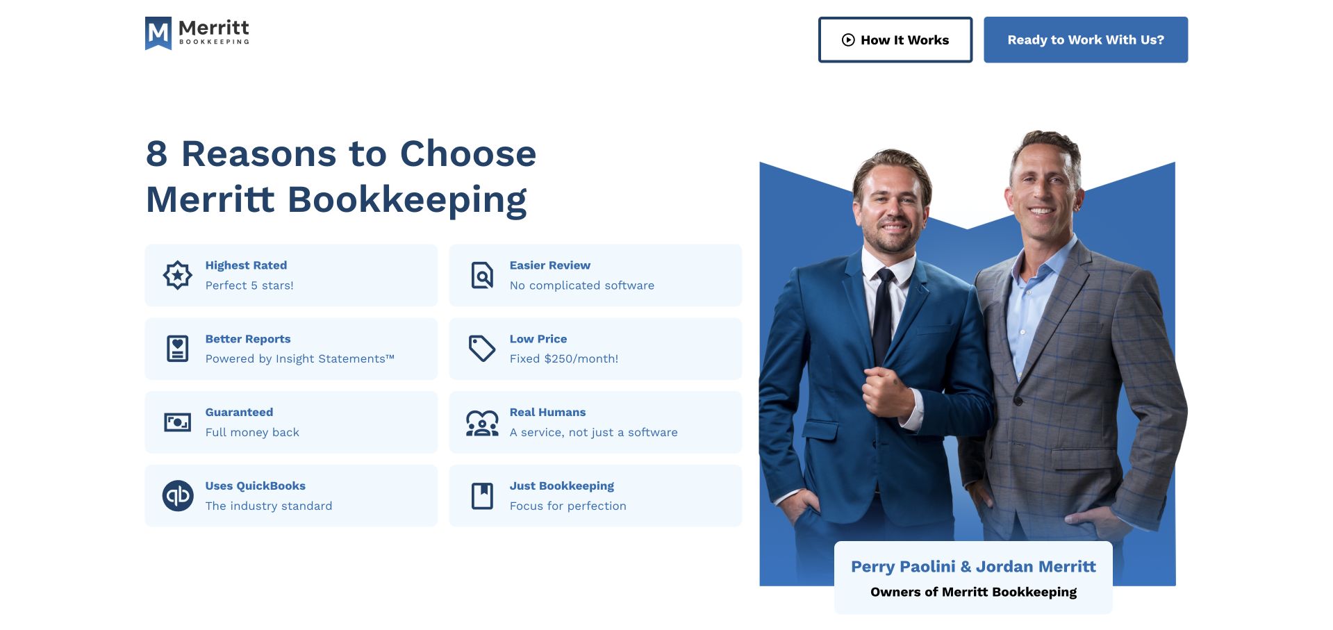
Merritt Bookkeeping places a compact reason-to-choose grid beside a photograph naming its two owners. Each tile describes an aspect of the service, while two header actions distinguish learning the process from starting a conversation. The layout is notably direct: it gives the visitor a set of practical comparison points before a long company story. Its pricing, guarantee and review statements are the firm’s own and should be read with their applicable terms, not treated as independent findings. The useful design feature is the combination of identifiable people and a scannable operating-model explanation on the first screen.
What you can learn
A small bookkeeping practice can make its offer tangible with named people and a few specific service facts. Link every material price or guarantee to its scope and terms, keep the process route available and avoid implying that a simple package suits every business model or financial situation.
Pros
The named-owner photograph gives the business a clear human identity near the opening.
The comparison grid is easy to scan without requiring a visitor to navigate several service pages first.
Cons & considerations
A dense grid of positive claims can feel like a checklist of promises unless each is explained.
Pricing and guarantee statements need maintained qualifications and should not be interpreted independently of their terms.
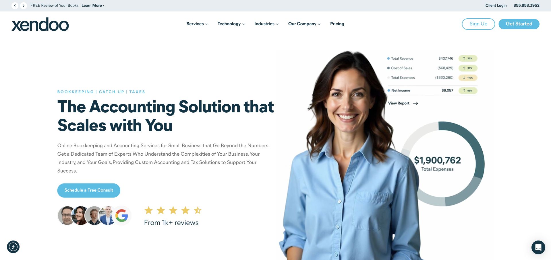
Xendoo combines a white background, blue accents and a prominent portrait with a compact expense visualization. The introduction describes an accounting service, while a conversation action and a row of review context sit below. Navigation separates services, industries, technology, company and resources, making the offer explorable before contact. The strongest design feature is the balance between a person and a small piece of product-like information: the page suggests that financial work involves both communication and organized data. The graphic is illustrative and is not evidence of a particular client’s finances or the technology behind the public website.
What you can learn
Keep human responsibility visible when using financial-interface imagery. Explain the service deliverables and communication model, offer an information route before the consultation and make sure charts contain example data rather than private records or implied promises about a client’s financial position.
Pros
The portrait and compact chart make the service more tangible without requiring a full dashboard screenshot.
Services, industries and technology are separated into understandable exploration routes.
Cons & considerations
A broad scalability message needs concrete information about scope, pricing and when the service changes.
Review stars and example financial figures need clear context and accessible text equivalents.
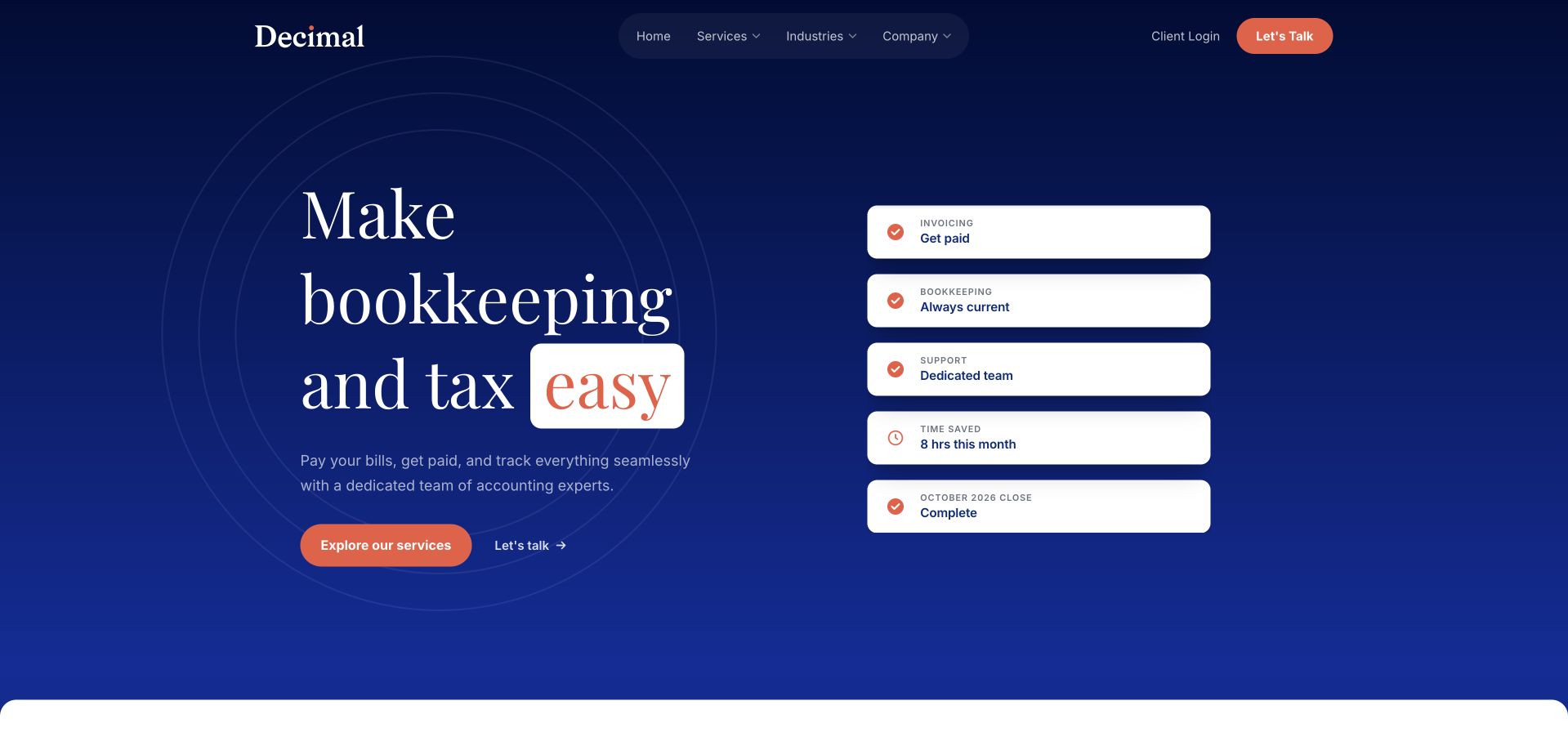
Decimal uses a navy field, serif display text and coral actions. A short column of white status cards describes operational aspects such as bills, books and a dedicated team, giving the introduction a more practical counterpart. The header remains compact, separating services, industries, company information and client access. The design is useful for studying a limited set of visual artifacts that explain recurring financial work without exposing an actual client account. The reassuring headline is broad, so the cards and subsequent service pages are important in explaining what the firm actually handles and how the engagement is structured.
What you can learn
Use a few well-labeled operational examples to explain a bookkeeping service, but make their illustrative nature clear. Define the recurring deliverables, who reviews them and how questions are handled. Keep tax work and other adjacent activities distinct rather than assuming a broad simplicity promise explains their scope.
Pros
The status-card column turns an abstract service message into recognizable pieces of recurring work.
The restrained navy and coral system creates a clear hierarchy between explanation and action.
Cons & considerations
Small status labels need readable text equivalents and cannot carry all the service terms.
A broad ease-oriented proposition needs more detail about exclusions, cadence and the client’s own responsibilities.
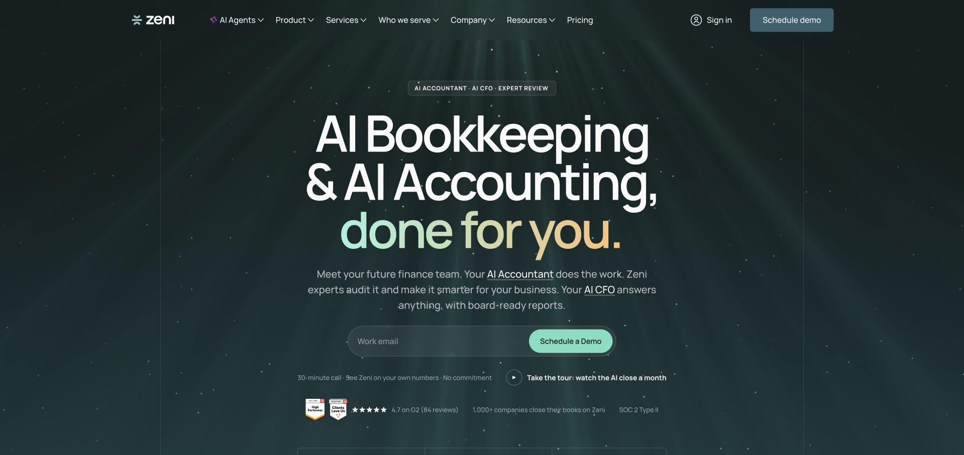
Zeni uses a dark green animated field and a large AI bookkeeping introduction. The following content identifies different roles within the service, including experts alongside AI agents, and uses an annotated product tour to explain the interface. Navigation separates agents, product, services, company information and pricing. The design is useful for studying how a technology-heavy offer can attempt to explain responsibility rather than only display an AI label. This review does not verify automated accuracy, financial conclusions or the underlying model. The relevant website lesson is the need to connect product claims to a clear description of human oversight and service scope.
What you can learn
If a financial service leads with AI, explain what the system does, what people review and what clients must approve. Use example data only, distinguish product access from professional services and avoid presenting a dashboard or automation score as a guarantee of accurate accounts or decisions.
Pros
The role-based explanation gives the AI message a more concrete operating-model context.
A structured product tour can explain interface functions without requiring access to a real account.
Cons & considerations
Large AI claims can dominate the page before service boundaries and review responsibilities are understood.
Animated graphics and low-contrast dark controls need a readable static and reduced-motion experience.
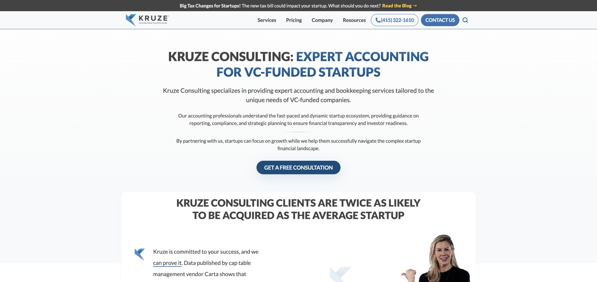
Kruze Consulting opens with a direct venture-funded-startup accounting proposition, followed by explanatory paragraphs and a consultation action. The restrained white layout lets the text do more work than a large lifestyle image would. Navigation includes services, pricing, company information and resources. The page continues into comparative claims and extensive educational content, so it is useful for studying a niche practice that publishes beyond a short brochure. Any acquisition, financial or performance statistics remain the source’s own claims and are not independently validated here. The strongest transferable feature is the explicit business-stage qualification before the service inventory.
What you can learn
A specialist practice should name the audience it actually serves and explain why its workflow fits that audience. Maintain source context for statistics, distinguish educational content from individualized advice and give visitors a concise route to scope and pricing before a large resource library overwhelms them.
Pros
The startup-specific introduction helps visitors assess relevance without guessing from generic accounting language.
Pricing and resources are visible routes that support investigation before a consultation.
Cons & considerations
Comparative business-outcome claims need rigorous context and should not be mistaken for causal guarantees.
Long text sections and a large resource library require strong navigation and careful reading hierarchy.
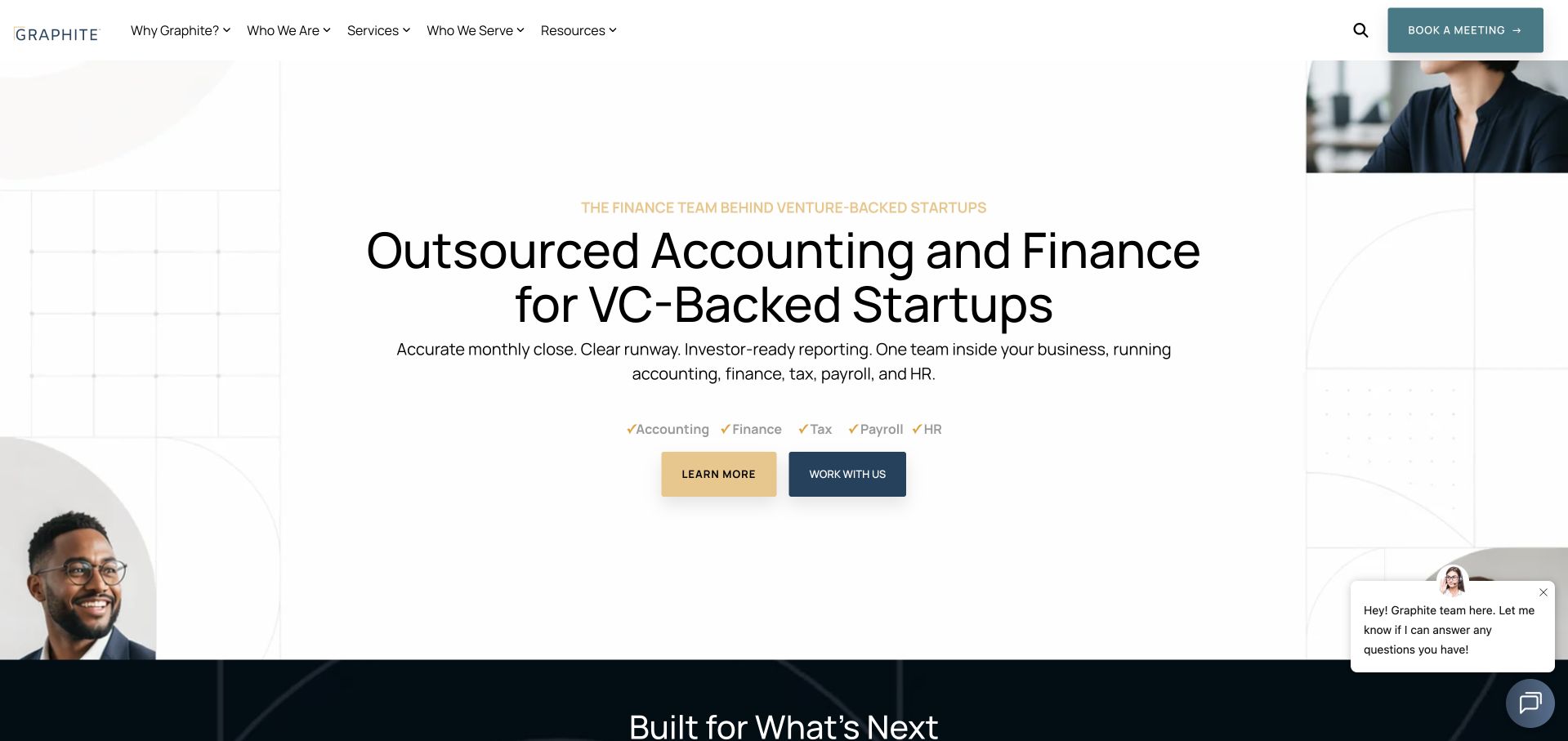
Graphite uses a mostly white opening, a centered startup-focused heading and a short list of service categories beneath it. Small human portraits frame the composition without replacing the text. Two contrasting actions distinguish learning more from booking a meeting, while navigation separates company, services, audiences and resources. The useful feature is the explicit scope line: accounting, finance, tax, payroll and HR are presented as related but distinct areas. That makes the breadth visible early, although the detailed pages still need to explain which responsibilities are included in a particular engagement and which require separate arrangements.
What you can learn
If bookkeeping is part of a wider outsourced function, name the components rather than hiding them behind a single finance label. Give information seekers a useful route before booking, define scope by engagement and explain where client approval or a separate specialist remains necessary.
Pros
The service-category line makes the breadth of the offer visible before a visitor opens a menu.
Learning and meeting actions are visually distinct and support different levels of readiness.
Cons & considerations
A broad startup-finance proposition needs detailed boundaries to avoid suggesting one team does everything automatically.
Decorative portrait fragments and chat prompts can add clutter to an otherwise restrained opening.
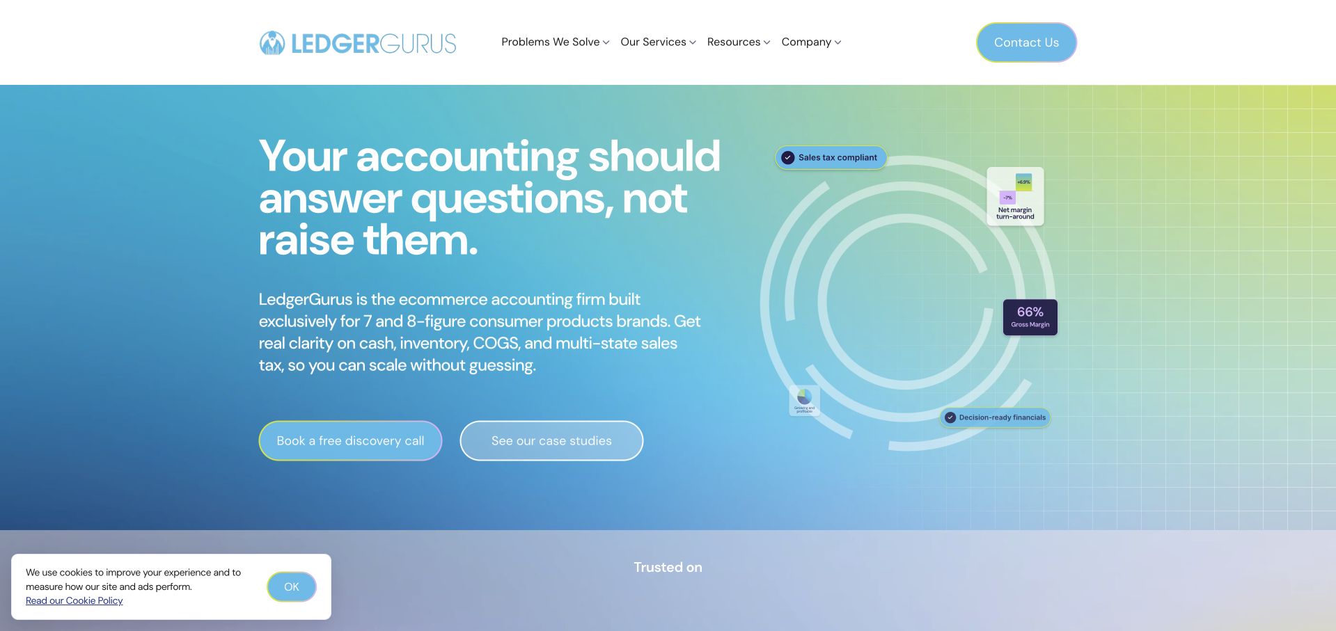
LedgerGurus uses a blue-to-green gradient and a direct accounting question beside a circular information diagram. The introduction identifies an ecommerce focus and names inventory, cost of goods and related operational questions. Navigation organizes the site around business problems, services, resources and company information, rather than only listing professional titles. This is useful for studying how a niche bookkeeping firm can connect its offer to the language of the customer’s operations. The diagram is a visual explanation, not proof of the site’s runtime, a particular client’s accounting data or a guaranteed improvement in financial performance.
What you can learn
Use the customer’s operational vocabulary to introduce a specialist service, then define the actual deliverables behind each problem. Explain software compatibility separately from the marketing site’s technology, and keep accounting information, tax scope and advisory recommendations clearly bounded.
Pros
The opening connects the service to recognizable ecommerce accounting questions rather than a generic bookkeeping claim.
Problem-based navigation offers a route for visitors who do not know the appropriate service name.
Cons & considerations
A complex circular diagram needs a readable text equivalent and a sensible mobile simplification.
A narrow niche proposition still requires explicit scope and exclusions for businesses with different operating models.
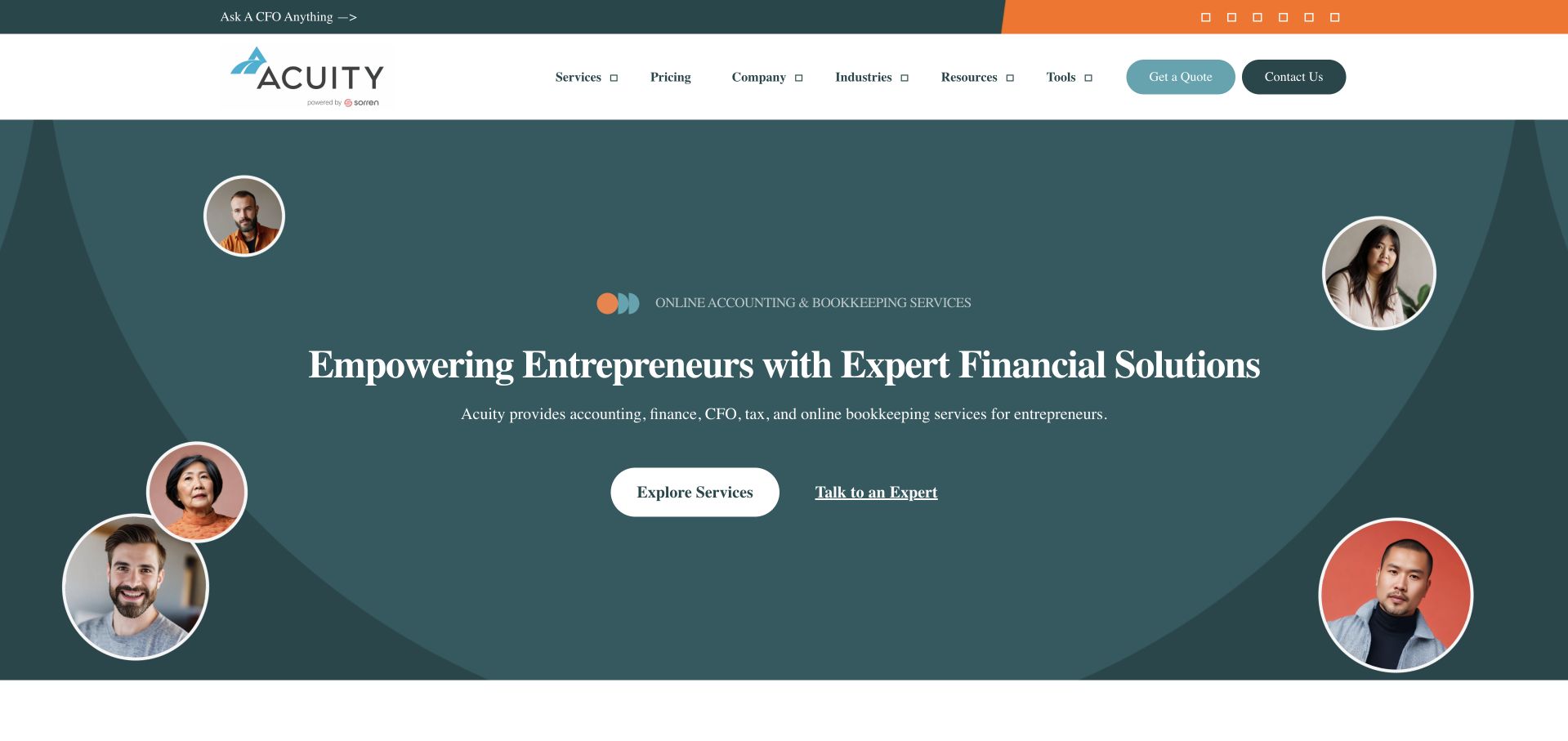
Acuity uses a dark teal opening, serif typography and circular portraits arranged around a centered service introduction. The header exposes services, pricing, company information, industries and resources, with contact and a question route visually separated. The portraits make the service feel staffed without needing a full-width office photograph. The design is useful for studying a human professional-services identity that remains relatively compact. The introduction names accounting, tax, CFO and bookkeeping work together, so the practical service boundaries must come from the following content rather than being inferred from the warm presentation alone.
What you can learn
A human-led visual system should connect to named team and process information, not stop at decorative faces. Keep pricing accessible, explain which financial functions are included in each engagement and make a general question route distinct from existing-client support or confidential document exchange.
Pros
The portrait treatment creates a recognizable human presence without consuming the whole first screen.
Pricing and service navigation remain visible before the visitor chooses a contact route.
Cons & considerations
A broad range of financial functions can blur professional responsibilities unless scope is explained clearly.
Small circular portraits should have meaningful context rather than becoming unexplained decorative trust markers.
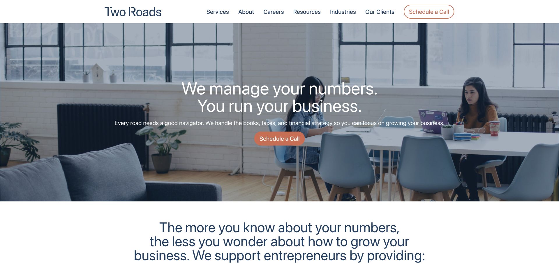
Two Roads places a short division-of-work message over an office photograph, followed by an explanatory section about bookkeeping and CFO support. A coral schedule-call action stands out against the more restrained gray and white system. Navigation separates services, company information, resources, industries and client stories. The page later introduces what the firm offers and how to start, making the initial headline part of a larger process explanation rather than the whole argument. The useful pattern is the progression from a simple owner-oriented statement to scope and onboarding, not any implied promise about business growth or financial performance.
What you can learn
Explain who handles the recurring work and what the client still needs to provide. Follow a short owner-oriented introduction with service boundaries, communication cadence and onboarding expectations. Keep a call request separate from the secure systems used for actual financial records and account access.
Pros
The contrasting schedule action is easy to find without dominating the entire opening.
Offer and getting-started sections extend the brief headline into a more useful service explanation.
Cons & considerations
A generic office photograph provides little evidence of the actual working relationship or deliverables.
A broad numbers-versus-business message needs detail so it does not understate the client’s ongoing responsibilities.
Supporting Strategies opens with a large people-led photograph beneath a conventional white header. Services, company information, solutions, knowledge and contact are clearly named in navigation, while the following section introduces people and experience. The page is useful for studying an understated service brand that relies on the human relationship more than an illustrated financial dashboard. The photograph creates a professional setting, but it does not by itself explain how a client is matched, what is included or how financial information is handled. Those practical questions belong in the service and contact destinations rather than being left to the visual impression.
What you can learn
Use real people to introduce a bookkeeping service, then describe the relationship in operational terms. Explain coverage, team responsibility, review and communication before asking for records. A professional photograph should support the scope explanation rather than substitute for it or imply results that have not been established.
Pros
Conventional navigation labels make the main service and information routes easy to recognize.
The human imagery keeps attention on an ongoing professional relationship rather than software alone.
Cons & considerations
A large photograph can delay the specific explanation of service scope and onboarding.
Broad people-and-experience language needs named roles and practical process detail to become meaningful.
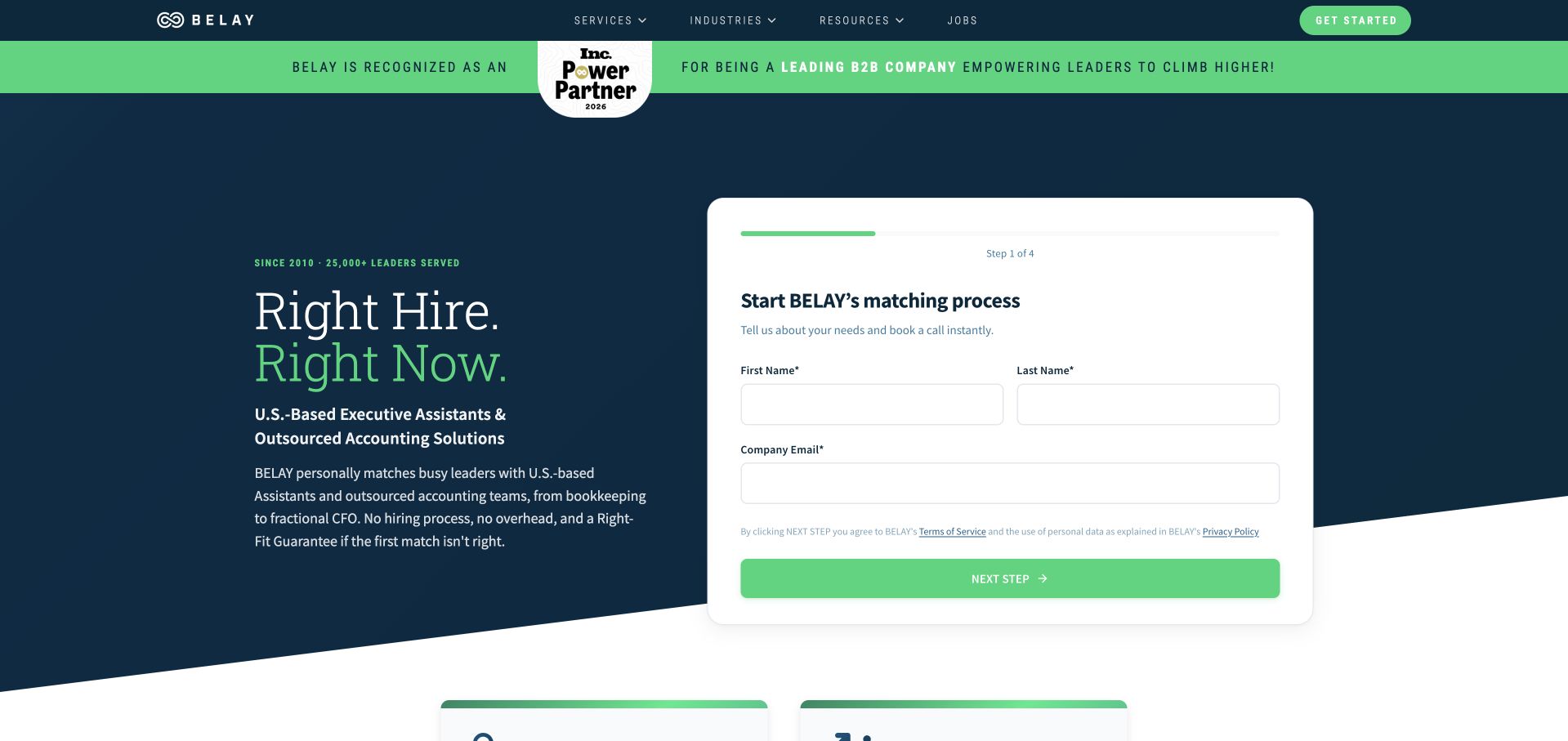
BELAY’s opening uses a dark navy background, a green accent and a white staged inquiry panel. The headline names both executive-assistant and outsourced-accounting solutions, while the following cards separate those service families. This distinction is important in a bookkeeping collection: the homepage is not exclusively a financial-service offer. The design is useful for studying how a broader staffing or service brand can give each audience a route without maintaining entirely unrelated visual identities. The form begins with basic business contact information, but the page still needs to explain the matching process and scope before users provide sensitive operational details.
What you can learn
If a brand offers bookkeeping alongside a different service, make the separation visible before the inquiry. Explain which team and process a visitor is contacting, keep initial fields limited and avoid implying that one broad matching promise establishes the quality or suitability of every service.
Pros
The assistant and financial-service cards provide a concrete distinction beneath the broad opening.
The staged inquiry panel shows a limited initial step rather than a complete operational questionnaire.
Cons & considerations
A combined headline can confuse visitors who arrive expecting a dedicated bookkeeping provider.
The prominent form asks for contact before all matching and service-scope details have been read.
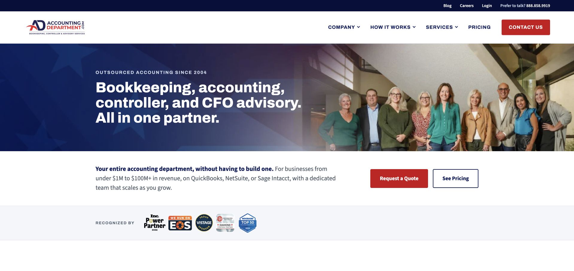
AccountingDepartment.com uses a navy introduction, a team photograph and a direct description of bookkeeping, accounting, controller and CFO advisory services. A white strip beneath adds business-context information and separate quote and pricing actions. The header keeps the company, process, information and contact routes simple. The useful pattern is the way the page identifies the broader operating model instead of treating bookkeeping as an isolated product. The photographed team gives that model a human presence, but it does not independently verify staffing, capacity or the quality of a particular engagement. Detailed scope remains essential to understanding the actual relationship.
What you can learn
If the offer is a wider outsourced department, explain the functions separately and state what the client retains responsibility for. Make pricing and process routes available before contact, and distinguish a quote request from the secure onboarding required for records, approvals and financial-system access.
Pros
The opening names several finance functions explicitly instead of hiding scope behind a generic service label.
Quote and pricing actions are presented as separate, recognizable choices beneath the introduction.
Cons & considerations
A broad department-style proposition can imply more coverage than an individual engagement actually includes.
Software and business-size references need current qualifications and should not be inferred from a team photograph.
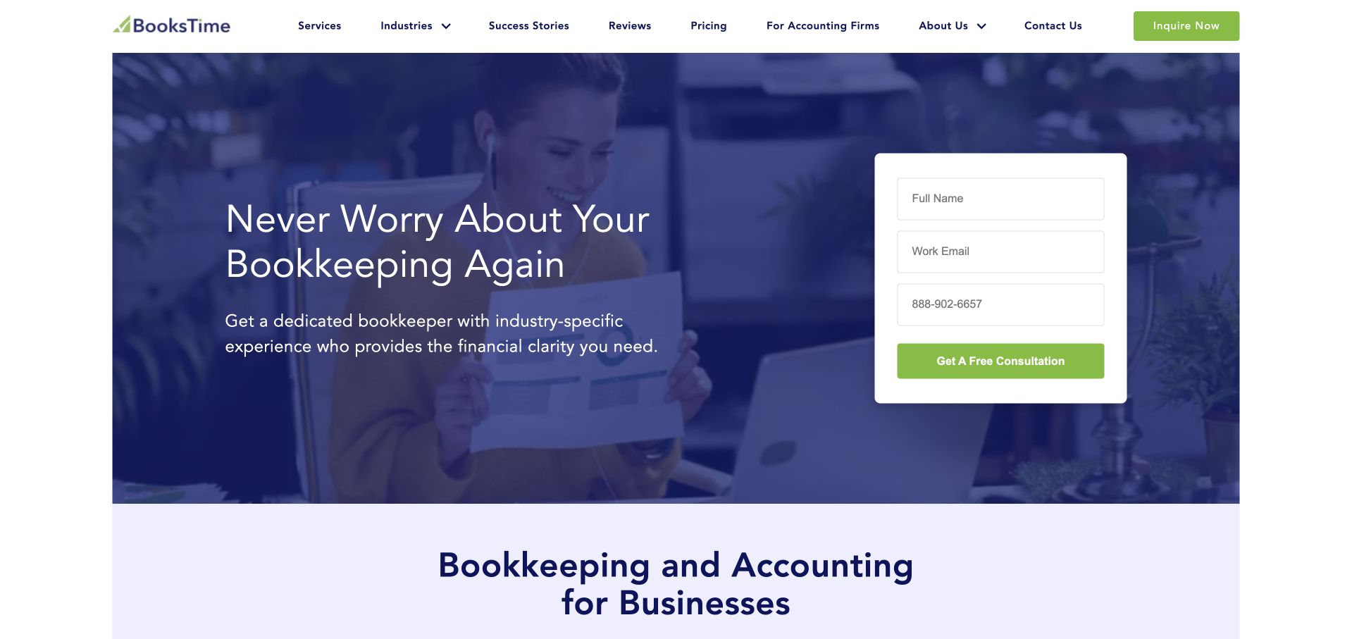
BooksTime combines a blue-toned office photograph, a brief bookkeeping introduction and a white consultation panel. The form asks for basic contact information, while navigation exposes services, industries, success stories, resources and pricing. The next section begins explaining bookkeeping and accounting for businesses, so the hero is not the only source of information. The useful pattern is the relationship between a quick conversation route and a visible information architecture. The reassuring headline is the source’s own marketing; this review does not verify an absence of financial worry, the suitability of the service or any resulting business performance.
What you can learn
A consultation-led bookkeeping site should explain what the conversation covers and retain a path for visitors who want scope and pricing first. Keep the opening form limited, label every field clearly and move sensitive records into an appropriate secure process only after the engagement is understood.
Pros
Pricing, industries and resources remain visible alternatives to completing the initial consultation form.
The white panel separates fields and action text from the more detailed photographic background.
Cons & considerations
A prominent form can feel premature if visitors have not yet understood the service boundaries.
Blue overlays and image-based reassurance need stronger supporting detail about people, process and deliverables.
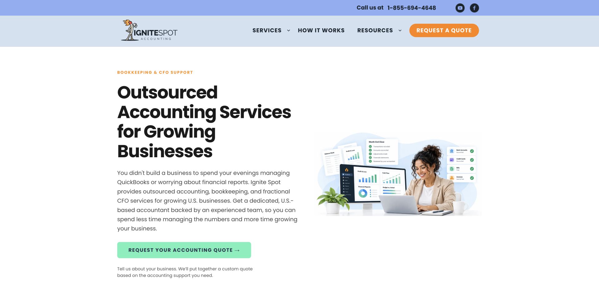
Ignite Spot uses a white opening, a bold service heading and a compact illustration combining a person with financial-work elements. A green quote action sits below the explanation, while the header keeps services, process, reviews and resources distinct. The page does not rely on a large cinematic image to communicate the category. Its useful feature is the close relationship between the introductory paragraph and the next action: visitors receive a short description of recurring work before being asked to inquire. Growth-oriented wording remains positioning, not an independently verified promise that outsourcing accounting produces a particular financial result.
What you can learn
Explain the recurring tasks in plain language before asking for a quote. Give process and scope the same importance as the main action, identify client responsibilities and keep illustrative charts separate from actual performance evidence or confidential financial data.
Pros
The restrained layout gives the service paragraph room instead of crowding it behind a large image.
A process route remains visible for visitors who need to understand the working relationship before contact.
Cons & considerations
A broad growing-business message needs clearer qualification for different company sizes and operating models.
Small illustrative report elements cannot carry essential service terms or evidence of an individual engagement’s results.
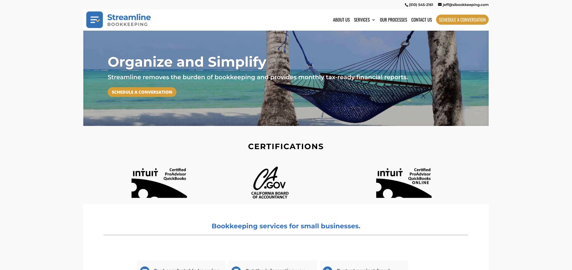
Streamline Bookkeeping uses a narrow header, a beach-and-hammock image and a short organize-and-simplify introduction. Telephone and email contact are visible at the top, while the navigation exposes company information, services, process and contact. Certification marks appear in a dedicated white section beneath the hero instead of being scattered through the opening. The page is useful for studying a small-practice layout that can communicate its basic structure quickly. The relaxed image is a metaphor rather than evidence of a client’s experience, and displayed software credentials need their own current context rather than being treated as a complete assessment of the service.
What you can learn
A small bookkeeping site benefits from clear contact and process information more than a large animation. Keep credentials current, explain what they signify and use the service pages to define deliverables and exclusions. An ease-oriented image should not understate the client’s ongoing review and approval responsibilities.
Pros
Contact details are visible before a visitor opens a form or explores company background.
Credential marks have a defined section rather than competing with every part of the hero.
Cons & considerations
A relaxation metaphor provides little detail about the actual bookkeeping workflow or team.
Small credential logos need accessible descriptions and should not imply a broader certification than they represent.
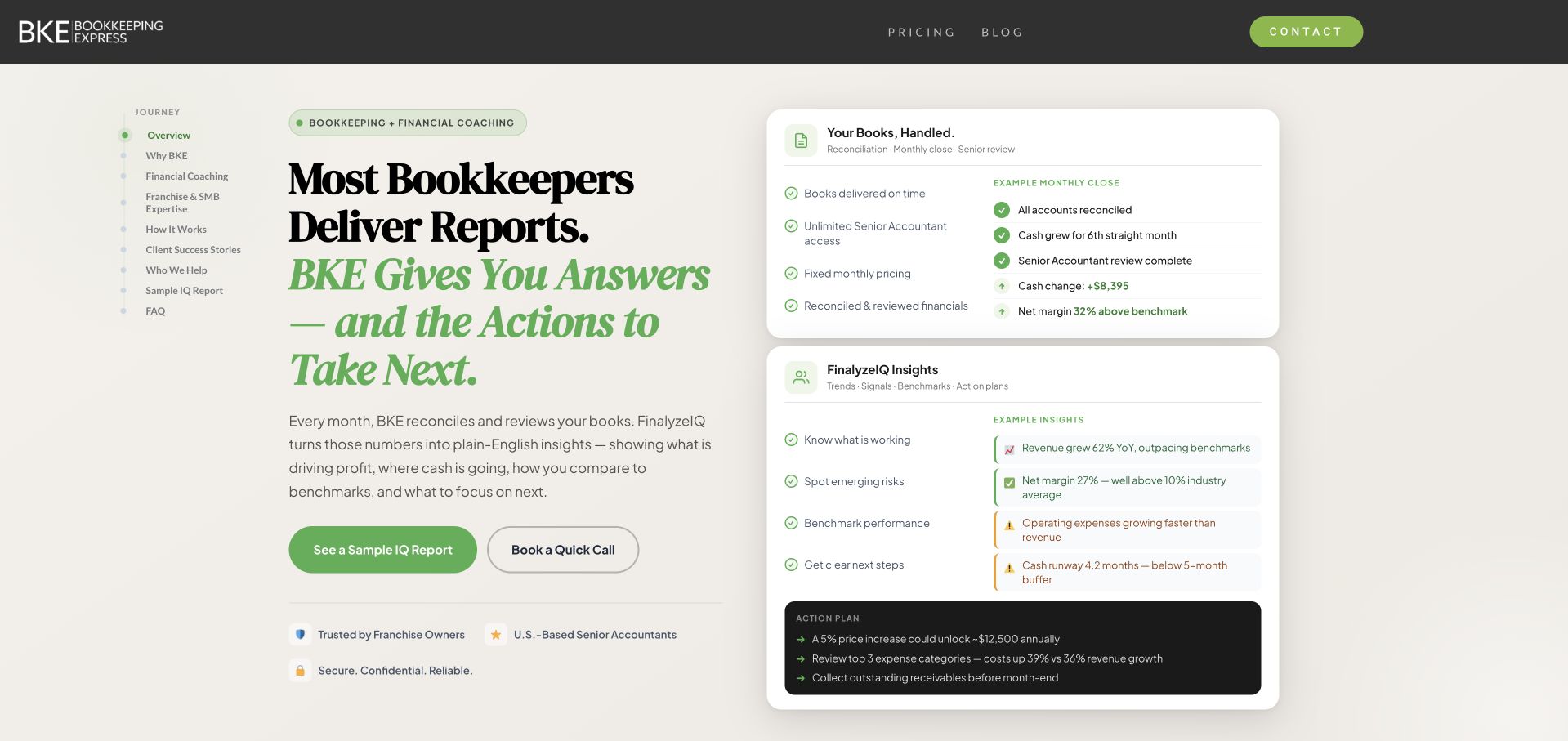
Bookkeeping Express uses a cream background, green accents and a two-column opening. The left side introduces the service in editorial typography, while the right shows a compact set of recurring tasks, insight cards and a sample report-like element. A sample-report action is paired with a call route, giving visitors an exploratory destination before contact. Pricing and FAQ links remain visible in the header. The design is useful for studying how a service business can show the shape of its output without displaying a private client’s records. Any example figures should remain illustrative, not be interpreted as a promised result or actual customer data.
What you can learn
Show a redacted or synthetic sample deliverable when it helps explain the service, and label it clearly. Define what is recurring, what requires approval and which advisory activities fall outside bookkeeping. Keep an information route available alongside the call request rather than forcing every visitor into lead capture.
Pros
The sample-report route gives visitors a concrete way to understand the output before booking.
The task and insight cards translate an ongoing service into recognizable deliverable categories.
Cons & considerations
Small report-like elements can become illegible on mobile and need readable supporting text.
A product-style interface can blur the distinction between software access and a human bookkeeping engagement.
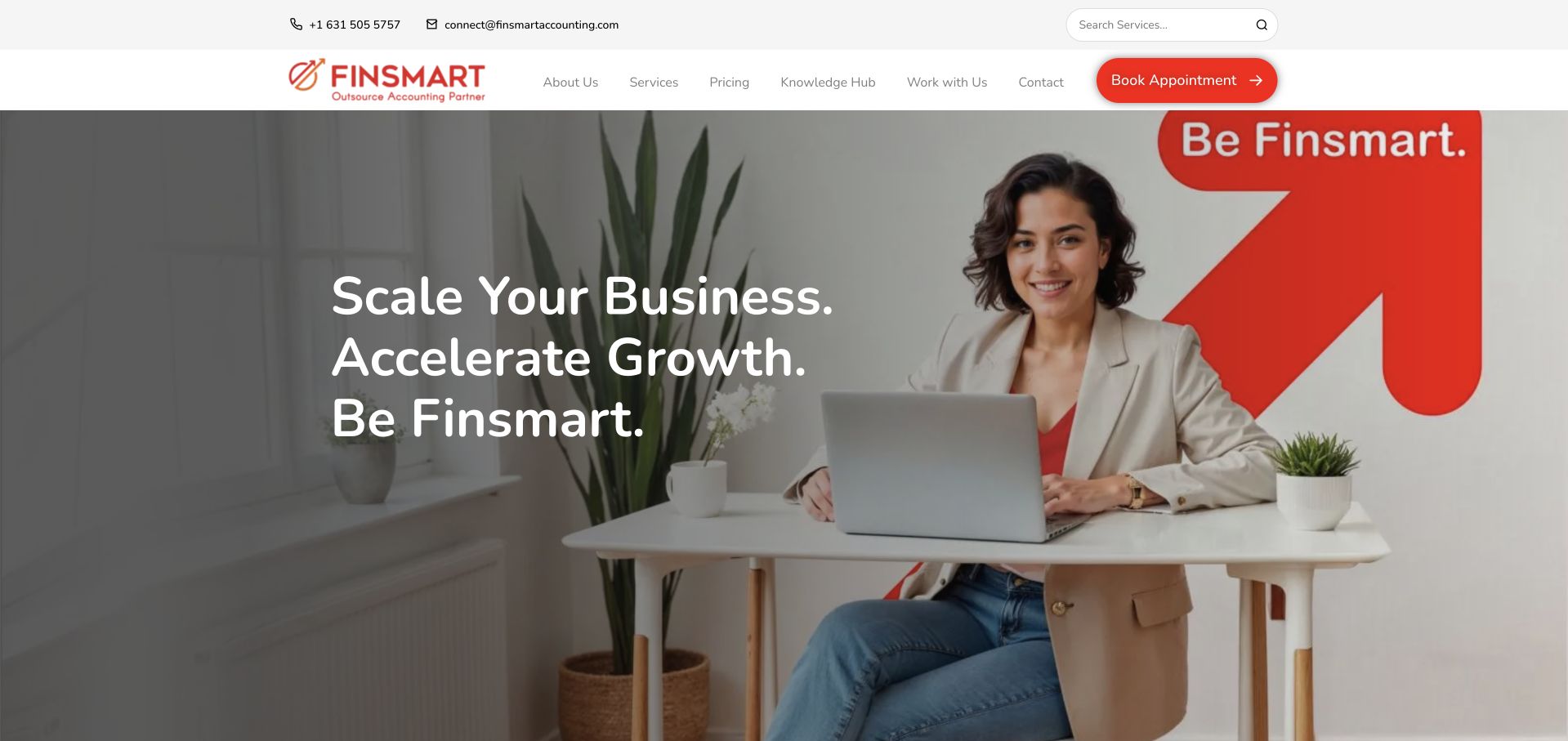
Finsmart uses a white header, red accents and a large portrait within a pale office setting. The headline is short and action-oriented, with service, company, team and appointment routes nearby. The design is useful as a conventional professional-services comparison: it makes a human presence central rather than leading with a spreadsheet or an AI interface. The public page still needs its detailed service content to explain audience, location and the distinction between bookkeeping, accounting and other work. A growth-oriented brand statement is not evidence that the service will change a client’s financial performance in a predictable way.
What you can learn
A portrait-led introduction should connect to named roles and specific service descriptions. Explain whether the audience is a business owner or another accounting firm, identify the engagement’s actual scope and preserve a clear process route before requesting financial records or system access.
Pros
The red accents connect the appointment action with the brand without requiring many competing colors.
Visible team and service routes support investigation beyond the introductory portrait.
Cons & considerations
A short growth slogan is not specific enough to describe recurring deliverables or responsibilities.
A large portrait can occupy valuable opening space before audience and service boundaries become clear.
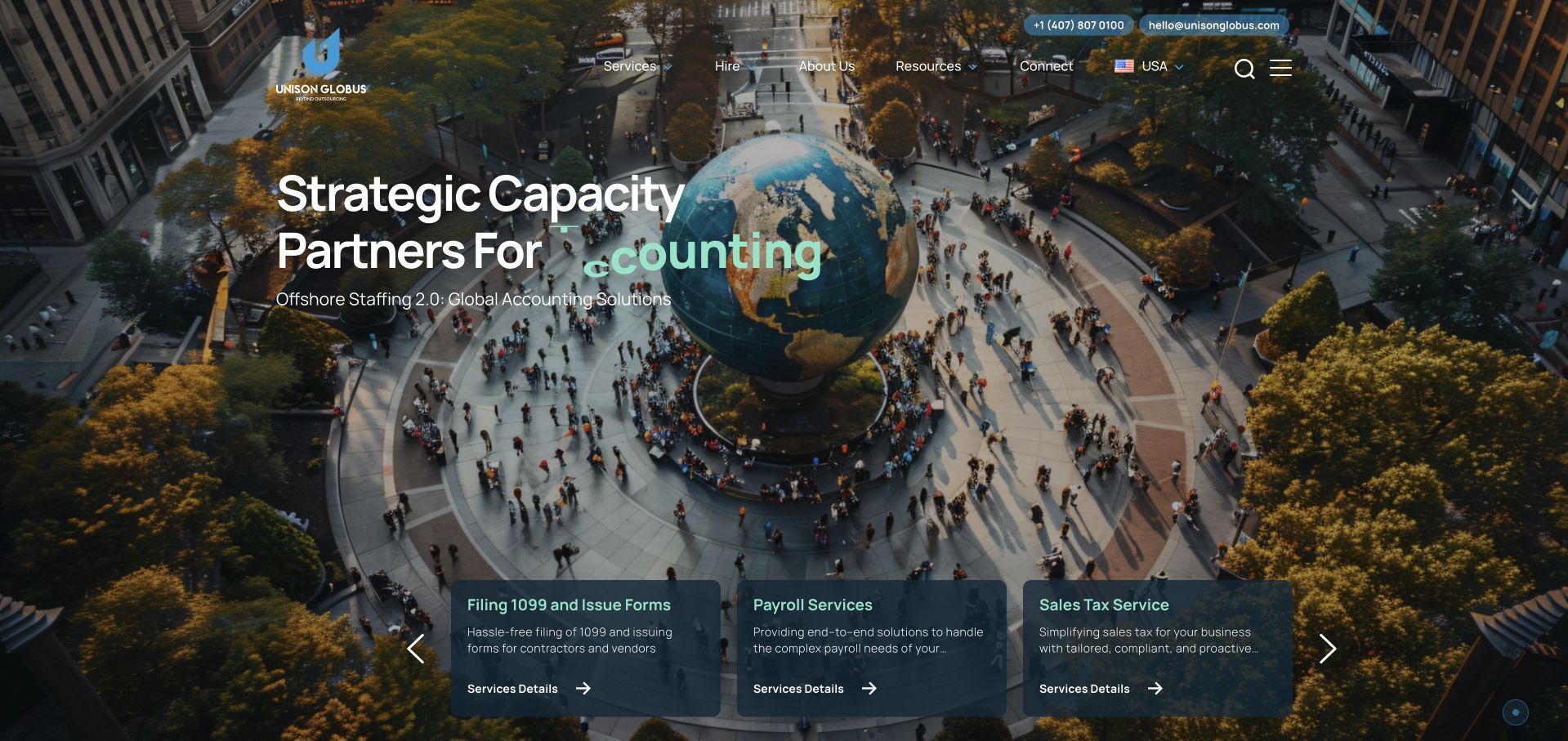
Unison Globus uses a large city scene, a capacity-oriented introduction and several service cards at the lower edge of the hero. The page describes outsourced accounting and tax support for CPA firms, which is a different audience from an owner seeking a local bookkeeper. Navigation exposes services, resources, company information and contact, with regional details visible in the header. The useful lesson is the need to state the service relationship early. The international image and broad capacity language supply a brand setting, but they do not explain staffing arrangements, data handling or the scope of responsibility in a particular engagement.
What you can learn
An outsourcing firm should identify whether it supports professional practices or serves end businesses directly. Define responsibilities, review and communication clearly, explain where data is processed and avoid using scale-oriented language as a substitute for a specific operating model and engagement scope.
Pros
The CPA-firm audience is explicit rather than being left for visitors to infer from technical terminology.
Service cards introduce different work categories near the opening instead of one undifferentiated outsourcing label.
Cons & considerations
A broad international image provides little practical information about teams, locations or data handling.
Rotating service text and multiple cards need a readable static sequence on smaller screens.
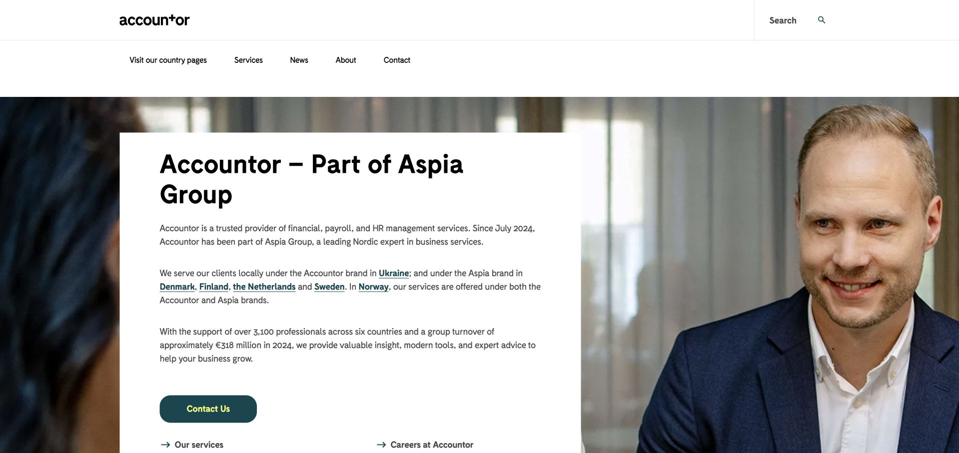
Accountor’s current homepage states that it is part of Aspia Group and explains the use of different brands across countries. A white text panel sits over a portrait photograph, with a contact action beneath the explanation. Country selection and services remain visible in navigation. This is useful for studying a financial-services brand transition rather than a standalone local bookkeeping practice. The opening acknowledges that the name a visitor sees may depend on geography, which is more informative than silently redirecting everyone to a new brand. The remaining pages still need current local scope and contact details.
What you can learn
When a service brand changes across markets, explain the relationship before asking for an inquiry. Preserve country-specific service information, identify the team and legal context relevant to the visitor and keep old and new contact routes consistent. Do not let a group overview replace the detail of an actual bookkeeping engagement.
Pros
The group and country-brand explanation gives returning visitors useful context at the start.
The text panel provides a readable surface independent of the large portrait photograph.
Cons & considerations
A corporate transition page can delay the practical service information a new small-business visitor needs.
Multiple country brands require active maintenance so scope, contacts and terminology remain consistent.
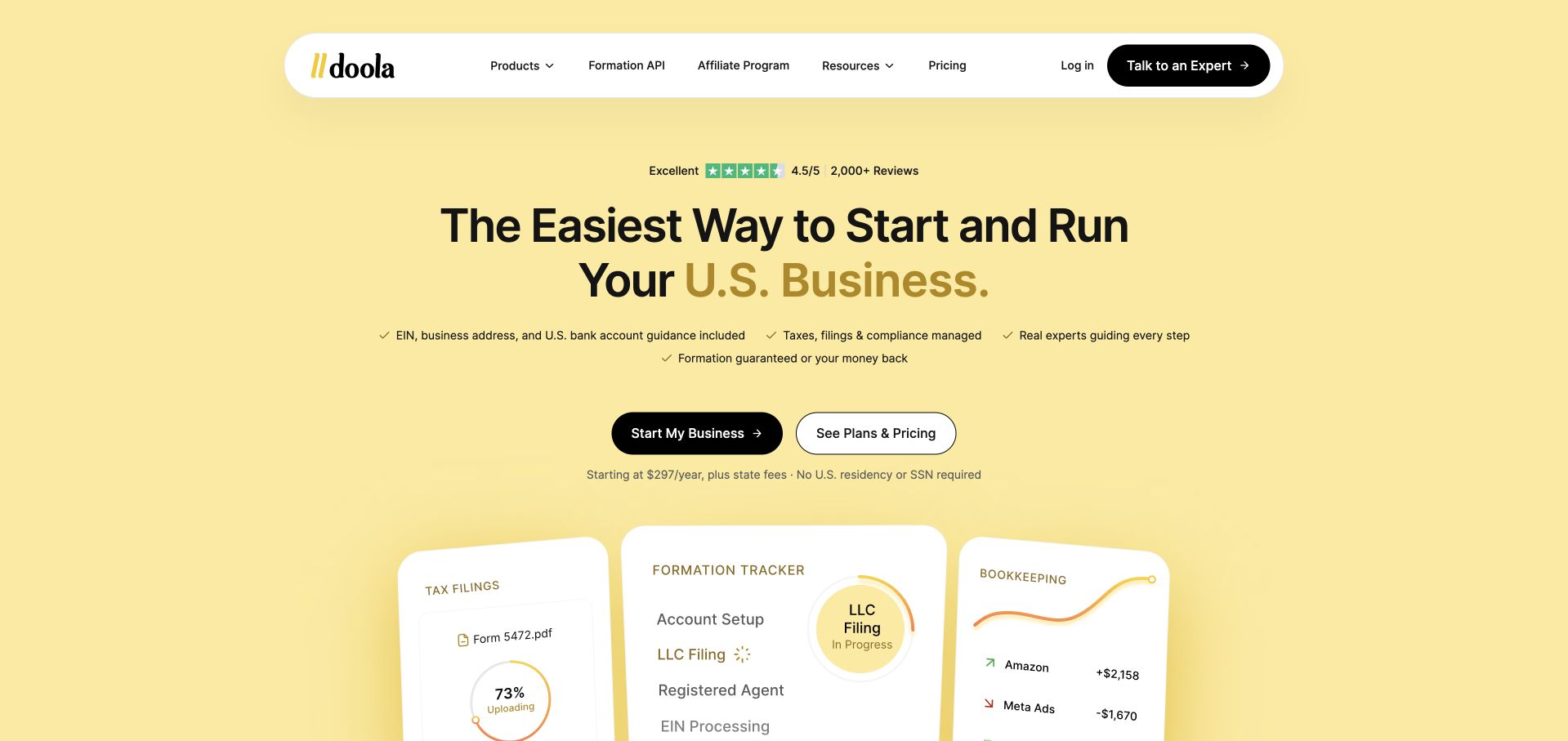
doola uses a yellow opening, large centered typography and a set of product cards for business formation, tax and bookkeeping-related work. A dark primary action is paired with a plans-and-pricing route, while the header separates products, company content and account access. This is an adjacent multi-service platform example rather than a dedicated bookkeeping practice. Its value in the collection is the way recurring financial work is placed alongside earlier business-setup tasks. That relationship can help visitors understand a broader product, but it also creates a need to explain exactly which services are included and which involve separate professional or legal responsibilities.
What you can learn
When bookkeeping is one part of a broader business platform, make each service boundary explicit. Keep pricing and scope accessible, identify what requires client approval or an outside professional and avoid implying that a streamlined signup removes the complexity of tax, formation or financial-record responsibilities.
Pros
The product cards make the different stages and functions of the broader offer visible near the opening.
A pricing route is offered alongside the main start action rather than only after lead capture.
Cons & considerations
A broad start-and-run-a-business promise can blur distinct legal, tax and bookkeeping responsibilities.
Illustrated balances and progress cards need clear example context and must not imply an individual client’s result.
Kegan is a freelance web designer and developer with 15+ years of experience helping businesses turn complicated website requirements into clear, maintainable digital experiences. He works directly with clients from planning and design through development, launch, and ongoing support.
For bookkeeping service website design, his development approach focuses on service scope, software connections, onboarding information, and privacy-conscious business inquiries. The scope can be a targeted improvement or a complete custom build, with responsive layouts, thoughtful content structure, and integrations chosen around the people using and maintaining the site.
Show 3 other bookkeeping service website designersHide other bookkeeping service website designers
Plan the service explanation before choosing a dashboard illustration
Write a scope that a business owner can actually compare
Start with the recurring work the practice accepts and the clients it is equipped to serve. List the business models, software compatibility and operating situations that genuinely affect the engagement. A specialist ecommerce firm can name the channels and inventory context it supports; a local practice may emphasize a different relationship. Do not turn every adjacent accounting keyword into a service page. If the business does not offer a function, the website should not imply that it is included merely because competitors list it.
Separate bookkeeping from payroll, tax, controller work, CFO support and other advisory activities in the content model. Explain the boundaries in ordinary language and have the responsible professionals review them. A broad outsourced-finance label can be useful as an introduction, but it does not tell a visitor which tasks are recurring, which are optional and which require a separate arrangement. Use dedicated pages or a clear scope comparison rather than relying on a long list of positive benefit claims.
Describe the client’s role as well as the provider’s. Explain what information must be supplied, what approvals remain with the business and how questions are resolved. A promise to remove administrative burden should not imply that the client has no continuing responsibility. The purpose of the website is to make the relationship understandable before a sales conversation, not to give individualized tax, accounting or financial advice. Avoid suggesting that one package or tool is automatically appropriate for every business with a similar revenue or industry label.
Show the work without exposing or inventing client evidence
Decide which service artifacts would genuinely help a prospective client understand the offer. A sample report, a close checklist, a communication schedule or an onboarding outline may be more useful than a decorative spreadsheet. Use explicitly fictional or appropriately redacted examples with permission and review. Do not expose real names, account details, payroll information or private transactions to make a homepage feel authentic. Label example figures so they cannot be mistaken for the visitor’s own numbers or a typical promised result.
Use software logos to describe a documented relationship such as compatibility or a relevant credential. That is different from claiming that the public marketing website runs on the same technology. Keep credential wording current and explain what it signifies without implying a broader professional approval. Similarly, reviews, awards and client marks can provide context when accurate, but they do not independently establish the suitability or outcome of another engagement. Record the sources and the person responsible for reviewing changing claims.
If AI or automation is part of the offer, explain the actual division of work. Describe what the system does, what people review and what clients must approve at the level the business can substantiate. Avoid using an AI badge as a substitute for responsibility. A dashboard tour can illustrate interface functions, but it does not verify accuracy or demonstrate financial performance. Keep the output explanation readable without video, animation or tiny interface labels, so visitors can understand the service even when they do not interact with a product demonstration.
Build an inquiry and onboarding handoff the team can maintain
Define the first conversation before selecting form fields. A new inquiry may need contact information, broad business context and a short description of the requested help. It does not need bank credentials, tax identifiers or a complete financial history in a public message box. Explain why the requested information is useful, mark required fields clearly and give people a way to ask a general question. A visible privacy expectation should be understandable before submission, not appear only after the user has already entered sensitive details.
Describe the next step accurately. A call request is not an accepted engagement, and an inquiry confirmation should not imply that service has begun. Explain whether the team will discuss fit, review scope or arrange another step. If the business uses a separate client portal, identify that destination and reserve it for the appropriate stage. Keep current-client support and new-business inquiries distinct. A client trying to resolve an existing question should not have to pretend to be a new lead to reach the right person.
Plan maintenance with the staff who answer inquiries and deliver the work. Assign ownership for pricing explanations, team information, software compatibility, credential statements and form delivery. Test the site with realistic tasks: understanding the scope, comparing the process and finding the correct contact route. Include keyboard and mobile checks, clear labels and useful error messages. Review what happens when a booking tool is unavailable or an external portal changes. A good bookkeeping website clarifies an operating relationship; it does not prove accuracy, guarantee savings or growth, or replace the individual professional review required for a particular client’s circumstances.
The editing job behind the design
Keep the public website separate from the financial operating systems
A maintainable CMS, clear service content and a reliable inquiry route can support a small practice well. Select booking and contact integrations for the real workflow, and document who maintains them. Do not rebuild a client portal simply to imitate the product-style appearance of a larger service brand.
The public site can illustrate a report without receiving private records. Keep authenticated documents, approvals and account access in the appropriate operational system. Use efficient imagery and readable text rather than making essential scope depend on a dashboard animation. Visible website technology signals are not a complete inventory of accounting tools or internal financial systems.
Our WordPress website examples offer a separate look at publishing approaches. A visible platform label is evidence for that named page, not a guarantee that the same system will suit your requirements.
Before the public launch
Bookkeeping website brief checklist
Name the business models and client audiences the practice actually serves.
Separate bookkeeping, payroll, tax and advisory scope instead of relying on one all-in-one label.
Explain recurring deliverables, review cadence and the client’s continuing responsibilities.
Provide a clear process or pricing route before requiring a consultation request.
Identify named people and roles behind the service rather than using portraits as decoration.
Use only permitted, fictional or carefully redacted sample reports and label their purpose.
Keep software compatibility and credentials distinct from claims about the public website’s technology.
Explain human review and approval responsibilities where automation or AI is part of the offer.
Do not invite bank credentials, tax identifiers or private transaction records into public forms.
Separate new inquiries, current-client support, booking and authenticated portal access.
Test form labels, errors and the main information tasks with a keyboard and a narrow screen.
Assign review owners for scope, pricing, team information, credentials and external integrations.
These checks are a project checklist, not a performance, legal, security, or accessibility certification. Test real journeys with the people responsible for the website before making claims about the result.
Sources & editorial method
How this collection was selected and reviewed
Public pages and direct browser captures were reviewed on November 9, 2026 for content, navigation and visual hierarchy. Dedicated bookkeeping practices and adjacent multi-service platforms are distinguished. Inclusion does not evaluate accounting accuracy, financial performance, professional competence or suitability. Primary source and capture records preserve the actual public pages observed.
Each example links to its actual source page. Screenshots are direct browser captures with their own capture dates; moving imagery, announcements and live designs can change. The notes describe observable design choices and conditional tradeoffs, not measured traffic, conversion results, service quality, or accessibility conformance.
Technology labels use public page metadata, asset evidence, or explicitly cited platform documentation. Platform documentation is not a complete current deployment audit. A component reference may be legacy or unused; it is not a complete backend inventory. Unknown stacks are omitted. These sites are editorial examples, not our client portfolio.
Written, Edited and Curated are separate editorial records, not timestamps advanced by a rebuild. Website designs and imagery belong to their owners. See our editorial standards or suggest a correction.
Questions worth asking
Bookkeeping Service website design questions
Should a bookkeeping firm specialize its homepage?
It can be useful when the specialization reflects the actual service. Name the audience and explain why the workflow differs, rather than simply adding an industry word to generic copy. A general practice can still be clear by describing the clients, recurring tasks and scope it genuinely supports.
Do we need a dashboard illustration?
No. Use one only if it explains the service more clearly than a short text example or process outline. Make example data explicit, keep labels readable and do not imply that a mock interface proves accuracy, financial performance or the technology behind the actual service.
Should bookkeeping, tax and CFO services be combined on one page?
A broad introduction can mention them, but their scope should remain distinct. Explain what is included, optional or separately arranged and have the appropriate professionals review the wording. A visitor should not need to infer responsibilities from a list of benefit statements or a general finance label.
What belongs in the first inquiry form?
Information needed to begin the stated conversation, such as contact details and broad business context. Avoid inviting private financial records or credentials into a public form. Explain the next step and use the appropriate later process when documents, account access or detailed review are actually required.
Can the design establish that a bookkeeping provider is trustworthy?
It can make the relationship easier to understand, but it cannot independently establish competence, accuracy or suitability. Clear scope, identifiable people and appropriately sourced claims are useful communication. Assessing the professional service requires evidence beyond the appearance of its public website.
Explain who does the work, what recurs and how the relationship begins. That is more useful than another unqualified promise that the client’s finances will become effortless.