Best Mortgage Broker Websites of 2026 (28 Real-World Examples)
Mortgage broker websites that make the next conversation understandable before asking for the full story.
Compare borrower routing, human introductions, tools and inquiry design. These are website-design observations, not recommendations of brokers, financial products or lending strategies.
A visitor may know they want to buy, refinance or understand the process without knowing the product terminology a broker uses internally. A useful homepage bridges that gap. It explains who the business serves, offers an appropriate next step and leaves a readable information route for people who are not ready to share personal details.
The examples include regional practices, specialist firms, online brokers and larger networks. Their jurisdictions, service models and terms differ. Study how the pages communicate those relationships; do not copy fees, regulatory text, rate claims or product promises from another organization.
Before the examples
What makes good mortgage broker website design in 2026?
Use intentions before product jargon
Buying, remortgaging, building and learning are recognizable starting points. Specialist categories can follow once the visitor has context. A short routing layer should explain what each choice does, not merely disguise the same lead form behind several buttons. Include a route for someone who does not yet know where they fit.
Distinguish information, inquiry and advice
A calculator, an educational guide, a callback request and a full application are different interactions. Label them accordingly and explain the next step before collecting information. The public website should not imply that a general illustration or a quick form has assessed an individual’s circumstances or established eligibility.
Make the people and service terms easy to investigate
Visitors may need to understand the firm, the relevant team, the service scope and how a conversation begins. Keep this context accessible alongside the main action. Review marks and lender logos can provide background, but they do not replace a clear explanation of the relationship or the qualifications that apply.
The collection · 28 examples
28 mortgage broker websites worth studying
Compare the first decision each page asks a visitor to make. Notice whether that decision matches a real borrower intention, an audience relationship or merely a marketing slogan.
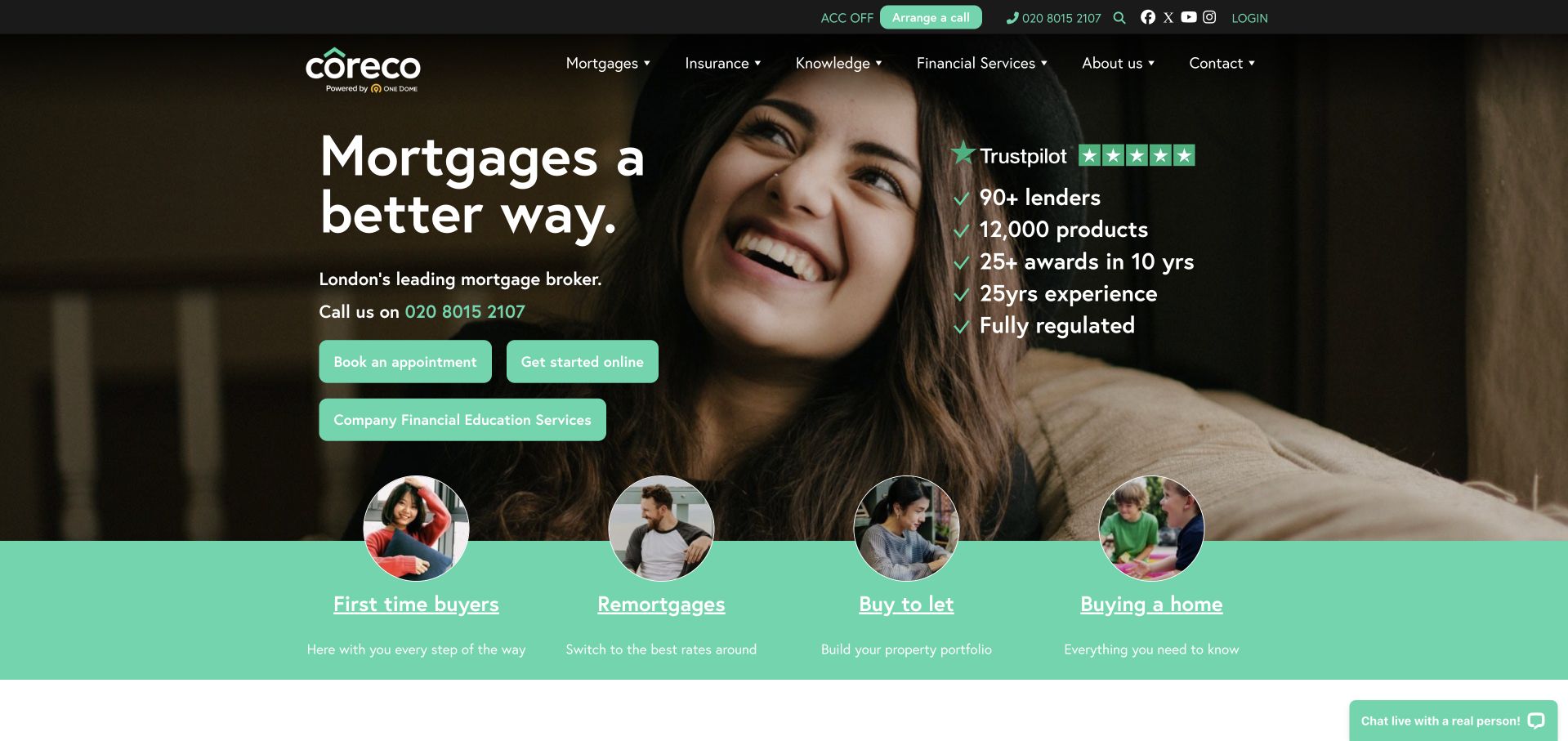
Coreco places a conversational mortgage headline over a person-led photograph, then uses mint-colored borrower categories immediately beneath it. First-time buyers, remortgages, buy-to-let and moving home are introduced with circular portraits rather than abstract financial icons. Booking and starting online are separate actions, acknowledging different preferences for beginning an inquiry. A compact proof column sits beside the headline, while the header exposes knowledge and company information as well as mortgage services. The strongest design decision is the rapid transition from a broad brand proposition to recognizable situations, without making the visitor understand the firm’s internal service structure.
What you can learn
Start a broker website with the situations visitors can name, then explain the corresponding process and scope. Use people and plain labels to make the introduction approachable, but keep fees, required notices and the distinction between general information and personal advice easy to find.
Pros
The borrower-category row provides a useful next step directly beneath the opening rather than another broad slogan.
Online and appointment routes are visibly different, which accommodates visitors who are not ready for the same interaction.
Cons & considerations
A busy image, proof column and multiple buttons can compete for attention in the opening.
Displayed awards, product totals and review marks need maintained source context rather than being repeated as independent validation.
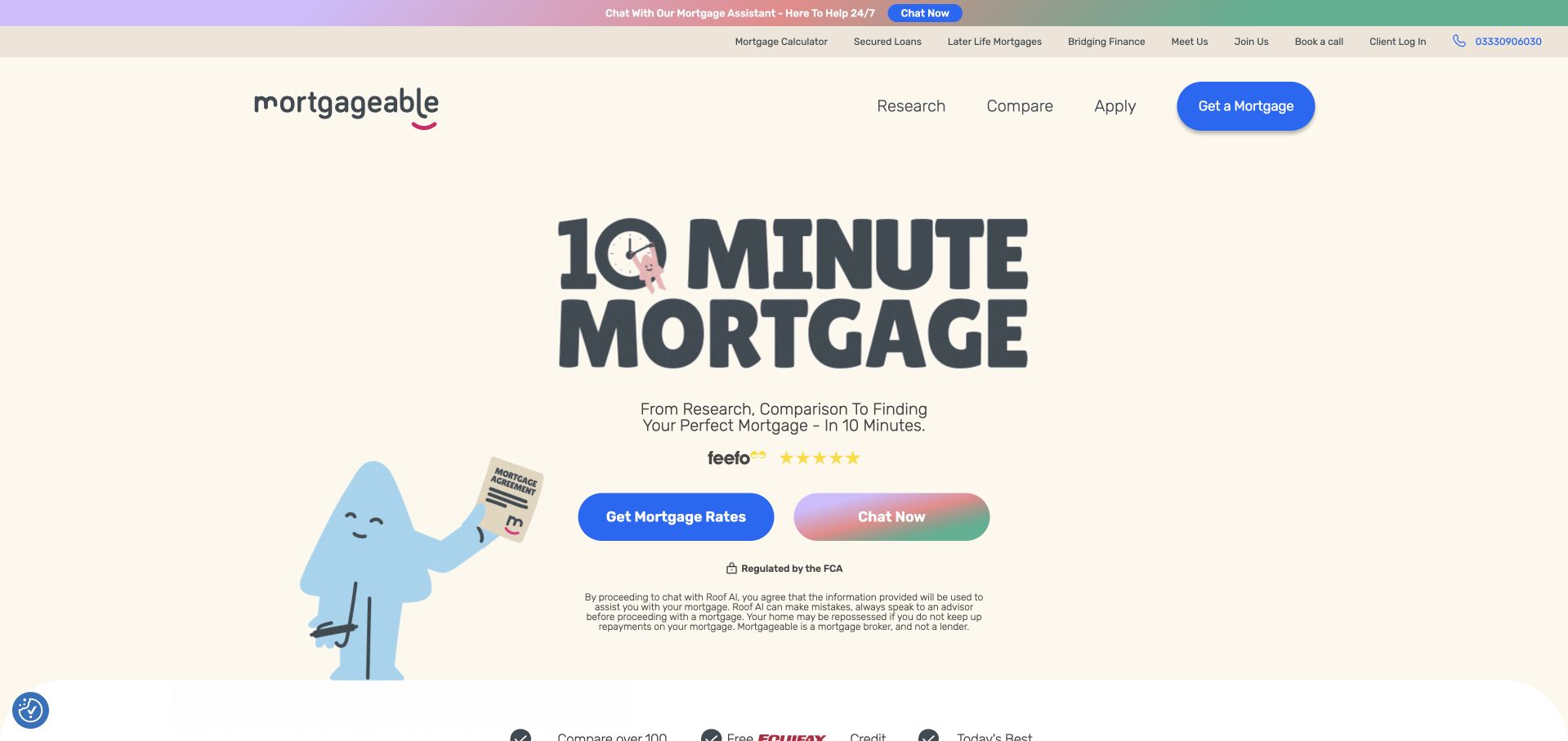
Mortgageable’s current page uses a cream background, oversized display lettering and a simple illustrated character. A rate-finding action is paired with a chat option, making the distinction between exploring information and speaking to someone visible. The header includes research, comparison and application stages rather than a dense list of mortgage products. This helps present a process at a glance, although the prominent time-based promise should be read as the site’s marketing copy rather than a guarantee verified by this review. The restrained opening leaves generous space around the two actions and the regulatory information underneath.
What you can learn
A digital broker can describe a sequence without showing an entire application form in the hero. Label exploratory and conversational routes clearly, explain what information will be requested next, and avoid allowing a short time claim to oversimplify the work required for an individual application.
Pros
Research, compare and apply create an understandable high-level navigation sequence for a new visitor.
The primary action and chat alternative offer different ways to begin without equal-sized form panels.
Cons & considerations
Very large display lettering can push important scope information below the first screen on mobile.
A simplified character and quick-process message do not establish what happens in more complex circumstances.
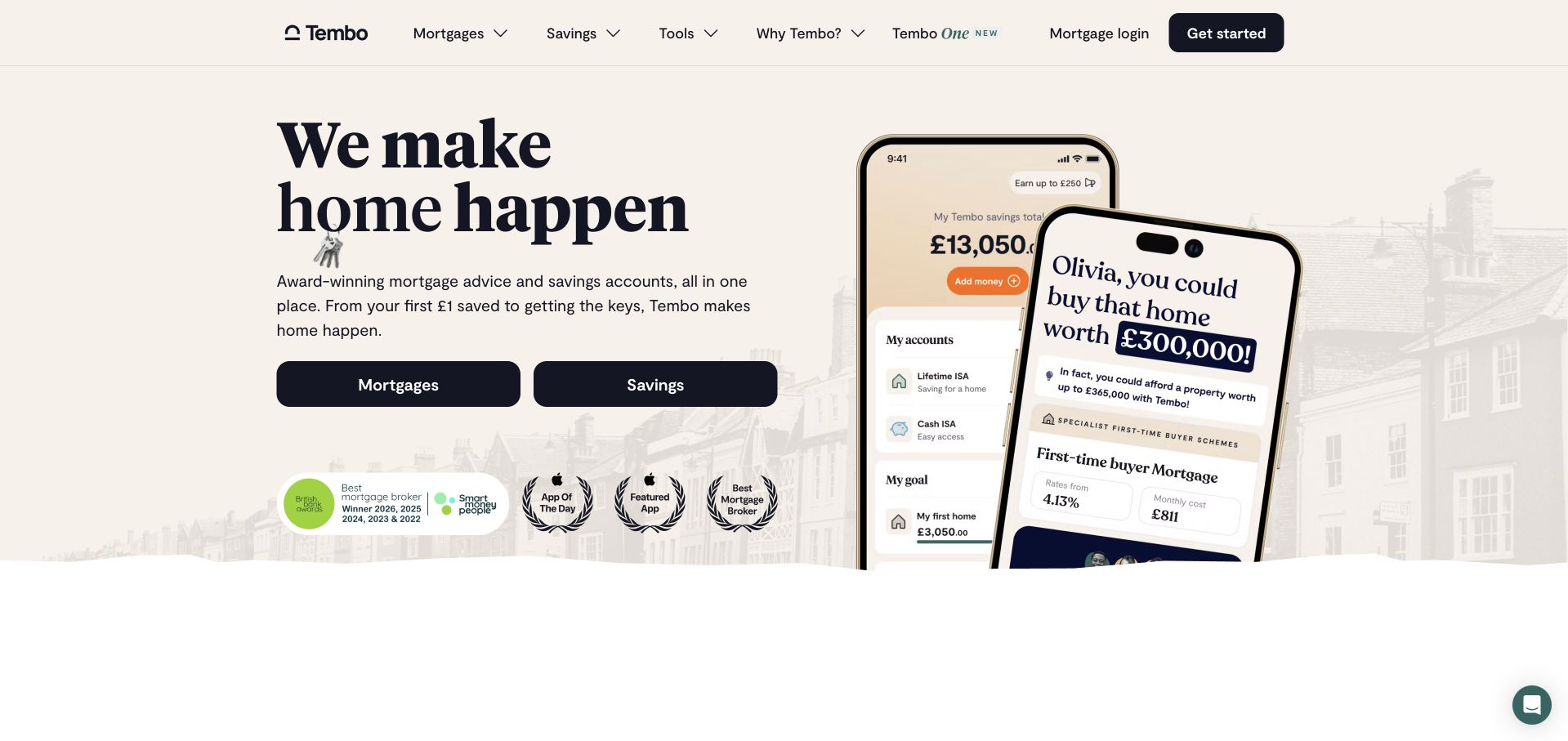
Tembo’s opening combines a bold serif headline with two product routes, mortgages and savings. A pair of phone mockups illustrates different parts of the home-buying journey rather than showing a generic calculator. The pale background and black primary controls create a strong contrast, while small colored marks introduce additional context beneath the actions. The header continues the product split and includes tools and an explanation of the brand. The page is useful for studying how a company can serve people who are at different stages of readiness, without assuming that every visitor wants to begin a mortgage conversation immediately.
What you can learn
When several products support the same broader goal, preserve their distinct labels and expectations. A website can connect the journey visually while explaining which route is general information, which is a savings product and which starts a broker interaction. Do not merge them into one ambiguous start button.
Pros
The two prominent product routes acknowledge visitors who are saving as well as visitors ready to explore a mortgage.
Phone mockups provide a recognizable product context without placing a full application interface in the opening.
Cons & considerations
Illustrated balances and property figures should be clearly understood as examples rather than personalized results.
Several proof marks and product concepts near the hero can become difficult to scan at reduced widths.
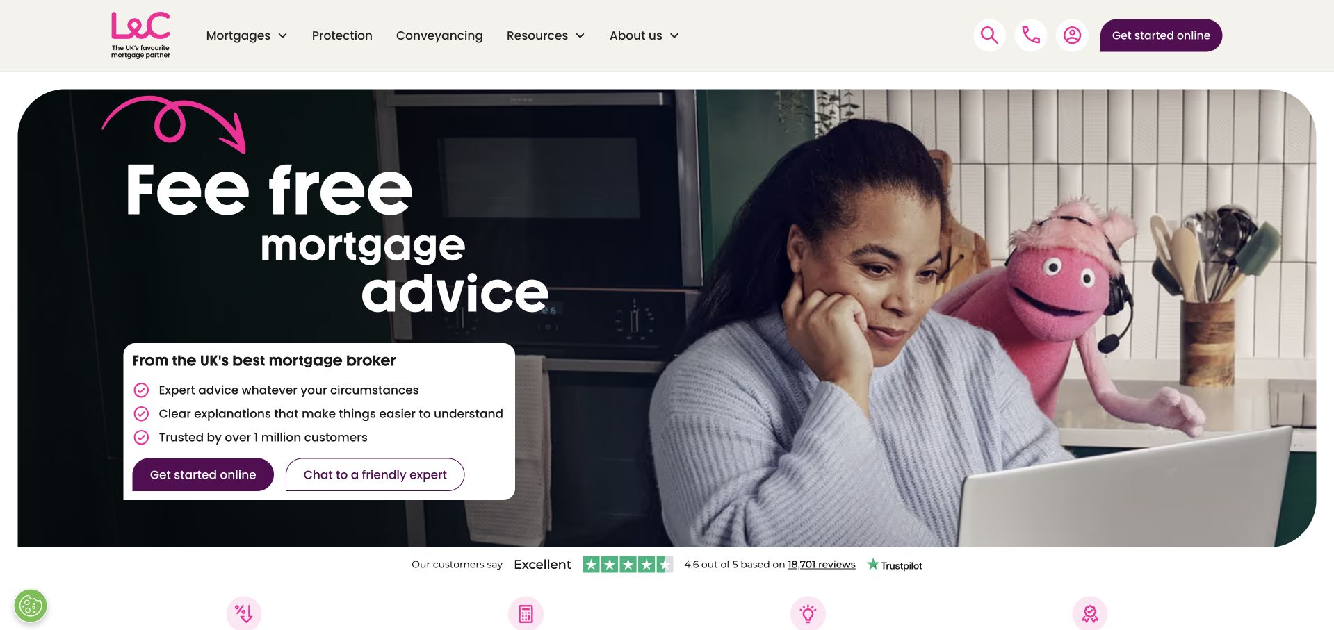
L&C uses a dark headline panel beside a household scene featuring its recognizable character. The main proposition is followed by a compact explanation and two actions: starting online or chatting to an expert. The header keeps mortgages, protection, company information and resources as separate groups. Below the opening, the page introduces mortgage information and comparison content, so the hero is only one entry point into a larger service. The design is useful for studying a brand device that adds personality while ordinary labels continue to explain the actual task. This review evaluates that presentation, not the suitability of any displayed mortgage.
What you can learn
A distinctive character can help a financial-service brand become recognizable, but the next step still needs a plain explanation. Keep an online inquiry and a conversation route separate, and make any fee proposition and important qualifications readable outside the main promotional image.
Pros
The contained dark panel gives the headline and supporting points a stable contrast background.
Starting online and speaking with an expert remain visibly different options near the introduction.
Cons & considerations
An unusual brand character can attract attention away from the details a cautious first-time visitor needs.
Current comparison information requires active maintenance and clear dates; a polished hero cannot make it evergreen.
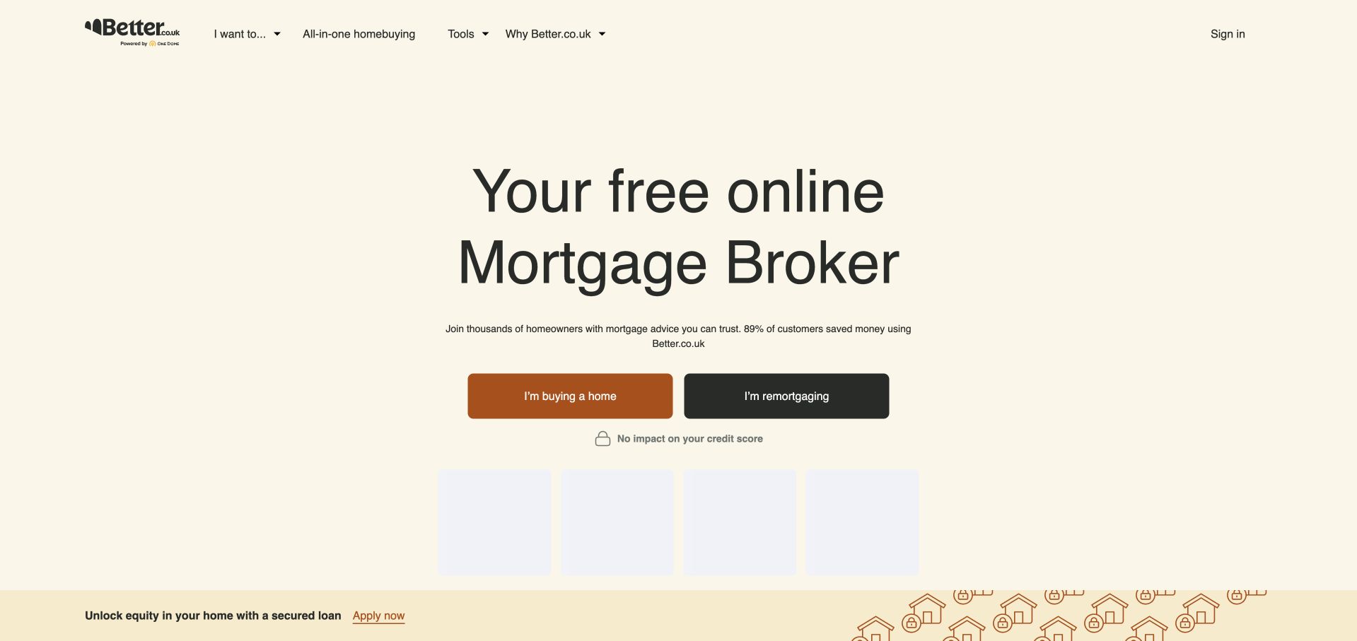
Better.co.uk uses a pale cream field, a large centered heading and two contrasting buttons for buying a home and remortgaging. The design removes most of the imagery normally associated with mortgage websites, giving the visitor’s intention nearly all the visual weight. Header navigation includes mortgage guides, company information and sign-in, while a lower promotional strip is kept outside the central decision area. The opening is valuable as an example of controlled simplicity: it does not ask for a property’s full history or personal financial details before the user has chosen the relevant journey.
What you can learn
Start with the smallest useful routing question rather than a long lead form. Then explain the selected journey, what information is needed and who will respond. Minimalism is effective only if later pages supply the practical detail that the deliberately sparse opening leaves out.
Pros
The two intention labels make the first choice understandable without product knowledge.
The generous space around the main actions keeps the page from resembling a crowded comparison table.
Cons & considerations
The opening provides limited human context for visitors who want to know who will handle an inquiry.
A promotional strip can introduce a competing message that is unrelated to the visitor’s chosen mortgage task.
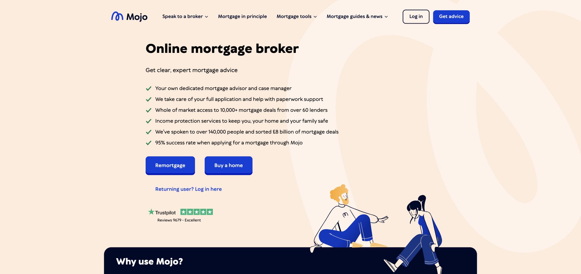
Mojo presents an online-broker headline above a short checkmarked list and two strong blue journey buttons. A small illustration occupies the lower corner rather than dominating the message. The peach background and dark text keep the opening light, while review information appears below the actions. The page continues into an explanation of why to use the service, the application sequence and questions about online brokers. This is useful for studying how a concise operational explanation can reduce the distance between a category label and a visitor deciding whether to begin, without putting a detailed application form in the hero.
What you can learn
A short introductory checklist should explain the service relationship, not simply accumulate unsupported superlatives. Pair it with intention-based routes and answer process questions before asking for sensitive information. Keep the initial inquiry visibly separate from any later application or advice stage.
Pros
The checkmarked introduction gives readers a scannable explanation before the primary choices.
A restrained illustration adds personality without reducing the space available for labels and actions.
Cons & considerations
Several positive claims in a compact list need qualifications and supporting detail elsewhere on the site.
A small review mark cannot substitute for an accessible explanation of fees, scope and how the broker is paid.
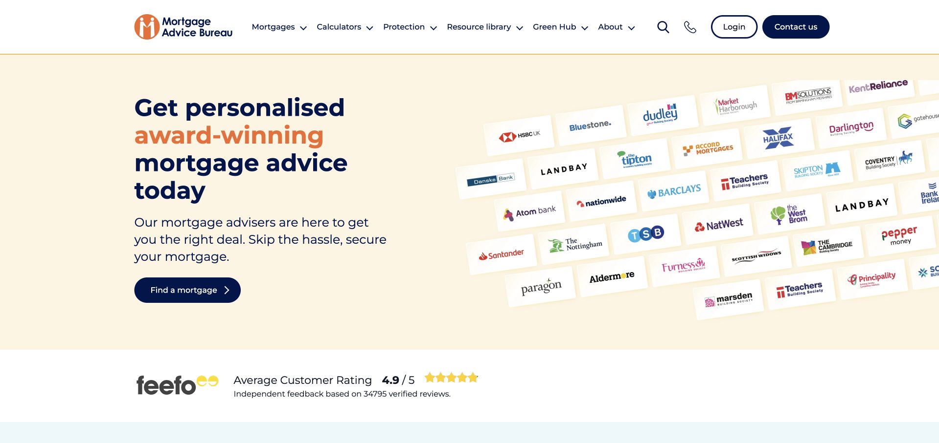
Mortgage Advice Bureau places a short advice proposition on one side and a tilted field of lender logos on the other. A dark-blue mortgage-finding action receives clear emphasis against a pale background. The header separates mortgages, protection, resources, locations and company information, with login and contact at the edge. The logos make the category visually recognizable, but they are not a substitute for explaining the actual scope of an individual broker’s service. The design is worth studying for how a broad network introduction can remain contained and leave the visitor a clear route into a more specific inquiry.
What you can learn
When displaying partner or lender marks, explain what the relationship means and keep the user’s next step independent of the logo wall. A network site should help visitors find the relevant adviser or location rather than expecting a national brand statement to answer local service questions.
Pros
The split layout gives the advice message and lender imagery distinct, easy-to-scan areas.
Locations and resources remain visible in navigation rather than being hidden behind the main start action.
Cons & considerations
A large field of logos can imply a wider relationship than an individual service route actually provides.
Displayed ratings and product breadth require current context and should not be treated as independent recommendations.
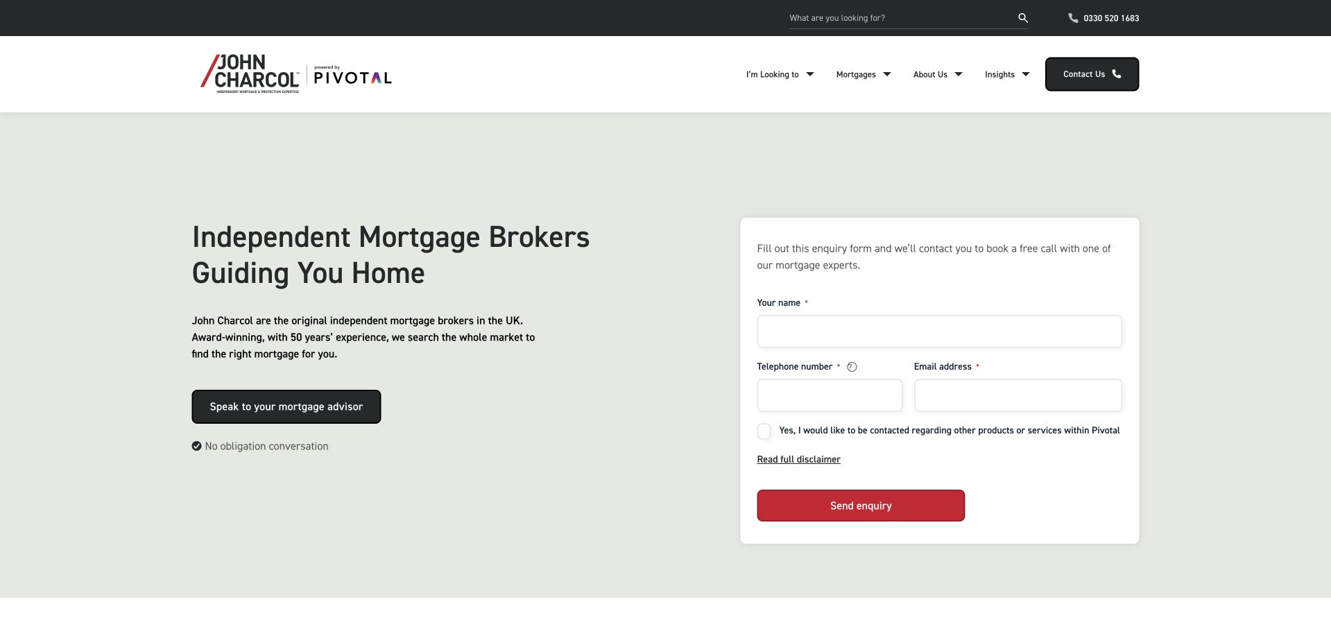
John Charcol places a compact contact form beside a plain broker introduction on a muted pale-green background. The form asks for basic contact details rather than attempting to collect a complete financial history in the opening. Navigation distinguishes mortgage information, insights and company content, while a dark utility strip keeps telephone access visible. The main design lesson is the clear relationship between the text and the form: the visitor can understand the type of conversation being requested before reaching the fields. The layout is more direct and less image-dependent than many lifestyle-led mortgage pages in this collection.
What you can learn
If a callback is the primary conversion, explain its purpose next to the fields and ask only for the information needed to arrange it. Keep consent choices clear, show an alternative contact method and move sensitive application details into an appropriate later process.
Pros
A contained form has visible labels and a distinct background separate from the introductory message.
The page can communicate its basic service without requiring a large photograph or animation to load.
Cons & considerations
A form-led hero may feel premature to visitors who first want to understand fees or the process.
Any optional marketing or partner-contact choice needs a clear distinction from the requested service response.
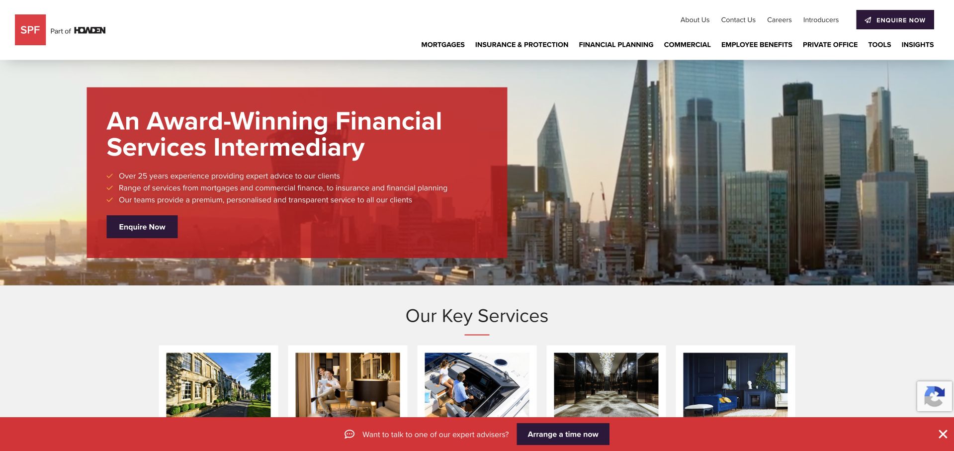
SPF’s homepage uses a red text panel over a city photograph, followed by a row of service tiles. Mortgages appear alongside insurance, financial planning and other activities rather than being presented as the firm’s only offering. The header groups those services and gives contact information a separate route. This is useful for studying a multi-service business that needs to establish a coherent brand without forcing every visitor into a single product journey. The strongest structural detail is the immediate transition from the broad introduction to clearly named services, which makes the breadth of the offer easier to navigate.
What you can learn
A specialist financial-services homepage should make the boundaries between services visible. Use a concise introduction, then let dedicated pages explain process, qualifications and terms for each route. Do not rely on a city image or a general intermediary label to explain what an individual visitor will receive.
Pros
The red headline panel protects readability while retaining the wider city photograph.
Service tiles bring the company’s different activities into view near the opening.
Cons & considerations
A broad intermediary proposition gives a first-time mortgage visitor relatively little process detail.
Multiple service categories and promotional elements can dilute the most relevant next step on small screens.
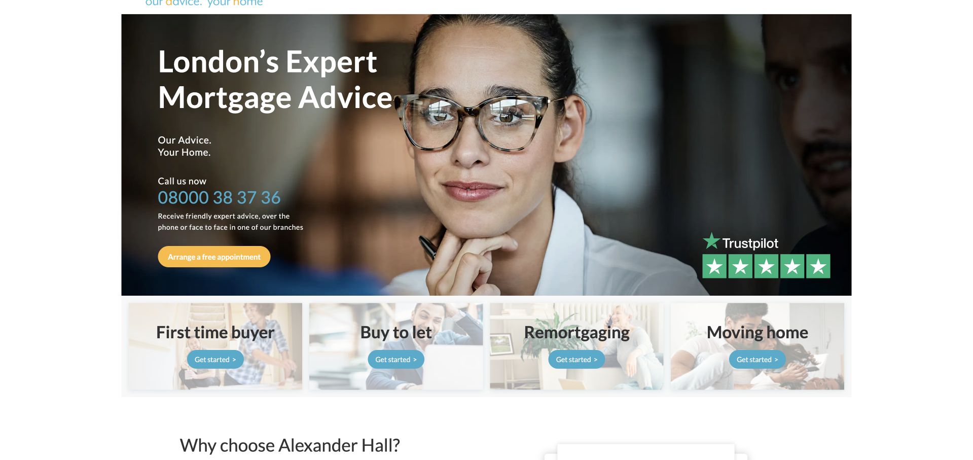
Alexander Hall uses a close portrait, a local mortgage-advice headline and a bright appointment action. Beneath the opening, first-time buyer, buy-to-let, remortgaging and moving-home cards create a clear set of routes. The header is comparatively restrained, naming the main lending categories before calculators and company information. The useful pattern is the quick shift from an individual human face to the visitor’s own situation. The page does not need to show a complex finance diagram to explain what the user should explore next. The local reference gives the introduction a more specific context than a generic national claim.
What you can learn
Use place and borrower situation together to make a broker introduction relevant. Keep any fee and service qualifications available in ordinary text, and ensure an appointment action explains the next interaction rather than appearing to promise an immediate product or approval.
Pros
The route cards make different borrower intentions visible immediately beneath the image-led opening.
The appointment action has a distinct color and does not compete with a large hero form.
Cons & considerations
A portrait with layered text needs a dependable contrast treatment across responsive crops.
Review badges and local-expertise messaging still require supporting details; they do not establish personal suitability.
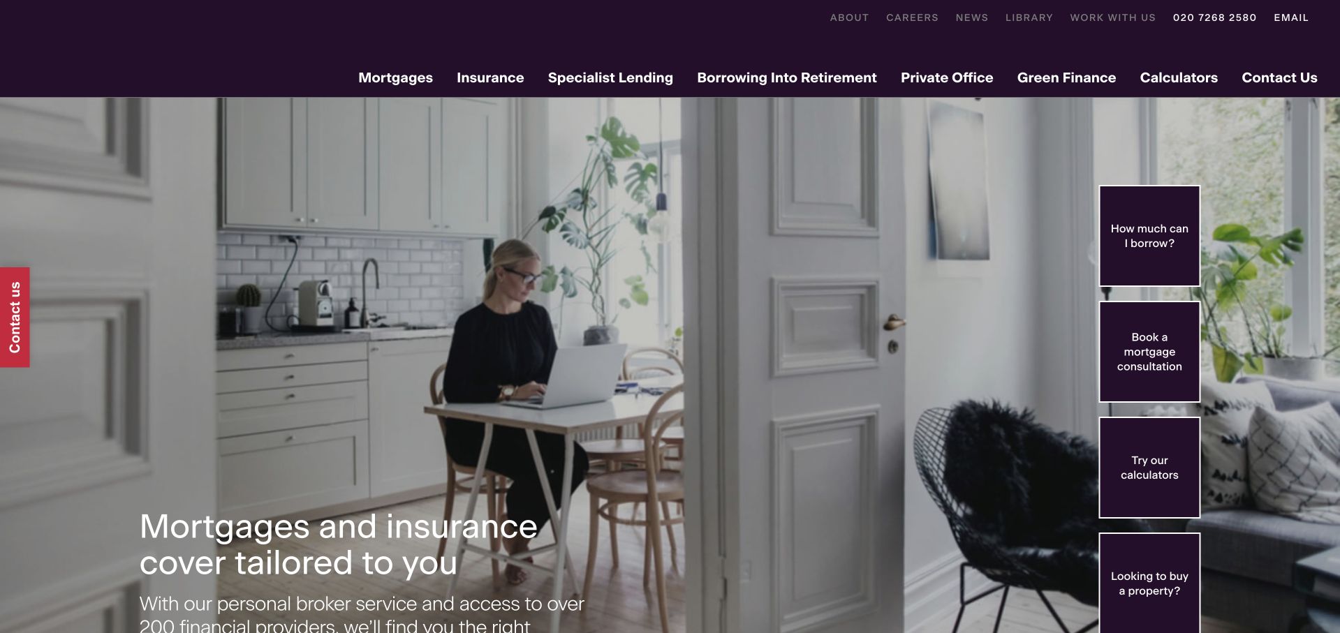
Knight Frank Finance uses a residential interior photograph, a restrained purple header and a short text introduction. A vertical stack of shortcuts offers borrowing information, a consultation, calculators and property-related routes. This provides several useful entry points without placing a long application form over the photograph. The navigation distinguishes mortgages, insurance, specialist lending and later-life borrowing, so the page is not framed as one universal product. The design is worth studying for the way it uses a familiar domestic setting while keeping functional tools and service categories plainly labeled around it.
What you can learn
A visually quiet opening can still be useful if its shortcuts reflect real visitor questions. Separate calculators, general explanations and a consultation request, and make clear when a tool is illustrative rather than personalized advice. Ensure later-life and specialist routes explain their own scope and qualifications.
Pros
The shortcut stack gives practical destinations a consistent shape beside the main image.
Service categories remain distinct instead of being combined into one ambiguous finance menu.
Cons & considerations
Several small floating shortcuts can become intrusive or difficult to arrange on a narrow screen.
A lifestyle photograph communicates a setting but provides little evidence of the actual inquiry process.
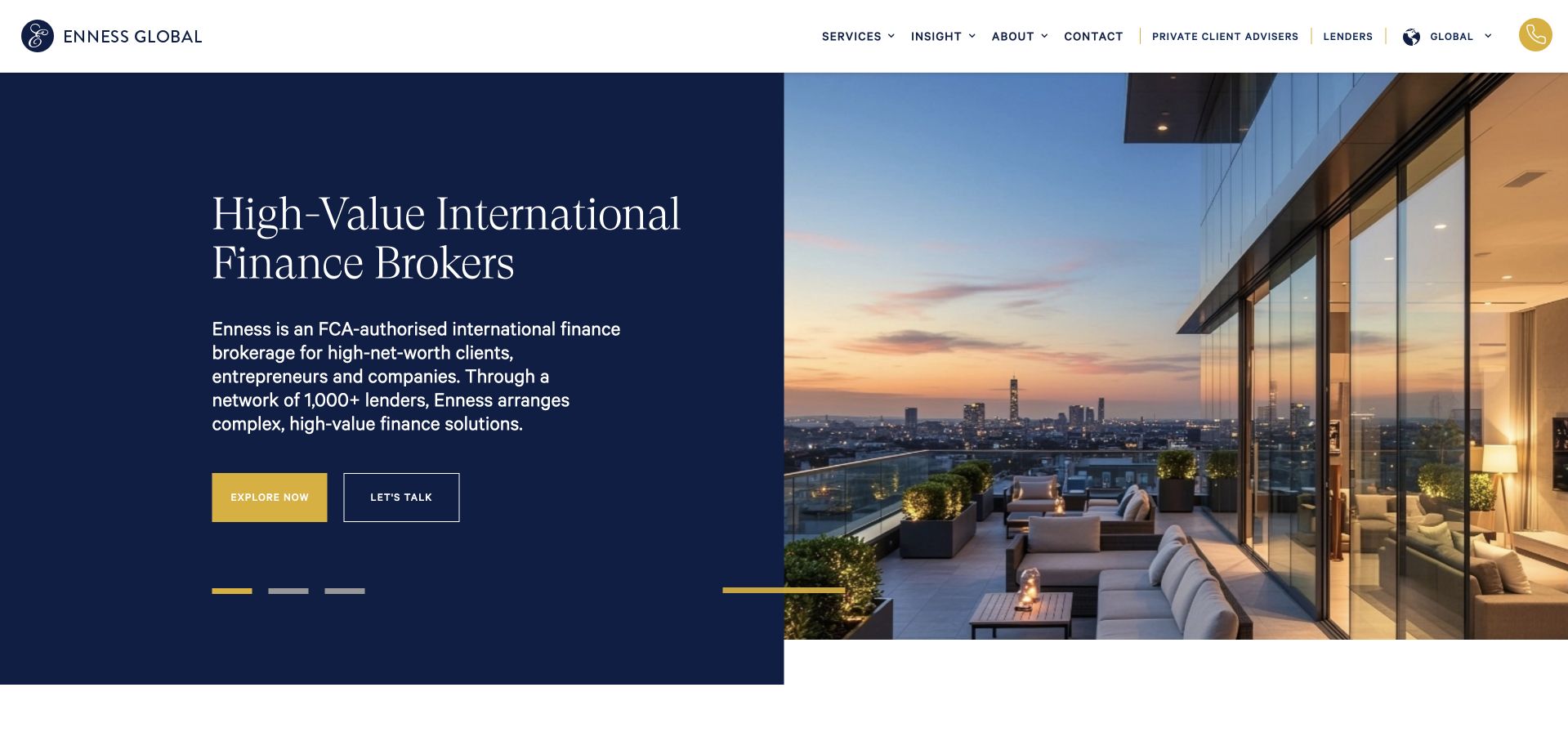
Enness Global pairs a dark-blue text field with a large contemporary-property photograph. The headline identifies high-value international finance rather than a generic home-loan service, and the supporting paragraph names the intended audience. Two actions offer exploration and a conversation, while service navigation stays at the top. This specificity is the useful design lesson: the page narrows the audience before introducing a broad list of possible products. The polished property image supports that positioning, but the more important information comes from the explicit description of the firm’s role and the separate routes into its services.
What you can learn
A niche broker should describe the audience and transaction context early, without implying that a visual style guarantees access or outcomes. Use a split layout to keep the explanation readable and reserve more detailed service, jurisdiction and process information for the relevant destination pages.
Pros
The text sits on a stable dark field rather than relying on contrast over the property photograph.
The introduction identifies a specific audience and service context before asking for contact.
Cons & considerations
A luxury image can overemphasize aspiration if practical scope and qualification information are delayed.
International service language needs careful jurisdiction-specific explanations beyond a broad homepage description.
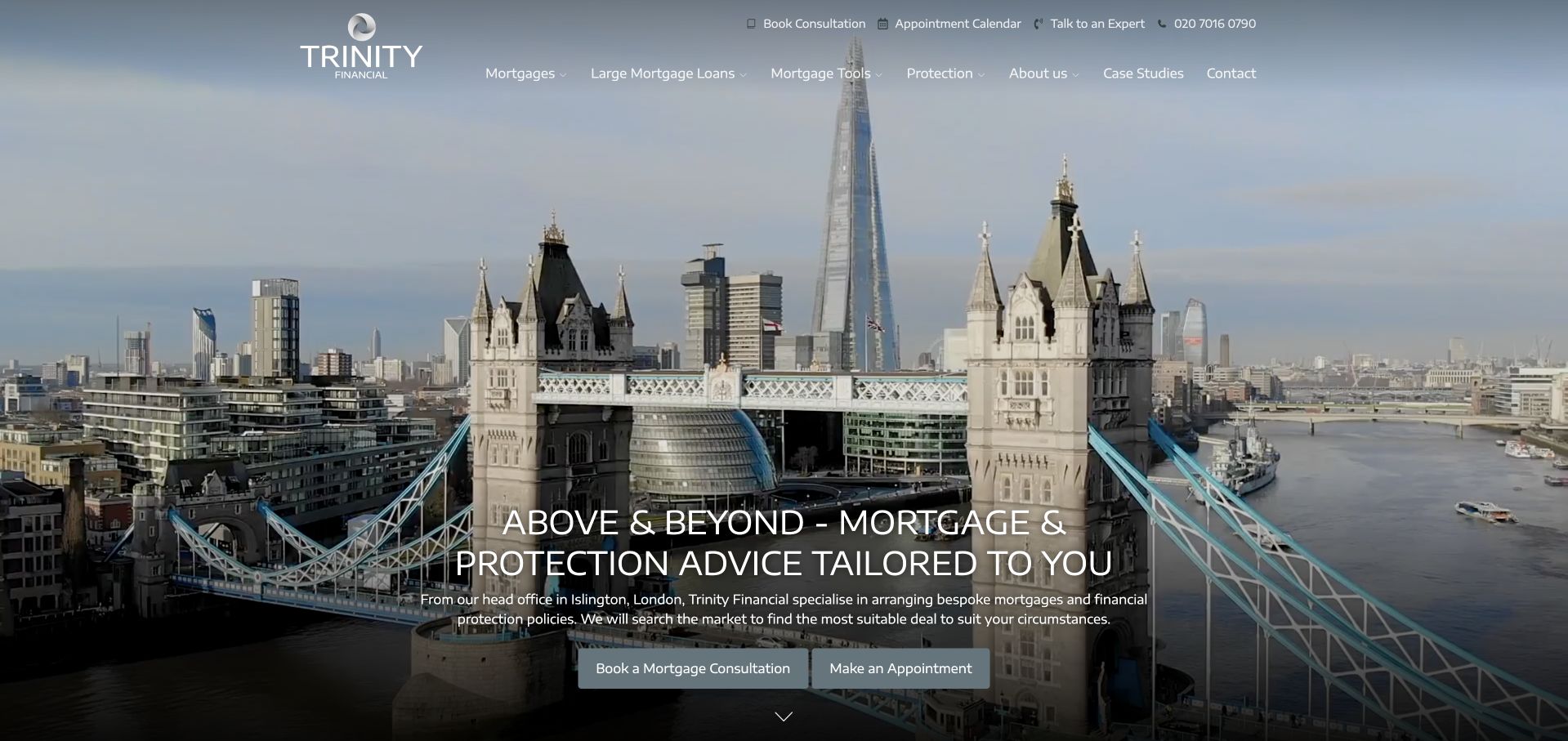
Trinity Financial uses a wide London landmark photograph and a centered service introduction. Two compact actions provide a consultation route and an appointment route, while the header separates mortgages, specialist lending, commercial activity, protection and other information. The skyline makes the regional context immediately recognizable, but it does not carry the explanation on its own; the service labels establish the actual category. This is useful as a comparison with more minimalist online brokers because the design favors a professional place-based identity rather than an illustrated application process or a large calculator.
What you can learn
A local landmark can establish context, but give the visitor a plain description of the service and the next interaction. Make consultation actions meaningfully different if both are shown, and keep detailed scope, fees and important notices available without requiring someone to submit an inquiry first.
Pros
The landmark creates a recognizable regional setting without requiring a large explanatory graphic.
Named service categories expose the breadth of the business before a visitor opens a form.
Cons & considerations
Two similar consultation actions can confuse visitors unless their different purposes are explained.
Centered light text over a detailed skyline needs careful contrast and responsive positioning.
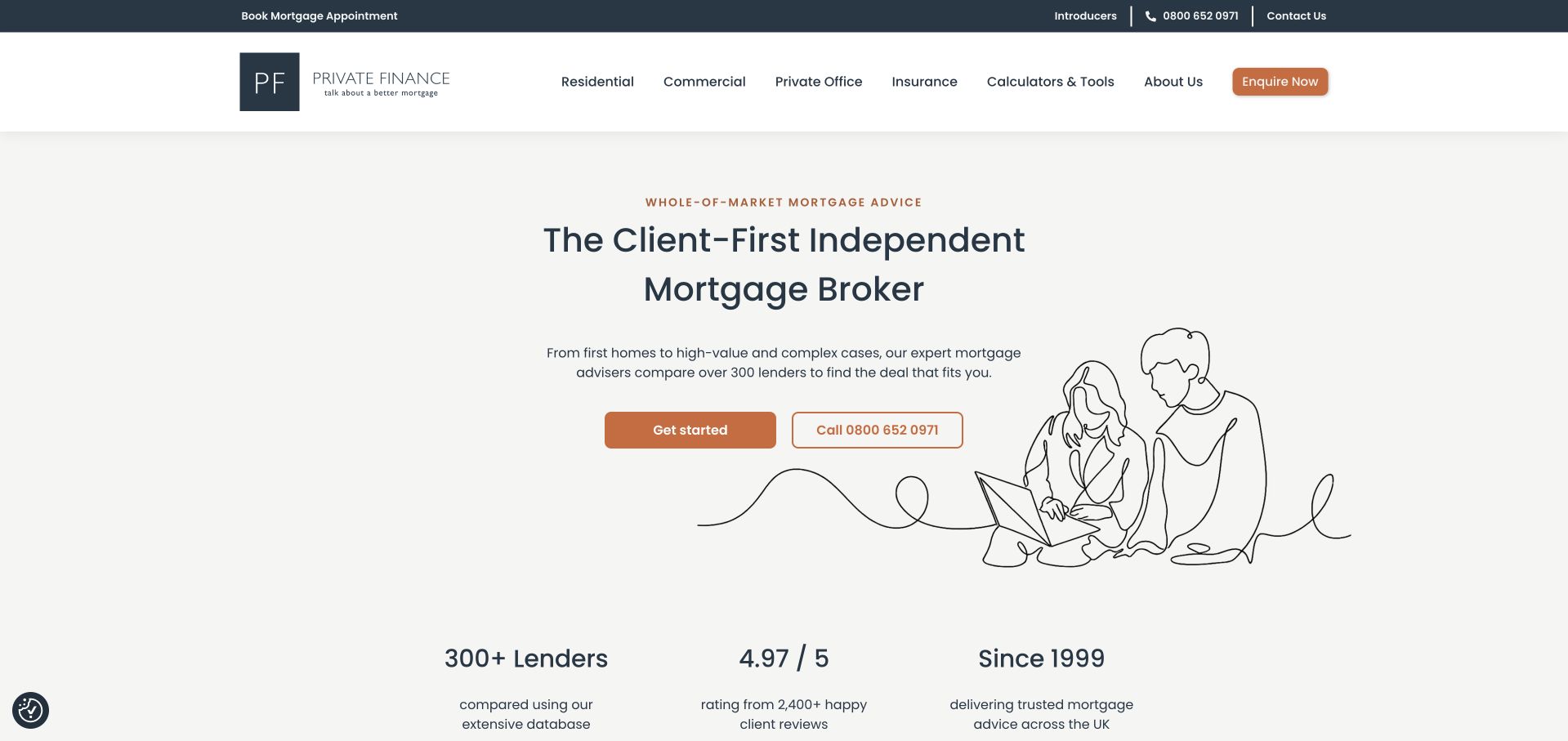
Private Finance uses a large centered service heading, a simple line illustration and two contrasting contact choices. A compact row underneath names lender breadth, a displayed review figure and the company’s operating history. The header separates residential, commercial, private-office, insurance and tool routes, so the homepage does not collapse several services into one proposition. The visual restraint is the main point of interest: the illustration adds human context without turning the first screen into a cinematic property advertisement. The proof row is easy to scan, although its claims remain the company’s own and need appropriate source context.
What you can learn
A broker can make a professional opening feel approachable with a lightweight illustration and clear contact options. Keep proof statements specific, linked and maintained, and ensure that the page explains service boundaries rather than asking a rating or long operating history to establish suitability for every visitor.
Pros
The sparse illustration leaves enough space for the main service description and contact actions.
The proof row is visually distinct from the primary message rather than scattered across the hero.
Cons & considerations
A review figure and lender count can appear more definitive than their context supports if not explained.
The broad client-first proposition needs more concrete process information further into the page.
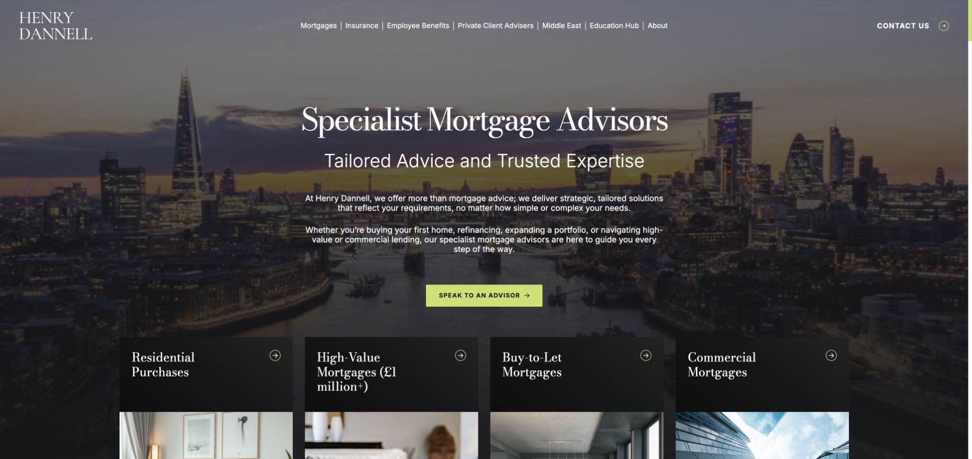
Henry Dannell combines an evening city photograph with a serif service heading and a contrasting green conversation action. A row of dark service cards starts immediately below, naming residential purchases, high-value mortgages, buy-to-let and commercial mortgages. That transition is more useful than the skyline alone: it helps visitors move from a broad specialist message toward a specific route. The header also separates insurance, employee benefits and other activities. This is a specialist finance example, and the design should be evaluated for its hierarchy and labeling rather than as evidence of access to a particular loan or financial outcome.
What you can learn
If a business serves several finance situations, let the homepage introduce the brand and then hand off quickly to specific explanations. Make the card labels consistent with navigation, explain who each service is intended for and preserve important qualifications in readable text outside the photograph.
Pros
The contrasting conversation action is easy to identify against the darker city image.
Service cards begin near the hero, so the visitor can move beyond the broad specialist label quickly.
Cons & considerations
Several service labels and corporate menu items create a substantial information load for a first-time visitor.
A detailed skyline needs a strong text contrast layer and a useful static image fallback.
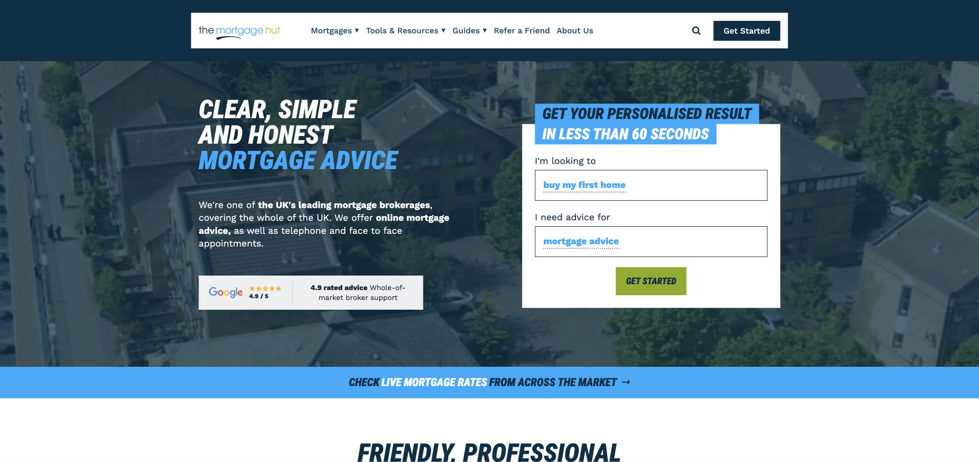
The Mortgage Hut places a compact guided panel beside its mortgage-advice introduction. The panel begins with what the visitor is looking to do and the type of help needed, keeping the first interaction narrower than a full personal-data form. A blue-toned background, lime action color and strong uppercase display text create a consistent visual system. Navigation provides mortgage, tool, guide and company routes, so someone can investigate before beginning. The useful pattern is the separation between a first routing question and the more detailed conversation that may follow; this review does not test the resulting application or advice process.
What you can learn
A short guided start should reduce uncertainty rather than simply disguise a long lead form. Tell users what the first questions do, allow them to read relevant guides first and avoid collecting confidential information before the purpose and appropriate handling of that information are clear.
Pros
The compact first-question panel explains the starting interaction without filling the hero with personal-data fields.
Tools and guides remain available for visitors who want background information before contact.
Cons & considerations
Uppercase display text and several bright accents can compete if used too widely on smaller screens.
A quick-start message should not imply that a complex mortgage situation can always be resolved in a fixed time.
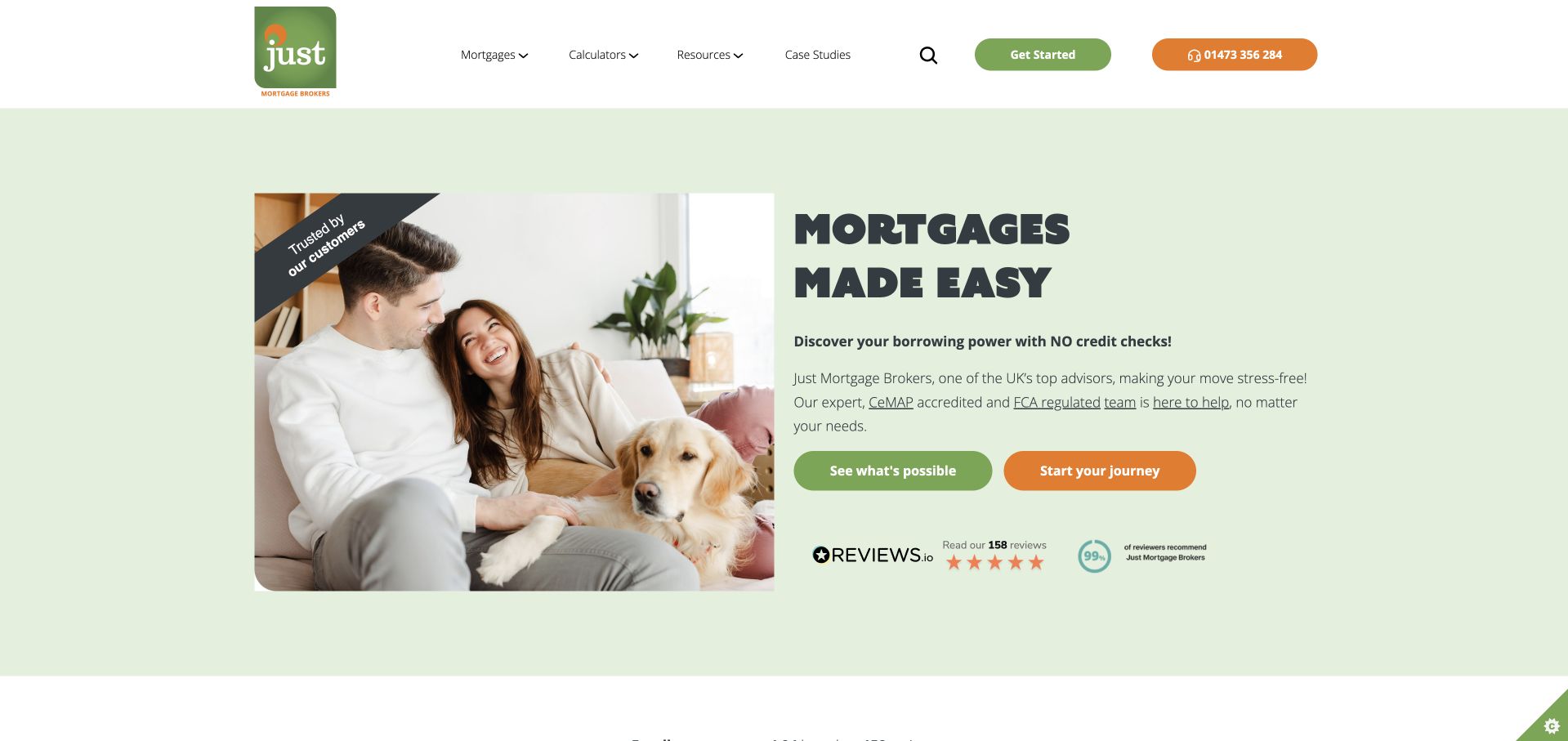
Just Mortgage Brokers uses a soft-green field, a domestic photograph and a large plain-language mortgage heading. Two buttons distinguish exploring what may be possible from starting a journey, with review information presented below. Navigation keeps mortgages, calculators, resources and company content separate. The page is useful for studying how a warm image and a narrow set of actions can avoid the intimidating appearance of a dense finance form. Its strongest structural feature is the visible route to information before the visitor commits to a conversation, although the meaning of the two main actions needs to remain clear beyond the opening.
What you can learn
A friendly image can lower visual complexity, but a broker still needs precise labels and expectations. Explain what an exploratory route returns, make any credit-check or data-use statements specific to the actual step, and keep personal advice distinct from general educational content.
Pros
The two actions give an information-seeking visitor an alternative to immediately starting an inquiry.
The pale background provides a calm, readable setting for the opening service description.
Cons & considerations
Two positive journey phrases can feel similar unless the following pages explain their different purposes.
Review marks and reassurance statements need accessible detail rather than being relied upon as standalone evidence.
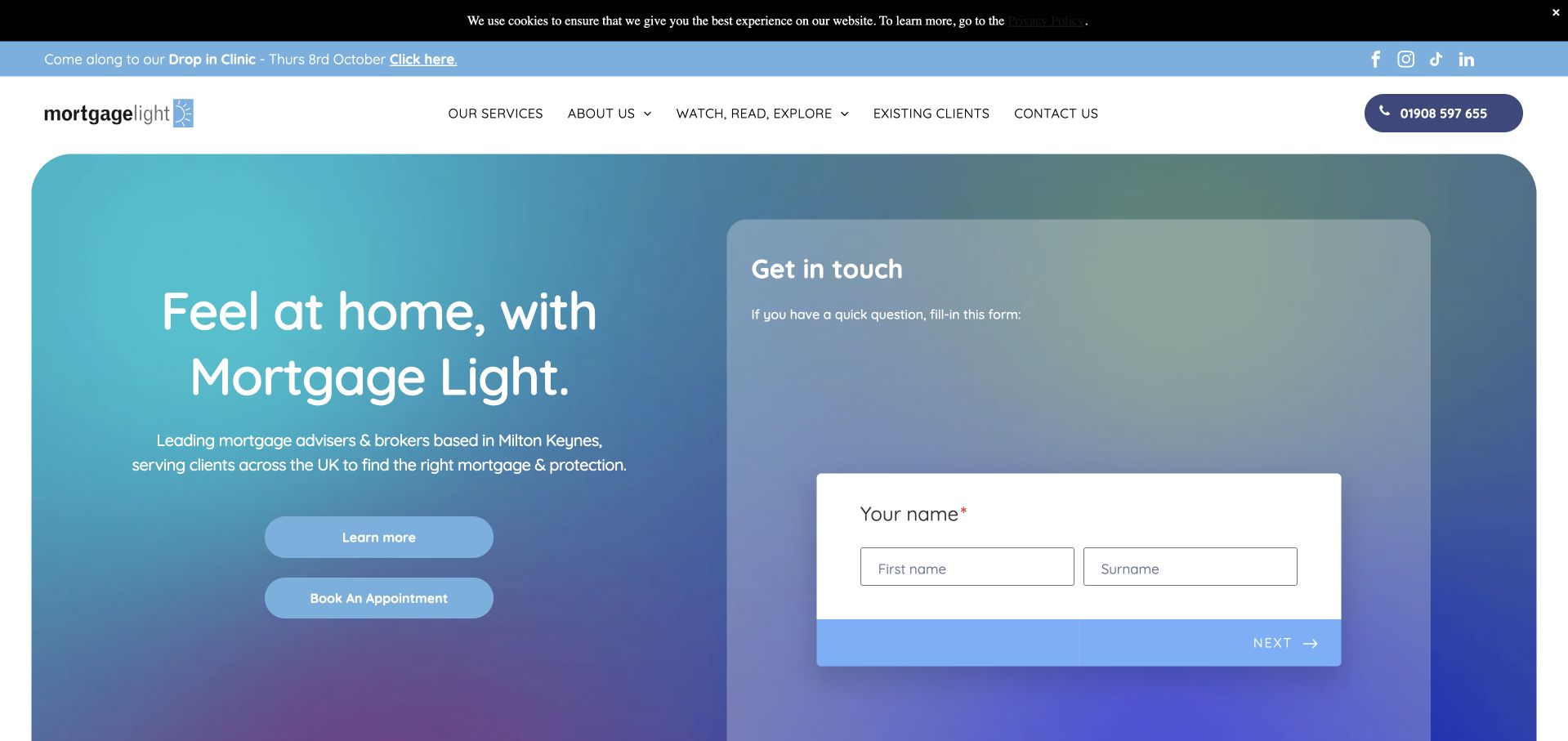
Mortgage Light uses a blue-green gradient, a concise home-oriented headline and a white contact panel. The supporting description identifies Milton Keynes, giving a local setting to an otherwise broad mortgage-and-protection proposition. A learn-more route and an appointment action sit outside the form, letting visitors choose between investigation and contact. Navigation also exposes the team and financial content rather than leaving all background information behind a generic company link. The design is worth studying for the relationship between locality, a human service and a limited initial form, not for any inference about the advice or products eventually offered.
What you can learn
A regional broker can establish relevance with a clear location and a visible team route. Keep the introductory form short, describe the expected response and provide information alternatives for people who are not ready to share contact details. Carry that local context through the destination pages.
Pros
The location reference gives the service introduction a more specific context than a generic national headline.
Information and appointment routes remain visible alongside the initial contact panel.
Cons & considerations
A large form occupies substantial first-screen space before the visitor has read the detailed service explanation.
Gradient backgrounds and translucent panels need checked contrast for every label and field state.
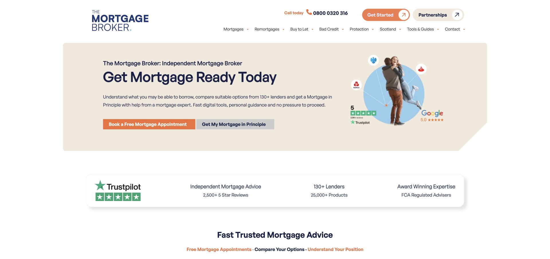
The Mortgage Broker places a concise service heading and two clear actions inside a pale contained hero. A small person-led illustration sits at one side rather than dominating the page. The next row presents review information, a lender statement and regulatory context, giving the opening a distinct supporting layer. Navigation separates buying, remortgaging, specialist situations and company information. This is a useful example of a compact first screen that leaves room for the following explanation to appear early. The displayed figures and regulatory wording remain source material to verify, not independent evidence of personal suitability or a guaranteed lending result.
What you can learn
Use a compact hero when the supporting information is more important than a large brand photograph. Separate the first inquiry from general mortgage information, and make every proof point readable and appropriately qualified rather than relying on a row of badges to carry the explanation.
Pros
The contained hero leaves supporting information close enough to become part of the initial reading sequence.
Two actions provide a direct contact route and a more exploratory information route.
Cons & considerations
Small proof labels may lose meaning when reduced or read without their surrounding context.
Several borrower categories need careful grouping so the navigation does not become a product-name inventory.
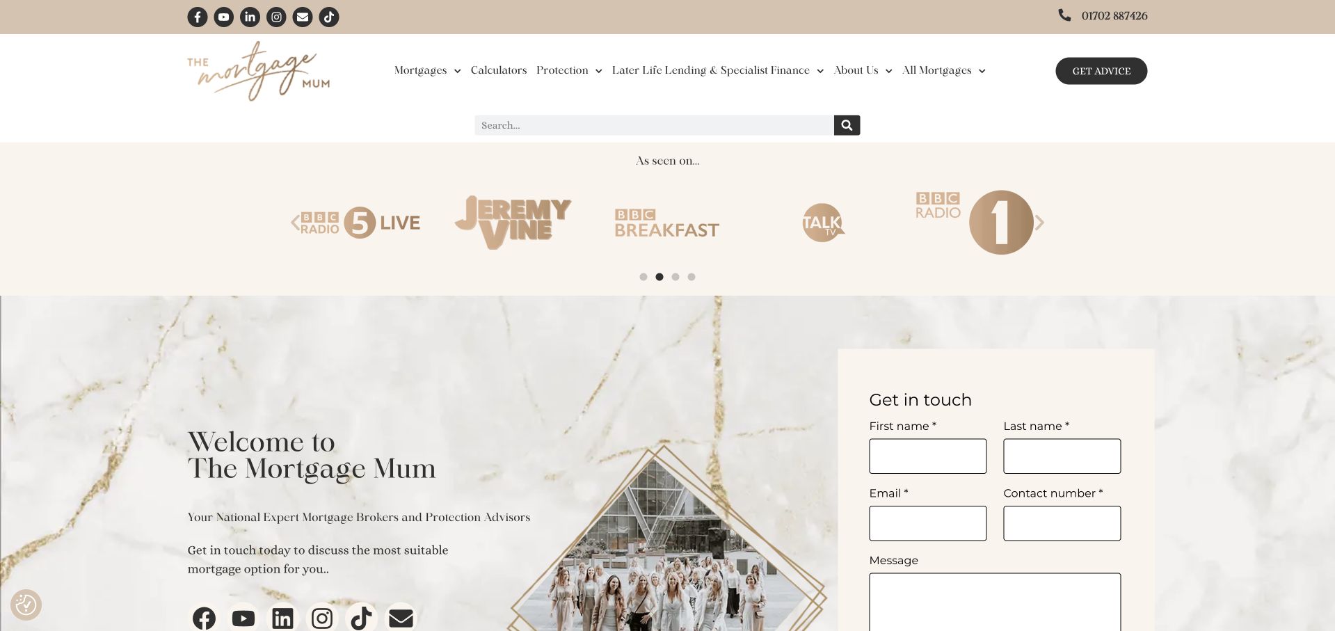
The Mortgage Mum uses warm neutral colors, a distinctive script logo and a marble-like background around its introduction. A compact inquiry form sits beside the welcome message, while media marks and social links occupy a separate band above. The header exposes mortgages, protection, specialist lending and company information. This creates a recognizable personal-brand setting without making the whole homepage a biography. The useful lesson is the consistent tone across color, typography and team-oriented content. The media marks supply context about the brand’s public presence but are not treated here as validation of an individual financial service or recommendation.
What you can learn
A person-led broker brand should still explain its service structure clearly. Let the founder’s voice create familiarity, then give visitors practical routes, team information and appropriate contact expectations. Keep media appearances separate from service qualifications and avoid making decorative typography carry essential instructions.
Pros
The restrained warm palette and script logo create a coherent identity that differs from standard finance blue.
A visible inquiry panel supplies a practical next step alongside the personal-brand introduction.
Cons & considerations
The media strip and several social links consume first-screen space before the core service explanation.
A contact-first layout needs clear privacy expectations and an alternative route for visitors who want information first.
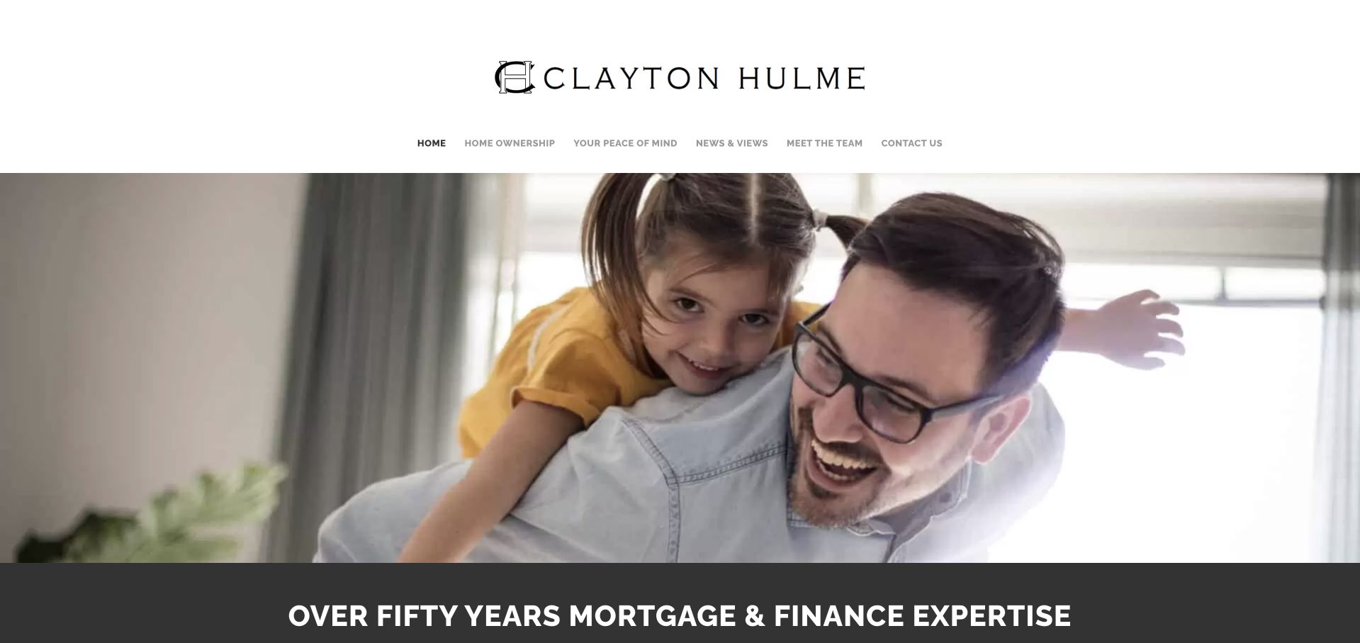
Clayton Hulme uses a large family photograph beneath a centered wordmark and a restrained navigation row. A dark strip directly below the image states the company’s experience proposition, then the page moves into financial goals and home-ownership topics. The composition is more conventional than an app-led broker homepage, but its simplicity makes the structure easy to understand: brand, human setting, experience statement and service information. It is useful for a regional business that wants to avoid a complex digital-product presentation. The site’s historical and experience claims remain its own and should be maintained rather than assumed from the design.
What you can learn
A local broker can use a straightforward photographic layout if it follows the image with specific service and location information. Keep the navigation shallow, make contact easy to find and support any longevity statement with current team and company details rather than leaving it as a decorative banner.
Pros
The centered logo and restrained menu create a clear, uncluttered opening hierarchy.
The experience statement is separated from the photograph, avoiding essential text on a busy image.
Cons & considerations
The family image alone does not explain the firm’s location, service scope or inquiry process.
A large photographic first screen can postpone practical information for users arriving with a specific mortgage question.
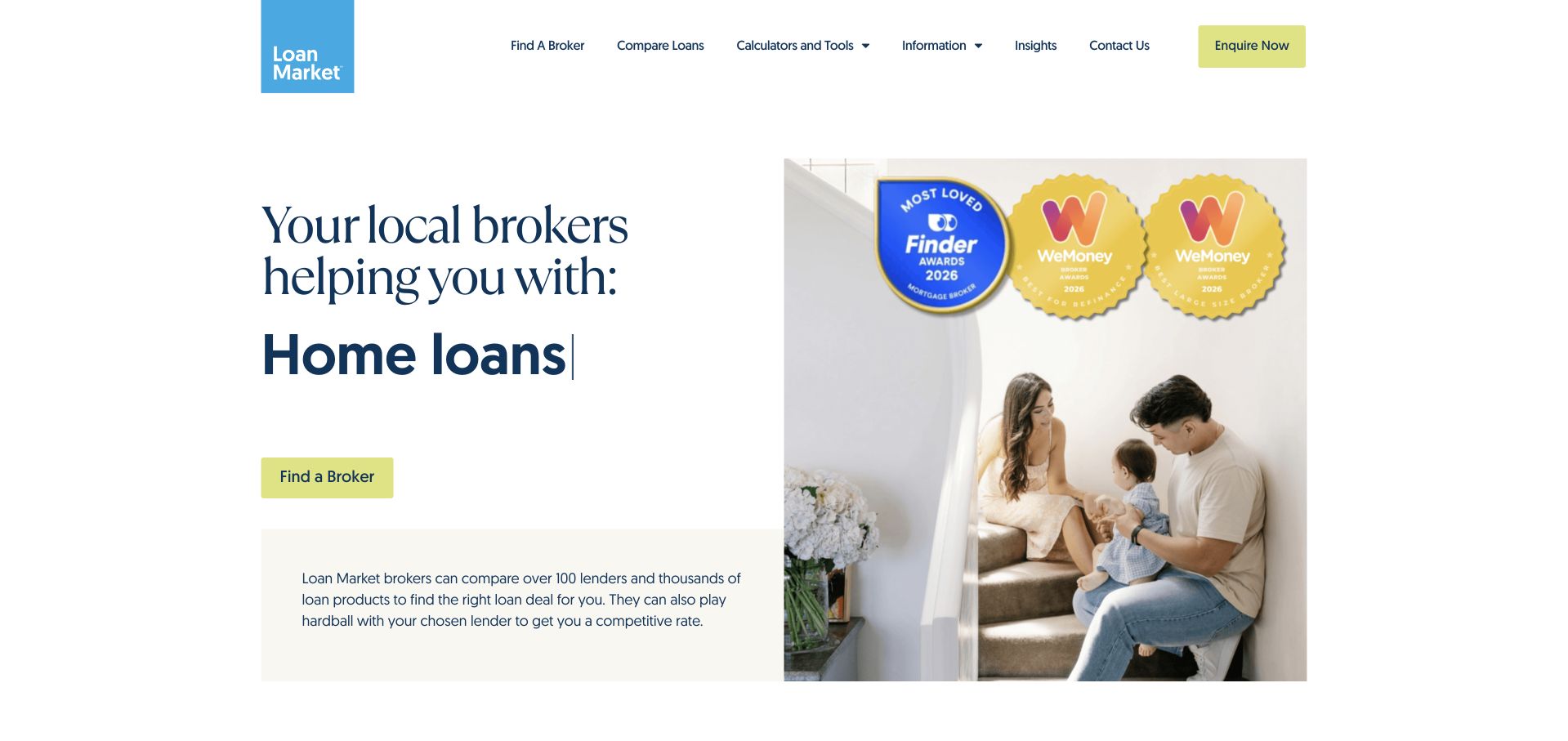
Loan Market uses a white opening, a person-led photograph and a short message about local brokers. A bright broker-finder action appears beneath the headline, while the navigation provides comparison tools, calculators, information and contact routes. Award imagery is placed with the photograph instead of becoming the whole introduction. The transferable pattern is the use of a local-person destination as the primary task. This is a network example, and the page should not be mistaken for a direct promise about every broker’s exact service or the availability of any particular loan.
What you can learn
If a network’s main role is connecting visitors with a local professional, make that destination clear. Give the finder useful location context and explain what happens after selection. Keep comparison tools and educational material distinct from a conversation or a personalized recommendation.
Pros
The broker-finder action expresses the network’s next step in straightforward language.
A restrained white layout leaves room for the introductory text and alternative tool routes.
Cons & considerations
A cluster of awards can distract from the practical explanation of the local broker relationship.
The broad loan-category message needs more specific scope and terms on the relevant destination pages.
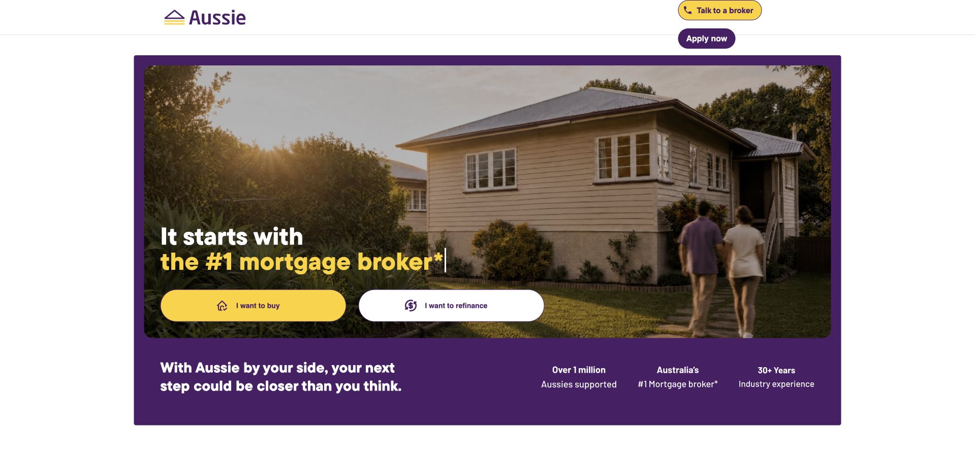
Aussie places a house-and-family photograph inside a broad purple panel, with yellow and white actions for buying and refinancing. The colored frame carries the brand identity while the photo supplies a recognizable residential setting. A small row of supporting statements sits beneath the actions, and the header keeps direct broker contact and application access visible. The page is useful for studying how a familiar brand can make the initial choice simple without showing every lending category at once. Its award and scale statements are part of the source’s own presentation, not independent findings about suitability or service outcomes.
What you can learn
Use two primary intentions when they genuinely represent the largest visitor groups, then reveal more detailed routes after selection. Keep the difference between speaking to a broker and starting an application explicit, and avoid letting a well-known brand replace the explanation of fees, process and scope.
Pros
The purple frame and yellow action create an unmistakable visual hierarchy around the main decisions.
Buying and refinancing are expressed as visitor intentions rather than technical product labels.
Cons & considerations
A strong brand panel can make the supporting qualifications feel visually secondary.
A single house photograph cannot represent the range of property types or individual circumstances visitors may bring.
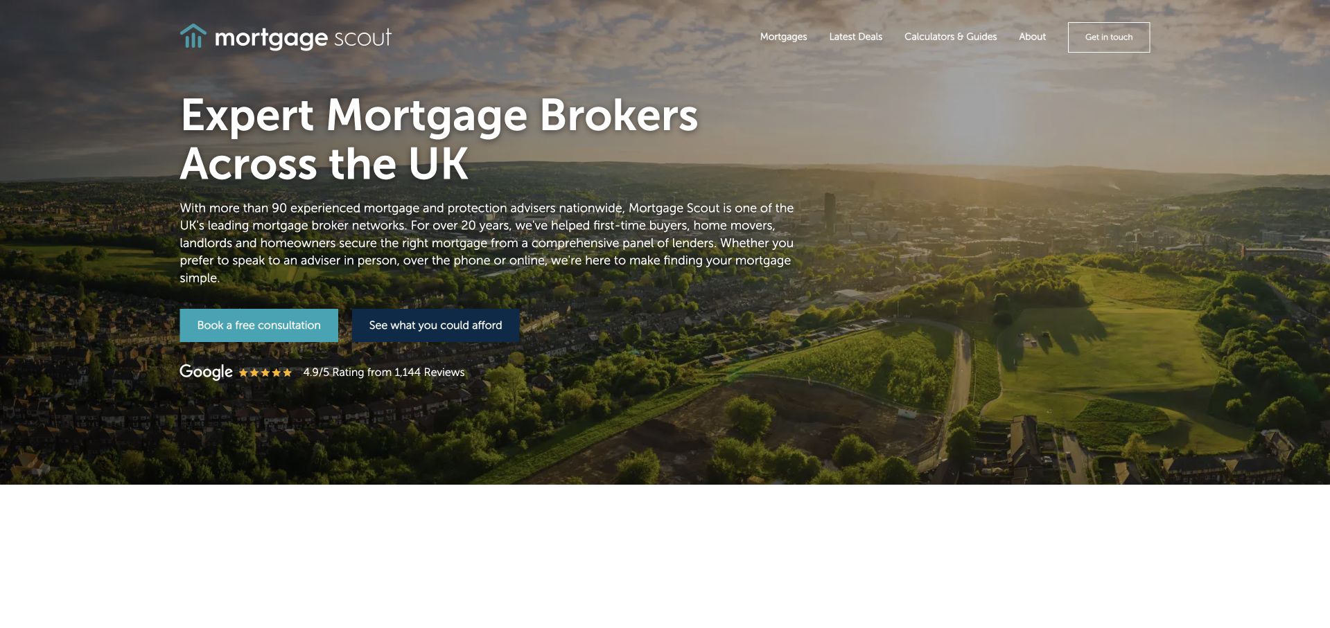
Mortgage Scout uses an aerial landscape behind a left-aligned service introduction. The headline names mortgage brokers across the UK, while a contrasting consultation button sits beside a more exploratory offer route. Review context is positioned underneath rather than replacing the service description. The header keeps mortgages, calculators, guides and company information separate. This is useful for studying a familiar regional-service layout that prioritizes a conversation without requiring an immediate personal-data form in the opening. The design still depends on the subsequent pages to explain the network relationship, fees and what an individual visitor can expect after contact.
What you can learn
A broad geographic statement should be followed by a clear explanation of who will respond and how the service operates locally or remotely. Give information-seeking users a useful alternative to booking, and ensure the scenery does not obscure the headline, labels or important qualifications.
Pros
The left-aligned text and contrasting button make the initial conversation route easy to identify.
Guides and calculators remain visible alternatives for visitors who want background information first.
Cons & considerations
A dark image overlay can reduce the distinction between the photograph, headline and supporting text.
A national reach statement needs operational detail so it does not imply the same local arrangement everywhere.
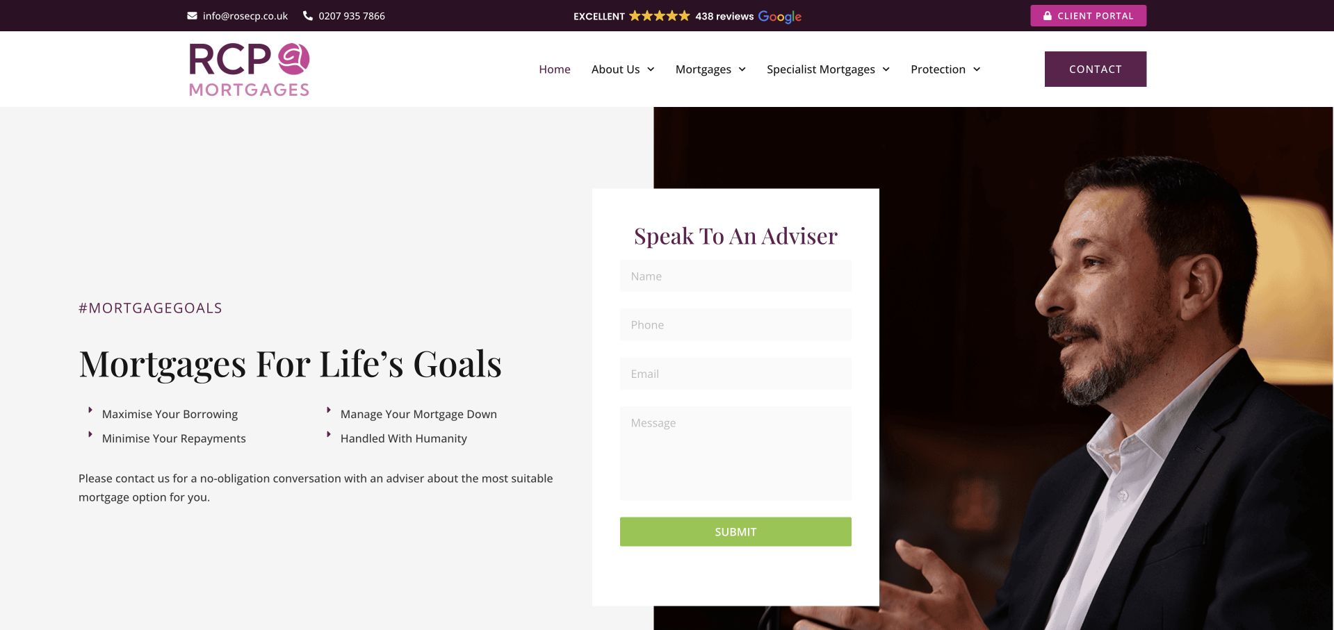
RCP Mortgages uses a restrained white layout, burgundy accents and a large portrait beside a short inquiry form. The headline frames the service around life goals rather than a particular rate or product. A compact list underneath makes the introduction more concrete, while the header separates general mortgages, specialist mortgages, protection and company information. The contact panel bridges text and image rather than occupying an unrelated full-width section. The page is useful for studying a human, professional introduction that still provides a direct route to an inquiry, although the broad goal-oriented language needs service detail beyond the hero.
What you can learn
A portrait can establish the idea of a human relationship, but it should connect to named team information and an explanation of the inquiry process. Keep the initial form limited, show an information route and avoid suggesting that a broad financial goal has one universal mortgage solution.
Pros
The burgundy identity is restrained enough to let the form and portrait remain visually distinct.
General and specialist mortgage navigation are separated before a visitor starts the contact process.
Cons & considerations
A form overlapping the image needs careful responsive handling to preserve labels and reading order.
Goal-oriented claims require concrete service explanations and appropriate qualifications elsewhere on the site.
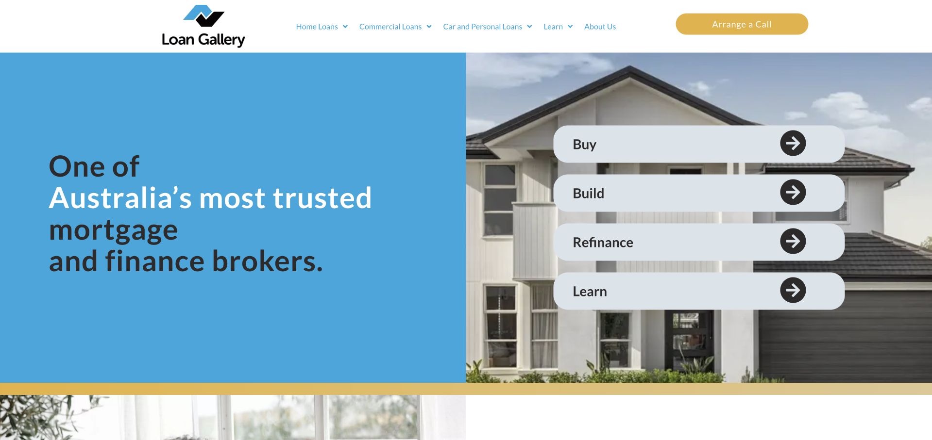
Loan Gallery pairs a blue introductory panel with a house photograph and a vertical set of routes labeled buy, build, refinance and learn. Those labels make the homepage useful before the visitor knows the company’s internal product terminology. The header exposes home loans, comparison tools, calculators and company content, with a contrasting call arrangement action. The design’s strongest element is the relationship between the four tasks: learning is given a place alongside transaction-oriented routes rather than being treated as an afterthought. The site’s own trust and experience language is not independently verified by this visual review.
What you can learn
Organize mortgage content around ordinary intentions and include a genuine learning route. Each task should explain its own process, required information and boundaries before asking for sensitive details. A concise routing layer can make a broad offering approachable without implying that all visitor situations are equivalent.
Pros
The four short task labels are easy to compare and do not require financial-product knowledge.
The learning route gives cautious visitors a useful alternative to immediately arranging a conversation.
Cons & considerations
Floating task bars over a photograph need a sensible stacked layout on narrow screens.
A broad trust statement in the opening needs current, specific supporting information rather than repetition.
Charles Cameron’s homepage explicitly separates employers interested in financial education from individuals looking for mortgage information. The opening uses a person-led video treatment and a centered serif heading, with the two audience routes introduced immediately afterward. This is a more meaningful split than a generic services grid because the relationship with an employer differs from the relationship with an individual borrower. The page explains that workplace programs are part of the business, while the footer distinguishes fee contexts. The design is useful for studying a dual-audience financial service rather than for copying its exact offer or regulatory language into another business.
What you can learn
If a broker serves organizations and individuals, make that distinction before presenting the detailed service sequence. Explain the relationship, communication and terms for each path separately. A workplace-benefit route should not leave an individual visitor assuming that every condition applies identically to direct inquiries.
Pros
The employer and individual choices reflect genuinely different visitor relationships rather than arbitrary product categories.
The page introduces financial education as a distinct activity instead of hiding it inside a generic company description.
Cons & considerations
Centered text over a moving image needs a stable, readable fallback and careful contrast.
The compact menu requires additional exploration for visitors seeking a particular service or important qualification.
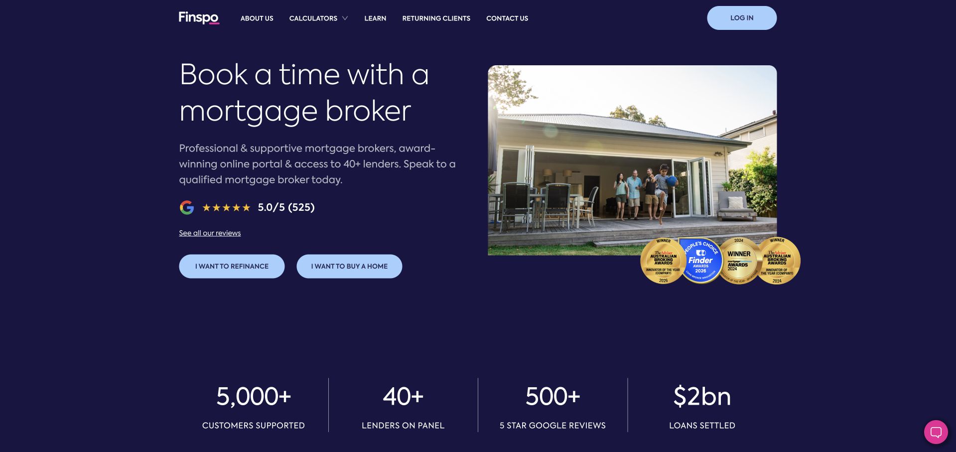
Finspo uses a dark navy background, a compact service heading and a house photograph with a few supporting award marks. The main choices distinguish refinancing from buying, while a meeting route appears elsewhere in the page structure. A lower row presents the company’s own scale and review statements in an orderly format. The header stays narrow, with company information, calculators, loans and returning-client access. This is useful for studying how a broker can make the opening about an initial conversation without requiring a large form on the first screen. The visible figures are contextual brand claims, not verified service-performance findings.
What you can learn
Choose whether the homepage is primarily a booking gateway or an information comparison tool, then make that purpose explicit. Retain useful educational routes, explain what a meeting involves and keep returning-client access separate from the path for someone making a first inquiry.
Pros
The two intention buttons make the initial route understandable even within a compact dark layout.
Returning-client access has its own header position rather than sharing the new-inquiry action.
Cons & considerations
Small award marks and statistics need accessible explanations and dates outside the image treatment.
A booking-first introduction can be insufficient for visitors who need to understand fees and process before contact.
Kegan is a freelance web designer and developer with 15+ years of experience helping businesses turn complicated website requirements into clear, maintainable digital experiences. He works directly with clients from planning and design through development, launch, and ongoing support.
For mortgage broker website design, his development approach focuses on service explanations, broker profiles, clear information requirements, and protected application-system handoffs. The scope can be a targeted improvement or a complete custom build, with responsive layouts, thoughtful content structure, and integrations chosen around the people using and maintaining the site.
Show 3 other mortgage broker website designersHide other mortgage broker website designers
Build a broker website around a clear, bounded first step
Define the audience and the service relationship first
Write down the actual audiences before choosing the navigation. A regional practice, a national broker network, a high-value specialist and a firm serving workplace-benefit partners do not need identical homepages. Specify whether the site is introducing one practice, locating a local adviser, explaining an employer program or presenting several distinct services. Make the relationship visible in plain language. Do not assume a visitor understands the difference between a lender, broker, network and comparison platform just because the brand name is familiar.
Create a small set of entry routes around real intentions. Buying and refinancing may be enough for a simple opening, while a specialist business may need different paths. Validate the labels against the questions people actually ask the team. Each destination should explain its audience, the service scope, what happens next and where to ask a question. Avoid producing many thin pages that repeat the same reassurance under slightly different borrower labels. A smaller set of useful explanations is easier to maintain and less likely to contradict the firm’s current offer.
Decide how human information supports those routes. Name relevant roles, explain how the inquiry is allocated and keep team information current after a personnel or brand change. A portrait is useful when it connects to a real person and process, not merely as decoration. Have the business’s appropriate reviewers approve service descriptions, fees, important notices and any claim about product access before publication. This is a communication plan, not a substitute for jurisdiction-specific professional or compliance review.
Separate educational tools from an application journey
List the tools the site genuinely needs and define the purpose of each. A general calculator may help explain an input relationship, while a guide may introduce terminology. Neither should silently become an application or imply that an individual has been assessed. Explain assumptions, limits and the meaning of the result close to the tool. Avoid prefilled example figures that look personalized or a large success message that obscures the difference between illustration and a real decision. Do not make an untested numerical tool the centerpiece simply because competitors have one.
For an inquiry flow, ask for only the information required at that stage. A short initial callback request may need contact details, a preferred time and a broad reason for getting in touch. More sensitive financial or identity information belongs in an appropriately designed later process, with clear handling expectations. Explain whether the first step creates an account, requests contact or begins a formal application. If the visitor is sent to an external system, name the destination and preserve the context of what they were doing.
Design failures as carefully as the successful path. A user should be able to correct an email address without losing the whole inquiry, understand which fields are required and know what to do if a booking time is unavailable. Use persistent field labels and readable instructions. Test with a keyboard, at a narrow width and with a long name or international telephone format where the service supports it. Do not infer accessibility or data protection from the visual appearance of a third-party widget; assess the actual integration and explain its role.
Plan evidence, content review and a calm mobile experience
Decide which claims the website will make and how each will be maintained. Reviews, awards, lender logos, operating history and product counts need context. Record the source, the period described and the person responsible for reviewing it. If a claim is temporary or depends on a particular arrangement, make that qualification visible rather than hiding it behind a decorative badge. Do not turn a company’s own marketing statement into an independent finding merely by repeating it in a new design. A calm, specific explanation is often more useful than a crowded proof wall.
Build the mobile sequence deliberately. A large family photograph, a portrait, a review column, a rate strip, a chat bubble and a multi-field form cannot all be the primary focus. Choose the first useful message and action, then place supporting information in a readable order. Keep essential text outside images, make moving media optional and avoid floating controls that cover fields or important notices. An information-seeking visitor should not have to close several panels before reaching the explanation of the service.
After launch, review inquiry delivery, broken links, outdated team information and any content that changes with the business. Give educational pages a named review owner rather than automatically refreshing dates without checking the substance. Monitor whether users can find scope, process and contact—not just whether a large button receives clicks. The website can improve clarity and routing, but it cannot establish a person’s borrowing suitability or guarantee approval, a rate, a completion date or a financial outcome. Keep those boundaries clear throughout the content and interface.
The editing job behind the design
Choose tools for a trustworthy handoff, not an impressive stack list
A maintainable content system, reliable inquiry delivery and a well-explained booking or application handoff are more important than copying a competitor’s frontend. Keep marketing content separate from sensitive application workflows. Document who maintains integrations and what happens when a form, calculator or appointment service is unavailable.
Use responsive images and restrained motion so the first useful explanation and action arrive promptly. Tool labels, error messages and privacy expectations need to remain readable on every screen. Public source observations can identify visible technologies; they cannot establish the full lending, CRM, identity or advice systems behind a broker’s website.
Our WordPress website examples offer a separate look at publishing approaches. A visible platform label is evidence for that named page, not a guarantee that the same system will suit your requirements.
Before the public launch
Mortgage broker website brief checklist
State whether the visitor is contacting a practice, a network, a comparison service or another operating model.
Identify actual audiences and jurisdictions before choosing borrower categories or location pages.
Use clear intention labels and explain the next step behind every primary button.
Keep educational information, calculators, callback requests and applications visibly distinct.
Have the appropriate business reviewers approve fees, scope, notices and product-access claims.
Explain calculator assumptions and avoid results that appear to assess personal eligibility.
Limit the initial inquiry to information needed for that specific first interaction.
Identify any external booking, account or application destination before the handoff.
Keep team roles, review statements, awards and lender relationships current and appropriately sourced.
Test forms with persistent labels, useful errors, a keyboard and a narrow screen.
Prevent chat widgets, notices and floating buttons from covering instructions or form controls.
Assign responsibility for inquiry delivery, content review and changes to the operating relationship.
These checks are a project checklist, not a performance, legal, security, or accessibility certification. Test real journeys with the people responsible for the website before making claims about the result.
Sources & editorial method
How this collection was selected and reviewed
Public pages and direct browser captures were reviewed on November 9, 2026 for content hierarchy, audience routing and interface presentation. Examples span different markets and service models; inclusion does not recommend a broker or product. No application was submitted and no individualized financial suitability was assessed. Source records preserve the pages actually observed.
Each example links to its actual source page. Screenshots are direct browser captures with their own capture dates; moving imagery, announcements and live designs can change. The notes describe observable design choices and conditional tradeoffs, not measured traffic, conversion results, service quality, or accessibility conformance.
Technology labels use public page metadata, asset evidence, or explicitly cited platform documentation. Platform documentation is not a complete current deployment audit. A component reference may be legacy or unused; it is not a complete backend inventory. Unknown stacks are omitted. These sites are editorial examples, not our client portfolio.
Written, Edited and Curated are separate editorial records, not timestamps advanced by a rebuild. Website designs and imagery belong to their owners. See our editorial standards or suggest a correction.
Questions worth asking
Mortgage Broker website design questions
Should the homepage show current mortgage rates?
Only if the business can maintain the information and explain its scope, assumptions and qualifications appropriately. A rate table is not automatically more useful than a clear service introduction. The design brief should establish who reviews changing content and what the user should understand from it.
Is a calculator the same as starting an application?
No. The interface should clearly identify whether it provides an illustration, requests contact or begins another process. Explain assumptions and limitations near the result. Do not use a general tool’s output to imply that a visitor has received individualized advice or a lending decision.
How much should the first contact form ask for?
Ask for the information genuinely needed for the stated first step. A callback request can be substantially different from a formal application. Explain what happens next, avoid inviting sensitive documents into a general message box and use an appropriate later system where detailed records are required.
Can we reuse another broker’s important notices?
Do not copy them as design filler. Service models, markets, fees and requirements differ. The business should have the appropriate reviewers approve its own current wording. This guide discusses public website communication and does not determine the legal or regulatory requirements of a particular practice.
Are review stars and lender logos enough to establish trust?
They can provide context when accurate and explained, but they do not replace scope, people, process and terms. A visible logo does not establish every relationship a visitor might infer. Keep supporting sources and dates accessible, and avoid treating design elements as independent proof of suitability.
Begin with the service relationship and the first conversation. A precise, well-explained next step is more useful than making a complex financial process look artificially effortless.