Best Custom Home Builder Websites of 2026 (26 Real-World Examples)
Custom-home-builder websites that connect residential photography with location, project scope, working relationships and a clear first conversation.
Study 26 real custom-home-builder websites, including regional specialists, design-build practices and builder networks. Compare how they present finished homes, explain the process and distinguish new construction from related services.
A striking house photograph can establish a visual direction, but it cannot explain everything a homeowner needs to know about a builder. Location, service scope, the relationship with an architect and the stage at which an inquiry is useful all shape the decision to continue.
These examples examine the public website rather than the quality of construction work. The collection includes builders with remodeling, fabrication or property-care services as well as complete custom-home offers. Each review preserves those differences and considers how clearly the page connects its imagery to the next useful piece of information.
Before the examples
What makes good custom home builder website design in 2026?
Explain what and where you build
Name the actual territory and distinguish custom new homes from renovations, additions, predesigned options and available properties. A clear service boundary helps visitors judge fit before they invest time in the portfolio or an inquiry.
Give projects useful context
Attach names, locations, project types and collaborator credits to photography. Explain the builder’s contribution without implying that architecture, interiors and construction were all delivered by the same team when they were not.
Make the first conversation understandable
Provide a process overview and explain how to start with land, drawings or an early idea. Keep an existing-owner portal separate from new inquiries, and describe what the initial conversation is intended to establish.
The collection · 26 examples
26 custom home builder websites worth studying
Compare 26 directly captured public website properties, from quiet portfolios to explicit service-led introductions. The Editors Choice recognizes the website’s design and communication; it is not a recommendation of construction services or a prediction of project outcomes.
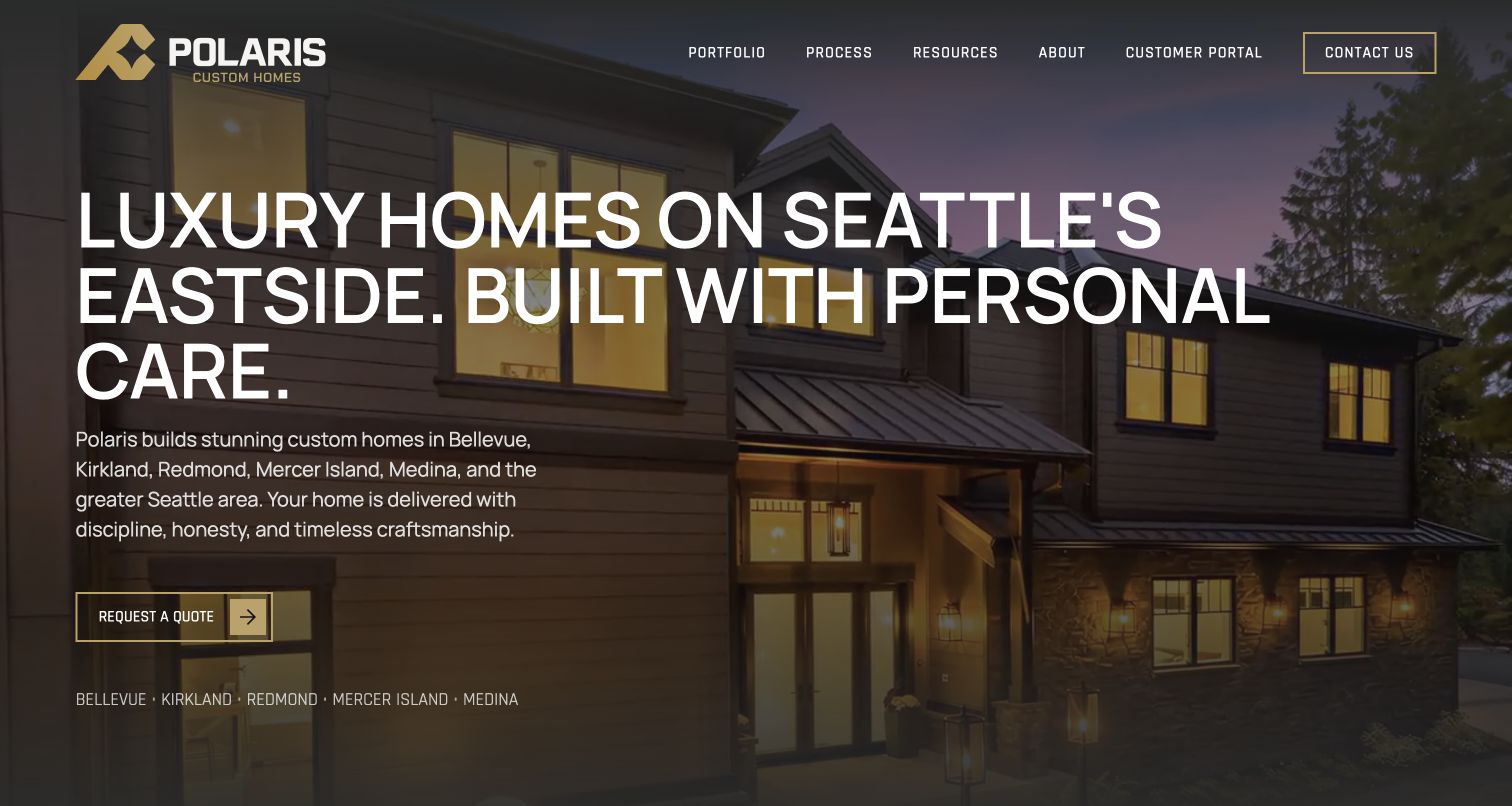
Polaris gives its opening a useful job: identify Seattle’s Eastside, explain that the service is custom homebuilding, and offer a direct inquiry. Gold details and a darkened house photograph support that message without concealing it. Farther down, named Woodinville and Alki projects connect the positioning to specific work. The process page then breaks the relationship into feasibility, design and engineering, permitting, construction, and handoff. This is a particularly practical combination for a homeowner who likes the imagery but has not yet worked out what hiring a builder involves. The website presents those stages as its service approach; it does not establish that every project achieves the promised timing or budget.
What you can learn
Make the service area and the next decision as prominent as the finished architecture. Explain how a visitor with land, plans, or an early idea enters the process before asking for a detailed project brief.
Pros
Named communities make geographic fit clear before an inquiry.
Project examples and staged process descriptions give the promise supporting context.
Cons & considerations
The large uppercase opening leaves less space for a detailed project caption.
Strong certainty in process copy needs careful separation from contractual guarantees.
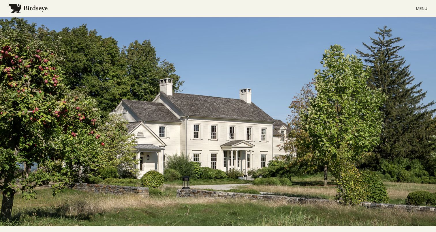
Birdseye’s Building page opens with a full-width residential photograph beneath a compact cream header. The owl mark and small Menu label leave the architecture almost uninterrupted. Below that opening, the page explicitly connects custom homes, renovations and historic restoration, then presents a substantial sequence of named projects with regional context. That range matters: a visitor can see that a traditional house and a contemporary retreat belong to the same building practice without assuming every pictured project is new construction. The restraint makes the work feel carefully selected. It also means the service explanation and team introduction do more of their work after the initial photograph rather than within it.
What you can learn
Let a portfolio be visually quiet while keeping project type and location explicit. A photograph can establish taste; captions and clear service language should explain what the builder actually contributed and which inquiries are appropriate.
Pros
The uncluttered header gives residential photography a strong visual role.
Named projects offer more useful orientation than an anonymous image slideshow.
Cons & considerations
The opening image does not itself explain the project or construction scope.
A single Menu entrance hides service and contact routes until opened.
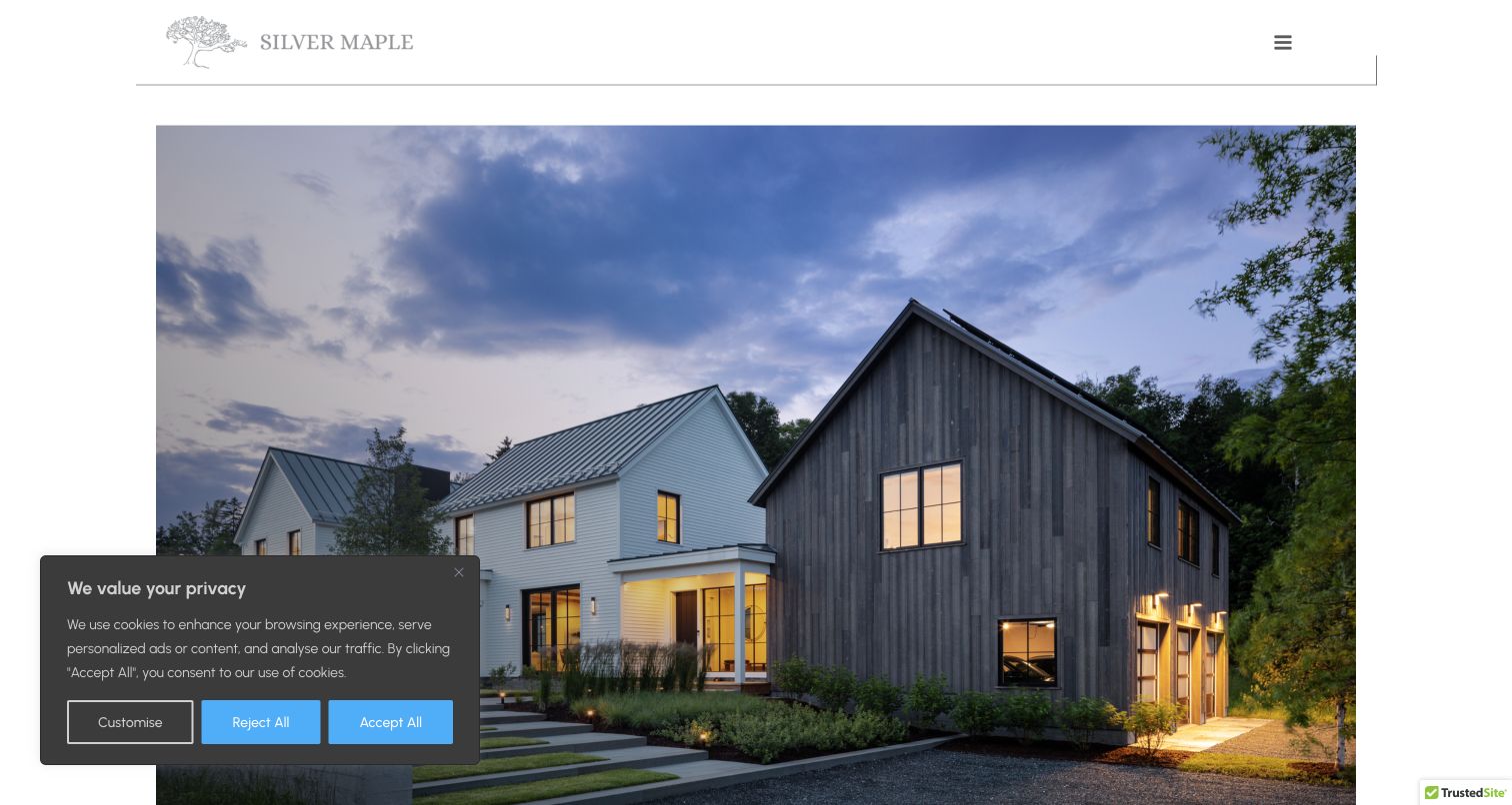
Silver Maple’s Fine Homes page uses a pale header, a fine dividing rule and generous margins around a large house photograph. This gives the residence a composed, almost editorial presentation rather than treating it as a background for a large sales slogan. The page describes residential construction and organizes the portfolio around new homes and renovations. It also explains the breadth of work involved in delivering a home, which helps visitors understand the relationship between the finished image and the team behind it. The captured view includes the source site’s privacy notice at the lower left. Even with that notice, the architectural image and restrained identity remain the dominant elements.
What you can learn
Use a separate residential landing page when the company has several divisions. Keep the visual treatment coherent, but distinguish new construction from renovation so the homeowner can compare work that resembles the intended project.
Pros
Wide margins make the main project photograph feel deliberately composed.
Residential categories give the image collection a useful service distinction.
Cons & considerations
The small menu icon requires exploration to find the full navigation.
The privacy panel overlaps part of the opening architectural photograph.
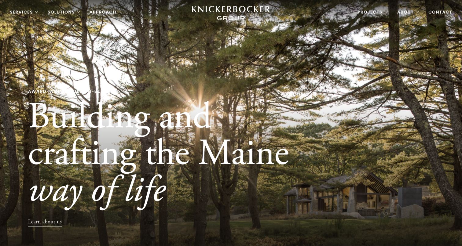
Knickerbocker Group frames a Maine residence within trees and late light, then pairs that landscape with a large serif statement about the Maine way of life. The centered wordmark and navigation arranged around it give the opening a distinctive balance. Services, solutions, approach, projects and contact remain visible despite the immersive image. The page continues into project stories and company material rather than stopping at an atmospheric promise. For custom-home-builder websites, the useful lesson is the relationship between place and aspiration: the landscape helps explain what living in these homes might feel like, while project links provide something more concrete to inspect. The testimonials remain statements published by the firm.
What you can learn
Show regional character through real project settings, then connect that atmosphere to service and project pages. Place should help a homeowner understand the work, rather than substitute for an explanation of the design-build relationship.
Pros
The forest setting makes the geographic positioning visually specific.
Core service and project routes remain exposed in the main header.
Cons & considerations
Light lettering must remain legible across bright areas of the image.
A lifestyle message needs subsequent detail about scope, process and project suitability.
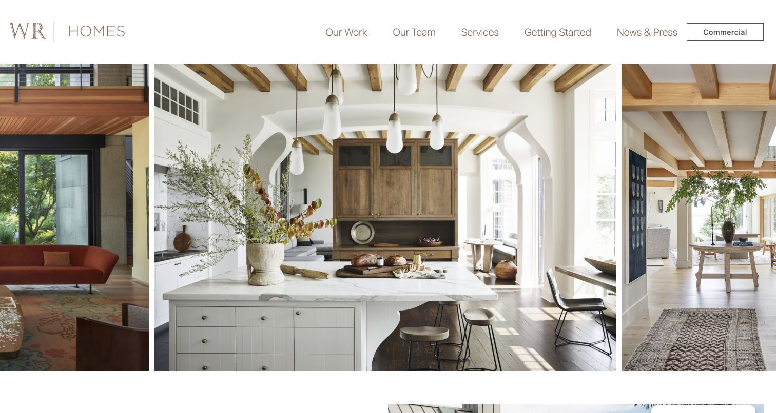
Wright-Ryan Homes distinguishes its residential business with a simple WR Homes identity and a separate Commercial link. The opening combines adjacent interior photographs rather than placing a broad headline across a single image. Our Work, Our Team, Services and Getting Started are clearly visible in the white header, so a visitor can move directly to a relevant destination. Further down, the page states that the firm works with architects and covers custom new builds, restoration, renovations and additions. Project names supply a route into individual examples. The design is useful because it separates the residential journey from the parent company while retaining a way to understand the wider business.
What you can learn
Give custom-home clients their own navigation when a company also builds commercially. Explain the architect relationship plainly, and label different residential project types so an impressive renovation is not accidentally presented as new construction.
Pros
The Commercial switch clearly distinguishes the two business audiences.
Services and Getting Started are available without first opening a menu.
Cons & considerations
The initial photo sequence offers little written context about each room.
Repeated Learn More labels below the opening can be less informative than specific actions.
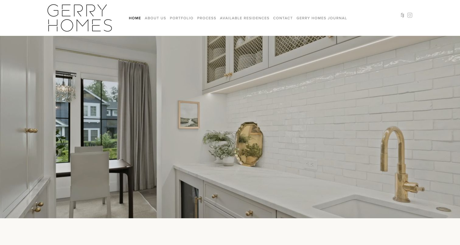
Gerry Homes uses a thin, architectural wordmark above a large interior photograph. The light header and compact navigation produce a quiet opening that suits the detailed cabinetry and finishes in the image. The page then becomes more explicit: custom homes and large renovations are identified as the service, Seattle and the Eastside as the territory, and consultation, portfolio and process as separate next steps. Featured homes have recognizable names and short descriptions, including a distinction between restoration and new construction. Available Residences has its own route, keeping a home for purchase from being confused with a commission to build. That separation of visitor intentions gives the restrained identity practical value.
What you can learn
A builder can serve several related markets without making them interchangeable. Label custom commissions, substantial renovations and available homes separately, then use individual project descriptions to make the differences understandable before a visitor contacts the team.
Pros
Project names and descriptions give the residential photographs meaningful context.
Portfolio, process and available residences are independently accessible from the header.
Cons & considerations
The first screen depends on photography before explaining service or geography.
Small, light navigation text deserves careful contrast and size testing.
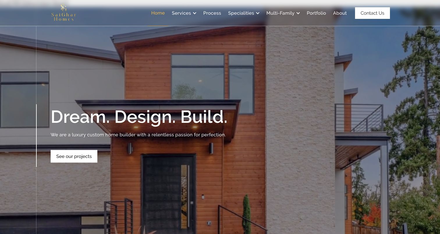
SaiGhar begins with a contemporary house photograph and a short three-part message about dreaming, designing and building. A plain project button gives that introduction somewhere to lead. The more informative content follows: surveying, design, architecture, engineering, permitting, land development, procurement and project management are presented as distinct parts of an end-to-end service. That inventory helps reveal how much work sits behind a custom home, rather than leaving the visitor with only a finished exterior. The page also describes the Bellevue and Seattle focus. Its longer process passages are more expansive than the opening, so the contrast between the concise first screen and the explanatory body is noticeable.
What you can learn
Translate an integrated service into understandable responsibilities. Keep the initial message short, but explain who handles the land, approvals, design and construction before asking the homeowner to trust a general promise of a seamless experience.
Pros
The project button makes the opening image a useful portfolio entrance.
The service inventory exposes responsibilities that many homebuilding sites leave vague.
Cons & considerations
Several broad navigation categories compete with the straightforward project route.
Long aspirational passages could be more useful as concise decisions and deliverables.
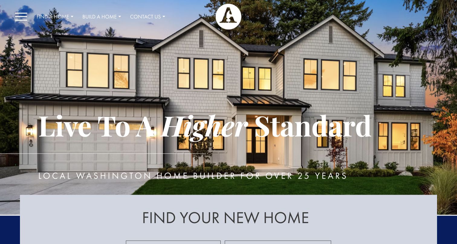
American Classic Homes pairs a large residential exterior with a prominent Washington identity and a broad lifestyle headline. The header separates Find a Home and Build a Home, while the page offers both available homes and a custom-home route. This is the important design decision for the collection: the website does not require every visitor to have the same intention. Someone ready to purchase a completed property can follow a different path from someone evaluating a custom build. Gallery imagery and feature descriptions support both routes, while the footer includes warranty and homebuying resources. The photographic homepage needs the specific destination pages to complete its service explanation.
What you can learn
Separate inventory shopping from commissioning a home at the highest navigation level. Give each route its own expectations, project information and contact process; a shared visual brand does not mean the underlying decisions are the same.
Pros
Find and Build labels make two different customer journeys recognizable.
Warranty and homebuying resources acknowledge needs beyond the initial sales image.
Cons & considerations
The broad opening slogan says less than the explicit task links.
Custom options require their own detail to avoid confusion with curated inventory.
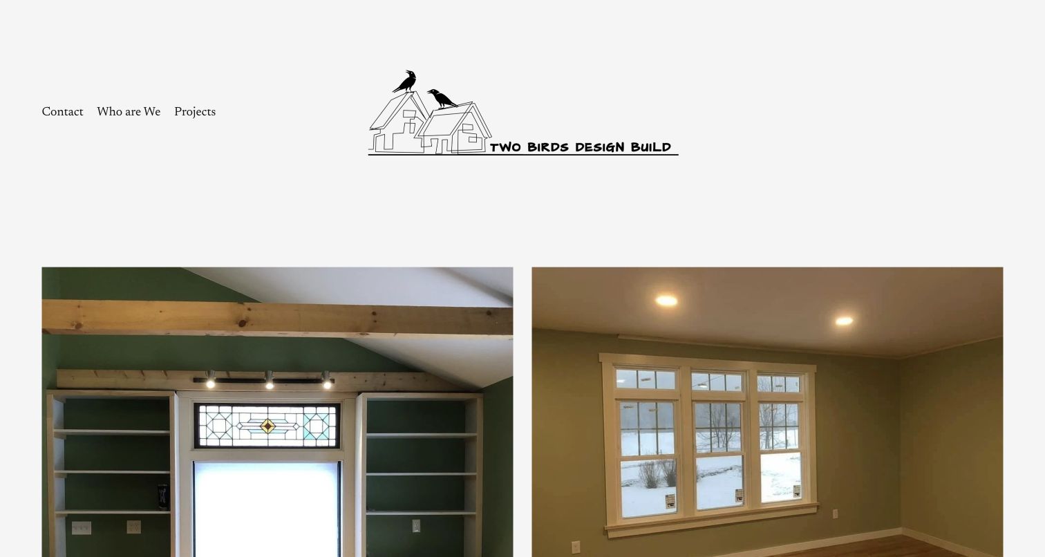
Two Birds Design Build uses a hand-drawn house-and-birds mark, a very small navigation set and paired interior photographs. The page feels closer to a local studio introduction than a national builder campaign. Below the images, it identifies Wallingford and Rutland County and describes the two-woman team’s work across remodeling and new building. That specificity is valuable for a custom-home-builder site because it answers who and where without requiring a long company history. Contact, team and projects are the main choices, and an email link supplies a simple next step. The compactness is appealing, although it leaves a prospective new-home client needing additional detail about the particular construction process.
What you can learn
A small practice does not need an oversized corporate menu. Lead with real identity, territory and examples, then add enough new-construction detail to explain how a complete home project differs from a room remodel or interior improvement.
Pros
The illustrated mark gives the small practice a recognizable personality.
Three navigation choices keep the first decision unusually straightforward.
Cons & considerations
The opening interiors do not immediately establish the new-home scope.
The brief introduction leaves process, project scale and initial requirements unexplained.
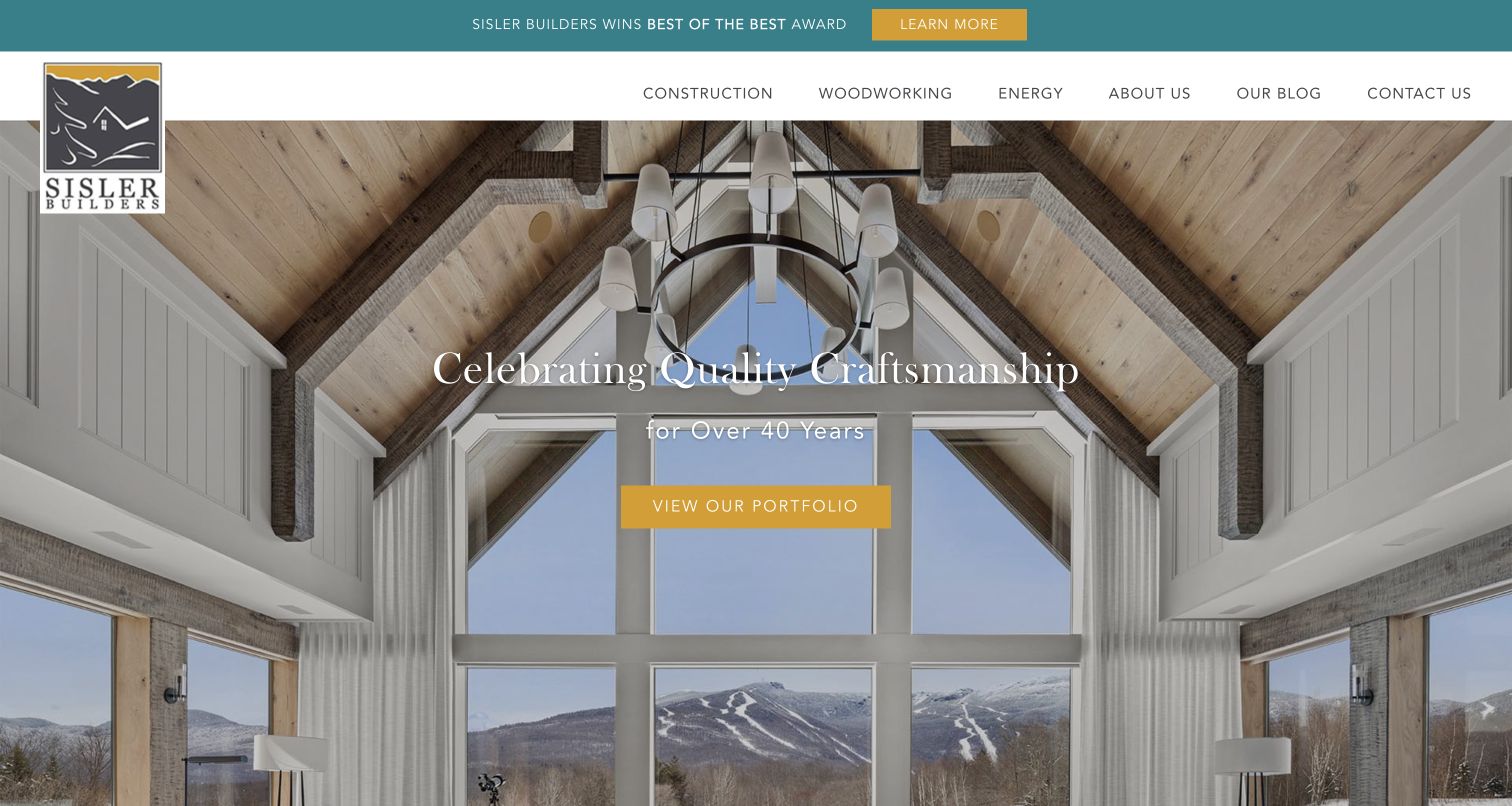
Sisler Builders uses a timber-rich interior photograph, a teal header accent and a gold portfolio button to introduce its work. The navigation is unusually useful for this category: Construction, Woodworking and Energy describe different capabilities rather than repeating several versions of a generic services label. The page identifies Stowe and North Central Vermont, then separates custom homes, major renovations, remodels and woodworking. A founder statement provides a personal introduction, while a featured renovation and blog content show how longer project stories can support the portfolio. The published award notice is part of the site’s own presentation; the website-design review does not verify or extend that recognition into a service recommendation.
What you can learn
Expose the capabilities that actually distinguish the builder, and connect them to project types. Specialist woodworking or energy work becomes easier to understand when it has a clear destination rather than appearing only in a general quality statement.
Pros
Capability-based navigation distinguishes construction, energy work and woodworking.
Separate project categories clarify new homes versus several kinds of renovation.
Cons & considerations
An award banner competes with the logo and portfolio message at the top.
The large opening photograph delays the more specific service-area explanation.
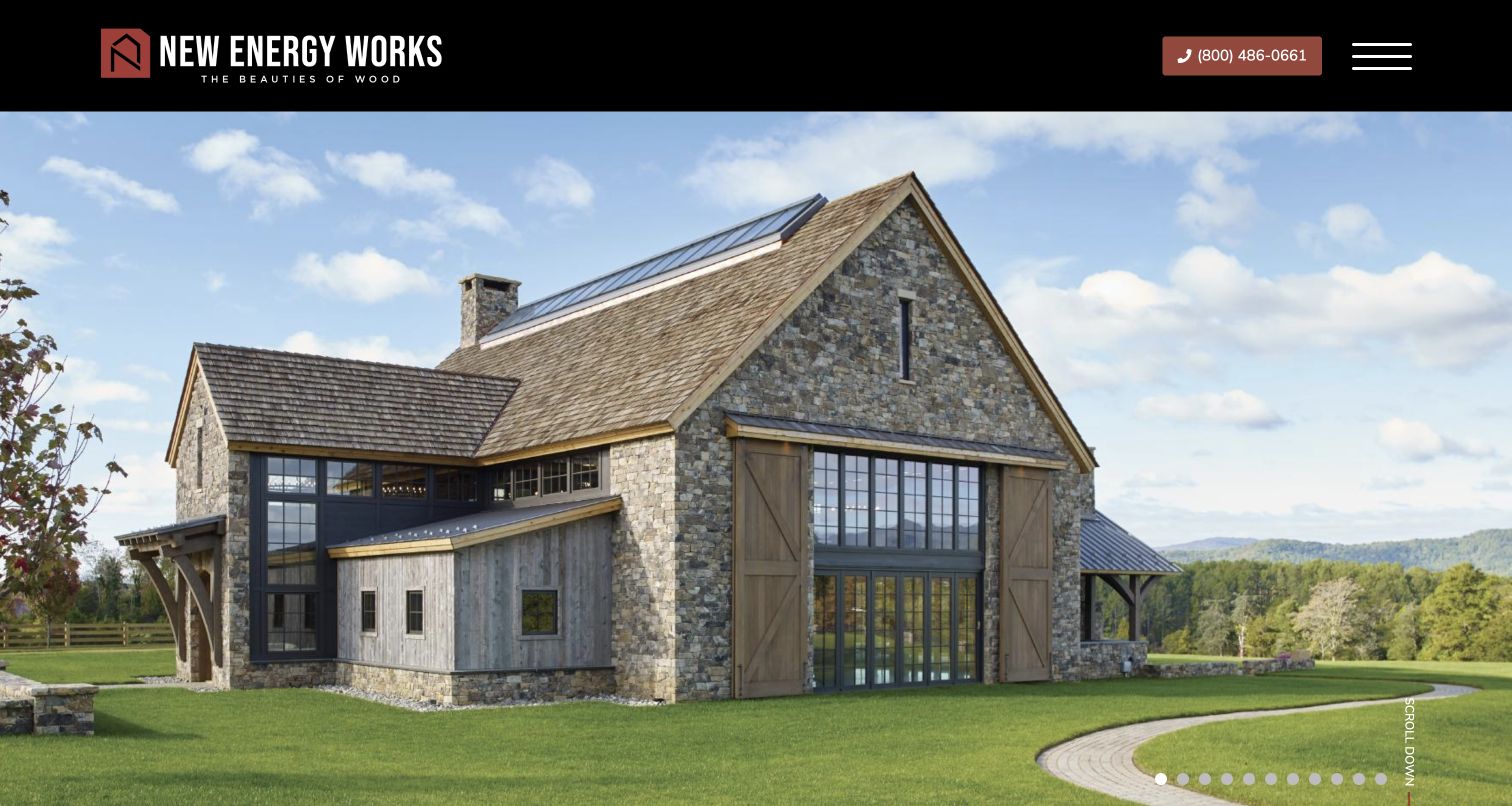
New Energy Works leads with a timber-and-stone building under a bold black header. The image occupies most of the first screen, with numbered slide controls and a discreet scroll prompt. The site describes custom wood structures and separates timber framing, design-build, enclosures, woodworking and other services. It explicitly explains that those services can be combined according to the project. This is useful for a custom-home collection because the business should not be mistaken for a conventional builder providing an identical turnkey package everywhere. Project stories and separate interior, exterior and barn galleries help visitors explore the specialty from different angles. The restrained identity reinforces the woodcraft.
What you can learn
When a construction specialty can be bought in different scopes, explain the boundaries before the inquiry. A homeowner needs to understand whether they are commissioning a complete home, a structure, or a specialist component within another team’s project.
Pros
Service combinations are explained instead of implying a single universal package.
Separate galleries and case studies organize a broad range of timber work.
Cons & considerations
The first photograph does not immediately explain the available service scope.
Eleven slide positions can add browsing effort before the written explanation appears.
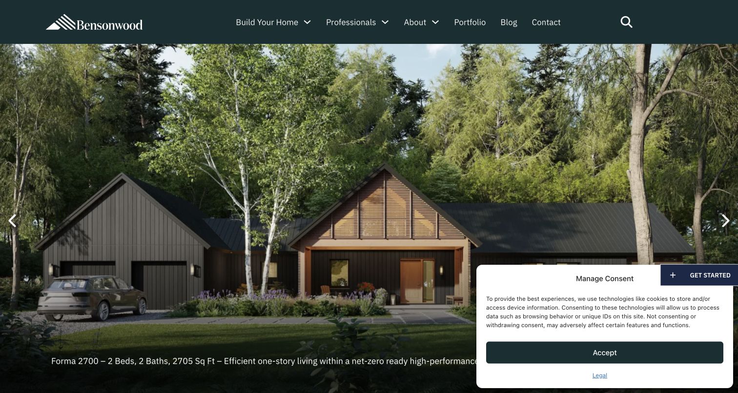
Bensonwood’s homepage places a detailed project caption beneath a large architectural image and separates Build Your Home from Professionals in the header. That audience distinction matters because the company presents both homeowner offerings and construction capabilities for other building teams. The body explains offsite fabrication, offers predesigned home options and identifies professional services such as timber framing and architectural millwork. The opening names a home platform, room count and area, providing more context than an unlabeled exterior. A privacy notice occupies the lower right of the source view. Performance language remains the company’s published positioning, not an independently measured result of this website review.
What you can learn
Describe both the product and the working relationship. A system-based homebuilder should explain which decisions are predetermined, which can vary, and whether the visitor is buying a complete home or collaborating as another building professional.
Pros
Homeowner and professional routes reduce confusion about the intended audience.
The opening project caption gives the pictured home specific identifying information.
Cons & considerations
The privacy notice overlaps a substantial portion of the initial image.
Predesigned options and bespoke work need careful distinctions throughout the inquiry journey.
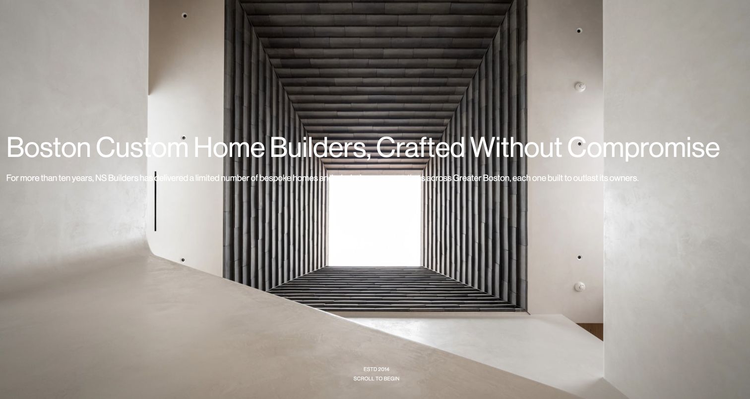
NS Builders opens with a striking upward view through an interior void, using the repeated structure itself as the visual composition. A large Boston custom-home headline makes the market and service explicit. The page then connects that identity to selected builds and a remodel, followed by pre-construction, construction and post-construction topics. Its editorial material addresses specific building decisions rather than relying solely on finished-room photography. For this collection, the useful idea is the relationship between the visible finish and the work behind it: the website gives visitors several ways to investigate the builder’s stated approach. The wide headline and bright central image create a demanding text-placement problem.
What you can learn
Use detail photography and practical articles to explain what the builder pays attention to. Connect those ideas to named projects and process stages so the promise of craftsmanship has a navigable body of supporting material.
Pros
The architectural-detail hero gives the brand a distinctive point of view.
Build and remodel labels help identify different kinds of selected work.
Cons & considerations
The long headline stretches across visually varied areas of the opening image.
A highly animated introduction should preserve an obvious route to practical information.
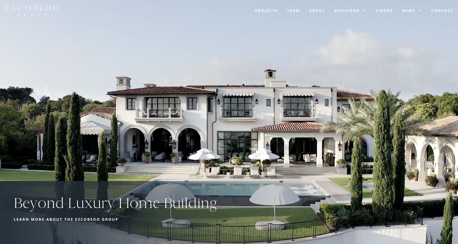
Escobedo Group uses a large house-and-pool photograph with a dark translucent panel across the lower portion. That panel gives the short homebuilding statement and company link a stable reading surface without hiding most of the architecture. The thin white wordmark and widely spaced navigation create a formal presentation. Projects, team and contact are visible, while Divisions signals that the business extends beyond a simple residential portfolio. The footer makes those specialties concrete with stone, metals and millwork destinations. For a prospective homeowner, this structure creates a useful distinction between the finished building and the capabilities involved in producing it. The next page must explain that relationship.
What you can learn
Connect specialist divisions to the complete-home offer. Show the finished work first if that suits the brand, but explain what the in-house specialties contribute and which team a homeowner should contact for a complete construction project.
Pros
The dark caption panel protects the opening message from a busy image.
Named fabrication divisions give the broader company structure concrete meaning.
Cons & considerations
The pale header lettering sits against a particularly bright sky.
The opening company link is less specific than a clearly described project-start route.
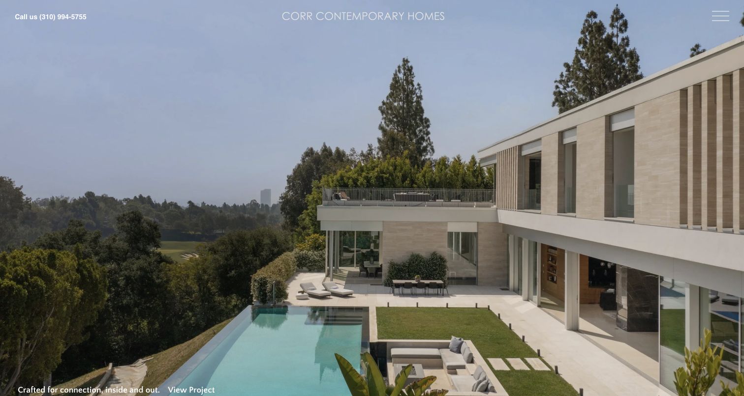
Corr Contemporary Homes places a full-width hillside residence directly beneath a minimal header, with a project link tucked into the lower corner. The phone number is unusually prominent for such a restrained composition. Continuing down the page reveals a Southern California custom-construction introduction, a separately labeled remodel and an explanation of the relationship between construction and ongoing property care. About, portfolio, working approach and contact then become large, clear destinations. This creates a progression from visual interest to practical context rather than asking the opening photograph to communicate everything. The discussion of different architectural styles broadens the service beyond the first featured house.
What you can learn
Use image-led project links as the start of a service explanation. Label remodels and new construction clearly, and explain any ongoing-care relationship separately so visitors understand both the scope of the initial build and what may follow it.
Pros
A direct project link makes the opening residence more than decorative scenery.
The page connects construction, working approach and ongoing care in readable stages.
Cons & considerations
The small project caption is easy to overlook at the bottom edge.
The full navigation remains hidden behind an icon in the opening view.
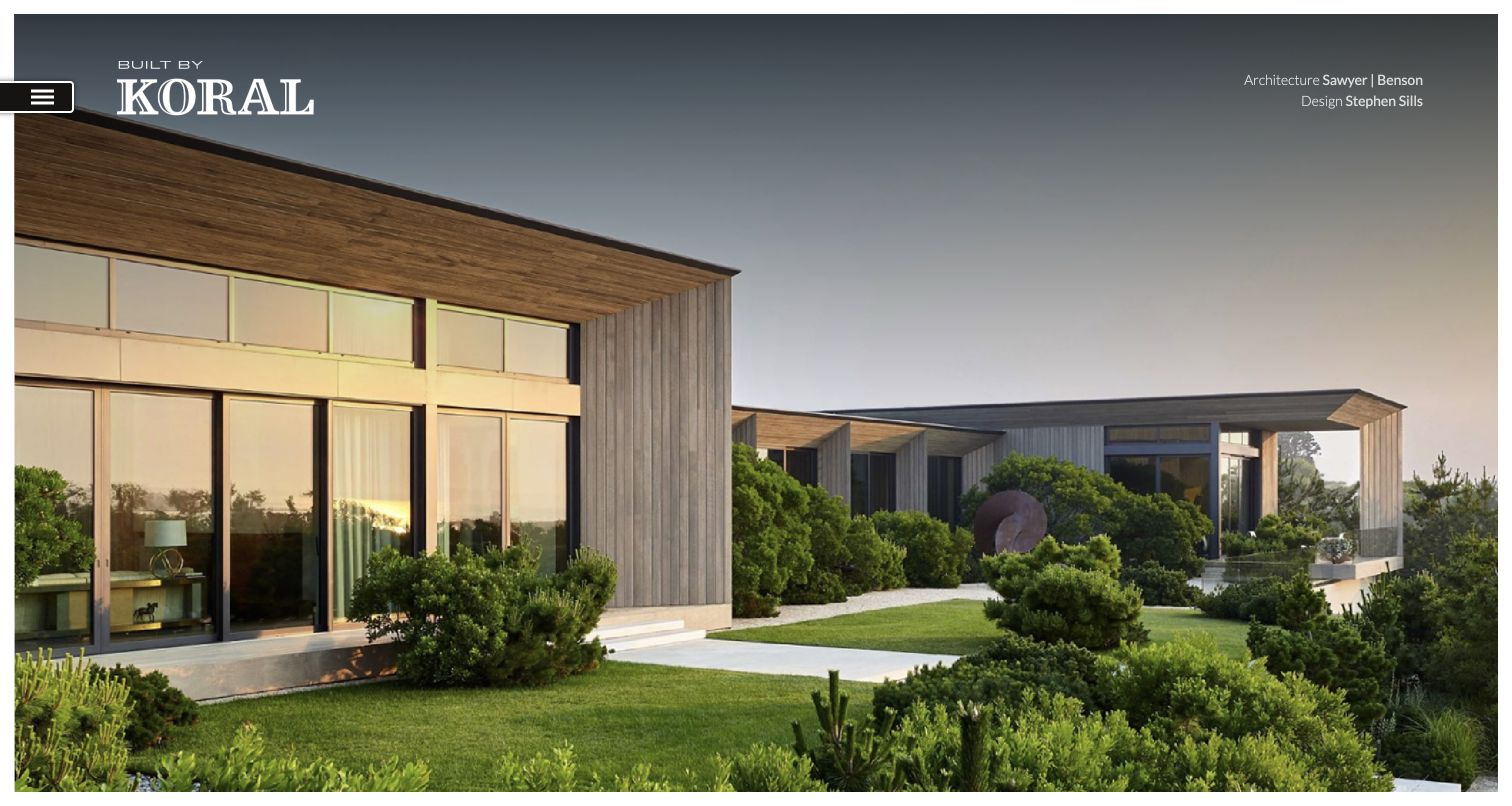
Koral’s opening house photograph sits inside a narrow white border, with a prominent builder mark on the left and architecture and design credits on the right. Those credits are the distinctive detail: they clarify that the finished home is collaborative work rather than silently attributing every creative decision to the contractor. The lower page introduces the Southampton practice, separates custom new construction from renovations and presents projects with names and East End locations. A historical company image supports its account of continuity. The visual presentation remains spare, with the main navigation tucked behind a small side control. This gives the work room but delays the broader explanation.
What you can learn
Credit collaborators where the work is shown. A builder portfolio can communicate construction expertise while naming the architect, interior designer or landscape designer, helping visitors understand the actual role of each participant in a finished home.
Pros
Visible architecture and design credits make collaboration part of the presentation.
Project names and towns provide useful context beneath the immersive opening.
Cons & considerations
The side-mounted menu is less obvious than exposed navigation labels.
Some portfolio controls depend on scripted interactions rather than visible destination paths.
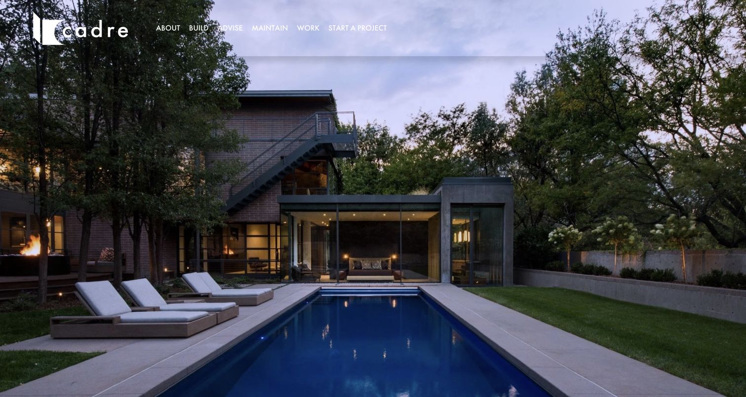
Cadre pairs a large residential exterior and pool photograph with a compact row of action-oriented navigation. Build, Advise and Maintain describe different working relationships, while Work and Start a Project provide direct routes for evaluation and inquiry. The homepage itself is exceptionally spare; its most explicit service-area statement appears in the footer, naming Denver Metro, Boulder County and the Colorado foothills. That arrangement makes the image the primary introduction while the navigation carries much of the explanation. For custom-home-builder websites, the useful pattern is the separation of service stages. A person seeking advice, commissioning construction or maintaining an existing property should not have to interpret the same undifferentiated contact invitation.
What you can learn
Use concise verbs when they correspond to genuinely different services. Support those labels with clear descriptions of geography and responsibilities, and make it obvious when a maintenance destination belongs to a separate service or platform.
Pros
Build, Advise and Maintain distinguish three practical client intentions.
Start a Project is available directly beside the portfolio route.
Cons & considerations
The first screen provides little written explanation of the builder or territory.
White navigation must remain readable against changing architectural photographs.
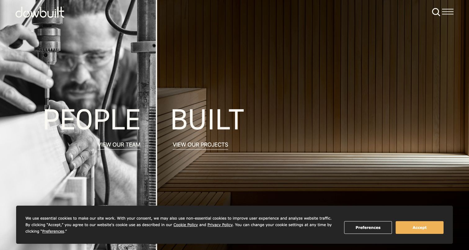
Dowbuilt divides its opening between a black-and-white craftsperson photograph and a warm image of finished woodwork. The large People and Built labels each lead to a separate destination, making the team and the projects equally prominent. Below that split, the page explicitly describes building individual residences with architects and introduces named work across several locations. The footer adds service, digital construction and woodshop routes, which expand the explanation beyond a gallery of completed homes. The captured first view includes a substantial privacy notice along the bottom. Its placement shows how a consent panel can compete with a carefully composed introduction.
What you can learn
Give the people responsible for construction a meaningful place in the design. Connect portraits and workshop details to actual team and project pages, so the human emphasis supplies useful context instead of becoming an unsupported promise of personal service.
Pros
The split composition creates two clear entrances with distinct purposes.
Named projects and locations broaden the portfolio beyond an anonymous image reel.
Cons & considerations
The privacy panel covers a substantial portion of the opening composition.
Specialist services are more apparent in the footer than in the initial navigation.
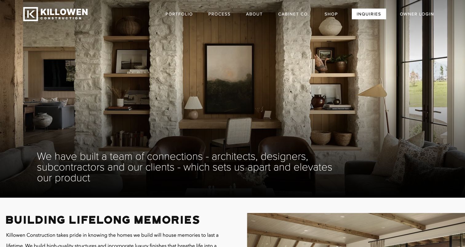
Killowen Construction uses a richly textured interior photograph and a shaded lower area for its introductory message. Portfolio and Process are exposed in the header, and the white Inquiries button creates a clear point of emphasis. Owner Login is separated from that inquiry route, recognizing that existing clients arrive with a different task. The page describes working with architects, designers and craftspeople, while the navigation also identifies the cabinet business and shop. This makes the website more than a prospecting brochure, although those additional destinations compete for space. Testimonials are presented as source-site statements; their presence is a communication choice, not independent evidence of the construction experience described by each customer.
What you can learn
Separate the public inquiry from the existing-client entrance. Explain the builder’s relationship with architects and other specialists, then keep supporting businesses and shopping links from overwhelming the main path to understand the residential work.
Pros
Process and Portfolio are easy to find before opening another page.
A distinct owner login keeps ongoing project access separate from new inquiries.
Cons & considerations
The long opening statement requires several lines over a detailed photograph.
Shop and cabinet-company routes add competing choices to the primary header.
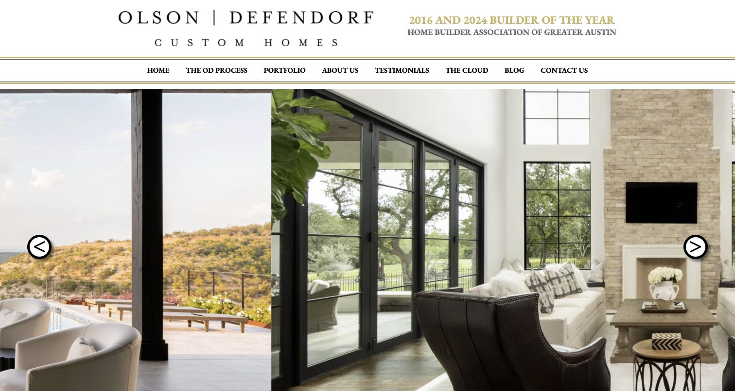
Olson Defendorf gives its custom-home identity a large white header above a broad interior slideshow. Gold rules and serif lettering create a formal visual language, while exposed links provide access to the building process, portfolio, company, testimonials, education and contact. The body identifies architect-designed homes in Austin and surrounding communities, which supplies useful context beyond the pictured rooms. A separate client-login destination exists under the label The Cloud. The page also prominently publishes industry-award claims; those remain claims from the source website rather than a ranking adopted by this collection. The overall structure is familiar and direct, with much of the visual character supplied by the residential photography rather than interface effects.
What you can learn
A straightforward navigation can work well for a high-value custom service. Use labels that explain the destination, keep the service area specific, and identify the role of collaborating architects without letting awards replace detailed project information.
Pros
The process, portfolio and contact routes remain visible above the imagery.
Named Austin-area communities make the geographic focus understandable.
Cons & considerations
The Cloud is a less obvious label for an existing-client login.
The opening slideshow needs stronger visible project captions to support comparison.
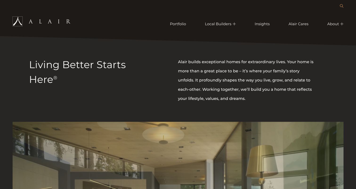
Alair begins with a dark, spacious introduction rather than placing its main headline over a full-screen house. A short statement on the left is balanced by explanatory copy on the right, with the residential image beginning below. Portfolio and Local Builders are prominent routes, and country choices distinguish Canada from the United States. The body explains the network model and provides a separate invitation for builders considering joining it. The corporate brand and local business handling a project are related but not interchangeable. Featured projects and editorial stories give the central website depth while the builder directory supplies the more practical next step for a homeowner.
What you can learn
A network website should explain how local delivery works before asking for an inquiry. Keep homeowner discovery separate from partner recruitment, and preserve location context when moving from the shared brand into a local builder’s information.
Pros
Local Builders is a prominent destination beside the general portfolio.
The network and recruitment explanations identify different audiences explicitly.
Cons & considerations
The broad opening message provides limited immediate detail about project suitability.
A visitor still needs local information before assessing the specific builder relationship.
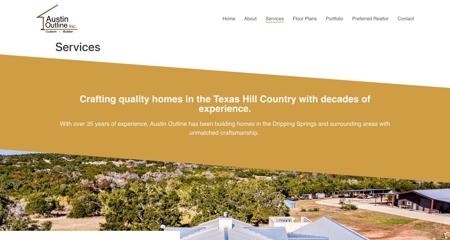
Austin Outline’s Services page uses a white header and a broad gold introduction above a landscape photograph. Its message names the Texas Hill Country and Dripping Springs, establishing regional context before the service list. The body then distinguishes custom homes, remodels and additions, metal buildings and shops, smaller dwellings and commercial work. Each category receives a short explanation rather than being collapsed into one general construction claim. Floor Plans and Portfolio are separate header destinations, and a final link introduces standard home features. The service page qualifies the offer more explicitly than an attractive homepage image could alone.
What you can learn
Explain adjacent services without blurring them together. A visitor planning a complete home should be able to distinguish that offer from a guest house, workshop or remodel, while still understanding which capabilities belong to the same regional business.
Pros
Named service categories make the range of construction work easy to scan.
The regional introduction helps visitors judge location fit early.
Cons & considerations
The large promotional band postpones the detailed service explanations below it.
A generic Learn More label gives little preview of the standard-features destination.
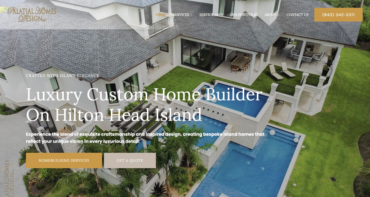
Palatial Homes Design puts its custom-home service and Hilton Head Island location directly into the main heading. A high residential view supplies the backdrop, while Homebuilding Services and Get a Quote form two distinct next steps. The header also exposes Service Area, Portfolio and a telephone route. Continuing down the page reveals separate categories for new construction, additions, kitchens, renovations and rebuilding, which prevents the local positioning from becoming the only useful detail. Gold accents and serif headings echo the imagery’s formal character. Several broad statements about quality and long-term value appear in the source copy; this review evaluates their presentation rather than verifying those promised building outcomes.
What you can learn
Put geography and service in the main message when local fit is decisive. Pair an exploratory service route with an inquiry route, then identify new construction and renovation categories clearly enough that visitors can choose the appropriate conversation.
Pros
The opening heading immediately identifies both custom homes and Hilton Head Island.
Service, portfolio, territory and phone routes are exposed in the header.
Cons & considerations
Large white text crosses a visually detailed exterior photograph.
Numerous adjacent service categories need clear boundaries to avoid repetition.
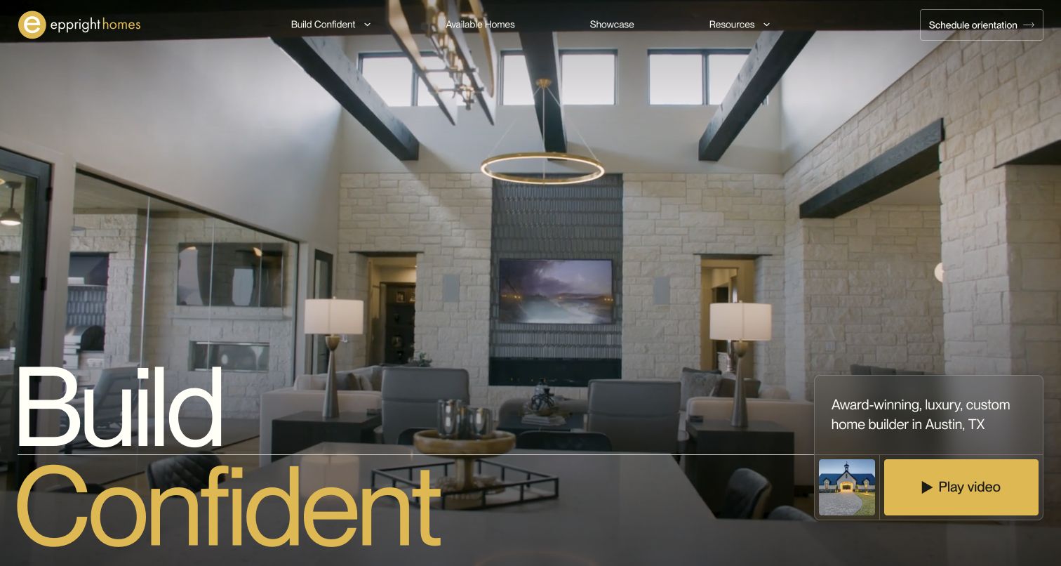
Eppright Homes uses a large two-line headline, yellow accents and an interior image to create a highly recognizable opening. More practical information sits around that visual statement: the page identifies Austin custom homebuilding, the header exposes available homes and project work, and Schedule Orientation describes a specific next step. Within the building menu, process, team and build-on-your-lot routes give different starting points to visitors with different levels of preparation. The page also displays substantial customer-review material. Those published accounts add detail, but should be read as source-site testimonials rather than independently established outcomes. The memorable brand message accompanies navigation addressing real homebuilding decisions.
What you can learn
Name the initial conversation in terms a homeowner can understand. Separate available properties from a custom commission, and provide a route for someone who already owns land without assuming every visitor arrives with completed plans.
Pros
Schedule Orientation gives the inquiry a more specific expectation than a generic button.
Available homes and building on an owned lot receive different navigation routes.
Cons & considerations
The large headline occupies space that could explain project suitability.
Long testimonial passages can make practical service information harder to scan.
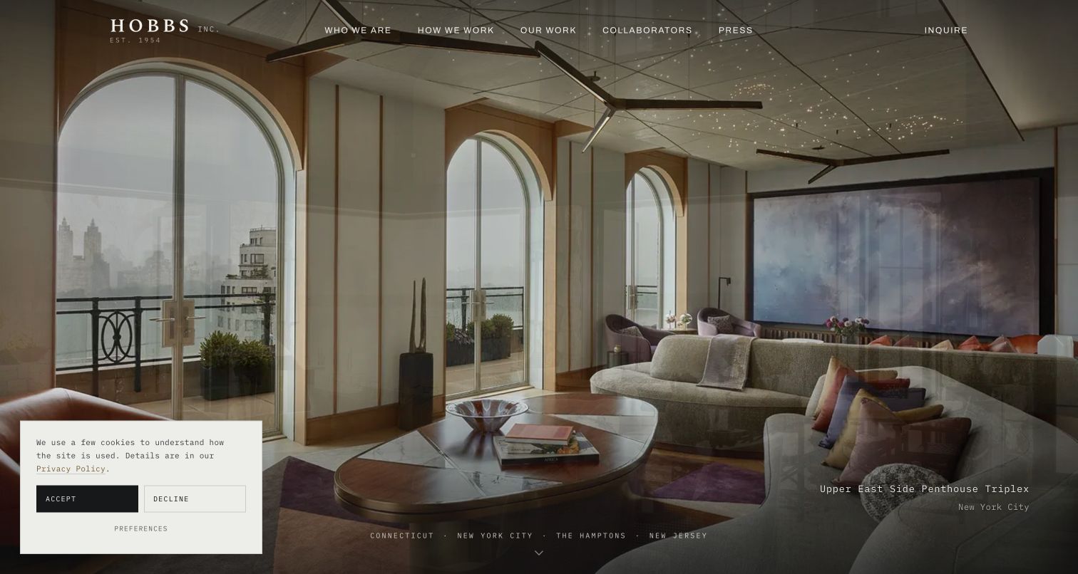
Hobbs presents a full-screen interior beneath a restrained header, with the project name and location placed at the lower right. The captured view shows a New York City penthouse, while regional links across the lower edge connect to Connecticut, the city, the Hamptons and New Jersey. Farther down, the page describes custom-home work and identifies featured projects with architect or designer credits. Who We Are, How We Work, Our Work and Collaborators remain visible above the image, making the company’s relationships part of its navigation. A privacy panel overlaps the lower left in the recorded view. The captions distinguish urban residential projects from houses.
What you can learn
Label the photographed project and the market it belongs to. When a residential builder handles different regions and property types, connect those differences to useful destinations instead of expecting a single image to represent every kind of commission.
Pros
Project names and locations turn the image sequence into identifiable work.
Collaborators has a direct header route alongside process and portfolio.
Cons & considerations
The privacy panel obscures part of the first-view composition.
A large rotating image area can delay the fuller custom-home service explanation.
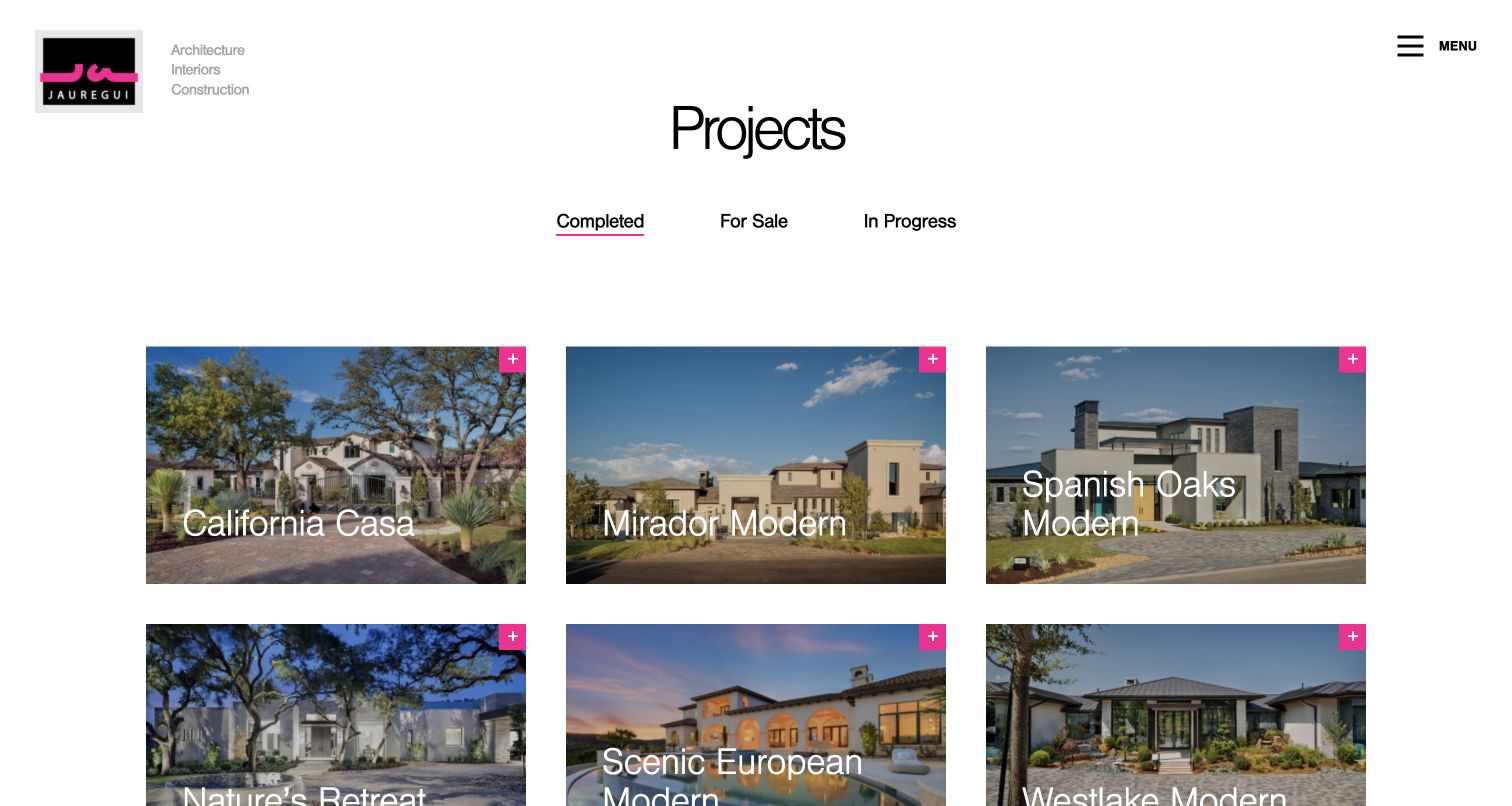
Jauregui’s Completed Projects page replaces the typical full-screen hero with a clear three-column gallery. A generous white header, compact identity and bright pink details give the individual project photographs room to stand apart. Completed, For Sale and In Progress are separate tabs, making status a primary organizing idea. Each card has a project name and a visible expansion marker, so visitors can scan several architectural approaches before selecting one. Architecture, interiors and construction are identified together beside the logo, establishing the integrated context of the practice. This portfolio distinguishes finished evidence from work underway and homes offered for purchase.
What you can learn
Make project status explicit before asking people to browse. A completed case study, an active build and a property for sale support different decisions; separate those journeys while using consistent card labels and clearly attributed project imagery.
Pros
Status tabs distinguish completed work, available property and ongoing construction.
The visible grid lets visitors compare several named homes at once.
Cons & considerations
White card titles can lose contrast over lighter areas of project photographs.
The compact global menu hides service explanations from this gallery view.
Kegan is a freelance web designer and developer with 15+ years of experience helping businesses turn complicated website requirements into clear, maintainable digital experiences. He works directly with clients from planning and design through development, launch, and ongoing support.
For custom home builder website design, his development approach focuses on genuine completed-home portfolios, service-area and site requirements, clear design-build stages, project-team context and qualified consultation inquiries. The scope can be a targeted improvement or a complete custom build, with responsive layouts, thoughtful content structure, and integrations chosen around the people using and maintaining the site.
Show 3 other custom home builder website designersHide other custom home builder website designers
Plan the website around project fit, evidence and the first conversation
Define the offer before choosing a visual direction
Write down the actual custom-home service in language a prospective homeowner can understand. Identify the geographic area, the kinds of projects the builder accepts and the point at which the team usually becomes involved. A practice that works from an outside architect’s drawings has a different relationship to explain from an integrated design-build firm. A specialist timber or fabrication business also needs to clarify whether it supplies a component, a structure or a complete home.
Separate related services where the visitor’s decision changes. New construction, a substantial renovation, a guest house and an available residence may all belong to the same business, but should not become interchangeable gallery items. Give each a clear description and a route to suitable examples. If local builder partners deliver the work, explain that model and help the visitor reach the relevant location.
Choose the homepage message after those boundaries are clear. A regional specialist may benefit from putting the service and place directly in the headline. A portfolio-led practice can be quieter, provided its practical explanation remains easy to find. Use the visual identity to express the character of the business without replacing factual information with repeated claims about luxury, quality or a dream lifestyle.
Build a portfolio that explains the work
Create a consistent project record before designing the gallery. Give each home a useful name, general location, project type and description of the builder’s role. Record the architect, interior designer, photographer and other collaborators when approved credits are available. Obtain permission for the images and decide which details can be published without exposing a homeowner’s private address or personal information.
Show more than the most dramatic exterior. A small, well-chosen sequence can connect the setting, layout, material details and construction approach. Use captions to explain what the visitor is seeing, especially when a renovation preserves an older structure or a specialist division produced only part of the work. Keep rendered concepts and unfinished projects clearly distinguished from completed photography.
Organize the collection around real differences. Project type, region or status can help when there is enough work in each category; unnecessary filters merely add empty choices. Separate property-for-sale information from historical case studies and assign someone to maintain its status. A portfolio should remain useful after the opening image has changed, with dependable project URLs, readable descriptions and a direct route back to the larger collection. Let the photographs attract attention while the written context establishes what they actually demonstrate.
Connect the process to a proportionate inquiry
Explain the early stages of working together without promising that every project follows an identical schedule. A concise overview can cover feasibility, design coordination, approvals, construction and handoff, while identifying which responsibilities depend on the particular contract. Clarify whether someone can contact the builder before owning land or selecting an architect. That is more useful than requiring a detailed brief before explaining what information is needed.
Use an inquiry route appropriate to the first conversation. Basic location, project type, current planning stage and contact information can help the team respond without asking for sensitive financial documents or private plans in a public form. State what happens after submission and keep operational project files in a separate protected system. Label an owner login plainly so existing clients do not need to navigate the sales journey repeatedly.
Treat the website as maintained working material. Assign responsibility for team details, service areas, portfolio credits and contact routes. Check navigation, keyboard access, image text alternatives and readable labels as part of routine automated and editorial checks. Keep initial calls to action accessible when video, a slideshow or an external service is unavailable. The goal is to make a well-informed first conversation easier, while leaving final scope, pricing and contractual commitments to the appropriate project discussions.
The editing job behind the design
Choose tools around maintainable projects and clear inquiry routing
A manageable content system should support project types, credits, photo sequences, regional pages and process information without requiring each new home to be built as a separate custom layout.
Use appropriately sized responsive images and restrained motion. An elaborate opening should still leave project and contact routes usable when a video or external asset does not load.
Keep homeowner documents, construction-management tools and inquiry records outside the public portfolio. The stacks below describe bounded public-page observations and qualified evidence, not a complete inventory of internal building or client systems.
Our WordPress website examples offer a separate look at publishing approaches. A visible platform label is evidence for that named page, not a guarantee that the same system will suit your requirements.
Before the public launch
Custom-home-builder website brief checklist
State the actual custom-home service and geographic territory.
Explain the relationship with architects, designers and specialist contractors.
Distinguish new homes, renovations, additions and available properties.
Give every project a name, type and appropriate location context.
Use approved photographs with accurate collaborator and photographer credits.
Label concepts, work in progress and completed homes separately.
Describe the early process without implying universal timing or budget guarantees.
Explain how visitors with land, plans or an initial idea should begin.
Keep owner login and project documents separate from public inquiries.
Use a proportionate inquiry form with clear expectations and privacy information.
Provide useful routes when slideshows, videos or outside services are unavailable.
Assign responsibility for portfolio, service-area and contact updates.
These checks are a project checklist, not a performance, legal, security, or accessibility certification. Test real journeys with the people responsible for the website before making claims about the result.
Sources & editorial method
How this collection was selected and reviewed
This collection contains 26 distinct public website properties, matching the original saved industry draw. All 26 screenshots are direct source captures prepared for this collection; the recorded source URLs, dimensions and actual capture times are retained. Several first-visit views include the source website’s privacy notice. Reviews assess visible presentation, navigation and public explanations, not construction quality, credentials or promised results. Each source page has a bounded broad technology-audit attempt, including the retained earlier audit for the previously known Palatial source. Unavailable scans remain unavailable and do not establish a hidden backend or refresh a successful observation date. No inquiry, account action, form submission or purchase was made for the review.
Each example links to its actual source page. Screenshots are direct browser captures with their own capture dates; moving imagery, announcements and live designs can change. The notes describe observable design choices and conditional tradeoffs, not measured traffic, conversion results, service quality, or accessibility conformance.
Technology labels use public page metadata, asset evidence, or explicitly cited platform documentation. Platform documentation is not a complete current deployment audit. A component reference may be legacy or unused; it is not a complete backend inventory. Unknown stacks are omitted. These sites are editorial examples, not our client portfolio.
Written, Edited and Curated are separate editorial records, not timestamps advanced by a rebuild. Website designs and imagery belong to their owners. See our editorial standards or suggest a correction.
Questions worth asking
Custom Home Builder website design questions
Should a custom-home-builder website begin with a large photograph?
A large photograph can establish the character of the work, but it should not hide the service, location or next step. Choose the opening around the information visitors need, and give an image a useful project caption when possible.
Can new homes and renovations share one portfolio?
Yes, if each project is clearly labeled and the relevant service boundaries are explained. Separate filters or collections can help when there is enough work, but a renovation should not be presented as evidence of a complete new build.
What should a project case study include?
Include approved photographs, a project name, appropriate location context, project type and a clear account of the builder’s role. Add verified collaborator credits and distinguish finished work from concepts or construction still underway.
Does every builder need a client portal on the marketing website?
No. When an existing protected system is used, a plainly labeled link can help current owners reach it. Keep project documents and private records separate from the public portfolio and new-client inquiry path.
Does the Editors Choice identify the best construction company?
No. It is an editorial website-design selection based on the public presentation and communication reviewed here. It does not establish construction quality, contractual suitability, credentials or the outcome of a future project.