Best Speech Therapy Websites of 2026 (12 Real-World Examples)
Speech therapy websites that make an unfamiliar first step easier to understand
These 12 speech therapy websites explore plain-language services, age and setting choices, referral routes and the difference between a welcoming message and a useful appointment journey.
A speech therapy website often meets someone before they know the professional vocabulary for their concern. A parent may be researching support for a child; an adult may be looking for a service after a change in communication; a school may need a professional assessment or training. Those are different tasks. A good homepage helps visitors identify a relevant route without asking them to diagnose themselves or write a detailed personal history into an ordinary enquiry box.
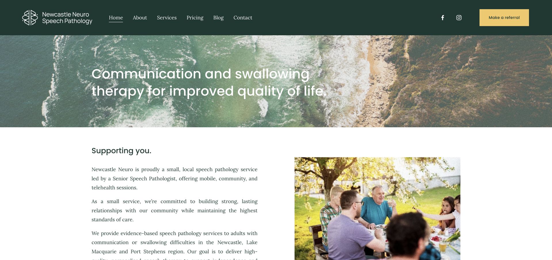
Newcastle Neuro is our Editors Choice for its clear adult-focused local identity. The inspected page identifies the service as small and local, names its coverage and explains mobile, community and telehealth delivery. Its natural imagery and quiet green palette support that practical information rather than replacing it. The selection recognises website communication, not the quality of therapy or the suitability of a provider for an individual.
This collection also includes children’s multidisciplinary practices, online services and university-linked clinics. They should not be copied as if they operate identically. Compare what each site explains about age groups, appointment formats, eligibility and next steps. A university teaching clinic, a local independent practitioner and an online service may need very different enquiry journeys even when the visitor uses the same search phrase.
Before the examples
What makes good speech therapy website design in 2026?
Let people recognise the relevant service without self-diagnosis
Use ordinary descriptions beside professional terms. Separate children, adults, school services and professional training when those routes genuinely differ. Explain what an assessment or introductory conversation is for, but avoid a symptom checklist that appears to determine a diagnosis. A visitor should be able to ask a sensible question without first selecting an unfamiliar clinical label.
Make the first interaction specific
A consultation, an assessment request, a referral and a confirmed appointment are not interchangeable. Label the action accurately and explain who responds, what information is initially needed and what happens next. If a call is only an introductory discussion, say so. If new referrals are closed or a waitlist is operating, publish that status rather than leaving a welcoming booking-style button to imply immediate availability.
Design for communication access, not only visual polish
Offer clear written contact routes as well as telephone information. Keep sentences and instructions concise, use descriptive headings and provide captions or written alternatives for important video content. Let visitors review information at their own pace. W3C’s cognitive-accessibility guidance is a useful planning reference, but a visual review or automated scan is not proof that a complete website is accessible to every person.
The collection · 12 examples
12 speech therapy websites worth studying
Compare the first useful task on each page: recognising the audience, finding an appointment format, understanding a referral or checking local coverage. The strongest ideas are often the small practical explanations underneath the hero rather than the headline itself.
Newcastle Neuro uses a dark forest-green header, a landscape photograph and a restrained yellow referral button rather than the bright classroom imagery common in children’s therapy. The opening copy then identifies the practice as a small local service for adults. Its strongest information is practical: community and telehealth delivery, named service regions, travel limits and a separate pricing destination. These details help visitors judge whether an enquiry is appropriate before entering any personal history. The broad photographic banner provides atmosphere, while the following two-column introduction supplies the specificity that the headline cannot carry alone.
What you can learn
Describe who the service is for and where it actually operates before presenting a long condition list. A local coverage boundary and explicit appointment formats can be more useful than another general reassurance about personalised care.
Pros
Adult-focused imagery and a compact navigation distinguish the practice from a paediatric clinic.
Referral, pricing and coverage information support concrete decisions without a large homepage form.
Cons & considerations
The landscape photograph communicates place more strongly than the details of an appointment.
The broad opening headline needs the explanatory section immediately below to establish audience fit.
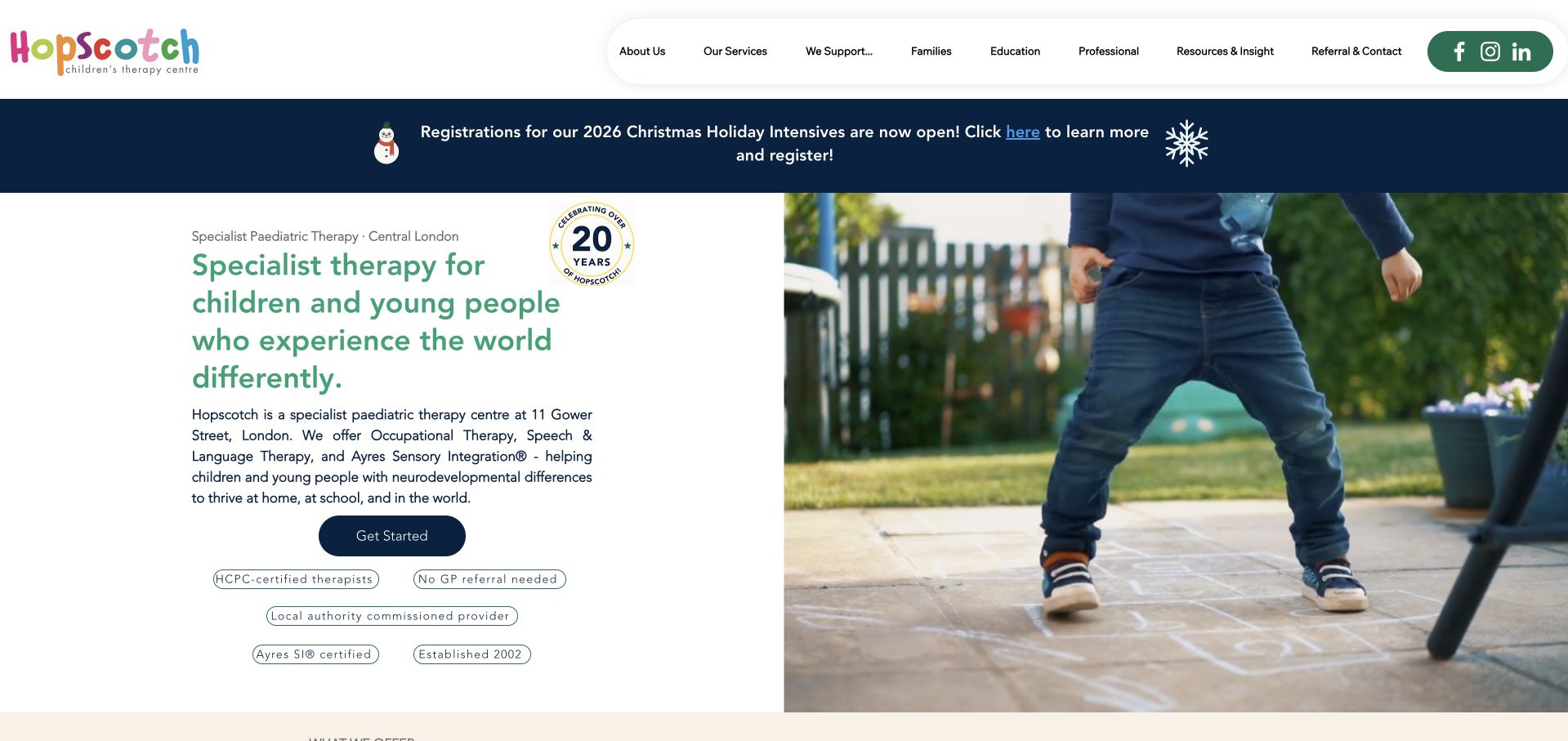
Hopscotch combines a white and forest-green interface with a prominent seasonal announcement and an introduction that names its central-London location. The page explains speech therapy alongside occupational therapy and sensory integration, then separates families, education and professional visitors in the navigation. Small reassurance labels sit next to the primary start action, making referral requirements easier to find than they would be in an isolated FAQ. The photographic area and compact service descriptions keep the clinic feeling approachable, although the number of menu groups creates considerable choice before a first-time parent reaches the main content.
What you can learn
When several disciplines share one practice, organise navigation around both service and visitor purpose. State the referral route beside the first contact action, then let schools and professional commissioners reach their more specialised information separately.
Pros
The opening identifies location and the disciplines available within the same practice.
Distinct audience pathways prevent school and professional information from overwhelming family-facing service copy.
Cons & considerations
The seasonal strip competes with an already detailed primary navigation at the top.
Credential-style labels still need supporting explanations; their presence does not independently verify service quality.
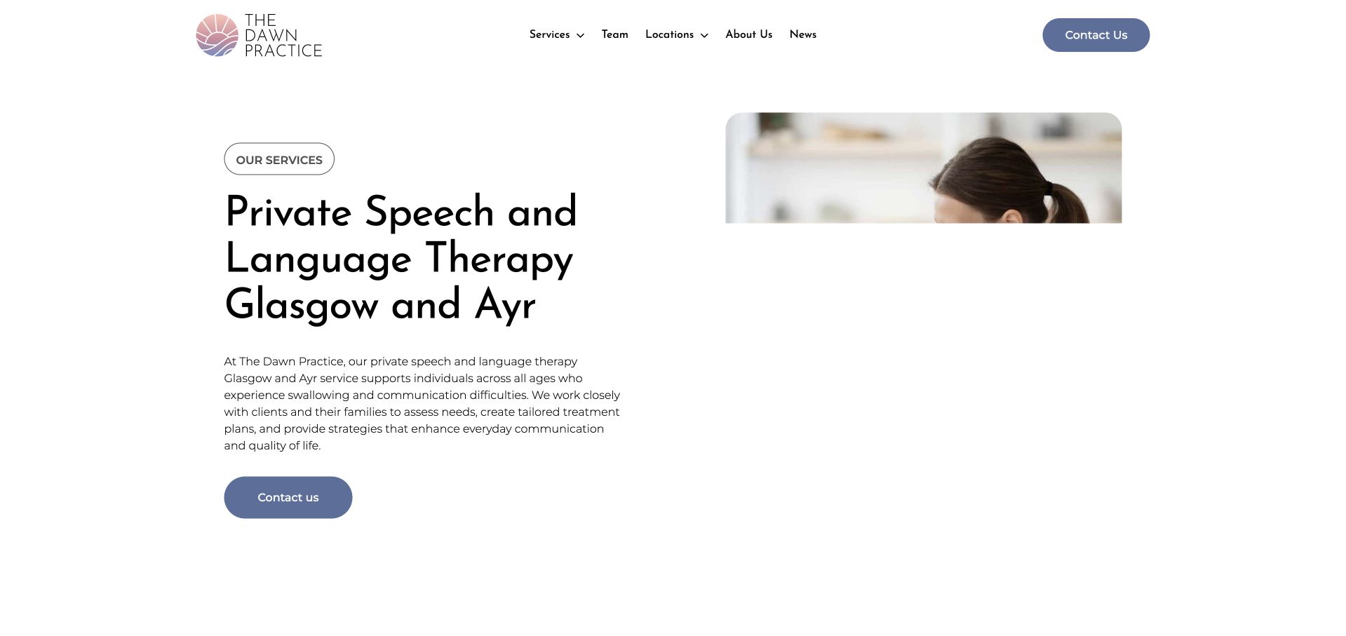
The Dawn Practice gives speech and language therapy a dedicated page rather than asking visitors to infer it from a general mental-health homepage. A large service heading and a child-and-therapist image lead into explanatory sections about an appointment, followed by a staged process. Generous white space, dark blue actions and soft neutral imagery create a consistent hierarchy. Team and location links remain available in the compact header. The page is particularly useful as an information-architecture example: it introduces the service, explains what a visitor can expect, and provides contact routes without making the first screen an extensive referral questionnaire.
What you can learn
Use a specialist landing page to answer practical questions that a general practice overview cannot. Pair each appointment stage with a short explanation, and check that every FAQ belongs to that service rather than a neighbouring template.
Pros
A descriptive heading establishes the service and its geographic context immediately.
The process sequence makes a potentially unfamiliar first appointment easier to picture.
Cons & considerations
The long page requires careful editing to keep repeated reassurance from obscuring practical details.
Some FAQ wording references other assessment types, illustrating the importance of service-specific content review.
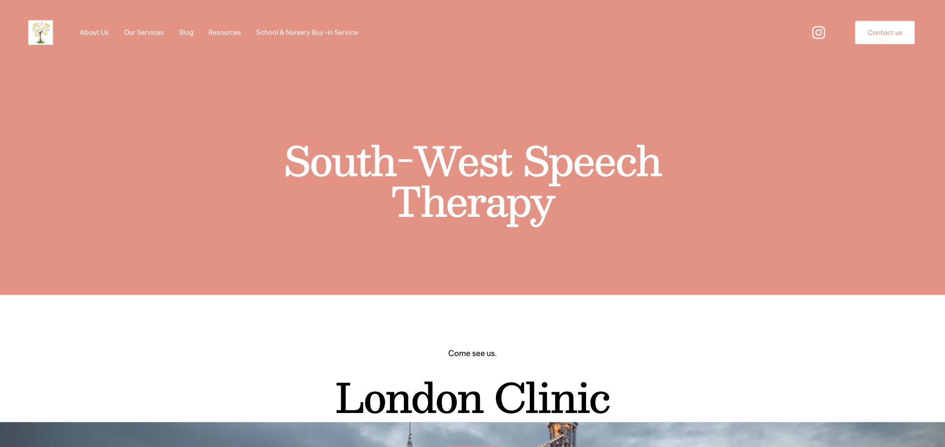
South-West Speech Therapy opens with a large coral-coloured identity panel and unusually direct language about visiting its London clinic. The composition is much quieter than a multi-location healthcare directory: a short header, generous spacing and a small number of page destinations. Further down, the site separates clinic appointments, online support and home or nursery visits, including the fact that visiting arrangements depend on location and availability. An embedded podcast introduces the clinical lead in a different medium. The useful design lesson is the relationship between the friendly brand presentation and the specific logistics that eventually substantiate it.
What you can learn
Keep a solo or small-practice homepage focused, but do not stop at a welcoming introduction. Give each delivery format its own short explanation, with real location and availability limits rather than a single ambiguous “online and in person” label.
Pros
Coral branding and spacious typography create a recognisable identity without a dense sales layout.
The delivery-format breakdown clarifies that clinic, remote and visiting appointments have different arrangements.
Cons & considerations
The very large opening name panel delays substantive service information on smaller screens.
The embedded media adds another loading and accessibility consideration alongside the written introduction.
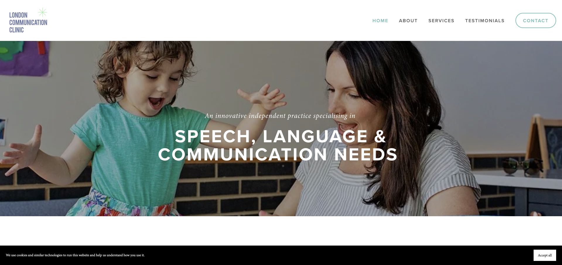
London Communication Clinic places a wide child-and-therapist photograph above a clear service directory. The palette is restrained, allowing the photograph and strong service headings to carry most of the page’s visual emphasis. Its information architecture goes beyond individual appointments: schools, training, supervision, assessment support and adult services have distinct destinations. An about section introduces the practitioner rather than leaving the organisation anonymous. This makes the site worth studying for a practice that sells several related kinds of expertise. The tradeoff is a substantial navigation inventory, with some specialist terminology that a newly concerned parent may not yet recognise.
What you can learn
A practice can serve families and other professionals without forcing both groups through the same copy. Separate specialist service destinations, but give unfamiliar terms short plain-language explanations wherever they first appear in the family-facing journey.
Pros
The service collection makes organisational and individual support routes visibly distinct.
Practitioner information adds a human reference point alongside the broad service offering.
Cons & considerations
The quantity of service labels increases the scanning effort in the primary navigation.
A limited cookie-choice strip occupies part of the initial view and deserves careful usability review.
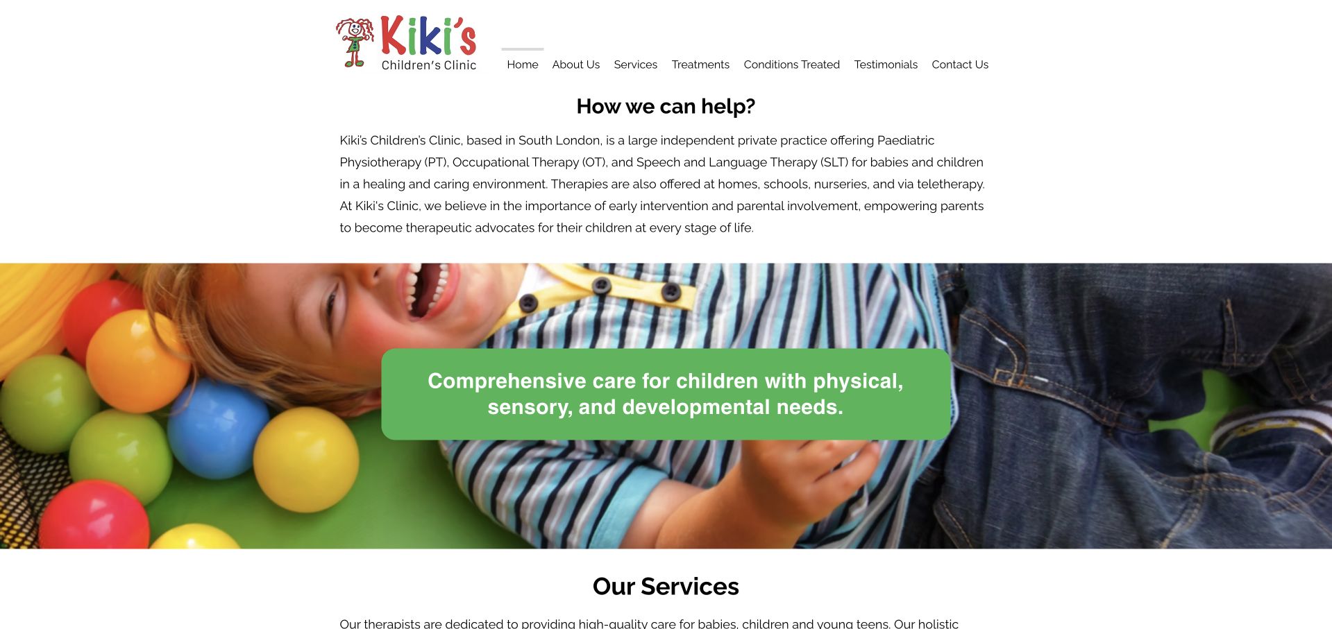
Kiki’s Children’s Clinic begins with an explanation of how it can help rather than a treatment promotion. The first paragraphs identify the South-London practice, the ages it supports and the settings in which sessions may take place. A broad photograph and a bright green statement then introduce a three-part service collection. Speech and language therapy sits beside physiotherapy and occupational therapy, with a brief explanation before its detail link. The overall structure is reassuringly literal: introduction, services, conditions and contact. Some of the most important information is delivered as relatively small text above the large image, which is a useful hierarchy tradeoff to examine.
What you can learn
Before presenting a multidisciplinary grid, give parents a short orientation explaining age range, location and appointment settings. Use the service cards to clarify differences between disciplines rather than repeating the same general promise beneath three different titles.
Pros
The initial description gives the practice’s scope before visitors choose a specialist discipline.
Brief service explanations make the multidisciplinary catalogue more understandable than titles alone.
Cons & considerations
Small introductory text carries information that may deserve stronger visual emphasis.
The broad photographic statement occupies substantial space before visitors reach individual speech-therapy details.
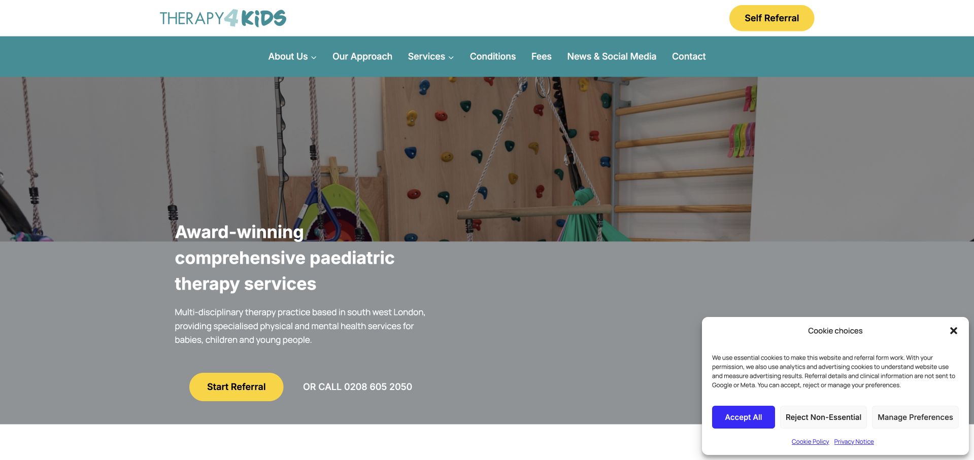
Therapy4Kids uses a teal navigation band, yellow actions and a photograph of its therapy environment to create a more tangible introduction than an abstract healthcare illustration. The referral action appears both in the header and within the hero, with a telephone alternative nearby. Visitors can also find fees directly in the main navigation, an important counterpart to the encouragement to make contact. Below the opening, the service collection includes speech therapy alongside several other disciplines and assessment pathways.
What you can learn
A referral button works better when the page answers practical questions first. Keep fees, service scope and a non-form contact option easy to locate, and distinguish enquiries from later collection of sensitive referral information.
Pros
The real therapy-space image helps visitors picture the setting rather than just the brand.
A visible fees destination and telephone option balance the repeated referral calls to action.
Cons & considerations
The large service inventory can feel demanding without strong grouping and concise descriptions.
The initial cookie-choice panel occupies meaningful screen space even though the underlying page remains visible.
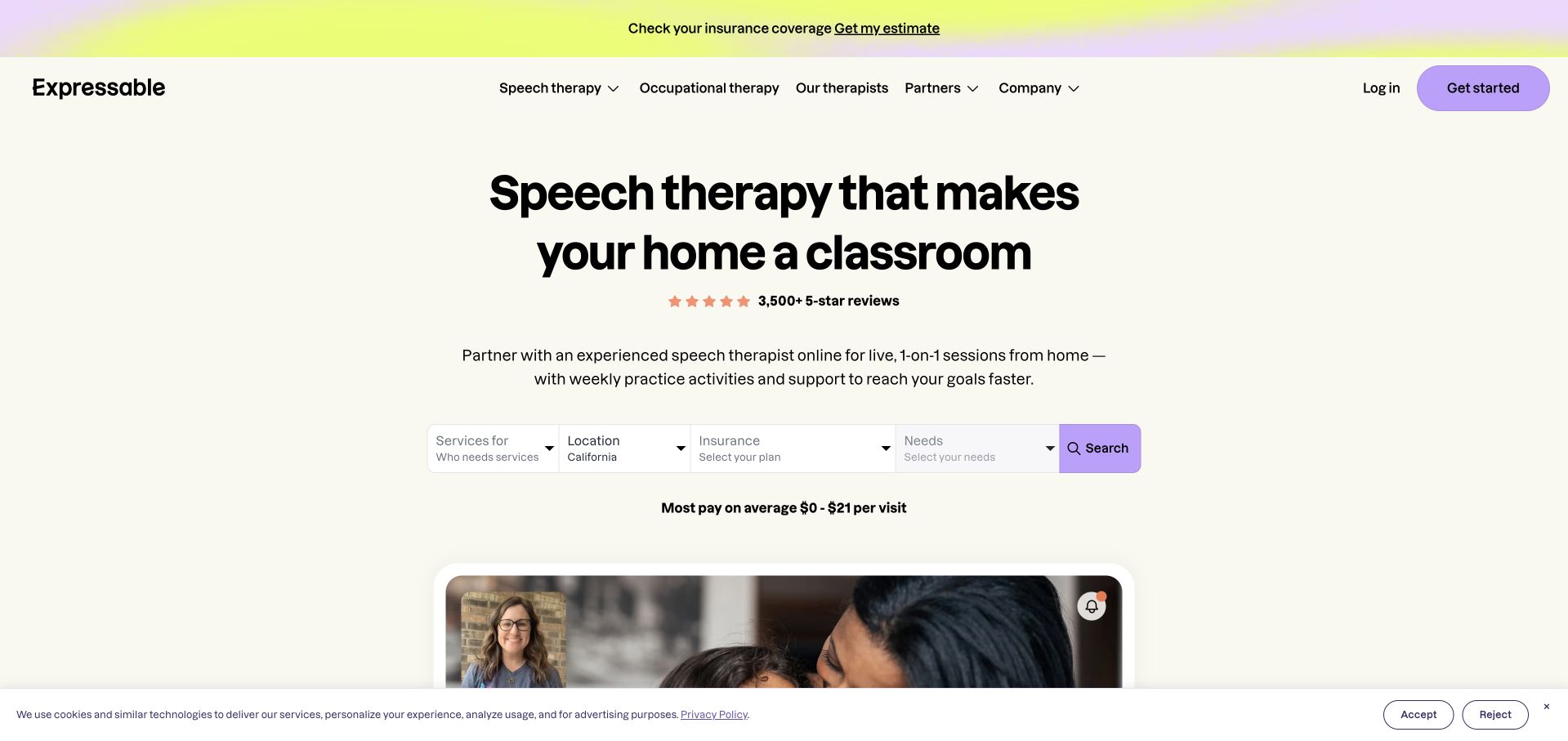
Expressable places a small eligibility-oriented search directly beneath its headline. Instead of asking for a long account registration immediately, the visible controls start with who needs services, location and insurance, with a later needs field dependent on earlier choices. A pale background, lavender accents and centred typography make the form the visual focus, while a family-and-therapist image grounds the remote-service proposition. The architecture recognises that an online service is not necessarily available to every visitor in the same way.
What you can learn
If availability depends on location or funding, surface those constraints before an intake form. Explain dependent fields clearly, preserve accessible labels and provide a route for visitors whose situation is not represented by the options.
Pros
The first controls address practical service-fit questions rather than demanding a medical narrative.
A compact form and clear remote-session imagery support a focused first-screen task.
Cons & considerations
Several eligibility controls may still be intimidating to someone unsure which service they need.
Prominent cost and review claims need context; visual emphasis alone cannot establish individual eligibility or outcomes.
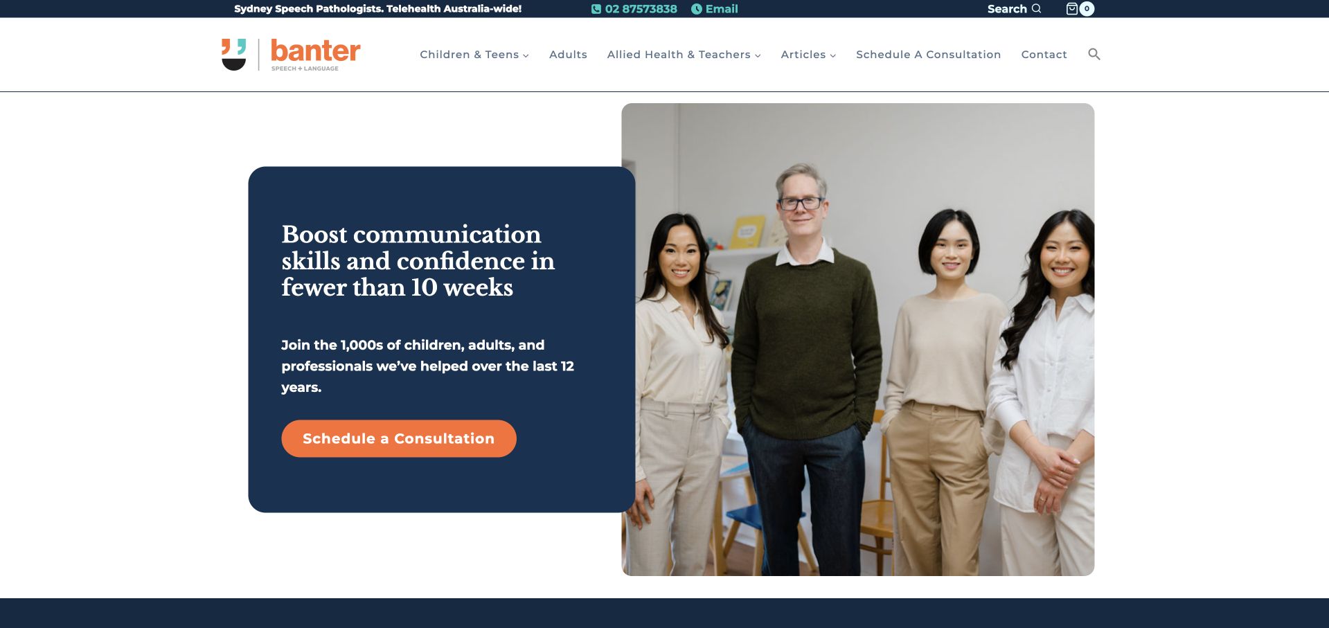
Banter combines a dark-blue header and content panels with a bright orange consultation action. The opening is followed by distinct pathways for children and teenagers, adults, and allied-health or teaching professionals. That separation matters because the site also offers educational material and resources, not just appointments. Contact information and a search control are visible above the main navigation, supporting visitors who already know what they need. The headline makes a strong time-based marketing claim, which should not be borrowed as an assumed result. More transferable is the way the page divides clinical help from professional learning while maintaining one visual identity.
What you can learn
When a clinic also publishes or sells resources, separate the visitor journeys before they enter the catalogue. Make appointments and professional learning different tasks, and ensure ambitious marketing headlines do not replace a clear explanation of service scope.
Pros
The three audience pathways distinguish personal therapy needs from professional resource browsing.
Phone, email, search and consultation options support several levels of visitor readiness.
Cons & considerations
The combination of clinic, articles and shop features creates a relatively busy header.
A time-specific outcome headline needs careful clinical and editorial review rather than uncritical imitation.
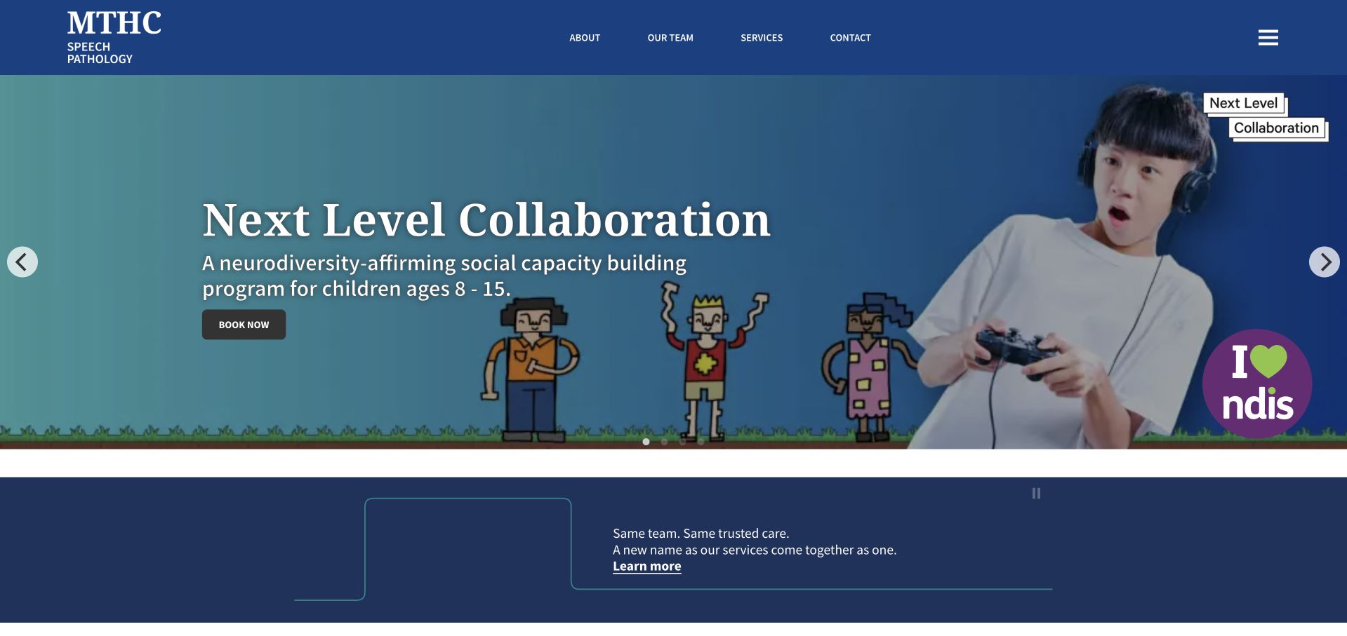
Melbourne Speech Pathology Clinic uses a blue identity and a programme-led carousel to introduce its services. The visible page also explains a transition to the MTHC speech-pathology name, giving returning visitors a bridge between the familiar clinic and the wider organisation. Below that announcement, individual programme links cover different needs rather than treating speech pathology as one undifferentiated appointment. A compact navigation keeps team, services and contact destinations available. The carousel can showcase distinctive programmes, but it also risks making one age group or offer appear to represent the entire clinic until visitors explore the rest of the page.
What you can learn
During a practice rebrand, explain the relationship between old and new names near the beginning of the page. Retain a stable service directory outside any rotating banner so visitors can find their programme regardless of which slide appears first.
Pros
The name-transition notice gives existing patients a useful continuity cue.
Programme-level links reveal a more varied service offering than a generic appointment button.
Cons & considerations
A rotating first screen can temporarily foreground one programme at the expense of others.
Multiple announcements and programme links require careful maintenance to avoid dated or conflicting messages.
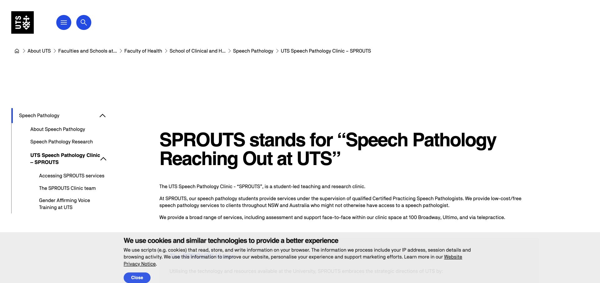
UTS SPROUTS sits within a university design system rather than imitating a private-clinic landing page. A large title, breadcrumb trail and left-hand navigation establish institutional context, while the main content explains the clinic’s teaching role, supervision and appointment formats. Subpages for access and the team give practical information a defined home. This is a useful reference for services that need to explain why they operate differently, including limited referral capacity. The university navigation consumes considerable space, but the plain content structure makes the service understandable without relying on promotional imagery or an immediate appointment promise.
What you can learn
Make a teaching clinic’s model and access conditions explicit. Publish referral status and next steps on a clearly labelled destination, and distinguish education, research and clinical participation so visitors do not assume every programme accepts the same enquiries.
Pros
The page explains its institutional and supervised-teaching context rather than leaving visitors to infer it.
Dedicated access and team destinations separate practical questions from the broader university navigation.
Cons & considerations
Institution-wide breadcrumbs and menus create a large amount of navigation before the clinic content.
A text-led page needs strong headings and current referral notices to remain easy to scan.
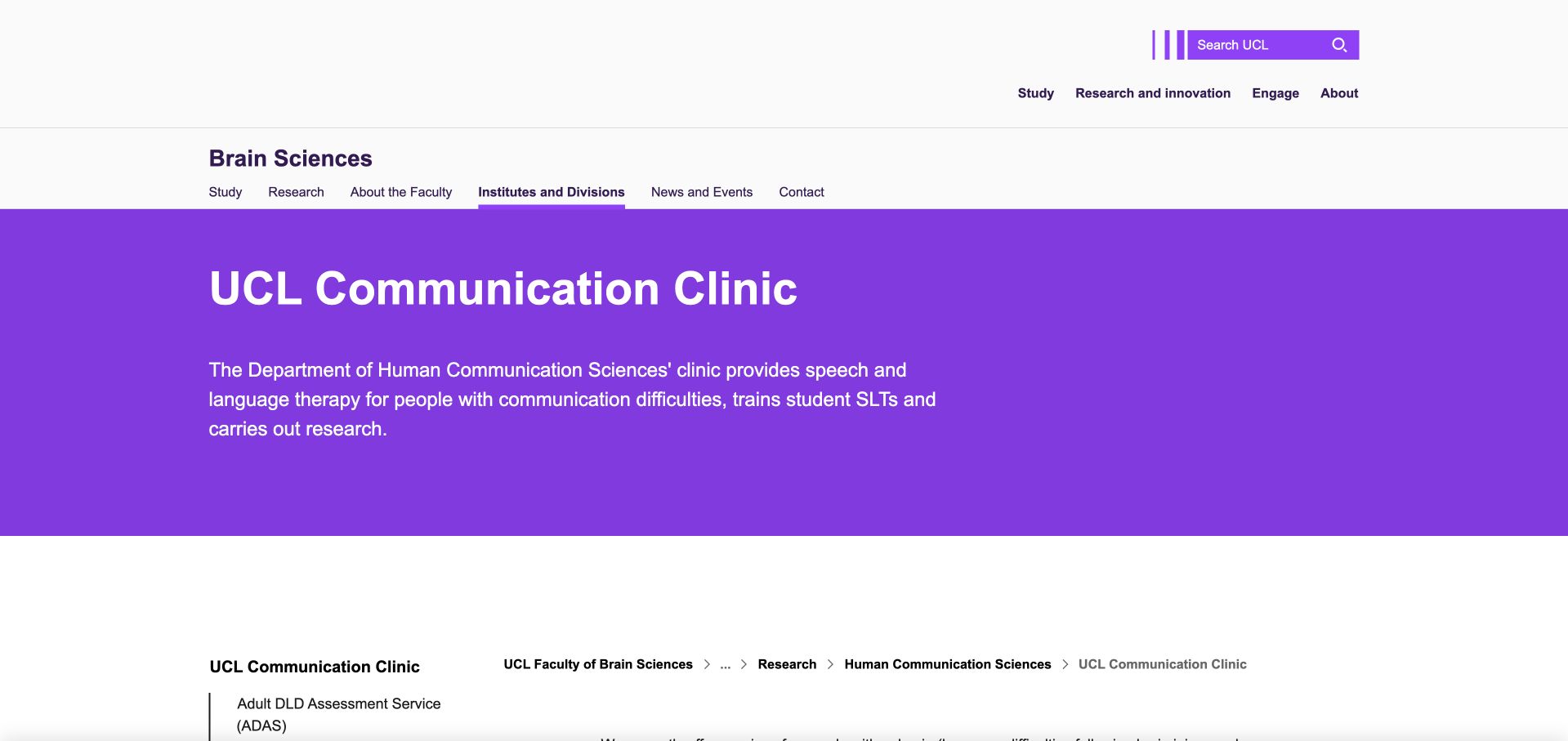
UCL Communication Clinic uses a strong purple title band within the university’s wider navigation. The introductory copy explains the clinic’s service, teaching and research roles, then directs visitors to individual adult communication programmes. A left-hand faculty menu and breadcrumb trail provide orientation within a large institutional site. Unlike a conventional private-practice homepage, the page gives programme descriptions and referral destinations more prominence than a single conversion action. Its strength is clarity about organisational context; its limitation is the number of university-level navigation layers that a visitor seeking help must scan before reaching the relevant clinical programme.
What you can learn
For a clinic offering several specialised programmes, make the programme directory the central task. Explain the relationship to the university and other services plainly, then give each programme an individual destination for eligibility, referral and current availability.
Pros
The purple title band clearly identifies the clinic within a large institutional website.
Programme-specific destinations avoid implying that every visitor follows the same referral route.
Cons & considerations
Faculty and university navigation add substantial visual overhead around the clinic’s own information.
Long explanatory paragraphs would benefit from clear subheadings for visitors with communication or reading difficulties.
Kegan is a freelance web designer and developer with 15+ years of experience helping businesses turn complicated website requirements into clear, maintainable digital experiences. He works directly with clients from planning and design through development, launch, and ongoing support.
For speech therapy website design, his development approach focuses on audience and service-scope information, therapist introductions, referral and first-visit guidance, accessible content, and privacy-conscious appointment inquiries. The scope can be a targeted improvement or a complete custom build, with responsive layouts, thoughtful content structure, and integrations chosen around the people using and maintaining the site.
Show 3 other speech therapy website designersHide other speech therapy website designers
Plan around the person, the setting and the first conversation
Map the actual service boundaries before writing the homepage
Record the ages served, appointment settings, travel area, online jurisdictions, referral requirements and any exclusions the practice needs to communicate. Build the navigation from those facts. Newcastle Neuro’s adult and local-service framing differs from Hopscotch’s multidisciplinary children’s service; neither should inherit the other’s audience assumptions just because both offer speech-related support.
Give schools and professional referrers their own route
School assessments, commissioned work, supervision and professional training can involve different deliverables and information needs from a family enquiry. Explain the route and responsible contact without asking a parent to read procurement language. London Communication Clinic and Banter show different ways to keep professional resources visible while preserving individual service pathways.
Separate the public enquiry from sensitive referral information
Start with enough information to route a request, not an unrestricted clinical narrative. Decide with the practice how later referral details, documents or recordings are collected and who can access them. Explain the handoff to a reviewed system and the expected response. Do not send health details, form text or document names into advertising tools, analytics events or ordinary page URLs.
Rehearse the journey with people who do not know the terminology
Ask someone to find a relevant service, establish whether it is local or remote and explain what the first action does. Test the page without sound, with a keyboard, with enlarged text and on a narrow screen. Review errors and success messages too: an accessible introductory page is not enough if the referral system becomes confusing after the visitor leaves it.
The editing job behind the design
Choose maintainable content and a carefully reviewed referral handoff
A small practice generally needs editable service pages, practitioner profiles, local coverage, fees or pricing context, and current capacity notices more than a complex animation system. Keep a written service explanation available outside video and carousels. Give staff a simple way to update referral status without changing the rest of the design. Preserve separate clinic and home-visit information when their arrangements differ.
A website builder, content platform or booking product does not automatically establish appropriate handling of health information. Review the actual fields, notifications, vendor access, retention and third-party scripts with the practice’s responsible specialists. Requirements depend on jurisdiction and circumstances. Keep the public marketing page and any later clinical workflow deliberately separated, and test the handoff without submitting real patient information during design review.
Our WordPress website examples offer a separate look at publishing approaches. A visible platform label is evidence for that named page, not a guarantee that the same system will suit your requirements.
Before the public launch
Speech therapy website planning checklist
Name the ages and audiences the practice actually supports.
Describe speech-related services in ordinary language beside professional terms.
Separate individual appointments from school and professional work.
State clinic, home, school and remote delivery arrangements accurately.
Publish the real geographic or online-service boundary.
Explain whether a referral or introductory conversation is required.
Keep fees or a clear cost-information route easy to locate.
Publish current referral capacity and maintain any waitlist notice.
Offer written contact alternatives to a telephone call.
Caption important videos and provide equivalent written information.
Keep sensitive referral details out of generic enquiry fields and tracking events.
Explain response expectations and the next step after every form.
These checks are a project checklist, not a performance, legal, security, or accessibility certification. Test real journeys with the people responsible for the website before making claims about the result.
Sources & editorial method
How this collection was selected and reviewed
The 12-example target was saved before this research began and was not rerolled to fit the available material. The editorial team directly inspected the official public pages, captured them in a normal browser and recorded actual capture URLs, timestamps and image dimensions. Blank loading frames, challenge pages, broken destinations and unrelated content were excluded or replaced. Reviews concern observable website presentation, navigation and information, not the competence of a speech therapy provider, clinical outcomes, safety, appointment availability or accessibility conformance. Commercial claims, testimonials and badges remain the source organisation’s statements, not independent verification. Technology labels require public source evidence and do not establish a complete backend inventory. No appointments, accounts, enquiries, screenings or private intake forms were completed. Website imagery and trademarks belong to their owners.
Each example links to its actual source page. Screenshots are direct browser captures with their own capture dates; moving imagery, announcements and live designs can change. The notes describe observable design choices and conditional tradeoffs, not measured traffic, conversion results, service quality, or accessibility conformance.
Technology labels use public page metadata, asset evidence, or explicitly cited platform documentation. Platform documentation is not a complete current deployment audit. A component reference may be legacy or unused; it is not a complete backend inventory. Unknown stacks are omitted. These sites are editorial examples, not our client portfolio.
Written, Edited and Curated are separate editorial records, not timestamps advanced by a rebuild. Website designs and imagery belong to their owners. See our editorial standards or suggest a correction.
Questions worth asking
Speech Therapy website design questions
Should a speech therapy website separate adult and children’s services?
Usually, when both are genuinely offered and their information needs differ. Adult visitors should not have to navigate an entirely child-oriented experience, and parents should not have to interpret a general adult-service page. Use separate pathways with clear scope, practitioner information, appointment settings and contact instructions rather than merely changing the photograph.
What should a first enquiry form ask for?
Only the information the practice needs to route and respond to that initial request. Distinguish the enquirer from the intended client where relevant, explain what not to include and provide a reviewed route for later sensitive details. The exact fields and workflow should be agreed with the practice rather than copied from another clinic’s form.
Can the homepage offer an online assessment or symptom quiz?
It can explain an appropriate service or screening process, but the interface should not imply that a public questionnaire establishes a diagnosis. State who reviews the information, the service’s limits and what happens next. Do not add an interactive quiz merely because it may produce more submissions; consider privacy, accessibility and clinical review first.
How should a clinic explain teletherapy?
Describe how the first contact works, which service areas and locations are supported, what equipment or assistance may be needed and who decides whether the format is appropriate. Do not imply that every visitor or service can be handled remotely. ASHA’s telepractice material is a useful professional reference; the practice should approve the actual service description.
What if the practice is not accepting new clients?
State that clearly beside the enquiry action and explain whether a waitlist exists, whether it is open and what contact is still useful for. Assign someone to review the notice. A welcoming contact button should not silently contradict a capacity message or allow visitors to assume a submission reserves an appointment.
How much technical detail belongs on a family-facing service page?
Enough to explain the service honestly, with plain-language definitions for unfamiliar terms and links to more detail where needed. Put school commissioning, professional training and clinician resources in their own routes. A useful service page should help someone understand the next conversation, not require them to acquire professional knowledge before asking for support.
A strong speech therapy website is clear about who it supports, where support happens and what the next step means. Borrow that clarity before borrowing a colour palette.